
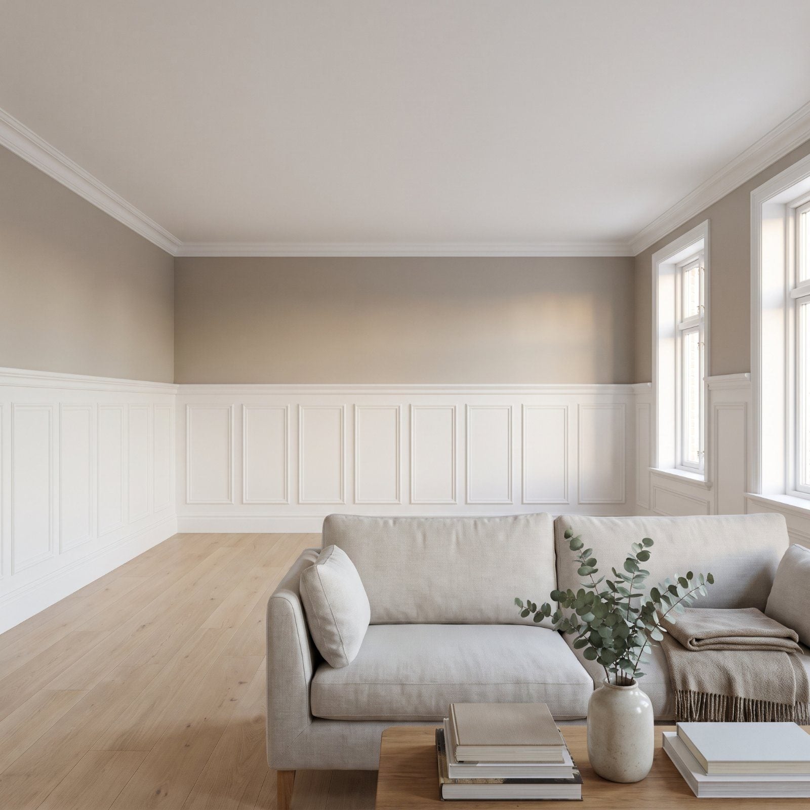
Wainscoting is supposed to make a room look finished. Half the time it makes the ceiling look like it’s sinking. One wrong horizontal line and a perfectly good room starts feeling like a basement with nice molding.
The problem is never the wainscoting itself — it’s the height, the cap, the color break, and whether anybody checked what the trim was doing to the walls around it. Below are the rooms that got it wrong, and exactly why the eye reads them as shorter than they are.
In order to come up with the very specific design ideas, we create most designs with the assistance of state-of-the-art AI interior design software. Also, assume links that take you off the site are affiliate links such as links to Amazon. this means we may earn a commission if you buy something.
26. Low-Ceiling Living Room Overwhelmed by Overly Tall Raised Panels
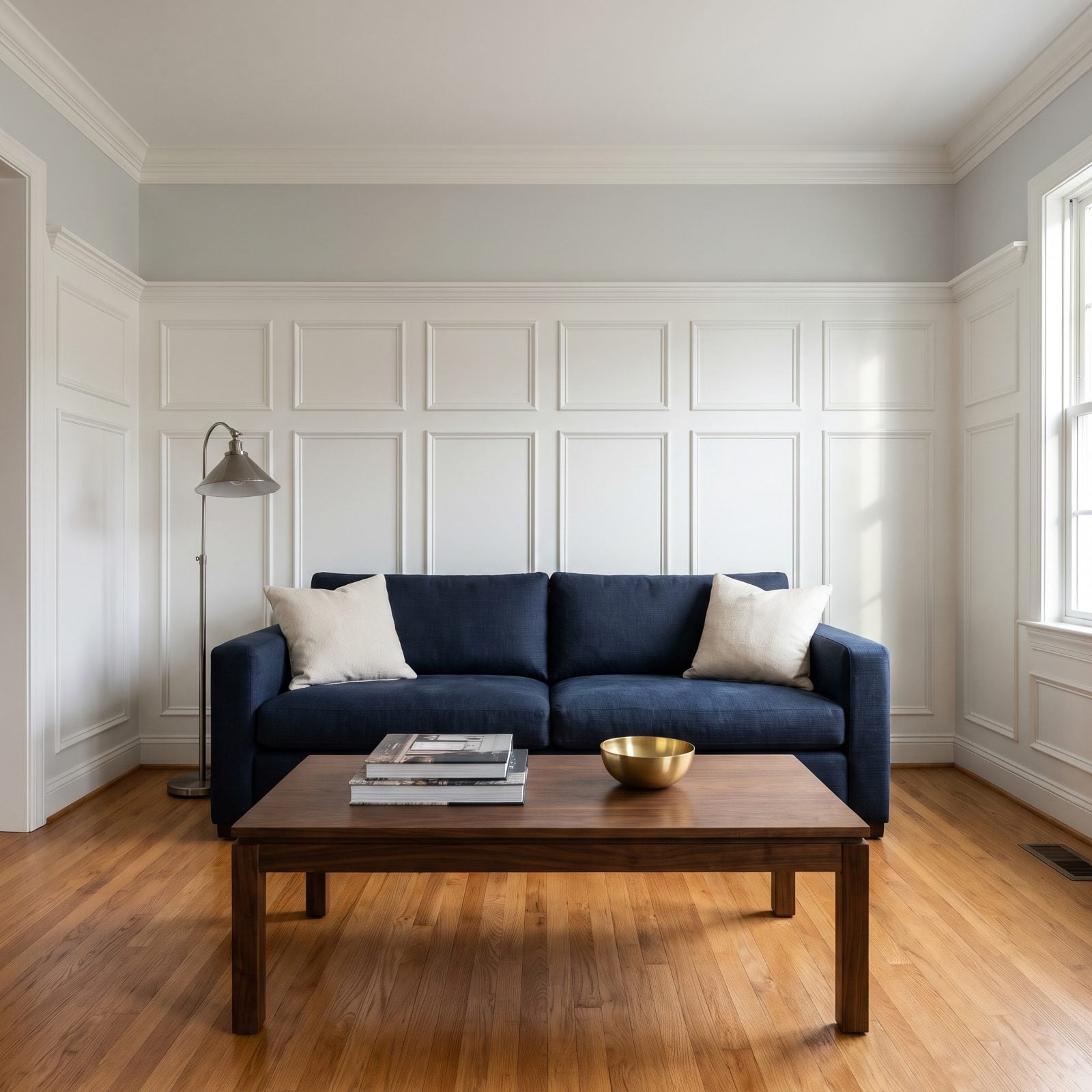
The wainscoting climbs to roughly five feet, which leaves a sliver of wall above it and a ceiling that looks like it’s been pressed down with a thumb. Tall panels belong in tall rooms. Drop them into an eight-foot ceiling and they devour the vertical space, leaving the crown molding looking like a coping saw lopped off the top of the wall.
Get the ratio wrong and the eye reads the wainscoting as the main event and the ceiling as an afterthought. That’s backwards.
25. Narrow Hallway Chopped in Half by a Dark Horizontal Band
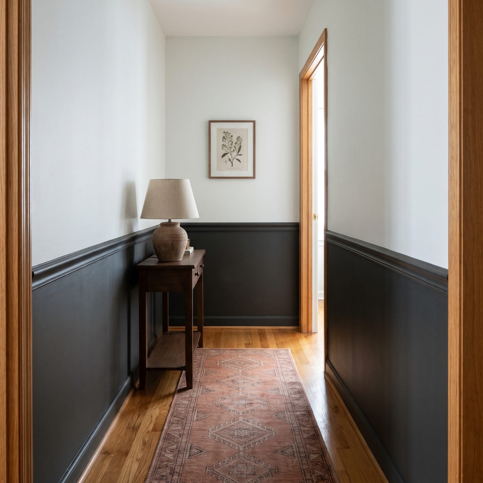
A dark band at 48 inches turns a long hallway into a tunnel. The eye follows that heavy line all the way down, and in a space this narrow, every inch of width you lose to visual weight hurts.
Dark wainscoting works when the room has breathing room. A hallway doesn’t. Keep the color light, keep the band low, and let the walls carry the length instead of fighting it. A pale terracotta runner rug on the floor pulls the eye down to where the length belongs.
24. Living Room Compressed by Heavy Crown Molding and Tall Wainscoting
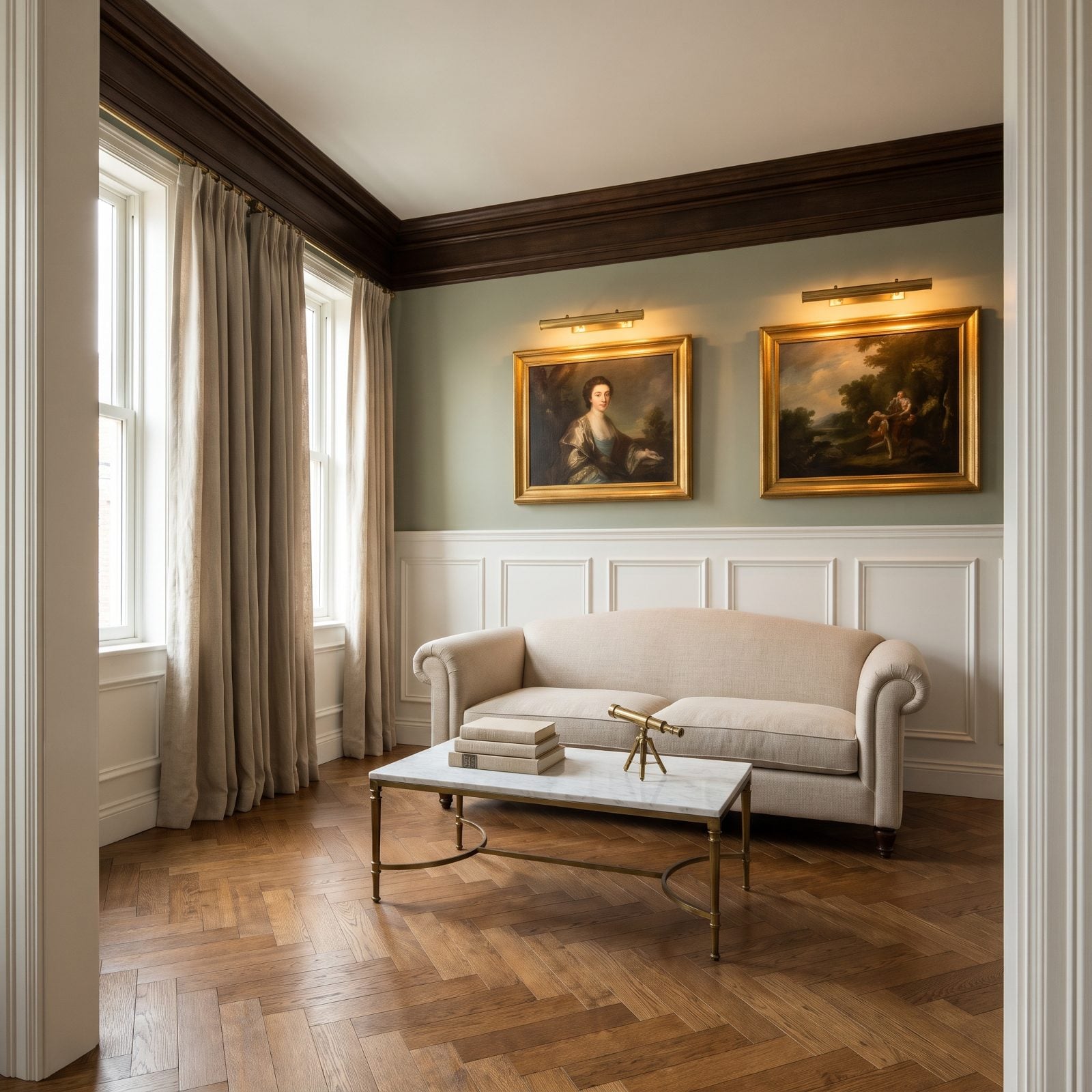
Two heavy horizontals pinching one thin stripe of wall. The deep crown presses from above, the tall wainscoting shoves up from below, and that sage-green middle band gets squeezed into nothing — a nine-foot ceiling reading like seven.
Here’s the fix nobody wants to hear: pick one feature to go bold, not both. Heavy crown with modest wainscoting, or tall wainscoting with a slim crown. When both compete, the wall loses, and so does the ceiling height you paid for.
What Our Readers Say
- In our reader polls, people who chose white ceilings were also more likely to choose white trim, 71% compared with 52% of everyone else.
- Home Stratosphere readers who wanted a bright overall feel at home picked white trim 75% of the time, versus 52% of readers who went another way.
From Home Stratosphere reader polls and votes.
23. Sunroom With a Chair Rail Bisecting Low Windows
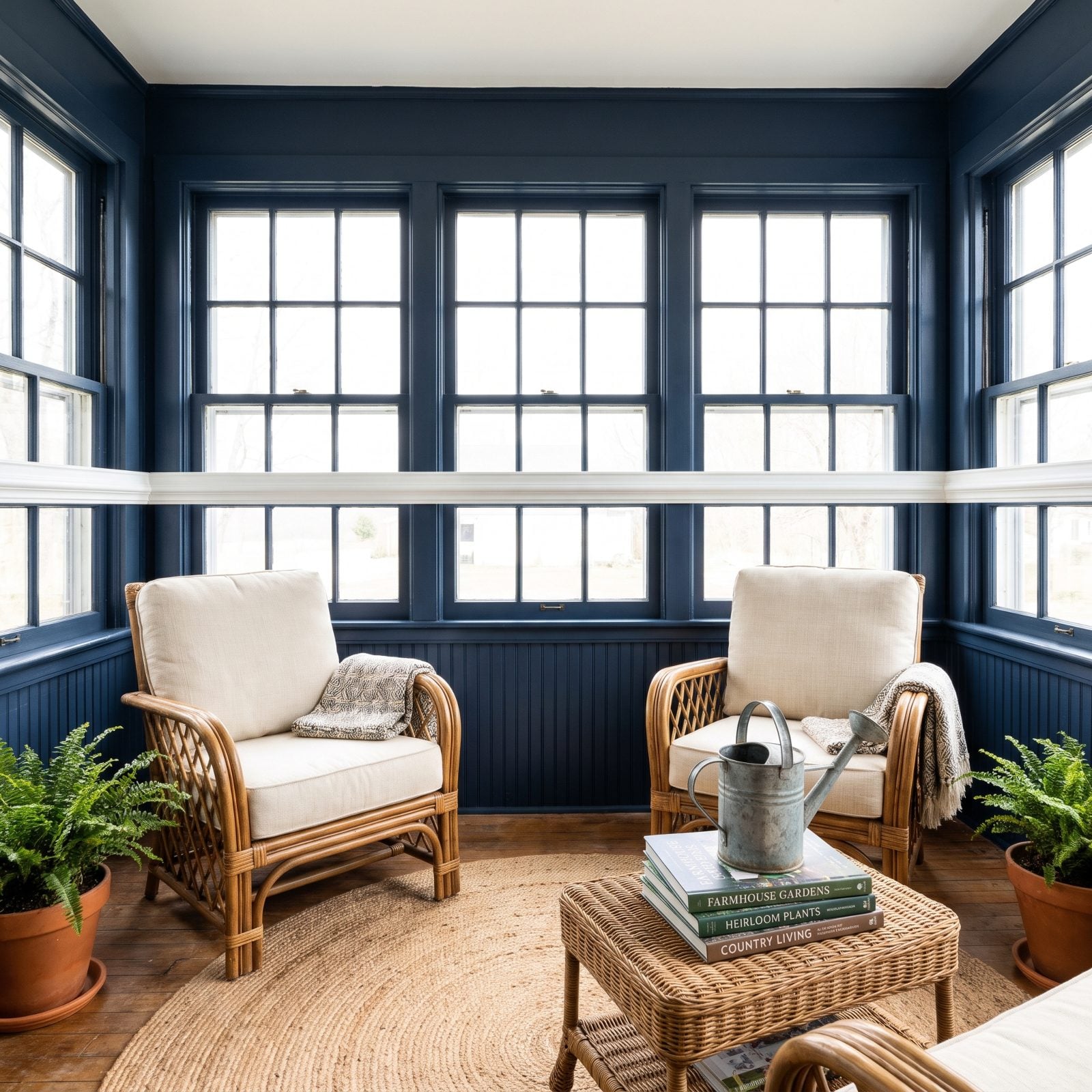
The chair rail runs straight across the glass. Low windows and a 36-inch rail collide, and now a horizontal line slices through the view of the garden — the one thing a sunroom exists to protect.
Trim should die into the window casing, not cut across the panes. When they can’t coexist at the same height, the window wins. Always. Nobody built a sunroom for the wainscoting.
22. Foyer Where the Panel Line Cuts Across the Front Door
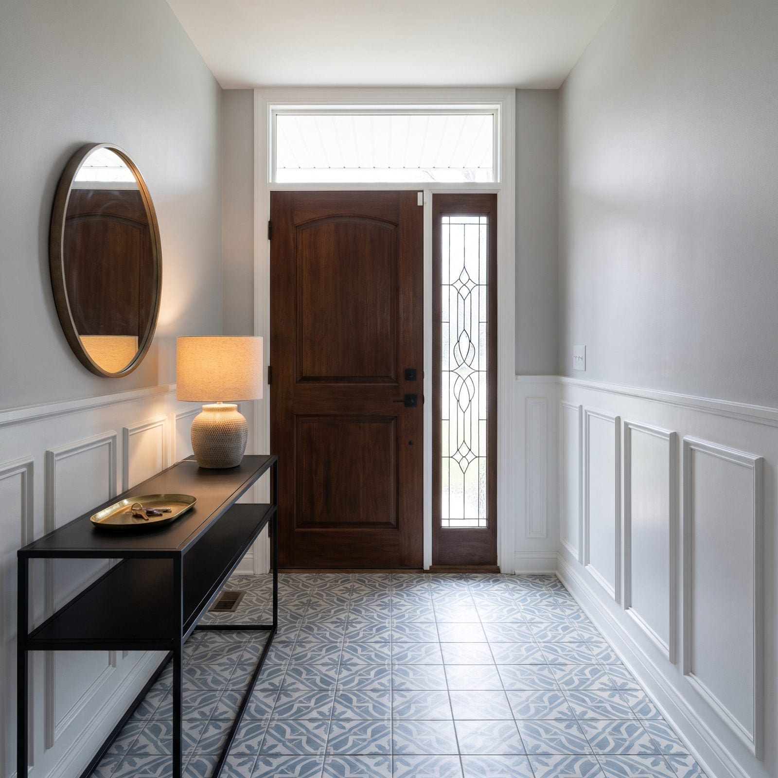
That cap line hits the front door at the wrong spot, missing the door’s own panel break by a few inches. You catch the mismatch the second you walk in, and a foyer is the one room where first impression is the whole job.
Doors come with their own built-in horizontals. Good wainscoting reads those lines and aligns to them, so the trim and the millwork speak the same language instead of talking over each other.
21. Stair Hall With a Level Chair Rail That Ignores the Stair Slope
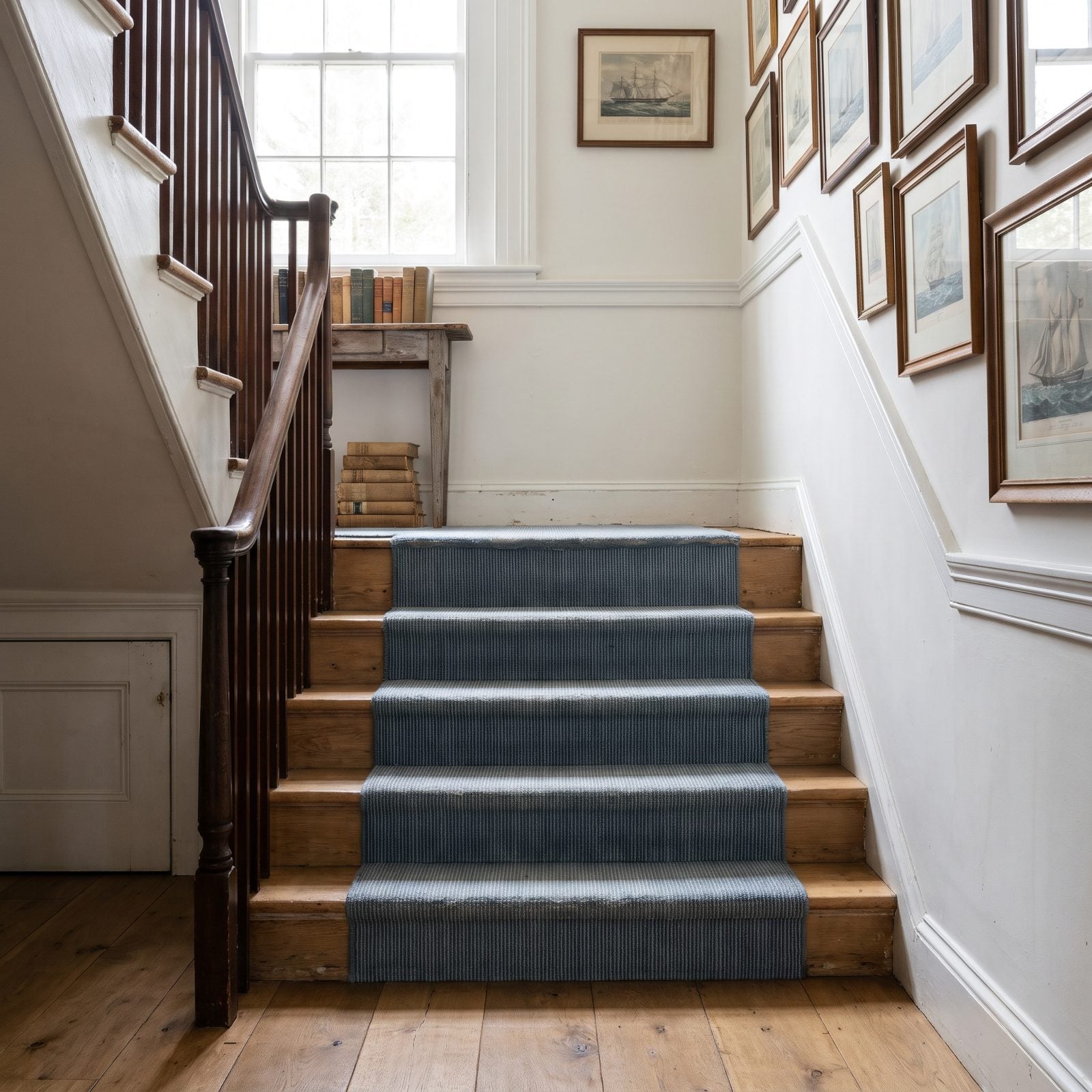
The chair rail stays dead level while the stairs climb beside it, and the triangle of wall between them grows wider with every step. It looks like a mistake because it is one. Stair wainscoting is meant to rake, following the pitch of the stringer and the handrail.
A raked cap parallel to the handrail keeps the whole stair reading as one clean diagonal. A level cap fights the geometry and loses, and your eye never stops noticing that widening wedge.
20. Attic Bedroom With Wainscoting Crowding the Sloping Ceilings
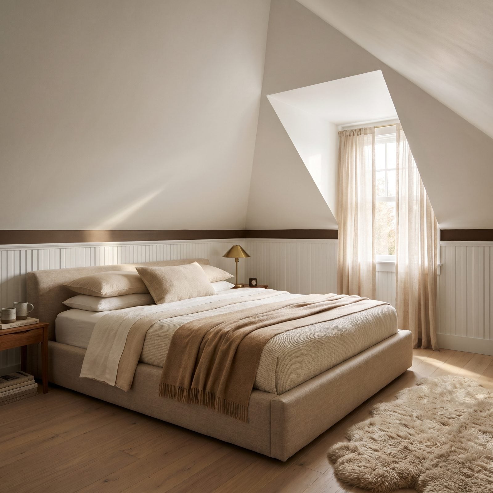
The wainscoting nearly touches the ceiling slope. On a knee wall that only stands 50 inches before it angles away, a 42-inch panel leaves barely eight inches of breathing room, and the whole low side of the room feels like it’s closing in.
Attic rooms already fight for headroom. Add paneling that crowds the slope and you’ve traded charm for claustrophobia.
19. Kitchen With a Panel Cap Higher Than the Countertops
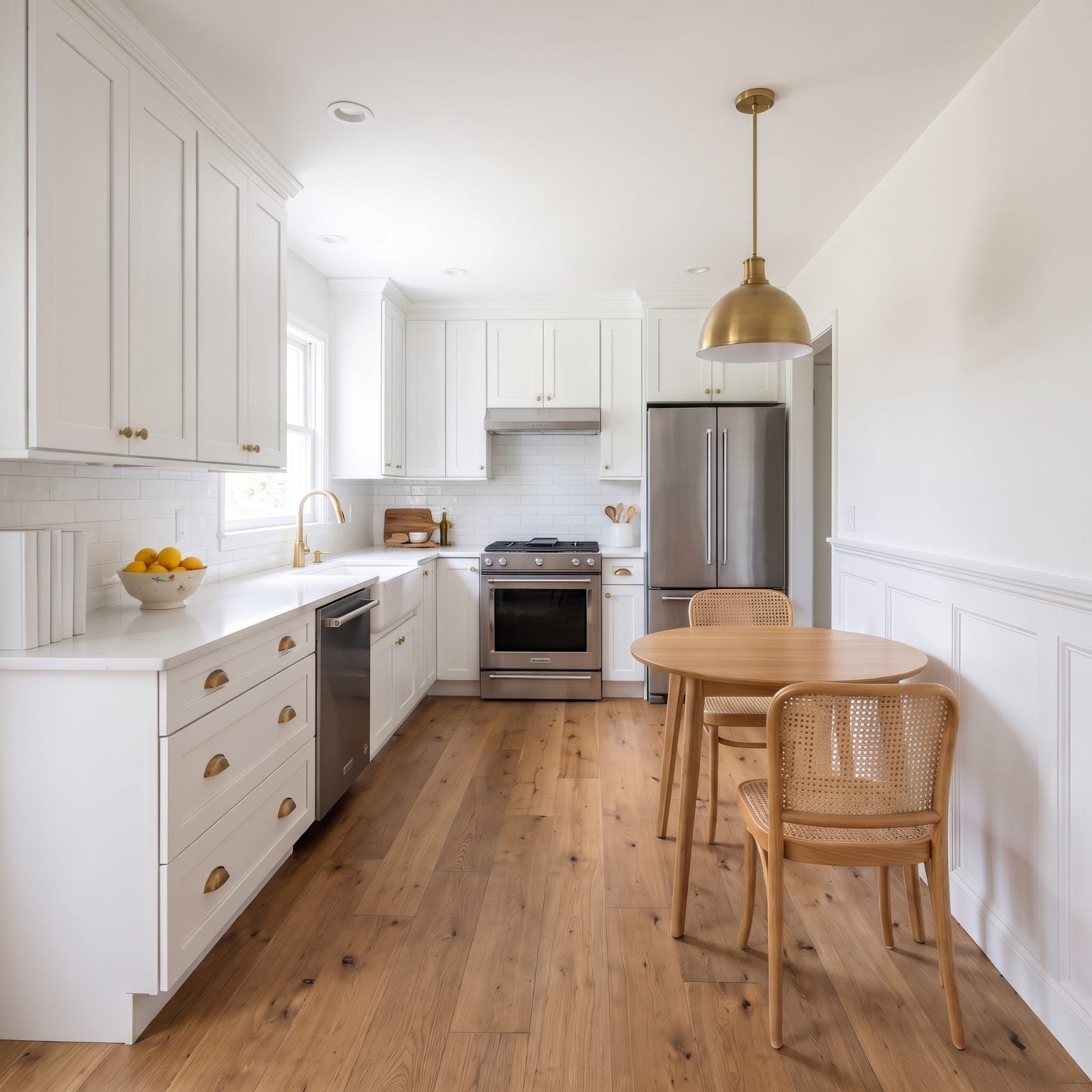
The wainscoting cap lands at 42 inches and the countertop sits at 36 — six inches apart, two parallel horizontals facing each other across the room, neither willing to line up. The eye bounces between them and the kitchen feels chopped.
In a kitchen, the counter is the governing line and everything else should defer to it. Set the wainscoting cap to meet the countertop height, or drop it below, so the trim and the work surface read as a single level instead of two near-misses.
18. Bathroom With Wainscoting and Tile Ending at Competing Heights
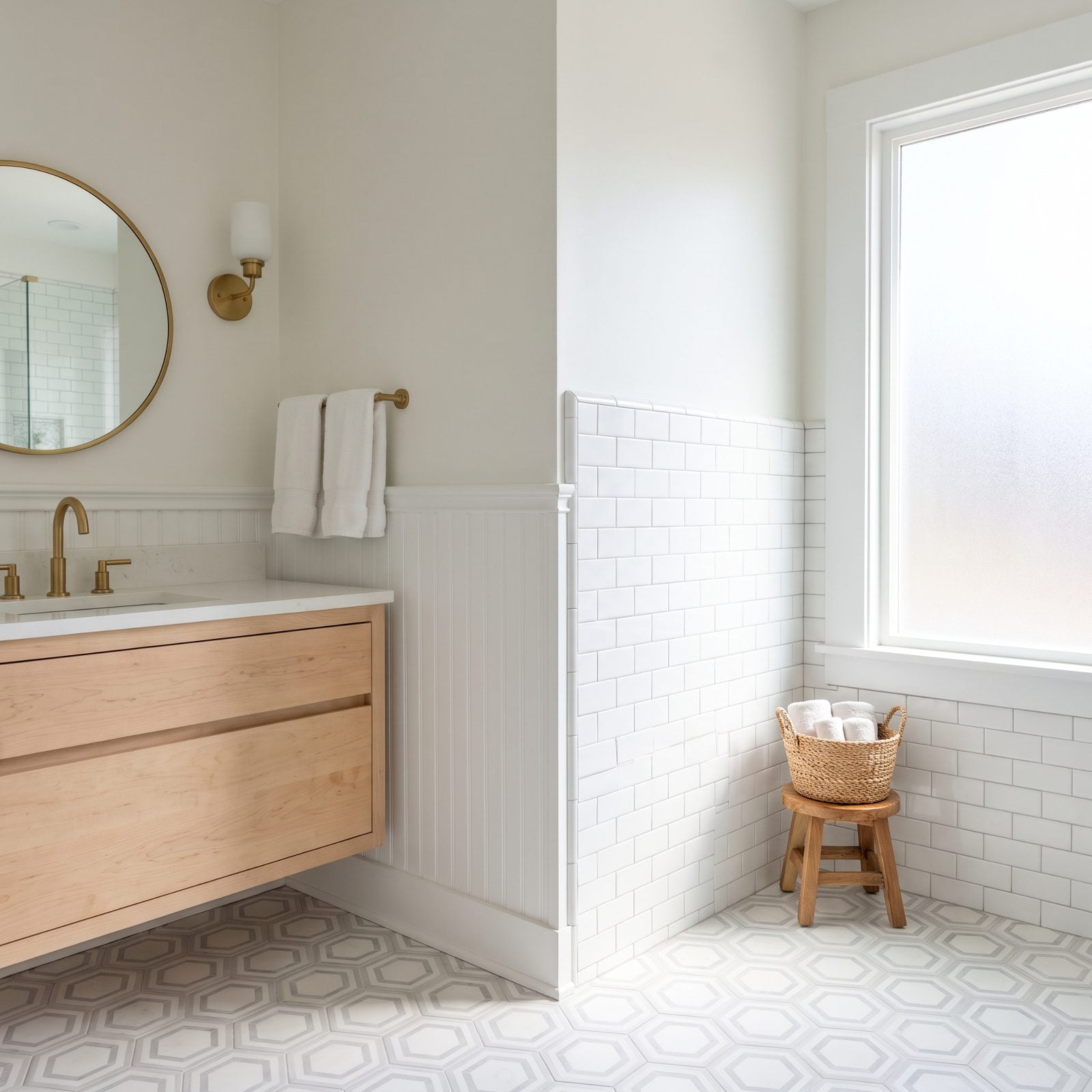
Beadboard stops at 36 inches, the tile stops at 48, and the two lines collide in the corner at a visible step. You don’t notice it until you do, and then you can’t stop. Two wall treatments ending at two heights in one small room is a math error the eye solves instantly.
Pick one cap height and make everything respect it. Run the beadboard and the tile to the same line, or stack them deliberately with a clear reason. A contemporary utility room can get away with a lot, but not two competing horizontals in a four-foot wall.
17. Fireplace Room Where the Panel Cap Collides With the Mantel
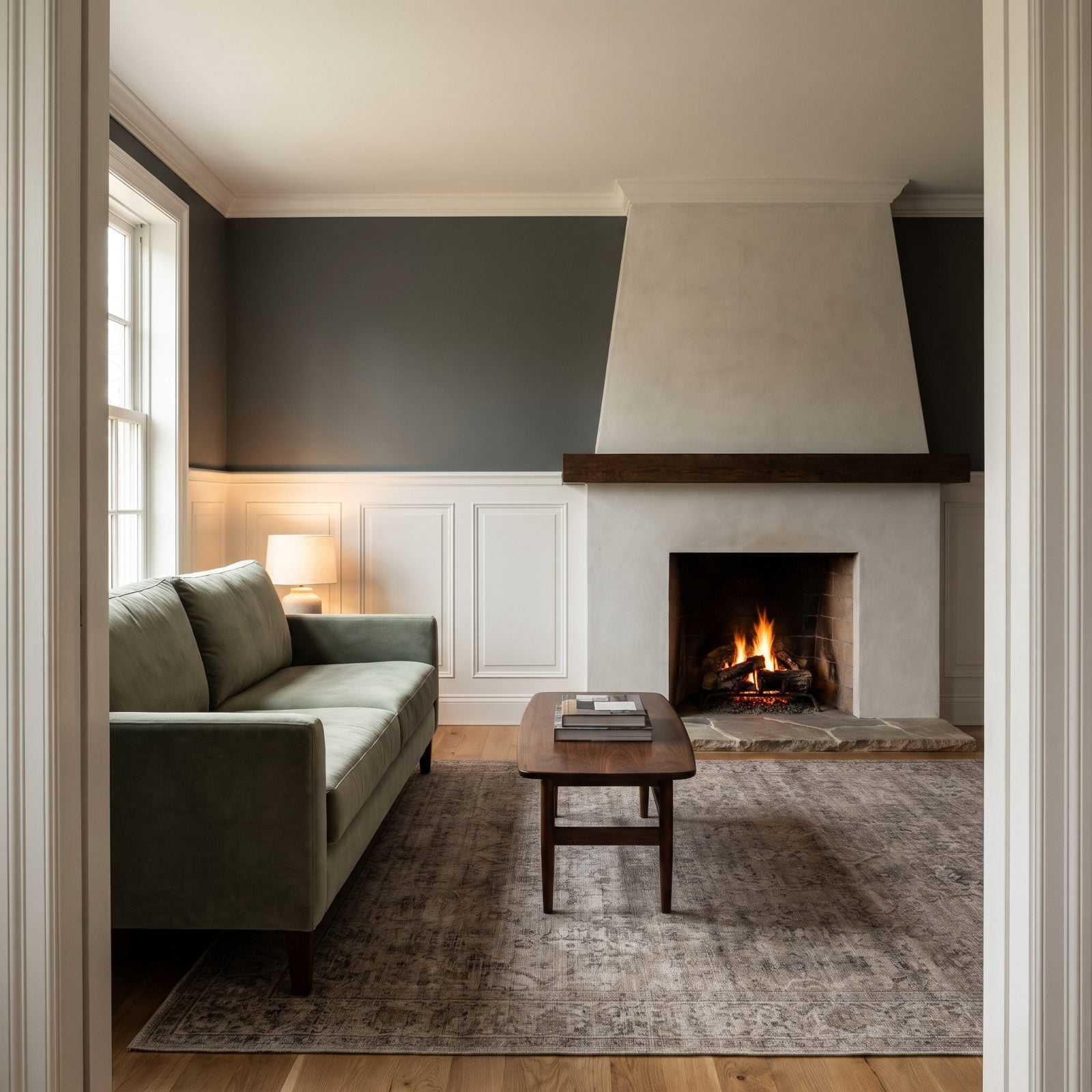
The panel cap and the mantel sit a few inches apart, and that near-miss is worse than a mile. When two strong horizontals almost line up, the eye reads it as a failed attempt instead of a design choice. Either match them exactly or separate them enough that nobody tries to connect the dots.
A mantel is already a commanding horizontal. Build the wainscoting height off the mantel, not the other way around, and the room pulls into alignment. Anchor a sage velvet sofa along the side wall, perpendicular to the fire, and the whole space finally agrees on where its lines live.
16. Dining Room With Large-Scale Wallpaper Squeezed Above the Rail
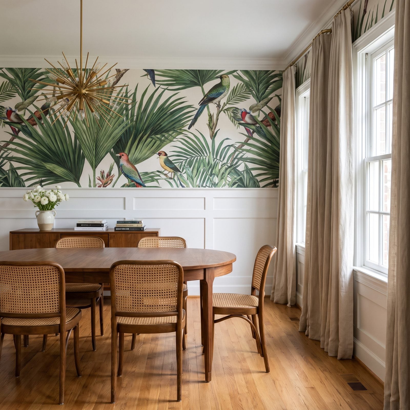
Big-print wallpaper wants room to breathe. Crammed into a five-foot strip above the chair rail, those oversized palm fronds get chopped mid-leaf, and your eye reads the chop as a ceiling. The rail turns into a hard shelf line, the pattern flattens into a frieze, and a nine-foot room suddenly feels like seven.
The fix is boring and it works. Either run the big paper floor to ceiling with no rail, or pair the wainscoting with a small, tight repeat up top. Scale has to match the canvas you give it.
15. Traditional Parlor With Too Many Stacked Trim Bands
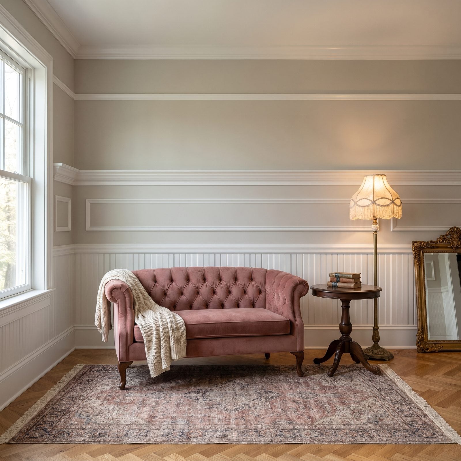
Trim is addictive. You add a chair rail, then a picture rail, then a little panel molding because the wall looked bare, and before long five horizontal lines are slicing the wall into ribbons. Each band is lovely on its own. Together they read like the rungs of a ladder laid sideways, and every rung shaves another inch off the perceived height.
Pick one horizontal event per wall. A single chair rail, or a single picture rail — not a committee.
14. Home Gym With Horizontal Planks Emphasizing the Low Ceiling
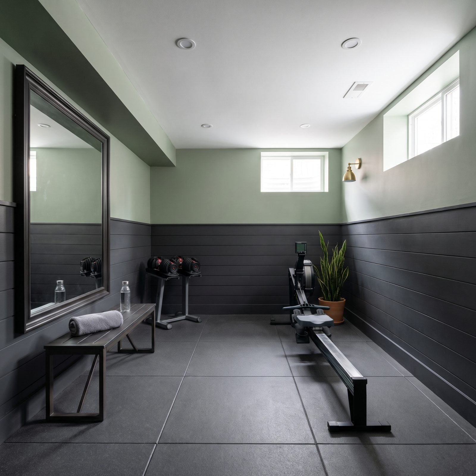
Horizontal shiplap in a room already short on height is a cruel joke you play on yourself. Those long charcoal plank seams run the full width of the wall, and the eye chases every one of them sideways, so an eight-foot ceiling starts feeling like seven-two.
Run the planks vertical instead. Same material, same charcoal, opposite effect: the seams draw the eye up and quietly buy back the height. Planning a sweat-it-out basement? Borrow layout cues from a bohemian media room and keep the walls working upward.
13. Dining Room Where Short Curtains Reinforce the Panel Height
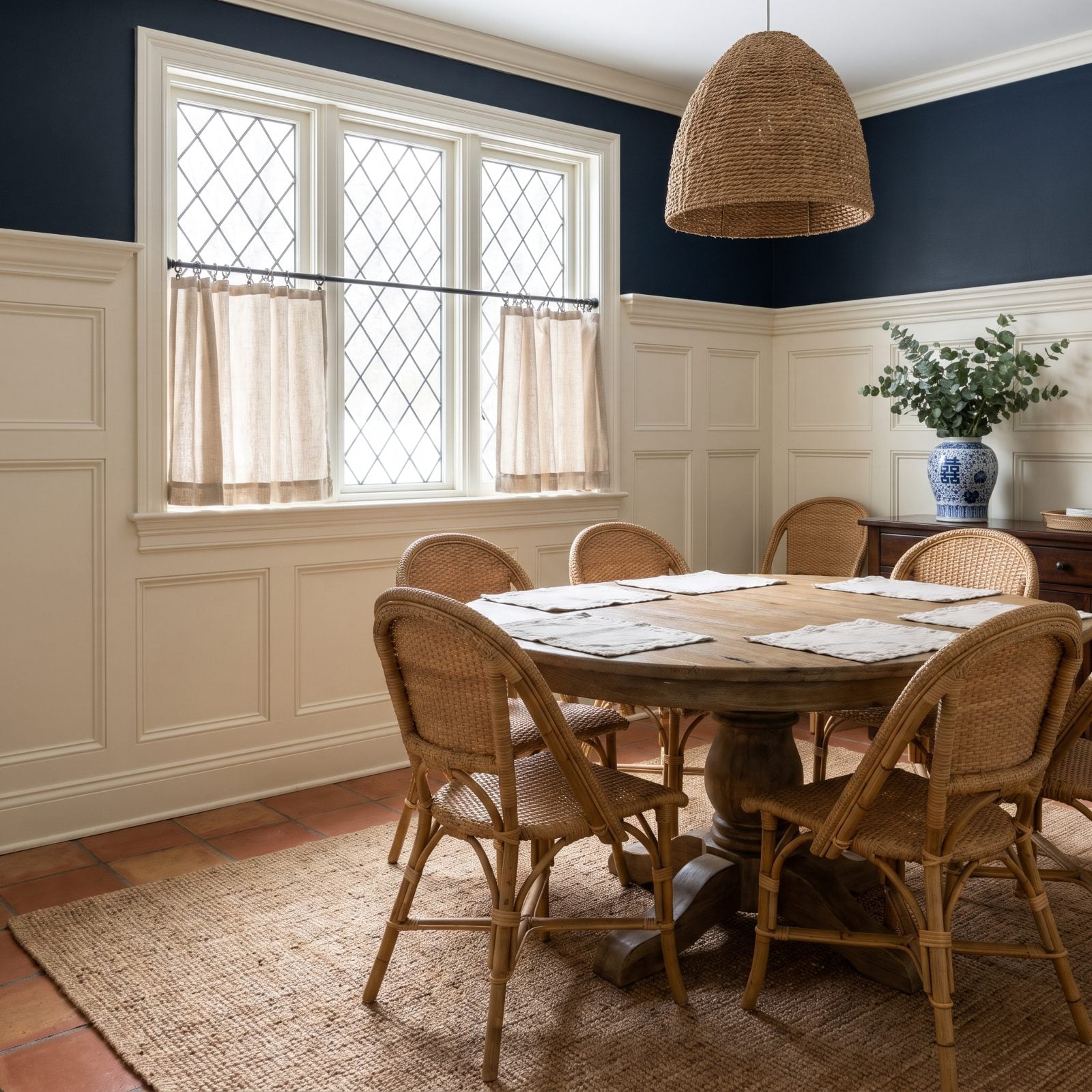
Here’s the quiet killer. The wainscoting caps at 38 inches and the curtain rod sits at 40 — two strong horizontals within two inches of each other, banding across the whole room at hip height. The window could have rescued the ceiling. Instead it doubles down on the low line.
Hang the rod at the crown and let the panels pool to the floor. One high horizontal beats two low ones, every time.
12. Living Room With Squat Square Panels Instead of Vertical Ones
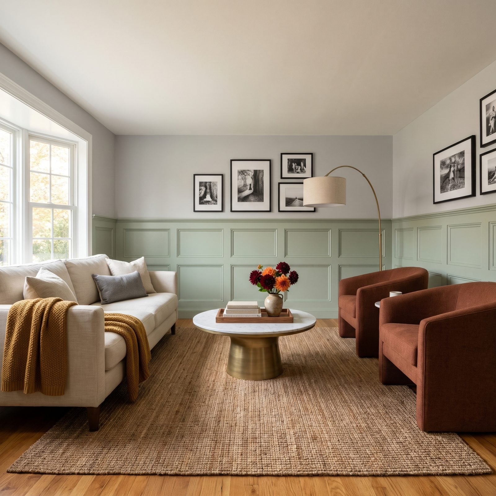
Panel proportion matters more than panel color. These boxes are wider than they’re tall, squat little rectangles lined up in a row, and every one of them whispers horizontal to your eye. The sage is gorgeous. The geometry is sabotaging it.
Tall, narrow panels do the opposite. A panel taller than it is wide reads as a column, and columns pull the gaze up. For a room where the walls carry the whole mood, there are plenty of family room ideas that get the proportions right.
11. Eight-Foot Entry Overwhelmed by Chunky Applied Molding
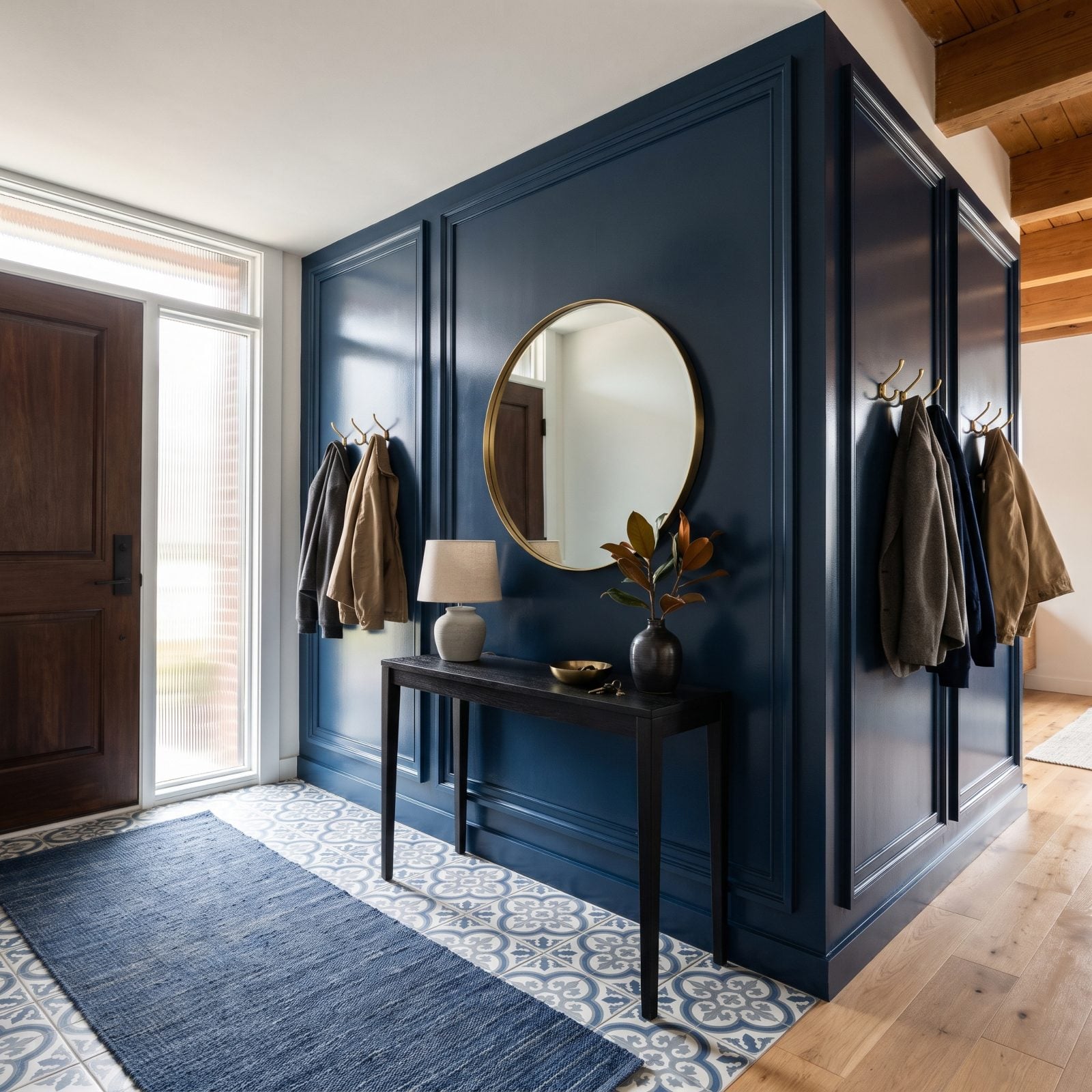
I love a moody navy entry. But three-and-a-half-inch molding boards standing proud of an eight-foot wall is too much muscle for the space. The frames eat the wall, the margins shrink to slivers, and the whole entry feels like it’s wearing a coat two sizes too big.
Scale the trim to the room. In an eight-foot entry, thin applied molding — half-inch or three-quarter — gives you the detail without the bulk. Delicate reads taller, chunky reads shorter, and it really is that simple.
10. Small Bathroom With a Thick Shelf Capping the Wainscoting
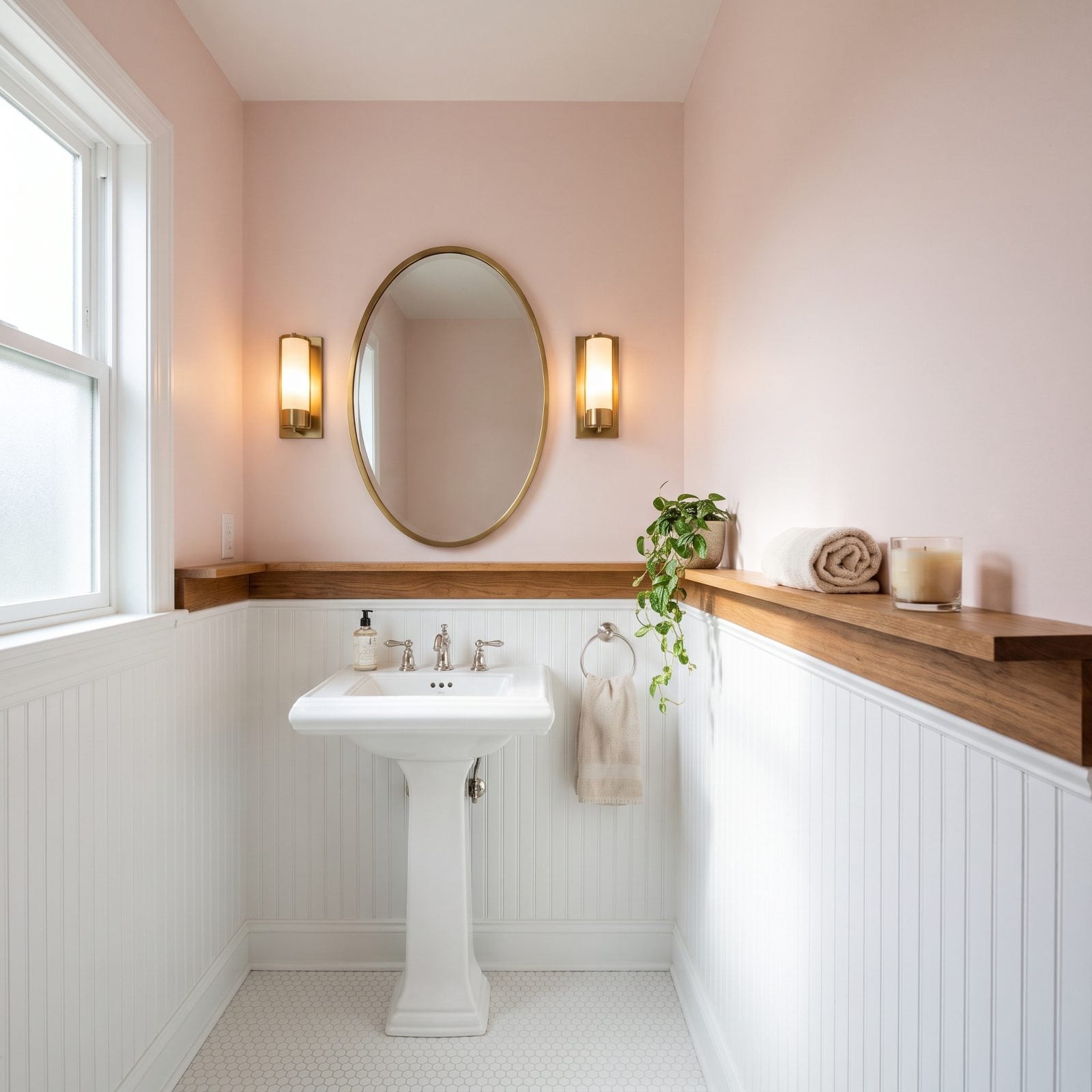
That four-inch shelf cap wrapping the room at 48 inches is the villain. In a small pink powder room with low-ish ceilings, a deep protruding ledge throws a shadow line all the way around and slices the little space clean in half. Cute for a candle. Brutal for the proportions.
Use a flat, flush cap instead — or skip the shelf and let the beadboard meet the wall with a simple thin molding. The less the cap sticks out, the less it chops the room.
9. Hallway With a Strong Horizontal Stripe Above the Wainscoting
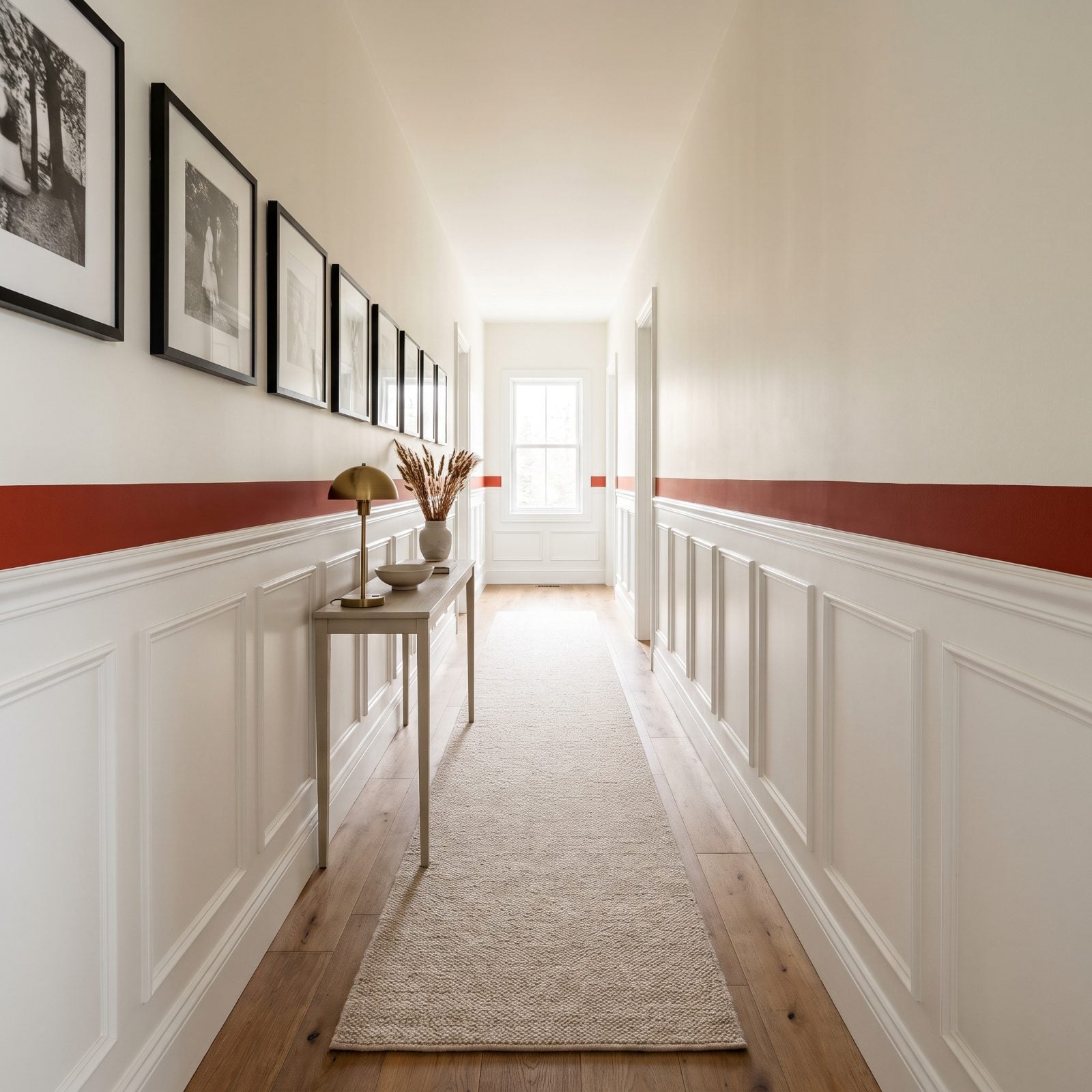
A painted stripe racing above the chair rail photographs great and lives terribly. Two parallel horizontals shooting down an eight-foot hallway press the ceiling down and pull the walls in at the same time. You feel it before you can name it.
Want color above the rail? Flood the whole upper wall with it. A solid field reads calm and tall. A stripe reads like a racing lane and drags everything sideways.
8. Kitchen Banquette Area With Three Competing Horizontal Lines
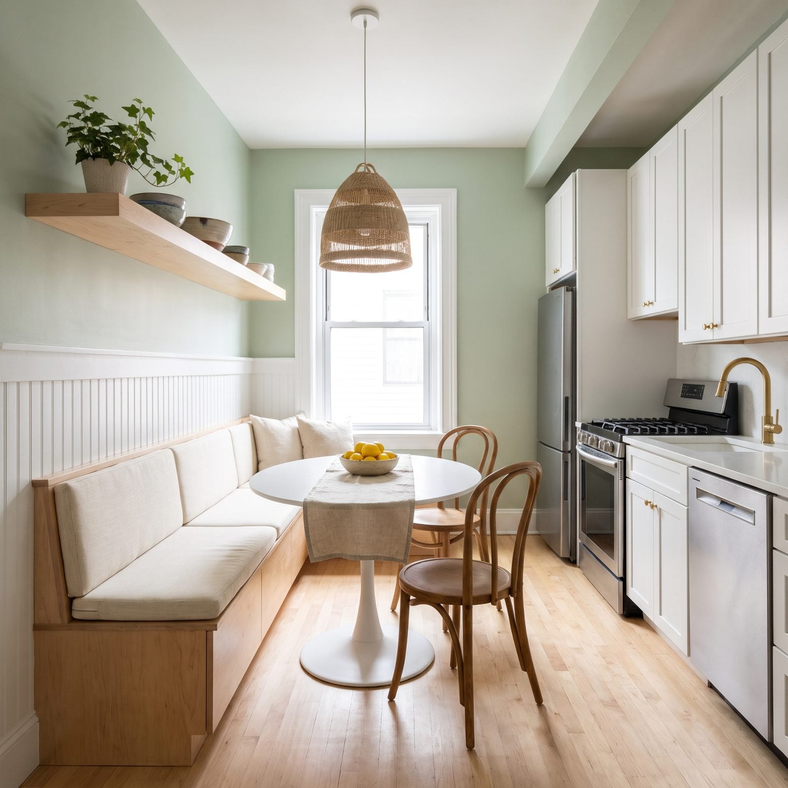
Count the lines on this banquette wall: bench back at 18 inches, wainscoting cap at 34, floating shelf at 54. Three horizontals stacked up like a layer cake, all telling your eye the ceiling is closer than it is. Each one is reasonable. The pile-up is the problem.
Thin the herd. Lose the floating shelf, or drop the wainscoting so the bench back is the only low line. One horizontal anchor lets the eye settle instead of bouncing up the rungs.
7. Basement Bar With Wainscoting Aligned to a Low Bulkhead
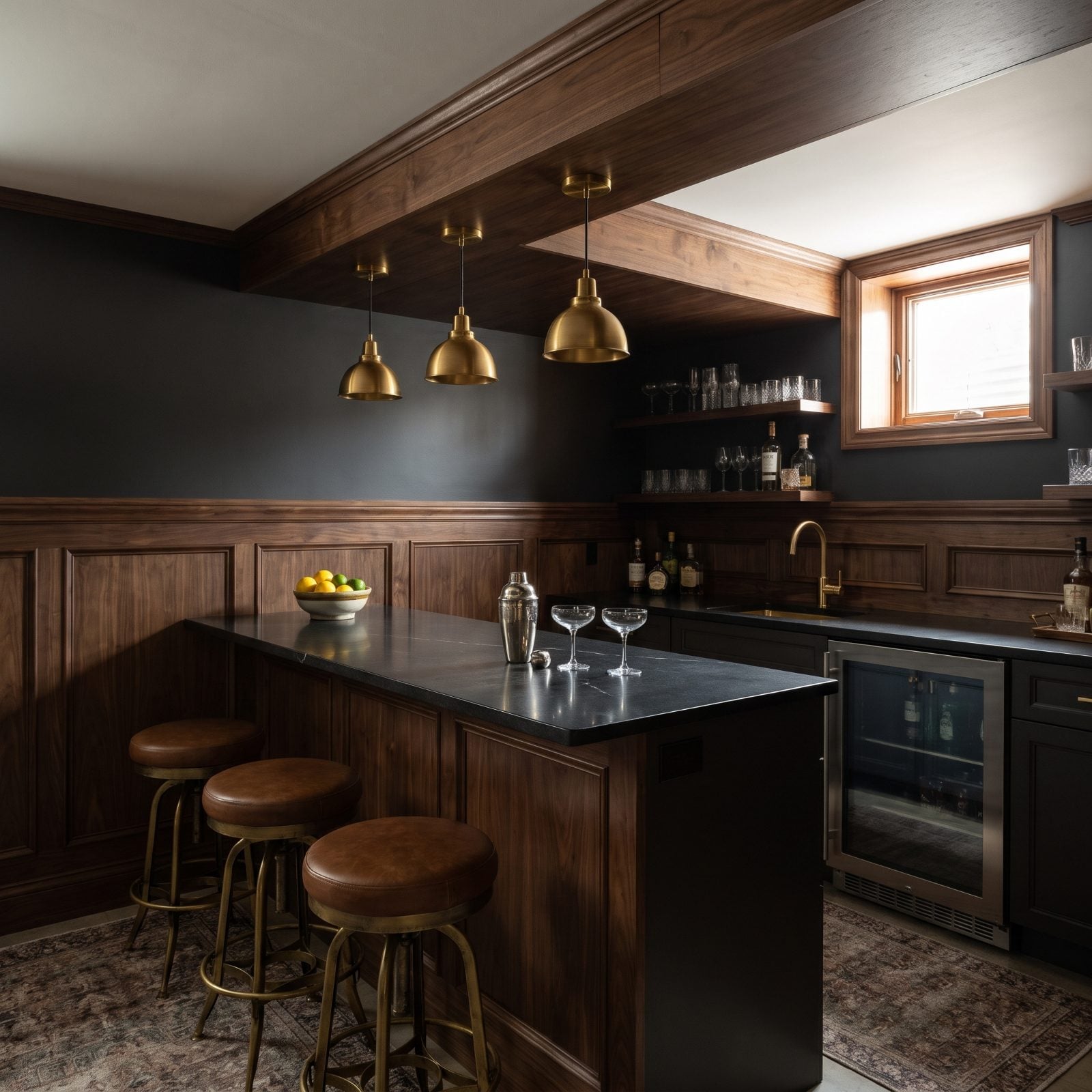
The bulkhead was always going to be low. Lining the walnut wainscoting cap up with the bottom edge of it just rubber-stamps the problem, boxing the wall into a squat band pinned between two heavy horizontals. In a seven-four basement, that’s the last thing you need.
Offset the two lines on purpose. Drop the wainscoting cap well below the bulkhead, or run tall vertical paneling up to the soffit so the eye travels past the low ceiling instead of stalling under it. A basement bar should feel like a retreat, not a crawl space — and a great room renovation approach to height tricks pays off down here too.
6. Living Room Where Wainscoting Interrupts Tall Arched Openings
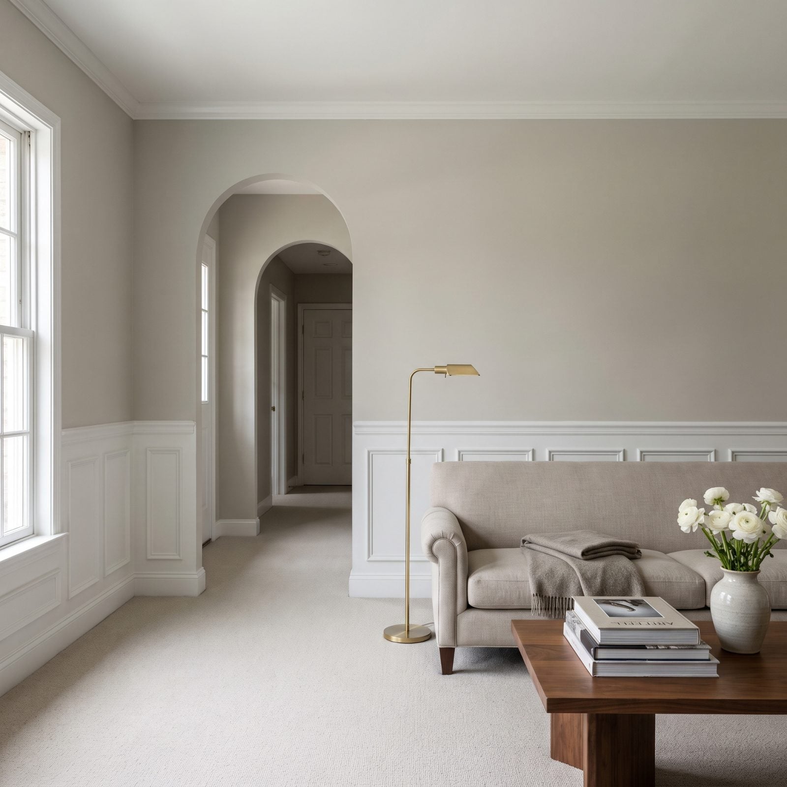
Those arched openings are the best thing in this room, and the wainscoting just chopped them off at the knees. Arches earn their keep by drawing the eye up and through. Slam a 48-inch horizontal band across their base and you’ve handed the eye a stop sign right where it wanted to climb.
The fix is restraint. Let tall architecture breathe. A room with built-in vertical drama doesn’t need wainscoting elbowing in to compete with it. A simpler baseboard and a brass floor lamp would have let those arches run clean to the floor.
5. Mudroom With Panels Ending Just Below Upper Cabinets
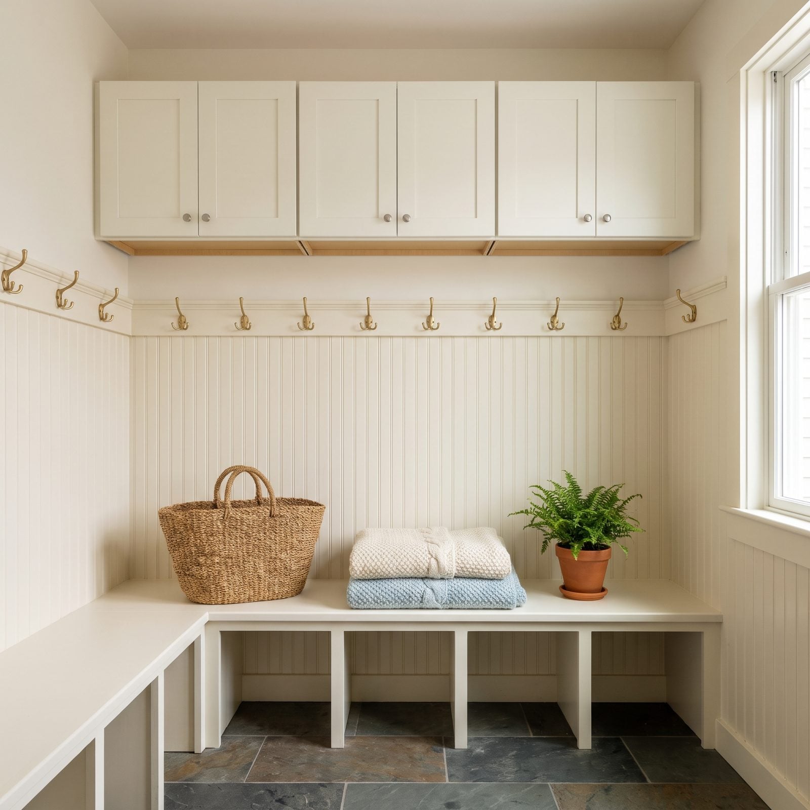
See that four-inch sliver of bare wall trapped between the beadboard cap and the cabinets? That’s the whole problem. Two strong horizontal lines sitting almost on top of each other create a pinch, and your eye reads the pinch as a low ceiling even when the ceiling clears a normal eight feet.
Wainscoting and upper cabinets each want to own a horizontal band. Stack them inches apart and they squabble. Run the panels higher to meet the cabinets cleanly, or stop them lower and give that strip of wall some room. For more grounded storage spaces, these family room ideas show cleaner vertical breaks.
4. Library With Wainscoting Crowded Beneath Built-In Shelves
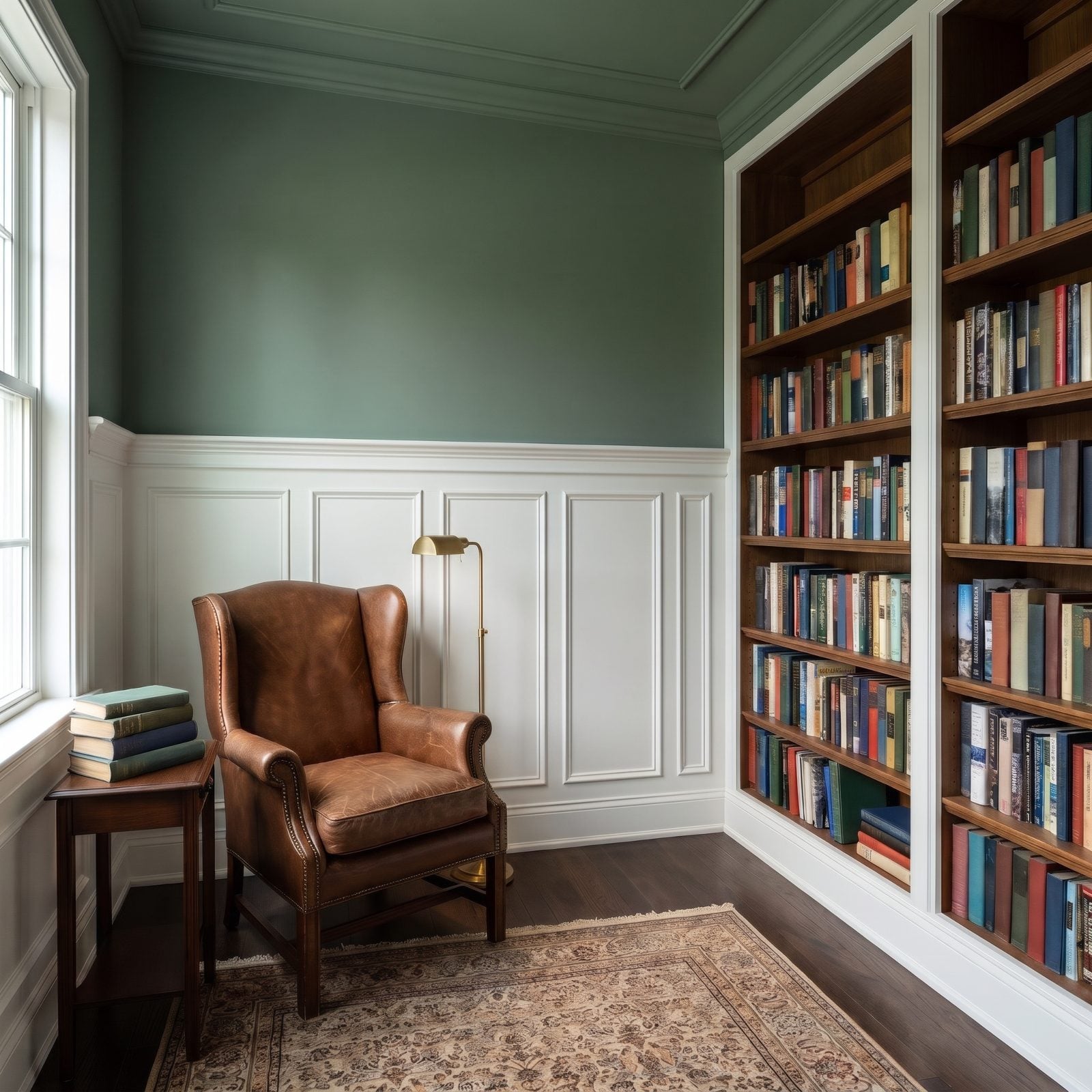
This is the classic overreach. Panels at 54 inches split the wall almost exactly in half, and a wall cut into two equal pieces always looks shorter than one left whole. With no dominant zone to settle on, the eye bounces and the room feels squat.
Libraries want verticality — tall shelves, spines climbing, the sense of reaching. Chunky waist-high panels on the facing wall undercut all of it. Drop the trim to a third of the wall height and the proportions snap back. Pair a leather wingback chair with a slim brass reading lamp and let the shelves do the lifting.
3. Breakfast Nook Where Tall Bench Backs Extend the Panel Line
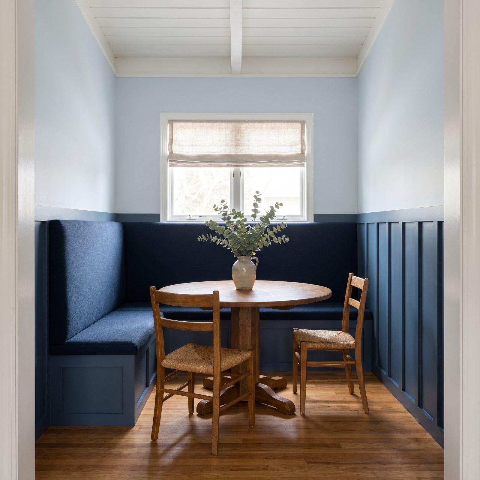
Here’s a sneaky one. The banquette back and the board-and-batten sit at the same 42 inches, which looks tidy in a drawing and flat in the room. One continuous line wrapping the whole nook draws a hard belt across the space, and belts shorten everything they circle.
Matching heights feels like good design logic. It rarely is. Offset the bench from the wall trim even slightly and the eye gets two layers to read instead of one dull band. Suddenly the nook stops feeling like a diner booth and starts feeling like a room.
2. Home Office With Dark Panels Beneath a Dark Ceiling
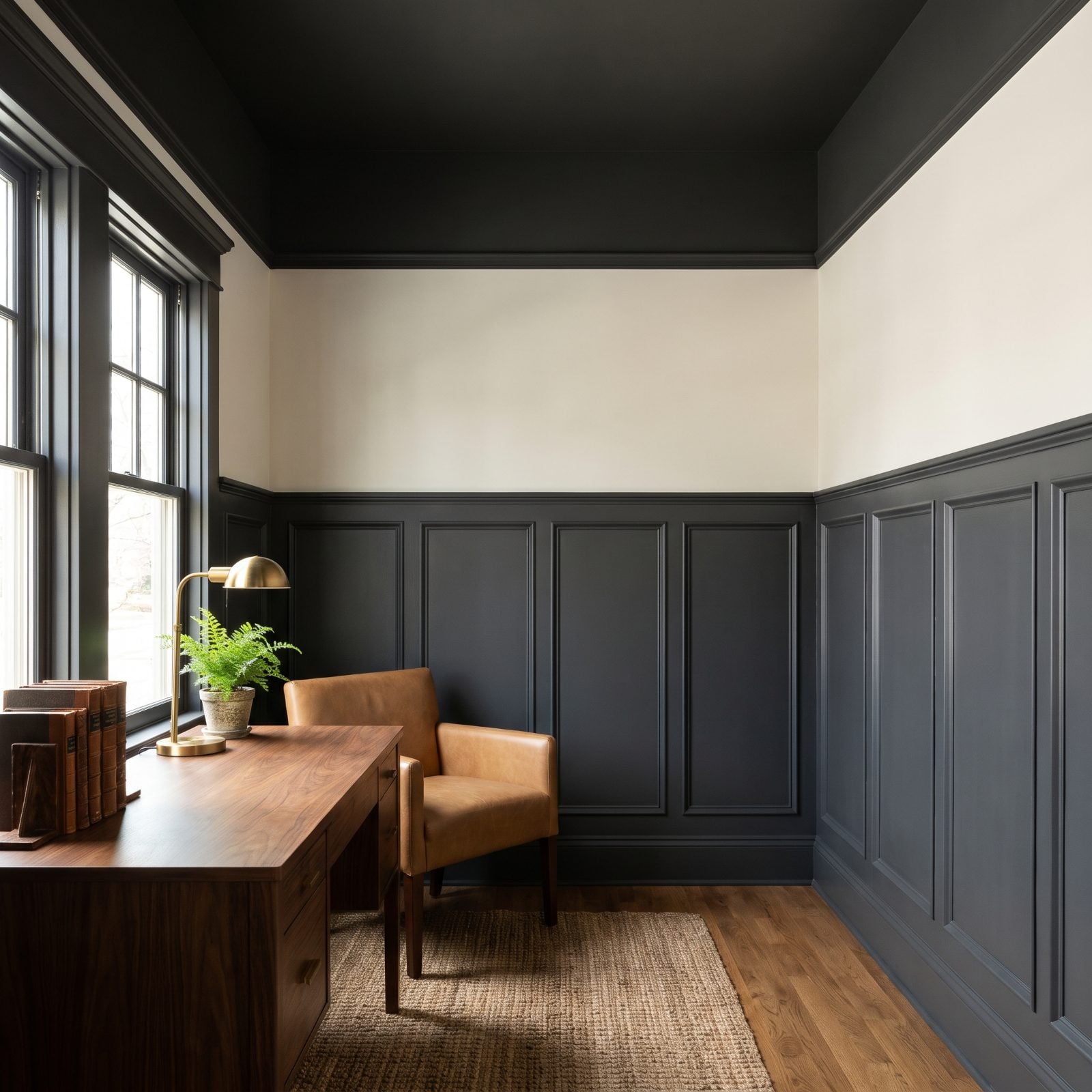
Dark paneling can be gorgeous. Dark paneling plus a matching dark ceiling is a trap. The charcoal presses down from above and up from below until that pale middle band gets squeezed into a letterbox. Nine real feet of ceiling, and it feels like seven.
Color weight has gravity — heavy tones sink, light tones lift. Load the heaviness onto both ends and the room collapses toward its center. Keep the moody charcoal on the lower panels if you love it, then let the ceiling go pale and watch the space stand back up. A brass desk lamp cuts through the dark beautifully.
Our readers lean the other way on ceilings: those who would buy bright lighting chose a white ceiling 75% of the time, compared with 45% of other readers.
1. Great Room Where Wainscoting Visually Shrinks the Double-Height Walls
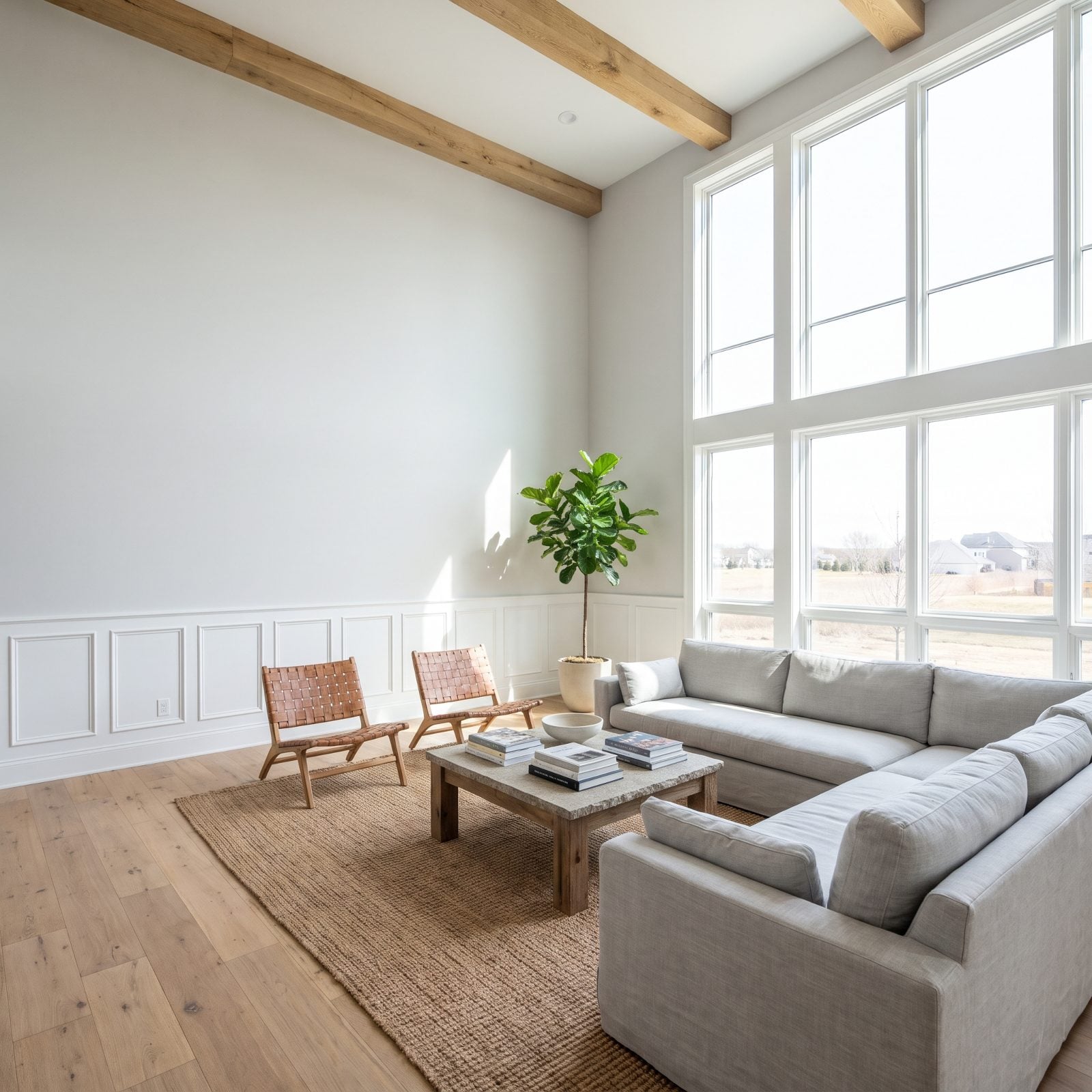
Standard 36-inch wainscoting in an eighteen-foot room is a wristwatch on a giant. Not wrong, exactly — just comically out of scale, a tiny band hugging the floor while acres of wall tower above it unaddressed. And the paneling pulls your eye down and pins it low, which is the last thing a soaring volume needs.
Double-height walls call for vertical moves, not a timid waist-high stripe. Floor-to-mantel paneling, tall fluted millwork, a two-story stone surround — something that climbs. If you want paneling here, scale it up with the room or skip it. For more big-volume strategy, this great room inspiration leans into the height instead of fighting it.