
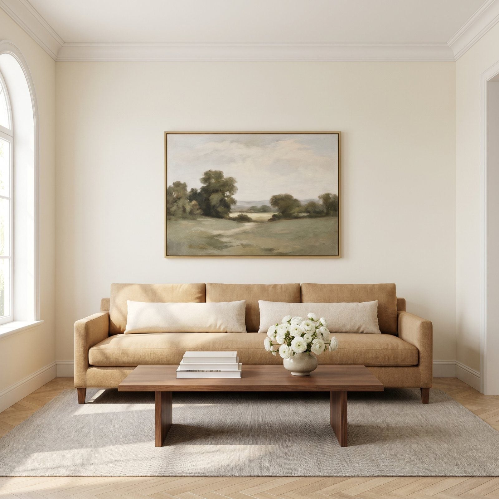
The sofa is set, the paint is dry, and you grab the first frame you own and center it on a nail. Step back. Something is off, and you can feel it before you can name it.
Almost always, it’s scale. Art above a sofa is a proportion game, not a decorating afterthought, and the gap between a wall that sings and a wall that sags comes down to a few inches and a measuring tape. Here’s what going wrong actually looks like, and exactly how to fix each one.
In order to come up with the very specific design ideas, we create most designs with the assistance of state-of-the-art AI interior design software. Also, assume links that take you off the site are affiliate links such as links to Amazon. this means we may earn a commission if you buy something.
46. The Tiny Square Canvas Lost Above a Long Sectional
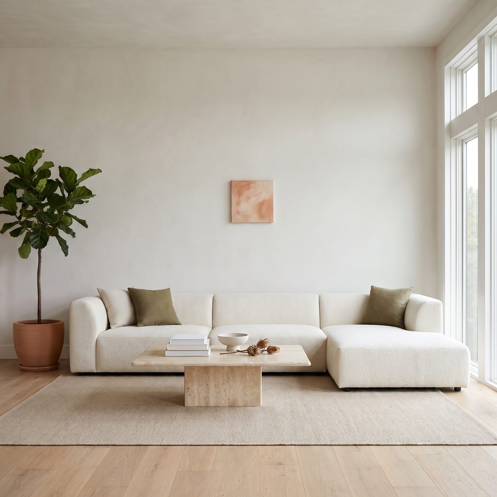
That little square is drowning. A nine-foot sectional reads as one long horizontal mass, and a 14-inch canvas floating dead center looks like a postage stamp someone forgot to mail.
Why it doesn’t work: art above a sofa should fill roughly two-thirds to three-quarters of the furniture’s width. Go smaller and the eye lands on the empty wall instead of the piece, and the whole wall feels unfinished.
What would work here? Go big or go wide. One oversized horizontal canvas, or a tight grid of three to five pieces that together span most of the sectional. A single terracotta abstract canvas at 40 inches or more would hold this wall without breaking a sweat.
45. The Massive Abstract That Made a Loveseat Look Miniature
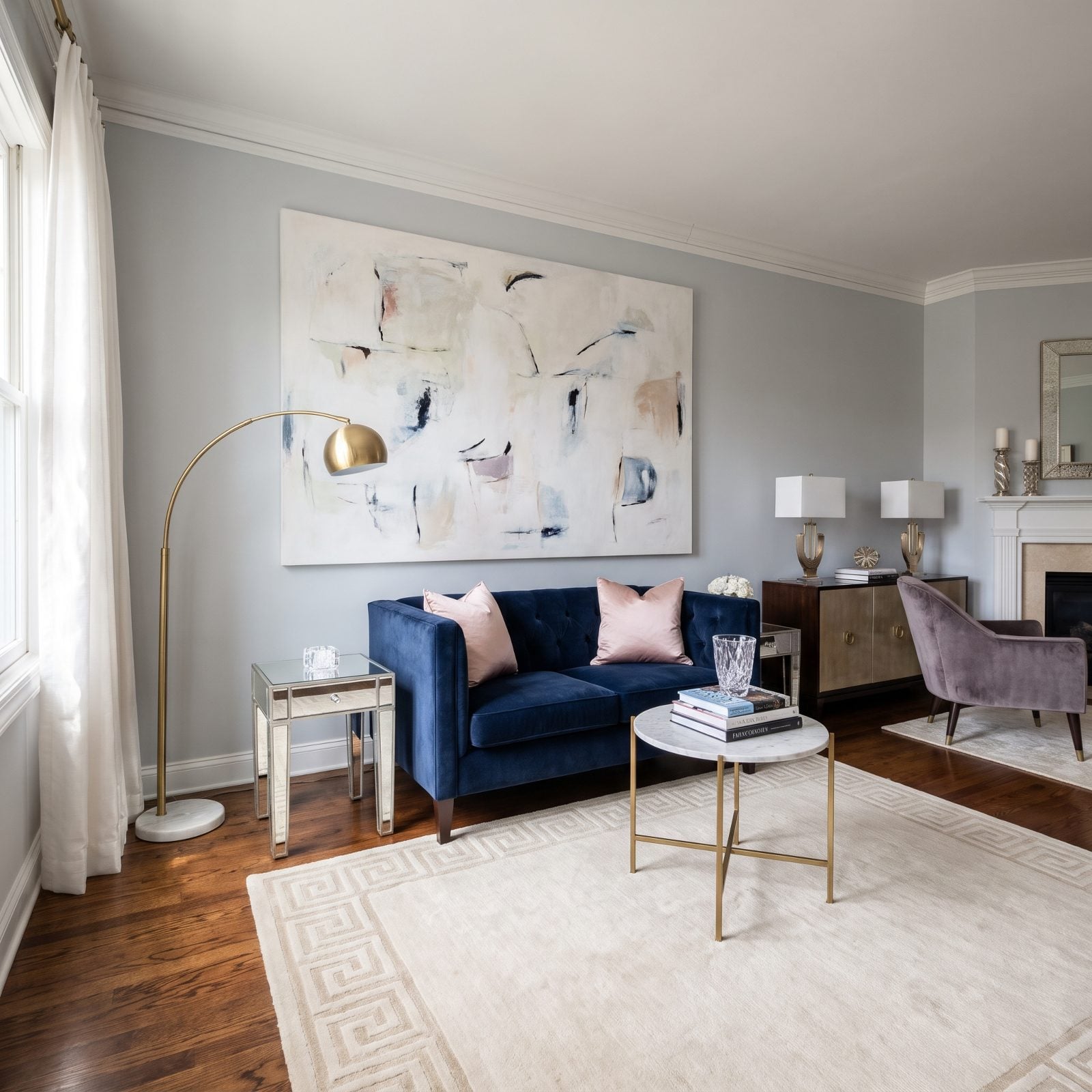
Here’s the flip side, and honestly the more common mistake once people learn that bigger is better. A six-foot canvas over a 52-inch loveseat makes the seating look like doll furniture.
Why it doesn’t work: when the art overpowers the piece below it, the sofa stops reading as the anchor. The whole arrangement feels top-heavy, like the wall is about to come down on the cushions.
The fix is restraint. Scale the canvas down so it sits within the loveseat’s width, or swap in a vertical orientation that respects the smaller footprint. A brass arc floor lamp and a modest framed print would let this glam loveseat breathe.
What Our Readers Say
- Asked what they would hang on a big empty wall, 53% of our readers would choose one large piece, compared with 27% for a gallery wall and 16% for a mirror.
From Home Stratosphere reader polls and votes.
44. The Skinny Portrait That Couldn’t Anchor a Wide Sofa
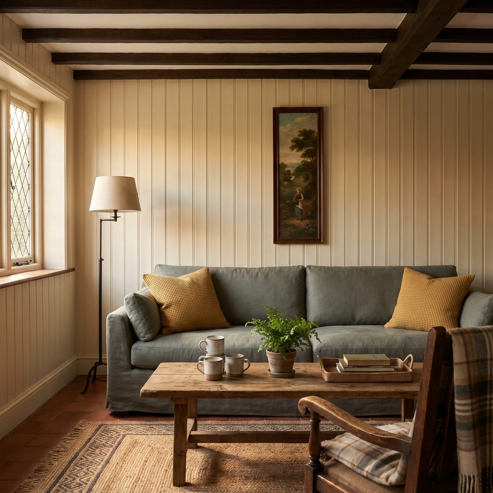
A tall skinny portrait centered over a 90-inch sofa leaves two gaping stretches of shiplap doing absolutely nothing, and the orientation ends up fighting the furniture it sits above.
Why it doesn’t work: a wide horizontal sofa wants horizontal art, or at least a horizontal arrangement. A lone vertical piece plays up the empty wall on either side and makes the sofa look like it’s missing its other two-thirds.
Flank that portrait with two more verticals for a triptych. Or hang a wide landscape instead. Either way, the arrangement needs to echo the sofa’s horizontal line.
As an artist and designer puts it, “For example, a wide sofa with a narrow piece above it feels off-kilter because their proportions are so different.”
43. The Towering Canvas That Overwhelmed a Low-Back Couch
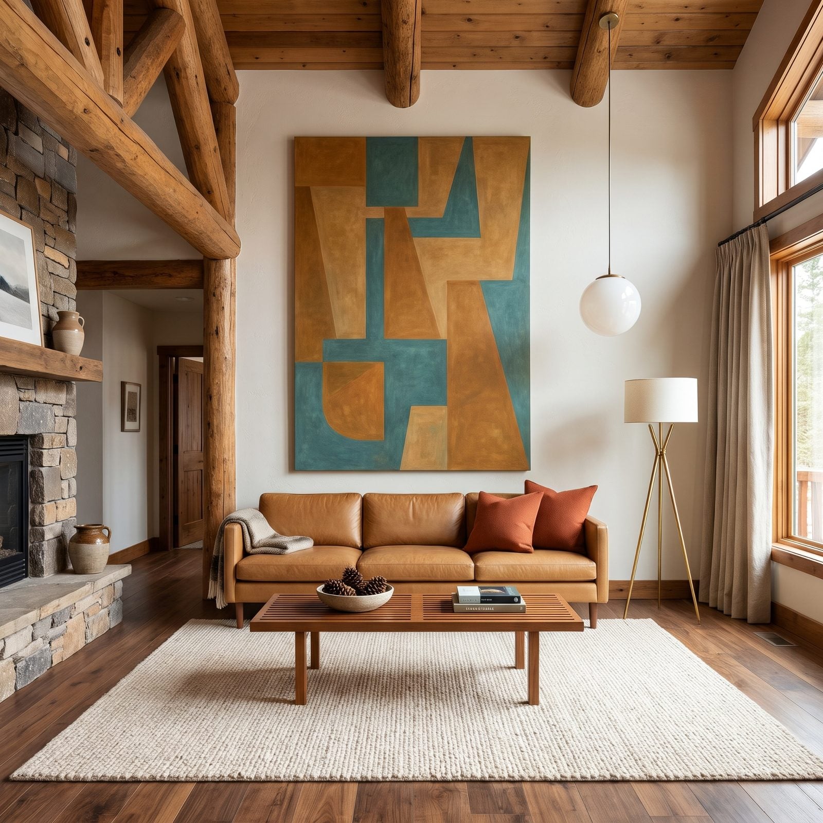
Low-slung sofa, sky-high canvas. The vertical art towers over a backrest that sits barely two feet off the floor, and the proportions wobble.
Why it doesn’t work: a low-profile mid-century sofa carries a strong horizontal presence. A 60-inch vertical canvas pulls the eye straight up and abandons the sofa entirely, stacking a column of tension above a calm low line.
Match the sofa’s horizontality. A long low landscape, or a pair of square canvases hung side by side, keeps the energy running parallel to the tan leather mid-century sofa rather than climbing away from it.
42. The Gallery Wall That Occupied Only the Sofa’s Middle Cushion
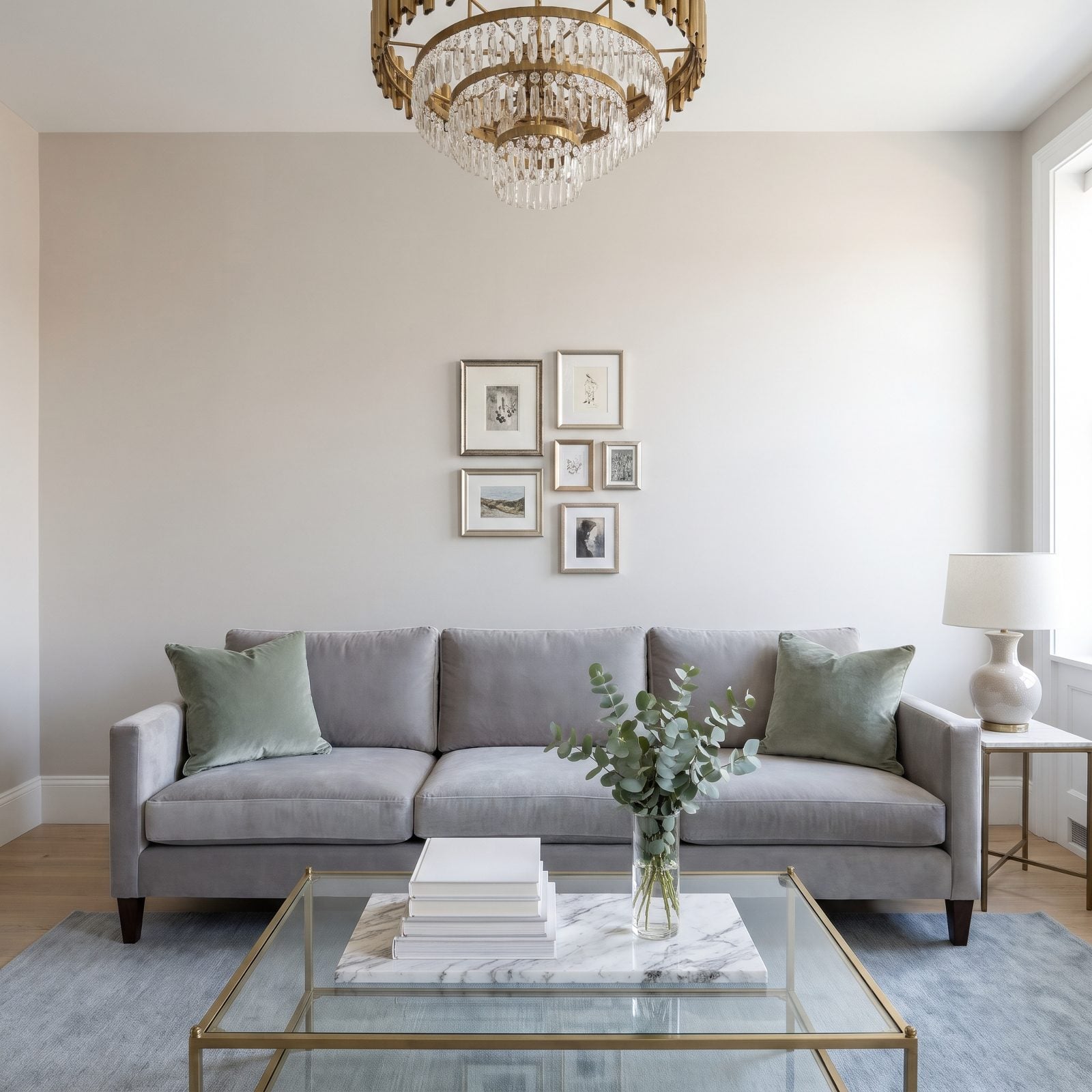
Six little frames bunched over the center cushion, and the two outer cushions sit under a desert of blank wall. The cluster itself is fine. The spread is the problem.
Why it doesn’t work: a gallery wall is supposed to fill the sofa’s footprint as one composed shape. Squeeze it into 30 inches over an 88-inch sofa and it reads as timid, like the frames are huddling together for safety.
Spread those same pieces wider, add a couple more, and let the arrangement reach toward the outer cushions. A gallery should mirror the sofa’s width, not cower in its middle.
41. The Gallery Wall That Spilled Far Past the Sofa
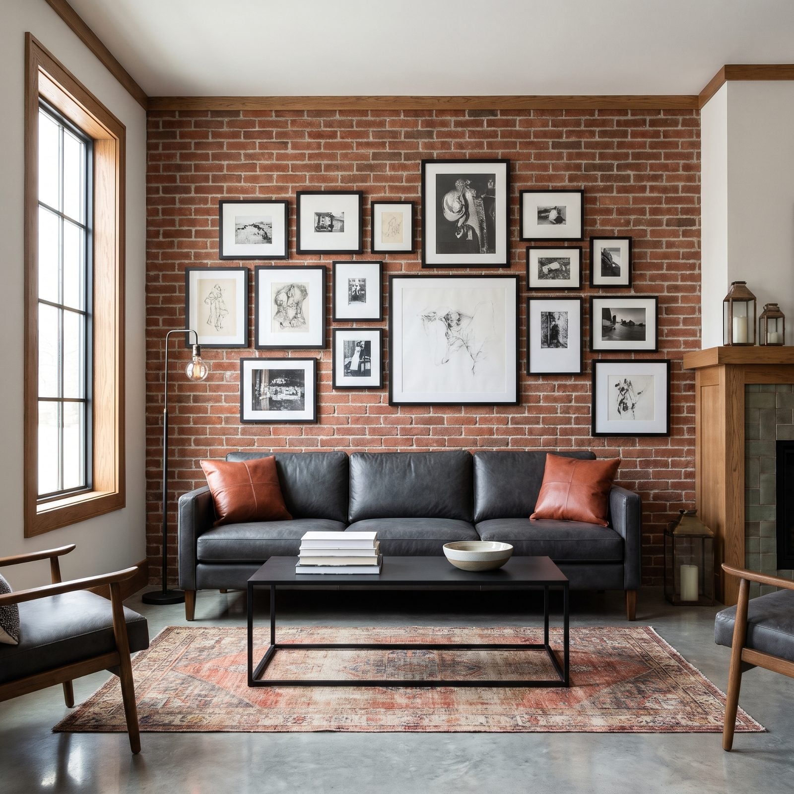
Opposite failure, same root cause. Here the gallery sprawls, sixteen frames in a loose block that runs well past the sofa’s width, sitting inside the left arm but spilling far beyond the right one and creeping toward the ceiling trim.
Why it doesn’t work: with its edges only loosely tied to the sofa, the wall’s anchor weakens. The sofa becomes incidental, a bench beneath a bulletin board, and the eye never knows where to land.
Pull that right edge back inside the sofa’s width, square up the top and bottom edges, and the whole thing snaps into order. On a charcoal leather sofa against brick, a tight contained grid looks far more deliberate than a sprawl.
A gallery wall needs edges as much as a painting needs a frame.
40. The Artwork Hung Almost Against the Ceiling
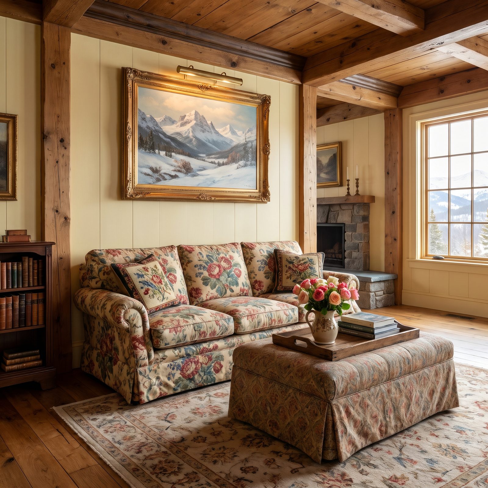
Right size, wrong altitude. This landscape is scaled perfectly to the sofa, then hung so high its top nearly kisses the crown molding, with two feet of blank wall marooned below it.
Why it doesn’t work: art hung too high disconnects from the furniture it’s meant to pair with. That floating gap between frame and sofa back severs the visual relationship, and the room feels stretched out and awkward.
The rule we’d tattoo on everyone’s measuring tape: the bottom of the frame should hang six to twelve inches above the sofa back. Close that gap and this cottage wall instantly settles.
39. The Frame Hung So Low It Crowded the Back Cushions
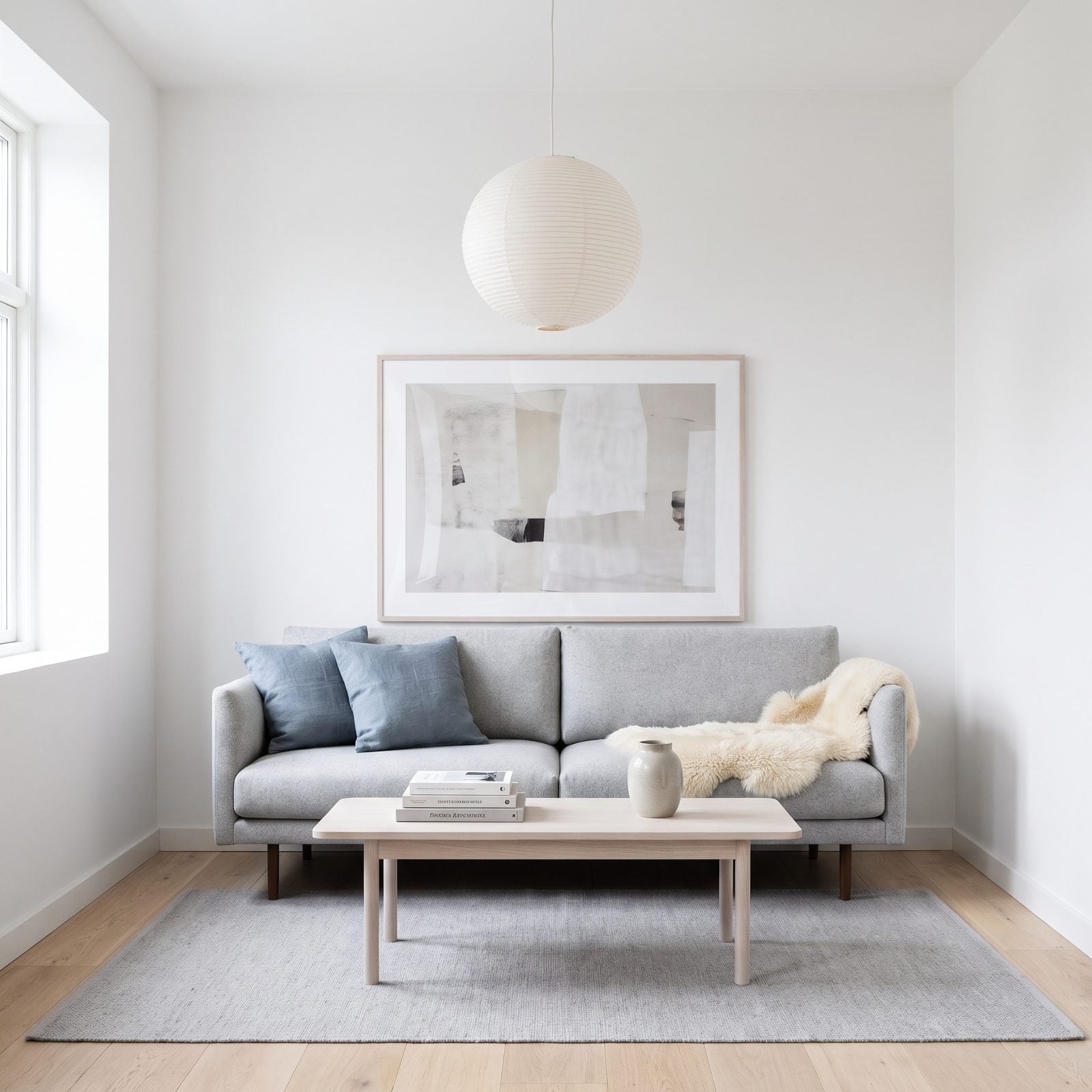
And now too low. The print hovers barely two inches above the back cushions, looking like it might slide down and rest on your head the moment you sit.
Why it doesn’t work: art crammed against the cushions feels cramped and unresolved. There’s no breathing room, and when someone sits down the frame visually collides with the back of their head.
Lift it. That same six-to-twelve-inch gap above the cushions gives the piece room to be seen and keeps heads clear. Scandinavian rooms live on negative space, so give this abstract the air it’s asking for.
38. The Picture Centered on the Wall Instead of the Sofa
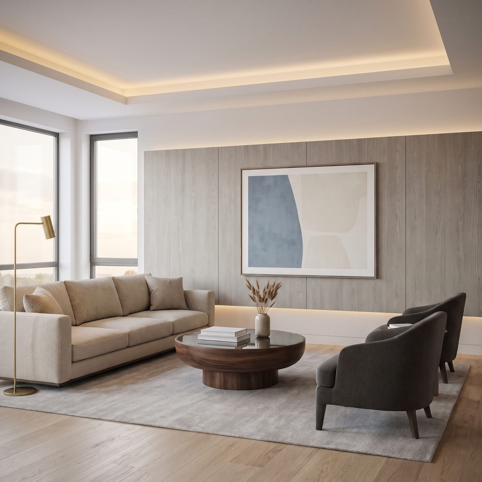
This one fools almost everyone, because technically the art is centered. Just on the wrong thing. It’s dead center on the wall, which puts it well to the right of the sofa it’s supposed to crown.
Why it doesn’t work: your eye pairs the art with the furniture directly below it, not with the wall’s geometry. When the sofa sits off-center on a long wall, centering the art on the wall shoves it off-kilter from the piece that actually matters.
Center the art on the sofa, always. The sofa is the anchor; the wall is just the backdrop. Shift that landscape left to sit over the cushions and the whole arrangement clicks.
37. The Art Cluster That Ignored the Sectional’s Chaise
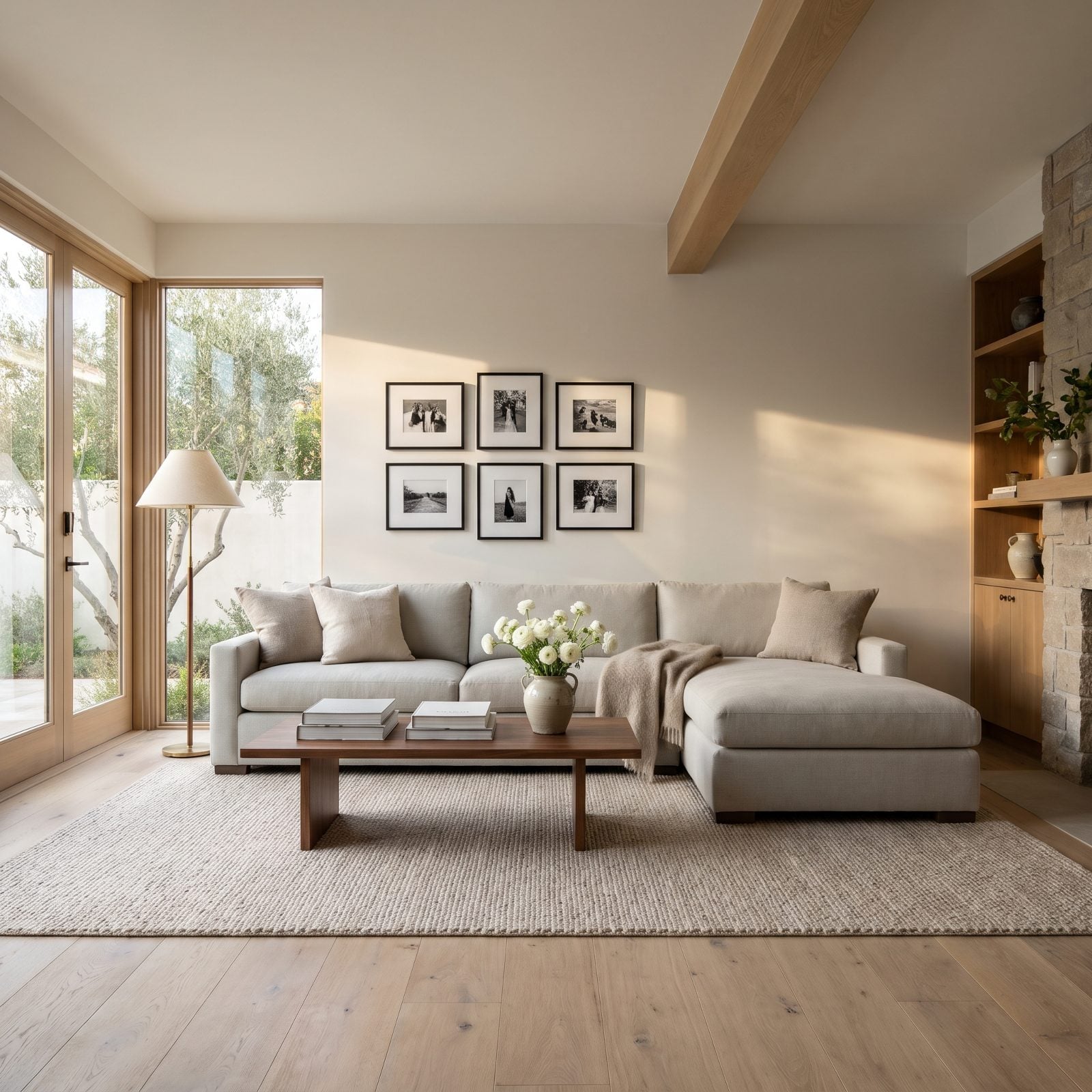
The cluster looks fine until you notice the chaise floating in a sea of blank wall. Art should read against the whole seating mass, not half of it. A chaise shifts the furniture’s visual center toward itself, so hanging everything over the straight run strands the whole arrangement off to one side.
Why it doesn’t work: The eye wants art and furniture to share a center of gravity. Ignore the chaise and the wall tips sideways.
Nudge the cluster right so it floats roughly over the inside corner. Or add two more frames and stretch the grouping across both sections. A brass floor lamp can anchor the empty end if you’d rather keep the art small.
As a professional art installer puts it, “Start by measuring the sofa from arm to arm. Then consider its back height, cushion height, and whether a chaise or sectional changes the visual center of the seating area.”
36. The Diptych With a Canyon-Sized Gap Between Its Panels
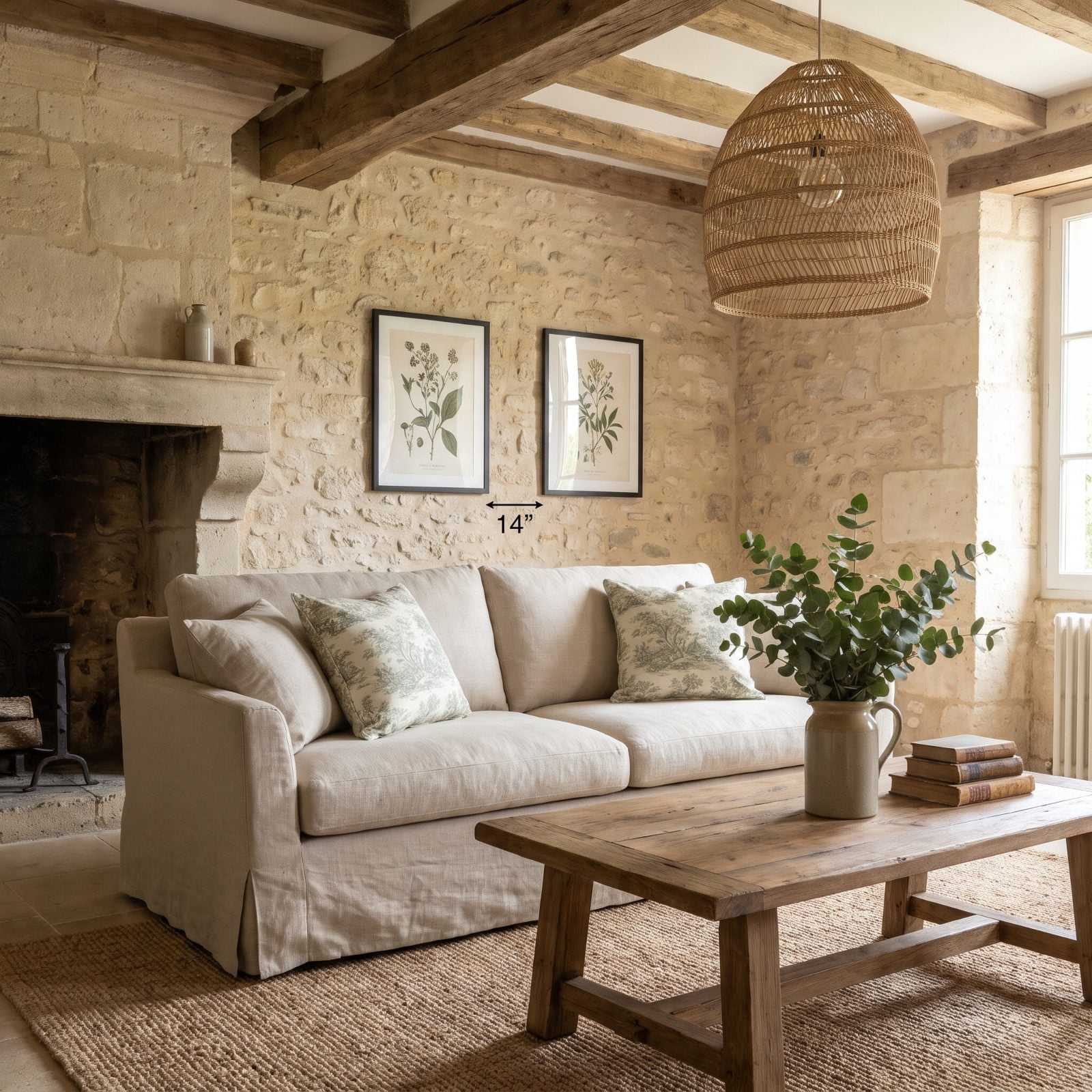
Two panels meant to work as a set only read as a set when they stay close. At roughly a foot and change apart, these botanicals stop talking to each other and start arguing over the wall.
A diptych wants a tight gap, a couple of inches at most, close enough that your eye jumps across the break without pausing. Go wider and the negative space becomes a third element nobody asked for.
Slide them closer and the pair snaps into one gesture across the sofa back.
35. The Triptych Packed Together Like a Single Cluttered Block
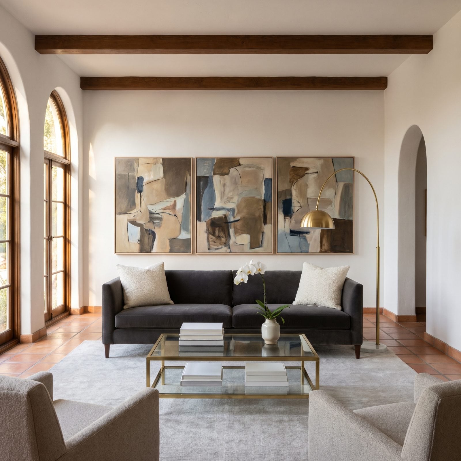
A triptych wants to breathe. Jam the three panels an inch apart and they collapse into one heavy block that fights the horizontal line of the sofa instead of riding along it.
The fix is counterintuitive. Pull the panels apart. Even gaps of a few inches let each canvas register on its own while still reading as a trio, and the spacing does half the composing for you.
Done right, the set stretches wide and low the way a mantel settles over a fireplace. Done wrong, it bunches up and looks like one oddly shaped painting someone took a saw to.
34. The Pair of Prints Too Narrow for a Three-Seat Sofa
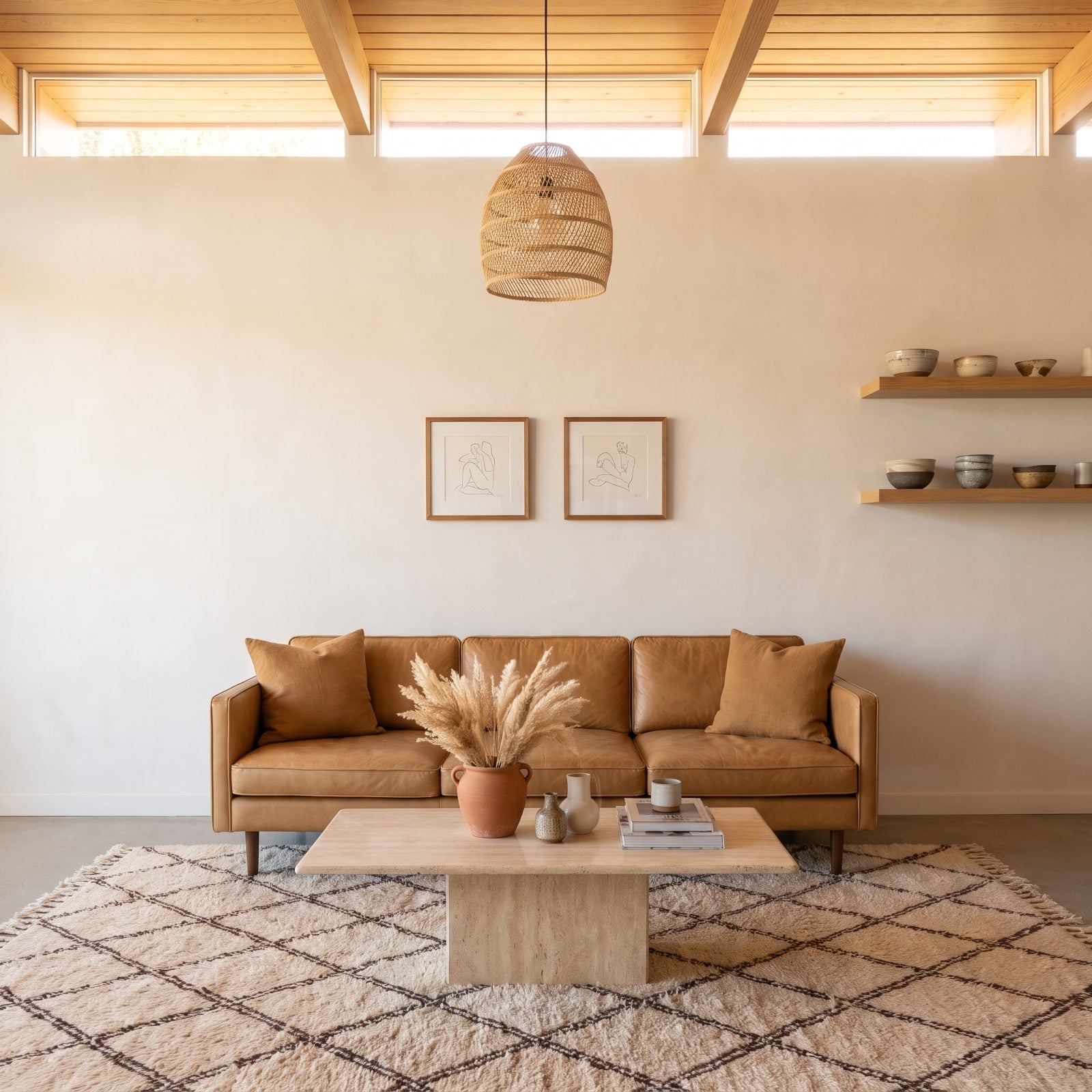
Those two little prints are drowning. A three-seat sofa hands you a wide horizontal anchor, and a pair of narrow frames marooned in the middle leaves acres of bare plaster on either side.
Go for artwork that spans most of the sofa’s width, somewhere around two-thirds or more. That might mean going bigger, building out a row of frames, or swapping in one wide landscape canvas.
Scale up and the sofa finally has something to talk to.
33. The Giant Empty Mat That Dwarfed the Actual Artwork
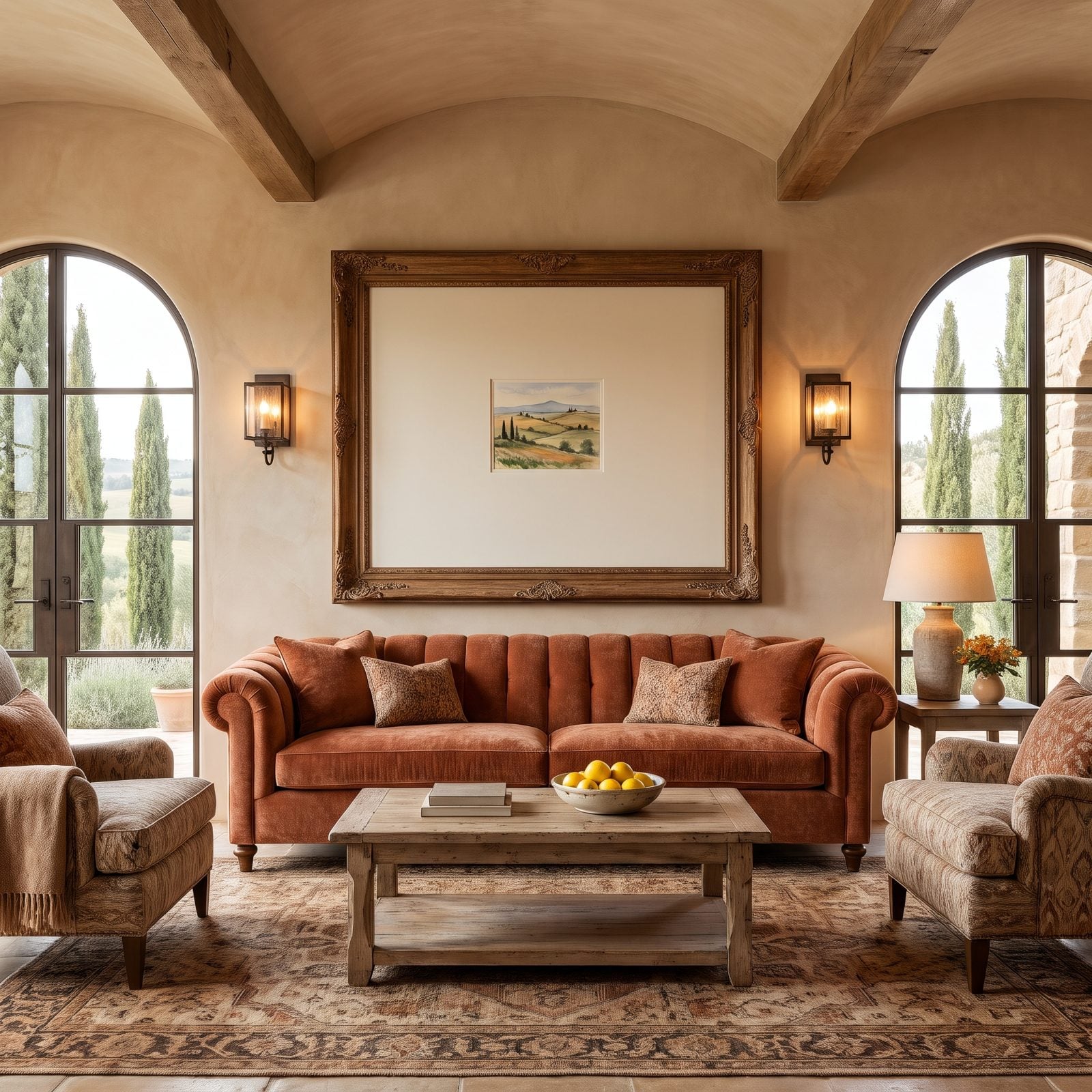
A wide mat is a styling trick, not a license to float a postcard inside a picture window. Here a small watercolor sits marooned in a huge frame, and all you see is cream board.
Generous matting can feel like a design move, right up until the ratio tips and the art becomes an afterthought. Keep the mat proportional. For a piece this small, a border of two to four inches carries plenty of elegance.
Want the big frame? Then commit to a larger image to fill it. A mat should frame the art, not bury it under a yawning margin.
As a custom picture framer puts it, “Mats that are too narrow make artwork look cramped and crowded. Mats that are too wide overwhelm small pieces and look disproportionate.”
32. The Heavy Ornate Frame That Overpowered a Delicate Print
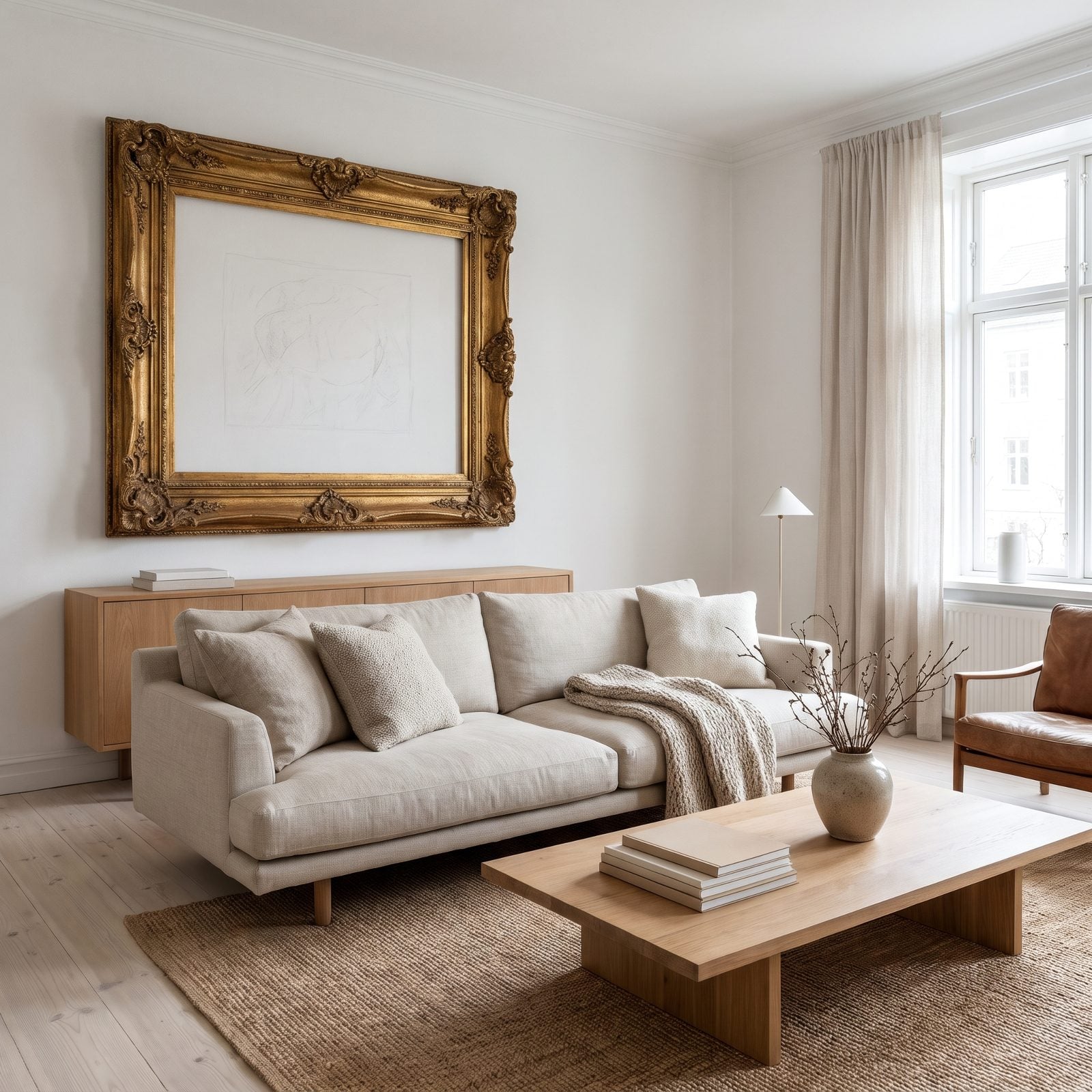
The frame is winning and the art is losing. This ornate gilded molding is so heavy and deep that the faint pencil sketch inside barely registers. All weight on the gold, nothing left for the picture.
Match the frame’s weight to the image’s weight. A delicate print wants a slim, quiet surround that lets the drawing lead. Save the carved antiques for oil paintings and prints with enough contrast to hold their own.
In a cottage like this, a thin gilt or limed-oak frame keeps the period feel without smothering the sketch. Honestly, the best frame is the one you stop noticing.
As a professional picture framer puts it, “For example, a minimalist line drawing might be overwhelmed by an ornate, heavy frame, and a grand oil painting can vanish in a too-simple frame.”
31. The Frameless Canvas Too Visually Light for a Chunky Leather Sofa
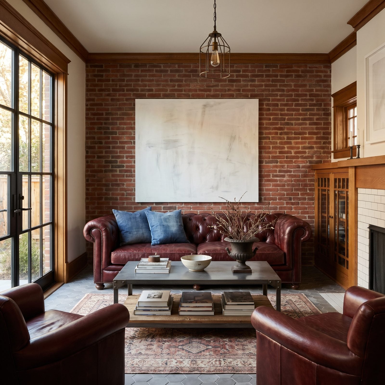
This pairing feels off, and it’s about visual weight rather than size. A dense oxblood Chesterfield with deep tufting and nailhead trim carries real heft, while that washed-out frameless canvas floats above it like a feather on an anvil.
Heavy furniture wants art that can hold its ground. A bolder palette, a chunky frame, higher contrast, a more graphic composition, any of these answers the leather’s density.
Frame it in black steel or swap in a moodier canvas and the room settles.
Leather earns its visual weight with our readers too: living rooms featuring leather got hearts 56% of the time, versus 47% for the other images in the same articles.
30. The Dark Oversized Painting That Crushed a Pale Linen Sofa
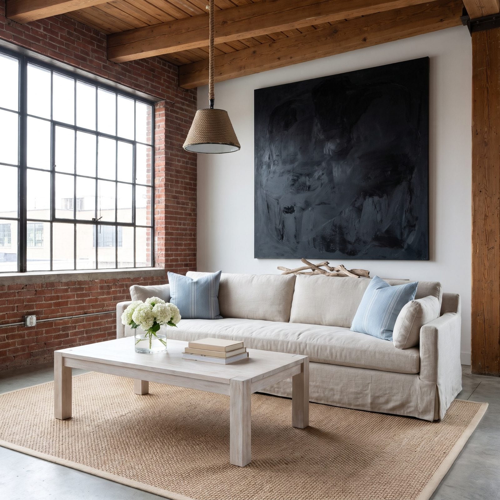
The painting isn’t too big in inches. It’s too dark for everything around it. A near-black canvas this size presses down on the soft linen sofa and the whole airy palette, a storm cloud parked over the beach.
Scale was fine. Tonal value was the miss. A dark anchor can absolutely work in a room built on pale neutrals and bright light, but only if other dark notes show up elsewhere to keep it company. Left alone, it just sits there, heavy and unbalanced.
Two ways out. Repeat that charcoal in a pillow or a lamp base to spread the weight, or pick art in a lighter key that moves with the room instead of against it.
29. The Round Artwork Too Small to Balance a Rectangular Sofa
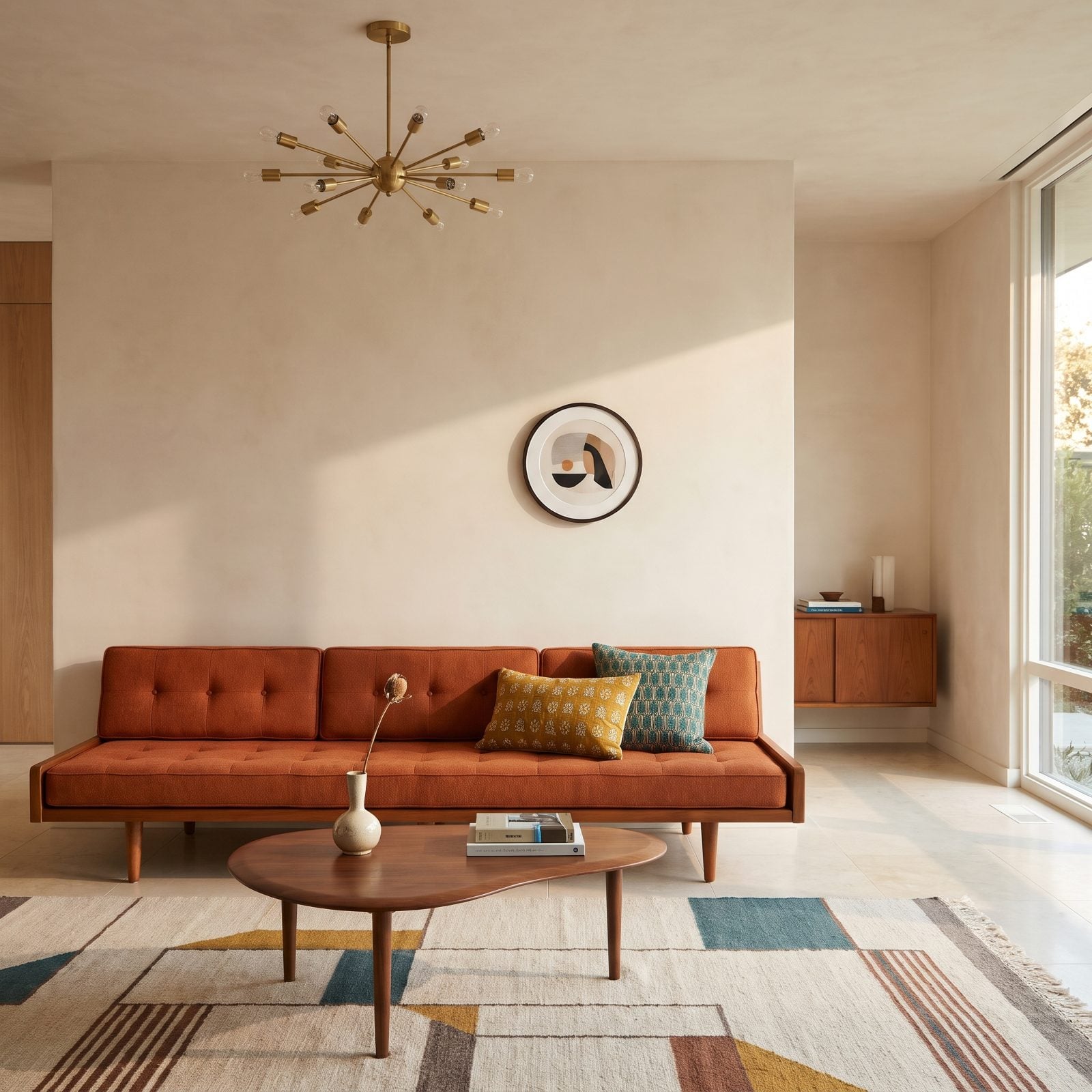
One small circle over a long rectangle reads like a button on a bedsheet. A round piece can play beautifully against a linear sofa, but only when it’s big enough to answer the horizontal sweep below, or when you gang several together.
This disc disappears. Scale it way up, or hang three circles in a row to build a line that keeps pace with the sofa’s length.
28. The Giant Round Mirror That Made the Sofa Feel Bottom-Heavy
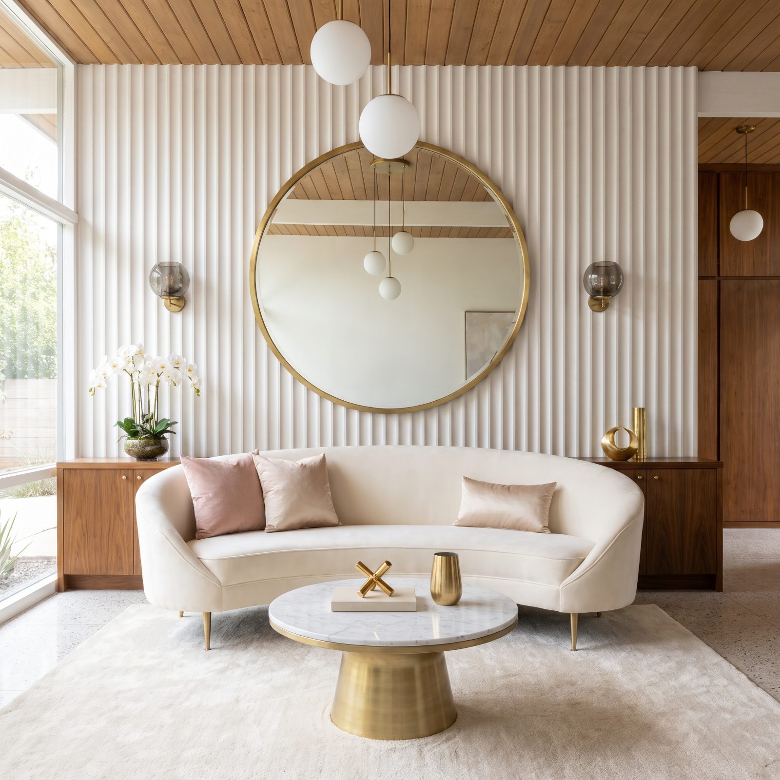
Hang a big round mirror too high and it opens a canyon of wall between itself and the sofa, and suddenly all the weight piles up at the bottom. Here, though, the mirror’s bottom edge sits just above the sofa back, so the seating doesn’t feel heavy, the mirror stays anchored, and the two shake hands.
Hanging height is the whole game here. The bottom of art or a mirror should land just above the sofa back, a hand’s width or so, close enough that the shapes relate. This mirror already sits in that zone, which is why the bottom-heavy problem never shows up.
Scale matters too. But position came first, because a piece can be exactly the right size and still read wrong when it’s hung a foot too high.
27. The Sculptural Wall Piece Too Visually Shallow for a Bulky Sectional
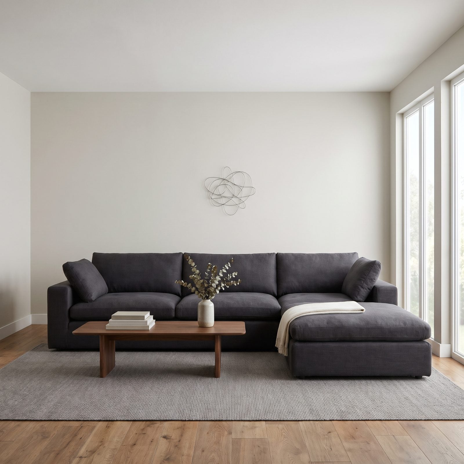
A heavy sectional needs a heavy anchor above it. This thin wire piece has no visual weight to push back, so it floats like an afterthought while the sofa quietly takes over the whole corner.
Why it doesn’t work: depth and scale have to answer each other. A deep, upholstered sectional reads as mass; a flat, skinny sculpture reads as a line. The eye wants balance, and that wall above the headrests just swallows the little form whole.
What would fix it in this same room? A large-scale textile, a grouped wood panel installation, or a wide abstract canvas with real tonal depth. Something that spans two-thirds of the sofa’s width and holds its own visual pounds. And if you genuinely love that wire piece, don’t make it fend for itself out there. Nest it inside a bigger arrangement.
26. The Deep Shadow Box That Projected Awkwardly Over the Headrests
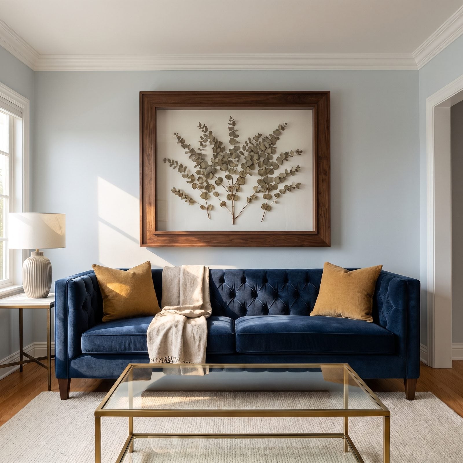
Depth is great on a gallery wall. Over a sofa, a frame that juts five inches off the wall starts to feel like it’s leaning over the people sitting there, nosy and a little too close.
The trouble is two problems stacked: hung too low and sitting too proud. Shadow boxes read heavier the nearer they get to your head, and this one crowds the backrest instead of giving it room to breathe.
Fix it right here by raising the piece so you’ve got at least 8 to 10 inches of clear wall above the sofa back. Or swap to a slim profile frame entirely. A flush canvas or a shallow float frame keeps the eye calm. Deep frames belong where nobody’s shoulder lands beneath them.
25. The Art Shelf Shorter Than the Sofa’s Middle Seat
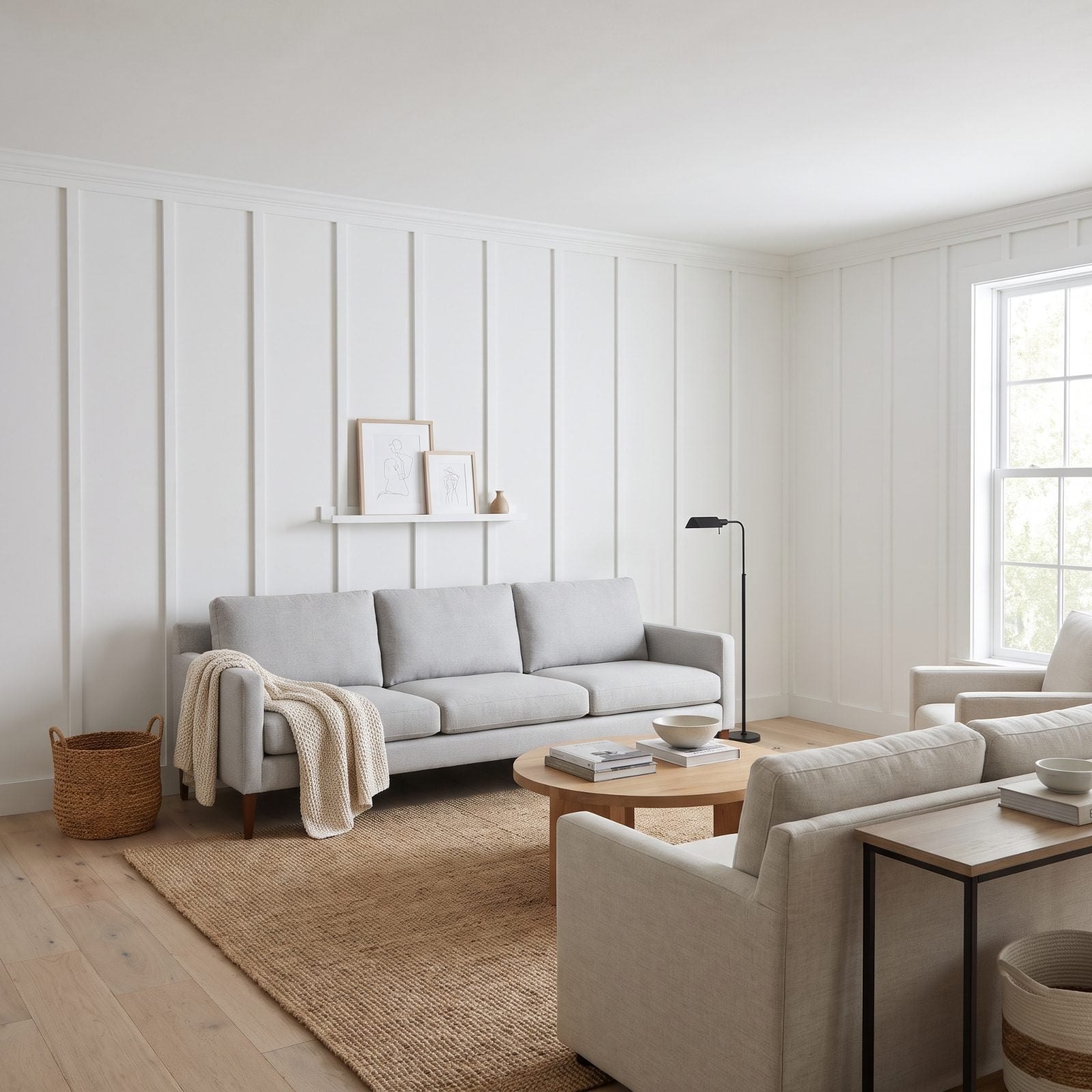
That little ledge is doing one-third of the job. It covers the middle cushion and gives up on the rest, which somehow makes the sofa look wider than it is and the wall look half-dressed.
A horizontal element above a sofa should echo the furniture’s line. When it’s dramatically shorter, your eye clocks the mismatch instantly, even if you can’t name what’s bugging you.
Easy fix in this Scandinavian setup: run a longer ledge that reaches close to each sofa arm, or add a second ledge and build a layered lean of frames across the full width. Keep the airy white guest room restraint. Just let the art span the actual seating.
24. The Leaning Frames That Left Most of the Wall Empty
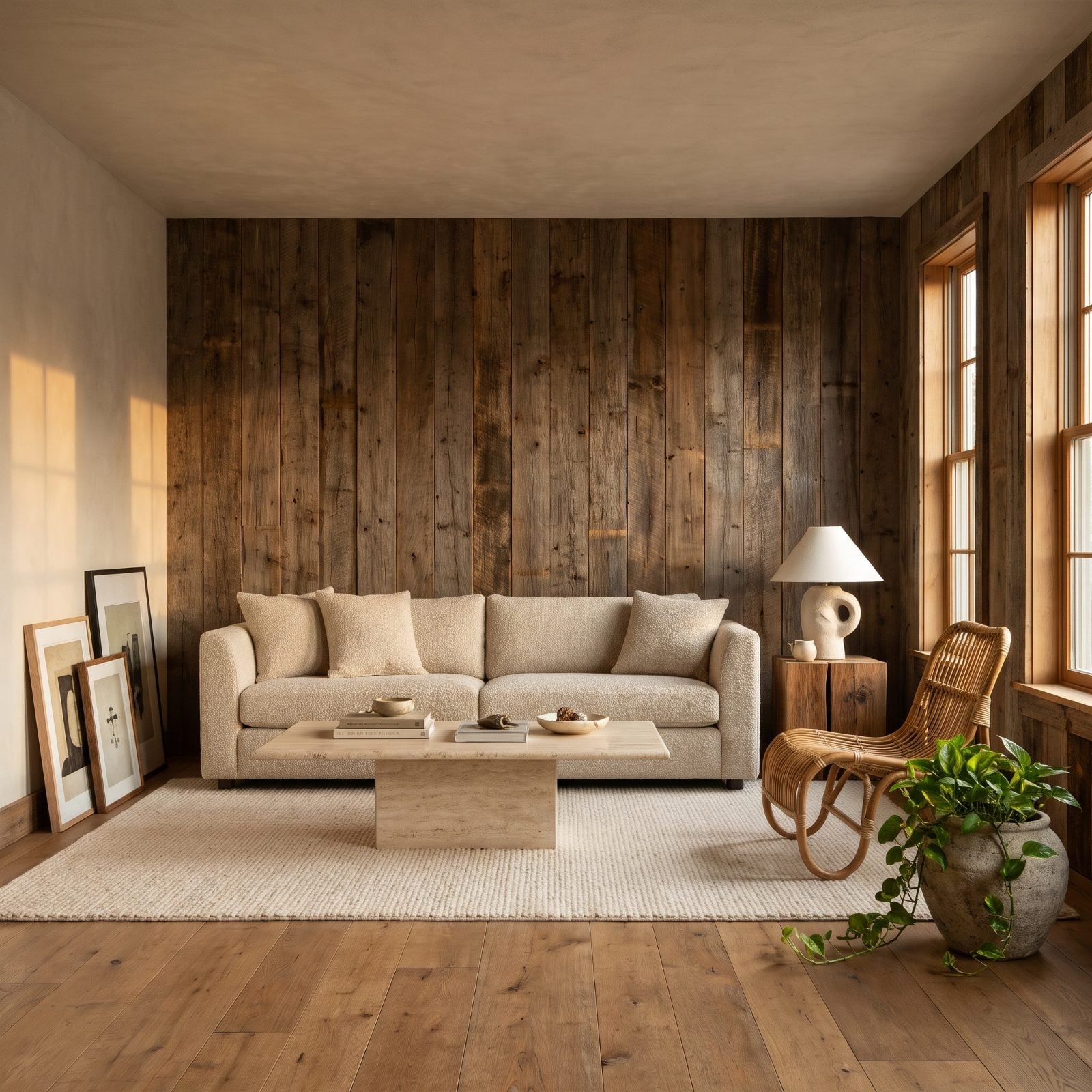
Leaning art reads relaxed, but relaxed still needs a center of gravity. Pile everything in one corner and the wall seems to tilt toward the floor on one side.
The wall above a sofa is a composition, not a dumping zone. When three frames cling to the left edge, that big empty stretch to the right becomes the loudest thing in the room, and nobody asked it to speak up.
In this organic space, spread the lean across the sofa’s full back, overlap a couple of larger pieces, and let the arrangement find its midpoint near the sofa’s center. Balance doesn’t mean symmetry. It means weight spread out so your eye can finally rest somewhere.
23. The Floor-to-Ceiling Salon Wall That Swallowed the Sofa
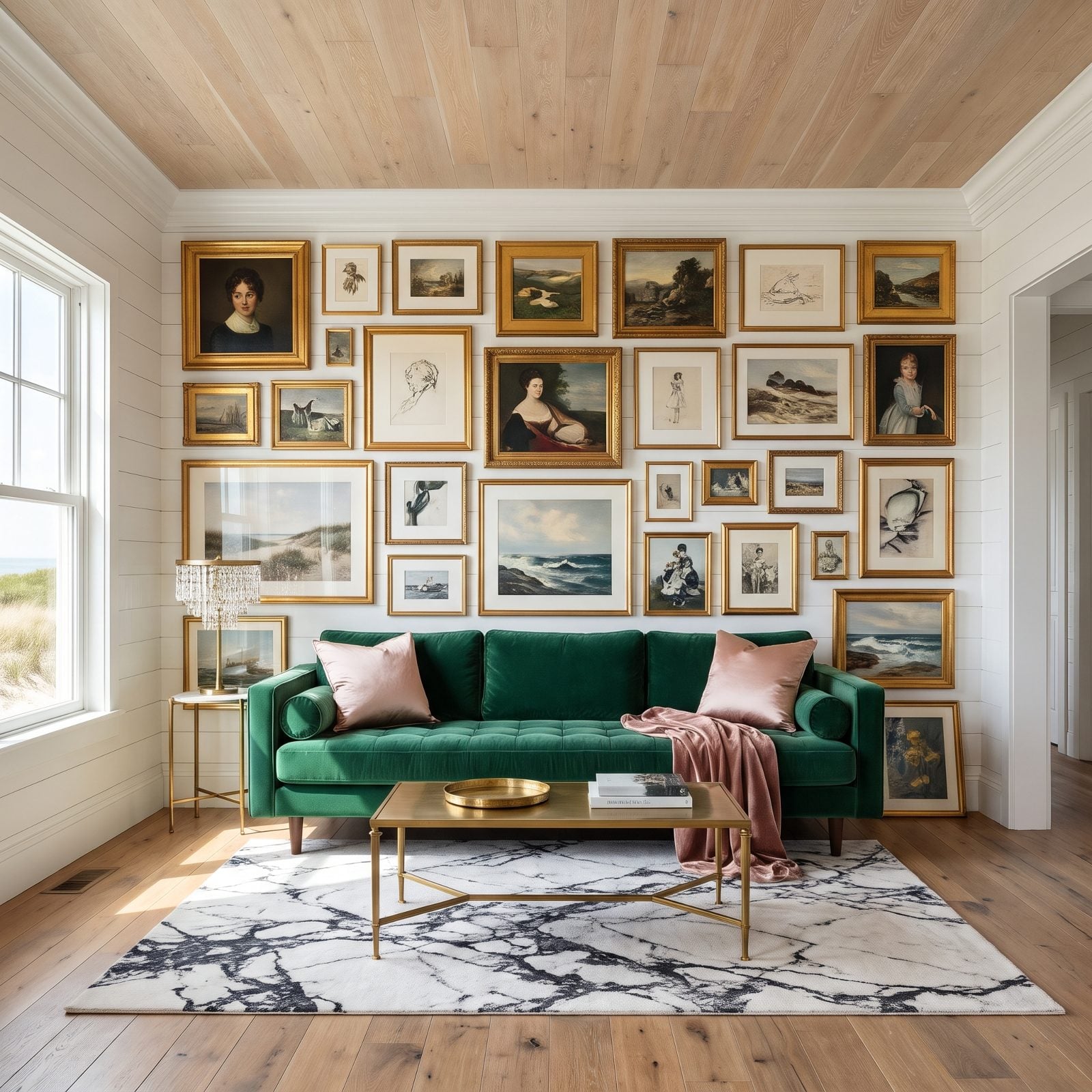
A salon wall is supposed to be a conversation. This one is a shouting match, and the emerald velvet sofa loses badly.
Once the frames climb to the ceiling and spill past both arms, there’s no room left to register the sofa as the anchor of anything. The eye never settles. The furniture becomes a baseboard for the art.
Keep the glamour, cut the sprawl. Contain the gallery within the sofa’s width and stop it a foot or so below the crown molding. A little negative space around a dense cluster is what lets it read as a deliberate choice rather than wall-to-wall wallpaper. The brass coffee table and crystal lamp already carry plenty of drama. Let them do it.
22. The Identical Small Prints Scattered Across an Oversized Wall
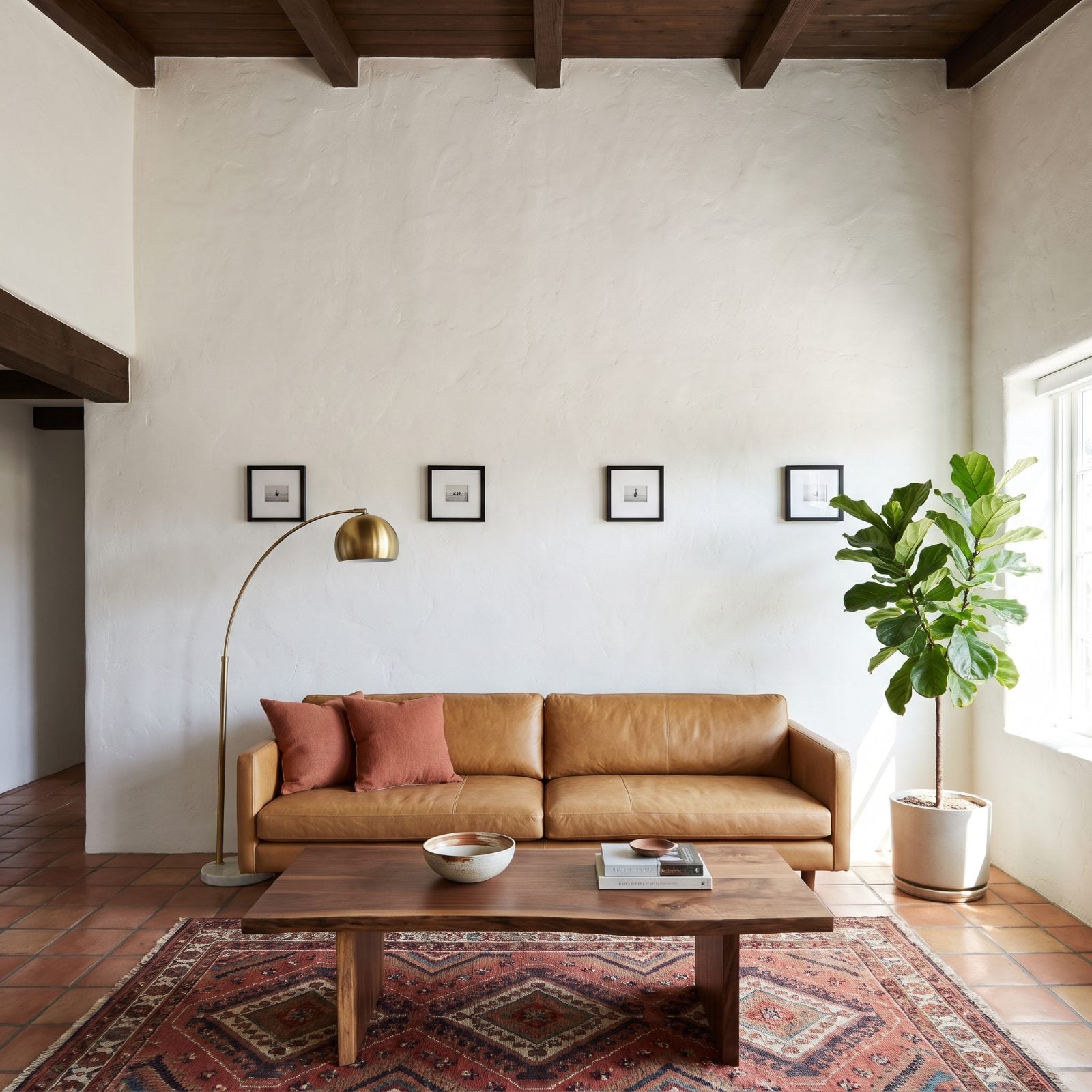
Four of the same print, spaced out like fence posts, with acres of blank wall wrapped around them. The repetition reads as filler, not design.
Here’s what goes sideways: identical small pieces on a big wall create a gap problem. Your eye catches the emptiness between the frames instead of the art itself, and the scale mismatch finishes the job.
In this California modern room, go one of two ways. Group the four tight into a single block with equal, narrow gaps so they read as one larger unit. Or retire them entirely and hang one oversized piece that fills the wall’s center. Big wall, big move.
21. The Oversized Triptych Squeezed Beneath a Low Soffit
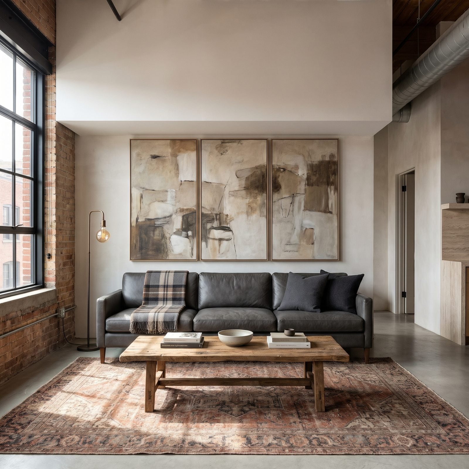
Scale this big needs headroom, and the soffit steals every inch of it. With barely two inches above the panels, the triptych looks shoved into a slot it was never cut for.
Negative space above art isn’t wasted space. It’s the thing that tells your eye the piece was placed, not crammed. Push art flush to a soffit and the whole wall suddenly feels shorter than it is.
Here in the loft, drop the triptych lower to open a clear band above, or trade down to a single horizontal canvas sized for the squeezed zone. Let the exposed brick and black steel frames do the muscular work. The art can afford to be calmer.
20. The Tall Artwork That Collided With Crown Molding
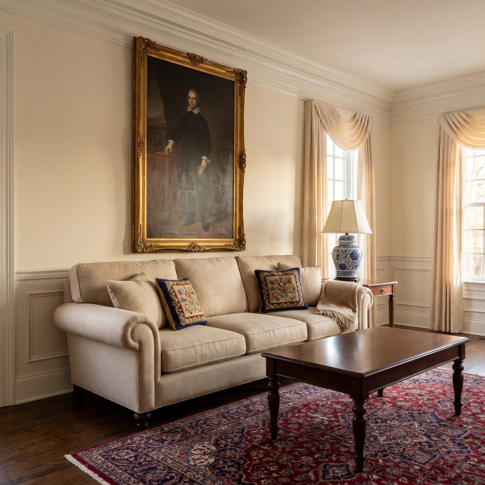
Beautiful painting. Wrong orientation for this wall. A tall vertical piece on a wall capped by substantial crown molding has nowhere to go but up, and up is exactly where it runs into the trim.
That collision creates visual tension at the precise spot your eye travels to, the top of the frame. Instead of resting on the art, you snag on the crowded little junction with the molding and can’t look away from it.
Two fixes for this traditional room. Choose a horizontal painting that mirrors the sofa’s line and leaves clean air below the crown. Or hang the vertical piece on a taller, uninterrupted wall where its height can actually stretch out and sing. The molding was here first. Work with it.
19. The Wide Canvas Jammed Between Two Wall Sconces
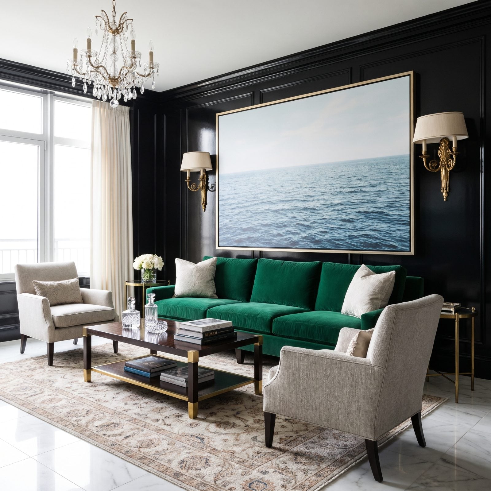
The sconces were placed for a smaller piece. Then a wide canvas moved in, and now everything’s elbowing for room.
When art nearly touches the fixtures flanking it, there’s no visual pause to keep them apart. So the sconces stop feeling like intentional lighting and start feeling like bookends under siege.
In this coastal setup, size the canvas so it sits comfortably inside the sconces with real breathing room on each side, a few inches at minimum. Or go smaller and let the sconces frame the art the way they were always meant to. And if you love this exact canvas? Move the sconces. Fixtures can be rewired. Proportion is harder to fake.
18. The Artwork That Fought With Oversized Swing-Arm Lamps
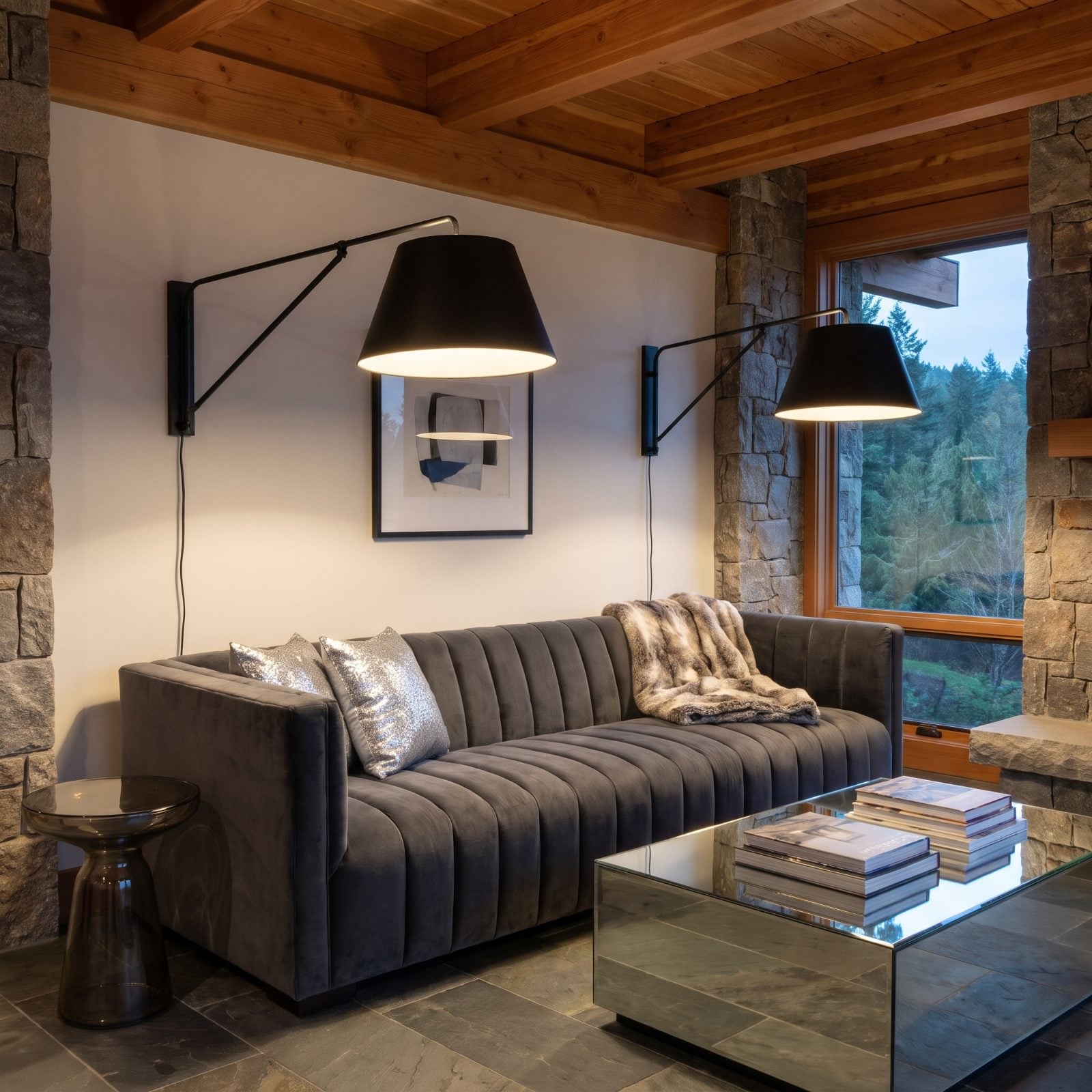
Two statement lamps, one shy little print. Guess who wins. The swing-arm fixtures are so large they overlap the art’s edges and nudge it straight into the background.
Lighting that’s meant to highlight art shouldn’t outweigh the art. When the shades are bigger than the subject they’re lighting, the hierarchy flips and the print turns into a bystander in its own frame.
In this glam room, scale up the art until it can hold its own against those lamps, or dial the fixtures down to slim picture lights that defer to the piece. The whole job of a swing-arm is to serve the art, not audition for the lead. Get the pecking order right and the wall finally settles down.
17. Picture Lights Spread Wider Than the Frames They’re Meant to Light
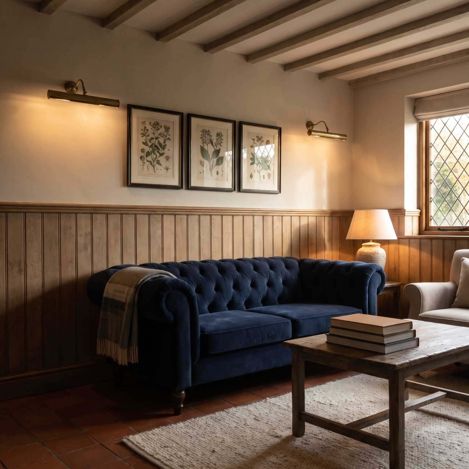
Picture lights have one job: throw their glow onto the art, not the paneling beside it. Here there are only two lights for three frames, so the middle print sits unlit between two glowing neighbors.
Why it doesn’t work: each frame in a group needs its own light, sitting roughly centered over it. Leave one out and the eye reads the gap instead of the picture, and the lighting ends up drawing a dark hole in the middle of the arrangement.
What you’d do in this room is add a third slim light over the middle frame so each print has one matched to its width, or hang a single longer fixture centered over the whole trio. Point the light where the thing you love actually hangs.
16. A Tiny Canvas Floating Alone in a Two-Story Great Room
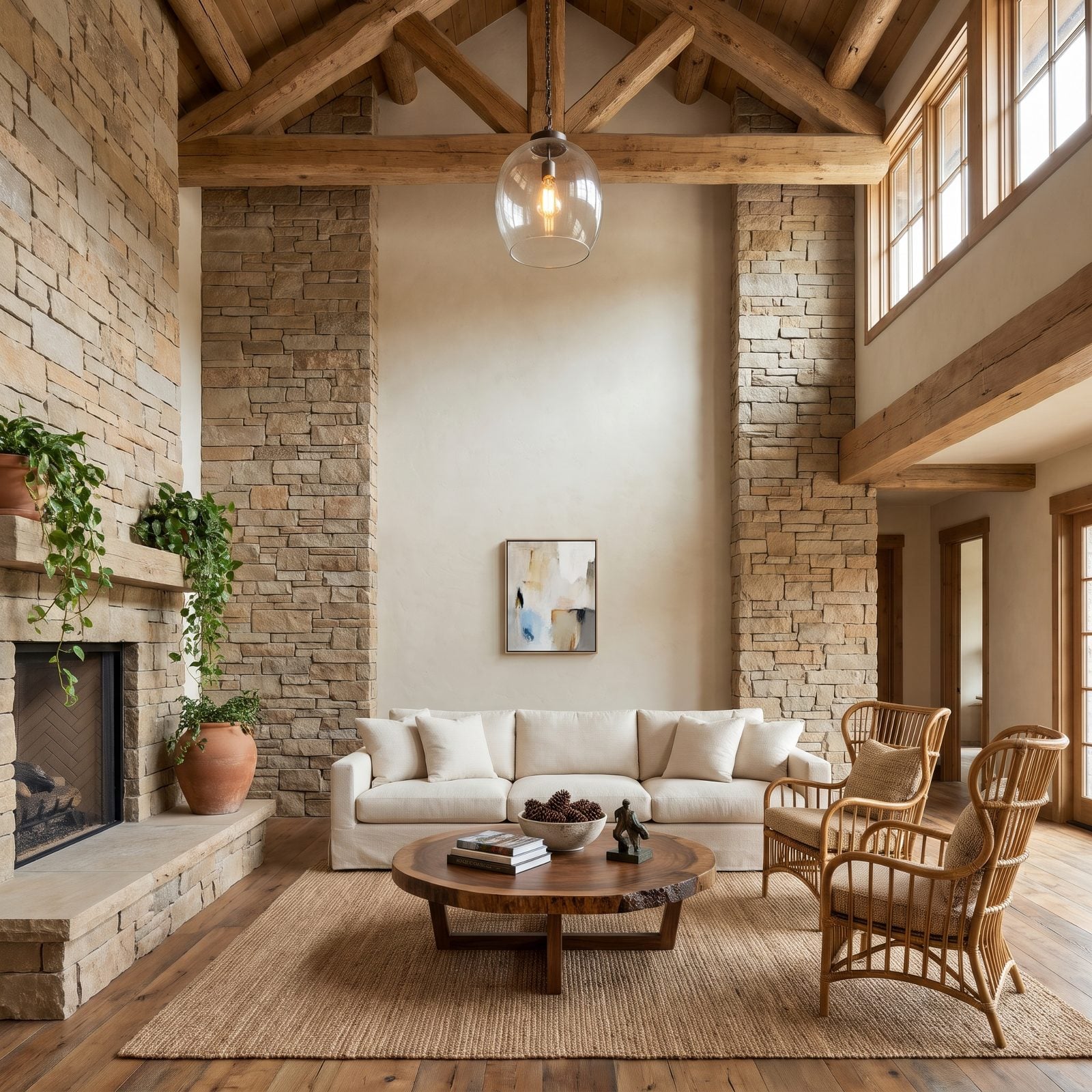
That little canvas is drowning. A 16-by-20 piece on a 20-foot wall reads like a postage stamp someone forgot to peel off.
Tall walls want vertical weight. Hang a single small piece at normal eye height and it ignores the twelve feet of plaster above it, so your eye keeps drifting up into all that empty space, hunting for something that never arrives.
In a retro great room like this, go big or go tall: one oversized vertical, a stacked column of three or four pieces climbing the wall, or an oversized abstract canvas sized to the volume of the space. Scale the art to the room, not just to the sofa.
15. Oversized Vertical Art That Made a Narrow Wall Look Even Narrower
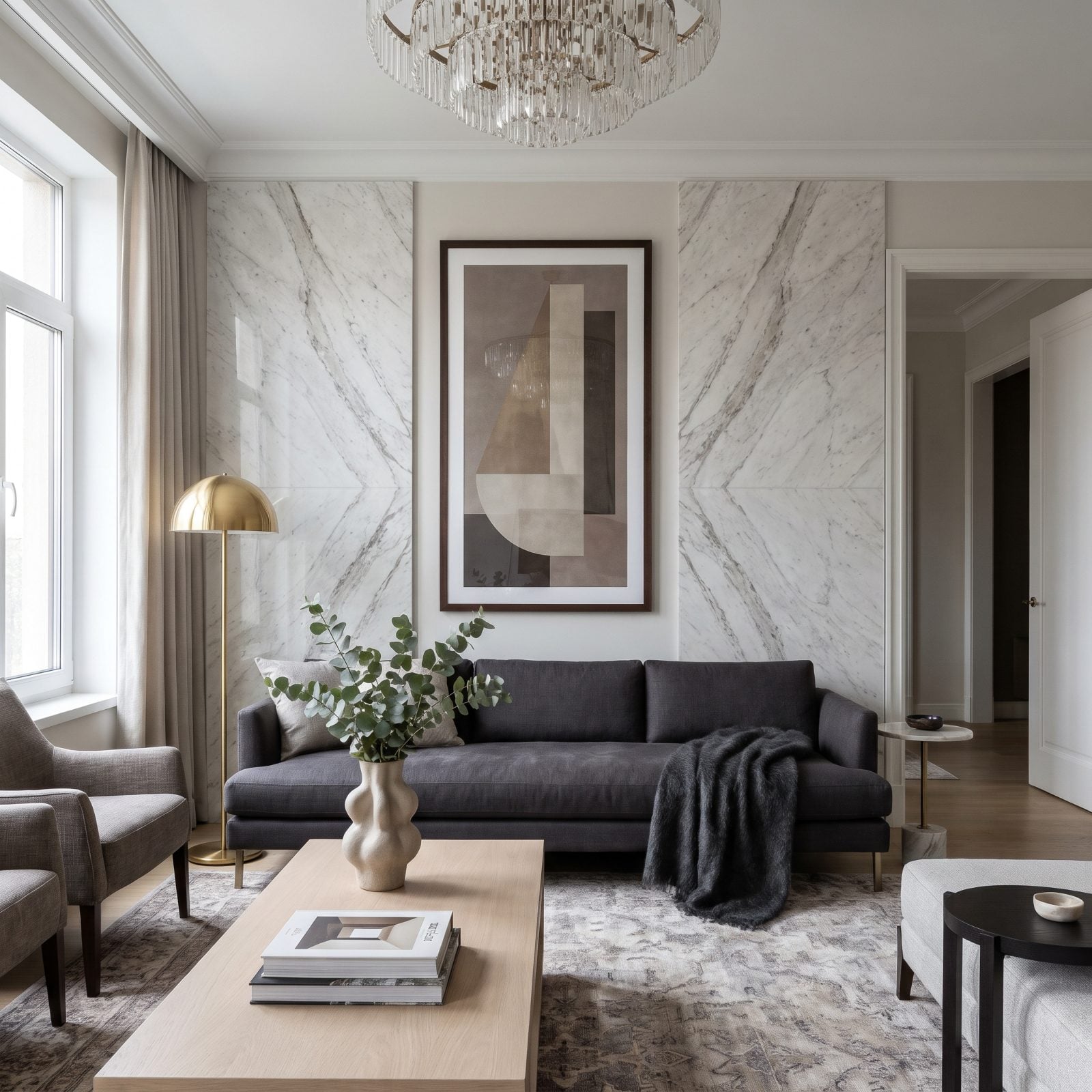
A tall skinny piece on an already-skinny wall doubles down on the problem. The vertical lines pull your eye straight up the chimney of the wall and make the strip feel tighter than it already is.
Why it doesn’t work: art should counter a wall’s proportions, not echo them. A narrow wall needs something that reads a little wider or softer, never a shape that mirrors the pinch.
Here, a horizontal piece or a squarer frame would have relaxed the wall. Or lean into the slim strip with a brass floor lamp and skip the art altogether. Tight walls don’t always need filling.
14. The Horizontal Print That Squashed a Short Wall Flat
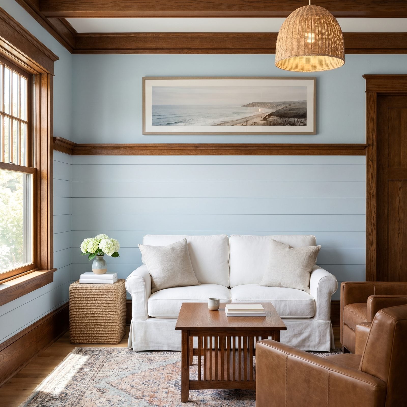
Under an eight-foot ceiling, a long low horizontal print presses the whole wall flat. The wide shape pushes your eye sideways and the squat height makes the ceiling feel like it’s sitting on your shoulders.
Short walls want a little vertical lift, not a landscape bar strung across the top. And that stretch of blank wall below the frame? It only makes the mismatch louder.
Drop the frame so its center lands about 57 inches off the floor, closer to the sofa back, and the whole arrangement breathes. Or trade the panorama for a taller piece or a square to give the low ceiling something to climb.
13. Art That Crossed the Visual Line of Floor-to-Ceiling Curtains
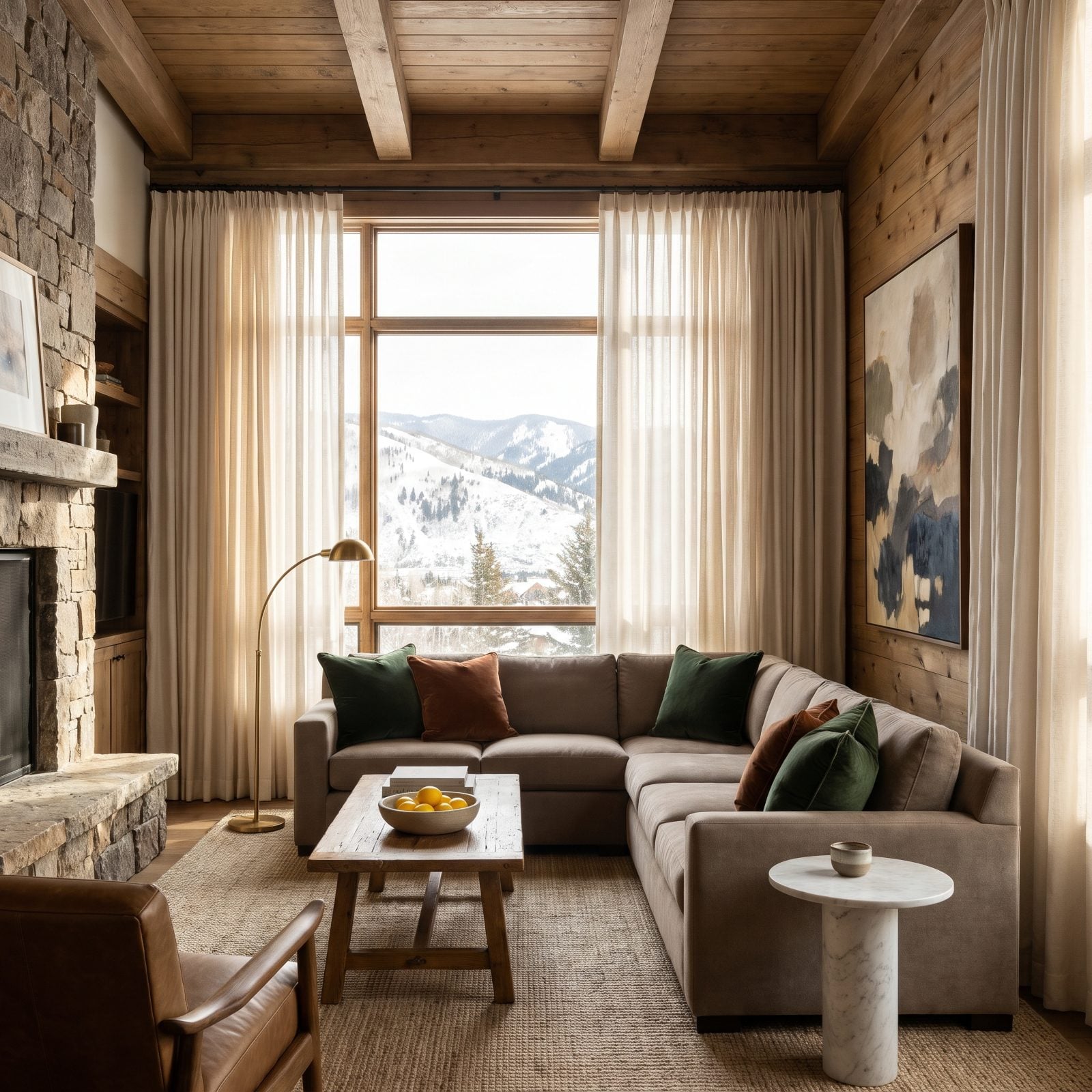
Those ivory linen drapes draw a crisp vertical line from ceiling to floor. The painting ignores it entirely, crossing the boundary so the frame and the curtain end up fighting for the same few inches of wall.
Full-height drapes behave like architecture. When art butts into them the edge reads as a collision, and the moment you draw the curtains, half the frame vanishes behind fabric.
Give the painting its own clear patch of wall with real breathing room from the drape’s leading edge. Wall too tight for that? Then the piece belongs somewhere else. Your art shouldn’t have to share a lane with your curtains.
12. Frames That Crowded the Window Right Next to the Sofa
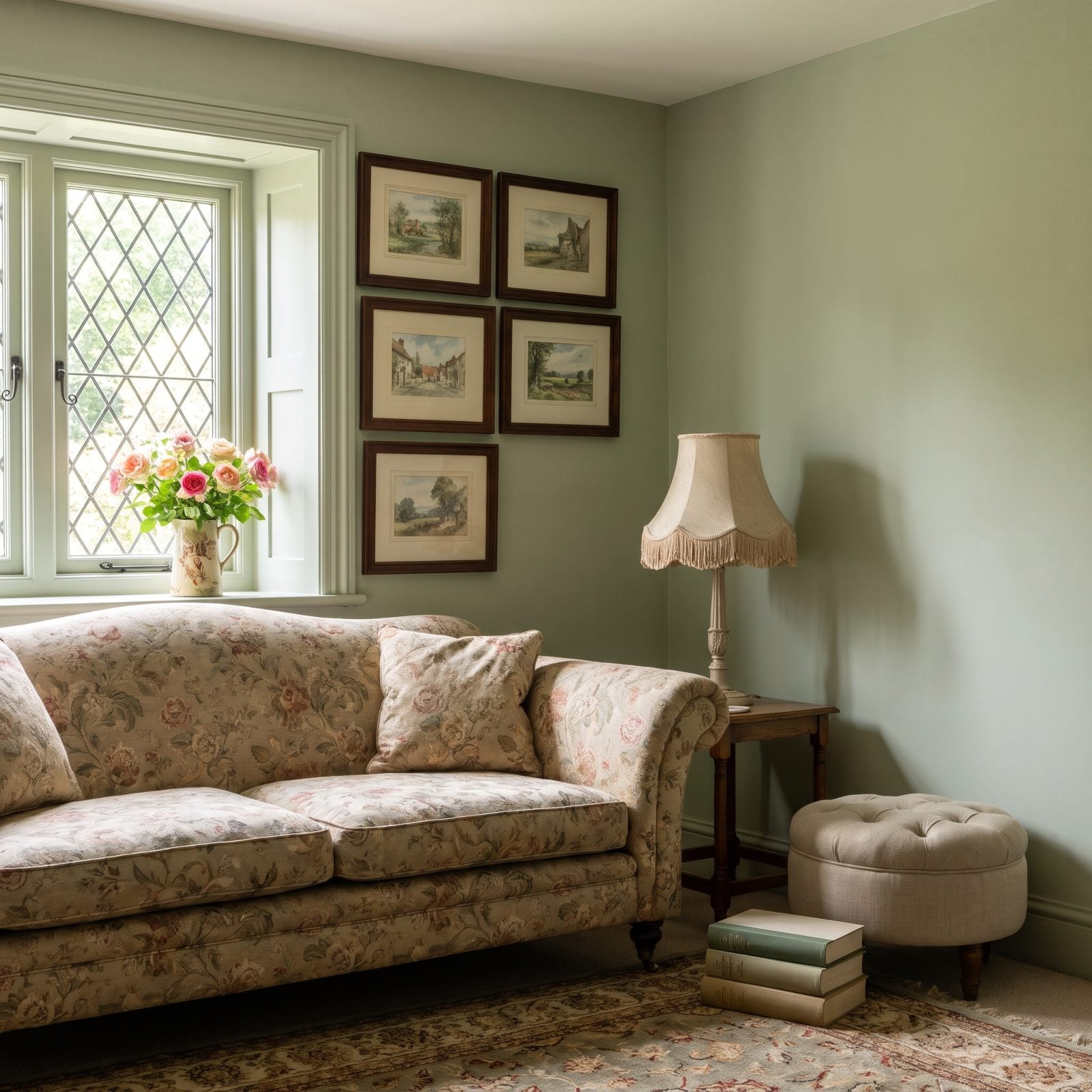
Five little watercolors shoved up against the window trim. The frames crowd the casing until the wall feels pinched and the window loses its edge.
Windows need a margin of calm wall around them to register as windows. Press art right into the trim and the eye can’t tell where the frame stops and the glass begins.
Pull the whole cluster off the window, give the casing four or five inches of clear air, then tighten the grid so it sits as one unit over the sofa instead of leaking toward the light. A little breathing room reads as confidence.
11. Art Sized to the Wall but Not to the Small Apartment Sofa
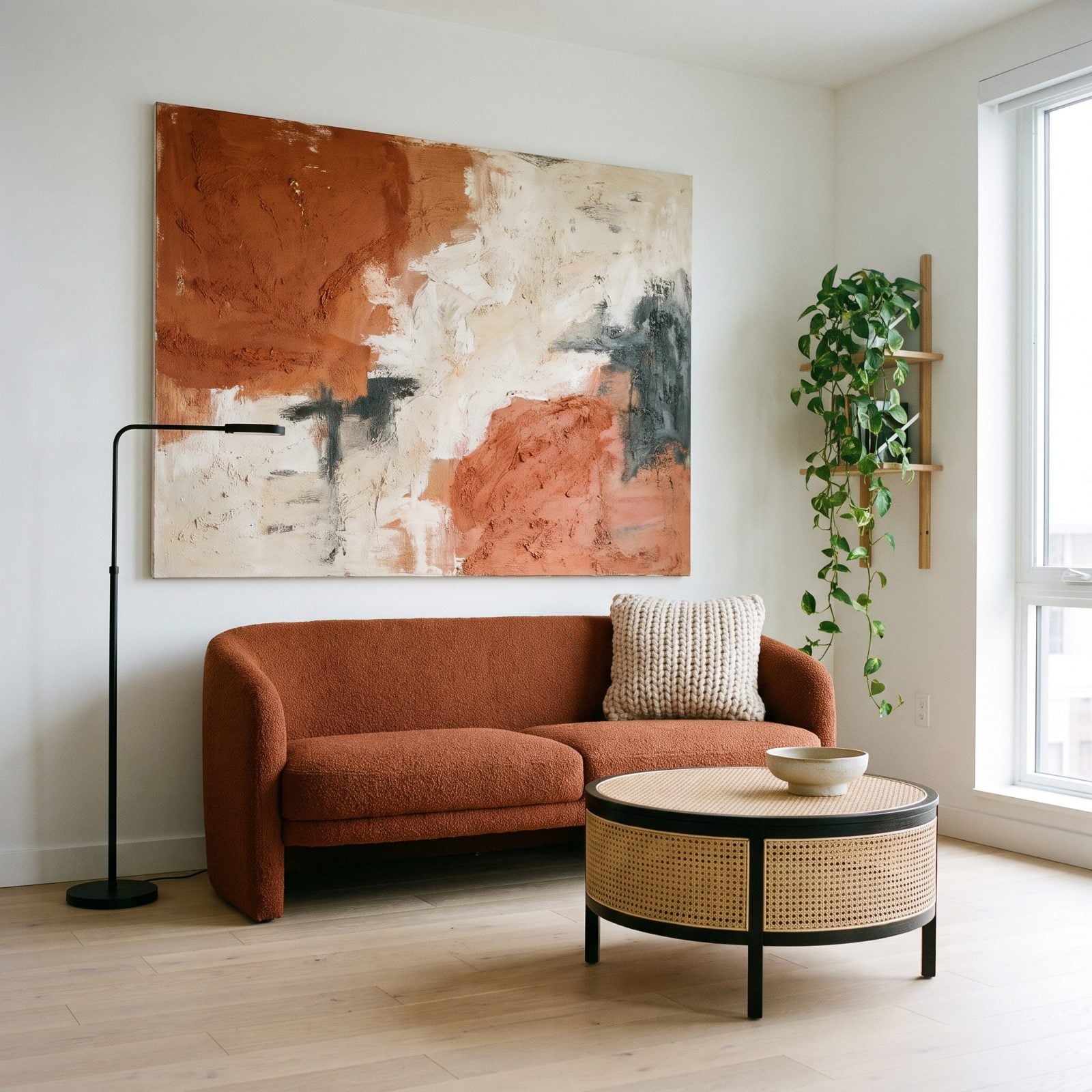
The canvas got bought to fill the wall. Trouble is, the rust boucle sofa underneath it is only five feet wide, so the art spans roughly 85 percent of it like a coat a size too big, and it’s hung off-center to boot, poking past the left arm while stopping well short of the right.
Art above a sofa should land at roughly two-thirds to three-quarters the width of the furniture, never wider than it. Overshoot that and the sofa looks shrunken, a child’s chair stuck under a grown-up painting.
Size the piece to the sofa first. A canvas around 36 to 40 inches wide, centered over the seat, would sit properly here, or swap to a smaller grouping centered on the furniture. The wall doesn’t get a vote the sofa doesn’t.
10. Art Still Hung for the Old Sofa Long After the New One Arrived
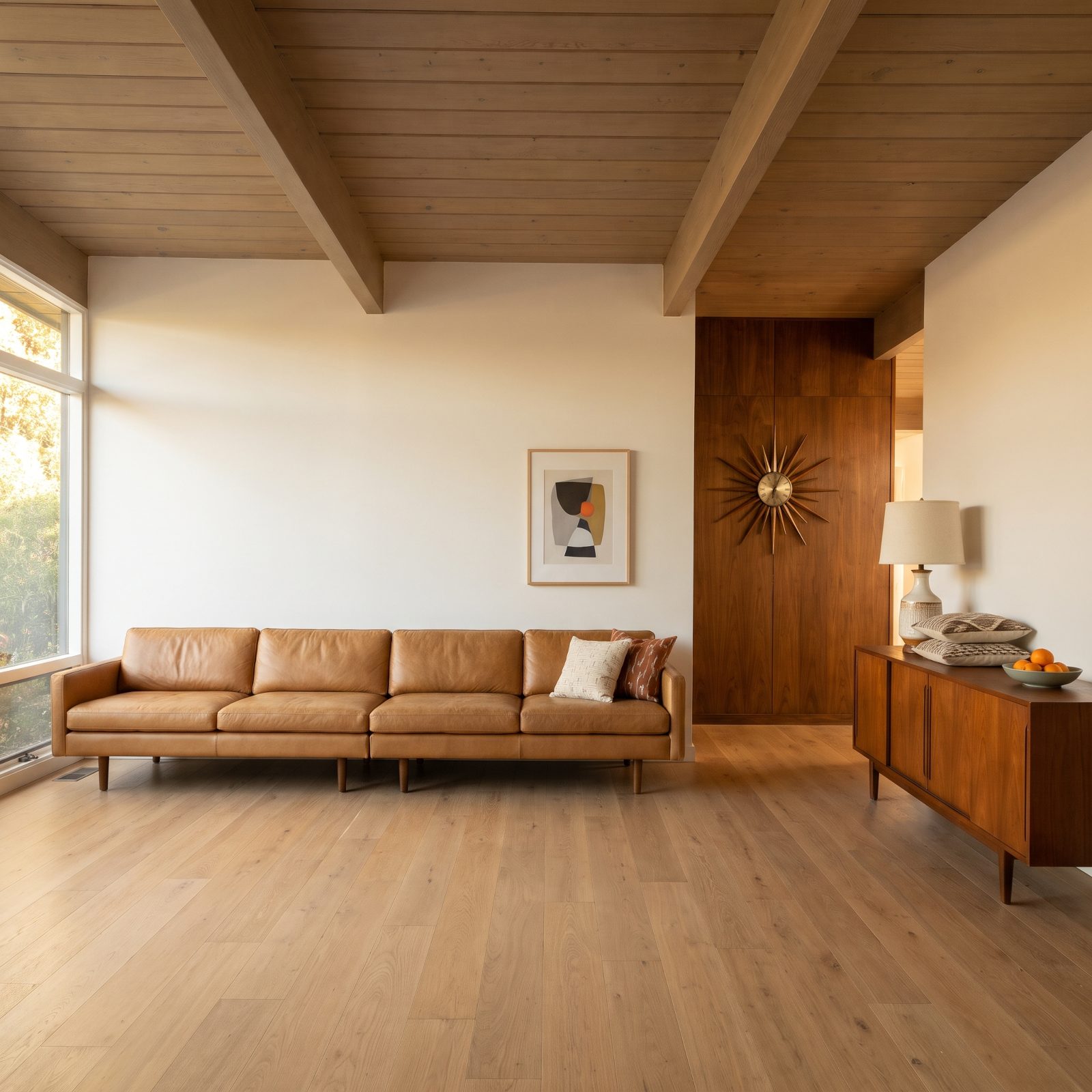
New sofa, old nail hole. The print still hangs where it suited the narrower piece that used to live here, floating high and shoved to the right while the left half of the long sofa sits under bare wall.
Art relates to the furniture below it, not to a hook you drilled two sofas ago. When the anchor moves, the art has to move with it.
Recenter the piece over the new sofa and drop it so the bottom edge sits six to ten inches above the back. One re-hang fixes the whole wall. I’ve put off this exact chore for embarrassingly long, so no judgment.
9. An Oversized Piece That Swallowed the Sofa’s Reading Lamp
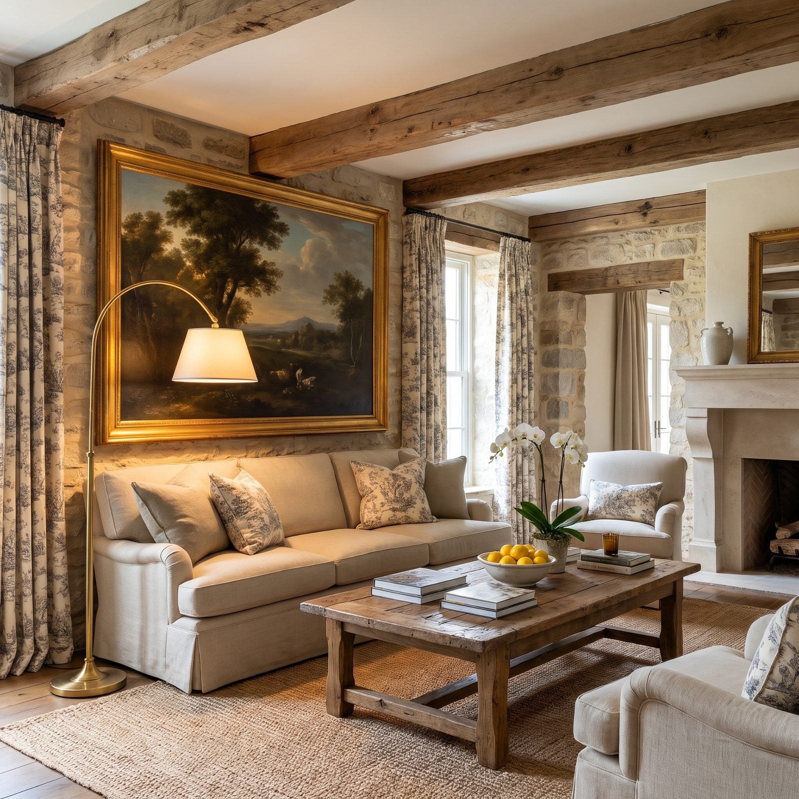
That gold frame hangs so low and so wide it eats the top of the brass arc floor lamp beside the sofa. The lamp’s whole point is to arch over your shoulder while you read, and now it can’t, because the art is parked in its way.
Function has to clear the furniture it serves. Oversized art looks great right up until it slams into a lamp, a sconce, or a swing-arm that needs the airspace.
Either raise and narrow the frame so the lamp swings free, or move the reading light to the opposite end. Gorgeous art that blocks the thing you actually use is just a very expensive obstacle.
8. A Top-Heavy Art Stack Towering Over a Low Modular Sofa
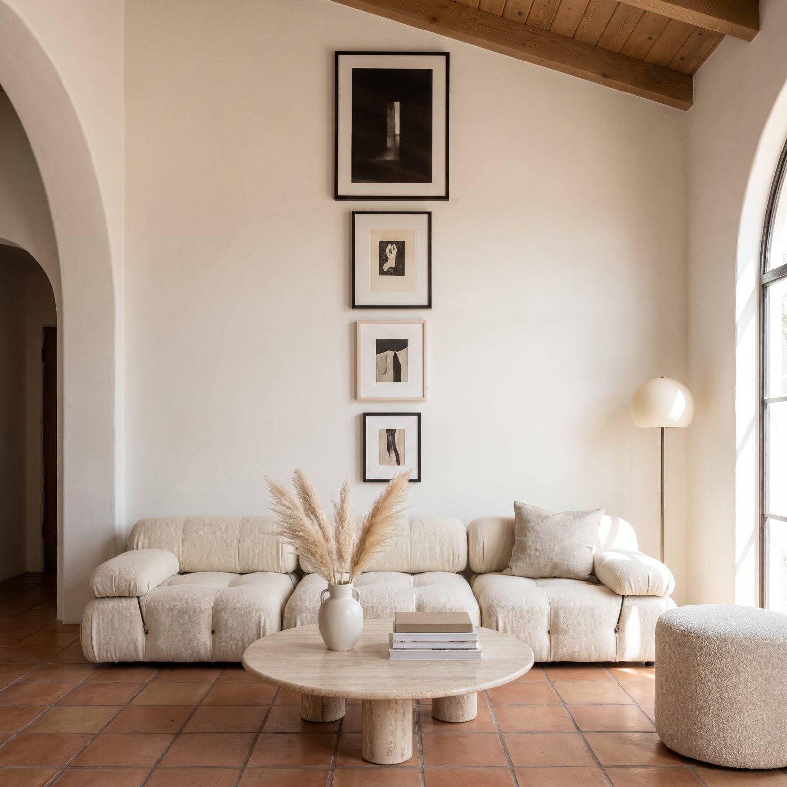
The sofa sits low to the floor while the art stack climbs high up the wall, yet the bottom frame hangs just a few inches above the sofa back, with a clear gap of several inches above the cushions, so the whole arrangement stays anchored to the furniture.
Low-slung seating needs its art to drop along with it. Keep the stack at standard height and the visual weight floats up top, leaving the sofa to read as an afterthought parked underneath.
Here the bottom frame sits within a few inches of the sofa back, and the largest, darkest piece sits at the very top of the stack, so the eye climbs toward the beams rather than settling. Art should hug the sofa it hangs over, not hover above it like a cloud.
7. The Tapestry Too Long for the Space Above the Cushions
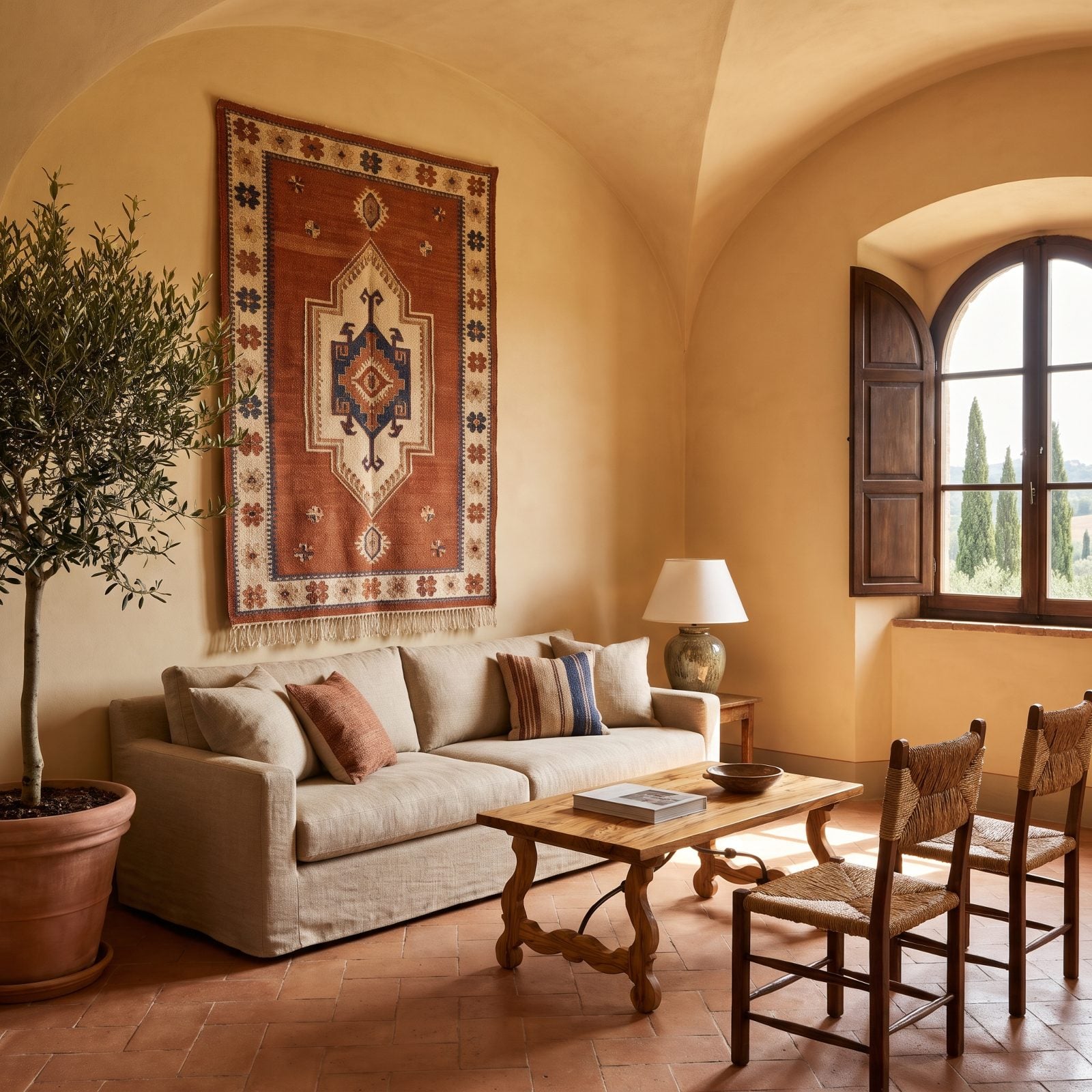
That tapestry is handsome. It’s also two feet too tall for the wall it landed on, so the bottom fringe grazes the cushions and the top crowds the ceiling.
Textile art reads as mass, not just image. When a long hanging fills the gap edge to edge, the sofa and the weaving fuse into one heavy block and the wall stops breathing. You want a visible band of plaster above the sofa back and clear air below the lower edge.
A shorter horizontal weaving would solve it, or mount this same tapestry on a rod and hang it higher, bottom edge eight inches above the cushions. Either way, the ochre wall finally gets room to show itself.
6. The Decorative Plates Spaced Too Far Apart to Form a Group
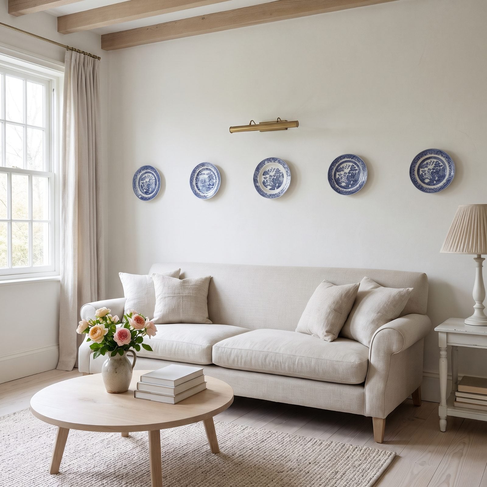
Five pretty plates, and not one of them is talking to the others. Fourteen inches of bare wall between each turns a collection into scattered punctuation.
Why it doesn’t work: grouped objects need to sit close enough to read as a single shape, and two to three inches of gap does the job nicely. Push them further apart and the brain stops grouping and starts counting, one lonely plate at a time.
Tighten the spacing to about three inches, stagger a couple of plates into a loose cluster rather than a stiff line, and suddenly you’ve got one confident arrangement anchoring the sofa. The same move rescues plenty of plate walls, framed prints, and little picture ledges in a craftsman living room too.
5. The Clock Mistaken for a Properly Scaled Focal Piece
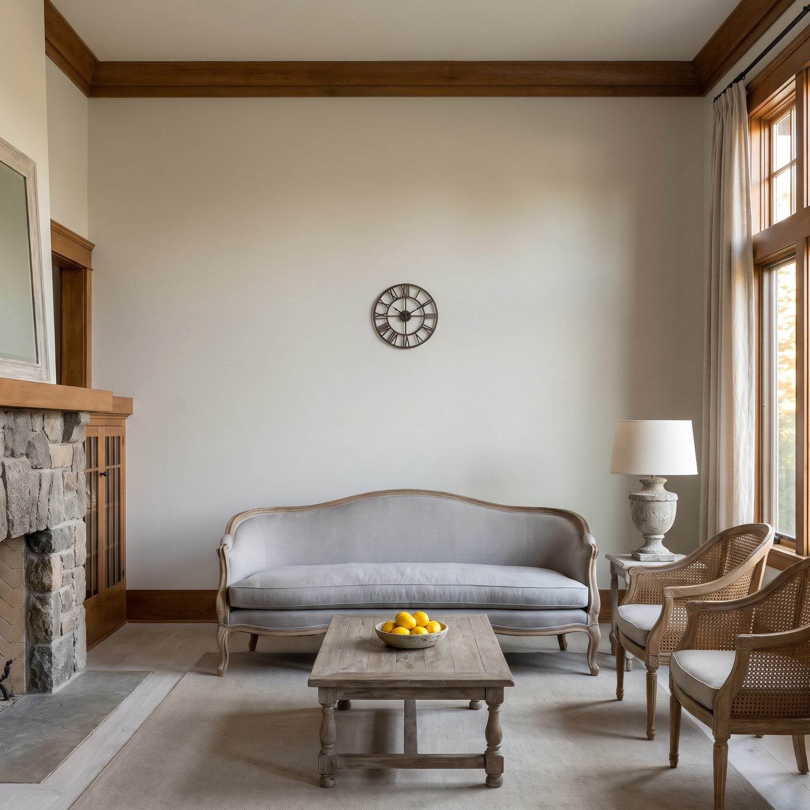
A clock is not a focal point. A 16-inch clock floating over an 80-inch sofa is a postage stamp on a billboard.
People reach for a clock because it feels like it earns its keep functionally. But above a sofa you’re reading scale, not time, and a lone small round object on a big wall creates an awkward island of emptiness your eye keeps circling.
If you love the clock, flank it. Pair it with two framed botanicals, or build a salon arrangement around it so the group covers about two-thirds of the sofa width. Or just swap it for one large piece. Stop asking one small circle to hold down a wide wall.
4. The Television-and-Art Combination That Overfilled the Wall
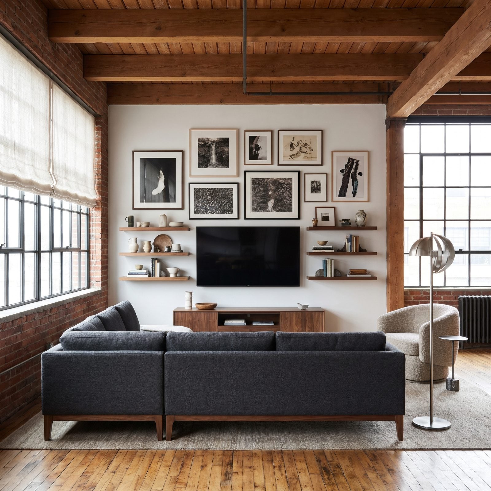
The gallery-around-the-TV move is everywhere right now, and this is how it goes sideways: the TV plus frames plus shelves climb to the ceiling and stretch wall to wall. Nowhere for your eye to rest.
A screen is already a heavy, dark rectangle. Pack art tight around all four sides and the whole wall turns into visual static, and you lose both the art and the TV in the noise.
Give the arrangement a clear outer boundary that stops well short of the ceiling and the corners. Thin the piece count, keep frames to one or two sizes, and let a margin of blank wall hold the whole thing. The screen needs quiet around it to disappear the way you want it to.
3. The Frames That Disappeared Against Oversized Wall Paneling
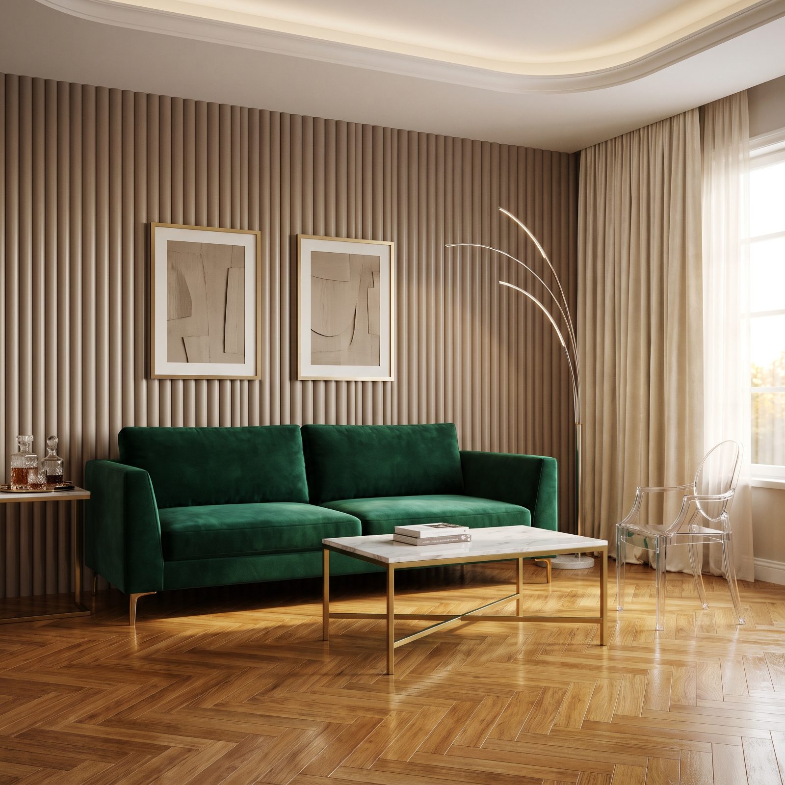
Big architectural paneling eats small art for breakfast. Match the frame tone to the panels on top of that, and your prints basically camouflage themselves into the wall.
Two forces are working against you. The oversized panel grid sets a large visual rhythm, and the matching finish strips away the contrast the frames need to pop forward. The result is art you have to squint to find.
On a statement wall like this, go one of two ways: a single oversized piece scaled to the paneling, or frames in a contrasting finish, matte black against the taupe, that break from the wall color. The emerald velvet sofa deserves art bold enough to hold its own against both the panels and the gold.
2. The Canvas That Covered Decorative Molding Instead of Fitting Within It
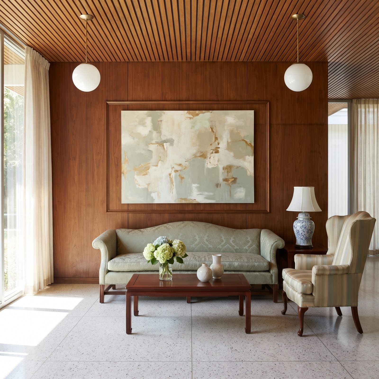
Someone installed a decorative molding box specifically to frame art, then hung a canvas that floats neatly inside it, with a clear reveal on every side and no contact with the molding lines. Here the architecture and the art work together.
Picture-frame molding is already a frame. When your artwork sits inside it with even reveals on all sides, the two reinforce each other. Overlap the molding, though, and both lines start to look like mistakes while the eye snags on the clash.
What works in this room: a piece sized to float within the molding box with two to four inches of wall showing between art and trim on every side. Or pull the box off entirely and let a single large canvas own the wall. Pick one frame, not two arguing.
1. The Oversized Frame That Left No Breathing Room at the Sides
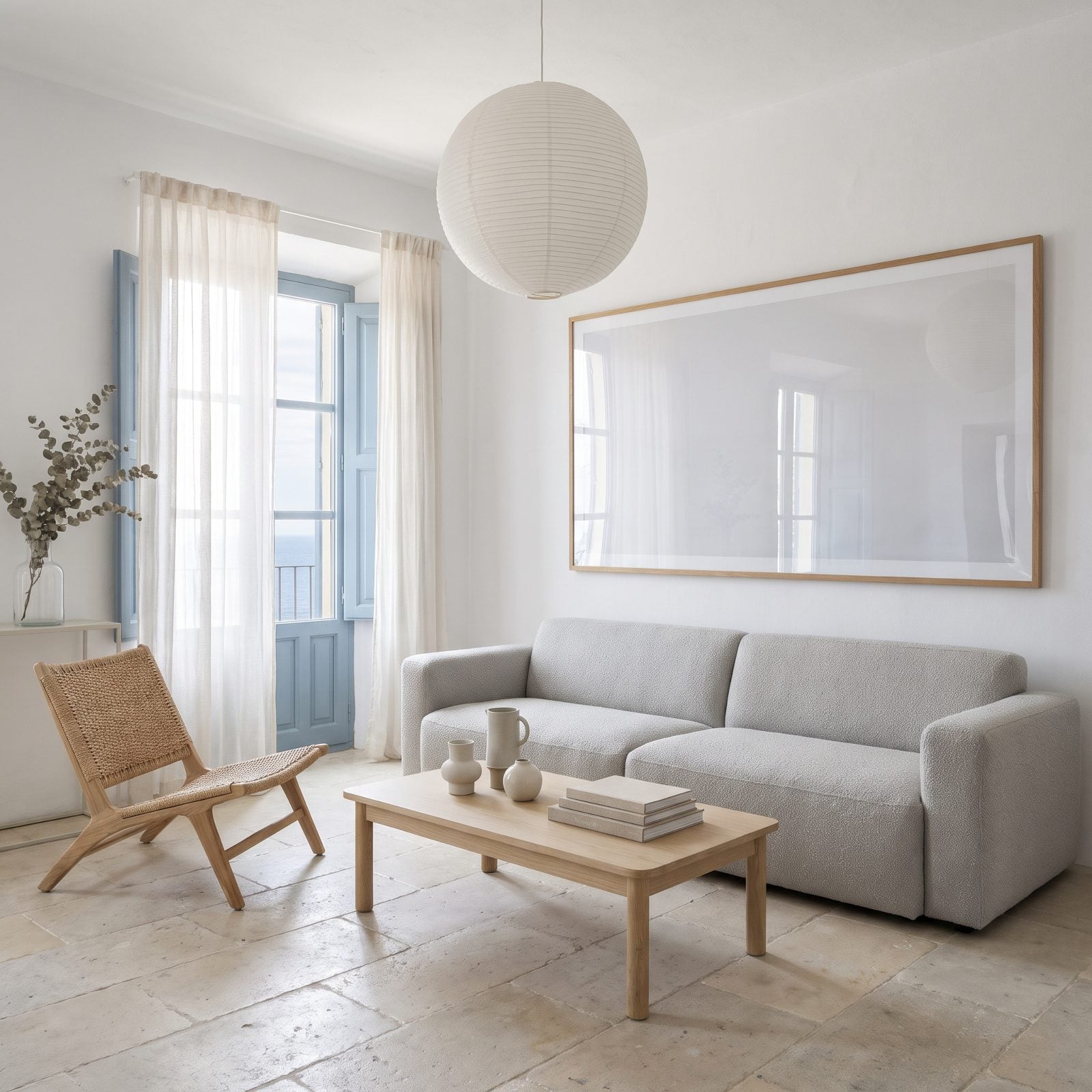
So close to right. One large oak-framed print, well chosen, and it stops well short of both corners, leaving a wide band of blank wall between it and the window on the left and open wall on the right. It looks hung, not wedged in.
Art needs margins the way a photograph needs white space. Crowd the corners and the wall feels undersized while the piece feels trapped. That little band of blank wall on each side is what tells everyone the art was placed with intention.
In a room this quiet, you want the frame to span roughly two-thirds to three-quarters of the sofa width, with generous air at both ends. Here the frame sits narrower than the sofa, and the whole wall relaxes. Sometimes the answer is just smaller.