
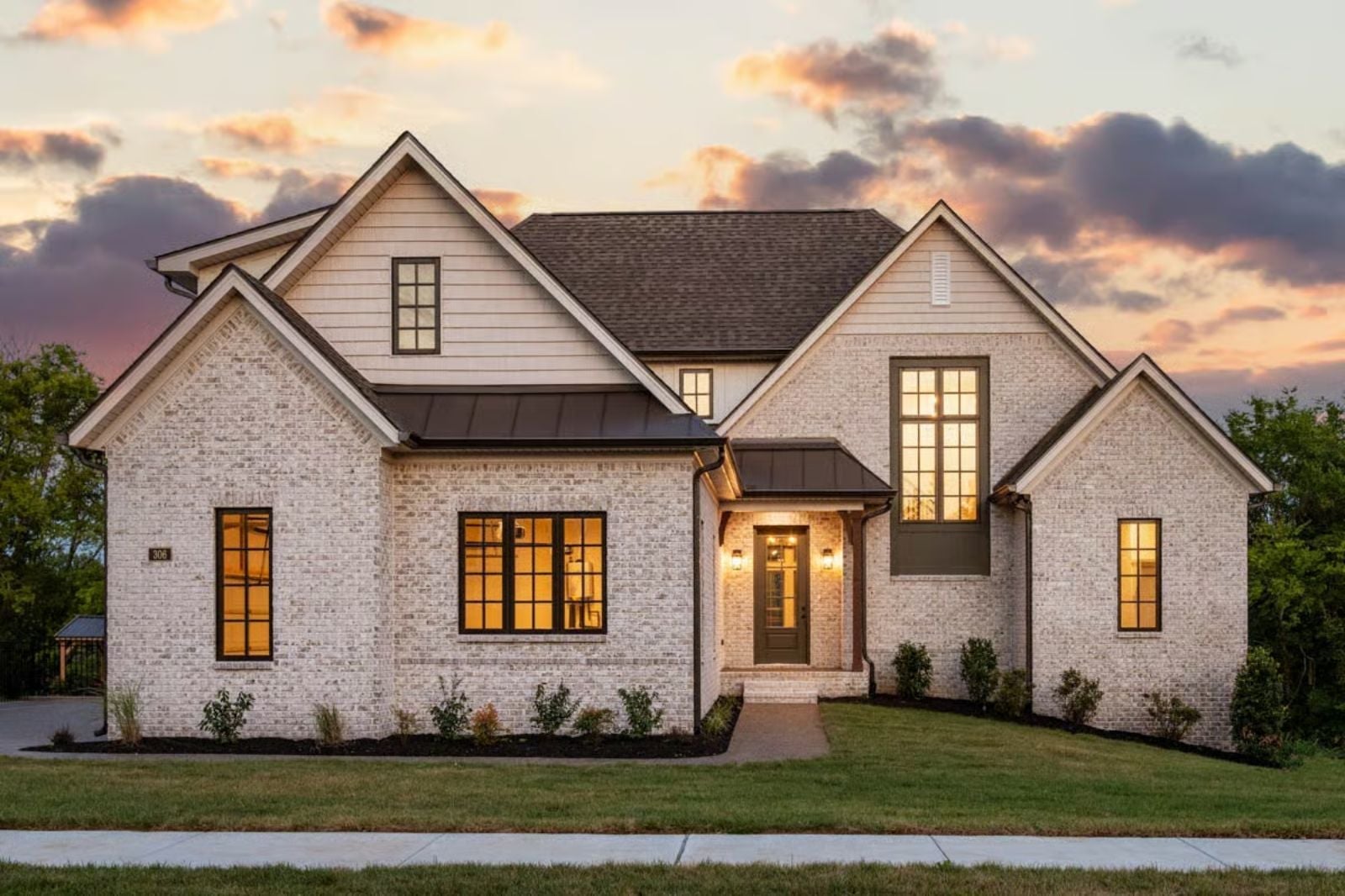
Parents who hire architects say the same thing after the kids leave: they wish they had put the primary bedroom further away sooner. The Wrenfield builds that boundary in from day one, with a main-floor suite tucked well away from the action, a loft upstairs that absorbs homework noise and weekend chaos, and an open living core where dinner conversation carries freely but your room stays yours.
Specifications
- Sq. Ft.: 2,051
- Bedrooms: 3
- Bathrooms: 2.5
Floor Plan – Main Floor
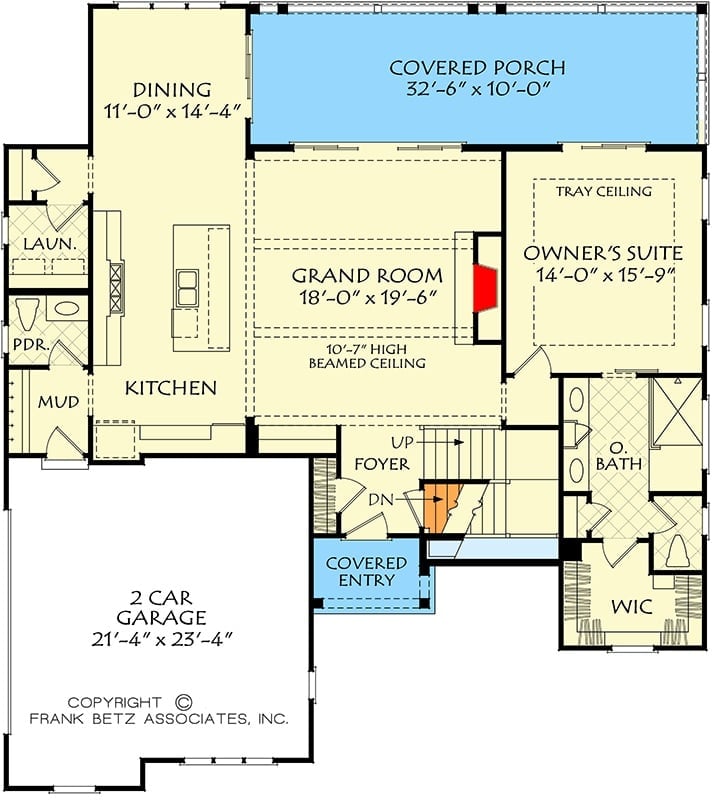
The owner’s suite sits on the right side of the main floor, well clear of the kitchen and dining zones stacked to the left. Between them, a grand room with a 10’7″ beamed ceiling holds everything together. Mud room, laundry, and powder room all cluster near the garage — a tight little containment zone for the daily blast radius of wet shoes and backpacks. Out back, a covered porch stretches more than 32 feet across.
Floor Plan – Second Floor
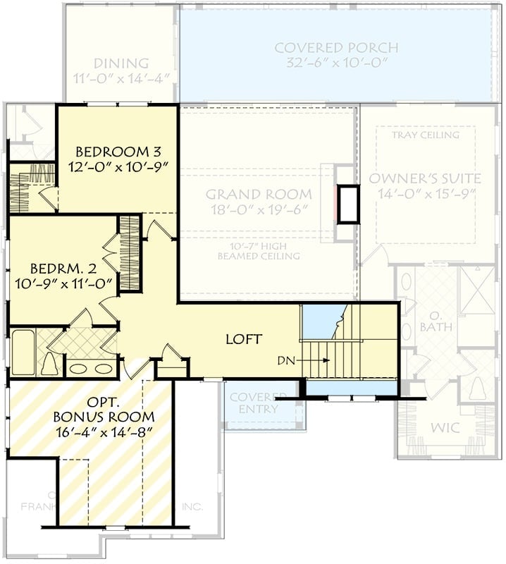
Upstairs you get two secondary bedrooms, a loft, and an optional bonus room over the garage. The loft is the detail worth paying attention to — it gives the kids a place to land that isn’t the living room. The grand room’s beamed ceiling reads from here too, which is a nicer view than most second floors manage.
Herringbone Brick, Blue Built-Ins, and Zero Furniture to Get in the Way
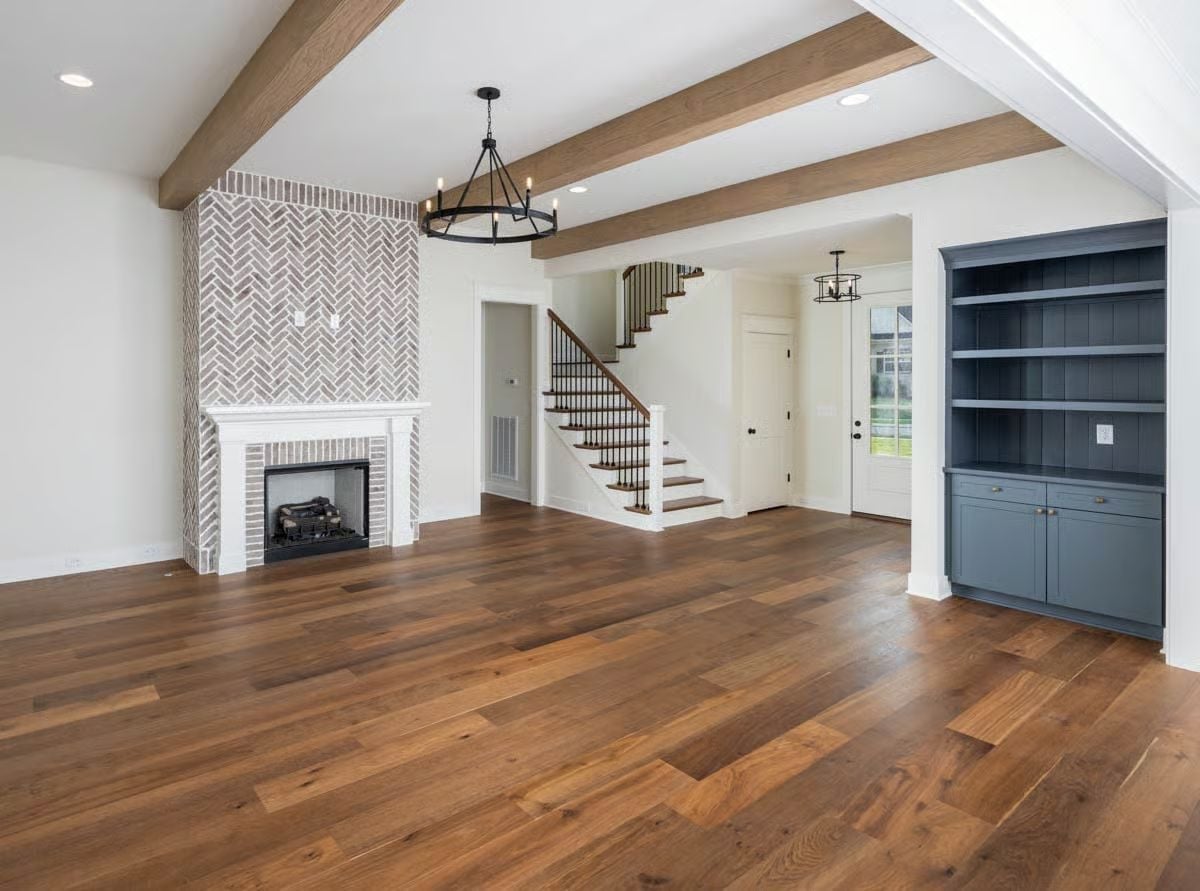
Wide-plank walnut floors this rich don’t need much competition.
The exposed ceiling beams echo the flooring without piling on, and the blue-gray built-in bookcase earns its wall all on its own. What really holds the eye, though, is the herringbone tile surround on the fireplace. It’s a small move that makes the whole room feel considered.
Globe Pendants and a Sink Island That Actually Has Breathing Room
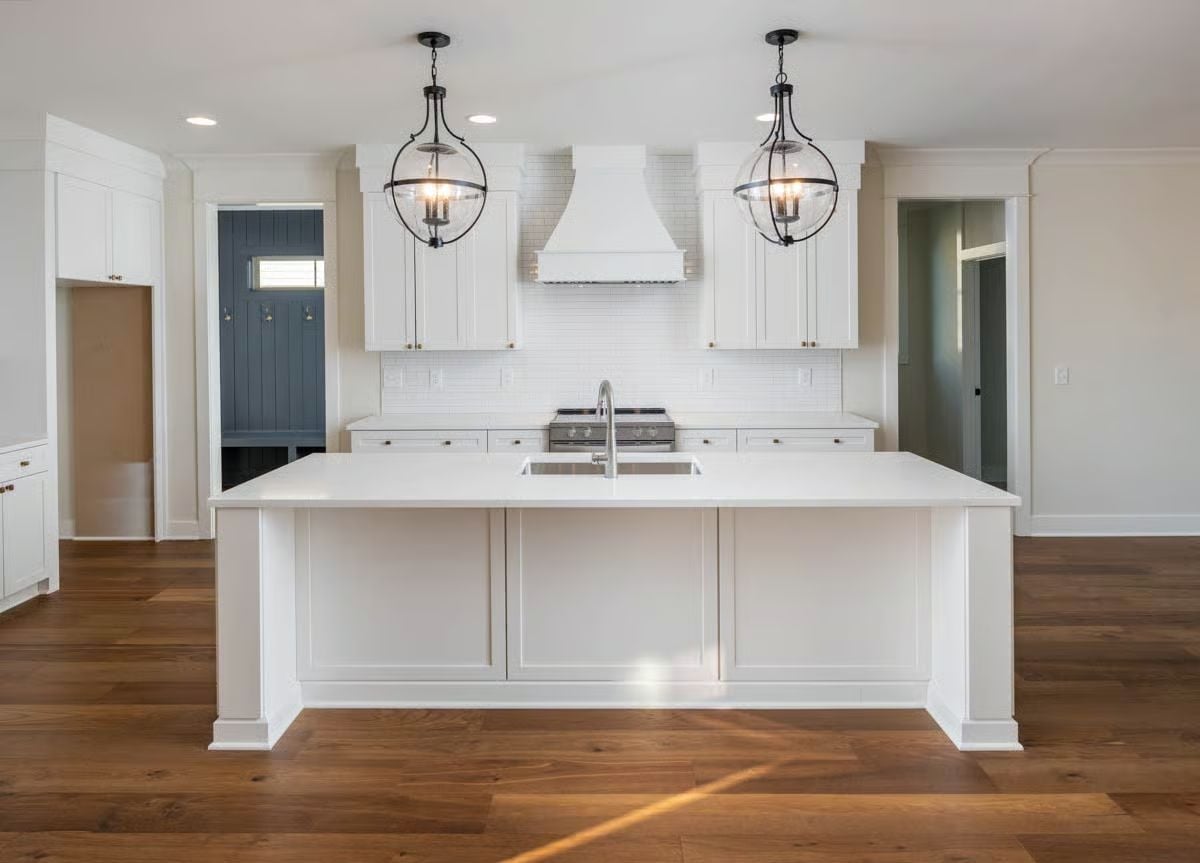
White shaker cabinets, brass hardware, a quartz island with an undermount sink, two globe pendants with visible candelabra bulbs hung in perfect symmetry overhead. It’s a kitchen that could easily tip into catalog-cold, but the dark shiplap mudroom entry visible in the background pulls it back toward something that feels like an actual house.
Style Math: White quartz plus white cabinets plus white hood reads monochromatic until the wood floor pulls everything back to earth. The brass hardware is doing quiet work — it’s the detail that keeps this from feeling like a showroom.
Built-In Storage Wall with Brass Hardware That Earns Its Keep
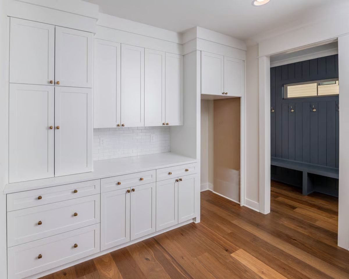
Floor-to-ceiling shaker cabinets without a gap wasted, brass knobs reading warm against the painted finish. Through the doorway, navy tongue-and-groove paneling and built-in lockers make it clear this house has a serious mudroom tucked just out of frame.
By The Numbers: A storage wall like this one can absorb the function of a separate closet, pantry, and utility room without adding square footage. Cabinet depth matters more than most people realize — shallow uppers look fine but limit what you can actually store, and you notice that tradeoff every single week. The subway tile backsplash behind a countertop workspace keeps the zone useful rather than just good-looking.
Wainscoting and Two Pendant Styles That Somehow Agree With Each Other

Box-molded wainscoting runs the full length of the upper hallway, paired with dark hardwood and two mismatched pendants that still manage to read as a set. Natural light from the landing window does the heavy lifting. Most builders treat upstairs hallways as leftover space. This one has more trim detail than some living rooms.
Ask Yourself: If you’re building new, push your builder on wainscoting in circulation spaces. It’s a finish upgrade that shows up in listing photos and in daily life — hallways are the first thing you see when you come upstairs, every single day, and bare drywall never stops feeling unfinished.
Dark Hardwood and a Tray Ceiling That Justify the Whole Floor Plan
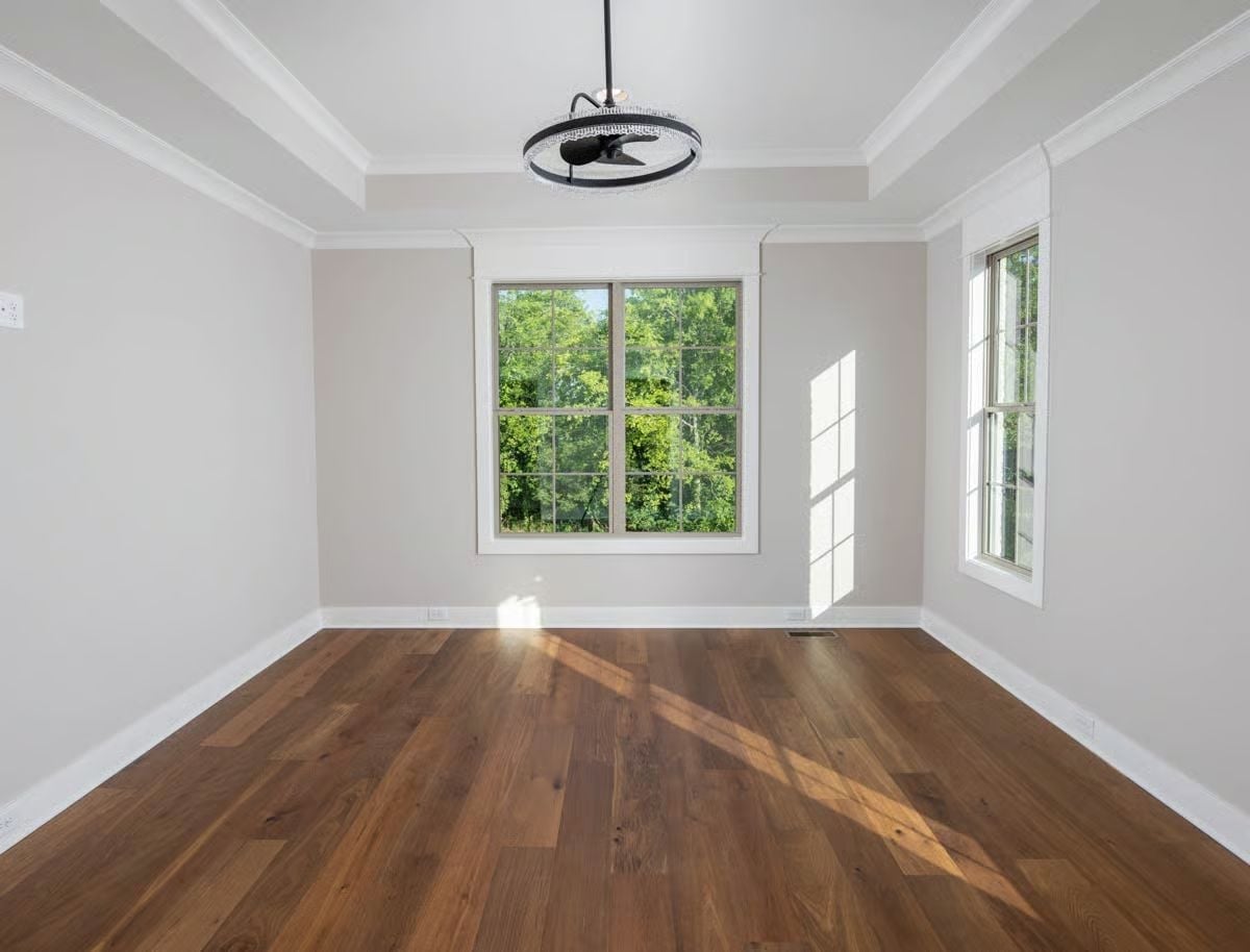
Rich walnut-toned hardwood runs wall to wall, catching light from two grid-pane windows, with crown molding wrapping a raised tray ceiling overhead. Unfurnished in this shot, which actually helps — you can see exactly what you’re getting.
Worth Knowing: Tray ceilings add visual depth without requiring extra height in the rooms below, and the cost difference between a flat ceiling and a shallow tray is often smaller than people expect when they’re budgeting. Two window orientations, as seen here, also help — large primary bedrooms can turn cave-like without enough natural light coming from more than one direction.
Scalloped Mirrors and a Tower Cabinet That Divides the Vanity Without Crowding It
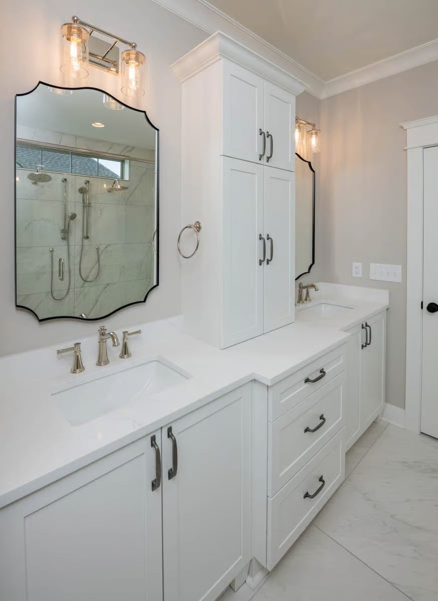
Polished nickel faucets and matte black cabinet pulls sharing the same vanity is the kind of thing that shouldn’t work and does anyway. The tall center cabinet justifies its footprint by reaching all the way to crown molding height — no awkward gap, no wasted wall.
Pin It
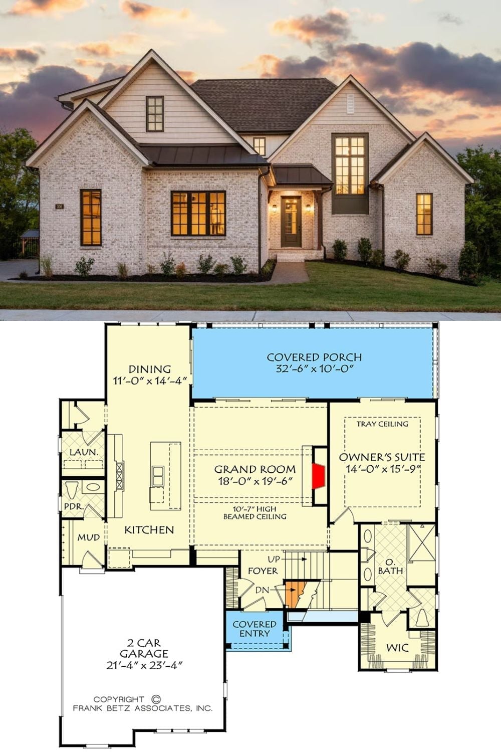
The exterior shot shows a New American craftsman with whitewashed brick, board-and-batten gables, and a standing-seam metal roof over the entry. Below it, the first-floor plan lays out the grand room with its 10-foot-7 beamed ceiling, the main-floor owner’s suite with walk-in closet, and that covered rear porch running more than 32 feet across the back.
