🔥 Would you like to save this?
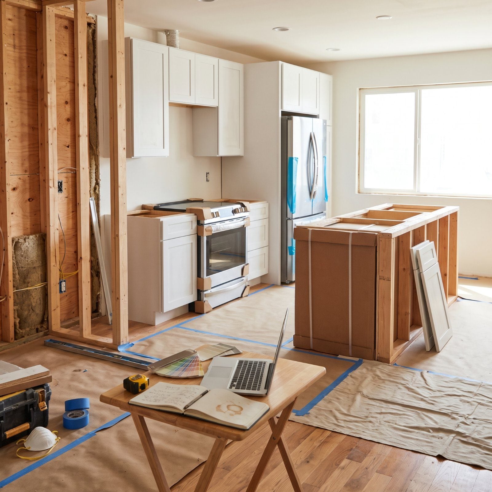
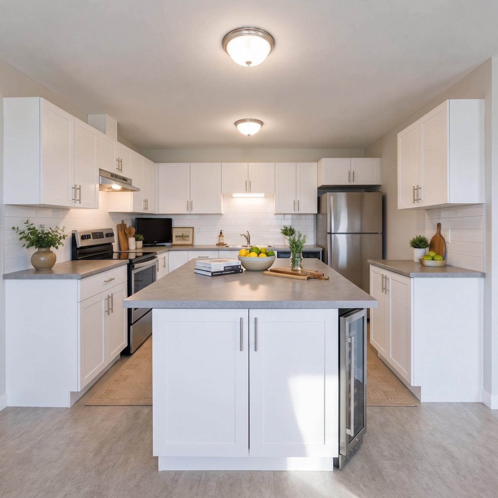
The kitchen had space, but almost none of it felt intentional. White cabinetry wrapped the room, gray counters flattened the palette, and the broad central island occupied plenty of territory without giving the room much visual direction. Nothing was especially bad on its own. Together, though, the pieces made the kitchen feel dated, heavy, and strangely anonymous.
White, mahogany, and brass change that equation fast when each is given a clear job. White opens up the perimeter. Mahogany adds depth, warmth, and enough visual weight to anchor the room. Brass works best in smaller doses, drawing the eye to a hood, a cabinet frame, a lighting detail, or the edge of an island instead of competing with everything around it.
In order to come up with the very specific design ideas, we create most designs with the assistance of state-of-the-art AI interior design software. Also, assume links that take you off the site are affiliate links such as links to Amazon. this means we may earn a commission if you buy something.
Across these 33 transformations, the palette moves from polished European minimalism to Art Deco, mid-century, Parisian, neoclassical, and more sculptural contemporary schemes. Some versions rely on one dominant focal point; others redistribute the weight of the room entirely. The strongest designs prove that a dated kitchen does not need more decoration. It needs better hierarchy.
33. The Sculptural Waterfall Island That Runs the Show
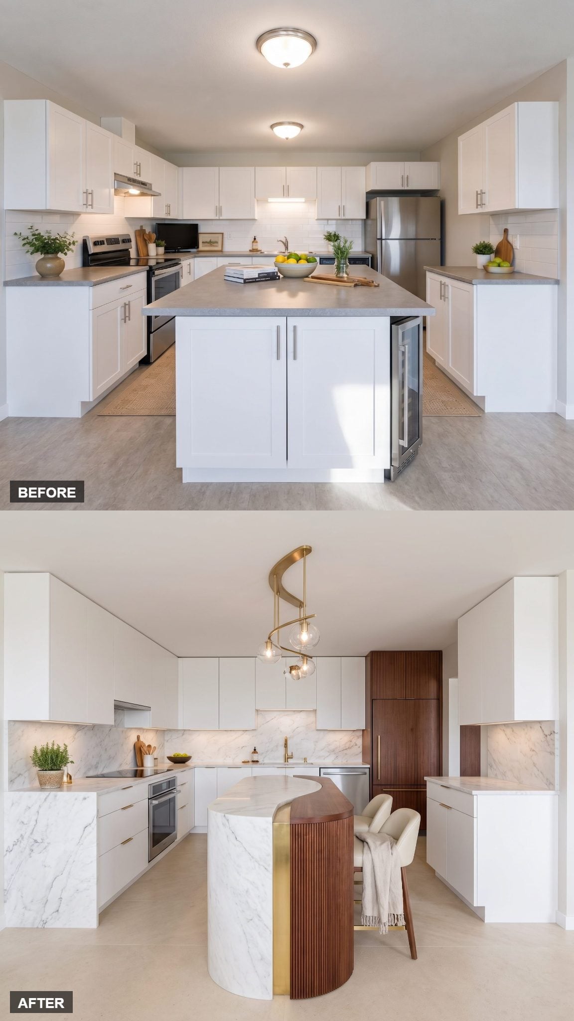
Two materials, one seam. The curved pale-stone waterfall meets fluted mahogany at a thin brass reveal, and that narrow strip of metal is what keeps the transition looking tailored rather than patched together.
The island is compact, but nothing about it feels apologetic. The rounded stone end gives it visual weight, the ribbed wood adds shadow and texture, and the brass line turns the junction itself into a design detail. The curved quartzite island idea works because the strongest object in the room is also the one with the cleanest geometry.
32. Glass Cabinets, Mahogany Ceilings and the Case for Looking Up
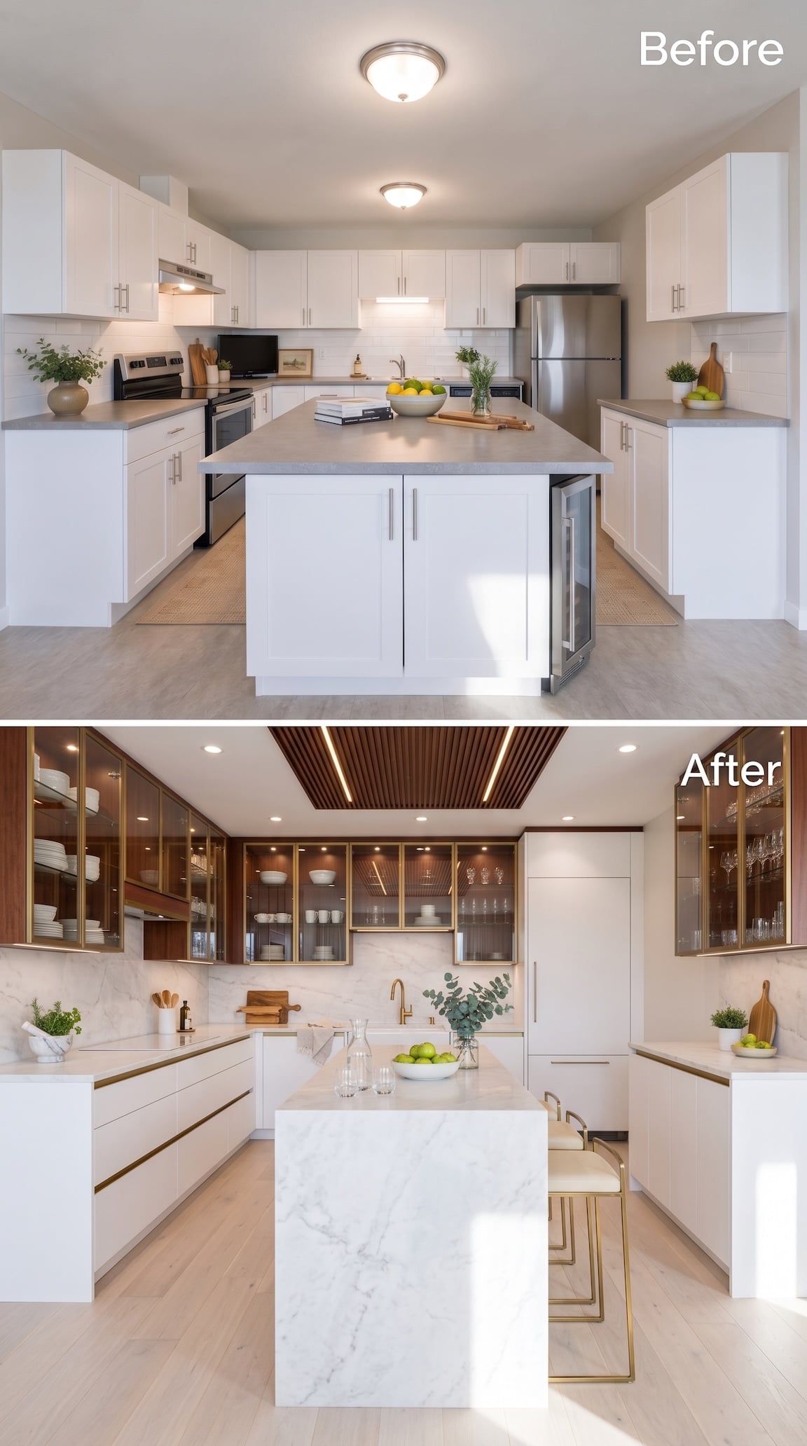
This transformation refuses to keep all the interesting material below shoulder height.
Mahogany-backed glass cabinets with slender brass frames climb around the upper walls, while a slatted wood ceiling insert carries the same warm tone overhead. Suddenly the ceiling is part of the cabinetry story rather than a blank white lid sitting above it.
The island wisely does the opposite. A clean pale waterfall block occupies the middle with almost no ornament, giving all that wood and glazing a calm center. The mahogany is substantial, but glass fronts, white lower cabinetry, pale flooring, and open sightlines keep it from becoming one dark canopy.
31. European High-Lacquer, Showroom-Slick in a Real Small Home
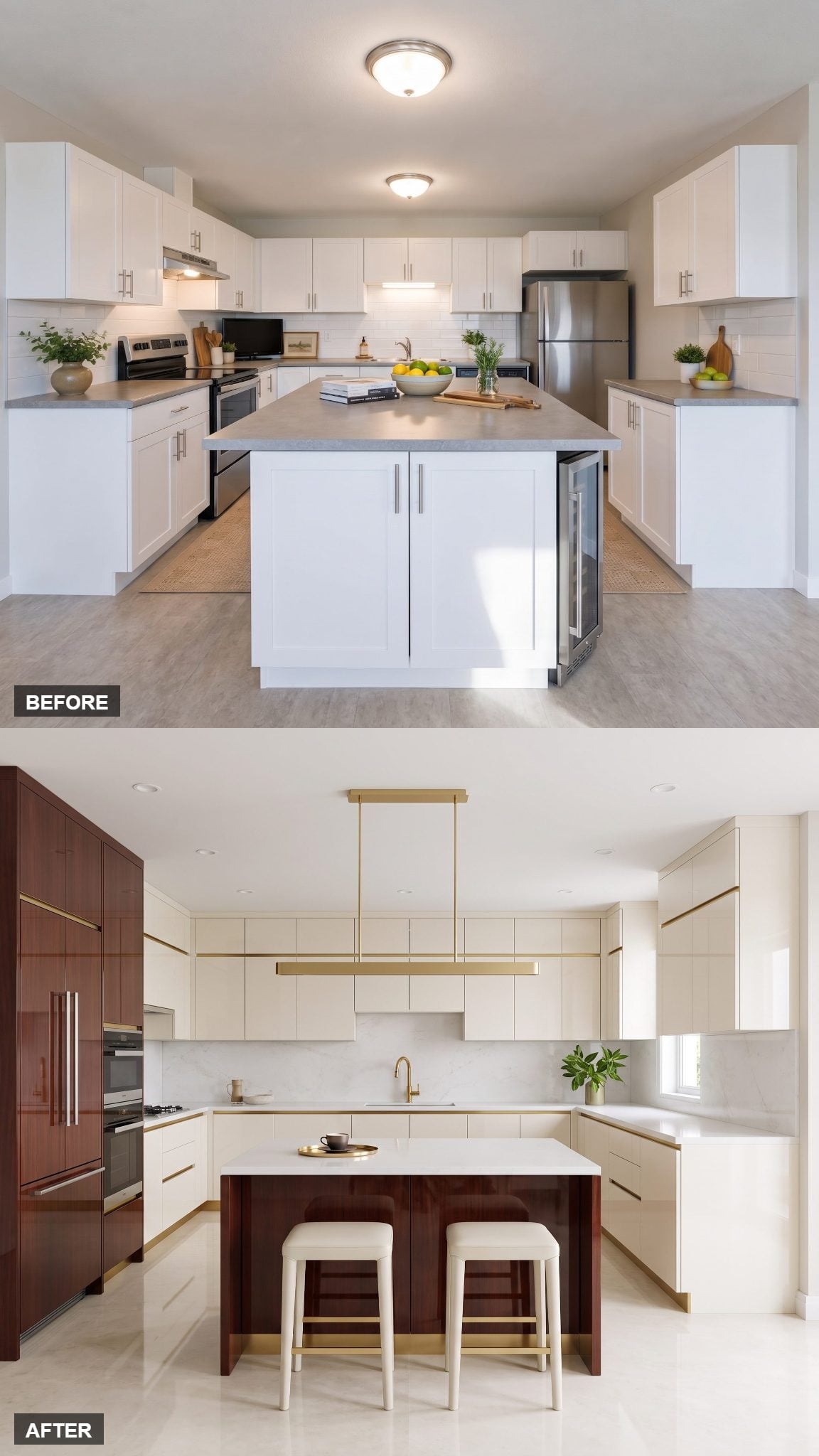
Now swing hard in the other direction.
High-lacquer white cabinetry turns the wall into a continuous reflective plane, while narrow brass reveals replace conventional hardware with something closer to architectural detailing. Mahogany arrives in controlled doses so the gloss never turns clinical.
The original white cabinetry and gray counters had very little depth or variation. Here reflection, recessed lighting, and uninterrupted cabinet fronts create the polish. This is genuine showroom territory, and worth studying if you want ideas for a bold kitchen makeover of your own.
30. A Full Wall of Mahogany Turns Storage Into the Main Event
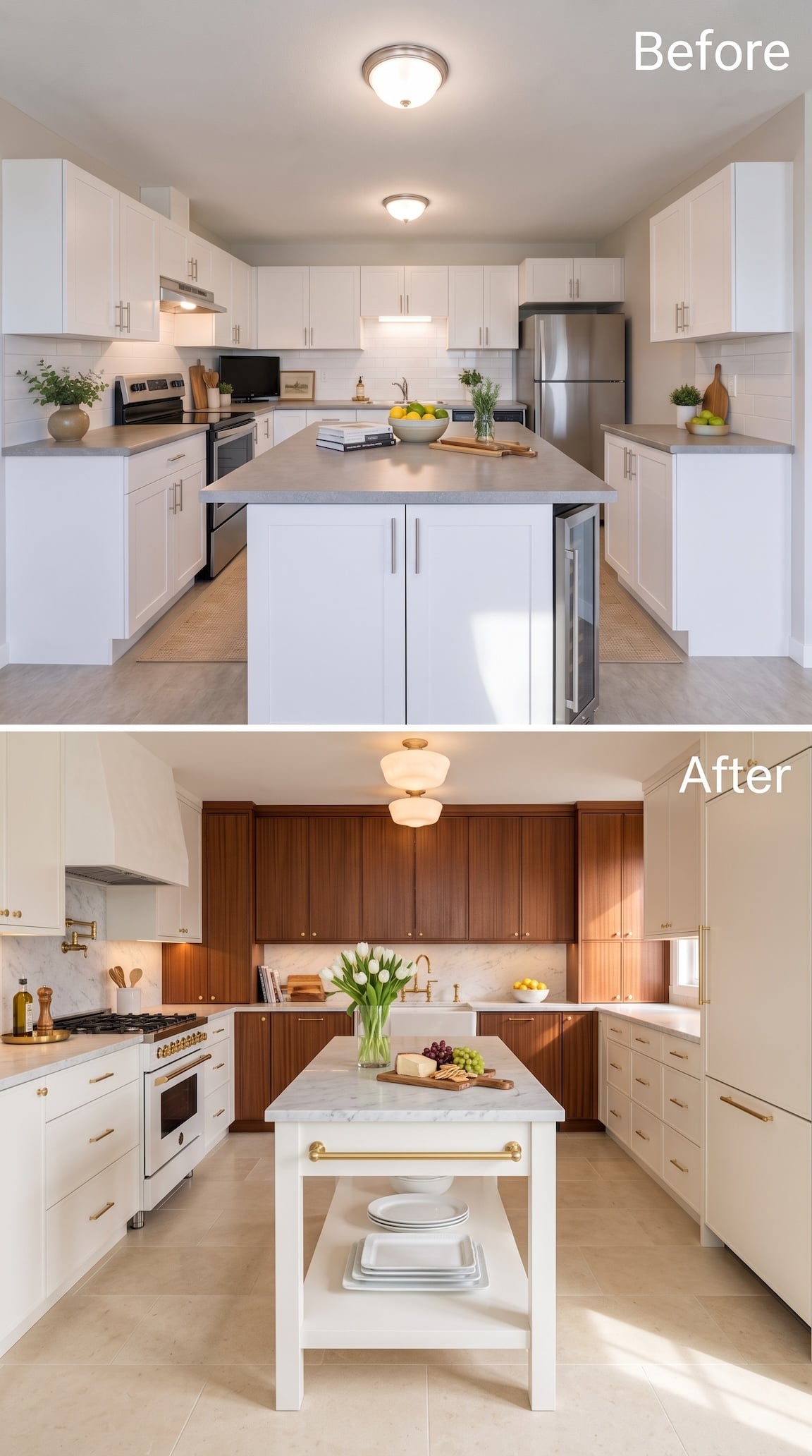
Most of these transformations ration the dark wood. This one commits an entire wall to it.
Floor-to-ceiling mahogany cabinetry creates a deep, furniture-like backdrop, while the opposite side stays pale and restrained. The center then flips back to white with a narrow island that includes an open shelf rather than presenting another solid cabinet face.
That rhythm — pale, dark, pale — gives the room more structure than scattering mahogany doors around every wall. Even the island gains lightness because part of its volume is open. The mahogany provides the drama; the white island gives it somewhere to stop.
29. Neoclassical Restraint, Furniture-Style Island Included
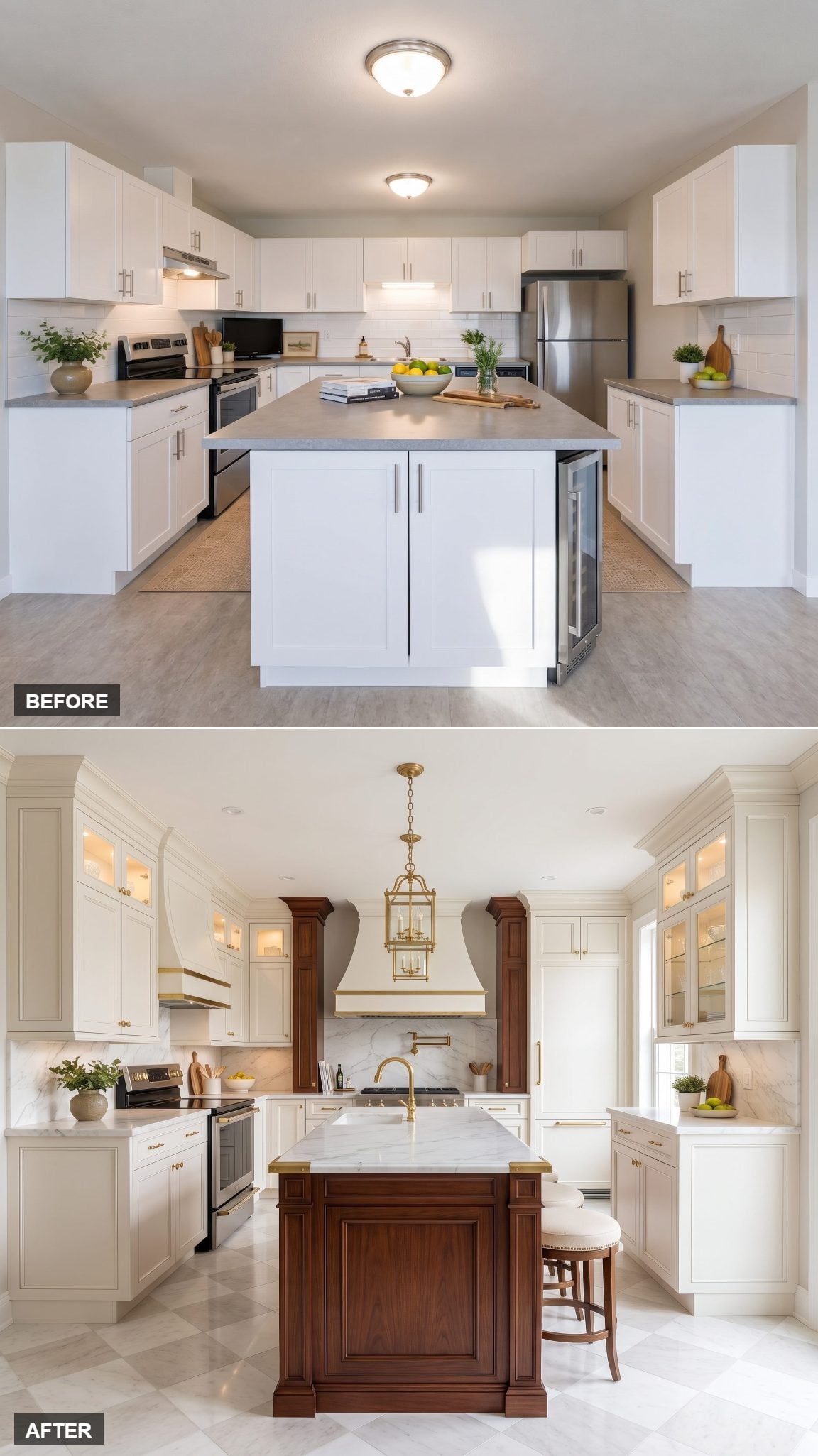
The mahogany island looks less like a cabinet box and more like a piece of furniture that wandered in from a drawing room. Turned legs, restrained molding, proper breathing room beneath it.
That lift off the floor changes everything. White cabinetry stays crisp and architectural while brass details act like punctuation rather than ornament for ornament’s sake. The whole room is proportioned like a good suit: fitted to the space instead of draped over it.
A dated kitchen doesn’t need to fake luxury. It needs every element to know its place.
28. Japandi Luxury Goes Darker With Mahogany
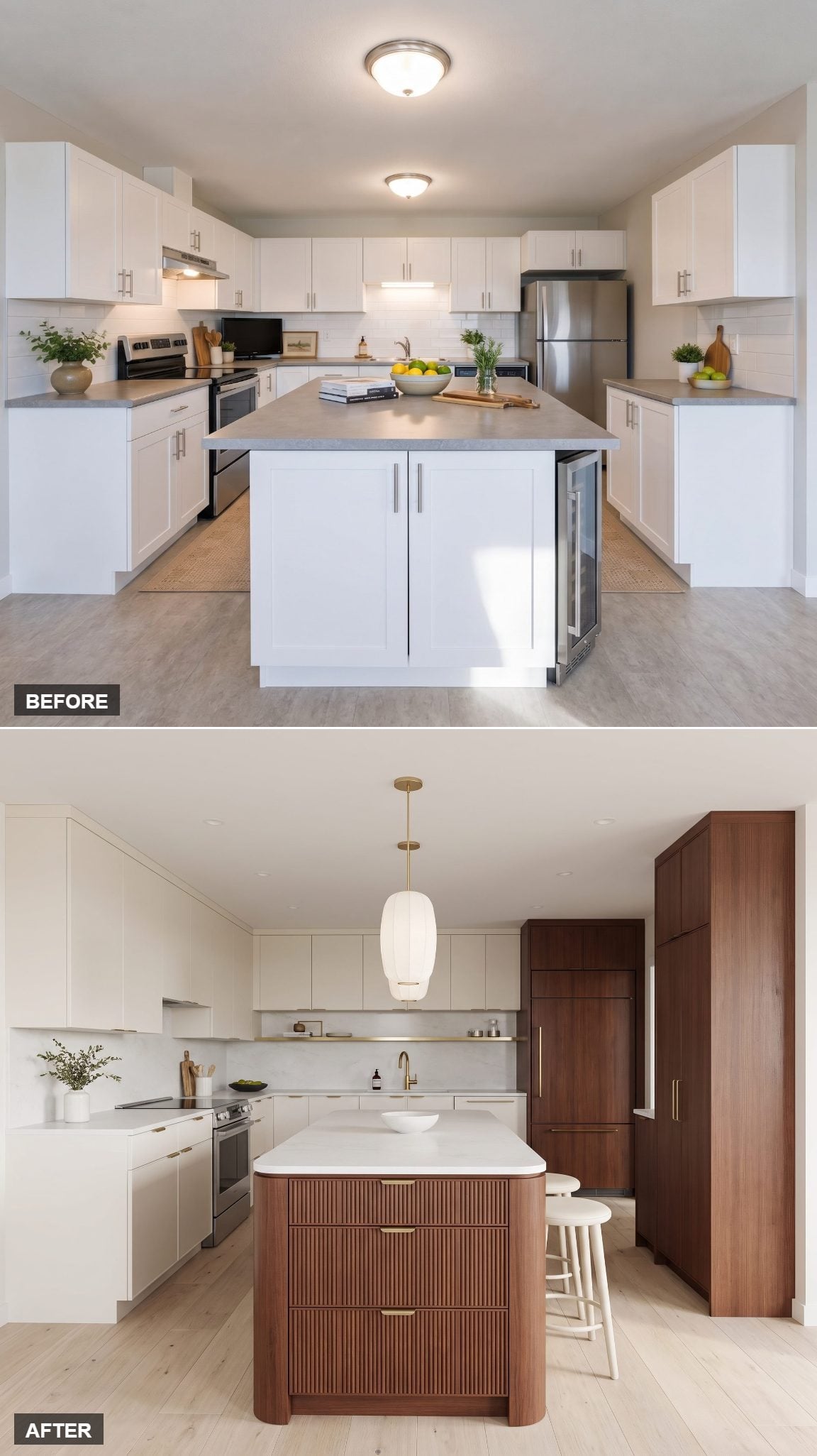
Japandi does not require blond wood to remain calm.
Here the restraint stays intact — matte white cabinetry, uncomplicated hardware, generous blank surfaces — but the narrow mahogany island pulls the palette into richer territory. Darker wood gives the room depth without forcing it into traditionalism.
Brass is reduced almost to a glint. Negative space gets treated like an actual material. The result makes a useful point about a bold kitchen makeover: sometimes the boldest decision is deciding what not to add.
27. The Brass Range Hood Changes the Entire Power Balance
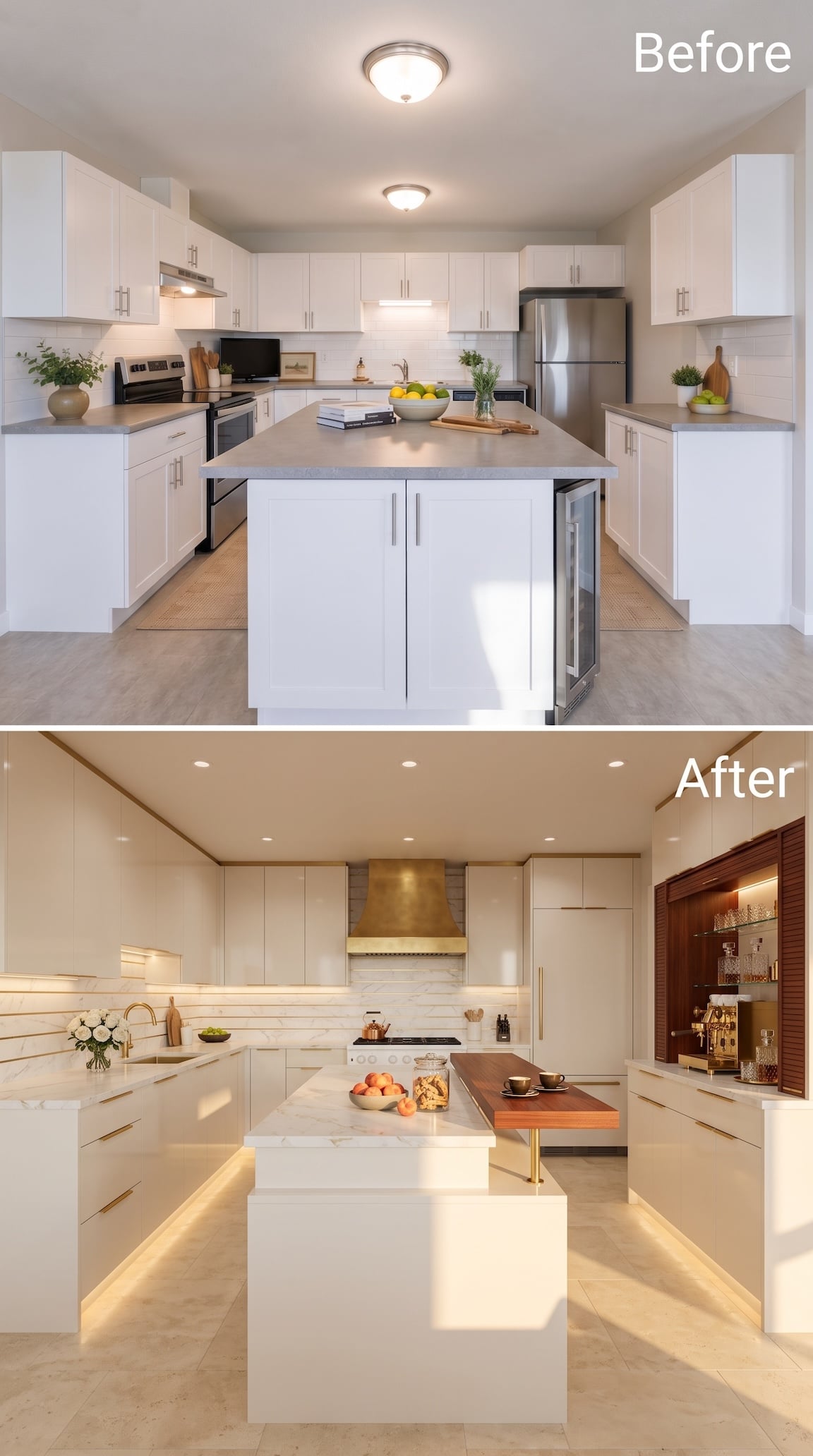
For once, the island does not get to be the loudest object in the kitchen.
A broad brass-toned hood takes control of the back wall, while glossy cream cabinetry and pale veined stone give it enough quiet space to work. Mahogany shifts sideways instead, appearing in the recessed coffee bar and the dining ledge attached to the island.
That thin wood extension may be the smartest move in the room. Instead of making the island another cabinet wider, it adds a place to sit with little more than a tabletop and one brass support. White carries the architecture, mahogany warms the social pieces, and brass finally gets a starring role instead of another cameo.
26. The Art Deco Jewel Box We Didn’t See Coming
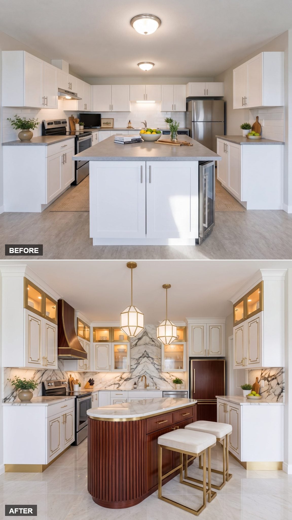
Art Deco in a compact kitchen sounds dangerous. Geometry, metal, patterned surfaces, strong symmetry — one extra flourish and the whole room could start wearing a tuxedo to breakfast.
Instead, the limited palette holds it together. Fluted mahogany carries the dark note. Fan-like brass detailing supplies the glamour. Pale stone keeps the decorative elements from closing ranks around the room.
25. Italian Contemporary and the Curved Capsule Island
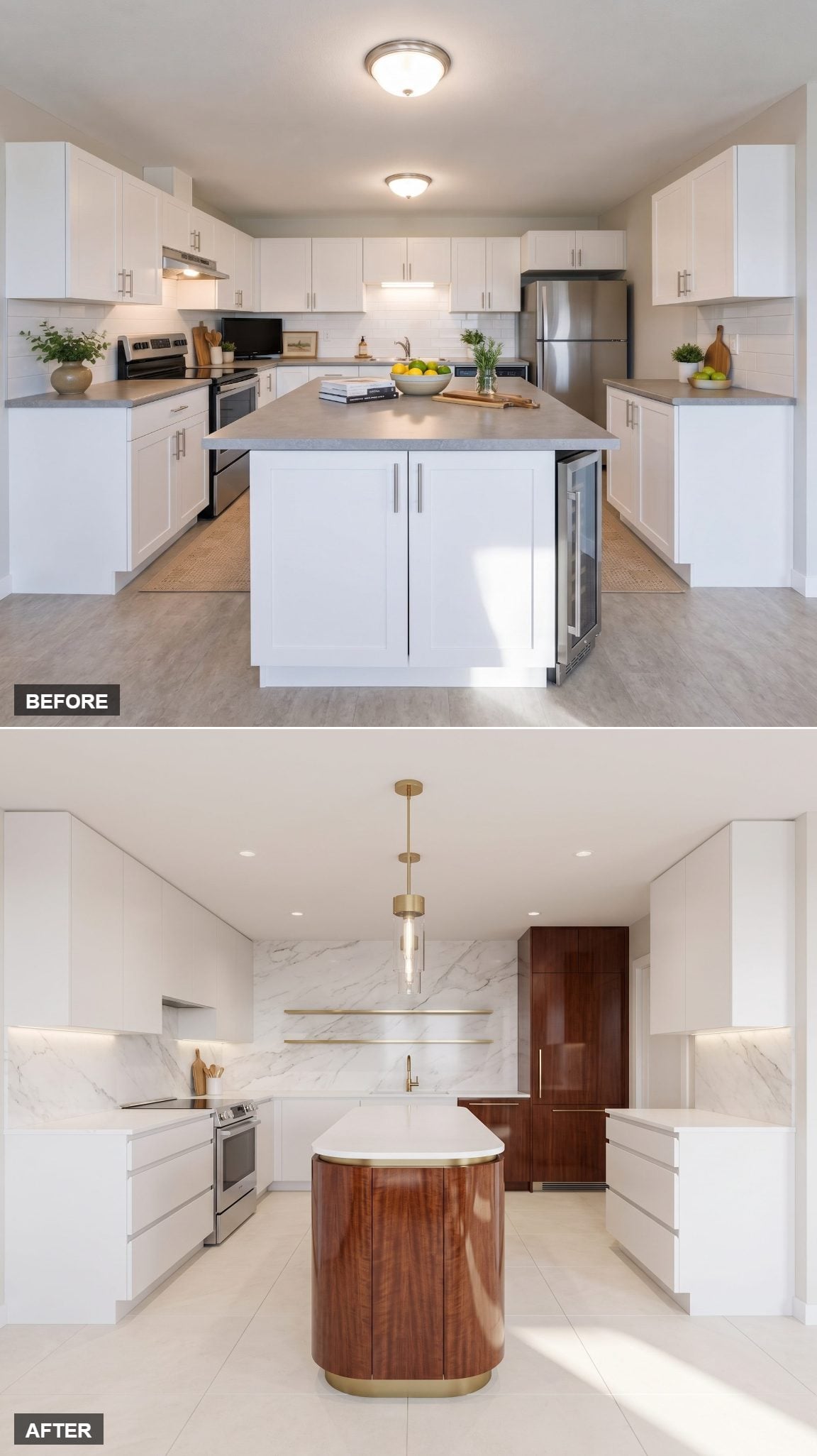
Corners can be the enemy in a tight kitchen, especially when an island already occupies the center of the circulation path.
This version replaces the hard rectangle with a capsule shape: rounded mahogany ends, a pale stone top, and enough softness around the perimeter to make moving past it feel less like negotiating furniture.
The cabinetry stays disciplined and the brass stays thin. That curve earns its place because it changes both the silhouette and the way the island occupies the room.
24. Old-World Mahogany Craft With a Crisp White Backbone
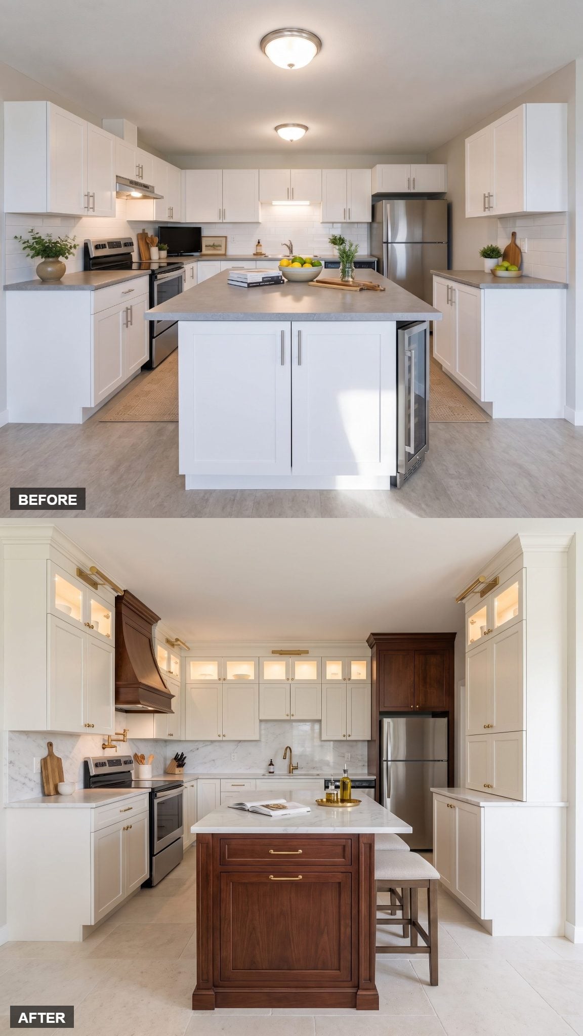
Size was not the only problem in the before. Everything carried roughly the same visual importance: white cabinetry, gray counters, simple hardware, and basic overhead lighting.
The redesign gives one element permission to dominate. A carved mahogany hood becomes the focal point while warm-white cabinets and a white marble backsplash step back. The unlacquered brass faucet supplies one smaller warm accent.
23. Brass-Framed Glass and a Luminous Marble Top
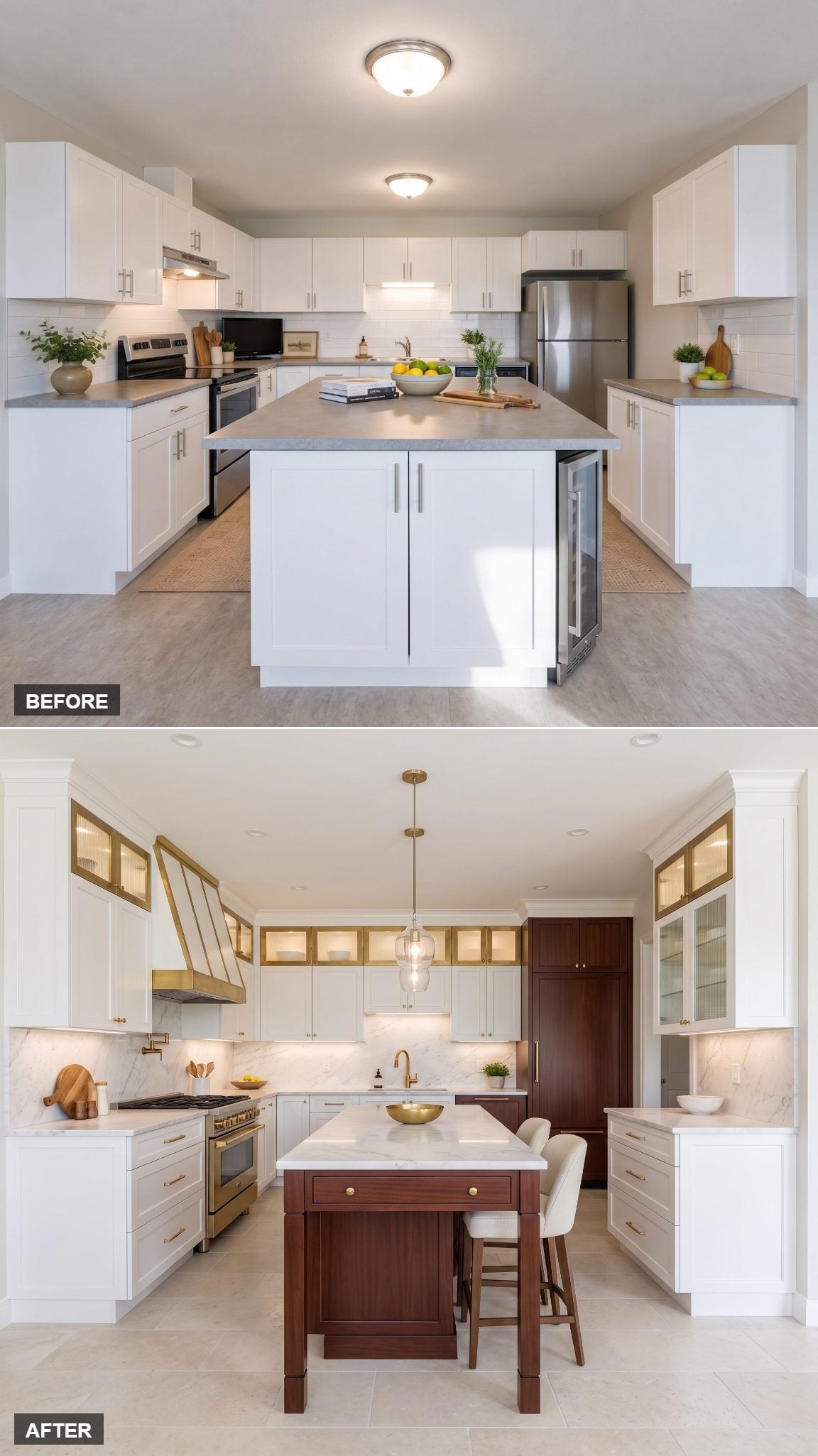
Glass-front cabinetry changes the mass of an upper cabinet without making the storage disappear.
Instead of one uninterrupted opaque wall, the brass-framed doors reveal depth behind the fronts. Add a slim mahogany island and luminous pale stone, and the room gains layers without piling on additional colors.
The brass does something useful here too: those narrow frames make storage feel more like display cabinetry and less like another bank of white boxes.
22. Mahogany Takes Over the Lower Half — and Somehow Gets More Elegant
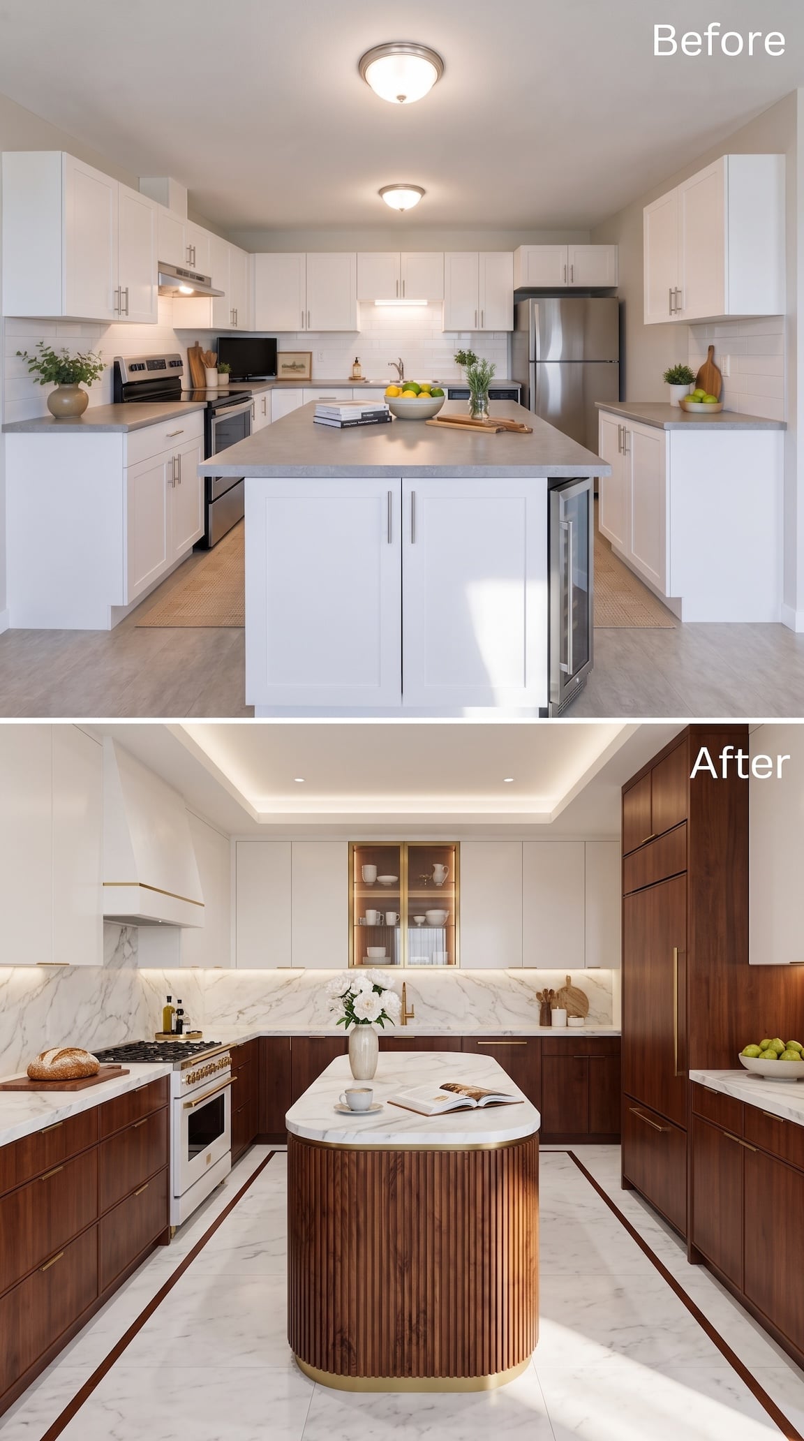
This one reverses the usual formula. Instead of treating mahogany as a single accent, the wood spreads across the lower cabinetry, tall storage, and deeply fluted island while most of the upper architecture remains white.
Keeping so much of the dark material lower in the composition gives the kitchen weight without turning every wall into wood paneling. Brass appears as a thin supporting line — hardware, faucet, island trim — while pale veined stone keeps slicing through all that mahogany with light.
The island is the knockout: rounded corners, tight vertical ribbing, and a narrow brass base turn a substantial volume into something much more tailored than bulky.
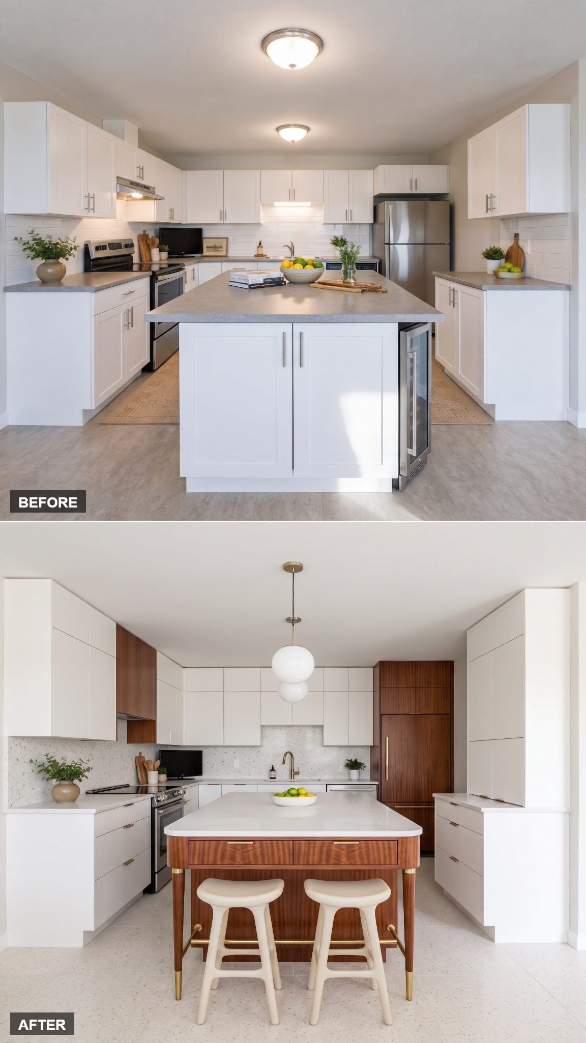
21. Mid-Century Mahogany With a Softer Silhouette
🔥 Would you like to save this?
The mahogany grain gives this version almost all the decoration it needs.
The island stays slim, its corners soften, and slender brass legs lift sections away from the floor rather than building another solid cabinet block. White counters keep the dark grain from taking over.
It feels recognizably mid-century without turning into a catalog of retro references. Wood grain first. Shape second. Brass somewhere well behind both.
20. Quiet Luxury and the Monolithic Island
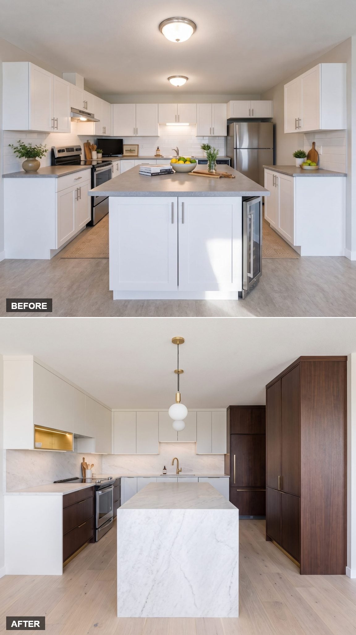
No brass parade. No marble fireworks. This one whispers.
A solid-looking mahogany island becomes the center of gravity against matte white cabinetry and restrained stone. Hardware nearly disappears. Decorative objects are kept on a very short leash.
What makes it feel expensive is not the accumulation of luxury cues but the confidence to stop. Nothing here is begging to be timestamped 2026.
19. Hollywood Regency in a Footprint the Size of a Closet
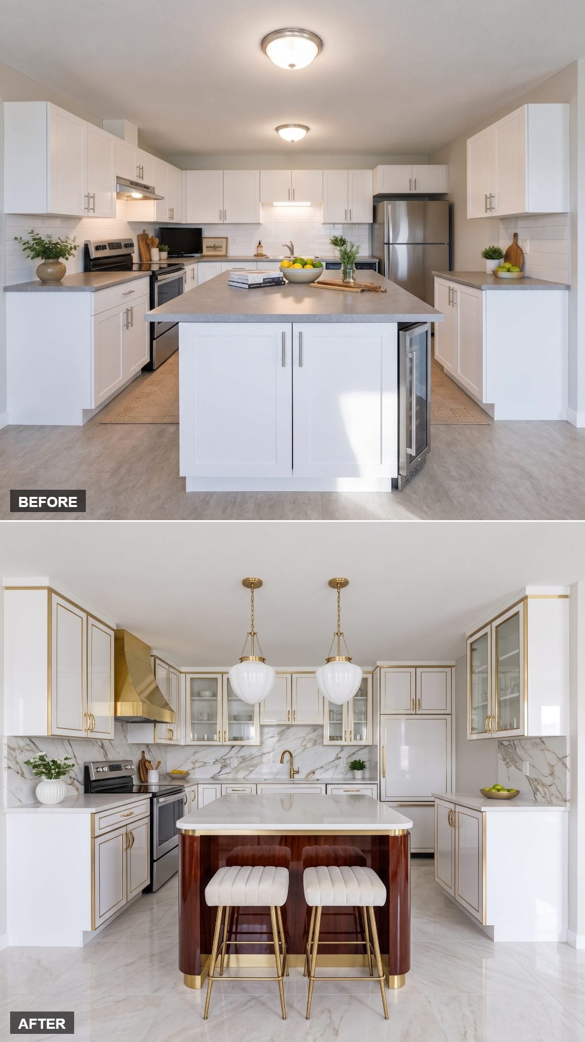
Restraint just left the building.
Glossy mahogany, rounded corners, polished pale stone, shining brass pulls — this concept uses reflection as decoration and makes no apology for the glamour.
A small brass bar cart pushes the fantasy another inch without demanding much floor area. What keeps everything from tipping into excess is the limited palette: three materials, several levels of shine.
18. Minimal Paris Apartment, Down to the Table-Island
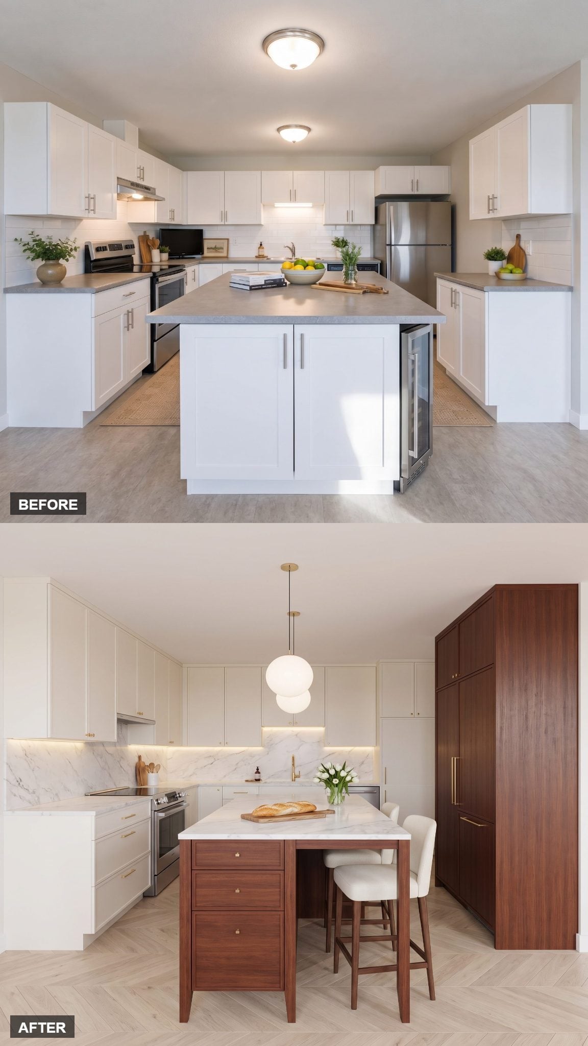
The thin-profile stone top is the tell.
Instead of treating the island as another storage block, this design turns one side into a table with open legroom underneath. The floor remains visible. Chairs tuck in. The center of the room feels furnished rather than barricaded.
The opaline globe pendants soften all those clean planes while mahogany adds just enough depth to keep the white from becoming surgical.
17. Warm Organic Luxury With Vertical Timber Detailing
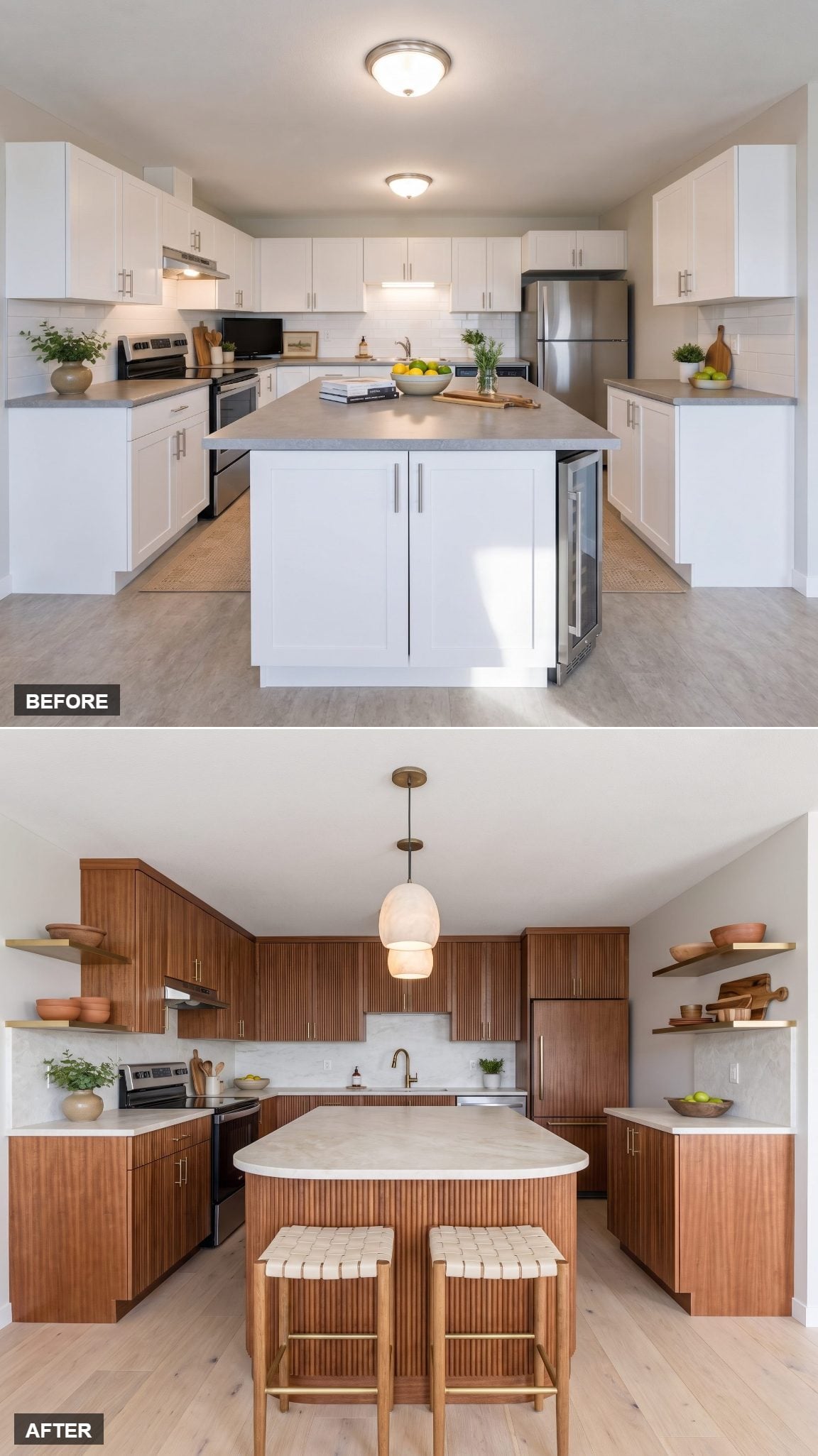
This is one of the softest rooms in the set.
Vertical mahogany slats wrap the island, but rounded edges and a honed pale-stone top keep all that texture from becoming aggressive. Brass turns brushed rather than polished. Plants, wood accessories, and linen take some of the showroom sheen off the composition.
It is a craftsman kitchen decor instinct filtered through contemporary restraint: richness coming from texture and material contrast instead of ornament.
16. When Brass Stops Being Hardware and Becomes the Architecture
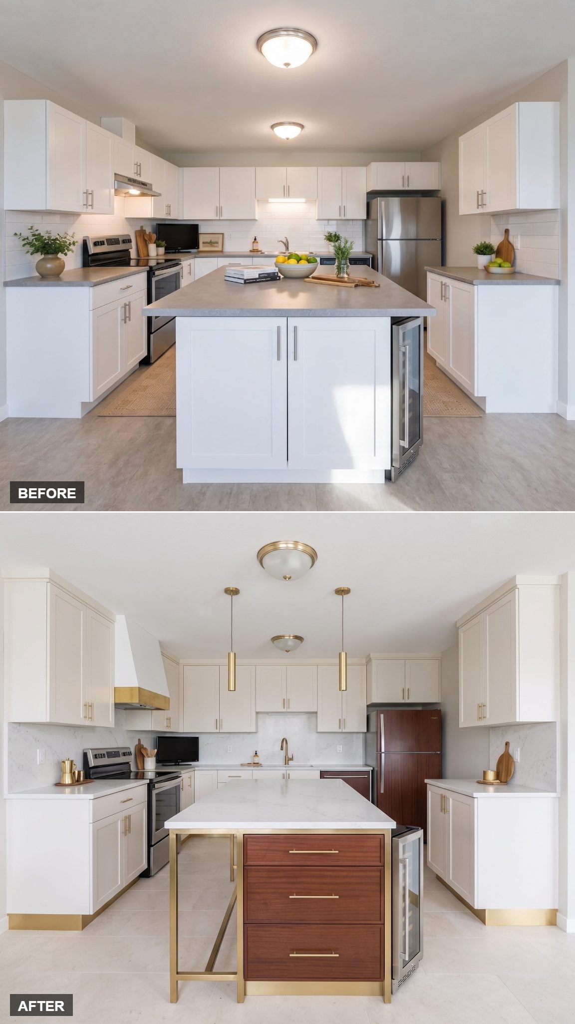
Here brass gets promoted.
Instead of hiding on knobs and pulls, a brushed-metal frame becomes part of the island itself, outlining mahogany drawer fronts and the thick pale-stone top like a border around a painting.
It is one of the boldest uses of the palette because the metal stops behaving like an accent. Mahogany warms it. White gives it breathing room. Brass gets to draw the architecture.
15. An Estate Kitchen That Never Pretends to Be Big
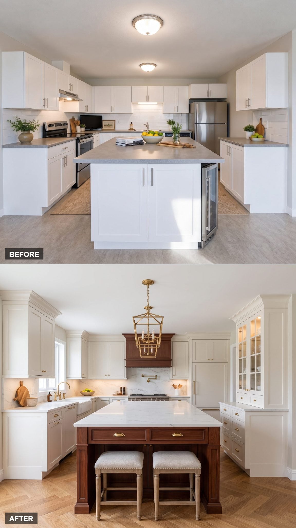
The danger with estate-inspired design in a smaller room is scale. Bring in too many oversized details and the kitchen starts looking like a mansion sample squeezed into a condo.
This version edits instead. The central mahogany island stays modest, classic paneling provides the traditional note, and a substantial pale-stone top gives it enough presence without swallowing the floor.
Brass hardware brings the heirloom note, while the pale cabinetry keeps the architecture crisp. The result carries some of the same cream-and-wood thinking found in this dark den design sensibility without trying to counterfeit square footage.
14. The Fluted Mahogany Island That Steals the Whole Room
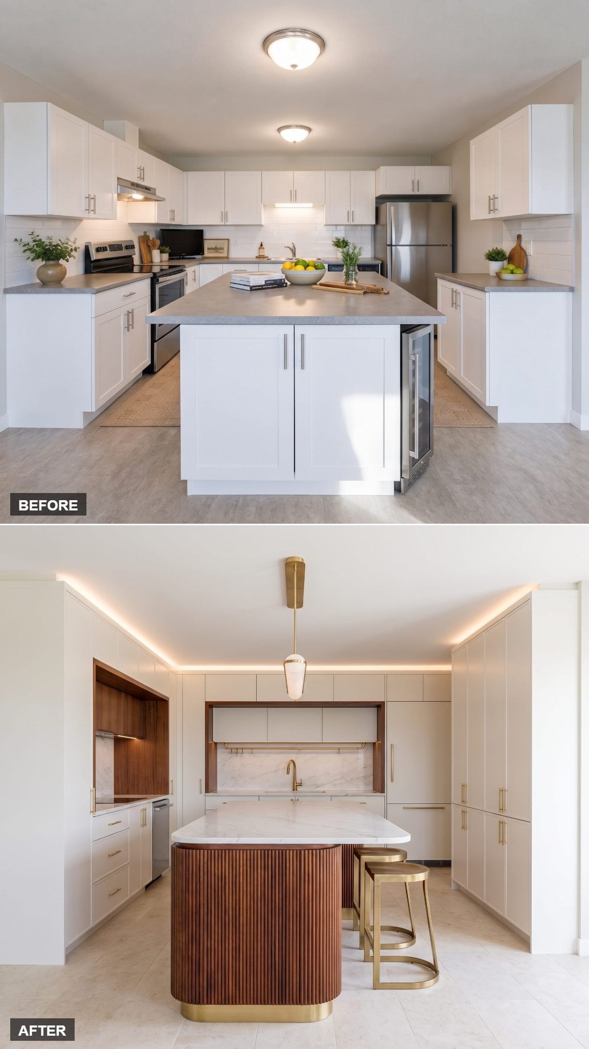
Sometimes you pick one thing to be the star and let everything else shut up.
Here it is the island. Deep vertical grooves wrap the mahogany base, producing narrow bands of highlight and shadow as the surface curves through the room.
White marble above and restrained pale cabinetry around it make the fluting look even richer because nothing nearby tries to compete. The slim brass rail is almost an afterthought, which is precisely why it works.
13. The Island Disappears and a Real Dining Table Takes Its Place
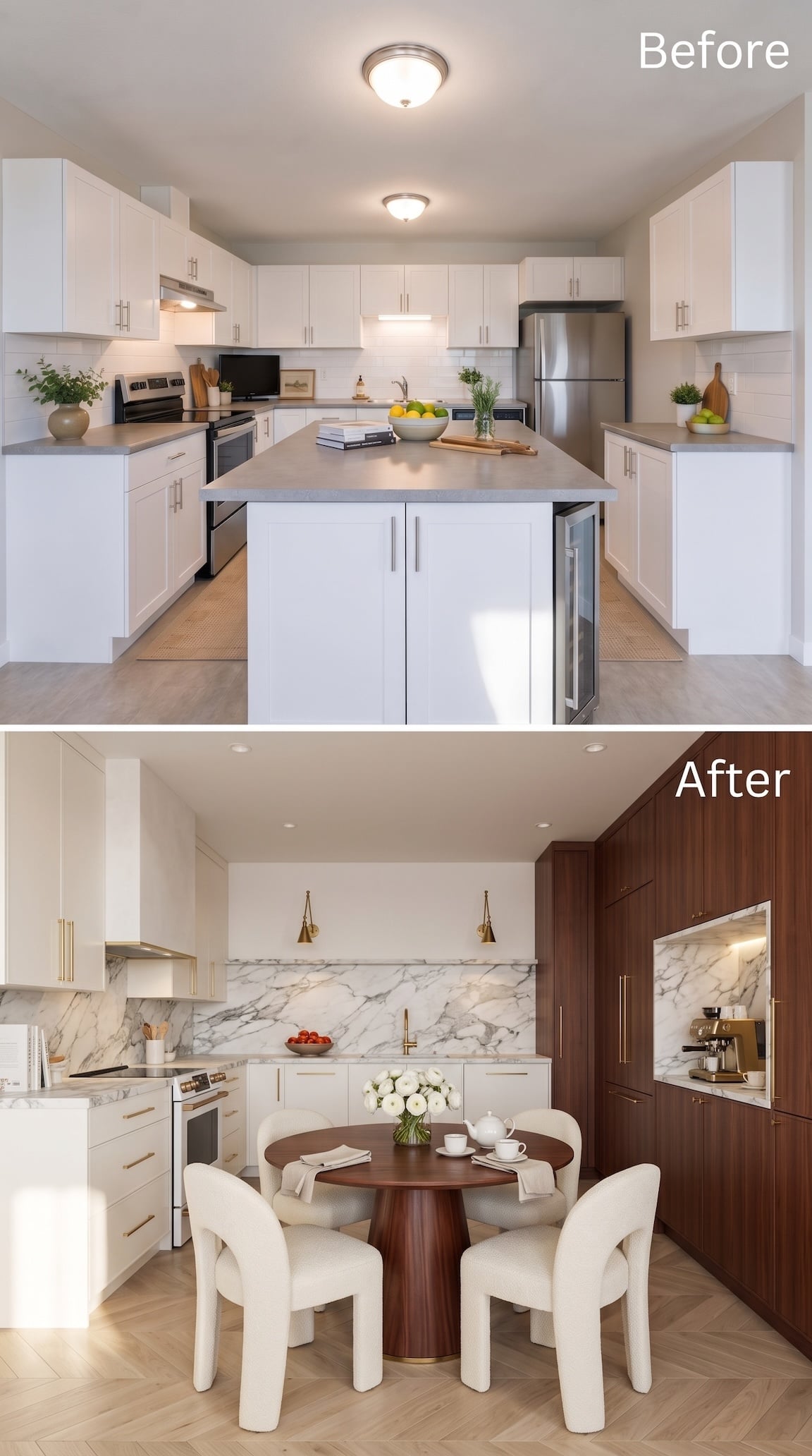
Here is one of the most radical ideas in the entire gallery: stop assuming the center of a kitchen needs an island.
The redesign opens that space for a round mahogany pedestal table and four upholstered chairs, turning the kitchen into a genuine eat-in room rather than another work zone with stools tucked under an overhang. A full mahogany storage wall absorbs the refrigerator and frames a dedicated coffee station, while cream cabinetry on the opposite side prevents the dark wood from monopolizing the room.
The circle changes the geometry too. After so many rectangles, waterfall ends, and cabinet blocks, the round table gives the room a softer social center. Sometimes the expensive move is not upgrading the island. It is admitting you would rather have dinner.
12. The Private Kitchen of a Boutique Hotel Suite
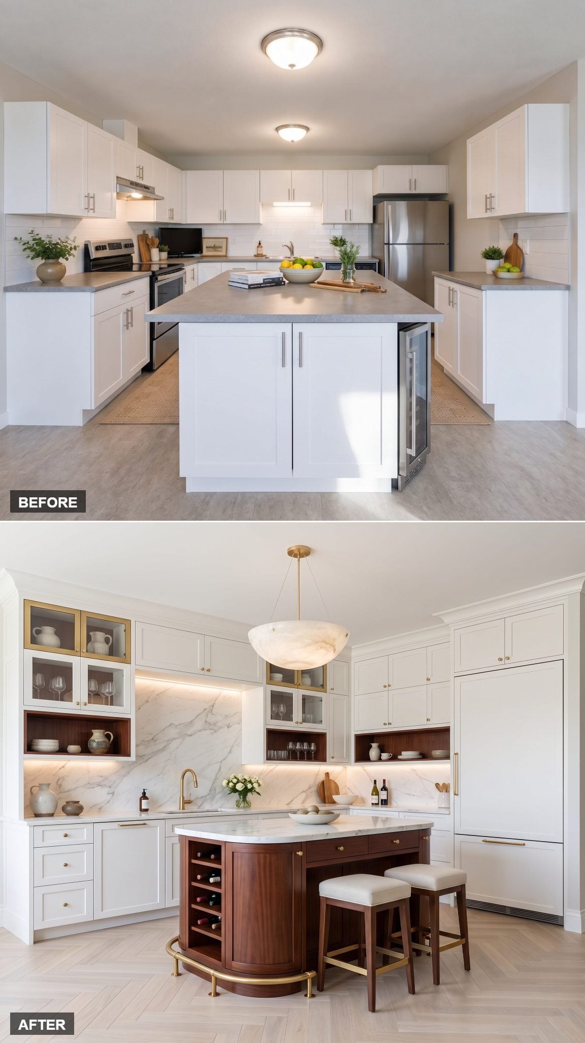
This one borrows the mood of a very good hotel kitchenette and then gives it materials the usual minibar never sees.
The compact mahogany island gets a rounded pale-stone top, brass fittings, and warm layered lighting. A folded white linen tea towel and a small tray of glassware reinforce the hospitality angle without covering the counters in props.
Small, composed, and just indulgent enough.
11. Modern Classic With a Statement Island
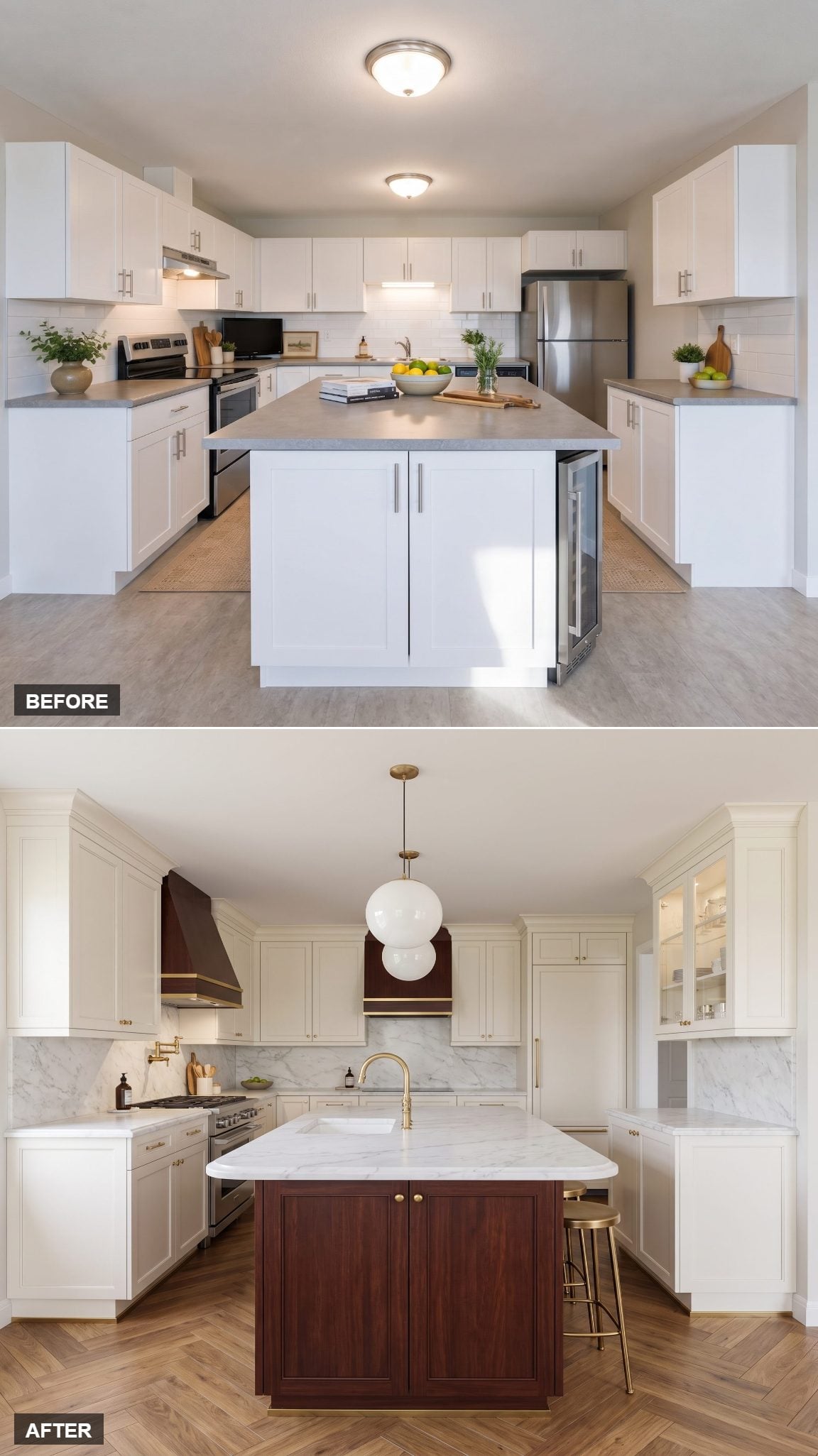
Call this the safe choice, and mean it as praise.
A deep mahogany island, pale marble-style slab, restrained brass pendants, cabinetry in warm white. No single component is trying to introduce a new design language halfway through the room.
The compact rectangular island holds the center without turning itself into a sculpture, and the wood grain supplies exactly the amount of warmth all that white needed. Nothing here is begging to be timestamped 2026.
10. Couture Cabinetry in White Marble and Mahogany Monogram
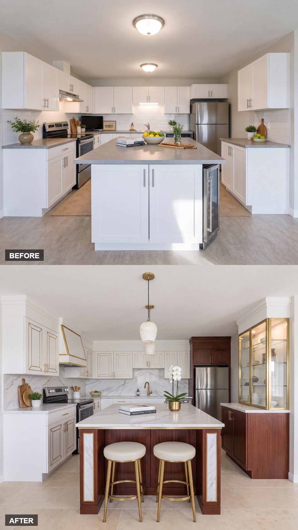
Brass inlay is precisely the sort of idea that can go wrong six inches after it starts.
This version knows when to stop.
The geometric metal appears on only a few focal doors, so it reads as detailing rather than wallpaper. Inset marble panels on the island ends and one illuminated display cabinet continue the couture idea without repeating it across every surface.
The before had very little hierarchy. This one knows exactly where to whisper and where to shout.
9. Parisian Modern With a Mahogany Island That Knows Its Worth
🔥 Would you like to save this?
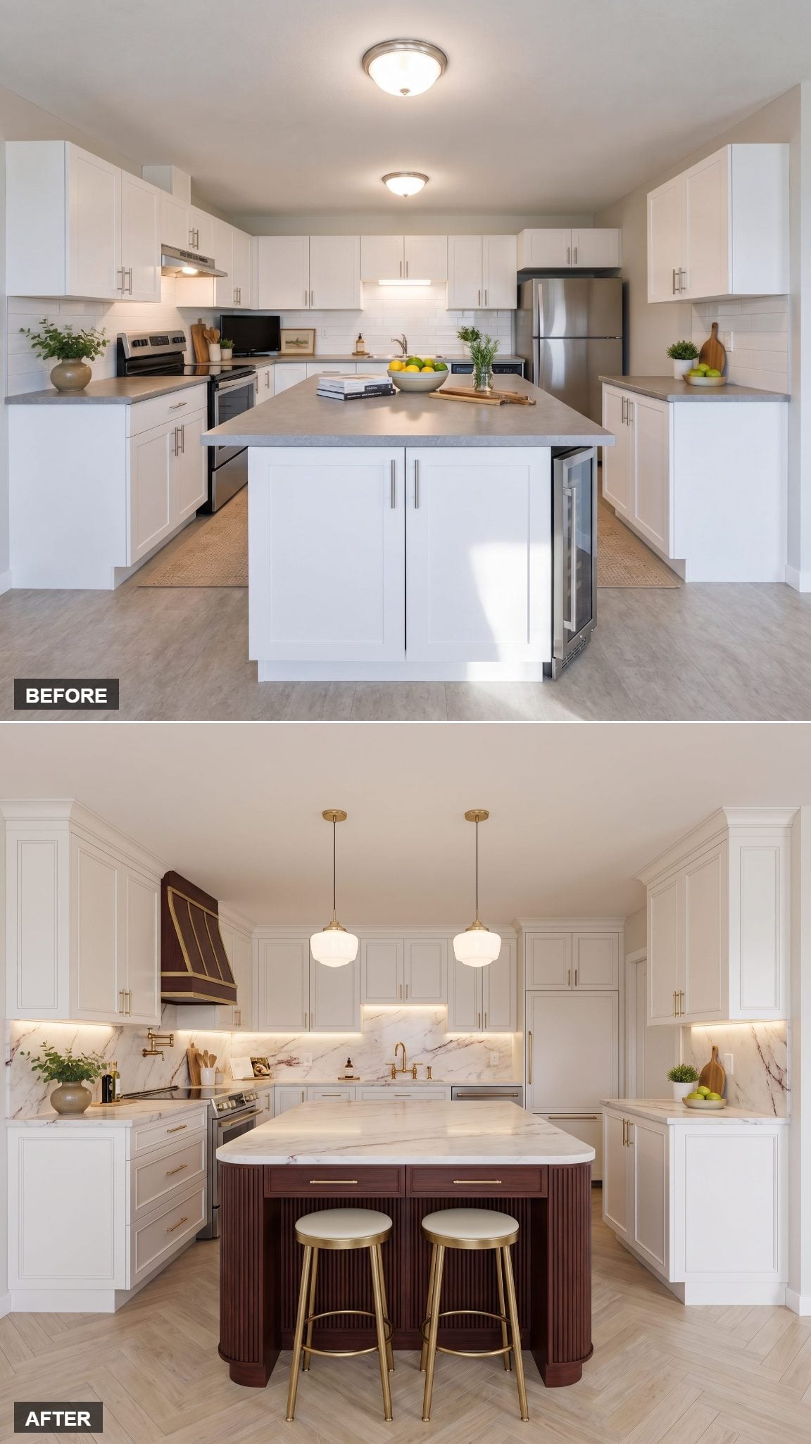
The Parisian reference here comes less from ornament than from proportion.
Tall paneled cabinetry runs toward the ceiling. The mahogany island stays narrow. Brass detailing is held to a few controlled moments instead of announcing itself from every drawer.
That vertical millwork gives the walls more architectural presence without making the galley appreciably busier. Refined, compact, and not one wasted gesture.
8. The Manhattan Penthouse Version of a Very Ordinary White Kitchen
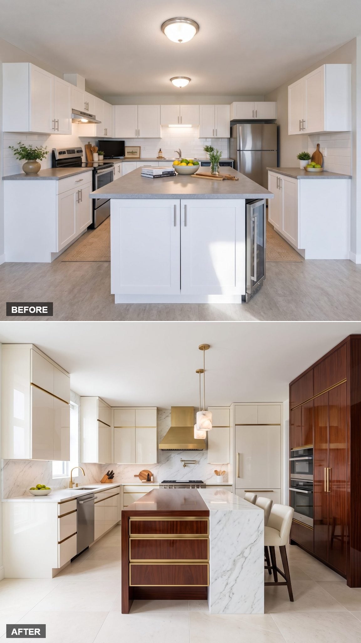
The original island dominates the available floor, reading more like a storage bunker than a piece of furniture.
The redesign attacks scale first. A slimmer mahogany island wrapped with brass cabinet hardware preserves storage without occupying quite so much visual territory. White lacquer cabinetry recedes around it, while brass pendants pull attention upward.
Same basic footprint, completely different hierarchy.
7. Open Shelves and a Brass-Legged Table Island Let the Kitchen Breathe
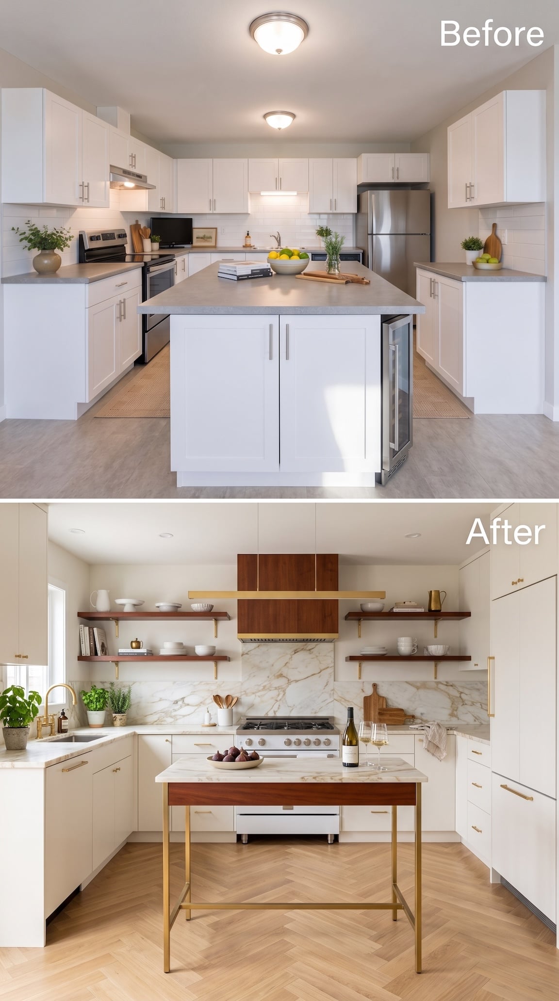
This one gets surprisingly close to furniture design.
Instead of packing the back wall with upper cabinets, long mahogany shelves flank a wood-clad hood, leaving generous stretches of white wall visible between them. Brass brackets, a slim linear light, and warm wood make every horizontal line feel intentional rather than empty.
The centerpiece pushes the idea even further. A pale worktop sits over a mahogany apron and slender brass legs, landing somewhere between prep table and dining furniture. You can see the floor straight through it, a dramatic change from the old solid island occupying the middle.
The herringbone floor supplies movement underneath everything. White defines the room, mahogany supplies the furniture language, and brass effectively sketches the final outlines.
6. Soft Contemporary Luxury With Not a Sharp Corner in Sight
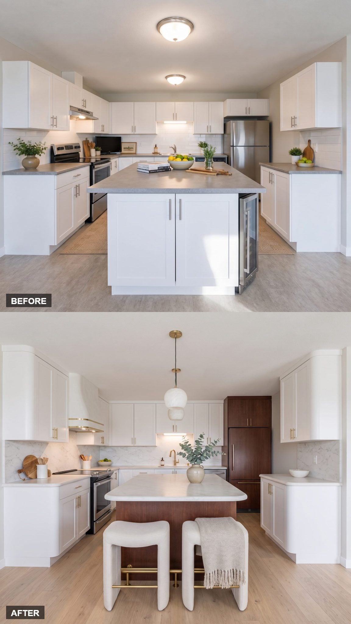
Every major edge gets softened, and the kitchen changes character immediately.
Bullnose stone, rounded cabinet corners, and the curved plaster hood repeat the same gesture at different scales. Nothing needs a decorative flourish because the silhouette itself has become the decoration.
More importantly, those curves give a room packed with rectilinear cabinetry somewhere to loosen up. The before reads as a collection of boxes. The after lets those boxes start negotiating with each other.
5. From Builder Grade Bland to Calacatta-Style Stone and Mahogany Waterfall
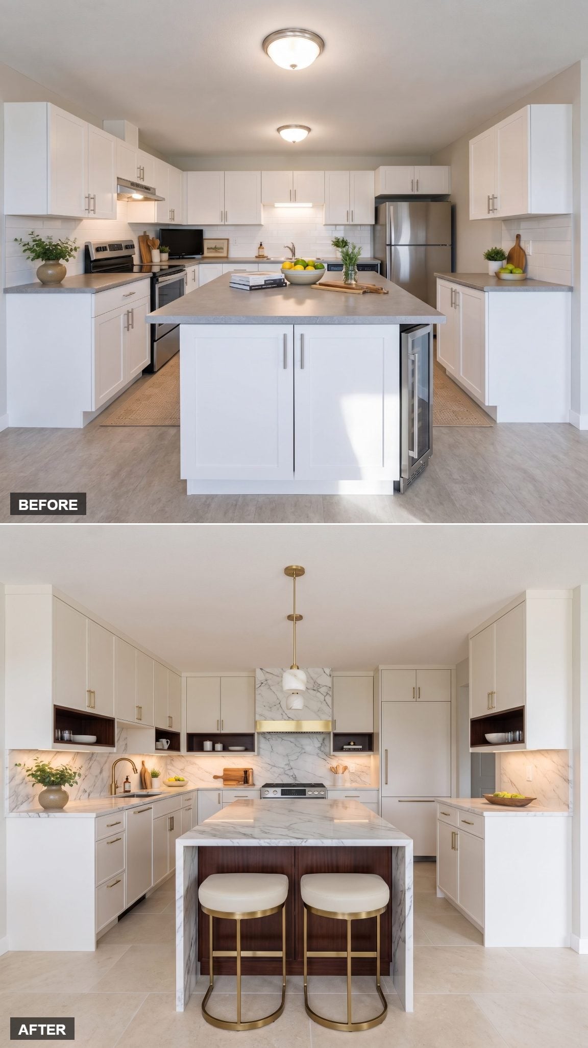
The old island is doing far too much physically and almost nothing visually.
Its replacement gets slimmer but considerably more assertive: mahogany below, Calacatta-style veined stone dropping down the end, and a brass faucet adding one concentrated flash of metal.
The veining is the show-off here. Letting the pattern continue over a waterfall edge makes the slab itself part of the architecture rather than merely a countertop sitting on a cabinet.
4. Curved Mahogany and Creamy Marble Go Full Parisian
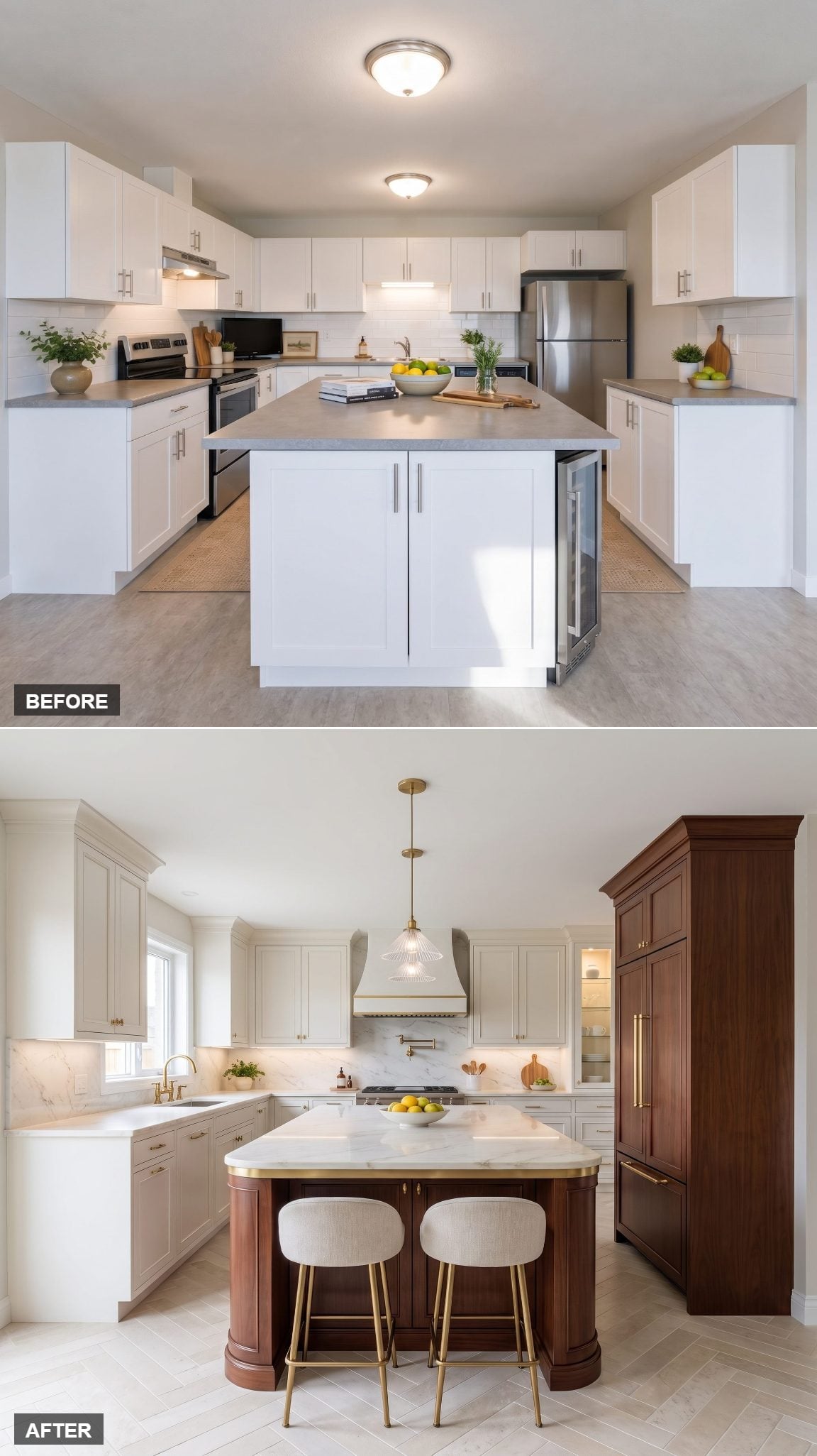
The earlier Parisian concept worked vertically. This one works horizontally.
The compact island rounds away at both ends, replacing a hard rectangular obstruction with something closer to a piece of furniture. Creamy pale stone sits above warm mahogany while brass remains deliberately fine-scaled.
The combination borrows the polish of a compact Paris apartment without pretending the room has suddenly acquired Parisian square footage. The luxury is in the curve, not the fantasy address.
3. A Kitchen Built for People Who Actually Entertain
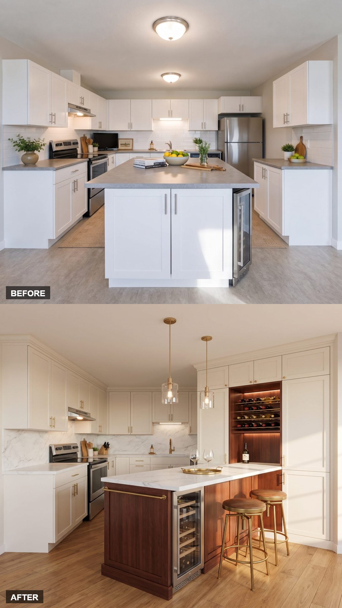
A busy layout does not have to surrender hospitality.
Here several components earn two jobs: the slim brass serving rail adds detail without another piece of furniture, the lit glass cabinet doubles as storage and display, and brass-and-leather stools disappear under the counter when nobody needs them.
A beverage fridge inside the island can also shift drink access away from the principal prep area. That functional thinking gives this bold kitchen makeover more substance than another expensive-looking countertop ever could.
2. Mahogany-Framed White, Built Like a Piece of Furniture
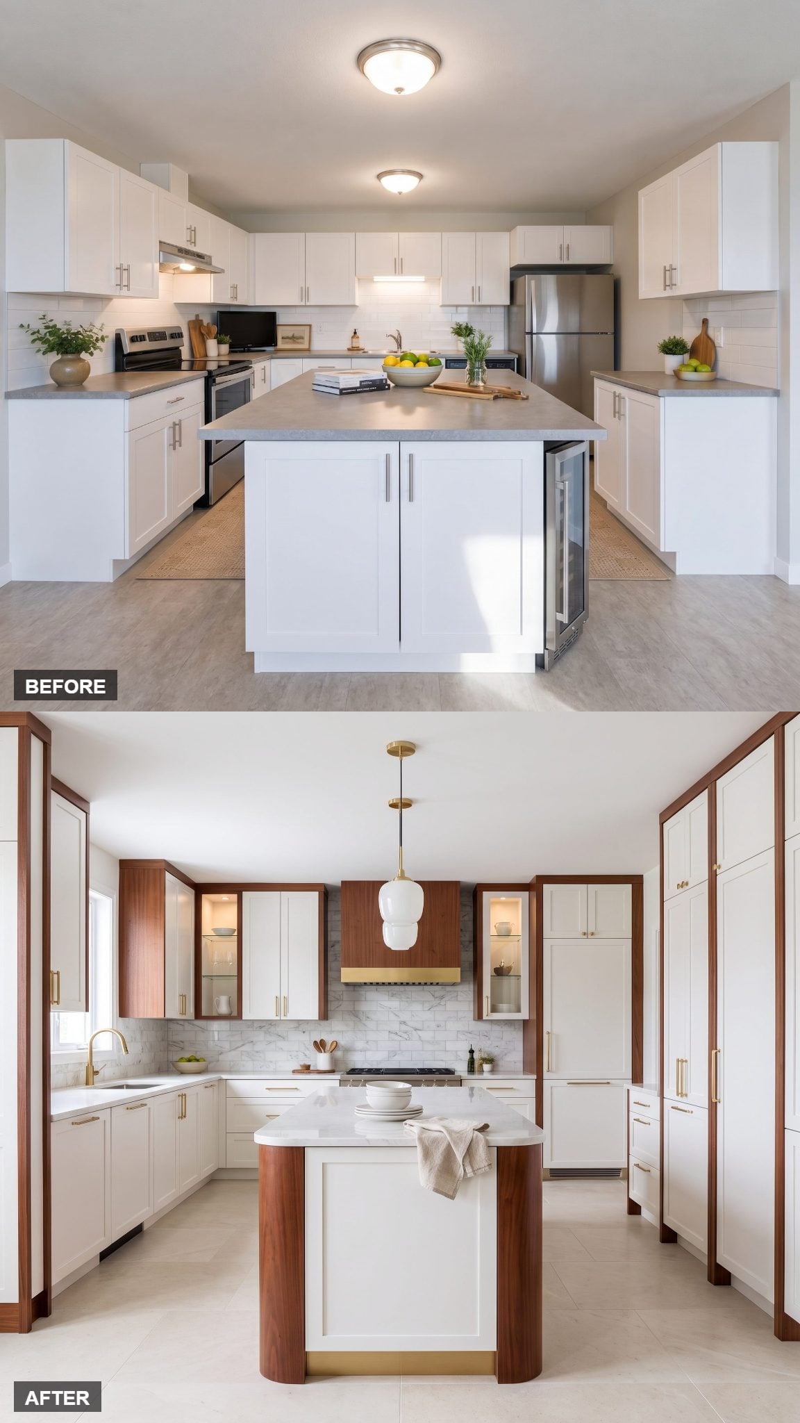
Framing does almost everything.
Narrow mahogany borders organize the white cabinet faces into one larger composition, making the wall feel more like custom millwork and less like a row of unrelated boxes.
The before cabinetry stops below a soffit. Here the vertical composition becomes much more deliberate, and the wood edging emphasizes that change without turning every door dark.
Assembled versus designed. That is the gap this one closes.
1. The Ultimate White, Mahogany and Brass Showpiece
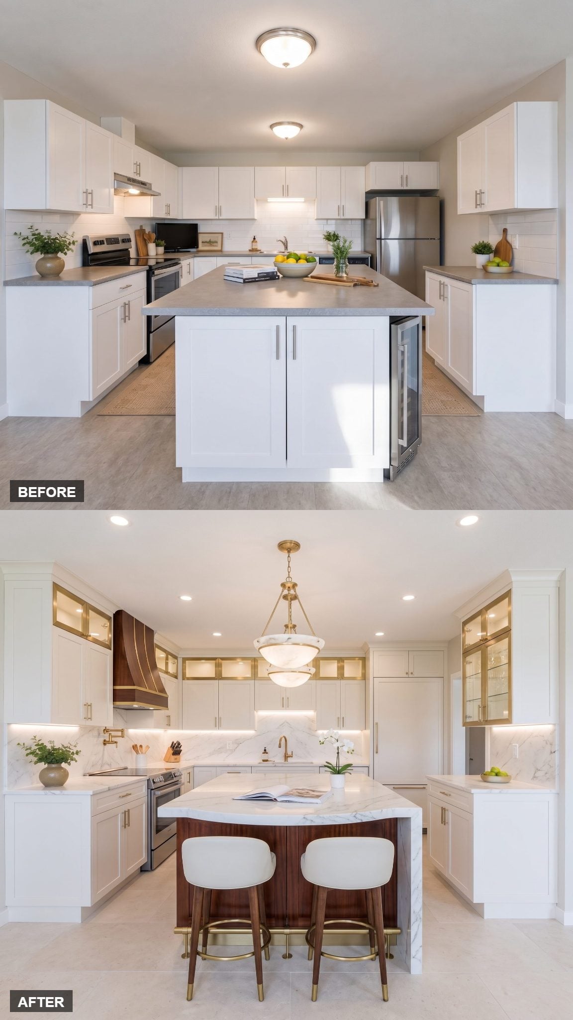
And then AI decides restraint has had enough attention.
The book-matched mahogany island curves through the center beneath a waterfall Calacatta-style top, while a recessed champagne-brass plinth makes that substantial object appear almost detached from the floor.
Ceiling-height white cabinetry keeps the perimeter comparatively quiet, which gives the island permission to carry the drama. Then the lighting starts working in layers: concealed cabinet illumination, a softer ceiling wash, and two alabaster-and-brass pendants rather than one lonely fixture trying to light everything.
Set it beside the before and the lesson from all 33 transformations finally becomes obvious. Expensive is not another material piled on top. It is hierarchy: deciding what gets the room’s attention, what supports it, and what has the good sense to disappear.