🔥 Would you like to save this?
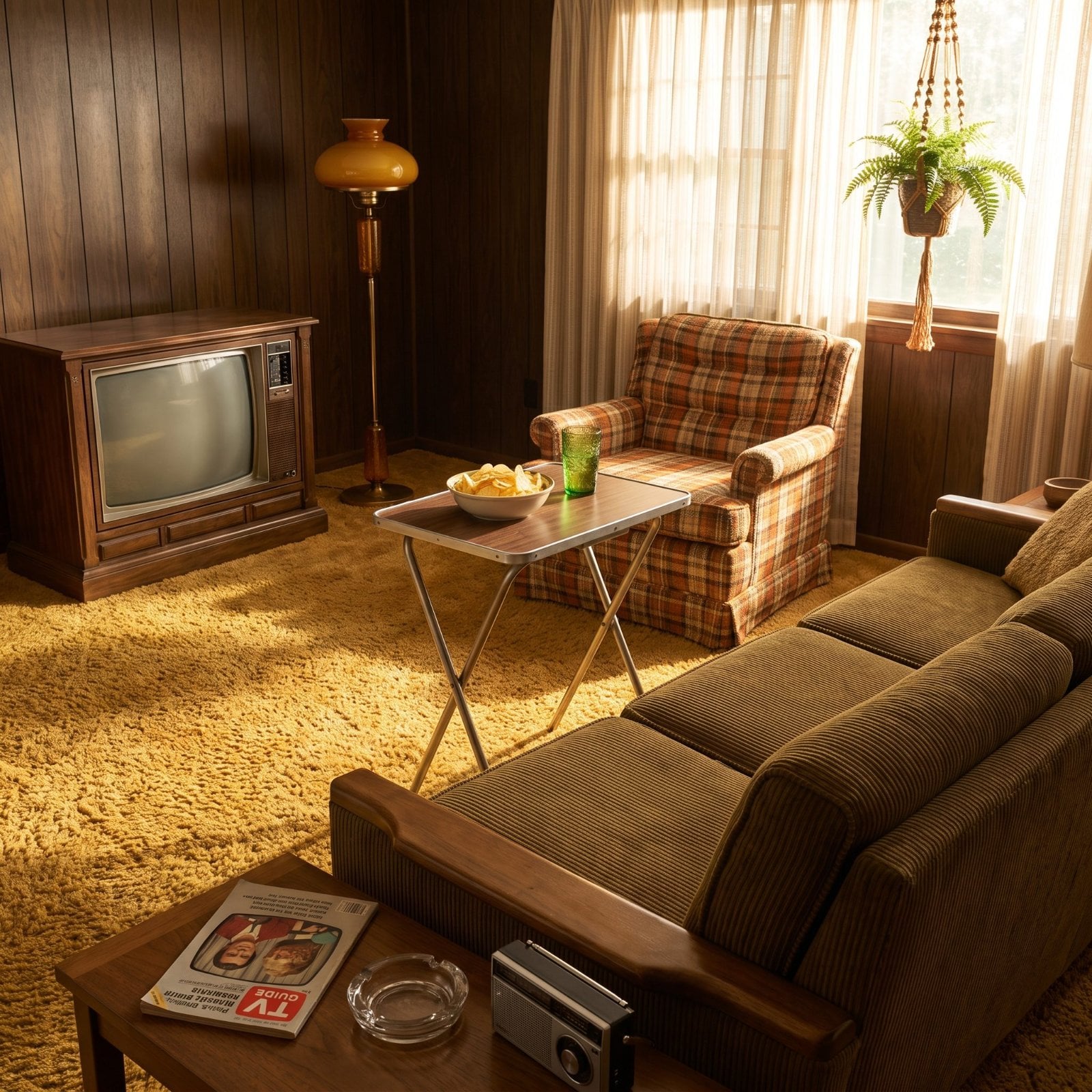
The 1970 family room rarely entered quietly. Wood paneling darkened the walls. Shag climbed the ankles. Avocado, harvest gold and burnt orange competed for territory while a console television occupied enough floor space to qualify as furniture. Nothing was especially shy, and very little was designed to disappear.
Half a century later, nearly every one of those ingredients has been reconsidered. Screens went flat. Speakers shrank. Glass claimed more wall. Fireplaces lost much of their visual weight. Matching furniture sets broke apart, the record collection migrated to a phone and the once-essential magazine rack quietly vanished beside the sofa.
In order to come up with the very specific design ideas, we create most designs with the assistance of state-of-the-art AI interior design software. Also, assume links that take you off the site are affiliate links such as links to Amazon. this means we may earn a commission if you buy something.
The change is bigger than swapping brown for beige. Family rooms moved from dense, object-filled interiors toward lighter spaces expected to handle more jobs with less visible clutter. Some old ideas came back in better clothes — earth tones, vinyl records, low sofas, houseplants — while others stayed firmly behind with the rabbit ears and shag rake.
These 33 comparisons track that transformation piece by piece, from the walls and floors to the way the entire room now connects, stores, lights, entertains and lives.
33. The Walls: Dark Wood Paneling Gives Way to Light Paint and Refined Slats
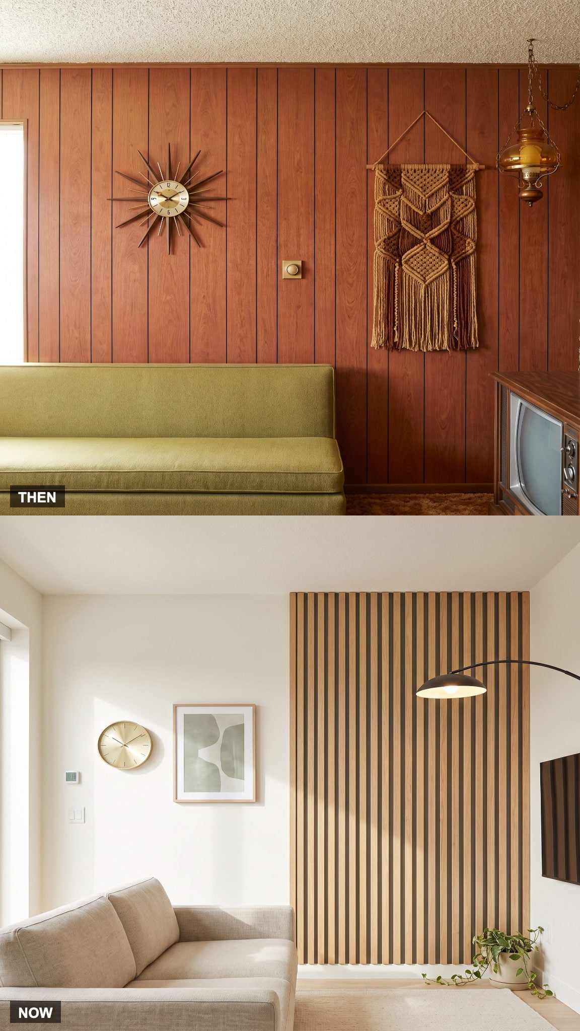
Wood paneling was one of the defining surfaces of the period family room. Dark grain could make even a generous room feel den-like, while its forgiving finish concealed the scuffs and wear that came with everyday use.
Today’s version often keeps the warmth of wood but changes the dosage. Warm-white walls bounce daylight around the room, while pale-oak slats add texture without covering every vertical surface. The wood survives. The gloom does not.
32. The Wood-Console Television Shrinks Into a Wall-Mounted Screen
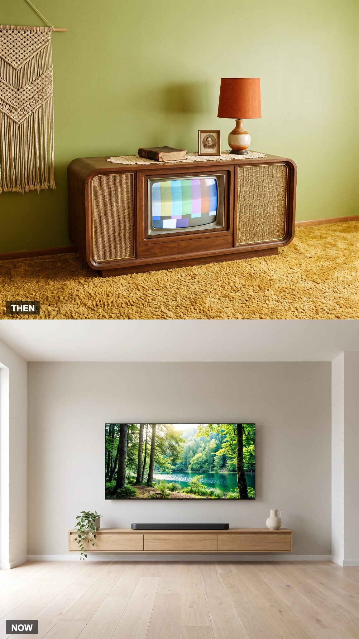
A console television was unapologetically furniture: screen, electronics and substantial wood cabinet combined into one heavy object that claimed a permanent section of wall and floor.
The flat-screen reversed the equation. Mount the display on the wall, conceal the cables and the television gives most of its footprint back. The technological centerpiece remains, but much of the cabinet that once announced it has disappeared.
31. Shag Carpet Gives Way to Hardwood and a Layered Rug
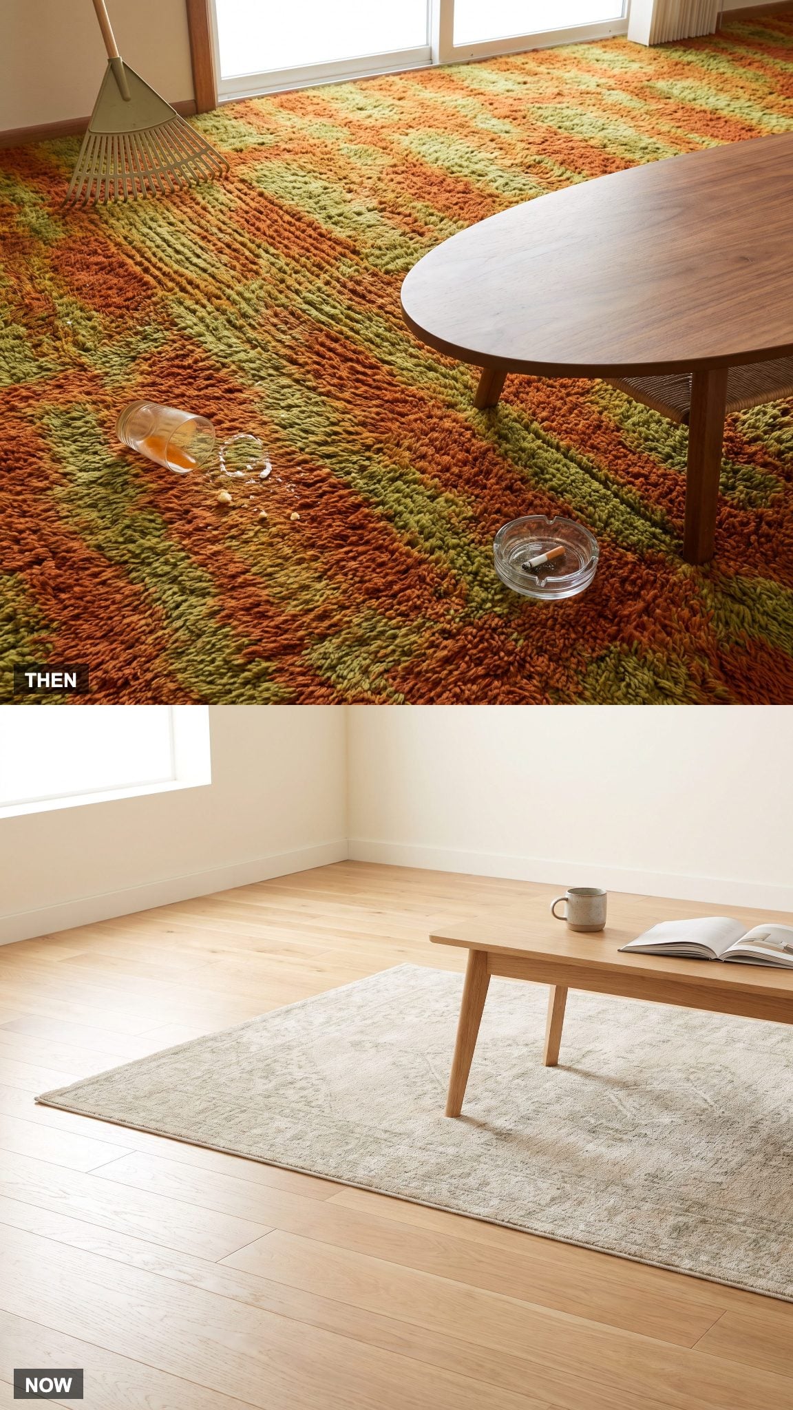
Wall-to-wall shag delivered softness with consequences. Its long pile trapped crumbs, dust and whatever else disappeared below the surface, which explains the wonderfully improbable accessory that accompanied some versions: the carpet rake.
Hardwood or luxury vinyl plank with a removable area rug separates the jobs. The hard surface takes the daily traffic; the rug supplies softness where seating needs it. When the rug wears out, the entire floor does not have to leave with it.
30. Heavy Drapes and Sheers Slim Down to One Simple Window Treatment
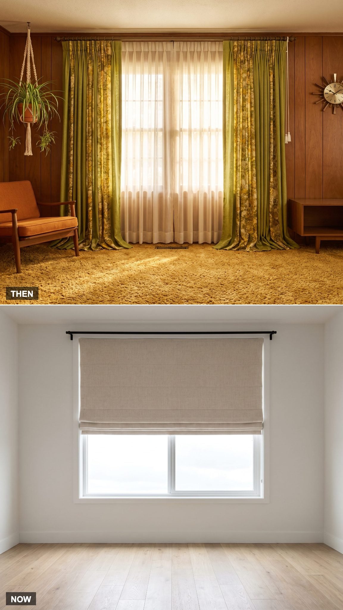
Layered window treatments were common in 1970s interiors: sheers for daytime privacy, heavier draperies for night and enough fabric to turn the window itself into part of the decorating scheme. Pattern, pleats and substantial hardware all competed for attention.
Contemporary rooms often reduce that stack to one linen panel, a Roman shade or nothing at all where privacy allows. Less fabric exposes more glass and gives daylight a cleaner route into the room.
29. The Long, Low Sofa Becomes a Deep Modular Sectional
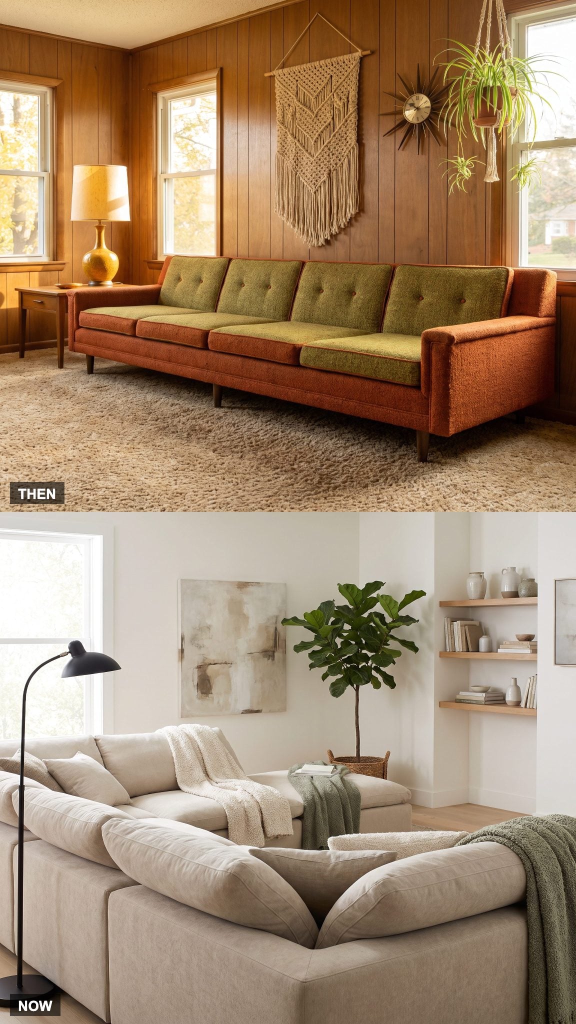
Low-slung sofas were already part of the 1970s design vocabulary, especially in more modern interiors, but the forms were often long and visually continuous rather than assembled from interchangeable pieces.
The contemporary sectional takes that low horizontal idea and makes it flexible. Deeper seats, softer arms and modular units turn corners, add chaises and expand or contract with the room. The silhouette stayed relaxed; the furniture learned to rearrange itself.
28. Avocado and Harvest Gold Return as Olive, Terracotta and Oatmeal
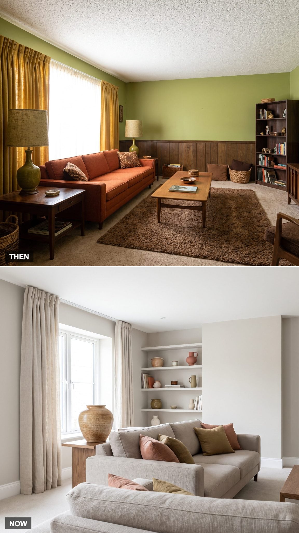
Avocado, harvest gold and burnt orange were not timid accents. In many 1970s rooms they appeared simultaneously across upholstery, carpet, appliances, wallpaper and accessories, pushing the entire interior toward the warm side of the color wheel.
The current revival keeps the earthiness but changes the proportions. Olive replaces bright avocado, terracotta takes over from saturated orange, and greige, cream and oatmeal provide enough neutral ground to let those warmer shades stand apart.
27. Rabbit-Ear Antennas Disappear Into Streaming and Concealed Technology
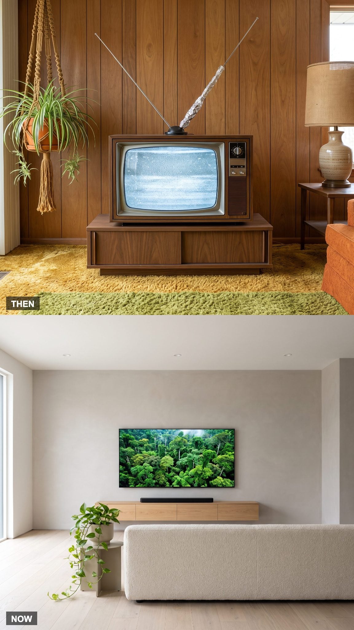
Television reception once demanded visible hardware and occasional improvisation. Extend the antenna, turn one element, shift the set slightly and hope the picture settled before the program ended.
Streaming changed the visual problem completely. Routers, receivers and streaming devices can disappear into cabinetry or sit elsewhere in the house, leaving the screen as the only obvious piece of technology. What once occupied the top of the television has almost vanished from view.
26. Matching Furniture Suites Break Apart Into a Collected Mix
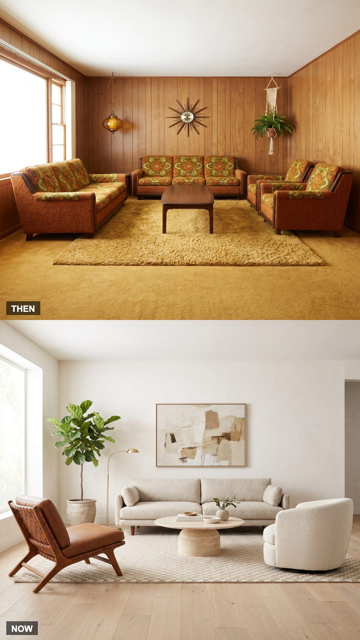
Coordinated furniture suites made furnishing a family room straightforward. Sofa, loveseat and chairs could arrive together in related shapes and matching upholstery, producing instant consistency with almost no guesswork.
Contemporary rooms are more likely to mix materials and silhouettes: a linen sofa beside a leather chair, perhaps with a bouclé swivel completing the group. Color, proportion and repetition still connect the pieces, but matching is no longer the requirement.
Perfect matching creates a set. Good mixing creates a room.
25. The Sliding Patio Door Expands Into a Wall of Glass
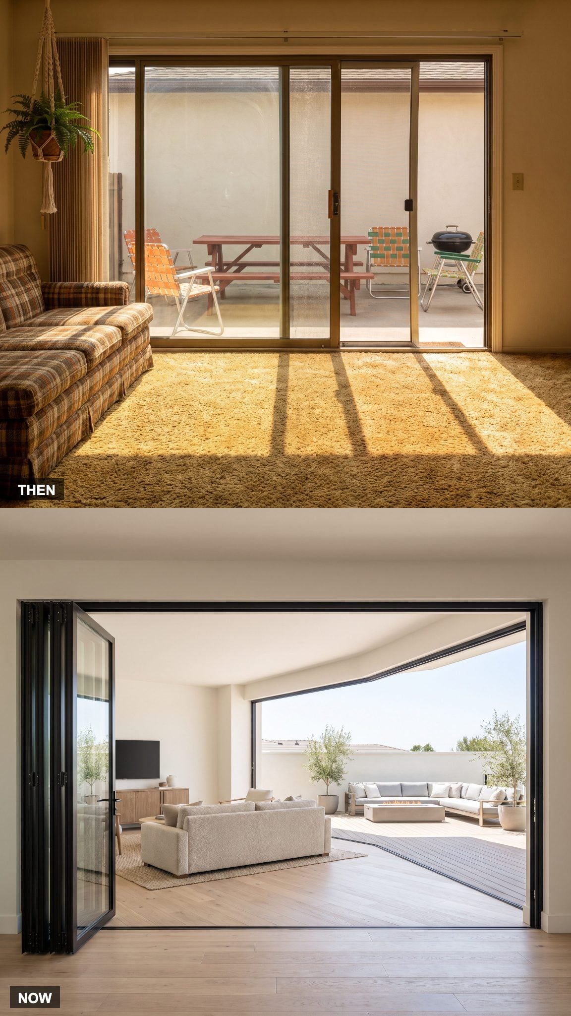
The aluminum sliding door was already a major connection between the family room and backyard, but half of the typical two-panel opening remained fixed even when the moving panel was fully open.
Wide multi-panel systems dramatically increase that opening. Folding or stacking panels gather toward the side, allowing indoor seating and an outdoor terrace to operate as adjoining spaces when weather permits. The engineering gets more complicated; the boundary looks much simpler.
24. Chunky Coffee Tables Become Sculptural Objects
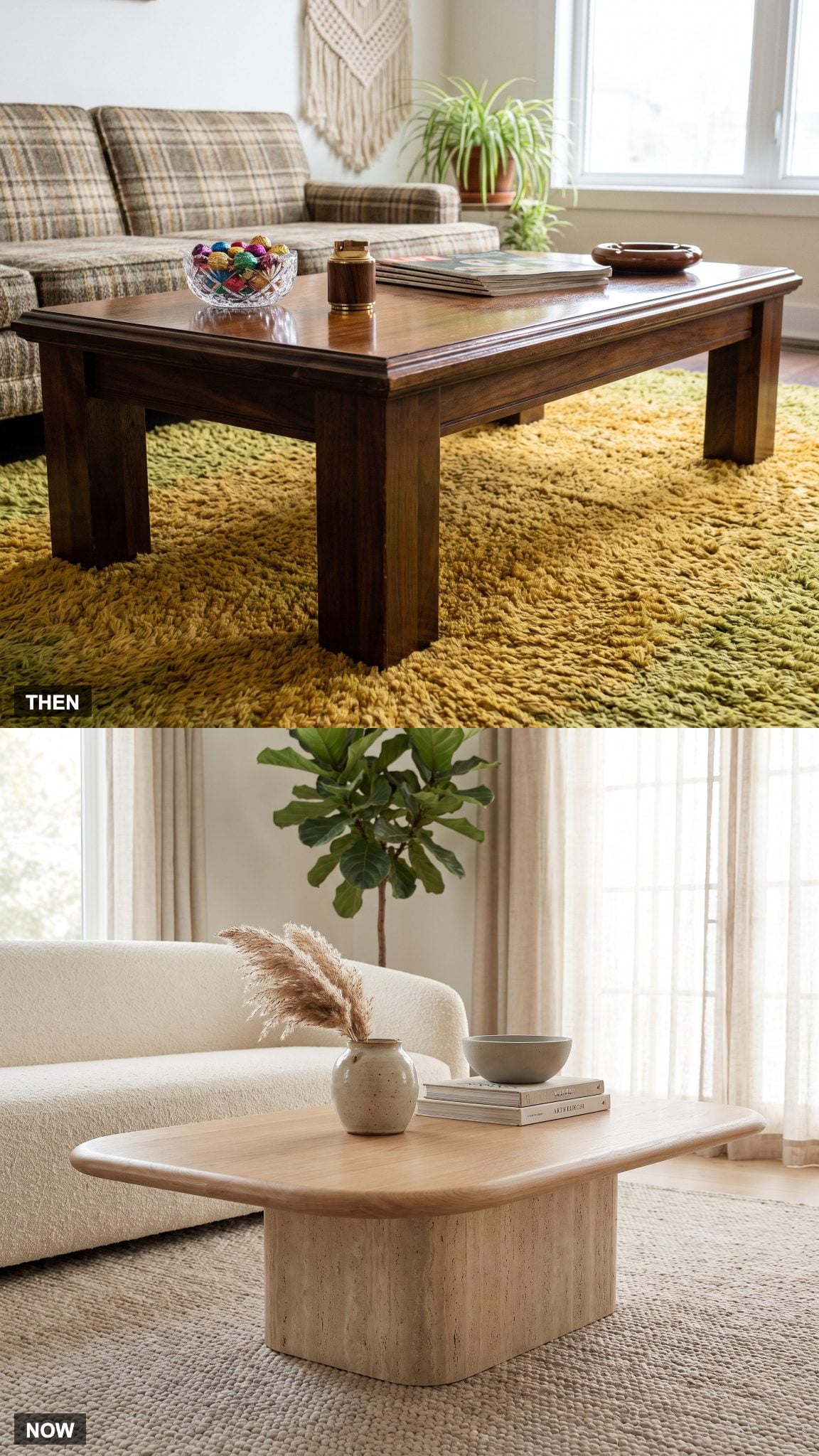
Many 1970s coffee tables emphasized mass: thick wood, carved edges, substantial legs and glossy finishes that could hold their own beside equally substantial sofas.
The current version is just as capable of becoming a focal point, but shape and material carry more of the drama. An organic oak top, rounded stone form or travertine coffee table introduces curves without building a small wooden fortress in the middle of the rug.
23. Macramé Plant Hangers Come Down as Houseplants Get Bigger
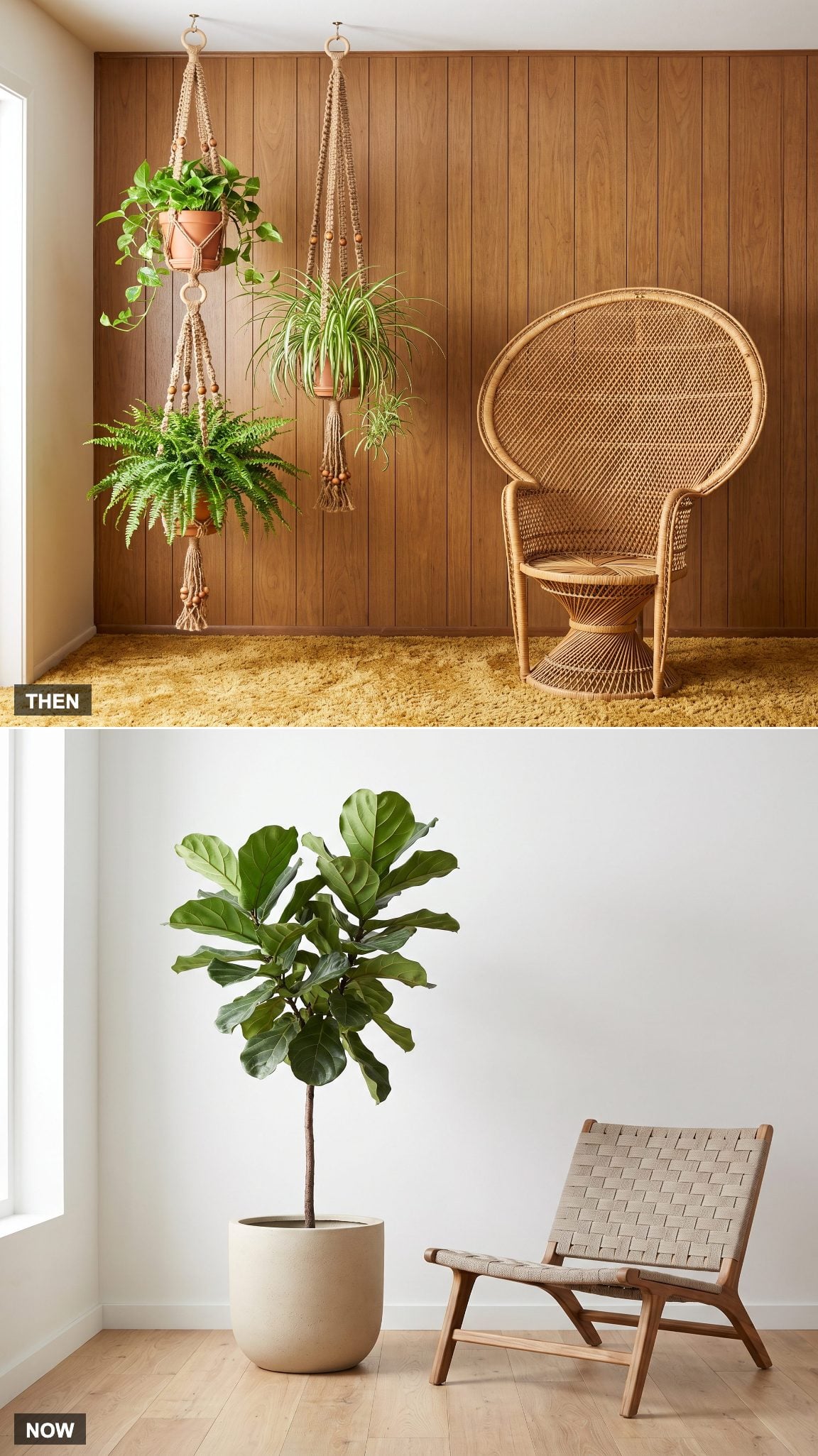
The 1970 approach to greenery frequently went vertical. Jute macramé hangers suspended spider plants, pothos and other trailing specimens from ceiling hooks, turning several small pots into a decorative layer above the furniture.
Contemporary rooms often concentrate that greenery into one or two larger floor plants. A tall fiddle-leaf fig or bird of paradise in a restrained planter creates considerably more visual mass with considerably fewer cords, hooks and watering expeditions.
22. The Television Stops Sitting on Furniture and Moves Into the Architecture
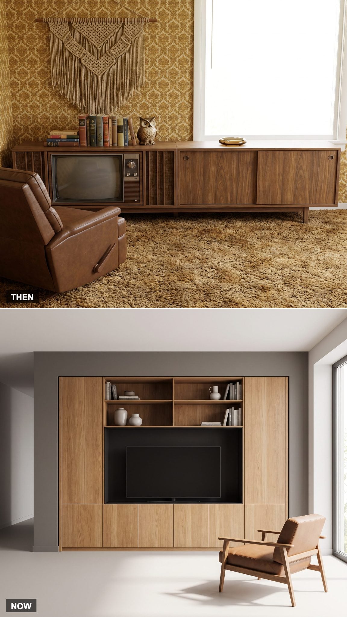
The console television made the screen and its cabinet inseparable. Contemporary media walls take the opposite approach, recessing the screen into millwork so storage, display and electronics become one architectural composition.
Symmetry, concealed wiring and a properly sized recess are what distinguish the built-in solution from simply placing a television against a wall. The screen still dominates when it is on, but the surrounding millwork gives it context when it is not. Similar planning shows up throughout modern family room design.
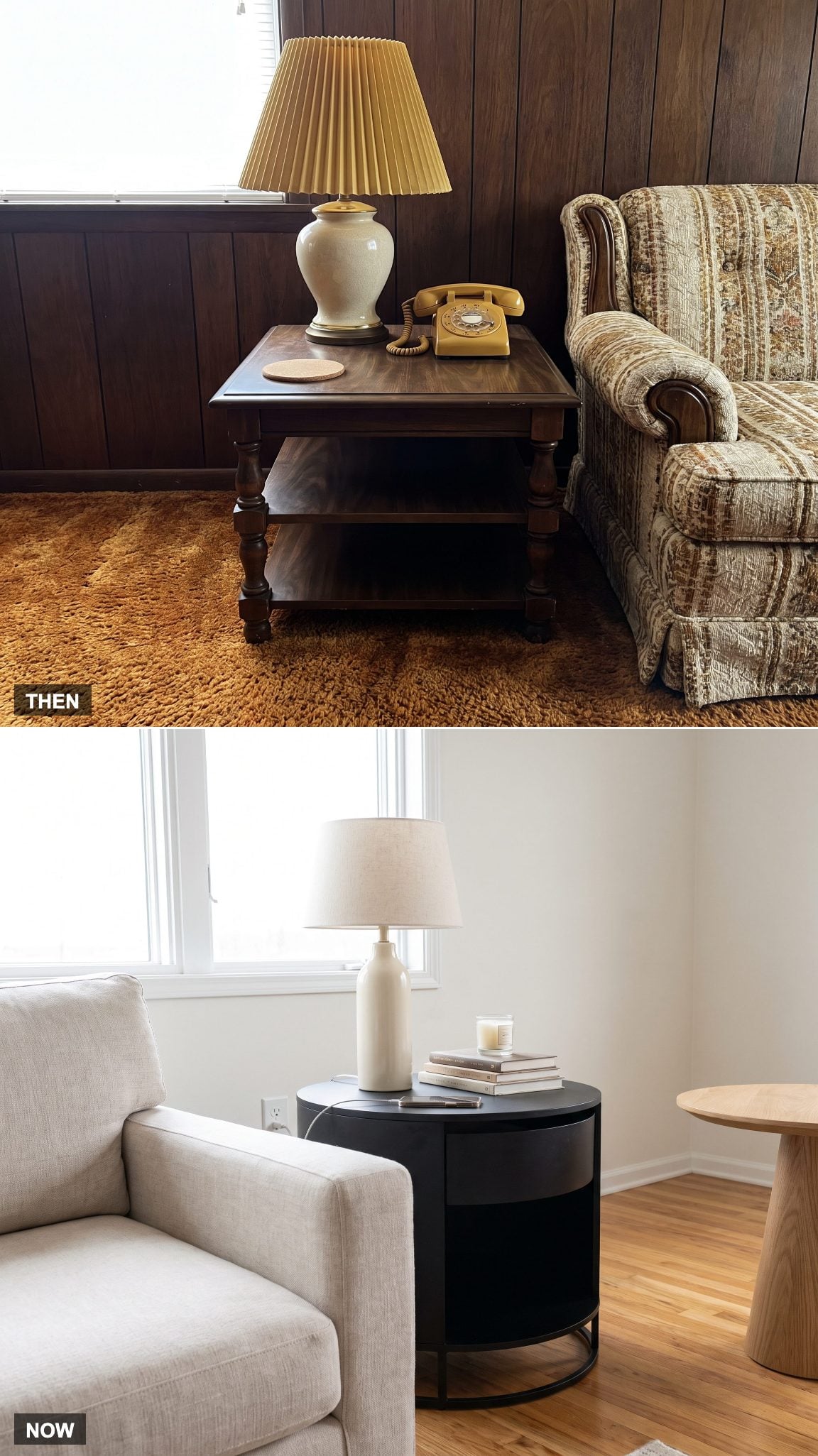
21. Matching End Tables Split Into Mismatched Accents
🔥 Would you like to save this?
Matched end tables reinforced the symmetry of coordinated furniture suites: same height, same finish, same lamp, one on either side of the sofa.
Breaking the pair creates more freedom. A metal drum can sit opposite an oak pedestal, with differences in material and height balanced by compatible scale. The room remains connected without looking as though every piece arrived on the same delivery truck.
20. Small Window Openings Give Way to Larger Areas of Glass
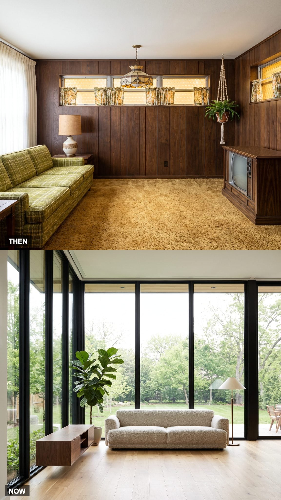
Not every 1970 house was dark — modernist and regional designs could feature enormous expanses of glass — but many conventional family rooms paired relatively modest windows with dark finishes, heavy draperies and deep roof overhangs. Together, those choices could produce the den-like atmosphere associated with the period.
Contemporary renovations frequently enlarge the glazing or expose more of what is already there. Slimmer frames, lighter wall finishes and simpler window treatments let daylight reach farther across the room and give the exterior view a much larger role.
19. The Oversized Recliner Slims Down Into a Lounge Chair
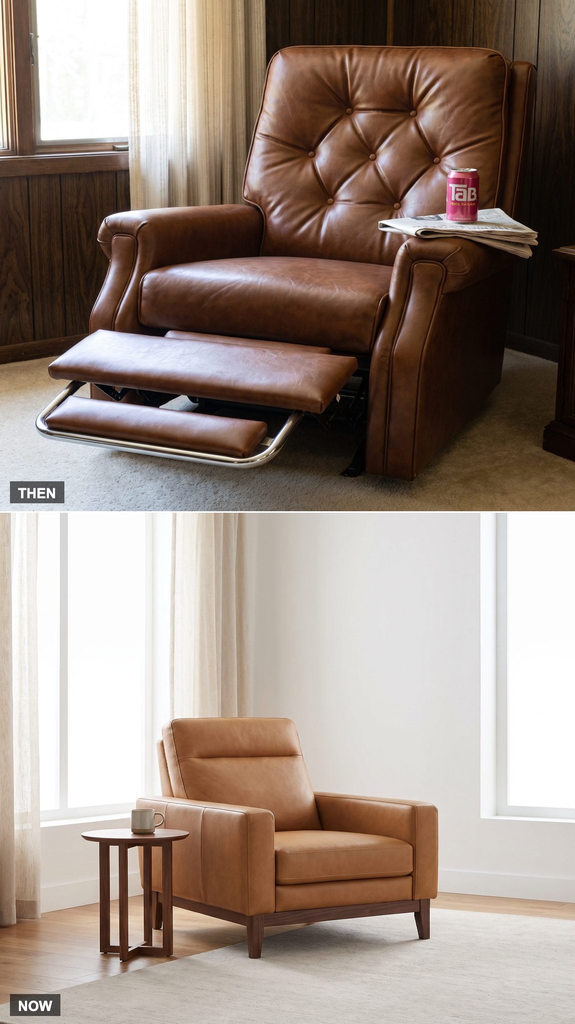
The classic overstuffed recliner put comfort ahead of visual restraint. Wide arms, thick padding and a projecting footrest could give one chair nearly as much presence as a loveseat.
Newer reclining chairs often disguise the mechanism inside a leaner silhouette. Track arms, exposed wood or metal bases and slimmer upholstery keep the full recline without requiring the chair to dominate everything sitting beside it.
18. The Record Collection Shrinks, Then Vinyl Comes Back on Purpose
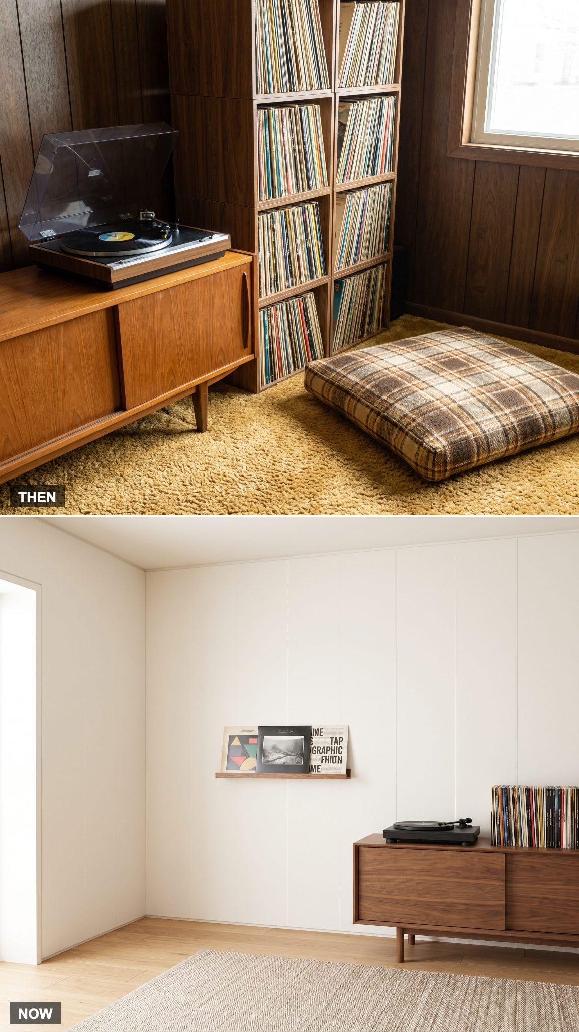
In 1970, recorded music required physical storage. Album sleeves occupied shelving, the turntable needed a surface and the collection itself became part of the room’s visual identity.
Streaming moved most everyday listening onto phones and networked speakers, but vinyl’s revival brought a selective version of the old setup back. Contemporary record displays often combine a working turntable with visible album art and compact storage rather than surrendering an entire wall.
17. One Main Ceiling Fixture Becomes Layers of Light
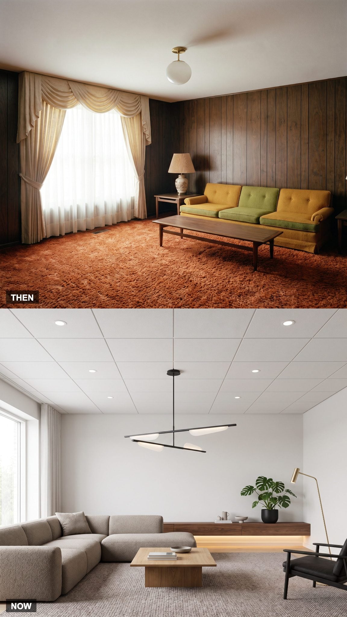
Many family rooms relied heavily on a central ceiling fixture supplemented by table lamps around the perimeter. The result could be plenty of illumination without much control over where that light actually landed.
Layered lighting divides the job. Recessed fixtures provide general illumination, a floor lamp serves the reading chair, pendants or decorative fixtures establish focal points and shelf lighting adds a lower, softer layer after dark.
16. Packed Built-Ins Become Displays With Breathing Room
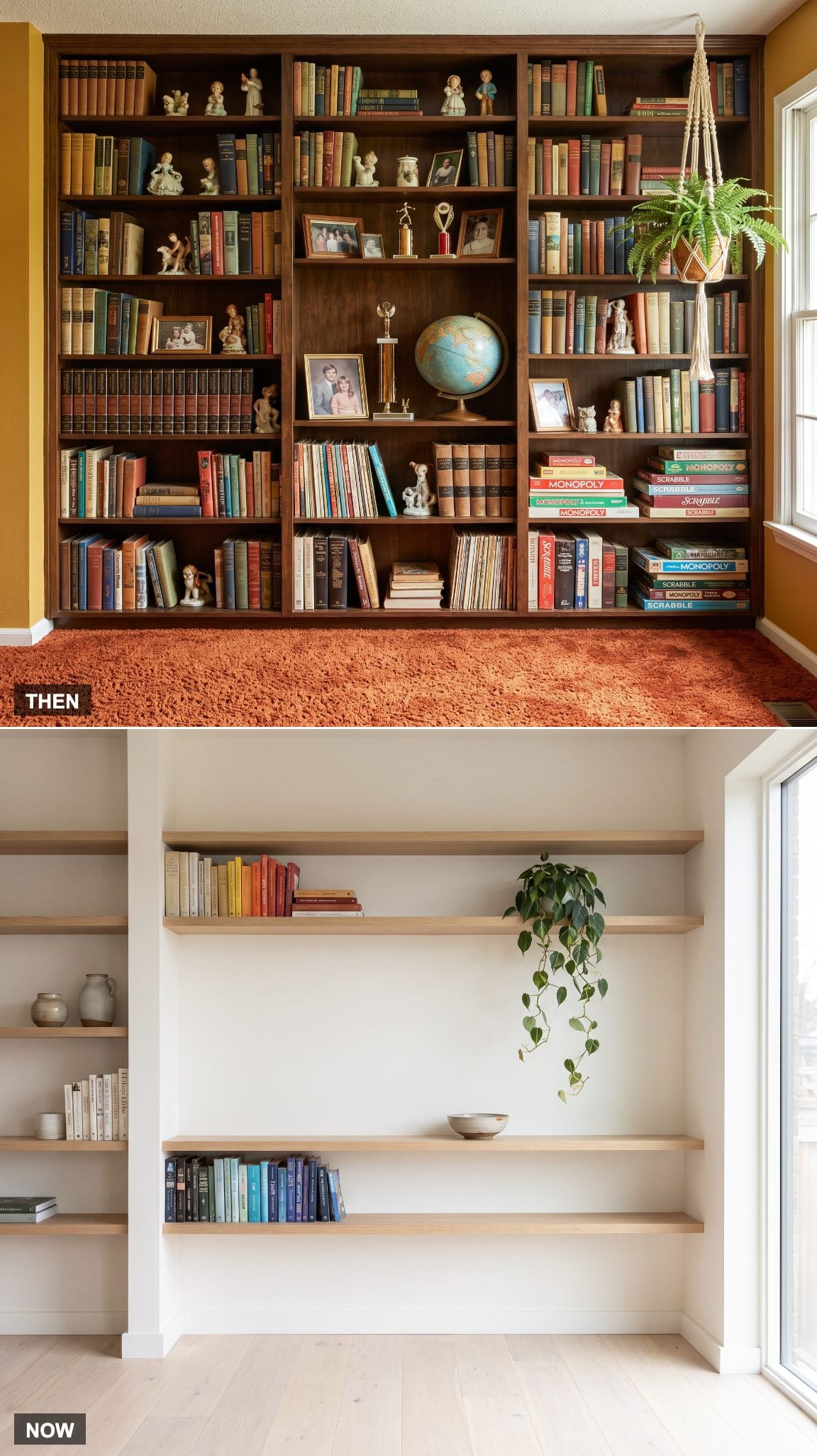
A 1970 built-in could function as household archive, library and display cabinet all at once. Encyclopedias, games, trophies, photographs and decorative objects shared the shelves because storage and display were often the same job.
Contemporary built-ins are more likely to conceal part of that inventory behind doors and leave open shelving selectively filled. Books, ceramics and framed objects get more space around them, while less decorative necessities disappear below.
15. The Swag Lamp Loses Its Chain and Finds a Cleaner Line
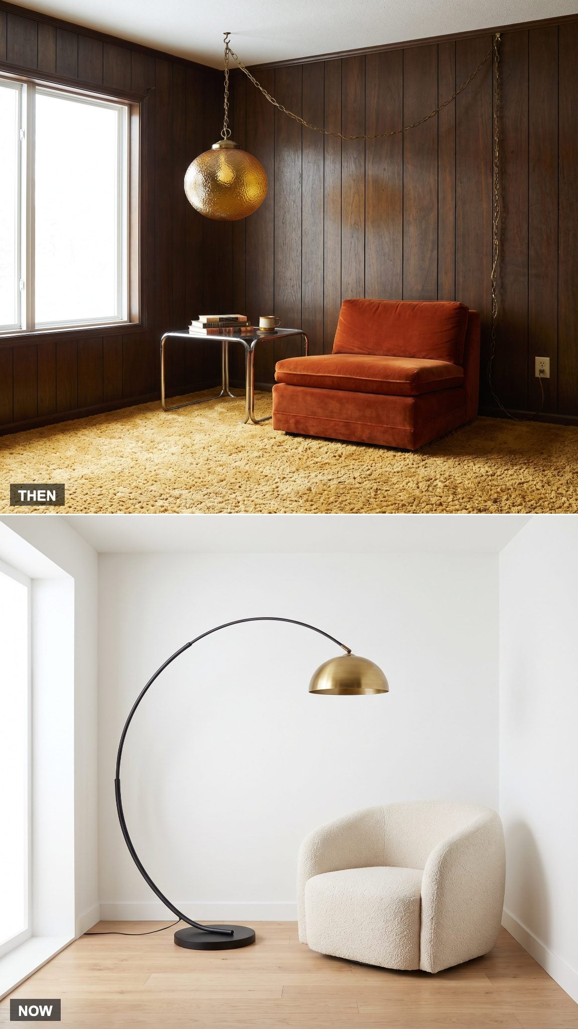
The swag lamp delivered overhead light without requiring a permanently wired ceiling box at the fixture location. A hook supported the chain, the cord ran toward an outlet and decorative glass or macramé made the cable part of the look rather than something to hide.
A contemporary arc floor lamp can still throw light over a chair or table without rewiring, while a hardwired pendant drops in one clean vertical line. The function survives; the looping chain usually does not.
14. Beanbags and Floor Cushions Grow Up Into Poufs and Ottomans
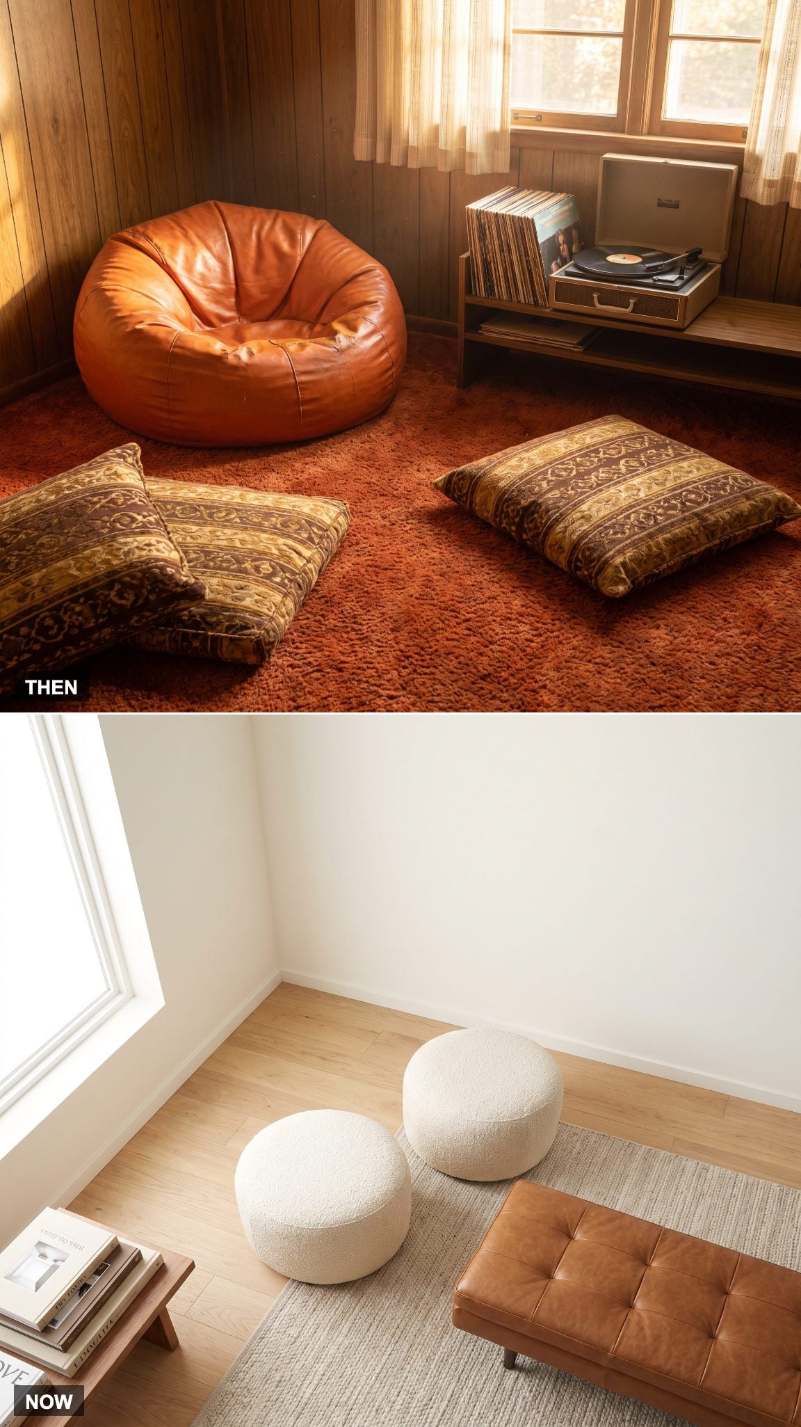
Beanbags and loose floor cushions offered inexpensive extra seating that could migrate wherever another body needed somewhere to land. Their informality suited the family room perfectly, even if escaped foam beads could make the aftermath considerably less charming.
Poufs and ottomans keep the flexible seating idea but add structure. A bouclé round pouf can handle feet or an extra guest, while a firmer ottoman can support a tray and substitute for a small table.
13. Wood-Burning Fireplaces Trade Ash and Kindling for a Switch
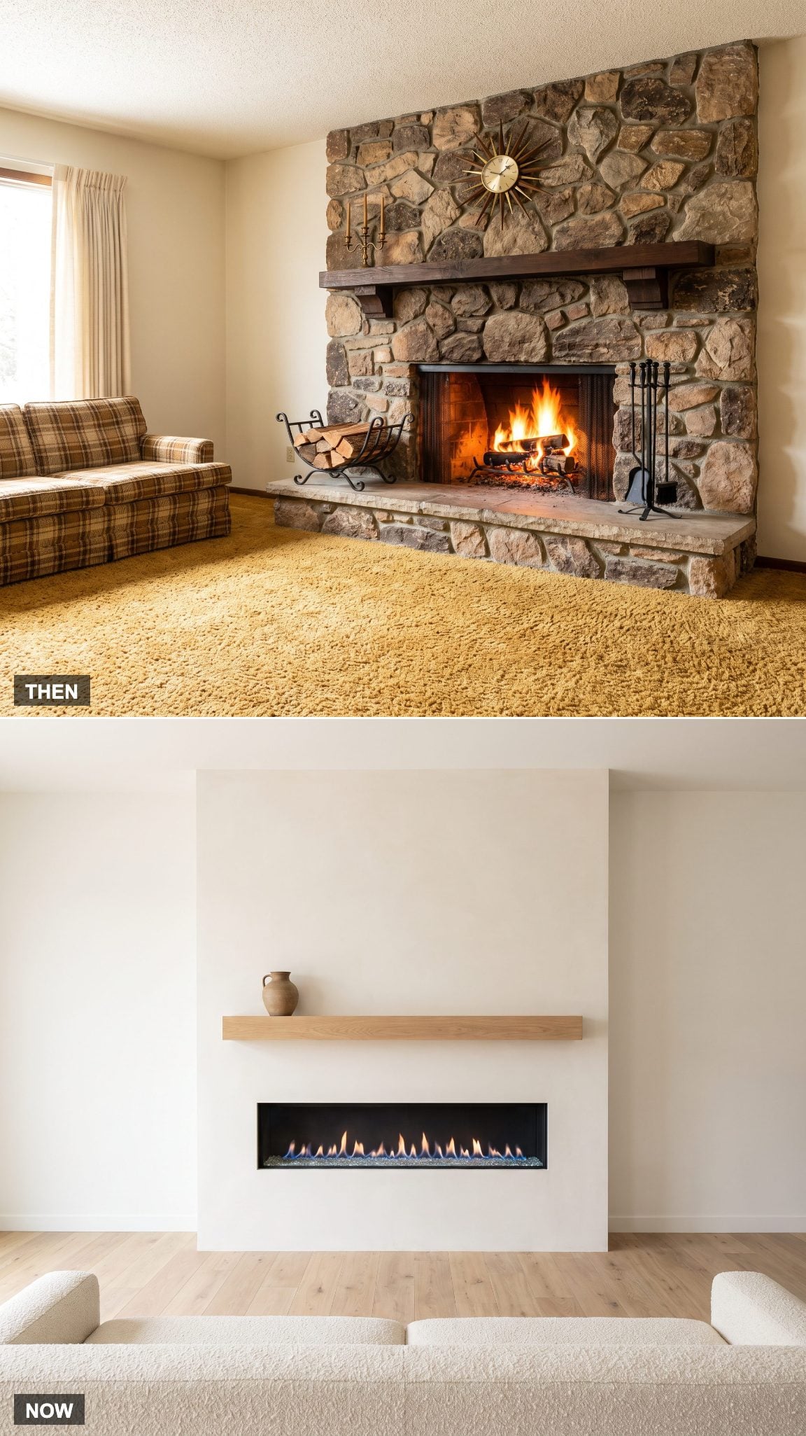
A wood-burning fireplace brought unmistakable atmosphere along with logs, ash, tools, soot and regular maintenance. In rooms built around large masonry hearths, the fireplace could become the dominant architectural element whether a fire was burning or not.
Gas and electric units reduce much of that maintenance and make the flame available on demand. Slimmer fireboxes also allow surrounds to become flatter and more restrained, changing the fireplace from a rugged masonry event into a cleaner architectural feature.
12. Busy Florals and Plaids Give Way to Solid Performance Fabrics
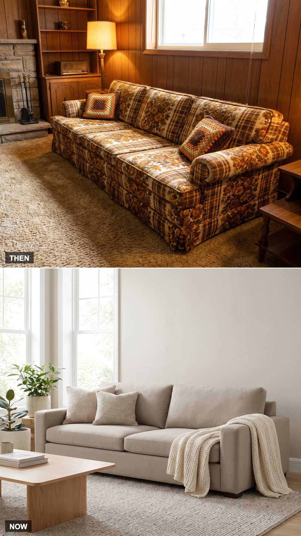
Patterned upholstery did more than announce the decade. Florals, plaids and textured weaves were visually forgiving, helping everyday stains and wear disappear into a busy surface.
A solid performance-fabric sofa aims for the same practicality through materials engineered to resist stains and wear. A chunky knit throw can supply texture without asking the upholstery to carry pattern across the entire sofa.
That quieter foundation also makes it easier to change pillows, throws and accessories without replacing the largest upholstered object in the room. This family room design breakdown takes the same idea further.
11. Waist-High Speakers Collapse Into a Soundbar
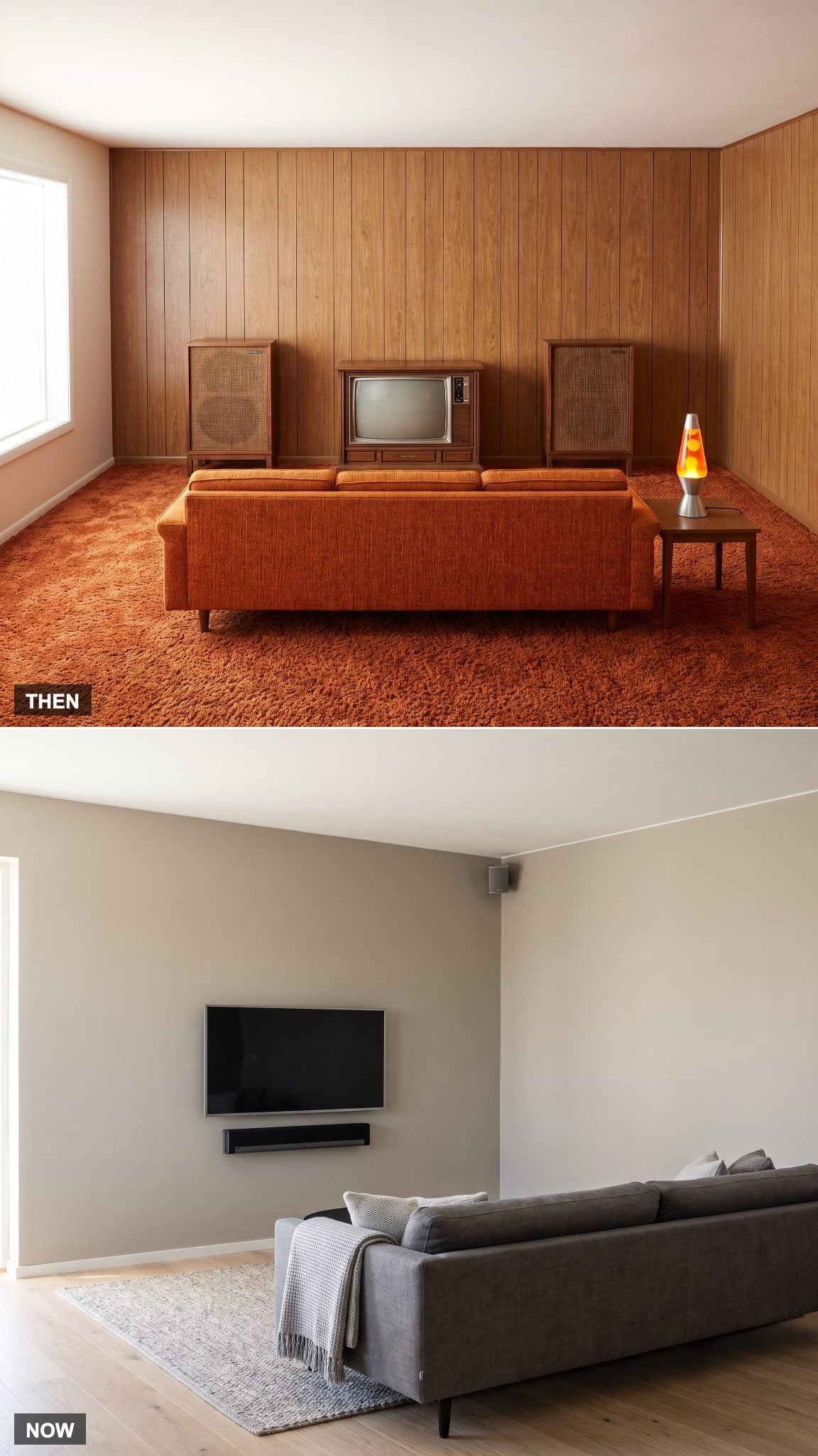
Large wood speaker cabinets made the audio system physically visible. Serious sound often meant two substantial boxes occupying floor space on either side of the stereo or television.
A soundbar condenses much of that hardware into one horizontal strip beneath the screen, while integrated speaker systems can hide even more. Removing two large cabinets from the corners changes the room before a single piece of seating moves.
10. Family Photos and Knickknacks Retreat From Every Flat Surface
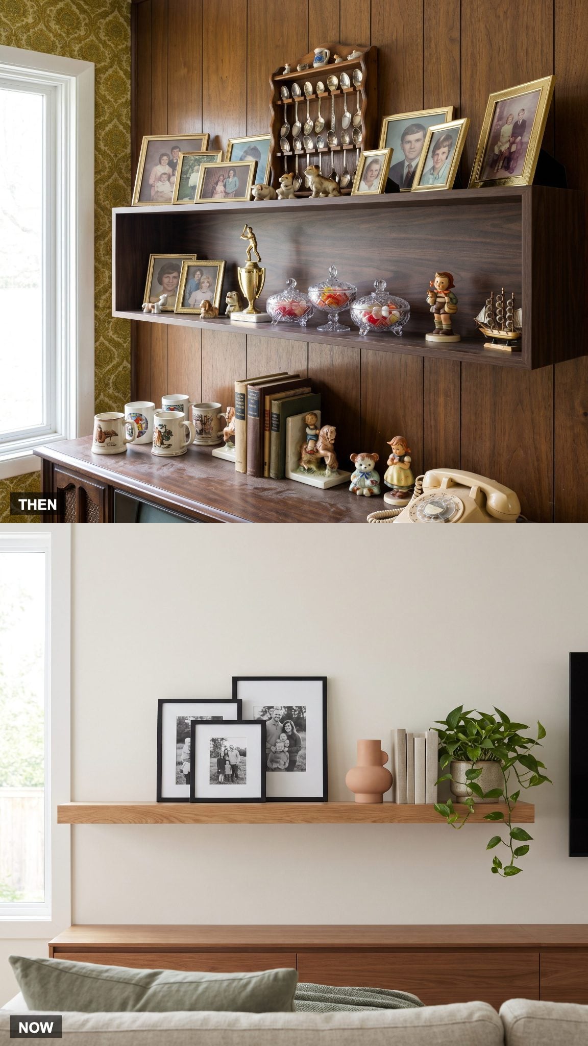
Family rooms traditionally carried a great deal of personal evidence in plain sight: framed photographs, vacation souvenirs, trophies, figurines and whatever else accumulated on shelves, mantels and side tables.
The contemporary approach tends to edit rather than eliminate. A smaller group of photographs, a vase and a few books get more room around them, allowing the display to stay personal without covering every available surface.
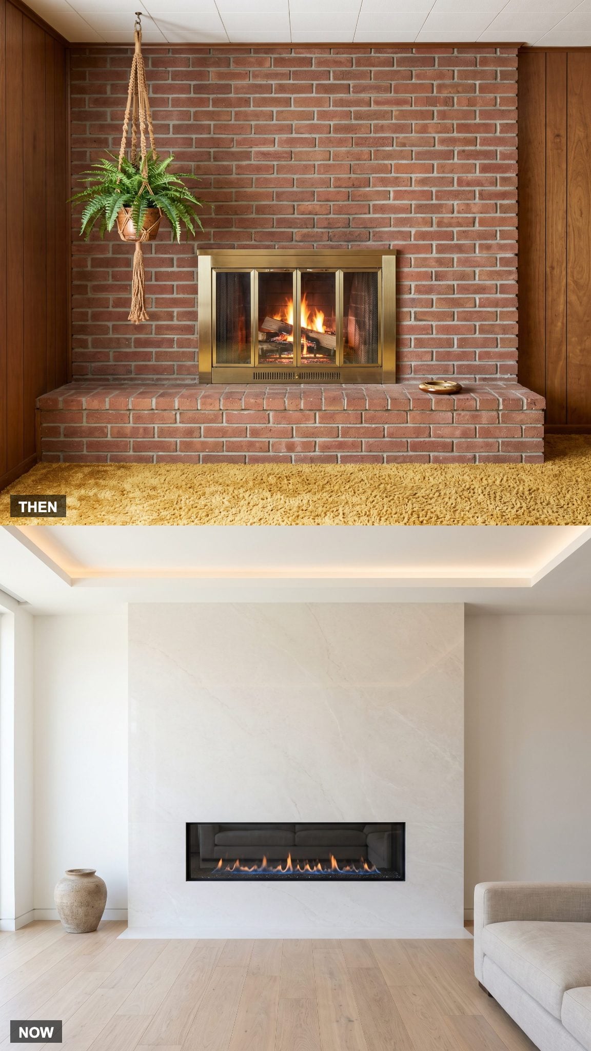
9. The Raised Brick Hearth Drops Back Into the Wall
🔥 Would you like to save this?
A raised hearth gave the fireplace physical weight at floor level. The projecting ledge could double as temporary seating while also extending brick or stone farther into the room.
Flush and minimal hearths reduce that projection. With less masonry interrupting the floor plane, the fireplace becomes more integrated with the wall and furniture can sit closer without having to negotiate a substantial ledge. The same clean-lined instinct appears in contemporary game room renovation work.
8. The Magazine Rack Disappears as Reading Moves Onto Screens
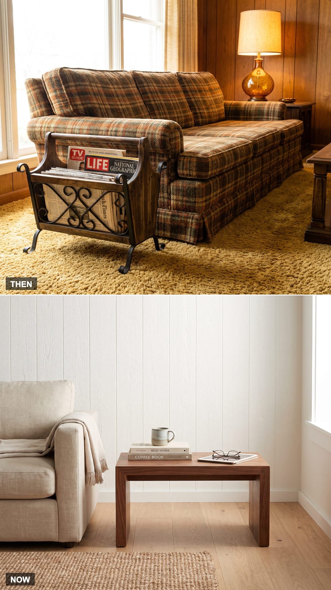
The magazine rack was household overflow made into furniture: newspapers, catalogs and back issues collected beside the sofa within easy reach of whoever claimed the nearest chair.
Much of that everyday reading moved to phones and tablets. What remains visible tends to be more selective — a short stack of hardcover books or magazines chosen because they are worth keeping around as objects as well as reading material.
7. Oversized Ceramic Lamps Become Simpler Statement Pieces
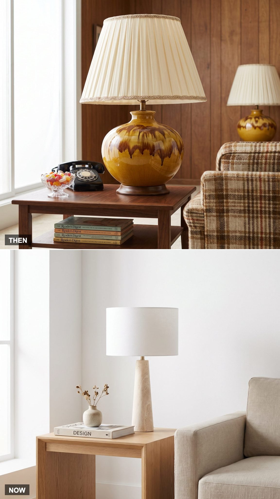
Substantial ceramic lamps with equally substantial shades suited the visual density of the period. Drip glazes, textured bases, fringe and wide shades gave a side-table lamp enough personality to compete with the upholstery behind it.
A modern statement lamp can still be sculptural, but the detailing is usually reduced. Travertine, matte ceramic or simple stone beneath a linen drum shade gives the object presence without filling half the tabletop.
6. Board Games and Electronics Move Behind Closed Doors
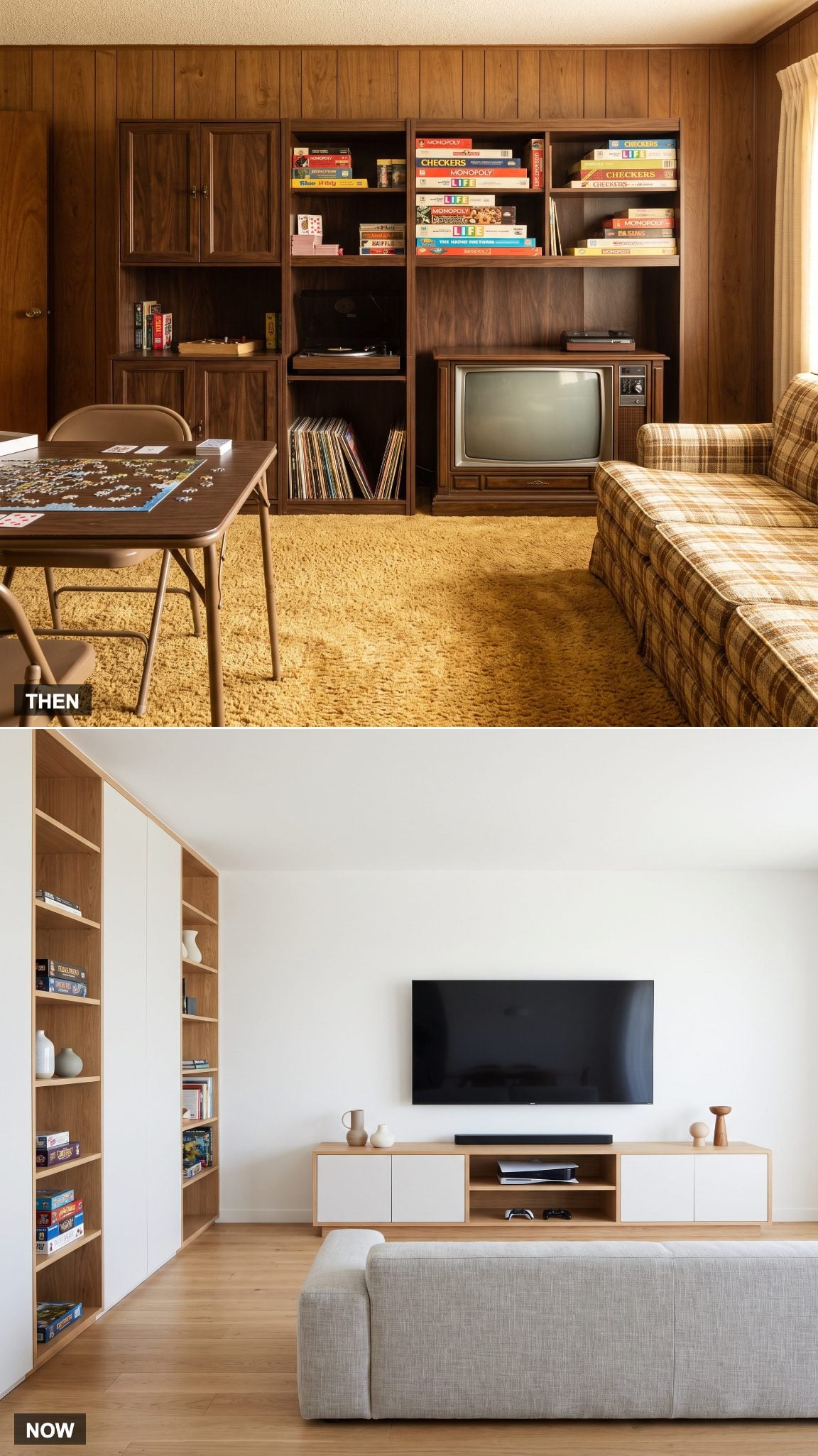
The family room has always accumulated entertainment equipment. Board-game boxes, records, puzzles and television hardware simply made more of that inventory visible when closed storage was limited.
Modern media furniture hides considerably more. Controllers, consoles, games and cables can disappear behind doors while the screen floats above, letting one low cabinet handle several categories of equipment. The same storage logic appears in a well-planned media loft.
5. Folding TV Trays Turn Into Furniture That Works Overtime
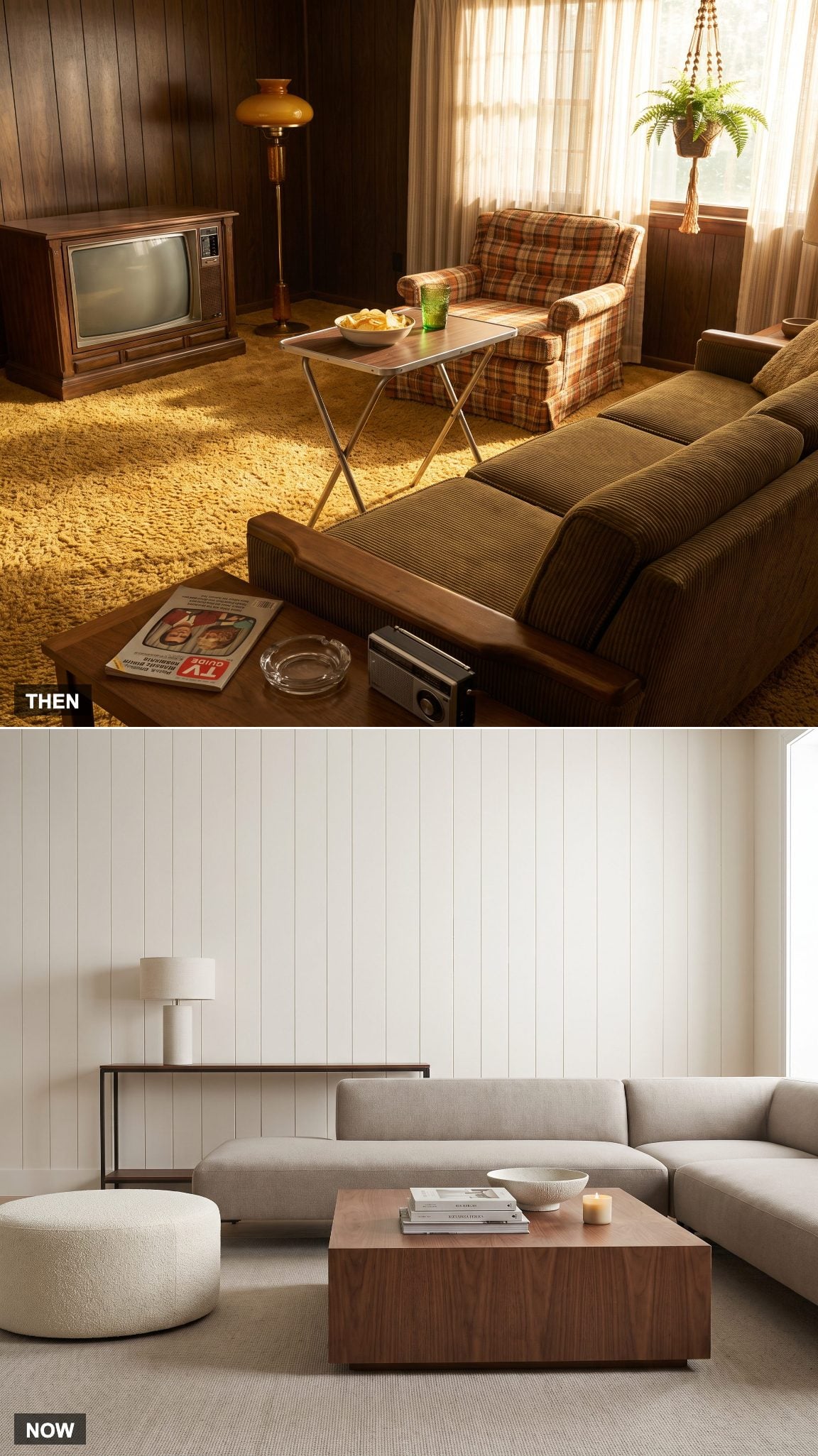
The folding TV tray solved one very specific problem brilliantly: put food within reach of the sofa, then fold the evidence away when dinner was over.
Today’s family room often asks permanent furniture to handle the same flexibility. An oversized walnut coffee table can become a work surface or snack station, while a bouclé ottoman shifts between footrest, extra seat and soft table.
4. The Furniture-Sized Stereo Console Shrinks to a Wireless Speaker
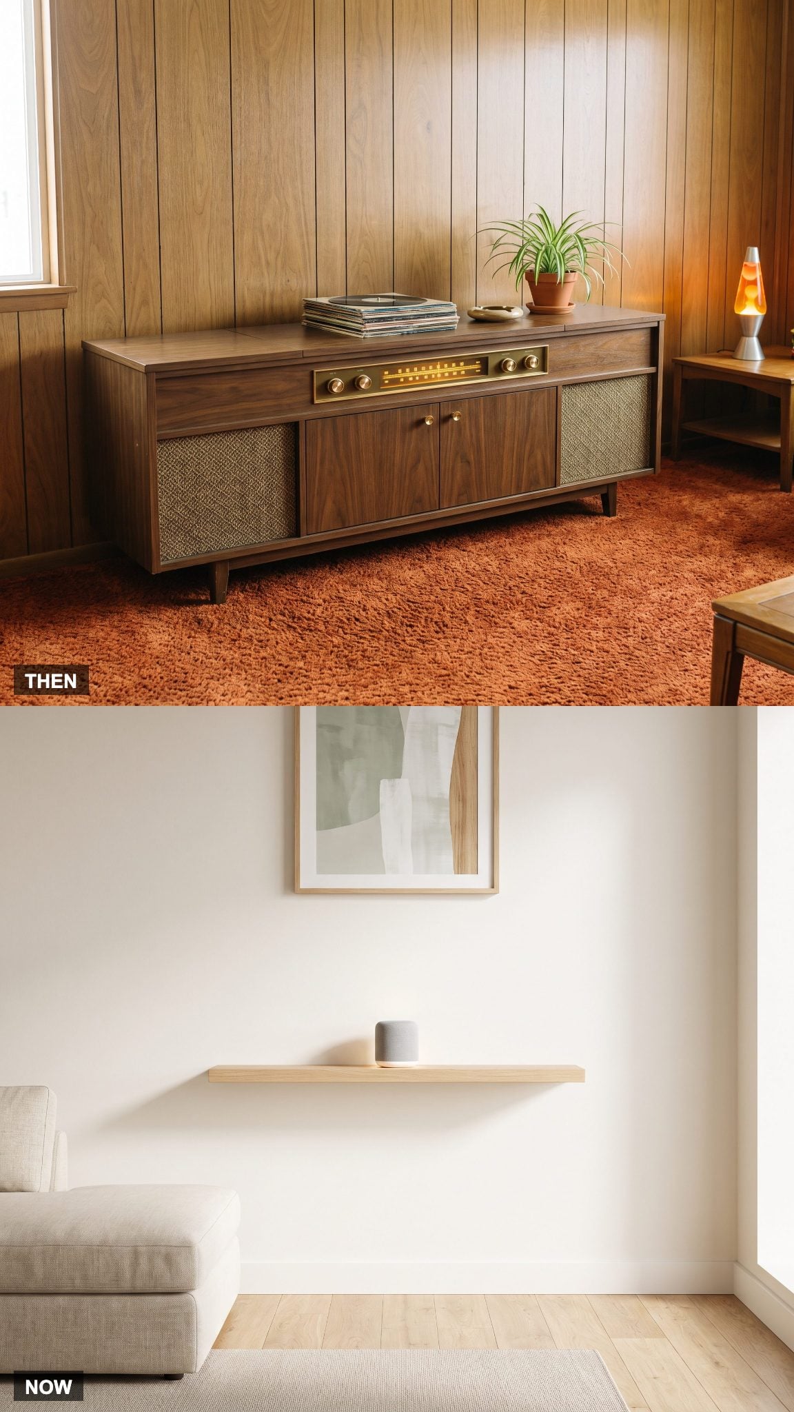
A stereo console combined turntable, tuner, speakers and storage inside a long furniture cabinet. Music had a substantial physical address in the room.
Wireless audio can perform much of that everyday listening from a speaker small enough to sit on a shelf. Removing the console opens a long stretch of wall and floor, although the current vinyl revival means some households are deliberately giving part of that territory back to the turntable.
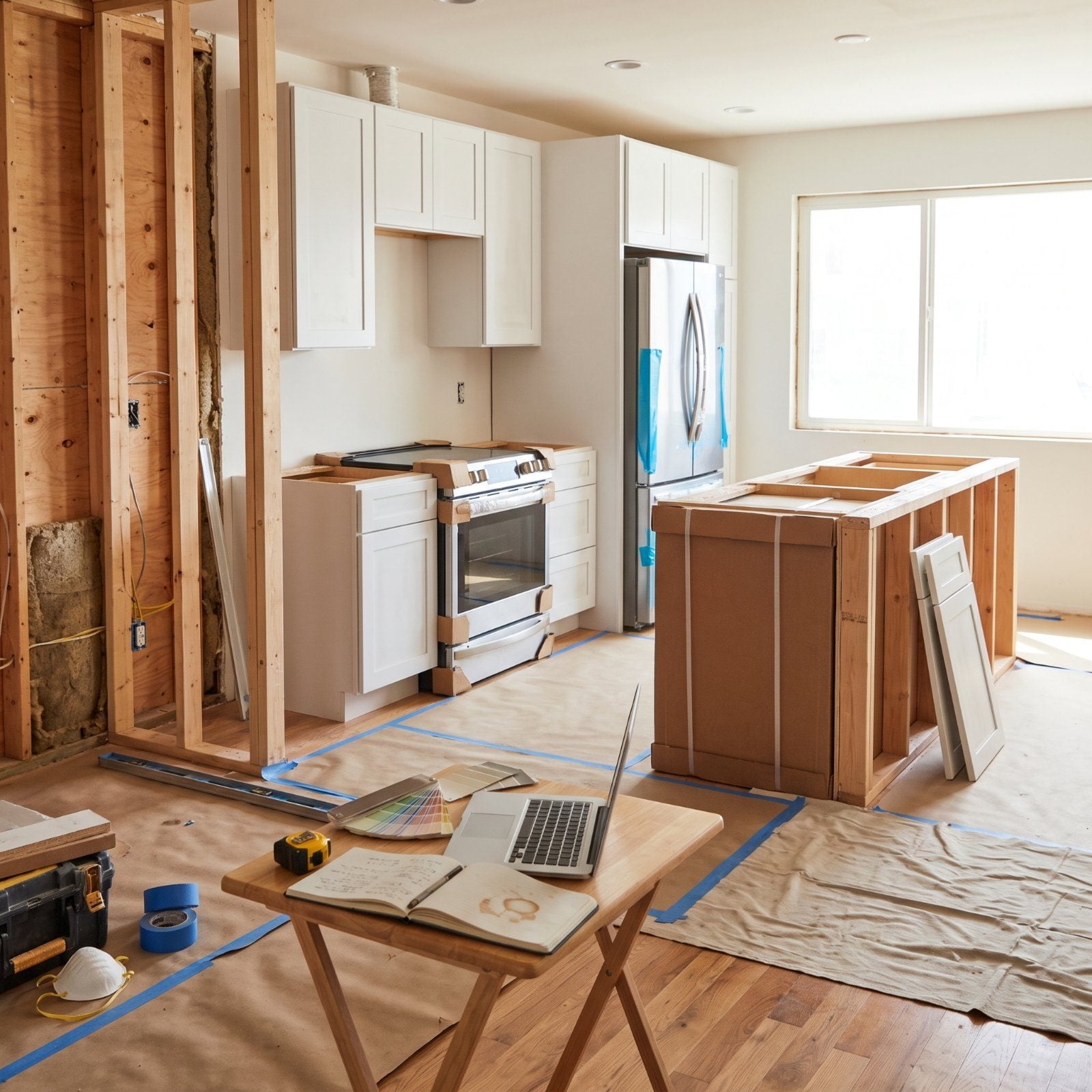
3. The Separate Family Room Opens Up to the Kitchen
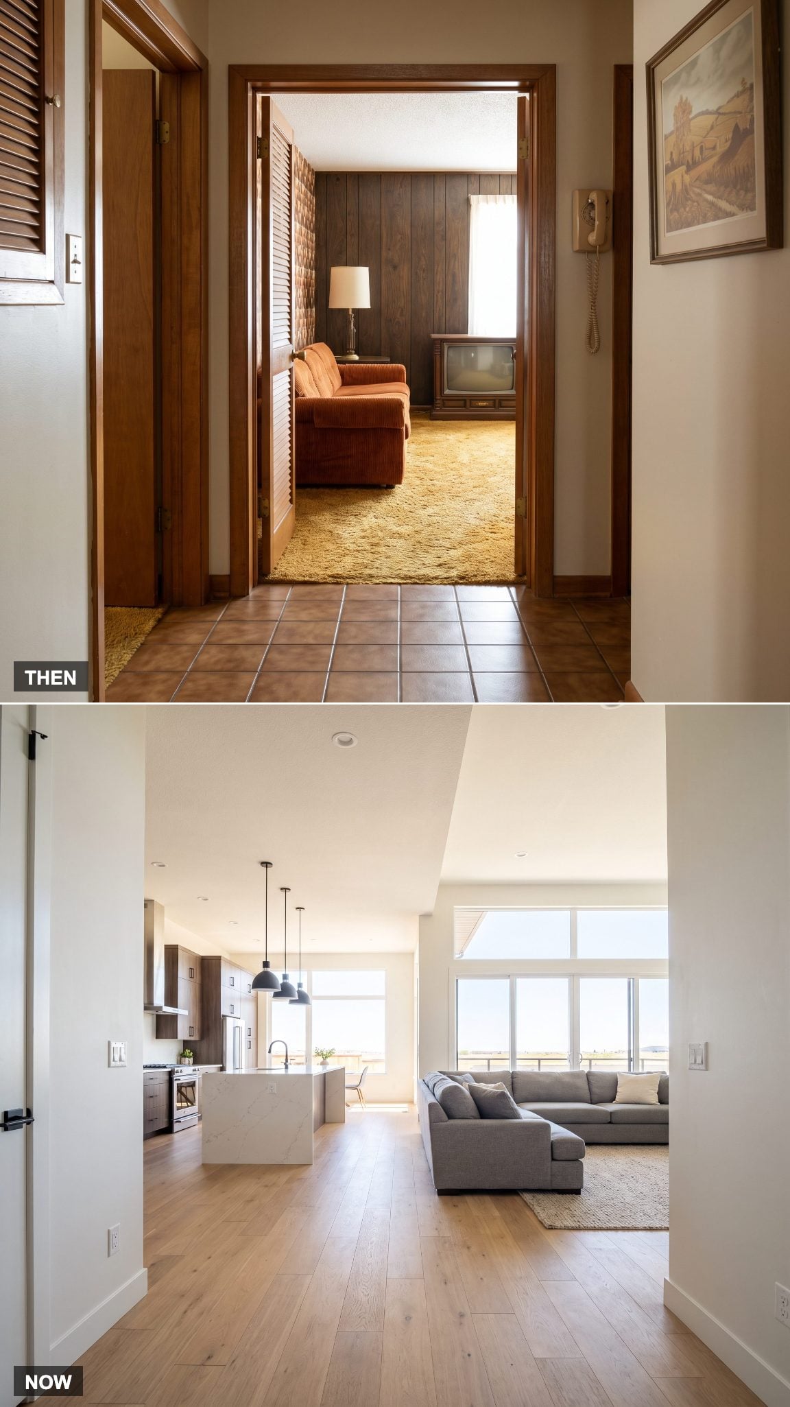
Many postwar houses treated cooking and relaxing as separate activities in separate rooms. The family room might sit beside the kitchen yet remain divided by a wall, doorway or short hall.
Open-plan remodeling attacked that boundary directly. Removing or widening the wall allows kitchen, dining and family-room activity to share one sightline, often with an island taking over some of the zoning the partition once supplied. Where complete openness is not desirable, carefully framed living room and kitchen openings can preserve a sense of separation without reinstating a full wall.
2. One Family Room Now Has to Lounge, Game, Entertain and Work
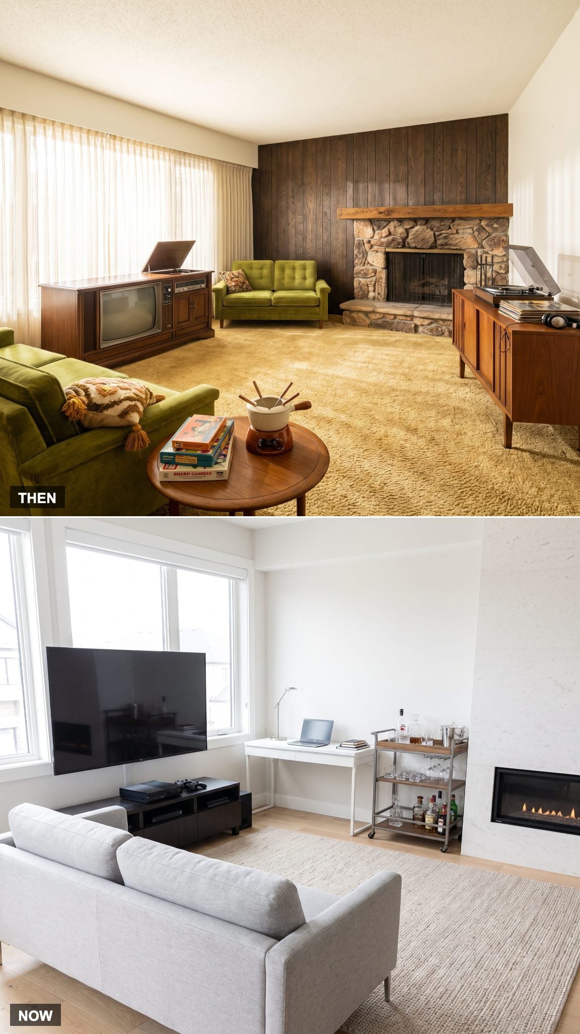
The traditional family room had a comparatively narrow brief: informal shared leisure. Television, music, games and conversation all happened there, but the room was not necessarily expected to double as office, bar, homework station and digital gaming center at the same time.
Contemporary family rooms routinely absorb those extra assignments. A desk can occupy one corner, gaming equipment another, while movable furniture and storage let the same floor area change character when guests arrive. Rugs, lighting and furniture placement help establish those zones without rebuilding the walls. A thoughtful game room renovation can separate play from lounging, while strong family room design keeps multiple functions from competing visually.
1. Visible Everyday Life Gives Way to a More Edited Version of It
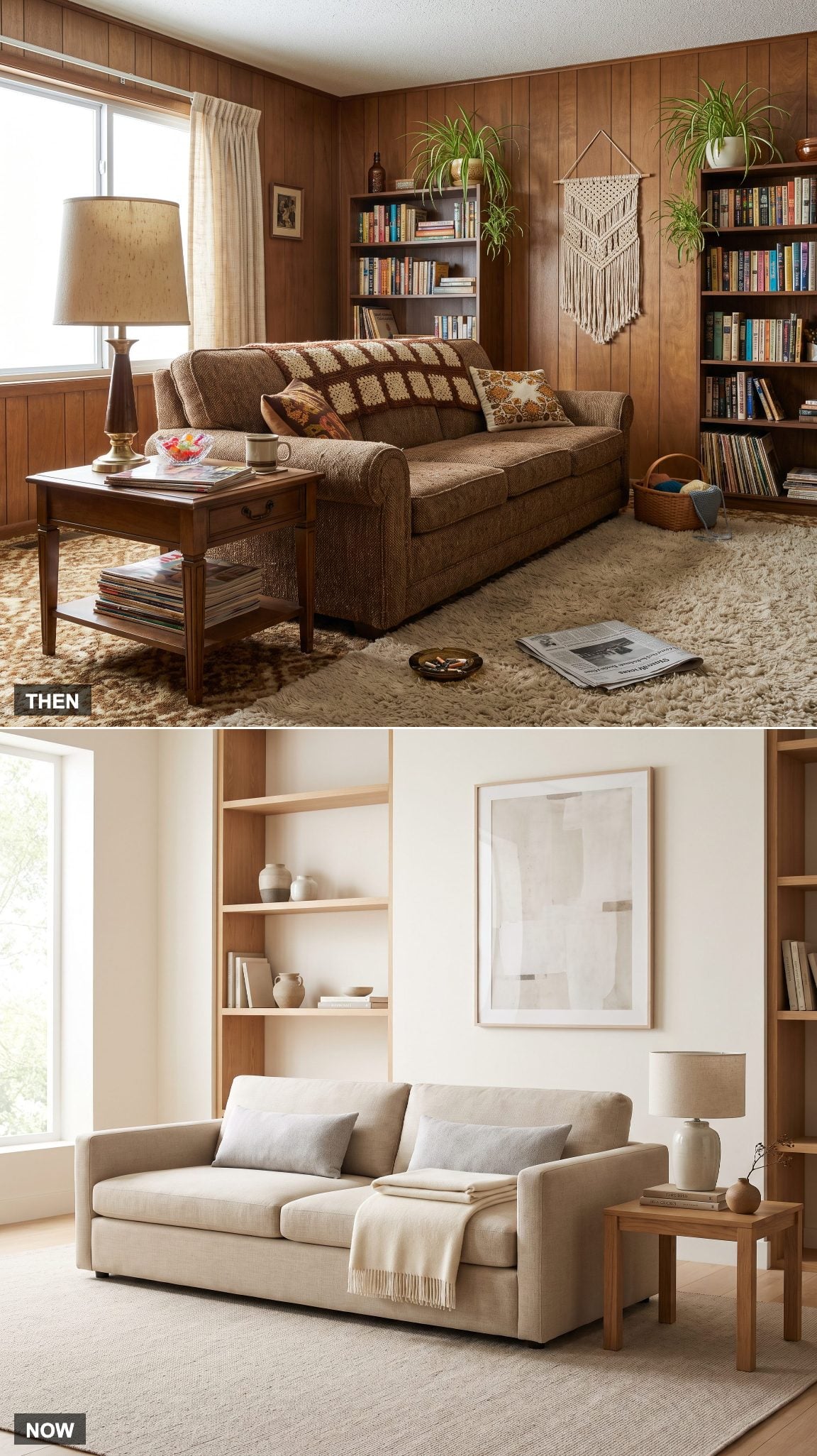
The 1970 family room rarely hid every trace of daily life. Afghans stayed on sofas, magazines accumulated on tables, family photographs crowded shelves and whatever the household was using remained visible until someone needed the surface for something else.
Contemporary interiors are photographed and designed with far more editing in mind. Throws get folded, shelves leave gaps and storage absorbs the mundane objects that once stayed in sight. A craft room inspiration level of organization can create extraordinary calm, although something is inevitably traded away when every sign of ordinary life disappears.
The 1970 family room showed you almost everything the household owned. The contemporary one is much better at deciding what you get to see.