
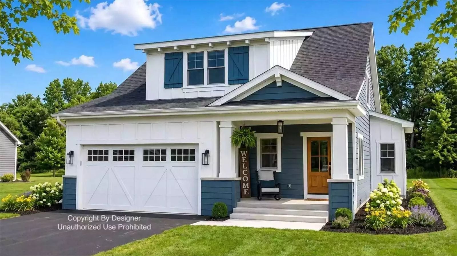
Friday night in March, and the kids have claimed the loft before the car is even unpacked — backpacks on the mudroom floor, dinner smell drifting up the open staircase, someone already asking if friends can sleep over. The Trafford Way is built around exactly that kind of household: a main-floor primary that keeps parents close to the kitchen while the loft runs loud above, an open layout that stays in the conversation, and enough square footage that a busy family can actually spread out without constantly running into each other.
Specifications
- Sq. Ft.: 2,225
- Bedrooms: 4
- Bathrooms: 2
Floor Plan – Main Floor
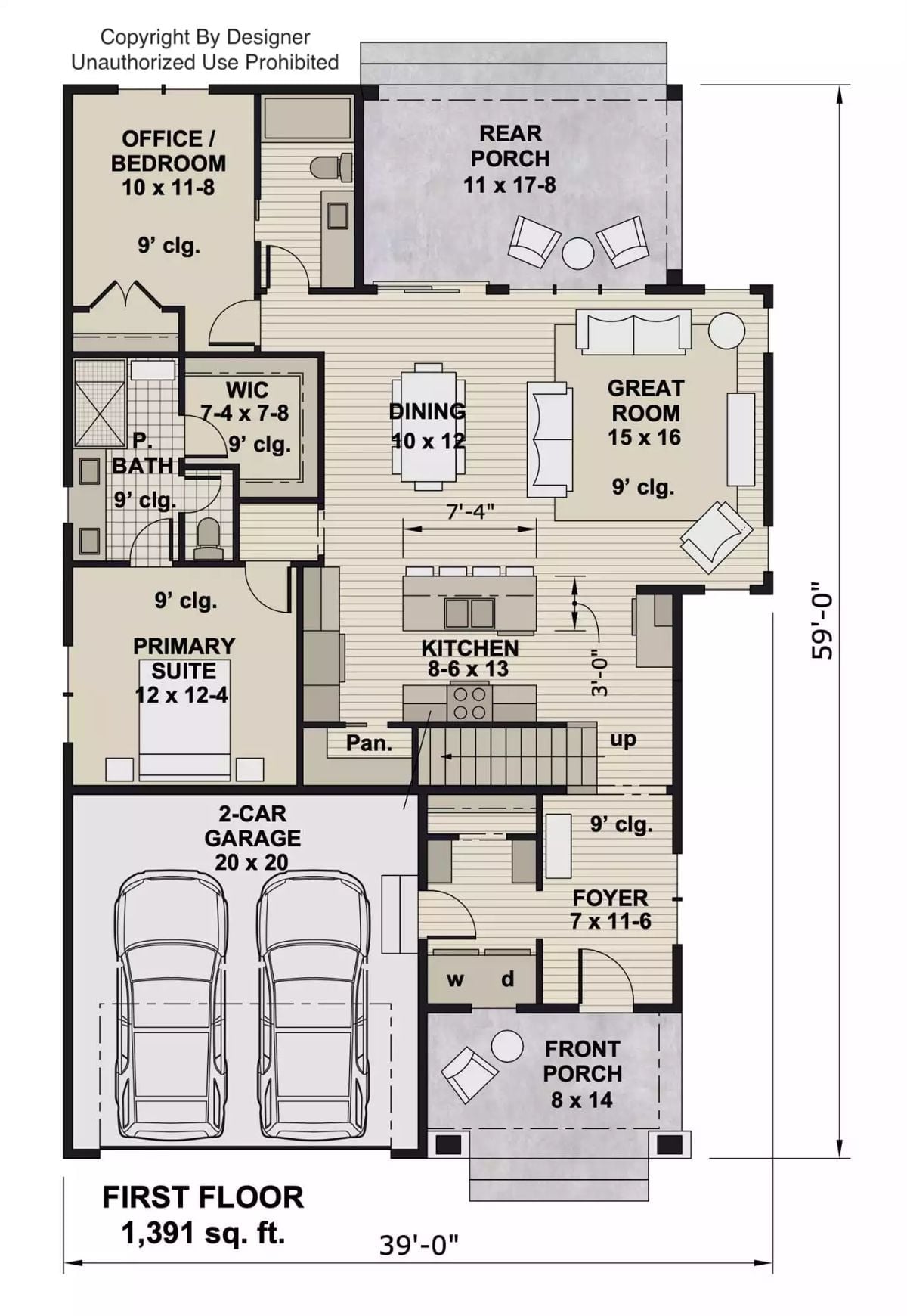
The first floor keeps the primary suite and an office/bedroom on the left side, away from the main living areas. A central kitchen connects to both the dining room and the great room, with a rear porch just beyond it. Foyer and laundry sit near the front entry, and the two-car garage tucks to the side without eating into the living footprint.
Floor Plan – Second Floor
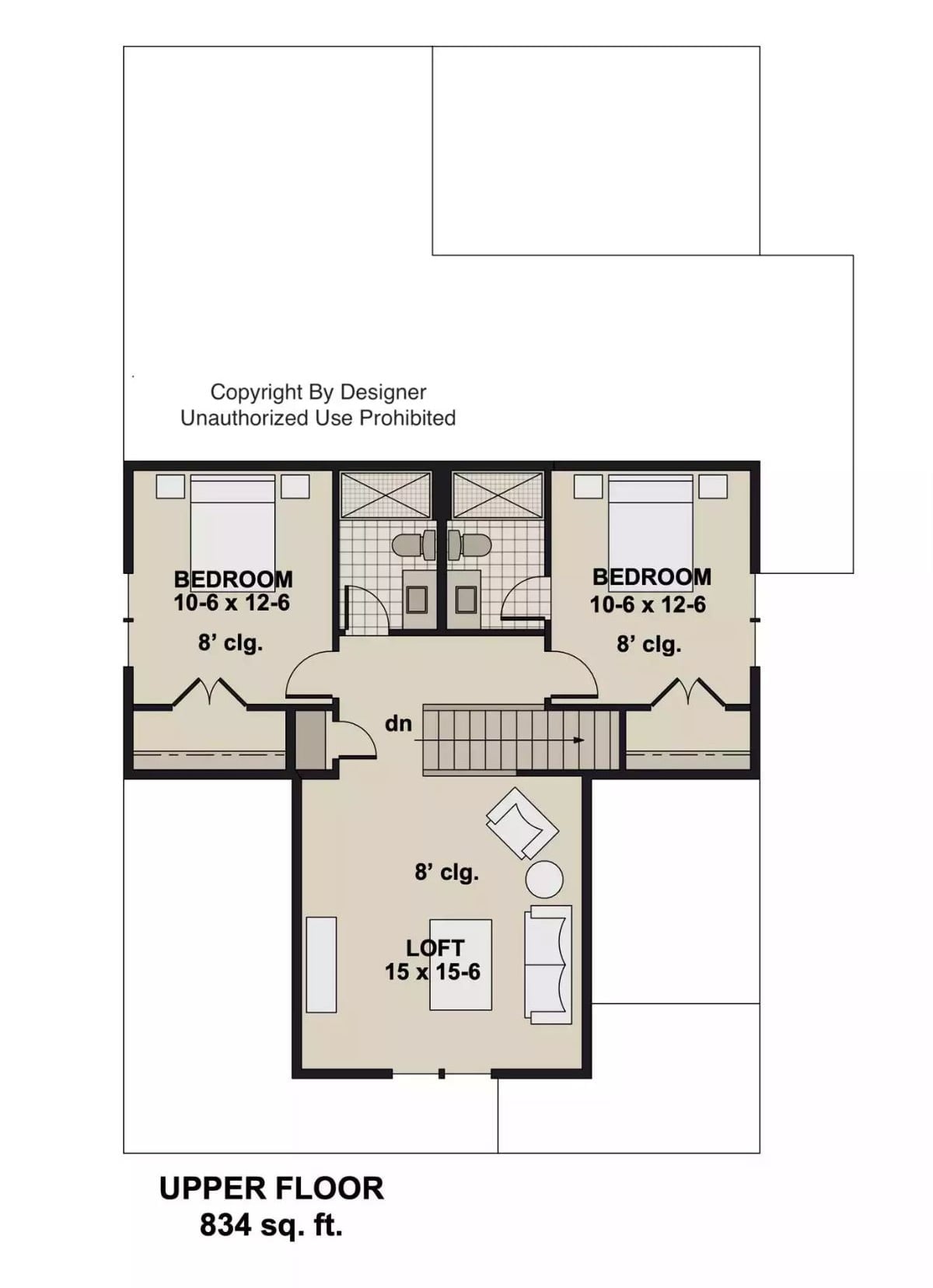
Upstairs: two equal-sized bedrooms, a shared bath, and an open loft that connects back down via the main staircase.
Blue Lap Siding and a Covered Porch Built for Long Summer Evenings
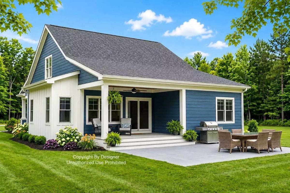
Slate-blue horizontal siding pairs with board-and-batten white accents — a combination that reads as farmhouse without overdoing the nostalgia. A ceiling fan on the covered porch and a gas grill right off the patio steps make this exterior more than curb appeal. People will actually use it.
Gray Island Base, White Counters, and Two Chandeliers That Actually Earn Their Keep
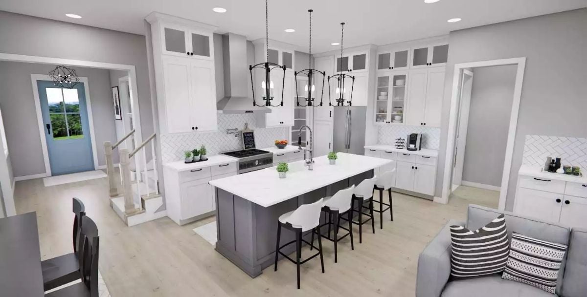
Paired lantern pendants anchor the gray-based island without overwhelming it. Upper cabinets with glass fronts and a herringbone tile backsplash add visual interest, but nothing here fights for attention — the kitchen feels busy in use, not busy to look at.
Material Matters: White shaker cabinetry with black hardware works because the contrast is legible without requiring color to carry it. The herringbone backsplash adds pattern without competing with the cabinet lines, and the glass-front uppers near the ceiling lighten the visual weight of all that white, letting the gray walls read into the space rather than getting swallowed by it.
Gray Sectional, Black Coffee Table, and a Blue Door That Sets the Tone Early
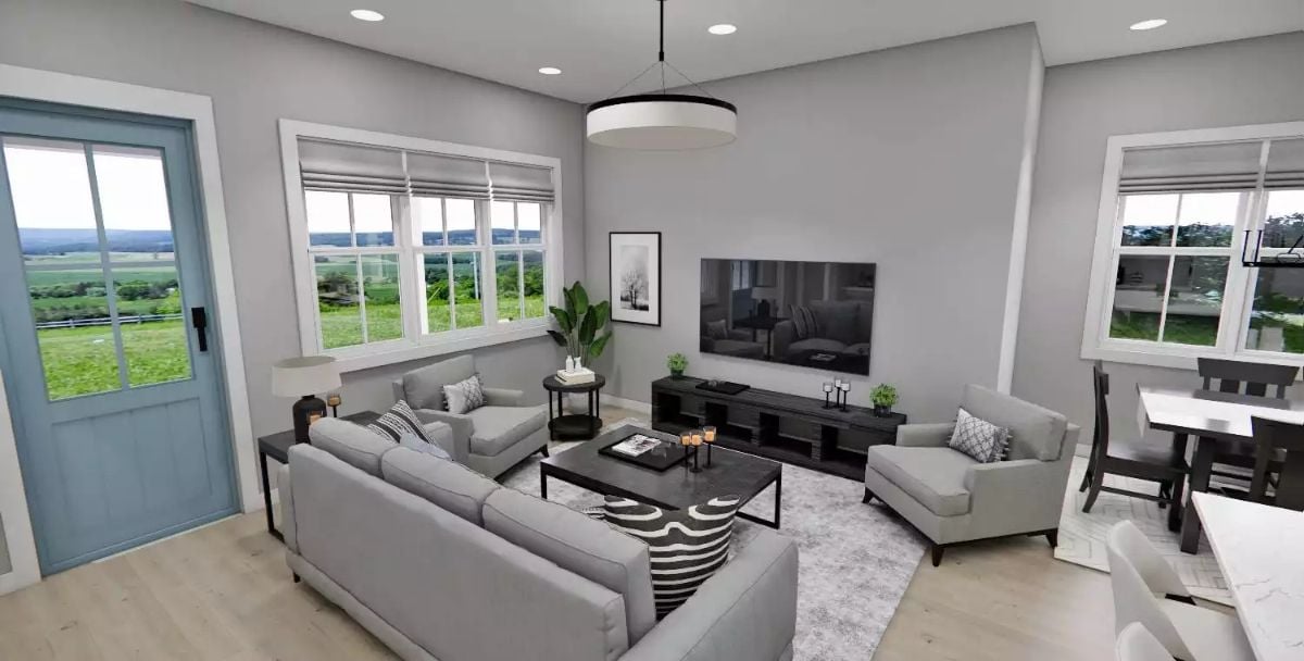
Roman shades filter the rural views without blocking them entirely. Low-profile gray seating keeps sightlines open across the room, and the dark TV console grounds the wall without adding visual clutter. Nothing here is fighting anything else. That’s the point.
Budget Tip: Drum pendant lights like the one centered here typically cost considerably less than chandelier-style fixtures but hold their own in rooms with standard ceiling heights. If you’re furnishing a new build on a tight budget, lighting is one place where price restraint doesn’t have to mean visual restraint. Look for metal-ring pendants with fabric shades over glass — glass adds cost without adding meaningful light output.
Candle-Style Chandelier and Dark Wood Chairs That Pull the Room Together
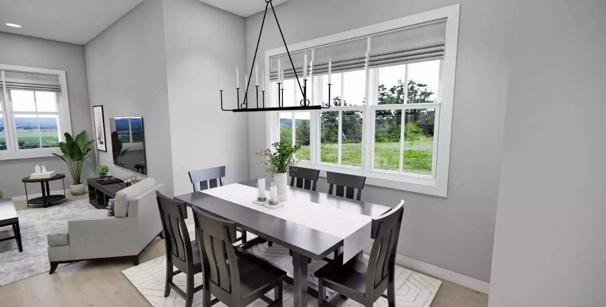
A black iron linear chandelier hangs over a white-top table, with gray chairs and a green centerpiece keeping the whole thing from drifting too formal. Simple, and it works.
Color Story: Gray walls read almost lavender in natural light, which shifts the whole mood of the room depending on the hour. Pair that kind of wall color with a warm white on trim rather than a cool white — otherwise the gray can drift toward clinical fast. Here, the crisp white window casing holds that line well.
Dark Upholstered Bed, Two Lamps, and a Window That Does the Heavy Lifting
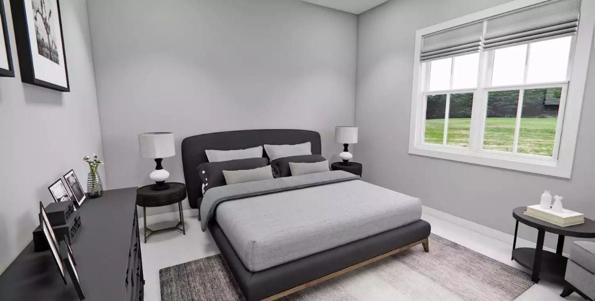
Gray walls, a charcoal platform bed, and matching nightstands stay cohesive without feeling like a showroom. Natural light through the main window does the work that a lot of homeowners try to do with accessories — it keeps the room from feeling cold without requiring anything fussy.
Quick Fix: Bedside lamps with globe bases like these cast light downward and outward, which is better for reading than a drum shade sitting at the same height. Worth thinking about how you actually use bedside light before you buy — it’s a small decision that matters every single night.
Double Vanity With Marble Counters and Sconces That Earn Their Place
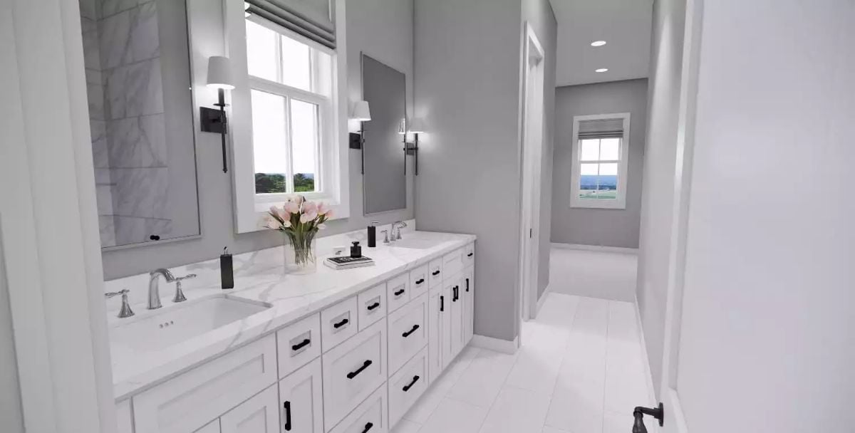
One sconce per mirror, positioned at eye level — light hits your face instead of the ceiling, which is the whole job. White shaker cabinets run nearly wall-to-wall, and the marble counters keep things bright without going cold. The pink tulips on the counter aren’t staging fluff. They’re the only warm note in an otherwise gray room, and they earn it.
Why Wall Sconces Beat Overhead Lighting in a Vanity Setup
Overhead recessed lights cast shadows directly under your chin and eyes — about the worst possible light for a mirror. Flanking sconces at face height distribute light evenly across both sides, which is why professional makeup artists have used this layout for decades. If you’re planning a bathroom renovation, sconce placement is one of those decisions that’s nearly impossible to fix cheaply after the rough-in, so get it right early.
Loft Space With a Desk Setup That Proves Work and Lounge Can Share a Room
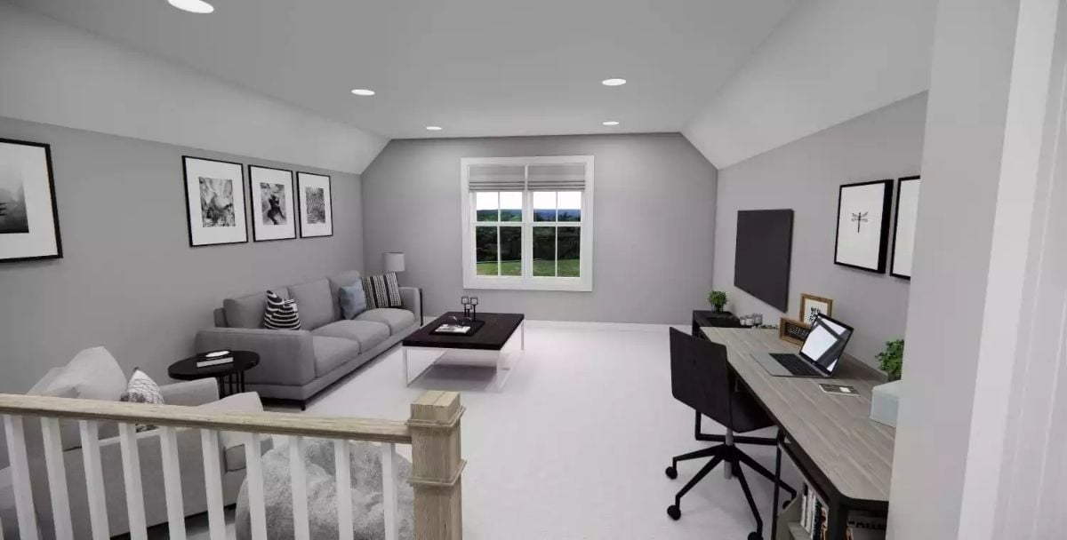
The vaulted ceiling on the far wall keeps the loft from feeling compressed — a real risk with open upper floors. Two zones sit side by side without crowding each other: a gray sofa arrangement facing a coffee table, and a long desk with a laptop and rolling chair along the opposite wall. Kids will claim this space immediately. That’s fine. That’s what it’s for.
Designer’s Secret: Loft spaces with open railings borrow visual square footage from the stairwell below, making the room feel larger than its actual footprint. Keep the desk along a side wall so it doesn’t block the sightline from the stairs up to the window — lose that sightline and the space suddenly feels like a hallway with furniture in it.
Pin It
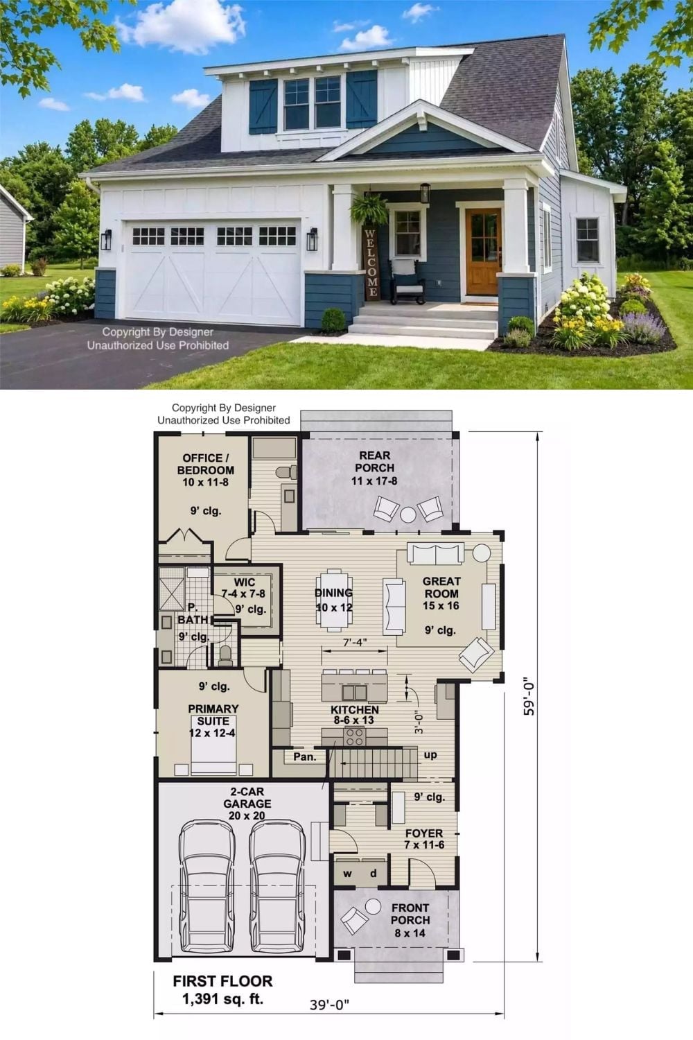
Craftsman exterior with blue lap siding and a covered front porch, shown above the first-floor plan with the main-floor primary suite and rear porch.
