
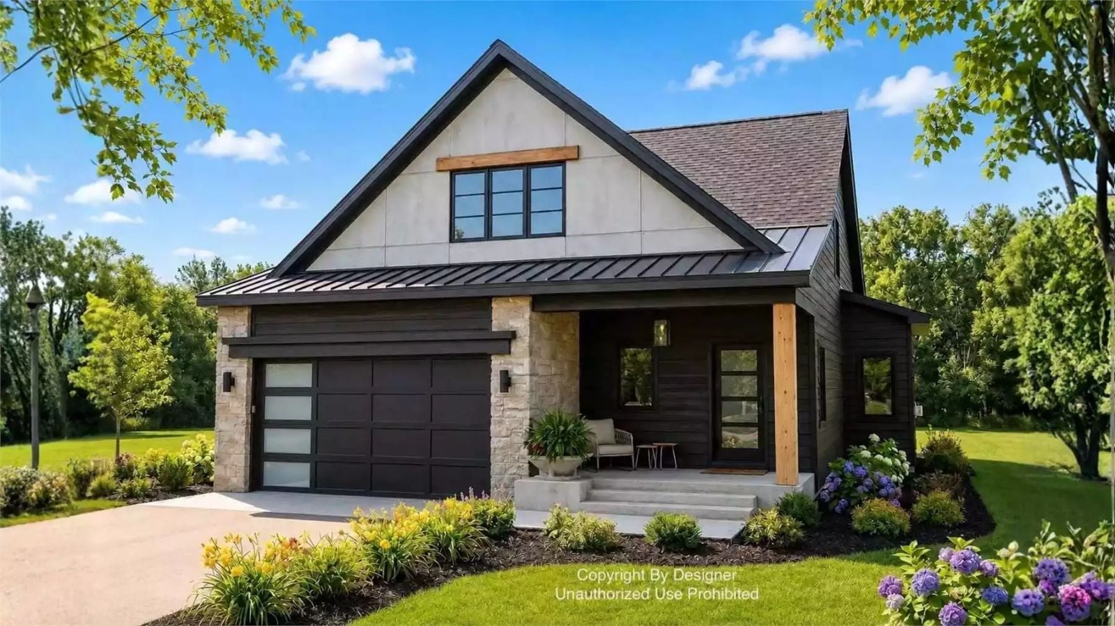
Most houses don’t actually support the way families move through an evening — someone starting dinner, a kid dropping a backpack on a chair, the back door still half-open. The Temple Crescent is built around that drift, with an open main living area, a kitchen designed for company, and a covered patio that keeps everyone outside longer than intended.
Specifications
- Sq. Ft.: 2,225
- Bedrooms: 4
- Bathrooms: 4
Floor Plan – Main Floor
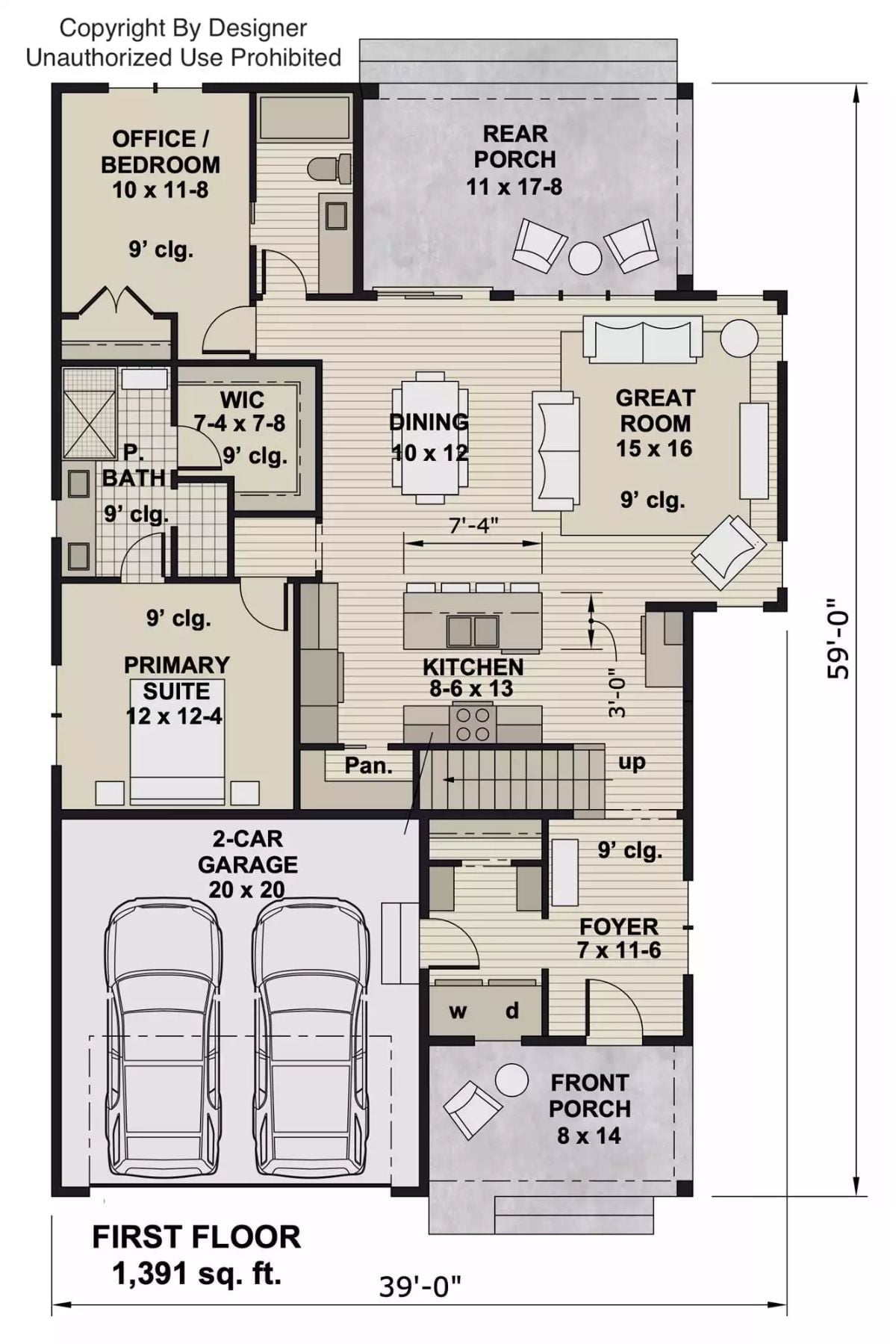
The first floor puts the primary suite and office/bedroom at the back left, keeping sleeping spaces well clear of the front entry. A great room, dining area, and kitchen share one open run across the right side, with the foyer connecting directly to the staircase and a 2-car garage sitting flush with the left wall.
Floor Plan – Second Floor
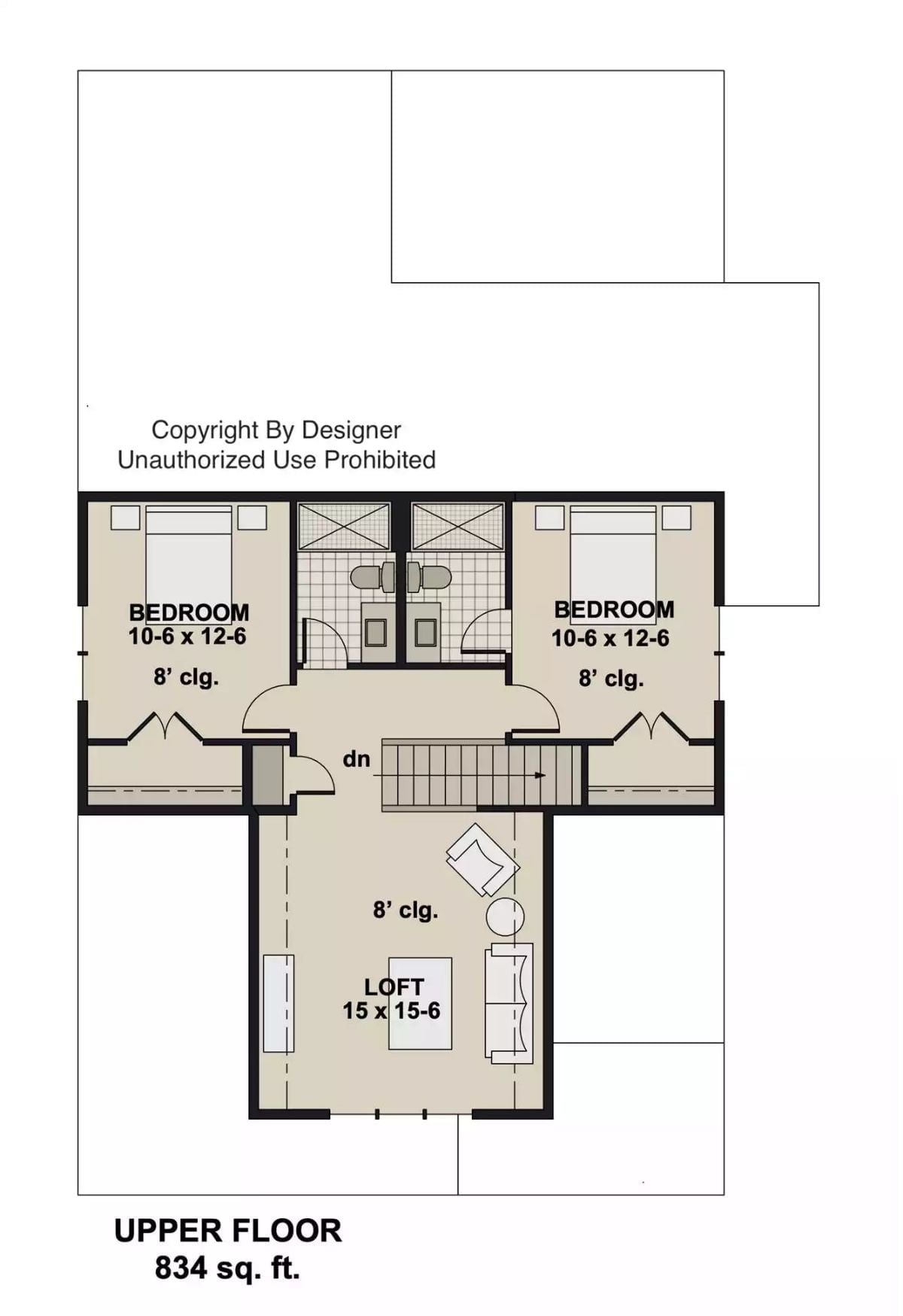
Upstairs, two equal-sized bedrooms share a full bath, with an open loft serving as flex space between them. The staircase lands centrally, so traffic flows naturally and neither bedroom gets stuck at the end of a corridor.
Editor’s Note: Both bedrooms measure 10’6″ x 12’6″ with 8-foot ceilings, so neither kid gets stuck with the short end of the stick. The loft runs 15 x 15’6″ — large enough to function as a media room, homework zone, or home office without feeling like dead square footage. For families who want shared common space without committing to a formal room, this is where that argument gets settled.
Covered Patio Out Back Does the Heavy Lifting for Family Gatherings
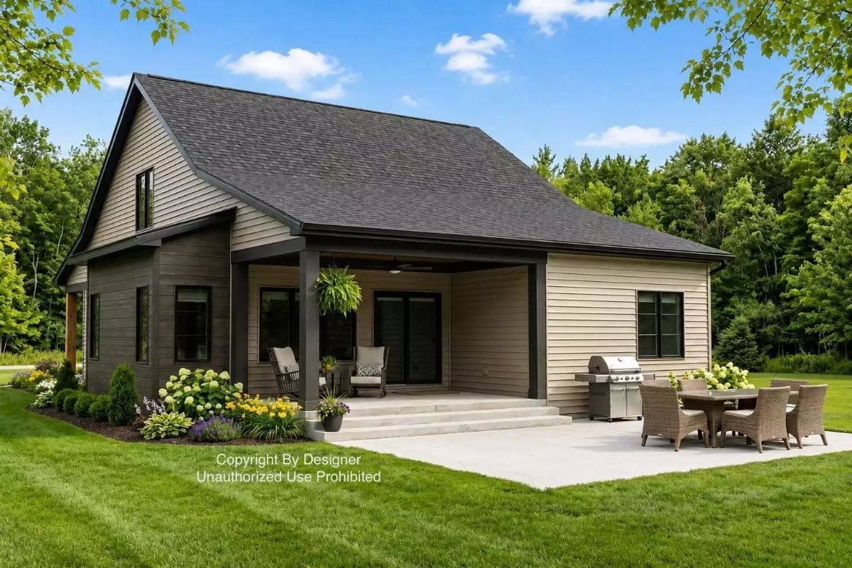
Beige lap siding with dark trim gives this exterior some edge without overdoing it. Out back, a covered porch with ceiling fan steps down to a concrete pad sized for a full dining set and a gas grill, with hydrangeas and hostas doing most of the landscaping work.
Why That Covered Porch-to-Patio Transition Works
Most covered porches stop at the roofline and leave outdoor furniture exposed once guests spill past the steps. Here the covered section handles the conversation zone while the open concrete pad takes the grill and dining table — a separation that keeps smoke away from where people are sitting and gives each activity its own footprint. Simple, but most plans don’t bother.
Gray and Black Living Room Pulls Three Spaces Into One Without Trying Too Hard
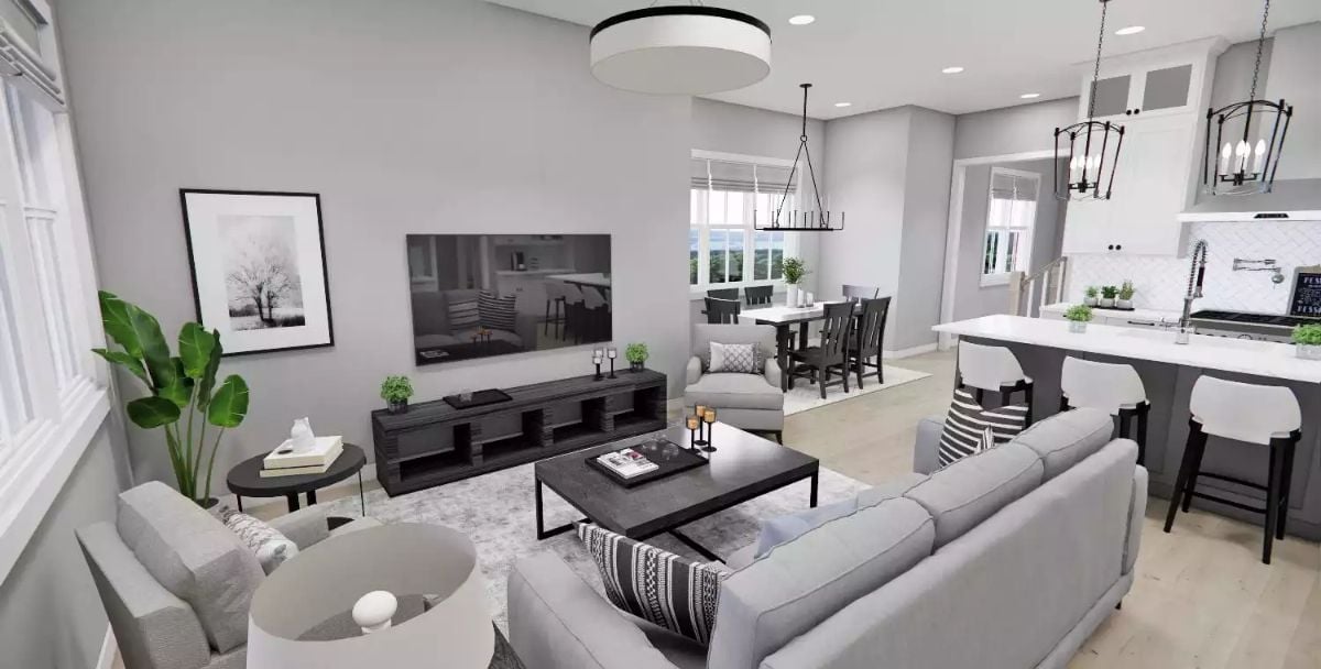
Light gray sofas anchor the living room, with a low black media console keeping the TV wall grounded. Behind it, dark-stained dining chairs and a rectangular chandelier carve out the eating area, and bar stools at the kitchen island pull everything together across the open floor plan. That large-leaf plant in the corner earns its space.
Try This: Repeating one finish across zones is the easiest way to keep an open floor plan from reading as a jumble of separate rooms. Here, dark-stained wood shows up in the media console, dining chairs, and bar stools, so your eye reads the whole space as deliberate rather than accidental. Pick one material and let it travel.
Gray Island, White Counters, Black Hardware — Kitchen Gets the Contrast Right
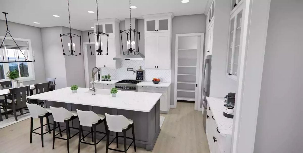
Black iron pendant chandeliers anchor the island without competing with the professional-style faucet rising well above the sink basin. White shaker cabinets keep the perimeter light while the gray island base adds weight at the center. A few small potted plants on the counter are enough to keep the whole thing from feeling like a showroom.
Fun Fact: Quartz countertops like the ones shown here are non-porous, so they don’t need annual sealing the way natural marble does — a real advantage in a kitchen that actually gets used. The veining still gives you the marble look without the maintenance commitment.
Candle-Style Chandelier Over a Dark Wood Dining Set Is a Pairing Worth Copying
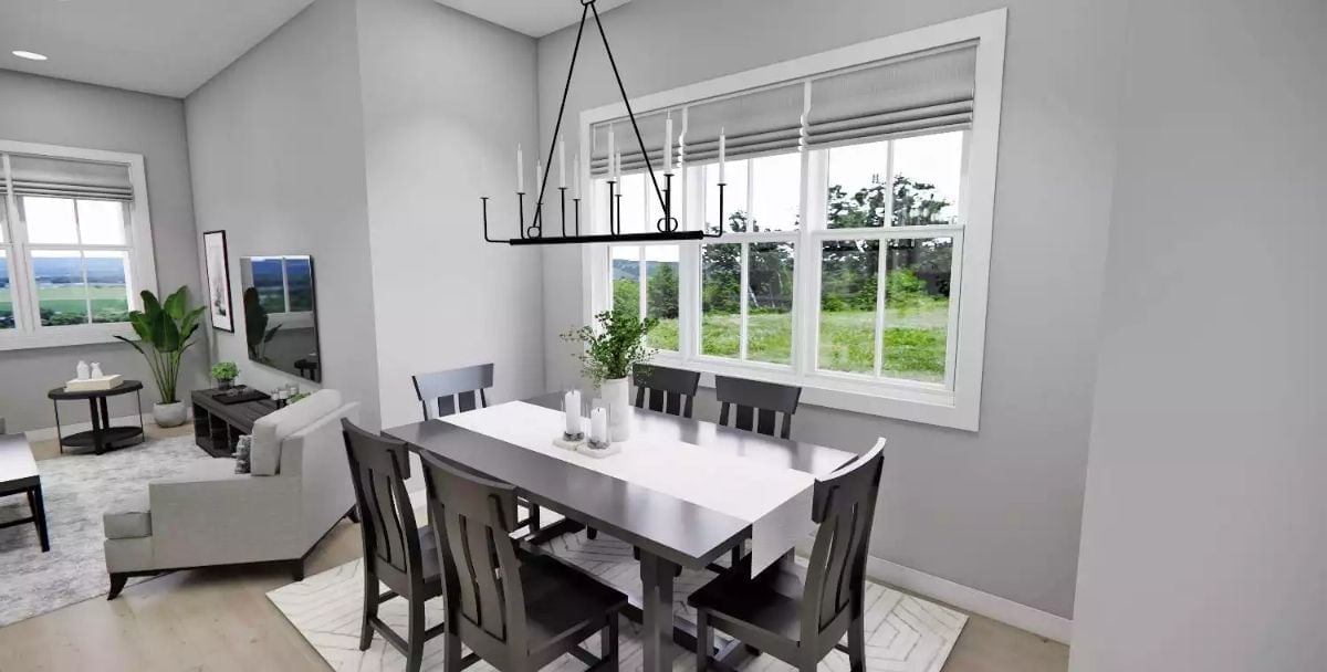
Dark wood chairs against a white tabletop give the dining room its contrast without any extra effort. Roman shades in linen keep the large window from feeling bare, and the centerpiece stays minimal — a plant, a few candles. That iron rectangular chandelier with taper-style arms reads traditional without tipping into formal.
- Roman shades filter glare without blocking the view
- A white tabletop makes dark wood chairs feel intentional rather than heavy
- Rectangular chandeliers work best when they match the long axis of the table beneath them
Charcoal Upholstered Bed With Matching Nightstands Keeps This Bedroom Grounded
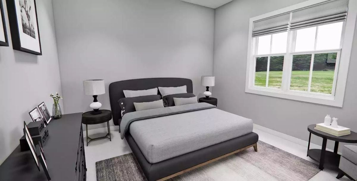
Gray walls, gray bedding, black furniture. Cohesion here comes from committing fully to the palette rather than second-guessing it with an accent color that doesn’t belong.
By The Numbers: Roman shades stack flat when raised, so they block far less glass than traditional fabric blinds — worth considering in a bedroom where natural light matters. Fabric choice does a lot of the heavy lifting too; a heavier linen or a blackout liner makes a noticeable difference in rooms that catch morning sun.
Marble Counters and Black Hardware Make This Double Vanity Worth the Square Footage

White shaker cabinets, veined countertops, and matte black pulls anchor a double-sink vanity with tulips centered between two mirrors. Clean, classic, and harder to mess up than it looks.
Loft Space With a Work Desk and Media Wall Earns Its Square Footage Twice
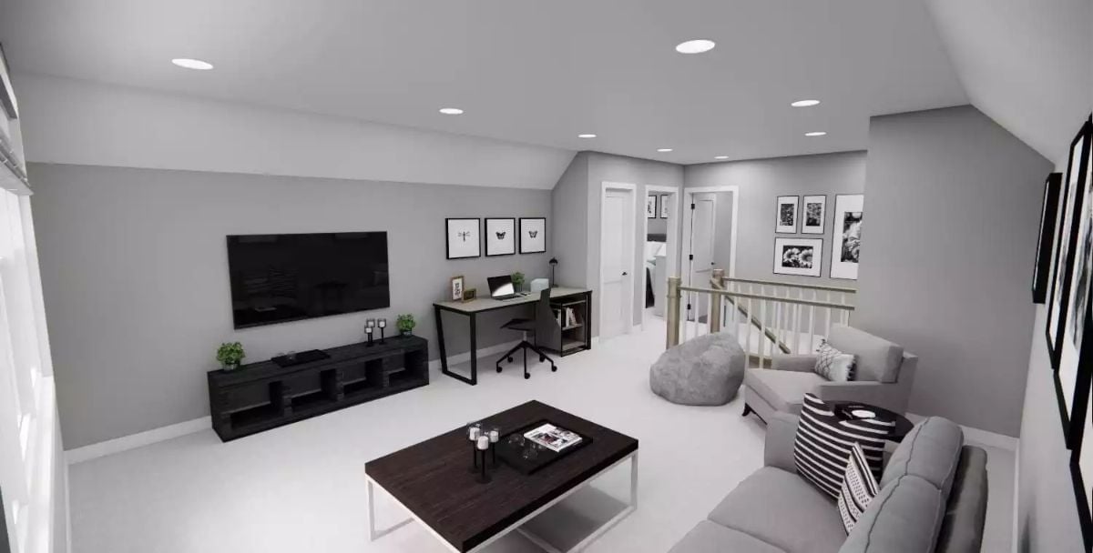
Recessed lighting handles the whole ceiling without a single fixture competing for attention. Bean bag seating beside the sofa signals that this loft genuinely serves multiple ages, and a wall-mounted TV opposite a dedicated desk means one person can work while another watches — no negotiating over the room required.
Pin It
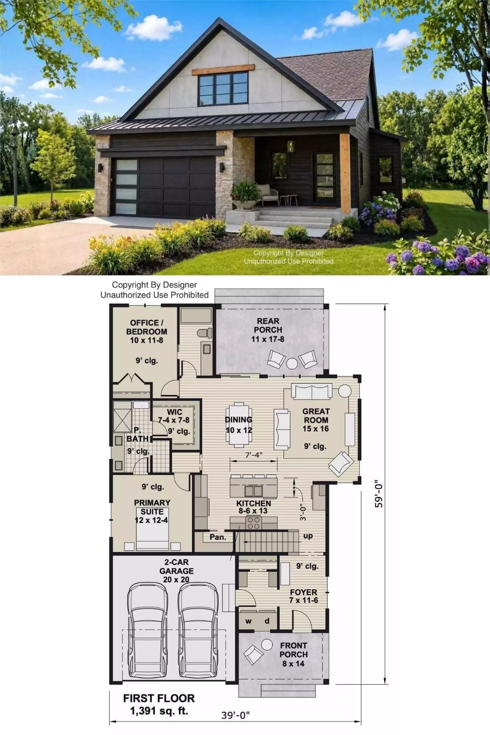
The exterior rendering shows a modern farmhouse with board-and-batten siding, stone accents, and a standing-seam metal roof. Below it, the first-floor plan lays out 1,391 square feet with a primary suite, office/bedroom, great room, kitchen, rear porch, and a 20×20 two-car garage.
