
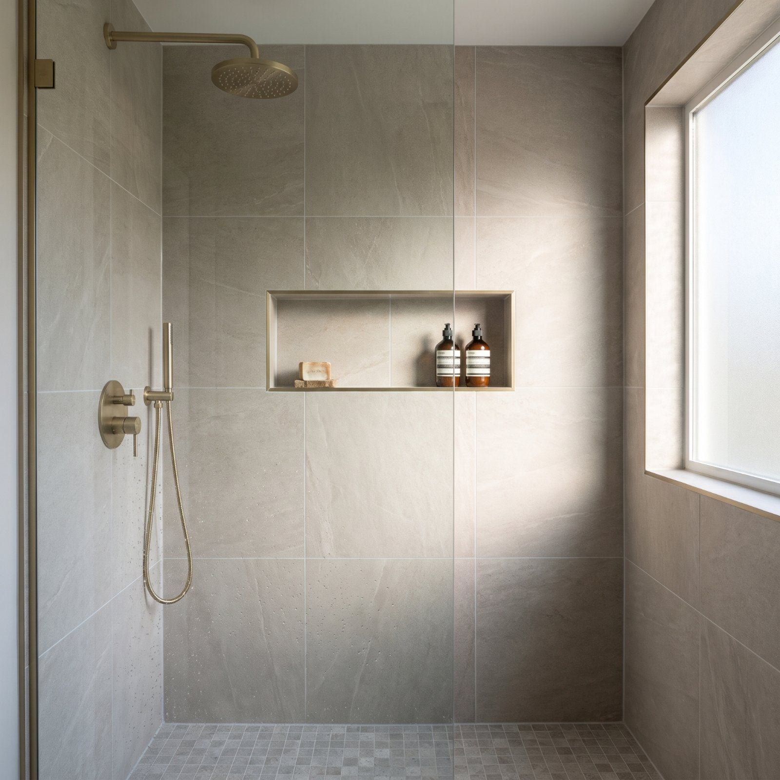
A shower niche is a small rectangle. It’s also the one detail a tile installer can’t fake, and the one a guest’s eye lands on the second they walk in. Most of these mistakes happen because the niche got decided last, after the planning energy was already spent. The fixes below cover waterproofing you can’t see, grout lines you can, plus proportion, placement, and the few inches that separate custom from builder-grade. None of them cost much. They just have to happen before the tile goes up.
37. Treating the Niche Like a Last-Minute Cutout
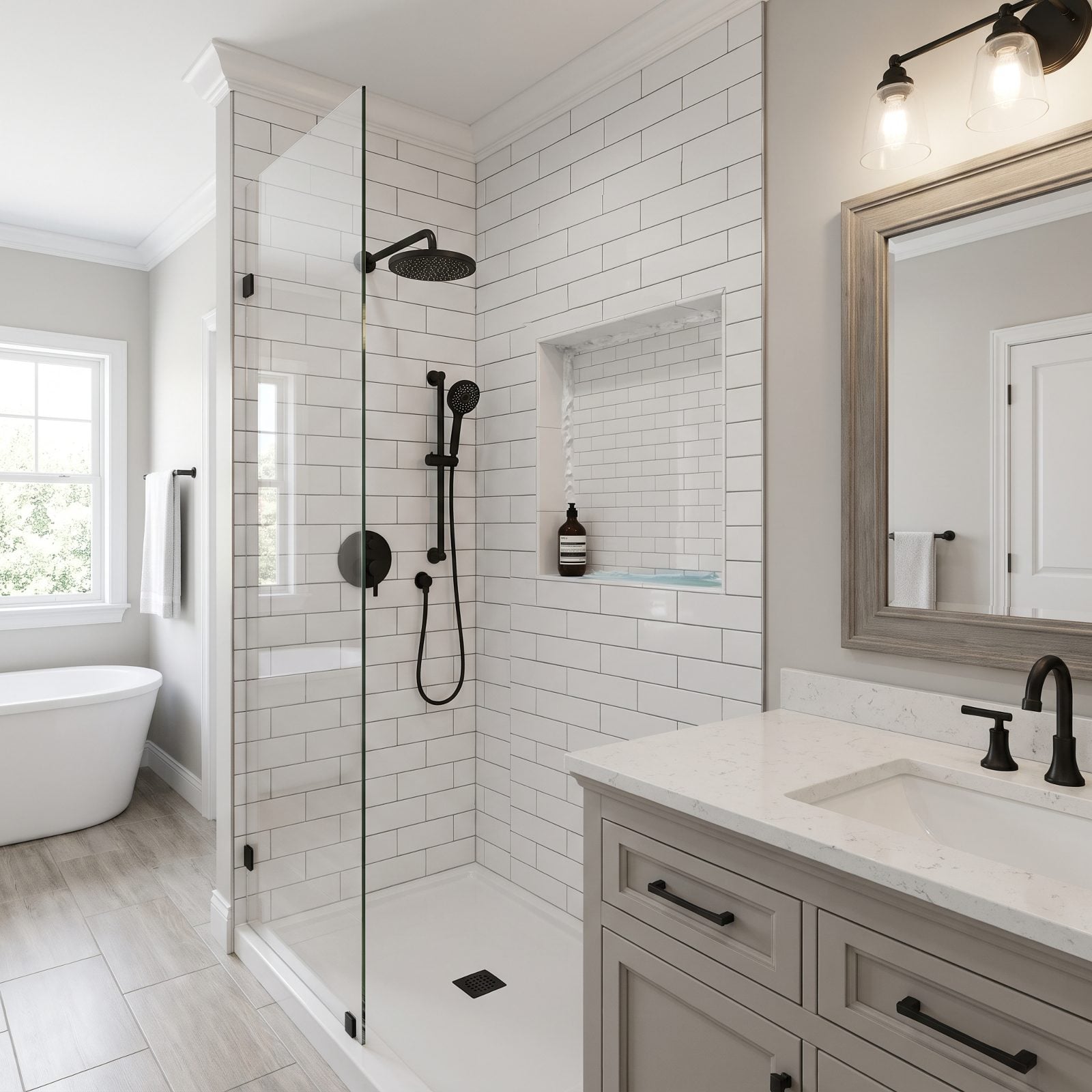
The niche looks fine from across the room. Step closer and the inside corners tell on themselves — globs of silicone doing the work the tile cuts should have done, and a flat bottom shelf cradling a thin puddle that never drains.
In order to come up with the very specific design ideas, we create most designs with the assistance of state-of-the-art AI interior design software. Also, assume links that take you off the site are affiliate links such as links to Amazon. this means we may earn a commission if you buy something.
Here’s what went wrong. The niche got added after the waterproofing membrane was already up, so there was no proper preformed pan, no slope, and no clean way to wrap the corners. Water pools, mold moves in, and the caulk yellows within a year.
Plan the niche before the membrane goes on. Use a bonded preformed niche pan pitched slightly forward on the bottom shelf, then tile tight corners with mitered edges instead of caulk. It’s a thirty-dollar part that reads as custom for the life of the shower.
36. Ignoring the Main Tile’s Grout Grid
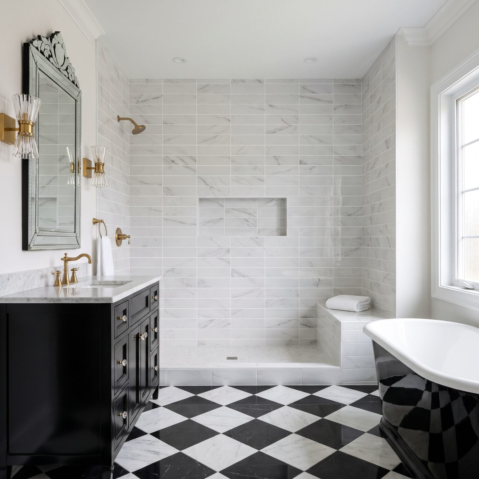
Stand in front of this shower and something feels off before you can name it. The niche is tiled in the exact same porcelain as the wall, yet its grout lines land two inches above the horizontal joints running across the field. The lines jog. Your eye snags.
Alignment is the whole game here. When the grout inside the box continues the lines outside the box, the niche reads as if it was carved from the wall. When it doesn’t, it reads as an afterthought bolted on.
So set the niche location to the grout grid, not the tape measure. Top, bottom, and sides should fall on existing joint lines so the opening disappears into the pattern. It’s a planning decision made with a pencil on the wall before a single tile gets buttered.
35. Making the Niche Too Small for Full-Size Bottles

A niche that can’t hold a standing pump bottle isn’t storage. It’s decoration that collects fallen bottles.
This one gives you about ten inches of interior height — looked generous on the drawing, fails the first time a real bottle of shampoo goes in. The bottle leans, the conditioner lies on its side, and the shelf becomes a place things fall rather than a place things live.
Give the opening at least 12 inches of clear interior height, 13 or 14 if you buy the tall salon bottles. Measure your actual product, pump nozzle included, and add an inch of knuckle room. Storage that fits the life you actually live is the difference between a niche and a ledge.
34. Making the Niche So Shallow Bottles Hang Over the Edge
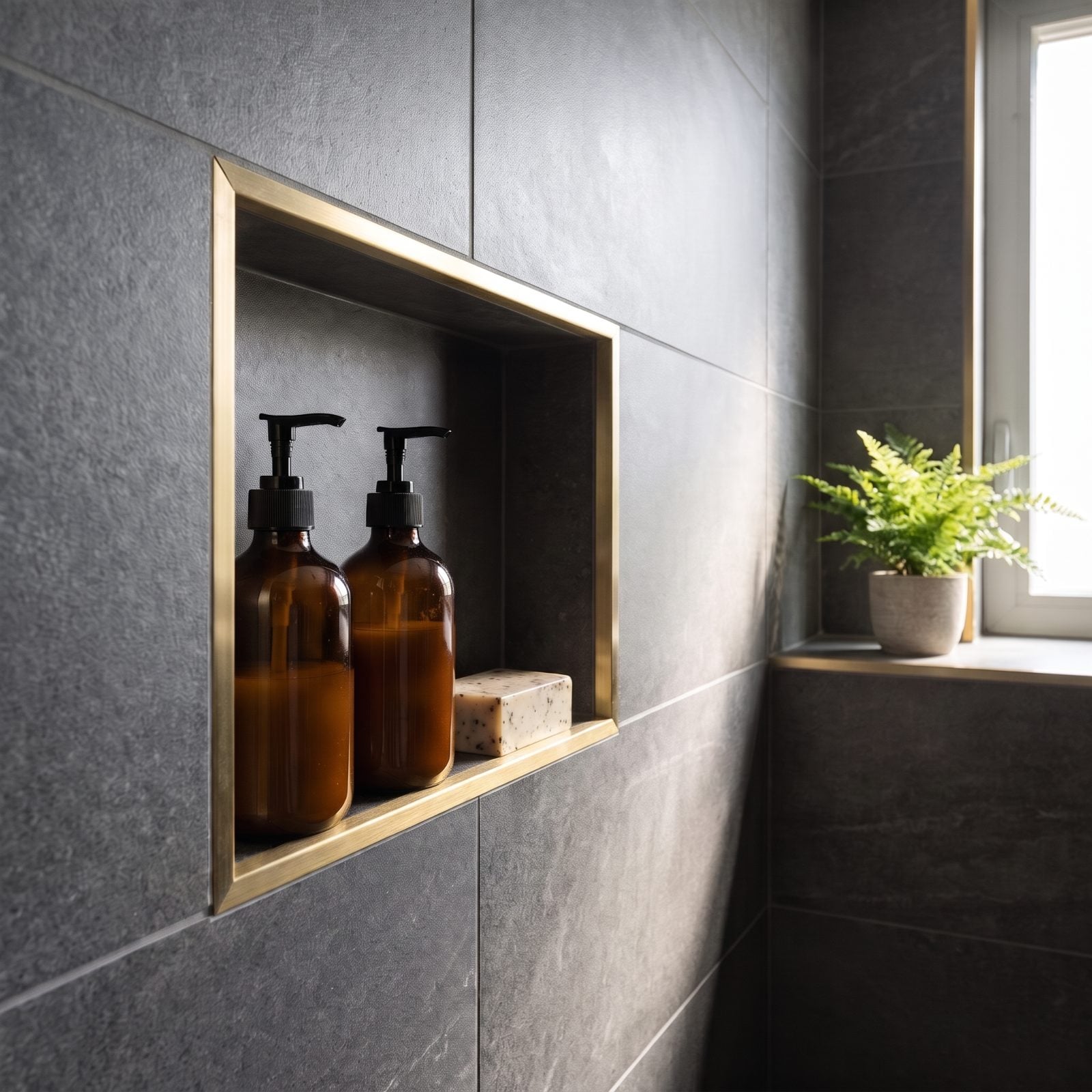
Depth is the niche spec everyone forgets. A shallow box looks clean empty, then every bottle you load sits with its nose hanging past the trim, cluttering the very wall the niche was supposed to tidy. The niche pictured gets it right: both amber pump bottles and the bar of soap sit fully inside, behind the brass trim, with nothing poking past the edge.
Shallow niches happen because the wall cavity is thin — usually a 2×4 wall with plumbing behind it. Nobody wanted to bump the depth, so the bottles pay for it.
Aim for 3.5 to 4 inches of interior depth so standard bottles sit fully inside the opening, below the trim lip. If the wall won’t give it to you, shift the niche to an interior partition wall with more room, or frame a shallow bump-out. A niche should swallow its contents, not spit them at the glass.
33. Oversizing the Niche Until It Dominates the Shower

A niche this big stops being a detail and becomes the wall. At roughly three feet wide and two and a half tall, it crowds the field tile into a thin frame and sits mostly empty, because nobody owns enough shower product to fill a billboard.
Proportion is everything. When the niche out-measures the tile around it, the shower loses its calm, and the pattern you chose barely gets to show.
Keep the opening to a modest share of the wall — a single bottle-width slot or a two-section box that leaves generous tile on all sides. Twelve to sixteen inches wide does everything you need and lets the stone breathe around it.
What Our Readers Say
- When Home Stratosphere readers loved a bathroom and said why, overall style came first at 28%, followed by feeling cosy at 20% and materials at 13%.
- Bathroom photos with beige accents got more hearts from our readers than the other images in the same articles, 69% versus 57%.
From Home Stratosphere reader polls and votes.
32. Centering the Niche on the Wall Instead of the Shower
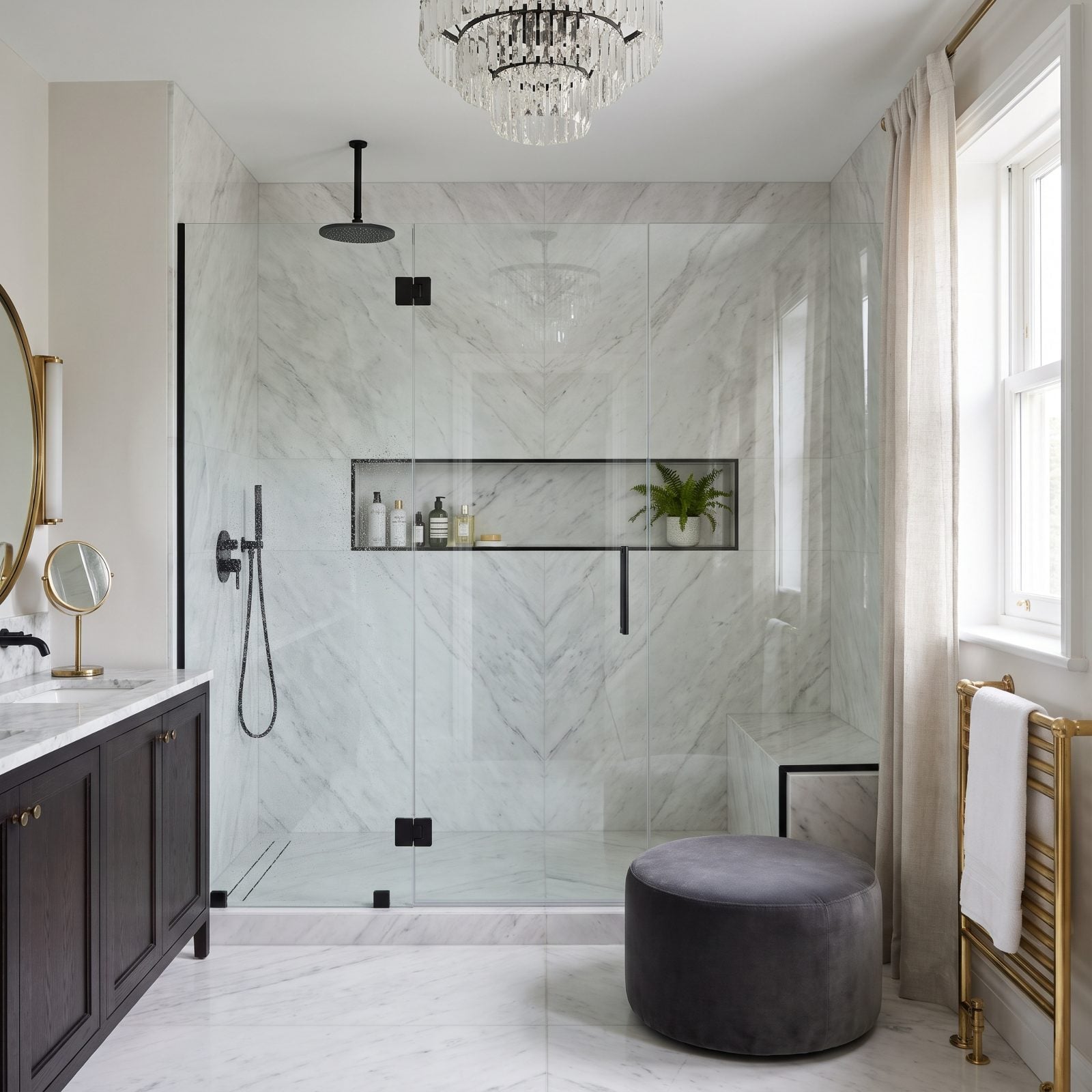
Mathematically, the niche is dead center. Functionally, it’s in the wrong spot. A bench eats the right third of the shower, so the niche that centers on the wall ends up off to one side of where you actually stand, and you reach sideways for your soap every morning.
Centering on the wall ignores how the shower gets used. The niche belongs where your hand lands — under or beside the showerhead, not at the geometric middle of a wall a bench already interrupts.
Place it relative to the standing zone and the showerhead, then fine-tune to the grout grid. Function first, symmetry second. Your shoulders will thank you. Same logic that governs good ceiling light placement applies here: put it where the body goes, not where the ruler says.
31. Letting the Niche Slice Through an Accent Stripe
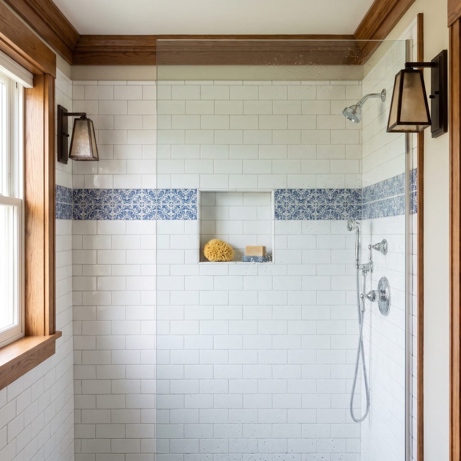
That blue mosaic band was supposed to be the moment. Instead the niche opening carves straight through it, and the stripe resumes on the far side half a tile off, so the one decorative line in the whole shower reads as broken.
When a niche intersects an accent band without planning, you lose both. The band looks interrupted and the niche looks careless.
Two moves solve it. Either sit the niche fully above or below the stripe so the band runs clean and unbroken, or use that band to line the interior back of the niche, turning it into the feature behind your bottles. Intersect on purpose, never by accident.
30. Positioning the Niche Too High or Low for Comfortable Use
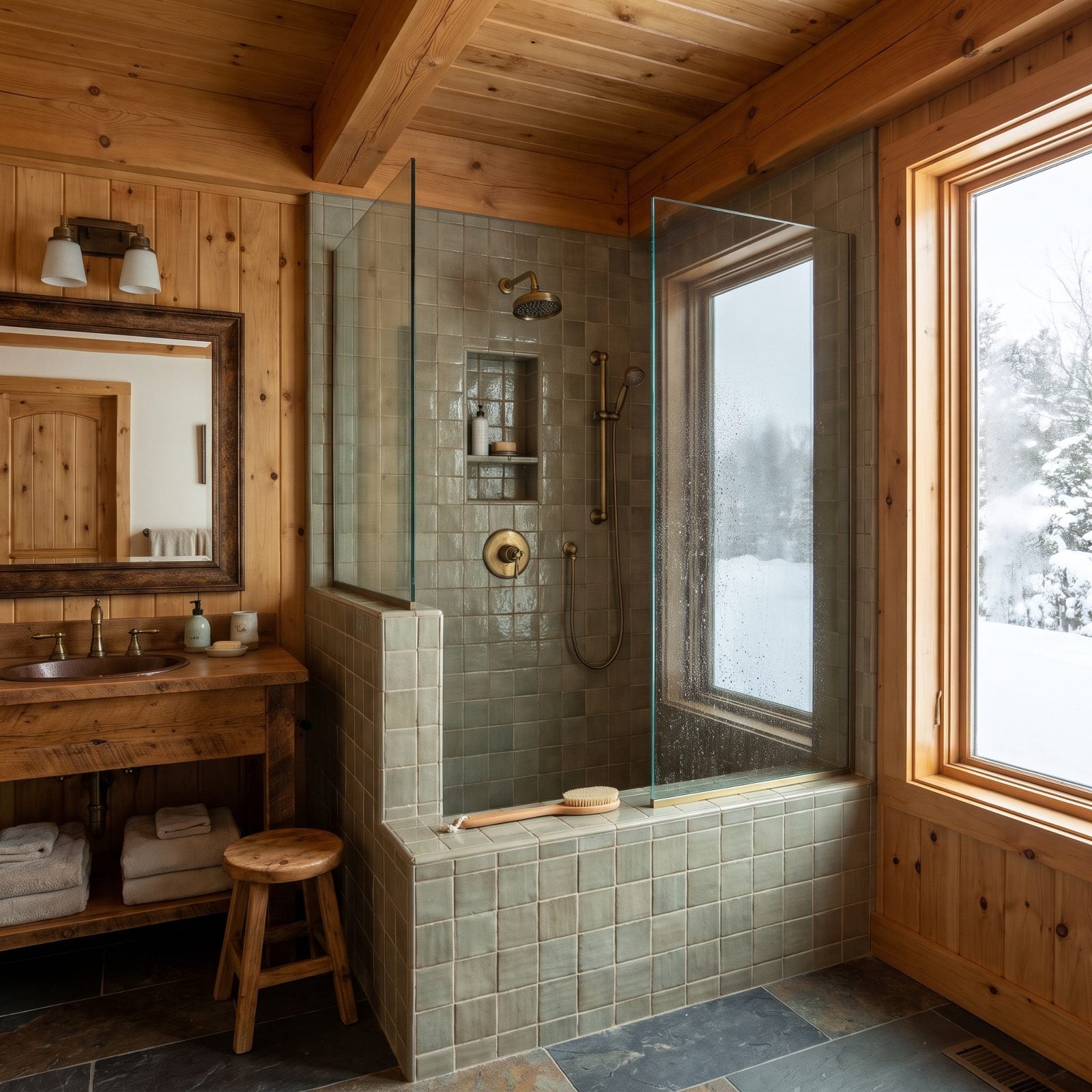
This niche sits up near the showerhead, its bottom shelf about five feet off the floor. Pretty. Also a reach — and anything in it sits in the direct spray, so your bar soap dissolves and your razor rusts.
Height is ergonomics. Too high and you stretch, too low and you crouch, and spray position matters as much as reach.
Set the main niche so its center lands between 48 and 52 inches off the floor, roughly chest height, and keep it clear of the showerhead’s direct line. Want a spot for a propped foot and leg-shaving? Add a second low niche or a bench at 18 to 24 inches. Two heights, two jobs.
29. Designing One Cavernous Opening Without Shelves

One tall opening sounds generous until you load it. Without a dividing shelf, everything crowds onto the single bottom ledge, tall bottles burying short ones, and the niche becomes a cave you root around in.
A shelf is cheap organization. It doubles your usable surface and lets you see what you own at a glance.
Add at least one tempered glass or stone shelf across the opening, splitting it into a tall lower section for bottles and a shorter upper one for soap, razors, and a loofah. In a tall niche, two shelves beats one. The same thinking that makes a light hallway renovation feel organized works in a two-square-foot box: give every object a home and the clutter vanishes.
28. Spacing Shelves Too Tightly for Useful Storage
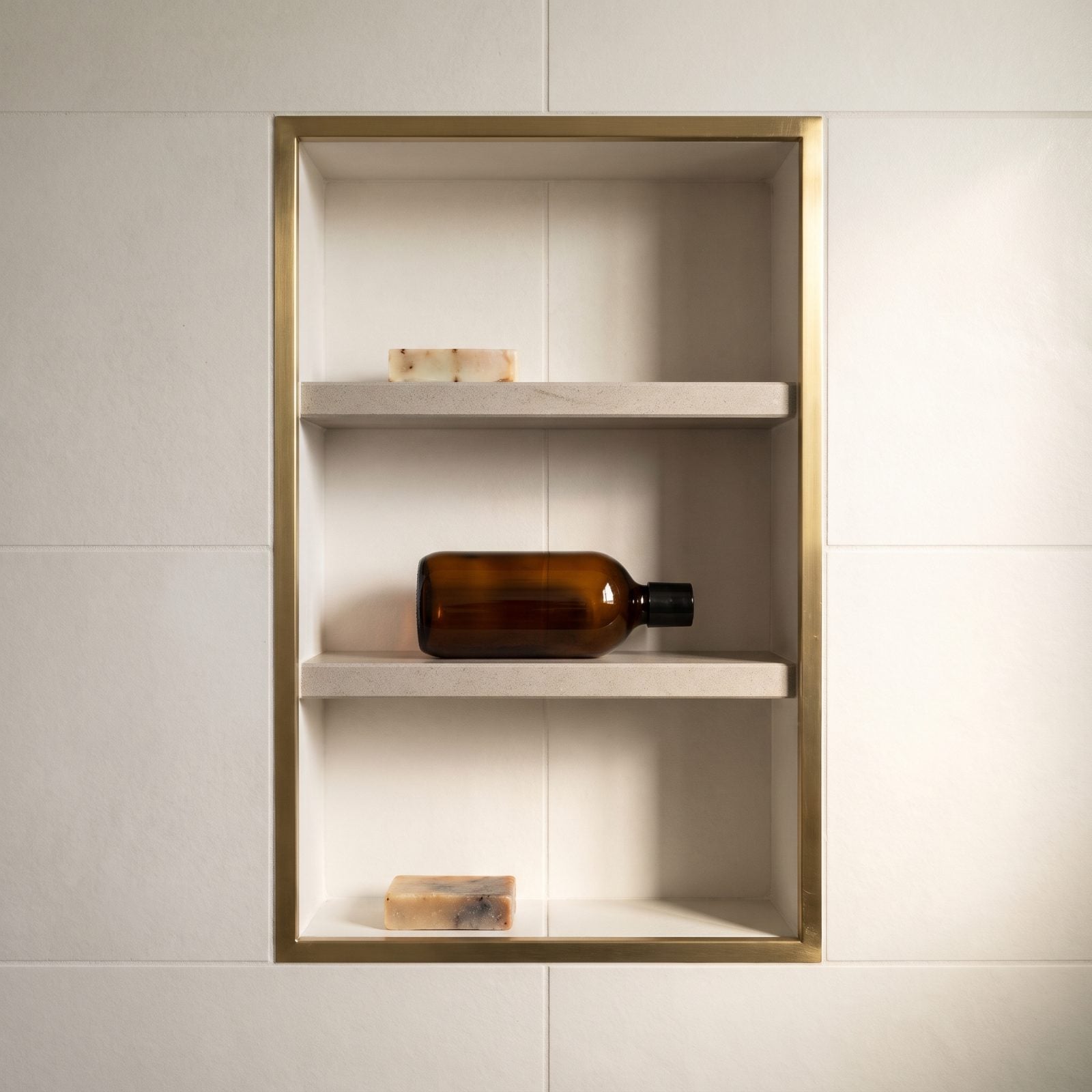
Three shelves, evenly spaced, and not one of them fits a bottle. Each gap runs about six inches, which looks balanced and stores nothing taller than a bar of soap. The shampoo ends up lying on its side.
Even spacing is the trap. Shower products aren’t evenly sized, so dividing the niche into equal bands guarantees the tall stuff has nowhere to stand.
Size the compartments to the contents instead. Give the bottom section 12 to 14 inches for pump bottles, then a shorter 6-inch band up top for soap, razors, and small things. Uneven on purpose beats even on principle, every time. Measure your tallest bottle, build the biggest gap to match, and the niche actually earns its keep.
27. Using a Chunky Shelf That Looks Like a Countertop
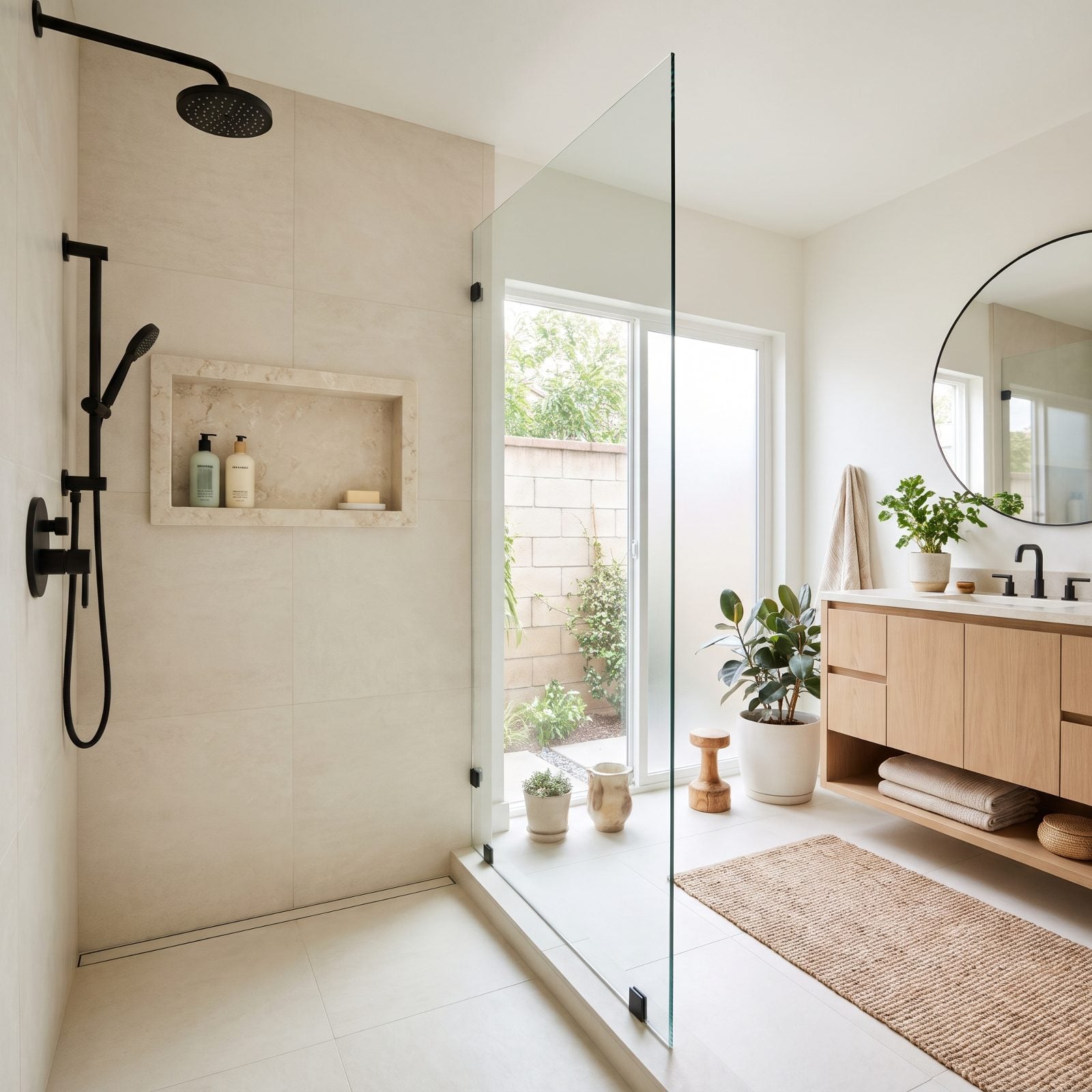
You’ve seen this one. The niche shelf comes in at an inch and a quarter thick, a stubby little countertop floating halfway up the wall, and in a shower where every other reveal is a few millimeters, that heft reads as leftover — like a slab offcut nobody wanted to throw away.
Why it doesn’t work: proportion. A niche is a cut in the wall, not a piece of furniture. The thick shelf fights the thinness of the tile around it, and your eye catches the mismatch before you’ve even registered why.
Run a slab shelf at roughly three-eighths to half an inch instead, or tile the shelf in the same field tile with a mitered front edge so it reads as part of the wall. Let the opening be the feature, not the ledge inside it.
26. Letting the Shelf Project Past the Niche Face
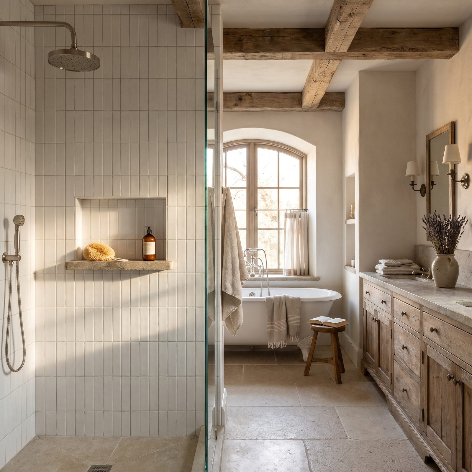
The shelf should stop flush with the face of the niche. When it juts out past the tile by half an inch or more, it stops being a recess and becomes a ledge bolted to the wall. Water sheets off the front lip, and the shadow it throws gives the whole thing away.
Flush is the goal. The shelf front should align exactly with the plane of the surrounding tile, or sit a hair behind it. Lay a straightedge across the niche face before the thinset cures and you’ll catch it in two seconds.
25. Mounting a Green-Edged Glass Shelf on Chrome Clips
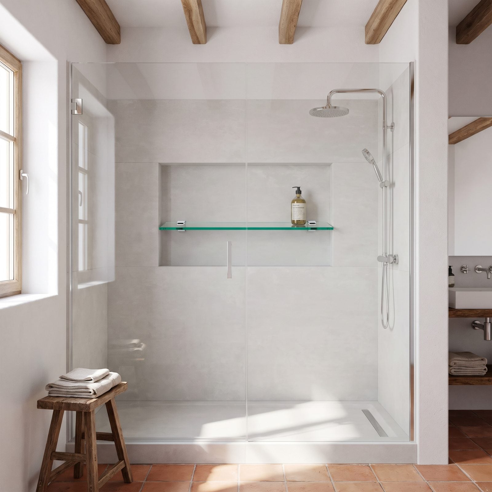
Builder-grade tempered glass has a green cast on its cut edges. Stick that shelf on four little chrome clips and you’ve announced the whole bathroom was finished on a budget. It’s the first thing a tile person clocks, and it’s everywhere in spec homes.
Two better moves: use low-iron glass, which reads nearly clear on the edge, and ditch the visible clips. A built-in integral shelf set into the niche walls hides its support entirely. Low-iron costs a bit more per shelf. It’s also about the cheapest upgrade you can buy for the biggest visible payoff.
24. Making Side-by-Side Openings Different Sizes
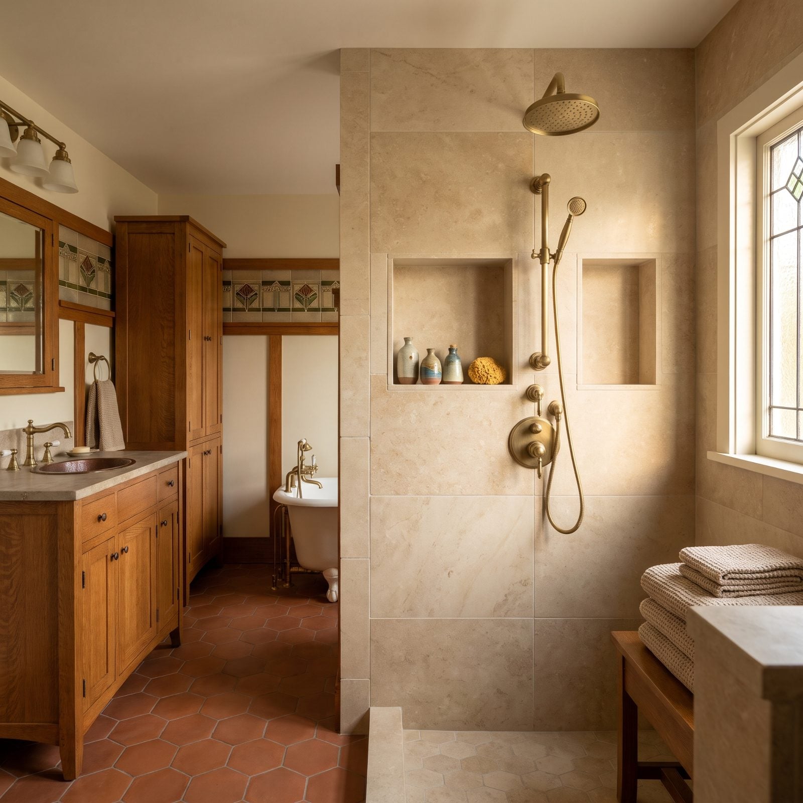
Twin niches are a smart idea. Twin niches of two different widths are an accident the eye cannot unsee — one opening four inches wider than its neighbor throws the whole wall off-axis, and the asymmetry nags at you every single morning.
If you want two, make them identical: same width, same height, same reveal, divider dead center. When the tile layout won’t allow two matching openings cleanly, do one wider single niche instead. Symmetry in a wet wall is calming. The brain loves it the way it loves a level picture frame.
23. Stacking Multiple Niches at Random Heights
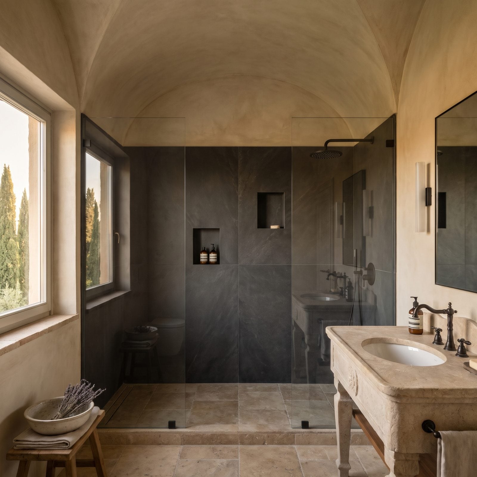
More niches is not more luxury. Three little cubbies scattered up the wall at whatever height felt right that day reads as busy and unplanned, especially when none of them line up with the grout joints.
Pick a logic and commit to it — either one generous horizontal niche that holds everything, or a stack that shares a vertical centerline with openings aligned to the tile grid. Tie the niche to the tile layout, not the other way around. One well-placed opening beats three random ones in every shower I’ve ever looked at.
22. Failing to Align the Niche With the Shower Controls
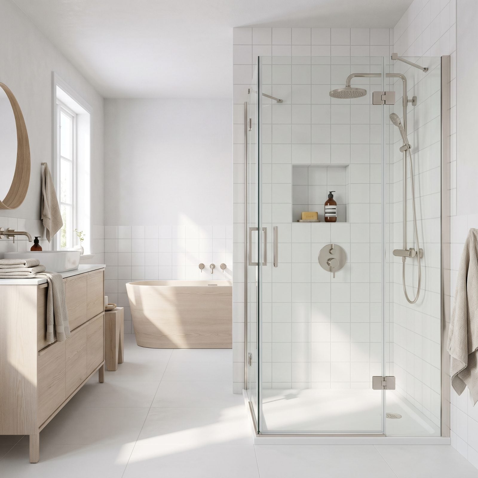
Here’s the one nobody notices until they do. The niche, the valve, the handle, the control plate all sit on the same wall, yet none of them share a centerline. The niche drifts left, the controls sit center, and the wall looks like two people installed it on different days.
Line them up. The niche should share its vertical centerline with the valve and trim below, so the whole wall reads as one considered composition top to bottom. Sort this on paper before the plumbing rough-in — by tile day it’s already too late. Good bedroom recessed lighting teaches the same lesson, actually: alignment is what separates designed from assembled.
21. Using a Rounded Prefabricated Insert in an Angular Shower
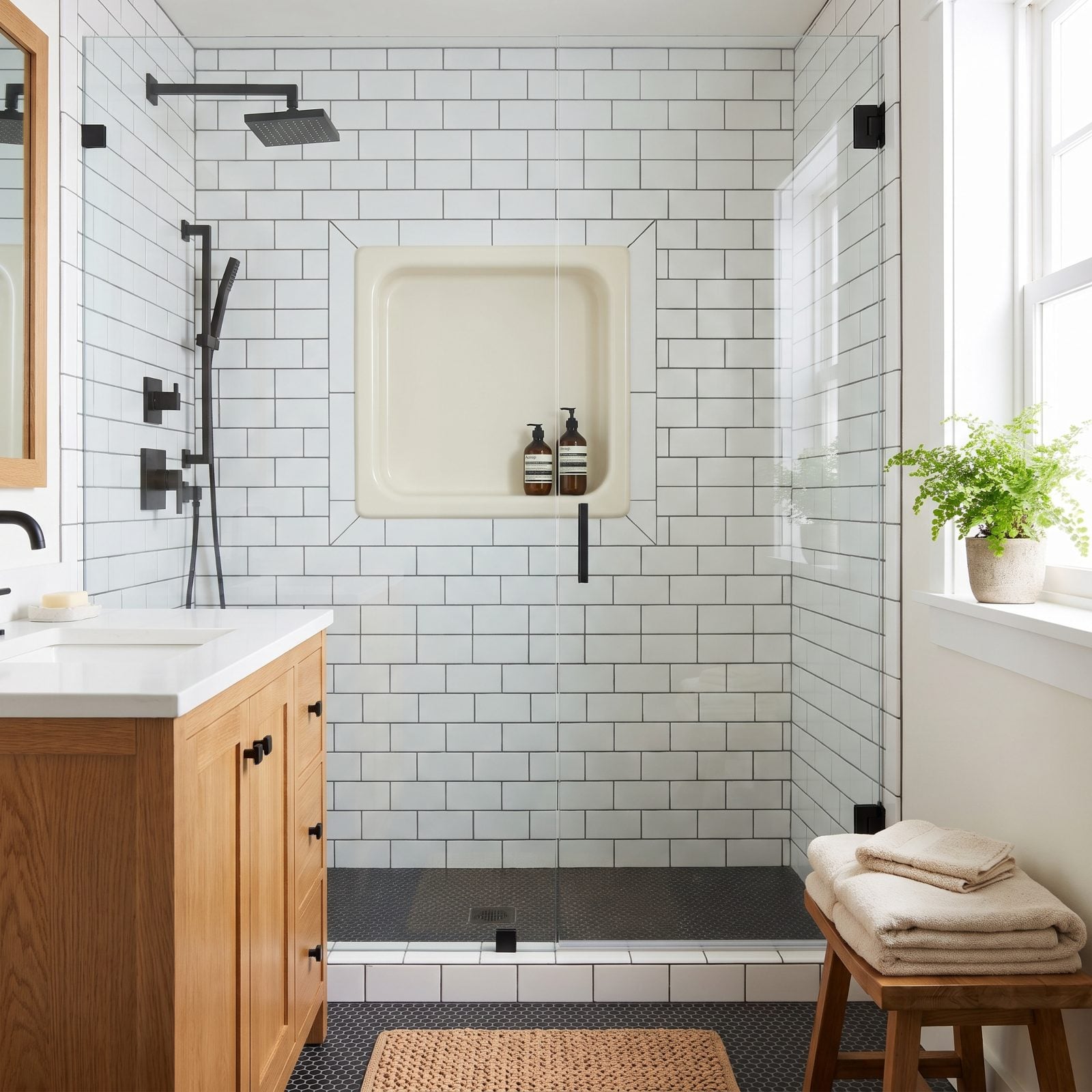
Prefab niche inserts are a gift to installers. They’re also often molded with soft rounded interior corners, and when you drop one into a shower built entirely from square-edged tile and crisp miters, the curves look borrowed from a different bathroom.
Match the geometry to the room. An angular, modern shower wants a square-cornered niche, either site-built or a prefab with true 90-degree corners. In a softer, more traditional space the rounded insert is fine. The shape of the opening should echo what’s already around it, not argue with it.
20. Leaving the Lip of a Plastic Niche Insert Visible

The plastic insert did its job behind the wall. The trouble is that quarter-inch lip of white flange peeking out between the tile edge and the inside of the niche, sometimes with a bead of silicone trying to hide it. That little strip of exposed plastic tells you everything about the shower, and none of it flattering.
Tile should die neatly into the opening with no flange showing — tiled right up to the edge, or finished with a clean metal profile. If you see plastic, the tile was cut short. Order a touch more trim and have the installer bury that lip completely.
19. Choosing Metal Trim That Looks Like an Afterthought
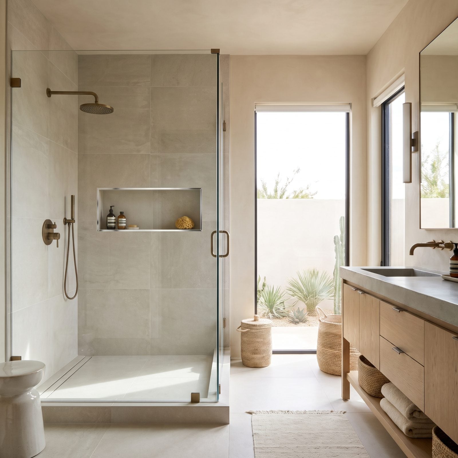
You picked bronze fixtures. You picked bronze hardware. Then the niche got edged in whatever bright chrome Schluter strip happened to be in the van, and now there are two metals in a four-foot square, both insisting they’re the right one.
The fix is boringly simple: match the trim metal to your fixtures. Bronze fixtures get bronze or a matching warm trim. Matte black handles get a matte black profile — or a tiled mitered edge with no metal at all, which is cleaner still. Every finish in a shower should feel like it came from one conversation, not three.
Every metal in the shower should look like it was chosen in the same five minutes.
18. Framing the Niche With Bulky Bullnose Tile

Bullnose edging around a niche is a holdover from an era of smaller tile. In a shower built from big flat slabs it looks like a picture frame nobody asked for — that raised, rounded border sitting proud of the field tile chops up a clean wall and dates the whole install on sight.
Go for a mitered edge. Cut the field tile at 45 degrees and fold it around the opening so the pattern wraps continuously, no border at all. It’s more skilled work, and it looks worlds more refined. In a large-format shower, the mitered niche is the quiet detail that tells you someone who knew what they were doing built this.
Big slabs are where most people are headed anyway: when we asked which shower tile they would order, 64% of our readers picked large format, well ahead of subway at 22%.
17. Leaving Raw Tile Edges Exposed
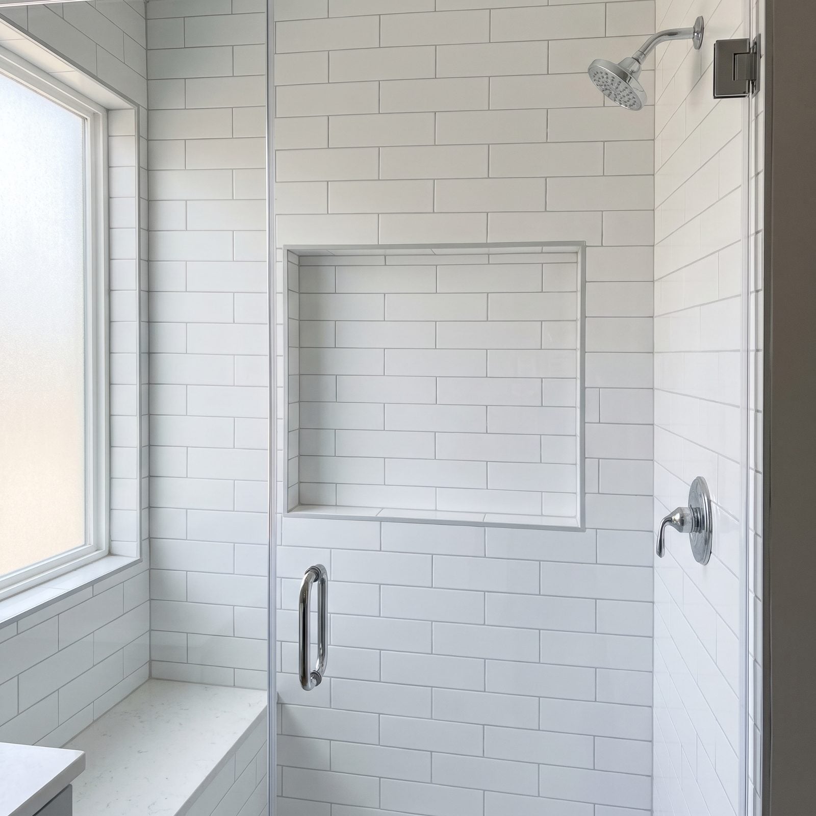
Look at the lip of this niche. That thin pale line running around the opening is the unglazed body of the tile, the part nobody was supposed to see, and once you clock it you can’t unsee it. It reads as unfinished the second you notice it.
Raw cut edges tell everyone the install skipped a step. A finished edge does the quiet work of making the niche look built-in rather than hacked-in.
Fix it with a profile. A brushed brass tile trim wraps the cut and turns the edge into a deliberate detail. Want no metal at all? Miter the field tile around the opening and the line disappears.
16. Allowing Backer Board to Show at the Corners
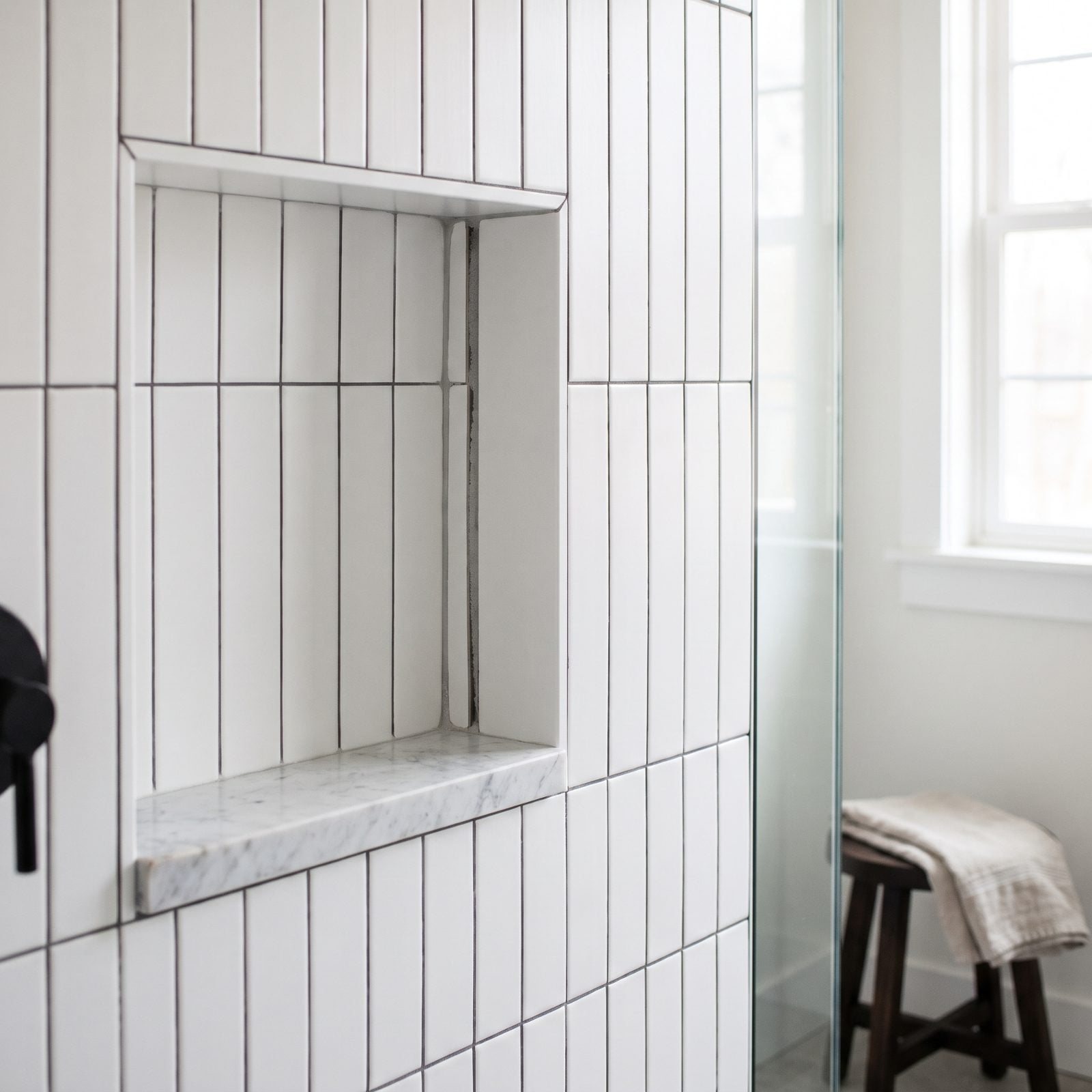
See that gray sliver tucked into the back corner? That’s cement backer board peeking through where two tiles didn’t quite reach. Nobody plans this — it happens when the cuts run a hair short and grout gets asked to cover a gap it was never built to fill.
Grout is not spackle. Open a gap that wide and it cracks straight out, and six months later you’re staring at bare board again.
Dry-fit the niche before any thinset touches the wall. Cut your pieces to close the corners tight, and if a gap is truly unavoidable, color-matched silicone in the corner beats grout every time. The waterproofing membrane behind the tile should never show a visible seam either — that’s what it’s there for.
15. Finishing the Corners With Sloppy Tile Miters
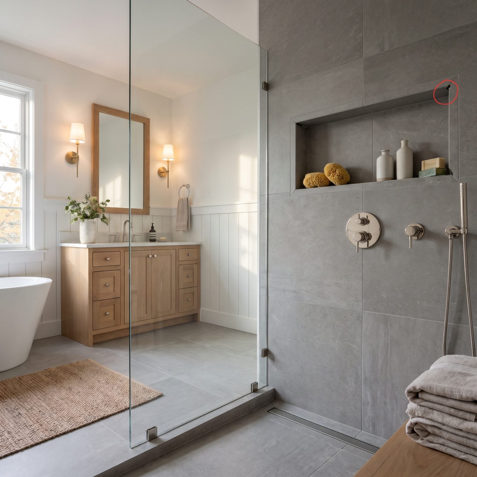
A good miter is a magic trick. A bad one is a confession. When two tiles meet at a 45-degree bevel, the edge looks solid, like the tile folds right around the corner. But let the cuts drift by even a degree and you get that little dark void at the tip, plus a chip where the fragile beveled edge caught a bump during install.
Miters demand a wet saw with a sharp blade and a patient hand. If the budget or the skill isn’t there, don’t force it. A metal corner profile gives you a crisp, forgiving line with none of the drama, and on large-format porcelain it often looks more deliberate than a miter anyway.
14. Stopping and Restarting Trim Around the Opening
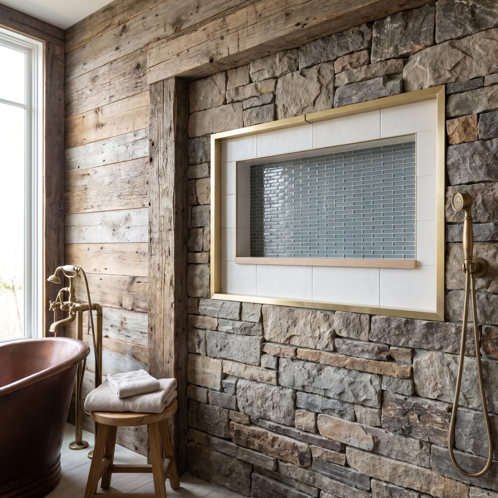
The brass trim here is doing its job right up until you reach the top edge and spot the break: two pieces butted together mid-run, ends slightly off, catching the light at different angles. It splits what should read as one clean frame into a patchwork.
Trim wants to run continuous around three sides, with joints only at the corners where they belong. A seam in the middle of a straight stretch is the thing your eye snags on every single time you shower.
Plan your trim like a picture frame. Miter the corners at 45 degrees so the metal turns cleanly, and buy a single length long enough to cover each run without a mid-span splice. If you absolutely must join, hide it in a corner, never on a face. It’s the same logic behind a good light hallway renovation, where unbroken lines carry the whole look.
13. Applying an Oversized Bead of Silicone
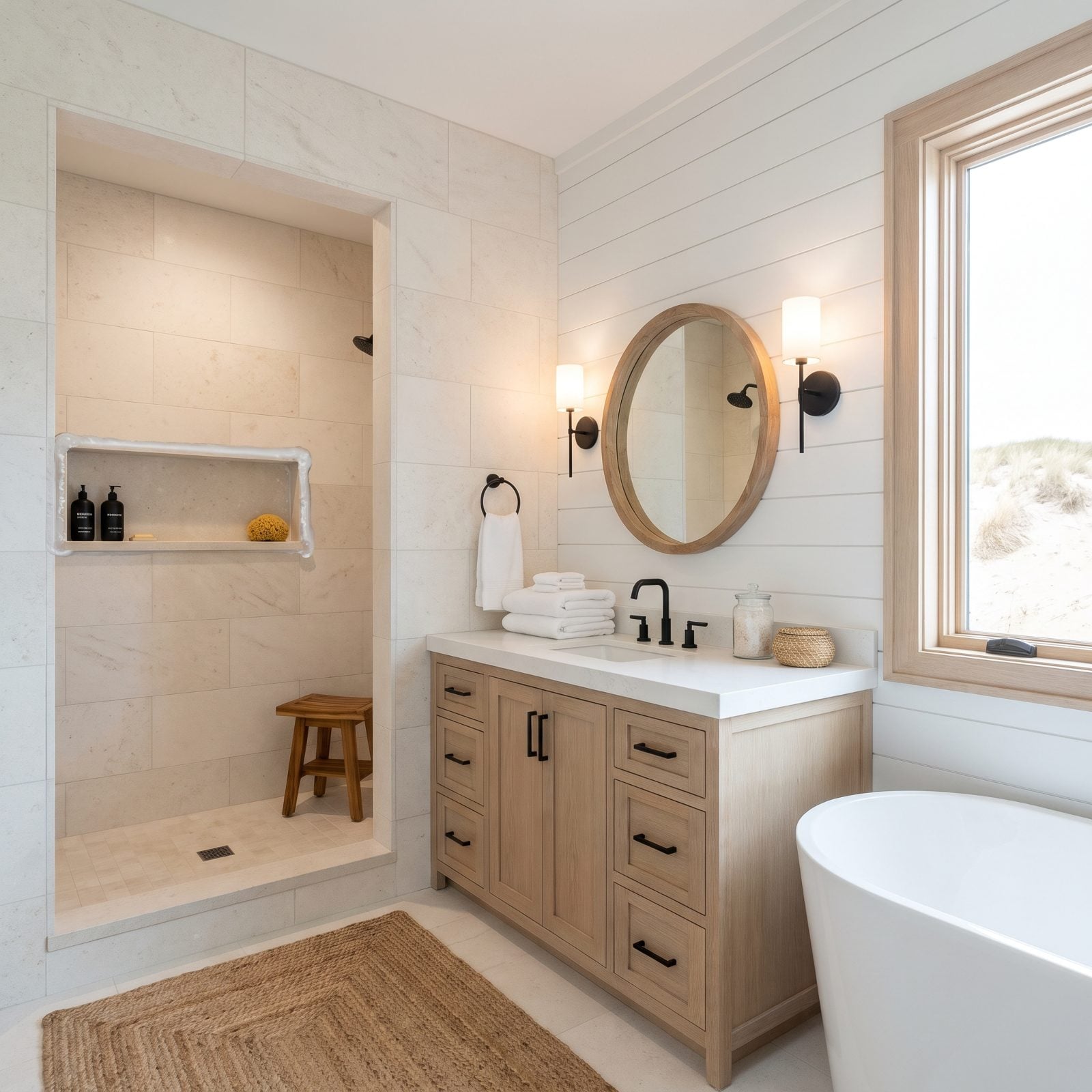
That fat rope of silicone sitting in the corner undoes an otherwise sharp niche. A bead that wide reads as a cover-up, because that’s usually exactly what it is — caulk filling a gap the tile left behind.
Silicone belongs in the change-of-plane corners, sure, but as a thin, tooled line. Not a snake. A heavy bead collects soap scum, yellows faster, and looks handmade in the worst sense of the word.
Tape both sides of the corner, lay a minimal bead, tool it once with a wet fingertip or a caulk tool, then pull the tape before it skins over. The line should be barely there. Match the color to the grout rather than the tile, so it vanishes into the joint it’s protecting.
12. Using High-Contrast Caulk Around the Perimeter
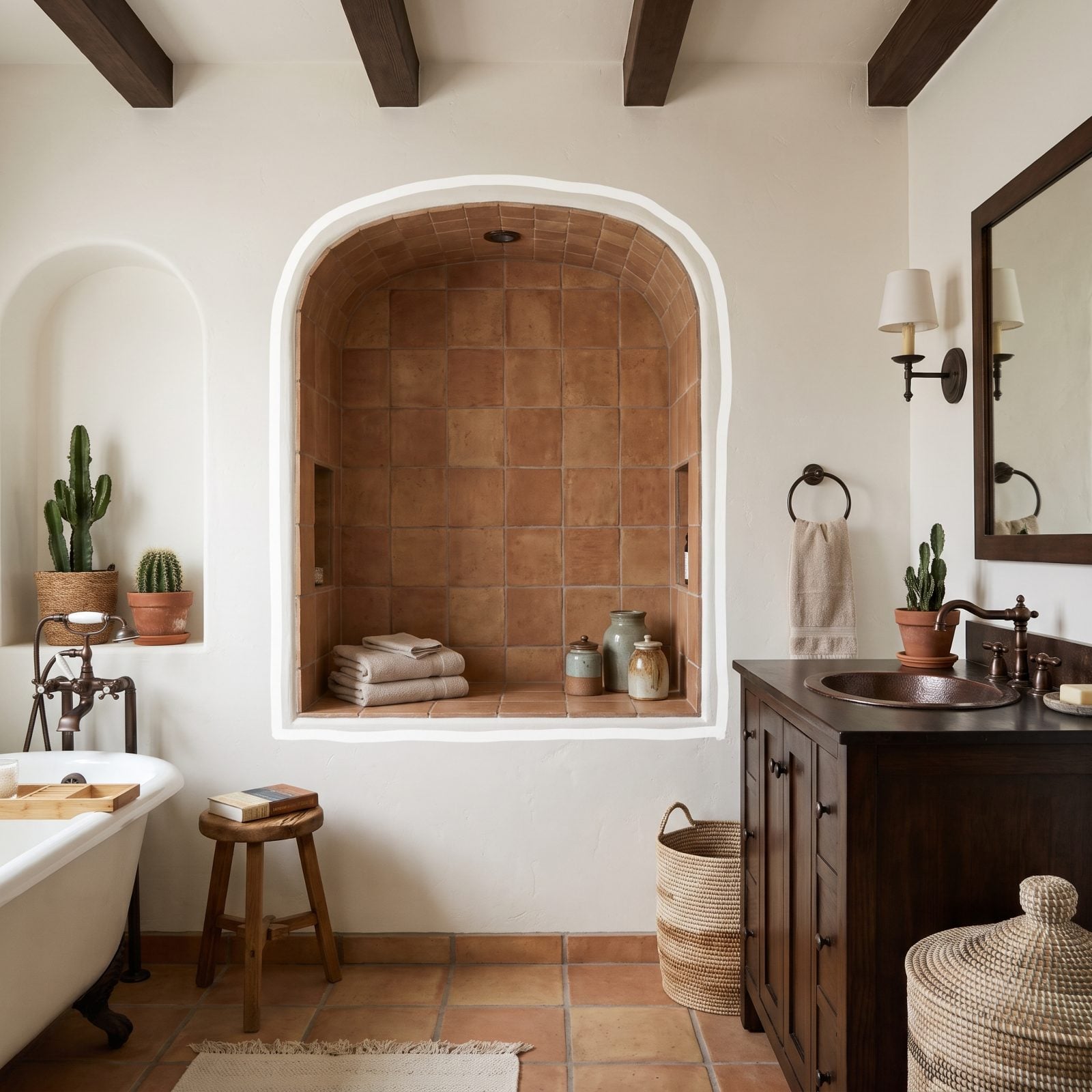
Everything in this niche is soft and quiet, and then a bright white caulk line draws a hard outline around the whole opening. Suddenly the niche looks traced, like someone took a marker to it. The contrast yanks your eye straight to the seam instead of the tile or whatever’s sitting inside.
Caulk should read as part of the grout, not a separate element. Two shades off and the perimeter screams for attention it never earned.
Buy caulk formulated to match your grout color, from the same manufacturer when you can. Most grout brands sell a matching sanded silicone for precisely this. The line stays invisible, the niche stays calm, and your eye goes where it should. Same restraint that makes a pale, low-contrast palette sing in kids’ bedroom ideas.
11. Squeezing Tiny Tile Slivers Into the Corners
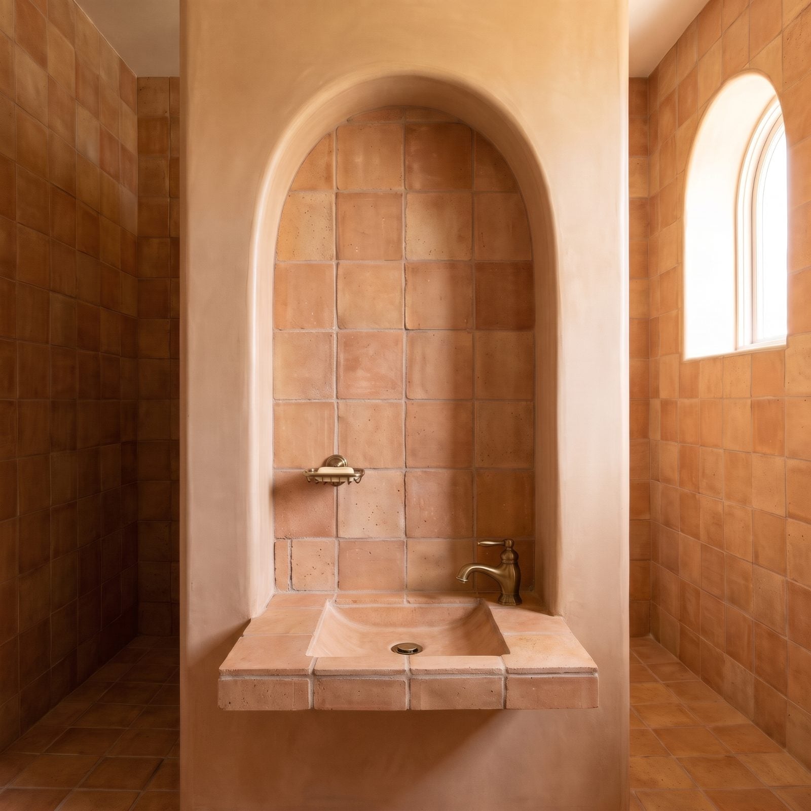
One corner of this niche has a tile cut down to a narrow strip, wedged in to close a gap. Those slivers are fragile, they crack, and the eye reads them as a layout that ran out of room. It’s the tiling equivalent of a sentence that just trails off.
The trouble started before a single tile went up. Slivers show up when the niche dimensions ignore the tile module.
So size the niche to the tile. Figure your tile-plus-grout dimension, then set the niche height and width to land on full or half tiles. A niche is one of the few openings you fully control, so build it to the material you’ve got. And when a sliver really is unavoidable, balance it — put an equal cut on the opposite side so the whole thing looks intentional rather than accidental.
10. Installing Niche Tile With Noticeable Lippage
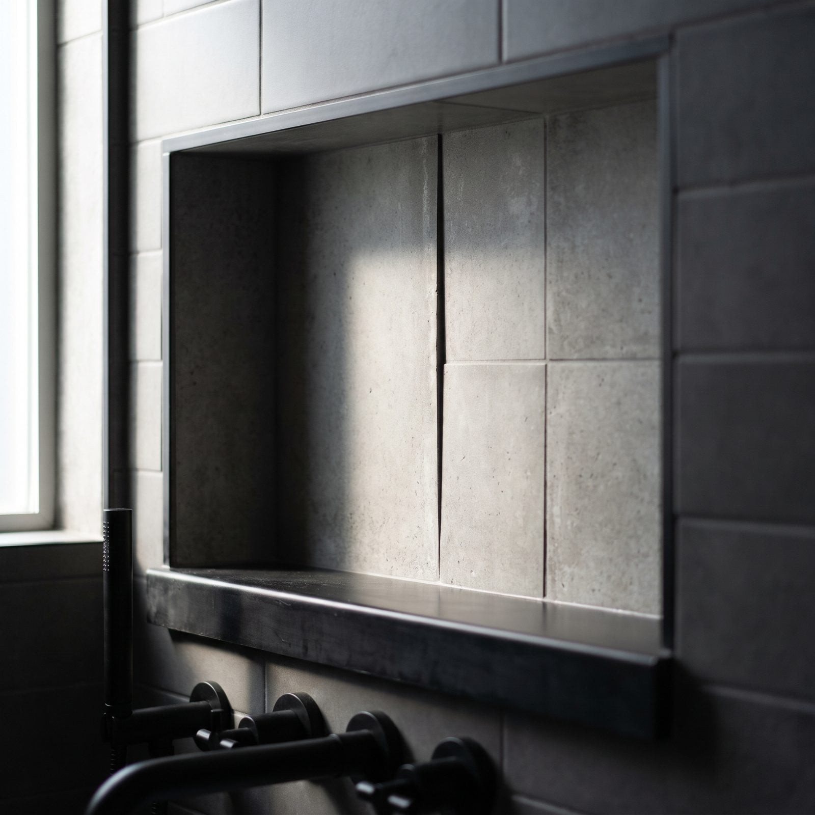
Lippage is the thing you feel before you see. Run your hand across the back of this niche and one tile catches your fingertip where it sits proud of its neighbor. In raking light that tiny step throws a shadow line, and inside a niche — where light arrives from one direction — it shows more than almost anywhere else in the shower.
Uneven tiles read as careless no matter how gorgeous the material. Inside a confined, well-lit box, the flaw has nowhere to hide.
Back-butter each piece, use a notched trowel sized to the tile, and run a leveling clip system for anything over a few inches. Check the plane with a straightedge as you go, not after it cures. A flat back wall is what makes the niche feel built by someone who actually cared.
9. Leaving Visible Seams Between Mosaic Sheets
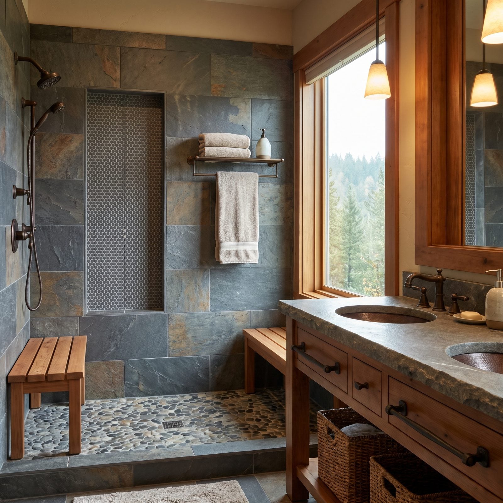
Mosaic sheets come on a mesh backing, and set them without closing the gap between sheets and you get a wider grout line running through the pattern — a faint seam where the rhythm breaks. On penny rounds it’s especially loud, because the whole charm of a mosaic is that steady repeat.
Spot that seam once and it’s all you see. The niche loses the handmade, continuous look that pulled you toward a mosaic in the first place.
As you set each sheet, nudge the edge rows so the spacing between sheets matches the spacing inside them. Pull a few individual tiles off the mesh and reset them by hand along the seam if you have to. Fussy, yes. But the mosaic was supposed to look effortless, and a visible grid of sheets is the one thing that gives it away.
8. Filling the Niche With an Overly Busy Accent Tile
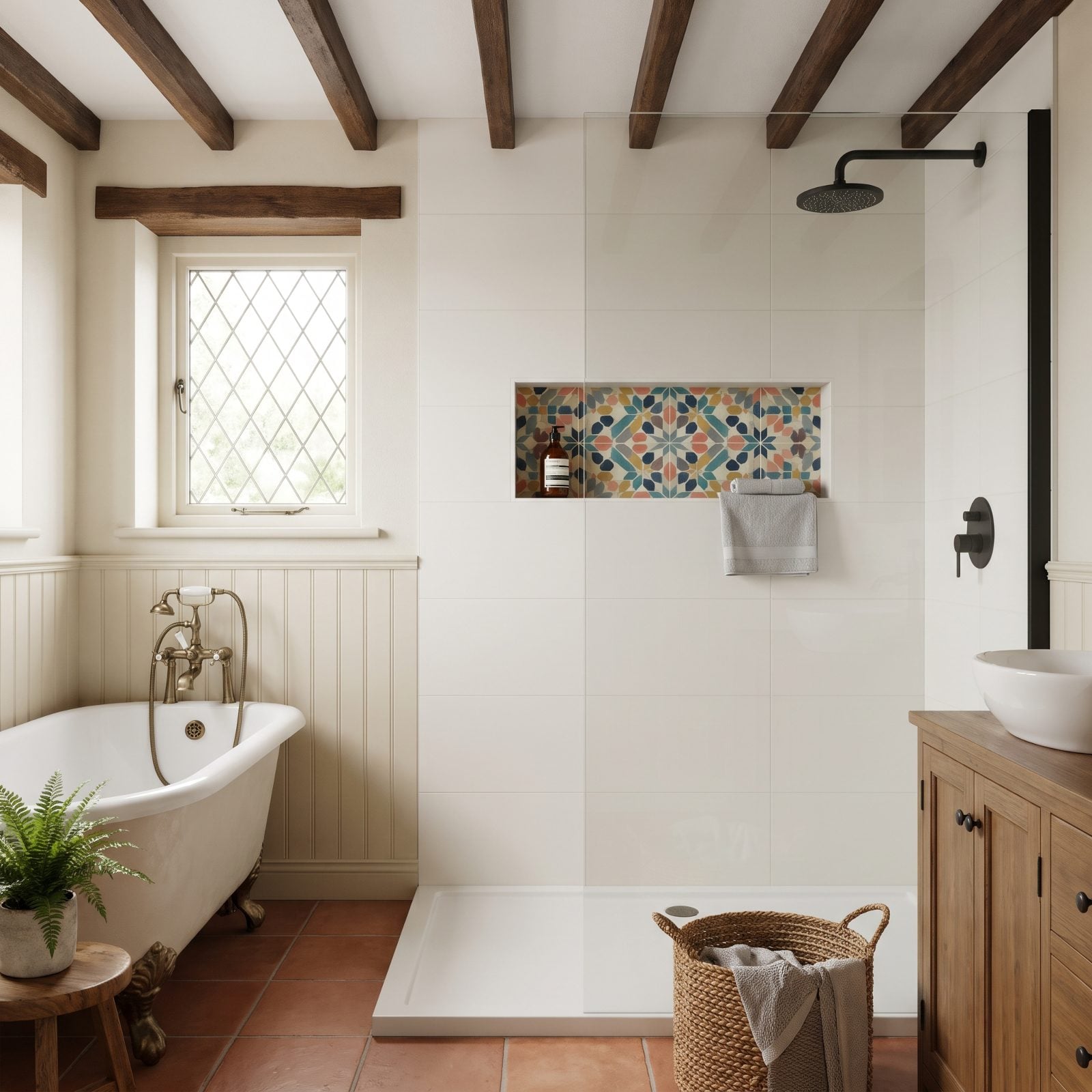
Here’s the trap. The field tile is all restraint, warm white porcelain, nothing shouting, and then the niche goes off like a confetti bomb. Six colors in a space the size of a shoebox. Your eye lands there first and never leaves, which is the exact opposite of what a niche should be doing.
A niche is a shelf. It holds bottles, and bottles come with their own color and clutter, so a loud backdrop fights them instead of settling them down. The whole thing reads cheap because the pattern was clearly picked to fill space rather than serve the room.
Run the same field tile straight into the niche, or drop in one tonal accent, a honed limestone or a soft zellige in a single color. Let the bottles be the busy part. I got this wrong early and regretted it every single shower.
7. Ignoring Vein Direction Across the Niche Surfaces
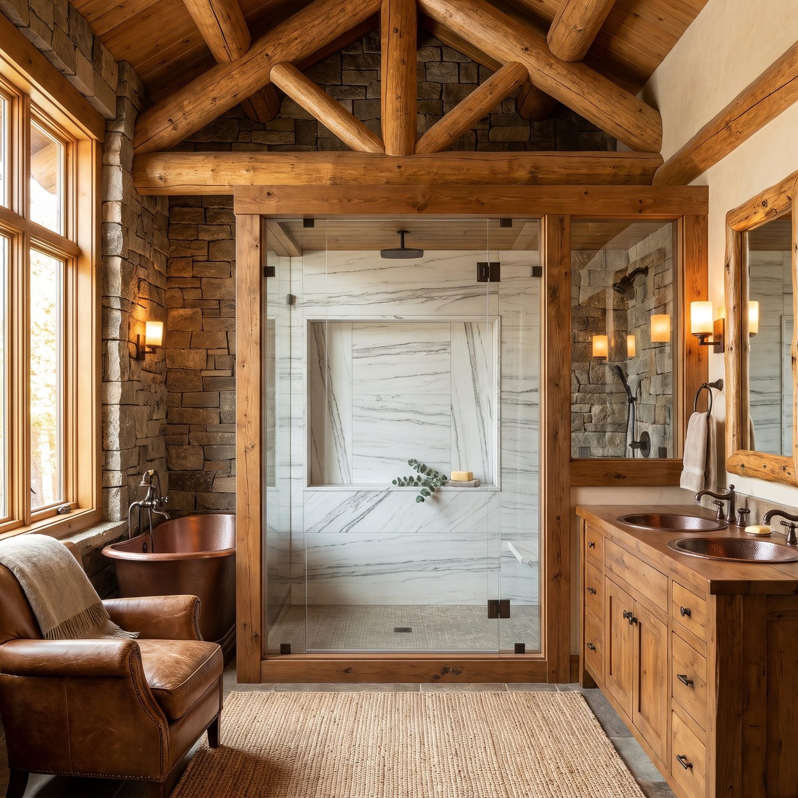
Marble veining has a current, and it flows. When the back of the niche runs horizontal while the sides run vertical and the sill cuts diagonal, you’ve got three rivers slamming into each other in a box the size of a hardback book.
This is the detail that separates a tile setter who thought about it from one who just filled the holes. Stone and stone-look tile earn their keep through flow. Break it, and expensive material suddenly looks like scrap offcuts.
Plan the cuts so the veins read as one continuous movement, usually horizontal across the back with the sides following the same gravity. Lay everything out dry on the floor first and snap a photo before any thinset goes down. Twenty minutes of staging saves a niche that’ll bug you for a decade.
6. Mixing Tiles From Noticeably Different Dye Lots
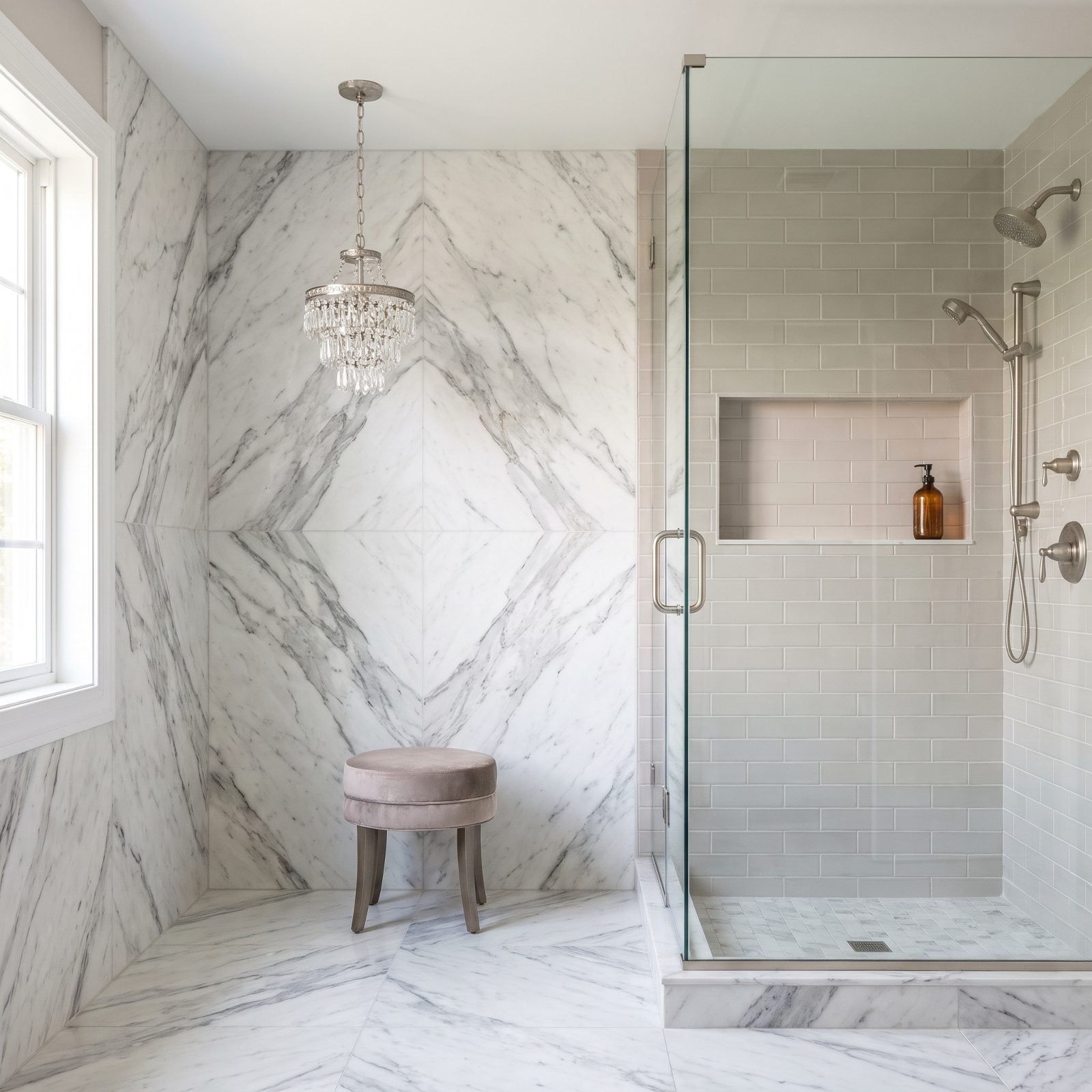
Same tile, different batch, and your eye catches it from across the room.
Ceramic and porcelain are fired in lots, and color drifts between runs the way paint drifts between cans. A greige that’s a half-shade pinker inside the niche reads as a seam, a patch, a spot where somebody ran short and grabbed another box off the shelf.
The fix is boring and it works. Buy all your tile at once, confirm every box carries the same lot number printed on the label, and order fifteen percent over so you’re never chasing a second batch mid-job. And if you do end up short? Pull the niche tile from the original lot and make up the shortfall somewhere low and hidden, behind the vanity, under the threshold.
5. Combining Too Many Tile and Trim Materials
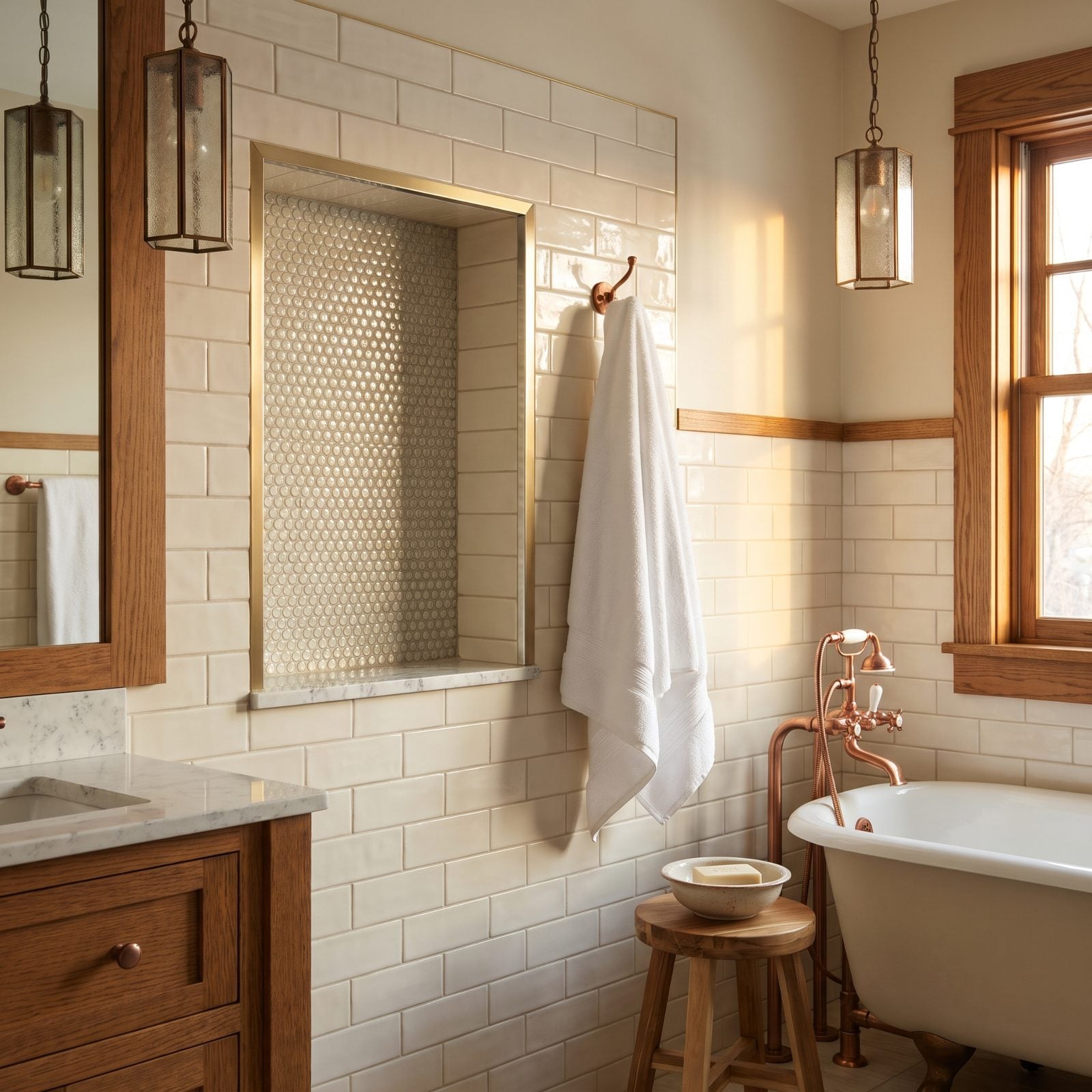
Count the materials in this niche. Glass back, marble sill, brass trim on the frame, cream field tile wrapping the edge. Four finishes in an opening you could cover with a dinner plate. Each one was probably a fine idea on its own, but jammed together they read like a sample board somebody forgot to edit down.
Small spaces have a material budget, and the niche burns through it fast. More finishes, more transitions, and every transition is a chance for the eye to trip. That trip is what reads as cheap, not any one material.
Hold it to two materials, tops. The field tile carries into the niche, and one honest metal trim finishes the edge in the same tone as your fixtures. Matte black handles, matte black trim. That kind of restraint is what the pricey bathrooms are quietly doing.
4. Sloping the Niche Sill Toward the Wall
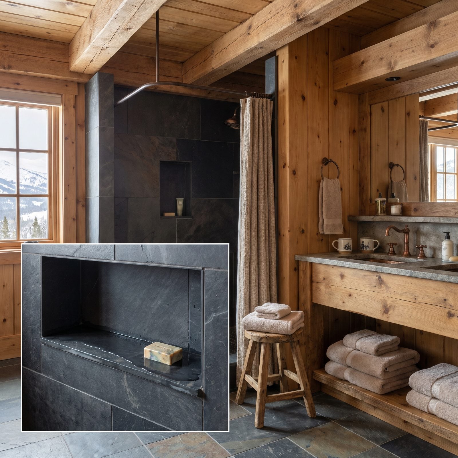
Water finds the lowest point. Always. If that point is the back wall of your niche, congratulations, you’ve built a tiny bathtub.
A sill that pitches toward the wall traps a film of water that never leaves. That water sits against the grout line and the waterproofing membrane behind it, and over a year or two it does exactly what standing water does. Even on a sill that mostly drains, the giveaway is a thin, shiny wet strip along the back edge that never quite dries.
The sill needs a slight forward pitch, roughly an eighth of an inch over its depth, so every drop runs off the front edge and back into the shower, like the drips spilling over this slate sill. Check it with a level and a marble before the tile cures. A marble that rolls out the front is the only test you need.
3. Exposing Individual LED Diodes Inside the Niche
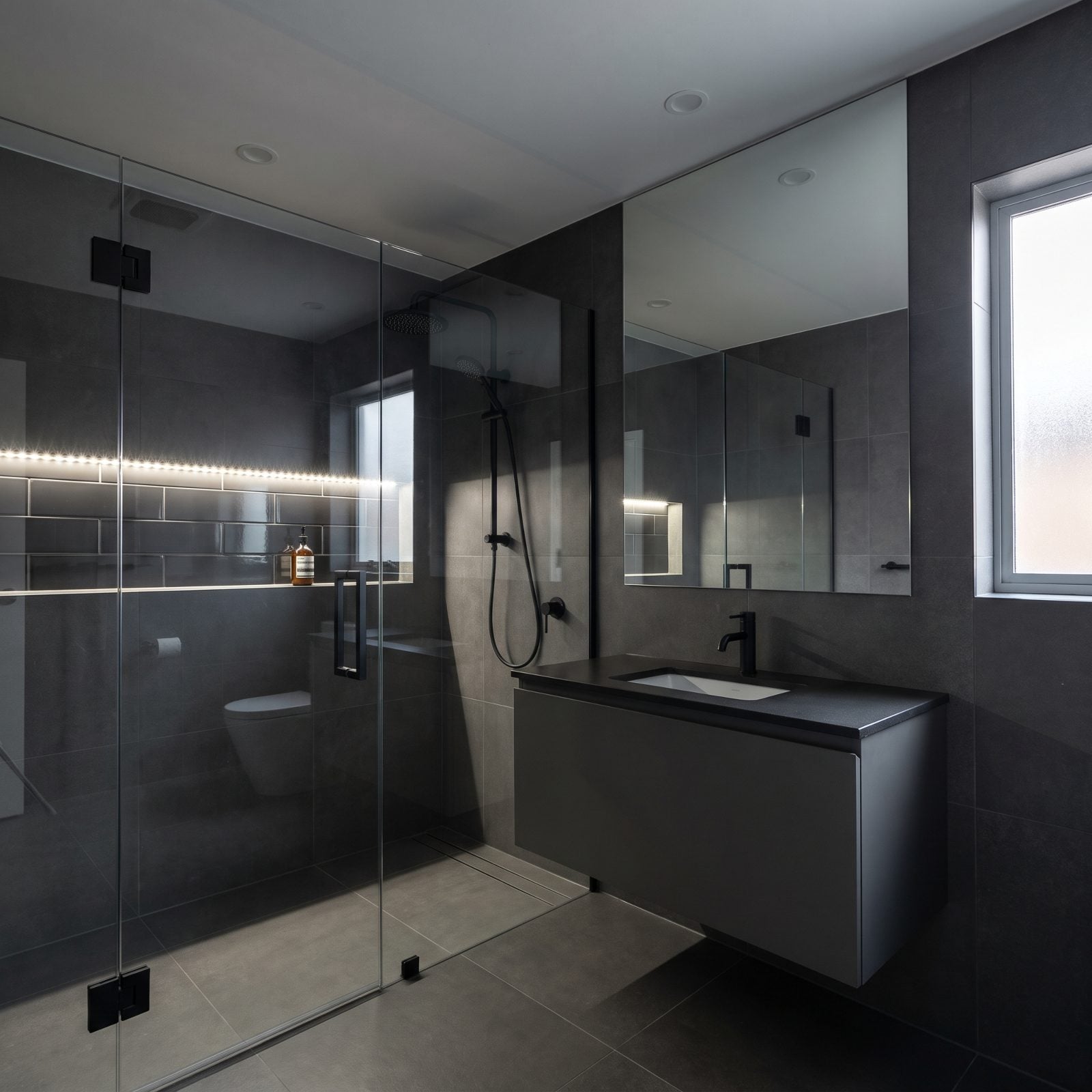
Niche lighting is one of the best upgrades you can make. Done right, it turns a storage hole into a glowing shelf. Done wrong, you get a row of tiny bright dots marching across the top edge like a budget string of Christmas lights, each diode reflecting twice over on the glossy tile below.
Your eye reads individual points of light as cheap electronics. You want the glow, not the hardware making it.
Use COB LED tape, the kind with a continuous phosphor coating that buries the diodes behind an even wash, and recess it behind a small aluminum channel with a frosted diffuser lens. Tuck it under the top lip so you see the light spilling down the back panel, never the source. Same principle as good bedroom recessed lighting: hide the fixture, show the effect.
2. Using an Ornate Picture-Frame Border Around the Niche
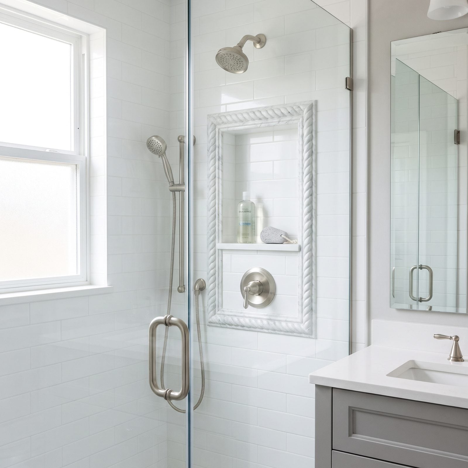
Somewhere along the way, the rope-twist marble pencil liner became shorthand for fancy. It isn’t. A raised, carved border framing a niche in an otherwise flat, modern shower looks like a gilt frame slapped around a grocery-store print. The ornamentation has nothing to do with anything else in the room.
Decorative borders date a bathroom faster than almost anything, and they catch soap scum in every carved groove, so they look tired within a year. A niche doesn’t want a frame. It wants a clean edge.
Finish the opening with a mitered tile return or a slim metal trim strip that matches your fixtures, flush and quiet. The niche turns into a shadow line in the wall rather than a jewelry box. That’s the look designers charge a premium for, and it costs less than the fancy liner ever did.
1. Framing an Opening That Is Visibly Trapezoidal
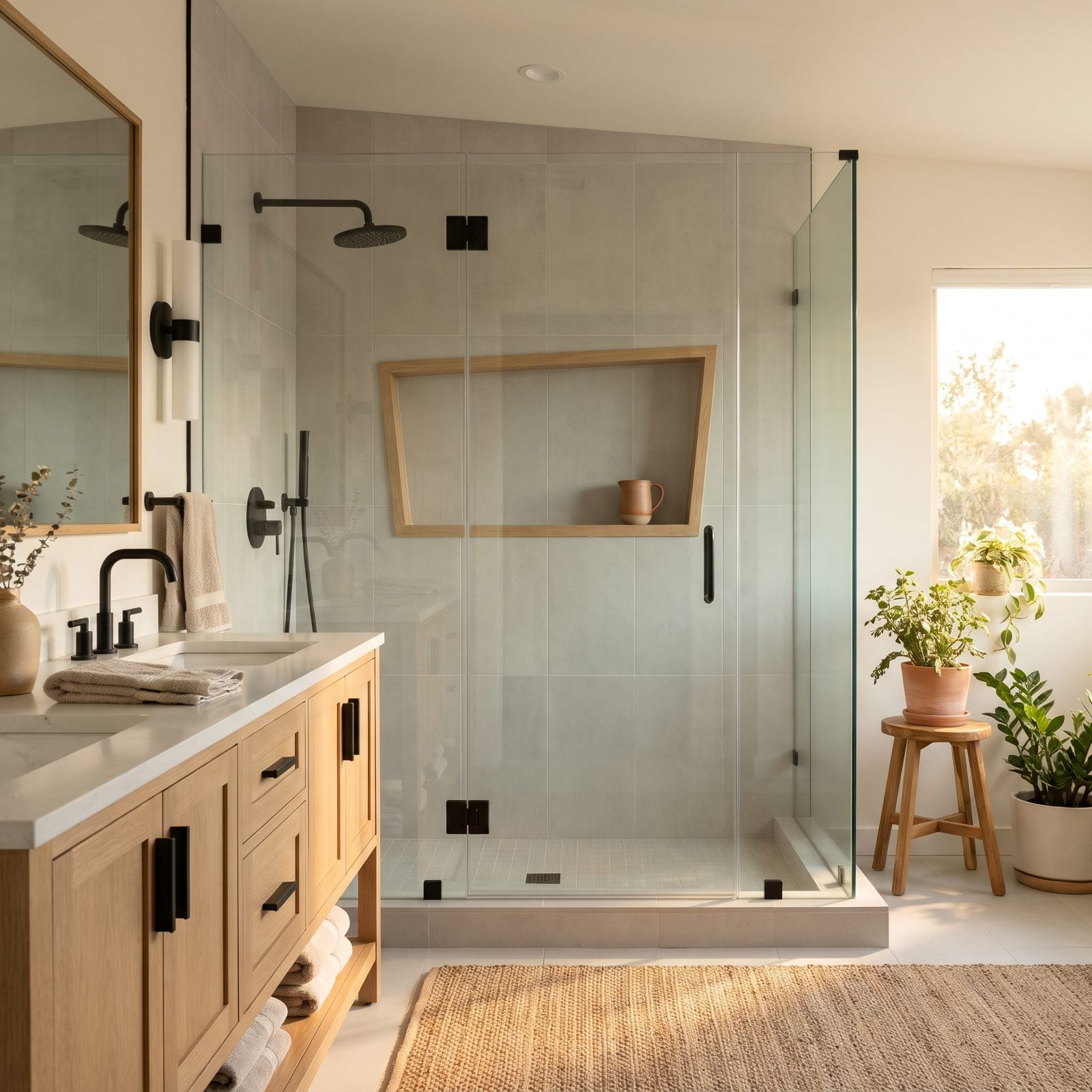
A niche is the one rectangle in your shower sitting dead at eye level, so every flaw in it gets a spotlight.
When the top edge runs three-quarters of an inch longer than the bottom, the opening leans into a trapezoid, and your brain clocks it as wrong before you can name why. The surrounding grout lines make it worse, because a crooked niche makes every straight line near it look crooked too.
Squareness is a framing problem, not a tile problem. The blocking has to be plumb and level before anyone touches thinset. Check the rough opening with a framing square and a level on all four sides, then measure the diagonals corner to corner. Equal diagonals mean a square box. If they don’t match, fix it now, because no grout joint on earth will straighten a crooked box later.