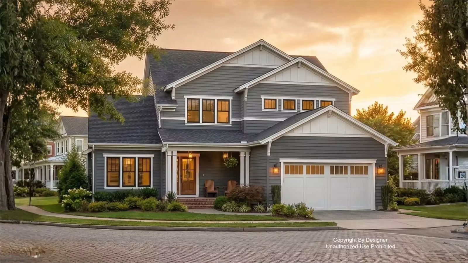
When was the last time your whole family actually wanted to be in the same part of the house? The Rosa Ave is built around exactly that kind of accidental togetherness — an upstairs loft that keeps older kids close without crowding the main floor, an open layout that lets dinner smells and conversations travel, and traditional bones that make the whole thing feel settled from day one.
Specifications
- Sq. Ft.: 2,433
- Bedrooms: 4
- Bathrooms: 3.5
Floor Plan – Main Floor
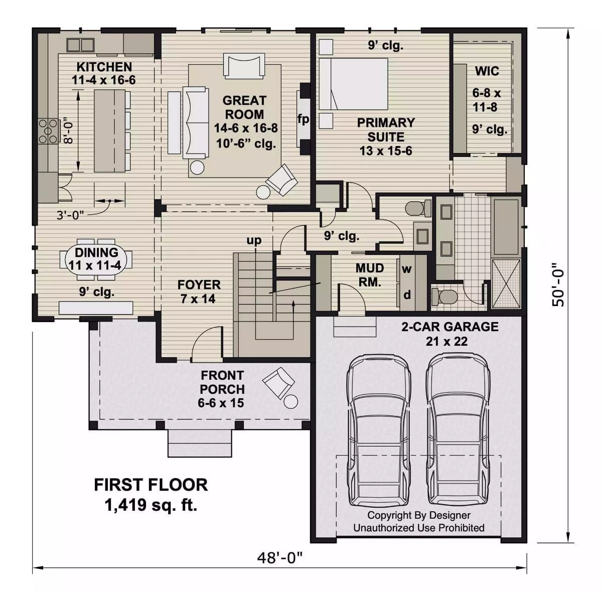
The first floor puts the primary suite and great room on opposite ends of a shared open zone, with the mud room connecting directly to the garage. Stairs in the foyer signal that the real square footage starts above.
Floor Plan – Second Floor
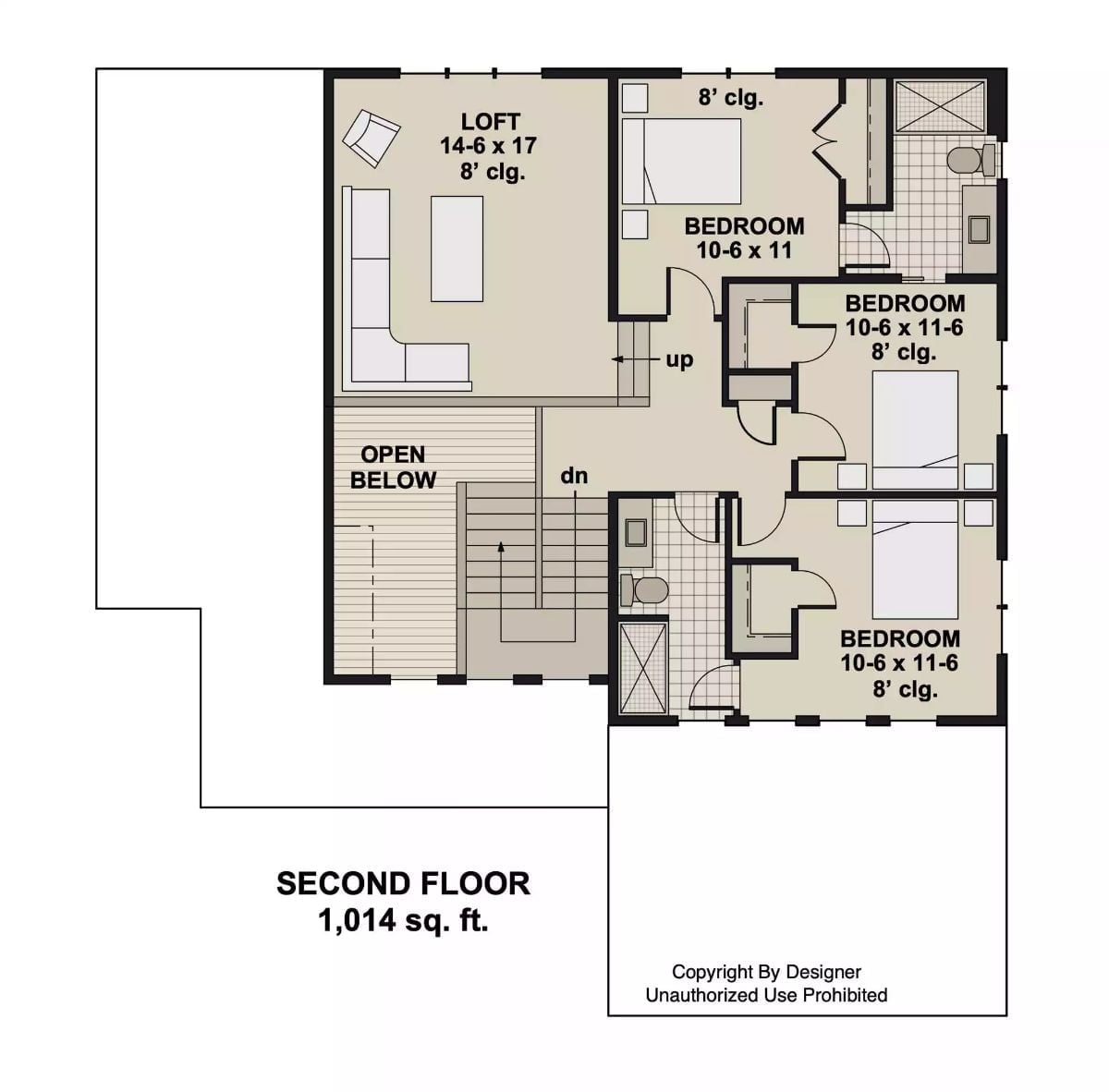
Three bedrooms, a loft, a shared bath, and the stair landing all share the second floor — tightly organized without feeling cramped.
Style Math: Three bedrooms plus a loft pulls more weight than the square footage suggests. Kids get their own rooms, but the open loft gives everyone a reason to drift upstairs instead of disappearing behind closed doors. At just over a thousand square feet, nothing gets wasted on hallways that go nowhere.
Soaring Entryway Sets the Tone Before You’ve Even Closed the Door
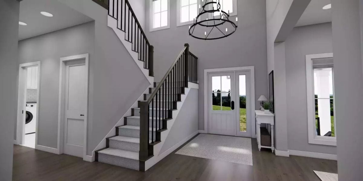
Double-story ceilings give the foyer genuine presence rather than just height for the sake of it. The wrought-iron chandelier hangs low enough to feel deliberate without crowding the sightline, and dark hardwood floors run straight to the front door where sidelights pull in daylight and a glimpse of green beyond. Laundry is tucked just off the left — quietly practical, easy to miss until you need it.
Pro Tip: A laundry room just off the entry hall is one of those layout decisions that sounds minor until you live with it. Shoes, bags, and muddy clothes get intercepted before they travel any further, which keeps the rest of the house cleaner without requiring much discipline from anyone.
Stone Fireplace Wall Does the Heavy Lifting So Everything Else Can Stay Simple
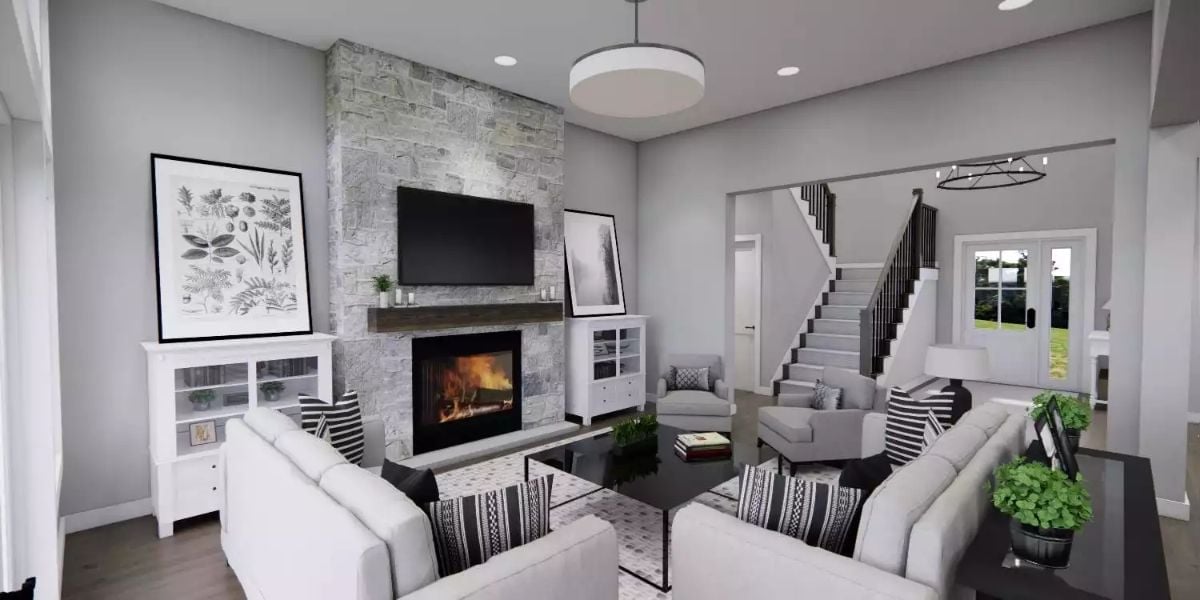
Gray stacked stone runs floor to ceiling, anchoring the TV above a wood mantel and a fireplace that is clearly earning its keep. White sofas and black-and-white patterned pillows keep the palette controlled without tipping cold. Scale is what makes it work: the stone column is tall enough to hold the room together so the furnishings don’t have to try so hard.
Why Floor-to-Ceiling Stone Changes the Math on Furniture Placement
When one wall claims that much visual weight, you don’t need to fill the rest of the room to make it feel finished. Rather than hugging the walls, the sofas here face each other across a low coffee table, which opens the floor considerably. That arrangement only holds because the fireplace wall gives the eye a fixed point to return to — without it, the room would feel adrift.
Candle-Style Chandelier Earns Its Keep Above a Table Built for Real Gatherings
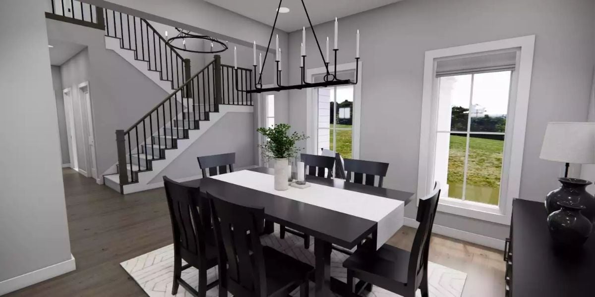
Dark wood chairs against a white table runner ground the dining room without making it feel heavy. The linear iron chandelier with candle-style lights draws the eye up toward the ceiling, and through the window, the green lawn outside does a decent job of explaining why families keep choosing this kind of neighborhood.
Did You Know: Dining rooms positioned near a staircase entry tend to feel more woven into the home because foot traffic naturally passes through rather than around them. Put the dining chandelier on a dimmer and the same space handles homework at four o’clock and dinner parties at eight without moving a single chair.
Black Hardware and Pendant Globes Pull a White Kitchen Back from Looking Too Safe
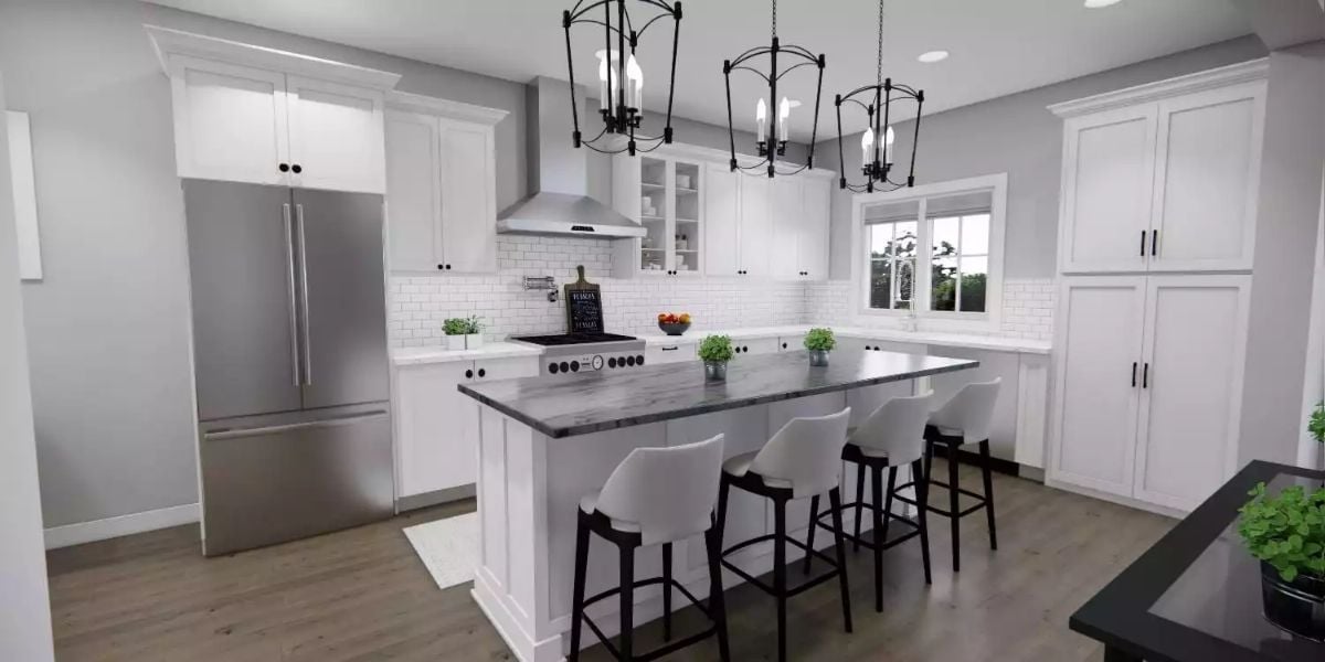
White shaker cabinets could easily read sterile, but matte black hardware and orb-style pendant chandeliers keep the palette from floating away into blandness. The island’s dark veined countertop does real work here — without it, there’d be nowhere for the eye to land besides all that bright cabinetry.
Fun Fact: White subway tile has been a kitchen staple since the early 1900s, when it first appeared in New York City subway stations chosen specifically for how easy it was to clean. Homeowners have been borrowing the idea ever since, and honestly, it still holds up better than most trends that have come and gone in the meantime.
Charcoal Bed Frame Against Purple-Gray Walls Proves Moody Bedrooms Aren’t Hard to Pull Off
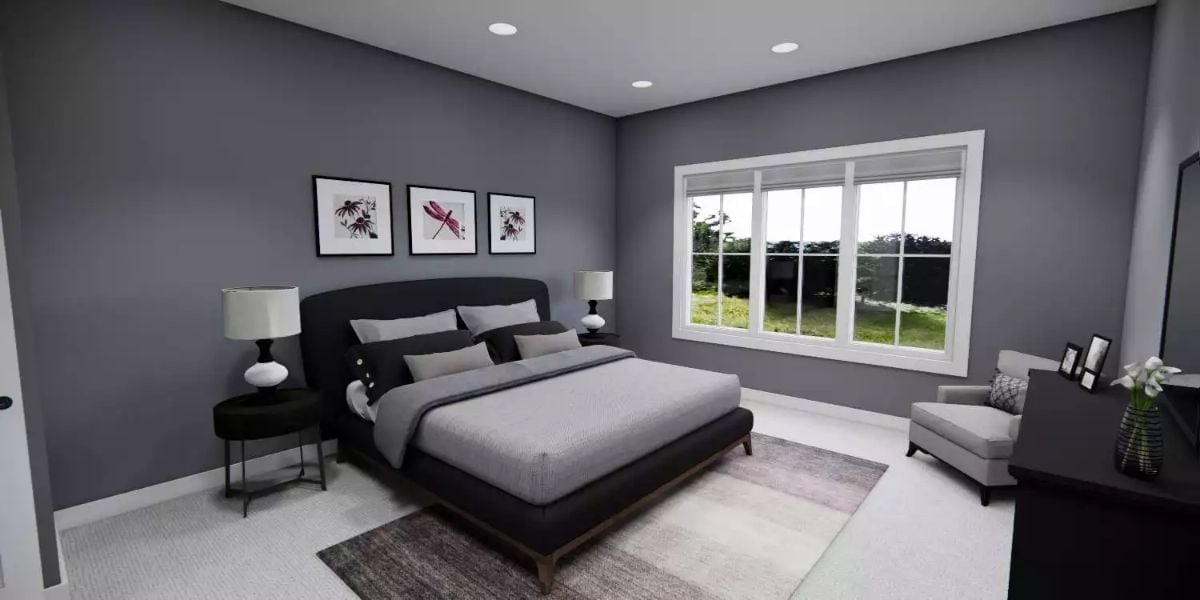
Recessed lighting keeps the ceiling clean so the wall color can carry the mood without competition. Three botanical prints above the bed add a quiet note of pink — just enough to keep the dark upholstered frame and layered gray bedding from feeling like they’re trying too hard.
Try This: A medium-dark wall shade actually makes recessed lighting punch harder, because the contrast draws the eye upward and tricks the ceiling into feeling taller. In a room like this, skip the shaded overhead fixtures. Pot lights earn their place in a way that table lamps alone can’t replicate.
Marble Shower Wall and a Freestanding Tub Make a Strong Case for Staying In
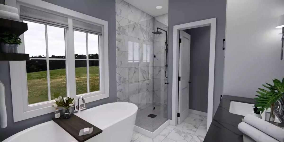
Calcutta-style marble tiles climb floor to ceiling in the walk-in shower, and the soaking tub sits where it can catch natural light from the window — which is exactly where it should be.
- Frameless glass keeps the shower from visually cutting the room in half
- Matte black fixtures read as intentional against all that white stone
- A separate door beside the shower likely leads to a water closet, which serious buyers notice fast
Loft Living Rooms With Stair Railings Beat Closed-Off Bonus Rooms Every Time
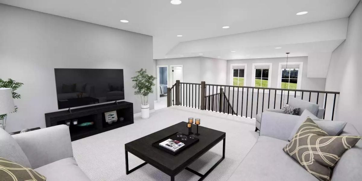
Carpet keeps things casual up here, which is appropriate. The black TV stand and coffee table hold the space together without overdoing it, and the open railing keeps the loft connected to the floor below rather than sealing it off into its own separate world. That connection is the whole point.
Pin It
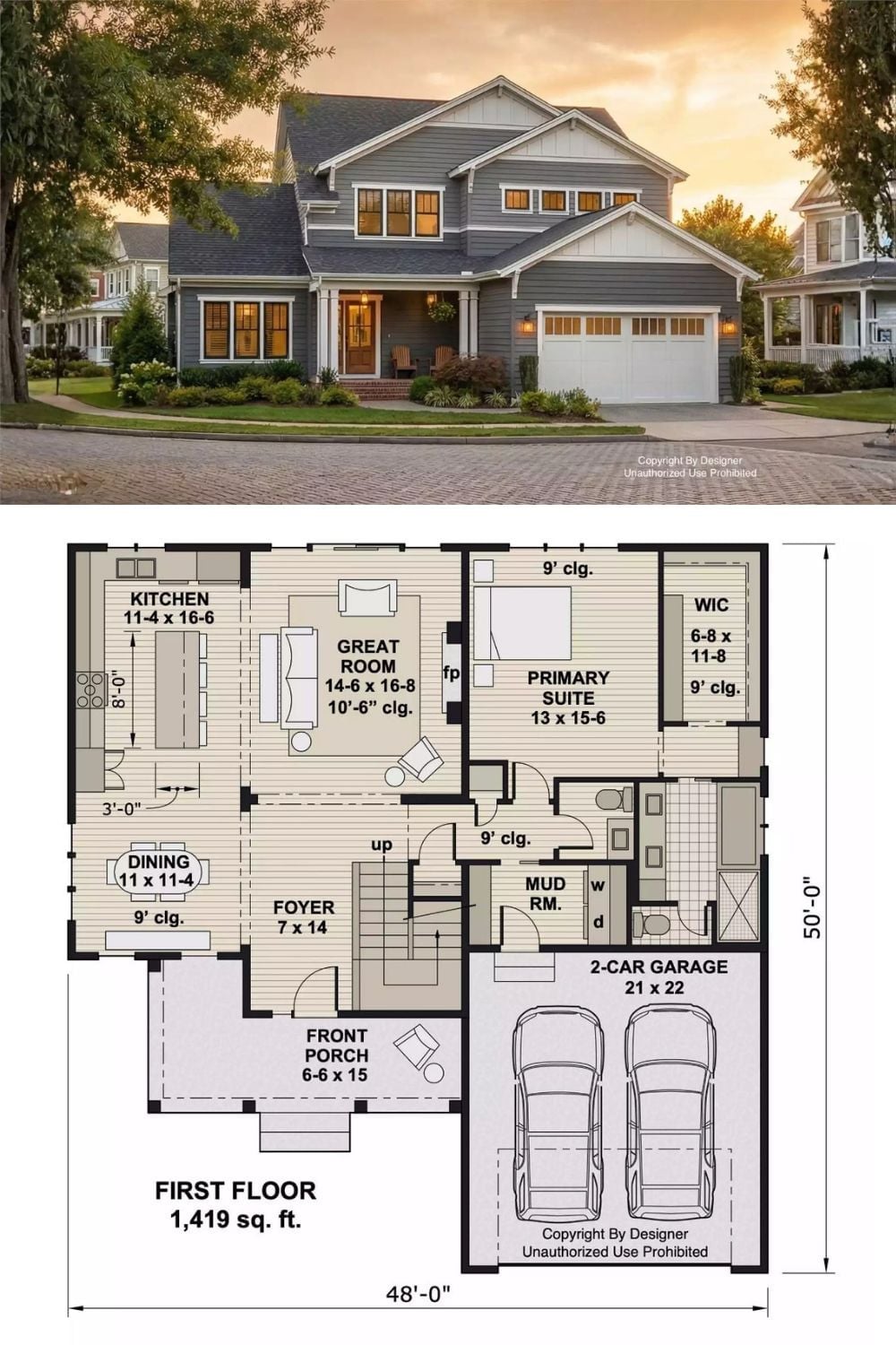
The exterior rendering shows a two-story traditional home with board-and-batten siding and a covered porch. Below it, the first floor plan lays out 1,419 square feet: primary suite, great room, and a two-car garage arranged around that central open zone.