
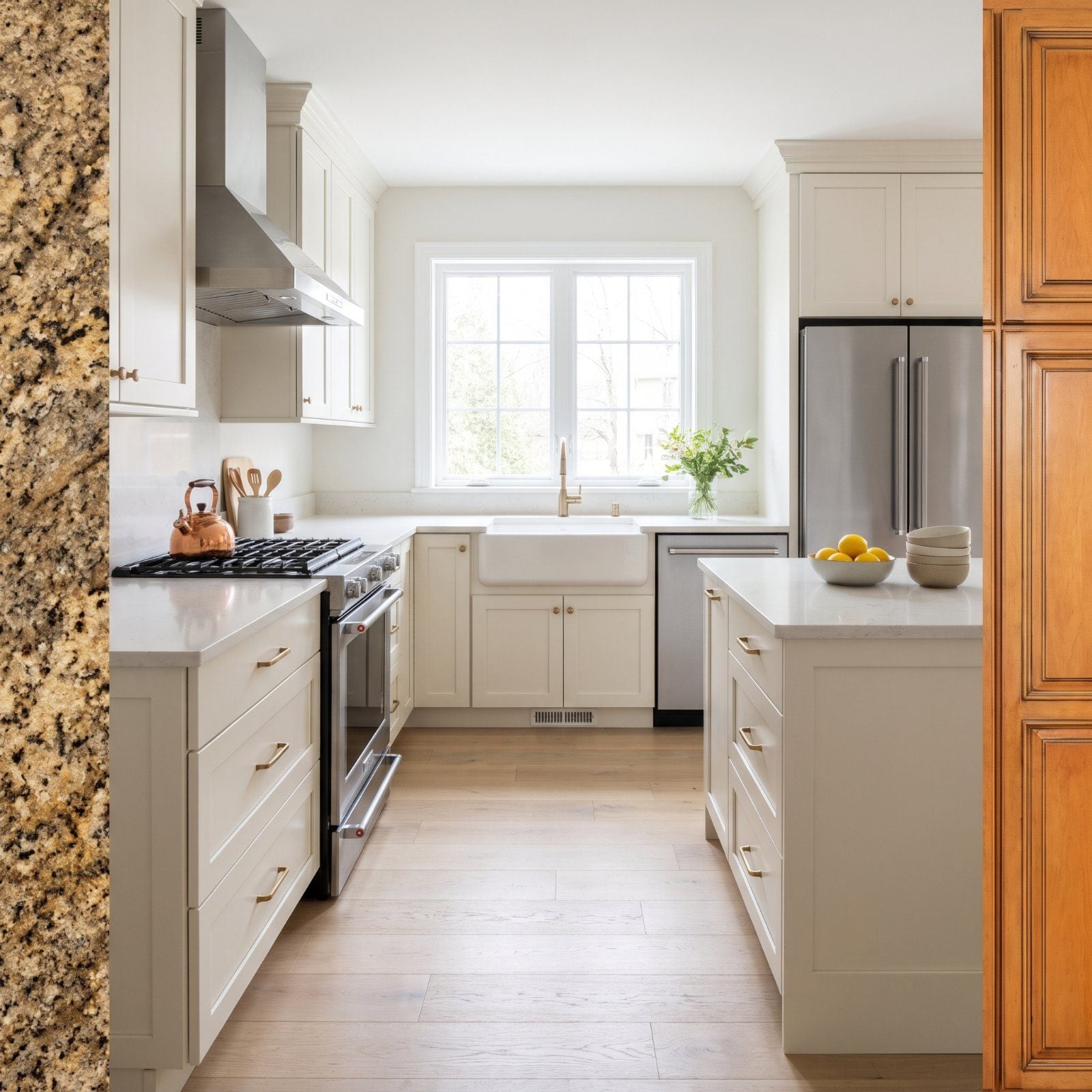
Walk into enough open houses and you start to see the ghosts. The granite that cost a fortune in 2006. The honey oak someone bragged about at a dinner party. That two-tier island that felt like a splurge. None of it was wrong when it went in, but taste moves on, and 2027 buyers read kitchens fast. Agents know exactly what makes a prospect’s shoulders drop the second they clear the doorway. The features below were status symbols once. Now they just read as dated, and dated reads as work. Here’s what’s falling out of favor.
29. Busy Brown-and-Gold Granite Loses the Room
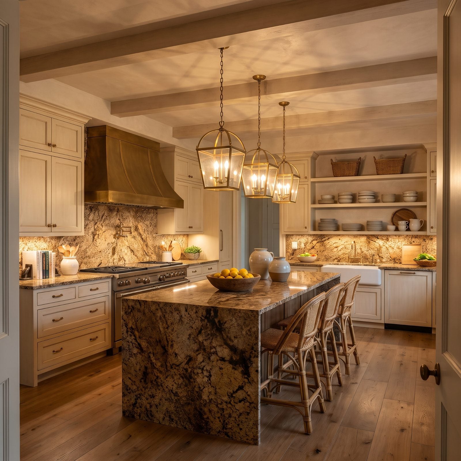
That brown-and-gold granite was the brag of the mid-2000s. Rust flecks, black speckle, gold shimmer under the pendant light, and the whole slab never shuts up. Every surface becomes the loudest thing in the room while nothing else gets to breathe.
In order to come up with the very specific design ideas, we create most designs with the assistance of state-of-the-art AI interior design software. Also, assume links that take you off the site are affiliate links such as links to Amazon. this means we may earn a commission if you buy something.
Agents watch buyers glance at it and start pricing out replacement on the spot. Busy stone dates a kitchen faster than almost anything because it locks you into a specific era of cabinet color and backsplash. A calm, light counter reads like a blank page. This one’s already covered in handwriting.
28. Honey-Orange Oak Cabinets Read as a Time Stamp
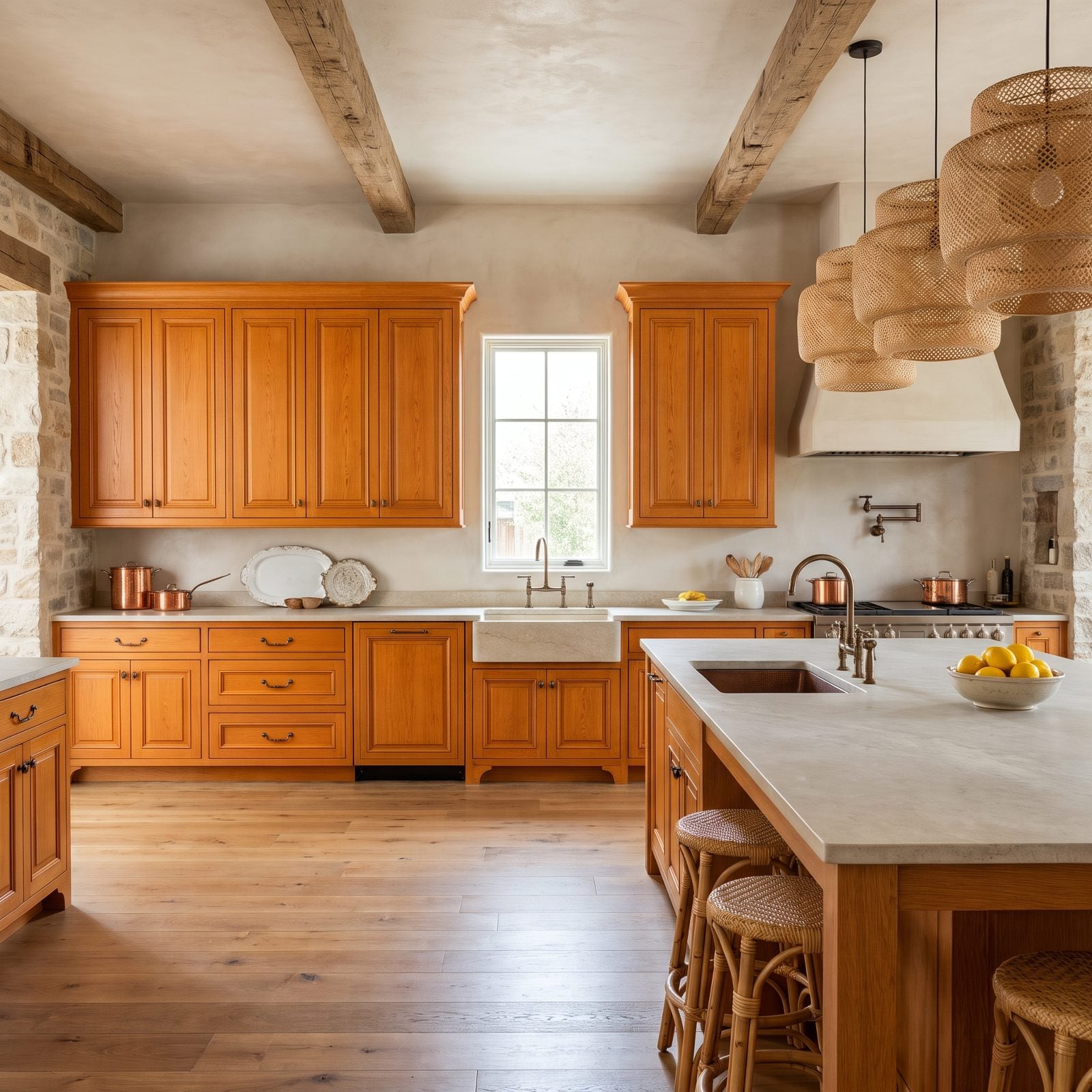
Honey oak had its moment, and the moment was 1998.
The orange undertone is the real problem. It clashes with almost every modern paint color, fights stainless appliances, and photographs even warmer than it looks in person, so buyers mentally add a cabinet refinish to the price before they’ve reached the sink. We’ve watched this grain color tank a kitchen’s first impression in seconds. But a coat of white or a soft green saves these boxes, and good oak construction is worth saving. Planning a green kitchen ideas refresh? These cabinets are better candidates than most people assume.
As one realtor puts it, “When they walk into orange oak and then walk into painted cabinets two streets over, they aren’t thinking about trend cycles.”
What Our Readers Say
- Asked which kitchen ages best, 73% of Home Stratosphere readers picked a timeless classic look, while only 11% bet on whatever is currently trending.
- In our reader votes, kitchen photos with gold accents got fewer hearts than the other kitchens in the same articles, 37% versus 45%.
From Home Stratosphere reader polls and votes.
27. Grouted Ceramic Tile Countertops Are a Hard No
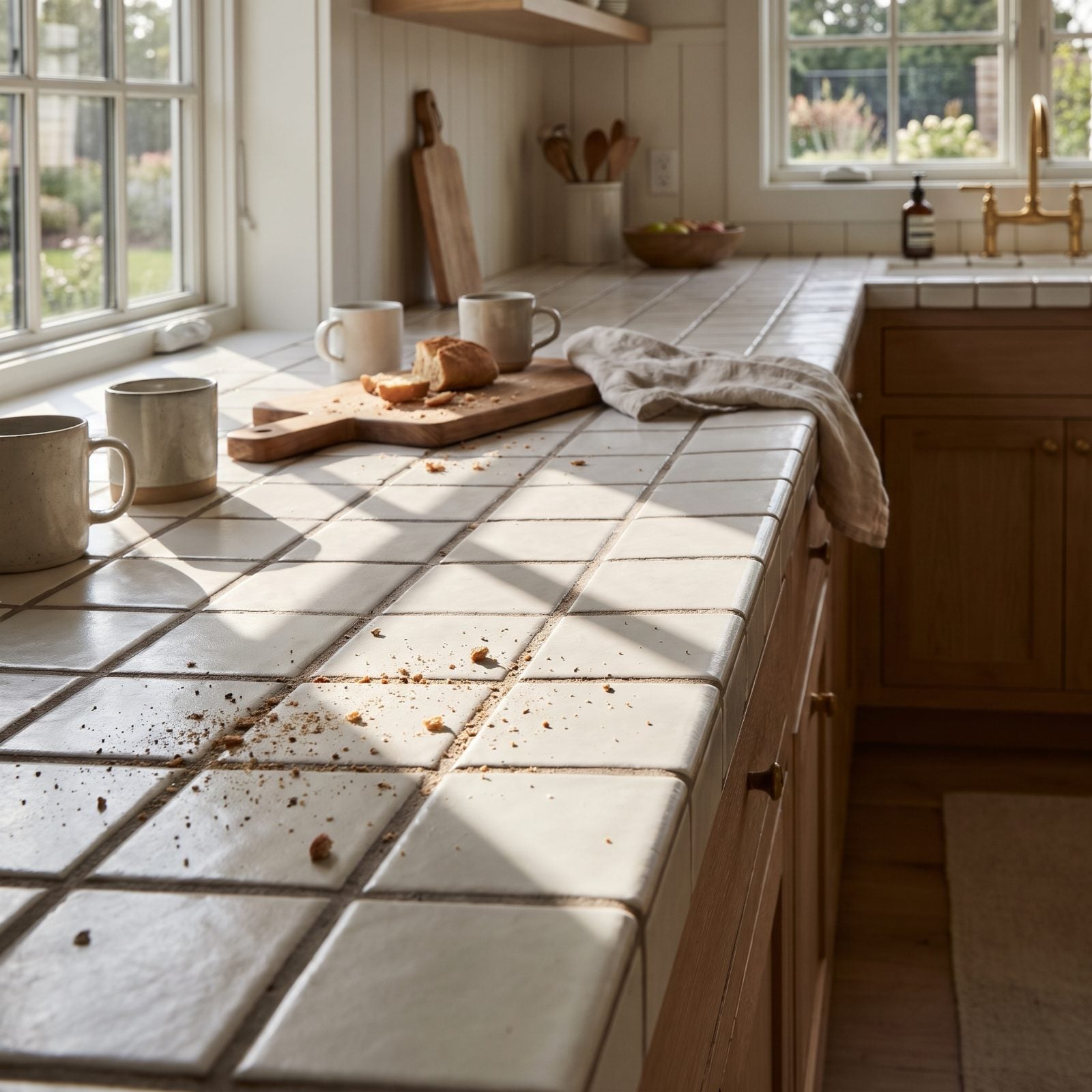
Tile counters look charming in a photo and feel miserable in real life, because every grout line is a trap for crumbs, red wine, and that one drop of oil you missed. No amount of scrubbing keeps them white for long.
Buyers in 2027 want a wipeable, continuous surface. Tile promises the opposite: more cleaning, more upkeep, more grout to re-seal. It’s one of the few features that earns a visible grimace at the open house.
As an interior designer puts it, “While tile material itself is waterproof and easy to clean, the grout between tiles is notoriously challenging to maintain, collects grime, and harbors bacteria, so a thorough daily scrub is essential.”
26. Raised Two-Tier Island Bars Are Falling Out of Favor
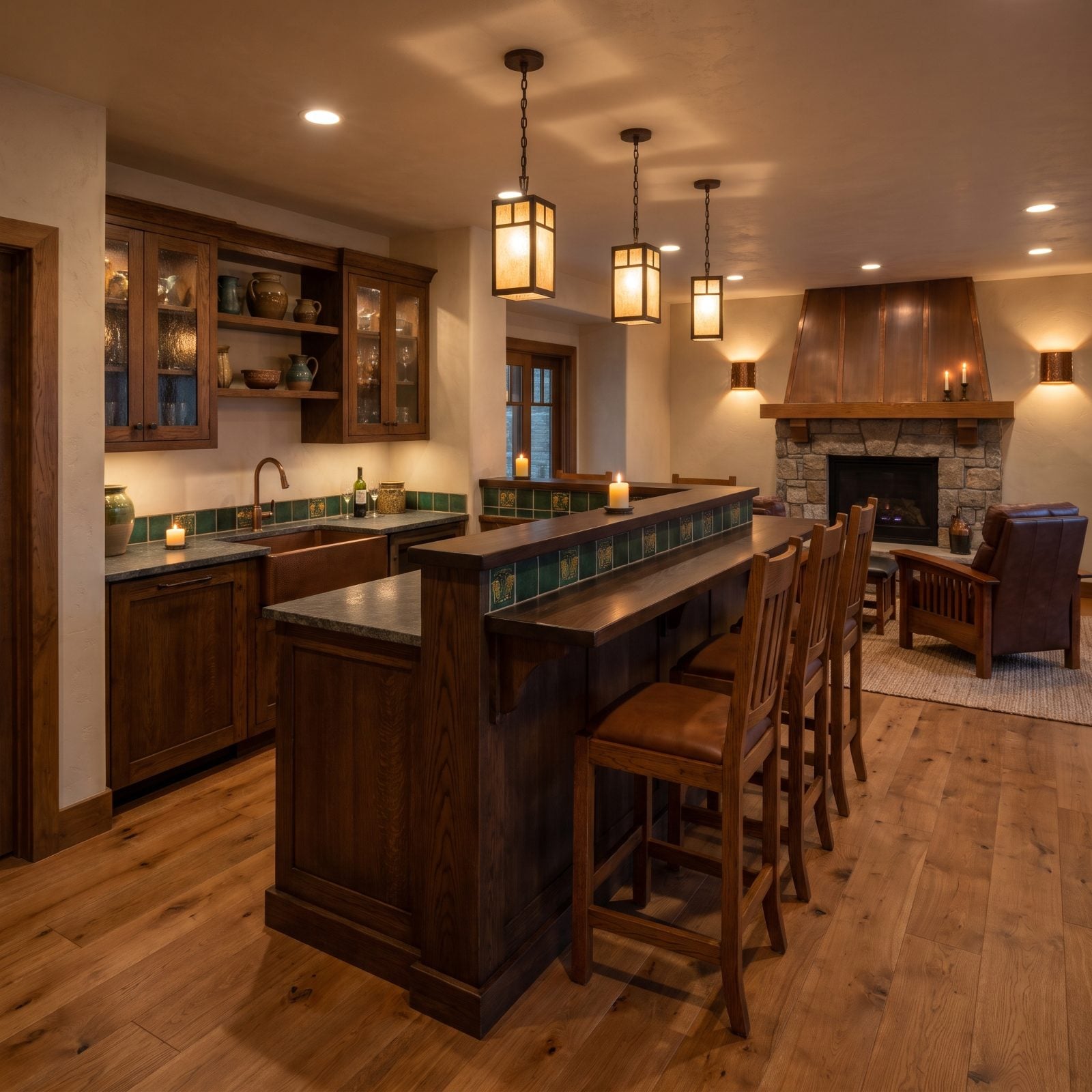
The split-level island was supposed to hide your dirty dishes from guests. Noble goal. Terrible execution.
That raised back ledge chops the island in half, wastes prep space, and blocks the sightlines that make open-plan kitchens feel big. Single-level islands won that fight years ago, and now buyers clock the extra tier the way you clock a cowlick. Flattening one to a single slab is among the highest-return updates in a modern kitchen design refresh, and it’s often just a countertop swap.
25. All-Gray Everything Starts to Feel Cold
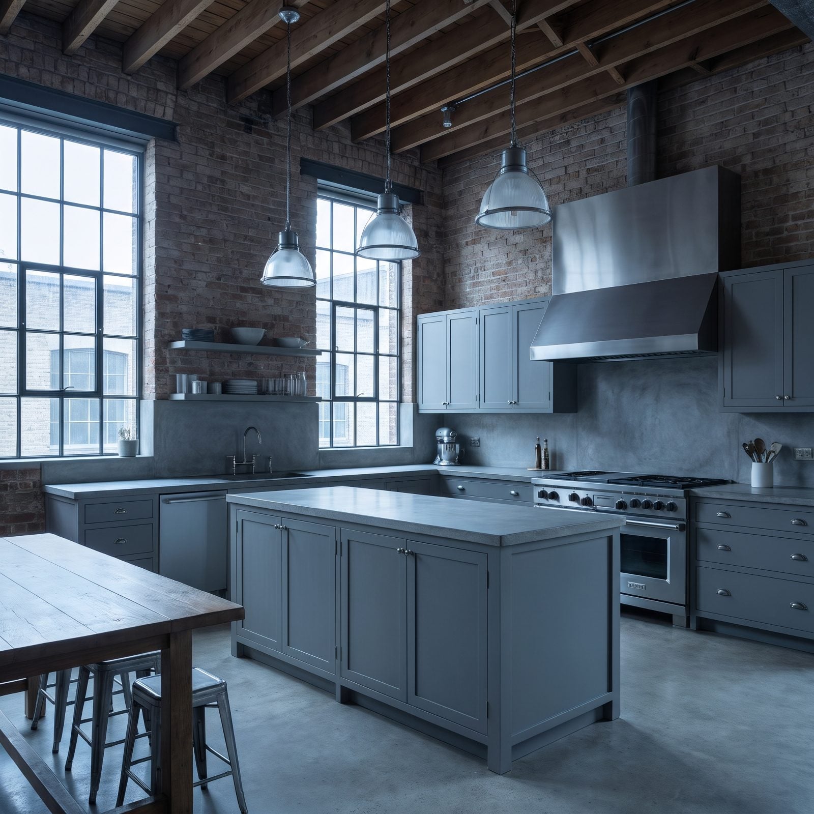
Cool gray was the safe choice for a decade. Now it’s the overplayed one.
When the cabinets, counters, backsplash, and floor all land in the same chilly gray, the room goes flat and vaguely clinical, with nothing warm for the eye to rest on. Buyers describe these kitchens as “nice but cold.” And cold is the last thing anyone wants from the room where they drink their morning coffee.
24. Heavily Distressed, Glazed Cabinets Look Fussy Now
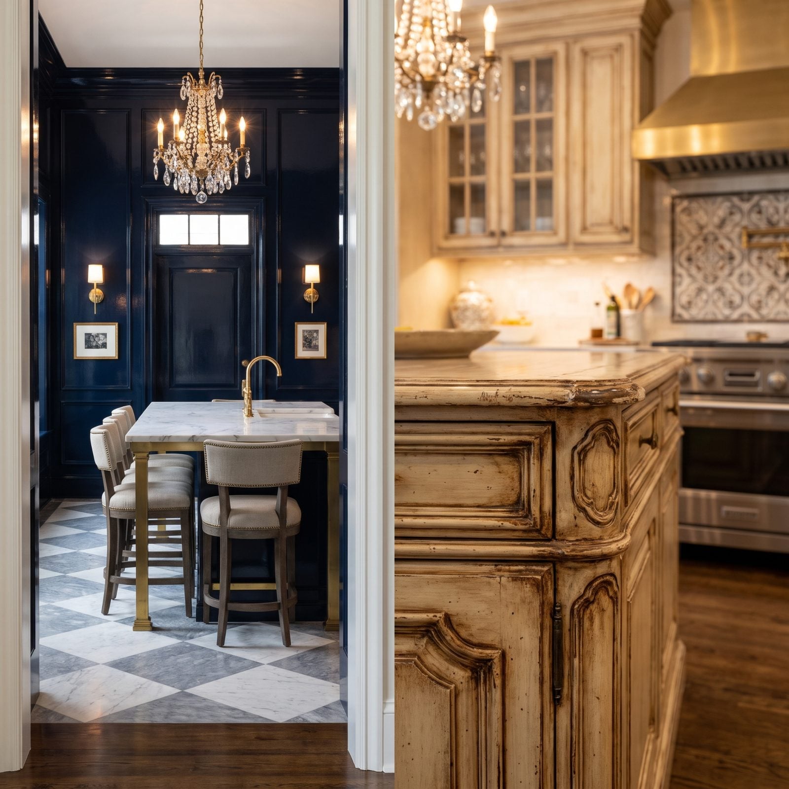
Faux-aged cabinets were everywhere in the Tuscan-kitchen years. Glaze pooling in every corner, sanded-through edges meant to look like decades of wear that actually happened in a factory last month.
Up close the artifice shows, and 2027 buyers want finishes that look honest. Distressing reads as a dated style rather than genuine patina, and it’s a pain to update without a full repaint. Clean, solid-color cabinets never go out of fashion, and there’s a reason for that.
23. Staggered Upper Cabinets at Three Different Heights
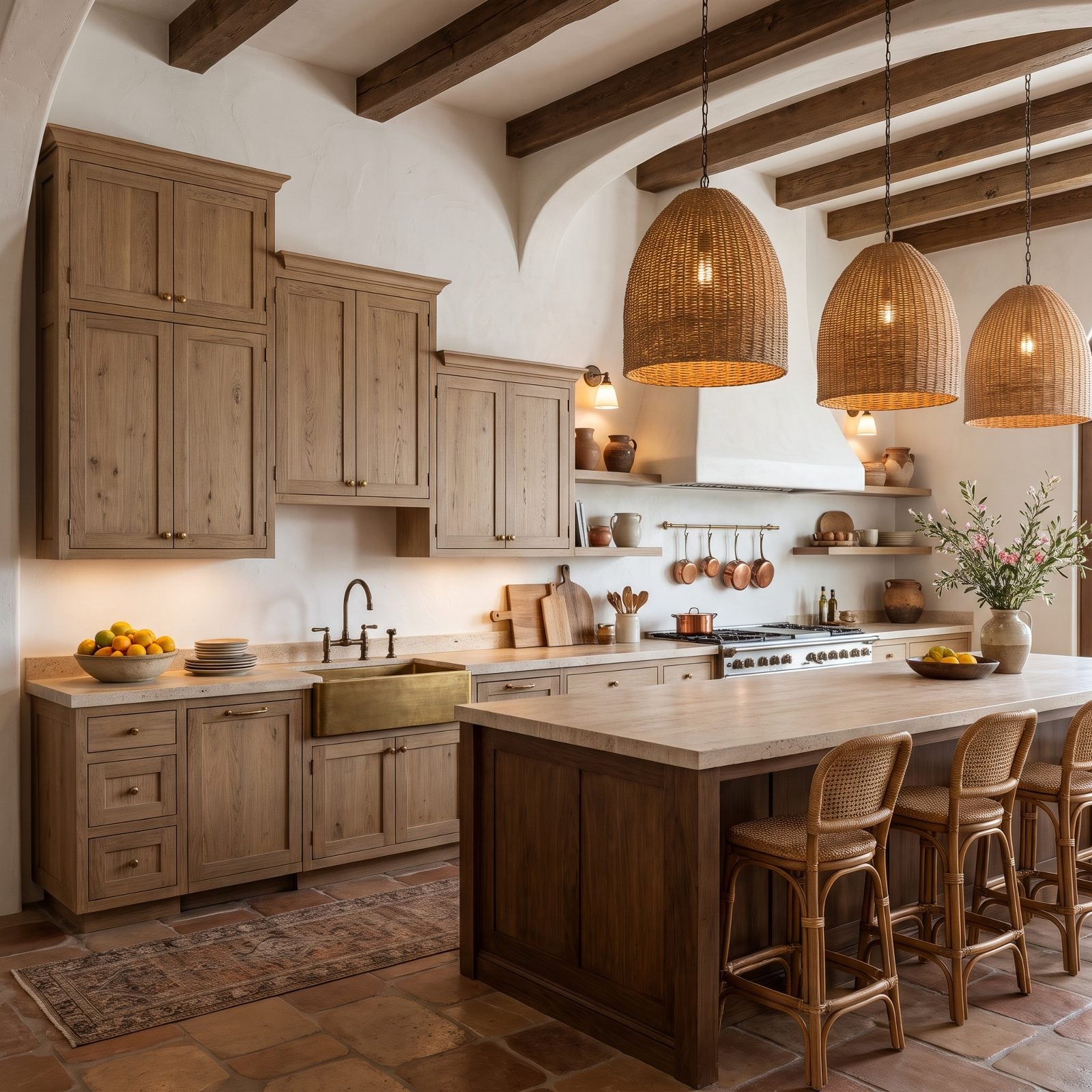
Somewhere along the way, builders decided a flat row of cabinets was boring and started stepping them up and down like a bar graph.
The result is a jittery top line that makes a kitchen feel chaotic and smaller than it is. Buyers can’t name the problem, but they feel the restlessness. A continuous cabinet run to the ceiling reads cleaner, stores more, and photographs calmer every single time. And few things date a kitchen to one particular stretch of years quite so plainly.
22. Bulky Soffits Boxing In the Cabinets
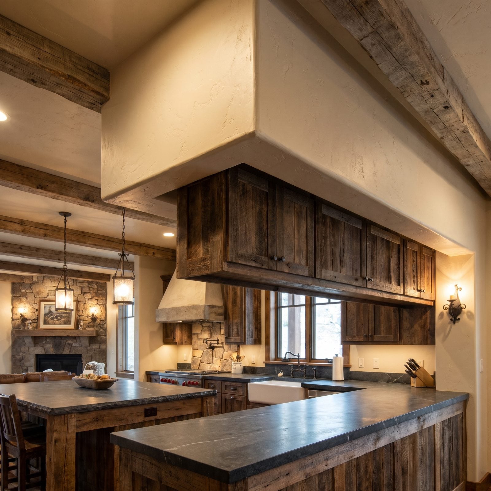
The soffit is the thing nobody notices until they can’t unsee it. That fat drywall box above the cabinets, hiding nothing but air and maybe a duct that could’ve been rerouted.
It drops the ceiling line and makes the whole kitchen feel shorter. Tearing one out, or at least building cabinets up into it, is one of the most satisfying small renovations going. Buyers reward the vertical breathing room, especially in homes with standard eight-foot ceilings.
As one interior designer puts it, “But building a soffit to top the cabinets, like in these above, is an outdated look.”
21. Open Shelving Where the Everyday Storage Should Be
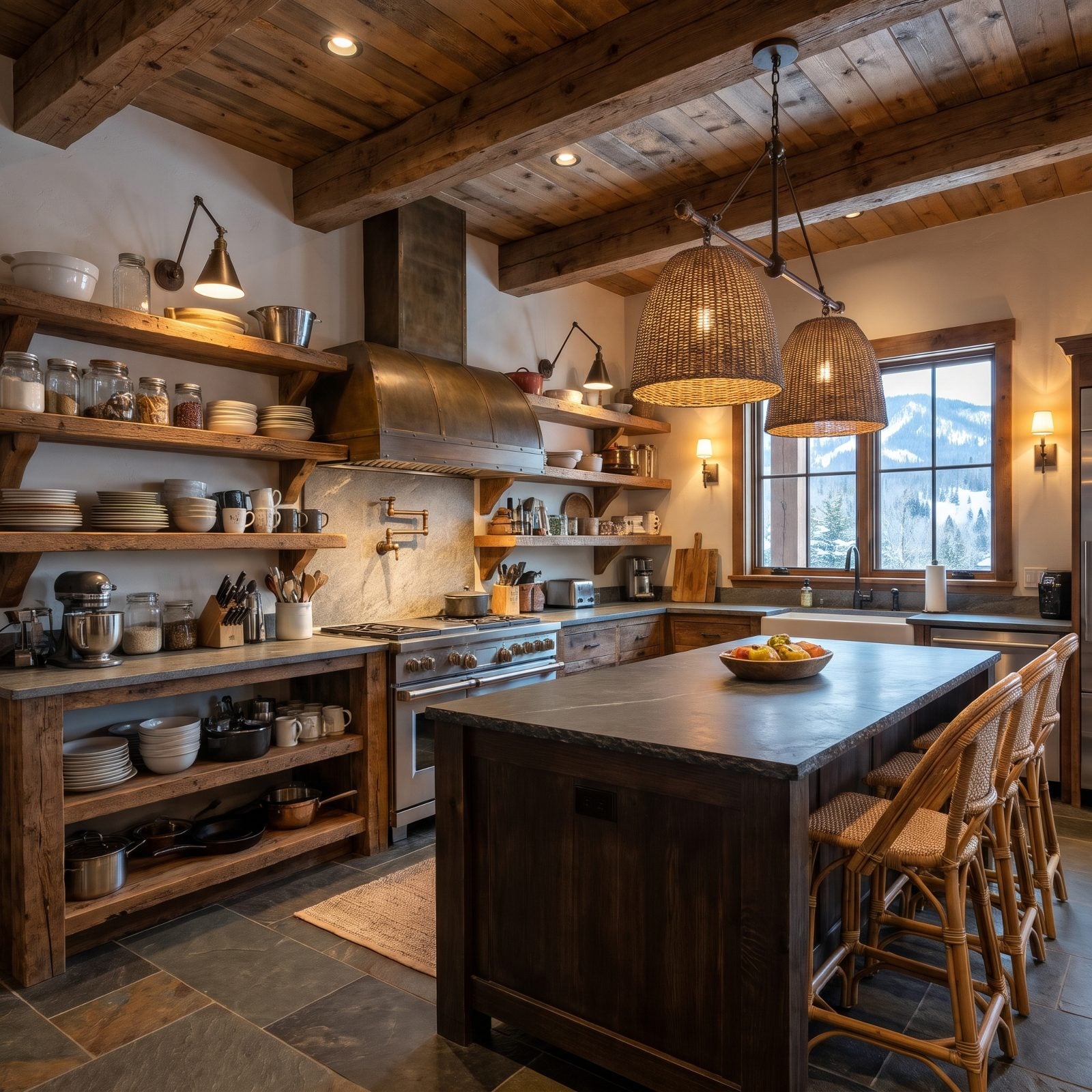
Open shelving photographs like a magazine and lives like a chore.
A few styled shelves as an accent? Lovely. Replacing all your uppers with them? Now every dish you own is a dust magnet, every glass needs rinsing before use, and your mismatched mugs are on permanent display. Buyers who actually cook spot the lost storage immediately and start subtracting. The trend peaked, and the practicality never caught up.
When our readers were asked which upper cabinets they would hang, 73% chose solid doors and only 12% went for open shelves.
20. Ornate Corbels Propping Up Every Counter and Cabinet
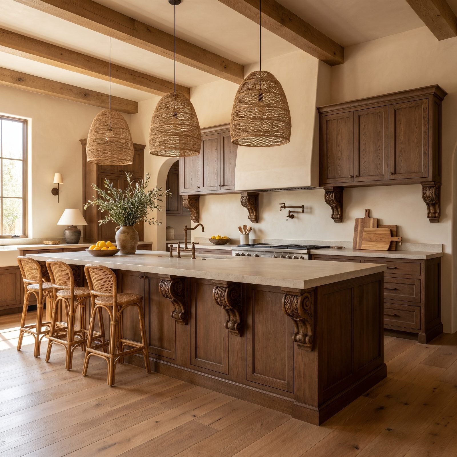
Carved corbels under every overhang were how early-2000s builders said “luxury.” Scrolled brackets on the island, more under the hood, a few propping up a bar that holds up perfectly fine on its own.
They read as fussy clutter now, collecting dust and pinning the room to one decade of over-ornamentation. Clean, minimal counter supports, or a simple steel bracket hidden underneath, look far more current. The restraint is the upgrade. If the bones of the kitchen are solid oak, a stripped-back look suits them better than you’d think, which is the same lesson that drives a good craftsman kitchen renovation.
19. The Oversized Furniture-Style Island That Ate the Kitchen
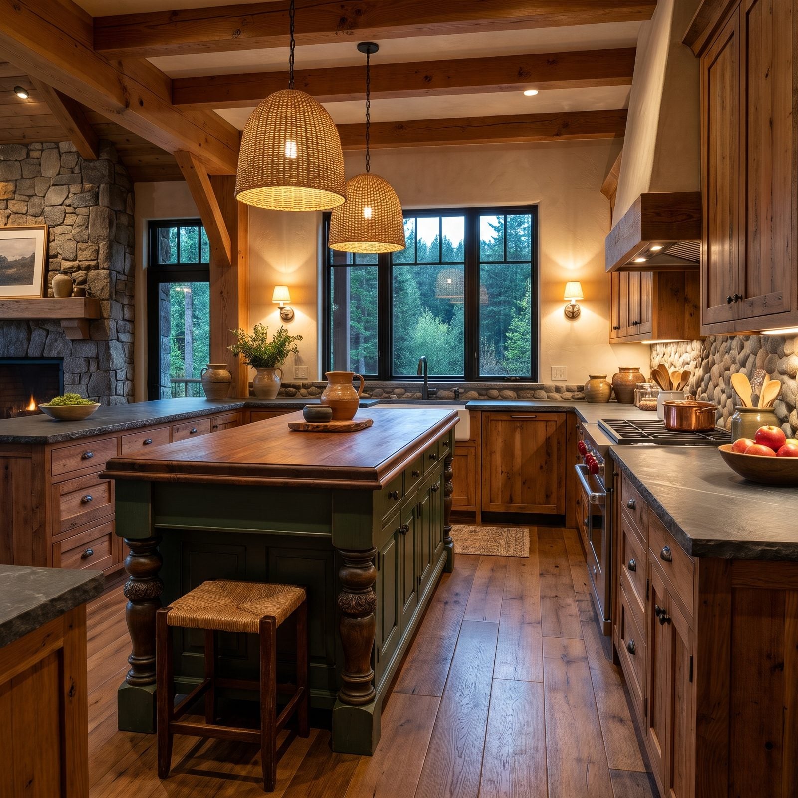
That island is lovely, and it’s also two sizes too big. Furniture-style islands with carved legs and corbels read like a dining-room buffet dropped into the cooking space, and buyers in 2027 clock the problem fast: you can’t open the dishwasher and the oven at the same time without doing a little dance.
Scale is the whole game here. An island wants 42 to 48 inches of clear floor on every working side, and this one gives maybe 30. The craftsmanship is real. The circulation isn’t.
18. The Built-In Kitchen Desk Nobody Sits At Anymore
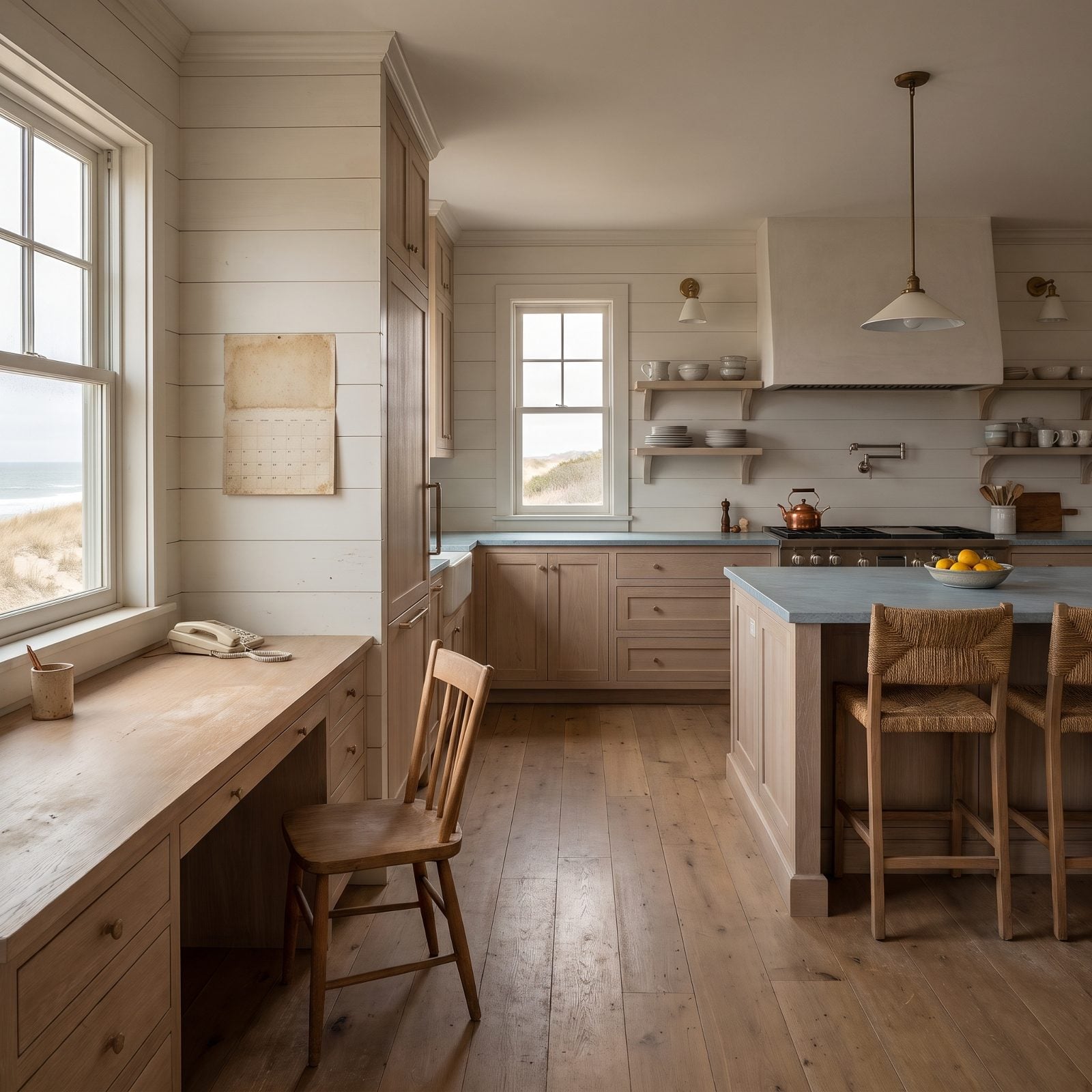
The built-in kitchen desk was the command center of the early 2000s — a spot for the landline, the bills, the wall calendar. Now it collects junk mail and tangled chargers.
Buyers look at that short stretch of lower cabinet and stubby counter and see wasted pantry or prep space instead. Most craftsman kitchen renovation plans rip the desk out first thing and reclaim it as tall storage. And honestly? We’ve never once seen a human being do homework at one of these.
17. Those Open Diamond Wine Cubbies Gathering Dust Up High
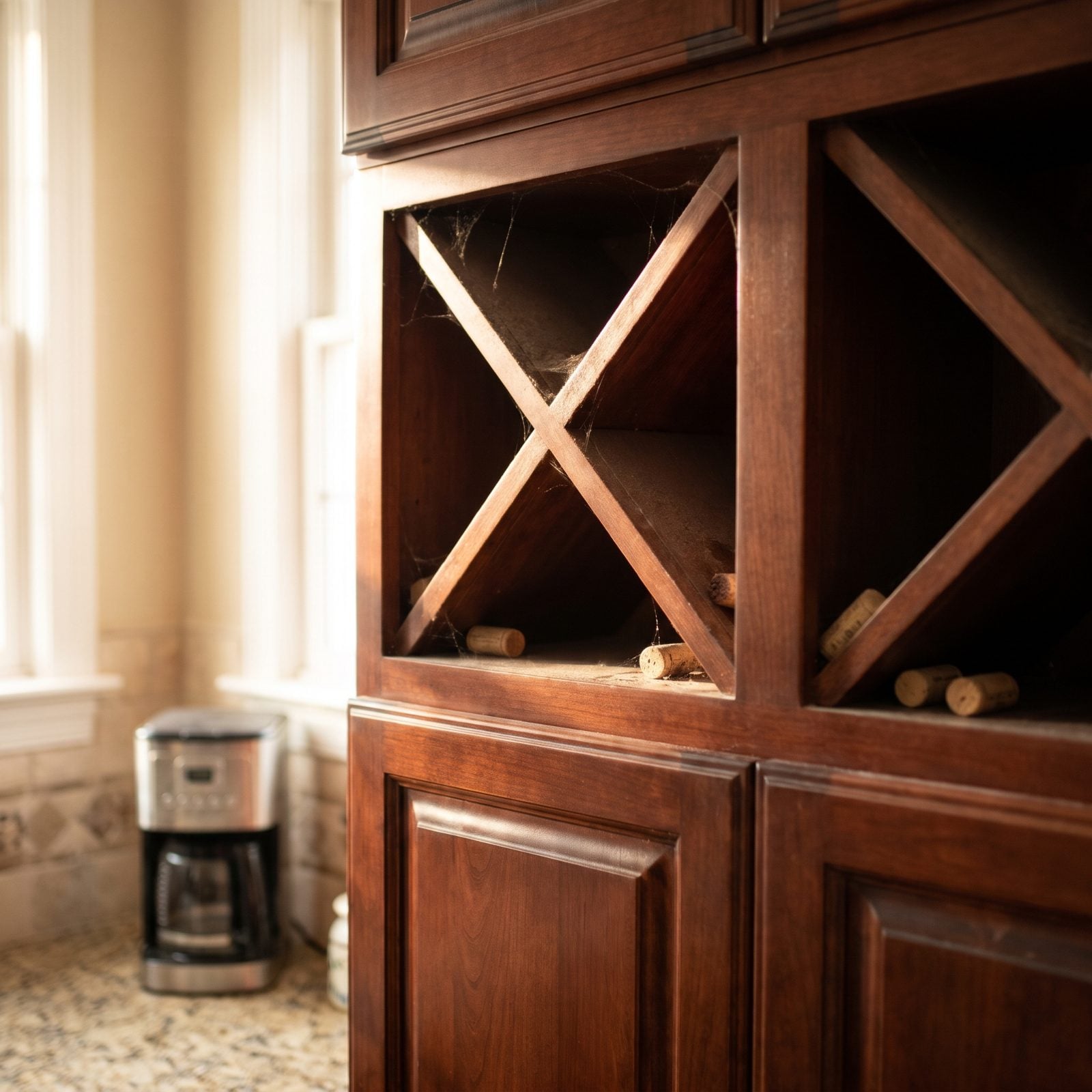
The diamond wine cubby was the builder-grade flourish of a thousand mid-2000s kitchens. A little lattice of X-shaped slots, usually tucked high above the fridge where no one can reach.
Here’s the problem. Open cubbies store wine on its side in warm kitchen air with light hitting the labels, and any real wine person winces at that. Buyers now read the whole thing as dated cabinet filler rather than a feature, which puts it first on the list to get infilled.
16. Modern Farmhouse Lines Undone by an Over-the-Range Microwave
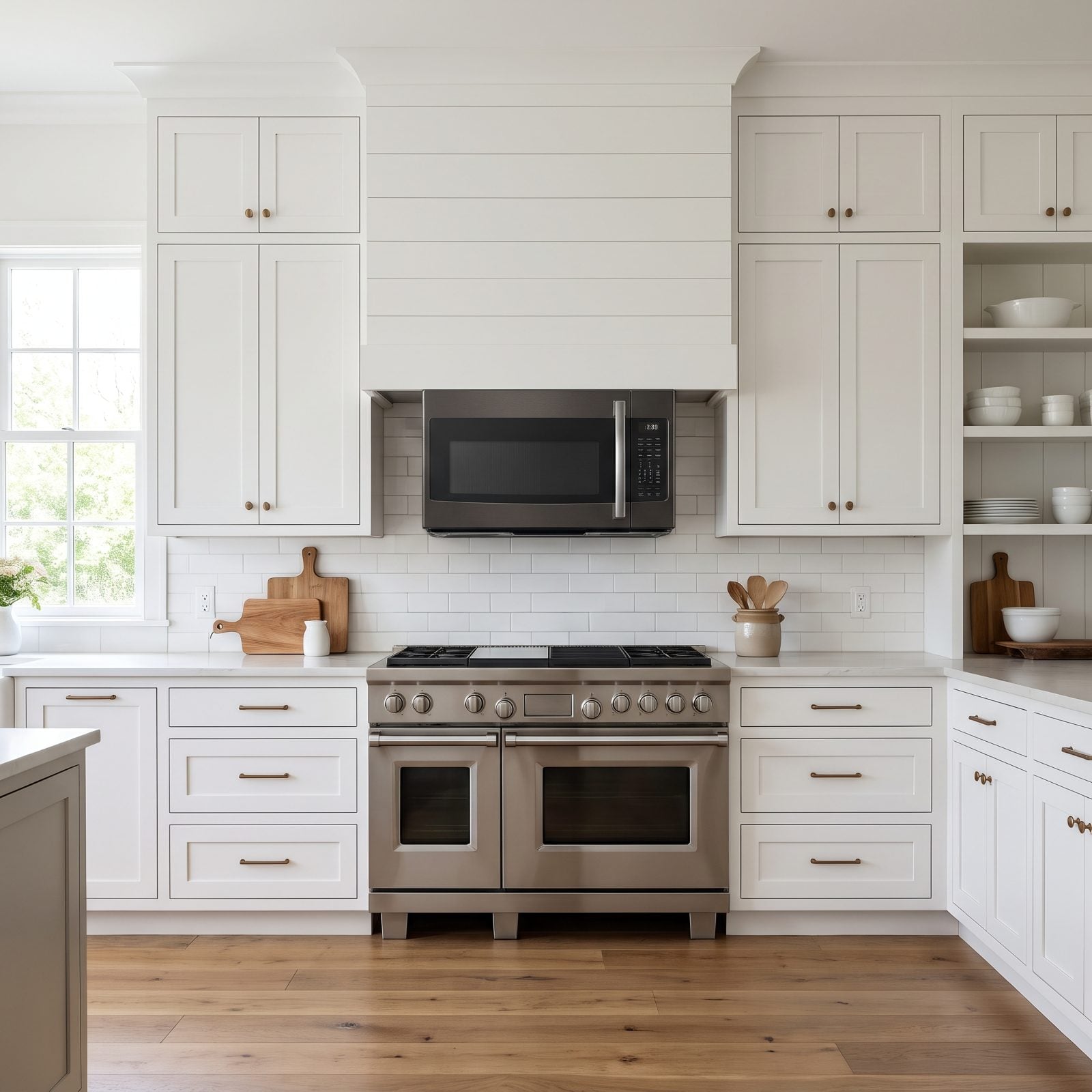
An over-the-range microwave with a recirculating fan earns a double demerit: it eats the prime spot where a proper vent hood belongs, and it doesn’t actually vent anything outside. The grease and steam get shoved through a little charcoal filter and blown right back at your face.
Design-forward buyers want a real hood making the visual anchor overhead, with the microwave tucked into a drawer or a pantry. In a modern kitchen design, that boxy stainless box reads as the one builder shortcut nobody bothered to update.
As one appliance store CEO puts it, “A charcoal filter traps some grease, but it sends heat, moisture and odors right back into the room.”
15. The Industrial Loft Kitchen Hiding a Built-In Trash Compactor
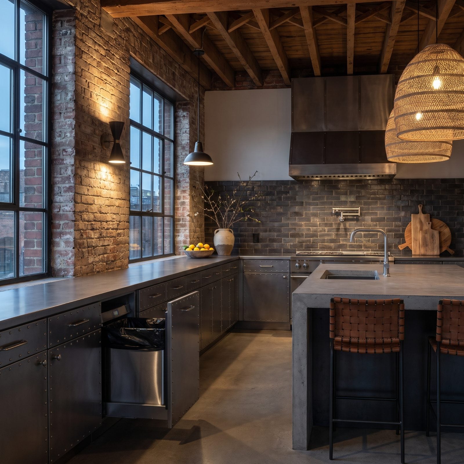
Remember when a trash compactor felt like the future? Smash your garbage into a dense little brick and haul the bin out half as often.
Buyers today see maintenance headaches — a specialty appliance that’s pricey to repair and a hassle to replace. Then they picture the smell of compressed garbage sitting in a sealed drawer, which, no thank you. That slim cabinet bay is worth far more as pull-out recycling and waste bins.
14. Rustic Warmth, Cold Reception for the Electric Coil Cooktop
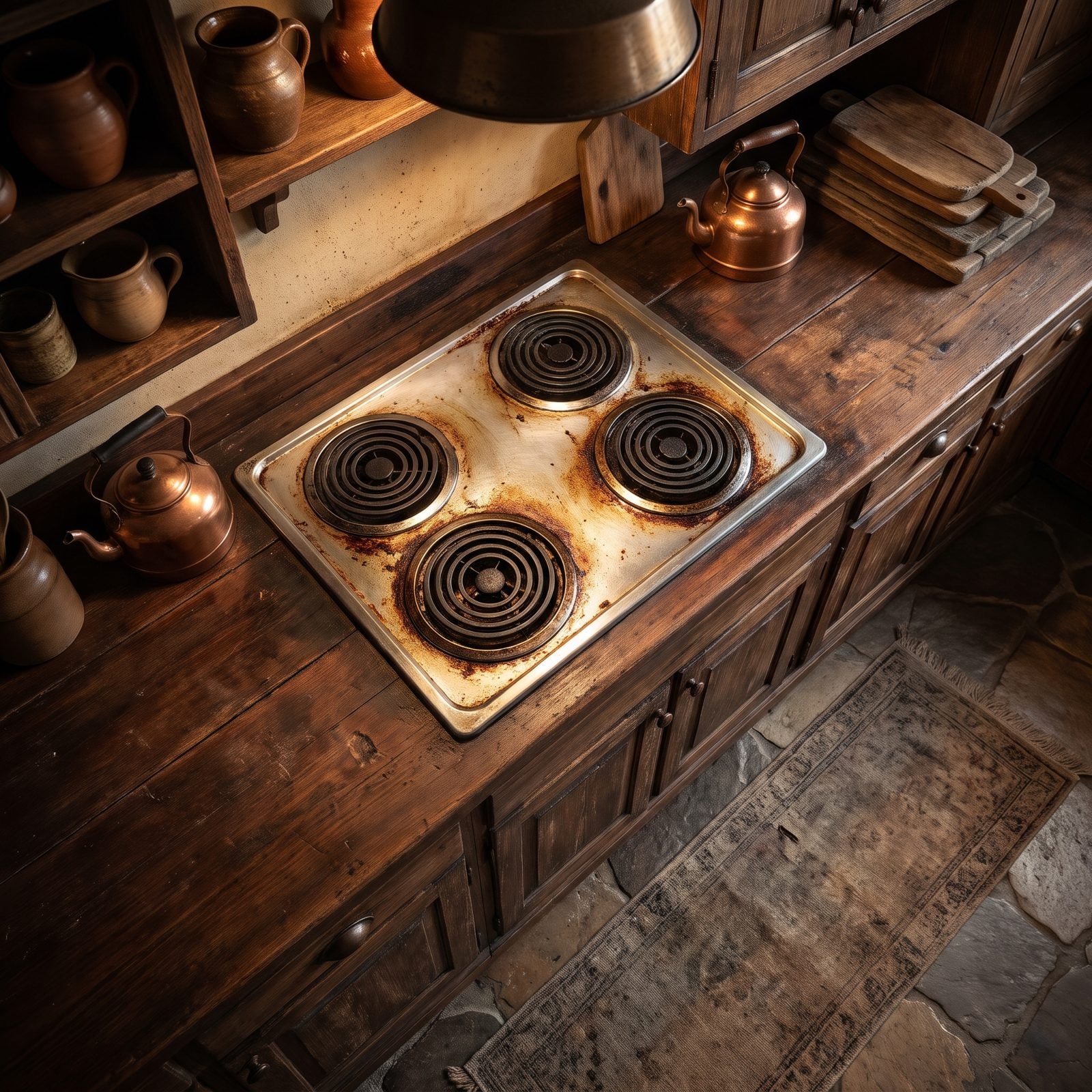
Four black spiral coils and a set of chrome drip pans that never come fully clean. The electric coil cooktop is the clearest signal in a kitchen that nothing’s been updated in a decade or two.
Coils heat slowly, scorch unevenly, and look rough the moment anything boils over. Buyers walk in, see them, and mentally subtract the cost of a smooth induction or gas cooktop. First impressions move fast in a kitchen, and this one lands wrong.
13. A Sleek Ski Lodge Cooktop Undermined by a Weak Downdraft
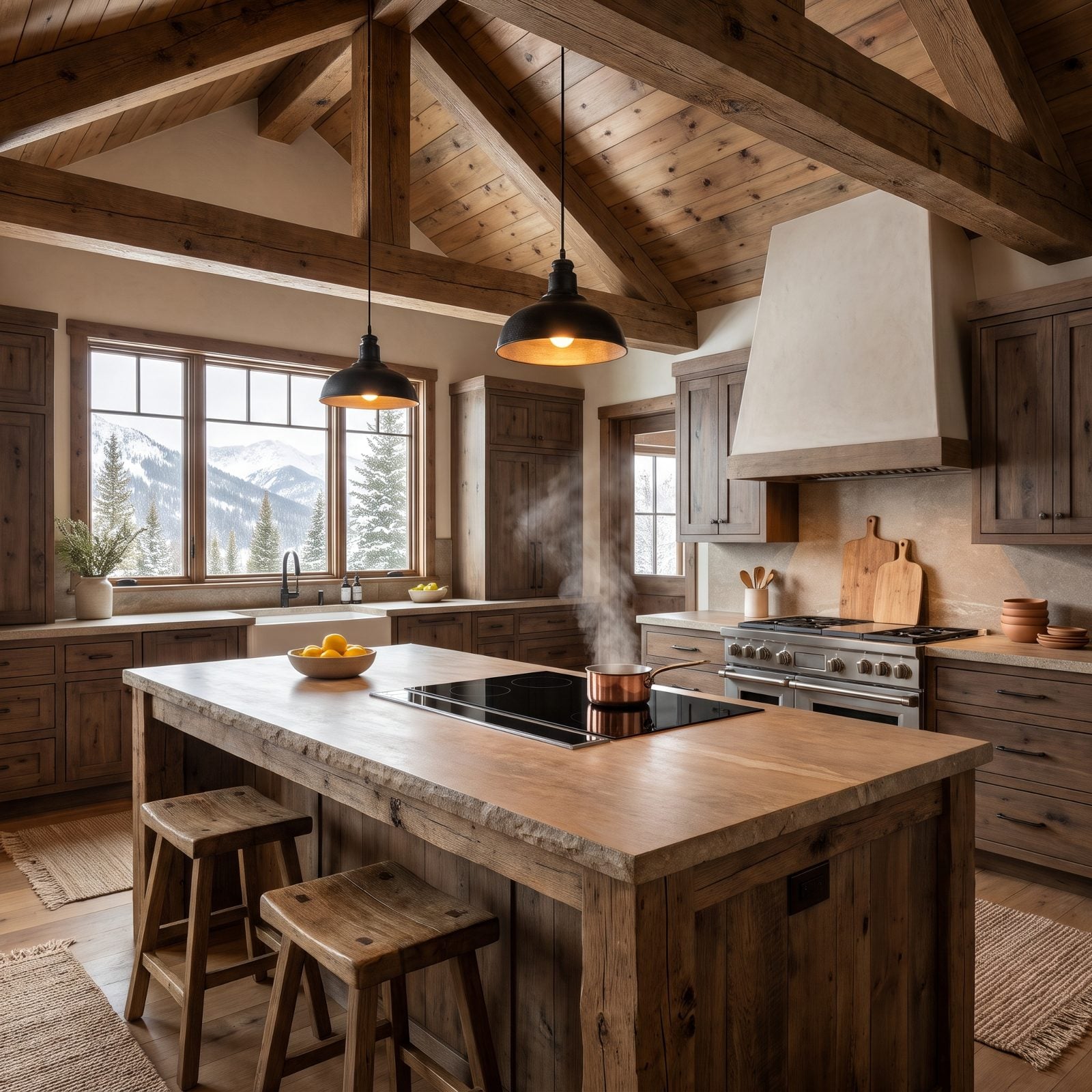
The downdraft cooktop promised a clean sightline with no hood overhead. On paper, perfect for an island in a room with big views.
In practice, pulling steam and smoke downward fights physics, and most of these units are too weak to win. Anyone who’s seared a steak over a downdraft knows the smoke detector takes that round. Buyers who cook seriously want real overhead or island ventilation that actually moves air, and they price the swap in before they’ve left the room.
As a longtime appliance retailer puts it, “You’re trying to reverse all of that through a tiny aperture with a long duct run, often with at least one elbow.”
12. A Traditional Kitchen’s Dead End: The Awkward Corner Sink
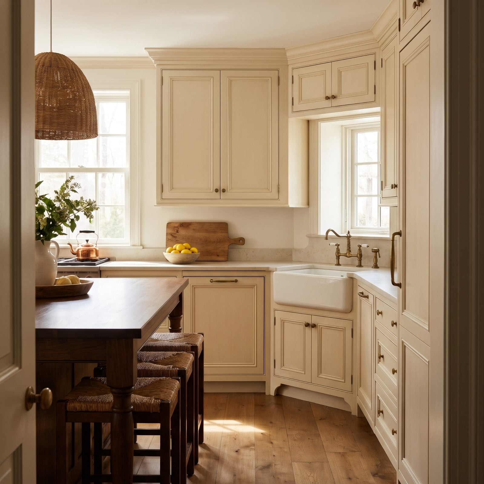
The corner sink was supposed to be clever: use the dead corner, free up the main runs. In reality it wedges you into a cramped elbow where two people can’t share the workspace and the dishwasher beside it blocks the cabinet below.
Standing hunched into a 45-degree corner to wash dishes gets old fast. Buyers reading kitchen details know a well-placed sink holds the whole work triangle together. A corner one usually breaks it.
11. The Apron-Front Farmhouse Sink Loses Its Shine
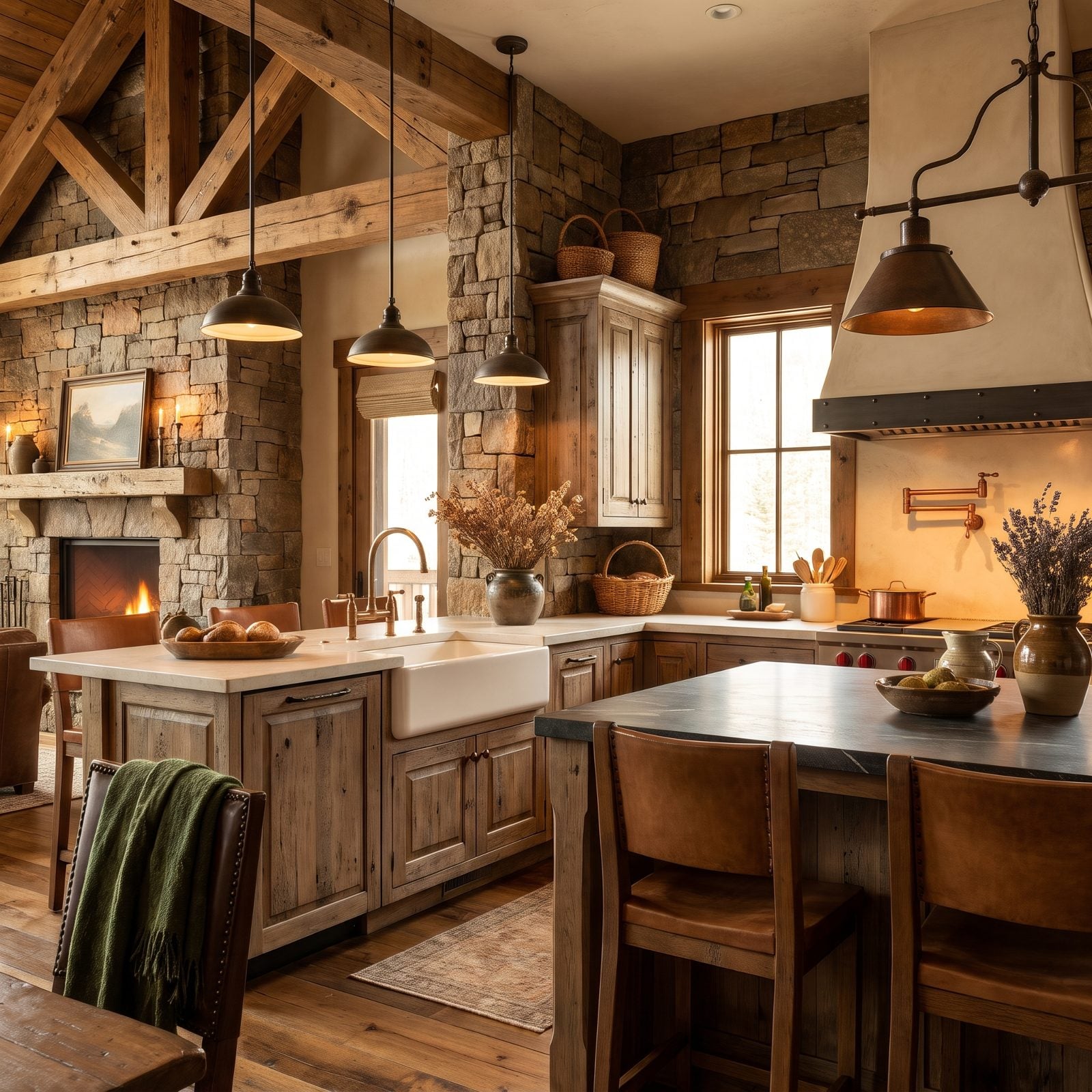
The apron-front sink was the darling of a thousand renovation reveals, and now it reads like a time stamp. Agents are noticing that buyers clock it immediately and mentally file the kitchen as a 2015 redo, fair or not.
The sink in this photo is clean and perfectly functional, which is exactly the problem with trend fatigue. Nothing is wrong with it. It’s just everywhere, and everywhere eventually becomes dated. We liked these for years, so we’ll admit this one stings a little.
In our reader poll on which replacement sink they would buy, undermount led at 37%, with the farmhouse apron tied with double basin at 29% each.
10. That Big Fluorescent Ceiling Box Has to Go
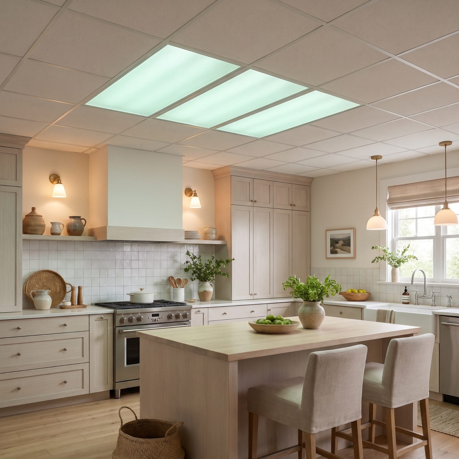
You know the one. That glowing acrylic rectangle in the ceiling, humming faintly, lighting the whole room the color of a waiting room.
It was practical lighting for its era, and it’s also the single fastest way to make a kitchen feel like it belongs to a different decade. Buyers don’t analyze it. They just feel the room go flat the second they walk in.
Recessed cans or a cluster of pendants fix it for not much money, which is why agents push for the swap before listing.
9. Hanging Pot Racks Start Feeling Like Clutter
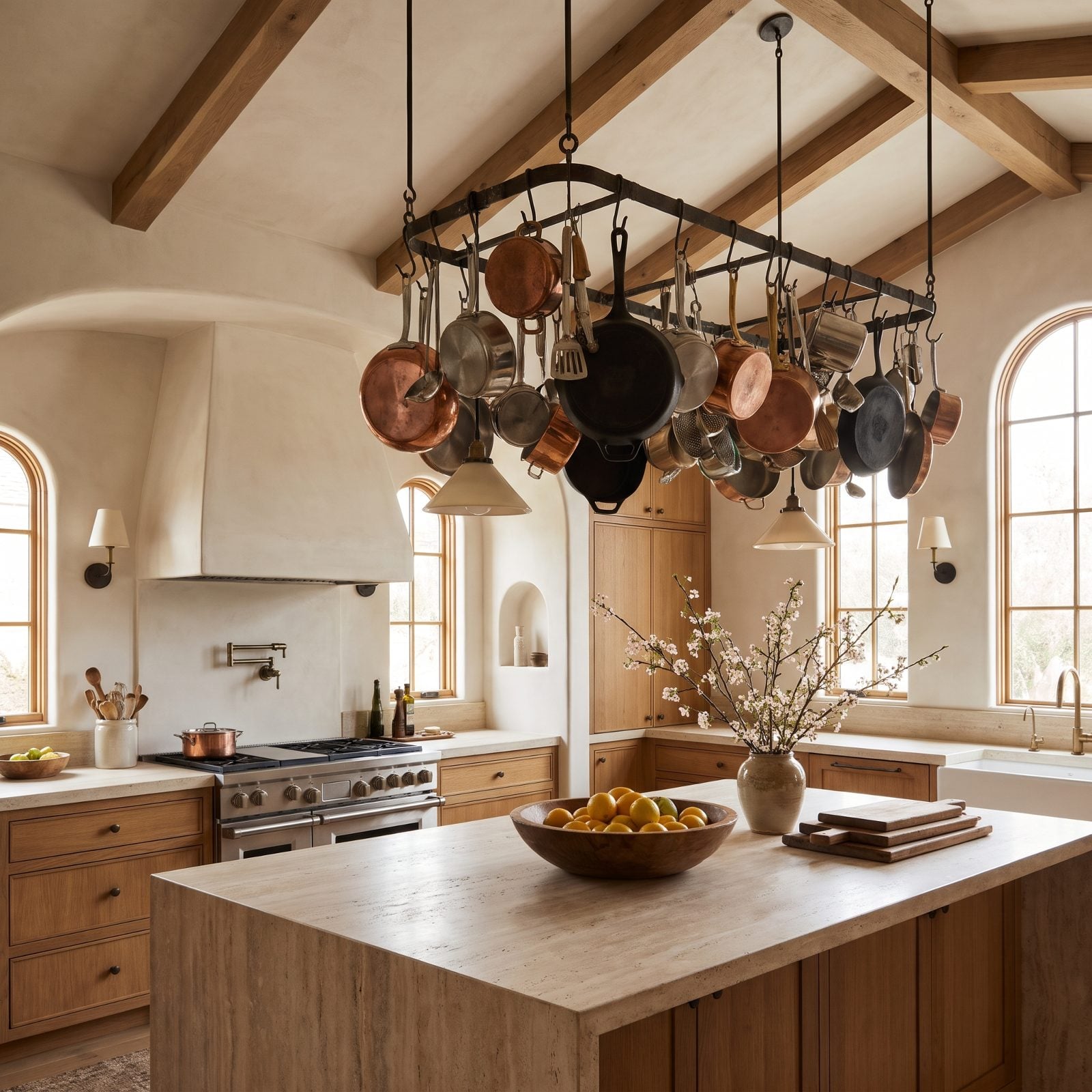
There’s a romance to the hanging pot rack. Rustic, chef-y, practical if you actually cook with everything up there.
Most people don’t, so the rack becomes a dust magnet suspended at forehead height, and it chops up the sightline across the kitchen, which is exactly what buyers walking a listing don’t want. Open ceilings read bigger. A loaded pot rack reads busy.
8. Shimmering Glass Mosaic Backsplashes Read as Dated
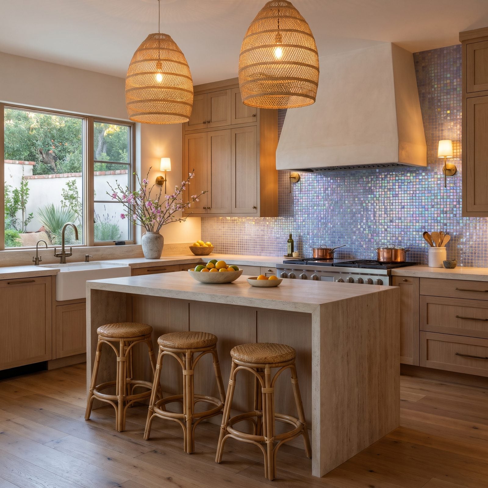
Little glittering glass squares caught every kitchen light and, for a while, every heart. In 2027, they catch the eye for the wrong reason.
The shimmer pins the install to a specific window, and buyers read it instantly. Large-format tile and simple slab backsplashes have taken over the modern kitchen design conversation, which makes the mosaic look fussy by comparison.
7. Tumbled Travertine Backsplashes Fall Out of Favor
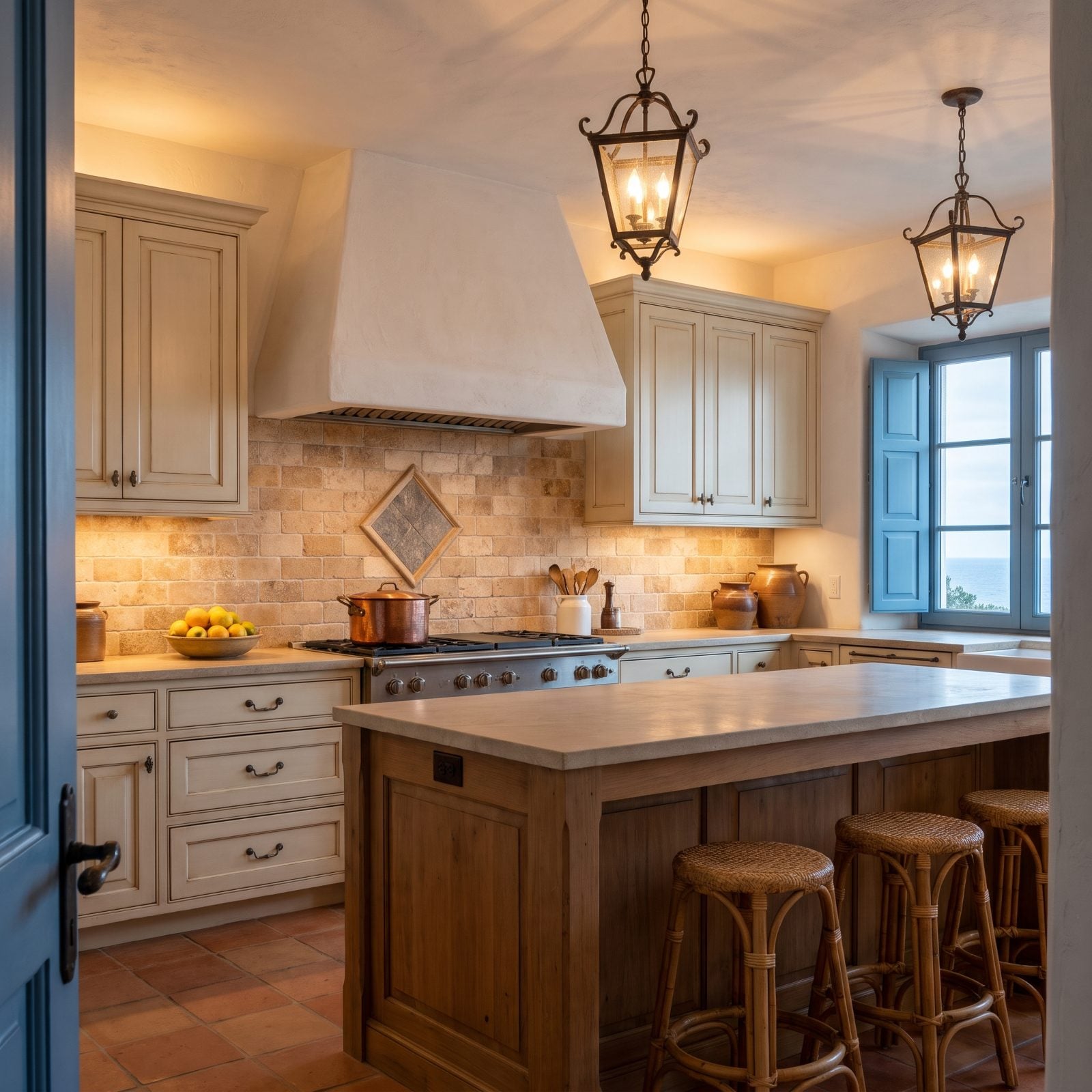
Warm, earthy, and everywhere two decades ago. The tumbled travertine backsplash, usually with a little diamond accent and a medallion behind the stove, defined the Tuscan moment.
Buyers now see the porous beige stone and date the whole kitchen on sight. It also stains and needs sealing, which practical shoppers know, so it’s a double deterrent. A lighter, non-porous backsplash instantly reads cleaner and newer.
6. Big Square Ceramic Floor Tiles Age the Whole Room
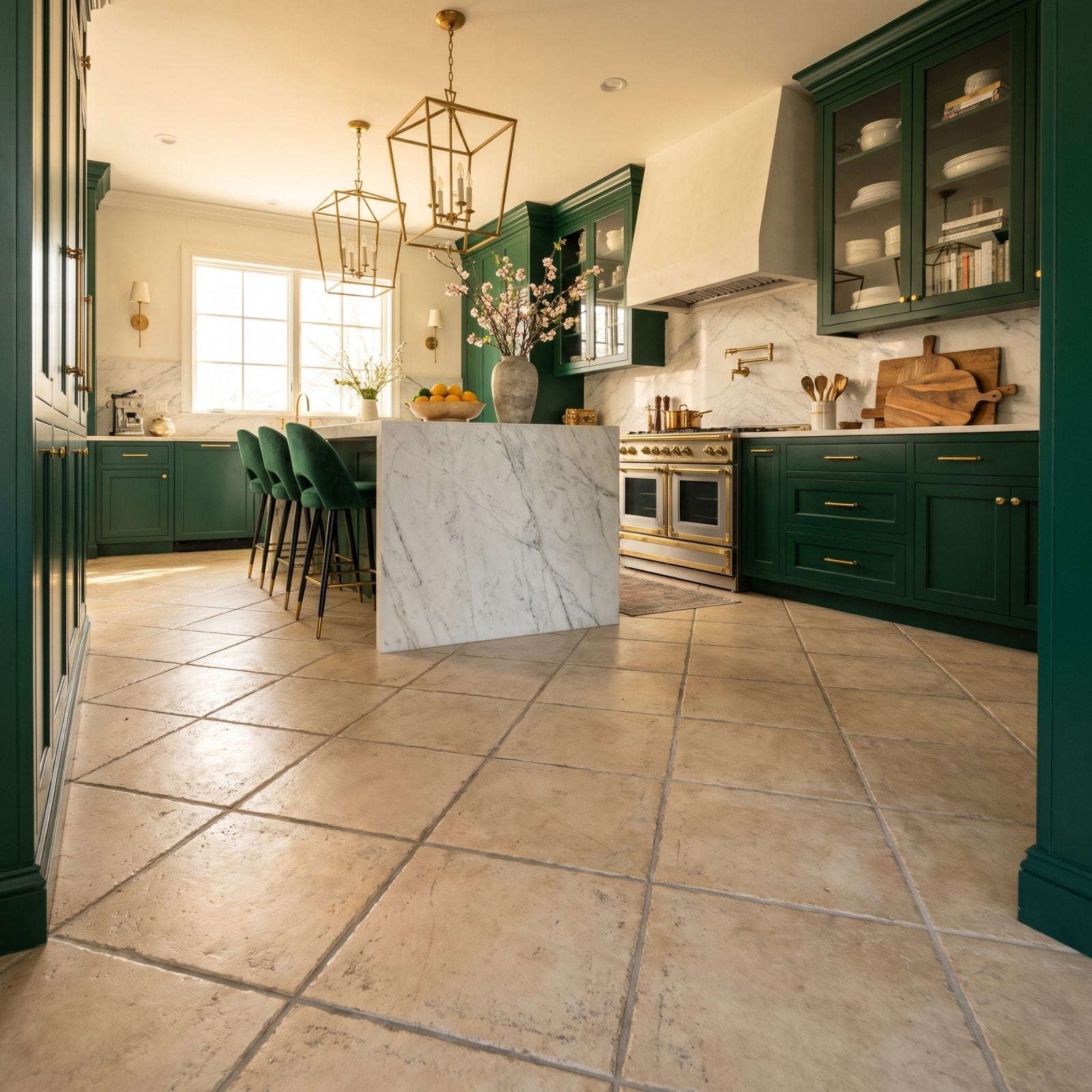
Eighteen-inch beige squares on the diagonal, grout lines gone slightly gray no matter how hard you scrub. You’ve mopped this floor at someone’s house.
It was the builder-grade default for two decades, and that familiarity is the issue. Wood-look plank tile and real hardwood now set the expectation, so the big square grid reads old before a buyer finishes the walkthrough. The diagonal layout, once a selling point, dates it harder.
5. The Tuscan Red, Gold, and Olive Palette Says Its Goodbyes
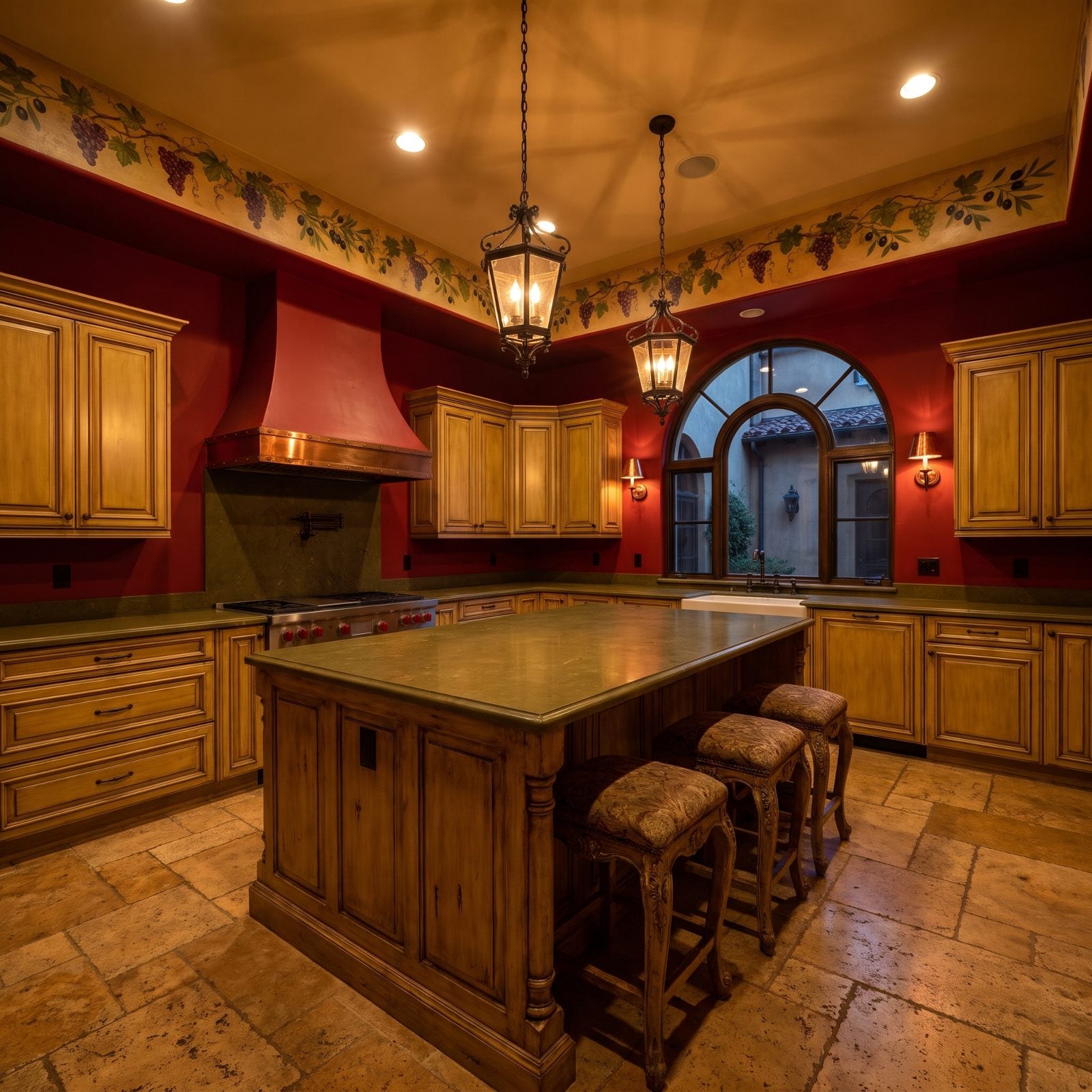
Red walls. Gold-glazed cabinets. Olive accents and a grapevine border somewhere near the ceiling. The full Tuscan color story was a love language for fifteen years.
It commits hard to one mood, and buyers in 2027 want a neutral canvas they can picture themselves in. Saturated warm palettes lose the crowd fast. The current wave of green kitchen ideas leans soft sage and muted olive, nothing like the heavy golds here.
4. Tuscan Arched Openings Lose Their Welcome
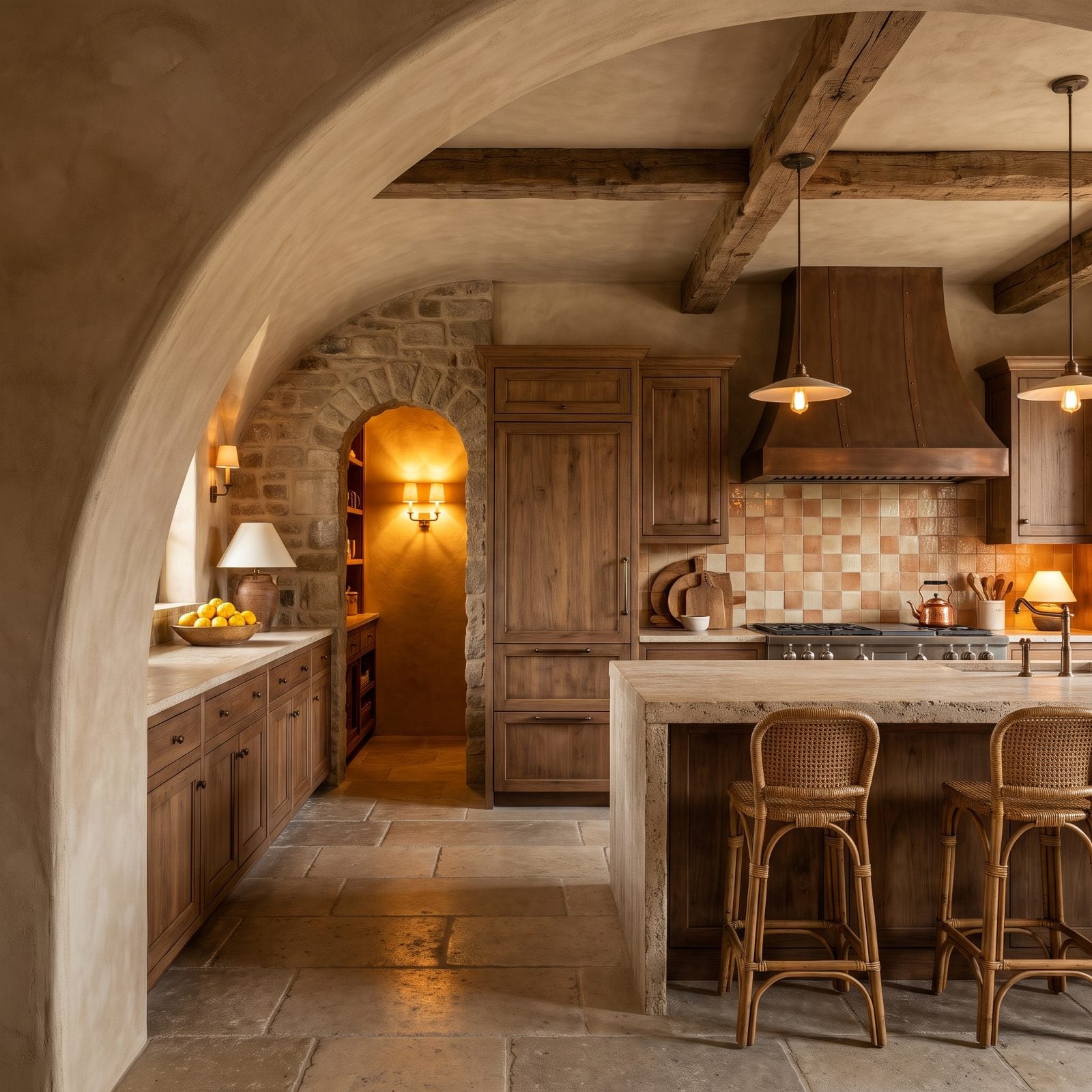
The soft rounded arch framing the pantry, the hallway, the pass-through. It was supposed to feel old-world. Now it mostly feels early-2000s.
Square openings read current, and buyers link the plaster arch to the same package as the travertine and the red walls, so one arch can date an entire floor plan. It’s an expensive thing to change, which is why it worries agents more than a backsplash does.
3. Decorative Columns Framing the Kitchen Start to Grate
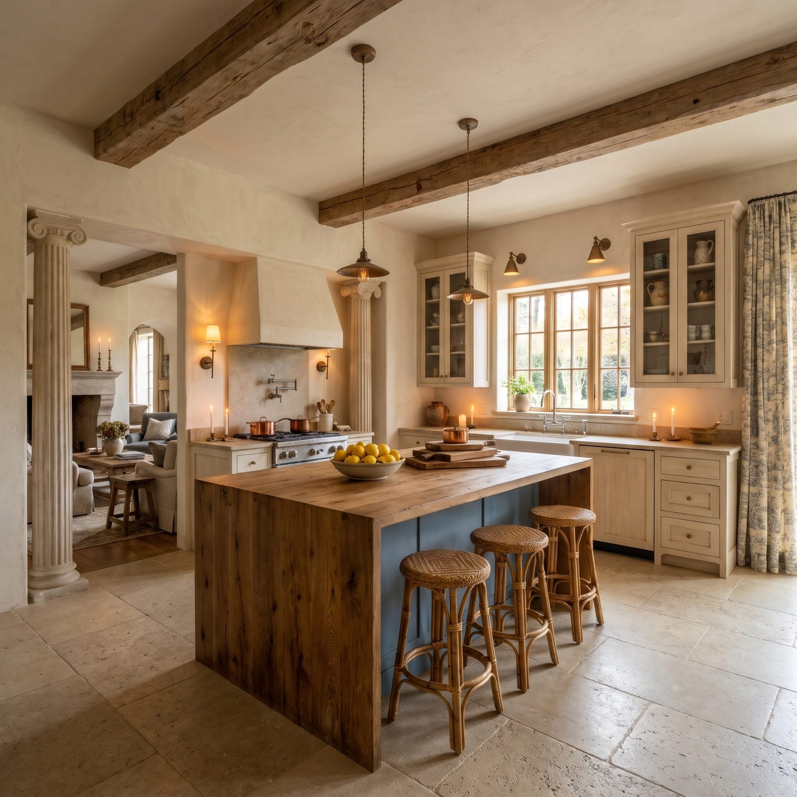
Fluted half-columns standing guard where the kitchen meets the great room. They hold up nothing. That’s the quiet tell.
Decorative columns were a builder flourish meant to signal grandness in open plans, and buyers now read them as fussy padding in a space that wants to feel clean and open. Strip them out and the room usually feels bigger overnight, which is exactly the reaction agents are chasing.
2. Sliding Barn Doors on the Pantry Hit Peak Fatigue
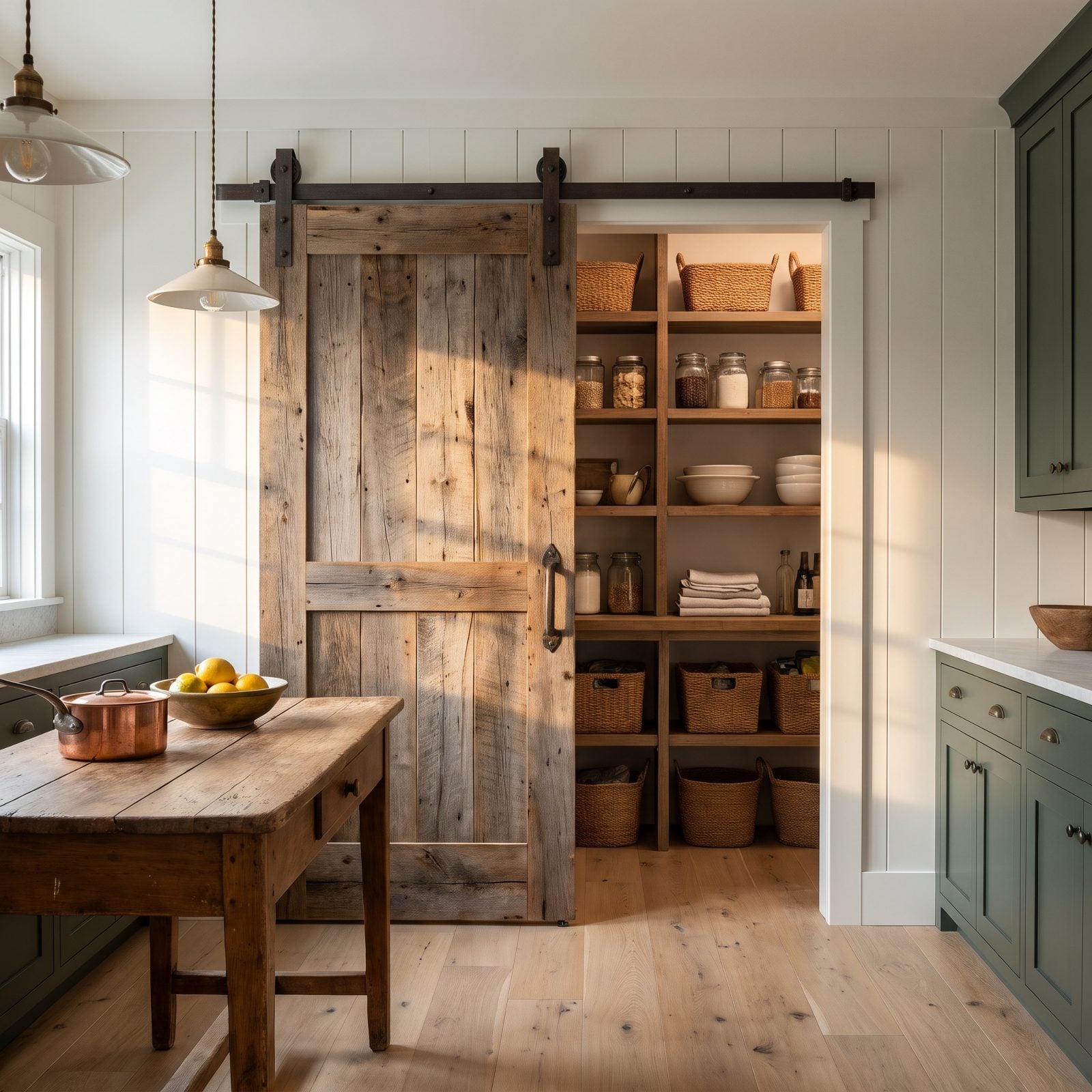
The barn door had a good long run. Reclaimed wood, black track hardware, that satisfying roll across the wall. By 2027, it’s the design cliché that launched a thousand identical kitchens.
Agents report buyers rolling their eyes at it now, the way they once did at wine-themed wallpaper. And it doesn’t seal, so it muffles no sound and hides no mess, which thins the appeal once the novelty wears off. A clean pocket door or a simple panel reads timeless by comparison.
1. The Closed-Off Kitchen With a Narrow Doorway Is a Hard Sell Now
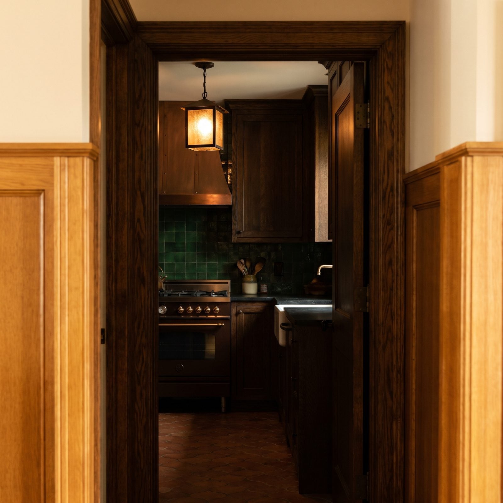
That wall and the skinny doorway next to it used to be the whole point — the kitchen was where the mess lived, tucked safely out of sight when company came over. Now it just reads as a dead end. You walk in, you walk out, and whoever’s cooking ends up having a conversation with the backsplash.
Everything in here is honest enough. Dark-stained wood cabinets, black stone counters, a copper range hood, a silver kettle, a single lantern pendant, a deep sink set against the green tiled backsplash. Nothing’s broken. The trouble is the floor plan, and floor plans cost real money to undo. Buyers wandering through in 2027 start running the numbers on tearing that wall out before they’ve even reached the back bedroom.
Here’s the upside. A narrow pass-through, or just a widened cased opening, buys back most of that flow without gutting the room down to studs. Do that first, before you reface a single cabinet.