🔥 Would you like to save this?
A home can be clean, cared for and genuinely lovely, and still whisper the exact year it was decorated. Nothing has to be broken. Sometimes one confident decision simply froze the room inside a trend that kept moving without it.
The funny part is how rarely the cure requires dynamite. A different bulb. A larger rug. Curtains dropped another six inches. One shiny thing removed before the room starts reflecting itself into infinity. Most dated spaces aren’t suffering from bad taste so much as too much agreement: everything bought together, everything matching, every surface repeating the same idea until the decade becomes impossible to miss.
In order to come up with the very specific design ideas, we create most designs with the assistance of state-of-the-art AI interior design software. Also, assume links that take you off the site are affiliate links such as links to Amazon. this means we may earn a commission if you buy something.
These 35 choices are the ones that do it fastest. Some belong to very specific decorating eras; others are timeless mistakes of scale, placement or excess. Either way, the fix is usually the same: break the pattern, introduce contrast and let the room look as though a life happened there instead of a shopping cart.
35. Buying the Entire Living Room From One Matching Furniture Collection
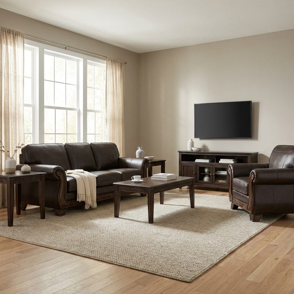
You’ve seen this room. Sofa, loveseat, chair, coffee table, end tables, all in the same espresso finish with the same rolled arms, all delivered on the same truck. Nothing is worn. Nothing is technically wrong. It simply looks as though the furniture showroom was shrink-wrapped and moved intact into somebody’s house.
Rooms that hold up tend to accumulate differences: an inherited chair, a table bought years later, a lamp that shouldn’t quite work but somehow does. A full matching suite skips that history, which is why it can timestamp a room so efficiently.
Break the set. Keep the sofa, then swap the coffee table for a vintage round walnut coffee table, replace one end table with a black metal side table, and bring in an armchair in another material entirely. Collected beats coordinated.
34. Using Cool Gray on the Walls, Sofa, Rug and Flooring All at Once
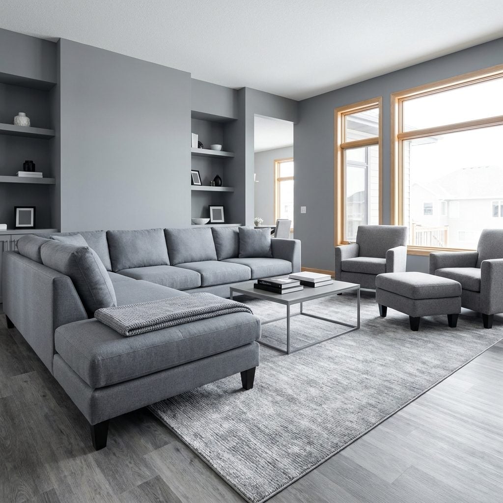
Gray isn’t the villain. The trouble starts when the walls, sectional, rug and flooring all land in nearly the same chilly register until the whole room dissolves into one uninterrupted fog.
This cool-on-cool palette became especially ubiquitous in the mid-2010s, which is why an entire house done this way can announce its renovation era before anyone notices the furniture.
Keep whichever gray piece you still love and warm the company around it: camel leather, oak, cream, rust, olive, cognac. Gray works beautifully as one voice. It gets a little bleak when asked to perform the entire choir.
33. Choosing Stark Blue-White LED Lighting for Warm Living Spaces
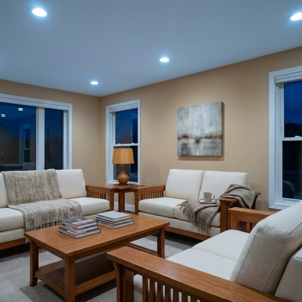
Here’s the one photographs rarely capture because you have to stand inside the room to feel it. The furniture is warm, the fabrics are soft, and then somebody screws in 5000K daylight bulbs and suddenly the living room has the emotional temperature of a dental office.
Color temperature changes how every finish around it appears. Warm woods can look flatter, creams cooler and cozy textiles far less inviting under very blue-white light.
For relaxed living rooms, bedrooms and dining spaces, try warm LEDs around 2700K to 3000K and see what happens before buying another piece of furniture. It is one of the cheapest transformations in the entire house, and I got it wrong in my own place for years.
32. Painting One Random Wall a High-Contrast Accent Color
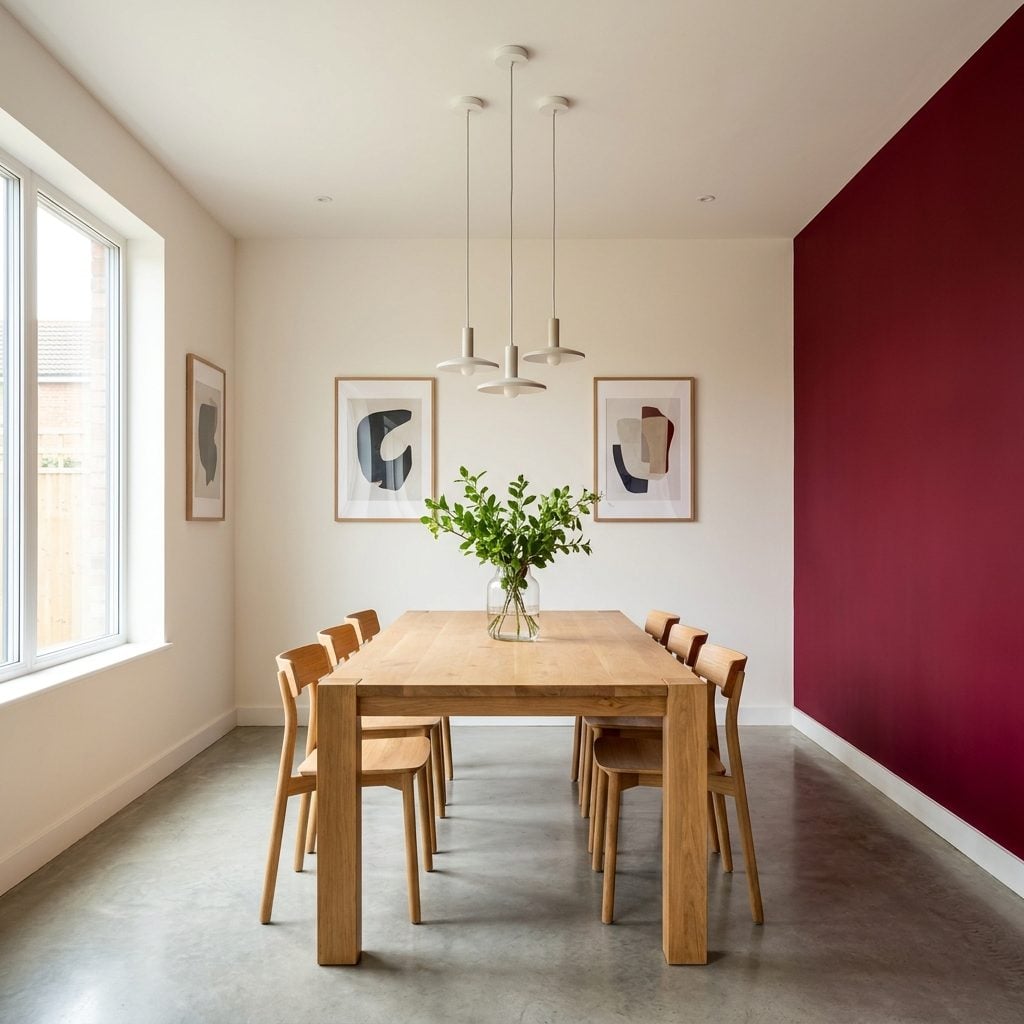
One wall, painted burgundy. Not because it holds a fireplace, frames a view or marks an alcove. The room simply “needed an accent wall,” and apparently this one drew the short straw.
Accent walls work when the architecture already gives the color a reason to stop: chimney breast, built-in, bed wall, recessed niche. Pick an arbitrary wall and the room can feel sliced apart, with the paint doing more pointing than decorating.
If you want color, give it a job. Paint the fireplace wall. Color the back of a bookcase. Or commit to all four walls in a sophisticated shade and let the room become the color instead of wearing one stripe of it.
31. Choosing a Rug Too Small to Connect the Furniture
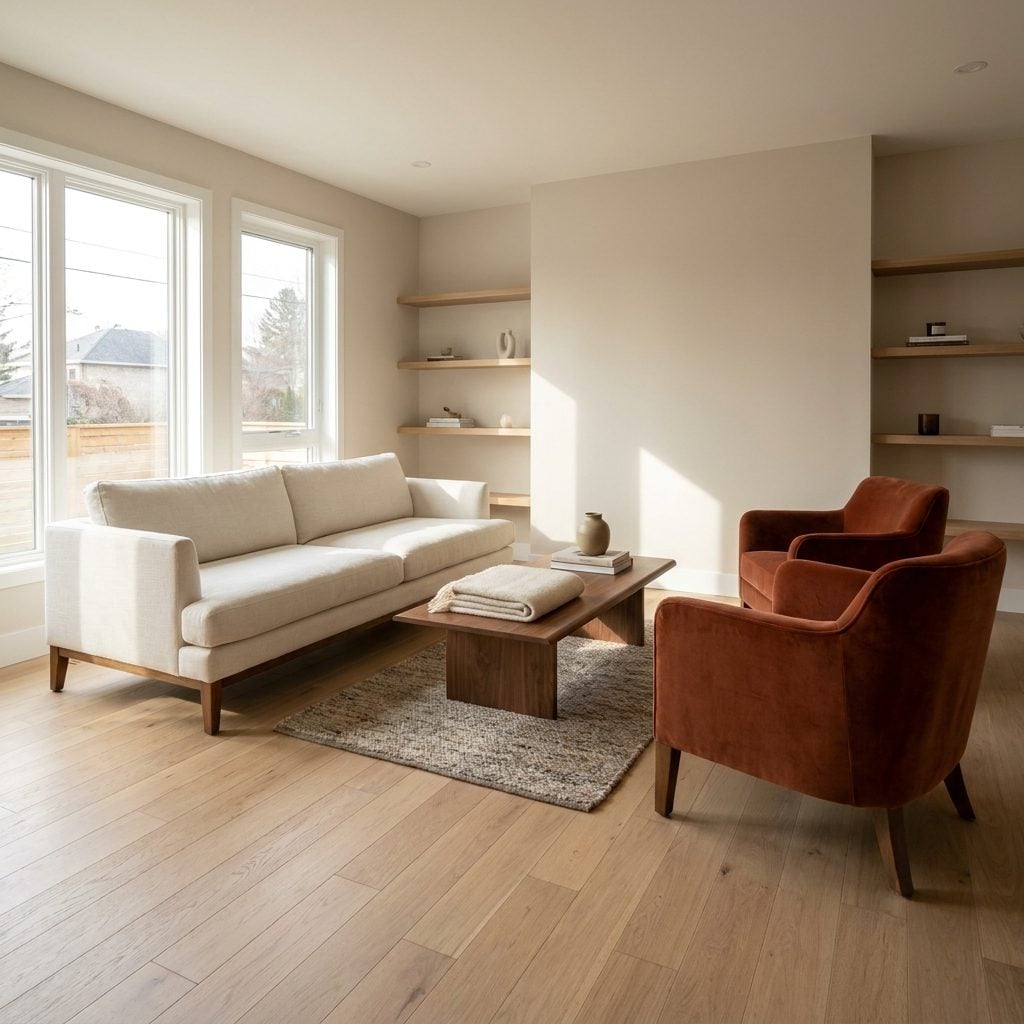
There it is: the little rug marooned beneath the coffee table while every sofa and chair leg stands on bare floor around it like nobody wanted to get their feet wet.
An undersized rug scatters a seating arrangement rather than gathering it. The furniture may be excellent, but without a shared ground plane the pieces stop feeling like a group.
Size up. It’s one of those rare decorating changes that can make all the furniture you already own look more expensive at once.
30. Using a Busy Mosaic Accent Strip Through an Otherwise Simple Backsplash
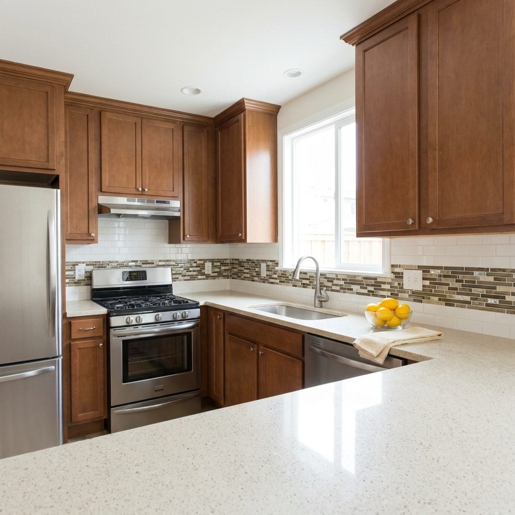
The backsplash is calm and neutral until, right at eye level, a four-inch ribbon of tiny brown, beige, gray and glass mosaic pieces wraps the kitchen like somebody underlined the entire room.
Mixed accent strips became especially common during the Tuscan and tumbled-stone renovation years of the 2000s. Because that narrow band is usually the busiest material in the kitchen, it can date otherwise perfectly serviceable cabinets with remarkable efficiency.
Run the quieter field tile straight through instead, or use one material from counter to upper cabinet. A backsplash has plenty of work to do without becoming a decorative border.
29. Making a Giant Decorative Wall Clock the Focal Point
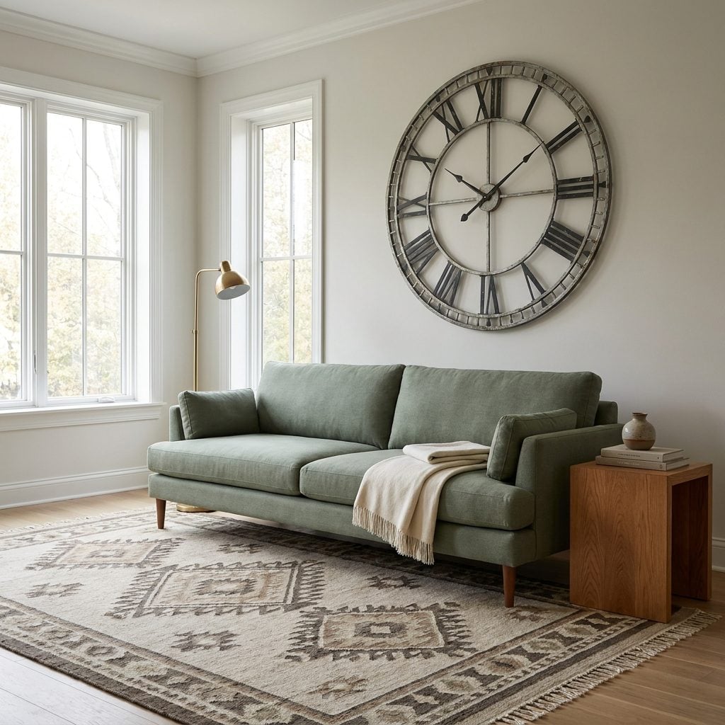
The oversized wall clock had a heroic run. Four feet of Roman numerals and distressed metal, commanding a living-room wall with all the authority of a station clock despite nobody in the house ever using it to tell time.
Scale is what makes it such a powerful timestamp. The moment you walk into the room, the clock wins, which means everything newer around it has to answer to a decorating decision made years ago.
Give the hero wall to something with visual character instead: one large landscape, an oversized round brass mirror, or art gathered one piece at a time. Love the clock? Keep it. Just don’t make it mayor.
28. Using Curtains That Stop Several Inches Above the Floor
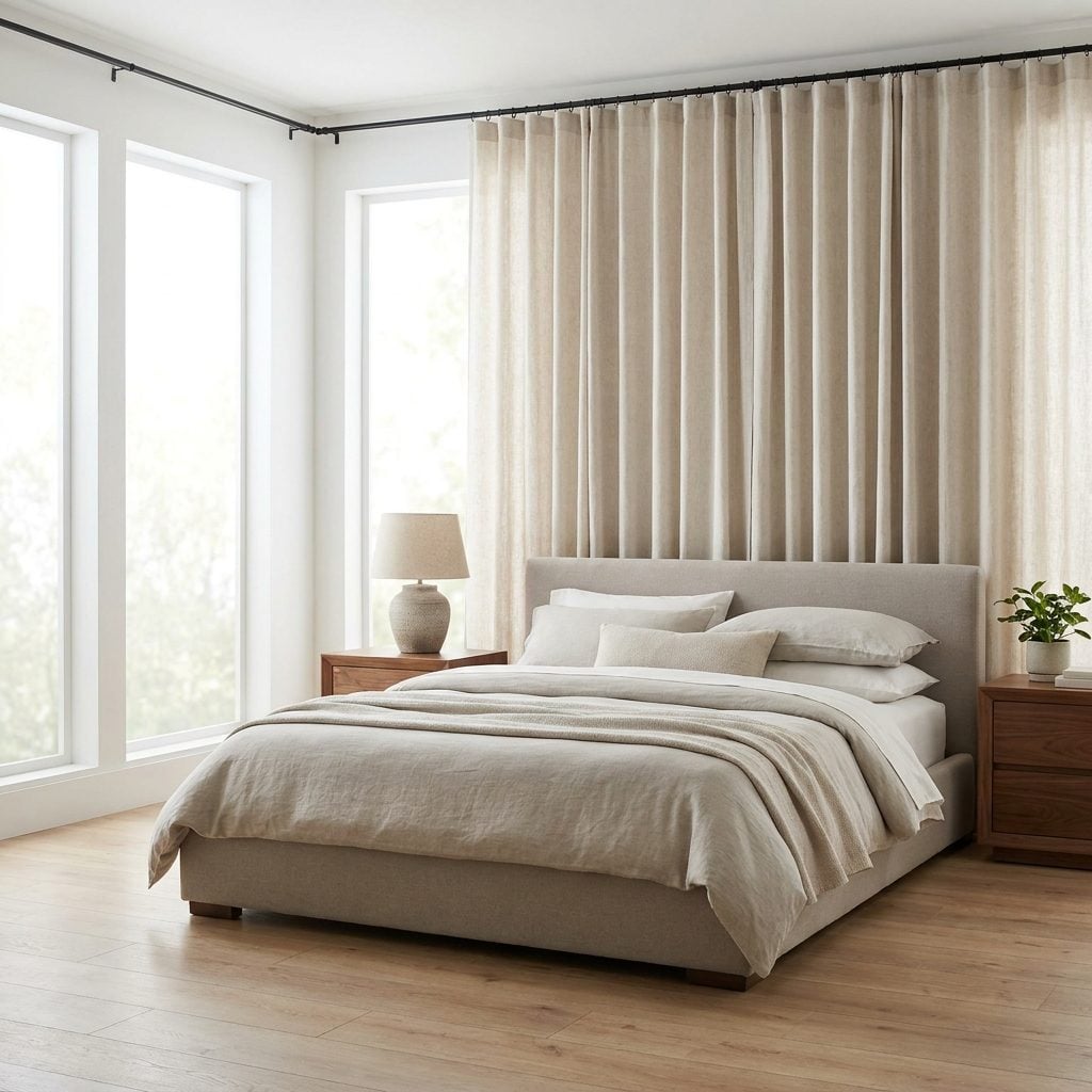
The linen is lovely. The rod is fine. Then the panels stop six inches above the floor and suddenly the window looks as though it outgrew its pants.
That visible gap cuts the vertical line short. Floor-length panels generally let the eye travel farther, which can make the window and ceiling feel taller without changing either one.
Let the hem kiss the floor or hover just above it. Already bought panels that came up short? Add a contrasting band along the bottom. Done well, the repair looks more custom than the original curtain ever did.
27. Covering an Interior Wall With Faux-Stone Veneer
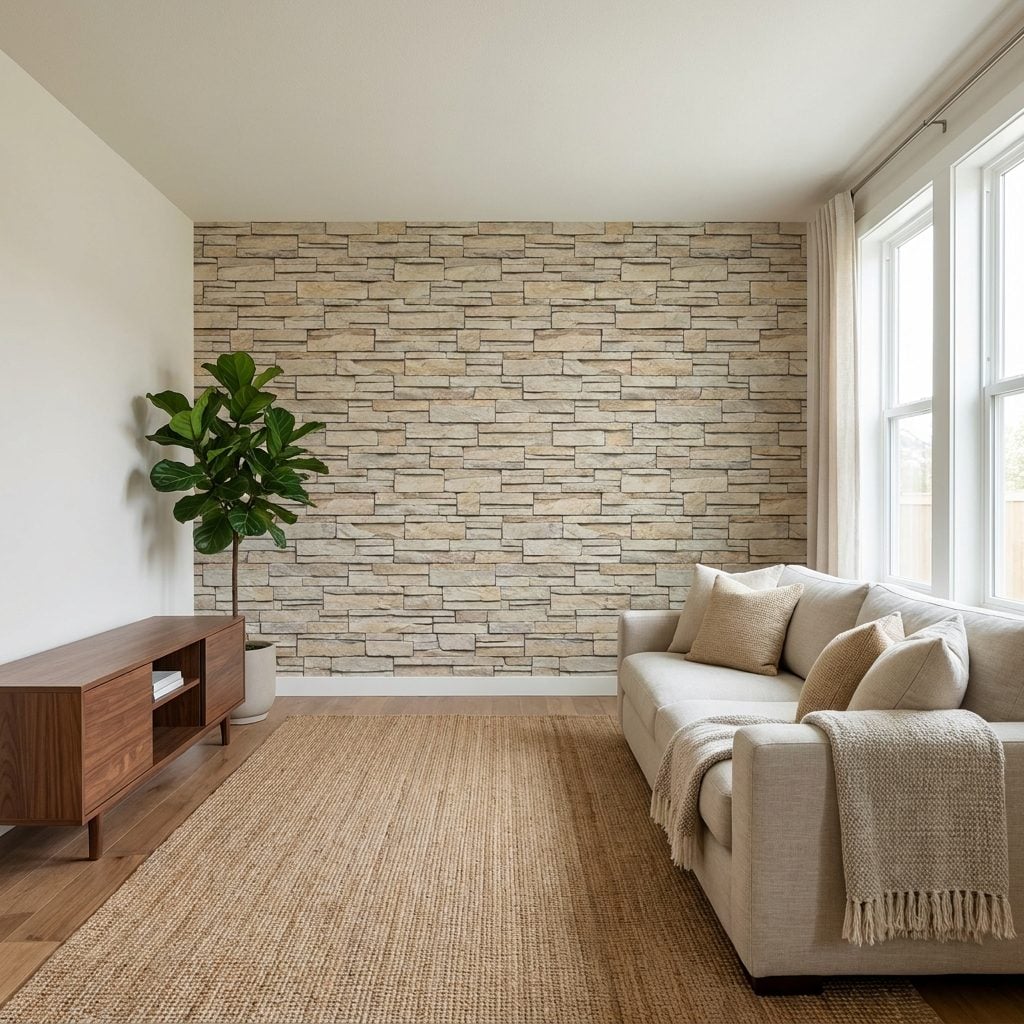
Floor-to-ceiling stacked stone in beige, tan and gray, applied to a perfectly ordinary interior wall with no fireplace, foundation, exterior continuation or other architectural explanation for why stone suddenly appeared there.
That’s the problem. Real stone connected to real architecture can be extraordinary. Thin manufactured veneer used only as a feature wall can feel like material cosplay, especially when the color variation is doing all the talking.
A fireplace wall can sometimes be quieted with limewash or another appropriate finish that reduces the tonal chaos. A completely arbitrary stone wall may simply be happier returning to plaster.
26. Using Matching Throw Pillows From the Same Fabric Collection
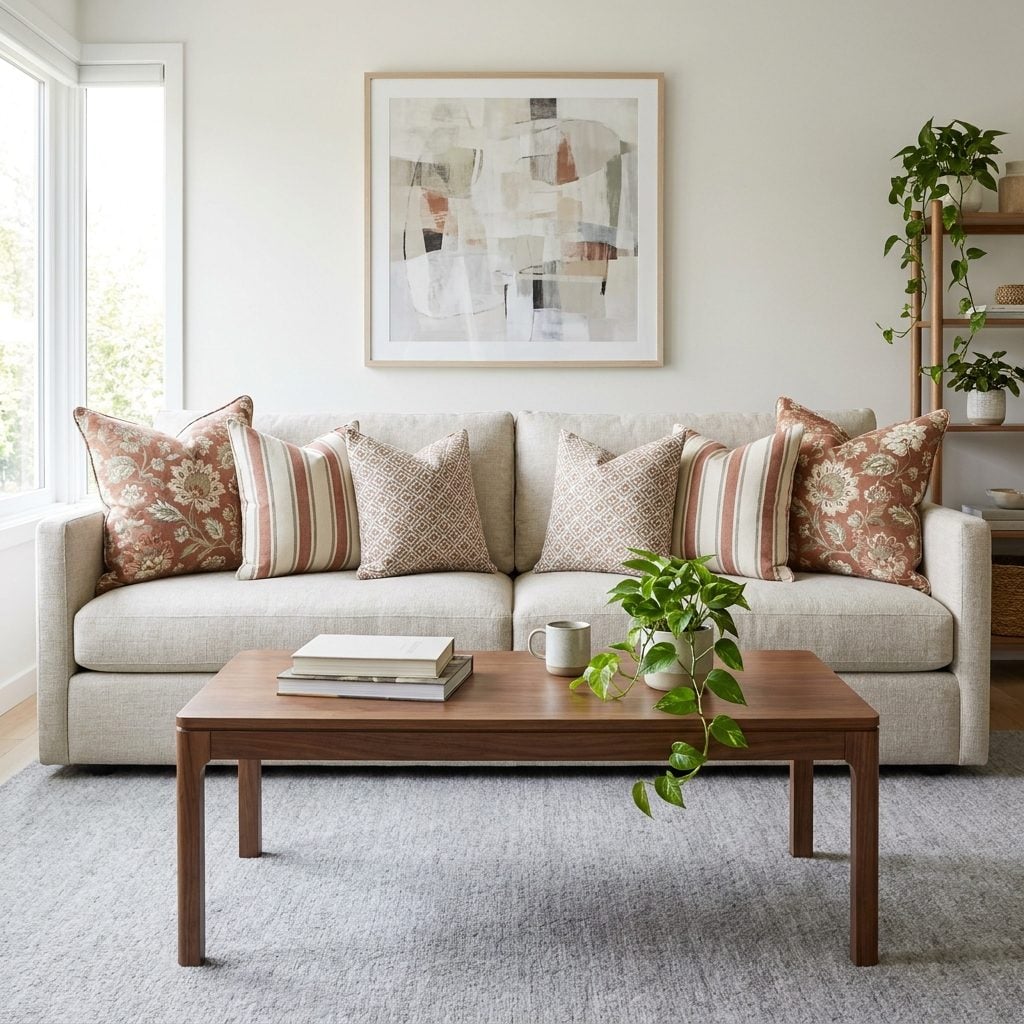
Floral on the outside, stripe next, geometric in the middle, then the entire arrangement mirrored precisely on the other end. Every pillow clearly came from the same fabric family and probably arrived in the same delivery.
Pattern isn’t the problem. Total coordination is. When every print repeats exactly the same palette and energy, a sofa begins to resemble a merchandising display.
Keep two you genuinely love. Add a solid linen lumbar pillow, a rougher texture, perhaps one old textile that couldn’t possibly have come in the package. Symmetry can stay if you like it. Perfect matching doesn’t have to.
25. Hanging Artwork So High It Floats Above the Furniture
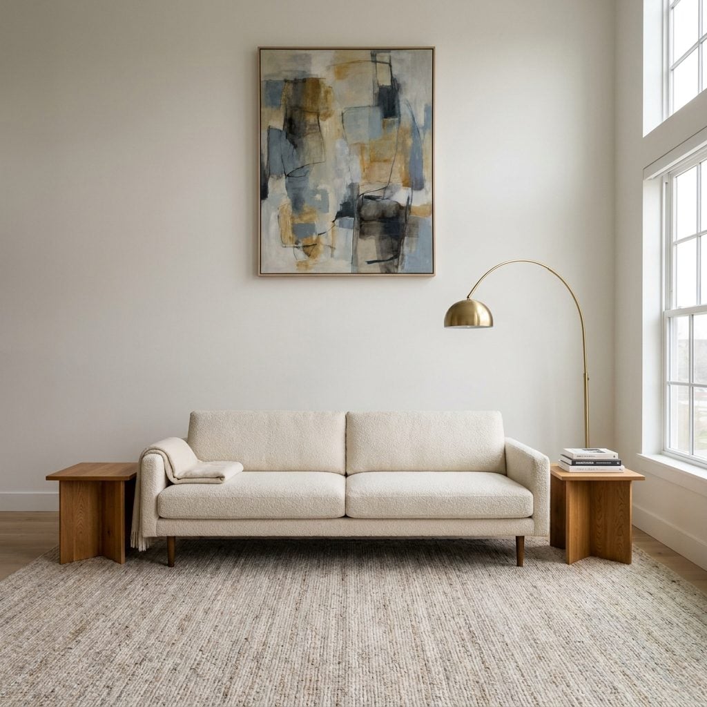
The artwork is good. It’s just trying to escape through the ceiling.
A huge strip of blank wall between the sofa and frame disconnects the two pieces, leaving the furniture below and artwork above feeling like separate arrangements that accidentally share an address.
Drop it down. The entire wall usually pulls itself together before you’ve even put the hammer away.
24. Installing Gray Wood-Look Flooring Throughout the House
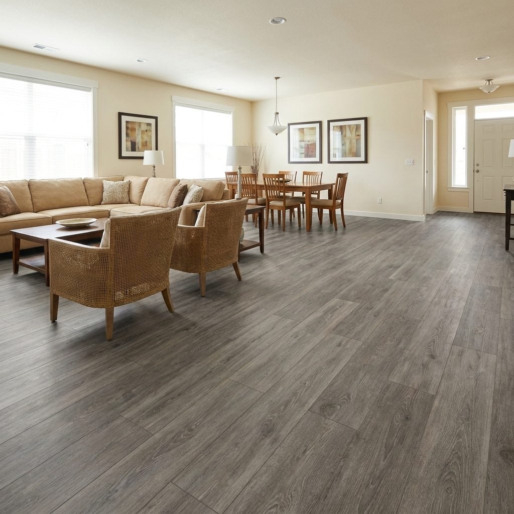
Weathered gray plank flooring running from foyer to kitchen to family room was everywhere for a reason: it photographed cleanly, hid dirt and paired easily with the cool neutral palette of the time.
The downside arrived later. Flooring occupies too much visual acreage to behave like a small trend. Once the fashion shifts, every room is still standing on it.
No need to tear it out simply because the internet changed its mind. Warm-toned rugs, natural wood furniture and creamier walls can rebalance it. When replacement eventually makes sense, natural white oak or a straightforward mid-brown tends to offer more room for the rest of the house to change around it.
23. Styling Bookshelves With More Decorative Objects Than Books
🔥 Would you like to save this?
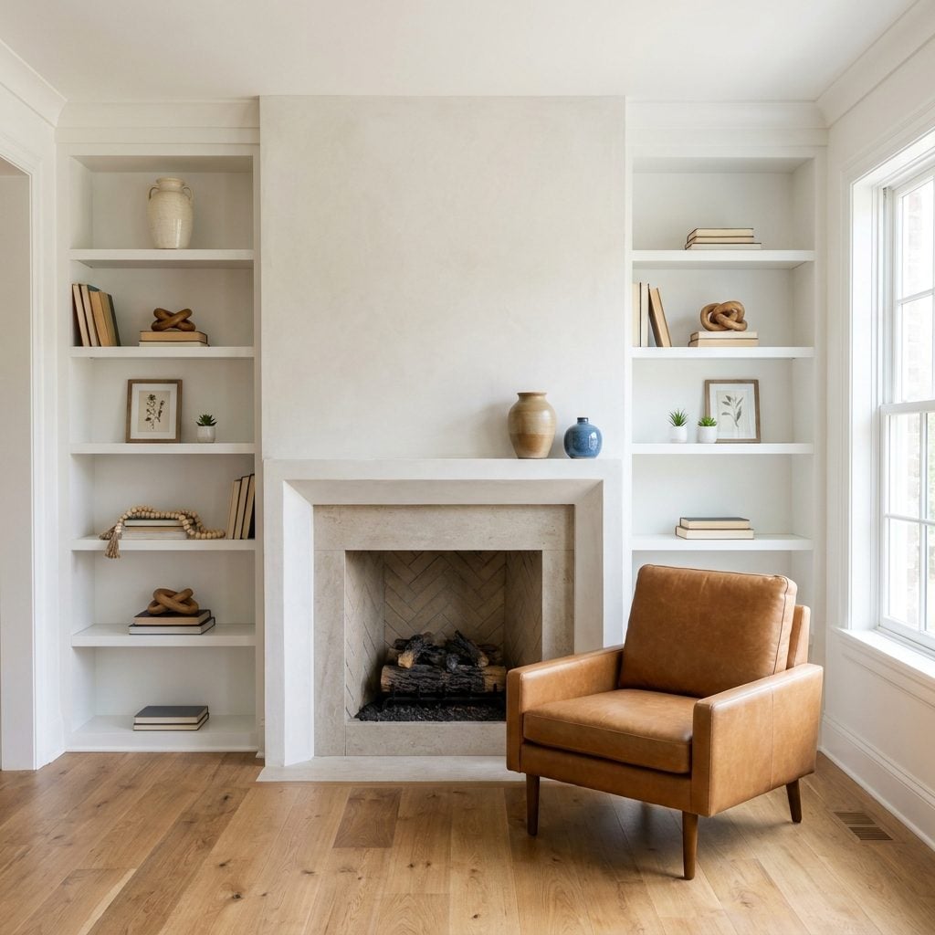
Books stacked flat to hold up a vase is a dead giveaway. The bookshelf has stopped being a library and become a stage set: sculptural knot, bead strand, tiny vessel, strategic empty square, repeat until nobody remembers what the shelves were built for.
That model-home formula photographs beautifully because nothing personal interrupts it. Unfortunately, nothing personal is also the problem.
Bring the books back. Stand most of them upright in real quantity and slip a few objects among them. A shelf that shows what you read beats a shelf that shows what you shopped.
22. Using Heavy Grommet-Top Curtains in Every Room
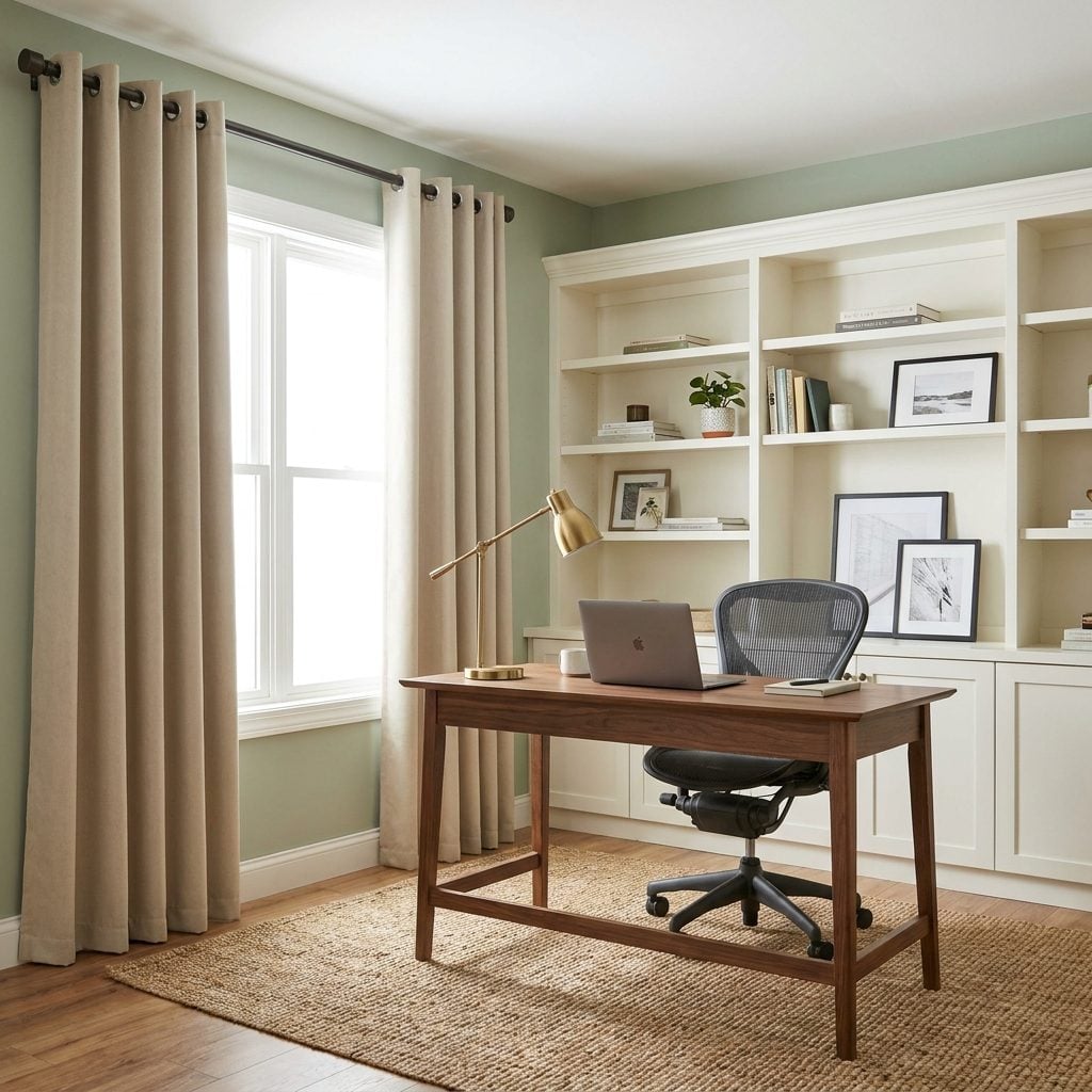
The giant silver grommet had a very specific moment: shiny rings punched through stiff polyester panels and threaded onto a chunky rod in room after room.
Grommet curtains themselves aren’t forbidden. The dated effect comes from the heavy fabric, conspicuous metal hardware and house-wide repetition. Once every window wears the same treatment, one old trend starts setting the date for the entire floor plan.
Try pinch pleats, pencil pleats or understated back tabs in fabric with more drape. Linen and linen blends fall in softer columns and let the window do more of the talking.
21. Using Mass-Produced Triptych Canvas Art as the Main Artwork
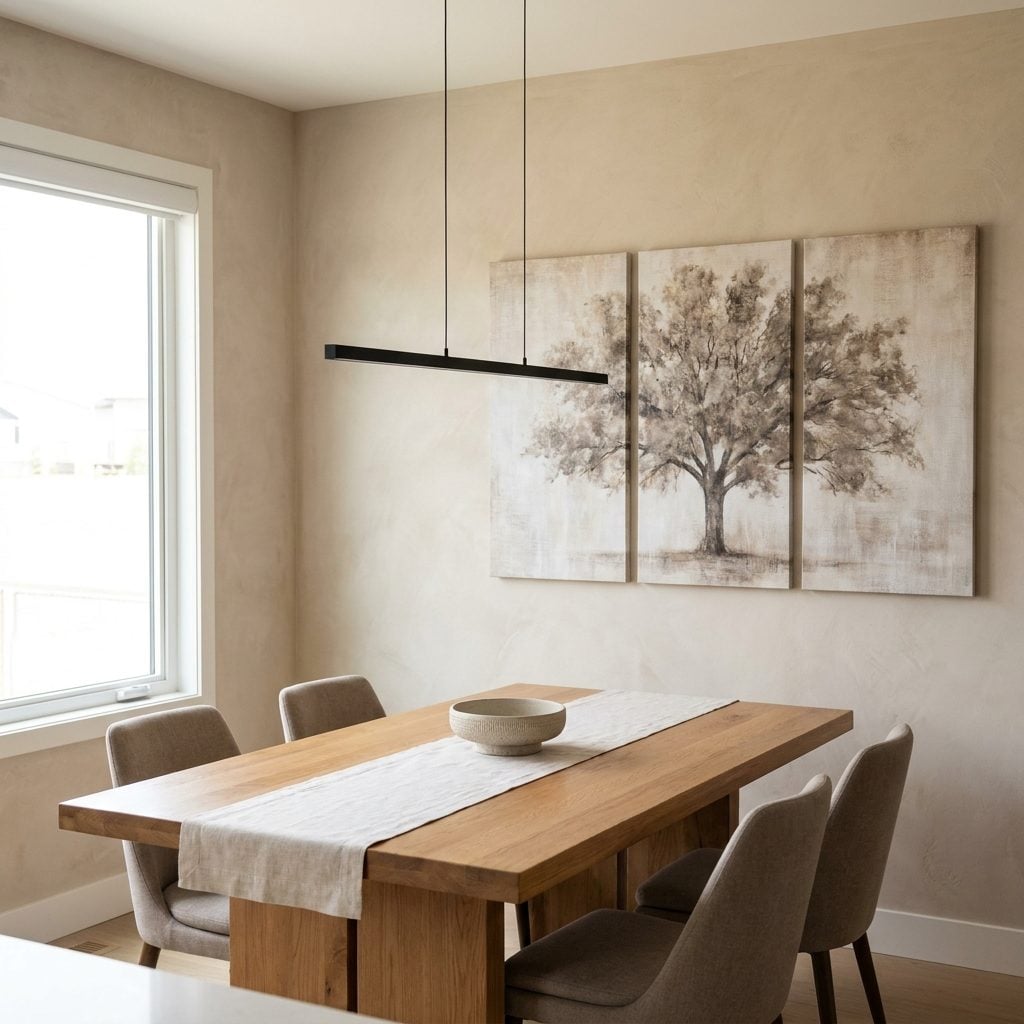
You know the split-canvas tree. One image sliced across three identical panels, equally spaced, sold as an instant answer to the terrifying problem of a large blank wall.
Triptychs are not the issue. Artists have used the format beautifully for centuries. The giveaway is the generic mass-produced image whose strongest characteristic is that it arrived already divided and ready to hang.
Go large and singular instead. One oversized canvas, an oil, a textile, a photograph that means something. The wall wants a reason to stop looking.
20. Using Edison Bulbs and Black-Cage Fixtures Everywhere
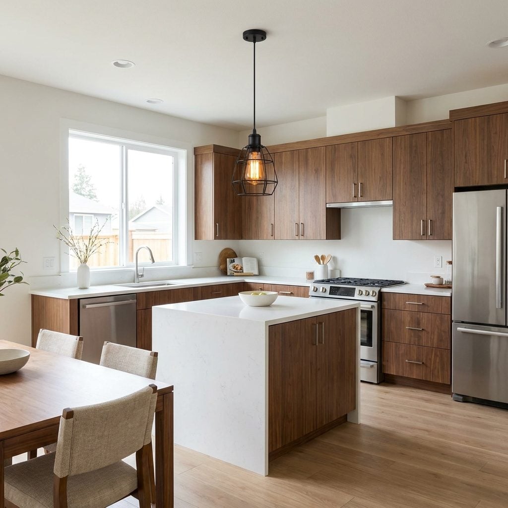
Three black cages above the island. Matching cages on the wall. Another exposed amber filament over the dining table. One fixture can feel industrial. Six begin to feel like the room signed an exclusive contract with 2015.
Repetition is what dates it. Keep whichever fixture you still love and let nearby lighting speak another dialect: fluted glass, plaster, aged brass, linen.
If the warm amber glow is what you actually miss, a good-quality warm LED bulb can deliver similar color with far less wasted heat. Choose compatible bulbs and dimmers carefully if flicker bothers you.
19. Creating a Reclaimed-Pallet-Wood Feature Wall
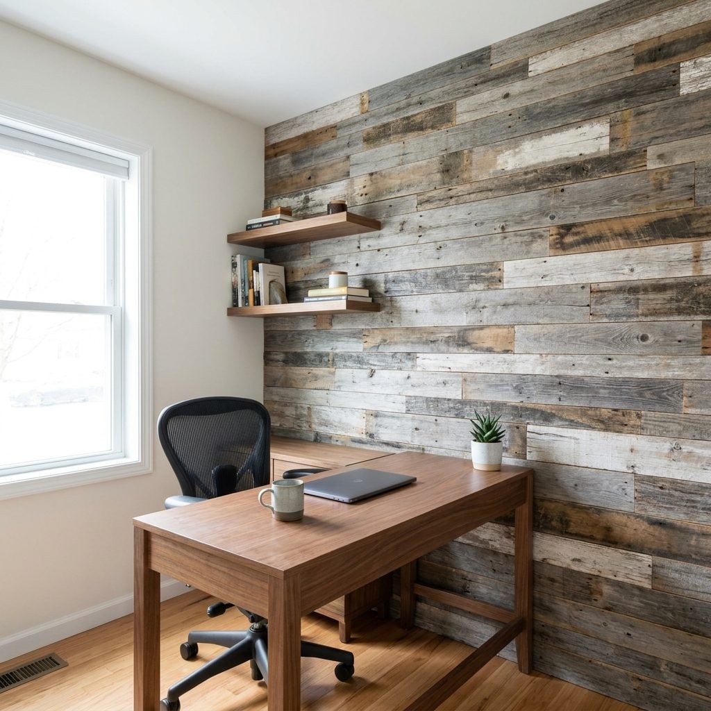
Gray plank. Brown plank. Distressed white plank. Repeat until the wall behind the desk looks like every 2014 DIY tutorial decided to collaborate on one afternoon.
The problem is not wood. It’s visual static. Ten deliberately mismatched stain colors compete harder than the furniture in front of them.
Love timber? Use it with conviction. Vertical or horizontal boards in one restrained stain, or tongue-and-groove in a consistent tone, reads like architecture instead of craft night. A calmer narrow home office setup shows how much easier it is to work when the wall isn’t trying to entertain you.
18. Covering the Sofa With Too Many Tiny Decorative Pillows
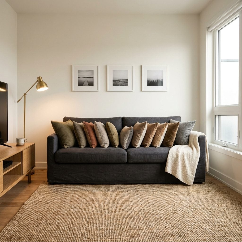
Suppose you’d like to sit down. First relocate nine pillows, stack them somewhere, then pretend anybody is going to reconstruct the arrangement with military precision later that night.
A sofa that can barely accommodate a person because it is displaying fourteen tiny cushions has crossed from styled into ceremonial. The furniture shrinks visually, the room gets fussier and eventually half the pillows live on the floor anyway.
Keep a few generous ones. Two large squares and a lumbar may be enough; a larger sectional can carry more. The governing principle is simpler than any formula: you should be able to flop down without beginning a cleanup operation.
17. Mounting the Television Almost at Ceiling Height Above the Fireplace
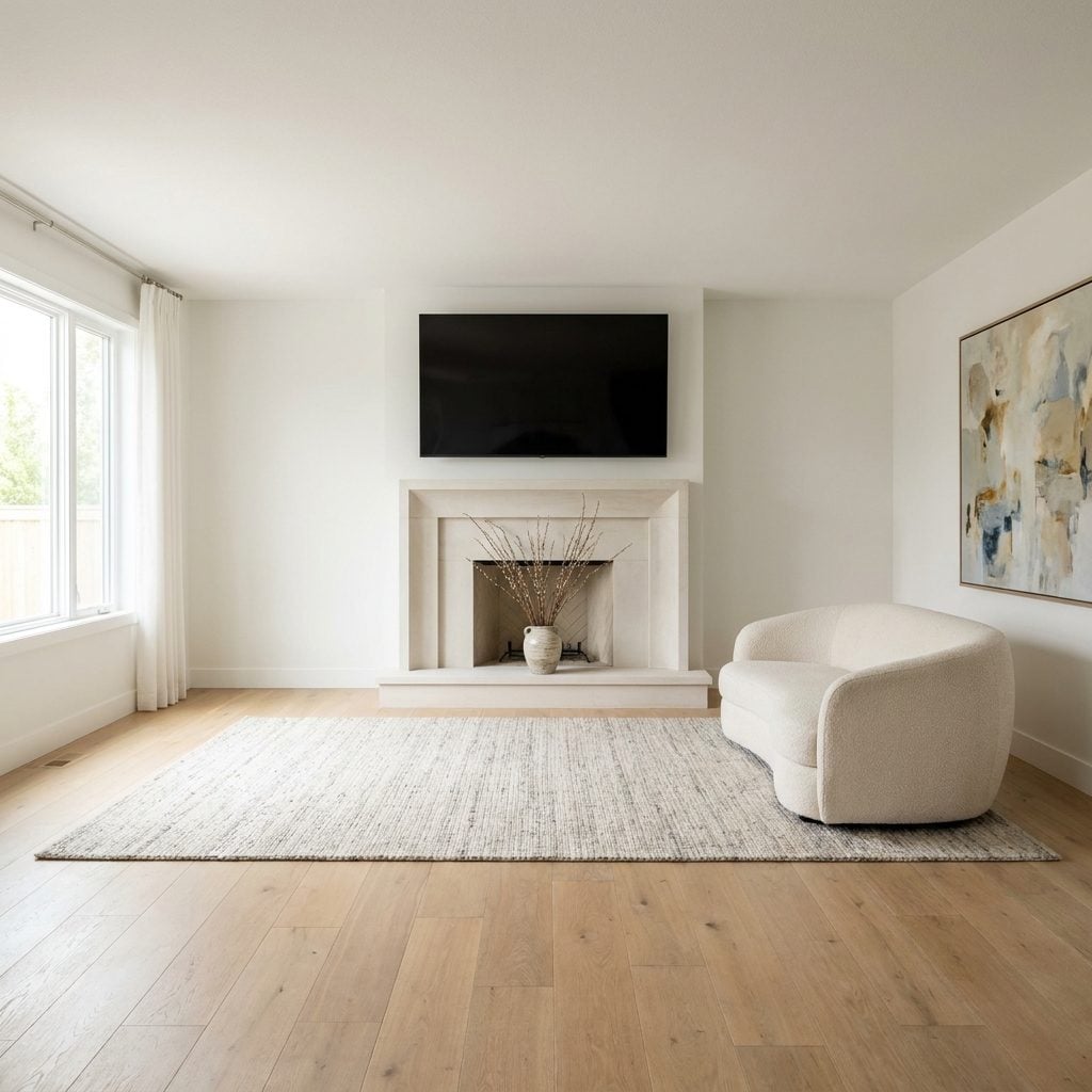
The fireplace is handsome, the sofa is current, the rug fits. Then the television is bolted so high that watching a movie starts to resemble tracking aircraft.
Comfortable screen height depends on television size, seating distance and how people actually sit, but the broad principle is uncomplicated: the center of the picture should not require a sustained upward stare.
A center height somewhere around 42 to 48 inches from the floor is a common starting point for conventional seated viewing, though every room differs. If the mantel pushes the screen much higher, consider an adjacent wall, a lower mantel or a pull-down mount.
16. Covering Every Wall in Farmhouse Word Signs
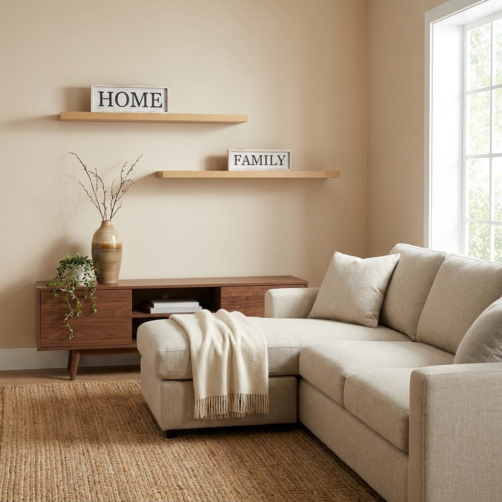
One farmhouse word sign is a wink. Seven is a filing cabinet.
HOME. FAMILY. GATHER. BLESSED. Suddenly every surface is shouting instructions while the walnut console and linen sofa sit underneath wondering why nobody trusts them to establish a mood on their own.
Keep the one that makes you smile. Trade the others for an actual image, mirror, textile or object: perhaps a woven wall basket or one strong framed print. Sentiment works better when the walls aren’t reading aloud.
15. Installing Crystal-and-Chrome Glam Fixtures Throughout an Otherwise Casual Home
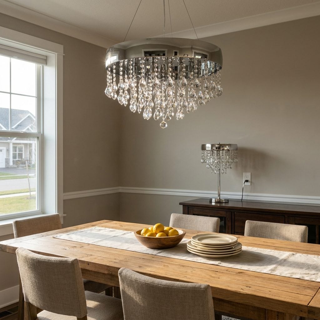
Plain plank table. Woven chairs. Warm wood. Relaxed room. Then an enormous chrome chandelier dripping crystals arrives overhead like it took a wrong turn on the way to a hotel ballroom.
Crystal isn’t inherently dated and neither is chrome. The problem is language. A high-glam fixture in a room whose architecture and furniture are speaking casually can feel like a trend imported without asking the rest of the house.
Match intensity, not necessarily style. A woven pendant, linen drum, plaster fixture or restrained aged-brass silhouette can still make a statement without beginning a separate conversation above the table.
14. Hanging Curtain Rods Too Low and Too Narrow Around the Window
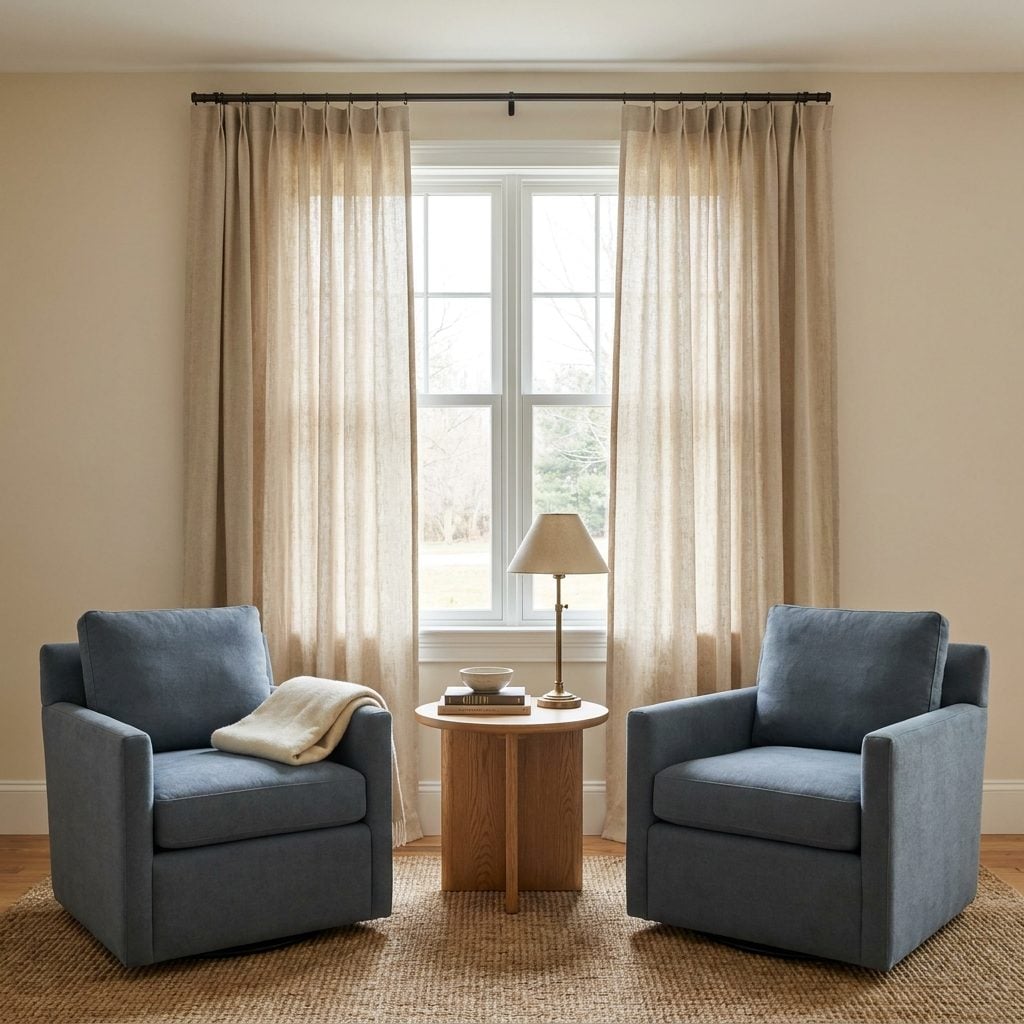
Same curtains, different problem. The rod hugs the top of the casing and ends barely beyond the frame, so even when the panels are technically open they are still sitting over the glass, eating daylight for no reason.
Rod placement changes how large the entire opening appears. Mount it too close to the window and you faithfully advertise the window’s exact dimensions. Give the fabric some wall to stack against and the opening suddenly feels more generous.
13. Using Identical Vases, Trays and Ornaments in Multiple Rooms
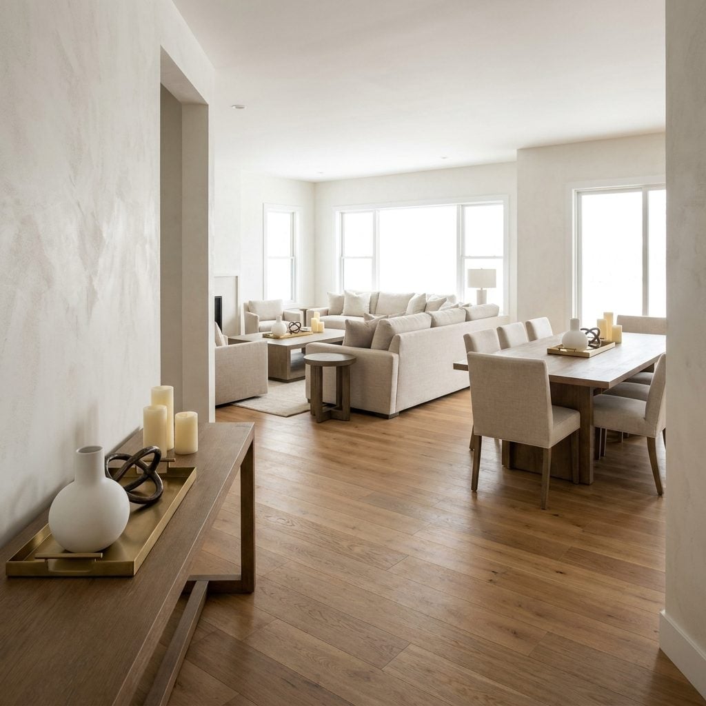
The white vase appears on the coffee table. Then again on the dining table. Then somehow a third one has reached the entry console, accompanied each time by its loyal brass tray.
Repetition this literal makes a home feel merchandised rather than accumulated. Real rooms usually develop unevenly: something from a trip here, an inherited bowl there, a flea-market mistake you inexplicably still adore.
Let each room have its own little biography. Different eras, different materials, different shapes. Love one vase? Give it the dignity of being the only one. The same principle works whether you’re building warm kitchen decor or a formal living room.
12. Running Tiny Subway Tile With Dark Grout Across Every Kitchen Surface
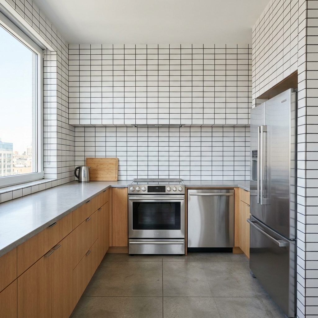
White subway tile is a classic. Nobody needs to put it on trial. But cover wall after wall with small-format white rectangles and charcoal grout, and suddenly the backsplash becomes graph paper with cabinetry attached.
The dated part isn’t dark grout by itself. It’s relentless contrast. Thousands of little black outlines turn a quiet field tile into the busiest pattern in the room.
Keep the tile and soften the grout toward the tile color, or give the high-contrast treatment a deliberate boundary instead of wrapping the kitchen in it. For a warmer read on similar bones, see how these warm kitchen decor spaces let tile participate without letting the grid take over.
11. Building a Gallery Wall From Dozens of Tiny Matching Frames
🔥 Would you like to save this?
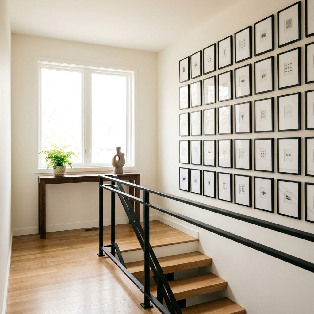
Twenty-eight tiny black frames arranged in a perfect grid. From across the landing, every individual photograph disappears and the collection turns into patterned wallpaper.
Gallery walls aren’t dated. Tiny scale plus absolute uniformity is what does the damage here. Nothing gets to be memorable because everything has been reduced to the same visual unit.
Mix sizes. Let two or three larger pieces anchor the composition, then allow the smaller frames to fill around them. I say this as somebody who once hung eleven matching 5x7s and congratulated himself. History has judged me.
10. Filling the House With Obviously Artificial Plants
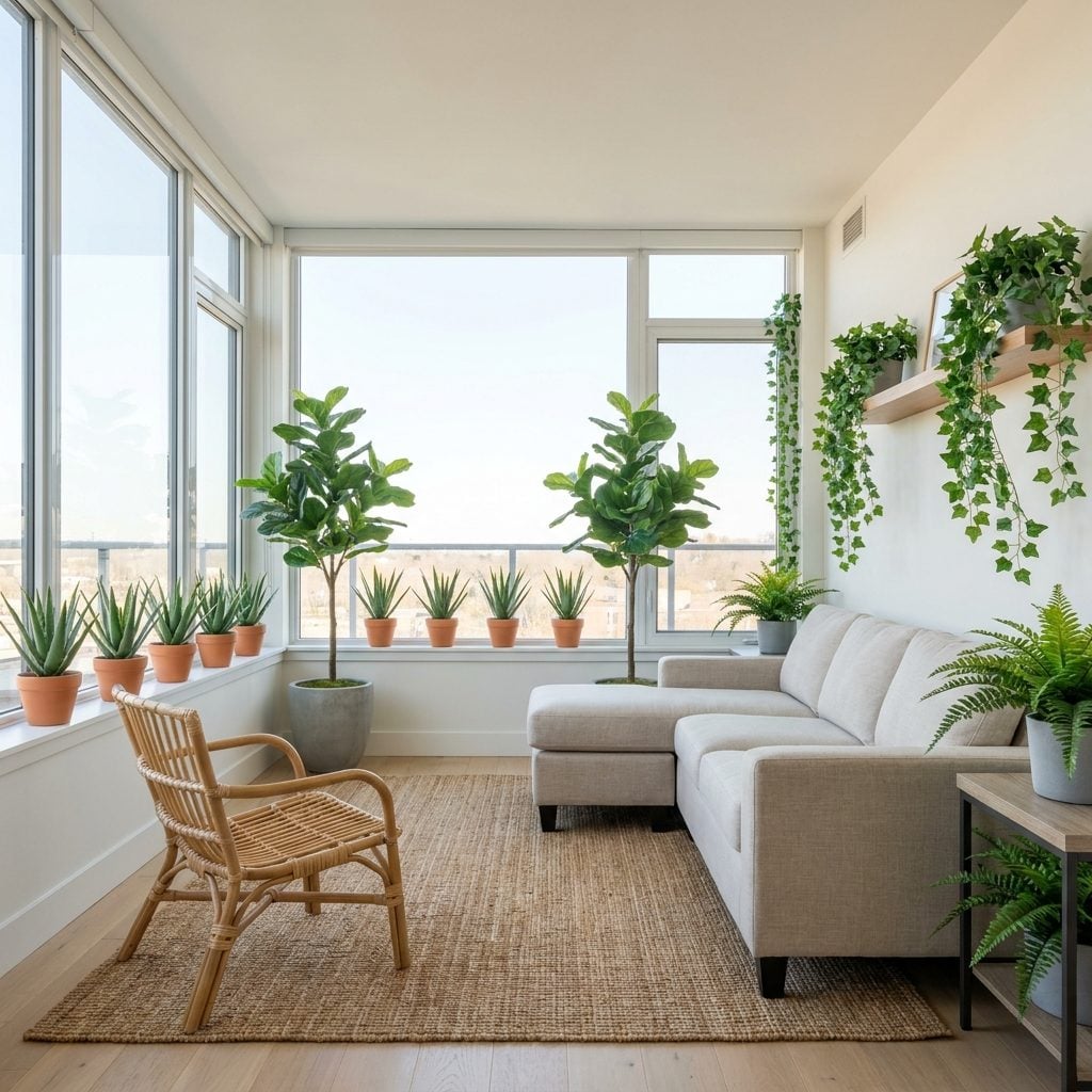
Two identical faux fiddle-leaf figs in matching pots. Plastic succulents lined up on the sill. Stiff vines that haven’t changed position since installation. In a sunroom flooded with daylight, the deception feels particularly unnecessary.
Good faux greenery can absolutely earn its keep in a difficult corner. What dates a room is the army of obviously plastic, perfectly repeated specimens deployed everywhere as a substitute for anything living.
Keep a convincing faux plant where light genuinely makes a live one impractical. Elsewhere, start with tolerant species such as pothos, ZZ plants or snake plants and accept that real leaves occasionally have the audacity to look imperfect.
9. Putting Shiplap in Rooms Where It Has No Architectural Reason to Be
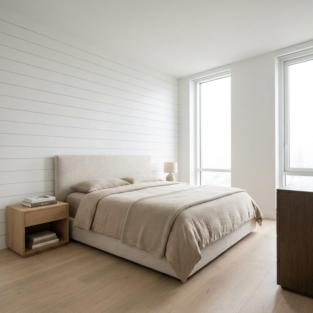
Bright white horizontal shiplap behind the bed in an otherwise sleek city apartment. Perfectly installed. Completely convinced it has wandered in from another house.
Shiplap can work beautifully in contemporary interiors when the proportions, detailing and architecture support it. What aged quickly was the reflexive feature-wall version applied because the trend demanded one.
If the room already speaks a cleaner modern language, let texture come from linen, wool, wood or paneling designed as part of that language. Vertical slats, fluting or restrained boards may feel more connected to the architecture instead of attached to it.
8. Depending on One Harsh Ceiling Light to Illuminate the Entire Room
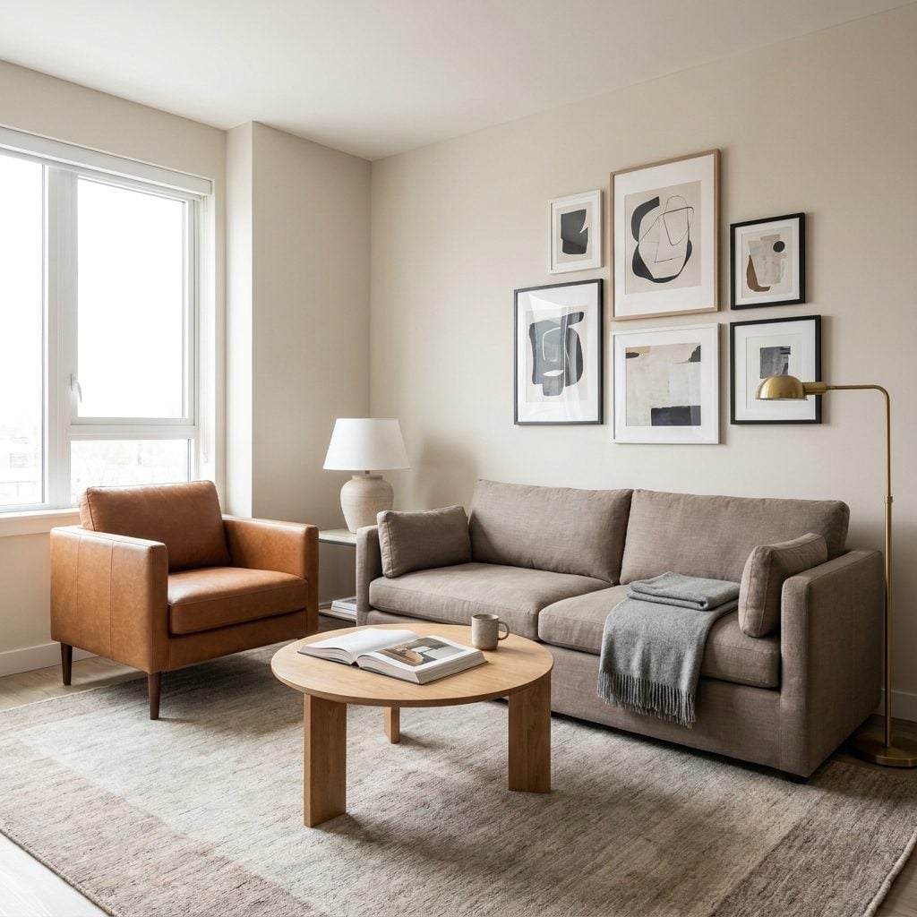
Evening arrives and the entire living room is entrusted to one flush-mount overhead. Light pours straight down, corners fall away and everyone’s face begins preparing for a minor outpatient procedure.
A layered room needs more than one height and direction of light. Overhead illumination can handle general brightness; table and floor lamps bring warmth closer to people and create smaller pools within the room.
Put the ceiling fixture on a dimmer, switch on a table lamp and floor lamp, and keep the sources warm enough to work together. Three well-placed lights often beat one heroic fixture trying to save the entire evening.
7. Filling a Room With Mirrored Furniture and High-Gloss Surfaces
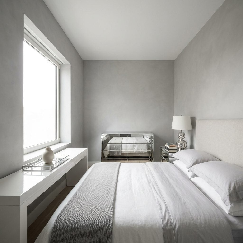
Mirrored nightstands. Mirrored dresser. Lacquer console. Chrome accessories reflecting the mirrored dresser reflecting the lacquer console. Eventually the room starts holding meetings with itself.
Reflective furniture can be terrific in small doses because shine becomes meaningful against matte surfaces. When everything shines, none of it gets to be special.
Keep one reflective hero and bring in warm oak, linen, plaster, wool or another finish that absorbs rather than throws back light. The same balance can carry a navy bedroom decor scheme or a pale neutral one.
6. Filling Walls With Generic Inspirational Quote Art
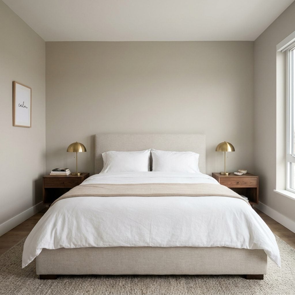
Script-font quote prints have a remarkable reproductive rate. One over the bed, another by the door, one on the dresser, all black cursive on white as though the room has developed subtitles.
The problem isn’t sentiment. It’s generic sentiment multiplied until the wall stops revealing anything about the person who lives there.
Keep the one phrase that genuinely means something. Replace the rest with an image that earns attention without telling the viewer what to feel: your own photograph, an abstract, a vintage botanical, a textile, something chosen because the image caught you first.
5. Using a Massive Matching Entertainment Center That Dominates the Living Room
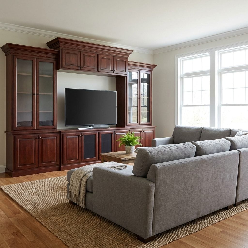
You know the piece. Dark cherry towers, bridge cabinets, glass cubbies and enough raised-panel millwork to frame the tube television the room probably owned when the unit first arrived.
Large traditional entertainment centers fell sharply out of favor as flat screens changed living-room layouts. The television got thinner; the furniture surrounding it somehow remained the size of a municipal building.
Let the screen breathe. Mount it thoughtfully or place it on a low oak media console, then leave some wall visible around the whole arrangement. The room gets its ceiling back almost immediately.
4. Filling Every Empty Surface With Small Decorative Objects
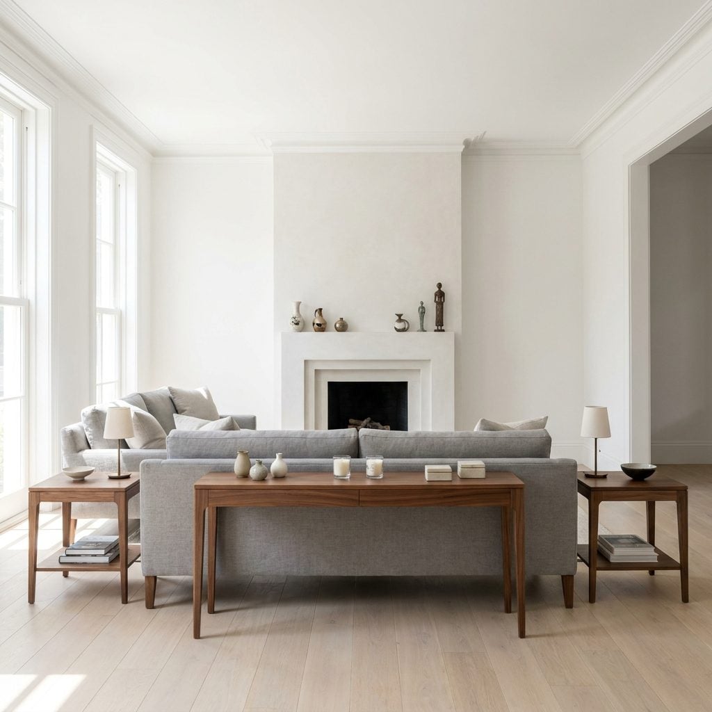
A vase, candle, box, figurine and bowl on the console. A similar committee on the coffee table. Another delegation occupying the mantel. None of it is clutter in the accidental sense. Somebody carefully selected every inch of it.
That’s exactly why the room feels busy. Empty surface is not evidence that decorating stopped halfway through. It is what lets the stronger objects around it register.
Clear one surface completely, then return only the pieces that earn the trip back. Vary height and scale rather than obeying a magic number. The easiest room to dust often turns out to be the easiest room to look at too.
3. Choosing an Oversized Diamond-Tufted Headboard With Crystal-Like Buttons
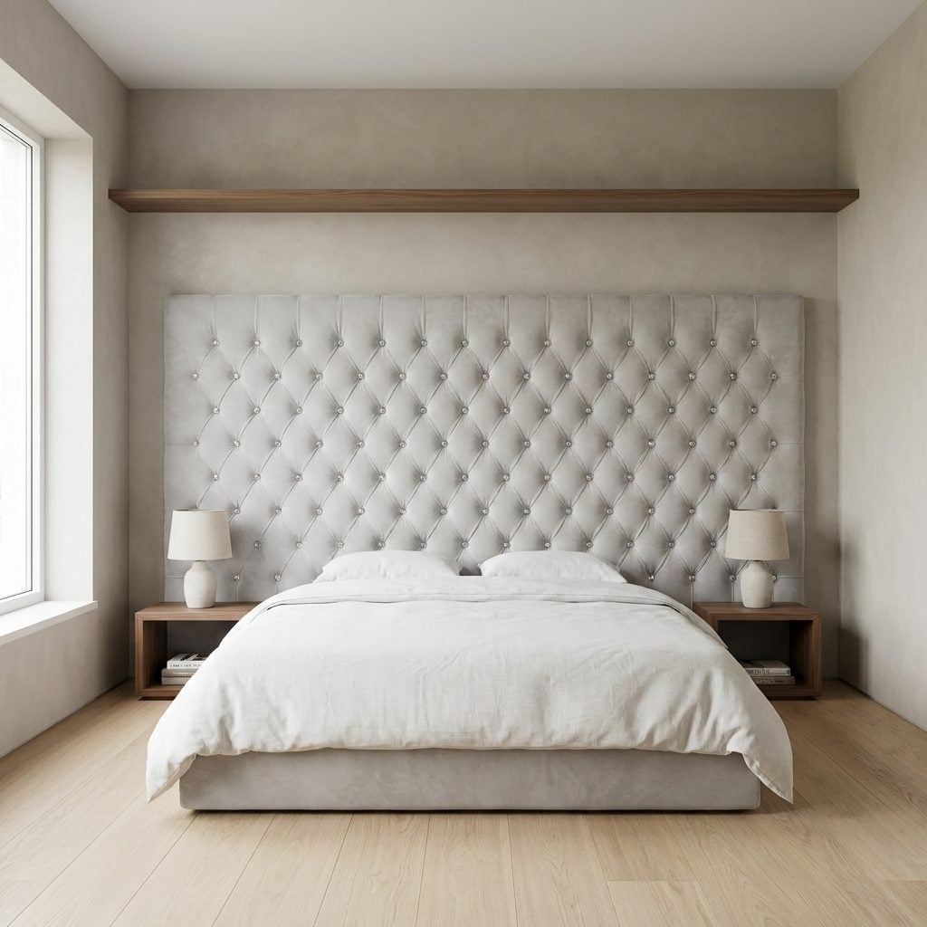
Seven feet of tufted velvet, every diamond punctuated with a faceted button catching the light like a chandelier lost its coordinates. The nightstands are quiet. The bedding is restrained. Then the headboard walks in from another decorating era and asks everyone to clear the room.
Tufting isn’t the issue. Neither is velvet. Scale plus sparkle plus deeply patterned upholstery is what makes this particular combination so recognizable.
A plain upholstered slab, soft channel design or matte velvet headboard gives the bed texture without requiring every square inch to perform. A linen upholstered headboard is an easy reset if the rest of the room already has plenty to say.
2. Decorating an Entire Room Around One Literal Theme
🔥 Would you like to save this?
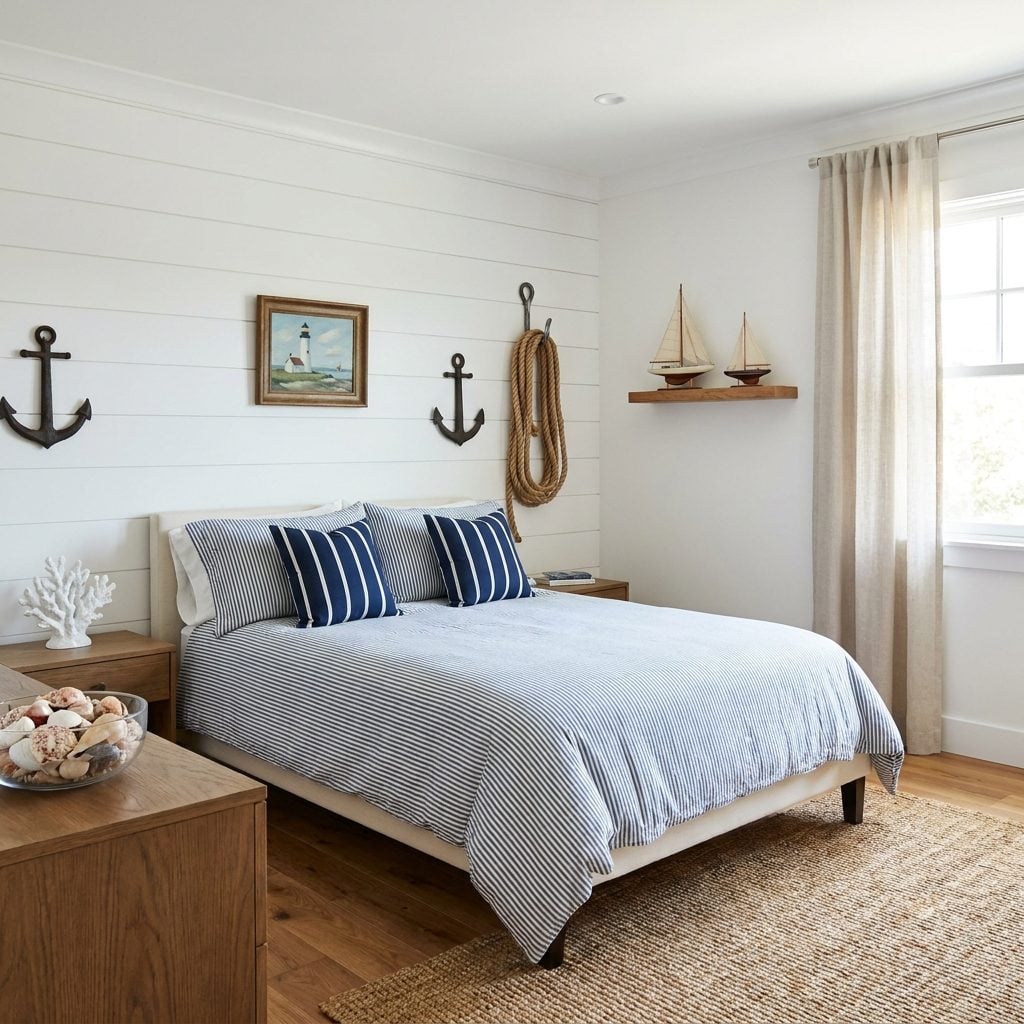
Coastal design is lovely. A room that has been told “coastal” fourteen separate times is a costume.
Anchor. Rope. Shells. Coral. Lighthouse. Tiny sailboat. Stripes. Each object may be harmless on its own, but piled together they stop suggesting a place and begin inventorying it.
Keep the influence and cut the symbols. One good piece of coastal art, a faded blue-and-white palette, linen, weathered wood and a jute area rug can imply the sea perfectly well. Suggest it. Don’t issue a packing list. The same rule applies to farmhouse, safari, Paris café or any other theme that arrives with accessories in bulk.
1. Buying Every Major Piece From the Same Current Trend at the Same Time
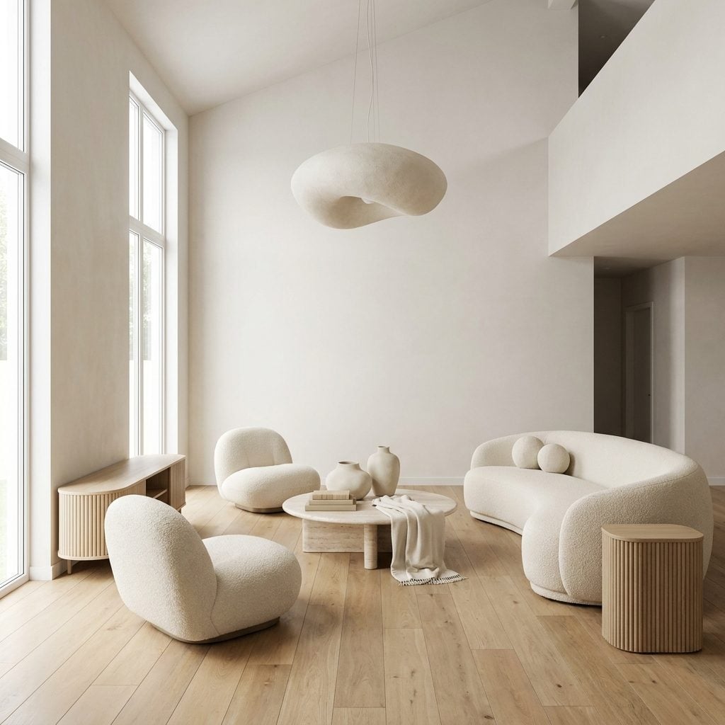
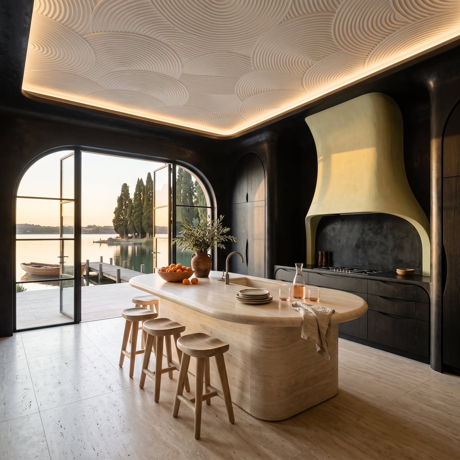
Here’s the sneaky one because nothing in the room is ugly. The curved bouclé sofa is gorgeous. The fluted oak console is gorgeous. The rounded travertine table, organic pendant and oversized cream vessels are all gorgeous too.
And that’s exactly what gives the game away. Every silhouette curves, every material repeats and every tone belongs to the same narrow moment. The room isn’t badly designed. It is simply dated in advance.
The answer isn’t replacing today’s trend with tomorrow’s. It’s buying across time. Keep the curved sofa. Add something older, something handmade, something inherited, one color that refuses to cooperate. A room becomes harder to timestamp when its pieces don’t all share a birthday.
A room full of one trend dates as fast as it arrived. A room full of decades never quite goes out of style.
I got this wrong for years, chasing whatever the catalog was pushing that season. The rooms that stay interesting are usually the ones with one slightly wrong chair—the piece that refuses to match and saves everybody else from looking like a set. Buy slower. Let a room disagree with itself.