
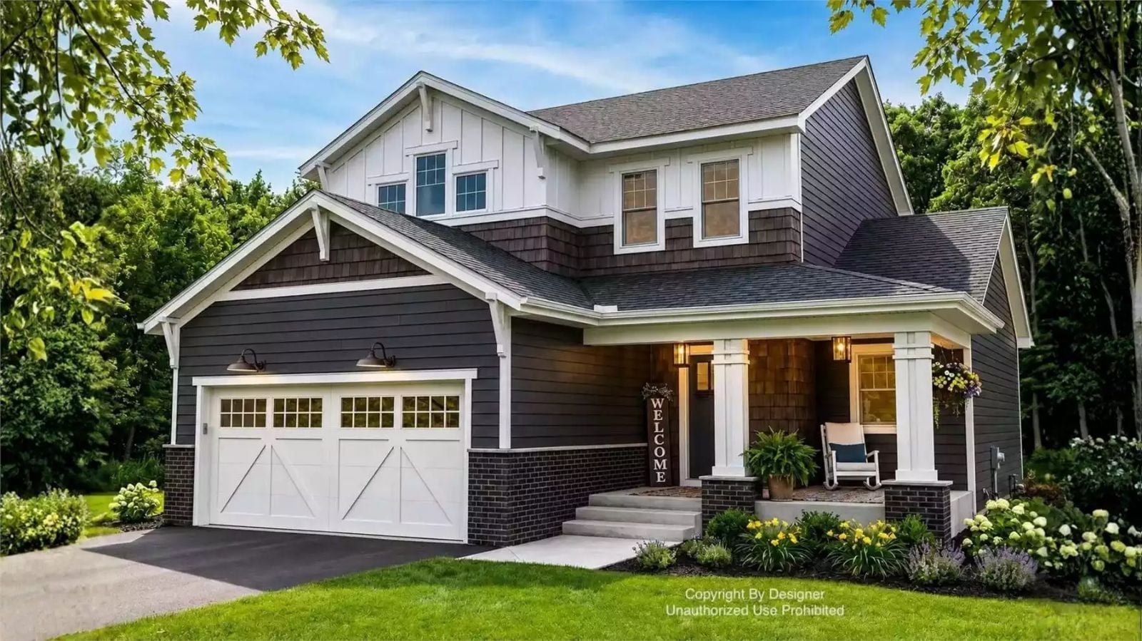
Saturday morning, and both kids are already fighting over the same bathroom before the first cup of coffee is poured. The Oakham Ground is built around that exact friction, with a Jack and Jill bath separating two bedrooms, a farmhouse kitchen big enough for backpacks on the counter and dinner already starting, and a two-story layout that gives parents their own floor at the end of the day.
Specifications
- Sq. Ft.: 1,871
- Bedrooms: 3
- Bathrooms: 2.5
Floor Plan – Main Floor
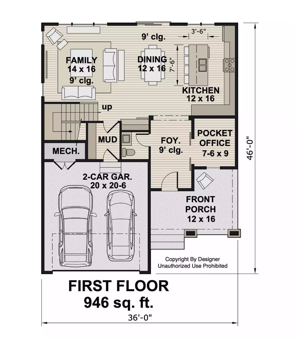
The first floor runs family room, dining, and kitchen in an open row along the back, all under 9-foot ceilings. Up front, a foyer connects to a pocket office near the porch. The mud room and mechanical room tuck in beside the two-car garage, out of the way but right where you need them.
Floor Plan – Second Floor
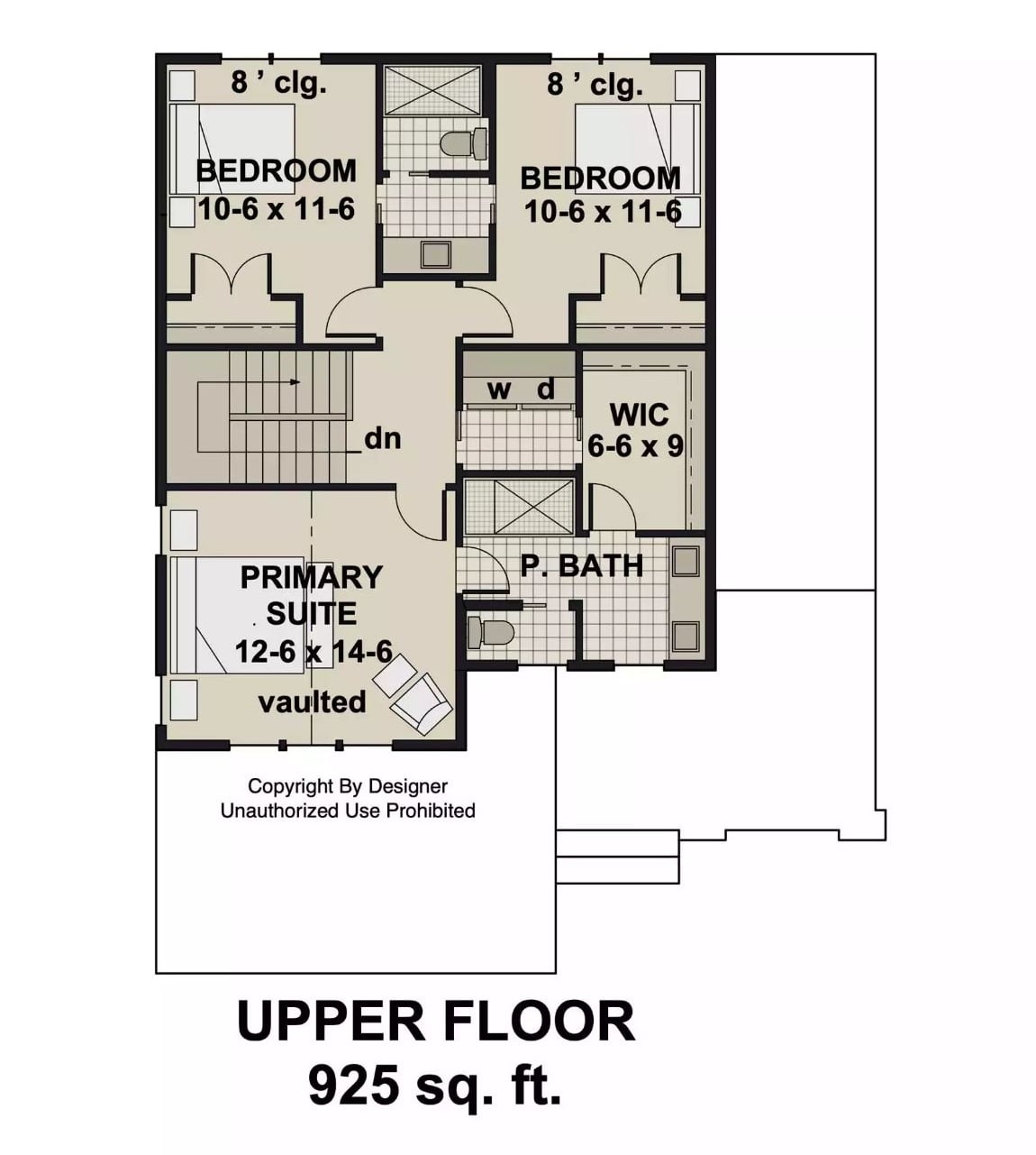
Upstairs: primary suite, two secondary bedrooms sharing the Jack and Jill bath, a walk-in closet, and laundry positioned between all three.
Style Tip: Parking the washer and dryer between the primary suite and the kids’ rooms puts laundry where it actually gets used — not in the basement, not on the main floor, not somewhere you have to think about. Families with school-age kids figure out how much that matters within the first week.
Dark Siding and a Low Deck That Actually Invites You to Sit Down
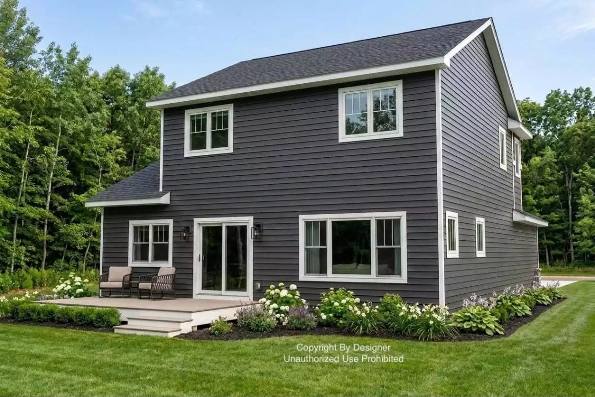
Charcoal lap siding against white trim is a contrast that holds up at every distance, street view included. Hydrangeas and hostas anchor the foundation planting without looking like anyone tried too hard.
Quick Fix: Sliding glass doors to a low deck outperform French doors in a busy household. No threshold to trip on when you’re carrying groceries, no door arc eating into patio space, no panel swinging into a kid who just ran outside. It’s the kind of detail that sounds minor until you’re living with the alternative.
Foyer That Keeps the Bathroom Close Enough to Actually Matter
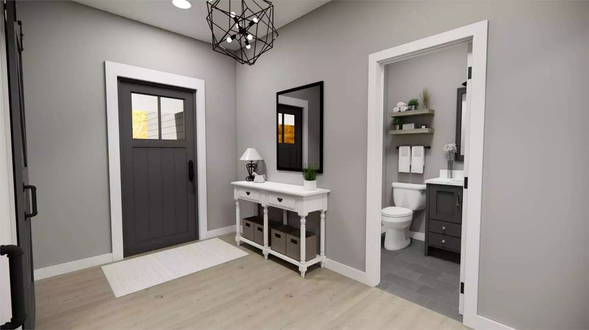
Gray walls and light wood floors read calm the moment you walk in, but the real move is the half bath positioned just off the entry — guests don’t end up wandering through the house looking for it. A white console table with woven baskets underneath handles drop zone duty without requiring a full mudroom. Dark door hardware and that geometric pendant keep the space from skewing too soft.
- A powder room off the foyer cuts down foot traffic through the main living areas.
- Entry consoles with open lower shelves beat closed cabinets for quick grab-and-go storage.
- Dark front doors read better at dusk than light ones, which tend to disappear against the exterior.
Open Layout Where the Kitchen Stays in Conversation With the Living Room
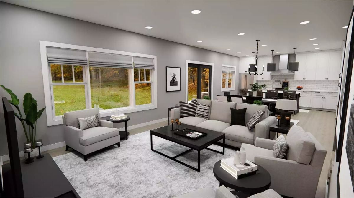
Light gray upholstery and a low-profile sofa keep the sightlines clear from the seating area straight into the white kitchen beyond.
Light gray upholstery and a low-profile sofa keep the sightlines clear from the seating area straight into the white kitchen beyond.
Dark Island, White Cabinets, and a Pendant Situation Worth Copying
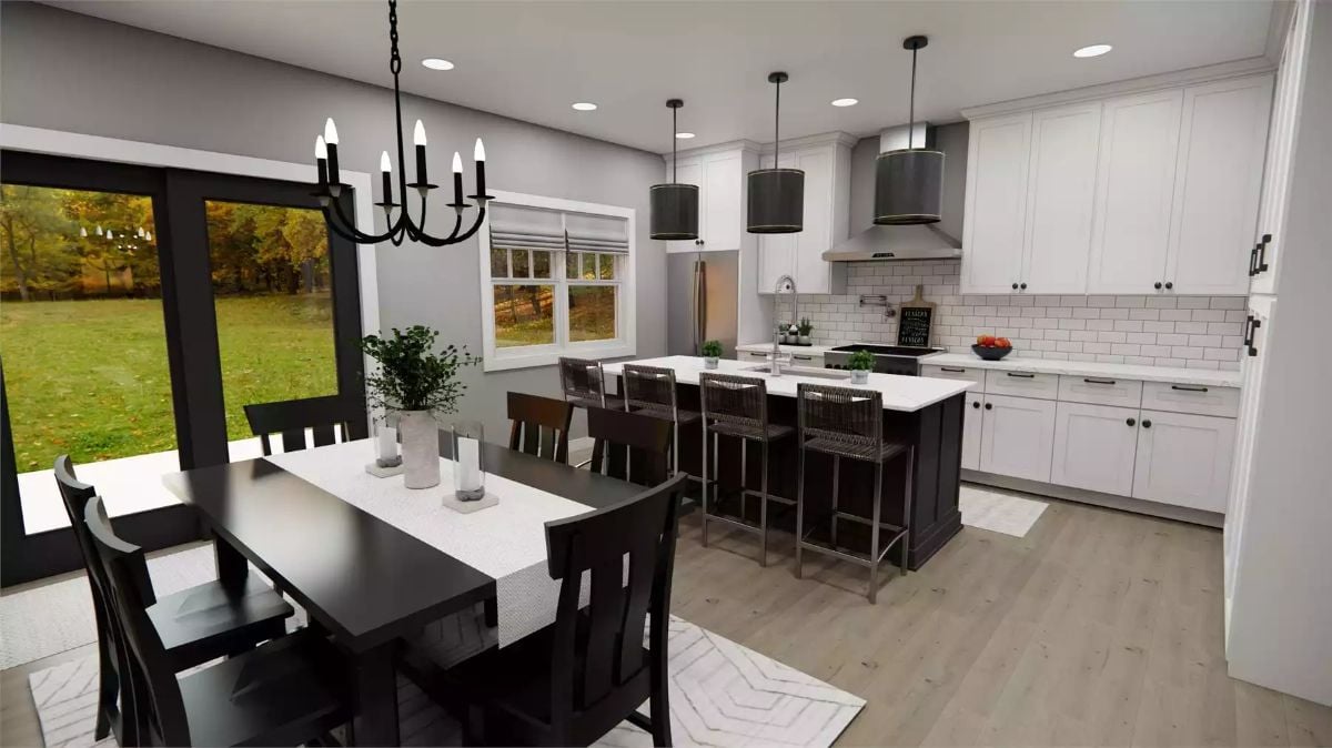
Most kitchens hang pendants that are too small for the island and then wonder why the room feels unresolved. Here, drum pendants are sized to match the space, which sounds obvious but rarely happens. Wall cabinets run straight to the ceiling, hood included. Out in the dining area, a candle-style chandelier pulls the room back from feeling clinical, and the black chairs and table hold contrast without competing with the kitchen’s palette.
Trend Alert: Two-tone kitchens — white uppers, dark island — have held on because they solve an actual problem. All-white reads flat in person as much as it does in photos, and keeping the island dark grounds the room without locking you into a full cabinet color you’ll second-guess in five years.
Vaulted Ceiling and a Dark Bed Frame That Anchor the Whole Room
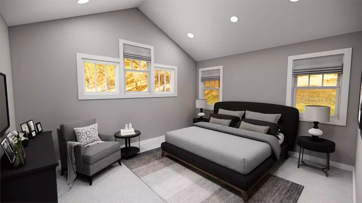
Vaulted ceiling with recessed lighting keeps the room from feeling heavy despite the dark upholstered bed dominating the far wall. Roman shades and a gray armchair with a patterned pillow soften the palette without competing with anything.
Pro Tip: Vaulted ceilings can make furniture feel undersized if you’re not deliberate about scale. A bed with a tall, curved headboard pulls the eye upward and fills the vertical space without needing artwork or an accent wall to do the heavy lifting — one of those furniture choices that pays off immediately and quietly.
Marble Counters, Matte Black Hardware, and a Door That Goes Straight to the Laundry Room
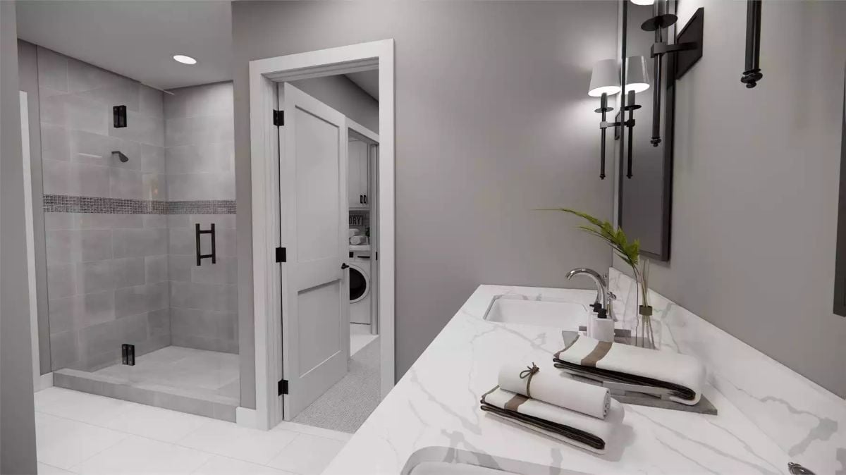
Frameless glass shower, mosaic accent stripe, marble-look countertop — there’s a lot happening, and it holds together. The detail most bathrooms skip is right there in that open doorway: direct access to the washer, no hallway required.
Why It Works: A bathroom with direct access to a laundry closet means wet towels and dirty clothes travel about six feet instead of through half the house. Builders don’t offer this layout often, so floor plans that include it are worth paying attention to. Matte black fixtures are also the practical choice in high-humidity rooms — water spots that would show immediately on chrome barely register on matte.
Walk-Through Closet With a Laundry Room Right on the Other Side of That Door
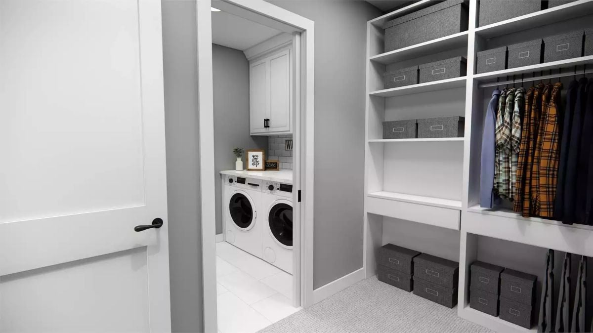
Built-in shelving with labeled bins stacked floor to ceiling and hanging space below keeps this closet from becoming the place where organization goes to die. But the layout’s real selling point is that doorway — clean white trim opening straight into the laundry room, side-by-side washer and dryer right there. Clothes move from the rod to the wash without leaving the same corner of the house. That’s a short loop, and it matters more than people expect.
Pin It
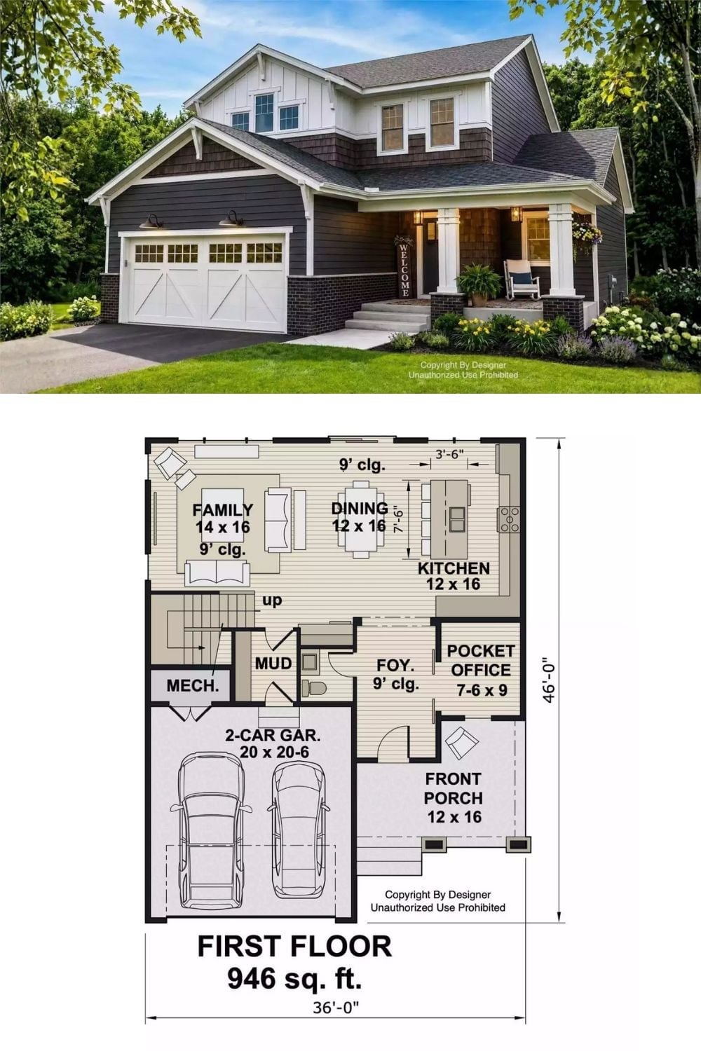
Exterior photo shows a two-story craftsman farmhouse with dark board-and-batten siding and a covered front porch. Below it, the first floor plan lays out 946 square feet: family room, kitchen, dining, pocket office, mudroom, and two-car garage.
