
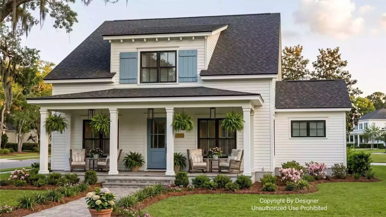
The loft is the tell. Families who actually want to be near each other without being on top of each other always end up drawn to a plan with one — homework spread across the railing, a movie going while dinner finishes downstairs, Saturday morning cartoons while the adults have one quiet cup of coffee below. The Mansfield Lane is built around exactly that: a main-floor primary that keeps parents close, an open farmhouse kitchen where conversation carries, and a loft that gives kids somewhere to land without disappearing entirely.
Specifications
- Sq. Ft.: 2,596
- Bedrooms: 4
- Bathrooms: 4.5
Floor Plan – Main Floor
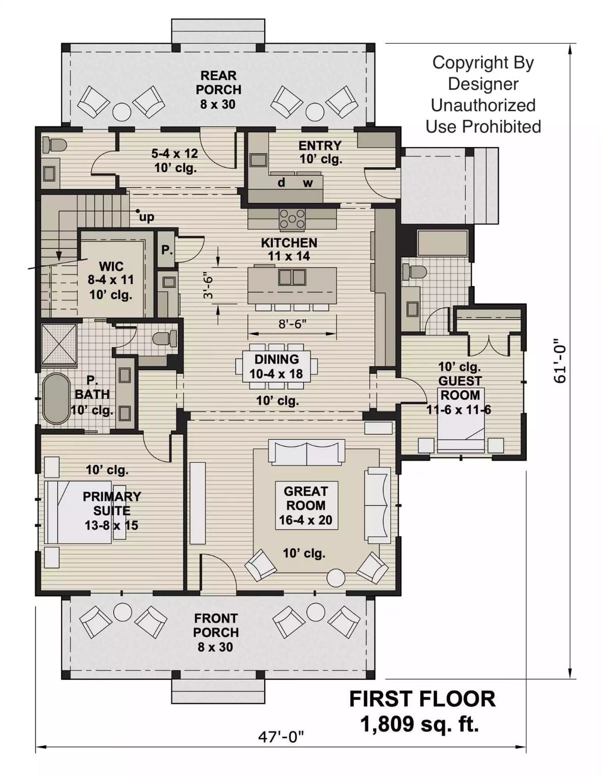
The primary suite and guest room anchor opposite ends of the first floor, with the great room, dining, and kitchen sharing the open space between them.
Floor Plan – Second Floor
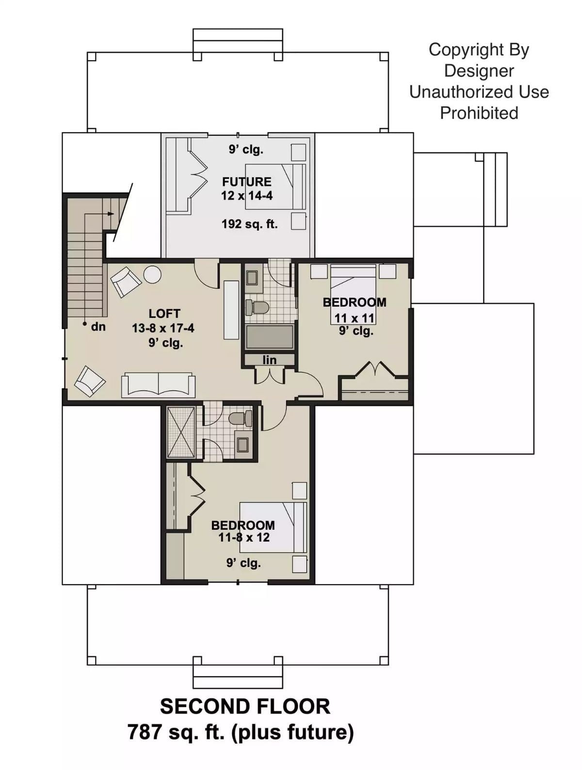
Upstairs, two bedrooms, a loft, and two full bathrooms fill out 787 square feet. The loft opens directly at the stair landing, which makes it natural flex space — reading area, homework zone, overflow seating, whatever the family needs it to be. Both bedrooms have 9-foot ceilings and closets, with bathrooms positioned between them for shared access. There’s also a future room roughed in at 192 square feet for when the headcount changes.
Style Tip: Anchor one wall of the loft with built-in shelving and keep the center clear — kids can spread out without retreating behind a closed door, which makes it easier to stay in earshot without actually hovering. A low bookcase used as a room divider defines the space without boxing it in.
Gray Sofas and a Black Coffee Table That Actually Earn Their Keep
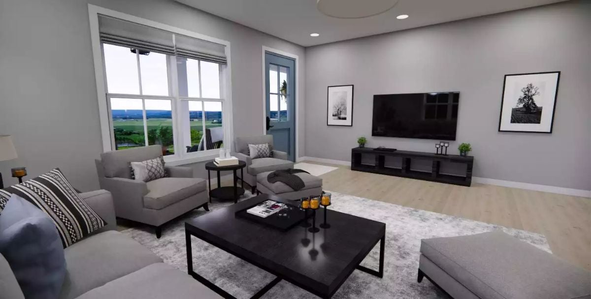
Light wood flooring stops the gray furniture from reading as heavy, and the candle holders on the coffee table add just enough warmth without turning into a tablescaping exercise. Views through the large window do a lot of work here — the room feels more generous than the square footage alone would suggest.
Common Mistake: Pushing all your seating against the walls is almost always the wrong call. Floating the chairs and sofa toward the center — as shown here — creates a conversation area that actually functions for a group rather than leaving everyone staring across an empty stretch of floor.
Open-Plan Dining Where the Kitchen, Table, and Living Room Actually Talk to Each Other
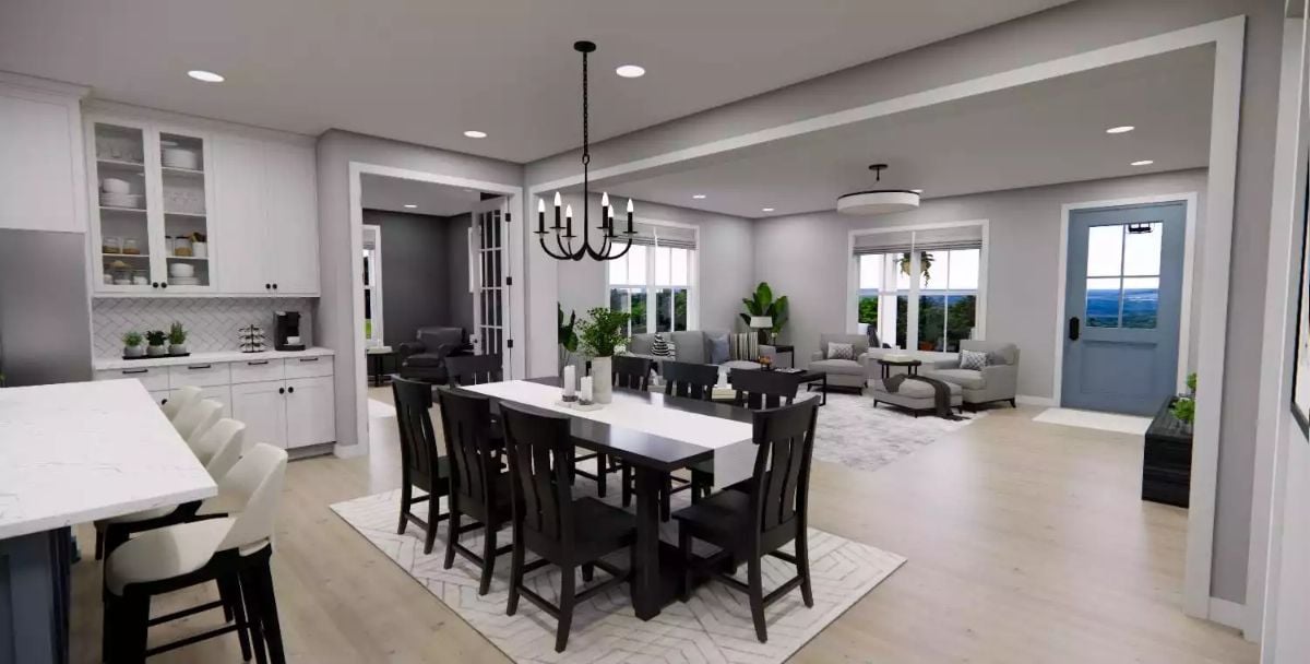
Dark wood chairs pull up to a white dining table beneath a black chandelier, and the pale hardwood floors and gray walls hold the palette together without tipping into cold. The living room is close enough that nobody’s shouting across a divide. It reads as one space, not three zones that happen to share a wall.
Try This: Nudge the dining table a few inches off dead center so foot traffic flows naturally between the kitchen and living room. If guests always end up bunching in one spot, the table is probably blocking the path.
Dark Island Base, White Quartzite Top, and a Faucet Built for Serious Cooks
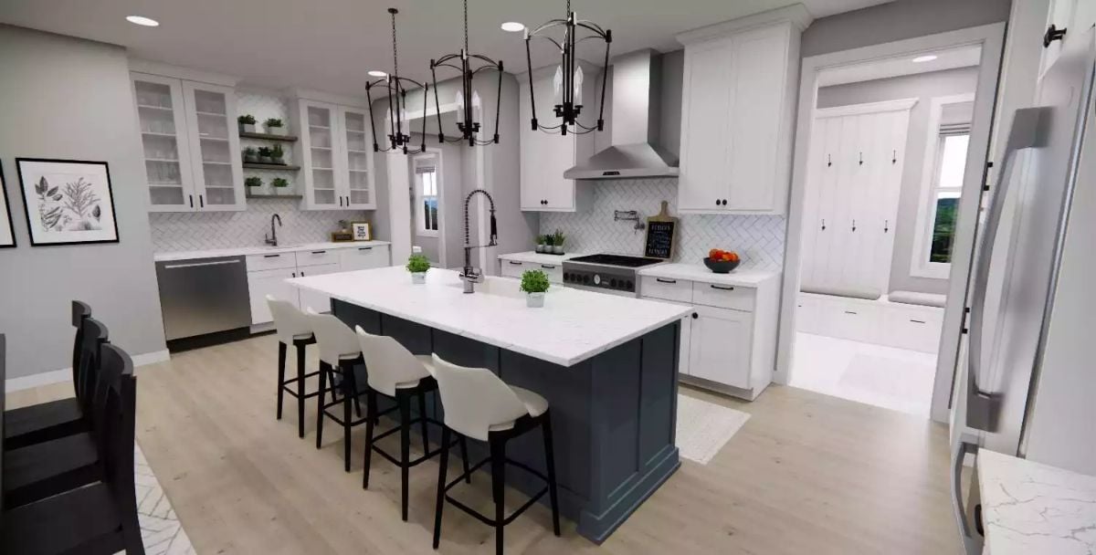
Somebody planned this kitchen around actual cooking, not just photography.
The island’s slate-blue base paired with a white quartzite countertop gives the room a visual anchor without fighting the white perimeter cabinetry. That pro-style pull-down faucet mounted to the island suggests the sink gets serious use. Two black iron pendant chandeliers pull the eye upward and keep the scale honest in what’s clearly a generous footprint. The mudroom entry visible at the right is a quietly smart placement — bags and boots drop there before they ever make it into the house.
Charcoal Walls and Floating Shelves Built for a Home Office That Means Business
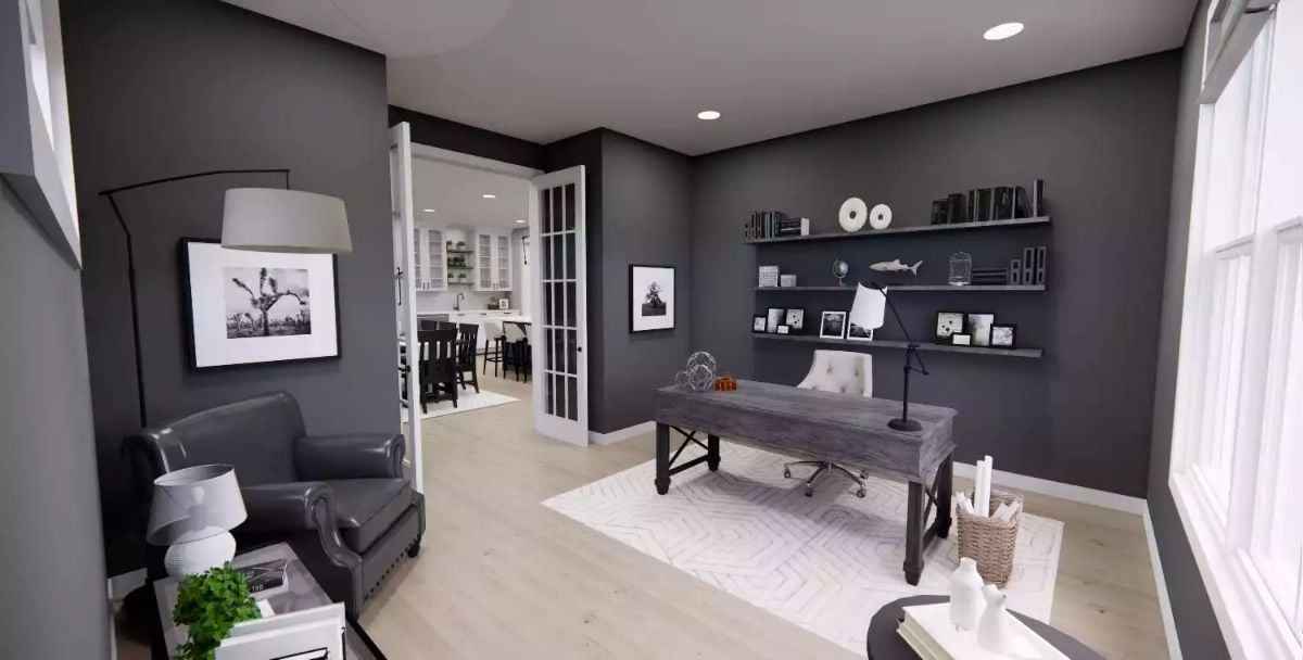
A weathered wood desk anchors the room while layered shelves keep books and objects within reach. The charcoal walls earn their place — dark paint in a home office reduces eye strain from screen glare better than most people expect.
Worth Knowing: Floating shelves outperform a bookcase in a home office because they don’t eat floor space or block window light. Mount them at two different depths so taller items don’t disappear behind shorter ones. A desk lamp with a directional head handles task lighting without crowding the desktop.
Charcoal Bed Frame, Gray Walls, and a Reading Nook That Pulls Its Weight
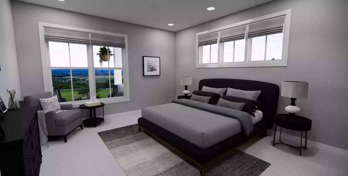
Roman shades filter daylight without killing the view, gray bedding layers over the charcoal upholstered frame in a way that feels deliberate rather than monotonous, and the armchair near the window actually justifies its square footage. A reading chair that nobody sits in is just an expensive surface for laundry. This one looks used.
Material Matters: Roman shades stack flat when raised, so you keep the full glass — no fabric bunching at the sides eating into your light. Fabric weight matters more than color. A heavier linen or cotton-poly blend holds its shape longer and blocks more light when closed than a lighter weave at the same price point.
Moving deeper into the primary suite, the bathroom makes a strong case for itself.
Matte Black Fixtures, Marble Tile, and a Double Vanity That Earns Every Inch
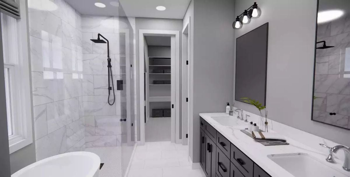
Paired sinks drop into a white quartz countertop above dark shaker cabinets, with matte black hardware connecting back to the rainfall showerhead across the room. Large-format marble tile keeps grout lines minimal in the walk-in shower — less to clean, cleaner to look at. Built-in shelving visible through the doorway means the linen closet was actually designed into the plan rather than treated as an afterthought.
Sectional Placement and Recessed Lighting That Make a Large Room Feel Intentional
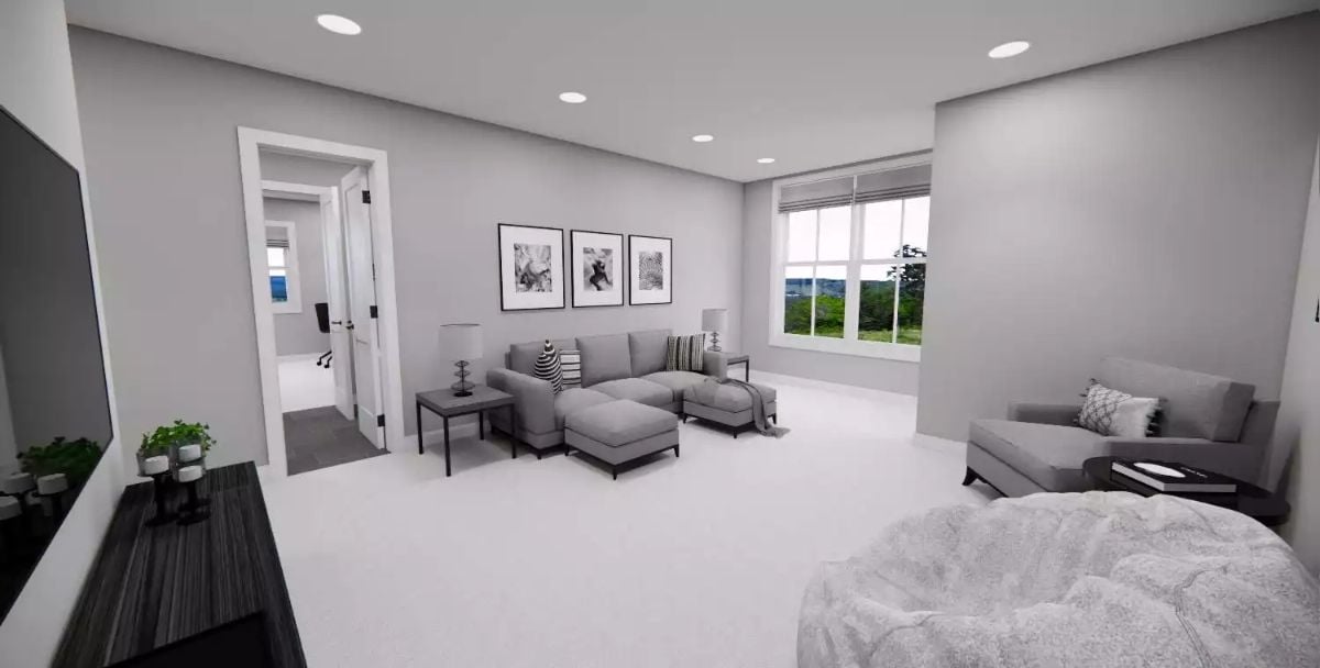
The gray sectional floats well off the back wall, leaving the carpet open underfoot rather than using the sofa as a room divider. Three framed prints above anchor the seating area — enough to give the wall purpose, not so many it turns into a gallery hang.
Pin It
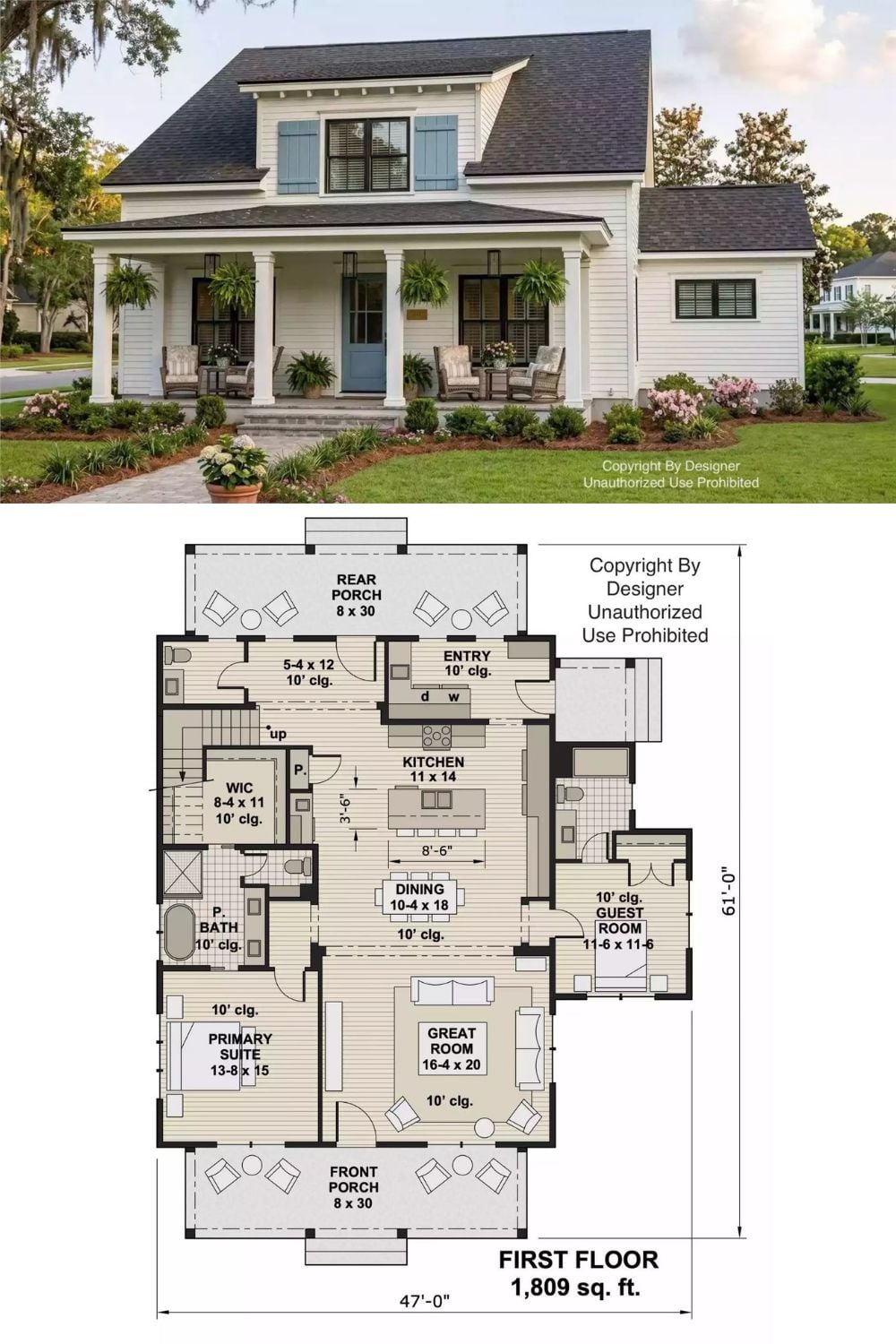
The exterior shows a white farmhouse with a covered front porch and dormer windows overhead. Below it, the first-floor plan lays out 1,809 square feet: main-floor primary suite, guest room, great room, and an 8×30 rear porch that makes warm-weather evenings worth planning around.
