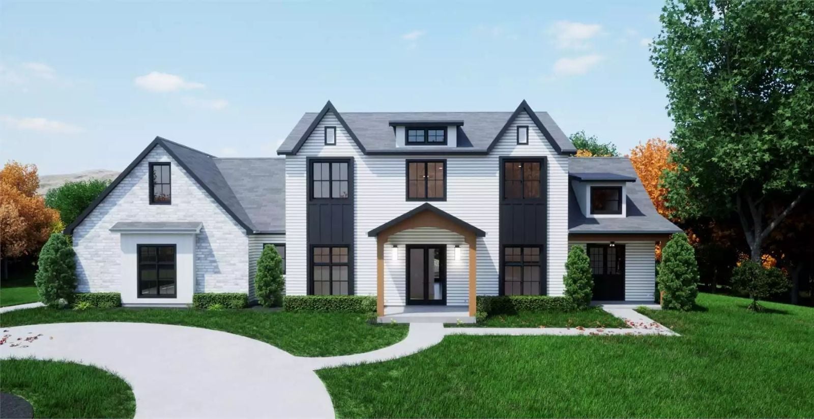
When was the last time everyone in your house ended up in the same room without being summoned? The Lindenfield Drive is built around exactly that kind of accidental togetherness — farmhouse bones that make the common spaces feel genuinely lived-in, a floor plan that keeps pulling people back toward each other, and a hidden room behind a Murphy door that will absolutely cause at least one argument about who gets it.
Specifications
- Sq. Ft.: 2,922
- Bedrooms: 4
- Bathrooms: 2.5
Floor Plan – Main Floor
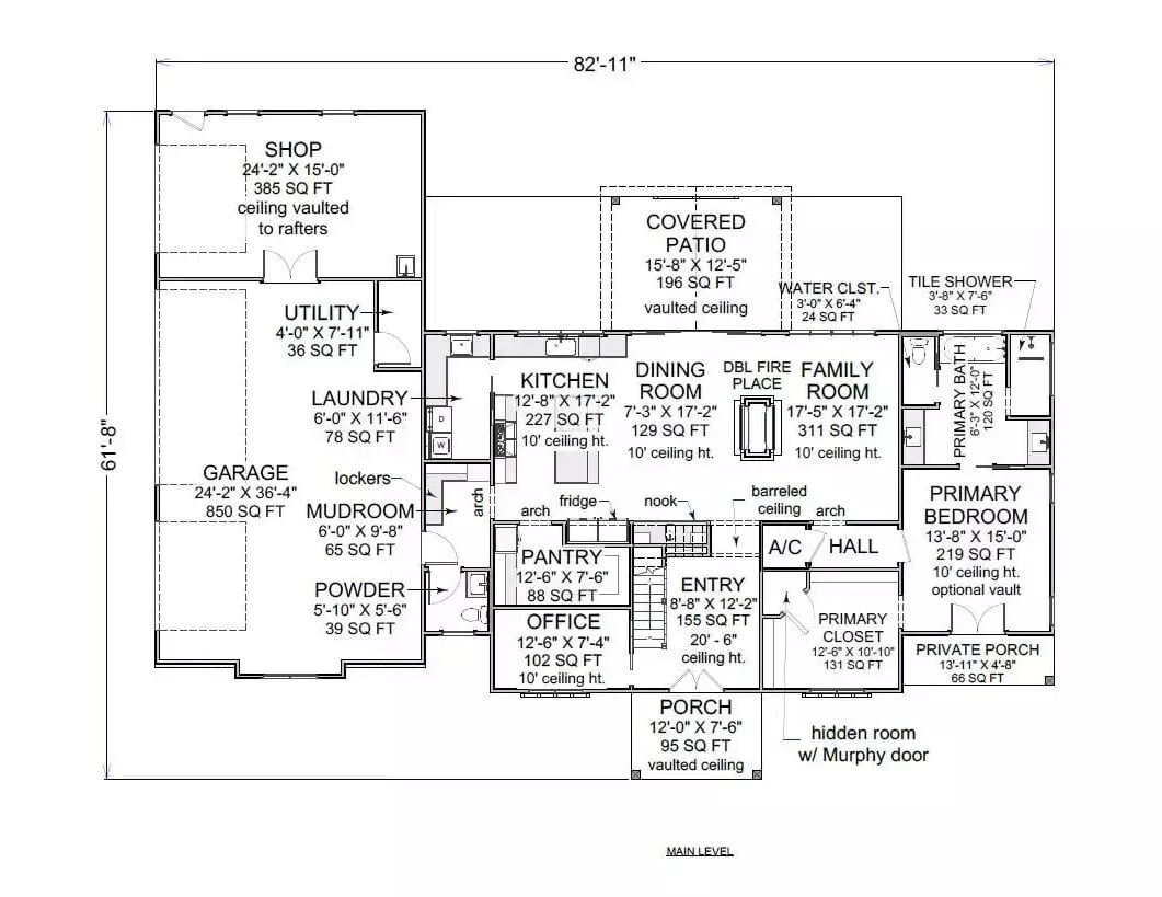
The single-level layout stretches 82′-11″ wide, with a hidden room tucked behind a Murphy door off the primary closet. A double fireplace anchors the family room at the center, flanked by kitchen and dining on one side and the shop and garage wing on the other.
Floor Plan – Second Floor
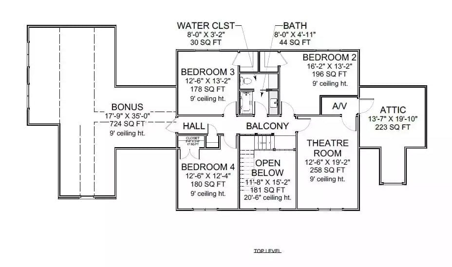
The upper level fits four bedrooms, a theatre room, bonus space, and a balcony that looks down into the open-below stairwell. There’s also a dedicated A/V closet, which is the kind of thing you don’t know you needed until you’ve lived without one.
Floor Plan – Foundation
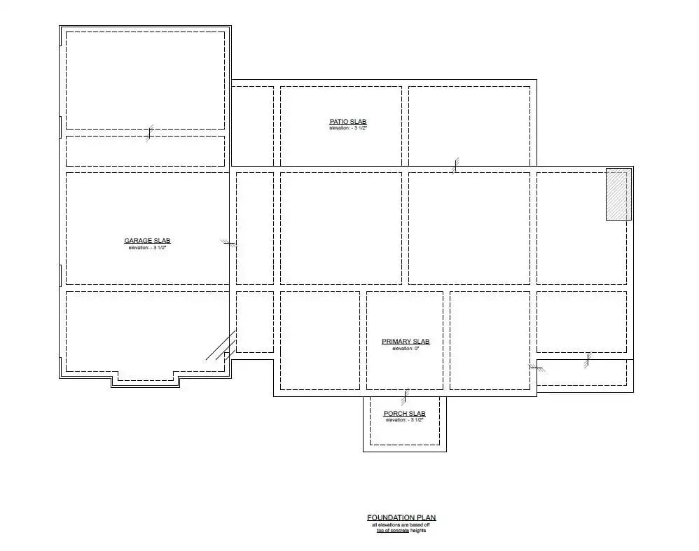
The foundation plan breaks into four distinct slab zones — garage, patio, primary, and porch — each sitting at a different elevation. A large attached garage wing extends off the main multi-bay structure, and dashed lines throughout the drawing mark interior footings and load points.
Warmth Without Trying Hard: Open Living Done Right
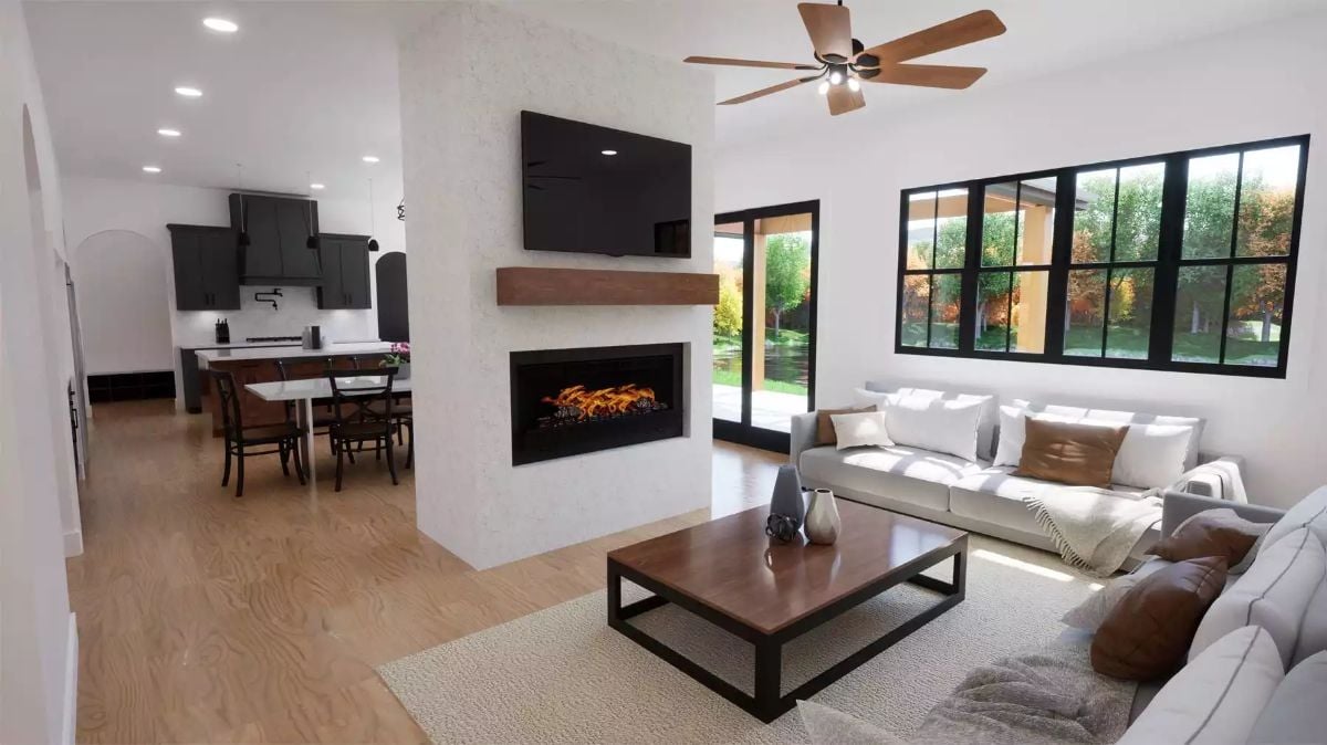
That linear fireplace below the wood mantel does a lot of the room’s heavy lifting. Light hardwood floors run straight into the kitchen without interruption, which makes the open layout read as deliberate rather than just wall-free.
Trend Alert: Electric linear fireplaces are showing up in new builds at a pace that would’ve seemed unlikely a decade ago. They skip the chimney, install cleanly into interior walls, and manufacturers have finally closed the gap on realistic flame appearance. This one’s a solid example of why designers keep specifying them.
Dark Cabinetry, Wood Island Base, and a Table Big Enough to Mean It
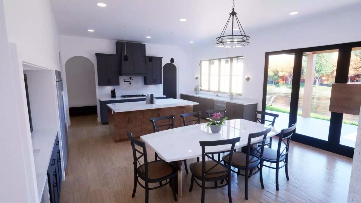
The walnut-toned island base pushes back against the dark upper cabinets, and white quartz countertops keep the whole thing from tipping into cave territory. It’s a balancing act that works because the contrast is deliberate, not accidental.
Worth Knowing: Mixing cabinet finishes — dark uppers with a wood-toned island base — has become a practical workaround for kitchens that want warmth without committing to an all-wood look. In larger open-plan spaces especially, a single finish across every cabinet can feel flat and a little institutional. Anchoring the contrast with one consistent countertop material, as the white quartz does here, keeps it from looking like two separate rooms got merged together.
Four Posts, Warm Wood, and Windows That Earn Their Keep
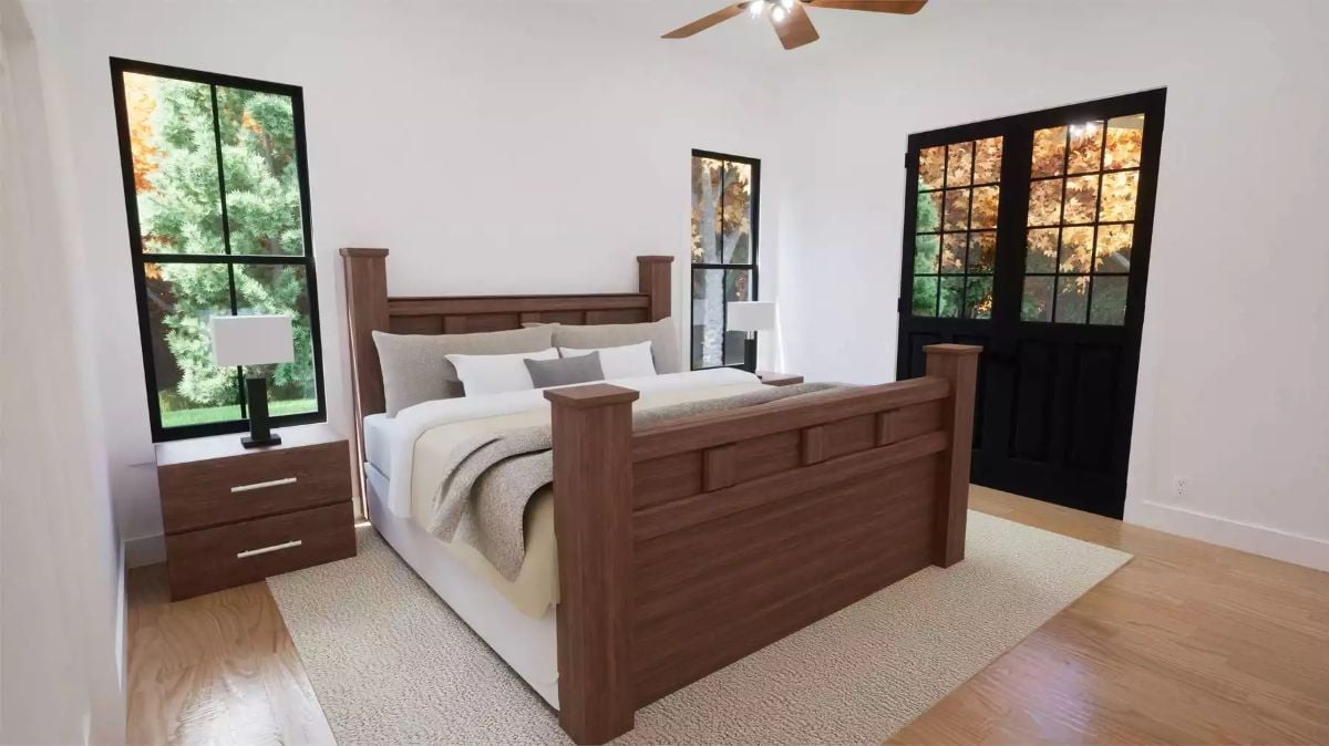
Dark walnut tones on the four-poster frame set the room’s temperature before anything else does. The footboard panels are chunky and flat — no ornate carving — which keeps it grounded. Black steel window frames read sharp against white walls, and the matching nightstands with bar pulls hold the room together without being too coordinated about it.
Did You Know: Running a ceiling fan on low overnight can take some of the load off your HVAC system, and that adds up across a full season. Pair it with a dimmer-controlled light kit and you’ve got two comfort variables to work with instead of one.
Move into the primary bath and the palette stays consistent, but the mood shifts toward something quieter.
Matte Black Hardware, Soaking Tub, and a Window That Frames the Trees
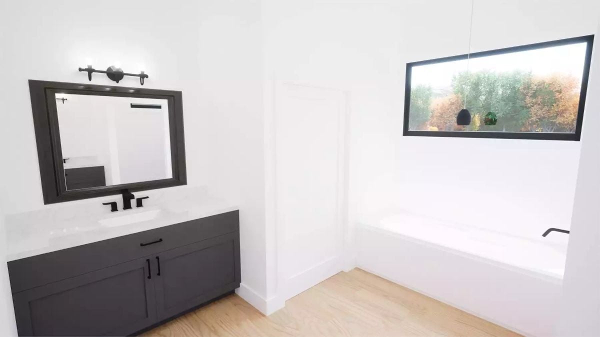
Charcoal shaker cabinetry pairs with a white countertop and matte black faucet set. The soaking tub sits under a horizontal window that pulls in tree canopy rather than open sky — a small decision that makes the whole corner feel more private. Wall sconces above the mirror replace the usual bulb-per-bulb vanity strip with a cleaner two-light bar.
Gray Sectional, Warm Pillows, and a Room That Knows How to Sit Still
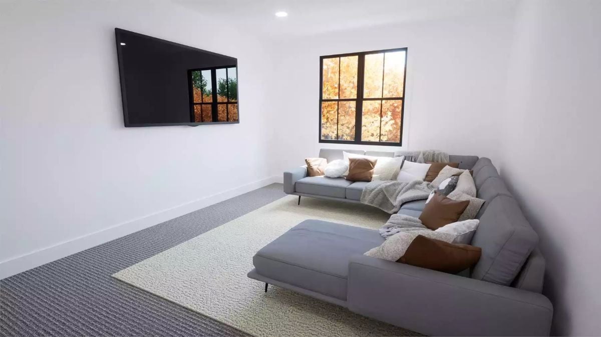
A gray sectional with a chaise extension anchors the space on a cream area rug edged by gray carpet. Leather-toned throw pillows cut through the light upholstery without overcomplicating it. Outside the grid-pane window, autumn foliage does more for the room than any artwork would. Low-key and livable — exactly what a second living space should be.
Leather-toned throw pillows break up the light upholstery without overcomplicating it.
Open Railings, Warm Wood Treads, and a Staircase Built to Be Seen
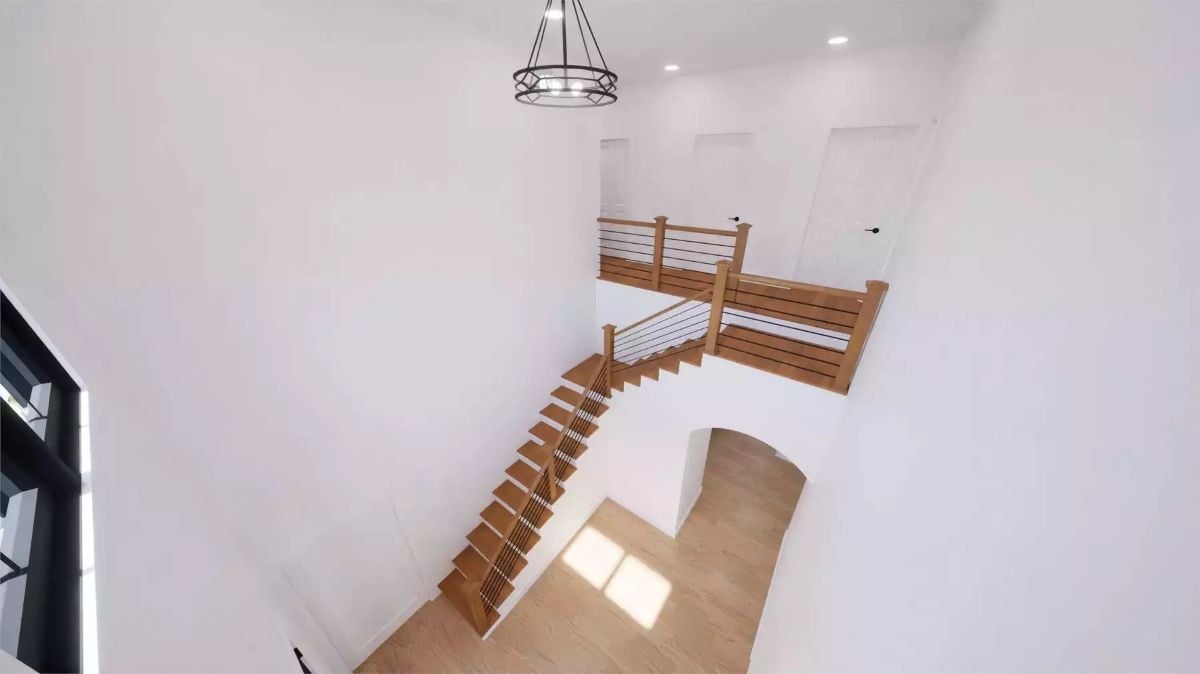
Horizontal cable railings with wood posts keep sightlines open across both levels. Natural wood treads run the full width of each step, no skirt board hiding the sides. At the base, an arched passageway softens what would’ve been a hard right angle.
Ask Yourself: Open staircases look clean, but they draw attention to everything around them. White walls and light floors are carrying real weight in this photo. Before committing to this style, think honestly about how bare the surrounding walls will stay once you’re actually living in the house.
Bonus Room Up Top, Sloped Ceiling and All
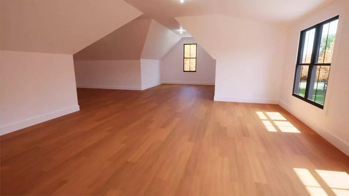
Vaulted attic space with warm hardwood floors, white walls, and black-framed windows letting in afternoon light. Spare, but it doesn’t feel unfinished.
Quick Fix: Bonus rooms with sloped ceilings get written off too often. The knee wall on the left side of this space is actually useful — it creates a natural zone for built-ins or low furniture, and anything that hugs the slope stops fighting the architecture. A rug can also do a surprising amount of work here, defining separate uses within one open floor plate without adding walls or visual noise.
Pin It
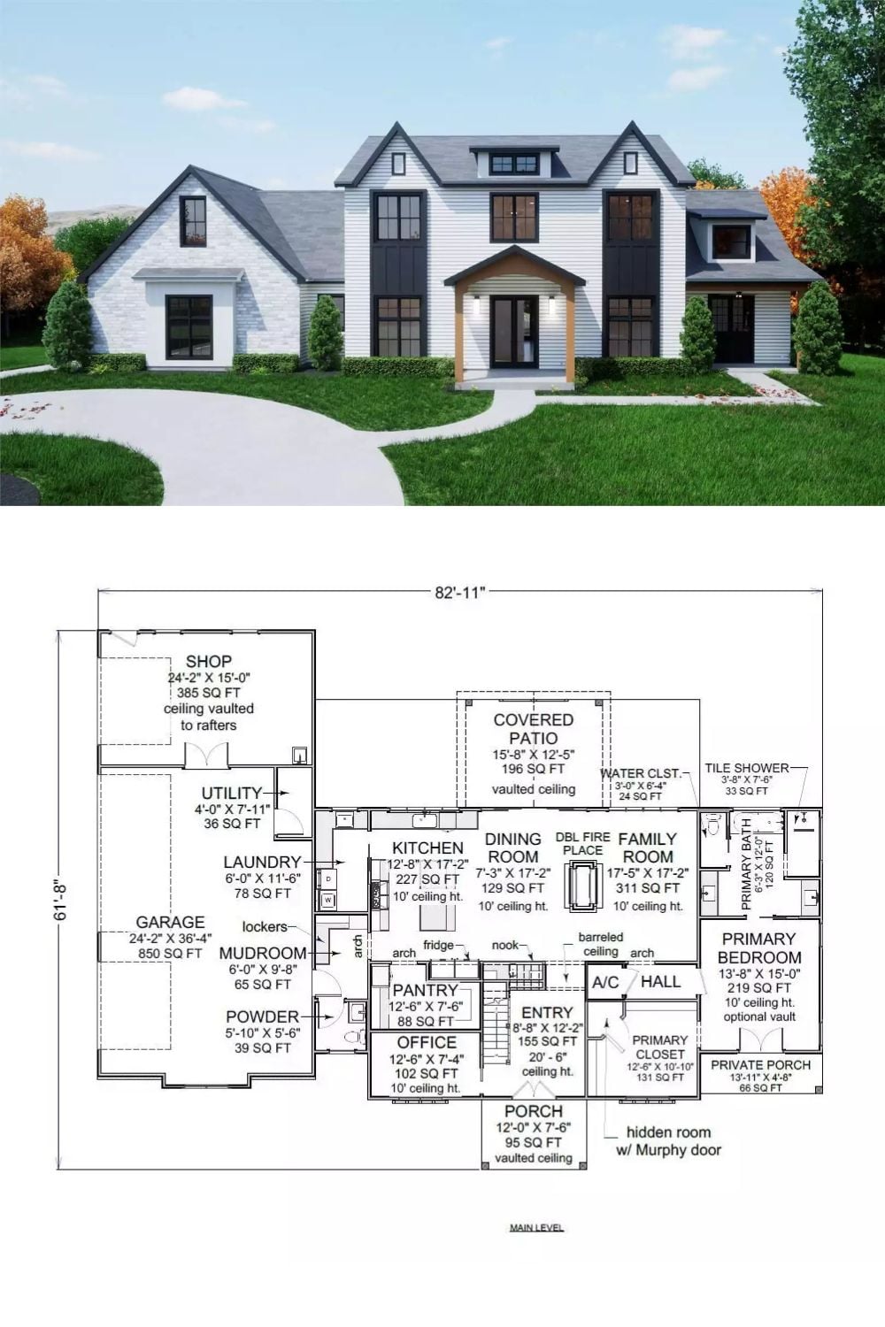
The exterior rendering shows a modern farmhouse with board-and-batten siding, stone accents, and a covered entry framed by wood beam details. Beneath it, the main-level floor plan lays out the full picture: hidden room behind a Murphy door, a 311-square-foot family room, and a primary suite with its own private porch access.