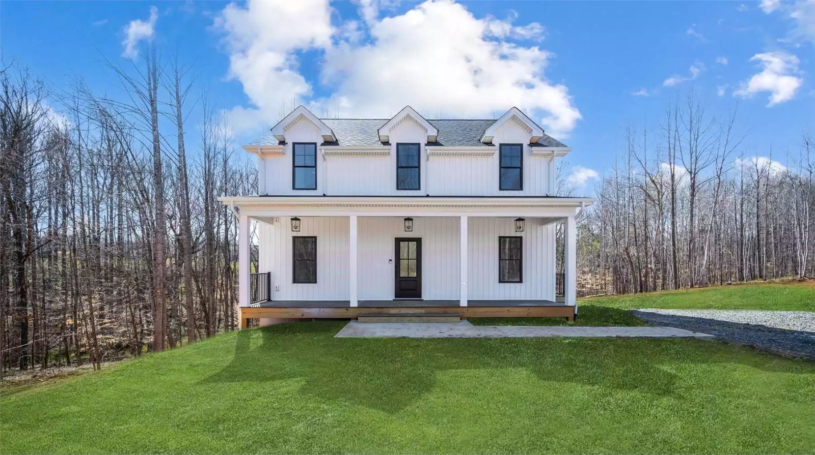
If you’ve been in a starter home long enough to resent it, you already have a precise list of what you need next: somewhere homework can land that isn’t the kitchen counter, a room a teenager can disappear into, and a covered porch that justifies itself on a slow Sunday morning. The Langford Place answers that list directly, with a finished basement that gives the kids their own floor, a front porch that earns its square footage, and a modern farmhouse layout that puts a real door between the kitchen noise and everyone else.
Specifications
- Sq. Ft.: 1,531
- Bedrooms: 3
- Bathrooms: 2.5
Floor Plan – Main Floor
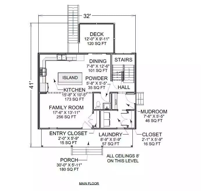
The main floor opens the kitchen, dining, and family room into a single arrangement anchored by an island, with a powder room and laundry tucked near the central hall. A mudroom connects to the side entry, and front porch and rear deck bookend the whole thing — outdoor space on both sides, which sounds like a small detail until you’re actually living in it.
Floor Plan – Second Floor
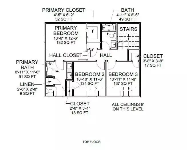
Three bedrooms share one level, and none of them feel like an afterthought. The primary claims 182 square feet with its own bath, linen closet, and walk-in. Across the hall, two kids’ rooms come in at 134 and 137 square feet, each with closet access — not huge, but genuinely usable. Ceilings hold at 8 feet throughout.
Raised Deck and Dual-Level Entry Give This Backyard Real Utility
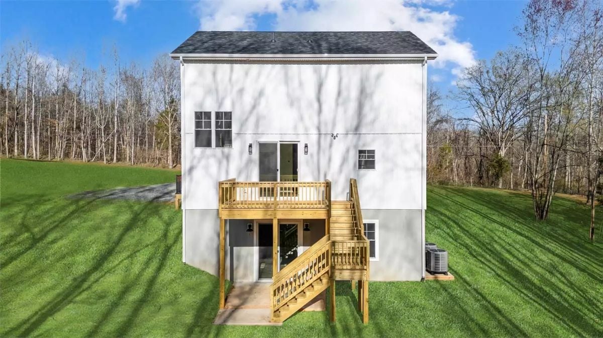
The deck sits elevated off the main floor, with stairs dropping down to a ground-level patio entry below. White board-and-batten cladding ties it back to the exterior. Two levels of outdoor access from one structure is a layout decision that pays off more than it looks like it will on paper.
Material Matters: Pressure-treated lumber is the right call for a deck like this, where moisture exposure is ongoing and ground contact is a real concern. It resists rot far better than untreated pine and takes stain well once it’s had time to dry out. The AC condenser on the right side is placed where it should be: accessible without crowding the patio below.
Warm Wood Floors Keep This White Kitchen from Feeling Cold
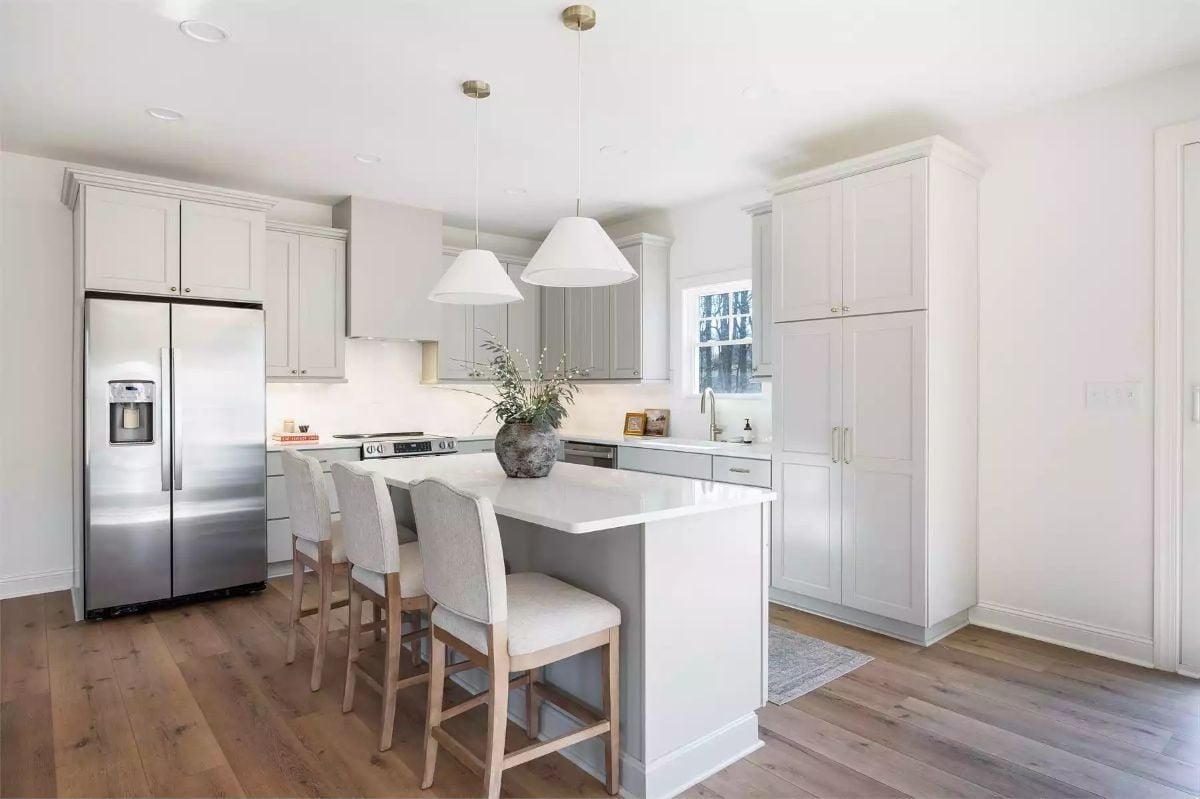
Gray shaker cabinets wrap the perimeter, and the island wears the same finish — cohesive without being matchy. White cone pendants hang low enough to read as deliberate rather than incidental. The hardwood floor is doing the heaviest lift here, pulling warmth into a palette that had every opportunity to tip clinical and didn’t.
It’s the hardwood floor doing real work here, pulling warmth into a palette that could’ve easily read clinical.
Wainscoting Panels and Sliding Glass Doors Pull Double Duty in This Dining Room
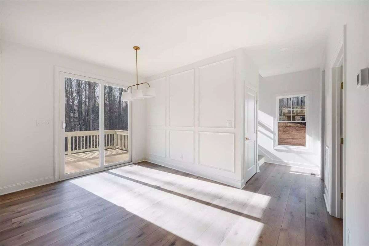
Board-and-batten panels add texture without needing a single piece of furniture to back them up. Afternoon sun cuts hard across the dark hardwood floors, and the deck beyond the slider stays visible from anywhere you stand in the room. It’s a small thing that makes the space read larger than it is.
Try This: Before you commit to a dining table placement, watch where the brightest patch of afternoon light lands consistently throughout the day. Shadowlines from that kind of directional sun can actually tell you where furniture wants to go. You might find the room has already made the decision for you.
Brass Hardware and Bare Wood Treads Make This Staircase Worth the Climb
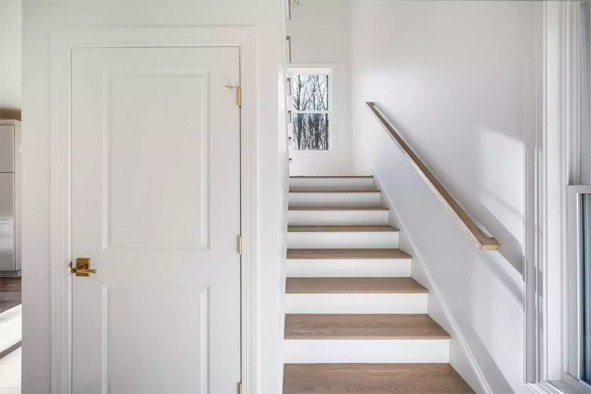
White risers paired with natural oak treads keep the staircase light without looking like a hospital corridor. The brass lever handle on the paneled door holds its own against all that white. A slim wall-mounted rail replaces what would’ve been a bulky baluster system, and it’s a better-looking solution for a narrow run.
Quick Fix: Floating wall-mounted handrails need to go into studs, not drywall. If you’re retrofitting one, find the studs first and use lag screws rated for the load. A rail that pulls away from the wall mid-step isn’t just annoying — it’s a real hazard.
Vaulted Ceiling and Board-Molding Wall Give This Bedroom Two Reasons to Linger
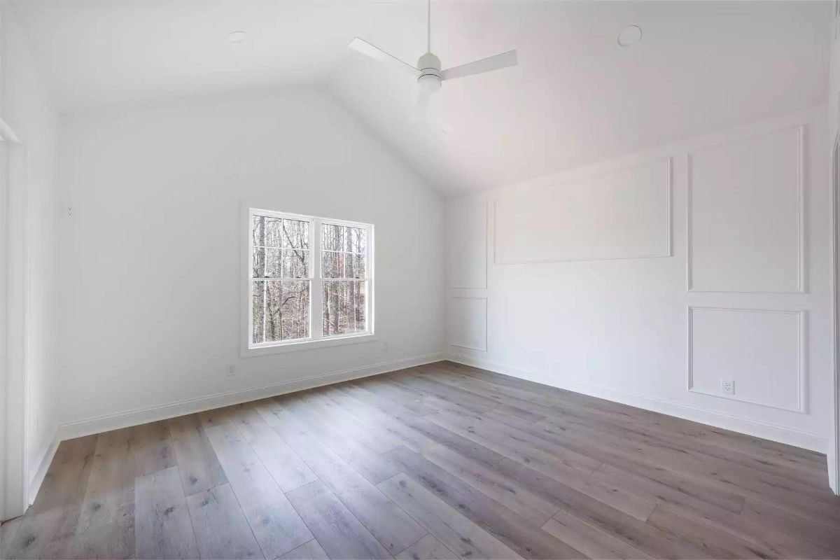
Cool gray-brown hardwood floors ground the room without competing with the all-white walls. That coffered molding panel on the right wall adds real architectural depth — no furniture required to sell it. The vaulted ceiling makes the square footage feel more generous than the numbers suggest, and the simple ceiling fan skips a light kit entirely, which is the right call here.
Designer’s Secret: Picture-frame molding panels like these are more DIY-friendly than they look — basic MDF trim and a miter saw will get you there. Install before painting so you’re not cutting in around every edge afterward. Prime every cut end before nailing; MDF will absorb moisture and swell if you skip that step.
Brushed Brass and Marble Make This Double Vanity Hard to Walk Past
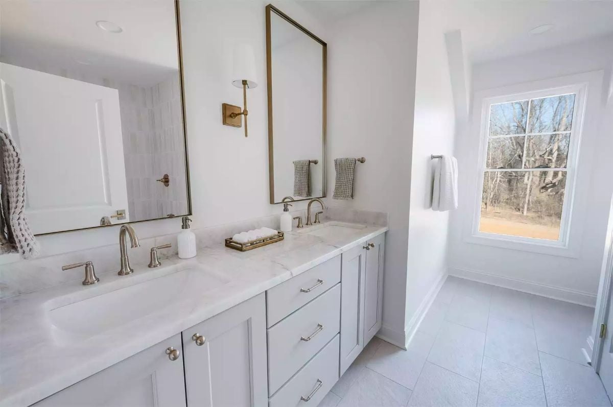
Undermount sinks, marble countertops, and brass sconce hardware — the combination is calm rather than loud, which is harder to pull off than it looks.
Spread-faucet sets give you more flexibility than single-hole installs because you can shift accessories around without fighting a fixed deck plate. That tray of rolled hand towels centered between the sinks is doing organizational work, not just decorative. Worth noting how much less cluttered the counter reads because of it.
One sconce serving two mirrors only works when the mirrors are close enough together — as they are here. Push them further apart and you get a shadow problem in the middle. Know the tradeoff before you plan the layout.
Sliding Glass Doors and Bare Wood Decking Make Backyard Access Feel Effortless
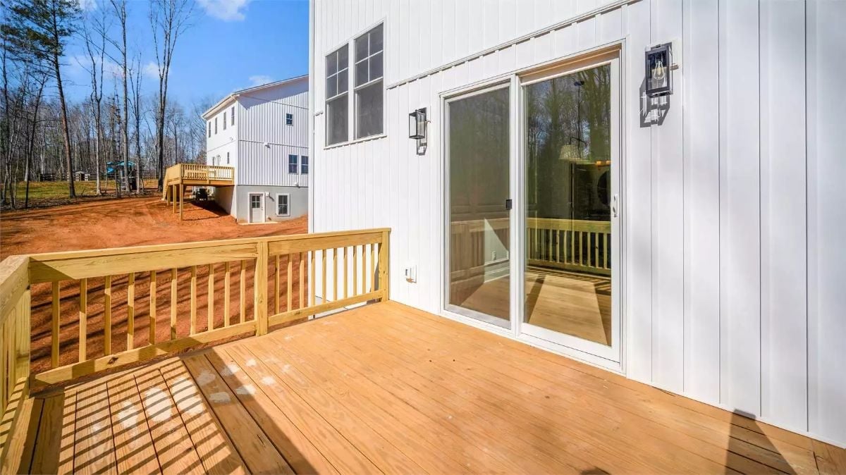
Natural wood tones on the deck planks save the all-white exterior from going stark. Two wall sconces flank the door without overcrowding it — placed far enough apart to frame the opening rather than compete with it.
Pin It
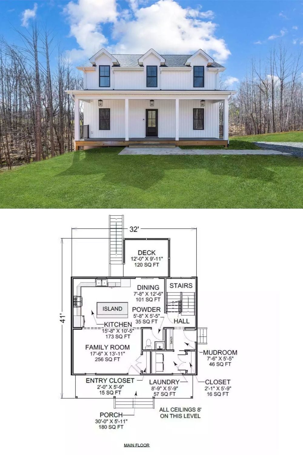
Exterior photo of a white modern farmhouse paired with its annotated main floor plan below.