
🔥 Would you like to save this?
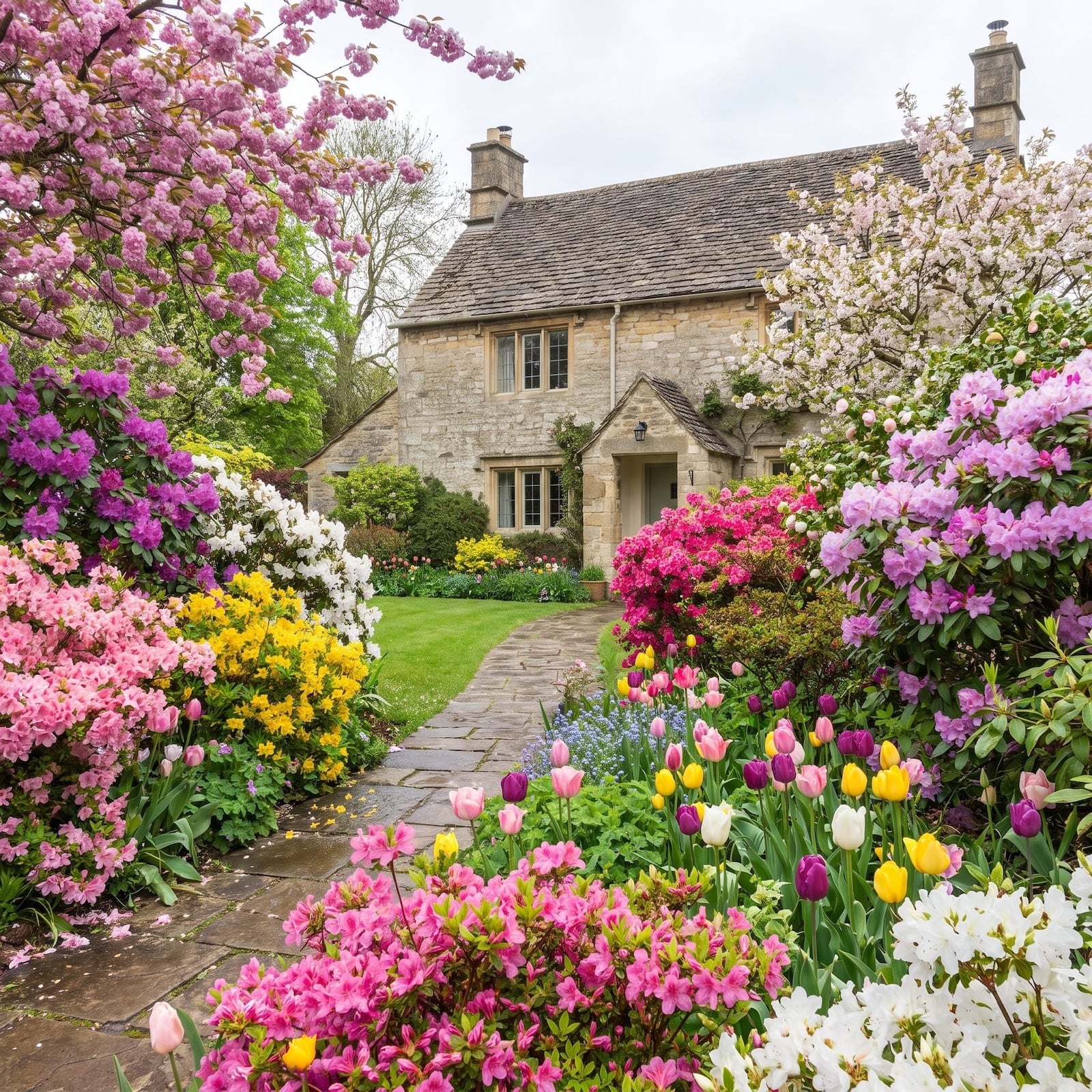
A front yard can be green, healthy, freshly mulched, and still be quietly sabotaging the house behind it. That is the unnerving part. The shrub you have trimmed faithfully for fifteen years may now be swallowing the windows. The tree that once looked charming beside the walk may have matured directly into the best view of the front door. A perfectly healthy row of plants can flatten a facade, shrink an entry, fight the roofline, or make an expensive house look oddly unsure of itself.
Landscape designers notice these things almost before the car stops moving. Not because they know some secret list of approved shrubs, but because they are reading scale, sightlines, rhythm, hierarchy, proportion, edges, and the relationship between the green stuff and the built stuff. Once you start looking that way, the yard changes. A hedge becomes a wall. A bed edge becomes a frame. A gap becomes a missing beat. These 36 mistakes are the ones hiding in plain sight — and quite a few can be fixed without buying a single new plant.
In order to come up with the very specific design ideas, we create most designs with the assistance of state-of-the-art AI interior design software. Also, assume links that take you off the site are affiliate links such as links to Amazon. this means we may earn a commission if you buy something.
36. The Shrubs That Ate the First Floor
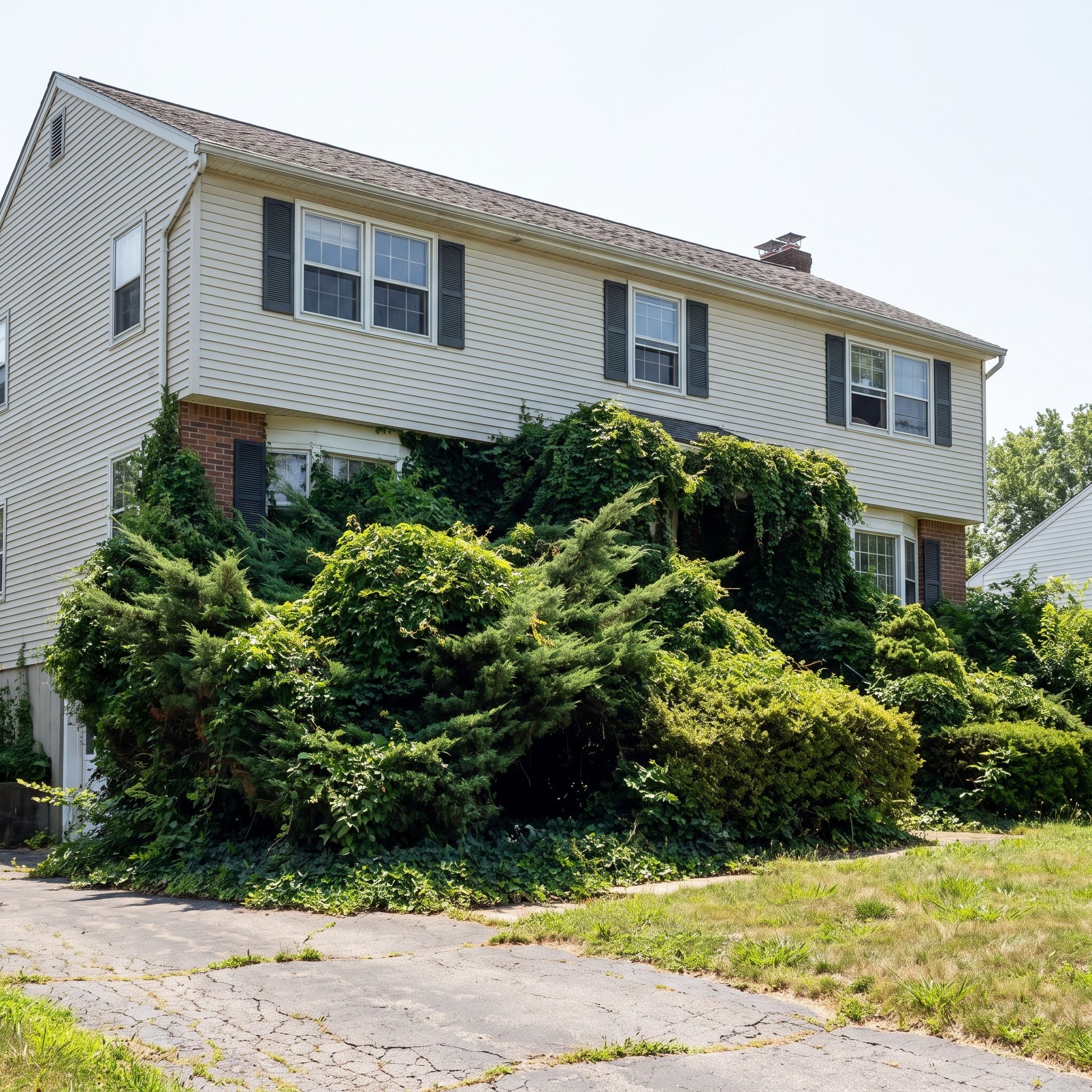
The plant was cute when it arrived. A one-gallon nub in a black plastic pot. Years later it is taller than the porch railing, leaning into the windows, and making a determined run toward the gutters. The change happened an inch at a time, which is exactly why it became invisible.
An oversized shrub does not automatically read as lush. Once its mature mass overwhelms the architectural space assigned to it, the house starts losing the composition. Windows shrink, porch details disappear, and the foundation planting becomes the main event when it was supposed to be supporting cast.
The remedy depends on the plant. Some multi-stem deciduous shrubs tolerate rejuvenation pruning; many evergreens need much more selective treatment, and some cannot be cut hard into old wood at all. Sometimes pruning restores the relationship. Sometimes the only honest answer is replacing a plant that was simply given the wrong job.
35. The Tree That’s Standing Right in Front of Your Best Angle
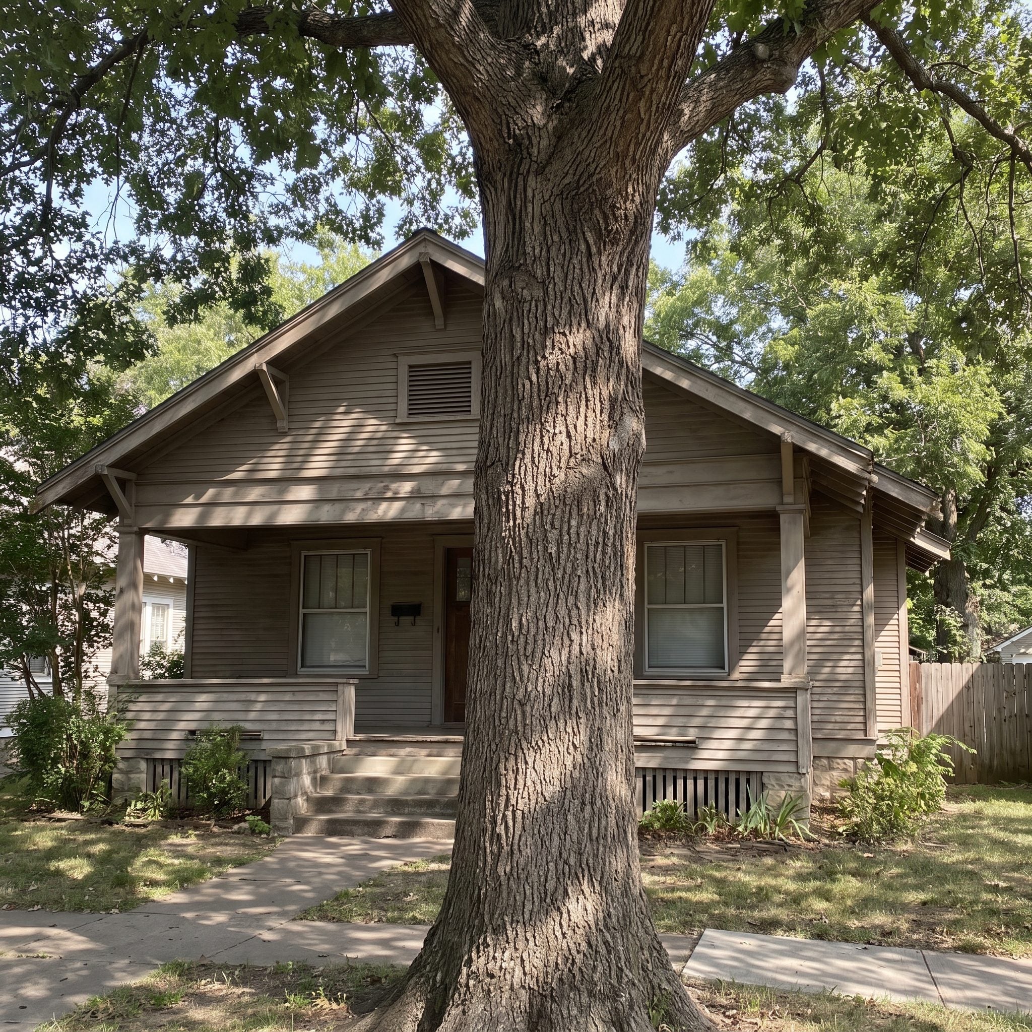
Somebody planted a shade tree decades ago in a spot that looked completely reasonable when the trunk was the width of a broom handle. Now it sits directly between the street and the porch, gable, or front door, owning the exact piece of sky where the house ought to appear.
A mature tree is not a disposable design accessory, and cutting down a healthy one simply for a cleaner photograph would be an absurd first move. But placement still matters. A canopy can frame a facade beautifully or swallow it whole.
Often the useful intervention is limbing up: selectively removing appropriate lower branches so views open beneath the canopy. Done properly by an arborist, the house can reappear without sacrificing the tree that took decades to grow.
34. A Front Door You Have to Hunt For
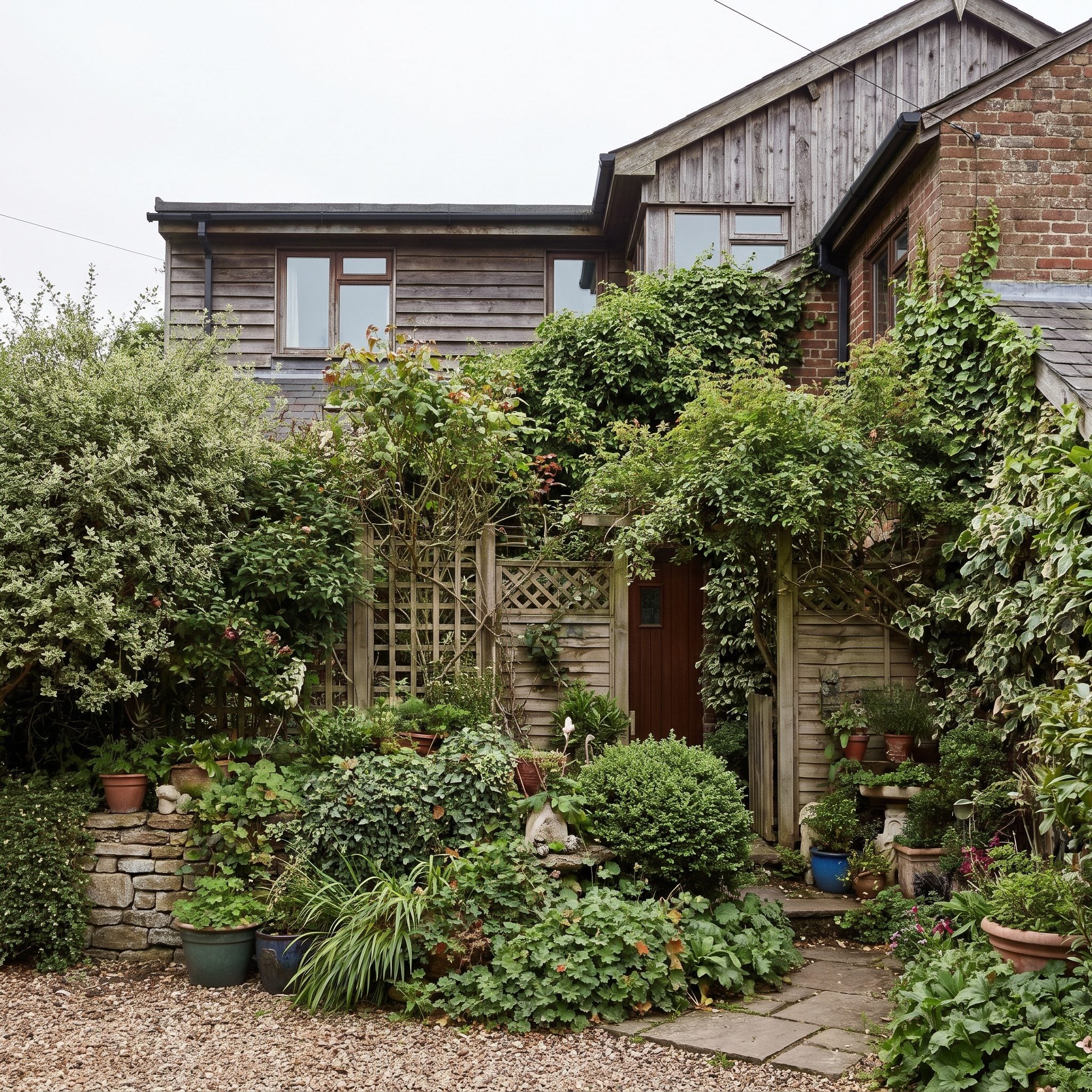
The front door is supposed to be punctuation — the place where the facade finally tells the eye where to stop. Crowd it with shrubs, drag a vine across the lintel, add three competing pots and a hedge leaning in from the side, and suddenly the sentence has lost its period.
An obscured entrance also makes the entire front elevation harder to read. Visitors hesitate. The pathway feels less obvious. A beautiful door color becomes irrelevant because the planting has stolen the focal point.
Give the entrance some negative space. Pull vegetation back far enough that the door, trim, lighting, and address can register clearly. A bold front door should not have to fight through a hedge to introduce itself.
33. Windows You Can Barely See Behind the Greenery
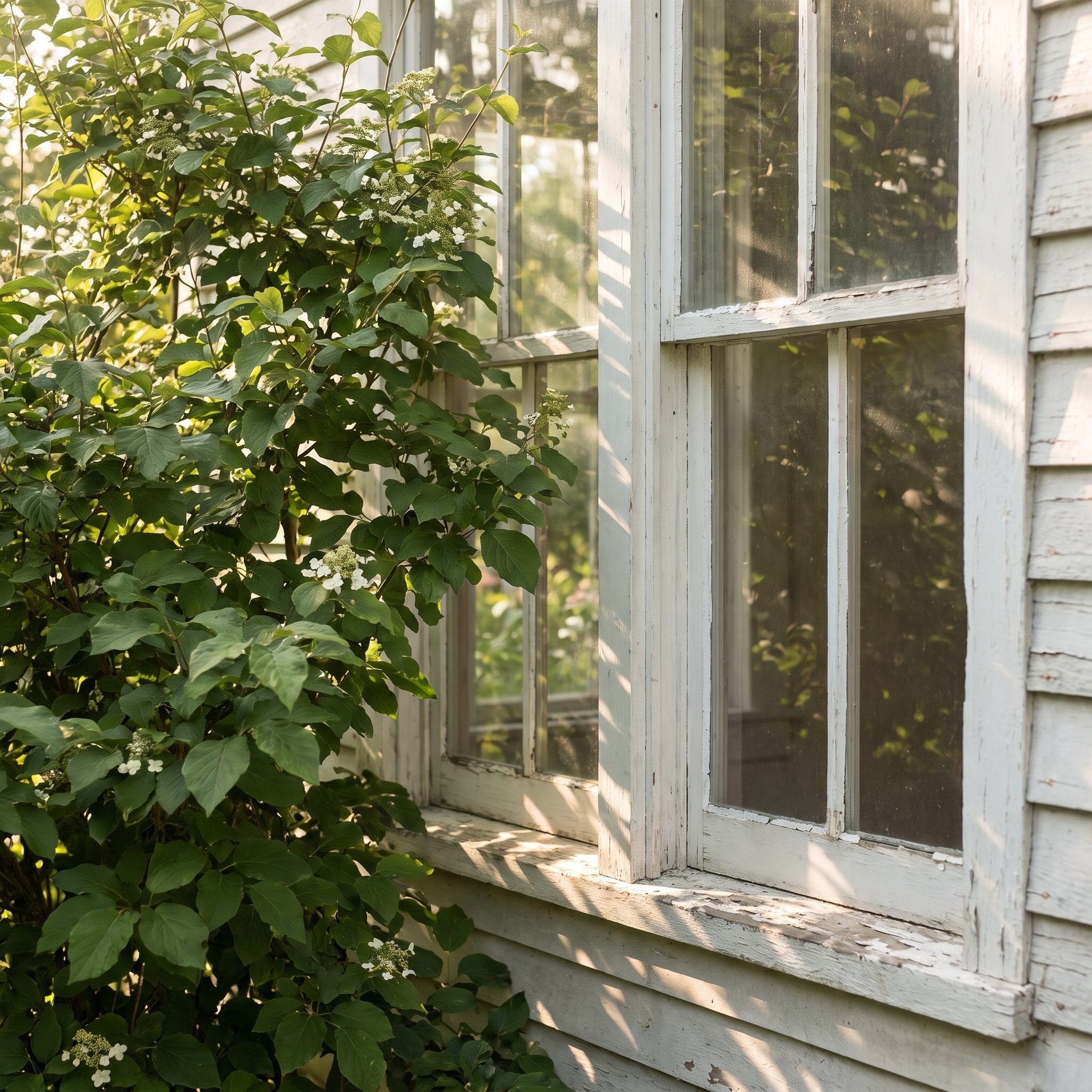
Windows are among the strongest repeating shapes on a facade. Cover their lower halves with foundation shrubs and that rhythm gets chopped up before the architecture has a chance to work.
Dense planting directly in front of glass can also reduce daylight inside, especially where shrubs have grown well above the sill. From the street, the problem is even simpler: the house looks as though its eyes have been slowly closing.
Plantings immediately in front of windows generally work best when they respect the glazing rather than swallowing it. Taller material can still live between windows, at corners, or wherever the architecture gives it room. A crisp gray entryway design loses plenty of its effect when the openings around it disappear into leaves.
32. The Hedge That Turned Your Yard Into a Fortress
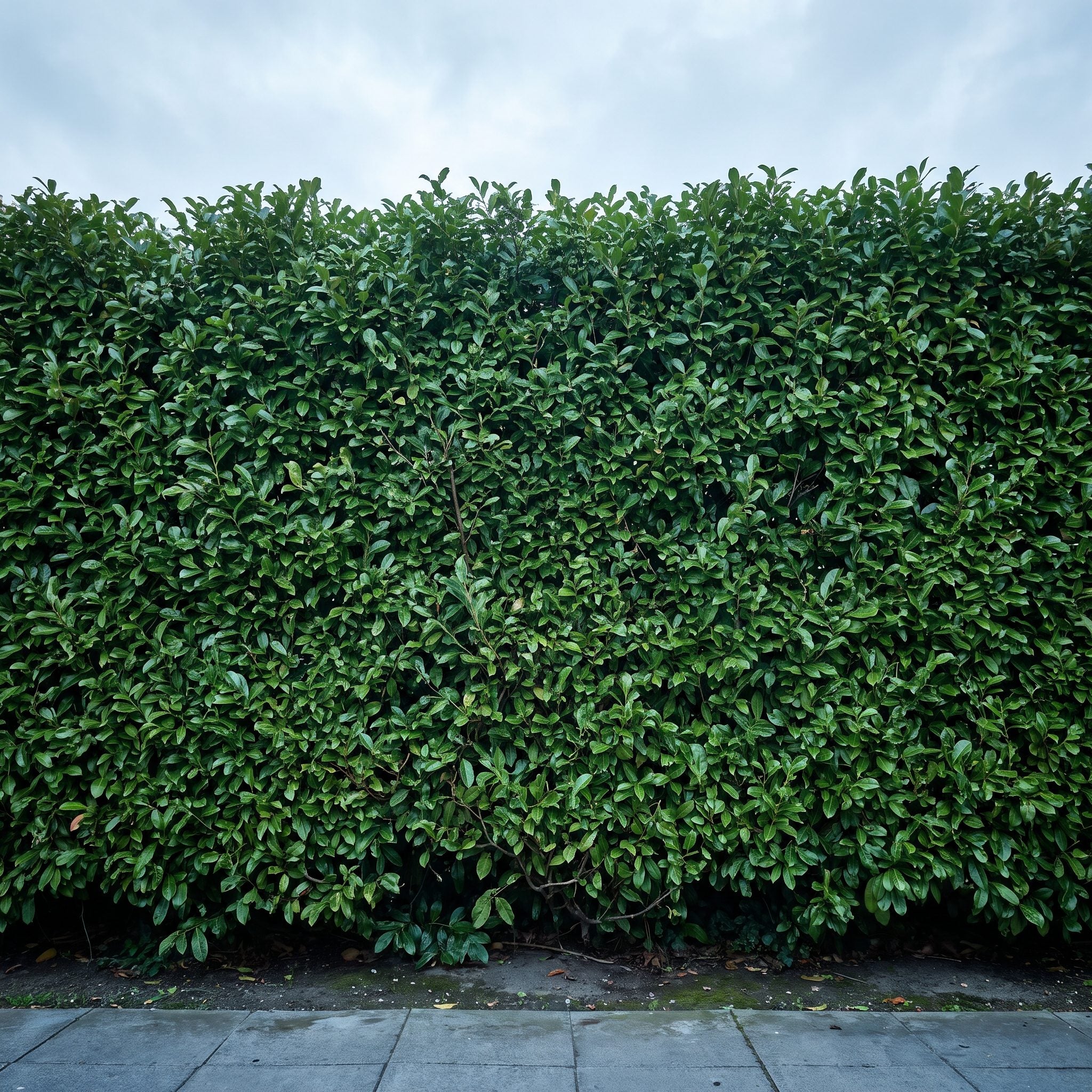
A hedge can be one of the cleanest elements in a front yard. Then it keeps growing. The tidy boundary becomes a nine-foot wall and the house starts appearing to have withdrawn from public life.
Privacy and complete visual isolation are not the same design move. A hedge high enough to block every view inward can make the front yard feel defensive, while one maintained at a scale that still allows some relationship between house and street feels much lighter.
The right height depends on the property and what the hedge is actually screening. The useful question is whether it is framing the house or replacing it.
31. Plants That Are Wildly Out of Scale With the House
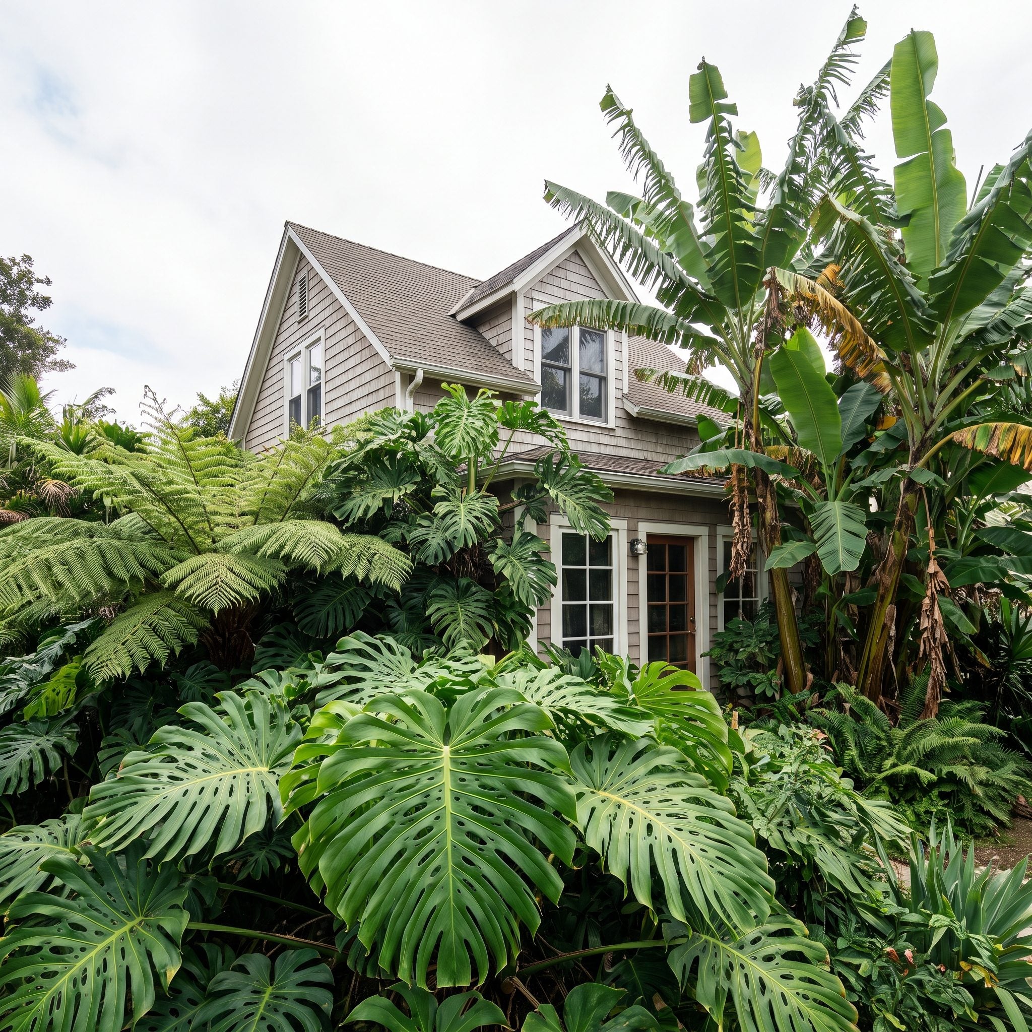
Scale is the thing that can make every individual plant look perfectly healthy while the yard still feels wrong. A tall two-story facade can visually overpower a necklace of tiny perennials. A low horizontal ranch can disappear behind enormous upright shrubs that belong beside something twice its height.
The goal is not to match house size literally. It is to give the architecture enough plant mass that the two feel related. Large facades can often carry small ornamental trees, substantial shrub groupings, and broader planting beds. Lower houses may benefit from masses that reinforce their horizontal lines.
Get the proportion right and modest plants suddenly look intentional. Get it wrong and expensive specimens can look as though they wandered in from somebody else’s yard.
30. A Front Yard That Doesn’t Know Where to Look
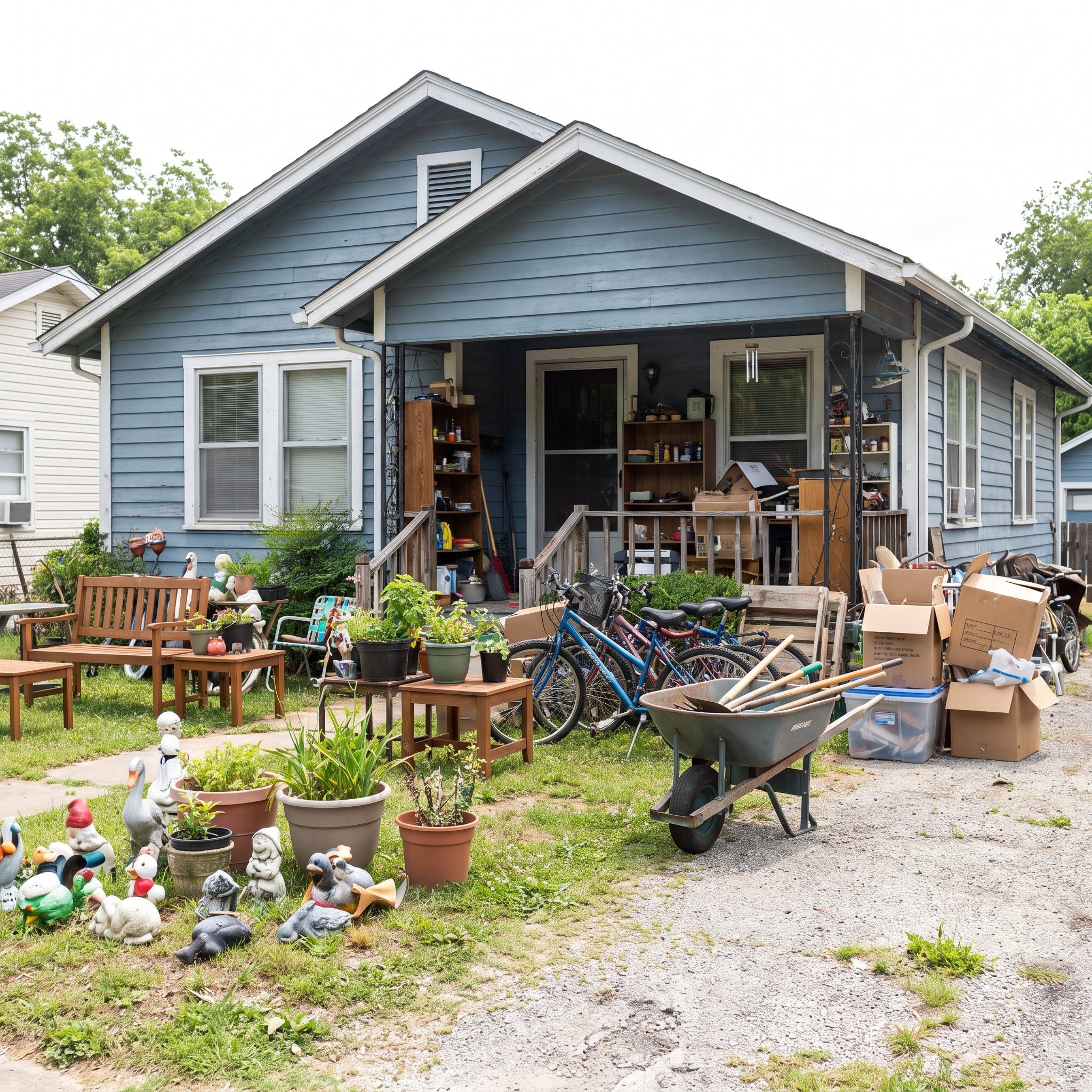
Stand across the street and let your eye land somewhere. If everything competes equally — specimen tree, bright flowers, sculpture, four different containers, ornamental grass, door color — the yard can feel busy without ever becoming memorable.
This is not a shortage-of-plants problem. It is hierarchy. One element should usually get first billing while the others support it. That anchor might be the front door, a beautiful tree, a sculptural pot, or a particularly strong planting mass.
A yard becomes calmer the moment everything stops auditioning for the lead role at the same time.
29. Planting Beds That Ignore the House Behind Them
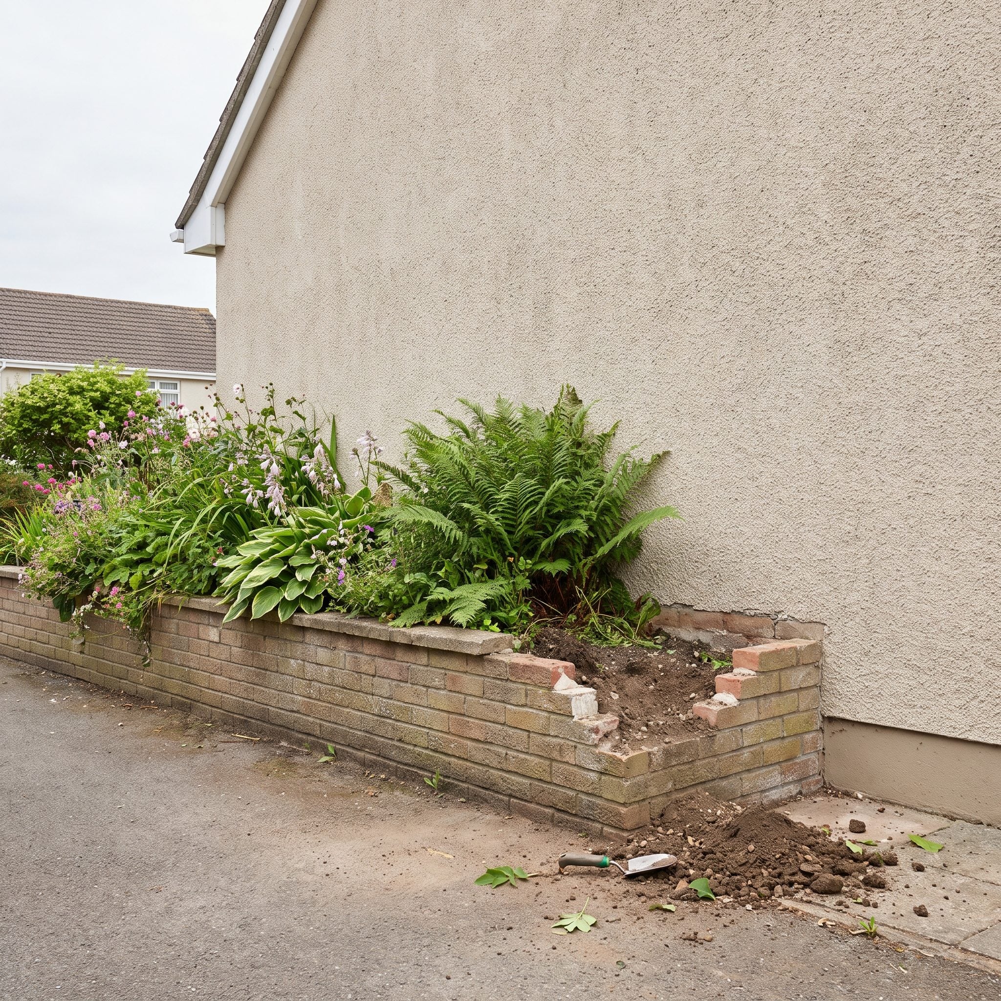
Beds should not stop wherever the shovel got tired. A curve that gives up in the middle of a blank wall or ends three feet short of the corner makes the planting feel detached from the building it is supposed to belong to.
Landscape design gets much stronger when bed geometry responds to something already present: a house corner, porch edge, window grouping, path, step, or change in facade.
Extend a bed until it resolves somewhere logical. Wrap a corner when the architecture suggests it. Let the green geometry answer the built geometry. That conversation is where landscaping stops looking like decoration parked on a lawn.
28. A Front Bed Where Everything Is Exactly the Same Height
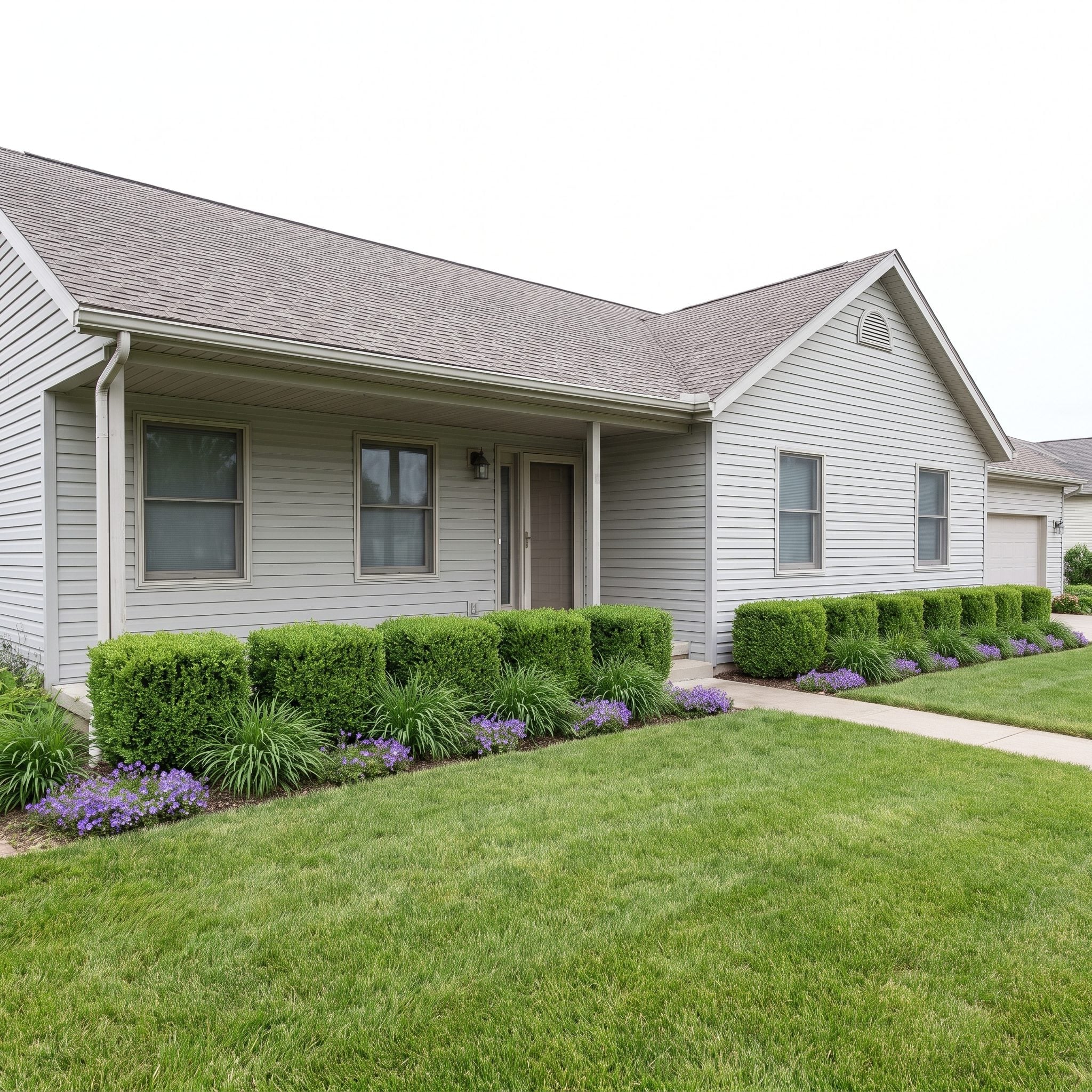
A row of unrelated shrubs all clipped to exactly thirty inches can make a planting bed look like a hedge having an identity crisis. The problem is not repetition. Repetition can be excellent. The problem is a flat skyline with no rhythm.
Varying plant mass gives the eye somewhere to travel: one taller anchor, a broader middle layer, a low edge, perhaps a repeated grass or perennial tying the pieces together.
The bed starts to feel composed rather than measured with a ruler.
27. The Plant Collection Masquerading as a Garden
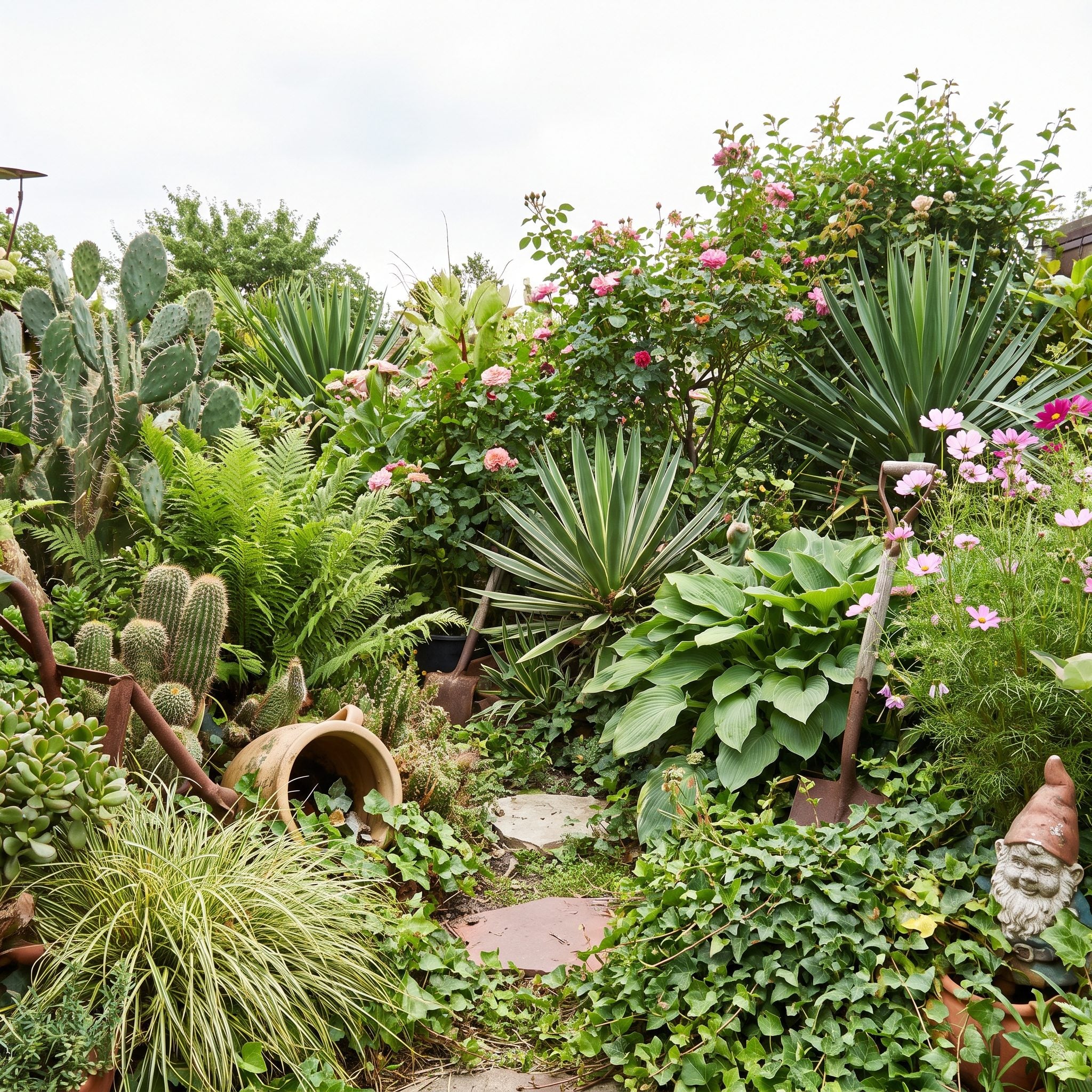
One of everything sounds generous. In a front yard it can look like the garden center delivered its sample table. Different leaf, different flower, different shape, different color, repeat until nothing actually repeats.
Repetition is what turns individual purchases into a composition. Choose a smaller plant palette and let important species appear again farther down the bed. A drift here answers a drift there. Suddenly the eye has a pattern to follow.
The same instinct that drives a good modern kitchen design applies outside: a few materials used with conviction usually feel stronger than twelve materials used once.
26. Landscaping With No Rise From Low to Tall
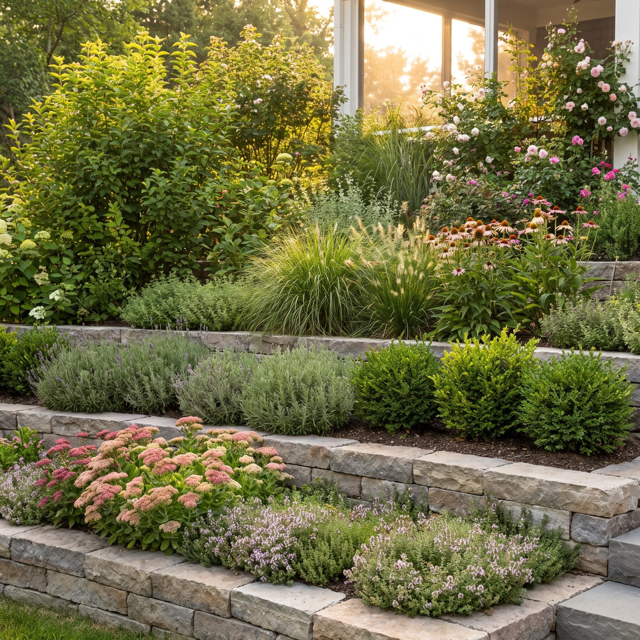
One of the easiest ways to create depth in a traditional foundation bed is to layer heights. Low plants near the edge, medium masses behind them, taller material farther back or at selected anchor points. The eye gets foreground, middle ground, and background instead of one confused plane.
That does not mean every bed needs three rigid rows. Mass planting, groundcovers, and more naturalistic schemes can work beautifully. The useful principle is visibility: taller material should not accidentally erase everything shorter behind it.
That same stacking logic that makes a tropical patio design feel layered can give a front bed real depth without adding another square foot.
25. Tiny Foundation Plants Lost Against a Giant Facade
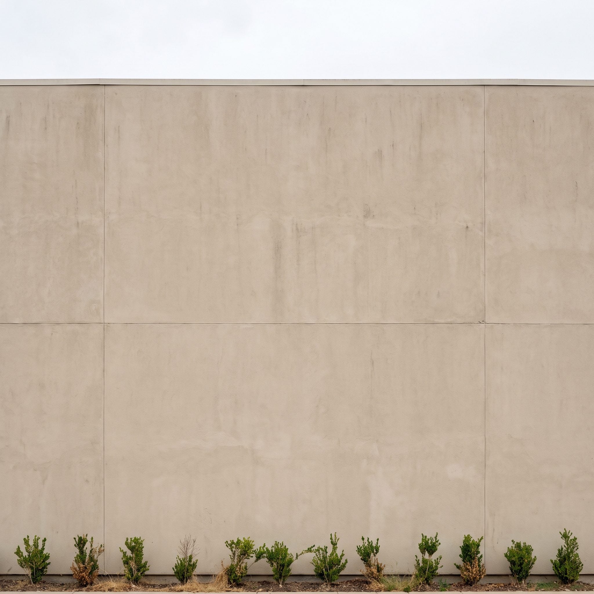
A large blank wall with six knee-high shrubs lined up underneath can make the plants look less like landscaping and more like punctuation somebody forgot to finish.
Big expanses of facade often need some intermediate scale between lawn and roofline: an ornamental tree, a taller shrub group, a broad mass of planting, or another vertical element that breaks down the wall.
The answer is not automatically buying the biggest specimen at the nursery. Mature size still matters. Choose plants that can eventually bridge the scale without spending the next twenty years trying to invade the eaves.
24. A Front Door Standing There With No Backup
🔥 Would you like to save this?
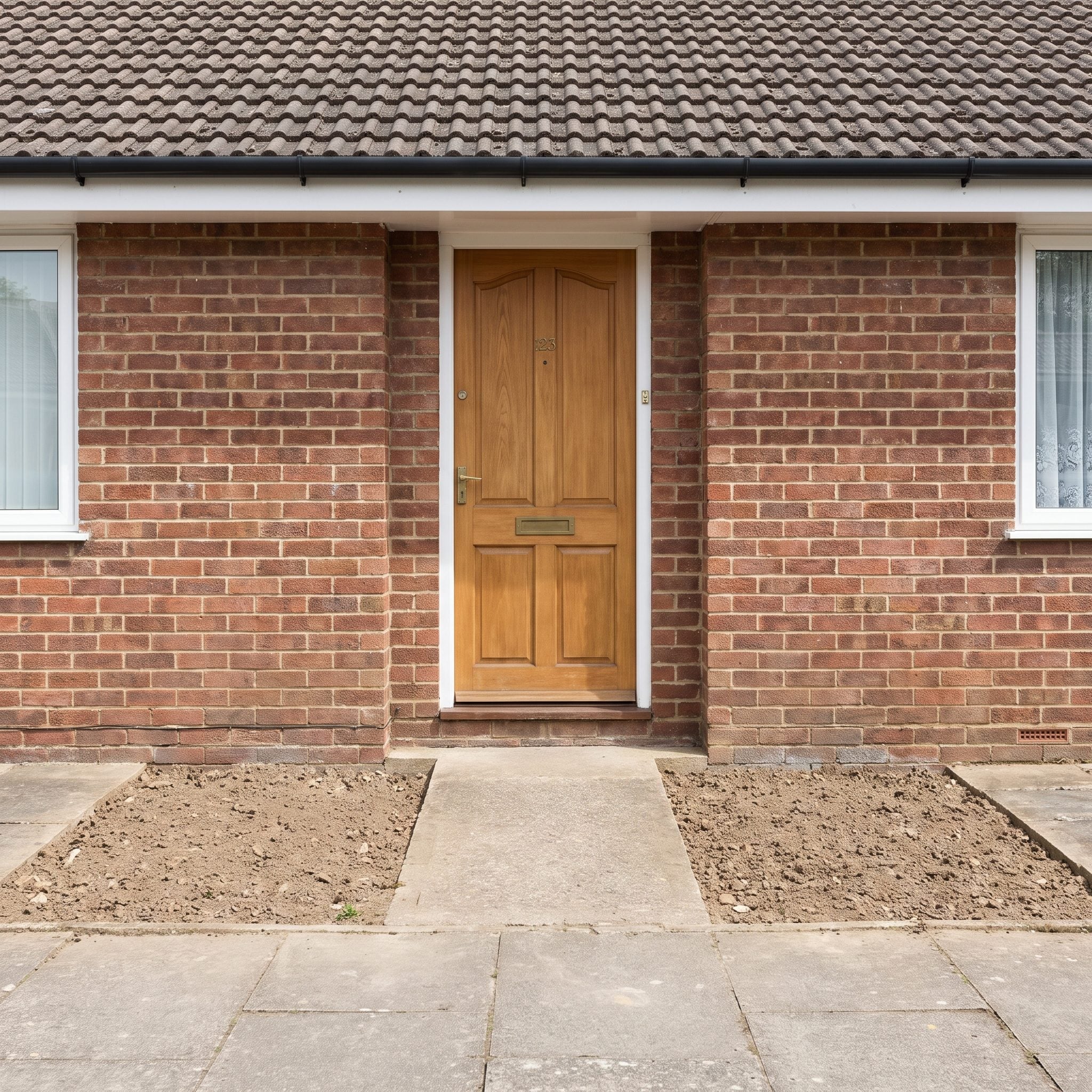
A completely bare entrance can make the door look oddly stranded on the facade. Technically nothing is missing. Visually, something is.
Framing the entry gives the architecture company. A pair of matching containers with a glazed ceramic planter on each side creates immediate emphasis. A flanking shrub, climbing vine, or tall grass in a black metal planter can accomplish the same thing without perfect symmetry.
Paired elements create obvious order, but asymmetry can work just as well when the visual weight balances. The point is not matching twins. The point is giving the entrance enough support to look intentional.
23. The Walkway That Vanishes Into the Lawn
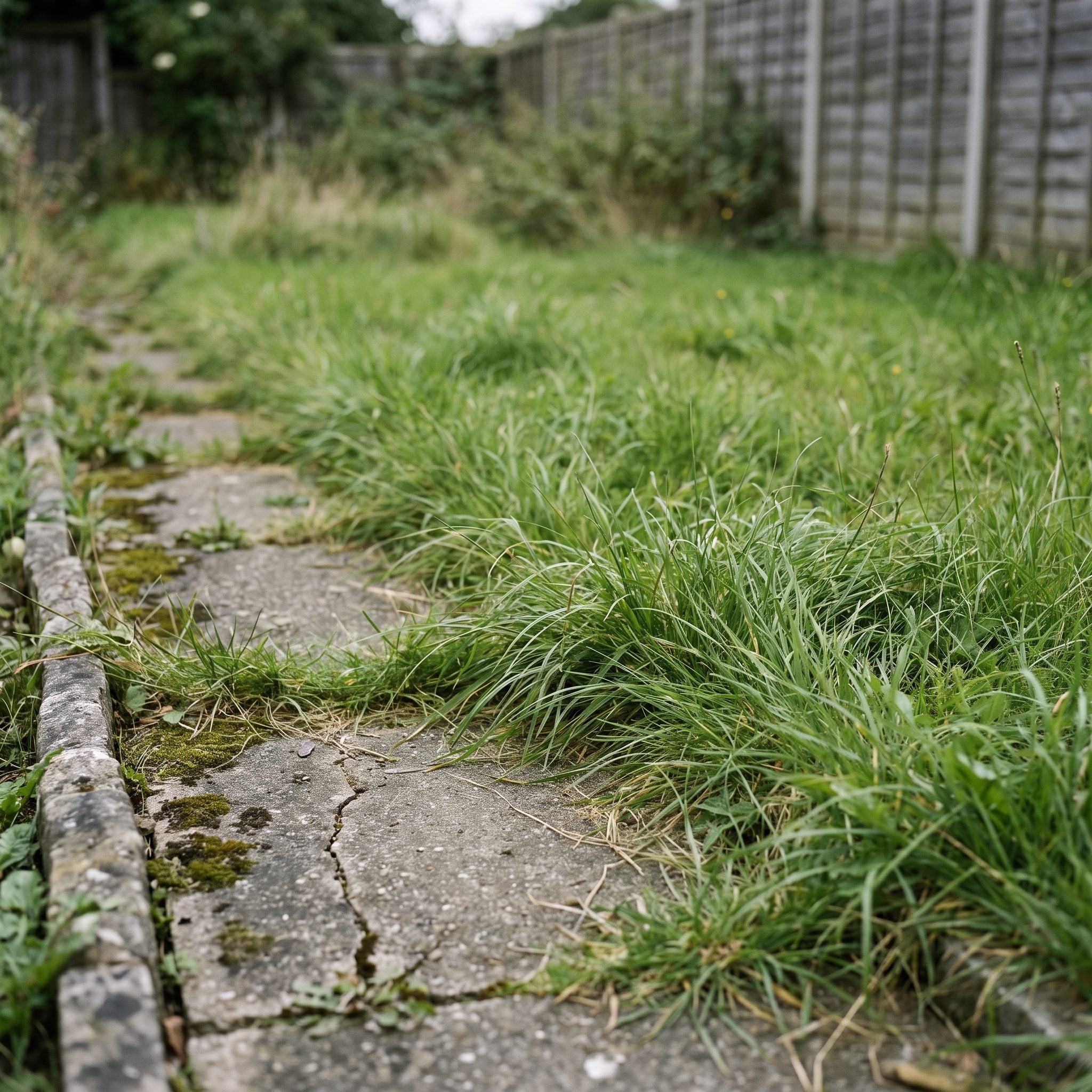
A walkway should feel like a route with a destination, not a strip of concrete apologizing for crossing the grass. When turf melts directly into both edges and nothing reinforces the approach, the path can lose visual authority long before it reaches the door.
A defined edge can change that quickly. Low planting, a crisp cut in the turf, gravel, brick, or another repeated material gives the walk a visible boundary and makes the route easier to read.
22. Shrubs That Have Swallowed the Path to Your Own Front Door
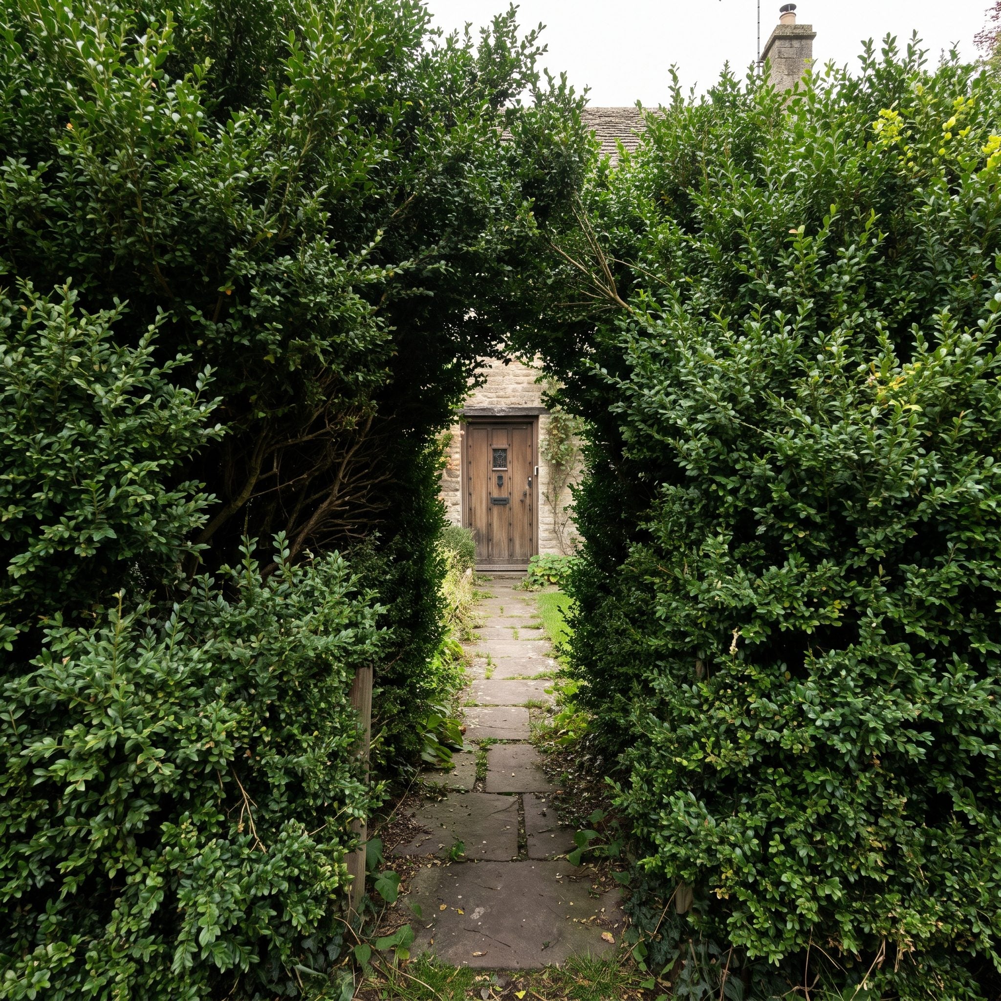
There is lush, and then there is having to turn sideways because the hydrangea has annexed half the walkway. Once planting spills far enough into circulation space, the entry stops feeling generous and starts feeling improvised.
Overgrowth also changes scale. A broad walk suddenly looks narrow. Steps feel smaller. The whole approach compresses before the visitor even reaches the porch.
Restore comfortable clearance based on the width of the path and the mature habit of the plant. Some shrubs can be reduced selectively; others may need moving or replacing if repeated cutting destroys their natural form.
21. Foundation Beds So Skinny They Look Regretted
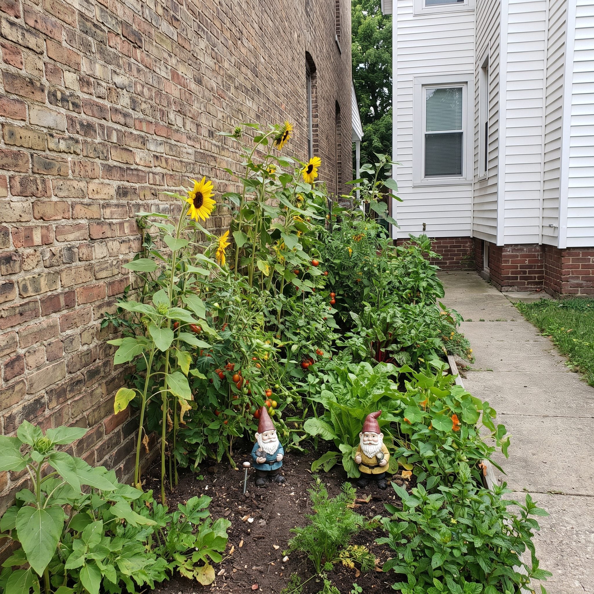
A narrow ribbon of mulch pressed against a large house gives the plants nowhere to go except into a single row. No layering, no depth, no foreground — just shrubs standing against the wall like they have been called into the principal’s office.
Broader beds create options. On many properties, several feet of depth is enough to stagger plants front to back, but there is no magic universal dimension. Mature plant size, drainage, maintenance access, and house scale all matter.
The same challenge appears in a narrow attic design: limited depth makes every inch work harder. Outside, widening a bed even modestly can change the composition from a line into a landscape.
20. Shrubs Pruned Into Lollipops and Cardboard Boxes
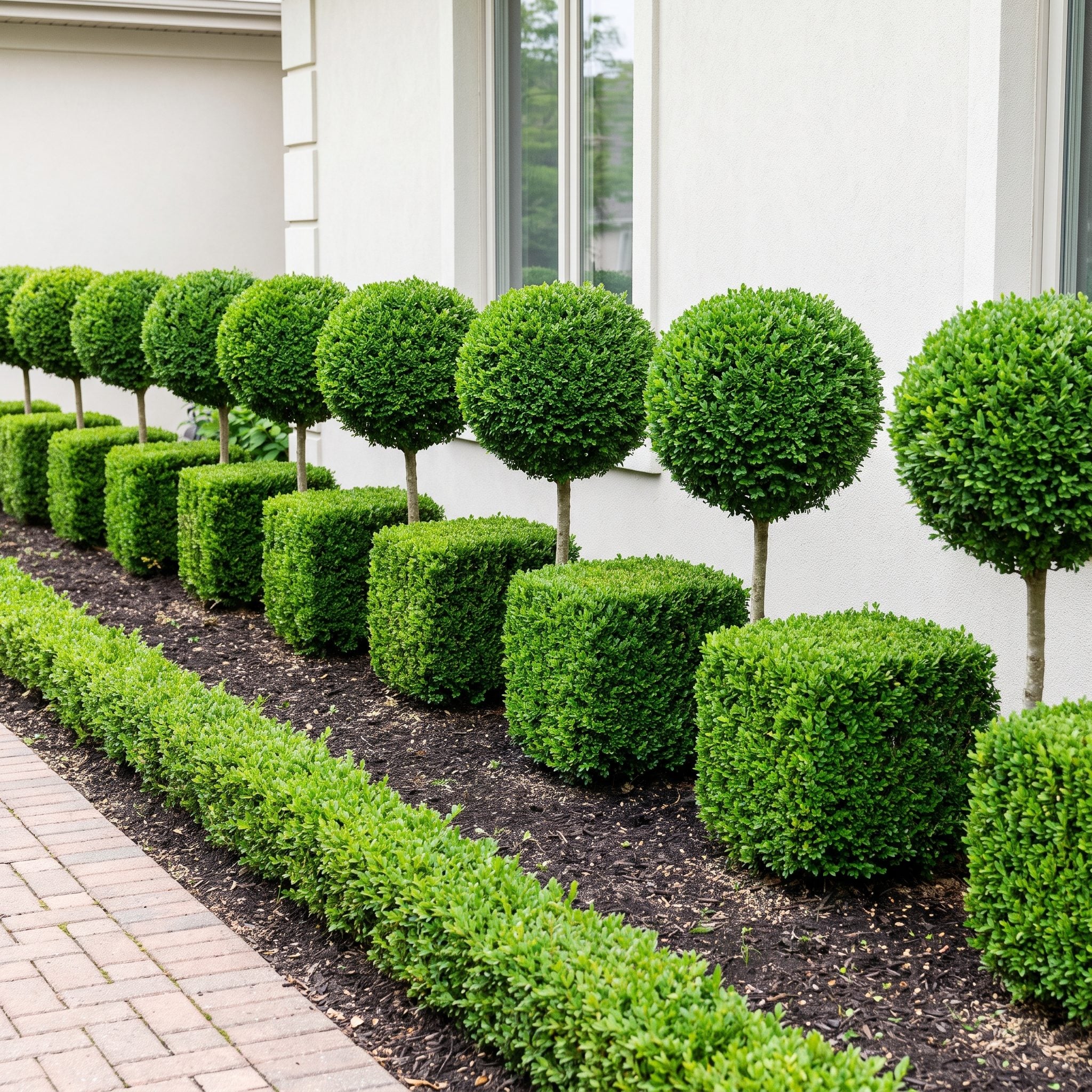
Somewhere along the line, routine maintenance convinced half the suburbs that every shrub secretly wanted to become a meatball. Balls, cubes, gumdrops, little green ottomans — an entire yard of plants forced into shapes unrelated to how they actually grow.
Repeated surface shearing can create very dense outer growth while shading the interior, particularly on shrubs maintained this way year after year. That does not make formal clipping inherently wrong. Boxwood hedges, topiary, and architectural forms can be spectacular when the species and design actually support them.
The problem is indiscriminate shearing. A shrub selected for loose branching rarely improves when sculpted into a basketball. Let the maintenance style belong to the plant and the garden around it.
19. Oceans of Mulch and Barely Any Actual Plants
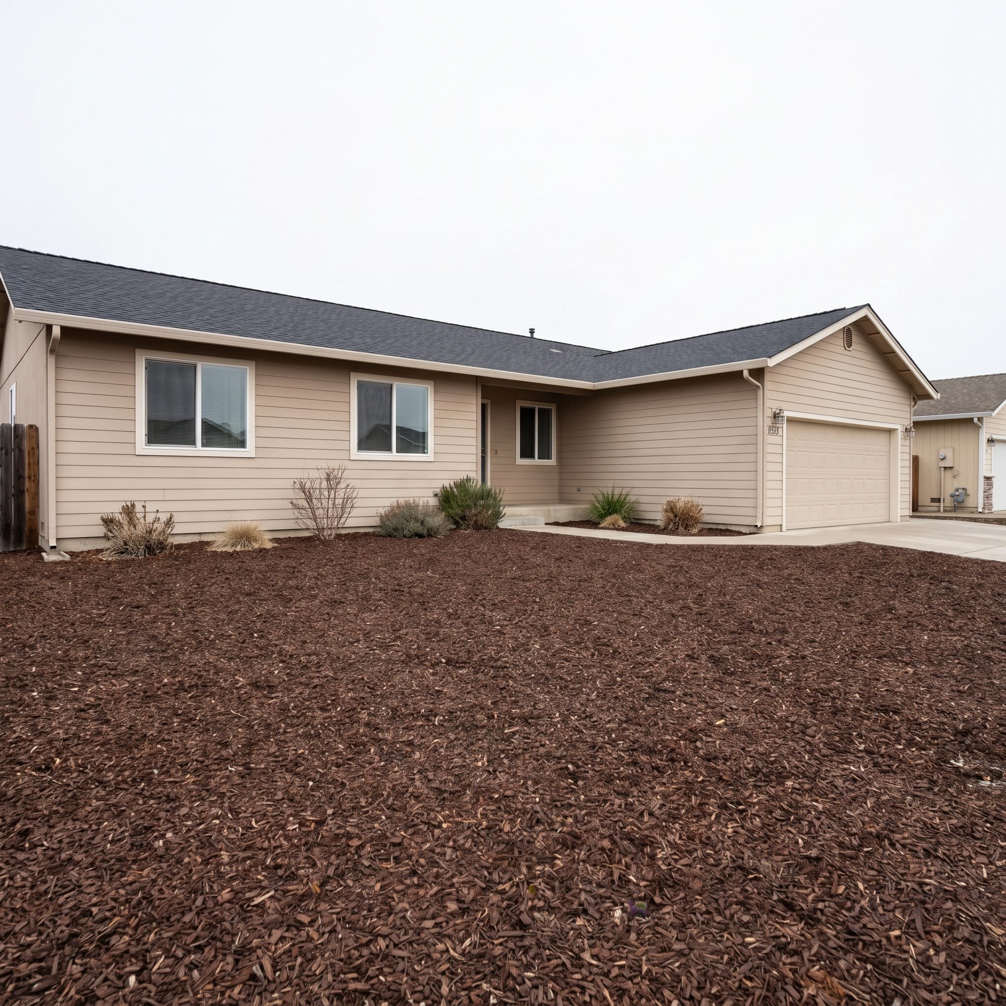
Mulch is a supporting actor that keeps getting promoted to lead. When ninety percent of the bed is brown and the remaining ten percent consists of lonely shrubs floating six feet apart, the landscape looks like it is waiting for the second half of the installation.
Plant for eventual coverage. As shrubs and perennials mature, overlapping foliage reduces the amount of exposed soil and can suppress many weeds by limiting light and available space. The mulch can then return to its actual job beneath the planting.
The same low-effort logic behind a good boho pantry design applies here: fill the useful space with things earning their place rather than making the empty background do all the work.
18. The Patches of Bare Dirt That Say ‘I Ran Out of Money’
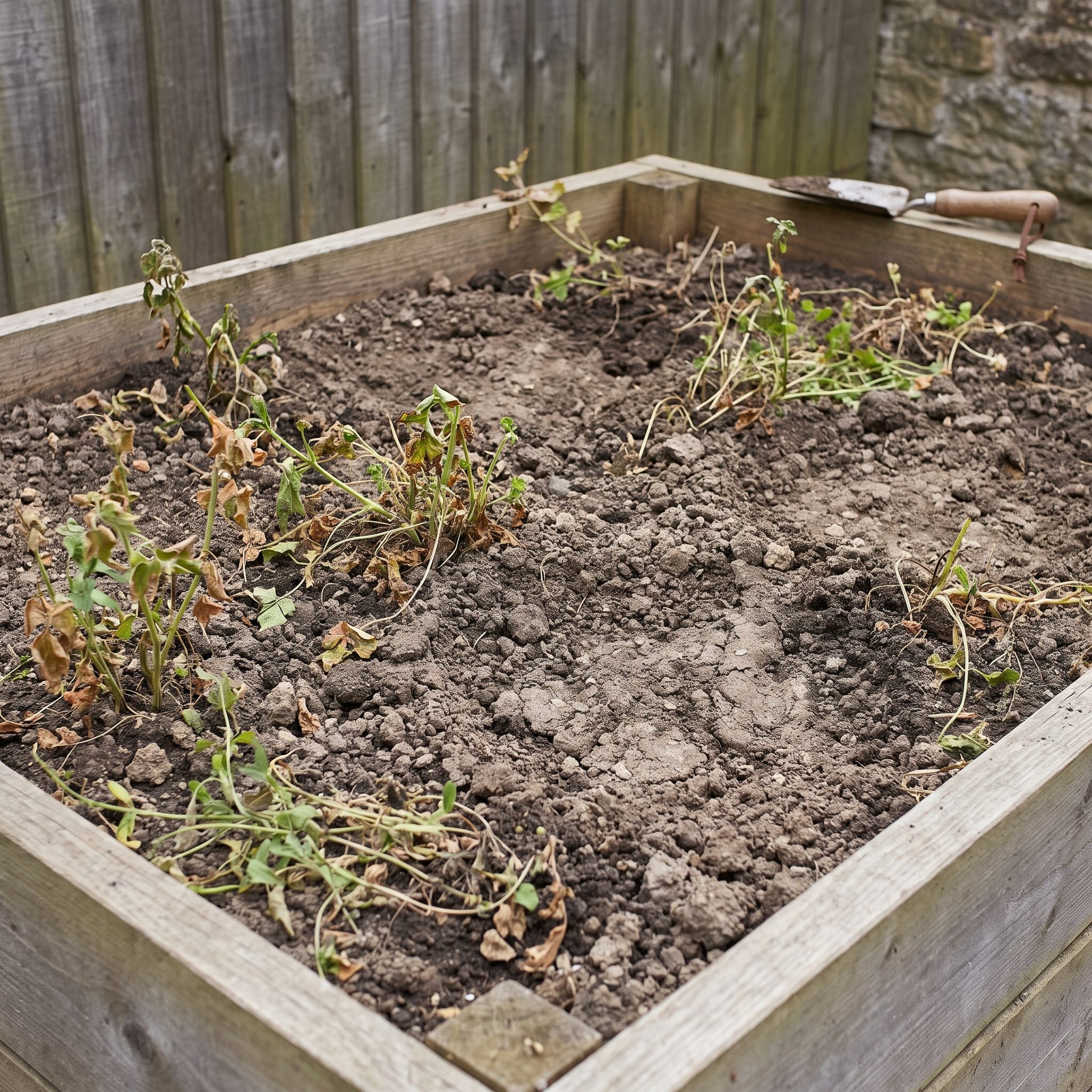
Bare soil between young plants makes the eye land on what is missing instead of what is growing. Even a perfectly legitimate new planting can look unfinished simply because the ground plane has not been visually resolved.
A layer of shredded bark or another appropriate mulch ties the bed together while plants establish. It also helps conserve soil moisture and suppress many germinating weeds.
Dark mulch around green foliage works like a quiet frame around a photograph: it recedes so the thing inside it can do the talking.
17. The Empty Gap Where a Plant Used to Live
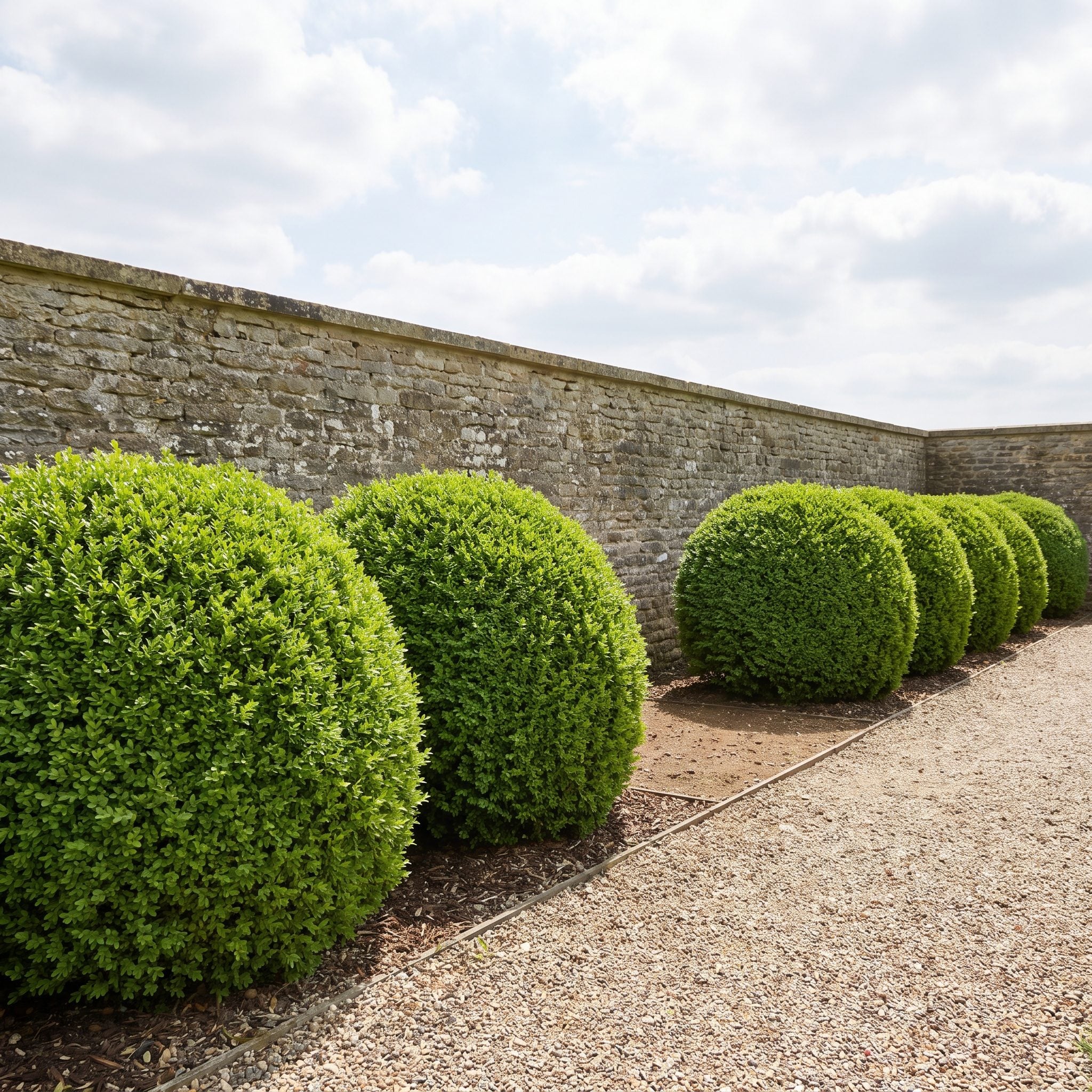
A shrub dies, somebody removes it, life gets busy, and suddenly a carefully repeated row has a hole punched straight through the rhythm.
Gaps are different from general sparseness because the eye can often tell something used to be there. One missing plant in a sequence behaves like a skipped beat in a song.
Fill it permanently or temporarily. Repeat a plant already thriving nearby, use an ornamental grass with similar mass, or place a shapely container there until the long-term answer is ready. A well-considered gray entryway design can lose its rhythm surprisingly fast when the planting framing it starts dropping notes.
16. When the Weeds Are Winning the Popularity Contest
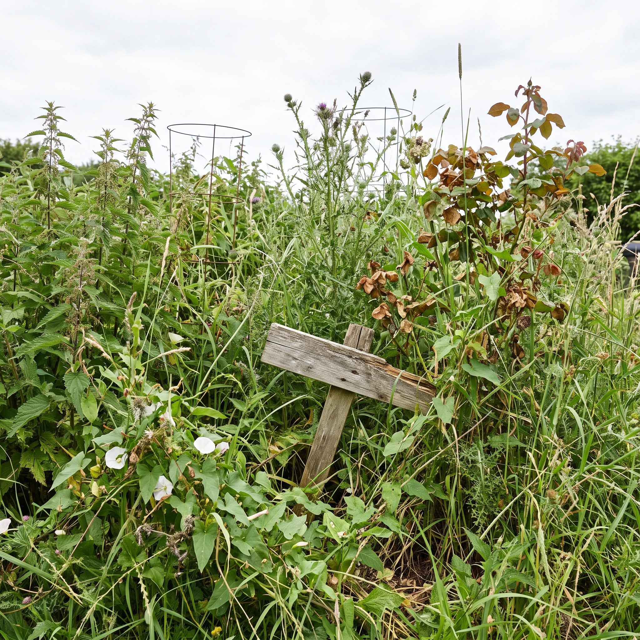
There is a tipping point where a garden with weeds becomes weeds with a few ornamental plants trapped inside. Once volunteer growth is taller, denser, and more visually dominant than the species you actually selected, the composition has changed whether you intended it or not.
Remove weeds before they seed when possible, then cover exposed soil. Organic mulch suppresses many annual weed seedlings, although persistent perennial weeds can still push through and need direct removal.
Dense planting helps too. Nature hates a vacuum, and bare ground rarely stays bare out of politeness.
15. The Dying Plant You’ve Stopped Seeing but Everyone Else Still Does
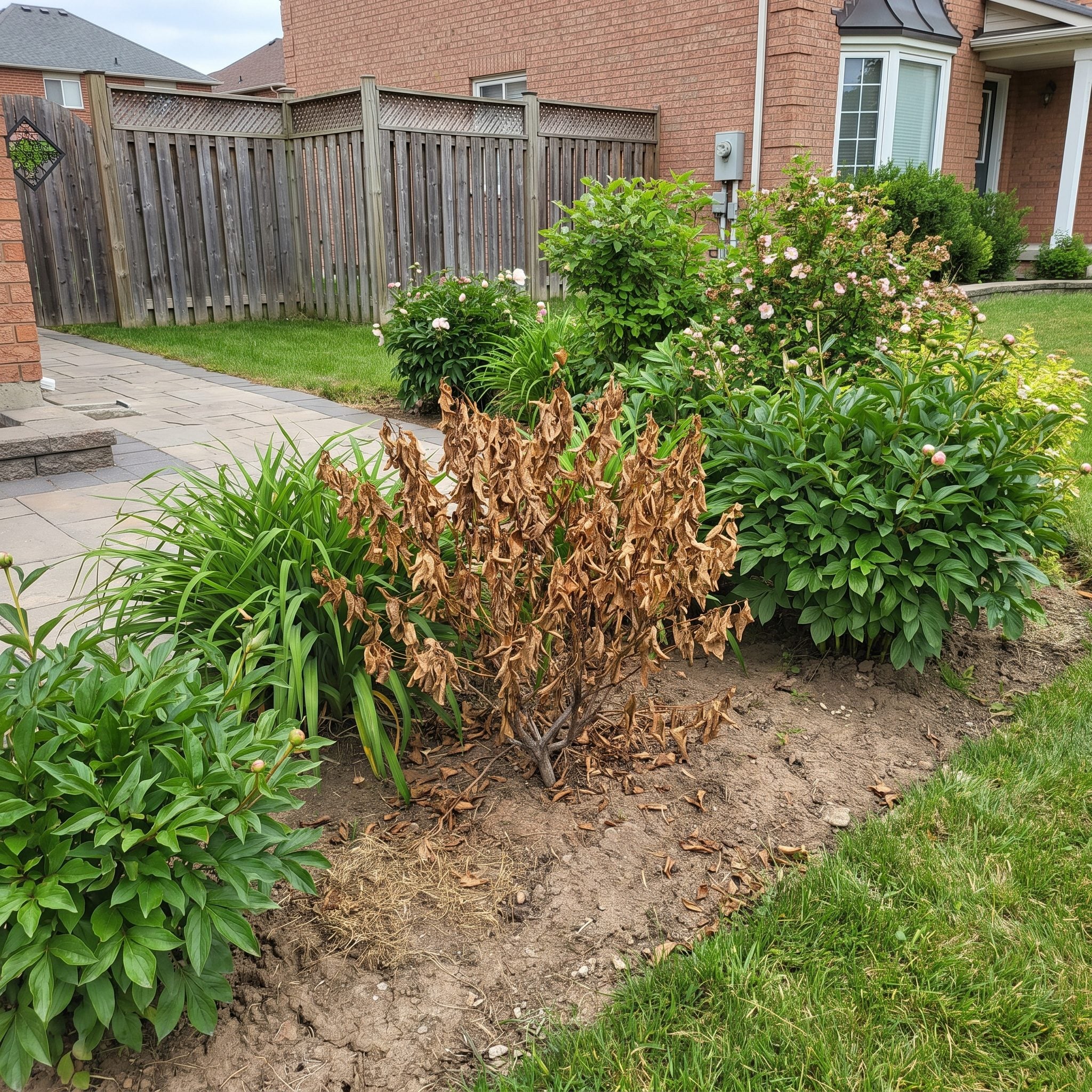
You pass it every morning, so eventually your brain files it under permanent scenery. Visitors do not have that luxury. One dead or badly declining plant pulls attention with almost comic efficiency.
Be realistic about what is recoverable. A shrub with localized dieback may respond to correct pruning and improved care. A plant that has remained leafless through an entire growing season deserves a much less sentimental evaluation.
One casualty should not be allowed to become the visual mascot for the whole front yard.
14. The Landscape Fabric Peeking Through Like a Bad Slip
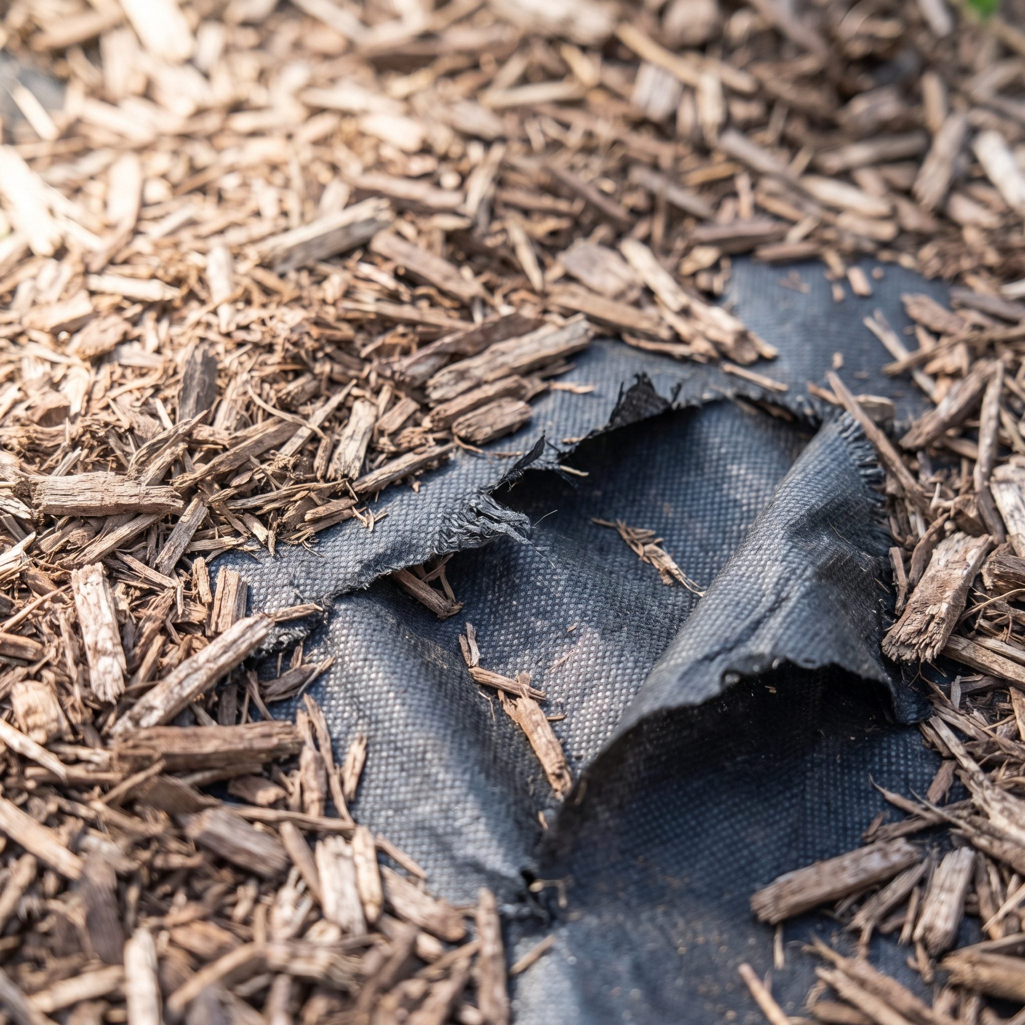
Nothing announces an aging installation faster than a strip of black landscape fabric curling through the mulch. What was supposed to disappear beneath the bed has become the most visible thing in it.
Fabric can be useful in some applications, but ornamental beds change over time. Mulch decomposes, weeds root into material above the fabric, plants spread, and edges eventually surface.
If the fabric is still performing a useful job, cover exposed areas properly. If the installation has become a long-term maintenance nuisance, removal may make more sense than repeatedly disguising it.
13. Mulch Volcanoes Slowly Killing Your Trees
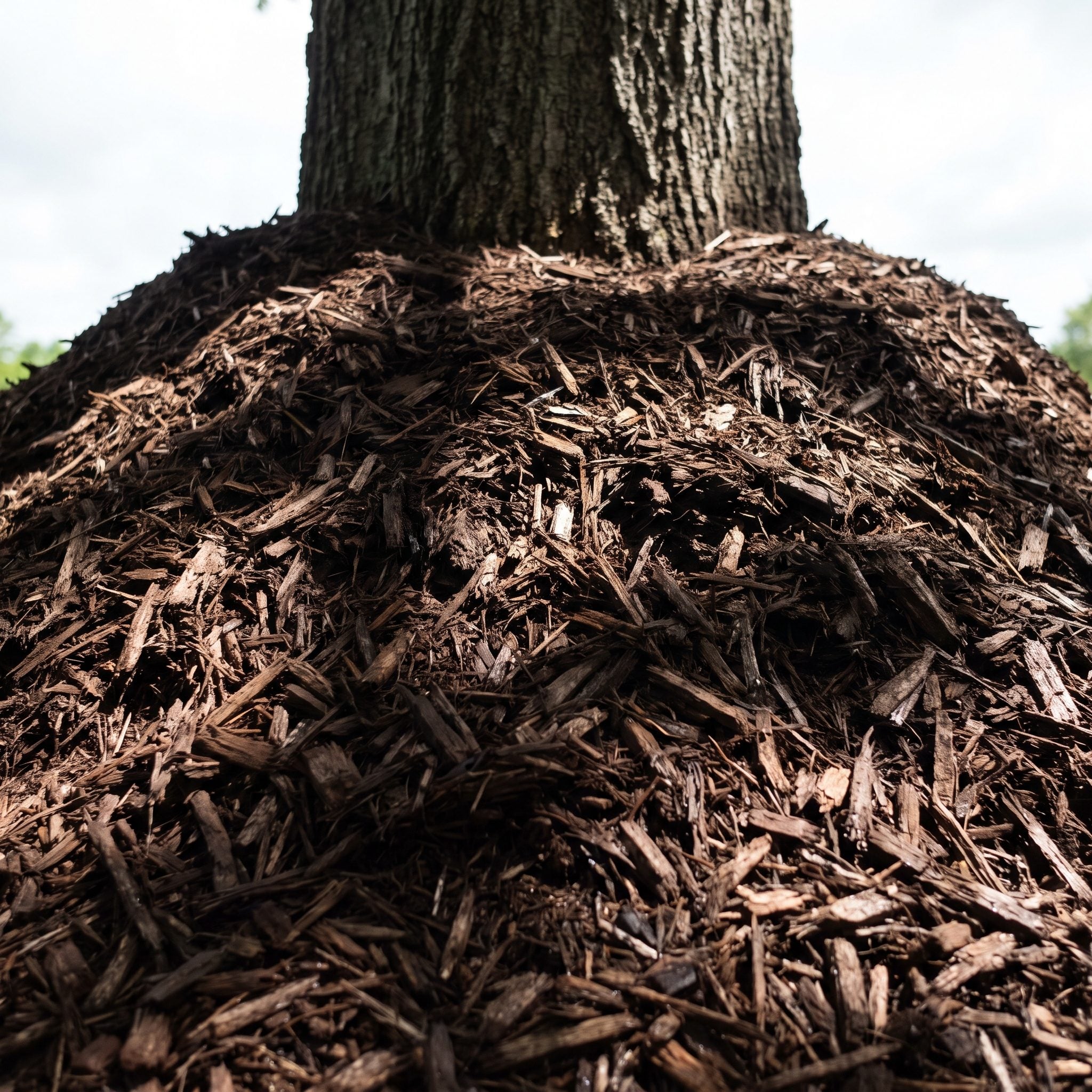
The mulch volcano is landscaping’s strangest recurring ritual: buy a tree, then bury the exact part of the trunk that should remain exposed beneath a decorative brown cone.
Mulch piled against bark holds moisture where the trunk is not designed to stay constantly damp and can contribute to decay, pest problems, and poor root development.
Trees want a broad, relatively flat mulch ring. Keep the root flare visible, maintain a modest mulch depth, and pull the material back from direct contact with the trunk. Doughnut, not volcano.
12. The Thin, Patchy Lawn Announcing Itself Before Anything Else
🔥 Would you like to save this?
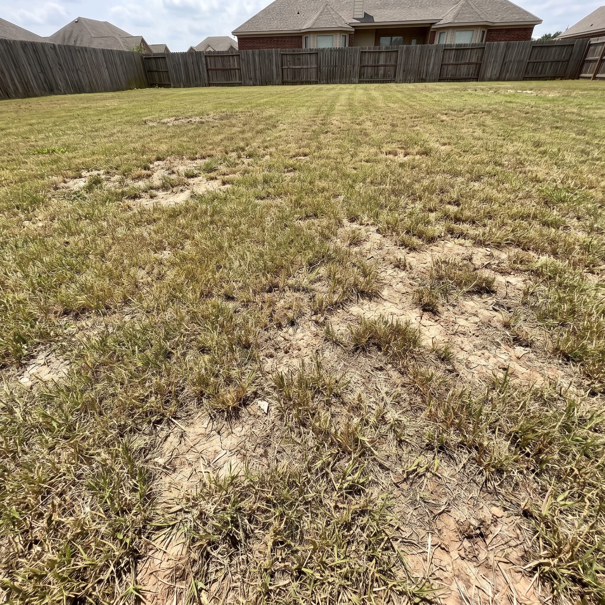
The lawn is often the largest uninterrupted surface in the front yard, which gives every bald patch an unfair amount of screen time. Healthy beds and a beautiful porch can only distract so much when the foreground looks exhausted.
Compaction, shade, irrigation problems, disease, wear, and unsuitable turf can all contribute. Core aeration and overseeding are useful for many cool-season lawns when timed appropriately, but warm-season turf follows a different calendar.
If one corner never receives enough sun to support the grass you keep reseeding, stop negotiating with it. A shade-tolerant groundcover or different surface may be the better design decision.
11. Grass Marching Into the Garden Beds Like It Owns the Place
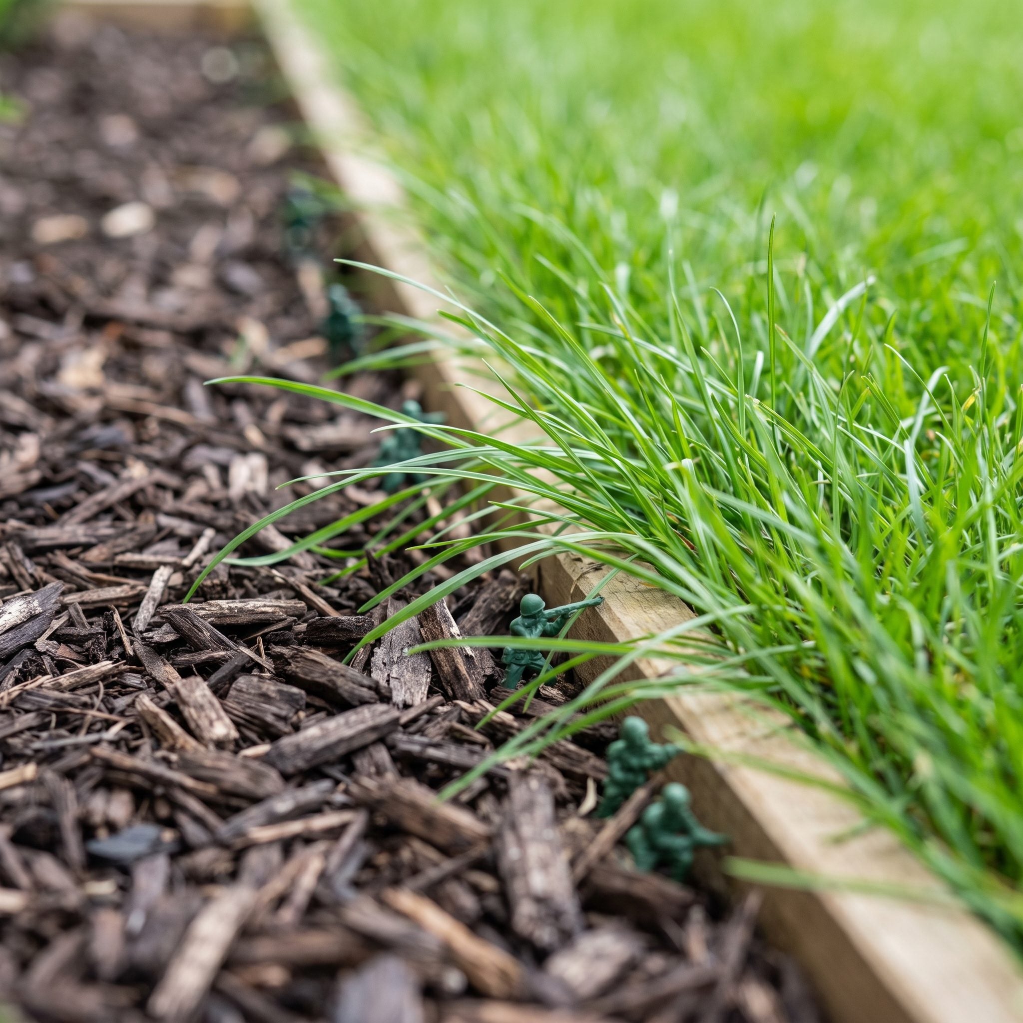
A beautifully planted bed can lose half its authority when turf starts advancing through the mulch in little green fingers. The plants have not changed. The boundary has.
Cut a clean spade edge between lawn and bed and the composition suddenly becomes legible again. Steel or aluminum edging can hold the separation longer where constant recutting is not appealing.
10. Bed Edges That Wobble Like a Bad Haircut
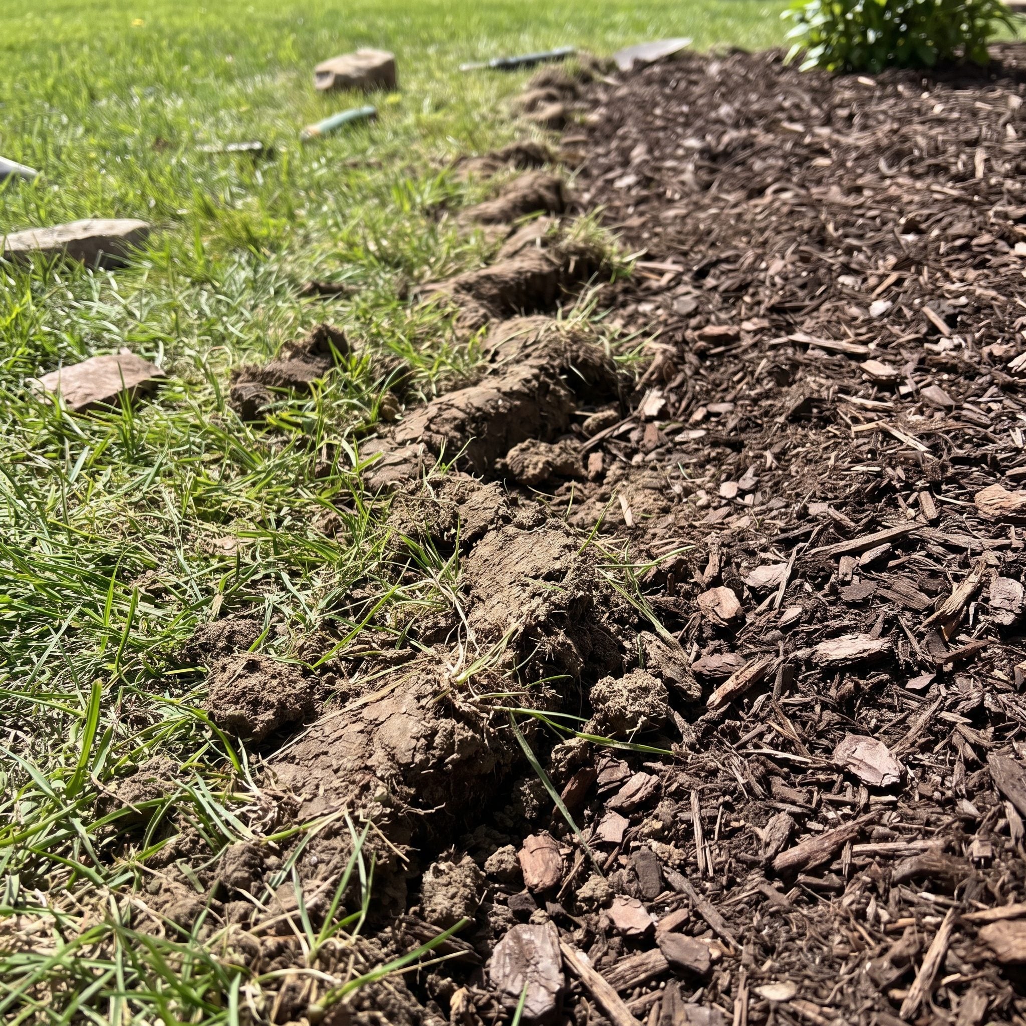
The bed edge is the frame around the planting. A strong curve or crisp straight line makes almost everything inside it look more considered. A hesitant wiggle through the lawn makes even expensive plant material feel accidental.
This is about geometry rather than turf invasion. Decide what the line is trying to do, then commit to it. A clean spade-cut trench can be enough; brick, stone, steel, and other permanent edging are optional.
Few landscape fixes deliver more visual change with less material.
9. Plenty of Plants, Zero Plan
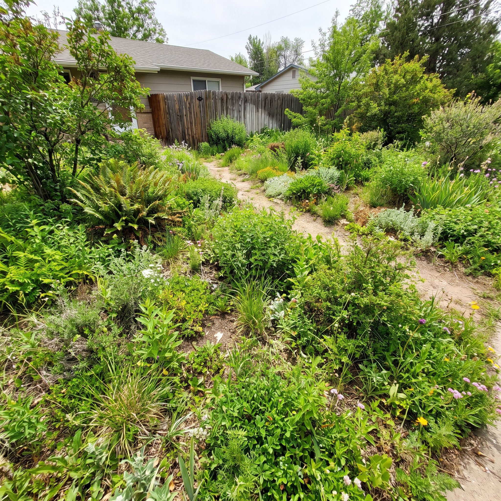
This yard is not sparse and it is not unhealthy. It is structurally homeless. Beds appear without relating to the facade, tall plants block circulation, focal points compete, and individual groups behave as though they were designed in separate meetings.
This is different from owning too many species. You could plant only four varieties and still arrange them badly. The missing ingredient is the underlying framework: bed geometry, circulation, scale, sightlines, hierarchy, and the relationship to the house.
Good design starts with bones. Plants are what you hang on them.
8. The One-Week Wonder: A Yard That Only Shows Up for Its Big Bloom
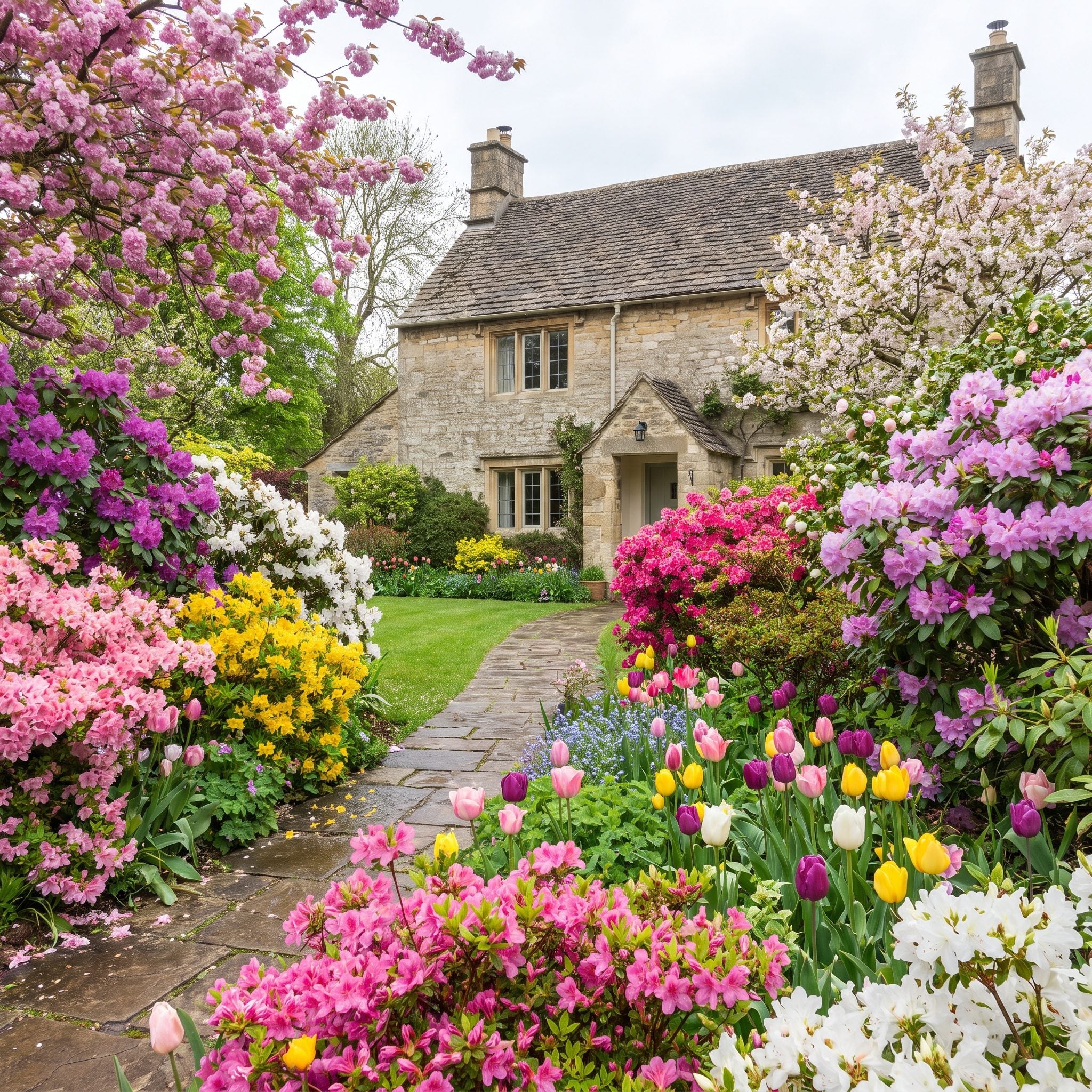
For ten glorious days every spring, this yard stops traffic. Then the blossoms drop and the entire landscape seems to spend the next eleven months remembering what happened.
Seasonal succession gives the garden more than one peak. Spring flowers hand the job to summer foliage, late bloomers, fall color, seed heads, bark, ornamental grasses, and whatever remains interesting after frost.
The same logic that keeps a tropical patio design visually active applies at the curb: do not spend the whole annual budget of drama in one week.
7. The Landscape That Vanishes the Second Winter Arrives
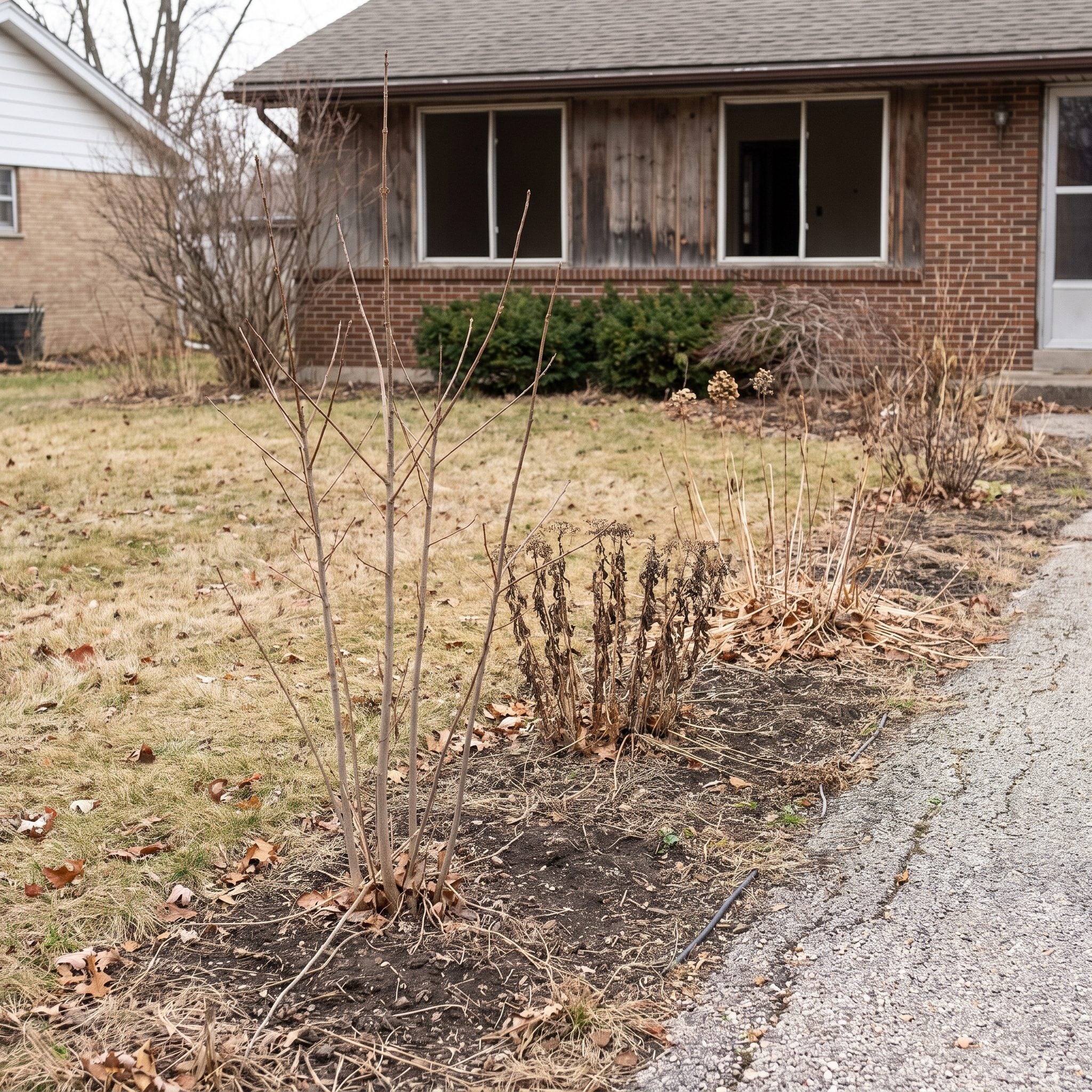
A garden does not need to stay green all winter to stay interesting. Bare branches, bark, seed heads, grasses, stone, and strong bed geometry can all carry a dormant-season landscape beautifully.
The problem comes when every element that supplied mass in summer disappears at once. A few well-placed evergreens, broadleaf evergreens, conifers, or other persistent forms can hold the composition together while deciduous material rests.
There is no magic percentage. What matters is whether something still has presence when the flowers clock out.
6. When Nothing Points You Toward the Front Door
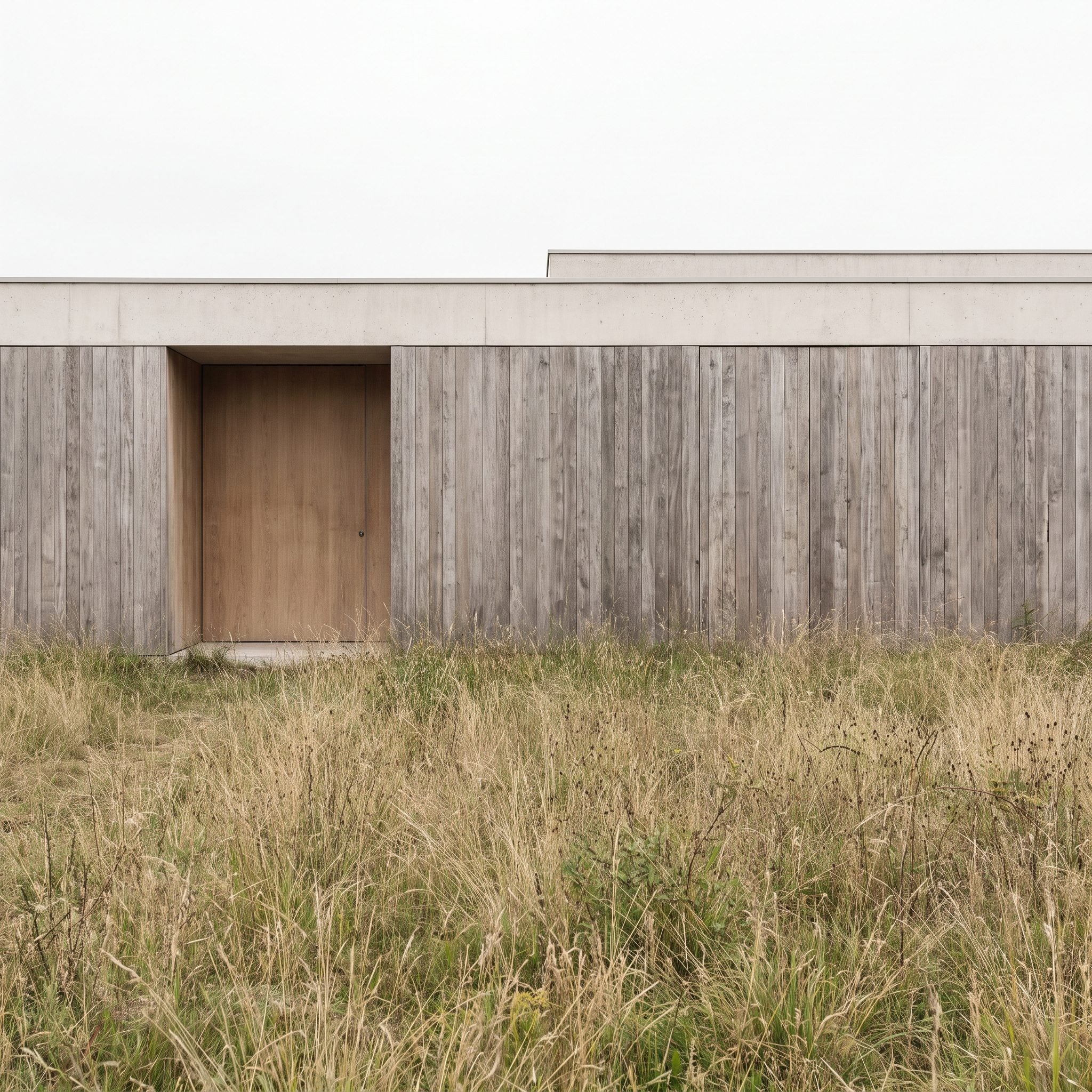
Good front-yard design contains a little wayfinding. The eye should be able to understand where arrival happens before the feet have to solve the puzzle.
Planting can help: larger masses at outer edges, lower material near the entry, repeated containers, a clear path, lighting, or a strong door color can all pull attention inward. There is no single funnel formula.
A gray entryway design becomes much stronger when the surrounding landscape participates in the introduction rather than staring off in another direction.
Stand at the street and ask one question: where is this yard sending me?
5. The Front Walk That’s Losing a Fight With Your Own Flower Beds
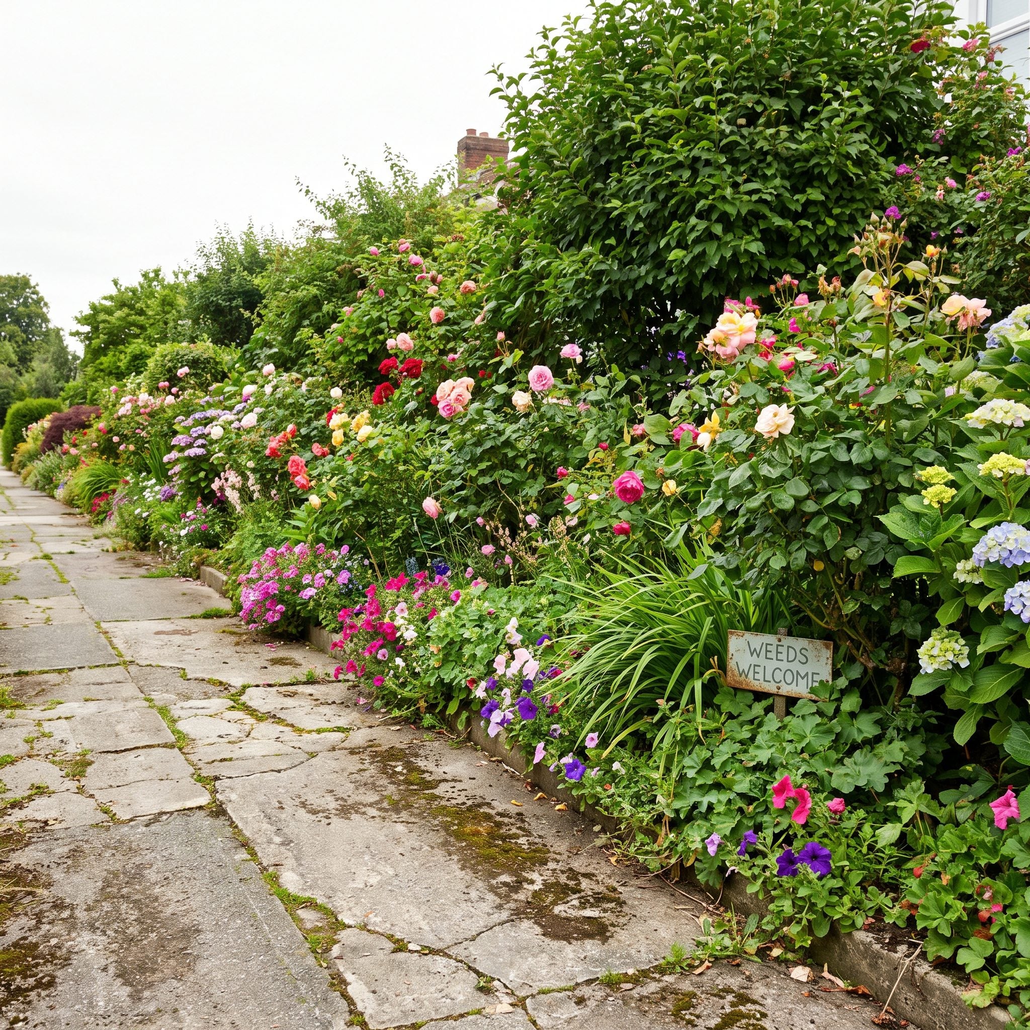
Healthy planting can make a tired walkway look worse simply by raising the standard around it. Fresh foliage beside stained concrete, moss-filled joints, or neglected cracks turns the hardscape into the weak link.
Basic cleaning and appropriate crack repair can make a surprising difference. Pressure washing should be done with enough restraint that the cure does not etch the concrete or damage joints.
People spend plenty on gray entryway design while forgetting that every visitor reaches it over the ground plane first. If the existing slab is seriously deteriorated, resurfacing or overlay systems need to account for drainage, thresholds, and the condition of what is underneath rather than simply hiding the problem.
4. Driveway Edges That Trail Off Into a Ragged Mess of Weeds and Gravel
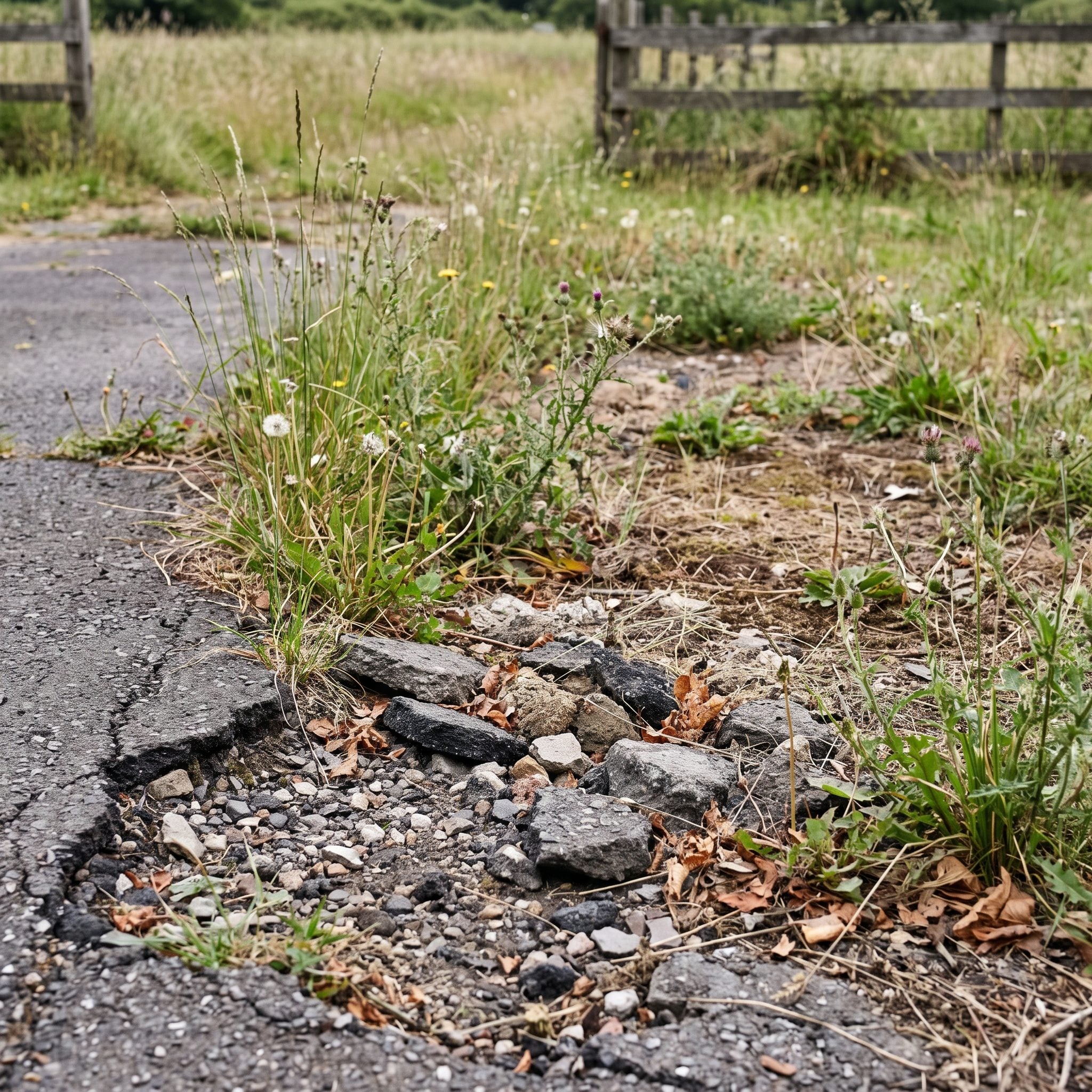
Driveways are so utilitarian that their edges become almost invisible — until those edges dissolve into weeds, loose gravel, broken turf, and three different ideas about where the pavement ends.
A clear transition makes the whole surface look more finished. Steel edging, brick, stone, a soldier course, or simply a clean turf line can give an ordinary driveway far more composure.
3. The Trash Cans, Coiled Hoses, and Gear You’ve Stopped Noticing (Everyone Else Hasn’t)
🔥 Would you like to save this?
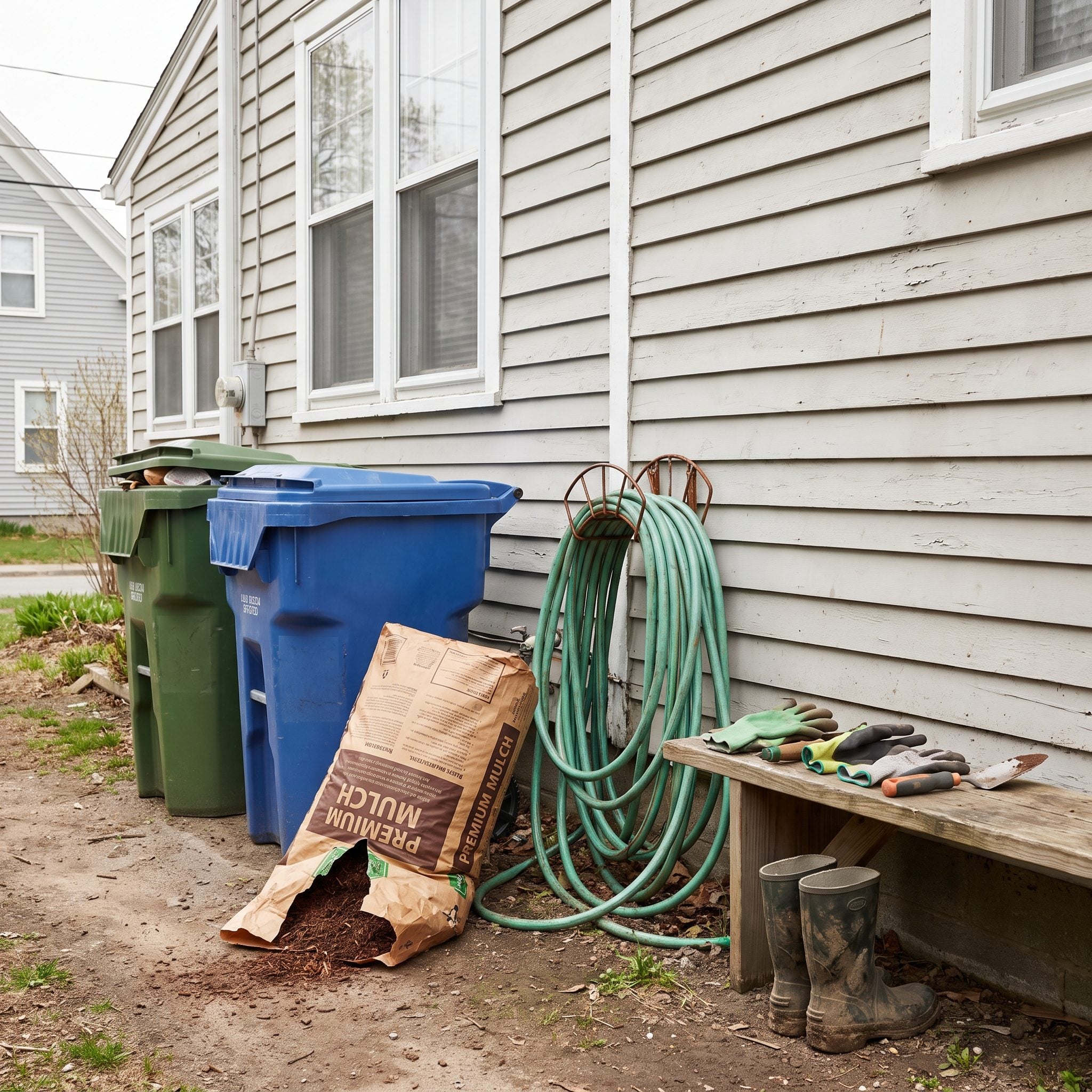
Utility clutter has a remarkable talent for becoming invisible to the person who lives with it. Bins beside the garage. A hose in a green knot. Three empty pots. The open bag of mulch that has technically been “temporary” since April.
None of this requires an expensive landscape redesign. A simple screen can hide bins. A wall-mounted reel gets the hose off the ground. Leftover materials can leave the front yard entirely.
The plants may already be doing their jobs. Sometimes the biggest improvement is removing the objects that have been photobombing them.
2. Landscape Lighting That Looks Like It Was Installed in the Dark
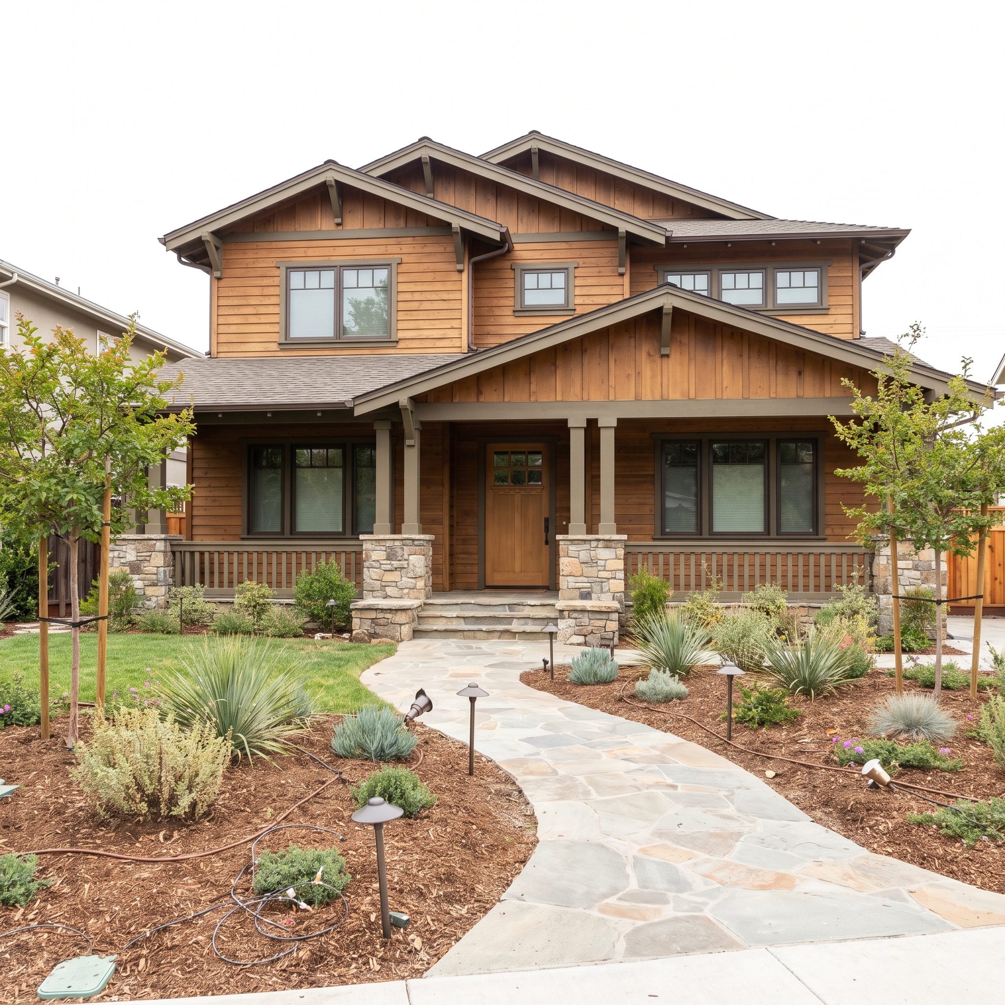
Bad lighting is louder than no lighting at all. A path light leaning sideways. A flood aimed directly toward the street. One tree lit like a crime scene while everything beside it disappears into black.
Good landscape lighting usually makes the subject visible while letting the hardware disappear. The eye notices texture on stone, branching in a canopy, the edge of a path, or a soft wash across the facade rather than staring into the bulb.
Aim fixtures carefully, avoid unnecessary glare, and let pools of light overlap enough that movement through the yard remains legible. And level the crooked path lights. Once you see a row of them leaning in six directions, there is no going back.
1. Plantings That Are Quietly Arguing With the House They’re Supposed to Flatter
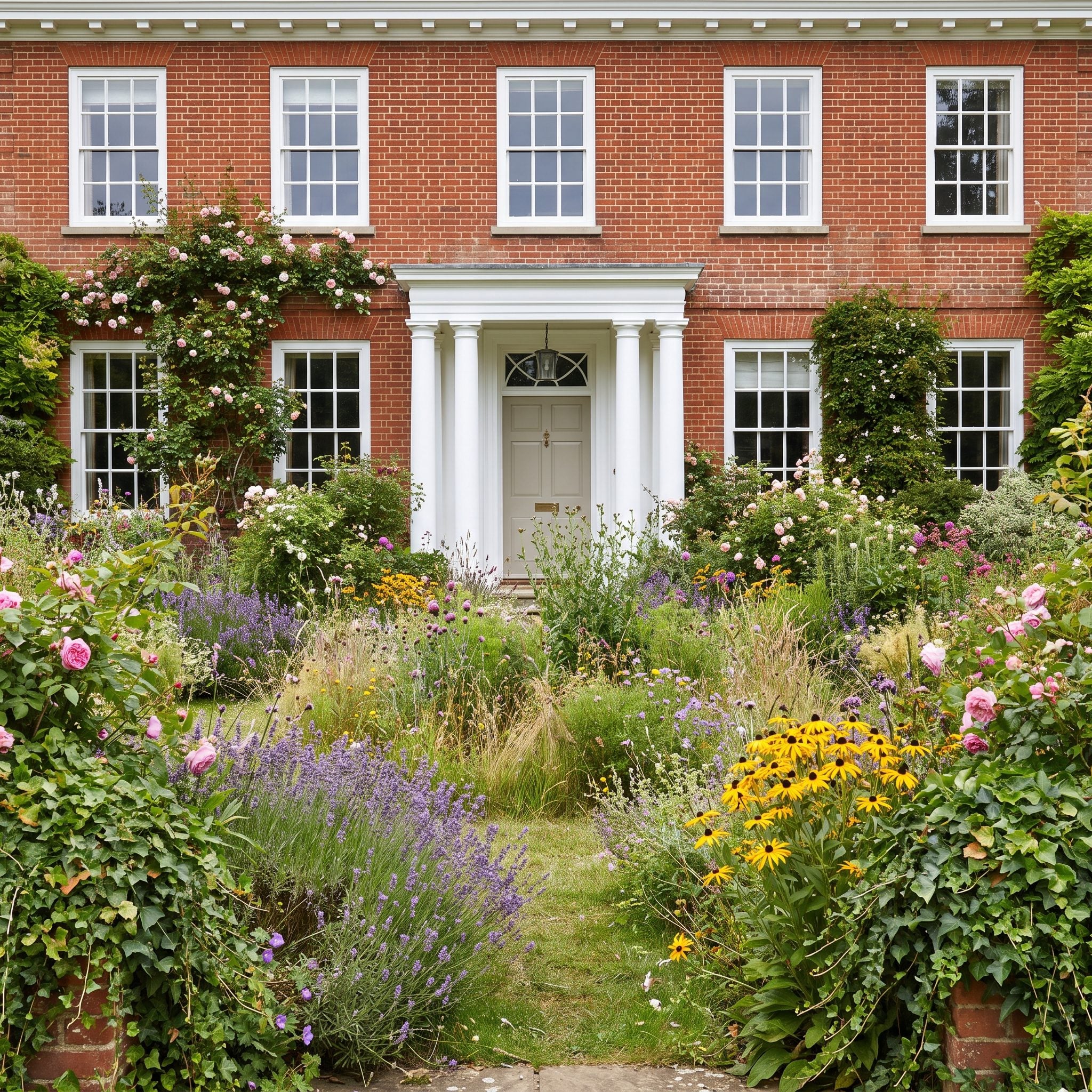
This is where almost every mistake before it finally meets. Scale, shape, repetition, bed geometry, sightlines, color, texture, maintenance — all of it ultimately has to negotiate with the house.
A formal brick Colonial can look terrific with symmetry and clipped structure, but it does not require them. A cottage can carry loose, layered planting beautifully, but it does not have to dissolve into romantic chaos. A modern facade may welcome restrained masses and strong geometry, yet even that rule can be broken intelligently.
The point is not matching a plant list to an architectural label. It is making the greenery and the building feel as though somebody introduced them before the party started. A tall facade needs enough mass around it. A horizontal house needs planting that understands its proportions. Strong windows should stay visible. A beautiful door deserves an approach that knows where it is going.
A crisp modern facade can carry the same disciplined editing you’d bring to a modern kitchen design; a softer house can tolerate more looseness, overlap, and irregularity. What matters is coherence.
The cheapest plant in the nursery can look remarkably expensive when it belongs exactly where it was put. The expensive one can look completely lost when it does not.
Cheap plants in the right style beat expensive plants in the wrong one, every single time.












