
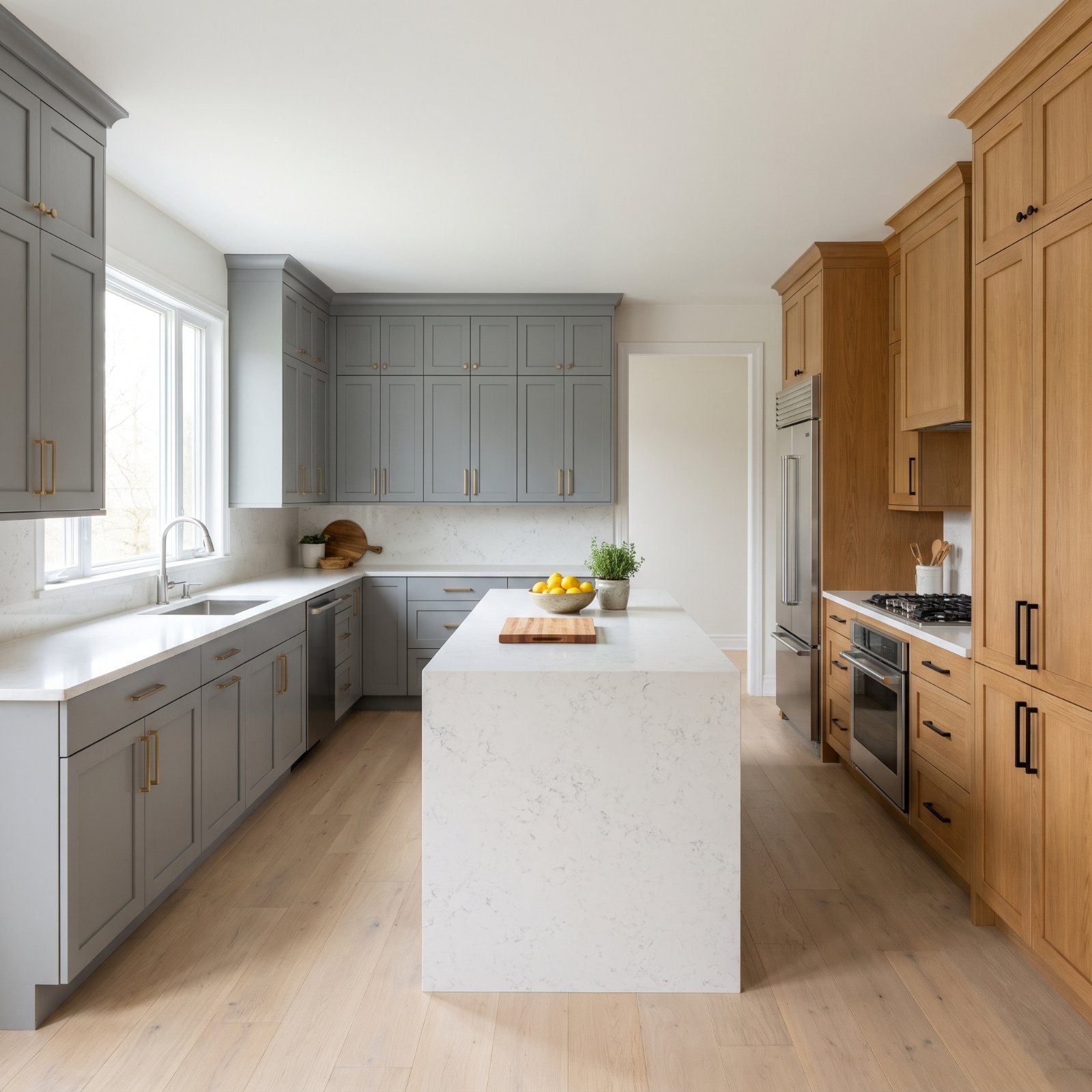
The gray kitchen was everywhere for a solid decade, and now it reads like a time stamp. Buyers have started clocking these finishes the way you spot shoulder pads in an old photo. Nothing wrong with them, exactly. They just say a specific year out loud, and that year is not this one. We walked through the cabinet and countertop choices that sold like crazy and are starting to cool off fast. Each earned its moment. Each is also quietly telling a resale appraiser how long it’s been since the last renovation.
31. The All-Gray Shaker Kitchen That Everyone Built in 2016
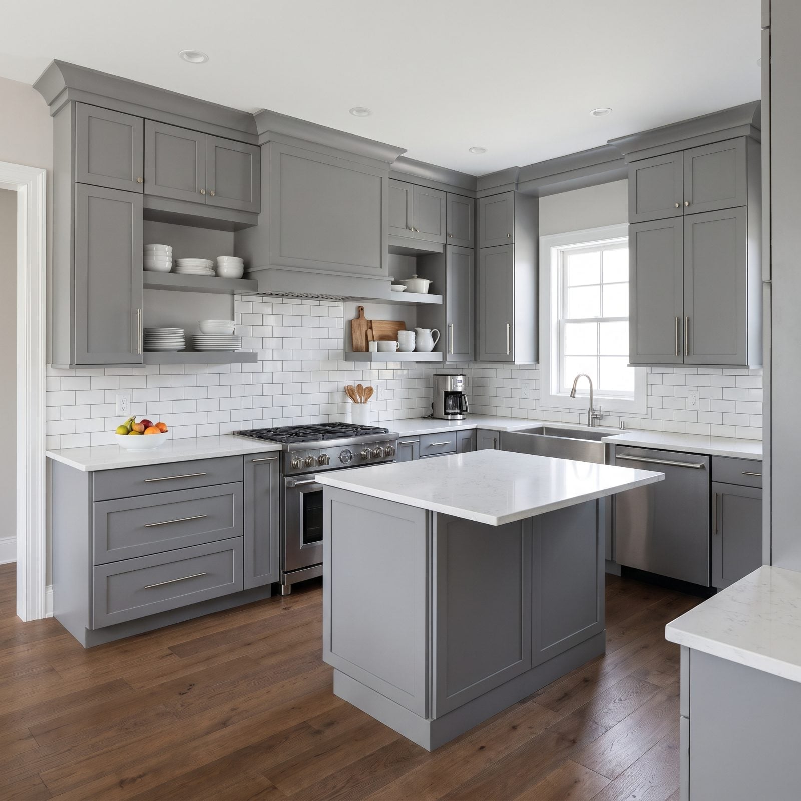
This is the kitchen that launched a thousand Pinterest boards. Gray shaker boxes, white quartz, brushed nickel pulls. For a while it was the safe choice, which is exactly why it now reads as a date stamp rather than a decision.
In order to come up with the very specific design ideas, we create most designs with the assistance of state-of-the-art AI interior design software. Also, assume links that take you off the site are affiliate links such as links to Amazon. this means we may earn a commission if you buy something.
The problem isn’t the cabinets. It’s the coolness. Gray paired with white quartz reads a touch clinical in 2027, when buyers want warmth back in the room, and that slate tone bounces cold light until the whole space feels like a showroom nobody cooks in.
30. Waterfall Islands Running Down Every Side
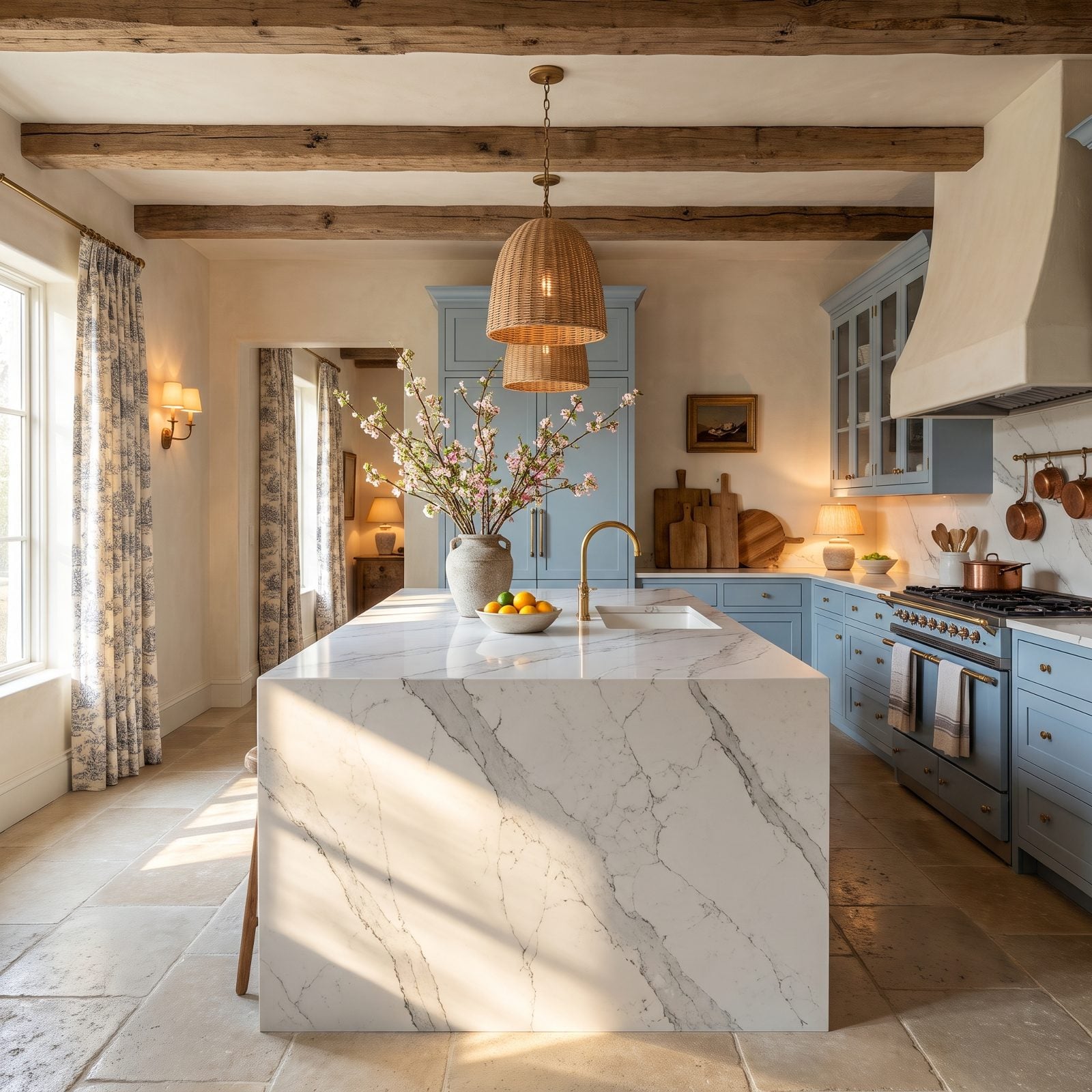
The waterfall edge was the flex. That sheet of quartz pouring over the island side told everyone you spent money, and for years that was the point.
Now it’s starting to feel like a party trick everyone knows. When a feature shows up in every builder spec home, it stops reading as custom and starts reading as formula, and designers expect buyers in 2027 to glance at the waterfall and mentally subtract a few years. The detail also eats stone, so a repair or a change costs more than a standard edge ever would.
What Our Readers Say
- When we asked Home Stratosphere readers which countertop they’d pick, quartz led with 47%, ahead of butcher block at 21%, granite at 19%, and marble or marble look at 13%.
From Home Stratosphere reader polls and votes.
29. Orange Honey Oak, Back From the ’90s and Not in a Good Way
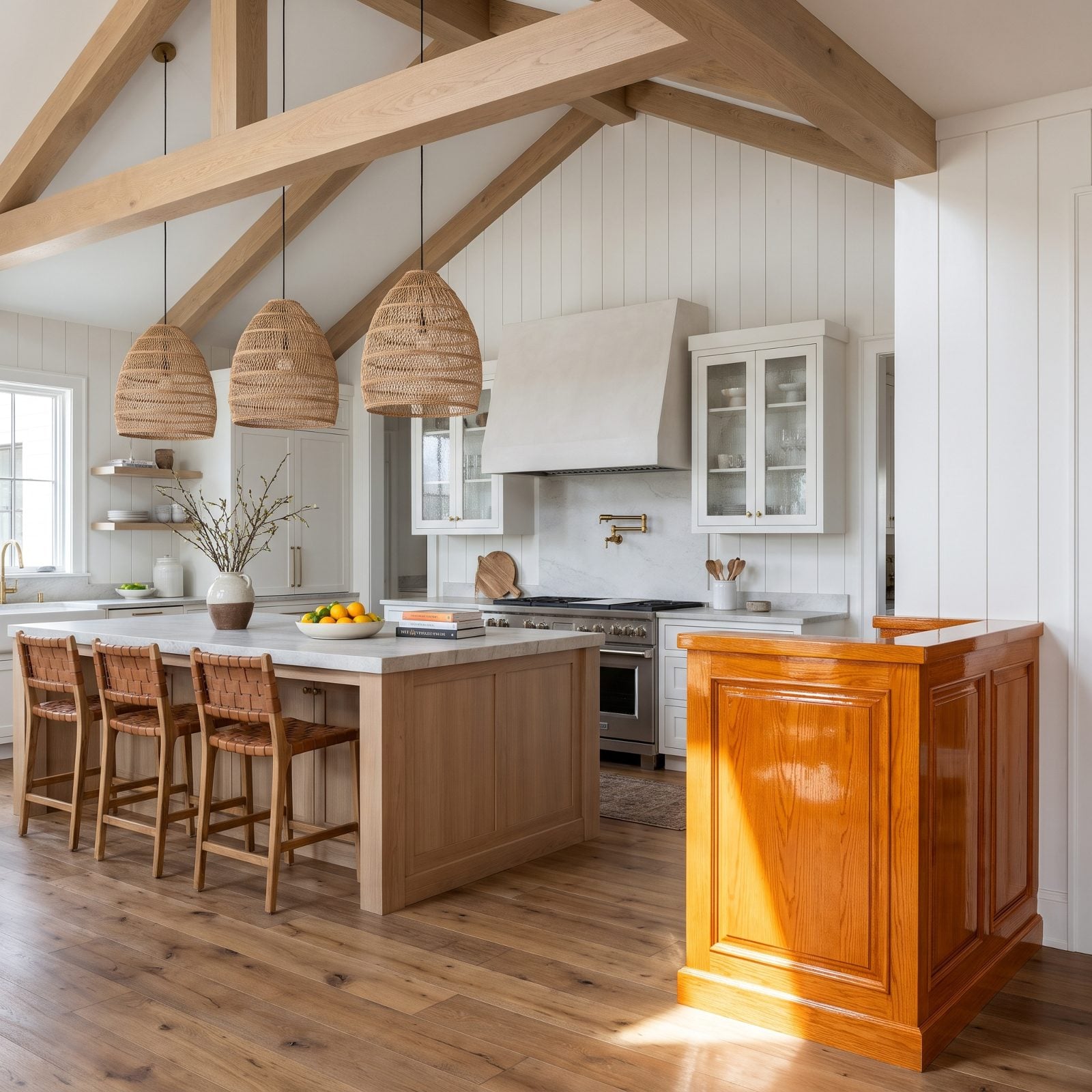
Honey oak never fully left, but the orange version is the one buyers flinch at. That glossy amber grain reads 1994 the second you walk in, and no amount of new hardware fixes the undertone.
Here’s the twist. Oak is back. Natural, white-oak, rift-cut oak is all over new builds. But the warm-toned, orange-sealed oak of the ’90s is its own animal, and the difference is the finish. One looks intentional. The other looks like it’s been waiting for someone to paint it.
28. Marble-Look Quartz With the Veins Turned Up Loud
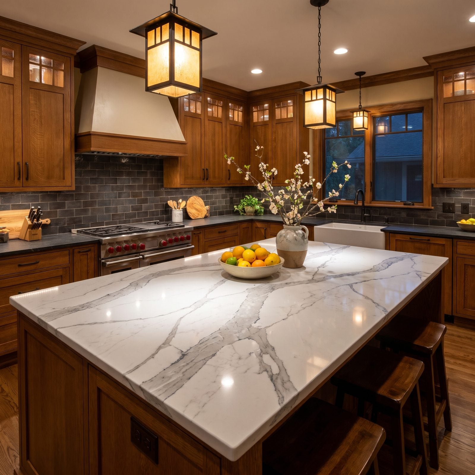
Calacatta-look quartz with thick, dramatic veining had a long run as the look that said luxury without the marble maintenance.
The issue now is volume. The boldest veins, the ones that swoop across the slab like a weather map, start to feel like a costume. Quieter, more realistic stone is winning because it doesn’t shout its own name. And a heavily veined slab locks you into a palette, which is exactly the opposite of what a buyer wants when they’re imagining their own stuff in the room.
27. White Farmhouse Cabinets Wearing Black Cup Pulls
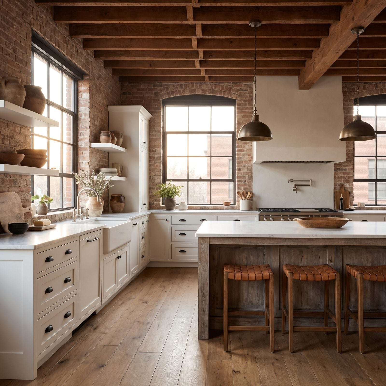
White cabinets, black cup pulls, apron sink. The uniform of the 2018 farmhouse kitchen.
It’s a good look. It was just such a good look that it went everywhere, from magazine spreads to the model home in every new subdivision. Ubiquity is the quiet killer here. Buyers in 2027 recognize the formula instantly, and recognition is the enemy of feeling like you’ve found something special. Those cup pulls especially pin the kitchen to a narrow trend window. If you’re building something fresh, a cool bedroom design can carry the farmhouse mood more quietly than this kitchen does.
26. Gold-and-Burgundy Granite That Won’t Stop Talking
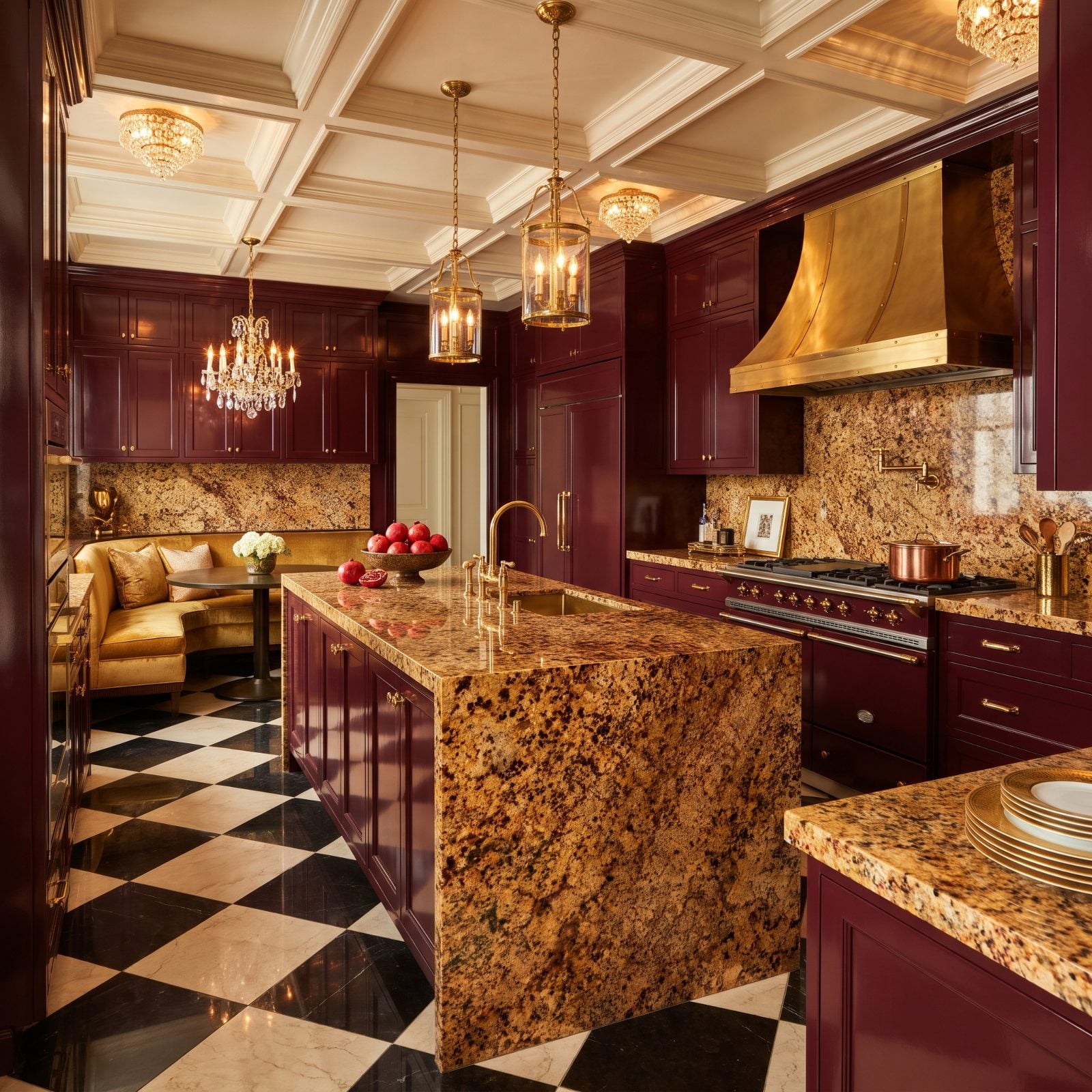
Speckled granite in gold and burgundy was the premium countertop of the early 2000s, and for a long time it meant you’d arrived.
The pattern is the problem. There’s so much movement in that stone that it fights everything else in the room. Cabinets, backsplash, floor — all of it has to negotiate with the countertop, and the countertop never backs down. Buyers now want surfaces that recede and let the kitchen breathe. This one does the opposite.
As a property staging executive puts it, “granite colors that tend to be perceived as outdated include overly speckled or heavily patterned varieties, such as busy browns and golds”
25. Open Shelving Where the Upper Cabinets Used to Live
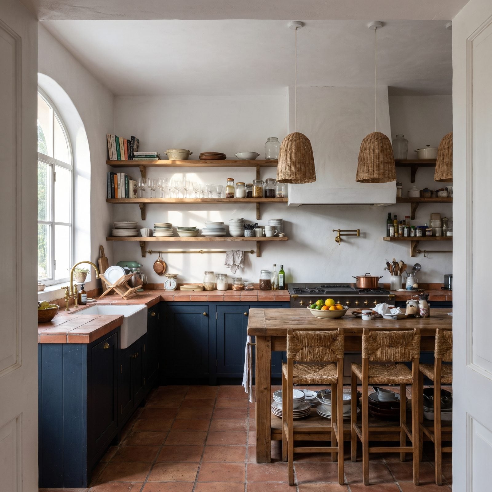
Open shelves looked great in photos. Then people had to live with them.
Dust lands on everything, and the styled stack of matching bowls lasts about a week before real life piles up: mismatched mugs, a cereal box, the good glasses next to the chipped ones. Buyers have caught on. Replacing every upper cabinet with shelving means less storage and more daily maintenance, and the people shopping in 2027 are quietly counting the cabinet doors they’d have to add back.
A shelf or two as an accent still works. Gutting all the uppers is the move that’s losing favor.
24. Sparkle Quartz That Catches the Light a Little Too Hard
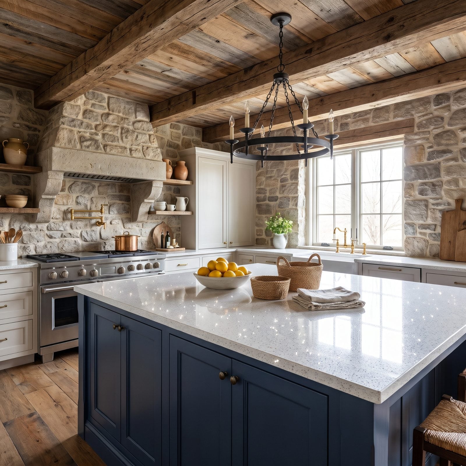
Quartz with mirror flecks was the countertop that wanted attention, and it got it. Under the right light, the whole surface glitters.
That’s the catch. The sparkle photographs as flashy and in person reads as dated, a very specific slice of late-2000s glam. Natural, matte, honed finishes are where buyers are headed — surfaces that feel like stone instead of something sprinkled with silver dust.
23. Distressed Tuscan Cream Cabinets With the Glaze and the Scrolls
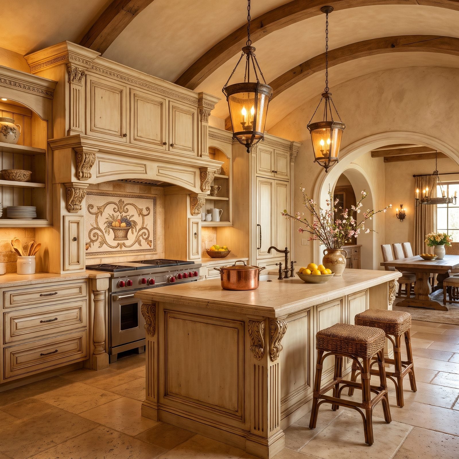
The Tuscan kitchen peaked around 2008: cream cabinets rubbed with brown glaze, carved corbels, a mosaic medallion behind the range.
It was heavy then and it’s heavier now. The glaze packed into the crevices was meant to look old-world, but today it mostly looks like a mid-2000s catalog, and the scrollwork weighs the whole kitchen down. Simpler, lighter cabinetry reads as current to a 2027 buyer, and every carved detail here points the other way.
22. Butcher Block Wrapping the Sink, Where Water Always Wins
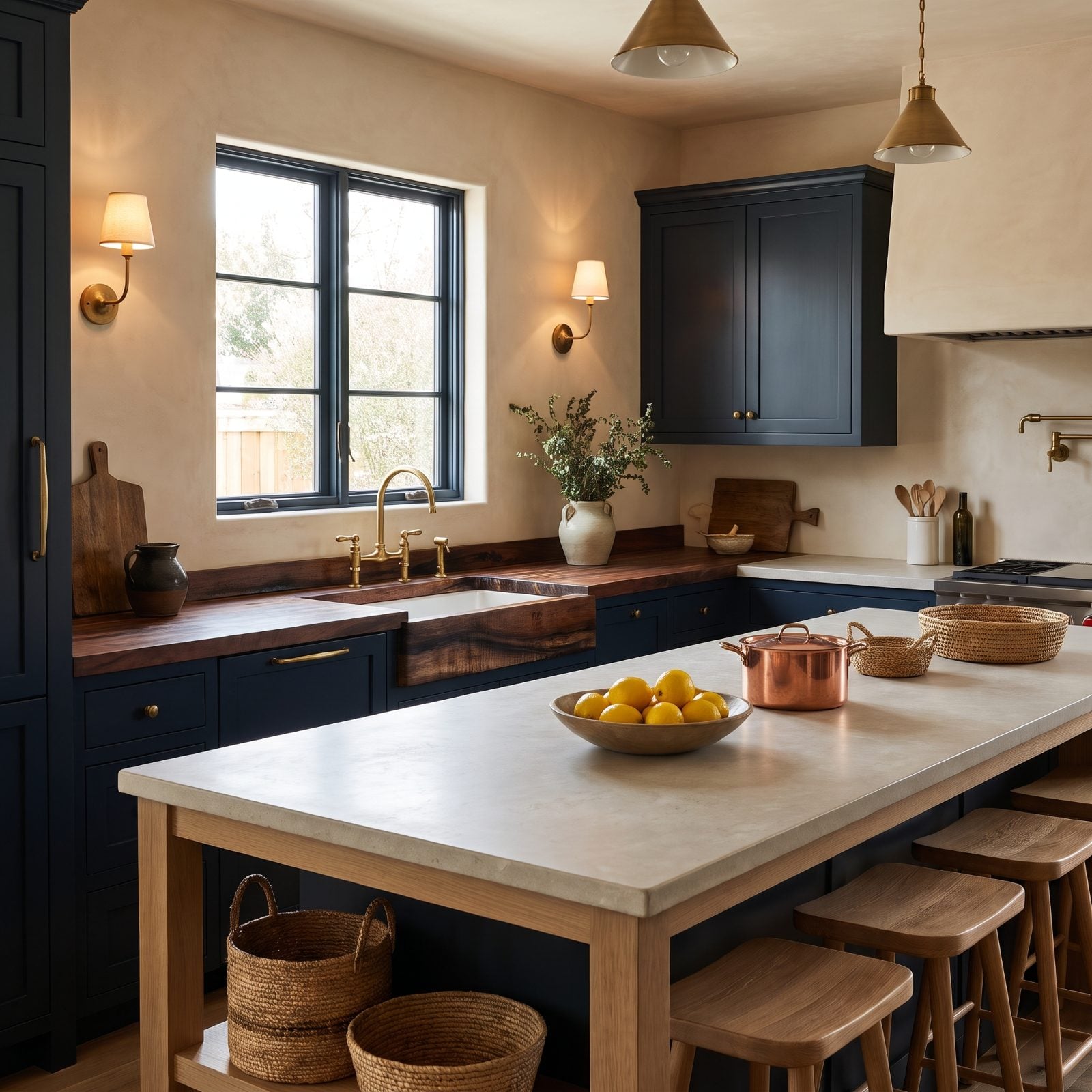
Butcher block around the sink looked warm and handmade, and it is. For about a year.
Then the water does what water does, and the wood around the basin darkens, swells, and stains no matter how religiously you oil it. It happens in kitchen after kitchen, and the sink zone is always the first to go. Buyers know this now. Butcher block on a dry island? Fine. Wrapped around a wet sink? That’s the detail an inspector circles and a buyer prices down.
As a countertop manufacturer puts it, “If not, they can absorb water, leading to stains, warping, or splitting. This is a common problem near sinks or in humid areas.”
21. Matte-Black Cabinets From Wall to Wall
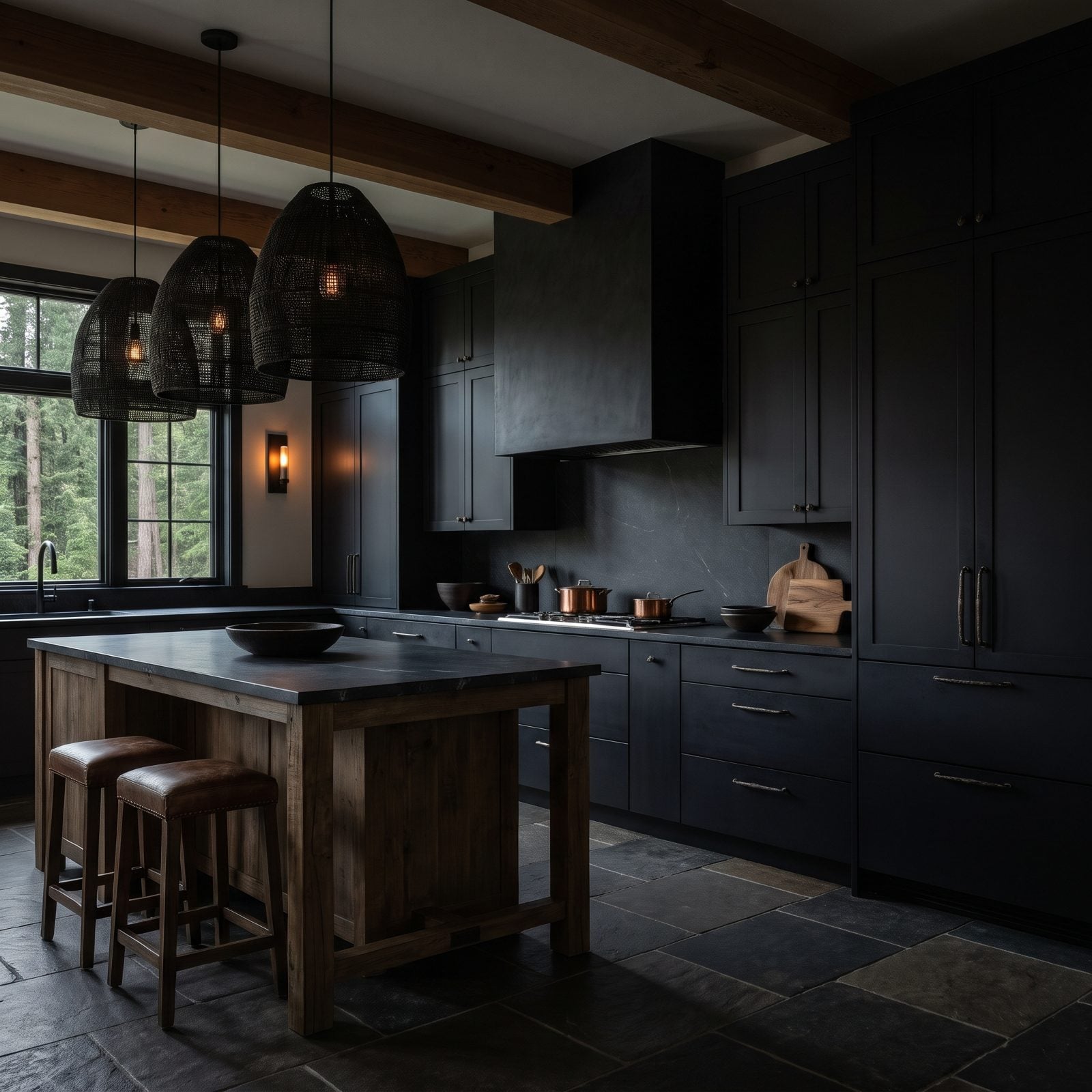
Matte black looked fearless for about three years. Then people lived with it. The finish drinks every drop of daylight, and in a kitchen already fighting for brightness, that’s a problem you notice by breakfast.
Fingerprints are the quiet killer. Matte black shows the oil from your hands near every handle, and no amount of wiping fully clears it. Walk a buyer through a wall-to-wall black kitchen in 2027 and they’ll read maintenance chore long before they read mood.
20. Tile Countertops With Wide Grout Lines
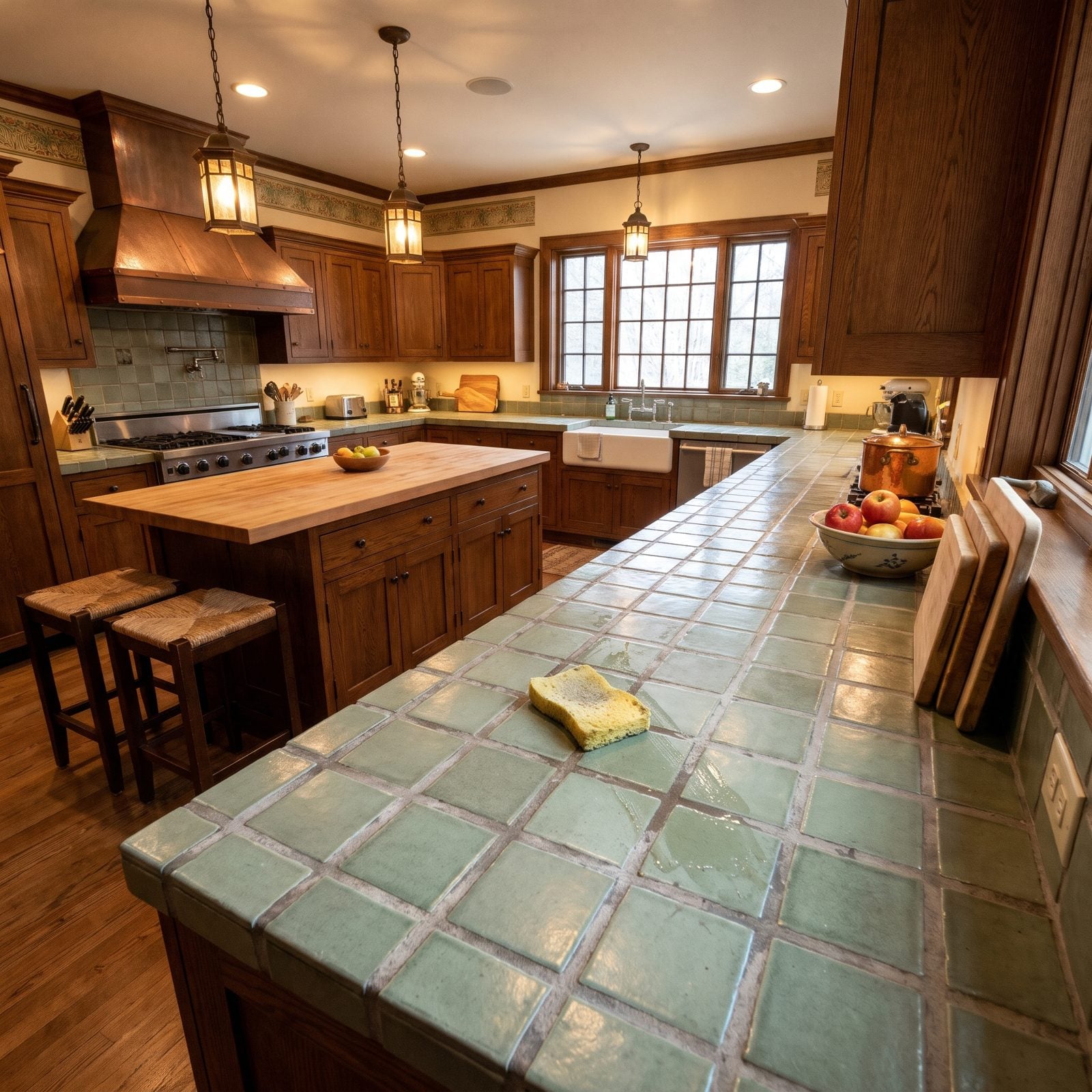
You know the feeling. Dragging a wet sponge across a tile counter and watching the grout stay exactly as grey as it was before. That’s the whole case against this one.
Wide grout lines trap everything: coffee rings, pasta water, the fine grit of flour. They stain, they harbor bacteria, and they turn food prep into a cleaning project. Slab surfaces took over for a reason. A buyer in 2027 sees a tile counter and mentally adds a demo line to their renovation budget before they’ve left the room.
As an interior designer puts it, “You cannot really clean and keep clean a tile surface that has grout between tiles – the grout will not only stain but bacteria will thrive and grow in this porous environment.”
19. Two-Tone Cabinets Divided at the Island
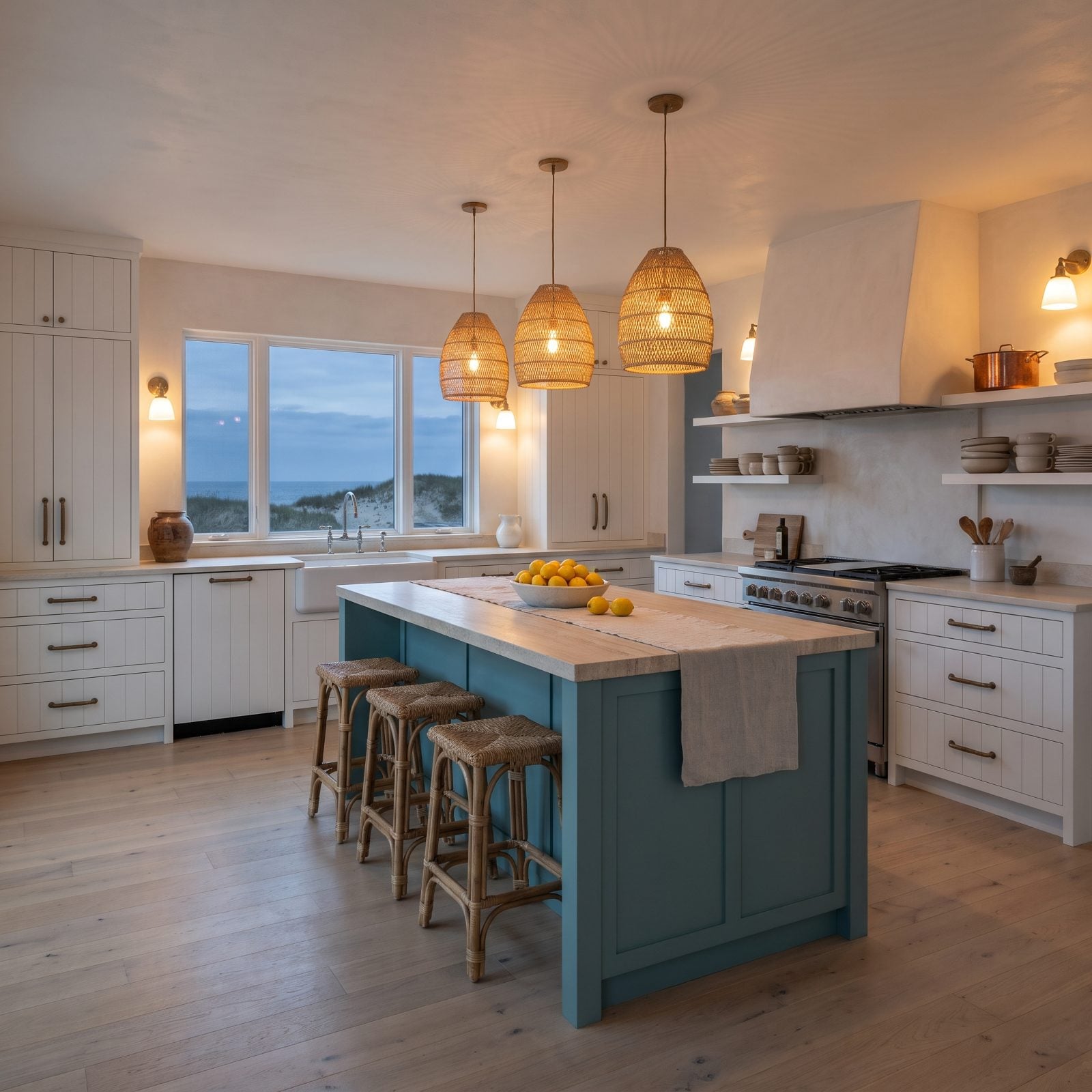
The white-perimeter, colored-island combo was the safe daring move of the last decade. Everybody did it. That’s exactly the problem now.
When a look becomes the default, it stops reading as a choice and starts reading as a date stamp. Designers expect buyers in 2027 to clock the navy island the way we now clock a Tuscan faux-finish: a year, not a style. The split also commits you to two finishes that have to keep relating to each other through every future tweak.
18. Pure-White Quartz That Shows Every Mark
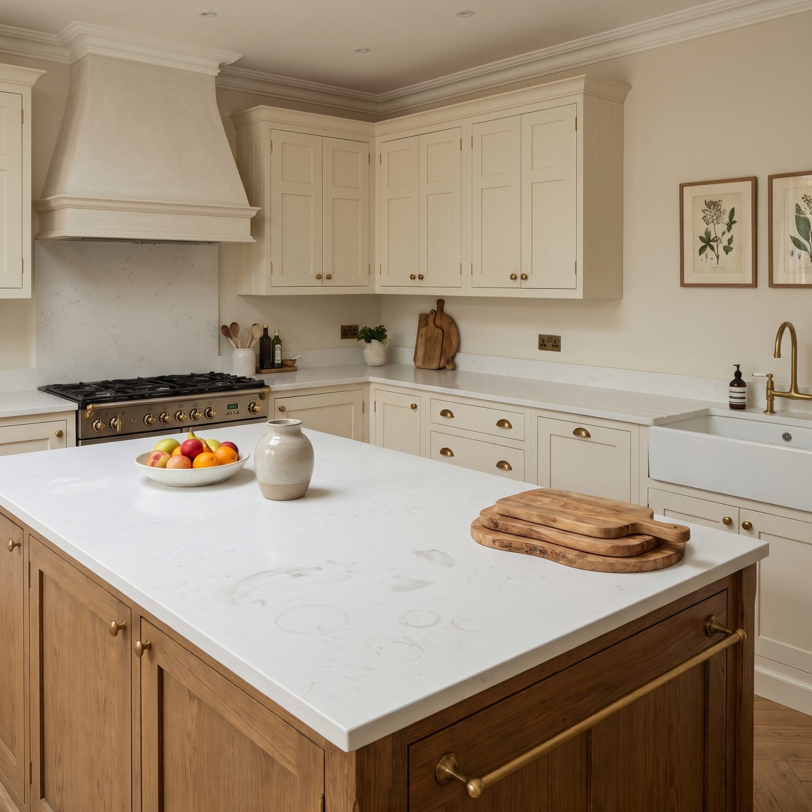
Solid pure-white quartz photographs like a dream and lives like a toddler’s bib.
With zero veining to break up the surface, every crumb, water spot, and faint turmeric smear stands at full attention. The look that promised clean ends up demanding constant cleaning, and that gap between promise and reality is what wears people down. Expect 2027 buyers to lean toward soft movement and warm veining that hides daily life instead of broadcasting it. Pair bright counters with bright kitchen decor only if you genuinely enjoy wiping.
17. Heavy Raised-Panel Cherry Cabinets
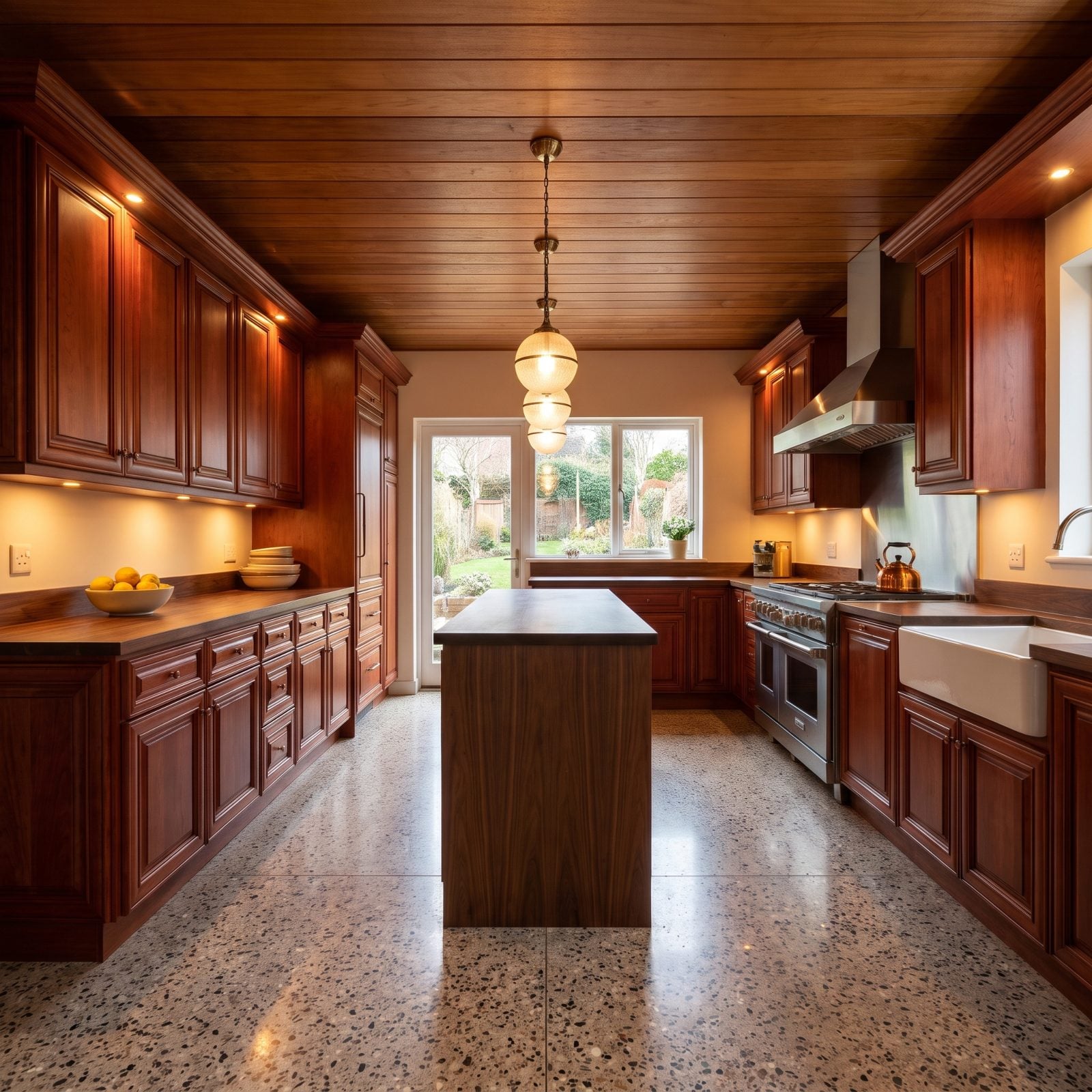
Cherry was the status wood of the early 2000s. Deep red, heavily grained, almost glowing under puck lights. We liked it then. We won’t pretend otherwise.
Here’s the snag. That reddish stain doesn’t play well with current palettes, and the raised-panel profiles make a room feel heavier and darker than the footprint deserves. Buyers in 2027 will see a wall of cherry and immediately price out a repaint or a full replacement. A lovely wood stuck in a decade it can’t shake.
16. Concrete Counters With Visible Hairline Cracks
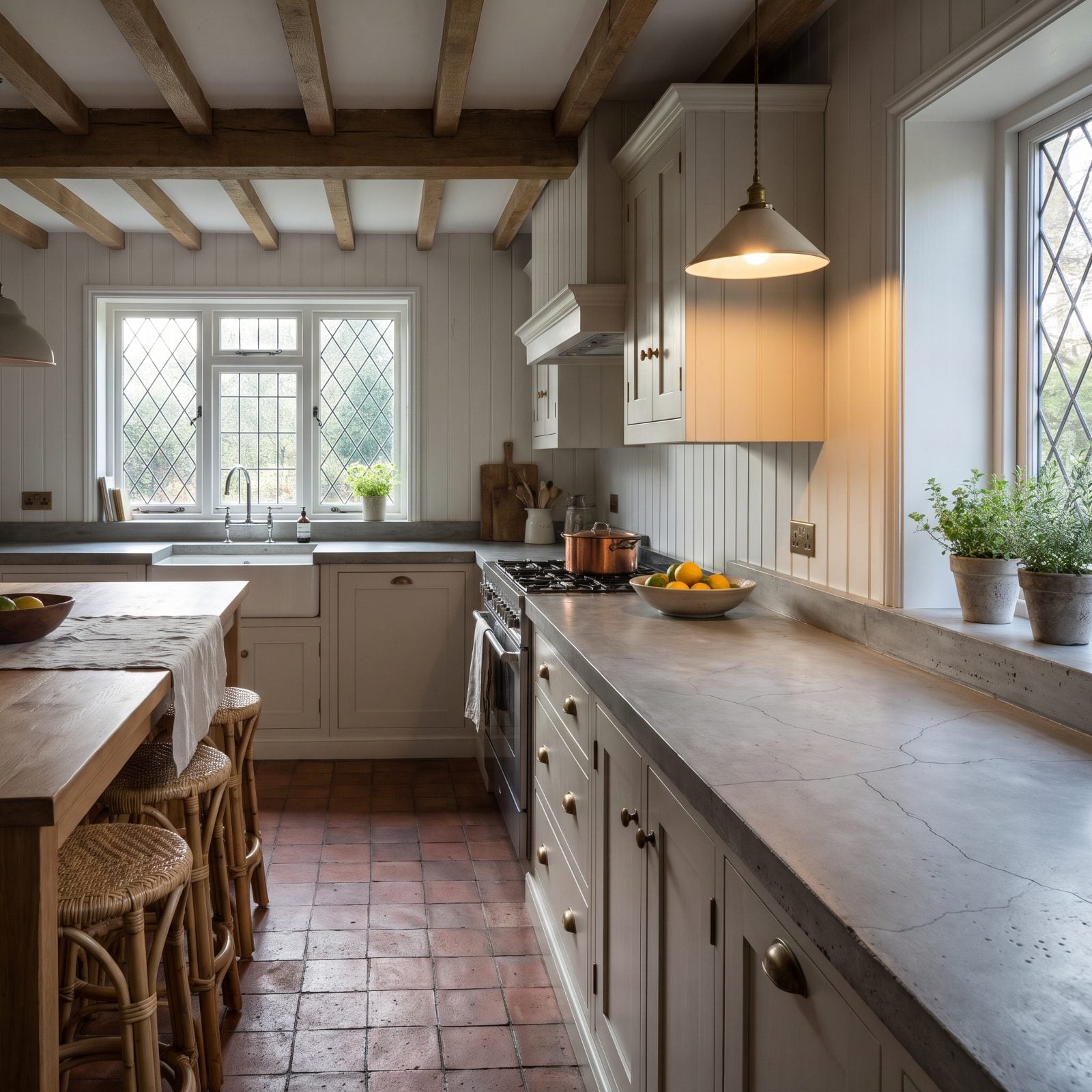
Concrete counters sold a fantasy of industrial cool. Nobody mentioned the hairline cracks.
Concrete moves. It cures, it settles, it develops spidery fissures that fans call patina and buyers call damage. It also needs resealing to fend off wine and oil stains, a habit most people quietly abandon. The raw look that felt honest in a loft reads as neglected in a resale listing. In a dark den design the texture can earn its keep as drama, but a daily kitchen is a harder audience.
Even a concrete countertop studio, defending the material, admits that “hairline cracks and slight irregularities are a natural part of the wear and tear and will not affect the structural integrity in the slightest”
15. High-Gloss Acrylic Slab Cabinets
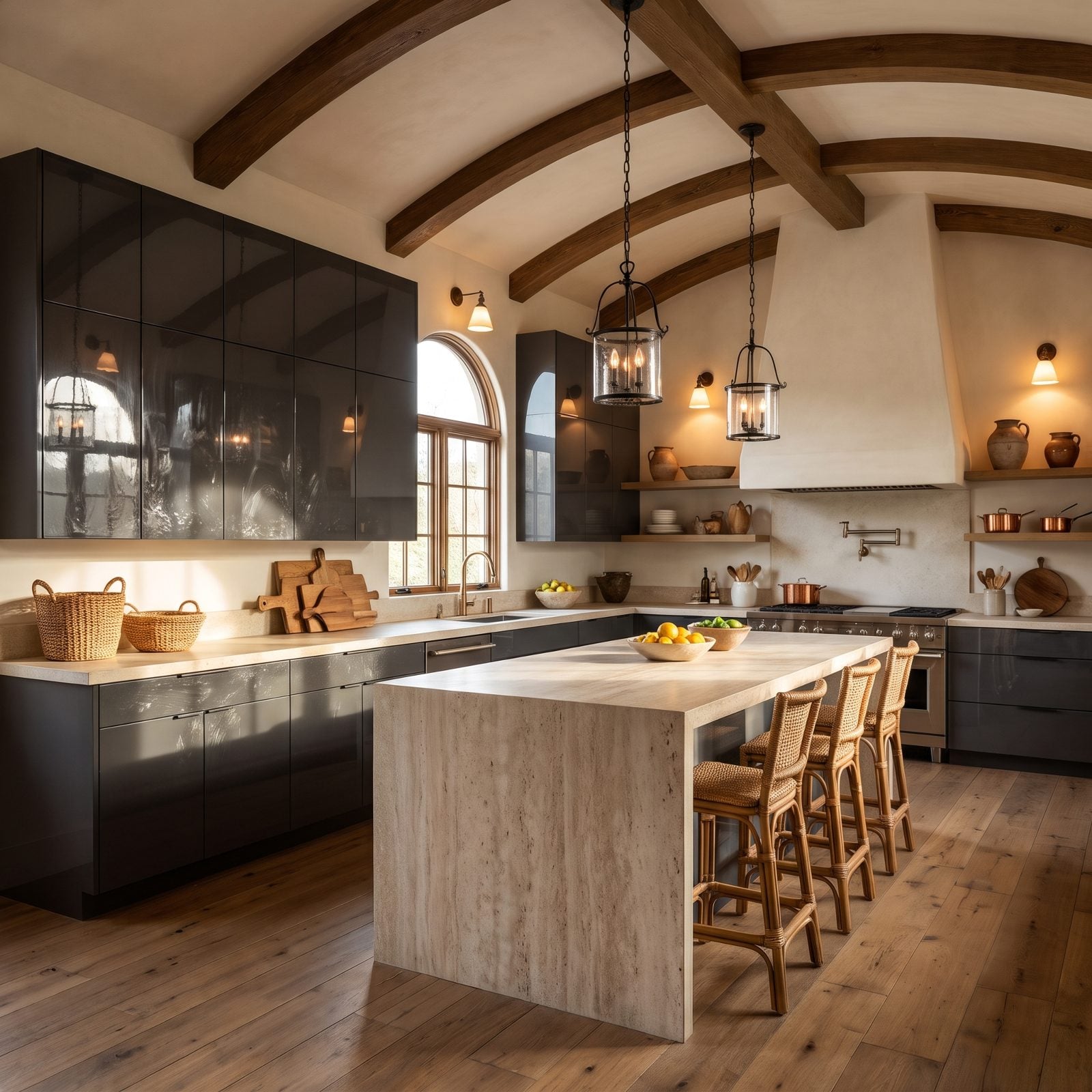
Glossy acrylic fronts smudge if you look at them wrong.
Every fingerprint, every splash, every passing hip shows up on that mirror finish, and kitchen lighting magnifies the lot. The showroom shine lasts exactly until someone cooks. Designers expect 2027 buyers to steer toward matte and textured laminates that forgive a lived-in life, because a kitchen you have to polish is a kitchen you grow to resent.
14. Resin River Countertop Islands
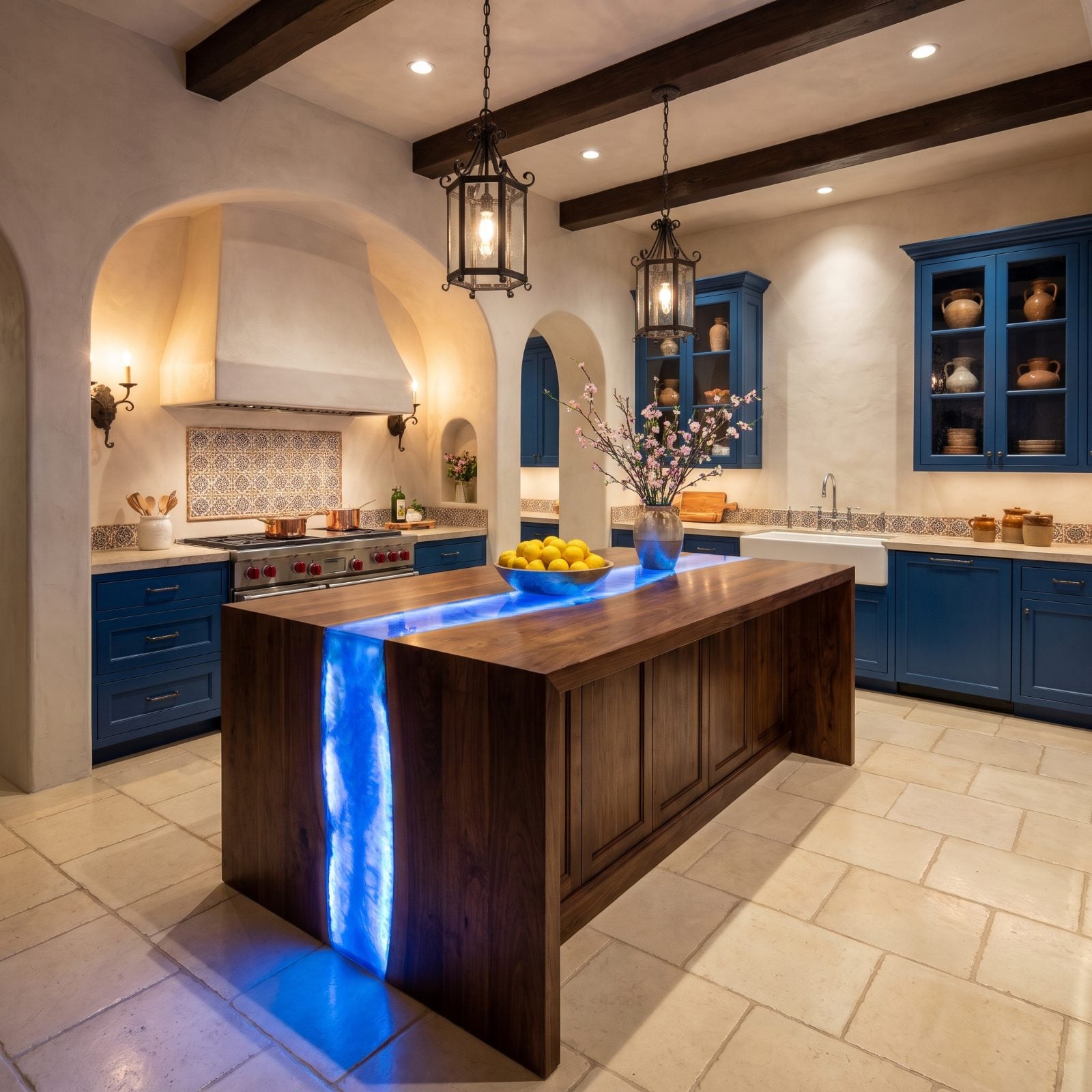
The resin river island was the brag piece of the custom-build era. One look, and everyone knew you spent money.
Which is also why it dates fast. A surface this specific locks you into one moment and one palette, and the epoxy scratches, clouds, and yellows under UV over time. Most buyers don’t want to pay for a sculpture they can’t change. Loud statement pieces age like loud wallpaper, fun until you want it gone and can’t peel it off.
13. Cathedral-Arch Cabinet Doors
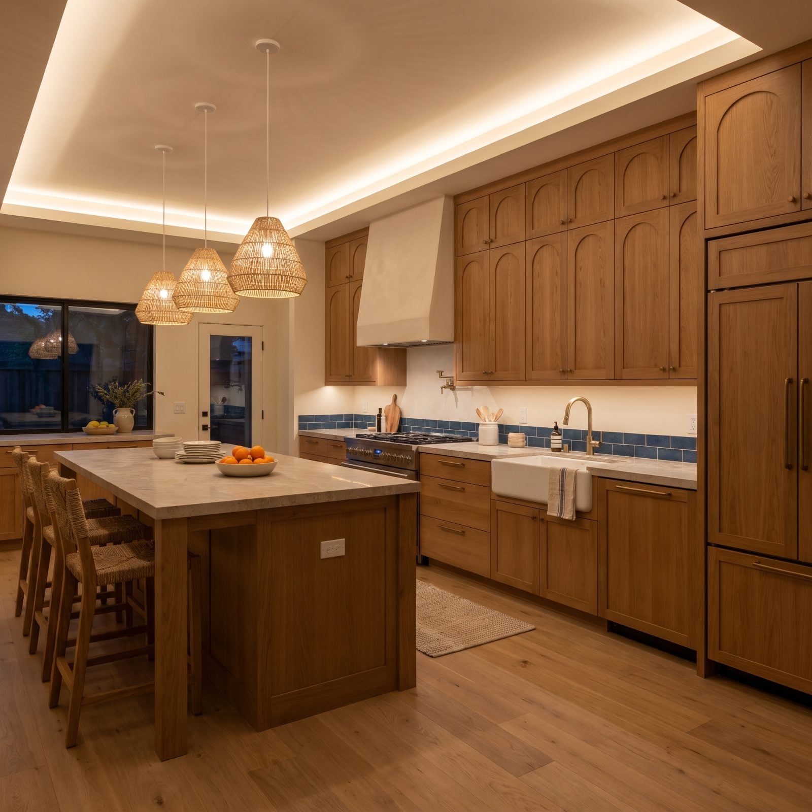
Cathedral arches were everywhere in builder kitchens through the late nineties. That curved top on every upper door, usually in golden oak. The profile is harmless on its own, but it carries a decade on its back.
Flat and shaker fronts read as timeless because they don’t commit to an era. The cathedral arch commits hard. Buyers in 2027 will see those curves and instantly date the house, which pressures the price even when the boxes are solid.
12. Chunky Laminated Countertop Edges
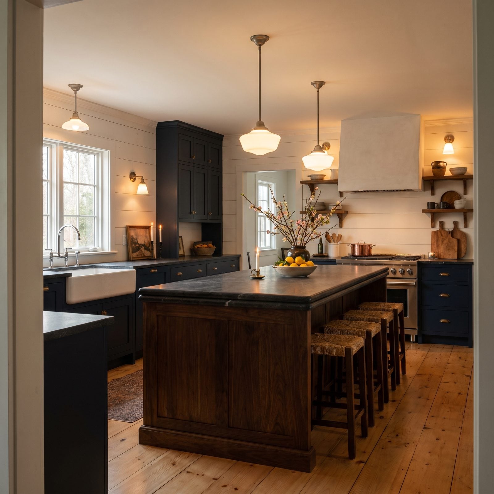
That fat, double-stacked counter edge once signaled you’d upgraded past basic. Now it signals the year you did it.
Thin profiles took over. A clean, slim eased edge reads modern and light, while the chunky built-up version looks bulky and bottom-heavy next to it. A small detail, sure. But small details are what trained eyes catch first, and they’re what designers expect 2027 buyers to quietly deduct for. Go thin, go simple, and stop paying for the edge that ages you.
11. Greige Cabinets Paired With Greige Quartz, Two Non-Colors Canceling Each Other Out
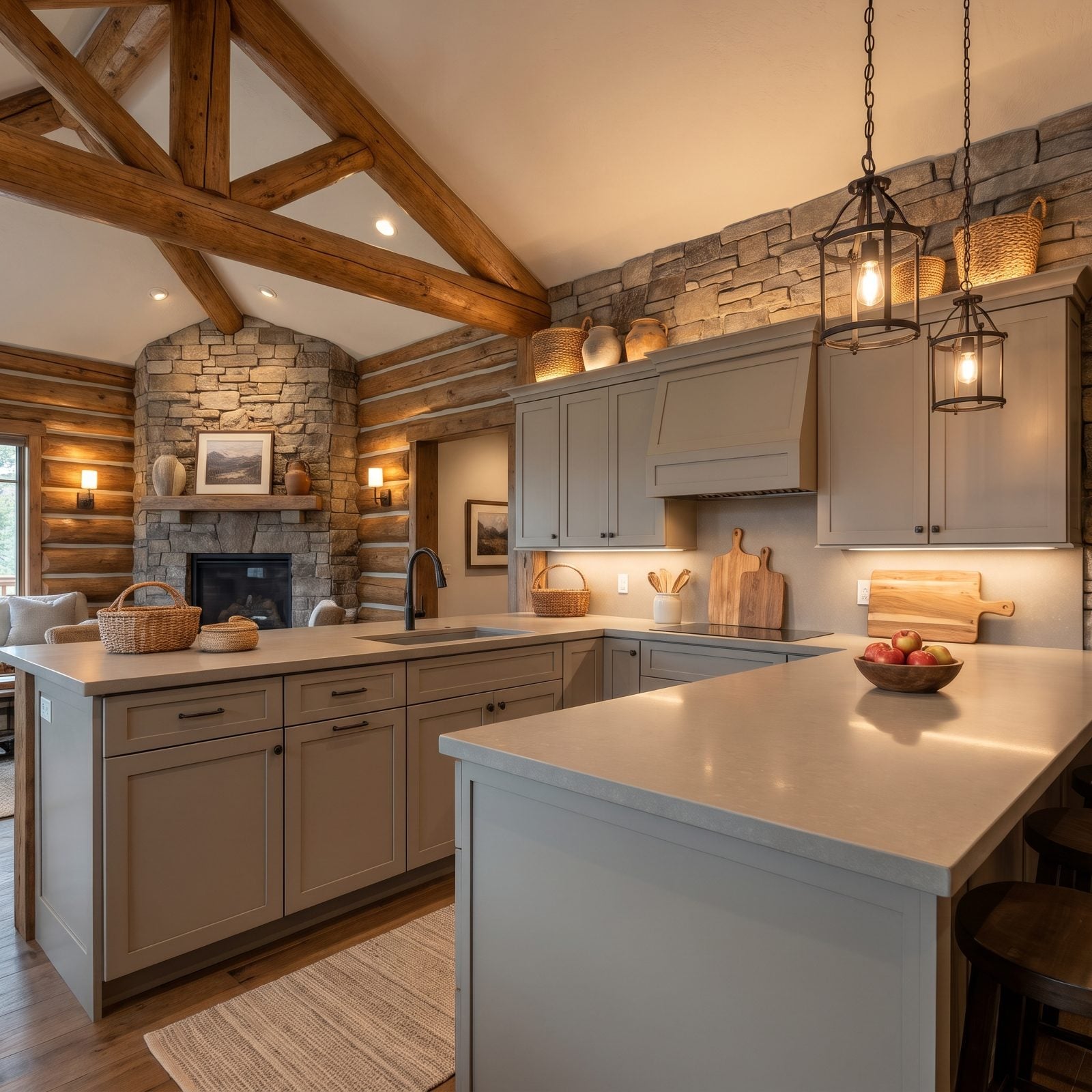
Everything in here sits at the same temperature, and that’s the problem. Greige cabinets against greige quartz give you a room that photographs like a fog bank — no contrast, no depth, nothing for the eye to grab onto.
Greige sold hard around 2016 because it felt safe. Buyers read safe as dated now. When the cabinets and the counters share an undertone this closely the whole kitchen flattens out, and brass pulls or a warm backsplash can only do so much to haul it back.
In our reader poll on light cabinets, only a quarter of readers picked greige, while about half went for cream.
10. Recycled-Glass Counters Flecked With Bright Candy Chips
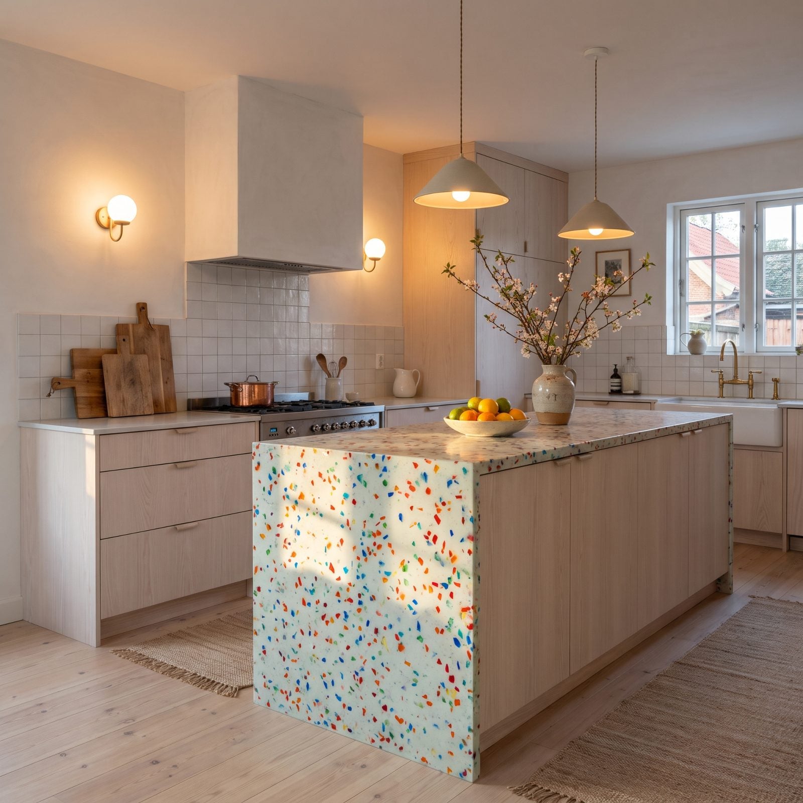
Those bright glass chips looked eco-forward and playful fifteen years ago. Now they read like confetti someone forgot to sweep up.
The real trouble is commitment. A counter studded with cobalt and emerald flecks locks you into a color story you can’t paint over, and buyers walk in seeing a decorating decision they’d have to live with or tear out. Guess which one they pick.
9. Live-Edge Wood Slab Crowning the Island
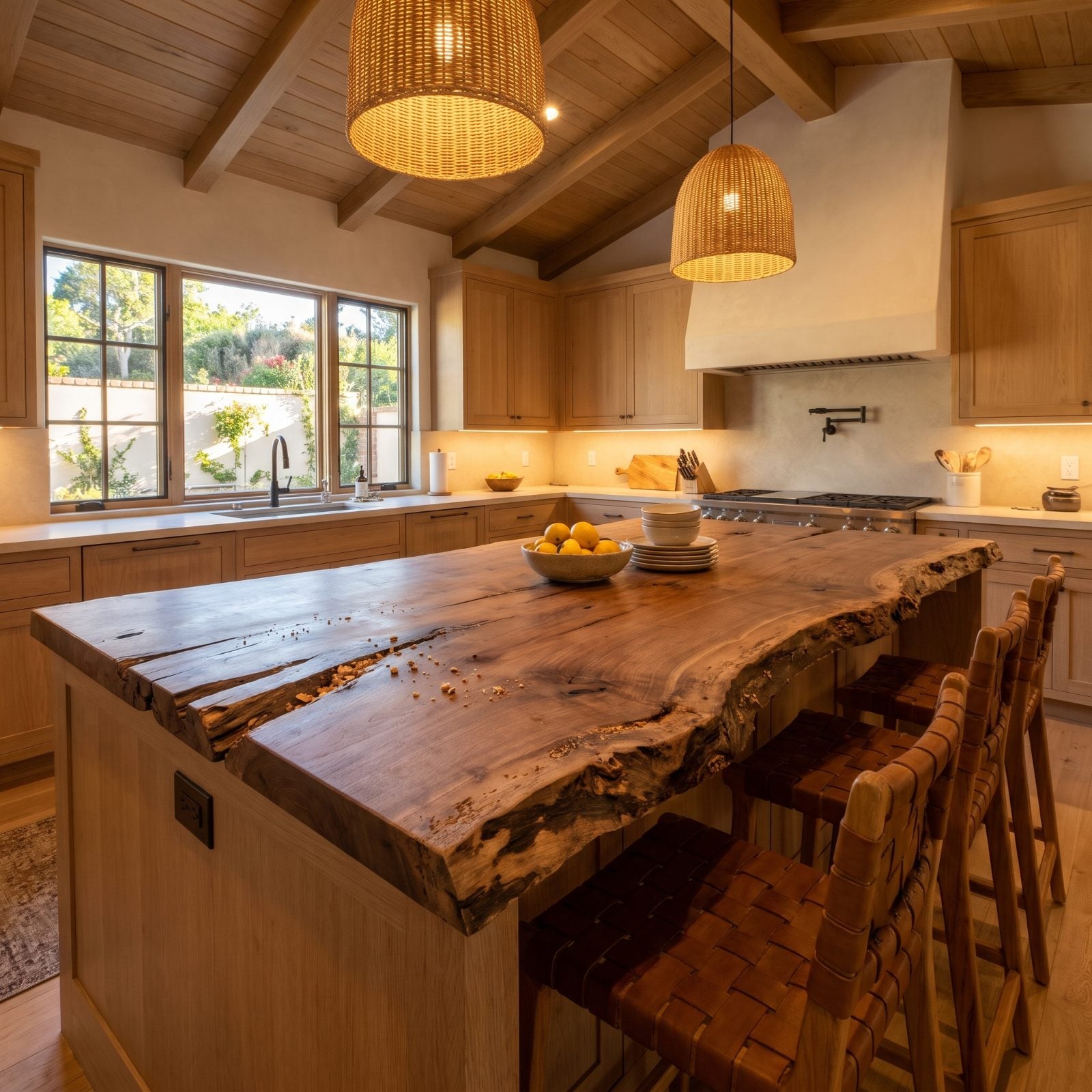
A live-edge slab is a beautiful object. It’s a terrible work surface.
The bark edge collects crumbs, the uneven thickness means your mixing bowl wobbles, and that organic outline eats usable prep space. Buyers who actually cook clock the problem in about four seconds. Put this look on a console table where it can be sculpture, not on a counter you have to wipe around every single day.
8. Beadboard Fronts On Every Last Cabinet
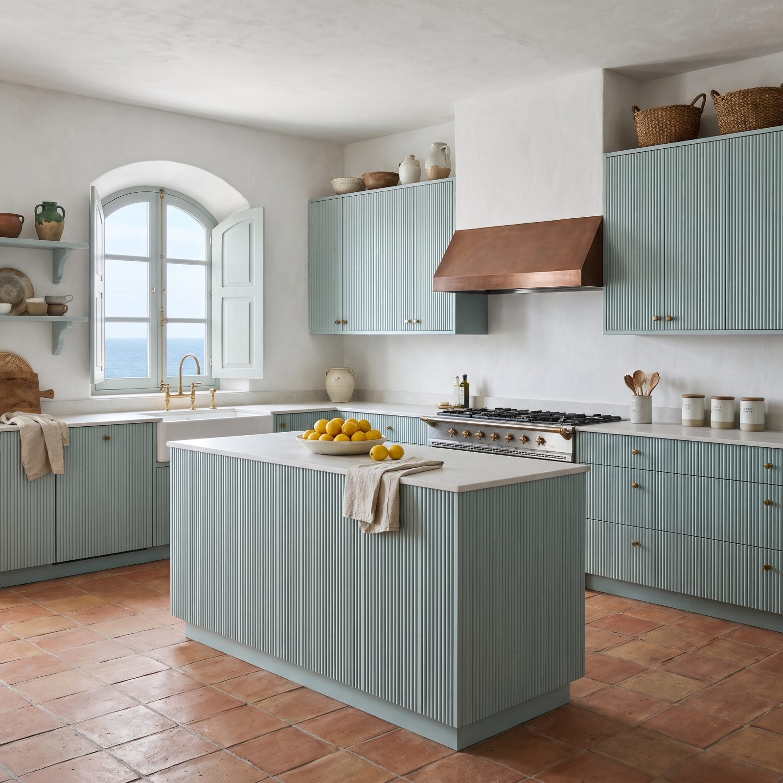
Beadboard on one piece is charming. Beadboard on every single door turns the whole kitchen into a washboard.
Plenty of people fall for this one and live to regret the dust that settles into every groove. The texture goes relentless once it covers that much surface, and buyers register it as fussy rather than cozy. Reserve it for an island back or a single bank of uppers — head-to-toe is too much of a good idea. For the airy coastal look people actually want now, lean into bright kitchen decor with calmer surfaces.
7. Polished Black Granite, Mirror-Shine And Water Spots
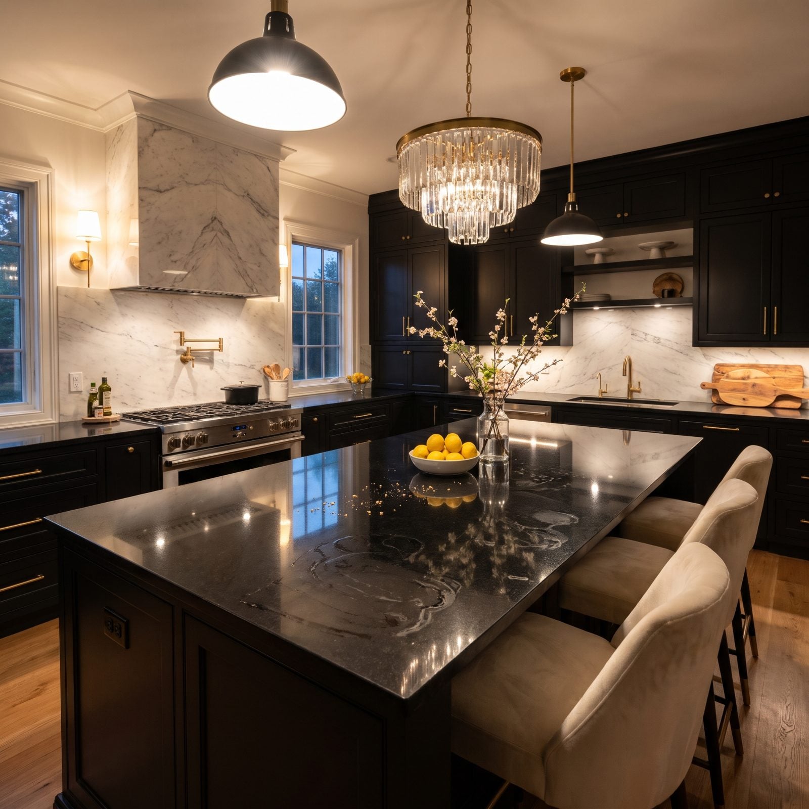
Polished black granite was the countertop that announced you’d arrived. Now it shows every crumb, every smudge, every water droplet the second they land.
Pair it with cherry cabinets and the combo dates a kitchen straight to the early 2000s. Buyers want matte, honed, or soft-veined surfaces that forgive real life. High-gloss black is a smudge magnet you’ll be wiping ten times a day.
6. Chicken-Wire Inserts Where Glass Used To Go
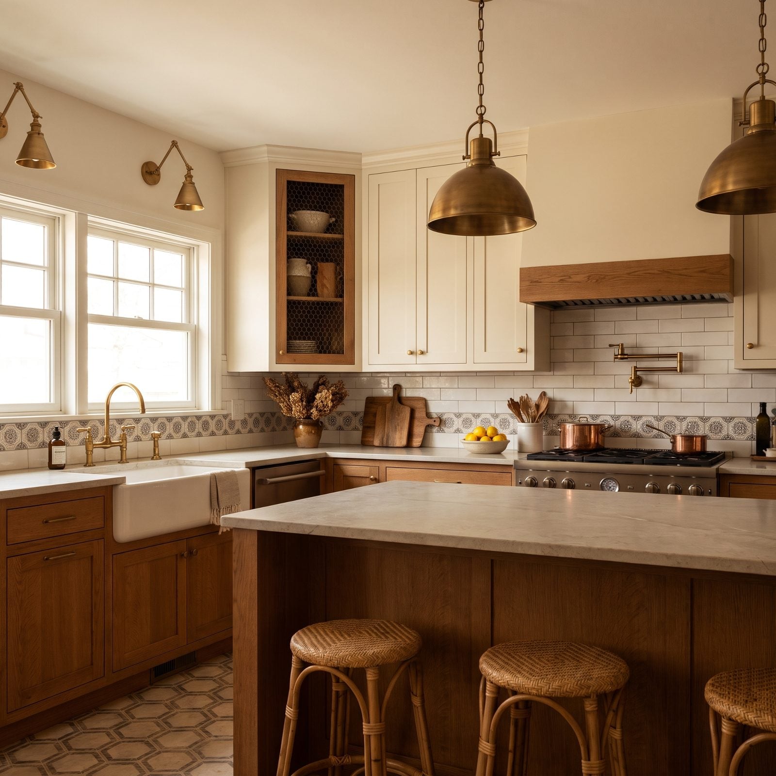
Chicken wire on cabinet fronts had a real moment during the French-country revival, and it’s fallen hard since.
The mesh lets dust and grease drift straight onto whatever’s stored behind it, and you lose the clean concealment solid doors give you. Swap the wire for reeded glass or a solid panel and that same cream cabinet reads current instead of farmhouse-cosplay. Save the look for a pantry or a mudroom — not for the shelf over your plates.
5. The Oversized Island That Swallowed The Walkways
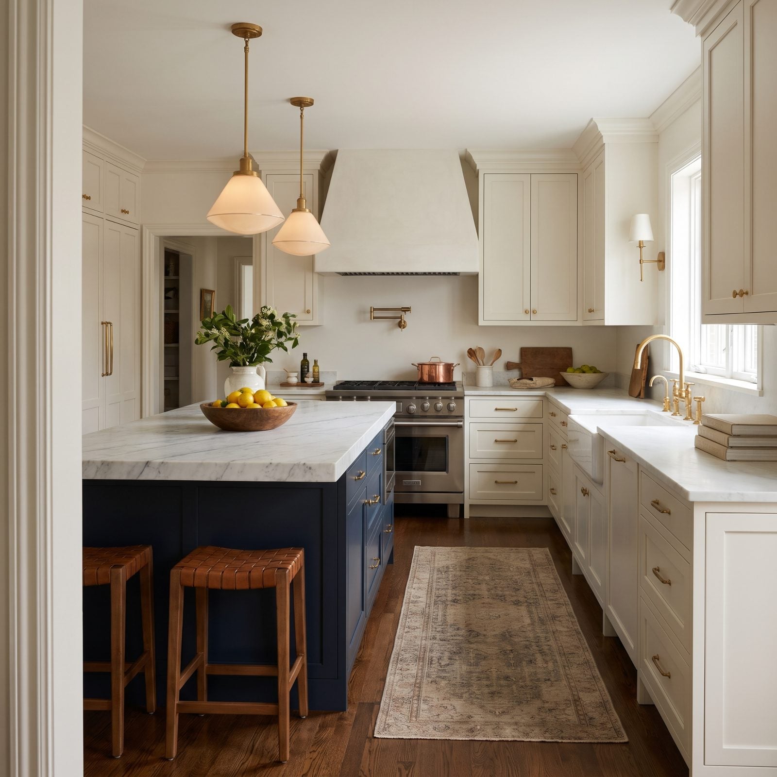
Bigger island, better kitchen. That was the pitch for a decade, and it wrecked a lot of floor plans.
When the island balloons past what the room can hold, the walkways around it shrink to pinch points — two people can’t pass, and the oven door can’t fully open. Designers now plan for a comfortable gap on every side before the slab goes in. A giant island with nowhere to walk isn’t luxury; it’s a traffic jam you installed on purpose.
As a custom kitchen cabinetmaker puts it, “This is one of the most common kitchen island design mistakes we see: in an effort to maximize countertops and extra storage space, the walkways around the island suffer.”
4. Range-Hood Cabinet Boxes Built Like A Fireplace Mantel
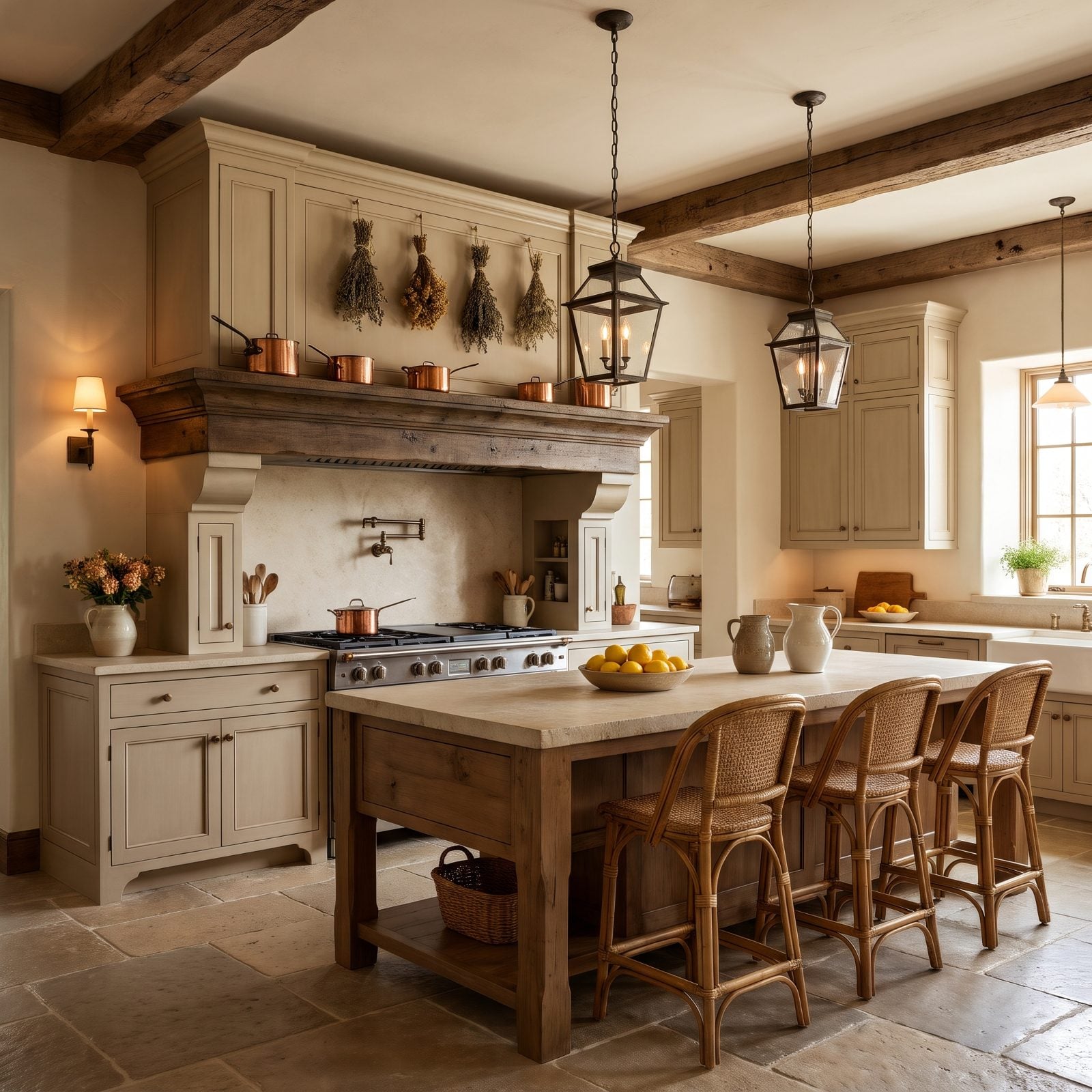
Somewhere along the way the range hood stopped being a vent and became a cabinet the size of a chimney breast.
These boxes were meant to read as grand. They read as heavy. The bulk projects into the room, drops the visual ceiling, and leaves the cooking wall feeling like it’s leaning over you. A slim plaster hood or a clean metal insert does the same job and gives the eye room to breathe.
3. Faux Furniture Feet Tacked Under The Base Cabinets
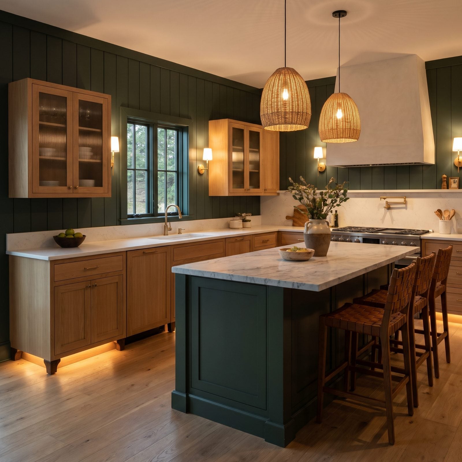
Faux furniture feet were supposed to make built-in cabinets pass for charming old free-standing pieces. The illusion never lands.
You end up with decorative bun feet bolted onto a toe-kick, collecting dust underneath and offering a stubbed toe every time you reach the sink. Buyers see it as a costume. A clean recessed toe-kick reads honest and keeps the floor easy to sweep. Let furniture be furniture and cabinets be cabinets — I’ll die on this hill.
2. Ornate Carved Corbels Propping Up the Counter Overhang
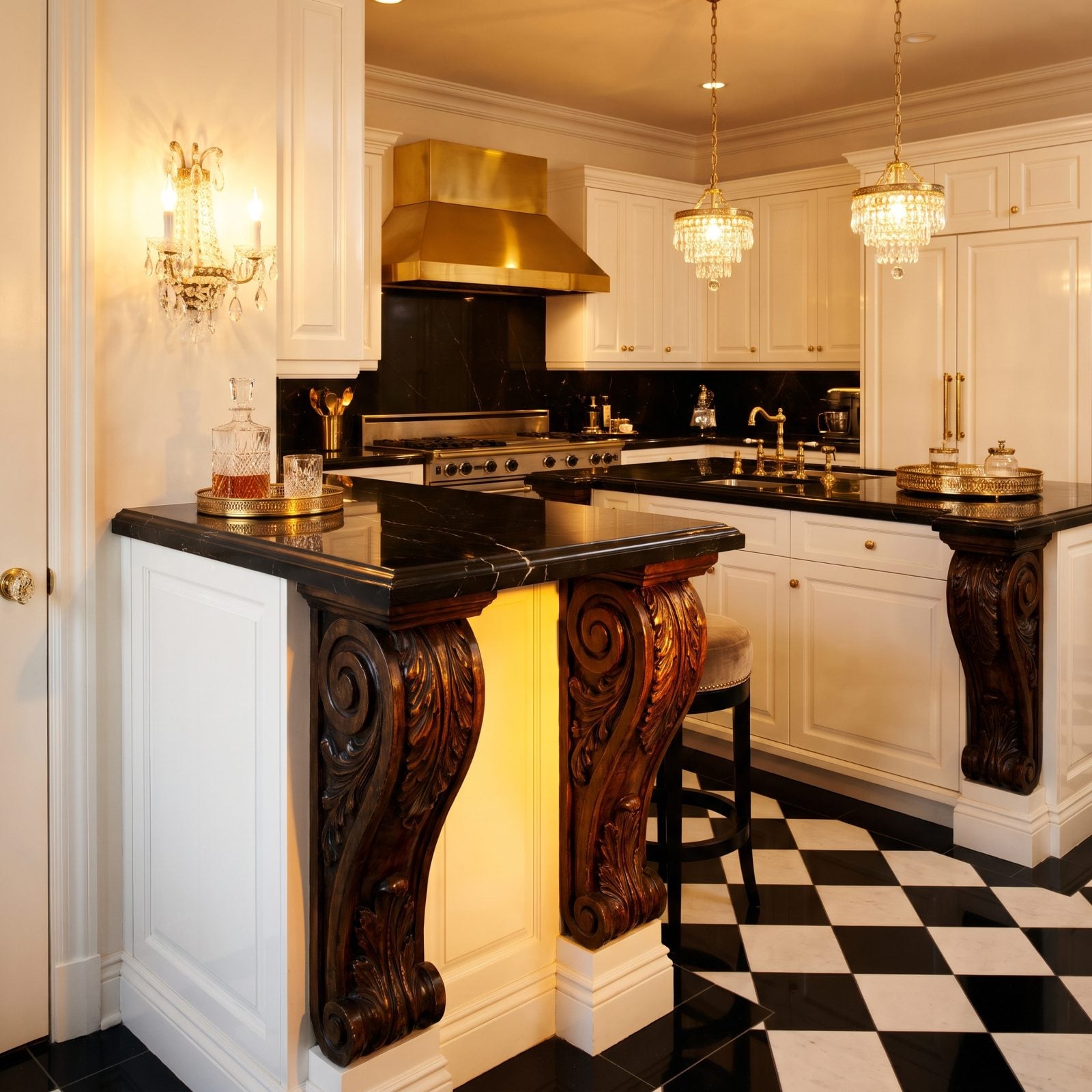
Those scrolled acanthus corbels under the counter lip were the mark of a serious kitchen around 2008. Now they haul the whole room backward about fifteen years.
A simple steel bracket or a hidden support does the same job without announcing a decade. The problem isn’t the overhang — it’s the carving. Fussy woodwork pulls a kitchen toward old-world heaviness, and buyers scanning listings read heavy as dated.
1. Decorative X-Brace Panels Capping the Cabinet Ends
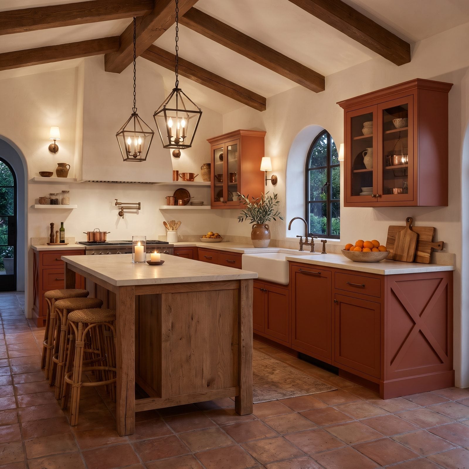
Applied X-brace trim on cabinet ends was supposed to evoke a barn door or a shaker heirloom. It mostly evokes a catalog upgrade someone clicked in 2012.
Flat recessed panels or a plain slab end read cleaner and let the paint color do the work, the way a good paint color wants to. The crisscross motif fights the finish for attention and loses. Leaning traditional? A quiet end panel keeps the room feeling intentional instead of over-decorated. Pair it with the kind of restrained palette you’d see in a cool bedroom design and the whole kitchen calms right down.