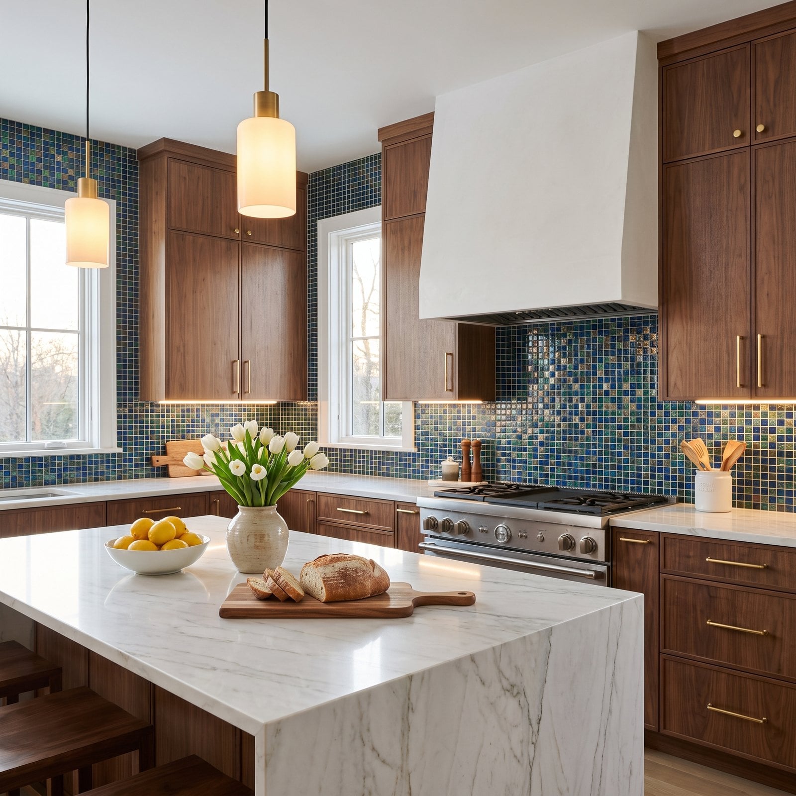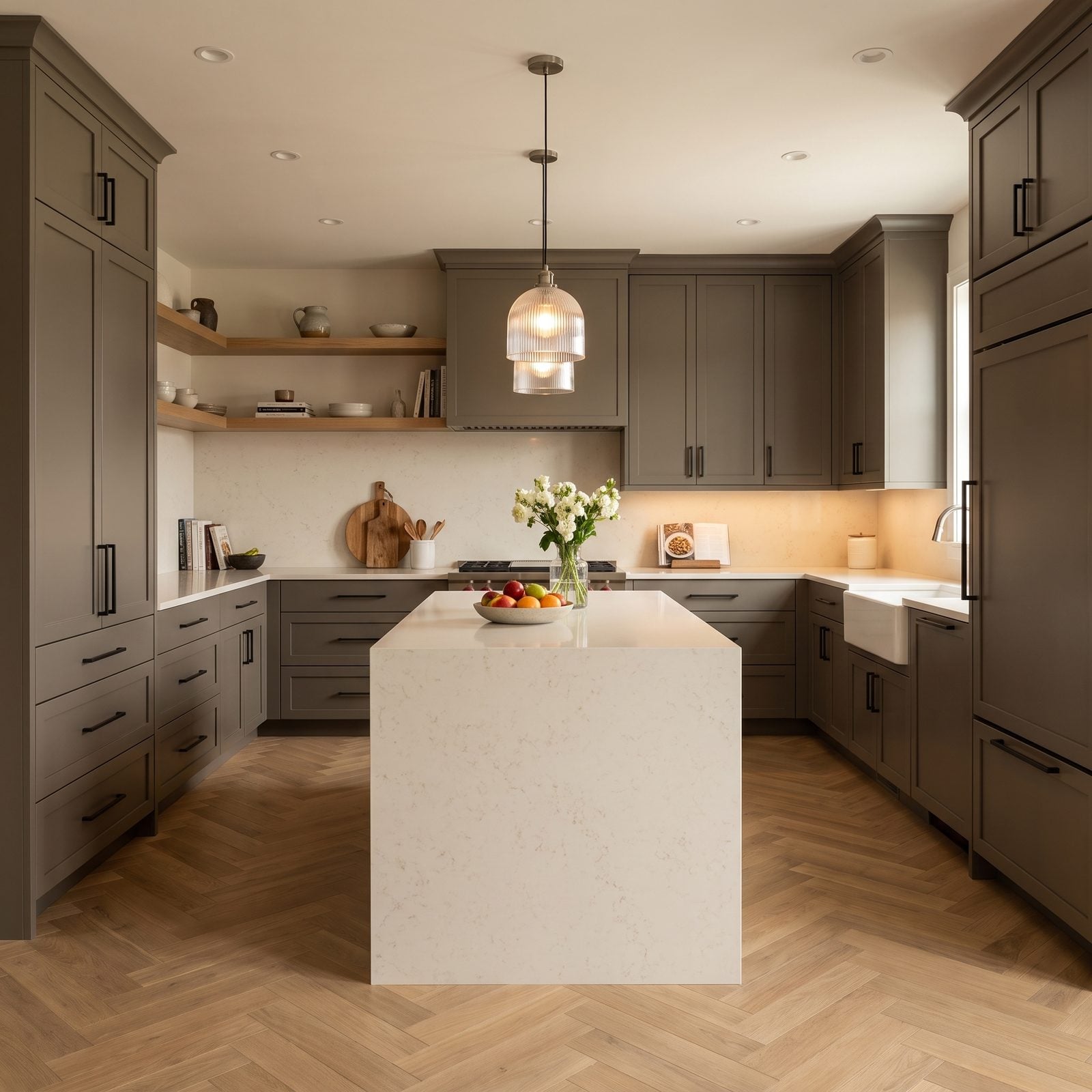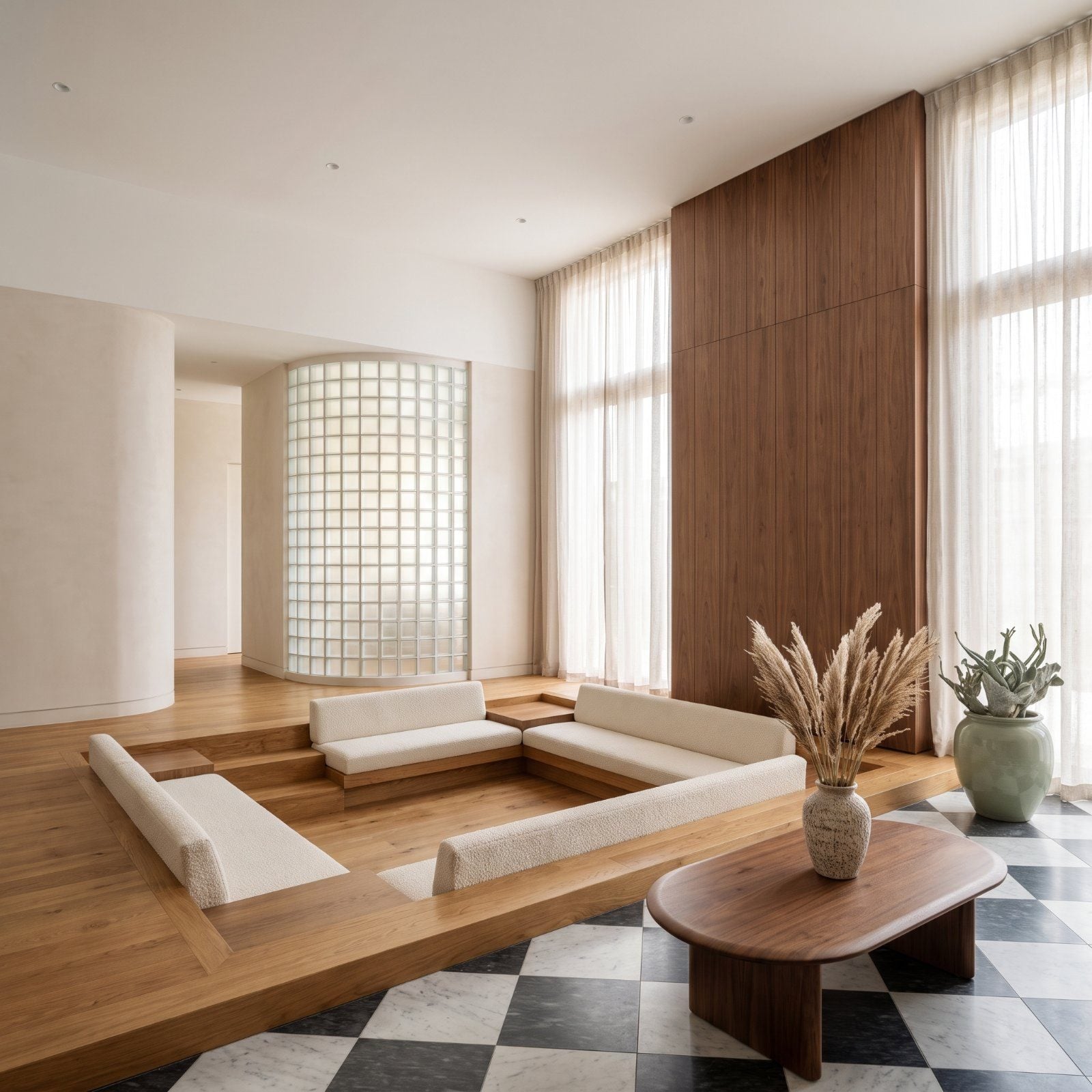
🔥 Would you like to save this?
Somebody told you oak cabinets were over. Somebody told you glass block died with the 80s. Half right, completely wrong. The details below spent years on the design blacklist, mocked at open houses, ripped out by the pallet-load. Then something shifted. Used with a lighter hand and better company, every one of these reads as character instead of calendar. We rounded up a pile of supposedly finished ideas and photographed them doing the opposite of aging. Restraint does most of the heavy lifting. Here’s where the old stuff earns its spot again.
44. Conversation Pits With Built-In Seating
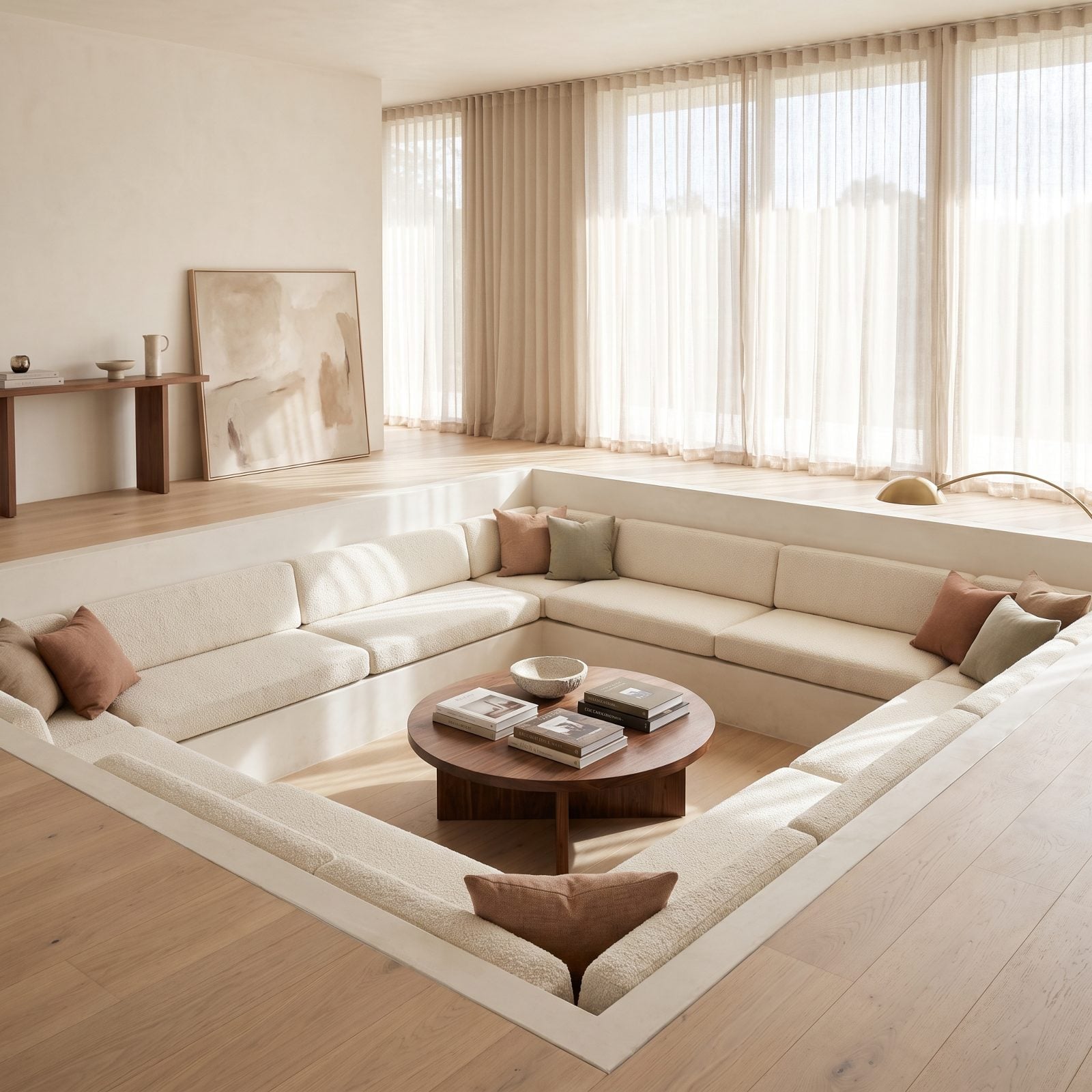
The sunken living room died because nobody wanted to carry a tray of drinks down two steps in the dark. Fair enough. But the social geometry was always right, and dropping the seating means everyone faces each other instead of a screen.
In order to come up with the very specific design ideas, we create most designs with the assistance of state-of-the-art AI interior design software. Also, assume links that take you off the site are affiliate links such as links to Amazon. this means we may earn a commission if you buy something.
The ivory bouclé here keeps it soft and current, and the continuous built-in bench means no sofa-shopping ever again. That low walnut table in the middle pulls the eye down and settles the whole room.
43. Warm Stained-Wood Wall Paneling
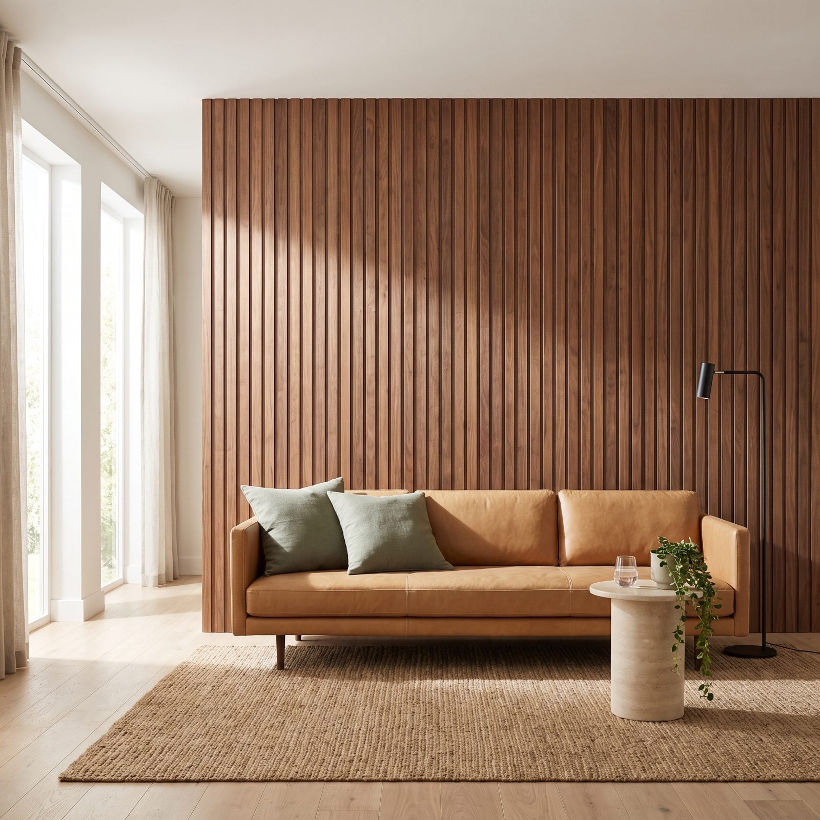
Wood paneling earned its bad reputation honestly. The 1970s drowned entire basements in the stuff, floor to ceiling, dark as a steakhouse. The fix is just one wall.
Here the walnut slats catch the raking daylight and the grain does something no paint can fake. Camel leather and sage pillows keep it from going full hunting cabin. Warm wood on a single plane reads as material, not nostalgia.
42. Glass-Block Partition Walls
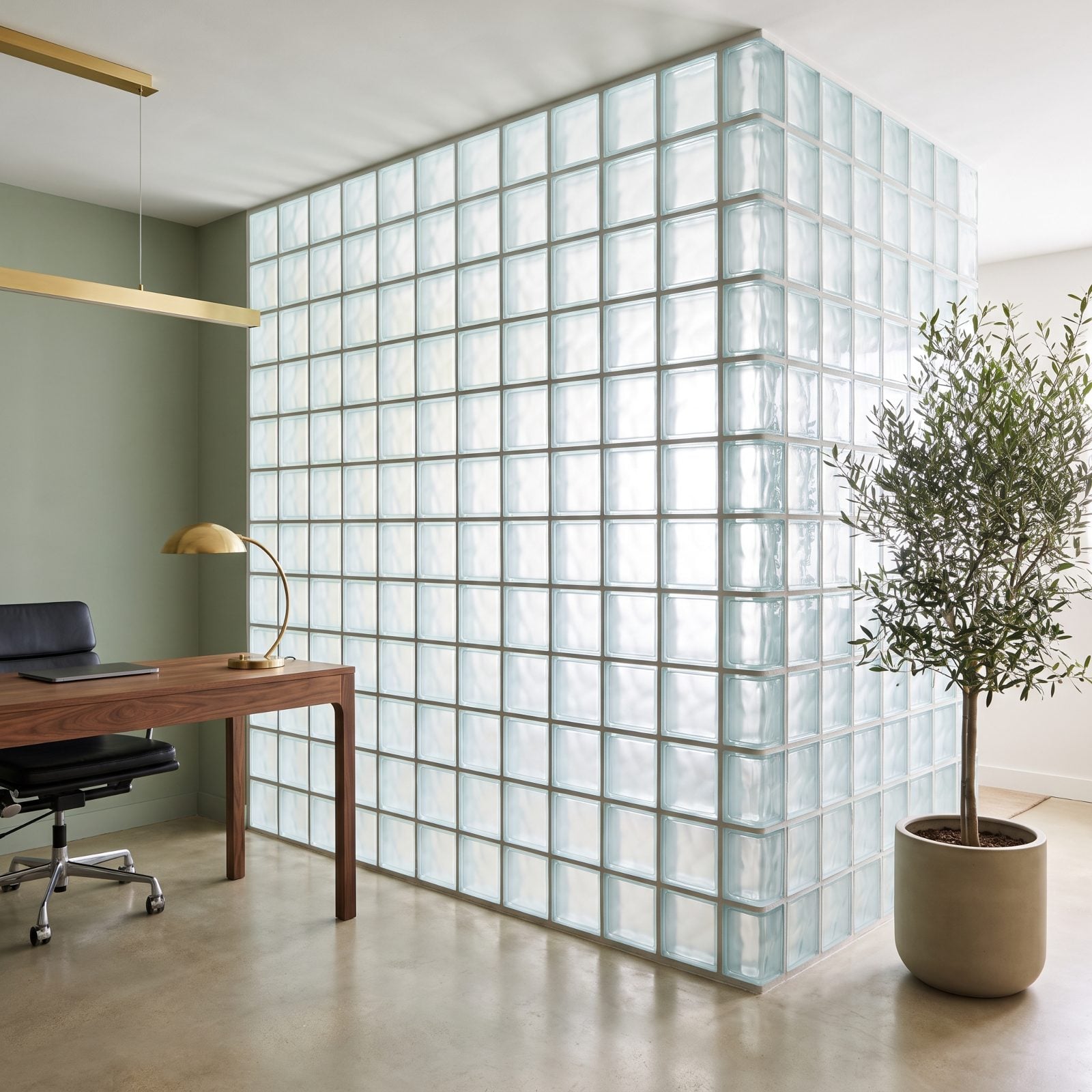
Glass block spent a decade as shorthand for bad bathroom renovations. Then people remembered what it actually does: splits a room without killing the light.
That luminous partition keeps the office separate while letting daylight bleed straight through, and the wavy texture turns the glow into something soft and watery. Pair it with warm walnut and polished concrete and it reads architectural.
41. Honey-Toned Oak Kitchen Cabinets
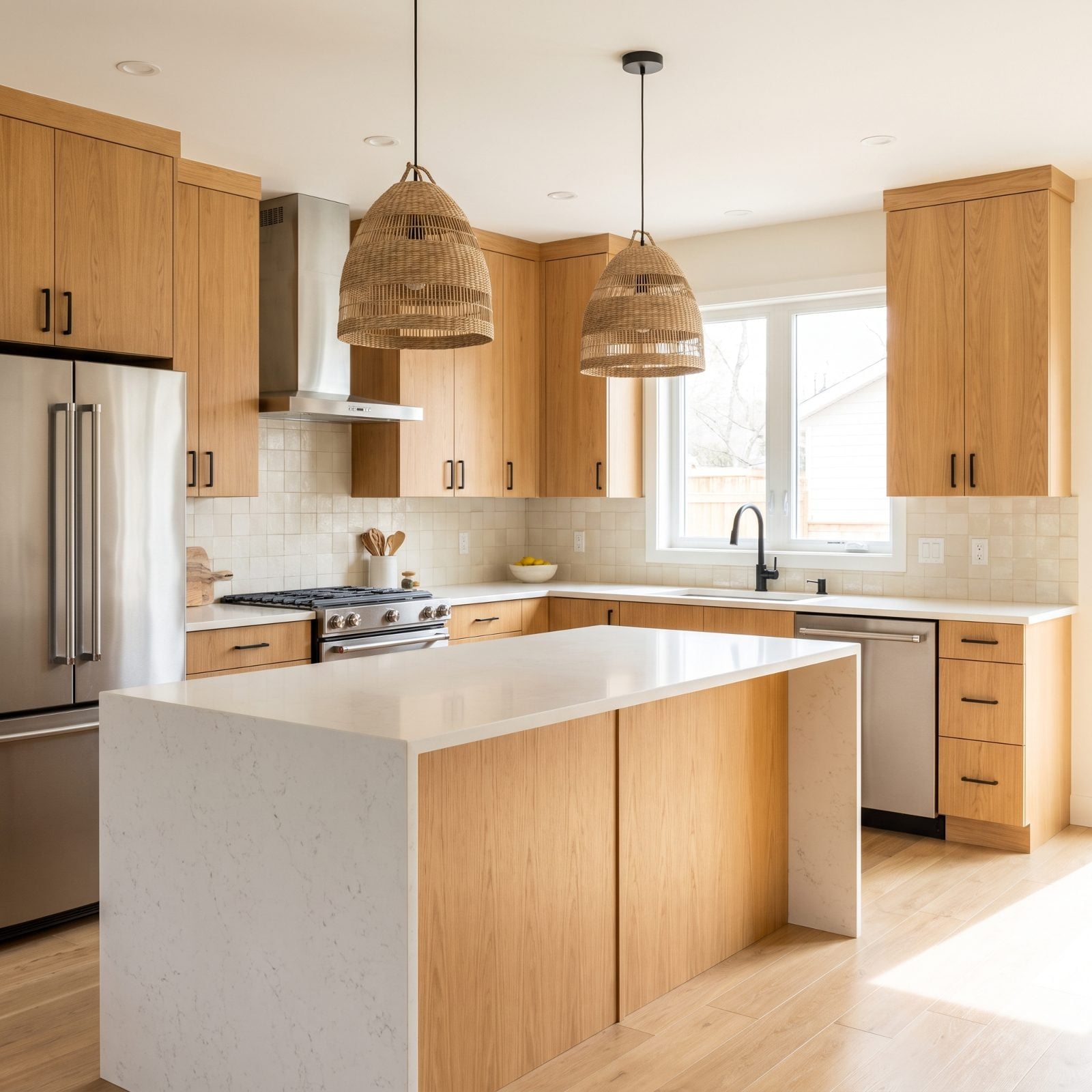
Everyone painted their oak cabinets white around 2015 and immediately regretted the shaker-and-subway sameness that followed. Wood is back. Not orange builder oak. This.
The flat-slab fronts keep the grain modern instead of country, and honed white quartz cools the whole thing down so it never tips into amber. Black pulls, a stainless range, cream zellige behind the sink. The refrigerator and dishwasher tuck into the cabinet run so the oak gets to be the star.
Want the finishing touches that make warm cabinetry sing? The right kitchen details matter as much as the boxes themselves. Shop the look with matte black cabinet pulls and a pair of woven pendant lights.
40. Large-Scale Floral Wallpaper

Big floral wallpaper gets filed under grandmother before anyone actually looks at it. Scale changes everything. Tiny sprigs feel twee; blooms the size of dinner plates feel like a mural you commissioned on purpose.
One wall, muted colors, plain plaster everywhere else. That restraint is why this bedroom reads intentional rather than inherited. The terracotta throw picks up the ochre in the pattern and the whole wall quiets right down.
39. Built-In Cocktail Bars
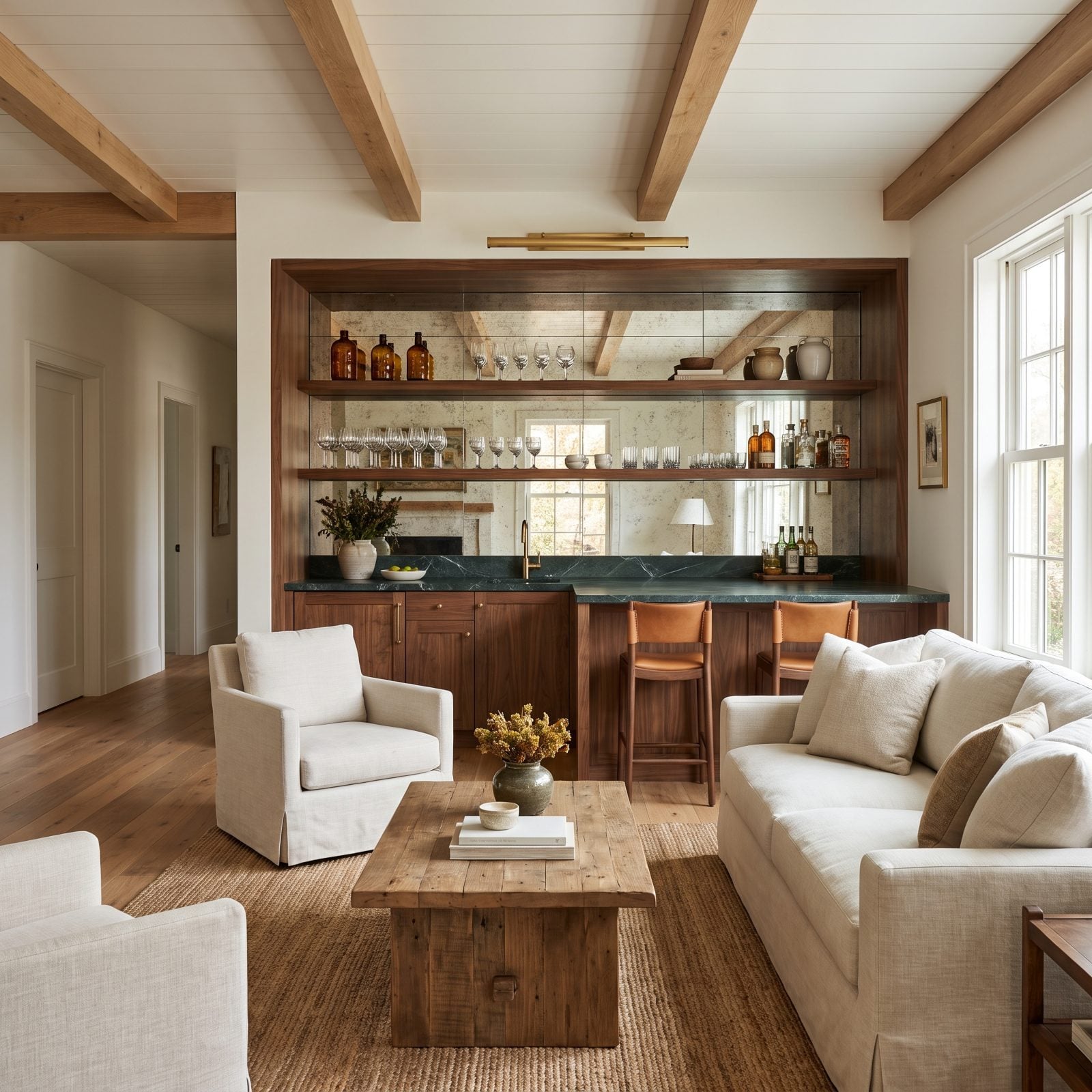
The built-in bar never actually went away. It just got embarrassing for a while, all mirrored tile and brass overload.
This version keeps the glamour and drops the excess. Walnut cabinetry, honed green marble, antique-mirror backing that throws light around without screaming for attention. The amber bottles and brass picture light handle the mood.
A proper bar niche is the one piece of built-in furniture that makes a house feel like it’s expecting company.
Finish it with walnut leather counter stools and a brass picture light.
38. Black-and-White Checkerboard Floors
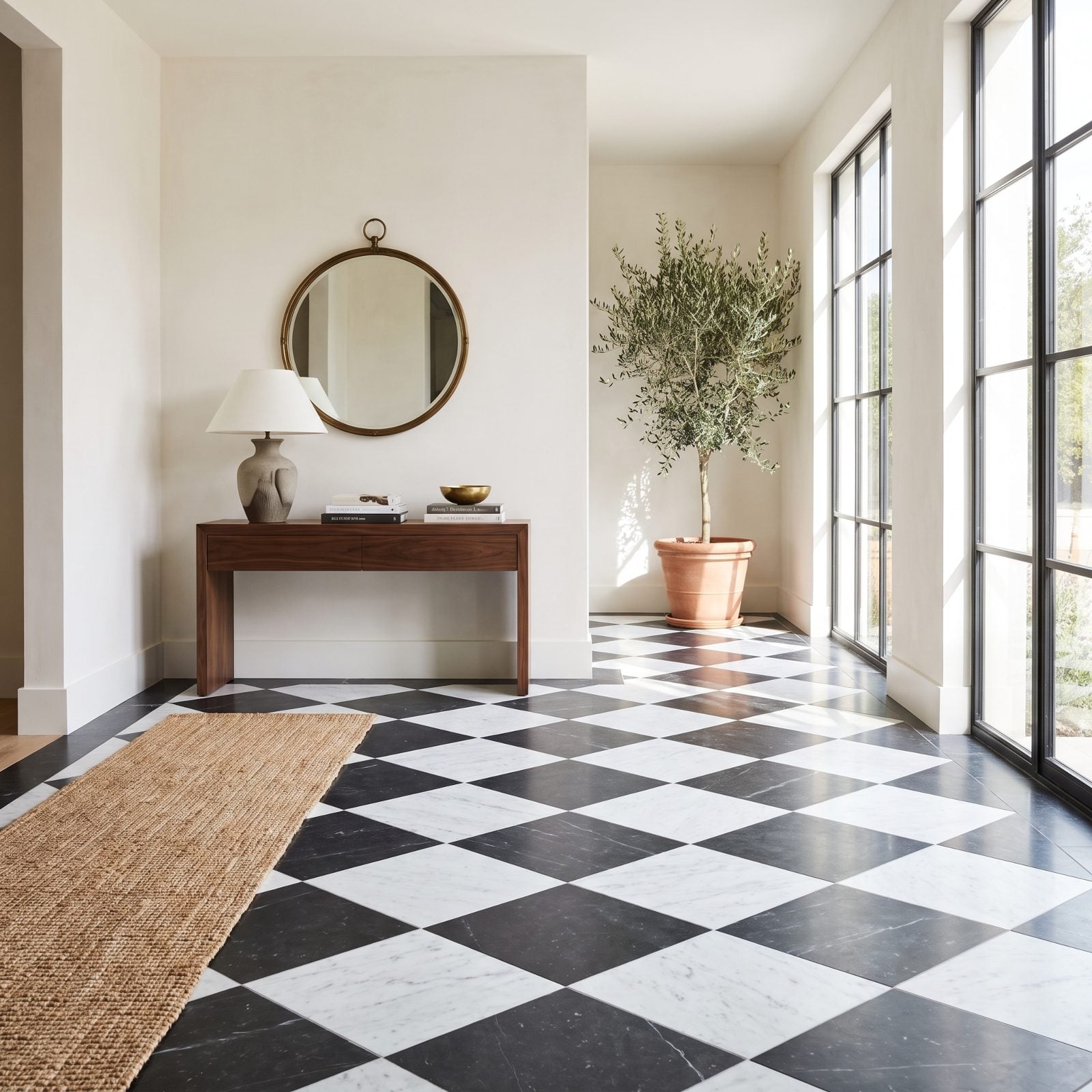
Checkerboard floors read either diner or chateau, and the difference lives entirely in the material. Vinyl squares in a kitchenette say the former. Honed marble laid on the diagonal says the latter.
The graphic punch down low lets you keep everything above it calm, which is exactly what this entry does with plaster walls and a single walnut console.
37. Fabric-Skirted Bathroom Sinks
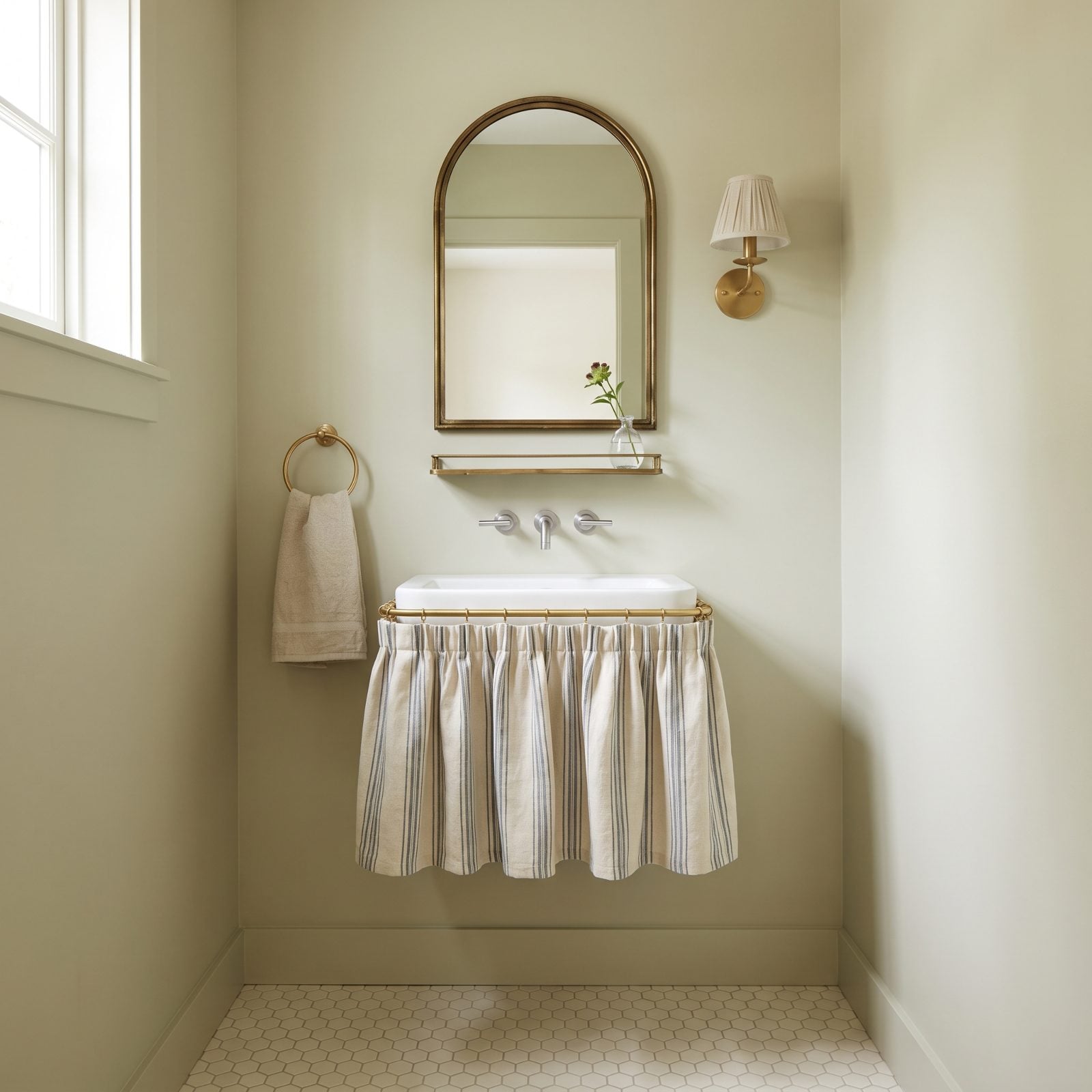
Hiding plumbing behind a gathered curtain sounds like a craft-fair idea until you see it done in good linen. Then it’s just clever.
The striped skirt here softens an entire hard-surface room and hides the storage underneath in one move. Add soft sage walls and brass fittings and the whole thing lands somewhere between a Paris apartment and your favorite aunt’s good taste.
36. Kitchen Pass-Through Windows
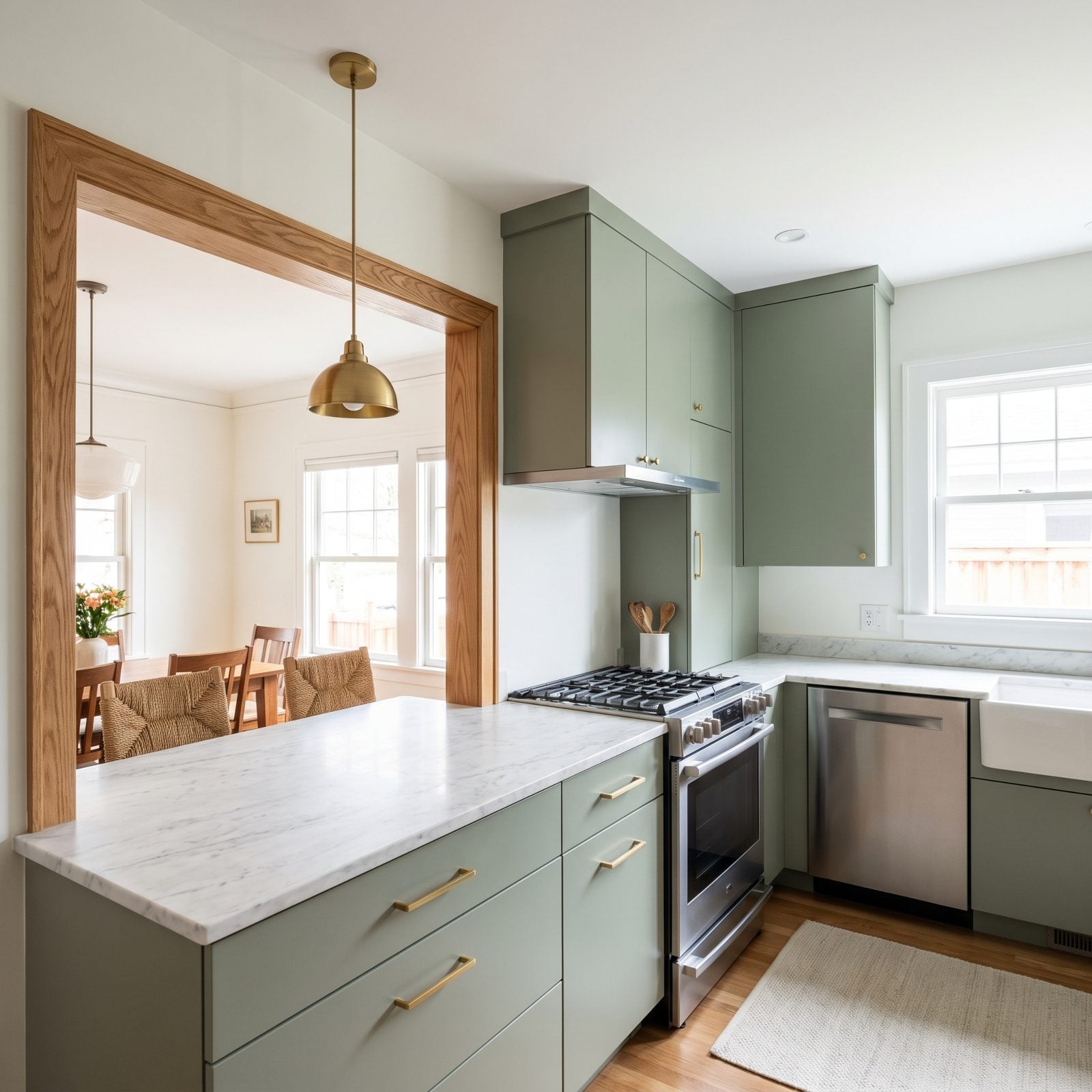
The pass-through window got demolished in the open-concept rush, when every wall became an enemy. Turns out total openness has downsides too: smell, noise, clutter you’d rather not frame for dinner guests.
A framed pass-through splits the difference, giving you the sightline and the conversation without the kitchen bleeding into the living room. Here the oak-framed opening doubles as a serving ledge with stools, and the sage cabinets, brass pulls, and marble counters keep it current. The stainless range, refrigerator, and dishwasher all stay on the working side where they belong, out of the dining room’s eyeline.
35. Patterned Laminate Countertops
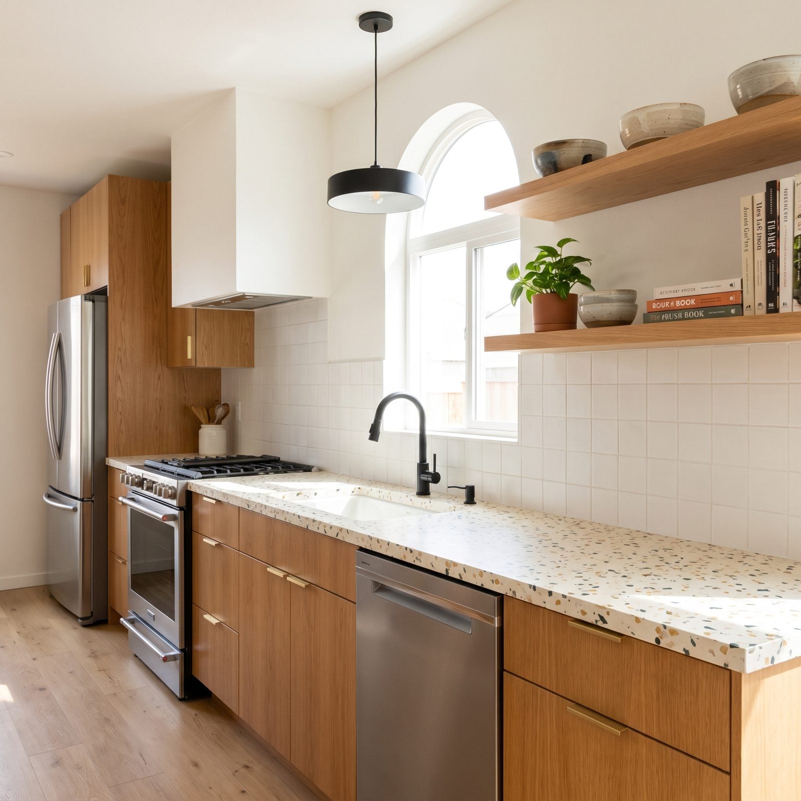
We spent years telling people to rip out laminate. We were wrong, and the new stuff is why.
The patterned laminate here reads as a soft terrazzo, cream flecked with ochre and sage, and from arm’s length you’d swear it was stone. Oak cabinets and white tile keep it honest instead of kitschy.
Here’s the part nobody admits: on a budget, laminate lets you take a real swing at pattern you’d never risk in slab stone. The refrigerator, range, and dishwasher anchor the practical side while the counter gets to be fun.
34. Full-Height Antiqued Mirror Walls
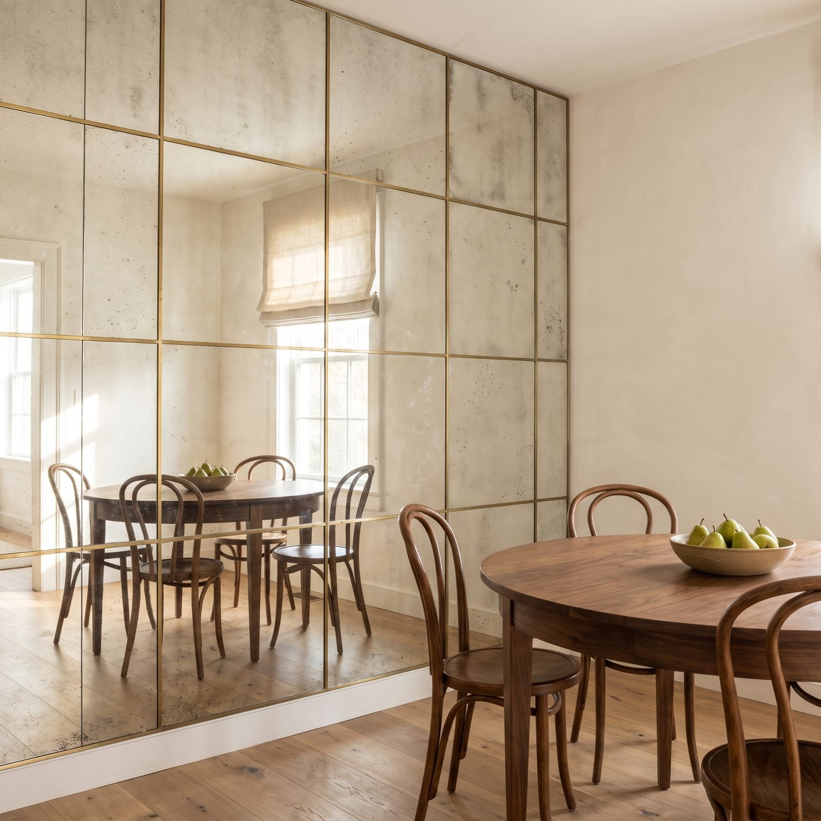
Antiqued mirror used to mean a glitzy 1980s bathroom. Here it reads as texture instead of shine. The foxing and speckling kill the funhouse effect that makes new mirror feel cheap, so the wall throws light around the room without throwing your reflection back at you.
Pairing it with chalk plaster and a walnut dining table keeps everything grounded. Those thin brass dividers do the quiet work, carving one big silver sheet into something that feels built rather than hung.
33. Decorative Wallpaper Borders
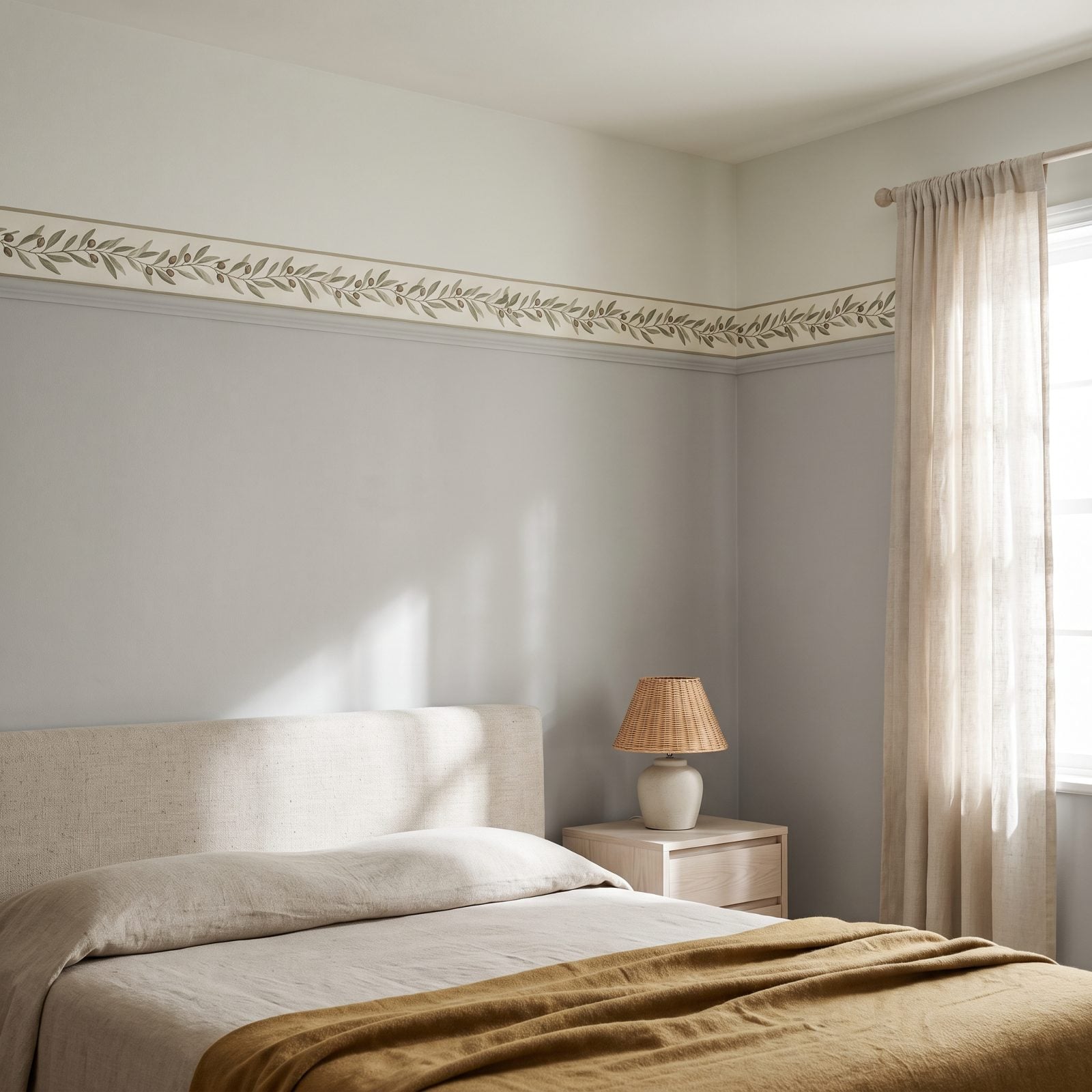
Borders earned their bad name honestly. People once ran a floral one around every room in the house, the garage included, probably. Used once, high on the wall, as a thin band rather than a full frame, the effect flips completely.
This olive-branch band sits at picture-rail height and behaves like crown molding you can draw. It lowers the ceiling just enough to make a tall room feel held, which is exactly what you want in a bedroom.
32. Geometric Parquet Flooring
🔥 Would you like to save this?
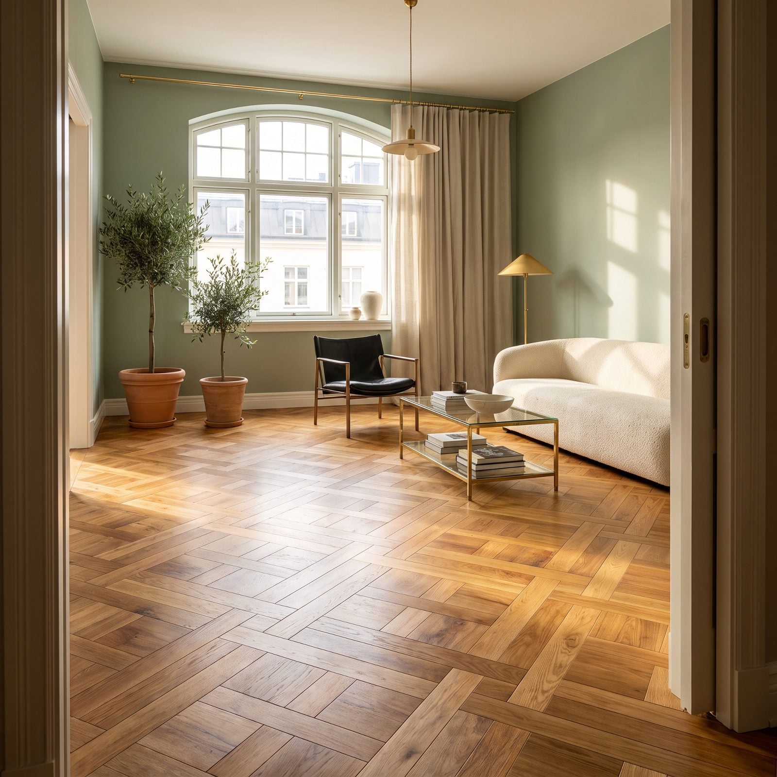
That herringbone your grandparents hid under the carpet? It’s the floor designers now pay a fortune to install.
Geometric parquet gives you pattern and texture in one move, which means a room can run almost empty above it and still feel finished. Keep the furniture low and plain and let the floor do the talking. A cream bouclé sofa and a single black leather sling chair are all this room needs.
31. Layered Chintz Upholstery
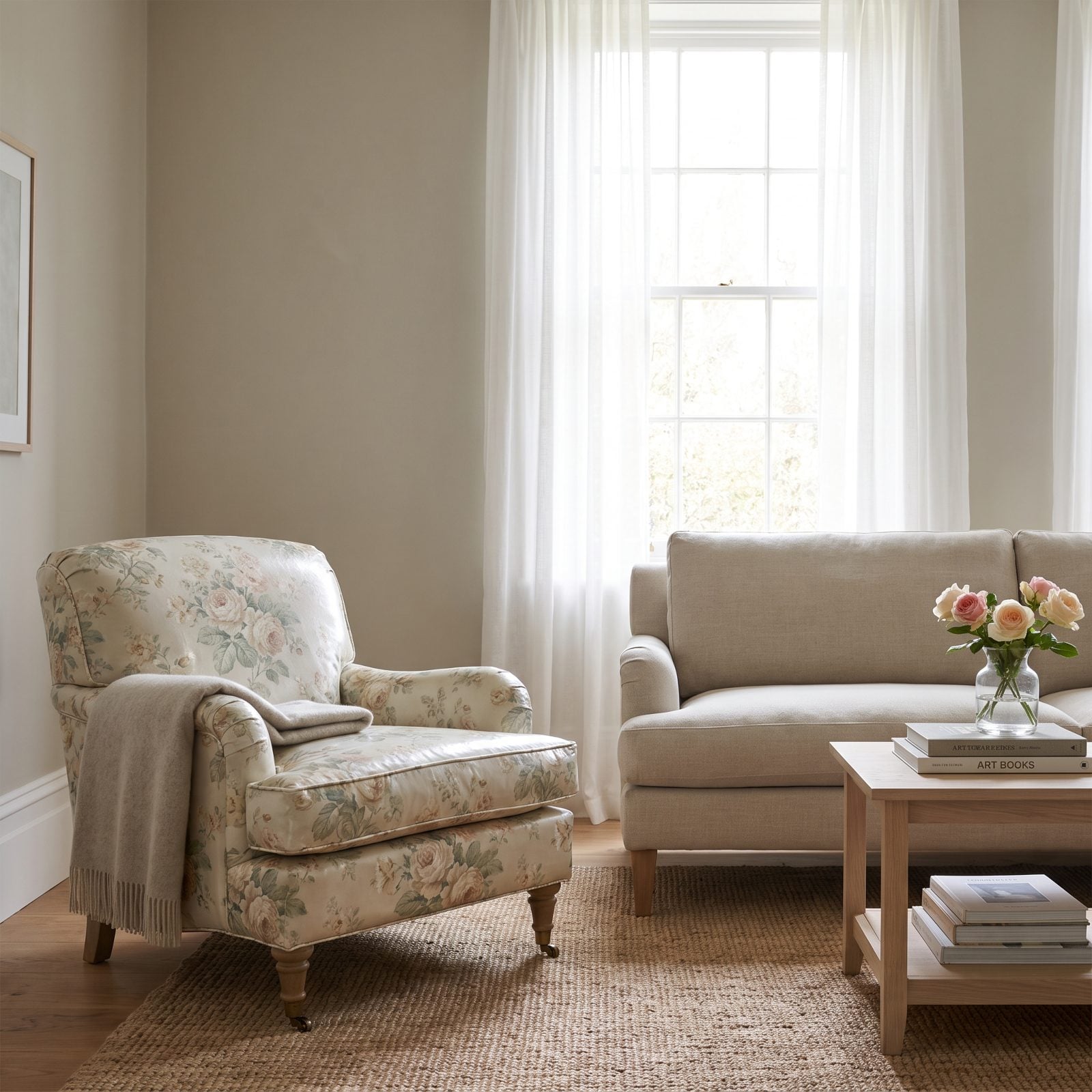
We spent years thinking chintz was something you inherited and then quietly donated. Wrong.
The glaze on real chintz catches light in a way printed cotton never manages, and a faded rose colorway reads soft rather than loud. The move is restraint: one chair, not a whole matching suite. Set it against plain flax linen and greige walls and the florals stop being granny and start being the most interesting thing you’ve got.
30. Ornate Ceiling Medallions
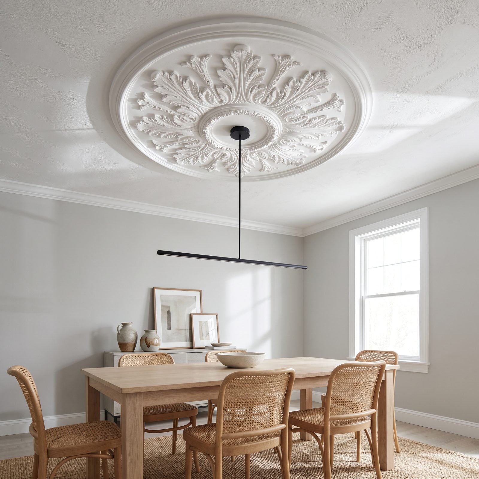
Hang a stark modern pendant from an ornate plaster medallion and watch both get better.
The old trick was gilding the medallion and crowning it with a crystal chandelier, which buried the detail under more detail. Paint it flat matte white instead. Now the carving reads as pure shadow and relief, and the minimalist black fixture below gives your eye somewhere clean to land. That friction between the two is what makes the ceiling worth looking at.
29. Patterned Linoleum Floors
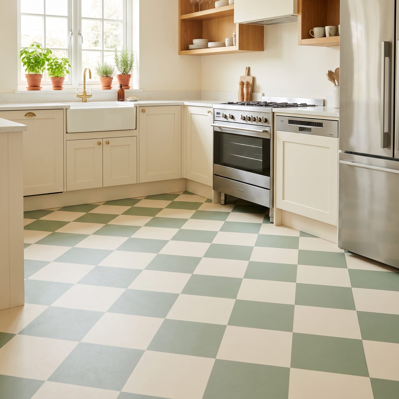
Linoleum is not vinyl, and it isn’t the cracked yellow sheet you remember from a rental.
Real linoleum is made from linseed oil and cork dust. Warm underfoot, quiet, and these days it comes in patterns worth showing off. A sage-and-cream diamond layout hands a plain Shaker kitchen a floor that actually does something, without the cost of tile.
Pair it with kitchen details like brass hardware and open oak shelving and the whole room feels considered rather than retro.
28. Tailored Fabric Valances
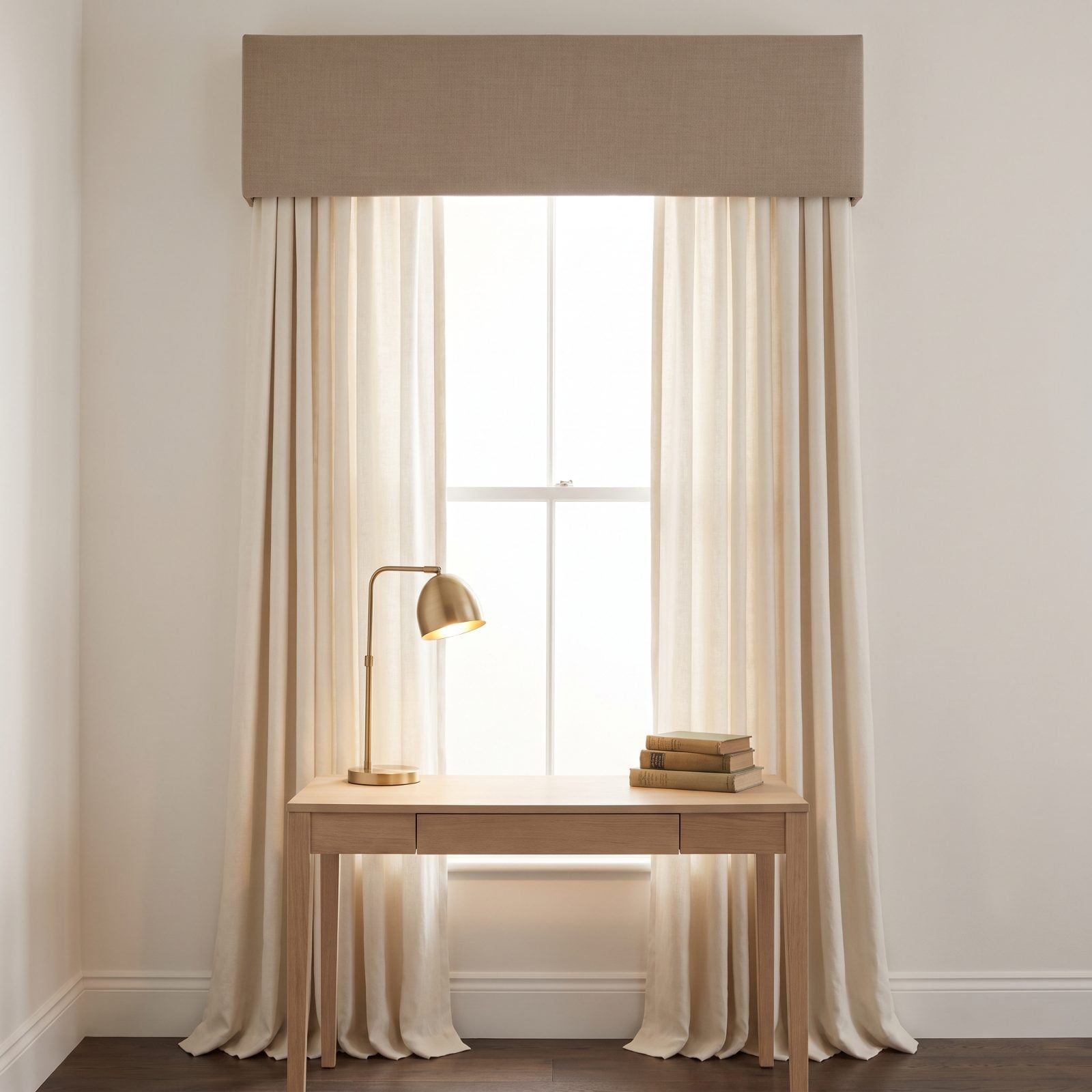
Valances went out because they went frilly. Pleats, swags, tassels, the works. Strip all that off and you’re left with the actual idea, which was good all along: a clean horizontal band that finishes a window the way a frame finishes a painting.
This flat taupe linen box valance is basically trim. It hides the hardware, squares off the top of the window, and makes an ordinary opening look built-in. Tailored, not fussy — and that gap is everything.
27. Cork Wall Tiles
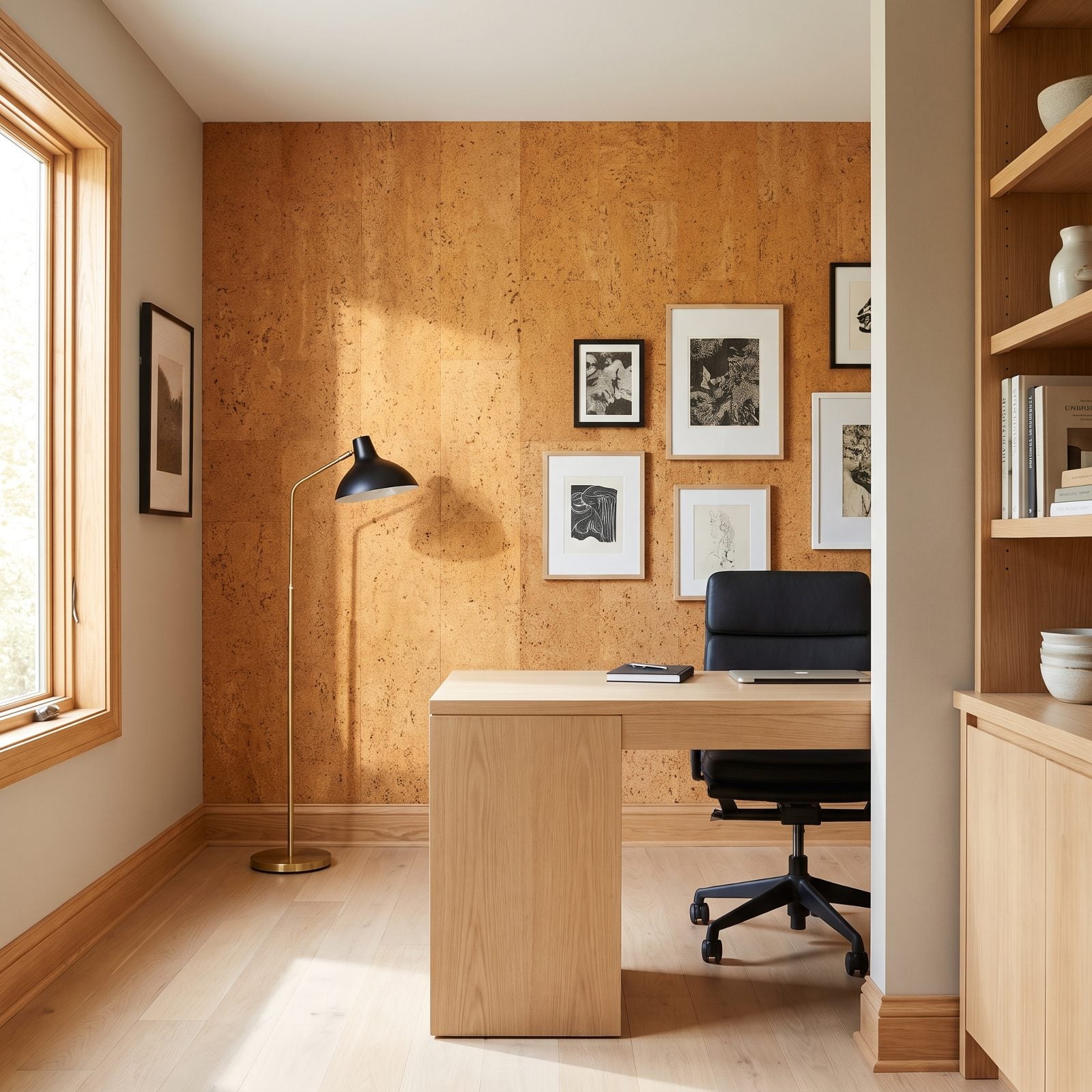
Cork on the walls sounds like a 1970s rec room. In amber tones, floor to ceiling, it looks like money.
The surface eats sound, which is the real reason it earns its keep in a home office — no more echo bouncing off hard plaster. The grain gives a flat wall actual depth, and you can pin things straight into it. Keep the rest of the room spare, a pale oak desk and a brass floor lamp, and the cork reads warm instead of dated.
26. Plug-In Swag Pendant Lights
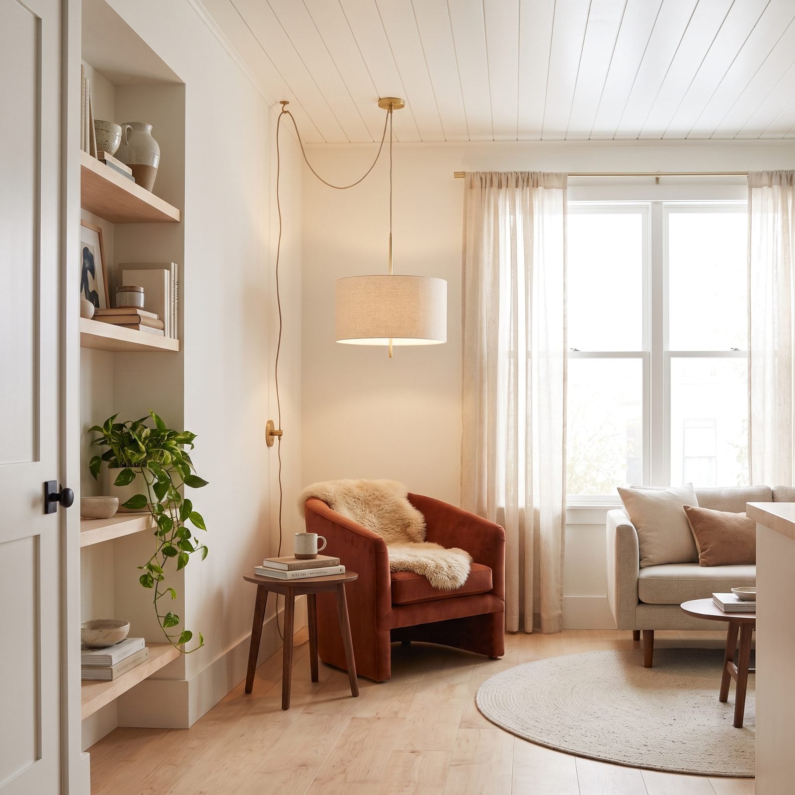
No electrician, no hole in the ceiling, no permission from a landlord. The swag pendant was always the renter’s loophole, and it still is.
What changed is the fixtures. Skip the macramé and get a plain linen drum on a cloth-covered cord, swagged from a hook to a discreet brass plate. Over a rust velvet armchair, it conjures a reading corner out of nothing.
25. Avocado-Green Kitchen Accents
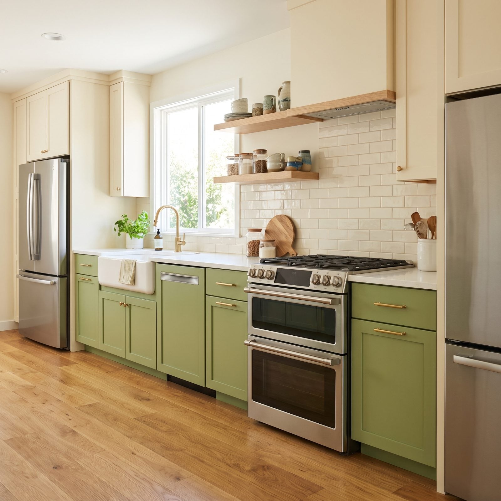
Avocado green is the color everyone loves to mock. The fridge, the oven, the carpet, all of it green at once — that’s the version that earned the jokes.
Use it on the lower cabinets only, muted down toward sage, and pair it with cream uppers and brass pulls. Suddenly it reads earthy and expensive. The appliances stay stainless so nothing competes. One committed color beats ten timid ones every time.
24. Adjustable Track Lighting, Finally Done Right
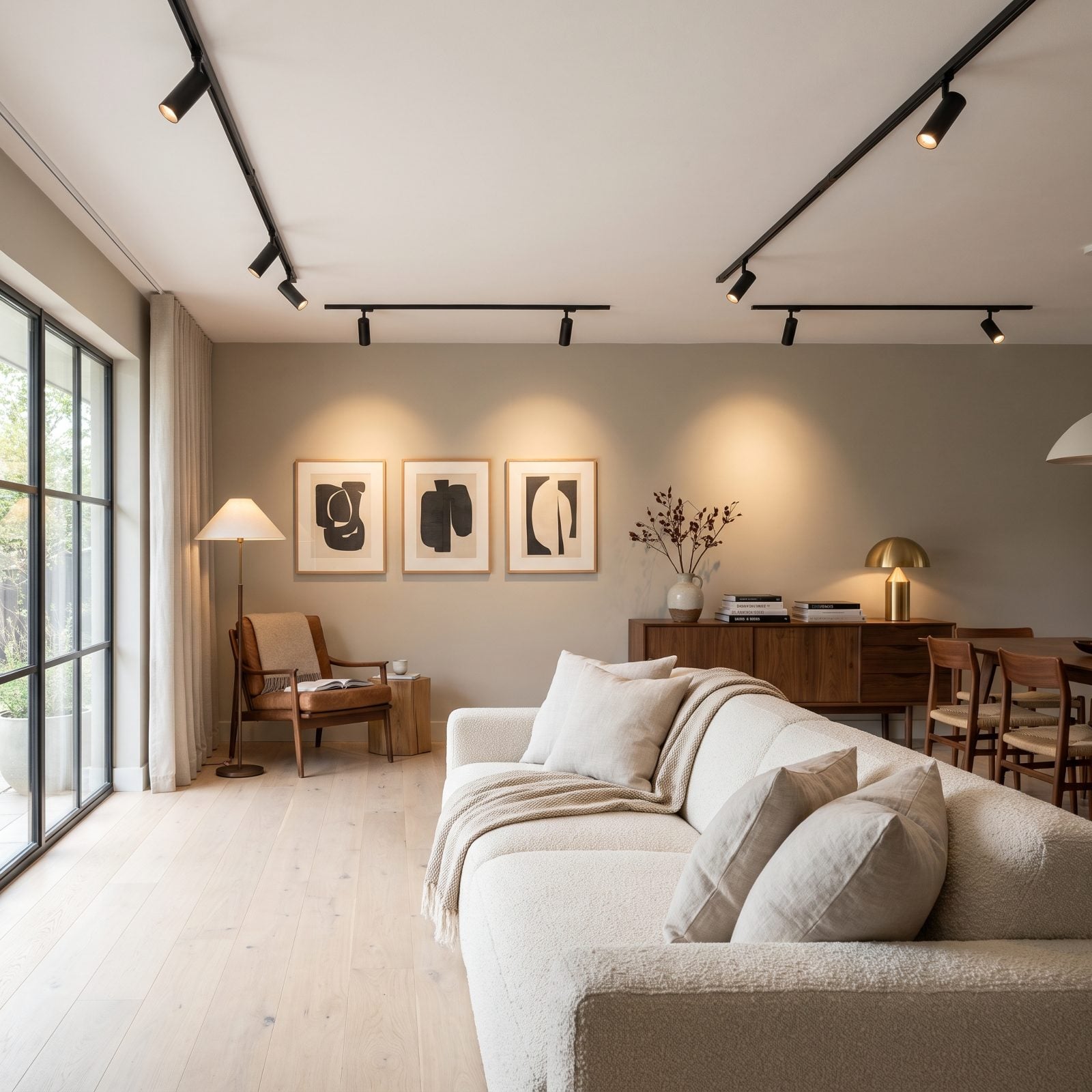
Track lighting earned its bad reputation honestly — the old versions were chunky, chrome, and pointed everywhere except where you needed them. The new slim matte-black runs fixed that. Here, every head is aimed with intent, washing the artwork and the reading corner instead of flooding the whole room flat.
What makes it work is restraint. One clean run, dark enough to recede into the ceiling, heads angled like a gallery rather than a showroom. Directional control is why designers quietly came back around to it.
23. Turned-Spindle Room Dividers That Earn Their Keep
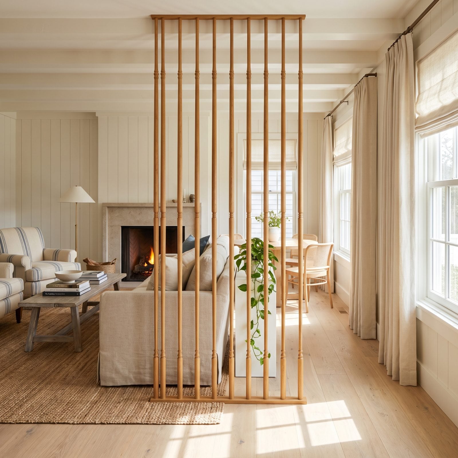
A spindle screen used to mean shag carpet and avocado appliances were nearby. Not anymore. Slim the dowels down, strip the stain back to honey oak, and the thing reads as sculpture that happens to divide a room.
The magic is the light. Solid walls block it, but these let it through in soft vertical stripes that shift across the floor all afternoon, so you get separation without the gloom. It zones the space while keeping sightlines open — exactly what open-plan homes have been begging for.
22. Wall-to-Wall Bedroom Carpet Nobody Wants to Leave
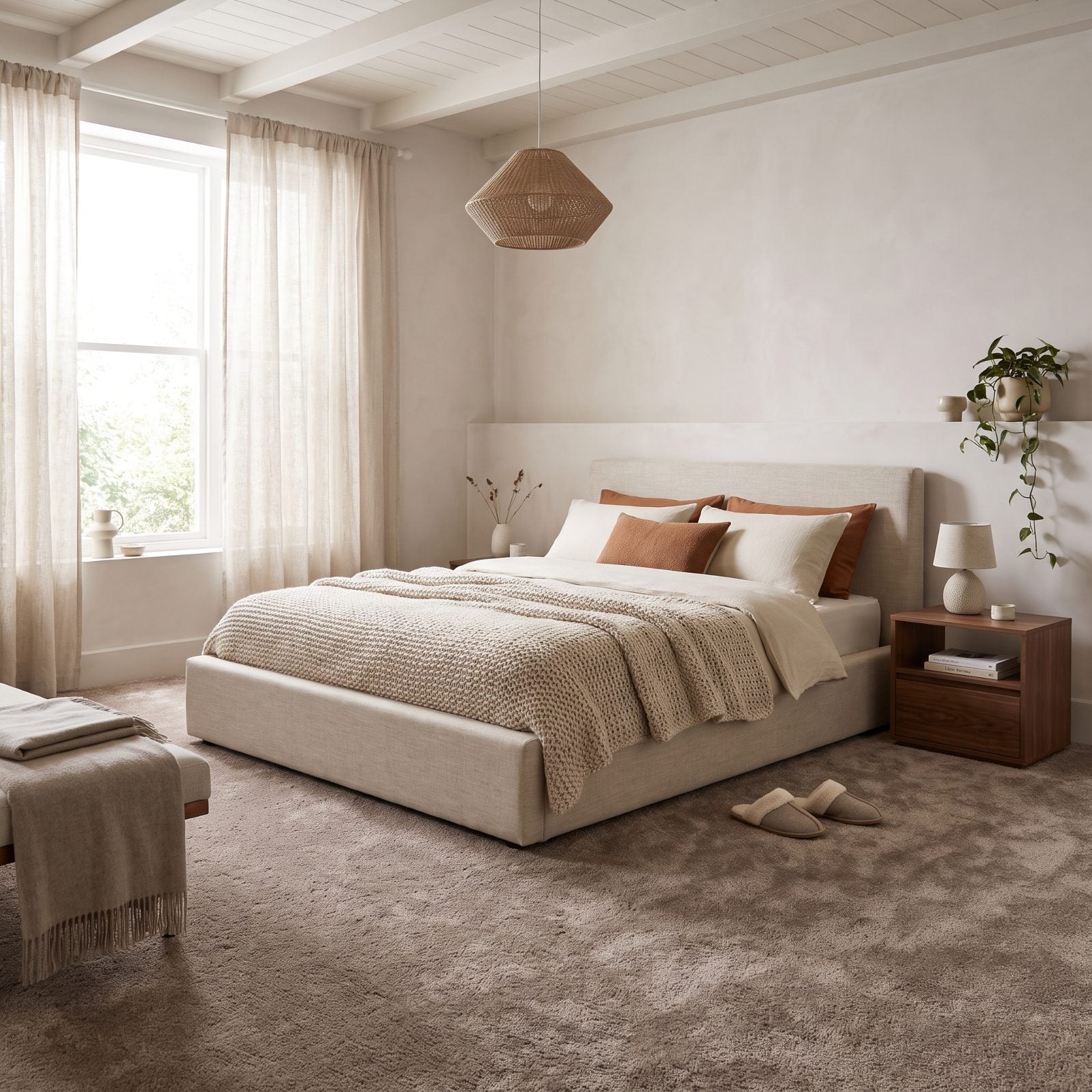
I spent years in the hardwood-only camp. Then I stepped onto deep wool carpet in a bedroom at six in the morning and shut up about it.
The trick is keeping it to the bedroom and choosing a quiet, warm neutral. Mushroom, oatmeal, soft taupe — not the beige of a rental office. Underfoot it does something cold floors can’t, and the pile swallows sound, so the whole room goes hushed the second you walk in.
21. Tiffany-Style Stained-Glass Lamps, Decontextualized
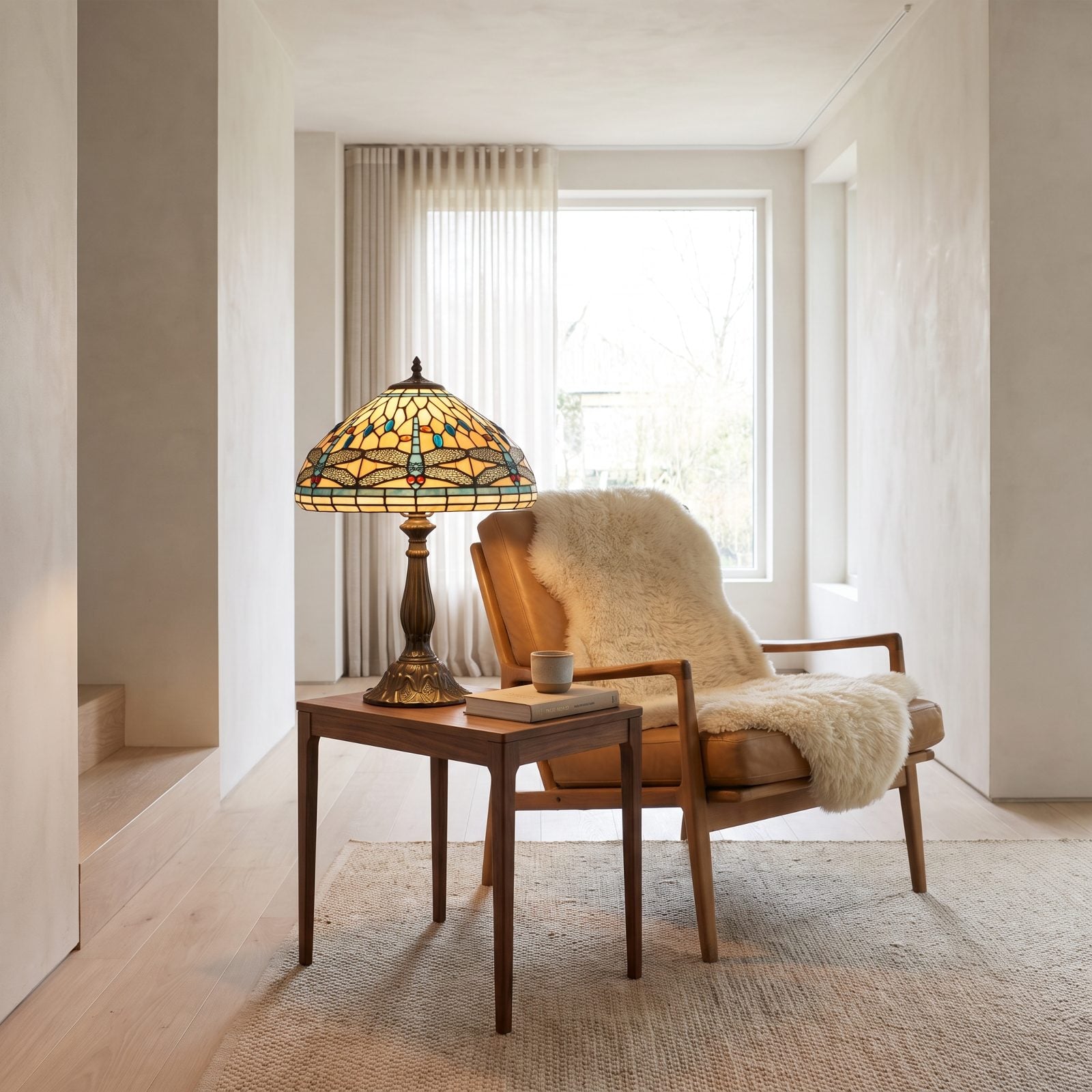
Pull a Tiffany lamp out of the fussy Victorian parlor and drop it into a pared-back room, and it stops being grandma’s lamp. It becomes the one colorful thing in a calm space, and that contrast is what saves it.
One amber-and-teal shade glowing against bare plaster walls and tan leather. Nothing else competing. The leaded glass does what it’s done for a century: throws warm, jeweled light that no LED filter has ever matched.
20. Picture Rails That Do Real Work
🔥 Would you like to save this?
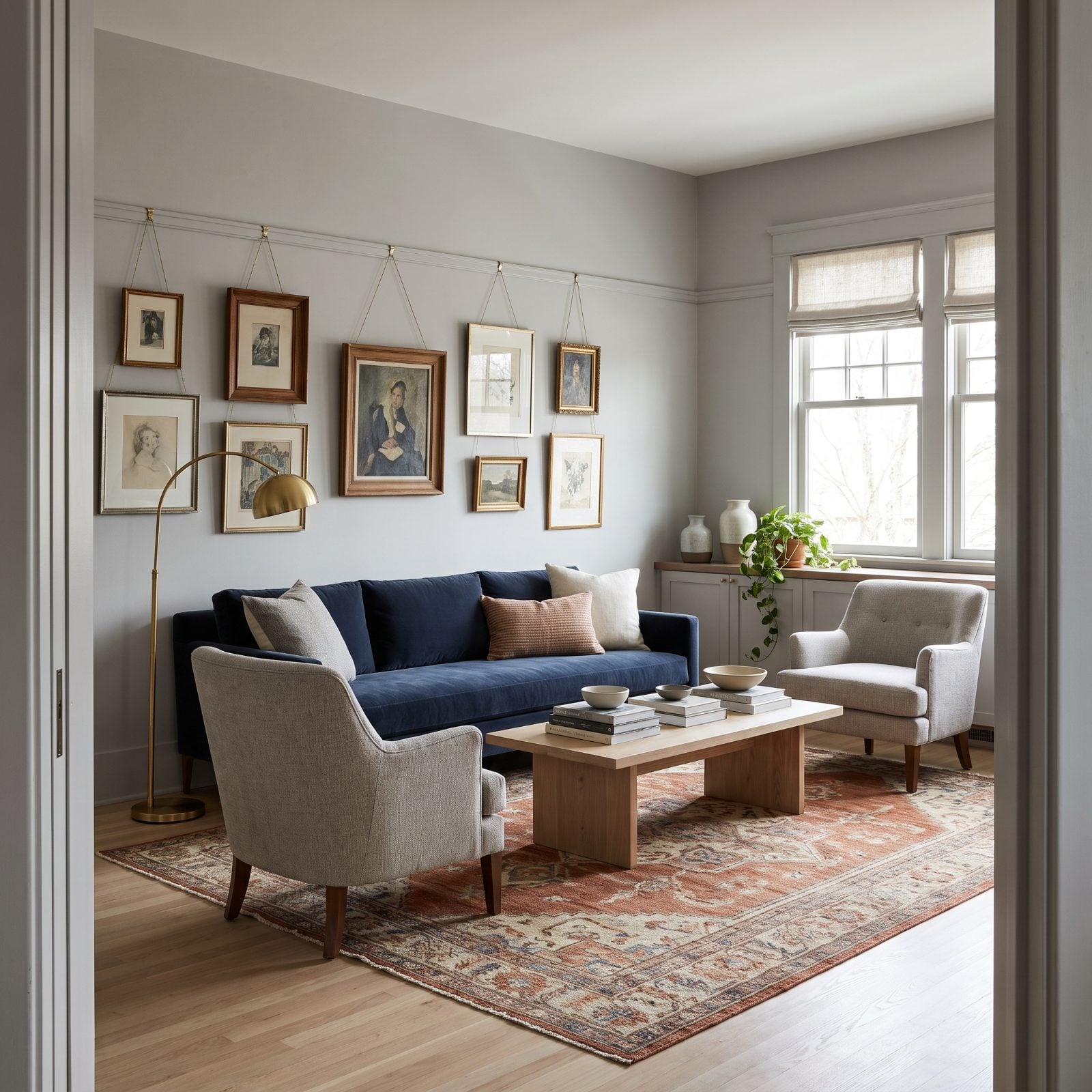
The quiet genius of a picture rail? You never put another hole in the wall again. Hang everything from slim brass wires, slide frames left and right whenever the mood shifts, and rehang the entire wall in ten minutes flat.
There’s more to it than convenience. That horizontal line draws the eye up, implies height, and gives a plain modern room a bit of backbone. Paint the rail to match the wall and it reads as detail, not fuss. Learning to read these small kitchen details and their counterparts across the house is half the fun of an older home.
19. The Kitchen Swinging Door, Back by Demand
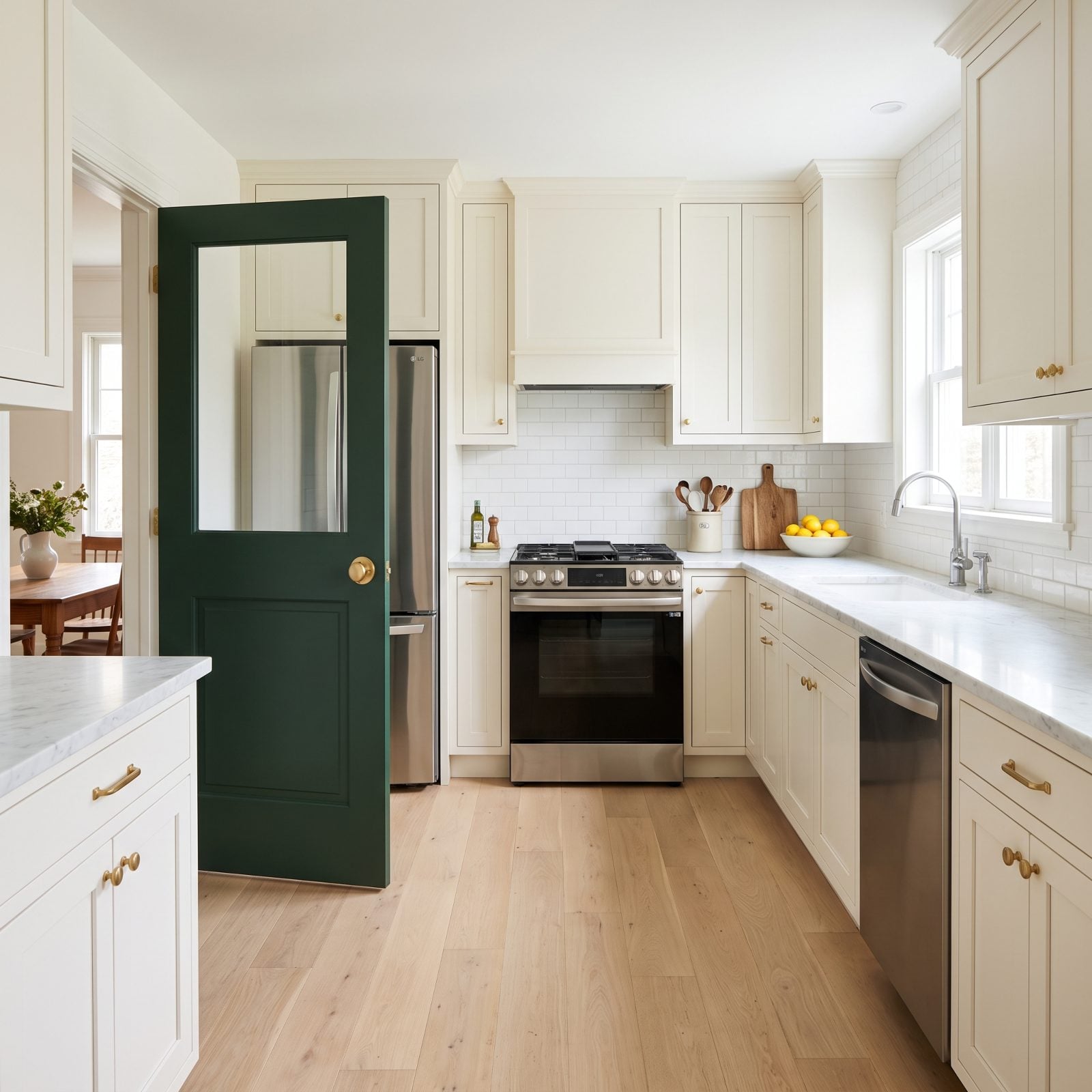
Open-plan ate the swinging door for a decade. Now people are tired of smelling last night’s fish from the sofa, and the door is sneaking back.
Paint it a confident color — forest green with a brass knob here — and it reads as a deliberate move rather than a leftover. It hides kitchen mess from dinner guests, muffles the dishwasher, and gives you that satisfying swing with your hands full of plates. The stainless range, fridge, and dishwasher stay hidden until you want them seen.
18. Dutch Doors That Split the Difference
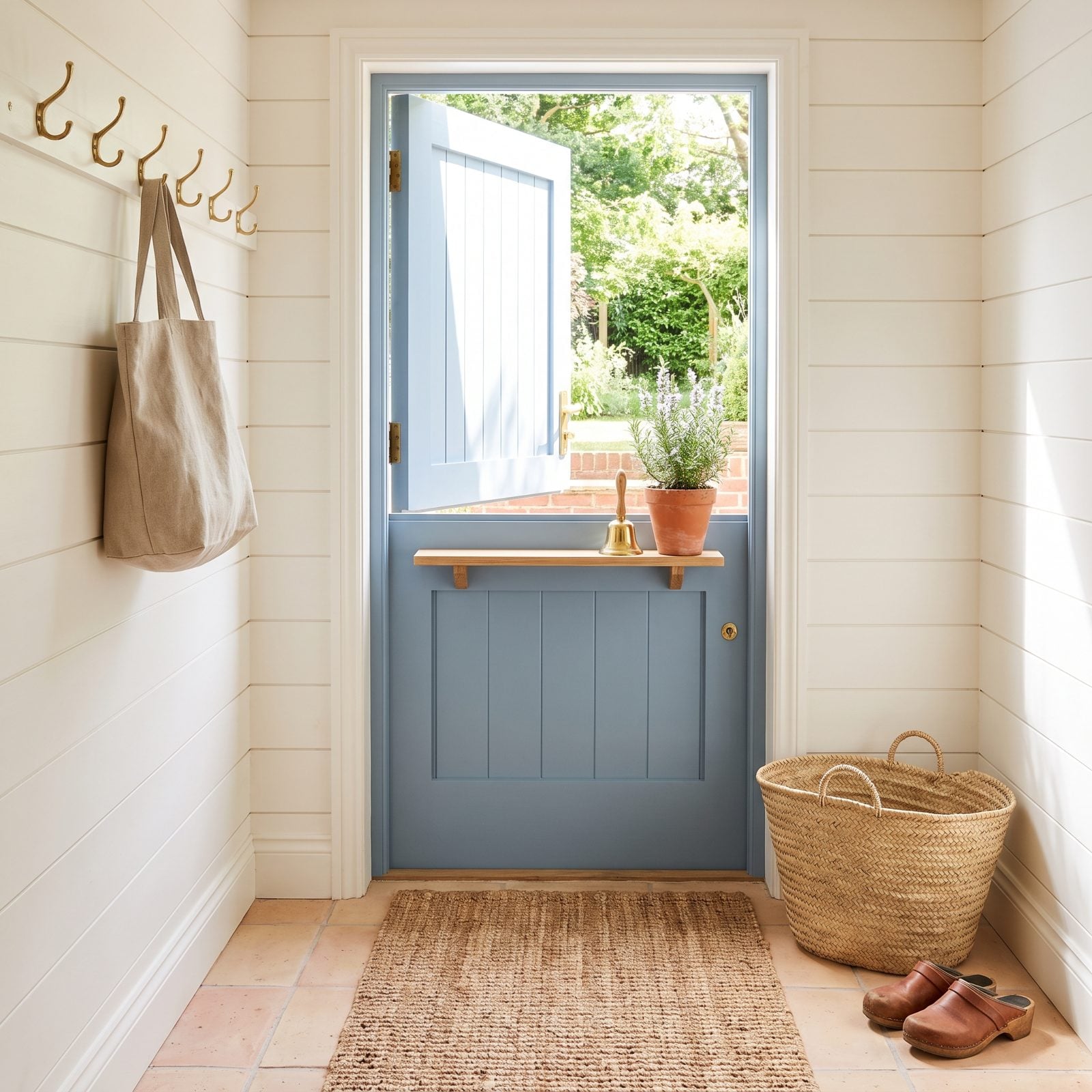
A Dutch door is the most charming piece of problem-solving in any old farmhouse. Open the top, keep the bottom shut, and you get a breeze and a view without the dog escaping or the leaves blowing in.
In dusty blue against white shiplap, it turns a plain back entry into the most porch-style moment in the house. That little ledge on the bottom half? Perfect for a pot of rosemary and a brass bell.
17. Painted Beadboard, Grown Up
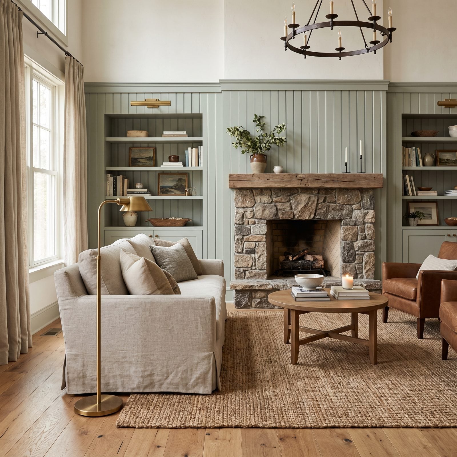
Beadboard went flat-white and builder-grade for so long people forgot it had any character. Give it a real color and the whole thing changes.
Muted sage across the lower two-thirds of a wall, warm plaster above, and suddenly those vertical lines read as texture instead of apology. The paneling catches raking daylight and throws soft shadows down its grooves, so even a small bathroom gets some depth. Same restrained discipline you see in good perfectionist-minded decor, just warmer.
16. Freestanding Wood Stoves as the New Centerpiece
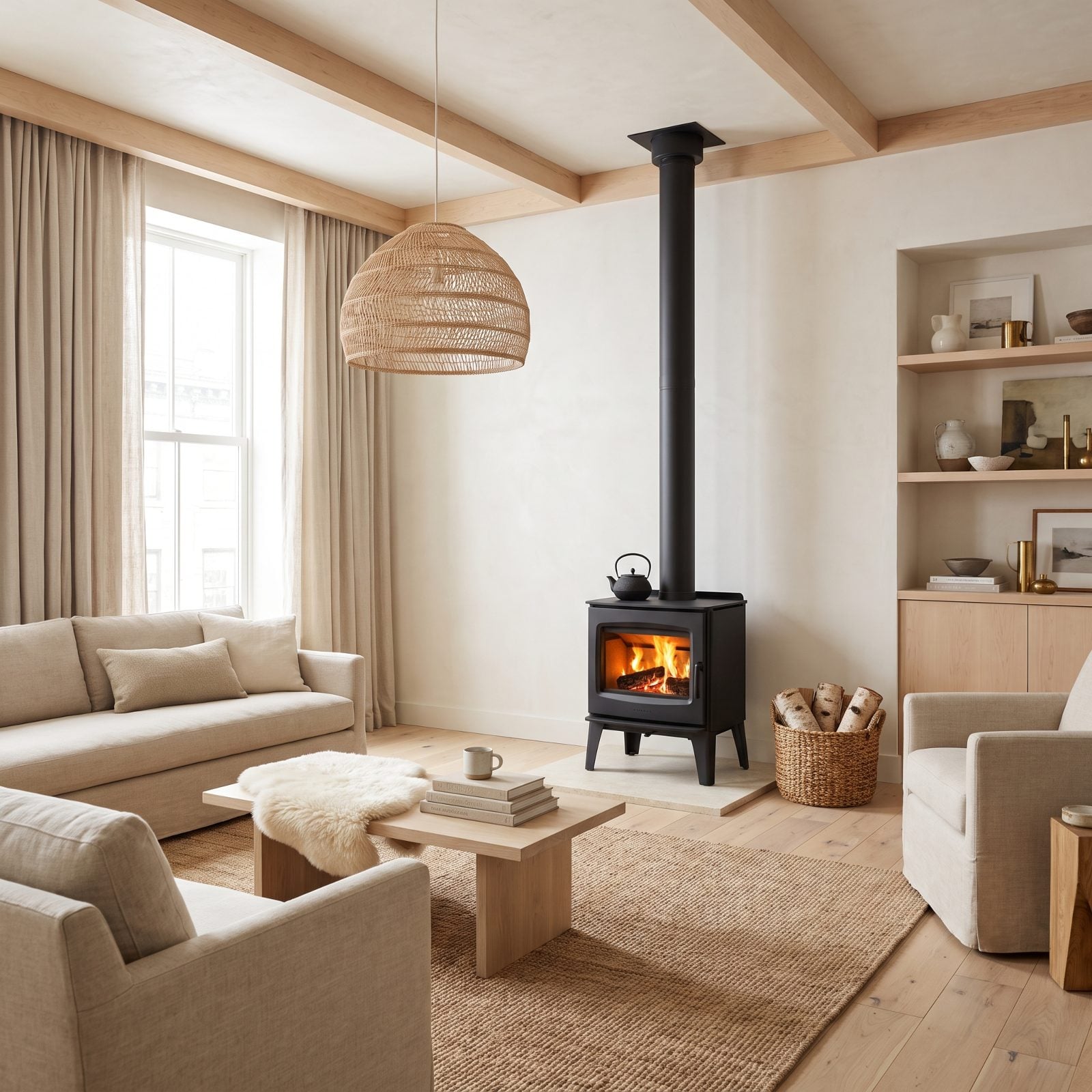
A freestanding wood stove sits in the room like a small, patient animal that happens to throw heat. No built-in surround, no mantel to style. Just a matte black object on a stone pad and a flue going straight up.
That sculptural simplicity is why it works in a pared-back room. It radiates warmth in every direction instead of up a chimney, and the ritual of it — split birch in the basket, kettle ticking on top — does something no thermostat can. The clean Scandinavian decor around it keeps the stove the clear star.
The best heat source in the house is also the best thing to look at in it.
15. The Clawfoot Tub, Curtain and All
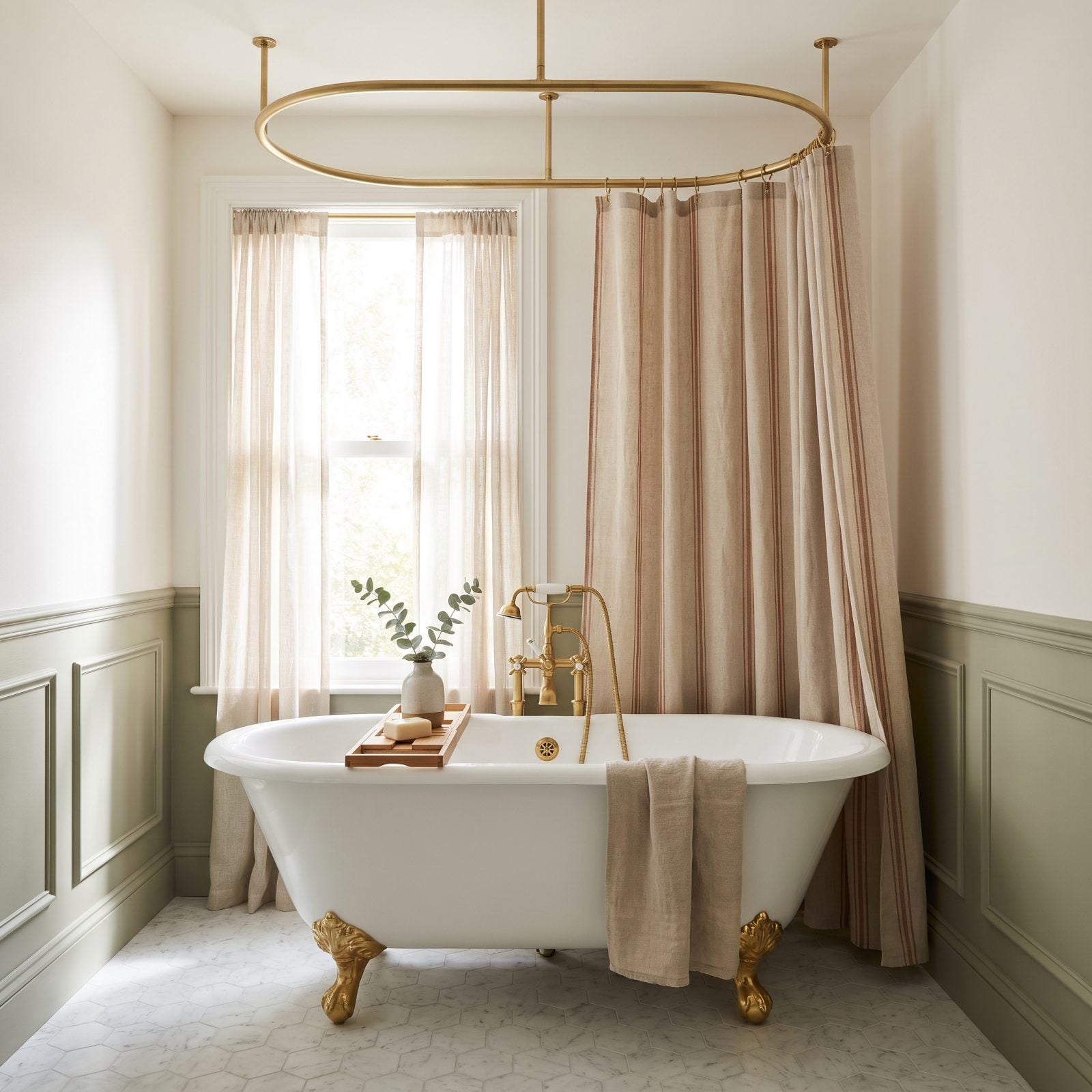
People spend a fortune ripping clawfoot tubs out, then spend another fortune buying reproductions a decade later. We’ve seen it happen.
The wraparound curtain is the part everyone second-guesses, and it’s the part that makes the tub practical. Hang it from an oval brass ceiling rail in natural linen with a thin rust stripe, and that curtain stops looking like a motel afterthought and starts framing the tub like a four-poster bed. Brass ball-and-claw feet, honed marble hex underneath, and the whole thing earns its floor space.
14. Traditional Pedestal Sinks, Back From Exile
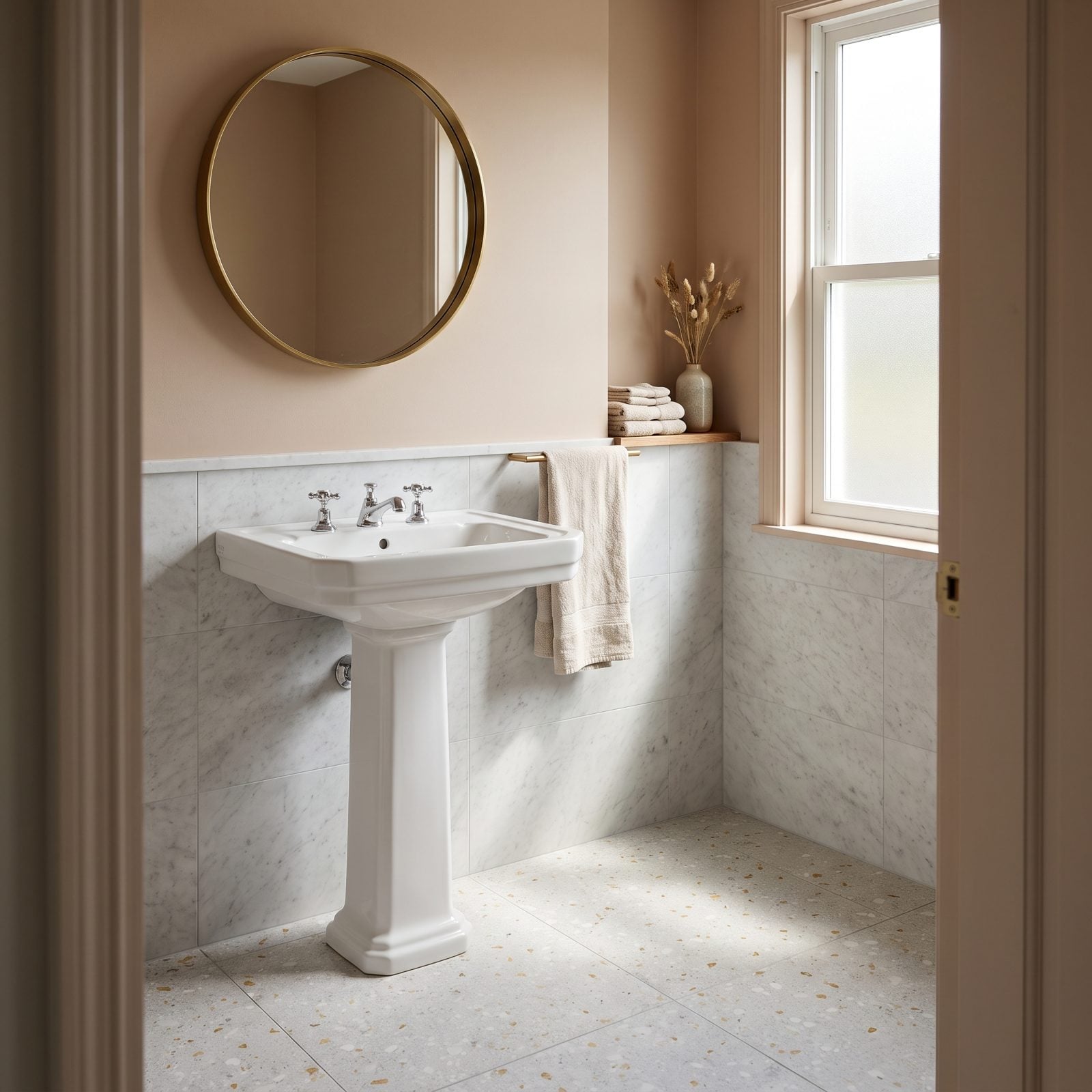
The pedestal sink got pushed out by the vanity because the vanity gave you a cabinet for the toilet paper. Fair enough. But in a powder room where nobody keeps spare rolls, that cabinet was just bulk — pull it out and the room breathes.
This one works because the same logic from good kitchen details applies: let one good object stand alone. The fluted column and the chrome cross-handle taps read as sculpture when nothing crowds them.
13. Colorful Retro Appliances That Aren’t Costume Pieces
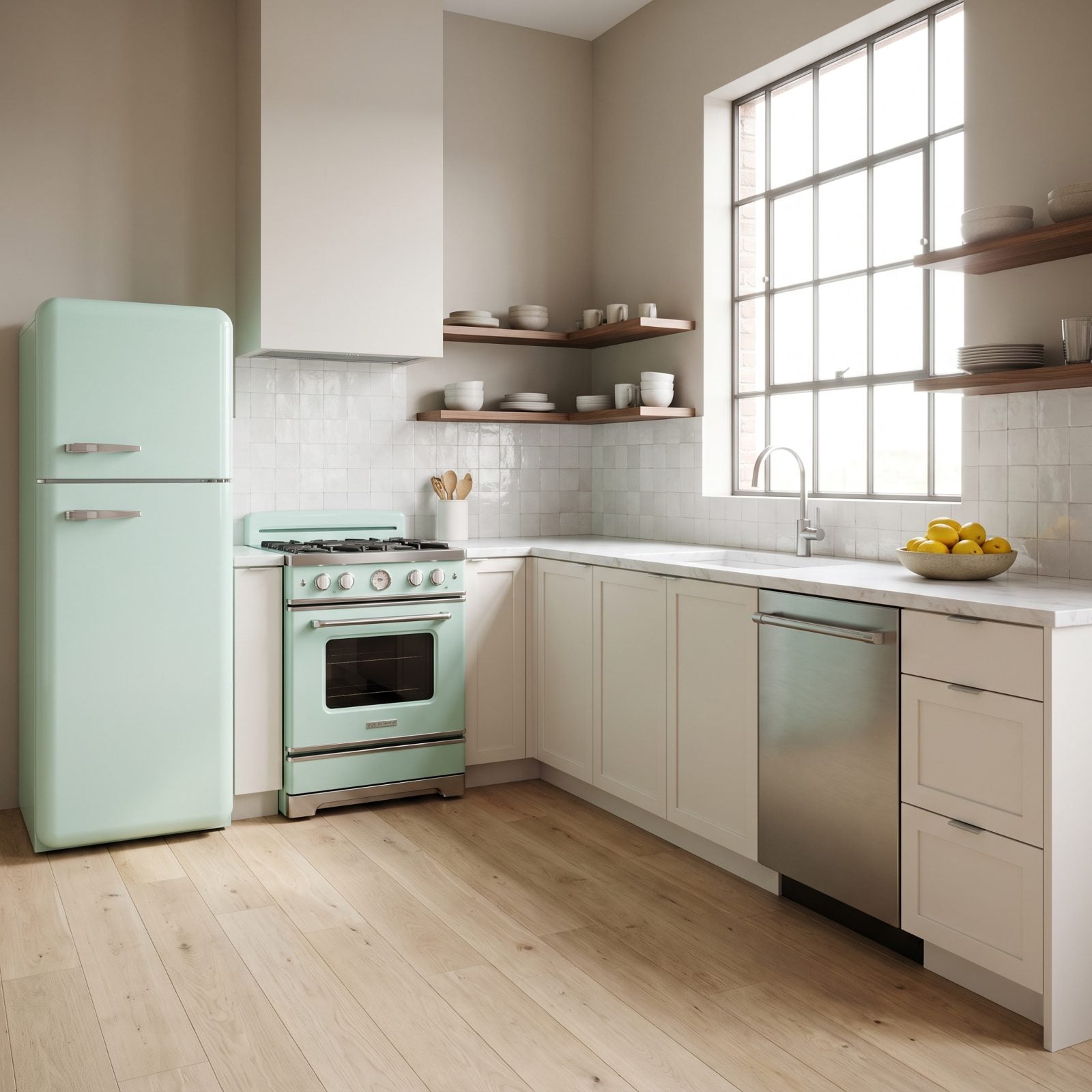
Mint, butter yellow, cherry red. The retro fridge earns a bad reputation because people pair it with checkerboard floors and a jukebox, and then it’s a diner, not a kitchen.
Here it works because everything around it stays quiet — warm-white shaker cabinets, honed marble, pale oak floors. The mint retro refrigerator and its matching range get to be the only loud thing in the room, and one loud thing is charm. Three loud things is a theme party. The stainless dishwasher hides in the cabinet run so the color stays deliberate.
12. Scalloped Wood Trim, Softened for Now
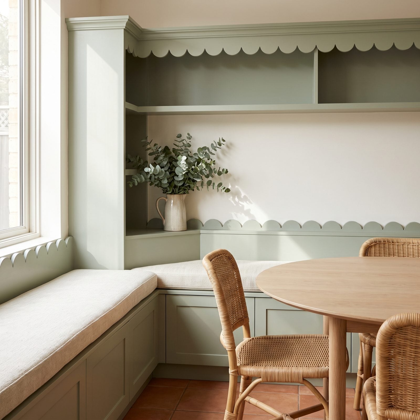
Scalloped trim used to mean a country kitchen with roosters on everything. The shape is innocent. The styling around it was the crime.
Painted in a flat sage against plain off-white walls, the scallop reads as a modern soft edge rather than a doily. It catches raking light along each curve, which is why carved trim exists and why nobody should ever gloss it. Keep the finish matte, keep the rest of the room clean, and the scallop turns into quiet rhythm.
11. Built-In Breakfast Booths Worth Keeping
🔥 Would you like to save this?
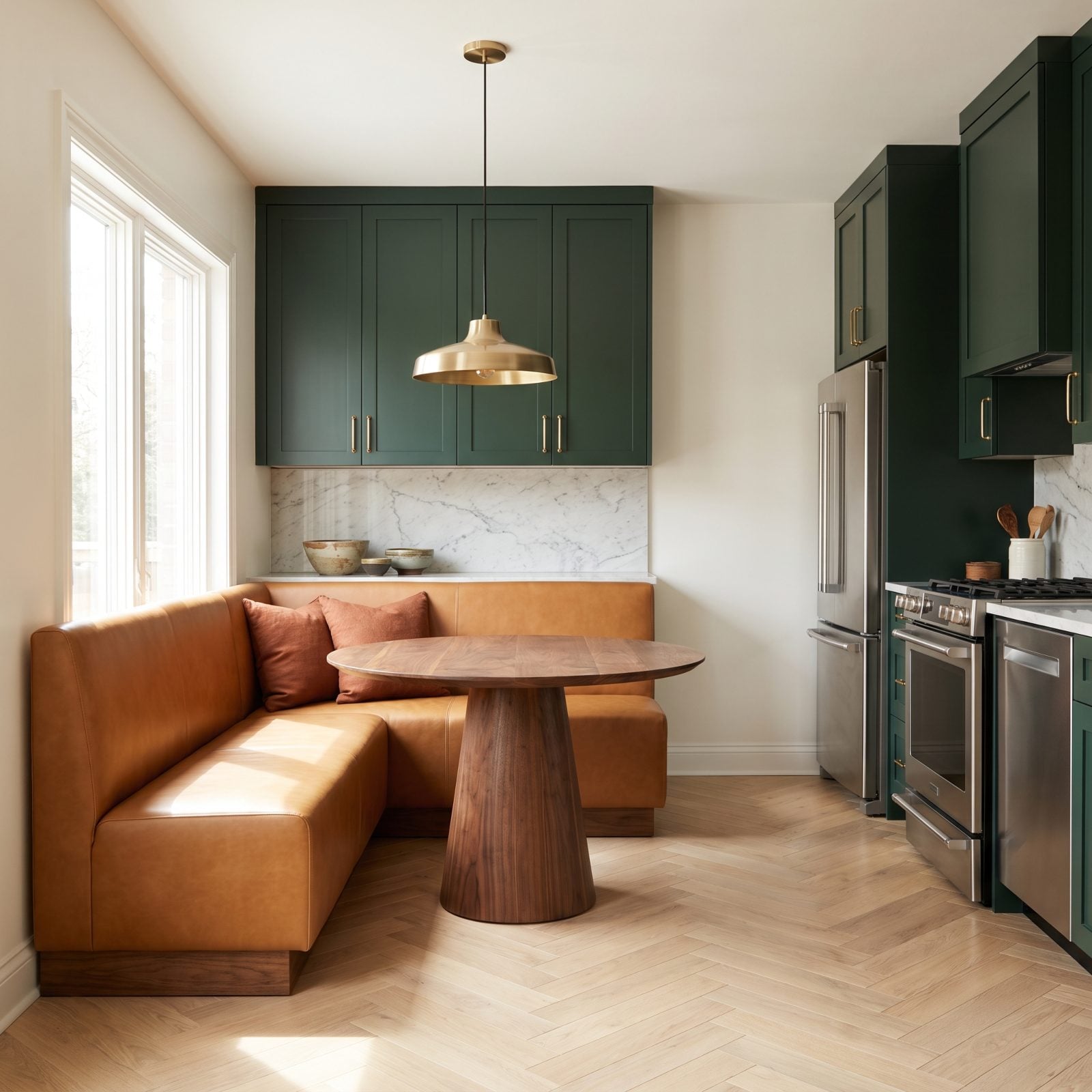
The breakfast booth feels like something hauled out of a 1978 split-level, and for years people ripped them out in favor of freestanding tables. Then they did the math. A booth seats more people in less square footage than any table-and-chairs setup ever will.
This one loses the orange vinyl and goes caramel leather instead, wrapping a walnut pedestal table. Forest-green cabinets and brass pulls keep it current, and the refrigerator, range and dishwasher sit in the main run nearby, so the booth stays a destination rather than a storage afterthought.
A booth is the only seating that makes people want to stay longer than the meal.
10. Freestanding Glass-Front China Cabinets
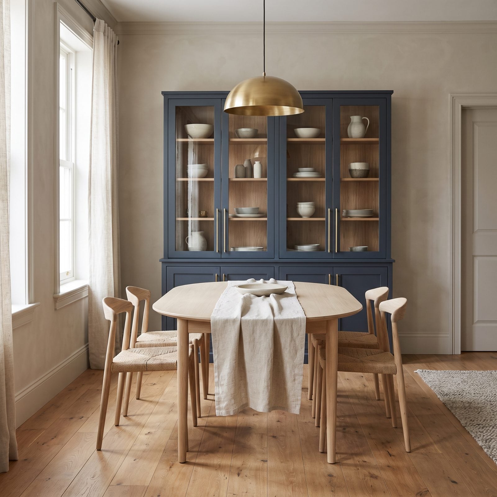
A china cabinet packed with inherited plate sets looks like a museum of obligations. The furniture itself was never the problem.
Paint it a deep navy, fill it with simple modern ceramics spaced like you actually chose each piece, and the glass front becomes a display case instead of a dumping ground. The trick is negative space inside. Half-empty shelves look intentional. Crammed shelves look like you’re hoarding. We’ve gotten this wrong, and the fix was throwing out half the plates.
9. Secretary Desks That Fold Away the Mess
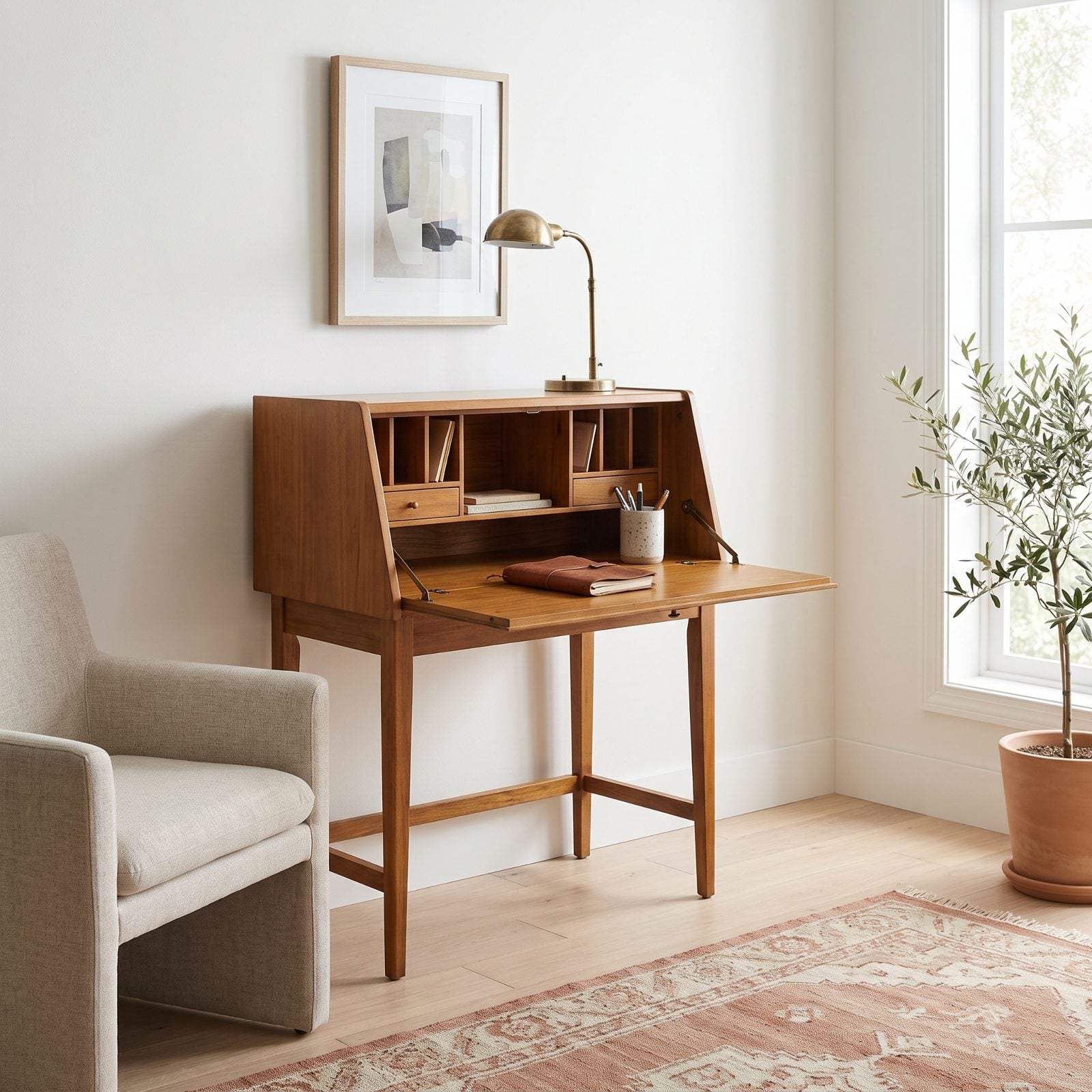
The secretary desk solved a problem we pretend is new: a workspace you can shut when the workday ends. Fold the surface up and the clutter vanishes behind a clean panel.
Refinished in honey walnut against plain white walls, it stops looking like grandmother’s parlor and starts looking like the smartest small-space furniture you can own. A brass desk lamp and a leather notebook keep the inside feeling deliberate.
8. Grandfather Clocks in Modern Entryways
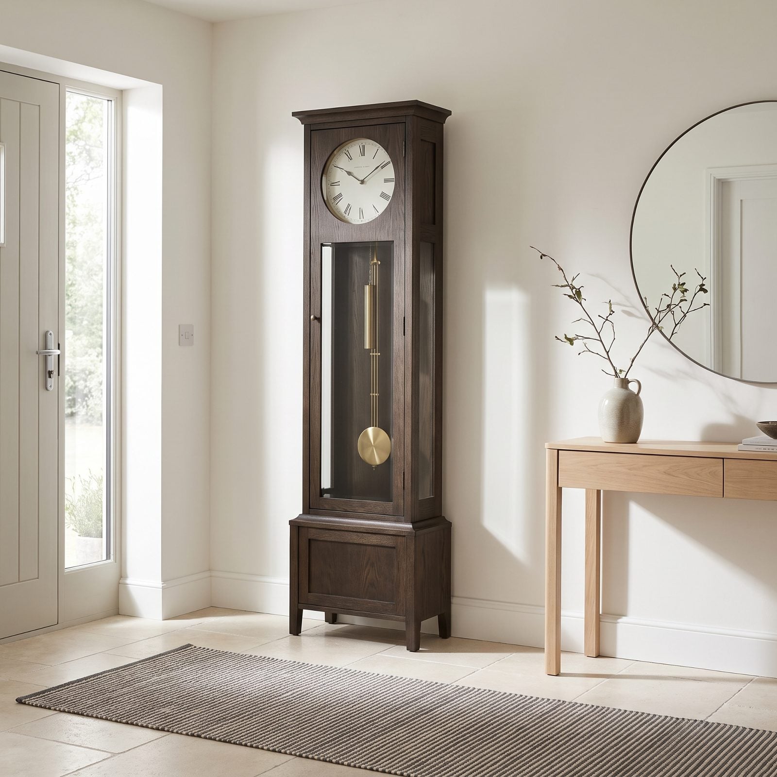
Nothing says inherited furniture like a grandfather clock, which is exactly why it works in a stripped-back modern entry. One ornate antique against clean walls reads as a confident choice, not a hand-me-down you felt guilty giving away.
The vertical case anchors a space most people leave empty, and the slow pendulum swing adds the one thing a minimalist entry usually lacks: movement. We’ll die on this hill. A quiet tick is a nicer greeting than a smart speaker announcing the weather.
7. Four-Poster Canopy Beds, Stripped Down
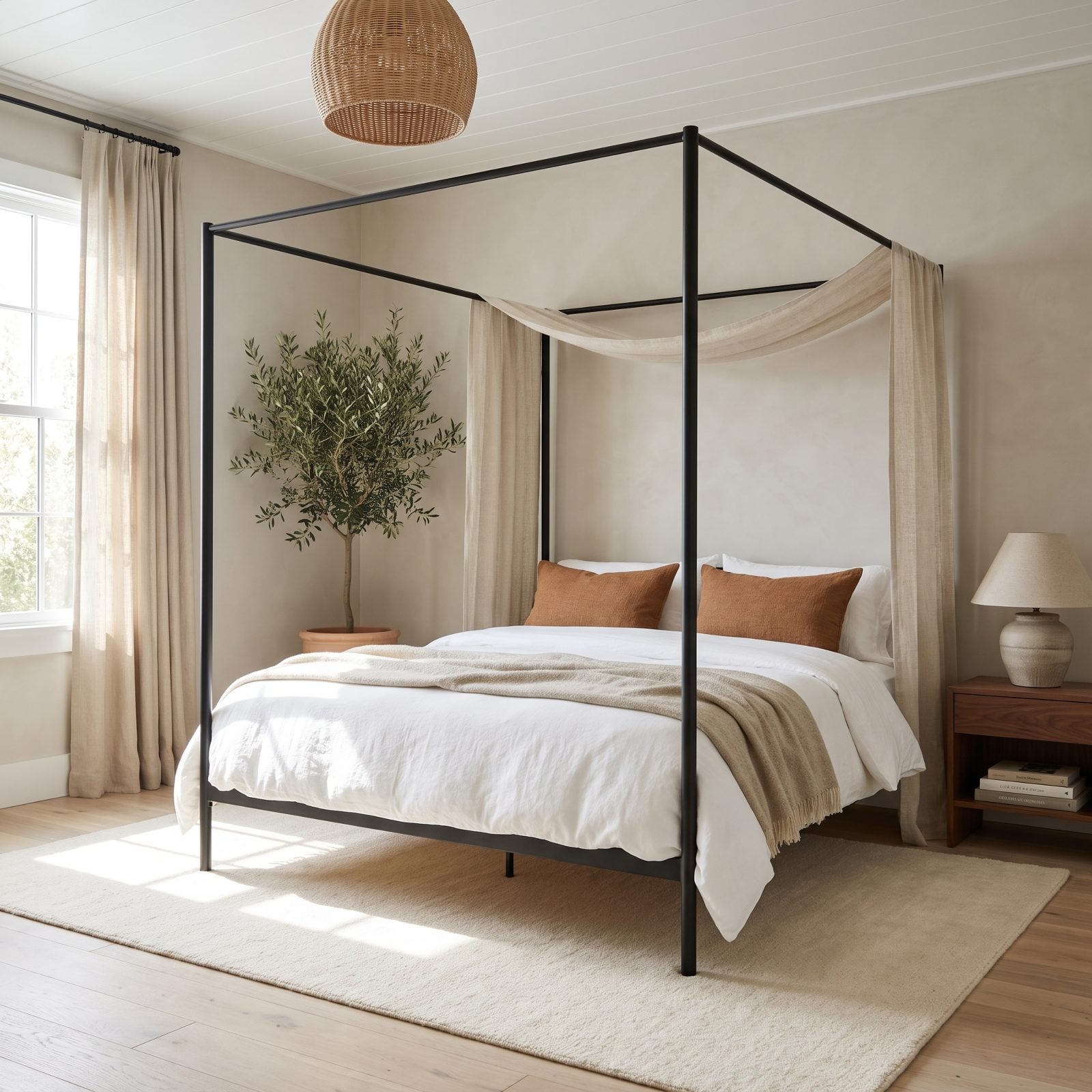
The heavy mahogany four-poster with its full fabric canopy made bedrooms feel like Tudor cosplay. But the structure underneath is the best thing you can give a bedroom.
Swap the carved posts for slim matte-black metal and skip the drapery, or let one sheer linen panel trail loosely over the top. The frame draws the eye up, makes the ceiling feel taller, and gives the whole room a spine to hang off. Dress it in white linen bedding and a rust throw, and it reads calm, not costume.
6. Blue-and-White Toile, in Small Doses
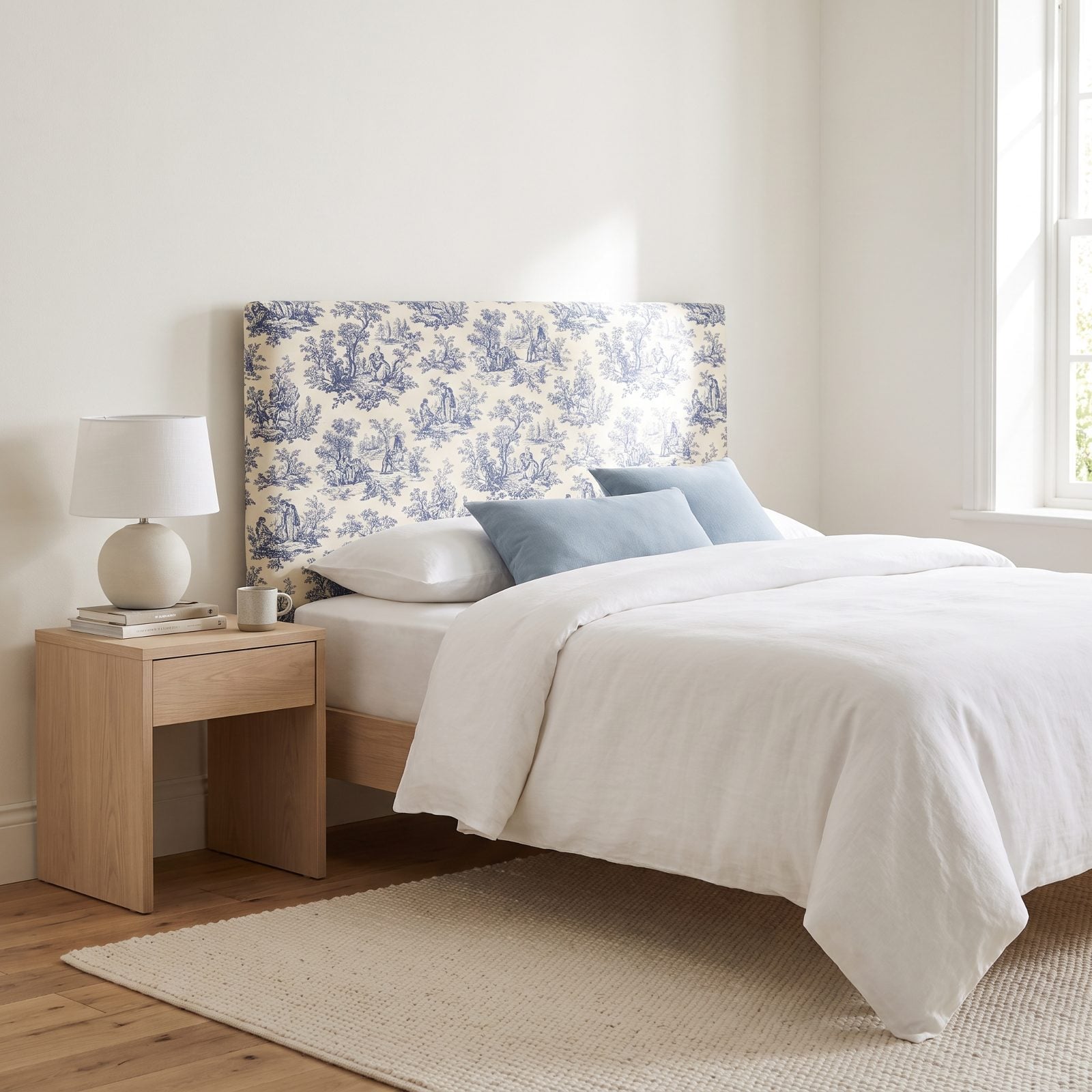
Toile overwhelms when it covers the walls, the curtains, the bedding and the lampshade all at once — which is how our grandmothers did it, bless them.
Pull it back to one element. An upholstered headboard, say, or two cushions and a shade. Against warm white walls and plain linen, the indigo pastoral print becomes a quiet story you only notice up close. The same restraint that makes boho bedroom decor work applies here: one patterned hero, everything else calm.
5. Handworked Needlepoint Cushions
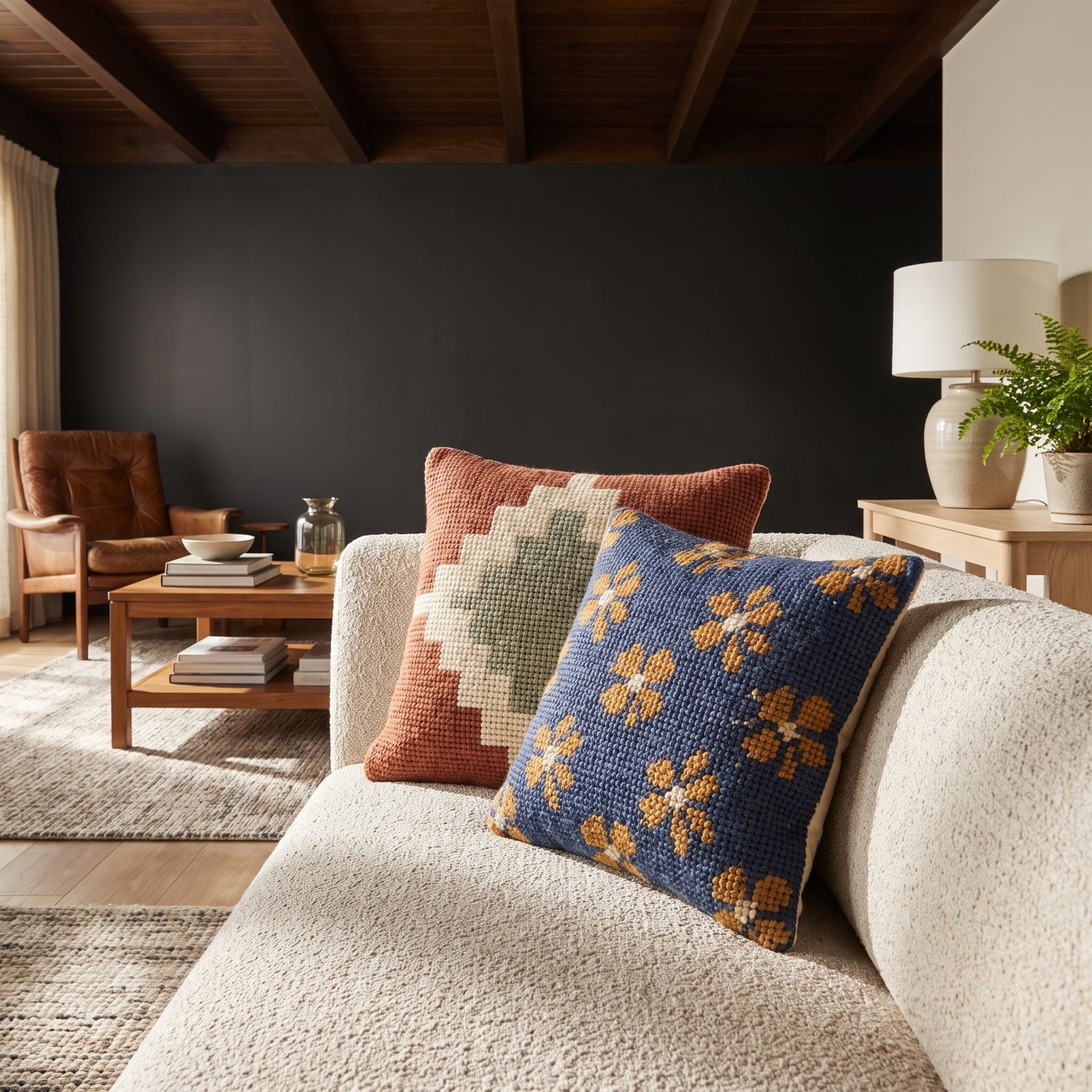
Needlepoint cushions got filed under grandmother’s sofa, right beside the plastic slipcovers. The handwork was never the problem. The busy Victorian florals were.
On a modern bouclé sofa, a needlepoint cushion in a muted geometric does something machine-printed pillows can’t. It holds light. Each raised stitch catches a little shadow, so the cushion looks alive from across the room. That tactile depth is exactly what AI-generated decor images keep failing to fake, because a flat render can’t hold a real stitch.
4. Sheer Lace Curtains That Shed the Grandma Reputation
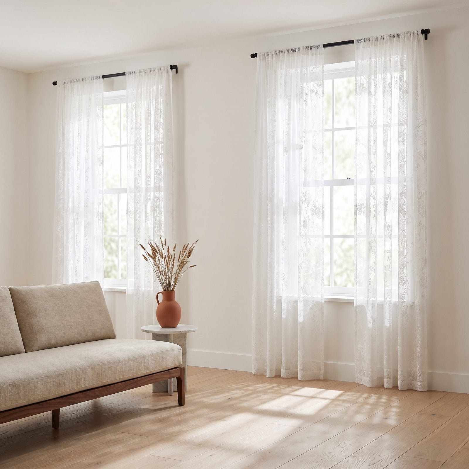
That delicate shadow the lace throws across the floor every morning is the whole argument. Hang it flat on a thin black rod, skip the ruffled tiebacks your grandmother loved, and sheer lace stops reading as fussy — now it’s light management with a pattern bonus.
Restraint does the work. One clean panel, no valance, no fringe. Let the weave filter and the sun draw.
3. Pleated Fabric Lampshades, Minus the Dust-Collector Vibe
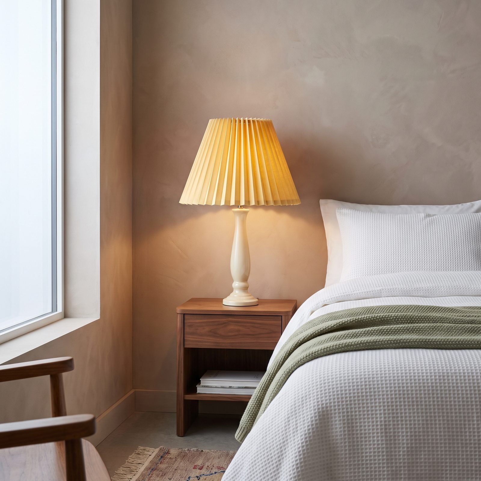
Pleated shades got filed under old-lady lamp sometime in the 1990s and never got a fair retrial. Here’s the case for reopening it: the folds catch light and throw a subtle vertical rhythm up the wall that a plain drum shade simply can’t manage.
Go for a crisp knife-pleat in a saturated color — a butter-yellow pleated lampshade on a clean ceramic base — and suddenly it’s a decision, not an inheritance. We held out against these for years. We were wrong. The glow is warmer and far more flattering than anything flat-sided.
2. Small Mosaic-Tile Countertops Back From the Dead
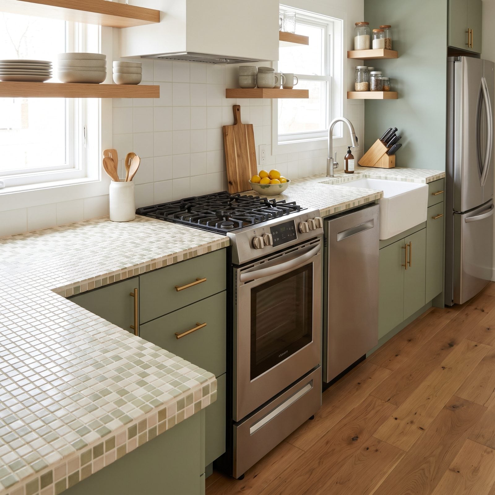
Everyone ripped these out for slab quartz, and now the kitchens all look like the same catalog page. A small mosaic-tile counter has texture a slab can’t fake — light hits the grid and shatters into dozens of tiny highlights.
What separates this from the 1970s version: thin grout lines, a tight color range, and sage cabinets with brass bar pulls pulling it into the present. Pair it with honest kitchen details and the whole run feels handmade instead of stuck in a decade.
1. Chair Rails and Two-Tone Walls, Played Straight
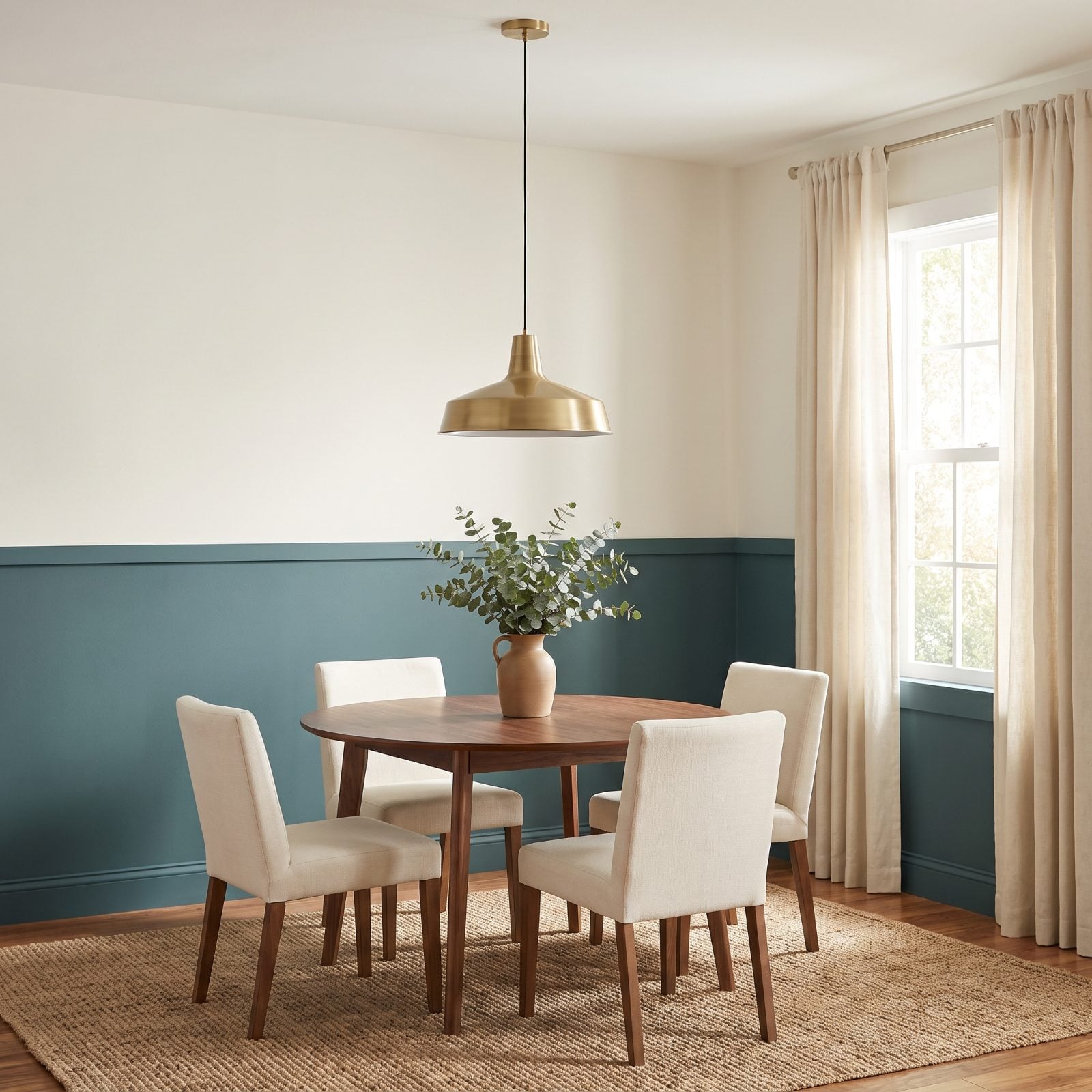
Chair rails earned their dated reputation honestly. Builder-grade oak molding, a wallpaper border up top, mauve paint below — a genuine crime scene.
Played straight, though, the idea holds up beautifully. Paint the rail and the lower third in one deep color like a muted teal and leave the top chalky white. That horizontal line lowers the ceiling where you want intimacy and lifts it where you don’t, and a dining room is the perfect test case: grounded below, airy above. Keep the molding profile simple and modern, hang a low brass pendant light over the table, and nobody will reach for the word dated.