
🔥 Would you like to save this?
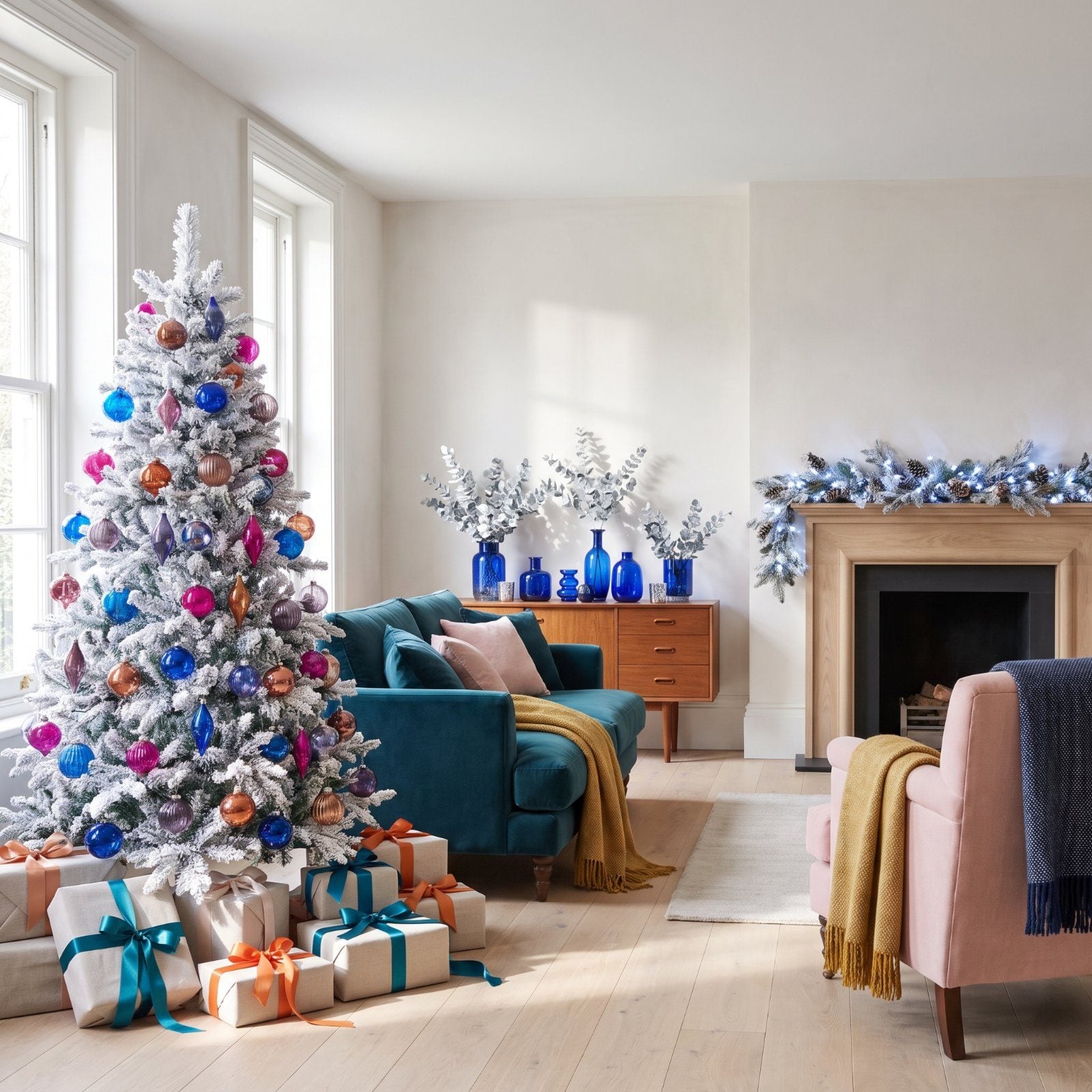
Red, green and gold have run Christmas for a century. They don’t have to. Swap them out and the holiday stops looking like a greeting card and starts looking like your actual home, dressed up for the occasion. These 31 rooms prove a disciplined off-palette reads just as festive, maybe more so. The trick is commitment. Pick two colors, carry them through ribbon and ornaments and textiles and light, then let the greenery go frosted and quiet in the background.
31. Electric Blue and Fuchsia: The Christmas Living Room That Thinks It’s a Nightclub
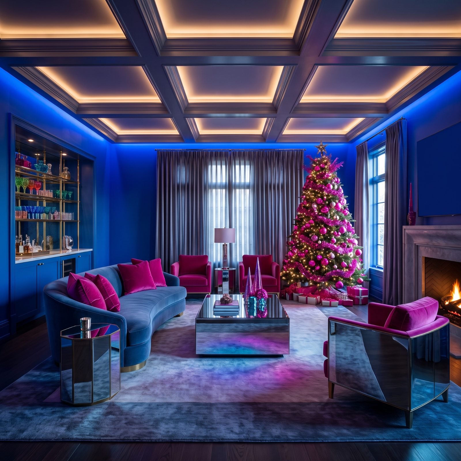
Two colors that should scream clash, and don’t. Electric blue and fuchsia sit near-opposite on the wheel, so the contrast does all the festive work that red and green usually handle. The frosted white tree plays referee, cooling the whole thing down so it reads jubilant instead of just loud.
In order to come up with the very specific design ideas, we create most designs with the assistance of state-of-the-art AI interior design software. Also, assume links that take you off the site are affiliate links such as links to Amazon. this means we may earn a commission if you buy something.
Keep the fuchsia on soft, chewable surfaces like velvet and grosgrain ribbon, and let the electric blue live on glass and glossy wrap. That material split is what keeps it from tipping into the toy aisle.
30. Copper and Deep Teal: A Low, Warm Christmas Den You Won’t Want to Leave
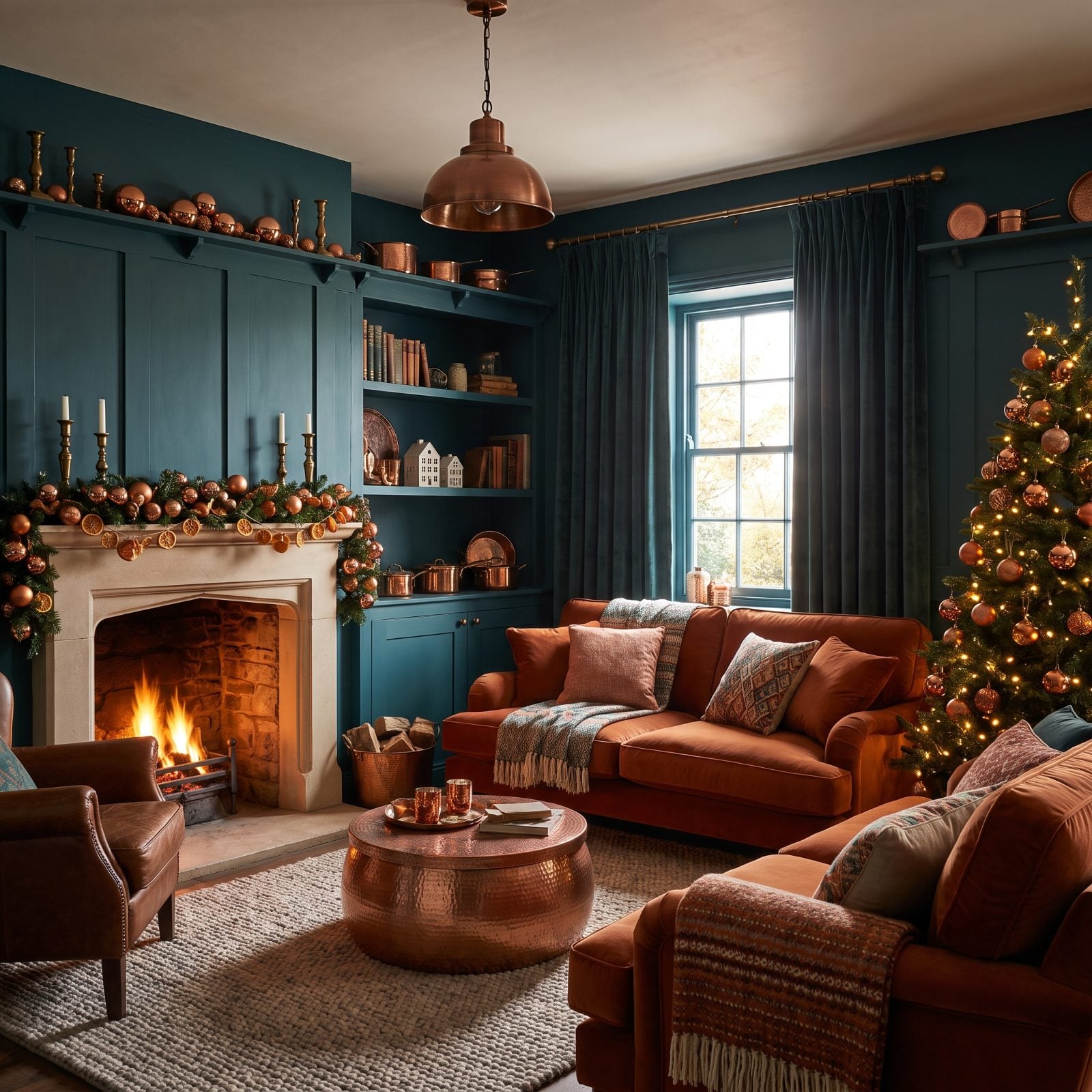
Copper is the clever substitution. It gives you metallic shine and warmth without defaulting to gold, and against deep teal it goes almost jewel-like. The teal velvet armchairs pull the room inward while the copper catches every scrap of firelight.
This is the warmest room on the list and it’s barely trying. Credit the deep teal, because dark, saturated walls and upholstery trigger a refuge response. You feel tucked in. For a cozy nook like this, a traditional attic design handles the same low-ceiling intimacy beautifully.
29. Cobalt Blue and Tangerine: A Graphic, Sunlit Christmas Dining Room
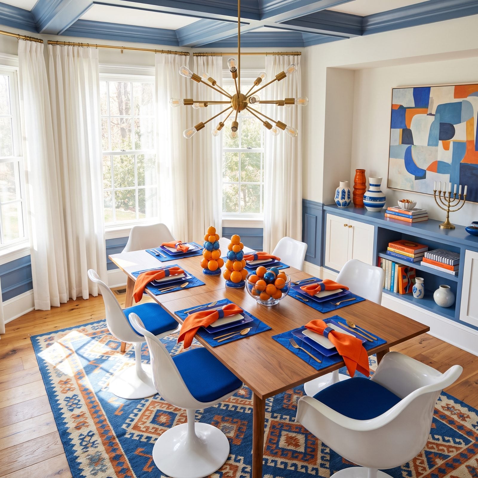
Cobalt and tangerine is the pairing I keep coming back to, and I got it wrong for years by making the orange too timid. Go full tangerine or don’t bother. Against a strong blue it turns graphic and sunny rather than Halloween-adjacent.
Frosted white walls and a frosted tabletop tree keep the two primaries from brawling. It’s all clean blocks of color sitting side by side, which is why the table reads festive before a single ornament goes up.
28. Blush Pink and Burgundy: A Soft, Grown-Up Christmas Bedroom
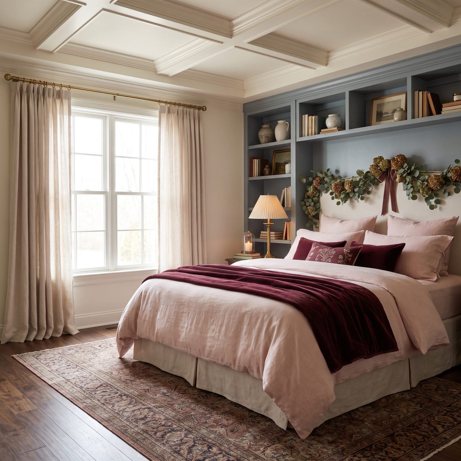
Burgundy is the closest you’ll get to red without actually using red, and that’s the whole point. Paired with blush, it reads as a tonal story rather than a holiday theme, which means the room still works in February.
Blush does most of the room (walls, duvet, lamp) while burgundy shows up only on velvet and knit. That ratio of lots of pale with small pools of deep is what makes it feel adult instead of nursery. Softer palettes like this translate well into traditional bedroom inspiration too.
27. Silver and Smoky Violet: A Frosted, Almost Futuristic Christmas Entry
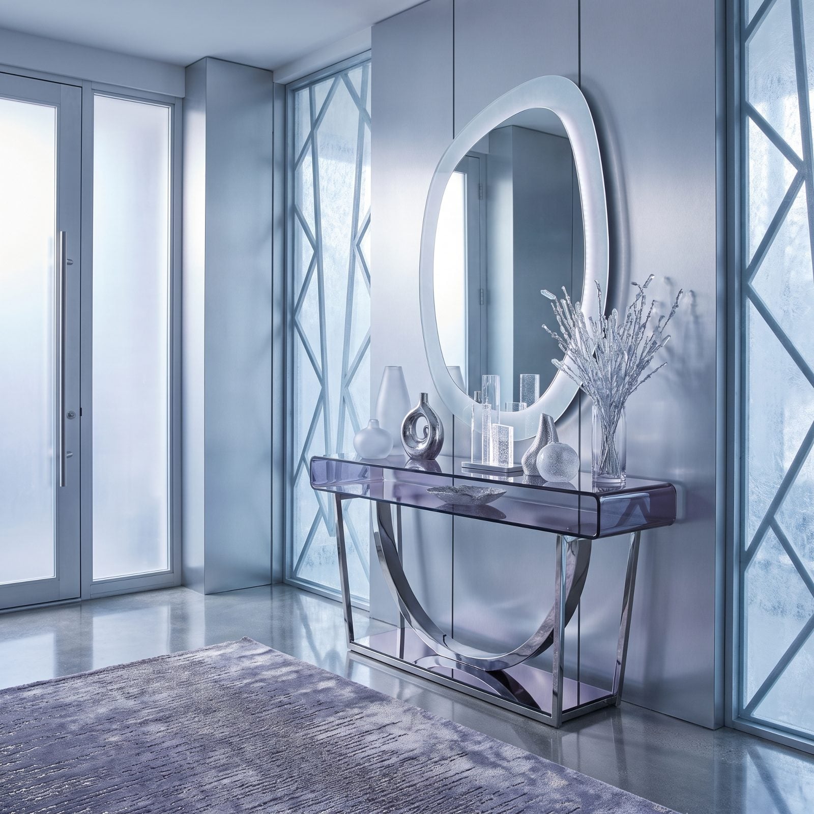
Silver instead of gold changes the whole temperature of Christmas. It goes cool and frosted, a little like a window left open to the snow. Smoky violet keeps it from feeling clinical, adding a dusky, grown-up depth.
Mercury glass and mirror ornaments are the move. They bounce the cool winter light around the entry so the whole space shimmers without a single warm bulb. We flipped the red mirror ideas approach on its head here, letting one big silver-framed mirror double the sparkle instead.
26. Terracotta and Soft Peach: A Sun-Baked Christmas in the Dead of Winter
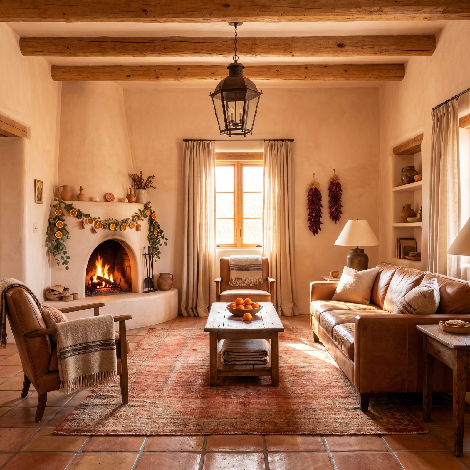
This is the room for people who find December gloomy. Terracotta and peach are both warm and both a touch sun-bleached, so the space feels like late afternoon in a Mediterranean courtyard even when it’s sleeting outside.
The two colors are neighbors on the wheel rather than rivals, so there’s no tension at all, just a slow gradient of warmth. Without that frosted white tree, though, the whole thing would slide into full earthenware.
25. Mustard Yellow and Ink Blue: A Mid-Century Christmas Study
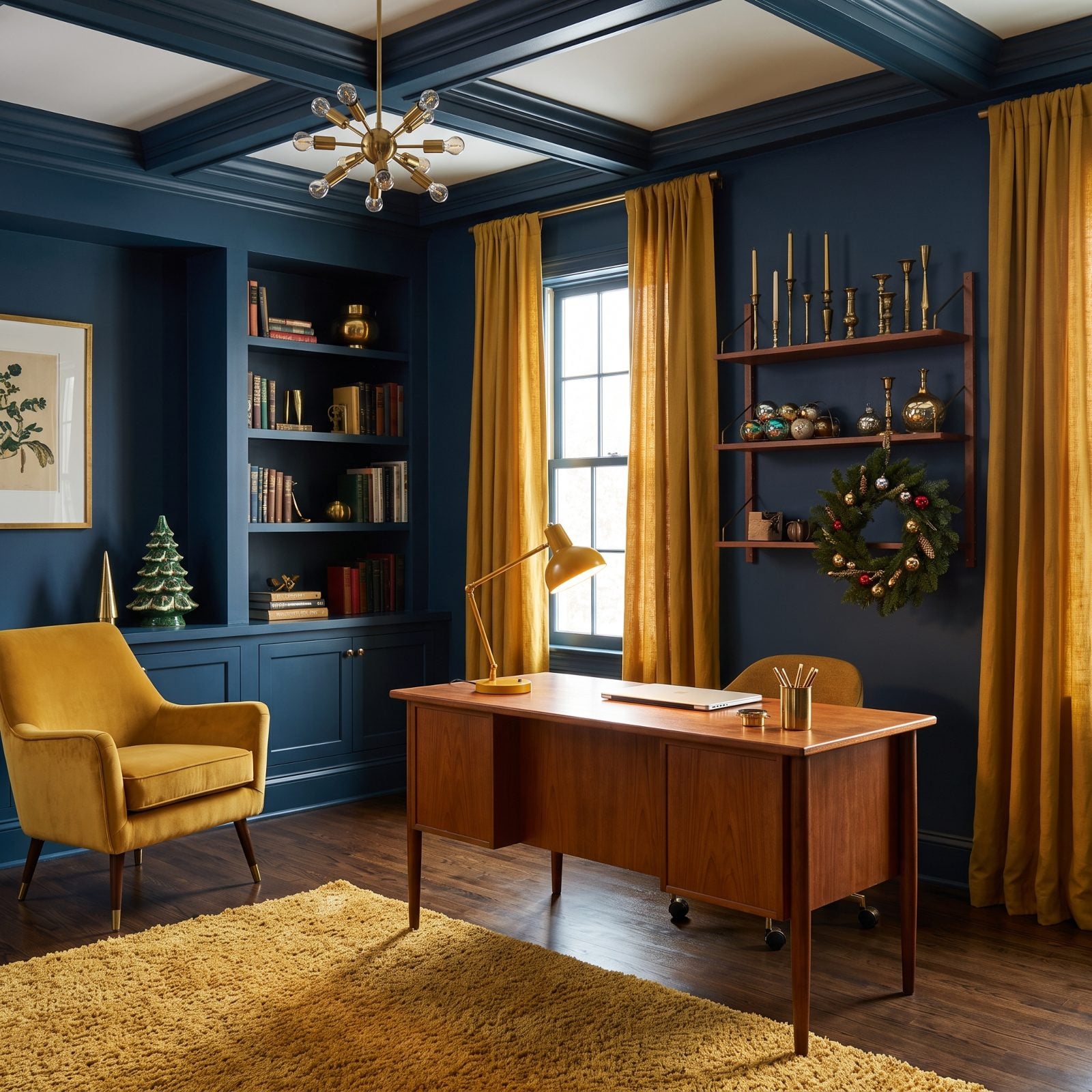
Mustard reads like gold’s cooler, cleverer cousin. It brings the festive glint without the metallic shine, and against deep ink blue it turns almost retro, like a 1960s Christmas card that aged well.
Material matters most here. The mustard lives on velvet and ceramic, never anything shiny, so it stays matte and grounded. Let it catch the light like foil and the whole room curdles into generic gold.
Walnut shelving bridges the two. The ink blue walls pull everything toward library stillness. It’s the most masculine-reading room on the list, and honestly the easiest one to live with past January.
24. Aqua and Burnt Sienna: A Breezy, Unexpected Christmas Kitchen
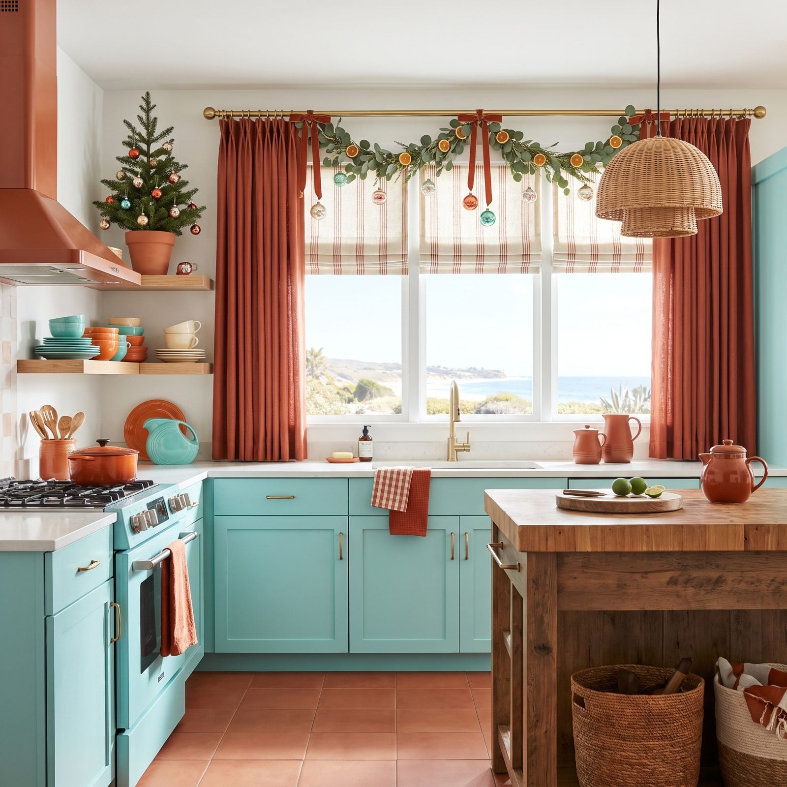
Aqua cabinets with burnt sienna accents is a pairing I didn’t expect to love and now won’t shut up about. The aqua keeps the kitchen feeling fresh and coastal, and the burnt sienna warms it back up so it never goes cold.
Stainless appliances stay neutral and let the two colors do their thing. The frosted tabletop tree and silvered garland keep the greenery quiet, which is exactly where it belongs in an off-palette scheme.
23. Black and Winter White: The Christmas Room That Refuses to Shout
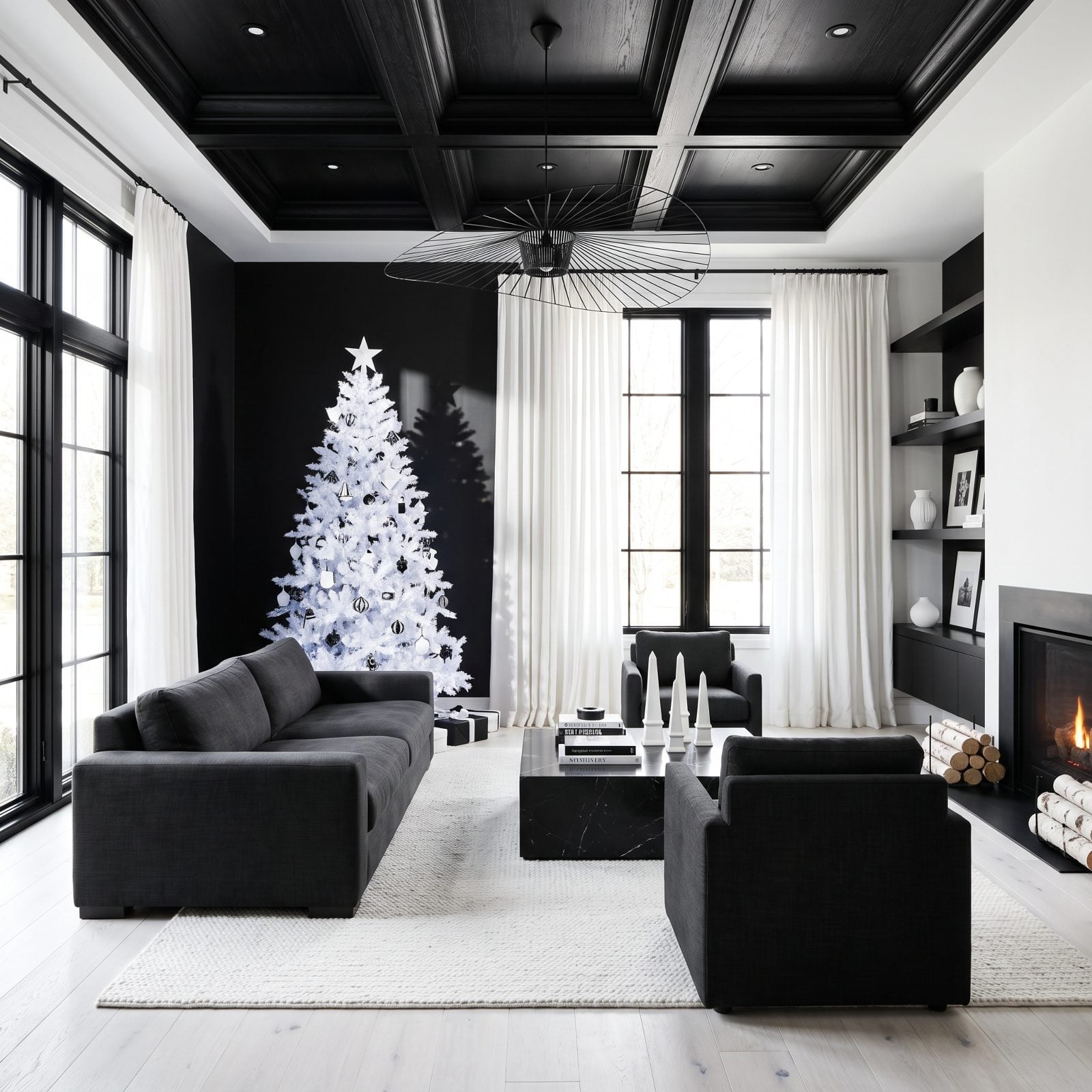
No color at all, and somehow the most festive restraint here. Black and white Christmas works because the contrast is so clean the eye reads it as deliberate, graphic, almost architectural.
A frosted white tree against a black mantel is the entire story. Striped wrap, boucle sofa, matte black baubles, all of it is just rhythm around that one line. If red and gold wear you out, this is the holiday whispering instead.
A monochrome Christmas doesn’t lack warmth. It just makes you earn it with texture instead of color.
22. Peacock Blue and Clay: A Jewel-Toned Christmas Great Room
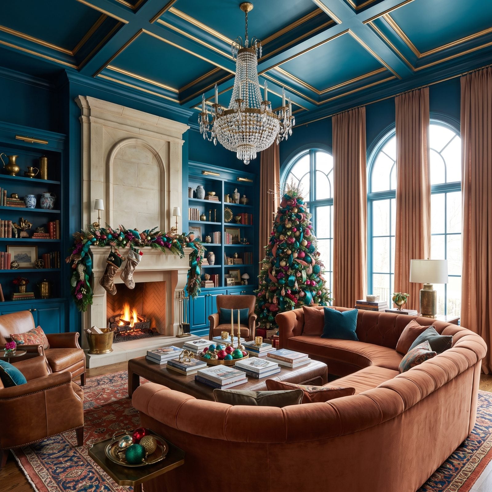
Peacock blue carries real drama, and clay is the earthy warmth that keeps it from reading cold or showy. Together they feel rich without touching a single traditional holiday color.
Scale is the whole game. In a big great room, saturated jewel upholstery like that peacock velvet sectional stops the space feeling empty, while clay walls wrap the entire volume in warmth so the high ceilings don’t read as drafty. For more on this kind of tonal confidence, the thinking behind a green great room runs parallel.
21. Hot Pink and Ice Blue: A Christmas Living Room With Zero Interest in Tradition
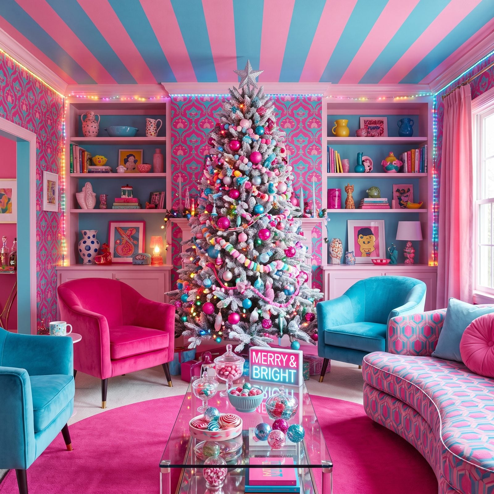
The frosted tree is the smartest move in the room. Strip the green out of a Christmas tree and suddenly hot pink and ice blue read as the whole story rather than an accident. The pink velvet sofa carries the heat while the ice blue cushions and rug cool it right back down, and nothing competes.
This works because pink and blue sit on opposite temperature ends, so the eye keeps bouncing between warm and cold without ever getting bored. Meanwhile the chalk white walls stay out of the fight entirely. Want the look? Commit to the hot pink velvet sofa first and let everything else answer to it.
20. Mushroom Taupe and Chalk White: The Quietest Christmas in the House
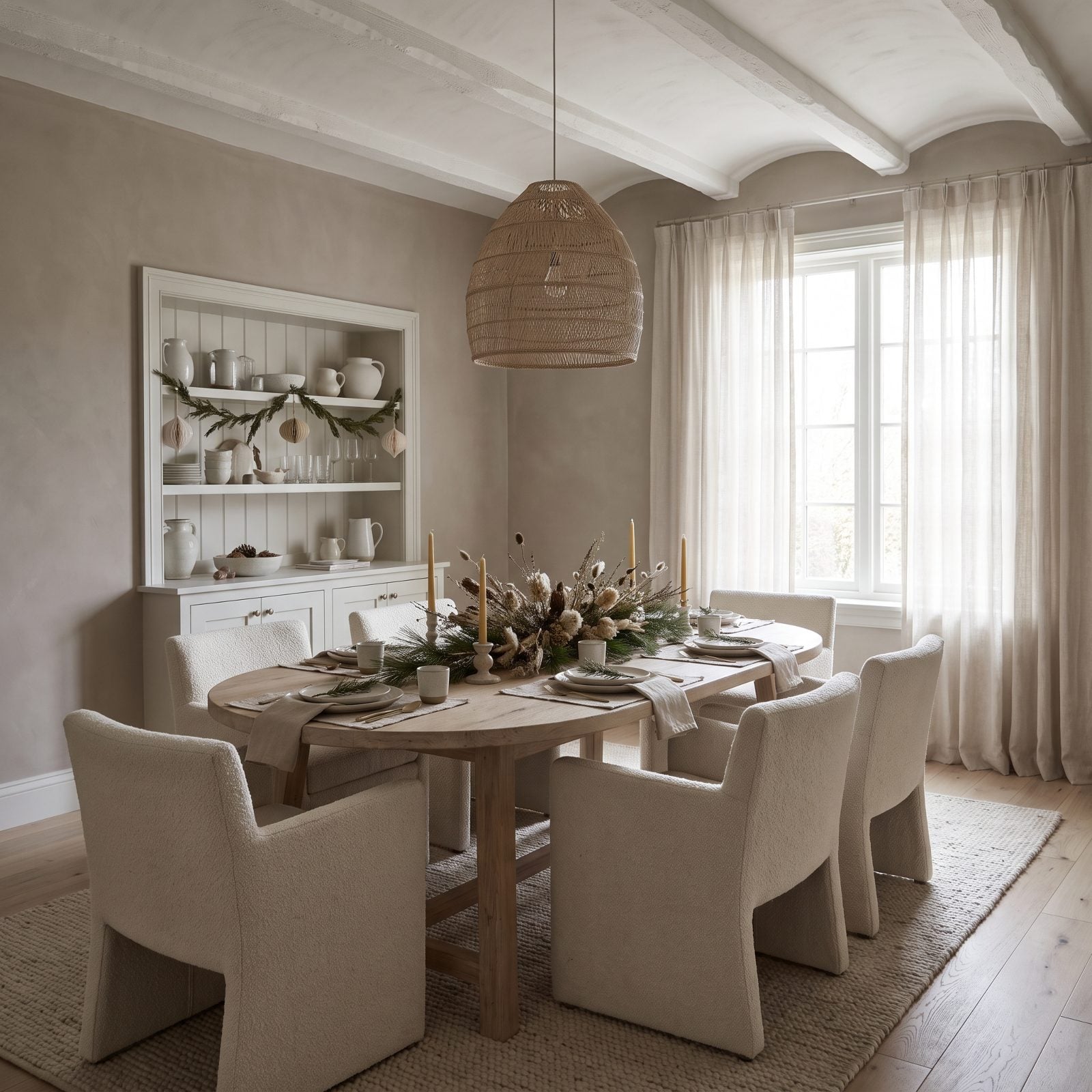
No red, no gold, no shouting. This dining room proves Christmas can whisper. Everything lives in a narrow band between mushroom taupe and chalk white, so the drama comes entirely from texture: boucle chairs, a linen runner, raw stoneware, frosted eucalyptus.
Tonal rooms succeed or fail on material contrast. Flatten the color and you have to crank up the touch. The frosted white tree stays festive without a single traditional note, and that humble taupe linen ribbon is quietly outworking every bow in a brighter scheme.
19. Indigo and Cinnamon: A Warm-Spiced Christmas Den That Skips the Obvious
🔥 Would you like to save this?
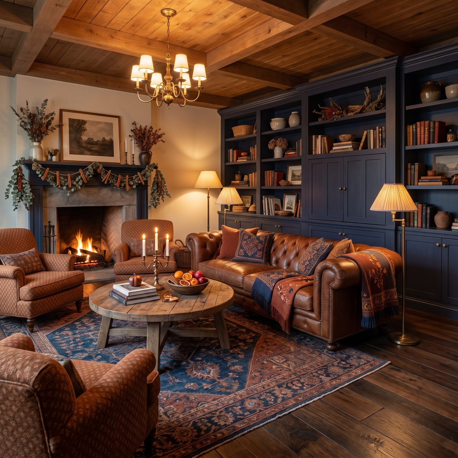
Indigo gives you all the depth of evergreen with none of the Christmas cliché, and cinnamon brings the warmth you’d normally beg from gold. Smart swap.
The room leans heavily indigo, with cinnamon as the warm accent that keeps the whole thing from going cold and nautical. Cream lampshades warm the light so the indigo reads velvety instead of flat, and the frosted tree with cinnamon glass ornaments is the detail that tells you it’s December. This is the kind of traditional bedroom inspiration palette borrowed for the holidays. It works because it was always livable in the first place.
18. Plum and Pale Lilac: A Christmas Bedroom That Reads Like a Jewel Box
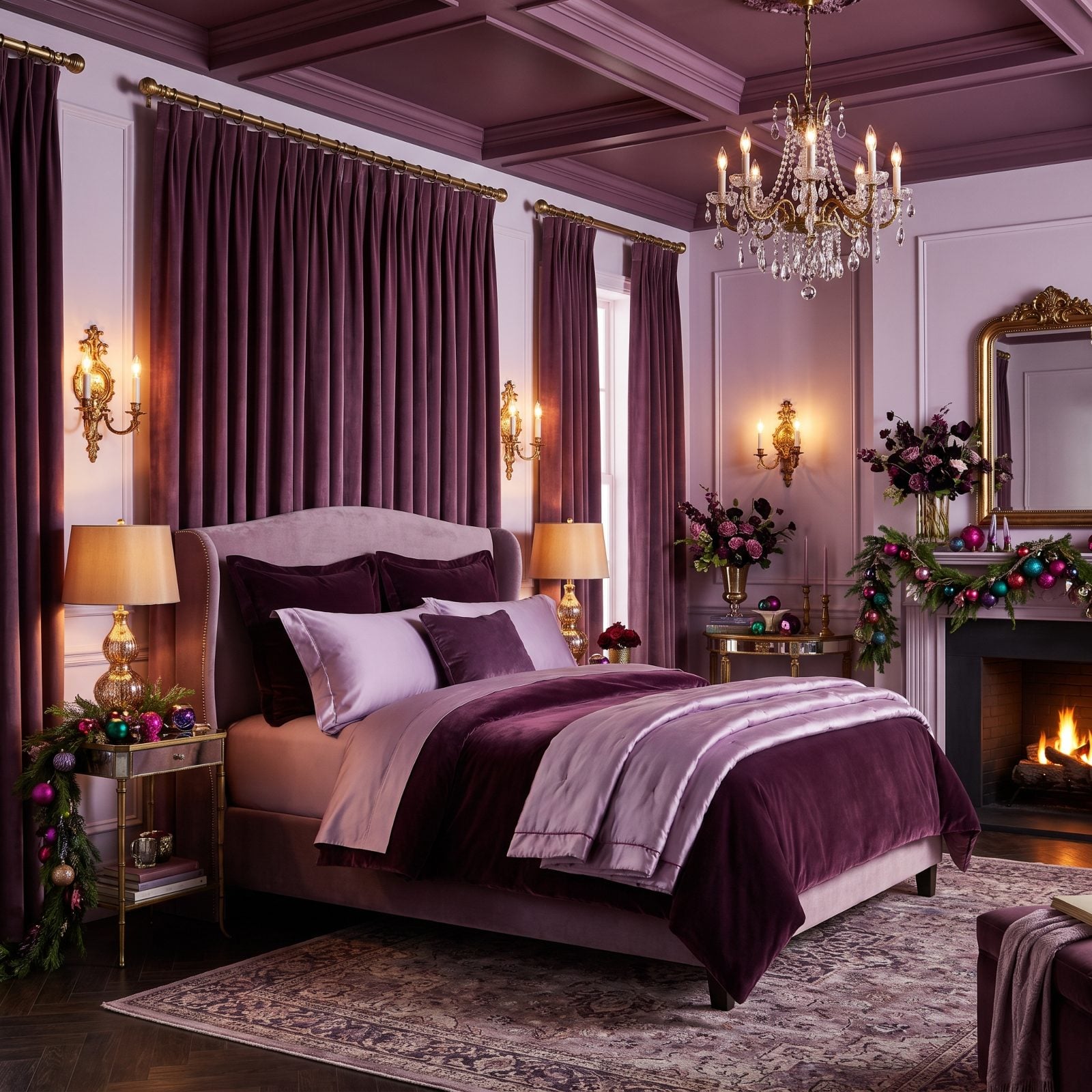
Plum against pale lilac is the same color family two octaves apart, which is why the room feels harmonious instead of busy. The deep plum velvet quilt grounds the bed, the lilac walls float around it, and the frosted tabletop tree ties the festive bow without a single red ornament in sight.
Monochrome purple can go flat fast. Velvet saves this one. The nap on that quilt catches light differently from every angle, so the plum never sits still.
17. Camel and Matte Black: A Modern Christmas Loft With Serious Restraint
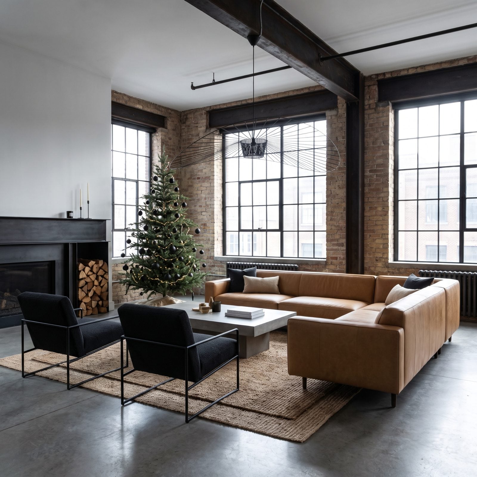
Everything in this loft is doing less, and the restraint is the appeal. Camel warms, matte black sharpens, and the frosted tree sits between them like a comma in a long sentence. No glitter, no gold, nothing shiny.
That camel leather sofa is the only soft, warm thing in a room full of steel and concrete, which is exactly why your eye goes straight to it. Matte black ornaments on a frosted white tree? That’s the detail I’d steal first. Graphic without trying hard.
16. Lemon Yellow and Soft Gray: A Christmas Breakfast Nook That Feels Like Sunrise
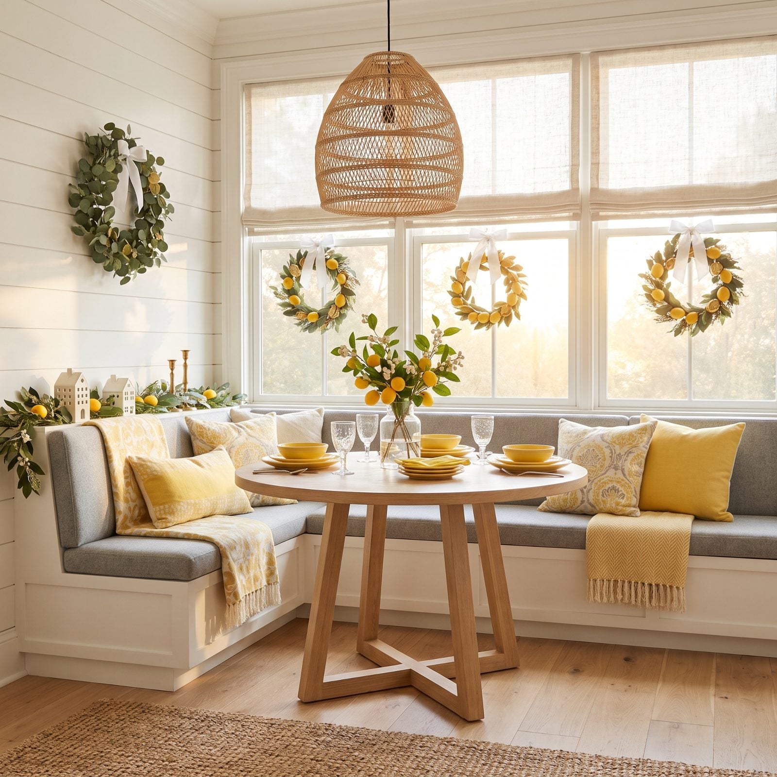
Lemon yellow is the sneaky substitute for gold here. Same brightness, none of the heavy-handed holiday baggage. Soft gray cools it just enough to keep the nook from looking like a cartoon.
This is a morning room and the palette knows it. Gray handles the background, lemon does the lifting, and the frosted tree with yellow glass ornaments keeps Christmas in the frame without the usual suspects. A cheerful space like this reminds me of the best green curtains designs played in a different key.
15. Periwinkle and Copper: A Christmas Entryway With a Cool-Warm Handshake
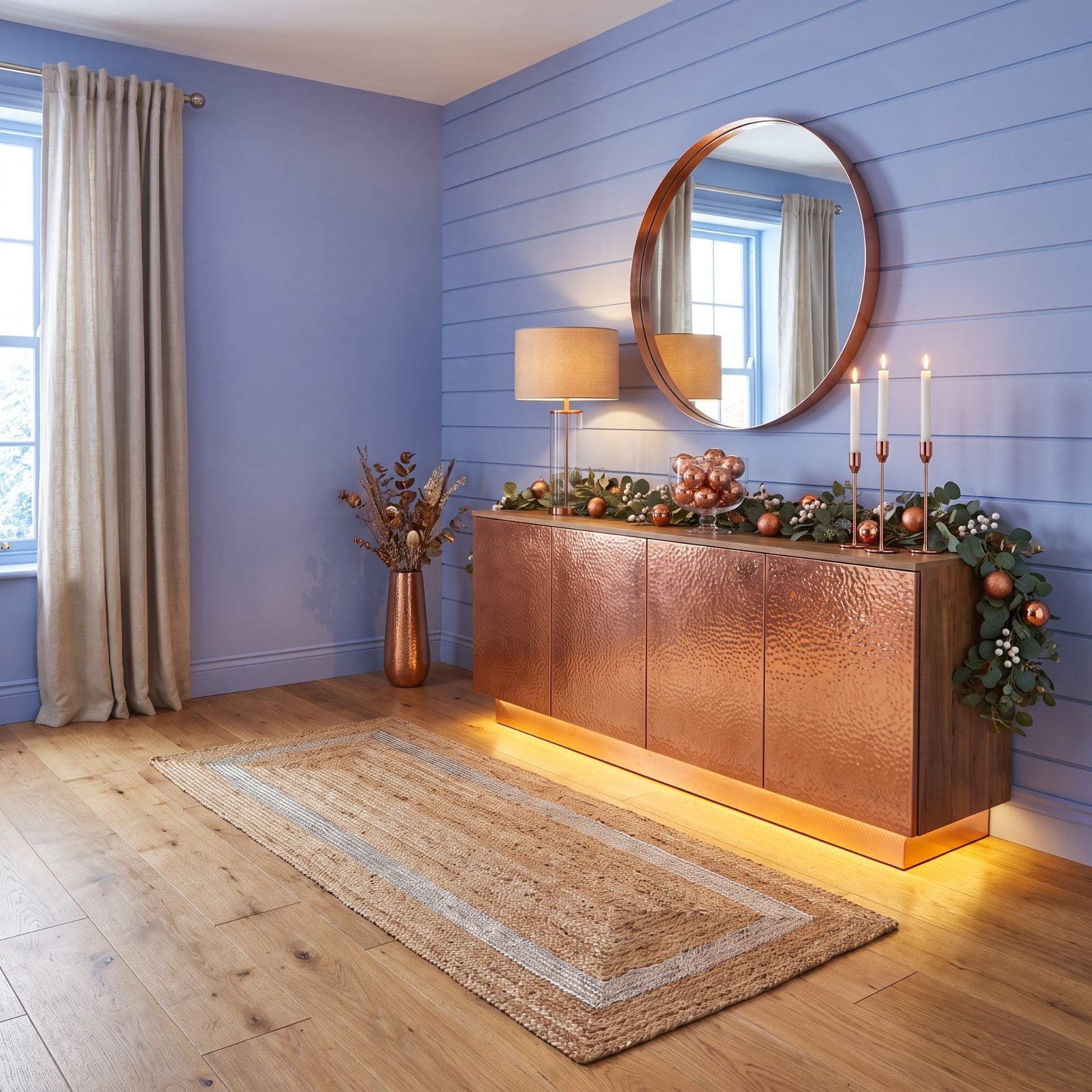
Copper is the warm metal that owes nothing to gold, and against cool periwinkle it practically glows. First impression handled.
Entryways are small, so the palette has to land fast. The copper console and mirror throw warm reflections, the periwinkle velvet bench cools the room back down, and the frosted tree with copper ribbon says Christmas the second you walk in. Copper and blue sit opposite on the color wheel, which is why this feels balanced rather than themed.
14. Mulberry and Dove Gray: A Christmas Sitting Room With Old-World Calm
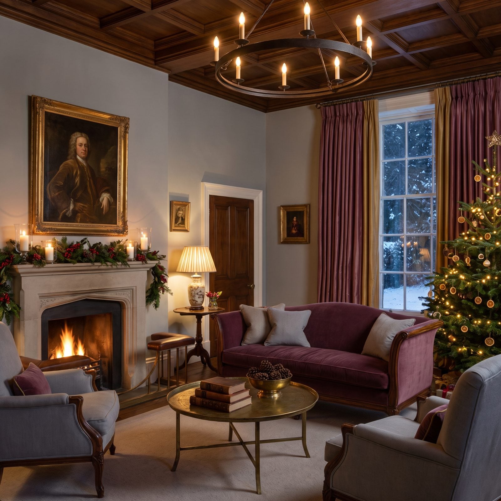
Mulberry is close enough to red to feel seasonal and far enough away to feel original, and that’s the whole trick of the room. Against dove gray it reads deep and expensive, never garish.
Gray is the great equalizer here. It takes the saturation out of mulberry’s hands so the velvet sofa can be rich without being loud, and the frosted tree with mulberry ornaments keeps the holiday thread going quietly.
13. Turquoise and Pearl Gray: A Coastal Christmas Kitchen Without a Hint of Holly
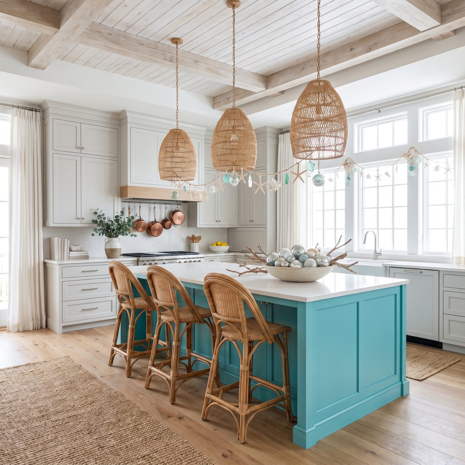
The turquoise island is the one bold move, and the pearl gray cabinets wisely stay out of its way. That’s how you do color in a kitchen without the whole place feeling like a theme restaurant.
Turquoise on an island works because it’s grounded at waist height, so it anchors rather than overwhelms. The frosted tree on the counter with turquoise glass ornaments reads festive and coastal at once. Stainless appliances keep the cool palette consistent too, with no warm metals muscling in.
12. Raspberry and Pale Aqua: A Christmas Playroom That Earns a Grown-Up Look
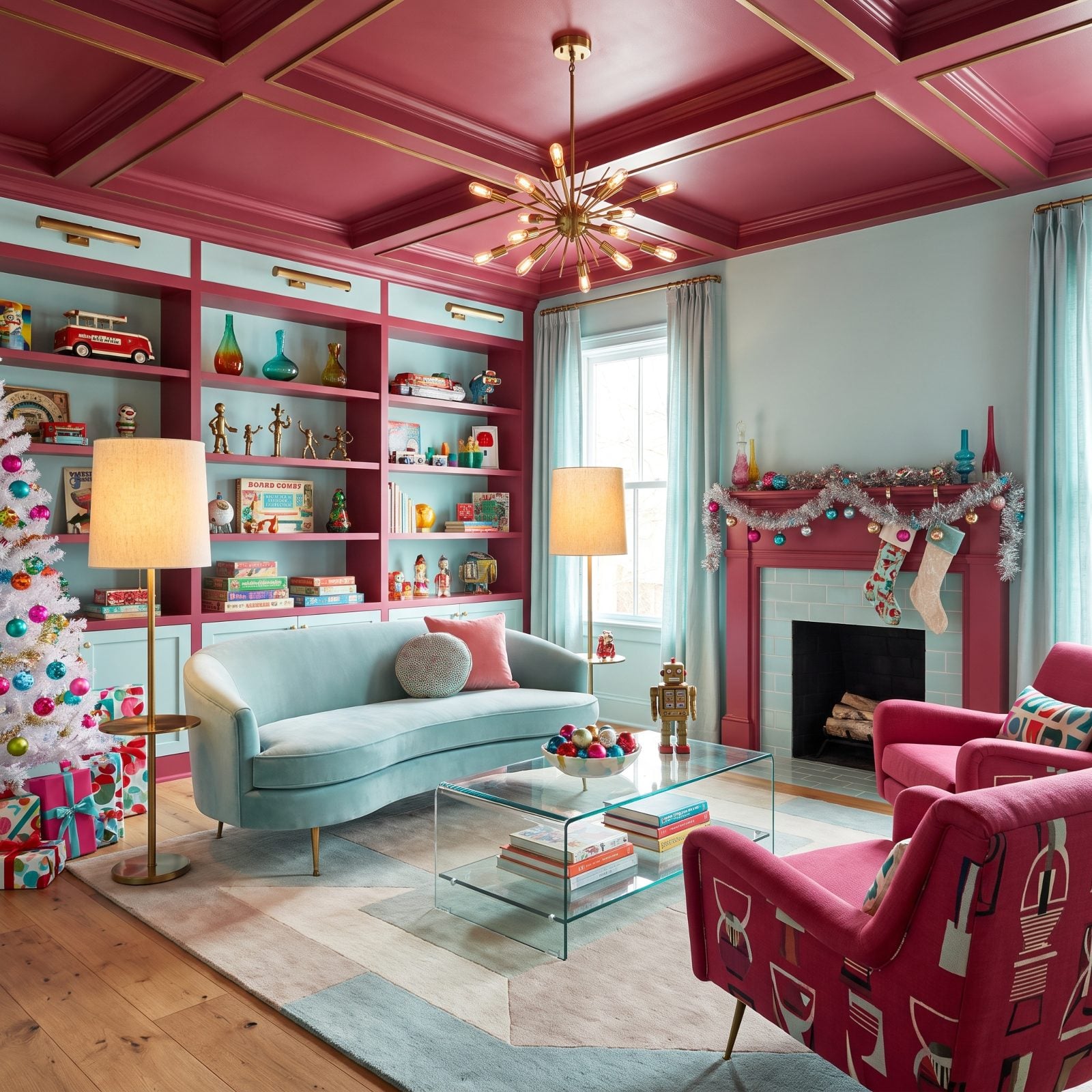
Raspberry is a hotter, more confident pink than the usual nursery stuff, and pale aqua keeps it from tipping into saccharine. The result is a family room kids love and adults don’t mind sitting in.
Warm raspberry against cool aqua is that same warm-cold tension running through half the rooms here, just dialed up and dressed casual. The raspberry linen sofa is the heart of it, the frosted tree with raspberry ornaments handles Christmas, and the aqua walls do the calming. Honestly? I’d keep this palette up long after the tree comes down.
11. Rust and Dusty Blue: A Christmas Living Room That Skips the Candy Cane Script
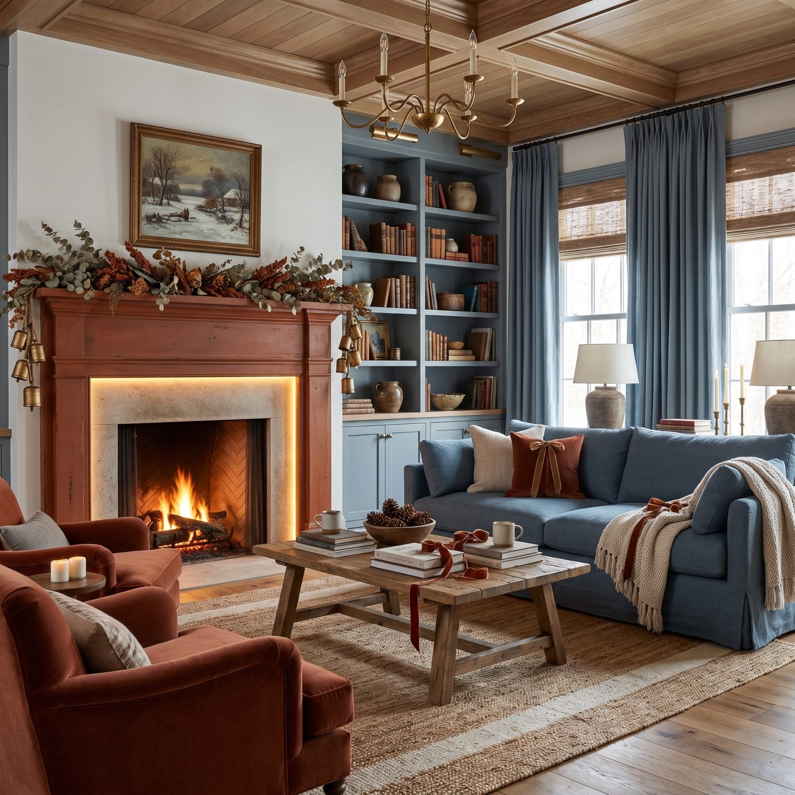
Rust does the warming that red usually handles, minus the holiday cliché shouting at you from the mantel, and the dusty blue keeps the whole thing calm so the room reads festive instead of frantic. That contrast between the earthy orange and the cool blue is the entire trick — warm against cool, saturated against soft.
The frosted tree matters here. Drop the bright green and those rust ornaments suddenly get to be the loudest thing in the room. A rust-orange linen sofa carries the weight, dusty blue velvet chairs answer back, everything else stays quiet. Want this at home? Start with the wrapping paper, because rust kraft and faded blue tissue under the tree sets the palette before a single ornament goes up.
10. Aubergine and Ballet Pink: A Soft, Grown-Up Holiday Bedroom
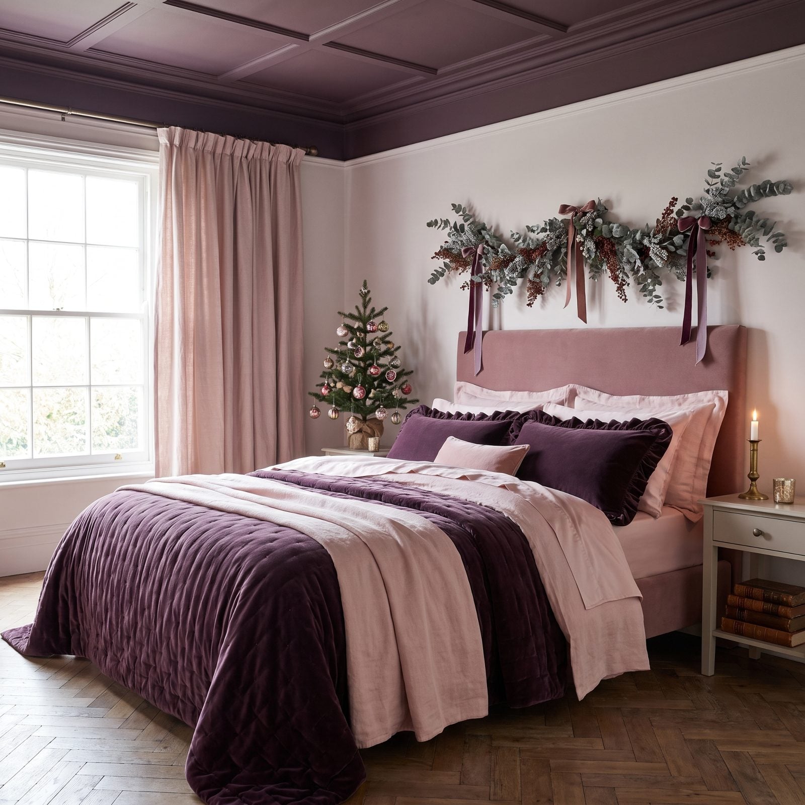
Aubergine is the quiet power player here. Dark enough to anchor the softness, it stops the whole thing from floating off into a cloud of blush. The ballet pink walls do the heavy lifting on mood, and the deep purple velvet keeps the bedroom from reading like a nursery.
This is a palette I wish more people trusted at Christmas — festive in a hushed, candlelit way. The frosted tabletop tree with aubergine baubles and blush paper flowers signals the season without a scrap of red. For the full effect, keep the metals out entirely and let the velvet be your only shine. A deep aubergine velvet throw across pink linen is where this room earns its keep.
9. Pewter and Cloud Blue: A Cool Minimalist Christmas That Still Feels Warm
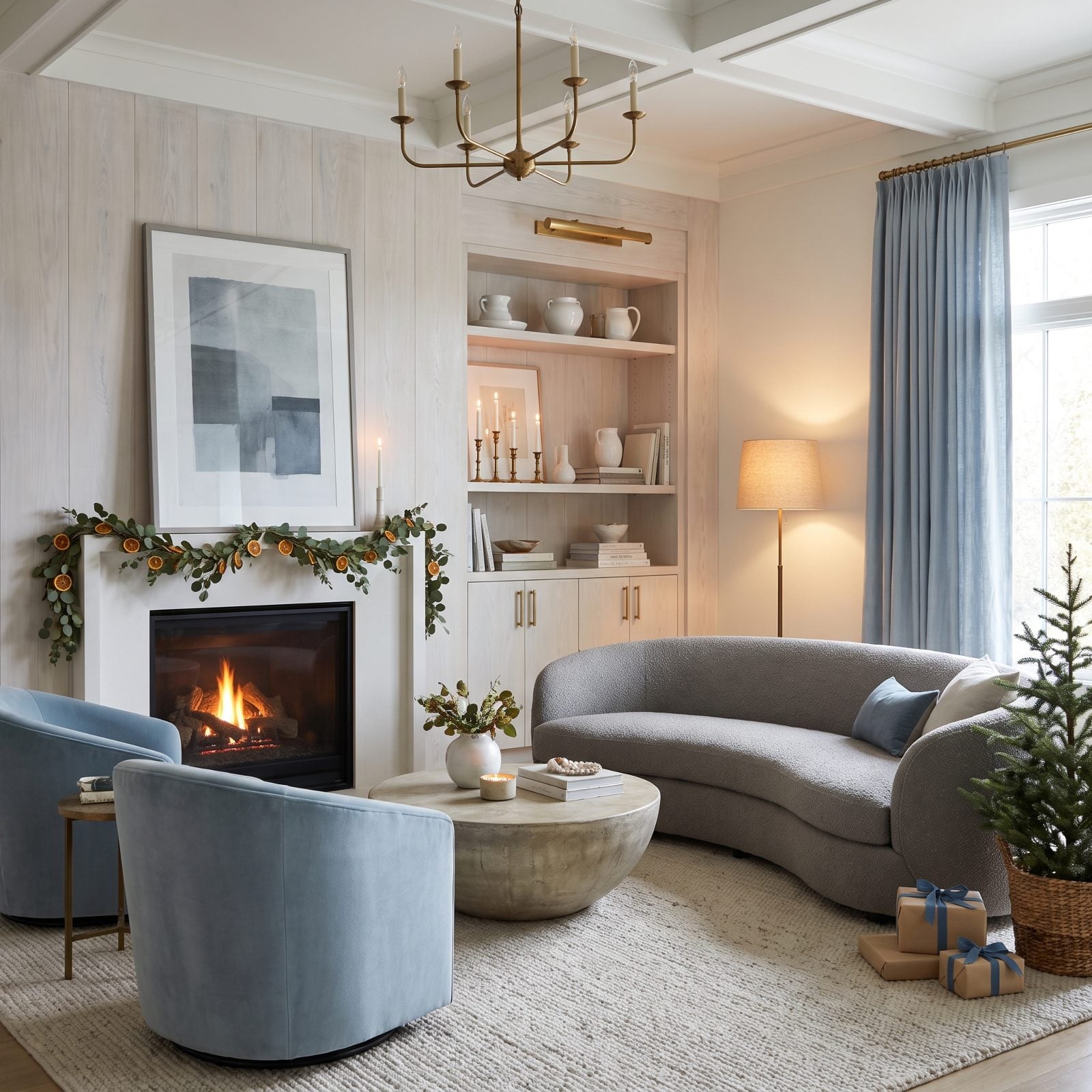
Cool palettes get accused of being cold. This one isn’t, and the fix is warm light. The pewter bouclé sofa and cloud blue walls could read icy on their own, but glowing bulbs and candlelight pull the temperature back up where you want it.
A frosted silver-grey tree with pewter and blue ornaments proves you can do a quiet Christmas without going beige. Restraint is the point.
8. Apricot and Deep Plum: A Warm-Spiced Dining Room for Candlelit Dinners
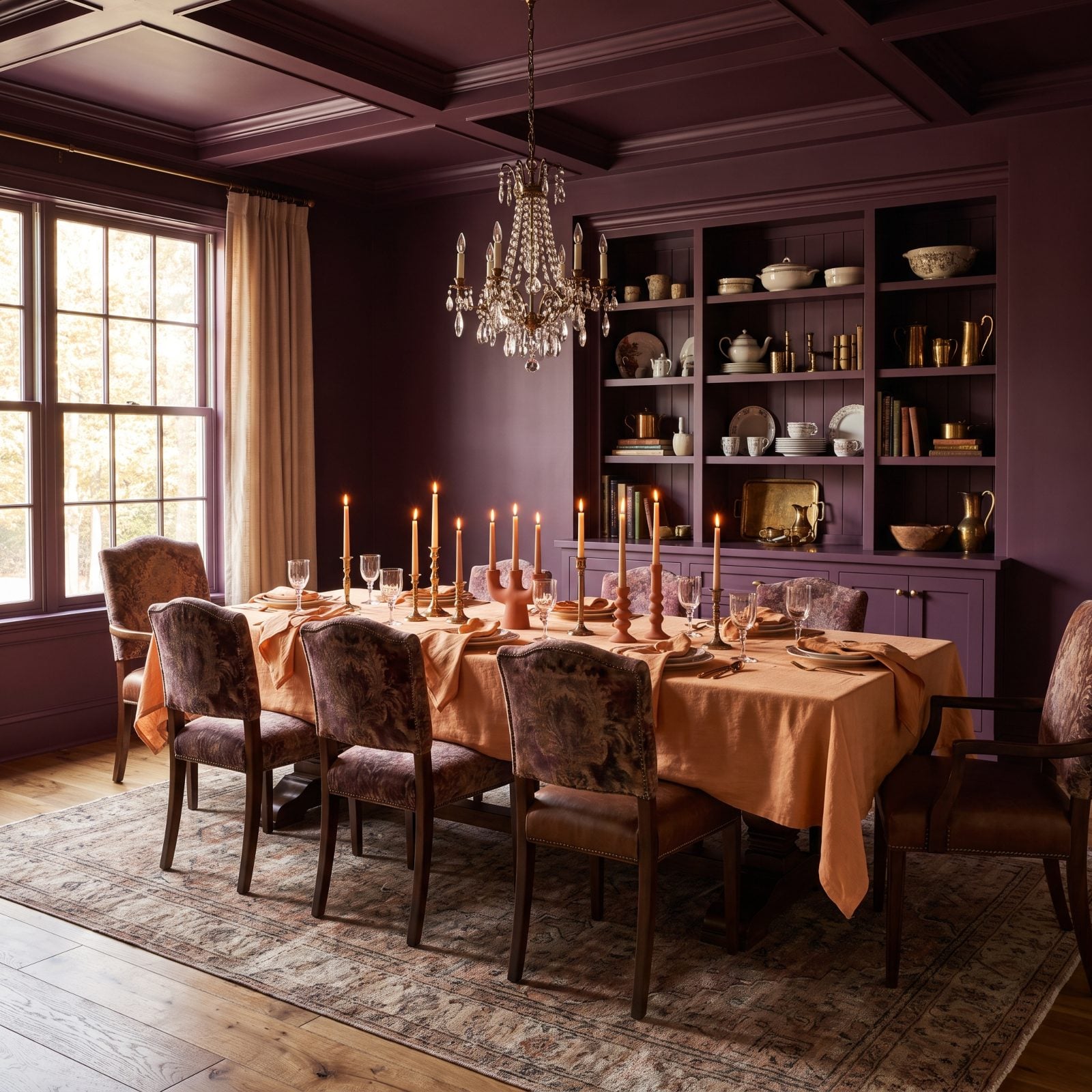
Deep plum walls with apricot linens is the dinner party palette I keep coming back to. The plum swallows light and makes the whole room feel like dusk — exactly what you want when the candles come out. Apricot throws the warmth back in so nobody feels like they’re eating in a cave.
Apricot velvet chairs against walnut do the festive work without a single traditional holiday color, and frosted eucalyptus down the table keeps the foliage subtle and off-palette. Try one thing here: swap your gold candlesticks for plum ceramic ones. Gold would fight everything.
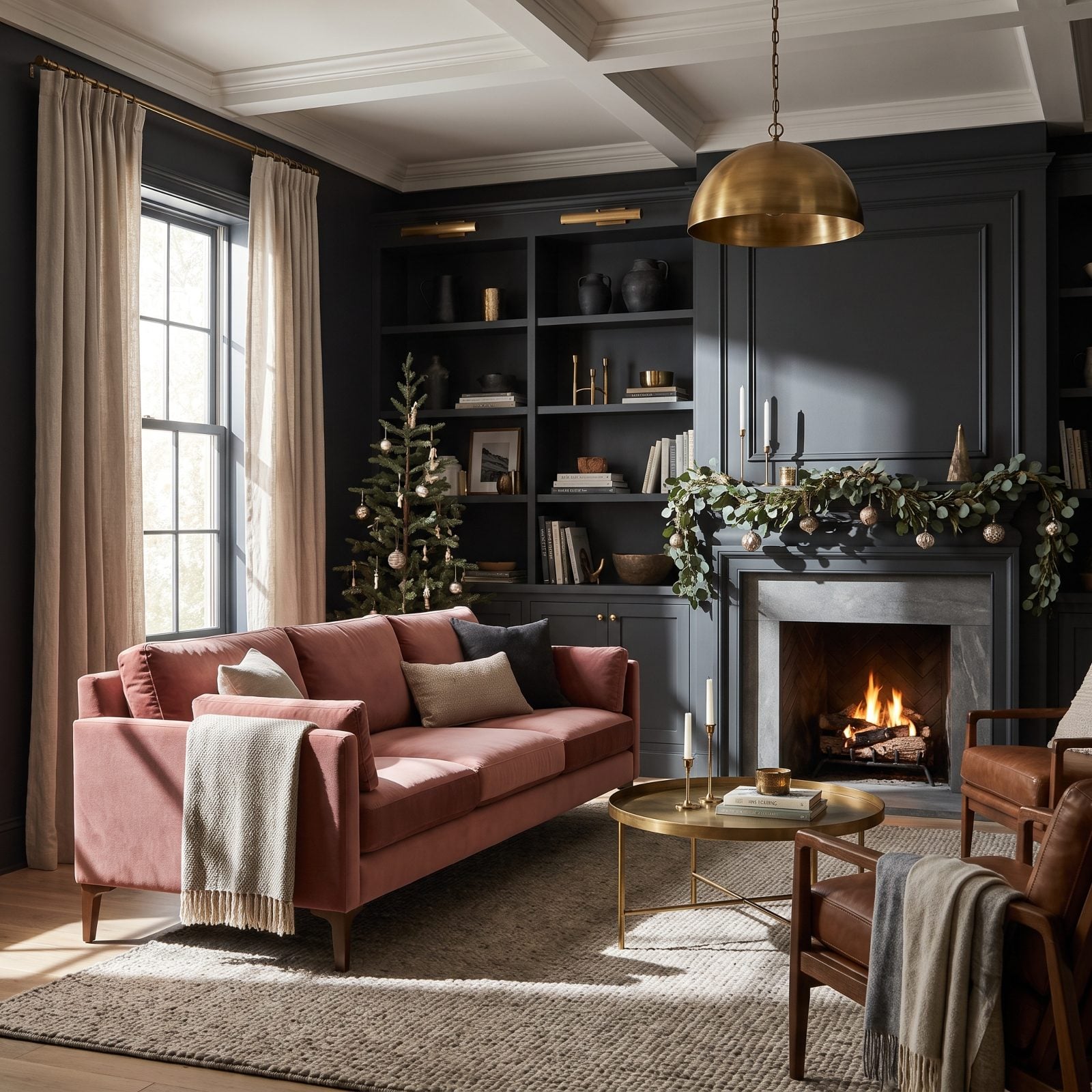
7. Dusty Rose and Charcoal: A Moody Modern Christmas with a Soft Side
🔥 Would you like to save this?
That dusty rose velvet sofa against charcoal walls is doing all the heavy lifting. Dark walls make soft colors look expensive, and the rose practically glows against them — it’s the contrast you’d use with jewel tones, just dialed down to something quieter.
The frosted grey tree with rose ornaments keeps the room firmly in its lane. No red creeping in, no gold shine. A dusty rose velvet sofa is the single piece this whole scheme hangs on, so spend there and keep the rest restrained.
6. Mocha and Pale Lavender: An Unexpectedly Cozy Christmas Reading Nook
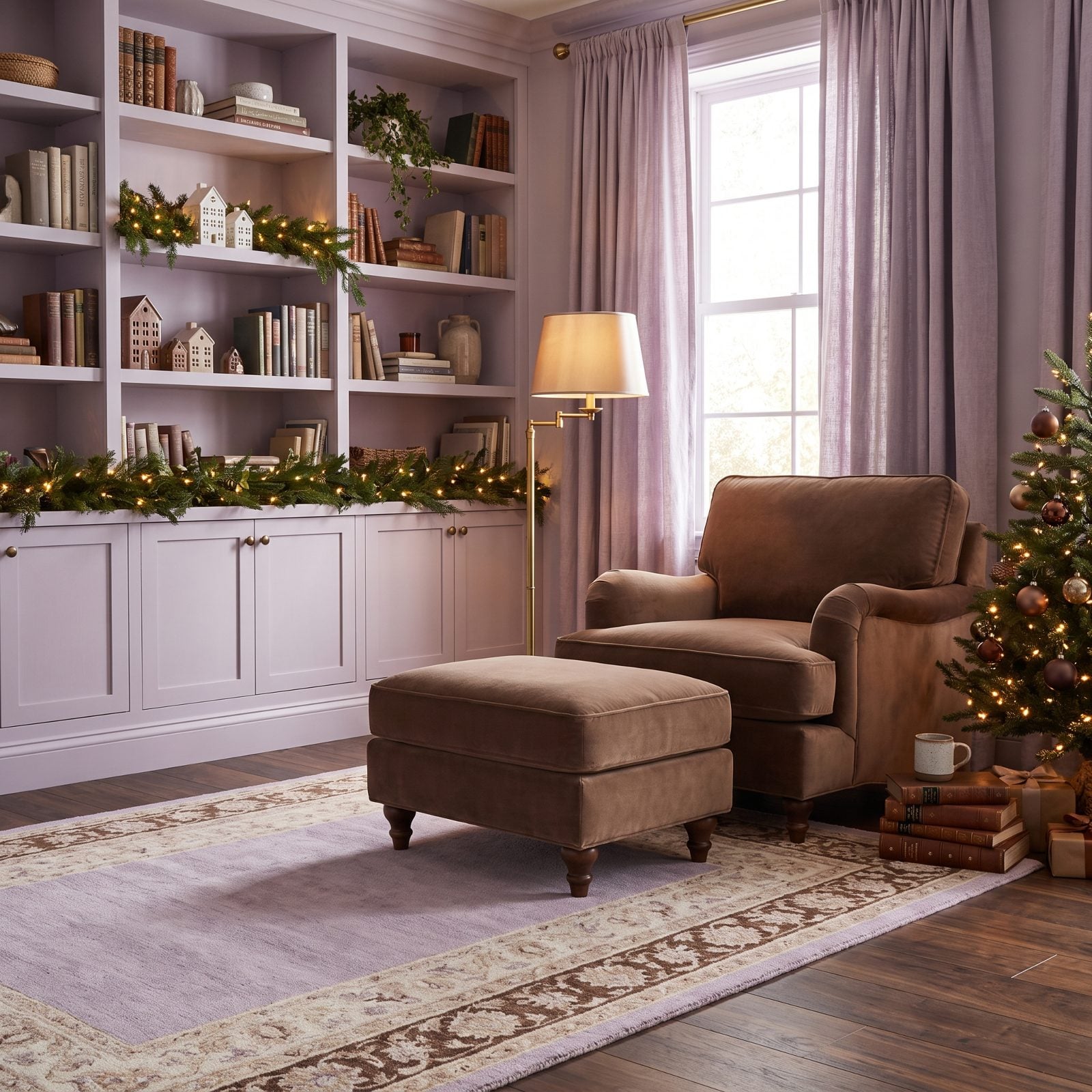
Mocha brown and pale lavender shouldn’t work as well as they do. Brown grounds the lavender so it never goes saccharine, and the lavender keeps the brown from feeling heavy. Coffee with a little something floral in it, basically.
This tucked-away corner leans into the whole prospect-and-refuge thing — low ceiling, a chair you sink into, a small frosted tree with lavender ornaments. It’s the kind of traditional attic design that becomes a holiday hideout. Mocha leather and lavender wool is a texture pairing worth stealing even after the decorations come down.
5. Navy and Bright Coral: A Preppy, High-Energy Christmas Living Room
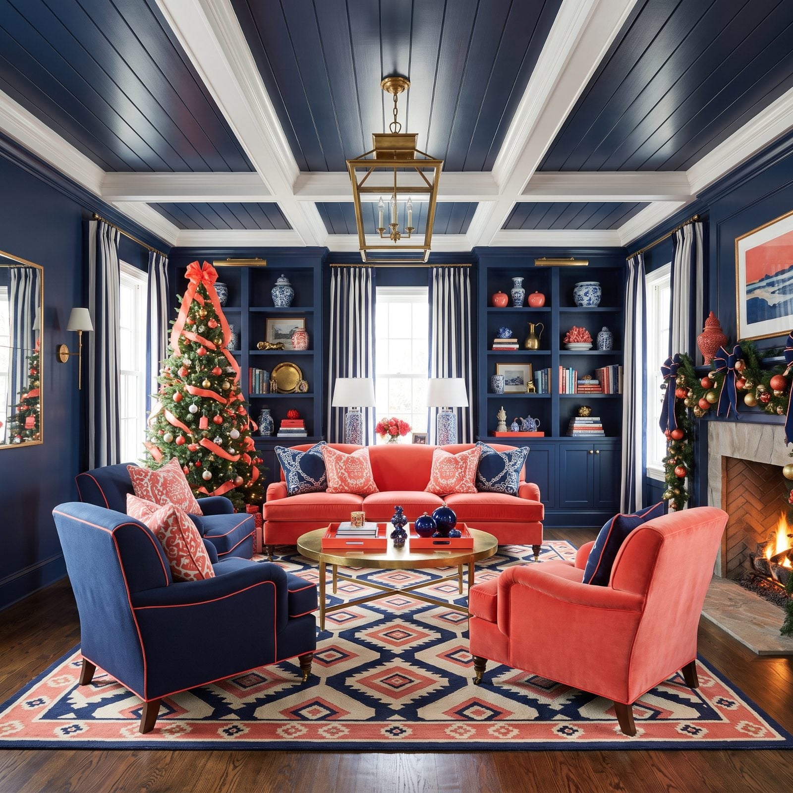
Everything here is turned up loud and somehow nothing is losing. Navy gives the coral a dark backdrop to pop against, which is why the coral velvet sofa practically hums. Coral is the sneaky hero of the no-red Christmas — it reads warm and festive while staying firmly on the orange side of the family.
Striped coral and navy wrapping paper sets the tone before you even look up at the tree. This is the most high-energy palette in the lot, and it works because the two colors are confident opposites. A coral velvet sofa against navy walls is a commitment, but a cheerful one.
4. Ocher and Aubergine: A Richly Layered Christmas Great Room
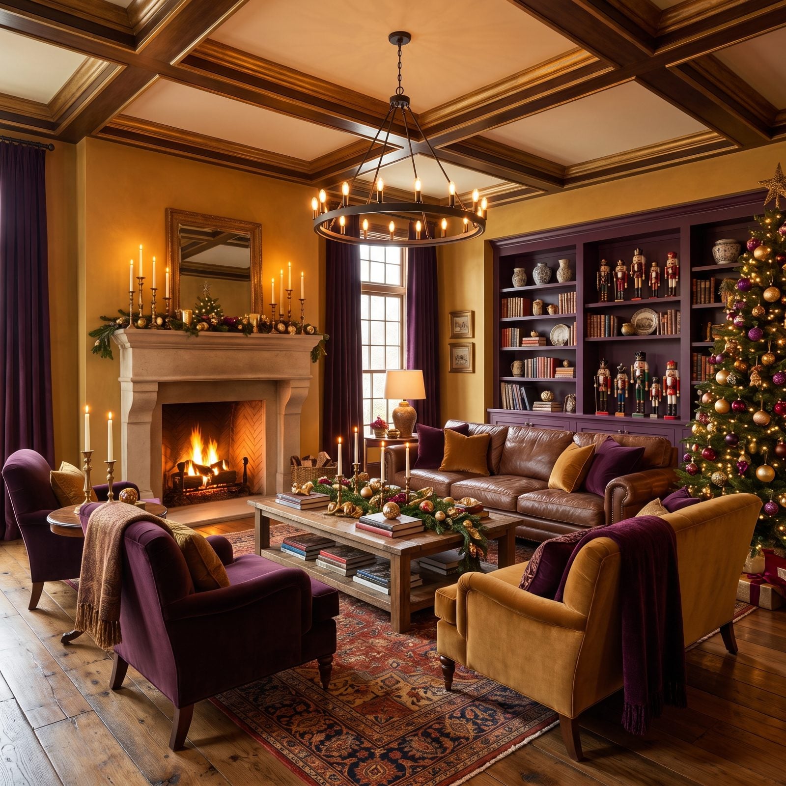
Ocher reads like candlelight baked into the walls, which is why this green great room alternative feels so warm without a scrap of traditional holiday color. The aubergine velvet sofas drop the temperature just enough to keep the room from feeling like the inside of a pumpkin.
Deep purple against golden ocher looks borrowed from an old oil painting. The kilim rug ties both colors into one pattern on the floor, so your eye reads the whole room as deliberate.
Ocher ornaments on a frosted tree, aubergine ribbon, and that’s your festive signal sorted. No red required.
3. Tobacco Brown and Frost Blue: A Masculine, Wintry Christmas Study
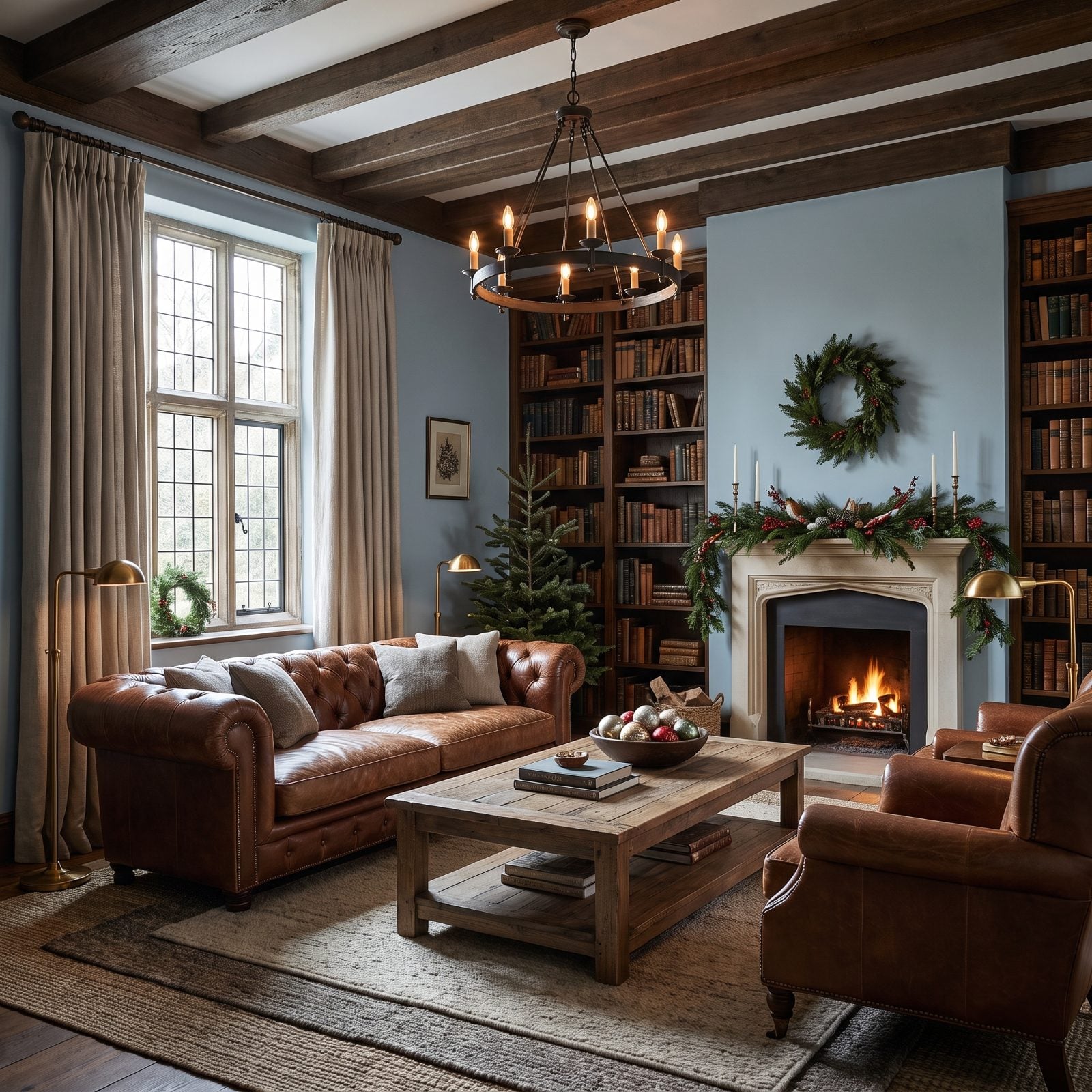
Frost blue walls behind a tobacco leather chesterfield give you the chill of winter and the warmth of a worn-in library at once. The blue reads cold on purpose, like frost on the glass, and the brown leather is the fire that keeps you in the room.
Here’s a quieter take on Christmas. The frosted tabletop tree with frost blue ornaments and tobacco ribbon is nearly subtle enough to miss, which is the appeal. A tobacco leather chesterfield is the backbone of the whole scheme, and it earns its spot every month of the year, not just December.
2. Orchid and Espresso: A Dramatic, Jewel-Toned Christmas Entryway
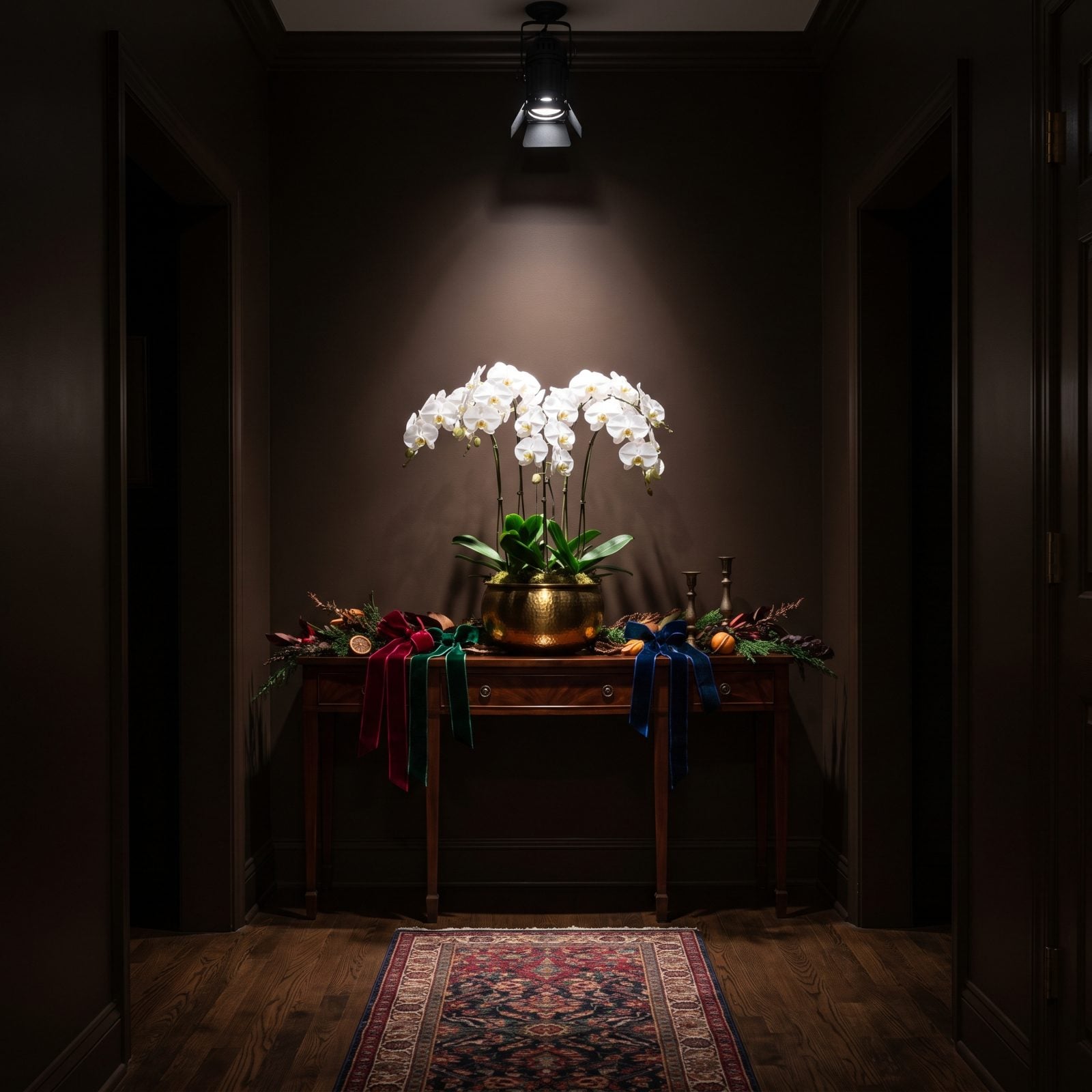
Espresso walls this dark turn every other color into a spotlight, and orchid takes full advantage. The purple-pink practically vibrates against the near-black, which is why this entryway hits you the second you walk in. First impressions, handled.
Orchid is a bold choice for Christmas, and that’s exactly the point. The frosted tree with orchid ornaments and espresso velvet ribbon makes the holiday obvious without leaning on a single expected color. An orchid velvet bench against dark wood is the kind of risk that pays off, and the dark backdrop keeps the whole thing grown-up rather than loud.
1. Graphite and Champagne Pink: The Moody-Soft Christmas Living Room
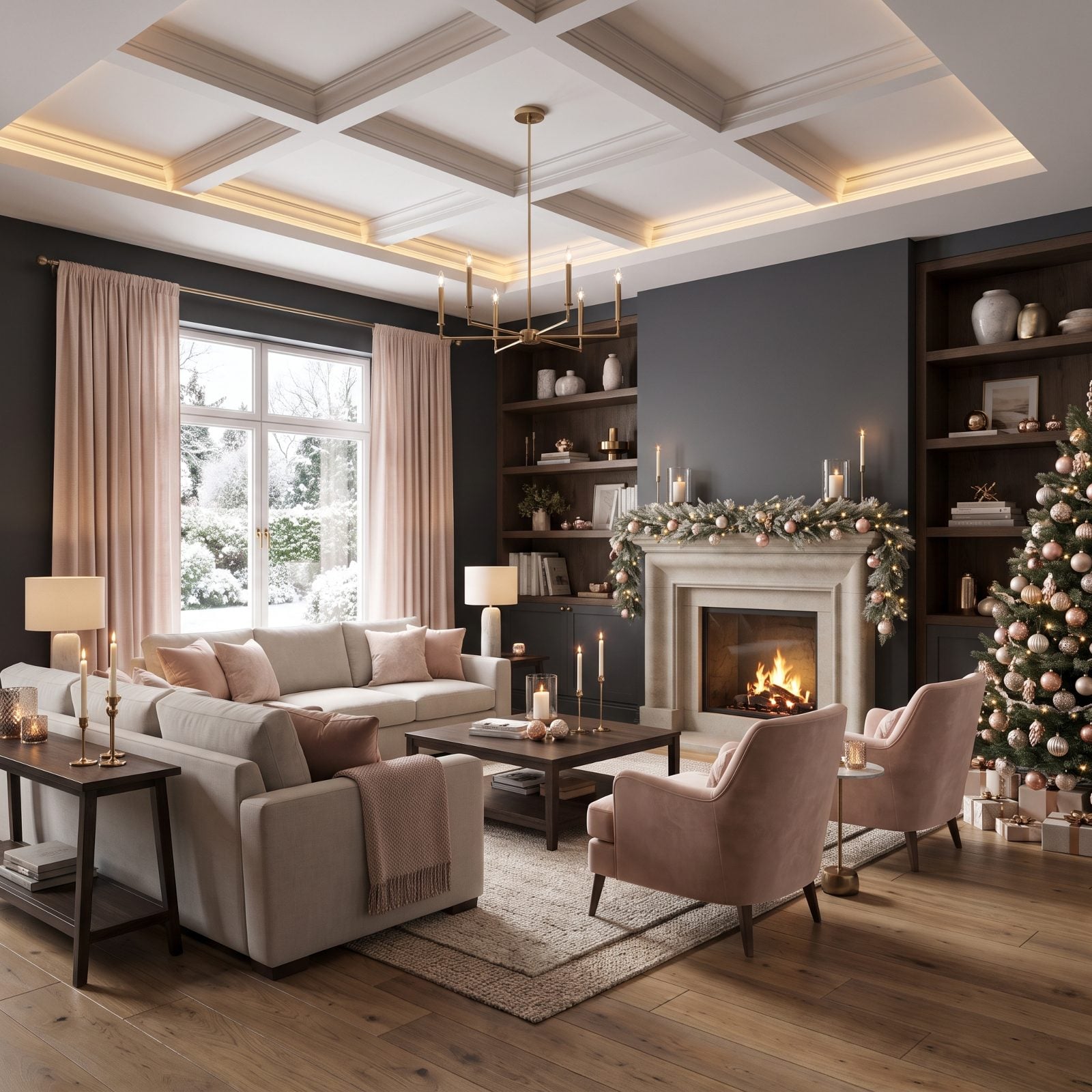
Graphite walls could read cold. They don’t here, because champagne pink keeps stepping in to soften every hard edge. The charcoal velvet sofa anchors everything, dark and substantial, while the blush silk cushions perch on top like the one warm thought in an otherwise serious conversation.
The frosted tree is the clever bit. Its white branches let the blush pink glass baubles and matte graphite ornaments register instantly as festive, so you skip the green entirely and nobody misses it. Pink peonies in a smoked vase. Champagne tapers in pewter holders, presents wrapped in charcoal and pale pink paper, and not one element raising its voice. The whole thing just quietly agrees with itself.












