Would you like to save this?
Creating a beautiful, sophisticated home doesn’t have to be expensive, but certain design choices can make even pricier spaces look cheap and uninviting. Understanding these common decorating pitfalls is essential to elevating your space regardless of your budget.
In order to come up with the very specific design ideas, we create most designs with the assistance of state-of-the-art AI interior design software.
Avoiding design mistakes that cheapen your home’s appearance can dramatically transform how your space feels without requiring significant financial investment. From cluttered spaces to outdated lighting fixtures, these seemingly minor details can significantly impact the overall impression your home creates. By identifying and correcting these issues, you can ensure your home reflects thoughtful design rather than hasty decisions.
1. Overusing matching flat-pack furniture

Walking into a room where every piece of furniture matches perfectly can make your home look cheap rather than curated. Matching flatpack furniture is a sure-fire way to make a room look tacky, according to property experts.
The uniform appearance creates a showroom effect that lacks personality and suggests minimal investment in creating a thoughtful space. Your home should tell your unique story, not look like a furniture catalog page.
Mix different styles, materials, and finishes to create visual interest and depth. Try pairing your flat-pack sofa with a vintage coffee table or adding a statement chair in a contrasting material.
Quality matters more than quantity when furnishing your home. Instead of buying an entire matching bedroom set, invest in one or two high-quality pieces and complement them with budget-friendly items that don’t match exactly.
Consider upcycling some flat-pack items with new hardware, paint, or treatments to give them a custom look. This personal touch will elevate the appearance of your space and make it feel more expensive.
2. Using rugs that are too small for the room

Selecting a rug that’s too small for your space is a common design mistake that can instantly make your home look cheaper than it really is. When your rug is undersized, it creates a disjointed and choppy appearance that makes the entire room look smaller.
Your rug should be large enough to accommodate the main furniture pieces in the room. Ideally, at least the front legs of your sofas and chairs should rest on the rug to create a cohesive seating area.
A tiny rug floating in the center of your room creates an awkward, unanchored feel. This mistake can make your beautiful living room feel smaller and generally cheap.
When shopping for a rug, remember it needs to be proportional to your room size. For living rooms, experts recommend leaving 12-18 inches of floor space between the rug edge and walls.
Light-colored rugs can make a space appear larger, while properly sized area rugs ground your furniture and create visual harmony. This small adjustment can dramatically improve your home’s overall appearance.
3. Cluttering surfaces with too many items

One of the quickest ways to make your home look cheap is by overcrowding your surfaces with too many decorative items. When every available space is filled with knick-knacks, your home can appear disorganized and lacking intentional design.
Even expensive decor can look cheap when there’s simply too much of it. According to design experts, decor clutter makes your home look cheap even when the individual items themselves are nice.
Consider adopting a more minimalist approach to your decorative objects. Select a few meaningful pieces that complement your space rather than overwhelming it.
Remember that negative space is an important design element. Allowing some empty areas on shelves, countertops, and tables creates visual breathing room and highlights your carefully chosen pieces.
When items are spread out too far, they can also appear disconnected and cheap. Try grouping similar items together in small, intentional arrangements for a more cohesive look.
Rotating your decorative items seasonally is another solution. This approach allows you to enjoy all your pieces without cluttering your space all at once.
4. Choosing outdated lighting fixtures

Lighting plays a crucial role in how modern and expensive your home appears. Builder-grade fixtures or those stuck in another decade can instantly make your space feel dated and cheap.
Boob lights (dome fixtures with a center knob) and oversized chandeliers with fake candles scream early 2000s and diminish your home’s aesthetic value. These fixtures not only look outdated but also often provide inadequate lighting.
Track lighting from the 90s is another culprit that can make your home look less than current. Consider replacing these with slim, modern track lights or recessed lighting for a more polished look.
Be careful about installing too many recessed lights throughout your home. This approach can make spaces feel flat and uninspired rather than creating depth and interest.
Old-fashioned wall sconces with dated designs or finishes can make hallways and rooms feel dark and cheap. Update these with streamlined, contemporary options that complement your overall design.
Remember that having coordinated lighting in every room can feel forced. Each space deserves fixtures that suit its specific function and style.
5. Selecting disproportionate furniture sizes

One of the quickest ways to make your home look cheap is by using furniture that’s not proportionate to your space. When pieces are too large or small for a room, it creates an awkward, thrown-together appearance that suggests little thought went into your design choices.
Disproportionate furniture makes a house look cheap, giving the impression you simply combined whatever pieces you had without considering how they work together. This mistake is particularly noticeable in smaller spaces where oversized furniture can make rooms feel cramped and uncomfortable.
Consider the room’s length, width, and height when selecting furniture pieces. A sofa or chair might look perfect in a showroom but feel overwhelming once placed in your actual living space if it’s too large for the room.
The relationship between different furniture pieces also matters. Your coffee table, end tables, and seating should complement each other in scale rather than competing for attention.
Pay attention to artwork as well. Placing disproportionate art on walls can make your space look unbalanced and poorly planned, detracting from the overall aesthetic of your home.
6. Relying on bland, generic decor substitutes

Generic, mass-produced decor items can make your home feel impersonal and cheap. When you opt for the same basic items found in every discount store, your space loses its unique character and personality.
Cookie-cutter artwork with generic phrases like “Live, Laugh, Love” or mass-produced canvas prints signal a lack of thoughtfulness in your decorating choices. These items have become so ubiquitous that they immediately give off a budget appearance.
Identical furniture sets straight from showroom floors can make your space look like a catalog rather than a home. Home design experts suggest that mixing complementary pieces creates a more curated, expensive look.
Plastic plants collect dust and appear obviously fake compared to real greenery. If maintaining live plants seems challenging, high-quality silk alternatives can be a better investment than cheap plastic versions.
Basic builder-grade light fixtures often look dated and cheap. Upgrading even a few key lighting elements can dramatically elevate your home’s appearance without requiring a complete renovation.
Consider investing in a few quality statement pieces rather than filling your home with inexpensive, forgettable items. Quality over quantity applies strongly to home decor choices.
7. Ignoring proper maintenance of furniture and finishes

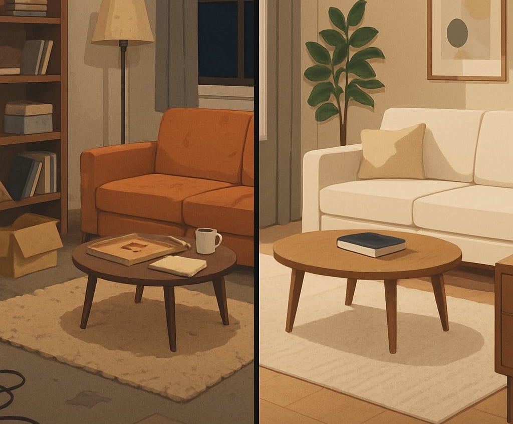
Regular maintenance is essential for keeping your home looking polished and high-end. When you neglect the upkeep of furniture and finishes, your house can quickly take on a shabby, cheap appearance regardless of how much you initially invested.
Peeling or chipped paint on walls and trim is an immediate signal of neglect. Cracked or peeling paint instantly makes your house look rundown and affects the overall impression of your space.
Scratched wooden furniture that hasn’t been refinished can make even expensive pieces look like budget finds. Take time to polish wood surfaces regularly and address any damage promptly to maintain their quality appearance.
Fabric upholstery requires consistent cleaning to prevent permanent staining and premature wear. Dirty, stained sofas and chairs will make your entire living space look unkempt and cheap.
Scuffed floors and worn carpeting drag down the appearance of any room. Consider refinishing hardwood floors when they show excessive wear and replace carpeting that has become matted or stained beyond cleaning.
Tarnished metal fixtures and hardware also contribute to a cheap look. Clean and polish these elements regularly to maintain their luster and prevent them from appearing dated or neglected.
8. Displaying cheap or fake decorative accents

Decorative accents can make or break your home’s aesthetic. Fake flowers and plants are particularly problematic, immediately signaling a budget approach to décor. They collect dust and fade over time, making them look even more artificial.
Mass-produced artwork and generic “word art” with phrases like “Live, Laugh, Love” can make your home look tacky. These items lack personality and are easily recognizable as inexpensive fillers.
Poor quality picture frames with flimsy construction or mismatched styles can diminish the impact of even your favorite photos. Consider investing in fewer, better quality frames that complement your décor.
Plastic accessories and cheaply made figurines rarely stand the test of time. Instead, save for a few meaningful, well-crafted pieces that tell your story and elevate your space.
Remember that clustering too many small decorative items can create visual clutter. Curate your collection carefully, focusing on quality over quantity to create a more sophisticated look.
9. Using low-quality paint with uneven application

Paint quality can make or break your home’s appearance. Bargain-bin paints often lack the pigment concentration and binders necessary for proper coverage, leading to a patchy, inconsistent finish that instantly signals corner-cutting.
Uneven application compounds this problem, creating noticeable roller marks, drips, and inconsistent sheen across walls. These imperfections catch light at different angles, drawing unwanted attention to flaws rather than architectural features.
Professional painters invest in high-quality tools and premium paints for a reason. Quality brushes and rollers distribute paint evenly, while premium paints contain superior ingredients that allow for smoother application and better durability.
Color inconsistency between walls or within the same surface suggests hasty work or inadequate preparation. This particularly stands out in high-traffic areas or places with natural light, where variances become more pronounced throughout the day.
Taking time to properly prepare surfaces, invest in quality paint, and apply it with care yields significantly better results. The modest price difference between economy and premium paints is vastly outweighed by the dramatic improvement in your home’s overall appearance.
10. Filling rooms with excessive, unmatched patterns

Pattern mixing is a design skill that requires careful balance. When you combine too many competing patterns without consideration for scale, color, or theme, your space can quickly look chaotic and unrefined.
A common mistake is layering bold patterns across multiple surfaces without establishing harmony. Floral curtains paired with geometric rugs, plaid furniture, and striped pillows create visual confusion rather than intentional design.
Experts suggest limiting your space to 2-3 patterns that share a color palette or theme. This creates cohesion while still allowing for visual interest.
Consider scale when mixing patterns. Combine larger patterns with medium and small-scale designs to create balance. This hierarchy helps guide the eye and prevents overwhelming competition.
When in doubt, follow the 60-30-10 rule for your room’s design. Use your dominant pattern for 60% of the space, a secondary pattern for 30%, and an accent pattern for the final 10%.
Solid neutrals between patterned elements give the eye places to rest. These breathing spaces are essential for preventing that cluttered, cheap appearance that comes from pattern overload.
11. Neglecting cohesive color schemes

One of the quickest ways to make your home look cheap is by neglecting to implement a cohesive color scheme. Using too many colors can create a chaotic and visually overwhelming space that feels disorganized rather than thoughtfully designed.
Conversely, using only one color throughout your entire home can make spaces feel monotonous and flat. A well-designed home strikes a balance with complementary or contrasting colors that bring life to each room.
To create a more sophisticated look, limit your palette to a few complementary colors and use them consistently throughout your space. This approach helps establish visual harmony from room to room.
Don’t forget about trim and moldings when considering your color scheme. These architectural details deserve attention and can enhance your overall design when properly incorporated.
Materials also play a crucial role in color cohesion. The woods, metals, and natural elements you select should work together harmoniously. Using similar materials across different rooms helps your entire house feel more connected.
12. Inconsistent styles within the same space

Mixing too many design styles in a single room can make your home look unplanned and cheap. When you combine ultra-modern furniture with Victorian accents and rustic elements without a coherent vision, the space feels disjointed rather than intentionally eclectic.
This mistake often happens when you purchase items you like individually without considering how they work together. A room with mismatched furniture styles creates visual confusion and lacks the cohesion that defines well-designed spaces.
Professional designers recommend choosing a primary style direction and then adding complementary pieces. You can mix styles successfully, but there should be connecting elements like color, texture, or scale that tie everything together.
Pay attention to the architectural style of your home as well. Furnishings that dramatically contradict your home’s inherent character can look out of place and create an unintentionally cheap appearance.
When shopping for new pieces, consider how they’ll integrate with your existing items. Taking photos of your space while shopping can help you visualize how new additions will fit in with your current design elements.
13. Skipping layering in lighting design

Would you like to save this?
One of the quickest ways to make your home look unpolished is by neglecting proper lighting design. Many homeowners settle for a single overhead light fixture and call it done, missing the opportunity to create depth and visual interest.
Proper lighting involves creating layers that work together – ambient, accent, and task lighting. When you skip this approach, rooms feel flat and uninviting rather than warm and dimensional.
Professional designers understand that layered lighting adds depth and dimension to your space while creating focal points and enhancing ambiance. Without it, even beautifully furnished rooms can feel incomplete.
Make sure each room has enough light fixtures for its function. Consider floor lamps, table lamps, sconces, and even candles alongside your ceiling fixtures.
Budget constraints often lead to lighting being an afterthought. However, allocating funds specifically for lighting is essential for a polished look.
Remember that lighting isn’t just practical—it’s an art form that balances hues and brightness throughout your space. When done thoughtfully, it elevates your entire home’s appearance.
14. Inadequate window treatments or cheap blinds

Window treatments are often overlooked, yet they significantly impact how your home is perceived. Vertical blinds particularly make a room look cold and cheap, resembling an office rather than a warm living space. They can instantly downgrade the appearance of an otherwise well-designed room.
Leaving windows completely bare is equally problematic. Naked windows make your home look undone and unfinished, regardless of how nicely you’ve decorated the rest of the room.
For a more elevated look, consider Roman blinds or roller blinds instead of vertical options. These alternatives provide functionality without sacrificing style and can blend seamlessly with your decor.
Hanging curtains or drapes properly can dramatically improve your space’s appearance. Position curtain rods at least 12 inches above window frames or mount them ceiling-height to create the illusion of taller windows and more spacious rooms.
Extend your curtain rods 3-6 inches beyond each side of the window. This simple trick allows more natural light when curtains are open and makes your windows appear larger.
15. Using worn or faded textiles and upholstery

Upholstery that has seen better days can instantly make your home look outdated and neglected. Faded fabrics, frayed edges, and visible wear patterns on sofas and chairs communicate that you haven’t invested in maintaining your space.
Even expensive furniture pieces lose their appeal when the fabric has sun damage or discoloration. According to design experts, certain upholstery details can make your house look cheap even if the furniture itself was quality when purchased.
You don’t necessarily need to replace entire furniture pieces. Reupholstering key items can breathe new life into your space while preserving pieces you love. Slipcovers offer an affordable alternative for updating worn seating.
Don’t forget about other textiles in your home. Faded curtains, discolored throw pillows, and worn area rugs contribute to an overall impression of neglect. These smaller items are typically less expensive to replace and can make a significant impact.
Consider adding pattern and texture when replacing worn textiles. Design professionals recommend this approach to elevate your home’s appearance and create a more curated feel.
16. Poorly hung or cheap artwork and frames

Artwork and frames can significantly impact your home’s overall aesthetic. When art is hung at improper heights or with uneven spacing, it creates a disorganized appearance that cheapens your space.
The standard rule is to hang art at eye level, typically with the center of the piece positioned 57-60 inches from the floor. Ignoring this principle can make your home look amateur and unpolished.
Mass-produced, generic prints in flimsy plastic frames are instantly recognizable as budget items. These pieces lack character and fail to make a personal statement about your home and style.
Frame quality matters just as much as the artwork itself. Thin, plastic frames or those with visible warping signal cost-cutting that visitors will notice. Investing in proper framing transforms even modest artwork into something that looks intentional.
Mismatched frames without a cohesive strategy can create visual chaos. While eclectic groupings can work wonderfully, they require thoughtful curation rather than random collection.
Artwork that’s disproportionately small for your wall space creates an awkward, floating appearance. Consider larger pieces or properly spaced gallery arrangements to fill the space appropriately.
17. Neglecting the balance between furniture and negative space

Filling every inch of your home with furniture and decorative items can make spaces feel cluttered and smaller than they actually are. Empty space isn’t wasted space—it’s an essential design element that creates visual breathing room.
Negative space in interior design is just as important as the furniture and decor you choose. When you don’t leave enough empty areas, your home can appear cramped and chaotic, giving off a cheap impression regardless of how expensive your items might be.
Proper balance means allowing some areas to remain open and unoccupied. This intentional approach to designing with negative space creates a sense of calm and makes your selected pieces stand out more effectively.
Consider the rule of quality over quantity. A few well-chosen furniture pieces with breathing room around them create a more sophisticated look than numerous items competing for attention.
Remember that positive space (your furniture and decor) needs negative space to shine. When planning your room layout, deliberately leave some walls, corners, and surface areas empty to achieve a more balanced and expensive-looking design.
18. Overcrowding with too many small decorative items

When it comes to home decor, the “less is more” philosophy often rings true. Displaying too many small decorative items across your surfaces can quickly make your home look cluttered and cheap rather than stylish.
Small decorative pieces can certainly add personality to your space, but an abundance of them creates visual chaos. Your eye doesn’t know where to focus when dozens of tiny objects compete for attention.
Consider the impact of your accessories carefully. Multiple small frames, figurines, and knickknacks scattered across every available surface diminish the visual impact that fewer, more carefully selected pieces would make.
Too many decor accessories can be particularly problematic if they’re not properly scaled to your space. Items that are too small for their surroundings can look insignificant and create a busy, disorganized appearance.
Try using trays or decorative containers to group smaller items together. This creates a more cohesive look while reducing the visual clutter that makes spaces feel chaotic and unrefined.
Remember that each decorative item should earn its place in your home. Quality over quantity will always create a more expensive and intentional look.
19. Ignoring functional placement of furniture

Furniture placement can make or break your home’s functionality and aesthetic appeal. When you position pieces without considering traffic flow, you create unnecessary obstacles that disrupt movement through your space.
Poor furniture arrangements can make even spacious rooms feel cramped and uncomfortable. Placing a sofa that blocks a doorway or positioning chairs too far from conversation areas sends a message of carelessness rather than intentional design.
Blocking natural pathways through your home creates daily frustration and makes your space feel awkward to navigate. Your guests shouldn’t have to sidestep or squeeze past furniture to move through rooms.
An effective layout considers how you actually use each space. Furniture should support your activities, not hinder them. For example, coffee tables should be easily accessible from seating areas.
Pay attention to scale and proportion when arranging furniture. Oversized sectionals in small living rooms or tiny pieces in large spaces create visual imbalance that cheapens your design.
Simple adjustments to furniture placement can dramatically improve both function and appearance. Move pieces closer together to create intimate conversation areas or rearrange to highlight architectural features instead of blocking them.
20. Choosing glossy cheap plastics over natural materials

Opting for glossy plastic materials instead of natural ones can instantly cheapen the look of your home. When you choose shiny plastic furniture or decorative pieces, they often reflect light in a way that highlights their inexpensive quality.
Natural materials like wood, stone, cotton, and wool add warmth and character to a space. These materials develop a patina over time that adds to their appeal, while plastics tend to look worn and dated quickly.
You don’t need to spend a fortune on natural materials. Adding natural elements to your home creates a more relaxing atmosphere and helps you feel connected to the outdoors.
Consider incorporating sustainable materials like bamboo, cork, or reclaimed wood as alternatives to plastic. These options are not only better for the environment but also elevate your interior design.
If budget is a concern, focus on replacing plastic items in high-visibility areas first. Even small changes, like swapping plastic picture frames for wooden ones, can make a significant difference in how expensive your home appears.
21. Using outdated wallpaper or wall decals

Wallpaper featuring floral patterns from decades past can instantly make your home feel cheap and behind the times. When guests see dated wallpaper, they often assume you haven’t updated your space in years.
Wall decals that were trendy in the early 2000s, like inspirational quotes or silhouette designs, now look tired and generic. These elements often fail to impress and can make your space appear less sophisticated.
Accent walls with outdated patterns or colors can particularly age your home. Many designers now suggest moving away from the single accent wall trend toward color-drenching all four walls for a more current look.
If you’re stuck with dated wallpaper, consider removing it completely rather than trying to work around it. A fresh coat of paint in a contemporary neutral or subtle tone will immediately modernize your space.
For a more current approach, consider textured wallpapers, subtle geometric patterns, or nature-inspired designs that reflect today’s trends. These options add character without making your home appear stuck in the past.
Remember that wall treatments communicate your home’s architectural style and create continuity throughout your space. Choose wisely to avoid that cheap, outdated look.
22. Not updating hardware on cabinets and doors

Outdated cabinet and door hardware instantly ages your home and creates a cheap appearance. Those shiny brass knobs from the 90s or basic builder-grade pulls can make even the nicest cabinetry look dated and neglected.
Mixing too many hardware styles or finishes can make your kitchen look disorganized and poorly planned. Inconsistent hardware styles create visual confusion and suggest a piecemeal approach to home design rather than a cohesive vision.
Updating your hardware is one of the most cost-effective ways to transform your space. Modern matte black, brushed nickel, or even leather-wrapped pulls can instantly elevate the look of your cabinets without requiring a full renovation.
Don’t forget about your front door hardware! The exterior of your home deserves the same attention as the interior. A dated doorknob or handle creates a poor first impression for visitors.
If you’re planning to age in place, consider switching to longer bar pulls or D-shaped hardware for improved accessibility. These not only look more contemporary but are also more functional for everyone in your household.
23. Incorporating visibly cheap flooring materials

Flooring plays a crucial role in defining the aesthetic of your home. When you opt for visibly cheap flooring materials, it immediately diminishes the overall appearance of your space.
Low-quality laminate that peels at the edges or vinyl flooring with obvious seams can make your entire room look hastily finished. Inconsistent hard surface flooring like different types of LVT or laminate in adjacent rooms will make your house look cheap.
You don’t need to spend a fortune on flooring to achieve a high-end look. There are many budget-friendly options that can appear elegant when properly installed.
If you have existing floors in good condition but find them boring, consider adding a stencil design to elevate their appearance. Stencils offer a wide range of patterns and provide an inexpensive way to improve your flooring.
Poorly installed transitions between different flooring types also contribute to a cheap appearance. Take time to ensure smooth transitions between rooms, even if you’re using budget materials.
Remember that clutter combined with cheap flooring compounds the problem. Keep your floors clean and minimize excessive furniture to make even budget flooring look better.
24. Excessive use of synthetic fabrics over natural fibers

Filling your home with synthetic fabrics can make even the most carefully designed space appear cheap and uninviting. Synthetic materials like polyester, acrylic, and nylon often lack the depth, texture, and quality appearance of natural alternatives.
Natural fibers such as cotton, wool, linen, and silk add an inherent richness and sophistication to your home. These materials breathe better and provide more comfort than their synthetic counterparts.
You can identify lower-quality synthetics by their uniformity, slight shine, and sometimes that unmistakable “plasticky” feel. These materials often pill quickly and can look worn after minimal use.
While synthetics have their place due to durability and excellent color retention, using them exclusively throughout your home creates a flat, artificial atmosphere.
Consider incorporating natural fibers in key visible elements like curtains, throw pillows, and upholstery. Even a partial switch to cotton, wool, hemp, or linen can dramatically elevate your interior’s perceived value.
For budget-conscious decorating, semi-synthetic fabrics like viscose or modal offer a middle ground, providing some natural characteristics at a lower price point.
25. Placing too many throw pillows causing chaos

Would you like to save this?
While throw pillows can add comfort and style to your living space, having too many can make your home look cluttered and cheap. Excessive throw pillows can make your living space feel crowded and less inviting.
When you overload your sofa or bed with pillows, it becomes difficult for anyone to actually sit or relax comfortably. Your guests might feel awkward about moving or rearranging numerous pillows just to find a place to sit.
Design experts suggest being more intentional with your pillow selection. Choose a balanced combination of sizes and textures rather than overwhelming your furniture with too many options.
The number of pillows should be proportional to the size of your furniture. According to designers, the ideal number depends on the corners of your couch, not how many you can possibly fit.
For a polished look, select fewer high-quality pillows that complement your décor rather than competing with it. This creates a more sophisticated, intentional appearance that elevates your space.
26. Over-reliance on trendy, fast-furniture pieces

Just like fast fashion, fast homeware has become a significant problem in interior design. These mass-produced, trendy furniture pieces might be affordable in the moment, but they often lack quality and longevity.
When you fill your home with cheap, trendy pieces that follow current fads, you risk your space looking outdated as soon as the trend passes. Interior designers note that these items can instantly make your home look cheap rather than thoughtfully designed.
The issue isn’t necessarily the price point but rather the disposable mindset. Furniture that’s poorly constructed with low-quality materials will quickly show wear and tear, requiring replacement much sooner than well-made pieces.
Instead of purchasing numerous inexpensive trendy items, consider investing in fewer, timeless pieces that will last. You can still incorporate current styles through smaller, less expensive accessories that are easier to switch out when trends change.
Bland substitutes for quality furniture are immediately noticeable to guests. A home filled with obviously mass-produced items lacks the character and individuality that makes a space feel authentic and well-curated.
27. Failing to coordinate metals and finishes

When metals and finishes clash throughout your home, they can make spaces look unplanned and inexpensive. Randomly mixing brass, chrome, nickel, and copper without intention creates visual chaos rather than harmony.
A good rule of thumb is to limit yourself to two metal finishes per room. This creates consistency and helps maintain a cohesive visual flow throughout your home, even with different finishes present.
You don’t need to match every single metal exactly, but creating some coordination shows intentional design. When selecting fixtures, hardware, and decorative pieces, consider how they’ll work together in the space.
For those unsure where to start, try using one dominant metal finish for larger items like faucets and lighting, then add a secondary finish for accessories and smaller hardware. This approach provides both unity and interest.
Mixing metals effectively is something designers master to create high-end looks. Thoughtfully paired combinations like matte black with brass or brushed nickel with chrome can elevate your space’s appearance.
Remember that metal finishes are a design element that, when properly coordinated, add sophistication rather than detract from your home’s overall aesthetic.
28. Ignoring repair needs like peeling wallpaper or scratches

Neglecting small repair needs around your home is a fast track to making it look cheap and uncared for. Peeling wallpaper edges, chipped paint, and visible scratches on furniture or floors immediately signal neglect to visitors.
These minor flaws create a cumulative negative impression that’s hard to overcome with decorative elements. Even beautiful furnishings can’t distract from visible damage that catches the eye.
You don’t need to tackle everything at once. Prioritize repairs in high-traffic areas and spaces where guests spend the most time. A few coats of paint can be a simple, affordable fix for many wall issues.
For scratched wooden surfaces, touch-up markers or wax sticks in matching colors can work wonders. Deep scratches in flooring might require professional help, but surface marks can often be addressed with DIY solutions.
Consider adding repair tasks to your regular home maintenance schedule. Addressing issues promptly prevents them from worsening and becoming more expensive to fix later. Small imperfections may seem insignificant individually, but collectively they create an impression of a home that’s poorly maintained.
29. Poorly planned furniture layout disrupting flow

A poor furniture layout can make even the most expensive pieces look cheap by disrupting the natural flow of your home. When furniture blocks pathways or creates awkward movements through rooms, it immediately signals poor planning.
Consider how people naturally move through your space. Aim for clear pathways of at least 30-36 inches for main traffic areas, allowing people to walk without squeezing past furniture or bumping into things.
Pushing all furniture against walls is a common mistake that creates a doctor’s office look. Instead, create conversation areas with pieces arranged to facilitate interaction while maintaining flow.
Scale and proportion matter significantly. An oversized TV above a tiny console creates visual imbalance that cheapens your space regardless of how much you spent on the items.
Before finalizing your layout, test the traffic patterns by walking through different scenarios: entering the room, accessing windows, reaching storage, and sitting down. This practical approach helps identify problems before they become permanent features.
Consider seeking advice from design professionals who can help rethink your furniture layout to create a more expensive-looking, harmonious space.

