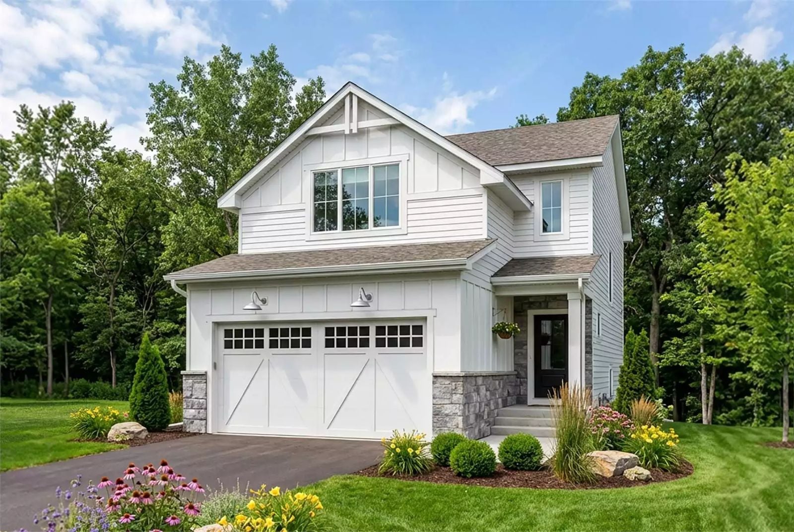
Most farmhouses on the market today are just colonial floor plans with a shiplap accent wall slapped on for good measure. The Hollywell is actually designed around how families live: homework spread across the island, dinner on the stove, a conversation happening in three rooms at once — open-concept kitchen and living area, a generous dining space, main-floor flow that keeps everyone visible, and upper-level bedrooms close enough to matter.
Specifications
- Sq. Ft.: 1,900
- Bedrooms: 4
- Bathrooms: 2.5
Floor Plan – Main Floor
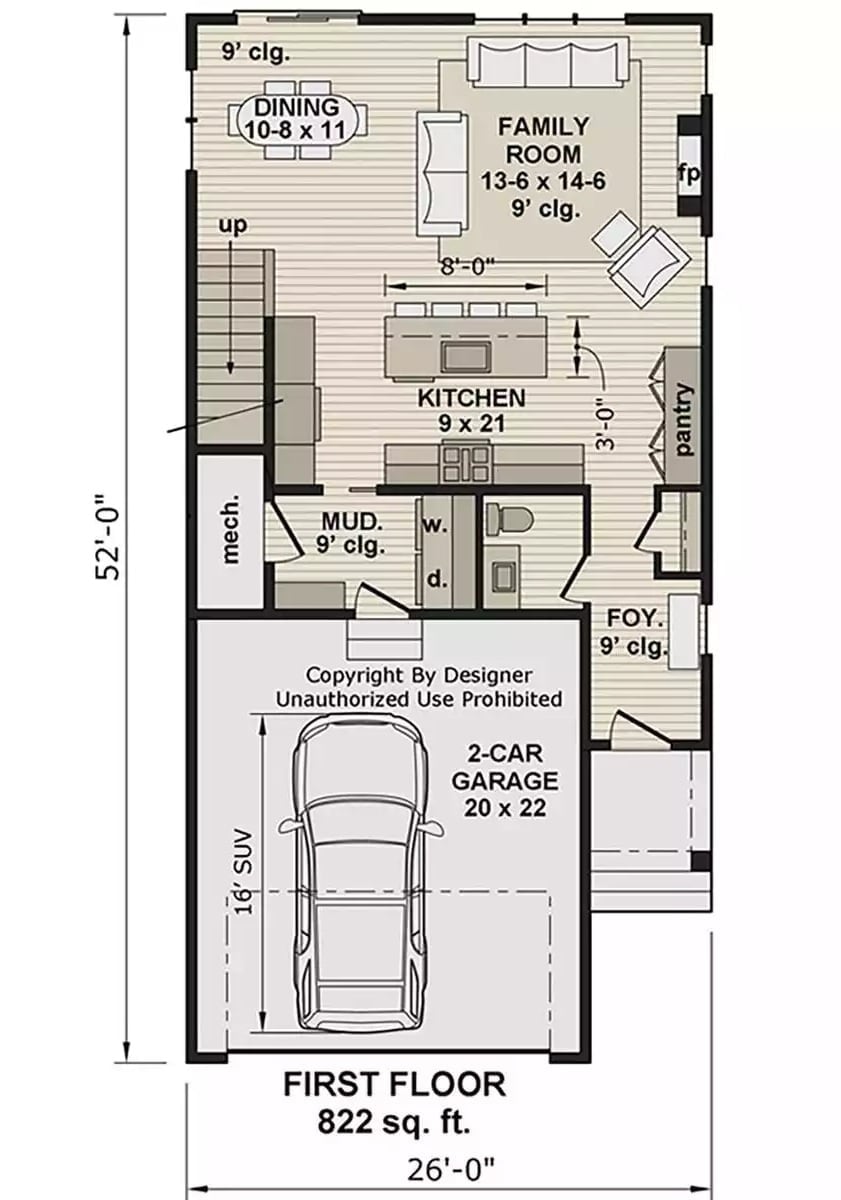
The first floor puts the family room, dining area, and kitchen in a connected open layout at the rear, keeping all the social spaces where they belong. A mud room and laundry sit just off the garage entry, and the foyer lands near a half bath and pantry. At 822 square feet, it’s a lean footprint — nothing wasted.
Floor Plan – Second Floor
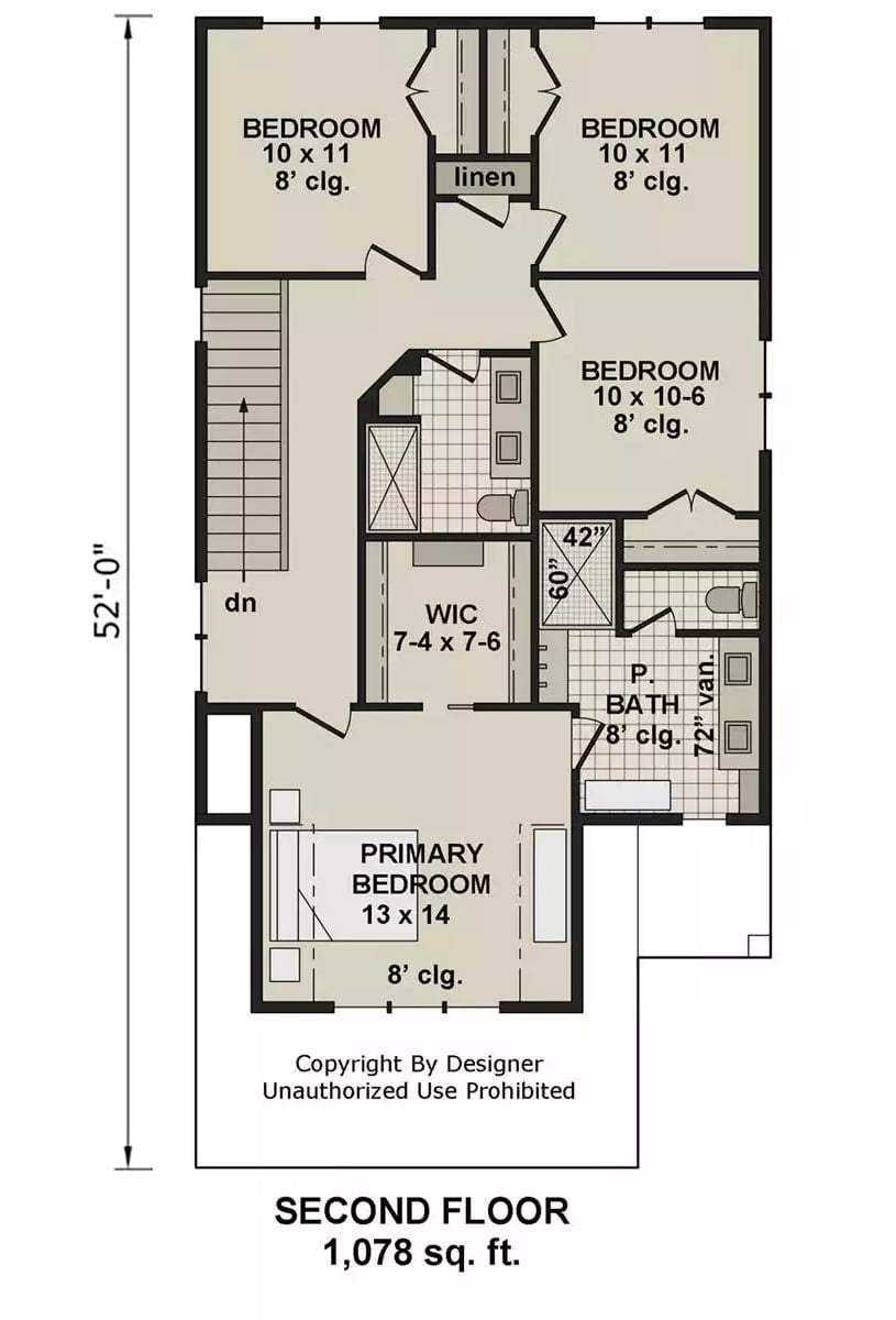
The second floor puts all four bedrooms on 1,078 square feet. The primary gets a walk-in closet and a private bath; the other three cluster around a shared linen closet and hall bath, which keeps the morning traffic pattern reasonably sane.
Geometric Chandelier, White Console, and a Hallway That Actually Welcomes You
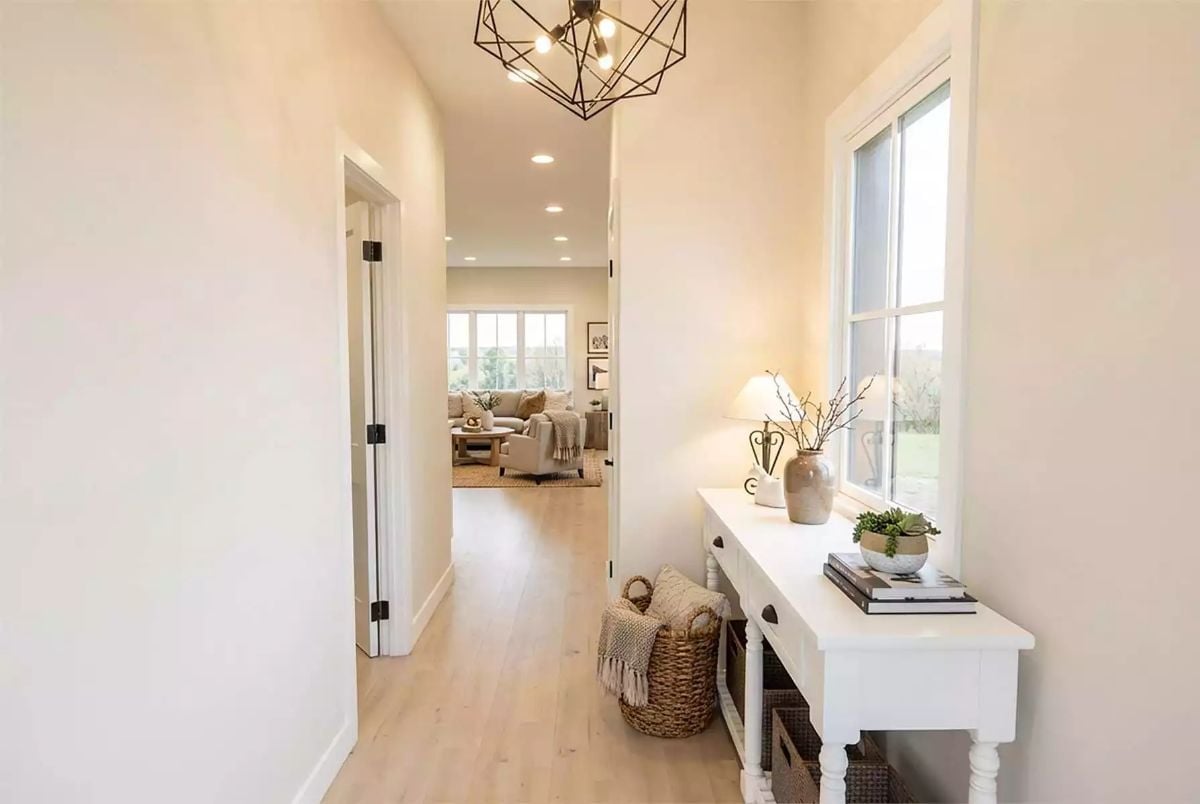
Warm blonde hardwood runs the length of the entry hall, anchored by a white console table and a geometric black metal chandelier overhead that actually justifies its own existence. At the far end, natural light spills in from the living room and pulls you forward before you’ve even set your bag down.
Trend Alert: Entryway console tables are replacing traditional coat-closet setups in new farmhouse builds. Pairing open shelving with woven baskets keeps everyday clutter contained without hiding the architecture, and it photographs well enough that you’re seeing it in nearly every new listing right now.
Stone Fireplace Tower and a View That Competes With the TV
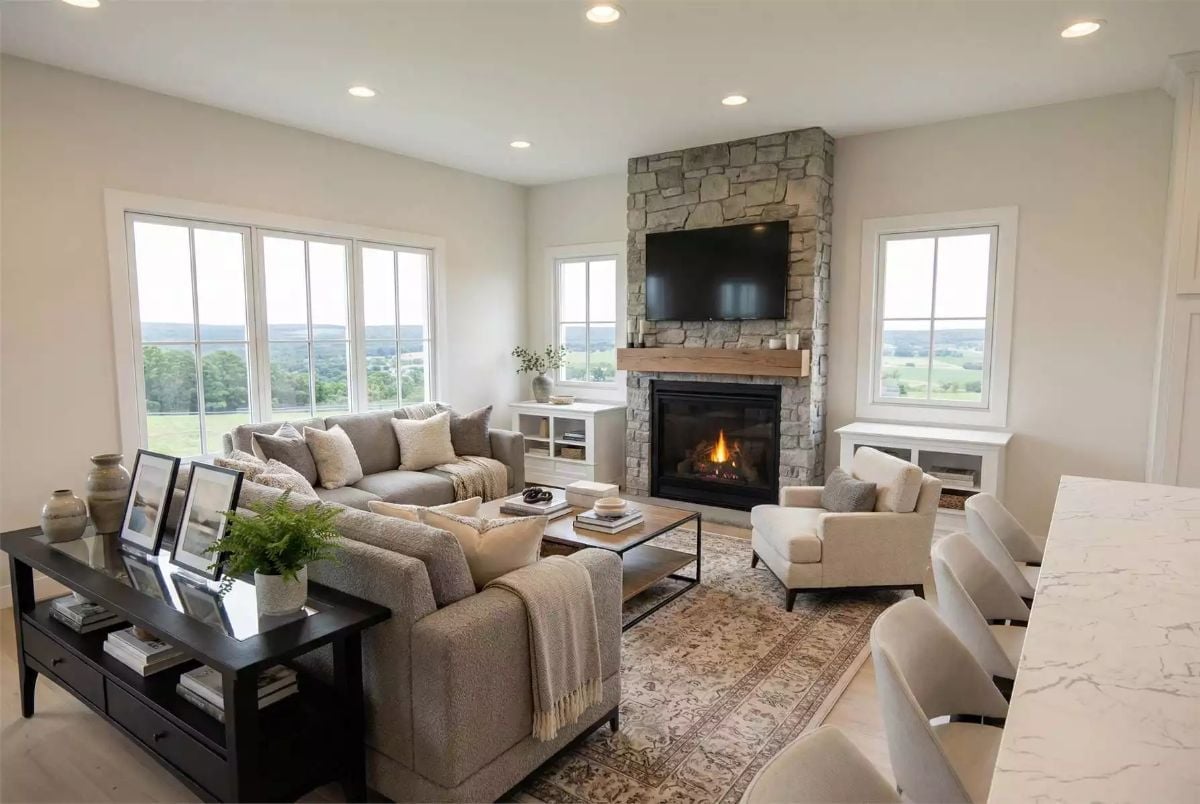
Stacked stone climbs floor to ceiling beside a wood mantel, anchoring a room that also has a gray sectional, a Persian rug, and rolling countryside visible through every window. Hard to say which one wins.
Color Story: Greige walls read differently depending on the light source, and this room proves it. Morning sun pulls out warm undertones; overcast days push them cooler and more gray. Pick your wall color under both conditions before you commit — the swatch on the store card will lie to you.
Navy Island Base, White Quartz, and Three Pendants That Earn Their Keep
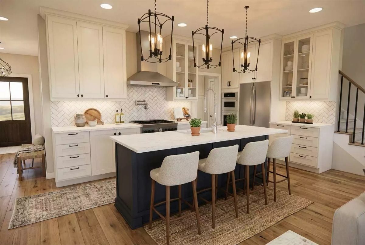
A navy island base against white perimeter cabinets keeps the kitchen from reading too precious — enough contrast to feel intentional, not so much that it exhausts you. Herringbone backsplash tile adds pattern without fighting the quartz, and the boucle bar stools with walnut legs do a lot of visual work without a lot of budget behind them.
Budget Tip: Painting just the island a dark color — navy, forest green, whatever you’re drawn to — costs a fraction of refinishing every cabinet in the kitchen. Look for cabinet-specific paint with a built-in primer; it cuts prep time considerably and holds up better than standard wall paint on high-touch surfaces.
Open-Plan Living Where the Dining Table Is Actually the Center of the House
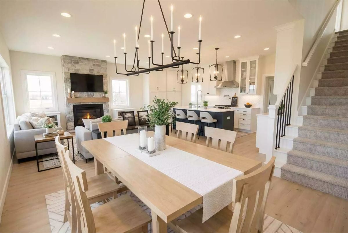
A light oak dining table seats eight, anchored by an iron candelabra chandelier scaled to actually match it. Behind the table, the island’s dark base reads almost charcoal against the white cabinetry. The stone fireplace grounds the living area beyond, giving the eye somewhere to land at the end of the sightline.
Why That Chandelier Works at This Scale
Most dining chandeliers hang too small. Above a large table that makes them look like an afterthought, a decorating mistake dressed up as a design choice. Here the iron candelabra frame is wide enough to mirror the table’s footprint, so both read as intentional. Candle-style fixtures also throw light upward, which softens the ceiling and keeps the room from feeling like a showroom floor.
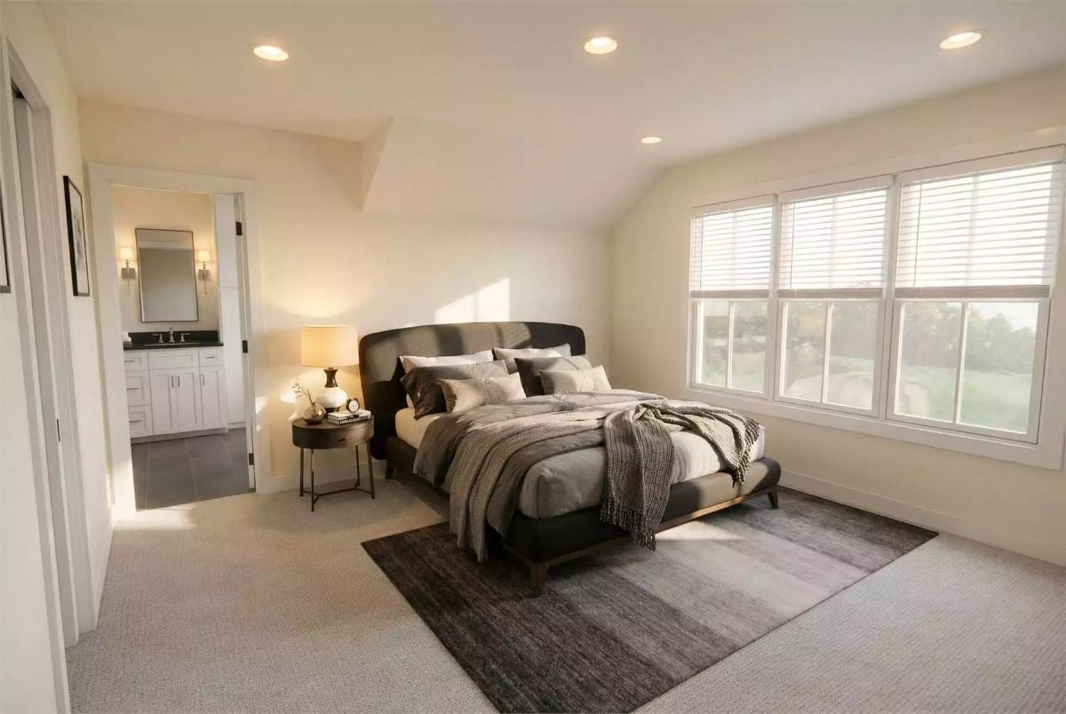
Vaulted Ceiling, Dark Upholstered Headboard, and Morning Sun That Does the Work
Carpet underfoot and a knit throw on the bed keep this room feeling lived-in, not staged.
Carpet underfoot and a knit throw on the bed keep this room feeling lived-in, not staged.
Carpet gets a bad reputation in bedrooms, but it earns its place here. Underfoot warmth matters more than most people admit, especially when you’re stepping onto the floor barefoot at six in the morning. The round nightstand and single lamp keep the left side of the bed from feeling crowded, and that en suite doorway visible in the background is a quiet reminder of how much a connected bathroom changes the daily rhythm of a room — without adding a single square foot to the bedroom itself.
Double Vanity, Marble Counters, and a Linen Tower That Pulls Its Weight
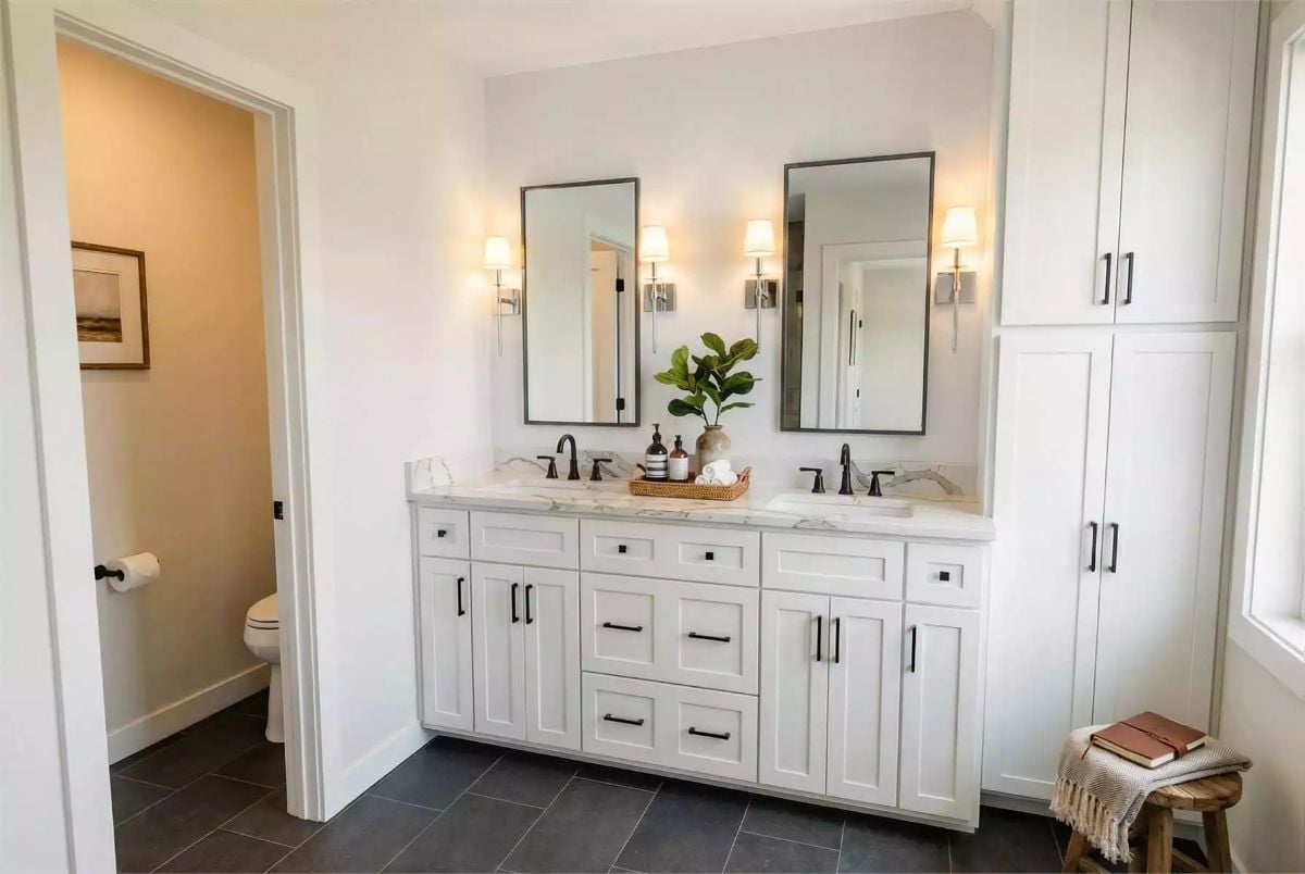
Marble countertops sit above white shaker cabinets with matte black hardware, and two framed mirrors share wall sconce lighting between them. The tall linen cabinet on the right solves storage without borrowing floor space from anywhere else. Black faucets tie back directly to the drawer pulls — a small thing that makes the whole room feel considered rather than assembled.
In The Details: Separating the toilet into its own water closet — visible through the doorway here — is one of the most requested features in primary bath layouts. It lets two people use the bathroom at the same time without sacrificing privacy, and builders are increasingly treating it as standard rather than an upgrade worth negotiating for.
Pin It
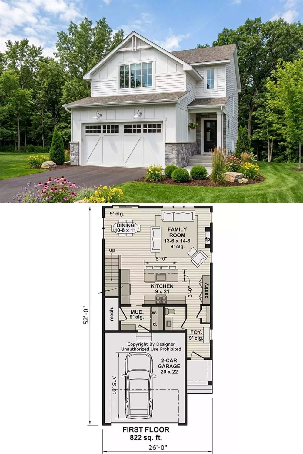
The exterior shows a white board-and-batten farmhouse with a two-car garage and stone accents. Below it, the first-floor plan maps out 822 square feet: family room, open kitchen, dining area, mud room, pantry, and foyer — everything in its place, nothing extra.
Ask Yourself: If your garage takes up nearly half the first-floor footprint, pay close attention to how the plan connects it to the rest of the house. A mud room buffer between the garage door and the main living area keeps daily chaos from spilling directly into your kitchen. On this plan that transition space is small, but it’s doing a lot of heavy lifting.