
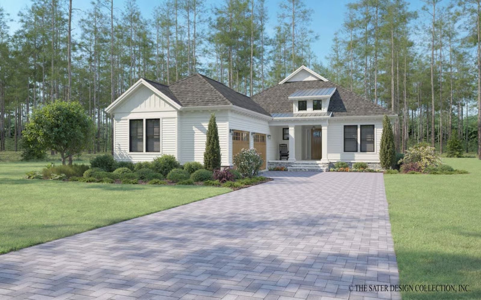
A wet bar in a downsizer’s house is a declaration — Saturday afternoon gin and tonics, the grandkids chasing each other through the back door while you finish the cheese board, October evenings that stretch past nine because nobody has an early meeting anymore. The Hayfield is built around exactly that: a wet bar primed for low-key hosting, an open layout that keeps the cook in the conversation, and a single-story footprint that means none of this ever requires a trip upstairs.
Specifications
- Sq. Ft.: 2,429
- Bedrooms: 3
- Bathrooms: 3.5
Floor Plan – Main Floor
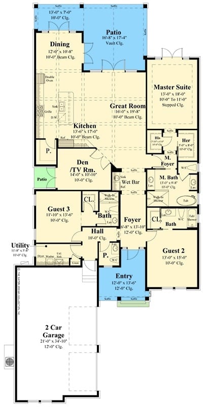
Three-bedroom layout pairs an open great room with a wet bar, den, and generous master suite off the main living corridor.
Wet Bar Off the Foyer Makes Entertaining Feel Effortless From the Moment Guests Walk In
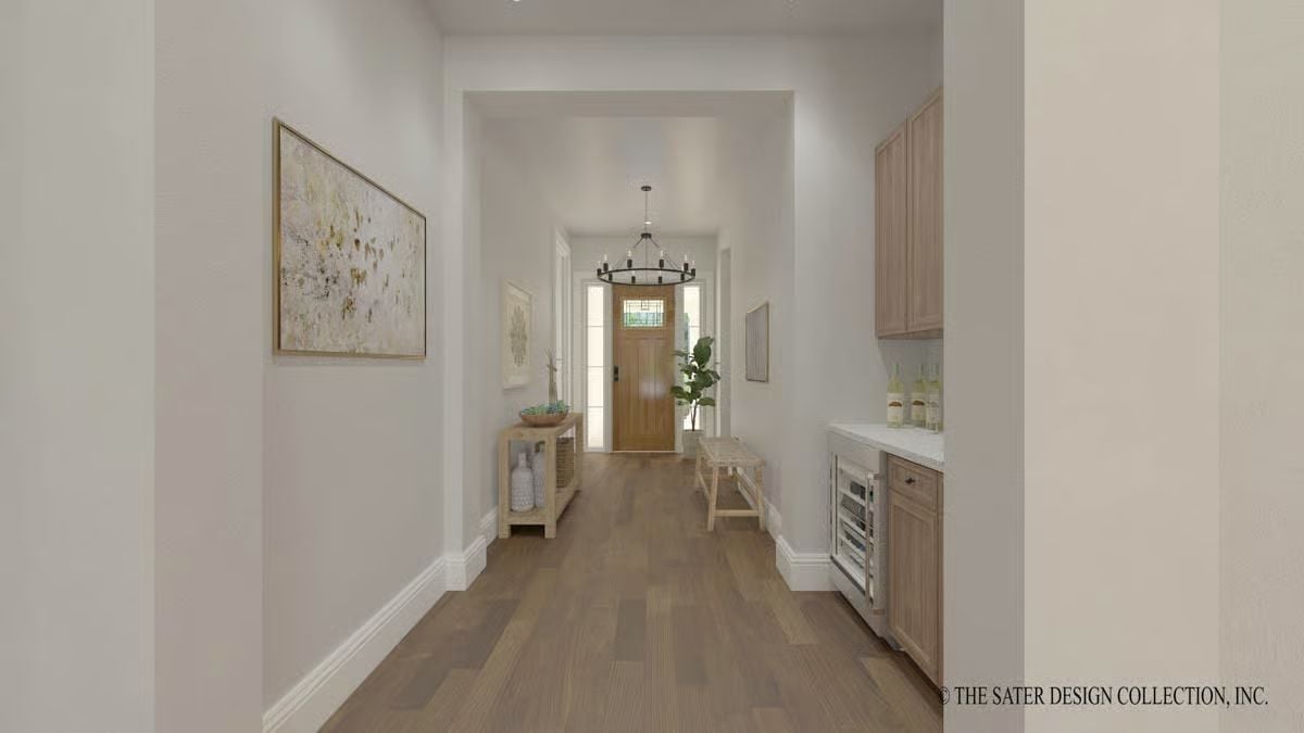
Wine fridge, wood cabinetry, and white countertop sit steps from a chandelier-lit entry hall.
French Doors and an Exposed Beam Keep This Dining Room From Taking Itself Too Seriously
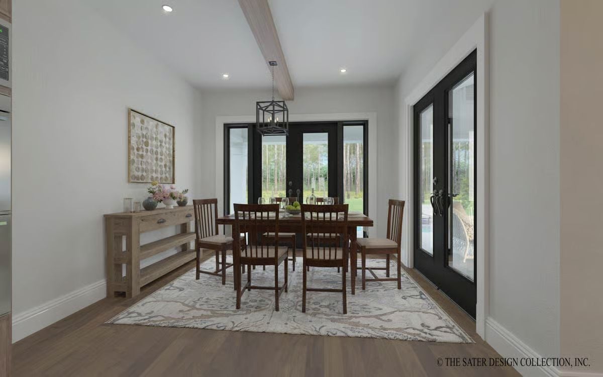
Dark-stained chairs push against the light wood console and wide-plank floors in a way that works better than it should. The lantern pendant, exposed ceiling beam, and direct patio access give the room enough looseness that nobody feels weird eating breakfast in here on a Tuesday.
Coffered Beams and an Open Kitchen Make Downsizing Feel Like a Lateral Move
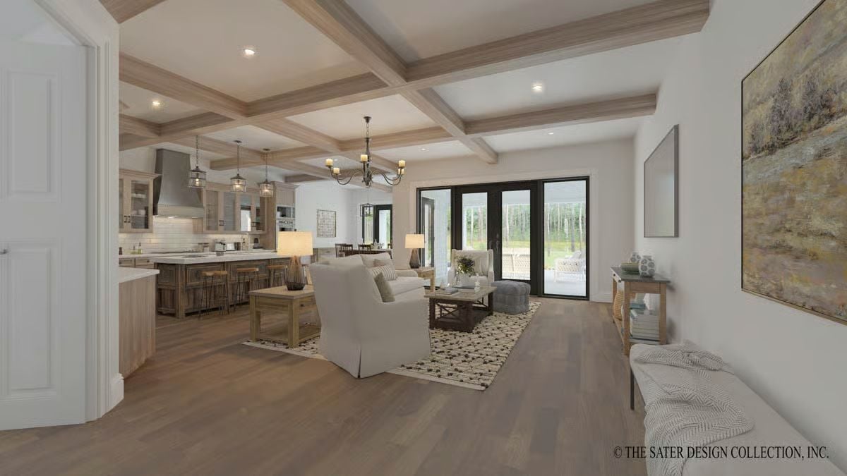
Bleached wood ceiling beams set the tone before you even reach the sofa. There’s no wall between the living area and the kitchen — bar seating handles the transition, keeping whoever’s standing at the range hood part of the room rather than apart from it. French doors pull the outside in, which at 2,429 square feet is not a small thing.
Editor’s Note: The coffered beam ceiling earns its place here by giving the open floor plan a sense of zones without actually closing anything off. It reads as structural first, decorative second — and anyone who’s spent time in a large open plan that feels like an airport terminal will understand why that distinction matters.
Barrel Stools and Wire Pendants Keep This Kitchen Honest About What It Is
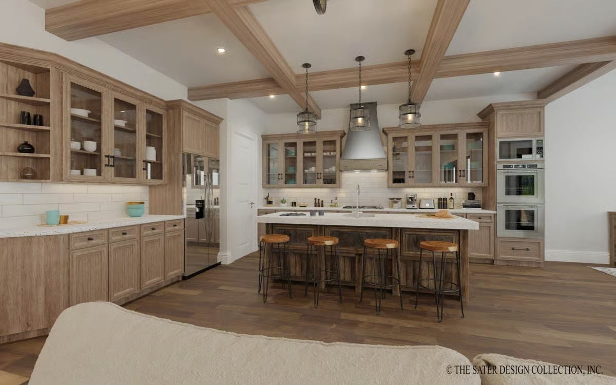
Rustic bar stools with iron bases pull up to a thick quartz island, while cage-style pendants hang low enough to actually light the workspace rather than just gesture at it. Glass-front upper cabinets. No fussiness, no apology.
By The Numbers: Kitchen islands with seating on one side have largely replaced formal breakfast nooks in new construction. Designers favor overhangs of at least 12 inches to give stools enough knee clearance to sit comfortably for a full meal.
Navy Paneling and Raw Wood Pull Off Something Most Home Offices Can’t
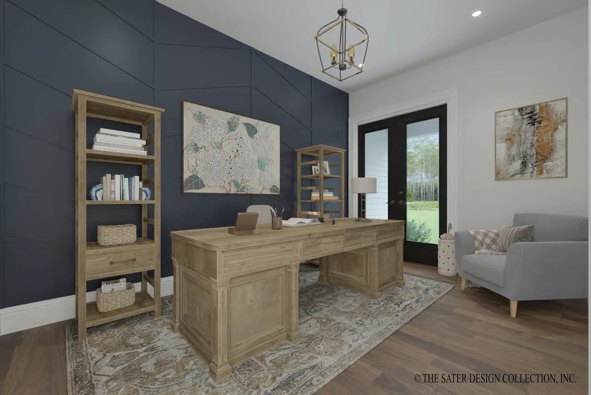
Geometric board-and-batten on that navy accent wall does more than add texture — it gives the room a backbone without crowding the natural wood tones of the desk and open shelving. The lantern pendant keeps things grounded. Woven baskets tucked into the lower shelves handle the clutter problem quietly, which is the best way to handle it.
Board-and-Batten as Geometry, Not Just Trim
The diagonal pattern in this board-and-batten installation breaks from the standard grid layout most homeowners default to. Running trim at angles creates a herringbone-adjacent effect that reads as intentional rather than decorative filler — and it’s a meaningful distinction because diagonal layouts require more precise miter cuts and planning upfront. That’s why you rarely see them in production homes. Worth asking a finish carpenter about before you assume it’s out of reach.
Tray Ceiling and French Doors Do the Heavy Lifting in This Master Suite
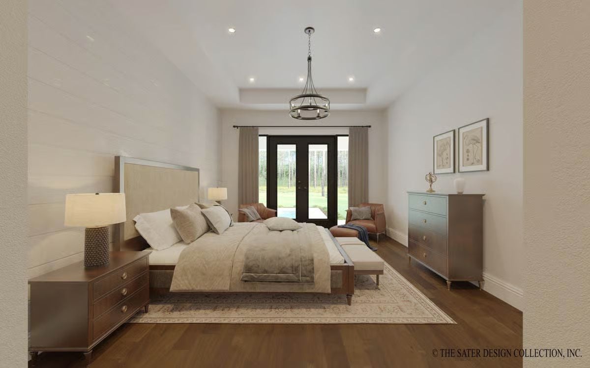
Warm walnut floors, a linen upholstered headboard, leather accent chairs. The room feels complete without trying too hard, which is harder to pull off than it looks.
Designer’s Secret: Pendant lighting centered over a bed reads best when the fixture sits roughly 7 feet above the floor — close enough to matter, high enough not to feel like a hazard. Most builders default to flush ceiling fixtures in bedrooms, so if you want pendants, rough in a junction box at center during framing and specify it early. A small call during construction that changes how the whole room reads after dark.
Hex Floor and Freestanding Tub Make This Master Bath Feel Earned
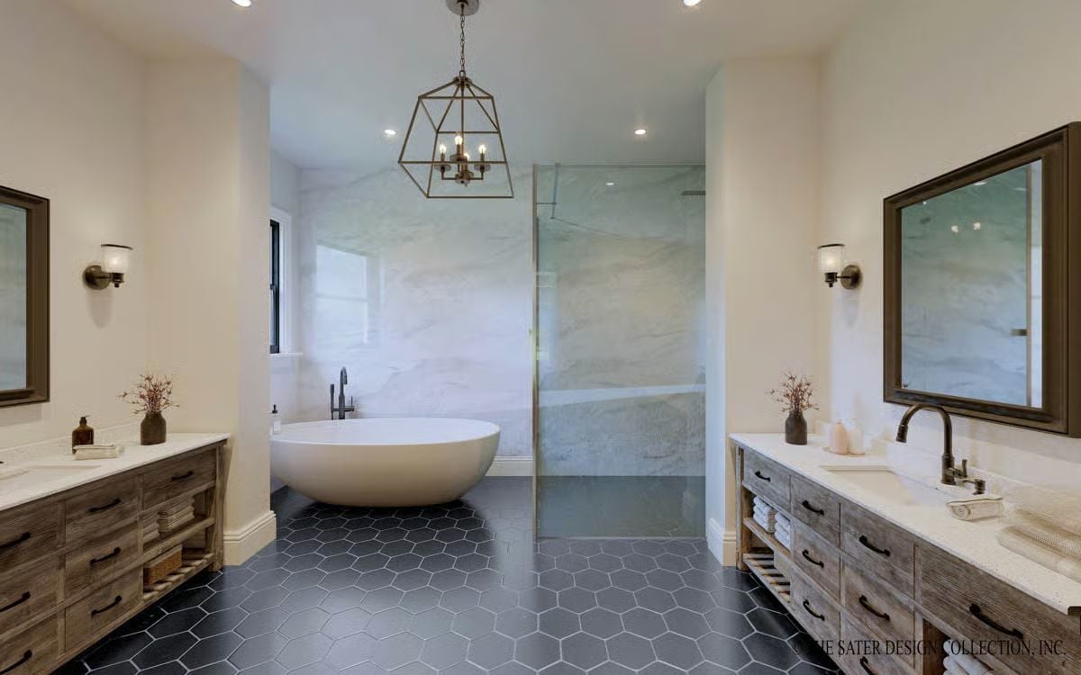
Matte charcoal hex tile anchors the floor without competing with the marble slab walls in the walk-in shower. The freestanding soaking tub sits centered against that stone backdrop — positioned to be seen, not tucked. Both vanities share the same weathered wood finish, which keeps the whole room from feeling like it was assembled from a catalog.
Common Mistake: Freestanding tubs look best with at least 18 inches of clearance from any wall — enough room to clean behind them and enough visual breathing room to make the tub read like furniture rather than plumbing. Crowding one against a wall is the most common installation error, and it’s a hard fix once tile is set.
Pin It
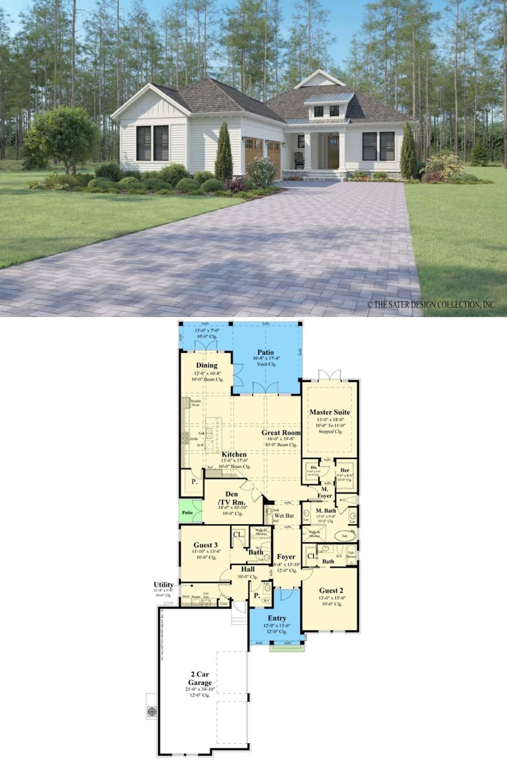
Outside, a white board-and-batten farmhouse sits on a tree-lined lot with a paver driveway. The floor plan below shows a single-story layout with three bedrooms, a den/TV room, wet bar off the foyer, and a rear patio connected to the great room. The master suite occupies its own wing entirely.
