🔥 Would you like to save this?
Somewhere along the way, “float the furniture” stopped being a useful option and hardened into a rule. Sofas crept away from walls. Beds were centered whether the room wanted them there or not. Dining tables claimed the middle like monuments. In a generous room, all that negative space can be beautiful. In a small one, it can amount to paying rent on floor nobody can actually use.
In order to come up with the very specific design ideas, we create most designs with the assistance of state-of-the-art AI interior design software. Also, assume links that take you off the site are affiliate links such as links to Amazon. this means we may earn a commission if you buy something.
These 35 rooms make the opposite case. Sometimes the smartest place for the biggest piece is exactly where common decorating advice tells you not to put it: hard against a wall, deep in a corner, under a slope, tucked into an alcove, or built straight into the architecture. The payoff is not theoretical. It is the strip of floor you can walk across, the chair you finally have room to add, the drawer that opens all the way, the guest bed that can actually unfold. Small rooms do not need more empty space behind the furniture. They need useful space in front of it.
Have several home projects on your wish list? Compare current HELOC rates while you work out the budget.
35. Small Bedroom, Bed Lengthwise Against One Wall
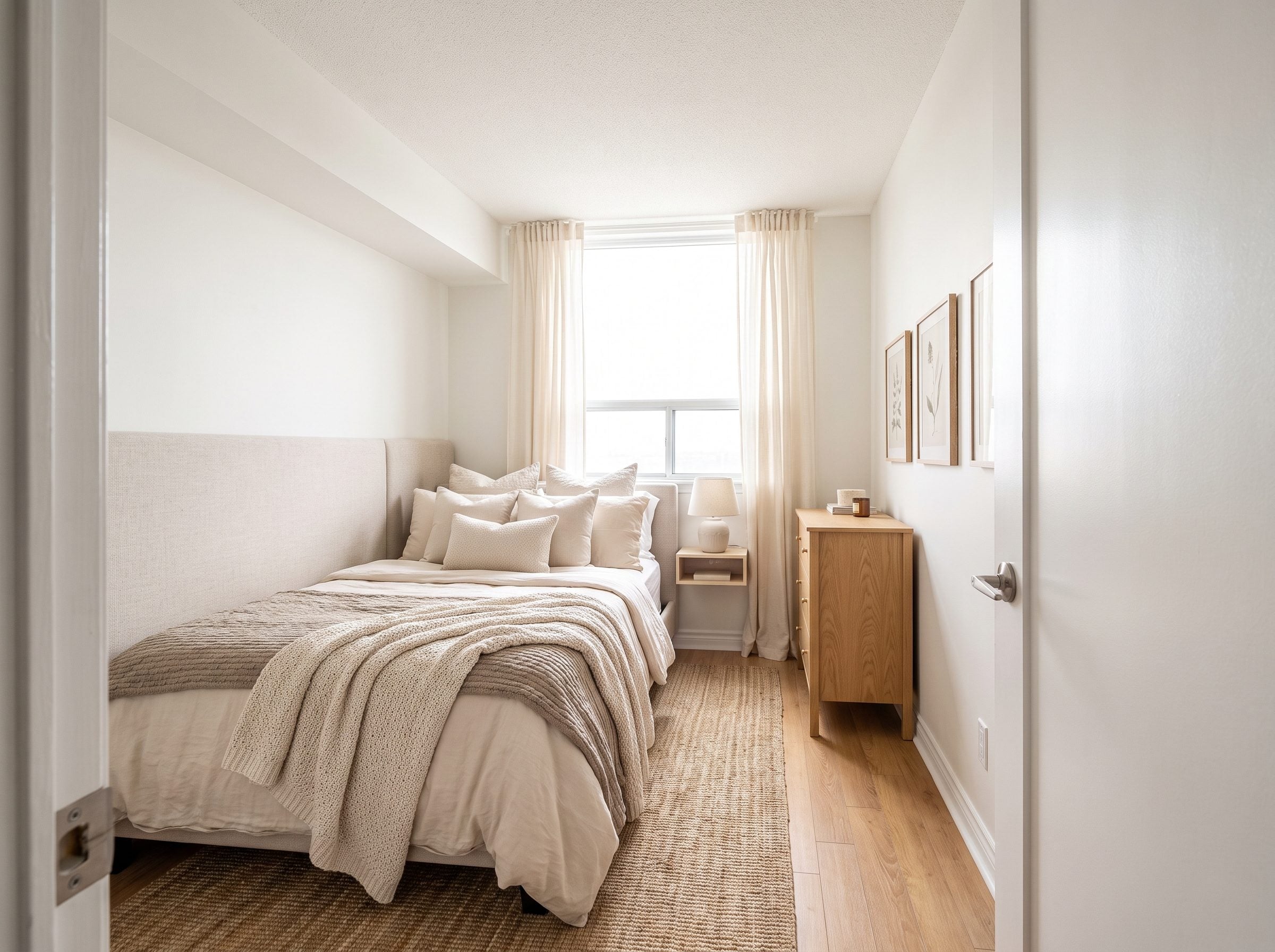
A full-size mattress is 54 inches wide. Center it on an eight-foot wall and the remaining 42 inches divide into two narrow strips of about 21 inches each. That may look symmetrical from the doorway, but neither side is especially generous.
Turn the bed lengthwise and push it to one wall. Instead of two skinny passages, the room gets one useful one. The opposite wall can now take a natural oak dresser, and the open side has enough floor to feel like an actual route rather than leftover margin.
The trick is to make the wall placement feel deliberate. An upholstered panel running behind the pillows, a narrow shelf at the head, and a brass wall sconce turn the bed into something closer to a daybed than a mattress pushed aside in defeat.
34. Tiny Dining Room, Wall Banquette Claims the Dead Side of the Table
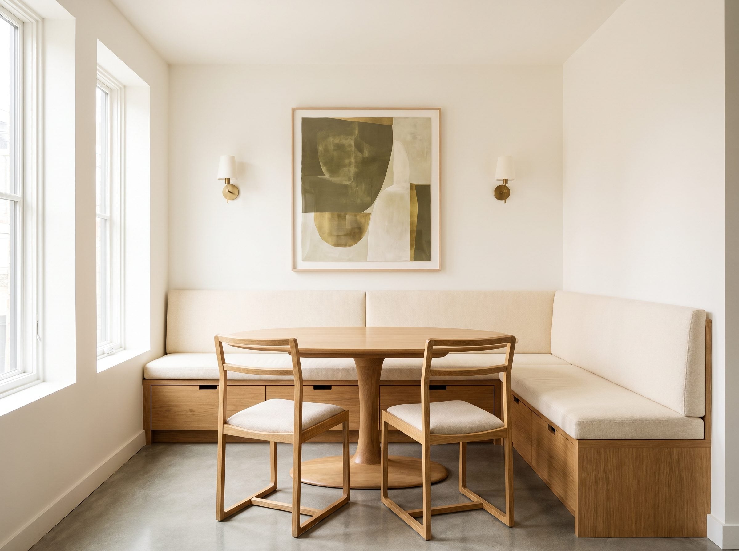
A freestanding chair needs room behind it to move. A built-in bench does not. That one difference is enough to rewrite an eight-by-nine dining room.
Put the cream banquette flat against the wall, let two oak chairs handle the open side, and the table shifts off center without looking misplaced. The bench can even hide shallow drawers underneath, turning the space occupied by seating into storage at the same time.
The wall becomes part of the composition rather than something the furniture politely avoids. Sconces above, upholstery below, art in between. Nobody misses the empty strip that would have existed behind a row of chairs.
33. Small Home Office, Desk Against the Wall
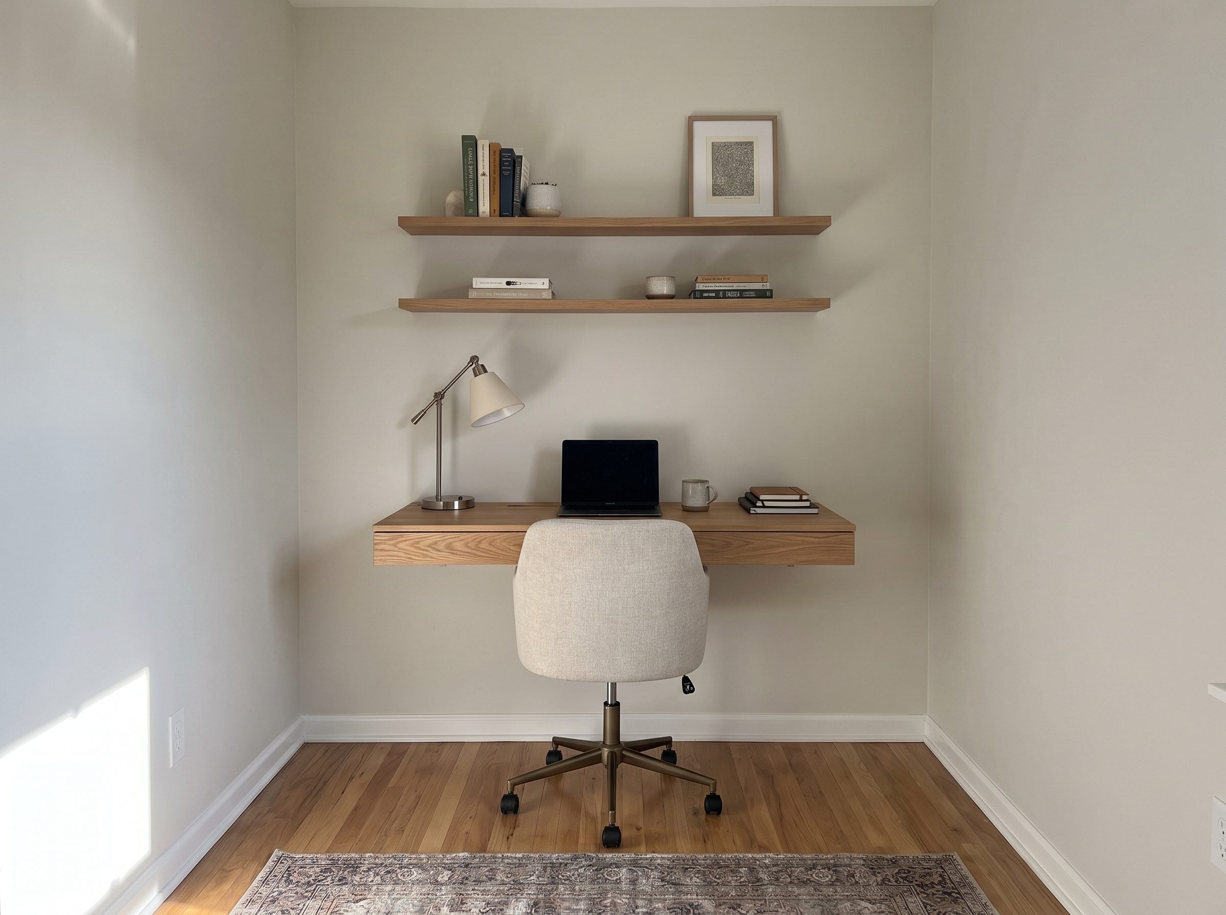
A seven-by-nine office gives you 63 square feet. Put the desk in the middle and both sides of it become awkward leftovers. Put the same desk on the wall and almost the entire room becomes useful again.
A shallow 20-inch desktop is enough for a laptop, keyboard, notebook, and lamp without behaving like a dining table. The wall above can carry the pieces that would otherwise demand floor space: task lighting, a pinboard, a slim shelf, even the charging cables.
Behind the chair, leaving roughly 30 to 36 inches makes rolling back and standing much easier.
32. The Narrow Townhouse Keeps Its Traffic Lane by Putting the Sofa on the Wall
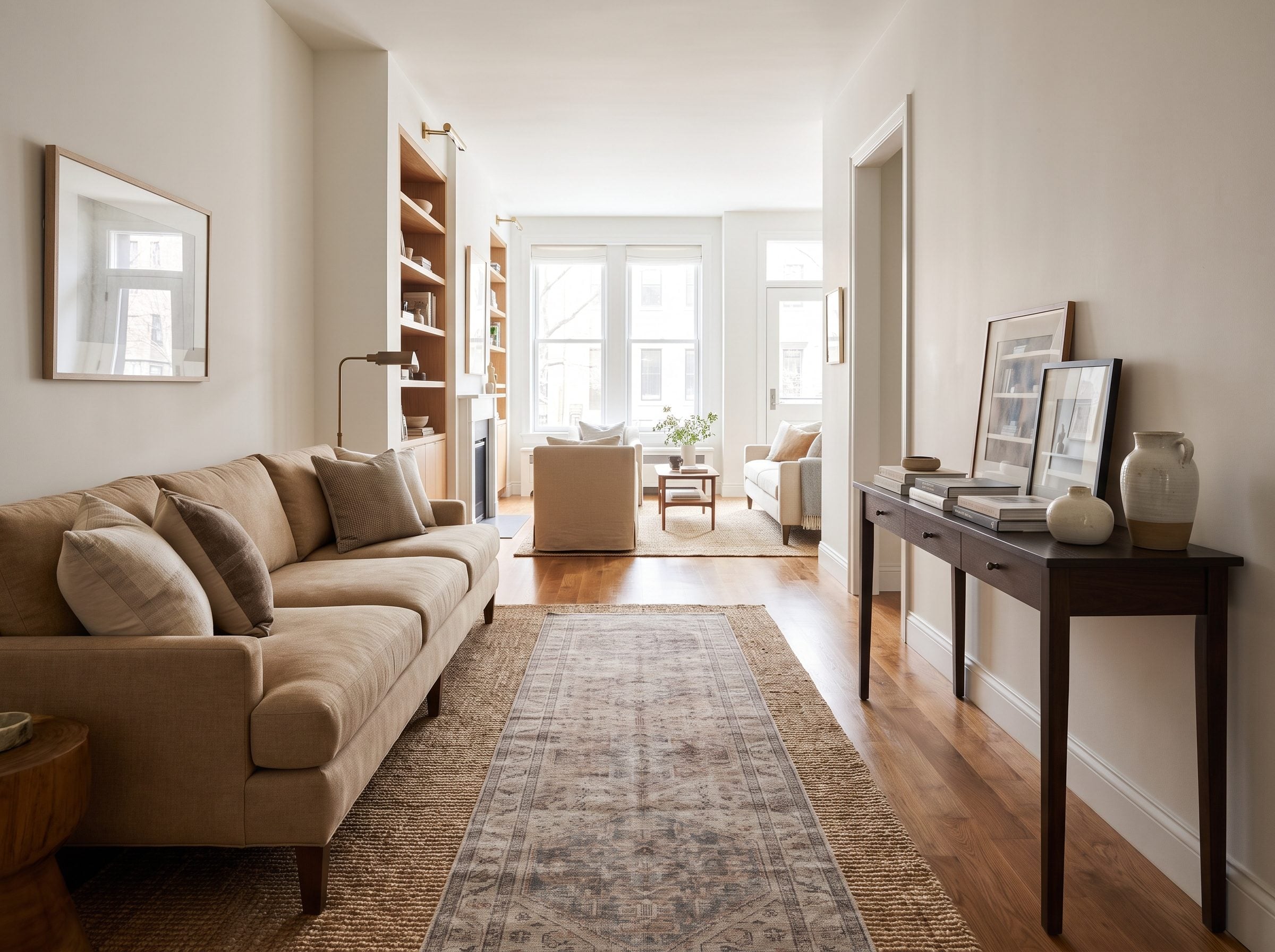
A narrow townhouse often has one unavoidable line of traffic running straight through the living room. Front door to kitchen. Kitchen to stairs. Groceries, laundry, people, pets. That path matters more than a decorative gap behind the sofa.
Push a camel leather sofa against the long wall and the opposite side can remain a continuous passage. Thirty-six inches is a useful accessibility benchmark for a comfortable clear route, even though it is not a universal furniture-layout code for every house.
Across from it, keep everything shallow. An oak media cabinet under 16 inches deep, a slim table, and a compact cream accent chair preserve the room’s length instead of eating into it.
31. Box Room, Wall-Hugging Daybed Makes 63 Square Feet Work Overtime
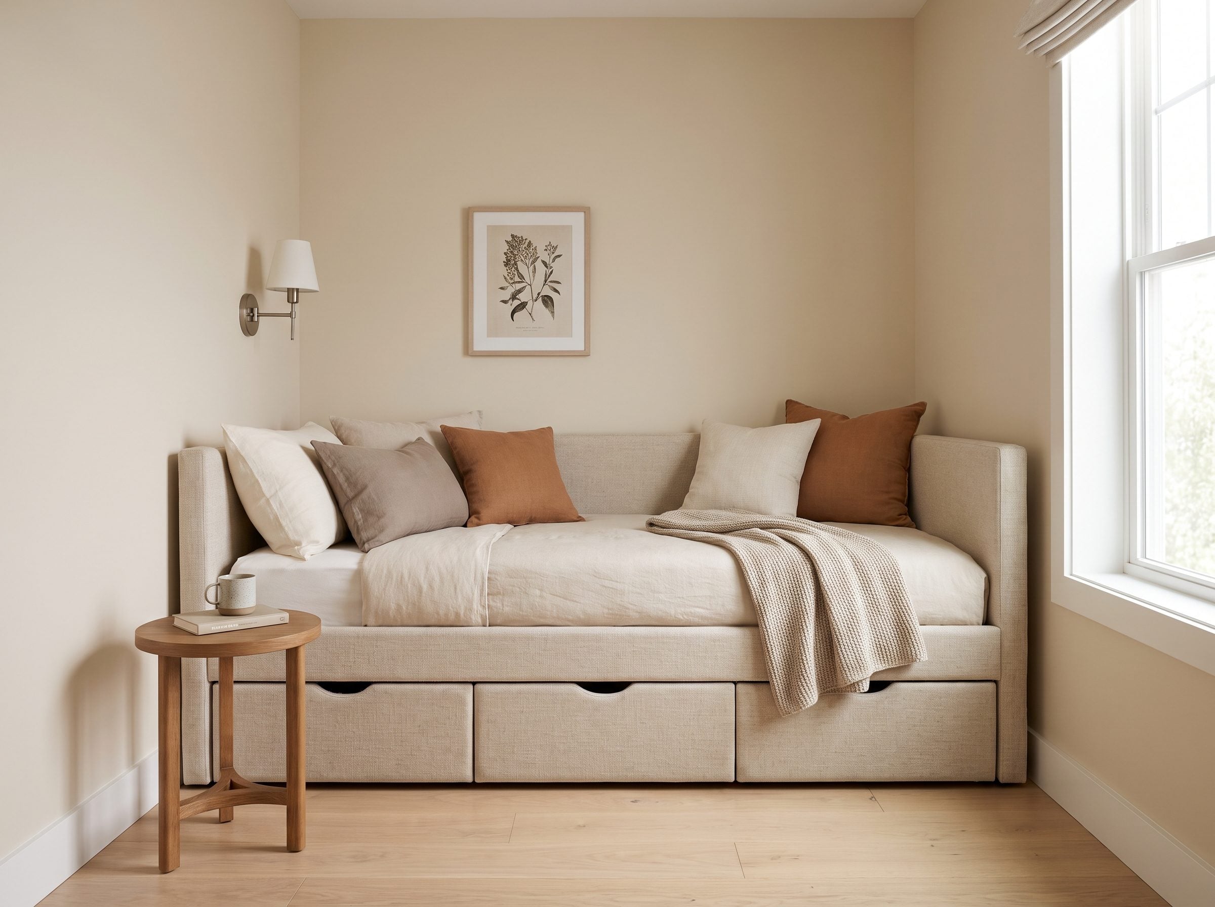
A seven-by-nine room is barely large enough for one full-time purpose. A daybed against the longest wall gets around that by refusing to be just a bed.
During the day it behaves like seating. At night it handles a guest. Drawers underneath turn the entire footprint into storage. That leaves enough open floor for a walnut wall-mounted desk on the opposite side.
Integrated brass wall sconces remove another small piece of furniture from the equation. In a room this tight, every lamp with a footprint is asking for an inch the room may not have.
30. Tiny Kitchen, Breakfast Table Slides Under the Window and Out of the Work Zone
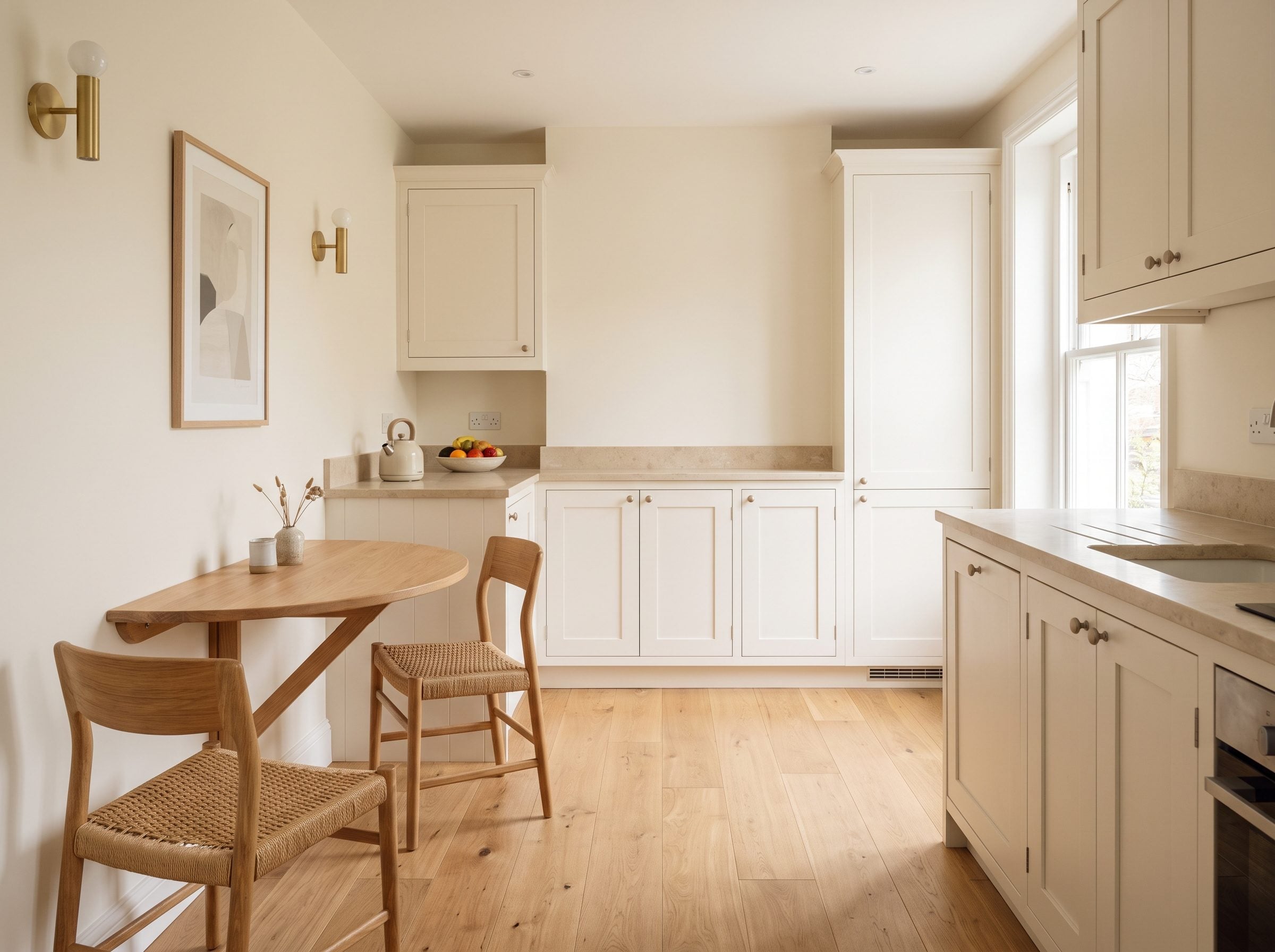
A kitchen table does not have to occupy the geometric center of a kitchen any more than the sink does. In a small room, the better question is whether the cook can still open the oven, reach the refrigerator, and turn around carrying something hot.
The classic kitchen work triangle was developed to think about efficient movement among major work zones, not to dictate where a breakfast table belongs. Guidance still often keeps the sink, range, and refrigerator within practical reach of one another; this work-triangle overview explains the basic idea.
A shallow oak drop-leaf table under the window stays outside that working core. Add two woven rush chairs and a brass wall sconce, and the dead edge of the kitchen becomes a breakfast zone without colonizing the middle.
The useful question is not whether the table floats. It is whether the cook can still move.
29. Small Living Room, Two Chairs Against a Solid Wall
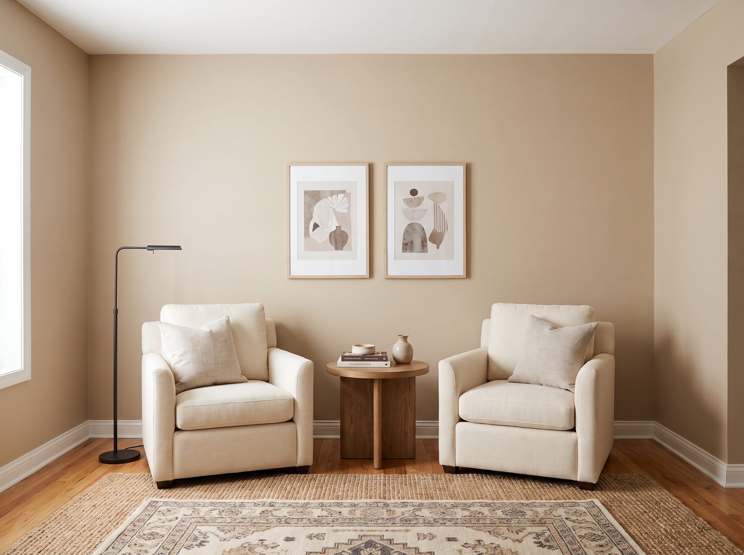
Two armchairs floating in the middle of an 11-by-13 living room can consume more space than their dimensions suggest because each one also creates an island of circulation around itself.
Line them up against the solid wall instead and the chairs become one composition. A shared side table fits between them, wall-mounted reading lights take the place of lamps, and one piece of art turns the whole arrangement into a deliberate secondary seating zone.
The middle remains available for the conversation rather than permanently occupied by the furniture creating it.
28. Attic Bedroom, Bed Tucks Under the Slope and Saves the Standing Height
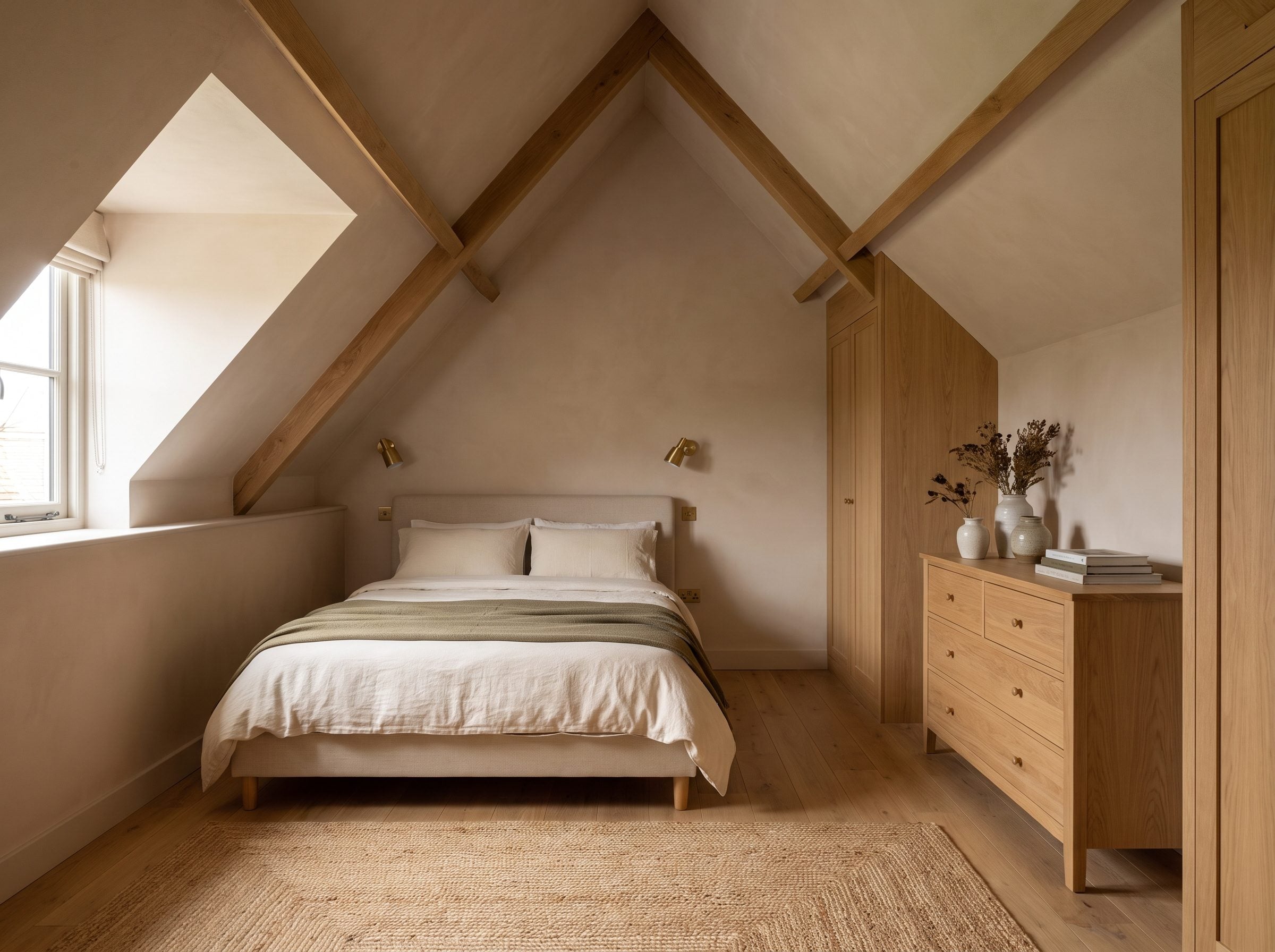
An attic bedroom has its own zoning system built into the roof. The low edges are awkward for standing adults and perfectly acceptable for furniture nobody stands on.
Put the bed beneath the slope and the tallest part of the room stays open for walking. A low headboard respects the pitch, while reading lights mounted to the low wall replace nightstands that would only crowd the same zone.
The full-height gable wall can take an oak dresser or wardrobe, where doors and drawers actually have room to operate.
27. Small Living-Dining Room Puts the Sofa on the Perimeter So Both Halves Survive
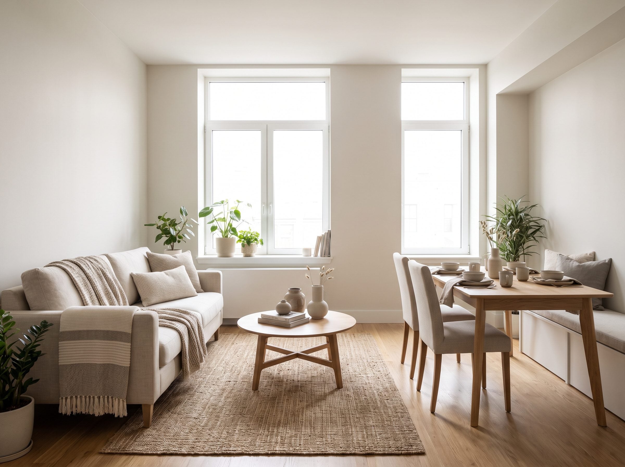
A 12-by-15 room has 180 square feet to perform two jobs. The danger is not that the living and dining zones will look too close together. It is that one of them will consume the circulation the other needs.
The sofa takes the living-room wall and stays there. Walnut nesting coffee tables provide surface when needed and disappear when they are not. A round dining table takes the opposite end, where its curved edge is easier to pass.
26. The L-Shaped Sectional Finally Makes Sense When the Room Uses the Same Shape
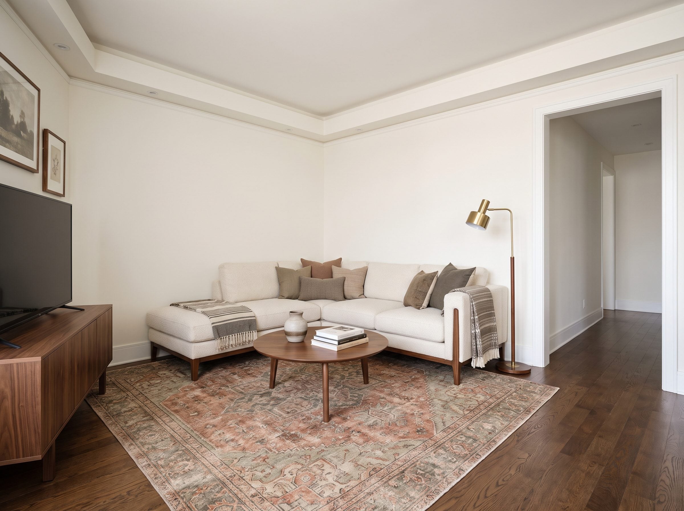
A sectional already arrives with a corner built into it. In a compact room, fighting that geometry can waste more floor than the furniture itself.
For a rough sense of scale, this living-room dimension reference shows how quickly furniture occupies a 10-by-12 footprint. An eight-foot sectional placed in the center needs circulation on several exposed sides. Tucked into a corner, two of those sides disappear into walls.
A round walnut coffee table is easier to move around than a sharp rectangle. A cream floor lamp can sit at the elbow, while earthy throw pillows keep the long mass of upholstery from reading like one uninterrupted block.
25. Bedroom, Bed Takes the Only Wall That Is Actually Available
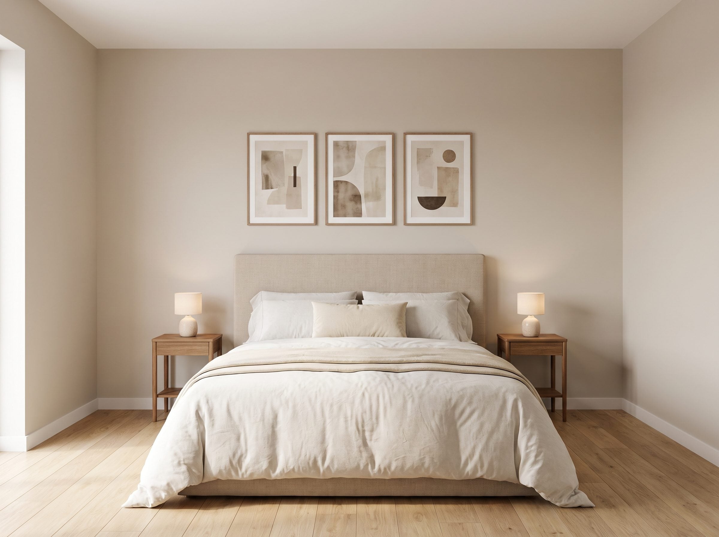
Sometimes furniture placement is not a philosophical question. The window takes one wall. The closet breaks another. The door swing destroys a third. One long, unbroken wall remains, and that is where the bed goes.
Centering the headboard on that solid run gives the room visual order even if the side clearances are modest. Slim nightstands, wall-mounted sconces, and one large piece of art above the pillows make the arrangement look intentional rather than inevitable.
A narrow dresser can use the window wall without blocking circulation. A six-by-nine rug can visually lengthen the bed while still leaving the route to the closet obvious.
24. Small Reading Room, Loveseat Against the Wall Makes Room for the Actual Reading Chair
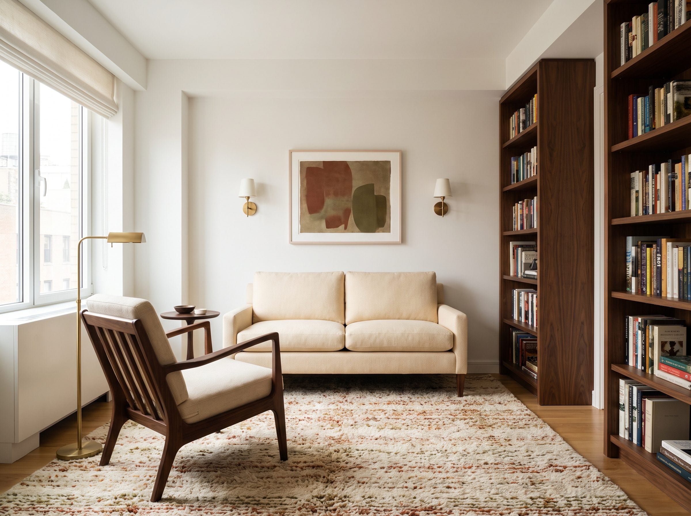
A nine-by-ten room does not have enough depth to waste a foot behind a loveseat and still pretend nothing happened.
Push the 58-inch seat to the long wall and the recovered depth can go where people actually use it: an armchair, a walnut side table, and a clean approach from the doorway.
Two brass wall sconces and centered art turn the loveseat wall into the room’s visual front. Angle the chair slightly toward it and the small room becomes conversational without turning the walkway into part of the seating plan.
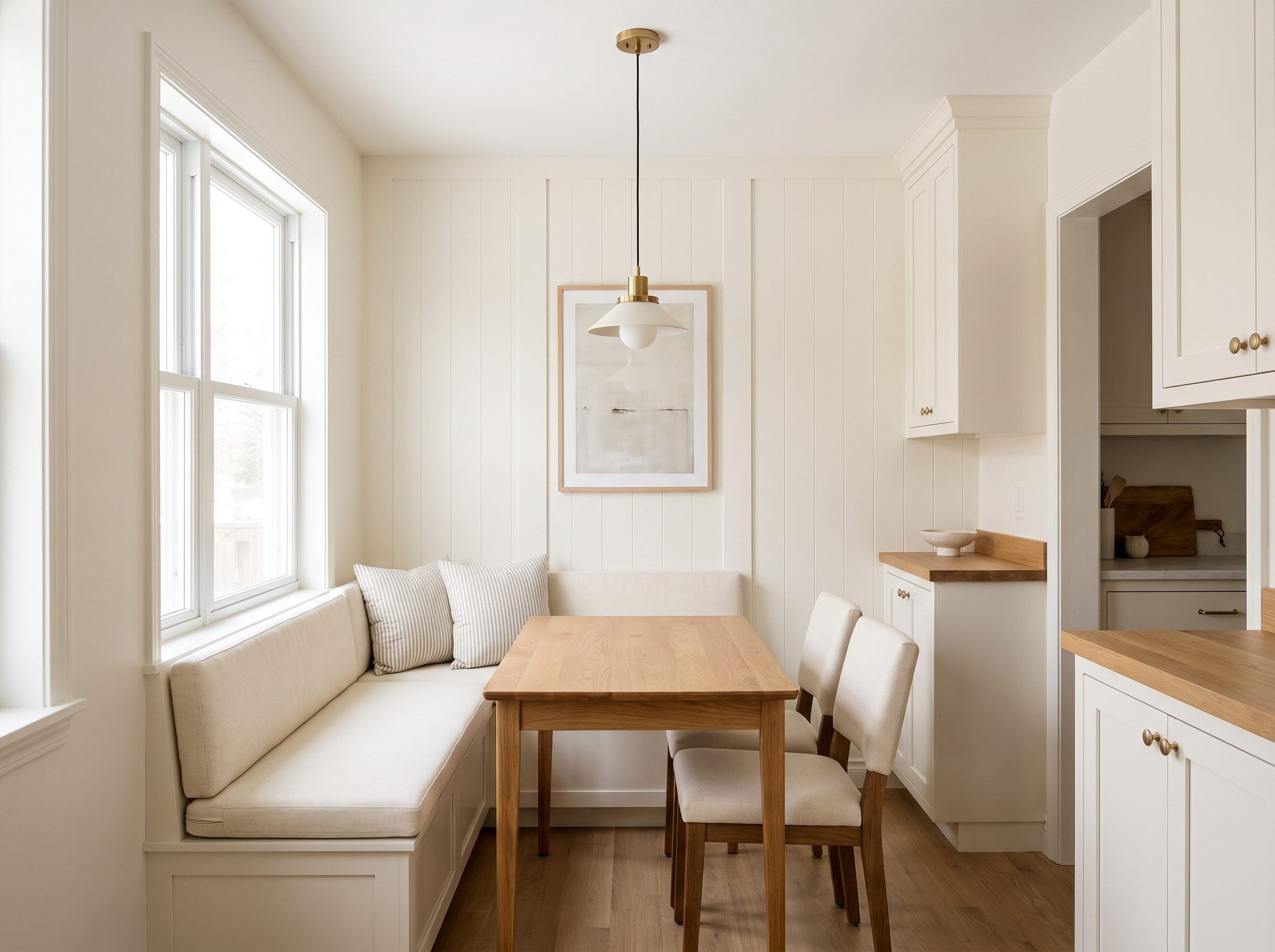
23. Small Breakfast Nook Uses One Fixed Bench Instead of Four Moving Chairs
🔥 Would you like to save this?
A breakfast nook works because the seats do not all need the same kind of space. Two chairs can pull out on the open side while the bench remains exactly where it is.
This dining clearance guide illustrates why planning room behind chairs matters. In a compact kitchen, eliminating that pull-back zone on one side can open the route to the refrigerator or cabinets.
Keep the bench upholstered, the table light enough to move, and the two open-side chairs easy to grab. The nook becomes flexible without needing to occupy the center of the kitchen.
22. The 9×11 TV Room Lets Viewing Distance Decide Where the Sofa Goes
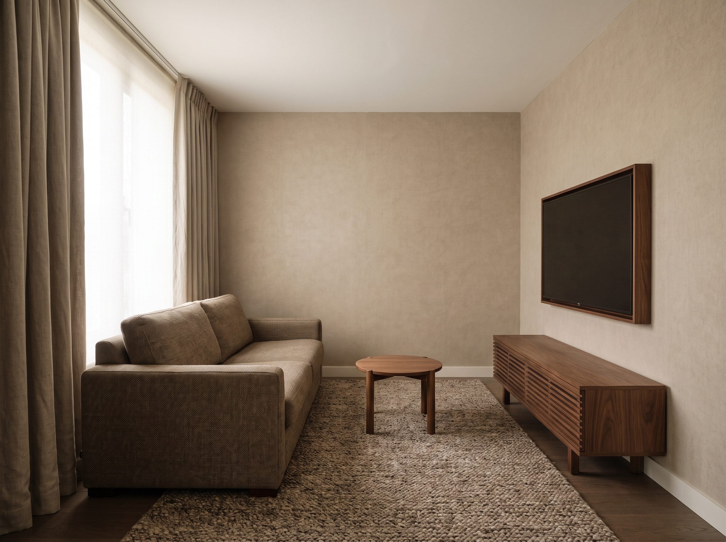
A TV room has one advantage over a general living room: the screen gives you a concrete distance to work with.
In a nine-by-eleven room, a sofa on the back wall can place a 55-inch screen in a very comfortable range. A current TV viewing-distance guide shows how 4K resolution allows closer seating than the old tube-era formulas did.
A low walnut media console, a textured linen sofa, blackout shades, and a small round walnut coffee table let the room lean into what it actually is: a compact place to watch something, not a formal living room pretending to be twice as deep.
21. The 9×10 Bedroom-Office Uses a Wall Desk That Barely Exists
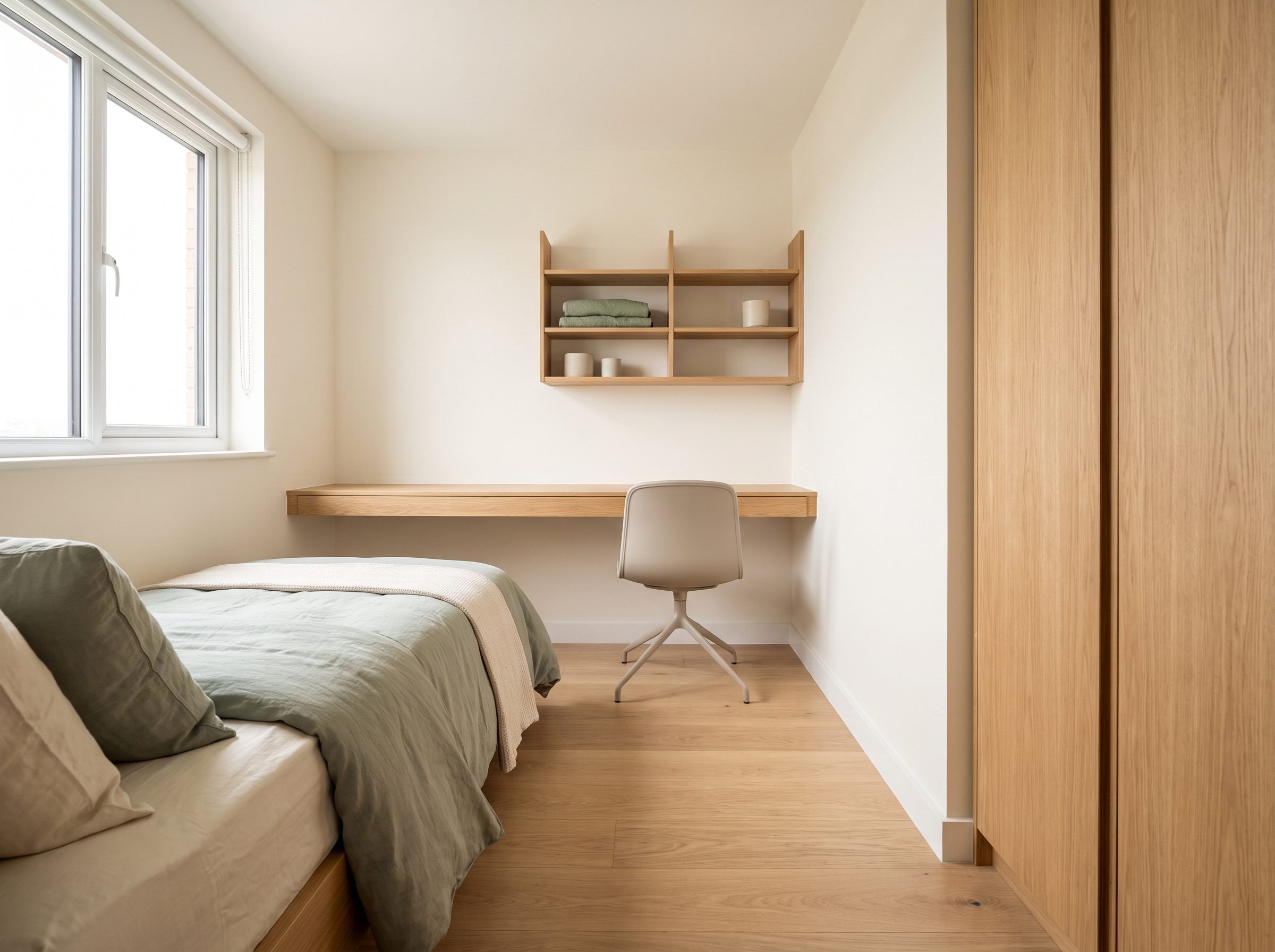
A bedroom-office is a negotiation between two pieces of furniture that both assume they deserve the room. The bed wins on size, so the desk has to win on efficiency.
An 18-to-20-inch wall-mounted desktop is deep enough for a laptop and notebook without behaving like another chest of drawers. No front legs means the chair can tuck fully underneath, leaving the center floor clear when work is over.
The best desk in a tiny bedroom is the one that stops existing when the chair slides underneath it.
Run the charger behind the top, keep the shelf shallow, and repeat the wood tone already used in the bedroom so the work zone belongs to the room instead of announcing itself as an office annex.
20. Sofa Between Built-Ins Turns Wall Placement Into the Whole Architectural Idea
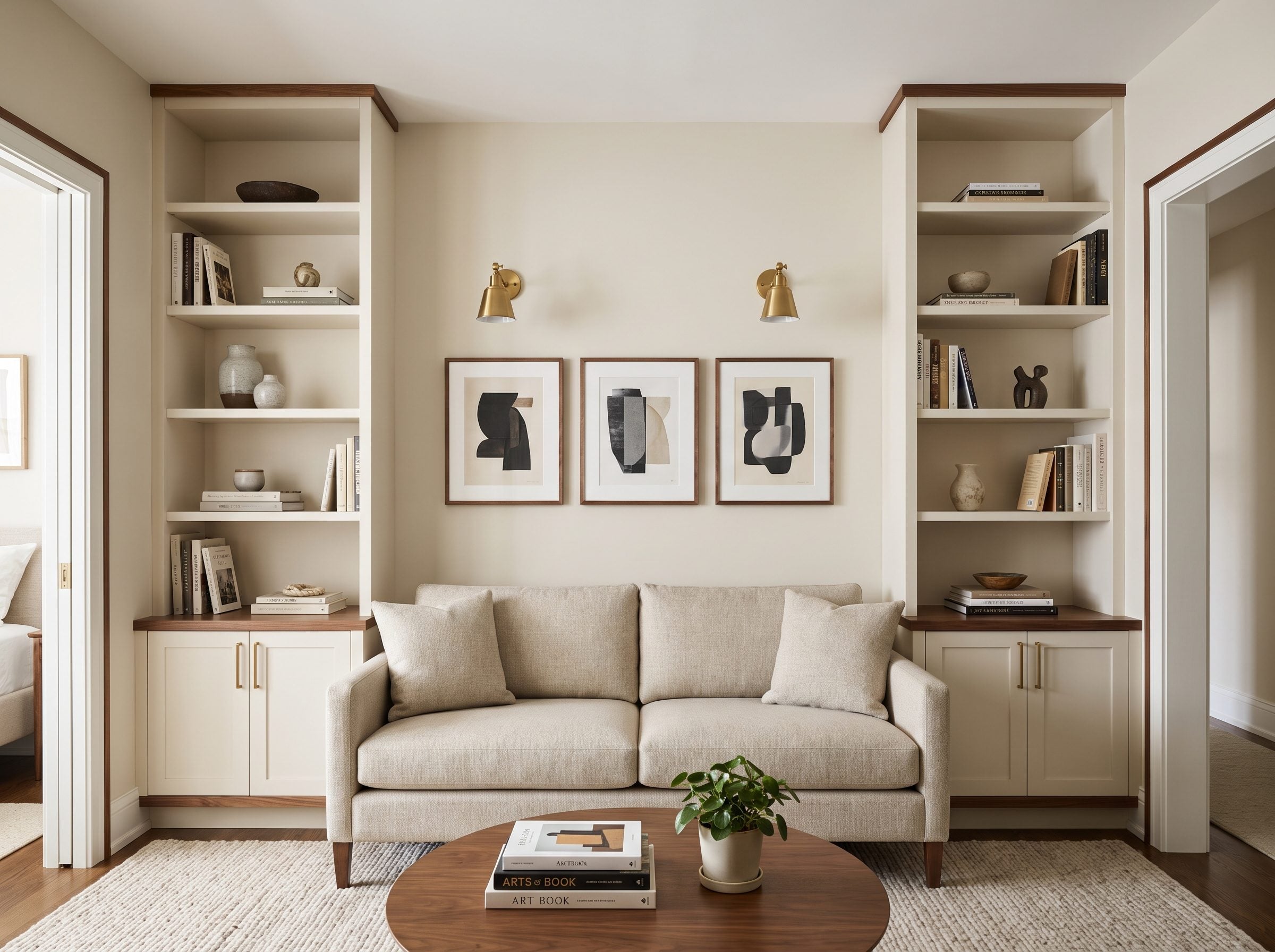
A sofa against a blank wall can look incidental. Put it between two matching bookcases and suddenly the wall placement becomes impossible to read as accidental.
Depth is the crucial number. Shallow shelves around 11 or 12 inches deep can hold books and small objects without consuming the floor the seating area needs.
Keep the styling loose, add two brass wall sconces, center art over the oatmeal linen sofa, and the arrangement starts to feel closer to millwork than furniture placement. The same principle carries into many modern living room designs.
19. Two Kids, One 10×10 Room: The Beds Form an L and the Floor Escapes
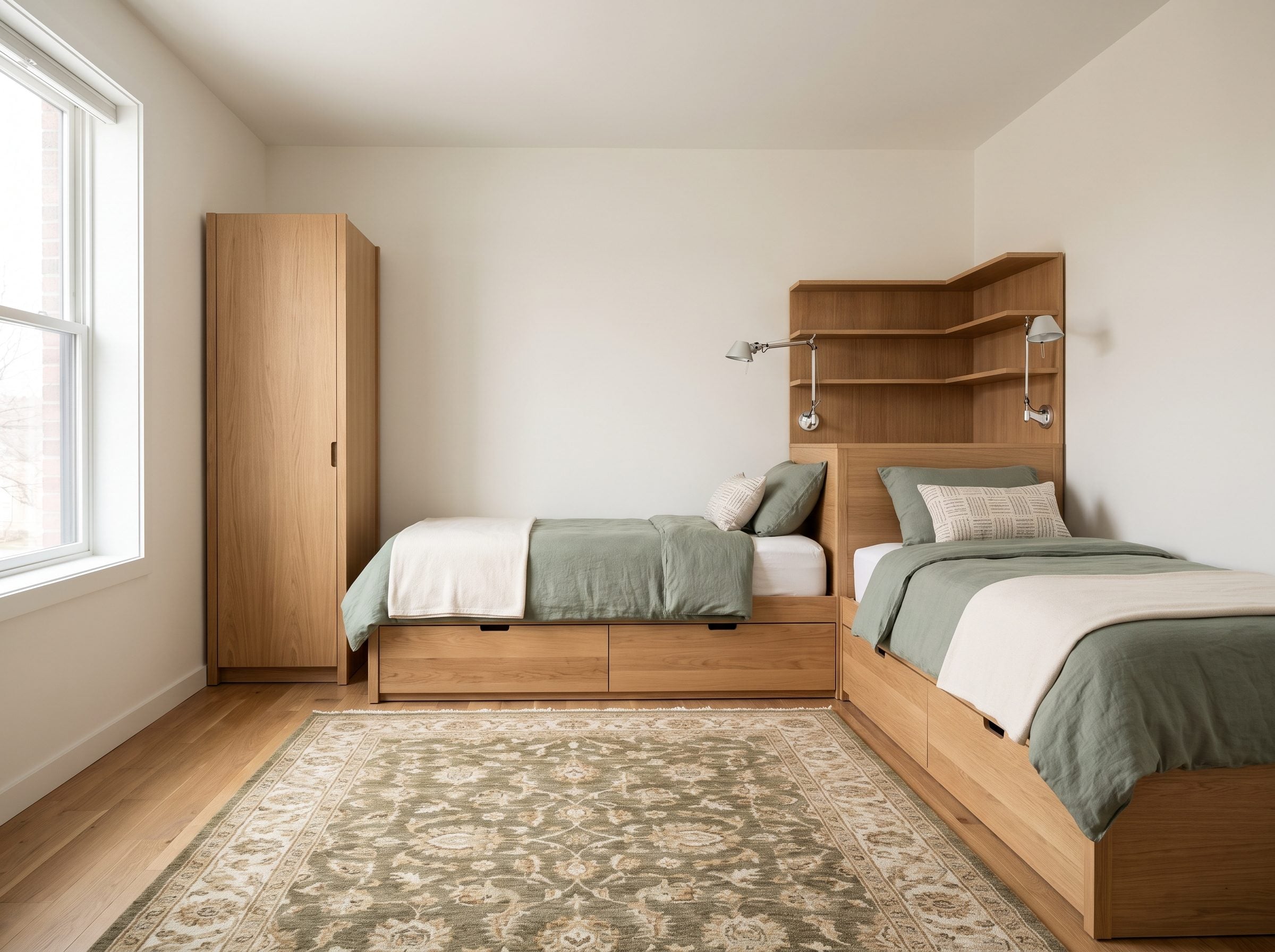
Two twin mattresses are each about 38 by 75 inches. Put both in the middle of a ten-by-ten room with circulation all around and the furniture quickly begins designing the room for you.
Turn them into an L instead. One bed takes one wall, the second turns the corner, and the notch between them becomes a shared shelf or table. Both children get a reading light and somewhere for a water glass without adding two separate nightstands.
A tall, narrow oak wardrobe can use the remaining solid wall while drawers slide under the beds.
18. Narrow Dining Room Pushes the Table Aside Between Meals
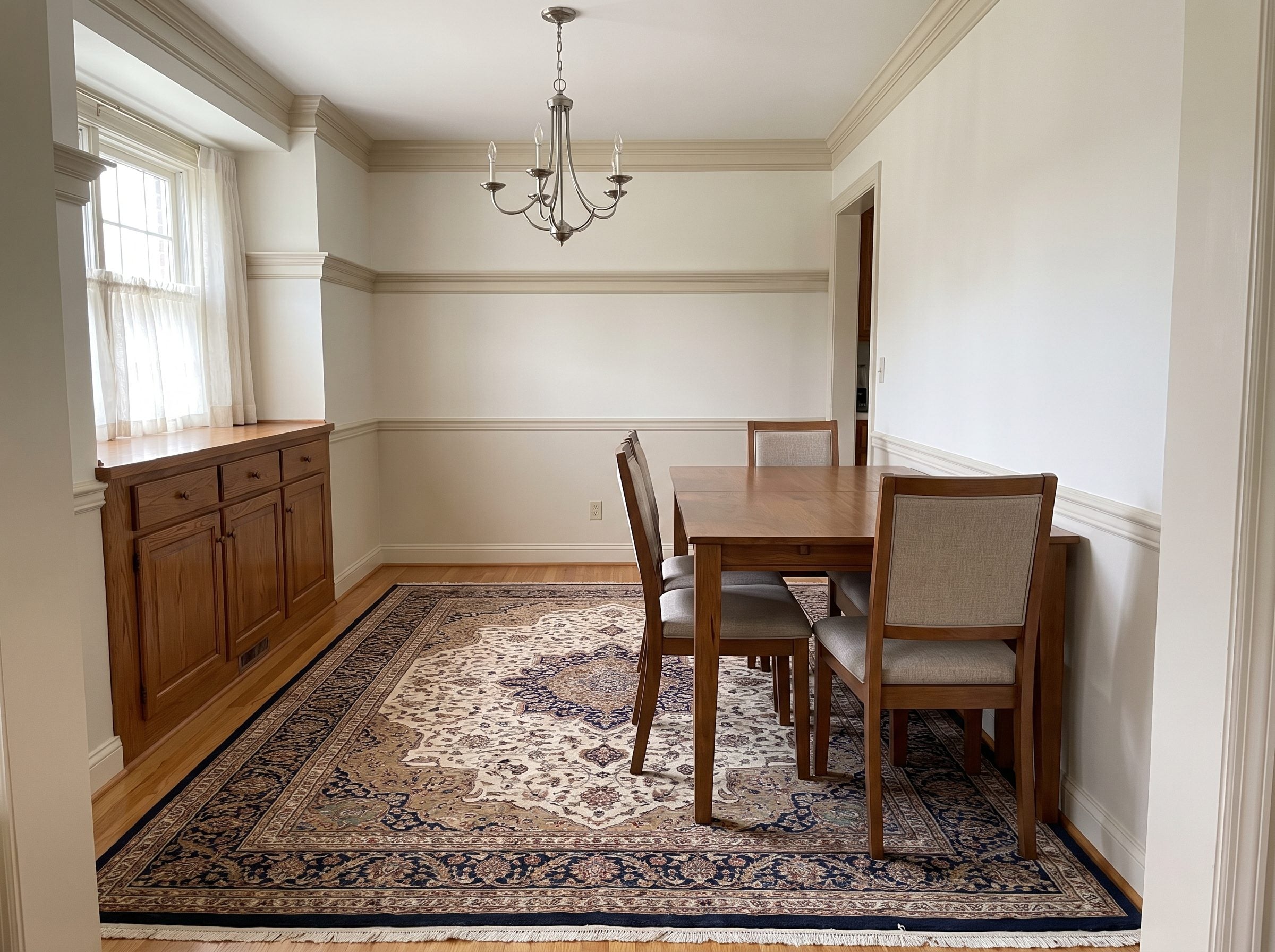
A dining table does not have to spend twenty-four hours a day in its dinner-party position.
Against the long wall, a slim table leaves a generous passage on the open side and still works for everyday meals. When more people arrive, pull it out, redistribute the chairs, then push it back afterward.
Art and a picture light above the everyday position make the shifted table feel composed rather than temporarily parked. The same emphasis on circulation is one reason a small bathroom can look bigger when the path through it remains visually clear.
17. Small Bedroom, Dresser Flat Against the Wall Leaves the Drawer Zone Where It Belongs
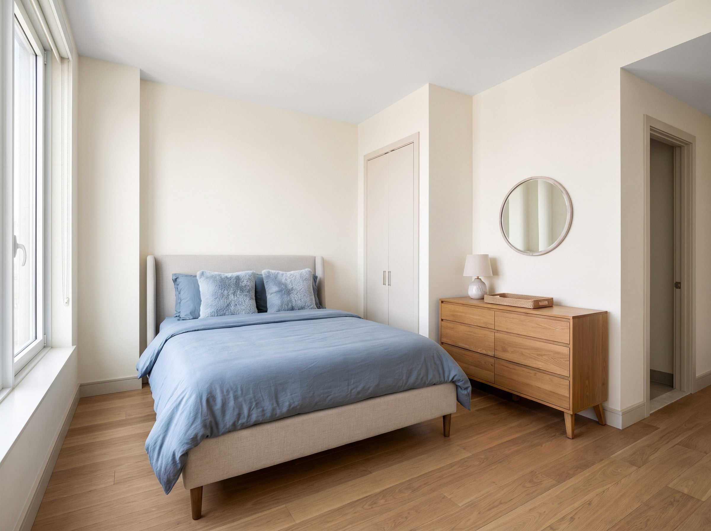
A dresser already needs working space in front of it. Floating the cabinet simply adds a second clearance zone behind it that nobody uses.
Typical dresser depth often lands in the 18-to-24-inch range, as this dresser dimension guide shows. This clearance guide likewise recommends leaving room in front for drawers and access.
Put the dresser flat against the wall and concentrate all that clearance on the side where it does something. A lamp, tray, and leaning mirror keep the top visually composed while the center of the bedroom remains crossable.
16. Small Family Room Gives the Middle to the Kids and the Sofa to the Wall
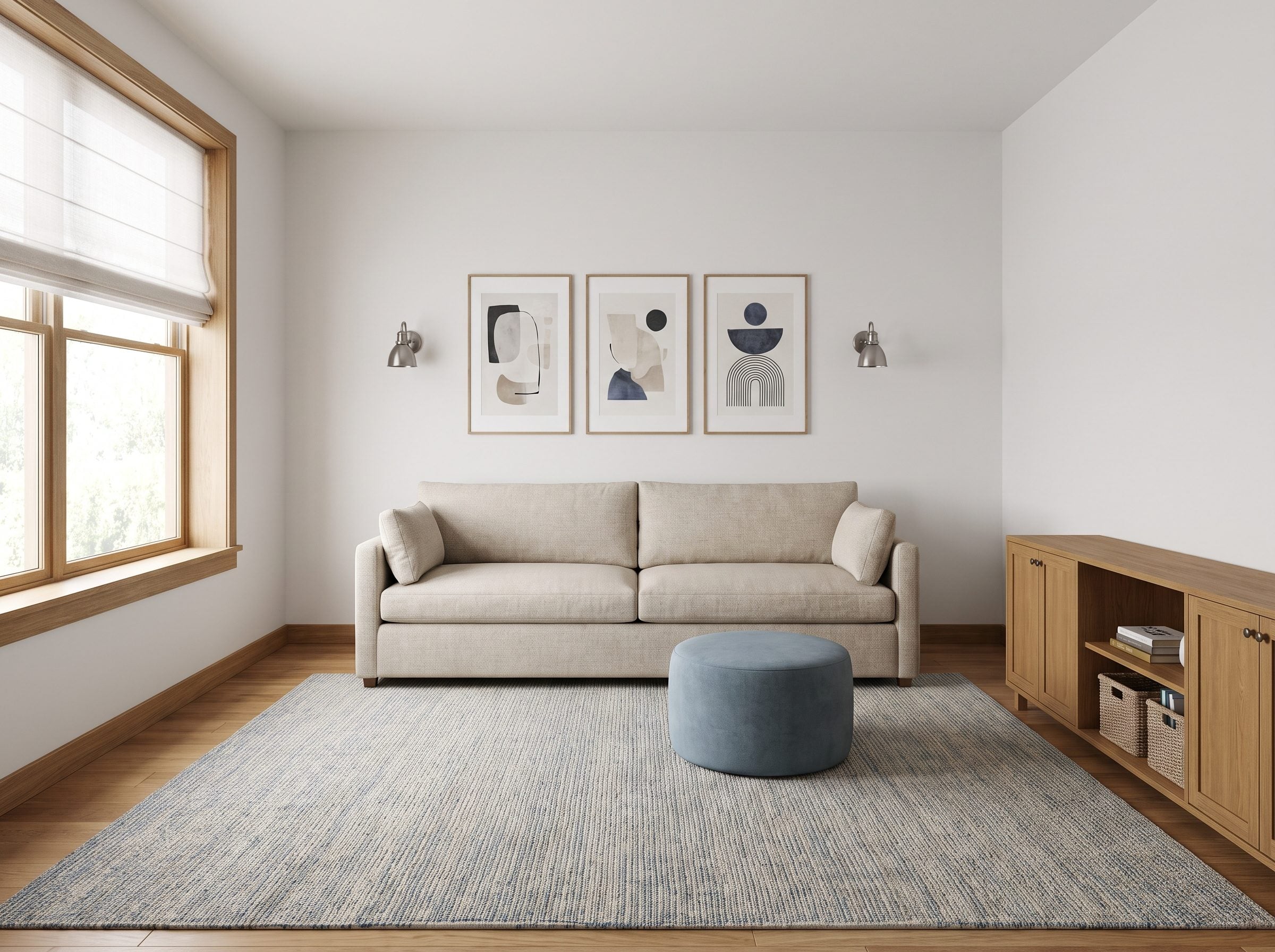
A family room earns its name when the center can survive something more demanding than a coffee table.
Slide the sofa to the longest wall and leave the rug mostly open. Blocks, trains, puzzles, and blanket forts suddenly have a place that is not the doorway.
General research on unstructured play makes a broader case for giving children room to invent their own activity. The floor does not guarantee that behavior, but it certainly makes it easier.
One upholstered ottoman can handle drinks and feet, then roll aside. Low closed storage keeps toys from turning the room into permanent evidence of the afternoon.
15. Apartment Sofa Backed Into a Storage Wall Makes the Wall Work Twice
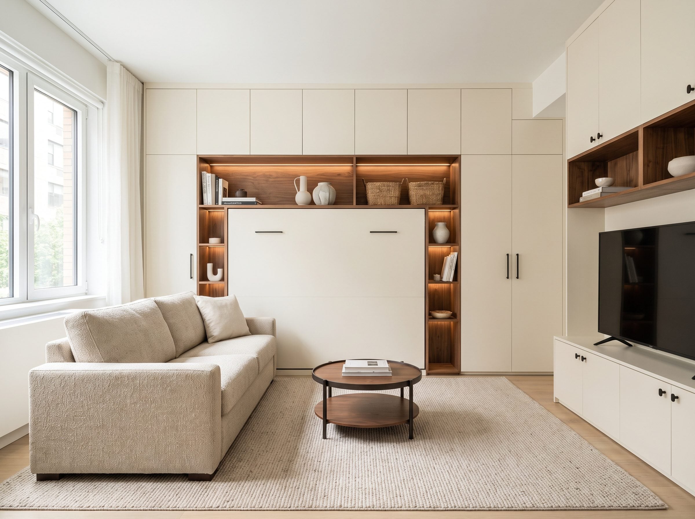
Once the wall behind a sofa also has to store books, cabinets, and objects, floating the couch away from it becomes doubly expensive. You lose floor in front and access behind.
This room treats the storage wall and sofa as one composition: cream cabinetry below, walnut niches above, seating tight to the base. A useful overview of when designers do and do not float furniture appears in this Apartment Therapy discussion.
The wall behind the sofa can be storage, backdrop, lighting zone, and architecture all at once. Empty carpet cannot.
With the couch tight to the millwork, the center has room for a proper rug, compact coffee table, and a passage that does not thread through the seating.
14. One Wall Does Five Jobs in a 10×11 Multipurpose Room
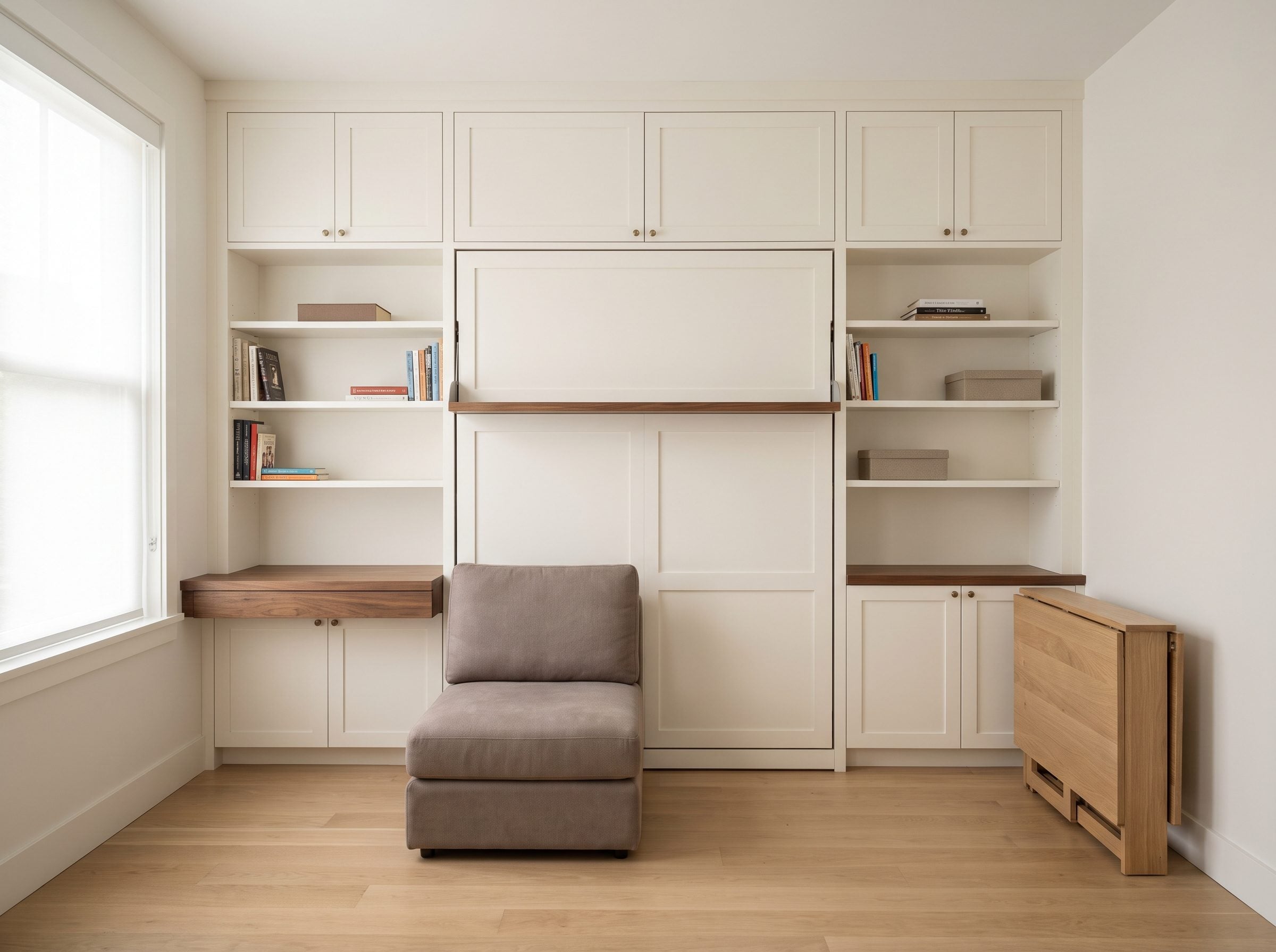
Scattering storage around 110 square feet can make the furniture feel larger than the room. One working wall does the opposite.
A shallow desk, closed cabinets, and open shelves all run along one side from floor toward ceiling. The other walls can stay comparatively quiet, and the middle remains available for whatever the room becomes next.
A 15-inch desktop can work for a laptop-centered setup, though larger equipment may require more depth. The advantage is obvious: reducing a nine-foot run from 24 inches deep to 15 returns almost seven square feet of floor.
On Saturday, a folding table can turn the open center into a small game room. On Sunday, a taupe lounge chair can move in. The wall handles the fixed functions so the floor can remain temporary.
13. The 8×9 Guest Room Chooses One Good Walkway Over Two Bad Ones
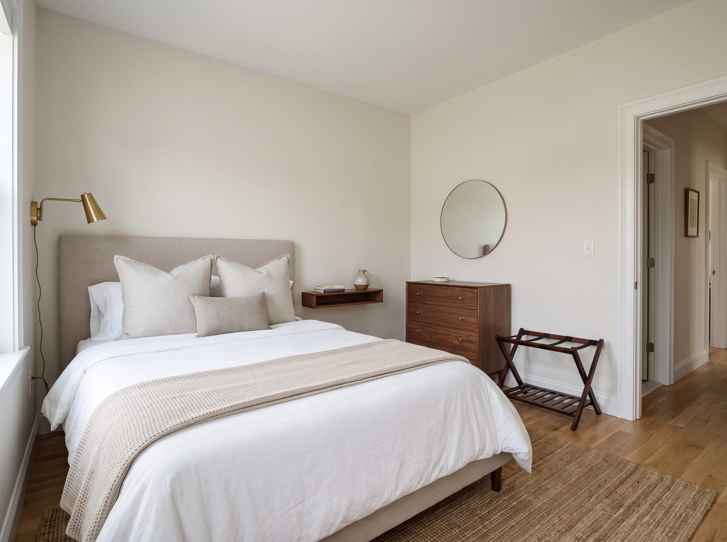
An eight-by-nine guest room contains only 72 square feet. Center a full bed and add two matching nightstands, and symmetry immediately starts spending floor the room does not have.
Turn the bed lengthwise against the long wall instead. One side becomes the useful approach, while the far corner can take a shallow dresser or luggage rack.
Upholstered wall panels and a slim shelf at the head make the bed feel integrated. A hardwired sconce can replace the nightstand lamp, though the exact mounting height should respond to the bed and the person using it rather than one universal number.
12. Living-Dining Apartment Uses a Wall Banquette to Draw the Line Between Zones
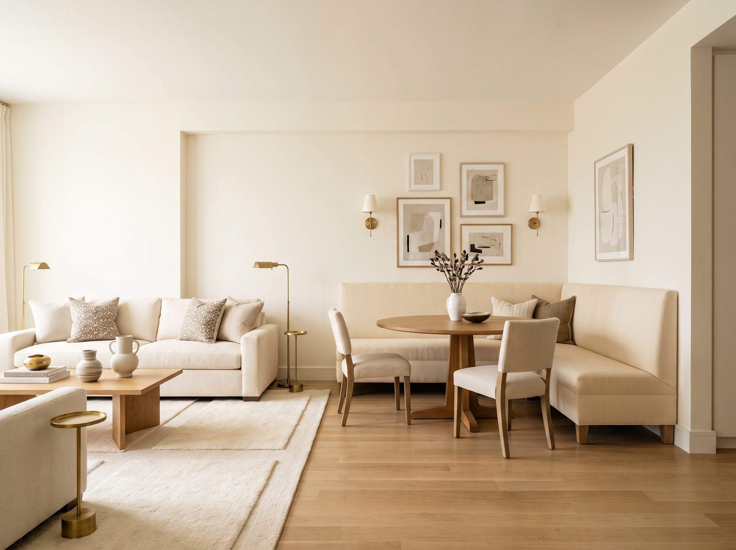
This is where a banquette stops being merely a space-saving seat and starts acting like architecture. The bench fixes the dining zone to one wall, while the sofa does the same for the living zone.
A walnut oval pedestal dining table sits in front of the built-in bench with two movable chairs on the open side. Across the room, a muted olive sofa takes the perimeter rather than competing for the middle.
The strip between them reads clearly as circulation. Nothing has to be floated in order for the two zones to feel distinct.
11. The 10×12 Cottage Lets the Sofa Anchor While the Chairs Stay Mobile
🔥 Would you like to save this?
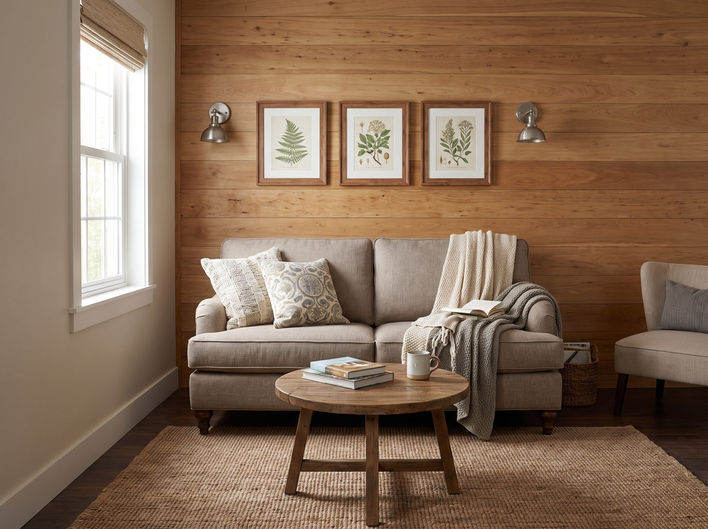
A 10-by-12 cottage room usually has more interruptions than walls: windows, fireplace, doorway, maybe a radiator. One solid seven-foot run can therefore be more valuable than an abstract desire to center the furniture.
The 84-inch sofa takes that wall and becomes the fixed anchor. Two smaller chairs do the moving instead, turning toward the fire, the window, or each other as the room changes.
That division of labor is the useful idea here. The largest object stays put. The lighter pieces create flexibility.
10. Family Room, Wall Storage Bench Turns Seating Into a Built-In Utility Strip
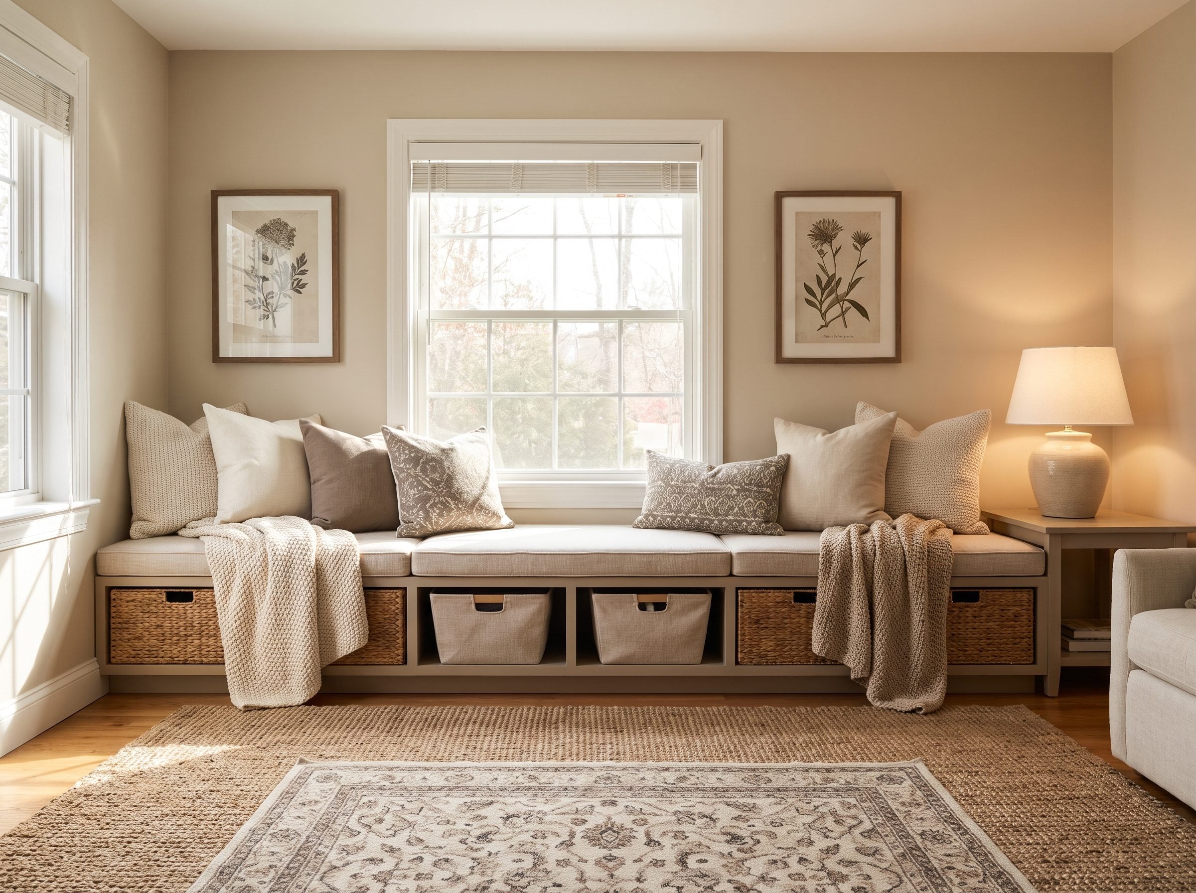
A storage bench against a wall is almost impossible to accuse of wasting space because nearly every inch has a job. Sit on it. Store things underneath it. Light it from above. Use the wall behind it for art.
The arrangement has deep roots in informal family rooms, window seats, breakfast nooks, and the kind of built-in cabinetry that filled many 1980s family rooms. The useful principle is the same regardless of decade: storage and seating can share one footprint.
Style the top with a few muted cushions and cream linen lumbar pillows. A pair of brass wall sconces gives the bench the visual presence of architecture rather than overflow seating.
9. Tiny Rental Keeps the Sofa Fixed and Lets the Chairs Do the Moving
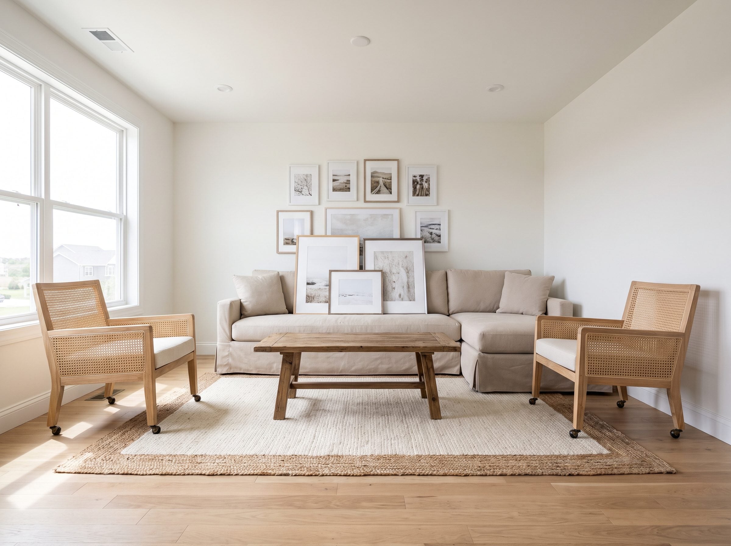
A rental often cannot rely on built-ins, wall paneling, or custom millwork, so flexibility has to come from furniture you can carry out when the lease ends.
The cream sofa stays against the long wall. Two lightweight terracotta accent chairs move toward it for conversation, pivot toward the window, or leave the middle entirely when more floor is useful.
A warm wood freestanding shelf and charcoal floor lamp keep the rest renter-friendly. The same mobile-seating logic can scale into larger living room designs.
8. Tiny Studio Slides the Bed Into an Alcove and Gives the Center Back to Daytime
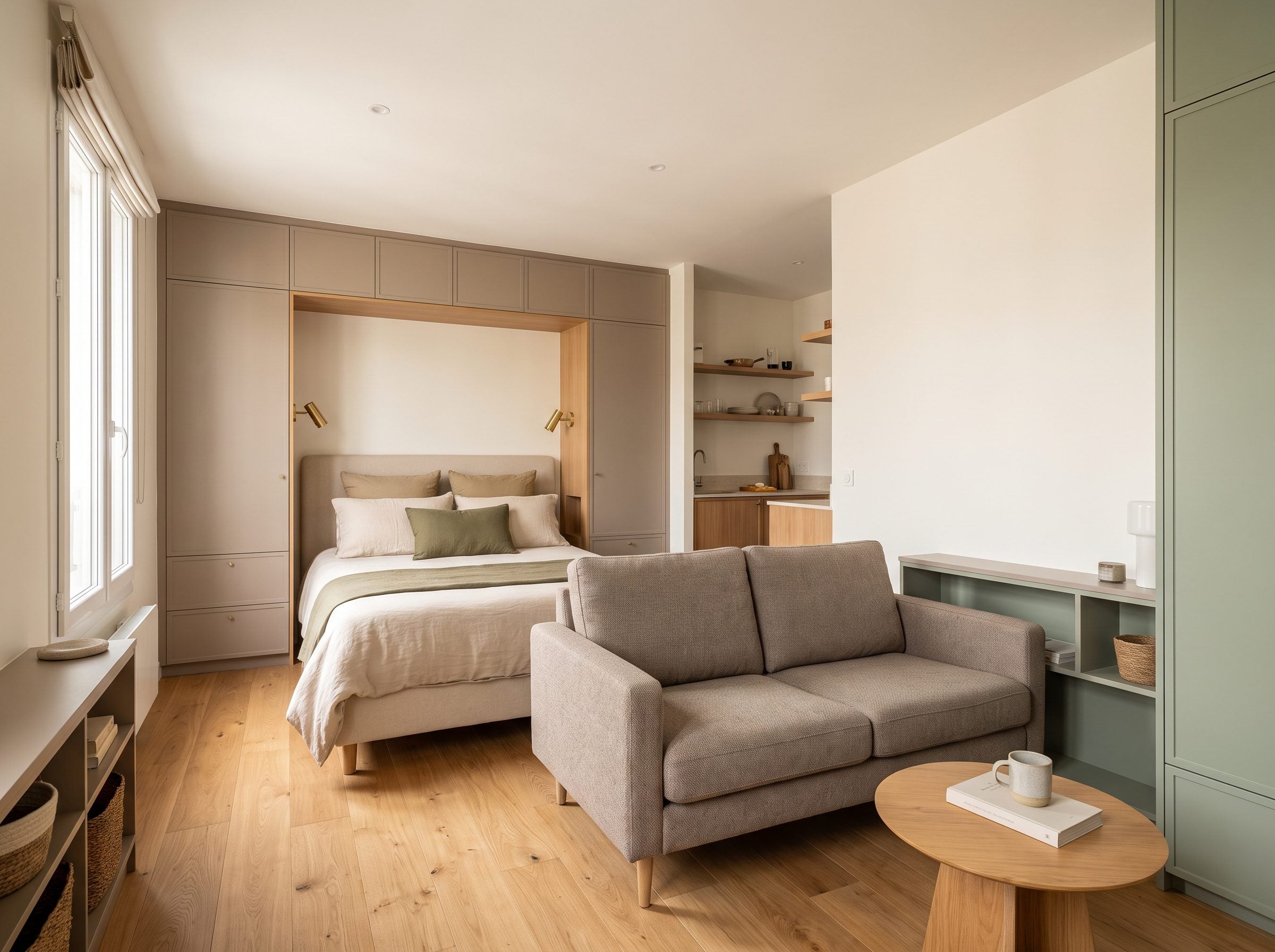
A queen bed in the middle of a 320-square-foot studio is not merely a bed. It becomes the central object every other function has to orbit.
Move it into a shallow wall alcove and the sleeping zone gains an edge. Oak trim, two reading lights, and built-in shelving can make the recess look intentional enough that the bed reads almost like cabinetry.
Push the bed to the edge and the middle of the studio can finally belong to the daytime.
A clear lane now runs from door to window while the opposite wall can hold a low sofa. The center stops being a negotiation between bed and living room.
7. Small Living Room Saves the Middle for Entertaining Instead of Parking the Sofa There
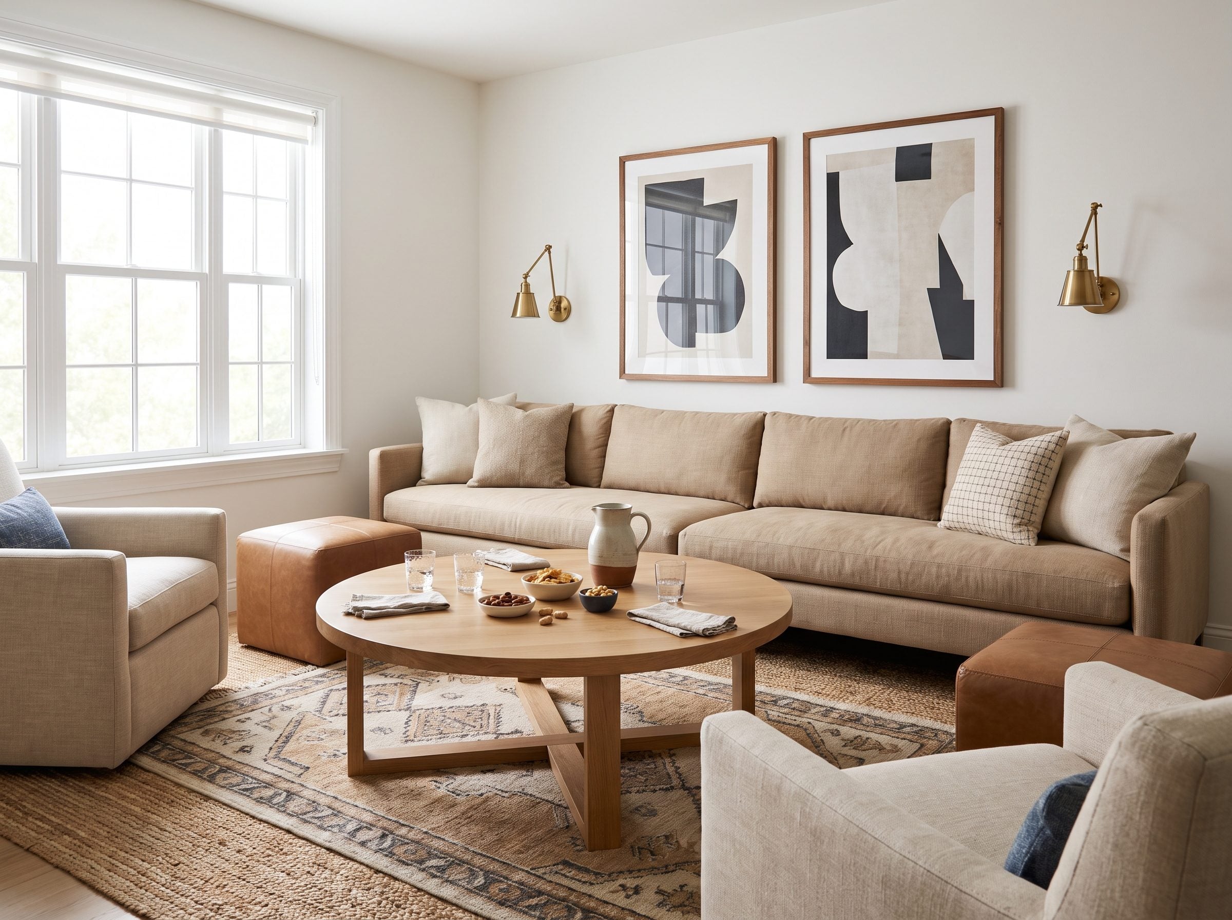
A small room does not need to look ready for six people every day. It needs to become ready for six people when six people arrive.
A cream linen sofa stays against the back wall and a walnut sideboard takes the window wall. The middle remains open until guests arrive.
Then two lightweight olive accent chairs pull into the center and face the sofa. Walnut nesting tables give everyone somewhere to set a glass and slide away afterward.
6. Built-In Bench Proves That Furniture Against a Wall Can Be the Most Deliberate Move in the Room
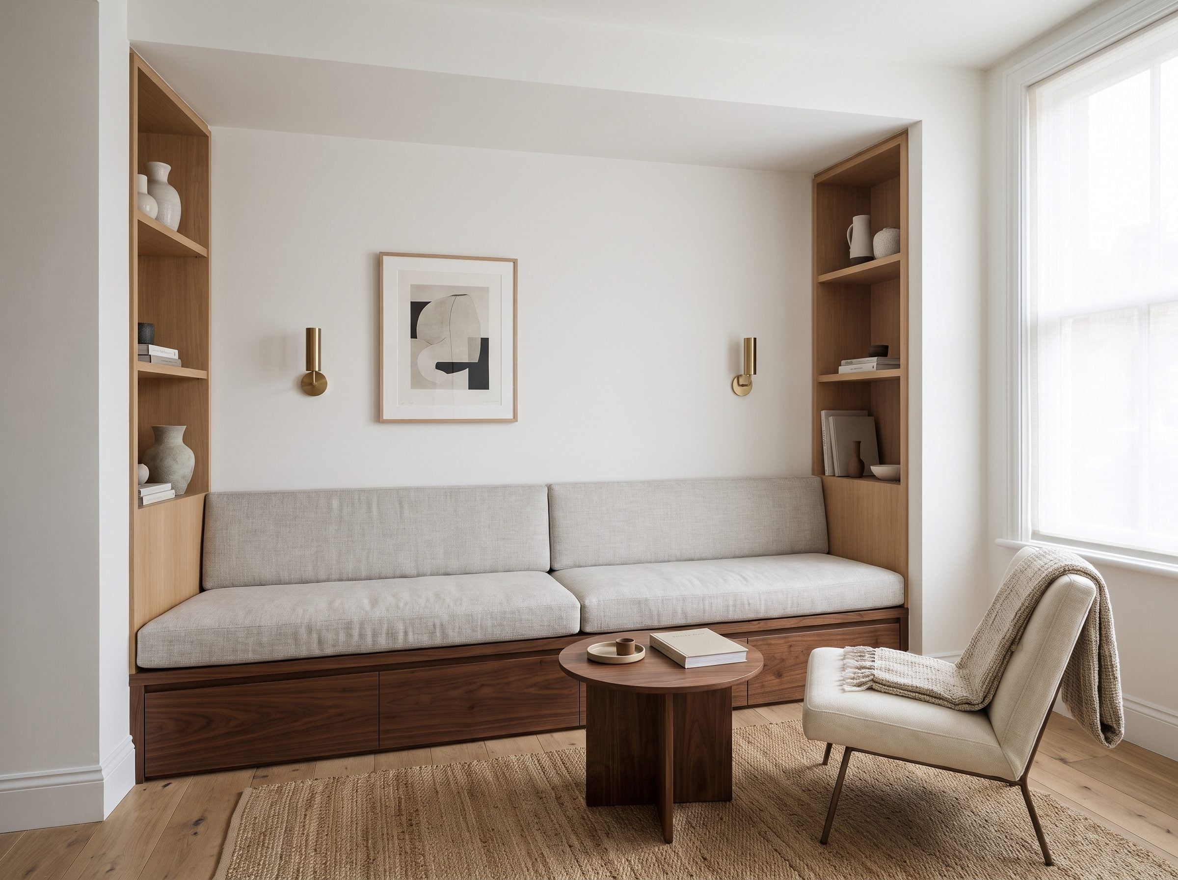
A built-in bench makes the anti-wall rule look especially strange because the entire point of the object is that it belongs to the wall.
Upholstered seating runs across the full width while drawers below hide blankets, games, or anything else that would otherwise need a cabinet. Shelves at the ends can hold books and a brass table lamp.
One walnut lounge chair and a round table are enough to turn the built-in into a sitting area rather than just storage with cushions.
You do not accidentally build a bench into a wall. The wall is the plan.
5. Tiny Living Room Keeps the Furniture Perimeter Tight and the Circulation Loop Loose
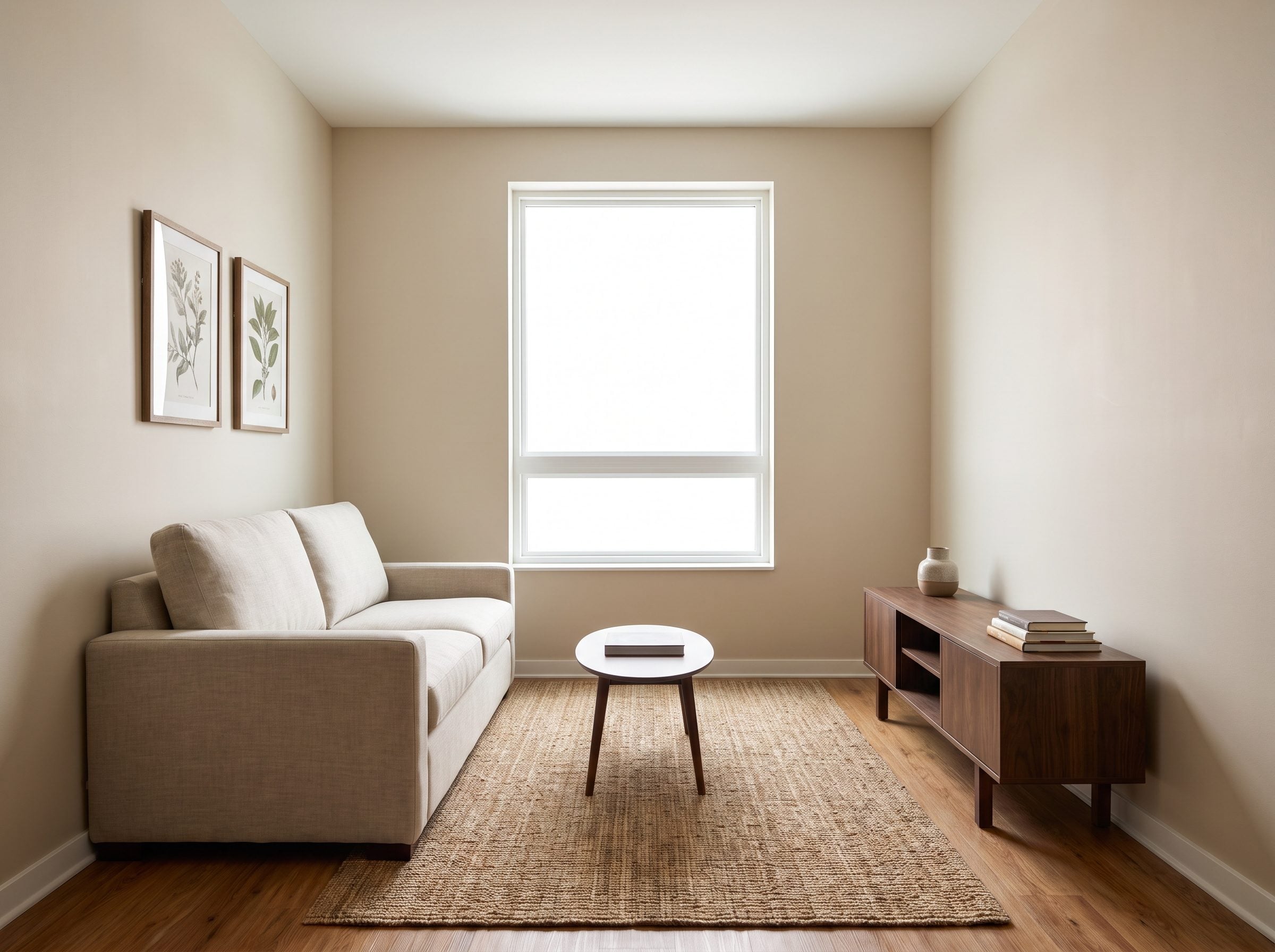
Ninety-nine square feet sounds workable until furniture depth starts subtracting from it. A 30-inch-deep sofa already uses more than two feet of an eleven-foot room. Add a 24-inch gap behind it and the combined depth becomes 54 inches before the coffee table even arrives.
That is not more than half the room, but it is still a substantial amount of depth devoted to sofa plus empty carpet.
Put the sofa on the back wall instead. Ten-inch media storage takes the opposite side, a slim chair angles in from one corner, and a compact round walnut coffee table sits in the center without blocking the circulation loop.
4. Tiny Entry-Living Room Protects the Route From the Front Door First
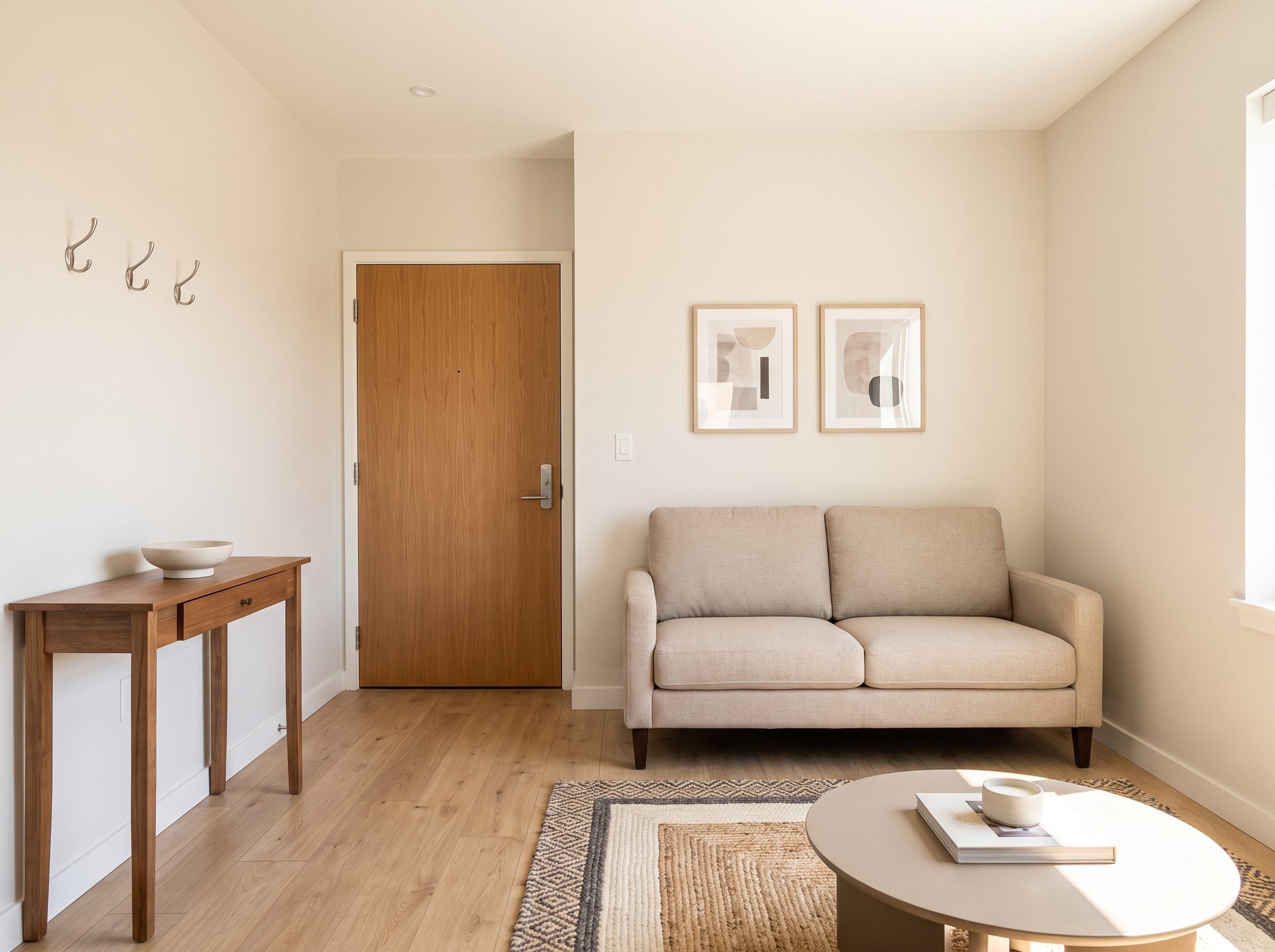
When the front door opens directly into the living room, furniture placement becomes a circulation decision before it becomes a styling decision.
An 84-inch sofa floating in that path forces every arrival to detour around it. Push the sofa against the longest solid wall and the entrance can maintain one clean route toward the rest of the apartment.
Thirty-six inches is a useful accessible-route benchmark; around 30 inches may still work in a tight residential passage, but it feels notably narrower. The key is not pretending the room can support both simultaneously.
A pair of brass wall sconces, blue-gray linen pillows, and a walnut oval coffee table make the wall placement look finished rather than merely practical.
3. Narrow Living Room, Sofa Against the Long Wall
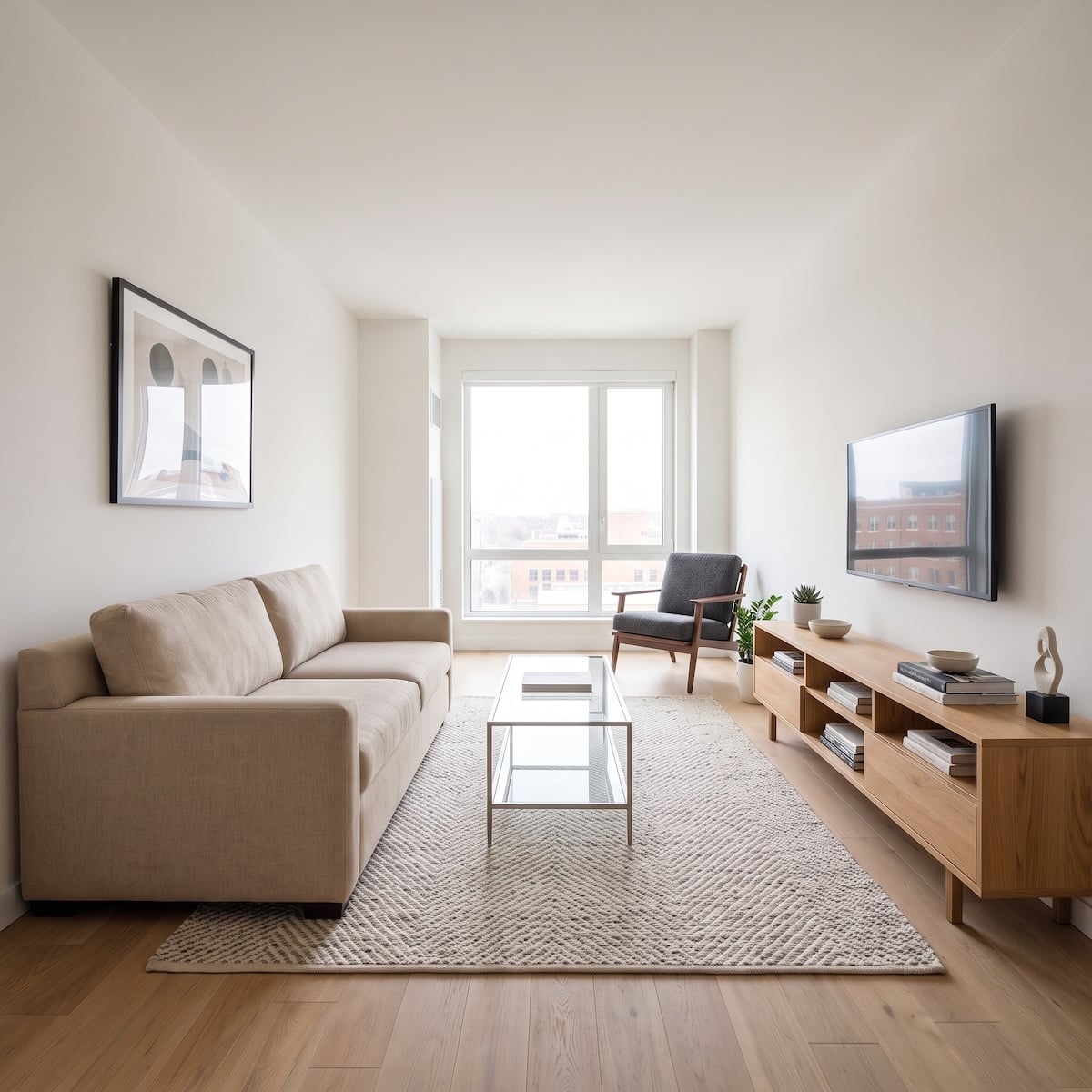
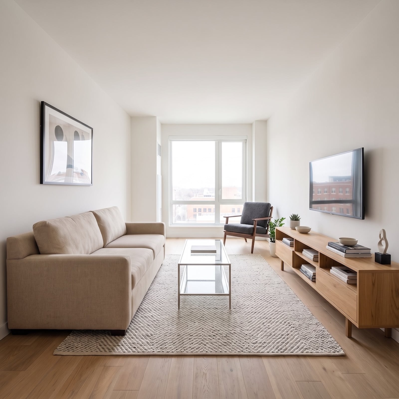
This nine-by-fifteen room exposes the problem faster than almost any other: nine feet wide and fifteen feet long. An 84-inch sofa is seven feet from arm to arm, but its depth is usually closer to three feet. Pull that depth another two feet into a narrow room and the loss shows up immediately where it hurts most, in the circulation lane.
Against the long wall, the sofa stops competing with the room’s width. The rug and coffee table can occupy the middle without turning it into an obstacle course, while a shallow media unit opposite keeps the passage legible from one end to the other.
A compact accent chair near the window gives the layout its break in symmetry. The sofa can stay disciplined because the smaller piece supplies the angle.
2. Tiny Apartment, Back-Wall Sofa Turns the Empty Gap Into Living Space
🔥 Would you like to save this?
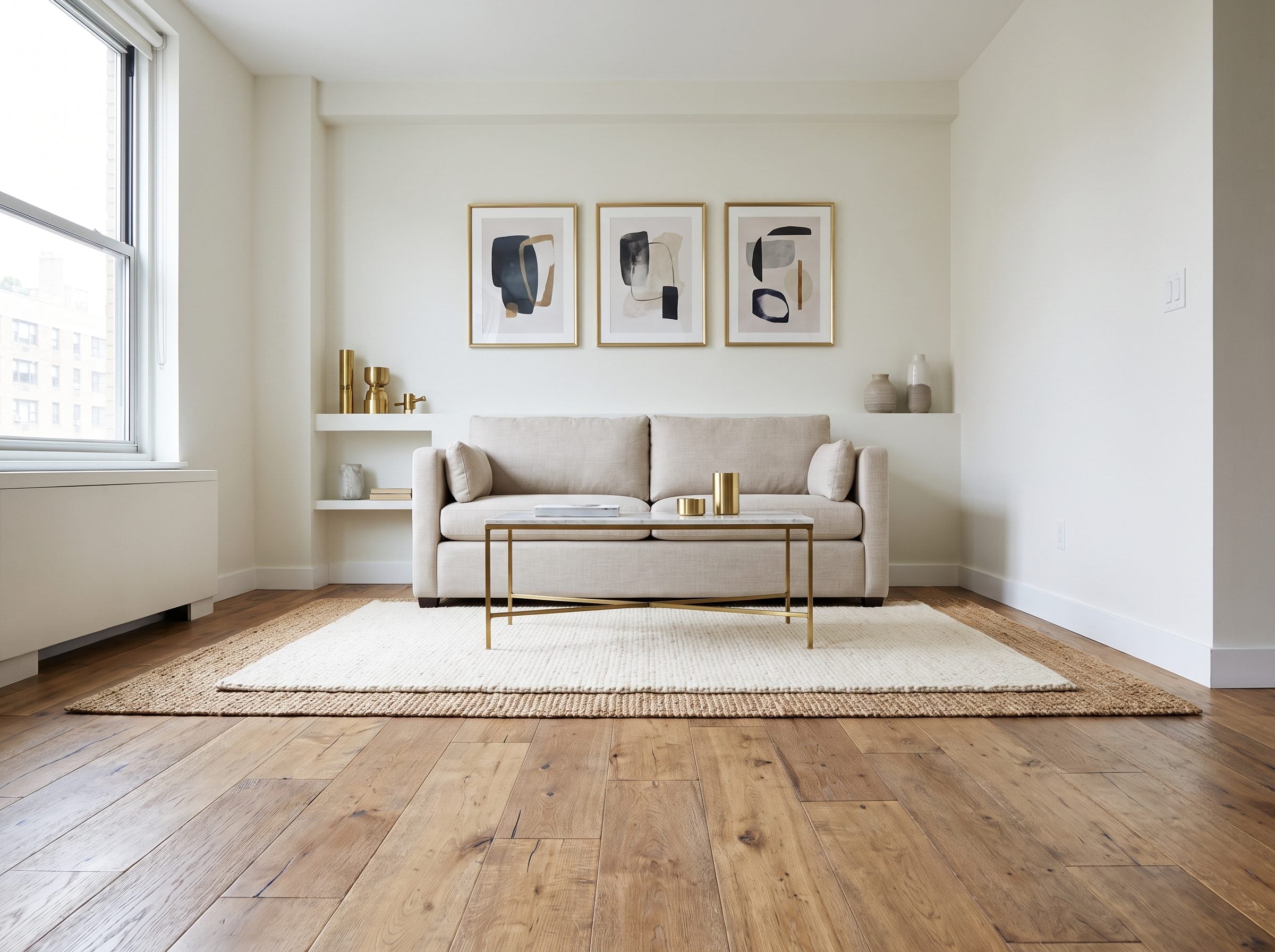
Here the lost floor is easy to calculate. An 84-inch sofa is seven feet wide. Leave a 10-inch gap behind it and that strip alone uses almost six square feet. Make the gap 12 inches and the cost rises to seven.
In a 110-square-foot room, that is not background noise. It is enough floor to affect where the coffee table sits and whether the path from door to window feels comfortable.
Push the oatmeal linen sofa back, center a round oak coffee table on the rug, and use the wall itself as the decorative backdrop.
1. Tiny Living Room Uses the Back Wall for the Sofa and Keeps the Center Calm
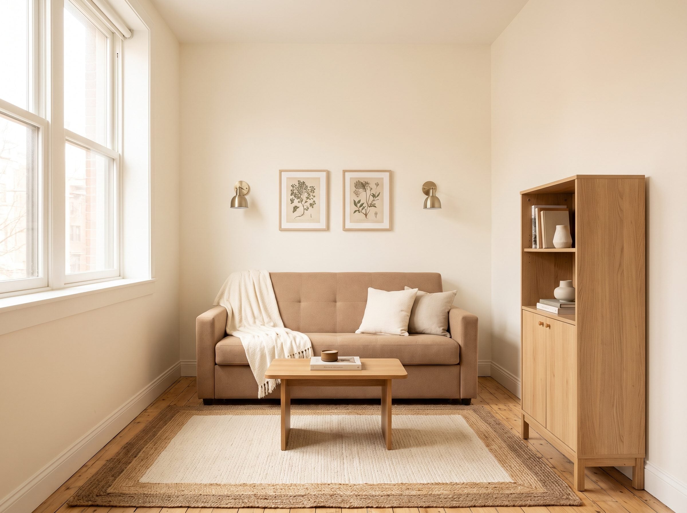
This room makes the wall placement feel less like a concession and more like the obvious answer. The sofa sits squarely against the back wall, which leaves the center open enough for a compact coffee table without turning the room into a slalom course.
The styling keeps that wall from feeling bare. Two brass sconces and a pair of botanical prints give the sofa a proper backdrop, while the light upholstery and pale walls keep the narrow room from feeling boxed in.
The tall wood cabinet on the right uses vertical space instead of spreading storage across the floor. That leaves the rug and coffee table to define the living area without asking for much additional footprint.
The useful move here is restraint. One sofa, one small table, one tall storage piece, and a clear route through the room. Nothing needs to float to make the layout feel finished.
The lesson after 35 rooms is not that furniture should always hug the wall. It is that small rooms punish rules without context. Sometimes floating a sofa creates a beautiful conversation zone. Sometimes it turns six usable feet into four. The floor plan gets the final vote.