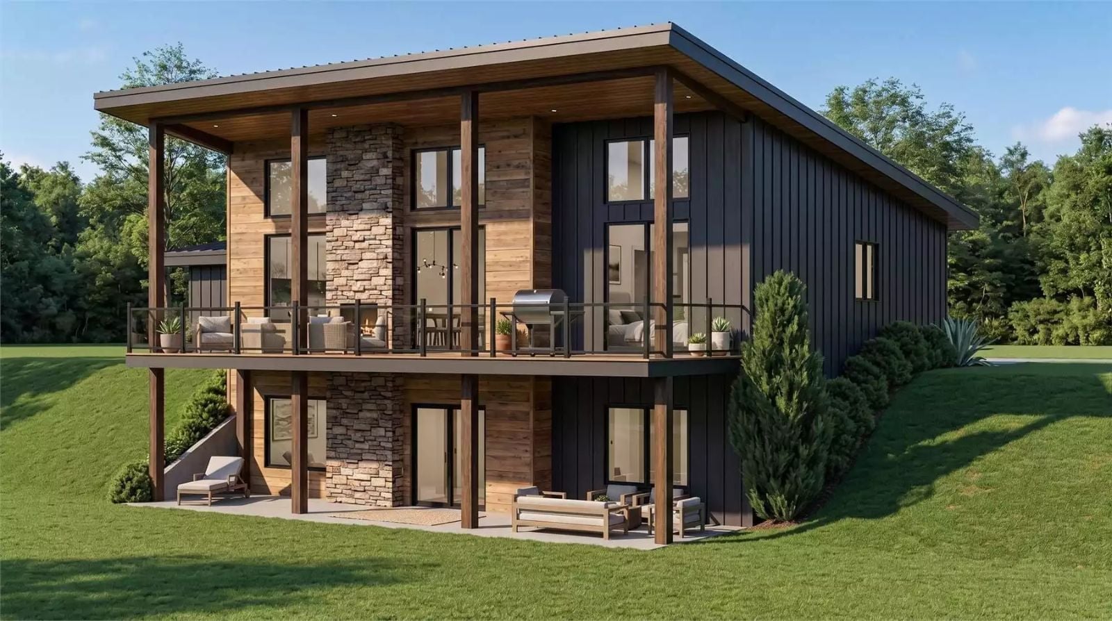
The Estes Way is designed for the couple who’s tired of a house that just functions — exposed timber, a walkout basement that spills onto the lower patio, a rustic modern palette that feels lived-in rather than staged, and a layout sized for two without ever feeling like something was left out. Coffee in morning light, a book on the deck when the afternoon cools, dinner with nowhere else to be.
Specifications
- Sq. Ft.: 1,198
- Bedrooms: 2
- Bathrooms: 2
Floor Plan – Main Floor
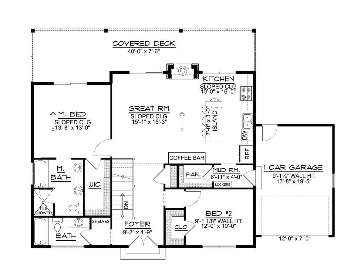
A great room with a sloped ceiling anchors the main floor, opening directly into the kitchen and its 7-foot island. The master suite sits privately to the left with a walk-in closet and tile shower, while Bedroom 2 shares the right wing with the mud room and foyer. Out front, a 40-foot covered deck runs the full width of the house.
Floor Plan – Basement
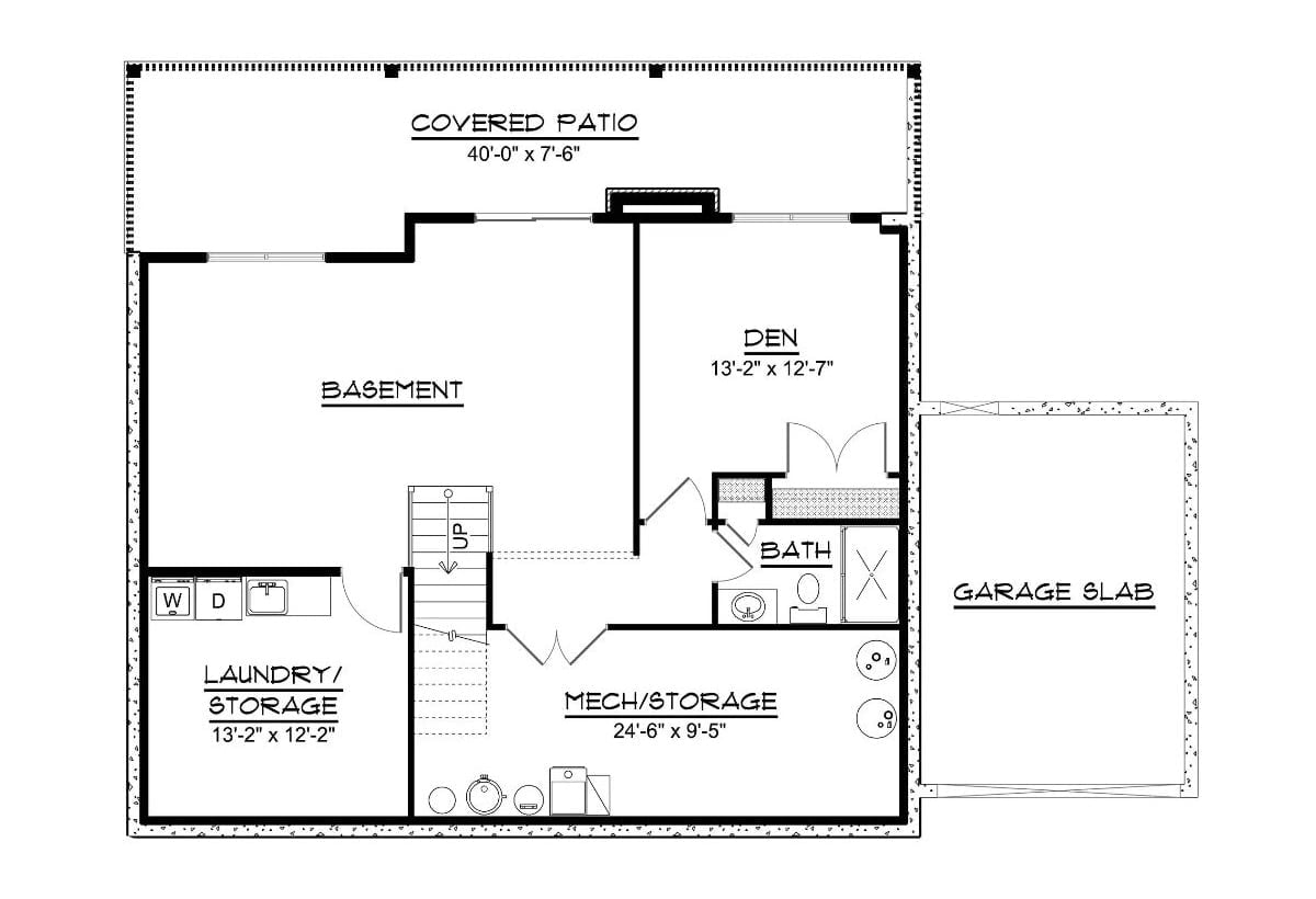
The basement level holds a den, full bath, laundry and storage, and a mechanical room, with stair access up and a covered patio spanning the full front width below the deck.
Floor-to-Ceiling Stone Fireplace Anchors an Open Living Space Built for Two
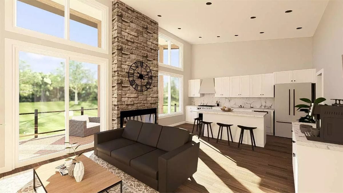
Stacked stone climbs two full stories to meet the ceiling, with a clock mounted mid-column that reads more like sculpture than decor — or rather, it reads like someone made a considered choice instead of just filling space. Dark hardwood floors carry through both the living area and kitchen. White shaker cabinets, marble-look counters, and a four-seat island keep the kitchen crisp against all that warmth without fighting it.
Designer’s Secret: Mounting a large clock directly on a fireplace surround is a trick designers use to fill vertical stone without adding shelves or wall art that could become a fire hazard. It pulls the eye upward and makes a tall chimney feel intentional rather than just… tall. Look for a matte black or wrought iron finish so it doesn’t compete with the texture of the stone behind it.
Warm Wood, Dark Leather, and a Sliding Door That Blurs the Line Between Inside and Out
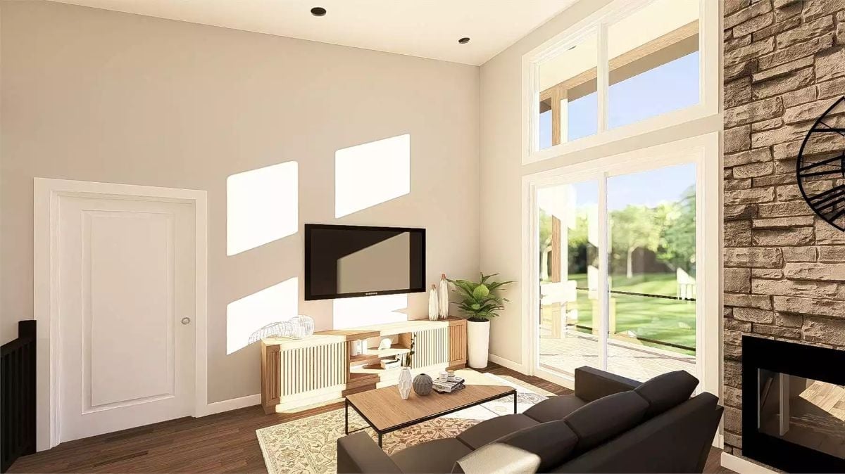
Sunlight cuts hard angles across the wall, doing more decorating than any art piece could. A low wood console keeps the TV grounded rather than floating, the dark leather sofa pulls attention toward the fireplace, and the sliding glass doors frame the backyard like a living painting you can actually walk into. The whole room functions on layered warmth rather than any single statement piece.
Trend Alert: Slab-front media consoles with reeded or fluted wood panels are showing up in place of the traditional TV stand. They read as furniture rather than storage, which matters in open-plan rooms where the media wall is always in view. Pair one with a dark sofa and you get enough contrast to anchor the space without needing a second accent wall to do the heavy lifting.
White Quartz, Black Hardware, and a Range Hood That Earns Its Square Footage
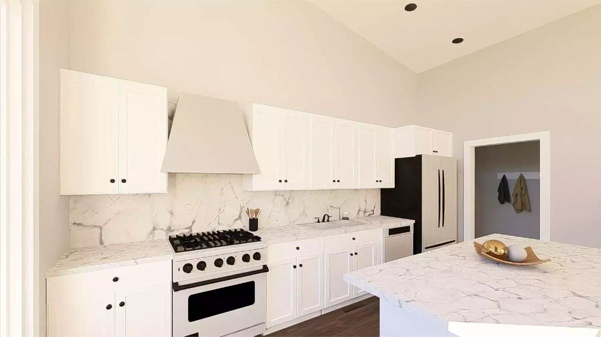
Calacatta-style quartz runs from the countertops straight up the backsplash without a seam, which does something subtle but real — it makes the wall feel taller. White cabinetry and a matching range hood keep the upper half cohesive, while matte black hardware on every drawer and door gives the eye something to land on. Clean without being cold.
Style Math: Matching your range hood finish to your upper cabinets is one of the quieter ways to make a kitchen feel pulled together without adding visual weight. Pair that with a contrasting hardware finish — matte black against white reads sharp without overwhelming the space — and you’ve done most of the work without touching a single wall color.
Coffee Bar With Marble Countertop and Gold Wall Art Pulls Double Duty on the Upper Level
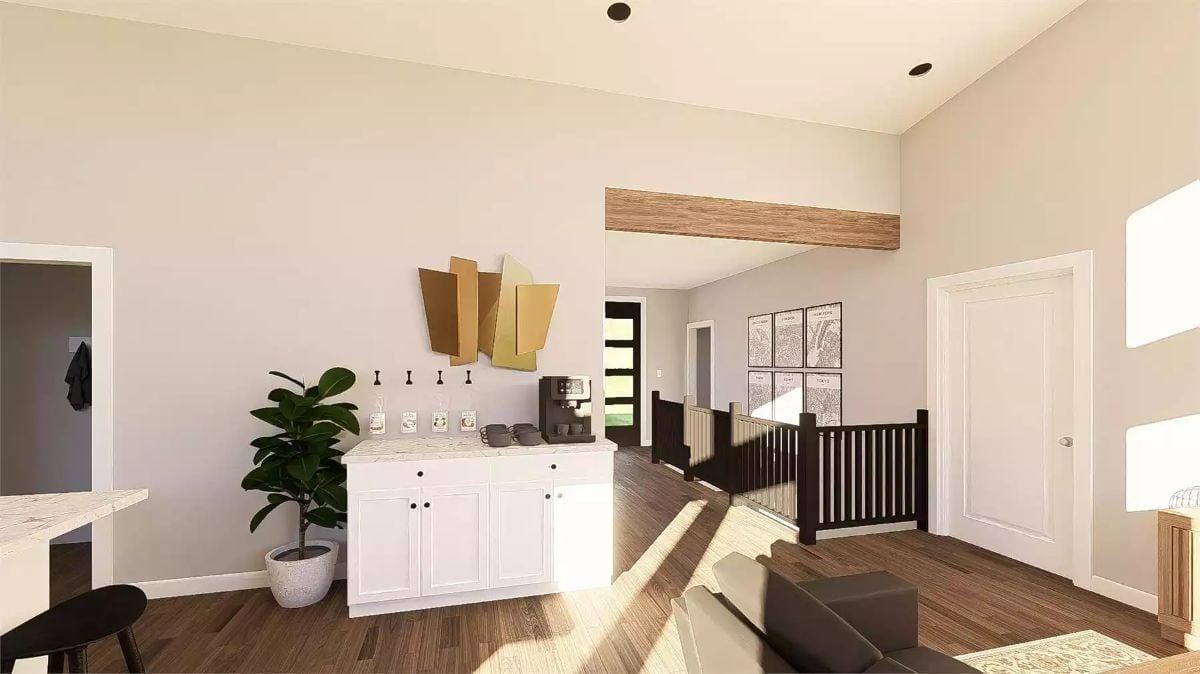
White shaker cabinets with black hardware anchor a built-in coffee station topped with veined marble. Four cup hooks mounted directly to the wall keep mugs within reach without eating into counter space — a small detail that makes a real difference on a tight footprint. The gold sculptural wall piece above handles the vertical space without any help from generic framed art.
History Corner: Built-in coffee bars started gaining traction in residential design after hotels popularized in-room beverage stations as a luxury amenity. Homeowners picked up on it as a way to keep morning routines contained to one spot rather than spread across the main kitchen counter. In a smaller household like this one, that station often pulls double duty as a drink setup for entertaining, too.
The master bedroom takes that same warmth from the living spaces and carries it upstairs.
Three Ink-Wash Panels and a Double-Height Window Make the Bedroom Feel Like a Retreat
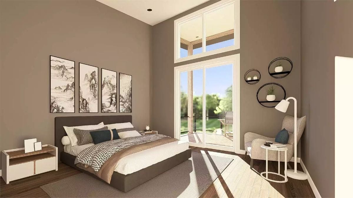
A dark upholstered bed frame, circle wall shelves, and a reading chair with a floor lamp. Sometimes a room just doesn’t need more than that.
Botanical Prints, a Glass Shower, and a Soaking Tub That Gets the Window Seat
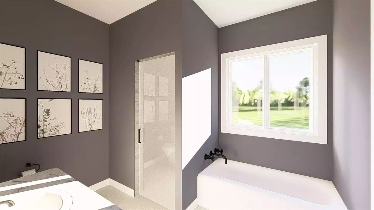
A matte black wall-mount faucet sits directly above a drop-in tub positioned under the window, keeping the sightline to the yard open rather than breaking it with deck hardware.
Why Wall-Mount Tub Fillers Are Worth the Extra Rough-In Work
Moving the faucet off the tub deck and onto the wall frees up the entire rim — for candles, a book, or just breathing room. It requires planning the rough-in before the walls close, so retrofitting one later isn’t really on the table. Builders who include it at the new-construction stage tend to hear about it during walkthroughs, usually because buyers weren’t expecting it and now they can’t stop thinking about it.
Pin It
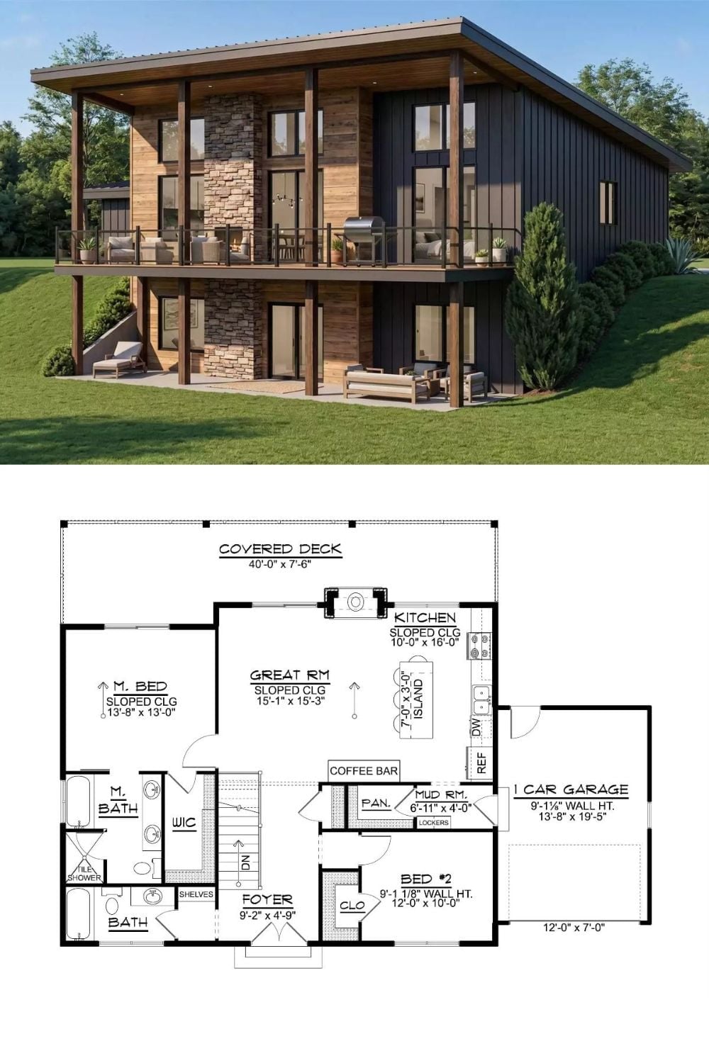
The exterior rendering shows a two-story rustic modern with board-and-batten siding, wood accents, stone columns, and a covered upper deck. The floor plan below lays out two bedrooms, a great room with sloped ceiling, kitchen with island, mud room, and one-car garage.