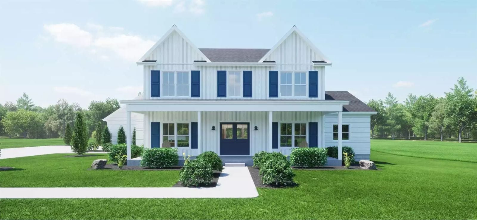
Families who outgrew their starter home years ago are increasingly skipping the mid-tier upgrade and holding out for a layout built around how they actually live now: a primary suite they do not have to climb stairs to reach at the end of a long day. The Emberleaf Lane delivers exactly that — main-floor primary, a second-floor balcony where the older kids disappear after dinner, an open kitchen that holds three conversations at once, and enough breathing room that the house stops feeling like it’s working against you.
Specifications
- Sq. Ft.: 2,307
- Bedrooms: 3
- Bathrooms: 2.5
Floor Plan – Main Floor
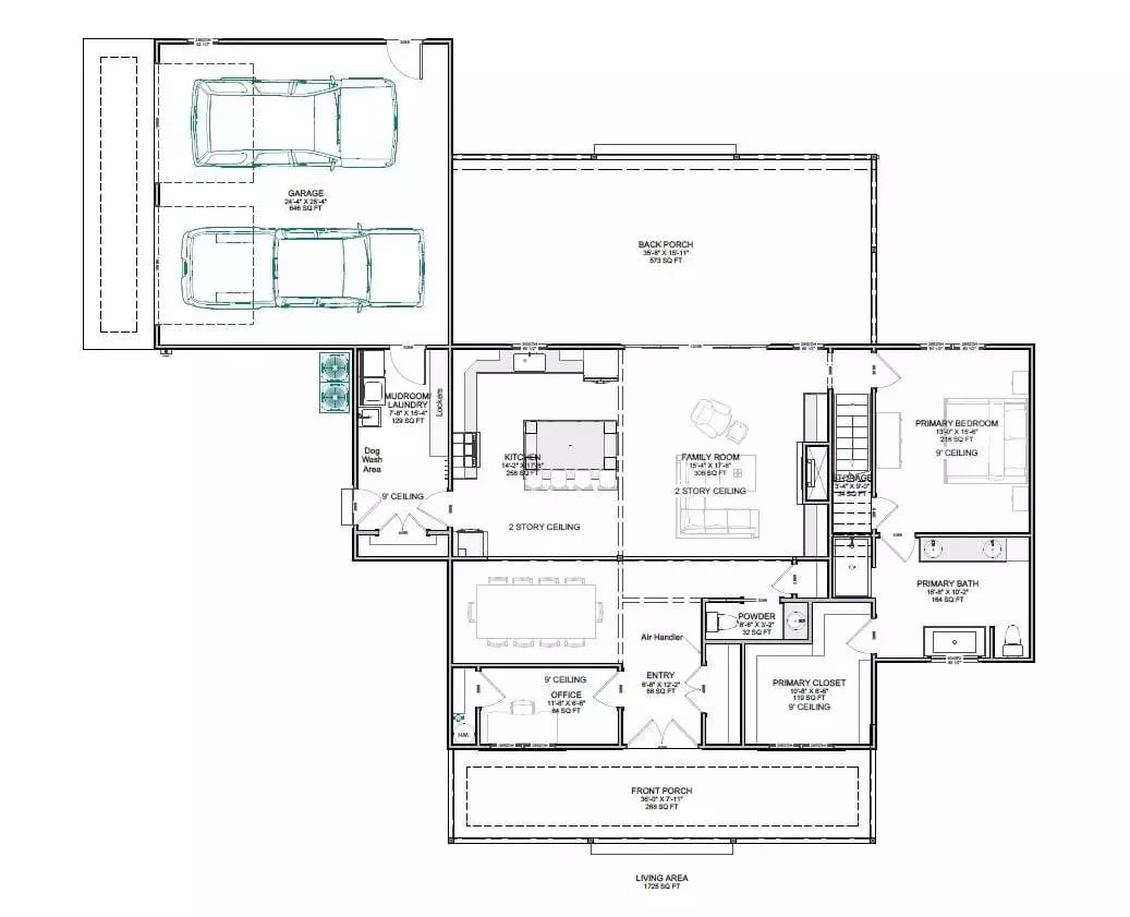
Single-story layout with main-floor primary suite, open kitchen and family room with two-story ceiling, dedicated office, mudroom with dog wash, and covered front and back porches.
Floor Plan – Second Floor
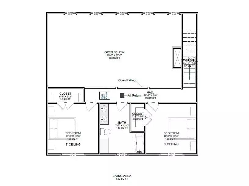
The upper level holds two bedrooms with 8-foot ceilings, a shared bath, and a hall closet, with an open railing overlooking the 563-square-foot void below. Stairwell access sits at the far right corner.
The Psychology Behind This: Parking both secondary bedrooms upstairs creates a natural buffer between the kids’ zone and the main-floor primary below — and that separation does real work for families where different people genuinely keep different hours. It’s not just about sound. It’s about the feeling of having your own end of the house at the end of the day.
Floor Plan – Foundation
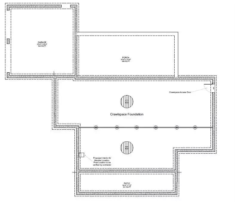
Foundation plan shows a crawlspace beneath the main living area, a front porch, attached garage, rear patio, and a proposed interior air handler location with crawlspace access door marked on the perimeter.
Trend Alert: Crawlspace foundations are making a quiet comeback in modern farmhouse builds, particularly in regions with expansive clay soils where slab movement is a genuine concern. Builders also tend to prefer them because running HVAC, plumbing, and electrical through an accessible crawlspace is far easier to service down the road than chasing a problem through concrete. If you’re weighing foundation types, ask your contractor about encapsulated crawlspace systems — they handle moisture far better than the vented designs that were standard a few decades ago.
Blue Island, High Ceilings, and a Fridge That Doesn’t Hide in the Corner
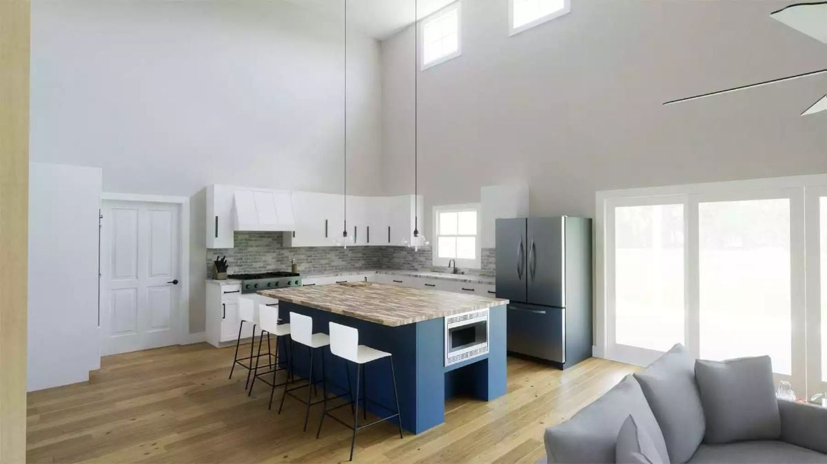
Cobalt blue island base anchors the kitchen while white upper cabinets keep tall walls from feeling heavy.
- Painting only the island a bold color lets you commit to contrast without repainting every cabinet in three years.
- Skipping upper cabinets on one wall opens visual breathing room in kitchens with ceilings above nine feet.
- Bar-height seating on one island side doubles prep space and casual dining without adding square footage.
Brick Fireplace Wall, Loft Railings, and Two Blue Chairs That Anchor the Room
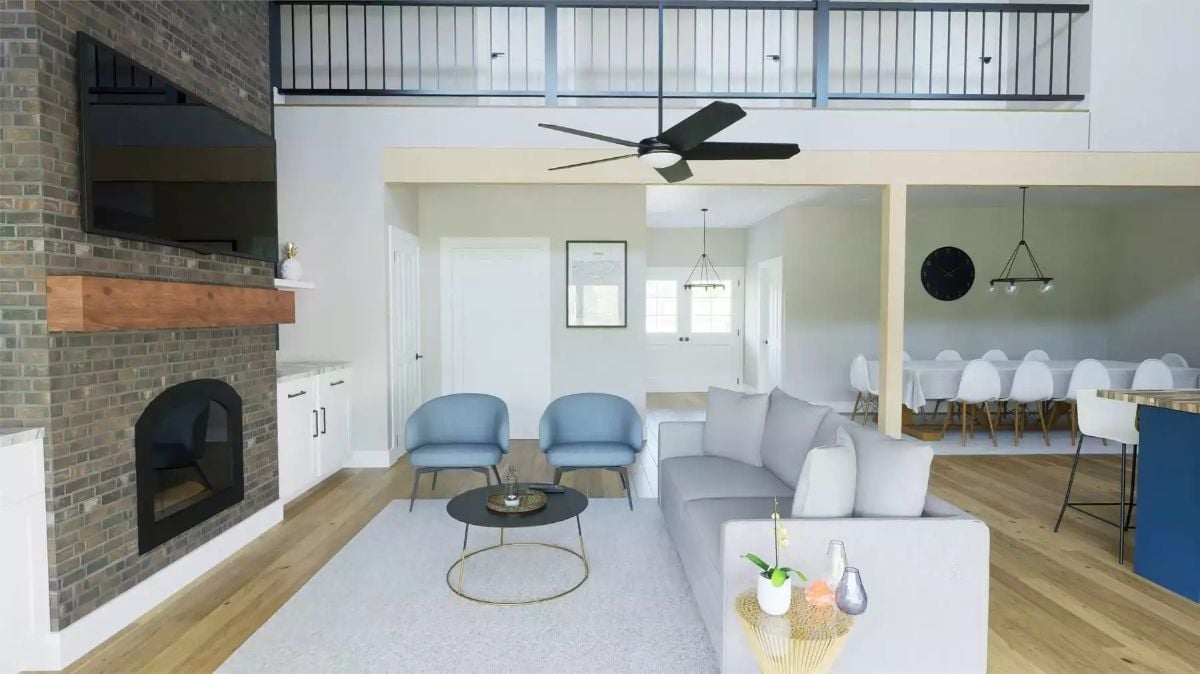
Gray sectional faces a brick fireplace with a wood mantel shelf, and two powder-blue accent chairs pull the seating arrangement together without crowding it.
Common Mistake: Mounting the TV directly above the fireplace is tempting because it feels symmetrical, but the viewing angle from a standard sofa puts your neck at a strain over time. A better call is placing the TV slightly off to the side on the same wall, at actual eye level when you’re seated. Much easier to sort out during the build phase than after the drywall is up.
Long Table, White Chairs, and a Chandelier That Earns Its Place Above Both
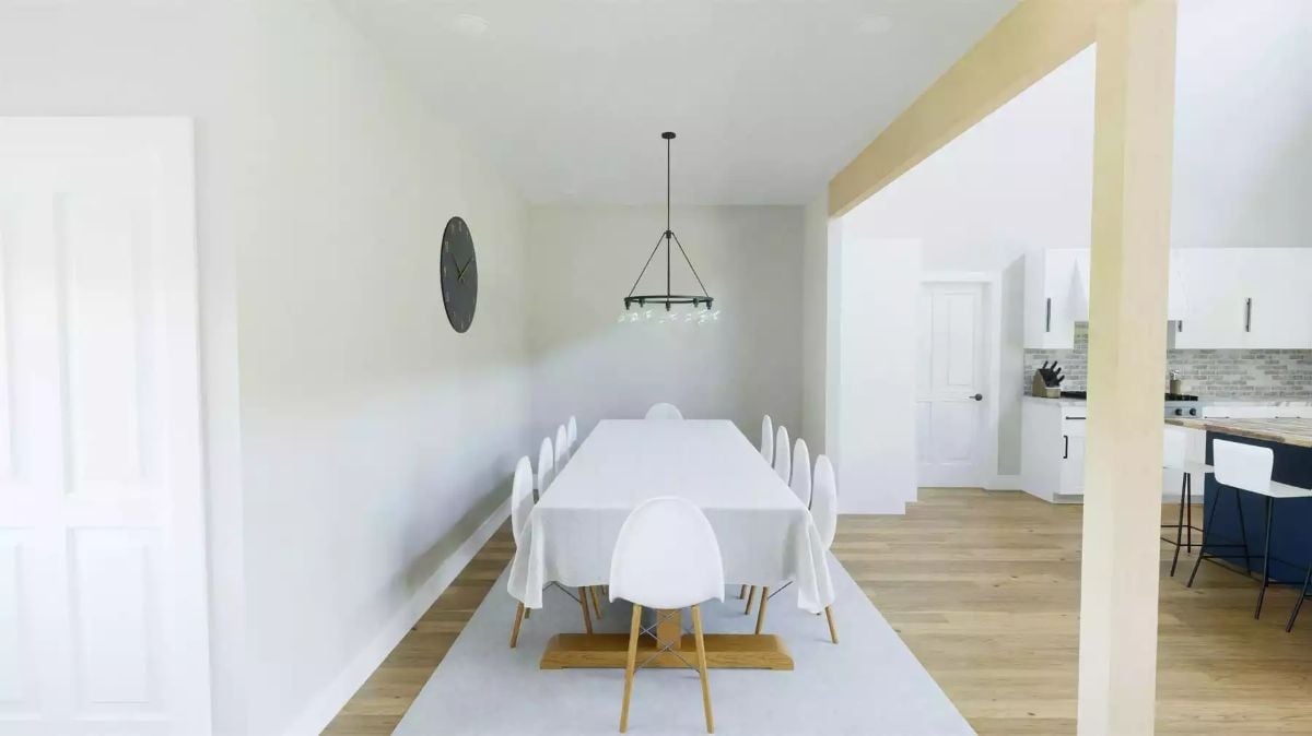
Seating twelve at a farmhouse table without cramming the room is harder than it looks.
Wood-leg chairs keep the arrangement from feeling heavy, and the rug grounds the table without boxing it in. The ring chandelier sits at the right drop height — not so low it feels oppressive, not so high it reads as an afterthought. Having the kitchen visible just past the opening makes hosting practical rather than chaotic, which is the whole point of an open plan in the first place.
Quilted Charcoal Bedding, Warm Oak Floors, and a Fan That Actually Fits the Ceiling
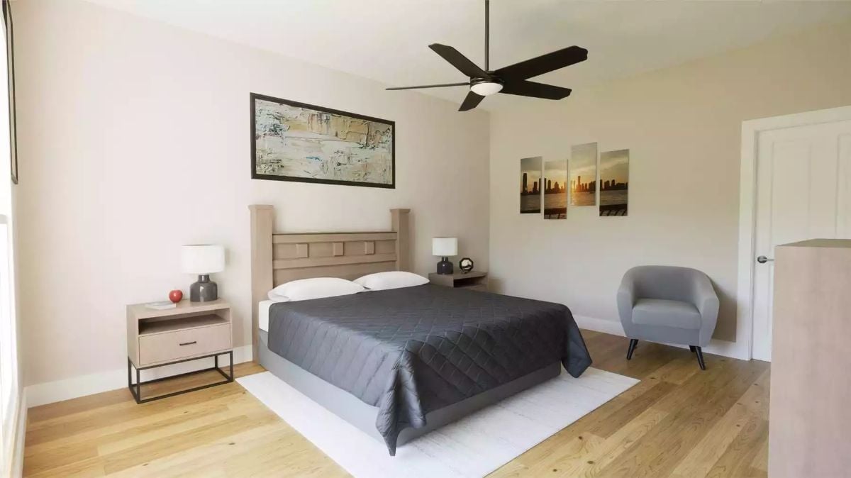
Diamond-quilted charcoal bedding pulls focus without competing with the natural oak flooring beneath it. The two nightstands flank the bed but don’t match exactly, which keeps the room from looking like a showroom floor. That gray barrel chair in the corner earns its spot — rooms this size need somewhere to sit that isn’t the bed.
In The Details: A ceiling fan sized too small for the room moves less air and looks vaguely sad doing it. For a bedroom this size, a blade span of 52 inches or larger is generally the right call. Get the scale right and the fan reads as intentional; get it wrong and it looks like whatever was left at the hardware store.
Freestanding Tub by the Window, Walk-In Shower Behind the Wall
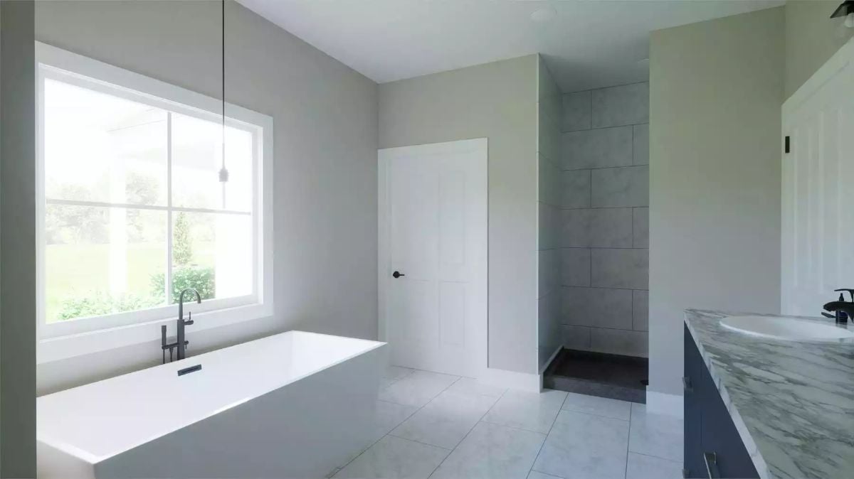
Marble-look floor tile keeps things light while the gray wall tile in the shower shifts the mood without tipping into dark. That matte black faucet positioned over the tub is a deliberate contrast — one piece of hardware doing a lot of visual work against all the white.
Editor’s Note: Doorless walk-in showers have become a fixture in primary baths because they remove the visual bulk of a glass enclosure without giving up privacy. A half-wall configuration like this one blocks sightlines while keeping the space feeling open. Just confirm your exhaust fan is sized to handle the extra moisture a doorless design releases into the room — it’s a detail contractors sometimes underspecify.
Utility Sink on Legs, Mosaic Floor Tile, and Coat Hooks That Actually Get Used
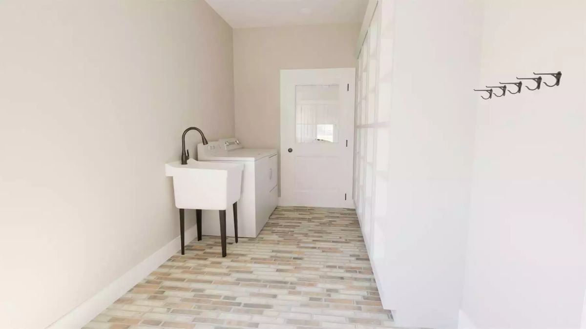
A freestanding utility sink with a dark faucet sits beside the washer, while linear mosaic tile keeps the mudroom grounded without demanding attention. Functional rooms should look like they know what they are.
Pin It
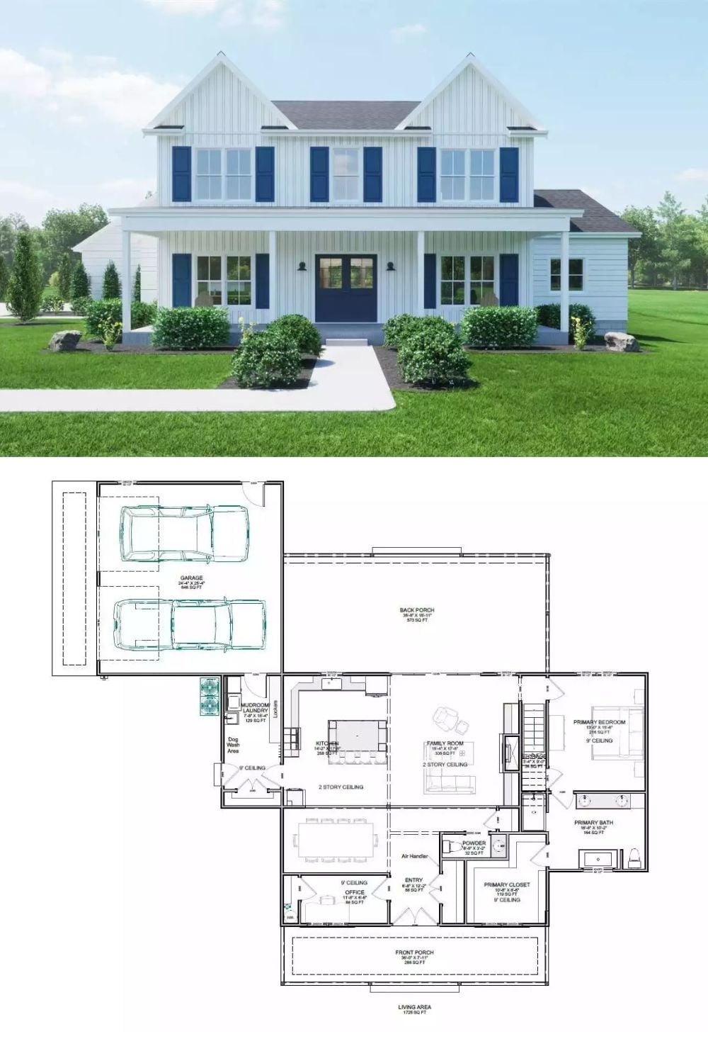
Exterior rendering of a white modern farmhouse paired with its annotated first-floor plan below.