
Would you like to save this?
Your front door sets the tone for your entire home, but if you’re like most homeowners, you might be unknowingly broadcasting “dated” instead of “distinguished.” After three decades in the building and design business, I’ve seen countless front doors that once felt fresh and modern now making homes look like they’re stuck in a time warp.
In order to come up with the very specific design ideas, we create most designs with the assistance of state-of-the-art AI interior design software.
Recognizing and replacing these outdated front door trends can dramatically improve your home’s curb appeal and first impressions. From peeling paint that’s been on your weekend to-do list for two years running to those overly ornate glass inserts that scream “estate sale find,” your entrance might be working against you. Whether you’re dealing with tired paint colors, outdated hardware, or design elements that feel more museum piece than modern home, understanding what’s no longer working is the first step toward creating an entrance that truly welcomes guests instead of making them wonder if they’ve time-traveled.
Please note the imagery in this article, in an effort to provide highly specific examples, was created with the assistance of AI.
17. Doors with peeling or faded paint you swore you’d fix last summer (we all have that door).
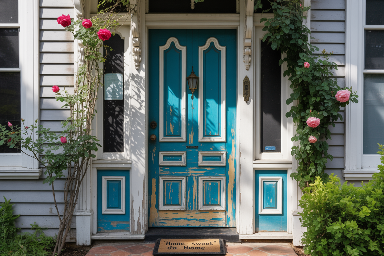
You know the one. That front door that greets every visitor with curling paint chips and sun-bleached patches that scream “project postponed indefinitely.”
A front door with peeling or faded paint can instantly make your home look neglected. It’s like wearing a wrinkled shirt to a job interview – everything else might be perfect, but that’s what people notice first.
Weather, moisture, and UV rays are the usual suspects behind your door’s deteriorating appearance. Poor quality paint or skipped primer makes the problem worse.
The good news? Fixing peeling paint requires removing it with paint stripper and a putty knife, then repainting with oil-based paint. For sun-damaged wood doors, restoration can be surprisingly simple.
Your door doesn’t need to look like a before photo forever. Set aside a weekend this spring instead of promising yourself “next summer” again. Your curb appeal will thank you.
16. Mass-produced doors with zero personality that look like they came off an assembly line.
🔥 Create Your Own Magical Home and Room Makeover
Upload a photo and generate before & after designs instantly.
ZERO designs skills needed. 61,700 happy users!
👉 Try the AI design tool here
You know that bland, cookie-cutter door when you see one. It’s the architectural equivalent of vanilla pudding – technically functional but utterly forgettable.
Mass-produced doors became the norm during the 20th century, prioritizing speed and cost over character. While this made doors more affordable, it stripped away the soul that makes a home uniquely yours.
These assembly-line specials scream “builder grade” from a mile away. They’re the ones with perfectly uniform grain patterns, identical proportions, and that telltale hollow sound when you knock.
Your front door should be the opening act to your home’s story, not a snooze-fest prologue. When every house on the block sports the same generic slab, you’ve essentially put your home in a uniform.
The good news? You don’t need to break the bank to escape this trend. Even budget-friendly doors can have character with the right hardware, paint color, or simple modifications.
Your guests’ first impression shouldn’t be “I’ve seen this door a thousand times before.” Give them something worth remembering instead.
15. Paint colors that clash violently with the rest of your house like a bad fashion choice
Your front door shouldn’t look like it was painted by someone wearing a blindfold. When your door color fights with your home’s exterior, it creates visual chaos that makes visitors wonder about your decorating judgment.
Colors that clash with the environment can make even beautiful homes feel less appealing. Think hot pink doors on gray colonial homes or electric blue on warm brick facades.
The worst offenders are doors that completely ignore the home’s undertones. You might love that lime green, but if your house has warm beige siding, it’s going to look like a mistake rather than a design choice.
Front door colors should complement your home’s architecture and existing color palette. If you want contrast, choose colors from the opposite side of the color wheel that still harmonize with your home’s style.
Your door should enhance your home’s curb appeal, not make it look like you raided a clearance paint bin. When neighbors start talking, it’s usually not about how bold and creative you are.
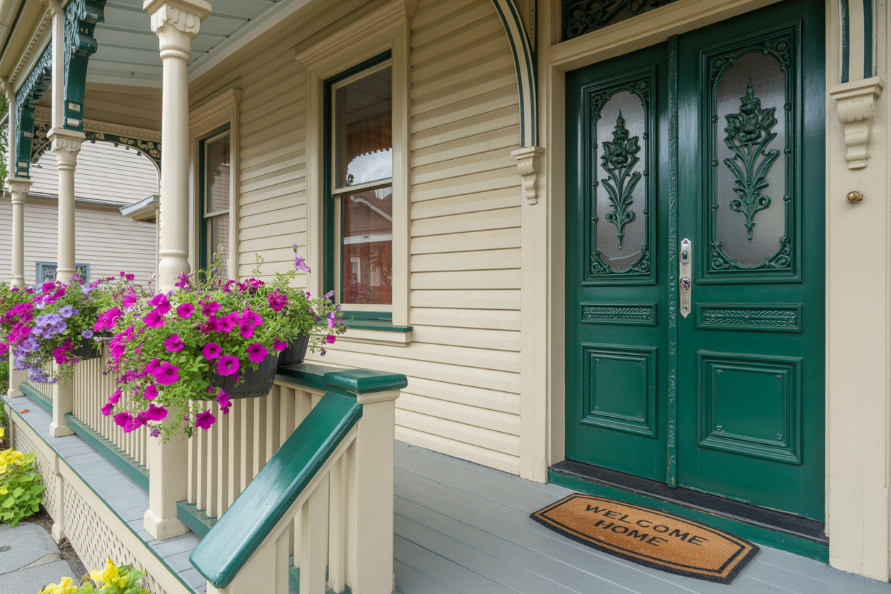
14. Doors sporting outdated glass inserts covered with etched floral patterns
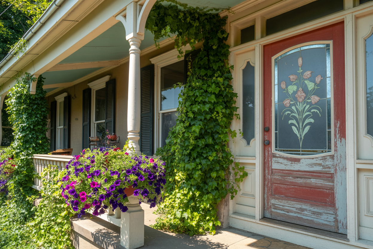
Your grandmother’s rose-etched front door glass might have been charming in 1995, but those ornate floral motifs on glass panels now scream dated design. The elaborate swirls and botanical flourishes that once felt elegant have become visual clutter.
Those busy etched glass patterns featuring flowers compete with your home’s architecture instead of complementing it. The intricate detailing that seemed sophisticated twenty years ago now looks fussy and overcomplicated.
Modern design favors clean lines and subtle textures over ornate decoration. Your decorative floral glass inserts are fighting against contemporary aesthetics that prize simplicity and understated elegance.
The problem isn’t glass itself – it’s the overly ornate patterns that make your entrance feel stuck in the past. Today’s homeowners prefer geometric designs, clear glass panels, or minimal frosted effects that provide privacy without the visual noise.
If you’re clinging to those rose-covered glass panels, it’s time to embrace cleaner alternatives that won’t make visitors wonder if they’ve stepped into a vintage tearoom.
13. Overly glossy combined with ornate moldings that feel stuffy.
Your high-gloss black door might have seemed sophisticated five years ago, but now it’s giving off serious funeral home vibes. The mirror-like finish reflects every fingerprint, raindrop, and neighborhood dog that walks by.
When you pair that shiny surface with elaborate Victorian-style moldings, you’ve created a visual heavyweight that overwhelms your entrance. The combination screams “trying too hard” rather than effortless elegance.
Modern homeowners are gravitating toward matte or satin finishes that offer sophistication without the maintenance headaches. These surfaces hide imperfections while maintaining that coveted black door appeal.
The ornate moldings that once spelled luxury now feel dated and fussy. Clean lines and simpler trim work better complement today’s architectural preferences.
If you’re stuck with glossy black, consider toning down the surrounding elements. Replace heavy moldings with streamlined versions that let the door breathe.
Your entrance should welcome guests, not intimidate them with overly formal elements that belong in a different era. Save the high-gloss finishes for your kitchen cabinets where they actually make sense.
12. Pastel-colored doors that desperately want to be cheerful but just look washed out
Would you like to save this?
You know the ones I’m talking about. That pale mint green that looks like it’s been left in the sun too long, or the barely-there pink that whispers instead of welcomes.
While pastel front doors can add charm, many homeowners choose shades so light they disappear against their home’s exterior. Your door should make a statement, not apologize for existing.
The problem isn’t pastels themselves – it’s picking colors with no backbone. That powder blue might look dreamy in the paint chip, but against white trim and beige siding, it vanishes faster than your motivation on Monday morning.
These washed-out doors often come from good intentions. You wanted something soft and welcoming, but ended up with something that looks like it needs a vitamin supplement.
If you’re drawn to lighter hues, choose pastels with enough saturation to hold their own. Your front door is your home’s handshake – make sure it’s firm enough to feel.
A door that looks like it’s fading away sends the wrong message about what’s inside.
11. Brass hardware that’s lost its shine and gained a lot of tarnish.

Nothing screams “I gave up on maintenance” quite like tarnished brass door hardware. That once-gleaming finish now looks like it survived a pirate shipwreck.
Your guests notice this before they even ring the doorbell. Brass door hardware combines elegance and durability, but only when it’s properly maintained.
The good news? You don’t need to replace everything. Cleaning brass hardware can make it look like new with minimal effort.
The safest cleaning method uses simple soap and water. For stubborn tarnish, try natural ingredients like baking soda and vinegar.
Your hardware doesn’t need to look like archaeological artifacts. A little elbow grease can restore that original radiance and make your front door respectable again.
If you’re committed to the neglected look, at least commit fully and add some fake cobwebs.
10. Heavy, oversized door knockers that feel like medieval torture devices

Those massive medieval door knockers that weigh more than your cat have overstayed their welcome. You know the ones – they require both hands to lift and make visitors feel like they’re announcing themselves to a dungeon keeper.
These heavy duty cast iron knockers were supposed to add gravitas to your entrance. Instead, they’ve turned your front door into a museum piece that screams “I shop at Renaissance fairs.”
The problem isn’t just their intimidating size. These handmade iron knockers often clash with modern architecture and make your home look like it’s trying too hard to be a castle.
Your elderly neighbors shouldn’t need a gym membership to announce their arrival. Modern door hardware focuses on sleek functionality rather than making guests feel like they’re storming the gates.
Consider switching to contemporary door knockers that complement your home’s actual architectural style. Save the medieval aesthetic for your Game of Thrones viewing parties.
9. Glossy, mirror-like finishes that blind guests more than welcome them.

That ultra-shiny lacquer finish on your front door might seem sophisticated, but it’s creating more problems than curb appeal. The mirror-like surface reflects sunlight so intensely that delivery drivers need sunglasses just to find your doorbell.
High-gloss lacquer finishes were trendy for their European flair, but they’ve become the automotive equivalent of chrome bumpers. They show every fingerprint, water spot, and speck of dust.
Your guests shouldn’t need to shield their eyes when approaching your home. The glare from these finishes can be genuinely uncomfortable, especially during peak sun hours.
Weather takes a brutal toll on glossy surfaces. Rain spots become permanent fixtures, and the constant expansion and contraction from temperature changes leads to cracking and peeling.
Modern trends favor more subtle finishes that enhance rather than overwhelm. A satin or semi-gloss finish provides durability without the maintenance headaches or the need for visitor eye protection.
Your front door should welcome people, not send them scrambling for their car visors.
8. Doors with too many small panels making them look like a jigsaw puzzle gone wrong.

You know the doors I’m talking about. Those front entrances that feature twelve, fifteen, or even twenty tiny panels crammed together like someone couldn’t decide when to stop adding rectangles.
These overly segmented doors were supposed to look sophisticated and detailed. Instead, they create visual chaos that makes your entrance feel cluttered before guests even step inside.
The problem isn’t paneling itself. Traditional six-panel doors have enduring appeal for good reason. But when manufacturers started multiplying panels to create “luxury” looks, they lost the plot entirely.
Your eye doesn’t know where to focus on these busy designs. Each small panel competes for attention, creating a fractured appearance that fragments your home’s facade.
Modern design favors clean lines and purposeful details. A door that looks like it was assembled from leftover trim pieces works against this principle.
Consider updating flat panel doors with thoughtful design instead. Simple geometry beats complicated chaos every time.
These puzzle-piece doors also collect dirt and debris in all those crevices. You’ll spend more time maintaining them than admiring them.
7. Faux wood grain doors that try to be rustic but scream plastic.

You’ve seen them everywhere – those fiberglass doors with molded wood grain patterns that look like they were pressed in a waffle iron. The manufacturers promise rustic charm, but they deliver something closer to a camping cooler aesthetic.
The telltale signs are obvious once you know what to look for. The grain pattern repeats in unnatural ways, creating a monotonous texture that real wood would never display.
These doors often come in that peculiar orangish-brown color that exists nowhere in nature. It’s too uniform, too bright, and somehow manages to look both cheap and trying too hard at the same time.
While techniques exist to create convincing faux wood finishes using gel stains and proper application methods, most mass-produced versions skip these nuanced approaches.
The worst offenders feature deep, exaggerated grain lines that look like someone attacked them with a fork. Real wood grain has subtle variations and natural imperfections that these molded versions completely miss.
Your guests will notice immediately, even if they can’t articulate why something looks off. The door becomes a beacon announcing that corners were cut rather than creating the welcoming entrance you intended.
6. Ornamental glass with patterns so busy they distract the neighbor’s cat
Would you like to save this?
Your front door’s decorative glass panels shouldn’t look like a kaleidoscope exploded. Those overly intricate patterns from the early 2000s are screaming for retirement.
You know the ones. Swirls within swirls, geometric chaos, and enough visual noise to make your eyes water. These busy designs fight for attention instead of enhancing your home’s entrance.
Modern textured glass options focus on subtle elegance. Simple reeded patterns, clean geometric lines, or gentle etched designs create sophistication without the visual assault.
Your door glass should complement your home’s architecture, not compete with it. When your neighbor’s cat starts staring at your door like it’s a laser pointer convention, you’ve crossed the line.
Choose pattern glass that provides privacy while maintaining clean lines. Rain glass, seeded glass, or simple frosted panels deliver function without the frenzy.
Remember, your front door sets the tone for your entire home. Save the busy patterns for your grandmother’s china cabinet where they belong.
5. Wrought iron doors with convoluted swirls that collect dirt and nostalgia alike.

Those elaborate wrought iron doors with their twisted scrollwork once screamed luxury and Old World charm. Now they mostly scream “someone needs to get out here with a toothbrush.”
The intricate swirls and curlicues that seemed so sophisticated in the 2000s have become dirt magnets. Every groove collects dust, pollen, and grime that’s nearly impossible to clean properly.
Your beautiful investment becomes a maintenance nightmare. Those delicate decorative scrollworks require constant attention to look their best.
Modern homeowners want security and style without the upkeep headache. Clean lines and simpler geometric patterns offer the same iron door benefits without the cleaning circus.
The overly ornate designs also feel dated against today’s architectural styles. Contemporary homes favor minimalist aesthetics that make busy wrought iron patterns look fussy and out of place.
If you’re considering wrought iron doors, choose designs with broader spaces between elements. Your future self will thank you when cleaning day arrives.
4. Black front doors that have been done to death and feel more vampire than inviting
🔥 Create Your Own Magical Home and Room Makeover
Upload a photo and generate before & after designs instantly.
ZERO designs skills needed. 61,700 happy users!
👉 Try the AI design tool here
The black front door craze has reached peak saturation in neighborhoods across America. What once felt fresh and sophisticated now screams “I saw this on Pinterest in 2019.”
Your neighbors have caught on too. Walk down any suburban street and you’ll spot three black doors within a single block. The trend has lost its punch when everyone’s doing it.
The bigger problem? Many homeowners choose the wrong black. They go for that flat, matte charcoal that sucks light from your entryway like a design black hole.
These doors end up looking more haunted house than welcoming home. Guests approach your entrance wondering if they need garlic or holy water.
The oversaturation means black front doors have become predictable rather than striking. Your door should make visitors feel invited, not like they’re entering a gothic novel.
Consider warmer alternatives that still pack visual punch. Deep navy, forest green, or even a rich burgundy can deliver drama without the vampire vibes that plague every third house on your street.
3. Main entrances flanked by sidelight panels that look stuck in the ’80s.

Your front door’s sidelight flanking is an outdated front door style you need to ditch for a modern look. Those narrow vertical windows on either side of your main door scream 1980s suburbia louder than a neon windbreaker.
The problem isn’t sidelights themselves. It’s the dated execution that makes your entrance look like it belongs in a time capsule.
Traditional sidelights from decades past typically feature basic rectangular glass panels with chunky mullions. They lack the sleek proportions and refined details that define contemporary design.
Your entrance deserves better than these relics from the Reagan era. Modern alternatives include wider glass panels with minimal framing or asymmetrical designs that create visual interest.
Consider replacing those dated panels with cleaner lines and updated hardware. Contemporary sidelight designs can transform your entrance from tired to inspired.
The key is choosing proportions that complement your home’s architecture rather than fighting against it. Your front door should welcome guests into this century, not transport them back to when shoulder pads ruled fashion.
2. Doors with overly intricate carvings that belong in a museum, not a home.

Your front door shouldn’t look like it was salvaged from a medieval cathedral. Those heavily carved wooden doors with elaborate rosettes, mythical creatures, and ornate moldings scream “trying too hard” in today’s design landscape.
While intricate carvings on wooden doors can add curb appeal, there’s a fine line between elegant detail and visual chaos. When your door requires a magnifying glass to appreciate all the carved elements, you’ve crossed into museum territory.
These overly ornate doors often clash with modern home exteriors and require constant maintenance. Every carved crevice collects dirt, moisture, and debris that becomes a nightmare to clean.
The trend has shifted toward cleaner lines and subtle textures. Your guests should notice your beautiful door, not spend ten minutes studying it like an artifact.
Modern homeowners prefer doors that complement their lifestyle rather than compete with it. Save the museum-worthy carvings for actual museums, where they belong.
1. Cold gray front doors that scream ‘I’m chilly’ and not in a good way.
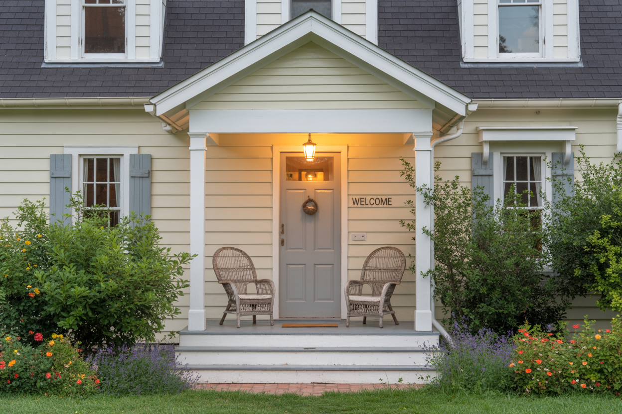
You know that flat, lifeless gray that makes your front door look like it’s having an existential crisis? That’s what I’m talking about.
Cold gray doors became the go-to choice when everyone jumped on the modern farmhouse bandwagon. But here’s the thing – not all grays are created equal.
These particular shades have all the warmth of a parking garage. They make your entrance feel unwelcoming, like you’re walking into a government building rather than someone’s home.
Gray houses work beautifully with many door colors, but when you pair cold gray siding with an equally chilly gray door, you’ve created a monochrome mess.
The problem isn’t gray itself – it’s choosing the wrong undertones. These cold variants often have blue or green undertones that clash with warmer elements in your landscape and make your home feel sterile.
Your front door should invite people in, not make them wonder if anyone actually lives there. A gray door can work when it has the right warmth, but these arctic versions need to go.


