🔥 Would you like to save this?
Most Christmas mantels fail for one reason: too much. The good ones look easy because somebody made hard decisions about what to leave off. Effortless is the most edited look in the room. Each of these 34 examples teaches a single composition principle you can steal — one focal point, a locked color palette, scale over quantity, greenery that falls instead of piles. Watch how the spacing breathes and how the restraint reads as confidence. Then go cut your mantel display in half.
34. One Strong Focal Point Instead of Five Competing Ones
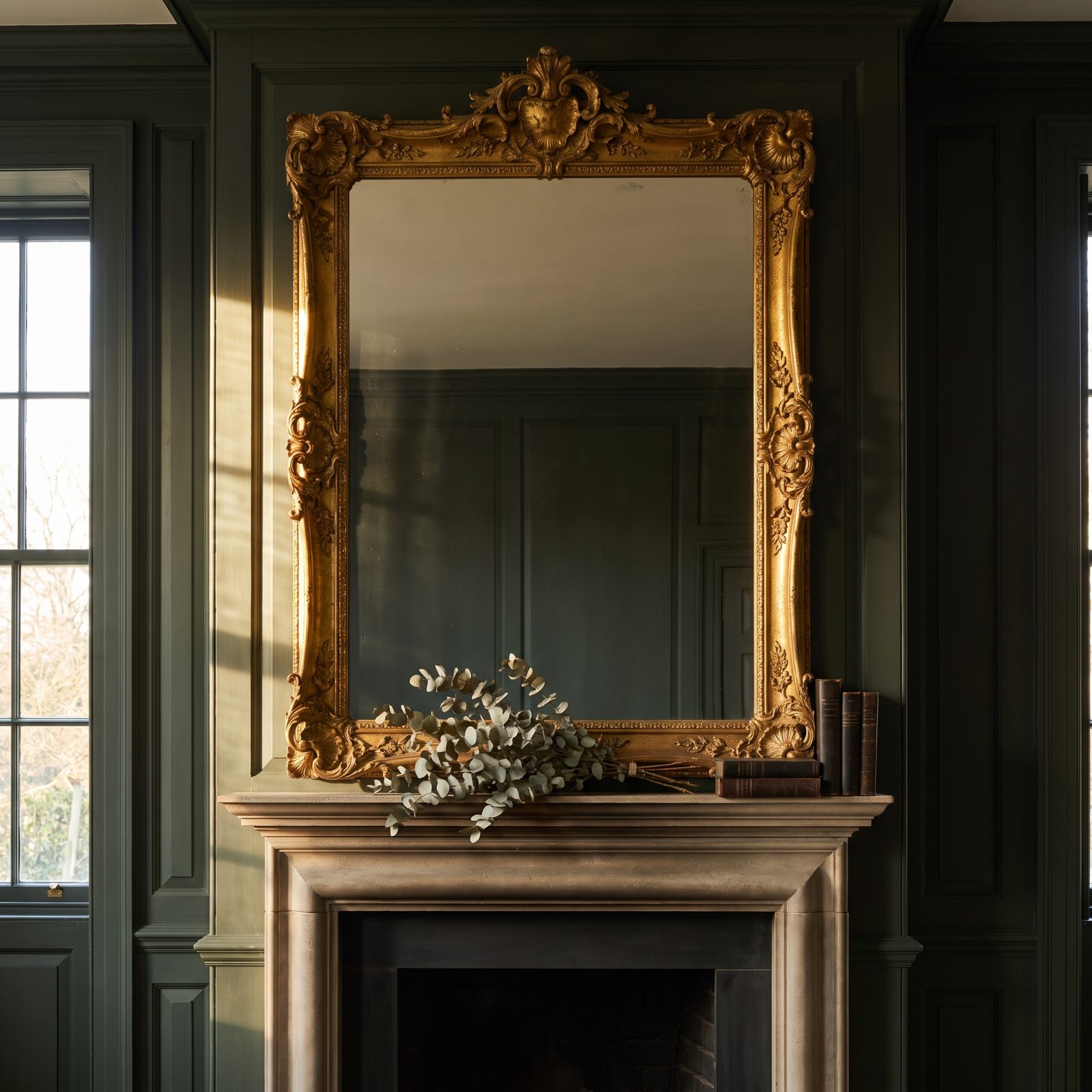
That oversized gilt mirror is the whole show, and everything else on the shelf knows its place and stays quiet.
In order to come up with the very specific design ideas, we create most designs with the assistance of state-of-the-art AI interior design software. Also, assume links that take you off the site are affiliate links such as links to Amazon. this means we may earn a commission if you buy something.
It works because of hierarchy. One element gets to be loud, the rest drop their voices to support it. Let five objects all demand attention and your eye bounces around until the mantel reads as noise. So pick your hero first, then starve everything else of drama.
33. A Restricted Three-Color Palette
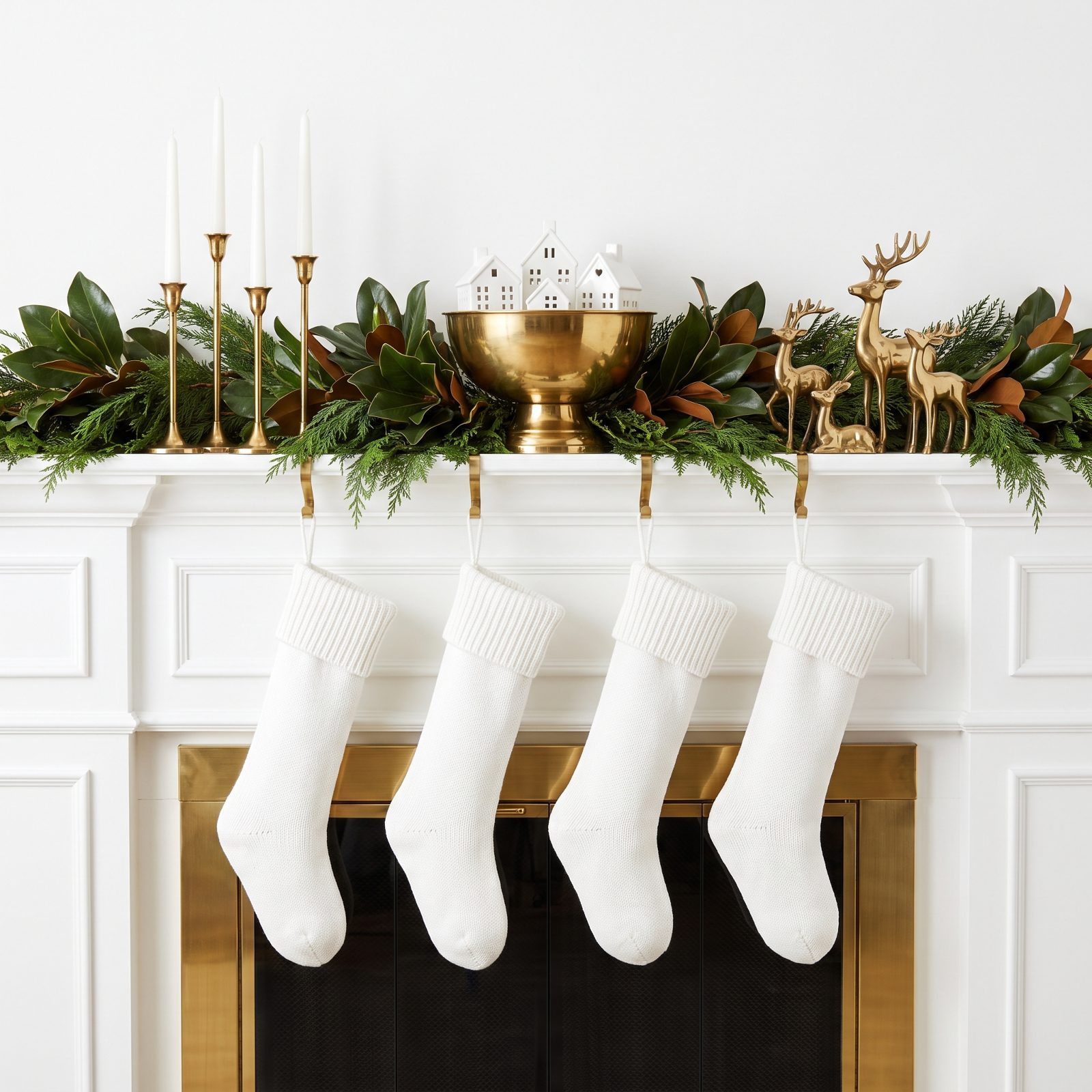
Green, brass, white. That’s it. The whole mantel speaks three words and nothing else.
A locked palette is the fastest route to a display that looks intentional. Your eye stops registering it as a pile of stuff and starts reading it as one composition. Most cluttered mantels aren’t over-decorated — they’re over-colored. And the brass warms up what could have been cold.
32. Three Substantial Objects Replacing a Crowd of Tiny Trinkets
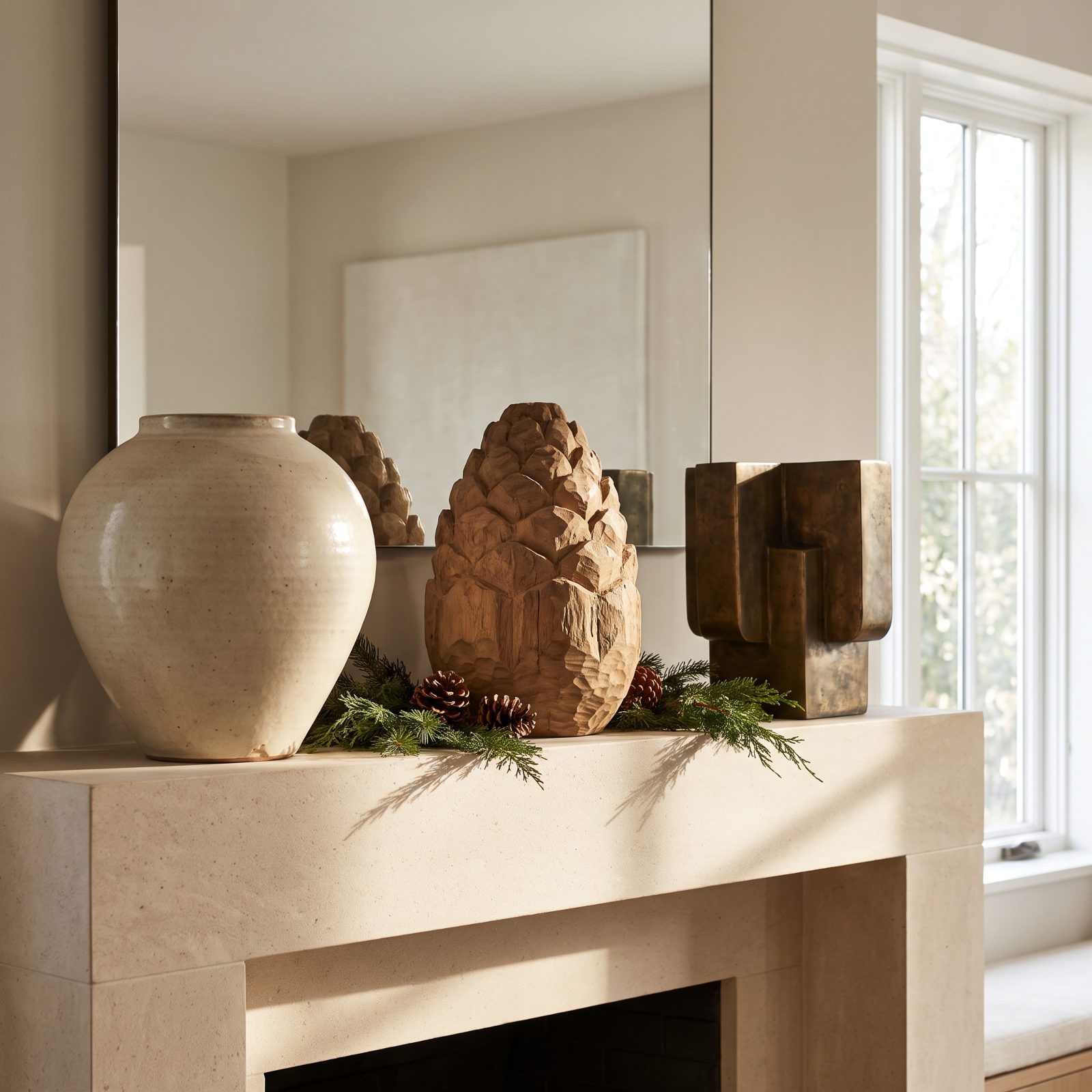
Three big things beat thirty small ones. I learned this the hard way, after years of lining up tiny figurines like some kind of parade.
Small objects scatter the eye; substantial ones anchor it. The jug, the candle, the bowl each carry enough mass to hold their own patch of shelf, and the space between them does as much work as the objects themselves. A chunky wooden bowl of pinecones reads as one confident gesture instead of a cluttered little shrine.
31. Asymmetry Balanced by Visual Weight, Not Matching Pairs
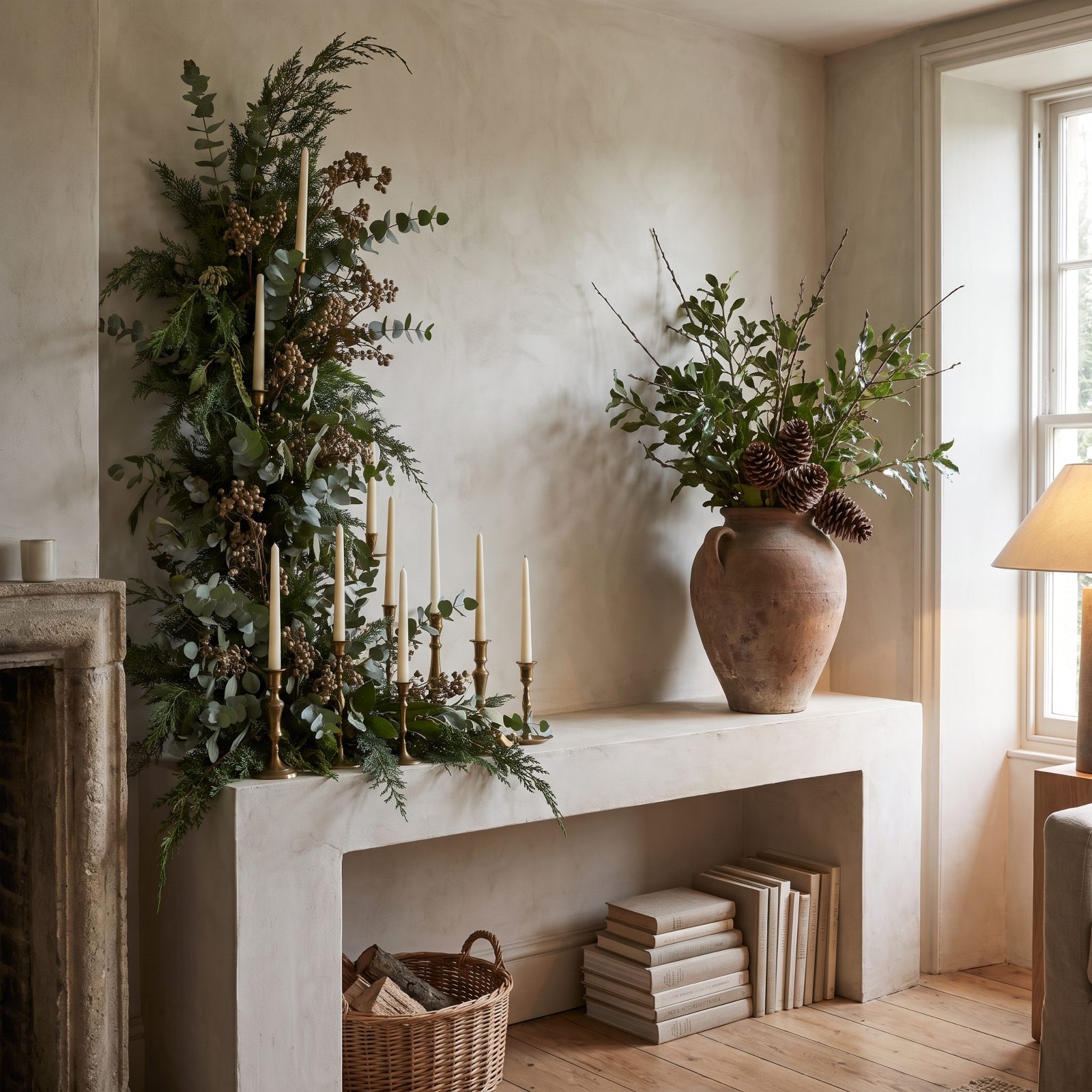
Nothing here matches, and yet the whole thing feels settled. That tall cluster on the left gets counterbalanced by one heavy lantern on the right.
Symmetry is the easy way out. Asymmetry done right holds tension without tipping over, and the trick is weight rather than quantity — a big dense group of objects on one side equals a single large piece on the other. Your eye registers the balance even when it can’t name why.
Symmetry is safe. Asymmetry, balanced by weight, is what looks designed.
30. Greenery Allowed to Fall Naturally Instead of Sitting Rigidly
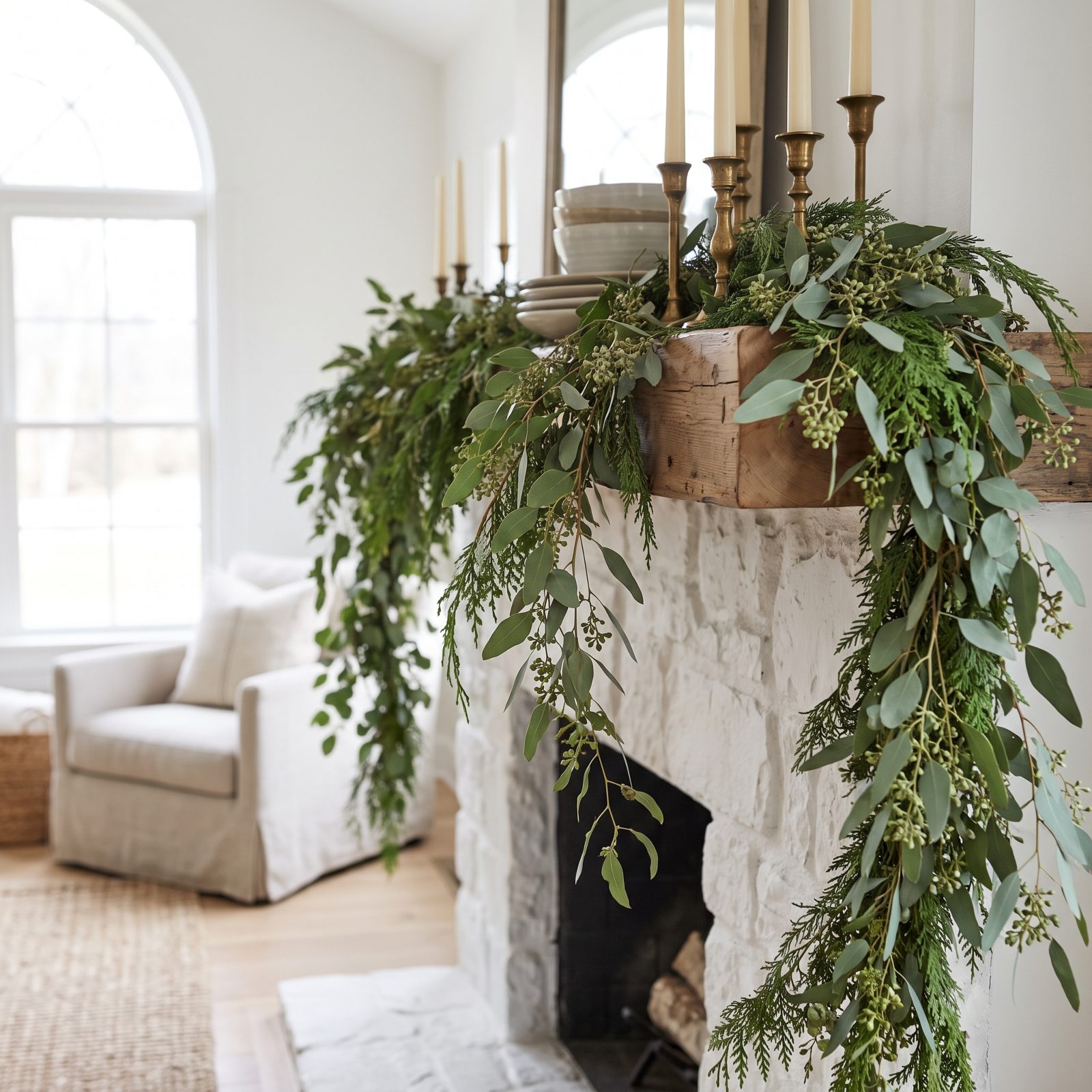
Greenery that falls looks alive. Greenery pinned flat looks like a craft project.
Let the garland drape over the front edge in uneven lengths. One side can dip lower than the other, and that slight imperfection is exactly what sells it. Rigid, taped-down foliage reads as effort; a loose cascade reads as ease.
29. Greenery Layered Front to Back, Not Piled High
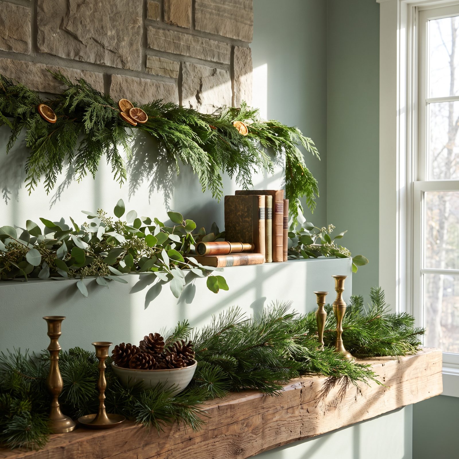
Depth beats height every time. The greenery here steps back in layers instead of stacking up into a lump.
A low base at the front, medium sprigs behind it, a few tall branches rising against the mirror. That staggering gives the eye something to travel through, so the display feels full without feeling heavy. Pile everything tall and you just get a green blob.
28. A Garland Sized to the Mantel’s Actual Depth
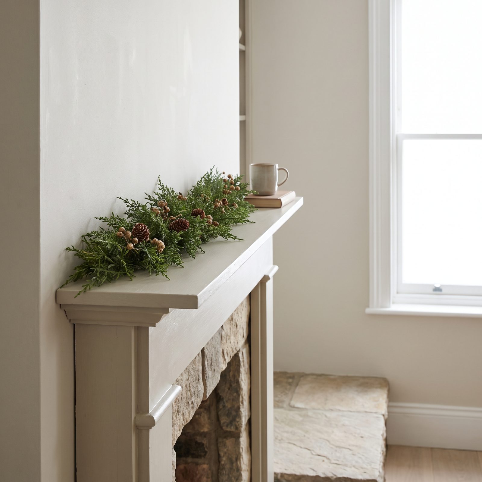
A fat garland on a shallow shelf looks like it’s about to slide off. Scale the garland to the depth you actually have.
This one fits. It drapes just over the front lip, lush but not bullying, leaving candlesticks room to breathe beside it. Oversized garland is the most common mantel mistake I run into, and it instantly reads as too much even when everything else is dialed in. Match the mass to the shelf.
27. One Botanical Variety Used in Generous Quantity
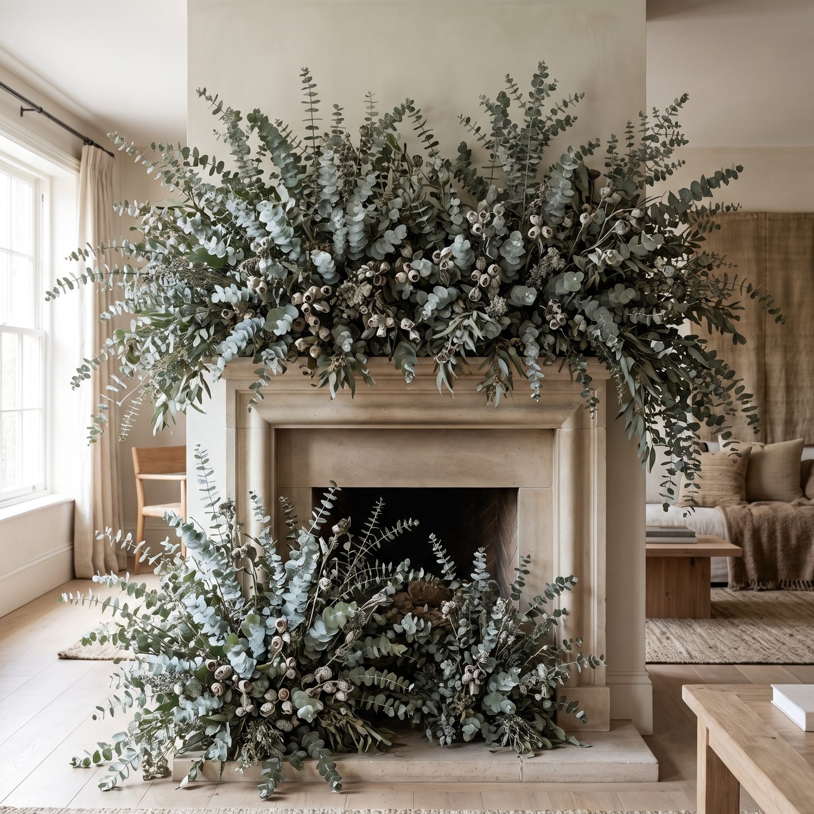
One plant, lots of it. All eucalyptus, nothing else competing for the role.
Material repetition is a quiet power move. Commit to a single variety and use it generously, and the uniform texture reads as deliberate rather than leftover. Mixed greens get busy fast. A whole mantel of silvery eucalyptus looks like a choice somebody made on purpose.
26. Warm Lights Hidden Deep Within the Foliage
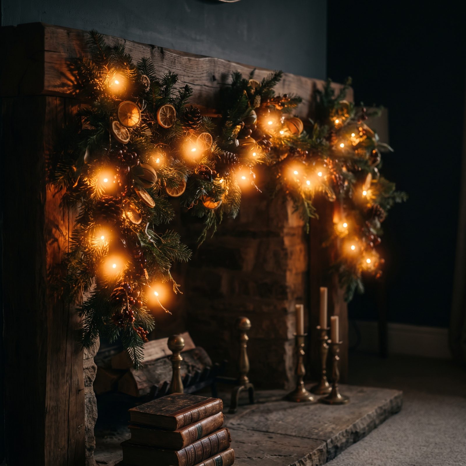
You should see the glow, never the bulbs. Push the lights deep into the greenery until the wires vanish and only the warmth remains.
Visible string lights draped across the front turn a mantel into a dorm room, while hidden ones make the foliage look lit from inside. Go warm white, never cool blue, and bury the strand in the back layers. The payoff is a soft interior radiance instead of a row of dots.
25. Ribbon Used Once as an Anchor, Not Everywhere

That burgundy velvet ribbon appears exactly once, and because it appears once, it matters. Scatter it everywhere and it becomes wallpaper.
A single wide bow tied at one end of the garland acts as an anchor — the one spot of saturated color your eye goes to first. Restraint gives it power. A burgundy velvet ribbon used once makes a point; the same ribbon in six places is just a lot of ribbon. One accent, deployed with discipline, beats accents everywhere.
24. Pinecones Used as Texture, Not Scattered Filler
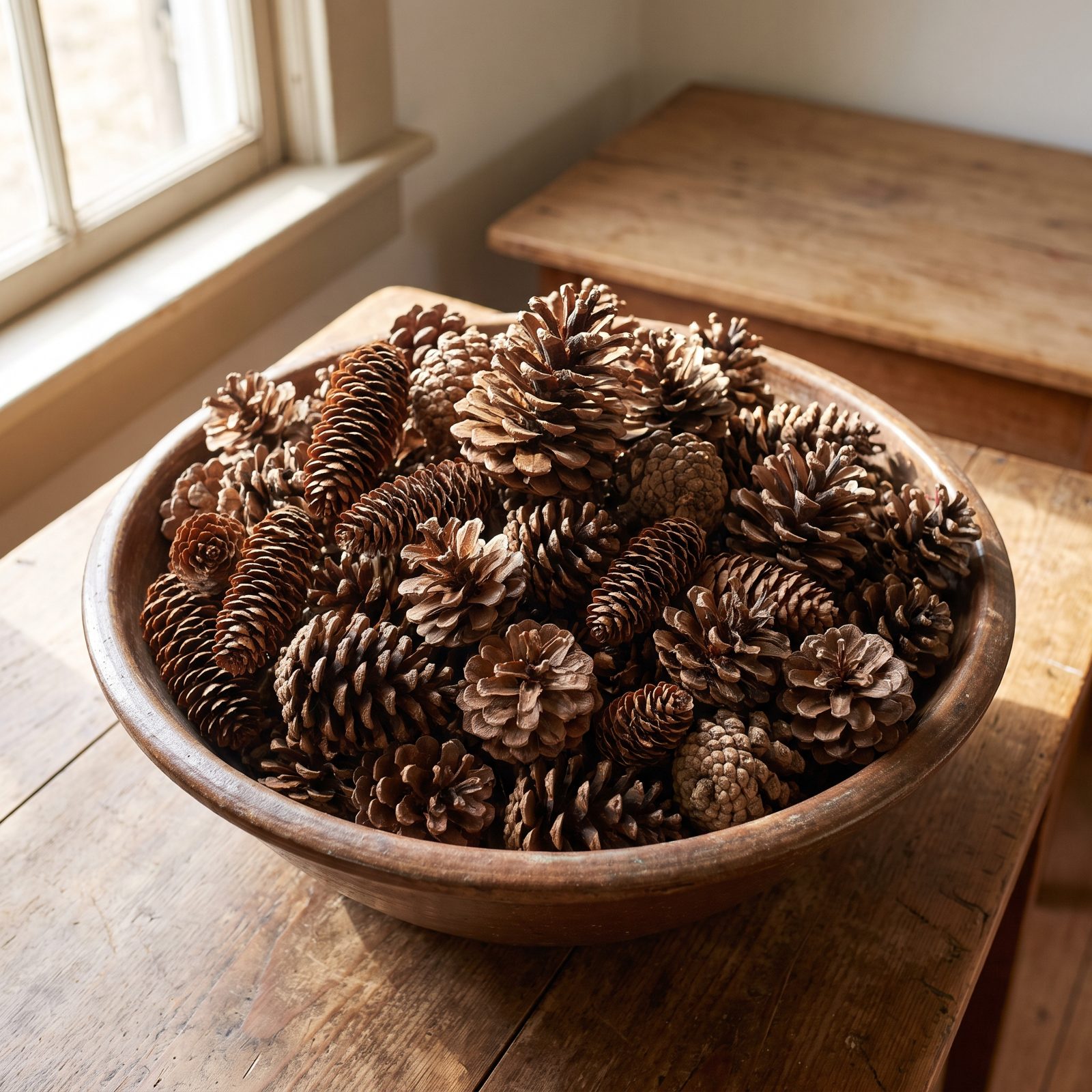
Scatter pinecones across a mantel one by one and they read as clutter. Cluster them tightly in a single bowl and suddenly they’re a deliberate textural mass, all those scaled ridges catching the light together. That’s the move here. A low wooden dough bowl holds the cones packed dense at the mantel’s center, flanked by two short brass candlesticks and a loose run of cedar.
The daylight does half the work, raking across the cones from the side so you actually see the texture instead of a brown blur. Group your natural elements. Don’t sprinkle them.
23. A Garland That Ends Cleanly Instead of Trailing Into Mess
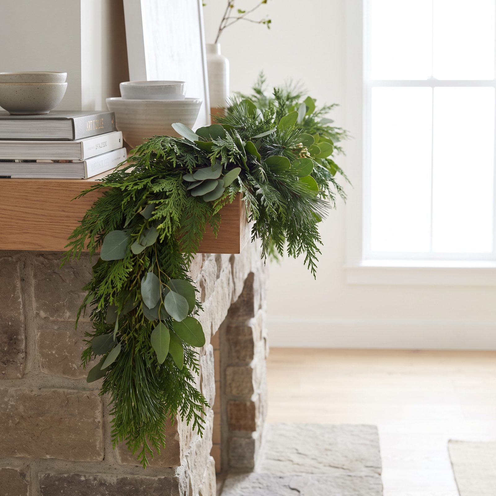
A garland that cascades to the floor sounds romantic until you’ve vacuumed around it for three weeks. Here the noble fir stops clean at both mantel corners, each tail gathered and tied off with a single matte gold velvet ribbon. Done.
Three white pillar candles step up behind it at graduated heights, kept well clear of the greenery because dry fir and open flame are a genuinely bad pairing. The whole thing looks finished rather than abandoned mid-drape, and that gathered-tail finish is easy to copy with any garland you already own.
22. A Large Mirror Giving the Display Quiet Structure
🔥 Would you like to save this?
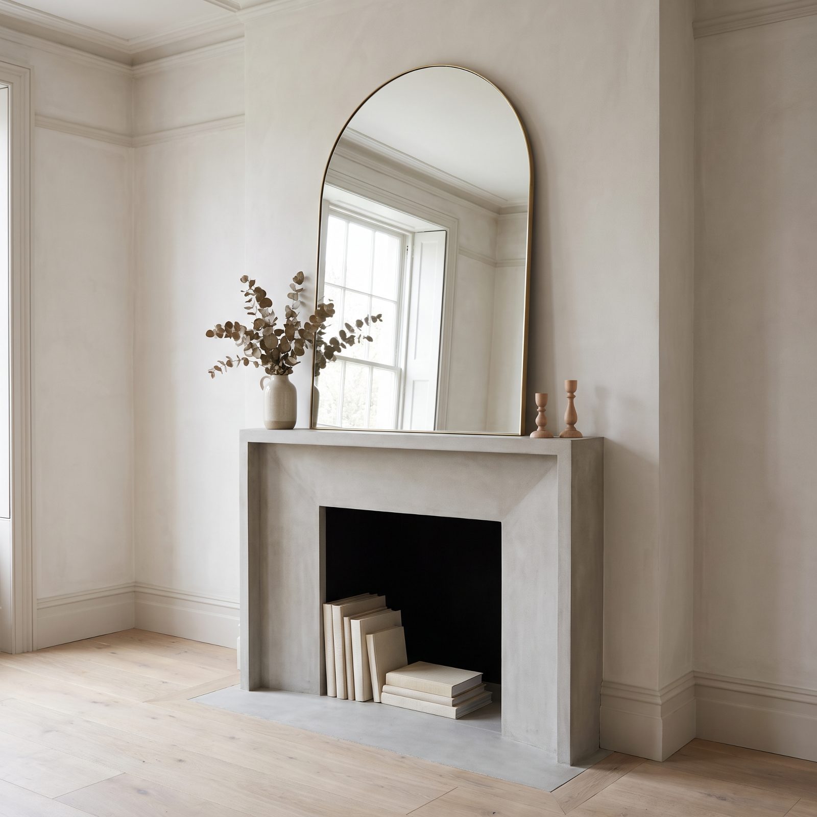
A big arched mirror leaning against the wall does something a garland alone never can: it gives the whole arrangement a spine. Everything below it can stay low and symmetrical because the mirror is carrying the vertical weight.
Underneath sits a modest spread of eucalyptus and cedar along the mantel edge, two amber votives, one bud vase with a single sprig. That’s it. The antique brass frame bounces the daylight back into the room and the reflection doubles whatever greenery you’ve laid down. If your mantel decor keeps looking fussy and unanchored, a large mirror is usually the missing piece.
21. Artwork Left Visible Above the Greenery
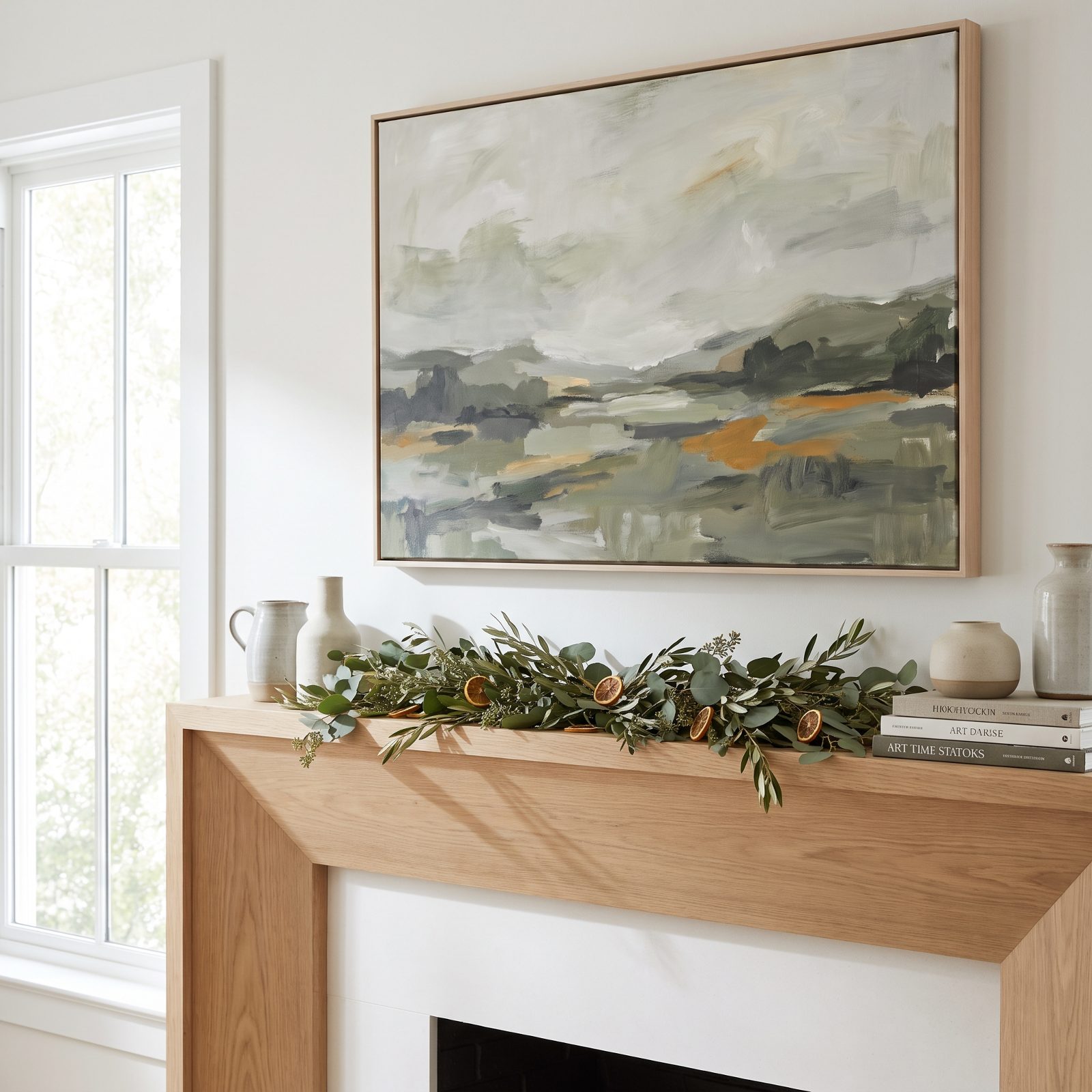
You spent money on that painting. Why bury it under a mountain of pine? This mantel keeps the abstract landscape fully in view, its muted ochre and sage doing the color work while the cedar stays flat along the front edge of the shelf, never climbing up to swallow the frame.
Brass taper candlesticks and a jug of white amaryllis cluster off to one side, weighting the composition without competing with the art. The season gets its nod and the painting still gets to be the painting.
20. A Low Arrangement That Respects the TV Above
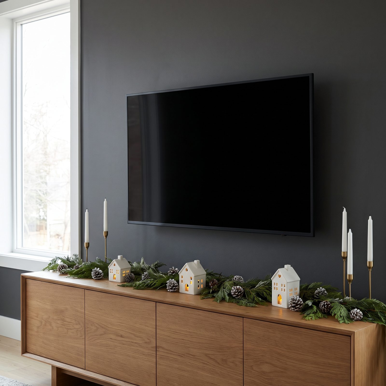
The mounted TV isn’t going anywhere, so stop decorating like it’s invisible. Everything here runs low and horizontal: a thin pine garland flat along the mantel front, three small frosted votives, a row of little pinecones tucked below the screen’s bottom edge.
A few inches of breathing room stay clear around the TV frame. Nothing reaches up to crowd it, nothing throws a reflection across the screen. It’s the un-fussy approach that actually works when a flat black rectangle is the dominant object on your wall, and honestly most people overthink this one.
19. Decor Scaled Up to a Tall Chimney Breast
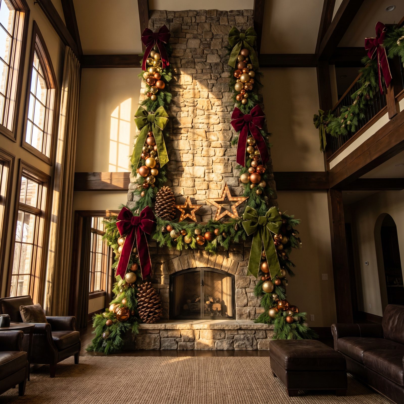
Two-story chimney breasts eat normal decorations alive. A dainty garland on a wall this tall just looks apologetic. The answer is to go big to match: an oversized magnolia-and-fir garland with real volume, a huge reclaimed-wood mirror reaching toward the ceiling, two tall glass hurricanes holding thick cream pillars.
Suddenly nothing looks dwarfed. The whitewashed brick runs the full height and the decor finally keeps pace with it. Scale is the single most common thing people get wrong on a grand fireplace, and the fix costs nothing but confidence.
18. A Shallow Mantel Styled Without Dangerous Overhang
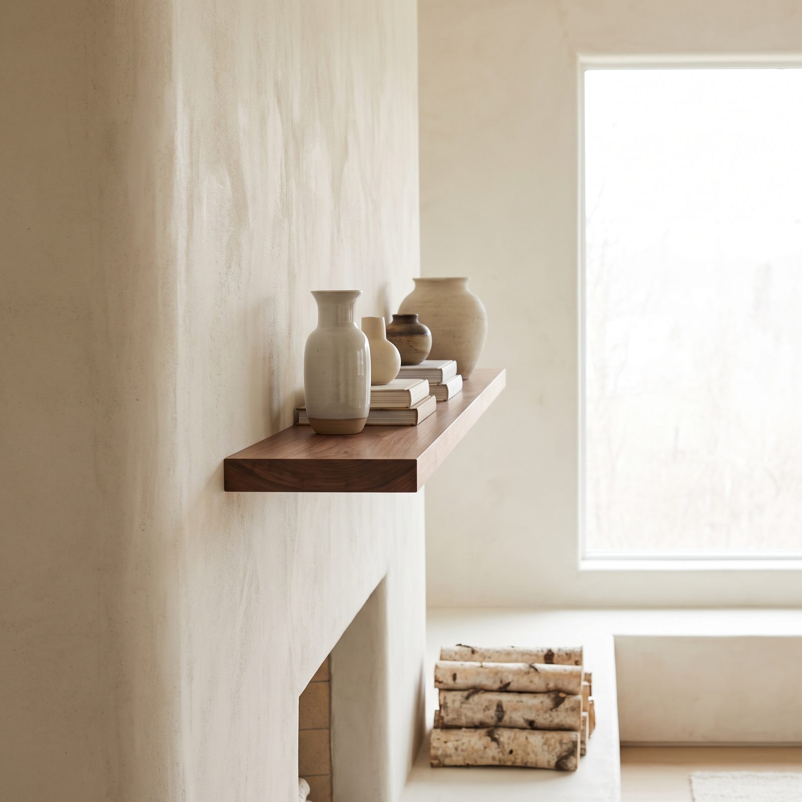
Shallow mantels are a test. Pile anything forward and it tips, usually into the firebox. Everything on this slim walnut shelf sits securely within the depth: a flat-backed cedar sprig laid against the wall, three short brass bud vases pushed to the back edge, small stable ceramic trees that won’t topple.
Nothing hangs over the front lip. The flames below have ample clearance from every piece of decor, which matters more than any styling trick. A narrow shelf wants low, flat, stable things with their weight set back. Respect the depth you’ve got.
17. A Stone Fireplace Styled With Chunky, Simple Forms
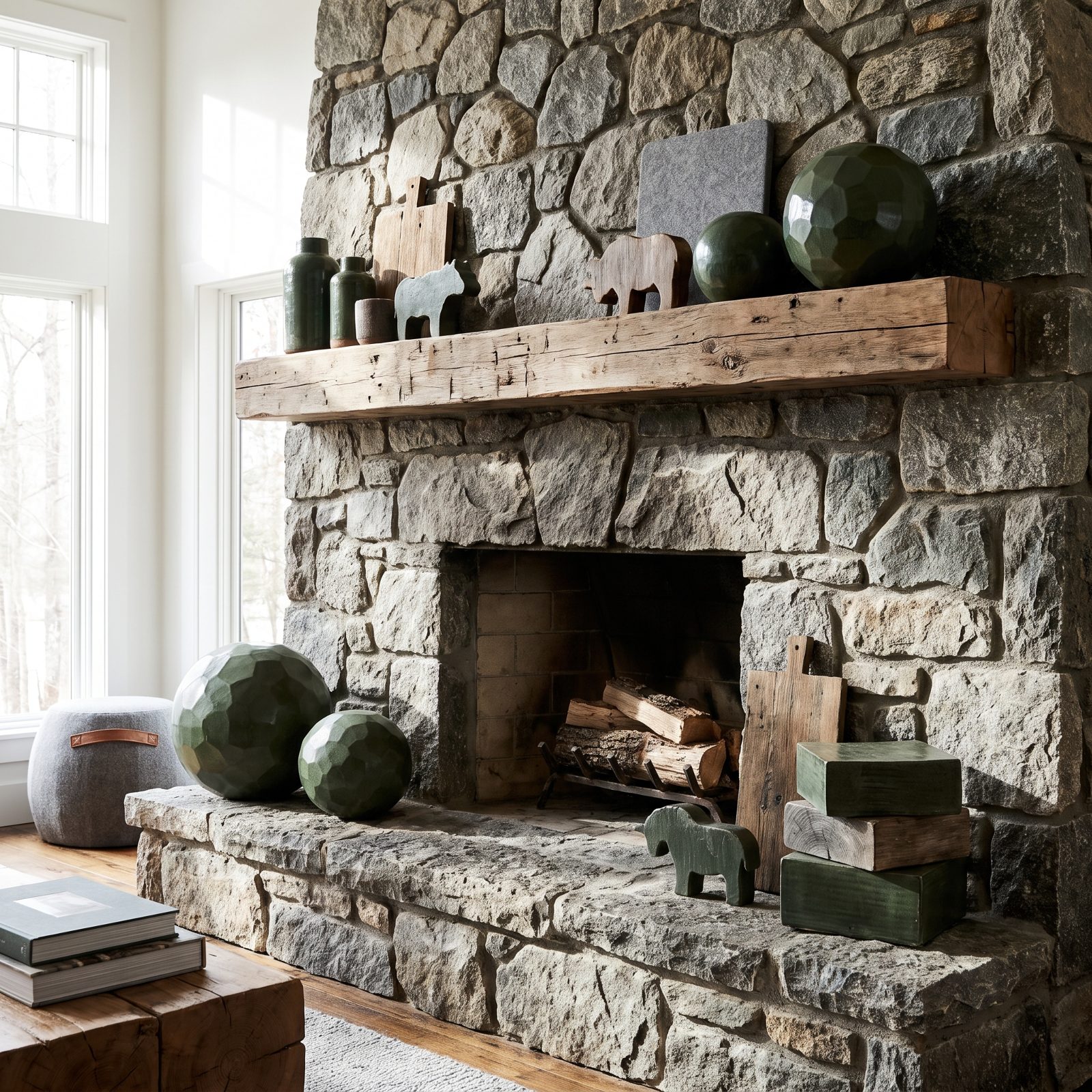
Delicate decor disappears against rough fieldstone. The stone’s scale demands bigger, blunter forms, so this mantel answers with three fat cream pillars in heavy iron holders, one dense fir wreath leaning against the rock, and a single oversized bowl of large pinecones on the raw-timber beam.
No thin ribbons, no fiddly ornaments, nothing the stone would overwhelm. The decor matches the fireplace muscle for muscle, and the whole thing reads warm and solid instead of precious. When your surround is this heavy, go chunky or go home.
16. A Modern Linear Fireplace Given One Horizontal Gesture
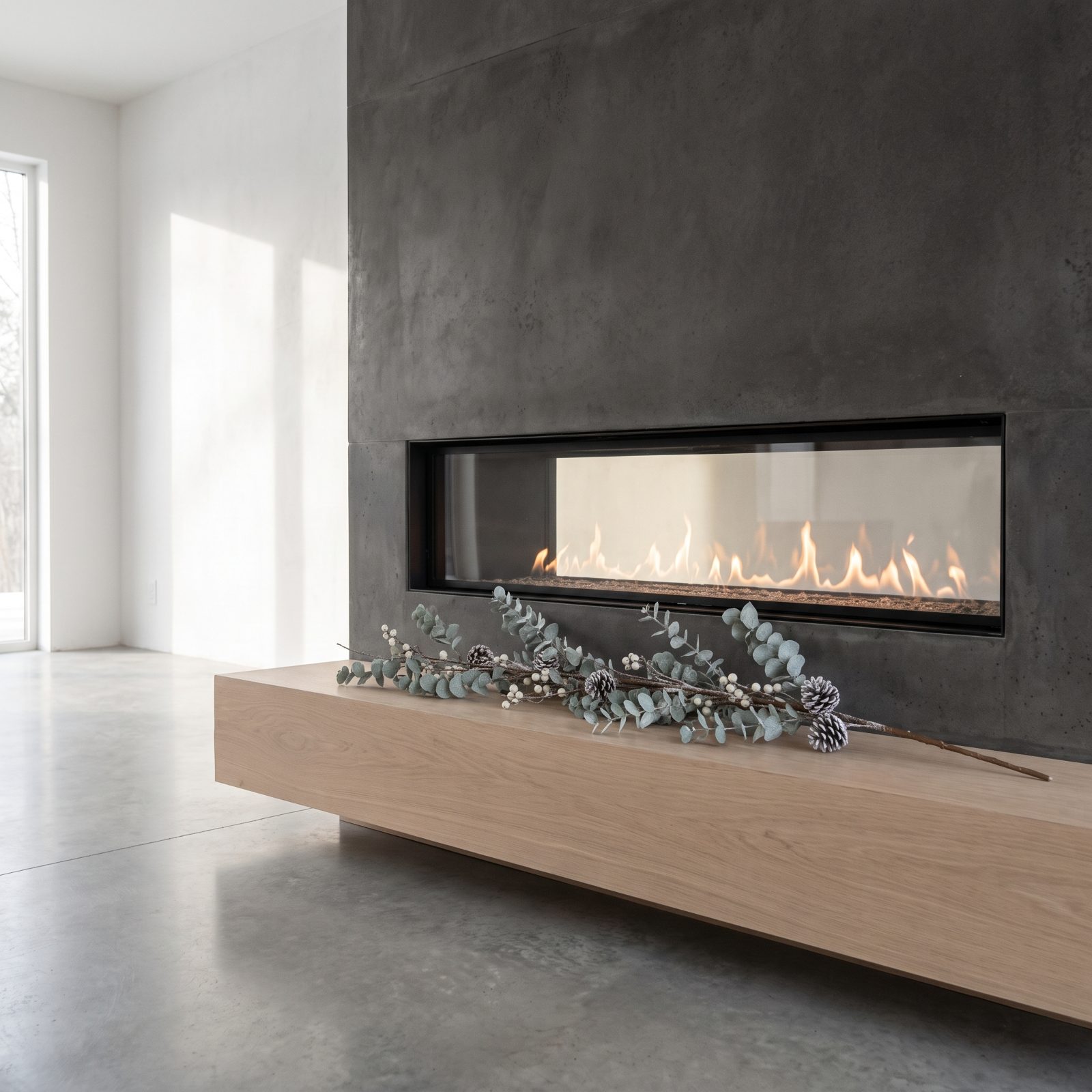
Long, low fireplaces don’t want a pile. They want one clean line that echoes their proportions. So the entire decoration here is a single continuous run of eucalyptus laid flat along the floating oak shelf. Nothing stacked. Nothing vertical.
The restraint tracks exactly with the fireplace’s stretched horizontal shape and the pale oak and sage sit quiet against the smooth plaster. One gesture, done well, beats a crowded shelf every time on a fireplace built this lean.
15. The Firebox Brought Into the Whole Composition
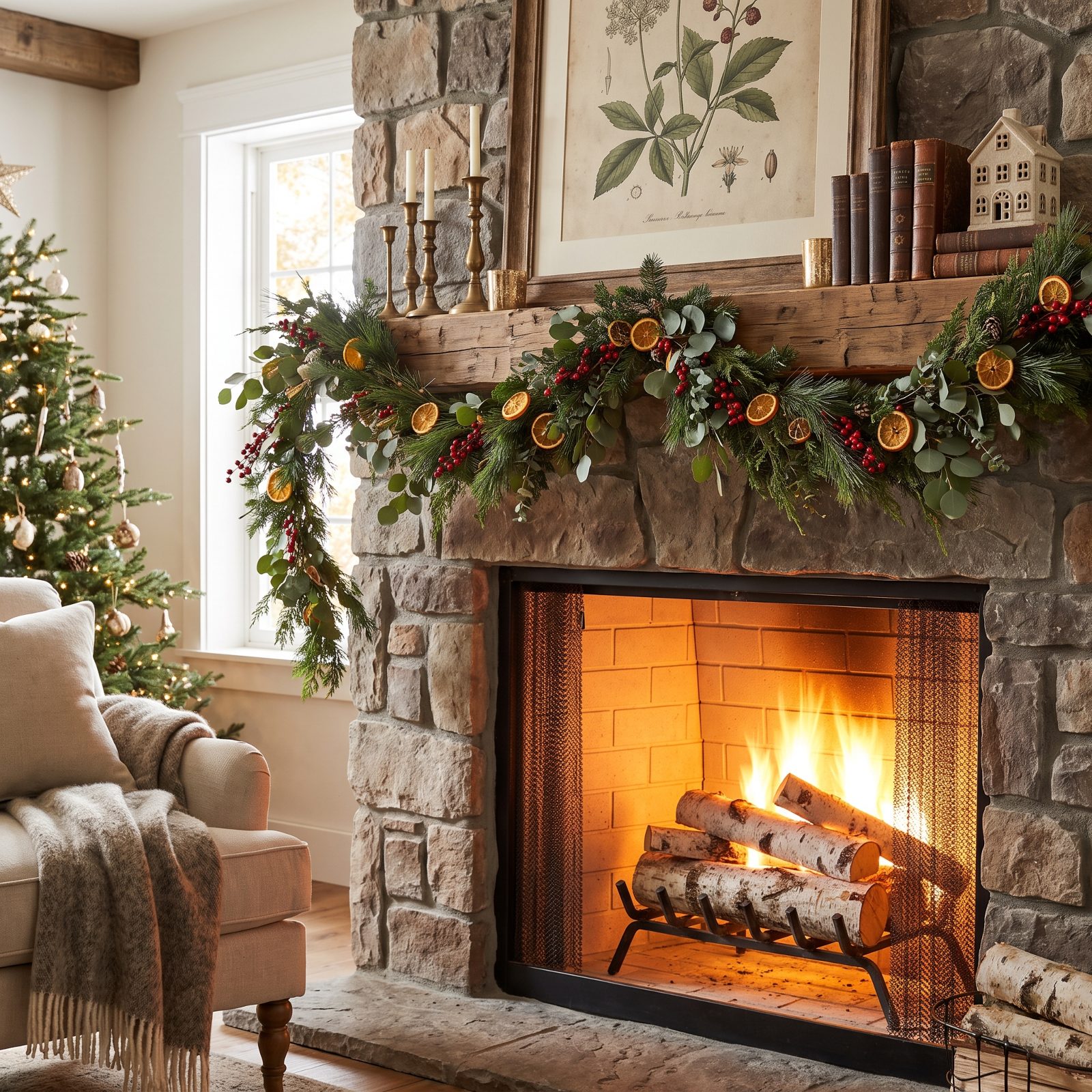
Here’s what most people forget entirely: the firebox is part of the picture. Leave it dark and gaping and the eye stops at the mantel. Fill it and the whole composition reads top to bottom. Inside this classic white surround, thick cream pillars cluster on a bed of clean birch logs, safe and unlit, pulling your gaze down.
Up top, cedar runs along the mantel and two brass candlesticks echo the glow from below. Nothing competes; everything connects. Styling the firebox is the easiest way to make a mantel feel like a finished scene rather than a shelf with stuff on it.
14. Decor Aligned With Existing Wall Sconces
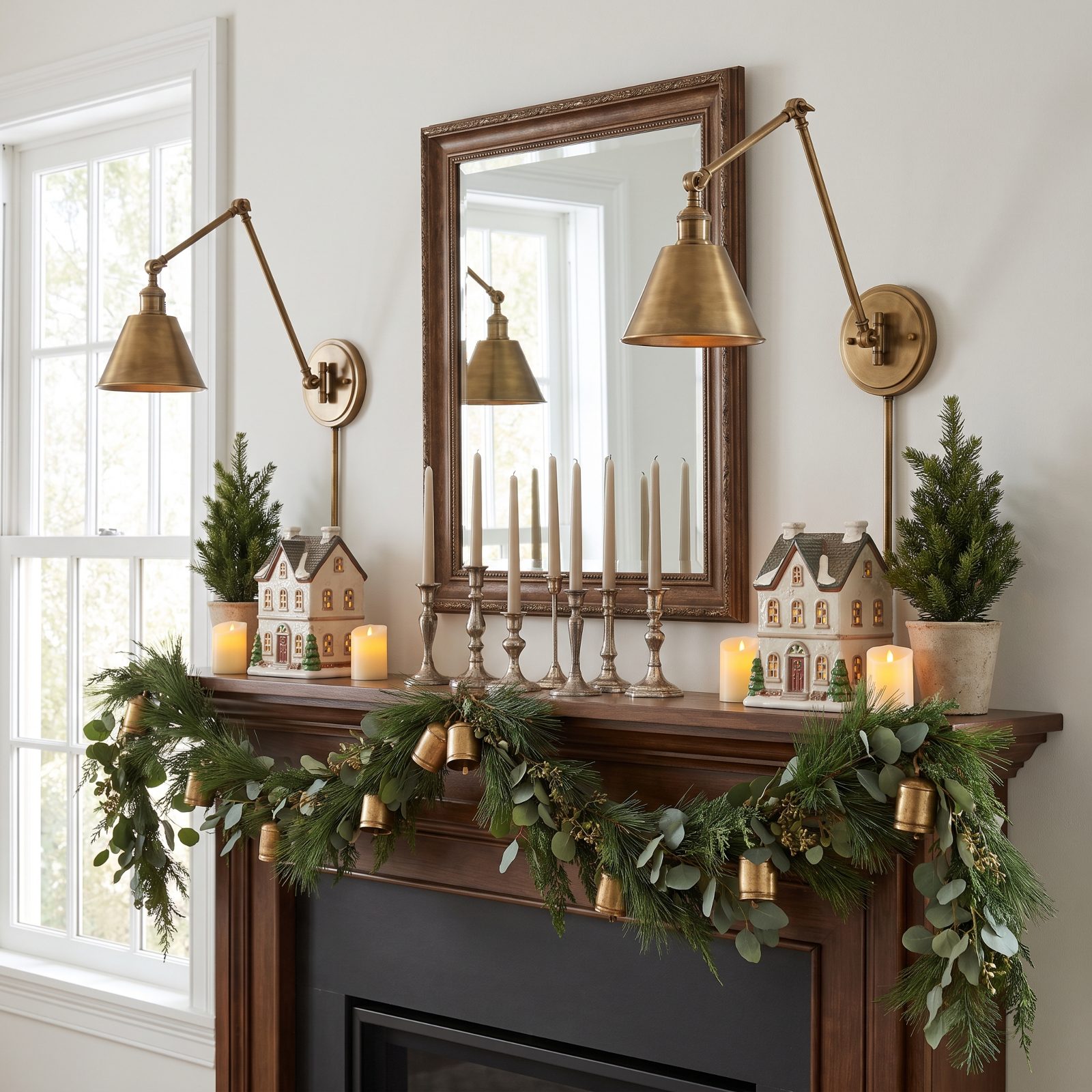
The quiet trick here: everything on the mantel lines up with the sconces already bolted to the wall. The garland crests right where the frosted glass shades sit, so your eye reads one clean horizontal line instead of three competing ones.
Start with what’s already there before you add a single bough. You’re getting a free grid, so use it.
13. Candles Varied in Height but Unified in Color
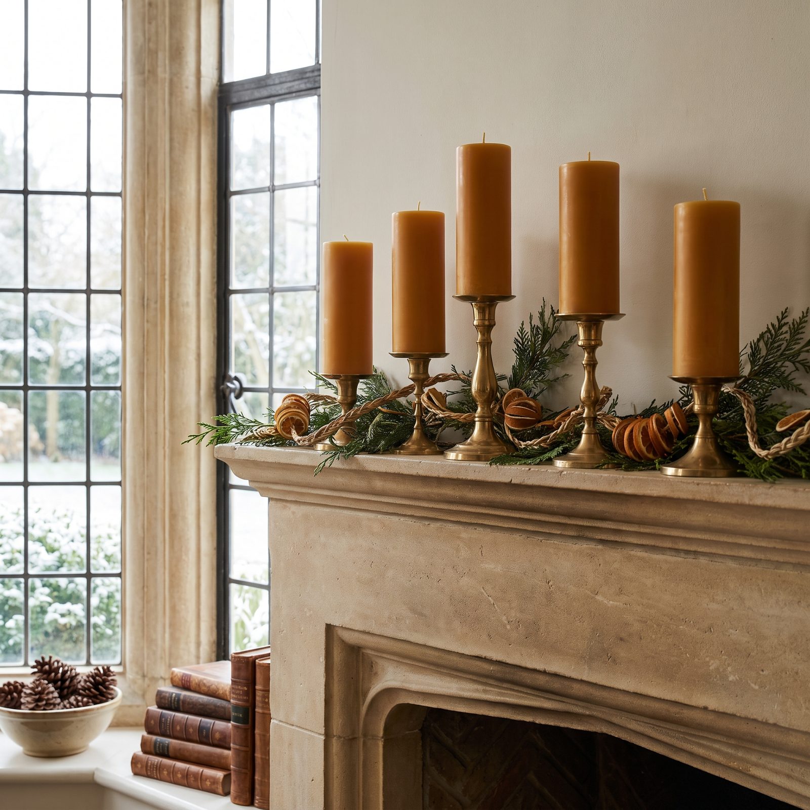
Five candles, one color, five different heights. That’s the whole move. The staggered heights give you rhythm and a soft triangular peak, and the single ivory tone keeps the grouping from looking like inventory at a candle shop.
Vary one thing, lock the rest. When height carries the display, color gets to sit quiet.
12. Metal Finishes Kept Consistent
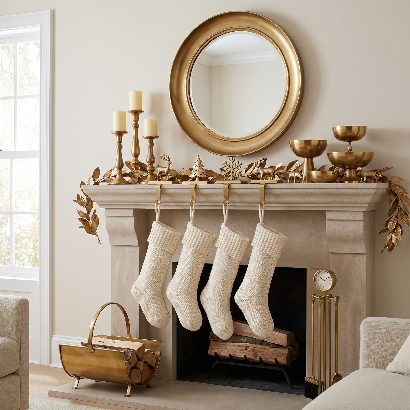
Count the metals on a cluttered mantel and you’ll usually find three or four elbowing for attention. Here it’s one. Brass, top to bottom — candlesticks, lantern, stocking hooks, mirror frame, all the same warm tone.
I used to think mixing metals read as collected and worldly. Mostly it just reads as indecisive. One finish repeated across a mantel pulls separate objects into a set, the way a single thread holds a row of beads together. Want that brass-heavy feel elsewhere? The same logic carries a red entryway just fine.
11. A Deliberate Mix of Matte, Glossy and Organic Surfaces
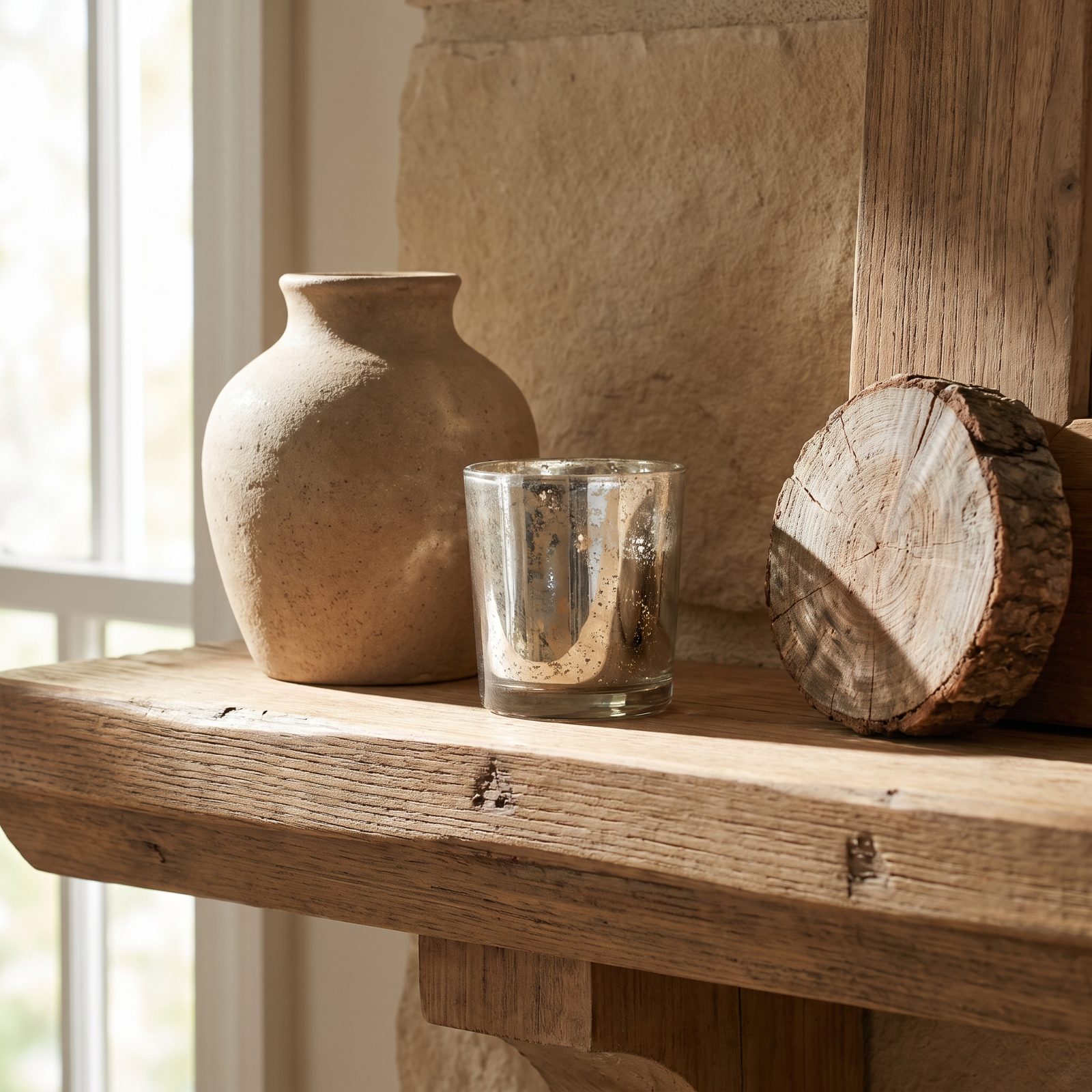
Look closely and three finishes are having a conversation: matte ceramic, glossy mercury glass, and the rough grain of pinecones and dried orange. Light hits each one differently, so the display gains depth without needing more stuff crammed onto the shelf.
Texture is what stops a tight color palette from going flat.
10. A Consistent Shape Repeated at Different Scales
🔥 Would you like to save this?
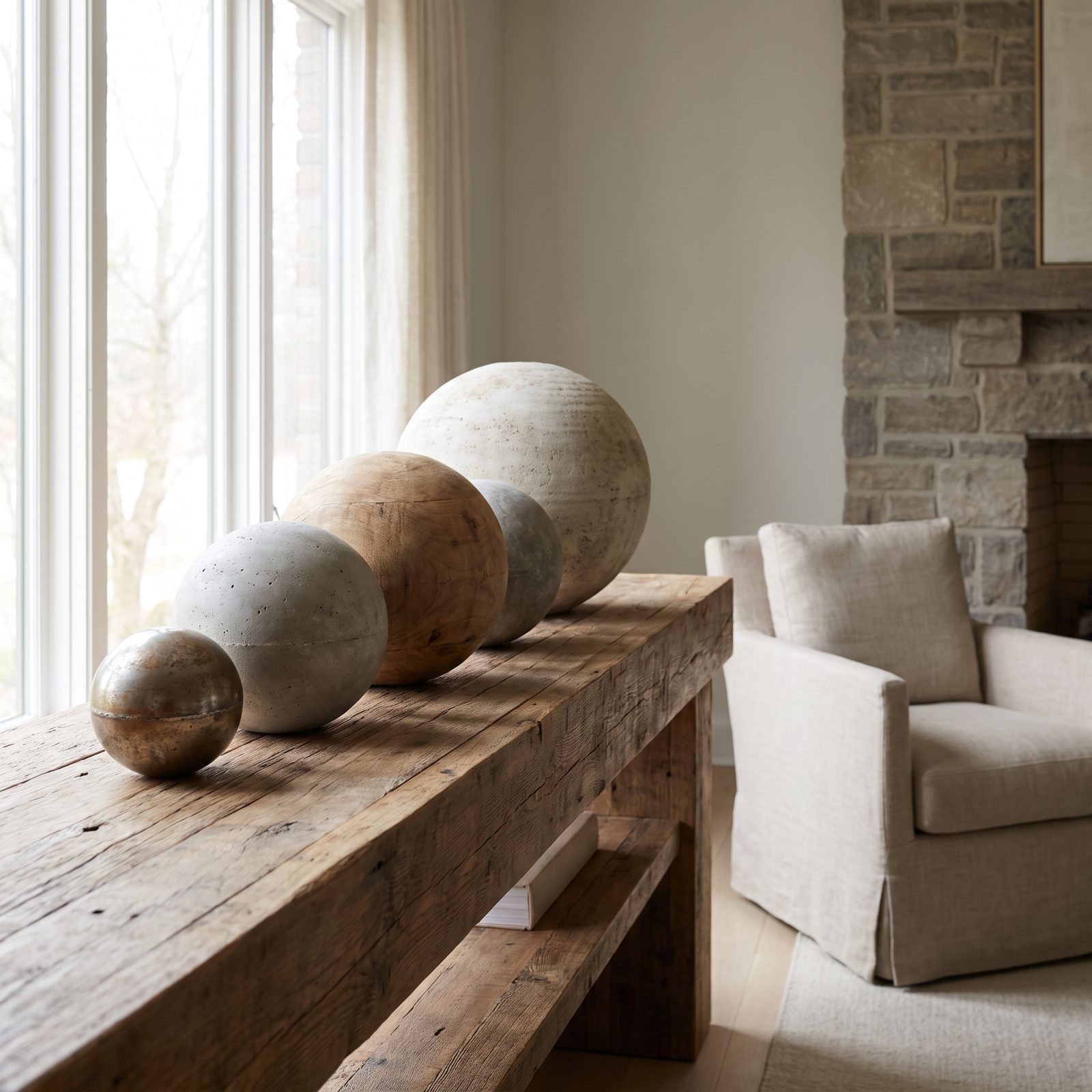
Spheres everywhere, in five sizes. A leaning round wreath up top, big glass ornament balls mid-shelf, brass orbs, berry clusters, right down to tiny beads. One shape, descending scale.
Repetition is the oldest calming trick in the book. Catch the same form again and again and the whole arrangement reads as deliberate rather than dumped there.
9. Stockings Matching in Material but Not Nameplate Style
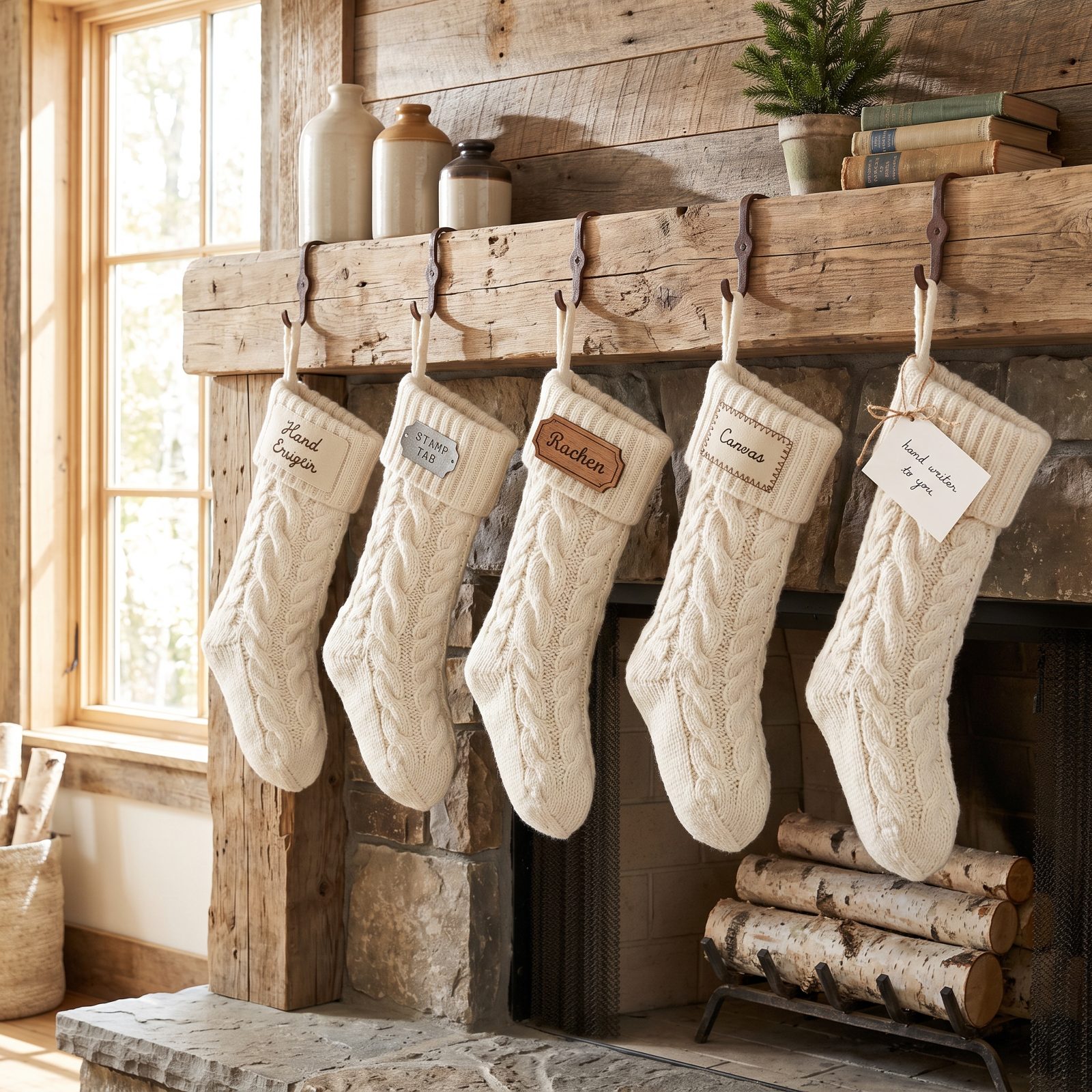
Four stockings, one knit. Same chunky ivory cable wool, same texture, hung in a row. The personality lives entirely in the little brass nameplates, each one a touch different from its neighbor.
That’s the editing at work. Let the material be the chorus and the detail be the solo. Matching knits hold the row together while the varied tags keep it from feeling mass-produced.
8. Stockings Spaced to Follow the Mantel’s Architecture
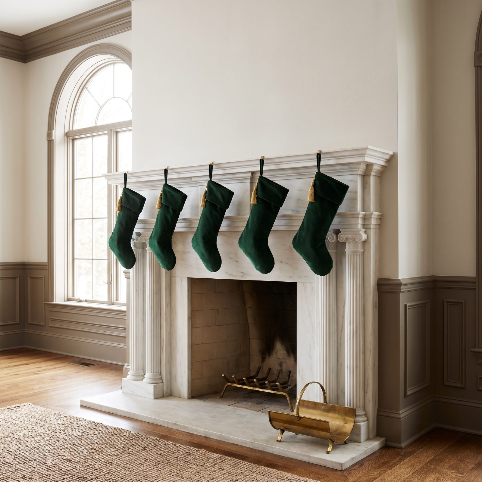
These stockings aren’t just evenly spaced — they’re spaced to echo the carved pilasters below them. Each deep green velvet stocking hangs right above a stone break, so the whole display feels anchored to the fireplace rather than pasted onto it.
Read your surround before you hang anything. The stonework usually tells you where things belong.
7. Stocking Holders Hidden Beneath the Greenery

Where are the holders? Buried. The garland is thick enough to swallow those clunky metal weights whole, so each stocking looks like it’s hanging straight off the greenery.
Hiding the hardware is one of those small edits that separates a styled mantel from a merely decorated one. The eye wants the magic, not the pulleys backstage.
6. Everyday Objects Integrated With Seasonal Greenery
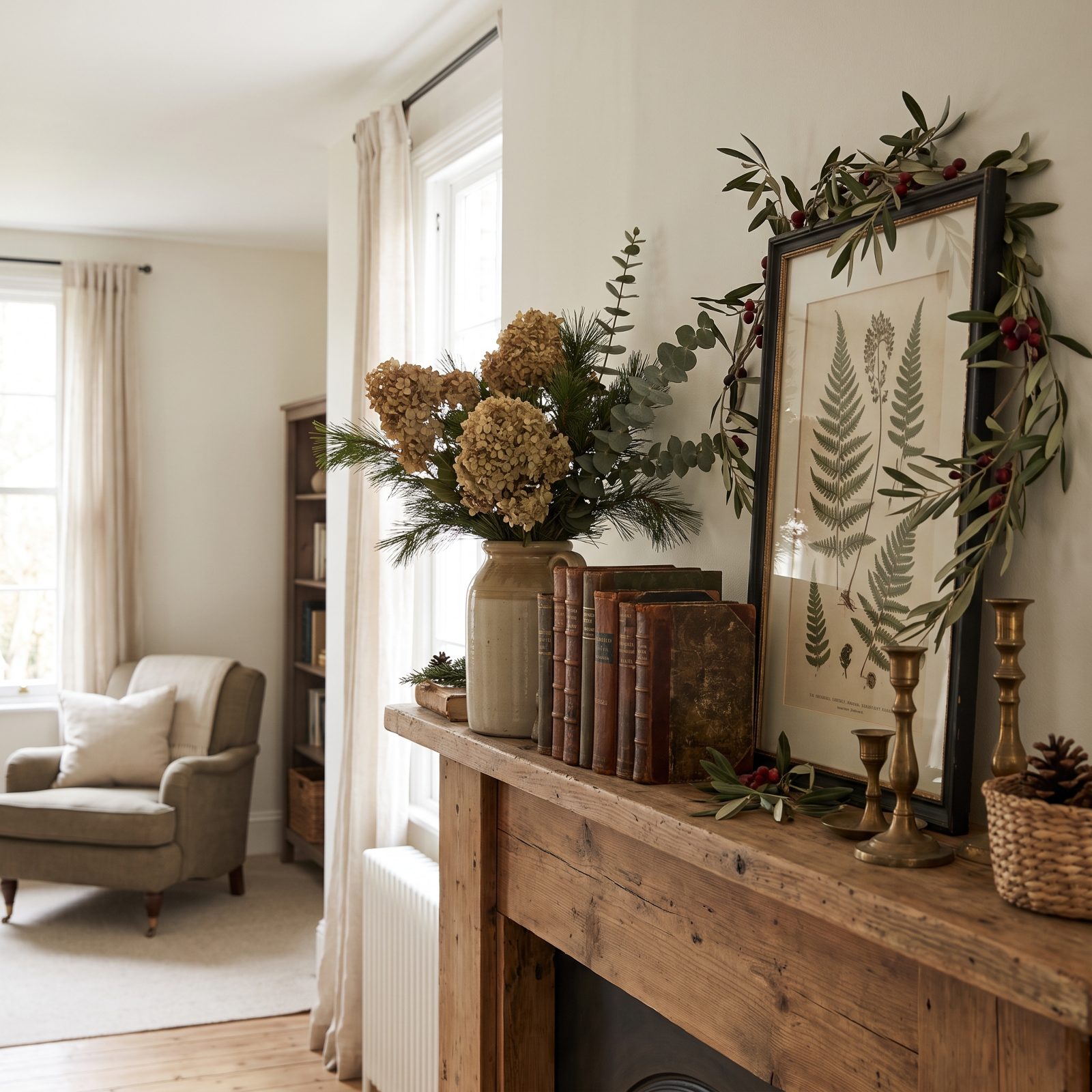
No glittery novelty anything. The books, the ceramic vase, the little botanical print all live on this mantel the other eleven months of the year, and the greenery simply moves in around them for December.
This might be the most undervalued move on the whole list. When seasonal styling grows out of what’s already sitting there, it never reads as a costume you threw over the room for a few weeks. Folding everyday pieces into the display works the way a red bedroom decor scheme does when it builds on what you own instead of starting from scratch.
5. One Sentimental Object Given Pride of Place
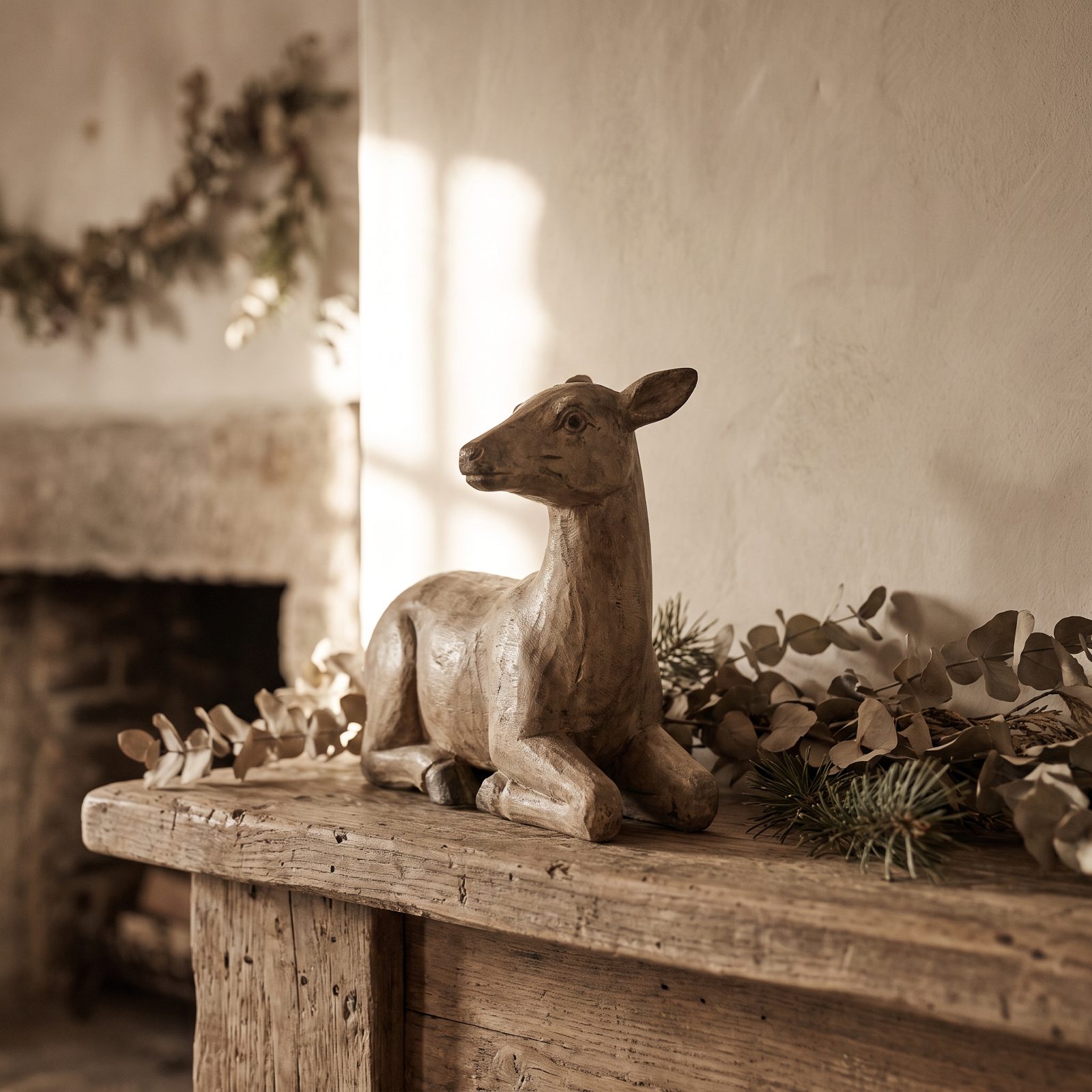
Everything on this mantel steps back for one piece. An old carved wooden figure sits dead center with breathing room around it, and the garland and candles stay deliberately low so nothing competes with it.
Hierarchy is the whole game. Pick the object that genuinely matters to you, give it space and height, let the rest play backup. A mantel with one clear hero always lands calmer than a mantel crowded with equals. That’s the note I’d end every holiday on.
4. Fresh Fruit Repeated, Not a Grab Bag of Novelty Ornaments
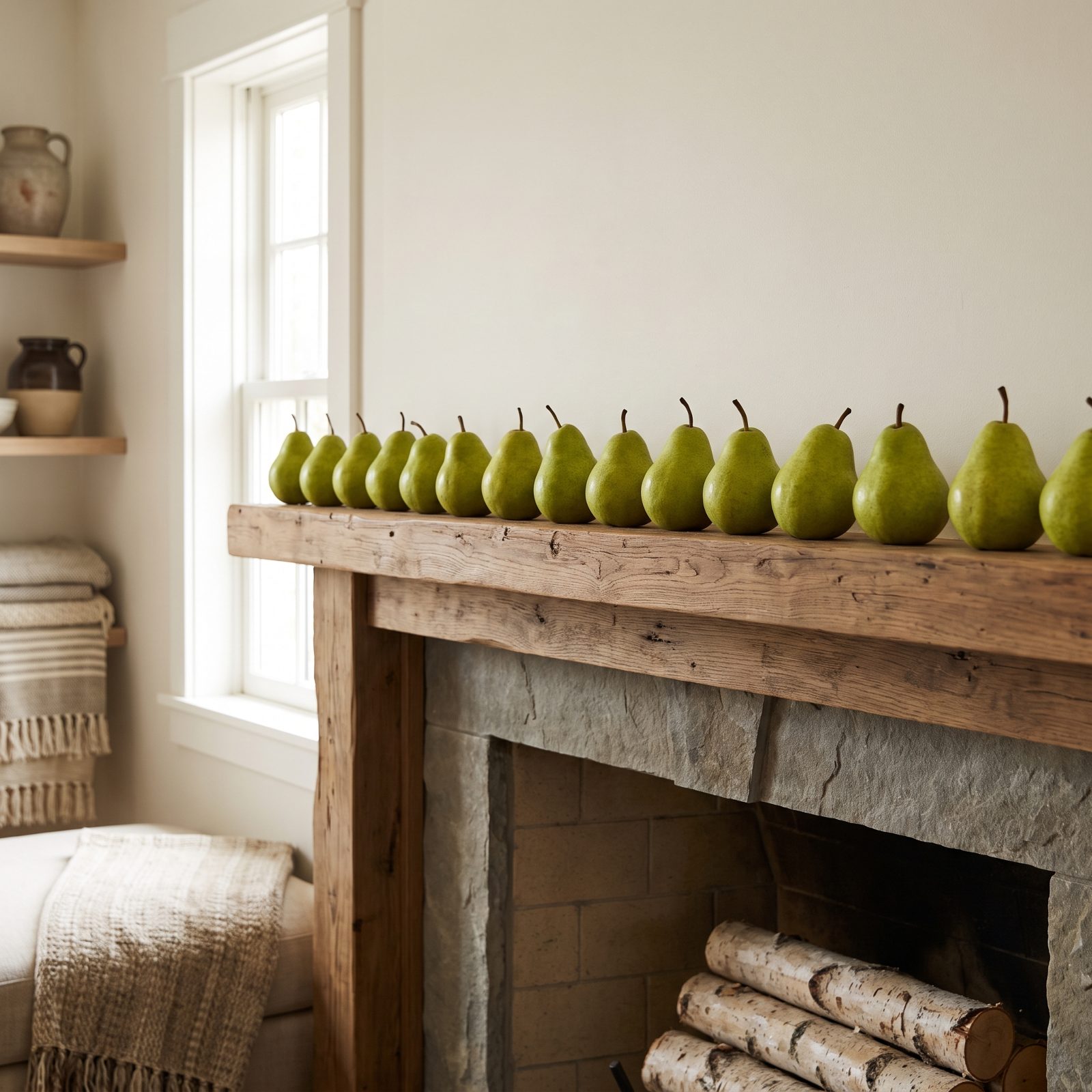
Pears, every eight inches or so, all the way down the shelf. That’s the entire trick. Repetition reads as intention, while a scattered mix of novelty ornaments reads as whatever was left in the box.
Fresh fruit also gives you something plastic never will: subtle color variation within one shape. Each pear is a slightly different green, so your eye registers rhythm instead of clutter.
3. A Low Bowl of Ornaments Beats Baubles Scattered Everywhere
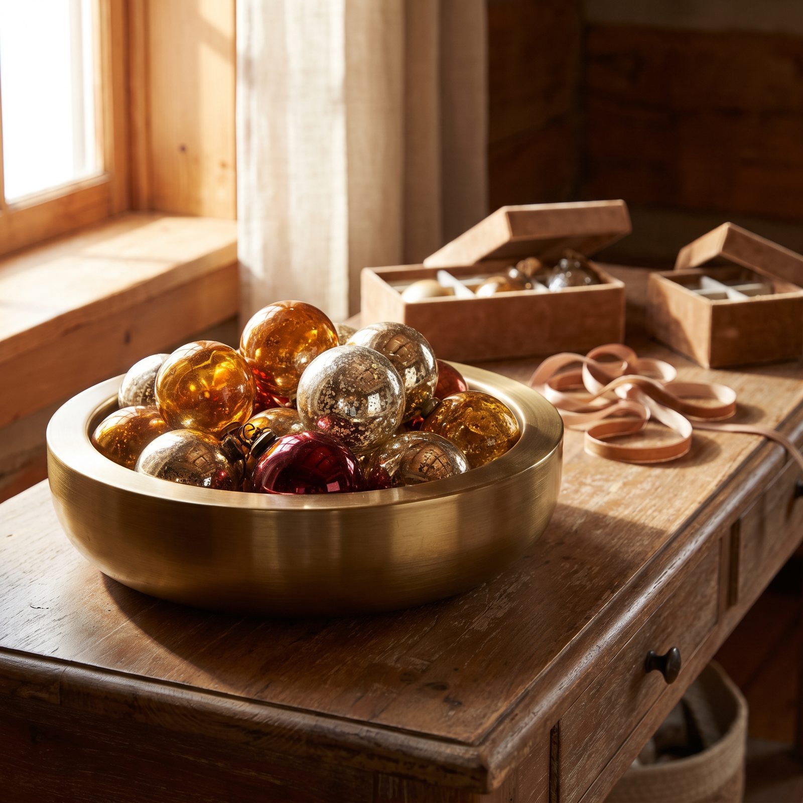
Loose baubles on a mantel are a confession that you ran out of ideas. Corral them into one low brass bowl and the whole display tightens up.
Containment is the move. A bowl gives a wandering pile of ornaments a hard edge and a job to do. Keep the palette narrow — blush and cream and pale gold here — and the mound becomes one considered object instead of forty small decisions.
2. Let the Mantel Speak the Room’s Existing Style
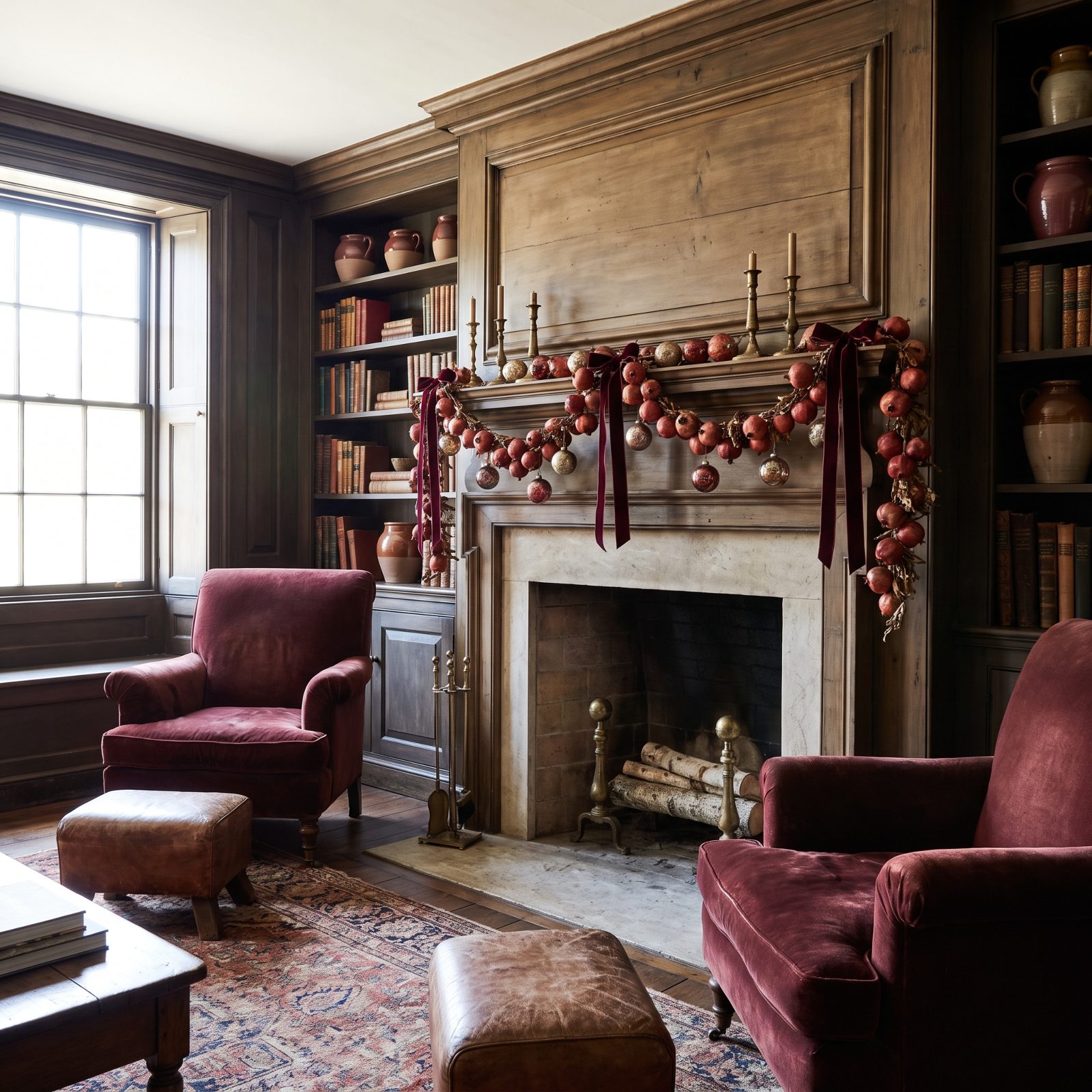
The mantel that looks effortless usually looks like it belongs. Heavy burgundy velvet ribbon and aged brass bells here aren’t a theme bolted on for December. They repeat the brass sconces and the formal bones already in the room.
Match the weight of your decorations to the weight of the architecture. A carved marble surround wants a dense, symmetrical cedar garland, not a few sparse sprigs — thin styling on a formal mantel always looks like an afterthought. And the same logic carries anywhere you dress a space for the season, from a red entryway to the staircase.
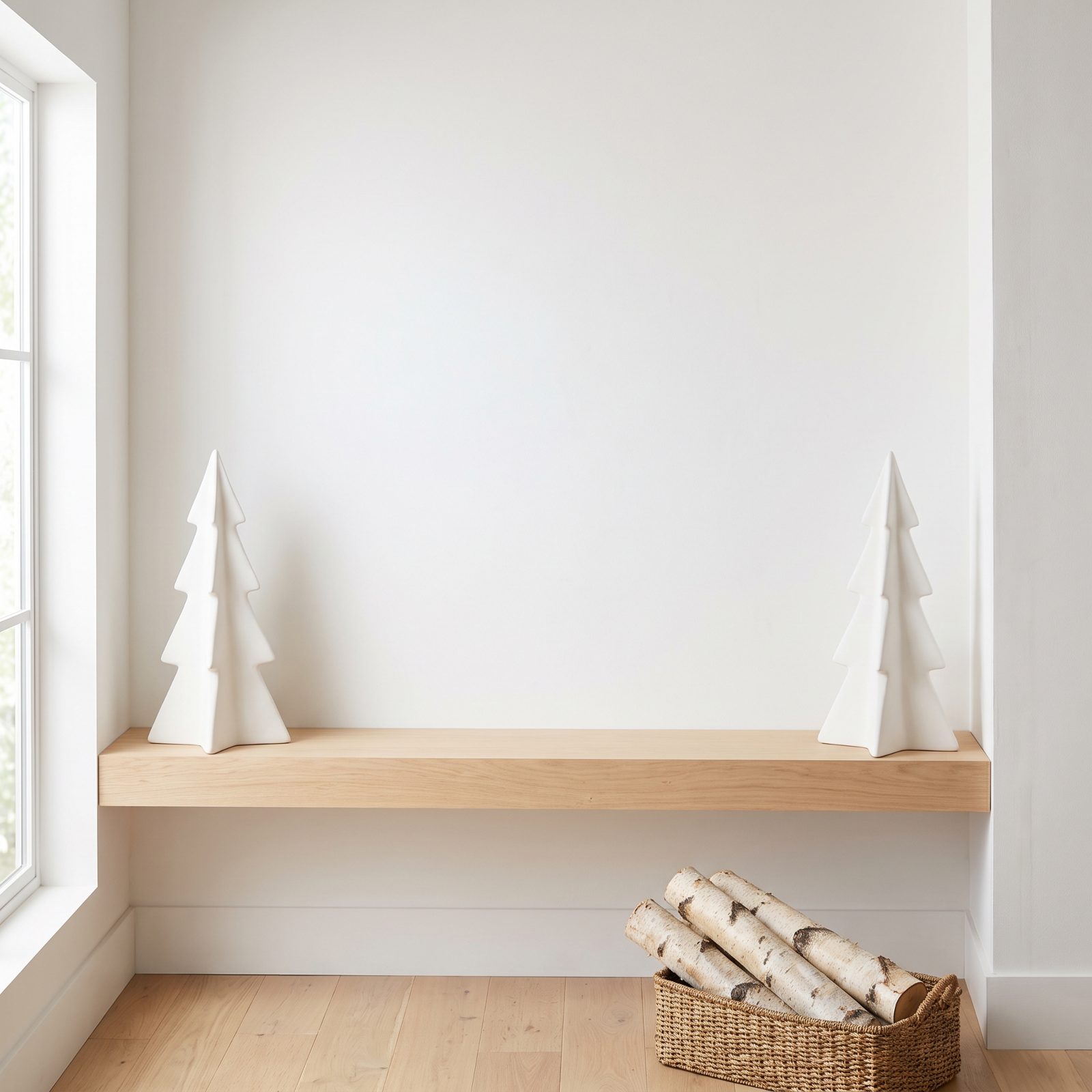
1. Two Sculptural Objects, One Empty Center
🔥 Would you like to save this?
Empty space is the decoration here. Two matte white ceramic trees sit at the ends, the middle is left wide open, and that restraint does more work than a loaded garland ever could.
Symmetry plus a bare center reads as confidence. The pair frames the gap, your eye settles in the middle, and the whole thing breathes. Hardest look to pull off, honestly, because every instinct screams at you to fill it.