Somewhere between the open-concept takeover and the all-white-everything decade, kitchens lost something real. Not just character, function. The kind of function that made cooking feel like cooking, not like performing in a showroom. You remember the deep drawers, the real pantry, the tile that wasn’t afraid to be itself. These aren’t just features. They’re the things that made a kitchen feel like the center of the house. Here are the ones that deserve a serious second look.
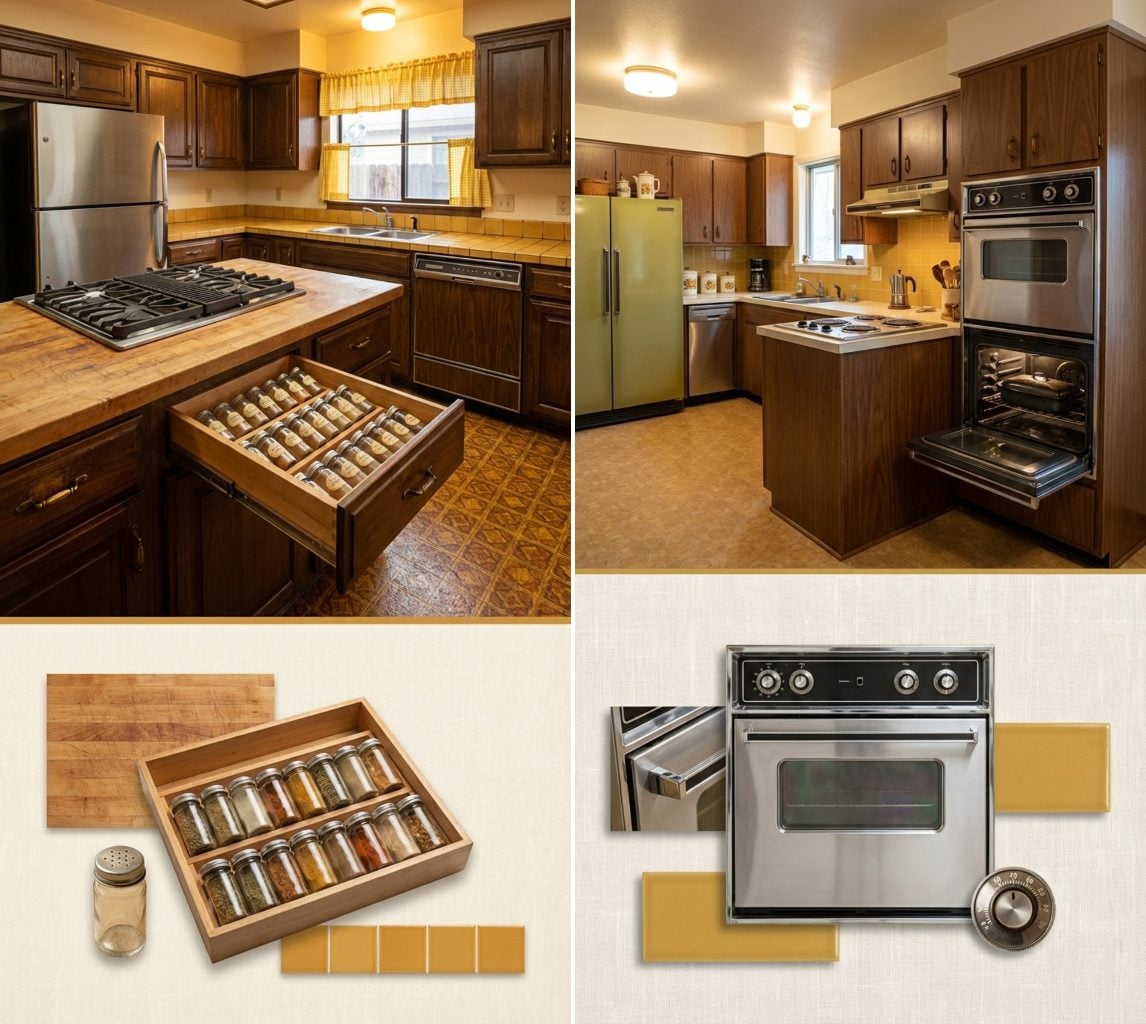
The Dedicated Spice Drawer Built Into the Counter Beside the Range
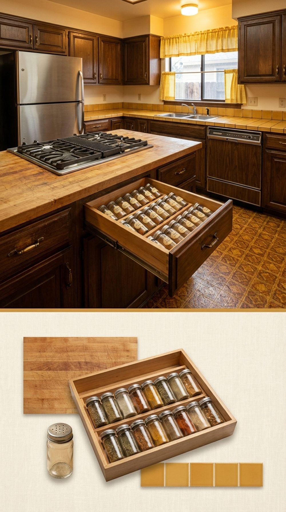
Positioned within arm’s reach of the burners, this shallow pull-out drawer held two angled rows of small glass jars, all facing up so you could read the labels without lifting a thing. It didn’t require a cabinet door, didn’t demand a lazy susan, and never once sent a jar of paprika rolling behind the refrigerator.
In order to come up with the very specific design ideas, we create most designs with the assistance of state-of-the-art AI interior design software.
The drawer was typically 3 to 4 inches deep, built into the cabinet run between the range and the nearest base cabinet. Simple. Obvious. Completely absent from almost every new kitchen built in the last 20 years.
A Second Oven That Lived in the Wall, Not Stacked on Top of the First One
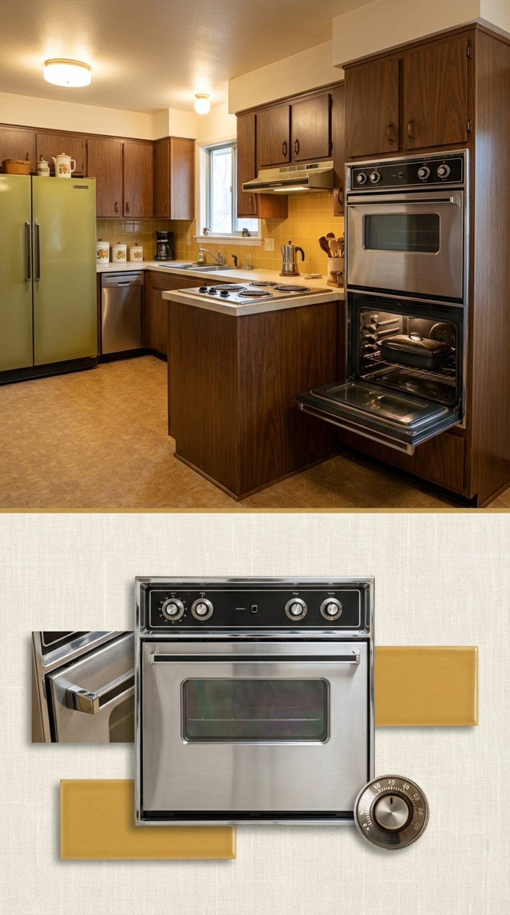
Not a double wall oven where both cavities stack into the same tall cabinet. A second, separate oven in its own location. One for the turkey, one for the pies, and nobody waiting on anyone else’s temperature setting.
The logic was sound: serious cooking requires serious oven space, and wall ovens at eye level meant no bending down to check on a roast at 350. Somewhere along the way, the dedicated oven cabinet became a casualty of the open-concept kitchen’s need for more visual breathing room.
The practical loss is real. Ask anyone who has tried to coordinate Thanksgiving in a single-oven kitchen.
The Bread Box That Sat on the Counter and Actually Had a Purpose
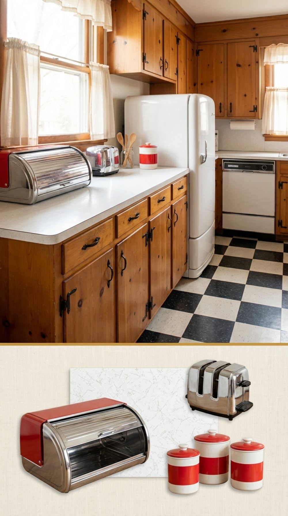
It sat at the end of the counter like a small monument to common sense. Bread went in. Bread stayed fresh. Nothing about this system was complicated.
The breadbox’s fall from grace tracks almost perfectly with the rise of the sealed plastic bag, and then with the counter-clearing obsession that hit kitchen design around 2010. Every object that once lived on the counter got banished to a cabinet, which is how we ended up with kitchens that look like they’ve never been cooked in.
A good breadbox, chrome, enamel, wood with a tambour roll top, is also just a handsome object. It earns its counter space the way a French press earns its counter space. Functionally and aesthetically.
Plate Rails That Ran the Full Perimeter of the Room Near the Ceiling
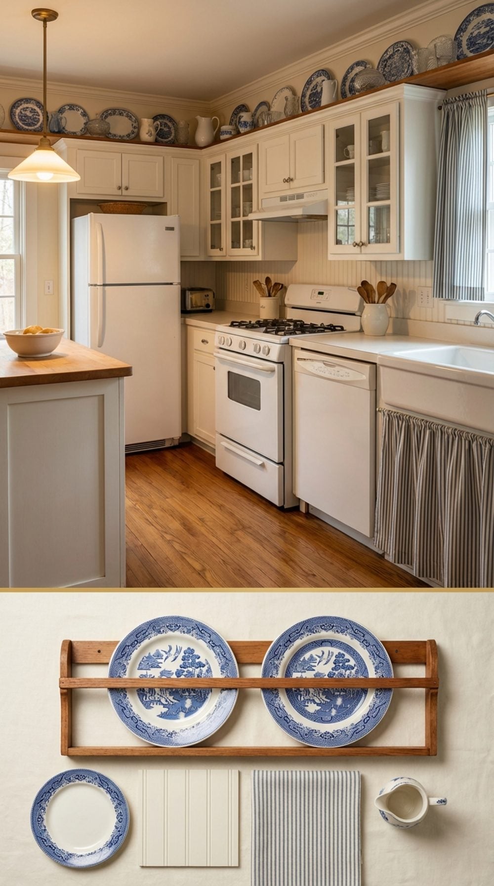
A plate rail is a narrow wooden ledge with a small front lip, mounted near the ceiling, holding decorative plates upright around the perimeter of the kitchen. It sounds modest. In practice, it gave a kitchen the kind of collected, layered warmth that no tile backsplash or floating shelf has ever fully replaced.
The plates didn’t have to match. In fact, they were better when they didn’t.
“A plate rail turns the top third of a kitchen into a gallery without requiring a single nail hole below eye level.”
Craftsman bungalows, Victorian farmhouses, and Colonial Revival kitchens all used them. The detail disappeared when ceiling heights dropped and kitchens modernized. It costs almost nothing to add one back.
The Drop-In Cooktop That Let You Choose Your Countertop Independently
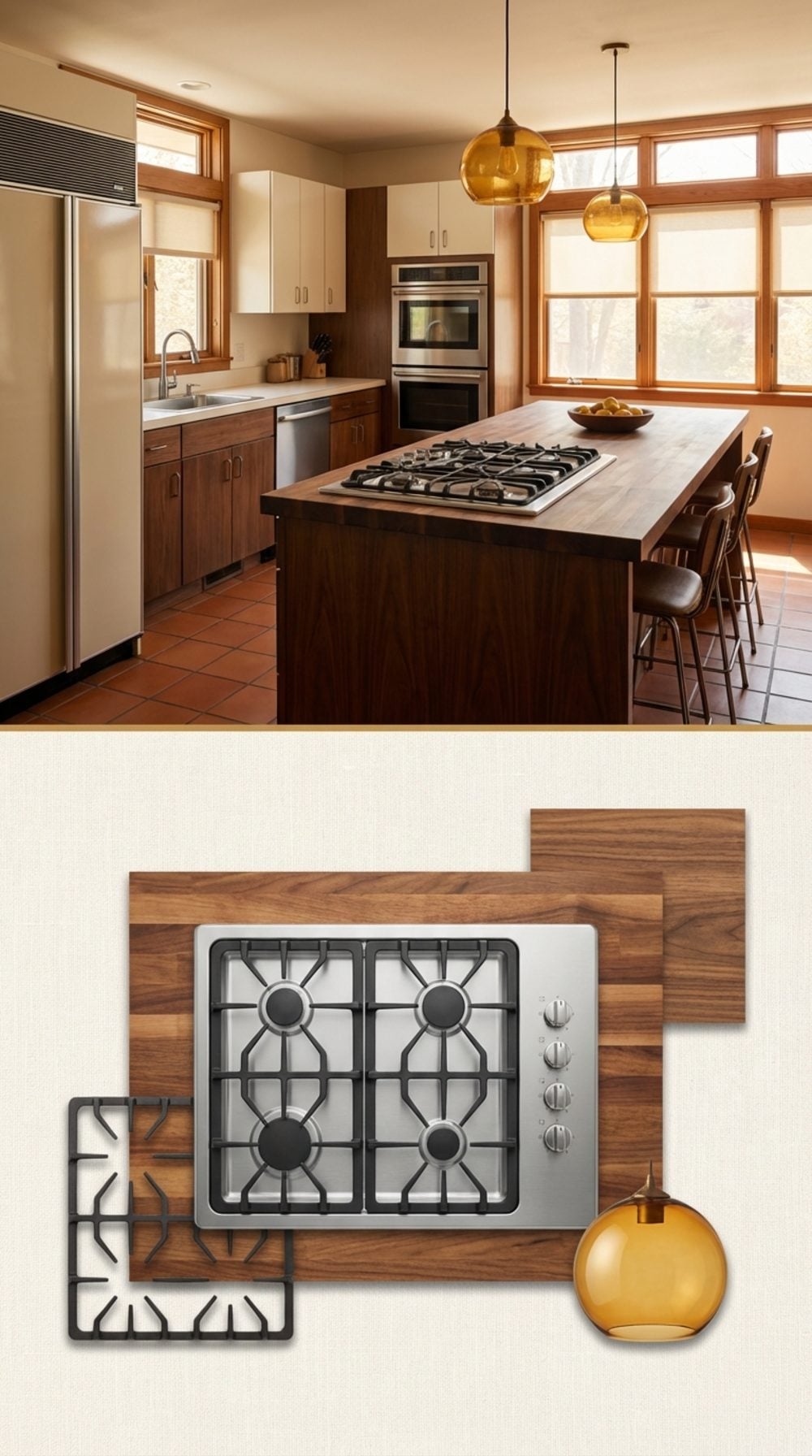
Separating the cooktop from the oven was one of the smarter kitchen planning ideas of the mid-century, and it’s baffling that the all-in-one range became the default again.
A drop-in cooktop, flush with the counter, surround in chrome or black, let the countertop material do its job without interruption. Butcher block island with a gas cooktop dropped in: still one of the most functional kitchen configurations ever devised. The oven goes in the wall at eye level. The cooktop goes where the cook actually stands.
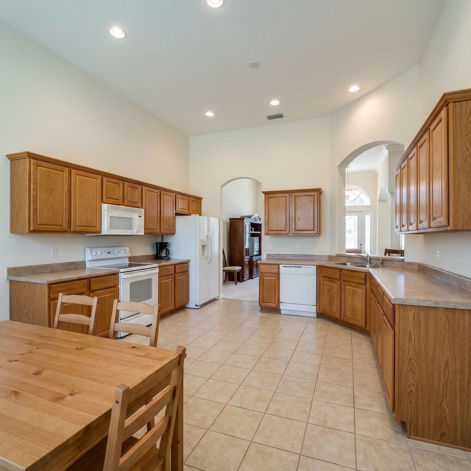
The Canned Goods Pantry Cabinet With Pull-Out Shelves on Both Sides of the Door
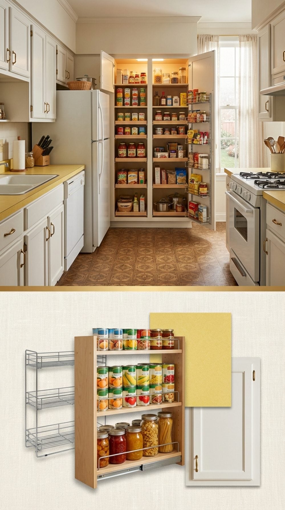
Both sides of the door. That detail is doing more work than it looks like. A well-configured pantry cabinet from this era used every inch: pull-out shelves in the body of the cabinet, door-mounted racks on each side of the door panel for spices and small cans, and a clear sightline to everything at once when you opened it.
No digging behind things. No archaeological expeditions into the back of a shelf. Just rows of cans in plain sight, first in, first out.
The modern equivalent, the walk-in pantry with floating shelves and labeled linen bins, looks better in a magazine. The old pull-out pantry cabinet actually worked better on a Tuesday night when you needed a can of diced tomatoes in under five seconds.
Recessed Lighting? No. Actual Incandescent Pendant Lights Over the Counter
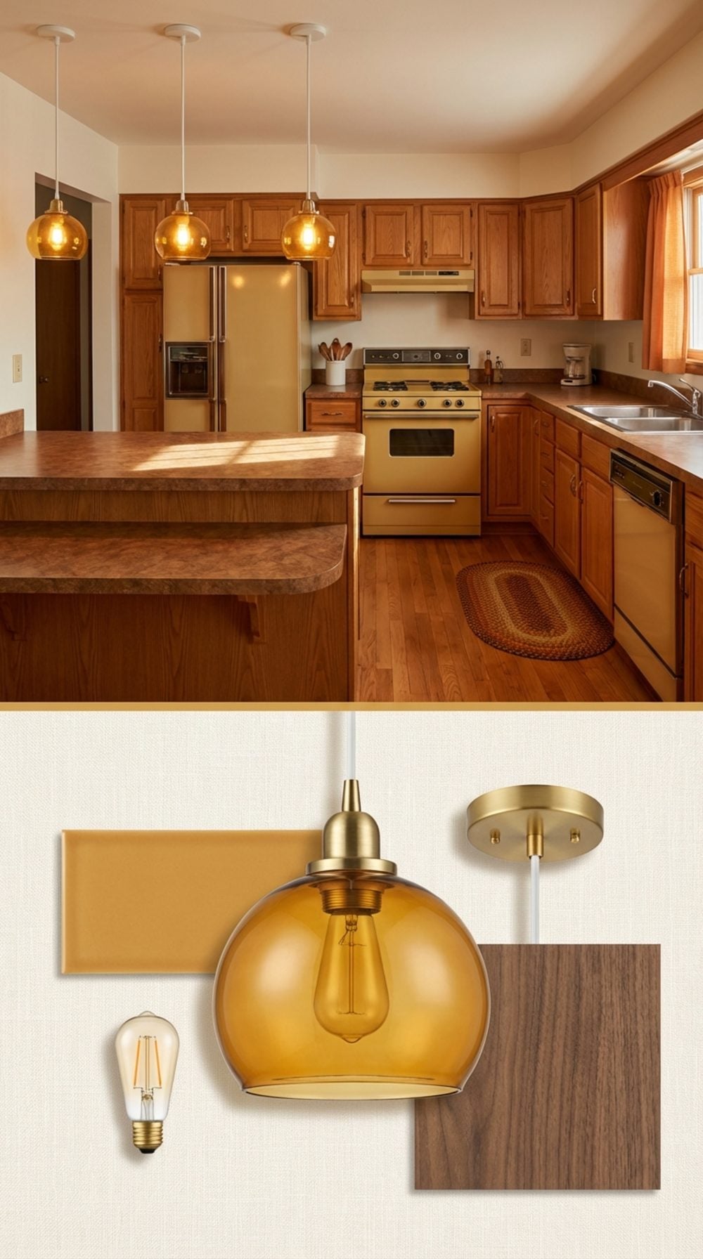
Recessed can lighting does one thing well: it makes a kitchen look like a well-lit office. Pendant lights over the counter do something recessed lighting simply cannot, they create a layer of warm, directed light that makes the counter feel like a specific place where something is happening.
There’s a psychological reason you feel more alert and focused under a pool of warm pendant light than under a flat ceiling of recessed fixtures. Directed light creates task orientation. It signals: this is where the work is done.
The pendants that worked best were unpretentious: amber glass, ceramic in a solid color, enameled metal. Nothing architectural. Just light doing its job from a thoughtful height.
The Built-In Telephone Nook With a Small Desk Surface and a Drawer for the Phone Book
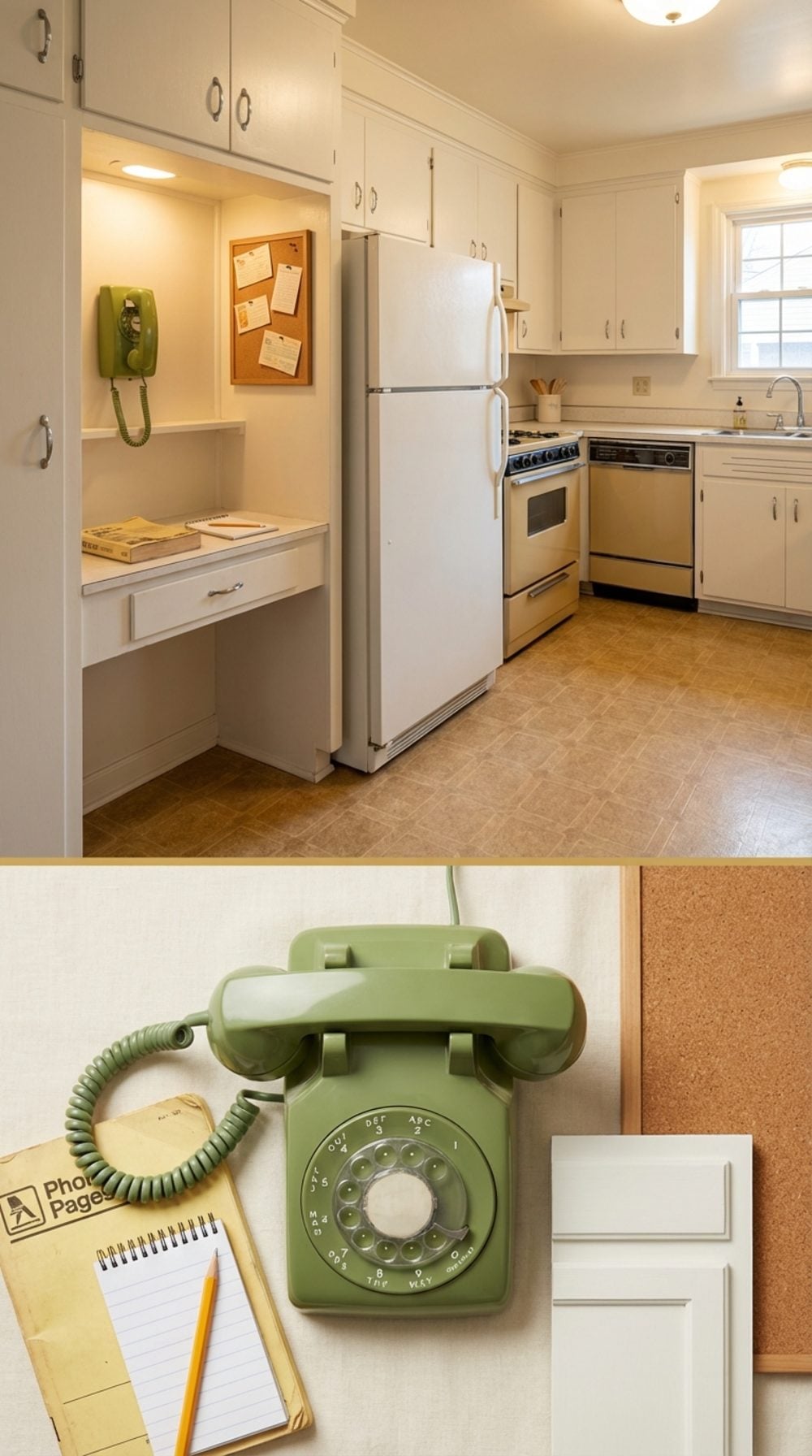
This was the original command center. One wall-mounted phone, a 6-inch-deep writing surface, a drawer for the phone book, and a small cork board above for grocery lists and the number for the pediatrician. Every family had one. Every family needed one.
The built-in kitchen desk fell out of fashion when laptops arrived and then got fully erased when open-concept renovations needed the cabinet real estate. What replaced it: standing in the middle of the kitchen holding a phone, looking for somewhere to put it down.
The concept deserves a 21st-century version. Not a home office. Just a small, dedicated surface for the things that actually happen in a kitchen: a charging spot, a notepad, a place to sit for a moment with a cup of coffee.
The Separate Ice Maker Cabinet Built Into the Kitchen Island
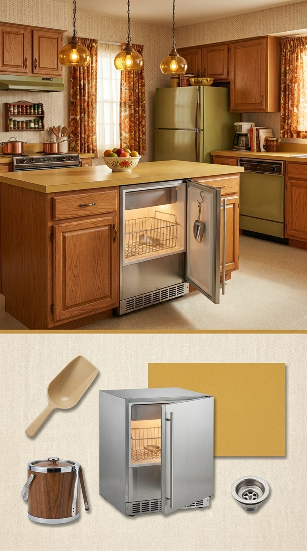
There was a specific joy to pulling open that little door and scooping ice with the actual plastic scoop hanging on its hook inside. Not a refrigerator ice maker. Not a freezer tray. A dedicated under-counter ice maker that lived in the island and hummed quietly at all times like it had one important job and it knew it.
These were standard in nicer kitchens through the late 1970s and 1980s, usually with a stainless or black plastic interior and a drain line running somewhere mysterious beneath the floor. They made ice constantly, stored about 25 pounds of it, and made you feel like you were running a slightly upscale bar operation in your own home.
The refrigerator ice maker eventually won by default, being one less appliance to maintain. But the dedicated under-counter unit was better in every measurable way.
Crown Molding That Actually Met the Ceiling (Not a Two-Inch Gap of Drywall)
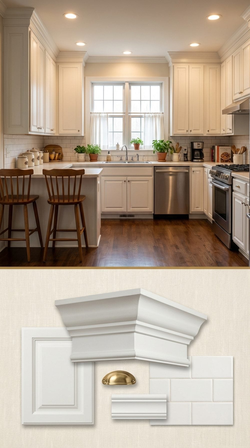
You ran your eye along the top of the cabinets and they just… stopped at the ceiling. No floating boxes with a dusty void above them. No decorative gap that collected grease and spider webs. The crown molding at the top of the cabinets stepped up and met the ceiling plane in a continuous line, and the whole kitchen felt finished.
This detail disappeared when cabinet manufacturers moved to standardized heights and builders stopped spending money on custom trim work. The result is every kitchen built since 2005 with that same floating-cabinet look that, no matter how beautiful the rest of the room is, always looks slightly unresolved at the top.
The Overhead Pot Rack Above the Island, Hung From the Ceiling
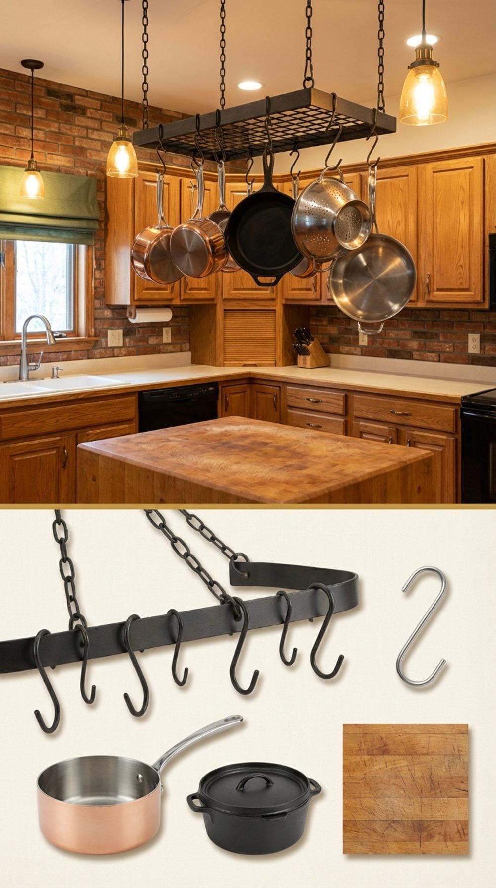
Cast iron dutch ovens. Copper sauciers. A colander that got used every night. All of it hanging in a grid above the island from a wrought iron or black steel rack suspended by four chains from ceiling hooks, swaying slightly if you walked by fast enough.
This was kitchen storage that doubled as a declaration. It said: we cook here, with real pots, often. The rack was usually loaded unevenly because some pots got grabbed every day and some hung there for months between uses, and the whole thing had a slightly chaotic beauty that no closed cabinet could replicate.
Pot racks fell out of favor when kitchen aesthetics shifted toward the clean, empty surfaces of the hotel-lobby school of interior design. But the homes that kept them always felt more alive.
“A kitchen with a full pot rack hanging over the island always felt like the house was actually being used.”
The Built-In Hutch With Glass-Front Doors That Showed Off the Good China
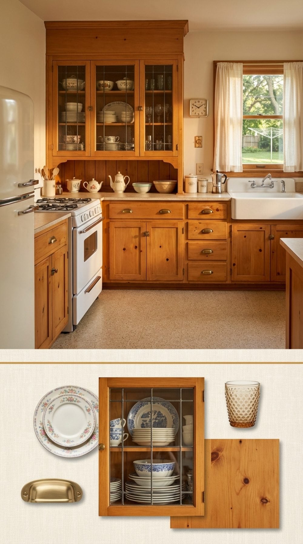
The glass-front hutch was the original open shelving, only better, because it had doors. You could see the good china without breathing dust onto it for six months between Thanksgivings. The upper panes were usually divided into small rectangular lights, sometimes with wavy old glass that made the plates look like they were slightly underwater.
Lower cabinets held the heavy cast iron and the canning jars. The whole piece was built into the wall like it had always been there, because it had. Replacing it with a flat bank of shaker cabinets is technically the same storage but emotionally a completely different kitchen.
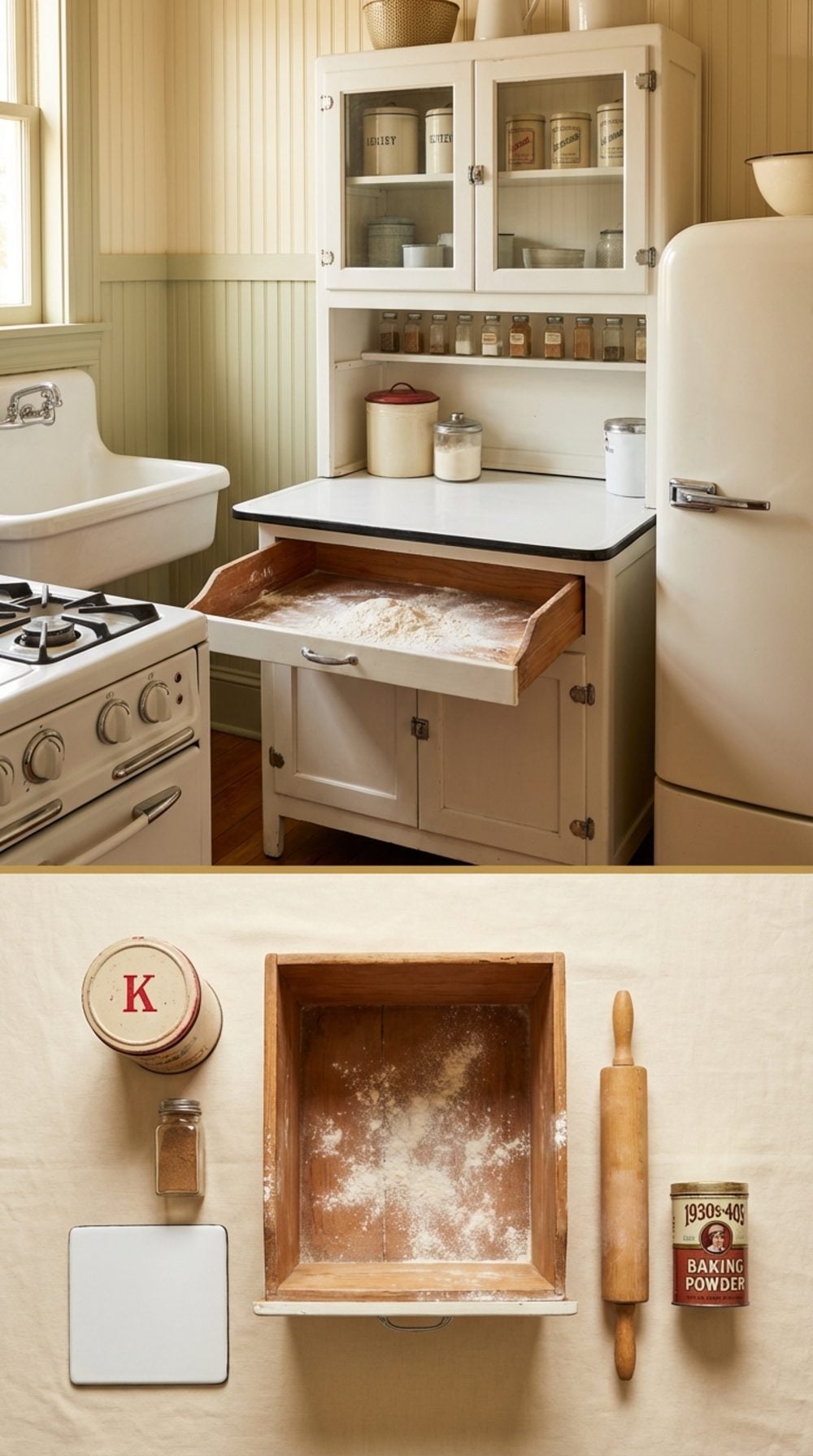
The Dedicated Baking Cabinet With a Pull-Out Flour Bin
🔥 Would you like to save this?
A pull-out flour bin was engineering in service of an actual daily need. It sat at the exact right height, held exactly enough for a week of serious baking, and the drawer face sealed it shut so the flour stayed fresh and the pantry moths stayed out.
The Hoosier cabinet version had a built-in sifter mounted to the bottom of the bin so flour fell directly onto the enamel work surface below. This was not a gadget. It was a system that worked so well nobody improved on it, they just stopped building it.
The Pass-Through Window Between the Kitchen and the Dining Room
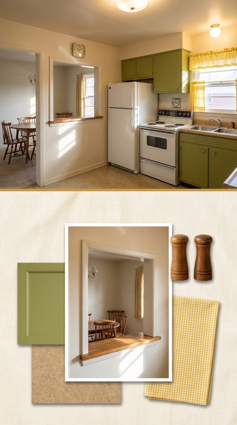
Before the kitchen island came along and made everyone stand awkwardly together, the pass-through was how you stayed connected to the dining room without the cook disappearing entirely. You slid the hot dishes through the opening one at a time, and whoever was setting the table caught them on the other side.
It kept the kitchen separate enough to hide the mess while open enough to have a conversation. Some had hinged panels you could close. Some had a fold-down counter on the dining side that doubled as a serving buffet. It was a humble architectural detail that solved a real social problem, and the open-concept plan eliminated it without replacing what it actually did.
Painted Wood Cabinets in an Actual Color (Not White. Not Gray. A COLOR.)
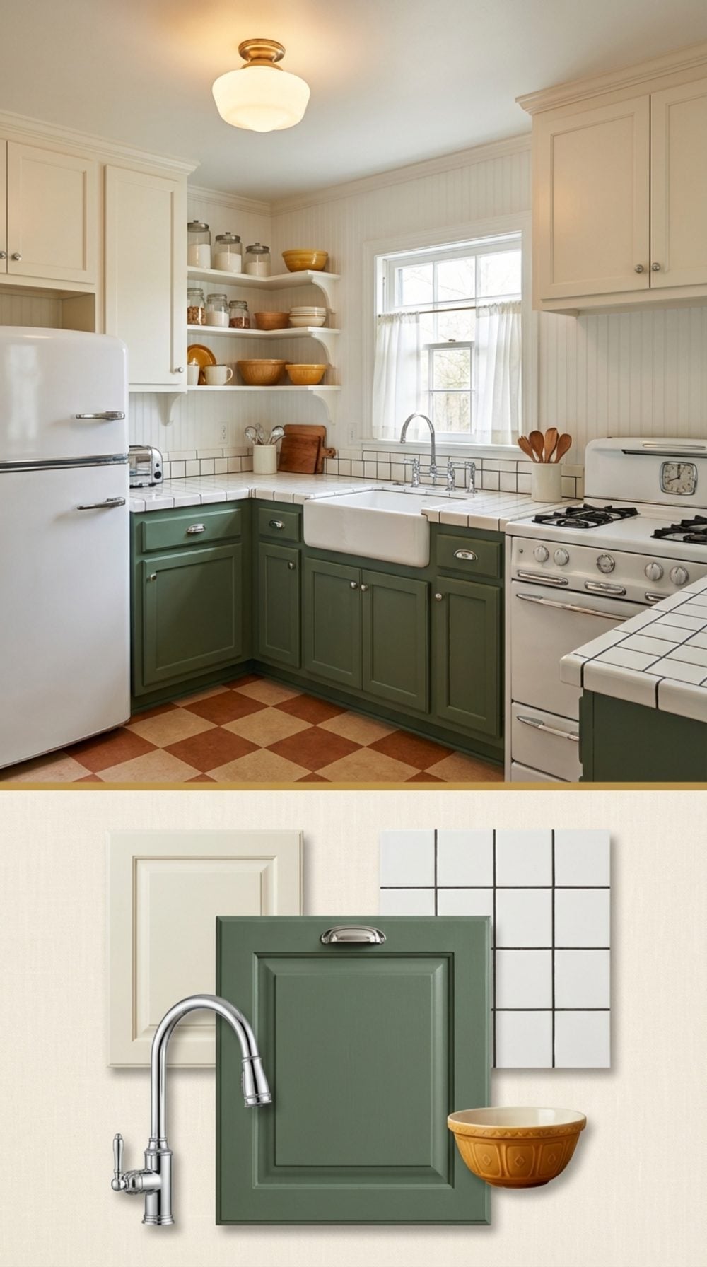
The tyranny of white and gray kitchen cabinets is a recent and specific phenomenon. For most of the twentieth century, kitchens came in sage green, butter yellow, cerulean blue, barn red, and combinations that should have been ugly but somehow weren’t. The color was usually milk paint or oil-based enamel over solid wood, which meant the finish had depth, slight variations in application that made it look hand-done, because it was.
Repainting cabinets in a real color remains one of the cheapest and highest-impact things you can do to a kitchen. And yet most renovation guides still default to white. The bias is psychological as much as aesthetic: we’ve been trained to believe color is risky and neutral is safe. Neither of those things is true.
The Single Deep Double Sink, Porcelain Over Cast Iron
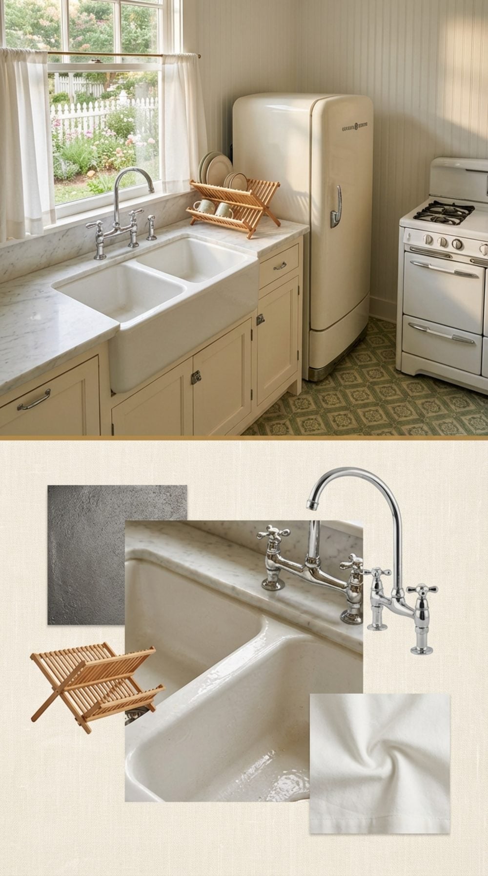
The dimensions of an old cast iron sink were engineered around actual tasks: washing an eighteen-quart stockpot, soaking a roasting pan overnight, bathing a baby in a pinch. Each basin was roughly twelve inches deep. Modern stainless undermount sinks average seven inches. Those five inches are the difference between useful and decorative.
The porcelain-over-cast-iron surface had a texture to it, a slight softness that made it feel different from metal under your hands. It chipped if you dropped something heavy, which meant every old cast iron sink told a small history of dropped things. That imperfection was not a flaw. It was evidence of use.
A Proper Pantry Room With a Door That Closes
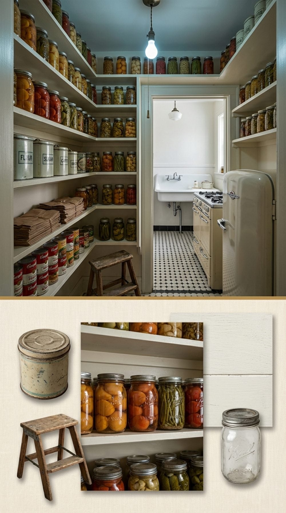
A walk-in pantry with a door that actually closes is one of those things you don’t fully appreciate until you’ve planned a dinner party with forty-five pounds of groceries and nowhere to put them. The pantry kept things cool because it was an interior room, often windowless, sometimes on the north side of the house. Before refrigeration was reliable, that temperature difference mattered.
It also kept the kitchen visually clean without any organizational effort at all. You just opened the door, put things inside, and closed it again. The absence of the pantry in modern homes is directly related to the rise of cabinet organizers, lazy Susans, drawer inserts, and an entire industry of products designed to solve a problem that a room with a door would have solved for free.
A door that closes is worth more than any amount of pull-out organizers.
The Warming Drawer Built Into the Base of the Oven
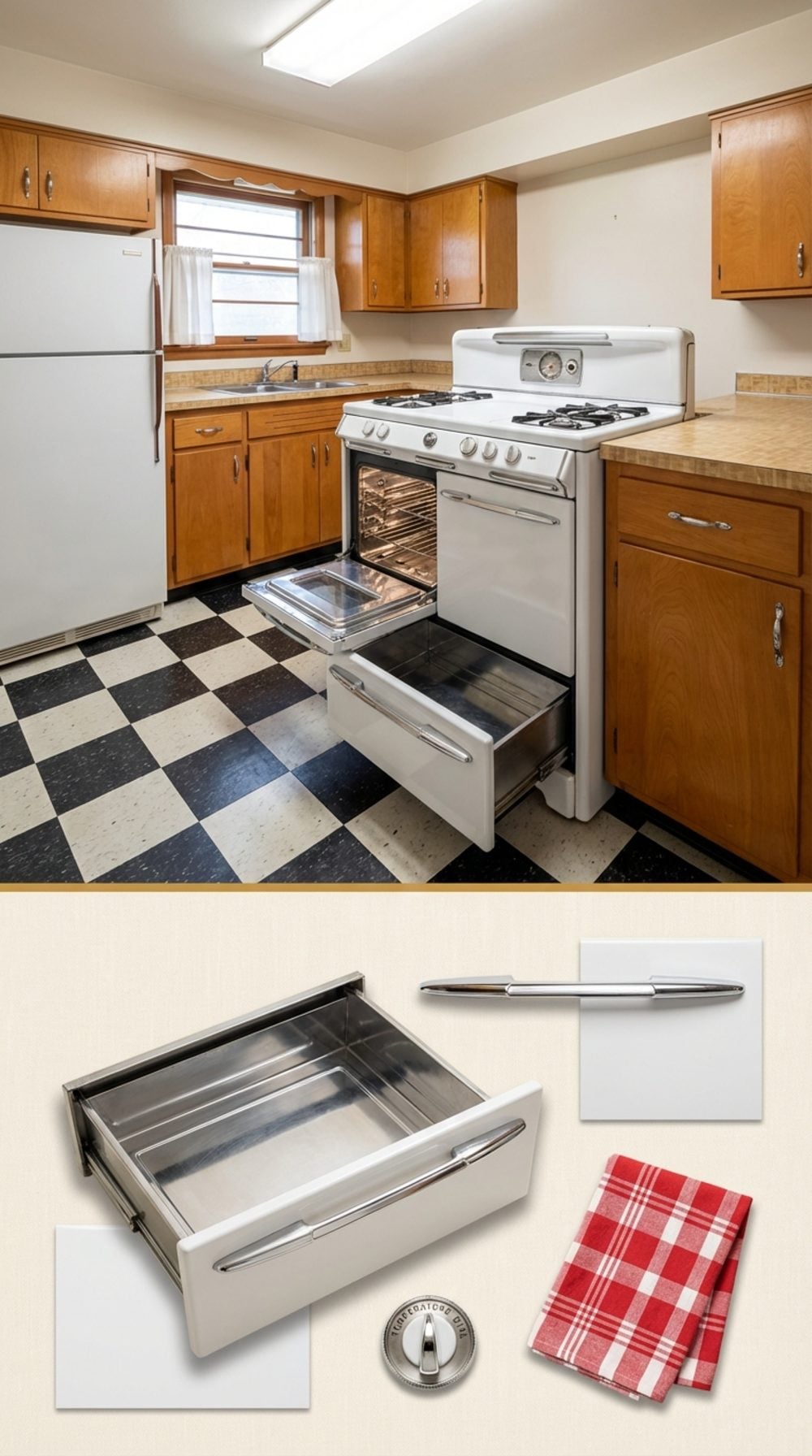
The warming drawer at the base of every old freestanding range was the unsung MVP of the family dinner. You made the mashed potatoes twenty minutes before everything else was ready, slid them into the warming drawer, and they stayed hot without drying out or overcooking. It was so reliable it became invisible, just part of how cooking worked.
Modern ranges dropped the warming drawer in favor of a storage drawer that no one uses for anything except the broiler pan and a lid that no longer matches any pot. The warming drawer wasn’t replaced by anything better. It was just gone.
Actual Tile Countertops With Visible Grout Lines
Before the granite slab era erased them, tile countertops were everywhere, and they were genuinely beautiful in a way that quartz composite has never quite matched. The slight variation between individual tiles, the texture of the surface, the visible grid of grout: it made the countertop look handmade, because it was.
Yes, the grout got stained. Yes, small items tended to tip at the edges. These are real problems. But quartz countertops that are digitally printed to look like stone, at $150 per square foot, have their own kind of dishonesty. At least the tile was exactly what it said it was.
The Kitchen Banquette Built Into the Corner
The corner banquette was spatially brilliant: it used the least-useful corner of the room for the most-used piece of furniture in the house. Built-in benches had storage underneath for placemats and rarely-used serving pieces, and the L-shape meant six people could fit into the space a round table with chairs could seat four.
More than that, it anchored the kitchen as a place you’d actually sit and stay for a while. Not a quick counter seat with a bar stool, but a proper seated place with a table and a window. The kitchen banquette said: this is a room worth inhabiting, not just passing through.
Open Wood Shelving With Actual Wood, Not Particle Board With a White Coat
There’s a reason old kitchens with solid wood open shelving photograph so well a hundred years later: wood that old has character that can’t be manufactured. The grain darkens at the edges where hands have touched it for decades. The front edge rounds slightly from contact. The finish develops a patina that particle board laminate will never achieve because the laminate is, at its core, pretending.
Thickness matters too. Old shelf brackets held pine or oak boards cut at three-quarter to one inch. They didn’t flex under a cast iron skillet. They felt permanent. The open shelving trend of the 2010s gave us the look without the material, and most of those shelves are already bowing.
The Built-In Cookbook Shelf Right Above the Counter
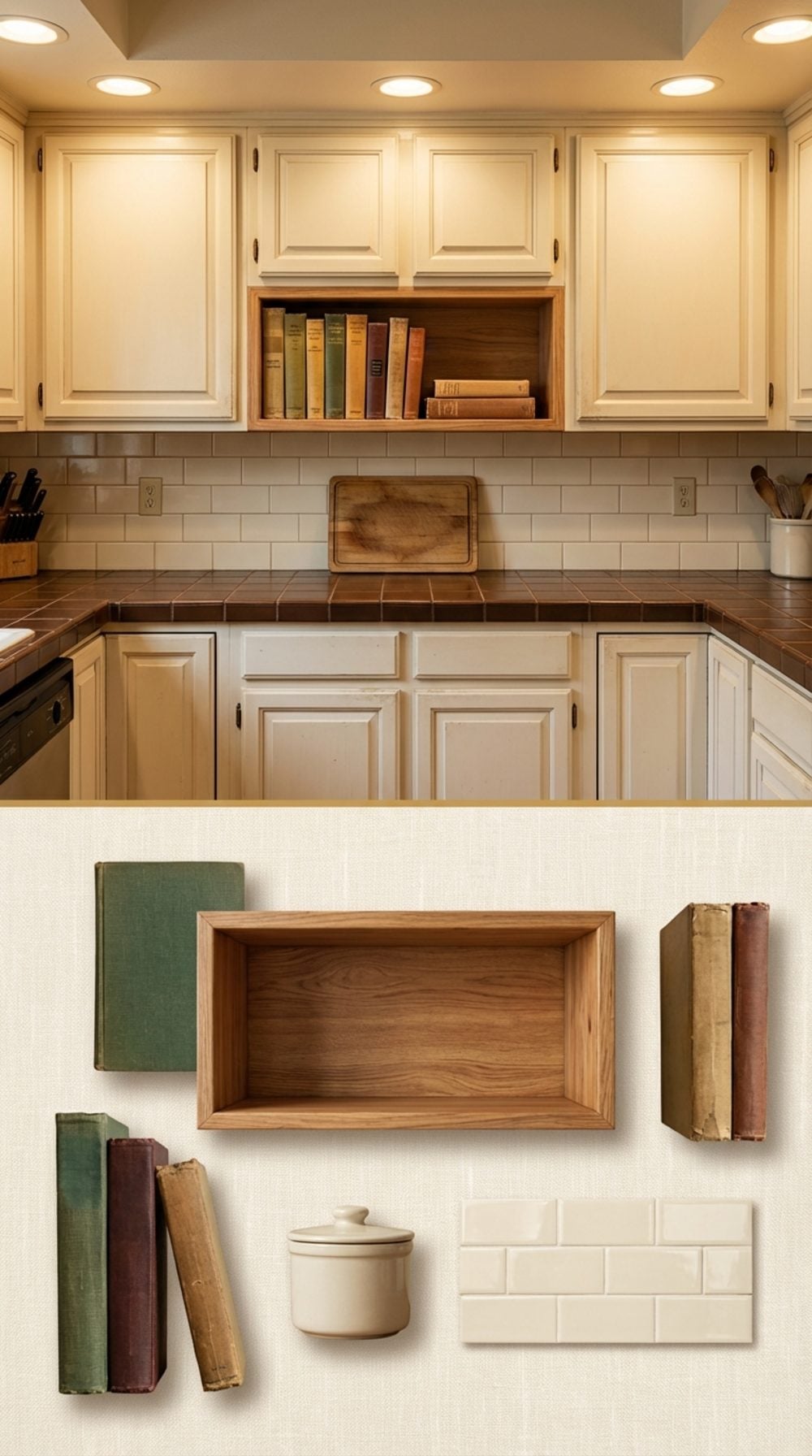
Right there, at eye level, tucked between the upper cabinets and the backsplash tile: a shallow ledge just deep enough for a row of cookbooks standing upright. Not a cabinet. Not a drawer. Just a simple, open shelf that said this kitchen is for cooking. The books were always a little grease-splattered on the spines. That was the point.
Somewhere around the granite-and-stainless renovation era, the cookbook shelf got value-engineered out. Now we prop an iPad on a stand and wonder why cooking feels like a chore. A two-inch ledge fixed something we didn’t know needed fixing.
The Pot Filler Faucet Mounted to the Wall Above the Range
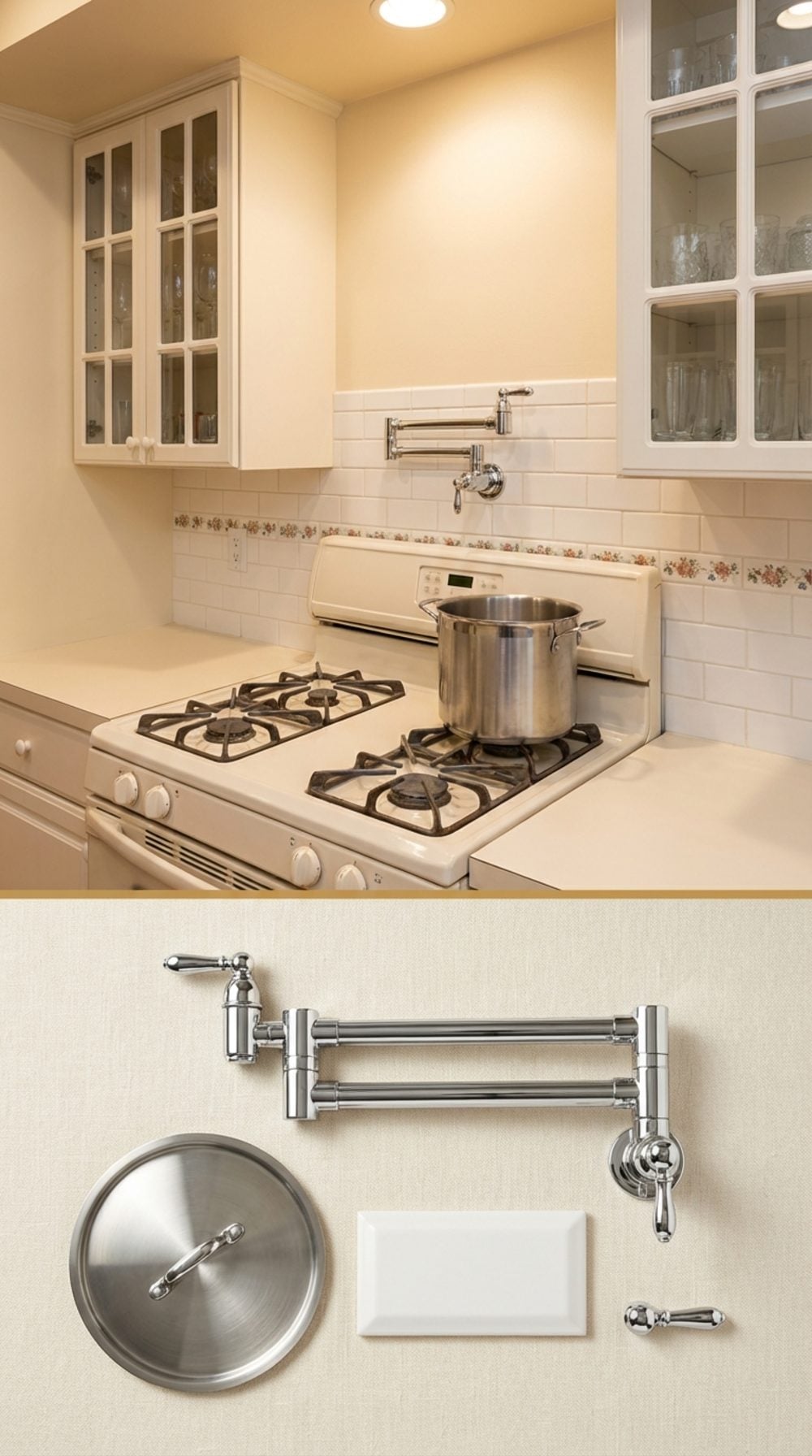
Two-jointed, brushed nickel or polished chrome, folded flat against the wall when not in use. You swung it out over the pot, filled it right there on the stove, and never had to lug eight quarts of water across the kitchen again. It was a small luxury that felt architectural, not decorative.
Pot fillers went in and out of fashion a few times, partly because plumbing behind the range wall felt like a commitment. But the logic was sound. Heavy pasta pots happen every week. The pot filler was the kitchen feature that admitted cooking was physical work and met it halfway.
Appliance Garages With a Roll-Up Tambour Door
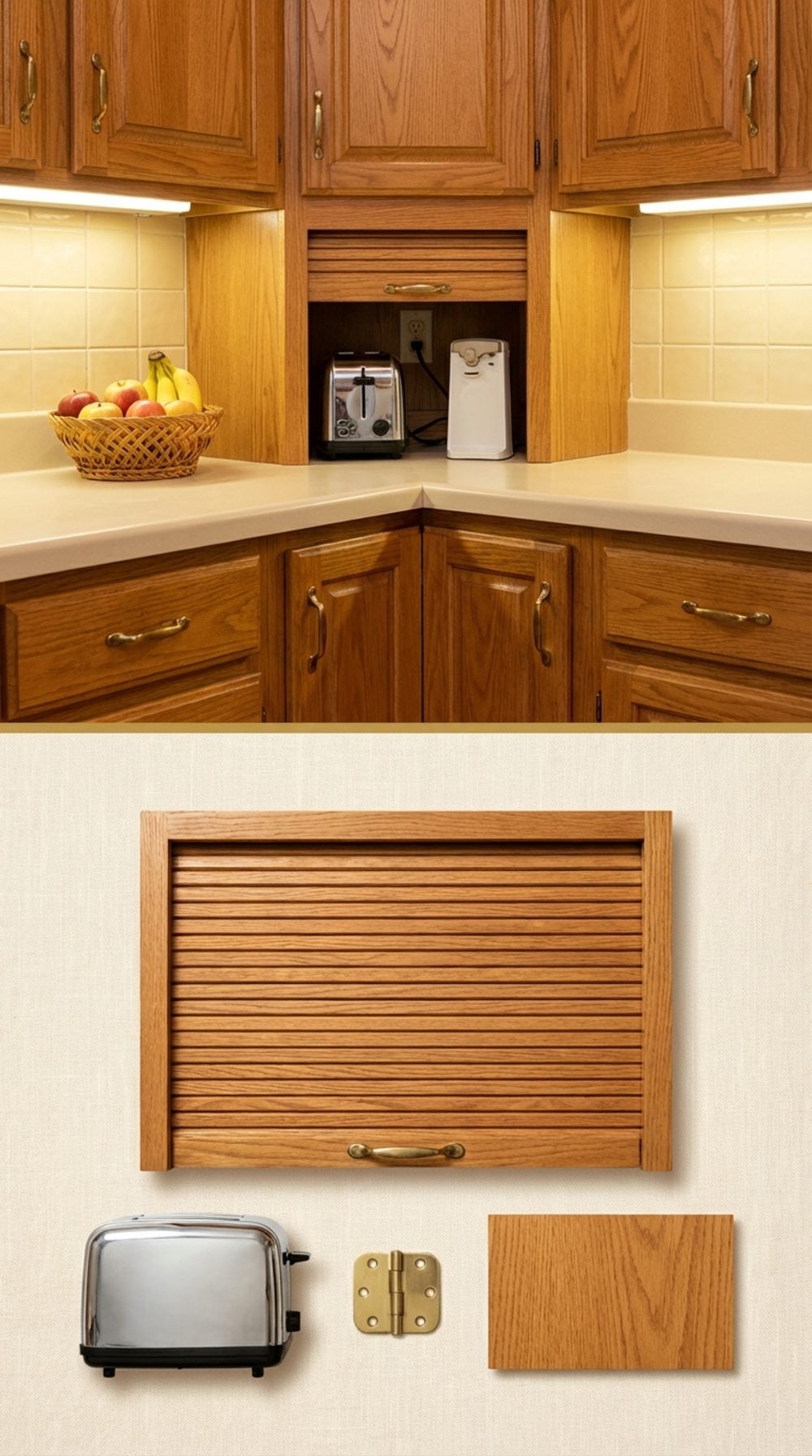
The tambour door was a small miracle of kitchen engineering. It rolled up on a track into the cabinet like a tiny garage door, revealing the toaster, the can opener, the coffee maker, all plugged in and ready, all invisible when you didn’t need them. The wood-slatted door had a satisfying wooden rumble as it opened. Every kid who ever lived in a house with one pulled it up and down for no reason whatsoever.
Appliance garages showed up in late 1970s and 1980s kitchens as a response to counter clutter, and they worked beautifully. The logic was simple: countertops look better without appliances on them, but appliances need to be accessible. A roll-up door in the corner of the counter solved both problems at once. Open-plan kitchens and the current obsession with upper cabinet removal killed them. They deserve a full comeback.
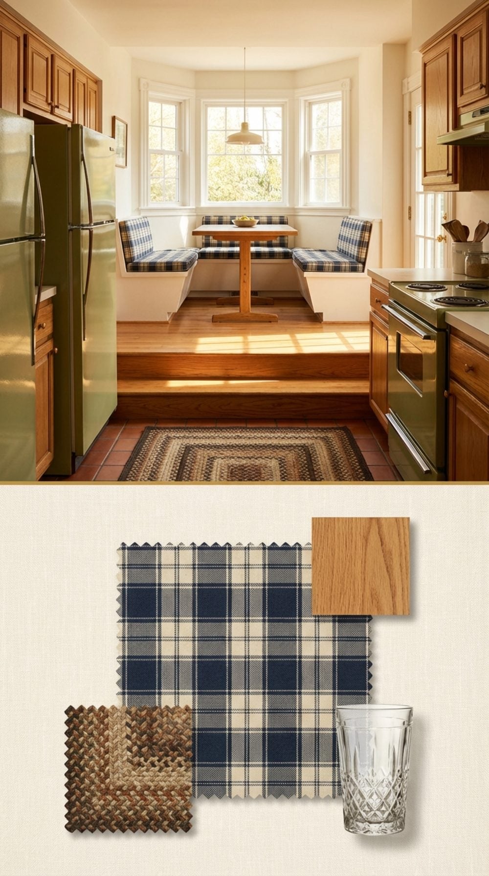
The Step-Up Breakfast Nook, Slightly Elevated From the Kitchen Floor
🔥 Would you like to save this?
Two steps up, a platform of hardwood or brick tile, and suddenly you were in a different room without actually leaving the kitchen. The breakfast nook sat elevated from the cooking area, usually in a bay window bump-out, with a built-in cushioned bench running the perimeter and a small table that the whole family barely fit around.
The elevation was partly practical (it defined the space without walls) and partly theatrical. Sitting up there for morning coffee while someone cooked below felt oddly civilized. The cushions were always slightly too thin and covered in a floral or plaid fabric that had been there since the house was built. Nobody ever replaced them. They were perfect.
‘The breakfast nook didn’t just feed you. It was where the kitchen let you sit down and breathe for a minute.’
Under-Cabinet Fluorescent Tube Lights With a Switch on the Fixture
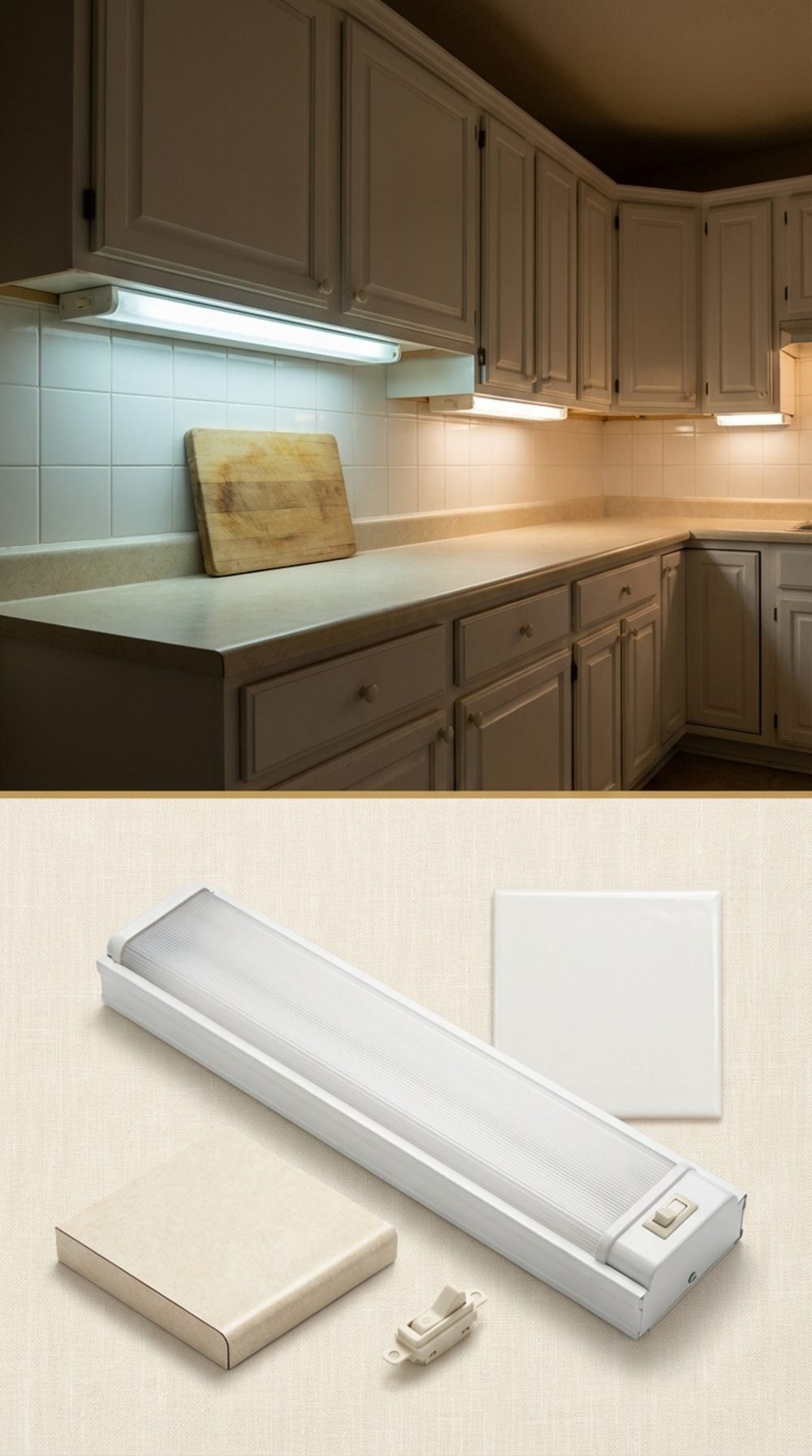
That little plastic switch right on the light fixture itself, usually mounted under the cabinet just above the cutting area. You’d reach up without looking, flick it on, and the counter lit up with that slightly cool, slightly humming fluorescent glow. Not glamorous. But functional in a way that the recessed LED puck lights that replaced them never quite matched.
The under-cabinet fluorescent tube was honest about what it was: task lighting. Not ambiance. Not a design feature. Just a tool that made chopping vegetables after sundown an easier proposition. The hum was part of the kitchen’s background sound. You stopped hearing it after the first thirty seconds, like the refrigerator compressor or the furnace kicking on.
The Knife Block Slot Built Into the Wooden Countertop Edge
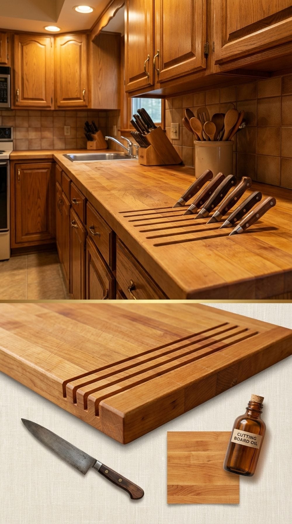
Not a free-standing knife block sitting on the counter. The slots were cut directly into the wooden edge strip or butcher block countertop, a row of narrow parallel cuts, angled slightly, holding four or five knives by their blades, handles up. It was elegant in a purely functional way. The knives lived in the counter itself.
Butcher block countertops had these as a built-in feature throughout the 1970s and 1980s. When laminate and then granite took over, the integrated knife slot went with them. The free-standing knife block appeared on every wedding registry after that, and we accepted it. But the built-in version was better: fewer things to move when you wiped down the counter, fewer things to knock off accidentally, and a kitchen that looked like it was designed to be used.
The Pull-Out Cutting Board Hidden in a Drawer Below the Counter
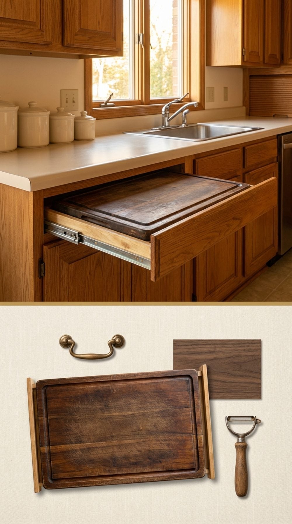
Second drawer down, right below the main prep area. You pulled it out and it extended about eighteen inches on wooden slides, giving you a dedicated cutting surface without taking up a single inch of counter space when it was put away. The board was usually a thin hardwood slab, sometimes with a juice groove, almost always stained dark from years of use.
The Lazy Susan Corner Cabinet, Spinning on Ball Bearings
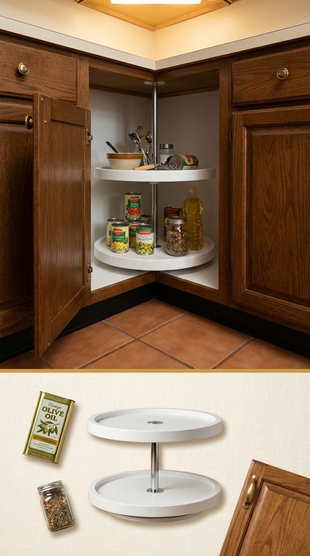
There was a specific sound to it: a low rumble with a slight squeak at about 270 degrees. You’d reach in, give the shelf a spin, and watch the canned goods, the olive oil, the mystery bottle of something from 2004 rotate past until the thing you wanted came around. Corner cabinets without a lazy Susan were dead space. Corner cabinets with one were a minor miracle of storage engineering.
Full-circle and half-moon versions both existed. The half-moon attached to the door and swung out with it; the full-circle spun freely behind a bi-fold door. Both had the same organizational logic: nothing stays invisible forever if you just keep spinning.
The Window Over the Kitchen Sink That Actually Opened
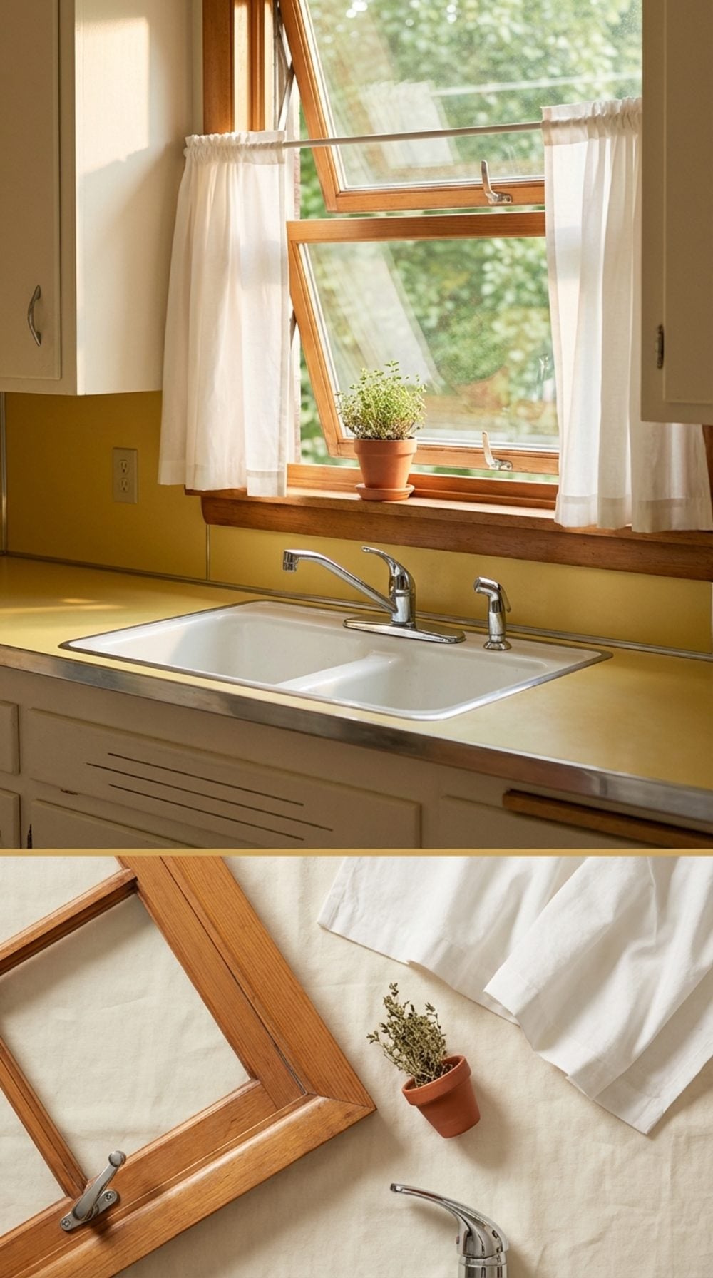
Crank it open two inches while doing dishes and the whole kitchen changed. A cross breeze came through, carrying whatever was happening outside: cut grass, rain on concrete, someone’s backyard grill starting up two houses down. The window over the sink was the kitchen’s only contact with the outside world during the long hours of meal prep, and it worked as both ventilation and company.
New construction kitchens frequently skip operable windows over the sink in favor of fixed glass, or skip the window entirely for a tile backsplash that runs to the ceiling. Both decisions are wrong. Not wrong aesthetically. Wrong in the way that removes something quietly essential from daily life and replaces it with nothing at all.