🔥 Would you like to save this?
Small-room advice used to arrive with all the flexibility of a building code. Paint the walls white. Keep the ceiling white. Buy pale furniture. Avoid anything that might remind the room it has a personality. The theory made enough intuitive sense to survive for decades: light surfaces reflect more light, so surely the room must feel larger. Sometimes they do. Sometimes they simply make every corner, door frame, ceiling line, and awkward jog in the architecture exceptionally easy to see.
In order to come up with the very specific design ideas, we create most designs with the assistance of state-of-the-art AI interior design software. Also, assume links that take you off the site are affiliate links such as links to Amazon. this means we may earn a commission if you buy something.
Dark rooms play a different game. Charcoal can make brass flare to life. Forest green turns ordinary oak into something worth noticing. Navy gives a television somewhere to disappear. Matching trim can quiet busy architecture, while pale curtains against an ink-colored wall can make the window suddenly become the brightest thing in the room. None of this changes the tape measure, and dark paint isn’t a magic enlargement machine. What it can change is what the eye notices first: boundaries or furniture, clutter or composition, square footage or atmosphere.
These 31 living rooms go dark for different reasons, and that’s where things get interesting. Some use contrast aggressively; others deliberately remove it. Some work with abundant daylight; one of the most persuasive stops fighting a naturally low-light room altogether. Mirrors, rugs, lamps, upholstery, bookshelves, fireplaces, windows, and art all get involved before we’re done. The goal isn’t to prove that white is wrong and black is right. It’s to show how much more useful the conversation becomes once “Will this make the room look bigger?” stops being the only question.
Before your renovation wish list becomes a shopping list, see today’s home equity rates if you’re exploring financing.
31. Paint Every Wall Dark Instead of Creating One Lonely Accent Wall
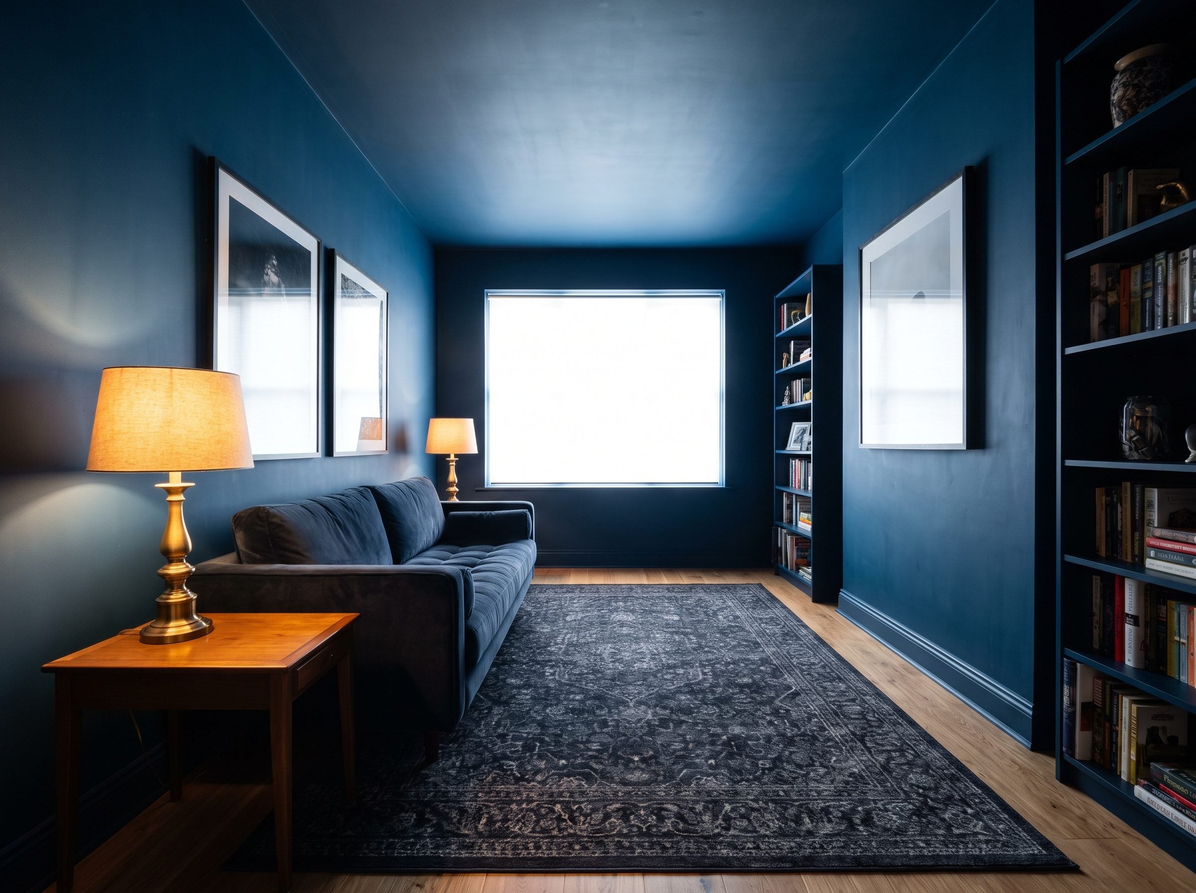
The cautious version of a dark room is one dramatic wall surrounded by three pale ones. Sometimes that’s exactly what a room needs — the TV wall later in this gallery is a good example — but don’t assume it is automatically the safer choice.
An accent wall is designed to attract attention. In a very small room, that can make one boundary unusually obvious. Wrap all four walls in the same deep color and the effect changes completely: instead of pointing at one surface, the paint becomes the background to everything else.
Charcoal, oxblood, forest green, or ink navy can create a remarkably enveloping shell, particularly when the trim isn’t shouting from inside it.
The advantage isn’t mysterious physics. It’s visual priority. One dark wall says, “Look at this wall.” Four dark walls give the furniture, lamps, windows, and art a chance to take over the conversation.
30. Pair Dark Walls With a Pale Sofa for Strong Contrast
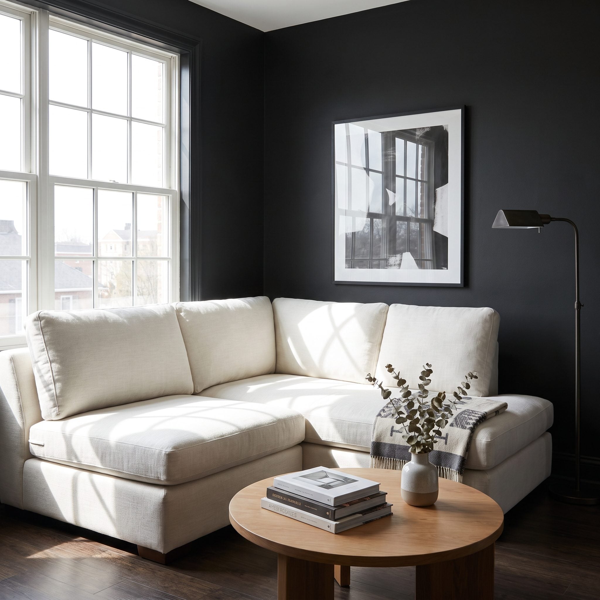
A cream sofa against near-black navy doesn’t disappear. That’s precisely the point.
The pale upholstery becomes the first thing you notice, while the wall behind it settles into the background. Instead of asking the architecture to provide all the visual interest, the room gives one large piece of furniture a very clear silhouette.
Farrow & Ball’s Hague Blue behind a cream linen sofa is the kind of contrast that makes both colors look more deliberate. The sofa appears lighter, the wall appears deeper, and the room acquires hierarchy.
Push the contrast when you want the sofa to be the focal point. Later we’ll do the opposite and let dark upholstery merge into the wall. Neither strategy is universally “bigger.” They’re two different ways to organize the same amount of space.
29. Choose Deep Navy Instead of Defaulting to White
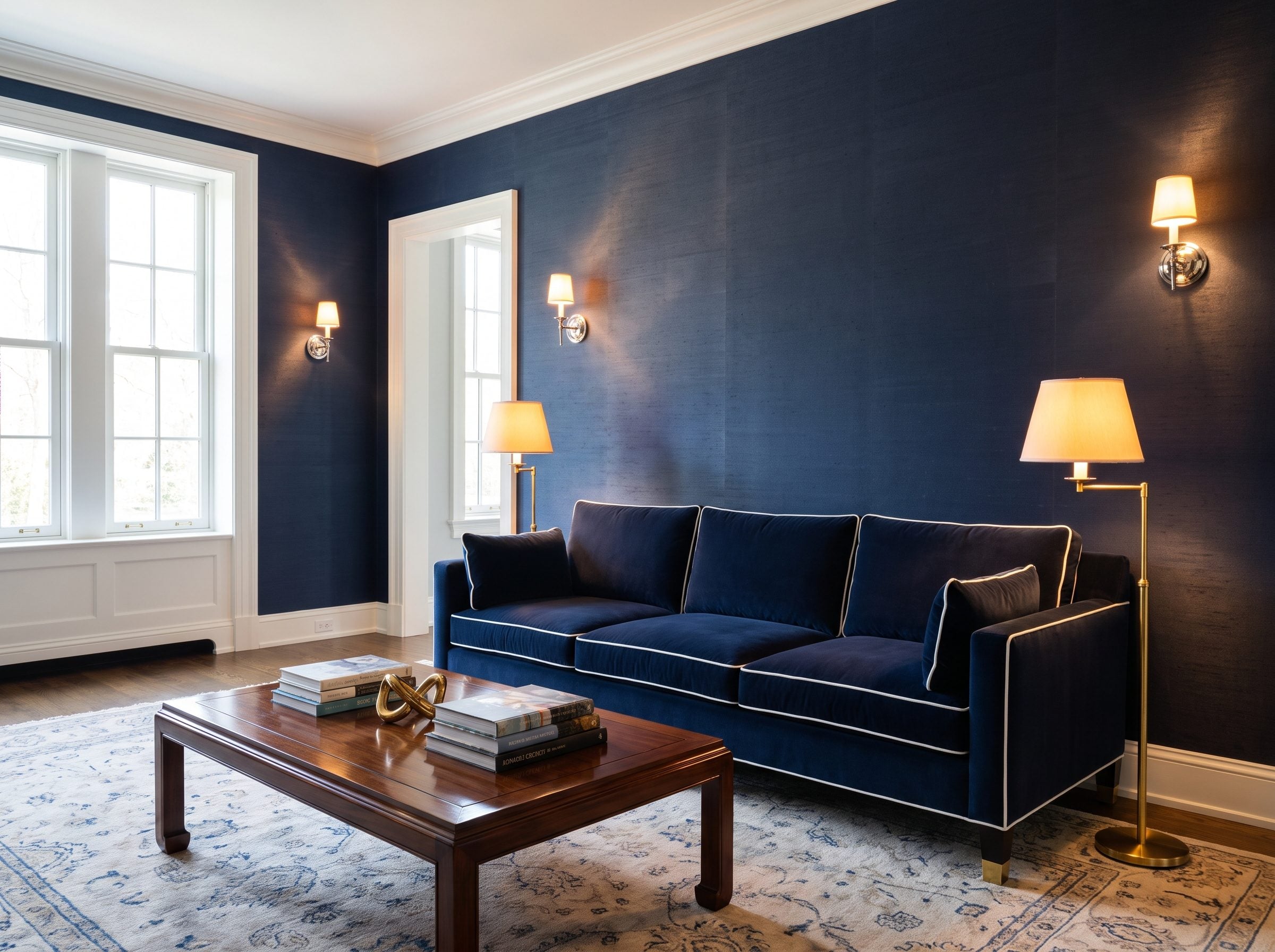
White reflects more visible light. That’s real. It still doesn’t mean every small room needs to be white.
Farrow & Ball’s Hague Blue has a Light Reflectance Value of about 7. Source It’s a very dark color, and that’s part of the appeal: instead of trying to flood every surface with brightness, it creates a deep backdrop for whatever does catch the light.
Hague Blue also isn’t a flat, generic navy. Its green-gray character shifts noticeably as daylight changes. Source Morning light can pull out the greener side; evening pushes it toward ink.
Finish matters too. An eggshell or satin surface can return more highlight than a dead-flat one, while warm off-white trim produces a gentler contrast than brilliant white.
I resisted navy for years. Thought it belonged in libraries with 12-foot ceilings and taxidermy. It belongs in your 11-by-13 den too. A navy velvet sofa is there if you’d rather start with the furniture.
28. Use Warm Wood Furniture Against Dark Walls
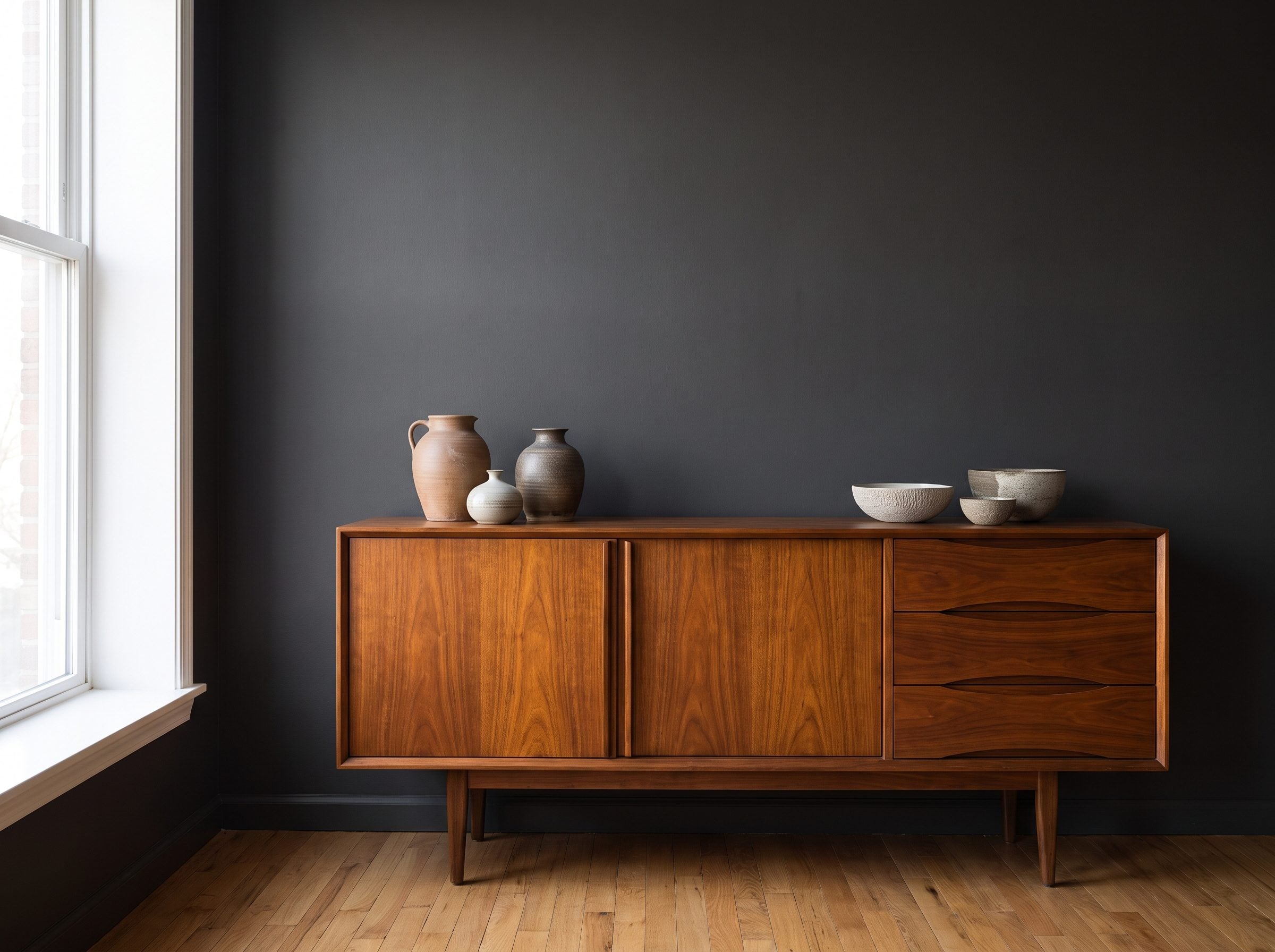
Dark paint gives warm wood somewhere to show off.
Put a walnut sideboard against deep olive or navy and suddenly the grain, brass hardware, and warm brown undertones become much more obvious. Against beige, that same piece can politely blend into the scenery.
That’s useful in a small room because the walls don’t have to be the attraction. Let them become the backdrop and allow the furniture to provide the warmth.
Walnut, teak, cherry, oak, rattan, and cane all benefit from that deeper field. A sage living room shows the same relationship at a softer intensity; push the wall several shades darker and the contrast becomes more dramatic.
27. Color-Drench the Walls, Trim, and Doors in the Same Deep Shade
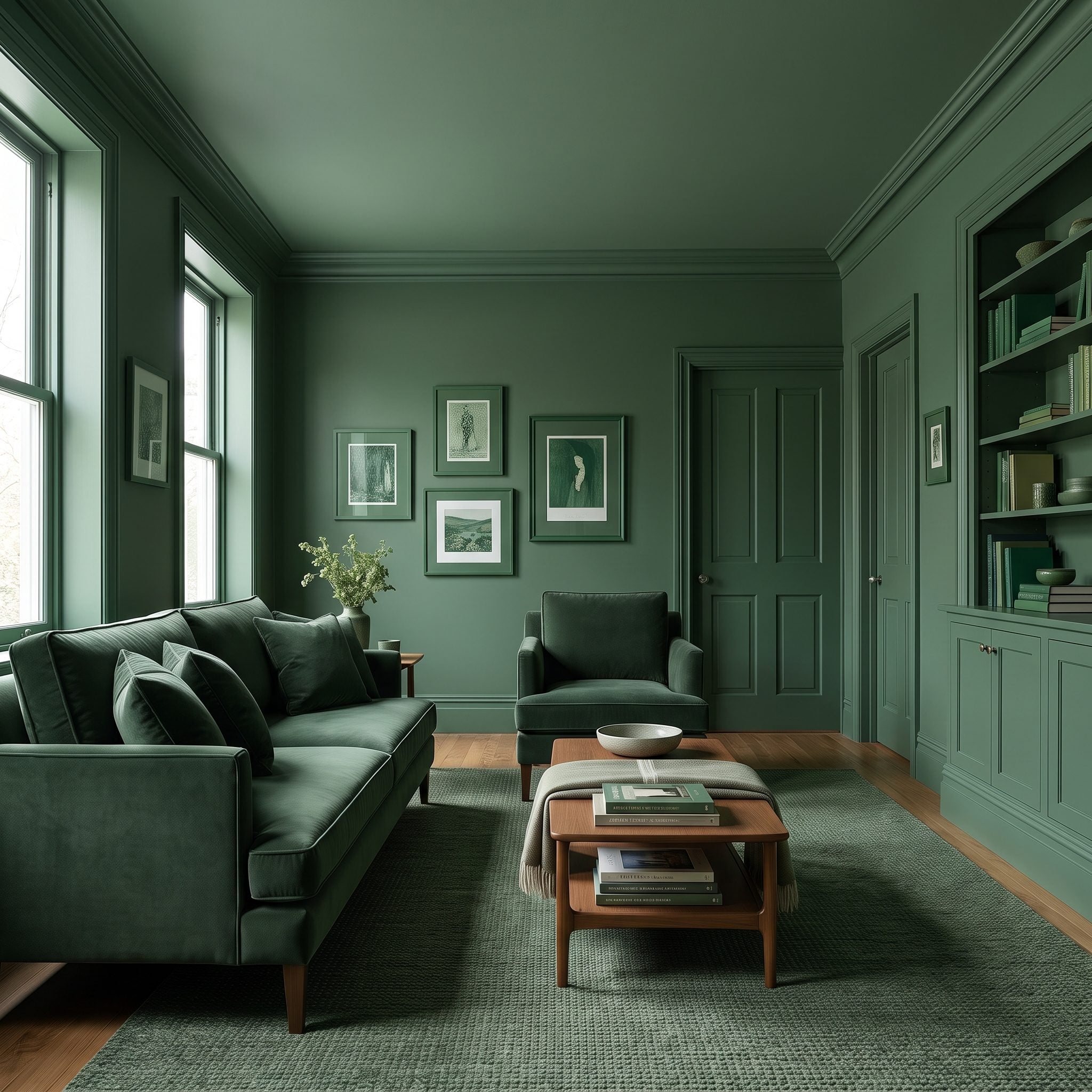
Color drenching takes the dark-wall idea and removes one more source of interruption: contrasting woodwork.
Paint the walls, baseboards, door casings, doors, and other architectural trim in the same color and suddenly the room has fewer little outlines competing for attention. The molding remains visible because of profile and shadow, but it no longer slices the wall into separate colored pieces.
The technique has become known as color drenching. Source Farrow & Ball even developed its Dead Flat finish so one low-sheen paint could be used across different interior substrates.
The company also recommends the approach in narrow spaces such as hallways. Source
You don’t have to paint literally every available surface to qualify. Start with walls and trim. Add doors if the room can take it. Take the ceiling dark only when you want the more immersive version.
26. Try Chocolate Brown for a Small Room That Needs Warmth
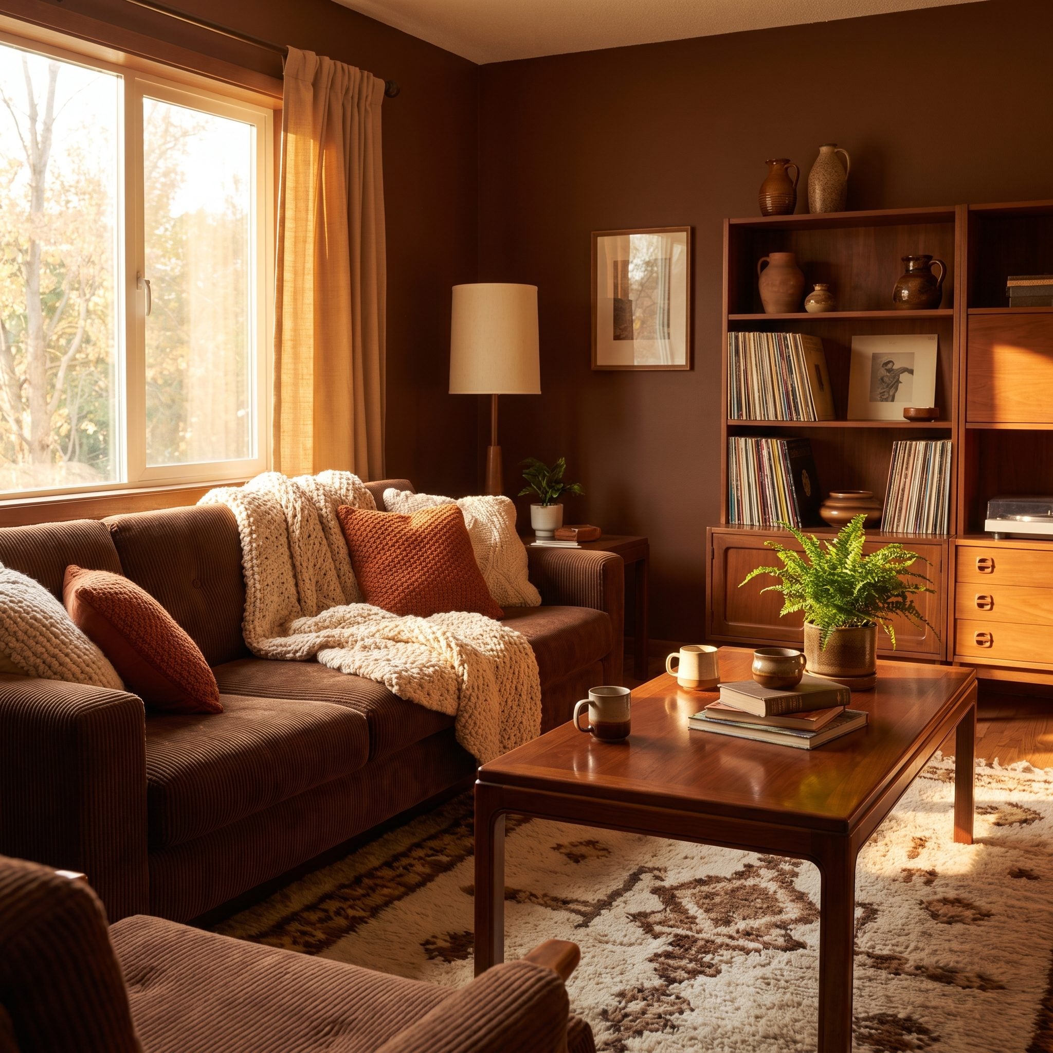
After years of cool gray and greige, chocolate brown feels almost indecently warm.
Apartment Therapy was already tracking dark brown’s return by 2024, but the appeal has little to do with novelty. Brown plays easily with wood, aged brass, cream upholstery, rust, terracotta, and almost everything else people already use to warm up a living room.
Undertone is where the decision gets made. Redder and clay-based browns can feel earthy and generous; grayer versions can turn muddy in weak light.
Then give the darkness something pale to work against. A cream linen sofa, an aged brass table lamp, and a lighter rug keep the palette from becoming one uninterrupted brown sentence.
Warm the lamps too. Around 2700K is a useful starting point when you want chocolate paint to read warm rather than gray.
25. Hang Light Curtains Against Dark Walls to Make the Window the Brightest Thing in the Room
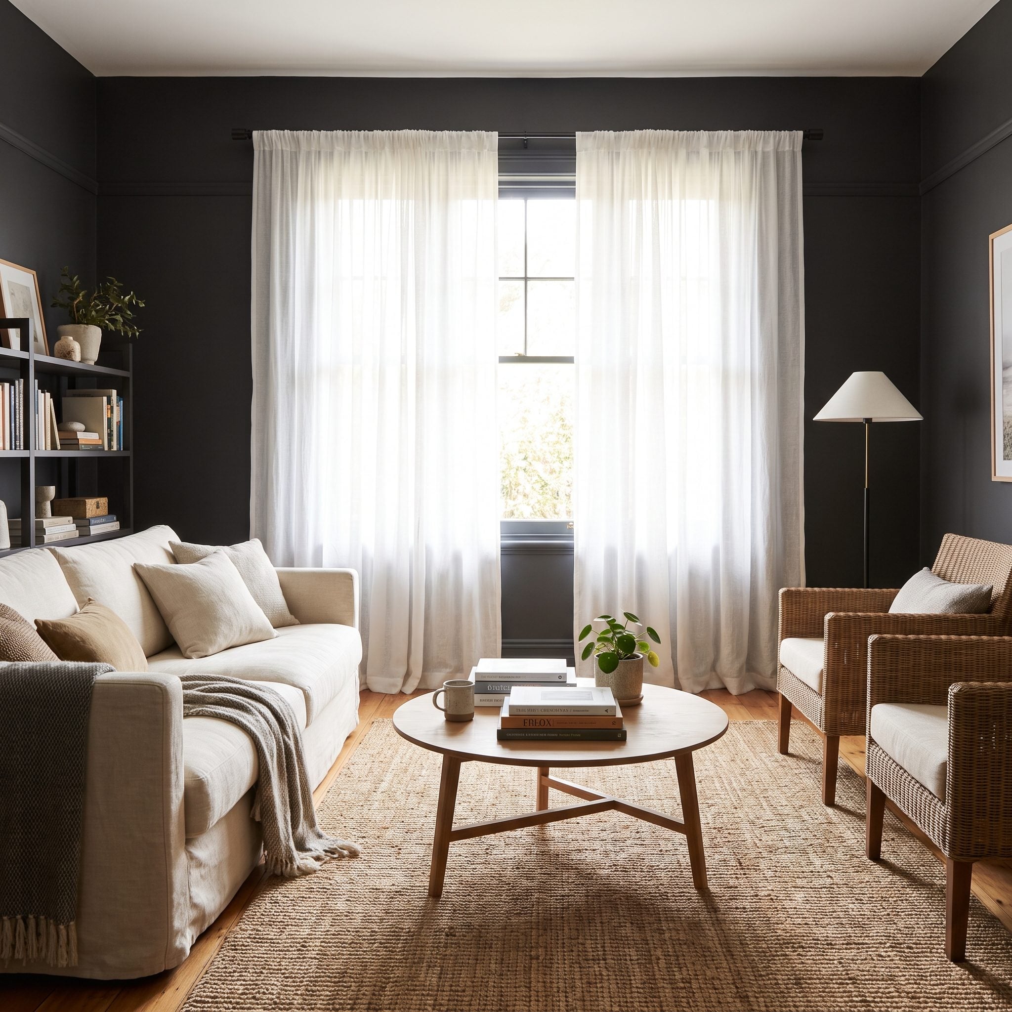
Pale curtains against a charcoal wall are not subtle. That’s why they work.
The fabric becomes a bright vertical element framing the brightest opening in the room. Instead of trying to hide the window inside the wall, this strategy announces it.
Mount the rod above the trim and extend it beyond the frame so the curtains can sit mostly off the glass when they’re open. That exposes more daylight and makes the window assembly appear broader.
Heavy blackout velvet has its place, but if daylight is scarce, pale linen or unbleached cotton keeps things visually lighter. A pair of oatmeal linen curtains can become architecture by themselves.
24. Use Mirrors to Send the Best View and Available Daylight Back Into the Room
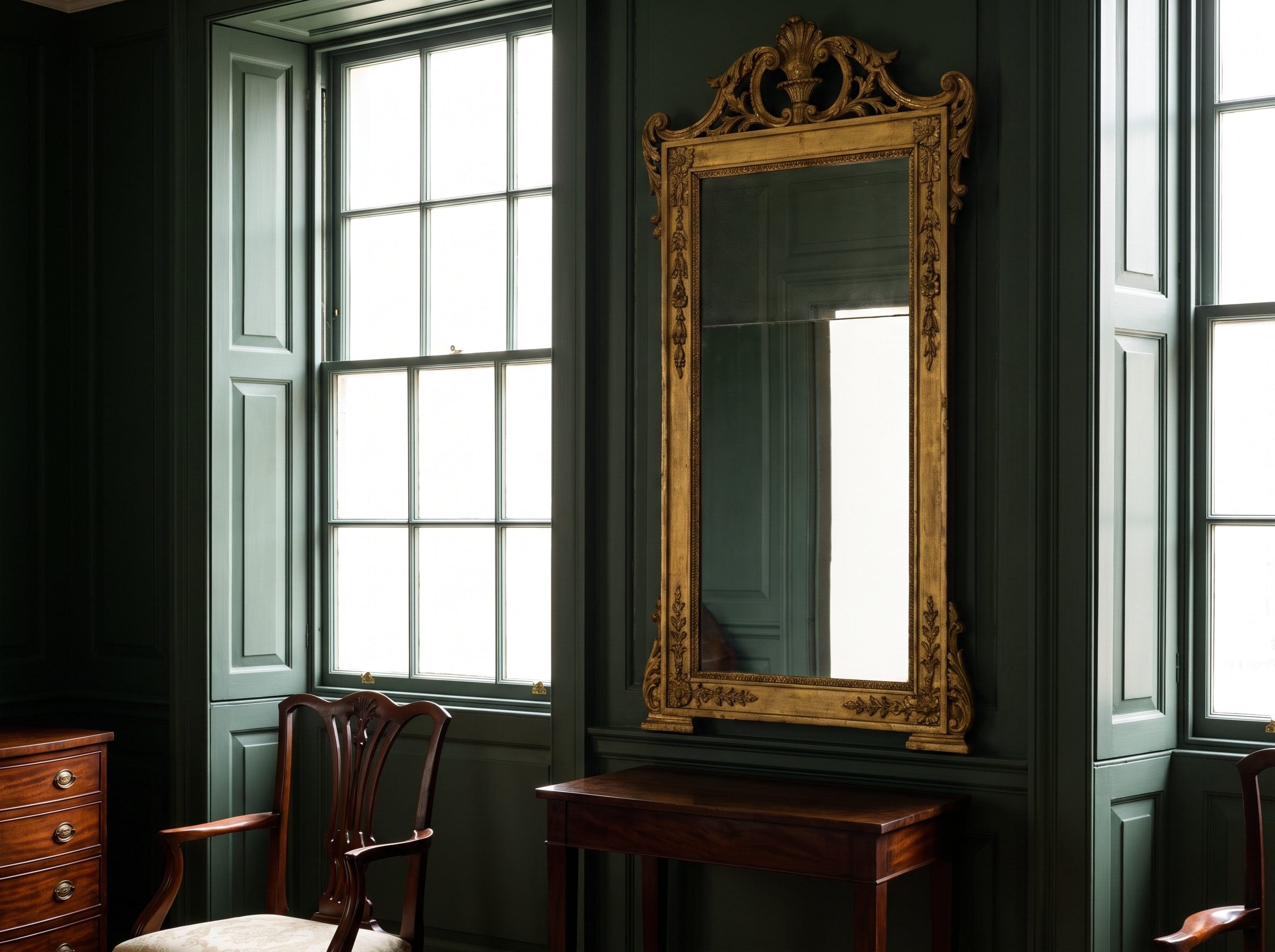
Before electric lighting, mirrors were already doing useful work in dim interiors.
Large pier glasses became important features in Georgian and later interiors, often positioned between windows where they could reflect daylight, candlelight, architecture, and movement back into the room. Source
The modern version doesn’t require six feet of mercury-silvered glass. Put a substantial mirror opposite a good window and it reflects both light and view. Source An adjacent wall can work too if the reflected sightline is worthwhile.
Bigger generally gives you more room, view, and light to reflect. What matters even more is what the mirror sees.
Don’t point your largest mirror at the blank wall behind the TV. It will reproduce that view with astonishing loyalty.
23. Choose Burgundy or Oxblood for a Jewel-Box Effect
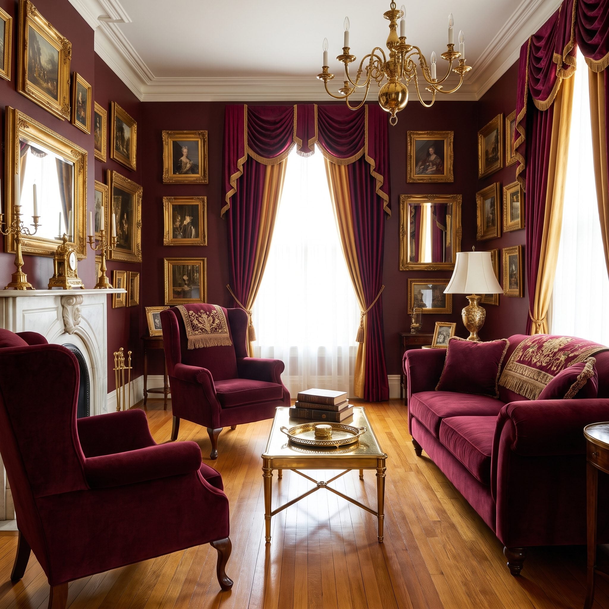
Burgundy and oxblood take the idea of a dark room somewhere navy can’t. They’re deep, but they still carry unmistakable heat.
The name oxblood has a long history in color vocabulary. Source What matters here is less the disputed mythology around the name than the color itself: a red darkened with brown until it feels almost leathery. Source
Burgundy usually pulls a little more purple; oxblood generally feels browner and earthier. That difference is why one can feel like wine velvet while the other feels closer to antique leather.
Farrow & Ball’s revived Etruscan Red sits in that warm, brown-red territory. Source
Run the red onto trim or wainscoting for the jewel-box version, then bring in brass, warm oak, cream, and low light. An emerald powder room uses the same commitment in a different color family.
22. Turn an Entire Bookcase Wall Into a Deep, Moody Backdrop
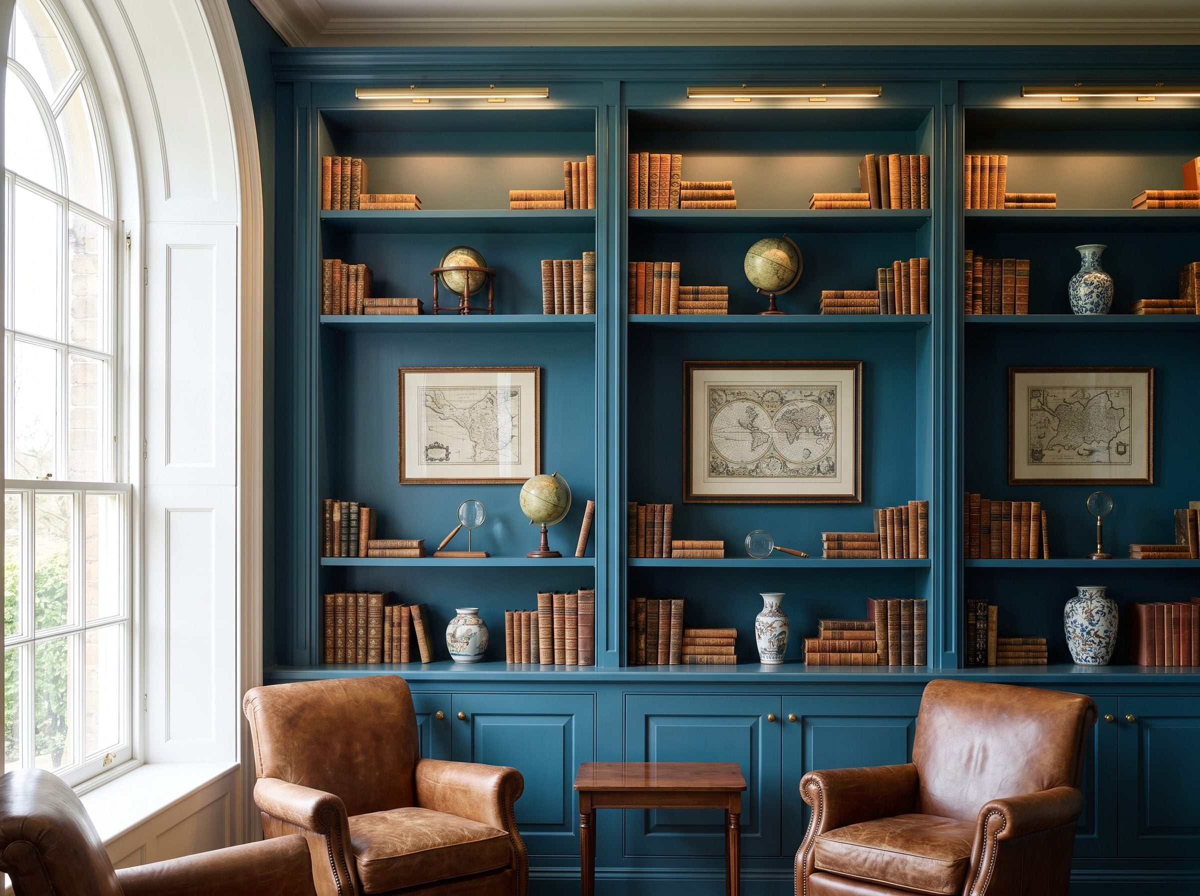
Built-ins can either look like architecture or like furniture somebody bolted to a wall.
Paint the shelves, back panels, trim, and surrounding wall one saturated color and the whole installation starts behaving like architecture. Gallery green, tarry navy, deep charcoal — the shelves become shadow and the books provide most of the color.
That is especially useful in a small reading room because hundreds of book spines already create visual activity. The wall itself doesn’t need another contrasting outline.
The same saturated-backdrop logic turns up in this bohemian media room, where brass and paper look richer against a dark field.
Leave some breathing room on the shelves. Dark cabinetry packed to capacity can feel wonderfully library-like, but if you want the objects to stand out, let a little of that deep back panel remain visible.
21. Use Charcoal When Pure Black Feels Too Severe
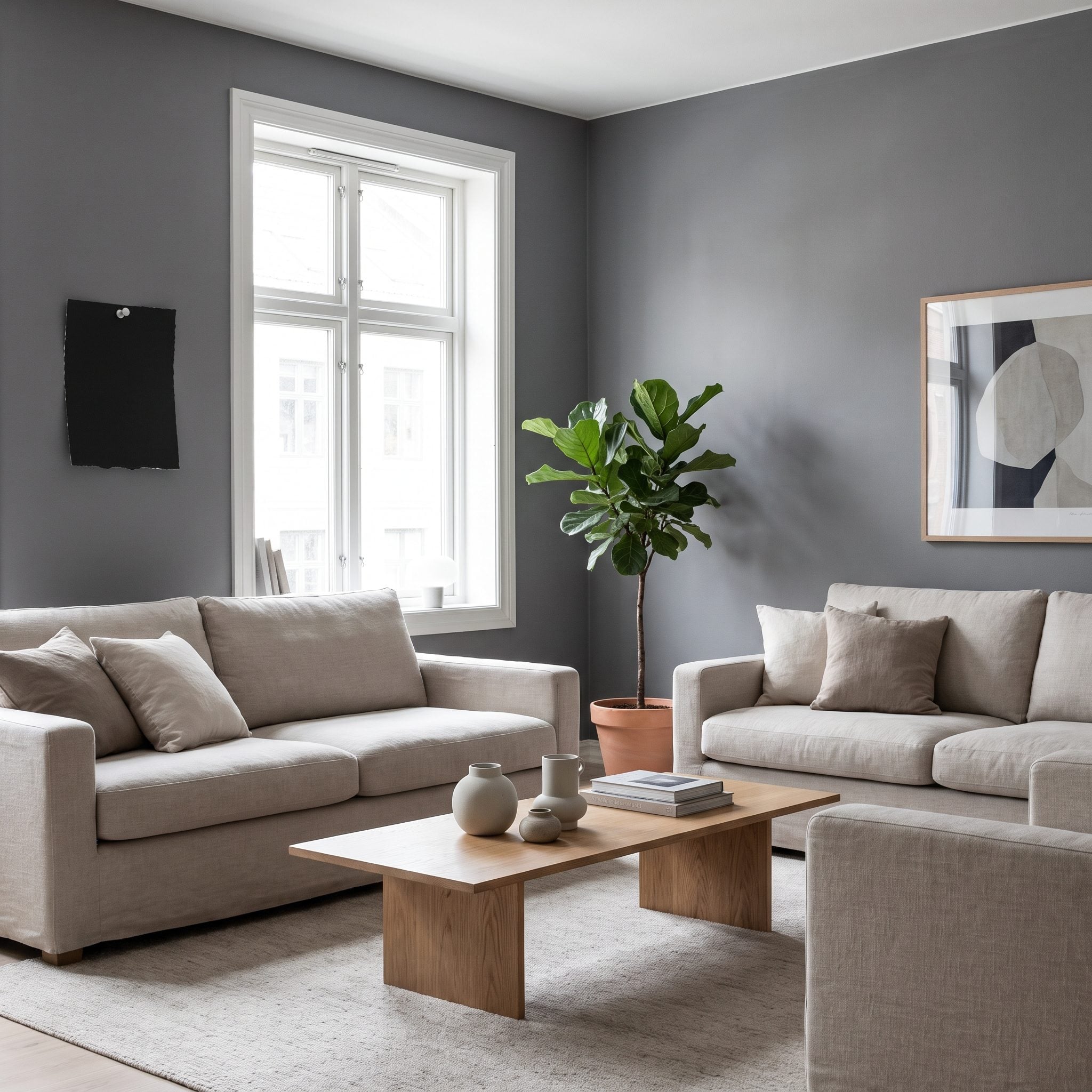
If black feels like too large a leap, stop one step short.
Farrow & Ball Railings, No. 31 is routinely described as sitting somewhere between black and deep blue. Source Designers discussing it often emphasize the blue that becomes more obvious as the light changes. Source
That’s the advantage of many near-blacks and charcoals: undertones remain available to interact with daylight, wood, textiles, and metals rather than reading as one flat neutral.
Farrow & Ball’s darker range gives you several points along that spectrum, including Hopper Head, Down Pipe, Railings, and Off-Black. Source
The same range also shows why “black” isn’t a single visual experience. Source Some versions lean blue, some softer or browner, and the room changes with them.
Sample a large patch or board and watch it from morning through evening. Dark paint is particularly unforgiving when judged from tiny sample chips under showroom lighting.
20. Let Brass and Warm Metals Glow Against a Dark Background
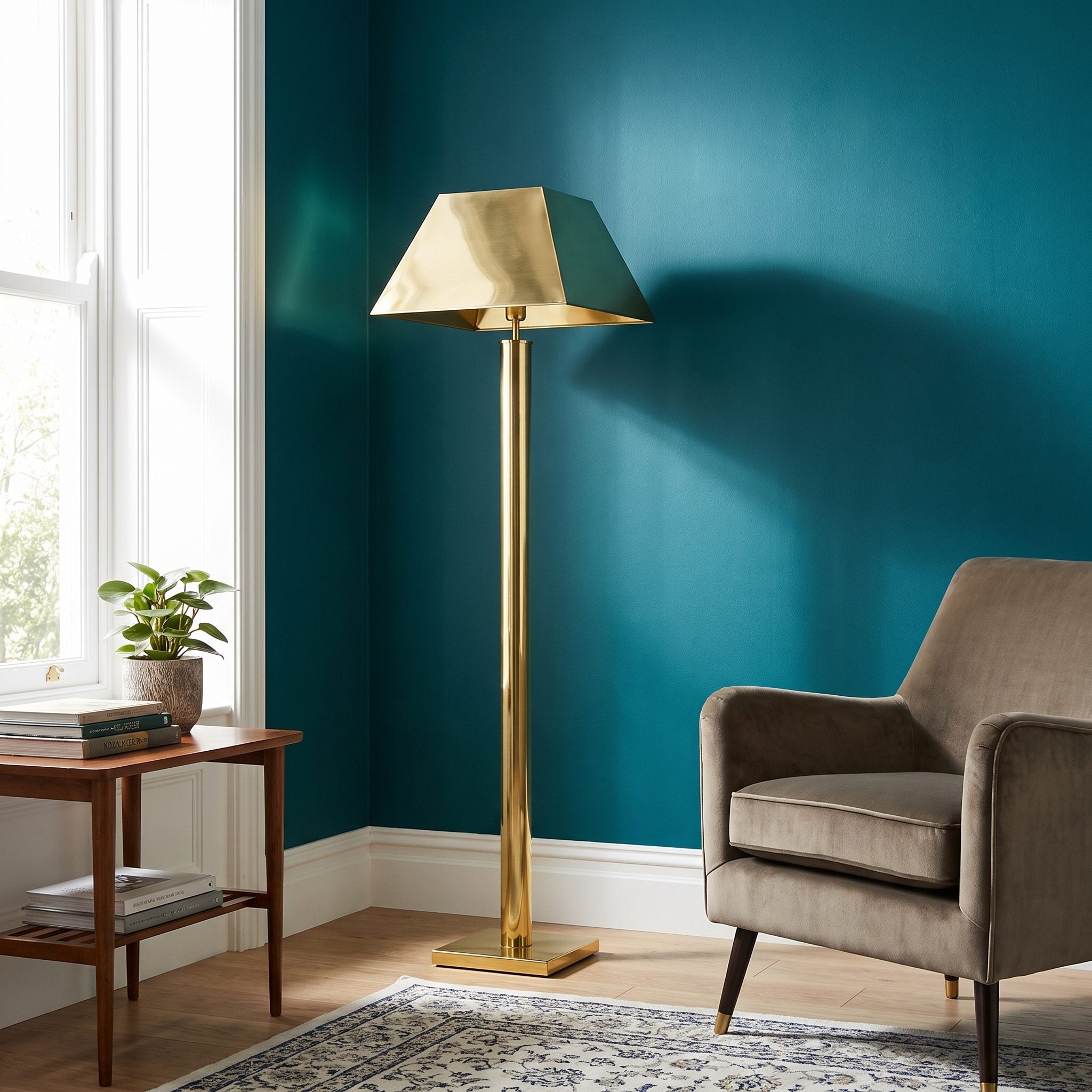
A brass lamp against white can be lovely. Against charcoal, it becomes jewelry.
Designers and stylists regularly use warm metal against deep paint for exactly that contrast. Source The metal supplies the highlight the matte wall refuses to provide. Source
Charcoal, deep evergreen, and navy are particularly easy partners for brass. Source
An antique brass wall sconce, a brass coffee table, and a handful of brass picture frames are enough. You don’t need to turn the room into a hotel lobby.
Brushed and aged finishes usually give a softer reflection than mirror-polished brass, which can be useful in a small room where you want glow rather than glare.
19. Use a Dark Ceiling With Lighter Walls When Intimacy Is the Point
🔥 Would you like to save this?
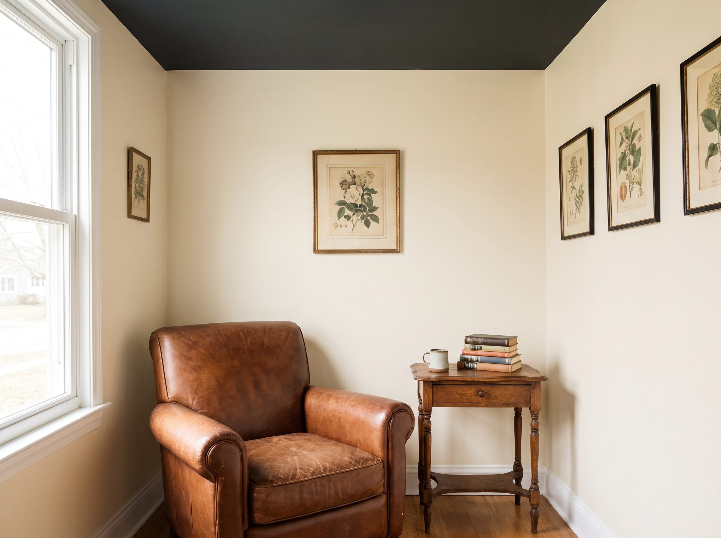
A dark ceiling and light walls are doing something quite different from full color drenching.
Dark overhead color can make a tall or oddly proportioned room feel more intimate. Source Designers often use the trick in generous rooms precisely because it visually lowers the emphasis overhead. Source
In a standard-height room, the transition needs more care. A brutally sharp black line at eight feet can emphasize exactly where the ceiling begins.
That’s where crown molding, a picture rail, or a deliberate band of color can help. The point isn’t to pretend the ceiling is higher. It’s to make the junction look designed rather than accidental.
A low room can absolutely carry a dark ceiling. Just understand the effect you’re choosing: intimacy, drama, and emphasis overhead rather than the seamless shell created by full-room drenching.
18. Let Deep Plum or Aubergine Replace Predictable Neutrals
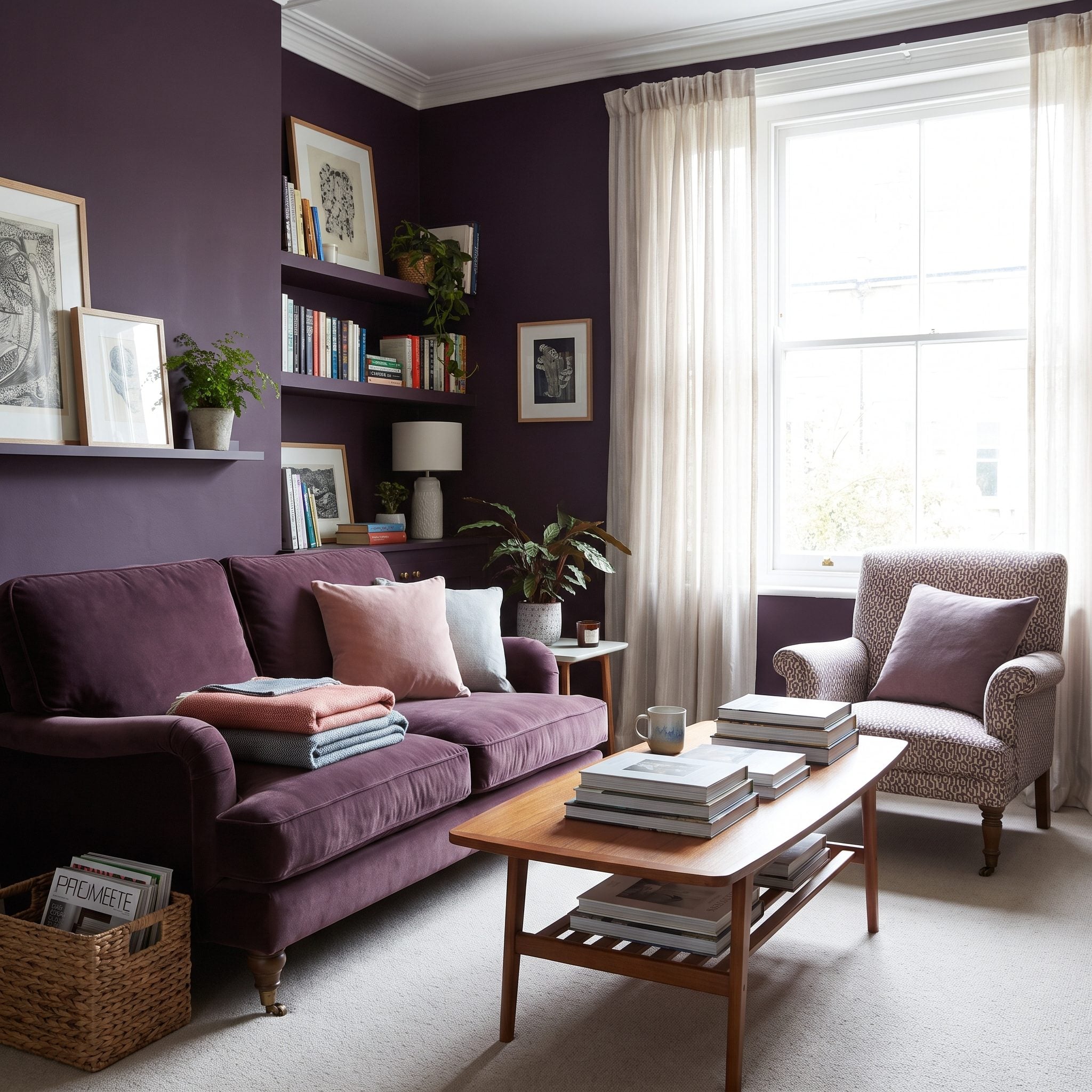
Aubergine is what happens when a neutral room finally loses patience.
Deep plum brings red, blue, and brown into the same conversation, which is why it changes so much depending on upholstery, daylight, and lamp light.
Color forecasters and designers have been pointing toward deep plum and eggplant again. Source Farrow & Ball’s Patrick O’Donnell has specifically discussed the growing appeal of the family. Source
The same coverage makes the case for using strong eggplant shades in smaller rooms rather than reserving them for grand ones. Source
Brinjal has turned up in high-profile interiors, while designers continue working with plum and berry tones in dens and sitting rooms. Source
Pair matte aubergine with aged brass, warm brown, pale pink, or an aubergine velvet armchair. The attraction is not that plum performs some special optical trick. It’s that a small room can carry far more color than cautious decorating advice gives it credit for.
17. Use Dark Paint to Make an Awkward TV Wall Visually Disappear
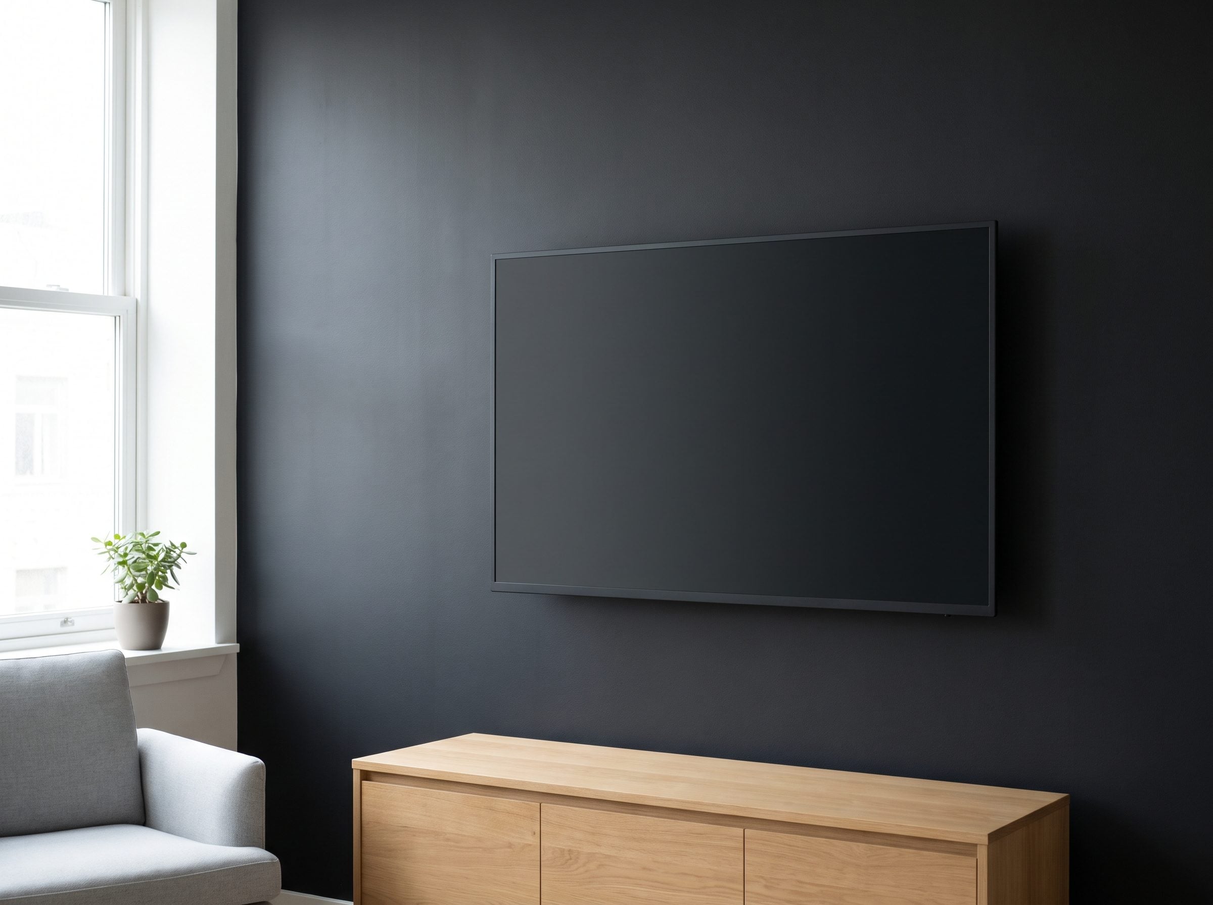
Here’s where the accent wall earns its existence.
A switched-off television is a large black rectangle. Put it on a white wall and you have maximum contrast around something you probably don’t want to be the room’s focal point.
Charcoal, forest green, or near-black behind the screen reduces that contrast. The bezel recedes, and so can the soundbar and other dark electronics nearby.
Media rooms have used this idea forever because it is functional before it is fashionable.
Test the idea on the media wall before you commit to the whole room. A near-black such as Benjamin Moore Soot or Sherwin-Williams Iron Ore gives you the low-stakes version of the same saturated bohemian media room logic.
16. Use Glossy or Reflective Details to Break Up Matte Darkness
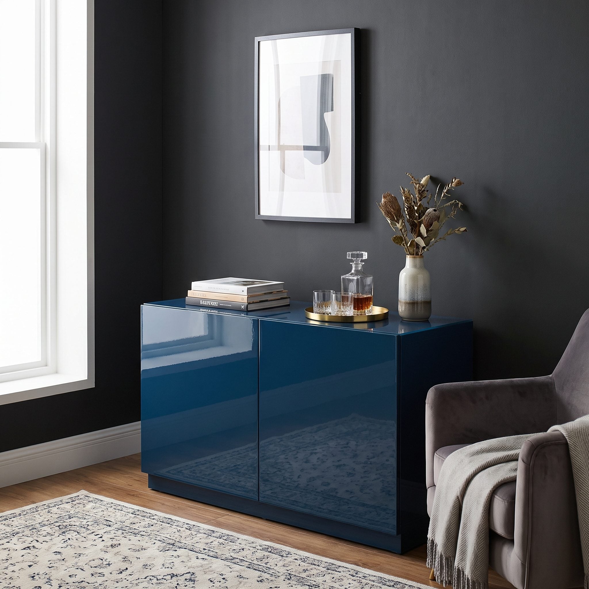
A dark room becomes dull when every surface handles light the same way.
Matte paint absorbs and diffuses reflection. Higher-sheen paint, glass, metal, lacquer, and mirrors return highlights. Same palette, completely different sense of movement.
You don’t have to lacquer an entire room to get the effect. An brass arc floor lamp, an antiqued mirror, or a lacquered black side table gives the eye somewhere to catch light.
I got this wrong for years. Every dark surface was matte because matte felt sophisticated. Eventually the room looked less sophisticated than underexposed.
Think of the approach used in an emerald powder room: saturated walls, then a few carefully chosen surfaces that flash back at you.
15. Pair Dark Walls With Rich, Tonal Upholstery Instead
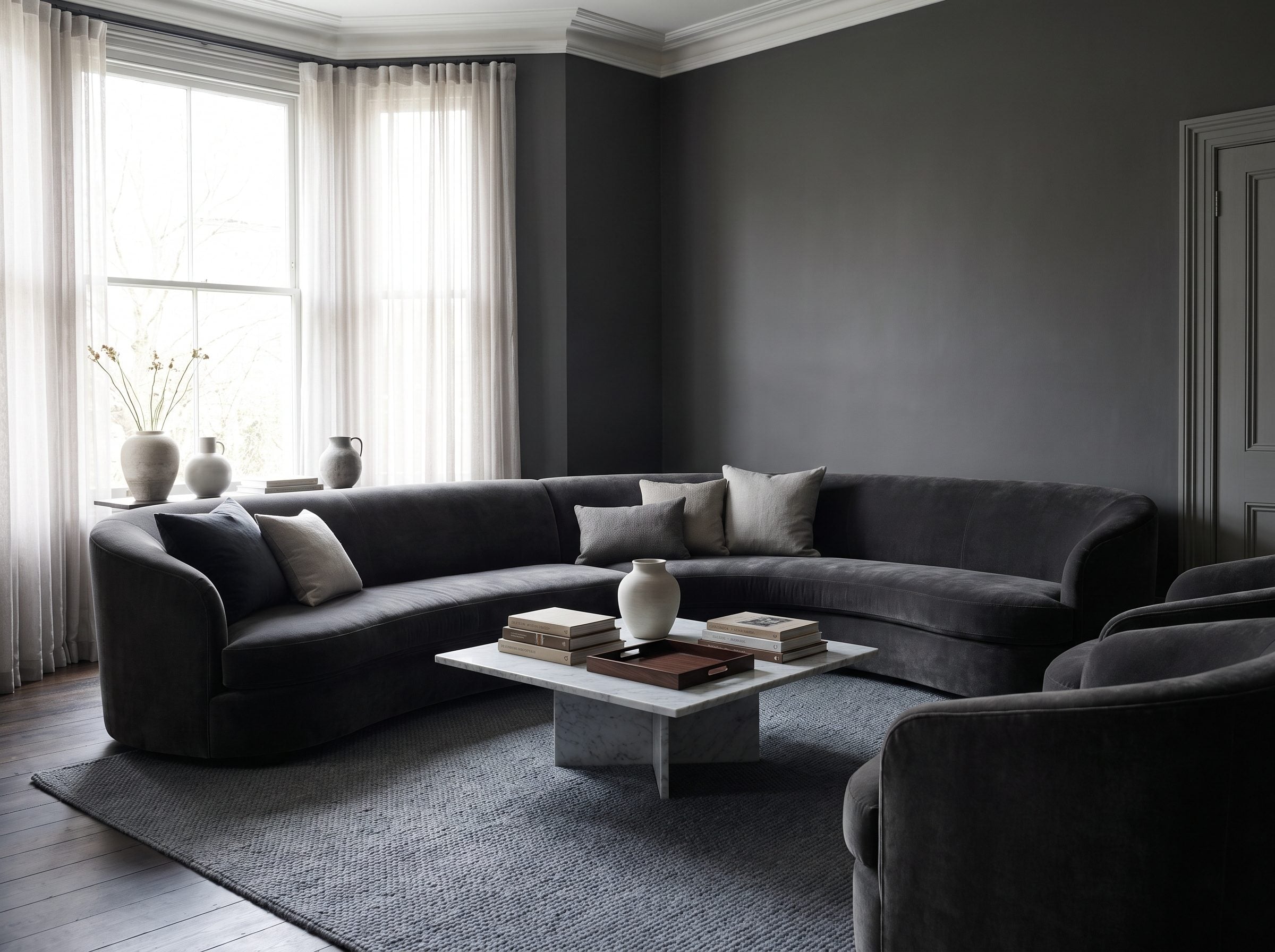
The pale sofa earlier in the gallery was meant to stand out. This room does the opposite.
Put a charcoal velvet sofa against a charcoal wall and the furniture becomes part of the color field. The shape is still there, but contrast stops outlining every inch of it.
That lets texture take over. Velvet, bouclé, wool, and matte paint can all be almost the same color while handling light differently.
It’s the same pleasure you get in these before-and-after powder rooms: saturation creates continuity, then surface variation keeps the whole thing from going flat.
A navy bouclé armchair beside an indigo wool throw can give you several versions of the same blue without turning the room into one anonymous blob.
14. Take the Dark Color Across the Ceiling Too
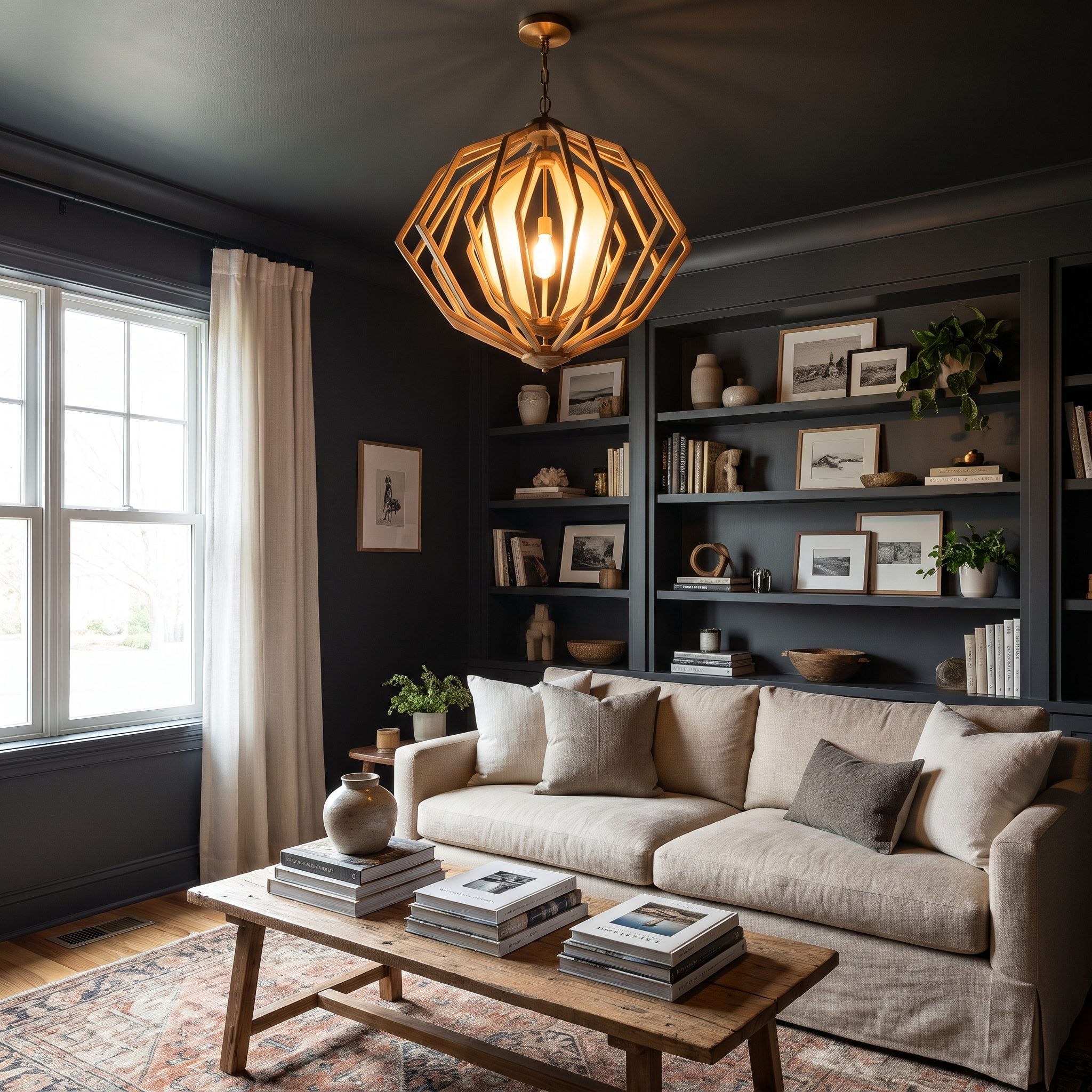
If walls, trim, and doors are already dark, the white ceiling becomes the final high-contrast plane.
Painting it to match creates the fully enveloping version of color drenching. Designer Naomi Astley Clarke has specifically argued that taking a dark wall color over the ceiling can work beautifully in small spaces. Source
Other designers make the same case in terms of changing how the room’s scale is perceived. Source
Farrow & Ball’s Dead Flat helped popularize the practical side of the approach by allowing a consistent low-sheen color across multiple interior surfaces. Source
If you’re not ready for full saturation overhead, a lighter version of the wall color can soften the contrast without creating a stark white cap. Source
13. Let Large Windows Provide the Contrast Instead of Pale Walls
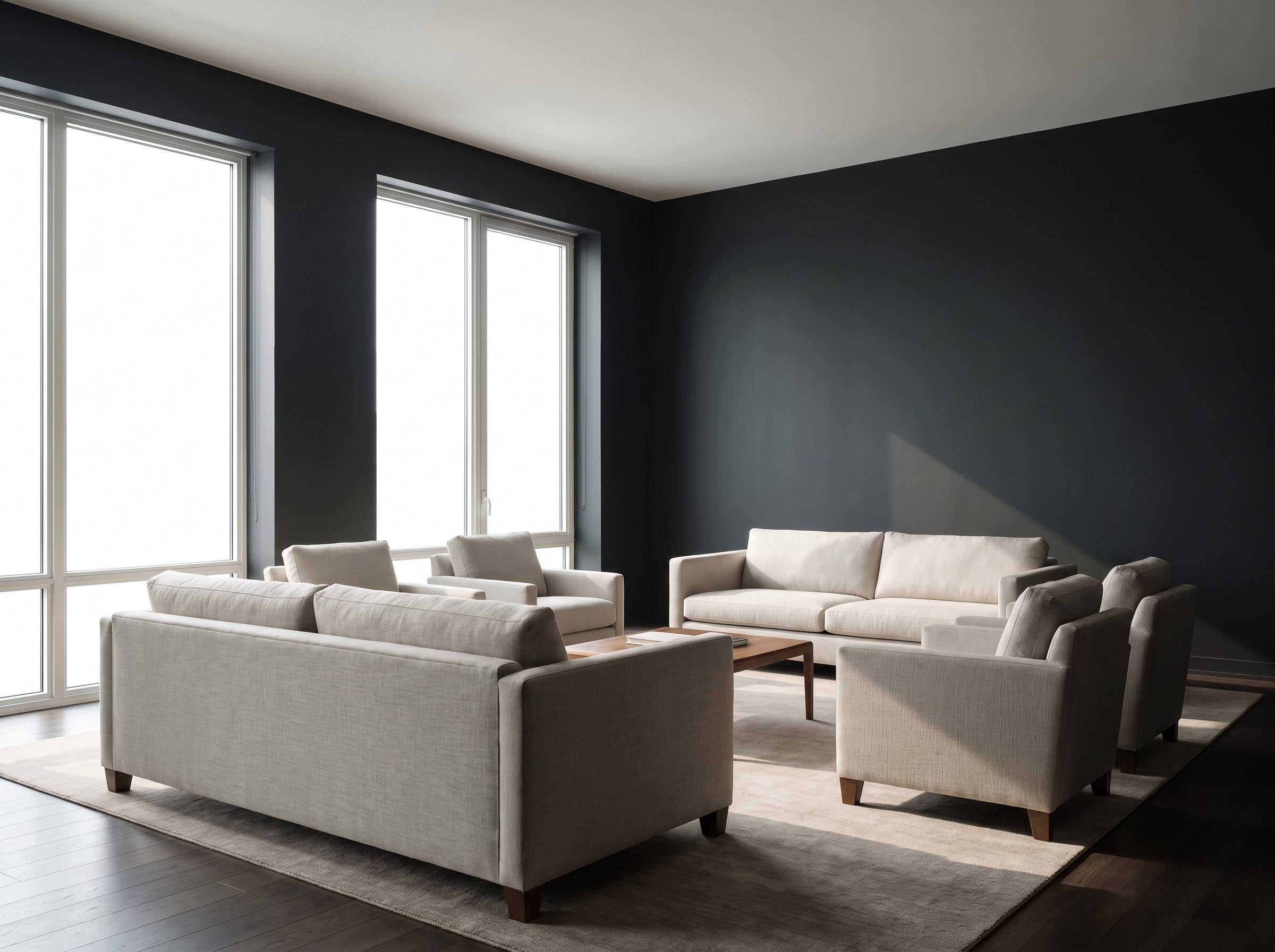
A room with a good window already owns a source of brightness. Let the wall around it provide the contrast.
Paint the window wall charcoal, deep green, or navy and the glass becomes an illuminated rectangle inside a darker field. The view outside gets more emphasis because the surrounding architecture isn’t competing with it.
Keep the casing dark too if you want the strongest framing effect. The window itself then supplies the light edge.
A low teal velvet sofa can sit near that wall without trying to imitate the brightness outside.
This works best in a room that actually has useful daylight. Dark paint can’t manufacture a window you don’t have.
12. Skip the Bright Rug if It Turns the Floor Into a Giant Rectangle
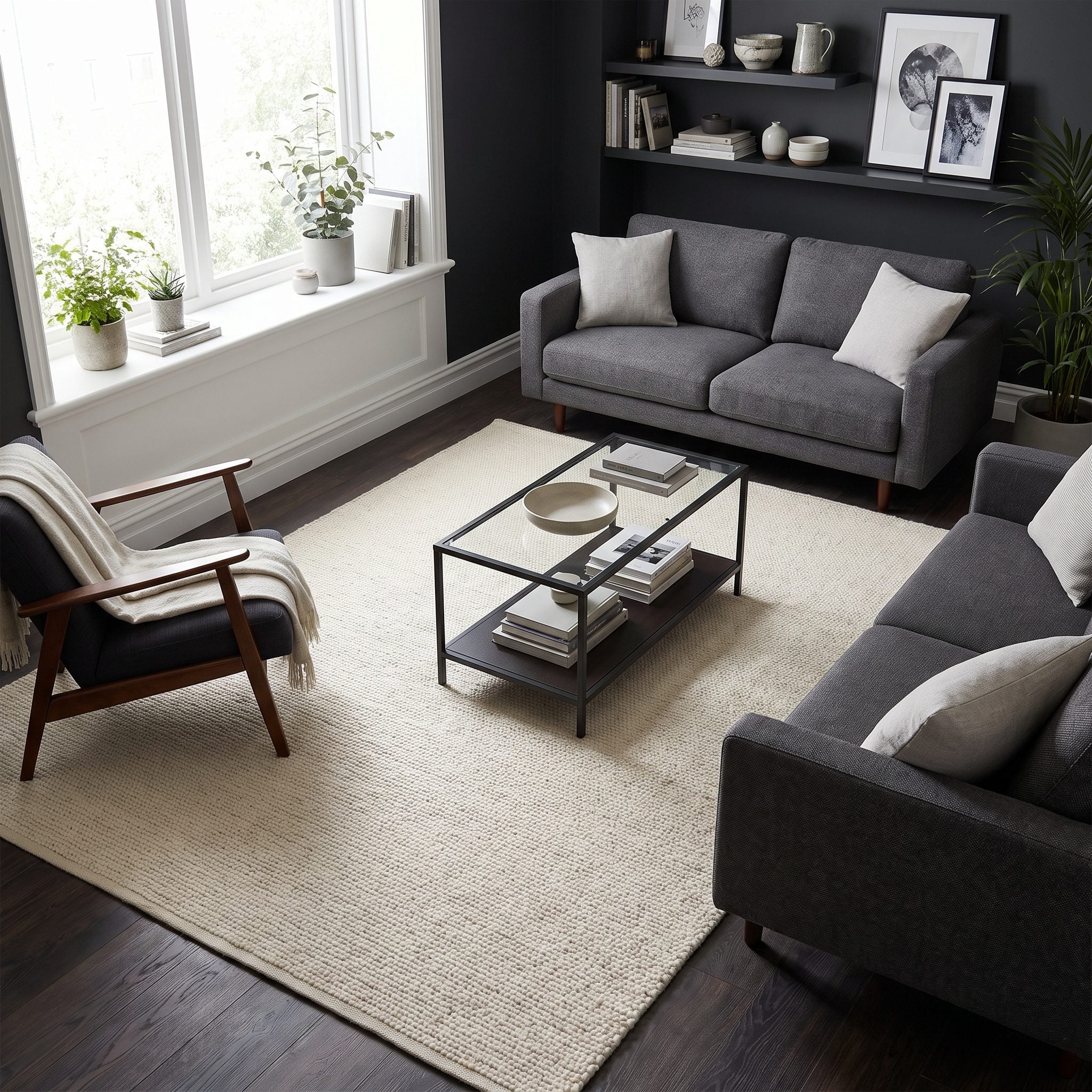
A pale rug is not automatically the antidote to dark walls.
Sometimes an ivory rectangle under charcoal furniture creates exactly the sharp division you were trying to avoid. If the rug becomes the first thing you notice, it may be too bright for the rest of the composition.
A mid-tone alternative often works better: rust, faded navy, olive, tobacco, or a Persian pattern with both light and dark notes. You get contrast, but not one enormous white landing pad in the middle of the floor.
Size matters more than any universal color rule. Get at least the front legs of the major seating onto the rug and keep the exposed floor border reasonably consistent.
A rust vintage wool rug is a particularly easy bridge between charcoal, warm wood, leather, and cream upholstery.
11. Let Artwork Pop Against Deeply Colored Walls
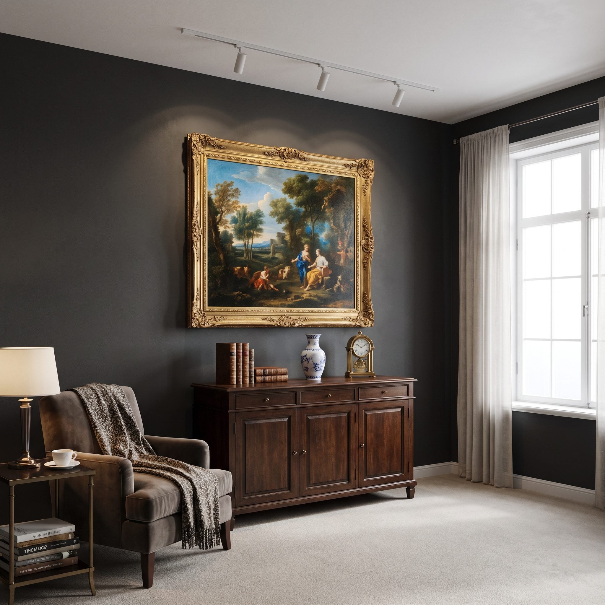
Historic galleries give you plenty of evidence that white is not the only respectable backdrop for art.
The Frick, the Wallace Collection, and various rooms in major European and American museums use saturated wall colors where those colors suit the collection and architecture. Deep reds and greens have a particularly long association with traditional picture galleries.
Against oxblood or bottle green, a gilt frame becomes brighter and an oil painting can feel more integrated with the room instead of floating on a blank white field.
The point isn’t that serious galleries never use white — many do. It’s that dark color has an equally legitimate history as a display surface.
At home, give your strongest piece the strongest wall and let the color behind it do some of the framing.
10. Use Forest Green for a Small Room That Wants to Feel Enveloping
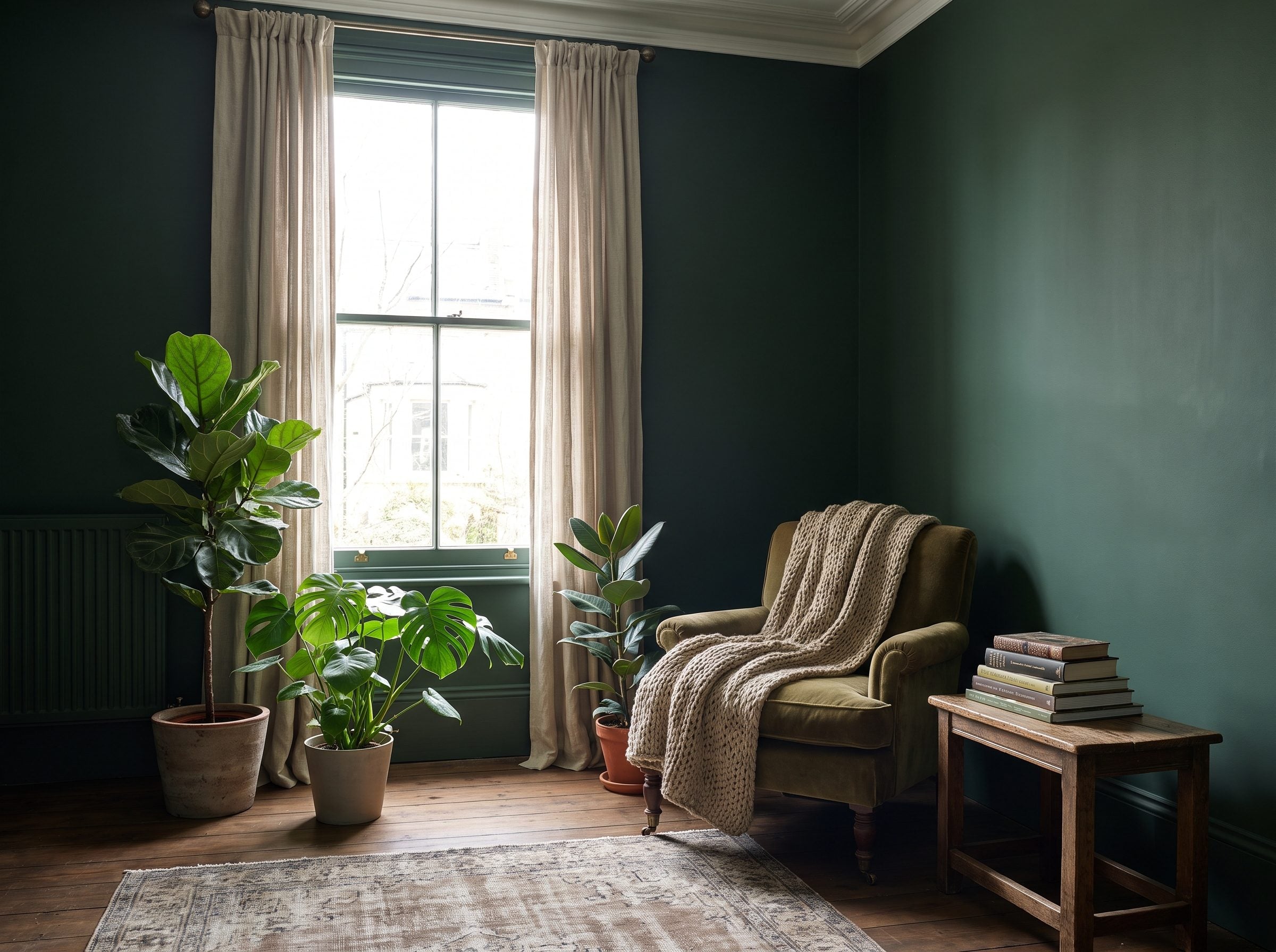
Forest green has an unfair advantage: it can go very dark without losing its connection to natural materials.
Oak, walnut, leather, linen, terracotta, cane, brass, and actual plants all know what to do next to it.
Rawlins Paints uses deep green as a classic example of color drenching across walls, trim, doors, and other surfaces.
Design discussions around the technique also emphasize the way one repeated color can make a room feel more immersive. Source
That’s the more useful reason to choose forest green. It doesn’t need to “trick” the brain into believing in extra square footage. It can make an ordinary small room feel unusually complete.
9. Paint the Fireplace the Same Dark Color as the Surrounding Wall
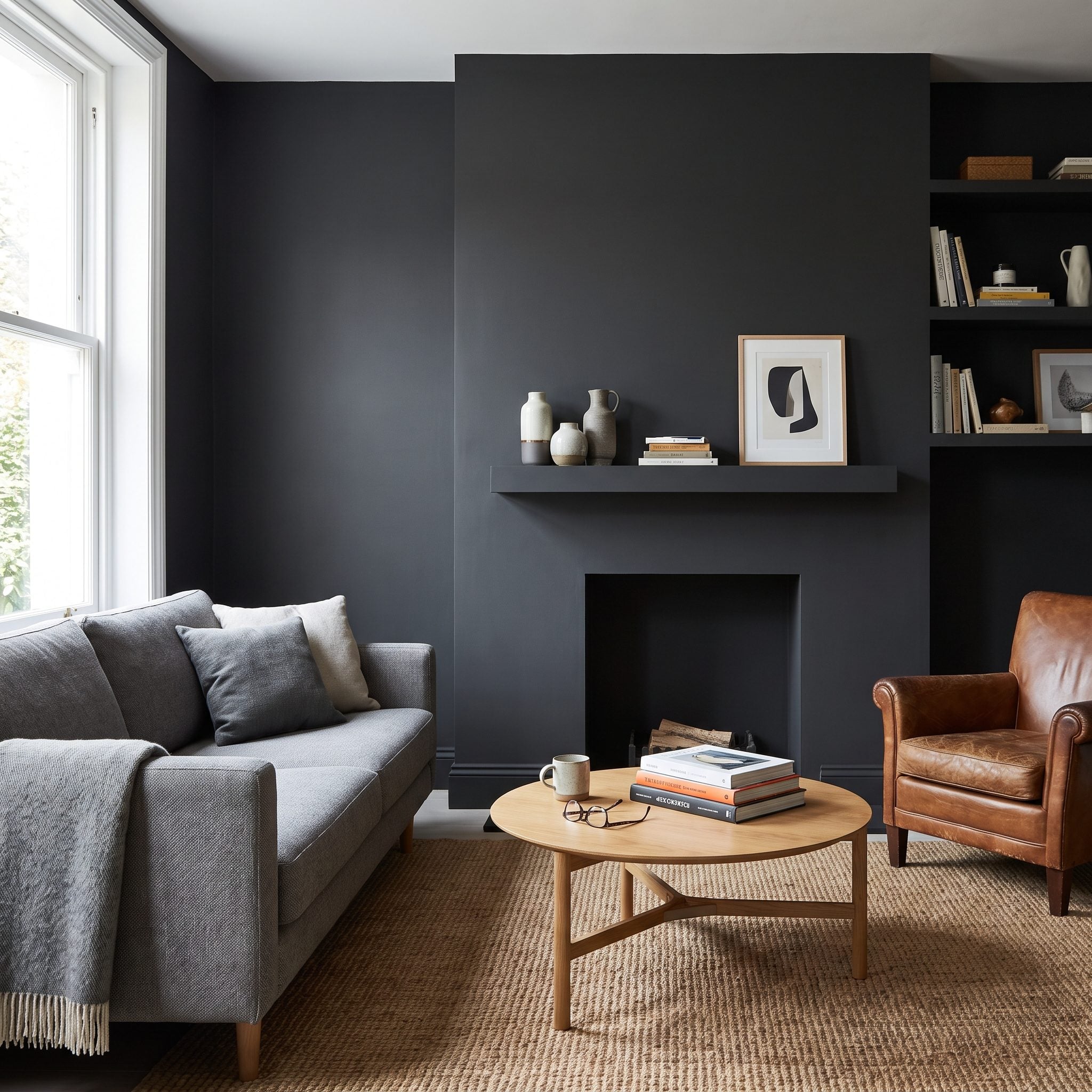
A fireplace doesn’t always need a contrasting mantel, contrasting brick, contrasting surround, and contrasting wall behind all three.
Paint the decorative masonry, mantel, and surrounding wall the same dark color and the collection of parts begins to read as one architectural feature.
The brick texture stays. The shadows stay. What disappears is the stack of color changes.
A matte black mantel can push the same idea even farther.
I’ve painted white mantels dark and watched a room become calmer immediately. Not larger by sorcery. Just less visually chopped into pieces.
8. Use Dark Curtains When You Want the Window to Merge Into the Wall
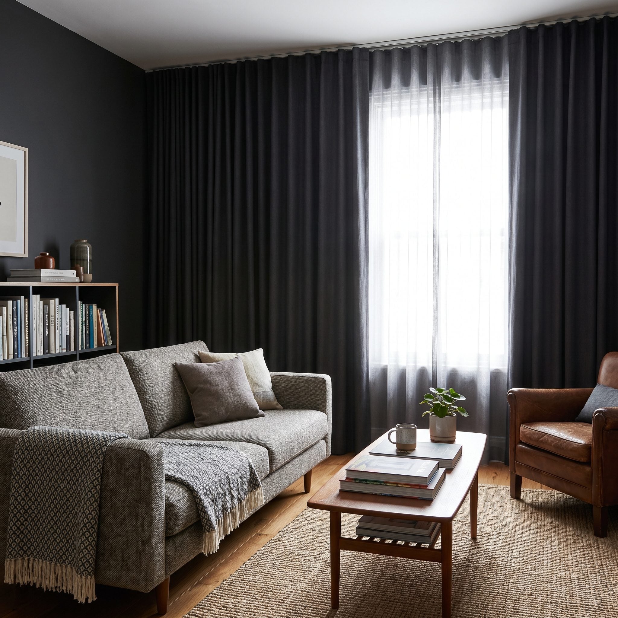
The pale-curtain room earlier wanted the window to stand out. This room wants exactly the opposite.
Match teal curtains to a teal wall or charcoal curtains to charcoal paint and the fabric becomes part of the surrounding color field.
That can be especially useful when one small or awkwardly placed window keeps breaking an otherwise strong wall.
Mount the rod high, run the panels to the floor, and make them wide enough to clear most of the glass when open.
Light curtains frame the window. Matching dark curtains quiet the frame. Choose the effect you actually want.
The same strategy turns up in a snug powder room or anywhere a lone opening needs to feel less isolated.
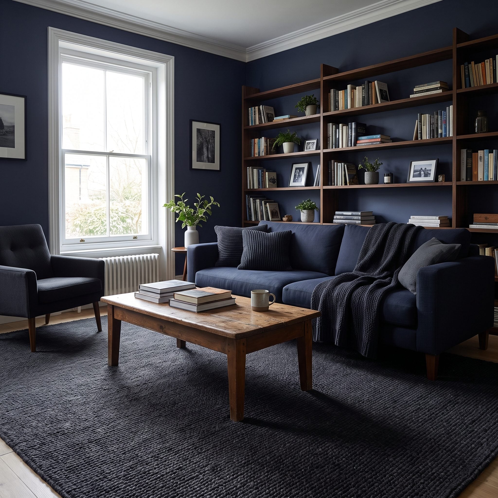
7. Try a Dark Rug and Dark Walls for a Fully Cocooning Effect
🔥 Would you like to save this?
If the mid-tone rug was the compromise, this is the full commitment.
Charcoal walls over a charcoal rug produce a continuous dark envelope from vertical surface to floor. That can feel theatrical, quiet, or wonderfully cocooning depending on the furniture and lighting.
A low-pile charcoal wool rug lets texture distinguish floor from wall without introducing a new color.
Then give the room one obvious release valve: ivory curtains, warm wood, brass, or a pale oatmeal linen sofa.
6. Layer Table Lamps, Floor Lamps, and Sconces Instead of Relying on One Ceiling Light
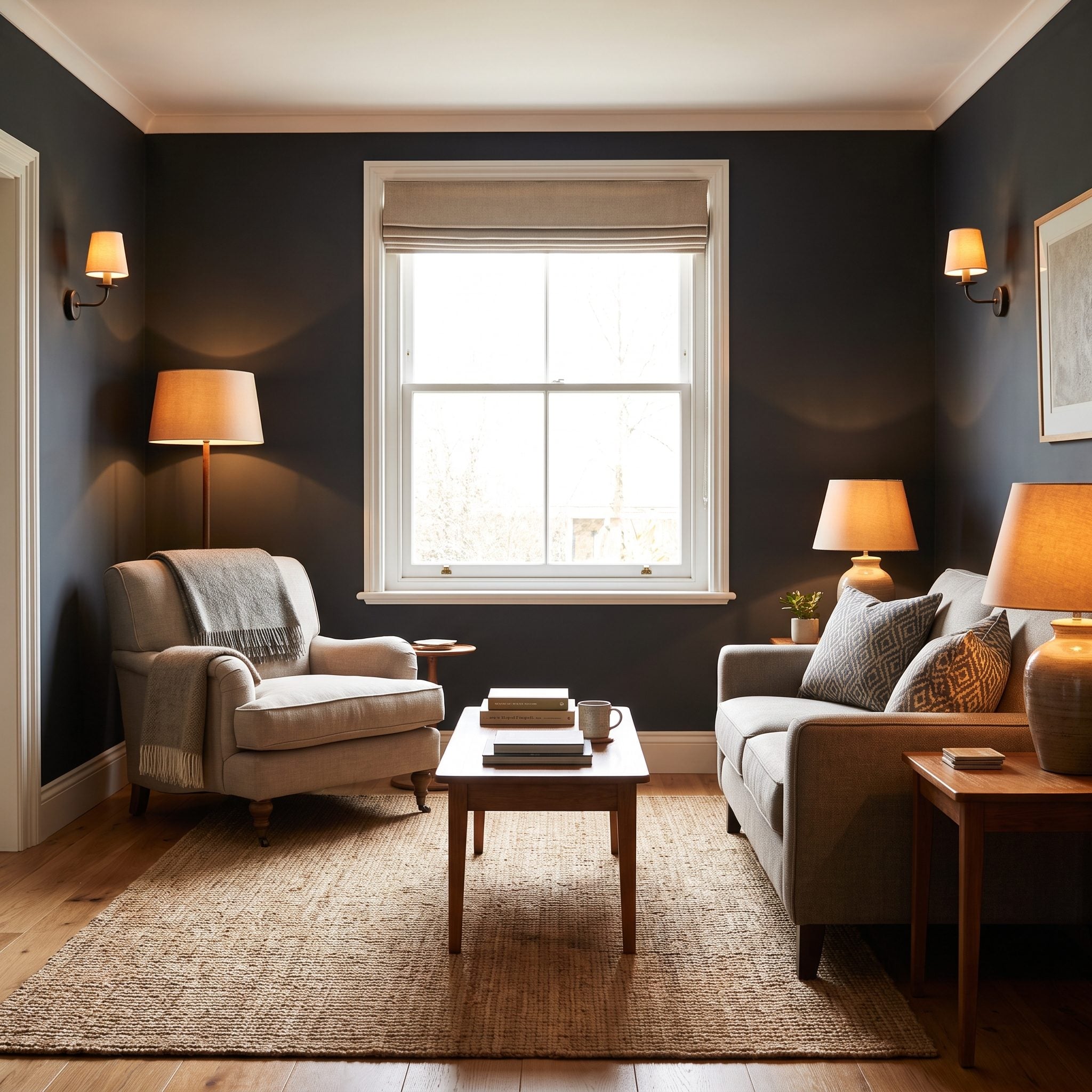
This is where a lot of dark rooms go wrong.
Deep paint absorbs more visible light than white paint. Source Turn on one builder-grade ceiling fixture and you can end up with a bright center and gloomy perimeter, which makes the paint take the blame for bad lighting.
Layering fixes the lighting problem rather than repainting the room. Ambient light establishes overall brightness. Task lighting handles reading and work. Accent lighting puts light on the things worth seeing. Source
Two table lamps, one floor lamp, and a pair of sconces can completely change how navy or charcoal behaves after sunset.
Use warm bulbs — around 2700K is a reliable residential starting point — and dim them independently.
A saturated bohemian media room lives or dies on this distinction. One overhead glare source and five pools of warm light are not remotely the same room.
5. Use One Oversized Artwork Instead of Filling Dark Walls With Tiny Pieces
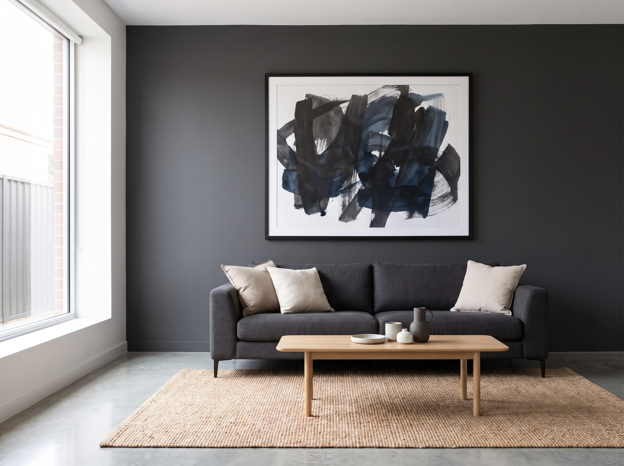
Dark walls already carry visual weight. They don’t always need twelve little frames competing for oxygen.
One large work above the sofa gives the eye a single destination and leaves enough uninterrupted wall around it for the paint to matter.
A useful starting point is artwork around two-thirds the width of the furniture below it. For an 84-inch sofa, something around 50 to 56 inches wide lands in that neighborhood, but treat that as a proportion to test, not a statute.
Likewise, hanging art with its center somewhere around average eye level is a starting point. Furniture height, artwork shape, ceiling height, and the room itself can all move it.
The same confidence that makes an emerald powder room work applies here: commit to one large idea rather than breaking the wall into nervous little fragments.
I did the scattering version for years. One oversized abstract made the room quieter in an afternoon.
4. Use Deep Paint to Quiet a Room With Too Many Corners
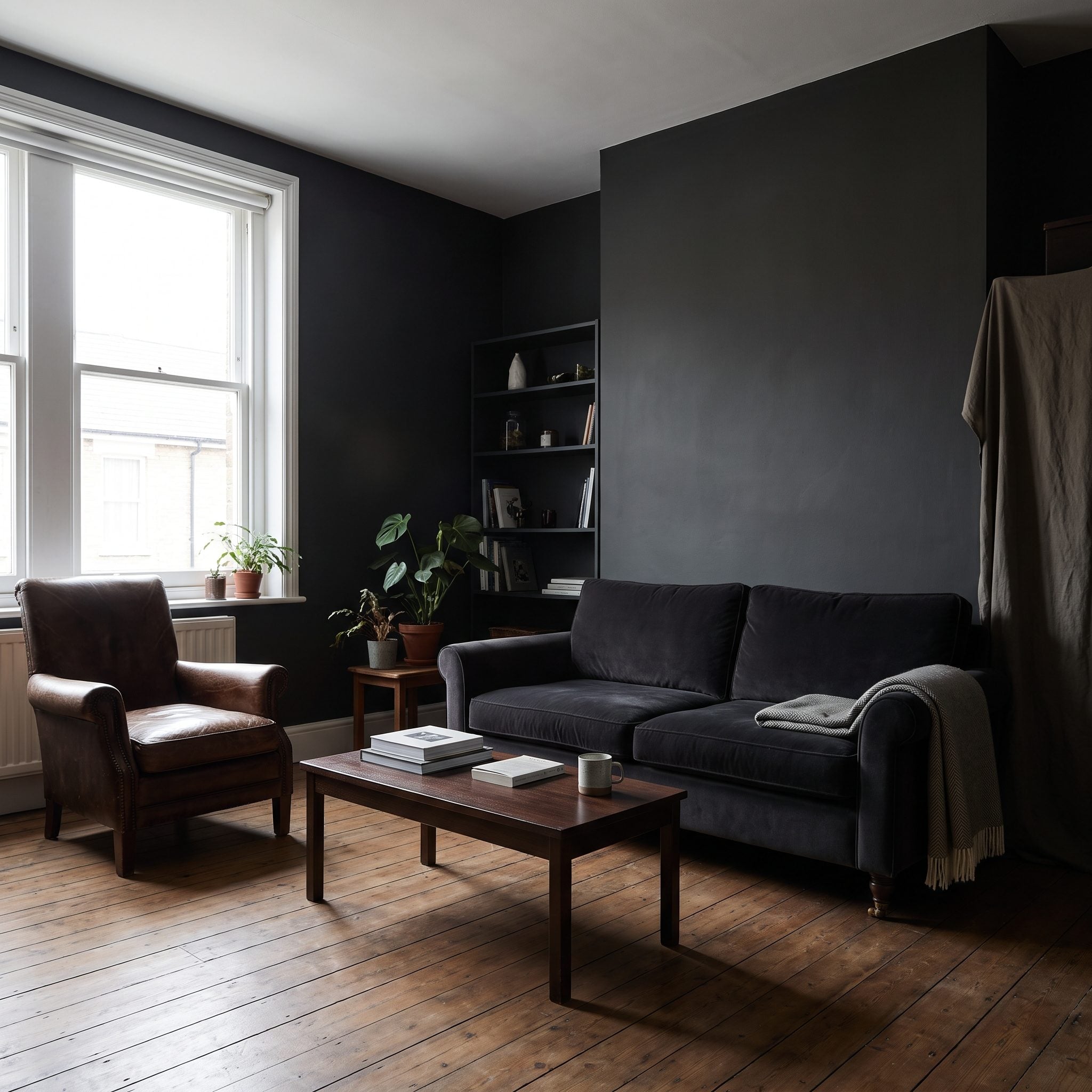
Some small rooms aren’t difficult because they’re small. They’re difficult because they’re busy.
A door casing here. A little projecting wall there. Built-ins, baseboards, soffits, radiator covers, three different trim profiles, and an alcove nobody quite knows what to do with.
Paint every interruption a different color and you get an architectural inventory. Paint several of them the same deep shade and the room can become dramatically quieter.
That’s the useful version of “losing the edges.” You’re not asking the paint to falsify the square footage. You’re using one color to stop every minor piece of architecture from demanding separate attention.
A charcoal wool rug can continue the calm across the floor if the room needs it.
This is the strategy I’d try first in the room you’ve already decided is hopeless. Hopeless rooms often just have too many things announcing themselves at once.
3. Stop Fighting a North-Facing Room With White Paint
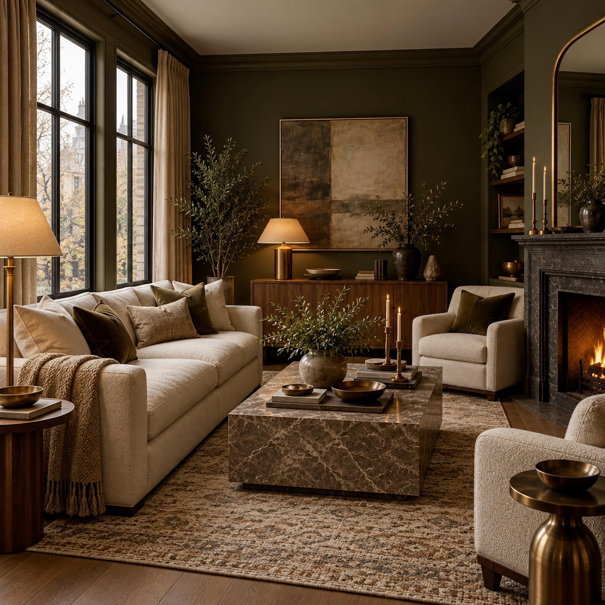
Here’s the room the white-paint rule has the hardest time explaining.
A north-facing room can spend the entire day looking as though the sun has made other plans. Painting it white doesn’t change that. White can only reflect the light that’s actually available, and cool, indirect daylight can leave some pale paints looking grayer and flatter than the chip promised.
That’s when working with the exposure starts making more sense than fighting it. Deep olive, tobacco, charcoal, aubergine, or another warm, earthy shade can turn subdued daylight into part of the room’s character instead of something the paint is unsuccessfully trying to correct.
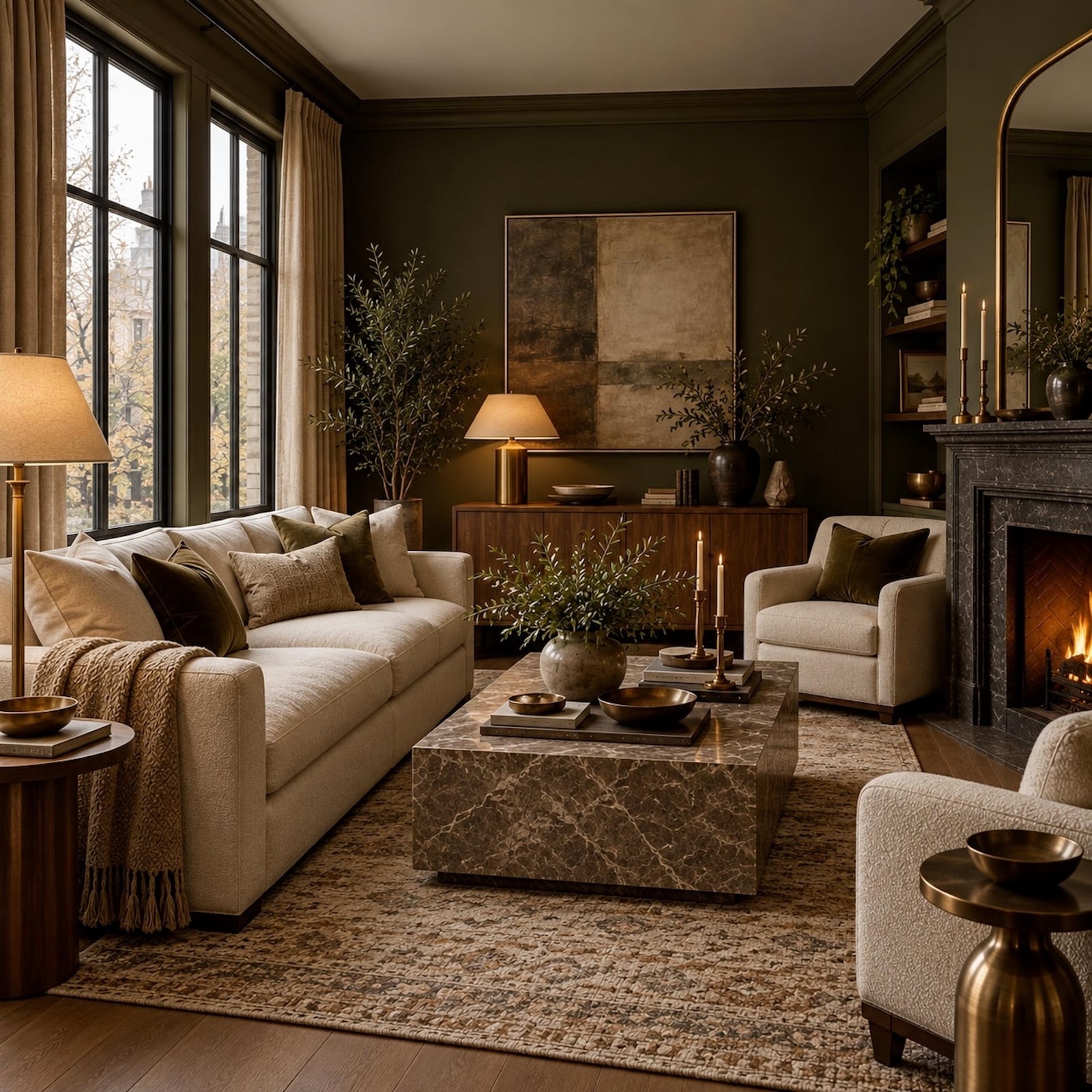
This room proves the argument doesn’t need much square footage to look expensive. The olive walls don’t compete with the cool light coming through those tall windows; they absorb it gently. Cream upholstery supplies the lift, walnut brings warmth through the middle of the room, brass catches whatever light reaches it, and the black stone fireplace gives the darker end of the palette somewhere to land. Nothing is trying to impersonate noon in July.
The result is especially useful as a reminder that low light and small size are two different design problems. A room can be generous and still naturally dim. It can also be compact and naturally dim. In either case, automatically reaching for brilliant white may solve neither.
2. Make a Tiny Living Room Intentionally Cozy Instead of Trying to Fake Spaciousness
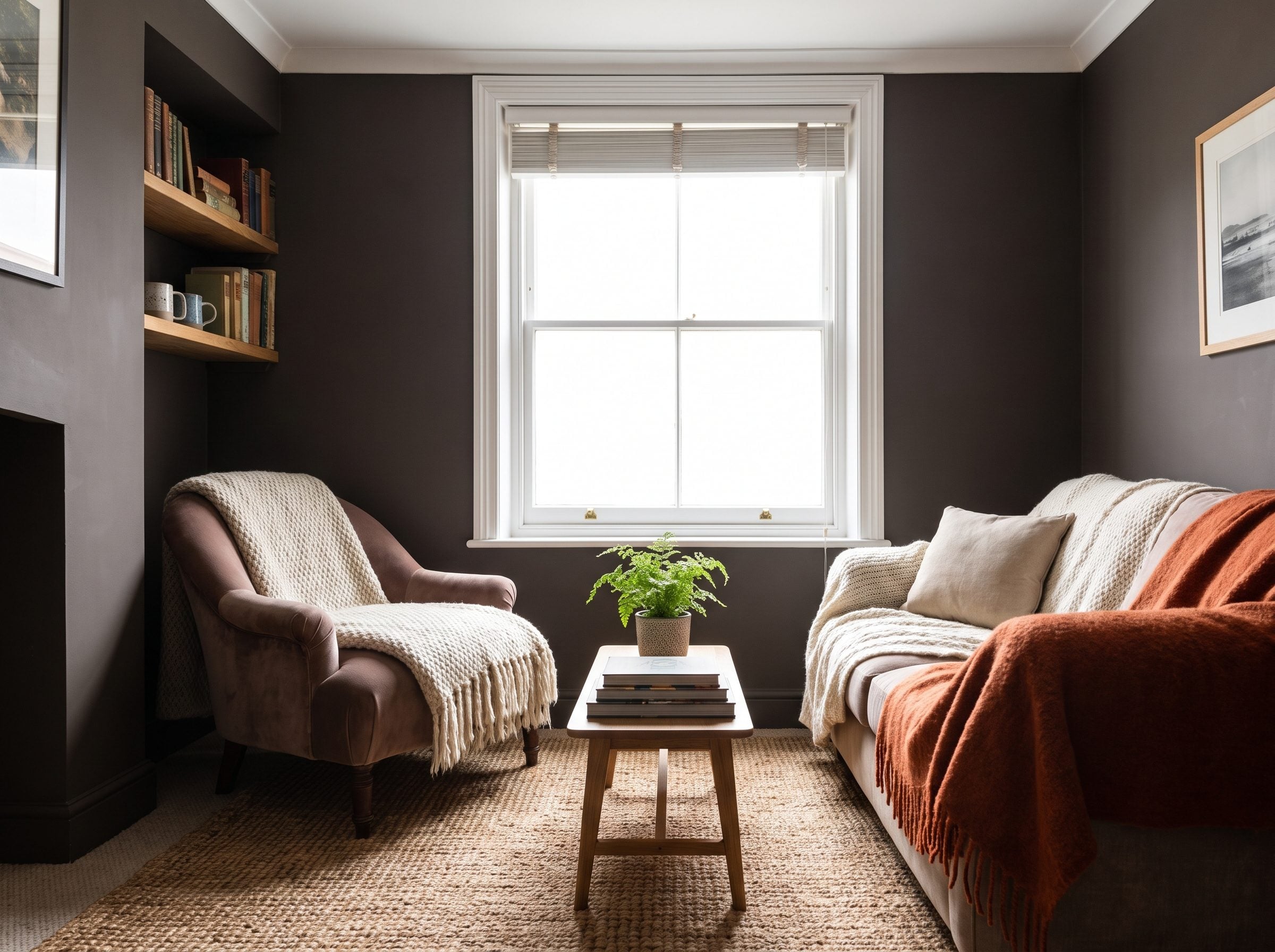
There is a point where trying to make a 10-by-12 room impersonate a ballroom becomes less useful than admitting you’ve got a very good 10-by-12 room.
That’s where dark color gets liberated from the “does it look bigger?” argument.
Hague Blue, charcoal, forest green, or another deep shade can make a small sitting room feel deliberate rather than apologetic. Add a low brass floor lamp, a deep-seat green velvet sofa, and a substantial wool rug, and suddenly compactness is part of the atmosphere.
A cramped room lit like a dentist’s office is worse than a small room lit like a study.
The same instinct drives this emerald powder room: once the space stops apologizing for its dimensions, color can become the reason you remember it.
Trying to make 120 square feet act like 300 is a fight nobody needs to win.
1. Stop Treating “Looks Bigger” as the Only Measure of a Successful Small Room
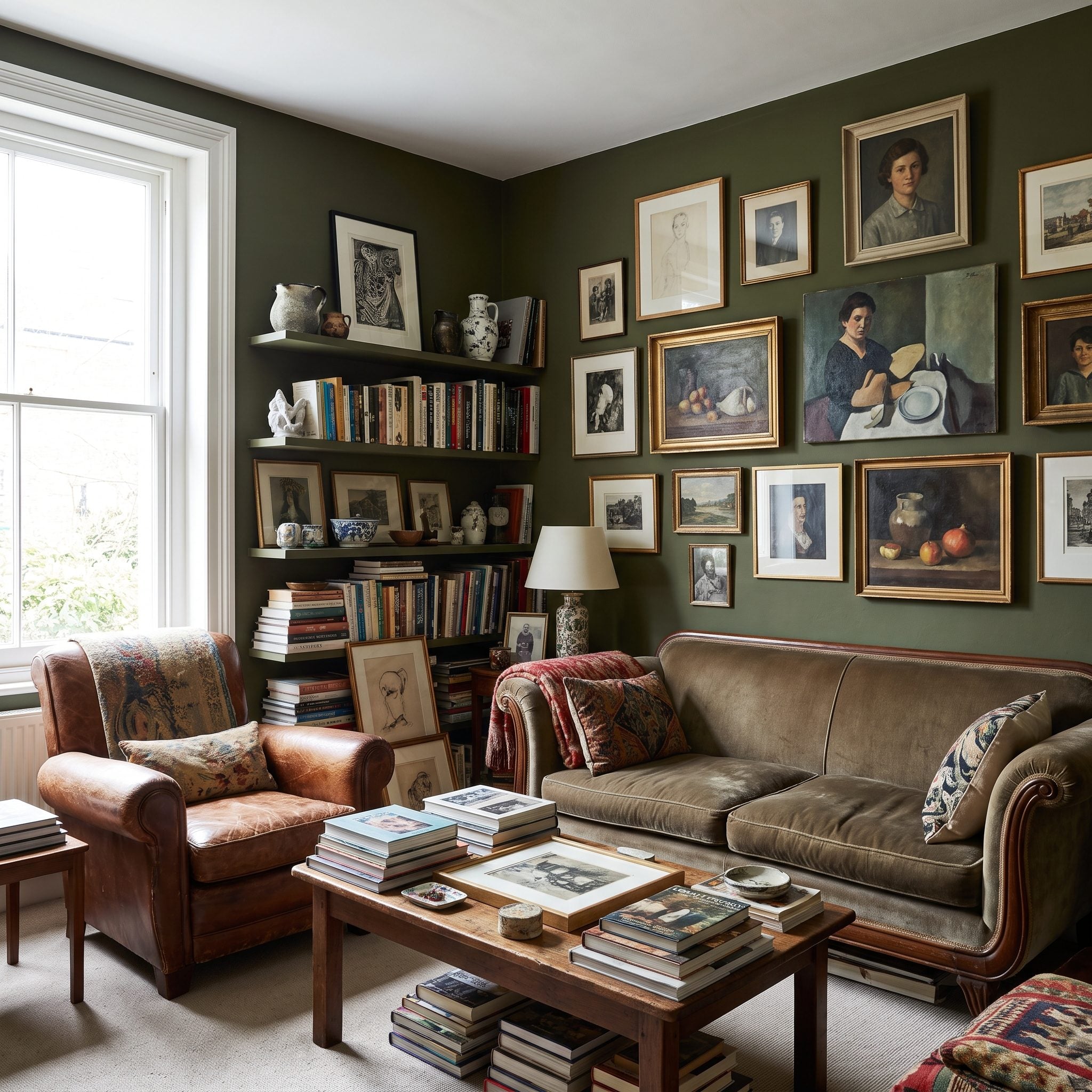
And here is the question all those old small-room rules kept skipping: bigger for what?
You don’t live inside a real estate photograph. You live in the room on Tuesday night when the lamps are on, the dog has taken the good end of the sofa, and nobody is standing in the doorway estimating the square footage.
Light paint remains useful. Dark paint remains useful. Stagers often favor broadly appealing neutral palettes because they’re trying to make it easy for prospective buyers to imagine their own belongings in a space. That’s a selling problem, not necessarily a living problem.
Think about memorable small interiors instead. A paneled study. A booth in the back of an old restaurant. A hotel bar with espresso-colored walls. None needs to pretend to be larger to be successful. They need to feel like somewhere.
Cozy is a feature, not a failure. A deep wall behind a low camel leather sofa, two warm lamps, good art, and the right rug may do far more for your evenings than another coat of anonymous white.
Square footage is fixed. The experience of it isn’t.