
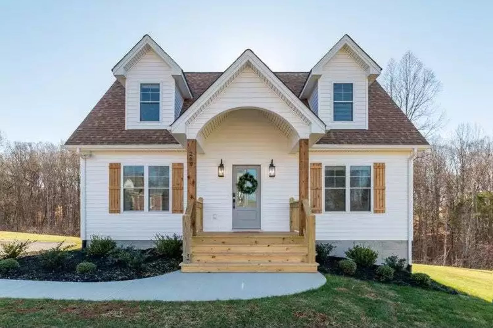
The starter home felt fine until it didn’t — second kid in middle school, the basement pulling triple duty as gym, office, and guest room, kids doing homework at the kitchen island while dinner burns, and somehow every Saturday still ends with the whole family stacked in the same twelve feet of space. The Crestbourne Drive is built around that exact breaking point: a country layout that keeps the main floor from feeling crowded, a basement expansion that gives the overflow somewhere to actually go, and enough separation between zones that each one can do its job without borrowing from another.
Specifications
- Sq. Ft.: 1,468
- Bedrooms: 3
- Bathrooms: 2
Floor Plan – Main Floor
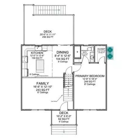
The main level puts the family room, kitchen, and dining area on a single open run that flows toward a primary bedroom suite at the back. Two decks bookend the layout front and rear, and the stair position points clearly toward lower-level expansion below.
Floor Plan – Second Floor
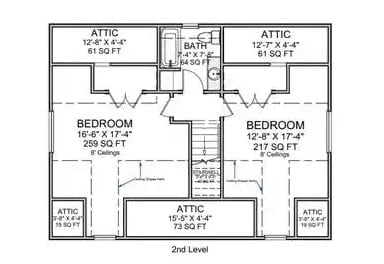
Upstairs holds two bedrooms with 8-foot ceilings, a shared bath, and a stairwell landing with four attic access points — storage tucked into corners that would otherwise just be dead space.
Floor Plan – Basement
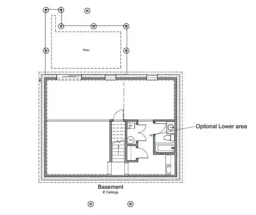
The basement splits into a large open area on the left and an optional expansion room on the right, divided by a central staircase and a full bathroom. Eight-foot ceilings make it feel like usable square footage rather than a place to store holiday bins. A patio footprint sits just above the foundation line, so outdoor access from this level isn’t an afterthought.
Brass Ceiling Fan, Gray Sofa, and a Staircase That Actually Earns Its Place
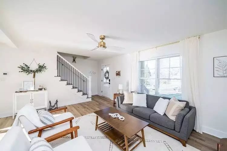
Warm wood floors run the full length of the space, which matters more than it sounds — without them, all that white would read as clinical. The gray sofa is pulled toward the window, the wooden coffee table has an open shelf underneath that actually sees use, and the staircase with iron balusters is doing real work as a focal point rather than just connecting floors.
The Ceiling Fan That Gets the Proportions Right
Living room ceiling fans usually look like someone bolted a hardware store fixture to an otherwise finished ceiling. This one doesn’t. The brass-and-white fitting reads closer to a light fixture that happens to move air, with a blade span that sits right for the room’s footprint — not hovering awkwardly overhead, not so small it disappears. Brass has been making its comeback for a while now, and this placement is a decent argument for it.
Gray Cabinets, White Island, and Pendant Lights That Don’t Overdo It
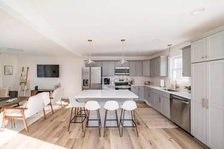
Gray shaker cabinets cover the full perimeter, keeping the palette grounded without going cold. Three pendants hang over the white island, which seats four on matching basket-style stools. Stainless appliances feel practical rather than precious. The open sight line into the living room means whoever’s cooking stays part of the conversation — a detail that sounds minor until you’ve spent years cooking in a closed kitchen.
Whoever’s cooking isn’t cut off from the rest of the house.
Gold Chandelier, Linen Curtains, and a Dining Table Set Like Someone’s Actually Coming to Dinner
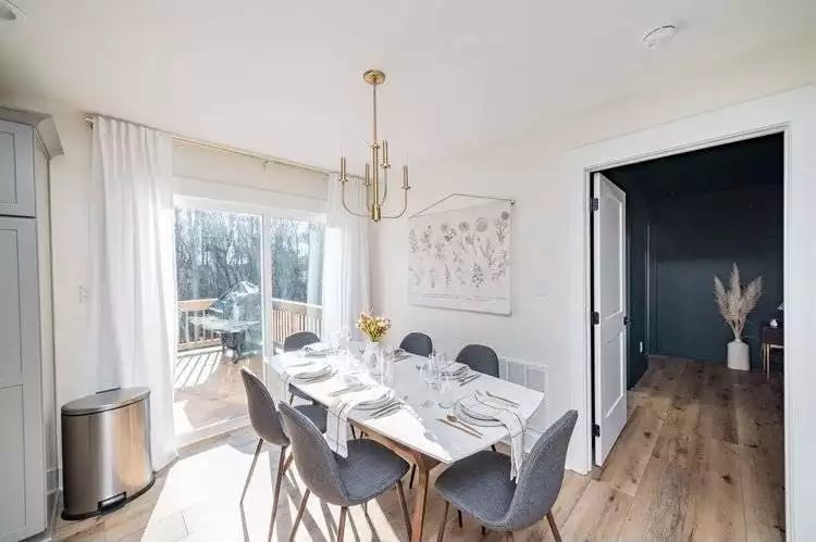
A brass chandelier with slim cylindrical arms anchors the white dining table below it. Shaker-style chairs in textured charcoal seat six — actual capacity, not the kind of seating that works only if everyone holds their elbows in. Natural light comes through the sliding glass doors and lands on wide-plank hardwood that carries the warmth the white walls don’t.
Style Math: Brass hardware with charcoal upholstery has staying power because neither finish fights for the room’s attention — they just occupy different corners of the palette and leave each other alone. The botanical wall hanging stops the white walls from reading as empty without adding visual clutter. Light wood floors like these do show scratches, but they make a small dining room feel considerably larger, which is usually the better trade.
Deep Teal Walls, a Sputnik Fixture, and Pampas Grass That Pulls Its Weight
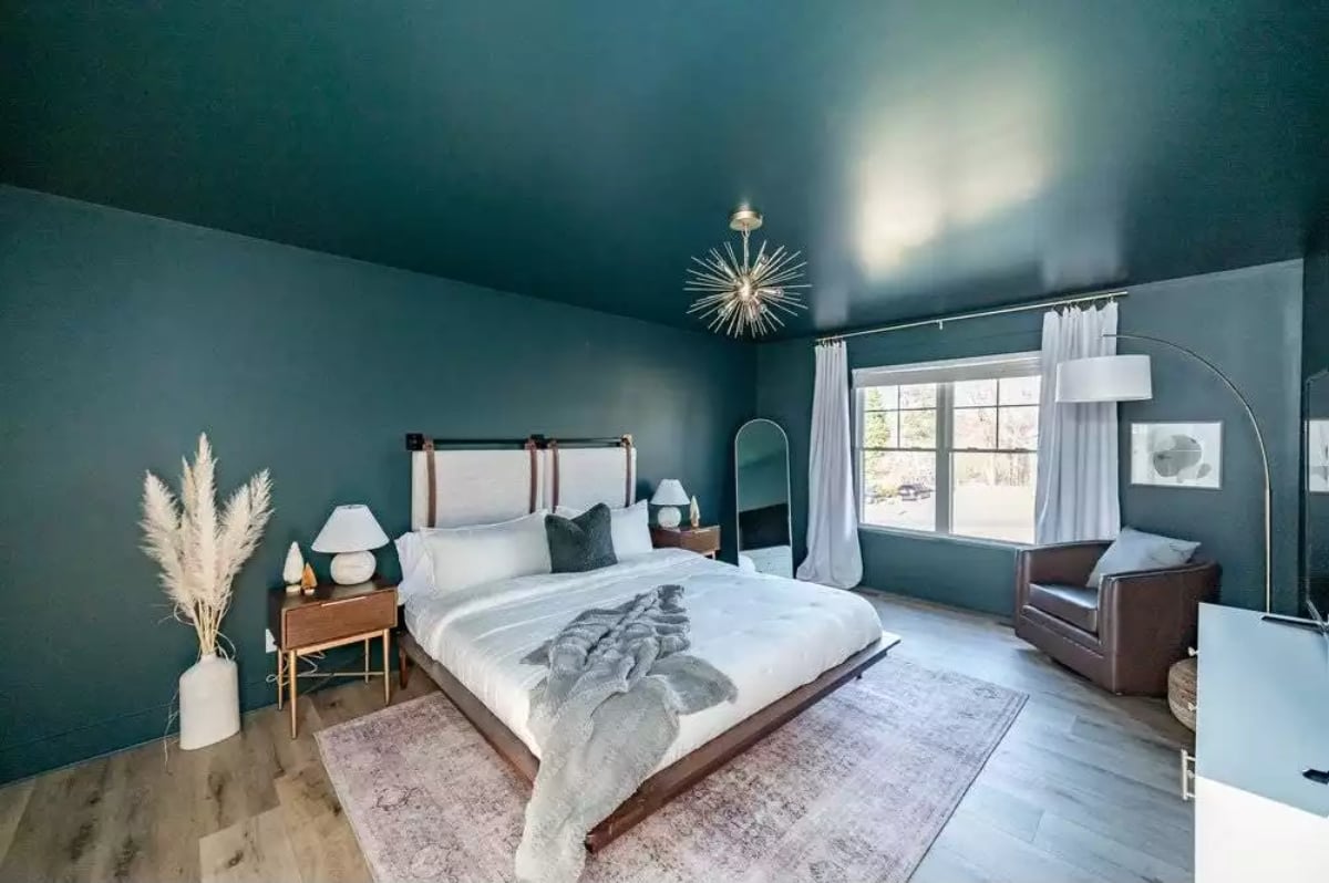
Painting the ceiling the same deep teal as the walls is a commitment most people talk themselves out of. Here it works. The lacquered finish catches light from the sputnik chandelier differently than flat paint would — the ceiling becomes part of the room rather than just the top of it. Walnut nightstands, a leather chair, and white bedding keep the palette from collapsing into darkness, and the pampas grass in the corner earns its square footage.
Fun Fact: Lacquer and high-gloss ceiling finishes were standard in Victorian-era parlors, where the reflective surface helped bounce candlelight around rooms that had no other artificial source. The technique is making a return in bedrooms now for a similar reason — a single overhead fixture works considerably harder when the ceiling is throwing light back into the room rather than absorbing it.
The bathroom trades the living spaces’ relaxed palette for something crisper, built around a finish that shows up everywhere.
Gold Fixtures, White Vanity, and a Round Mirror That Actually Fits the Wall
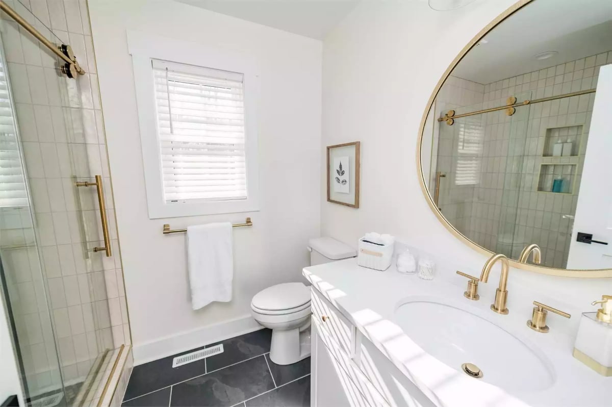
Brushed gold runs consistent across the faucet, towel bar, and shower pulls — repeated enough to feel intentional, but not so heavy it tips into theme. That’s a harder line to walk than it looks.
Billiards Table, Bar-Height Perch, and Enough Open Floor to Actually Use Both
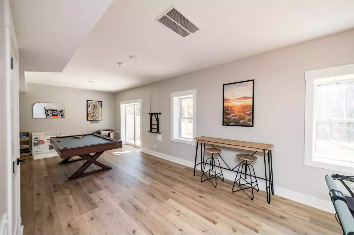
A dark walnut X-base pool table takes up one side of the room while industrial stools pull up to a hairpin-leg console on the other. Light hardwood floors keep the space from feeling heavy despite how much furniture mass is in it — the combination works because the floor is doing the visual lifting.
The Psychology Behind This: Game rooms built around a single activity tend to sit empty more than people expect. Adding a spectator spot — somewhere to sit, watch, and be part of the room without picking up a cue — pulls people in even when they’re not playing. That social layering is what separates a bonus room from one that actually gets used.
Cedar Deck, Iron Patio Set, and a Grill Positioned Close Enough to Actually Use
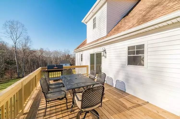
Fresh pressure-treated decking, wrought iron furniture built to stay outside year-round, six chairs around a table with real capacity. The wall-mount lantern by the sliding door handles evenings without requiring a lighting plan, and the tree line in the background keeps the space from feeling exposed to the neighbors.
Try This: Pressure-treated lumber is the standard deck choice, but it needs time to dry out before stain or sealant will absorb properly. Most manufacturers recommend waiting at least six months after installation before finishing. Staining too early traps moisture under the surface and causes peeling well ahead of schedule.
Pin It
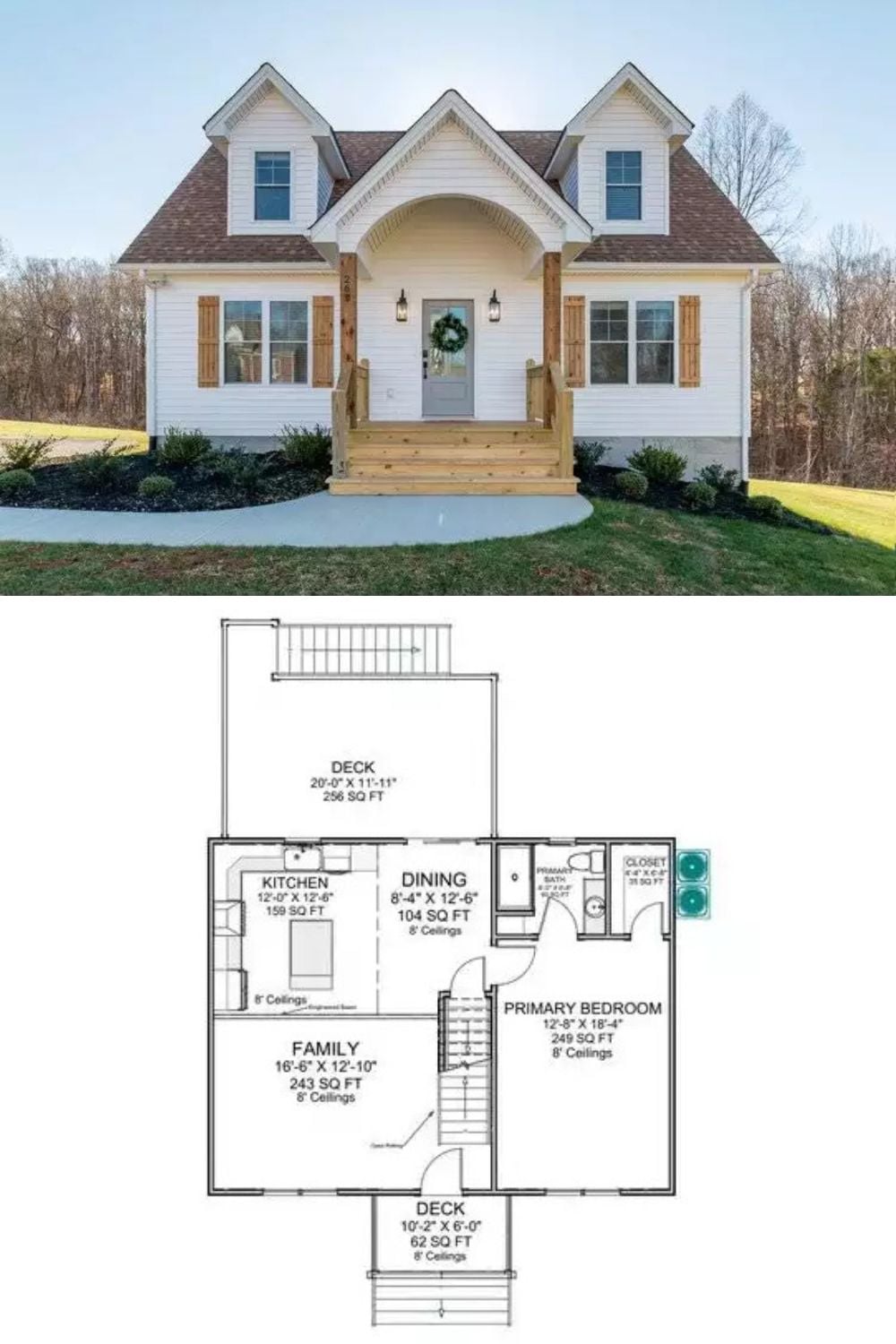
The exterior shows a white country with dormer windows, cedar shutters, and an arched front porch entry. Below it, the floor plan lays out the main-level primary bedroom, open kitchen and dining area, family room, and the two decks that bracket the whole thing front and back.
Color Story: White siding with natural wood shutters is one of those exterior combinations that manages to read as both traditional and current without committing hard to either. The cedar tones pull warmth into a facade that could otherwise feel flat, and if you let the wood weather naturally over time, the contrast only deepens — which is a rare case where doing less maintenance is actually the right call.
