🔥 Would you like to save this?
I wasn’t expecting to have strong feelings about coffee tables this week.
Yet here we are.
I’ve been digging through the first batch of data from the Home Stratosphere Living Room Preference Index. We measured how readers responded to thousands of living-room images instead of asking them what they say they like.
One result jumped out.
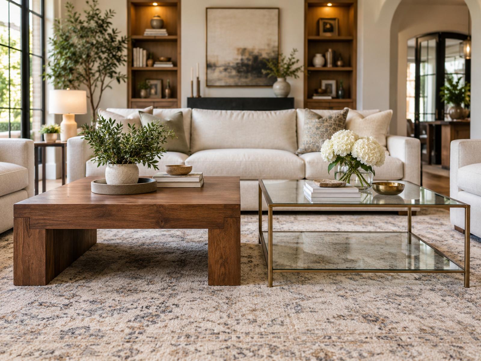
Glass coffee tables got clobbered.
Not slightly.
Not the sort of difference where I can squint at a chart, invent a compelling narrative and congratulate myself on discovering the next great furniture trend.
I mean clobbered.
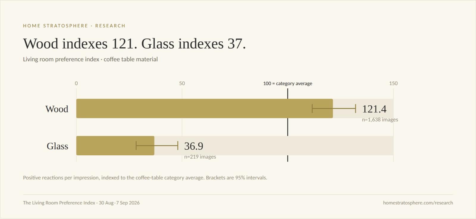
Wood coffee tables registered a Preference Index of 121.4.
Glass?
36.9.
That’s a helluva spread.
And unlike some of the tantalizing numbers kicking around in the dataset, there’s enough data behind both of these that I take the result seriously.
Here’s the result
The Home Stratosphere Preference Index measures positive reactions per impression relative to the average for that attribute.
100 = average.
Above 100 means the feature attracted positive reactions at a higher rate than the category baseline.
Below 100 means it attracted them at a lower rate.
That’s not subtle.
Wood scored more than three times as high as glass on the index.
And before anyone emails me with, “Yeah, but how many glass coffee tables did you actually test?” that’s the first thing I wondered too.
Quite a few.
| Coffee table material | Images | Impressions | Reactions | Preference Index | 95% interval |
|---|---|---|---|---|---|
| Wood | 1,638 | 62,260 | 1,049 | 121.4 | 111.6–132.1 |
| Glass | 219 | 20,920 | 124 | 36.9 | 28.3–48.0 |
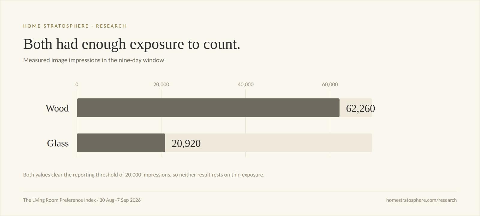
That’s 20,920 impressions across 219 glass-coffee-table images.
More importantly, look at those confidence intervals.
Wood: 111.6–132.1
Glass: 28.3–48.0
They aren’t remotely close to overlapping.
So while I’m cautious about turning preference data into sweeping proclamations—and I’ll get into why below—I’m comfortable saying this:
In this dataset, living rooms with wood coffee tables generated positive reader reactions at a dramatically higher rate per impression than living rooms with glass coffee tables.
That’s interesting.
This isn’t a survey
This is the part of the project I find particularly fun.
We didn’t round up 1,000 people and ask:
Which coffee table material do you prefer: wood, glass, metal, stone or upholstered?
There’s nothing wrong with surveys.
But surveys measure what people say.
I’m increasingly interested in what people do.
Home Stratosphere readers encounter living-room images while they’re browsing the site. They can react positively, react negatively or save images they like.
That means nobody knows they’re participating in my grand coffee-table investigation.
Which, come to think of it, is probably for the best.
During the initial nine-day measurement window, the larger Living Room Preference Index included 2,977 tagged living-room images, of which 1,079 received measured exposure during the window.
| Entire living-room dataset | Count |
|---|---|
| Tagged living-room images | 2,977 |
| Images receiving measured exposure | 1,079 |
| Image impressions | 144,690 |
| Positive reactions | 836 |
| Negative reactions | 726 |
| Neutral reactions | 74 |
| Saves | 199 |
That’s 1,636 emoji reactions plus 199 saves during the window.
Every interaction is tied back to a specific image.
The images are then tagged against a fixed attribute schema.
That’s how I can start asking questions such as:
Does a sectional outperform a standard sofa?
Do readers respond differently to velvet versus linen?
Patterned rug or solid rug?
Traditional or transitional?
Wood coffee table or glass?
And sometimes the answer is basically:
Meh.
That’s what happened with sofa fabric. Velvet and linen/cotton didn’t separate statistically in this window.
But every once in a while the data screams.
Glass coffee tables are one of those times.
The index matters because 1,000 reactions aren’t necessarily better than 100
This is an important distinction.
I can’t simply count how many positive reactions every coffee-table type received.
Suppose I published 10 times as many living rooms with wood coffee tables.
Wood would presumably collect far more reactions merely because readers saw wood far more often.
That tells me very little.
So the Preference Index normalizes positive reactions by impressions.
Very roughly, we’re asking:
When readers actually had an opportunity to see this feature, how often did it generate a positive response relative to the average for that attribute?
The category baseline is set to 100.
That’s what makes this comparison interesting.
Wood isn’t winning merely because Home Stratosphere has more wood coffee tables.
Wood is at 121.4 after adjusting for exposure.
Glass is at 36.9 after adjusting for exposure.
Put differently, wood is somewhat above the category baseline.
Glass is way, way below it.
Glass isn’t just losing to wood
Here’s another interesting wrinkle.
There are five informative coffee-table-material categories in this dataset.
Only wood and glass currently clear my reporting threshold.
The other three are interesting, but they don’t have enough measured exposure or reactions yet for me to make recommendations from them.
Here they are anyway:
| Material | Images | Impressions | Reactions | Index | Reporting status |
|---|---|---|---|---|---|
| Upholstered ottoman | 74 | 840 | 22 | 150.3 | Below threshold |
| Wood | 1,638 | 62,260 | 1,049 | 121.4 | Reportable |
| Stone / marble | 374 | 5,930 | 90 | 94.6 | Below threshold |
| Metal | 77 | 1,770 | 29 | 87.2 | Below threshold |
| Glass | 219 | 20,920 | 124 | 36.9 | Reportable |
And this is where research gets dangerous.
Because if I wanted clicks more than good data, I’d have a field day with that table.
“UPHOLSTERED OTTOMANS DESTROY WOOD COFFEE TABLES!”
Index 150.3 versus 121.4.
Publish it.
Send the email.
Notify the world’s ottoman manufacturers that Jon from Home Stratosphere has saved their industry.
Except the upholstered-ottoman result comes from just 840 impressions.
Wood has 62,260.
I’m not making that call.
Same thing elsewhere in the dataset. Some of the most spectacular numbers are attached to insufficient exposure.
That’s precisely why I imposed a reporting threshold before deciding which findings I’m prepared to stand behind.
The threshold for the current report is:
At least 30 images and 20,000 impressions, or at least 300 measured reactions.
Glass clears it.
That’s what makes glass interesting.
Here’s what really surprised me
I would have guessed glass would do reasonably well.
Maybe not win.
But 36.9?
Nope.
Glass has several things going for it photographically.
It’s visually light.
It doesn’t occupy much apparent space.
It can work particularly well in smaller rooms where a big chunky coffee table might dominate the seating area.
It can also look expensive.
At least I think it can.
Apparently I don’t get a vote.
The readers do.
And there’s another reason the result caught my attention.
Glass wasn’t merely below wood. It was the worst-performing released value in the entire report.
Not worst coffee table.
Worst released value.
That’s quite the achievement.
Nobody at the glass-coffee-table association is putting this article in the Christmas newsletter.
But here’s where I have to ruin the fun
I can’t tell you:
“Consumers hate glass coffee tables.”
My data doesn’t establish that.
Nor can I tell a furniture retailer:
“Stop stocking glass coffee tables.”
That would be even worse.
This isn’t sales data.
Nobody pulled out a Visa card.
Nobody was shown two otherwise identical coffee tables at the same price and asked to choose one.
And nobody was placed in a controlled experiment where the only variable was coffee-table material.
What I can tell you is considerably narrower—and more useful if you understand the distinction:
Among the living-room images measured on Home Stratosphere during this window, images tagged with glass coffee tables generated positive reactions per impression at a much lower rate than images tagged with wood coffee tables.
That’s what we measured.
Nothing more.
Nothing less.
The room around the table matters
Here’s another big caveat.
We’re measuring rooms, not isolated product shots.
If you react positively to a living-room image with a wood coffee table, I can’t crawl through your monitor and ask:
“Excuse me, was that heart specifically for the coffee table?”
Maybe you loved the rug.
Maybe you loved the fireplace.
Maybe the sofa did it for you.
Maybe you have an irrational affection for brass floor lamps.
I don’t know.
This is one reason I’m so interested in what happens as the dataset gets larger.
Because each room has many attributes.
Eventually I can start controlling for combinations.
For example:
Glass + transitional
versus
Wood + transitional
Or:
Glass + patterned rug
versus
Wood + patterned rug
Or glass versus wood within similar sofa types, color temperatures, flooring materials, wall treatments and so on.
That’s when this gets considerably more powerful.
Right now, coffee-table material is associated with the response.
I’m not claiming it single-handedly caused the response.
That’s an important distinction.
There may also be a photography problem here
This is where I’d be paying attention if I sold furniture.
Suppose subsequent data keeps producing the same result.
It still wouldn’t necessarily mean:
Don’t sell glass coffee tables.
Maybe it means:
We need to figure out how to merchandise glass coffee tables better.
That’s an entirely different business problem.
Glass might be unusually dependent on its surroundings.
Maybe it works in certain styles but dies in others.
Maybe it needs warmer materials around it.
Maybe it works with one flooring material and looks terrible with another.
Maybe the problem is reflection.
Maybe people genuinely don’t like it.
I don’t know yet.
But 36.9 versus 121.4 is a large enough signal that, if glass coffee tables were an important product category for my business, I’d want to find out.
That’s where I think this type of data gets useful.
It doesn’t necessarily hand you the answer.
It tells you where to start digging.
There’s another number buried in here that I like
Wood obviously has much more exposure.
That’s okay.
That’s precisely why the index is exposure-normalized.
And glass still accumulated 20,920 impressions.
That’s enough that we’re no longer talking about a bizarre result generated by 14 people seeing three pictures.
In fact, the 95% intervals make the contrast unusually clean:
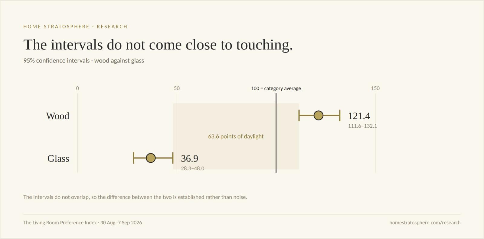
Even the upper end of the glass interval, 48.0, is nowhere near the lower end of wood’s interval, 111.6.
That’s why I’m comfortable writing an entire article about this result.
And this is only nine days of data
This might be my favorite part.
The measurement window here runs from August 30 through September 7, 2026.
Nine days.
This isn’t three years of data dressed up in a shiny PDF because I needed something new to talk about.
It’s the beginning.
The current living-room dataset contains 2,977 tagged images, with 144,690 measured impressions during this initial window.
Now imagine another month.
Then another quarter.
Then a year.
At that point I don’t merely get:
Wood 121.4. Glass 36.9.
I can start asking whether glass is improving.
Whether wood is declining.
Whether the relationship changes by season.
Whether a style that performed poorly nationally performs extremely well among a particular audience.
And, most interesting to me, whether certain combinations consistently outperform their individual ingredients.
That’s where this could get really good.
This is also why I’m reluctant to call everything a trend
The internet has beaten the word trend nearly to death.
Publish three green sofas and suddenly:
GREEN SOFAS ARE THE HOTTEST LIVING ROOM TREND OF 2027.
Maybe.
Maybe not.
My own data has some spectacular-looking numbers that I’m specifically not reporting as findings yet.
Leather sofas, for example, have an early Preference Index of 138.6.
Interesting.
But they have only 10,080 measured impressions, so leather doesn’t clear my reporting threshold yet.
I’m watching it.
I’m not calling it.
Coffee tables are different.
Wood clears the threshold.
Glass clears the threshold.
And their intervals don’t overlap.
So this one graduates from:
“Huh. That’s interesting.”
to:
“Okay. Something is going on here.”
What would I do with this if I sold coffee tables?
I wouldn’t discontinue anything.
I wouldn’t rush into the warehouse yelling:
GET RID OF THE GLASS!
I’d test.
I’d look at my own sales data first.
Then I’d look at click-through rates by material.
Product-page engagement.
Add-to-cart rate.
Pinterest performance.
Paid social creative.
Email clicks.
Maybe even showroom data if I had it.
Then I’d start testing the imagery.
If wood consistently earns more attention across several channels, that’s useful.
If glass sells beautifully despite weak image engagement, that’s useful too.
Because then you’ve discovered something arguably more interesting:
What people like looking at and what they ultimately buy aren’t necessarily the same thing.
That’s exactly the kind of discrepancy I want this research to uncover.
The big takeaway isn’t “glass sucks”
Although admittedly that’s the more entertaining headline.
The bigger takeaway is this:
Consumers may respond very differently to design attributes that the industry treats as roughly interchangeable.
Coffee table material doesn’t seem like a monumental decision.
It’s certainly not as sexy as forecasting the next great interior-design style.
Yet here I have one everyday material at 121.4 and another at 36.9.
That’s a massive difference hiding inside a mundane product attribute.
And that’s why I’ve become slightly obsessed with this data.
There are thousands of these little decisions inside a room.
- Sofa type.
- Sofa material.
- Sofa color.
- Rug pattern.
- Floor material.
- Wood tone.
- Wall treatment.
- Wall color.
- Window treatment.
- Fireplace.
- Built-ins.
- Lighting.
- Overall style.
- And on and on.
Most of the time, the industry has a pretty good idea what’s selling.
What I’m interested in is the stage before the sale.
What makes someone stop?
What makes them react?
What makes them save an image?
What combinations punch above their weight?
And which seemingly attractive design choices quietly die when actual people encounter them?
So far, glass coffee tables aren’t having a great time.
Research note
This analysis covers Home Stratosphere’s U.S. home-design audience during the August 30–September 7, 2026 measurement window. The audience is not a nationally representative sample of American consumers. The largest age band is 25–34 at 28.1%; ages 25–44 represent 46.1%; 45+ represents 34.1%; and 50+ represents 27.7%. Age bands total 96.4%, with 3.6% unattributed.
The images analyzed are rendered interiors rather than manufacturer product photography. Images are tagged using a fixed 17-field schema. No human tagging-calibration agreement rate has yet been computed, so no claim about tagging accuracy is made here.
The Preference Index is calculated as positive reactions per impression for a given attribute value divided by the same rate across all informative values for that attribute, multiplied by 100. An index of 100 therefore represents the attribute-category average.
The current reporting threshold is: at least 30 images and 20,000 impressions, or at least 300 measured reactions. Values below that threshold may be interesting but are not treated as findings.
The index measures attention and approval, not purchase intent. It does not measure price sensitivity, actual sales, causation or isolated preference for a single object within a room.