
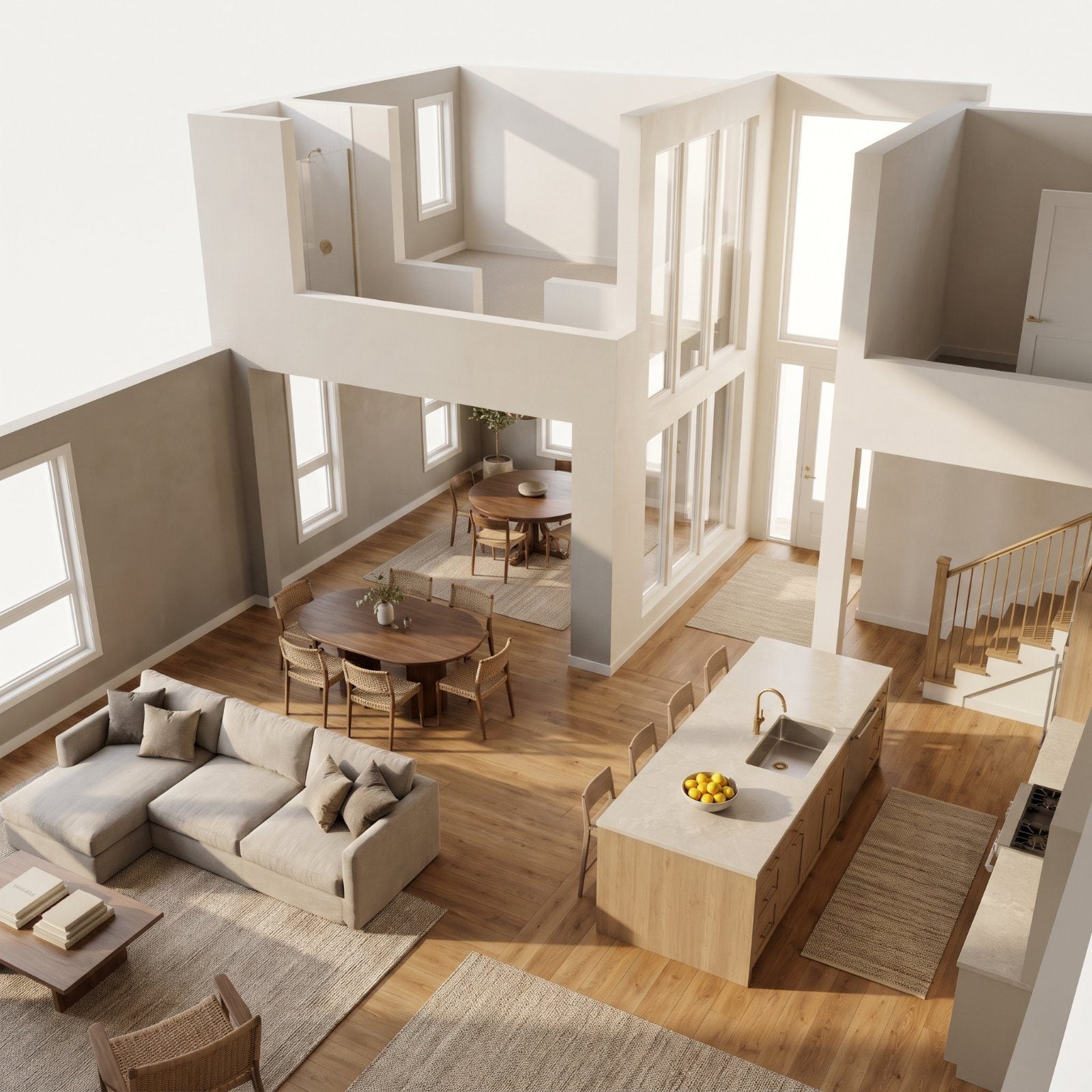
Builders talk. On job sites, at supplier counters, in the trucks between appointments, they trade notes on what buyers walk away from, and the 2027 list is getting specific. Some of these features were selling points five years ago. Now they sit on the market an extra month. We pulled together the floor-plan choices builders quietly predict will cool buyer interest, the ones that photograph well and live badly. Building, buying, or just wondering why your dream layout feels a little off? Read the ones below before you commit to a slab.
29. One Giant Open Room With No Acoustic Separation
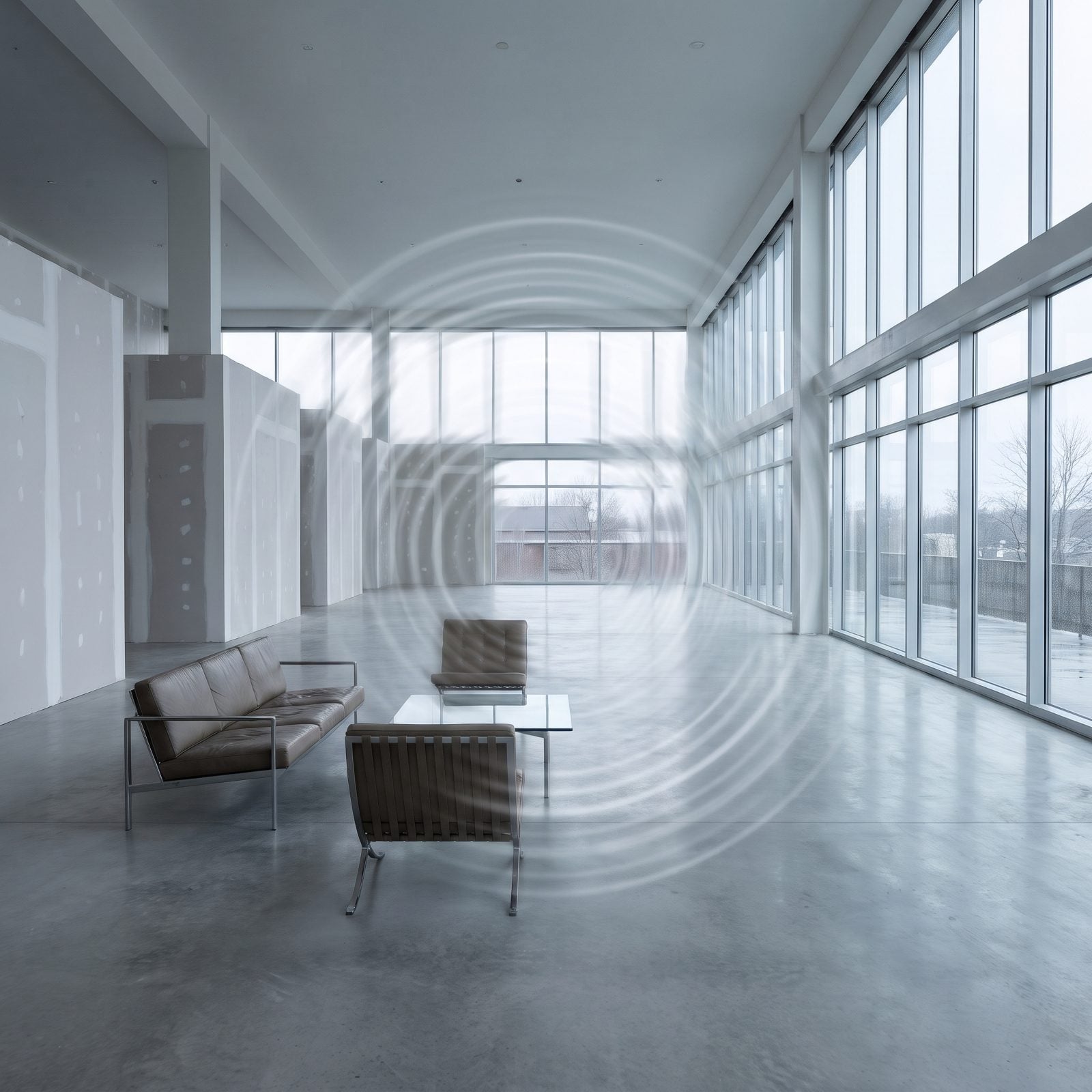
The great sell of the open plan was connection. The quiet cost is noise. Every hard surface in a room this size bounces sound, so the blender drowns the TV and a phone call in the kitchen carries clear across to the sofa.
In order to come up with the very specific design ideas, we create most designs with the assistance of state-of-the-art AI interior design software. Also, assume links that take you off the site are affiliate links such as links to Amazon. this means we may earn a commission if you buy something.
Builders are hearing it at resale now. Buyers walk in, clap once by accident, and wince at the echo. The fix isn’t walls, necessarily. It’s zones, a drop in ceiling height over the living area, a wool rug big enough to matter, acoustic panels dressed up as art.
As a sustainable building designer puts it, “A very common experience is hearing kids making lots of happy, enthusiastic noise at one end of the house, but being unable to escape it even at the far end or upstairs.”
28. Formal Living Rooms Nobody Uses
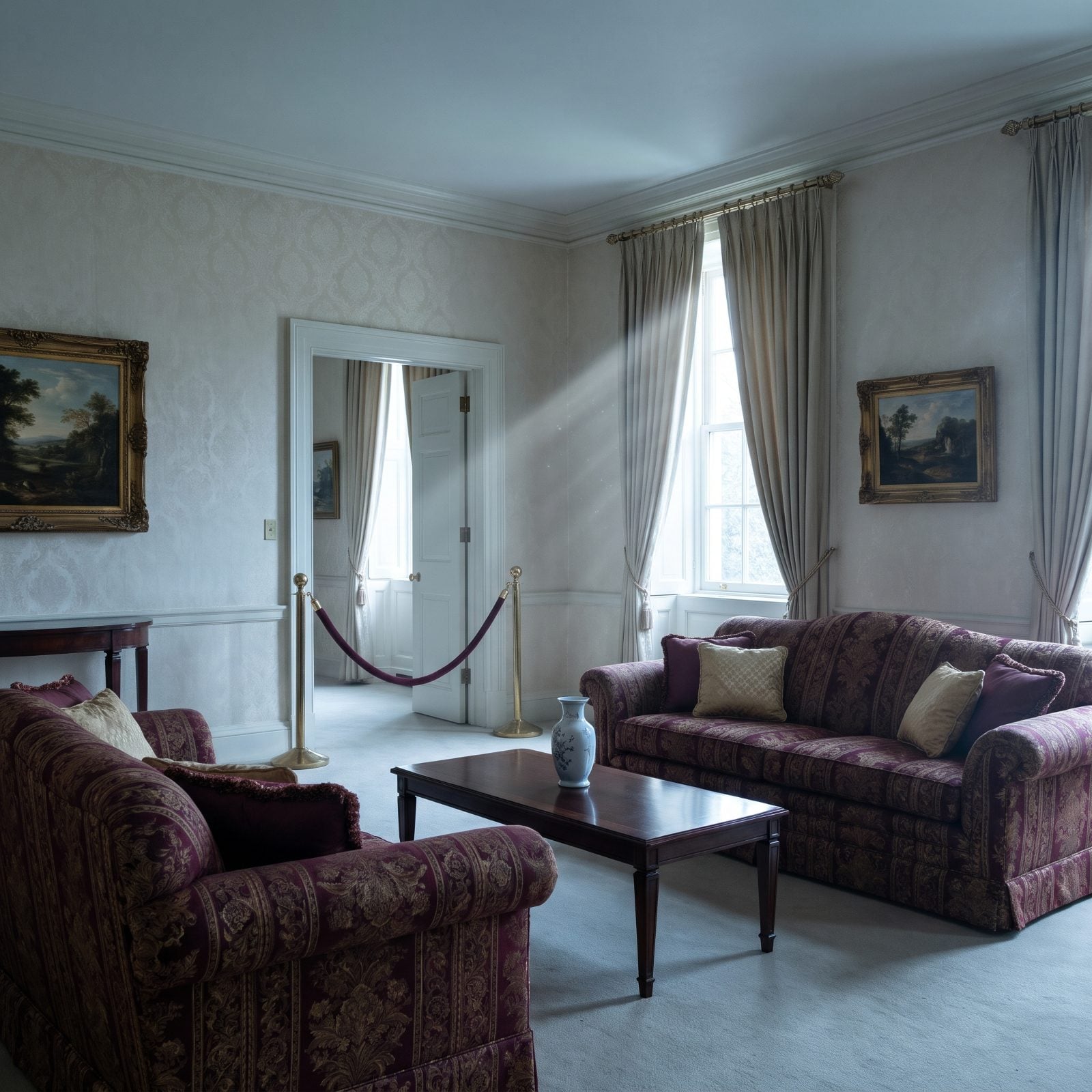
A whole room set aside for guests who come twice a year. That was the pitch once. Buyers in 2027 do the math differently, and they see square footage paying no rent.
The formal living room reads as dead space the moment you walk past it. Builders say the smart move is folding it into something people actually use: a home office, a reading den, a second family room with a real red bookshelf and a chair you’d fight someone for.
As a luxury real estate agent puts it, “But the idea of dedicating hundreds of square feet to a beautiful room that rarely gets used is becoming increasingly difficult to justify.”
27. Formal Dining Rooms Cut Off From the Kitchen
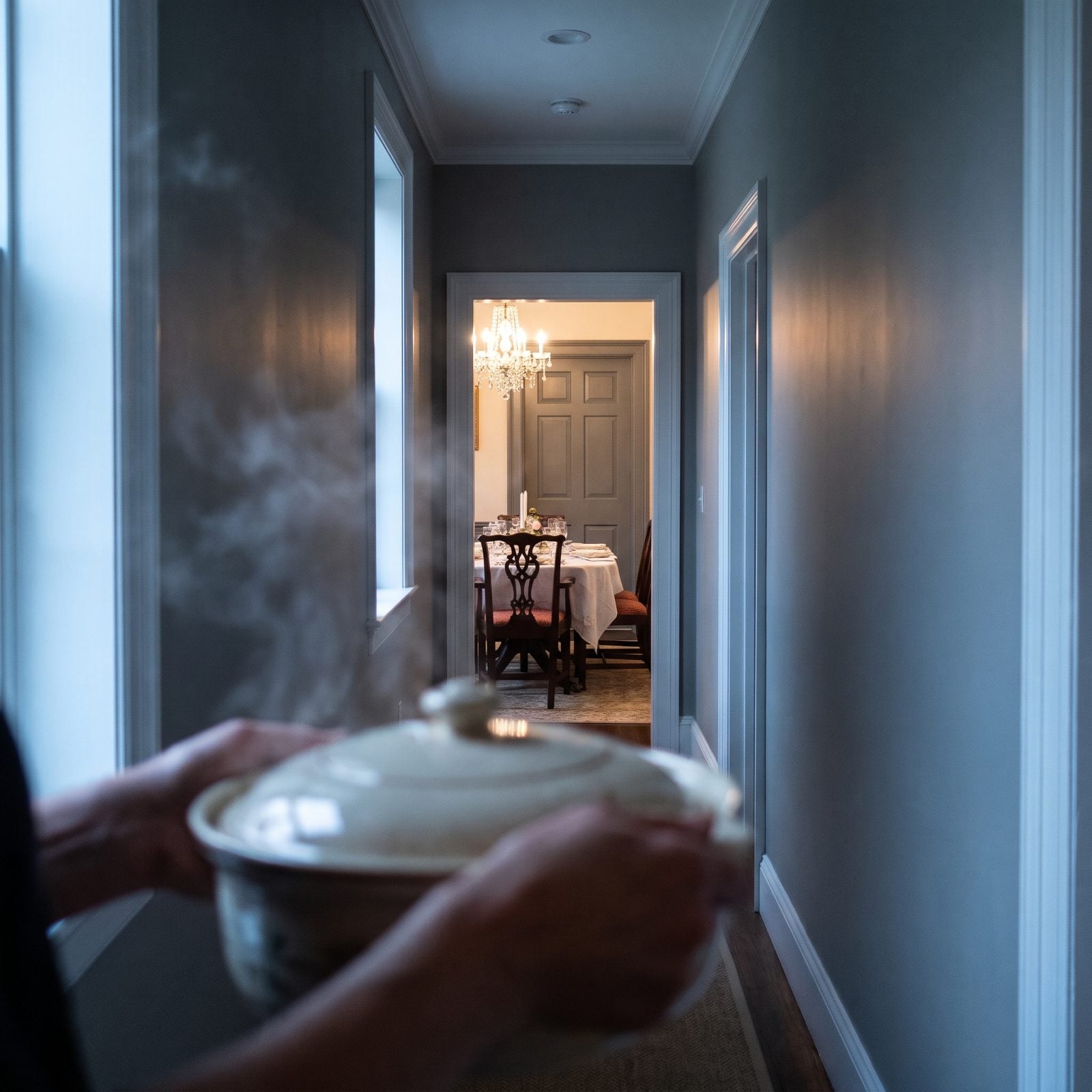
You’ve carried a hot dish down a hallway, balanced it past a doorway, and set it down already half cold. That’s the formal dining room cut off from the kitchen.
It made sense when kitchens were for staff and dining was for show. The cook wants to see the table now. Builders report buyers scanning for a clear line between stove and seating, then marking down homes that turn dinner into a relay race. A pass-through window or a widened opening buys back a lot of appeal. Want a template for a warmer connected scheme? This dark den design shows how cream and brass soften a boxed-in room.
26. Two-Story Foyers That Consume Upstairs Space
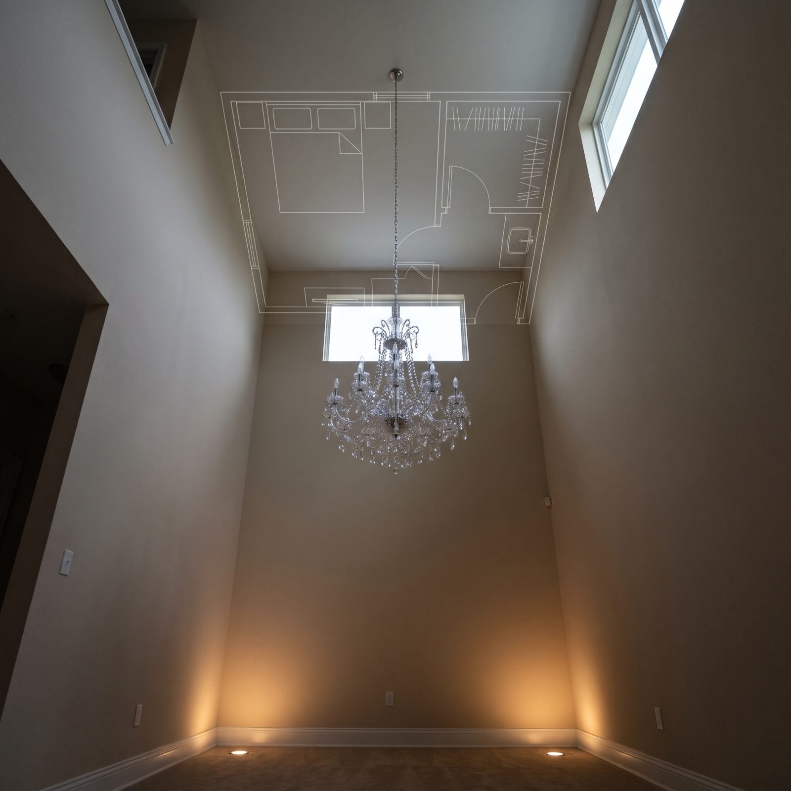
That cathedral entry looks grand in the listing photo. It’s also a big chunk of upstairs that became air.
Builders predict buyers in 2027 will clock the trade: you got drama at the door and lost a bedroom, a bonus room, or a proper laundry above it. Heating that column of empty space costs money every winter too. The volume impresses for about four seconds. Then you live with the gap for years.
As one realtor showing new construction puts it, “By eliminating the 2-story foyer, builders are able to increase the usable square footage of the home to accommodate, for example, an upstairs lounge area for the family or a home office”
25. Two-Story Great Rooms With Hard-to-Reach Windows
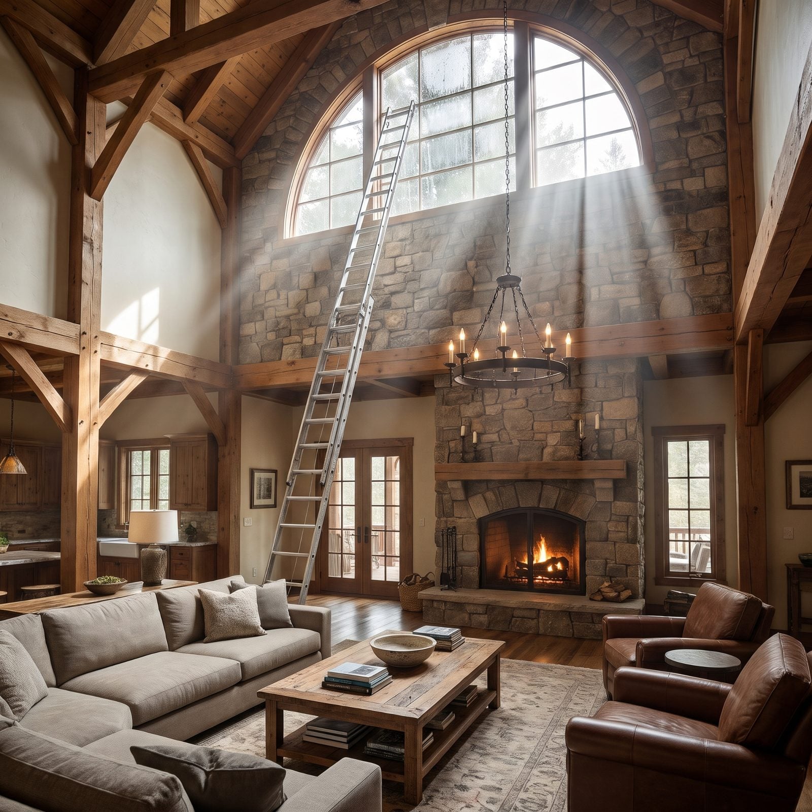
A window you can’t clean is a window that’s always a little dirty. That’s the two-story great room problem in one line.
All that glass looks spectacular until a bulb burns out in a fixture thirty feet up, or the top panes film over and you realize scaffolding is the only way to reach them. Buyers now ask the practical question out loud at showings: how do I maintain that? And temperature stratification is the other quiet issue, heat pooling up top while the sofa stays cool.
24. Walk-Through Kitchens Used as Hallways
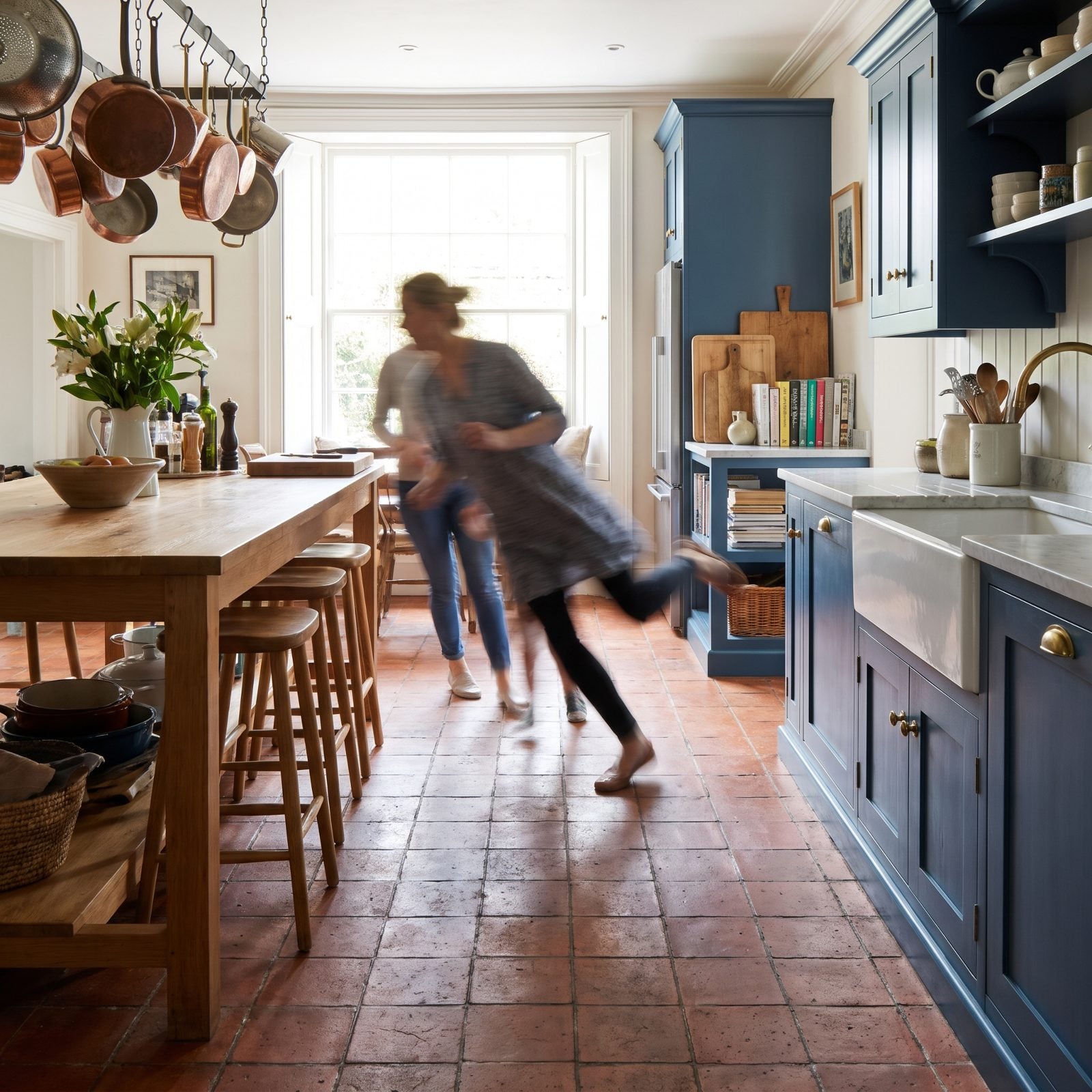
Cook anything real in a walk-through kitchen and you’ll spend half your time stepping aside, because everyone in the house treats it as a shortcut.
The problem is simple. A kitchen is a workspace, a hallway is a path, and a floor plan that stacks one on top of the other makes both worse. Hot pans and a steady stream of foot traffic don’t mix. Builders flag these layouts as resale friction because the buyer who cooks notices the conflict in about ninety seconds.
23. Pantries Located Across the House
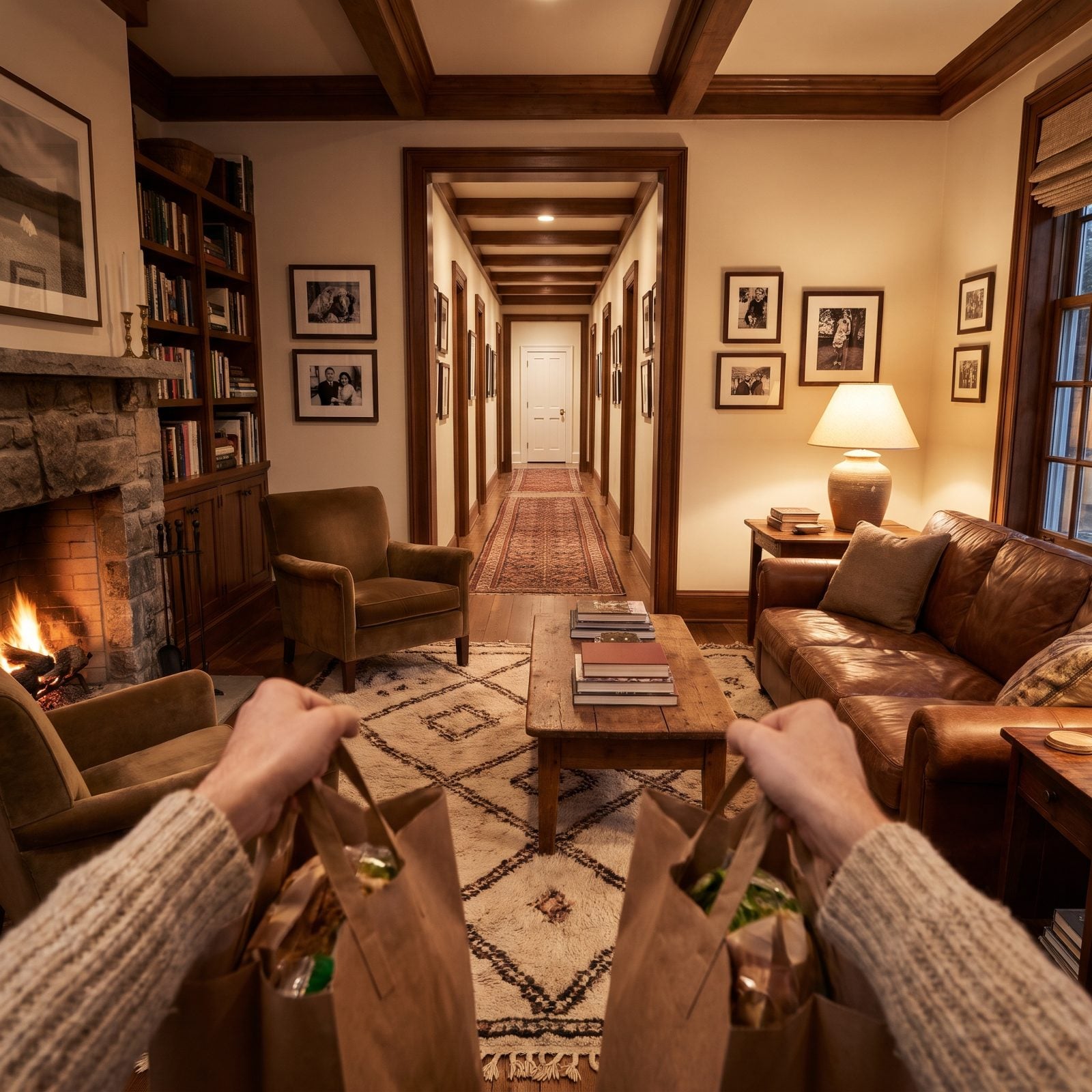
A pantry you have to march to is a pantry you stop using. Builders are seeing floor plans that tuck the walk-in off a mudroom or around a corner, nowhere near the stove.
Convenience is the whole point of a pantry. Put it across the house and groceries pile up on the counter because nobody wants the trek. The best ones sit one turn from the prep zone, close enough to grab flour mid-recipe without leaving the room.
22. Front Entries Opening Directly Into Living Rooms
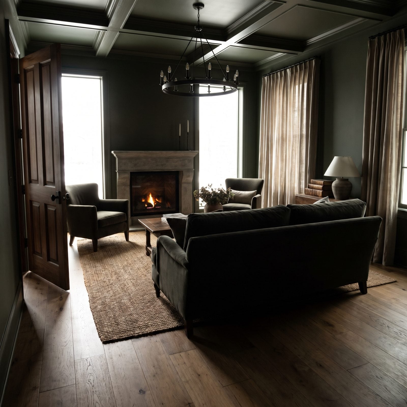
Open the front door and you’re standing in the living room. No landing, no closet, no breath between the street and the sofa.
Builders call this one out because the lack of a buffer costs privacy and order. Guests see straight to your couch, there’s nowhere to drop wet shoes, and cold air blows right onto the seating every time someone enters. A small entry zone, even a half-wall or a bench and hooks, reads as a huge upgrade to buyers.
A home should let you arrive before it lets you in. Skip the entry and every visitor walks straight into your private life.
21. First-Floor Plans Without a Coat Closet
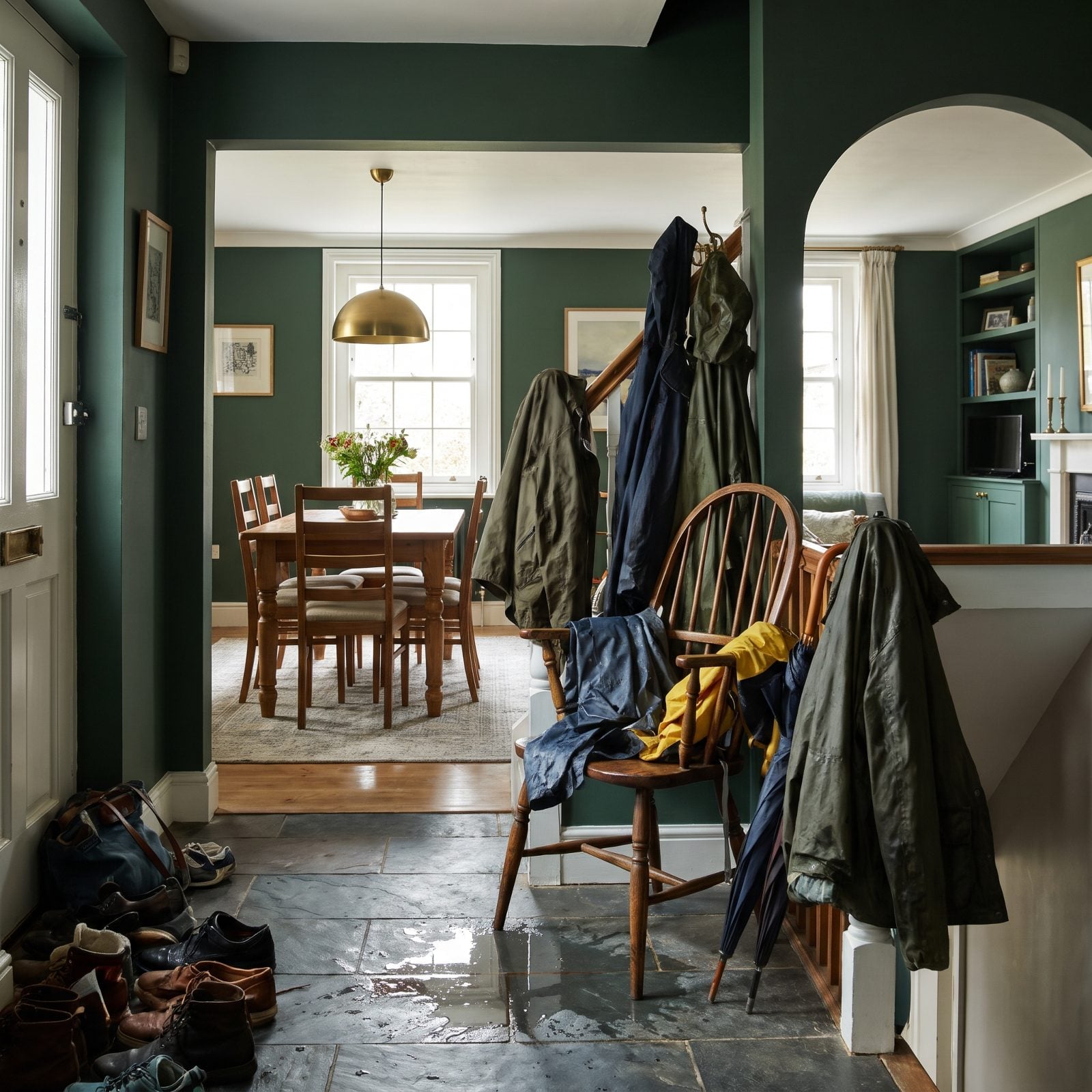
You walk in with wet coats and nowhere to put them. Buyers feel that in the first ten seconds of a showing, and it sticks.
Builders keep shaving the front coat closet to buy open-concept square footage, and the wooden dining chair and stair balusters standing in for it never quite hide the pile. Jackets, bags, and muddy boots become the first thing a guest sees. A chair patches the hole. It doesn’t solve it.
20. Laundry Rooms Reached Through Primary Closets
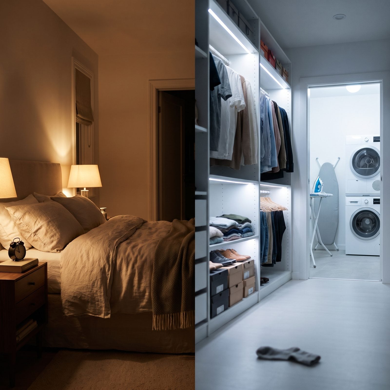
Routing laundry through the primary closet sounds efficient on paper. It isn’t.
Picture one person still asleep while the other needs to swap a load. Now there’s a lit hallway carved straight through the most private room in the house, past open shelves of folded laundry and the white built-in hanging rods. Guests doing a quick wash tour your underwear drawer on the way. Builders love the shared plumbing wall. Buyers clock the privacy problem the moment they walk the plan.
19. Primary Bedrooms Directly Beside Great Rooms
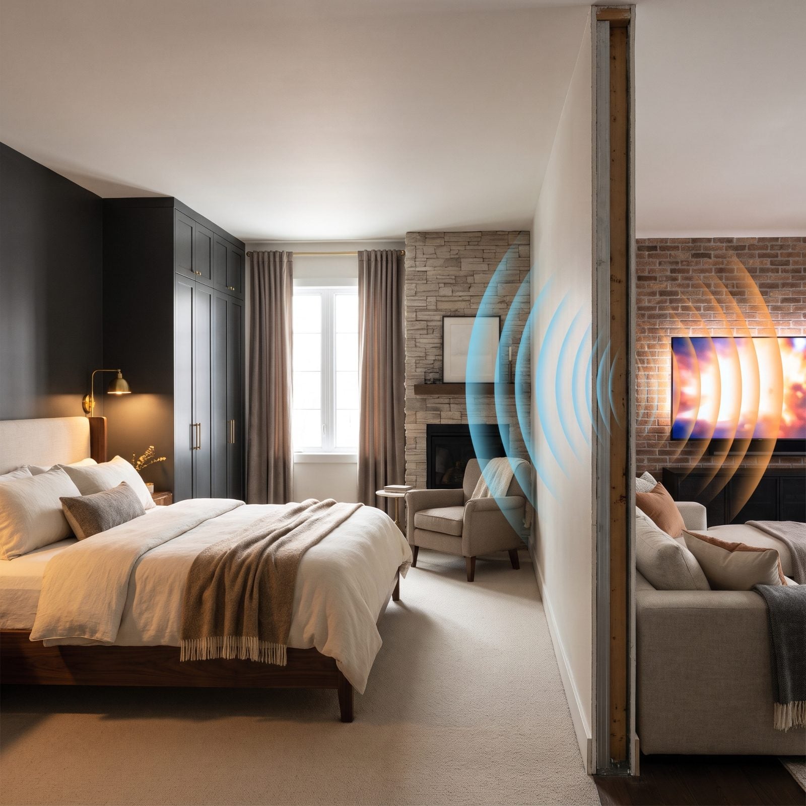
A bedroom wall touching the great room is a sound problem wearing a space-saver costume. Movie night cranked up on one side, somebody trying to sleep on the other.
The fix builders skip is a buffer. A closet, a bathroom, a hallway, anything with mass between the grey sectional and the bed. Without it, the only peace in the house depends on everyone else shutting up at nine.
18. Primary Bathrooms Open to the Bedroom
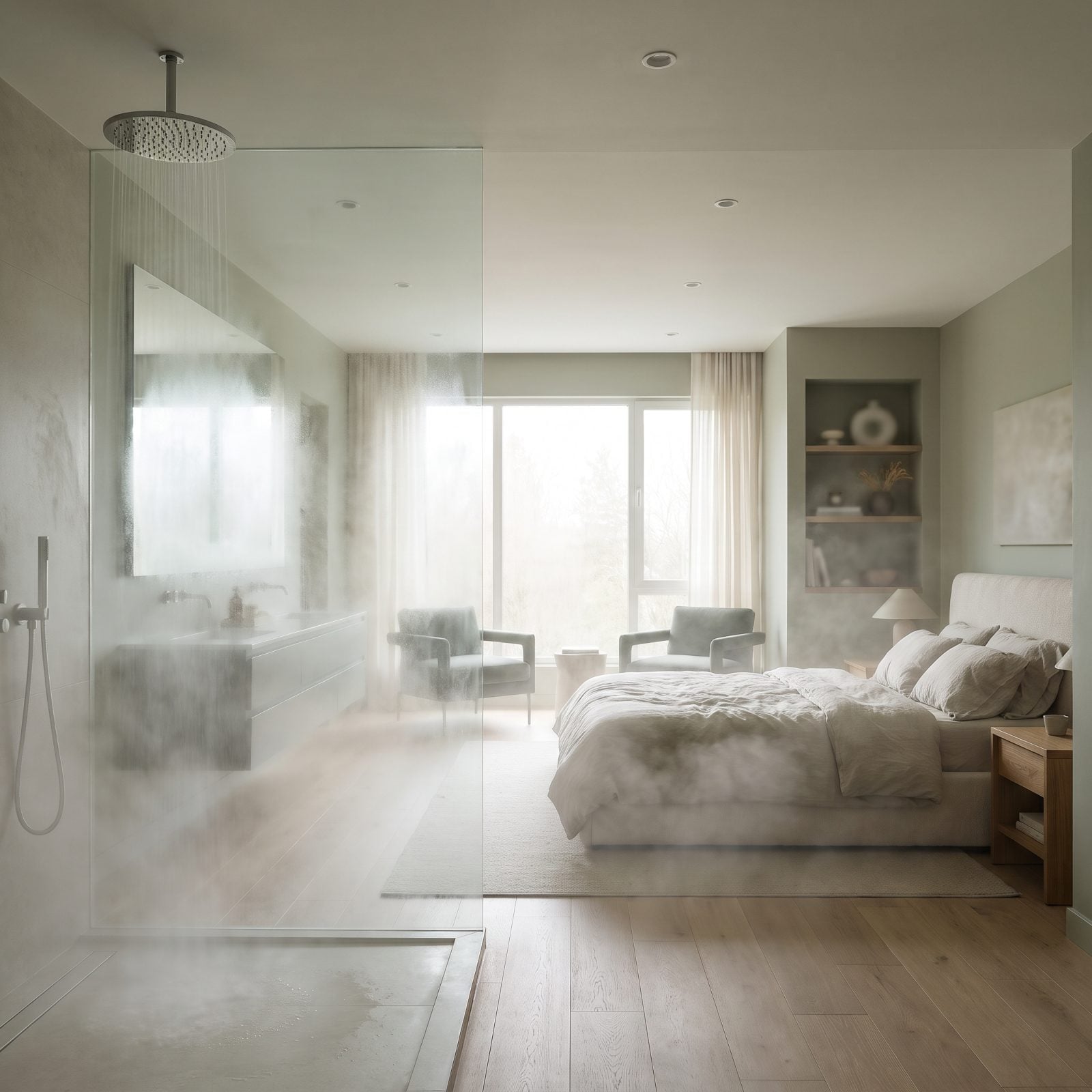
The open primary bath photographs like a spa and lives like a mistake.
Steam fogs the oatmeal linen headboard. An early riser flips on the vanity lights and the whole bedroom glows. Smells travel, noise travels. Resale buyers, especially couples on opposite schedules, walk in, picture a 6 a.m. shower waking a sleeping partner, and move on. A door is cheap. Regret isn’t.
17. Primary Closets Accessible Only Through Bathrooms
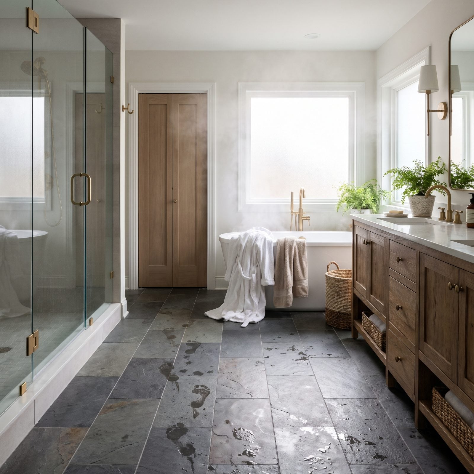
Getting dressed shouldn’t require walking through a wet room.
When the closet hides behind the bathroom, every outfit change means crossing humid tile past a glass shower. Clothes in a steamy space is a rotten long-term plan, and the one still sleeping catches the light and the fan every single morning.
Walk-in closets this good deserve their own door off the bedroom. We’ve pulled together some red and jewel-toned closet layouts that prove a dressing room can be a destination instead of a passthrough.
As a working interior designer puts it, “When your closet entrance is located directly off the bathroom, it means that your wardrobe is adjacent to all of the issues that plague that room — namely, moisture and smells.”
16. Bedrooms Sharing Walls With Entertainment Rooms
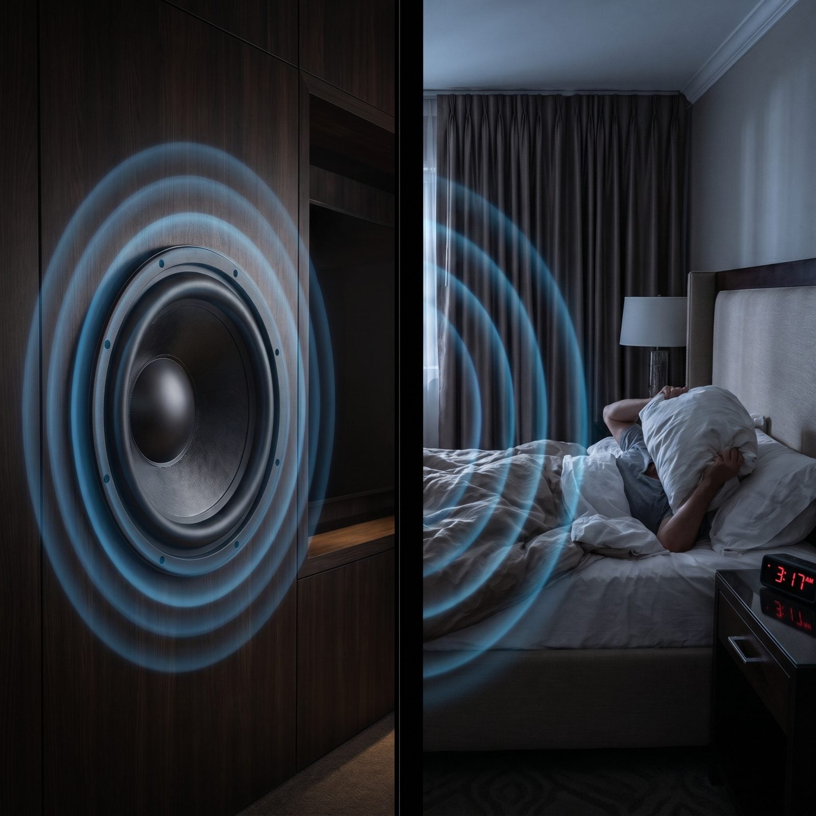
Mount a subwoofer on a bedroom wall and you’ve built an alarm clock for the room next door.
Entertainment rooms run loud and run late, and bass carries through standard framing like it isn’t even there. Put a kid’s bedroom on the other side and bedtime turns into a negotiation with a movie. Families shopping for resale spot this adjacency fast, and it’s one of the hardest things to undo once the drywall’s up.
15. Secondary Bedrooms Too Small for Queen Beds
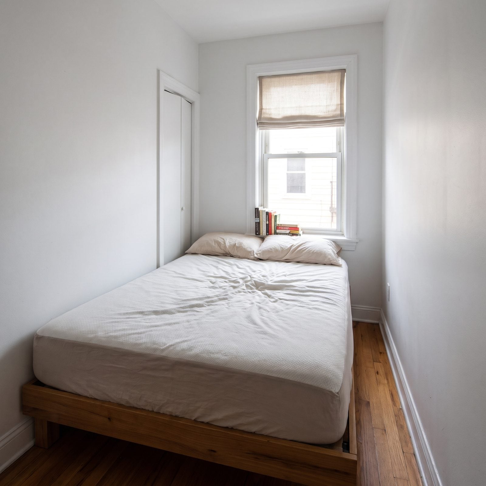
A bedroom that can’t hold a queen with walking room isn’t a bedroom. It’s a storage closet with a window.
Builders shrink the secondary rooms to pad the primary suite, and the math shows on the walk-through. Push the bed to one wall and you get a single narrow path, no space for two nightstands, the closet door clipping the small dresser. Guests and teens both need a genuine queen. This one fails the tape measure.
14. Windowless Interior Home Offices
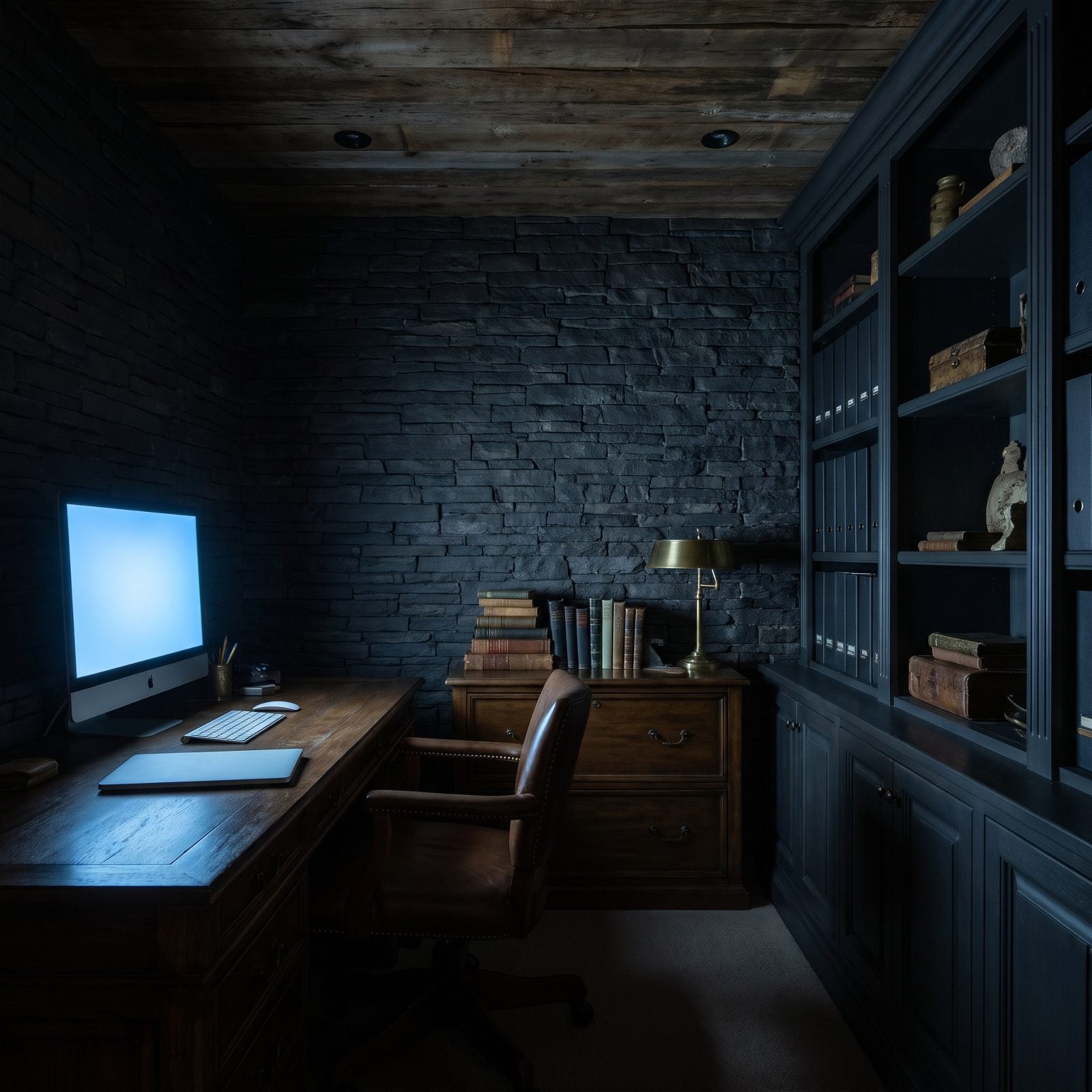
Remote work turned the home office into a dealbreaker, and the windowless interior version is the one buyers reject on sight.
No daylight. No view. No air that moves. You feel the gloom within an hour: the monitor glows brighter than anything else in the room, and the single desk lamp sitting on the file cabinet barely dents the dark stone walls. Even a bright den with one honest window reads twice as valuable as this square stone cave, navy built-ins and all. By 2027 buyers want the office to feel like a room, not a handsome vault with a desk dropped in.
13. Loft Offices Open to Noisy Great Rooms
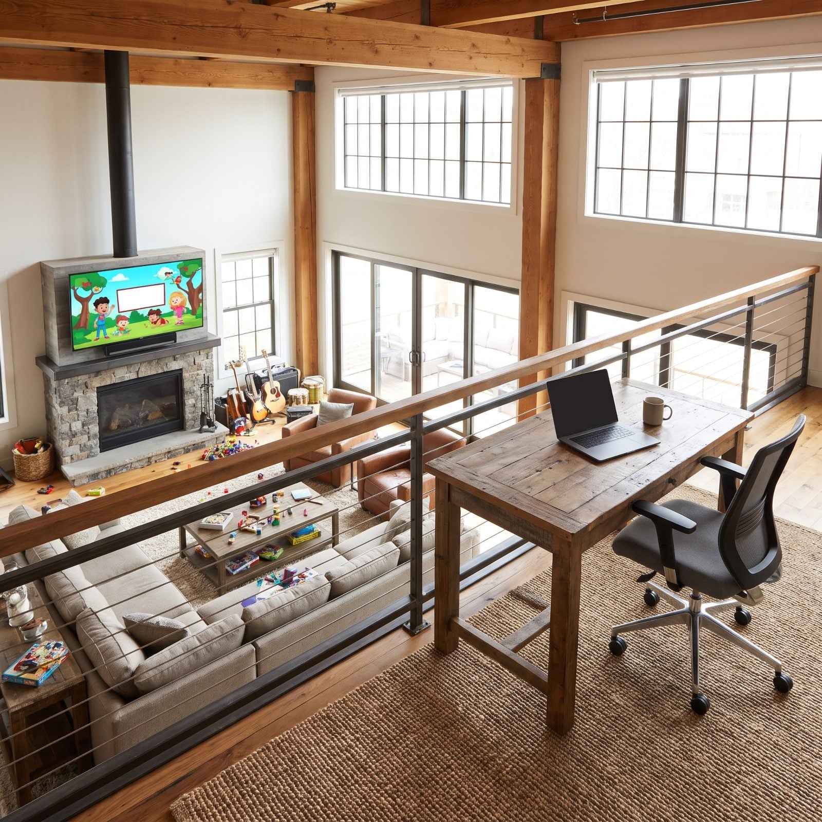
An open loft office looks like a design win in the model home and sounds like a problem the day you move in.
Every word from the great room floats straight up through the double-height void. No walls, no door, no barrier. You’re on a work call while the TV, the kitchen, and the front door all share your acoustic space. Builders sell it as flexible square footage, but anybody who works from home hears the catch right away.
12. Dedicated Theater Rooms With No Alternate Use
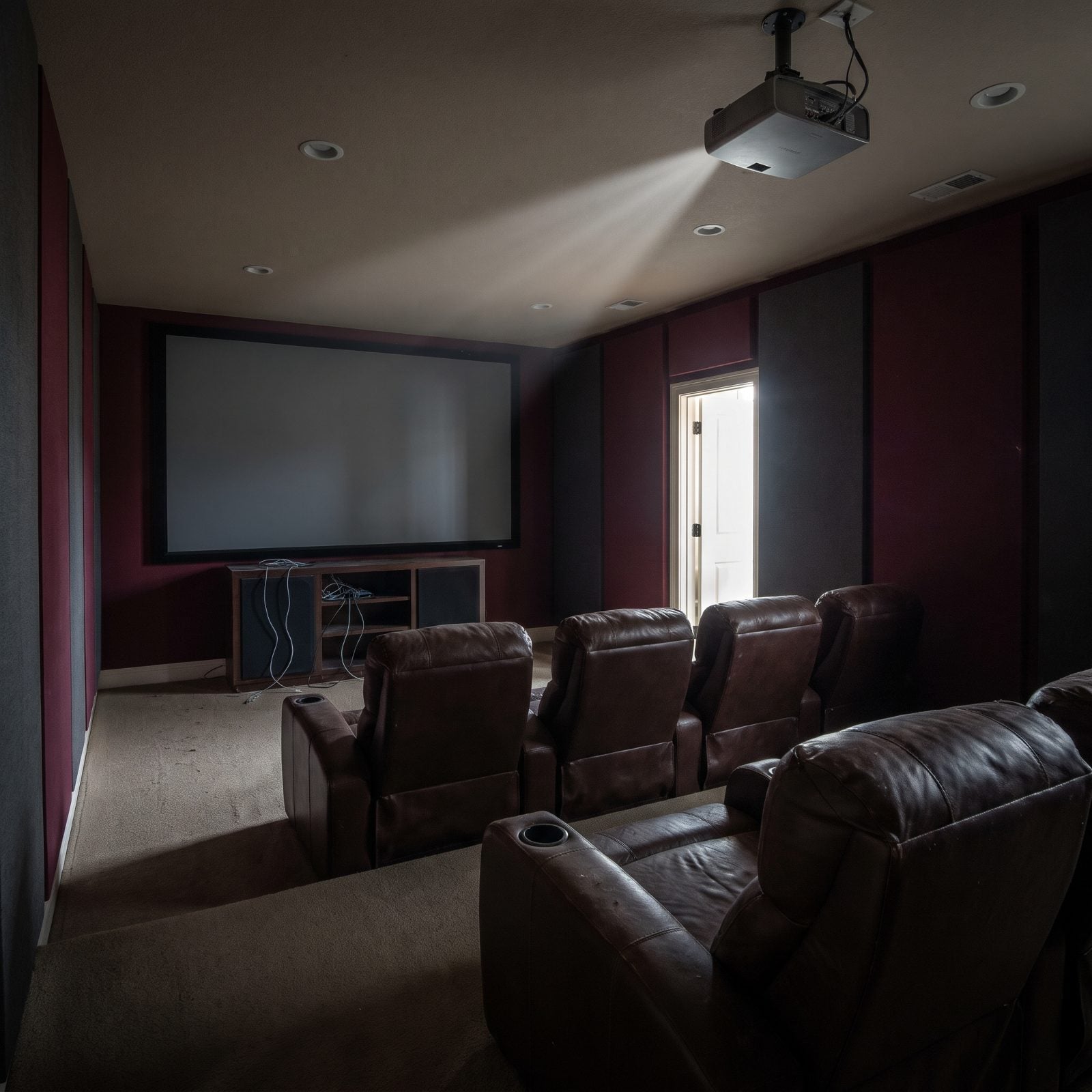
The dedicated theater room was a status symbol a decade ago. By 2027 it’s a dark, windowless box that does exactly one thing and nothing else.
Fixed risers, blackout walls, recliners bolted to a platform. No daylight, no second act, no way to make it a bedroom or an office when life shifts. Buyers now want rooms that flex: a media space that doubles as a guest room, a bonus room that converts on demand. A single-purpose cinema reads as footage they’ll be paying to heat for one movie night a month.
Flexibility is the new luxury. A room that only does one thing had better do it for someone willing to pay extra, and that pool keeps shrinking.
11. Sunken Living Rooms With Step-Down Hazards
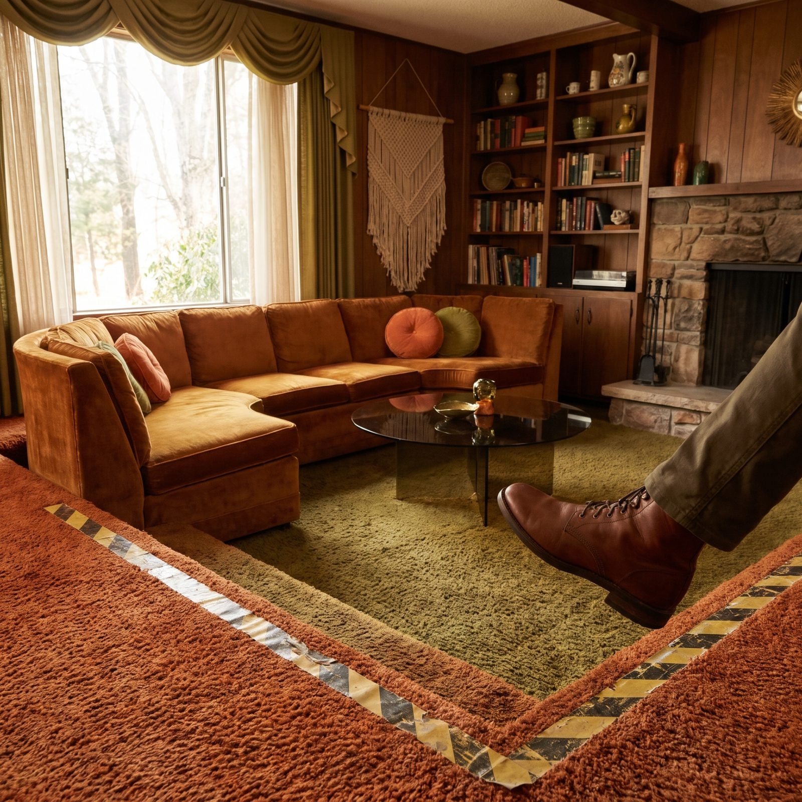
That buried floor looked like the future in 1975. Now it reads as a sprained ankle waiting to happen. Builders flag sunken living rooms because the step-down is the first thing a buyer with a toddler or an aging parent clocks, and the furniture never quite flows between the two levels.
The rust velvet sectional can’t borrow a chair from the kitchen side without someone carrying it down a ledge, and resale appeal drops the second a space feels like it needs a warning sign.
10. Long Hallways With No Natural Light
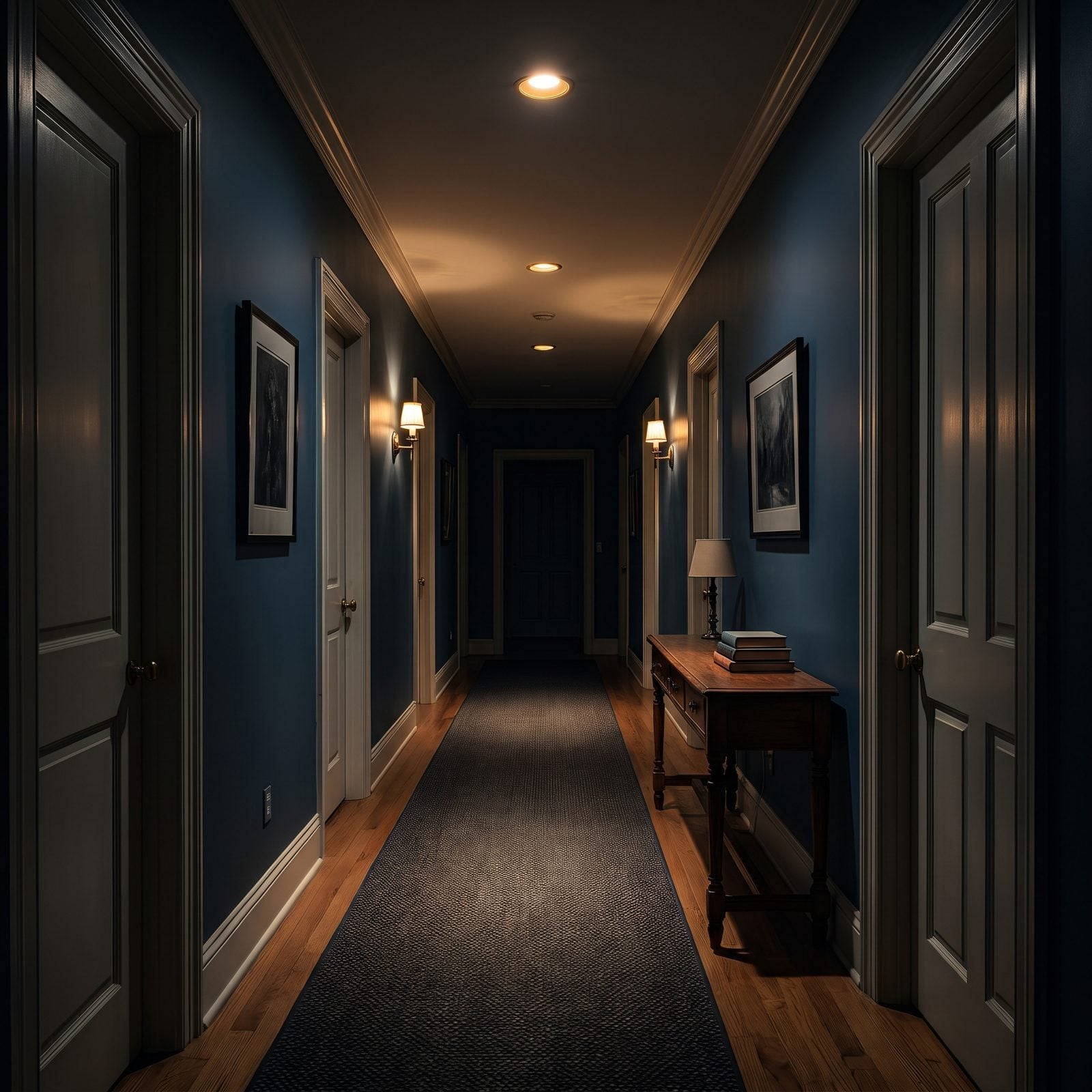
You’ve walked one. The hall that needs the lights on at noon, flanked by shut doors, going nowhere interesting. Builders predict these tunnels will drag on resale because buyers now read daylight as a baseline, not a bonus.
A windowless corridor burns electricity around the clock and feels like a holding pattern between the rooms people actually want. If a bright den is what buyers chase, a dark hall is the opposite signal the whole floor plan sends.
9. Powder Rooms Opening Toward Dining Areas
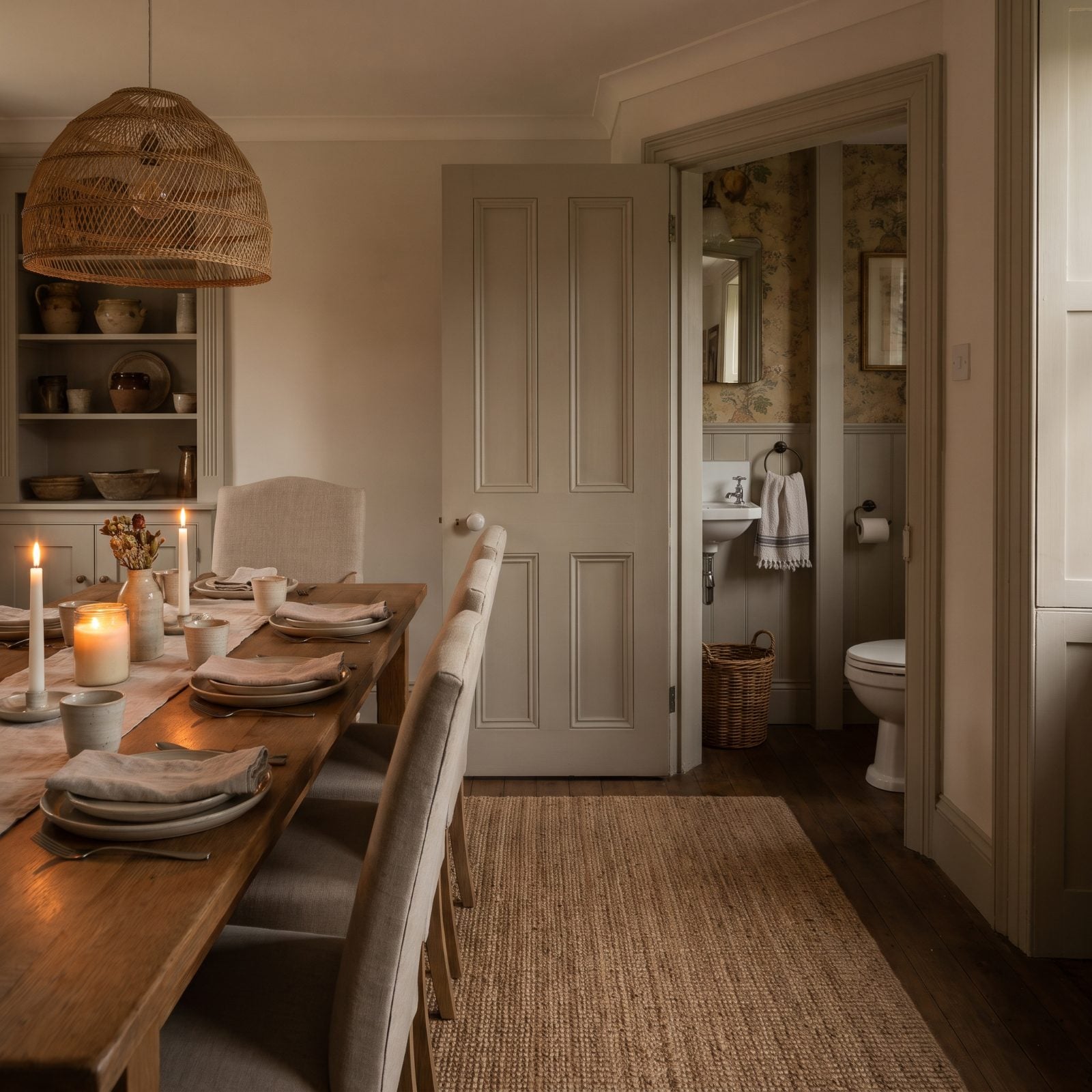
Nobody wants to pass the gravy while a bathroom door swings open four feet away. That direct sightline from the dining table into a toilet is a layout mistake builders expect buyers to notice fast in 2027.
The fix is usually just a dog-leg entry or a pocket of wall. Without it, hosts spend dinner managing who’s in there and when, and the rattan dome pendant over the reclaimed pine table can’t rescue the mood.
As one residential home designer puts it, “Start by checking the direction of the doorway. A door facing the dining table can create an uncomfortable view.”
8. One Shared Bathroom for Several Bedrooms
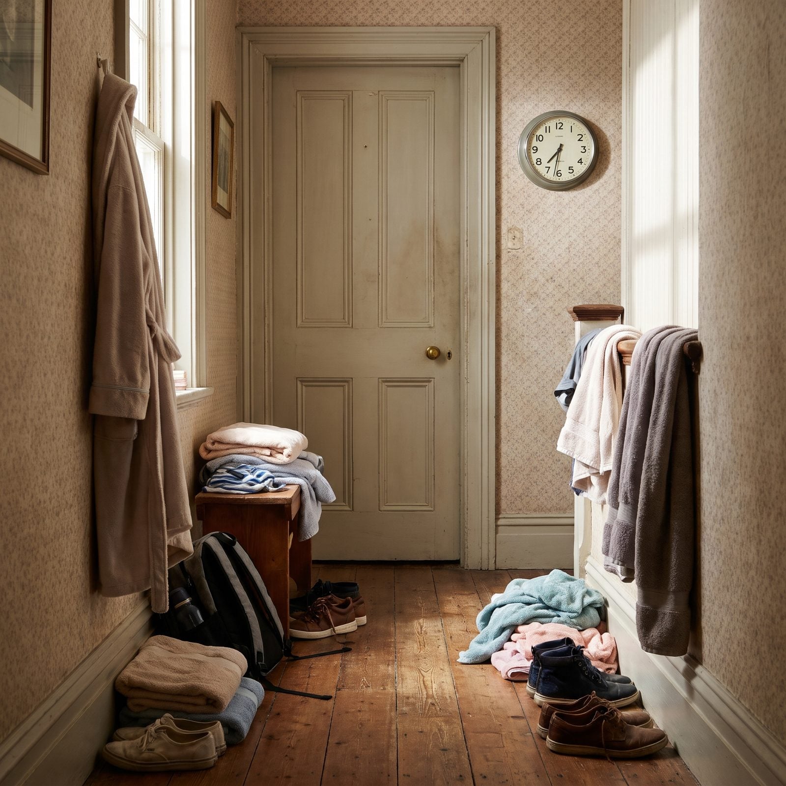
Four bedrooms, one bathroom. The math fails every weekday morning at 7:40.
Builders single this out because buyer expectations have climbed. A bathroom per two bedrooms is close to the floor now, and a single shared bath across a four-bedroom plan reads as a compromise rather than a feature — the kind of flaw that never shows in a listing photo but quietly kills the second viewing.
7. Spiral Staircases as Primary Circulation
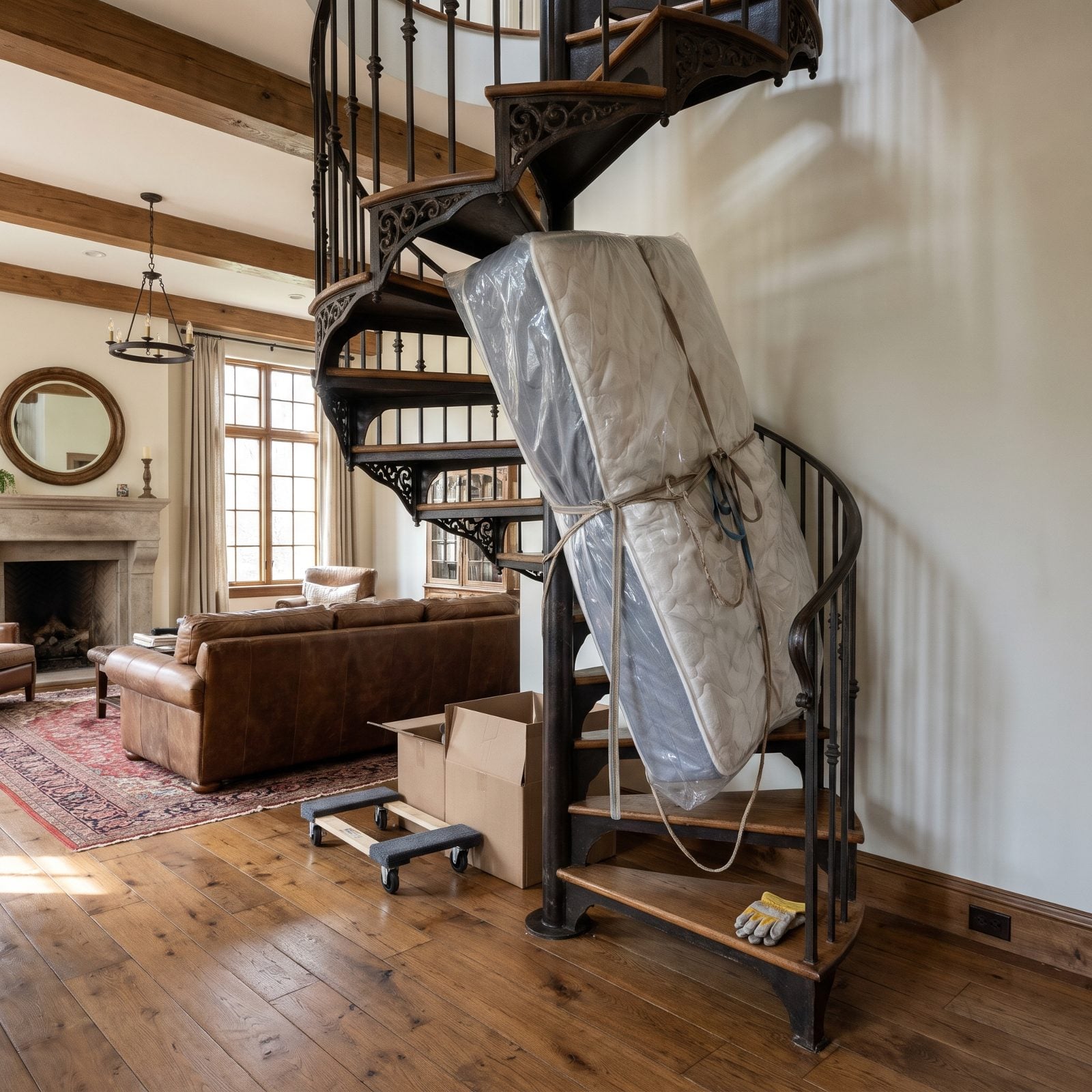
A spiral staircase is a sculpture, and a terrible primary route.
Try carrying a mattress up one. Or a laundry basket while gripping a railing you can only reach from one side. Builders flag spirals as main circulation because the thing that makes them charming — that tight radius — is exactly what makes daily life harder. Buyers fall for them in photos, then reconsider the moment they picture a moving day.
As one stair-building expert puts it, “If there isn’t, it’s going to be extremely difficult to move large objects up and down the stairs.”
6. Low Sloped Ceilings Across Usable Floor Area
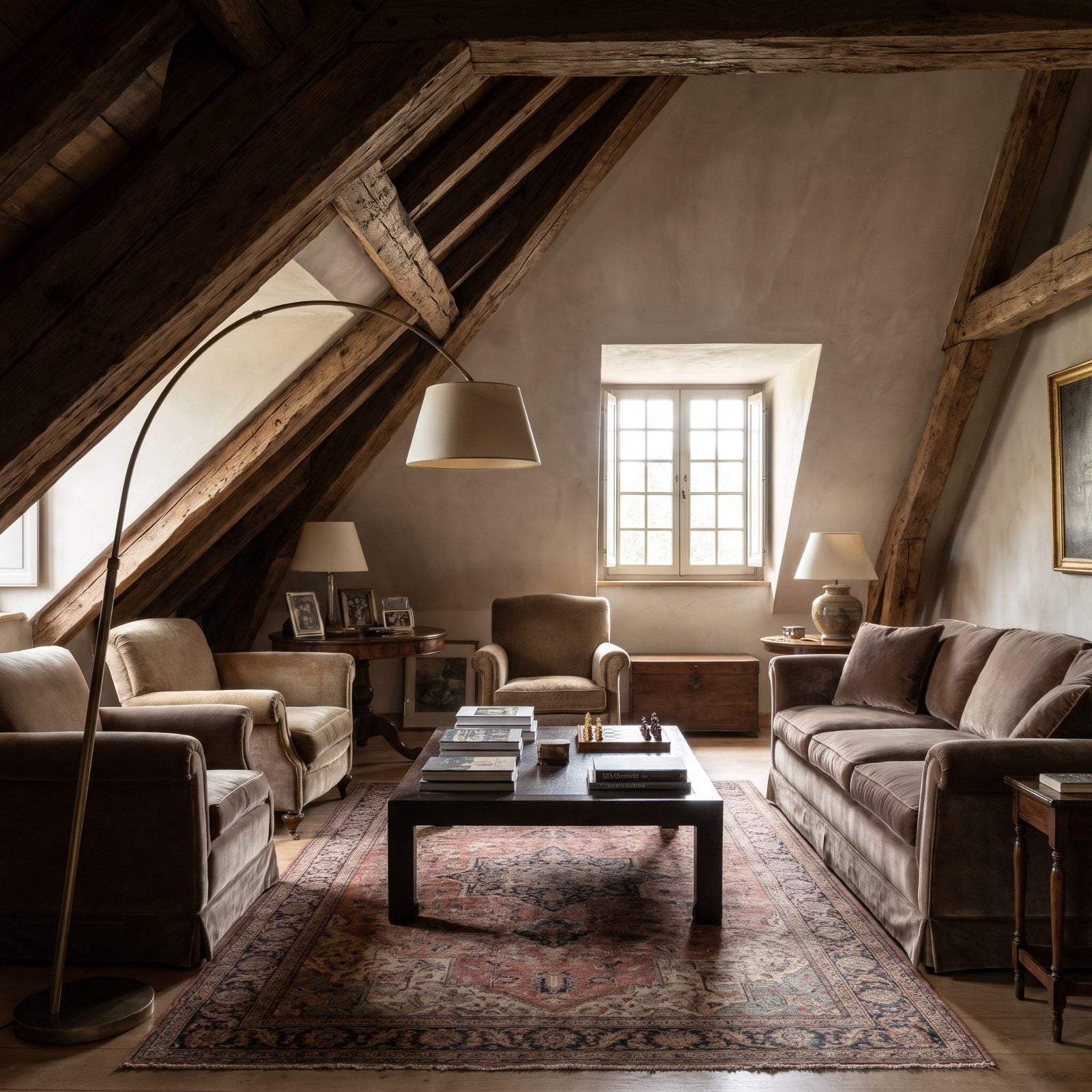
Square footage on paper is not the same as square footage you can stand in. A room measured at 300 square feet feels like 180 when the roof pitch crushes both sides down to a knee wall.
Builders expect buyers to get sharper about this in 2027, counting the parts they can actually use and resenting the parts they’re paying to heat but can’t furnish. A craftsman den with a generous ceiling plane reads as real room. A sloped attic bonus space reads as a storage closet with ambitions.
5. Outdoor Kitchens Far From Indoor Kitchens
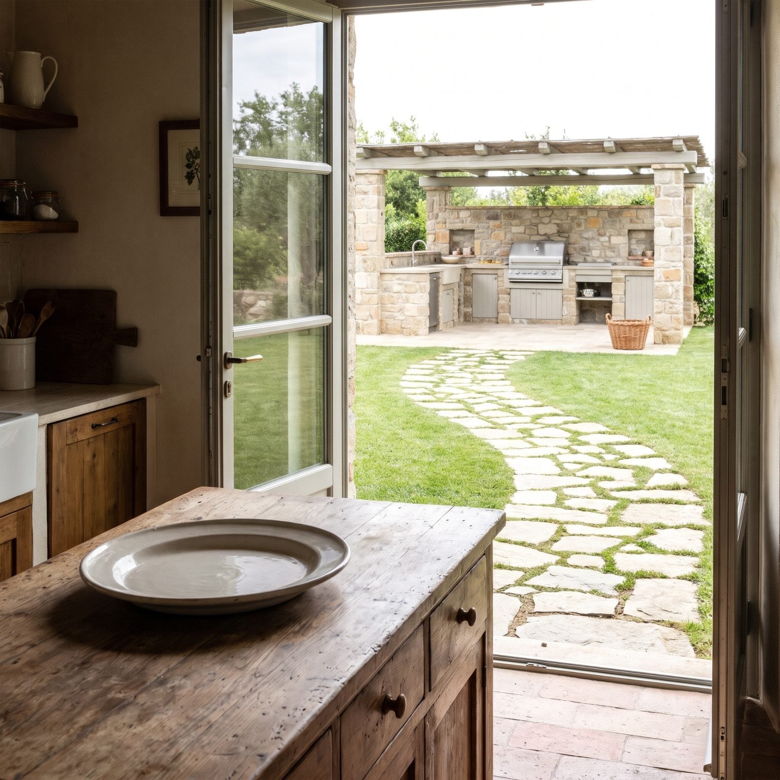
An outdoor kitchen is only worth it if you’ll actually use it. Park it fifty feet from the indoor kitchen and every forgotten spatula becomes a long round trip across the lawn.
Builders predict buyers will scrutinize the distance between the two cooking zones, because an outdoor kitchen that’s a hike from the fridge gets abandoned fast. The stainless grill and the outdoor refrigerator look impressive, but proximity to the real kitchen decides whether anyone cooks out there twice.
4. Covered Patios That Darken Interior Rooms
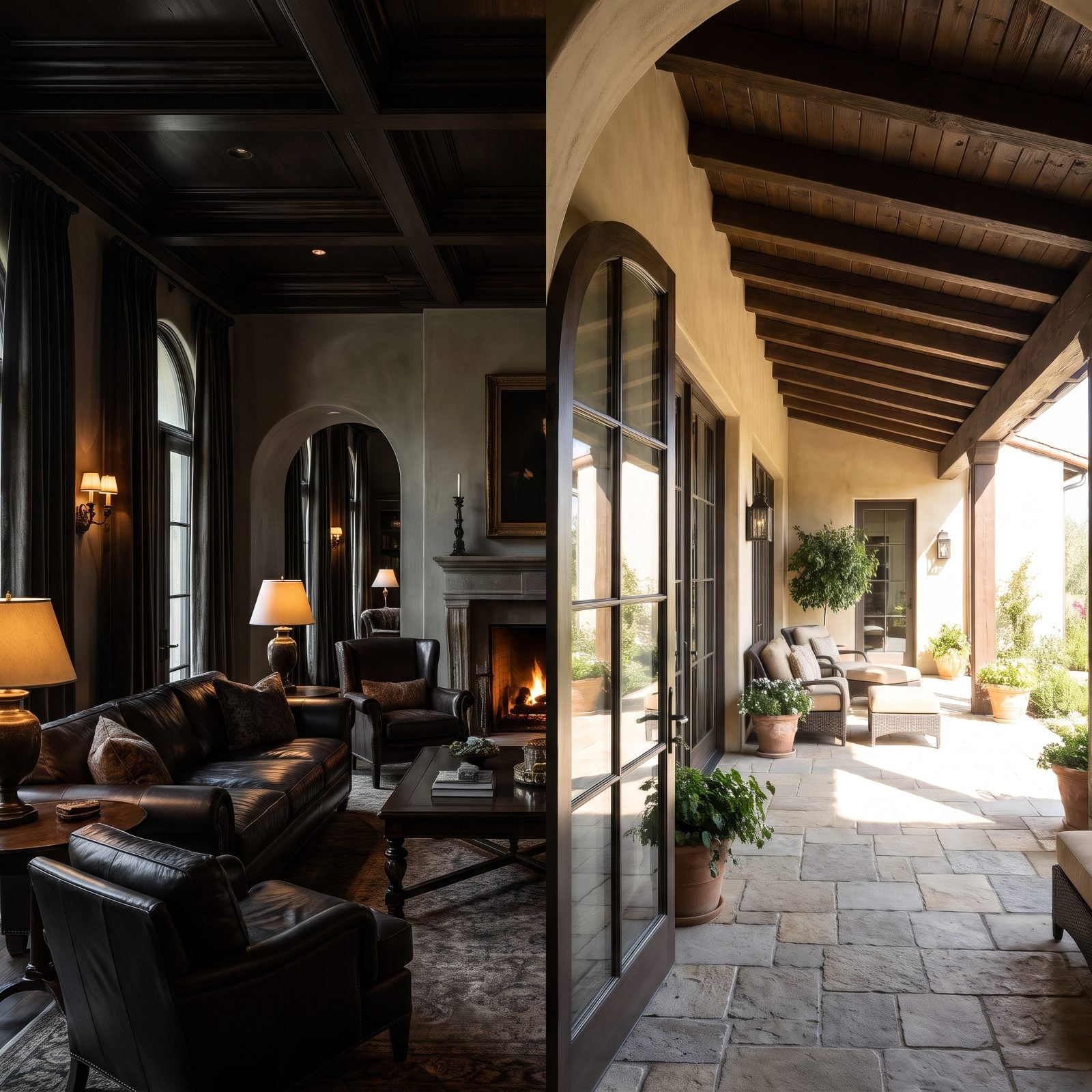
Here’s the trade-off nobody mentions at the builder’s model home. A deep covered patio keeps you dry on the deck and steals the daylight from the room behind it. The deeper the overhang, the darker the family room.
Builders flag this because the rooms that lose light are usually the main living spaces, and a dim family room at 2pm is a feeling buyers remember longer than the patio they admired for a minute. Shallower overhangs or light-colored patio ceilings soften the hit.
3. Pools Filling Nearly the Entire Backyard
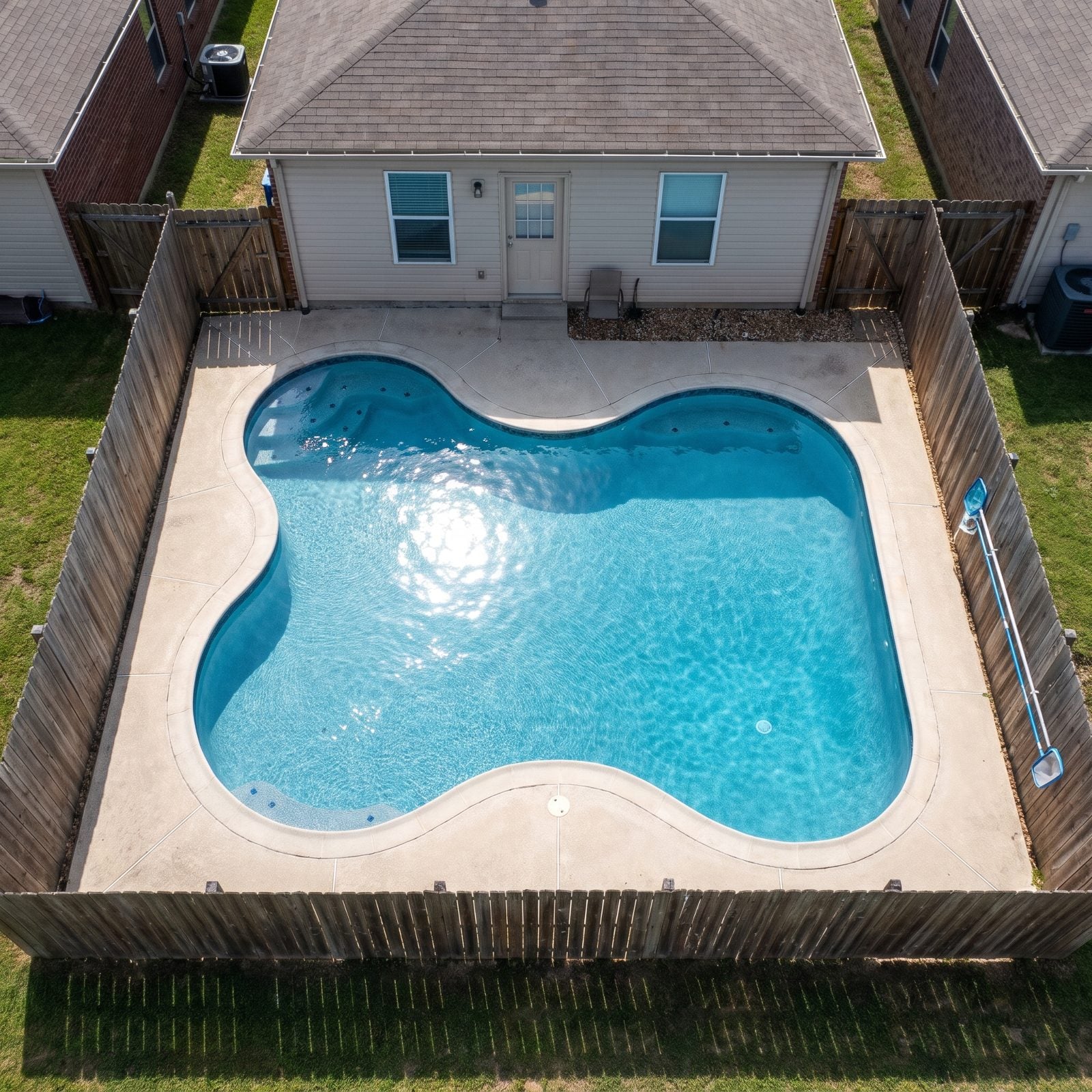
A pool that eats the whole yard sounds like a dream until you want somewhere to put a table, a trampoline, or a tomato plant. Builders expect buyers in 2027 to weigh flexibility heavily, and a backyard that’s all water leaves room for nothing else.
Families who want a lawn walk away. So do buyers nervous about pool upkeep with no yard to show for it. A pool filling the footprint narrows the buyer pool to people who want exactly that, and nothing more.
2. Three-Car Garages That Swallow the Front Elevation
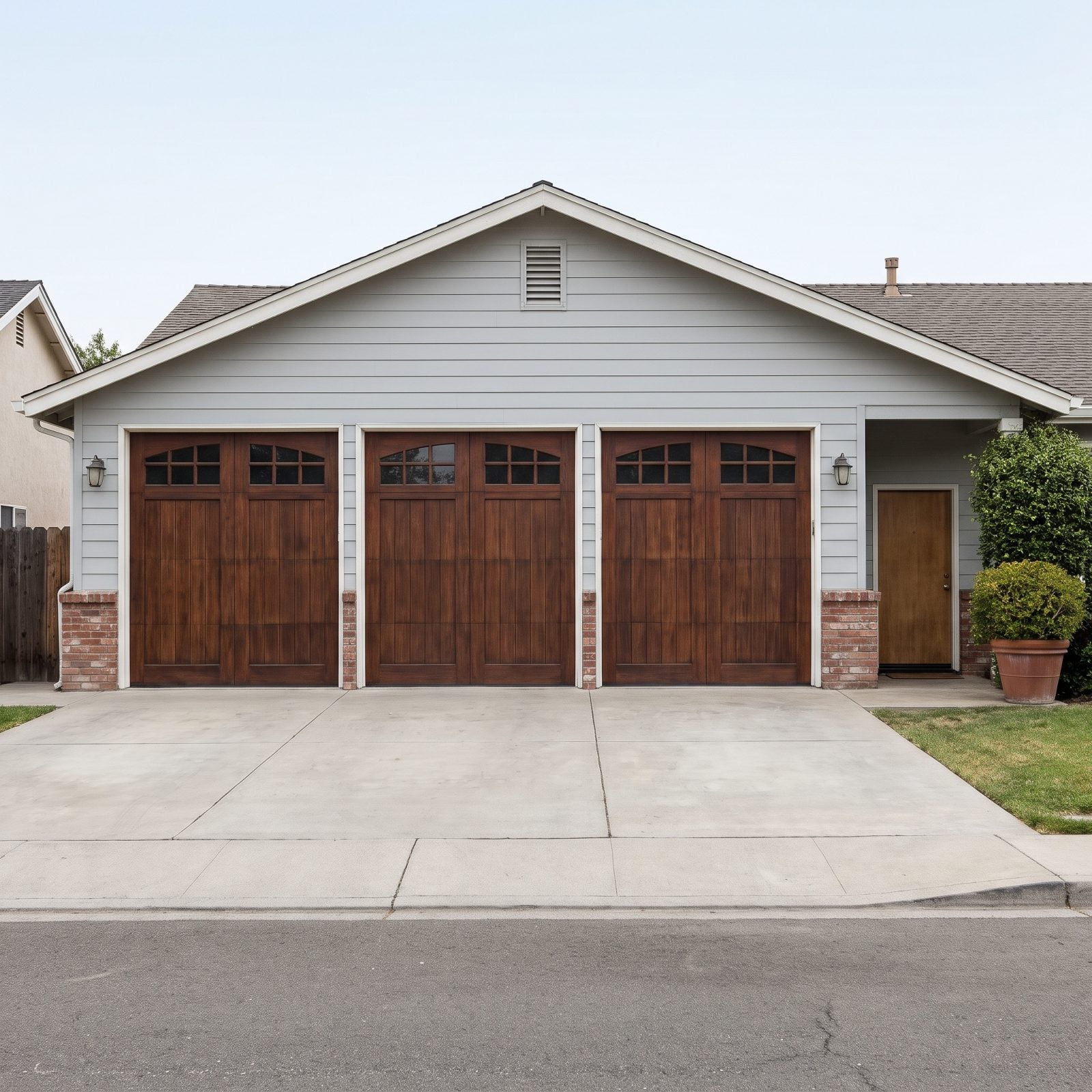
Look at this facade and your eye lands on the garage, not the front door. That’s the whole problem. When three single-bay carriage doors eat two-thirds of the elevation, the house reads as a place to park cars that someone also happens to live beside.
Builders are flagging this because buyers want the entry to mean something, and right now it means almost nothing. The oak doors here are handsome on their own — they’re just doing the wrong job at the wrong scale. Push the garage to the side, or turn it so the doors face away from the street, and the same square footage starts to feel like a home rather than a storage shed with bedrooms tacked on the side.
1. Tandem Garages and the Daily Car Shuffle
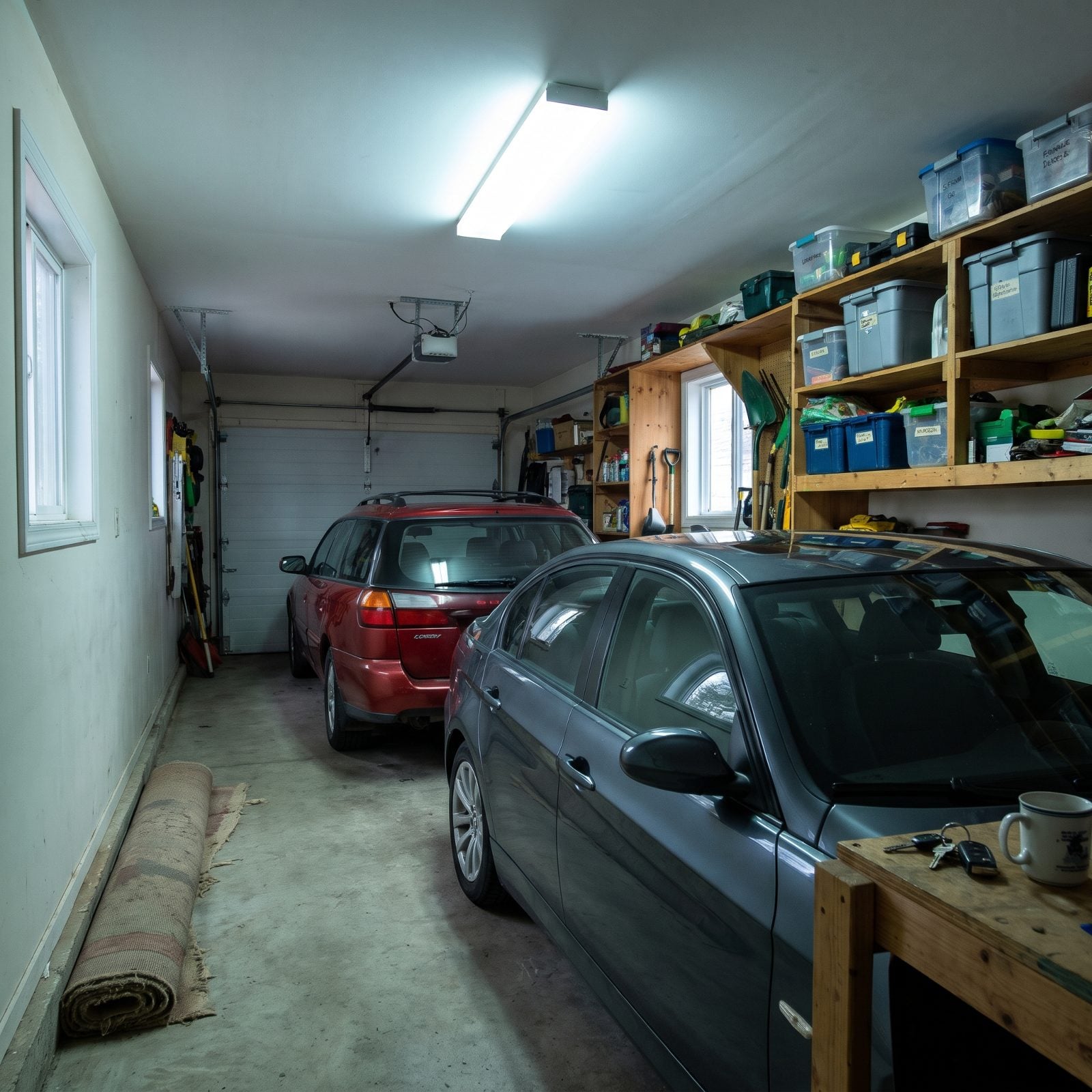
The tandem garage looks like a deal on paper. Two parking spots, half the width. Then you move in and live with it.
Every morning the car in back sits trapped behind the car in front, so somebody has to pull out, let the other through, then pull back in. You’ve done this in a parking ramp and hated it — and now it’s your own house pulling the same trick on you, every single day.
Builders expect this one to cool off fast. Sure, the long concrete bay with its pegboard, shelving and tall storage cabinet looks practical enough. But the plan fights the way real households actually leave and come back. Two honest side-by-side bays win every time, even when the extra width costs you something up front.