
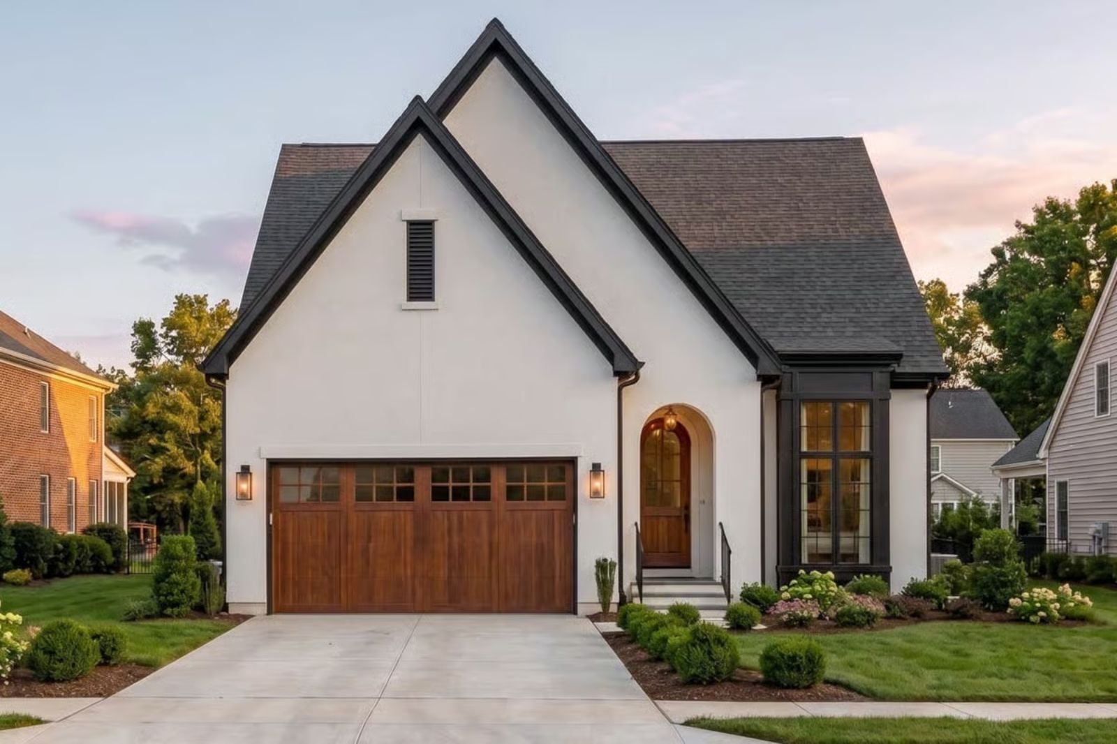
People rarely fall in love with a floor plan because of the floor plan itself. They picture the dinner party that drifts from the dining room downstairs long after dessert, the guest room that turns a quick visit into a weekend stay, the quiet upstairs coffee while the rest of the house slowly wakes below. Belvoir is designed around those moments, pairing Modern European architecture with a two-story layout that separates gathering from retreat and a lower level that transforms extra square footage into a home people won’t want to leave.
Specifications
- Sq. Ft.: 2,240
- Bedrooms: 3
- Bathrooms: 2.5
Floor Plan
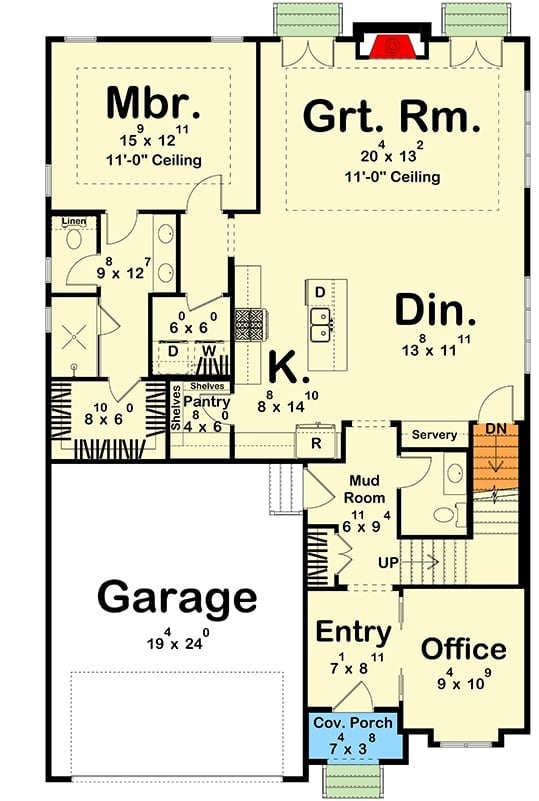
The master suite sits in the upper left, tucked away from the entry where it belongs. Across the plan, a great room with 11-foot ceilings anchors the upper right and opens toward the dining area and kitchen — a sequence that works well for how people actually move through a house. Off the garage, the mud room intercepts daily traffic before it reaches the living spaces, and a dedicated office near the front entry gives the plan a work-from-home answer that doesn’t eat into bedroom count. Stair access points to a lower level with real room to grow.
Floor Plan
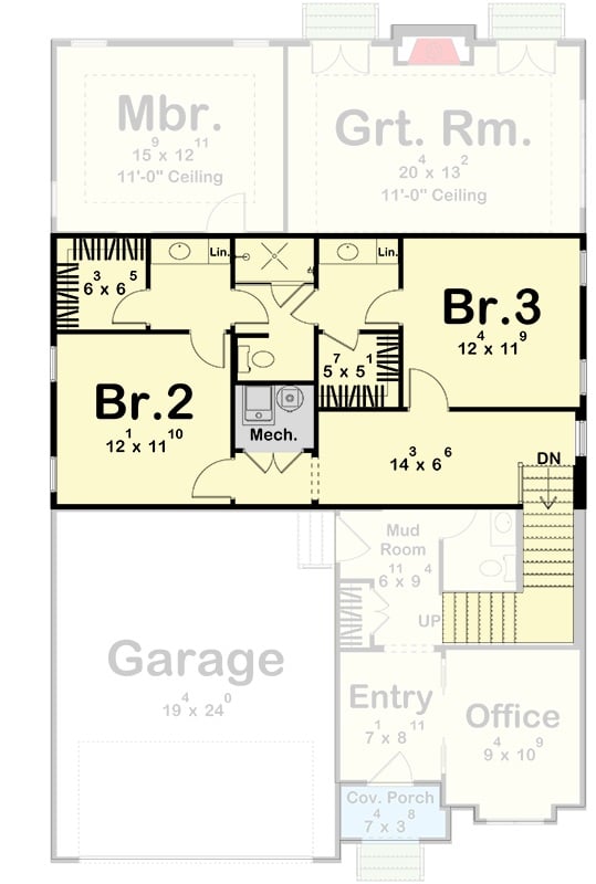
The upper level includes two bedrooms, a hallway bath, and a mechanical room that keeps utility out of sight.
Floor Plan
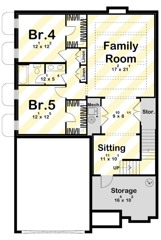
Bedroom 4 and Bedroom 5 anchor the left side of this lower level, sharing a full bath with a soaking tub. A generous Family Room opens across the right — enough square footage to actually use it. Sitting and storage areas near the staircase add flexibility, and linen closets alongside the mechanical room keep the utilitarian stuff consolidated in one corner rather than scattered around.
Step inside and the entryway makes the first impression before a single room is seen.
Dark Wallpaper and Brass-Trimmed Cabinetry Set a Confident Tone at the Entry
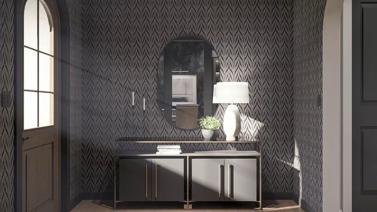
Chevron-patterned charcoal wallpaper anchors the foyer, paired with a dark cabinet whose brass pulls and oval mirror above make the space feel curated rather than just decorated. Most entries get a coat of paint and a console table. This one got an opinion.
Paired Sofas and a Dark Fireplace Surround Give This Living Room Real Presence
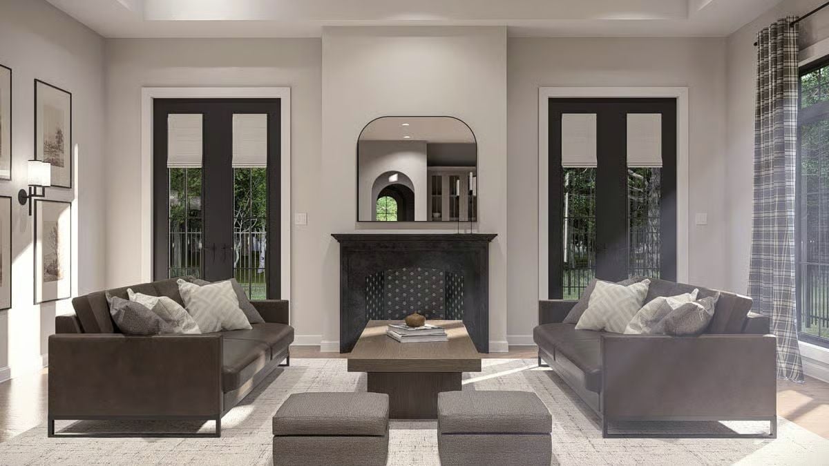
Symmetry this deliberate doesn’t happen by accident.
Two charcoal velvet sofas face each other across a wood coffee table, held together by a low-pile area rug that grounds the arrangement without competing with anything else in the room. Roman shades on the French doors soften what would otherwise be a hard contrast between black frames and pale walls. That arched mirror above the fireplace mantel earns its place by reflecting the room’s depth rather than just filling wall space.
Warm Wood Cabinetry and Marble Island Make This Kitchen Worth Gathering In
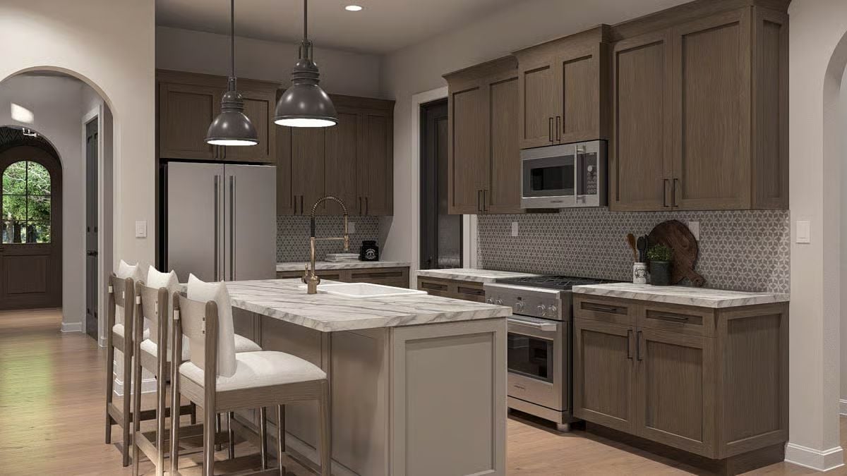
A brushed brass faucet, farmhouse sink, and veined marble countertops anchor the island, while dark pendant lights and a patterned tile backsplash add depth without turning the whole room into a competition.
Designer’s Secret: Painting your island a shade lighter than the perimeter cabinets is one of the oldest tricks in kitchen design. It visually separates the two zones and makes the island feel like furniture rather than an afterthought. Here, the greige island against the warm brown uppers does exactly that.
Round Table, Arched Passage, and a Drum Pendant That Pulls It All Together
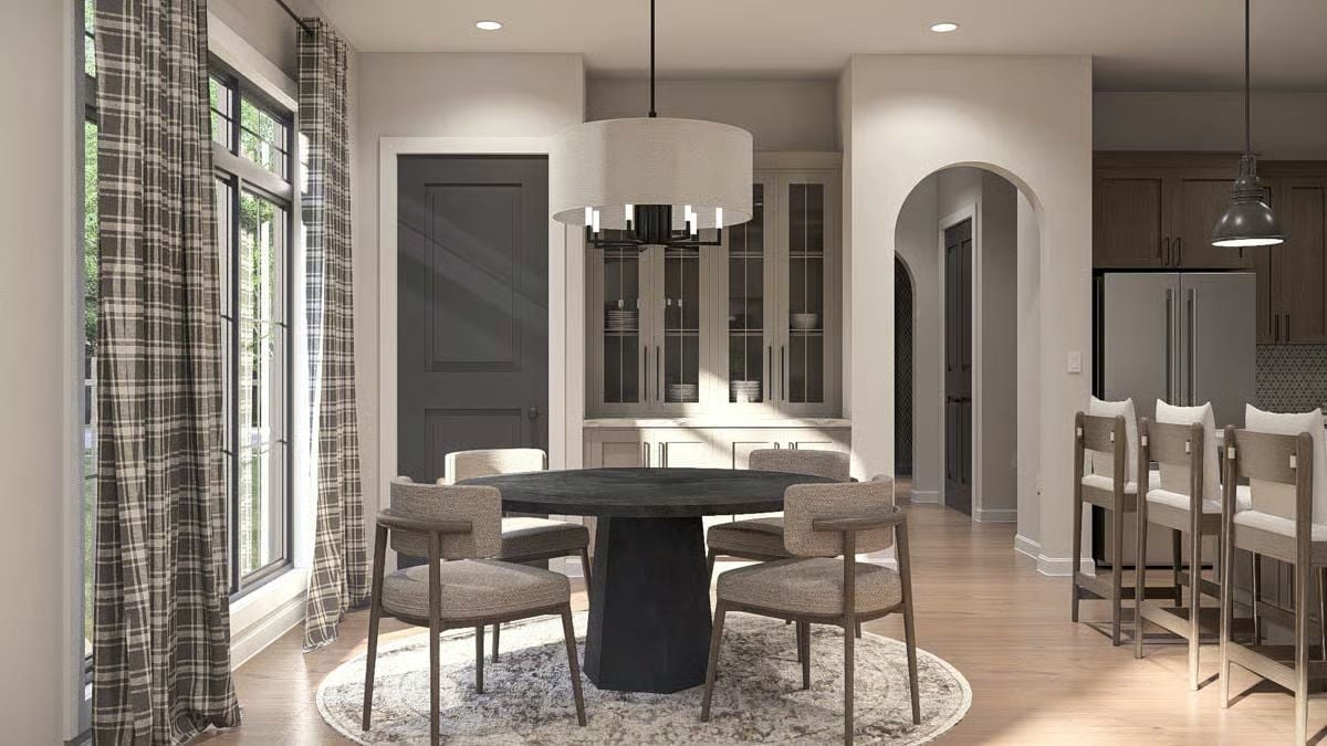
A dark pedestal base grounds the round table without crowding the room, plaid curtains add pattern without overwhelming it, and the built-in glass cabinet behind offers storage that doubles as a display. Three things are working quietly, so the arched passageway to the kitchen can be the thing you actually notice.
- Round tables remove the head-of-table dynamic, making every seat feel equal
- A drum pendant sized to match the table diameter keeps proportions honest
- Arched passageways between dining and kitchen reduce visual weight compared to squared openings
Olive Green Upholstery and Warm Sconce Light Make Rest Feel Intentional
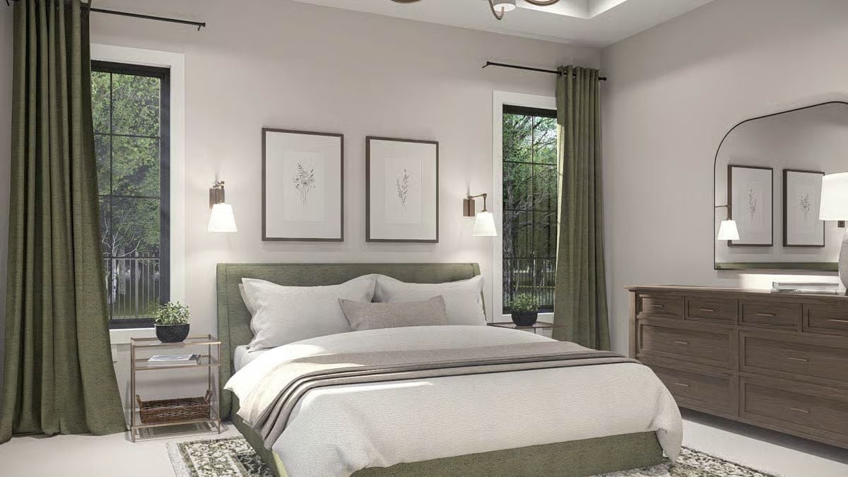
A green linen headboard anchors the room while brass wall sconces cast soft light across botanical prints above the bed — warm enough to actually wind down by, which is more than can be said for most overhead fixtures.
Editor’s Note: Wall sconces flanking a headboard free up nightstand space and put the light closer to eye level, where it actually does its job. If you’re retrofitting them, plug-in sconces with a fabric cord are a surprisingly clean solution that doesn’t require an electrician.
Charcoal Doors and Bronze Hardware Bring Sharp Contrast to a Soft Bathroom
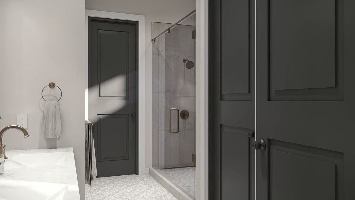
Painted charcoal doors pull focus the moment you walk in, and bronze fixtures on the shower glass carry that warm metal tone through the rest of the room without forcing it. Mosaic floor tile keeps things light underfoot. The frameless glass enclosure makes the shower feel larger than it is — no square footage borrowed from anywhere, just the right material doing the right thing.
History Corner: Glass shower enclosures went mainstream in residential design during the late 20th century, largely replacing shower curtains and opaque fiberglass units in higher-end construction. Before tempered safety glass was widely available, frameless designs like this simply weren’t practical for everyday home use. Building codes in most regions now require tempered or laminated glass for any enclosure of this type.
Built-In Glass Cabinets and a Globe on the Desk Signal a Serious Home Office
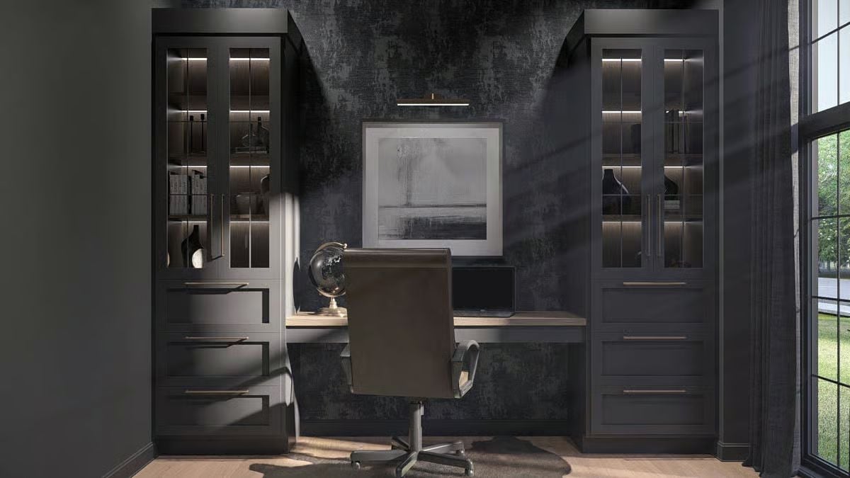
Lit display cabinets flank a floating desk with a warm wood surface, keeping collectibles visible without letting them bleed into the workspace. It’s a setup that manages to feel collected and functional at the same time — not easy to pull off in a small room.
Fun Fact: Built-in desk systems with flanking cabinetry trace back to the study rooms of Victorian-era townhouses, where a dedicated writing room was considered essential rather than optional. Today’s versions borrow that same logic but add LED strip lighting inside glass-front cabinets to keep displays visible without overhead glare. More storage, somehow, makes the room feel calmer.
Pin It
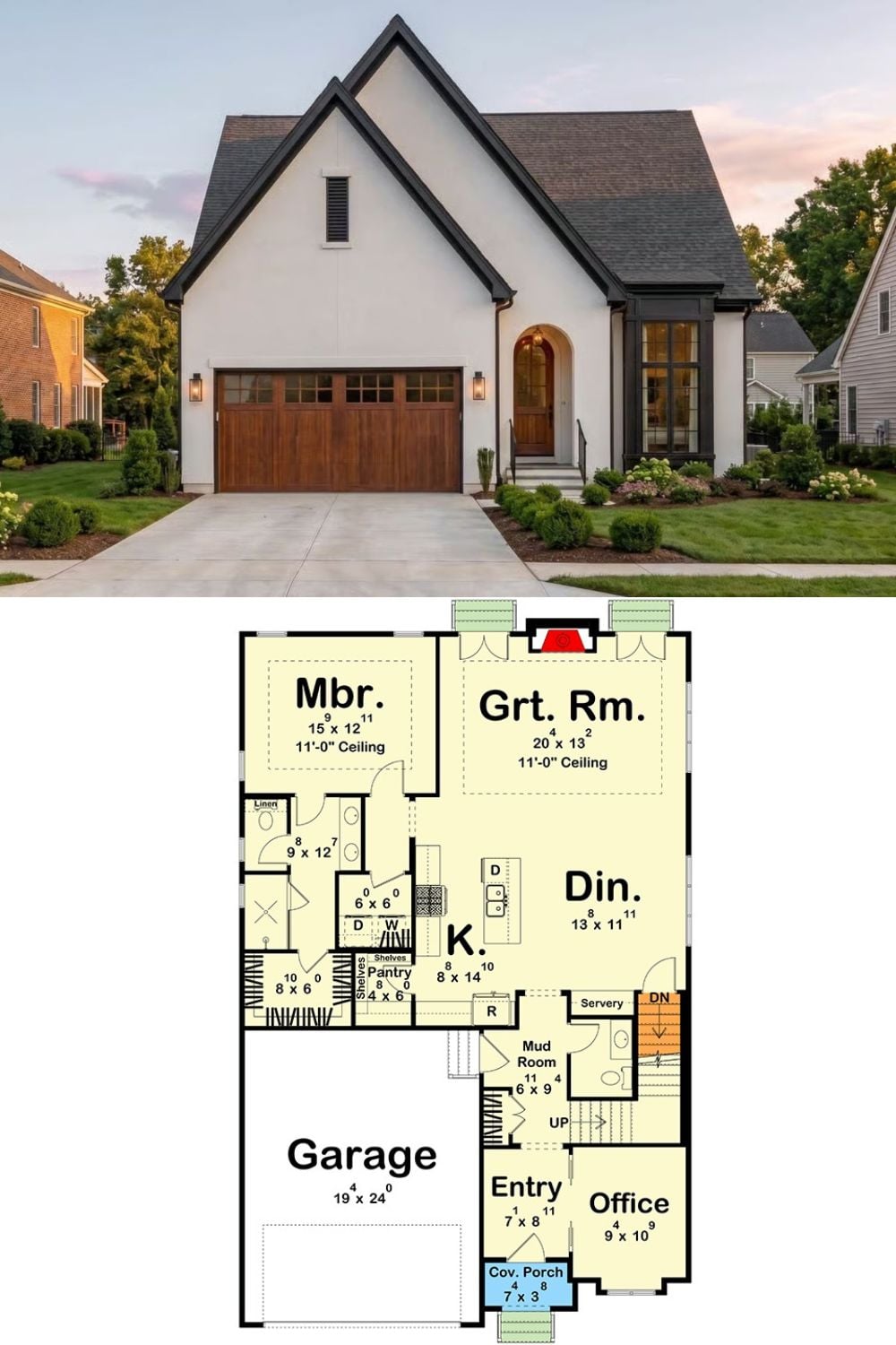
Exterior photo shows a white Modern European home with a wood garage door and an arched entry. The floor plan below details the layout with a master suite, great room, kitchen, and garage.
Pro Tip: A mud room positioned between the garage and main living area does more work than most homeowners expect. Put laundry, storage, and a half bath in that same zone and wet shoes, dirty coats, and school bags never reach the kitchen. It’s one of those layout decisions that’s easy to skip on a budget floor plan and genuinely hard to live without once you’ve had it.
