
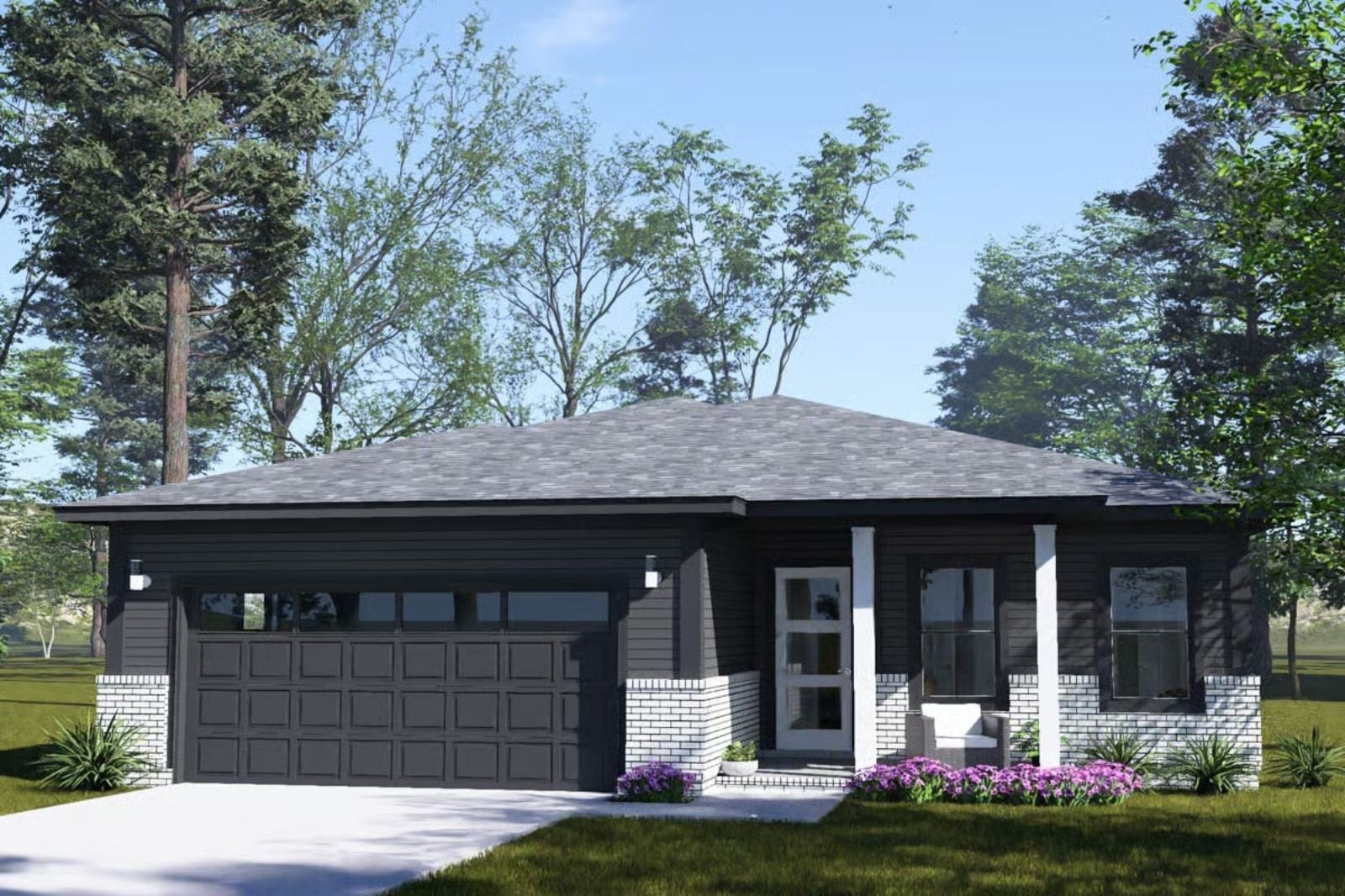
Saturday morning in March, and both cars are already blocking the driveway while a third idles at the curb waiting for someone to move. The Ashgrove Cottage is built around ending that particular standoff — a double garage that actually fits two vehicles, an open contemporary layout where homework migrates to the kitchen island after dinner, and clean sightlines that let one parent track the backyard while the other finishes the third load of laundry.
Specifications
- Sq. Ft.: 1,480
- Bedrooms: 3
- Bathrooms: 2.5
Floor Plan – Main Floor
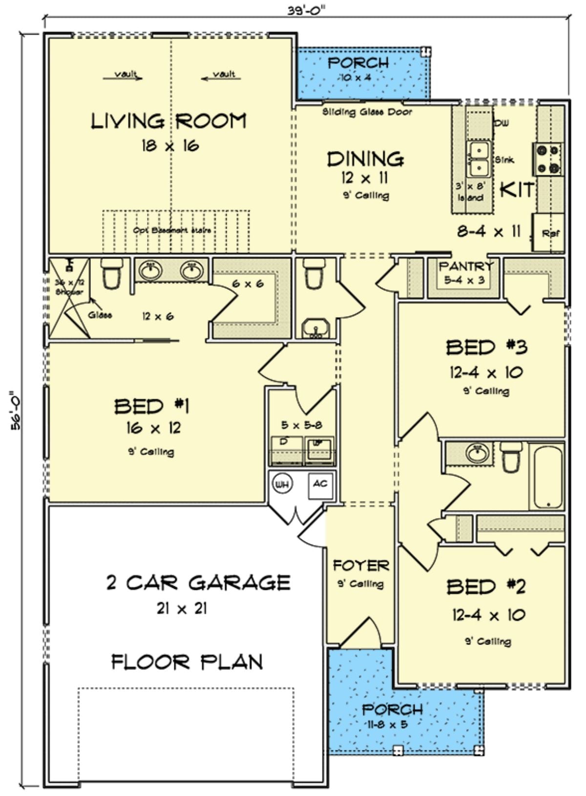
The living room and dining area sit up front, with the kitchen tucked to the right behind a pantry. All three bedrooms cluster at the rear and share a full bath, though Bed #1 gets its own en suite. A utility hall near the laundry connects the 2-car garage to the rest of the house.
Gray Lap Siding and a Covered Patio That Actually Has Room to Sit
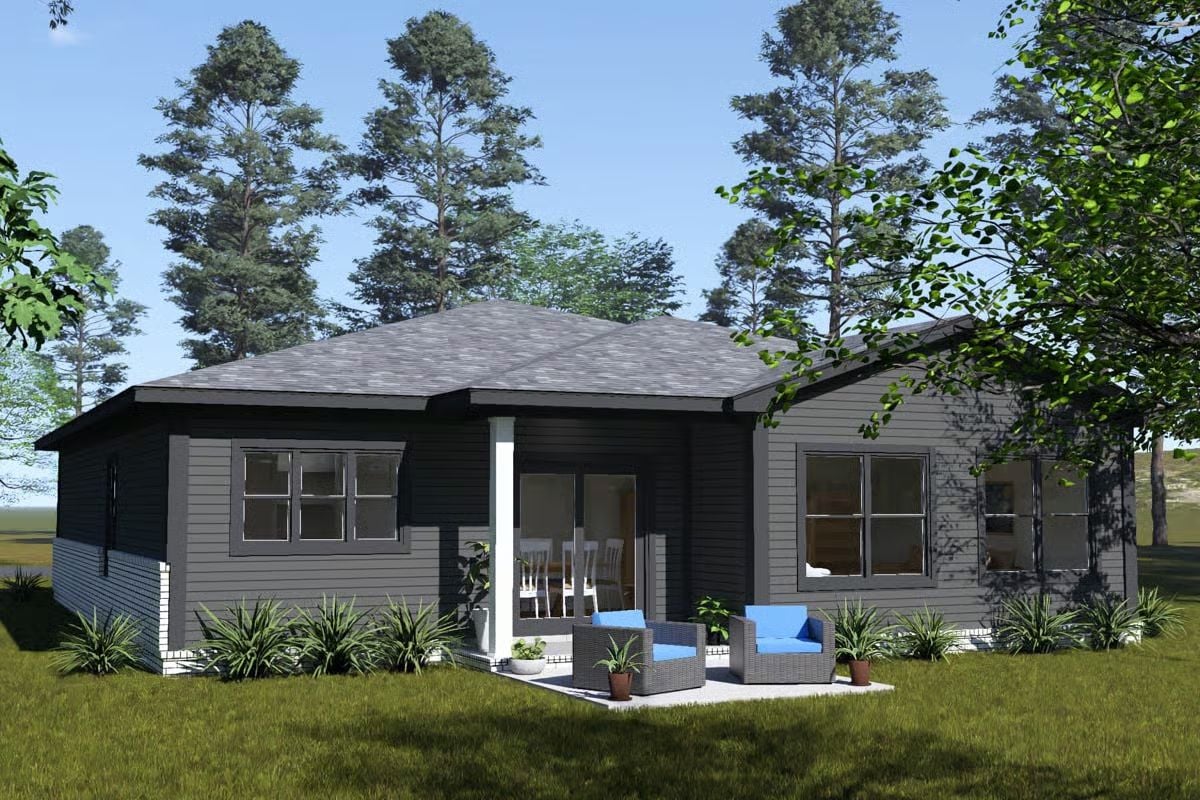
Two wicker chairs with blue cushions anchor a small concrete patio under a covered overhang, and gray lap siding wraps the exterior while tall pines frame the roofline from behind. Simple. It works.
Van Gogh on the Wall and Sunlight Doing Most of the Work
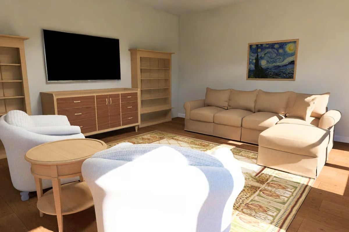
Warm wood tones carry the whole room without a single dark accent in sight.
Natural light pools across the hardwood floors and bleaches the sectional to almost white by midday. The Starry Night print above the sofa isn’t ironic — it actually fits here, which is harder to pull off than it sounds. Bookshelves flank the TV console without crowding it, and the oval side table gives the armchair grouping somewhere reasonable to land.
Sliding Glass Doors Doing Double Duty as a Light Source and a View
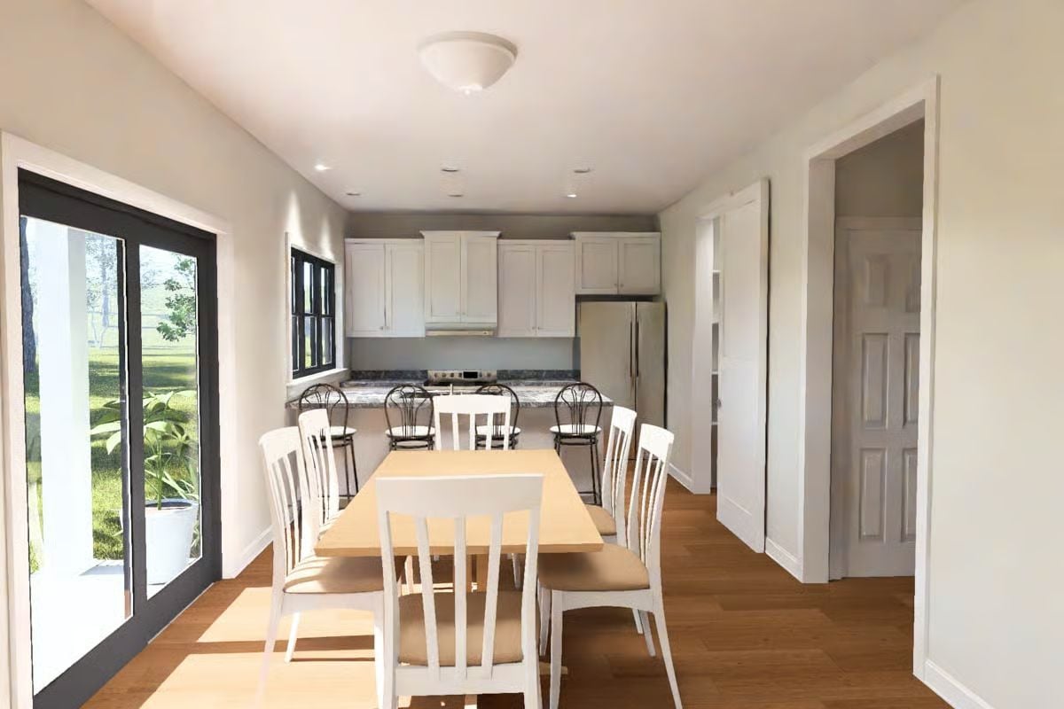
Sunlight cuts hard across the wood floor, doing what no overhead fixture could replicate. White shaker cabinets run wall to wall in the kitchen, and the dark granite countertop gives the peninsula something solid to contrast against. Six white dining chairs pull up to a blond wood table that fits without crowding the space.
Material Matters: White shaker cabinets have stayed relevant for decades because the flat center panel hides grime better than ornate profiles do. Pairing them with dark granite keeps the palette grounded without requiring much else to anchor the room, and wood-look flooring in a warm honey tone bridges the kitchen and dining zones without a seam between them.
Step inside and the kitchen makes its case before you’ve set down a single grocery bag.
Wraparound Counter Space That Seats Four Without Crowding the Cook
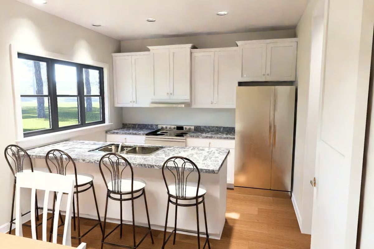
Marble-patterned counters wrap into a peninsula with a built-in sink, which gives the prep zone real separation from where people actually sit. That distinction matters more than it looks on paper.
Wraparound Sightlines and a Kitchen Counter That Knows Its Place
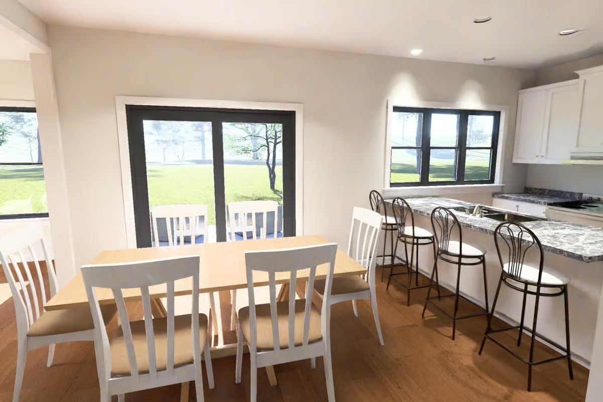
Slender iron barstools pull up to the granite-patterned peninsula while white dining chairs anchor the longer table nearby. The sliding doors pull the backyard right into the sightline from both zones. Hardwood floors tie everything together without making the kitchen and dining areas feel like the same room.
Did You Know: Open-plan kitchens that share space with dining areas tend to sell faster than closed-kitchen layouts because buyers mentally expand the square footage when they can see through the space. Keeping the peninsula lower than full cabinet height preserves that visual openness without sacrificing storage. It reads as a small detail on a floor plan but registers immediately once you’re standing in the room.
Warm Wood Tones and a Headboard That Curves Just Enough to Matter
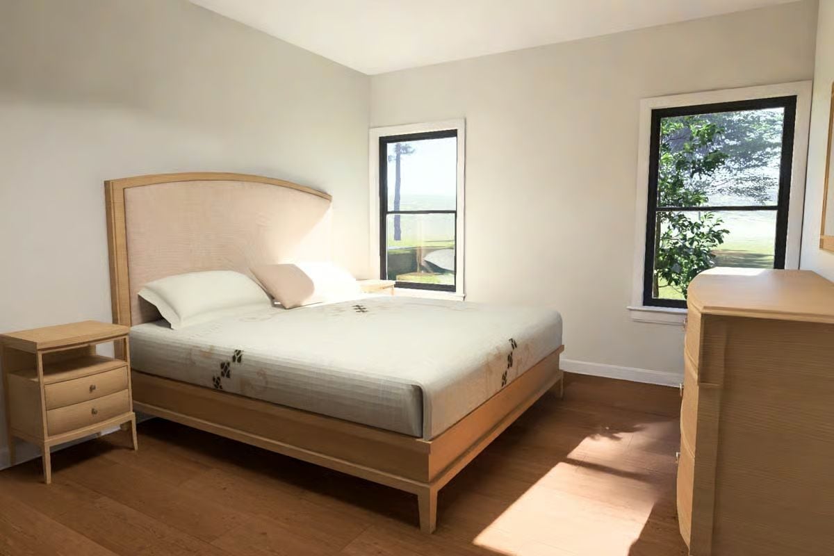
Pale maple furniture keeps the palette cohesive without tipping into the kind of matched-set look that makes a room feel like a hotel that hasn’t been updated since 2004. The arched upholstered headboard softens what would otherwise be a boxy corner, and the bare mattress with its botanical print suggests the room is staged mid-setup rather than finished — which, honestly, makes it feel more livable.
Style Tip: Bedroom furniture sets get dismissed as too coordinated, but matching wood tones across the bed frame, nightstand, and dresser makes a smaller room read as calmer and less cluttered. Bring contrast in through textiles instead. Bedding and window treatments are far easier to swap out than furniture ever will be.
Dark Granite and Round Mirrors Earning Their Keep Above a Double Vanity
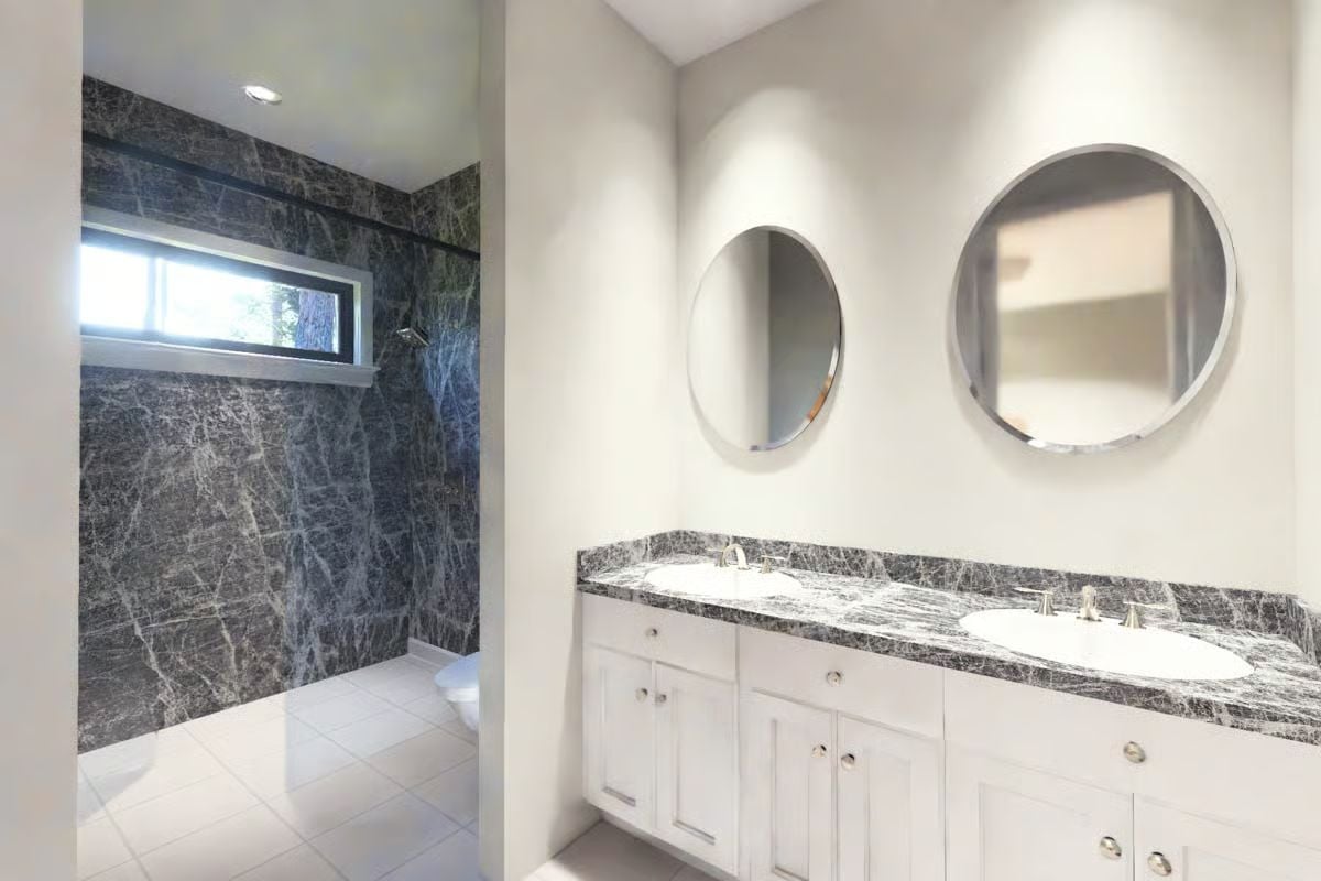
Veined granite countertops pull the same dark tones from the shower surround visible through the doorway, tying the two spaces together without any forced coordination. The round mirrors are frameless except for a thin chrome edge, and the white cabinet pulls stay small enough that they don’t compete with anything else in the room.
History Corner: Round mirrors became a dominant bathroom fixture choice during the mid-20th century Scandinavian design movement, which favored soft geometry as a counterpoint to hard tile and stone. They fell out of fashion for decades before coming back hard in the 2010s. Designers often credit their return to the rise of minimalist interiors that needed one curved element to keep spaces from feeling like a waiting room.
Pin It
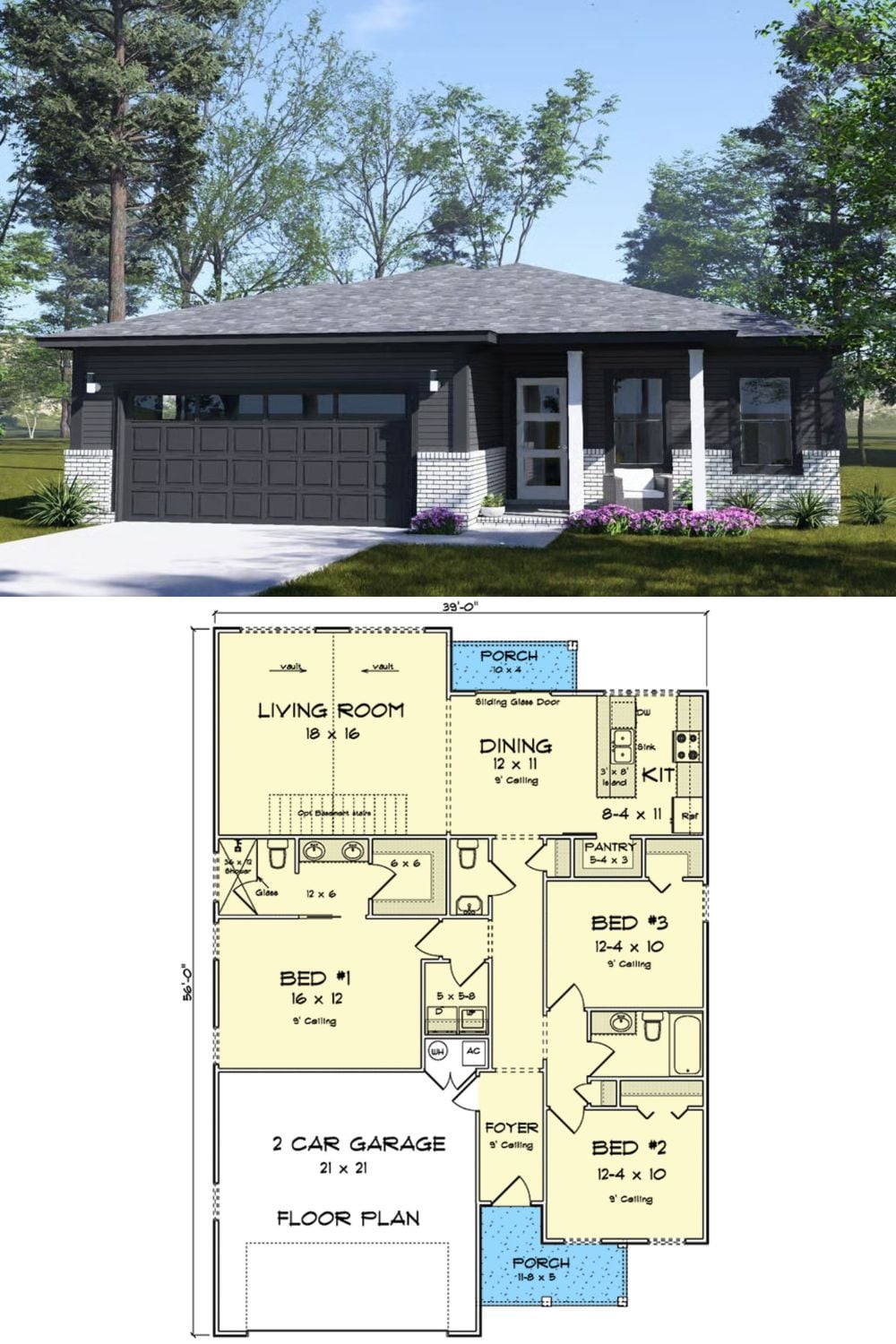
Exterior rendering shows a contemporary dark-sided ranch above a three-bedroom floor plan with attached garage.
