🔥 Would you like to save this?
The bathroom your family had when Reagan was president is having a moment again. Dusty rose porcelain. Tile counters with grout you could actually see. A window made of glass bricks that turned the morning sun into something soft and swimmy.
We spent years calling it dated, ripping it out, painting everything white and pretending we invented restraint. Now colored sinks, warm wood, brass, patterned tile and curves are wandering back into bathrooms with very respectable design credentials. Funny how that works. Here are 26 things the 1980s bathroom understood better than we gave it credit for.
In order to come up with the very specific design ideas, we create most designs with the assistance of state-of-the-art AI interior design software. Also, assume links that take you off the site are affiliate links such as links to Amazon. this means we may earn a commission if you buy something.
26. Colored Ceramic Wall Tile That Actually Committed to a Palette
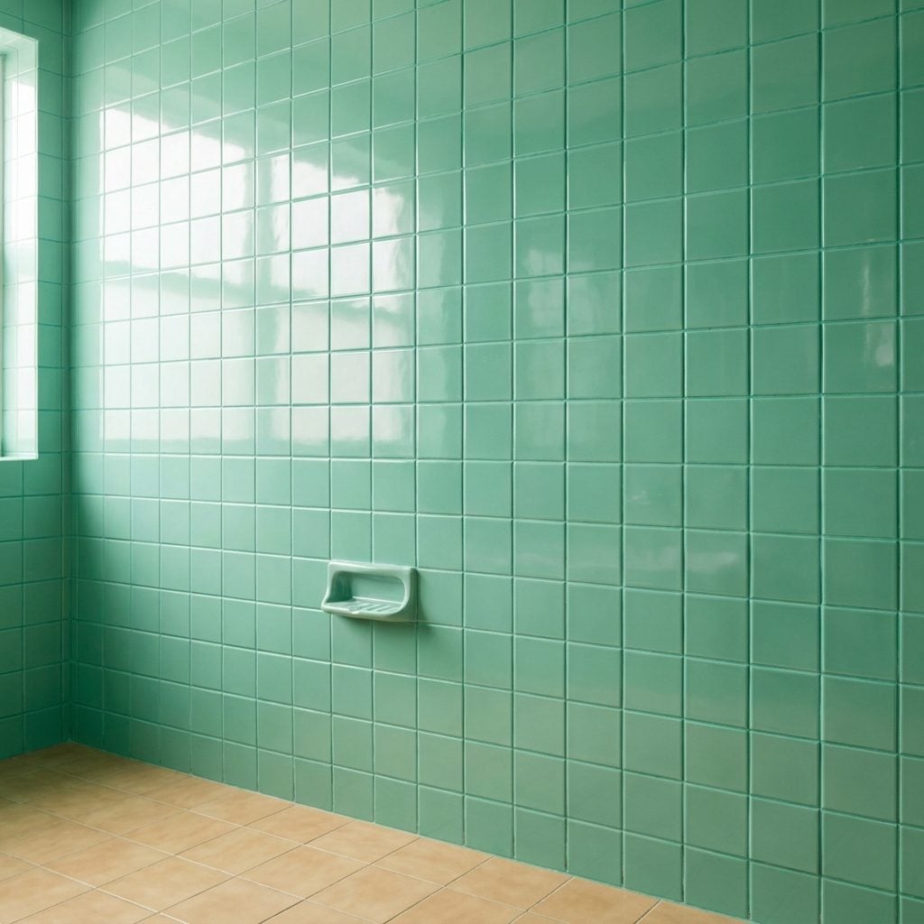
White was the safe answer for a long time. The ’80s bathroom was interested in a different question: what if the walls were dusty rose and nobody apologized?
Color covered the wet zone instead of appearing as one timid accent. Muted green could meet peach, blue could wrap an entire tub surround, and visible grout gave every square its own little border. A colorful powder room today may call the same move fearless. Back then somebody simply liked mauve.
25. The Glass-Block Window That Turned Sunlight to Soup
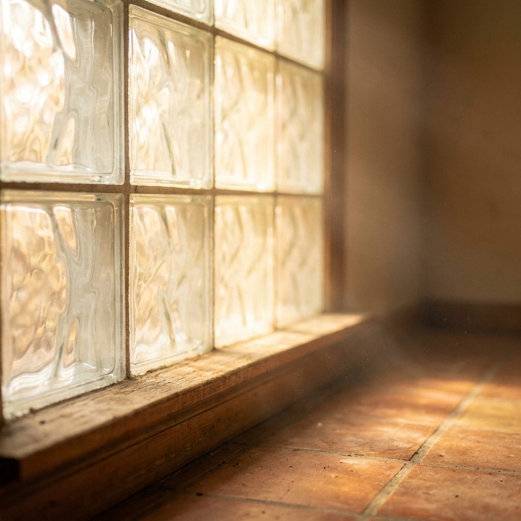
The light came through it as if it had passed through water.
Glass block solved a very ordinary bathroom problem with an unusually memorable material: daylight without a clear view in or out. The textured blocks blurred whatever was beyond them while turning direct sun into a soft, diffuse glow.
That privacy-and-light combination still makes sense wherever a window faces something uncomfortably close. The same logic can matter in a narrow living room layout, but bathrooms gave glass block its most convincing performance.
24. Colored Sinks in Almond, Peach, and Dusty Blue
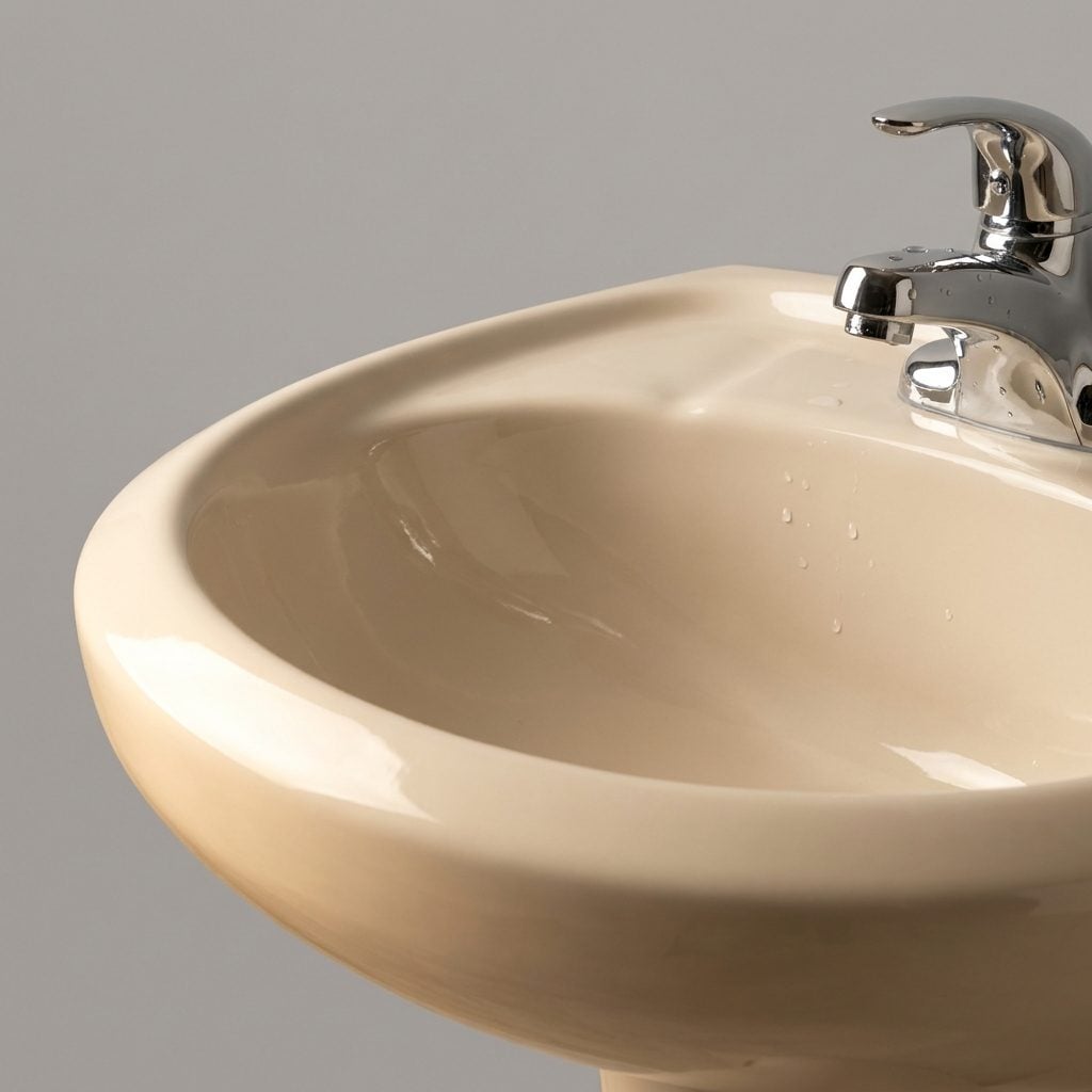
Nobody thinks about the sink until it’s a color. Then it’s the first thing you notice.
Almond, peach, dusty blue, pale green: the basin could participate in the room instead of hovering in white porcelain neutrality. Sometimes it matched the counter. Sometimes it picked up the tile. Either way, the fixture wasn’t pretending it had nothing to do with the decorating.
White sanitaryware became the near-default for decades, but colored basins have never lost their ability to make a bathroom feel specific. A peach sink was never the crisis we were told it was.
23. The Natural Wood Vanity Before Everything Went White
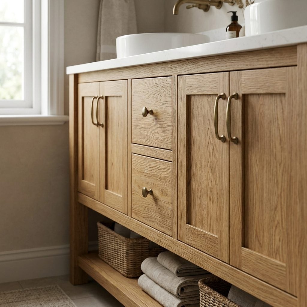
Before the all-white vanity started reproducing across bathrooms like laboratory furniture, there was oak. Warm, grainy, unmistakably wood.
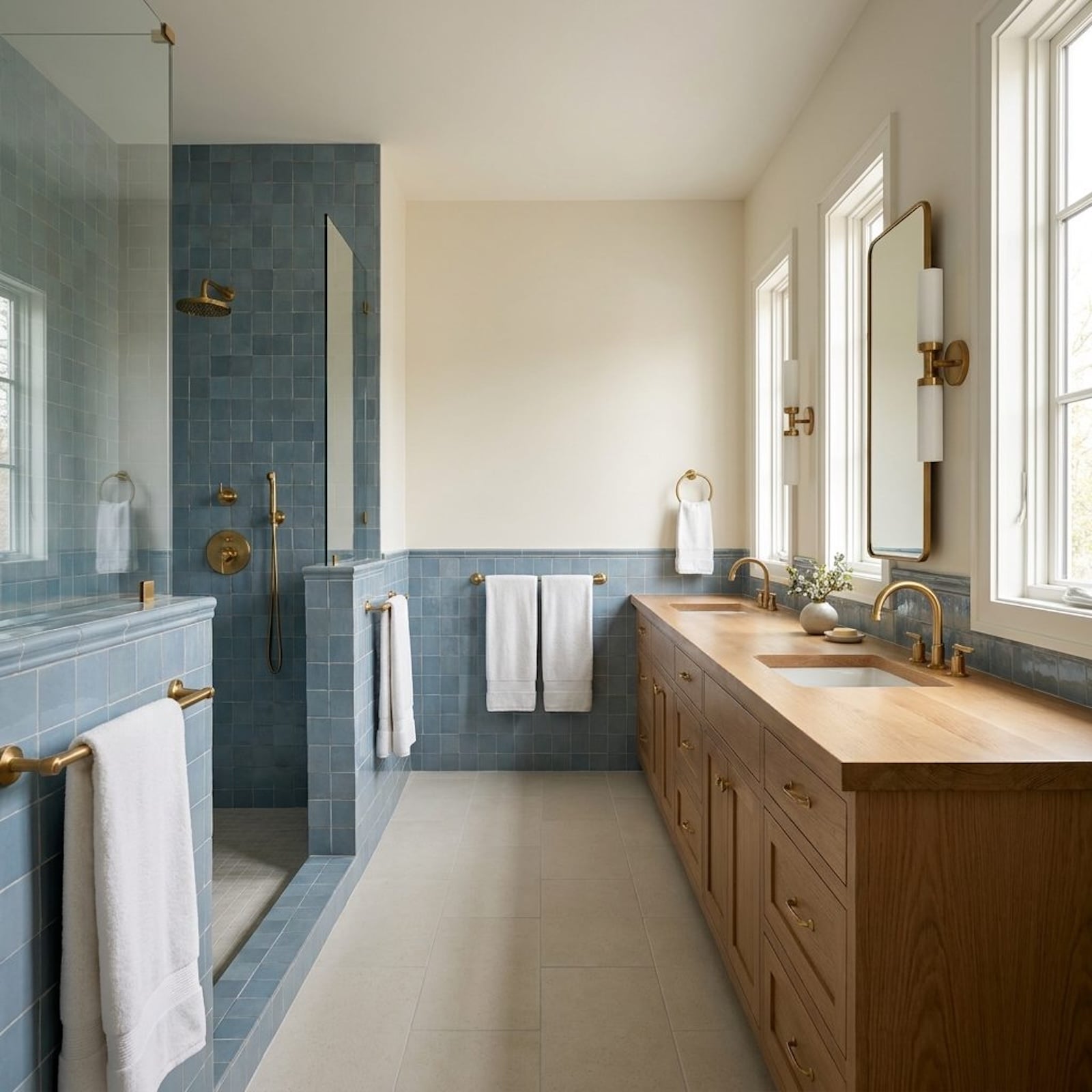
A medium-stained base with framed doors, practical drawers and a laminate or solid-surface top brought the texture of furniture into a room dominated by ceramic, glass and tile. The grain supplied enough visual life that the cabinetry didn’t need much embellishment.
22. Bold Geometric Floor Tile You Couldn’t Ignore
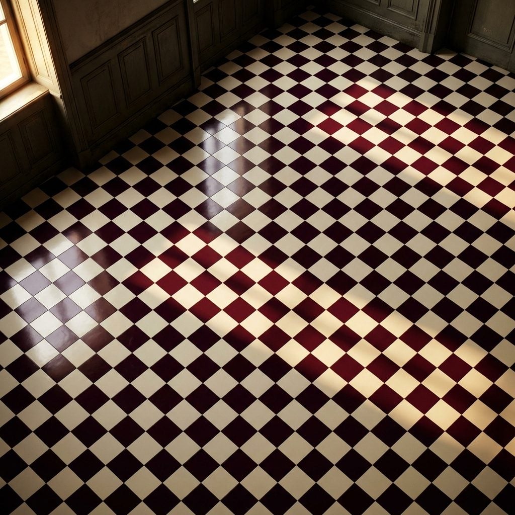
You noticed the floor before anything else, and that was rather the idea.
Diamonds in burgundy and cream. Checkerboard borders. Repeating geometry that made the bathroom floor behave more like a permanent rug. The walls could remain relatively calm because the pattern had already supplied the room’s punctuation.
That approach still works: give one large surface permission to be graphic, then decide how much competition it actually needs.
21. Wall Sconces Mounted Right Beside the Mirror
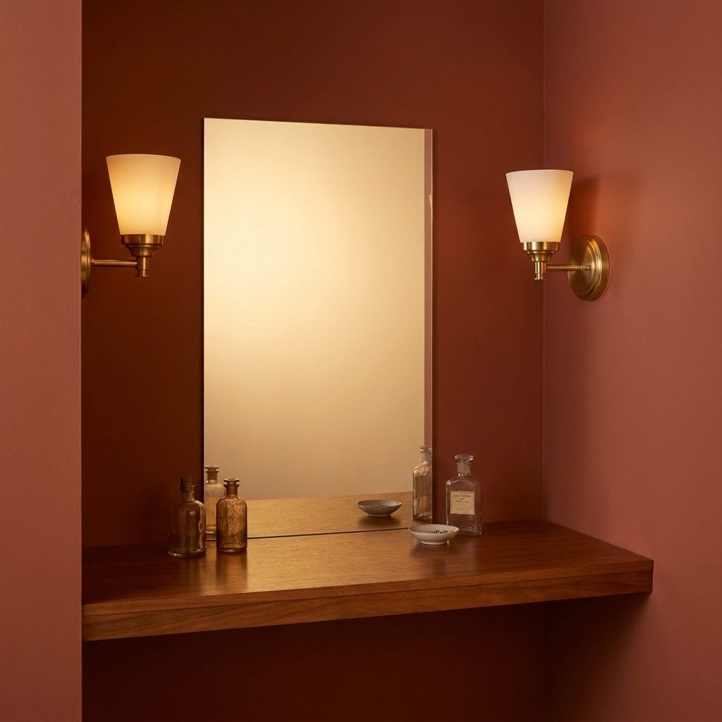
The bathroom can have beautiful tile and still betray you at the mirror. One strong fixture above the sink tends to cast downward shadows; light arriving from both sides can illuminate the face more evenly.
The old versions often used frosted shades on brass, chrome or painted bases, with warm incandescent bulbs doing everybody a favor before seven in the morning. Side-mounted vanity lighting remains useful for exactly the same reason: your face is three-dimensional and deserves more than one beam from the ceiling.
20. The Matching Colored Toilet Nobody Blinked At
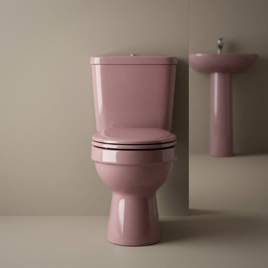
A rose-colored toilet used to be a completely reasonable thing to own.
The sink could be rose. The tub could be rose. Then the toilet joined the team, because why should one fixture suddenly lose its nerve? A matched suite gave the room a coherence that builder white achieves only by refusing to participate.
Colored porcelain now gets presented as a statement. Plenty of older bathrooms managed it with no statement at all. They simply ordered the toilet in almond and got on with Tuesday.
19. The Mirrored Medicine Cabinet Everyone Slammed Shut Too Hard
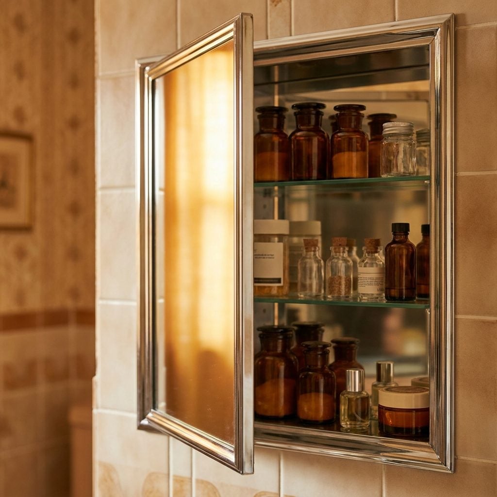
You knew the sound before you knew anything else: magnetic click, faint rattle, three bottles of aspirin settling somewhere behind your own reflection.
The mirrored medicine cabinet was where the family kept its tiny secrets—the thermometer nobody trusted, good scissors, spare razor blades and six tubes of toothpaste with one useful squeeze left among them.
Its logic remains difficult to argue with. You need a mirror. You need concealed storage. Combining the two was never exactly architectural malpractice.
18. The Arched-Top Mirror After a Decade of Hard Rectangles
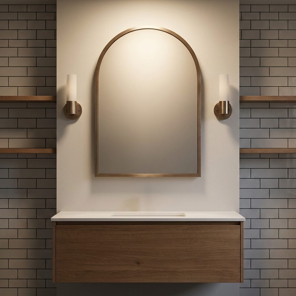
Somewhere along the way, bathroom mirrors became rectangles with the emotional range of spreadsheets.
The arched version interrupts all those straight lines with one simple curve. Over a boxy vanity, it softens the composition without requiring another material, another color or another square inch.
The same trick works outside the bathroom too. An arch can loosen up a charcoal family room just as effectively as it can take the severity out of a tiled vanity wall.
17. Polished Brass Faucets That Caught the Light Just Right
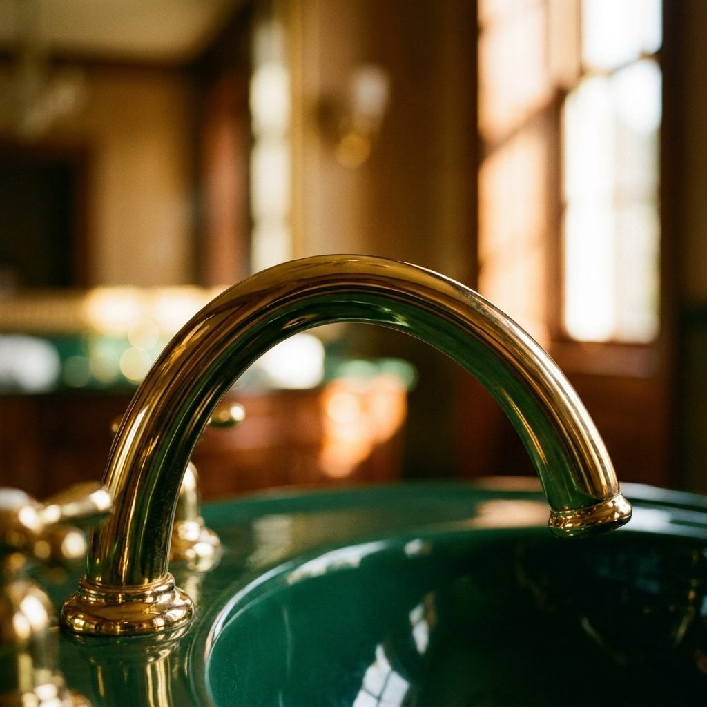
Polished brass did not enter a 1980s bathroom quietly. It caught every vanity bulb in the room and sent the light straight back.
Handles were often rounder and spouts more substantial than the narrow profiles that dominated later minimalist bathrooms. Against cream tile, oak and warm stone, the metal supplied a little jewelry without needing an actual jewel.
The tan bathroom decor of the period made especially good use of it: warm neutrals below, polished metal flashing above.
16. The Big Built-In Soaking Tub That Turned the Bathroom Into a Retreat
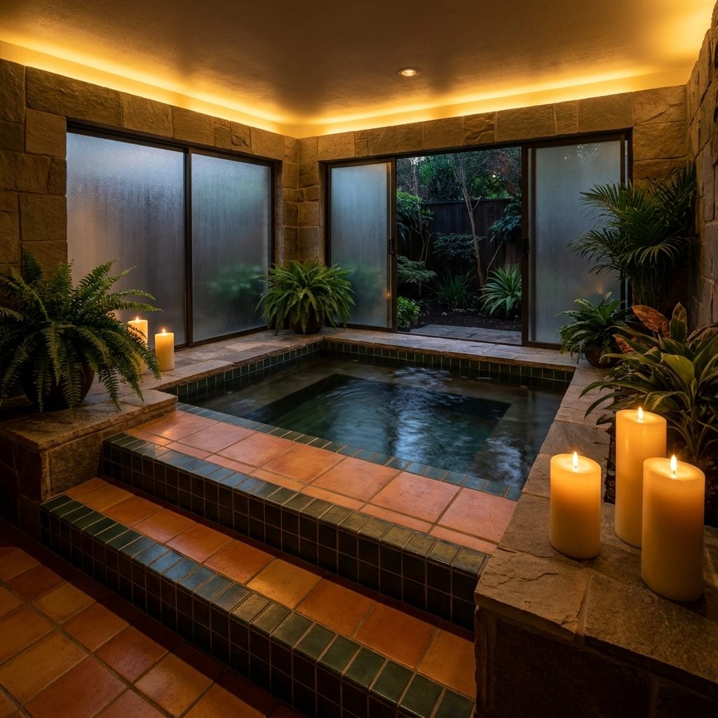
The late-’80s primary bathroom had ambitions, and chief among them was the tub. A substantial soaker sat inside a tiled platform, occasionally with jets, surrounded by enough horizontal surface to suggest that bathing had become an appointment.
The decade leaned hard into the idea that a bathroom could be somewhere you lingered instead of somewhere you escaped from in a towel. Modern freestanding tubs pursue the same fantasy with a different silhouette.
And yes, the old built-in version had one advantage the sculptural egg often forgets: somewhere to put your coffee.
15. Plain Square Tile Made Graphic by Dark Grout

Basic square tile changes character the moment the joints stop disappearing.
Run a darker grout between pale tiles and suddenly every individual square becomes part of a visible grid. The material itself can remain inexpensive and ordinary; contrast supplies the graphic effect.
That is why the combination keeps resurfacing. Nothing exotic happened. Someone simply let the grout line become part of the drawing.
14. The Pedestal Sink Standing Proud in the Powder Room
🔥 Would you like to save this?
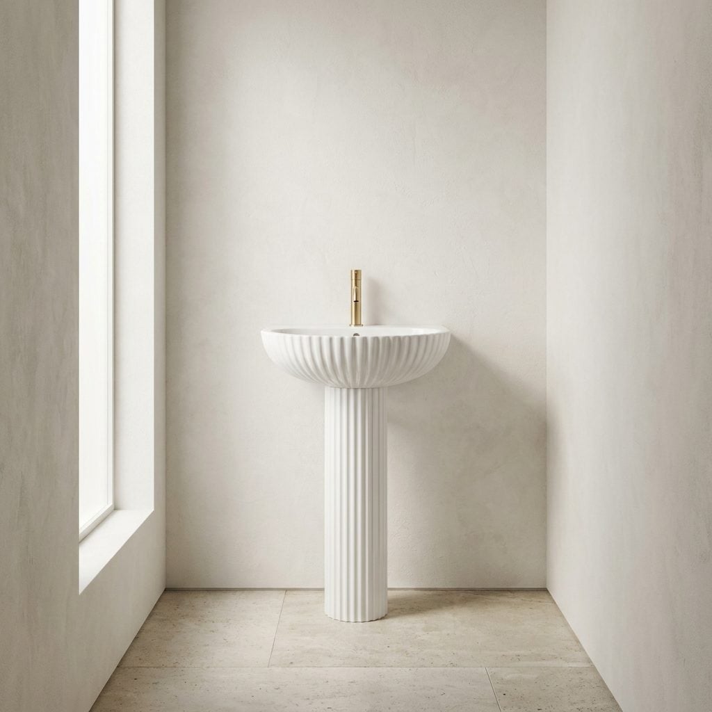
No cabinet, no countertop clutter, just porcelain balanced on a column and almost no place to hide anything. In a tiny powder room, that was partly the charm.
Pedestal sinks long predate the 1980s, but the decade gave them plenty of room in traditional and transitional bathrooms. Their advantage remains obvious: without a bulky vanity below, more of the floor stays visible.
A well-composed colorful powder room can let the sink itself provide the sculptural moment. Storage can fend for itself somewhere else.
13. The Globe Vanity Lights That Looked Like a Row of Little Moons
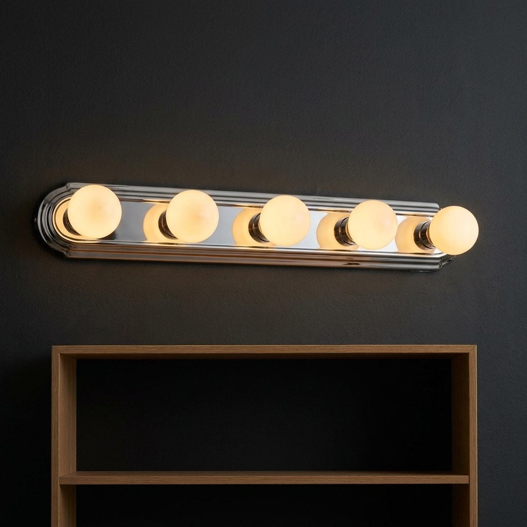
Three frosted globes. Four if the vanity was feeling important. Five if restraint had left the building entirely.
The round shades sat on a solid bar and threw a broad wash across the mirror, turning even a laminate vanity into something vaguely theatrical. Contemporary globe fixtures tend to be slimmer and more sculptural, but the old bar had a confidence of its own.
No apology, no disappearing hardware, just a row of illuminated moons waiting for someone to brush their teeth.
12. The Fluted and Reeded Cabinet Fronts Making a Full Comeback
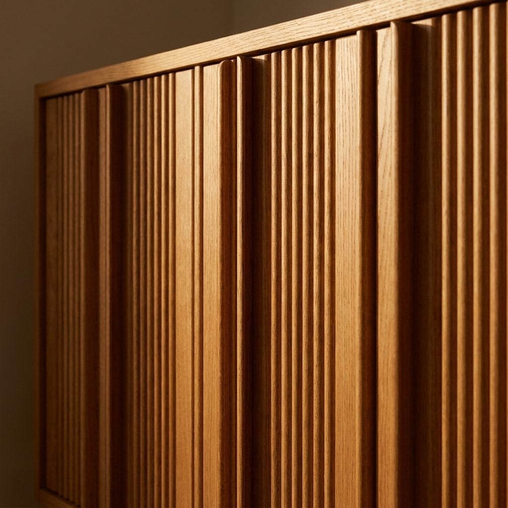
Run light sideways across a grooved cabinet front and an otherwise flat door suddenly develops dozens of fine shadows.
Reeded, ribbed and vertically grooved wood details appeared across furniture and cabinetry well before today’s revival. Some late-20th-century bathrooms used that texture on vanity doors or decorative panels, usually in warmer wood and with softer profiles than the sharply milled versions common now.
The period connection matters less than the lesson: a flat surface doesn’t always need another color. Sometimes it needs relief.
11. Tile Climbing Halfway Up Every Wall
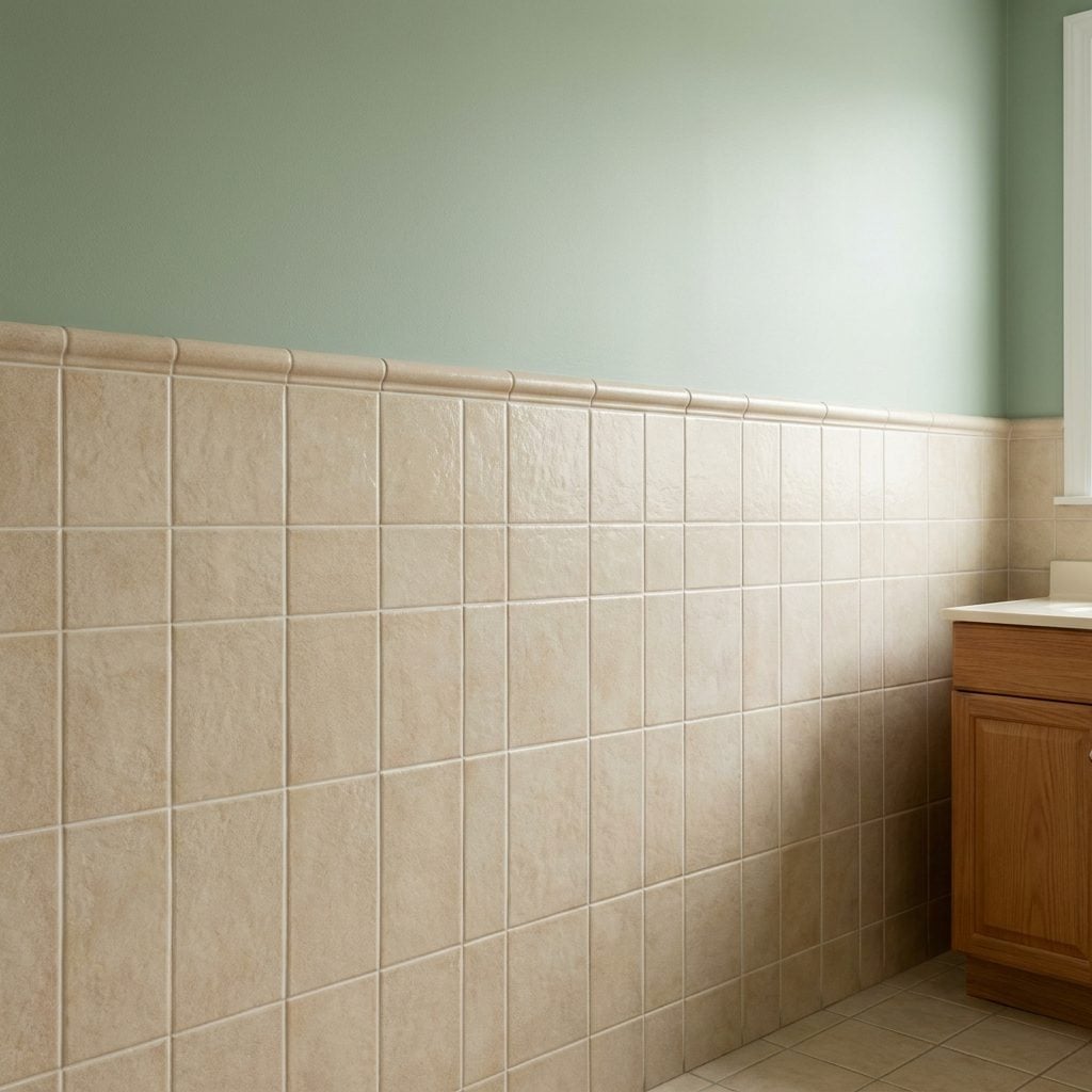
Why stop at a four-inch backsplash when you could tile half the room?
Bathrooms of the period often carried tile around tubs, behind sinks and across lower walls, giving splashes very little painted drywall to attack. The effect could be decorative, but it was also intensely practical in a room involving children, toothpaste and water.
Today’s fully tiled wet rooms push the idea even farther. The old cream-and-blue family bathroom had already figured out that washable walls have their advantages.
10. The Corner Shower With a Rounded Glass Enclosure
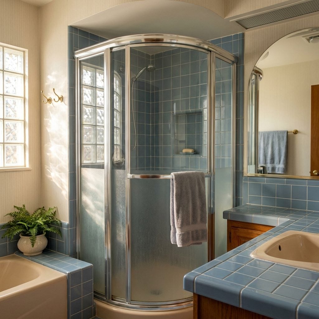
A square bathroom doesn’t require every object inside it to have square corners.
The rounded enclosure tucked the shower into a corner while shaving the projecting corner off the circulation path. Chrome framing caught the light; curved glass kept the footprint visually contained without turning the enclosure into a hard-edged box.
Contemporary versions often use clearer glass and simpler hardware, but the space-saving geometry still makes sense in a colorful powder room with a shower or any compact full bath.
A curve doesn’t create more floor space. It can make the floor space you have easier to move through.
9. The Matching Brass Towel Bars, Hooks, and Pulls
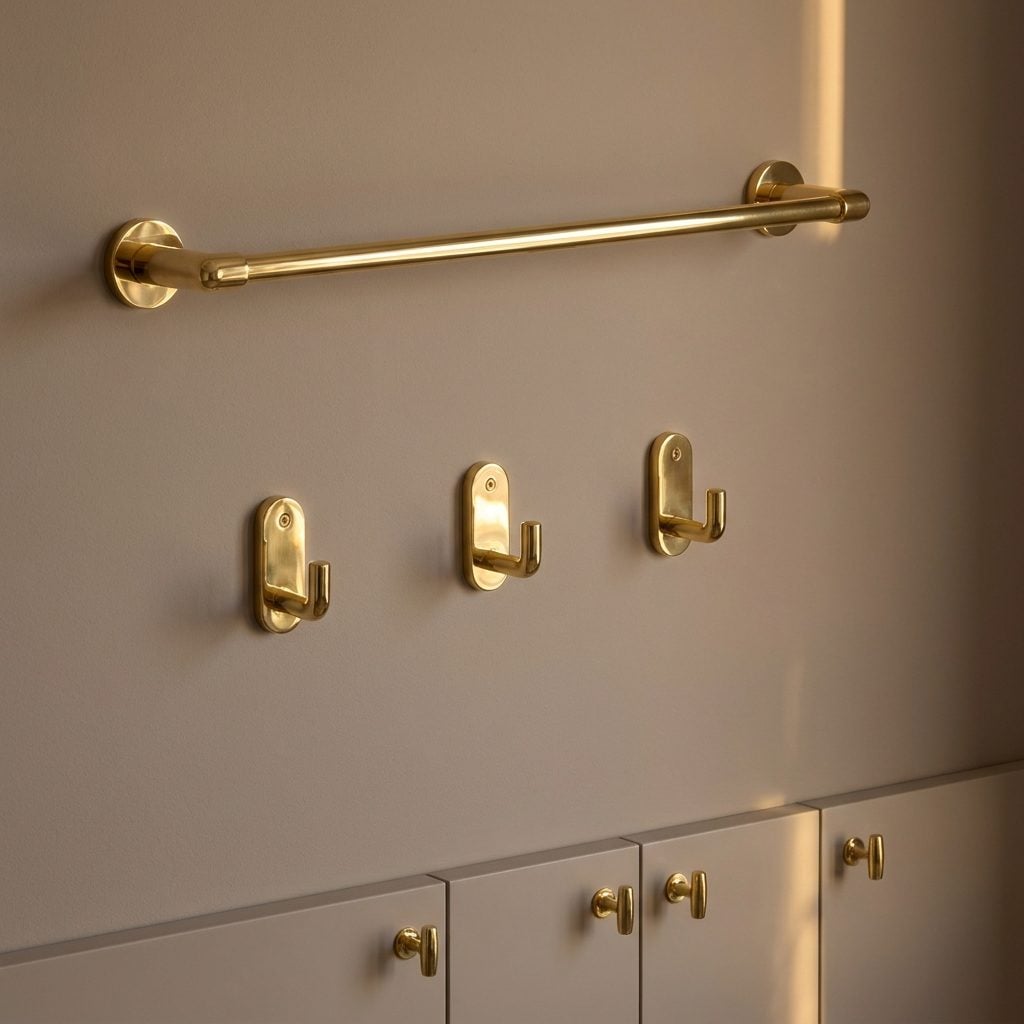
Somebody bought the whole set at once. Towel bar, robe hook, toilet paper holder, cabinet pulls—same polished brass, same little mounting plates, same determination to finish the job.
Matching every metal is no longer mandatory, but repetition still has value. When one finish turns up several times around a room, separate objects begin to feel related without needing to be identical.
8. Bathroom Wallpaper Doing All the Talking
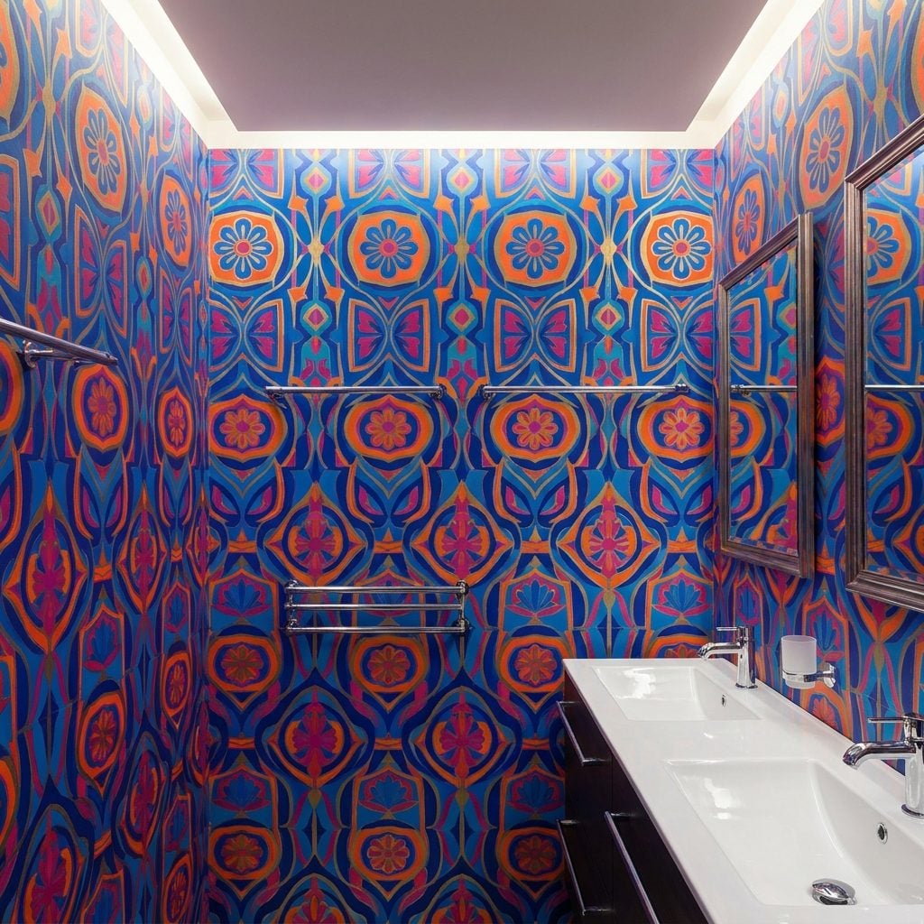
A small bathroom gave wallpaper a wonderfully unfair advantage: not much square footage, enormous personality.
Florals, stripes and botanical repeats could turn a plain powder room into something memorable before anyone changed the sink. Vinyl-coated and other washable papers offered greater moisture resistance than delicate untreated paper, although ventilation still mattered.
The important part wasn’t whether the pattern was fashionable forever. It was that somebody had bothered to give the room one.
7. The Built-In Tub Ledge Wide Enough for Towels, Soap, and One Sad Little Plant
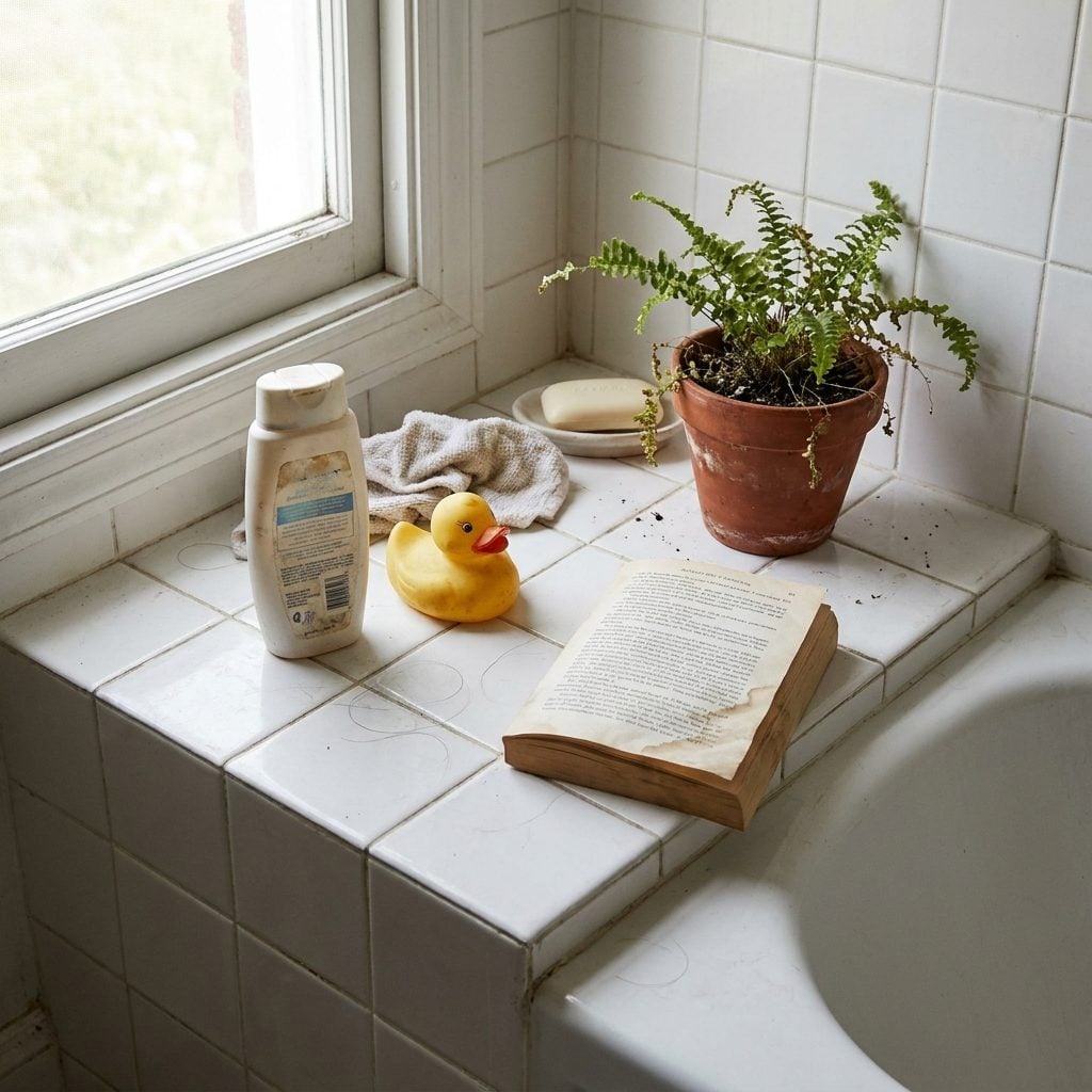
You could line up an entire afternoon on that ledge. Shampoo, paperback, rubber duck, towel, half a bar of Dial slowly surrendering to the grout.
Built-in tubs often required framed platforms and tiled surrounds, and those assemblies frequently left generous horizontal surfaces around the rim. Whatever the construction rationale, families immediately understood the ledge as storage.
Later bathrooms shaved tub surrounds down to narrow margins in pursuit of cleaner lines. Beautiful, certainly. Less useful when you want somewhere to put the conditioner.
6. Real Fabric on the Bathroom Window
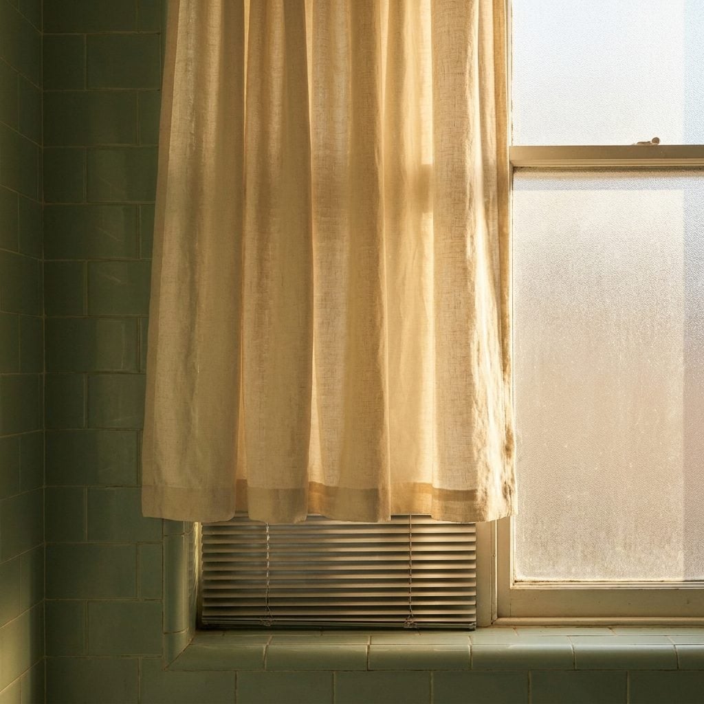
At some point the bathroom window was sentenced to blinds. Slats, roller shades, plastic mechanisms—the architectural equivalent of completing paperwork.
A café curtain or gathered valance does something different. Fabric softens the window edge and filters daylight through texture instead of slicing it into hard bands.
Moisture is the caveat. Washable fabrics can work well in a properly ventilated bathroom, particularly away from direct spray, but anything that stays damp is asking for trouble. Softness still has to live in the real world.
5. Floral Patterns That Knew When to Stop
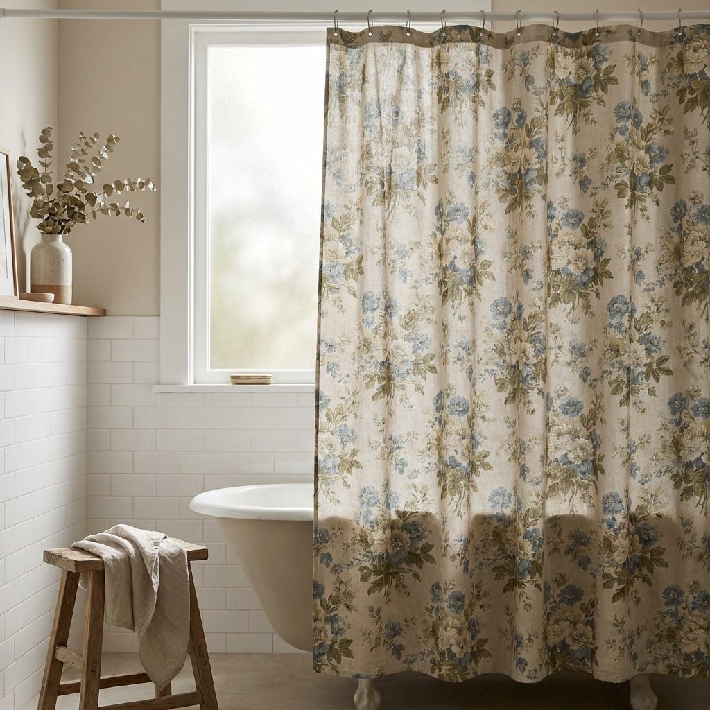
The best floral bathroom did not require flowers on every available molecule.
A shower curtain could carry them. Maybe a wallpaper border or a small valance joined in. Then the vanity stayed wood, the tile stayed comparatively calm and the pattern had somewhere to end.
Muted blue, mauve, dusty sage, a little burgundy—colors that looked as if they’d already been rained on. Today’s botanical revival feels less like a new invention than an old idea that survived a long commercial break.
4. Houseplants Crowded onto the Windowsill
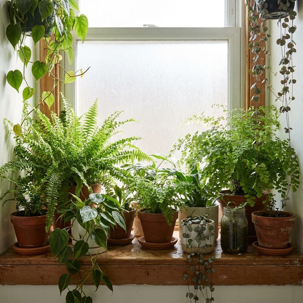
Nobody called it biophilic design. There was simply a fern in the bathroom because the fern stopped turning brown there.
Humidity can benefit many tropical houseplants, but light still decides whether the experiment succeeds. Pothos and spider plants are generally adaptable; Boston ferns appreciate humidity but can be considerably less forgiving when their soil dries out.
A bathroom with a bright or moderately lit window can be a very good home for greenery. A windowless powder room remains, regrettably, a closet with plumbing.
3. The Curved Glass-Block Shower Wall
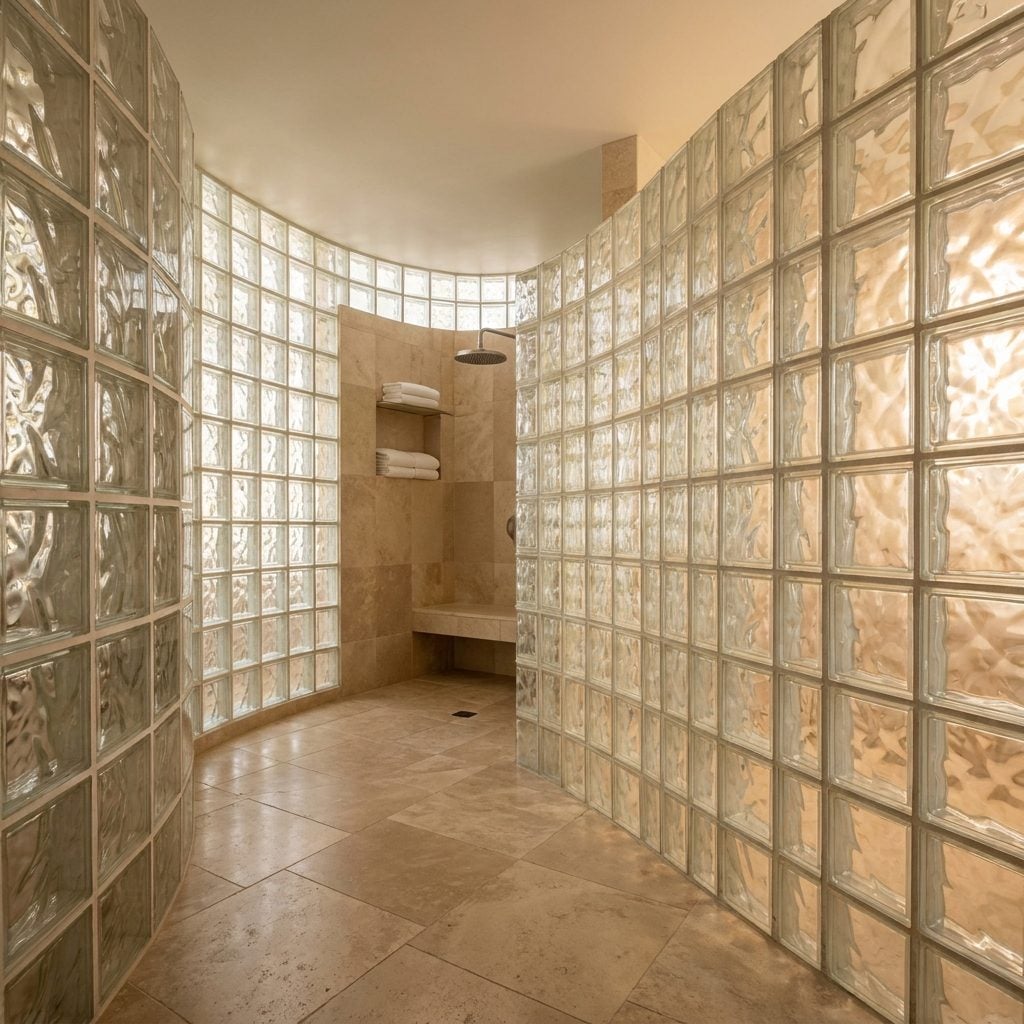
No flimsy sliding door, no clear panel exposing every water spot, just a wall of textured glass bending around the shower.
The blocks divided wet space from dry while allowing light to continue through the room. Curving the wall turned a practical partition into the architectural feature instead of hiding it.
Modern wet-room design uses plenty of clear frameless glass, but glass block offers a completely different proposition: privacy, diffusion, mass and texture all at once. The material isn’t subtle. That’s part of why it works.
2. The Track-Lighting Fixture Aimed Right at the Vanity
🔥 Would you like to save this?
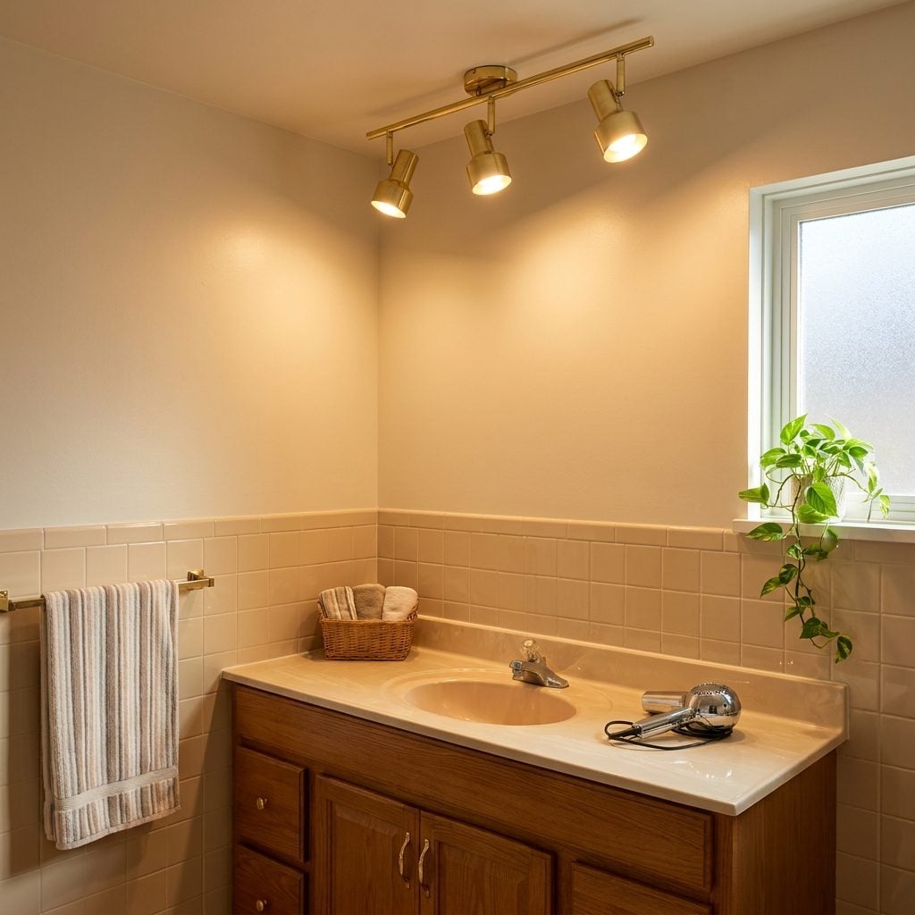
Track lighting’s great weakness was also its entire reason for existing: somebody had to aim it properly.
Adjustable heads could send light toward the vanity, artwork, shower wall or another part of the room rather than flooding everything from one central ceiling fixture. Used alone, directional spots can create harsh facial shadows, so they are better thought of as targeted or supplemental lighting than a universal replacement for good mirror illumination.
Today’s versions are slimmer and often finished in brass or matte black, but the adjustable principle hasn’t changed. A brass track lighting run paired with an arched vanity mirror, can give a small corner considerably more character than one anonymous ceiling dome.
1. The Fully Coordinated Color Scheme, Committed From Front to Back
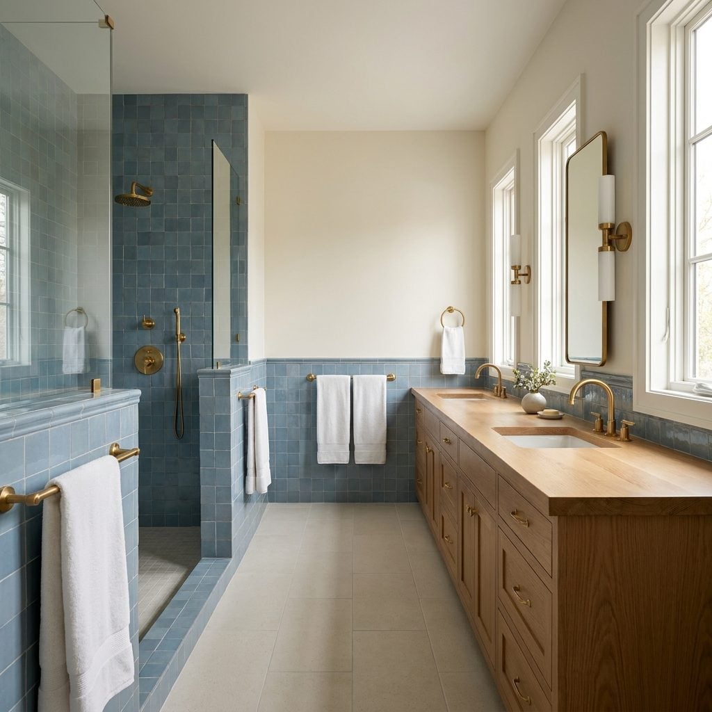
Walk into a good 1989 bathroom and you knew within three seconds what it believed in. Dusty blue with cream and oak. Rose with gray and brass. Sage with almond and warm wood. The towels, fixtures, tile and soap dish appeared to have attended the same meeting.
Later bathrooms often pursued broader resale appeal with quieter palettes and fewer permanent color commitments. Nothing inherently wrong with that. But neutrality can become anonymity when every decision is designed mainly to avoid offense.
The best ’80s rooms weren’t successful because everything matched exactly. They worked because colors repeated, undertones related and enough materials stayed within the same conversation. The sink could answer the tile. The brass could answer the oak. The floral could borrow two colors and leave the other twenty alone.
That’s the part worth bringing back. Not mauve for the sake of nostalgia. Not glass block because somebody declared it fashionable again. The useful lesson is simpler: a bathroom becomes memorable when its choices know one another.