
Luxury bathrooms have developed a peculiar talent for spending money in all the wrong places. Marble climbs the ceiling. Brass traces every available edge. Lighting emerges from architectural crevices nobody knew existed. A bathtub acquires the proportions of a sculpture and the practicality of a grand piano in a hallway. The materials are magnificent. The judgment behind them can be considerably less so.
In order to come up with the very specific design ideas, we create most designs with the assistance of state-of-the-art AI interior design software. Also, assume links that take you off the site are affiliate links such as links to Amazon. this means we may earn a commission if you buy something.
The trouble often begins when a room is designed as a collection of impressive objects rather than a piece of architecture. A bookmatched marble slab loses its authority beside three competing patterns. A sculptural tub becomes an expensive obstacle when nobody can clean behind it. A magnificent mirror offers little consolation when the lighting makes shaving or applying makeup an exercise in guesswork. Even the most elaborate shower can fail at something as elementary as keeping water where it belongs.
Good design requires an eye for proportion, a command of materials and an understanding of how a room actually works. Stone needs room to display its veining. Metal finishes need architectural purpose. Light must flatter surfaces and serve faces. The strongest bathrooms combine spectacle with discipline, allowing a single extravagant gesture to carry the composition while the quieter decisions do the heavy lifting. That’s where luxury becomes something more enduring than a shopping list with plumbing.
32. Fluting on Every Surface Can Turn a Trend Into a Timestamp
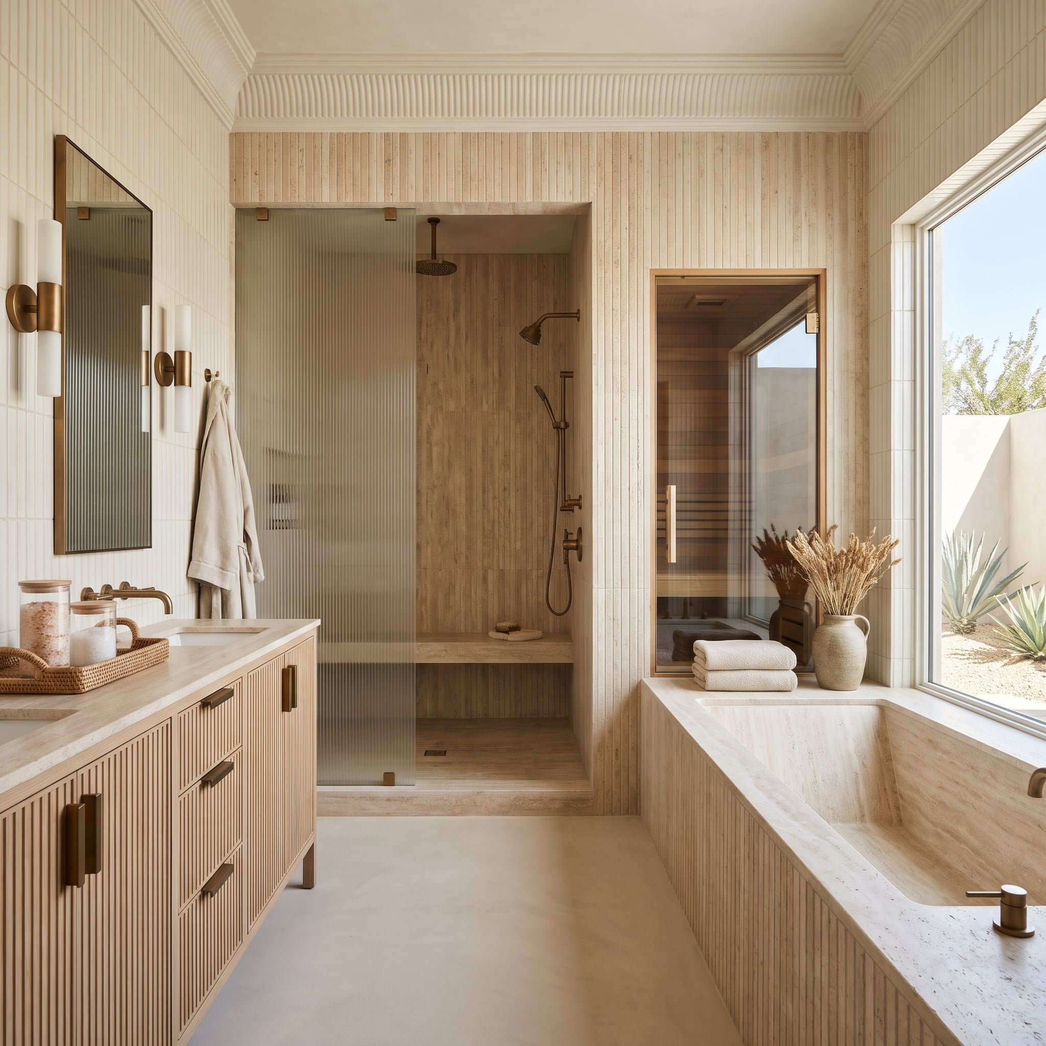
Start counting vertical lines and you won’t stop soon: ribbed panels on the shower enclosure, fluted oak on the vanity, slim stacked tile on the walls, grooves running down the tub apron. Any one of them could look lovely on its own. Four at once, though, and the bathroom begins to resemble a catalog of one decorating season.
The travertine offers a way out. Its irregular surface breaks the rhythm of those relentless grooves, while bronze pulls warm the oak without demanding attention. Keep the fluted vanity, simplify the shower panels and tub apron, and the oak’s vertical detailing becomes an architectural feature rather than one more variation on the same pattern.
31. Three Spotlights for the Marble, Not One for the Face
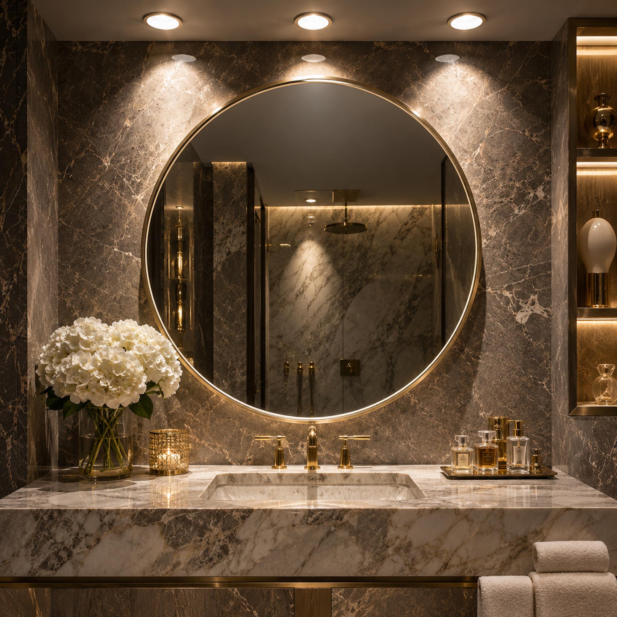
A monumental round mirror, dark marble threaded with pale veins, polished brass and three ceiling spotlights: every ingredient suggests a dressing room of considerable expense. The lighting, however, has been arranged to flatter the stone rather than the person standing at the basin. Bright pools of light strike the wall above the mirror while the face receives comparatively little direct illumination.
Overhead lighting can cast shadows beneath the brow, nose and chin, particularly when the fixtures sit behind the person using the vanity. A luminous ring around the mirror provides a decorative outline, but its usefulness depends on brightness, diffusion and direction. Vertical lighting near face height, positioned to illuminate both sides evenly, would give this lavish composition something its marble cannot supply: a properly lit reflection.
Lighting Matters: Vanity lighting should illuminate the face evenly while controlling glare. Well-diffused vertical fixtures on both sides of the mirror can reduce the harsh shadows associated with overhead-only lighting. Color rendering also matters when judging skin tones and makeup.
30. Walnut Beams Above, Plaster Walls Between, and Pale Stone Underfoot
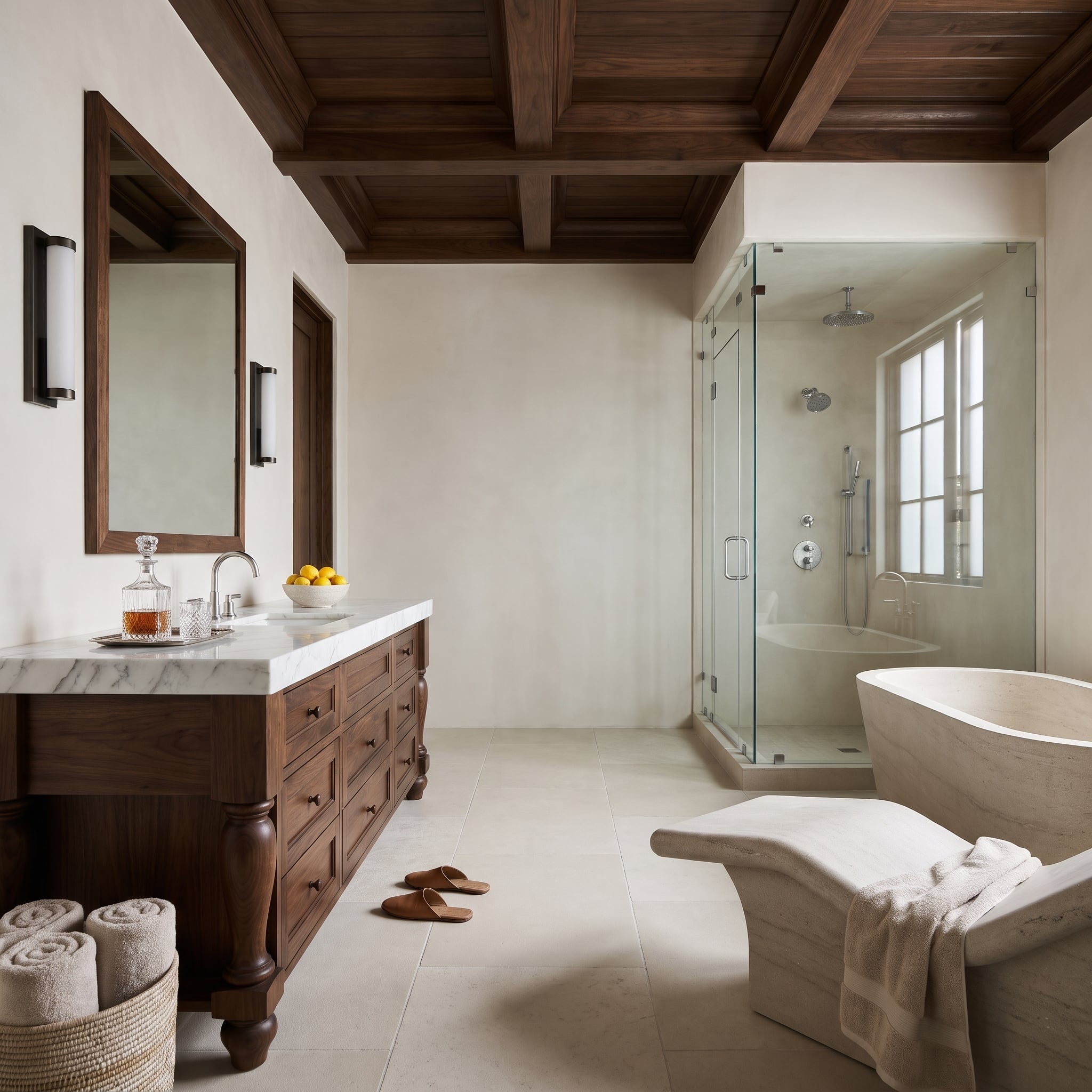
Walnut appears in two commanding places: the coffered ceiling and the furniture-style vanity on turned legs. Between them, nothing competes. Smooth plaster walls and oversized stone pavers carry little pattern, allowing the wood grain and veined marble countertop to hold their own without talking over each other.
The coffered ceiling provides the ornament, while the vanity’s turned legs introduce a more intimate, furniture-like scale. Pale stone keeps the lower half of the room light, and plaster separates the two expressions of walnut. The result has the richness of traditional craftsmanship without the oppressive weight of an all-wood interior.
What Our Readers Say
- Asked which vanity colour they would buy, Home Stratosphere readers picked wood most often at 39%, ahead of white at 30% and navy at 24%.
- When our readers chose which mirror they would buy for over the vanity, arched, round and rectangular came out as a near coin toss.
From Home Stratosphere reader polls and votes.
29. Hexagons on Every Surface Turn Geometry Into a Theme
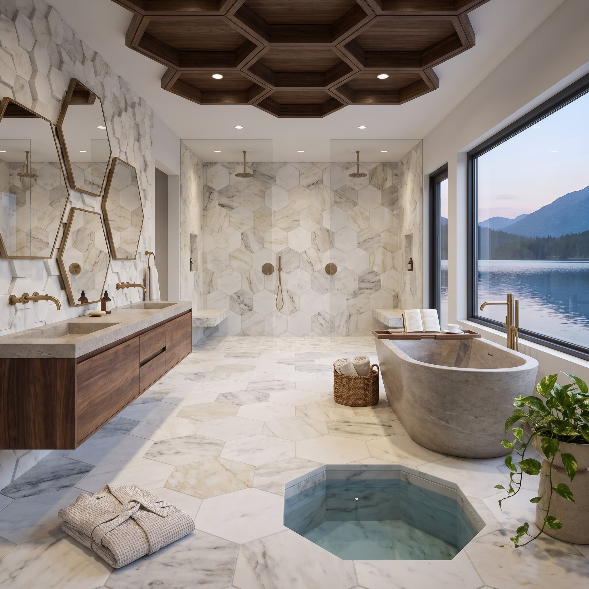
Count the hexagons and you’ll run out of fingers. The shape covers the floor, climbs the shower wall in flat marble, goes three-dimensional behind the vanity, frames four brass mirrors and then turns up again overhead in the walnut ceiling. Even the sunken soaking pool joins the geometric parade, although its outline is octagonal.
One strong motif can give a room identity. Repeated everywhere, geometry becomes a theme, and the individual materials lose their distinction. Keep the generous floor hexagons and the walnut vanity, simplify the mirrors and walls, and let the lake beyond the window provide the spectacle.
28. The Almost-Invisible Drain That Makes Large Shower Tiles Possible
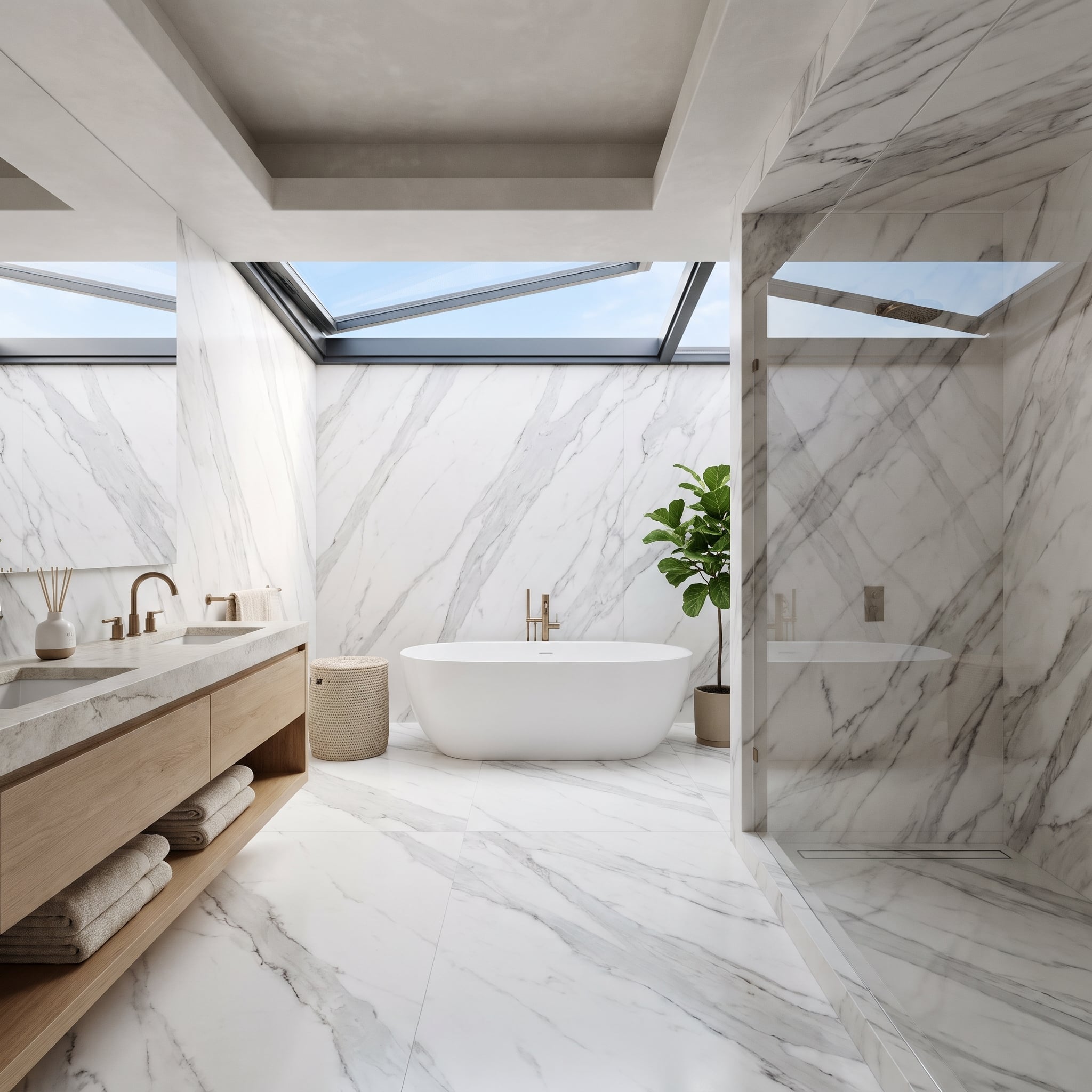
Inside the glass enclosure, a linear drain hugs the back wall. Properly designed, this arrangement permits a single-plane slope toward the drain, allowing larger floor tiles than a conventional center-drain layout might accommodate. The necessary drainage and waterproofing remain; the engineering simply retreats from view.
The vanity follows a similar principle. Pale oak drawers float above an open shelf of folded towels, while the countertop uses honed stone in warm greige instead of another cut of the wall marble. That small change gives the furniture its own identity without disrupting the surrounding stonework.
Pro Tip: Choose a vanity top that shares the wall stone’s undertone without duplicating its veining. Related colors can create continuity without making every surface look identical.
27. Sage Scallops Need a Wall Where the Pattern Can Stop
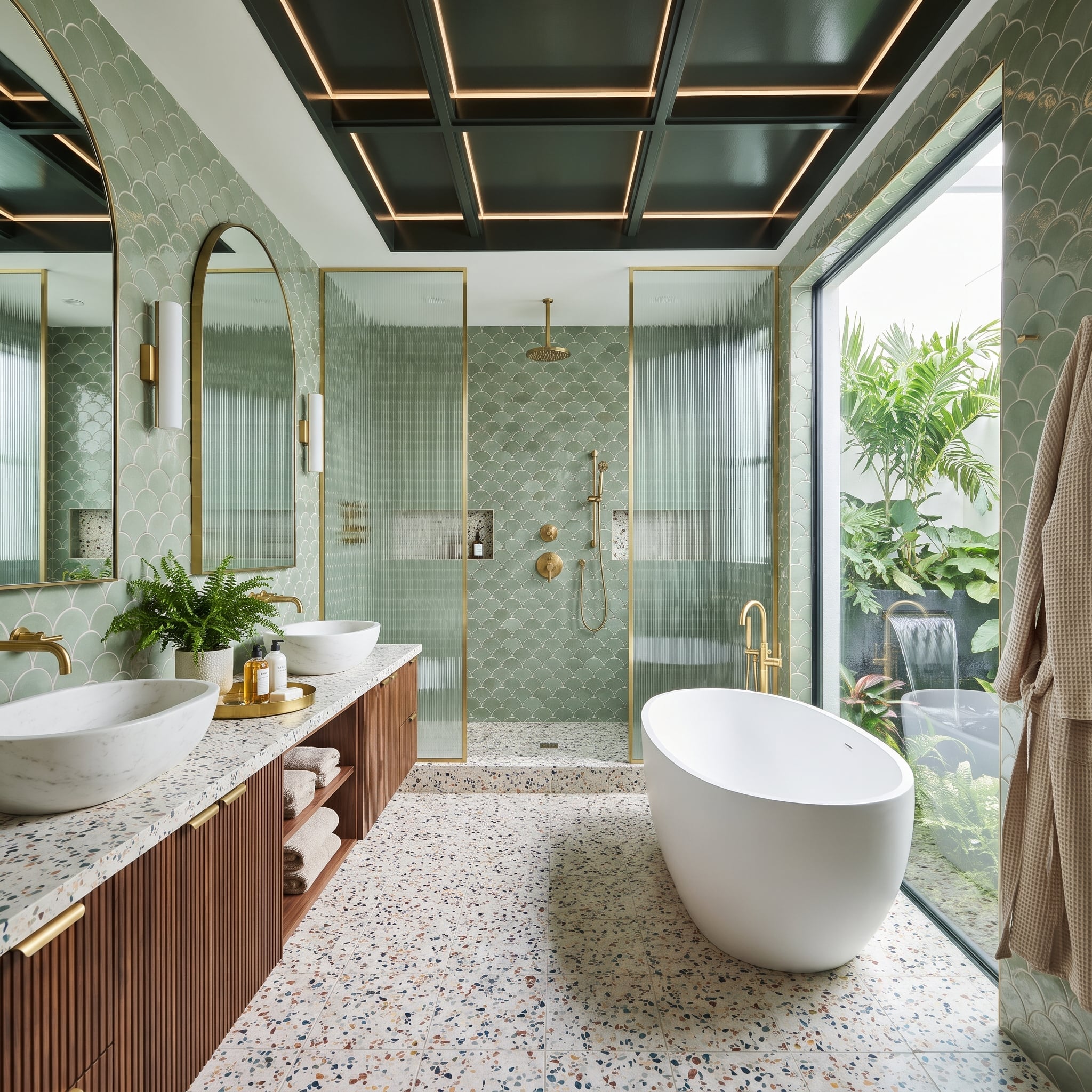
Scallops charm until they cover everything. Here the sage fish-scale tiles run behind both arched mirrors, fill the shower and wrap the window return. The pattern has no opportunity to rest, particularly when reeded glass and walnut fluting introduce still more vertical texture.
A smooth plaster wall behind the vanity would change the balance immediately. The scallops could remain the shower’s signature, the walnut could supply warmth, and the mirrors would regain their outlines instead of disappearing into a sea of overlapping curves.
26. An Antique Chandelier Needs More Than Age to Earn Its Place
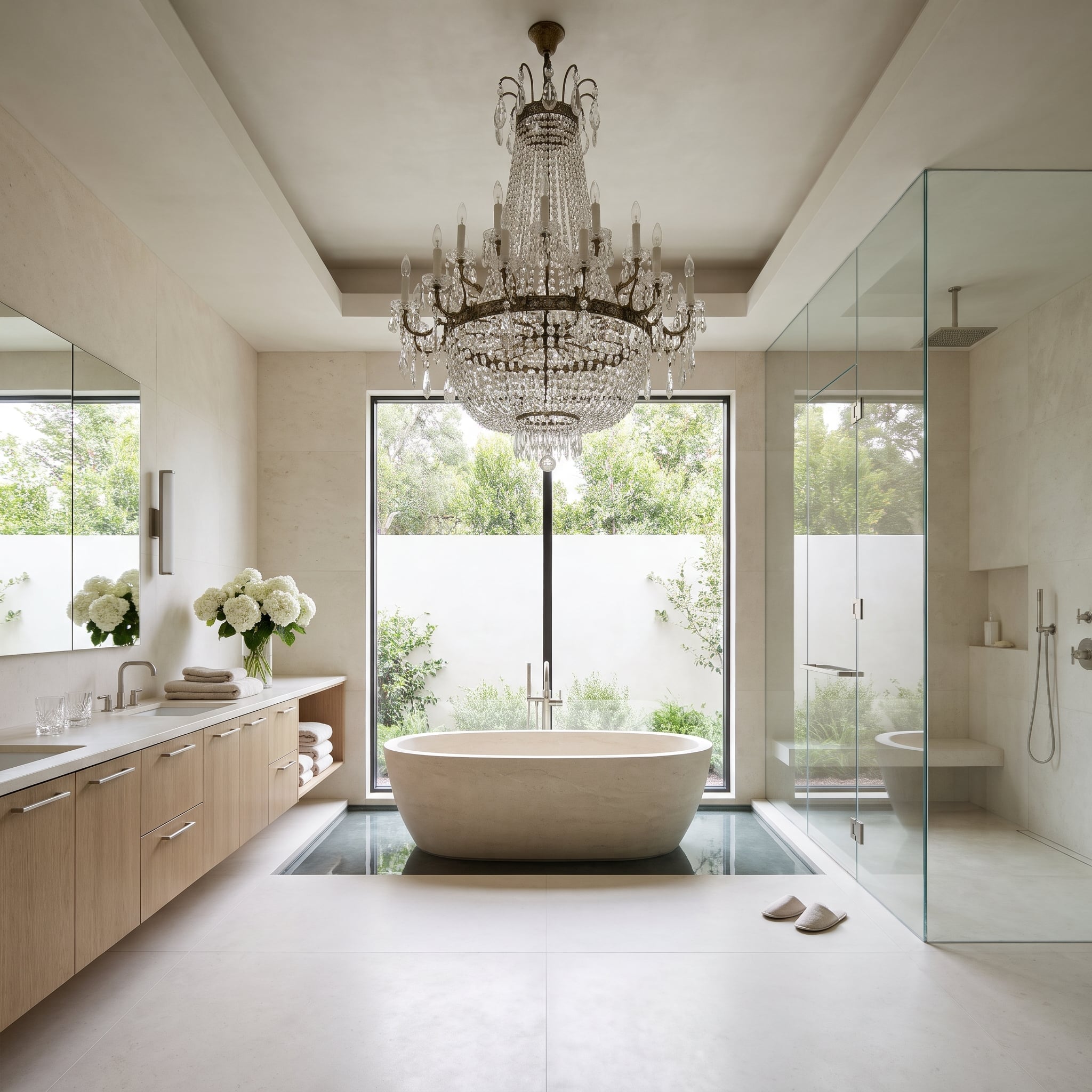
Crystal and aged bronze hang above a room built largely from limestone and white oak. The chandelier brings ornament to an otherwise restrained interior, and the contrast is what makes it interesting. An older fixture isn’t automatically timeless; its proportions, placement and relationship to the room determine whether it looks collected or simply dated.
Here the chandelier aligns with the window mullion and the stone tub, giving the composition a clear central axis. That placement is visually persuasive, although a chandelier near bathing fixtures must also satisfy electrical safety and clearance requirements. The dark reflective surface beneath the tub presents a more mundane concern: water spots and mineral deposits may become part of the daily view.
25. The Freestanding Tub That Looks Better Than It Works
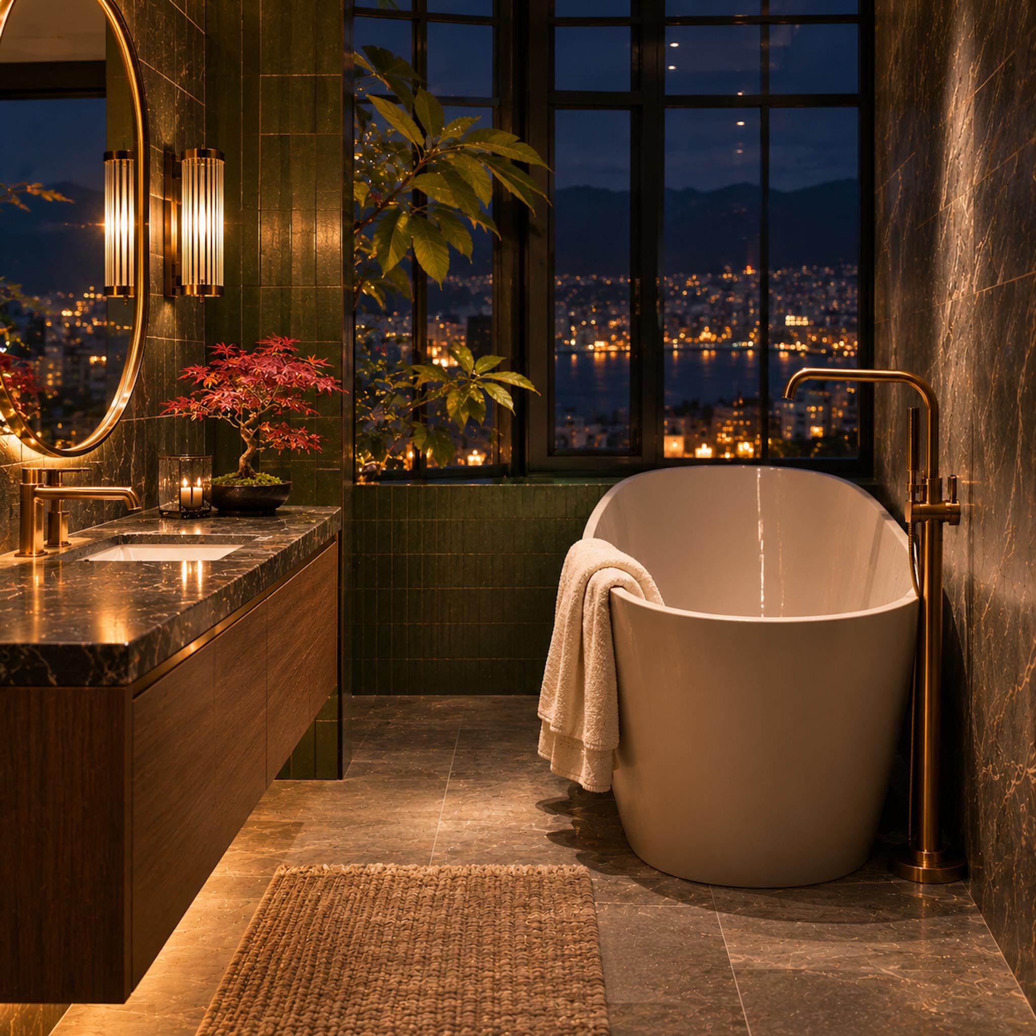
Beyond the tall black-framed windows, city lights scatter across the harbor beneath a dark mountain skyline. Inside, emerald tile, dark marble and warm brass create the atmosphere of an exceptionally expensive private hotel suite. The freestanding tub has the best seat in the house. Unfortunately, it has also been squeezed into a corner with almost no room behind it and precious little breathing space beside the wall.
That narrow strip between tub and wall is a cleaning problem waiting to happen. Dust, moisture and soap residue collect where a cloth or mop struggles to reach, while the floor-mounted filler occupies another piece of already limited circulation space. A freestanding bath needs clearance for cleaning, access and safe movement, not simply enough room to fit its footprint. Here the view is magnificent; the space planning is considerably less generous.
24. A Brass Fireplace Beside the Tub Needs Architectural Company
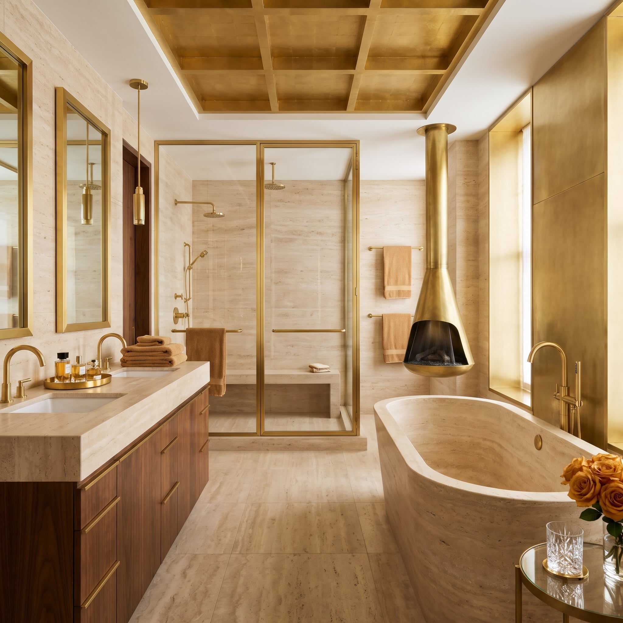
A suspended cone fireplace beside a bathtub could easily resemble an extravagant showroom accessory. Here it has company. Gold-toned ceiling coffers and brass-lined window reveals carry the metallic finish into the architecture, making the fireplace appear more deliberate than decorative.
The metal follows the room’s structural lines, establishing a relationship between the fireplace, ceiling and windows. Stone and glass temper its warmth, while the repeated brass detailing gives the suspended cone an architectural context. The fireplace becomes the centerpiece of a coordinated composition rather than an expensive object competing with its surroundings.
Worth Knowing: A fireplace near bathing fixtures must be specified and installed for the location, with appropriate clearances, ventilation where required, and compliance with the manufacturer’s instructions and local codes. Matching finishes cannot compensate for an unsuitable installation.
23. Color Drenching Stops Working When Even the Bathrobe Matches the Walls
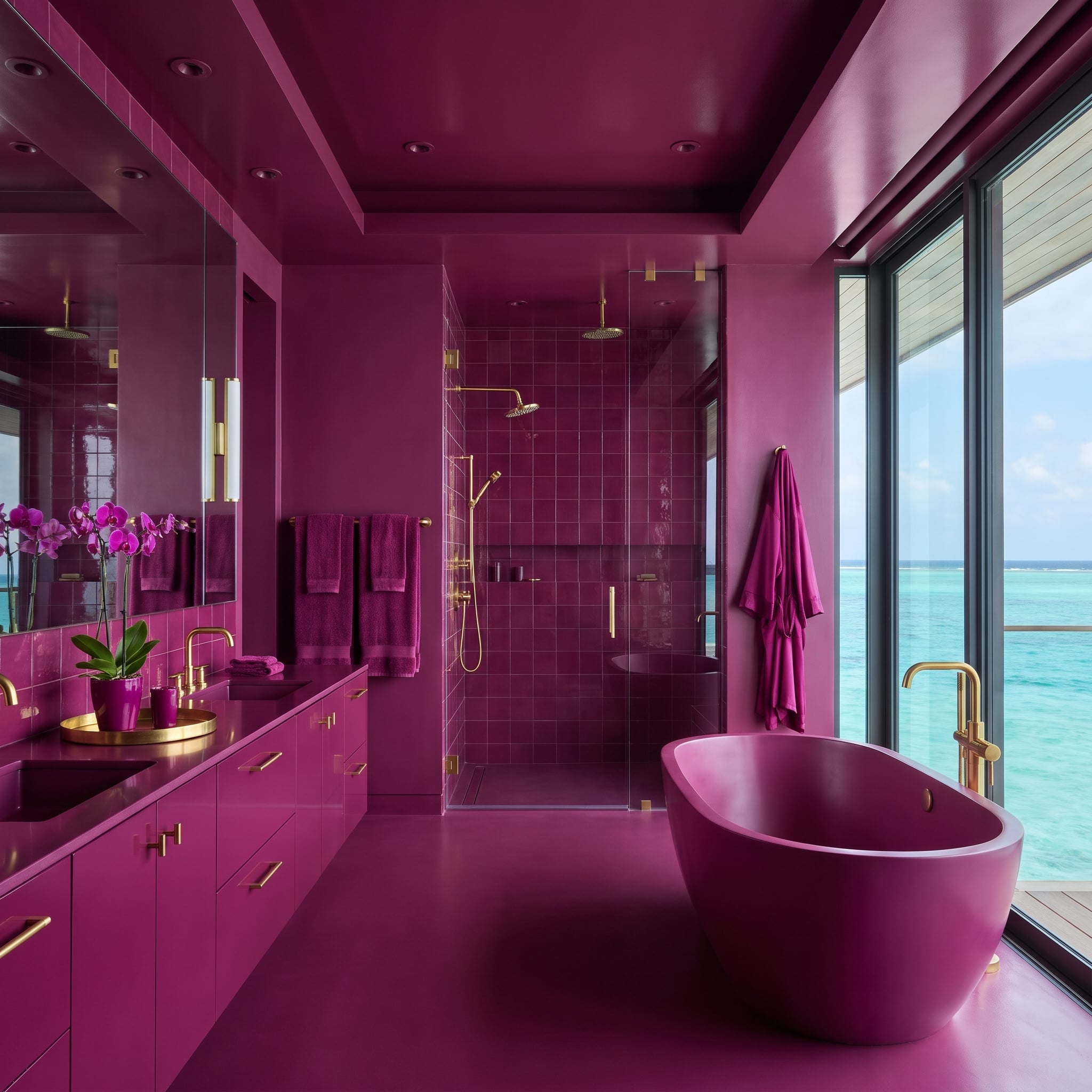
Berry coats the ceiling, floor, vanity and even the freestanding tub. That degree of commitment takes nerve. The matching towels, robe and orchids are where the composition becomes almost comically complete, leaving the ocean outside the window as the only substantial visual interruption.
Ivory towels, a pale robe and a few natural materials would introduce contrast without disturbing the architectural color scheme. Color drenching can be magnificent. Matching every accessory to the walls makes the room look staged for a paint advertisement.
Color Story: Brass hardware provides small points of contrast, but textiles can introduce larger, softer areas of relief. Unlike tile or cabinetry, they can be changed without renovation.
22. Let One Bookmatched Slab Do the Talking and Keep the Tub Plain
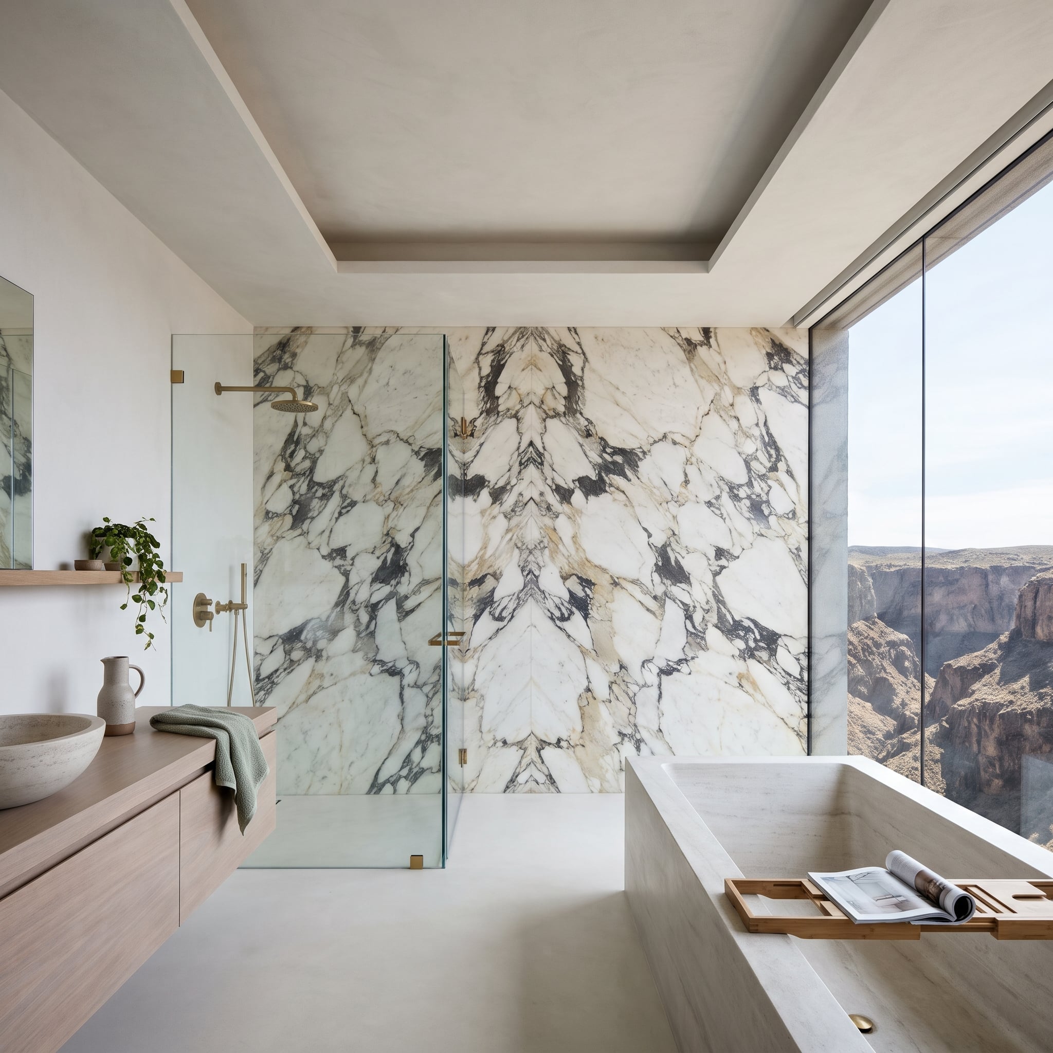
Bookmatched marble claims the back wall, its mirrored veins creating a composition that hardly needs help. The honed tub and plain plaster ceiling provide a deliberate contrast, their unbroken surfaces giving the stone’s intricate pattern greater force.
Frameless shower panels held by discreet metal clips help preserve the uninterrupted view. A heavily framed enclosure would cut across the veining, dividing one spectacular surface into competing pieces. When the stone is already doing the decorating, the smartest hardware is often the hardware you barely notice.
21. How Many Valve Wheels Does a Concrete Loft Bathroom Really Need?
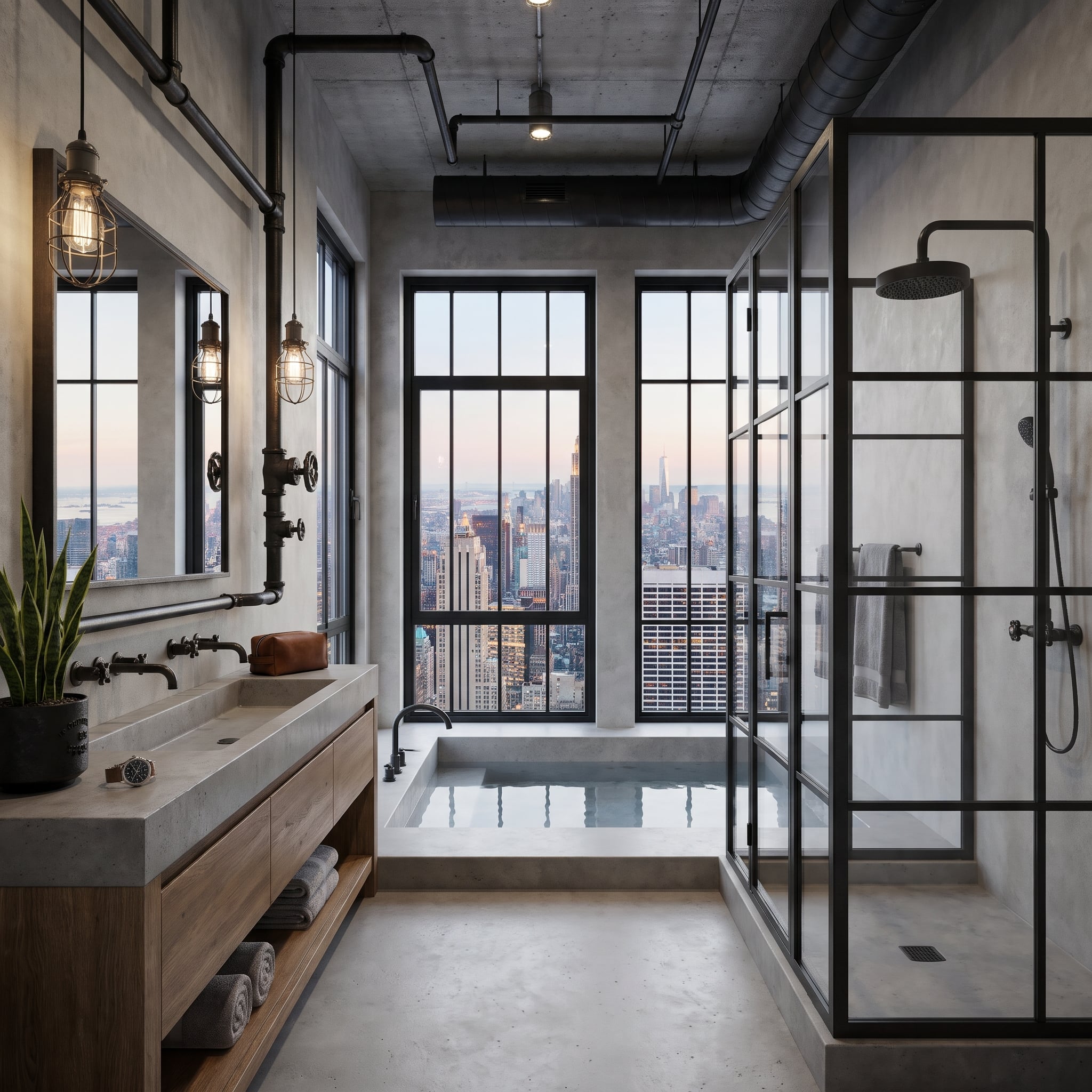
Concrete does most of the work here, and it holds up. The trough sink, sunken tub and plastered walls share a restrained gray palette, allowing the black-framed shower grid to read as part of the room’s structure.
Then comes the pipework on the mirror wall, complete with prominent valve wheels whose function isn’t apparent. Add caged Edison-style pendants and the industrial character begins drifting toward theme-restaurant territory. Genuine building services can have visual appeal. Decorative plumbing that imitates them needs a much stronger reason to exist.
Design Detail: Exposed ductwork and conduit can contribute to an industrial interior when they are functional and thoughtfully integrated. Before adding decorative pipework, consider whether the same character could come from materials already present in the building.
Not everyone agrees on concrete: in our readers’ votes, bathroom images featuring it got hearts 49% of the time, versus 59% for other images in the same articles.
20. Black Fixtures, White Marble, and One Dark Shelf to Keep the Contrast Honest
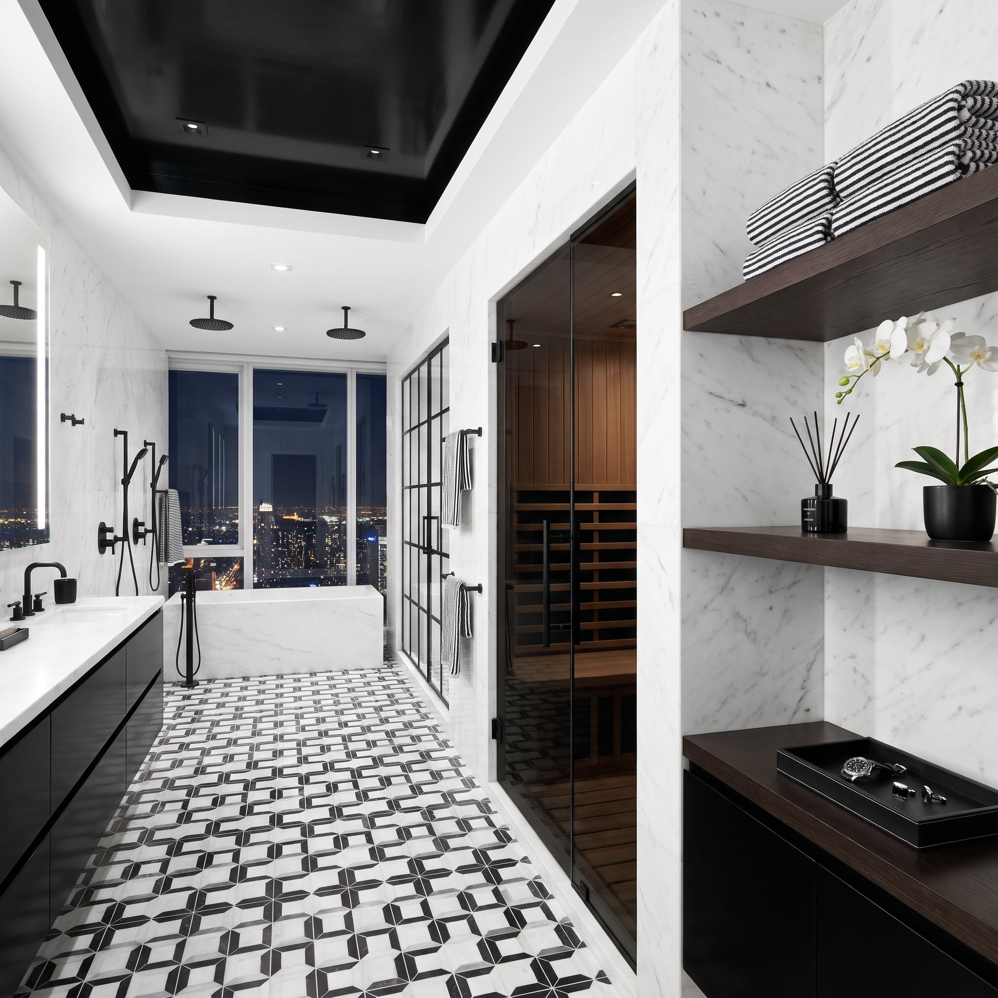
Every fixture here is matte black. Against white marble, that could have produced the familiar high-contrast bathroom of a particular decorating era. Dark-stained shelves and a wood-lined sauna change the calculation, adding enough warmth to make the black feel considered rather than automatic.
The geometric mosaic stays on the floor while the walls use quieter marble slabs. Black fixtures provide crisp outlines, but the dark shelving and timber-lined sauna give the composition something more substantial than graphic contrast. Wood grain, texture and warmth rescue the room from becoming an exercise in black lines on white stone.
In the Details: When fixtures create strong visual lines, a single patterned surface is often enough. Repeating the geometry across walls, floors and cabinetry can make an otherwise elegant bathroom feel overly coordinated.
19. Terrazzo Doesn’t Need to Cover the Entire Bathroom to Make Its Point
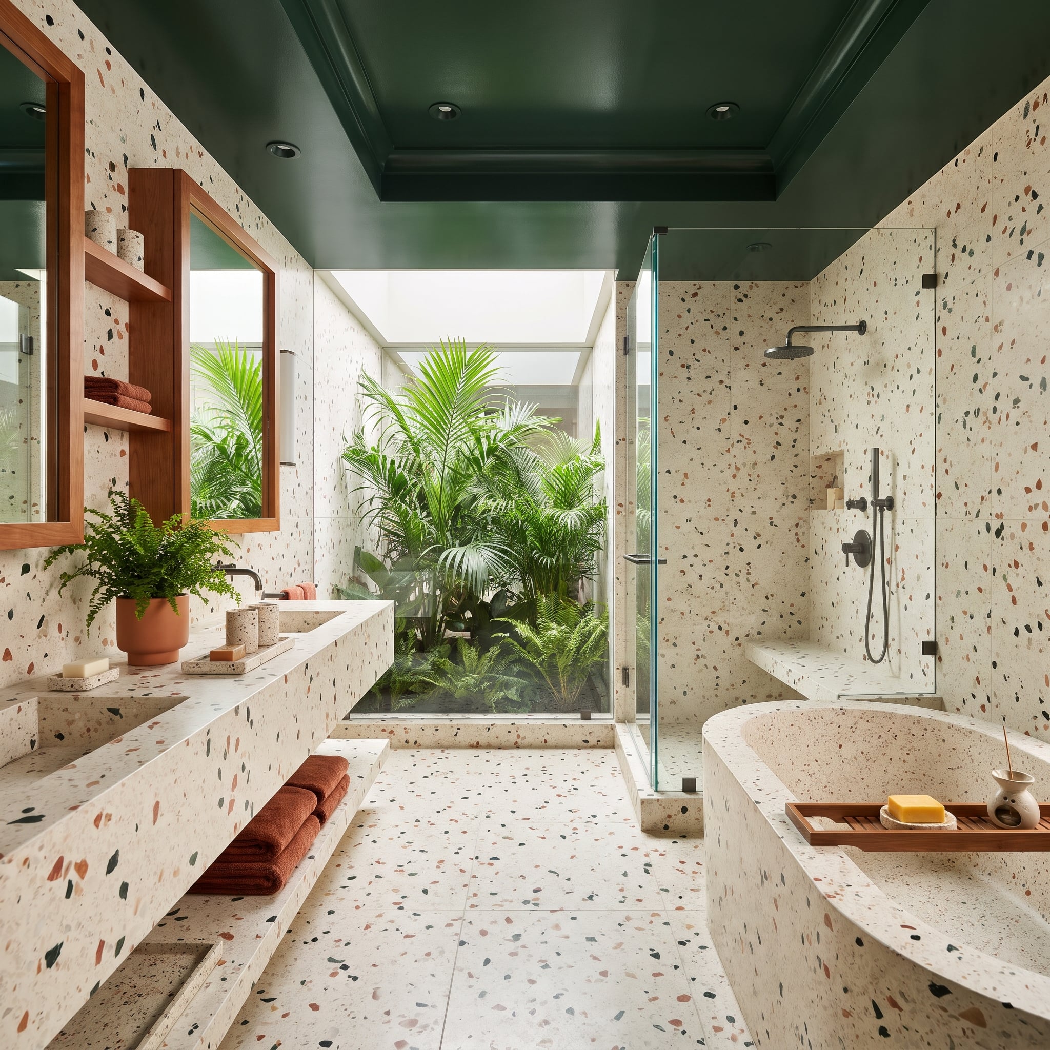
Speckled terrazzo climbs from the floor up the walls, wraps the floating vanity and shapes the oval tub. Rust and green chips scatter across practically everything. The glossy green ceiling and wood-framed mirrors offer some relief, but the tub and vanity still blur into the surfaces behind them.
The problem isn’t terrazzo itself. It’s the absence of hierarchy. A solid plaster wall behind the vanity would allow the sculpted tub to stand apart, while a finer aggregate on selected vertical surfaces could introduce variation without abandoning the material palette. The tub has a handsome silhouette. Buried beneath all those speckles, it barely gets a chance to show it.
18. Canyon Red Outside the Window Is a Better Color Consultant Than a Trend Forecast
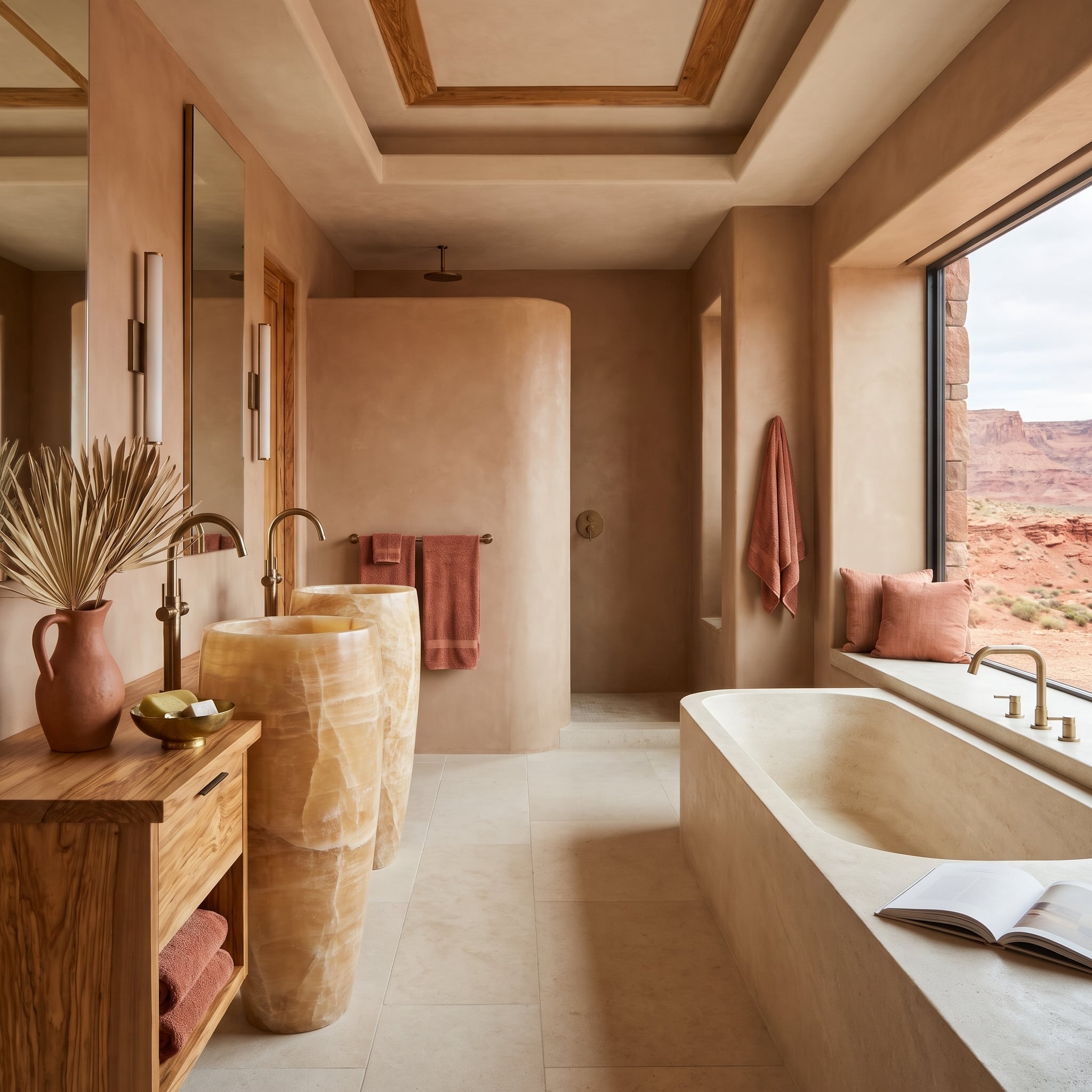
Honey onyx gives the twin pedestal sinks a mineral richness that ordinary ceramic basins could never achieve. Their substantial cylindrical forms bring weight and color to the vanity area, while the stone’s natural pattern makes each basin visually distinct. The sculptural effect is impressive, although limited counter space and storage would require careful planning for everyday use.
The surrounding palette is more quietly successful. Muted blush plaster relates to the sandstone outside, while rust-colored towels and window-seat pillows draw on the canyon walls. Rather than borrowing a fashionable shade from a paint forecast, the room takes its cues from the landscape it overlooks.
Practical Detail: Freestanding basins require coordinated plumbing and faucet placement. Floor-mounted and wall-mounted faucets are both possible, depending on the basin design. Supply lines, drainage and maintenance access should be planned before the stone floor is installed.
17. Split-Face Slate Gives an All-Black Bathroom Something Light Can Catch
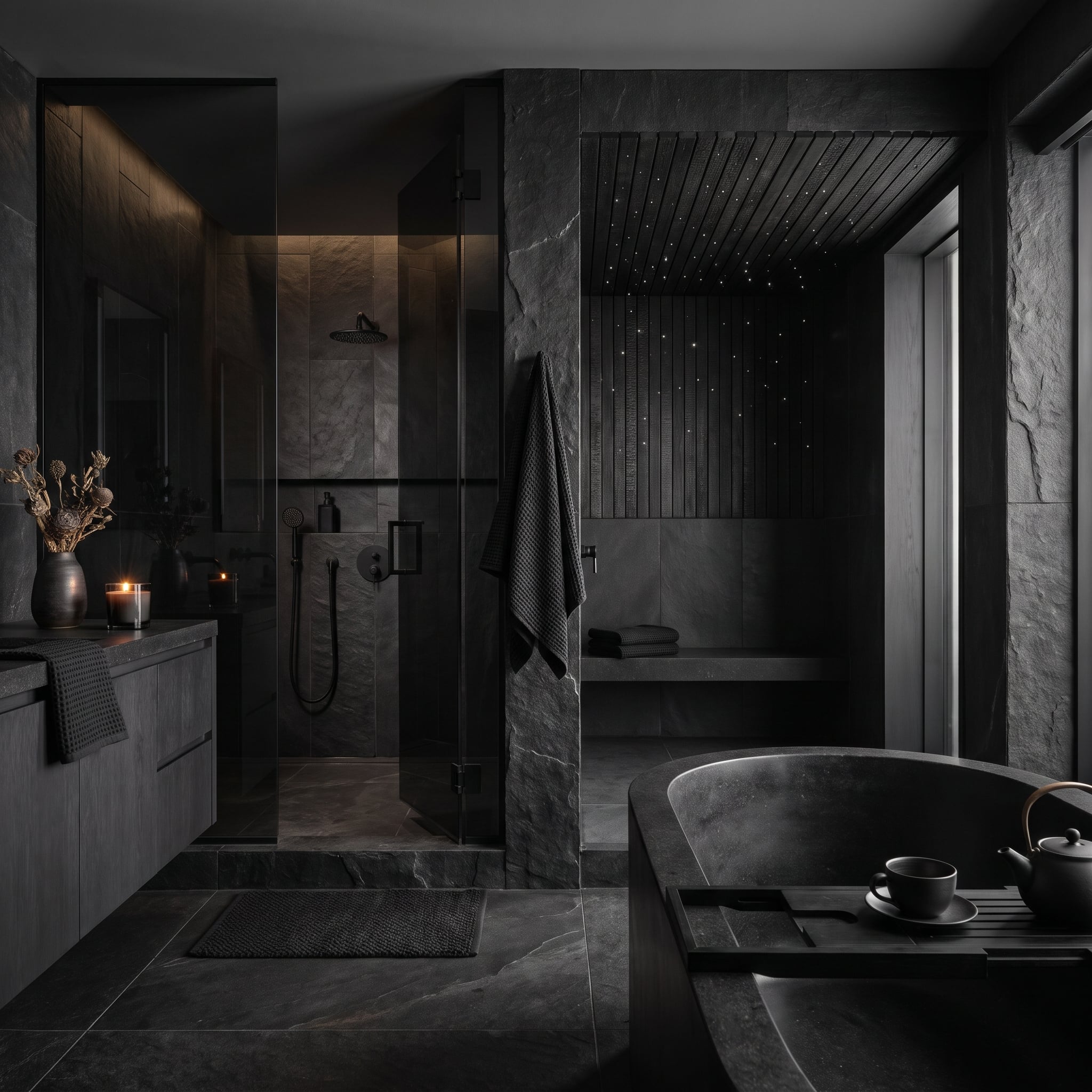
Nearly every surface here is black or close to it, so texture takes responsibility for keeping the room alive. Beside the shower, a split-face slate column catches light along its irregular ridges. Waffle-weave towels and a textured bath mat perform the same trick on a softer scale.
The sauna nook is less restrained. Pinpoint lights scattered across dark wood slats introduce a theatrical night-sky effect that competes with the materials. The slats already have depth and character. They don’t need a constellation to announce their presence.
16. Wood-Grain Planks Need Plaster and Glass to Keep the Bathroom From Becoming a Cabin
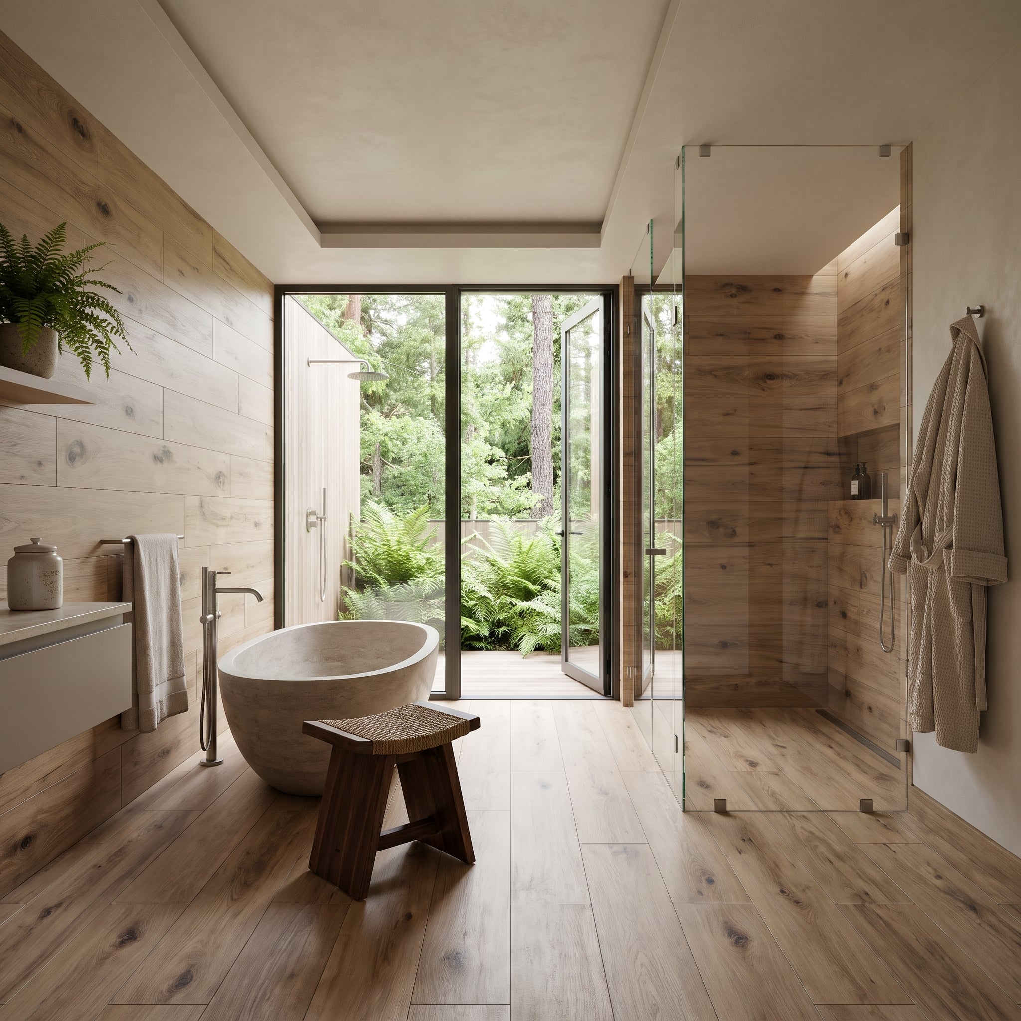
Knotty oak tones cover the floor, one wall and the shower interior. That’s a considerable amount of grain for one bathroom, yet the pale plaster ceiling and frameless glass enclosure keep the composition from becoming a wooden box.
The change in plank direction helps. Horizontal lines along the walls contrast with flooring that leads toward the window, allowing the two surfaces to retain their identities. A stone tub and garden view supply additional relief.
For the shower, the wood-look finish needs to be suitable for wet conditions. Porcelain tile designed to resemble timber is one practical option, installed over a properly waterproofed shower assembly. Ordinary interior wood planks aren’t an interchangeable substitute.
15. Ceiling Light Slots Can Steal the Show From Pink Banana-Leaf Wallpaper
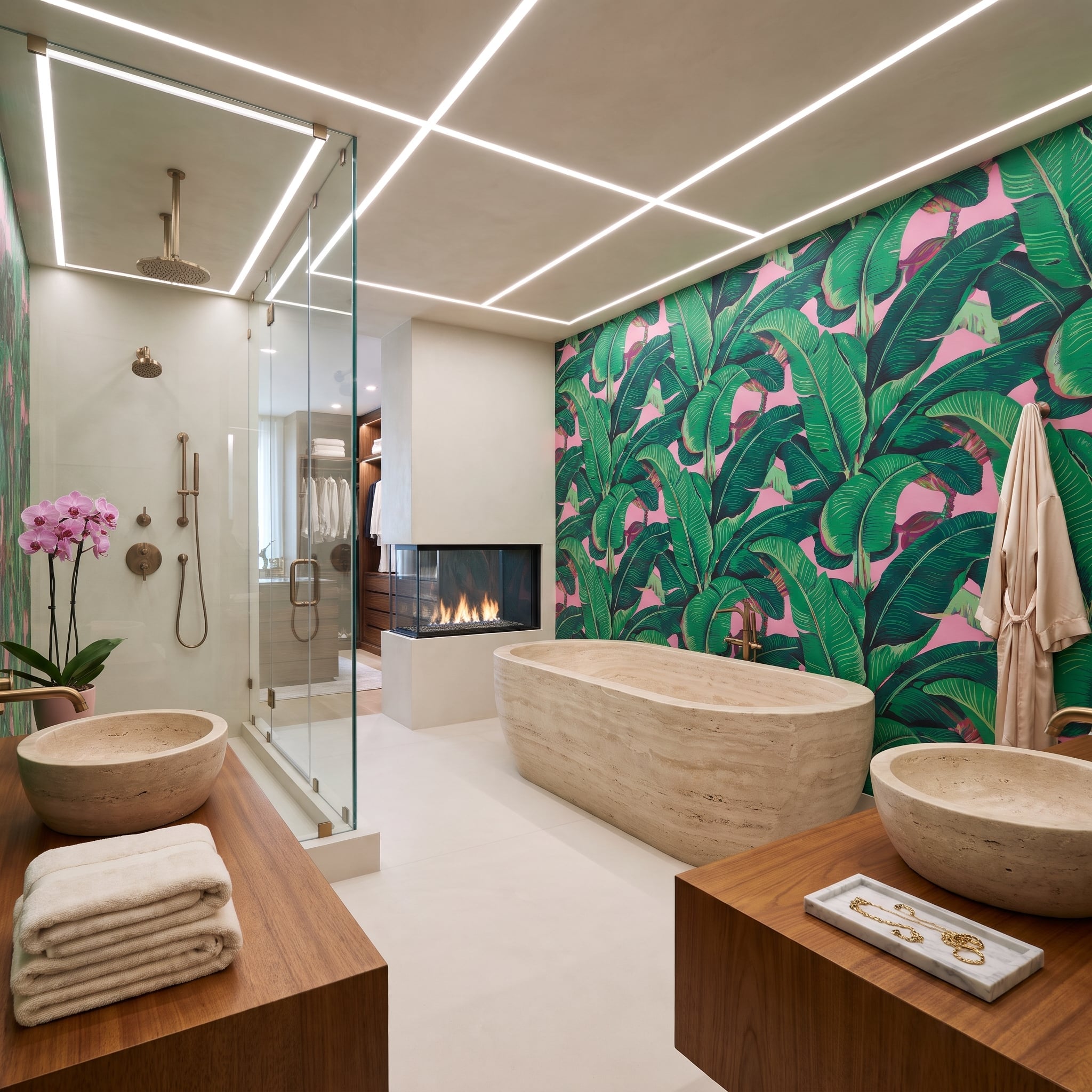
Pink banana leaves make an exuberant backdrop for the travertine tub and vessel sinks. The wallpaper is unapologetically decorative, and the stone gives it something solid to play against.
The ceiling is where the competition becomes unnecessary. Bright linear lighting slots slice across the surface, adding a second dramatic gesture that has little relationship to the botanical pattern below. A quieter ceiling with well-positioned task and ambient lighting would allow the wallpaper to be the room’s eccentric pleasure.
Worth Knowing: Wallpaper should be specified for the room’s humidity and kept away from direct shower spray unless the product and installation system are designed for that exposure. Reworking integrated ceiling lighting can also require electrical and finishing work, not simply a cosmetic patch.
14. One Swooping Slipper Tub Against a Room of Straight Lines
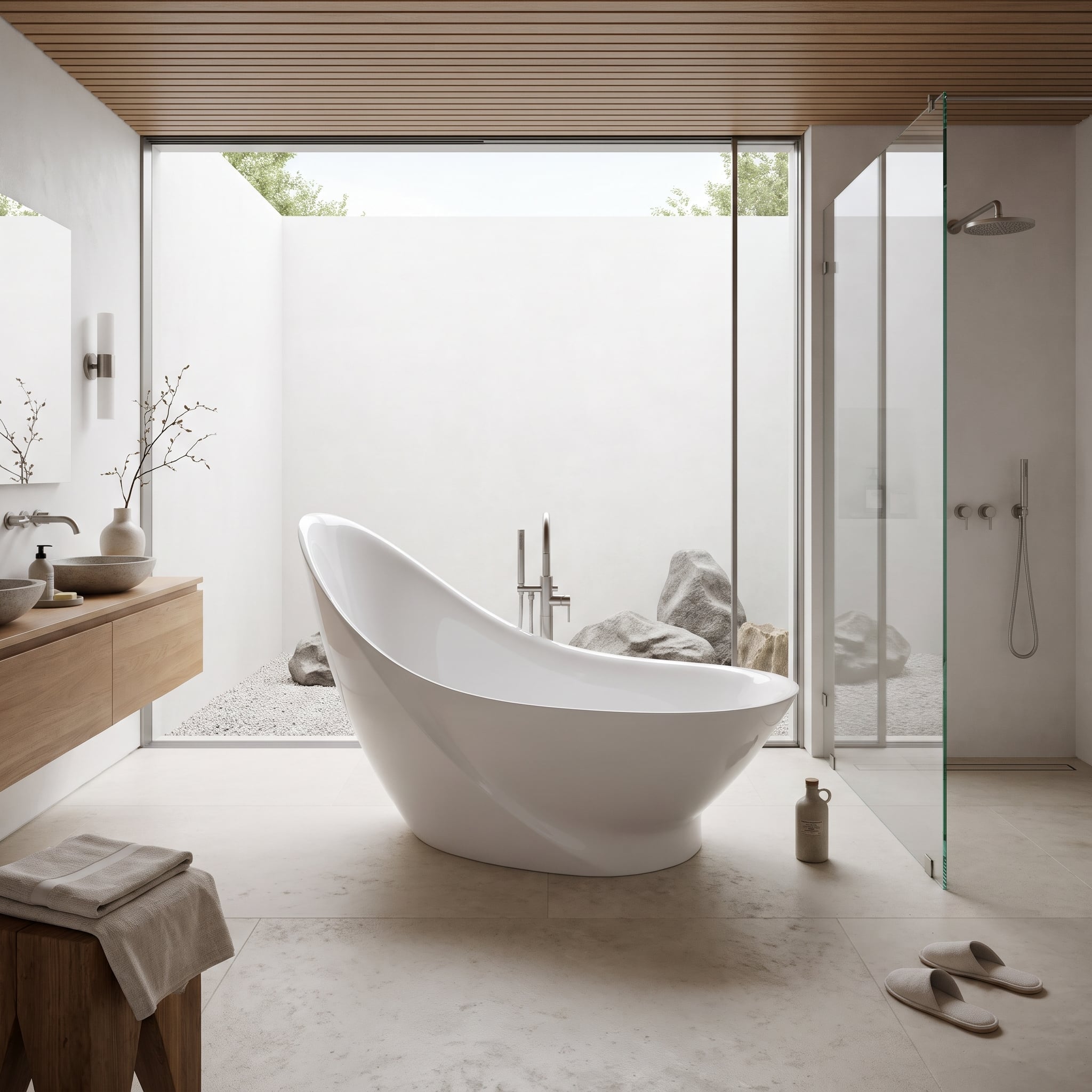
The slipper tub rises at one end in a sweeping curve, giving its silhouette an unmistakable sense of movement. Around it, the architecture stays disciplined: straight wall planes, clean edges and a restrained arrangement of finishes. The contrast makes the tub appear almost weightless against the room’s rigid geometry.
Its raised back creates a reclining profile distinct from the level rim of a conventional freestanding bath. The high end also changes the tub’s visual proportions, giving one side the height of a sculptural backrest while the opposite rim remains low and open. That asymmetry supplies all the drama the room requires.
13. Thin Brass Seams Give Stone a Framework Without Taking Over
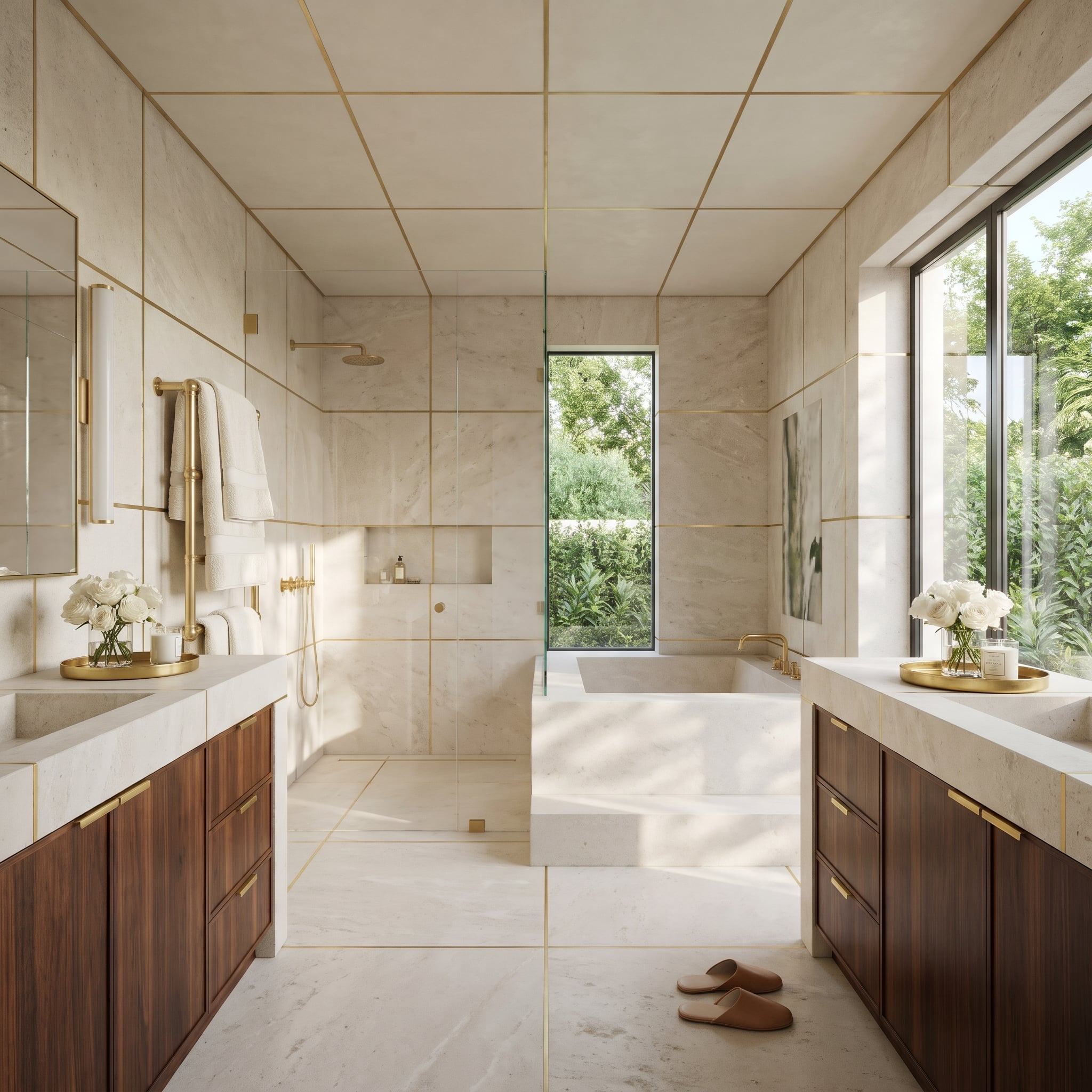
Brass appears as hairline seams between pale stone slabs, creating a delicate grid that runs up the walls and continues across the ceiling. The metal reads as part of the architecture rather than an accessory applied afterward.
Walnut vanities bring warmth without repeating the brass on every available edge. Their slim hardware leaves the stonework in charge. The effect is luxurious precisely because the metallic finish has a defined job instead of being asked to decorate the entire room.
12. Charcoal Grout Turns Square Tile Into Graph Paper
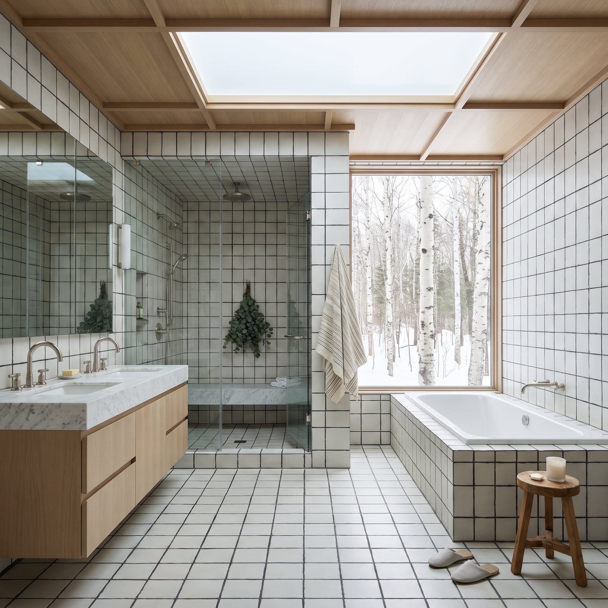
Dark grout outlines every square tile, running from the floor up the walls and across the shower ceiling. From the doorway, the contrast looks crisp. Up close, the arrangement is unforgiving. Uneven spacing, awkward cuts and misaligned corners become part of the design rather than details that disappear into it.
Oak ceiling coffers repeat the grid at a larger scale, while the wood-framed window over the tub provides a welcome interruption. The room demonstrates how precise installation can turn ordinary square tile into a strong graphic composition—and why that precision matters.
Quick Fix: Test contrasting grout on a sample board before installation. Dark joints emphasize spacing and may show light-colored mineral deposits, while pale grout can reveal other forms of staining. Neither color eliminates the need for proper cleaning and maintenance.
11. A Reef Aquarium Is Spectacular—and Anything but Maintenance-Free
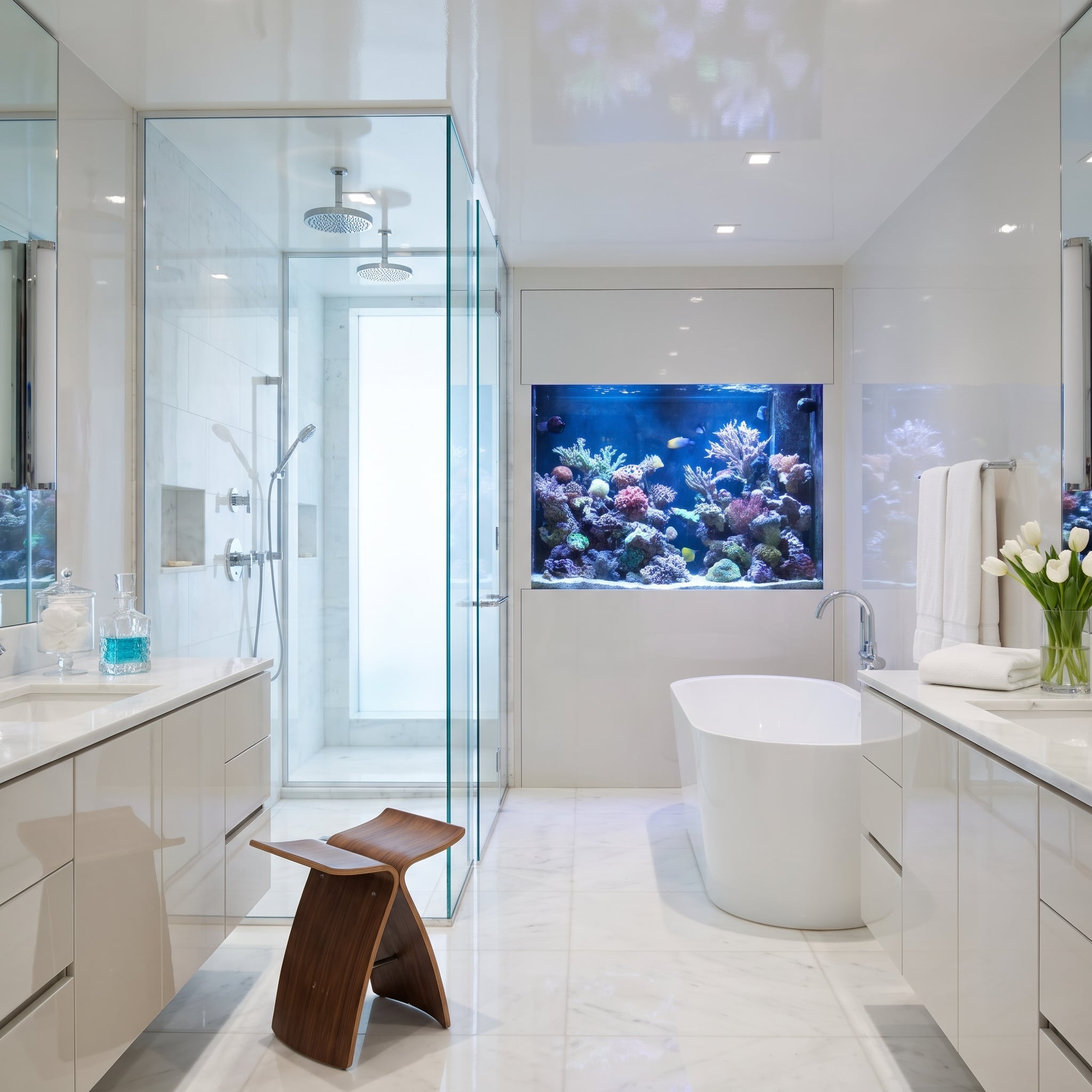
A reef aquarium supplies the color in an otherwise white bathroom. Set into the wall above the freestanding tub, the tank introduces moving blues and the intricate forms of living coral. Glossy surfaces reflect that color across the room, turning the aquarium into an unusually compelling focal point.
The walnut butterfly stool is a small but important counterweight. Its warm curves interrupt the lacquer, marble and glass, preventing the room from feeling clinical. The aquarium’s integration into the wall is visually seamless, although adequate service access and space for equipment would be essential in an actual installation.
A living reef demands ongoing water-quality management, filtration, lighting, temperature control and specialist care. The pumps, filters and maintenance access are as consequential as the glass wall everyone admires. This particular luxury feature comes with a second occupation: aquarium keeper.
Design Detail: Handle-free cabinet fronts help keep attention on the aquarium. Recessed pulls allow the vanity to provide storage without adding another set of decorative lines.
10. How Many Arches Can One Bathroom Hold Before the Shape Stops Meaning Anything?
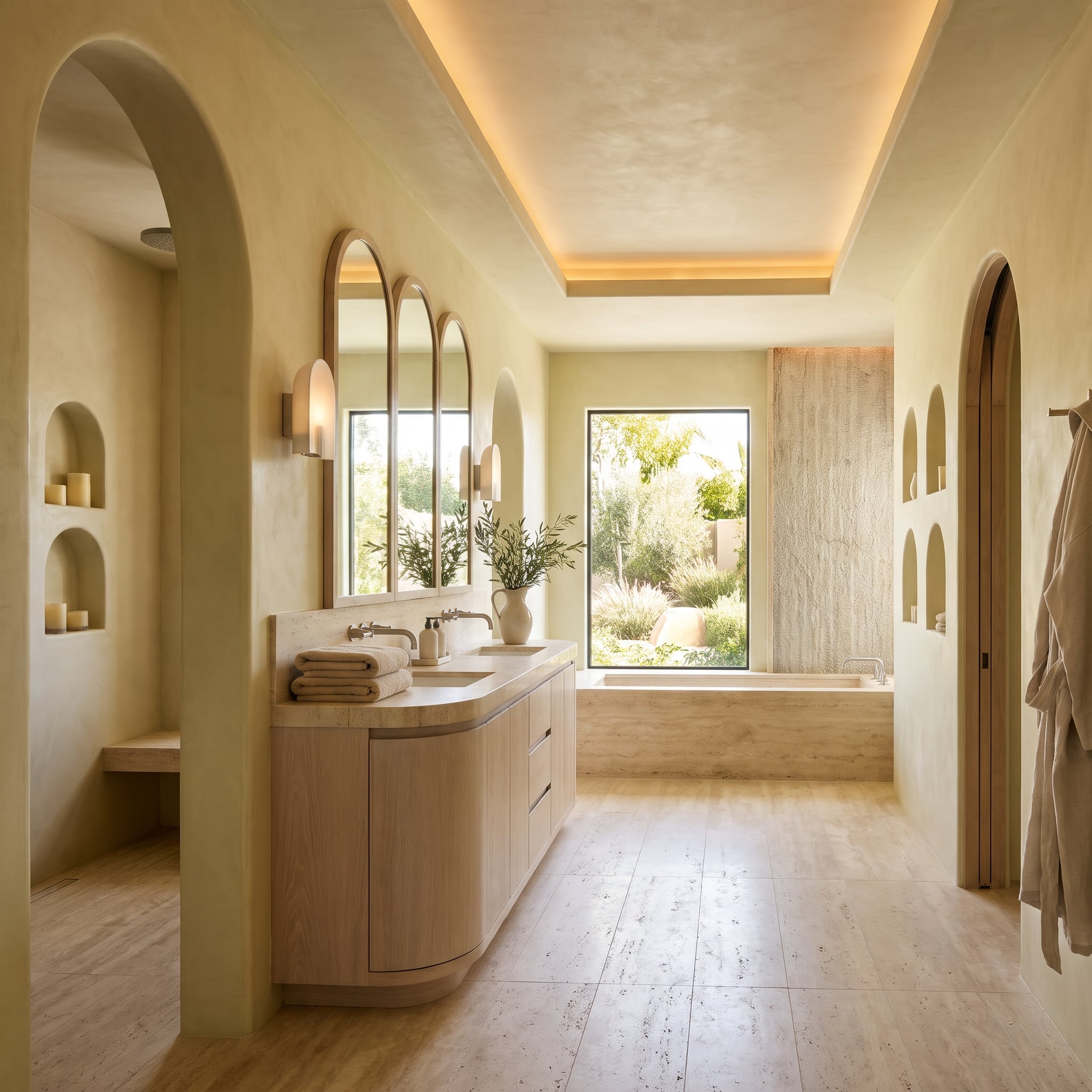
Arches frame the shower, the door, the mirrors and nearly every niche. Each curve is carefully executed, yet their accumulation makes the room feel more themed than architectural. When every opening repeats the same gesture, none has much opportunity to matter.
Travertine is the stronger unifying element. The stone connects the floor, tub surround and rounded vanity top, with natural variation supplying texture that doesn’t depend on a fashionable shape. Keep the principal architectural arches, simplify the smaller niches and mirrors, and the travertine would have more space to establish the room’s character.
9. Rounded Corners Repeat From Ceiling Cove to Mirror Frames, So the Curves Look Planned
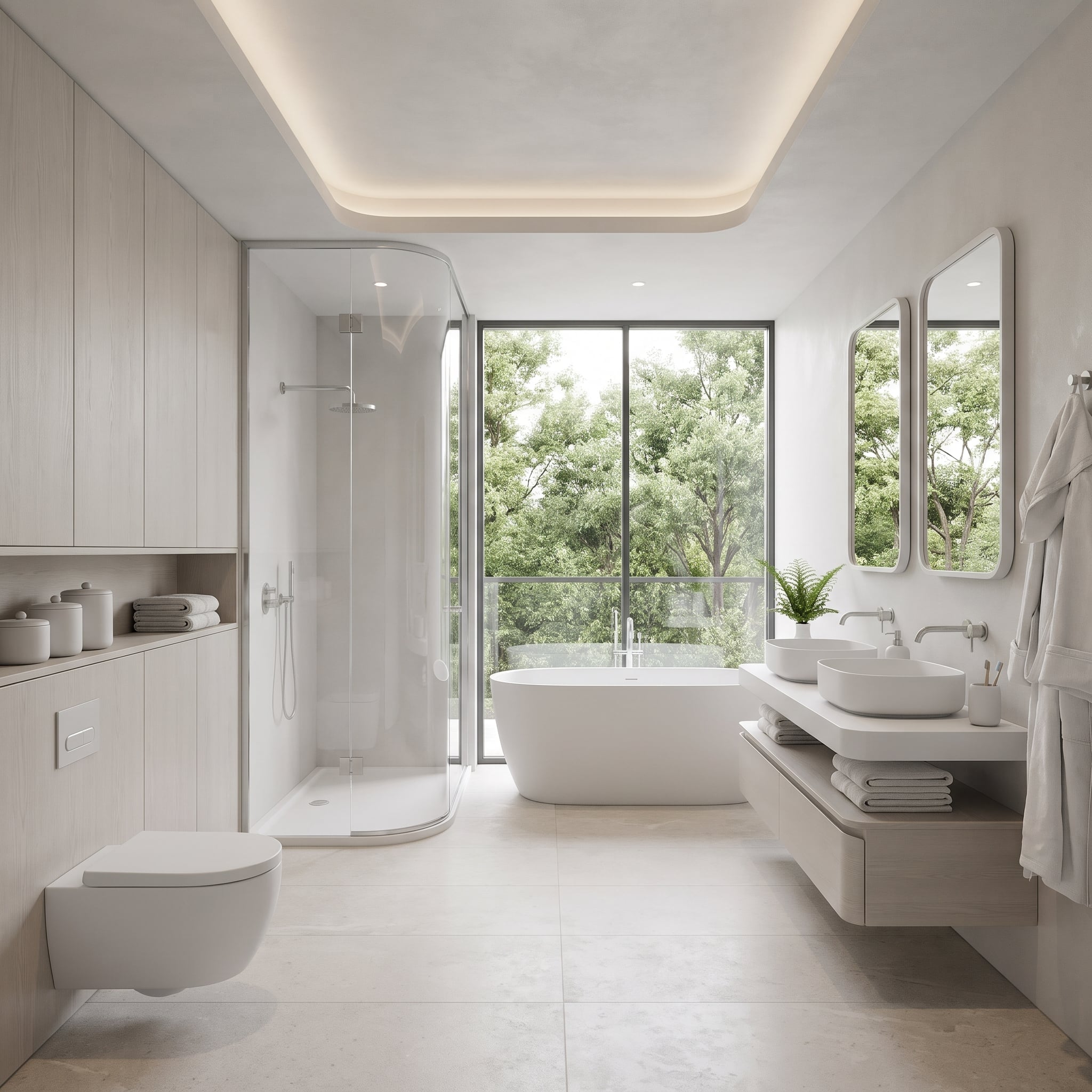
Look up first. The illuminated ceiling tray turns its corners on a gentle radius that reappears in the mirrors, shower enclosure and tub rim. Unlike a room crowded with identical arches, these curves vary in scale and purpose. They establish a common architectural language without making every object look interchangeable.
The pale wood wall provides a quieter backdrop and conceals the toilet cistern. Wall-mounted faucets keep the floating counter clear, while open shelving beneath the basins gives towels a place to live without cluttering the vanity top. The rounded mirror frames soften the room’s geometry without interfering with the practical arrangement below.
8. When the Shower Spray Has a Better Escape Route Than the Water
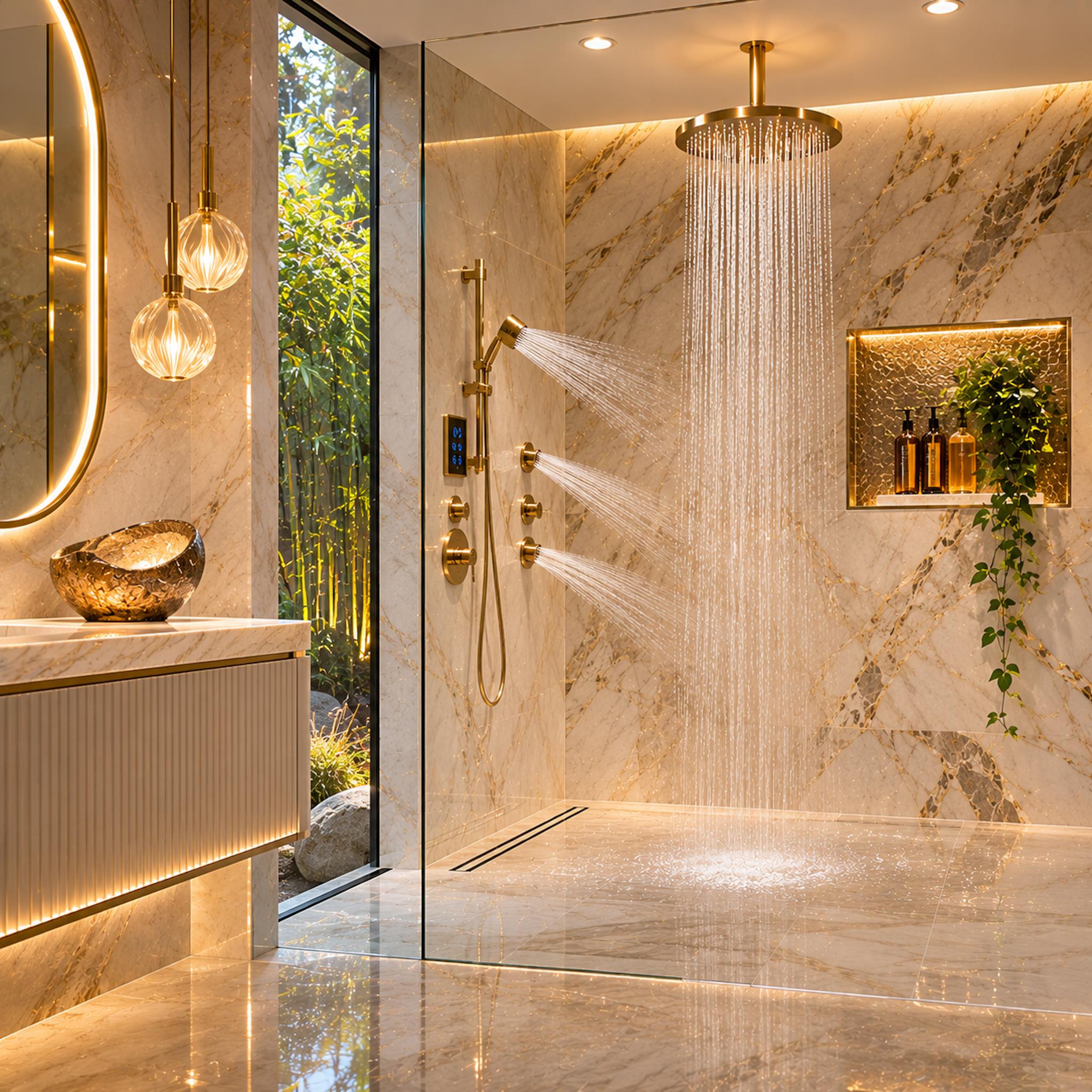
Gold-veined marble, sculptural pendant lights, a fluted floating vanity and a rainfall shower worthy of a five-star spa. The room has spent generously on every visible detail. Then three horizontal body sprays enter the picture, sending powerful streams across the shower toward a frameless glass screen whose position becomes crucial to keeping the surrounding floor dry.
Rainfall heads direct water downward; body jets introduce a very different trajectory. Their angle, pressure and distance from the enclosure determine where the spray lands and how much splash reaches the opening. The glass panel must contain the water without turning entry into an obstacle course. A properly sloped shower floor, correctly positioned drain and suitable waterproofing complete the system. Marble and brass can make the shower magnificent, but geometry determines whether the bath mat survives the experience.
Practical Detail: Test the intended spray directions against the enclosure layout before fixing the positions of body jets. Water containment depends on the entire shower design, including glass coverage, entry location, floor slope and drainage—not the showerhead alone.
7. Vines Fill the Window, So Why Do the Tub Steps Need Their Own Glow?
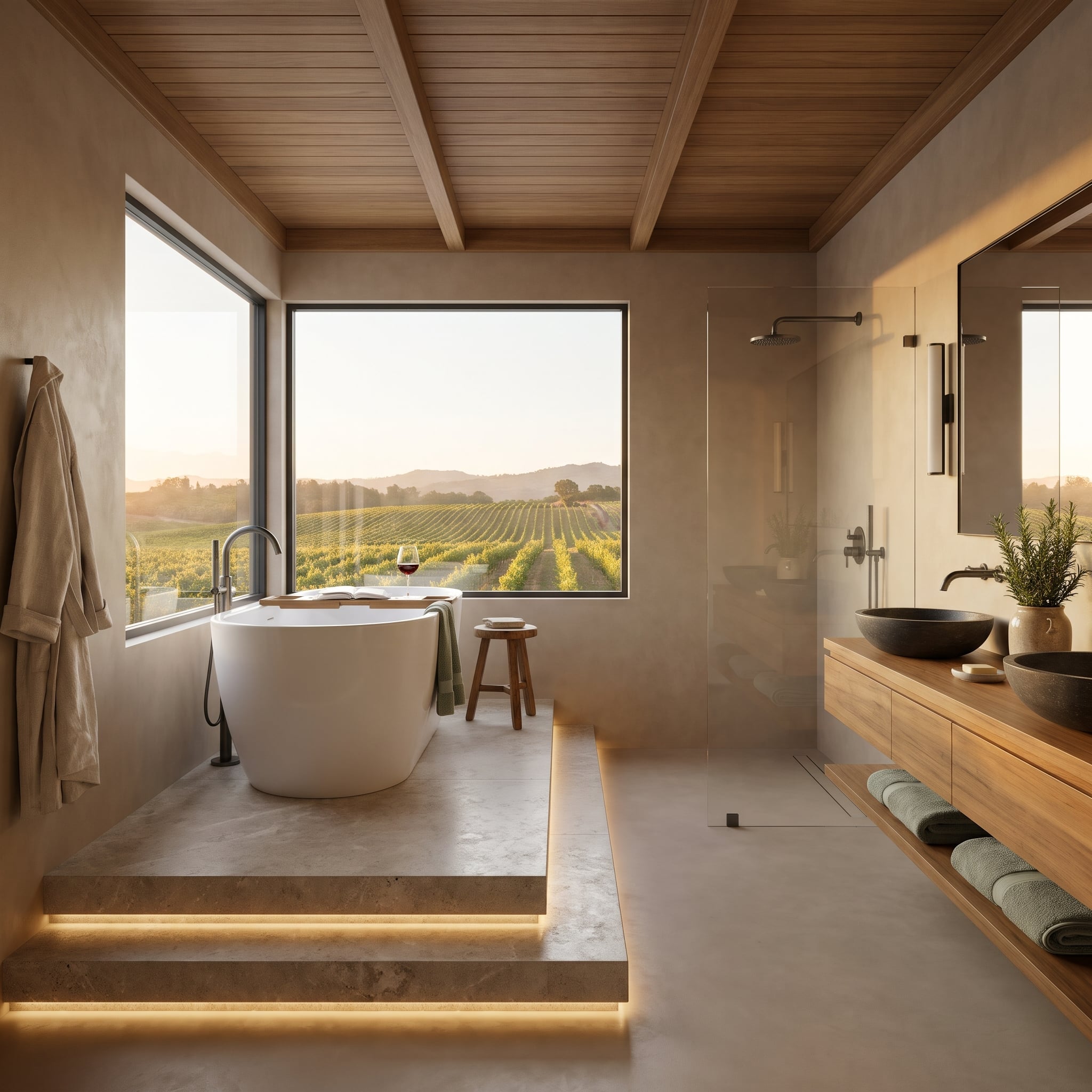
Two windows meet at the corner, and the tub sits on a raised stone platform where they join. The elevation changes the sightline, allowing the rows of vines outside to become the room’s dominant visual feature.
LED strips beneath the steps add another layer of spectacle, although the golden light entering through the windows already gives the plaster and stone plenty of atmosphere. Sage towels draw on the landscape more quietly, while gunmetal fixtures maintain a consistent finish.
The raised platform also deserves practical scrutiny. Wet steps introduce slipping and accessibility concerns, and a generous landing alone doesn’t eliminate them. Slip-resistant surfaces, safe access, appropriate lighting and the needs of the people using the bath should govern the design. The view may justify the tub’s position; it doesn’t excuse a hazardous route into the water.
6. A Curved Plaster Shower, a Square Marble Vanity, and Nothing to Prove
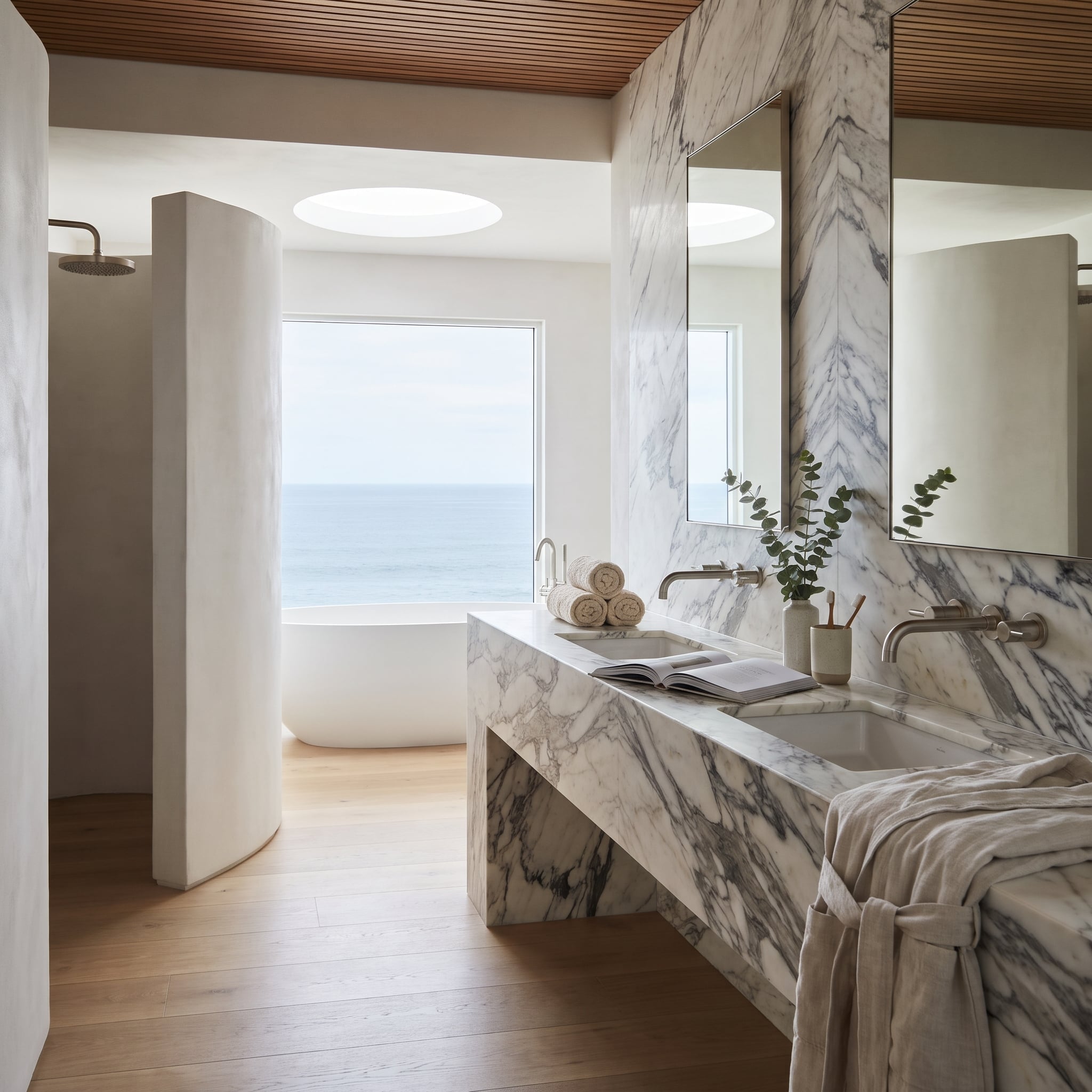
Plaster wraps the shower in one soft curve, while the marble vanity across from it remains a hard-edged block. The two forms have little in common geometrically, and that’s their strength. Neither attempts to mimic the other.
The contrast gives the room enough architectural interest without pulling attention from the ocean window. Stone supplies weight, plaster supplies softness, and the view provides the changing color and movement. Luxury doesn’t always require another feature. Sometimes it requires leaving a perfectly good wall alone.
5. Peacock Feathers in Glass Mosaic Make a More Lasting Impression Than Printed Paper
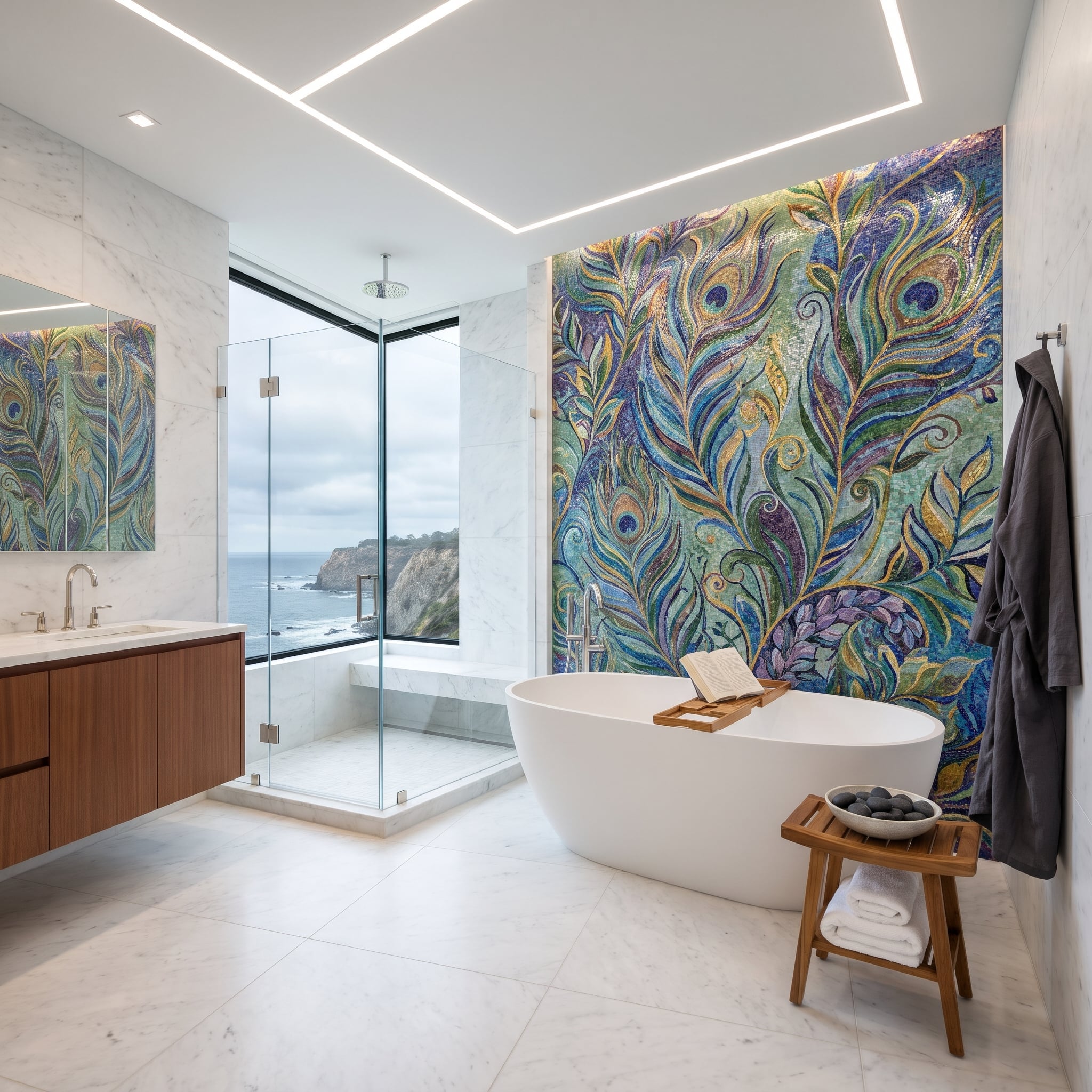
Peacock feathers are hardly a timid decorative choice. Here the motif appears in glass and gold tesserae, giving the wall texture and changing reflections that printed wallpaper couldn’t reproduce in quite the same way.
The mirror picks up the mosaic’s blues and greens, carrying the palette toward the vanity and connecting it with the gray-blue water visible beyond the shower. The design remains deliberately ornamental, but its strength lies in the depth of the glass, the precision of the pattern and the way the surrounding finishes accommodate it. Craftsmanship gives a bold motif staying power, even when tastes change.
4. Fewer Grout Lines, Not Less Responsibility: The Marble Slab Trade-Off
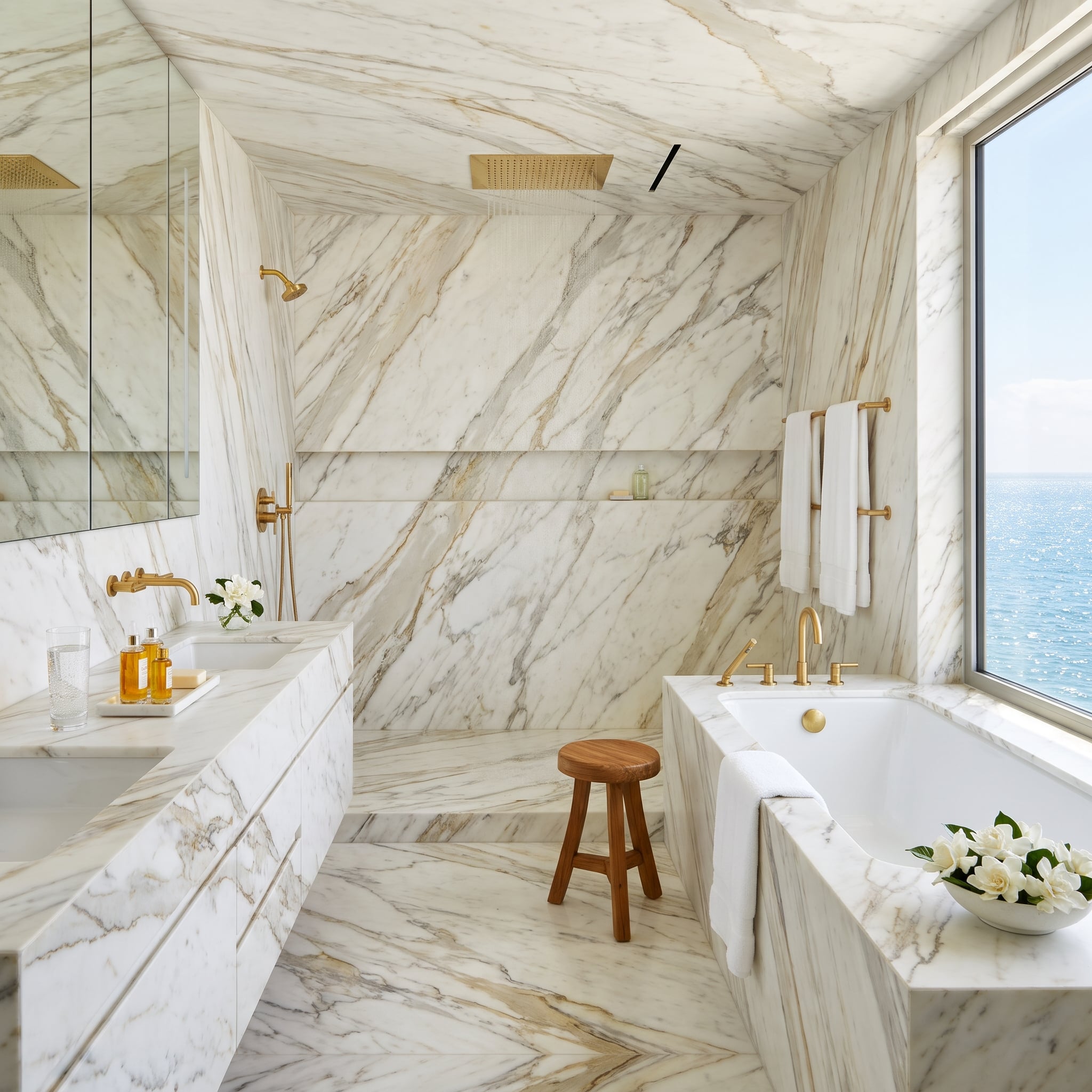
Large marble slabs wrap the walls, floor, ceiling and tub surround, reducing the number of grout joints and allowing the diagonal veining to travel across broad surfaces. The result is unusually calm for a room containing so much patterned stone.
Fewer joints mean less grout to clean, but marble still needs care. It can stain or etch, and installing slabs this large requires skilled preparation and handling. The visual simplicity comes from considerable technical precision.
Brushed brass stays largely with the fixtures and towel bar, while a recessed niche replaces the clutter of a hanging shower caddy. Broad stone planes, controlled veining and minimal hardware make an exceptionally demanding installation look almost effortless.
3. An Olive Tree Under Glass Needs More Than a Beautiful Skylight
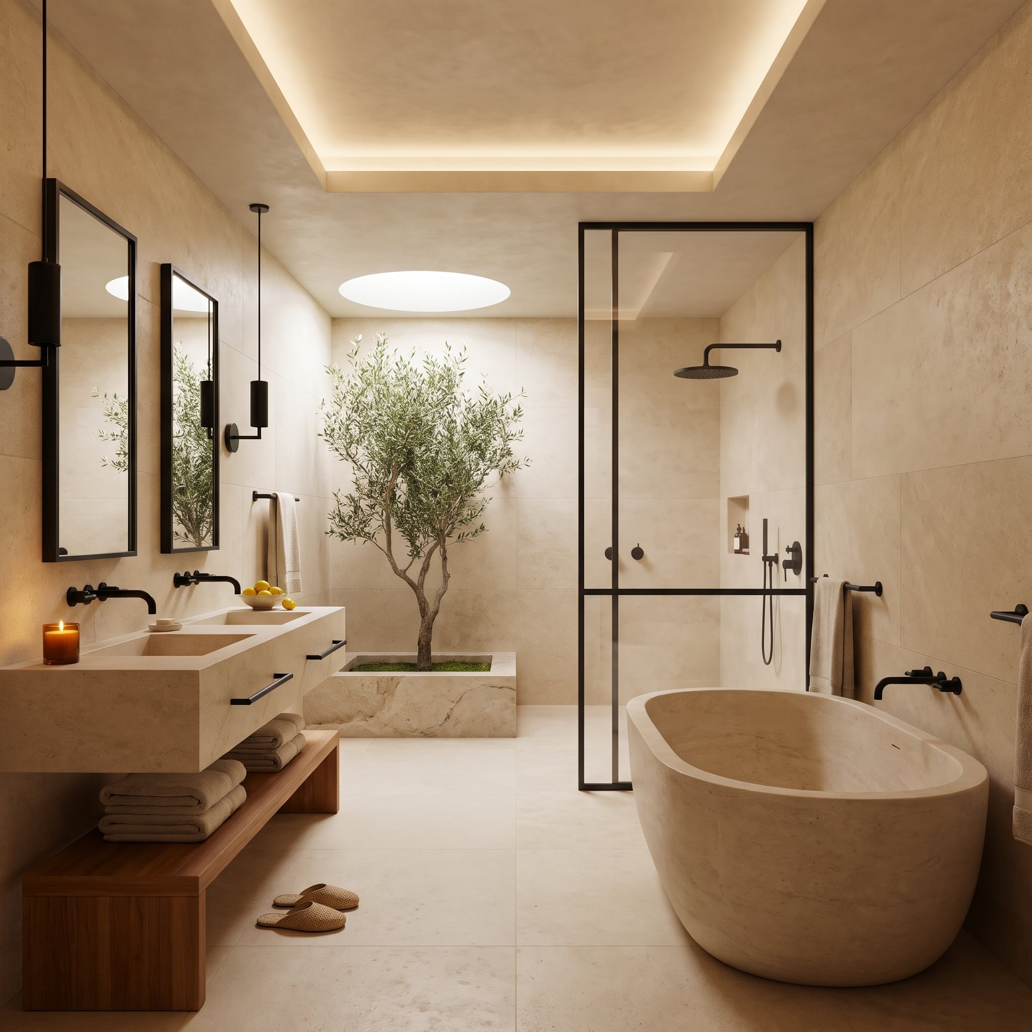
An olive tree rises from a substantial limestone planter directly beneath a round skylight. The pairing is architectural rather than decorative: a solid stone base anchors the trunk, while the circular opening draws the eye upward through the foliage. Pale stone flooring and restrained finishes give the tree the prominence usually reserved for an extravagant bathtub.
Keeping that tree alive is the less glamorous part of the composition. Olives need adequate direct light, drainage, suitable soil and appropriate growing conditions. A skylight may contribute valuable daylight without necessarily providing enough for long-term health. The design’s success depends as much on what happens beneath the limestone planter as on the beautiful opening overhead.
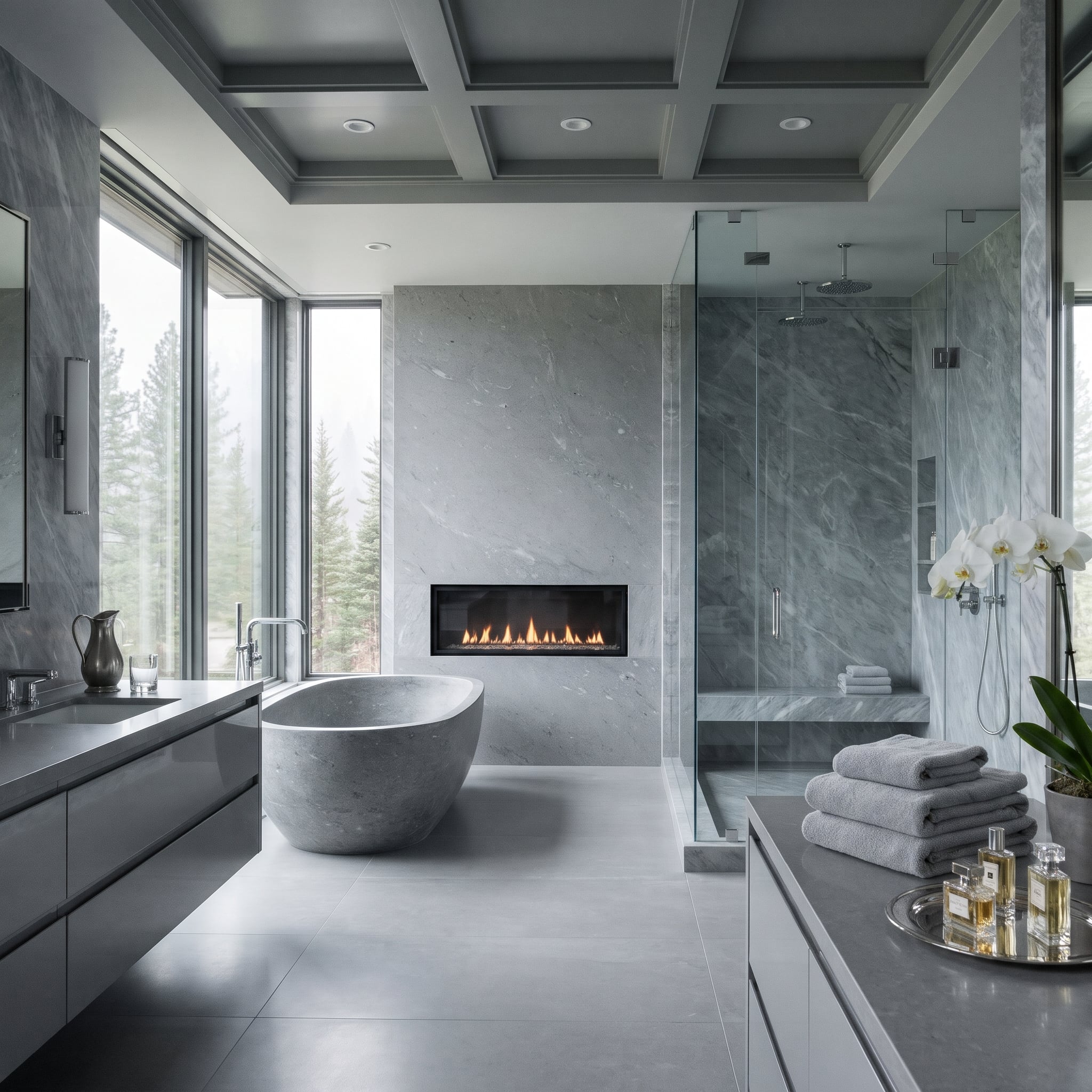
2. The All-Gray Bathroom That Knows When to Change Texture
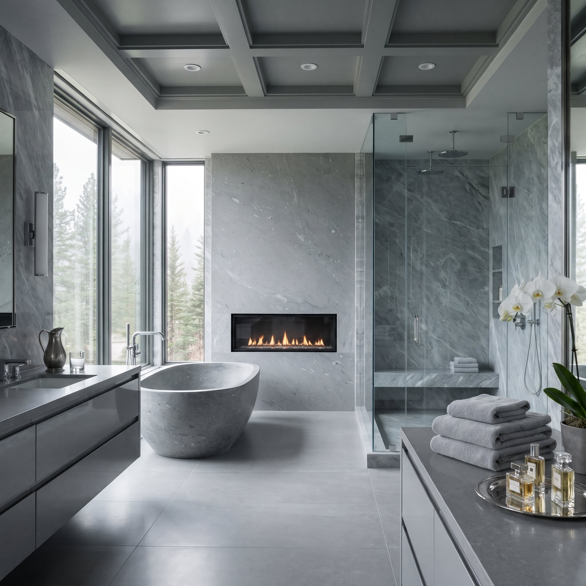
Nearly every surface here is gray, which should make the room feel cold and anonymous. Instead, the carved stone tub introduces a sculptural texture, the veined shower slab supplies movement, and a low linear flame brings warmth to the composition. Beyond the glass, mist-softened pines add a final layer of depth.
Nothing depends on a fashionable accent color or an elaborate decorative motif. The materials distinguish themselves through texture, finish and proportion. One color carries several different characters: the roughness of carved stone, the fluidity of marble veining, the soft movement of mist and the warmth of fire. Gray has rarely had so much to say.
1. The Ice-Blue Glow That Makes Copper and Greenery Look Cold
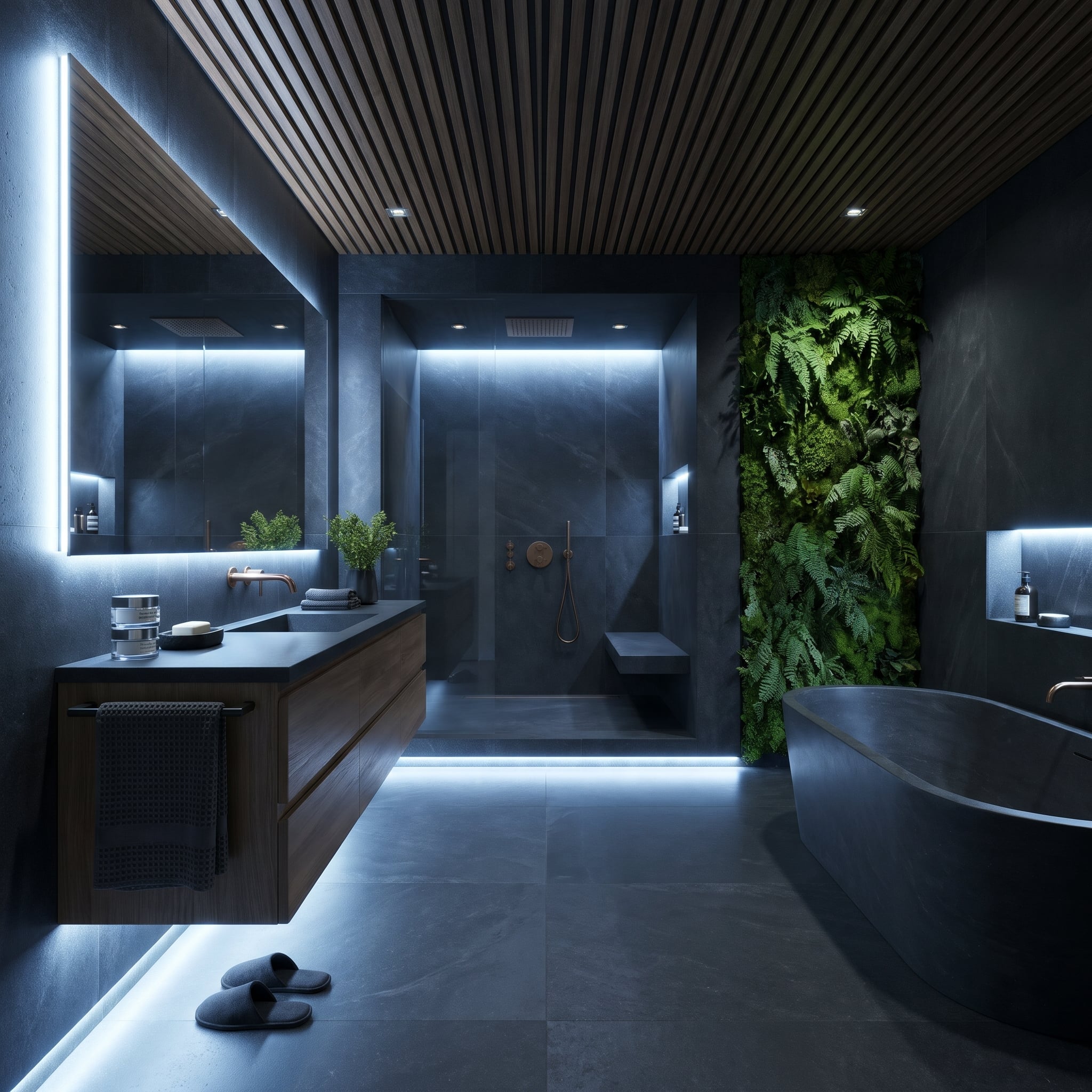
Copper fittings, a walnut slat ceiling and a full-height wall of ferns and moss all pull warm. Not the LED tape. It runs ice-blue under the floating vanity, behind the mirror, along the shower threshold and inside the bath niche, washing the slate-gray tile in a color that makes the whole place look like a nightclub restroom.
Large-format stone-look tile, a seated shower ledge and a floating vanity give the room architectural substance. Replace the blue illumination with warm white and the walnut grain regains its richness, the copper looks warmer and the greenery becomes the attraction rather than the lighting effect. The room has plenty of atmosphere without manufacturing a second one in neon.
Material Matters: Dark matte surfaces reflect less light than polished white ones, making the color temperature of artificial lighting especially influential. Test the lighting against the actual finishes before committing to concealed LED channels.
Our readers seem wary of blue accents too, giving images with them hearts 30% of the time, compared with 43% for the other images in the same articles.