🔥 Would you like to save this?
Some decorating rules survive because they’re useful. Others survive because nobody remembers who made them up. “Never put an area rug over wall-to-wall carpet” belongs suspiciously close to the second category. Somewhere along the way, layering textiles underfoot got confused with hiding a flooring mistake, and an entire generation of perfectly serviceable carpet was sentenced to go naked.
In order to come up with the very specific design ideas, we create most designs with the assistance of state-of-the-art AI interior design software. Also, assume links that take you off the site are affiliate links such as links to Amazon. this means we may earn a commission if you buy something.
The better question isn’t whether a rug belongs over carpet. It’s what the second layer is doing there. A rug can impose geometry on an anonymous floor, connect cognac leather to dark broadloom, pull an office together around a desk, give a dining table architectural weight or send the eye decisively down a carpeted entry. Done badly, yes, it can bunch, float or look like a bath mat that escaped the bathroom. Done deliberately, the carpet becomes part of the composition rather than the thing you’re trying to conceal.
That distinction matters more than the old prohibition ever did. These 38 rooms use pile, scale, color, border, shape, contrast and placement in completely different ways. Some rugs whisper over the carpet. Others practically seize control of the architecture. All of them prove the same larger point: wall-to-wall can be the ground, not the verdict.
38. A Vintage Rug Giving Builder-Grade Carpet Instant Character
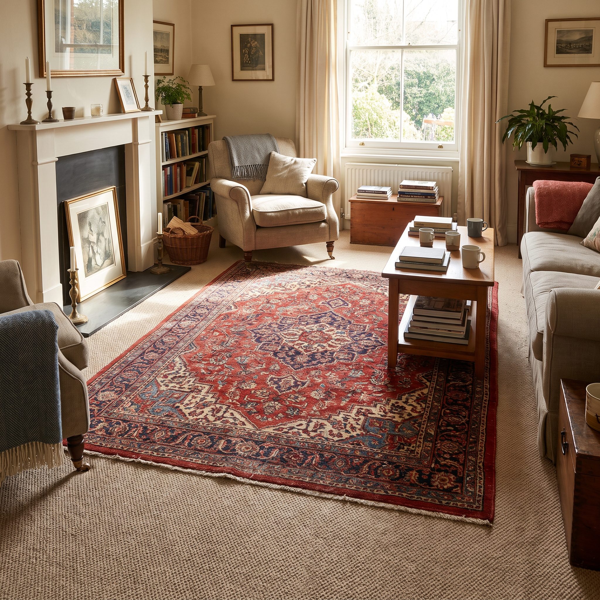
Picture the color: greige. Source Gray and beige became extraordinarily useful neutrals because they could sit behind almost anything without demanding attention. That lack of drama is precisely the opportunity.
Lay a worn Persian Heriz over it—faded rust, indigo, softened edges, the visual evidence of an actual life—and the floor develops a hierarchy. The carpet becomes the field. The rug becomes the thing worth looking at.
Replacing a houseful of decent carpet simply because the color is unremarkable can be an expensive way to solve an aesthetic problem. A vintage Persian area rug lets you concentrate pattern and history exactly where the room needs them.
37. A Bold Geometric Rug Over Neutral Wall-to-Wall Carpet
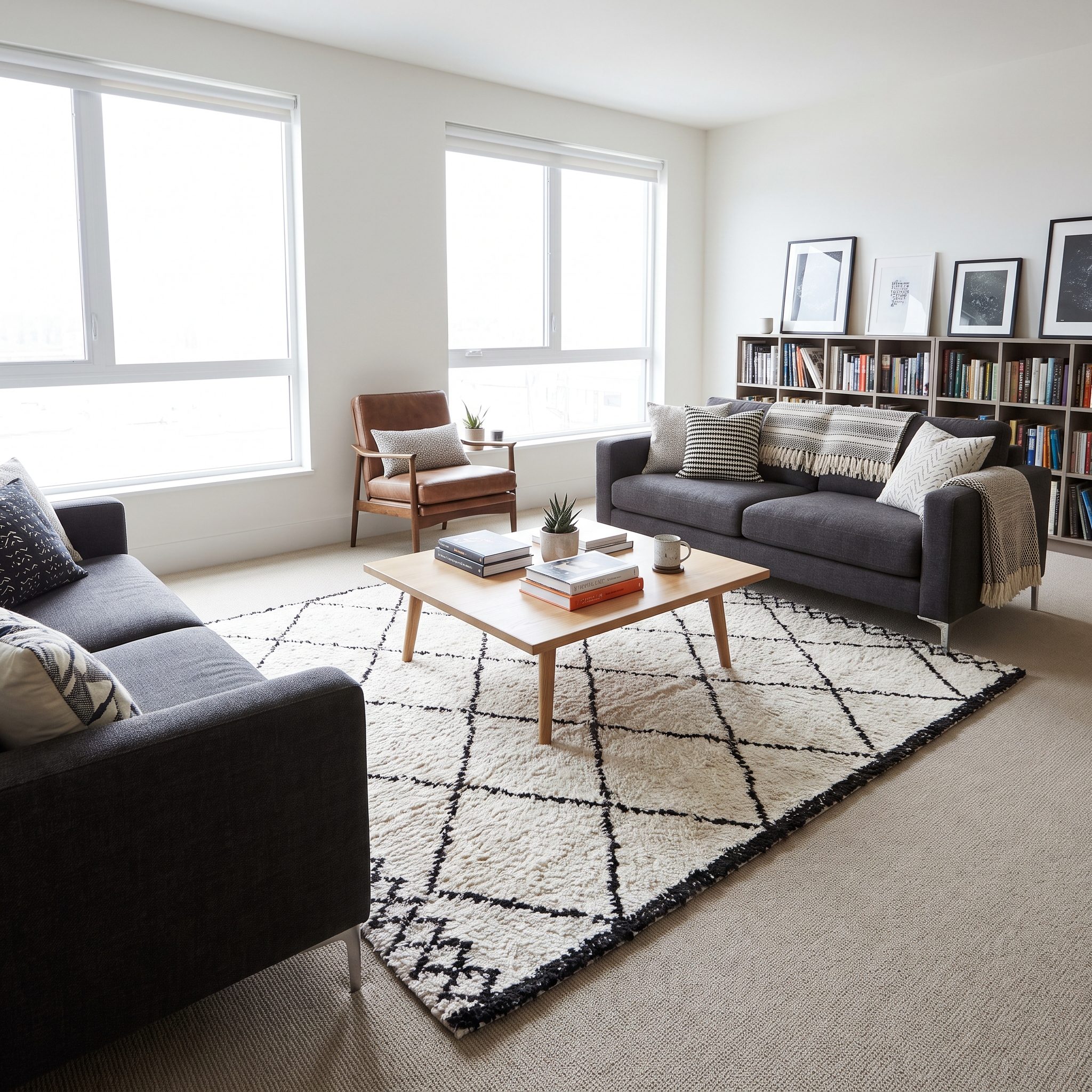
Now take the opposite route. Oatmeal-colored broadloom, almost aggressively polite, gets a black-and-white geometric flatweave dropped into its center. The room suddenly has punctuation.
Chairish discusses the usefulness of pairing stronger rugs with quieter surroundings, and Layla Grayce makes the same broader point about balancing patterns rather than letting every layer compete.
Let one pattern lead. The floor doesn’t need two soloists.
A solid carpet gives you considerable freedom on top. One designer guide similarly notes that solid-color carpet can support a bolder area rug.
Leave enough carpet visible around the rug for its geometry to register as an object rather than another attempt at wall-to-wall coverage. The exact border can vary with the room; consistency matters more than a magic number.
36. An Irregular-Shaped Rug Breaking Up a Wall-to-Wall Sea of Carpet
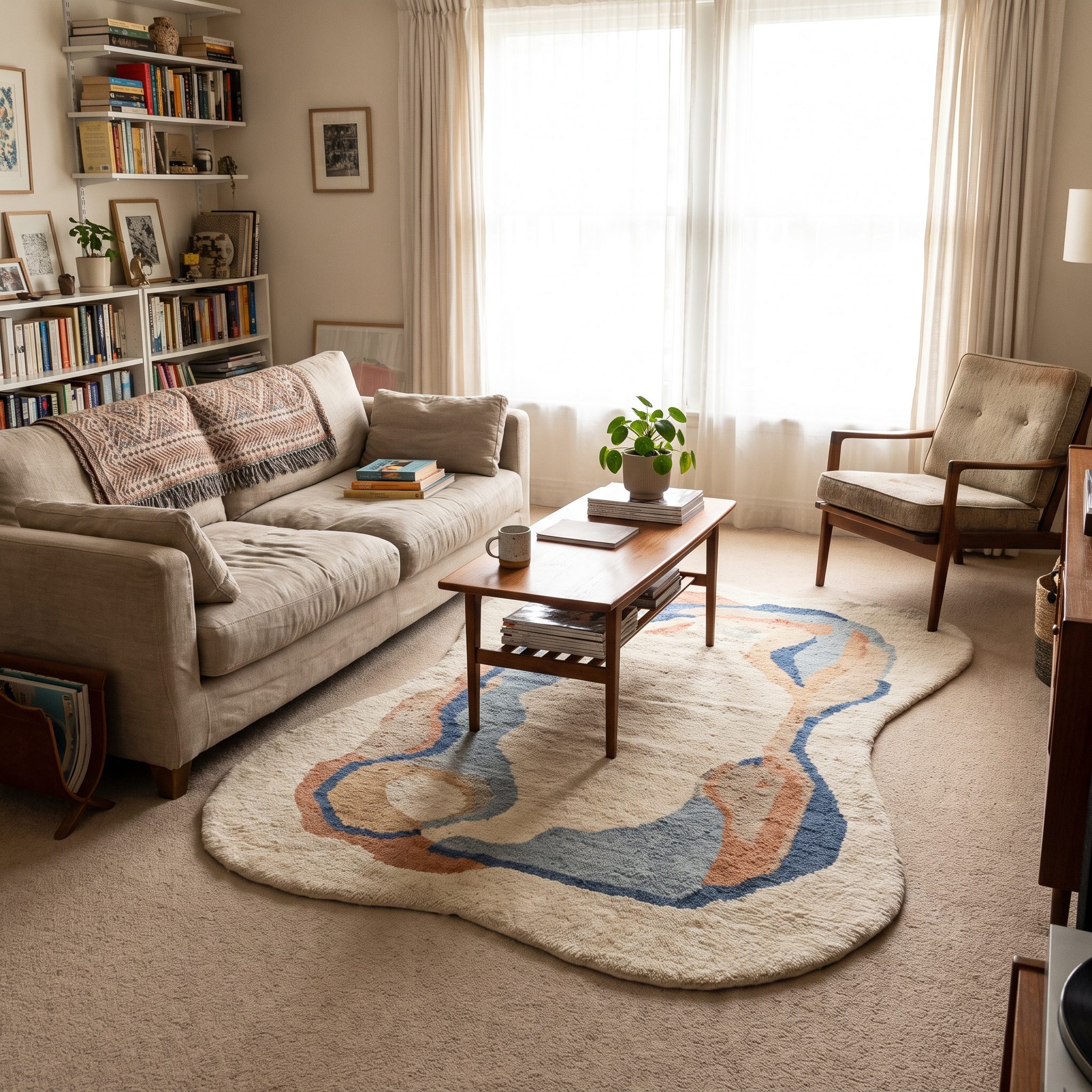
Beige wall-to-wall can become visual white noise: soft, continuous and almost impossible to locate inside the room. That’s exactly why an irregular rug has so much power over it.
A cowhide, round jute, kidney-shaped shag or antique Oushak with wandering edges interrupts the rectangular logic of the room immediately. A conventional rectangle can absolutely work over carpet—the rest of this gallery proves it—but an organic outline makes the decision impossible to miss.
Anchor part of the shape beneath a chair or sofa so it belongs to the furniture rather than floating independently. Low-pile carpet underneath also helps reduce movement and bunching around an irregular edge.
You’re not disguising the carpet. You’re putting an island in the sea.
35. A Natural-Fiber Rug Bringing Structure to a Plush Room
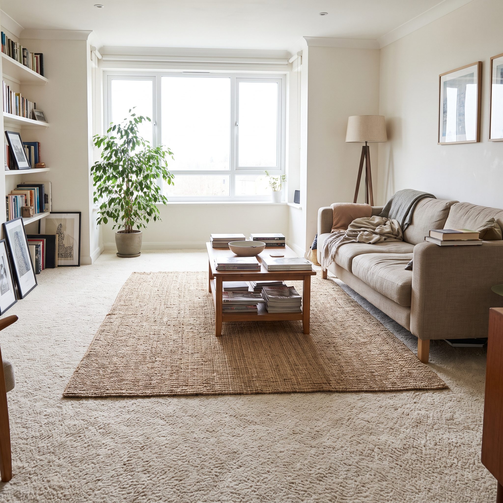
Soft over soft can turn into visual mush. That’s where jute or sisal earns its keep.
Sisal comes from the leaves of Agave sisalana; jute is a bast fiber harvested from plant stems, with major production centered in Bangladesh and India. Woven into rugs, both bring a dry, visible grain that pushes against the smoothness of plush carpet.
A low-profile natural jute rug under the coffee table gives a conversation area a footprint without adding another cloud of pile. Suddenly there’s a line for the furniture to stand on.
Add a slim leather or cotton binding if the raw edge feels too rustic for your preppy basement design. One tailored edge can change the entire attitude of the material.
34. A Warm Vintage Rug Bridging Dark Carpet and Cognac Leather
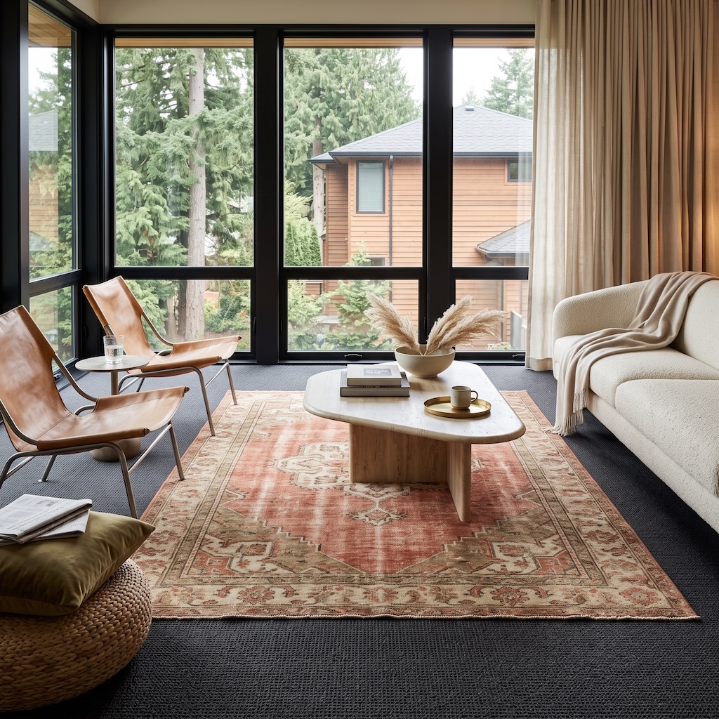
This room doesn’t need the rug to define where the seating goes. The architecture and furniture already handle that. What it needs is a translator.
The wall-to-wall carpet is nearly charcoal. The sling chairs are warm cognac leather. The sofa is cream and softly textured. Put those three finishes together without an intermediary and they can feel like separate conversations. The rug pulls them into the same room with faded coral, dusty rust, beige and muted cream.
That is the sophisticated version of color matching: don’t duplicate the chair color exactly. Find a rug that carries a softened relative of it, then let the dark carpet provide the contrast underneath. The worn pattern also brings a little age and looseness into a room otherwise defined by crisp black window frames and very clean modern furniture.
33. A Rug Connecting the Carpet to the Room’s Furniture and Artwork
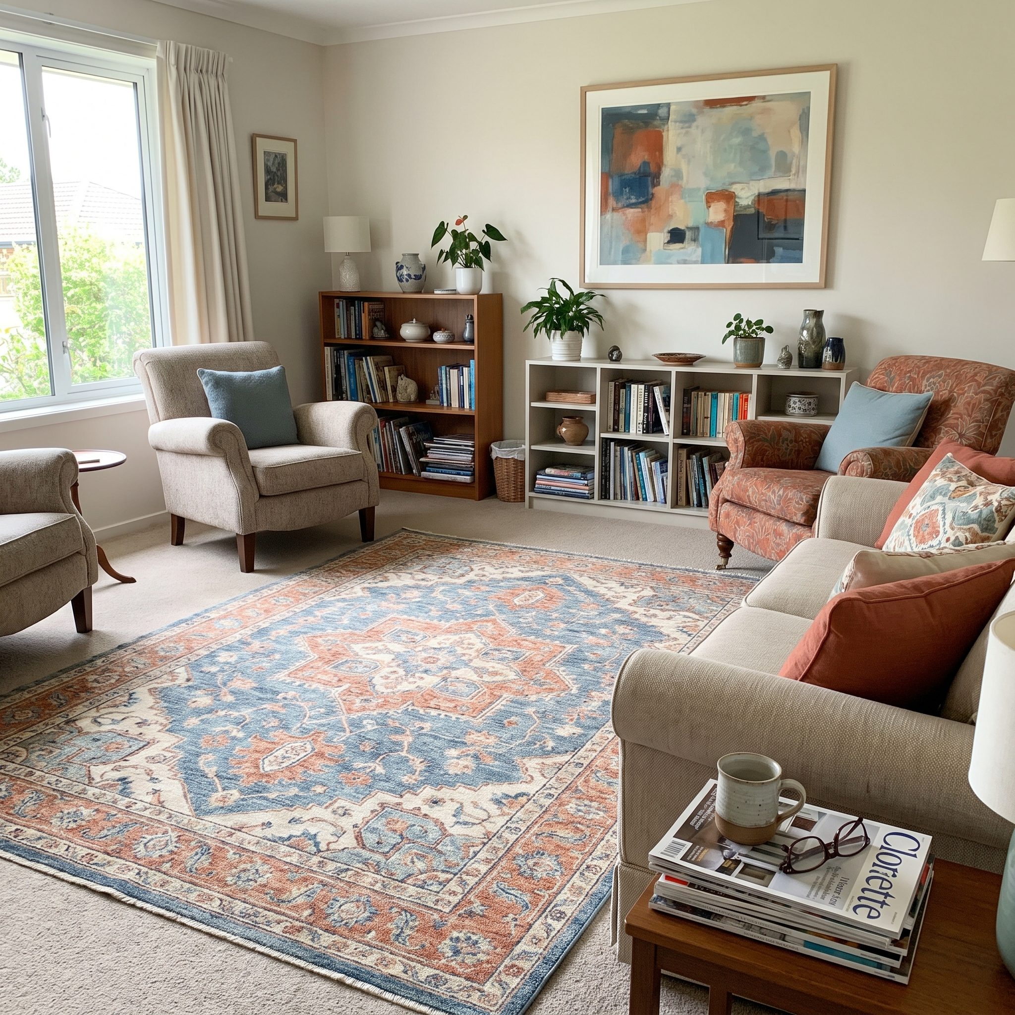
Now the rug gets a different job entirely: connector.
Put a rust-and-cream kilim on the floor, a navy sofa opposite it and an abstract above the fireplace carrying that same rust. Suddenly the rug isn’t merely decorating the carpet. It’s closing the circuit between floor, furniture and wall.
Pick one color from the artwork and let it recur in the rug. That’s enough. You don’t need every pillow, vase and lampshade joining the chorus.
A layered rug is a bridge, not a bandage. It links what’s on the wall to what’s on the floor.
Try a low-pile rust kilim rug with one abstract framed art print sharing its warmest tone. The same idea works in a gray entryway design, where a runner can pull color down from a gallery wall.
32. A Tonal Rug Creating Subtle Layers Without Fighting the Carpet
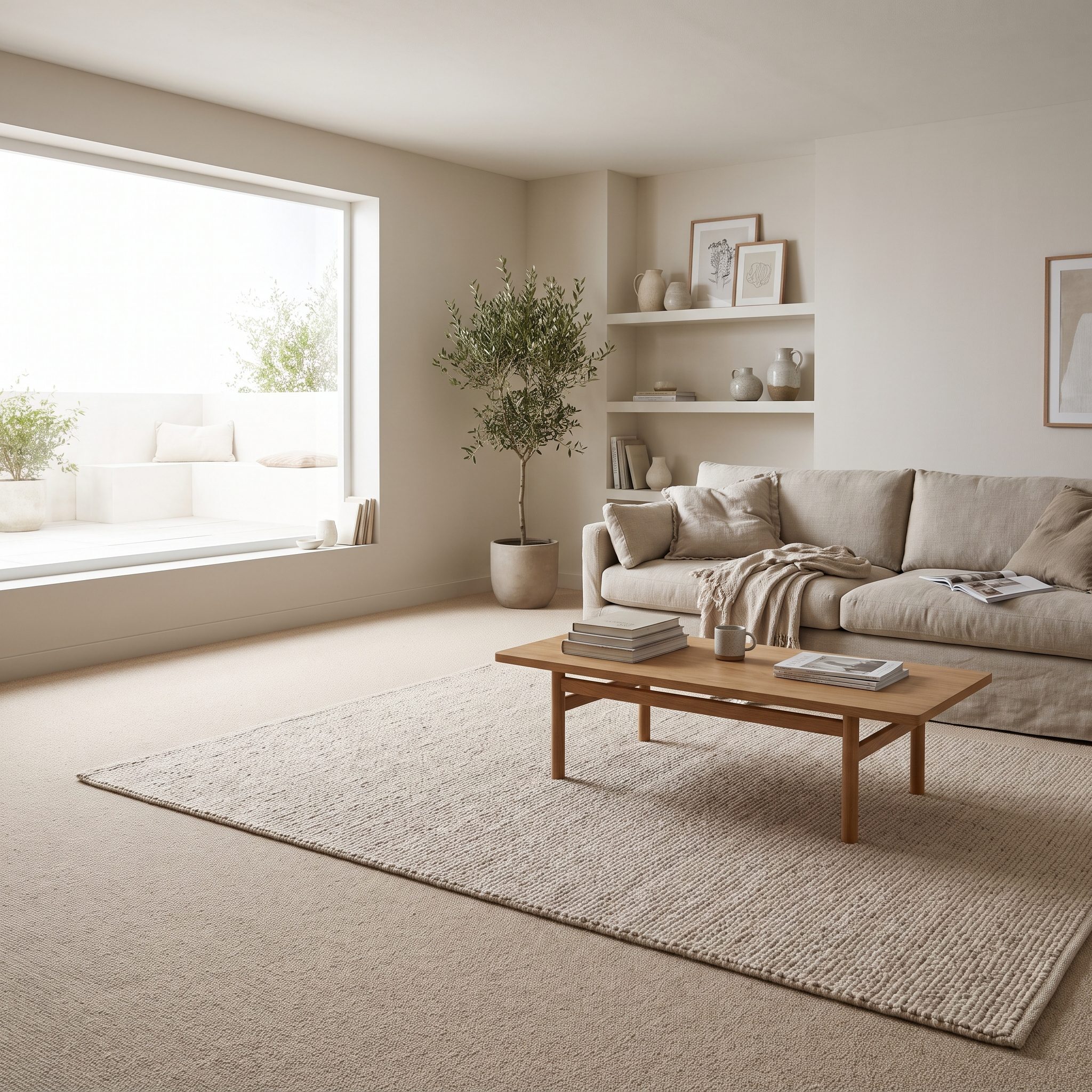
This is the version nobody photographs with fireworks going off behind it. Put a rug one or two shades away from the carpet and let texture, not color, announce the layer.
Oatmeal carpet. Warm ivory wool. A narrow charcoal border. The palette barely moves, but the surface does. That edge is enough to tell the room where the rug begins without turning the floor into a competition.
A ivory wool rug over sand-colored carpet works because the two surfaces cooperate rather than match perfectly. The rug gets definition; the carpet gets depth.
31. A Dark Rug Grounding a Room With Pale Carpet
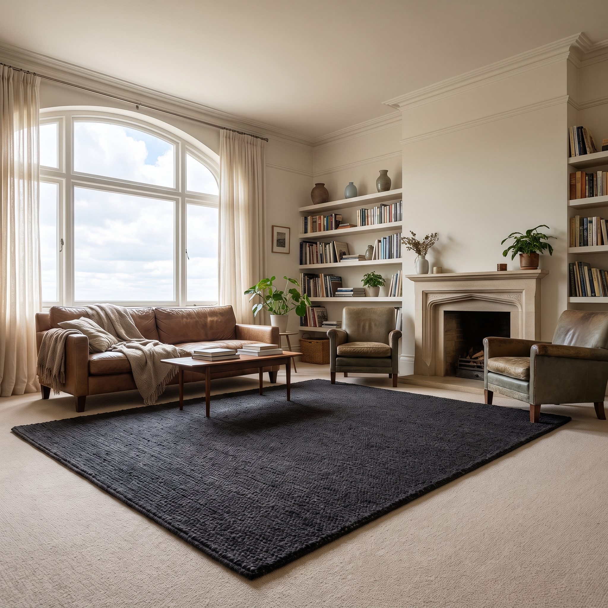
Pale carpet can make an entire room feel as though it’s hovering. Beige sofa, oatmeal floor, cream walls: lovely ingredients, no bottom.
A charcoal or deep indigo rug adds visual weight exactly where the room needs it. Painters have always understood the usefulness of darker values near the base of a composition; interiors can benefit from the same balance.
Keep the top rug relatively low pile and large enough for the sofa and chairs to catch its edge. A charcoal wool rug or indigo flatweave rug doesn’t necessarily make a pale room feel smaller. It can simply give the furniture somewhere to land.
30. A Light Rug Freshening Up Dark Wall-to-Wall Carpet
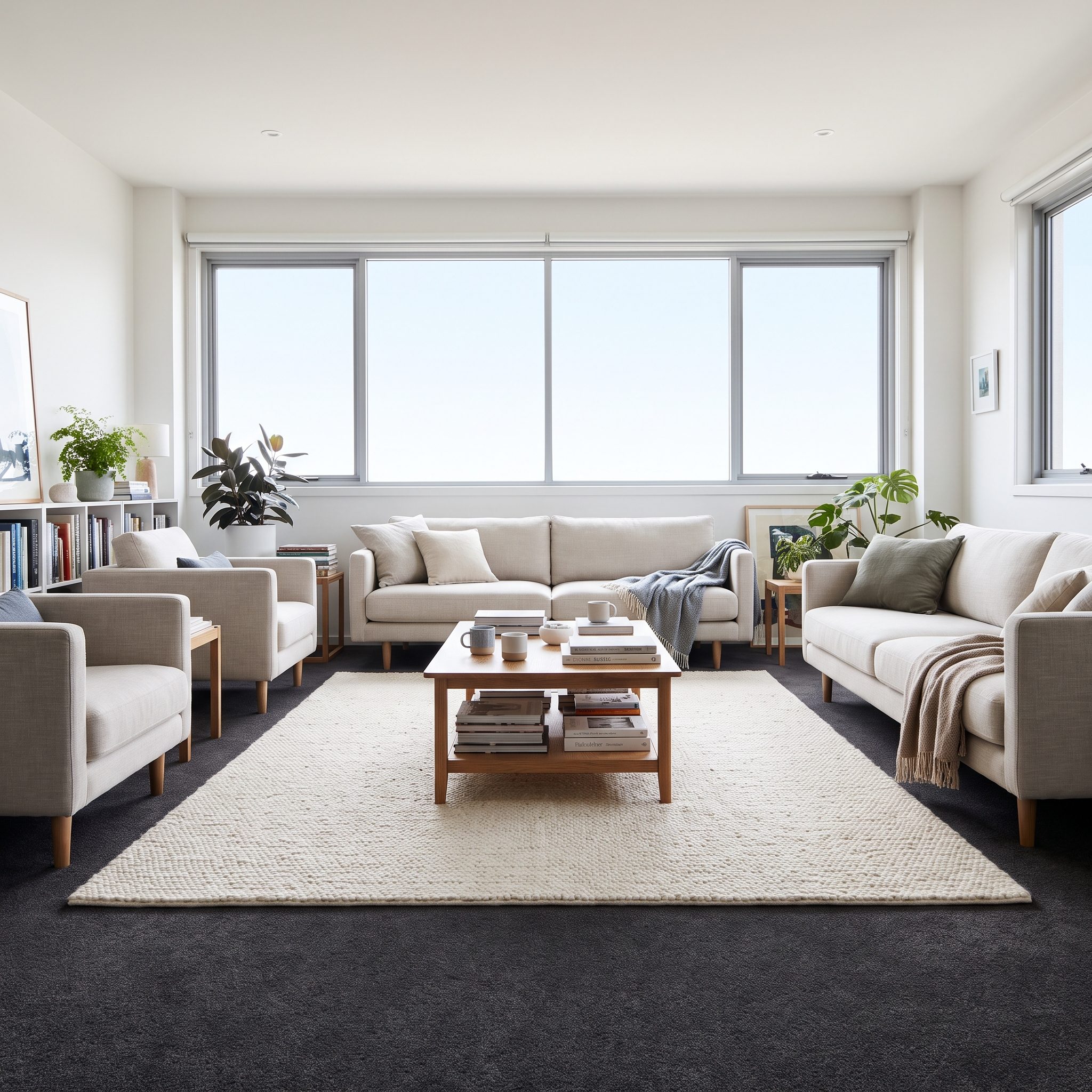
The reverse can be just as effective. Dark charcoal or espresso carpet swallows visual light; an ivory rug creates a pale island in the middle of it.
Go substantial enough that the light surface belongs to the furniture grouping. A 9-by-12 in bone, ivory or greige can change the balance of a room far more convincingly than a little pale rug floating by itself.
A pale-and-charcoal colorful rug can also bridge the two layers if you want the contrast softened. A chunky ivory jute rug brings the same lift with a more casual texture.
29. A Textured Wool Rug Making Basic Carpet Look More Luxurious
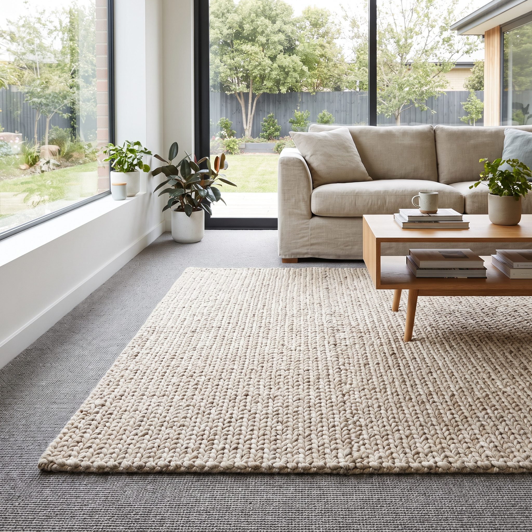
Sometimes the missing ingredient isn’t color at all. It’s material presence.
A high-low wool rug introduces shadow, irregularity and a more tactile surface over uniform carpet. Wool, nylon and polyester each take dye and reflect light differently depending on construction and finish, so the contrast between a dimensional wool rug and flatter broadloom can be striking without pretending one fiber is inherently beautiful and the other inherently cheap.
An ivory wool shag rug can make a neutral living room feel materially richer, but keep the base carpet relatively low and stable. Plush over plush is where layering becomes harder to control.
28. A Large Rug Anchoring an Entire Living-Room Conversation Area
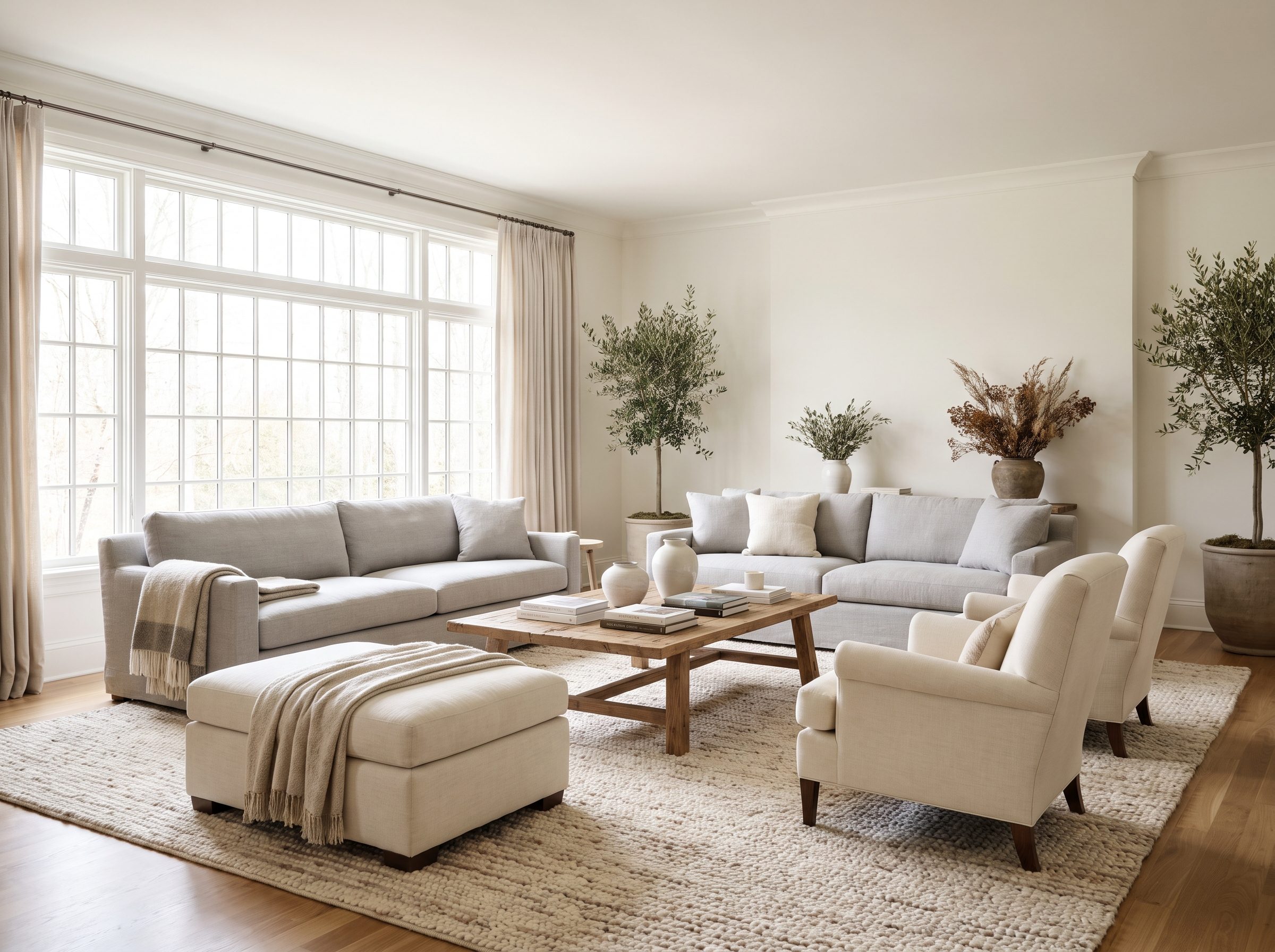
Forget color for a moment. This one is about scale.
A large rug under the front legs of the sofa and flanking chairs creates a common platform for the entire conversation group. Wall-to-wall carpet may cover the room, but the rug tells you which part of that room belongs to the people sitting together.
Go one size larger than the little rectangle that merely fits beneath the coffee table. Rugs often feel smaller after the furniture returns to the room, and a generous 9-by-12 can make a seating arrangement feel far more settled than a 5-by-7 stranded in its center.
27. A Graphic Dining Rug Giving Pale Carpet a Harder Edge
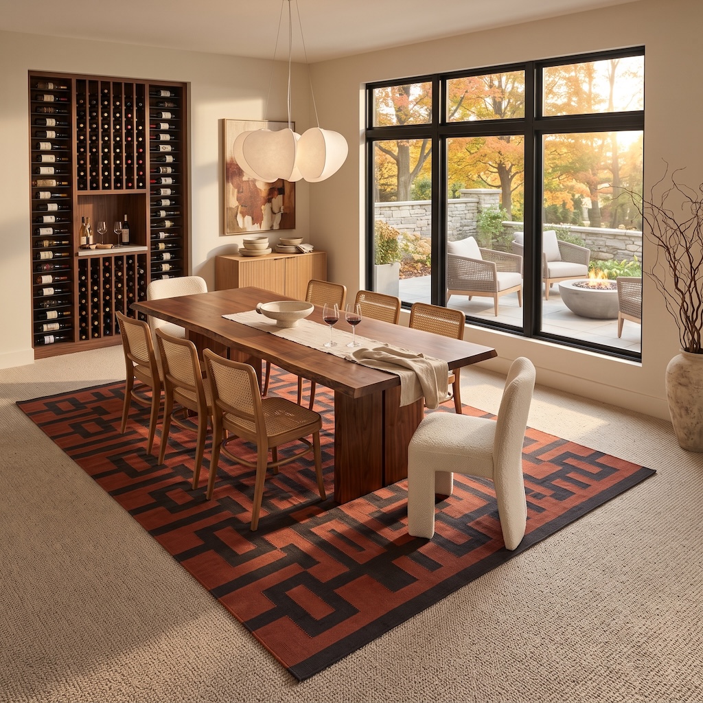
A dining table this substantial doesn’t need help looking important. What it needs is a floor with enough backbone to keep up.
The rust-and-black geometry does something a quiet jute rug wouldn’t: it echoes the strong lines of the walnut table and cane-backed chairs, then introduces an angular pattern beneath all those warm natural materials. Pale wall-to-wall carpet remains visible around the perimeter, but suddenly it feels like negative space rather than unfinished business.
The rug is also large enough for the dining arrangement to read as a single composition. That matters more than whether the top layer technically matches the carpet.
26. A Rug Turning an Empty Corner Into a Reading Nook
🔥 Would you like to save this?
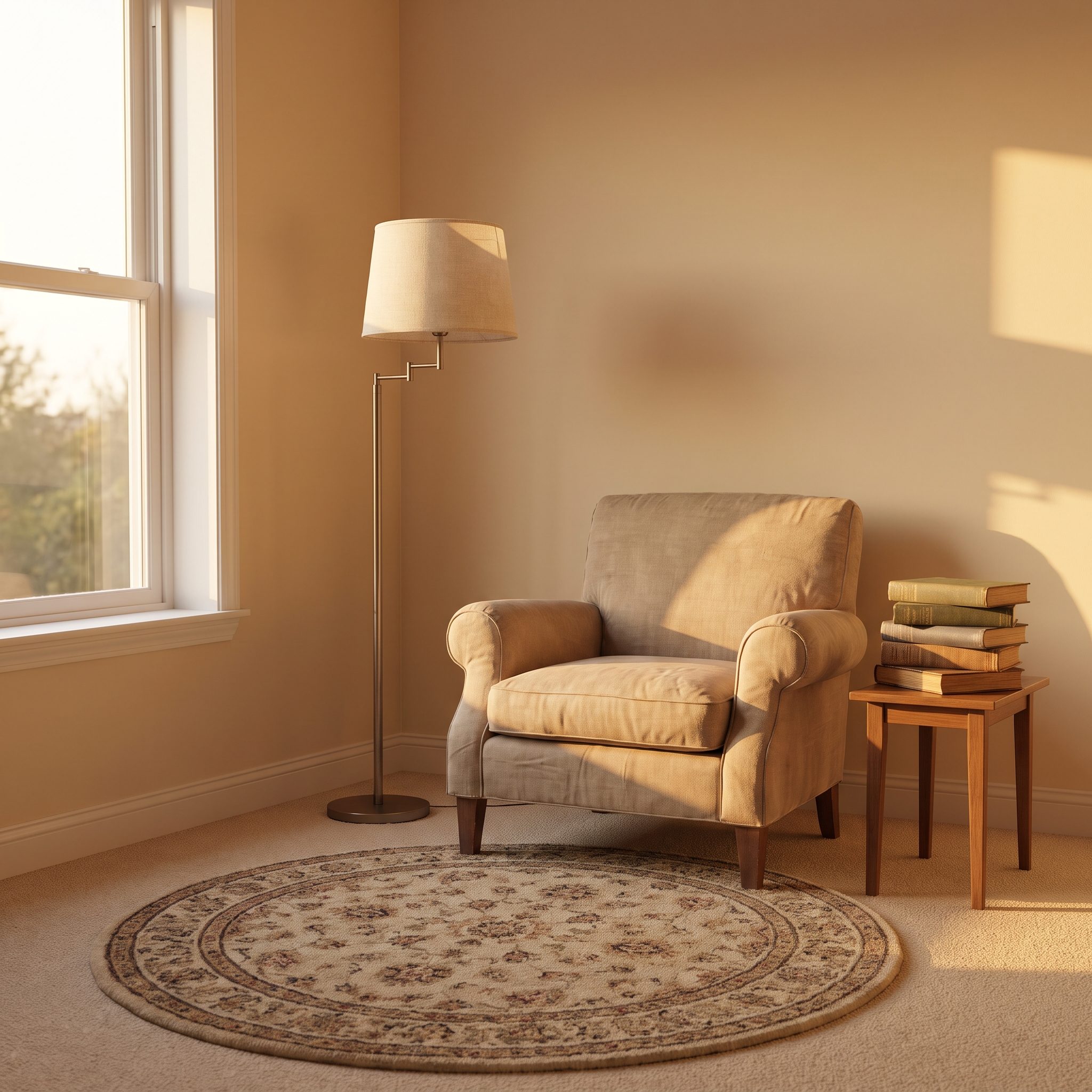
Every house has a corner where a chair looks lonely no matter how expensive the chair is.
A 4-by-6 rug changes the scale of the problem. Put the chair, lamp and perhaps a small table partly on it and the corner gains a perimeter. That edge does something furniture alone can’t: it declares that this little patch of floor has a purpose.
The same principle appears in a narrow attic design, where one deliberate zone can make an awkward leftover space feel intimate rather than abandoned.
A rattan wingback chair and slim brass floor lamp give the rug something substantial to organize around.
25. A Rug Defining the Living Area in an Open-Plan Carpeted Room
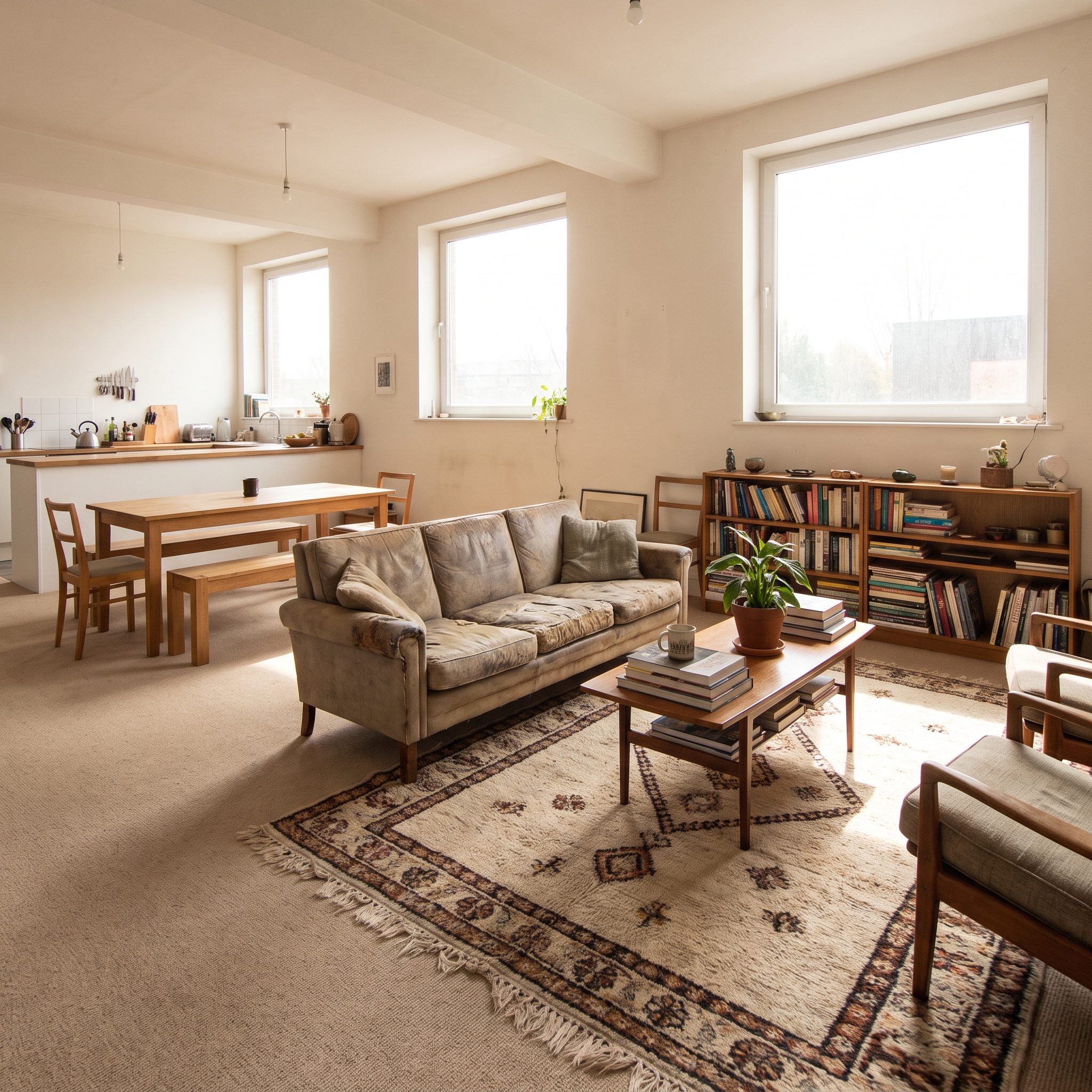
Open-plan carpet gives you continuity whether you want it or not. Living area, dining zone, mystery patch beside the window—all one uninterrupted field.
An 8-by-10 rug beneath the sofa and chairs draws a line the architecture never supplied. The dining table across the room can remain on the broadloom and suddenly the two functions make visual sense without a partition.
Use a low, stable rug over lower-pile carpet and the layering can sit remarkably close to the base floor. A charcoal charcoal wool rug over oatmeal carpet makes the boundary unmistakable.
24. A Persian Rug Turning a Carpeted Office Into a Proper Library
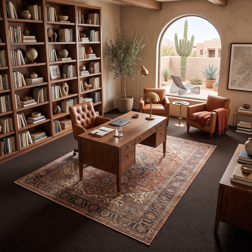
This office doesn’t need a rug to tell you where work happens. The desk has already made that announcement. The rug’s job is more atmospheric—and arguably more interesting.
The dark broadloom disappears beneath the faded rust, sand and blue of the Persian-style rug, which immediately connects the walnut bookshelves, cognac leather chairs and brass lighting. Suddenly the desk isn’t merely furniture placed in a room. It occupies a layered center with enough history and color to hold its own against an entire wall of books.
That’s one of the overlooked advantages of rug-over-carpet: the base layer can absorb visual noise while the rug carries the more specific decorative language.
23. A Rug Defining a Home-Office Zone Within a Larger Room
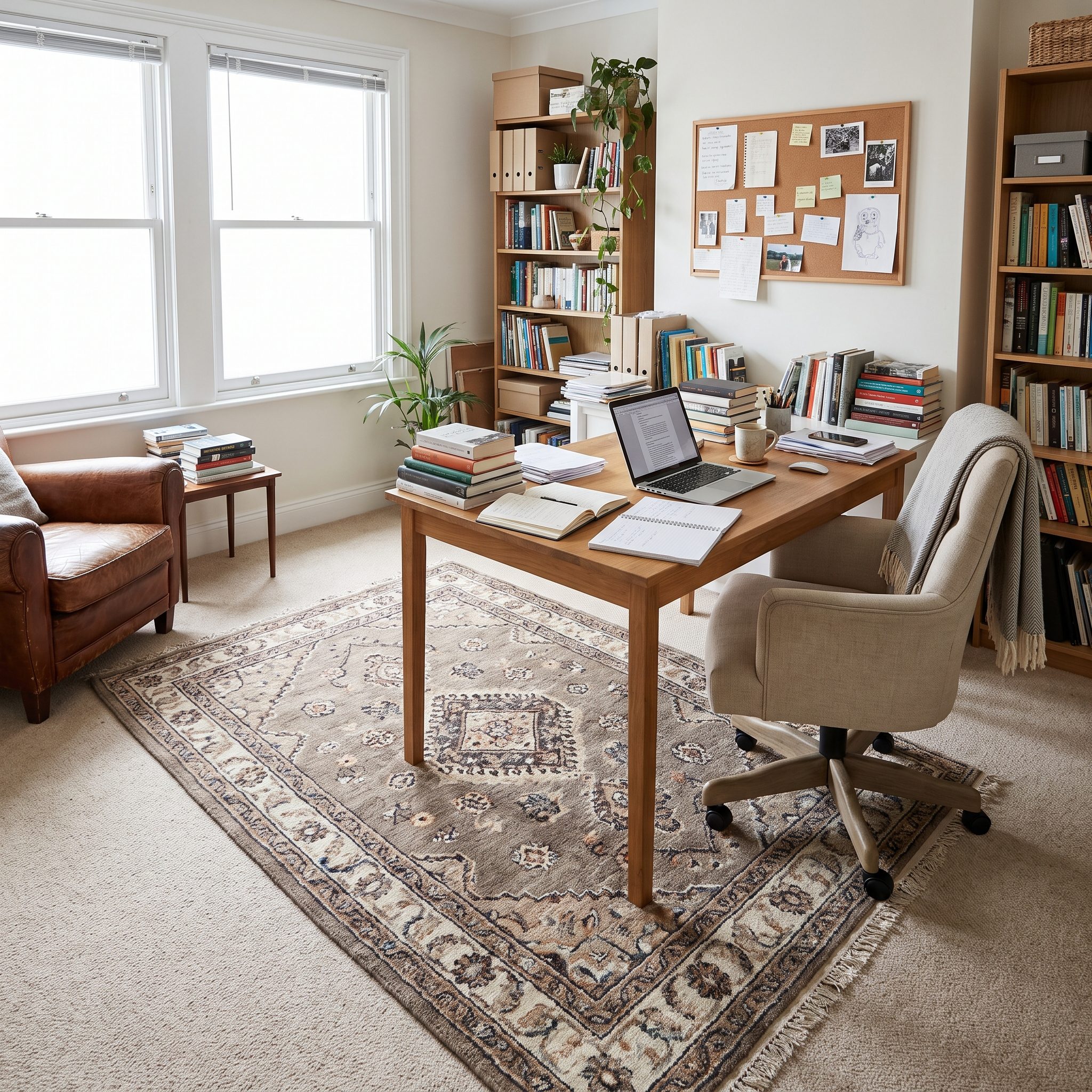
The improvised home office taught a lot of rooms a hard lesson: a desk shoved into the corner does not automatically create a workspace.
A flatweave under the desk gives that corner an architectural edge without building anything. Pull the rug far enough behind the chair that all casters remain on it through a normal range of movement; nothing destroys the illusion faster than rolling on and off the edge all day.
Skip deep shag where a rolling chair has to work. A flat sisal or colorful rug keeps the surface visually separate without becoming an obstacle. The same layered-textile instinct appears in this grandmillennial office design.
22. A Playroom Rug Creating a Visual Zone for Toys
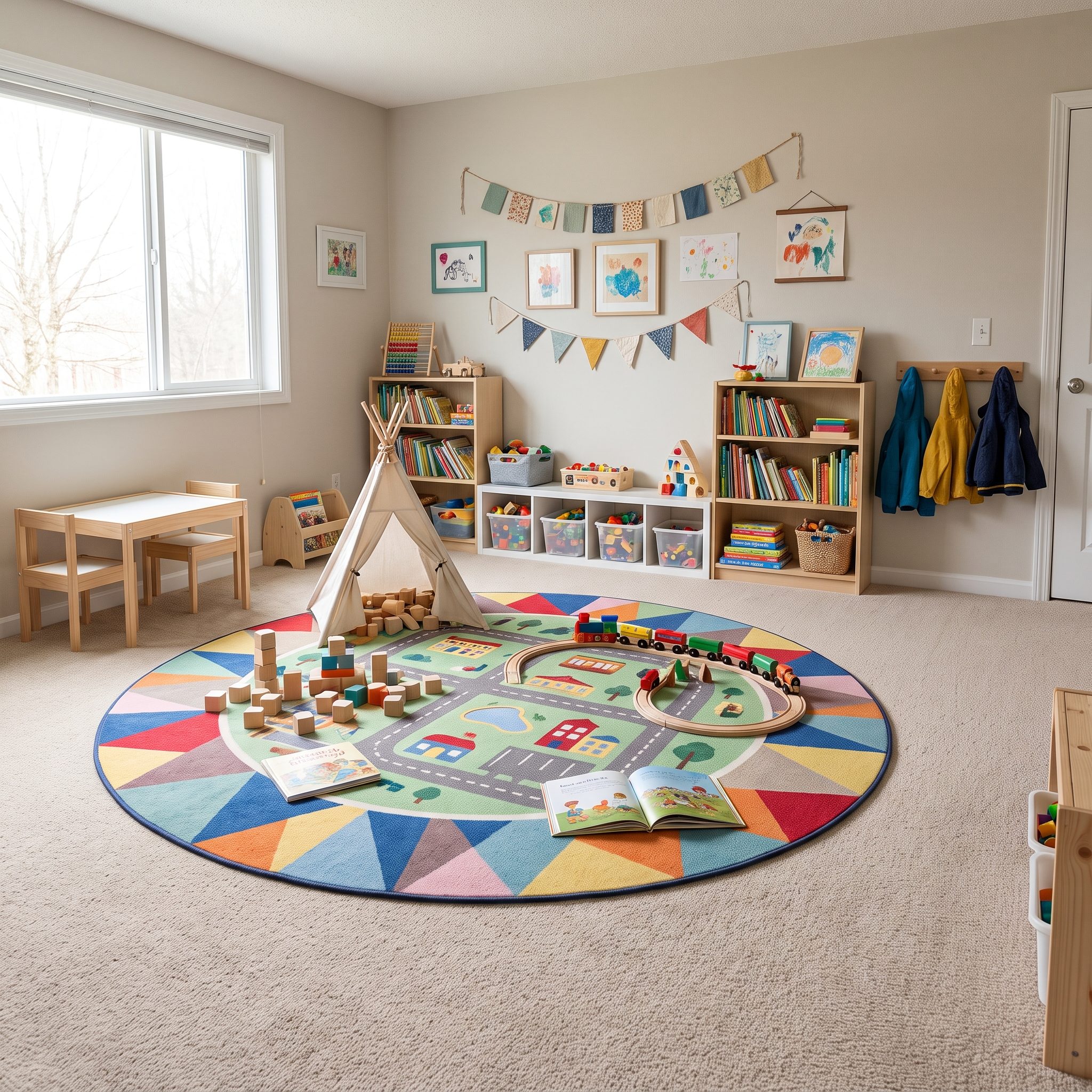
In a playroom, the argument becomes almost comically practical. Drop a washable 5-by-7 rug into a broad carpeted room and suddenly the train tracks, blocks and dinosaurs have an address.
A flat-woven cotton rug creates a visible play boundary without changing the entire floor. Pattern is useful here too: it tolerates the visual chaos of toys far better than another five square feet of uninterrupted beige.
Choose a washable design when practical, but remember that washable does not mean waterproof. Liquid can still reach the carpet beneath depending on the rug and backing.
21. A Nursery Rug Bringing Pattern to Practical Wall-to-Wall Carpet
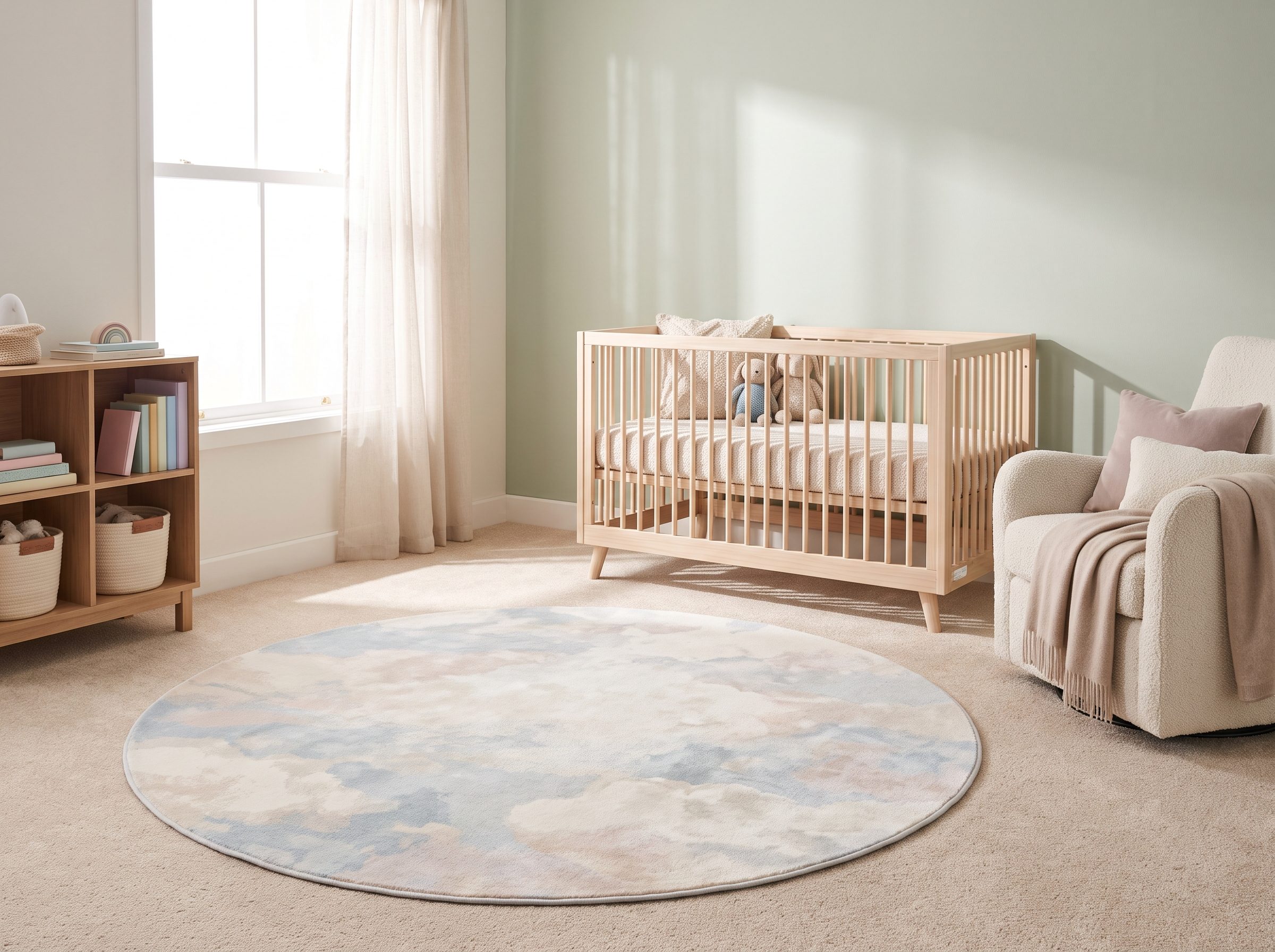
Neutral carpet in a nursery isn’t necessarily a design failure. It can be the quiet ground underneath the part you actually want to notice.
A scalloped cotton rug or hand-drawn animal print puts pattern down at floor level, where so much of early childhood happens. A pink scalloped nursery rug can define the play area without asking the installed carpet to become charming overnight.
If washability matters, check the manufacturer’s care instructions and your washer’s capacity rather than assuming a large cotton rug belongs in a home machine. Bigger rugs can become extremely heavy when wet.
20. A Cowhide Rug Breaking the Boxiness of a Carpeted Bedroom
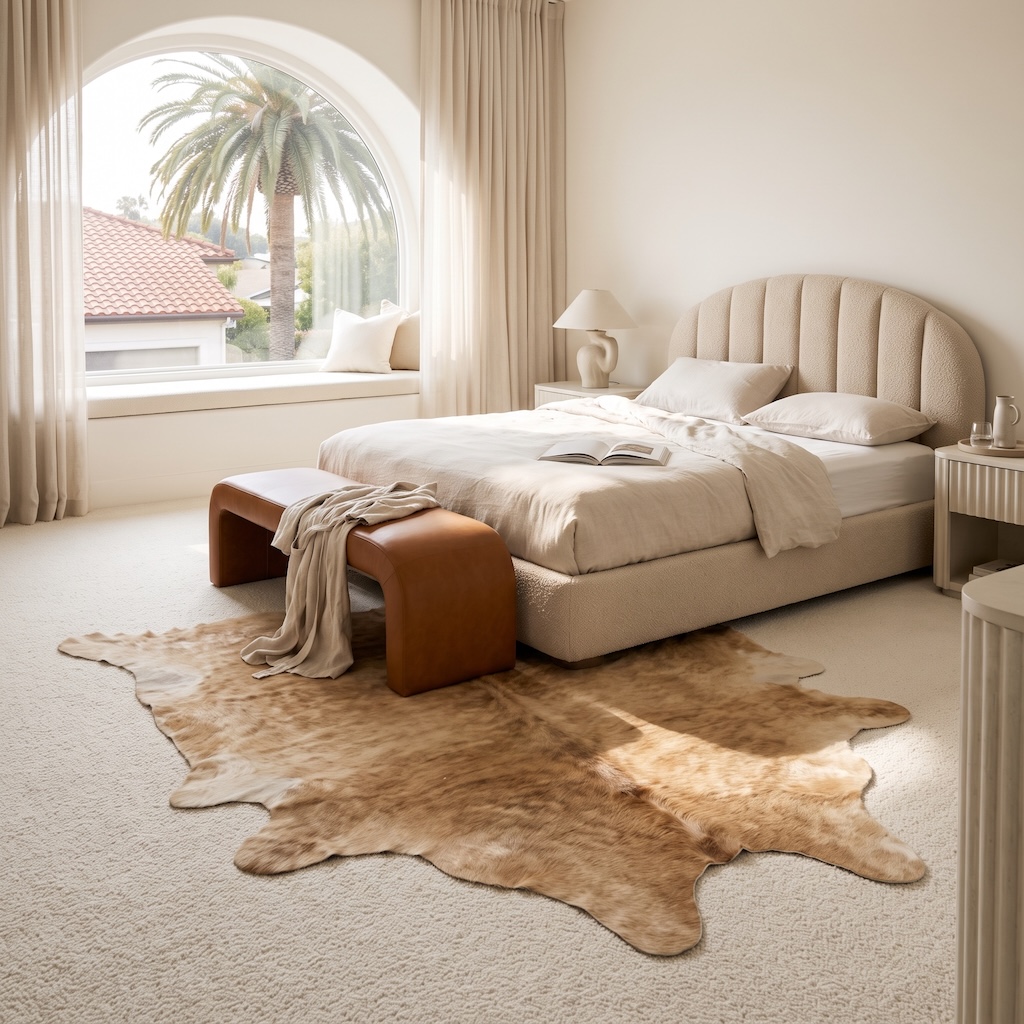
Everything in this bedroom wants to be a rectangle. Bed. Bench. Nightstands. Window ledge. Even the vertical channels of the headboard line up obediently behind the pillows.
Then the cowhide refuses to cooperate.
Its wandering edge introduces the one organic shape in the room, spreading across the pale carpet without trying to frame the bed symmetrically. Because the two floor layers are close in color, shape—not contrast—does nearly all the work.
That’s why this doesn’t feel like the living-room cowhide example repeated in another room. There the irregular rug creates an island. Here it loosens an otherwise rigorously controlled bedroom.
19. A Rug Under the Bed Making a Carpeted Bedroom Feel More Finished
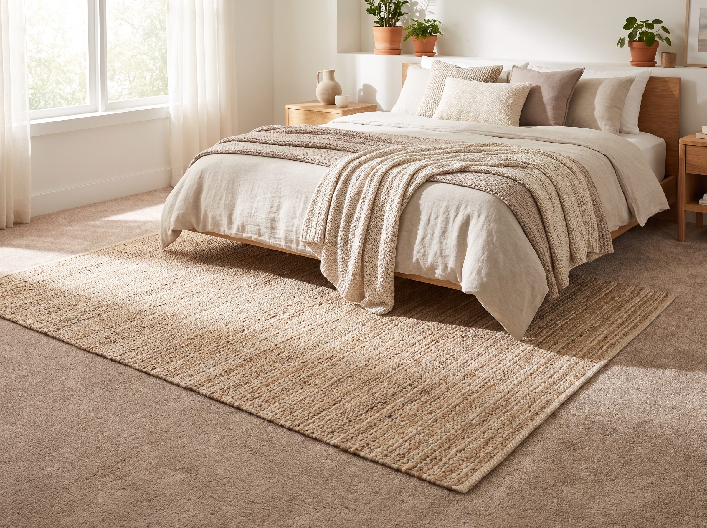
Wall-to-wall carpet gives a bedroom softness. A rug can give it composition.
Slide an 8-by-10 beneath a queen so a generous band remains visible at the sides and foot. Exact exposure depends on the bed, room and rug orientation; what matters is that enough rug remains visible to frame the furniture rather than disappearing beneath it.
A low-pile wool or flatweave is easier to manage over carpet than another thick plush layer. The bed supplies useful weight, but movement can still happen, so use an appropriate carpet-to-rug pad if the layers creep.
This trick is especially useful in a narrow attic design, where one patterned plane can establish the sleeping zone without another stick of furniture.
18. A Bedroom Rug Pulling Wood, Leather and Blue Into One Palette
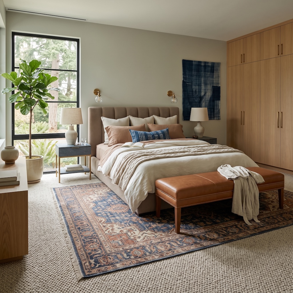
This one isn’t about where the rug stops beneath the bed. It’s about everything the rug manages to collect on its way there.
Rust in the pattern answers the cognac leather bench. Deep blue picks up the textile art and accent pillow. The creamy field connects back to the pale wall-to-wall carpet and bedding, while all of it sits beneath warm oak cabinetry without trying to duplicate the wood.
That’s sophisticated palette building: the rug doesn’t match one thing. It contains enough fragments of the room that everything else begins looking related.
17. A Strategically Placed Rug Concealing Permanent Carpet Stains
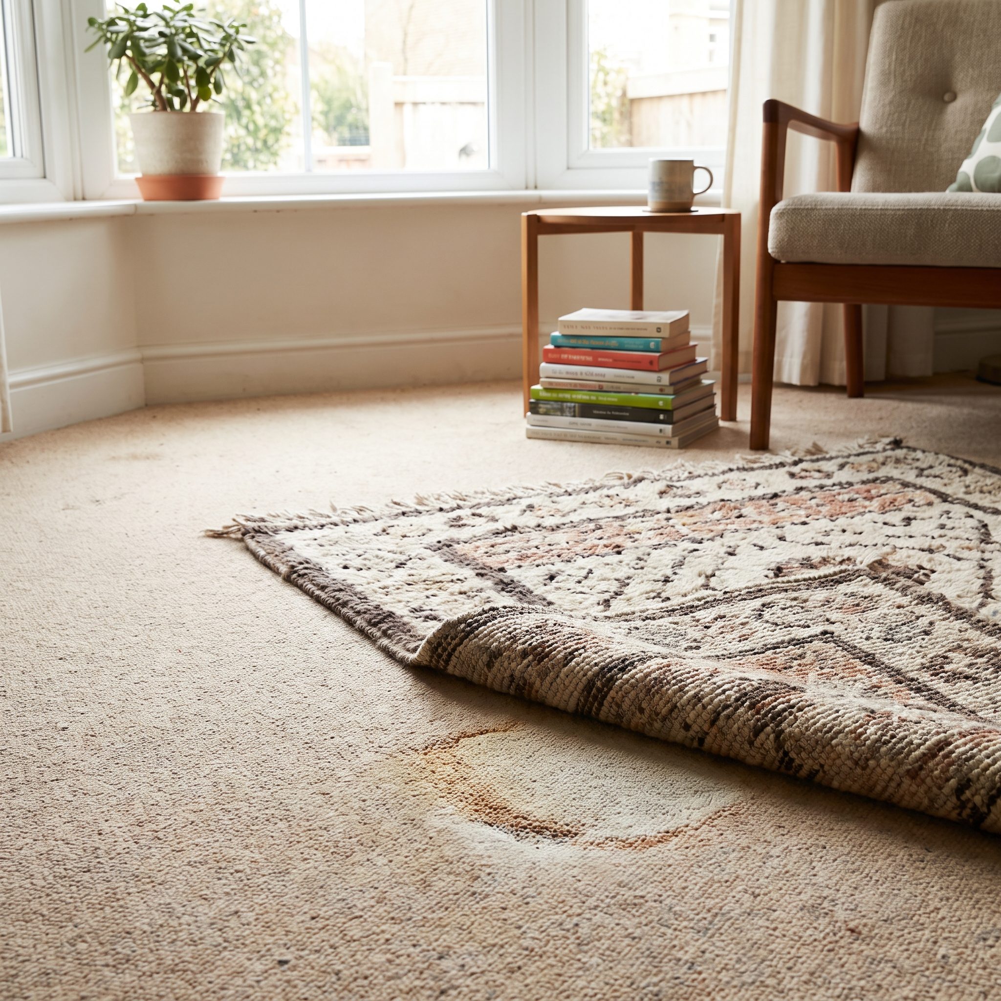
Not every layered rug begins with a design revelation. Sometimes there’s simply a stain.
A large rug can conceal permanent discoloration while also anchoring the seating arrangement, which is far better than floating a suspicious little rectangle over one bad spot. Let the furniture justify the rug’s position; the stain can disappear as a side benefit.
One caution matters more than aesthetics: never use a rug to hide an active leak, dampness or mildew. Trapping moisture beneath another textile can turn a cosmetic issue into a much more expensive flooring problem.
16. Matching Bedside Runners Layered Over Bedroom Carpet
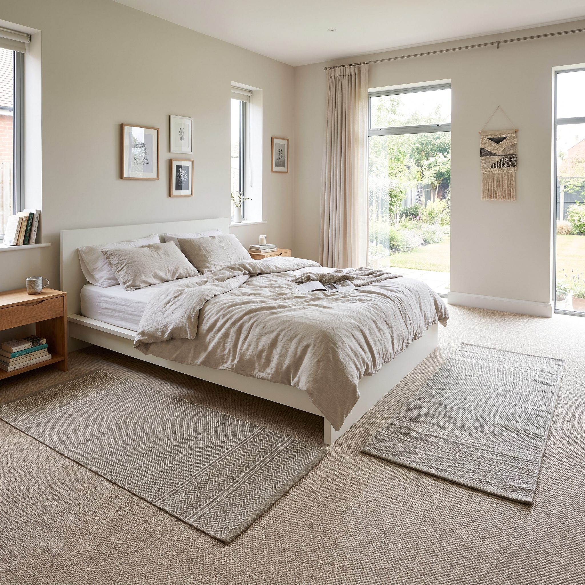
Don’t want to buy a rug large enough to disappear halfway beneath a bed? Use two skinny ones and make the repetition look deliberate.
Matching runners on either side of the mattress create symmetry while putting the interesting textile exactly where bare feet land. Run them roughly from the nightstand area toward or slightly beyond the foot of the bed so they feel related to the furniture rather than scattered beside it.
Vintage kilim, flatweave dhurrie, wool stripe—whatever you choose, let the pair actually be a pair. Add rug grippers suited to carpet if they shift.
15. A Rug Protecting the Most Heavily Used Part of New Carpet
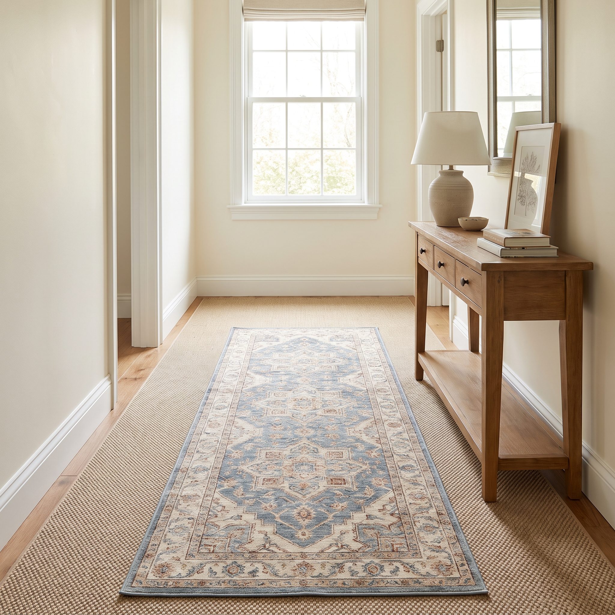
There’s a practical case for layering even when the carpet is brand new: traffic doesn’t distribute itself evenly.
Carpet warranties often distinguish actual fiber wear from changes in appearance such as matting or crushing, though the language varies by manufacturer and product. Source That’s why reading the specific warranty matters more than assuming a long wear period guarantees a pristine traffic lane. Source
A low-pile rug or runner over the path between doorway and sofa can take some of that concentrated traffic. Fiber resilience varies with construction and quality; polyester, nylon and wool all behave differently, so avoid treating any single fiber as universally good or bad. Source
Replacement-cost estimates vary enormously, but one published guide puts carpet installation in roughly the $3-to-$6-per-square-foot range and gives whole-house examples in the thousands. Source
14. A Statement Rug Giving a Primary Bedroom a Focal Point
🔥 Would you like to save this?
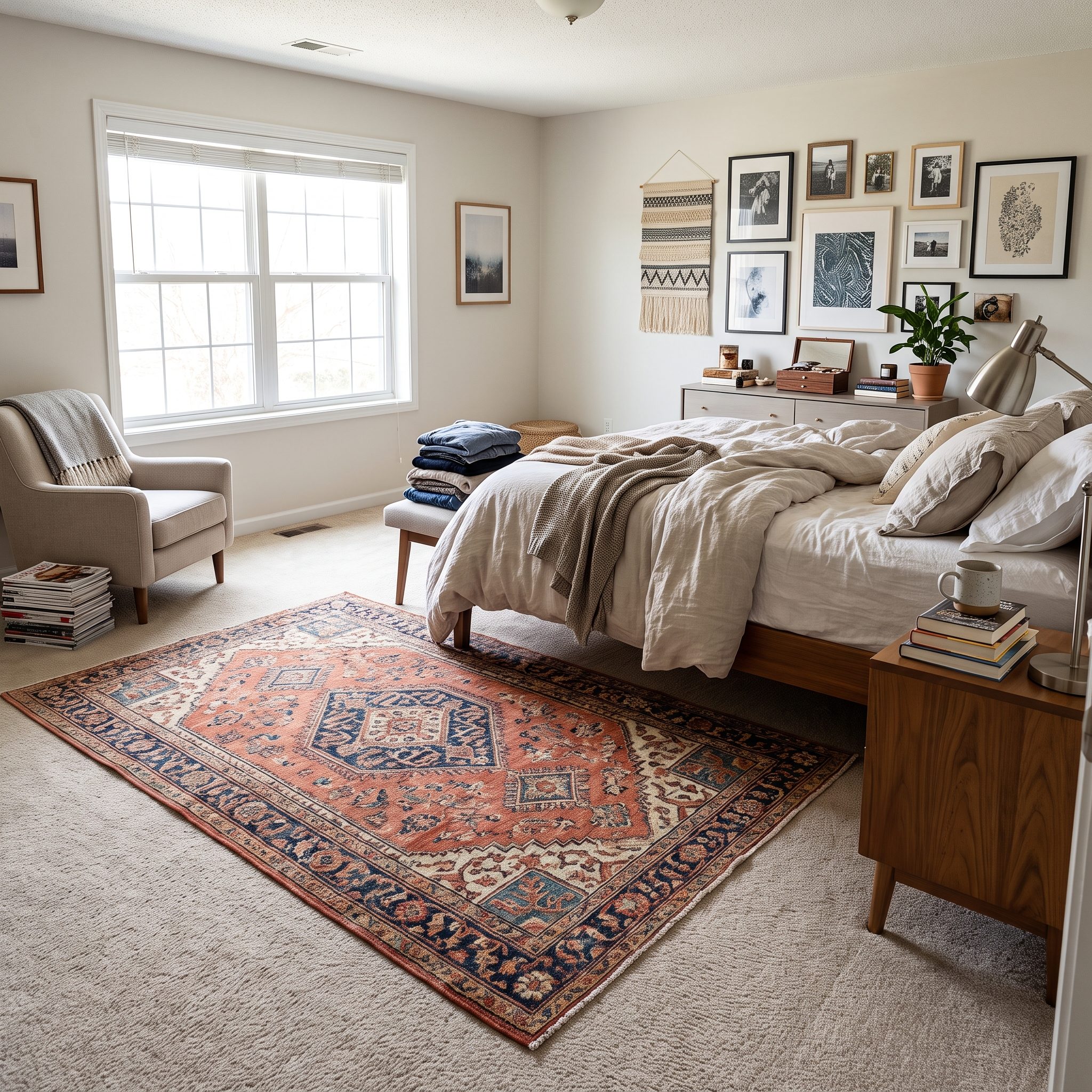
This bedroom lesson isn’t really about rug placement. It’s about making the floor participate in the room.
A red-and-navy medallion rug beneath an otherwise restrained bed creates a focal point below the mattress instead of asking the headboard and wall art to carry all the visual interest. Beige broadloom becomes the margin rather than the subject.
A chunky wool red medallion rug can do that beautifully, but anchor it properly and use a carpet-to-rug pad if needed. Installed carpet does not guarantee that another rug will remain perfectly still on top of it.
13. A Rug Making a Carpeted Family Room Feel More Designed
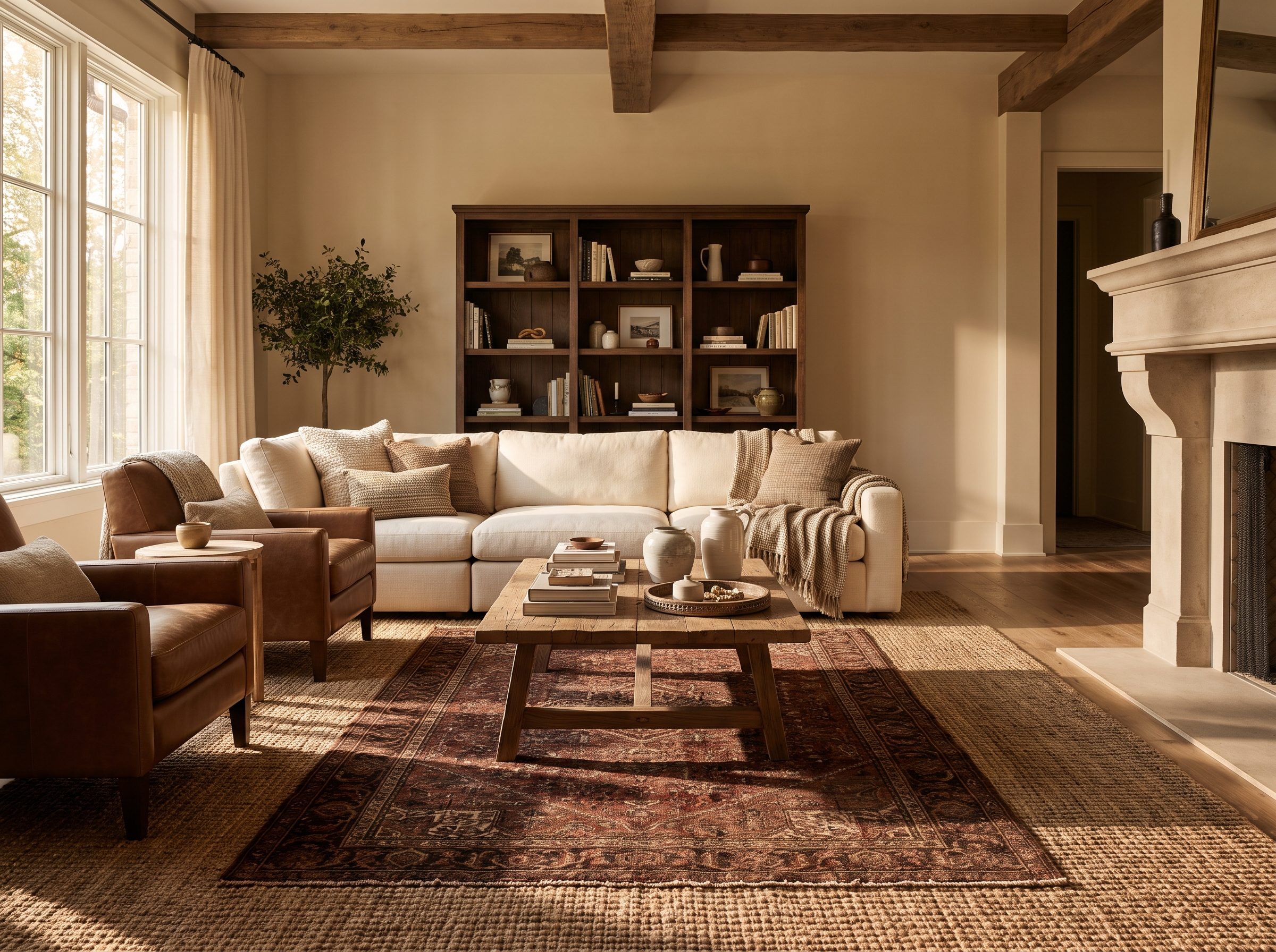
This is the family-room version of the argument: broadloom supplies comfort, but it doesn’t have to supply the entire design.
Put a patterned rug beneath the coffee table and front legs of the seating and you’ve added a graphic center to a room otherwise built around softness. Here the lesson isn’t zoning so much as finishing. The rug brings color, edge and material variation to a room that already has a perfectly functional floor.
A wool colorful rug with real pattern over neutral carpet can do more visually than another round of accessories. A blue wool area rug beneath a gray linen sofa gives the seating group a center without replacing anything underneath it.
12. A Rug Framing the Lower Two-Thirds of a Bed
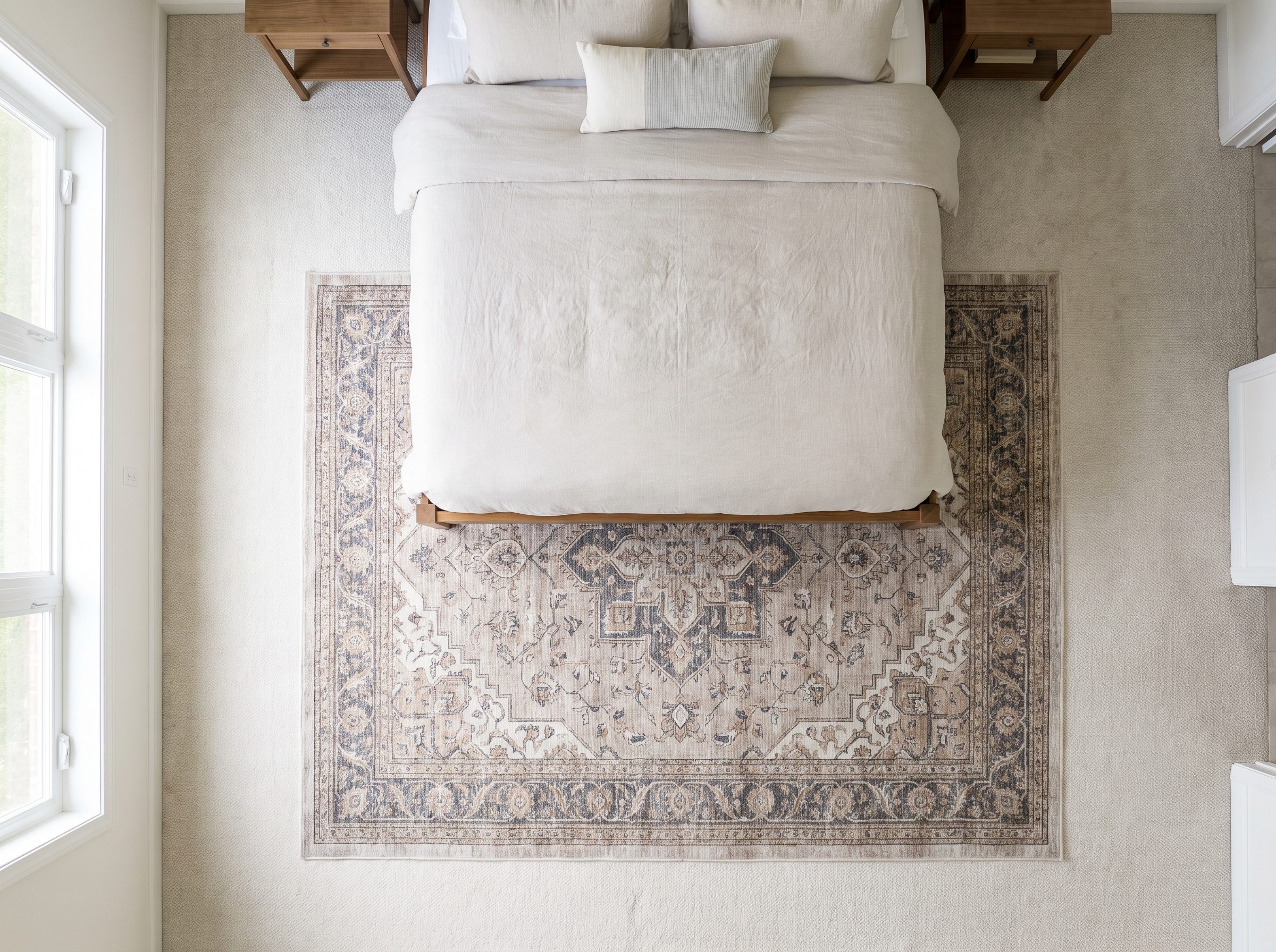
Here’s the more specific placement move: don’t spend a huge amount of rug beneath the headboard where almost none of it can be seen.
Slide the rug toward the foot so most of the exposed textile appears beside the lower mattress and beyond the footboard. A queen is 60 inches wide by 80 inches long, but the amount of rug exposed will depend on whether the rug is 8-by-10, 9-by-12 or another size and which direction it is laid.
The goal isn’t a prescribed 24-inch reveal. It’s getting the material where it contributes visually and where feet actually meet the floor.
11. A Rug Adding Pattern Without Committing to Patterned Carpet
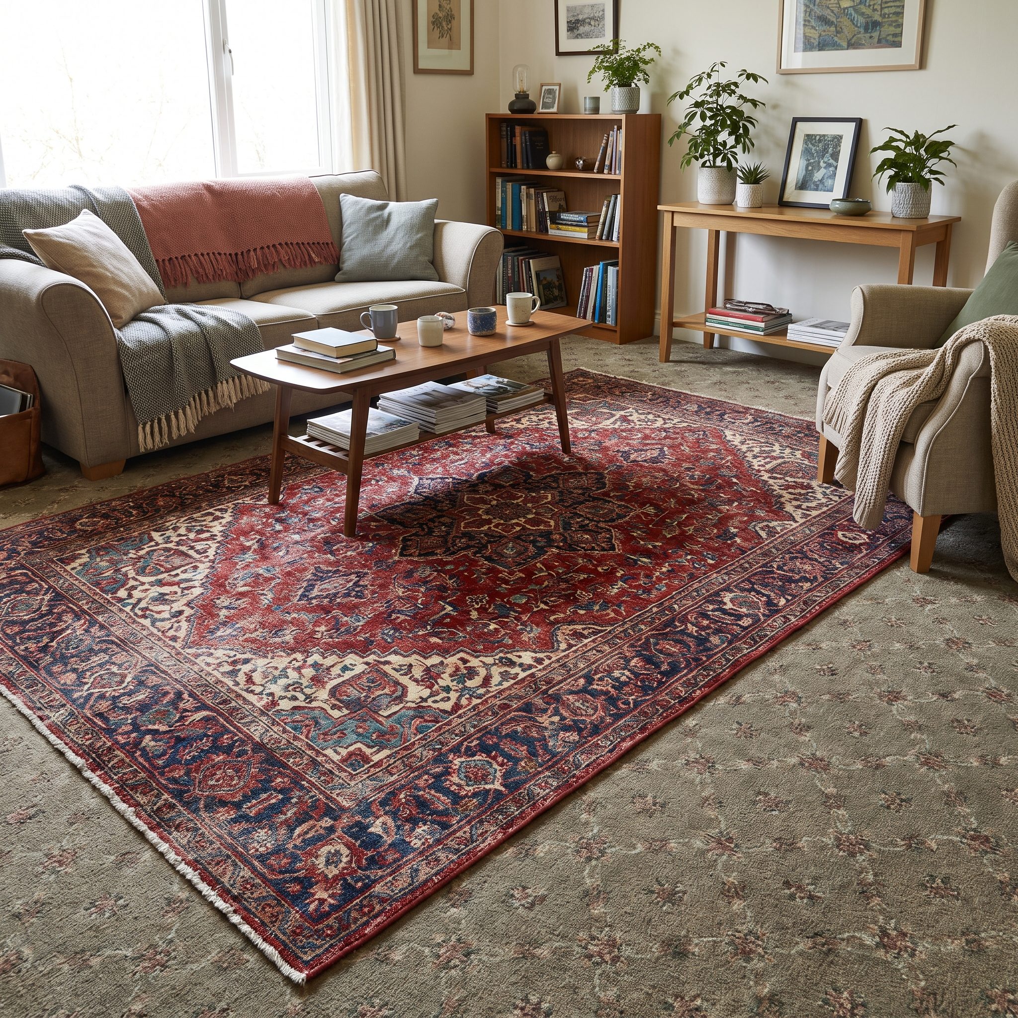
Wall-to-wall pattern is commitment. Area-rug pattern is a flirtation.
A vintage kilim over neutral broadloom gives you diamonds, stripes, medallions or block print without asking the entire room to live with them indefinitely. Roll it up when you’re tired of the motif and the quiet floor underneath never complained.
The same logic works with a colorful rug in a rental office: the permanent surface stays restrained while the removable one takes the risk.
10. A Rug Introducing Color That Can Be Changed Later
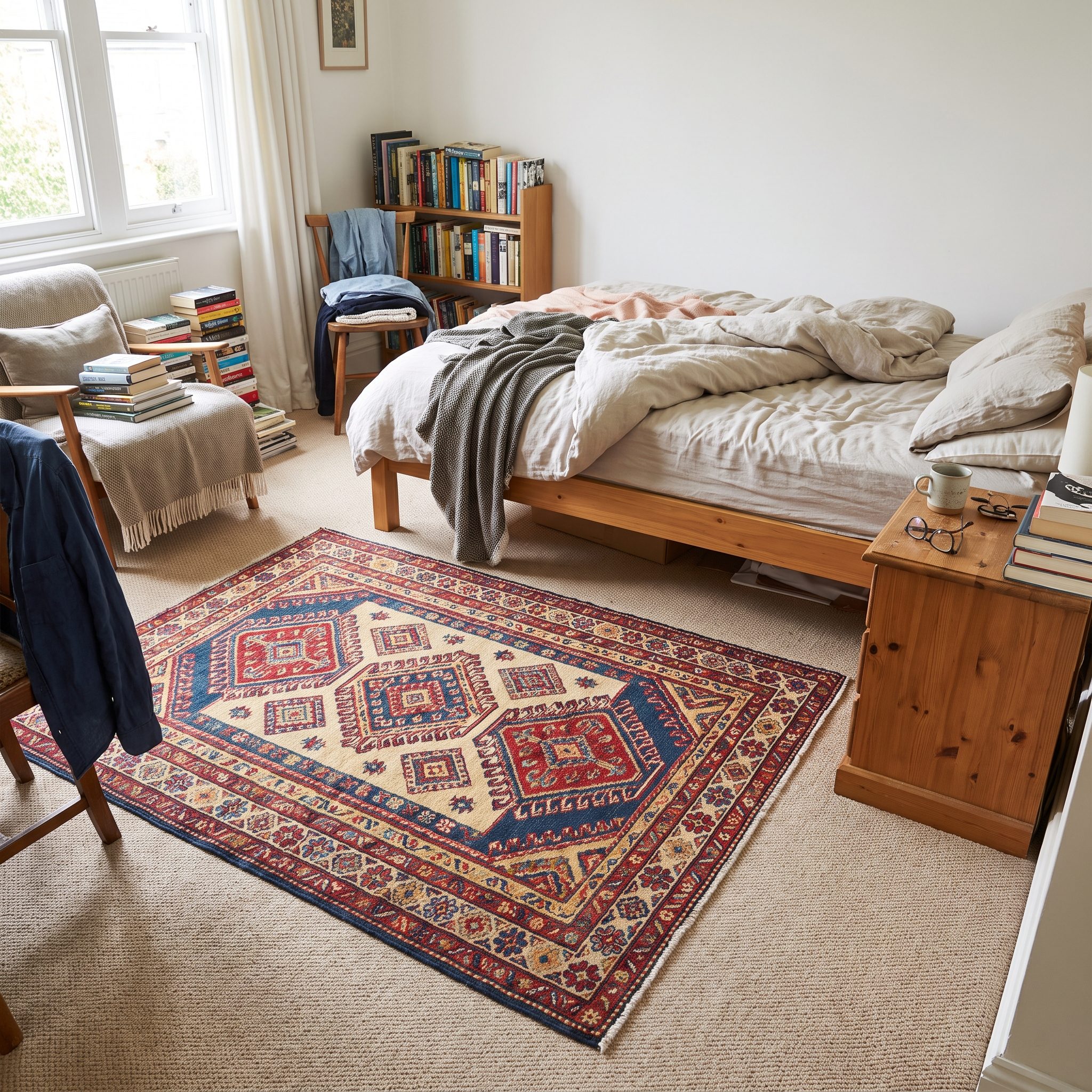
Pattern is one kind of commitment. Color is another.
A rust-and-teal rug over gray broadloom lets the room try a saturated palette without putting aubergine carpet from wall to wall. Pull one or two of those tones into pillows or a lampshade and suddenly the color feels integrated rather than dropped onto the floor.
Next year, if rust has become your personal enemy, roll the rug up and store it in the narrow attic design upstairs. A rust wool rug is a color choice with an exit strategy.
Start with the rug. Pull one teal velvet throw pillow from it. Stop before the room starts looking like it came as a set.
9. A Colorful Rug Turning Neutral Carpet Into a Background
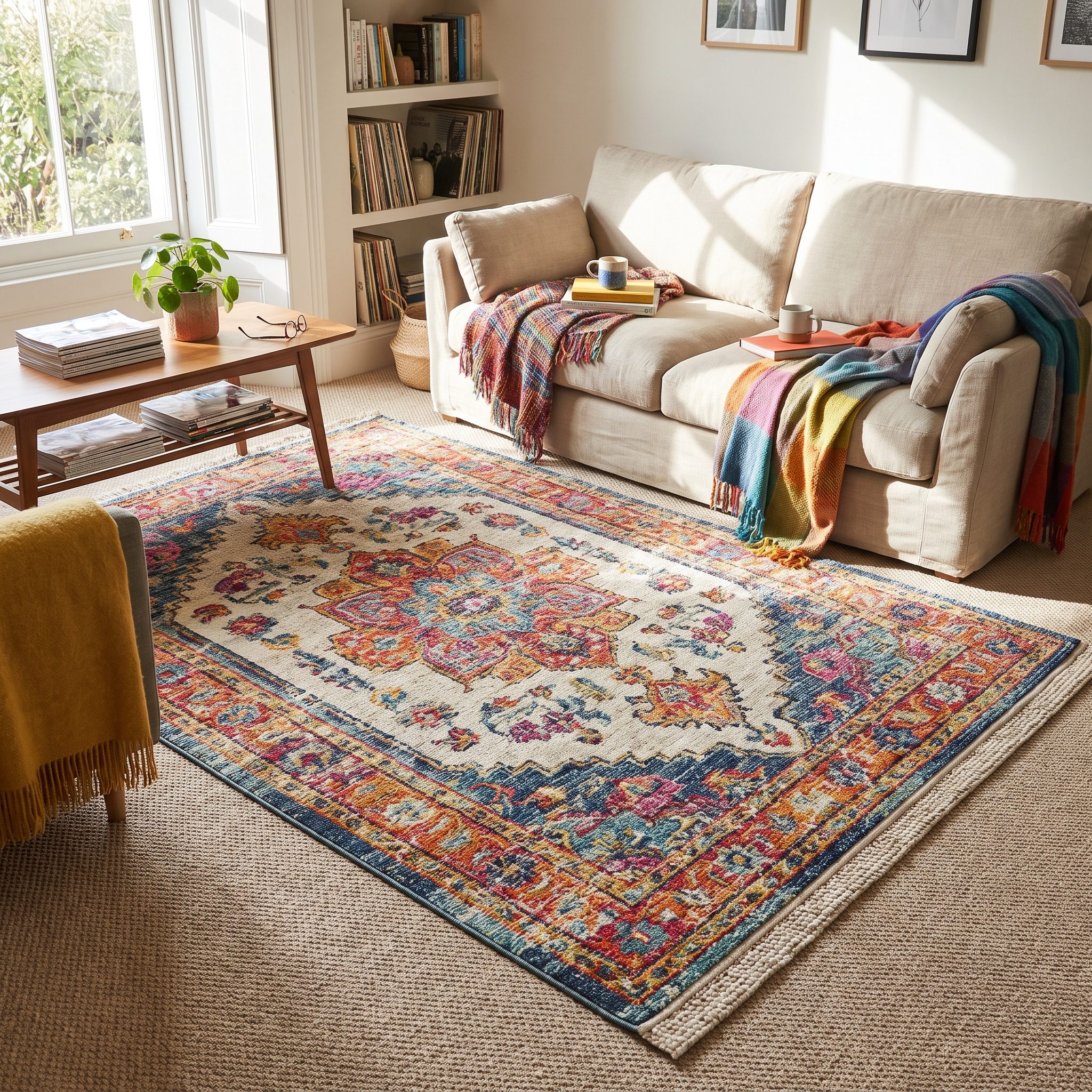
Beige wall-to-wall wasn’t necessarily a failed design decision. Sometimes it simply wasn’t supposed to be the interesting part.
Think about a gallery wall. The plaster disappears so the artwork can announce itself. An oatmeal Berber can play the same supporting role beneath a saffron-and-cobalt colorful rug.
The distinction from the previous item is hierarchy rather than reversibility: this rug isn’t merely introducing a color you can change later. It’s telling the neutral floor to stop competing for attention.
8. A Rug Deliberately Contrasting With the Carpet’s Texture
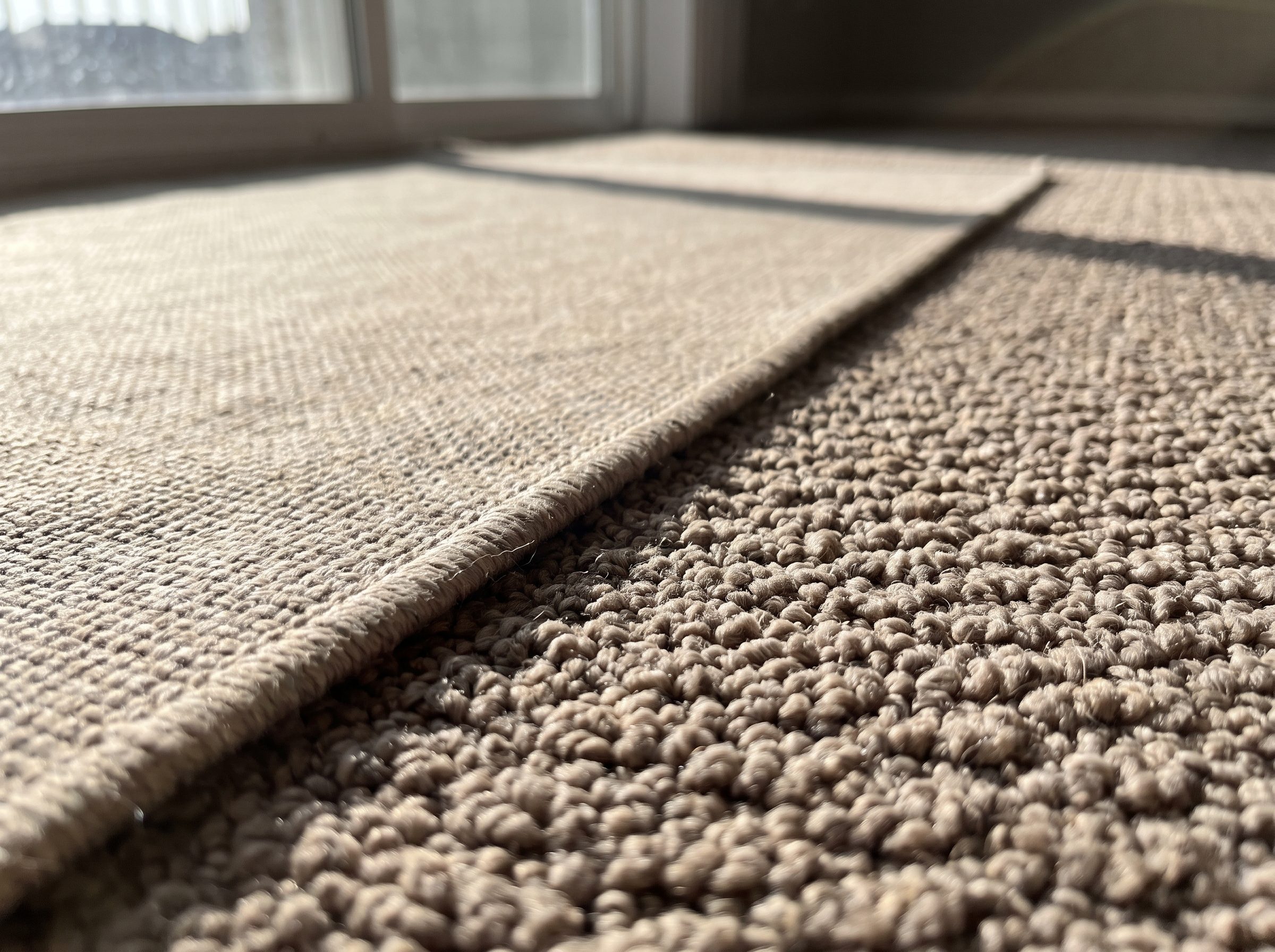
Two layers aren’t automatically the problem. Two layers that behave exactly alike can be.
Put a tight, graphic kilim over plush cut pile and the difference is immediate: one surface is flat and crisp, the other soft and diffuse. Texture, rather than color, establishes which layer is which.
A jute flatweave rug can work especially well at the foot of a carpeted bed or in a rental living room where another plush layer would feel overly padded.
7. A Low-Pile Rug Over Carpet That Doesn’t Look Bulky
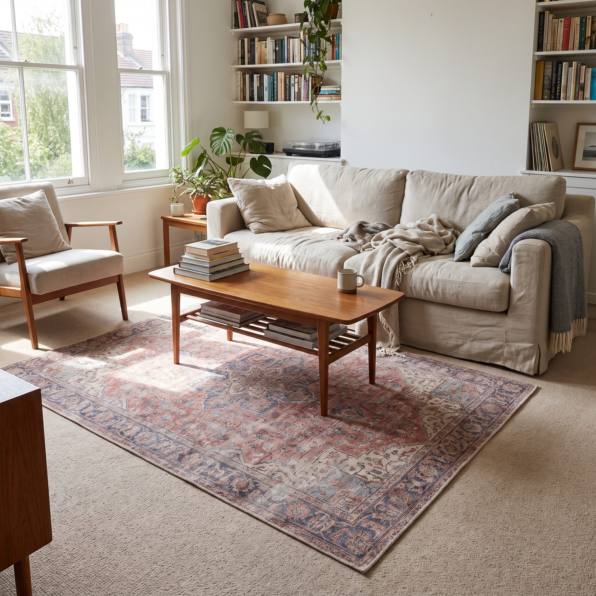
This one isn’t about visual texture at all. It’s about profile.
A thick rug over thick carpet can feel unstable, especially around exposed edges. A tighter flatweave or dhurrie adds far less height and generally sits more cleanly over broadloom.
Kilims, dhurries and other low-profile rugs are useful because they contribute pattern and edge without turning the floor into a second mattress.
The goal isn’t to build another floor. It’s to draw something on the one you already have.
Weight the rug with furniture and use a pad designed for rug-over-carpet applications if it shifts. A low jute ottoman can add another anchor without visually crowding the layer.
A gray entryway design can gain the same kind of definition from a thin runner, provided the edges remain secure.
6. A Rug Pulling a Floating Sofa and Chairs Into One Group
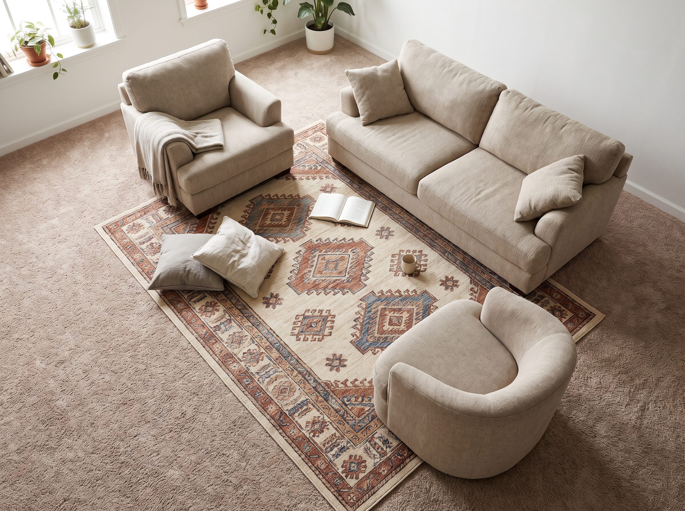
Here’s the furniture problem rather than the flooring problem. Sofa on one wall, chairs drifting near another, coffee table stranded in between. The carpet connects everything physically and nothing visually.
An 8-by-10 flatweave beneath the front legs of all three seating pieces creates a common footprint. A blue flatweave rug adds enough contrast to make that footprint visible.
The important part isn’t simply “rug under furniture.” It’s making separate pieces behave like one composition.
5. A Runner Giving a Carpeted Entryway Direction
🔥 Would you like to save this?
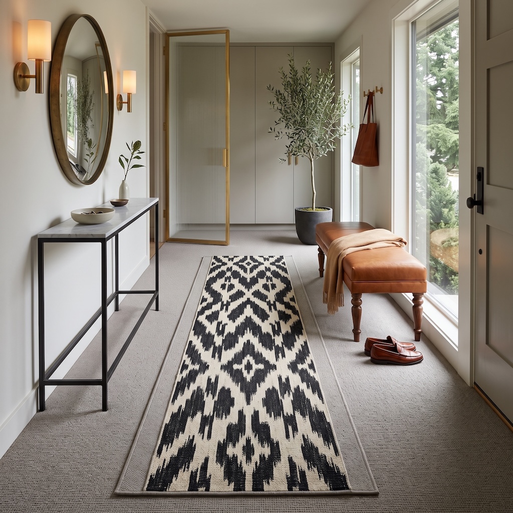
A runner over wall-to-wall carpet sounds redundant until you see what happens in a long entry without one. The broadloom covers the floor beautifully. It just has absolutely nothing to say about where you’re going.
This black-and-cream runner supplies the missing axis. Its narrow proportions exaggerate the length of the entry, pulling the eye from the door toward the cabinetry while the gray carpet becomes a broad margin on either side.
The geometric pattern matters too. With pale walls, a thin console and restrained cabinetry, the floor can afford to be the sharpest thing in the room.
4. A Rug Anchored Under Furniture So It Doesn’t Look Like It’s Floating
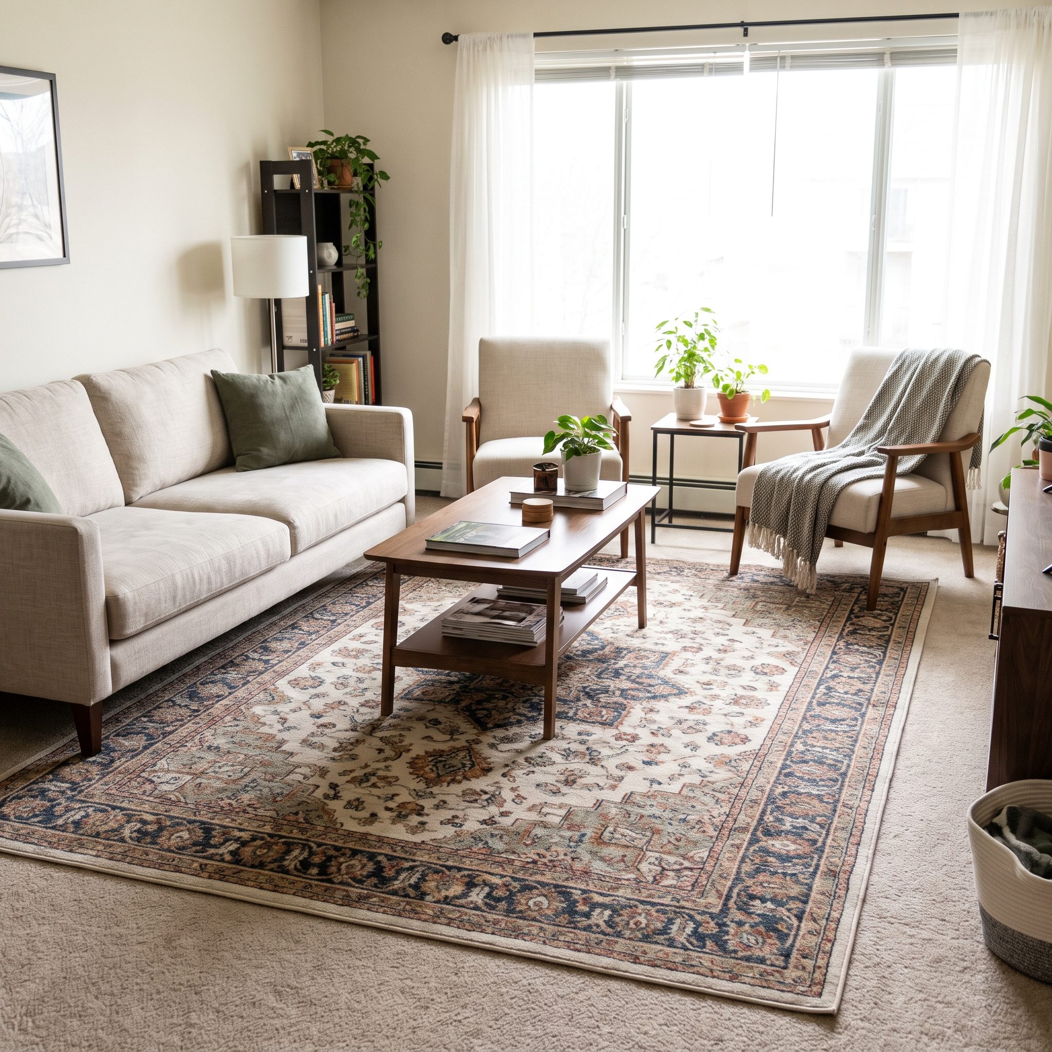
There’s a second furniture-placement problem: sometimes the furniture is fine, but the rug itself looks stranded.
A too-small rug marooned between sofa and chairs can look like a bath mat that wandered in. Pull furniture onto it and the layer suddenly has a reason to occupy that exact patch of floor.
There’s no universal eight-inch border rule. What matters is leaving enough base carpet visible that the top rug still reads as a separate layer while remaining large enough to connect to the furniture. A preppy basement design or reading nook can use the same principle.
A properly sized wool flatweave rug will usually transform the room more convincingly than another handful of decorative accessories.
3. An Oversized Rug That Leaves the Carpet Looking Like an Intentional Border
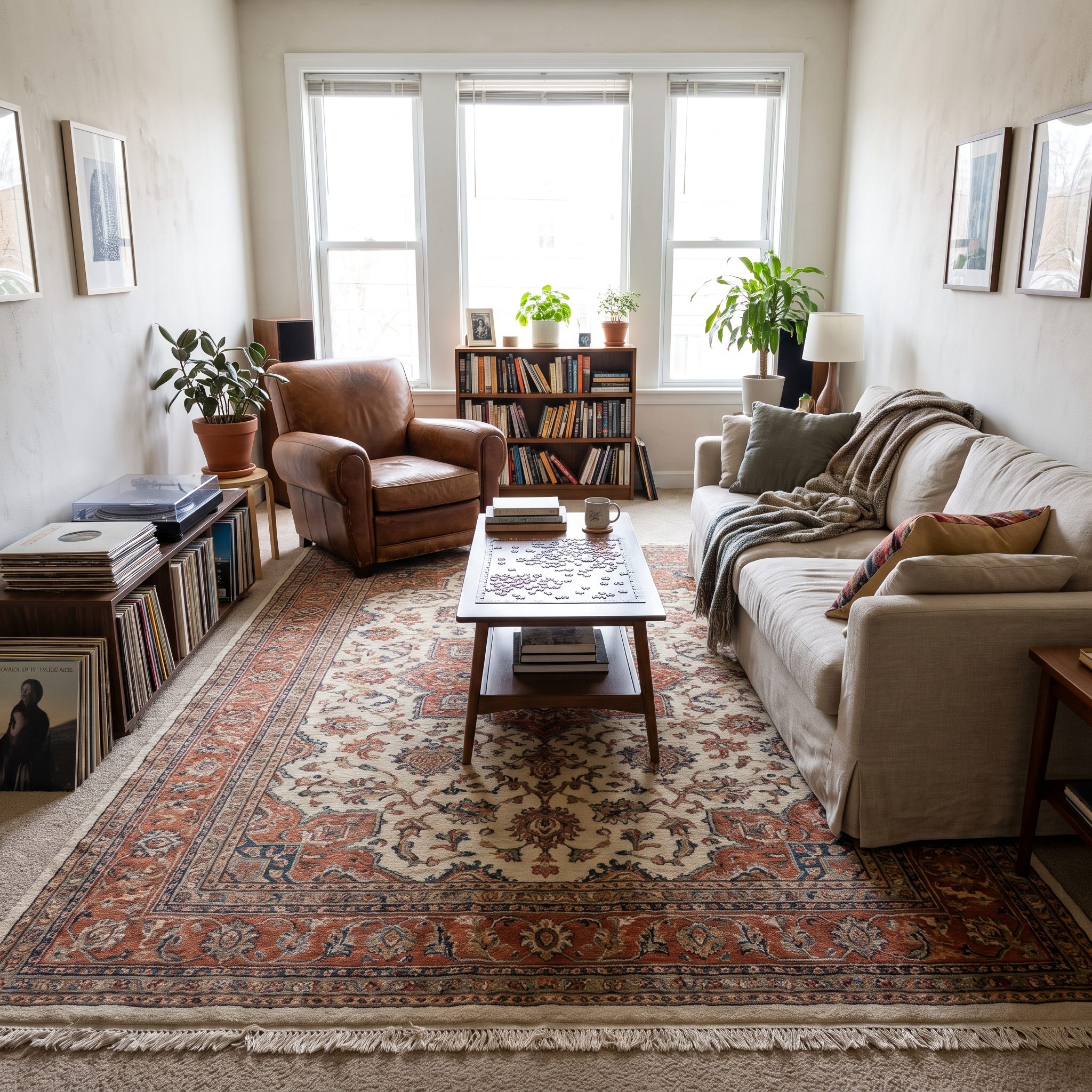
Then there’s the audacious option: stop buying the timid rug.
A 9-by-12 or 10-by-14 can push far enough toward the walls that the remaining carpet becomes a deliberate perimeter rather than the main floor. It starts functioning like the mat around a framed print.
Keep that reveal reasonably even. A narrow strip on one side and a huge one on the other rarely looks intentional unless the furniture plan clearly explains the asymmetry.
The effect can be especially sophisticated in low contrast—a charcoal rug over pale gray, cream over oatmeal—because the border announces itself through proportion rather than shouting through color.
2. An Oversized Graphic Rug Giving a Huge Carpeted Room a Center
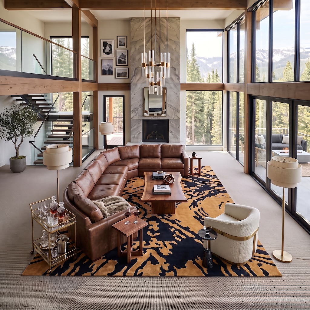
This is where scale stops being decorating advice and becomes architecture.
The room is enormous: double-height glass, exposed timber, a monumental fireplace, a sectional that could comfortably host a committee. Put a timid rug in the middle and the architecture would eat it before breakfast.
Instead, the black-and-camel graphic rug occupies enough floor to hold the entire sectional, coffee table and swivel chair in one commanding field. Its pattern is almost topographic—irregular, oversized and strong enough to compete with the mountain view without becoming fussy.
Notice what happens to the pale wall-to-wall carpet. It doesn’t disappear. It becomes the quiet perimeter around something much more assertive. That’s exactly the relationship this whole gallery has been arguing for, only here the volume is turned all the way up.
1. A Layered Rug That Makes the Carpet Look Like the Base Layer on Purpose
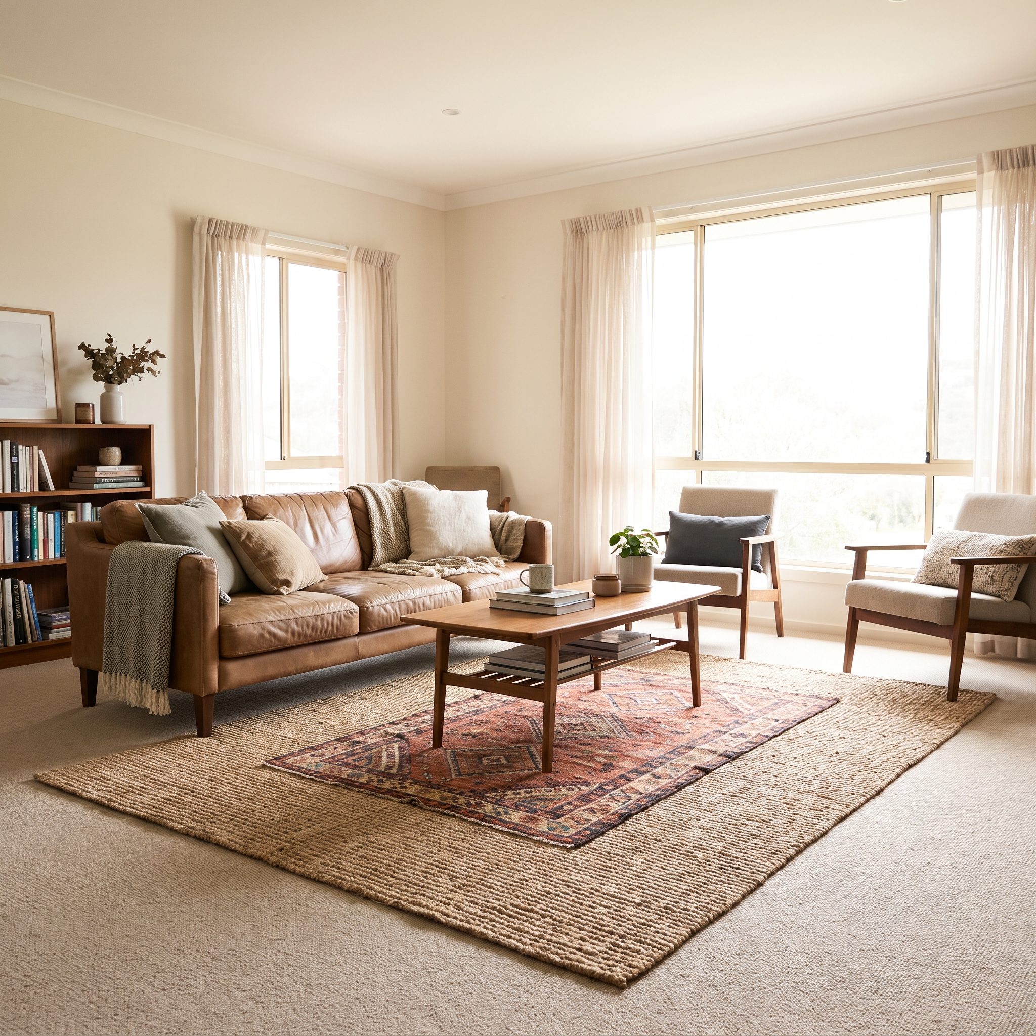
And this is where the supposed rule finally collapses.
Stop trying to disguise the fact that there are two layers. Make the hierarchy obvious. The broadloom is the continuous, practical base; the kilim or wool rug is the movable design layer carrying pattern, edge and color.
Hospitality interiors have long used broadloom and area rugs for different jobs: the installed carpet handles large-scale coverage and acoustics, while removable rugs can establish individual seating zones and introduce a more specific decorative language. No mythology required.
Contrast the texture without creating instability. A nubby carpet can take a flatter weave; a softer broadloom can work beneath a thin dhurrie. Add a low-pile flatweave kilim rug and rug gripper pads suited to the flooring beneath it. The same approach can rescue a preppy basement design without ripping out a perfectly serviceable carpet.