🔥 Would you like to save this?
Some bedrooms advertise luxury with objects. The better trick is to make the room look expensive before the eye has even reached the bed.
In order to come up with the very specific design ideas, we create most designs with the assistance of state-of-the-art AI interior design software. Also, assume links that take you off the site are affiliate links such as links to Amazon. this means we may earn a commission if you buy something.
Look at the architecture first. A ceiling breaks into coffers or sculpted planes. A headboard wall gains enough depth to become part of the building. Stone turns a corner instead of stopping politely at one surface. Windows sit deep inside thick reveals. Lighting disappears into recesses and seams, illuminating the architecture without announcing the fixture responsible.
That’s where these 31 bedrooms get interesting. Strip away the rugs, chairs, lamps, art, and bedside styling and the rooms would still have presence. Their luxury is built into proportion, material, depth, joinery, repetition, and the places where one surface meets another.
They don’t agree on what expensive should look like, either. One is almost colorless. Another turns the ceiling into a field of stars. There are rooms wrapped in navy, burgundy, timber, stone, plaster, and cobalt blue. The common denominator isn’t extravagance. It’s that the shell has already done the heavy lifting before the furniture gets a chance.
31. White Rafters and Deep Windows Make a Nearly Colorless Room Feel Anything but Flat
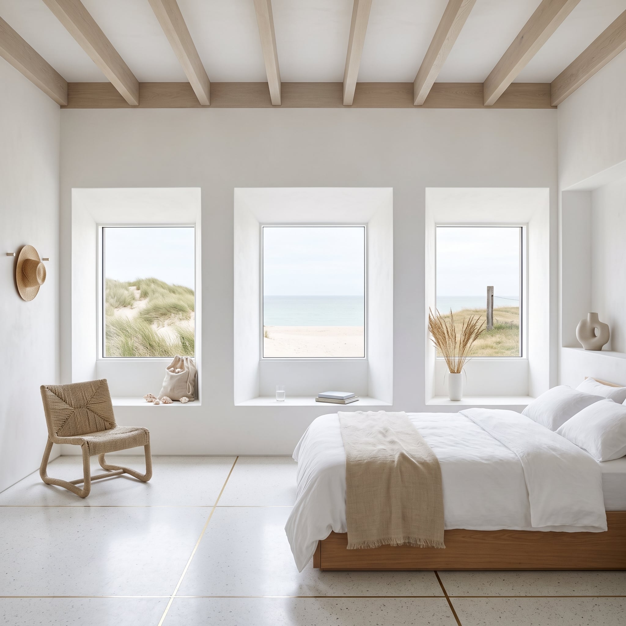
No lacquer. No jewel tones. No glowing stone. This room gets its depth from actual depth.
Pale exposed rafters articulate the ceiling while three deeply recessed windows cut strong shadow lines into the otherwise quiet envelope. Those openings read less like sheets of glass and more like cavities carved through substantial walls.
- Deep window reveals create dimension without requiring applied decoration
- The speckled floor introduces fine-grained texture beneath the broad pale surfaces
- Keeping the rafters close to the wall color lets their geometry register without turning the ceiling into a rustic contrast
30. A Faceted Dark Ceiling Meets a Red Wall With No Interest in Receding
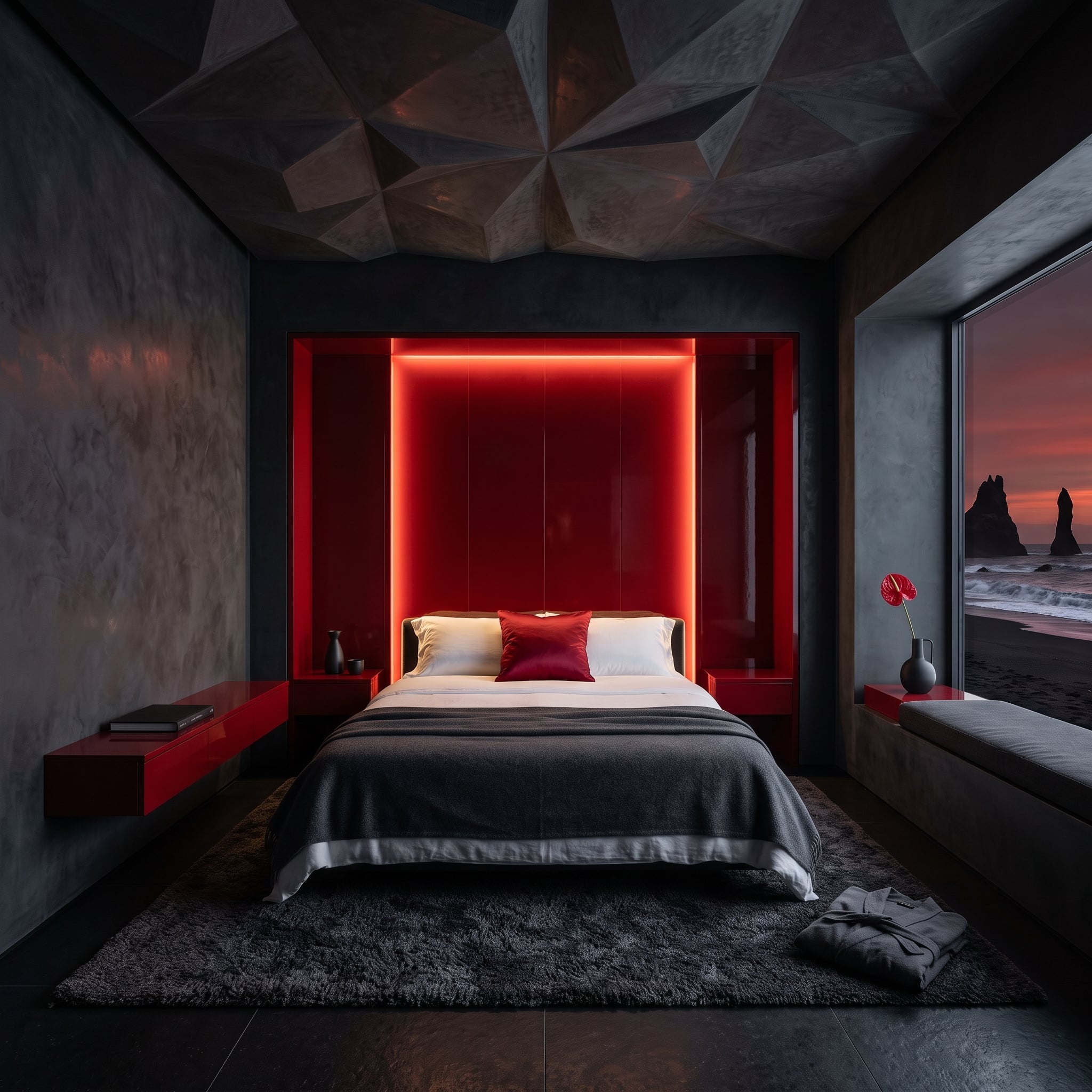
This is what happens when the ceiling stops behaving like a lid.
Dark geometric facets break the plane overhead into angular surfaces, with highlights catching different edges rather than spreading evenly across one flat expanse. Below, a floor-to-ceiling red headboard recess glows around its perimeter, putting one saturated vertical plane against charcoal walls and a nearly black ceiling.
Small pale accessories soften the severity without diluting it. The real tension is architectural: sharp overhead geometry against one enormous block of red.
29. A Circular Window Gives This Blush Bedroom Its Best Line
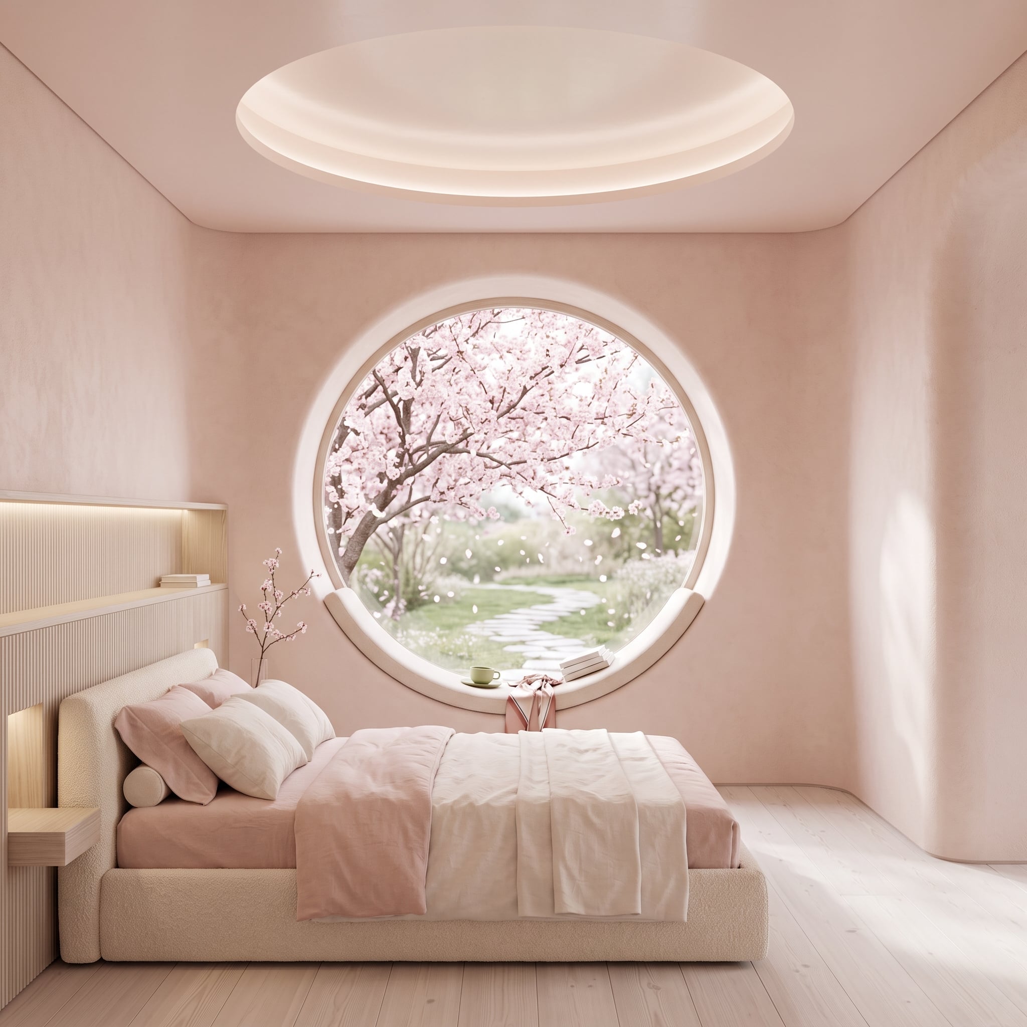
Soft blush walls could easily have carried the entire room. The circular window refuses to let them.
Its strong geometry interrupts the usual collection of bedroom rectangles, while an oval recessed ceiling detail repeats the curve overhead without copying it exactly. One is an opening; the other is a luminous recess.
The flowering branches beyond the glass add color in passing. The memorable move is the conversation between two large curves placed on different planes.
Shape Matters: A round window changes more than the opening itself. Its curved perimeter interrupts the room’s dominant right angles and becomes part of the composition before anything is placed in front of it.
28. Backlit Stone Turns the Headboard Wall Into a Light Fixture
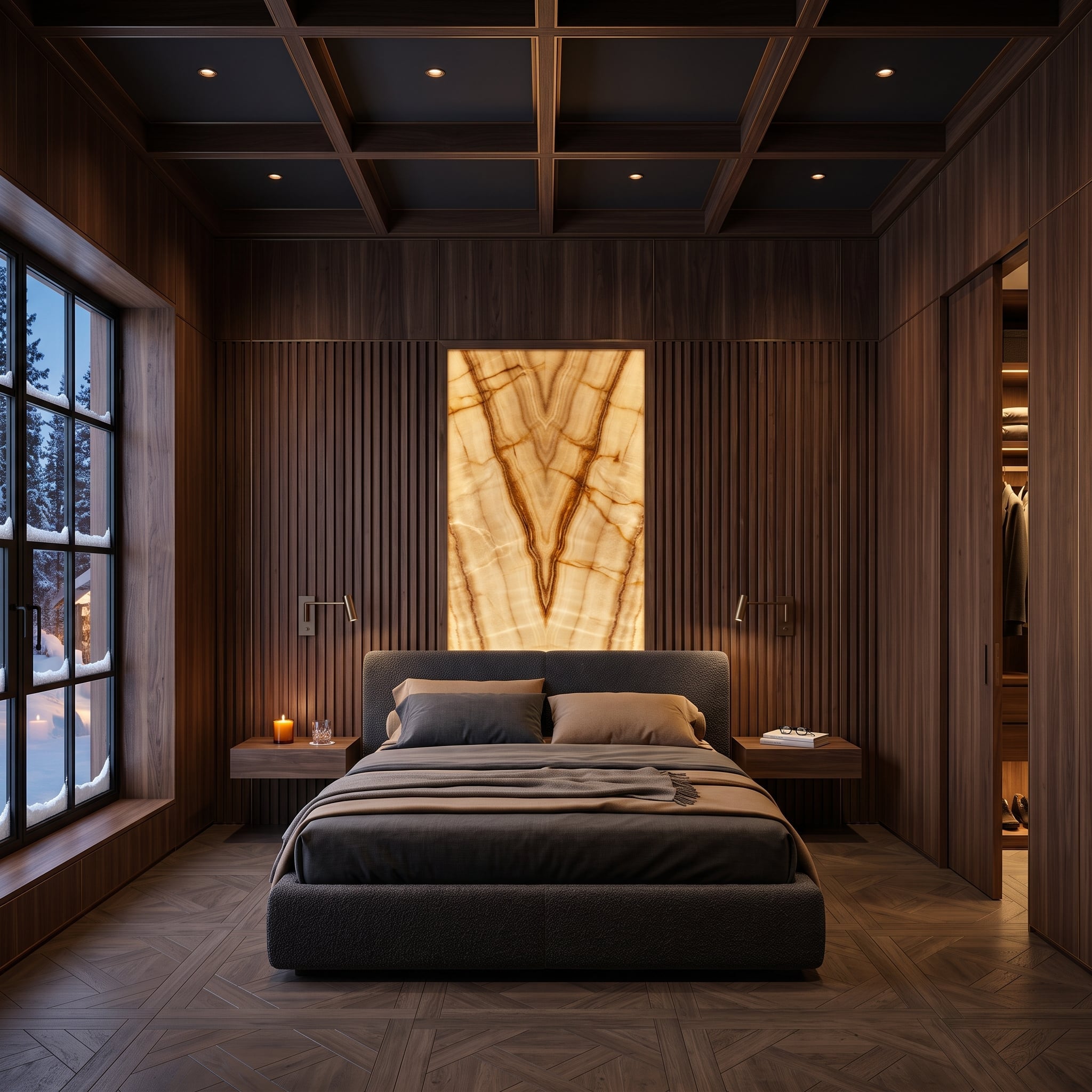
A translucent amber-toned stone panel glows above the bed, making its veining part of the lighting composition rather than simply a surface pattern.
Dark vertical wood slats surround it, giving the luminous center a deep architectural frame. Overhead, a near-black coffered grid shifts the geometry from vertical to horizontal, while parquet underfoot introduces a much finer pattern.
The clever move is consolidation: headboard feature, wall finish, ambient light, and focal point become one architectural gesture.
27. Raw Concrete and Warm Wood Split the Room Almost Down the Middle
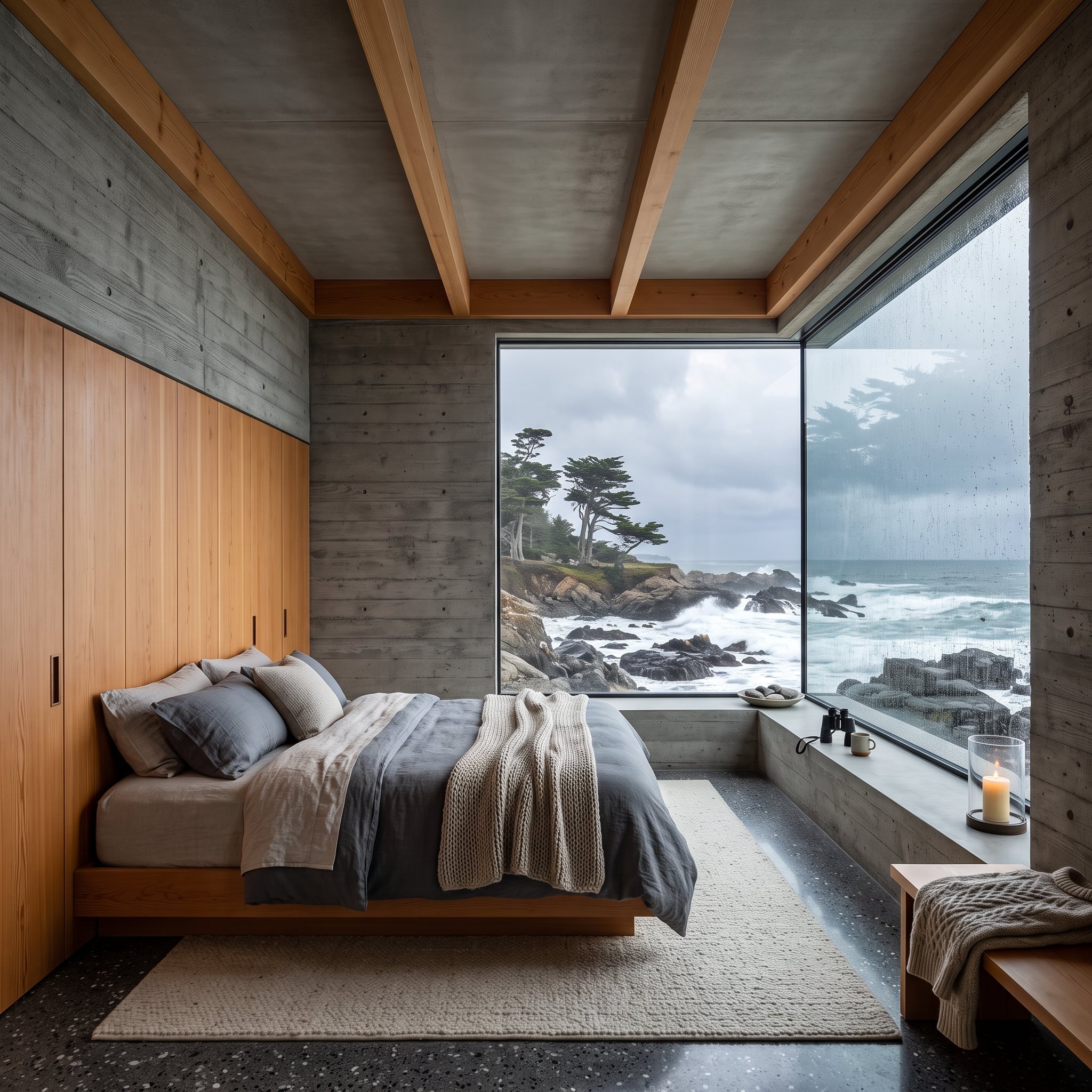
The gray walls carry linear impressions that give the mineral surface a grain of its own. Alongside them, floor-to-ceiling wood paneling introduces warmth and a much smoother visual rhythm.
Even the deep window seat appears to continue the mass of the wall rather than reading as a separate piece of furniture. Broad glazing then interrupts that solidity with an almost weightless plane.
The room doesn’t disguise the visual weight of its concrete-like surfaces. It makes that weight useful, then gives it wood and glass to push against.
26. Dusty Rose and a Raised Bed Turn the Floor Into Part of the Furniture
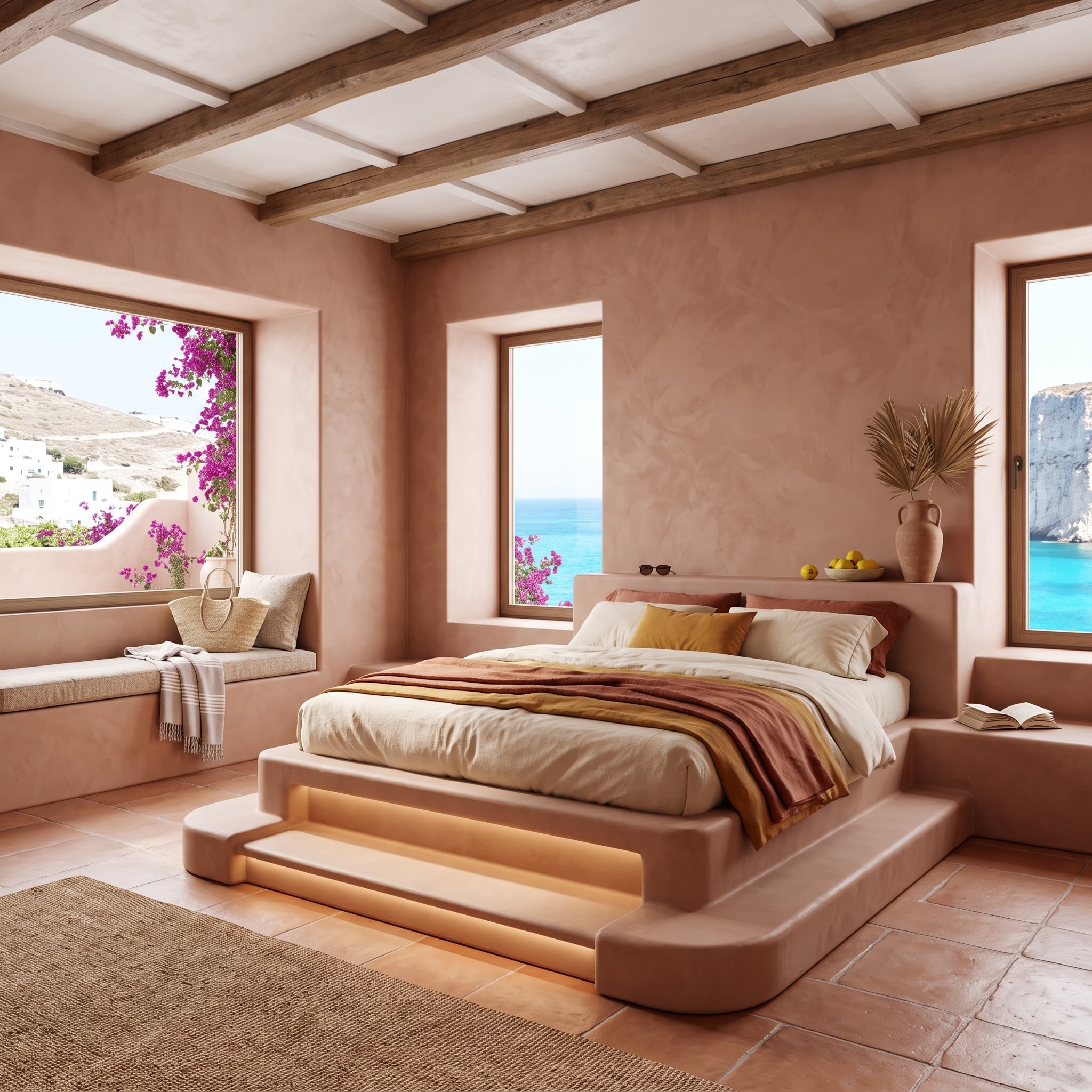
Dusty rose plaster, warm terracotta-toned flooring, and exposed timber beams give almost every major plane some color, yet the most interesting move happens beneath the mattress.
The bed occupies a raised platform with concealed lighting at its base, making the sleeping area feel constructed as part of the room rather than simply furnished. Low ledges on either side continue the platform horizontally and reduce the need for conventional nightstands.
A flash of turquoise beyond the opening sharpens the warm palette, but the interior already has a complete material hierarchy: plaster, timber, tile, and one illuminated plinth.
25. Checkerboard Below, Mirrored Stone Above—This Room Has No Background
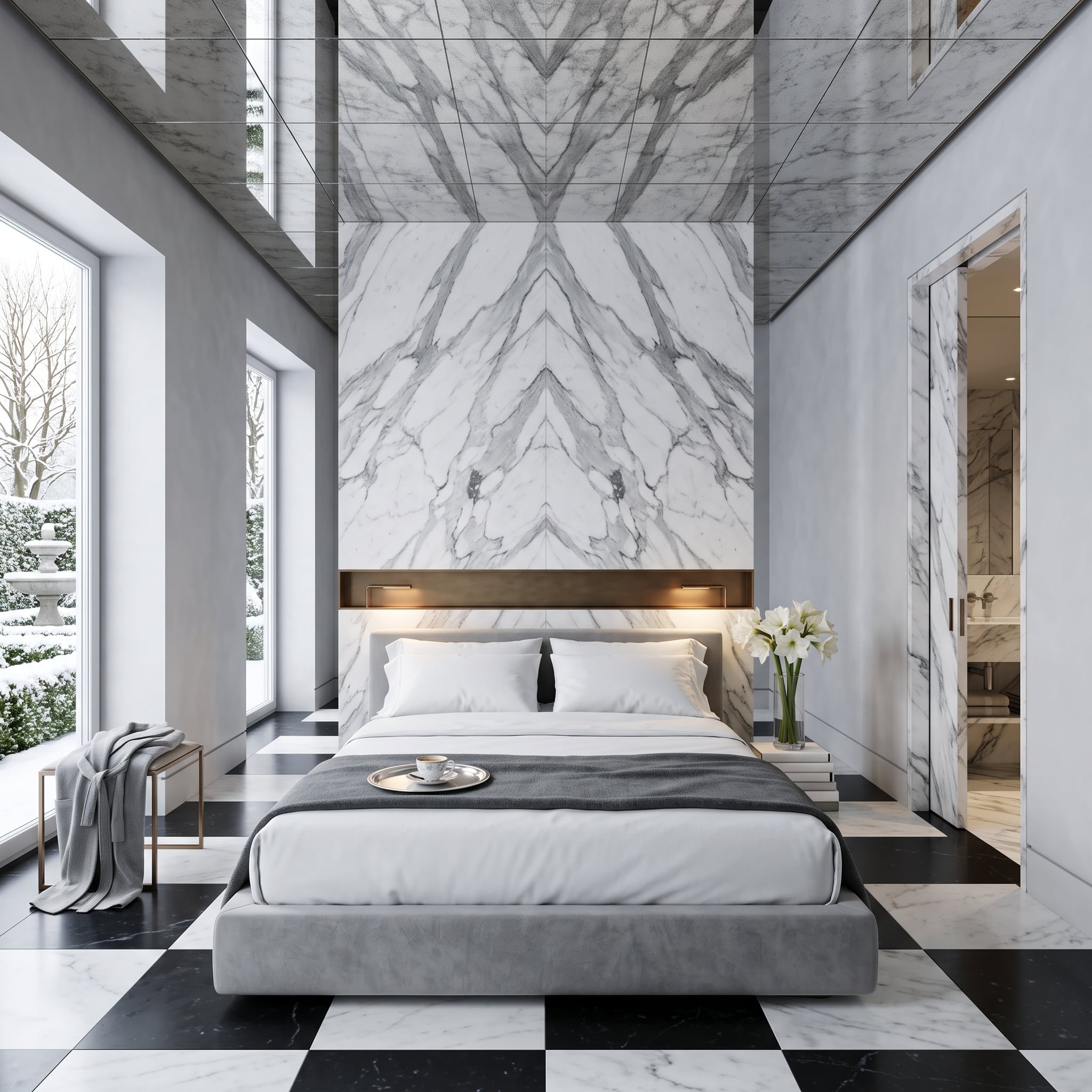
Some rooms give the eye somewhere neutral to rest. This one declines.
Large veined stone slabs on the headboard wall mirror across central seams, turning natural pattern into deliberate symmetry. Related stone continues overhead, while black-and-white squares establish an entirely different geometry underfoot.
A warm wood headboard shelf interrupts the stone envelope just enough. Upholstery and flowers soften the composition, but they aren’t responsible for its character. Floor, wall, and ceiling are all participating.
24. Pale Timber, Backlit Storage, and Almost Nothing Fighting for Attention
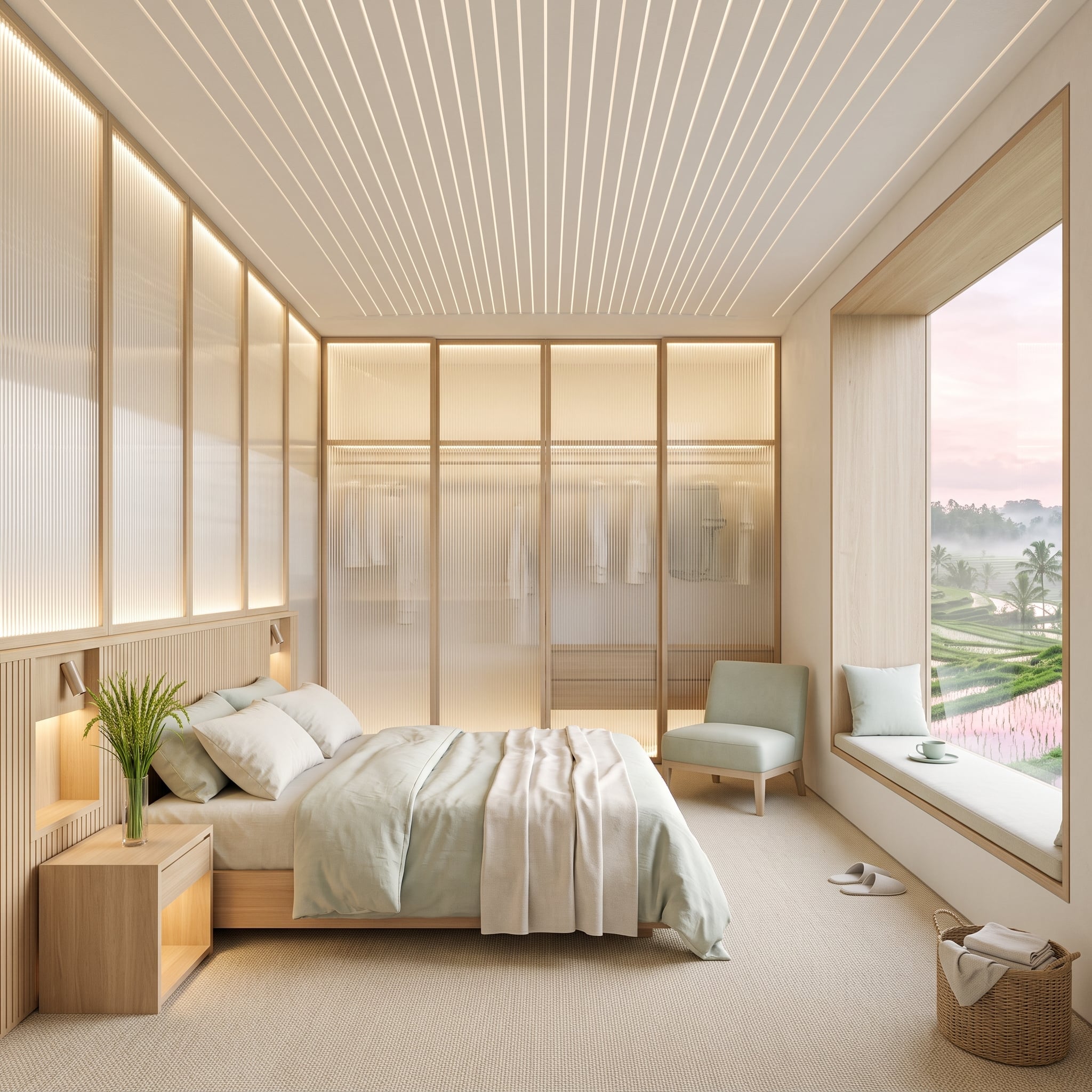
After the checkerboard and veined stone, this room practically whispers.
Pale wood moves across the bed, nightstand, slatted headboard, and framing around a translucent wardrobe wall. Backlighting turns that storage surface into part of the room’s ambient illumination instead of leaving cabinetry as a purely functional block.
A deep window seat tucks beneath ribbed ceiling panels, reinforcing the horizontal lines already established by the bed and low furniture. Nothing needs to shout because the detailing is doing the work.
23. Cobalt Walls and a Cloud Ceiling Refuse to Pick a Quiet Side
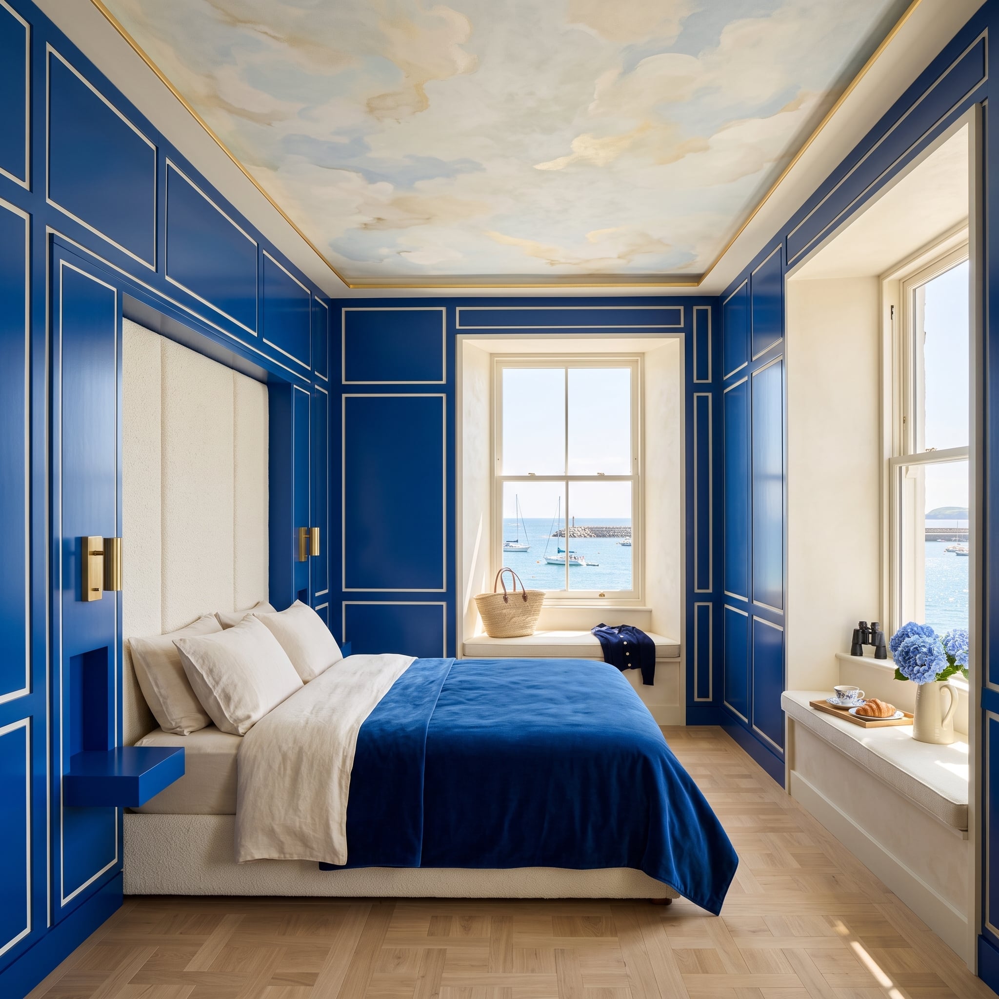
Cobalt-blue paneling wraps the room from floor to cornice, interrupted by fine gold-colored lines that turn the walls into a deliberate grid rather than one uninterrupted field of blue. Then the ceiling abandons that discipline completely: loose pale clouds spread across a much lighter ground.
That’s the tension. Hard lines below, atmospheric painting above.
Blue hydrangeas repeat the wall color on a smaller scale. The bigger idea remains architectural: the walls and ceiling belong to the same room without agreeing on how that room should behave.
Look Up: A decorated ceiling doesn’t have to repeat the walls. Here the pale, painterly treatment gives the saturated blue envelope a deliberately different character overhead.
22. A Timber Grid Turns Filtered Daylight Into Part of the Architecture
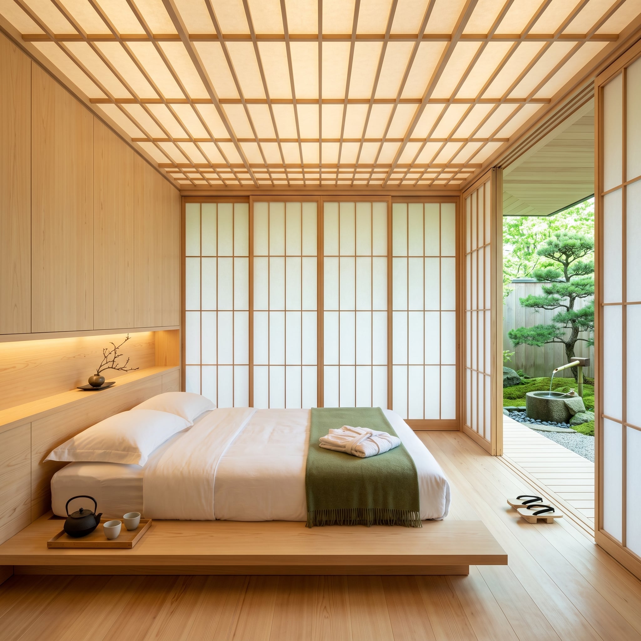
Wood-toned surfaces move across walls, floor, and the gridded ceiling, but the brightest elements are the translucent screens. They soften daylight and turn the openings into luminous planes rather than hard-edged rectangles.
The platform bed sits low, giving the vertical screens and overhead grid more room to register. The result is a room built from repeated lines, filtered light, and carefully controlled height rather than conspicuous ornament.
Filtered Light: Translucent screens spread daylight across a broad surface, replacing the hard rectangle of clear glazing with a softer luminous field.
21. Stone on Three Walls, Warm Metal Overhead—and Somehow Neither Wins
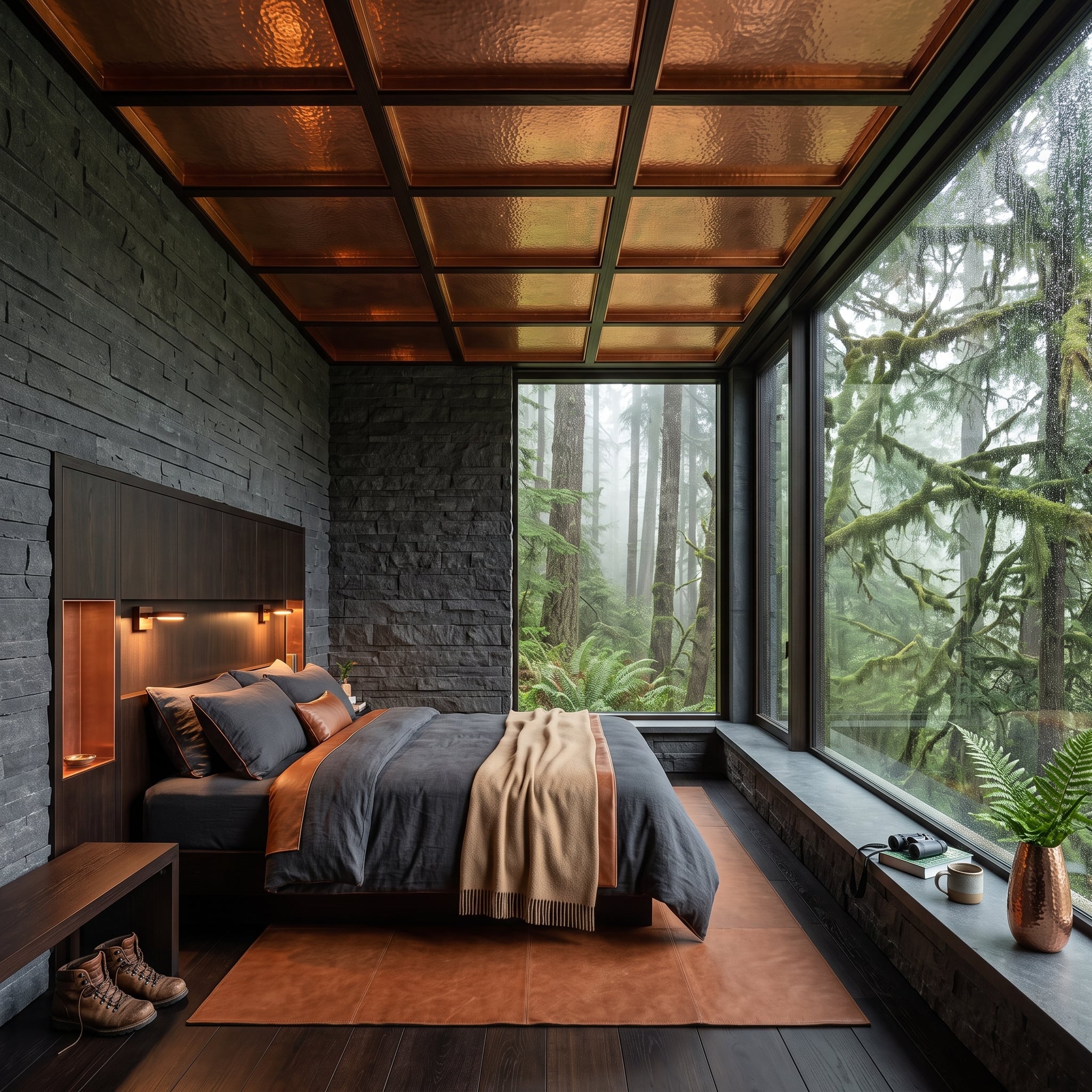
Cool gray stacked stone wraps much of the room, giving the walls a rough, heavily jointed surface. Above it, warm metallic panels fill a coffered ceiling and catch smaller highlights from the surrounding illumination.
That warm-cool split could have become a battle. Instead, the materials occupy different planes and carry different kinds of texture: rough and matte on the walls, smoother and more reflective overhead.
The large glazed opening keeps the heavily surfaced interior from feeling completely enclosed, but the room’s real contrast is already complete before the eye reaches the glass.
Surface Contrast: An irregular metallic finish breaks highlights into smaller flashes rather than producing the cleaner reflection of a highly polished plane. Against rough stone, that difference becomes especially visible.
20. A Woven Sunburst Makes the Ceiling Impossible to Ignore
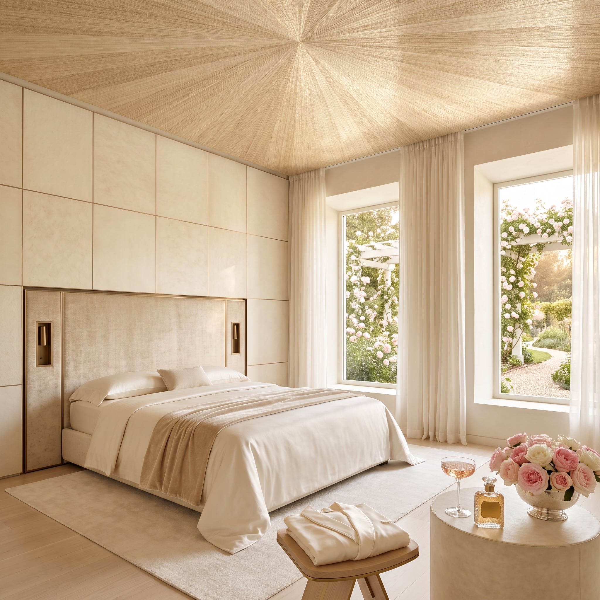
Cream wall panels and a deeply integrated headboard make the bed wall feel almost monolithic. Then the ceiling breaks loose.
Woven natural-fiber panels radiate from a central point in a huge sunburst, converting what could have been a quiet neutral plane into the room’s most intricate surface. The material stays close to the walls in color, so geometry rather than contrast carries the drama.
Why the Ceiling Wins: The finish is subtle in color but emphatic in direction. That lets the ceiling dominate without relying on a darker paint color, oversized fixture, or contrasting border.
19. Plum and Patinated Metal Give a Glass-Walled Bath Some Serious Competition
🔥 Would you like to save this?
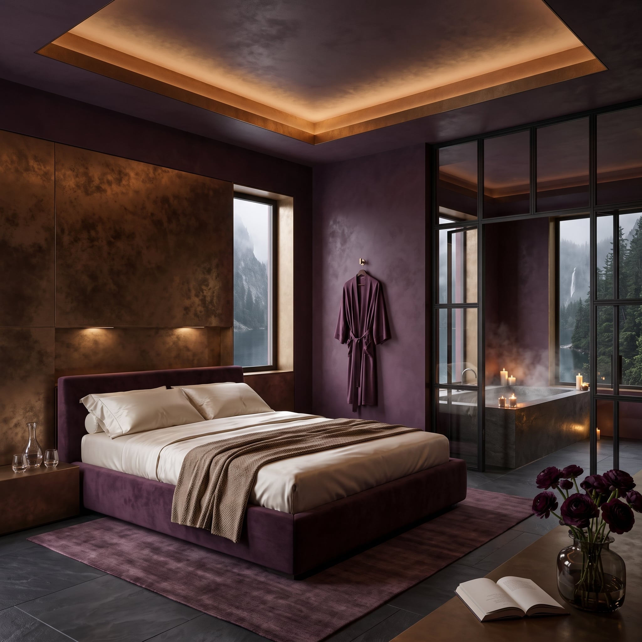
Plum upholstery sits against mottled copper-toned wall panels, while warm light from the tray ceiling draws out reds and browns across both surfaces. The palette is dark, but hardly uniform.
To the right, a bathing area remains visible behind black-framed glass. Continuous dark flooring connects the two zones, while transparency keeps the bath visually attached to the bedroom instead of enclosing it as a separate box.
Lighting Detail: Concealed light around a tray ceiling emphasizes the change in level without putting the fixture itself on display. Here it also brings out the warmer notes in the surrounding finishes.
18. A Mezzanine Library Makes the Bed Look Like the Ground Floor
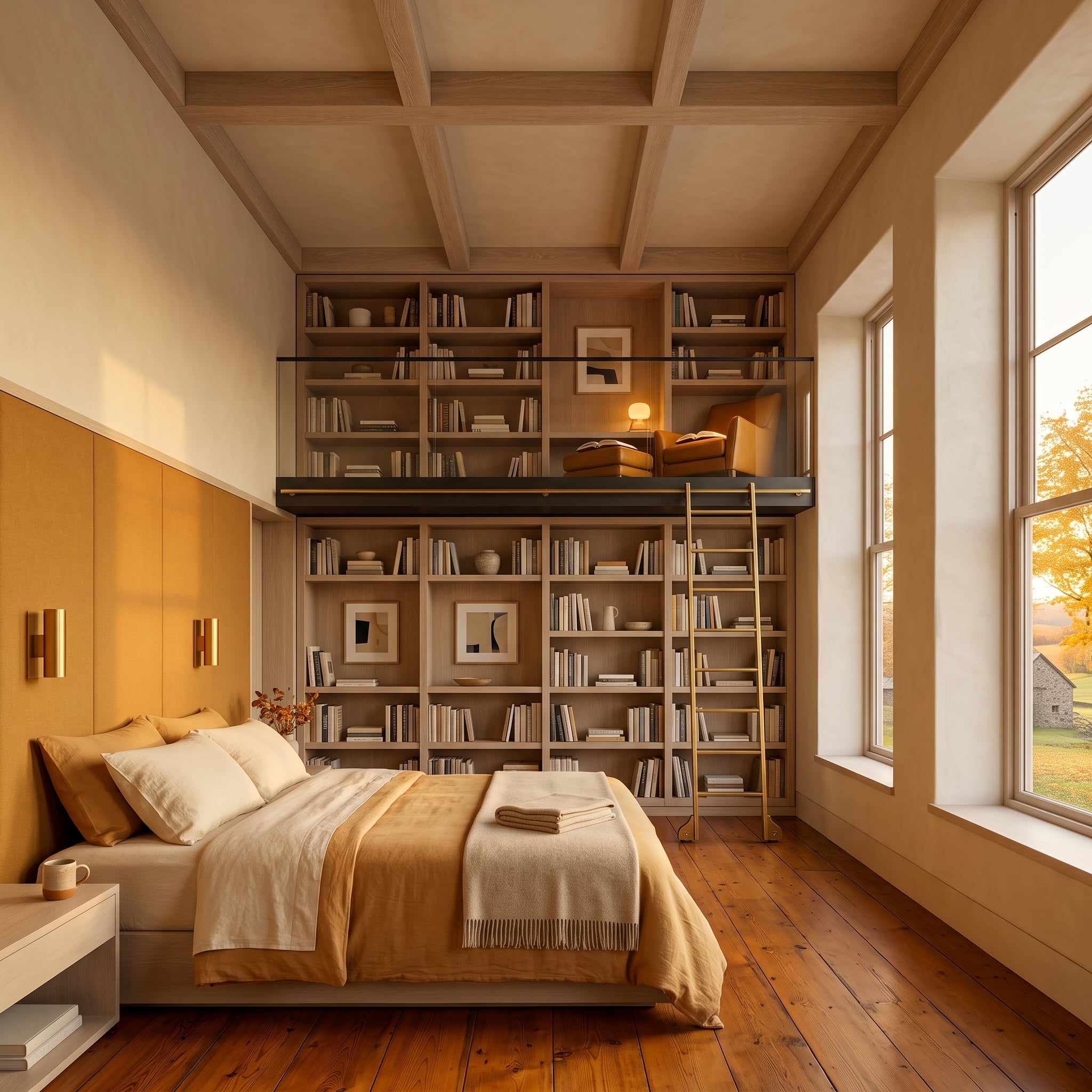
The ceiling is handsome, but the bookshelf wall changes the scale of the entire room.
Pale wood shelving rises far beyond conventional headboard height to a mezzanine reading level, reached by a slim library ladder. The bed suddenly occupies only the lower register of a much taller composition.
Warm saffron bedding adds concentrated color against the pale timber. More importantly, storage has stopped behaving like cabinetry and started behaving like a second story.
17. Forest Green Goes All In, Then Woven Ceiling Panels Break the Spell
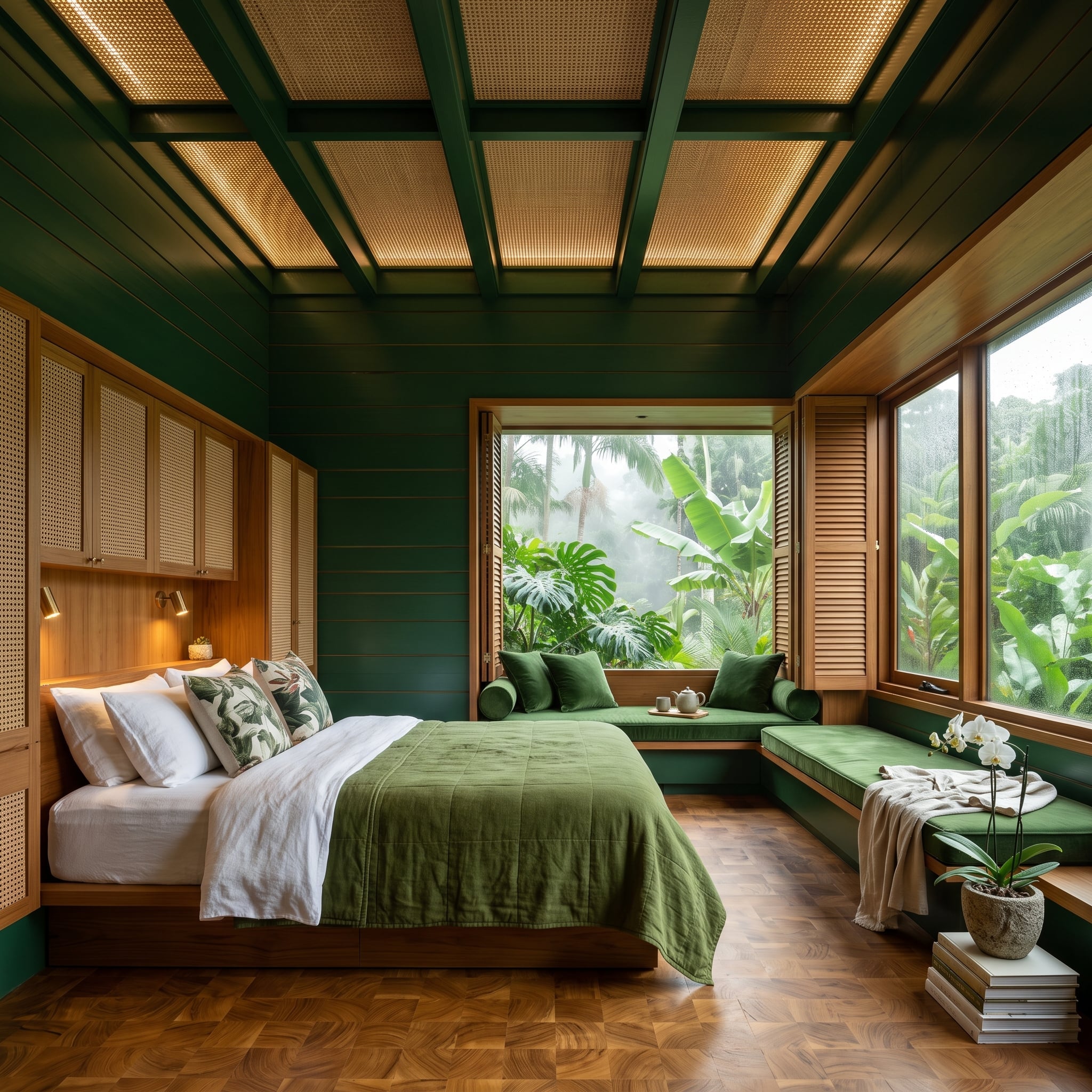
Dark forest green wraps the walls and continues across the framework of the coffered ceiling. Instead of filling those coffers with more solid green, woven natural-fiber panels introduce a lighter, visibly different texture overhead.
Herringbone parquet supplies another pattern at floor level. The result is nearly monochromatic in spirit but not in surface: paint, woven panels, and wood each interrupt the color in a different way.
Texture Break: Woven panels interrupt the painted ceiling with a visibly different grain and openness, keeping the upper plane from becoming one continuous dark field.
16. A Star in the Floor Competes With Coffers Overhead—and That’s the Point
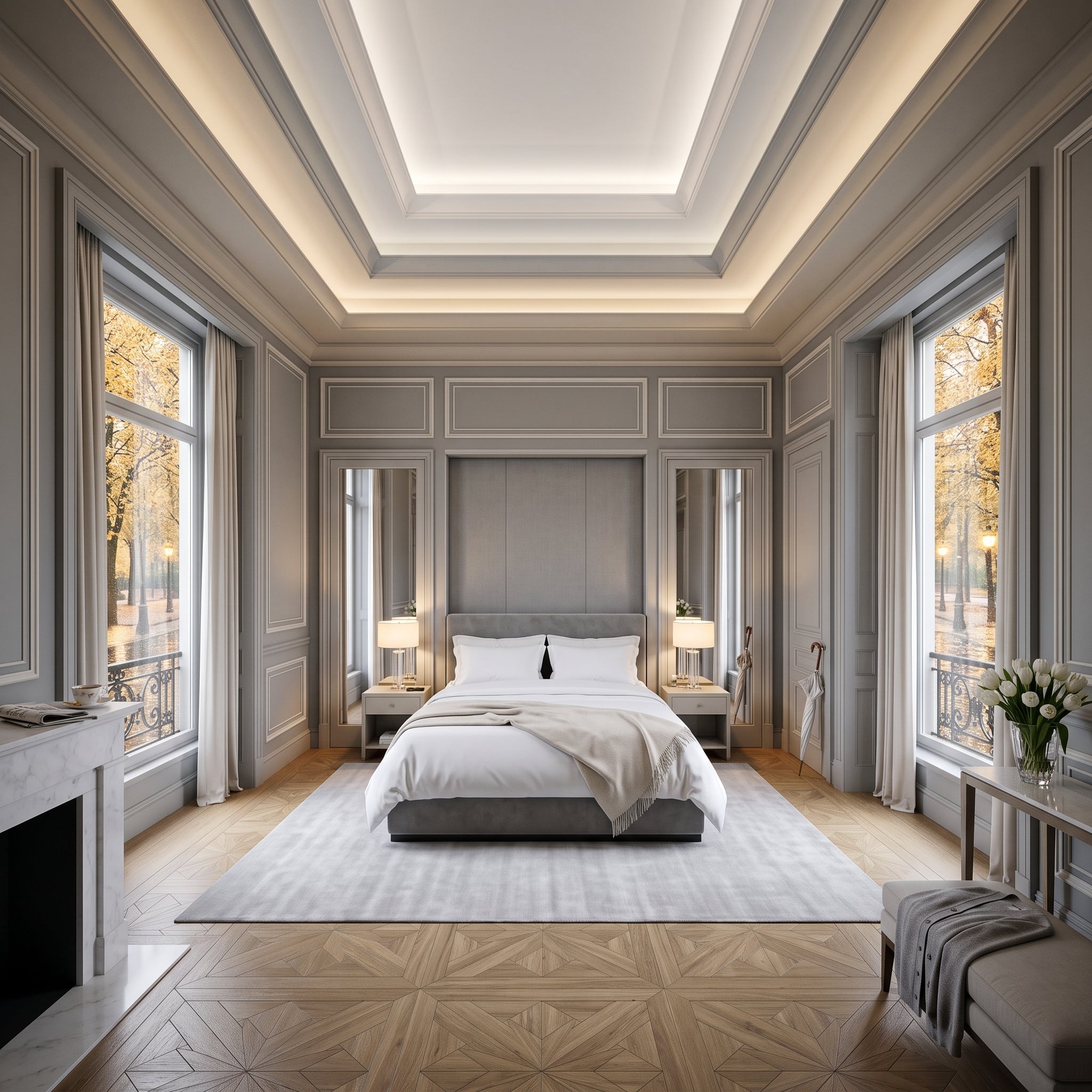
The ceiling offers one grid; the floor answers with another kind of geometry entirely.
Warmly lit coffers divide the plane overhead, while the parquet pattern below changes direction around a star-like central motif. Between them, a tall upholstered headboard and flanking mirrors stretch vertically, introducing a third orientation.
Clear lamp bases and white flowers are almost incidental beside all that built-in pattern. In a room this architecturally busy, that’s probably a compliment.
Pattern Without Print: The strongest patterns here aren’t fabrics or wallpaper. They’re made by the ceiling grid, parquet cuts, mirror edges, and panel seams—the architecture itself supplying the ornament.
15. Glossy Terracotta Turns One Wall Into the Warmest Thing in the Room
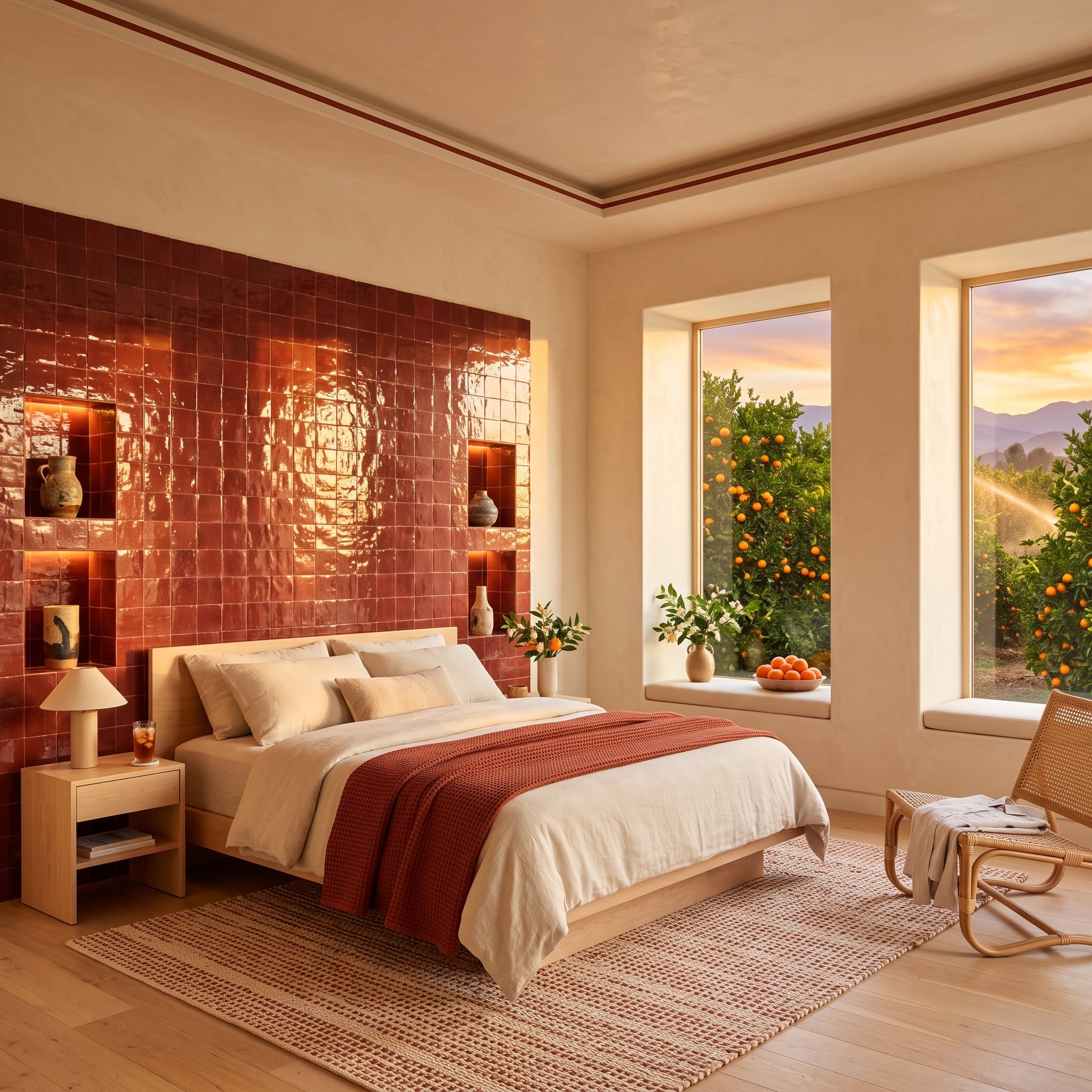
The bed wall is covered in glossy terracotta-toned tile, and slight variation from tile to tile keeps the surface from behaving like one flat sheet of color. Highlights break across it unevenly, especially around the recessed display niches.
Light wood at the bed, nightstand, and floor gives the orange-red wall a quieter base. The architecture gets its richness from repetition rather than accumulation: one material covers the wall, then depth is introduced by carving niches into it.
The surprise isn’t the color. It’s how much dimension comes from letting one surface do several jobs.
14. A Stone Fireplace Wall Gives This Bedroom Its Own Center of Gravity
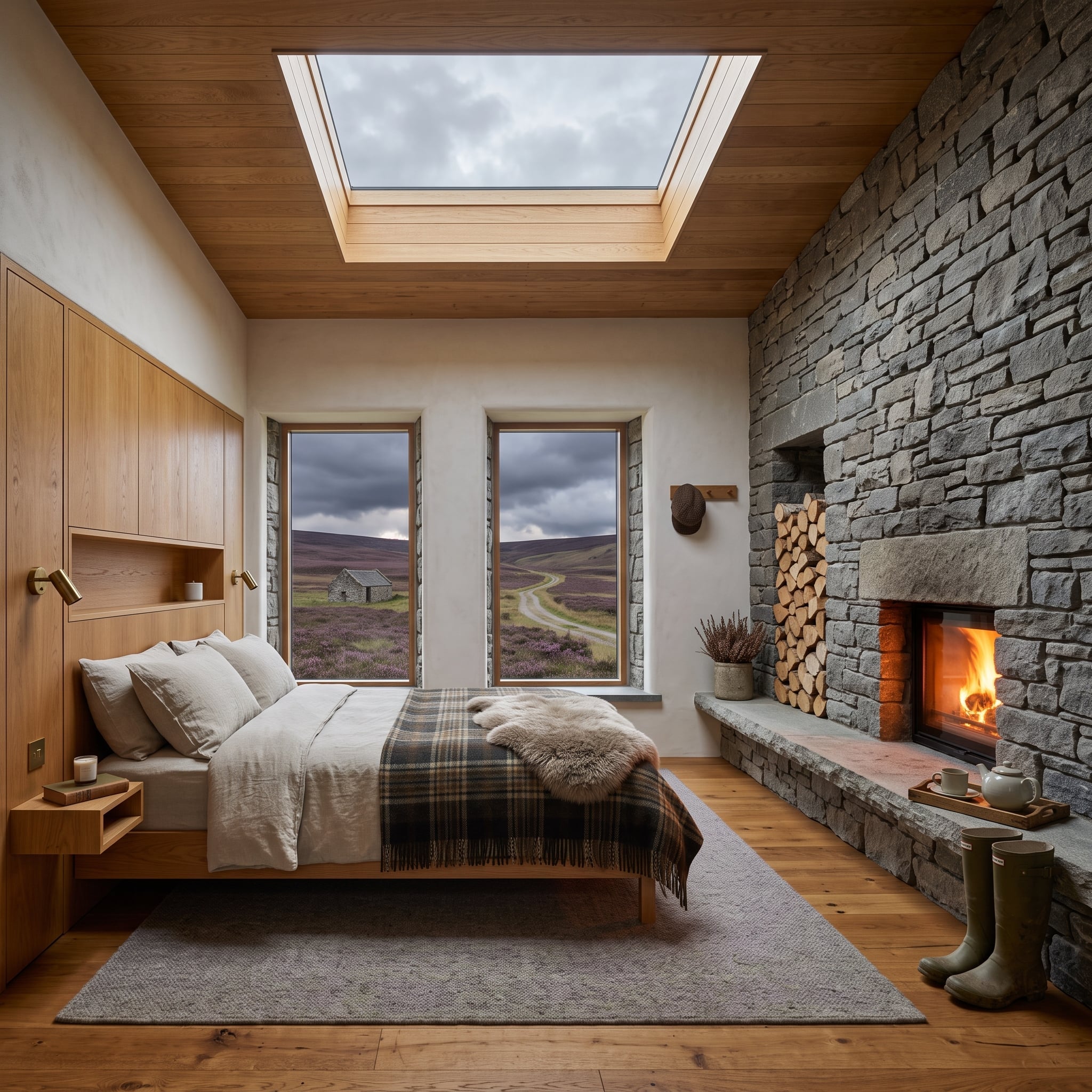
Few bedrooms get this much mileage from one wall.
Rough stone rises from floor to ceiling around an open-hearth fireplace, built-in log storage, and a thick projecting hearth. Above, a skylight cuts through the timber-lined ceiling, bringing a precise opening into an otherwise heavy material envelope.
Tartan and sheepskin-like textures extend the rugged palette without turning the room into a theme. Stone, timber, woolly texture, and cool daylight already give the room a complete vocabulary.
13. A Starry Ceiling Makes Navy Feel Bigger Than a Paint Choice
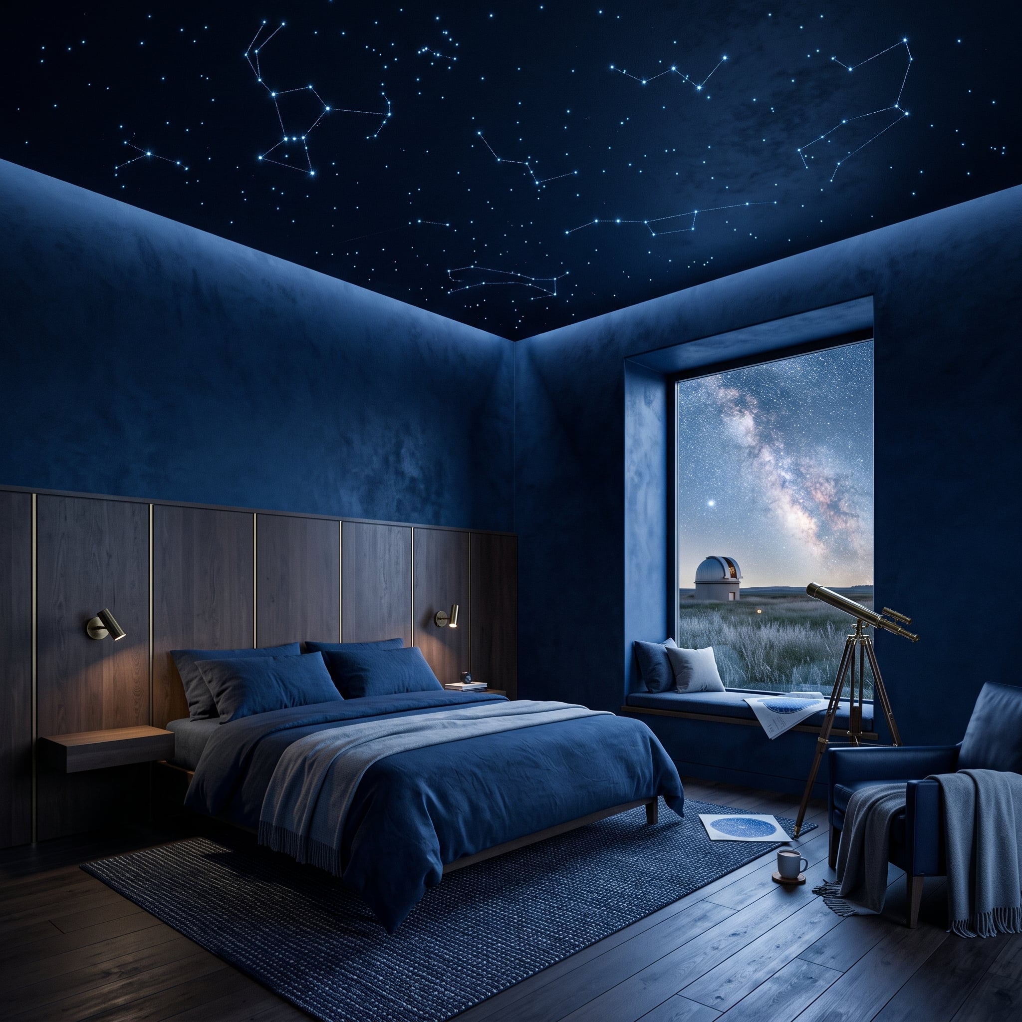
Navy moves from walls to bedding to upholstery until color becomes the room’s envelope rather than an accent. The ceiling pushes the idea further with tiny illuminated points and fine connecting lines arranged into a constellation-like pattern.
Warm wood paneling behind the bed interrupts all that blue without breaking the mood. Brass-toned reading lights add smaller flashes of warmth, while the telescope works as a sculptural vertical element near the glazing.
Ceiling Move: Tiny points of light can make a dark ceiling visually active without requiring a large central fixture. Against a monochromatic envelope, the effect becomes architectural rather than merely decorative.
12. Sculpted Sage Plaster Makes a Flat Ceiling Look Almost Too Easy
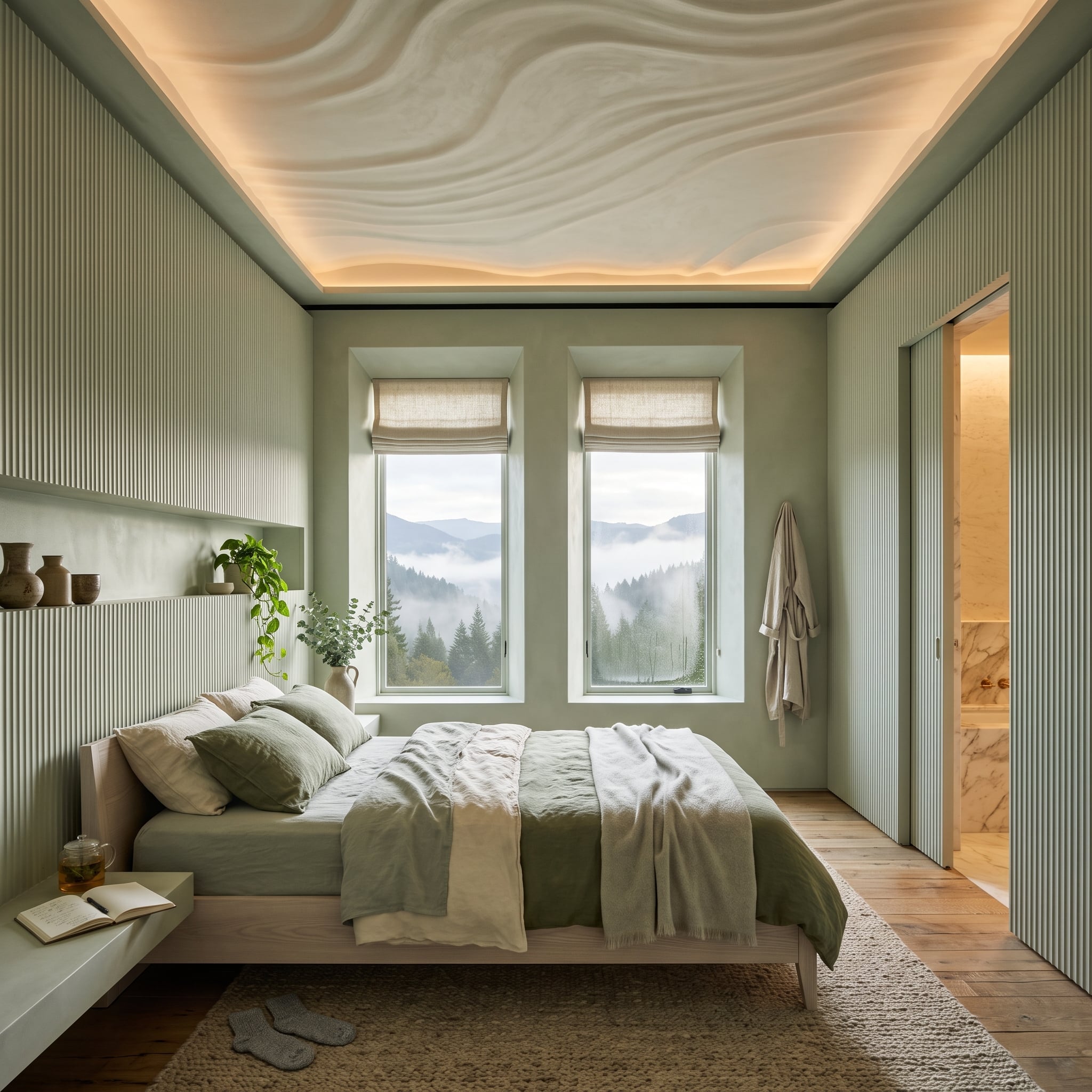
Ribbed sage-toned walls establish a quiet vertical rhythm, but the ceiling has other plans. Broad sculptural waves sweep overhead, picked out by concealed perimeter lighting that emphasizes every rise and hollow.
Below, Roman shades and mossy bedding stay comparatively simple. Another emphatic pattern at bed level would turn the composition into a contest; instead, the relief overhead gets the room it needs.
Relief Over Pattern: Sculptural plaster can create drama through shadow rather than color. Concealed lighting makes the relief more legible by catching raised areas and leaving deeper sections comparatively dark.
11. Burgundy Walls and an Arched Window Put Curves Against Saturated Color
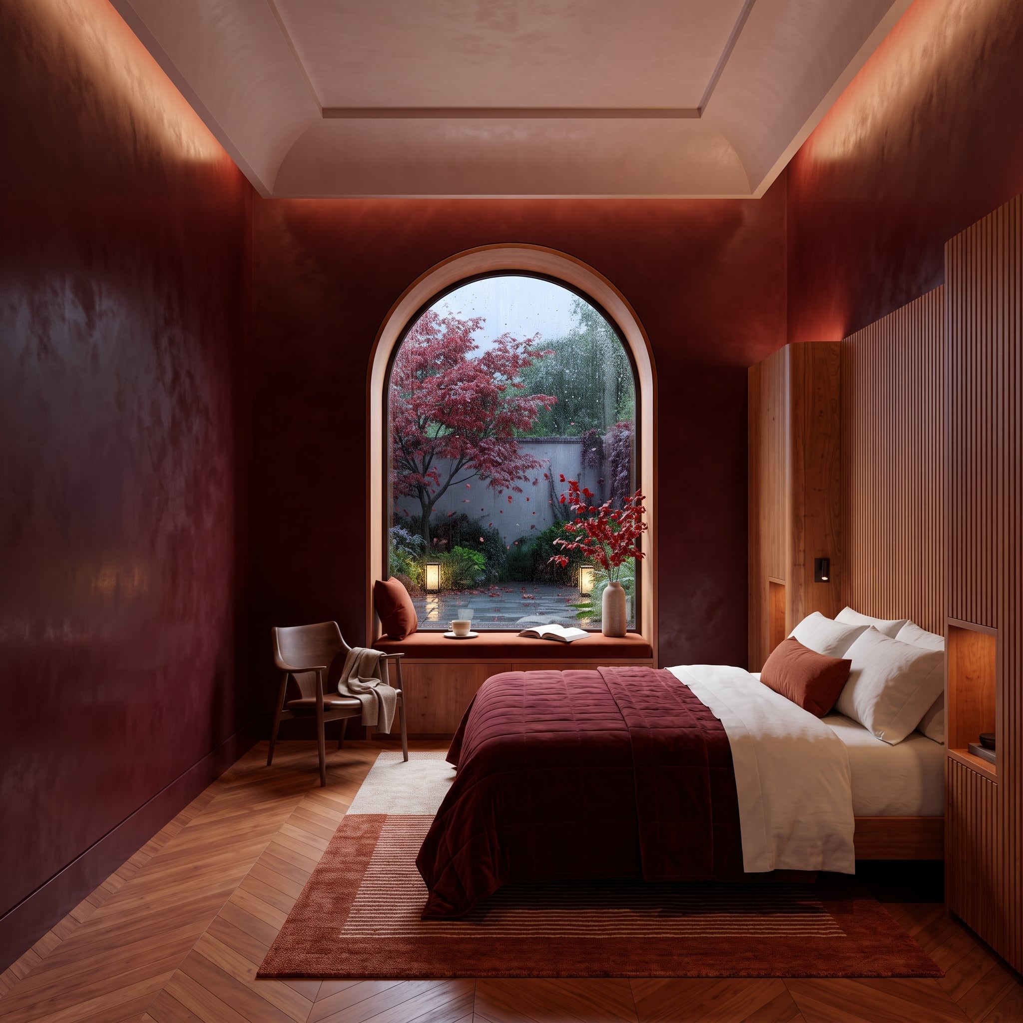
Burgundy plaster wraps the room in saturated color, its subtle surface variation responding to concealed ceiling light without becoming mirror-like. Against all that red, the arched opening becomes a decisive break in the wall.
Behind the bed, vertical wood slats introduce the room’s strongest linear texture. The curve of the opening works precisely because so much of the rest of the composition is rectilinear.
The arch isn’t simply an opening here. It’s the pause in a room otherwise determined to stay saturated.
10. Limewash-Like Walls, Deep Reveals, and Light Built Into the Architecture
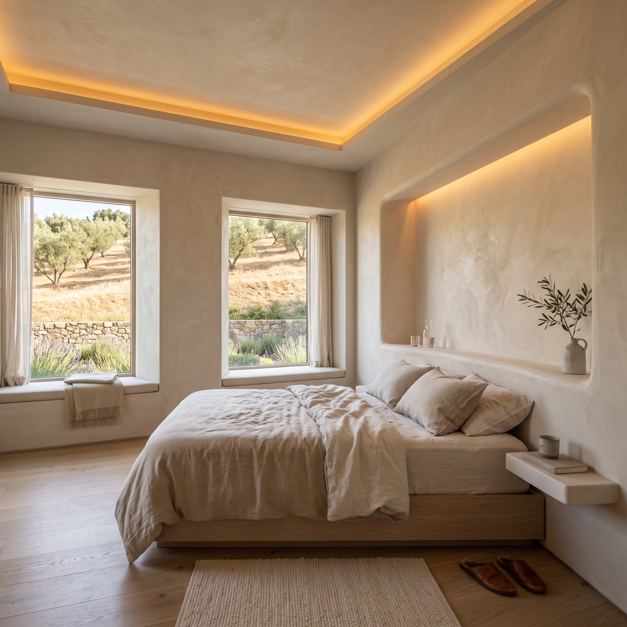
Warm concealed lighting traces the perimeter of a recessed ceiling and reappears above the bed niche, separating those planes without introducing a conspicuous fixture.
The walls have soft tonal variation rather than a perfectly uniform painted finish. Deep window reveals add another layer of shadow, while the low platform bed keeps the center of the composition visually spare.
A small branch in a ceramic vessel is almost incidental. Between the ceiling recess, bed niche, wall finish, and thick openings, the room doesn’t need much ornament.
9. Navy Climbs Onto the Ceiling and Takes the Gold Lines With It
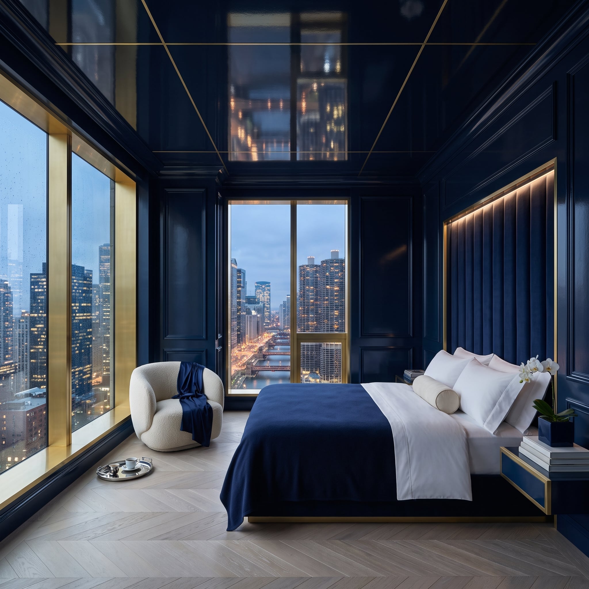
The navy doesn’t stop where the walls normally would. It continues across the ceiling, turning the room into one dark-blue envelope.
Fine gold-toned lines divide the upper plane into crisp sections, giving the ceiling structure without introducing another major color. Below, a warm herringbone wood floor prevents the blue from becoming total.
A few distant points of light appear beyond the glass, but the interior doesn’t need the assist. Thin metallic lines against saturated navy provide all the punctuation the room requires.
8. Striated Earth Tones Give the Bed Wall a Landscape of Its Own
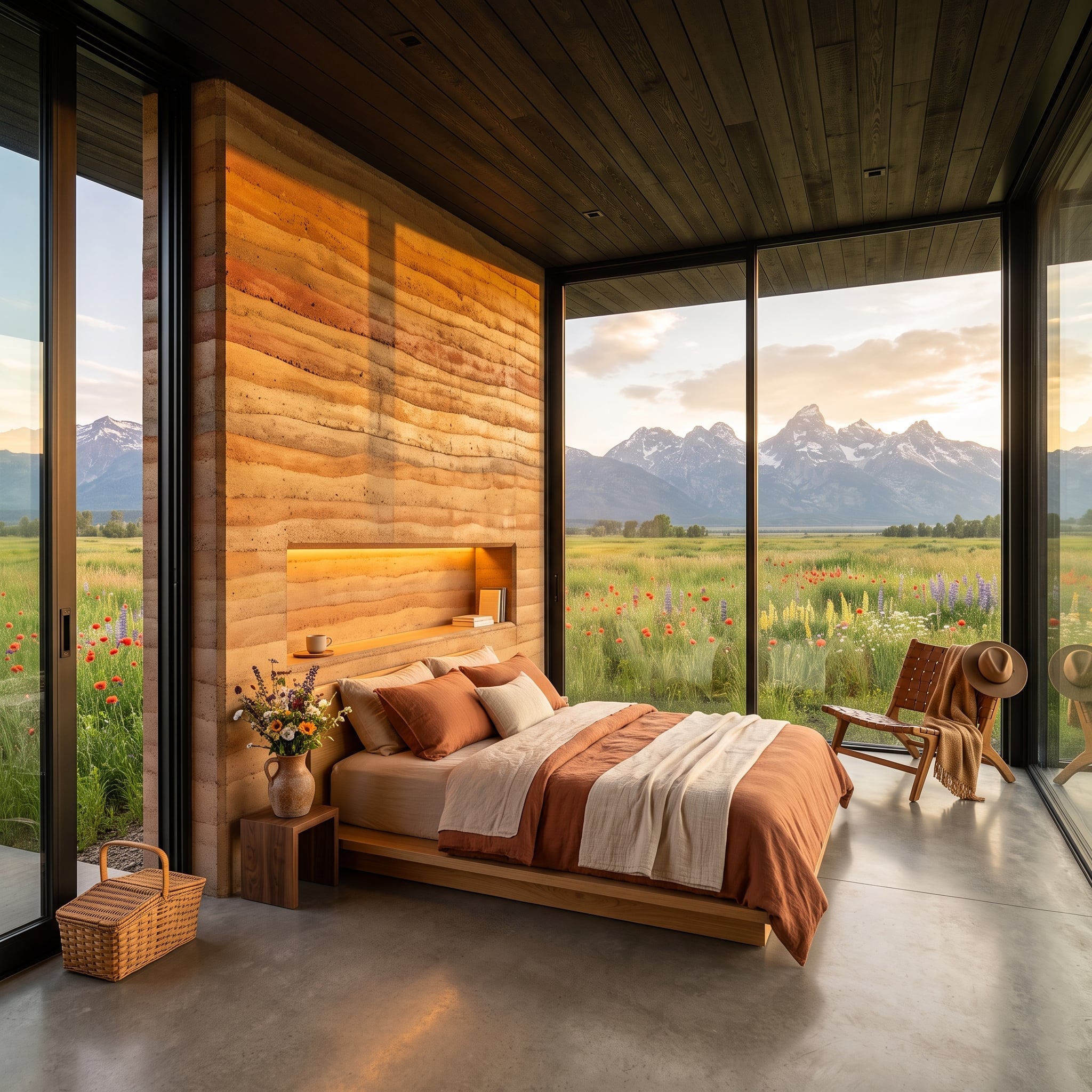
Horizontal bands of amber, ochre, and brown make the headboard wall resemble compacted earth or sedimentary layers. Recessed lighting cuts into that textured mass, emphasizing the strata rather than covering them with art.
Glass on three sides does the opposite: instead of visual weight, it offers almost no wall at all. The bed remains attached to the room’s one emphatically solid plane.
Steal the Idea: The useful move isn’t a particular material. It’s the decision to give one wall visible horizontal strata while keeping the surrounding glazing almost weightless.
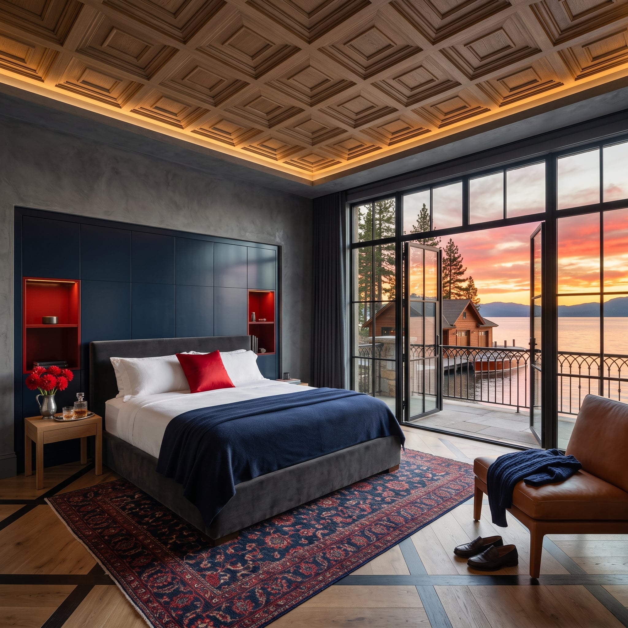
7. A Coffered Ceiling and Crimson Niches Make the Furniture Almost Secondary
🔥 Would you like to save this?
By the time the eye reaches the bed, the room has already made its case.
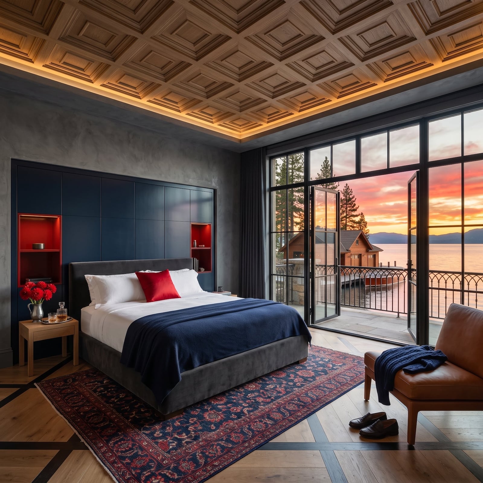
Deep wood coffers divide the ceiling into illuminated bays, turning the entire upper plane into a piece of architectural millwork. Behind the bed, dark built-ins form a broad composition across the wall, while crimson niches punch through that mass with concentrated color. Even the floor participates, using dark inlaid lines to interrupt the pale wood with another geometric system.
The large glazed opening brings daylight and distance to the edge of the composition. Inside, however, the expensive-looking part is structural: ceiling depth, integrated storage, controlled color, and several scales of geometry working at once.
6. A Gold-Toned Ceiling Makes Black Walls Look Almost Restrained
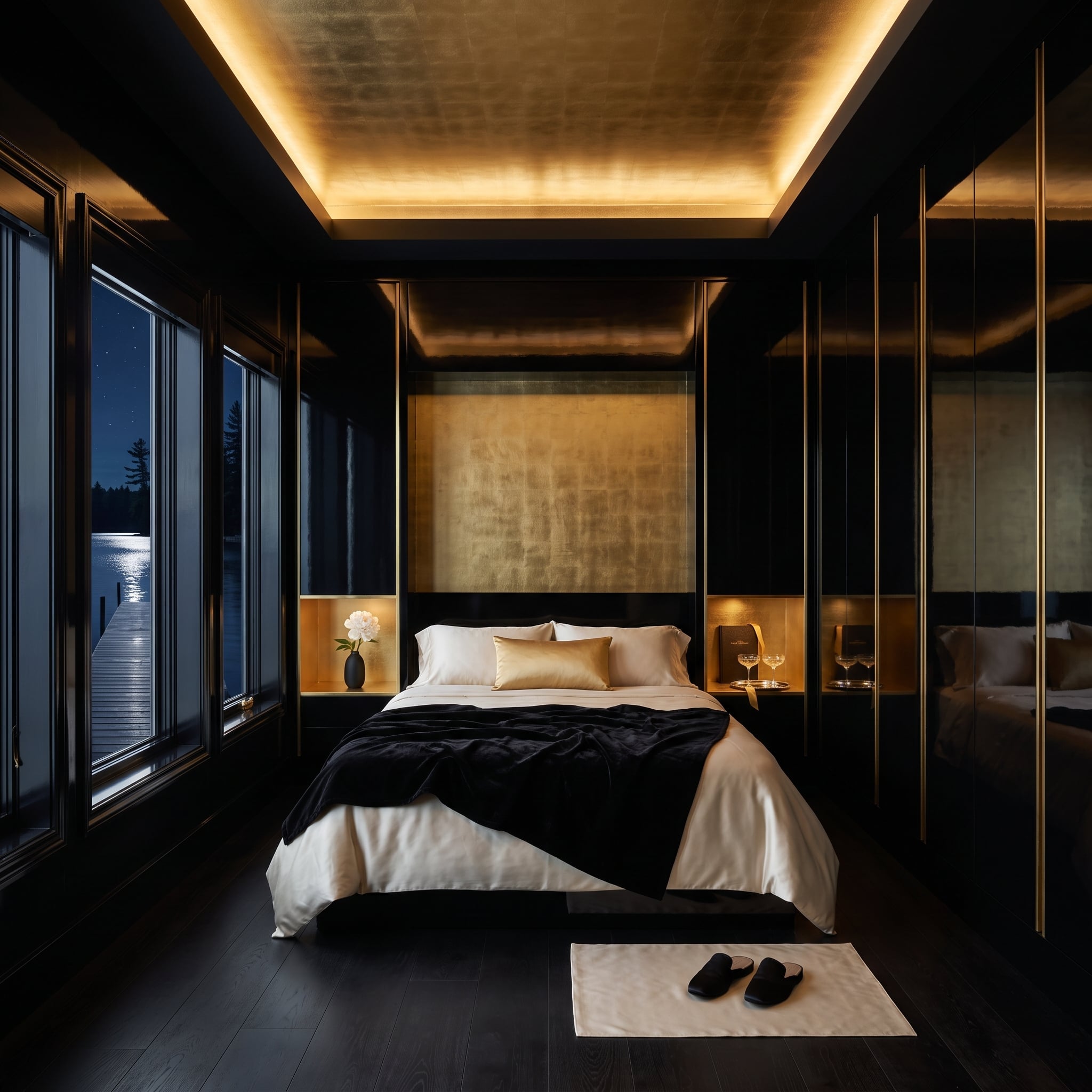
The walls go black. The floor goes dark. Then the ceiling glows.
A gold-toned finish fills the recessed tray overhead, illuminated from a concealed perimeter so the entire center plane appears luminous. Below it, the oversized metallic-framed headboard provides a quieter echo of the ceiling without repeating the shine everywhere.
After dark, the glazing becomes comparatively recessive, allowing the luminous upper plane to dominate the composition.
Top-Down Drama: Concentrating the brightest finish overhead reverses the usual bedroom hierarchy. The ceiling becomes the luminous surface, while the darker vertical planes provide contrast around it.
5. Slatted Timber Overhead Meets Veined Stone at the Fireplace
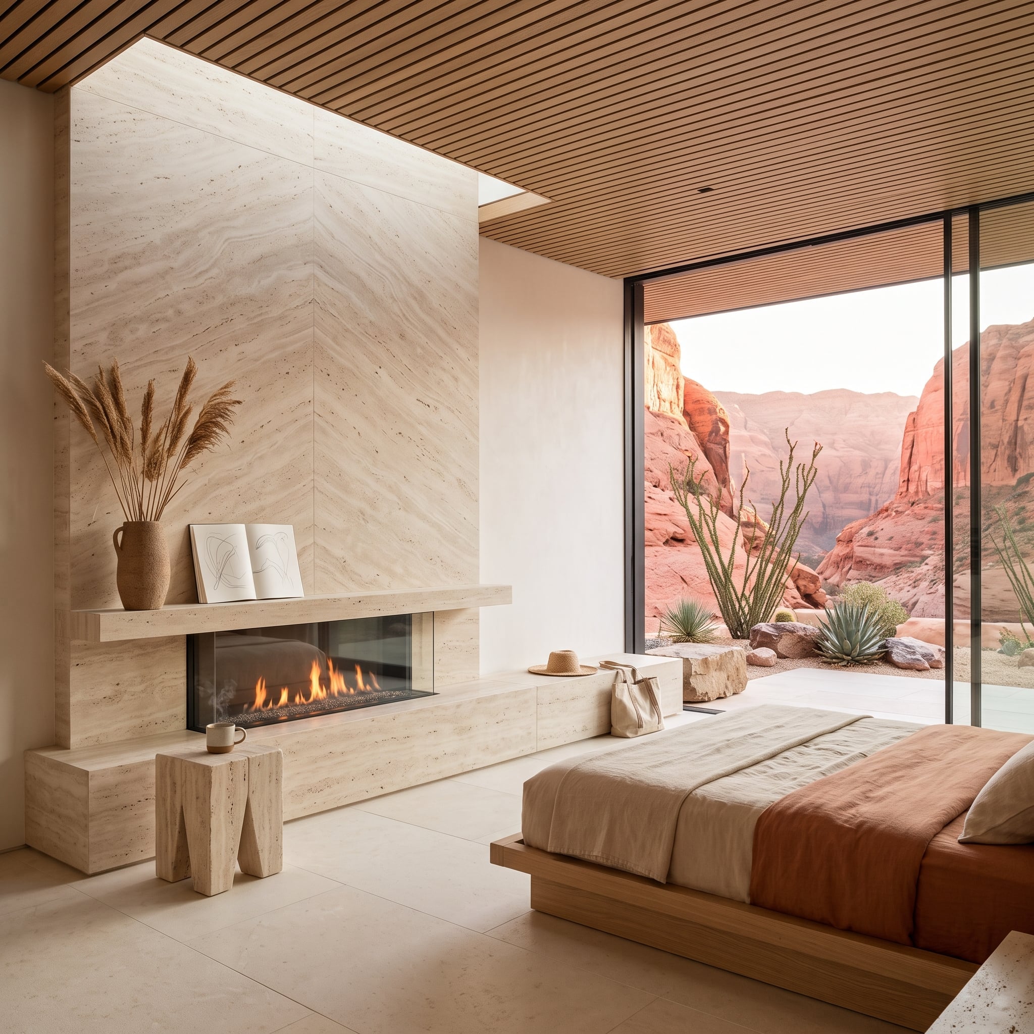
A full-height fireplace wall uses large veined stone panels arranged into strong directional patterns. Overhead, closely spaced timber slats run in another direction entirely.
That’s enough geometry for one bedroom, so everything else pulls back: a low platform bed, pale textiles, dried grasses, a small ceramic vessel. A little warm color beyond the glass is incidental beside the much stronger material conversation inside.
Stone on the wall, timber on the ceiling, quiet furnishings between them. Three levels of visual intensity, and they know their order.
4. Leather-Toned Channels and Dark Beams Give Cream Something to Push Against
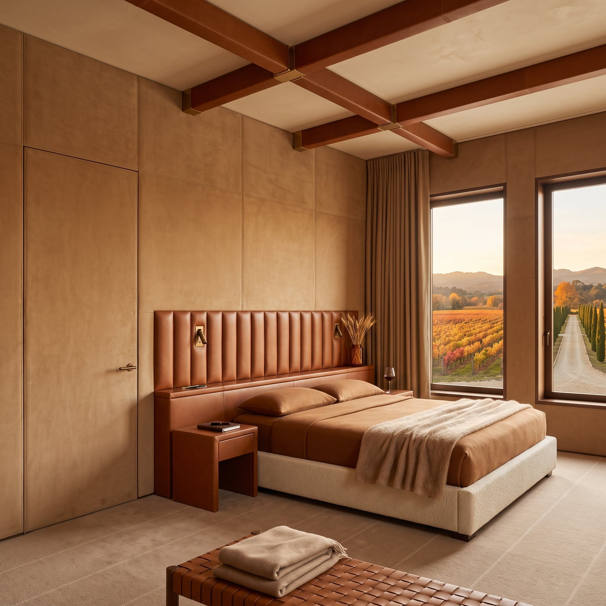
A cognac-toned channel-tufted wall rises behind the bed, giving the room a strong vertical rhythm. Above, deep reddish-brown beams cross pale ceiling panels, reversing that direction with a much heavier grid.
Cream bedding and upholstery create a quiet zone between those two assertive architectural treatments. The restrained palette matters because the room already has two powerful systems of line—vertical behind the bed, horizontal overhead.
Contrast in the Bones: Dark beams against pale infill make the ceiling structure conspicuous. The channeling behind the bed introduces a second architectural rhythm at ninety degrees to it.
3. Dark Timber and One Skylight Turn the Ceiling Into an Opening

Dark wood paneling runs from floor to ceiling, turning the walls into a continuous warm-brown enclosure. Then a skylight opens directly above the bed and breaks that enclosure with a hard rectangle of daylight.
The contrast couldn’t be simpler: dense timber around the perimeter, an opening overhead. Additional glazing becomes secondary to that single incision through the ceiling plane.
Instead of decorating the upper surface, the design removes part of it.
2. A Pebbled Floor and Dark Timber Make the Glass Feel Almost Weightless
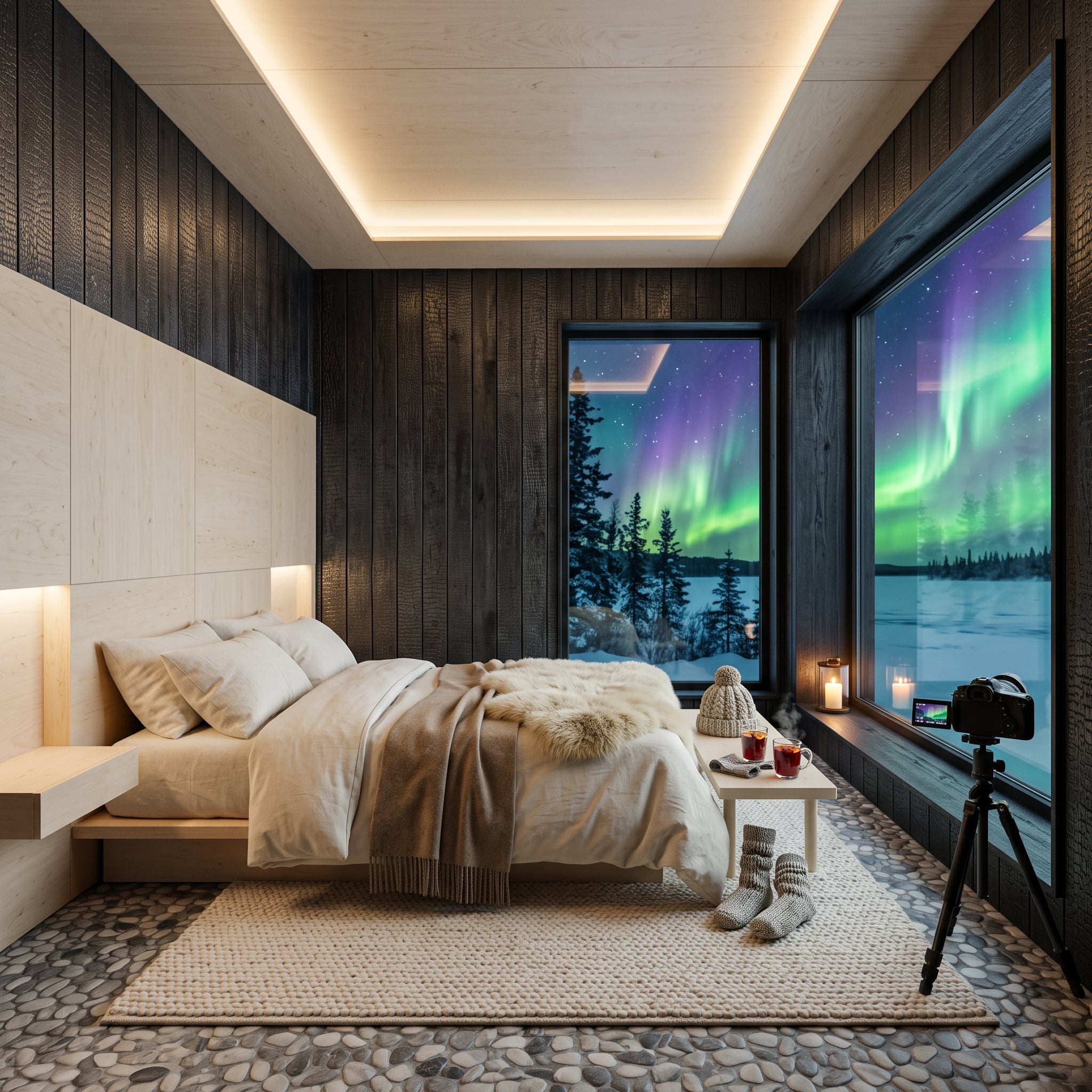
Dark tongue-and-groove timber wraps the walls, while a pebble-textured floor gives the room an unusually tactile base. Against those heavy, earthy surfaces, the floor-to-ceiling glazing becomes the visual release.
Color beyond the glass is almost a bonus. The architectural contrast would work without it: rough floor, dark enclosure, broad transparent opening.
- A floating wood headboard panel doubles as a narrow bedside shelf
- Layered blankets introduce soft texture against the harder wall and floor surfaces
- The large glass opening breaks an otherwise enclosed timber shell with one nearly transparent plane
1. Pale Walls, a Low Bed, and Almost Nowhere for Bad Detailing to Hide
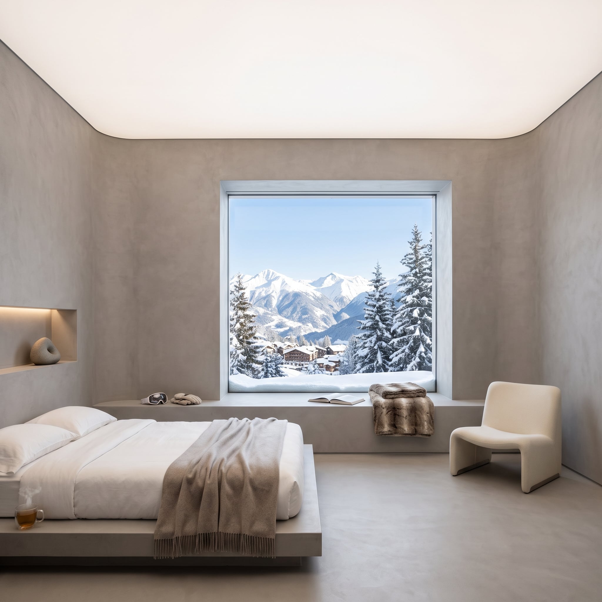
After glowing stone, cobalt walls, metallic ceilings, saturated plaster, woven coffers, starry skies, and enough architectural geometry to keep a drafting table busy for months, this room finishes the argument by stripping almost everything away.
A pale gray continuous wall finish wraps the corners with very little visible trim. The platform bed sits low. Concealed perimeter lighting separates ceiling from wall with a narrow wash of illumination. One large glazed opening supplies most of the remaining contrast.
Ski goggles, gloves, and an open book add small-scale detail to the window ledge, but there’s nowhere for the architecture to hide. When a room gets this quiet, every junction, recess, proportion, and line becomes more visible.
The Takeaway: Expensive-looking architecture doesn’t require every surface to perform. Across these 31 bedrooms, the strongest rooms establish a hierarchy: one ceiling, wall, opening, material transition, or lighting move takes command, while everything around it gives that move enough room to matter.