
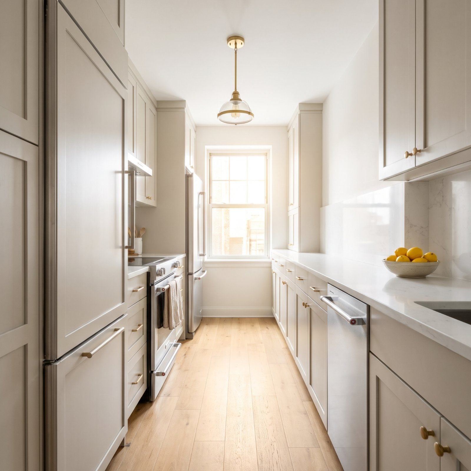
A galley kitchen punishes every bad decision. Four feet of aisle means two people can’t pass, the upper cabinets press in, and by dinner it feels like you’re cooking inside a filing cabinet. Most people assume the fix is a sledgehammer and a structural engineer’s bill. It isn’t. The strategies below trade square footage you don’t have for the illusion of it, leaning on light, reflection, tone, and a few clever layout swaps. Everything here fits the footprint you already own, and your walls stay exactly where they are.
41. Swap in a Shallow Base-Cabinet Run to Steal Back the Aisle
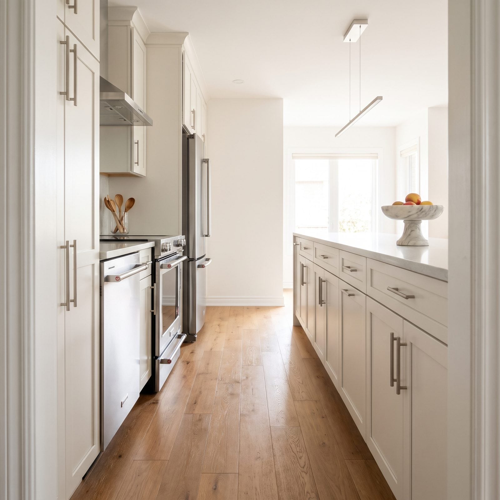
The aisle is where a galley lives or dies. Standard base cabinets run 24 inches deep, and in a tight galley that’s often several inches you simply can’t spare. Drop one run to 18 or even 15 inches and you claw back real walking room without touching a single stud.
In order to come up with the very specific design ideas, we create most designs with the assistance of state-of-the-art AI interior design software. Also, assume links that take you off the site are affiliate links such as links to Amazon. this means we may earn a commission if you buy something.
Yes, you lose a little storage. What you gain is the ability to open the oven while someone else stands at the sink, and for most people that’s the trade of the year. Put the shallow run on the side you don’t prep on, pair it with soft white white shaker cabinets, and the aisle reads generous even though the footprint never moved an inch.
40. Pick Cabinet Fronts That Bounce Light Instead of Swallowing It
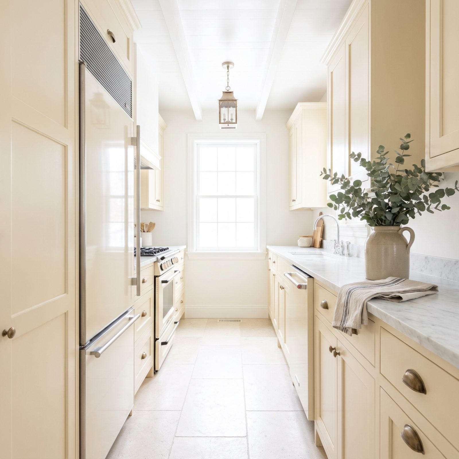
Dark matte cabinets absorb light, and they absorb it hard. In a galley, that’s the fastest route to walls that close in on you. Pale, light-reflective fronts do the opposite and throw whatever daylight you’ve got back into the room.
Go for soft white, buttercream, pale greige, or a gentle sage in a satin finish rather than a dead-flat one. That slight sheen is the whole point. It picks up the window and spreads it across the doors. Fully flat paint on a galley cabinet is a quiet mistake I made once and regretted every grey morning after.
39. Keep Walls and Cabinets Breathing in One Tonal Family
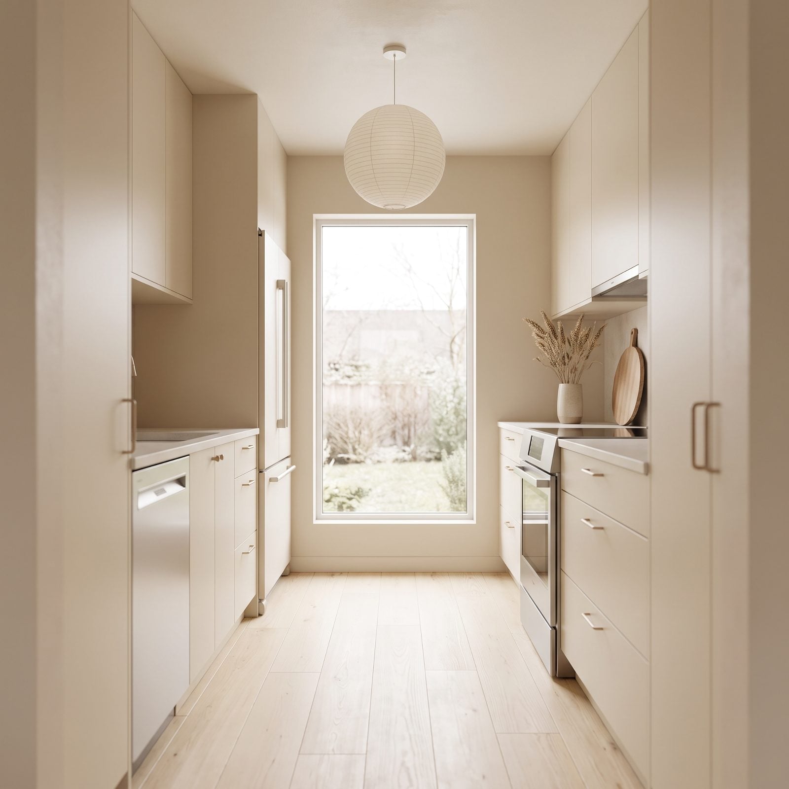
Contrast carves a room into pieces. Every time your cabinets stop and your wall color starts, your eye registers a boundary, and boundaries make a small space feel chopped up. Pull walls, uppers, and lowers into one tonal family and those boundaries melt away.
You’re not painting everything identical. Shift a half-tone here and there so the space still has some life to it. But keep them all speaking the same language. The eye slides from counter to wall to cabinet without snagging, and the whole galley reads as one continuous volume. Want more small kitchen inspiration? This is the single move that does the most heavy lifting.
What Our Readers Say
- In our readers’ heart vs thumbs-down votes, kitchens dominated by cream got hearts 58% of the time, compared with 49% for the other kitchen images in the same articles.
- Asked what they would want over the sink, 93% of Home Stratosphere readers picked a big window over a backsplash wall.
From Home Stratosphere reader polls and votes.
38. Run One Slab From Counter Straight Up the Backsplash
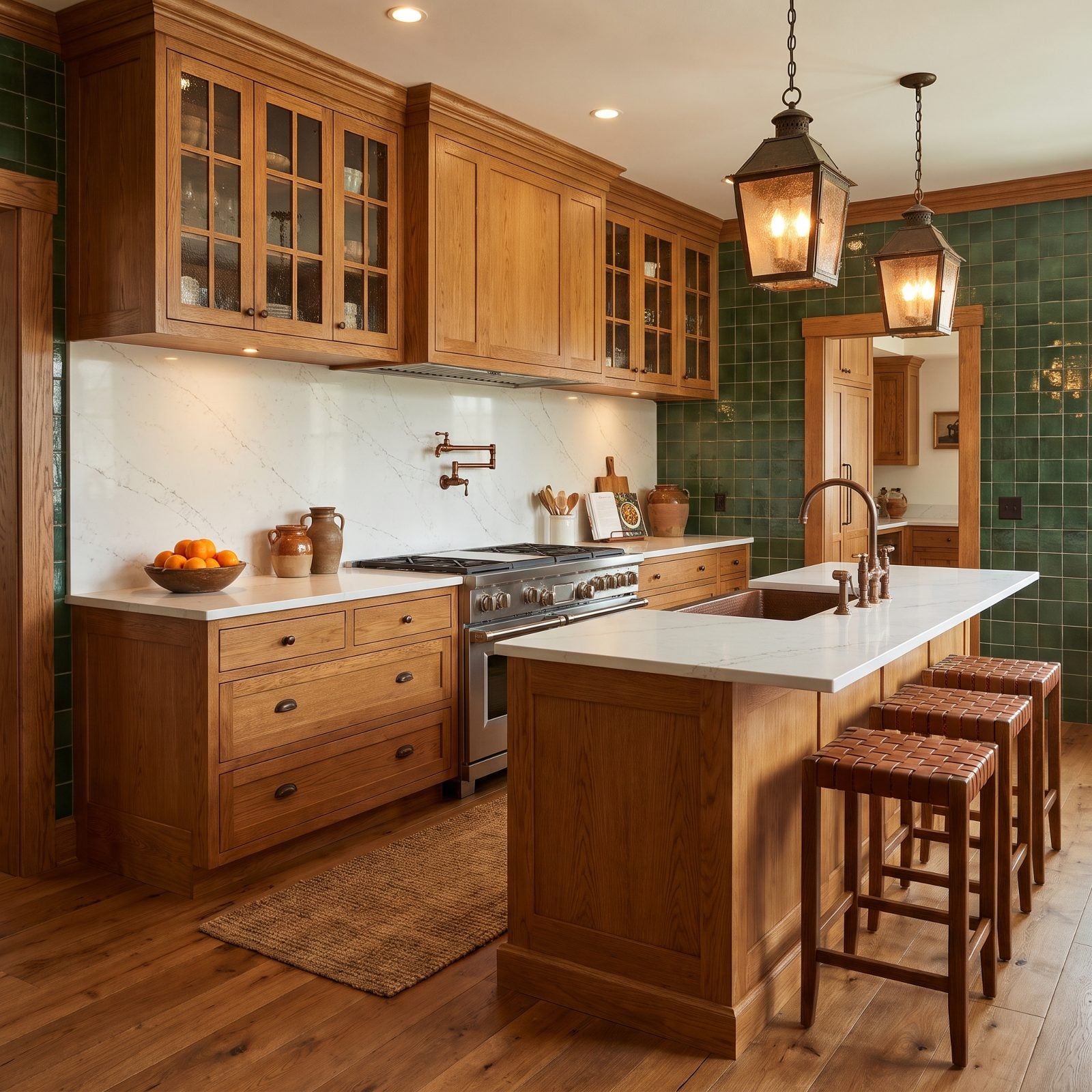
Every horizontal line where the counter meets a tiled backsplash is a visual stop sign. Run the same slab from the countertop up the wall and that line vanishes. The surface becomes one uninterrupted plane, and uninterrupted planes always read bigger.
Quartz or porcelain slab works beautifully here, and it’s a dream to wipe down because there’s no grout hoarding oil behind the stove. In a galley where every surface sits three feet from your face, that continuity does more for the sense of width than any other finish choice you could make.
37. Turn a Slice of Backsplash Into a Mirror
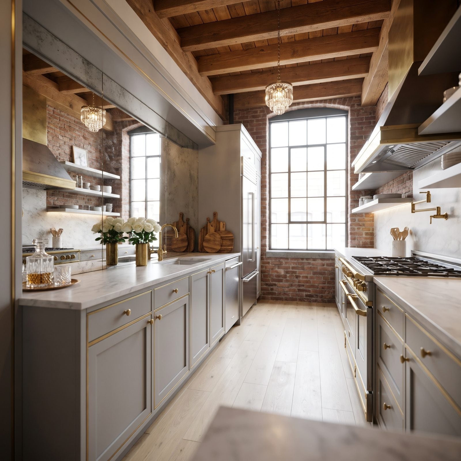
A mirrored backsplash is the oldest trick in the restaurant-design book, and it works because it flat-out lies about depth. Set mirror panels between your counters and uppers on both runs, and the galley seems to open into a second room that doesn’t exist.
Antiqued or bronzed mirror glass is the sophisticated call. It reflects without the dead sterile bounce you get off a bathroom mirror, and it hides fingerprints far better than clear glass does. Keep it to the backsplash band, though. Mirror the whole wall floor to ceiling and you tip straight from clever into carnival.
36. Go Large-Format Tile With Grout You Can Barely See
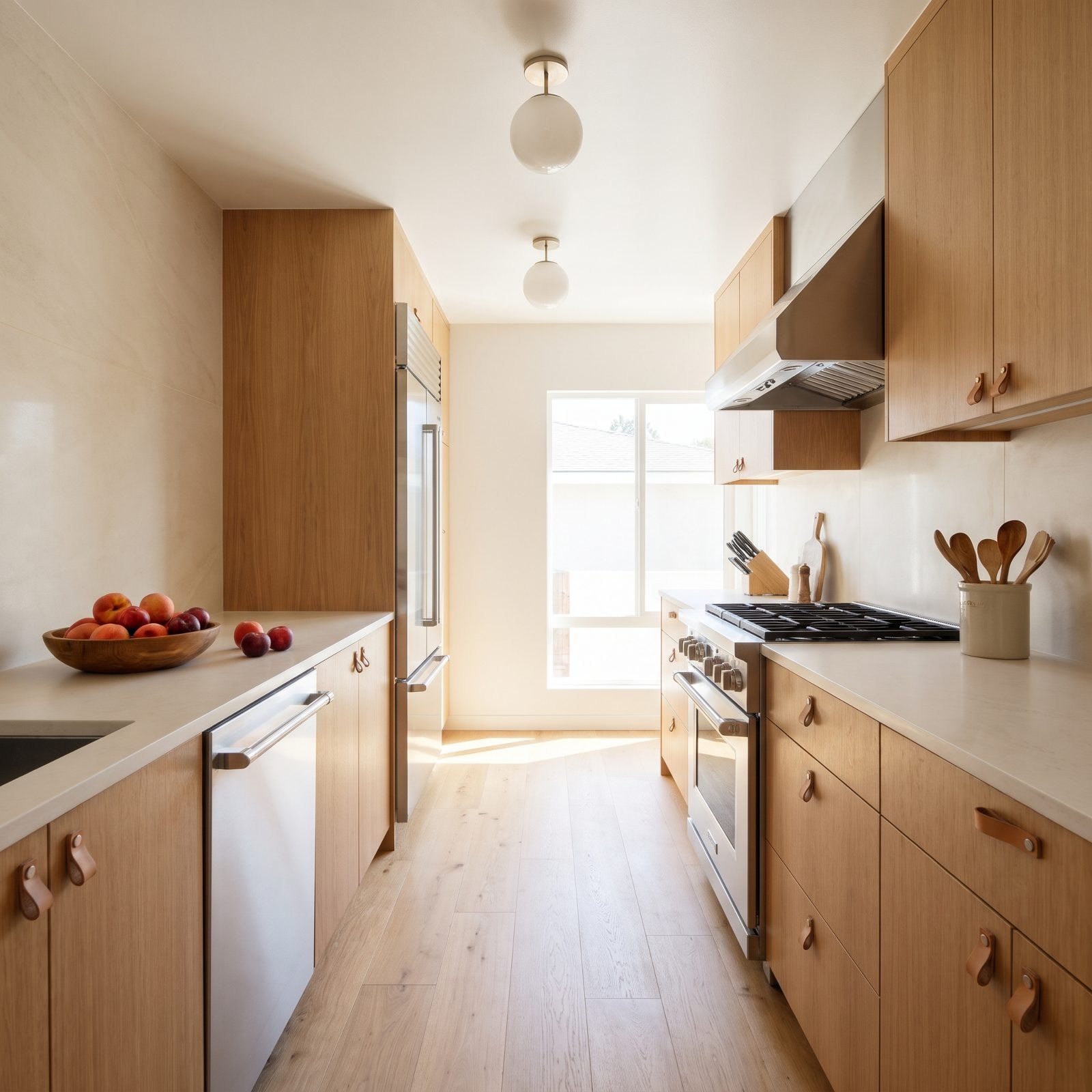
Small subway tile with dark grout turns a wall into a grid, and grids read busy. Busy reads small. Swap to large-format tile, match your grout to the tile color, and suddenly the wall looks like one smooth sheet instead of a hundred little boxes.
The fewer grout lines your eye has to count, the less visual clutter there is, and the more the walls recede, which leaves room for a bolder statement underfoot, like a wood-and-marble checkerboard floor. It also means far less grout to scrub. Anyone who has lived with white grout behind a home bar will tell you that alone is a mercy.
35. Paint the Ceiling a Cleaner, Brighter White Than the Walls
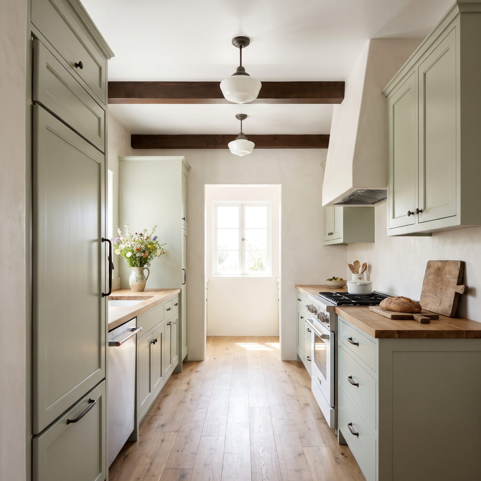
Kitchen ceilings are usually ignored, even tall, beamed ones like this. Big mistake. Paint one a touch brighter and cooler than the walls and it appears to lift, because the eye reads the lighter plane as sitting farther away.
Skip the off-white. Skip the match-the-walls move everyone defaults to. Go a clean bright white in a flat finish up top. The contrast stays subtle enough that nobody consciously clocks it, yet the room feels taller the second you step in. Even in a spacious room with exposed beams, that extra lift and brightness overhead is worth having.
34. Let the Main Window Stay Honestly Bare
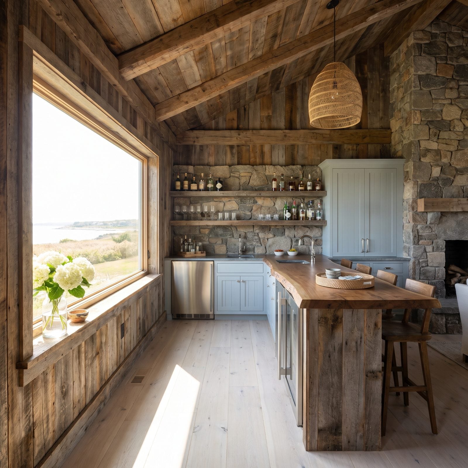
A galley window is your single biggest source of free space-expansion, and people keep burying it under café curtains and sill clutter. Clear it off. Leave the glass bare, or run a simple roller shade that disappears up when open.
Natural light reaches deeper into the room, and the window turns into a visual escape hatch, a view out that tells your brain the space doesn’t end at that wall. Lose the row of dusty jars on the sill. One clear vase, maybe. That’s it. I’ll die on this hill.
33. Trade the Solid Door for a Glazed One
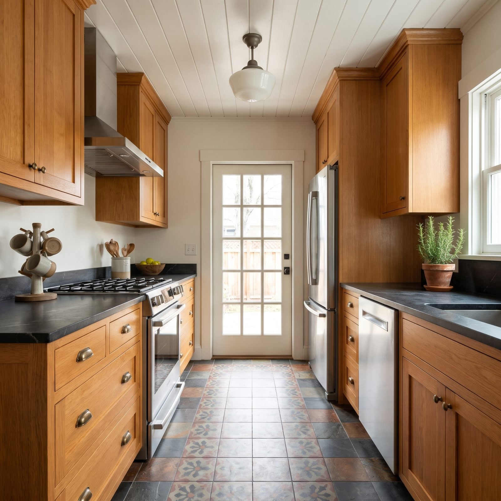
A solid door at the end of a galley is just a dead wall that happens to open. Swap it for a glazed one, full glass or divided lights, and the galley starts borrowing daylight and sightlines from whatever room sits beyond.
Now the kitchen doesn’t terminate in a blank slab. The eye travels through the glass into the next space, and borrowed depth is still depth. A reeded or seeded glass panel keeps your privacy if the far side is a mudroom or something you’d rather not put on display. The same logic that works on a minimalist hallway design works here: open the sightline, gain the space.
32. Drop in a Solar Tube Where a Window Can’t Go
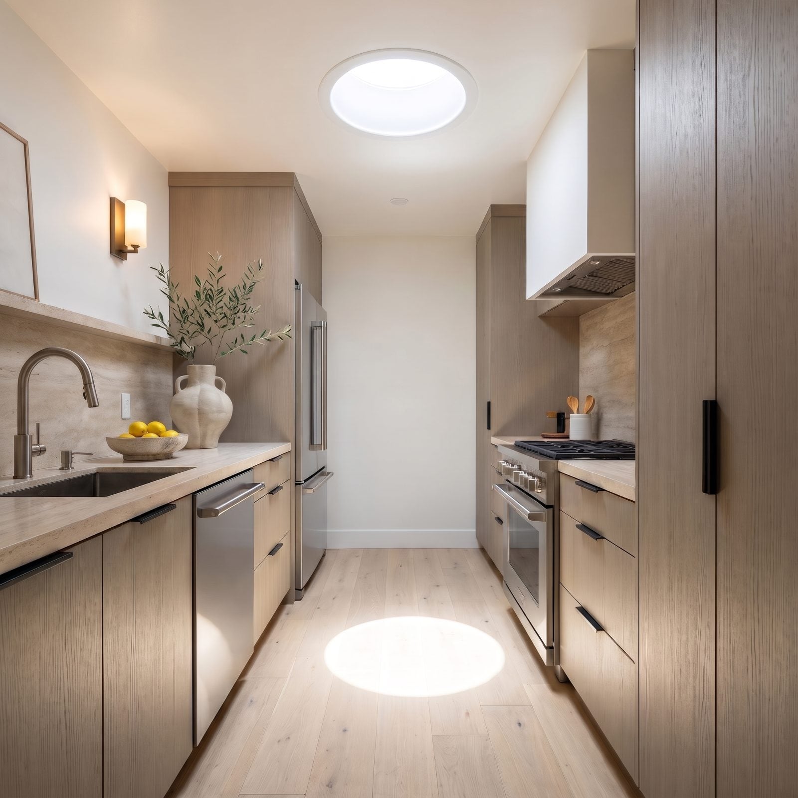
Some galleys run long and narrow, with a blank wall at the far end, no daylight reaching the middle, and no side wall to cut a window into. That’s where a solar tube earns its keep. A small reflective shaft pipes real daylight down from the roof and spills it into the middle of the room. No wall removal, no structural drama.
And the light it delivers is startlingly good, soft and genuine rather than the flat wash of an LED can. On a long galley with no window at either end, it’s the difference between a dim corridor and a room that feels open to the sky. Least obvious fix on this list, and quietly one of the best.
31. Wash the Counters With Under-Cabinet Lighting
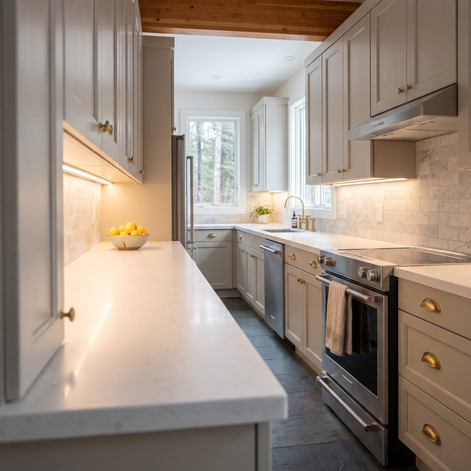
The quickest way to make a cramped galley feel longer is to delete the shadows. A continuous strip of warm under-cabinet LED washes light straight down the counter, and suddenly the whole run reads as one uninterrupted plane instead of a series of dim pockets.
The honed quartz here catches that glow and bounces it back, so the surface looks deeper than it is. Push the strip to the front edge of the cabinet, not the back, or you’ll light the backsplash and leave your chopping zone in the dark. I got this wrong in my own kitchen for a year before I moved the channel forward an inch.
30. Float the Cabinets With Toe-Kick Lighting
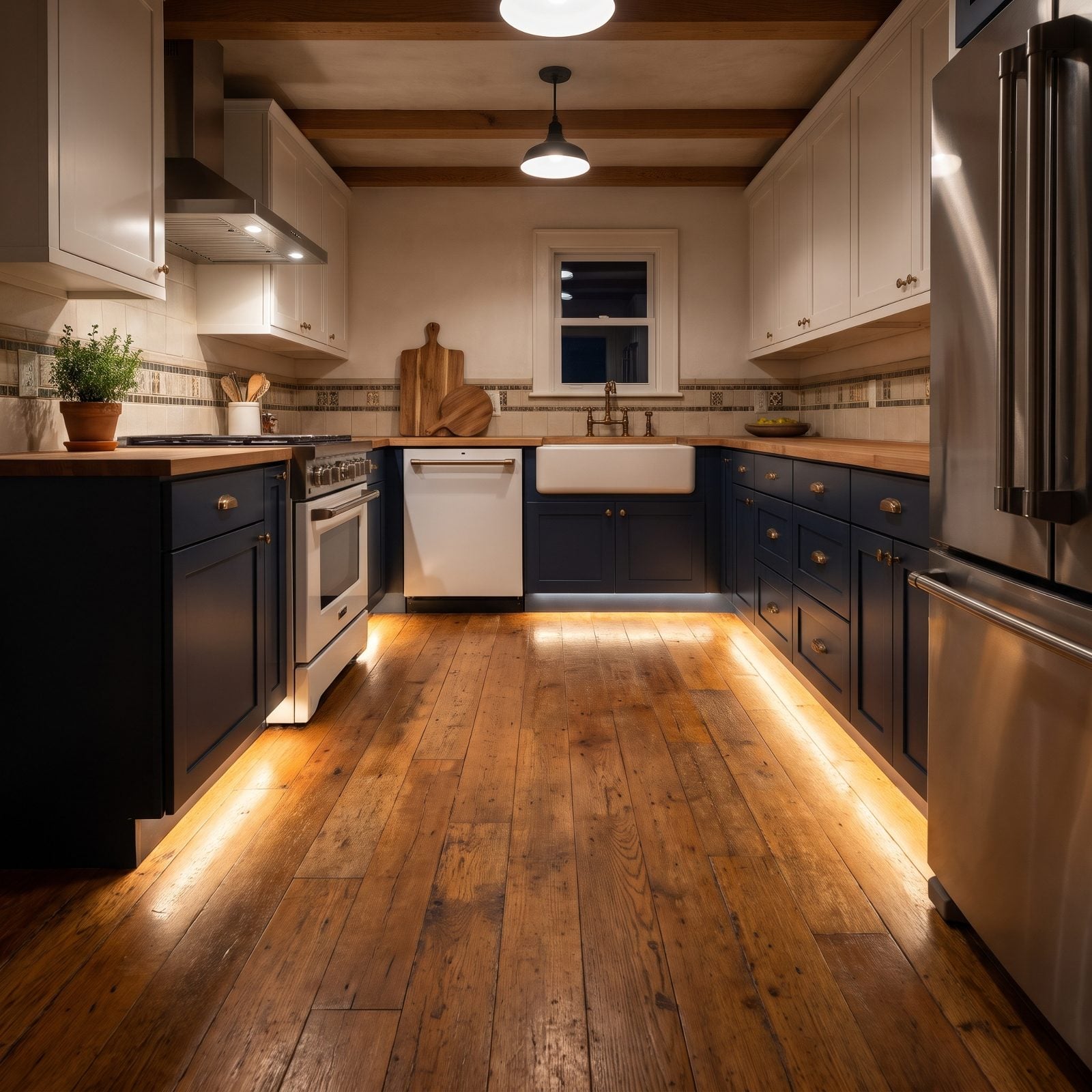
Heavy base cabinets are what make a galley feel like a corridor you’re squeezing through. Tuck a thin LED strip into the toe-kick and the whole run lifts off the floor, visually. Your eye follows that band of light down the length of the room, which reads as more floor, more depth, more air.
Here the warm glow grazes the oak boards and turns the floor into the brightest surface in the room. That matters. Lighter floors expand, dark masses contract, and floating the cabinets splits the difference to hand you both.
29. Run One Slim Linear Light Down the Center
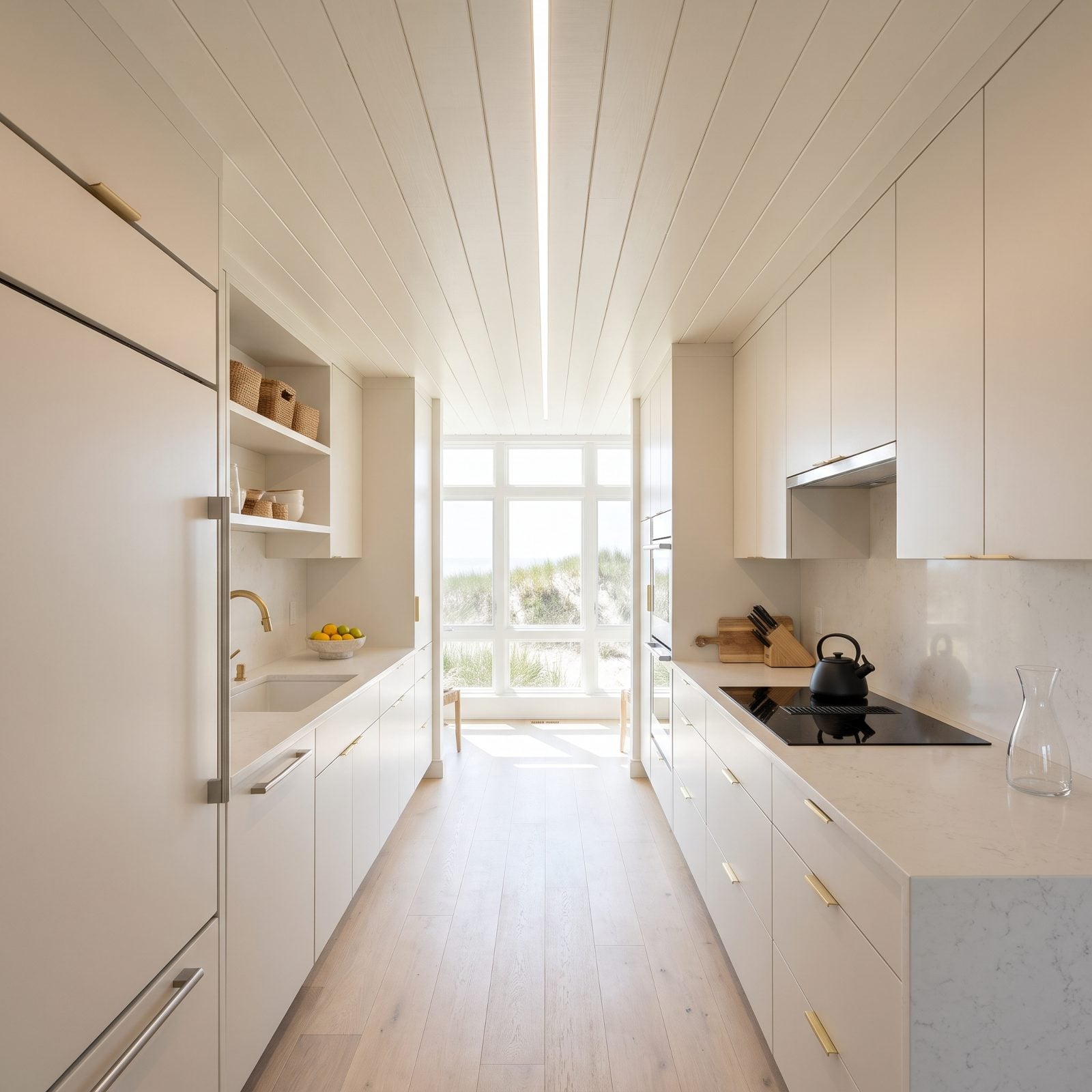
Scatter six recessed cans across a narrow ceiling and you chop the room into segments. One continuous linear light does the opposite, drawing a single clean line from the entry to the far wall so your eye rides it the whole way, which tricks the brain into reading more length.
Center it over the aisle, not over the counters. You want the strongest visual line running through the middle of the room, parallel to the walk path. Small move, outsized effect on how long the space feels.
28. Extend Upper Cabinets to the Ceiling
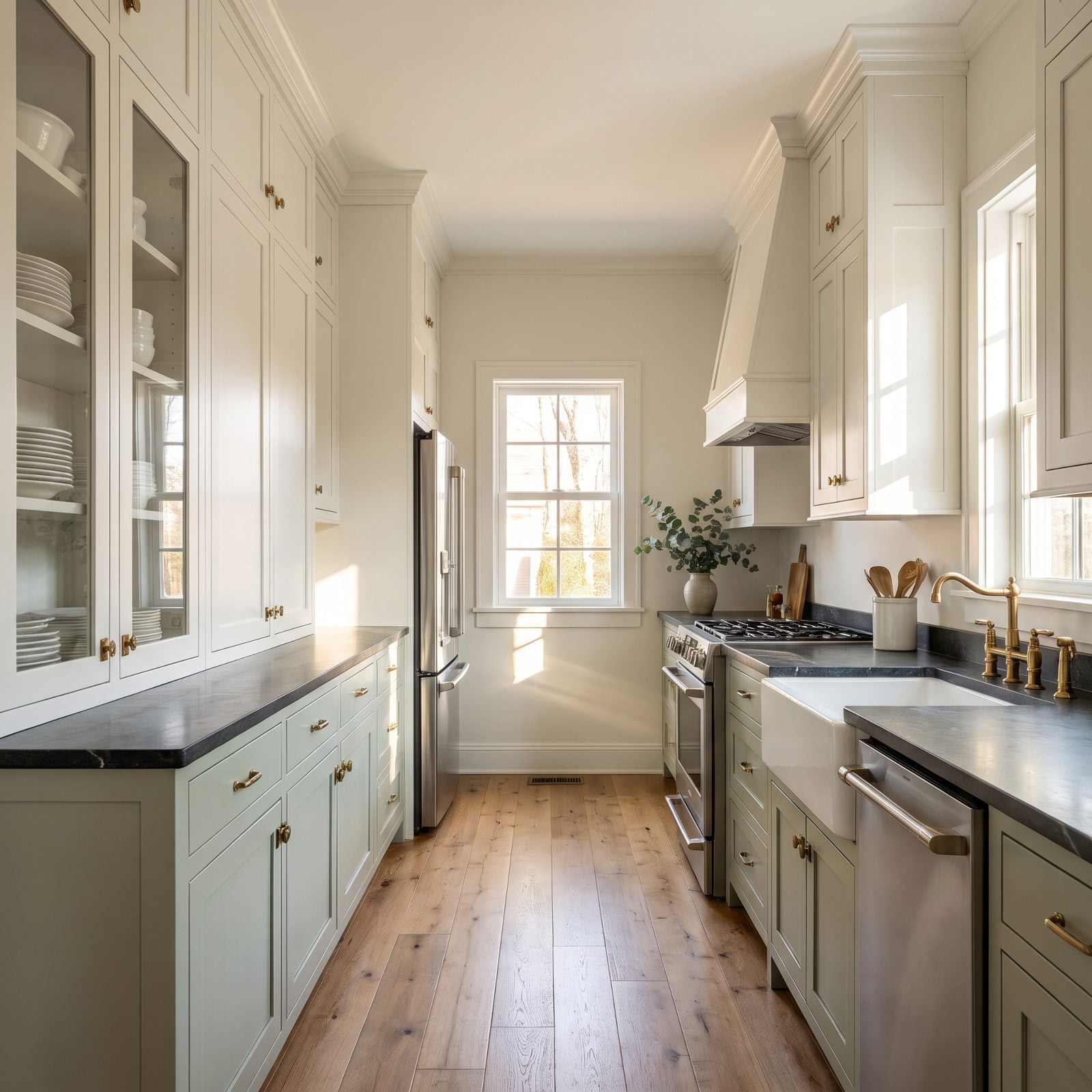
That dead gap above standard upper cabinets does two bad things in a galley. It collects grease-dust nobody ever cleans, and it slices the vertical line of the room clean in half. Run the cabinets all the way to the ceiling and you give the eye an uninterrupted vertical sweep instead.
The payoff is height. In a room that’s already short on width, up is the only direction left to grow, and tall cabinetry banks that gain. You also get a top shelf for the roasting pans you use twice a year. Everybody has that shelf. Mine holds a turkey platter and a waffle maker I’ve used once.
27. Use Open Shelves Along One Side
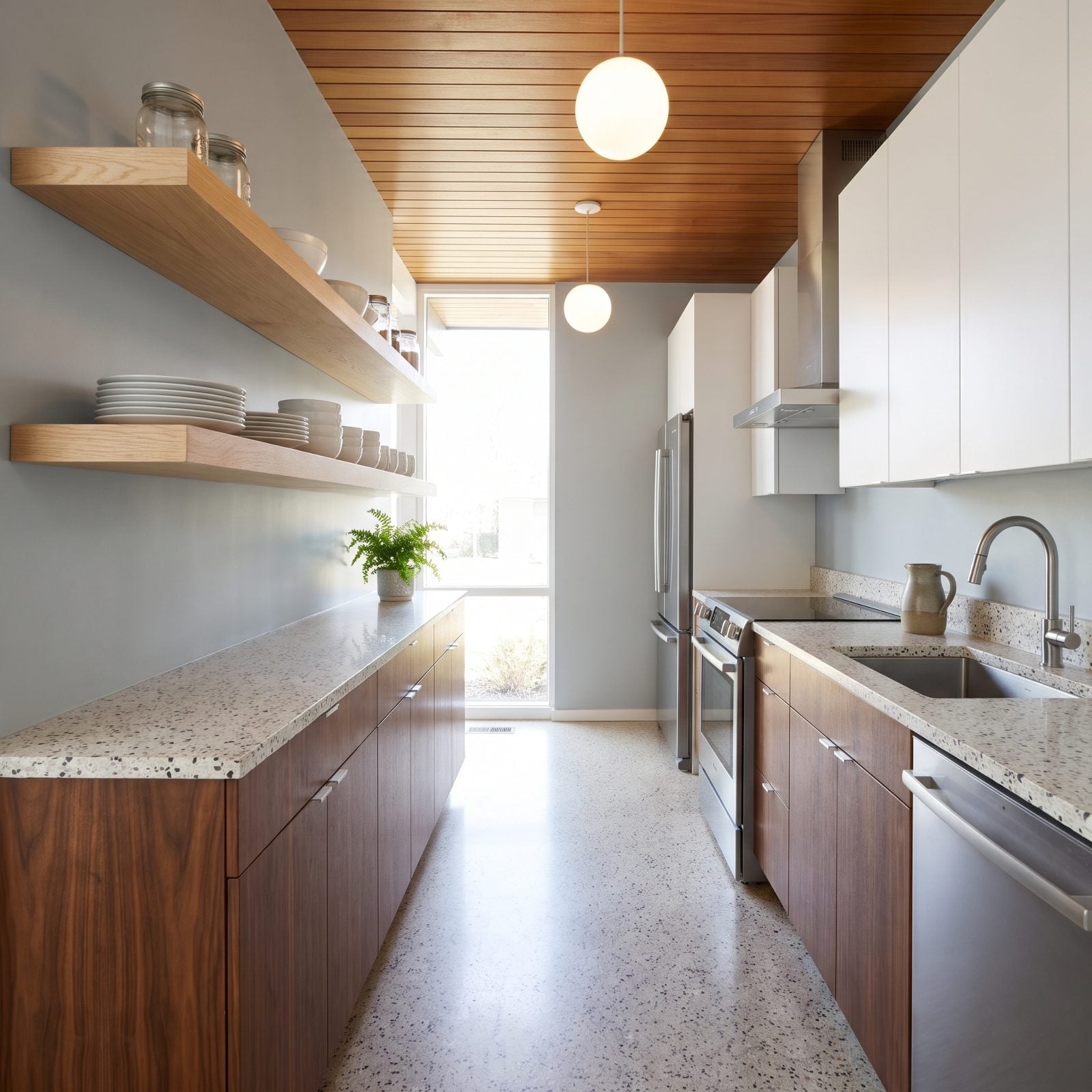
Upper cabinets on both walls of a galley close in on you like two bookcases shoved too near. Swap one run for open shelves and that wall exhales. The eye reads actual wall behind the dishes, and visible wall surface always feels like more room.
The trick is picking the right side. Put the open shelving on the wall you see first when you walk in, so the lighter plane greets you. Keep closed storage on the opposite run for everything you’d rather not display. And a plea: style them with what you actually use daily, not a museum of matching jars you’ll never touch.
Not everyone agrees: when our readers were asked which uppers they would hang, 73% chose solid cabinets, with open shelves at 12%.
26. Add Glass-Front Doors to Selected Uppers
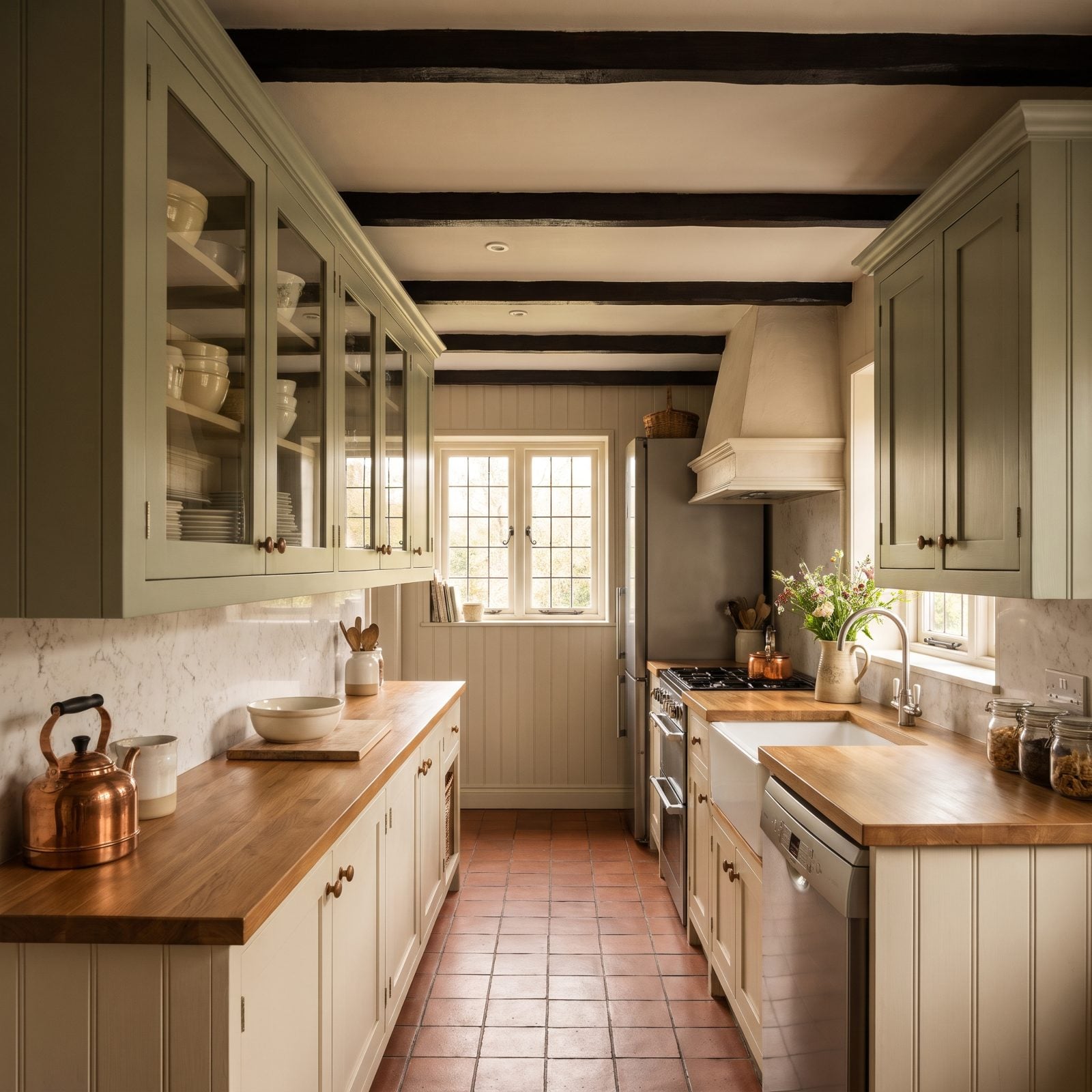
Not ready to commit to fully open shelves? Glass doors are the middle path. A clear front lets the eye travel into the cabinet instead of stopping flat at a solid door, and that borrowed depth makes the whole run feel less like a wall.
Pick two or three cabinets to glaze, not the whole lot. All-glass gets busy and you lose the calm. Reserve it for the things that look good stacked, your white plates, your drinking glasses, and keep the chaos of mismatched Tupperware behind solid doors. For more small kitchen inspiration, this is one of the easiest half-measures to pull off.
25. Specify Reduced-Depth Upper Cabinets
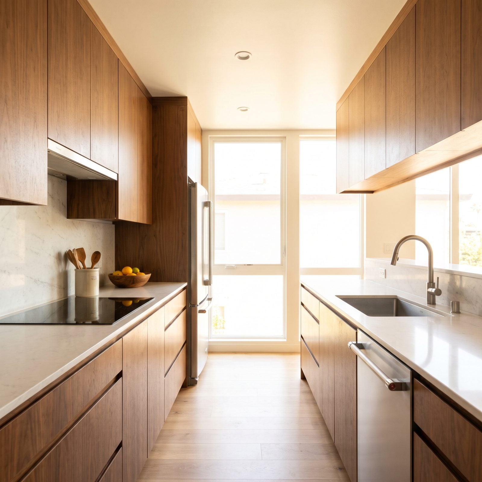
Standard uppers run twelve inches deep, and in a galley those extra inches hang right over your head while you chop. Drop the run to nine or even eight inches deep and you buy back shoulder room, headroom, and a less boxed-in feeling the second you walk in.
You lose a little storage, sure. But most people stack plates and glasses, which fit a shallower cabinet fine, and the openness over the work zone beats the cans of soup you were cramming at the back. The aisle just feels wider because your body has more clearance.
24. Choose Handleless, Flat-Slab Cabinetry
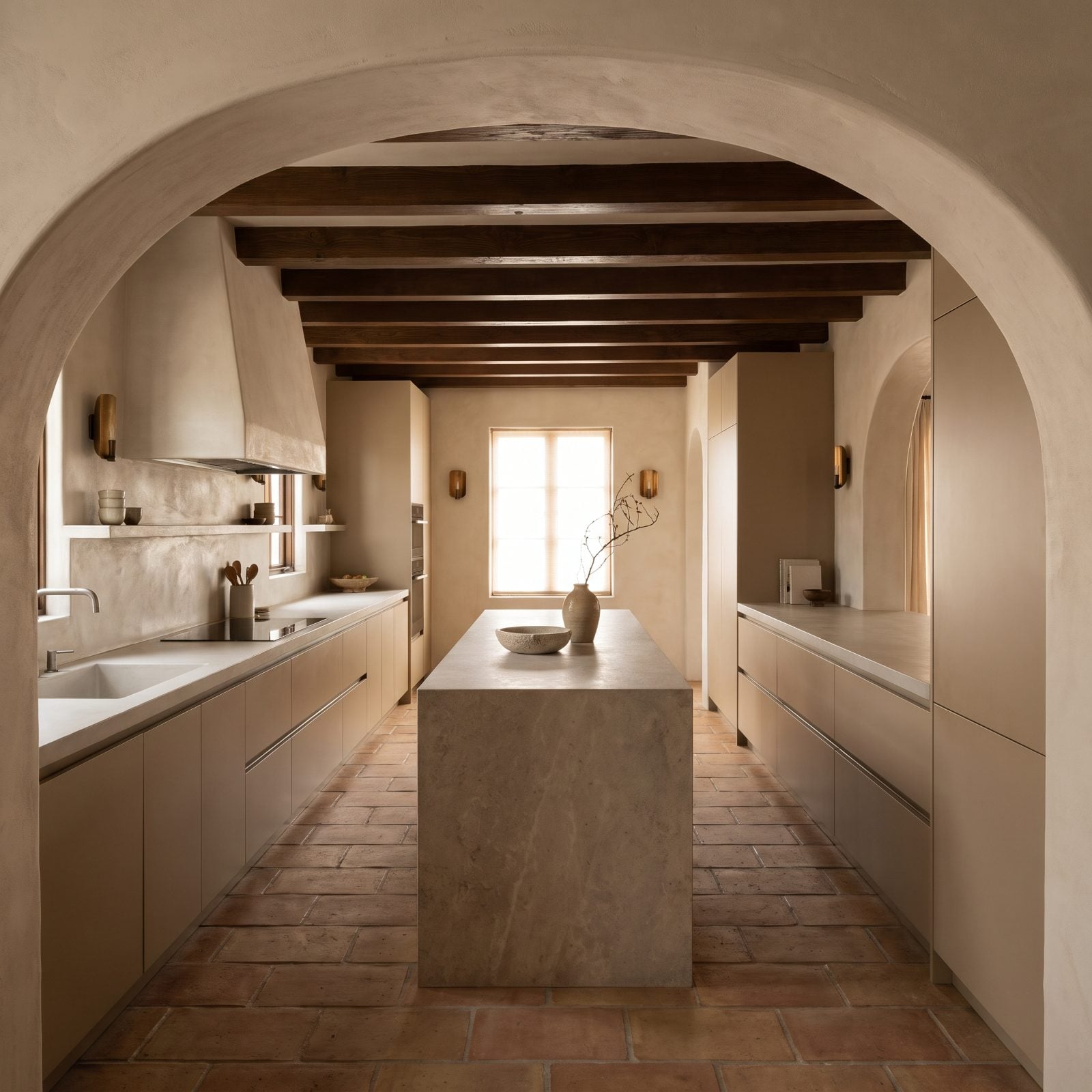
Every knob and pull is a tiny object the eye has to stop and register. Multiply that by twenty doors in a narrow room and you’ve got clutter you didn’t even know was making the space feel busy. Go handleless with integrated finger-pulls and the cabinet faces become long smooth planes that read as one continuous surface, which lengthens the run and quiets the whole room.
There’s a practical bonus. No hardware means nothing to catch your hip or your pocket as you sidestep down a tight aisle. And in a galley, you’re always sidestepping.
23. Hide the Vent Hood Behind Matching Cabinetry
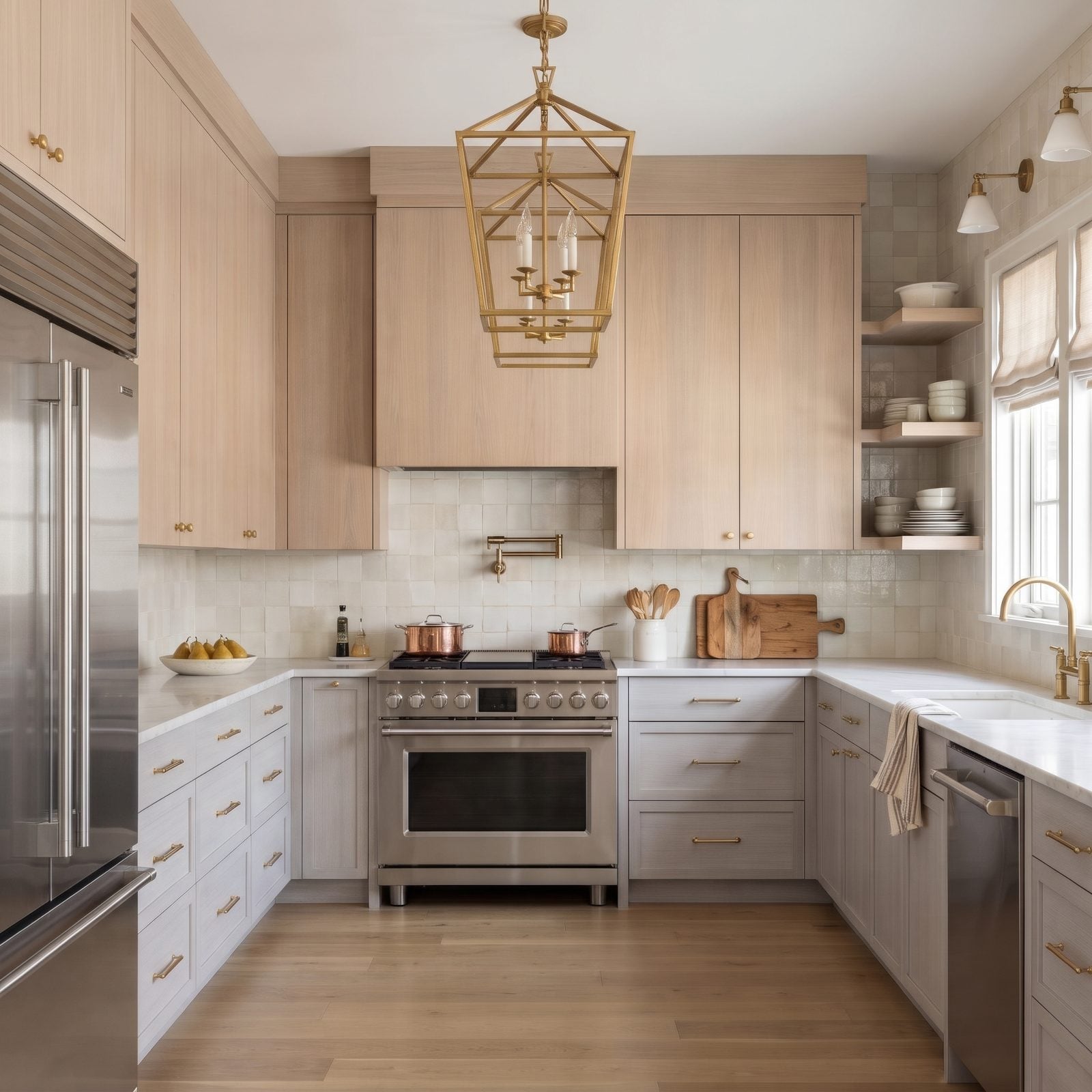
A chunky stainless chimney hood is a visual roadblock. It juts out, breaks the cabinet line, and announces itself in a room that badly needs calm. Wrap the hood insert in a simple box clad in the same light wood veneer as the uppers. It still projects a little, with the metal vent showing underneath, but it blends into the cabinetry instead of competing with it.
That matching colour is the point. Your eye glides from one end of the galley to the other without a shiny chimney to snag on, and the room reads longer and more composed. Running the box right up to the ceiling also means no dusty ledge on top, which in a tight kitchen you will appreciate.
Our readers lean the same way: asked which they would buy, about two out of three chose a hidden hood over a statement one.
22. Round the Exposed Corner of the Entry Cabinet
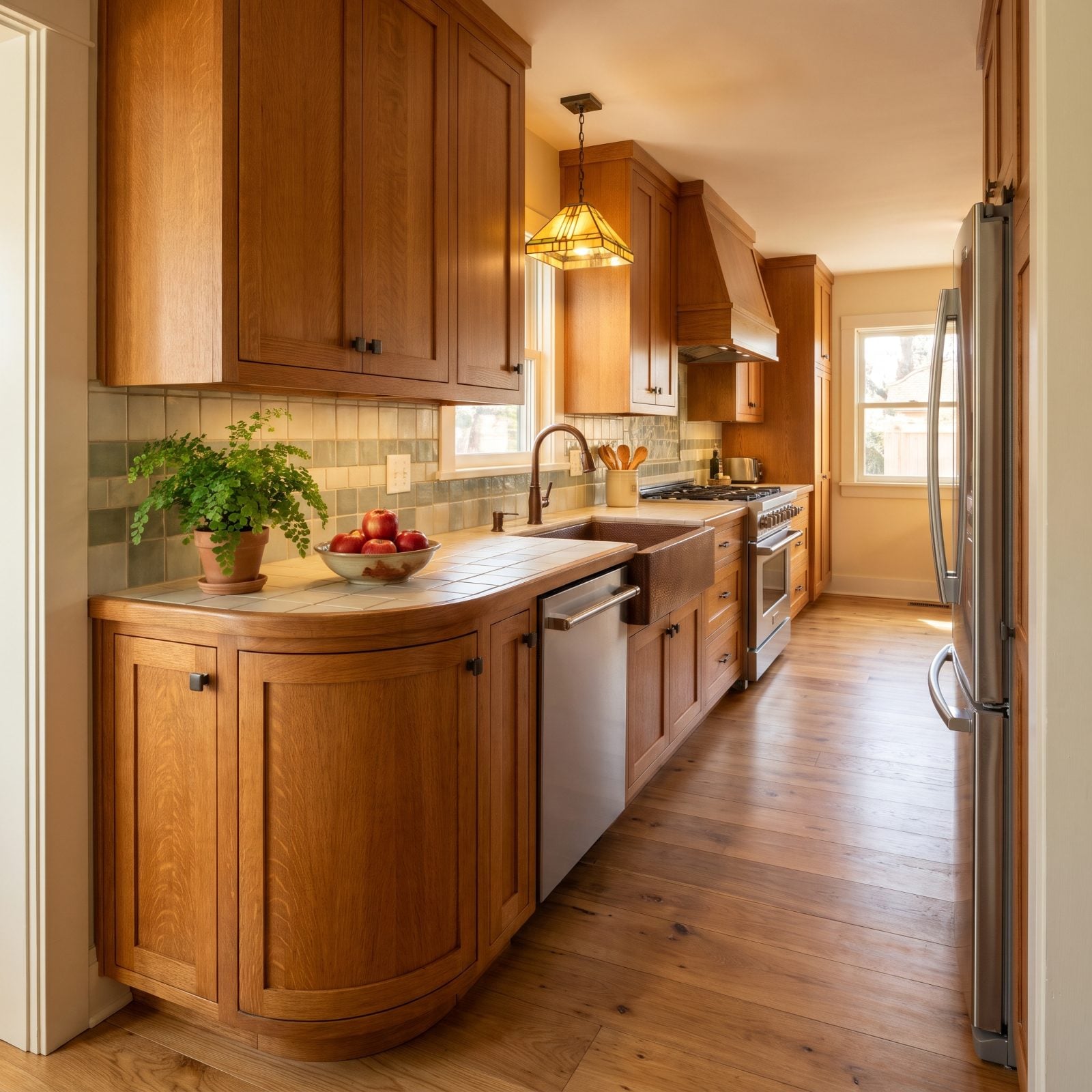
The cabinet corner at the mouth of a galley is the one you bruise your hip on, and it’s also the hard edge that makes the entry feel pinched. Round that exposed corner into a gentle curve and the whole threshold softens.
A curved end does two things. It physically opens the walk path, so you’re not clipping a sharp edge every time you carry groceries in, and it eases the sightline, coaxing the eye around the corner instead of stopping it dead. Suddenly the entry stops feeling like a doorway into a narrow chute and starts feeling like a room you’re welcome in.
21. Align Cabinet, Shelf, and Appliance Top Lines in a French Country Run
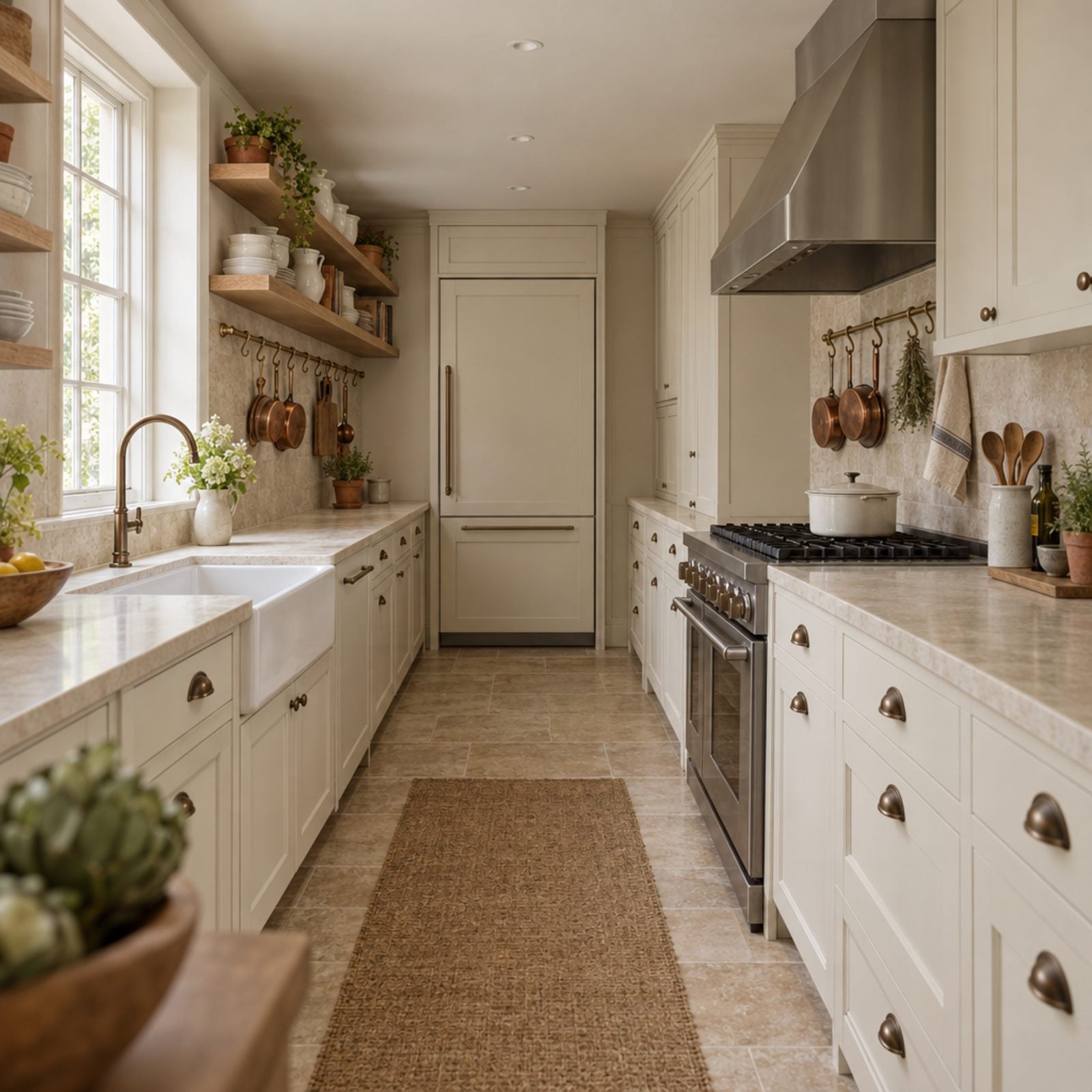
Look how calm this still reads, even though the top lines don’t share one horizontal plane. The hood chimney runs to the ceiling, the paneled fridge wall at the far end rises nearly to the ceiling, the two open shelves land at different heights well below the crowns, and the right-side uppers step down beside the hood. What carries your eye the length of the galley is the continuous countertop and the row of recessed ceiling lights. Mismatched top lines are the fastest way to chop a narrow room into clutter, so line them up wherever you can.
The cream Shaker fronts and antique bronze cup pulls keep things soft, while those long horizontals do the spatial work. Hunting more ideas like this? Our roundup of small kitchen inspiration leans hard on exactly this.
20. Skip the Heavy Crown and Let a Modern Farmhouse Run Breathe
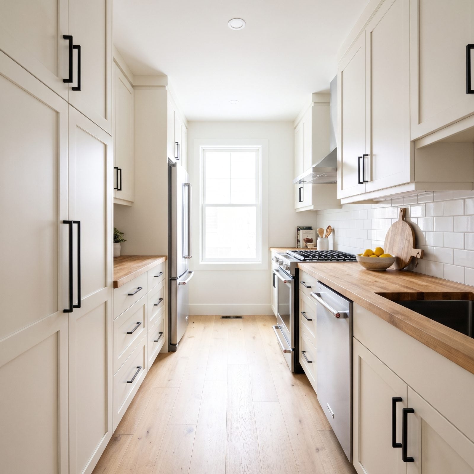
Crown molding has its place. A galley kitchen is not it.
Thick cornices and layered trim eat the gap between cabinet and ceiling, and in a tight room that chunky profile presses down on you. Run the fronts clean to the ceiling with a single crisp reveal, like the tall cabinets up front in this warm-white farmhouse example, and the verticals stretch while the ceiling feels taller than it measures. The stepped trim on the rear cabinets, and the uppers by the hood that stop short of the ceiling, are the parts I’d skip.
I fought this for years because I liked the “finished” look of crown. In a narrow space it finishes the wrong thing. Keep the top line simple and let the matte black bar pulls carry the detail.
19. Install a Counter-Depth Refrigerator in a Craftsman Galley
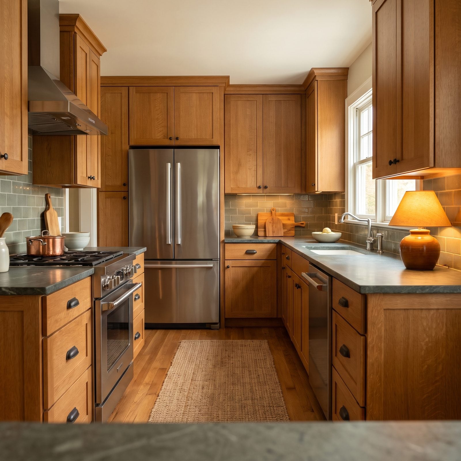
A standard fridge juts several inches past the cabinets, and in a galley that bulge is the thing you bruise your hip on every single morning. Swap to a counter-depth model and the box pulls back flush with the fronts, so the whole run reads as one clean wall.
You lose a little interior volume. You gain a walkable aisle and a kitchen that photographs flat and tidy. In a narrow space that’s the better trade almost every time.
18. Choose a Space-Saving 24-Inch Range for an Industrial Loft Galley
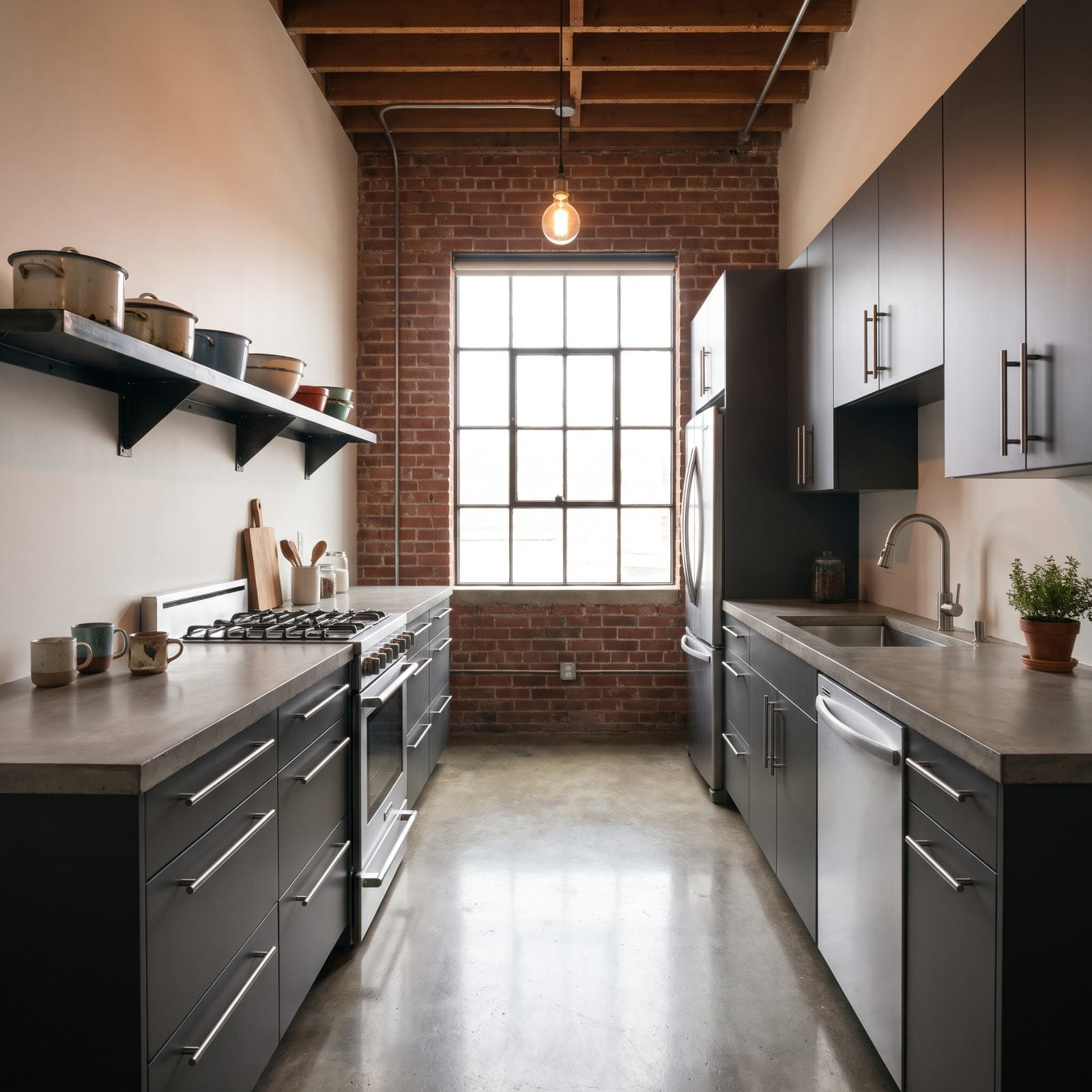
The 24-inch range is the unsung hero of tight kitchens. Shave six inches off a standard 30-inch stove and you reclaim a genuine strip of working counter, the kind you actually need when the whole galley is maybe four feet across.
This loft version pairs the slim range with charcoal flat fronts and exposed brick, so the stainless reads as deliberate rather than dorm-sized. Apartment-grade appliances have come a long way, and a good 24-inch range cooks fine for most of us who aren’t roasting two turkeys at once.
17. Move the Microwave Into a Drawer in a California Modern Run
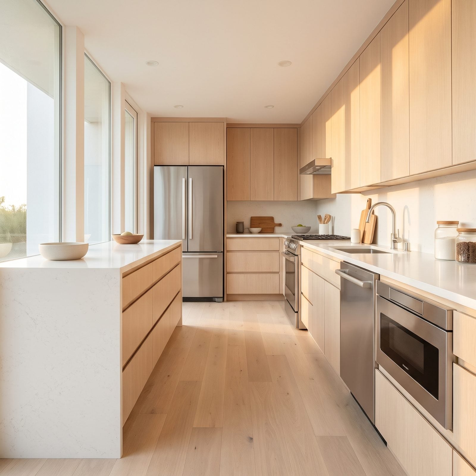
That over-the-range microwave is quietly wrecking your kitchen. It bulks up the hood zone, kills ventilation, and sits at an awkward height that leaves the whole wall feeling busy.
Drop it into a drawer tucked low in the base cabinets and two things happen. The counter clears completely, and the upper run goes calm, like this rift-oak California modern galley with its push-to-open fronts. A drawer microwave is also just easier to use, you look down into it instead of reaching up over a hot burner.
16. Install a Flush Frameless Induction Cooktop in a Scandinavian Galley
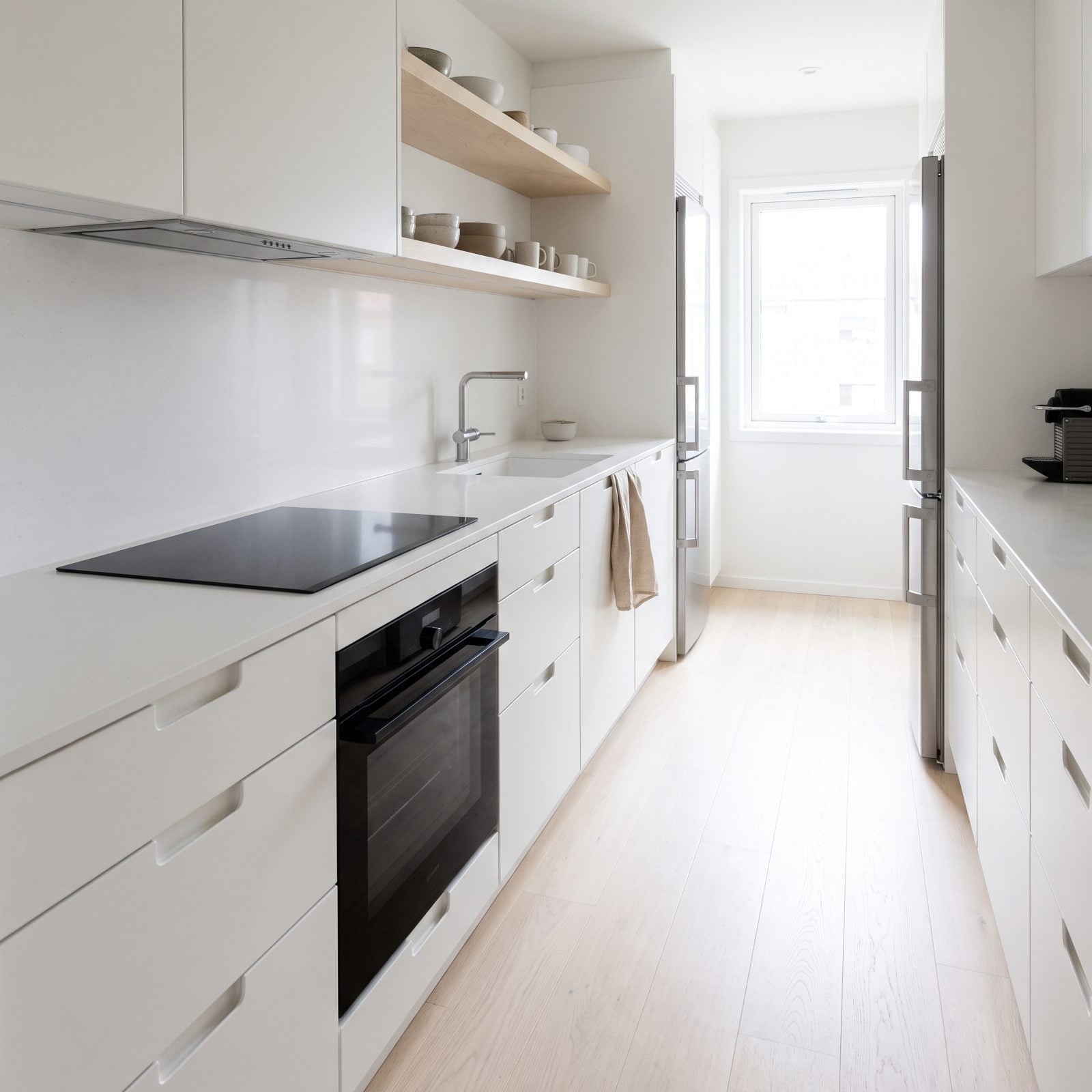
A flush induction cooktop basically vanishes when it’s off, and that vanishing act is pure spatial gold in a galley.
Set frameless into the quartz, the black glass sits level with the counter, so your eye reads one long uninterrupted surface instead of a stove-shaped interruption. Fewer visual breaks, longer apparent run, calmer room.
15. Choose a Seamless Undermount Workstation Sink in a Coastal Galley
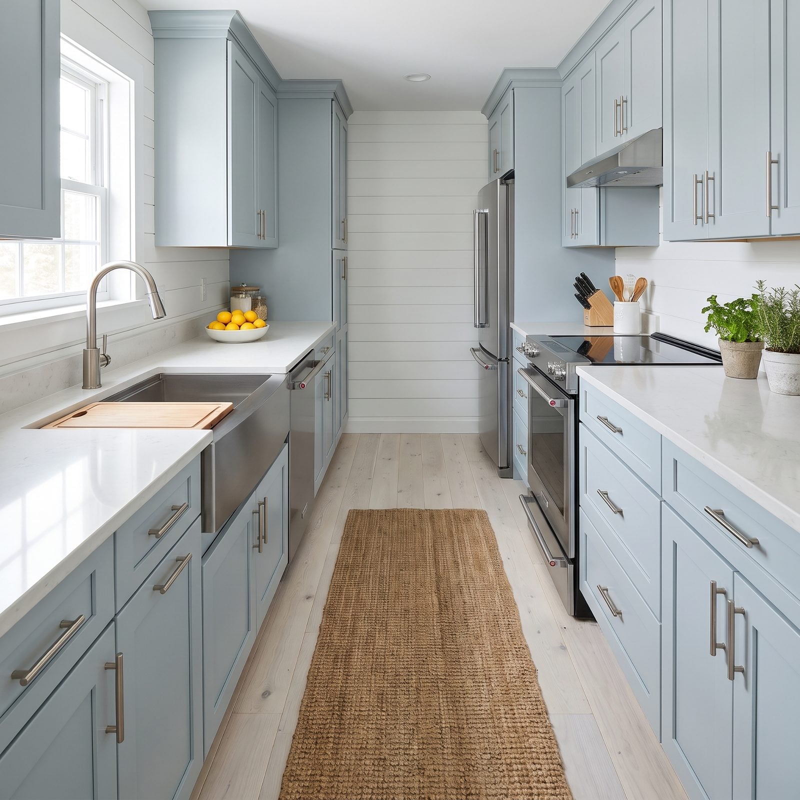
A stainless apron-front sink drops its metal face below the counter, so the bowl sits forward with a clean, built-in look beside the quartz. In a galley where counter is scarce, that seamless, hardworking front earns its keep.
The workstation twist adds integrated ledges, so a cutting board, colander, or drying rack slides across the bowl and the sink itself becomes extra prep space. In this blue-grey coastal run with polished nickel bar pulls, dead space turns into something that pulls its weight.
14. Hide Small Appliances in an Appliance Garage in a Traditional Galley
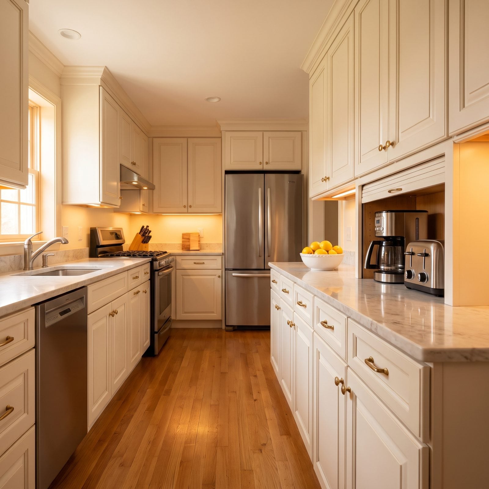
Clutter reads as chaos, and chaos reads as small. That coffee maker, toaster, and blender crowding the counter are quietly shrinking your kitchen.
An appliance garage, a cabinet at counter height with a roll-up tambour door, swallows all of it and leaves the surface clear. Everything stays plugged in and ready. You just close the door when you’re done.
This traditional galley keeps the fronts in warm white with brass knobs so the garage blends into the run. The psychology is simple, a clear counter lowers your cognitive load, and a room with less to process feels bigger than it is.
13. Add a Narrow Vertical Pullout Pantry in a Mid-Century Modern Galley
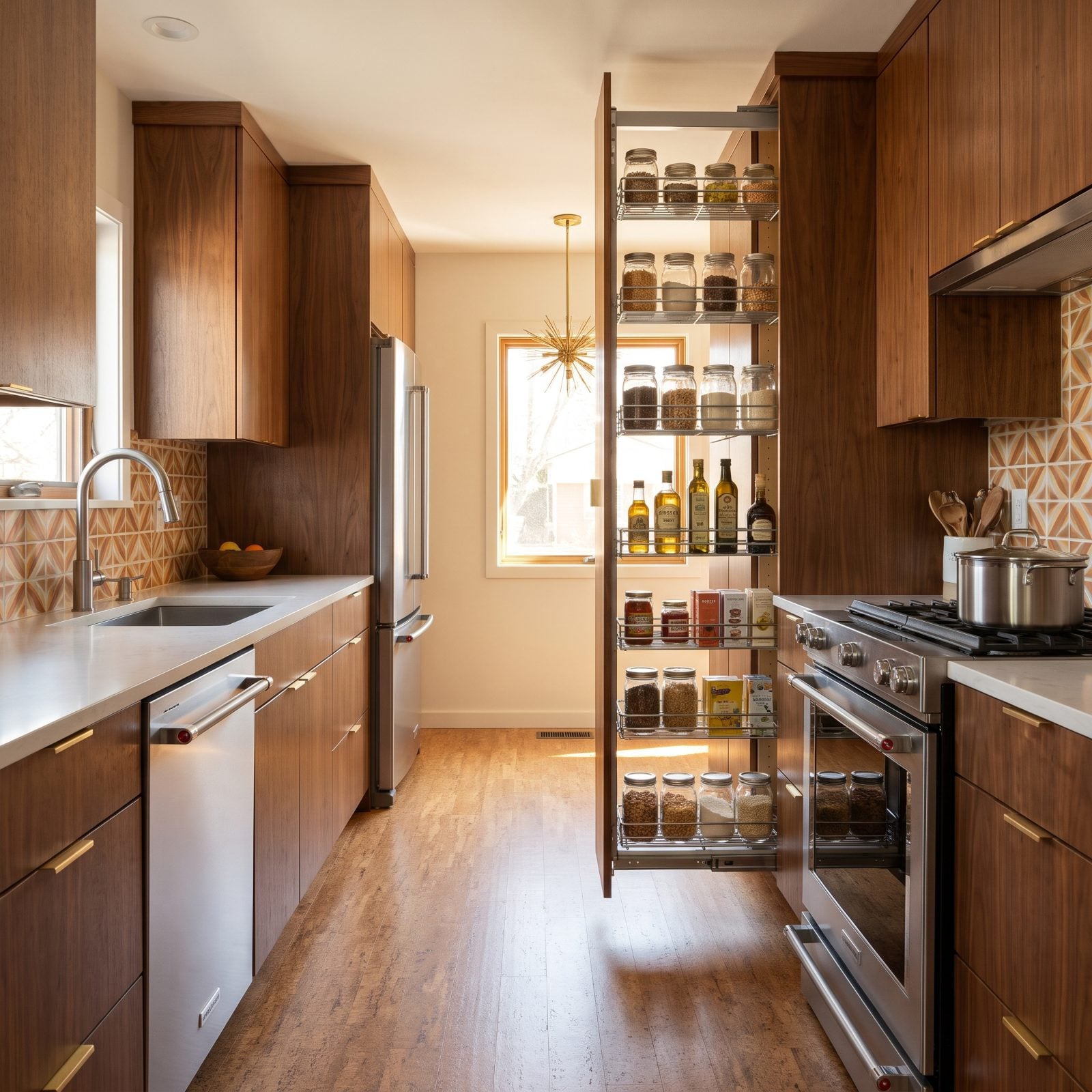
That skinny gap beside the range most people fill with nothing? A vertical pullout pantry turns it into serious storage.
Nine inches wide, running out on full-extension glides, it holds a shocking amount, oils, spices, canned goods, all visible and reachable from both sides. No groping into the black hole at the back of a deep cabinet.
Here it slots into a walnut mid-century run where the warm wood and brass finger pulls keep it looking built-in, not bolted-on. If you’re working this hard to carve out storage, it’s the same logic behind a smart narrow bonus room, where wasted width becomes usable depth.
12. Organize Deep Drawers So Counters Stay Bare
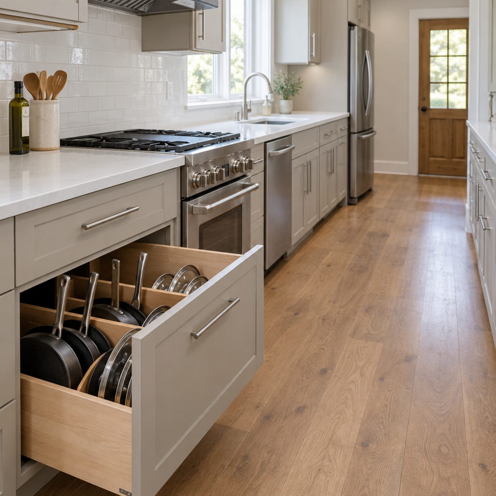
The bare counter is the whole trick. When pots, skillets and lids live in a deep drawer instead of crowding the backsplash, your eye runs the length of the aisle uninterrupted, and a narrow room reads longer the second those surfaces go quiet.
Fixed wooden compartments give every saucepan, skillet and lid its own slot so nothing piles into a jumble. One drawer for the whole cookware kit, and you stop rummaging every time you want a frying pan.
11. Press the Backs of Cabinet Doors Into Service
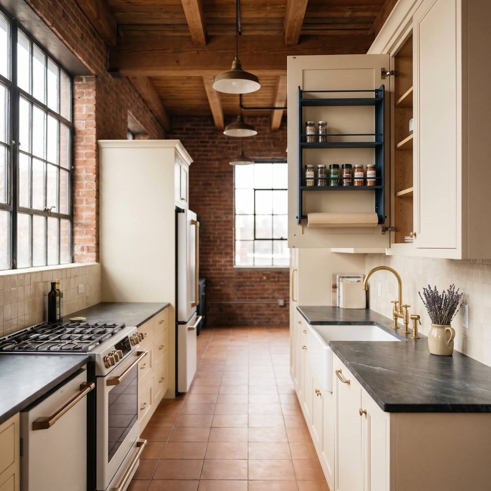
That open door holds spice jars, foil, and a measuring-cup rack on a slim wire frame, and none of it touches the counter. The back of every cabinet door is dead real estate in most kitchens. Mount a shallow rack there and you claim inches you already paid for.
Keep the frames thin so the door still shuts flush. Spices, wraps, lids: in a galley this narrow, those are exactly the things you want off the worktop. For more ways to squeeze a tight footprint, this small kitchen inspiration is worth a scroll.
10. Mine the Dead Space With Toe-Kick Drawers
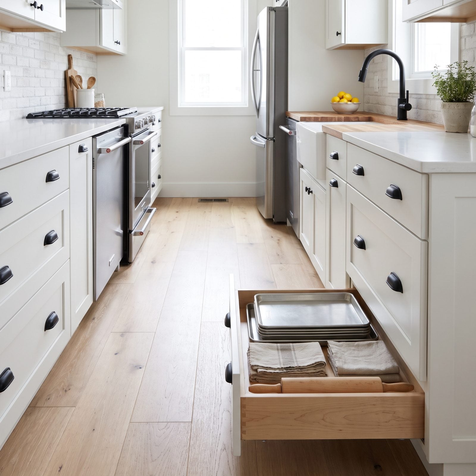
The gap under your lower cabinets is usually nothing but a shadow. Turn it into a drawer and you buy a flat home for baking sheets, platters, and all the stuff that never stacks neatly anywhere else.
This one runs surprisingly deep, so you can stack: sheet pans, folded kitchen towels, even a rolling pin. I ignored this for years and kept a cookie sheet wedged beside the fridge like a fool. Don’t be me.
9. Cap the Sink With a Flush Cutting Board
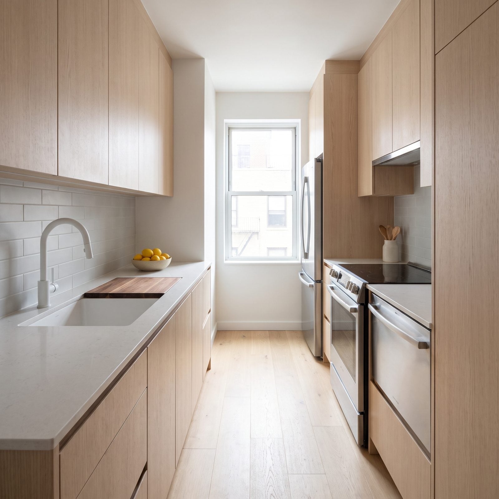
Drop a walnut board over the sink and you’ve just grown your counter by a full basin’s worth. In a galley where every inch of worktop matters, that reclaimed strip becomes where you prep, plate, and stage before everything heads to the table.
8. Slide Out a Hidden Counter When You Need It
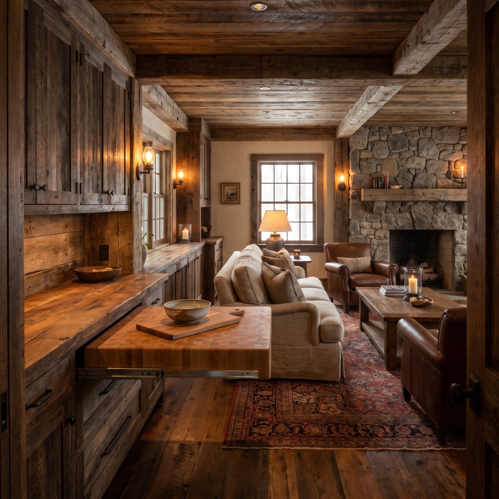
That lower pullout slides away the moment you’re done with it. A cozy den with a sofa and armchairs around the fireplace can’t spare room for a permanent table, so a retractable counter hands you the extra landing zone of one and then vanishes back into the cabinetry.
Set it a little below the main worktop and it doubles as a second prep height, handy for kneading dough or letting a toddler help without climbing. Shut it and the path between the built-ins and the sofa stays open and walkable, which is everything in a room this well furnished.
7. Hide the Bins in a Smooth Pullout
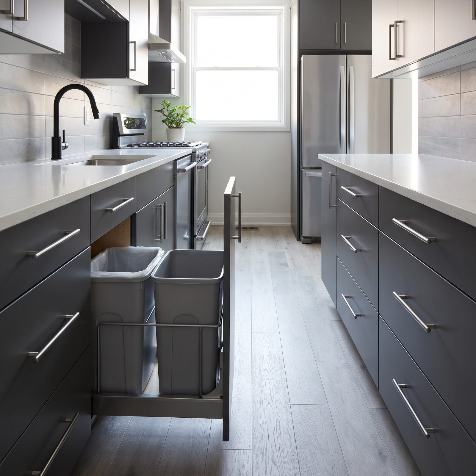
A standing trash can in a galley is a tripwire you set for yourself. Tuck it into a pullout and the aisle stays clear, the smell stays contained, and nobody’s bumping a bin on the way to the fridge.
Go dual if you can: one for trash, one for recycling, both on a slide-out frame attached to a drawer front that matches the surrounding cabinetry. That matters, because visual breaks chop a narrow room into pieces and an uninterrupted run of doors doesn’t.
6. Tuck the Outlets Under the Upper Cabinets
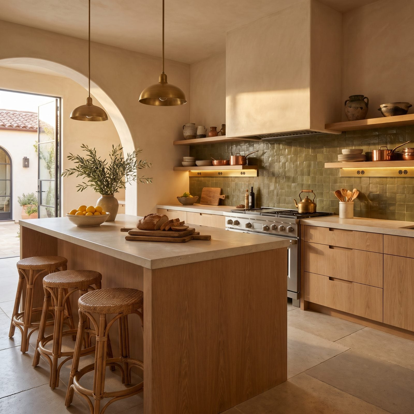
Look at that backsplash: not a single outlet plate breaks the green tile. The receptacles sit on brass strips tucked under the open shelves on both sides of the range hood. Move your receptacles to a strip under the upper cabinets or shelves and you clear the one spot where visual noise kills a narrow run fastest.
An unbroken backsplash reads as one continuous plane, and continuous planes make a tight galley feel deliberate rather than busy. You still have power exactly where you plug things in, just out of the sightline.
5. Run the Floorboards the Long Way Down the Galley
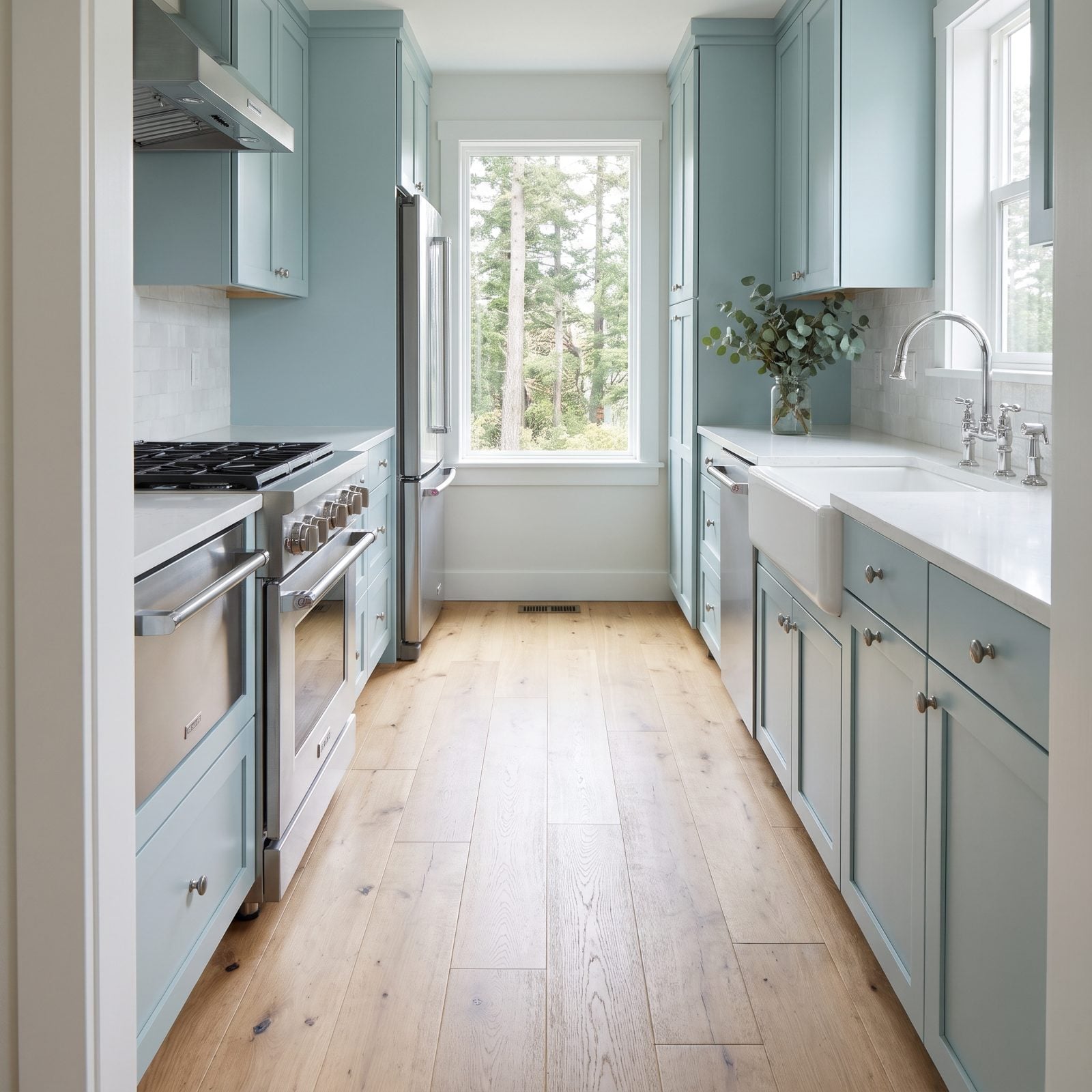
Watch where your eye goes: straight down those planks to the window at the end. Lay floorboards lengthwise and the floor becomes a set of lines pulling your gaze along the galley, and a room reads longer the instant its longest dimension gets emphasized.
Run them crossways instead and you chop the aisle into rungs like a ladder, which is exactly the squat, boxed-in feeling you’re fighting. Lengthwise, every time.
4. Lay Oversized Tile and Keep the Grout Lines Quiet
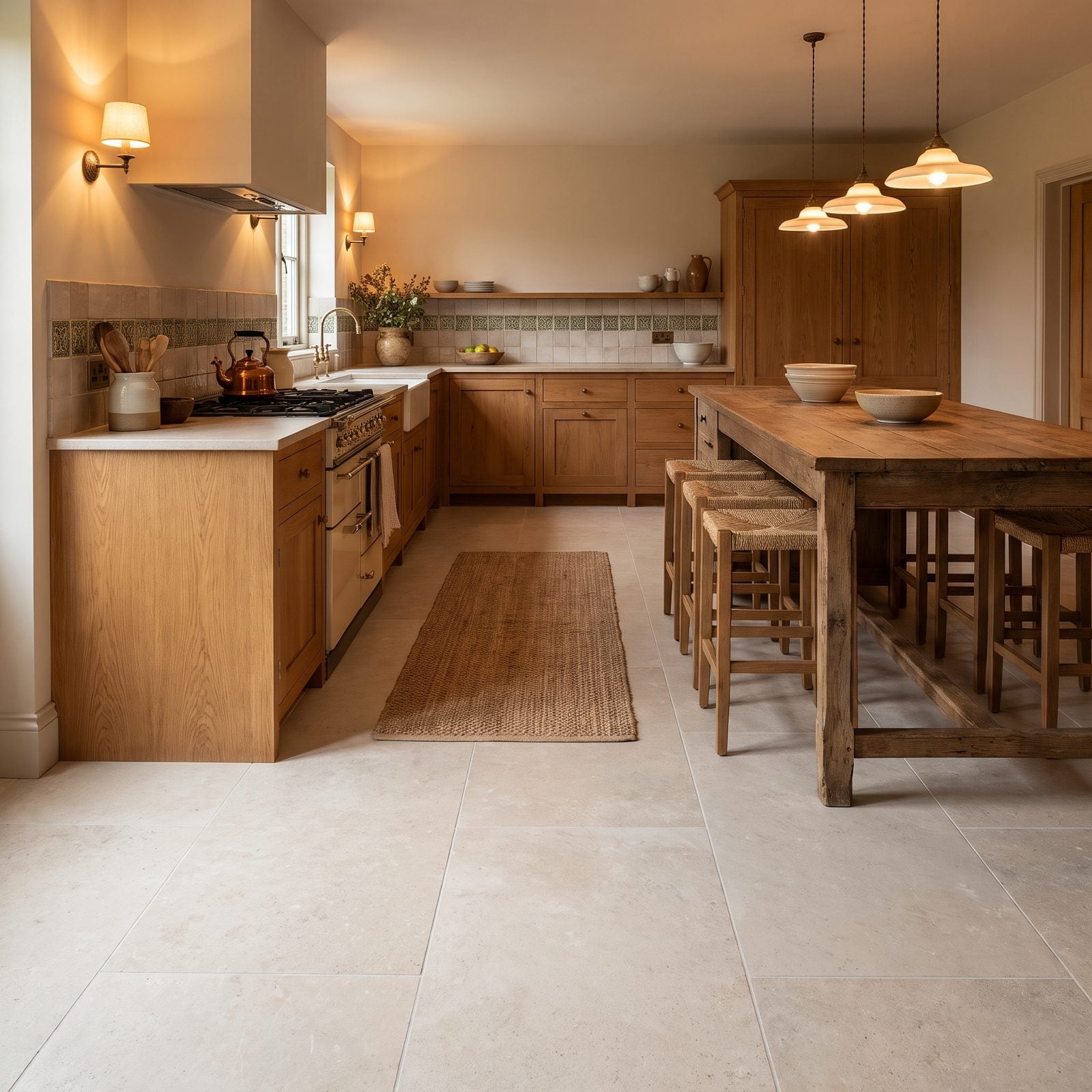
Big tiles, barely-there grout. Fewer lines crisscrossing the floor means your brain stops registering it as a grid of small squares, and a near-seamless floor quietly stretches the whole galley.
Match the grout to the tile so even the lines you do have nearly vanish. Small mosaic floors do the opposite: all those seams read as busy, and busy always feels smaller. Same principle that makes a minimalist hallway design feel so much longer than its footprint.
3. Carry the Same Floor Straight Into the Next Room
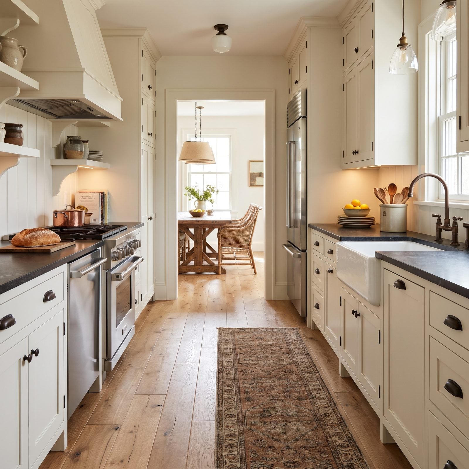
No threshold strip, no change in material, just the same oak planks flowing straight through the doorway. When the floor doesn’t stop at the edge of the galley, your eye doesn’t either, and the kitchen borrows visual square footage from whatever room it opens into.
A transition strip draws a hard line that says the galley ends here. Delete that line and the two spaces read as one continuous floor, which is the cheapest way to make a corridor kitchen feel like part of something bigger. Same logic opens up a tight cottage basement design.
2. Swap the Swinging Door for a Pocket Door at the Galley’s End
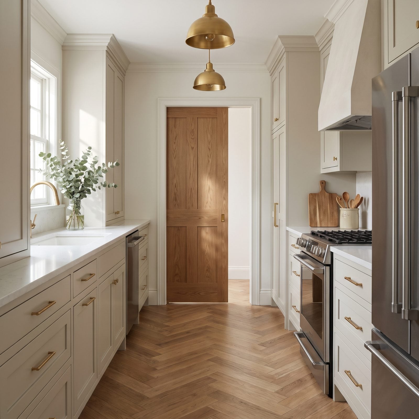
A swinging door needs a clear arc to open, and in a galley that arc eats a chunk of your one usable aisle — a slab of wood that’s either in the way or swinging at your face while you carry a hot pan. Slide it into the wall instead and you get the whole floor back.
Here the pocket door sits pulled about halfway across the opening at the end of the run, yet the aisle still reads unbroken from the range to the doorway. No dead zone. No bruised hip. Even half-closed, the slim wood panel slides flat within the frame instead of jutting into the room, and the eye still catches the far wall through the open half, which is part of why the room feels longer than it actually is.
Reworking circulation on the floor below too? The same logic carries into a cottage basement design, where every swing you delete is square footage handed back to you.
1. Hang One Oversized Mirror on the Dead End Wall
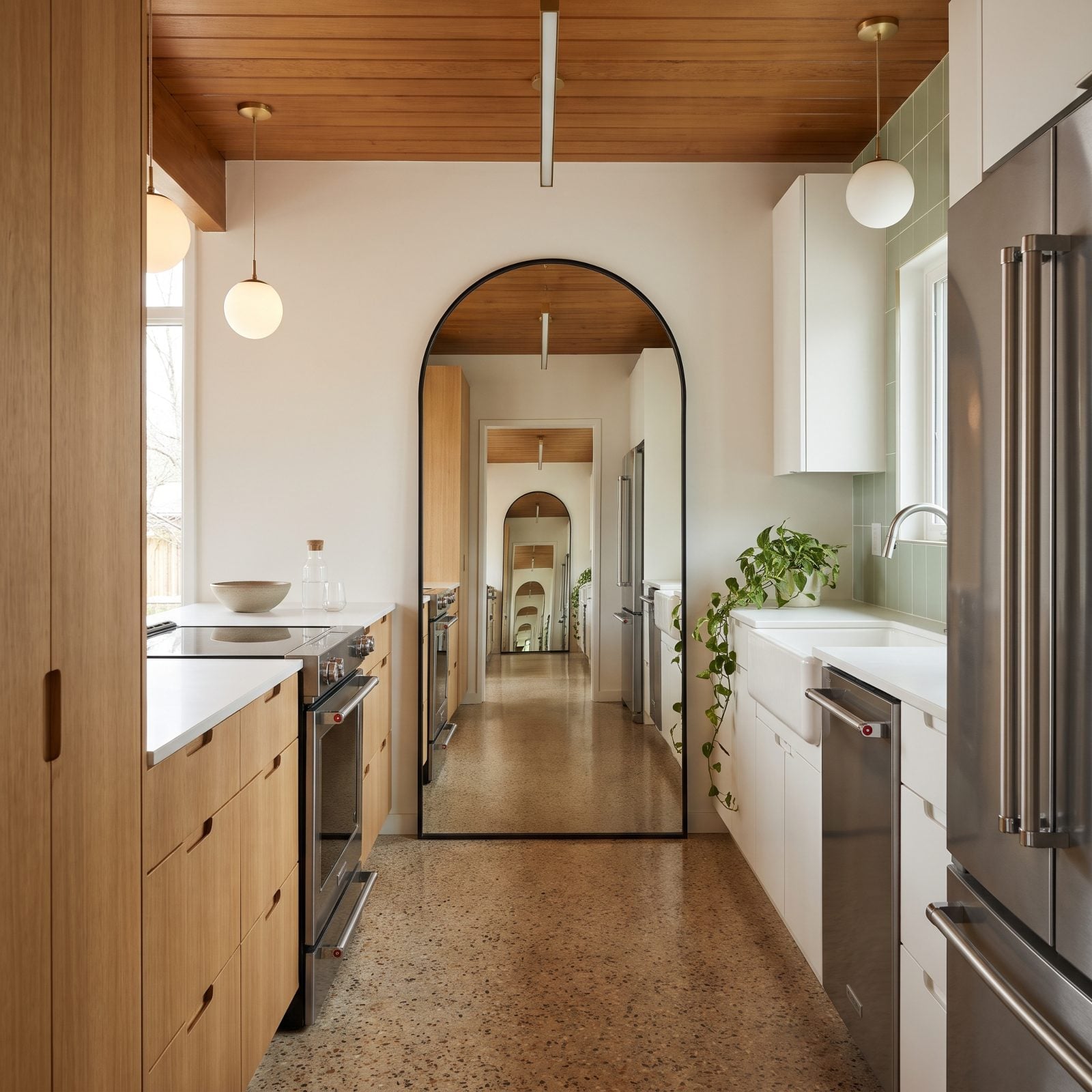
That blank wall at the end of a galley does nothing but tell you where the room stops. Hang a big mirror on it and you blur that full stop into a maybe.
A mirror this size catches the ceiling light and the full length of the aisle, then throws both right back at you. Here, a second mirror hung in a doorway facing it bounces the view back and forth, so your eye reads a tunnel of arched mirrors and kitchens stretching past a wall that isn’t really there. Go large, and go low. A floor-leaning or near-floor arched mirror pulls the reflection down to where you actually move, instead of parking it up by the ceiling where it does nothing for the sense of depth.
One honest caveat. Position it so it reflects the aisle and a window — not the side of your fridge, not a cluttered counter. A mirror is loyal to a fault. It shows whatever you point it at, mess and all. Angle it toward the light and keep that far counter clean.