🔥 Would you like to save this?
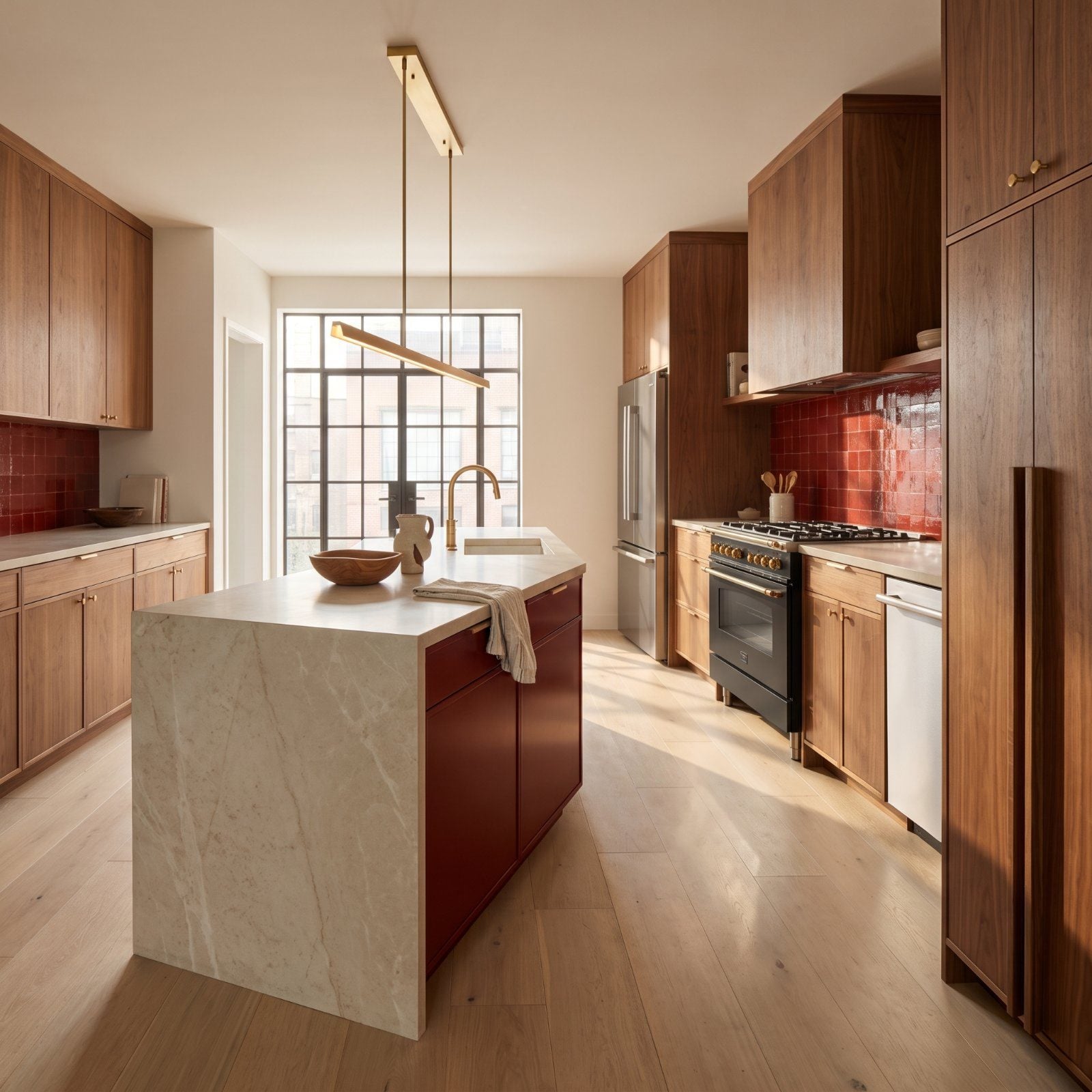
Red scares people. Walnut calms them down. Put the two in the same room and something unexpected happens: the red stops shouting and the walnut stops playing it safe. For years the safe kitchen meant grey cabinets and a white island, and it aged about as fast as a phone. These kitchens go the other way entirely. Deep walnut grain does the grounding while red does the talking, showing up in every form from oxblood lacquer to poppy-red zellige. We were skeptical too, and then we saw what the right red does to a wall of walnut. Skepticism gone.
28. Flat-Panel Walnut Kitchen With an Oxblood Island
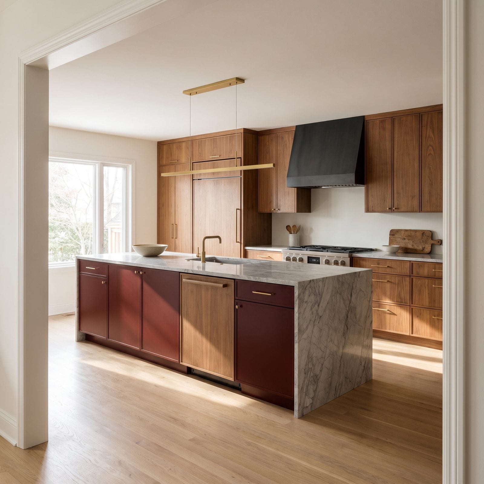
The oxblood island is the whole argument. Dark enough to read as furniture rather than cabinetry, it lands against all that walnut grain like a deep leather chesterfield dropped into a woodshop. Nothing else in the room dares fight it.
In order to come up with the very specific design ideas, we create most designs with the assistance of state-of-the-art AI interior design software. Also, assume links that take you off the site are affiliate links such as links to Amazon. this means we may earn a commission if you buy something.
Here’s where the marble waterfall counter earns its keep. Cool grey stone keeps the oxblood from turning the room heavy, so the whole thing breathes instead of brooding. Restraint doing the work a paint can never could — that’s what a bold kitchen makeover looks like when someone actually knows when to stop.
27. Walnut Kitchen With Red Levanto Marble Counters
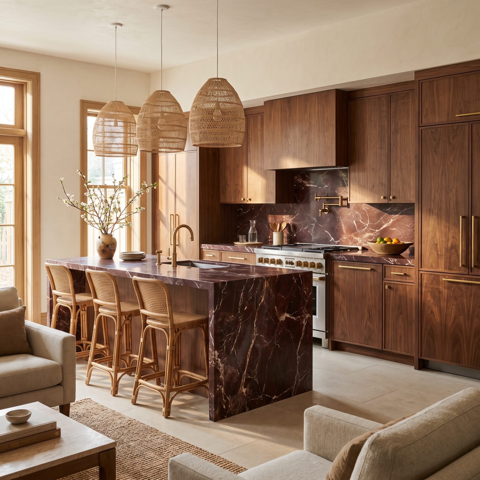
Rosso Levanto marble is a gamble. Get it wrong and you’re looking at a butcher’s counter. Get it right — white and gold veins running through burgundy stone — and it looks like something quarried for a cathedral.
Walnut is what makes the gamble pay off. The wood’s brown warmth catches the marble’s red undertone, and the veining threads gold that answers the brass pulls. Stone as a headline, not a background.
26. Minimal Walnut Kitchen With a Vermilion Cabinet Wall
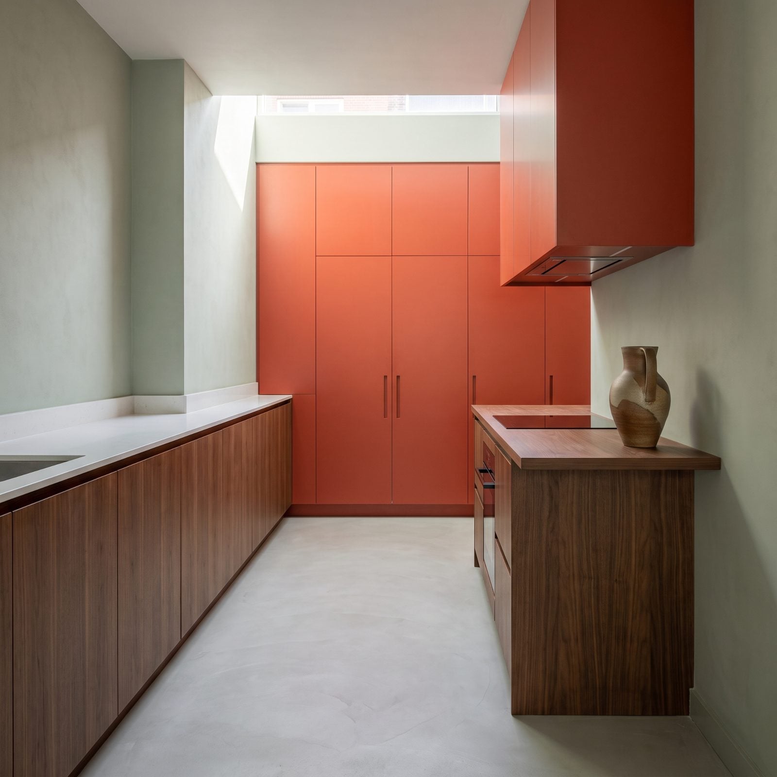
One wall of vermilion. That’s the entire move.
Everything else stays quiet — handleless walnut, thin white quartz, appliances tucked behind push-open doors. The red-orange wall gets to shout because nothing else says a word. Same logic as the person who wears one bold thing and keeps the rest of the outfit plain.
25. Walnut-and-Red Japandi Kitchen With Paper Lanterns
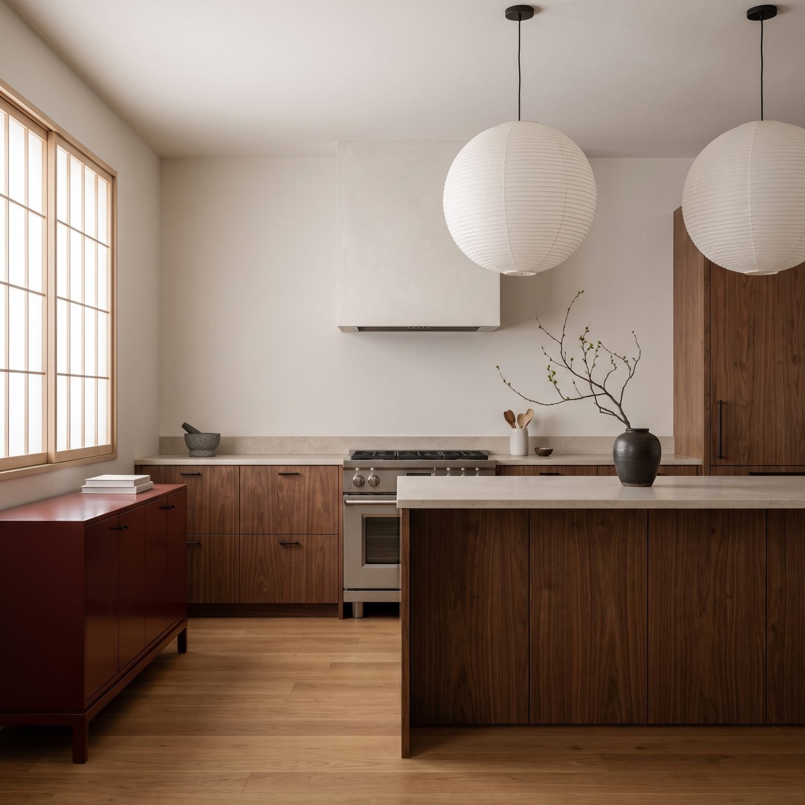
Japandi usually plays it safe with beige and black. This one breaks the rule with a single deep-red lacquered sideboard, and it’s better for the trouble.
Watch the round paper lanterns. Soft, glowing, hovering over honed stone, they pull the whole room toward calm while the red keeps it from nodding off. If that pared-back feeling is your thing, the same restraint turns up in this japandi workshop design.
One ikebana branch and a stone mortar, and the styling is done. Everything here earns its keep.
24. Walnut Galley Kitchen With a Glossy Cherry-Red Backsplash
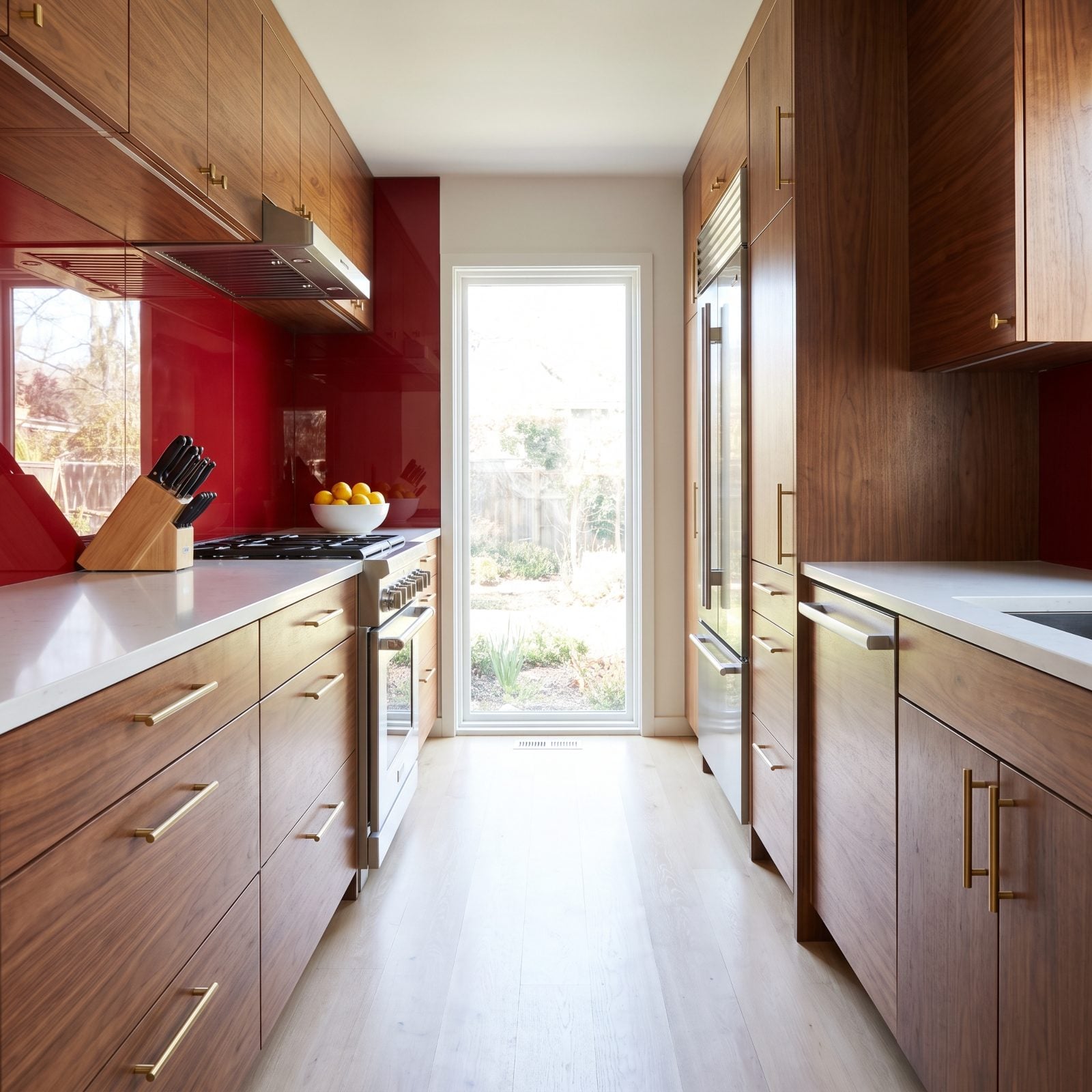
Galley kitchens live and die by light. A glossy cherry-red glass backsplash turns a narrow room into a lightbox, bouncing every scrap of daylight straight back down the run.
The gloss is the whole trick. Matte red would sit flat in a tight space, but the reflective finish adds depth and doubles the sense of width. And with walnut running down both sides, the red never tips over into clinical.
23. Walnut Kitchen With a Burgundy Range
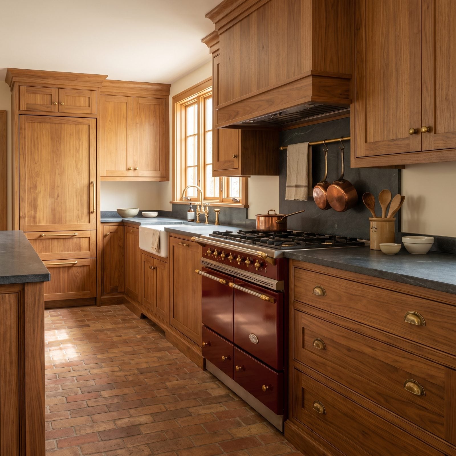
A burgundy range cooker is the kind of appliance you build a kitchen around, not the other way round.
Brass knobs, enameled body — it reads as heirloom rather than hardware. Set into a run of walnut shaker cabinets over a terracotta brick floor, it carries the lived-in ease of a proper country kitchen renovation. Dark soapstone counters keep the palette from tipping too warm, which it very much wants to do.
22. Walnut Slab Cabinets With Red Terrazzo Worktops
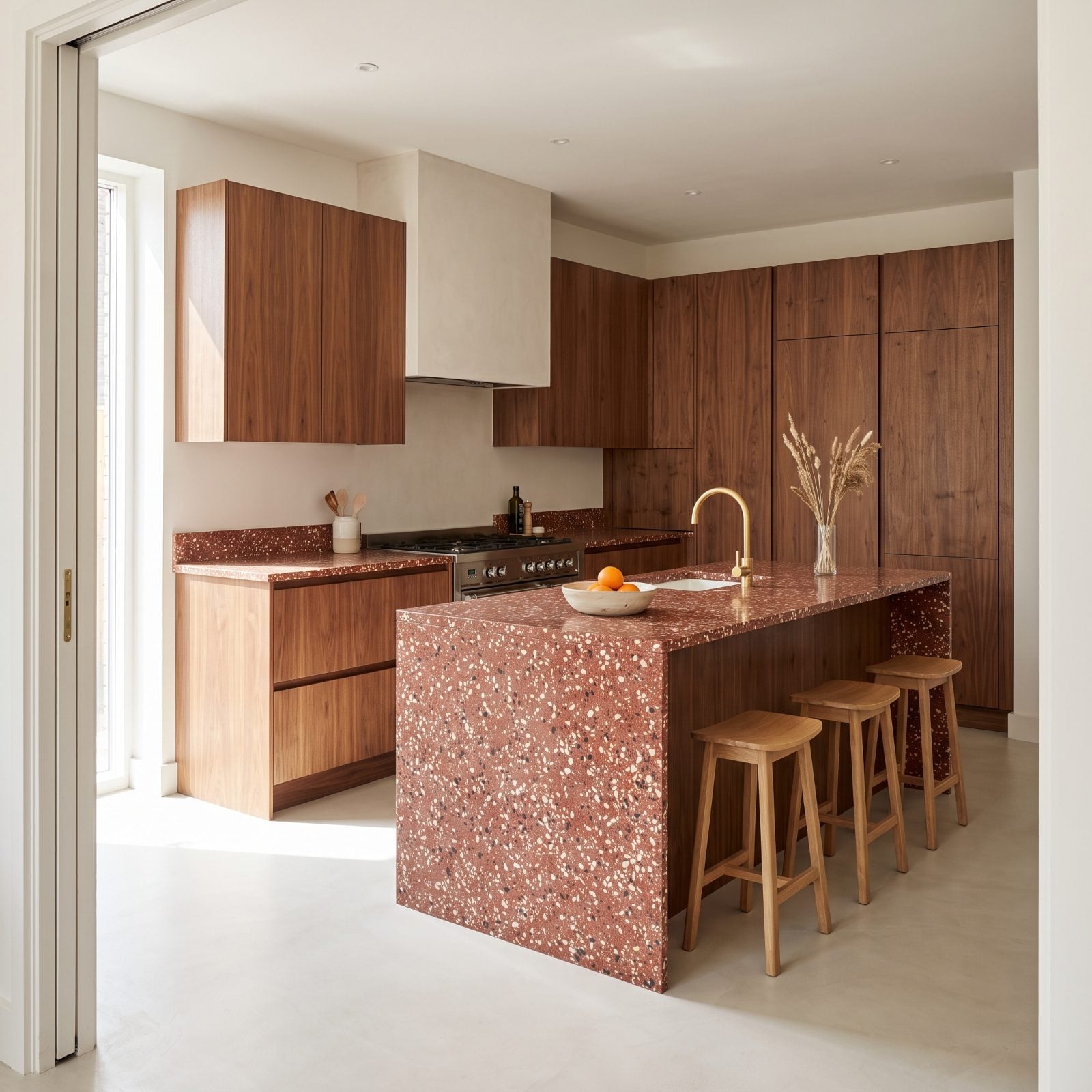
Terrazzo spent a decade going minimal and dull. This red-based version drags the fun back.
A brick-red matrix flecked with cream and dark chips hands you color and texture in one surface, and the waterfall island lets you watch it drop the full height. Against handleless walnut slabs it reads confident, not kitschy.
21. Walnut-and-Brick-Red English Country Kitchen
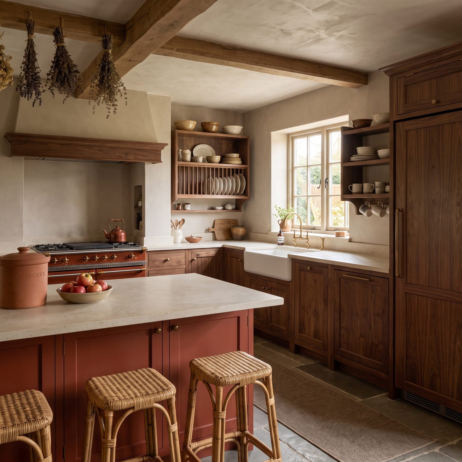
English country kitchens usually clock in at sage green or cream. Swap in walnut and brick red and the whole thing jumps from twee to grown-up in a single step.
The brick-red island is painted, not natural — the classic country move of treating cabinetry as furniture. Cream limestone worktops and a flagstone floor cool everything down, while the walnut in-frame detailing gives it a weight sage could never muster. Think of the easy warmth in good craftsman kitchen decor, just with more red in its veins.
20. Walnut Kitchen With a Freestanding Scarlet Refrigerator
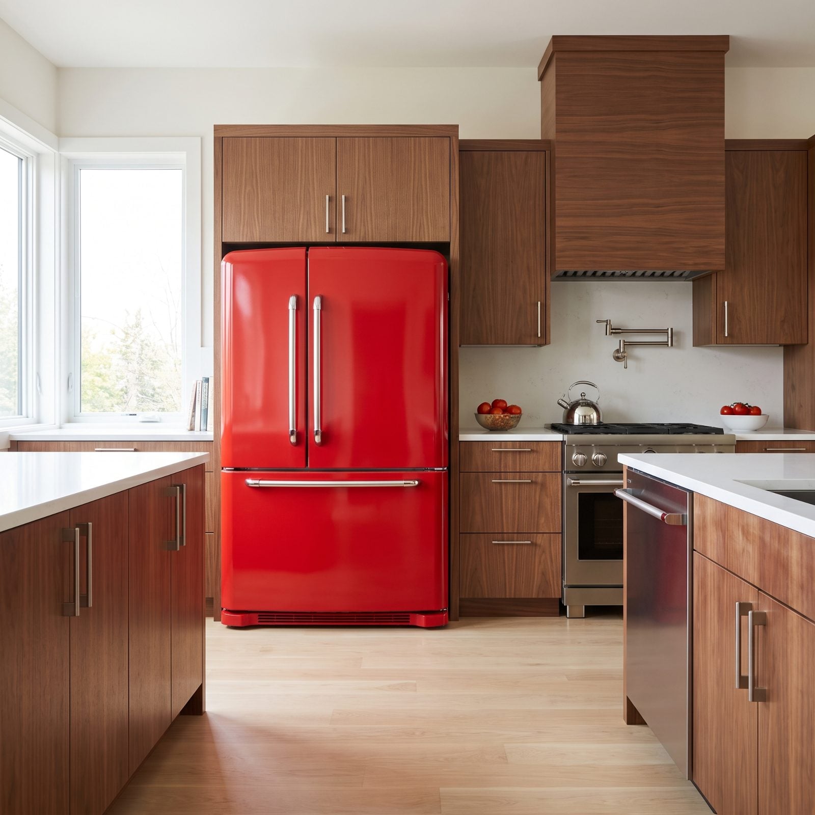
A scarlet refrigerator sounds like a mistake until you see it standing against a wall of walnut. Then it just looks like the whole idea.
The rounded retro-modern body and chrome handles keep it charming instead of shouty, and because it stands free it reads as an object you chose rather than a fixture you settled for.
The best kitchens have one thing you’d move house for. Here it’s the fridge.
19. Walnut Kitchen With Handmade Poppy-Red Zellige Tile
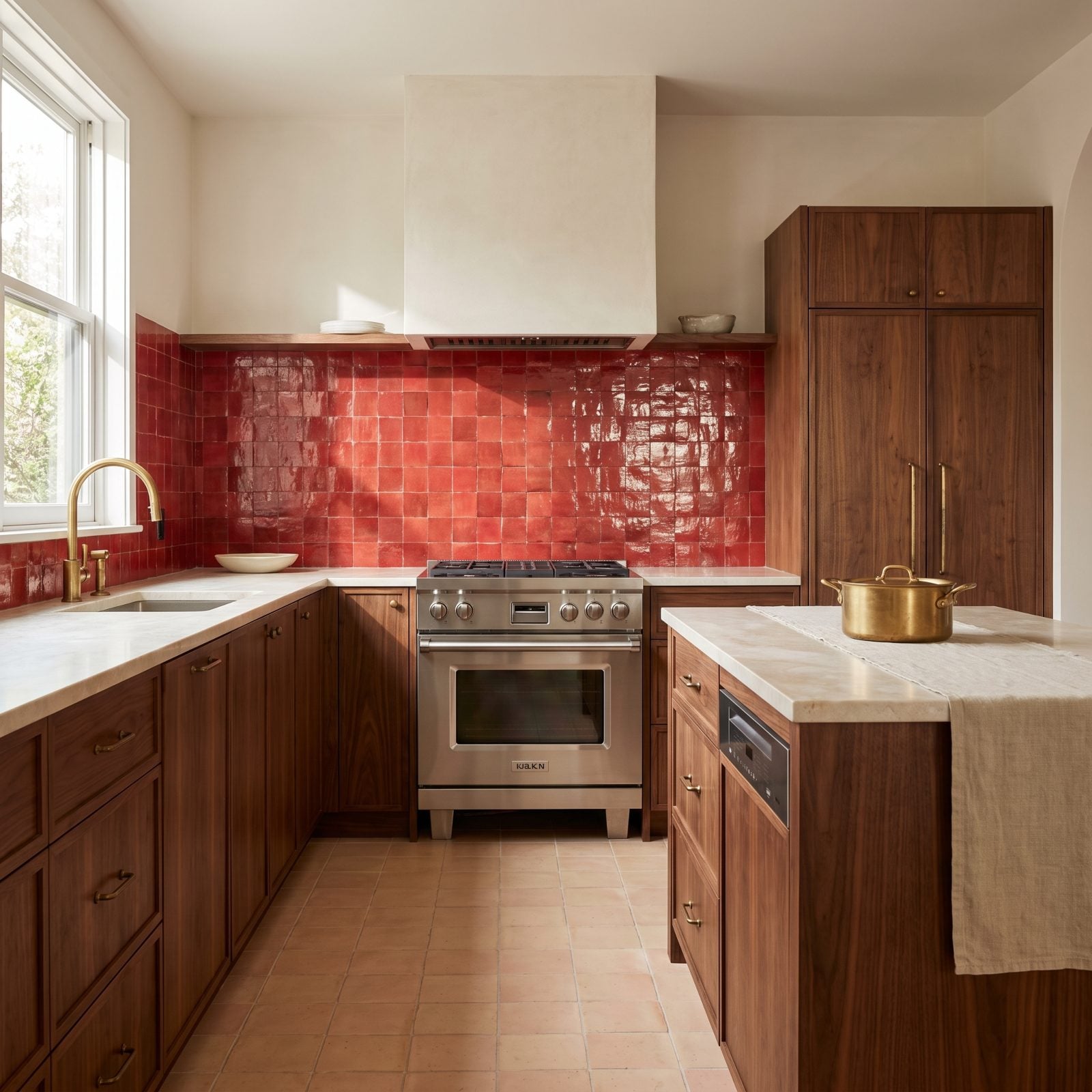
Zellige is the anti-subway tile. Handmade, irregular, glazed so no two pieces catch the light the same way — and in poppy red it practically flickers.
Unevenness is the point. Machine-cut tile lies flat and dead, while this throws back a dozen shades of red as the daylight drifts through the room. Against walnut it turns a backsplash into the reason you walk into the kitchen at all. Unlacquered brass that will patina over the years finishes the story. This is the pairing that got us. Somewhere around the third tile we quit arguing.
18. Walnut Pantry Wall Behind Fluted Red Glass Doors
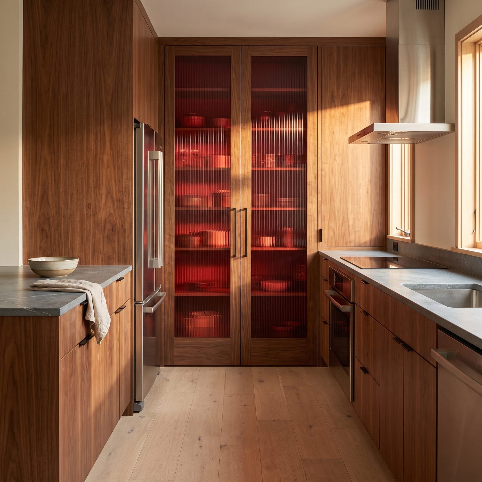
The fluted red glass works like a curtain, not a display case. You get the shape of what’s inside without the clutter of it, and the ribs catch the morning light like a stack of hard candy.
Pairing it with plain walnut doors below was the smart move. The wood stays quiet so the glass can shout. Give a color this loud a calm neighbor and it behaves.
17. Walnut Kitchen With a Raspberry-Red Banquette
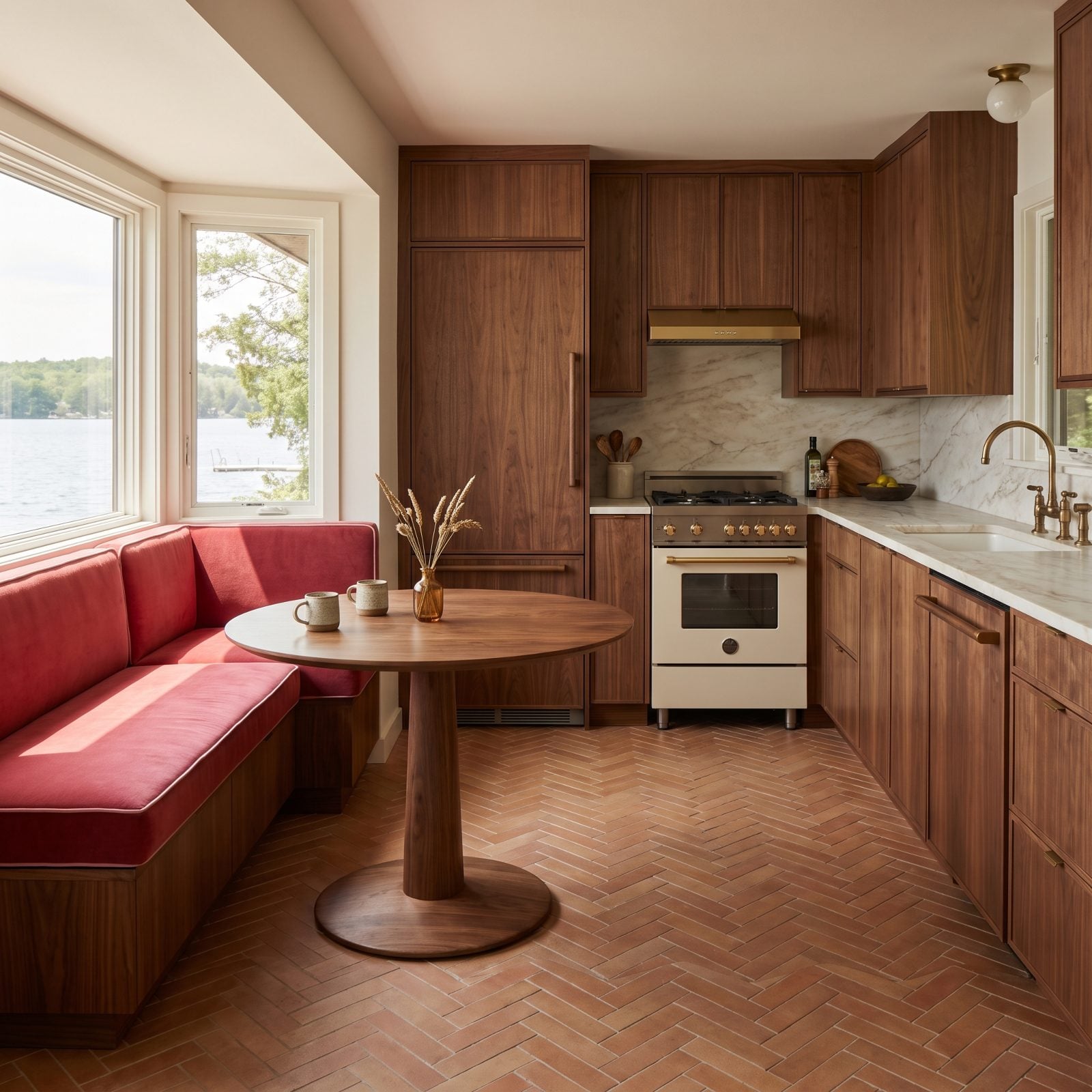
Raspberry velvet against walnut reads like a jewel box. The nap of the mohair grabs the afternoon light and holds it, so the banquette looks lit from inside even after the sun moves on.
Build this same corner with a harsher red and it would fight the wood. Raspberry has enough blue in it to sit beside warm walnut without clashing, and that’s the color decision most people skip. It’s the one that matters most here. Planning a bold kitchen makeover? Start with the fabric and let everything else follow.
The raspberry velvet banquette and walnut pedestal table anchor the nook without crowding it.
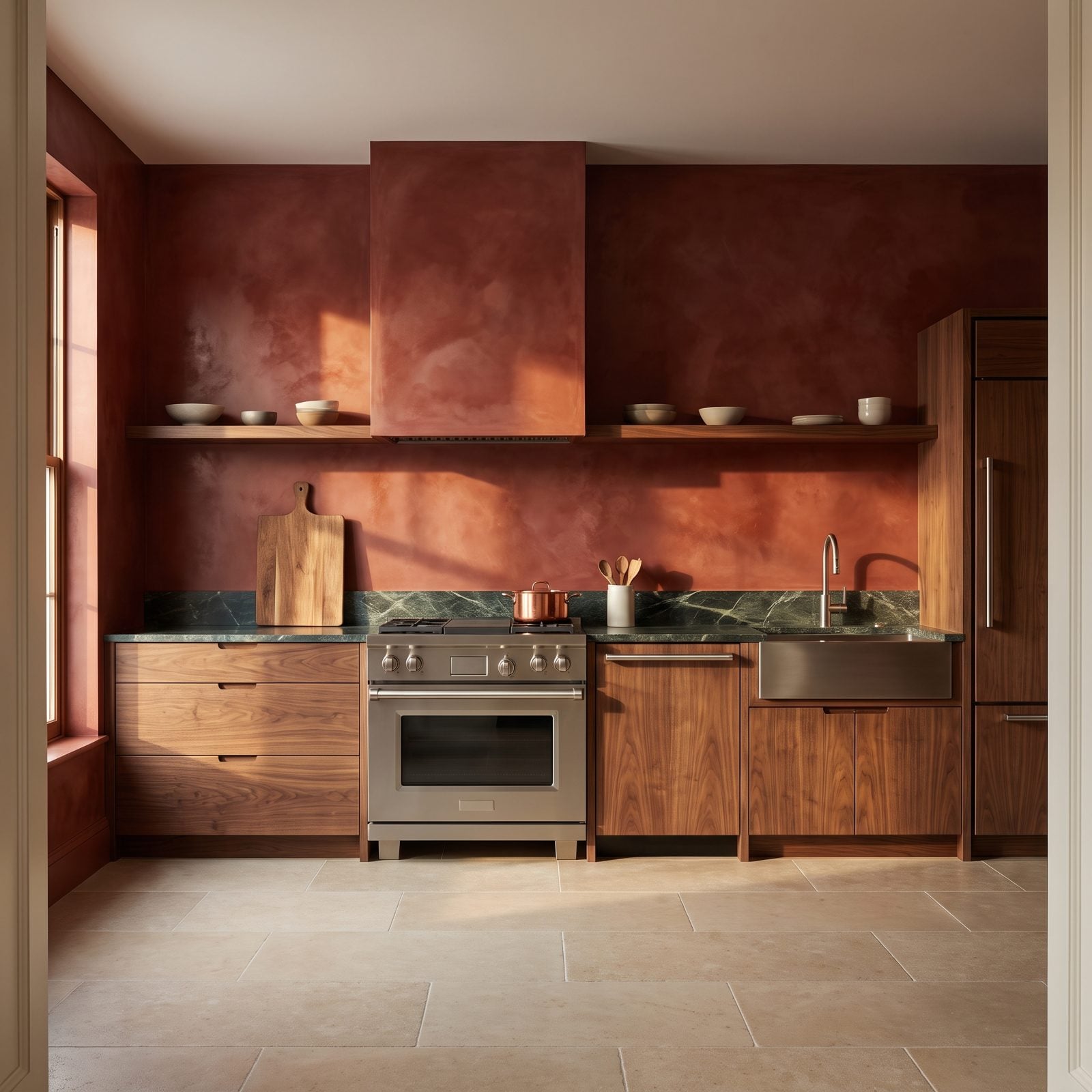
16. Walnut Cabinets Against a Venetian-Red Plaster Wall
🔥 Would you like to save this?
Polished plaster is why this wall doesn’t look like paint. The color shifts as you cross the room, going from terracotta near the window to oxblood in the shadows, and that movement earns the extra cost.
Set flat walnut against it and the two materials trade textures. Wood grain versus troweled clay. Nothing shiny, nothing flat, everything with a hand to it.
15. Walnut Kitchen With a Lacquered Garnet Butler’s Pantry
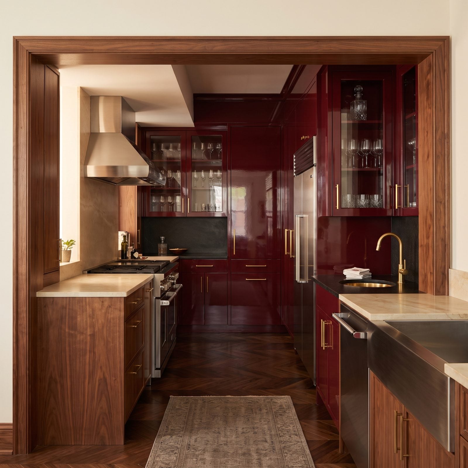
The play here is simple. Keep the main kitchen calm and let the pantry go all in. That garnet lacquer stays hidden until you round the corner, and then it hits you all at once.
Gloss is doing real work in that small room. A high-shine finish bounces light around a tight space and keeps a deep color from swallowing it whole. In a big room the same lacquer would feel like too much. Squeezed into a pantry, it feels like a secret.
The brass gooseneck bar faucet is the right note against garnet, warm metal on a warm red.
14. Walnut Kitchen With a Red Enamel Farmhouse Sink
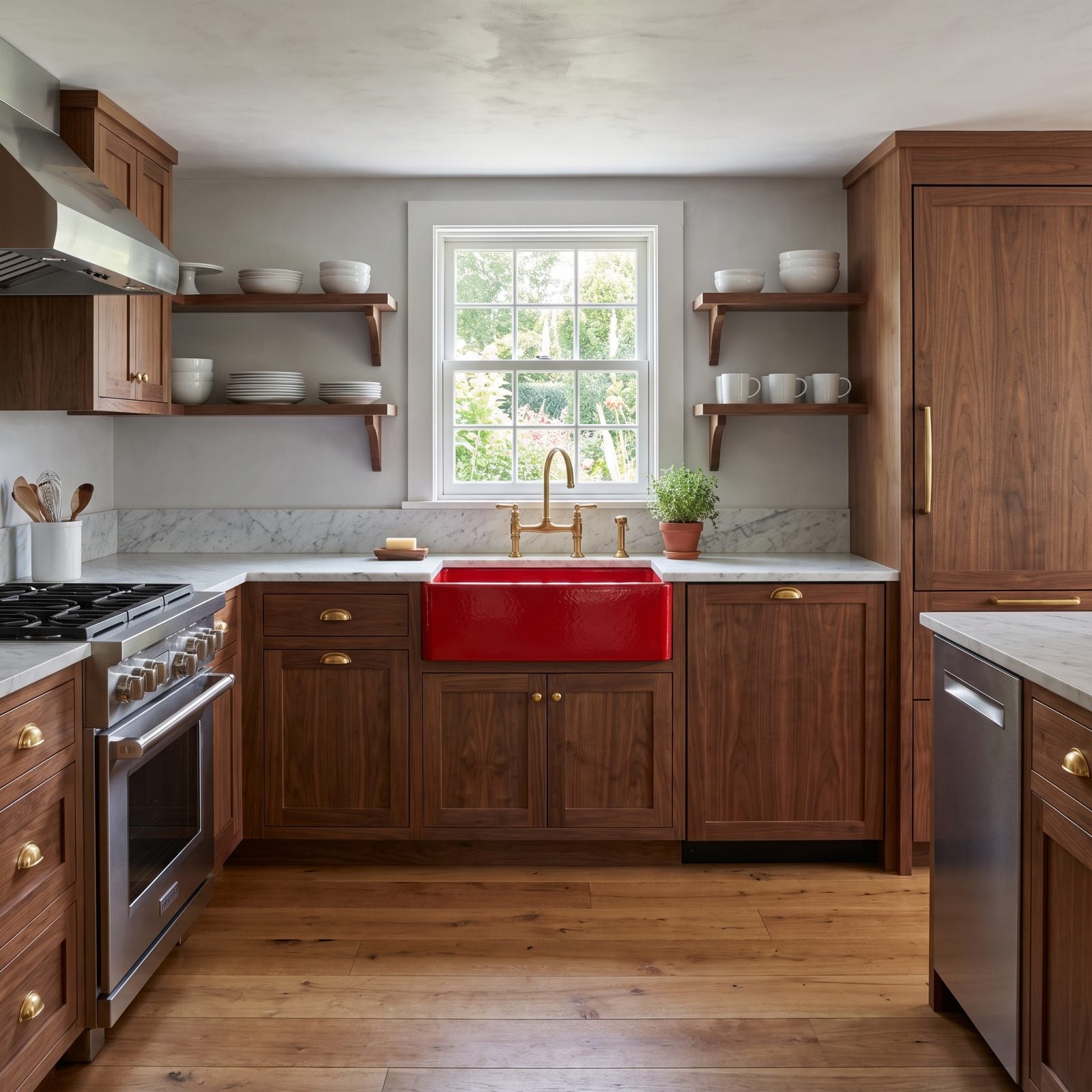
A red enamel apron sink is the kind of commitment most people talk themselves out of. Don’t. Cast iron enamel wears like iron because it is iron, and that glossy red will outlast three sets of trend-chasing cabinets.
The gloss against matte marble is the quiet star here, wet-looking red beside chalky white stone. Same reason a lacquered nail looks good against bare skin.
13. Walnut Kitchen With a Crimson Ceiling and Neutral Walls
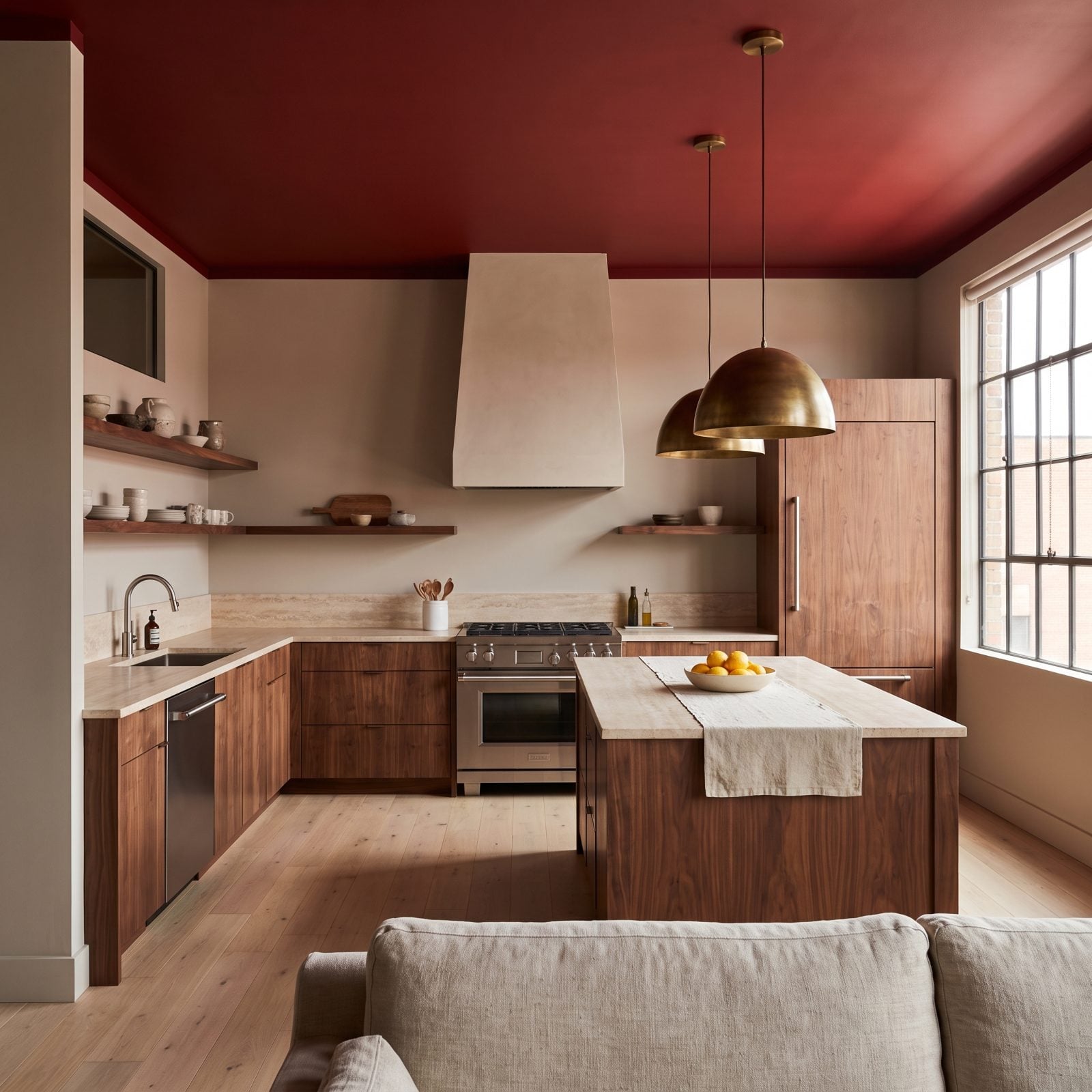
Painting the ceiling instead of the walls flips the whole room. Crimson overhead casts a warm reflected glow down onto the walnut, so the wood looks lit by a fire that isn’t there.
Keeping the walls greige was the discipline that makes it work. Red ceiling over red walls would feel like a heat trap. Neutral walls give your eye somewhere to rest.
12. Walnut Island Beneath Ruby-Glass Pendant Lights
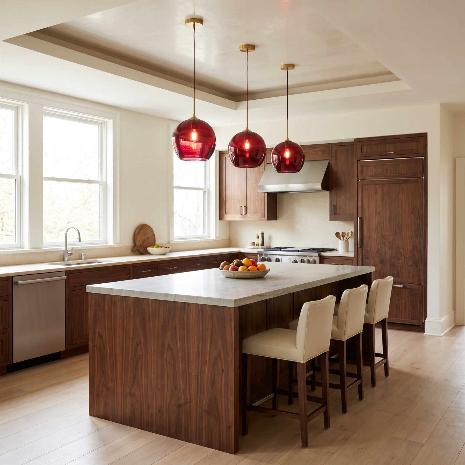
Three ruby-glass pendants are all the color this room needs. Hung over a walnut island, they pull your eye up and drop a wash of warm light onto the quartzite below.
Glass color reads differently than paint. It shifts with the daylight and glows after dark, so the room never looks the same twice. A lot of drama from three fixtures.
The ruby glass pendant lights and cream leather bar stools keep the palette tight and warm.
11. Walnut Kitchen With a Vintage Red Tile Mural
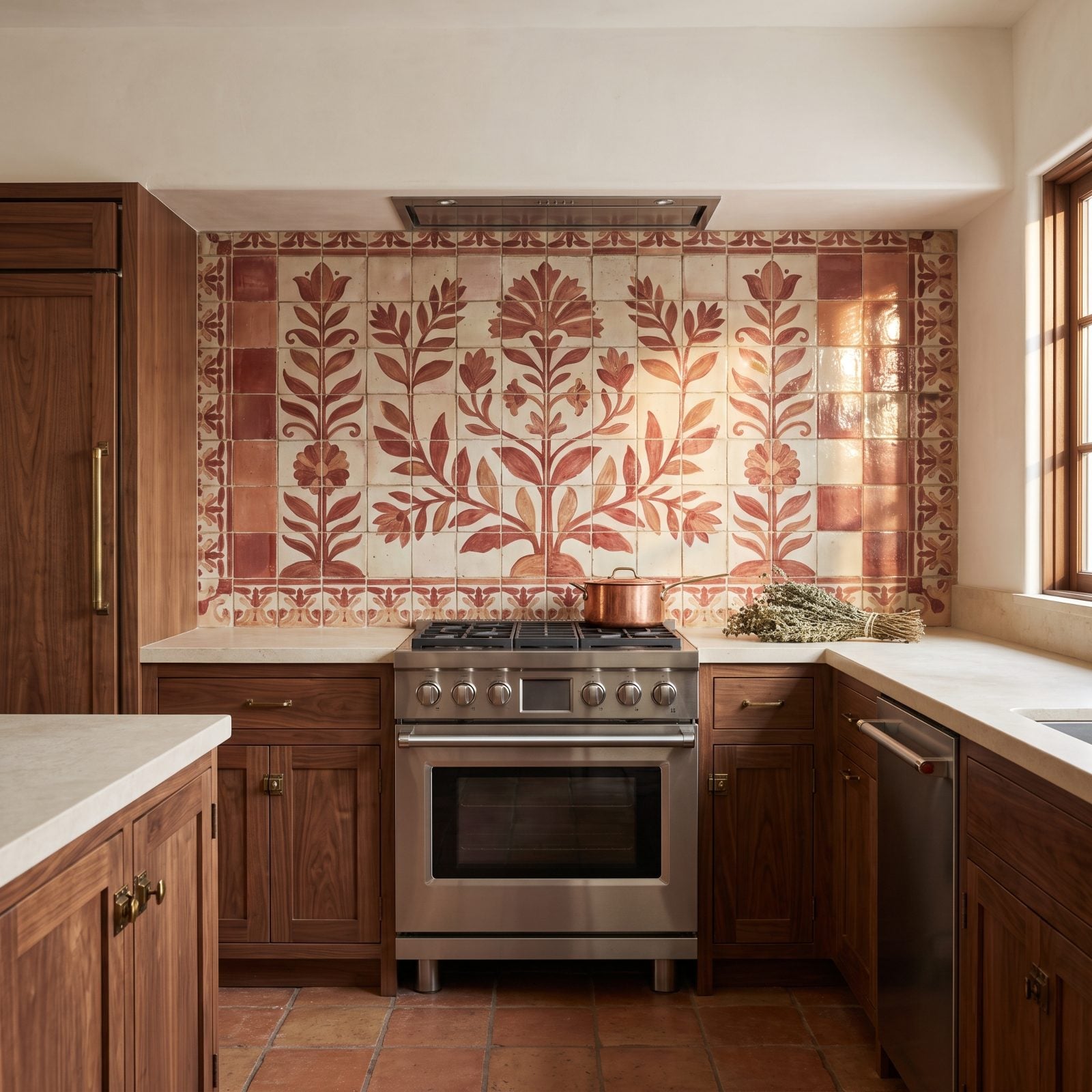
Every glaze irregularity on those tiles is a feature, not a flaw. Hand-painted ceramic catches light unevenly, so the red mural shifts and glints where machine-made tile would sit flat and dead.
Walnut cabinetry with old brass latches gives the whole wall a lived-in feel, like the mural came with the house and the kitchen was built around it. That’s the effect you want, history rather than showroom, and it borrows the same warmth you’ll find in a good country kitchen renovation.
10. Walnut Kitchen With a Coppery Red Metal Backsplash
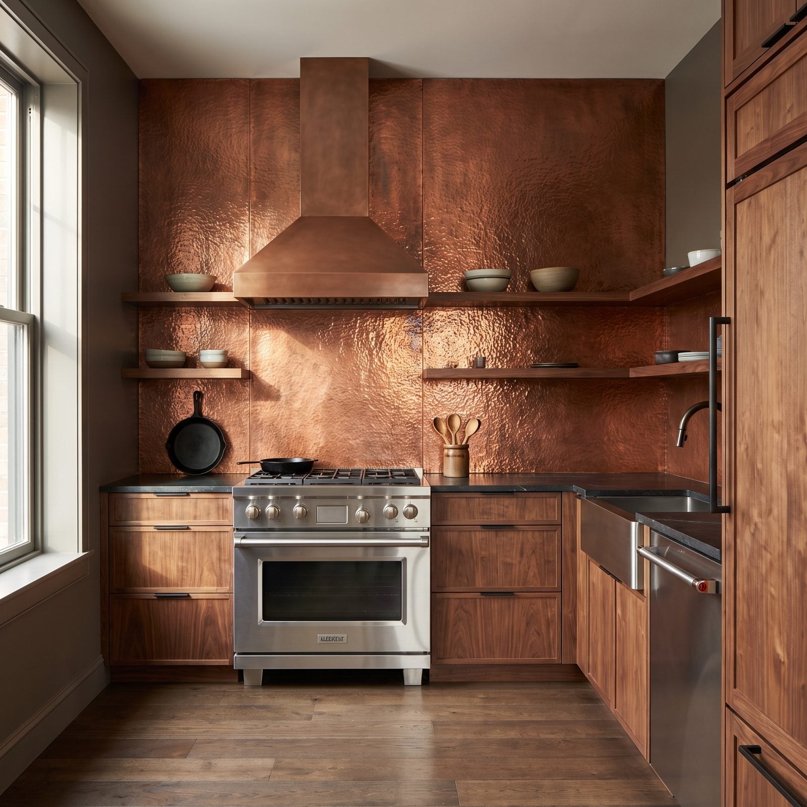
Hammered copper-red metal is a different animal than tile. The dimpled surface catches light in a hundred small points, so the backsplash flickers as you move past it. Static red goes still. This one moves.
Pairing it with dark soapstone and blackened steel keeps the metal from tipping into rustic cabin territory. The palette stays grown-up.
9. Walnut Kitchen With a Candy-Apple Red Prep Table
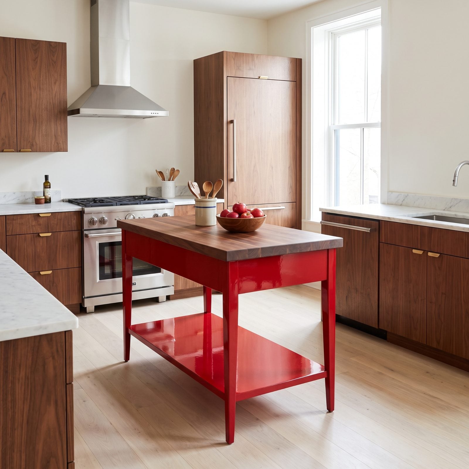
A freestanding red prep table is the easiest way into this whole look. No demolition, no lacquer sprayer, no commitment beyond wheeling it in. Tire of the red and it rolls right back out.
The candy-apple gloss against a walnut butcher-block top pairs shine and grain the way the enamel sink did a few entries back. It works, and it works in a rental too.
8. Walnut Kitchen With a Red Ribbed-Glass Appliance Garage
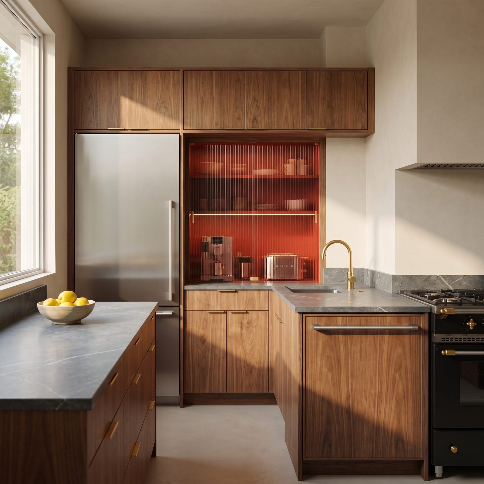
That red ribbed glass is the whole trick. It hides the countertop clutter every kitchen accumulates while glowing like a paper lantern when the light catches it, and the walnut around it keeps the effect grounded instead of gimmicky.
The soapstone counters were the right call over marble. They soak up the warmth of the wood rather than fighting it, and the deep grey lets the red read as a jewel instead of a warning sign.
7. Walnut Kitchen With a Dusty Rose-Red Coffee Station
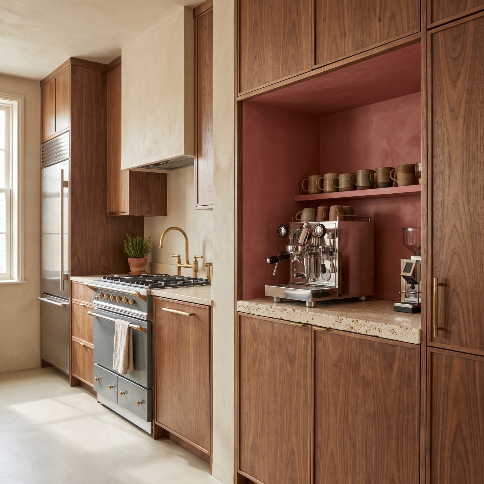
Dusty rose-red is what happens when you talk red down from a shout to a murmur. Chalky, faded, almost architectural. It reads more like old Italian plaster than a color chip, and against walnut it feels like it has always been there.
The cream travertine counter is the quiet hero, its pitted warm surface bridging the gap between the cool grey range and the rosy niche without asking for any credit.
6. Walnut Kitchen With a Fireclay-Red Peninsula
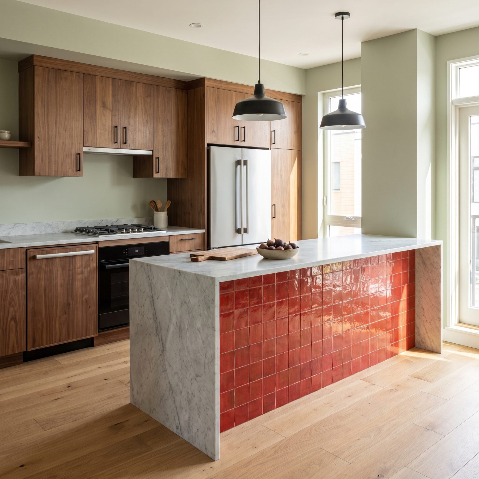
Everything about this peninsula is fighting for attention, and somehow nothing loses. The glazed fireclay tiles catch light unevenly, so the red shifts as you move around it.
Glossy red tile against matte walnut is a texture conversation, not just a color one. The sheen bounces the pendants while the wood swallows the same light whole, and that contrast is what keeps the eye moving.
Cladding an entire vertical surface in one saturated color takes nerve. It works here because the marble top acts as a cooling break, and the walnut wall behind gives the red something warm to lean on. This is the kind of decision that separates a real bold kitchen makeover from a timid one.
5. Walnut Kitchen With a Red-and-Cream Striped Backsplash
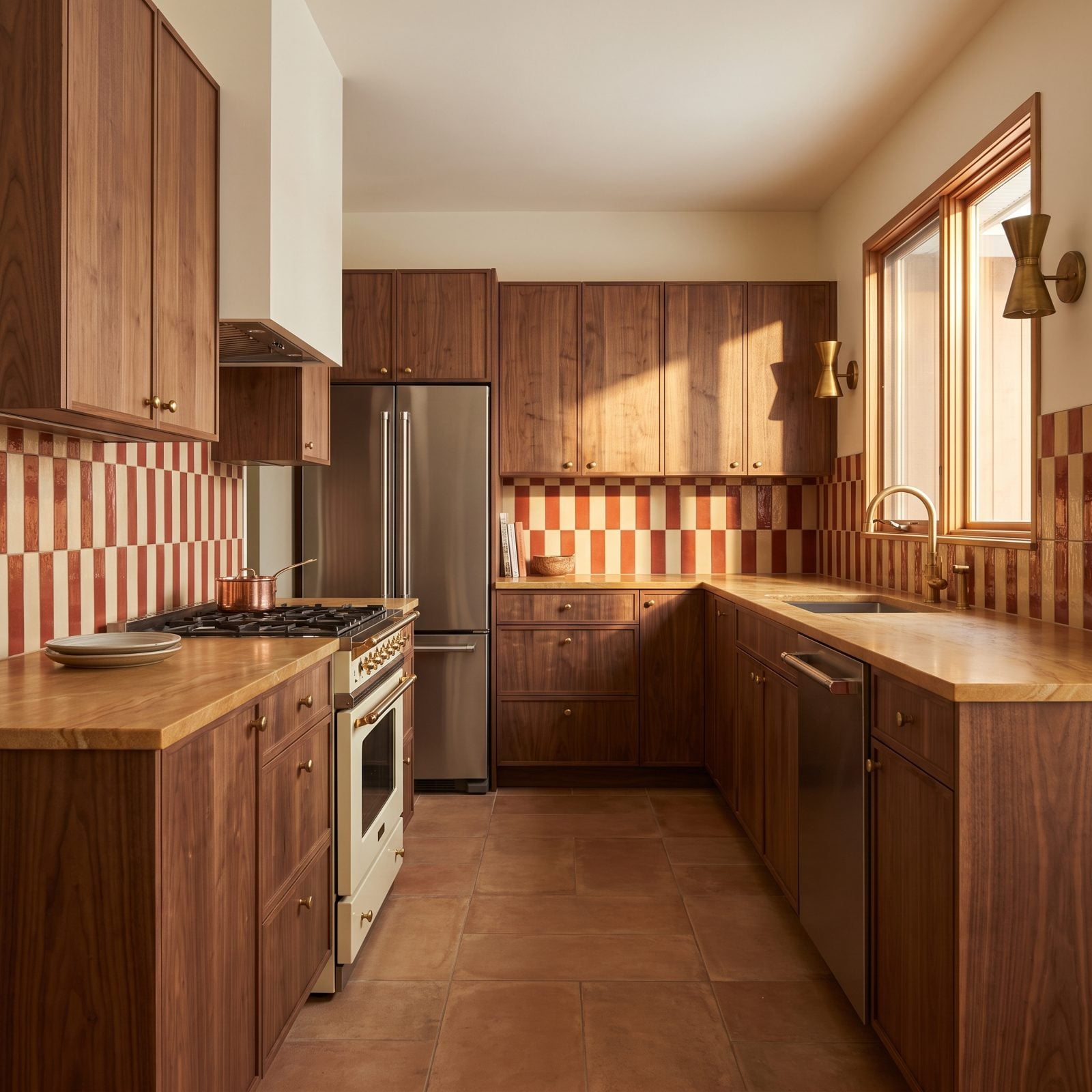
Stripes on a backsplash sound like a mistake until you see them done in a brick-red and cream this soft. The rhythm gives your eye somewhere to go, and the muted tones keep the whole thing from turning into a candy cane.
Warm honey quartzite counters were smart. They pull the cream out of the stripes and let the red stay the loudest thing in the room without overpowering the walnut.
4. Walnut Kitchen With a Red Cork Floor
🔥 Would you like to save this?
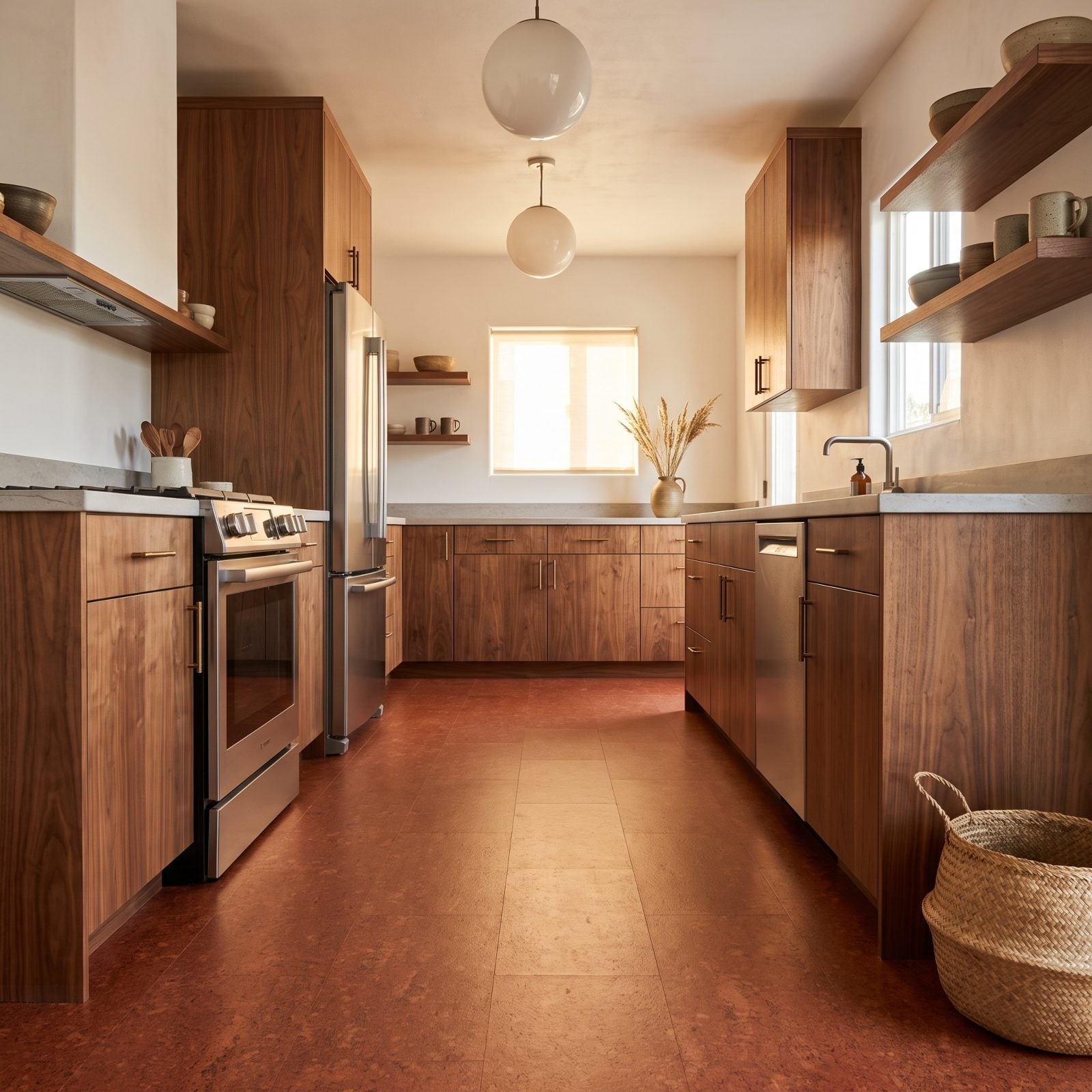
Red on the floor instead of the wall. Bold move, and it pays off.
Cork made it possible. It softens the red into something warm and rust-toned rather than glossy, and it takes the color underfoot where it grounds the whole galley instead of shouting from eye level. The walnut cabinets above read almost calm by comparison.
3. Walnut Kitchen With a Lacquered Rosewood-Red Hutch
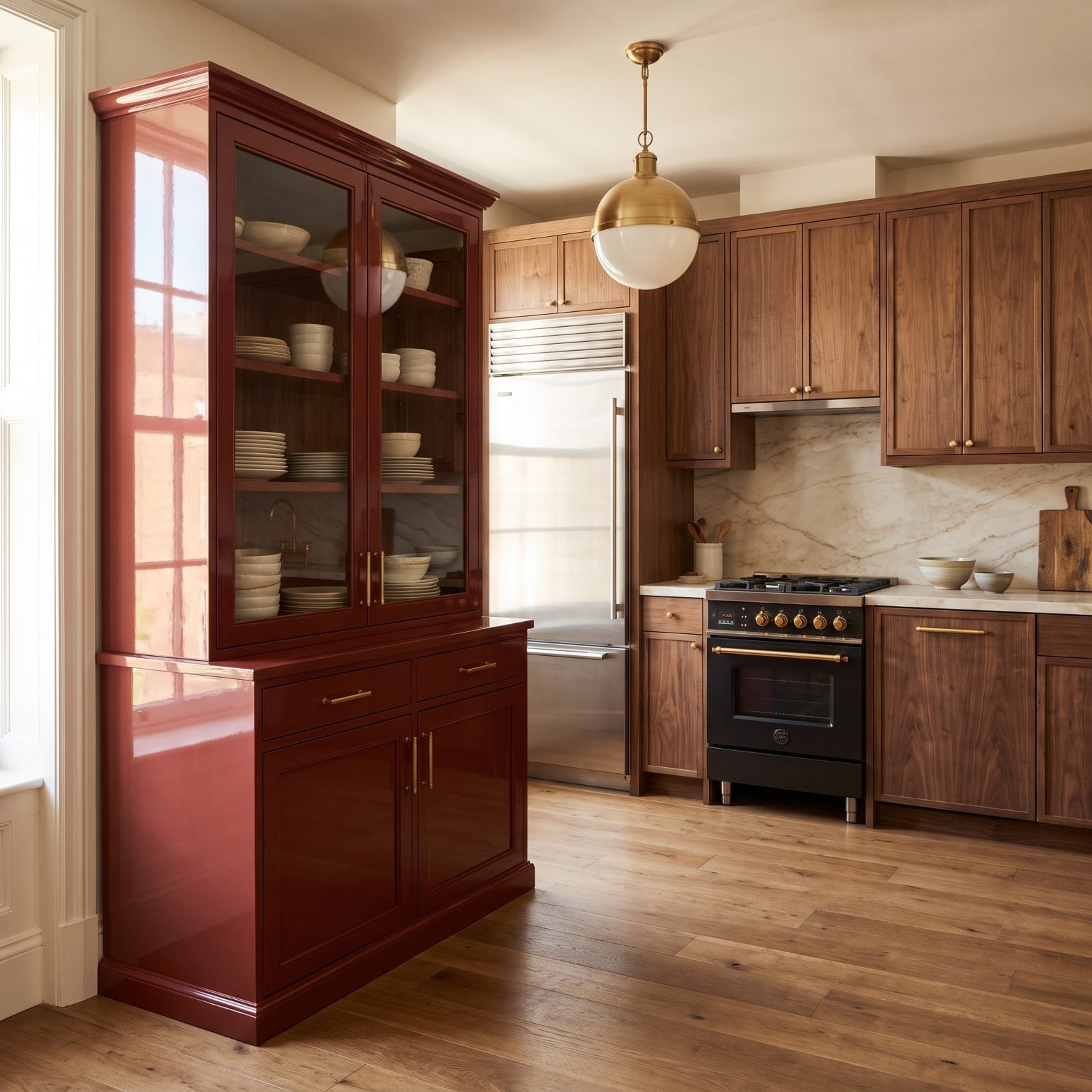
The gloss is everything here. That rosewood-red lacquer is polished to a mirror, and it sits against matte walnut like patent leather next to raw denim.
Reflective red bounces light back into the room while the wood absorbs it, so the hutch is the piece your eye lands on first every time. A freestanding element also lets you commit to a saturated color without marrying it to your cabinetry, which is the kind of flexibility a built-in never gives you.
2. Walnut Kitchen With a Burnt-Red Limewash Backsplash
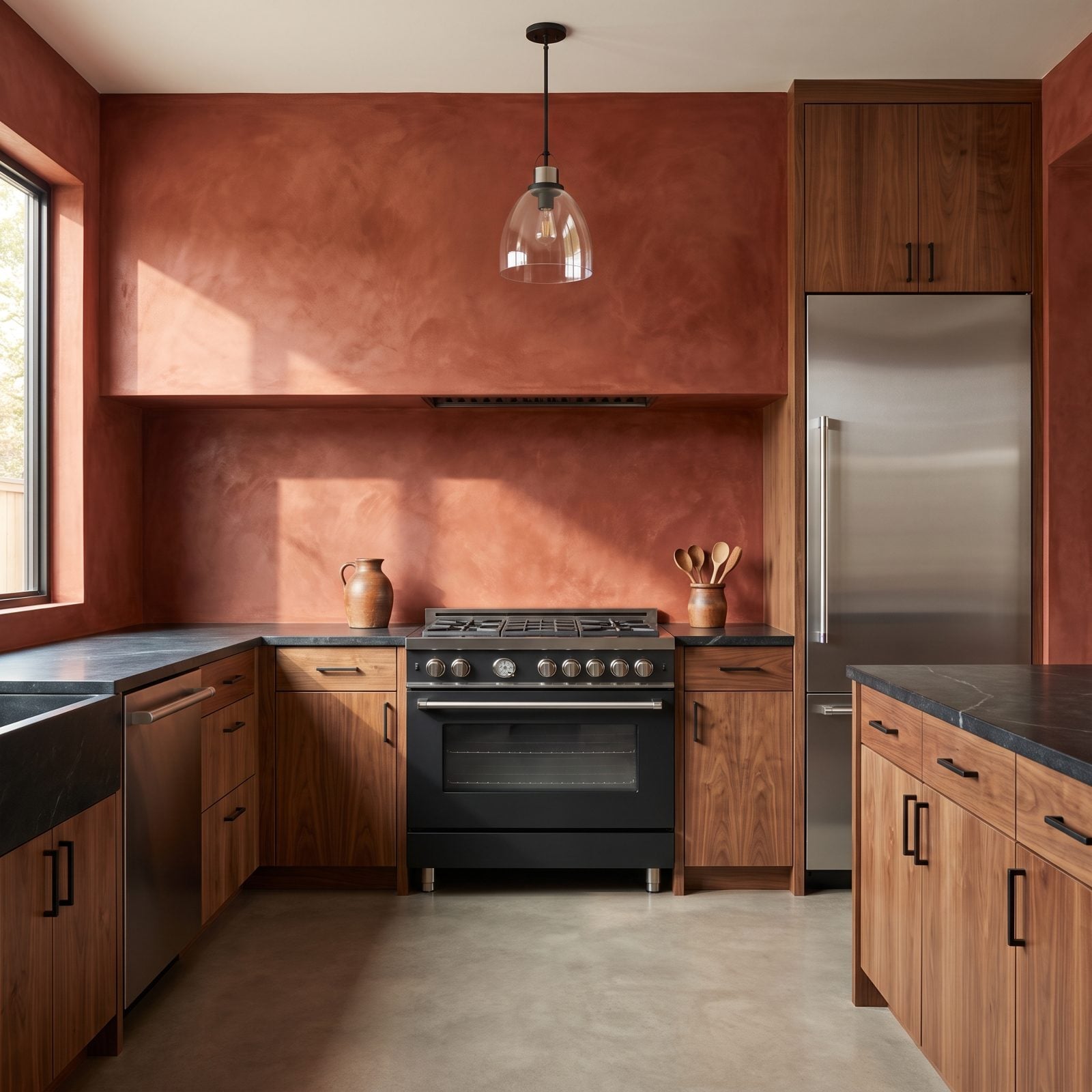
Limewash gives red a depth flat paint never manages. That burnt, cloudy surface shifts from brick to rust as the light moves across it, so the wall looks different at breakfast than it does at dinner.
Dark soapstone counters anchor it. They keep the burnt-red from floating and let the walnut grain sing between the two darker planes.
1. Walnut Kitchen With a Red Marble Shelf and Matching Sink
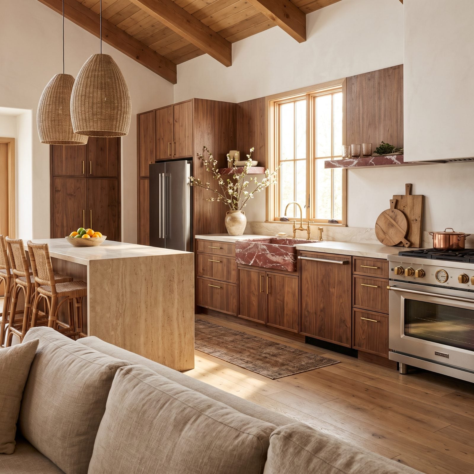
Red marble is a splurge, and this kitchen spends it in exactly two places: one floating shelf, one carved sink, both cut so the white veining reads like lightning across the stone.
Repeating the same rare material twice is what makes it look deliberate instead of accidental. Your eye connects the shelf to the sink and reads the whole room as considered.
The cream marble counters were chosen to step back on purpose. Match the red and everything flattens into one loud surface. Letting the counters play the calm neutral gives the red stone its jewel-box status, and that lesson carries well beyond the kitchen into craftsman kitchen decor and older homes alike.