🔥 Would you like to save this?
The 1970s spent decades serving as interior design’s designated bad example. Avocado appliances, shag carpet, faux wood paneling, harvest gold, mirrored walls — the decade became shorthand for everything later renovations were supposed to erase. Part of that reputation was deserved. Cheap imitations proliferated, good materials were pushed past their limits, and subtle ideas often ended up reproduced in plastic, laminate, and enough brown to dim a room at noon. But the caricature obscured what the better interiors were actually doing.
Seventies rooms had weight, texture, and appetite. Wood was allowed to show grain. Stone stayed rough. Upholstery carried color. Floors, ceilings, and walls all participated instead of fading into an interchangeable white envelope. Furniture sat low and encouraged people to gather; plants became architecture; lamps were objects rather than invisible sources of illumination. After years of cool gray, flattened minimalism, recessed lighting, pale oak, and rooms designed to photograph before they were designed to be inhabited, many of those instincts suddenly look remarkably current. The 36 ideas below are not arguments for rebuilding 1974 room for room. They are evidence that the decade understood something enduring about warmth, tactility, material honesty, and the pleasure of a house that does not apologize for having a personality.
In order to come up with the very specific design ideas, we create most designs with the assistance of state-of-the-art AI interior design software. Also, assume links that take you off the site are affiliate links such as links to Amazon. this means we may earn a commission if you buy something.
36. Wood-Paneled Walls
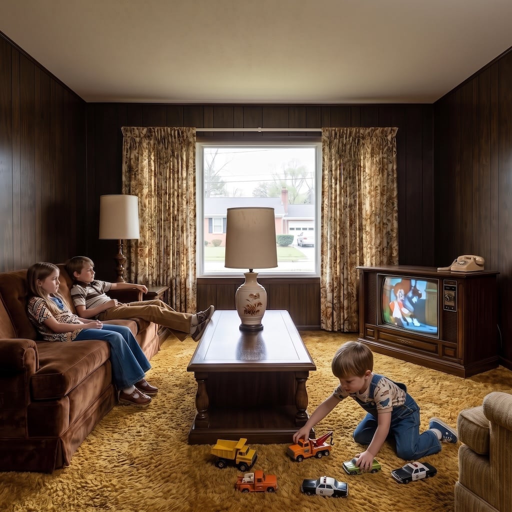
For years, wood paneling meant one thing: basement rec room, low ceiling, inadequate lamp. People painted over it with the urgency of witnesses destroying evidence.
The better versions deserve another look. Real veneer and solid wood bring grain, shadow, and variation that a painted wall cannot imitate. Walnut, teak, oak, and pecan turn a flat surface into part of the furniture, especially when the finish is matte enough to let the grain stay visible.
35. The Mushroom Lamp That Glowed Like a Warm Egg on the Side Table
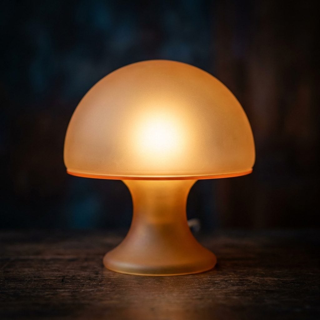
You did not so much switch one on as give the room a small glowing companion. Glass, acrylic, chrome, milky white, amber: the dome hid the bulb and turned ordinary lamplight into something softer and stranger.
Italian glassmakers helped make the form glamorous, but the silhouette spread far beyond expensive design houses. Department-store versions did the same essential job for much less money. That rounded little pool of light still looks good because harsh overhead lighting has not improved with age.
34. Avocado Green Kitchens
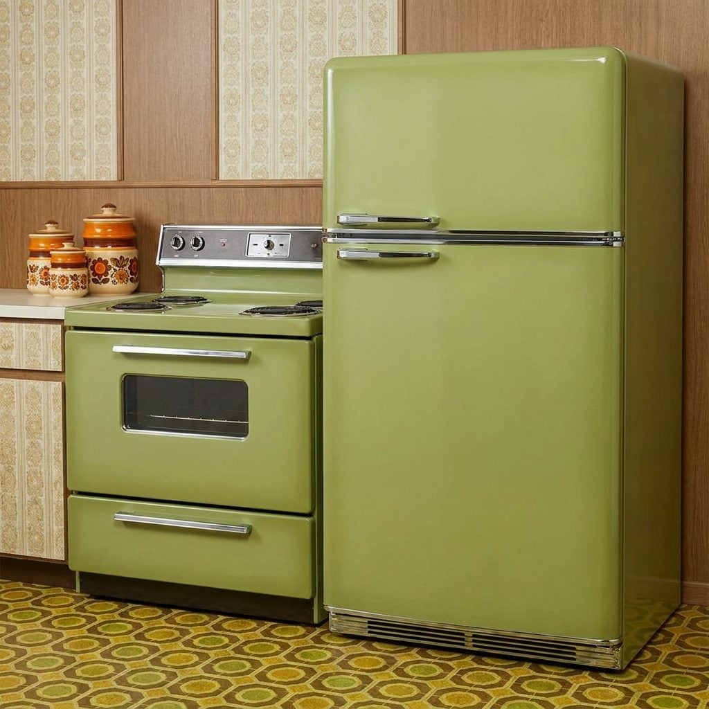
Avocado green spent years filed under kitchen crimes, somewhere between popcorn ceilings and vinyl flooring with suspicious yellow flowers.
Look at the color on its own and the joke is harder to sustain. Avocado is earthy, muddy, and unusually comfortable beside oak, walnut, cream, brass, and clay. Today’s olive, moss, and muted sage kitchens are not identical, but they live on the same branch of the family tree. Apparently green did not need rehabilitation so much as better lighting.
33. Conversation Pits
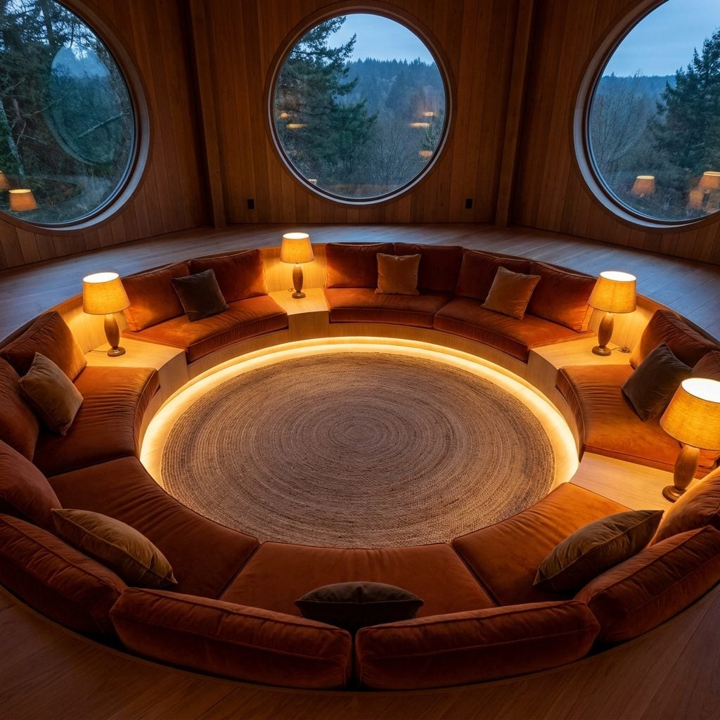
Few rooms announce their intentions as clearly as a conversation pit. You step down, everybody faces inward, and the television is suddenly no longer the architectural center of civilization.
The idea predates the 1970s, but the decade embraced it enthusiastically. Built-in seating made the social zone part of the architecture instead of a collection of furniture pushed against walls. Modern versions tend to be cleaner and better lit, but the appeal is unchanged: a room designed around people looking at one another.
A seating plan that makes conversation easier looks almost radical after decades of furniture aimed at screens.
32. Rattan and Wicker Furniture
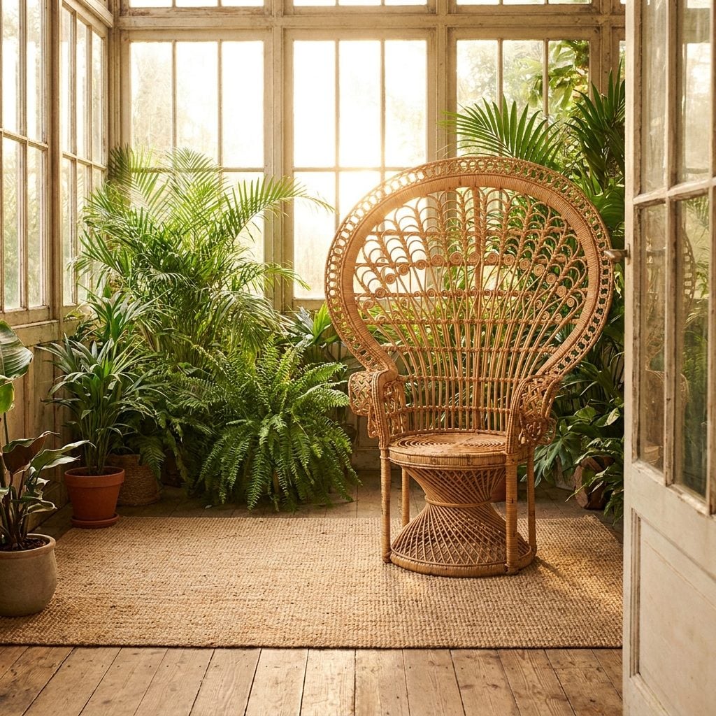
The peacock chair alone could carry a family-photo album. That enormous fan-shaped back turned an ordinary sunroom corner into a throne whether anybody asked for one or not.
Rattan and wicker spent a period exiled to patios, but indoors they do something solid furniture cannot: they bring texture without much visual weight. Honey-colored weaving beside plaster, stone, dark wood, or a wall of plants makes a room feel less polished and more inhabited.
31. Floral Wallpaper
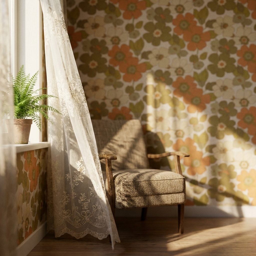
The 1990s attacked floral wallpaper with steamers, scrapers, and a gallon of builder beige. For a while, bare walls felt like victory.
Large-scale florals have since returned with their nerve intact. The interesting part is not that flowers are fashionable again; flowers never truly went anywhere. It is the return of commitment. Entire powder rooms, dining rooms, and bedrooms are being wrapped in pattern instead of receiving one apologetic accent wall.
30. Terrazzo Floors
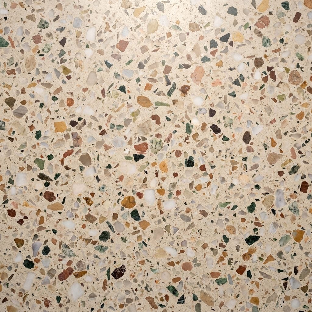
Terrazzo is much older than the 1970s and has spent centuries moving between grand architecture, commercial buildings, schools, airports, and domestic interiors. The decade simply gave it some memorable colors.
Cream bases mixed with amber, brown, rust, and ochre chips feel especially current now because they combine pattern with actual material variation. Every section differs slightly, and the surface can take enormous wear. A floor that survived public buildings was never going to be frightened by a family kitchen.
29. Built-In Wet Bars
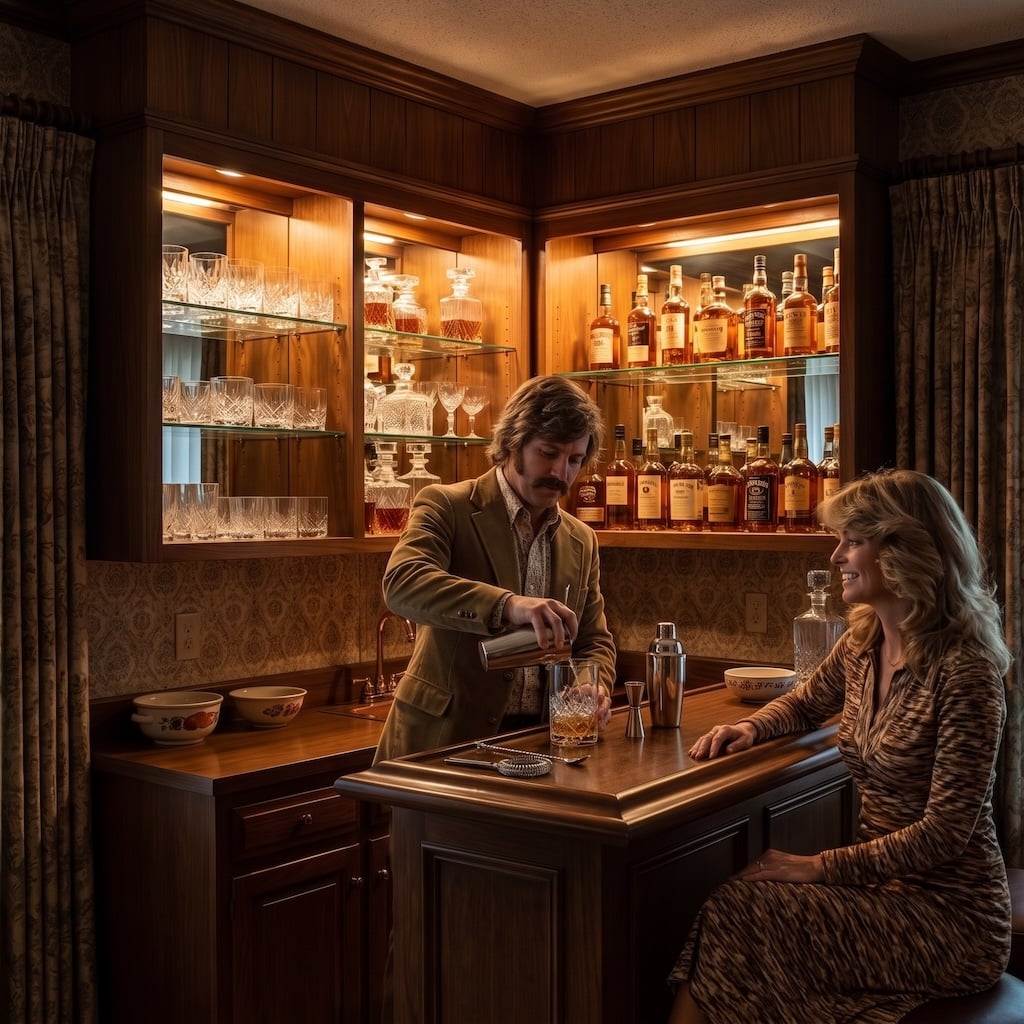
Every good party in 1975 seemed to migrate toward one of these.
A sink, a mirrored back, a few shelves of bottles, maybe a brass rail, and suddenly the family room had an after-dark department. Later renovations often absorbed the bar into larger kitchens, but the dedicated drink station never lost its theatrical advantage.
Modern versions are slimmer and better integrated, yet a craftsman home bar still owes plenty to the era that decided cocktails deserved their own cabinetry.
28. Shag Carpeting
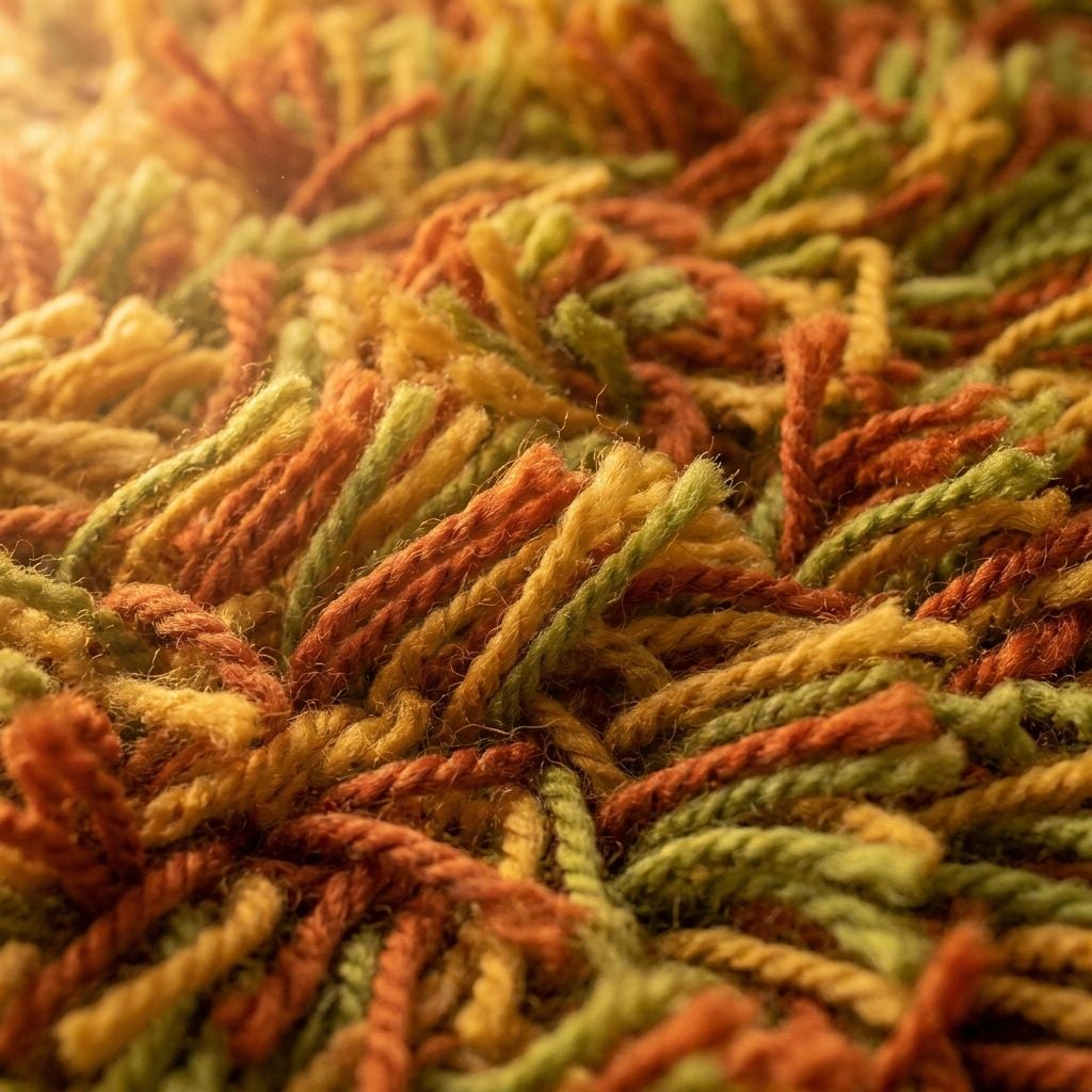
Shag earned part of its bad reputation honestly. Wall-to-wall versions trapped crumbs, jewelry, pet hair, and mysteries no vacuum attachment was qualified to investigate.
But the physical pleasure was real. Deep pile under bare feet adds softness that hard flooring cannot fake. Today’s plush wool and high-pile rugs revisit the idea without carpeting the entire room. Keep it contained, keep it cleanable, and suddenly shag stops being a punchline and starts looking like texture.
27. Arched Doorways and Openings
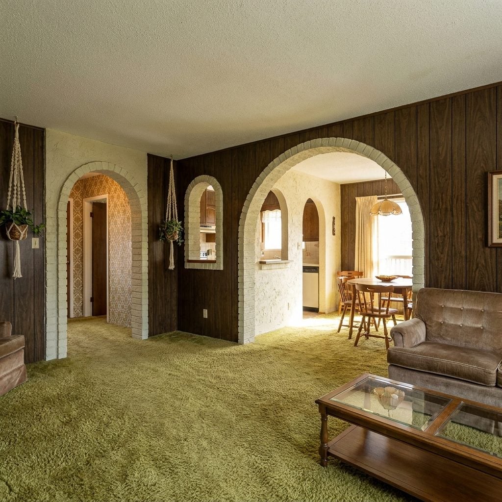
The square doorway is efficient. The arched one has a pulse.
Spanish-, Mediterranean-, and adobe-influenced homes of the period used curves to soften everything from room openings to pass-throughs and niches. Later remodels frequently squared those openings off in pursuit of cleaner lines.
An arch does not need a psychological theory to justify itself. It frames whatever sits beyond it, introduces a curve into a room full of rectangles, and turns an ordinary transition into an architectural event.
26. Harvest Gold Appliances
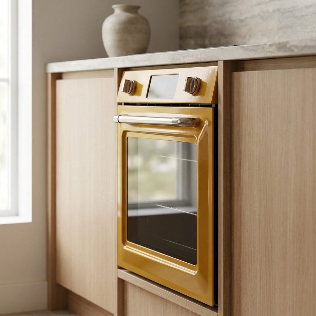
Harvest gold once stood beside avocado, coppertone, and brown in appliance showrooms across North America. Then tastes shifted and kitchens marched through almond, white, black, stainless, and a long stretch of everything looking vaguely professional.
Seen against wood cabinetry today, that muted mustard-gold suddenly has context again. It is closer to wheat, ochre, butter, and clay than the cartoon yellow memory suggests.
25. Smoked-Glass Coffee Tables
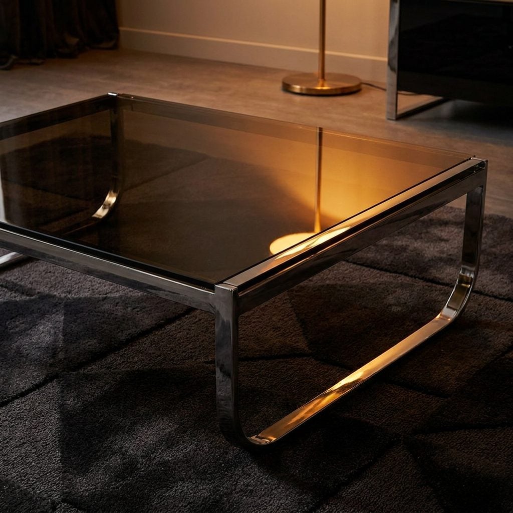
There was a stretch when any tinted glass table looked like evidence from an abandoned bachelor pad. That sentence has aged worse than the furniture.
Bronze and gray glass take some of the glare out of a transparent surface while preserving the sense of openness that made glass furniture attractive in the first place. Put the smoked top over brass, chrome, or sculptural wood and the table has presence without turning into a visual barricade.
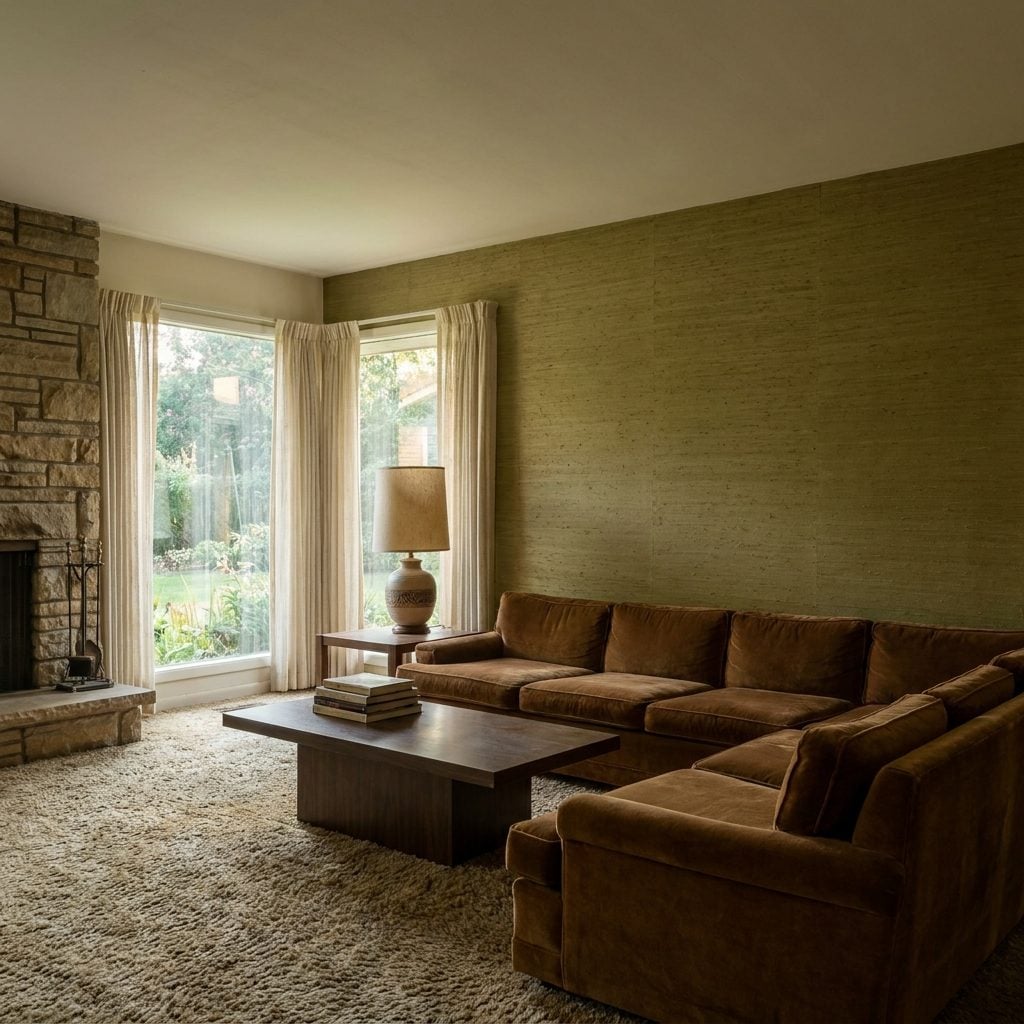
24. Grasscloth Wallcoverings
🔥 Would you like to save this?
Grasscloth never suffered quite the humiliation of avocado appliances, but it spent years being associated with formal rooms nobody was allowed to touch.
Natural-fiber wallcoverings make their case through irregularity. Fibers catch light differently from panel to panel; seams remain visible; color changes slightly across the surface. Instead of pretending the wall is perfectly uniform, grasscloth gives it grain.
That tactile quality works especially well in a home office design, where a small room can benefit from texture without needing another piece of furniture.
23. Sunken Living Rooms
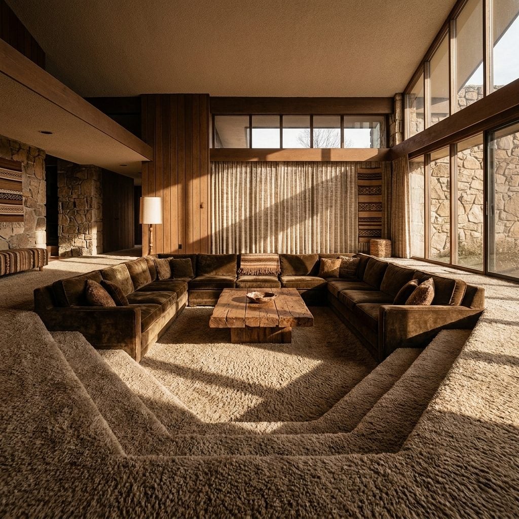
The sunken living room is the conversation pit’s less bossy cousin. Instead of prescribing built-in seating, it simply drops one zone of the floor and lets the change in level define the room.
Yes, steps introduce accessibility and trip concerns. They also create separation without a wall, which is why the idea keeps resurfacing whenever completely open plans start feeling too undifferentiated. For more home inspiration, the sunken lounge is worth studying as architecture rather than nostalgia.
22. Burnt-Orange Upholstery
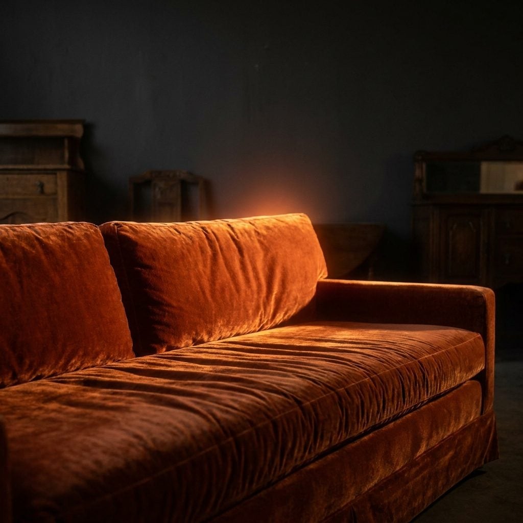
A burnt-orange velvet sofa used to be the kind of inheritance that triggered an immediate call to the upholsterer.
Now the same family of rust, terracotta, pumpkin, ochre, and deep amber works because it brings actual color without behaving like neon. Velvet exaggerates the effect: one section catches the light while another falls almost brown.
For a look with similar warmth, this home inspiration gallery shows what happens when deeper tones replace the standard gray-and-white formula.
21. Woodgrain Kitchen Cabinets
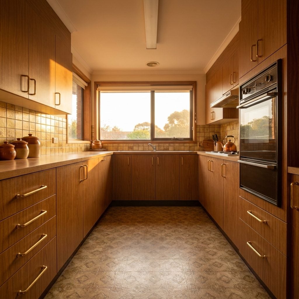
Honey oak, pecan, walnut, teak: for years the renovation script said paint them or rip them out.
What those finishes still have is visible grain. Light lands differently on every door because the surface is not one continuous color. That variation is exactly what painted MDF removes.
20. Swag Lamps Hanging From Chains
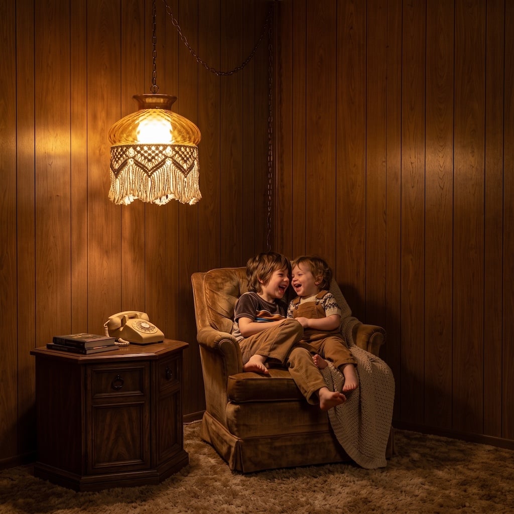
Plug-in swag lamps solved a wonderfully ordinary problem: you wanted pendant light where there was no convenient hardwired ceiling fixture.
A ceiling hook, a chain or cord, and an outlet gave you light exactly over the chair, table, or corner that needed it. The shades did the rest — amber glass, woven fibers, stained glass, macramé, smoked globes.
19. Stone Fireplace Walls
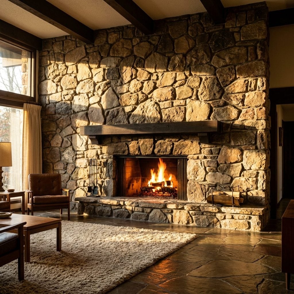
Somewhere along the way these got painted white. All of them. Magnificent slabs of fieldstone disappeared under latex in the name of brightening the room.
Leaving the stone alone looks increasingly sensible. A full-height fireplace wall gives a room rough texture, irregular color, shadow, and an obvious center of gravity. Natural stone beside timber, leather, and wool has the same material directness that makes a good rustic home feel convincing rather than themed.
18. Brown-and-Rust Color Palettes
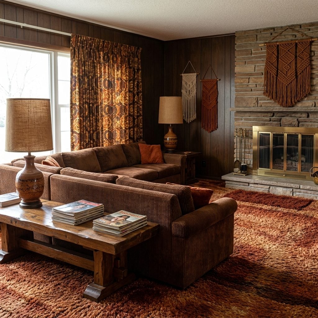
Brown and rust were once so common together that the combination became invisible. Then pastels, cool grays, and white rooms made the palette seem impossibly old-fashioned.
Call it earth tones now and suddenly everybody understands the appeal. Chocolate, clay, tobacco, ochre, cream, and rust resemble materials rather than trend colors: wood, leather, soil, dried leaves, terracotta.
17. Brass-and-Glass Furniture
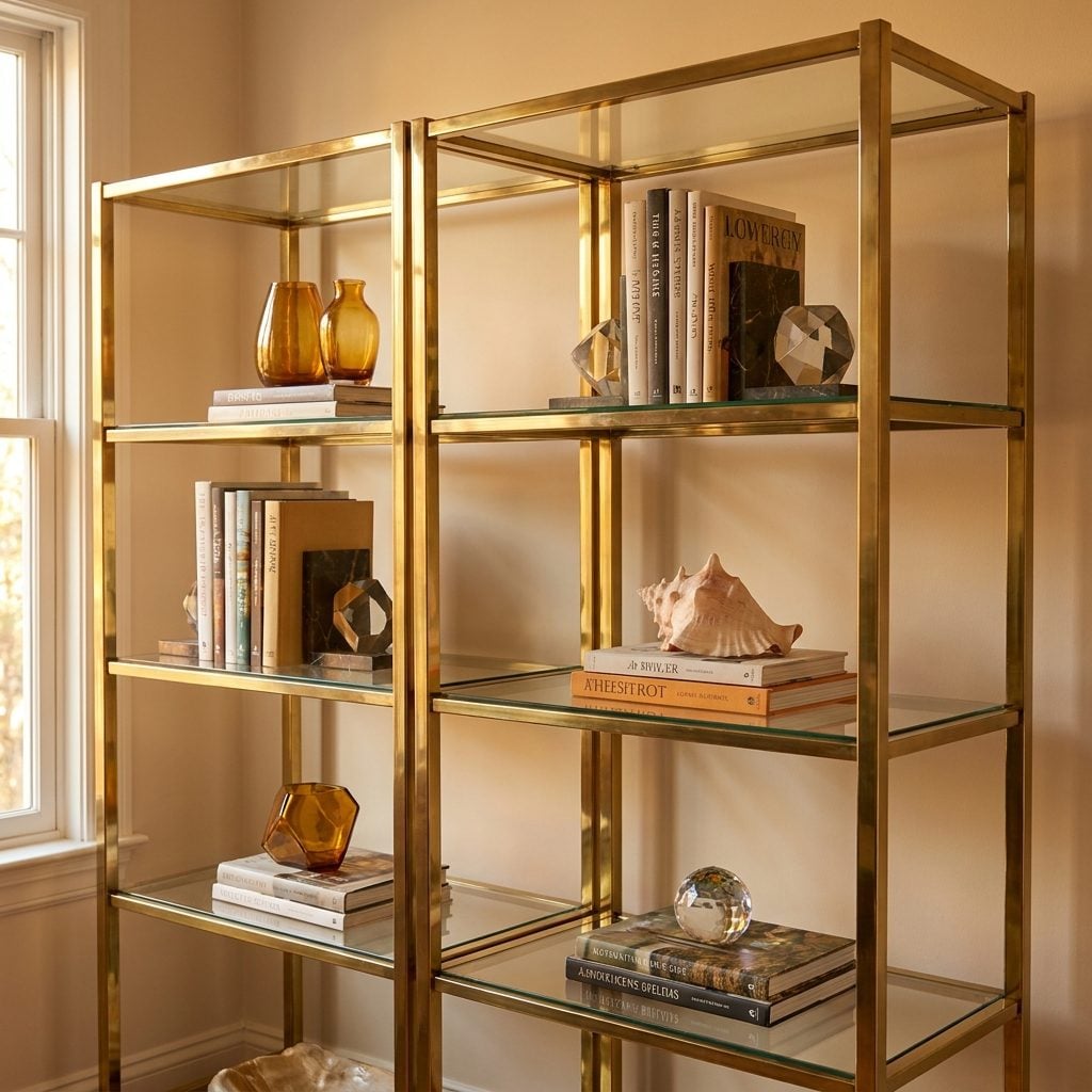
Brass étagères spent years being treated like embarrassing relatives from the formal living room. Chrome looked sharper. Matte black looked newer. Brass looked like something holding Aunt Carol’s crystal.
Seen now, the combination looks lighter and less fussy than its reputation. A thin brass frame catches warm lamplight while glass shelves let the wall remain visible behind whatever is being displayed. The combination can carry plenty without becoming visually bulky.
That same transparency makes the form surprisingly useful in a modern home office design.
16. Bold Geometric Wallpaper
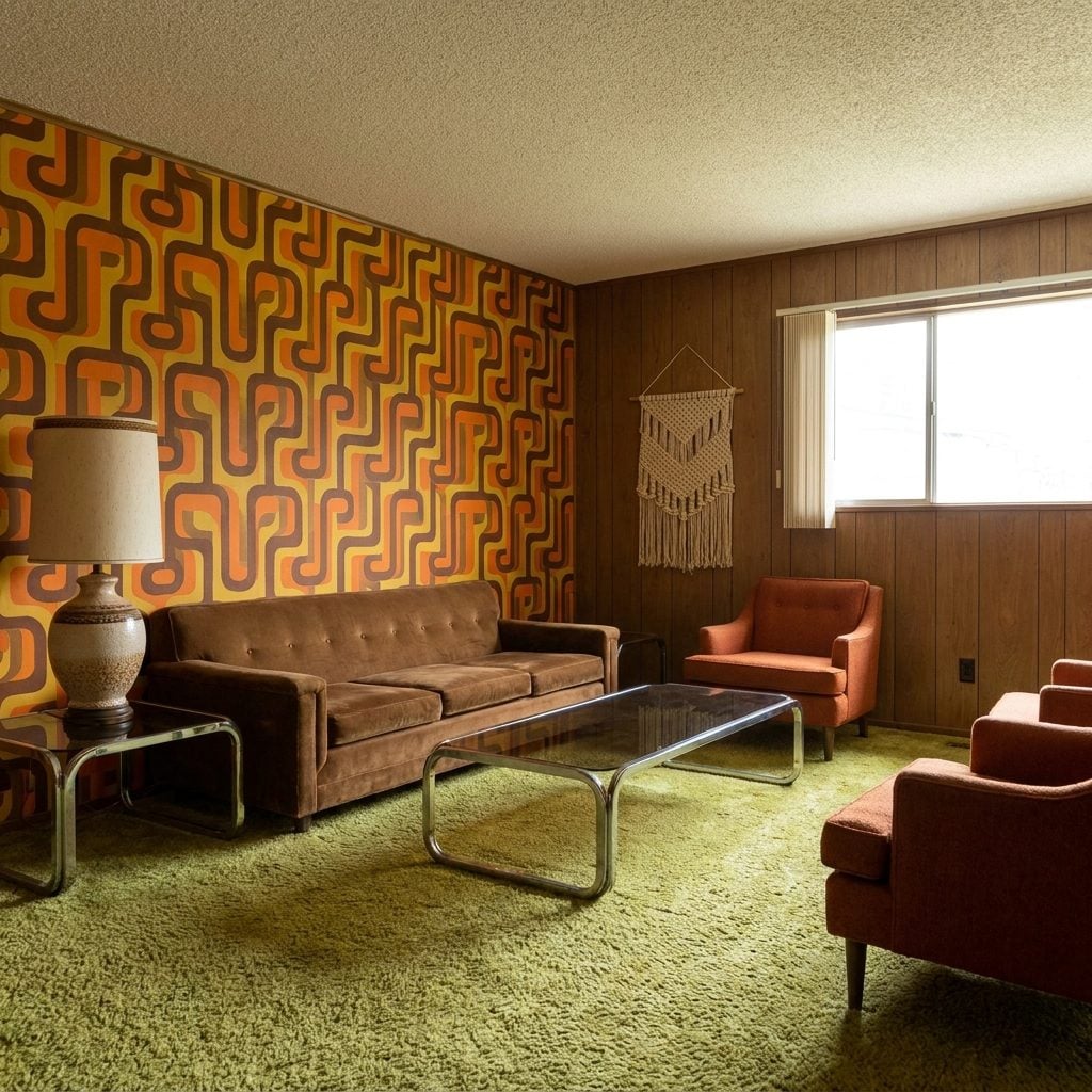
Interlocking circles, enormous diamonds, optical patterns that seemed to move when you walked past: the decade had no interest in pretending wallpaper was background.
The graphics drew from several streams already active before the 1970s, including Op Art, Scandinavian pattern design, Italian radical design, and modernist geometry. Memphis would arrive later, in the 1980s, with its own louder remix.
A concentrated burst of geometry can still work beautifully beside the sharp lines of art deco influences, especially when the rest of the room knows when to stop.
15. Butcher-Block-Style Counters
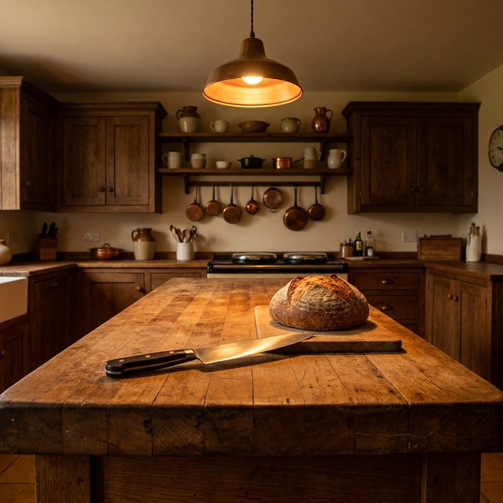
Butcher block is far older than the 1970s, but the decade’s appetite for natural wood made it an easy fit in domestic kitchens.
What still recommends it is the way it ages. Properly maintained wood develops dents, darkening, knife marks, and patina instead of preserving a showroom finish forever. Some people want a countertop that never changes. Others like one that keeps receipts.
14. Cane-Front Cabinets and Chairs
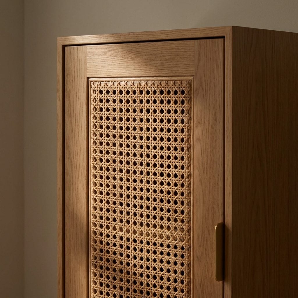
Cane webbing occupies the useful middle ground between solid furniture and full rattan. The frame still gives the piece structure, while the woven panel introduces holes, shadow, and movement.
On cabinet doors, headboards, and chair backs, that little grid keeps a broad surface from becoming one big slab of wood. It is decorative, but it can also allow ventilation in applications where that matters.
13. Dark-Stained Kitchen Cabinetry
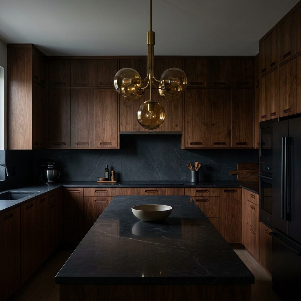
This is not the same argument as honey oak. Dark-stained cabinetry works because of weight.
Walnut and espresso fronts turn the cabinets into a strong architectural band instead of trying to disappear into the wall. Warm metal, pale counters, daylight, or lighter flooring keep the room from becoming a cave. The 1970s sometimes took the darkness too far; the material itself was never the problem.
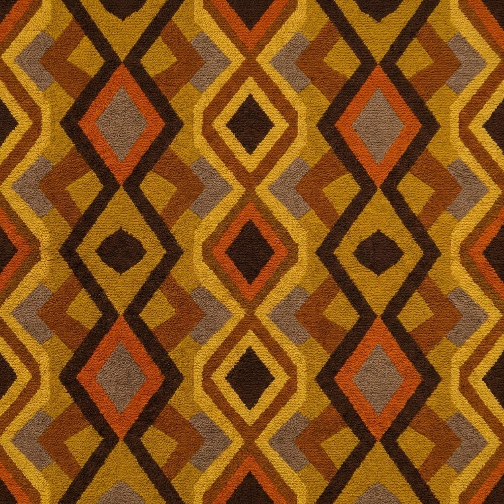
12. Patterned Wall-to-Wall Carpet
🔥 Would you like to save this?
Gold-and-brown geometry running from baseboard to baseboard is harder to defend than a small vintage rug. That is precisely what makes the good examples interesting.
Pattern breaks up wear, disguises small marks, and gives a floor an identity before a single chair arrives. Whether wall-to-wall patterned carpet is ready for a wholesale return is another question, but the instinct behind it — let the floor participate — is alive and well.
11. Faux-Brick Accent Walls
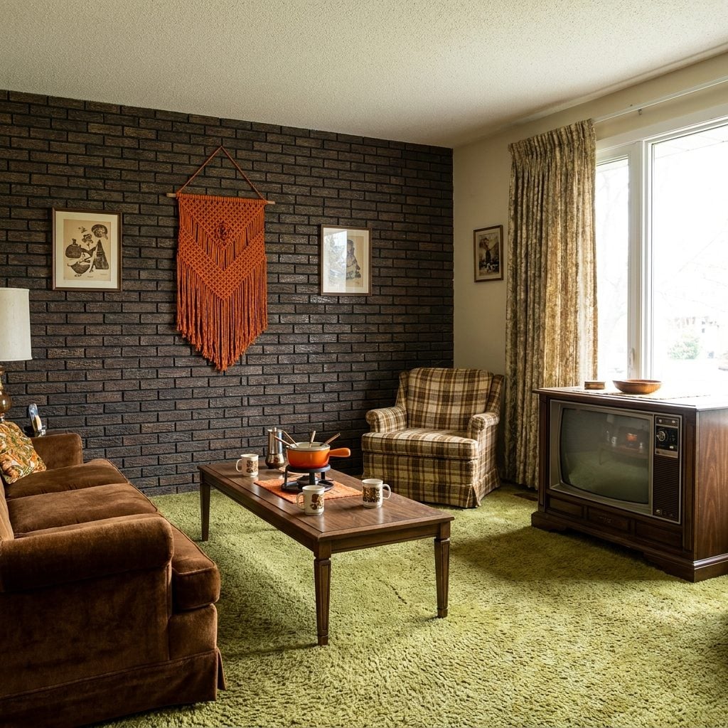
Faux-brick paneling was an unapologetic shortcut. Real masonry was expensive and heavy; a textured panel could turn a drywall room into something vaguely loft-like before dinner.
Bad versions looked bad up close. Good ones still deliver red-brown color, relief, shadow, and irregularity across a large wall without the structural requirements of actual brick.
10. The Macramé Wall Hanging That Someone’s Aunt Made by Hand
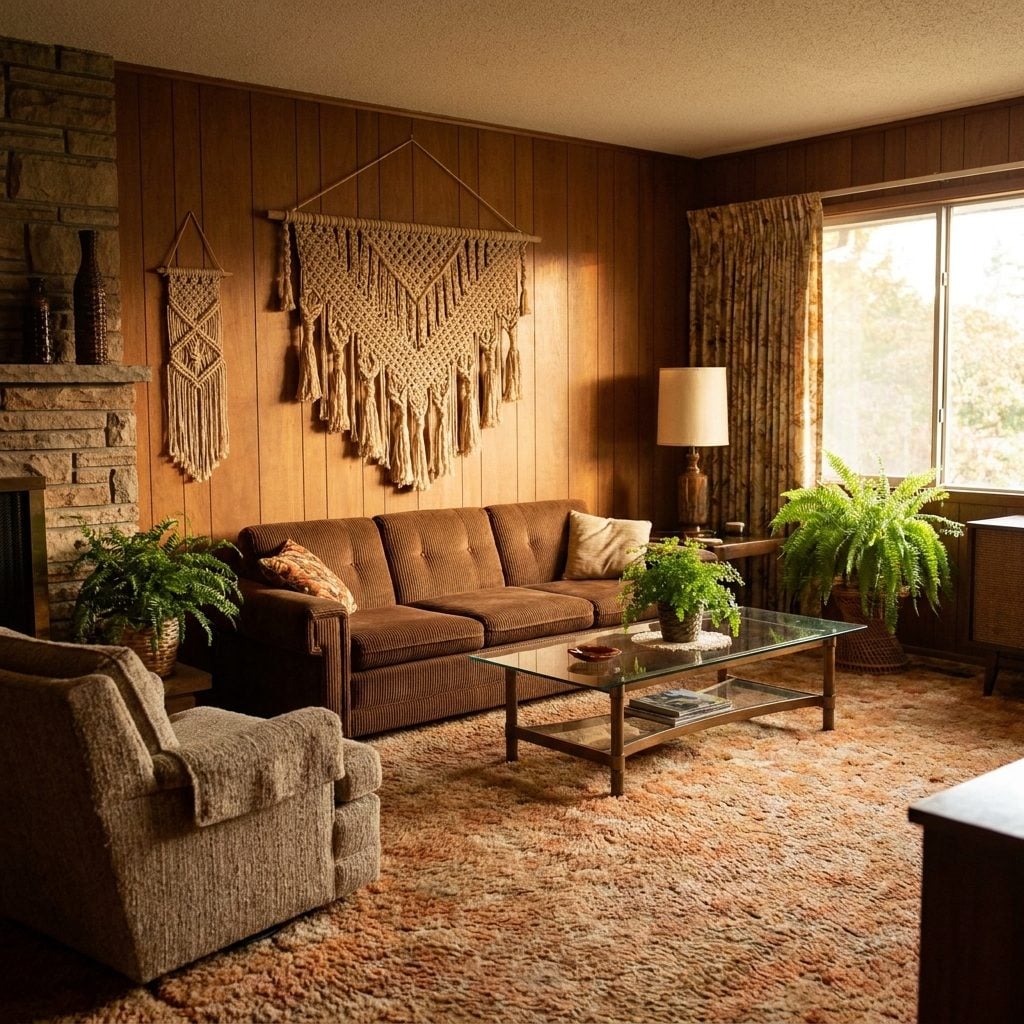
Knotted cotton, a piece of driftwood, several feet of fringe, and enough handmade sincerity to make a blank wall feel underdressed.
Macramé was not invented in the 1970s. Decorative knotting has much older roots across several cultures, and sailors helped spread knotting techniques through travel and trade. The 1970s merely gave the craft an enormous domestic audience and a permanent association with houseplants.
9. Laminate Countertops
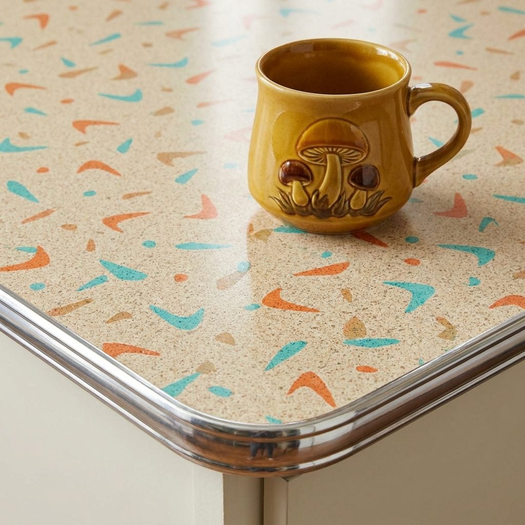
Laminate spent decades being treated as the countertop you endured until granite money arrived.
Vintage patterns make a better argument than that hierarchy allows. Flecks, boomerangs, terrazzo-like chips, linen textures, and unapologetic color gave inexpensive surfaces personality. Contemporary laminate is available in quieter finishes too, but the real lesson from the older kitchens is that affordable never had to mean anonymous.
8. Exposed Wood Ceiling Beams
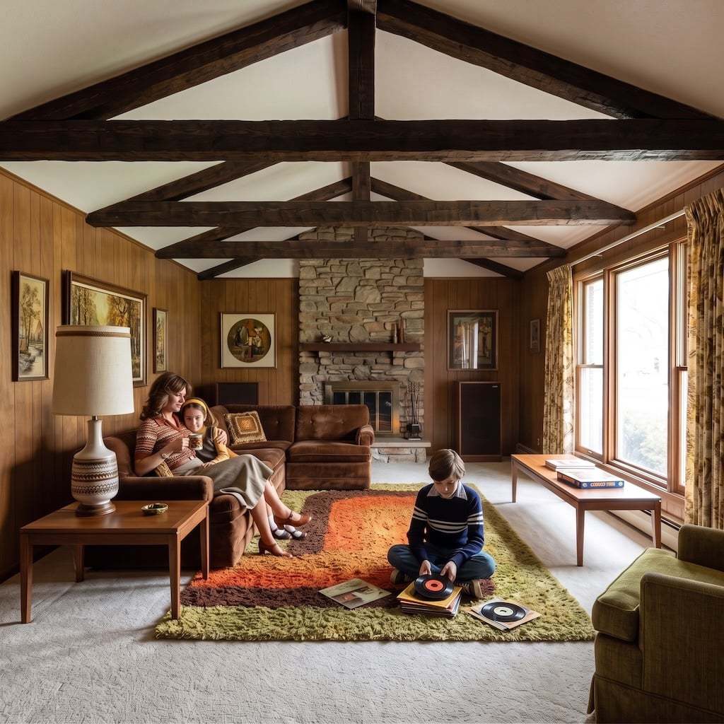
A flat white ceiling tends to disappear. Beams give it a reason not to.
Real structural timbers do this naturally, but many 1970s suburban interiors added decorative beams purely for the look. The better versions create rhythm overhead, cast shadows as the light changes, and pull warm wood above eye level.
Today’s versions may be lighter, rougher, or less numerous, but the idea survives easily in a rustic home because the ceiling becomes part of the material story instead of an empty lid.
7. Oversized Floral Sofas
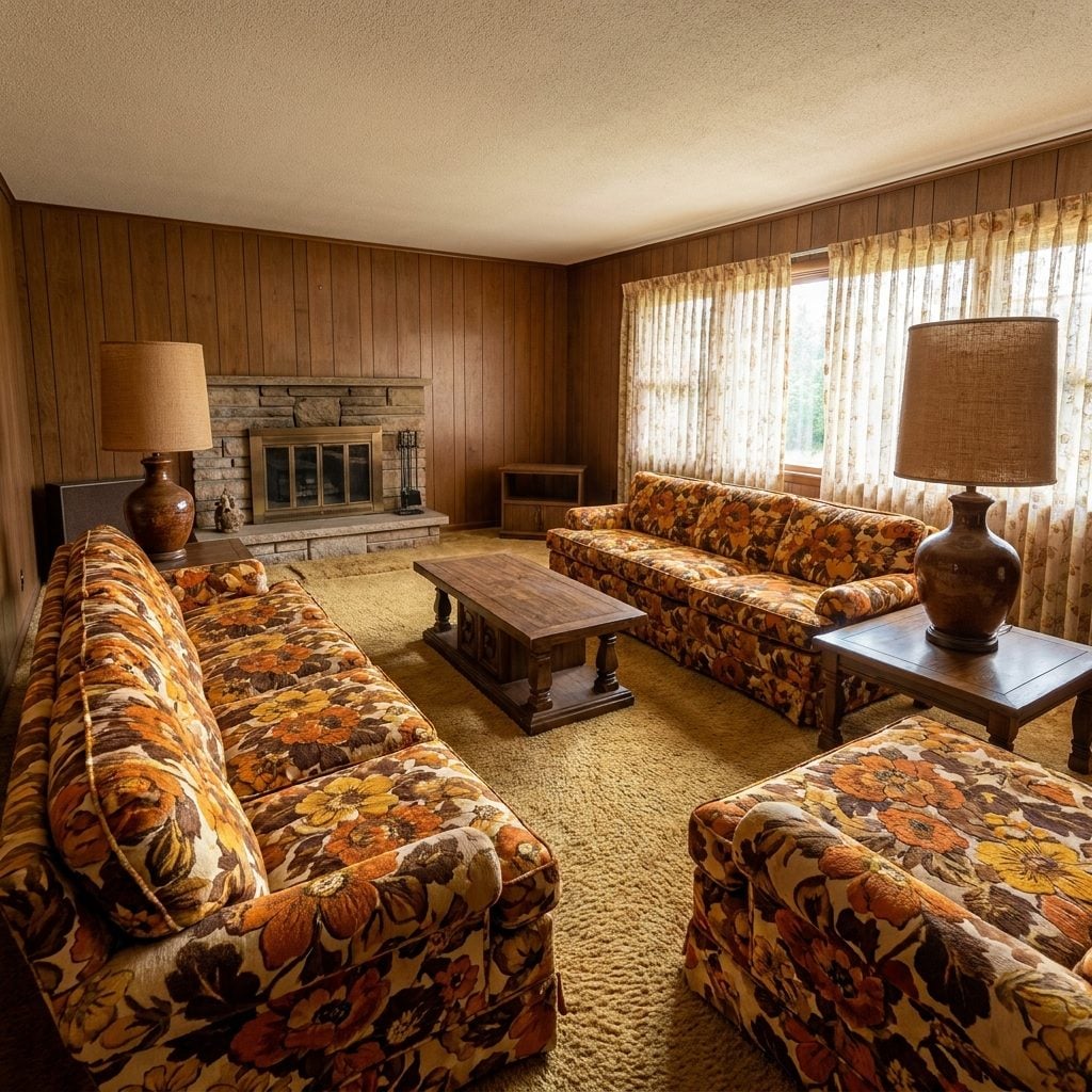
Somewhere along the way, sofas became gray by default. Beige was considered adventurous.
The 1970s put flowers the size of dinner plates across eight feet of upholstery and went on with the evening. Against plain walls, those huge rust, gold, olive, and cream blooms can still carry a room beautifully because there is no ambiguity about which piece is in charge.
6. Brown and Earth-Tone Ceramic Tile
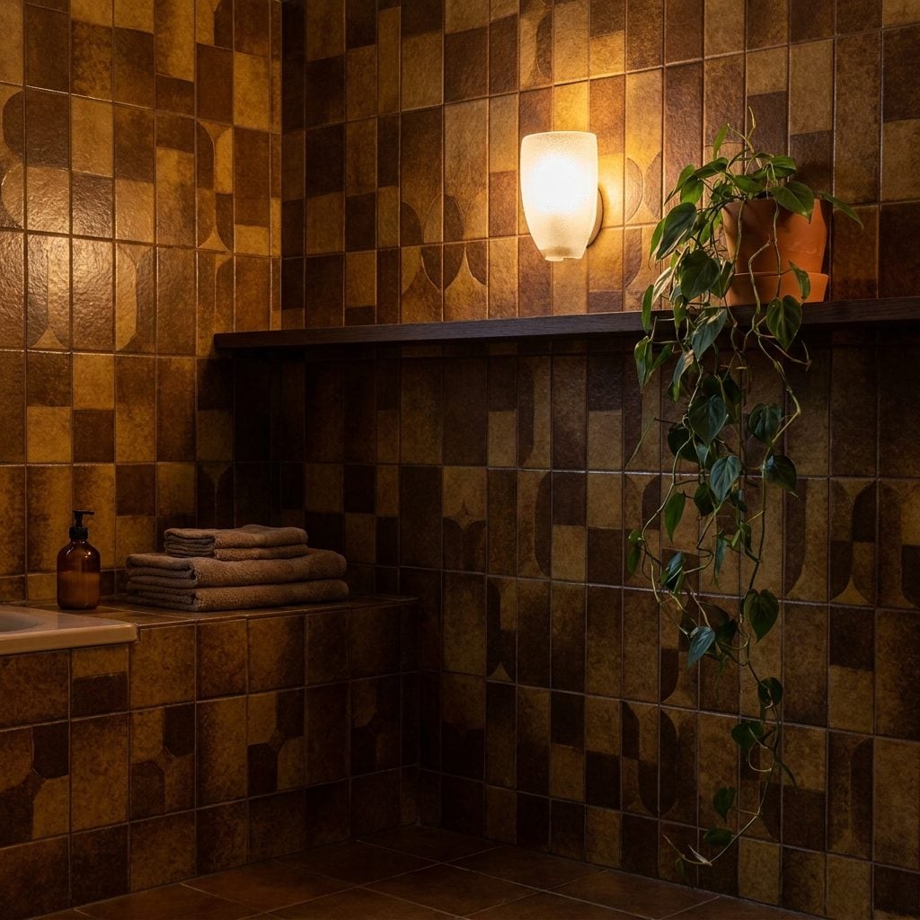
Brown bathroom tile got blamed for decades of bad lighting and tiny windows it did not personally install.
Matte clay, rust, ochre, tobacco, and warm brown can make tile feel substantial instead of clinical. The renewed appetite for terracotta and earthy ceramics makes plenty of 1970s bathrooms look less absurd than the white subway-tile years suggested.
5. Heavy Mediterranean-Style Furniture
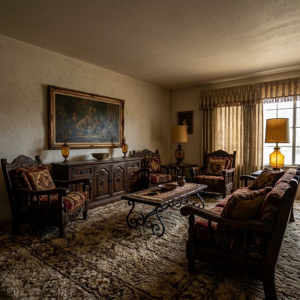
This was the furniture that made minimalists develop an eye twitch. Dark carving, turned legs, wrought-iron pulls, enough mass to require a plan and possibly a second cousin with a truck.
Its virtue is exactly that weight. One substantial sideboard can anchor a plain room in a way three skinny consoles never will. What dates the look is reproducing the entire Mediterranean showroom around it. One large carved piece beside simpler contemporary furniture gives the old craftsmanship room to breathe.
4. The Knotted Rope Planter Dangling a Spider Plant in the Window
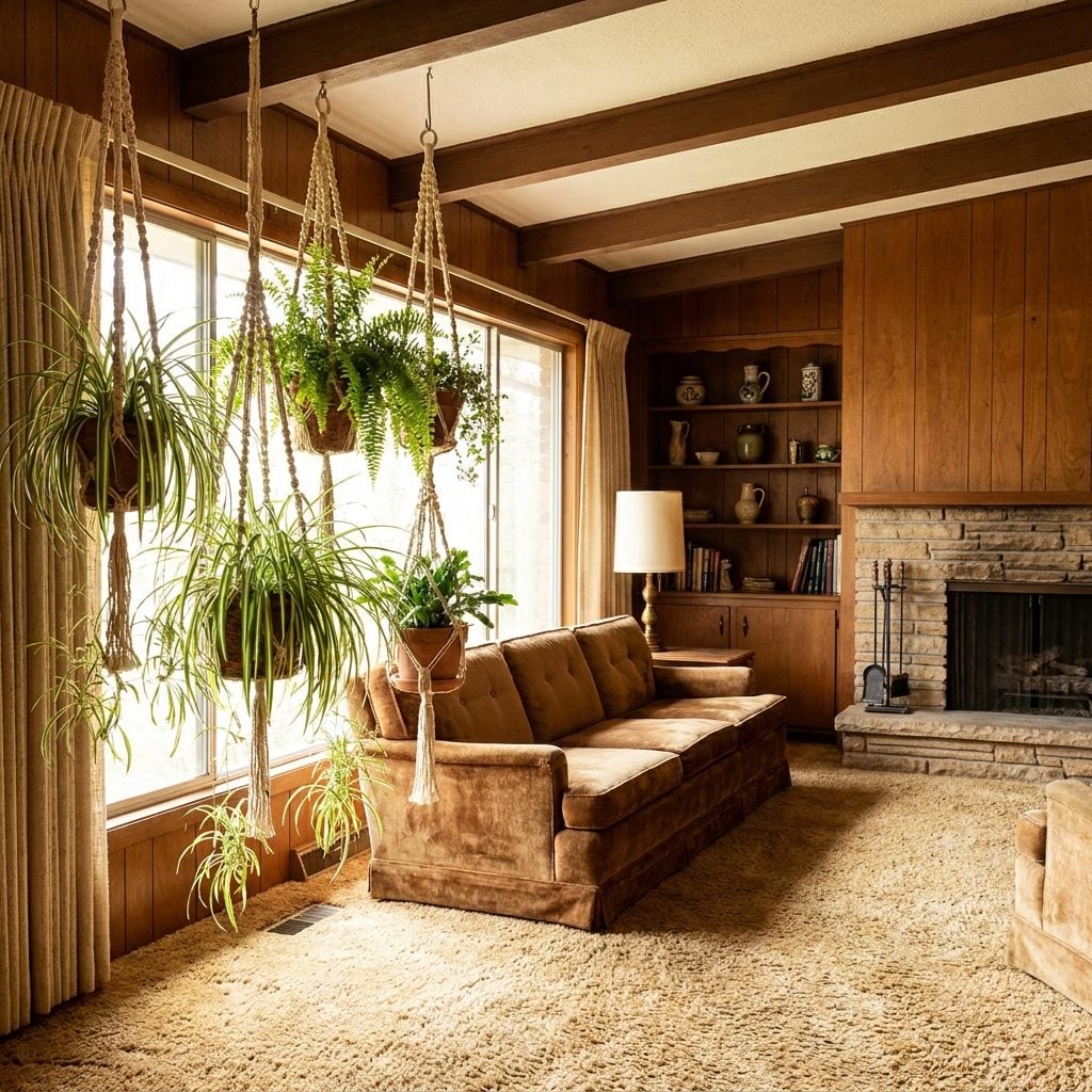
Jute rope, terracotta pot, spider plant producing offspring at industrial scale. The whole arrangement hovered in the window like a tiny suspended ecosystem.
The appeal is practical as much as nostalgic. Hanging plants use vertical space, put trailing foliage where it can actually trail, and free the furniture below. Just give the ceiling hook more thought than somebody’s uncle did in 1976. Wet soil is considerably heavier than optimism.
3. The Six-Foot Rubber Plant That Owned the Corner
🔥 Would you like to save this?
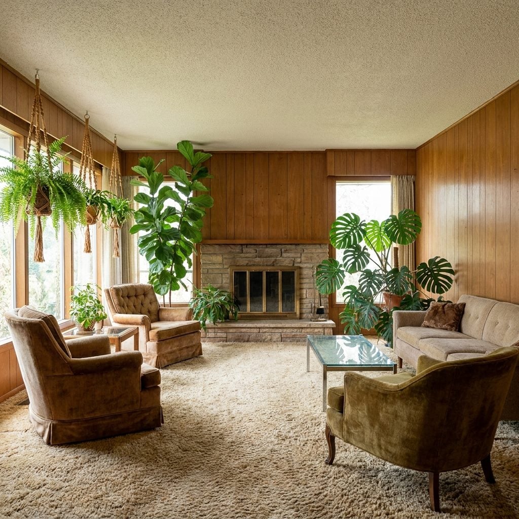
Every 1970s living room seemed to contain one plant that had exceeded the dimensions originally discussed. Rubber plant, weeping fig, philodendron — eventually the corner belonged to it.
Large houseplants are back because they solve a decorating problem cheaply and spectacularly. A substantial plant fills vertical space, softens architecture, and changes as it grows.
2. The Mirrored Wall That Made One Room Feel Like Two
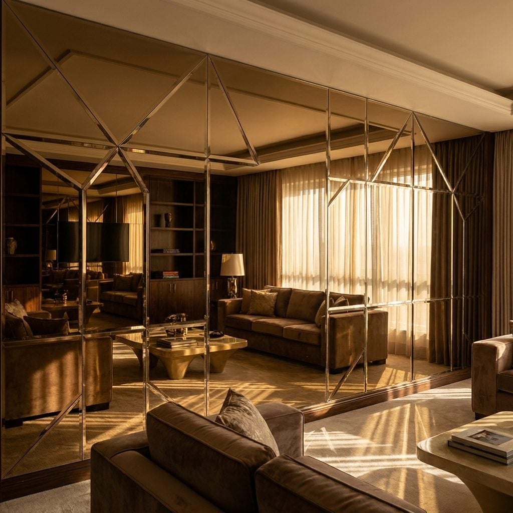
You noticed your reflection before you understood why the dining room suddenly looked twice as deep. Floor-to-ceiling mirror doubled the chandelier, doubled the guests, and created imaginary architecture where the wall ought to have stopped.
The smoked, bronze, and antiqued versions are particularly effective because they soften the reflection while still pushing light deeper into the room. The mirrored wall was never inherently the problem. Sometimes it just had a lava lamp standing beside it.
1. Beaded Curtains and Room Dividers
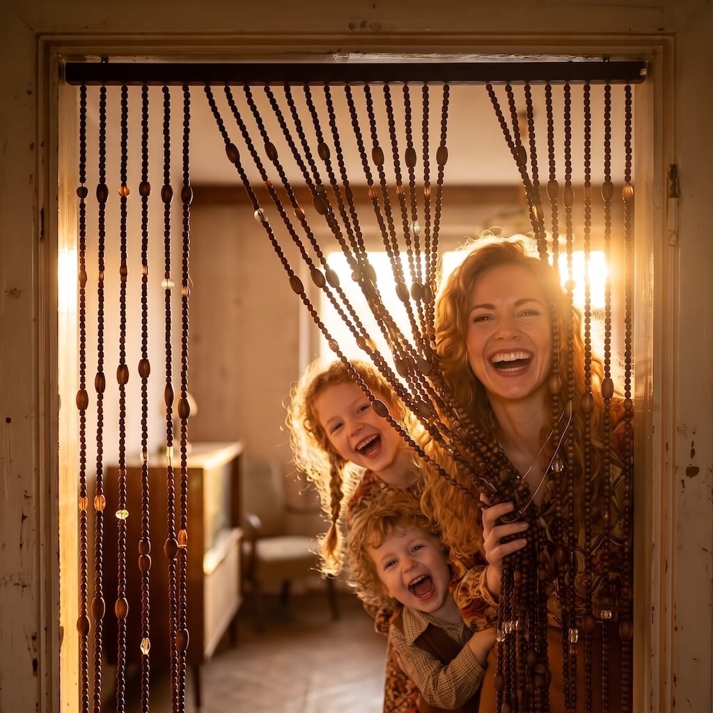
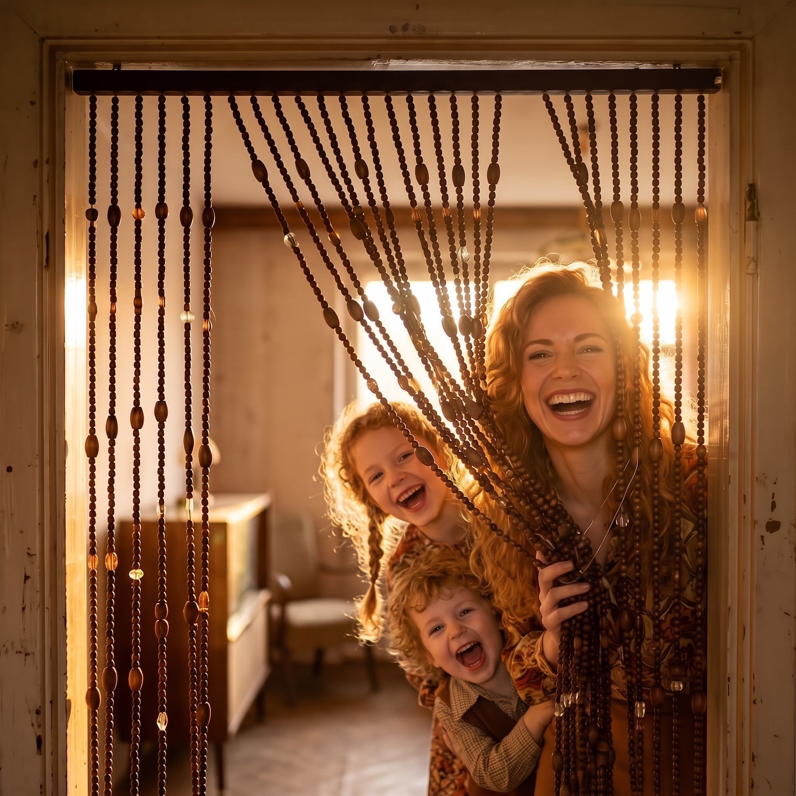
You heard it before you saw it. That soft wooden clatter as somebody pushed through, the strands still swinging after the person had disappeared into the next room. Beaded curtains did the job of a boundary without pretending to be a wall.
That makes them strangely useful again. They divide a doorway, alcove, closet, or open-plan transition while allowing light and glimpses through. Wooden beads feel warmer than the plastic novelty versions, and bamboo or dark-stained timber can look surprisingly architectural.
The best 1970s interiors were not timid. They trusted wood to look like wood, let color stay warm, put plants where furniture might have gone, and treated texture as something you could actually feel. Not every idea deserves a full revival. But after decades of sanding rooms down to gray, white, and safe, the era’s confidence suddenly looks less like bad taste and more like unfinished business.