🔥 Would you like to save this?
The faucet looked perfect in the showroom. Six months later it’s a map of white mineral spots nobody can scrub off. That’s the gap between a design that photographs well and one you actually have to live with. Everything below looks fine on day one. Then the water hits, the grease settles, the LED driver dies, and the regret starts. These are the details designers have learned to walk past, the ones that cost you in cleaning time, comfort, or a second renovation. Pretty is cheap. Pretty that holds up is the whole job.
34. The Shower Control You Have to Reach Through Cold Water to Reach
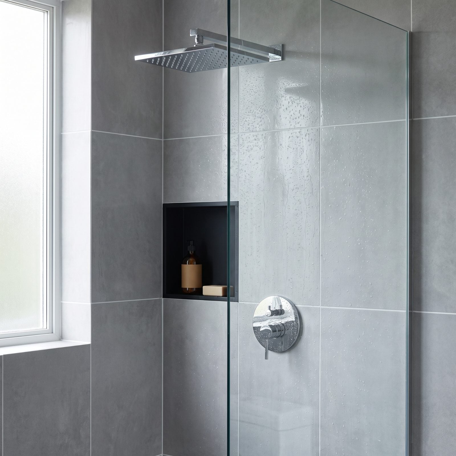
Here’s the test no showroom runs: can you turn the water on without standing in it? When the valve sits right under the head, you can’t. You reach in, get hit with whatever temperature was left over from last time, and do a little cold-water flinch every single morning.
In order to come up with the very specific design ideas, we create most designs with the assistance of state-of-the-art AI interior design software. Also, assume links that take you off the site are affiliate links such as links to Amazon. this means we may earn a commission if you buy something.
The fix costs nothing. Put the control near the entry, offset from the spray, so the water can warm up before you commit. The matte black niche and clean glass panel here are fine. The valve placement is what’s broken.
33. When a Burned-Out LED Driver Means Replacing the Whole Fixture
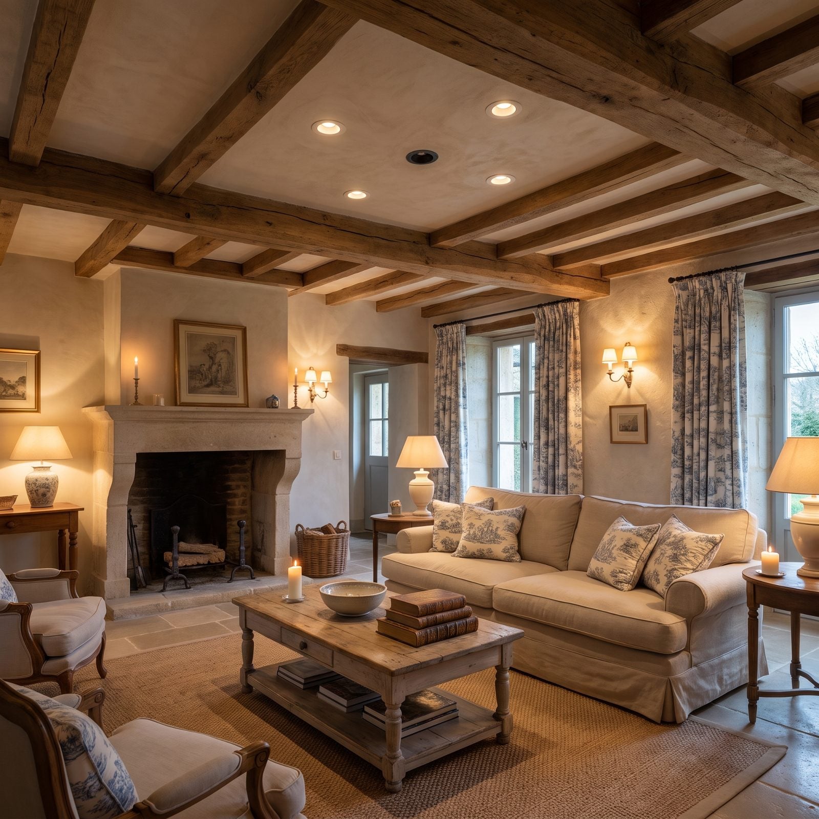
Integrated LED fixtures look clean because there’s no visible bulb, and that’s exactly the trap. When the little driver inside gives out, and it will, there’s no bulb to swap. You replace the whole fixture, sometimes cutting into drywall to do it.
A sealed LED strip tucked into a kitchen toe-kick is one thing. A ceiling full of integrated cans with no serviceable parts? That’s a future invoice you signed without reading. Designers who’ve cleaned up a few of these failures now spec fixtures that take a standard replaceable module.
32. A Freestanding Tub Wedged Into a Gap No Mop Will Fit
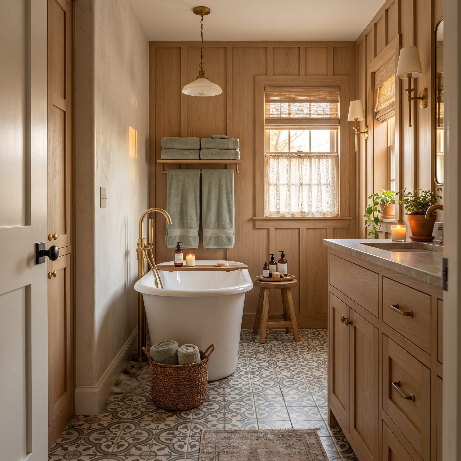
Freestanding tubs sell the fantasy of space, then get crammed into a spot that was never big enough, leaving a two-inch canyon between the tub and the wall where nothing but dust and a dropped bottle cap will ever live.
You can’t reach it. You can’t mop it. You just know it’s down there, slowly filling with lint and regret. A freestanding tub needs real breathing room on every side, enough to run a cloth around the base. If the room can’t give it that, a built-in alcove tub with a tiled apron wipes clean in seconds and looks right in a snug grey attic design or cottage bath anyway.
31. The Range Hood That Just Blows the Smell Back at You
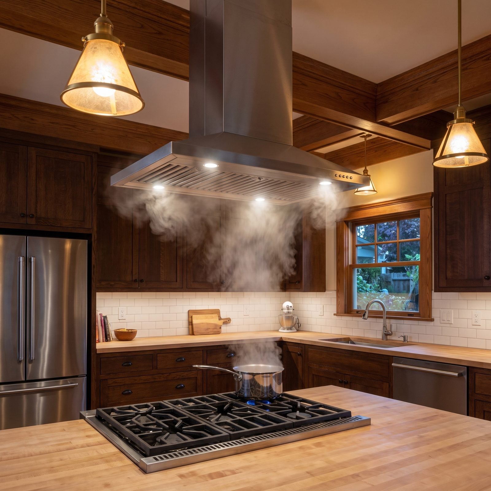
A recirculating hood doesn’t vent anything. It sucks air up, runs it through a charcoal filter, and pushes it right back into the room. Fry fish on Tuesday and you’ll still smell it Thursday.
Grease, steam, and odor need somewhere to go, and “back at your face” isn’t it. If a duct to the outside is physically possible, that’s the answer. Every time. The brass pendant lights and butcher-block counter here do their job. The hood only pretends to.
30. The Doorless Shower That Turns the Whole Room Into a Steam Box
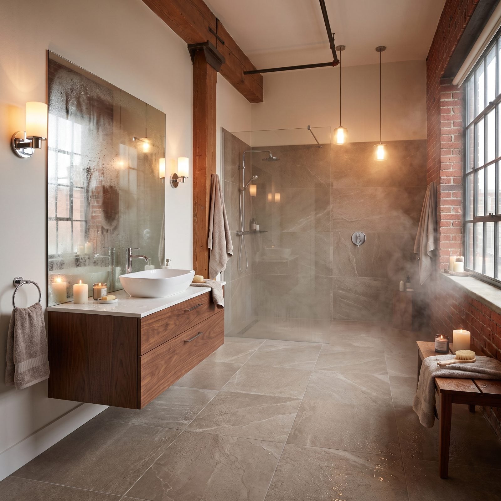
Doorless showers photograph like a spa and live like a wind tunnel. With no door, warm air and steam roll straight out into the room, so you step from the hot spray into a cold draft and your mirror fogs over every time.
Can they work? Sure, but they need a long enough entry run, a head aimed well away from the opening, and serious heat in the room, like radiant floors underfoot. Skip those and you’ve built a comfort problem dressed up as a design feature. Most bathrooms are happier with a simple glass panel that keeps the warmth where you’re standing.
29. Barn Doors on a Bathroom, Where Privacy Goes to Die
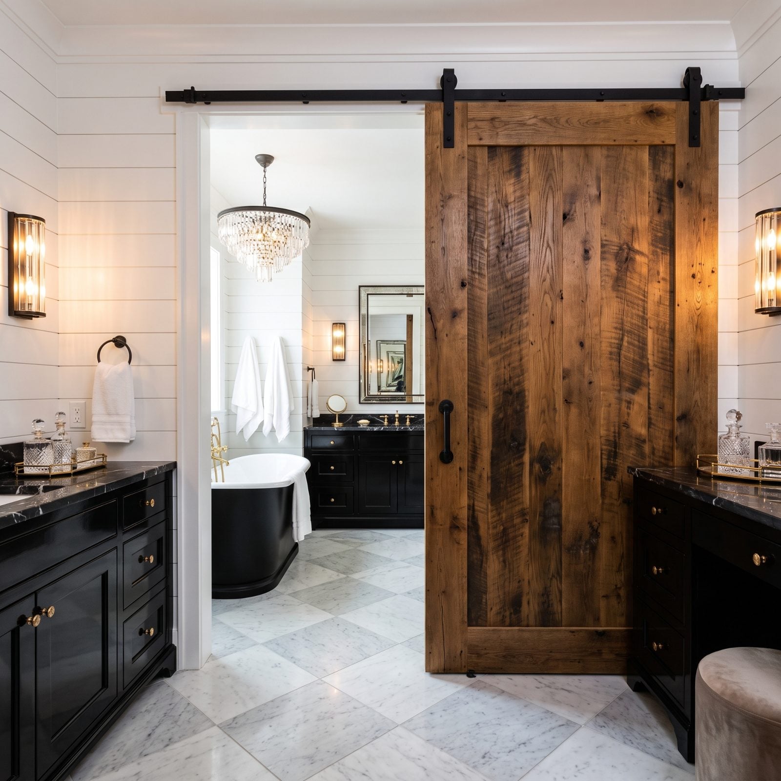
Barn doors slide. They don’t seal. There’s always a gap at the edges, the top, the bottom, which is a non-issue for a pantry and a real problem for a bathroom where you’d like both sound and smell to stay put.
The reclaimed wood and black barn-door hardware look great in a rustic hall. Just hang them on a closet. A bathroom wants a door that latches and shuts, full stop. This is the hill a lot of designers will die on, and they’re right to.
28. Open Shelves Right Beside the Stove, a.k.a. the Grease Collection
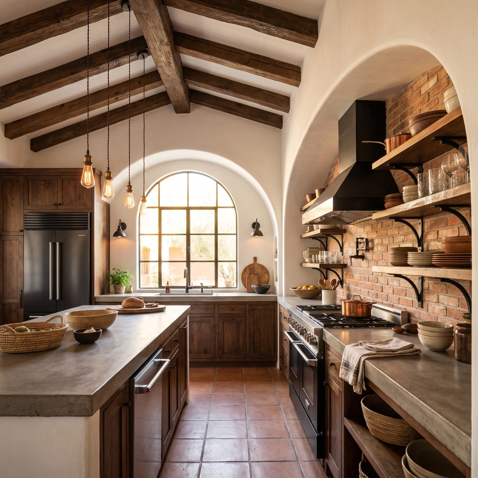
Open shelving next to the range looks relaxed and reachable. Then you cook. Every greasy aerosol that doesn’t get vented lands on the dishes you thought you’d just grab and use, and now you’re washing clean plates before you eat off them.
The green courtyard design crowd loves airy open shelves, and they have a place, just not within splatter range of a burner. Keep everyday dishes behind a door near the cooktop. Save the open shelves for the far wall, where the only thing settling is dust.
27. Upper Cabinets That Stop Short and Build You a Grease-and-Dust Shelf
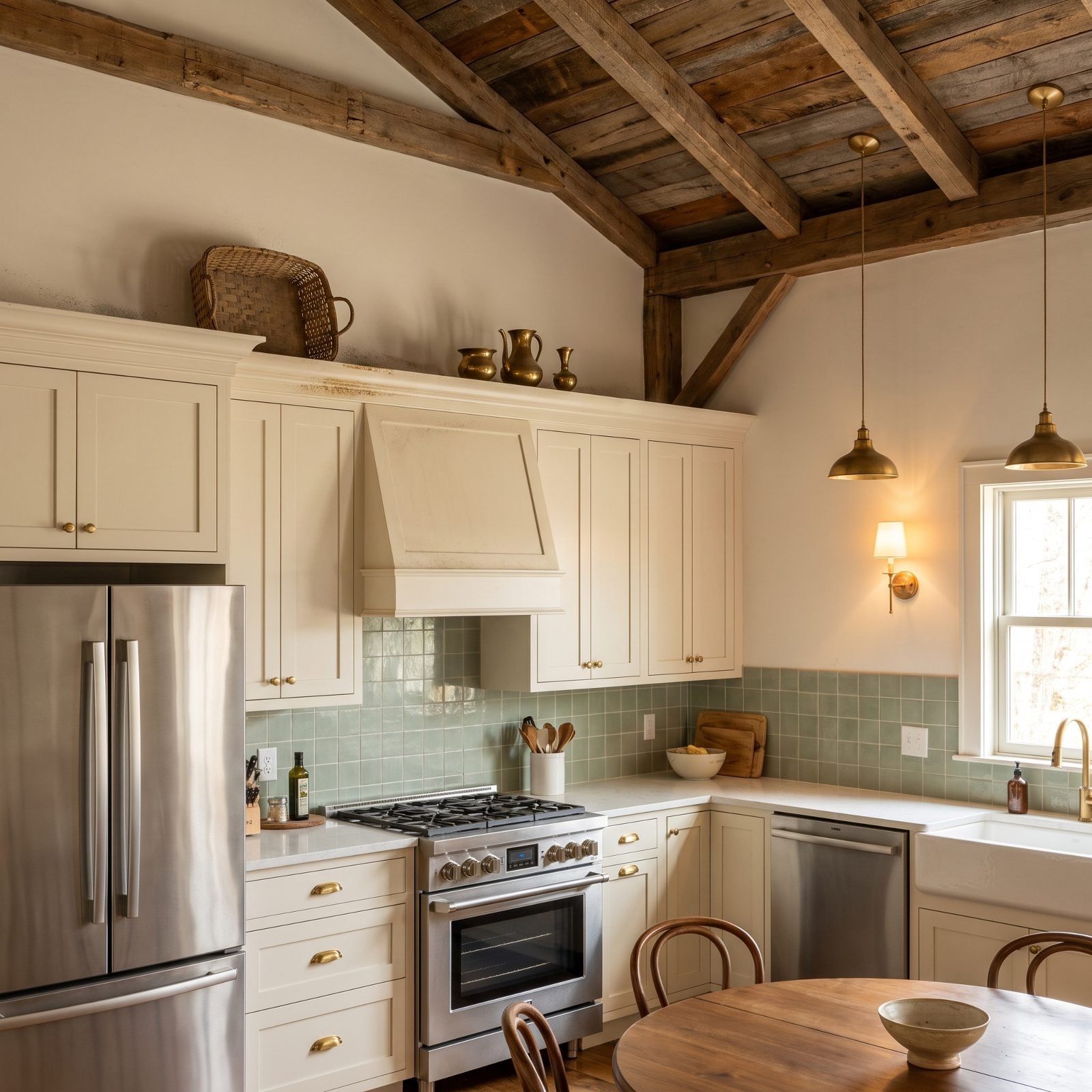
That gap between the top of the cabinets and the ceiling has one job: collecting things you’ll never notice until you climb up. Dust, airborne kitchen grease, a sad fake ivy somebody tacked up years ago and forgot.
You can’t reach it easily, so nobody cleans it, so it quietly turns into a grime ledge above head height. Run the cabinets to the ceiling, or cap the gap with a soffit or trim. The brass cabinet hardware and soft green backsplash here deserve a clean line above them, not a dust catcher.
26. Matte-Black Faucets in Hard-Water Country, Where Every Drop Leaves a Mark
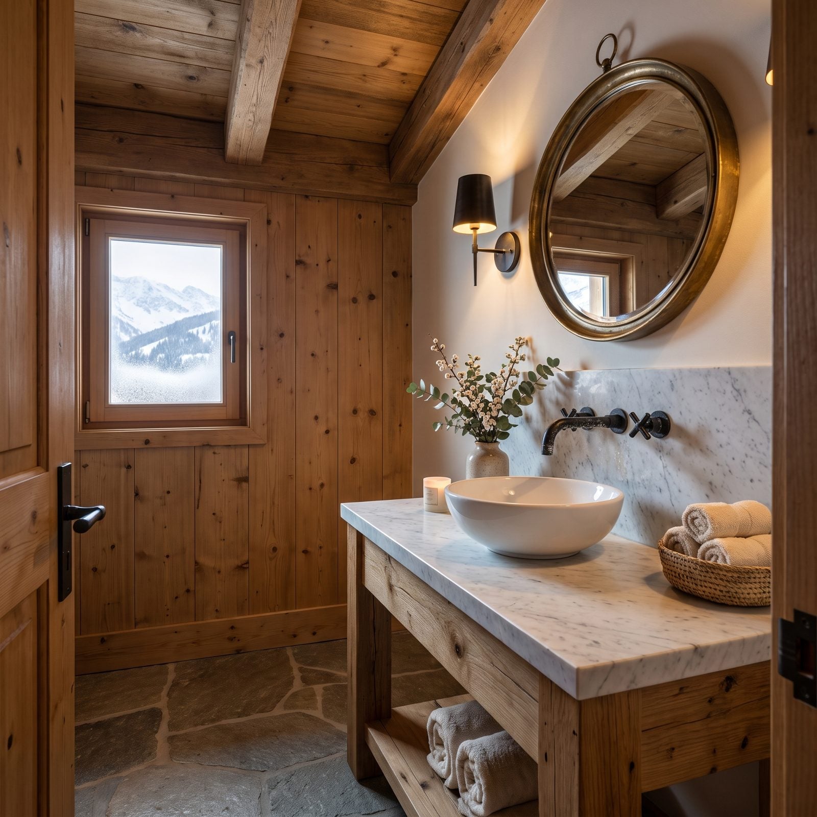
Matte black is having a moment. In a house with hard water, that moment lasts about a week. Every droplet that dries on the finish leaves a chalky white ring, and against black they practically wave at you.
Brushed nickel and stainless hide water spots. Matte black puts them on display. Soft water? Go for it. Hard water, and you’re signing up to wipe the matte black faucet after every single use or stare at the spots forever.
25. Exposed LED Tape, Where Every Single Diode Shows Through
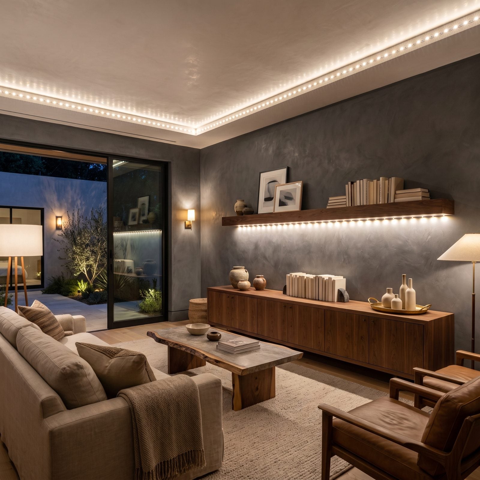
Bare LED tape is a row of tiny bright dots pretending to be a line of light. Mount it exposed under a shelf or along a cove and you don’t get a glowing band. You get a dotted line of diodes, like beads strung across the wall.
Channel and diffuser. That’s the whole secret. An aluminum channel with a frosted cover melts the diodes into one smooth ribbon and hides the tape itself. Skip it and your fancy accent lighting reads as a cheap under-cabinet strip from the hardware store, a real shame in an otherwise sharp gray, walnut and cream living room scheme.
24. Faux-Marble Porcelain With Veining That Repeats Like Wallpaper
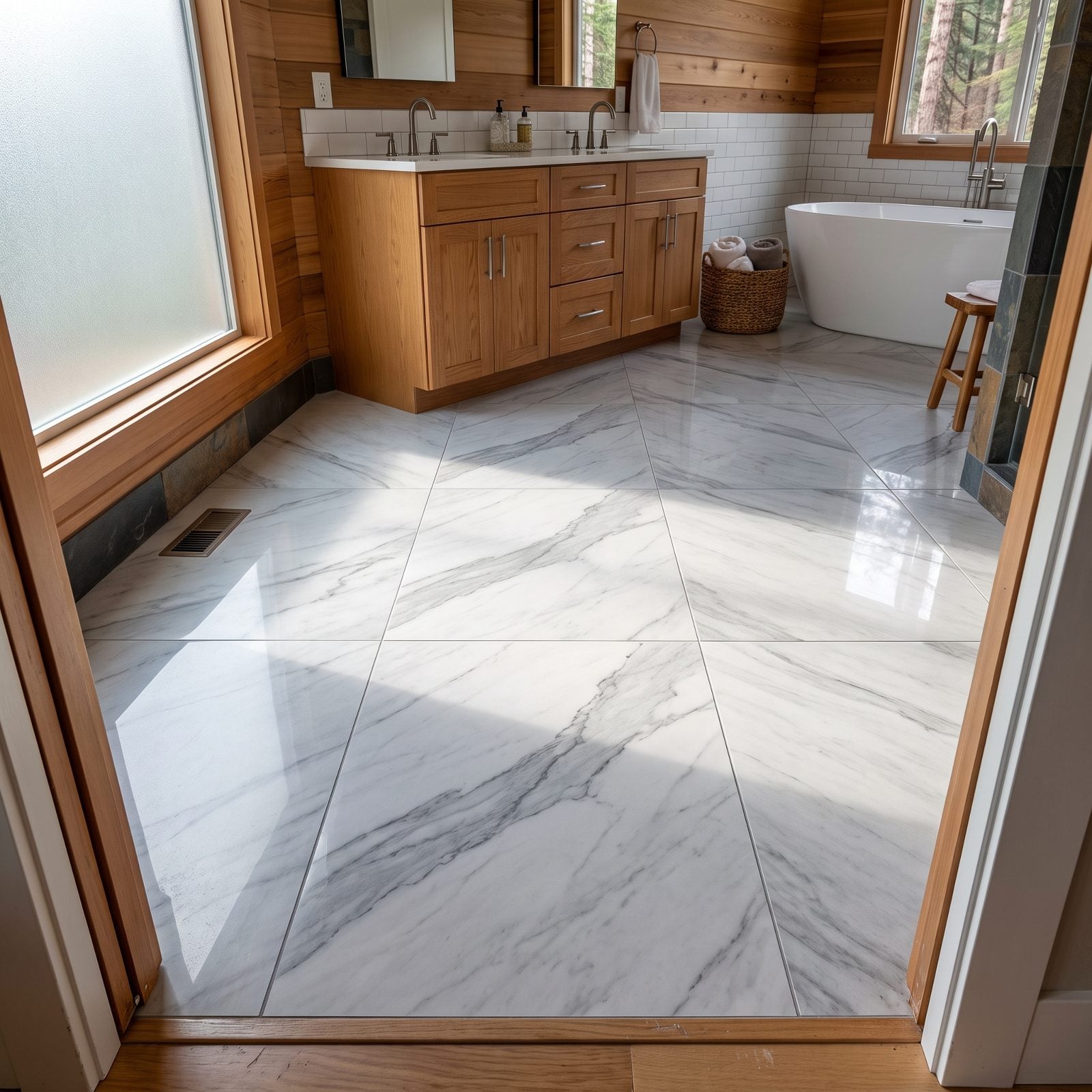
Lay enough of it and the trick gives itself away. Faux-marble porcelain can look convincing in a single tile, but real marble never repeats because natural stone has no pattern memory. The moment you spot the same grey vein curling the same direction three tiles over, your eye stops believing the whole floor.
The fix costs nothing. Dry-lay the tiles first, rotate them, shuffle the boxes, and break up any obvious matches before a drop of mortar goes down. Installers who skip this step are the reason the look reads cheap.
23. The Fridge That Juts Out Past Every Cabinet Door
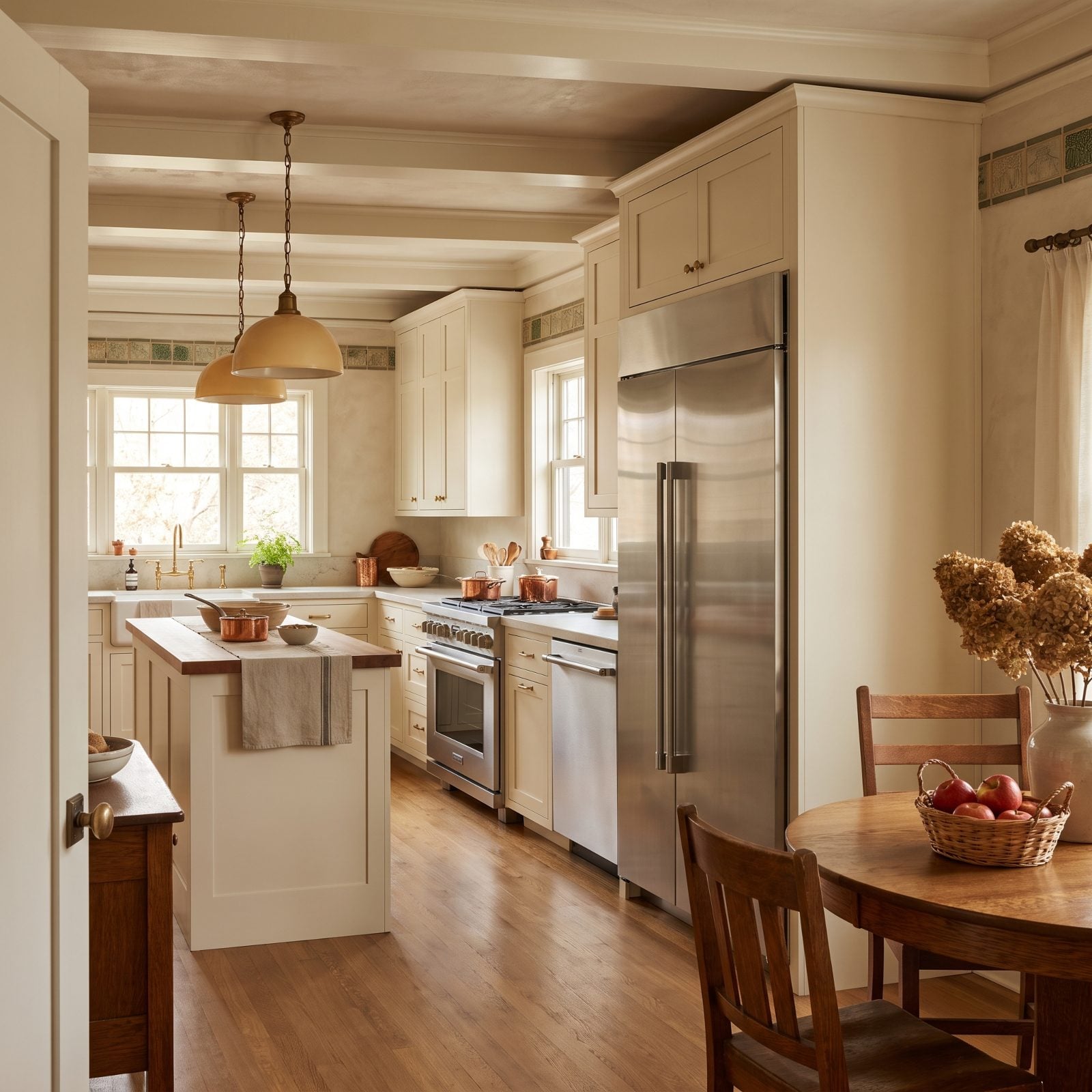
You’ve walked past it in a friend’s kitchen. The cabinets run flat and clean, then the refrigerator lunges forward like it’s trying to leave the room. Standard-depth fridges stick out past the cabinet faces, and that overhang is the first thing your eye catches every time you walk in.
Counter-depth or built-in models sit flush. They cost more, sure, but the payoff is a kitchen that looks finished instead of assembled from whatever happened to fit. Even framing the fridge in a deeper cabinet surround buys back that visual line.
22. Tile Countertops and the Grout Lines That Hold a Grudge
🔥 Would you like to save this?
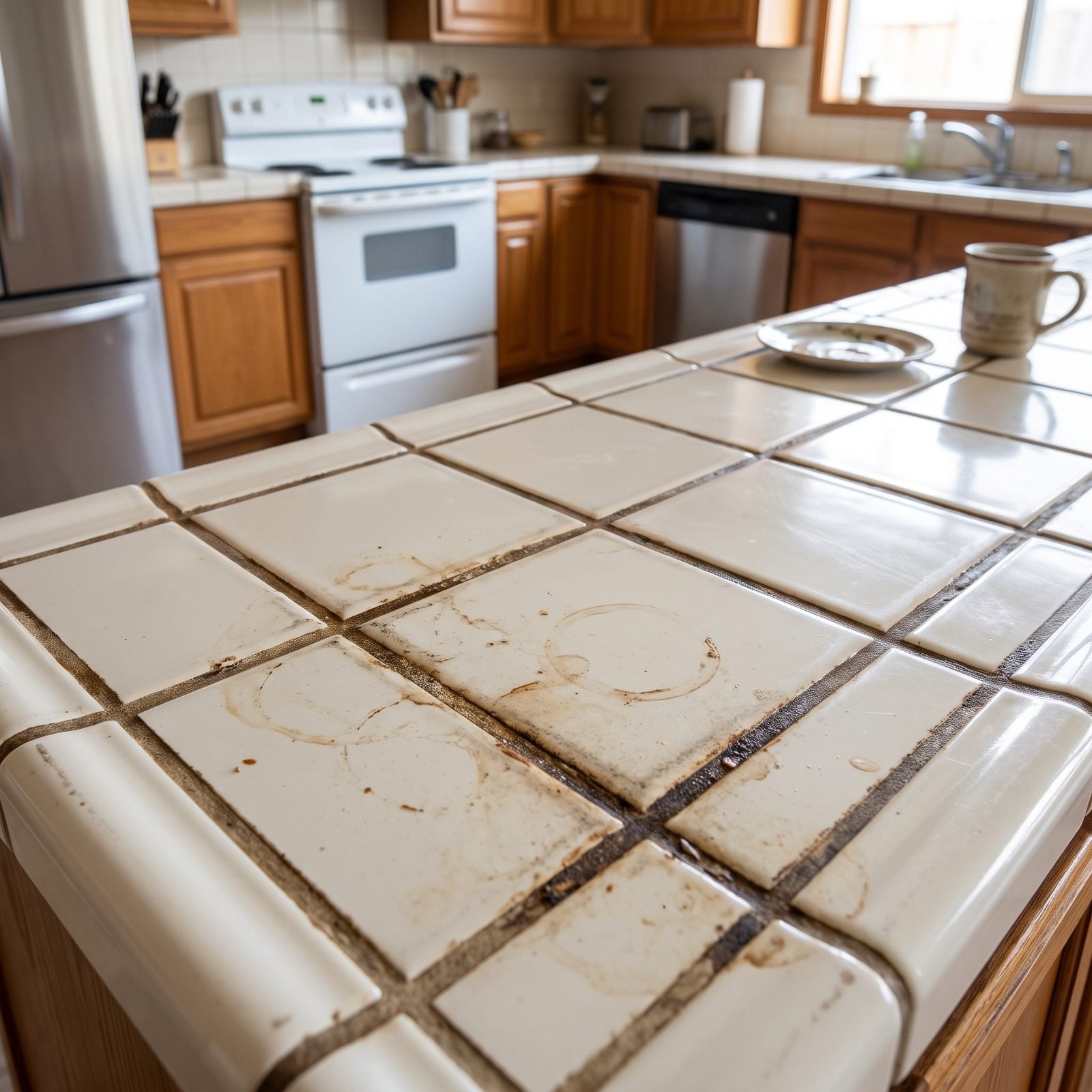
Tile counters look charming until you have to live with them. Every grout line sits lower than the tile, so crumbs, coffee, and grease pool right where you can’t scrub, and within a couple of years the once-white joints go the color of weak tea. No amount of bleach brings them fully back.
Slab surfaces (quartz, granite, solid porcelain) give you an unbroken plane you can wipe in one pass. For small kitchen decor, that continuous counter also makes a tight footprint read larger. We’ve scrubbed enough grout with a toothbrush to say this plainly: pick the slab.
21. Vessel Sinks: The Bowl That Splashes and Steals Your Counter
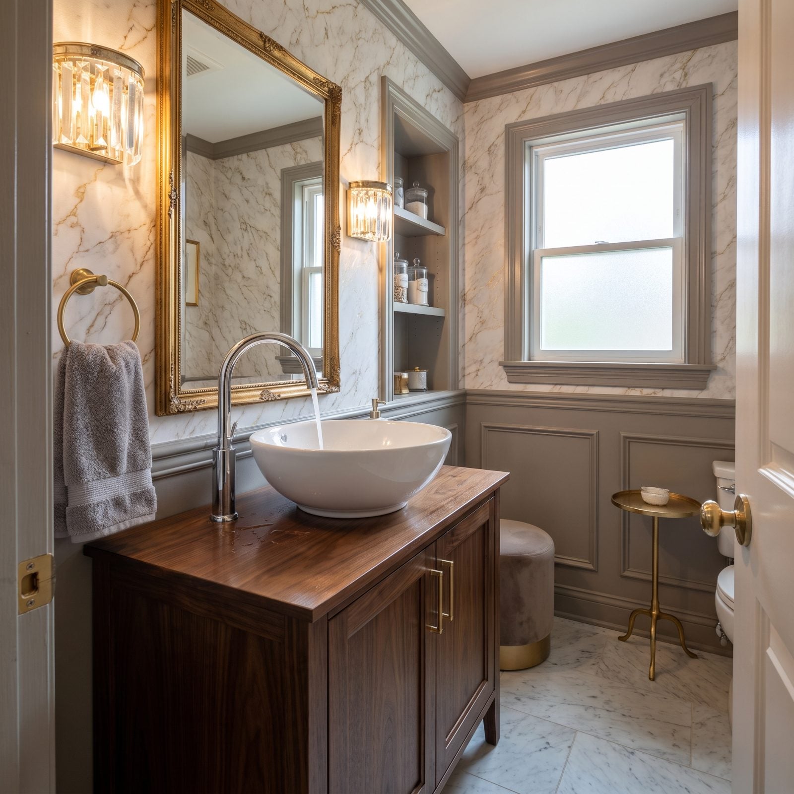
They look like jewelry. They behave like a toddler with a cup.
Vessel sinks sit high on the counter, so the faucet has to arc above the rim, and that drop sends water splashing over the edge onto the vanity top. You end up wiping the counter after every hand-wash, and the raised bowl eats the flat space where you’d normally set a soap dish or a toothbrush cup.
Undermount or integrated sinks disappear into the counter and keep the water where it belongs. Save the sculptural bowl for a guest powder room nobody actually uses twice a day.
20. Glossy Bathroom Floors That Turn Into a Skating Rink
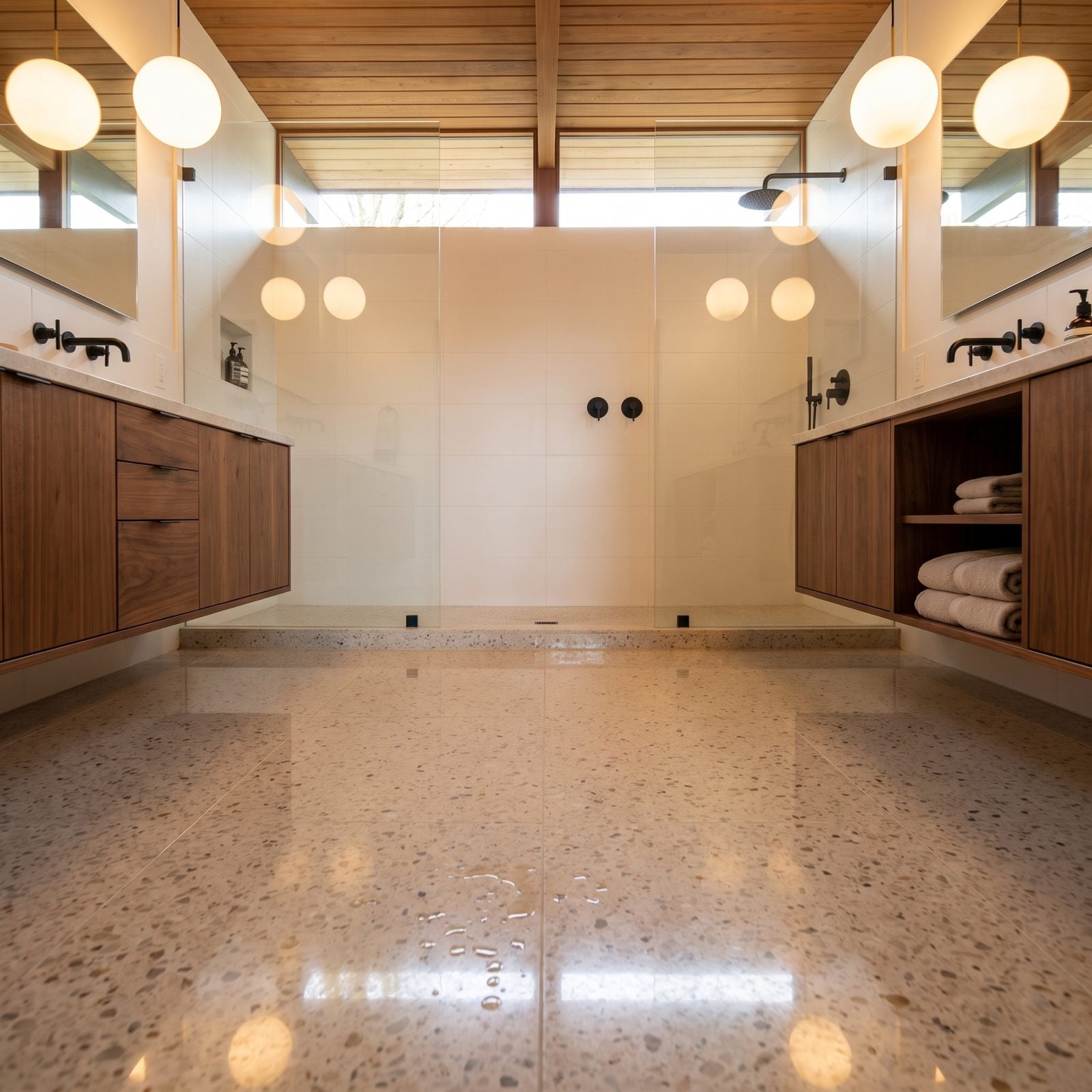
A polished floor photographs like a dream and performs like a trap. Add water and a high-gloss porcelain or marble floor becomes genuinely dangerous, especially right outside the shower where it’s wet most often.
Honed or matte finishes, smaller mosaic tile with more grout lines, or anything with a decent slip rating keeps your footing. You lose a little shine. You keep your hip intact.
19. The Countertop Microwave That Claims Your Prep Space Forever
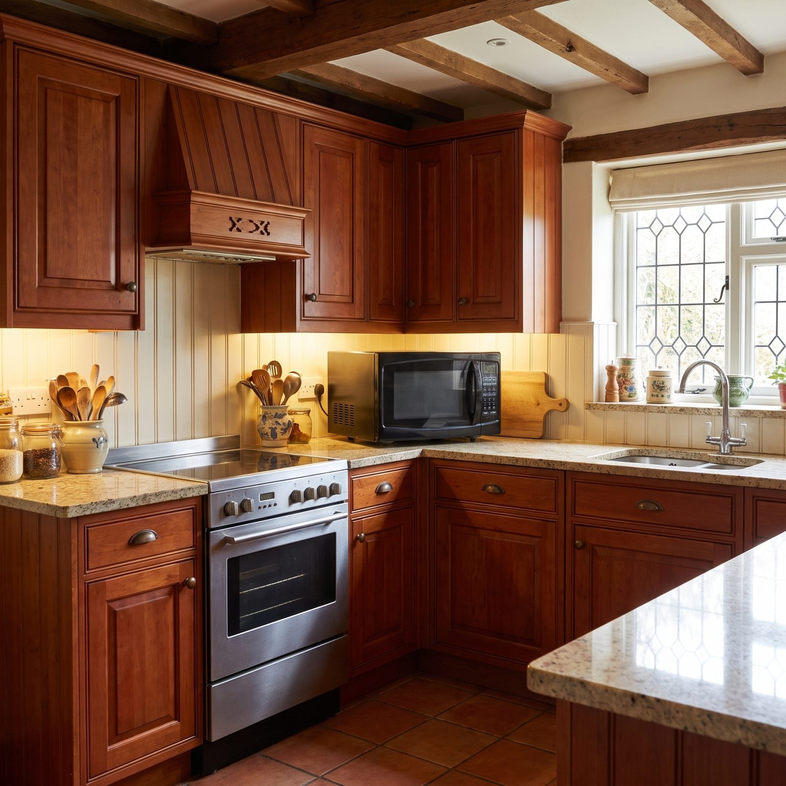
Measure your counter, then put a microwave on it. Watch a third of your usable prep space vanish overnight.
A countertop microwave almost always lands in the best spot — the clear run between stove and sink — because that’s where the room is. Then you’re chopping onions in a ten-inch sliver beside it. Build it into a lower cabinet, a tall pantry tower, or a drawer unit and reclaim the surface you actually cook on.
18. One Room, Three Bulb Temperatures, Zero Harmony
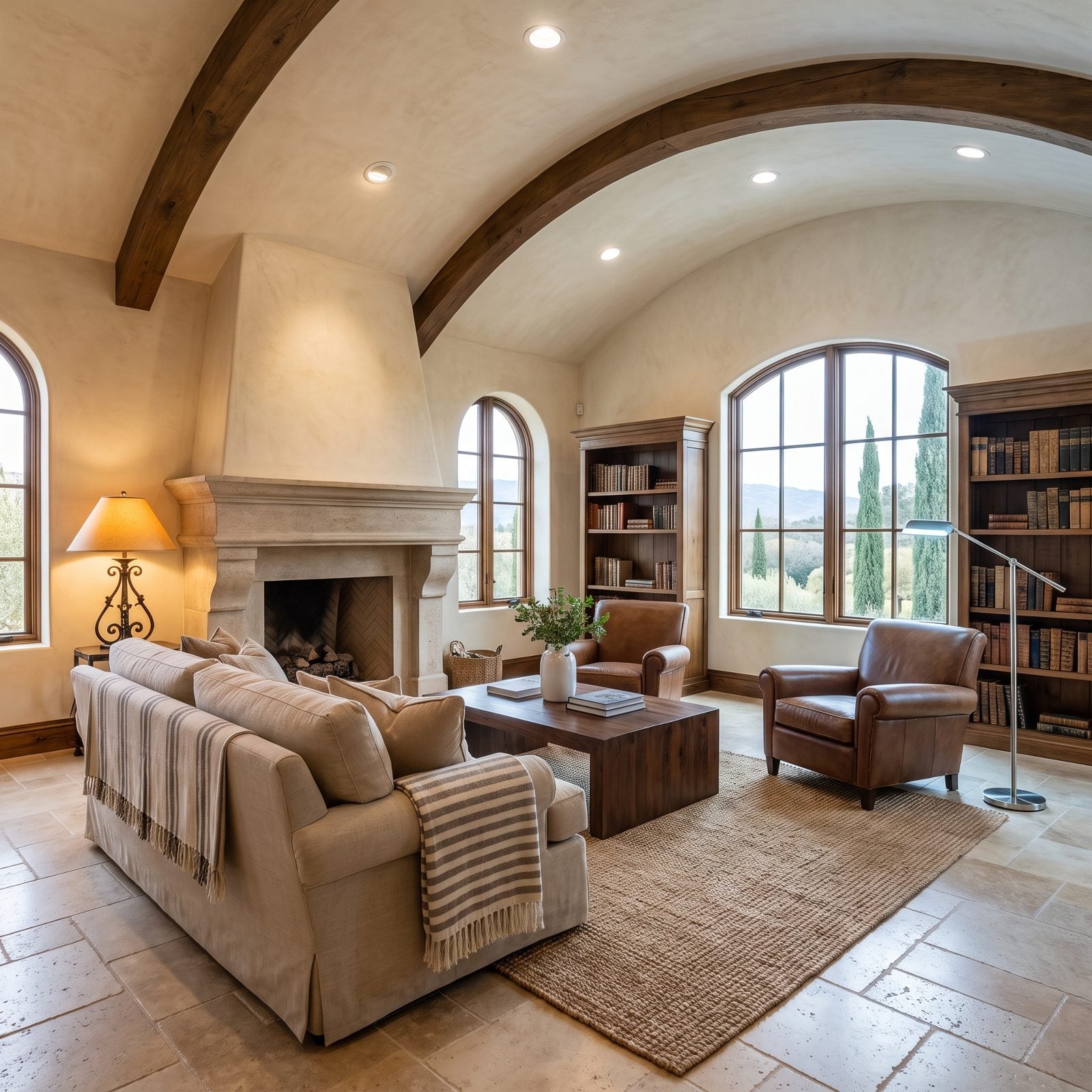
This one hides in plain sight. One lamp glows warm amber, the ceiling cans read cool white, and the bulb someone grabbed in a panic at the hardware store throws a faint blue. The room never feels settled and most people can’t say why.
Pick one color temperature and commit across every fixture. Warm white around 2700K for living and bedrooms, a touch cooler for kitchens and work zones. Check the little Kelvin number on the box before it goes in the socket.
17. Ceilings Punched Full of Recessed Lights in a Rigid Grid
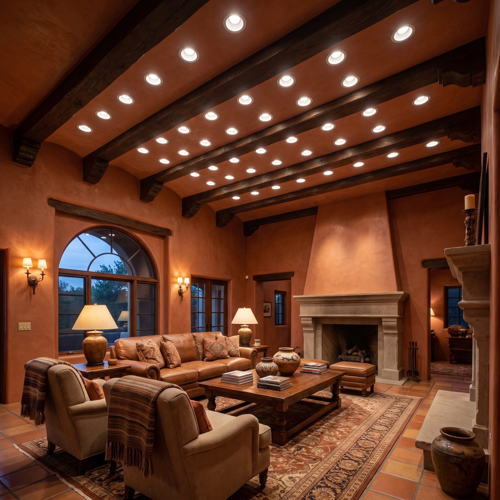
Count the cans next time a ceiling feels like a dentist’s office. Too many recessed lights in a tidy grid flattens a room, kills every shadow, and hands a living space the ambiance of a conference room.
Light should land where you need it: over the island, above the reading chair, washing a wall of art. A handful of well-placed downlights plus lamps, sconces, and a pendant will beat a dozen identical cans every time. The same trick saves low ceilings, where cans are tempting — see how layered lighting rescues a grey attic design that would otherwise feel like a crawlspace.
16. The Single Non-Dimmable Overhead That Runs the Whole Room
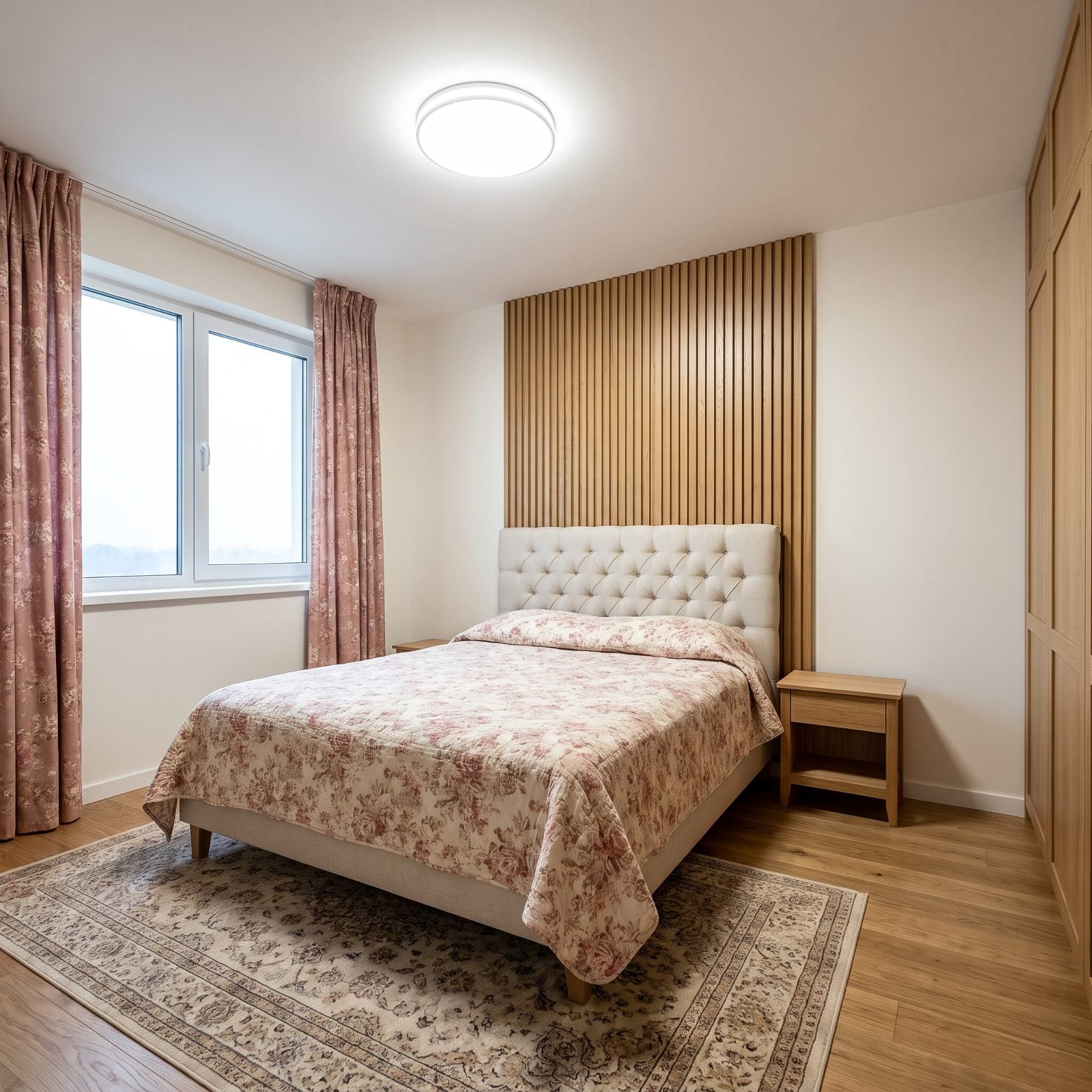
Flip the switch and the room has exactly one mood: interrogation. A single overhead fixture with no dimmer and nothing else to turn on forces the whole space to live at full brightness or total dark, with no in-between — and in-between is where most of real life happens.
Add lamps. Add a dimmer. One table lamp and a swap to a dimmable bulb changes the room’s entire temperament for under fifty dollars.
A room with only one light has only one mood, and it’s rarely the one you want.
15. The TV Mounted So High Above the Fireplace Your Neck Quits
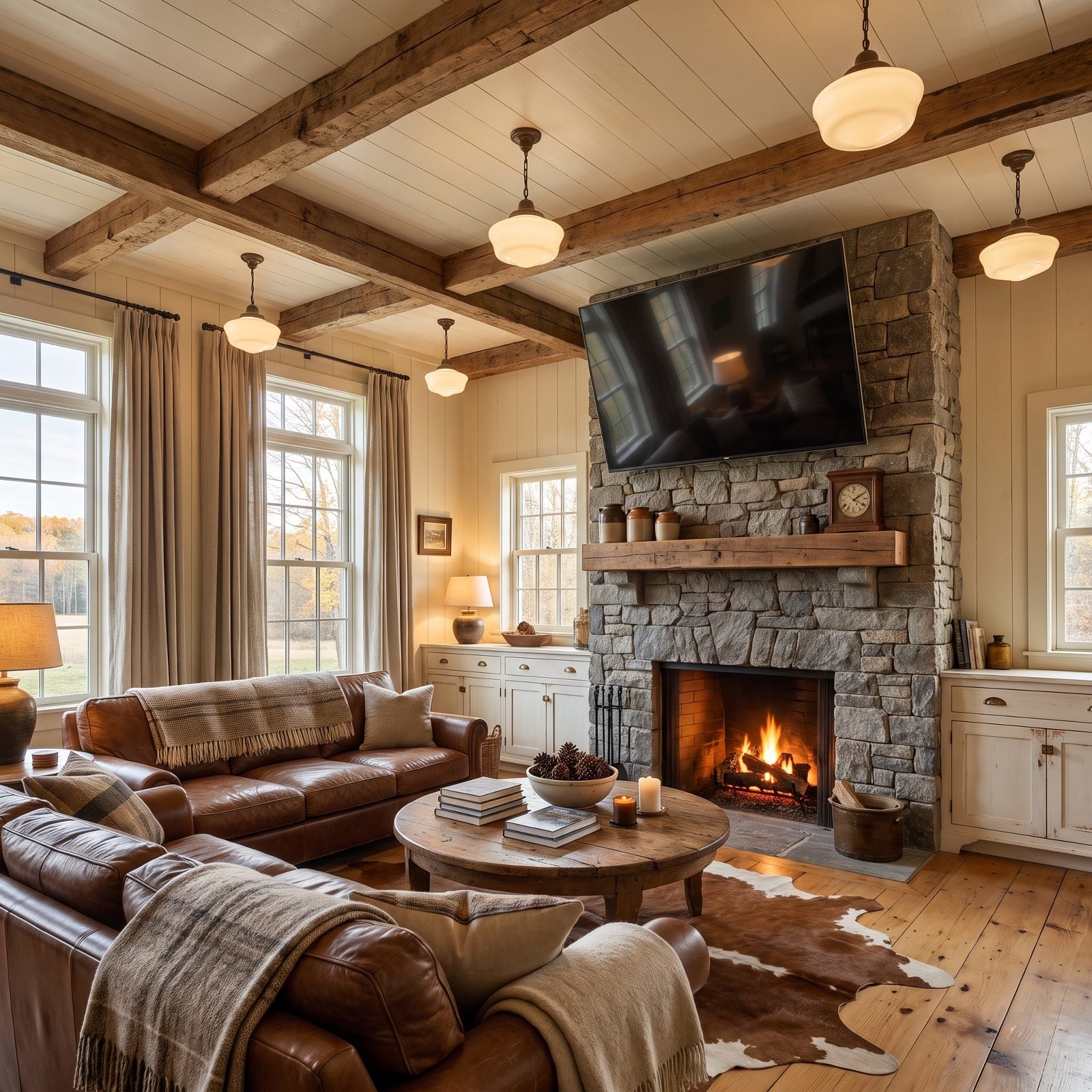
Sit on the couch and look up. If your chin lifts and your neck starts to complain within ten minutes, the TV is too high. Mounting a screen above a tall fireplace is one of the most common requests designers push back on, because the ideal center of a TV lands near seated eye level, not five feet off the floor.
Lower the mount, build a media wall beside the hearth, or choose a fireplace with a lower profile. And the heat rolling off a working firebox? No friend to electronics parked above it.
14. Busy Granite Fighting an Equally Busy Mosaic Backsplash
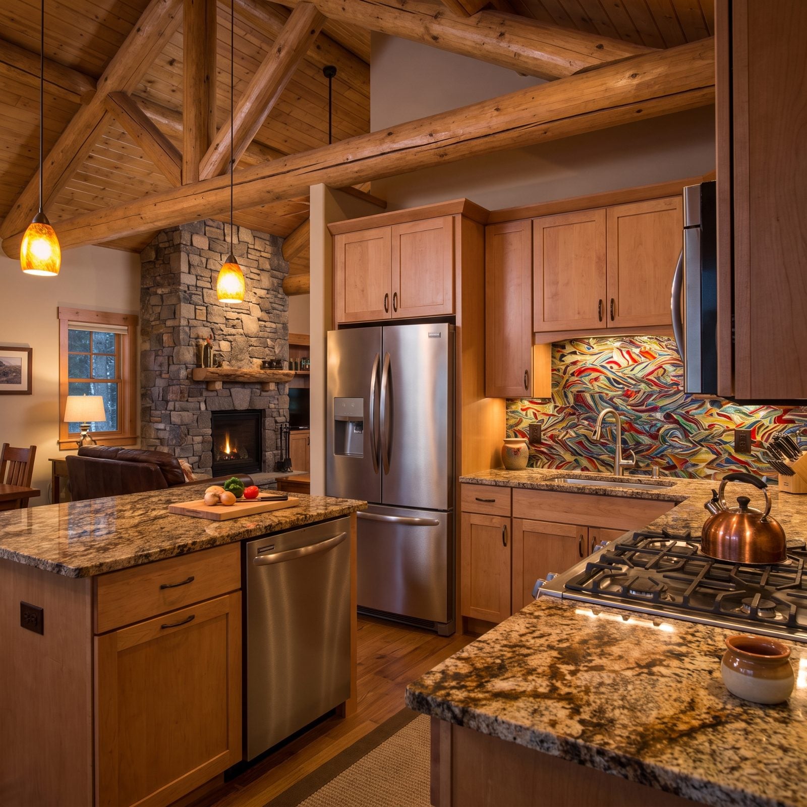
Two statement surfaces in the same four square feet, and both lose. The granite already has movement in every direction, so stacking a swirling glass mosaic behind it leaves your eye nowhere to land.
Restraint fixes it. One busy surface, one calm one. If the stone is doing the talking, the backsplash should shut up and sit in a single tone.
13. Factory-Distressed Cabinets Pretending to Have a Past
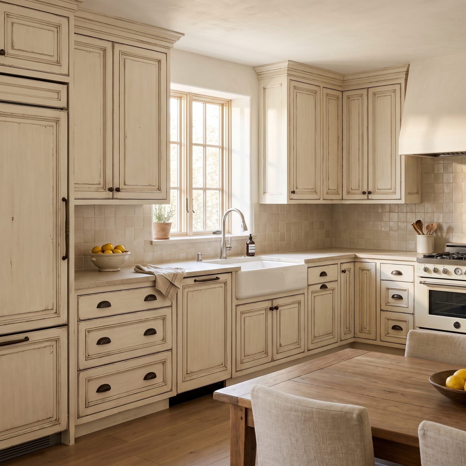
Real wear happens where hands actually go. The one drawer you yank open forty times a day, the cabinet edge your hip keeps clipping. Factory distressing ignores all of that and sands every corner the same amount, which is the tell.
So you get cabinets that look aged in theory and brand new in logic. Genuine patina earns its marks. Printed glaze in the recesses never will.
12. The Rug That’s Floating Three Feet From Everything
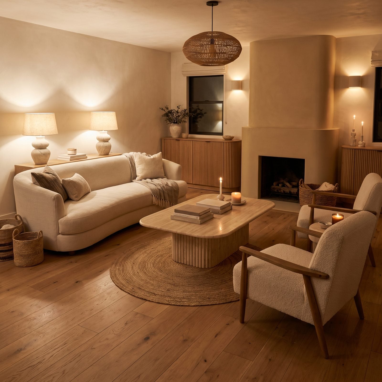
A rug too small for the seating area makes the whole room look like it shrank in the wash. Furniture ends up stranded on bare floor while the rug hovers in the middle like it wandered in and got lost.
Here’s the rule most designers keep in their back pocket: at least the front legs of every main piece should land on the rug. All four is better. A bigger rug pulls the seating into one conversation instead of scattering it across the floor.
11. The Sectional That Ate the Walkway
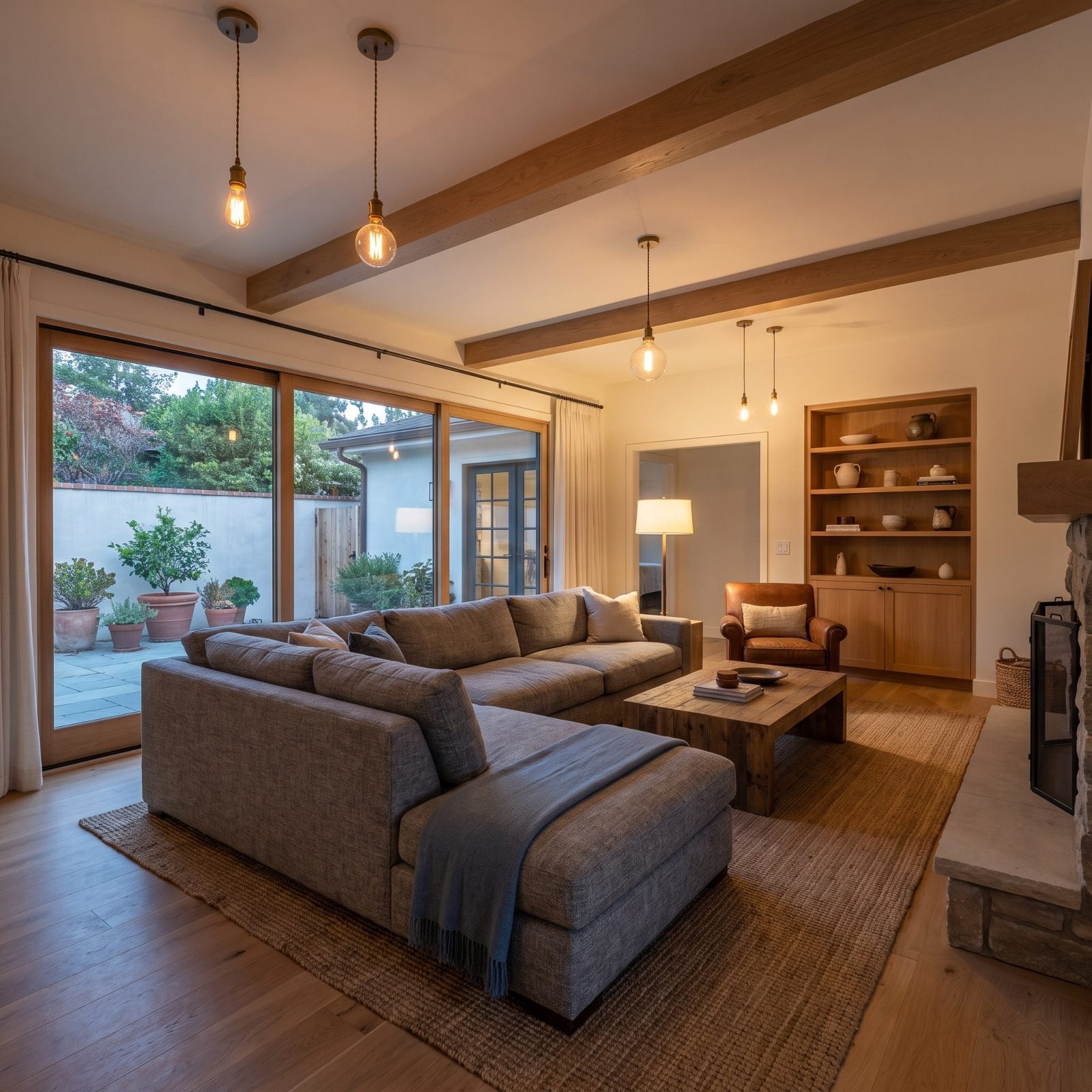
Big sectionals photograph like a dream and live like a traffic jam. Buy one two sizes past what the room can hold, and you’ll spend years turning sideways to get to the kitchen.
Circulation matters more than seat count. Leave roughly three feet of clear walkway, keep the doors swinging free, and the room breathes even when it’s full of people.
10. Extra-Deep Sofas and the Dangling-Feet Problem

🔥 Would you like to save this?
A sofa marketed as cloud-like can become a daily negotiation with your own knees. Go much past 24 inches of seat depth and most people either perch on the front edge or lose their feet entirely, legs sticking out like a kid in a grown-up chair.
Deep sofas lounge gorgeously and sit upright terribly. If your household actually reads, works, or eats on the couch, standard depth wins. Test it in the store. Sit all the way back and see where your feet land.
9. Backless Stools at a Counter You Actually Eat At
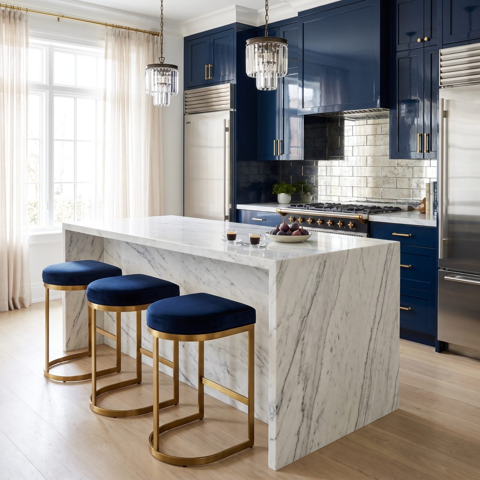
Backless stools tuck away under the counter and keep sightlines clean. That’s their whole appeal, and it’s a real one.
But if the island is where breakfast, homework, and half the dinners actually happen, nobody wants to sit spine-unsupported for an hour. Backless shines on an occasional-use counter and punishes you on a daily one. Match the stool to how the seat gets used, not to the catalog photo.
8. Bonded Leather, or the Sofa That Peels Like a Sunburn
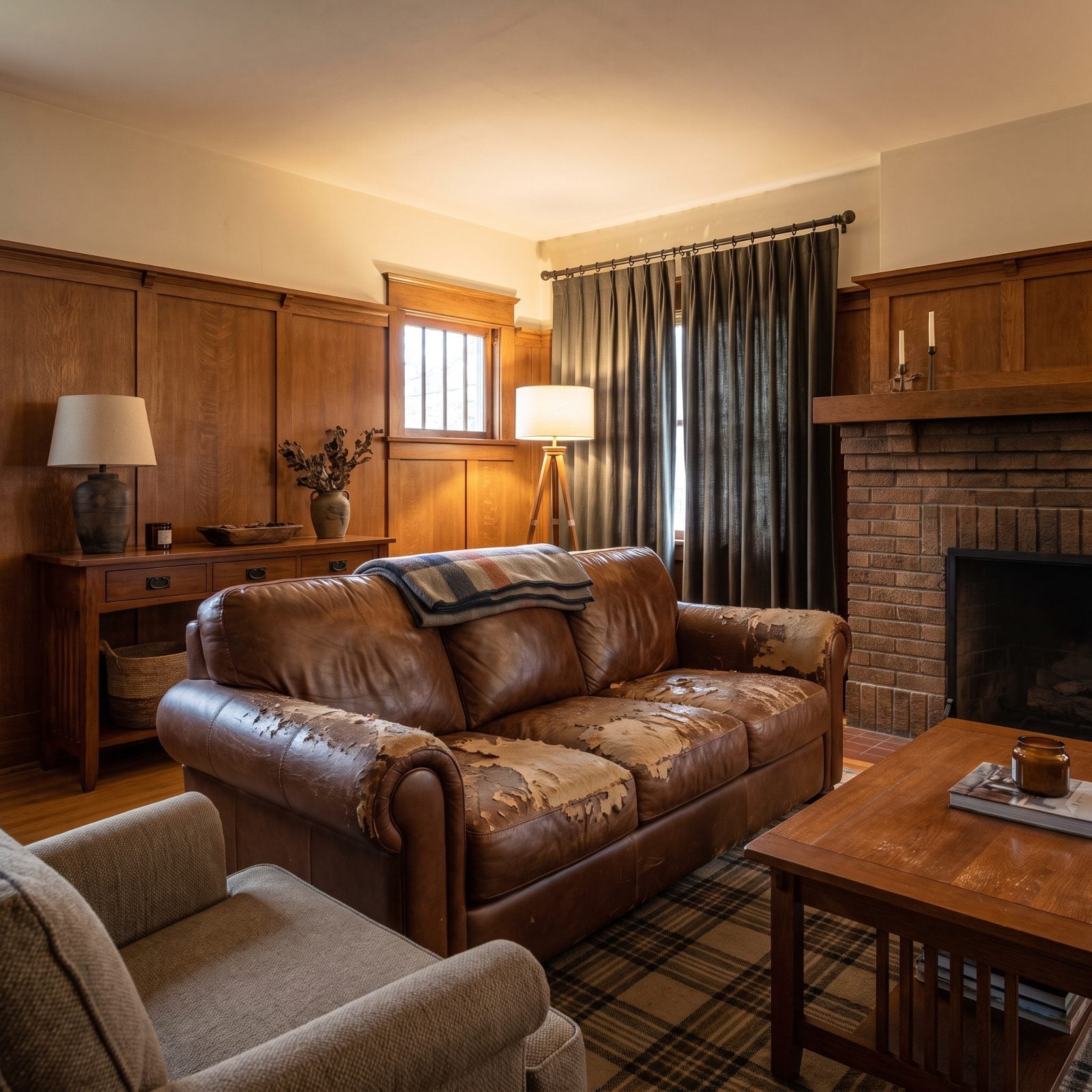
Bonded leather is leather the way a hot dog is beef: technically related, mostly something else. Shredded leather scraps get glued to a backing and sealed under a plastic topcoat, and that topcoat is what fails.
Give it two or three years of real use and it flakes off in papery curls, usually right where you sit. You can’t repair it. You can’t hide it. If the budget won’t stretch to full-grain, a good performance fabric outlasts bonded leather every time.
7. White Bouclé Seating With Nowhere to Send the Spill
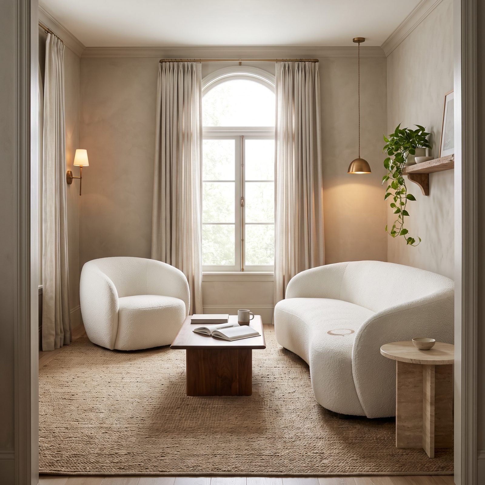
White bouclé is everywhere right now, and most of it ships with sewn-on covers that never come off. Gorgeous texture, terrible plan.
Those nubby loops grab everything: red wine, olive oil, a toddler’s sticky hand. No removable, washable covers means you’re signing up for professional cleaning or a slow slide into gray. Kids, pets, anyone who eats on the couch? Insist on zip-off covers, or go a shade darker in a performance weave.
6. Glass Dining Tables and the Fingerprint Tax
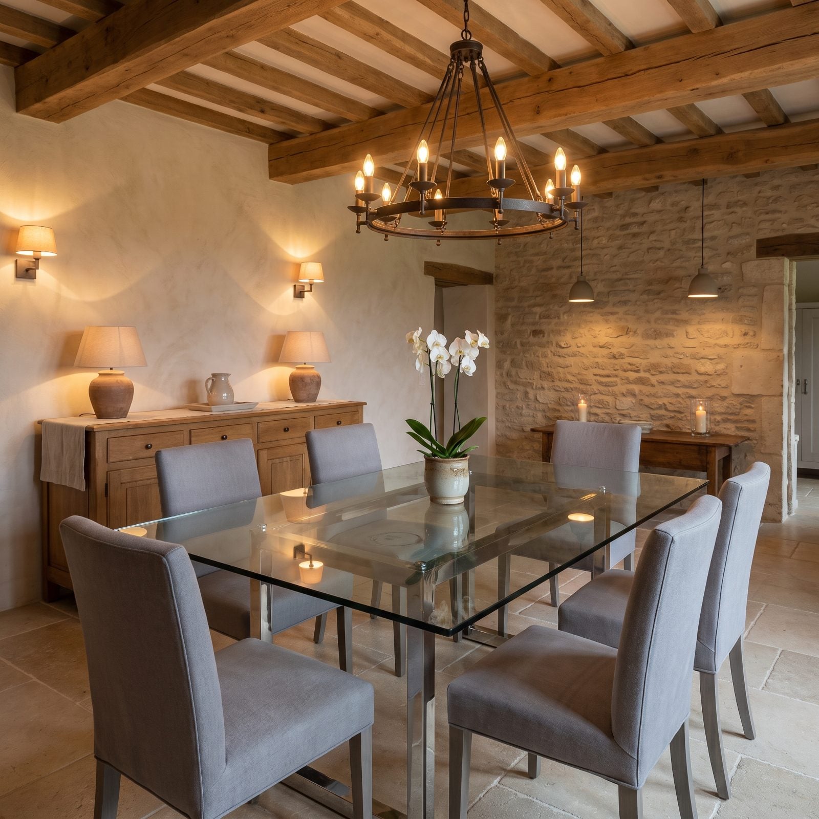
A glass dining table looks weightless and shows every single thing. Fingerprints, water rings, the ghost of last night’s dinner, all of it lit up the second afternoon sun hits the surface.
So you either wipe it three times a day or make peace with the smudges. In a busy house with kids, neither answer is great. Honed stone, wood, or a matte top hides daily life instead of broadcasting it to the whole room.
5. The Matching Furniture Suite Bought All at Once
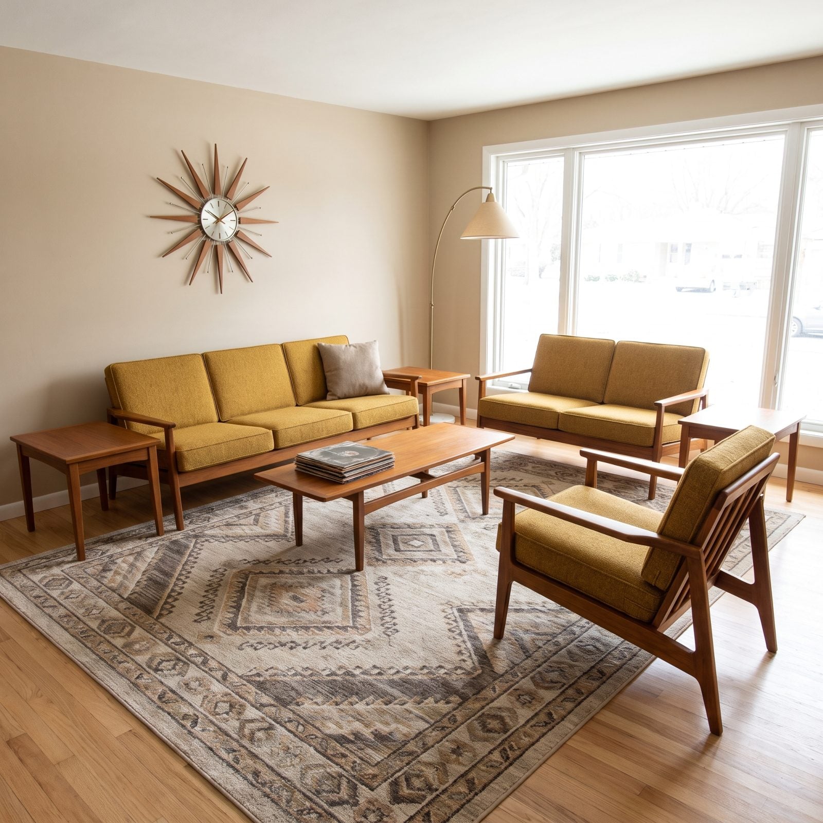
Buying the sofa, loveseat, chair, and both end tables as one showroom set feels efficient and looks exactly that efficient. Everything matches so completely that the room reads as a display rather than a home somebody lives in.
Rooms with soul collect their pieces over time. One old wood table, one new sofa, a chair inherited from an aunt who had better taste than you’d expect. Mix wood tones, eras, and fabrics on purpose. Keep a piece or two from the set if you love them, then break the matchy spell with something that has no business sharing a page in the catalog.
4. Curtains That Stop Short of the Floor in a Transitional Living Room
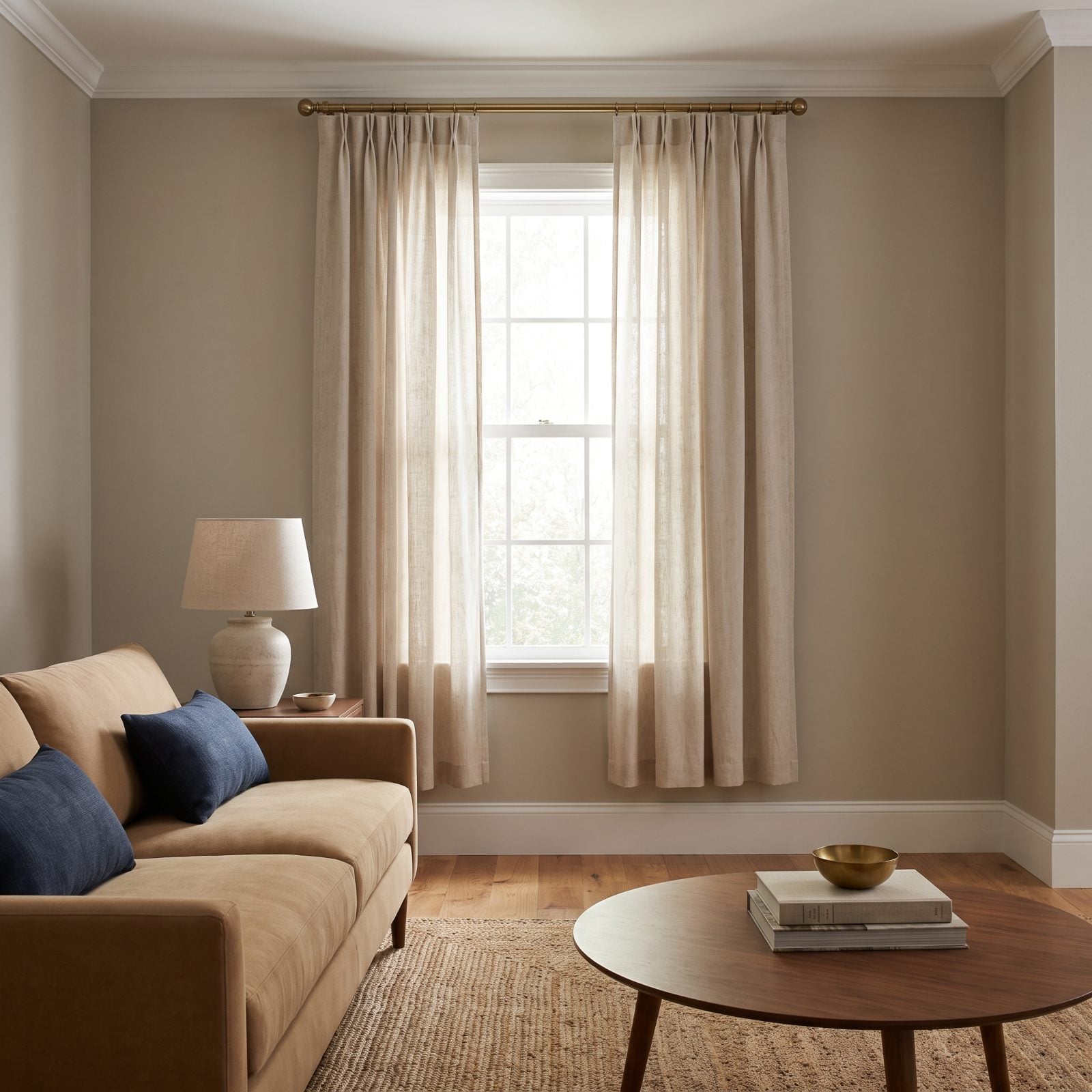
Those linen panels are gorgeous. And they land five inches short of the floor, which reads as a mistake from across the room every single time. Floor-length drapery pulls the eye down and makes the ceiling feel taller, while short curtains chop the window off at the knees.
The oatmeal linen drapery and brass curtain rod are both exactly right. The length is the one thing dragging everything down.
3. When Plastic Vertical Blinds Undo a Perfectly Good Farmhouse Window
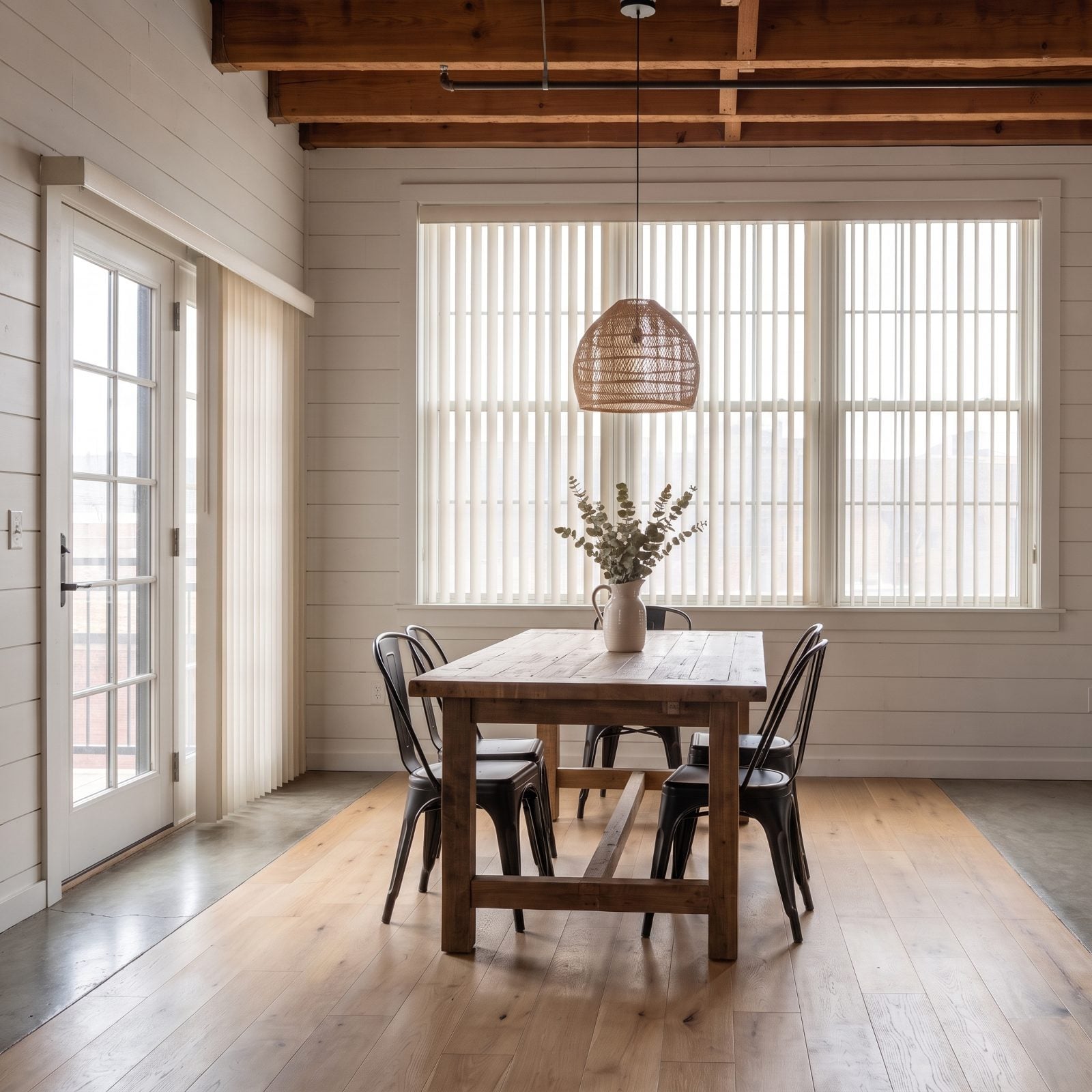
You know the sound. That clatter of plastic verticals every time the patio door swings open, slats twisting the wrong way, one of them cracked and dangling by a thread. Few things cheapen a room faster.
Everything else here is working beautifully — the shiplap, the reclaimed table, the woven pendant light overhead. The blinds are the single material that looks like it wandered in from a 1990s cubicle farm and never left.
Swap them for fabric roman shades or a wide roller in a natural weave. Your window stops announcing the budget.
2. Oversized Faux Beams That Give the Game Away in a Craftsman Den
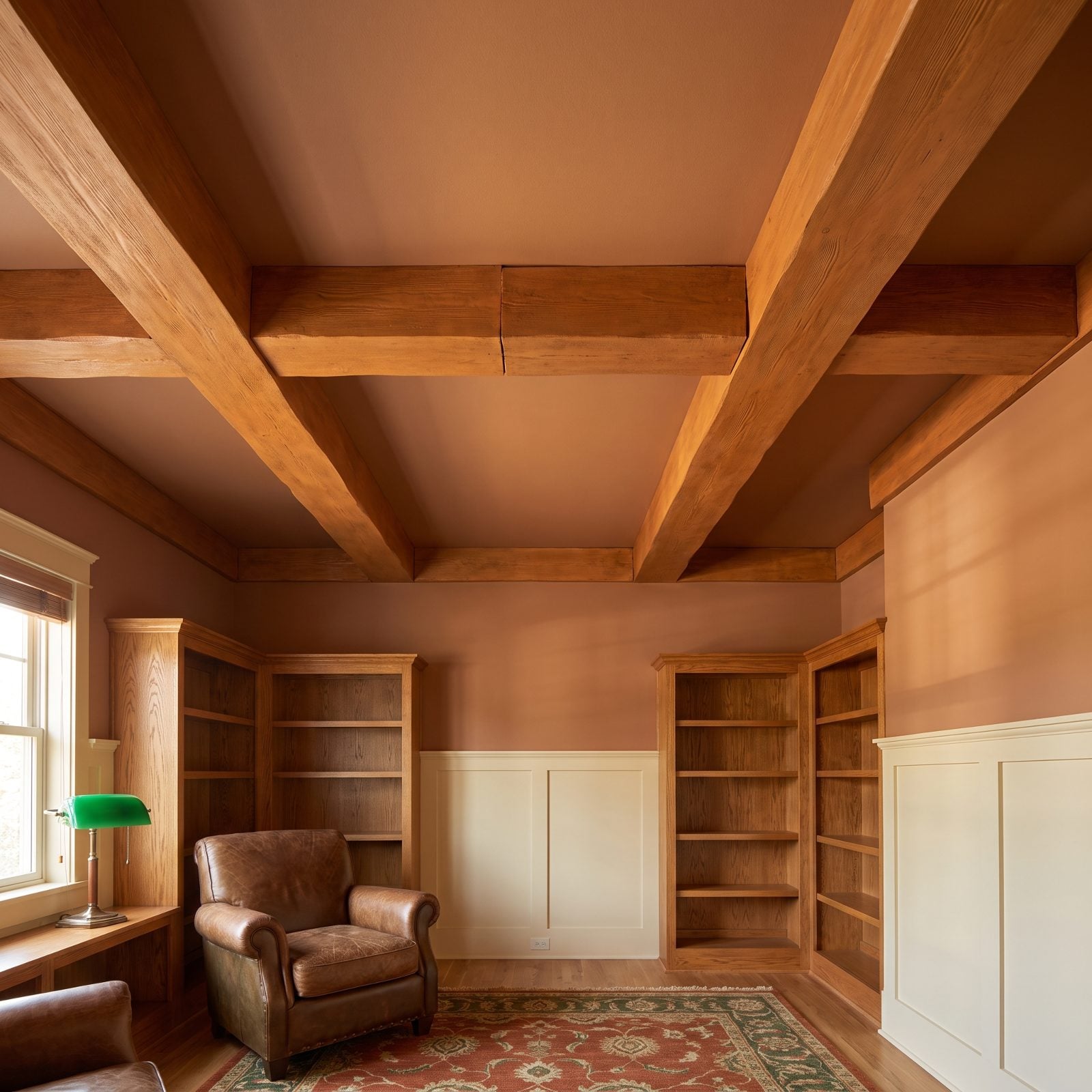
Faux beams can be terrific. These aren’t. They’re too big for the room, stained a shade too orange, and the corners give the whole thing away — hollow miters, a visible seam where two pieces meet with nothing but glue behind them.
Real timber has a weight your eye reads without thinking. Get the scale wrong and fake the joints, and the brain clocks it as a costume before you can even say why.
A beam that couldn’t hold up a feather shouldn’t pretend to hold up a roof.
So show some restraint. Size faux beams to span distances real ones actually could, match the stain to the millwork already in the room, and finish the ends so they read solid.
1. A Transition Strip at Every Doorway, and What It Does to the Floor Plan
🔥 Would you like to save this?
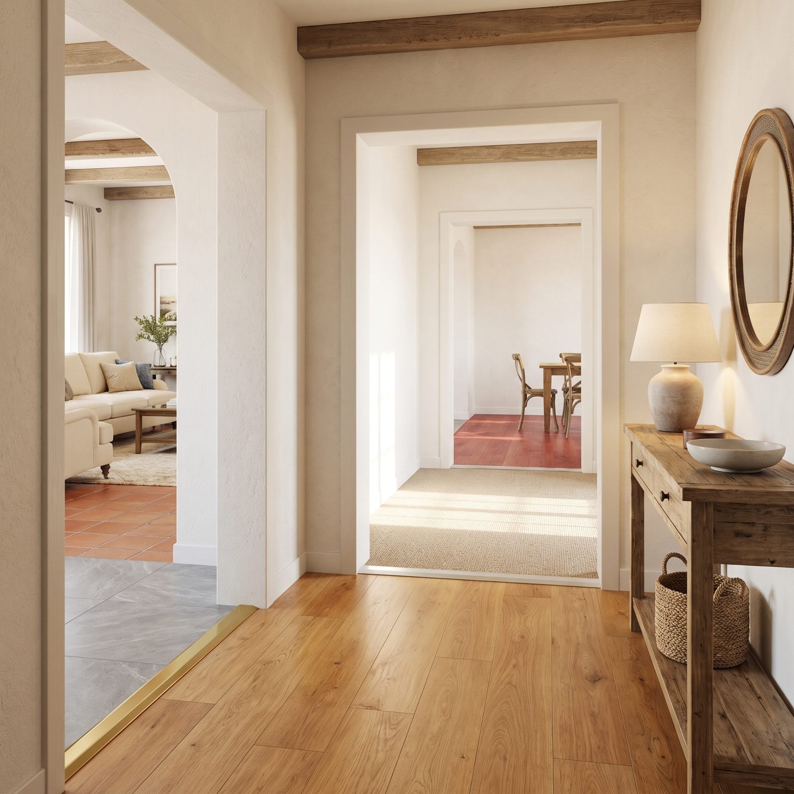
Stand in the hall and look down. Oak laminate, then a brass strip, then grey tile, another strip, carpet, one more strip into reddish engineered wood. Every room picked its own floor, and now a row of metal thresholds is trying to stitch the whole mess together.
What you get is a plan chopped into boxes. Continuous flooring does the exact opposite — it stretches your sightlines and makes a small home feel like one connected space rather than a string of compartments.
Run a single material through the main living zones wherever you can. The fewer transition strips your eye has to count, the bigger the house reads.