
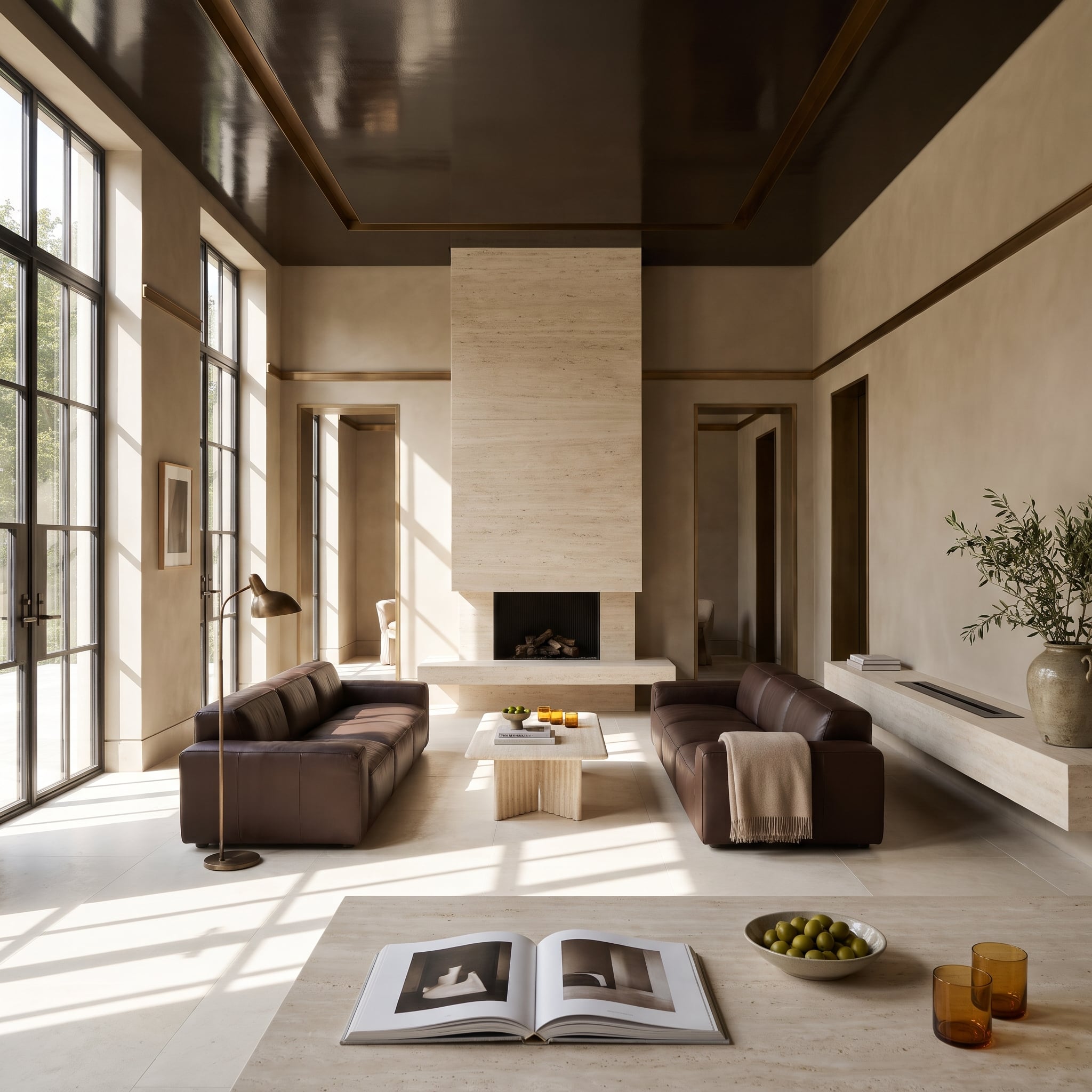
Most dark-ceiling rooms look like someone ran out of white paint halfway up. The good ones look as though white paint was the problem all along. Espresso overhead, limestone below. Oxblood lacquer above a blush fireplace. A ceiling so dark it seems to disappear, until a brass pendant, a skylight, or an entire courtyard starts behaving differently beneath it.
In order to come up with the very specific design ideas, we create most designs with the assistance of state-of-the-art AI interior design software. Also, assume links that take you off the site are affiliate links such as links to Amazon. this means we may earn a commission if you buy something.
For decades, the decorating rule was simple: keep the ceiling light, put the visual weight on the floor, and let the walls negotiate the distance. These rooms reverse the arrangement. Dark ceilings sharpen architectural lines, pull cavernous spaces into focus, and turn pale flooring into something more interesting than a neutral afterthought. The furniture doesn’t always play along. Sometimes that’s precisely why the room works.
White ceilings have had a remarkably long monopoly on respectability. Meanwhile, walnut can make a room feel wrapped in architecture, navy can give a sprawling interior some discipline, and glossy green can turn a bathroom ceiling into a reflection of the garden. The most interesting rooms don’t simply reverse the old rules. They make those rules look rather unimaginative.
30. Navy Coffers Give a Traditional Living Room an Unexpected Dark Side
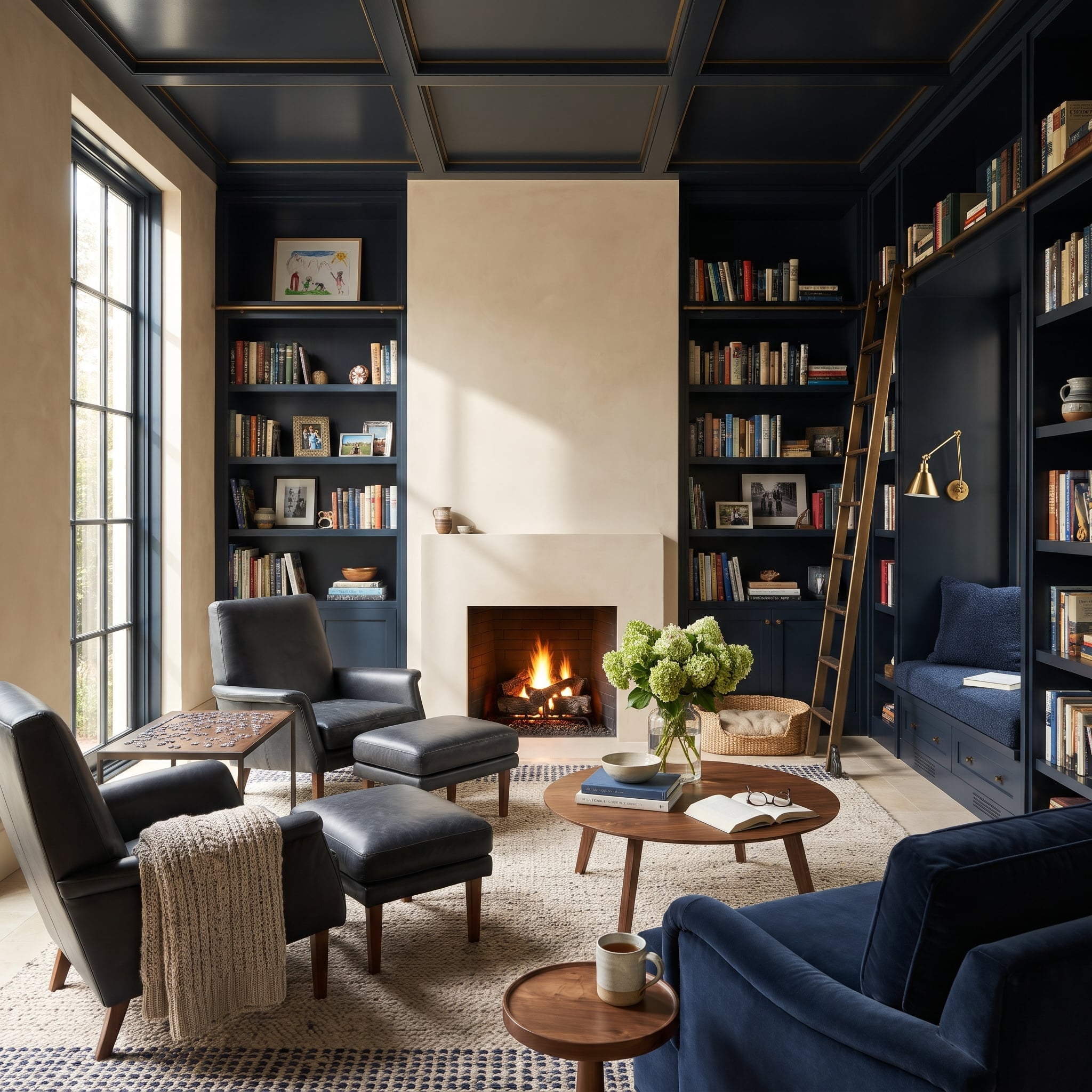
Nothing tentative about that navy. It runs across the coffered ceiling and down the bookcases, turning separate architectural elements into one continuous frame. The grid gives the darkness a rhythm, while walnut and leather introduce enough warmth to keep the room from feeling overly formal.
Underfoot, cream wool and pale limestone reverse the usual dark-floor arrangement. Even the bookcases participate, their navy interiors making the objects on display more conspicuous without competing with the ceiling. A traditional room has acquired a surprisingly assertive upper story.
What Our Readers Say
- In our reader polls, readers who would buy a bright light rather than a cosy one picked a white ceiling 74% of the time, compared with 44% of everyone else.
- Home Stratosphere readers who chose white interior doors also chose white ceilings 69% of the time, versus 46% of readers who picked another door finish.
From Home Stratosphere reader polls and votes.
29. A Bottle-Green Ceiling Turns a Bathroom Into a Reflection of Its Own Garden
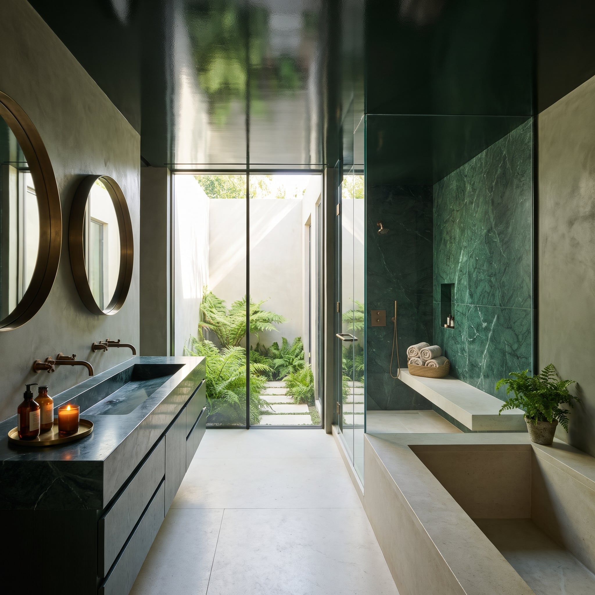
Finished in high-gloss bottle green, the ceiling catches reflections of the fern courtyard beyond the glass, turning an overhead surface into an unexpected extension of the landscape. Where matte paint would absorb much of that visual activity, lacquer puts it on display. The darkest surface in the room also carries one of its brightest views.
Green-veined marble carries the color into the shower, while the dark vanity anchors the room without requiring another wall of green. The sunken tub and pale limestone floor offer a quieter counterpoint. Above them, the glossy ceiling has effectively acquired a second job as a mirror.
28. Black Overhead, Glowing Onyx Below — Which Surface Is Really Running This Bar?
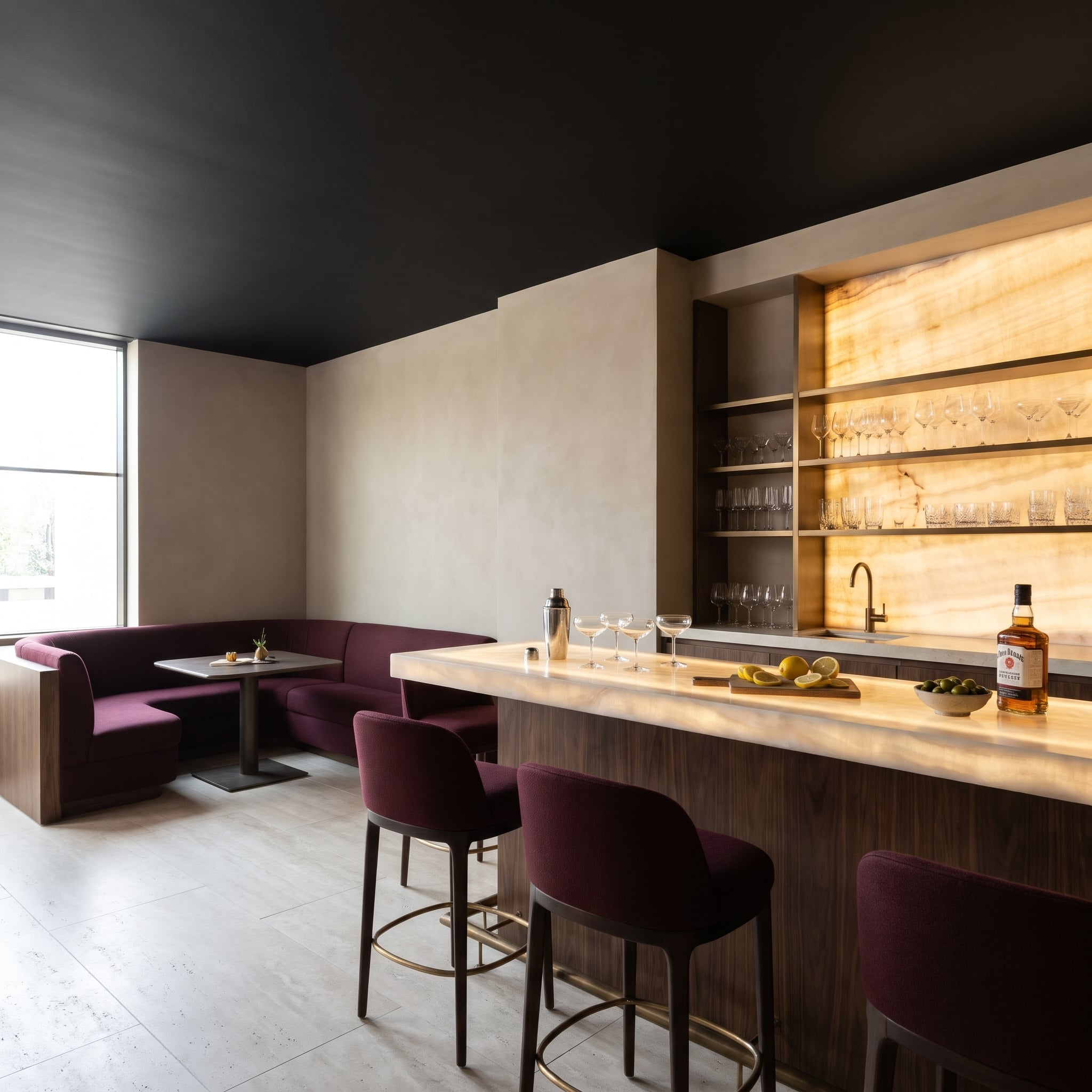
Black takes the ceiling out of the competition. The backlit onyx bar top and illuminated stone wall become the principal sources of visual drama, their warm glow sharpened by the darkness overhead. Plum wool on the stools and curved banquette adds richness without attempting to outshine the stone.
Walnut warms the bar front and banquette end panel. Bronze-toned shelving, a curved faucet, and metallic footrests introduce smaller points of reflection, while large travertine floor tiles catch daylight from the windows. After dark, the illuminated onyx takes command. Few bar tops have such a convincing claim to being the main attraction.
27. A Bronze Spiral Staircase Takes the Ceiling Down for a Spin
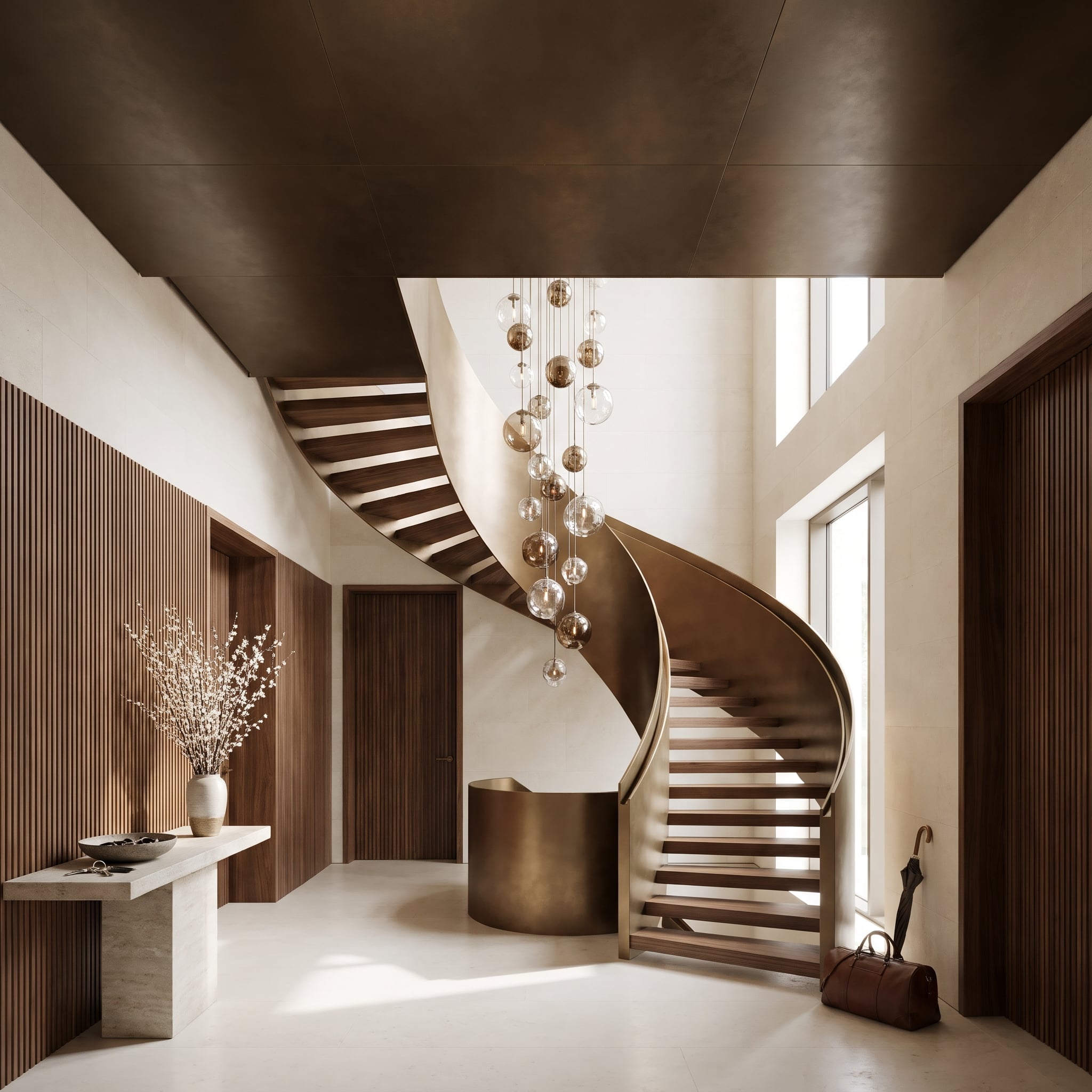
A bronze-toned surface curves from overhead into the spiral staircase’s outer structure, creating a continuous architectural gesture. Rather than appearing as a separate object inserted into the entry, the staircase seems to emerge directly from the ceiling. The sweeping curve gives the metallic finish a sense of movement that flat paneling could never achieve.
Walnut treads provide a warm contrast within the spiral. Below, pale limestone keeps the entry bright, while clear and smoked glass globes descend into the stairwell, bringing illumination closer to eye level. Their irregular arrangement plays against the disciplined curve of the staircase, giving the bronze something less predictable to reflect.
26. A Wine-Colored Bed Meets a Navy Ceiling, and Neither Agrees to Behave
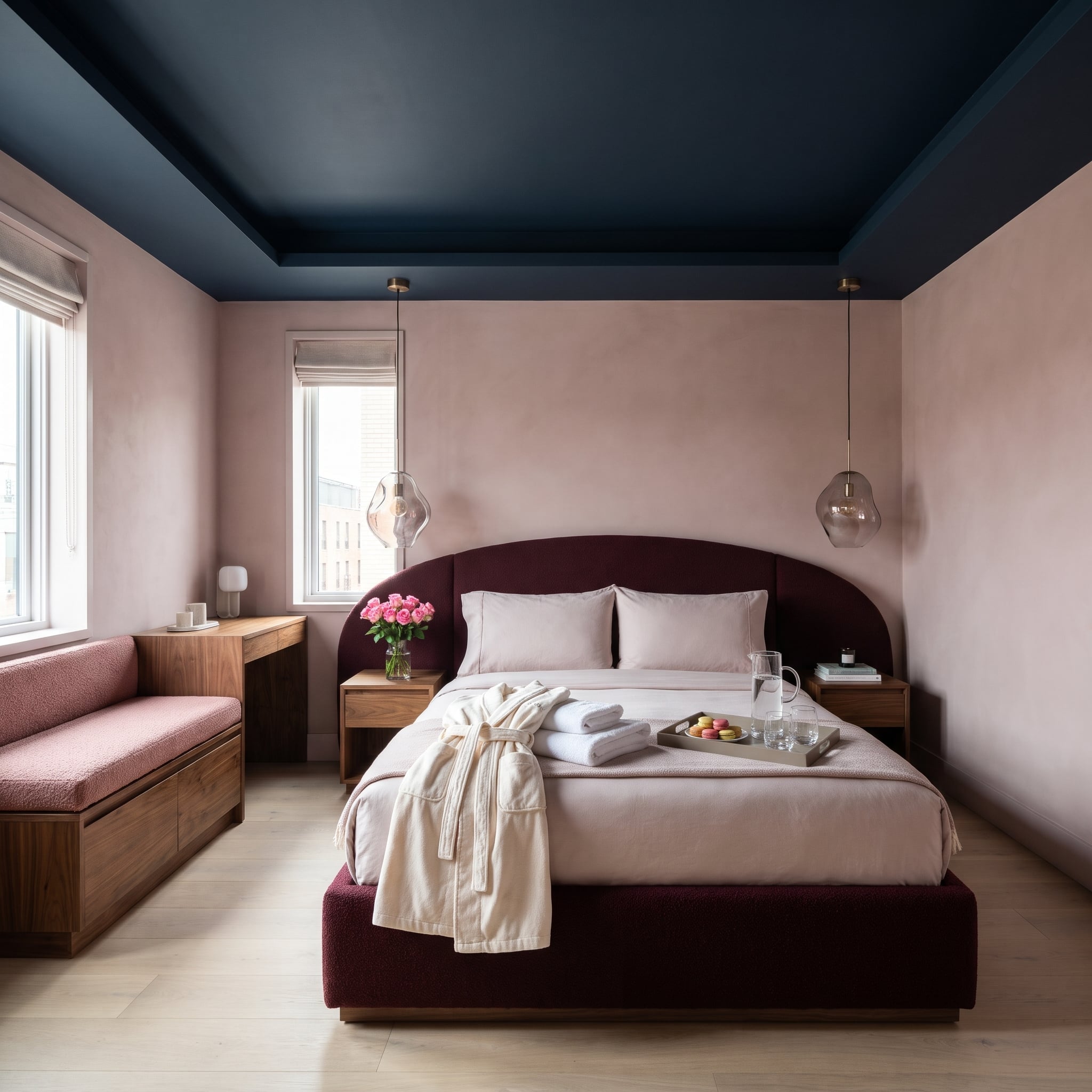
Navy and wine make an assertive pairing, particularly when one occupies the ceiling and the other wraps an enormous arched headboard. The bed’s bouclé upholstery continues around the base, giving the burgundy a substantial presence rather than reducing it to an accent color.
Blush plaster supplies breathing room between those saturated surfaces. The navy covers the recessed tray and its stepped edges, avoiding a distracting white outline. Walnut nightstands remain below the headboard’s curve, while pale oak flooring introduces a change of temperature. Nothing about the palette is timid, yet the bedroom retains a remarkably composed silhouette.
25. Teal Steel Beams, a Hanging Fern Cloud, and an Industrial Ceiling Gone Soft
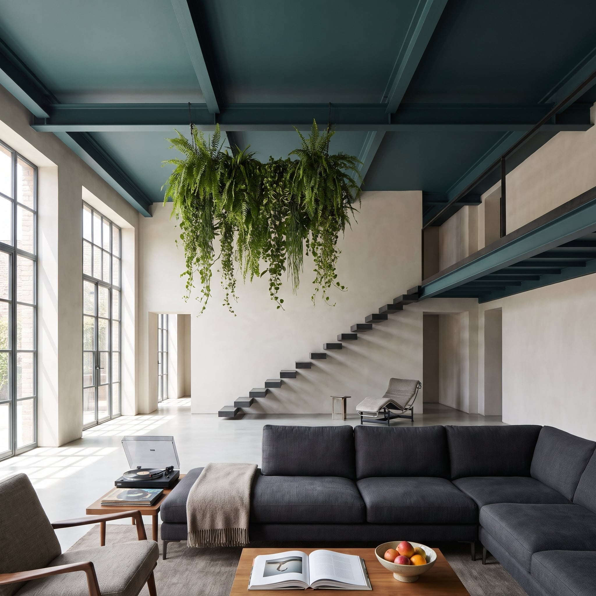
Exposed steel girders generally announce their engineering credentials. Painted deep teal, these beams become something more theatrical: a dark framework supporting a suspended mass of ferns. The greenery breaks up the hard geometry without concealing it.
Charcoal upholstery grounds the seating area, and polished concrete gives the floor a lighter, quieter finish. Expansive glazing keeps the exposed structure visually connected to the outdoors. Above the sectional, the fern cloud delivers an extravagant botanical interruption to an otherwise uncompromising collection of steel, plaster, and concrete.
24. A White Skylight Cuts Through Charcoal Like Someone Opened the Ceiling With a Knife
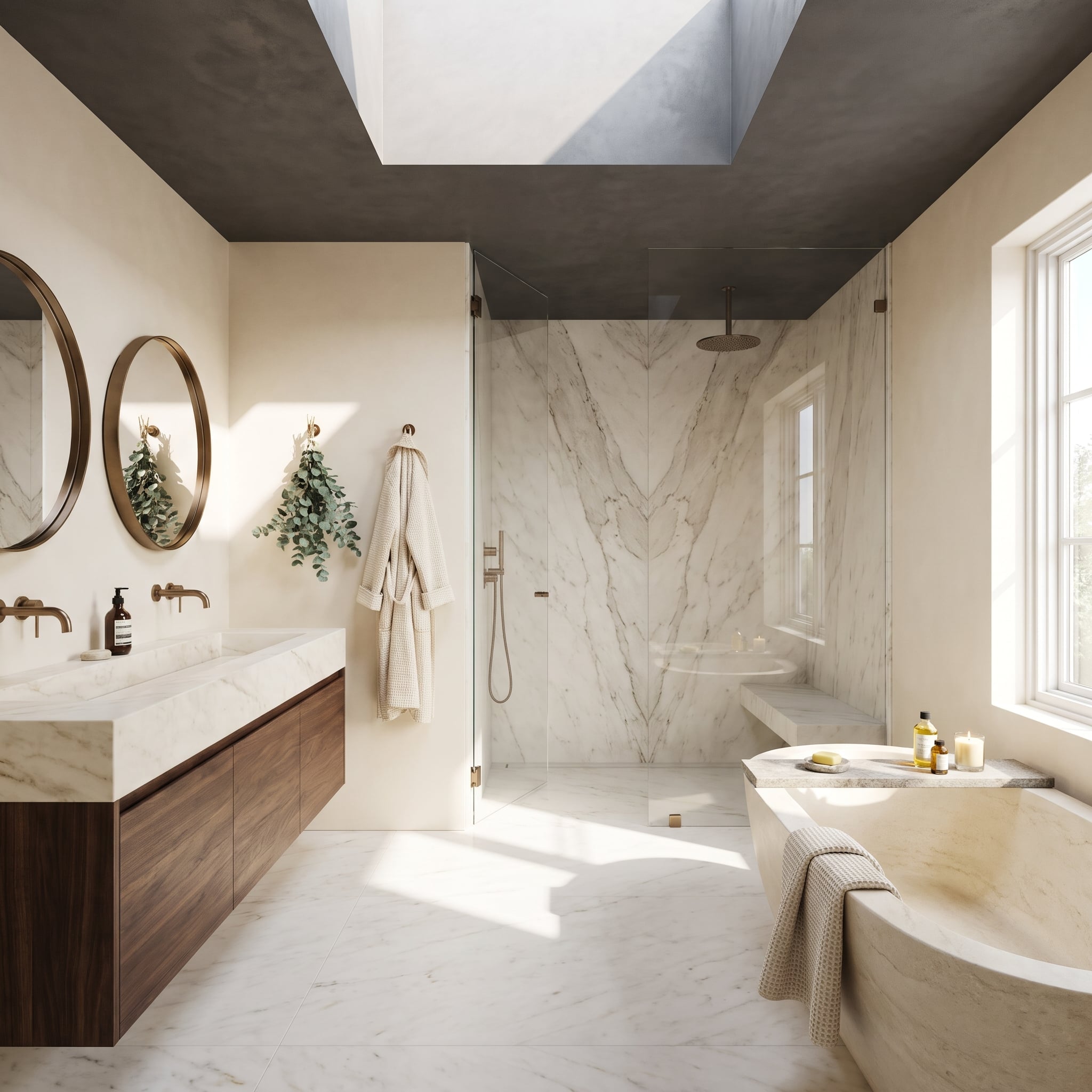
The white skylight shaft looks almost impossibly bright against the surrounding charcoal plaster. Its pale interior reflects daylight into the bathroom, giving the opening a sharply defined architectural presence. Rather than making the entire ceiling light, the design concentrates brightness exactly where it can have the greatest effect.
Below, bookmatched marble creates a dramatic pattern of gray veining in the shower. Walnut cabinetry introduces warmth between the dark ceiling and pale stone floor, while a bronze shower arm nearly disappears against the overhead charcoal. The white skylight opening remains startlingly crisp, like a rectangle of daylight cut directly through the darkness.
23. Chocolate Velvet Curls Around a Stone Table Under a Walnut Canopy
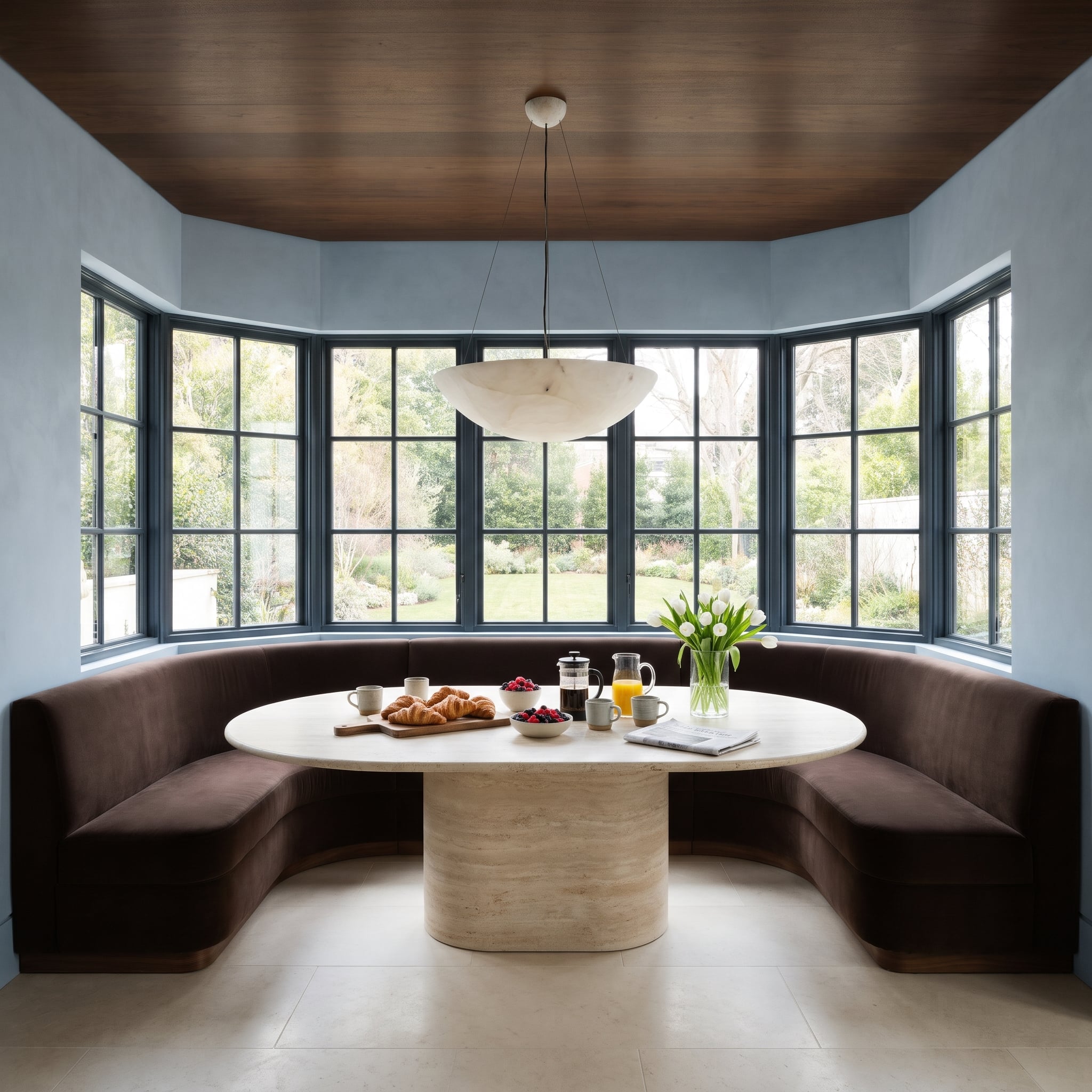
A curved chocolate velvet banquette follows the bay, wrapping the travertine pedestal table in a sweep of upholstery. Walnut planks overhead make the nook feel deliberately enclosed, but powder-blue plaster introduces an unexpectedly cool note between the wood and surrounding glazing.
The banquette rests on a recessed walnut plinth, creating a shadow line that lifts the velvet visually away from the pale floor. Above the table, an alabaster pendant interrupts the wooden ceiling with a soft, rounded form. Between the curved seating, pill-shaped stone table, and glowing pendant, scarcely a hard corner gets the final word.
22. The Ceiling Turns Oxblood, and Even the Ornate Plasterwork Joins the Conspiracy
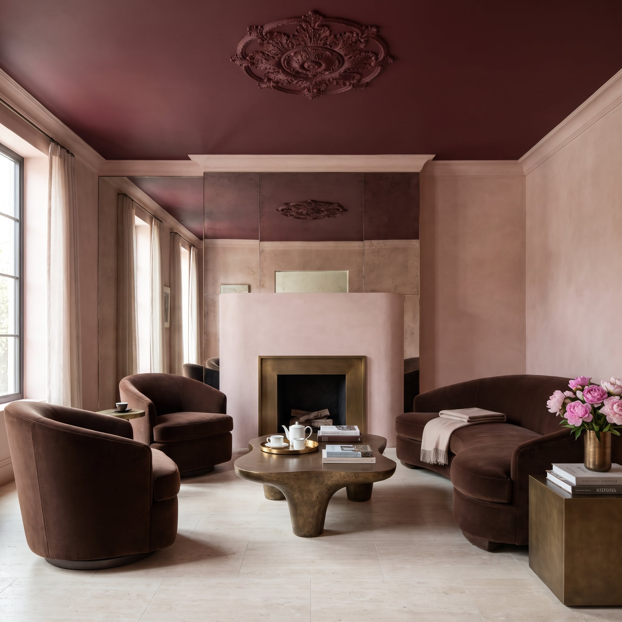
Painting an ornate ceiling medallion white would have made it the obvious centerpiece. Covering it in the same glossy oxblood as the ceiling produces a stranger, more sophisticated effect: the scrollwork emerges through highlights and shadows rather than color contrast.
Antiqued mirror panels behind the fireplace pick up softened reflections of the dark ceiling. The curved blush-plaster chimney breast offers a pale interruption, while chocolate velvet seating and a bronze puddle-shaped table keep the furniture suitably theatrical. Travertine underfoot prevents the red, pink, and brown from becoming an uninterrupted wash of richness. Even the fireplace has traded the conventional mantelpiece for something closer to sculpture.
21. Olive Paint Meets Brass Lines, and the Kitchen Ceiling Starts Drawing Its Own Geometry
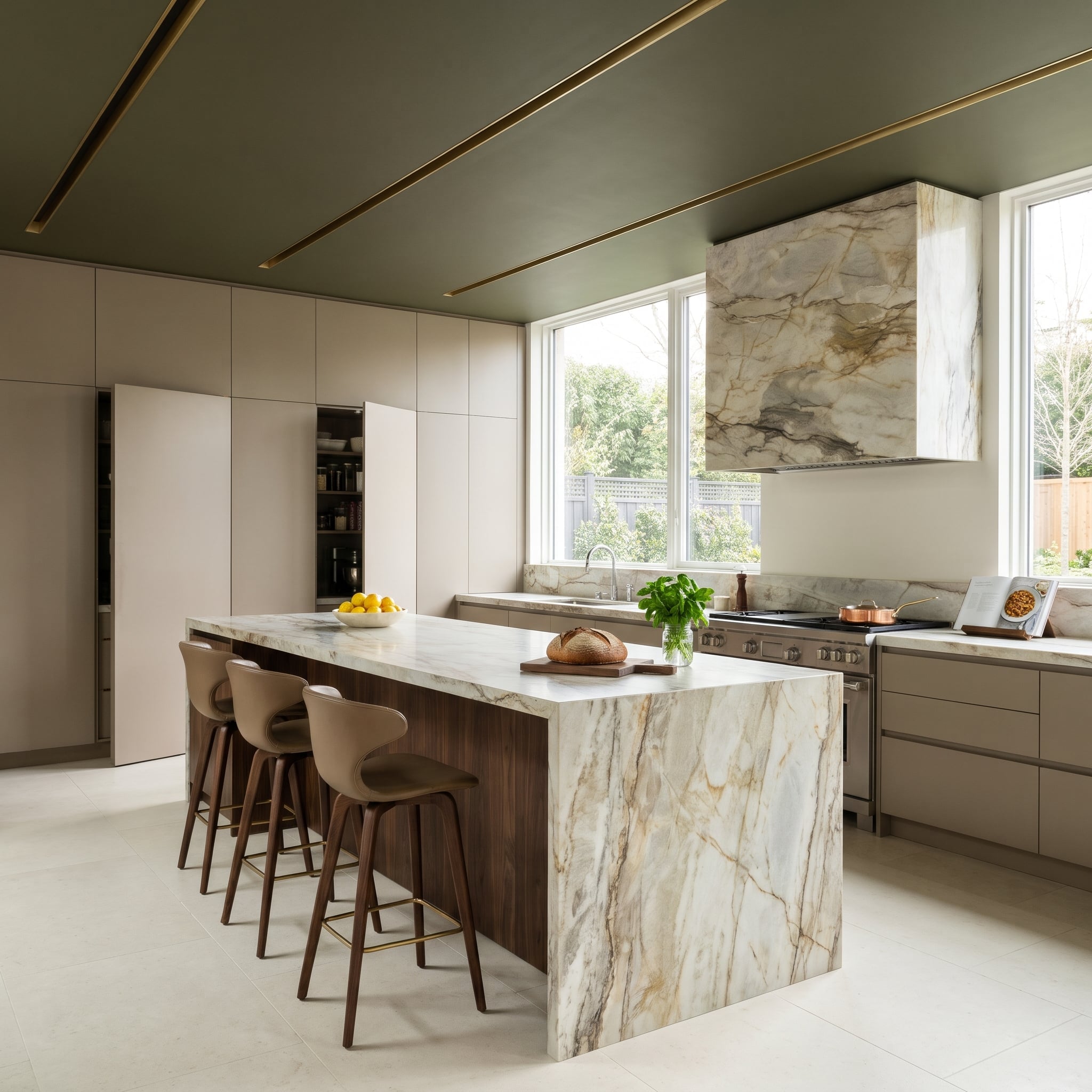
Deep olive gives this kitchen ceiling its visual weight, but the slender brass-toned reveals supply the precision. Their straight lines interrupt the painted field, introducing a metallic geometry that makes the overhead treatment feel architectural rather than decorative.
Below, the quartzite range hood becomes a sculptural centerpiece against warmer cabinetry. Walnut adds depth, while lighter stone surfaces keep the kitchen from becoming a single block of dark color. The straight brass detailing overhead is an especially effective foil for the natural veining of the quartzite, one rigorously ordered, the other entirely uninterested in straight lines.
20. Sink the Conversation Pit, and the Black Ceiling Loses Some of Its Authority
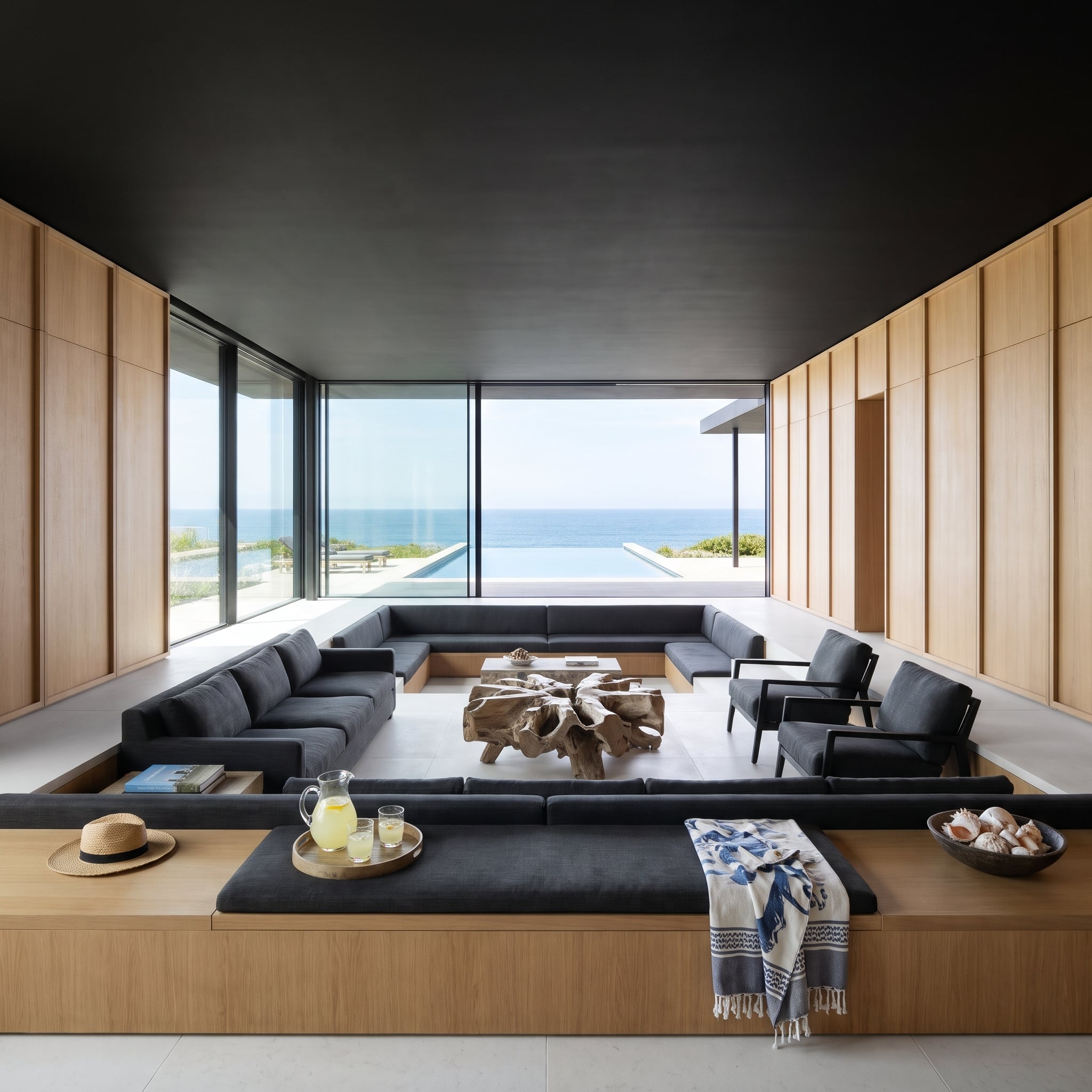
A dark ceiling ordinarily commands attention from above. Here, the architecture counters by lowering the conversation area. The sunken seating creates additional vertical separation for occupants sitting below the surrounding floor level, changing how the overhead plane is experienced without altering its actual height.
Pale oak panels flank the seating, while a sculptural driftwood-root table pulls attention toward the center of the pit. The broad wooden perimeter ledge doubles as an informal shelf for drinks and small objects, leaving the cushions free of clutter. The lowered seating is dramatic enough; nobody needs an obstacle course of side tables down there.
19. Plum Velvet Climbs the Walls, but the Carved Cornice Refuses to Stay White
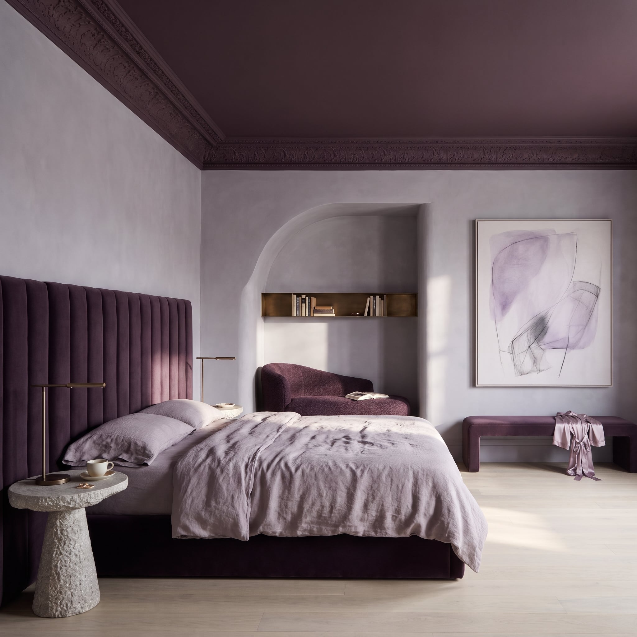
The carved cornice could have remained white, announcing every curve and flourish. Instead, plum paint runs straight across it and onto the ceiling, allowing the ornament to register through relief and shadow. An old-fashioned detail suddenly looks considerably less interested in tradition.
Lilac plaster softens the surrounding walls, while an aubergine velvet headboard brings a deeper version of the palette to the bed. Lavender linens and bleached oak flooring keep the room from becoming overwhelmingly saturated. The cornice still has all its elaborate carving; it simply no longer insists on wearing white to be noticed.
18. A Dark Walnut Library Ceiling Makes the Desk Look Like the Brightest Idea in the Room
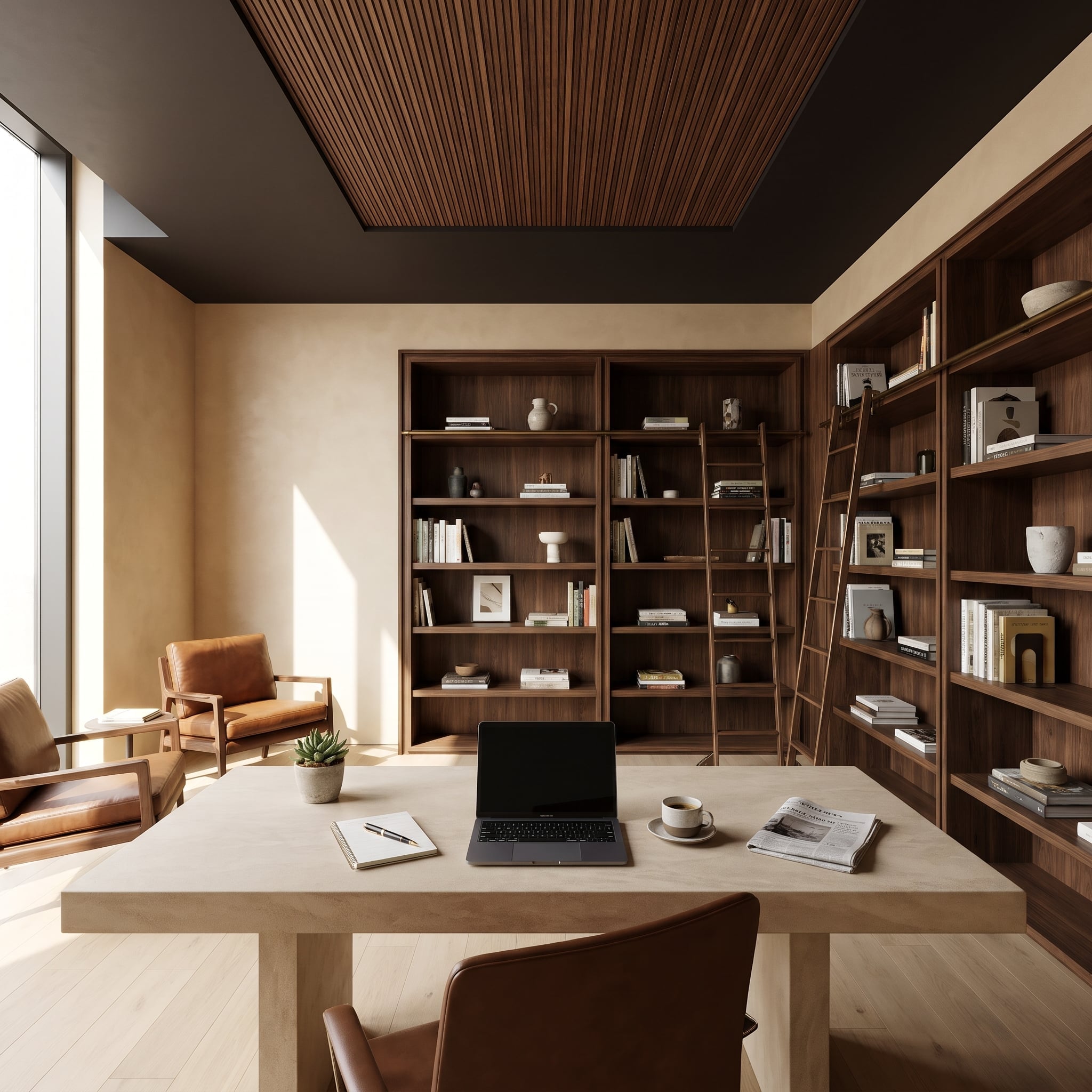
Slatted walnut sits inside a broad chocolate-colored ceiling border, creating a defined overhead field above the office. The arrangement works almost like a rug turned upside down: the darker perimeter establishes the boundary, and the slats give the central area texture and direction.
Matching bookshelves climb the walls, connected visually by rolling ladders on brass rails. Against all that dark wood, the pale desk becomes an immediate focal point. The rolling ladders and ceiling slats establish a network of strong vertical and horizontal lines, with the desk occupying the one bright clearing in the middle.
17. A Porch Daybed Hangs Beneath a Dark Timber Ceiling With Glass on Three Sides
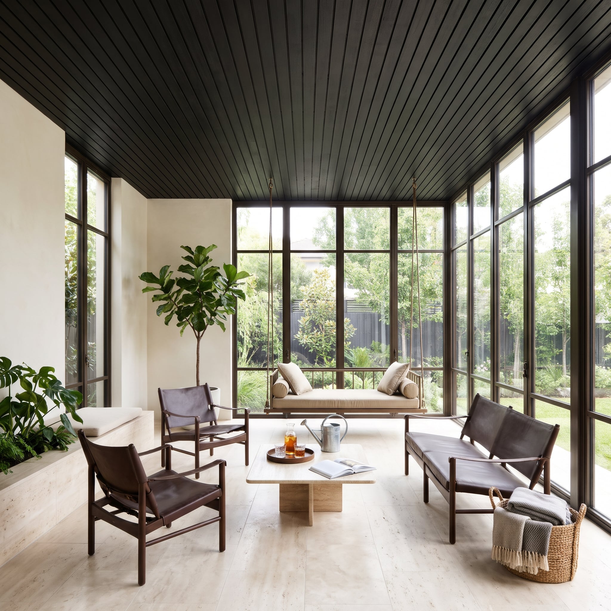
Three walls of glass give this room enough daylight to accommodate a deeply stained timber ceiling without sacrificing its openness. Bronze-toned mullions extend the overhead color downward, creating a continuous framework around the views. The dark wood reads as shelter rather than an oppressive lid.
A rope-suspended daybed provides the room’s most unexpected piece of furniture. Leather chairs sit nearby, while travertine appears in the flooring, coffee table, and planter bench. The daybed’s thick ropes introduce a decidedly informal note among all that precisely aligned glass and stone. An indoor room has borrowed one of the porch’s better ideas.
16. Black Gallery Lighting Lets the Furniture and Sculpture Make Their Own Arguments
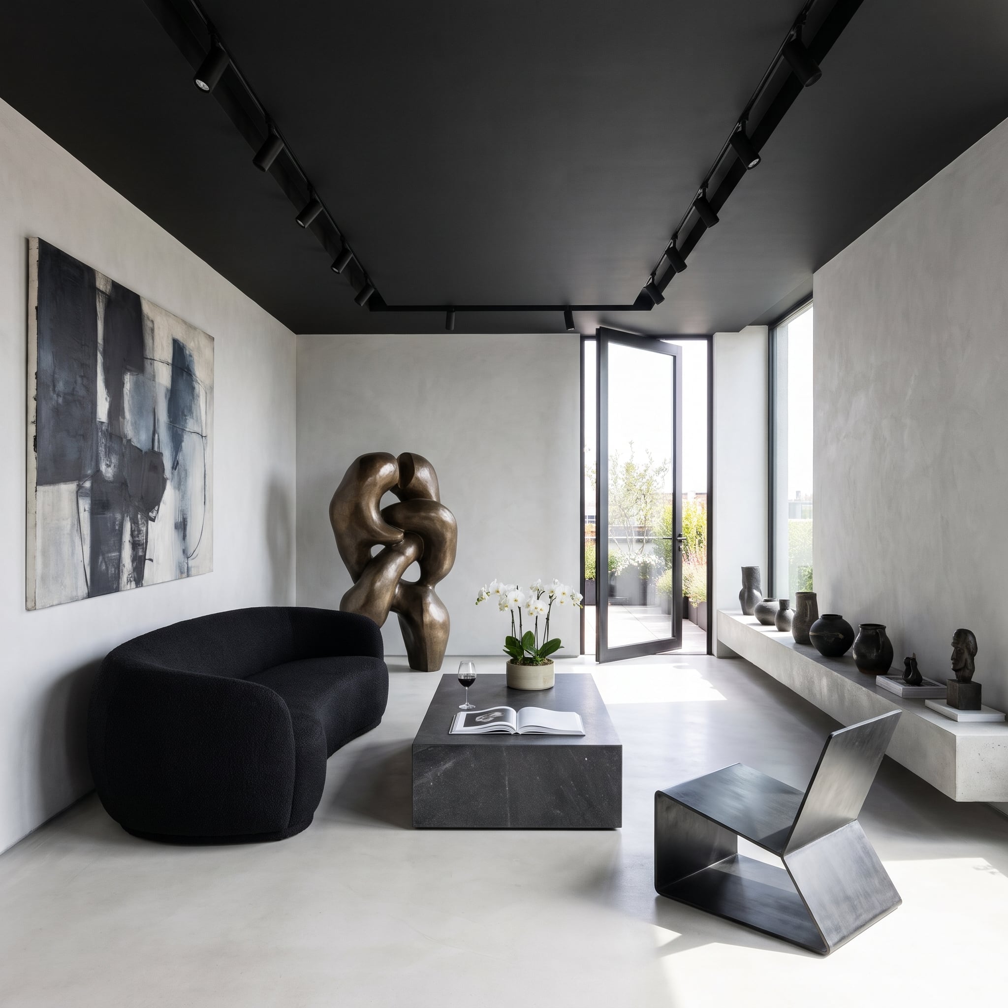
The black ceiling turns the track lighting into a discreet architectural tool. Against pale plaster walls, the dark overhead surface recedes visually, allowing the bronze sculpture and furniture to command attention. Inky bouclé, a substantial stone block, and a folded-steel chair contribute sharply different silhouettes.
A floating concrete ledge beneath the tall window carries dark ceramic vessels, their forms picked out by natural side light. Because the ledge stays close in tone to the pale surroundings, the objects appear as a sequence of dark marks along the wall. The folded-steel chair supplies the sharpest interruption, its angular profile looking almost confrontational beside the softer upholstery.
15. Burgundy Leather Brings an Oxblood Closet Ceiling Down to Hand Height
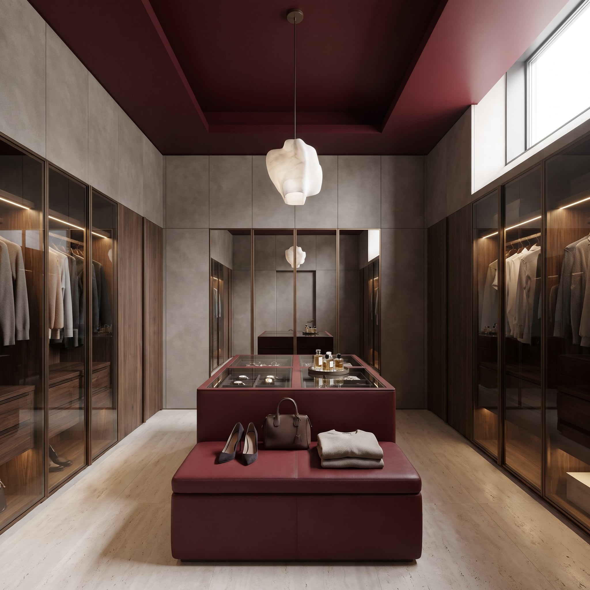
A burgundy leather island and matching bench repeat the oxblood tray ceiling at furniture level, making the color feel integral to the closet rather than confined overhead. Walnut wardrobes behind smoked glass provide a quieter background, while travertine flooring gives the room a pale foundation.
The irregular white pendant is the real interruption. Suspended low against the dark recess, its stone-like shade becomes a luminous object above the glass-topped jewelry drawers. A mirrored back wall catches its reflection, adding another layer of depth. Against the closet’s relentlessly straight cabinetry, the pendant looks almost defiantly misshapen.
14. A Charcoal Ceiling Gets Two Lines of Light Instead of a Chandelier
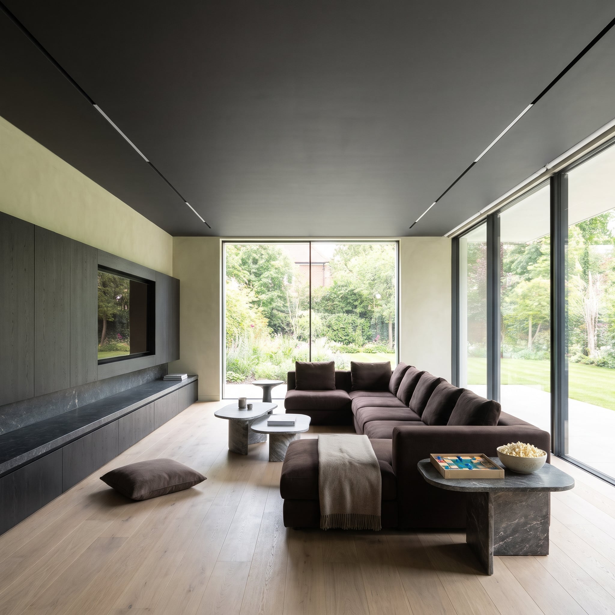
No pendant, no cluster of recessed spotlights, no decorative fixture demanding attention. Two long lighting slots follow the room’s edges, one beside the smoked-oak media wall and the other along the glazing. The charcoal ceiling remains a largely uninterrupted surface.
After dark, the perimeter lighting can illuminate the adjacent walls and soften the contrast between ceiling and room. Chocolate upholstery and pale wood flooring provide warmth below. The light slots also reinforce the room’s long horizontal proportions, drawing attention toward the glazing rather than toward a fixture suspended in the middle.
13. Abstract Art Makes Brown and Powder Blue Look Like They Planned This All Along
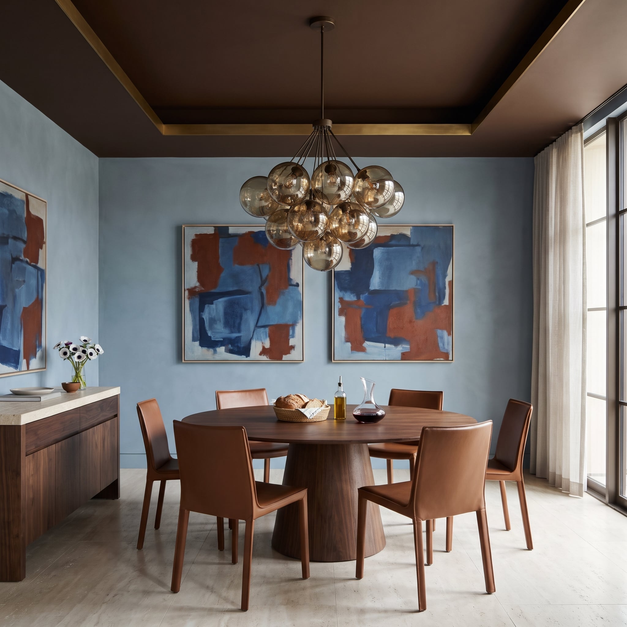
A chocolate tray ceiling, cognac leather chairs, and powder-blue walls could easily have looked like competing design decisions. Two abstract canvases settle the argument. Their rust-colored passages connect with the leather, while their blue fields echo the plaster, giving the palette a visual explanation without making everything match.
A thin brass band traces the ceiling’s stepped edge, adding definition without a bright white border. The walnut pedestal table supplies a substantial center, while smoked-glass globes introduce a softer, warmer glow above the dining area. Those paintings are doing considerably more work than simply occupying the wall.
12. Chocolate Suede Floats Above Bleached Oak Under a Slatted Timber Ceiling
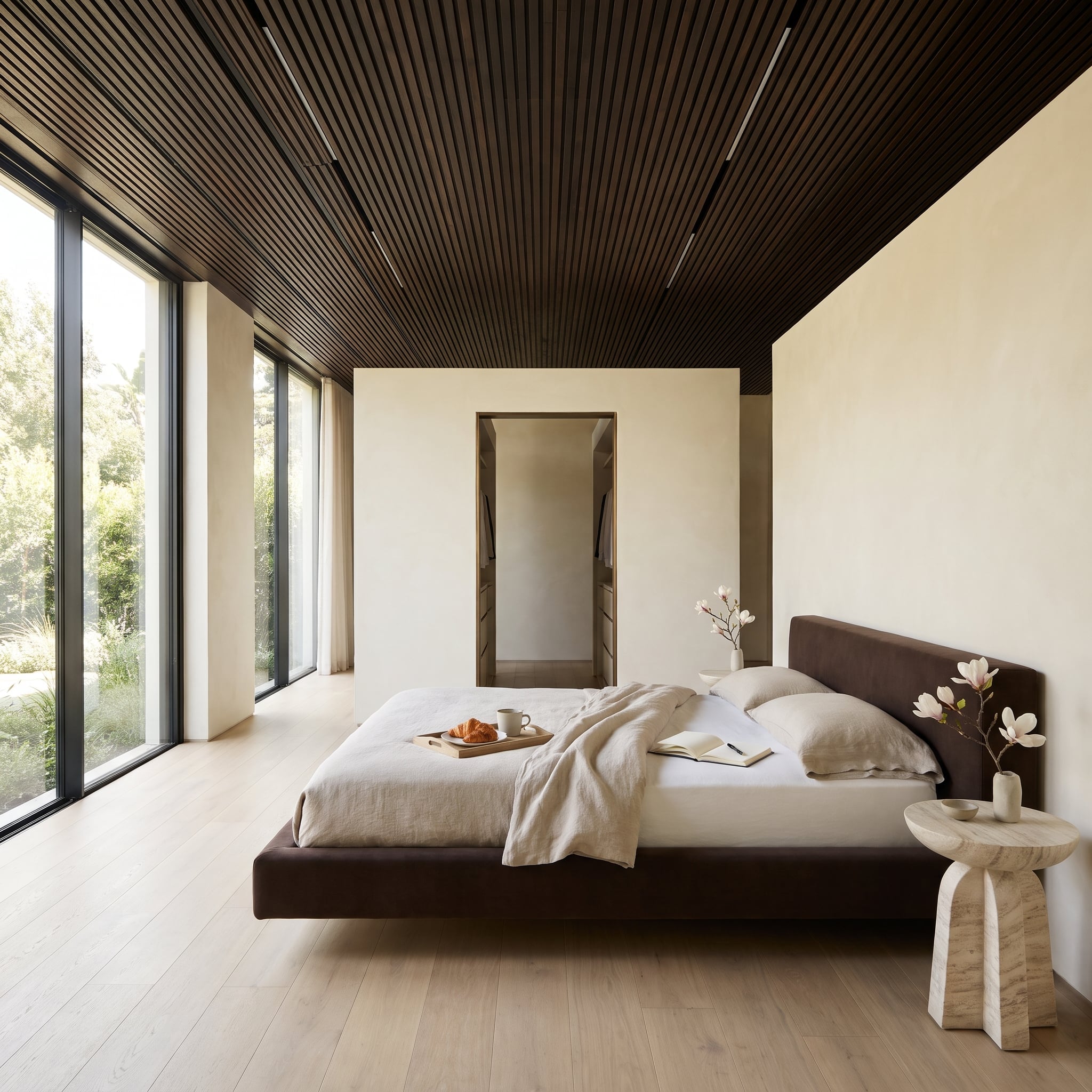
The bed appears to hover, thanks to a recessed base that leaves a narrow shadow beneath its chocolate suede frame. Against bleached oak flooring, that dark gap becomes a surprisingly important detail, separating the substantial upholstery from the pale boards.
Above, a slatted timber ceiling introduces a strong linear pattern. The tall headboard picks up its warm brown tones, while a fluted travertine side table provides a lighter, more sculptural shape at the bedside. The ceiling slats and the bed’s recessed base operate at opposite ends of the room, one emphasizing lines overhead, the other creating a barely visible gap at floor level.
11. Forest Green Claims the Ceiling, Then Walnut Slats Mark the Dinner Table
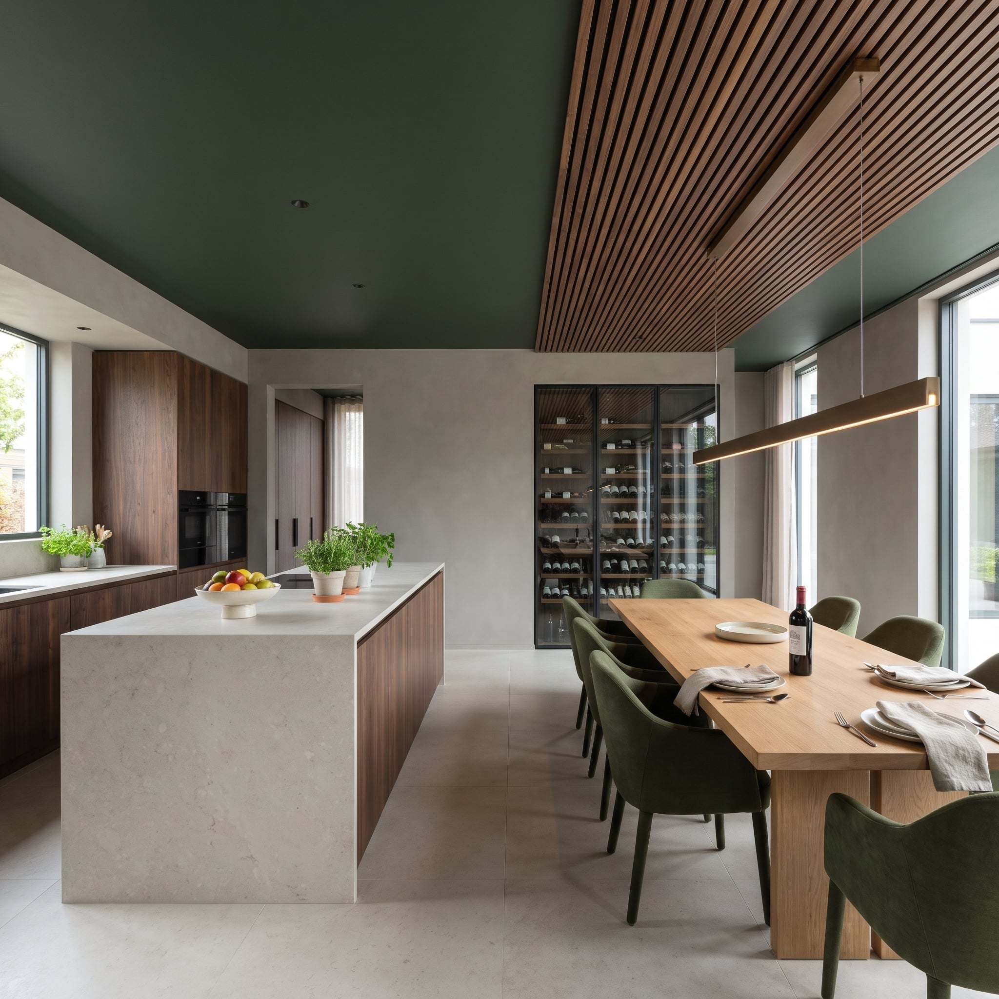
Forest green covers the ceiling until a band of walnut slats interrupts it directly above the dining table. The wood defines the eating area without partitions or a change in flooring, creating a distinct overhead zone within the larger kitchen. A linear pendant follows the slats’ direction.
Olive upholstered chairs repeat the green at seating level, while walnut cabinetry, a pale oak table, and a light waterfall island introduce several warmer and brighter surfaces. Soft putty-gray plaster separates the darker elements along the walls. The walnut slats provide the architectural equivalent of underlining the dining table, without having to draw a single boundary on the floor.
10. A Limestone Fireplace Climbs Into the Darkness and Takes the Hearth With It
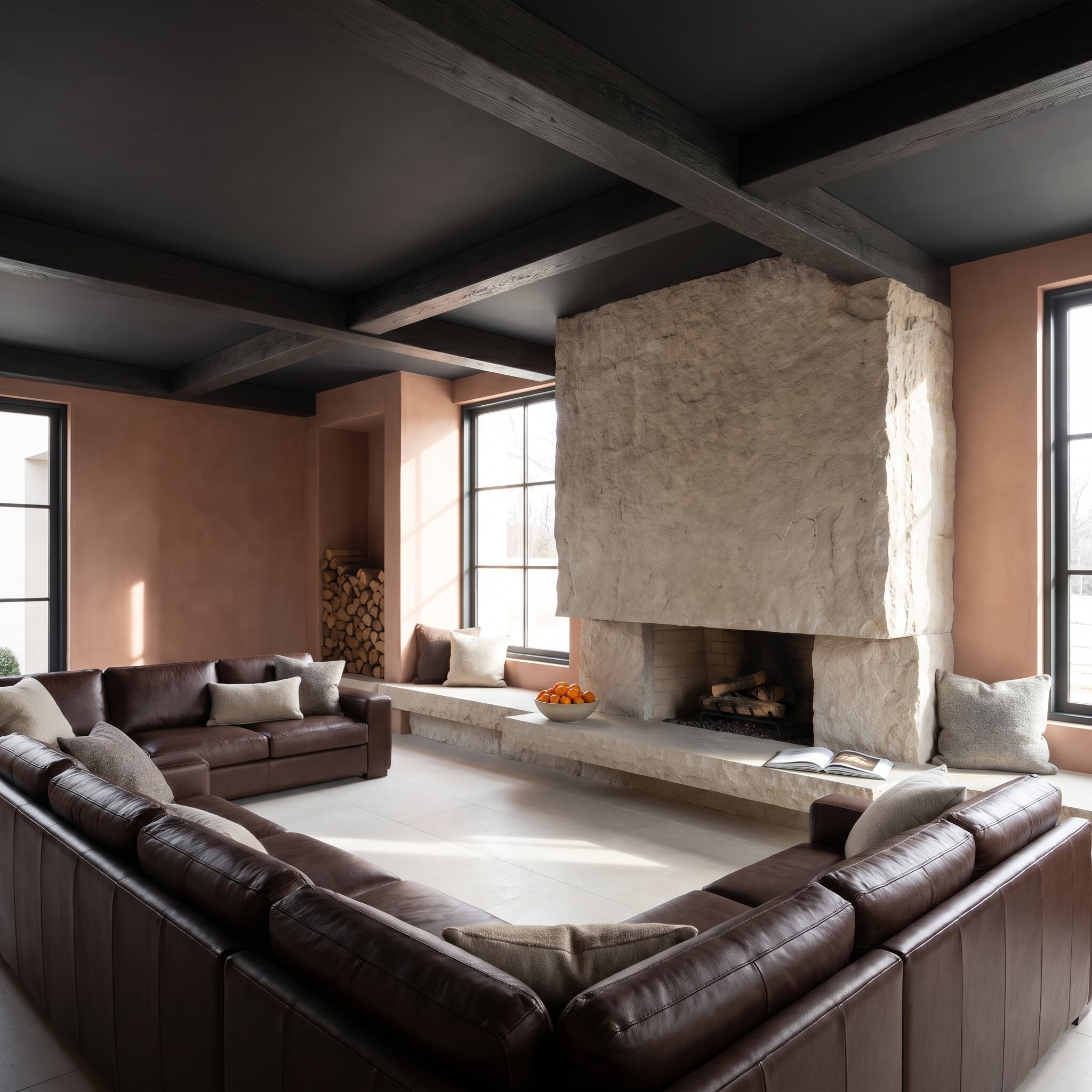
Rough limestone climbs from the hearth toward the dark overhead beams, creating the appearance of a continuous stone mass. At floor level, the hearth extends sideways into a window bench, giving the fireplace a horizontal reach to match its considerable height.
Chocolate leather seating provides a warm, low counterweight, while clay-pink plaster prevents the stone and dark ceiling from turning the room severe. A recessed firewood niche beside the window adds texture without introducing another freestanding object. The pale chimney remains the commanding feature, rising through the room like a piece of geology that happened to acquire a fireplace.
9. Olive Velvet Covers the Bedroom Wall While a Gridded Green Ceiling Takes Charge Above
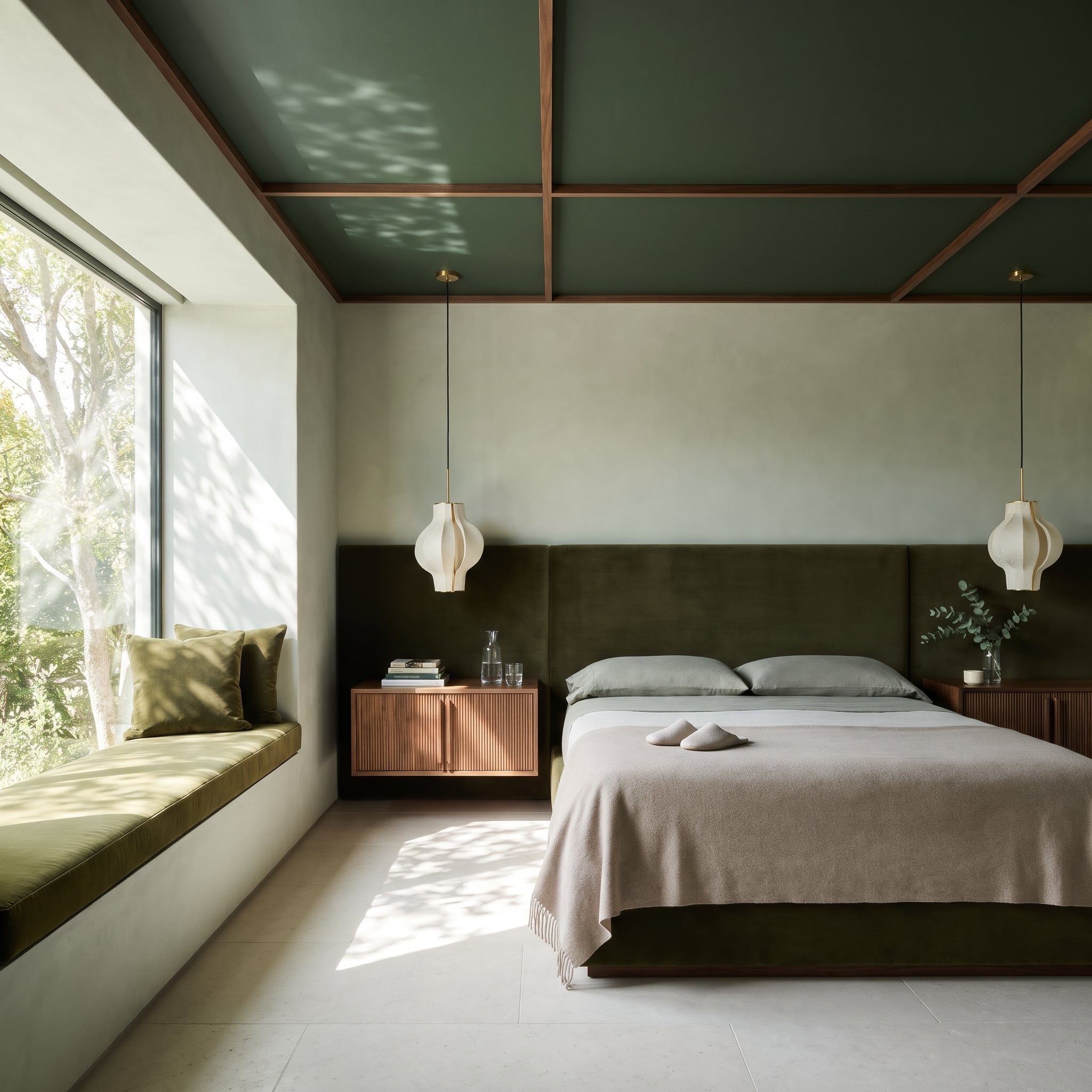
The gridded green ceiling establishes a strong geometric pattern above a bedroom dominated by softer surfaces. Olive velvet extends across the headboard wall, replacing the conventional upholstered rectangle with a much broader field of color and texture.
Fluted walnut nightstands project from the upholstered wall, their vertical grooves providing a smaller-scale counterpoint to the ceiling grid. Paper pendants hang above the cabinets, preserving the limited bedside surfaces for books and other essentials. Between the overhead grid, vertical fluting, and broad velvet wall, three different patterns share the room without repeating one another.
8. Black Paint Meets a Clerestory Window, and the Kitchen Gets Its Light From the Edges
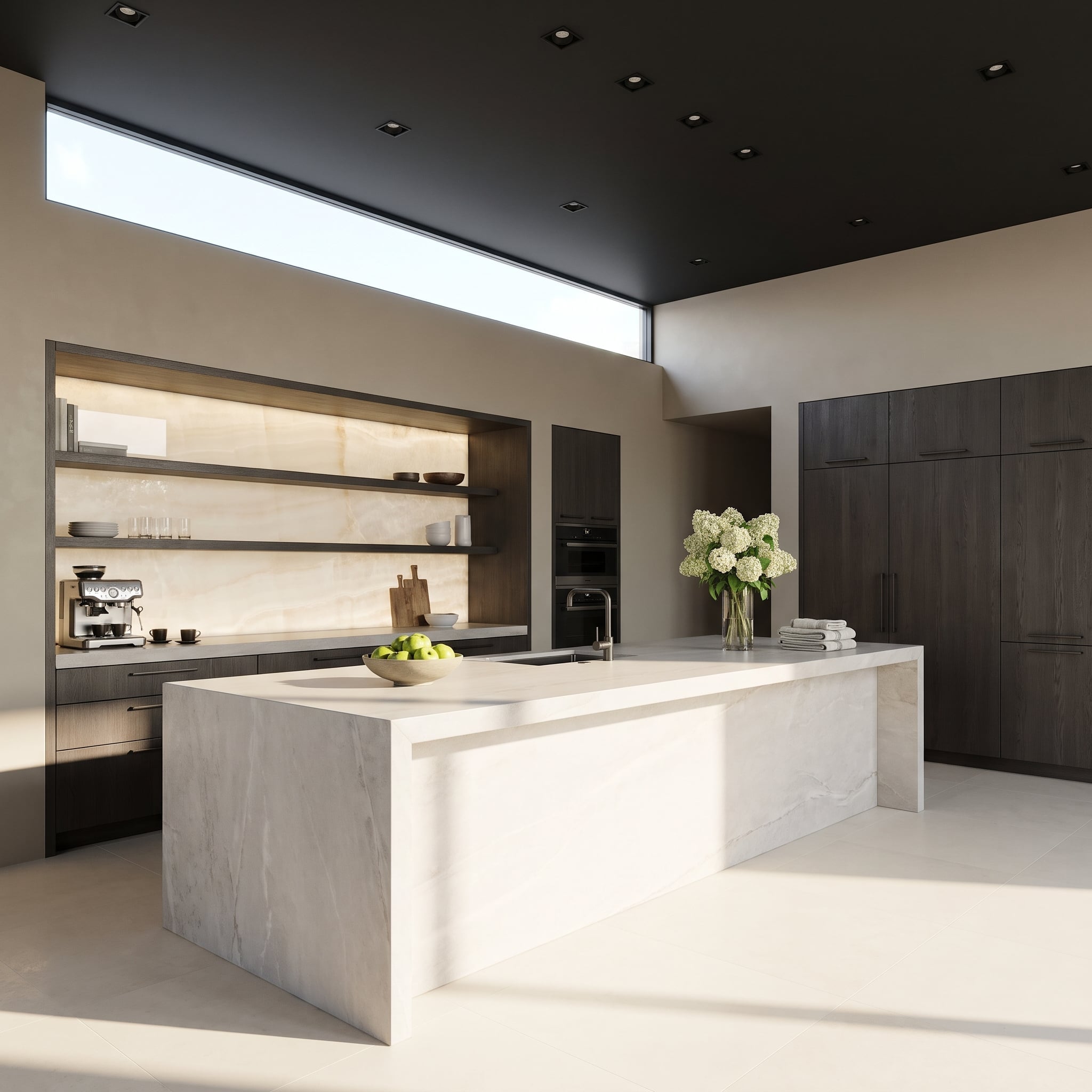
A ribbon of clerestory glazing runs beside the black ceiling, introducing daylight at the point where the overhead plane meets the walls. Instead of illuminating the room from a conventional central fixture, the architecture lets light enter along the perimeter and travel across the pale plaster.
Smoked oak cabinetry and open shelving bring warmth to the middle of the kitchen. The veined waterfall island supplies a bright central surface, contrasting sharply with the dark ceiling above. The clerestory’s long strip of glass makes the ceiling appear detached from the wall, a surprisingly delicate effect for such an emphatically black surface.
7. Chocolate Paint Stops Before the Walls, Leaving a Bronze Ring Suspended in Between
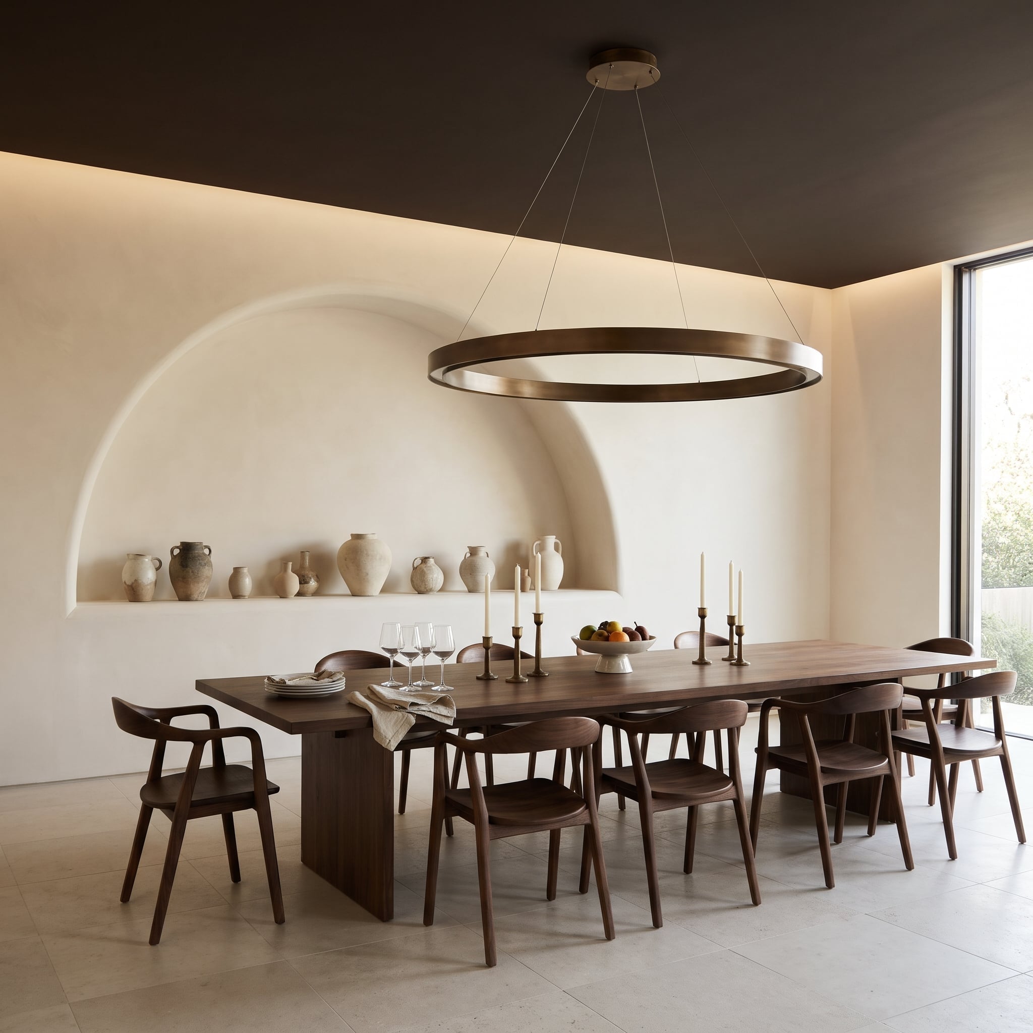
The chocolate ceiling doesn’t quite meet the walls. A recessed lighting cove marks the boundary, creating a slim luminous separation that makes the dark plane appear to hover. Suspended beneath it, a bronze ring pendant reinforces the circular geometry without introducing an elaborate chandelier.
Walnut chairs and table bring the warm brown palette into the dining area, while pale limestone tiles maintain a distinctly lighter floor. Small metallic accents, including candlesticks, pick up the pendant’s finish. The narrow illuminated boundary is the real architectural trick: an ordinary painted ceiling would never appear to float quite so convincingly.
6. Oxblood Lacquer Meets Blush Plaster in a Dining Room That Refuses to Be Subtle
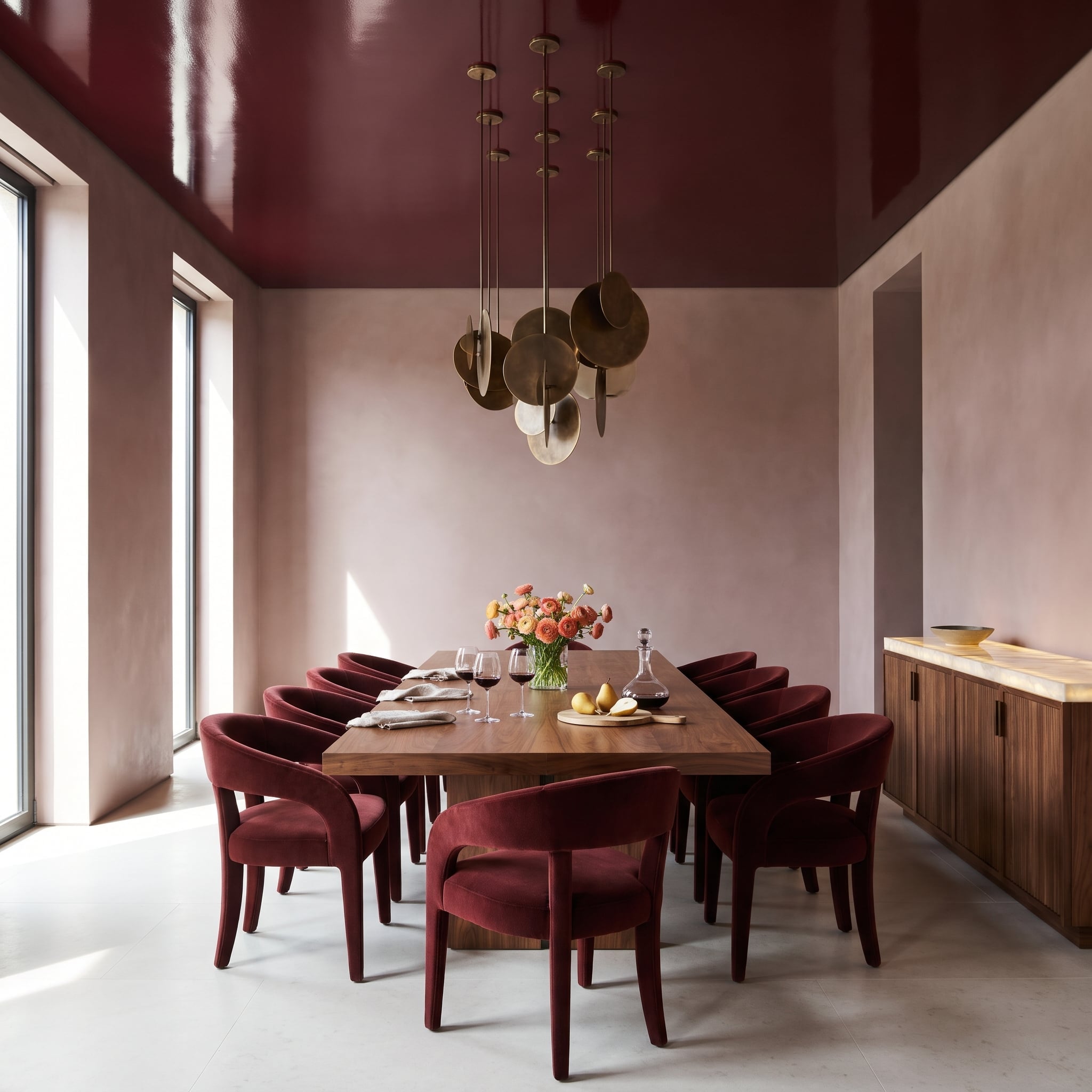
Oxblood lacquer gives the dining room a richly saturated ceiling, while blush plaster introduces a much softer version of the same warm color family. The transition avoids the predictable solution of pairing deep red with white, allowing the walls to mediate between the glossy overhead surface and lighter floor.
Bronze-toned chandelier elements add another layer of warmth, their metallic finish playing against the lacquer’s sheen. The pale stone floor provides visual relief from the saturated upper surfaces. The chandelier’s suspended forms break up the broad red plane, introducing smaller points of metallic detail into an otherwise gloriously extravagant ceiling.
5. Plum Velvet Brings a Dark Ceiling Down to the Window Seats
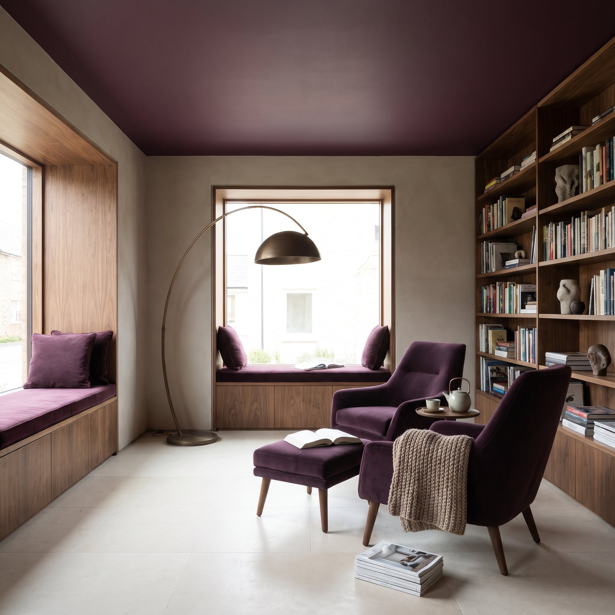
Plum paint covers the ceiling while the surrounding walls remain putty-colored plaster, giving the room a dark overhead plane without enclosing it in a single saturated color. The plum reappears in velvet upholstery on the window seats, armchairs, and ottoman, changing character as daylight catches the fabric’s nap.
Walnut lines the deep window reveals, fronts the seat storage, and climbs the wall as shelving. Its warm grain provides a transition between the painted ceiling and softer upholstery, while pale stone flooring keeps the room bright at ground level. The bronze arc lamp introduces a single metallic flourish. The most effective detail is the repetition of plum in two entirely different finishes: flat overhead, tactile and light-sensitive below.
4. Two Curved Linen Sofas Make a Conversation Pit Without Digging Up the Floor
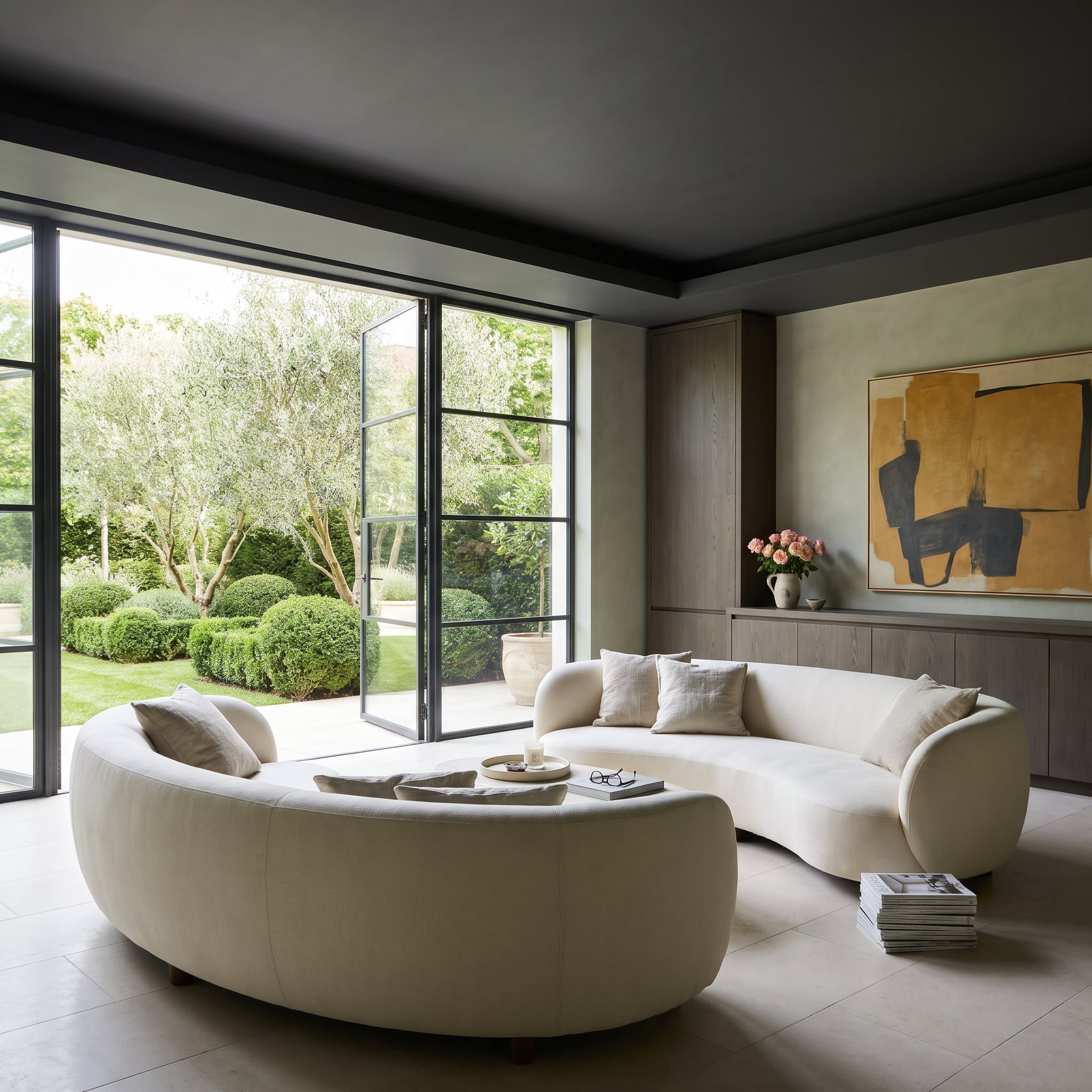
Two pale linen sofas bend toward one another like enormous parentheses, defining a conversation area through furniture placement rather than walls or changes in floor level. Their curved forms soften the room’s architectural lines and create a distinct social center beneath the charcoal ceiling.
The dark overhead finish gives the open space a more contained atmosphere, while the lighter upholstery keeps the seating arrangement from feeling enclosed. A low central table preserves sightlines across the room. The sofas’ opposing curves create the intimacy of a conversation pit without a single step down, and with considerably less risk to anyone carrying a tray of drinks.
3. Navy Lacquer Turns a Window Nook Into the Darkest, Glossiest Part of the Living Room
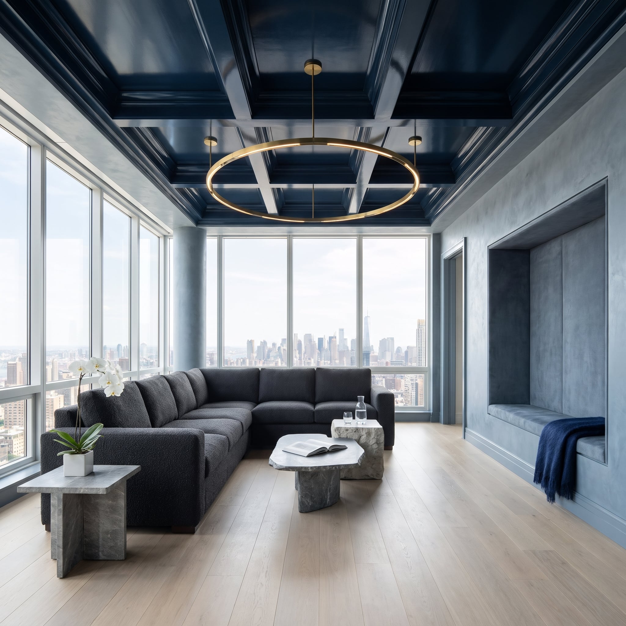
Navy lacquer transforms the ceiling from a passive background into a reflective surface, catching light above a room furnished in charcoal bouclé and washed oak. The finish matters: a matte navy ceiling would have produced a more subdued effect, while the gloss introduces highlights that shift with the surrounding daylight.
The window nook adds another layer to the composition, giving the room a smaller seating destination within its larger arrangement. Charcoal upholstery supplies depth without repeating the ceiling’s sheen, and pale flooring provides contrast below. The lacquer catches the light in a way the bouclé never could, setting two dark materials against one another with entirely different results.
2. Dark Timber Overhead, Espresso Leather Below, and Travertine Refusing to Take Sides
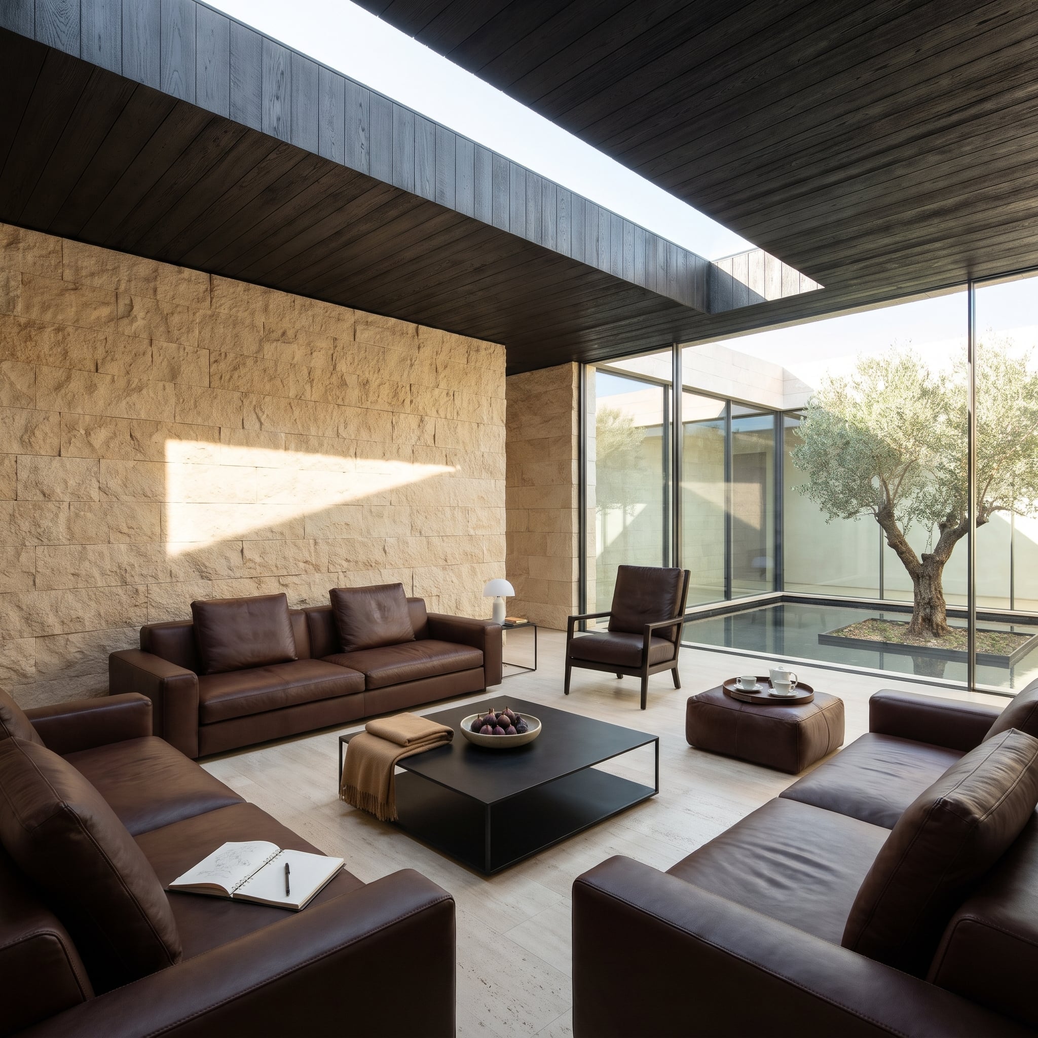
The dark timber ceiling brings grain, texture, and a strong directional pattern to the room. Espresso leather seating answers with a smoother, softer surface, allowing the furniture to share the ceiling’s depth without imitating its texture.
Travertine introduces a different material language altogether: pale, mineral, and comparatively quiet. The heavily grained wood and supple leather provide two distinctly different versions of darkness, while the stone refuses to participate in either. The ceiling’s long boards remain the most assertive lines in the room, their grain carrying more visual energy than another coat of dark paint ever could.
1. A Travertine Fireplace Climbs Into a Lacquered Brown Ceiling and Changes the Whole Argument
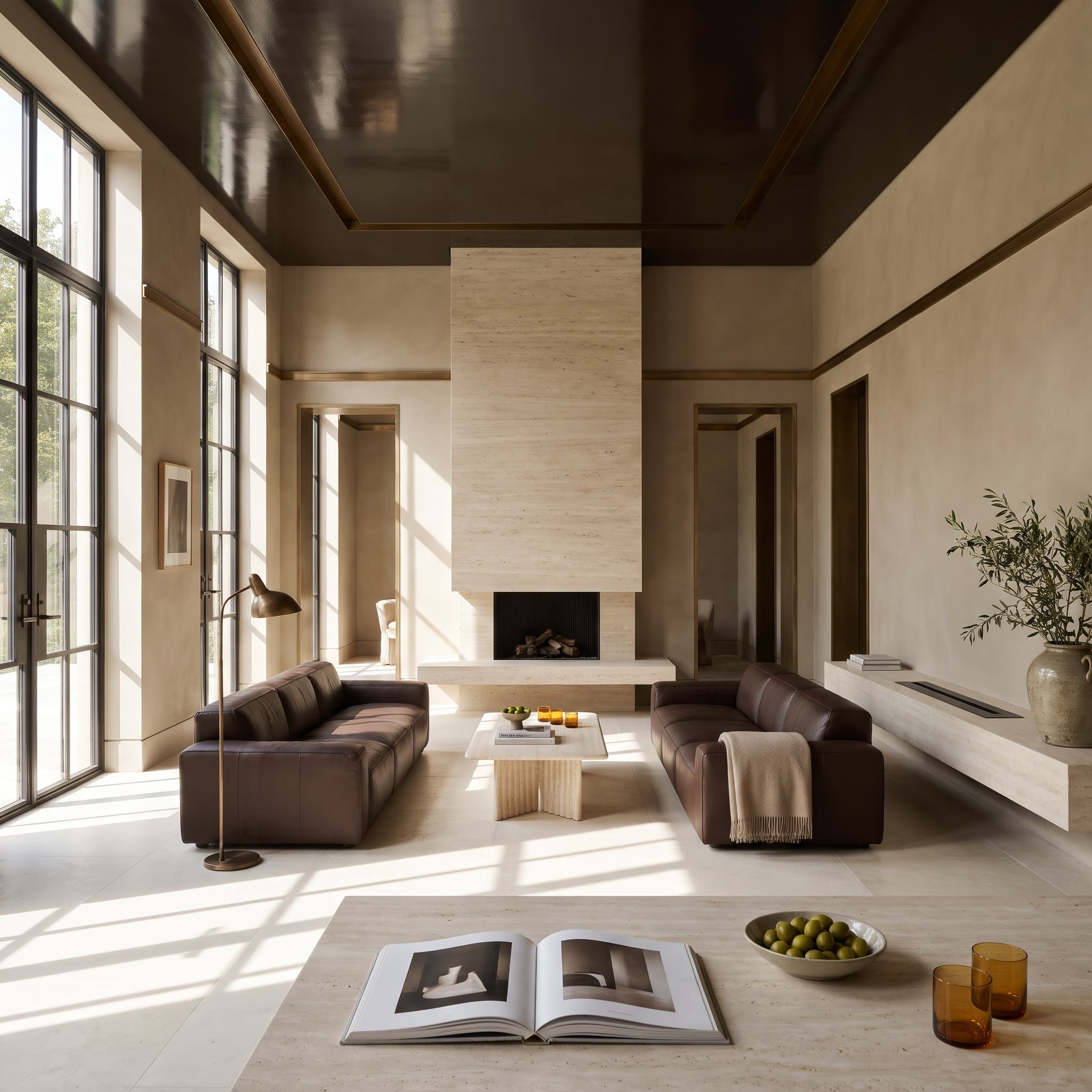
Facing leather sofas establish a formal conversation area beneath a lacquered brown ceiling, their arrangement creating a strong axis through the room. The glossy overhead finish brings depth and reflected highlights, while the leather introduces a softer, warmer surface at seating level.
Travertine provides the architectural counterweight. Its pale chimney rises toward the dark ceiling, connecting surfaces that would otherwise remain visually separate. The stone’s natural pattern breaks up the broad fields of brown, and its substantial presence gives the furniture a convincing center of gravity. Above it all, the lacquered ceiling catches the light while the travertine chimney climbs straight into the gloss. The room has turned the conventional color scheme upside down, and the architecture looks entirely comfortable with the consequences.