
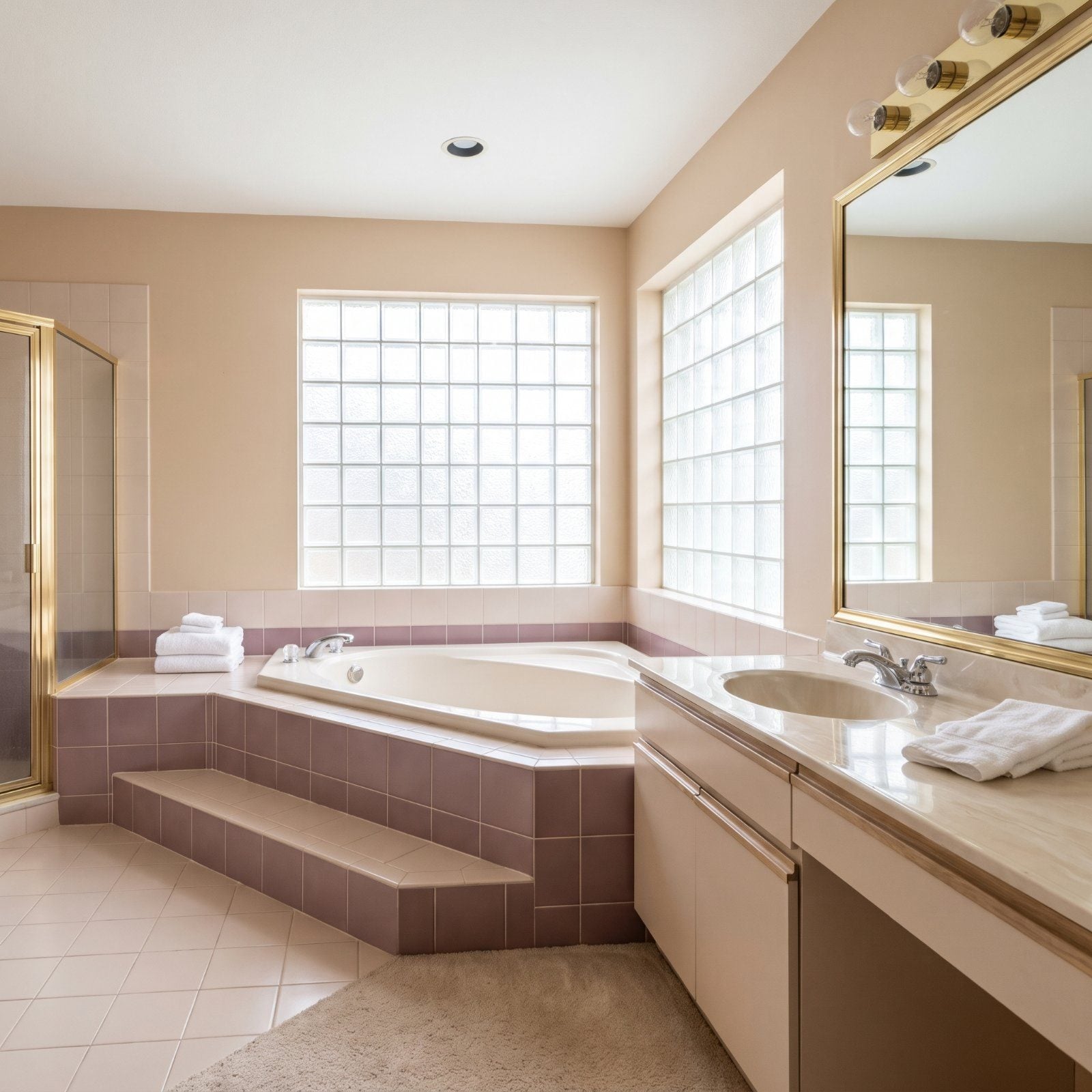
Walk into a house for sale and you can read its last renovation like a tree ring. Bathrooms date the fastest, and they date the hardest. A feature that felt like a splurge in 1988 now lands as a line item on the buyer’s mental repair list. Agents watch it happen on every tour: the slight pause at the doorway, the quiet math behind the eyes. Every feature below was somebody’s pride once. By 2027, they’re the things a buyer discounts before they’ve even reached the primary bedroom.
43. Wall-to-Wall Carpet in a Bathroom Still Reads as a Red Flag
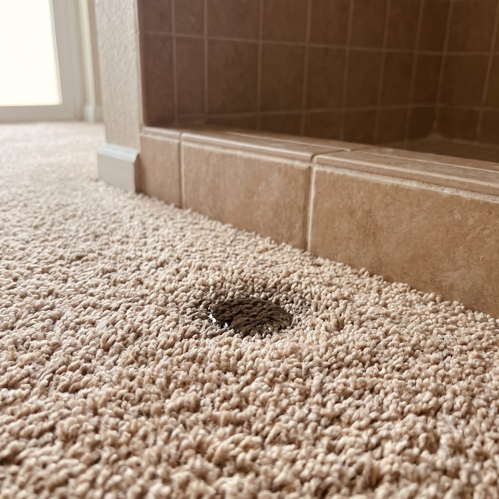
Carpet near a shower is one of those ideas that sounded cozy and aged into a cautionary tale. The problem isn’t the look. It’s what a buyer imagines living underneath it after years of splashes, steam, and the occasional overflow.
In order to come up with the very specific design ideas, we create most designs with the assistance of state-of-the-art AI interior design software. Also, assume links that take you off the site are affiliate links such as links to Amazon. this means we may earn a commission if you buy something.
Agents flag it on sight because it signals deferred updates everywhere else, and soft warmth in a wet room is a comfort you pay for later in subfloor repairs.
42. The Oversized Corner Whirlpool Tub Nobody Fills Anymore
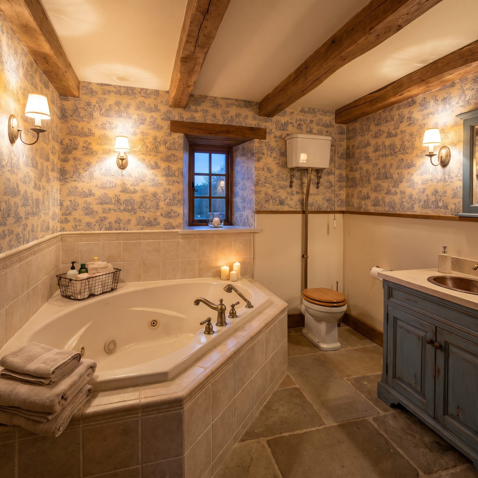
Big jetted tubs were the trophy of a 90s primary bath. Now they’re the first thing a buyer mentally rips out.
The math is unforgiving. These tubs swallow square footage, take forever to fill, run cold halfway through, and hide mildew in jet lines nobody can reach. A roomy walk-in shower uses the same footprint and actually gets used every day. Ask any agent and they’ll tell you a tub filled twice a year is just expensive floor space.
41. Climbing Steps to Reach the Tub Feels Dated and Risky
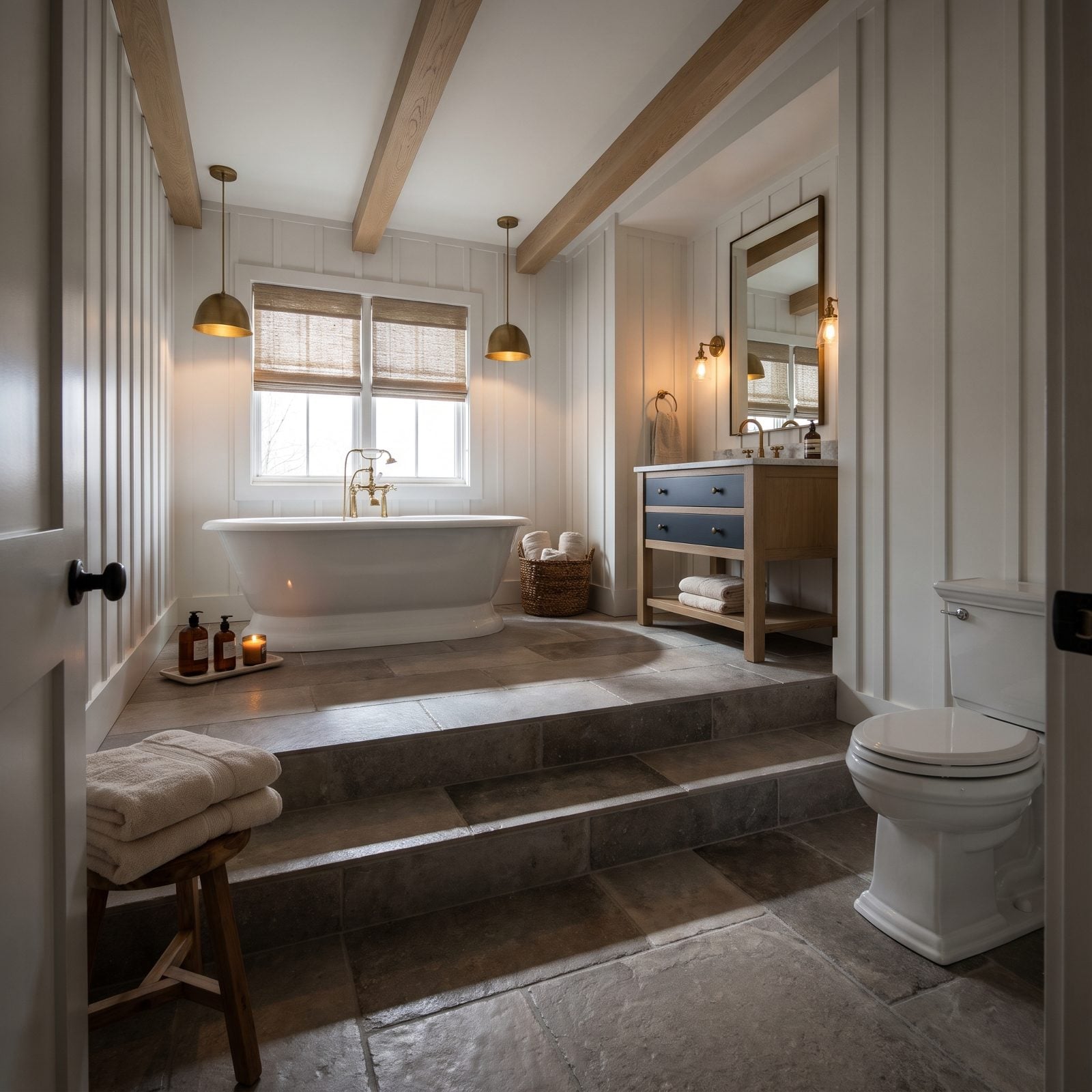
A tub up on a pedestal with steps was meant to feel like a spa moment. These days it reads as a slip hazard with extra cleaning.
Buyers thinking about aging in place see the steps and quietly cross the house off the list. The raised platform also eats headroom and wastes volume a flush-floor tub or shower would put to better use.
40. Decorative Columns Framing the Tub, Straight Out of 1994
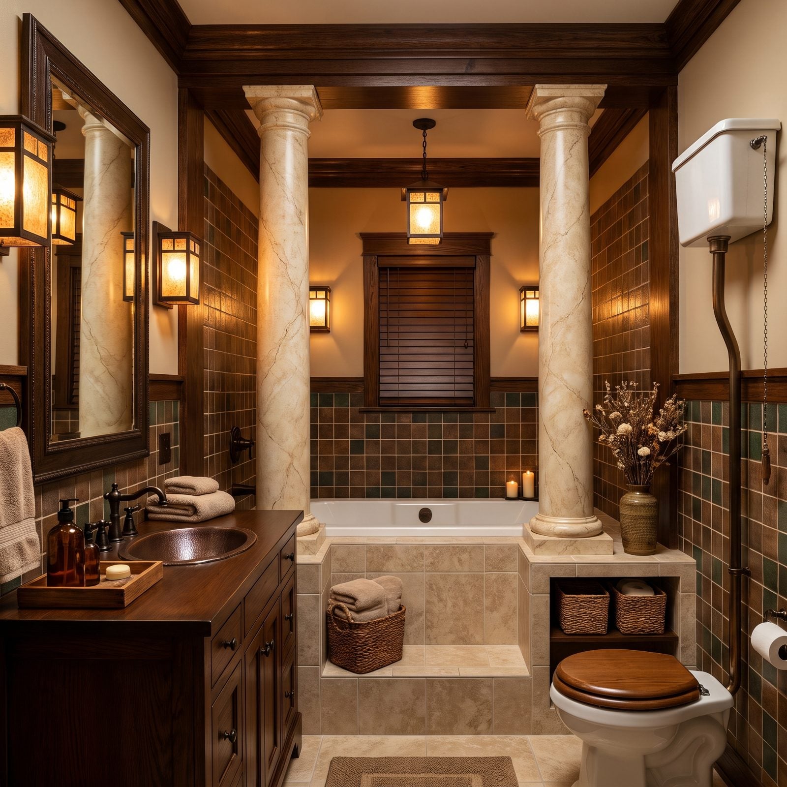
Columns around a bathtub. We’ll say it plainly: there’s almost nothing a buyer wants to inherit less.
They were a builder-grade grab at grandeur, Roman temple energy crammed into a 70-square-foot room. By 2027 they date a space by a decade on sight and make the whole bath feel like a stage set instead of a place to actually get clean.
39. Avocado and Harvest-Gold Fixtures Still Lurking in the Half-Bath
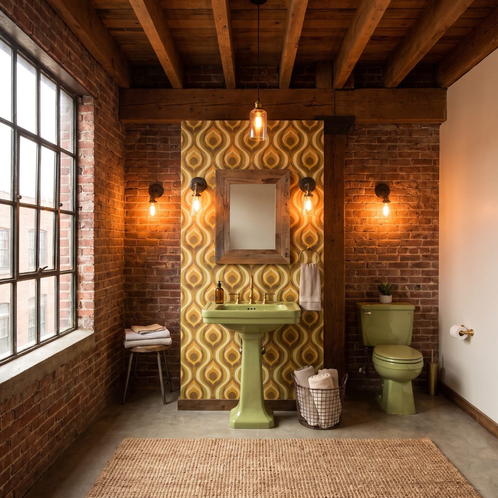
Avocado green and harvest gold had their decade, and that decade ended around the time disco did. A full suite of these fixtures is the clearest possible signal that a bathroom hasn’t been touched since.
Buyers don’t see charm here. They see a toilet, sink, and tub that all need replacing at once, which turns a cosmetic update into a full gut. A single navy powder room redo is cheerful weekend work. A matched vintage color suite is an invoice.
38. Glass-Block Shower Walls That Scream a Specific Year
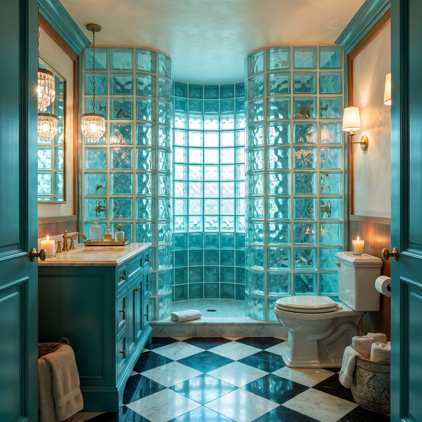
Glass block looked futuristic in 1993 and has stayed frozen there ever since.
That curved block wall doesn’t age toward neutral. It ages toward one very specific moment, and buyers clock it the second they walk in. Clear glass enclosures feel open and current; glass block feels like a time capsule with grout you can’t repoint.
37. The Almond One-Piece Fiberglass Tub Surround
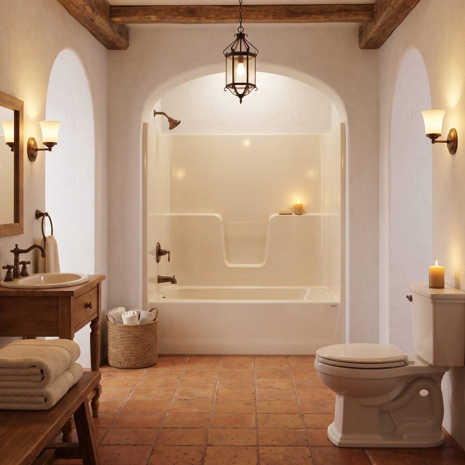
One-piece almond fiberglass is the builder-grade default that refuses to leave. It was cheap to install and it looks like it.
The molded faux-tile texture is the giveaway. It yellows, it scuffs, it can’t be refinished to look fresh, and no amount of scrubbing rescues it from looking dated. Set it against a crisp white or a soft cream bathroom design and that almond box looks a generation behind.
What Our Readers Say
- When Home Stratosphere readers loved a bathroom and tapped a reason, overall style came first at 28%, followed by feeling cosy at 20%.
From Home Stratosphere reader polls and votes.
36. A Tub-Only Alcove With Nowhere to Shower
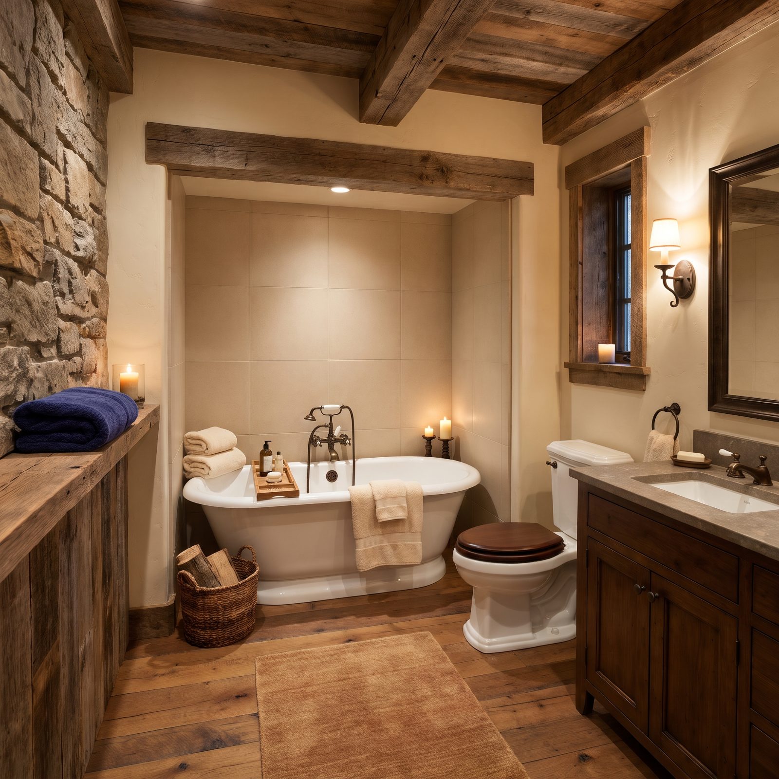
A tub with no shower sounds quaint until you remember most people shower every single day and bathe almost never.
Buyers want the option of a quick rinse without the whole ritual of a soak. A bathing-only alcove forces the next owner into a plumbing project just to live normally, and agents treat that as a flat discount to the asking price.
35. Ripping Out the Home’s Only Tub for a Shower-Only Layout
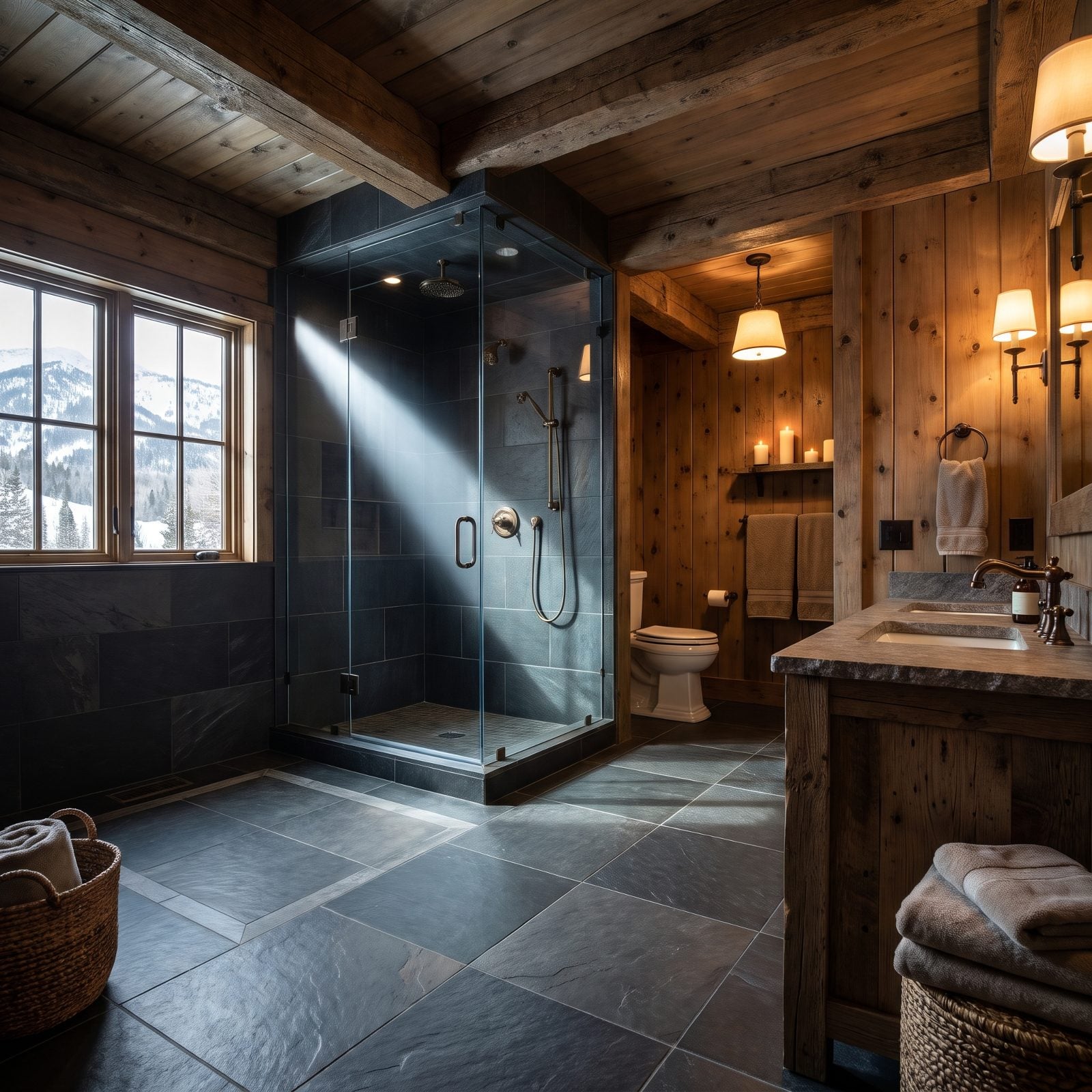
Here’s the trap. A big walk-in shower is a genuine upgrade, right up until it’s the only bathing option in the entire house.
Families with young kids need a tub somewhere, and resale buyers know it. Pull the last tub from a home and you narrow the buyer pool the way a two-bedroom listing does. The shower itself can be lovely; what it erased is the problem.
34. The Cramped Neo-Angle Corner Shower You Can Barely Turn Around In
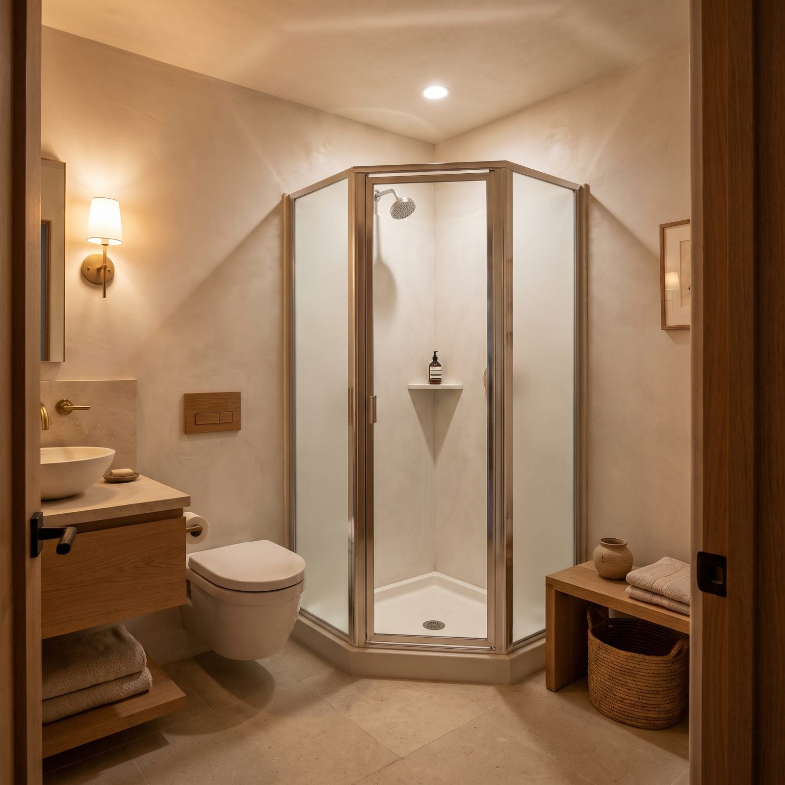
The neo-angle corner shower was invented to wedge a stall into a space that didn’t really want one. It solves a floor-plan problem and creates a comfort one.
You turn sideways to wash your back. The pivot door bangs the toilet. Buyers step in, feel the pinch, and mentally knock the whole bathroom down a tier. A plain rectangular shower feels twice as generous in the same corner, and that difference is what closes the sale. Rinse off in one just once and you’ll never argue for the five-sided version again.
33. The Doorless Walk-In Shower That Soaks the Whole Room
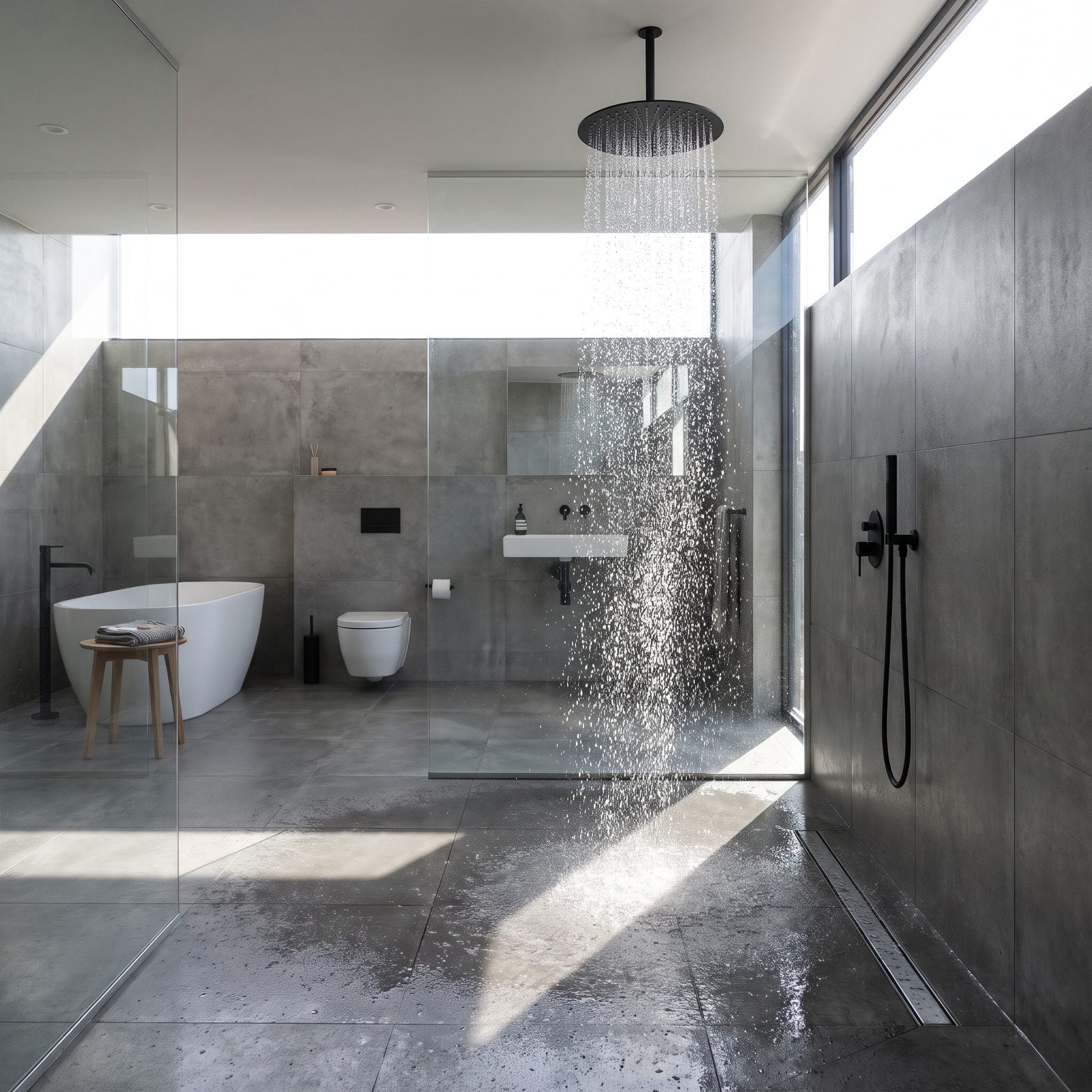
A shower with no door, no curtain, nothing to contain the spray. Open-plan bathing looked spa-like on the mood board, but in practice water sheets across the floor and you learn to mop before you towel off.
Agents are flagging these for 2027. The open tile and shallow drain photograph as minimalist and live as a daily cleanup, and to most buyers now a glass panel or even a half-wall is non-negotiable. Handsome grey-on-grey porcelain, sure. Also slippery when wet, which it constantly is.
32. Brass-Framed Glass Enclosures and the Gold-Rush Hangover
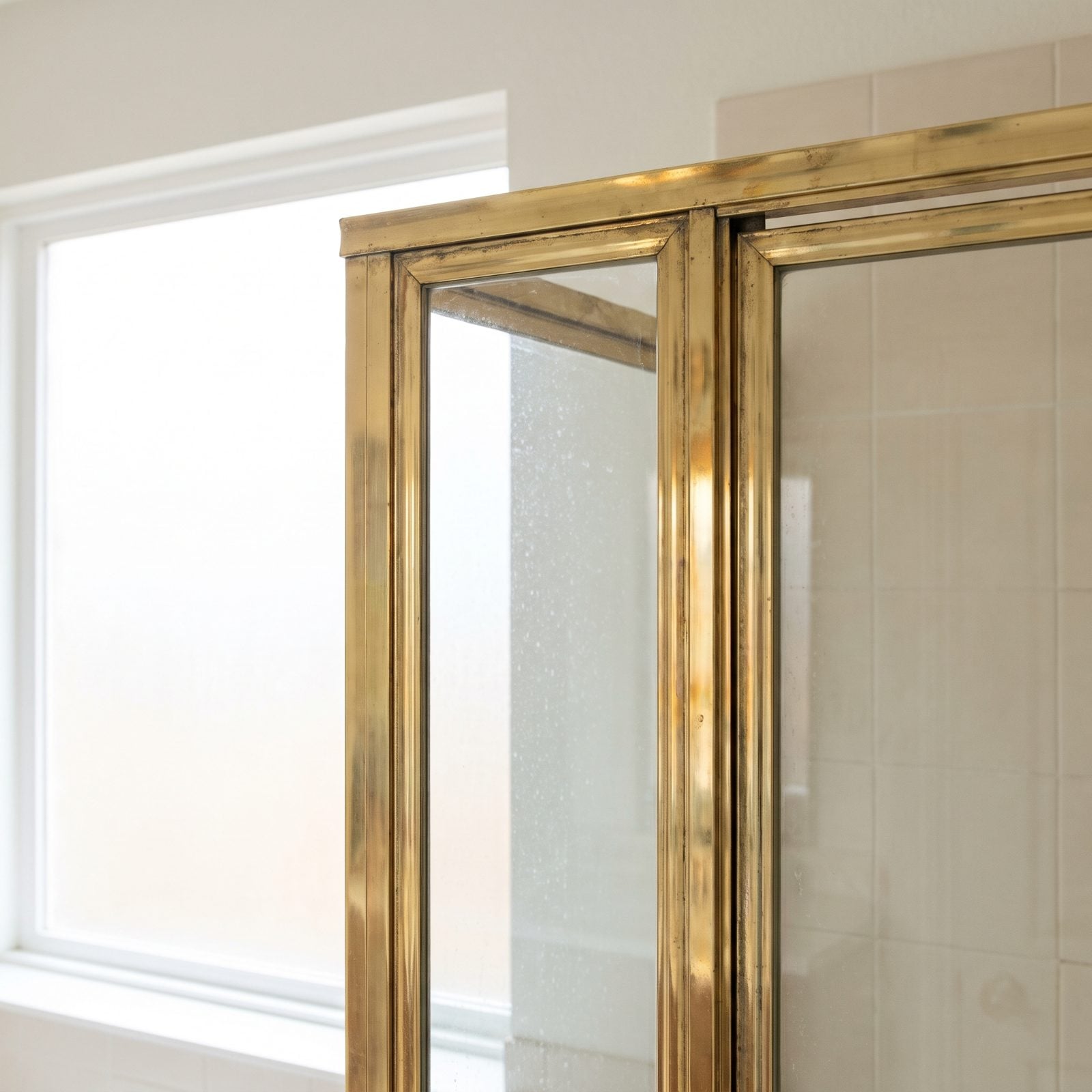
Yellow-gold brass framing on a glass shower screamed luxury in 1987. Now it screams the date of the last renovation.
The frame here is thick and polished and impossible to ignore, which is exactly the problem. You can’t swap the metal without replacing the whole unit, so the enclosure reads as a dead end to anyone pricing updates. Matte black and brushed nickel frameless glass took over because they disappear. This one introduces itself the second you open the door.
31. Etched Dolphins and Frosted Roses: The Novelty Shower Door
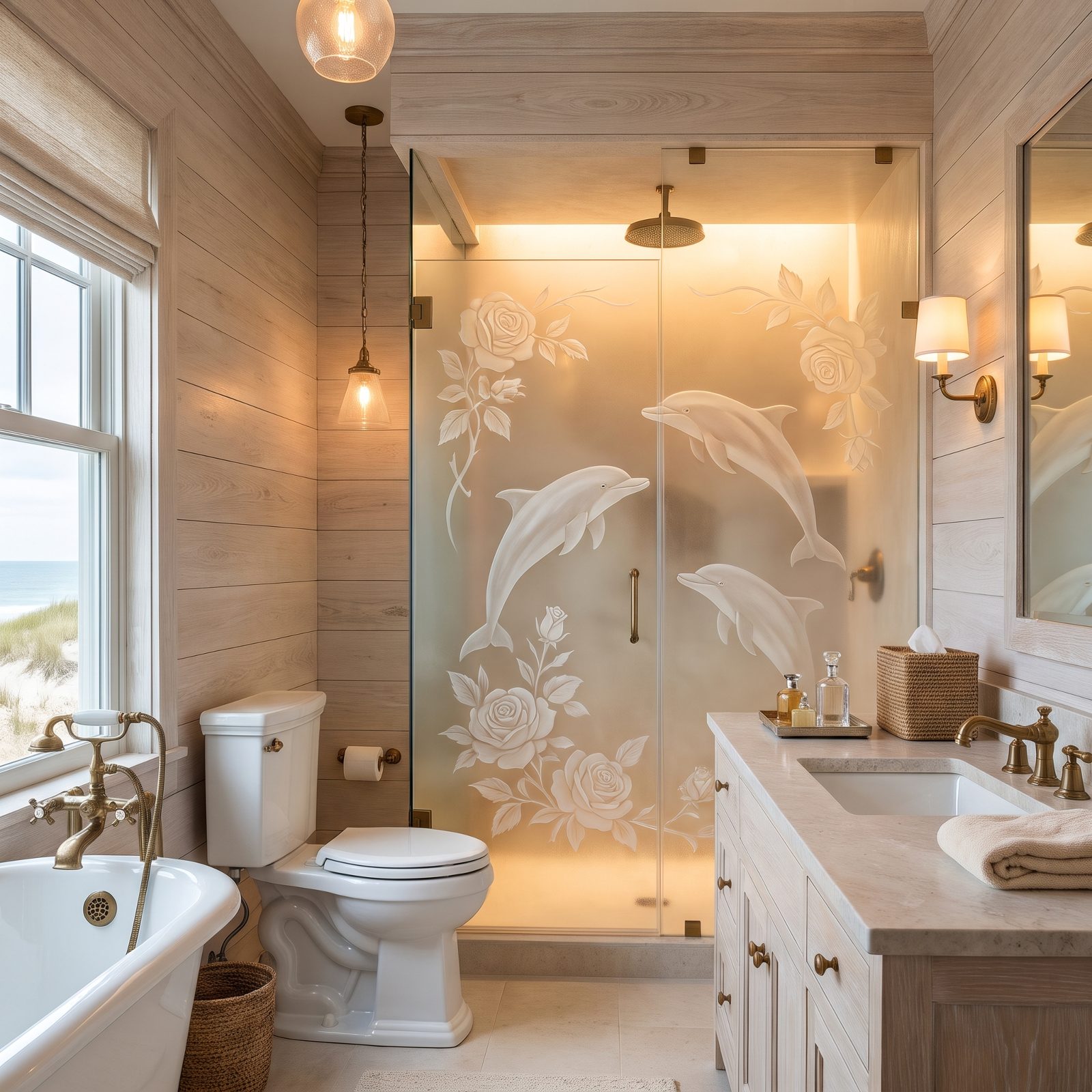
Etched dolphins. Frosted roses. A whole genre of shower glass designed to be looked at rather than through.
There’s a nostalgic charm to these if you squint, I’ll admit it. Buyers in 2027 won’t squint. A decorative etched panel dates a bathroom harder than almost anything else because it’s a specific style choice frozen in glass, and the only fix is a new door. These days clear or fluted glass is the quiet default, and quiet is winning.
30. A Rainfall Head With Nothing Handheld to Back It Up
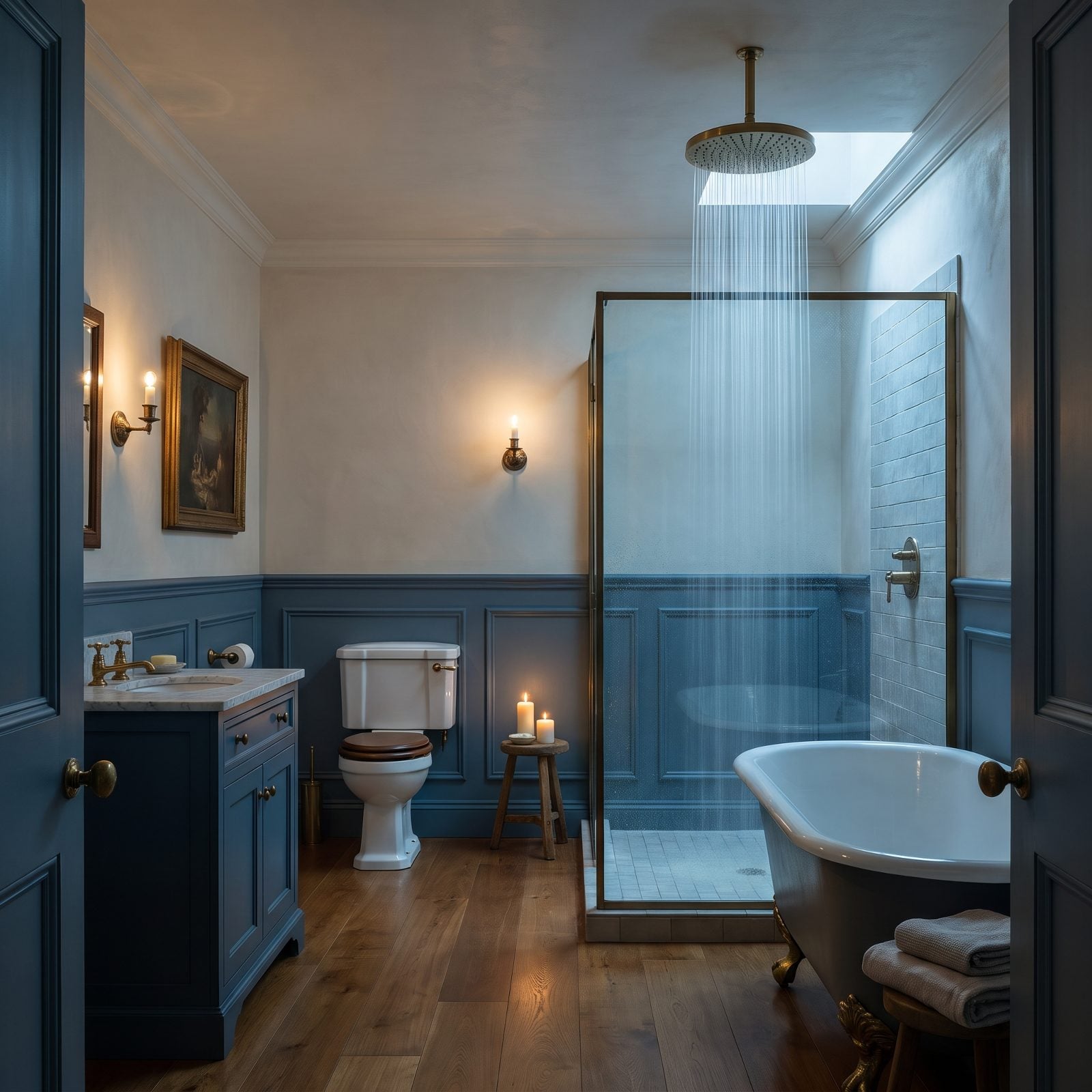
The ceiling rainfall head looks like weather you’d pay for. Then you try to rinse conditioner off the back of your head without tilting your whole body into the stream, and the fantasy collapses.
No handheld wand means no easy rinse of the walls, no spraying down the dog, no filling a bucket. Buyers have caught on. A rainfall head makes a fine hero as long as a handheld companion rides a slide bar beside it. Solo, it fights you every single day.
When we asked readers which shower head they would fit, 60% chose a combo setup, and only 12% picked a rain head on its own.
29. The Wall of Body Sprays Nobody Can Afford to Run
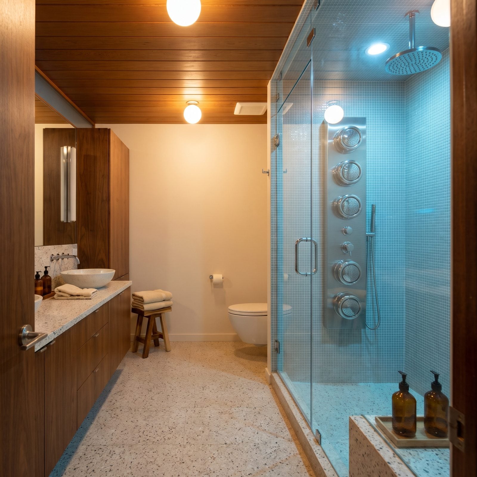
Five body sprays stacked in a column reads like a car wash for people.
These were the mid-2000s flex: more jets, more luxury. Then the math caught up. A full array of high-flow sprays can drain a water heater in minutes and shove the bills north, which is precisely the running cost a 2027 buyer prices in before they ever make an offer.
Buyers see the wall of jets and think maintenance, not massage.
28. The Steam Shower That Needs Its Own Maintenance Plan
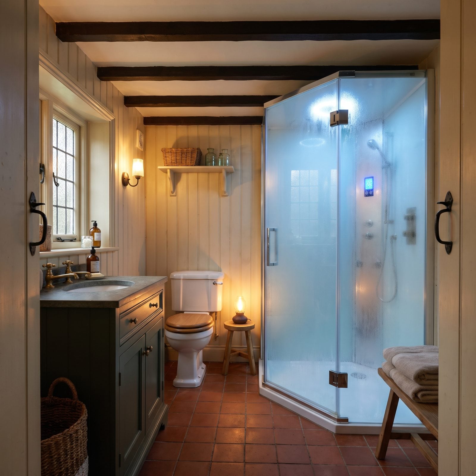
A sealed glass box with a digital steam panel and a closed-in top looks like something lifted from a hotel spa. It also behaves like one appliance that can break in a dozen ways.
Steam generators need descaling, the seals need replacing, and the whole enclosure has to be built airtight or it grows problems you can smell. Agents expect buyers to spot the control pad and immediately wonder who’s servicing it. A feature that comes with a maintenance schedule is a feature most people would rather not inherit.
27. The Standalone Bidet Eating a Square Metre of Floor
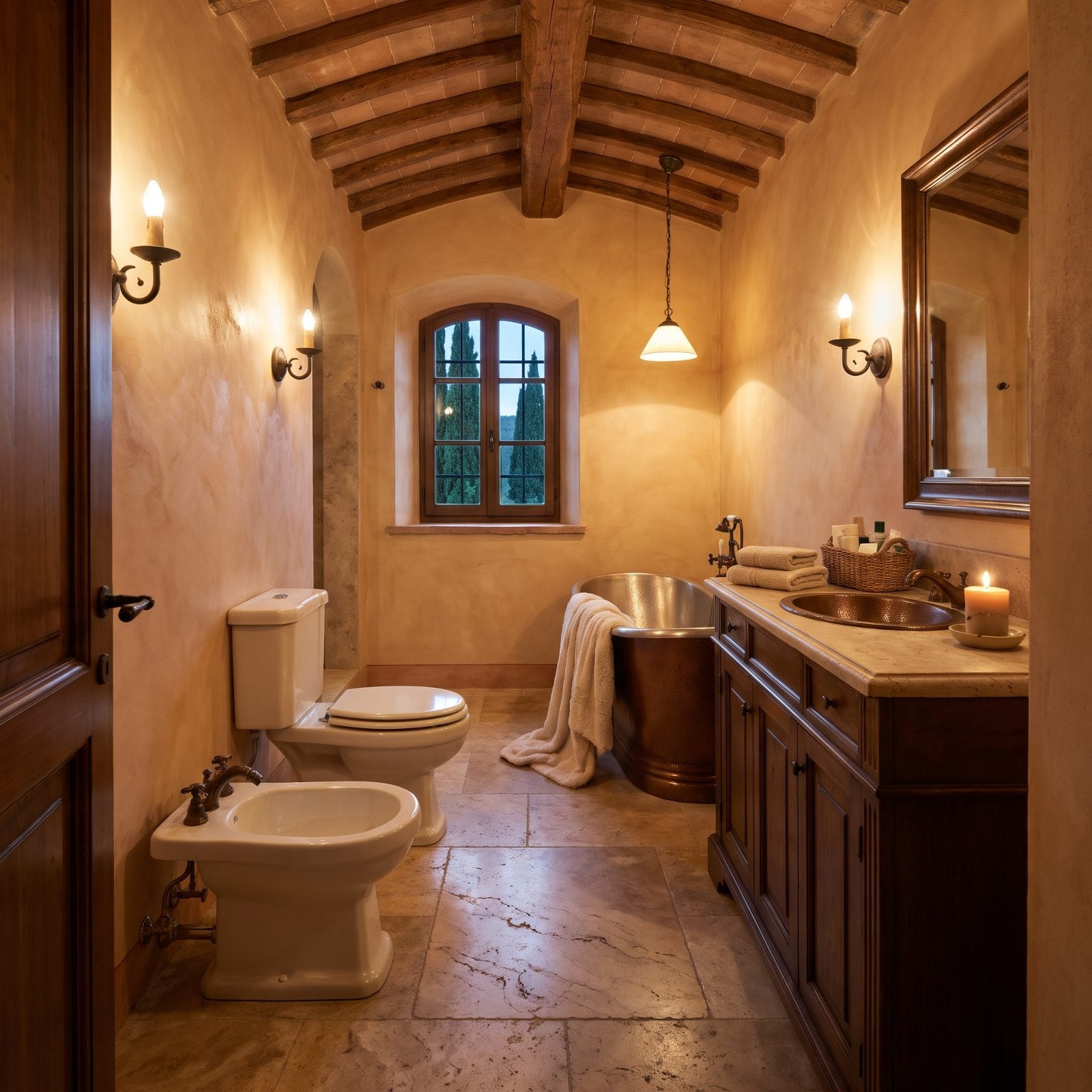
A separate bidet sitting beside the toilet is a European staple and, in most North American homes, a floor-space tax.
The fixture itself is clean and inoffensive. What hurts is the footprint. That dedicated porcelain unit swallows roughly a metre of floor a buyer would rather hand to storage or a double vanity. Bidet seats that bolt right onto the existing toilet did all the convincing, no second fixture required, so the freestanding version now reads as a renovation to undo rather than a perk.
26. The Low Standard-Height Toilet That’s Secretly Aging You
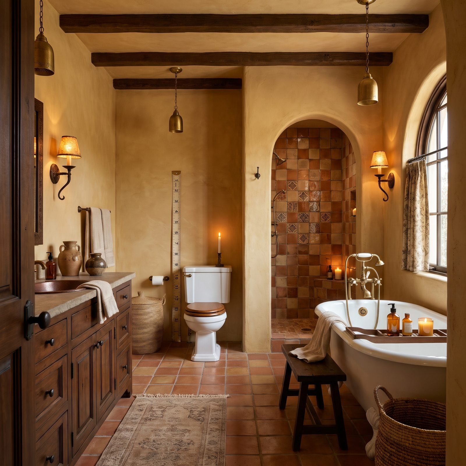
Standard-height toilets sit lower than you’d think, and buyers feel the difference the second they use one.
Comfort-height seats, sometimes called chair-height, became the expectation because they’re easier on knees, hips, and backs, and because they read as the current spec. The short version here isn’t broken. It’s just dated, and in an aging market it quietly whispers that nobody’s touched this bathroom in a while. Cheap to swap, yes. Still one more line on the buyer’s list.
25. A Pedestal Sink That’s All Looks and No Storage
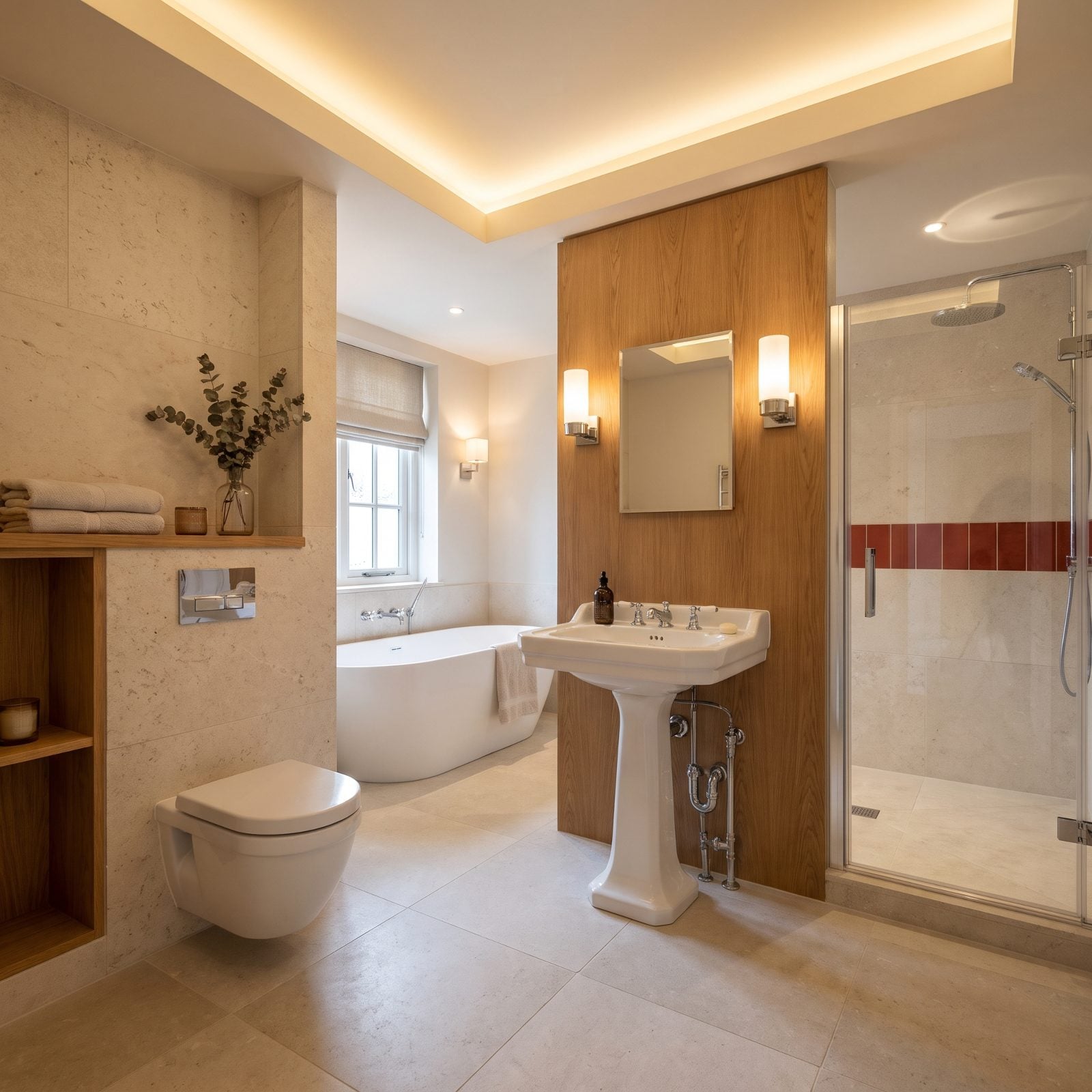
That slim pedestal column is genuinely pretty. The exposed plumbing underneath is honest about what you’re giving up: anywhere to put anything.
No cabinet, no drawers, nowhere to set a toothbrush. In a powder room nobody lives in, fine. In a main bathroom it’s a daily aggravation, and buyers know it before they finish walking the room. The vanity with real storage won that argument years ago. A cream bathroom design can keep the airy feel a pedestal gives you while a small vanity hides the clutter the pedestal leaves on display.
24. The Vessel Sink That Turns Hand-Washing Into a Splash Zone
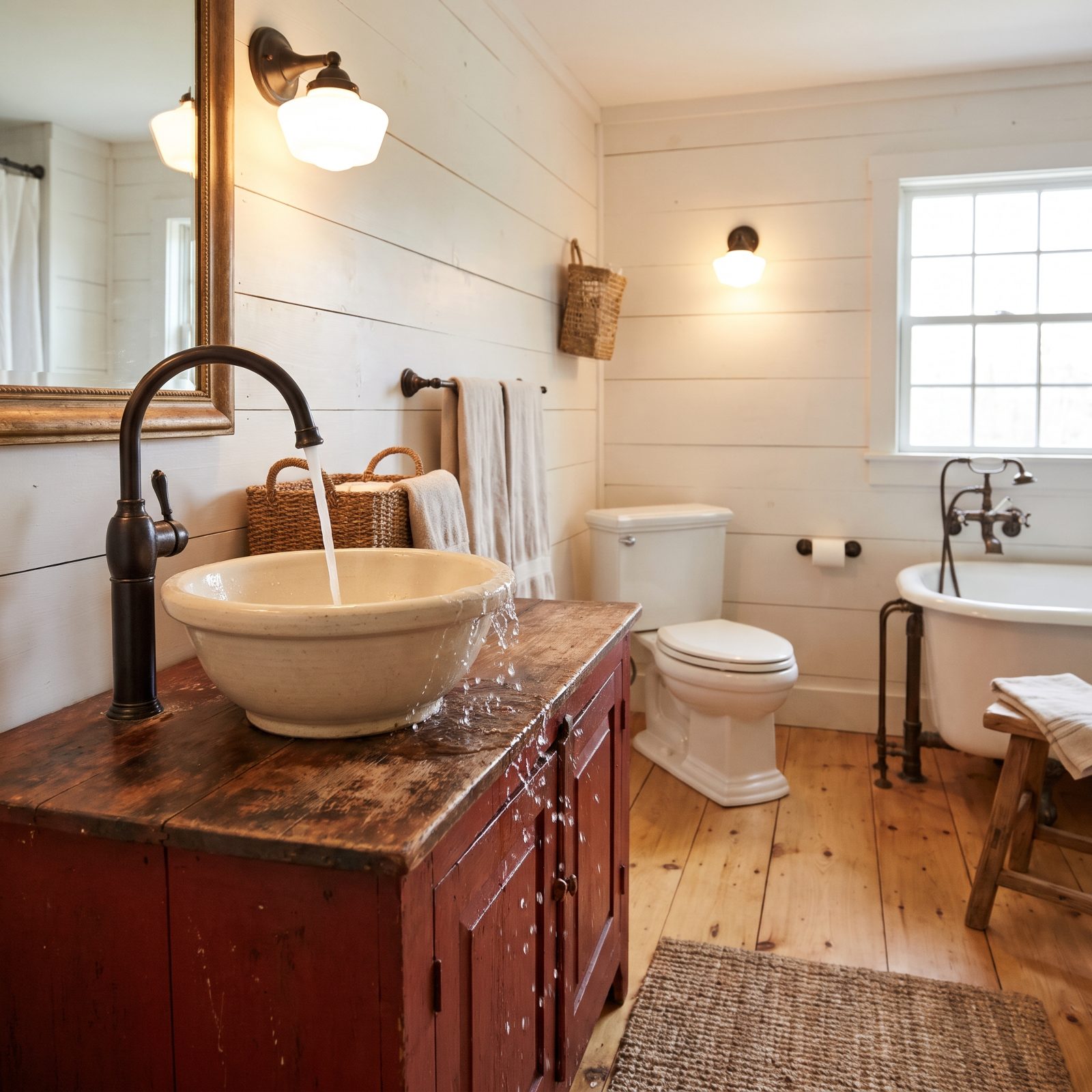
Vessel sinks had a long moment. The bowl perched on the counter like a piece of pottery, the tall faucet arcing over it, very mid-2010s design magazine.
Then daily life happened. The raised bowl sends water pouring over its rim, off the vanity and straight onto the floor, the gap between bowl and backsplash collects grime, and scrubbing around the base is a chore nobody signed up for. Buyers in 2027 take one look and picture mopping the floorboards after every wash. Undermount sinks sit flush, drain clean, and never ask for a towel standing by.
23. Two Sinks Crammed Onto a Vanity Built for One
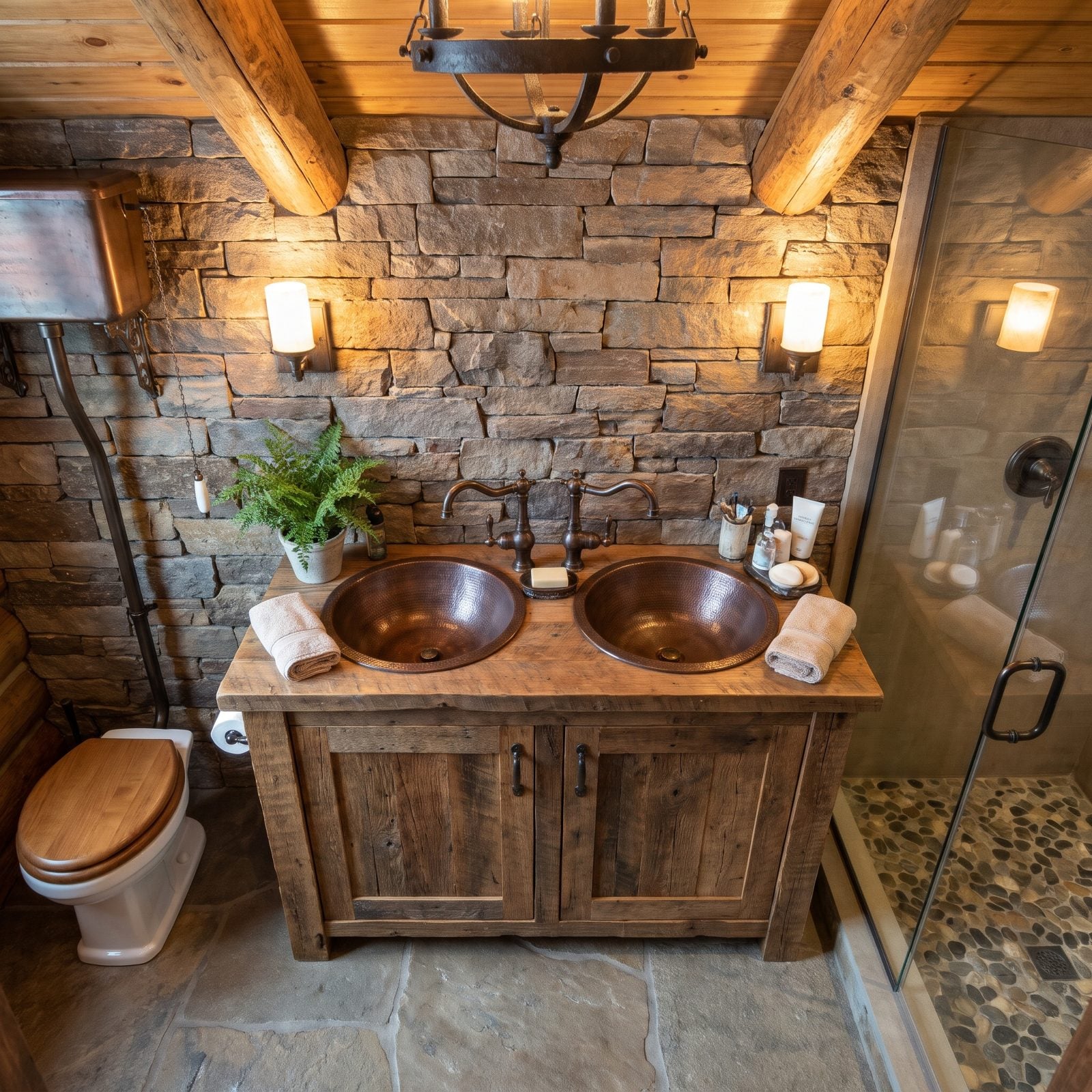
Two sinks sound generous until you try to set down a toothbrush. On a 48-inch run the faucets practically shake hands and the counter between them vanishes, so there’s nowhere for a soap dish, let alone a makeup bag.
Buyers in 2027 read this as a layout that fought itself and lost. One large basin with real counter on both sides beats two cramped bowls every time, and “double sinks” only earn the name when the vanity is actually wide enough to hold them.
22. Cultured Marble With Molded-In Sinks That Age Loud
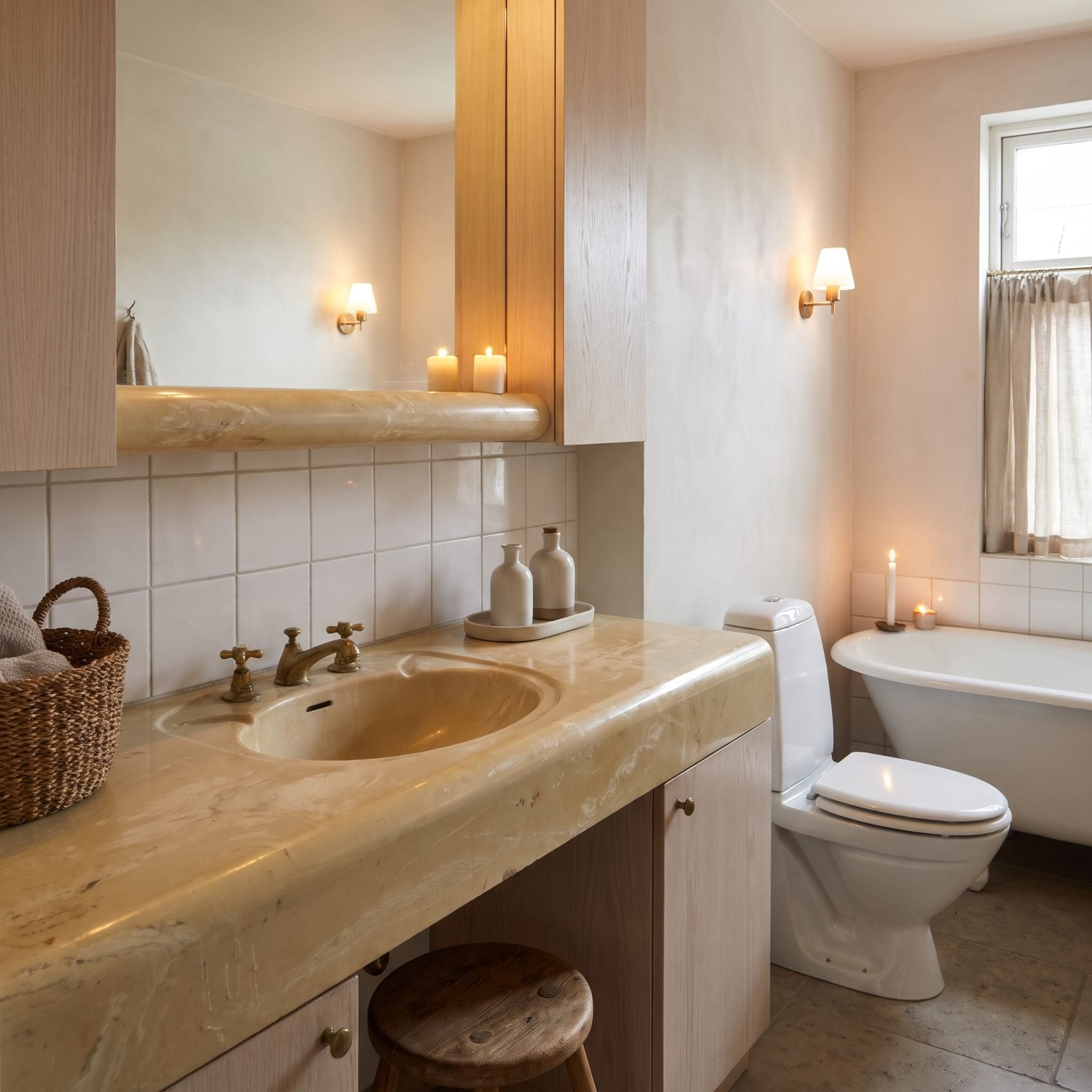
The giveaway is the seamless molded bowl and that rolled one-piece backsplash. Cultured marble was the budget hero of the ’80s, and it photographs exactly like what it is.
The pattern leans swirly cream and gray, and over time the surface dulls and yellows where water sits. A quartz or natural-stone top with an undermount sink reads as a different decade entirely. Want something softer? A cream bathroom design with honed stone keeps things calm without the plastic sheen.
21. The Tiled Countertop and Its Grid of Grout
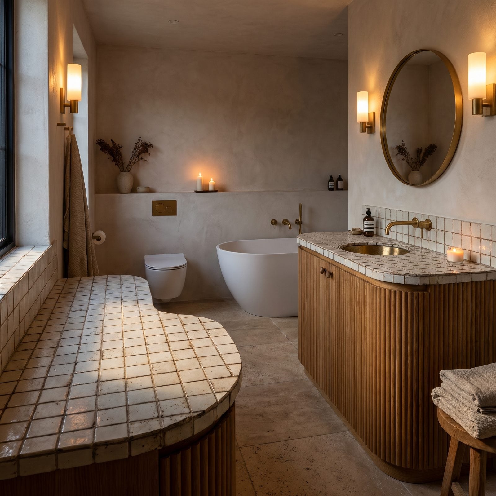
Tile on a countertop was once the practical choice. Now it’s the thing buyers mentally re-tile the second they walk in.
Looks aren’t even the worst of it. The grout grid traps everything and never stays bright, and the uneven surface wobbles a glass and catches crumbs. A continuous slab wipes clean in one pass, and the buyer clocks that on sight.
20. Brown-and-Gold Granite That Won’t Stop Talking
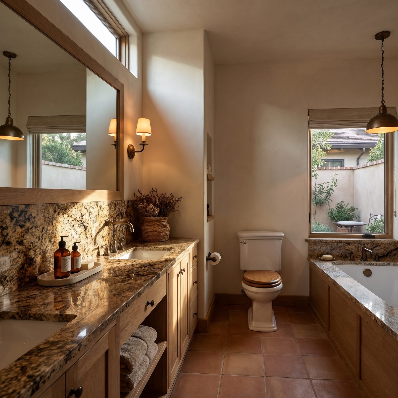
This granite had its moment, and the moment was very brown. Dense gold flecks, dark movement, a backsplash of the same stone marching up the wall. It fought the room back then, and it still does.
Nobody’s rejecting granite in 2027. They’re rejecting this specific loud, busy, warm-toned pattern that dates a bathroom to 2004 on sight. Quieter stone in grays and soft whites reads current and lets the rest of the room breathe.
19. Honey-Oak Builder Vanity, the Default of a Decade
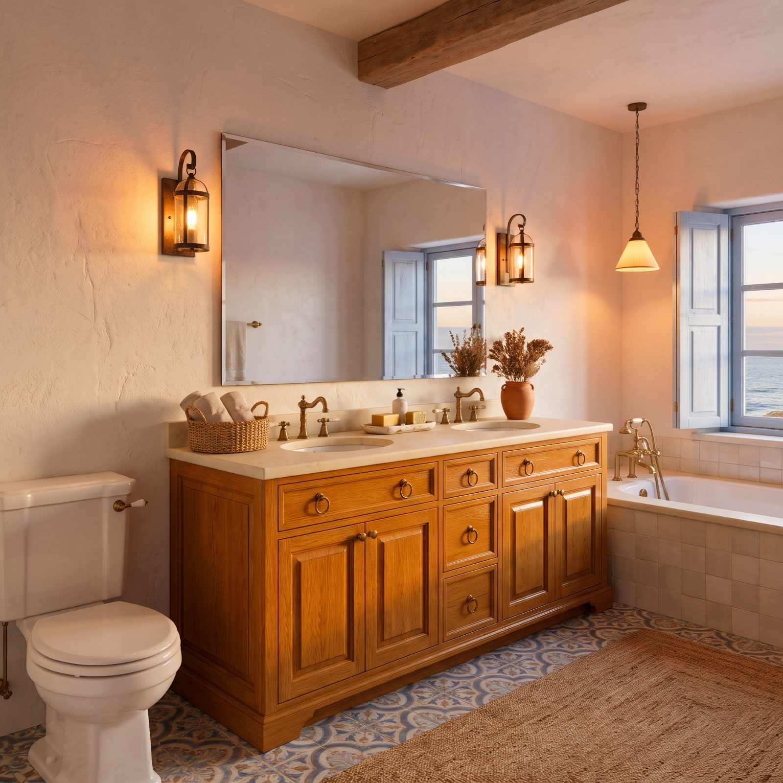
You know this cabinet. It came in millions of homes, orange-gold and glossy, with little brass ring pulls that went dull years ago.
Honey oak isn’t a problem because oak is bad. It’s the specific orange finish that drags the whole room back to 1995. Paint it soft white or sage, swap in matte black or brass hardware, and you’ve bought a decade of relevance for almost nothing.
18. The Ornate Dark-Cherry Furniture Vanity
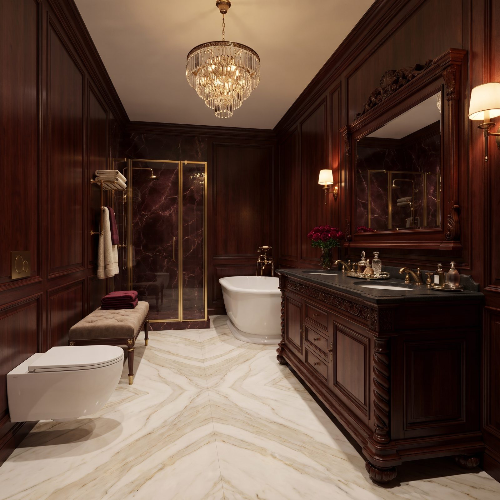
Furniture-style vanities were sold as elegance. The heavy, carved, dark-cherry version instead reads as a dresser someone drilled a sink into.
The dark wood eats light, the carving collects dust, and the bulk shrinks the room. Buyers today lean toward lighter, simpler cabinetry with clean lines. A floating vanity or a flat-fronted base in a pale finish makes the same floor feel twice as open.
Asked which new vanity they would install, 62% of our readers chose a floating vanity, compared with 29% for a furniture-style piece.
17. The Built-In Makeup Desk That Ate Your Storage
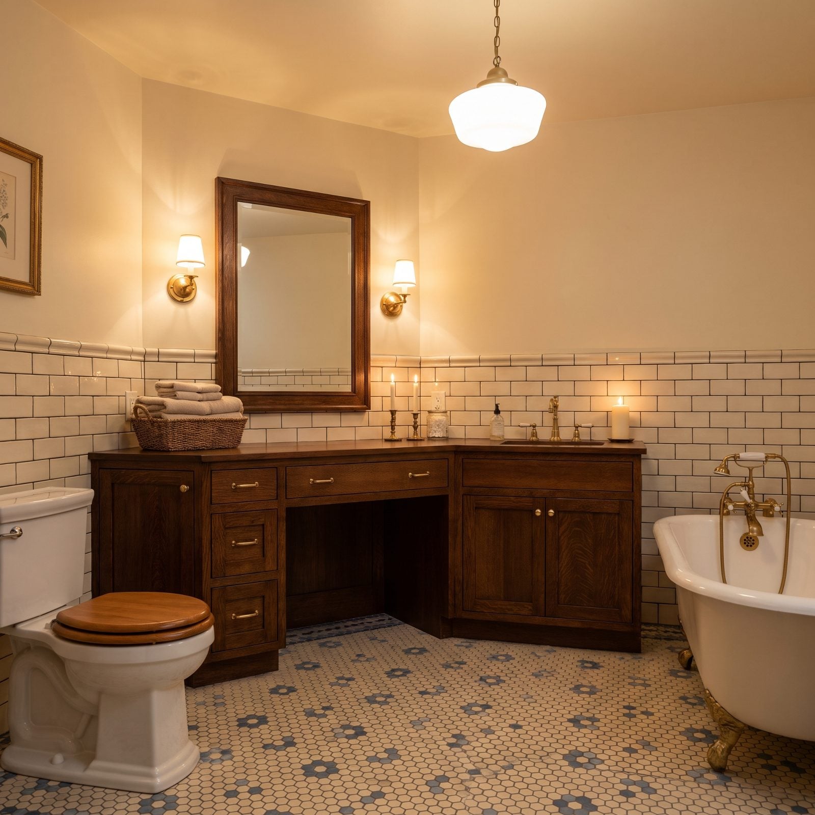
The seated makeup desk looked thoughtful on the floor plan. In practice it’s a knee-hole where three drawers of storage used to live.
And almost nobody sits there. The surface collects clutter, the chair never fits, and the lost cabinet space is exactly what a buyer notices in a bathroom that’s already tight. In a small bonus room or a compact ensuite, that gap is pure waste. Continuous drawers win.
16. The Tri-View Medicine Cabinet and Its Three Angles
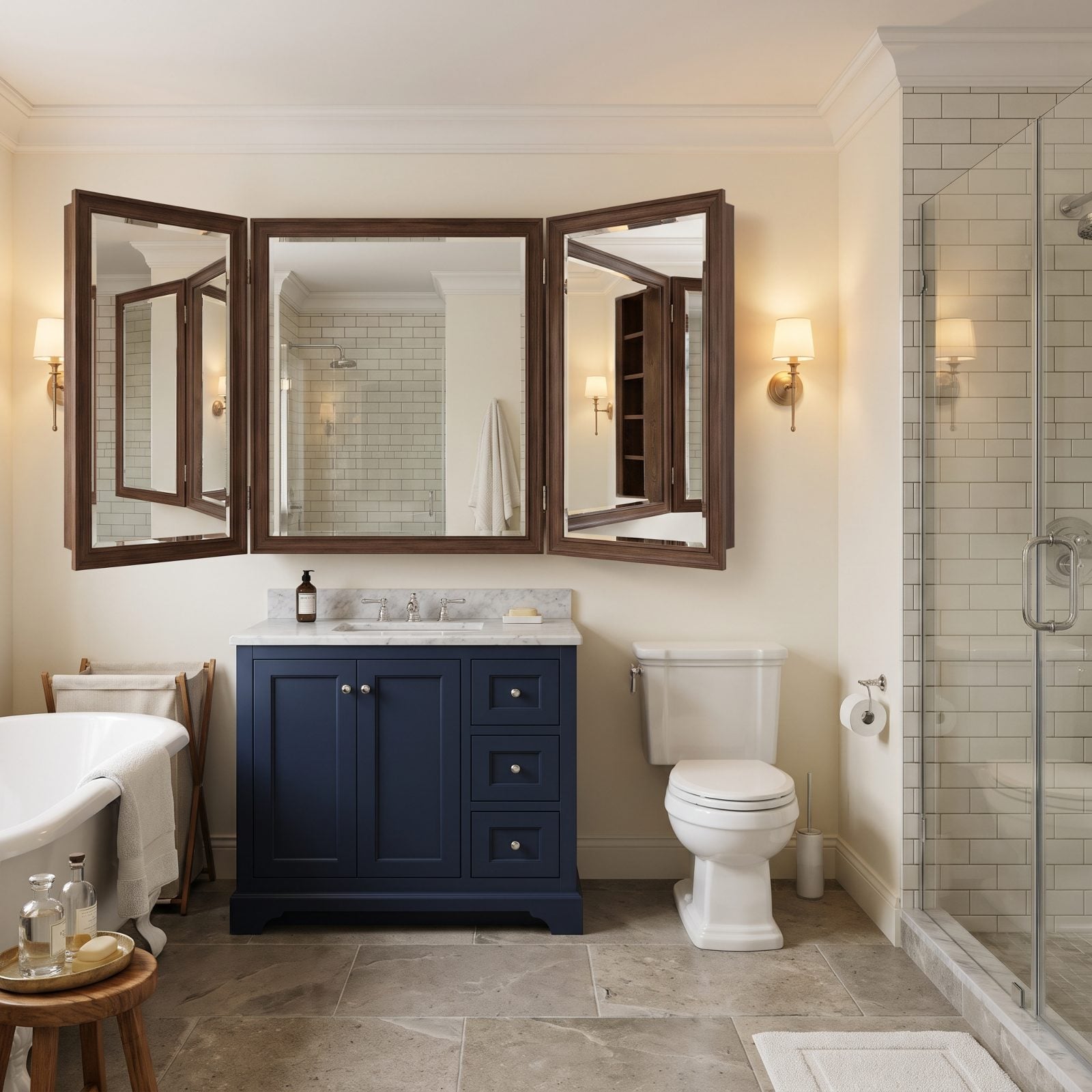
Three mirror panels, each on its own hinge, each reflecting the back of your head at an angle you never asked to see. The tri-view medicine cabinet was practical in its day, and it’s unmistakably dated now.
Those tall hinged panels, the dark wood frames, the way they’re hung across the painted wall all signal an older build. A single large mirror or a sleek frameless cabinet reads modern and makes the vanity wall feel wider and calmer.
15. The Big Builder Mirror Stuck On With Clips
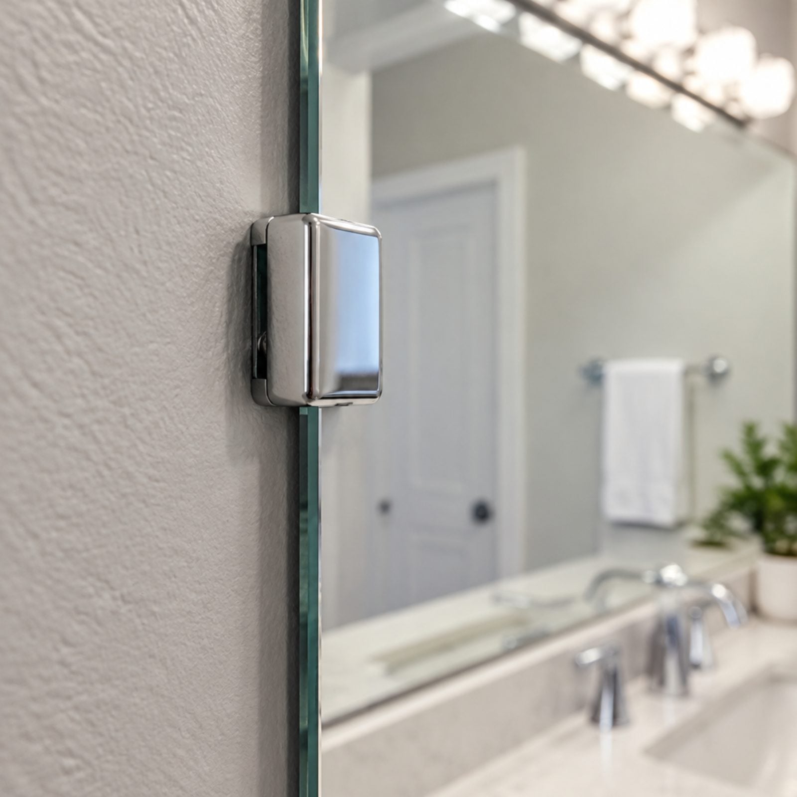
It’s the clips. Little chrome brackets pinning a raw sheet of glass to the wall practically announce the build year. The chrome clip here, holding a frameless mirror that reflects a bulb strip overhead, shows exactly the look buyers notice.
A frameless slab mirror can look clean, but the clipped builder version with a bulb strip overhead rarely does. Swap it for a framed mirror, or two framed mirrors over a double vanity, and the whole wall stops looking like a construction site leftover.
14. The Bulky Over-the-Toilet Hutch Nobody Misses
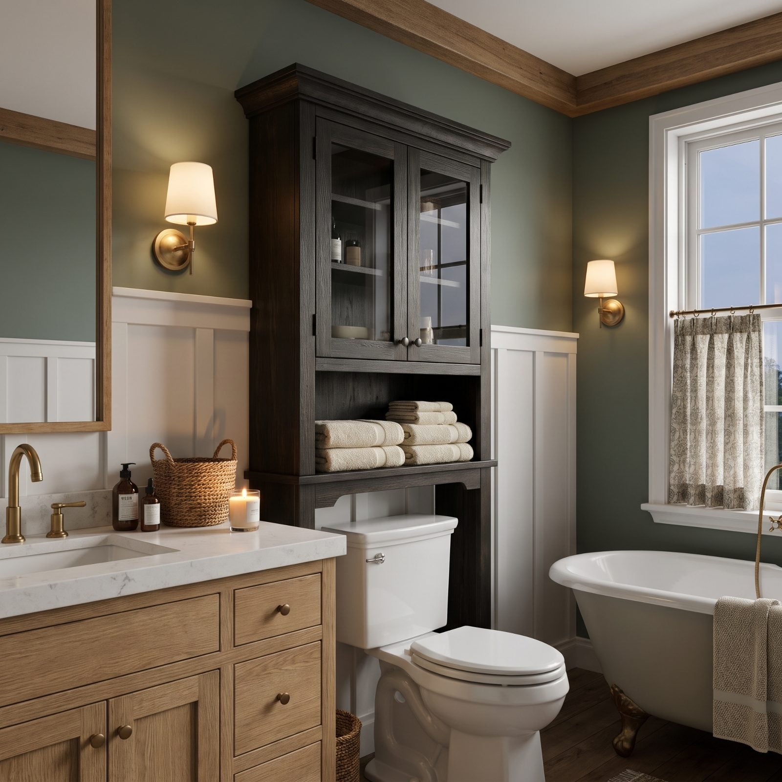
The over-the-toilet hutch solved a real problem badly. It parks a heavy cabinet at eye level, closes in the one wall that should feel open, and always looks a little precarious hanging there above your head.
Buyers read it as clutter they’ll have to haul out. Floating shelves or a slim recessed niche give you storage without the looming bulk, and the room immediately feels taller. Pull it down and the bathroom gains a wall it didn’t know it had.
13. The Banjo Countertop That Reaches Over the Toilet
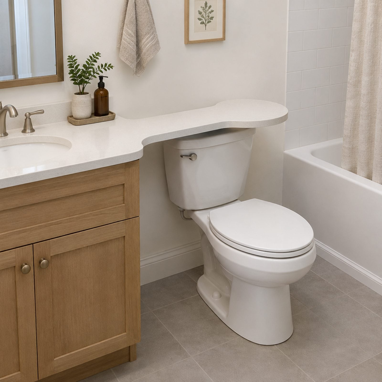
The banjo top is that stretch of countertop that runs sideways and parks itself right over the toilet. Builders loved it in the ’90s because it turned a dead corner into surface. Buyers in 2027 see a seat they can’t use without ducking under a slab of stone.
It reads cramped, and it dates the room in half a second — even a handsome creamy white quartz slab like this one can’t fully rescue it, since the layout itself is the time stamp. A standard vanity with some breathing room around the toilet almost always shows better.
12. Faux-Tile Sheet Vinyl Pretending to Be Something Else
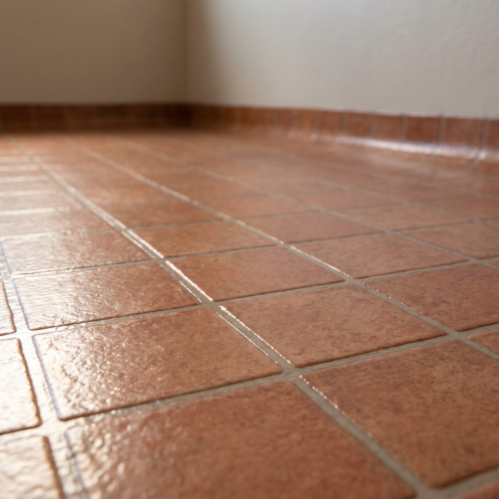
From the doorway it almost passes. Step in, though, and the grout lines give it away — too even, too shiny, and softly springy underfoot. Sheet vinyl printed to look like tile was cheap, fast, and warm on bare feet, which was the whole pitch.
The real tell is the edge, where the entire floor curves up the wall in one unbroken piece. Buyers clock it fast, and once they do, they start wondering what else got faked. Real porcelain or a good LVP plank with actual texture reads honest. This reads like a shortcut.
11. River-Pebble Shower Floors and the Grime They Hold
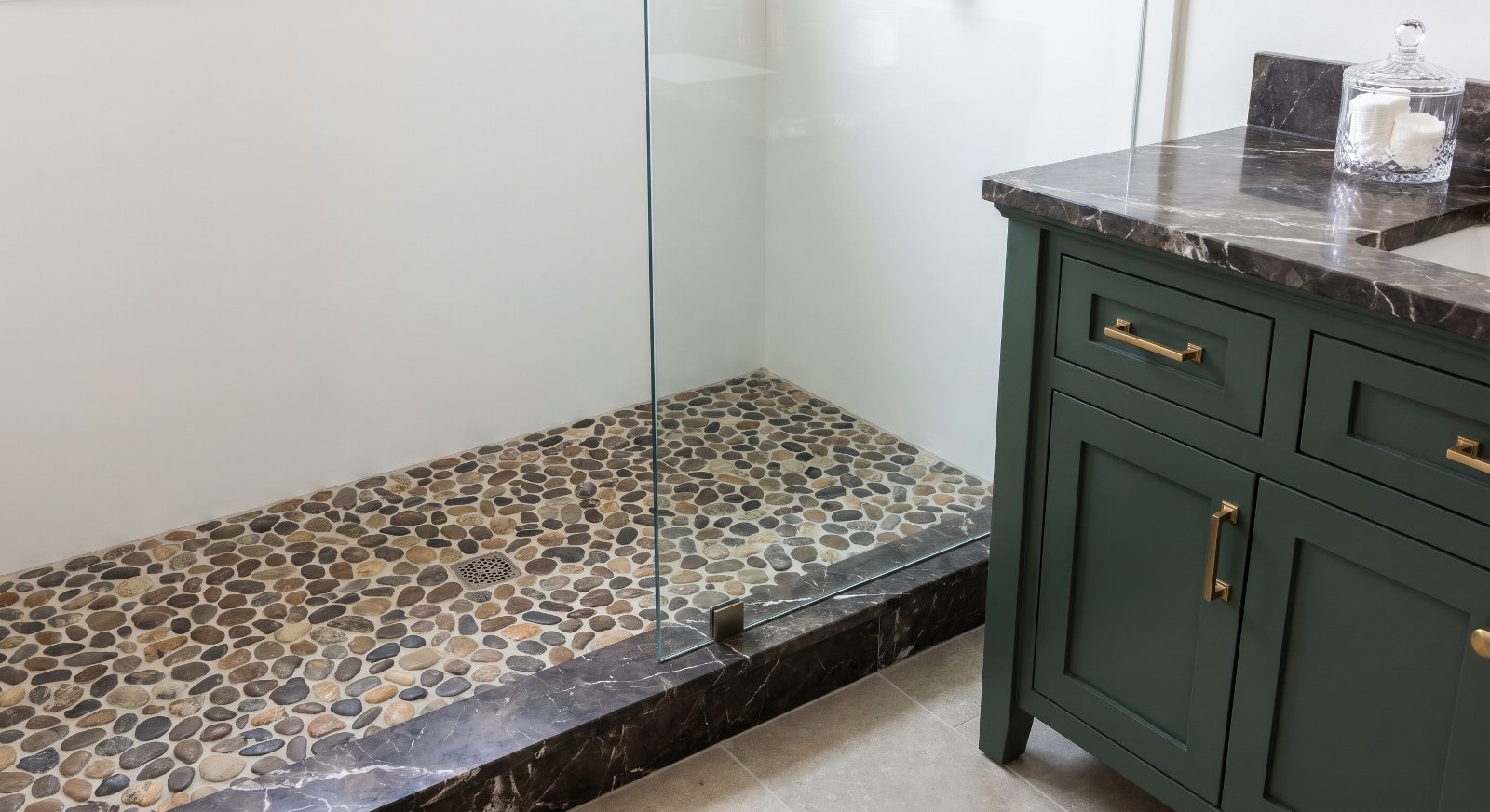
Pebble floors looked like a forest spa in every 2012 listing. Then people actually lived with them.
All those rounded stones mean a hundred tiny grout valleys, and water never fully clears them, so soap scum settles into the low points. The texture that felt like a foot massage becomes the chore you dread.
Real estate pros expect buyers to walk in, look down, and mentally subtract the cost of a re-tile. A flat large-format porcelain base does the same spa job with one grout line you can actually reach.
10. When Beige Travertine Swallows Every Surface
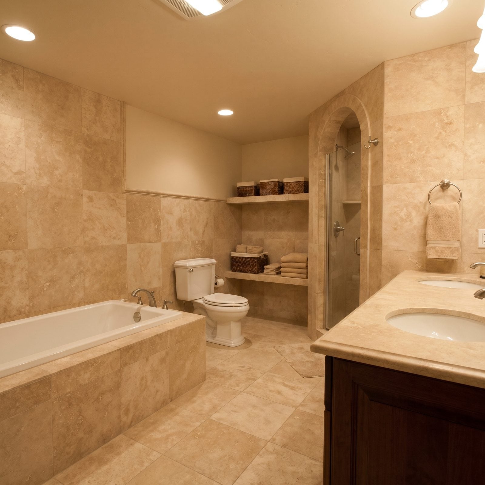
There’s a specific beige that owns the mid-2000s, and travertine wore it everywhere — floor, walls, tub deck, backsplash, all the same pitted tan, all at once.
In one spot it’s fine. On every surface the room goes flat. No contrast, no edges, just a warm sandy blur that stains if you so much as glance at a glass of red. Buyers in 2027 read it as the opening line of a budget they didn’t want to sign up for.
Not everyone is done with beige, though: in our readers’ votes, bathroom images with beige accents got more hearts than the other images in the same articles, 70% vs 57%.
9. The Floral Wallpaper Border Running Along the Ceiling
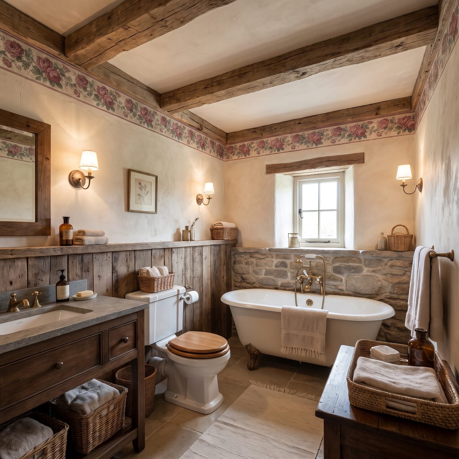
A strip of printed roses marching around the room just below the ceiling. For a good stretch of the ’90s, no powder room counted as finished without one.
That border drops the perceived ceiling height and locks the whole room into one decade. Worse, it coordinated with everything — the curtain, the towels, the hand soap — so pulling one thread unravels the entire set. Buyers see it and start peeling in their heads. Want a softer refresh? A cream bathroom design with no border at all lets the walls run clean to the ceiling.
8. Sponge-Painted Walls That Scream 1998
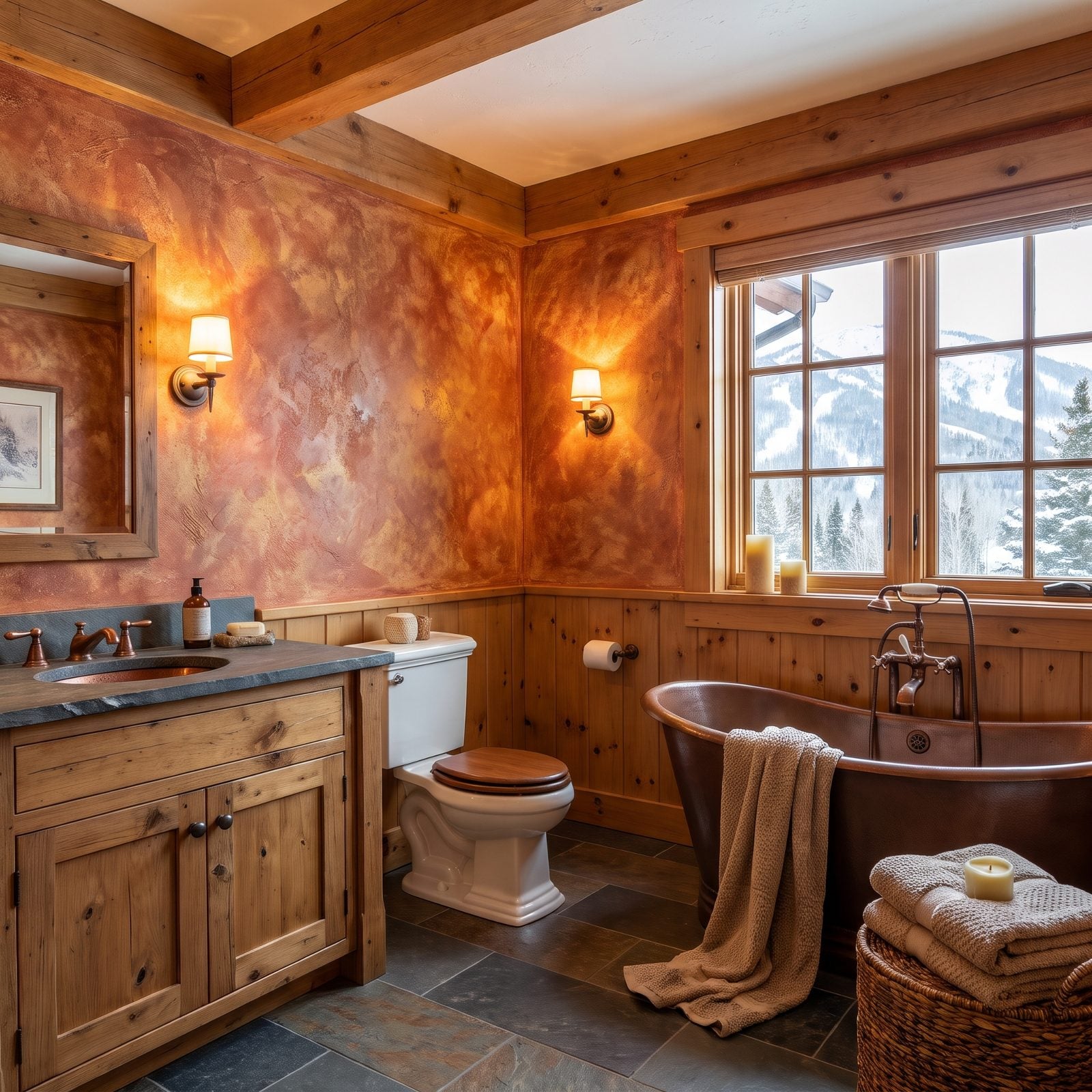
Terracotta base, cream and gold dabbed over the top, a cloudy mottled finish on every single wall. Sponge painting was the weekend project of the late ’90s, and plenty of them are still standing.
The trouble is movement. The eye never settles, and the walls feel busy and faintly dizzy. It reads as dated DIY the instant you walk in, and no amount of flattering light is going to rescue it.
7. Faux-Plaster Tuscan Walls Doing a Villa Impression
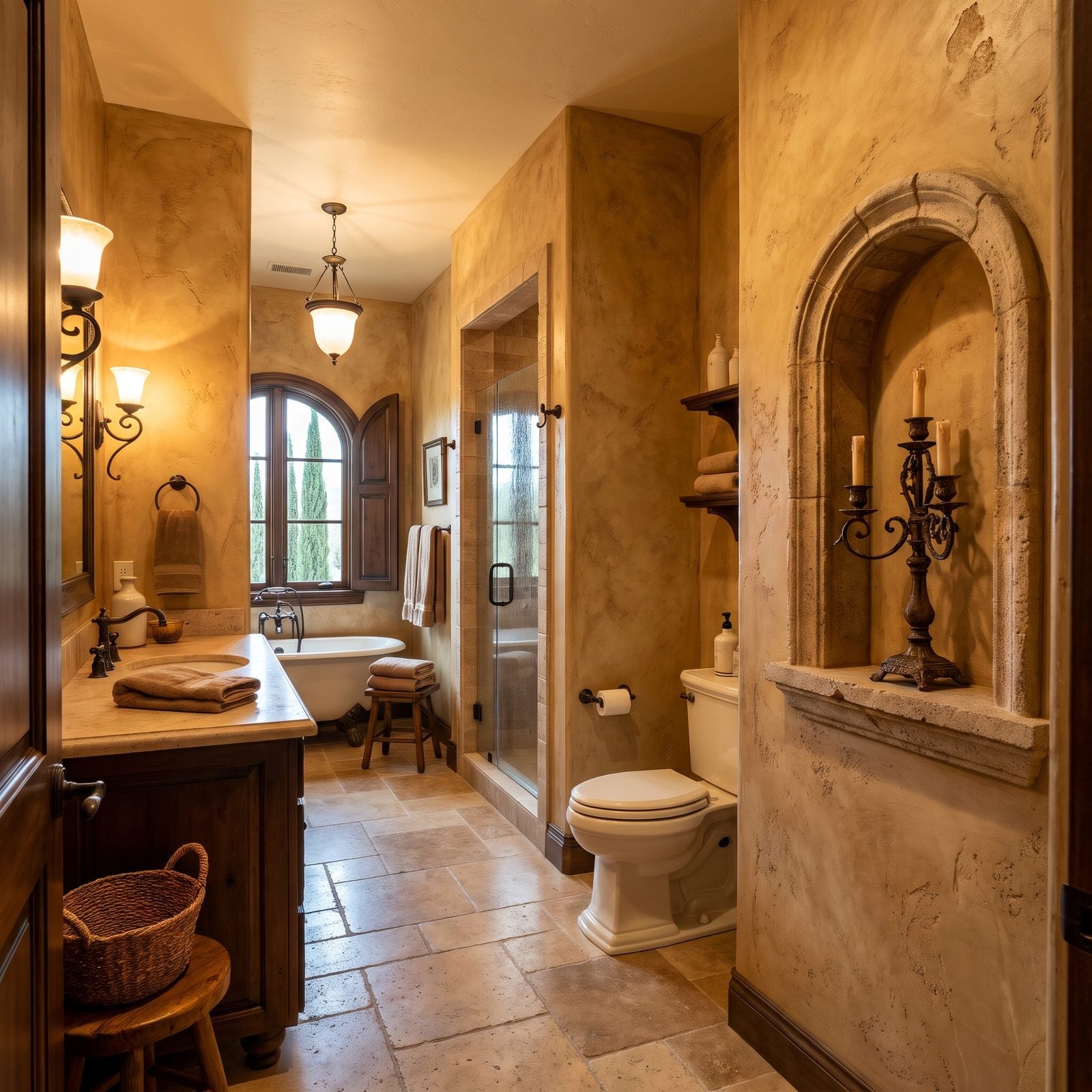
Troweled ochre plaster, an arched niche, oil-rubbed bronze — the whole Mediterranean-villa act, performed in a suburban bathroom. It felt rich in 2005.
Now the gold tones read orange, and the heavy texture fights the clean lines buyers want. Painting over it isn’t simple either, because that trowel finish grabs roller marks and fights you the whole way.
6. Shiplap Around the Tub, Where Water Lives
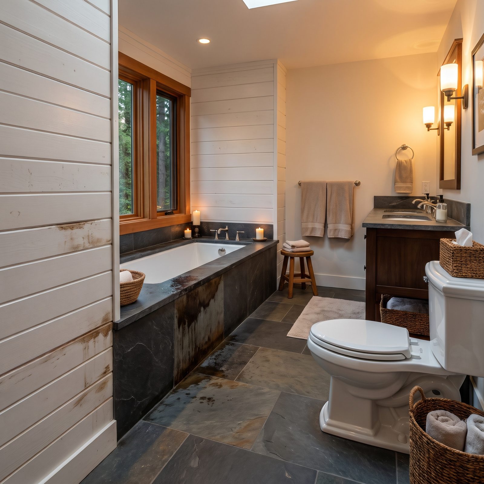
Shiplap near the tub carried the entire farmhouse look for a decade. The gaps between the boards are the catch.
Water finds those seams, sits there, and MDF or softwood swells and warps over time, so what looked crisp on install day slowly goes fuzzy at the edges. Buyers who’ve owned one already know, and they expect it ripped out and tiled. The look itself is perfectly nice — in a dry zone. Beside a bathtub, it’s a ticking box on the inspection report.
5. A Decorative Tile Mural Staged Above the Tub
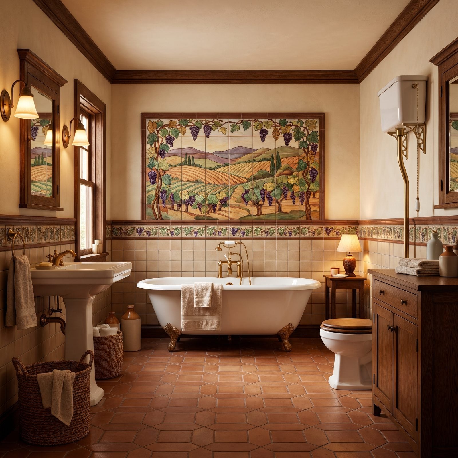
Someone picked out that vineyard scene tile by tile, and honestly, I respect the effort. The problem is that a permanent picture on the wall is a decorating decision nobody else got to vote on.
A mural is taste glued to the studs. Buyers can repaint a wall in an afternoon, but prying out a fixed ceramic scene means a demo day and a full re-tile — specific art, zero flexibility. It almost always counts against the room.
4. The Big Fluorescent Ceiling Light Box
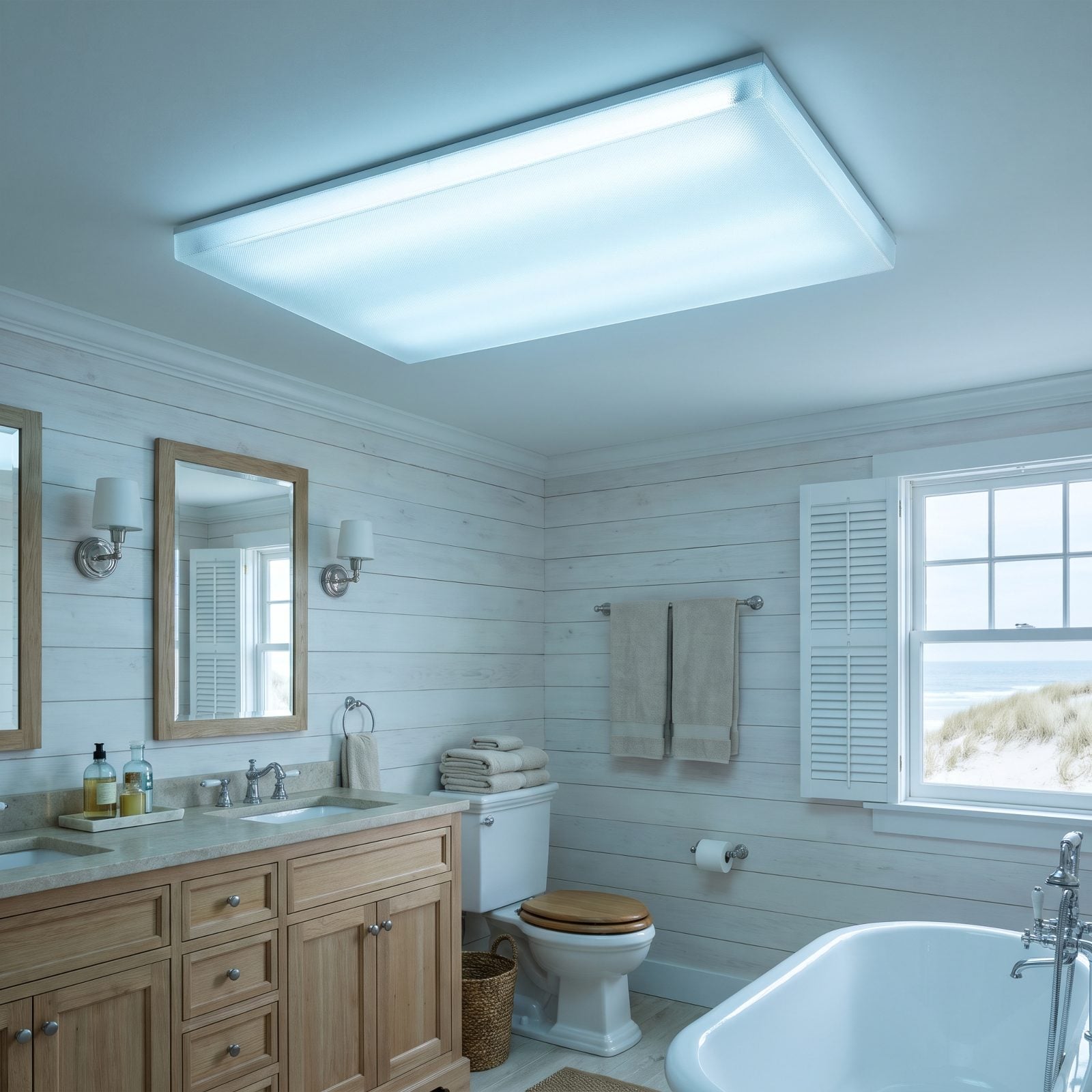
That wide frosted panel in the ceiling — the one that hums faintly and throws a flat, shadowless wash over everything. Builders used it to light a whole bathroom on the cheap, all in one go.
The light itself is the giveaway: cold, even, unflattering, the kind that makes every face look exhausted at the mirror. And the acrylic yellows as it ages. Buyers read it as the single most dated thing in the room, and swapping it for recessed cans plus a vanity fixture is one of the fastest wins there is. If you only fix one thing on this whole list, fix the lighting.
3. The Hollywood Vanity Strip and Its Row of Exposed Globe Bulbs
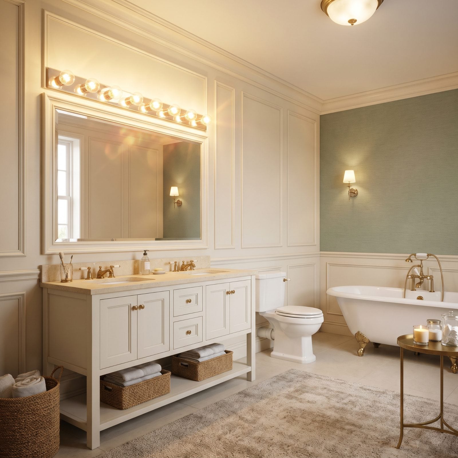
That chrome bar of exposed globe bulbs looked like movie-star glamour back in the ’90s, and now it reads as a dressing room somebody forgot to update. The trouble isn’t the light itself — it’s what the light makes people picture. Buyers walk in and see a stage set, not a place to brush their teeth.
Real estate pros flag it fast because it drags one whole wall back a decade. The cream vanity and limestone top hold up fine; that strip above the mirror is the only thing shouting about its age.
2. When a Sliding Barn Door Guards the Bathroom and Privacy Loses
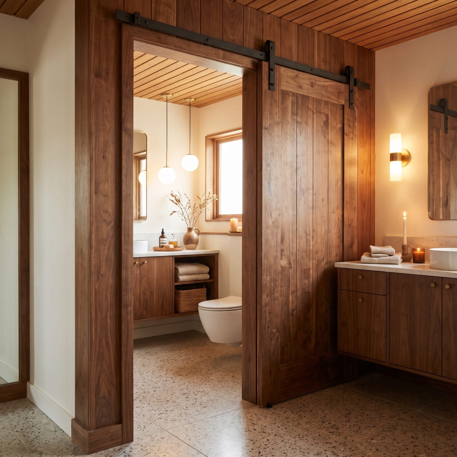
Barn doors sell the farmhouse fantasy right up until you try to use the bathroom with someone else home. Then you remember: they don’t lock, they don’t seal, and they leave a finger-wide gap down the side where light and sound sail straight through.
The hardware is genuinely handsome. Black steel track against warm walnut paneling still photographs beautifully, and the smooth, polished walnut planks bring real richness. But a bathroom is the one room where you want a door that actually latches, and this thing just rolls along a rail. Agents have watched buyers nod their way through an entire house and then stop dead right here.
A bathroom is the one room where privacy isn’t a preference. It’s the point.
Save the barn door for a pantry or a rustic utility room, somewhere the gap doesn’t cost you anything. On the bath? Buyers in 2027 want it gone.
1. The Open-Concept Ensuite That Forgot to Include a Door
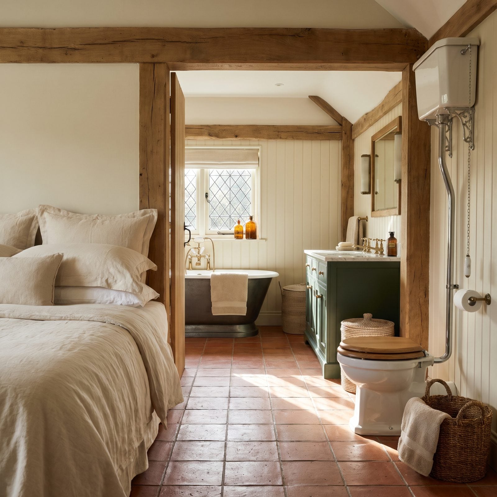
Somebody flipped through a design magazine, saw a hotel suite, and decided every home deserved one. So the door vanished — and now the toilet shares a sightline with the pillows.
It photographs like a spa and lives like a regret. Odors travel. Steam travels. The partner who sleeps later gets jolted awake by the one showering at six, because without a door there’s nothing to contain any of it, and real estate pros know buyers run that math in about four seconds flat.
The finishes here are perfectly good. Floor-standing green painted vanity, marble top, terracotta tile running clean through both zones. And the fix costs almost nothing against how badly it turns buyers off: add a door. Want to see separation handled properly? Look at how a defined cream bathroom design keeps its own four walls. Come 2027, buyers want that wall back.