🔥 Would you like to save this?
A large room can turn on you. You walk in expecting air and openness, and instead the walls press close, the ceiling sits low, and all that expensive square footage suddenly feels strangely stingy. Very often, the culprit isn’t the architecture at all. It’s what happened at the paint counter.
What follows are the color decisions that quietly work against your biggest rooms: dark ceilings, chopped-up sightlines, muddy undertones, overworked accent walls, and saturated shades asked to survive on almost no daylight. In a large room, the trick isn’t making everything pale. It’s preserving depth, continuity, and enough contrast to see the architecture without outlining every inch of it. Most of the fixes don’t involve a contractor. They involve a weekend, a roller, and knowing which surface needs to stop shouting.
In order to come up with the very specific design ideas, we create most designs with the assistance of state-of-the-art AI interior design software. Also, assume links that take you off the site are affiliate links such as links to Amazon. this means we may earn a commission if you buy something.
35. Painting All Four Walls a Dark Color in a Room With Limited Daylight
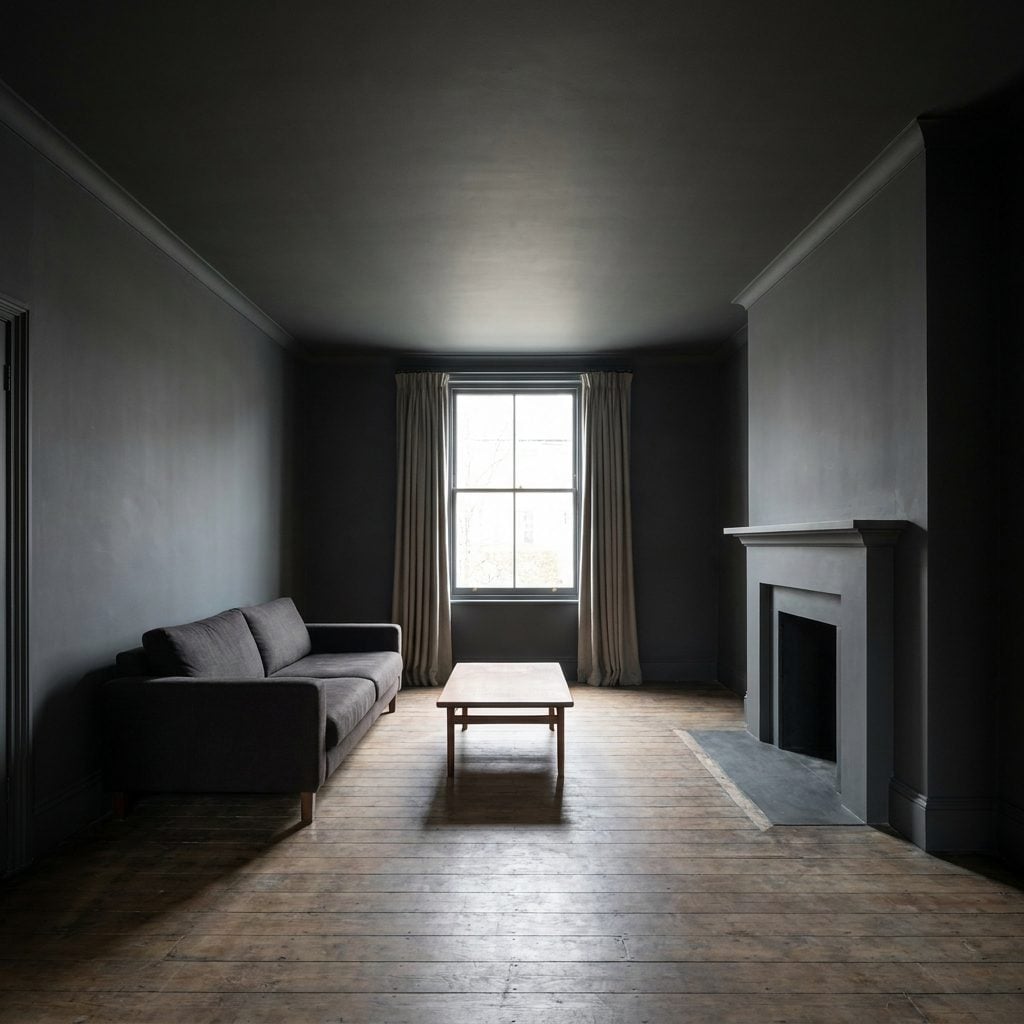
You’ve stood in this room. Big, quiet, expensive-looking, and somehow it feels like a lounge beneath a steakhouse. The charcoal walls aren’t inherently the problem. The problem is asking that much dark pigment to perform in a room where daylight was already scarce.
As the corners sink into shadow, the room loses some of its visible depth. The far edges become harder to read, and suddenly the generous footprint feels more enclosed than it should.
Pull the deep tone back to one wall and let the other three go lighter, or keep the drama and raise the lighting game considerably. Layered lamps, wall sconces, picture lights, and brighter corners can give a dark room back the dimension the paint took away.
34. Painting the Fireplace Wall in a Heavy Contrasting Color That Dominates the Room
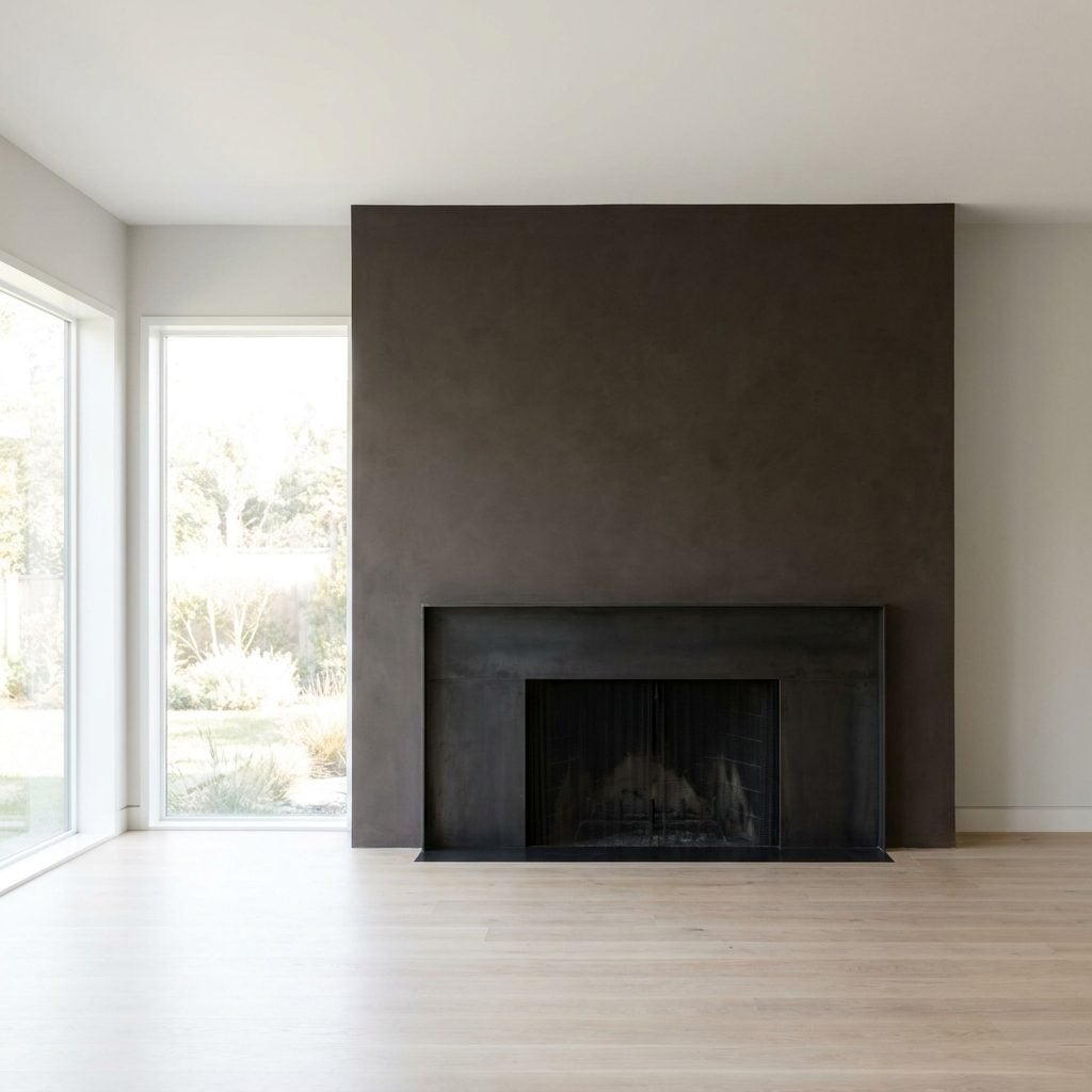
The fireplace is already the loudest thing on the wall. Painting the entire plane brown-black around it is like handing a megaphone to the person who was already running the meeting.
That heavy contrast brings one whole side of the room into sharper focus and makes the fireplace wall feel larger, darker, and more dominant than the architecture needs it to be. In a generous room, that can rob the space of some of its perceived depth.
You don’t need contrast to establish a fireplace as the focal point. Let the mantel, firebox, stone, tile, or artwork do that. If you still want something dark, contain it to the chimney breast or the vertical section immediately surrounding the firebox rather than swallowing the whole wall.
33. Painting a Low Ceiling a Heavy, Saturated Color
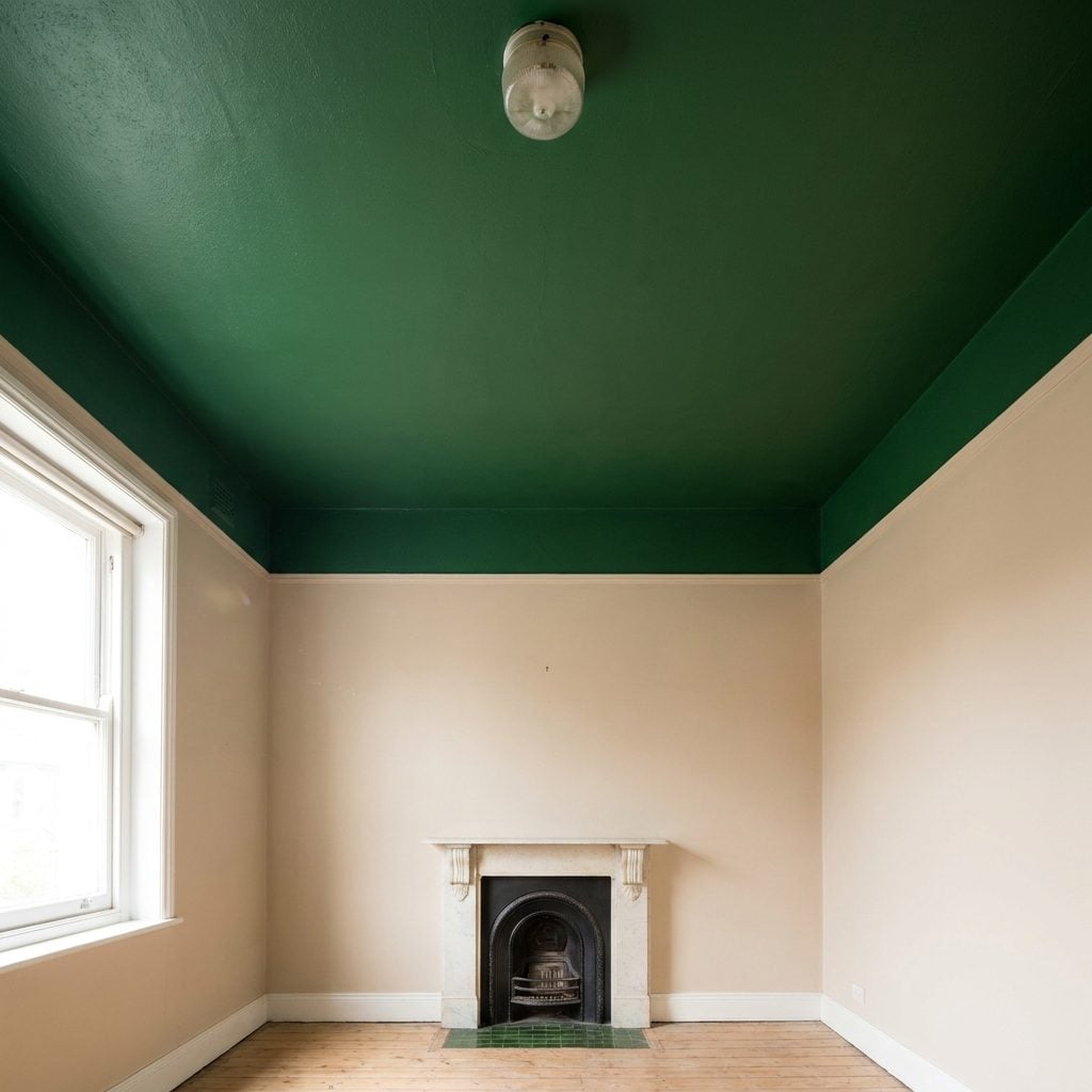
Eight-foot ceilings are already doing all they can to look taller. Paint one forest green, and suddenly they have another problem to solve.
A dense saturated ceiling can give the overhead plane more visual weight, especially when the room is broad and the ceiling already sits fairly close. Instead of disappearing upward, the color announces exactly where the room stops.
Keep a low ceiling light and visually quiet. Desperate for color overhead? Use it as a soft wash, something pale enough to register without becoming the heaviest surface in the room. Save the serious forest green for a wall where the drama has somewhere to go.
32. Picking a Wall Color That Clashes With the Flooring Undertone
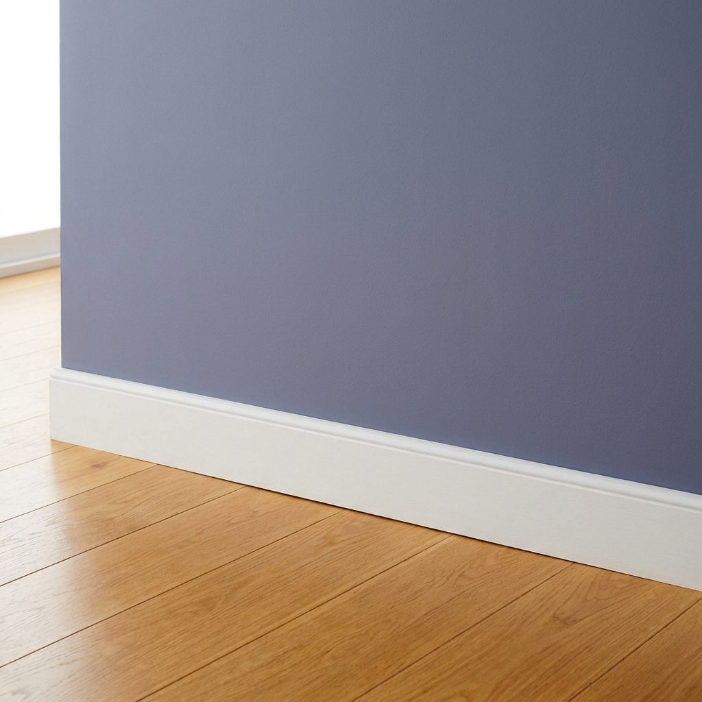
The floor is warm honey oak. The walls are cool gray with a blue-violet undertone. On separate sample boards, both look perfectly respectable. Put them together and suddenly they’re arguing across the room.
The gray looks colder, the oak turns aggressively orange, and attention keeps snagging where floor meets wall instead of moving easily through the space. Large rooms depend on cohesion more than most people realize. Break that visual continuity and the room can feel busier and less expansive.
Match undertones before you worry about matching colors. Flooring is the permanent player here, so it gets the deciding vote. Warm honey oak usually behaves better beside a greige, mushroom, warm gray, or soft neutral than beside a violet-leaning slate.
31. Using Black Trim Around Every Window and Door
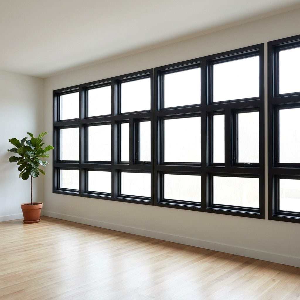
Black window trim looks incredible on a magazine cover. Put it around every single opening in a large room, though, and those walls start behaving like a grid.
Each dark frame becomes a visual stop. Instead of taking in a long stretch of wall as one continuous plane, you register rectangle, pause, rectangle, pause, rectangle. The openness is technically still there. The paint just keeps interrupting it.
Pick your moments. Black trim on a steel-look window wall or one pair of French doors can look deliberate and sharp. Black around fourteen unrelated openings starts feeling more like punctuation abuse. Everywhere else, let the casings recede into the wall color or a soft off-white.
30. The Muddy Greige That Drinks More Light Than You Expected
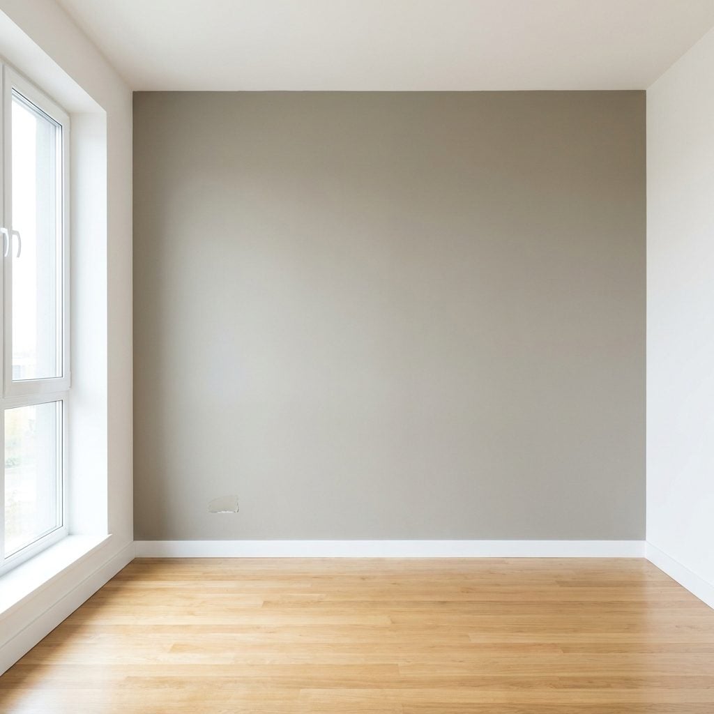
Greige promises to be the diplomatic neutral of the fan deck. Sometimes it gets home and turns into wet cardboard.
The trouble is undertone plus depth. A greige carrying too much gray-brown can go dull in weak daylight, particularly across long walls and deep corners. Instead of acting as a quiet background, it spreads a low, heavy cast across the whole room.
Hold the sample beside a piece of true white before committing. If the greige suddenly looks dirty rather than warm, go a shade lighter or shift the undertone. The right neutral should support the light you have, not make you wonder who closed the blinds.
29. Using Two Dark Opposing Walls That Visually Squeeze the Room
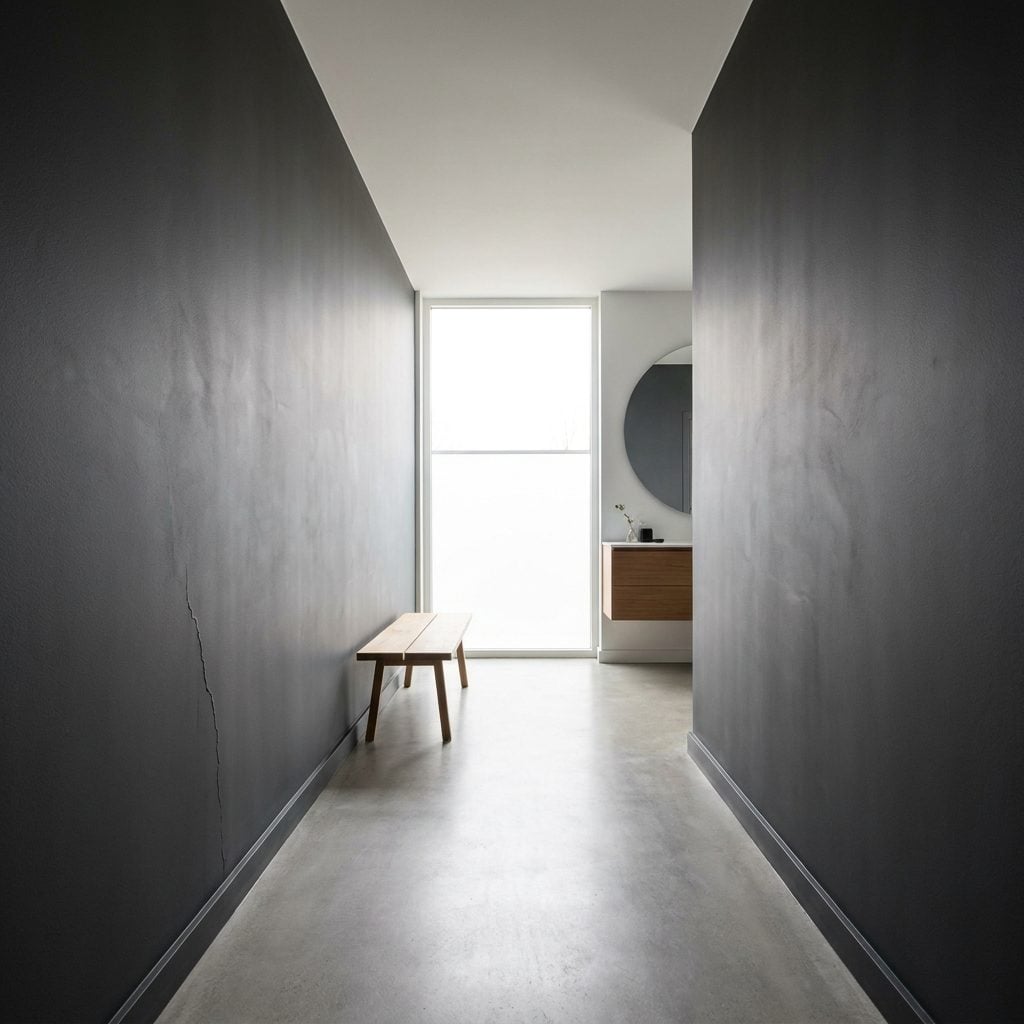
Two matching dark side walls feel balanced on paper. Symmetry, right? In practice, those charcoal planes can close in like a pair of hands and make a genuinely wide room feel noticeably narrower.
The effect is strongest when the two dark walls run parallel and dominate your peripheral vision. You keep registering the dark boundaries to either side instead of the width between them.
Try one dark wall and one pale wall instead, or reserve the deeper paint for the shorter end walls if the proportions support it. You still get drama, but the room doesn’t spend all evening trying to squeeze your shoulders together.
28. Painting Large Built-Ins the Same Heavy Dark Color as the Walls
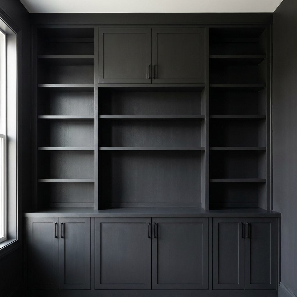
Painting built-ins to match the wall is usually a smart move. It makes cabinetry feel architectural rather than bolted on. There is, however, a point where the disappearing act works a little too well.
Take a huge floor-to-ceiling built-in, paint the shelving and surrounding wall the same muddy charcoal-green, then give the room moderate light. Shelf depth starts disappearing. What should read as recesses and shadow lines turns into one broad dark slab.
Bring the depth back with integrated shelf lighting, or paint the backs a shade or two lighter than the frames. You can also shop brass picture lights to wash the fronts and pull those layers back into view.
27. Cold Blue-Gray in a North-Facing Room
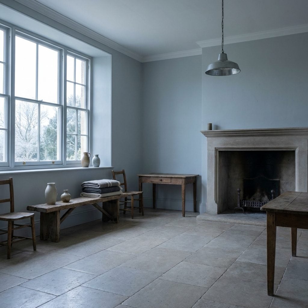
North light is steady, cool, and not especially interested in flattering your paint choices. Put a blue-gray in it and that pleasant little sample can turn into the color of a February parking lot.
The problem here isn’t simply that cool colors make rooms smaller; they don’t automatically do that. It’s that a color can become flat, chilly, and underlit when its undertone and the room’s daylight reinforce each other too aggressively.
North-facing rooms often benefit from a little counterbalance: warm white, soft greige, muted stone, or a green-gray with some life in it. Save the icier blue-grays for rooms with enough warm sun to keep them from going clinical.
26. Painting the Lower Half Very Dark and the Upper Half Strongly Contrasting
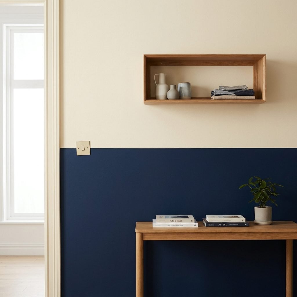
Two-tone walls can be lovely. This particular split is the trouble: navy on the bottom, cream on top, with a hard line circling the room at waist height like someone drew it with a ruler and refused to stop.
That horizontal break becomes the thing you notice first. Tall walls suddenly feel divided into upper and lower sections rather than one continuous height, especially when the value contrast is strong.
If you’re using two tones in a tall room, experiment with the break instead of defaulting to chair-rail height. A higher division, a lower painted base, or a gentler shift between the two shades can preserve the architecture while still giving you the layered look.
25. Deep Teal in a Room Already Loaded With Dark Furniture
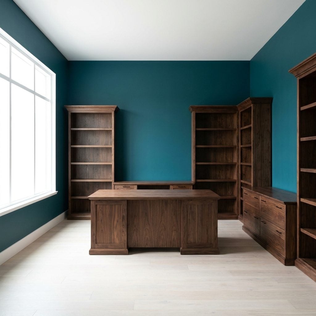
Deep teal and rich walnut are both gorgeous. Give them exactly the same tonal weight in the same room and they begin disappearing into each other.
The brown leather sofa melts into the wall behind it, dark cabinetry loses its edges, and furniture that should help describe the dimensions of the room becomes one dense block of color.
You don’t have to surrender the teal. Lighten the walls a few tones, or bring in lighter pieces — a cream rug, pale ottoman, oak console, even brighter upholstery — so objects separate from their background again. Contrast is what lets a large room show off its layers.
24. Using a Deep Accent Color on the Wall That Already Feels Closest
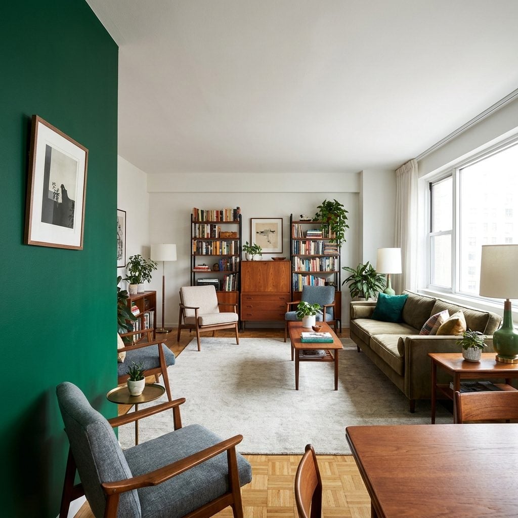
Accent walls are not just about choosing a gorgeous color. Placement matters, and the wall already dominating your field of view is often the one that needs the least additional emphasis.
Paint that near wall a saturated aubergine and the contrast can make it command even more attention, visually loading one side of the room. The open floor and pretty furnishings are still there, but suddenly the nearest plane is doing all the talking.
Before moving the color elsewhere, test it from the places where you actually sit and enter the room. A darker far wall can sometimes create a strong destination and apparent depth, but the effect depends on hue, light, contrast, and room proportions. Accent placement should be judged in the actual space, not by a universal rule.
Deep color attracts attention. Put it on the wall you want to emphasize, not automatically on the wall that happens to be easiest to paint.
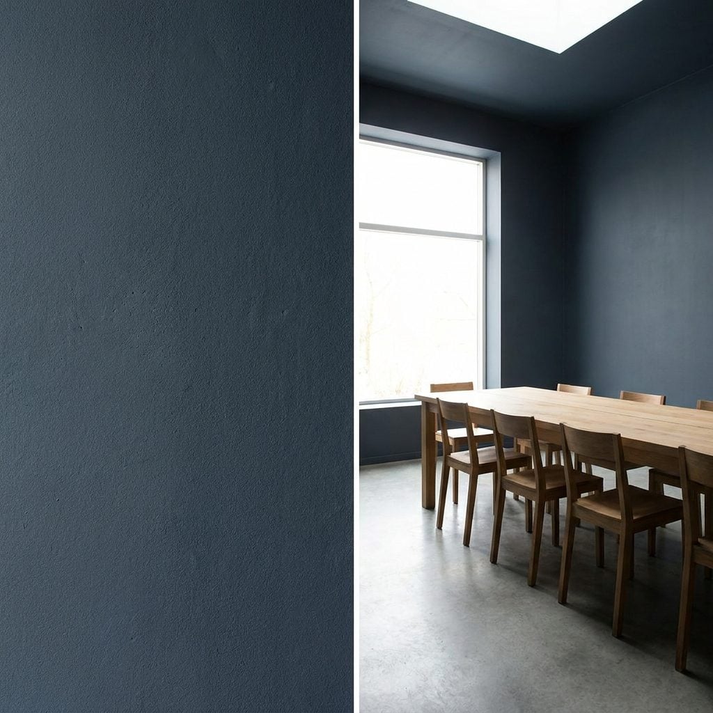
23. Choosing an Ultra-Flat Dark Finish That Swallows Available Light
🔥 Would you like to save this?
Deep charcoal-blue walls, a chalky dead-flat finish, and a room that suddenly looks as though somebody turned the dimmer down. This time the color doesn’t deserve all the blame. The finish is helping.
Very flat paint produces little sheen and scatters light differently from eggshell or satin. On a dark wall in a room already short on illumination, the result can look especially dense and velvety, which is beautiful until every corner starts disappearing with it.
22. Painting Every Niche and Recess a Different Strong Color
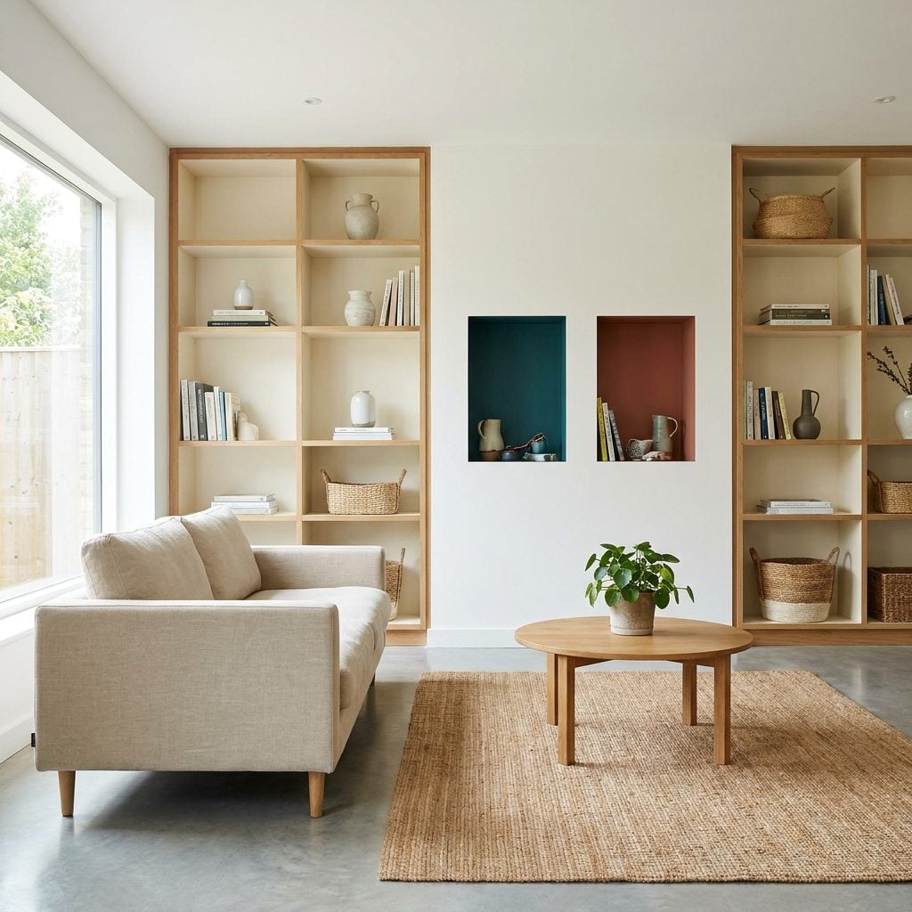
Somebody got excited at the paint counter. That’s how a calm room ends up with a teal niche, a rust niche, and an olive recess all demanding separate introductions.
A strong color turns an indentation into a focal point. Do that five times across one broad wall and the architecture stops reading as one composition. You get a scattered collection of bright rectangles instead.
Choose one recess to feature, or paint them all a single shade close enough to the wall color that they register as depth rather than competing destinations. These same recesses can handle more playfulness in a bonus room decor setup, where the point is to have some fun.
21. Deep Burgundy Across a Room With Barely Any Windows
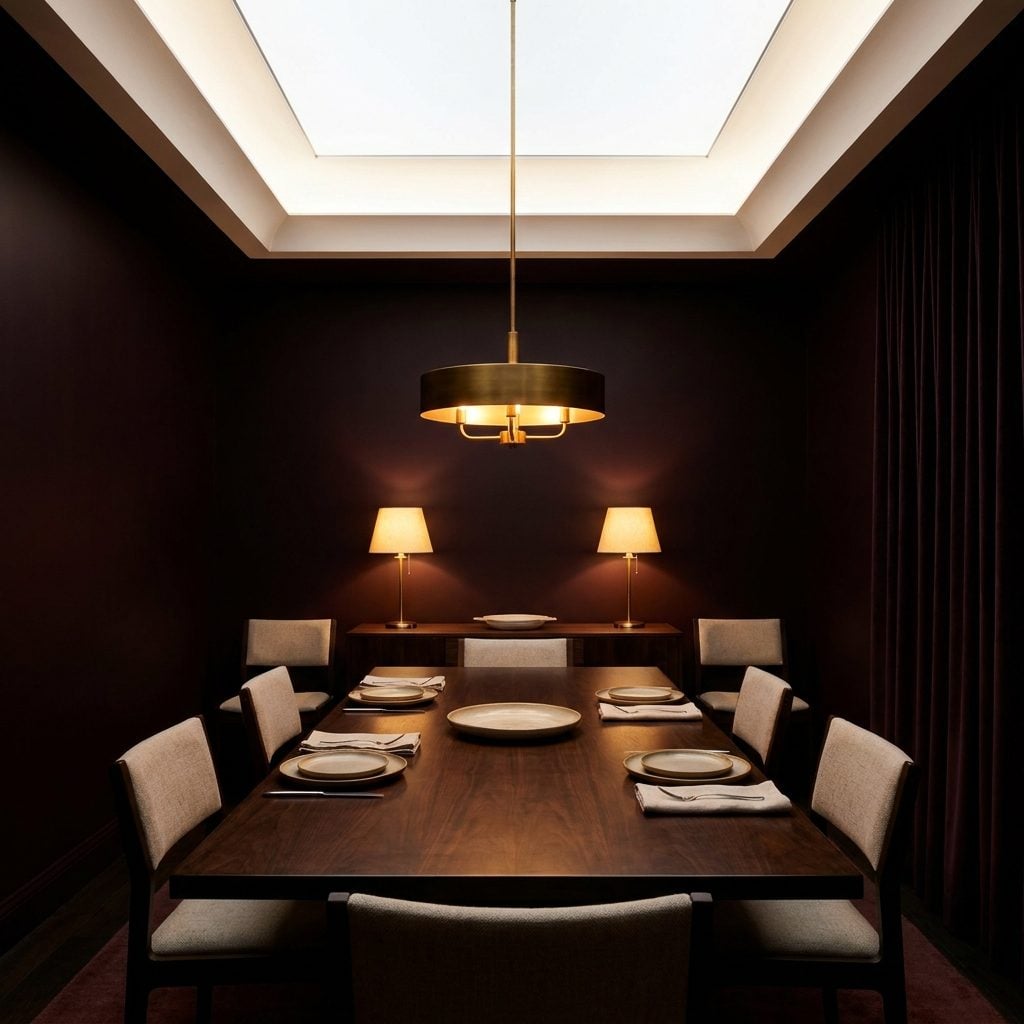
Burgundy in a dining room is a genuinely great instinct. Under warm evening light, it can be rich, flattering, and just formal enough. The trouble starts when a huge room has almost no daylight to keep that red looking red.
With only a couple of windows across an enormous footprint, a deep burgundy can tip toward brown-black in the corners. The room keeps its measurements, but visually the perimeter becomes murkier and less distinct.
Lighten the burgundy enough that it still holds its color in shadow, or keep the deeper shade and plan the lighting as carefully as the paint: sconces, buffet lamps, chandelier light, and illumination near the edges rather than one lonely fixture stranded in the middle.
20. Painting Baseboards Much Darker Than the Walls
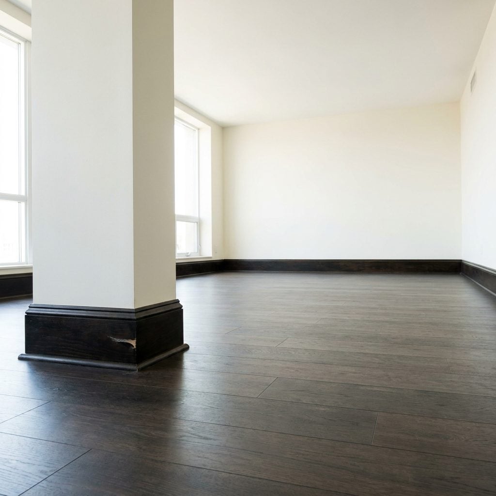
Dark baseboards seem harmless. They’re down at your feet, barely a focal point. Then you stand back and notice an espresso line tracing the entire perimeter of the room like somebody outlined the floor with a marker.
That continuous contrast makes the physical boundary impossible to ignore. In a large room, where the walls and floor can otherwise flow into one broad composition, a thick dark baseboard keeps reminding you exactly where every surface stops.
For a quieter effect, paint baseboards the wall color or only slightly lighter or darker. If you want definition, let profile and craftsmanship provide it rather than maximum contrast.
19. Breaking One Large Open Room Into Too Many Painted Color Zones
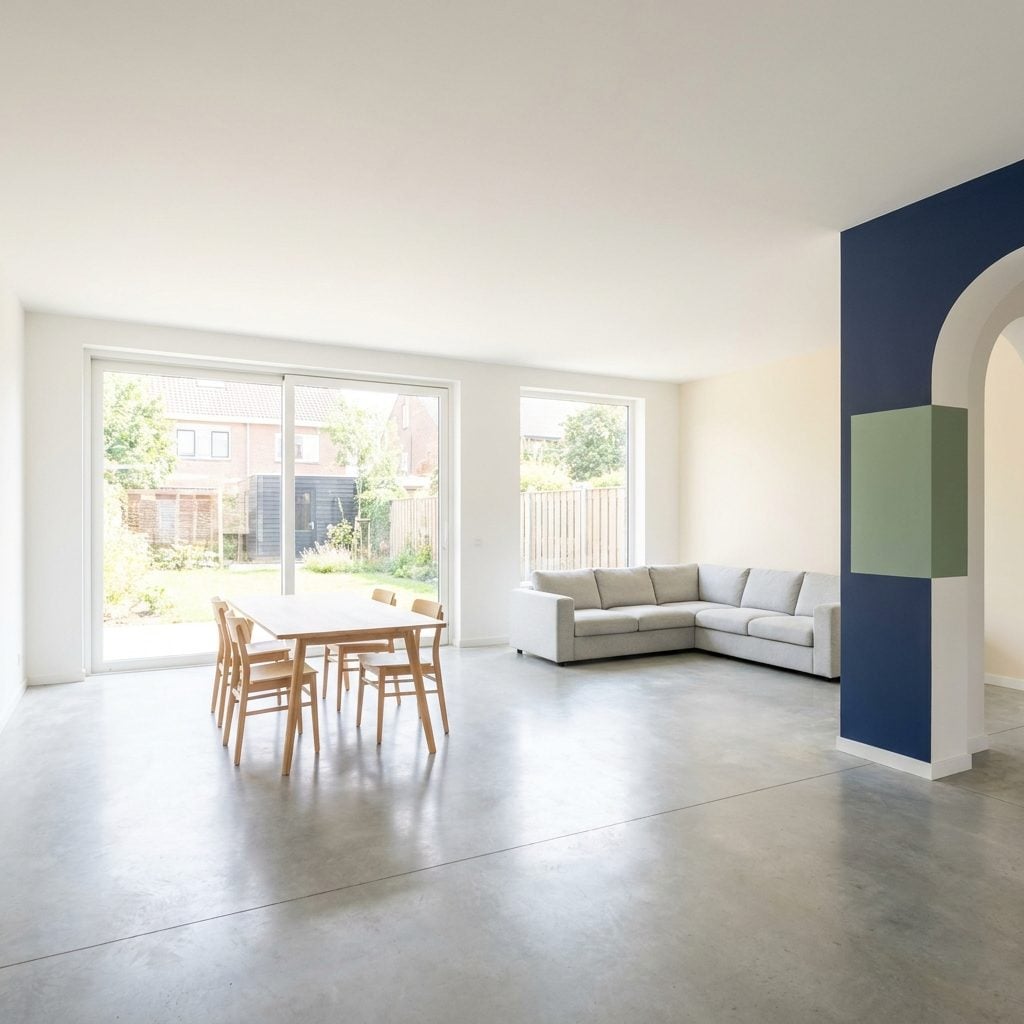
You’ve seen this in an open-plan home where someone tried to “define zones” with paint. Sage for dining, navy for the sofa, terracotta for reading. Sensible idea, right up until one architectural room starts looking like three unrelated ones sharing utilities.
Paint can define function, but it can also invent boundaries the architecture deliberately removed. When every zone gets its own saturated identity, the big uninterrupted volume becomes harder to perceive as a whole.
Run one primary wall color throughout and define areas with rugs, pendants, furniture placement, or ceiling fixtures. If you want a painted moment, choose one anchoring wall rather than assigning every activity its own zip code.
18. Heavy Olive Green in a Room Full of Shadows
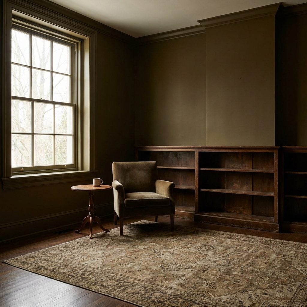
Olive green is a wonderful color with one inconvenient habit: the murkier versions need enough light to stay interesting. Put one in a den shaded by large trees and deep eaves and that beautiful olive can flatten into khaki by midafternoon.
Once the color loses its green and starts pooling brown in the corners, the room feels heavier than the palette originally promised.
If you love olive, test lighter or grayer versions that hold their identity in shadow, and light the corners deliberately with lamps rather than relying only on the ceiling fixture. Keep that pale ceiling. It’s doing more work than anybody is giving it credit for.
17. Using Dark Crown Molding That Visually Lowers the Ceiling
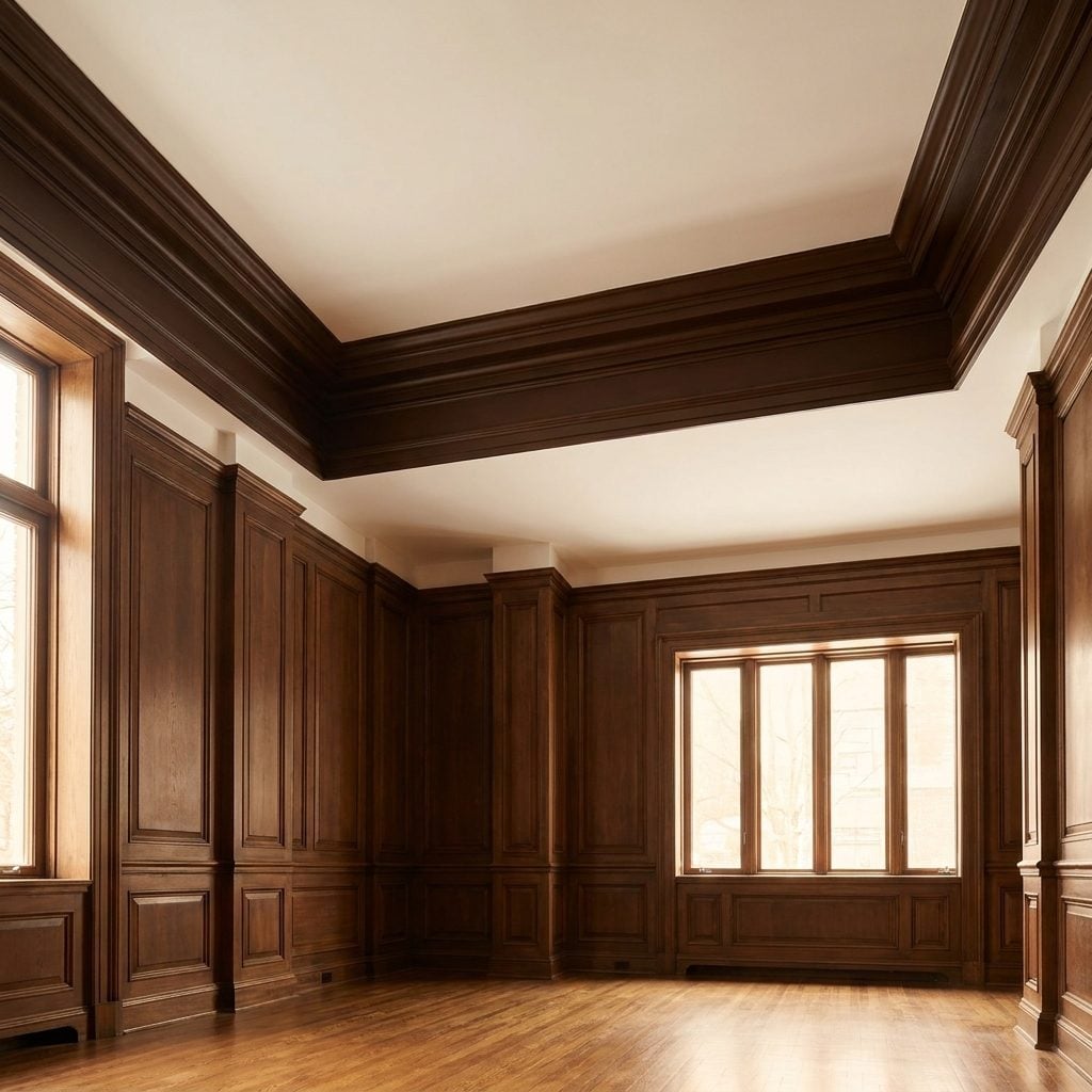
Eleven-foot ceilings are a gift. A thick chocolate crown molding can give some of that gift right back.
The strong horizontal band becomes a highly visible stopping point near the top of the wall. Instead of taking in the full height immediately, you register the dark line first and the ceiling above it second.
Paint crown molding the ceiling color for the quietest transition, or keep any contrast modest if height is what you’re trying to protect. The molding can still look expensive without wearing a belt around the room’s forehead.
16. A Strong Warm Wall Color in a Room Already Full of Warm Wood

Warm oak everywhere plus saturated terracotta walls is a lot of the same note played at full volume.
The floor, cabinetry, trim, and wall color all carry similar warmth, so very little in the room provides visual relief. Instead of the wood standing out as a material, everything starts blending into one warm field.
Use the walls as counterweight. Soft warm white, putty, muted sage, or another calmer neutral can let all that oak wood read as the feature rather than part of the background noise.
15. Painting Structural Columns in High-Contrast Colors
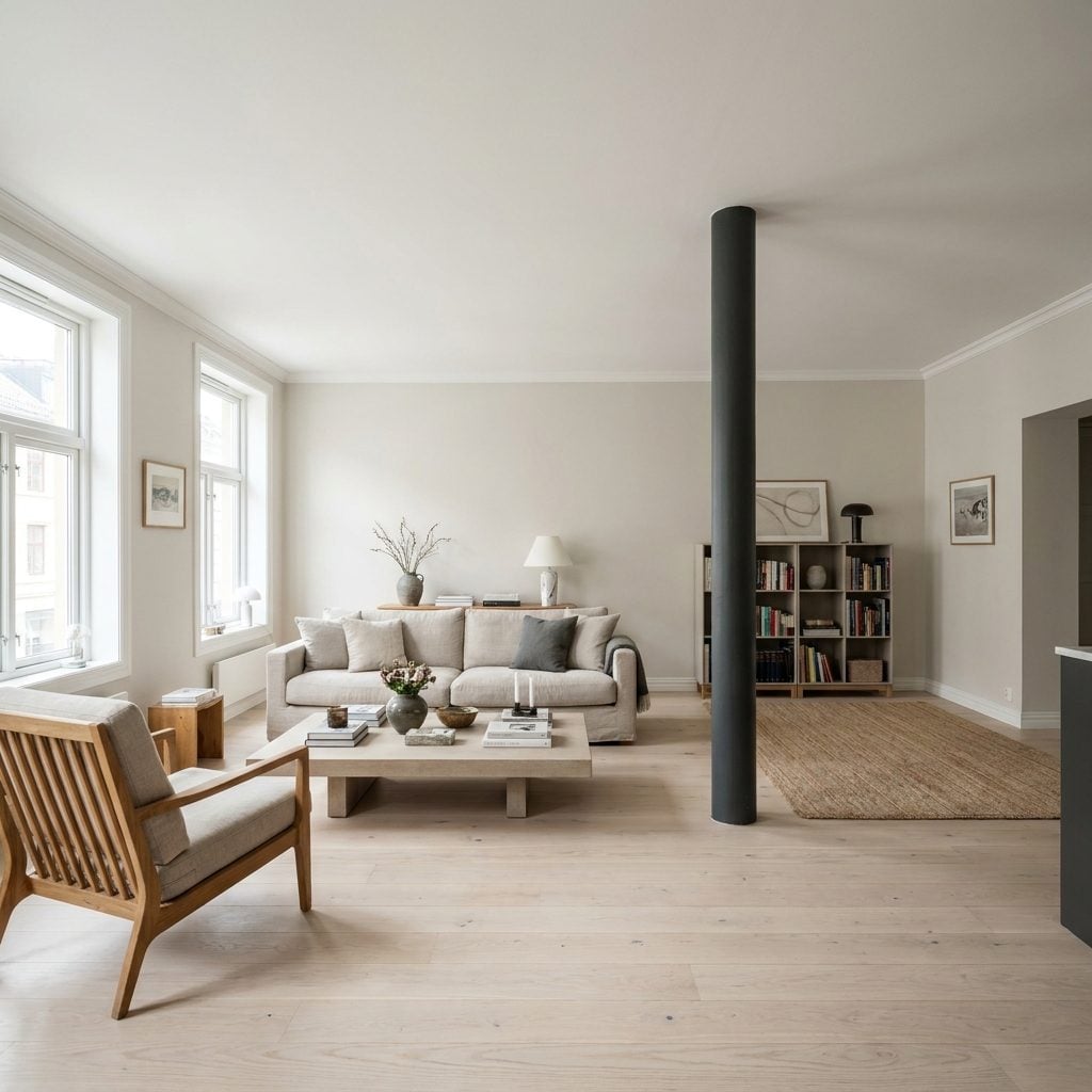
Painting the columns black feels architectural, like you’re honoring the bones. Sometimes you’re just introducing six new vertical bars into a room that was doing perfectly well without them.
Pale columns beside pale walls tend to stay visually quiet. High-contrast ones jump forward and divide the view, particularly in lofts and open plans where long uninterrupted sightlines are part of the appeal.
Match the columns to the wall color if you want them to disappear. If you genuinely want them visible, go one or two shades away rather than all the way to black. They’ll register as architecture, not fencing.
14. Using a Cool Gray That Goes Flat in Weak Daylight
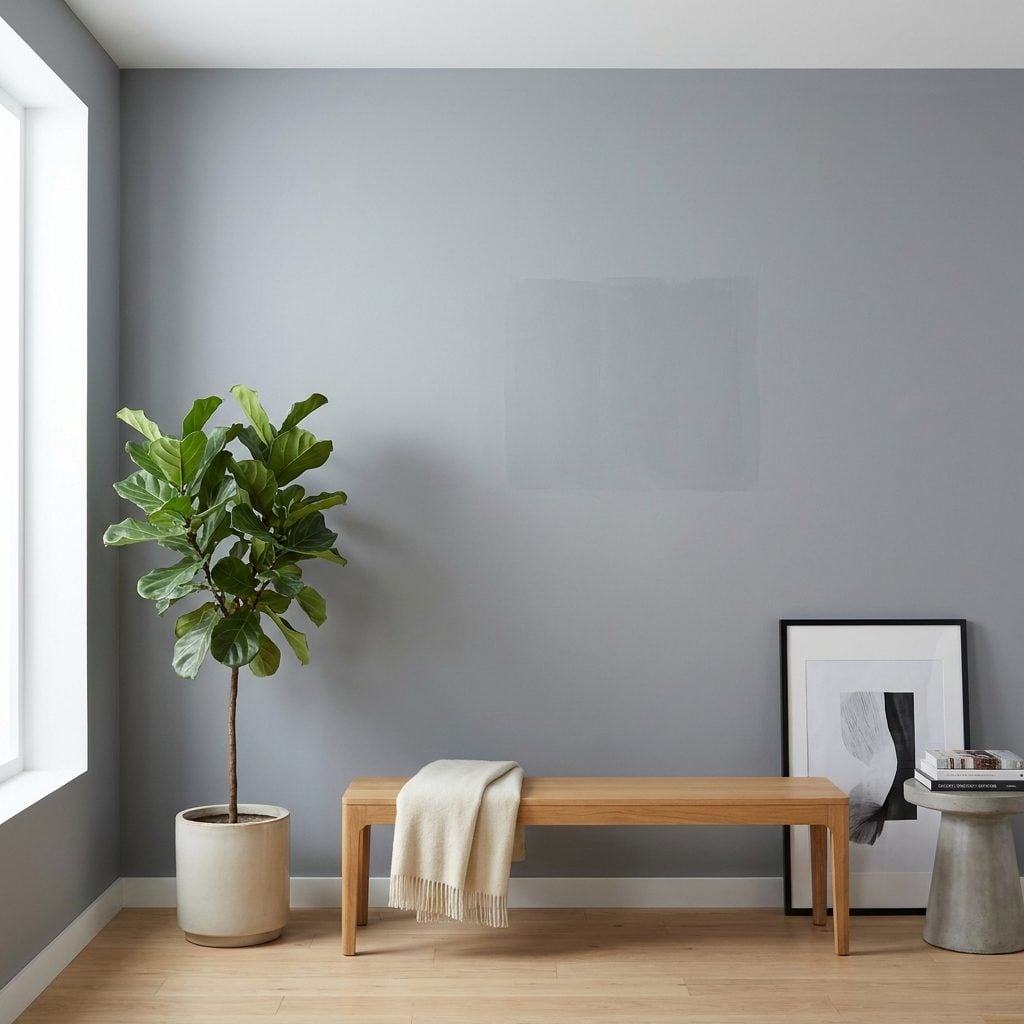
Gray gets blamed for a lot it didn’t do. The card looked crisp under the paint store’s blazing lights. Then it went home, met weak daylight, and turned the color of a rained-out afternoon.
Some cool grays depend heavily on good natural light to keep their undertones clean. Starve them and they can go dull, blue, or heavy, particularly on walls that never receive direct sun.
Test the actual paint in the actual room and look at it morning, noon, and dusk. If it flattens badly, go lighter or slightly warmer. A gray that behaves on the darkest wall is usually a much safer bet than one that only looks good beside the window.
13. Painting the Shortest Wall a Dark Color That Pulls It Visually Forward
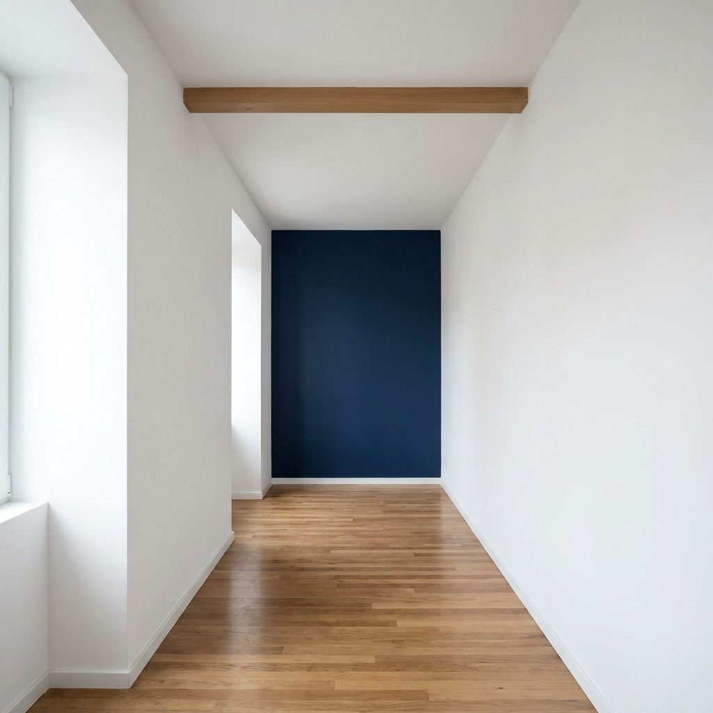
That deep navy on the end wall looks like a confident designer move. In a long narrow room, though, a high-contrast dark cap can make the end feel more emphatic and the run feel shorter.
The issue is not that every dark color automatically advances. It’s that strong contrast gives the wall more visual presence. When the short end is already the thing terminating the view, emphasizing it can exaggerate that stopping point.
If length is what you want to protect, keep the end wall close in value to the side walls or use a lighter, quieter color there. Save the darkest treatment for a surface that benefits from becoming the focal point.
12. Using Dark Wainscoting That Is Too Tall for the Room
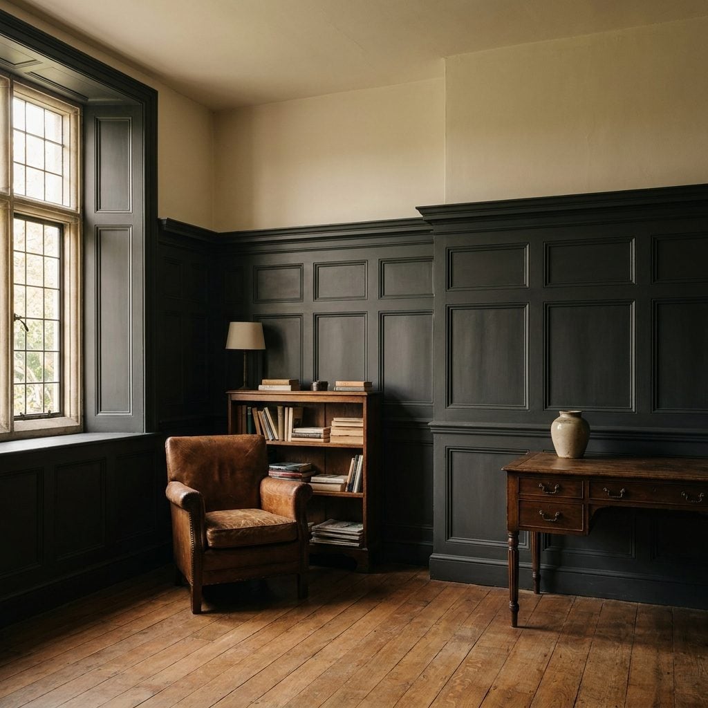
Wainscoting is one of the great architectural upgrades. This version just keeps climbing until it begins behaving less like trim and more like a second wall.
Dark charcoal paneling running two-thirds of the way up creates a large block of visual weight, while the narrow pale strip above it can make the upper portion of the room feel compressed.
Lower paneling — often somewhere around the lower third, depending on the architecture — is usually easier on the proportions. If you want taller millwork, consider easing up on the color so both height and darkness aren’t competing for attention at the same time.
11. Painting Dark Around Large Windows Instead of Letting Them Recede
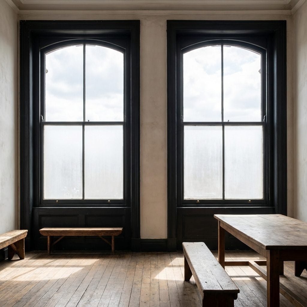
🔥 Would you like to save this?
Big windows are the best thing a room can own, which is exactly why it hurts to watch dark paint turn each one into a heavily framed picture.
Deep charcoal-navy beside bright glass creates a sharp border between interior wall and outdoor light. Instead of the glazing feeling almost continuous with the view, you become very aware of every edge.
A light warm white or pale greige around large windows reflects more daylight and lets the glazing dominate. Save the deepest color for a wall with no window at all, where it can be dramatic without picking a fight with the brightest surface in the room.
10. Dark Navy When the Lighting Is Too Weak to Carry It
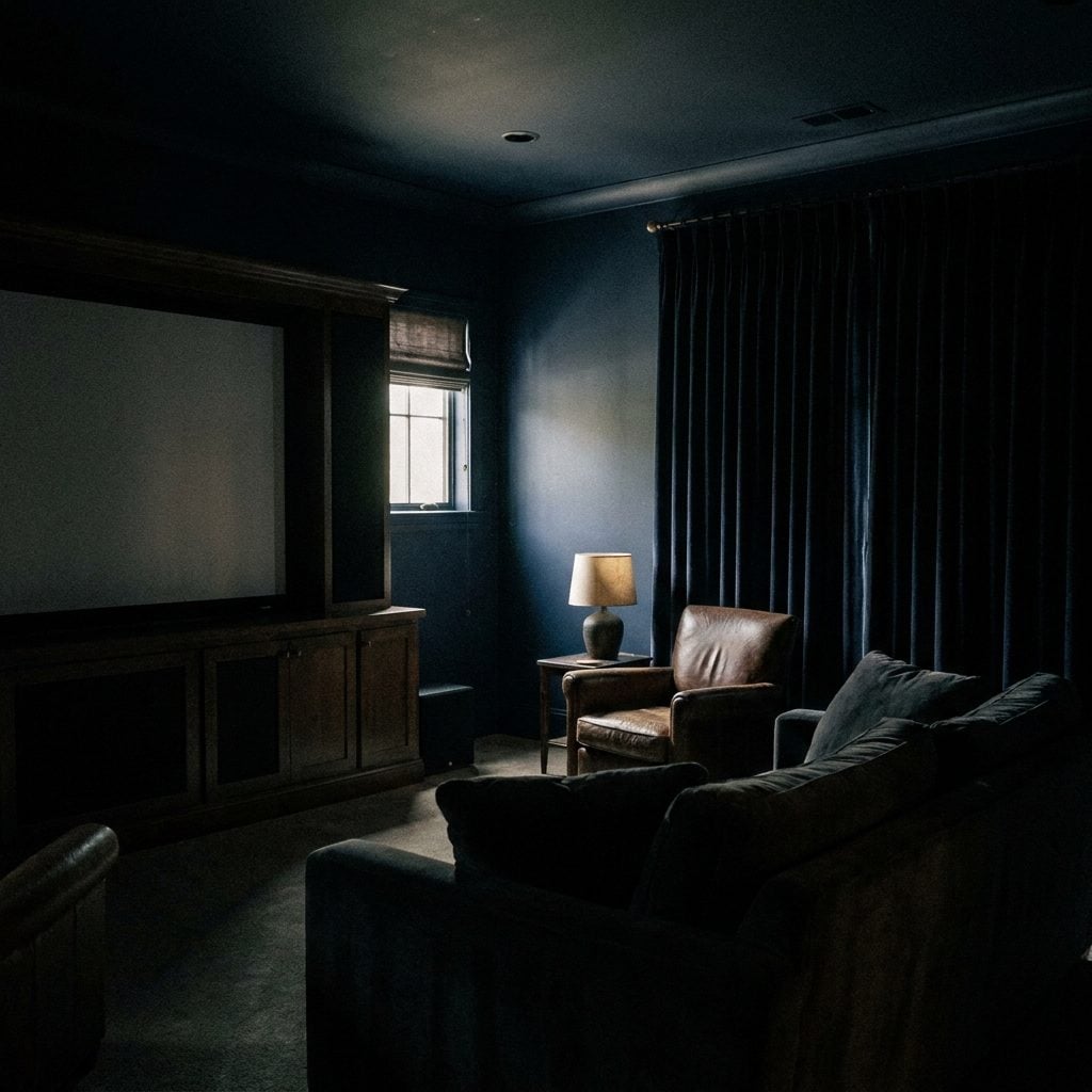
Navy is the reigning champion of cozy media rooms, and rightly so. But a color that dark is only as good as the lighting plan behind it, and this room got a couple of apologetic ceiling cans.
Near the fixtures, the navy has depth. Along the perimeter, it dissolves into nearly featureless shadow. That may be perfect during a movie, but the room feels much more enclosed whenever you actually want to see the architecture.
Navy in a theater benefits from deliberate perimeter lighting: dimmable sconces, LED cove strips, lamps at the rear, or light washing the walls rather than only the floor. The paint can stay dark without the room becoming a black box. The same lesson applies anywhere you use a serious blue, including some of these blue bathroom ideas: the color only works as well as the light around it.
9. Painting Every Wall a Different Strong Color
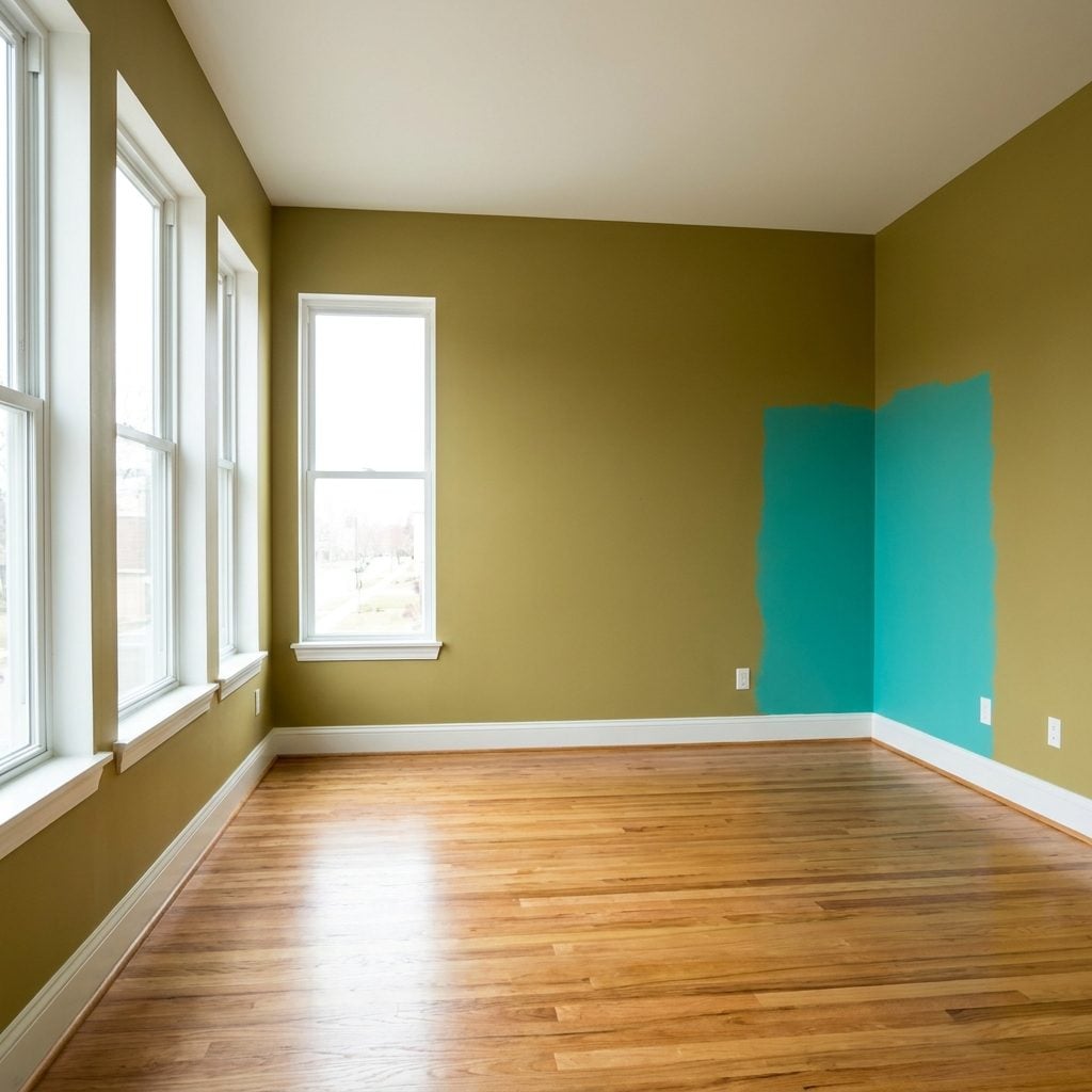
Four walls, four saturated colors, every one of them gorgeous on its own chip. Put them in one room and suddenly you’re taking a color exam every time you turn your head.
Each hard change makes the next wall feel like a separate event. Instead of one large volume, the room starts reading as a sequence of differently colored planes.
Choose one color to lead. If you still want variation, use a single accent wall or work with lighter and darker versions of the same family. You get the personality without making the room look like four smaller rooms wearing a trench coat.
8. Painting Door Casings in a High-Contrast Color That Chops Up the Walls
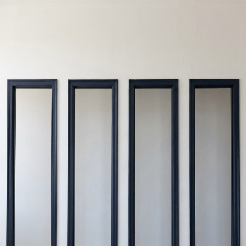
Navy casings are gorgeous. On one doorway. Line three or four of them along the same long wall and the effect changes completely.
An open-plan room earns much of its drama from long uninterrupted surfaces and sightlines. Ring every opening in contrasting navy and the casings start dividing that wall into individual panels.
If you want color on the trim, drop the contrast. A navy only a few shades away from the wall can still look tailored without turning every doorway into a separate frame. Or paint the casing and wall together and let the architecture do the talking.
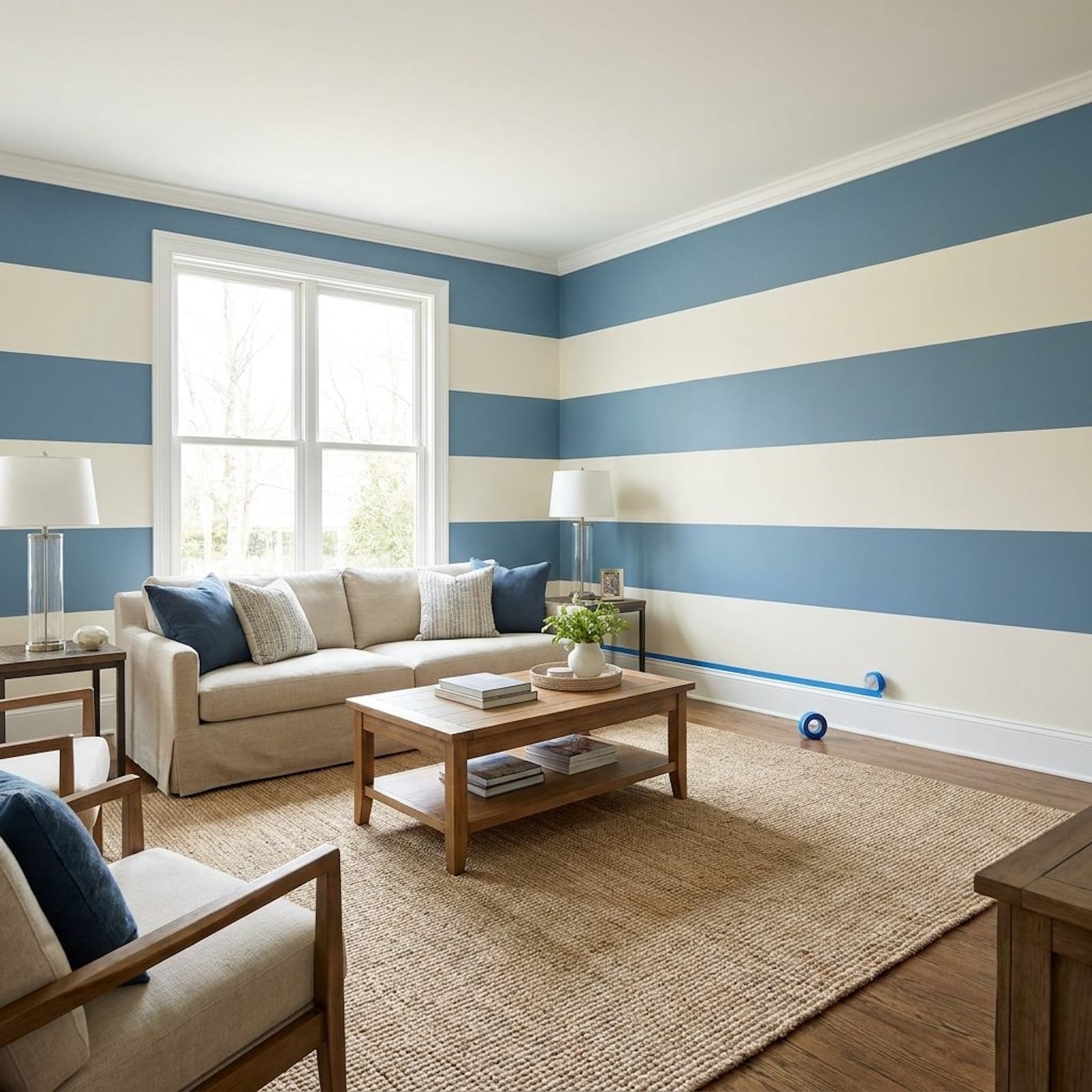
7. Creating Too Many Painted Horizontal Bands Around the Walls
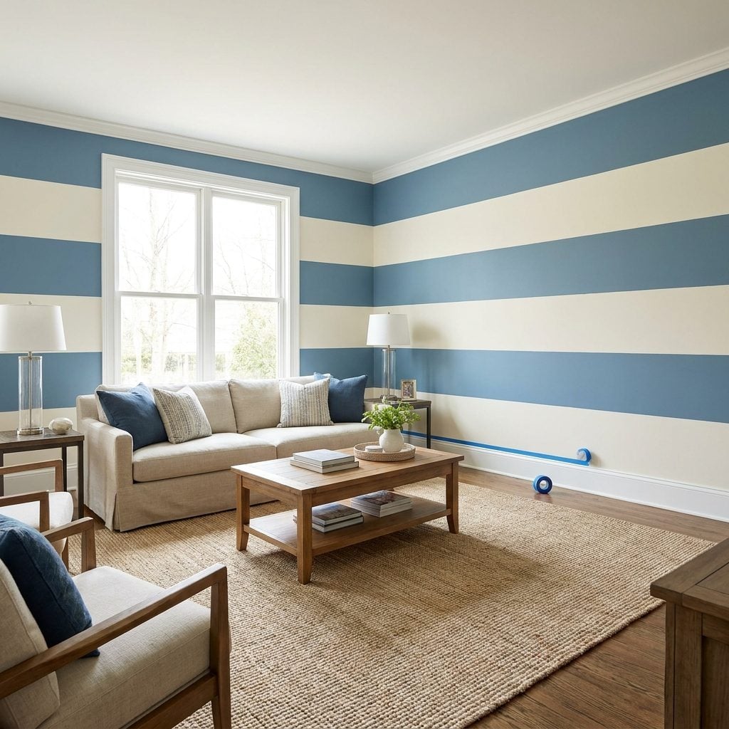
Three or four wide horizontal stripes wrapping a room read as an idea with confidence. They would probably photograph beautifully on one wall. Circle the entire space and suddenly the room starts wearing layers.
Strong horizontal bands keep sending attention sideways. In a room where height and openness are part of the appeal, that repeated striping can make the vertical dimension less important than the painted pattern.
Keep continuous banding to one feature wall, or let a single uninterrupted color carry the full height. Large rooms already have scale. They don’t need every wall proving how clever it is.
6. Using the Same Deep Color on Both Walls and Ceiling in a Low-Lit Room
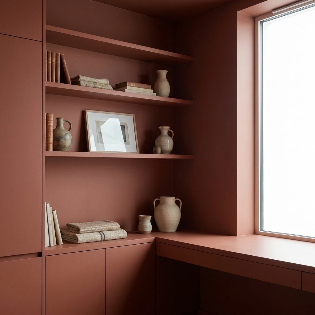
Color drenching is having a moment, and done well it’s one of the best ways to make a room feel deliberate. Same tone on walls, ceiling, trim, the works. In a bright room, it can feel enveloping and beautifully seamless. In a dim room, that same continuity can erase more architecture than you intended.
When wall and ceiling wear the same aubergine and there isn’t enough light to separate the planes, corners and ceiling lines become much less distinct. That can make the room feel cocooning — which may be exactly what you want — but it rarely emphasizes sheer size.
5. Using High-Contrast Paint Around Archways and Openings
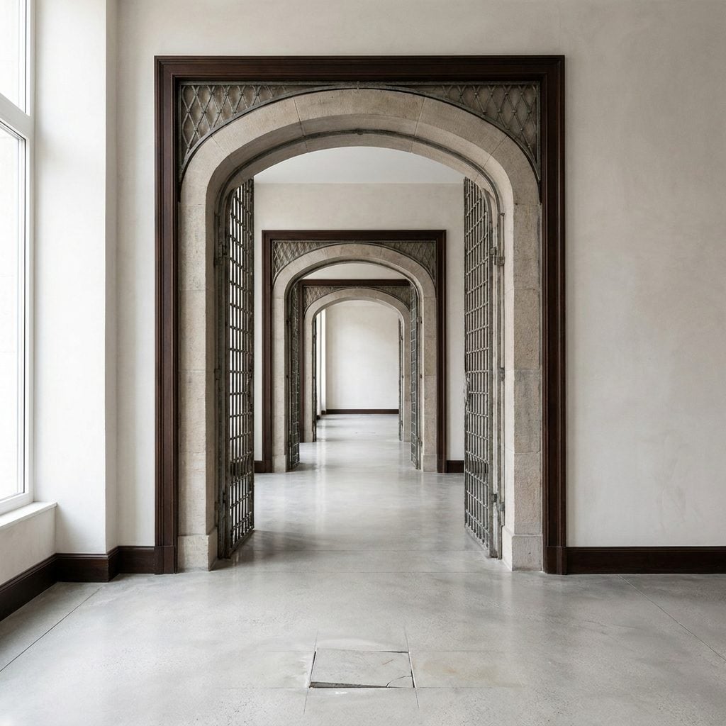
Outlining every arch in dark brown seems like a way to honor the architecture. Sometimes it does the opposite and turns each opening into a separate frame.
Instead of moving naturally from one connected room to the next, you notice the border first and the space beyond it second. Repeat that treatment several times and the house begins to feel like a sequence of portals rather than one flowing plan.
Let good arches carry themselves. Paint the opening close to the wall color, or only slightly deeper, so the shape stays visible without becoming a checkpoint.
4. Using Several Medium-Dark Moody Colors in the Same Large Space
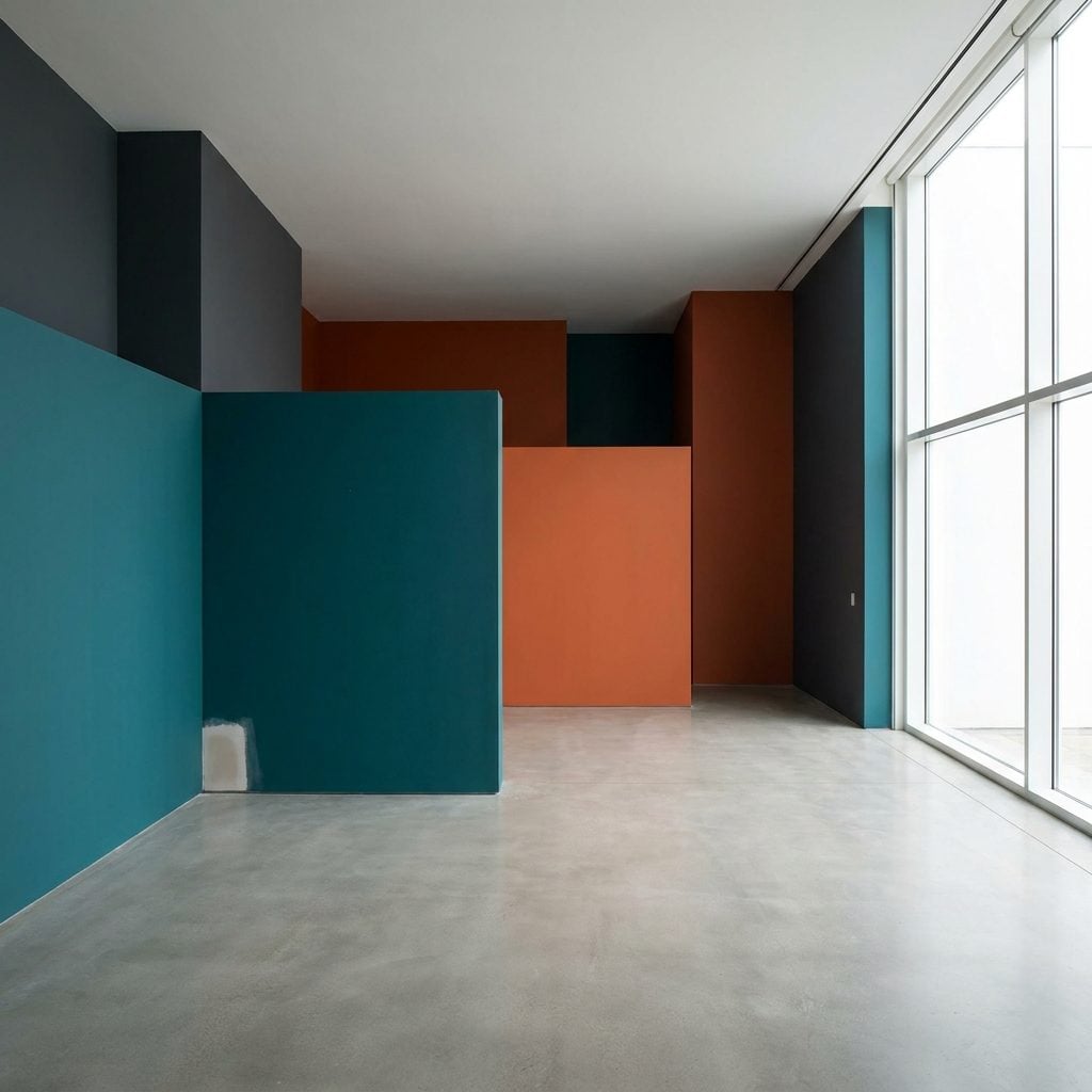
One deep saturated color in a big room can look spectacular. Four of them distributed across one open volume can start acting like imaginary walls.
Smoky plum in the living zone, charcoal-green over dinner, deep brown in the alcove, slate at the transition — each one handsome. Together, they give every section of the floor plan its own heavy visual identity.
Choose one moody hero color and carry it farther. Let the variation come from upholstery, art, rugs, wood, stone, and lighting instead of changing the walls every twenty feet. A big room can absolutely be dark. It just doesn’t need five competing versions of darkness.
3. Painting the Ceiling Darker Than the Walls
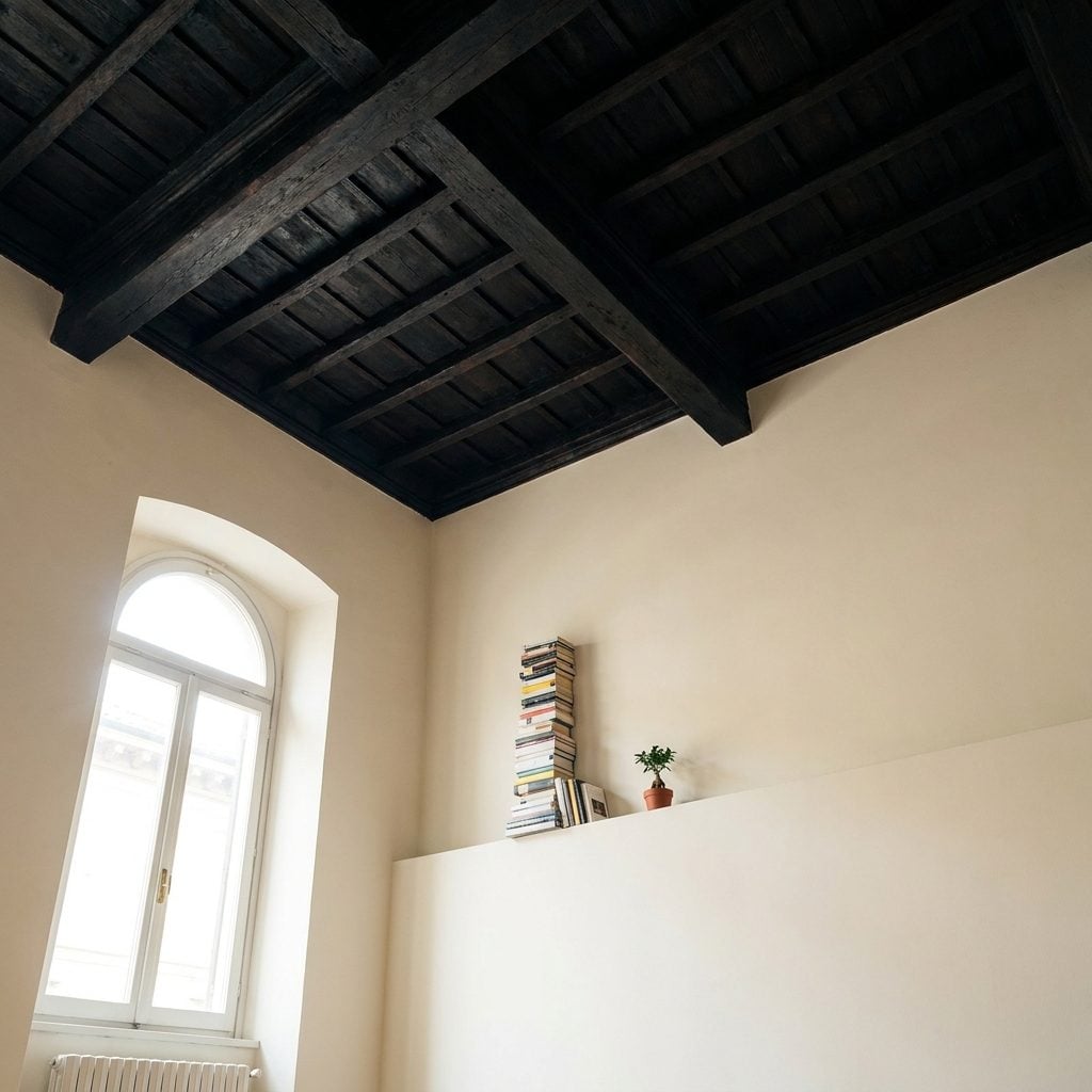
A dark ceiling over pale walls can work beautifully when intimacy is the goal. In a tall room where you’re trying to celebrate every inch of height, however, that same move can feel like putting a lid on the space.
The darker overhead plane becomes more noticeable and may appear lower, especially when the contrast with the walls is pronounced. Restaurants and lounges often use that effect deliberately because huge rooms can benefit from feeling more contained.
If you want the ceiling to recede instead, keep it light or use a ceiling color only slightly removed from the walls. Love the idea of color overhead? Try a much paler tint rather than taking the deepest shade in the palette straight to the top.
2. Using Stark Color Changes Between Connected Open-Plan Areas
🔥 Would you like to save this?
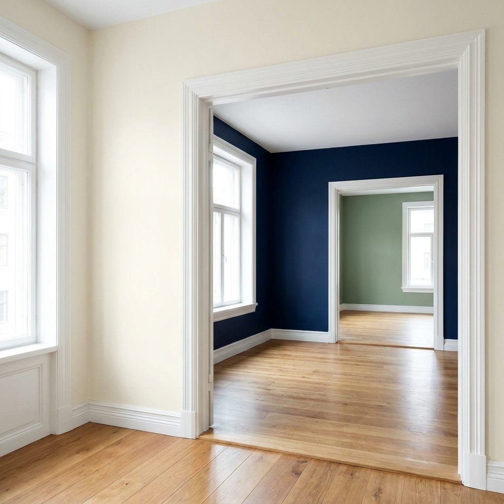
Ivory living room, navy dining walls, sage-green kitchen — all visible through the same wide openings designed so you could take in the entire floor in one sweep.
The colors are not wrong. The hard transitions are. Every abrupt shift announces the beginning of another zone, and suddenly the open plan feels more like three adjoining rooms than one continuous volume.
Run one color through the main connected sightline, or shift subtly within the same family. Save the real contrast for an island, fireplace, cabinet bank, or one feature wall. Open-plan architecture already did the difficult work of creating continuity. Paint doesn’t need to rebuild the walls.
1. Choosing Paint From a Tiny Swatch Without Testing It Through the Day
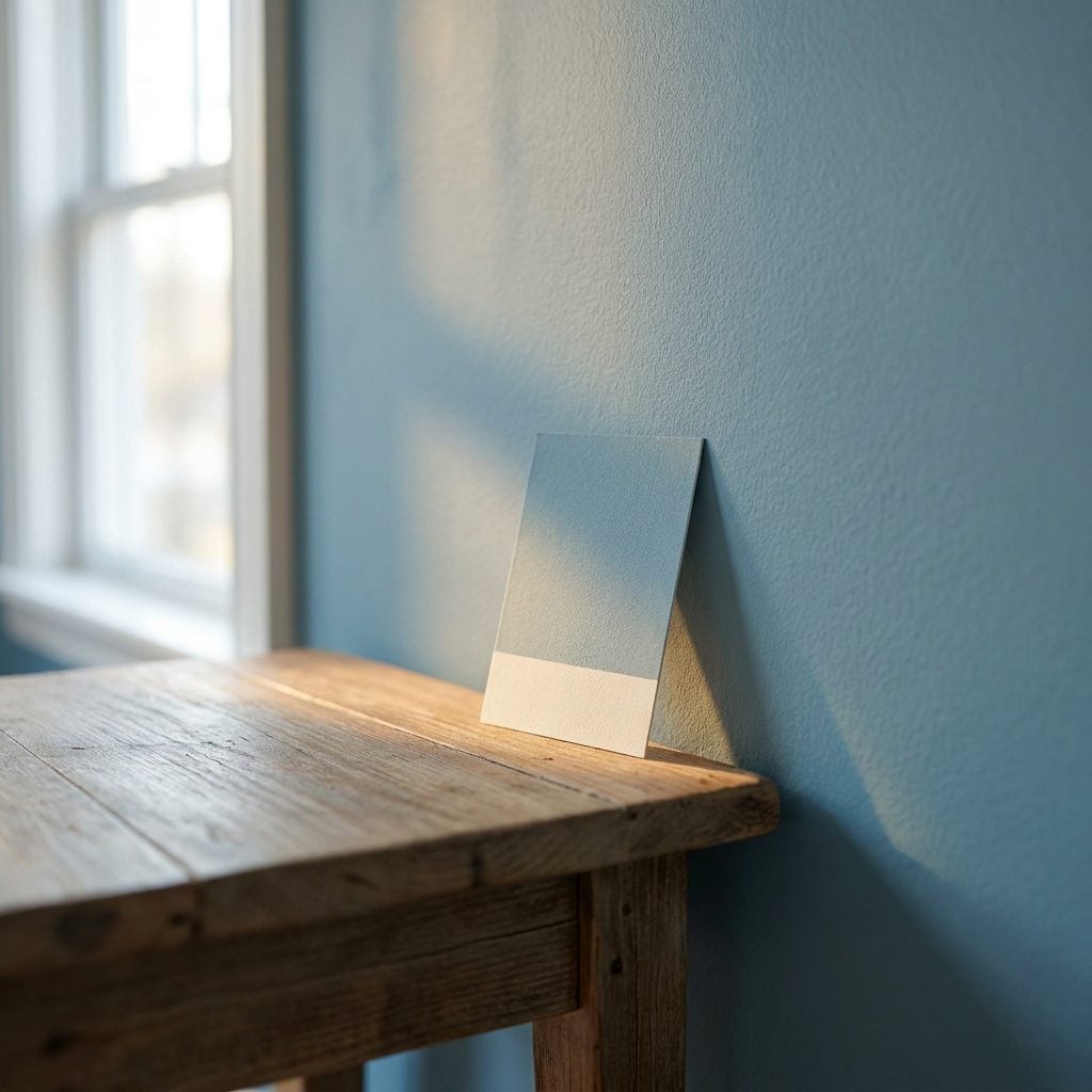
Look at that little sample card on the side table. Under the store’s direct lighting, the greige looked clean and neutral. Roll it across a thousand square feet of wall, let the late-afternoon sun hit it, and suddenly a violet undertone you never invited has moved in permanently.
A tiny chip can’t show you how color will react to orientation, floors, furniture, daylight, artificial light, or sheer acreage. The bigger the wall, the more dramatic the surprise can become.
Paint a poster-sized sample or two large boards and move them around the room. Look at them at 9 a.m., 3 p.m., dusk, and under the lamps at night. A color that still behaves when the room is at its least flattering is the one worth buying by the gallon.