🔥 Would you like to save this?
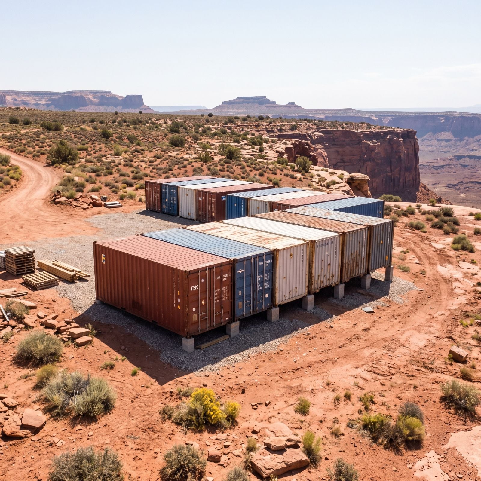
Twelve shipping containers do not arrive with much poetry built in. They are blunt, repetitive, engineered for freight, and spectacularly indifferent to scenery. That is exactly why they make such a good architectural provocation. Give the same steel stack to 39 different ideas and suddenly roofs lift, courtyards appear, glass cuts through the mass, stone pins it to the ridge, and entire floors begin to float over the clouds.
The fascination is not in disguising the containers. It is in watching architecture overtake them. These concepts work the same raw geometry through wildly different languages, from alpine shelter and dark monolithic cladding to winter gardens, planted roofs, glazed bridges, and terraces hanging over nothing but weather. By the end, the boxes are still there. They just no longer get the last word.
In order to come up with the very specific design ideas, we create most designs with the assistance of state-of-the-art AI interior design software. Also, assume links that take you off the site are affiliate links such as links to Amazon. this means we may earn a commission if you buy something.
39. Stepped Terraces Replace One Big Platform With a Sequence of Edges
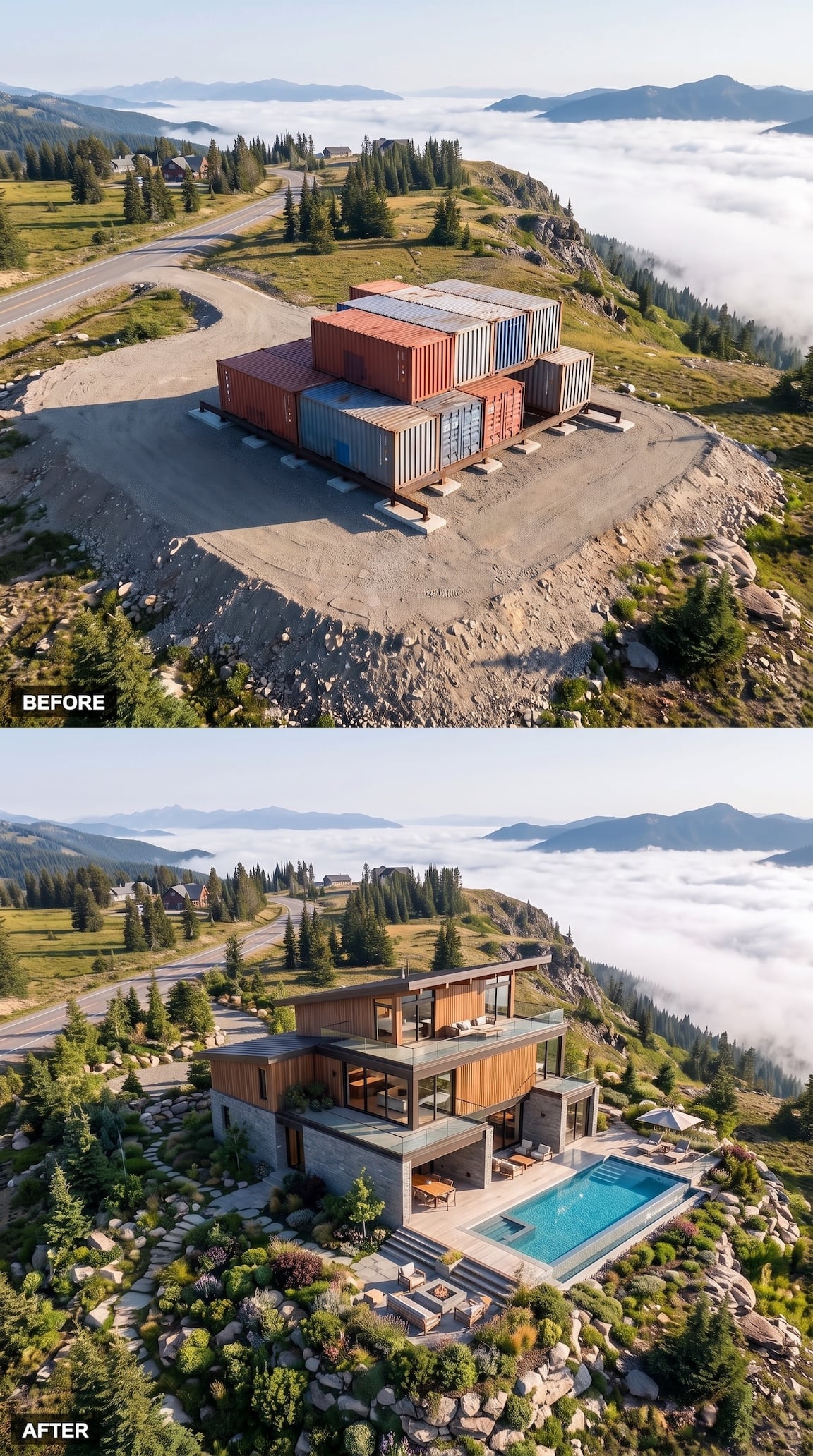
The raw stack sits on the ridge like freight waiting for another truck. The redesign breaks that blunt mass into levels: stone at the base, warm timber above, deep glazing between them, and terraces slipping out at different heights toward the clouds.
That stepping changes the relationship with the site immediately. Instead of one object parked on a scraped pad, the house begins to negotiate the slope. The pool occupies the lowest major terrace, upper decks recede beneath the volumes above, and the whole composition climbs rather than simply stacks.
38. A Glass Pavilion Makes the Roof Feel Like Another Landscape
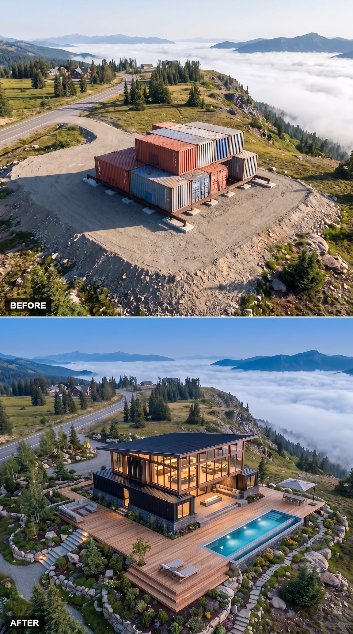
The second transformation takes almost the opposite approach. Instead of emphasizing the stack, it buries the denser volumes below a transparent upper pavilion whose glass walls seem to dissolve into the sky.
A broad roof stretches beyond the glazing, while the pool and timber terrace extend the architecture horizontally toward the ridge edge. In daylight the glass reflects mountain and cloud; once the interior is lit, the same upper level would read more like a lantern set above the darker base.
37. From Freight-Yard Stack to a House Made for the View
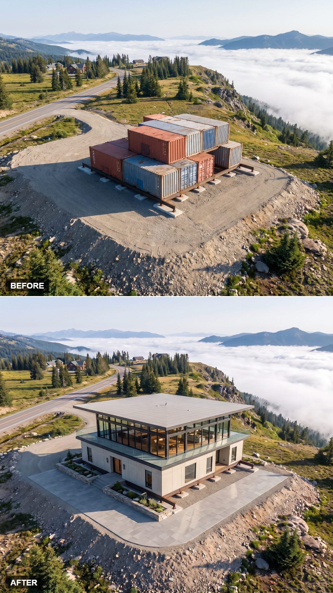
This transformation attacks the containers’ biggest visual liability: all that blank corrugated steel. Large areas of glazing cut into the elevations while warm timber and charcoal cladding pull the separate boxes into a more coherent whole.
The strongest move is subtraction. Once portions of the solid walls disappear, the mountain begins passing visually through the building instead of stopping at it. The original stack still supplies the geometry, but it no longer dominates the experience.
36. Twin Roof Peaks Pull the Boxes Into the Mountain Silhouette
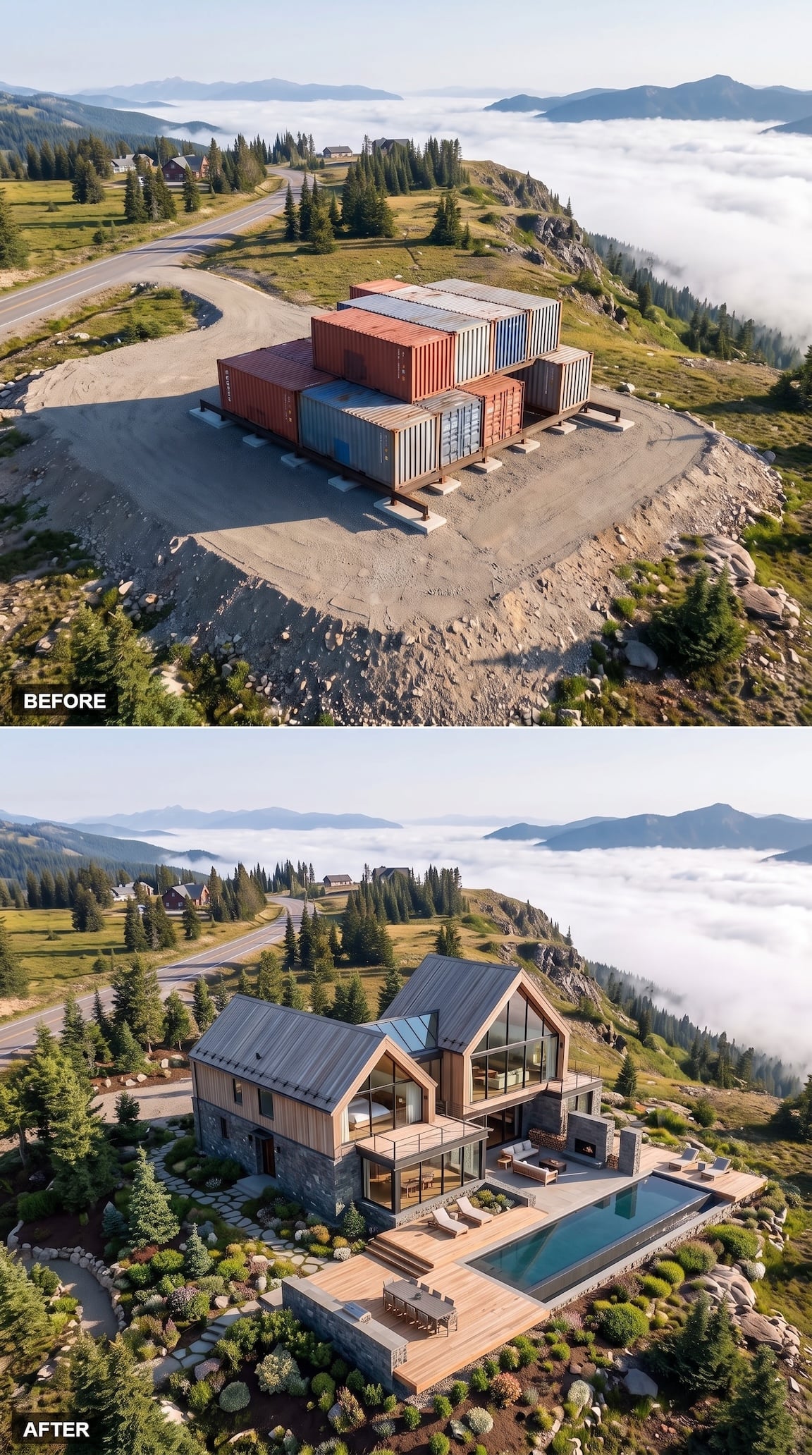
The before image is almost aggressively horizontal: stacked rectangles sitting beneath an enormous mountain skyline. Two steep gabled volumes change that conversation immediately, introducing vertical peaks that answer the terrain behind them.
Stone gives the lower level weight while timber warms the upper forms. Then the long pool and terrace pull everything back toward the horizon. The result borrows the sheltering silhouette of an alpine chalet without resorting to decorative nostalgia.
35. A Rooftop Observatory Gives the House a Reason to Look Up
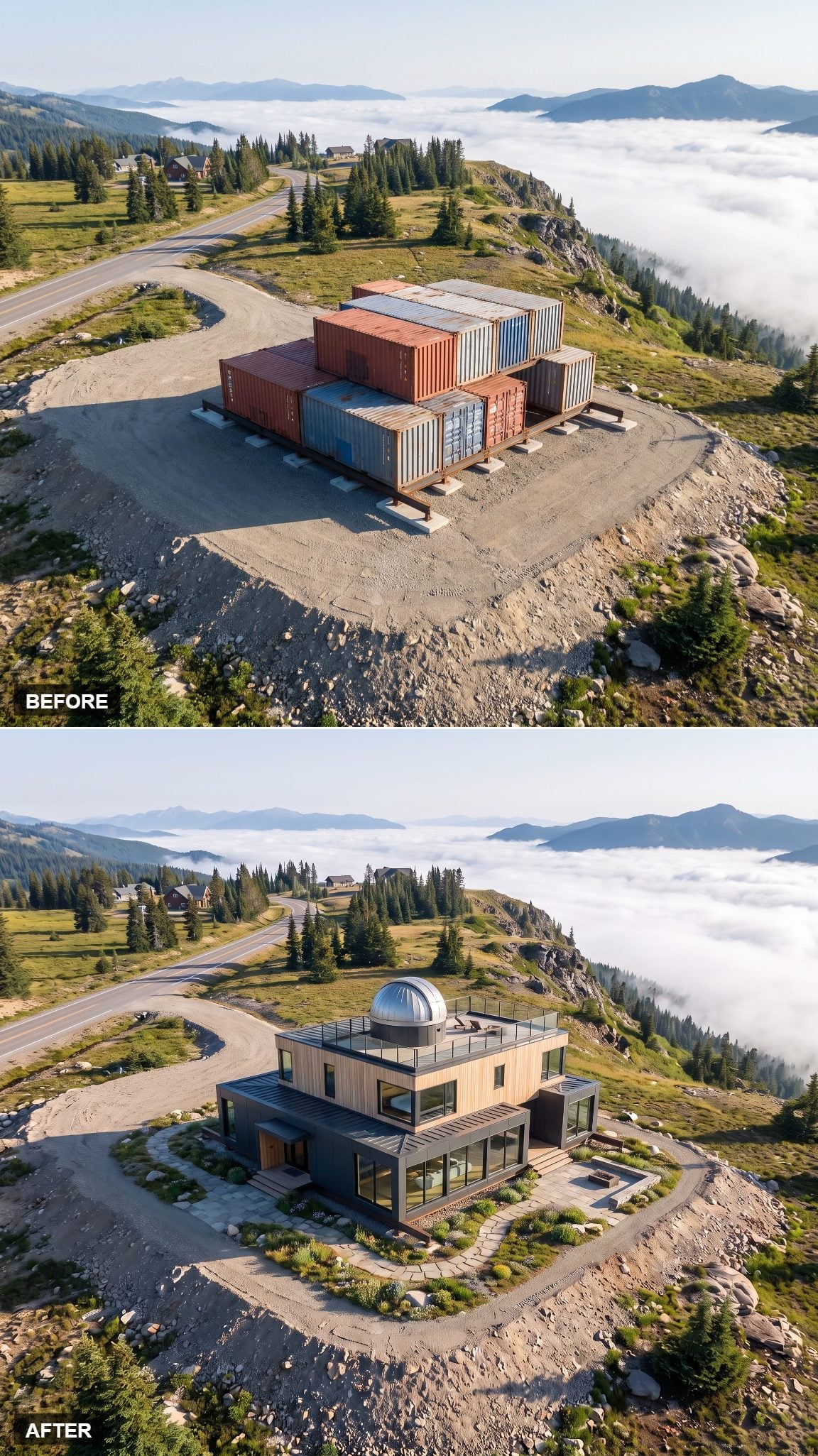
Most container concepts work hard to make the boxes feel wider. This one goes vertical instead, setting a glazed lookout above the main mass like a small observatory.
The whole reading of the house changes at once. The shipping modules become the compact base while the transparent room above takes over as the architectural event. On a ridge where sky occupies as much of the view as land, looking upward makes as much sense as looking out.
34. The Atrium Makes the Middle of the Stack Matter
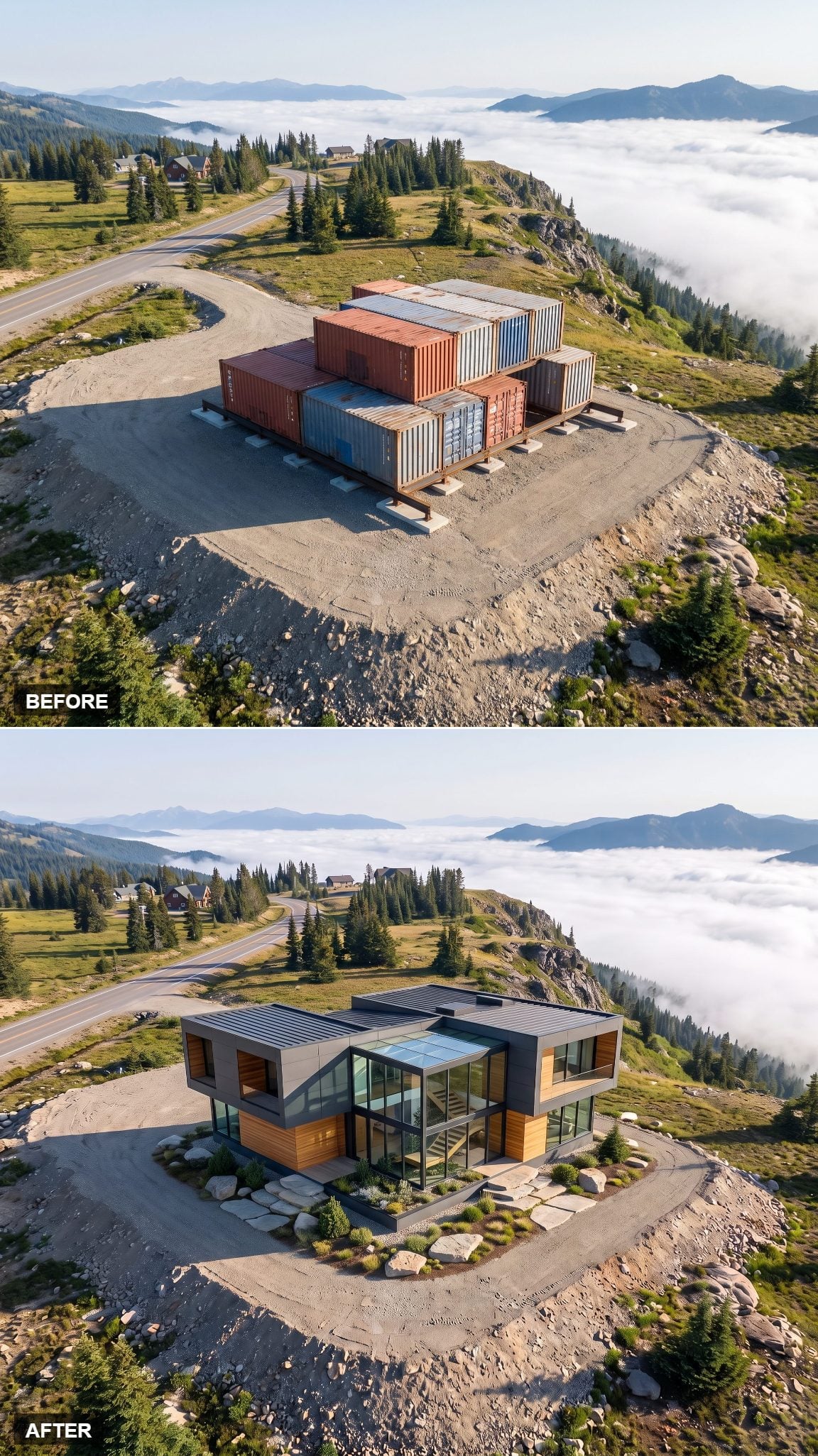
Instead of opening every module toward the cliff, this scheme directs part of the architecture inward. A glazed central void becomes the hinge between surrounding volumes, giving the house a protected center rather than a collection of rooms all competing for the outer edge.
Planting inside that core softens the steel-and-glass vocabulary further. The contrast is no longer simply container versus mountain. It becomes hard outer shell against a sheltered green interior.
33. Sawtooth Roof Monitors Put the Industrial DNA to Better Use
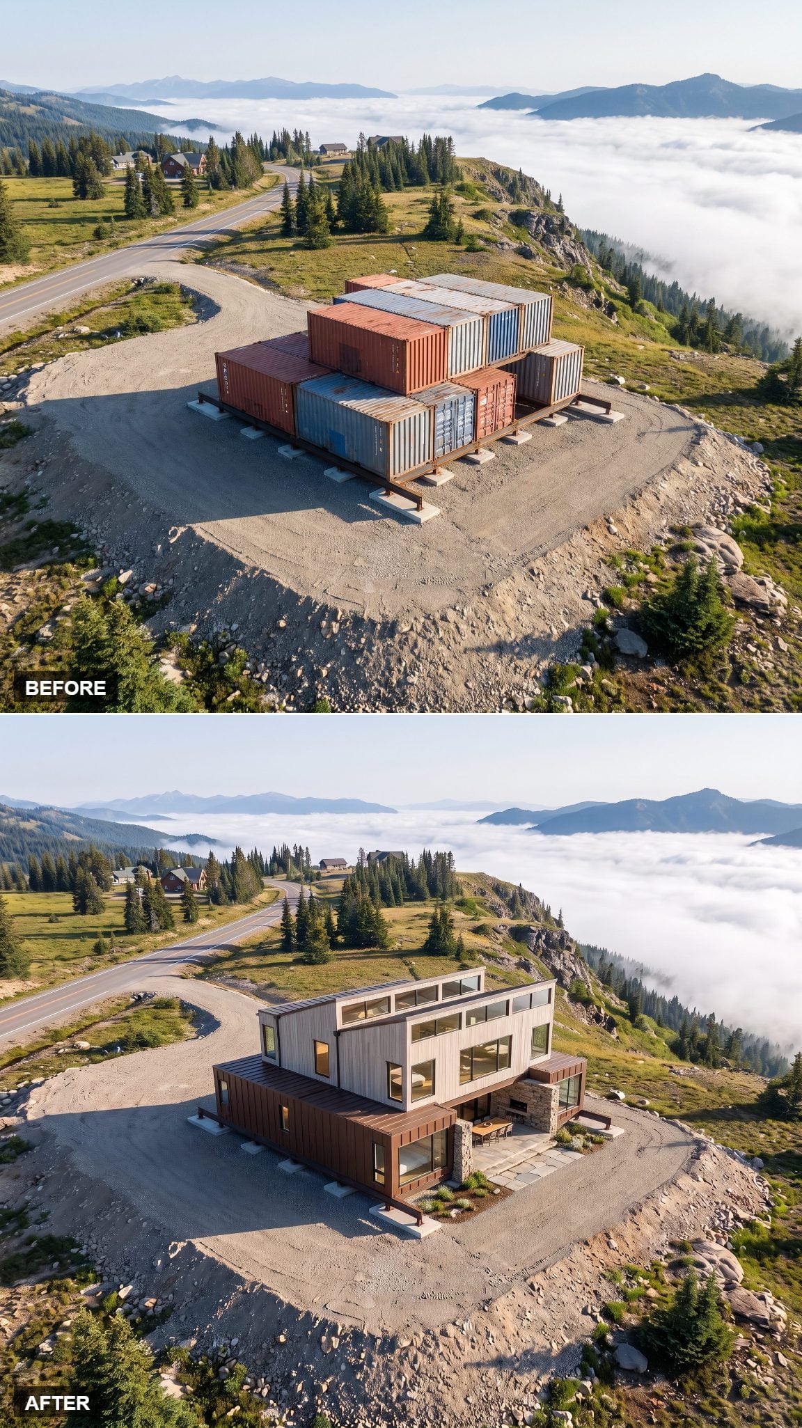
The sawtooth roof fits because it does not pretend the project was born as a chalet. Its repeating roof monitors belong to the same industrial family as the containers, but they turn that language into an intentional architectural rhythm.
Depending on orientation, sawtooth glazing can also bring controlled daylight from above. Visually, the repeated peaks break apart the long flat roof without disguising the modular logic underneath.
32. Copper-Toned Cladding Makes the Stack Read as One Object
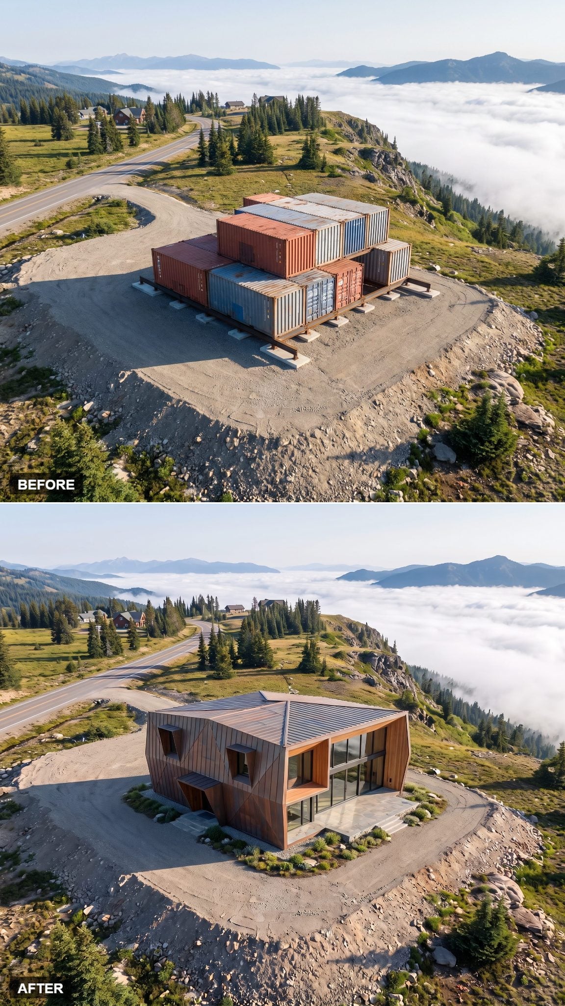
One approach is to celebrate every corrugation. This concept goes the other way, wrapping the cluster in a continuous copper-toned skin that visually erases the individual boxes.
Deep window openings keep the elevations from becoming flat, while the warm metallic color pushes against cool rock, cloud, and evergreen forest. The industrial origin is still buried underneath, but the exterior no longer needs to announce it.
31. A Winter Garden Splits the House Into Solid and Transparent
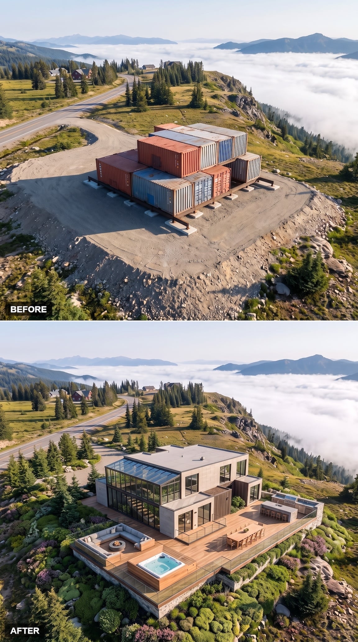
A full-height glazed conservatory gives this scheme two distinct halves. The solid rectangular volume anchors the ridge; the transparent enclosure beside it nearly dissolves.
The terrace, hot tub, and outdoor seating extend the same contrast horizontally. What began as an isolated freight stack becomes a sequence of enclosed rooms, glazed rooms, and open-air rooms rather than one undifferentiated object.
30. A Folded Roof Gives the Boxes a New Silhouette
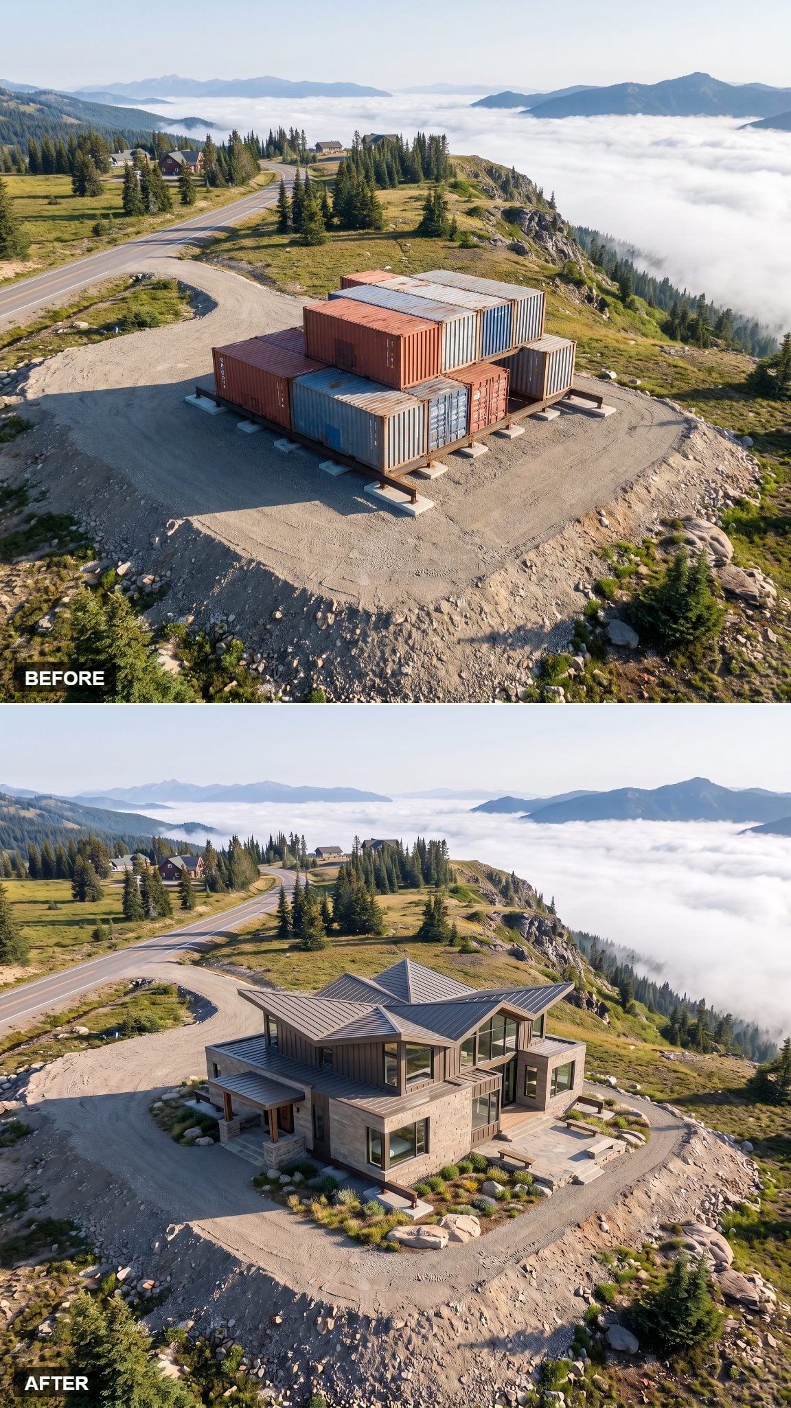
The original containers are all right angles and flat lids. This roof breaks that discipline deliberately, folding into sharp planes that catch light differently as they rise and fall.
Everything underneath stays comparatively calm, which is why the gesture works. Glass and warm interior surfaces sit below the dark roof rather than competing with it. One decisive shape is enough to give the house an identity.
29. The Butterfly Roof Opens the House Toward Sky and Valley
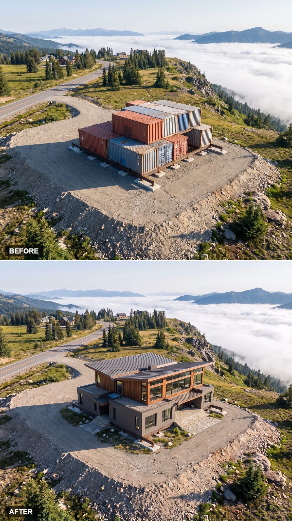
A butterfly roof reverses the familiar pitched form: its outer edges rise while the middle drops. On this ridge, that broad V immediately gives the compact container mass more breadth and a lighter profile.
Its real-world performance would depend on drainage, snow loading, structure, and orientation, but visually the idea is strong. The roof becomes the first thing you read; the boxes underneath become supporting geometry.
28. A Pass-Through Opening Makes Empty Space the Main Feature
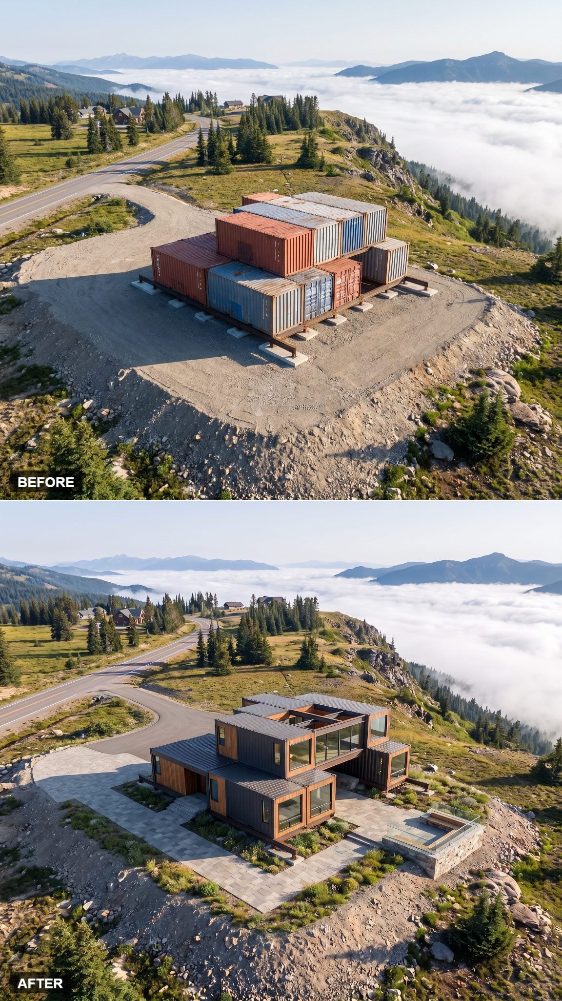
This scheme celebrates the part where there is no building at all. A large opening cuts through the mass and frames the cloud line beyond.
The void keeps the cluster from reading as one heavy block. Dark lining around the passage sharpens the frame, making the landscape visible before furniture, finish, or room gets a chance to compete with it.
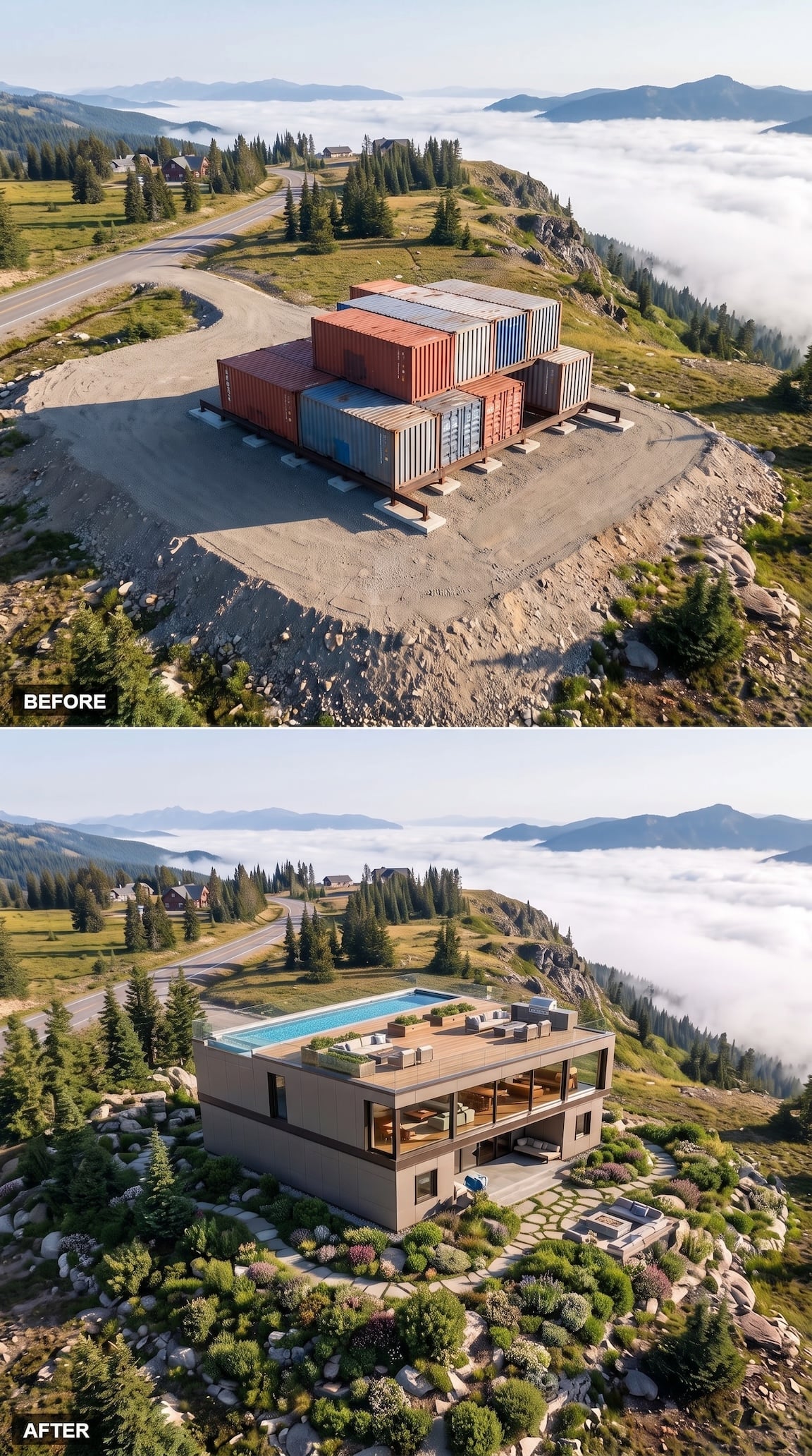
27. The Quiet Roof Terrace Lets the Horizon Carry the Drama
🔥 Would you like to save this?
Not every redesign needs an acrobatic roof. This one stays deliberately low and rectangular, trading the visual clutter of the container stack for long, controlled horizontal lines.
A roof terrace and pool add spectacle without making the enclosed building more complicated. Pale cladding, glass rails, and broad openings keep attention on the enormous horizontal band of cloud beyond. The restraint is the move.
26. One Giant Window Makes the Mountain the Main Interior Finish
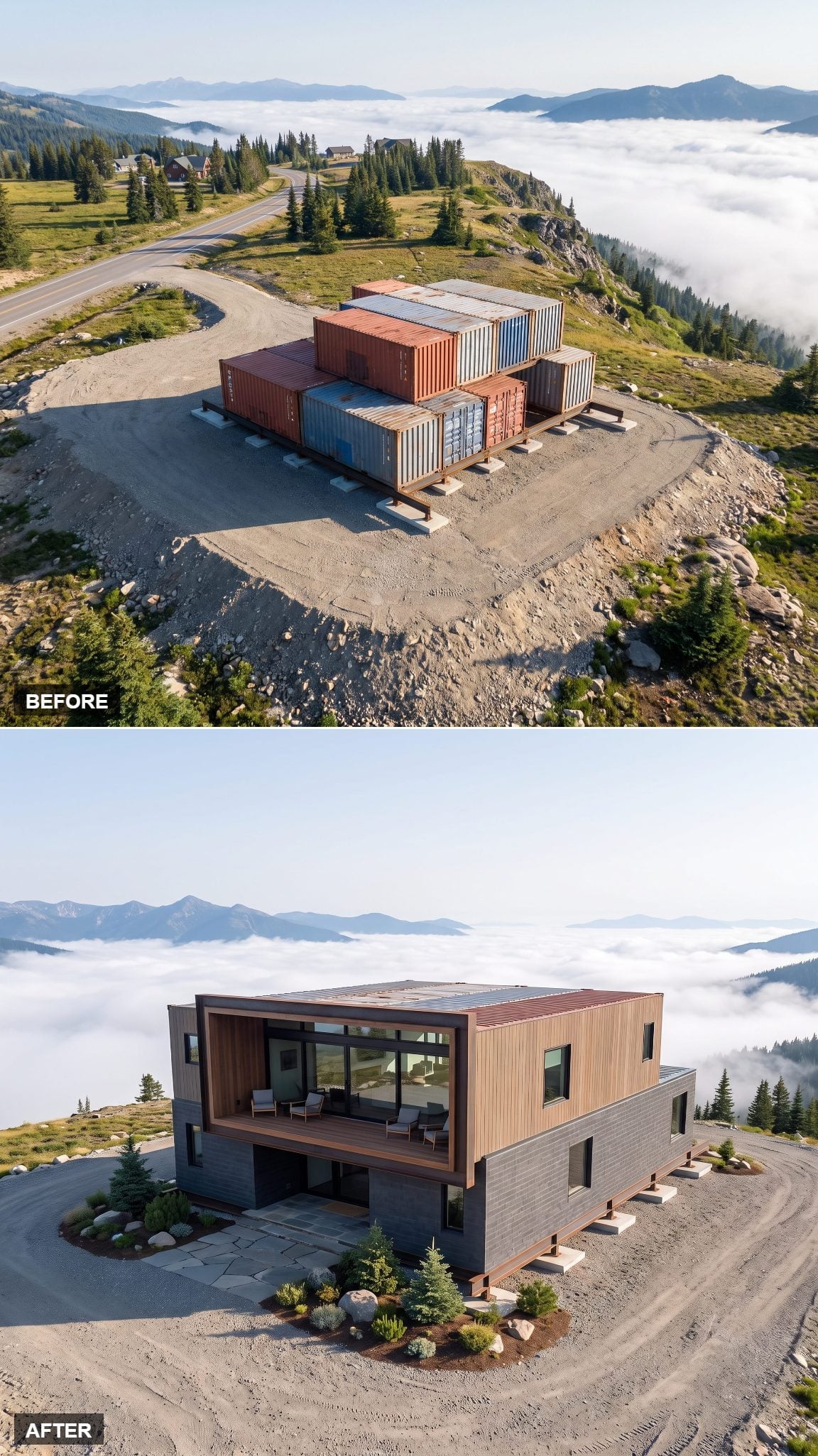
The attraction is almost embarrassingly simple: make one opening much larger than the others and aim the architecture toward it. The huge glazed frame becomes the visual center of the house.
If every wall were equally transparent, the panorama could become background. Framing one dominant view gives the eye a destination and makes the surrounding solid walls feel deliberate rather than leftover.
25. High-Desert Restraint Looks Surprisingly Convincing at Altitude
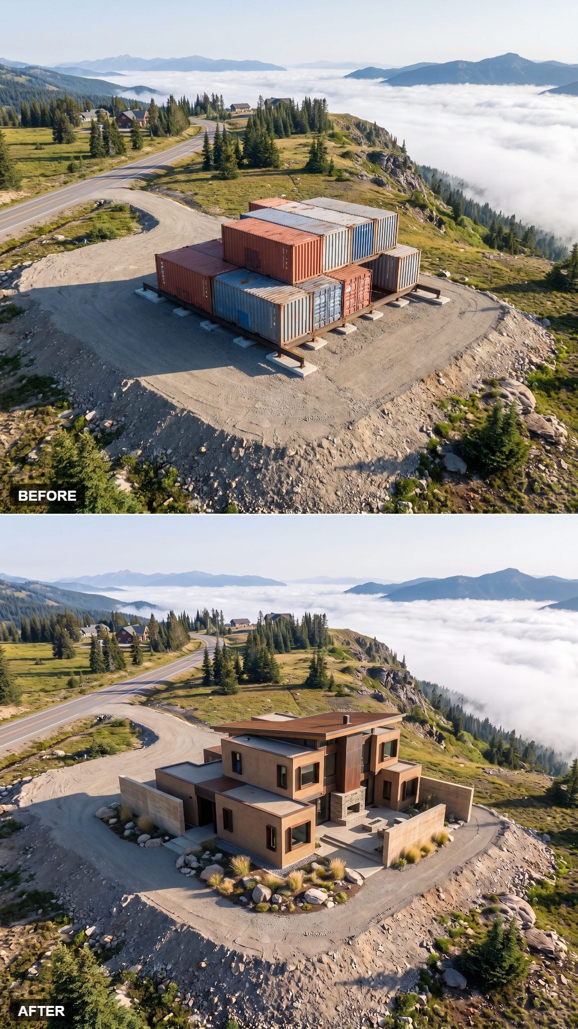
Warm mineral colors, deep openings, broad overhangs, and low horizontal massing steer the containers away from industrial imagery and toward high-desert modernism.
The mismatch is part of the appeal. Sandy render and muted terracotta usually suggest dry heat, yet against alpine rock and white cloud they make the house feel warmer and more settled. The setting supplies enough drama; the architecture does not need another loud color.
24. The Exoskeleton Draws the Structure Across the Façade
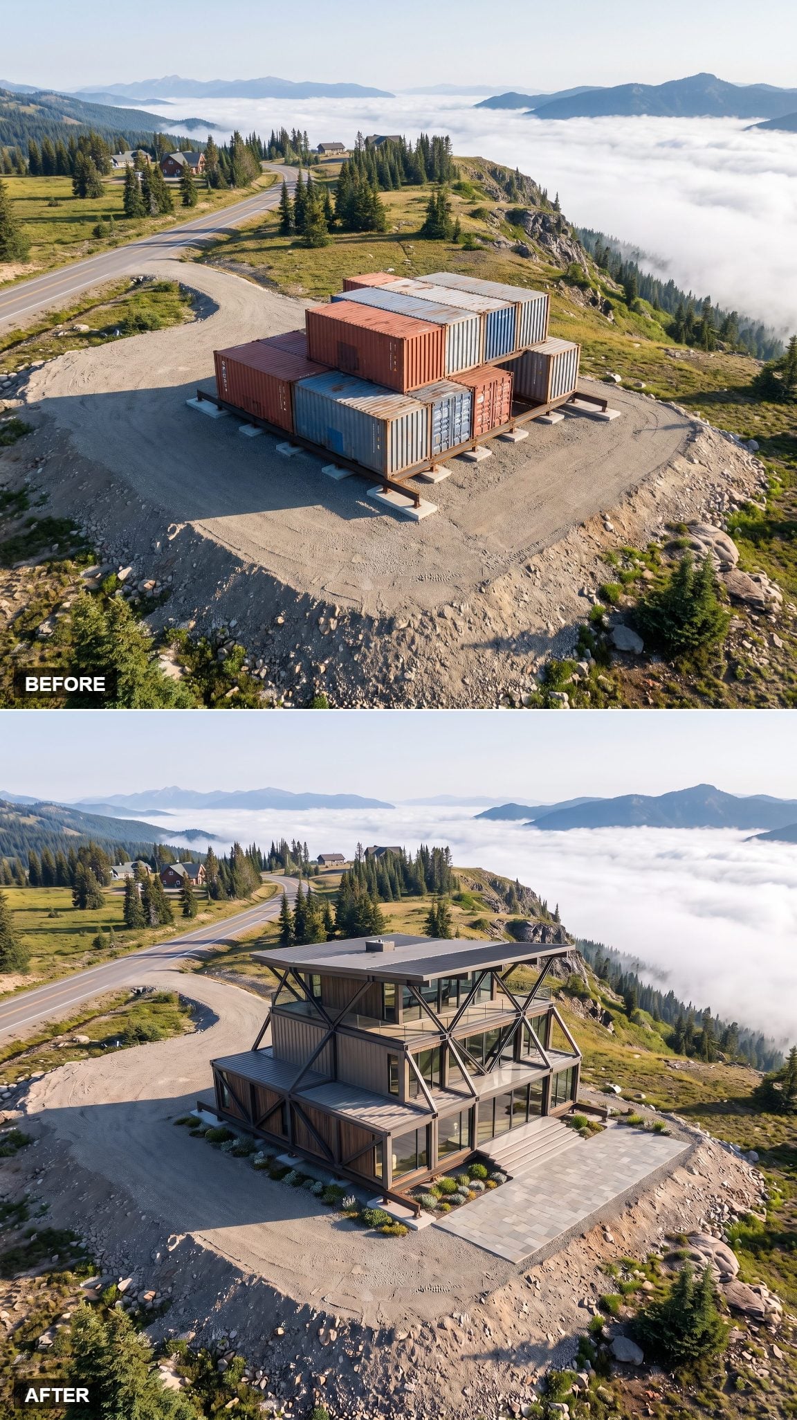
Dark diagonal members cross the façade instead of disappearing behind it. Whether or not this exact arrangement became the final engineered structure, visually it gives the house a powerful new identity.
The diagonals cut through a grid previously ruled by horizontals and verticals. Against pale glazing and stone, the black frame reads almost like an architectural sketch drawn directly over the building.
23. The Courtyard Gives an Exposed Ridge a Protected Center
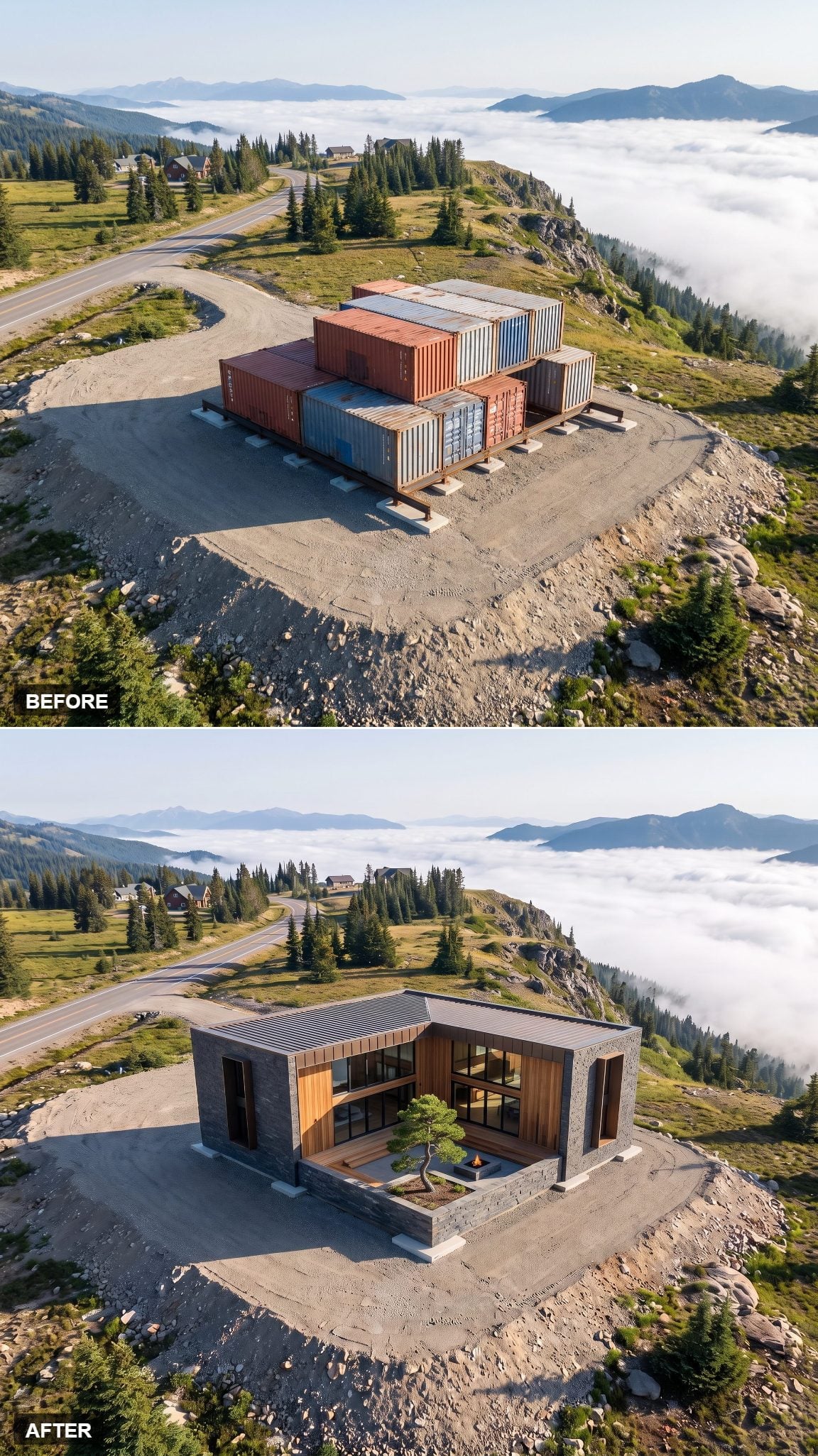
A straight row of modules would maximize outward views. This scheme sacrifices some of that exposure to create a protected middle, folding the volumes around a courtyard rather than aiming every room toward the cliff.
That produces two distinct experiences: panorama at the outer edge and enclosure at the center. On a site this dramatic, withholding the view in one place can make its return feel even stronger.
22. Stone Makes the Containers Look as Though They Mean to Stay

Containers carry an unavoidable association with mobility. Stone sends the opposite message. Put the two together and the tension becomes useful.
Here massive masonry forms appear to grip the lighter metal volumes, lending the composition a permanence the raw stack lacks. The house no longer looks delivered to the ridge. It looks embedded in it.
21. The Ribbon Window Keeps the Box and Changes What the Box Sees
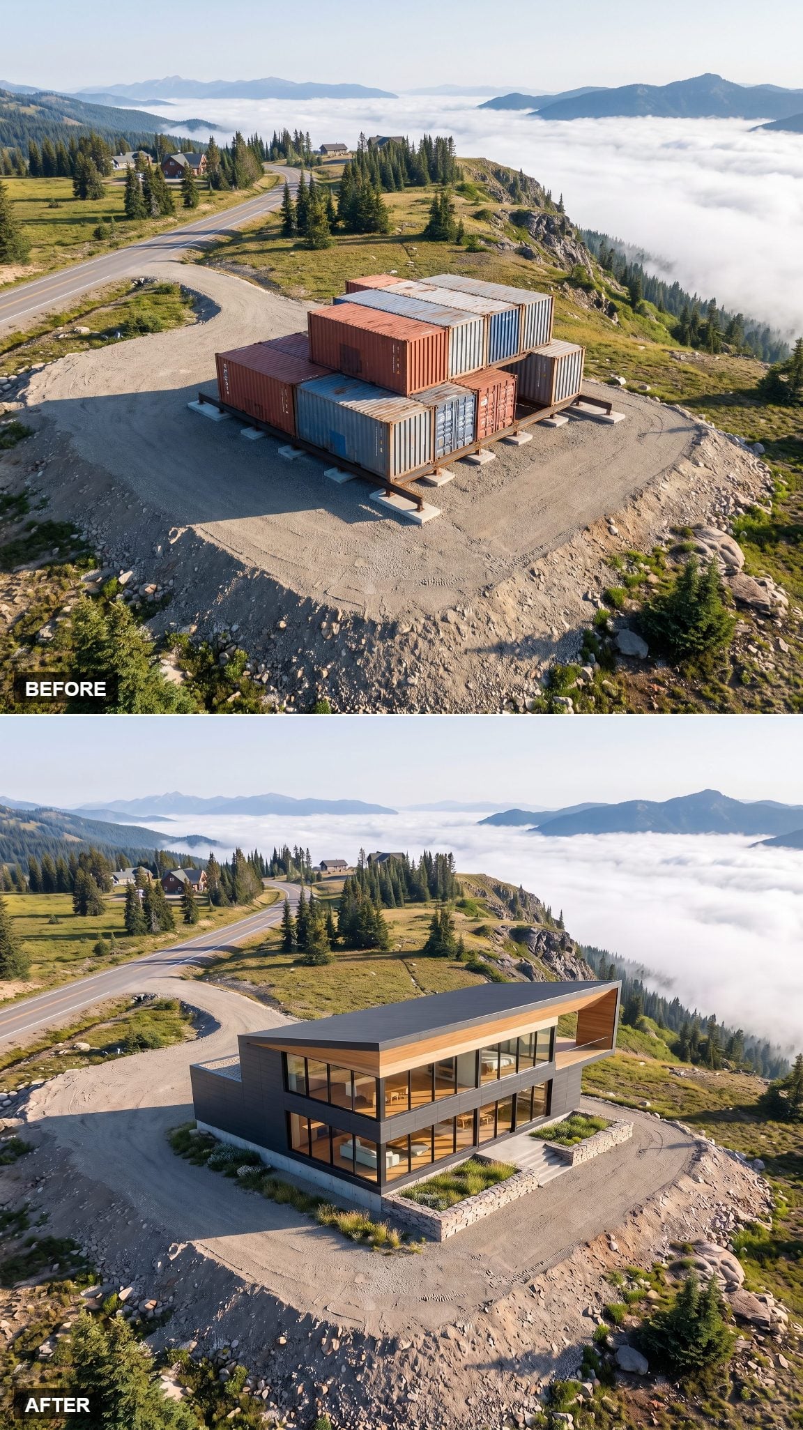
This design refuses the temptation to spread outward. The mass stays compact and boxlike, but a long horizontal band of glazing slices across the elevation.
That single line changes the scale of the façade. Individual container bays matter less because the eye follows the glass from side to side. It is one of the cleanest transformations in the gallery precisely because it does so little.
20. The Inverted Roof Carves Out a Pocket of Sky
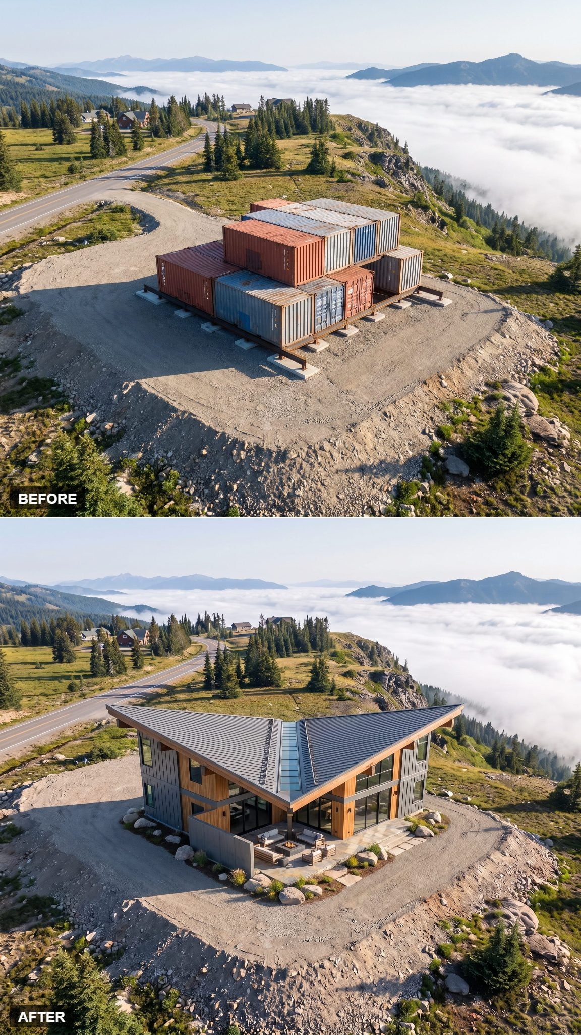
Instead of merely covering the containers, the roof folds inward and creates a valley between the upper volumes. That negative space becomes almost as important as the roof itself.
The fold prevents the skyline from turning into one long slab and creates a more intimate zone high above the ground. On a real mountain site, drainage, snow, waterproofing, and structure would all demand serious attention; as a concept, the spatial effect is compelling.
19. Long Sightlines Make the Narrow Modules Feel Deliberate
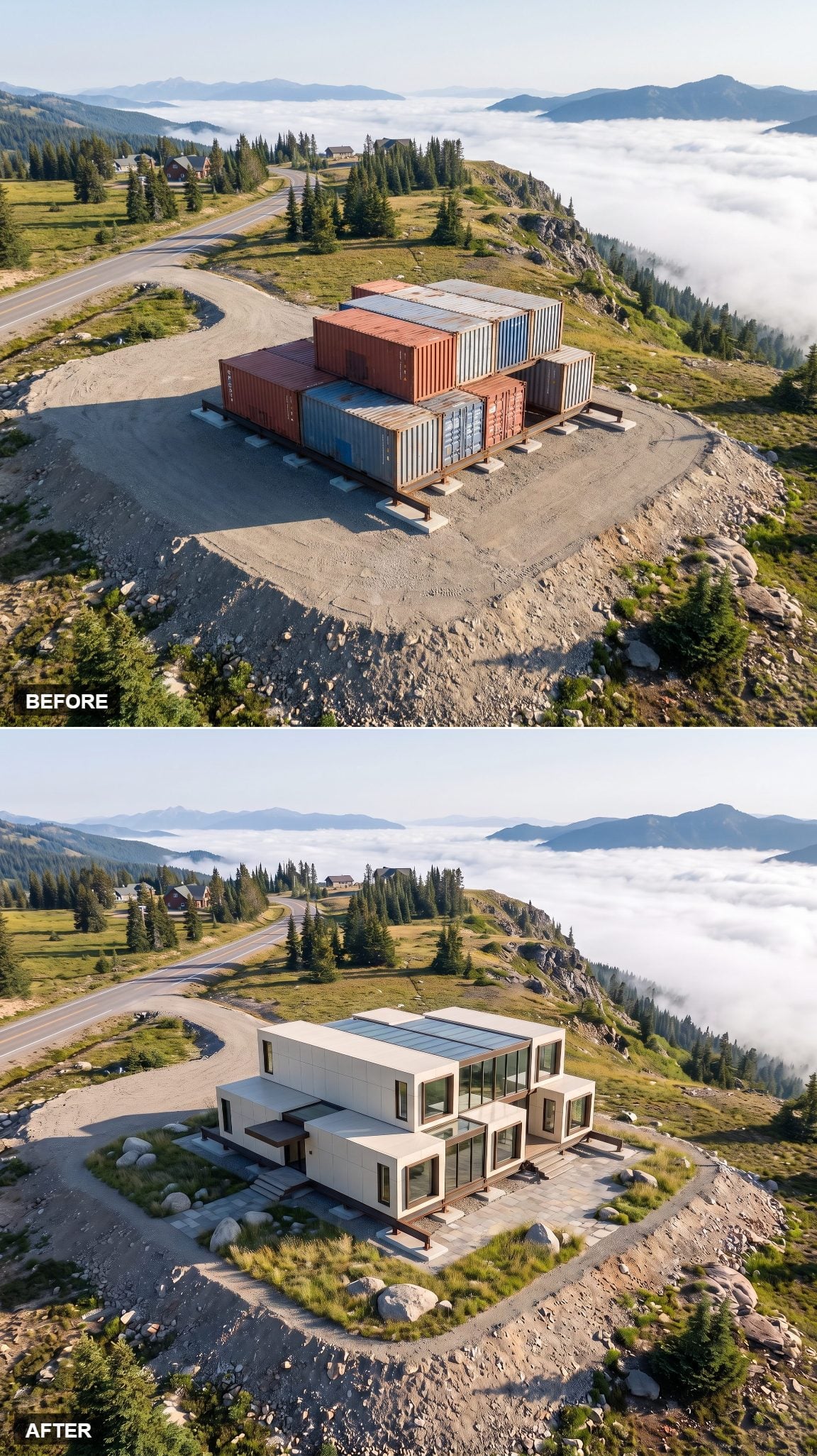
Container proportions are naturally long and narrow. Rather than fighting that, this scheme exaggerates it, lining up openings so the eye travels through several spaces toward a framed landscape at the far end.
The result reads less like a compromised floor plan and more like a gallery sequence. Pale surfaces stay quiet while the distant window becomes the visual punctuation mark.
18. Angled Glass Gives the Cliff Side a Sense of Motion
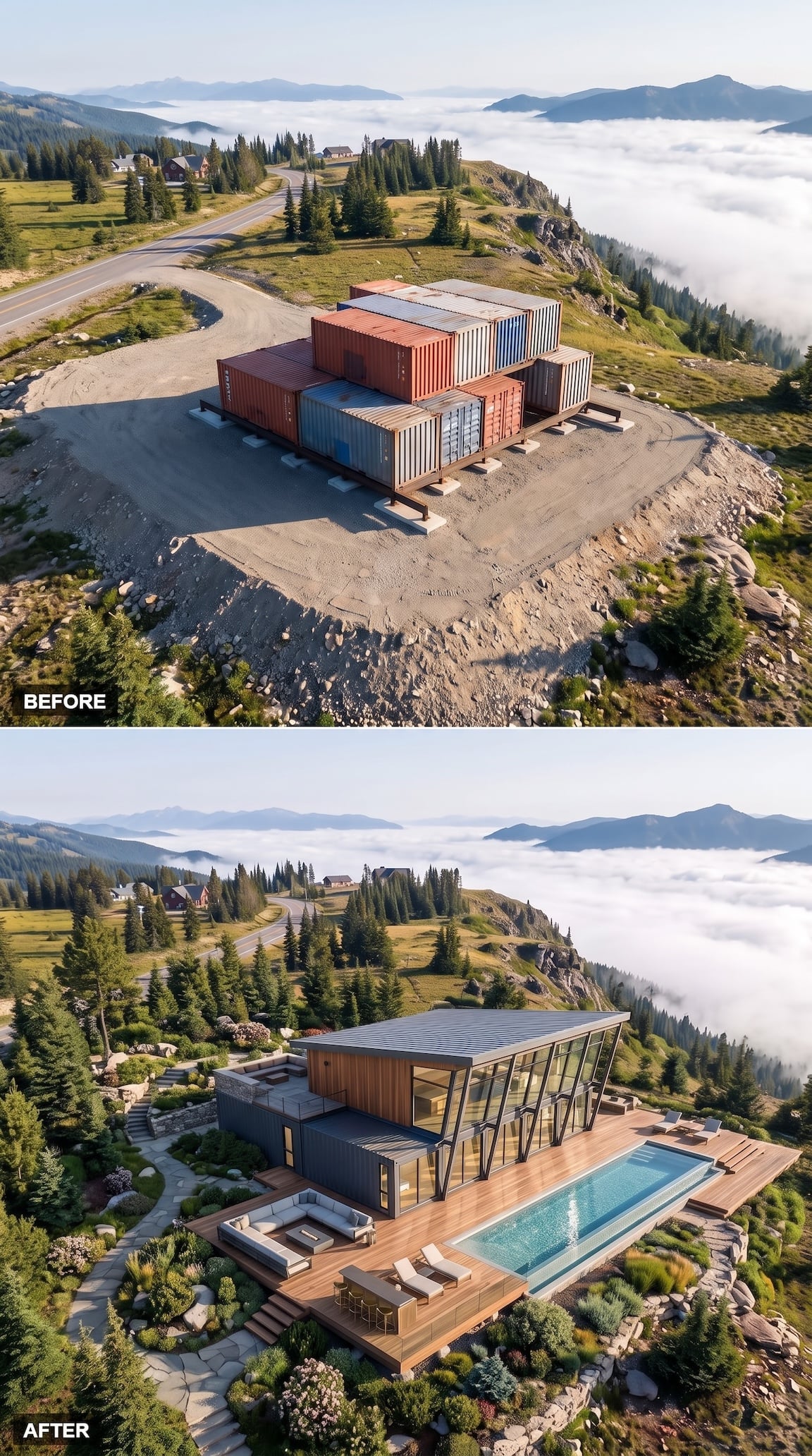
The before stack is relentlessly upright. This version introduces a glazed wall that leans inward beneath a broad sloping roof, and suddenly the building appears to be moving toward the landscape.
The angle also changes the reflections, pushing more sky into the glass. Beside the straight pool and rigid timber deck, that slight lean supplies exactly enough visual tension.
17. A Glass Bridge Makes the Walk Between Rooms an Event
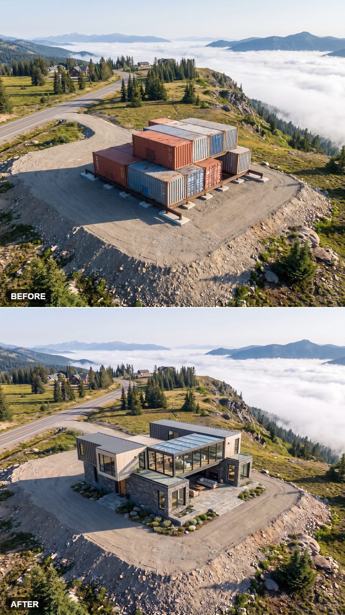
Instead of hiding the connection between upper volumes, this design makes it conspicuous. A transparent bridge spans the gap, leaving air underneath and views on both sides.
That crossing breaks the house into separate pieces while simultaneously explaining how they belong together. The container-derived masses remain anchored; the bridge is deliberately the opposite.
16. A Faceted Glass Crown Spends the Drama Up Top
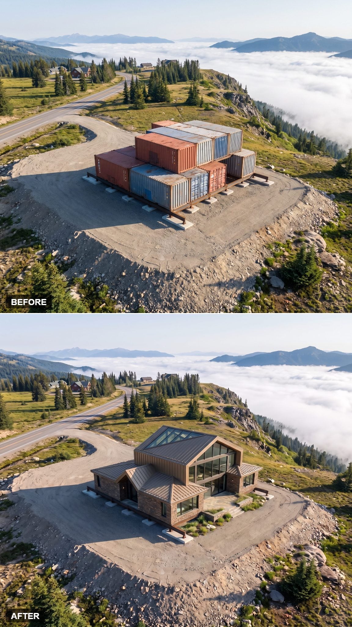
Most of the house stays rectilinear, which makes the faceted addition more effective. Its angled planes catch the sky differently from the flat steel walls below and create a new profile without requiring every part of the building to become complicated.
The contrast does the work: rough modular base, precise crystalline top. Keeping both languages visible makes the transformation more interesting than simply hiding the containers altogether.
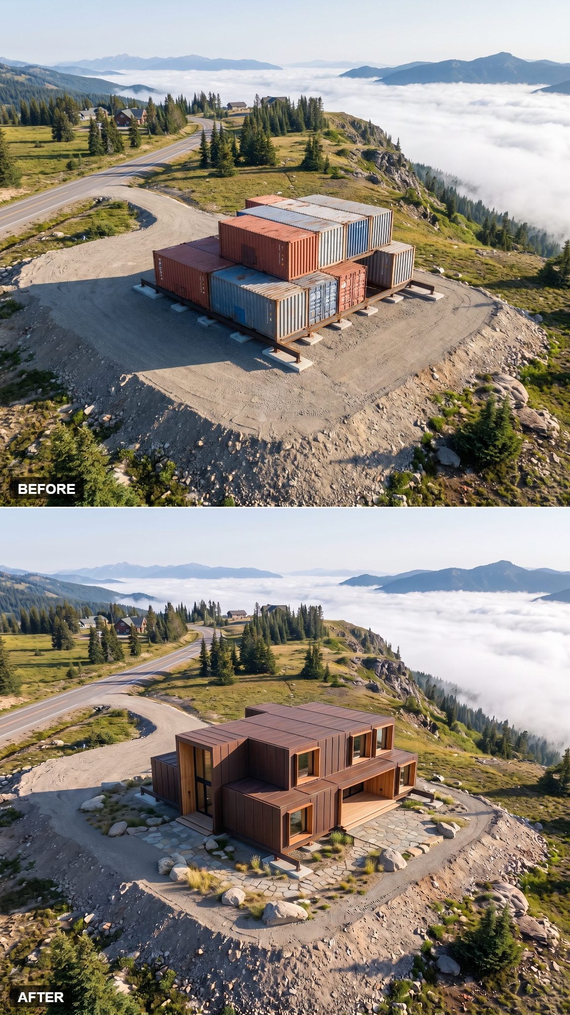
15. Weathered-Steel Color Keeps the Industrial Past in the Picture
🔥 Would you like to save this?
Rust does not have to disappear from the story. This concept takes the orange-brown character of aged metal and turns it into a controlled exterior palette.
Clean openings and dark frames keep the effect from reading as neglect. Against gray rock and green vegetation, the warm metal tone makes the building distinct without introducing a color foreign to the industrial starting point.
14. A Clerestory Crown Floats Above the Darker Base
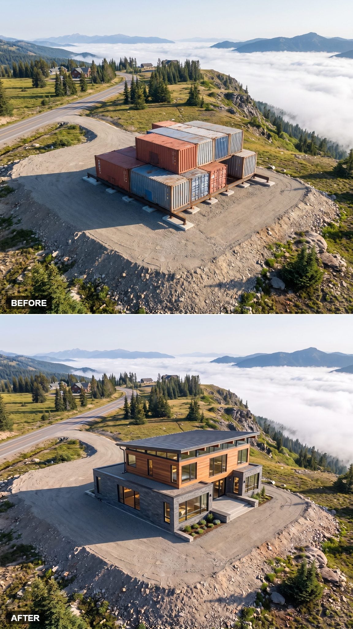
A continuous upper band of glass visually separates the roof from the darker container mass below. The top begins to hover instead of simply sitting on the walls.
Clerestory glazing also demonstrates that a house does not need floor-to-ceiling windows everywhere to feel bright. High daylight can preserve solid wall area while still changing the atmosphere of the interior dramatically.
13. The Alpine Chalet Gets Rebuilt Without the Costume
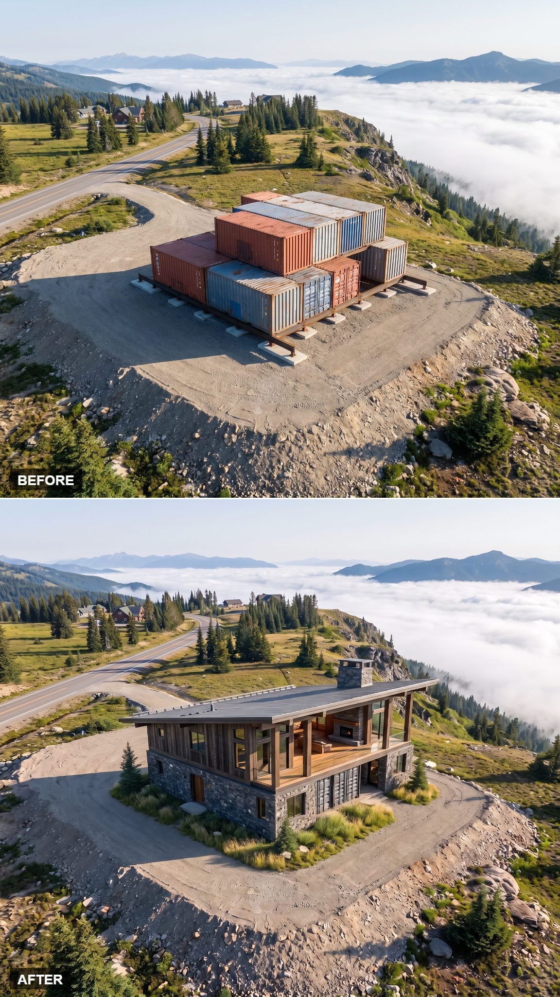
The references are familiar—pitched protection overhead, timber warmth, deep shelter—but the detailing remains contemporary. There are no decorative brackets or faux-historic flourishes trying to make the modules pretend they were born in another century.
Instead, pale timber softens the modular geometry while the roof supplies the recognizable mountain-house silhouette. The chalet survives as an idea rather than a costume.
12. Black Timber Makes the Cloud Line Look Even Whiter
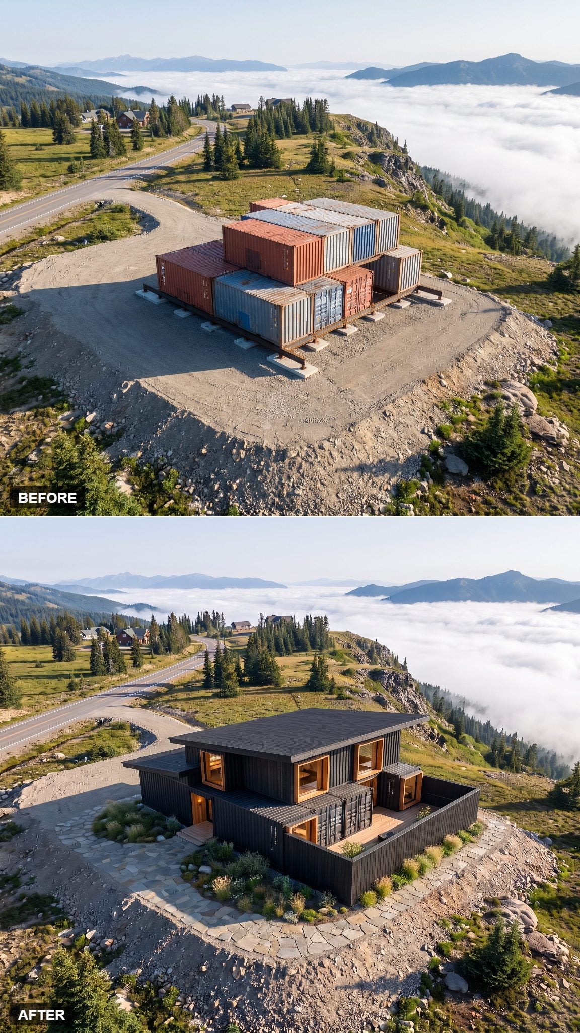
Few exterior palettes could contrast more strongly with a sea of cloud than near-black timber. The dark skin reduces the visual noise of individual container faces and makes the building read as one shadowy form.
Texture keeps the black from becoming flat. Whether achieved through charred timber or another dark wood treatment, visible grain gives the surface enough variation to hold its own against rock and forest.
11. One Balcony Does More Than a Dozen Decorative Gestures
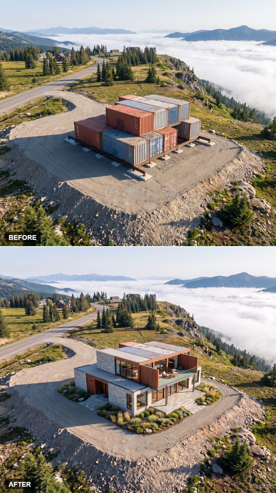
This scheme is almost stubbornly focused. Most of the building stays restrained while one platform projects toward open air.
That concentration gives the balcony far more force than a collection of smaller decks would have. Glass railing minimizes the edge, timber warms the surface, and the architecture seems to stop at precisely the point where the landscape becomes too large to compete with.
10. A Stone Spine Gives the Smaller Volumes Something to Orbit
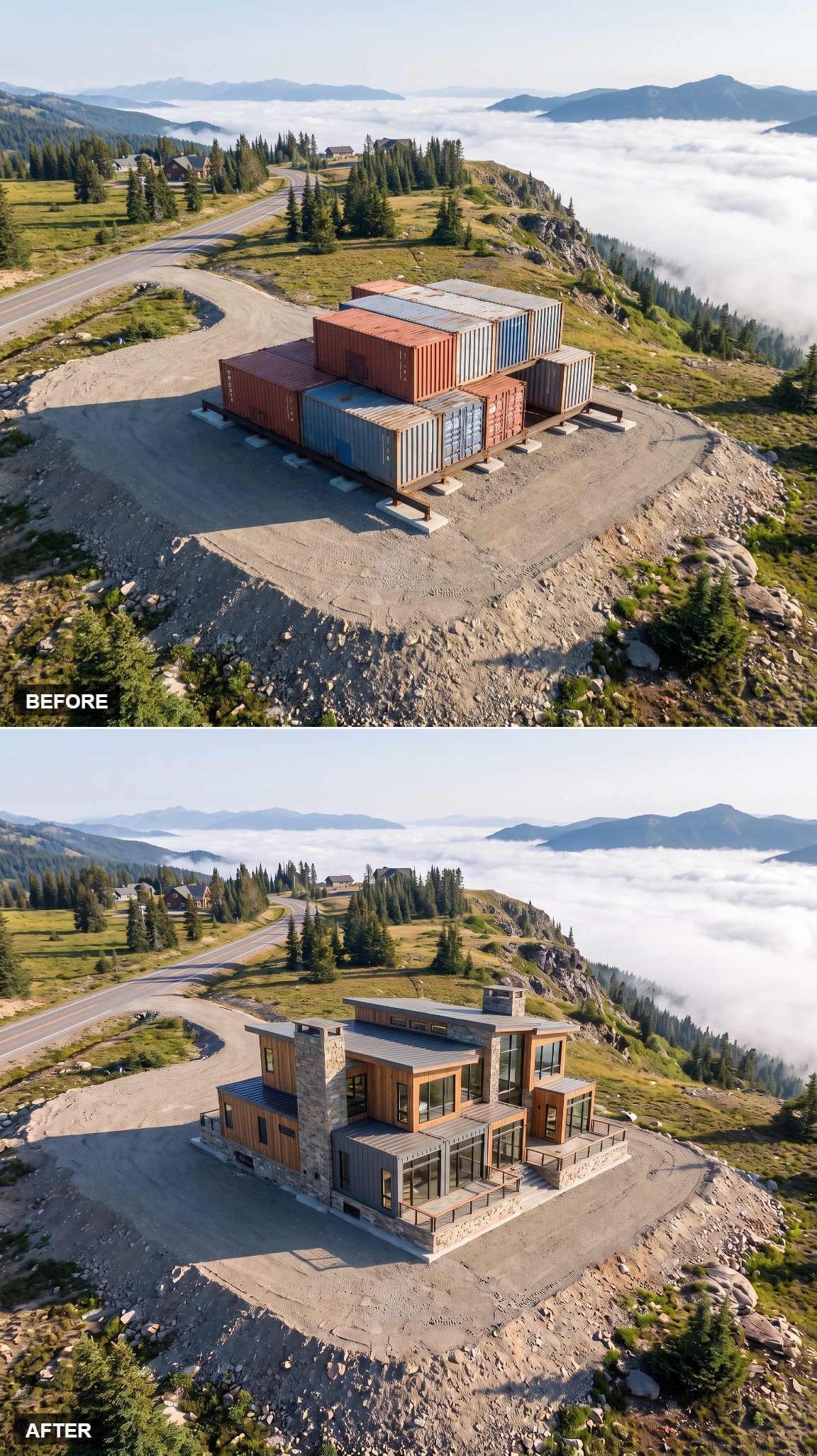
A tall masonry wall rises through the composition like a backbone, giving the smaller metal volumes something substantial to attach themselves to visually.
Stone adds permanence and vertical emphasis; the container-derived wings keep the house from becoming one monolithic lodge. Rough texture against precise metal edges is what gives the pairing its energy.
9. One Sweeping Roofline Points the Whole House Toward the Clouds
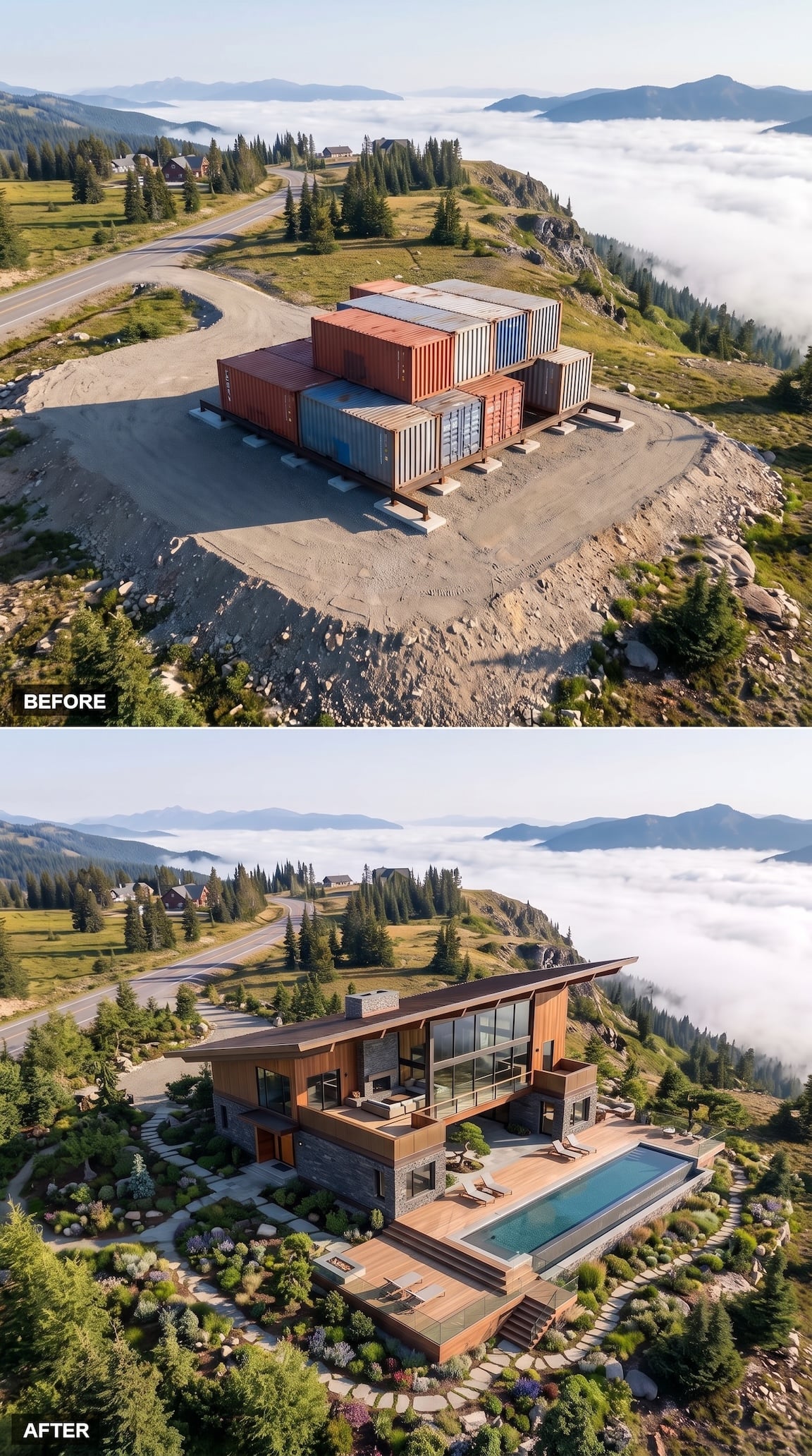
The roof behaves almost like an arrow. It rises toward the valley side, carries the eye across the tall glass façade, and gives the house one unmistakable direction.
Stone anchors the lower level while timber and expansive glazing take over above. The long pool repeats the same directional gesture. Compared with the anonymous container stack, the after image has something the before never possessed: a front, a stance, and a deliberate relationship to the horizon.
8. Three Glass Lanterns Break the Low Stack Into Vertical Markers
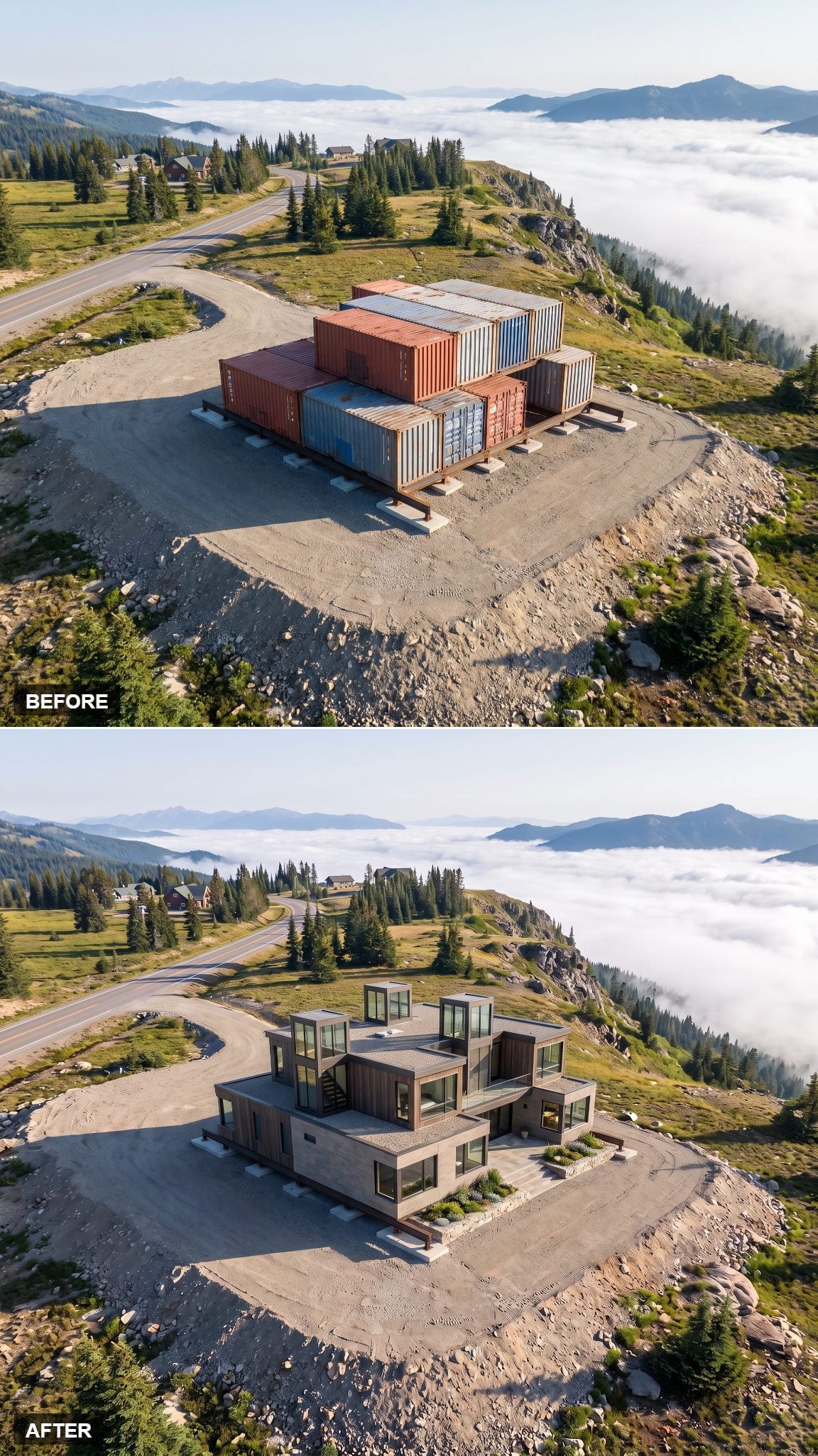
Three glazed volumes rise above the darker base, interrupting the squat proportions of the original modules. Repetition keeps them from reading as random additions.
The lower structure remains horizontal while the lanterns pull the eye upward. That split between opaque base and transparent upper elements gives a compact building considerably more presence on an enormous site.
7. The Long Cantilevered Roof Establishes a Clear Direction
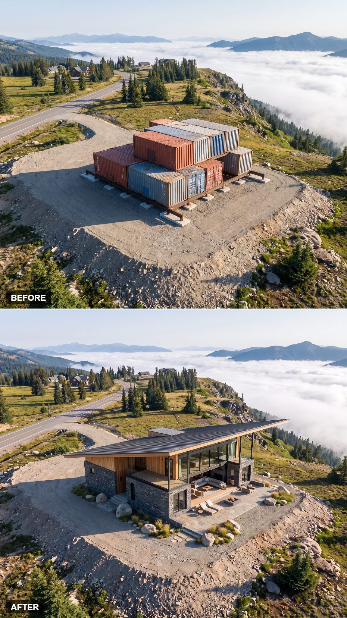
A broad roof projects toward the cloud line well beyond the walls beneath it. The overhang gives the composition a directional pull while creating a deep zone of shade along the glazing.
The modules underneath become almost incidental because the roof establishes a new scale. What began as several equal boxes now has a clear order: one dominant plane above, quieter volumes below.
6. A Double-Height Library Blows Apart the Expected Container Scale
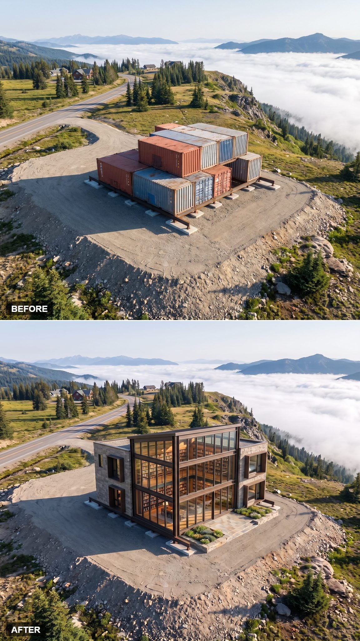
🔥 Would you like to save this?
The narrow dimensions associated with shipping containers disappear the moment two levels open into one tall room. Full-height shelving exaggerates that vertical dimension instead of trying to make the interior feel conventionally domestic.
The library is a useful reminder that these concepts do not have to rely entirely on exterior spectacle. Sometimes removing floor area creates more architectural drama than adding another room.
5. A Floating Canopy Makes the Roof Look Detached From the House
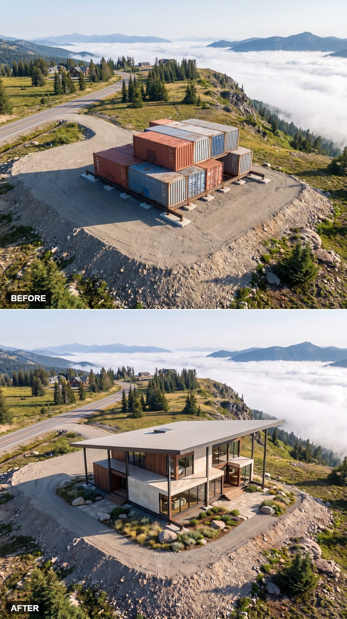
A narrow band of daylight separates the broad canopy from the denser volumes beneath it. That sliver is enough to make the roof appear independent, almost suspended over the containers rather than resting on them.
The illusion depends on restraint. Dark lower materials, a warm soffit, and thin supports leave the roof edge as the dominant line.
4. Timber Screens Give the Façade More Than One Face
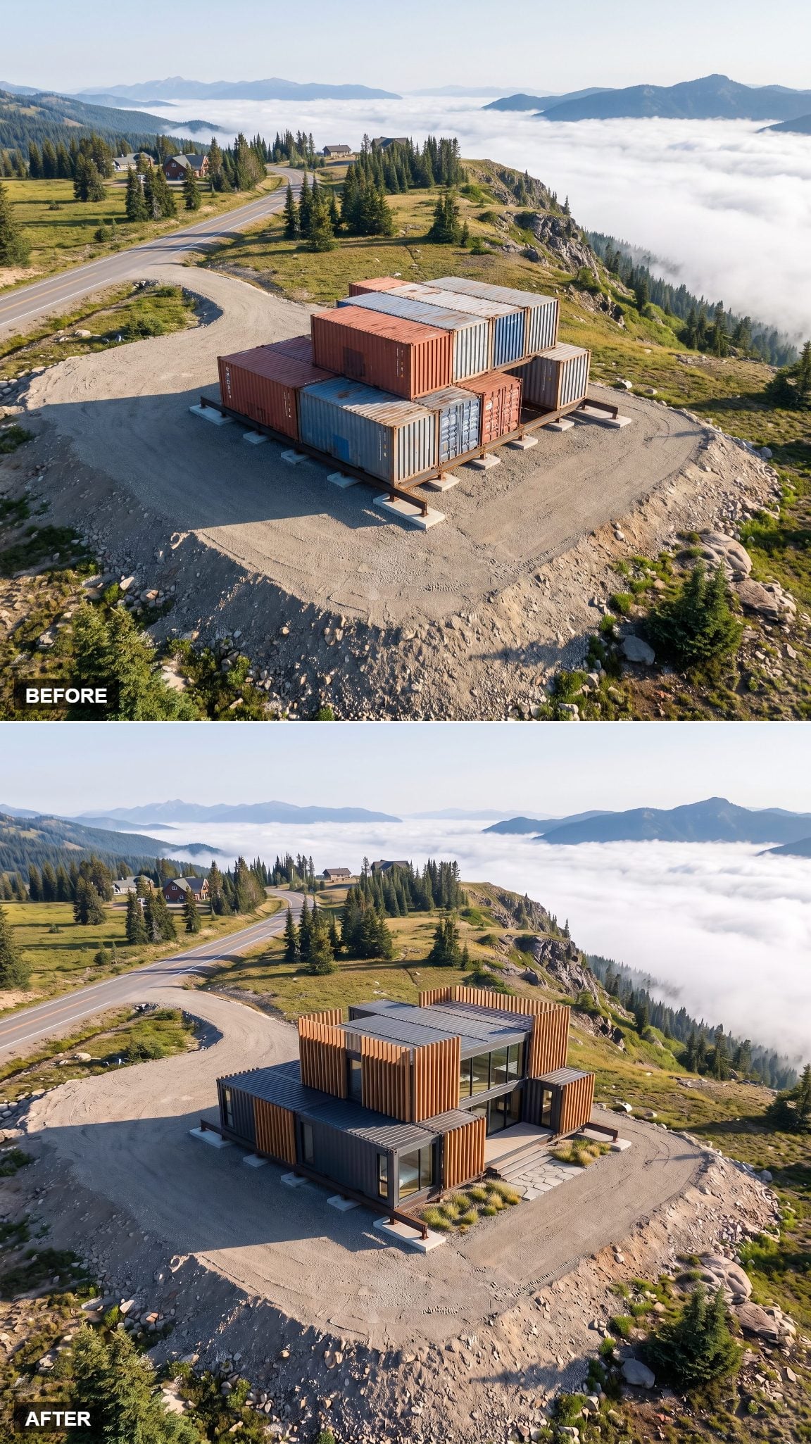
Vertical timber louvers add something many of the other concepts lack: the possibility of change. Closed, the screens create a warm repetitive outer layer. Open, the glass behind them becomes dominant.
The finer vertical rhythm also breaks down the scale of the broad container panels. As a design strategy, screens can add privacy and sun control without returning to blank metal walls.
3. An Amphitheater Turns the Landscape Into Part of the Floor Plan
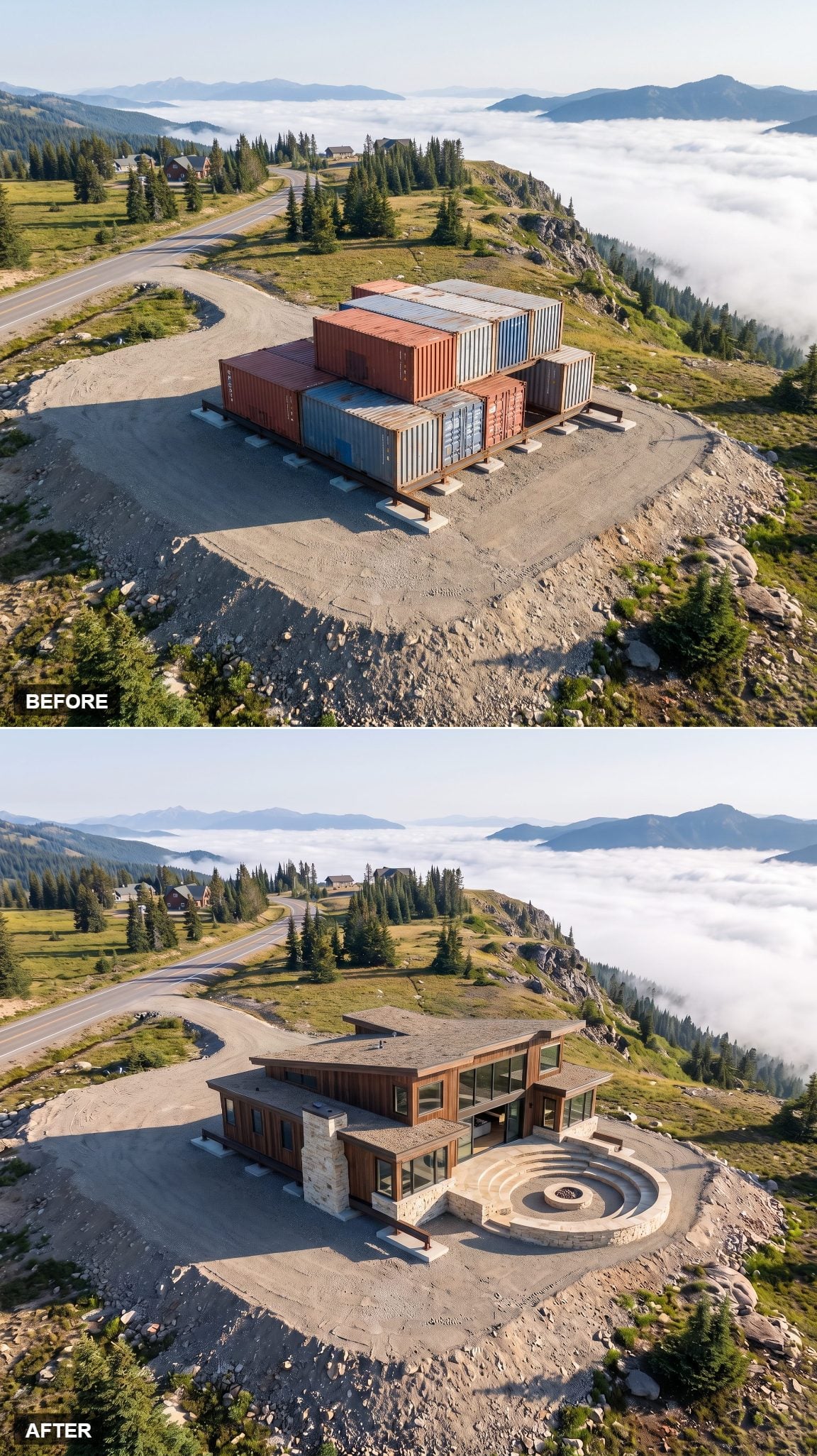
The biggest architectural gesture happens outside the house. Broad semicircular steps descend into the slope, creating a room whose far wall is nothing but distance.
That shifts attention away from the container conversion itself and toward the site. Rather than treating the ridge as scenery beyond a railing, the concept turns topography into seating, circulation, and gathering space.
2. A Crystalline Peak Gives the Boxes One Unforgettable Profile
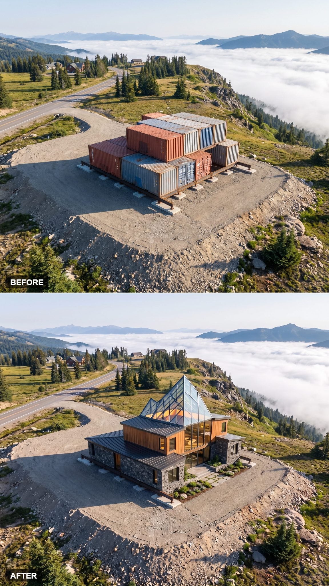
A single angular glass volume rises from the otherwise rectilinear roofscape. Because there is only one, it reads as a focal point rather than another layer of visual noise.
The strategy is simple: keep most of the modular base quiet and spend the drama in one place. The containers establish the grid; the crystalline peak breaks it.
1. A Meadow Roof Nearly Gives the Building Back to the Ridge
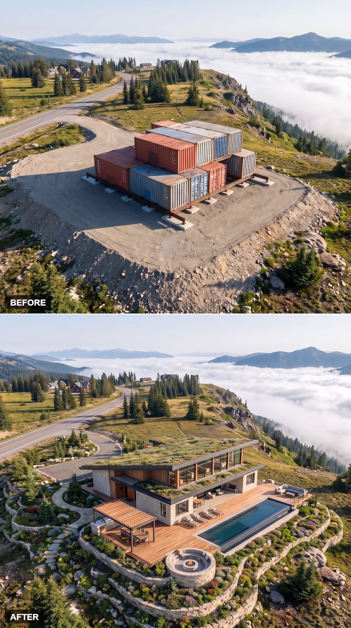
The before stack sits on bare gravel and announces itself from every direction. This version does almost the reverse, laying a broad planted roof over the house so the architecture begins to merge with the alpine foreground when seen from uphill.
Below that green plane, glass, timber decking, stone retaining walls, a long pool, and a circular fire terrace keep the composition crisp. The house does not disappear. It simply stops arguing with the ridge.
Across all 39 concepts, the most convincing ideas are not necessarily the ones that disguise every trace of corrugated steel. They are the ones that decide what matters first: one roof, one framed view, one protected courtyard, one glass bridge, one planted plane, one terrace reaching toward the clouds.
The original boxes provide a rigid starting grid. Architecture begins when that grid is given contrast—heavy against light, enclosed against open, rough against polished, horizontal against vertical. The mountain supplies the spectacle for free. The successful concepts are the ones smart enough to organize themselves around it.