
🔥 Would you like to save this?
The premise behind these AI-generated before-and-afters is simple: once a shared bedroom stops having to satisfy two people, almost every decision is back on the table. Color can get bolder. Furniture can get softer. The vanity can go exactly where it makes sense. The artwork no longer needs unanimous approval.
In order to come up with the very specific design ideas, we create most designs with the assistance of state-of-the-art AI interior design software. Also, assume links that take you off the site are affiliate links such as links to Amazon. this means we may earn a commission if you buy something.
These 27 concepts test just how different the same idea of “reclaiming the room” can look. Some push into saturated velvet and Art Deco geometry. Others retreat into cane, warm wood, plaster, florals, or barely-there blue. The interesting part isn’t finding one correct post-divorce bedroom. It’s watching compromise disappear from the design brief.
Here are 27 before-and-afters that let one point of view take over.
27. Powder Blue Walls and Gold Accents Started the Reset With Confidence
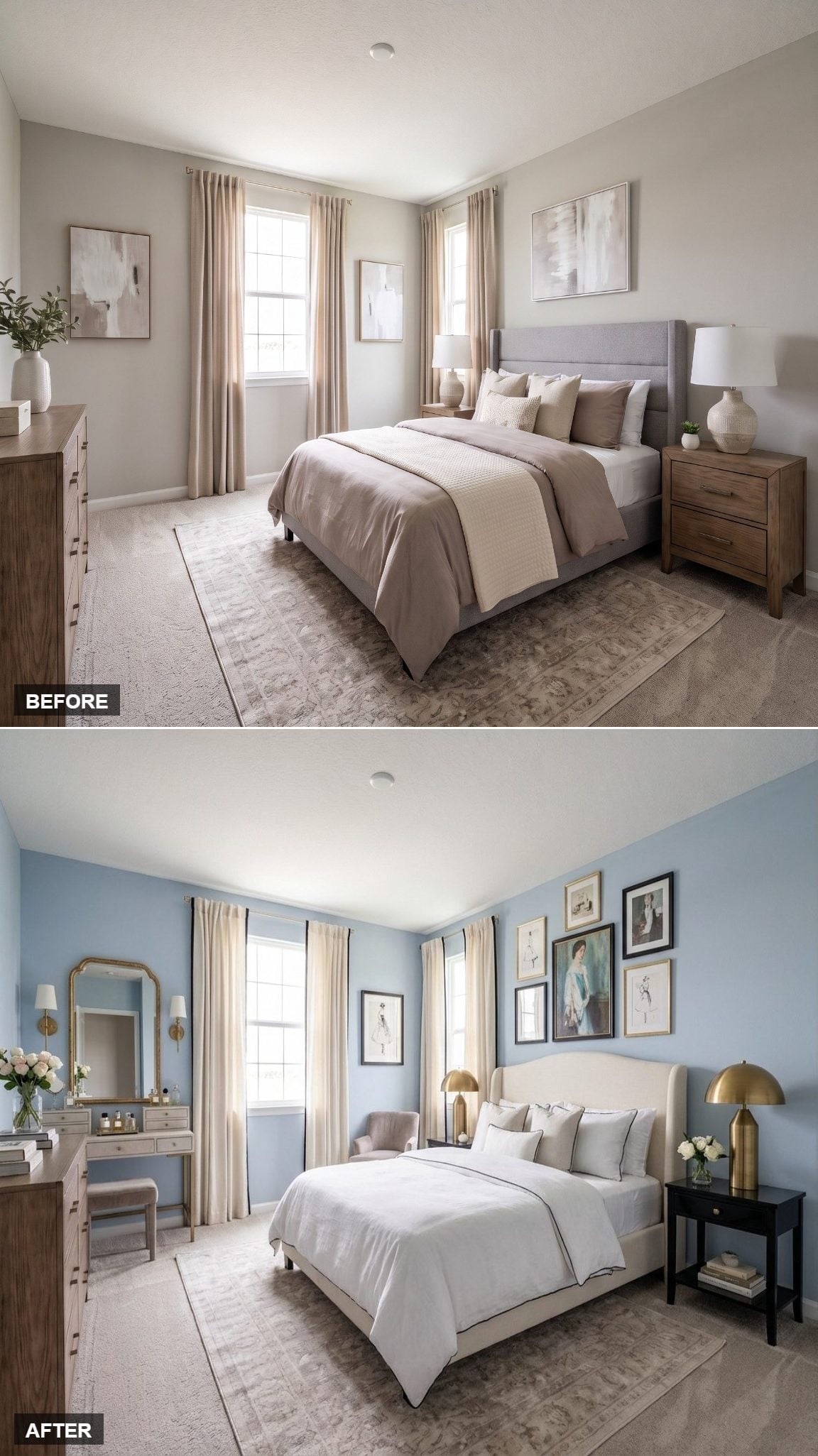
Soft powder blue changes the room before anything else gets a vote. Against it, a cream upholstered wingback headboard with dark piping feels crisp rather than sweet, while black nightstands give the pale palette necessary contrast.
Brass dome lamps, a gilt arch mirror, and matching sconces add warmth without turning every metal surface into an event. Above the bed, fashion illustrations in mixed black and gold frames give the wall a more personal rhythm than one oversized print ever could.
It’s a strong first move because nothing about it feels provisional.
26. Green Velvet and Art Deco Curves Made Restraint Completely Optional
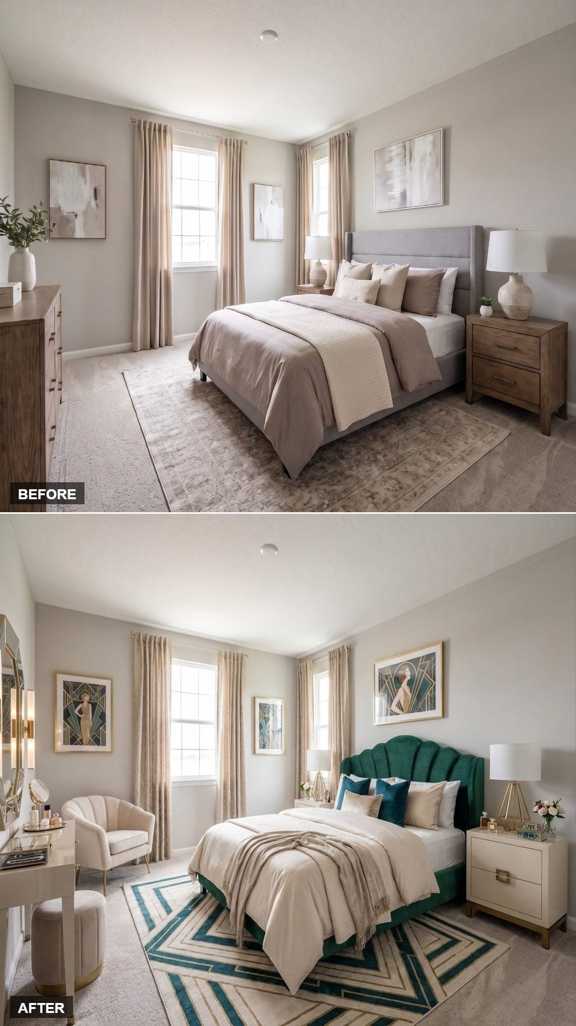
The forest green velvet headboard is the reason this room works. Its scalloped profile creates a strong silhouette before the bedding, rug, or lighting even enters the picture.
Cream linens keep that saturated green from becoming overpowering, while teal and ivory pillows repeat the geometric language of the rug below. Gold-toned details sharpen the Art Deco direction without requiring the entire bedroom to become a period set.
One dramatic shape is enough when it’s this good.
25. Rattan and Sea-Glass Color Took the Bedroom Somewhere Near the Water
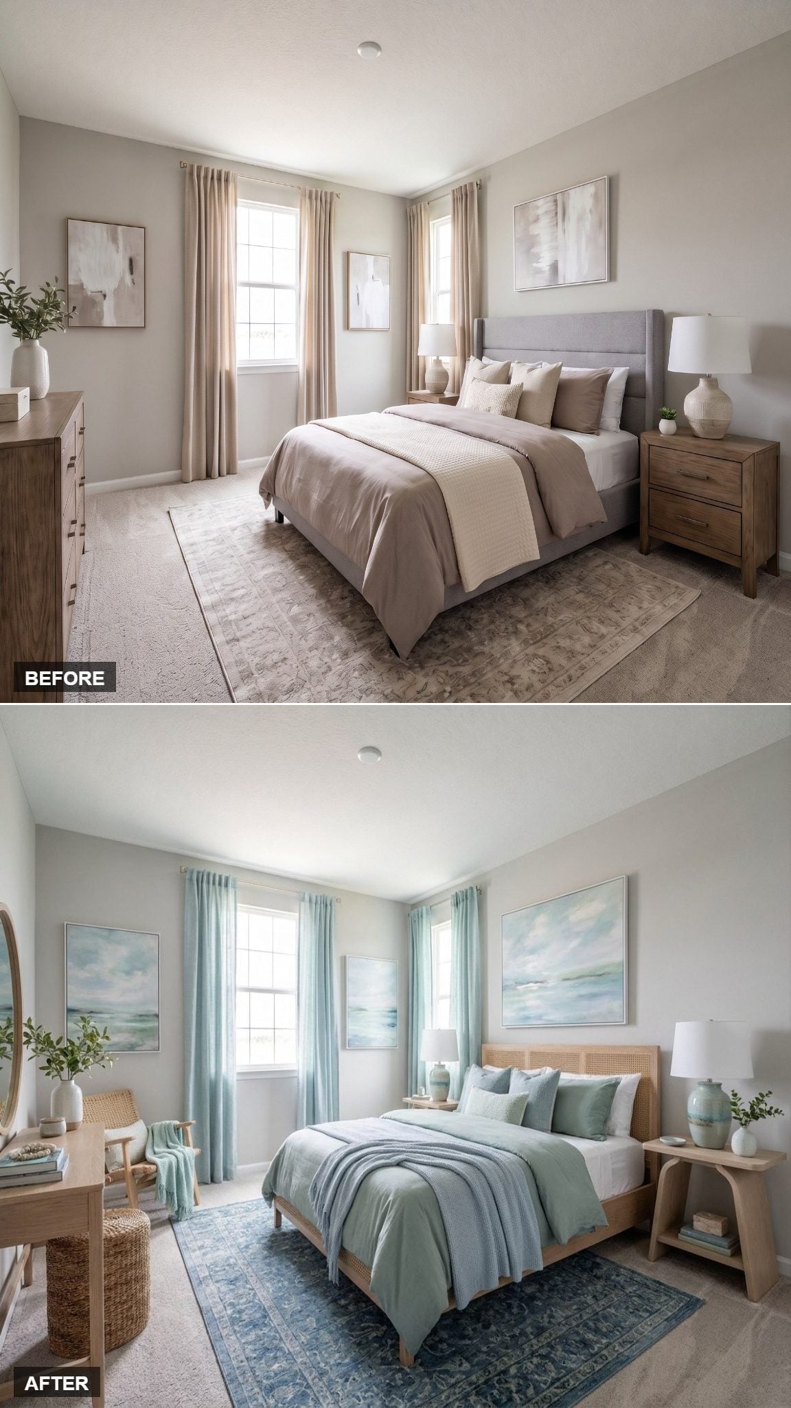
Woven cane panels give the bed texture without adding much visual mass. Sage and duck-egg bedding continue that lighter approach, while blue-toned artwork above the headboard carries the color upward without making the wall busy.
The appeal here is less about literal coastal decor than the materials associated with it: pale wood, woven fiber, washed color, and enough white to keep everything loose.
History Corner: Rattan and cane furniture have long histories in Asian craft traditions and later became widely traded into European and American interiors. Their appeal wasn’t originally decorative alone: the materials are lightweight, flexible, and well suited to woven furniture construction.
24. Warm Plaster and a Woven Headboard Took the Room in a Tuscan Direction
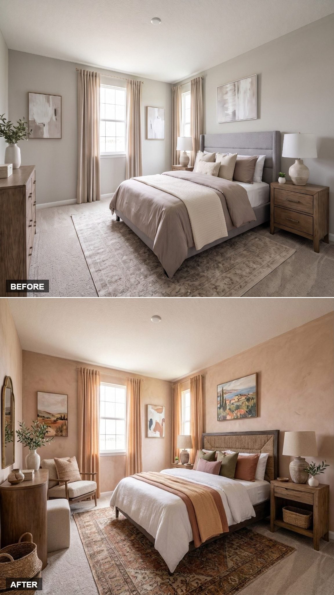
Venetian-plaster-style walls in dusty peach immediately pull the room away from cool, flat neutrality. Their mottled surface catches light unevenly, giving the backdrop depth before the furniture contributes anything.
The woven headboard brings in another irregular natural texture, while olive, blush, and terracotta bedding takes its cues from the landscape artwork above.
- A mottled plaster-style finish gives the walls tonal variation that ordinary flat paint doesn’t naturally produce
- The woven headboard brings natural fiber into the largest furniture piece instead of treating texture as an accessory
- The artwork supplies a ready-made palette for the bedding without requiring an accent wall
23. French Country Details Made Quiet Feel Deliberate
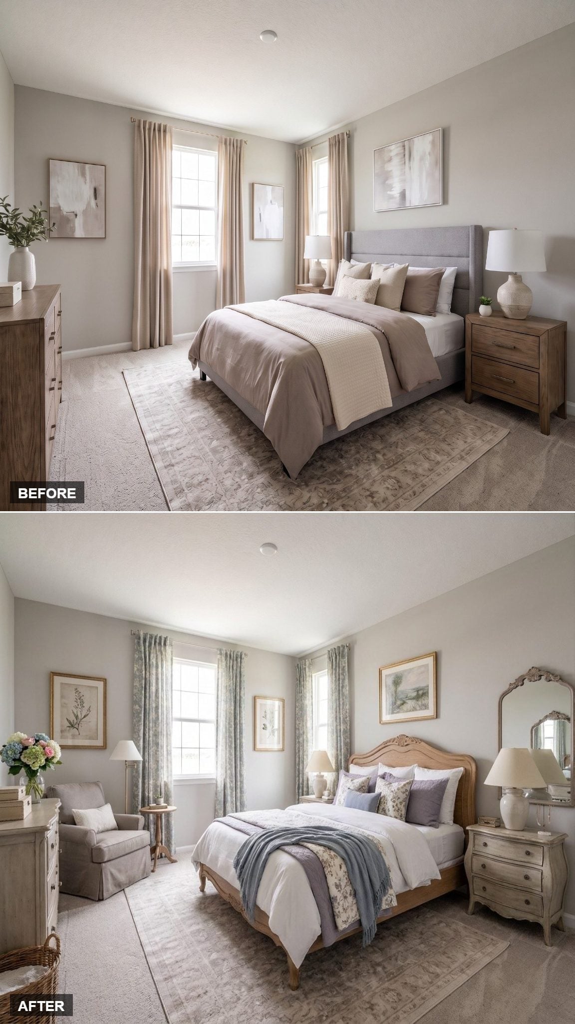
Not every reset has to announce itself in saturated color.
The carved wood bed frame carries a scalloped silhouette associated with French provincial furniture, finished in a weathered pale wood tone that sits comfortably between gray and blond. White bedding keeps the larger pieces calm, leaving lavender and floral pillows to introduce color in smaller doses.
Blue-green floral curtains soften both windows. A slipcovered armchair beside a small round table creates a genuine reading corner rather than another decorative chair nobody is meant to sit in. Fresh flowers and an ornate mirror finish the room without pushing it into costume territory.
22. Royal Blue Walls Made the Entire Room Pick a Side
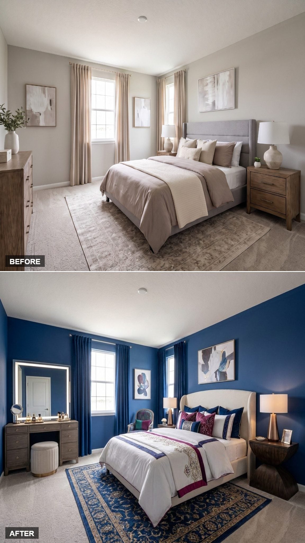
Cobalt covers every wall, eliminating any possibility that color is merely an accent. Against that depth, the cream wingback headboard becomes brighter and more sculptural.
Crimson and navy pillows add another saturated note instead of trying to calm the walls down. Navy velvet curtains extend the blue envelope into the windows, while a vanity with a lit mirror gives the far corner a purpose beyond filling empty floor space.
This one doesn’t ease into a new identity. It walks straight through the door.
21. Cream, Warm Wood, and Open Furniture Cleared Some Visual Breathing Room
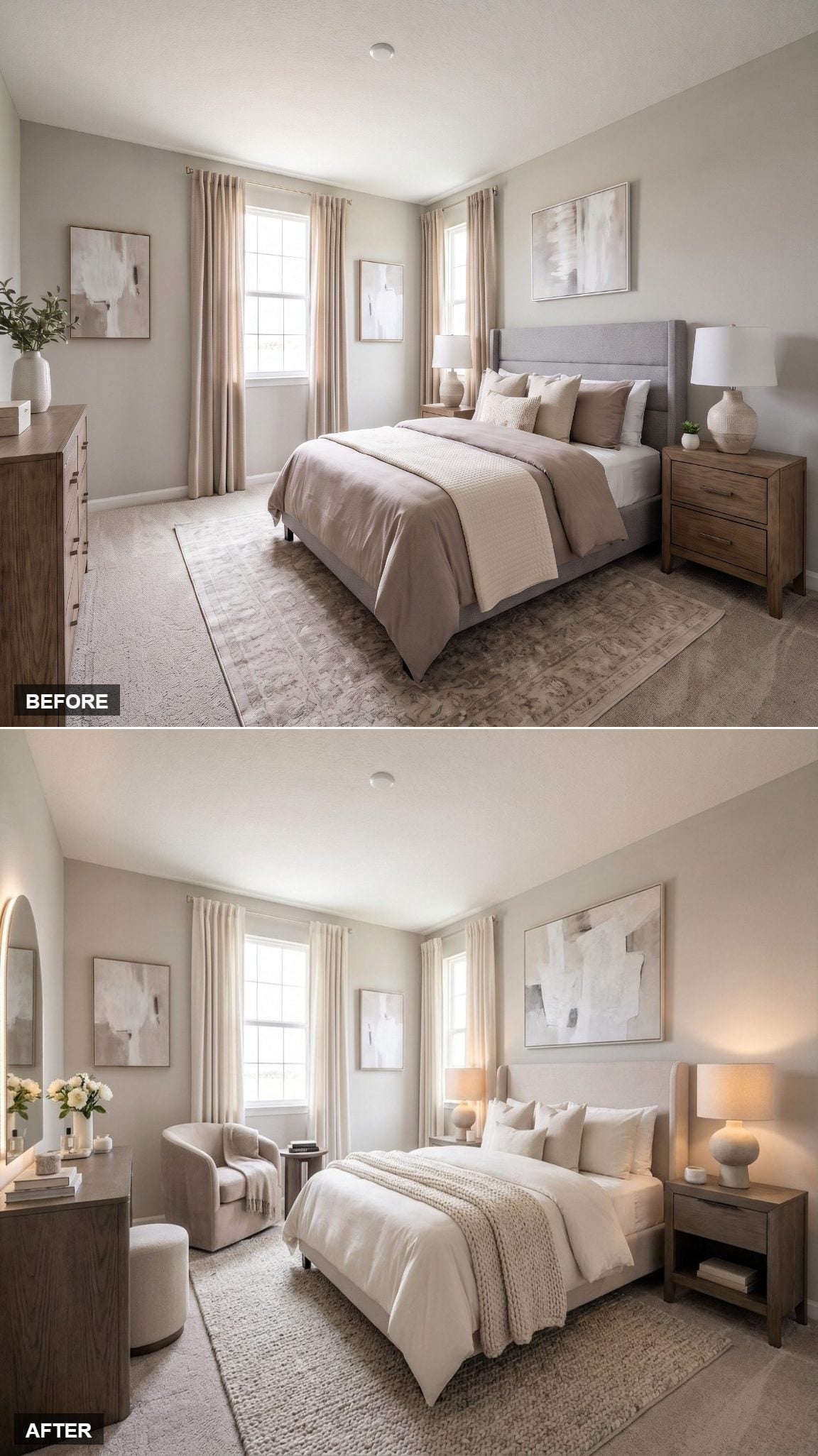
A vertically paneled wood bed brings warmth without ornament, giving the room a clean architectural center. White bedding and a chunky knit throw keep the palette pale, while the natural woven rug introduces texture without another pattern.
Two upholstered chairs near the window create a separate sitting zone, and an oval mirror leaning against the opposite wall keeps that corner visually loose.
Why the Open Nightstand Matters
The open-shelf bedside table exposes more wall and floor than a solid chest would. It’s a small distinction, but in a bedroom filled with large pieces, even one visually lighter object can keep the perimeter from feeling like a continuous row of storage.
20. Botanical Wallpaper Turned the Headboard Wall Into the Garden
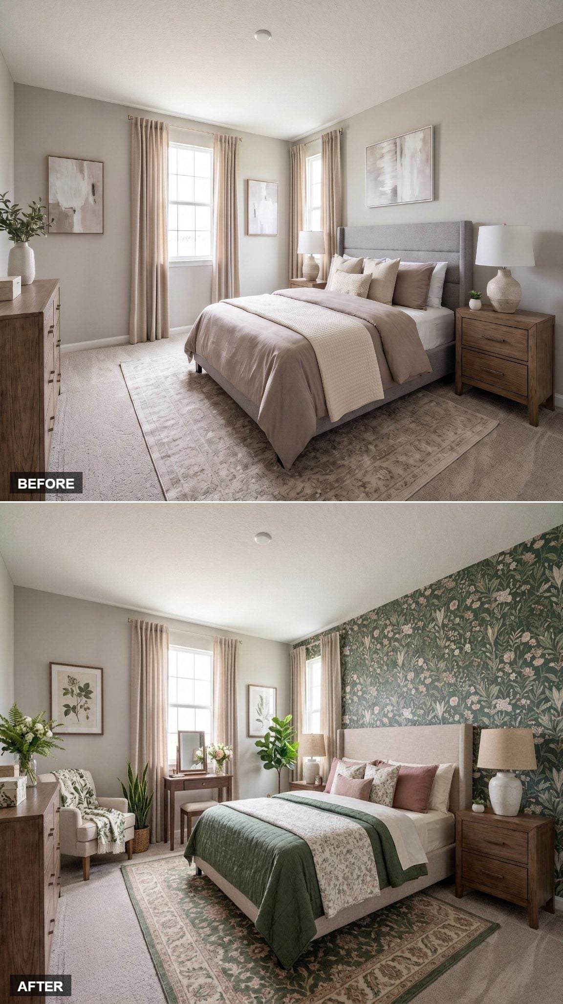
Sprawling floral wallpaper covers the full headboard wall, with white blooms and trailing leaves crossing a deep green ground. Against a pattern that active, the warm linen headboard wisely keeps its shape and color restrained.
Dusty rose pillows soften the green, while a forest-toned quilt carries the wall color onto the bed without reproducing the pattern. A vanity near the window adds function, but the wallpaper remains the undisputed event.
This is what an accent wall looks like when it stops being afraid of commitment.
19. Coral and Blue Let Opposites Do the Decorating
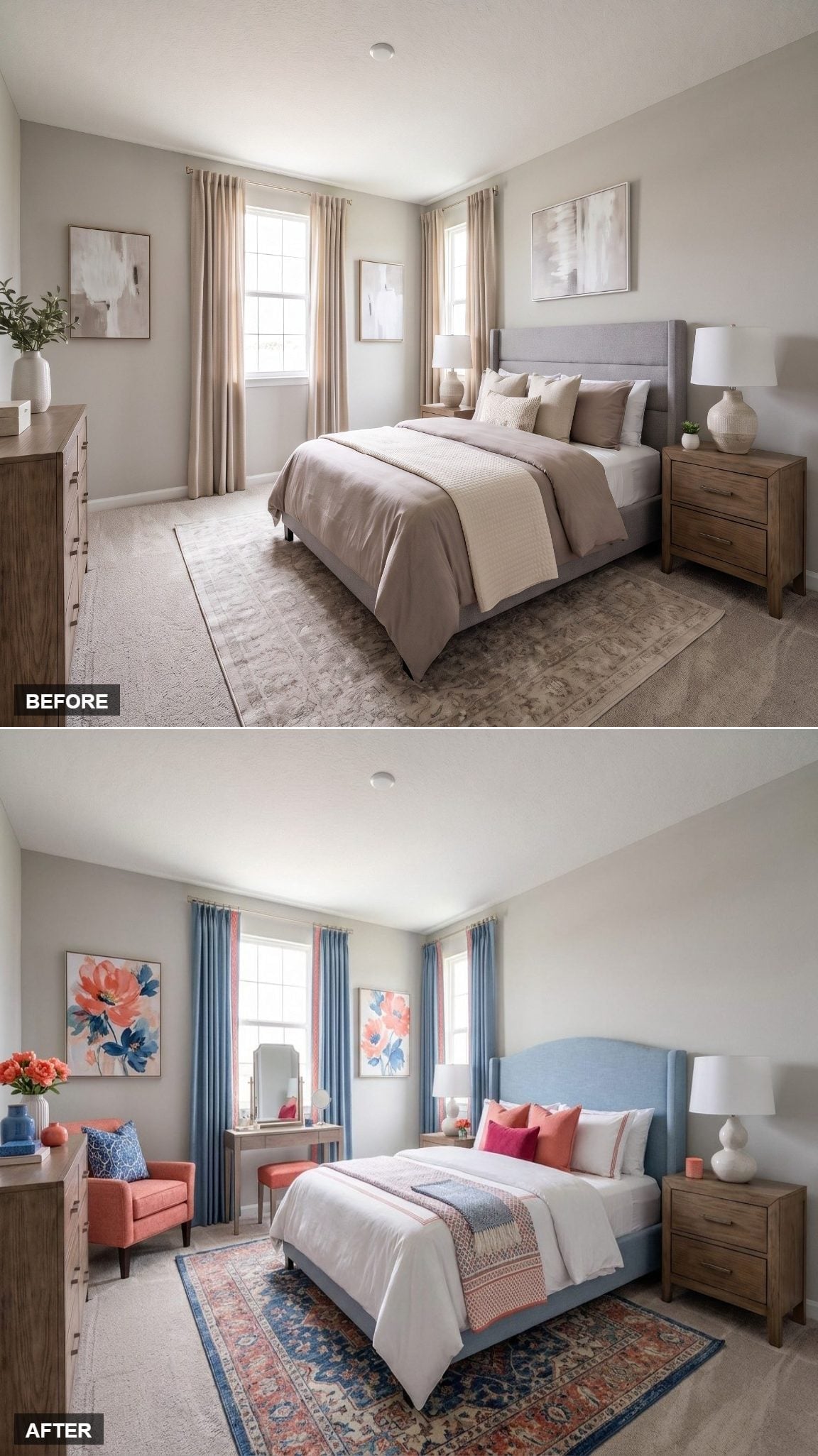
A powder blue upholstered headboard cools the center of the room while coral pillows push back from the other side of the palette. Neither color has to dominate because the patterned rug supplies a middle ground through navy, rust, and softer neutrals.
A coral chair near the dresser carries the warmer color away from the bed, while floral art repeats both families without resorting to identical prints.
In the Details: Repeating coral away from the bed keeps the color from looking accidental. The room feels balanced because the warmer accent appears in more than one zone rather than being stranded in a pile of pillows.
18. Old-World Portraits Made the Bedroom Feel Like a Private Gallery
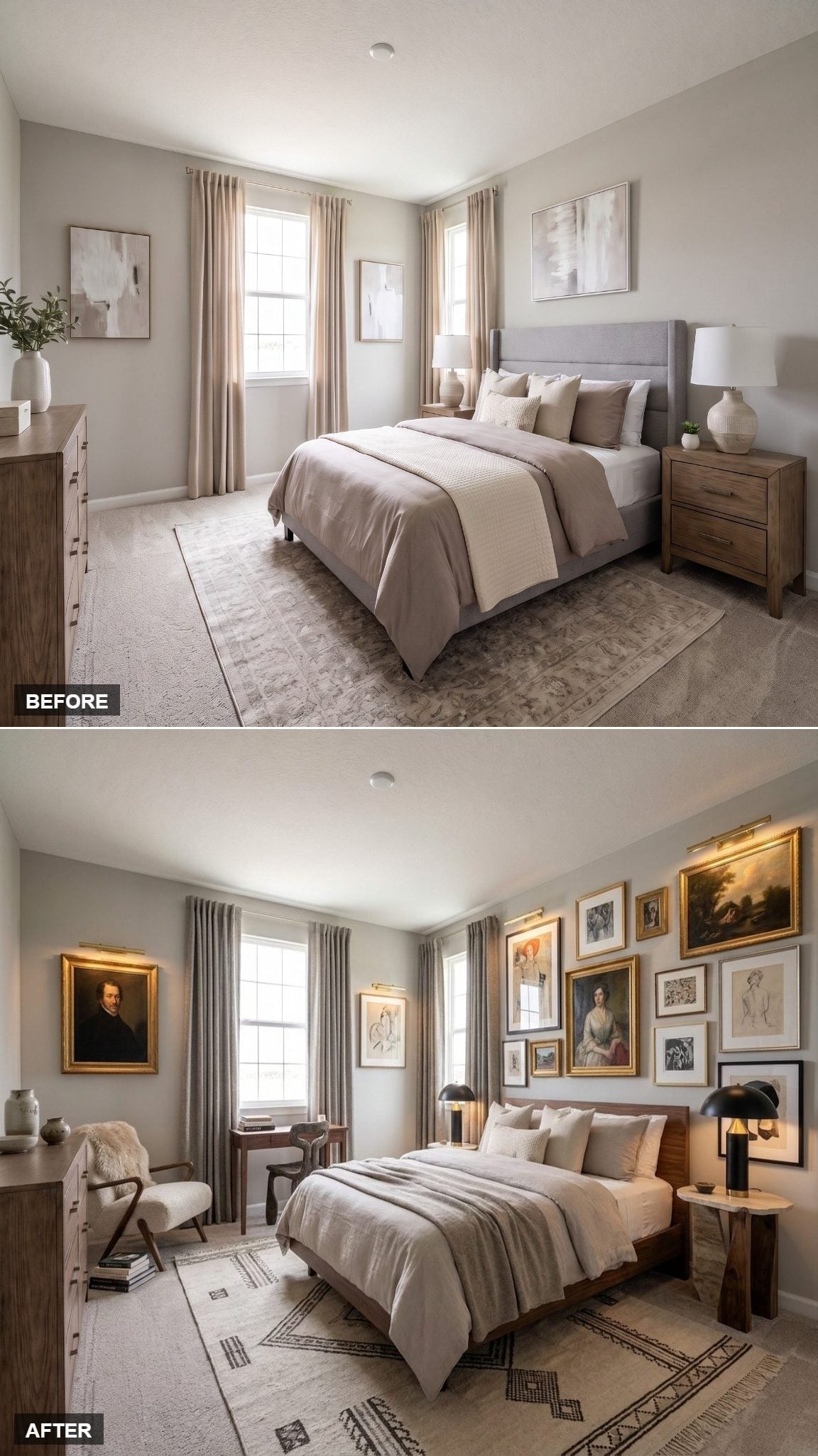
Gold-framed portraits, sketches, and smaller works climb above the bed without following one rigid frame style. The darker wood bed and deliberately plain bedding give all that artwork room to dominate.
Matte-black dome lamps on either side add a harder modern edge, which is exactly what keeps the collection from making the bedroom feel like a historical display.
Material Matters: Mixing black, wood, and gilt frames can make a gallery wall feel accumulated rather than purchased as a coordinated set. Repeating one or two finishes is enough to create continuity while still allowing individual pieces to look distinct.
17. Sage Walls and Cherry-Toned Wood Made Green Feel Grown-Up
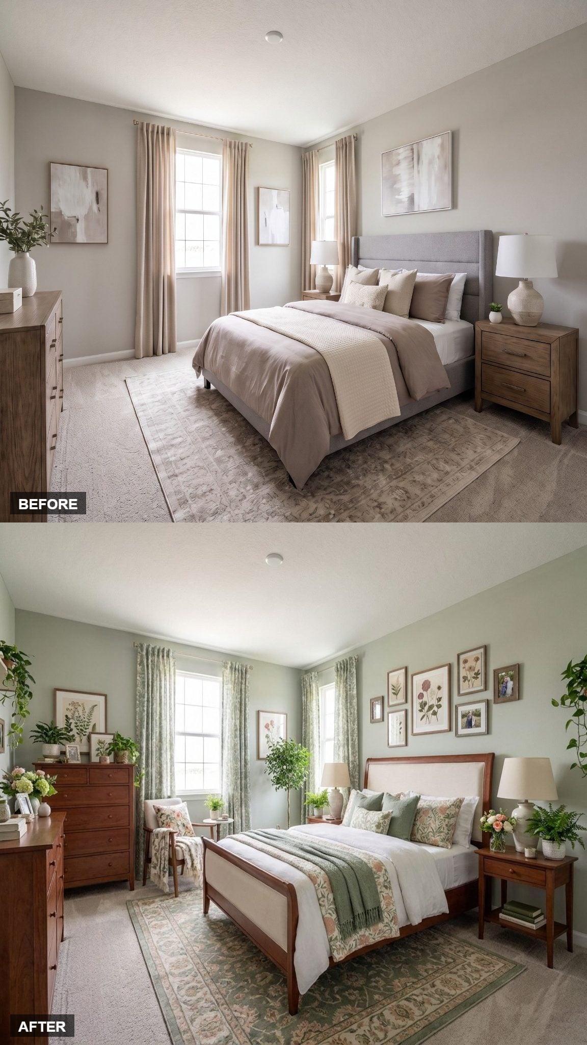
Soft sage on the walls gets its character from the richer wood sitting against it. The bed frame combines a warm cherry-toned finish with a linen-upholstered panel, giving the room both color contrast and material contrast in one piece.
Botanical prints in natural frames continue the green without turning the room into a theme. Plants, a floral rug, and a green throw build the palette outward in different textures.
The result is botanical, but far removed from the breezier cane-and-coastal versions.
16. Mauve Velvet and Wall-Mounted Sconces Changed the Bedside Equation
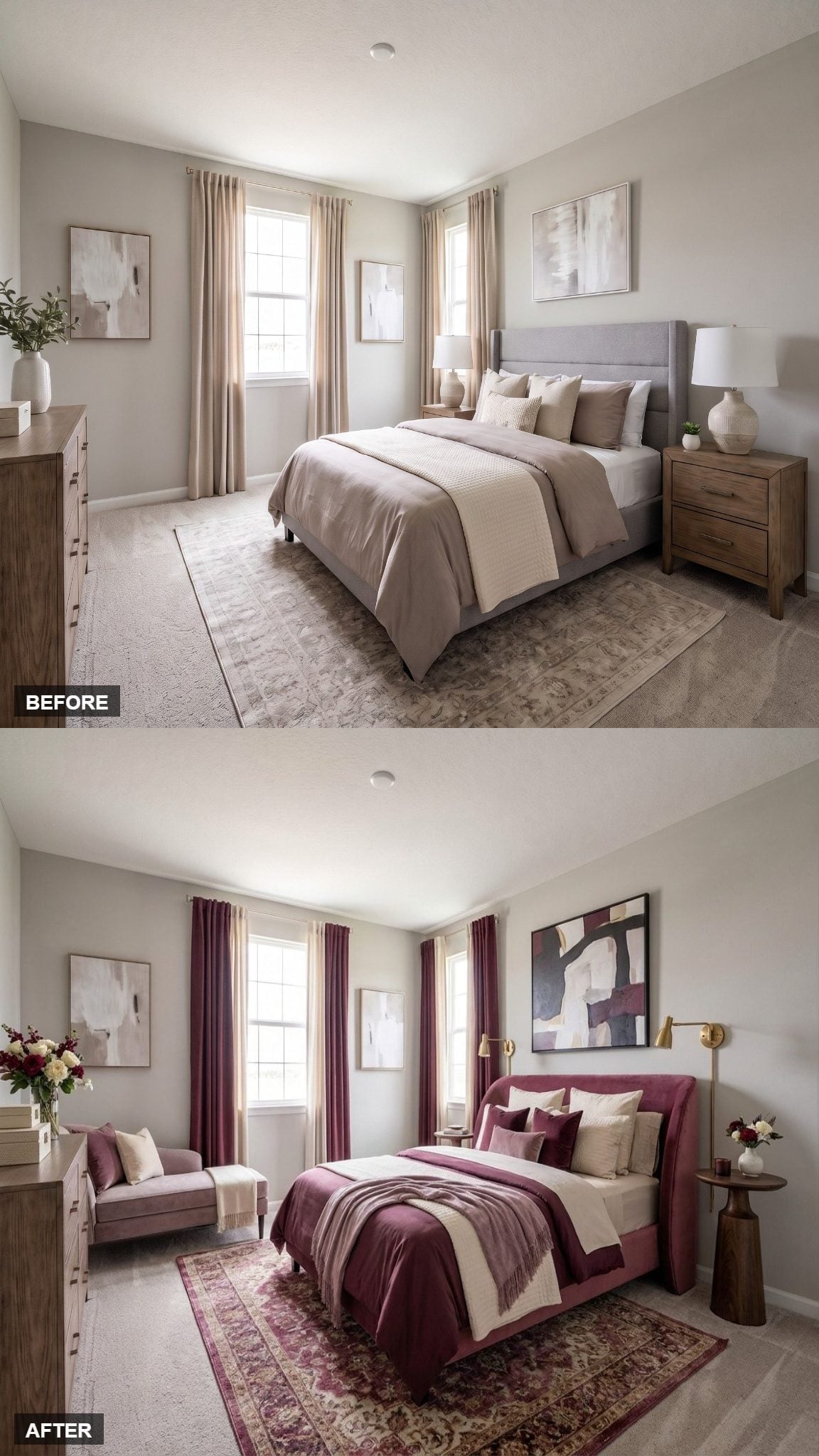
Burgundy velvet curtains make the windows part of the palette instead of background openings. The upholstered bed shifts slightly lighter into dusty mauve, creating depth without introducing another unrelated hue.
The smarter move is beside the bed. Gold swing-arm sconces move lighting off the nightstands entirely, freeing those surfaces while bringing illumination exactly where reading light is useful.
Color sets the mood. The lighting change makes the room function differently.
15. A Curved Wood Bed and Loose Art Made the Room Feel Younger
🔥 Would you like to save this?
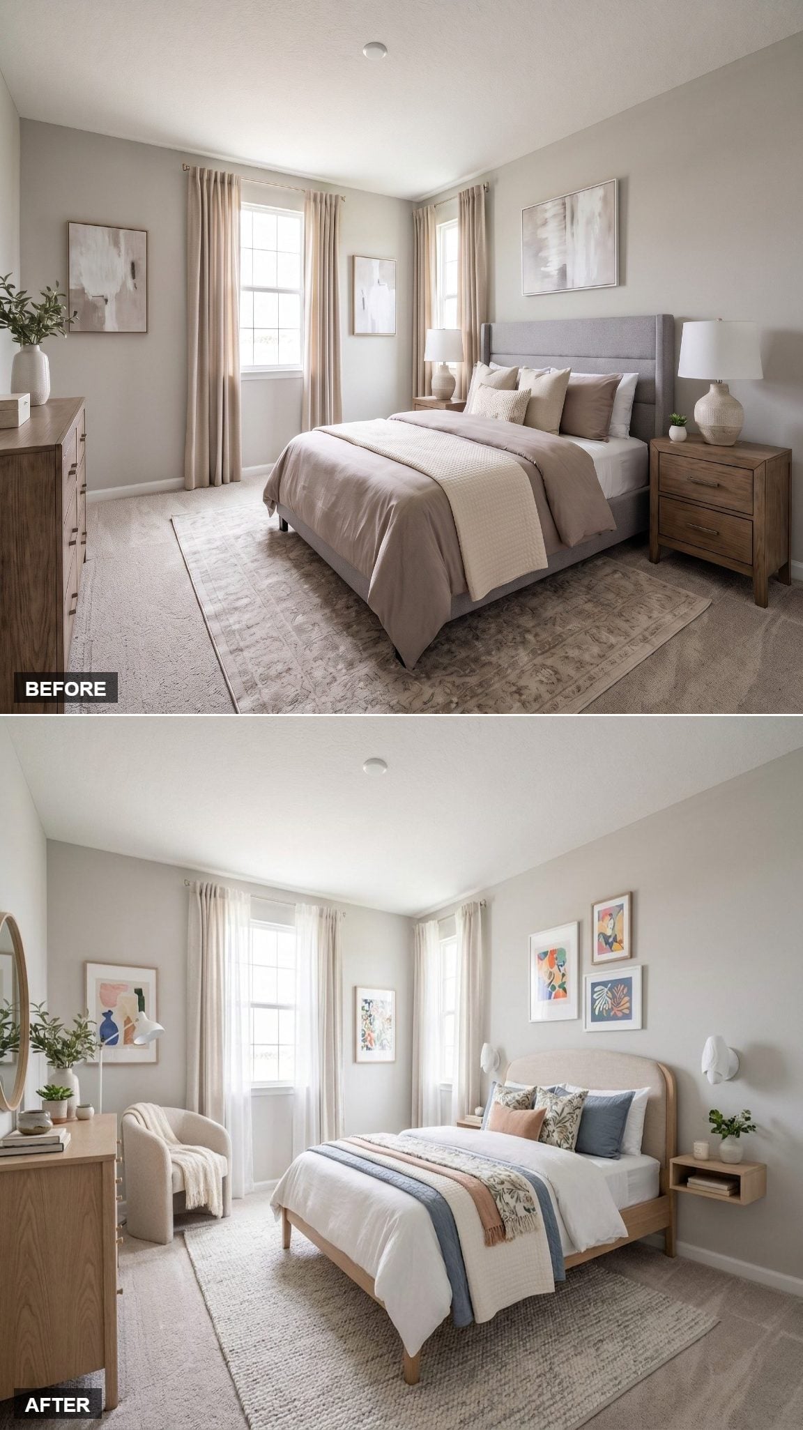
Light natural wood carries the redesign from the curved bed frame to the floating nightstand. White bedding leaves room for a blue runner, botanical throw, and pillows in dusty blue, blush, and earthier tones.
Three colorful prints above the bed avoid the rigid formality of a symmetrical gallery wall. A sculptural white sconce adds another irregular shape.
Nothing here is particularly ornate. Personality comes from refusing to sand every edge off the composition.
14. Cranberry Velvet Put the Bed Back at the Center of the Story
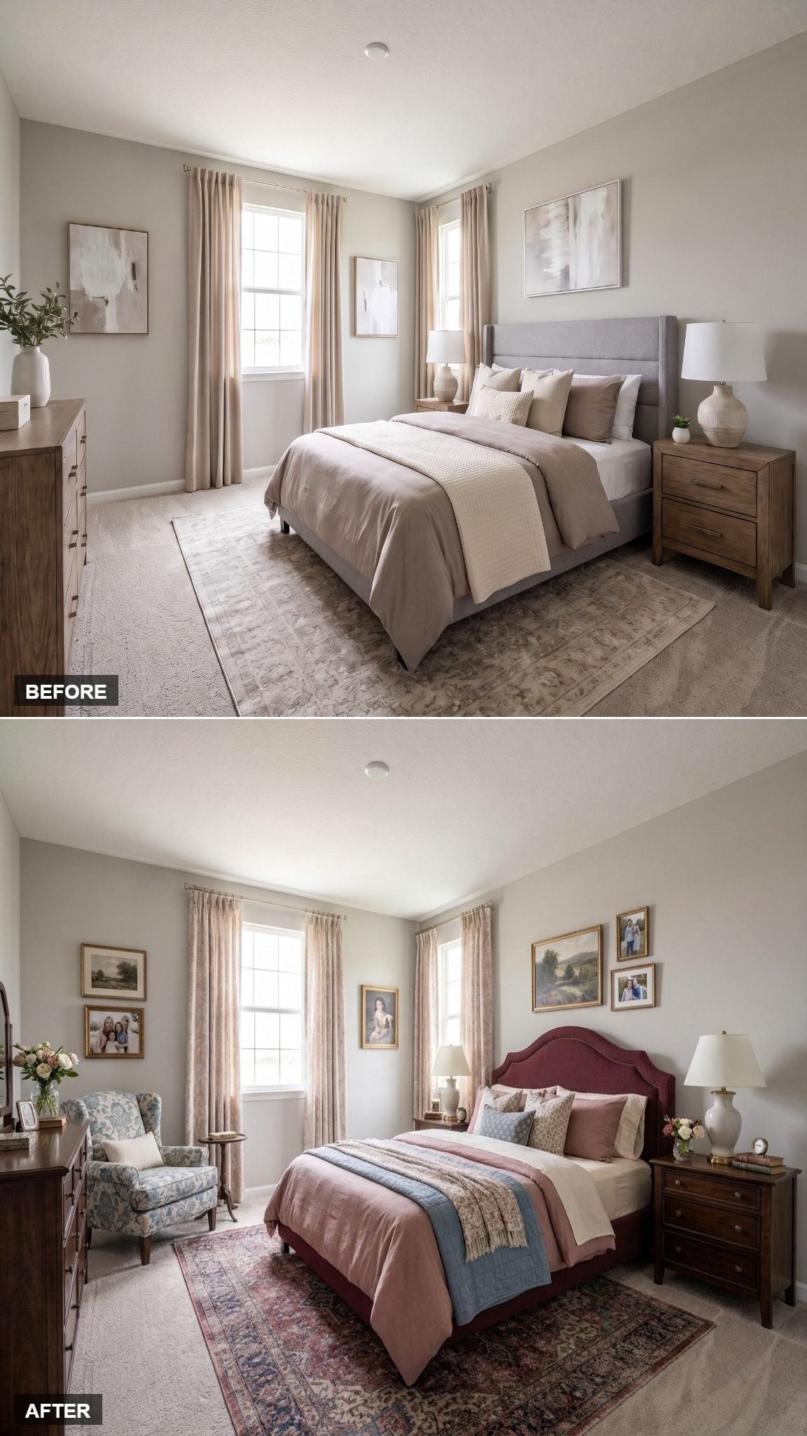
A cranberry-upholstered bed with a scalloped headboard gives the room an immediate focal point. The color is rich enough that everything around it can afford to be quieter.
Gold-framed portrait art, florals, and a worn Persian-style rug bring in the sense of a room assembled from things with different histories rather than ordered as one matching suite.
Designer’s Note: A curved headboard can soften a room dominated by rectangular nightstands, windows, frames, and case furniture. The contrast is geometric rather than psychological: one strong curve interrupts an otherwise boxy composition.
13. Sage Linen and Cane Took Coastal Style in a More Tailored Direction
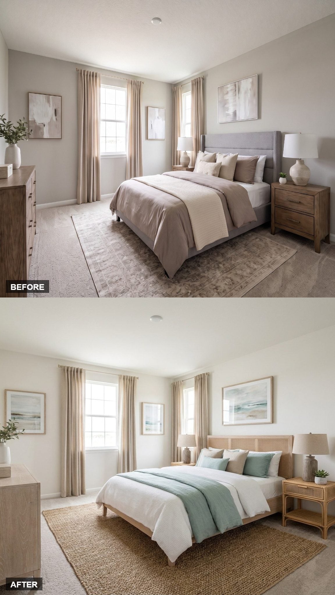
The earlier rattan room leaned airy and pale; this version gives the same family of materials more structure. A natural wood bed with a woven cane headboard sits over a substantial jute rug, making texture the strongest repeated element.
White and muted sage bedding keeps the color quiet, while a soft blue-green throw supplies the cooler note. Coastal-inspired artwork above the bed repeats those hues without introducing obvious beach imagery.
Matching cane detail on the nightstand creates continuity, but the room avoids the showroom effect because the upholstered and woven surfaces break up all that wood.
12. Navy Velvet and Coral Made the Bed the Strongest Graphic Moment
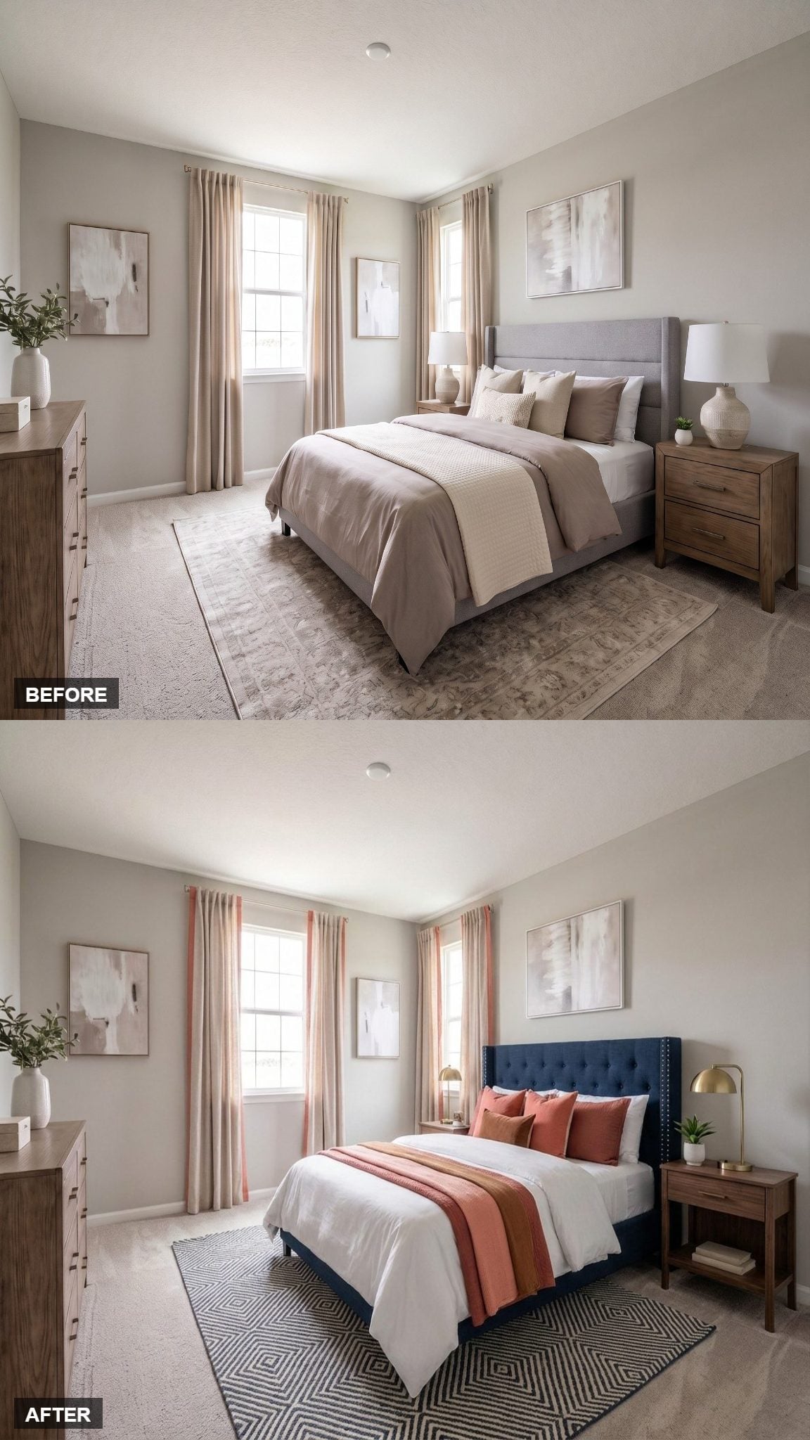
Here, the blue-and-coral pairing gets considerably darker. A tufted navy headboard with nailhead trim creates a strong vertical block behind the bed, while coral pillows and a salmon runner cut across it in warmer bands.
The geometric diamond rug gives the room another crisp pattern instead of repeating the florals seen in the softer blue-and-coral design earlier.
Same color tension. Completely different attitude.
11. A Cottage-Garden Headboard Let the Florals Take Their Time
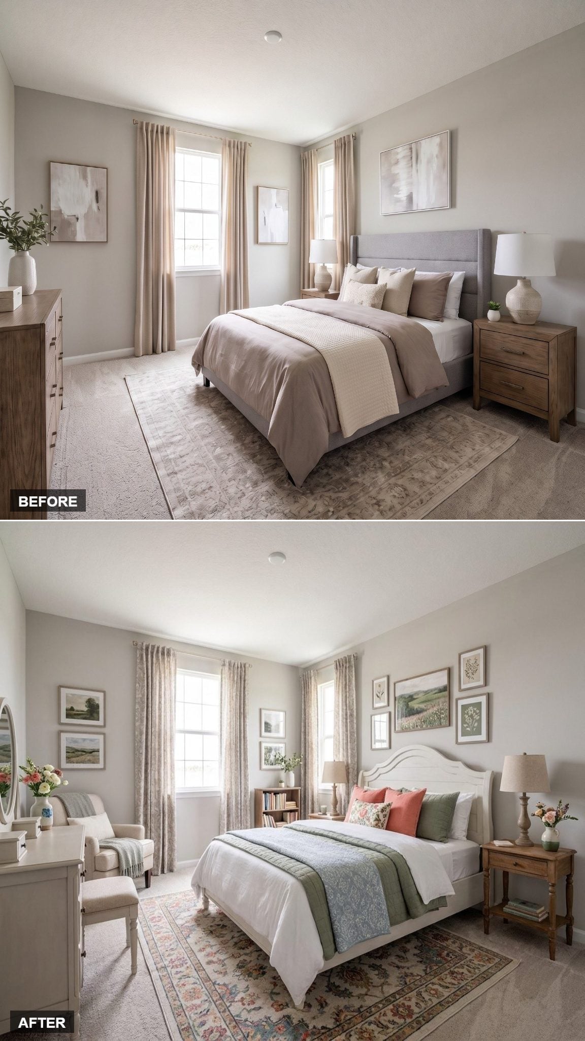
Warm cream walls and crown molding create a quiet architectural frame around a white-painted headboard with a scalloped arch.
Instead of concentrating the garden theme in one wallpapered wall, this room distributes it: botanical prints, a floral rug, and sage fabric across the bed. That makes the effect gentler and more traditional than the darker botanical bedroom earlier in the gallery.
The room doesn’t need a dramatic transformation gimmick. Its strength is that every small choice leans the same way.
10. Emerald Velvet and Black-Gold Geometry Went Full Deco
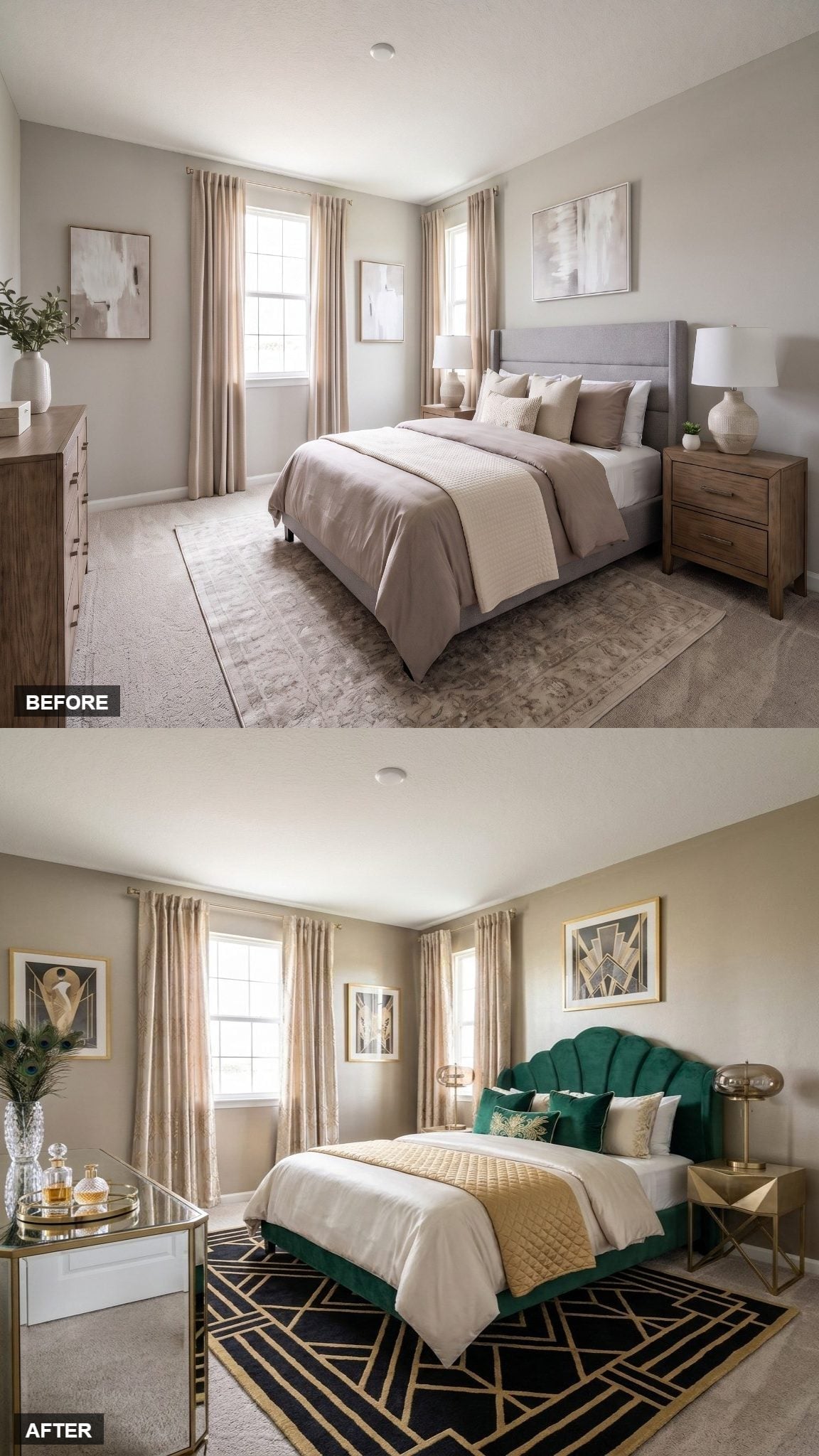
This is the more glamorous cousin of the earlier green velvet room. The emerald headboard is deeper and more theatrical, while the black-and-gold geometric rug pushes the Art Deco reference into much sharper focus.
Brass details on the lamp and side table repeat the metallic note without requiring gilding everywhere.
Where the first green room used shape as its main idea, this one is about contrast: emerald against black, black against gold, curves against hard geometry.
9. Dusty Rose Curtains Turned a Blue Headboard Into Something More Collected
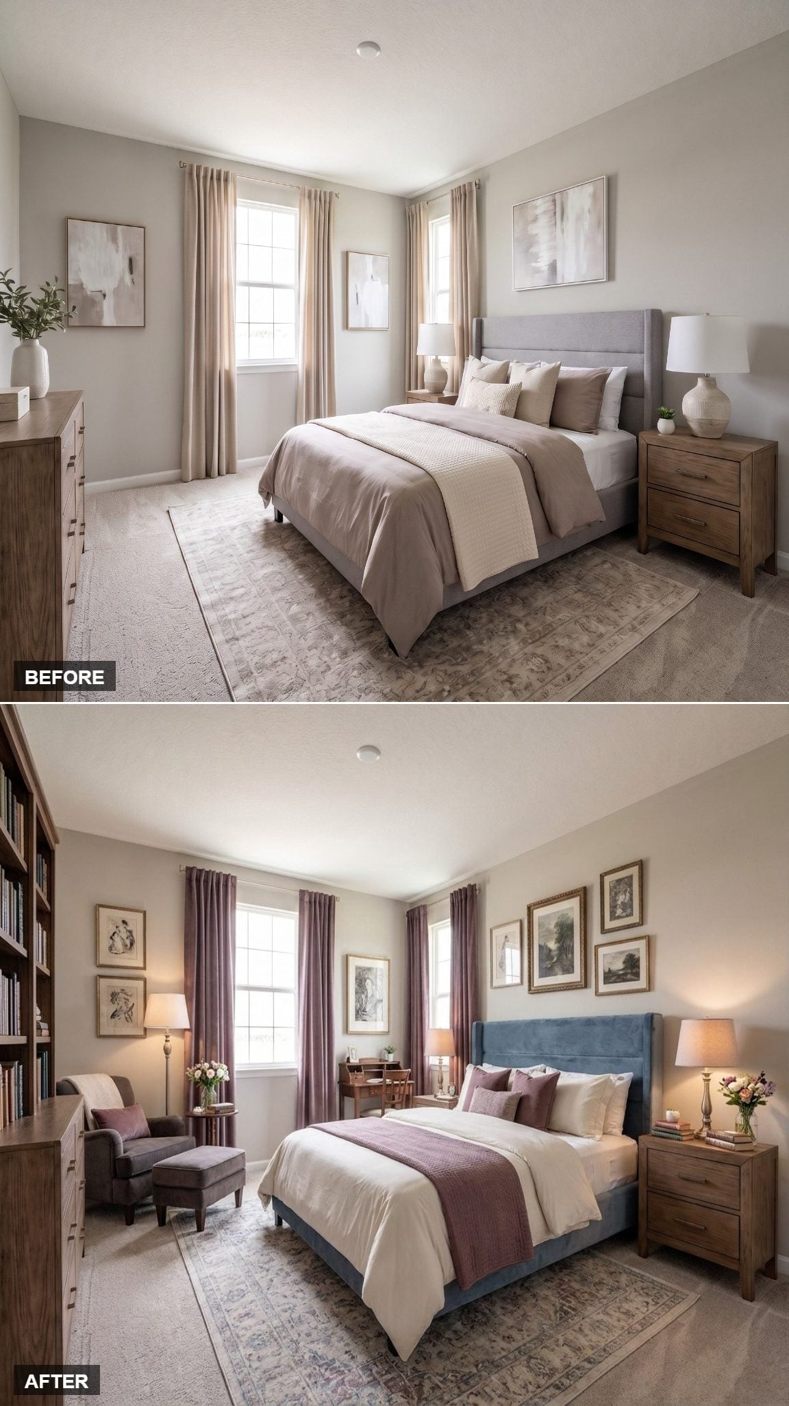
Dusty mauve curtains pool slightly at the floor, repeating color from the throw, pillows, and corner chair without making any one textile responsible for the entire palette.
The blue velvet headboard gives those rose tones a cooler surface to push against. Gold-framed artwork climbs behind the bed, while warm lamps prevent the blue from dominating once daylight fades.
A visible bookcase is the finishing move. This room isn’t trying to look empty enough for a photograph.
Design Note: After a major change, choosing a color simply because you like it can be reason enough. Here, blue becomes the fixed point and the warmer mauve and gold details are allowed to gather around it rather than dilute it.
8. Yellow Lamps Stole the Scene From an Otherwise Quiet Green Bedroom
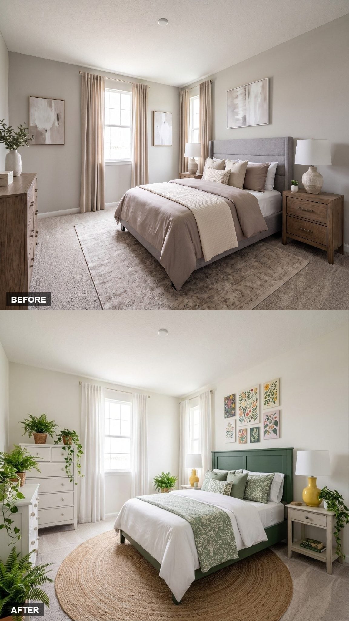
The sage paneled headboard is calm enough to disappear into white bedding and curtains if the room stops there. Fortunately, it doesn’t.
Two yellow ceramic lamps on the nightstands cut straight through the green-and-neutral palette. The round jute rug introduces a second shape break at floor level, while botanical prints keep the walls connected to the headboard color.
The surprise isn’t the green. It’s the yellow.
7. A White Wingback Headboard Let Powder Blue Stay Light
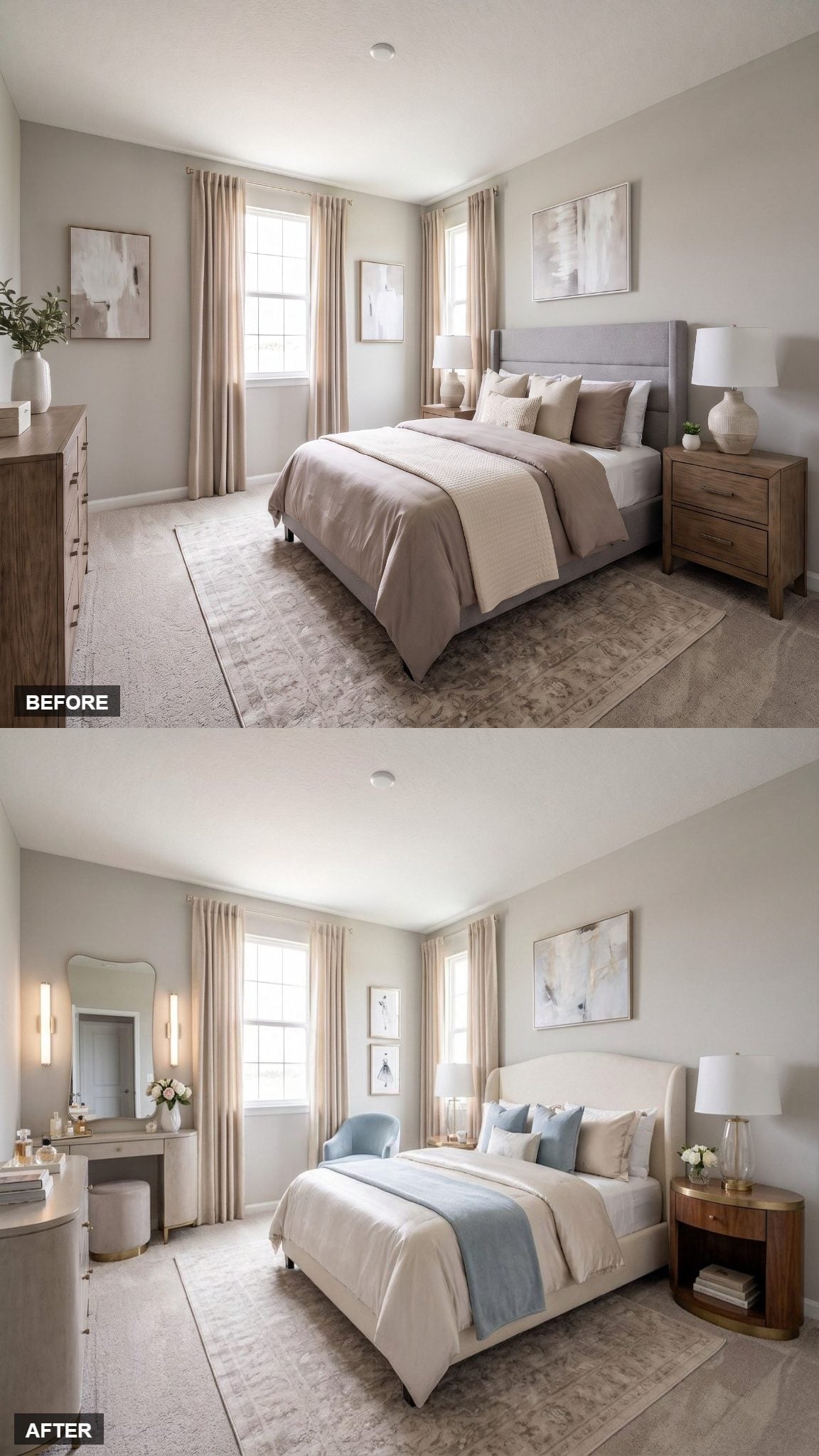
Ivory bedding gives the bed a nearly monochromatic base, leaving a powder blue throw and matching pillows to change the mood without saturating the room.
The curved wingback headboard adds shape rather than another color. On the left wall, a vanity with a scalloped mirror and sconces creates a separate grooming zone, while rounded walnut nightstands with brass bases keep pale blue and ivory from becoming weightless.
This is the quiet end of the color spectrum, not the indecisive one.
6. Dusty Rose and Sage Made a Neutral Room Stop Playing Neutral
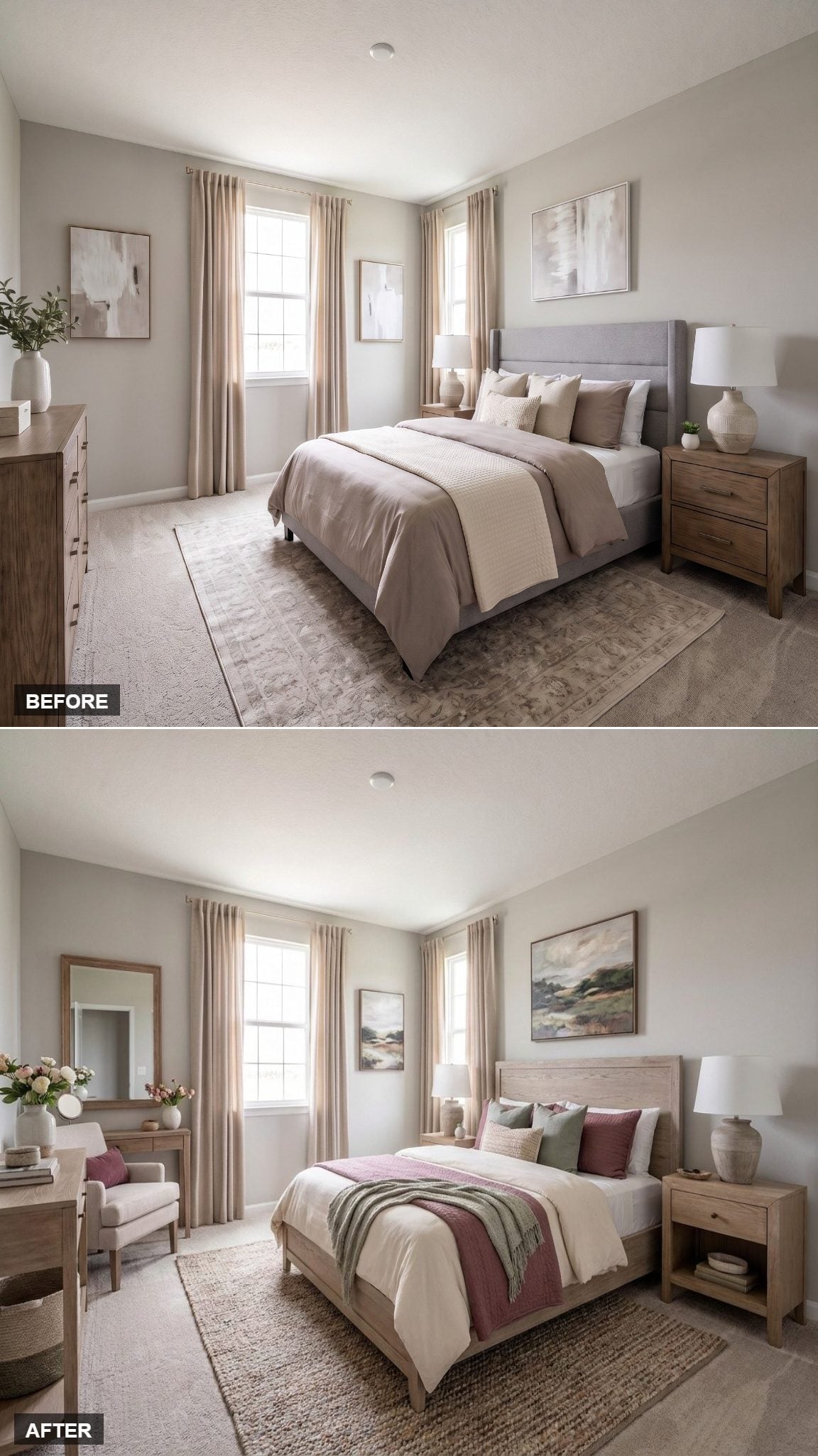
Bleached-looking wood furniture keeps the room pale and informal, while the bed’s simple paneled headboard leaves the color work to the textiles.
A deep rose runner crosses white bedding, with sage pillows supplying the cooler counterpoint. The jute rug stays almost deliberately anonymous underneath, giving those muted colors enough space to register.
Blush floral art picks up the rose without matching it exactly.
Color Note: Muted rose and sage work well together because each is softened rather than highly saturated. The warm-cool contrast gives the palette movement while the grayish undertones keep either hue from overwhelming the room.
5. Blue-and-White Toile Let Pattern Carry the Traditional Turn
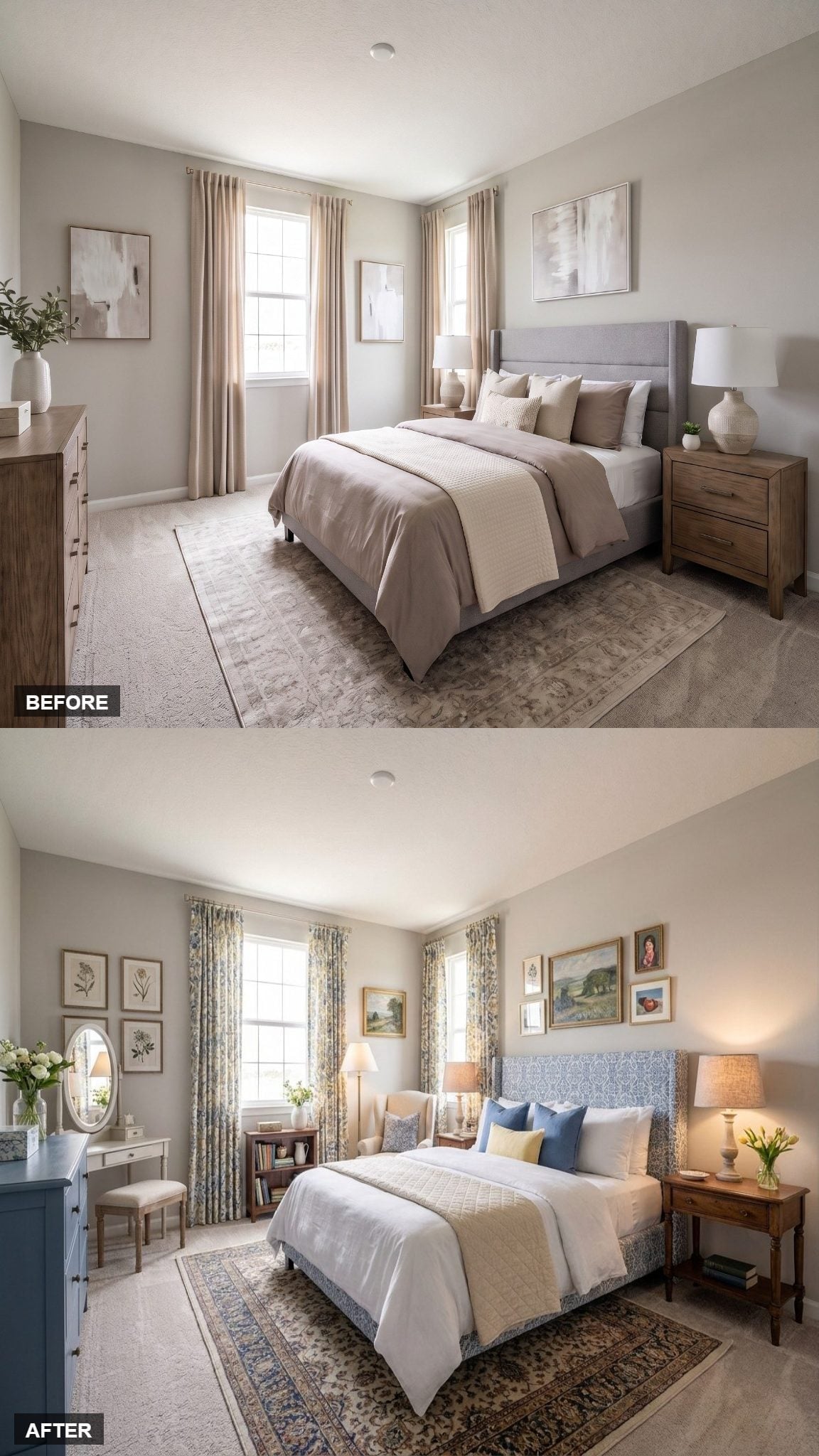
Blue-and-cream toile-style curtains immediately push the room toward a traditional French-inspired palette. The upholstered headboard repeats the same scenic floral language in a slightly denser blue, creating continuity without making the bed and windows look like a matched set.
The appeal is in repetition rather than contrast: blue at the window, blue around the bed, warm wood and flowers breaking up the cooler field.
A few tulips on the nightstand are enough. The fabric already did the decorating.
4. Pink and Blue Became a Deliberate Collision Instead of a Compromise
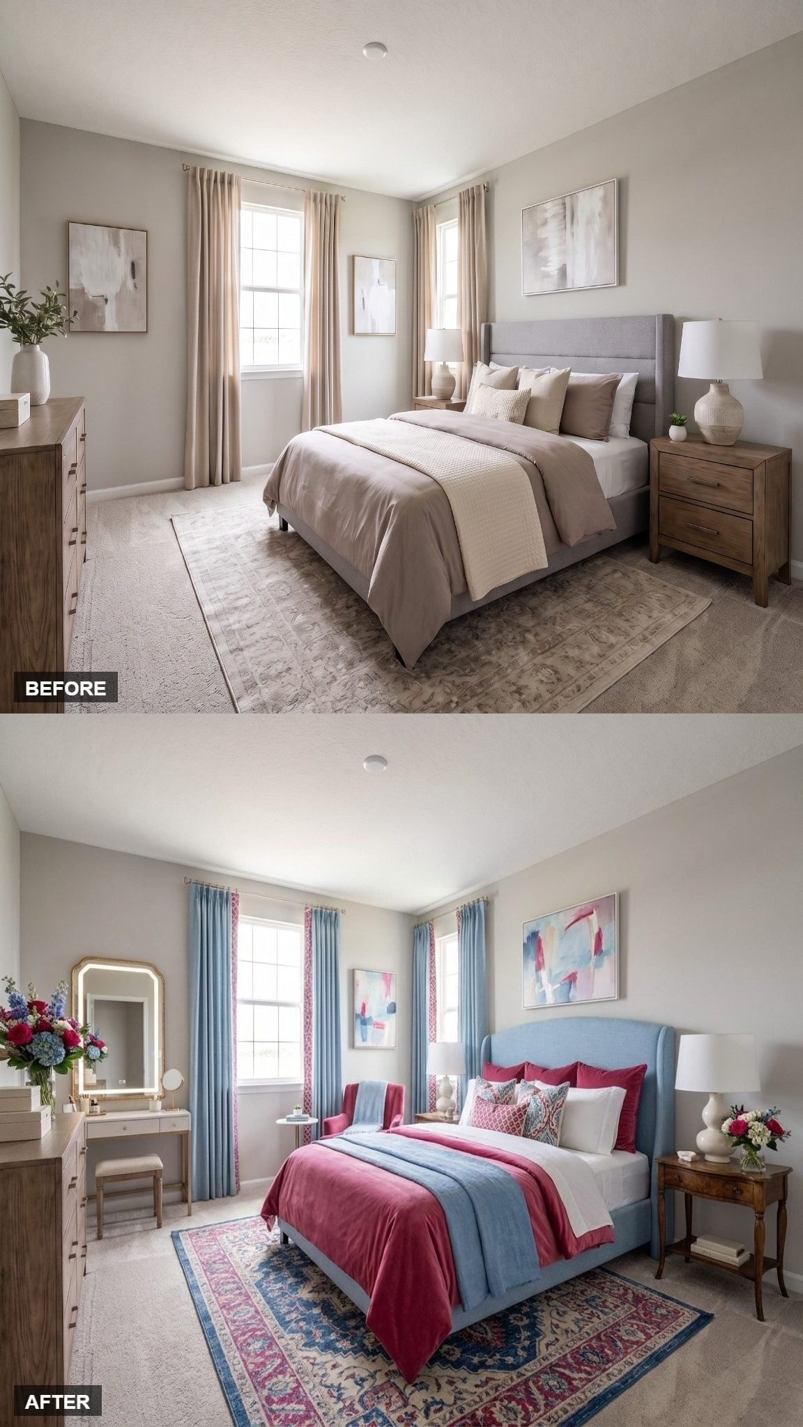
Crimson bedding against a powder blue headboard is bolder than the softer coral-and-blue combinations elsewhere in the gallery. Blue curtains trimmed with pink carry both colors onto the windows, so the pairing looks intentional rather than accidental.
A vintage-style wood nightstand and ceramic lamp give the palette something quieter to sit beside. Floral artwork above the bed picks up the rug’s pattern without repeating it exactly.
The colors may disagree. The room doesn’t.
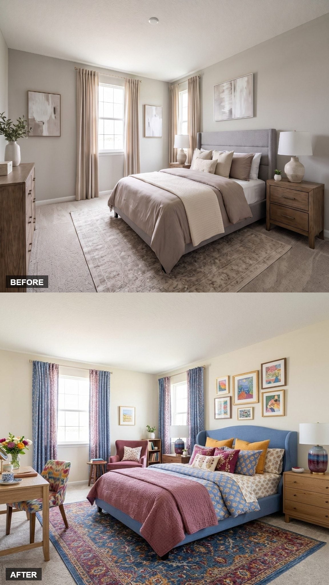
3. A Blue Wingback Headboard Gave a Maximal Gallery Wall Something to Push Against
🔥 Would you like to save this?
Denim-blue upholstery creates a solid block at the center of a room that otherwise has plenty happening: rose quilting, mustard pillows, a burgundy chair, floral curtains, framed artwork, and a Persian-style rug.
The gallery above the bed deliberately mixes gold frames and colorful prints rather than forcing everything into a matched grid. That density works because the headboard underneath is visually simple.
This isn’t the room for somebody hoping the accessories disappear.
2. Periwinkle Blue and Botanical Art Made Repetition Feel Restful
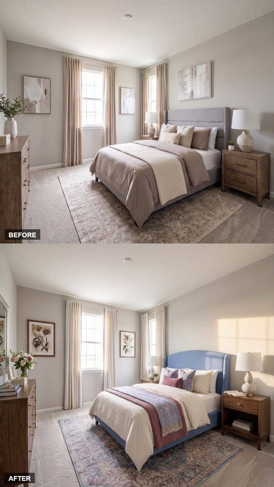
The neighboring blue-headboard room was maximal. This one strips the idea back.
Periwinkle upholstery gives the wingback headboard height without the visual density of a gallery wall. A dusty rose throw warms the white bedding, while botanical prints in matching wood frames create a steadier rhythm across the walls.
An open nightstand and gourd-shaped lamp keep the bedside relatively light. A Persian-style rug layered over carpet adds pattern at floor level rather than competing with the artwork.
Same basic headboard family. Almost the opposite temperament.
1. Wildflower Art and a Cream Headboard Let the Series End in Spring
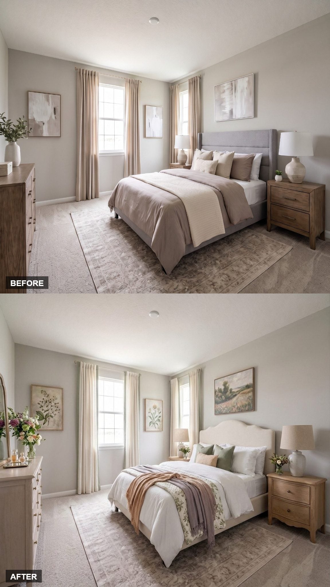
A cream upholstered headboard with a gentle arch gives the final room softness without asking color to carry the entire transformation. White linens continue that light base, then a floral runner, sage pillows, and a blush throw bring the garden in gradually.
Muted botanical art spreads across both walls in greens and soft pinks. A ceramic lamp with an oversized shade sits beside flowers on the nightstand, while the dresser repeats the idea with a round mirror and another small arrangement.
After rooms built around cobalt, cranberry, emerald, brass, wallpaper, galleries, and Deco geometry, this one finishes somewhere quieter.
The room doesn’t look like a declaration. It looks like the moment after one, when the door closes and the space finally feels settled.












