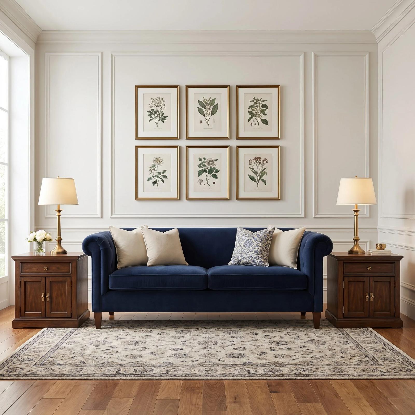
🔥 Would you like to save this?
The sofa gets blamed for crimes committed by everything around it. Too bulky. Too ordinary. Too low. Too old. Meanwhile a postage-stamp rug stops before the chairs, a nervous little coffee table occupies six inches of visual territory, and curtains end halfway down a wall that desperately needs height.
Scale changes the verdict. A sofa does not exist as an isolated object; it sits inside a composition of spans, heights, masses, openings, sightlines, and negative space. Give a deep sofa a table with enough footprint to answer it. Let a tall room have art capable of reaching into the upper register. Stretch a rug far enough to describe the seating zone instead of merely decorating its center. Suddenly the supposedly difficult sofa starts looking remarkably well chosen.
In order to come up with the very specific design ideas, we create most designs with the assistance of state-of-the-art AI interior design software. Also, assume links that take you off the site are affiliate links such as links to Amazon. this means we may earn a commission if you buy something.
These 29 rooms keep the important pieces and change the relationships around them. Sometimes the answer is larger. Sometimes it is longer, lower, wider, quieter, more concentrated, or simply positioned where the architecture can use it. The interesting part is not buying a better sofa. It is discovering how often proportion was the problem all along.
29. Organic Contemporary: Curves That Belong Together
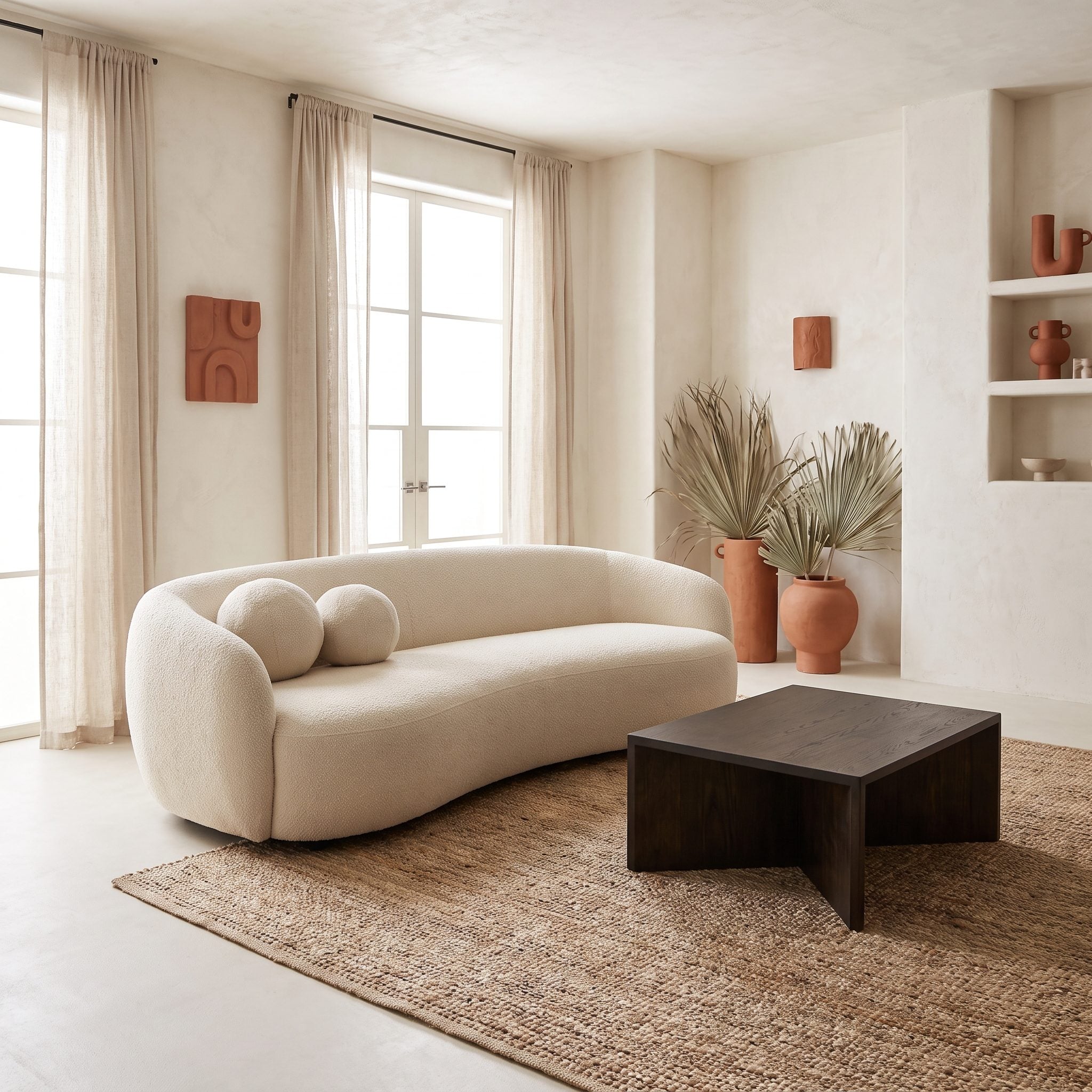
A curved sofa fighting a rectangular rug and an angular coffee table creates competing geometries in the same small zone. Every hard corner interrupts the sweep already established by the seating.
Let the surrounding forms continue that movement. A generous round rug can catch the front legs while a broad kidney-shaped curved coffee table echoes the sofa without duplicating it. The result is not softness for its own sake; it is continuity of line, with clear access preserved at both ends of the seating.
28. Window-Seat Living Room: Give the Daylight a Full-Height Frame
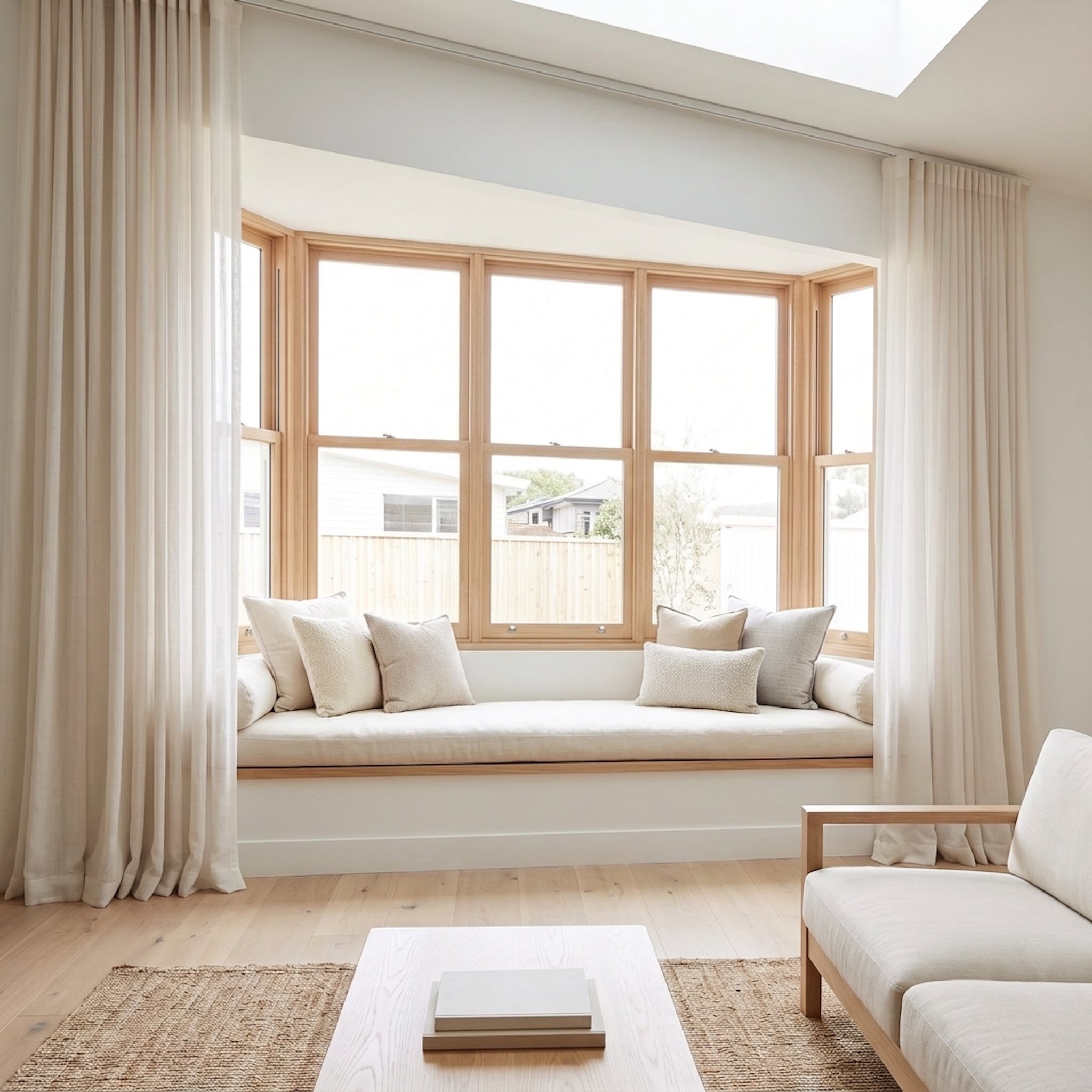
The window seat already has enough architectural presence to carry this end of the room. What makes it work is everything around it refusing to nibble away at that scale: the glazing stretches wide, the oak frames have real depth, and the curtains run nearly from ceiling to floor instead of clinging to the window itself.
Those long cream panels turn the entire recess into one framed composition, while the broad pale coffee table carries that generous horizontal proportion forward into the seating area. Even the skylight joins the argument, pulling daylight across the ceiling rather than concentrating it at the windows. Nothing here needs to shout. The dimensions are doing the work.
Why It Works: Full-height curtains frame the complete architectural opening rather than just the glass. Repeating its generous horizontal scale in the furniture keeps the window seat connected to the room instead of reading like a separate alcove.
27. Parisian-Inspired: Tall Art Over Low Furniture
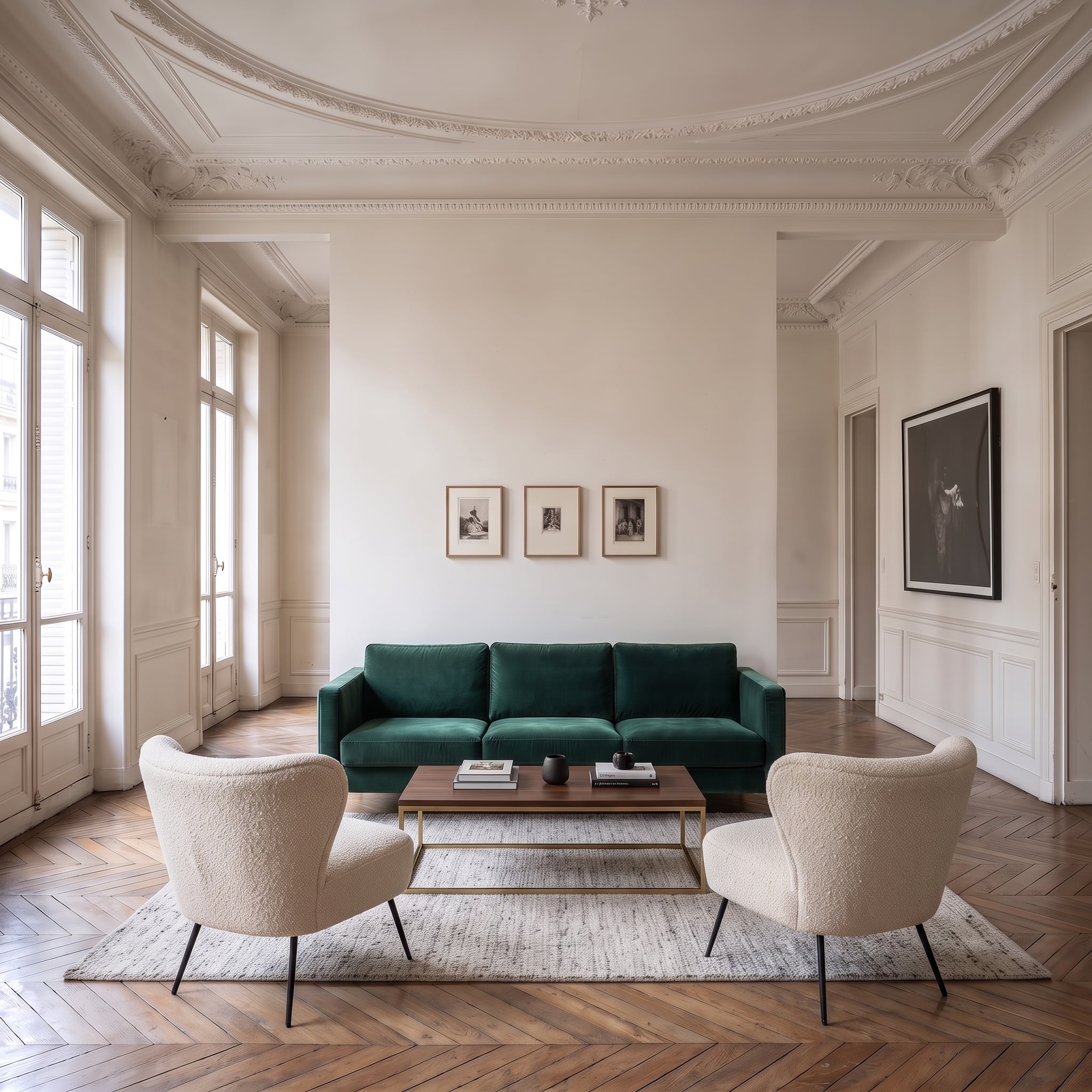
Soaring moldings and low furniture create useful tension, but three small prints suspended inside all that wall height barely register. A narrow coffee table compounds the problem by leaving both the upper and lower halves of the composition visually underfed.
The black sofa can remain exactly where it is. One large portrait-format painting centered within the molding claims the vertical space, while a broad, low marble-topped coffee table strengthens the horizontal base. That high-low tension also appears in many grandmillennial living room schemes that pair substantial wall art with quieter seating.
26. Graphic Contemporary: Scale That Makes Contrast Intentional
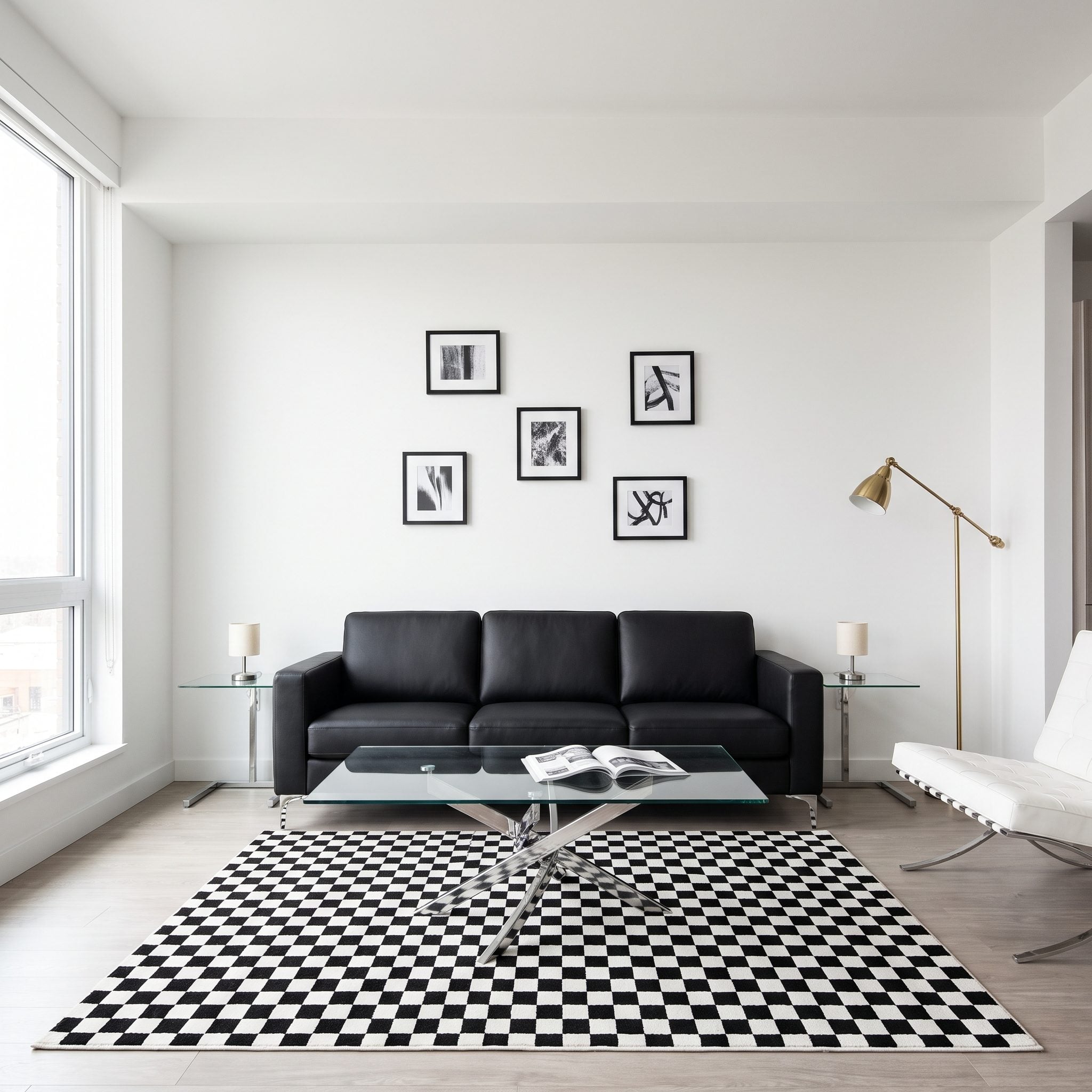
Black sofa, black-and-white art, checkered rug. Every surface is competing for attention, yet none has enough room to dominate. The sofa becomes another dark block in a field of visual static.
Quiet the floor and consolidate the wall. A generous plain pale rug gives the sofa a calmer field, while the existing prints can be regrouped into one wide composition with disciplined spacing. The glass coffee table, white chair, side tables, and lamps provide enough visual relief. Contrast starts looking controlled rather than accidental.
25. Desert Modern: Earthy Scale Around Rust Upholstery
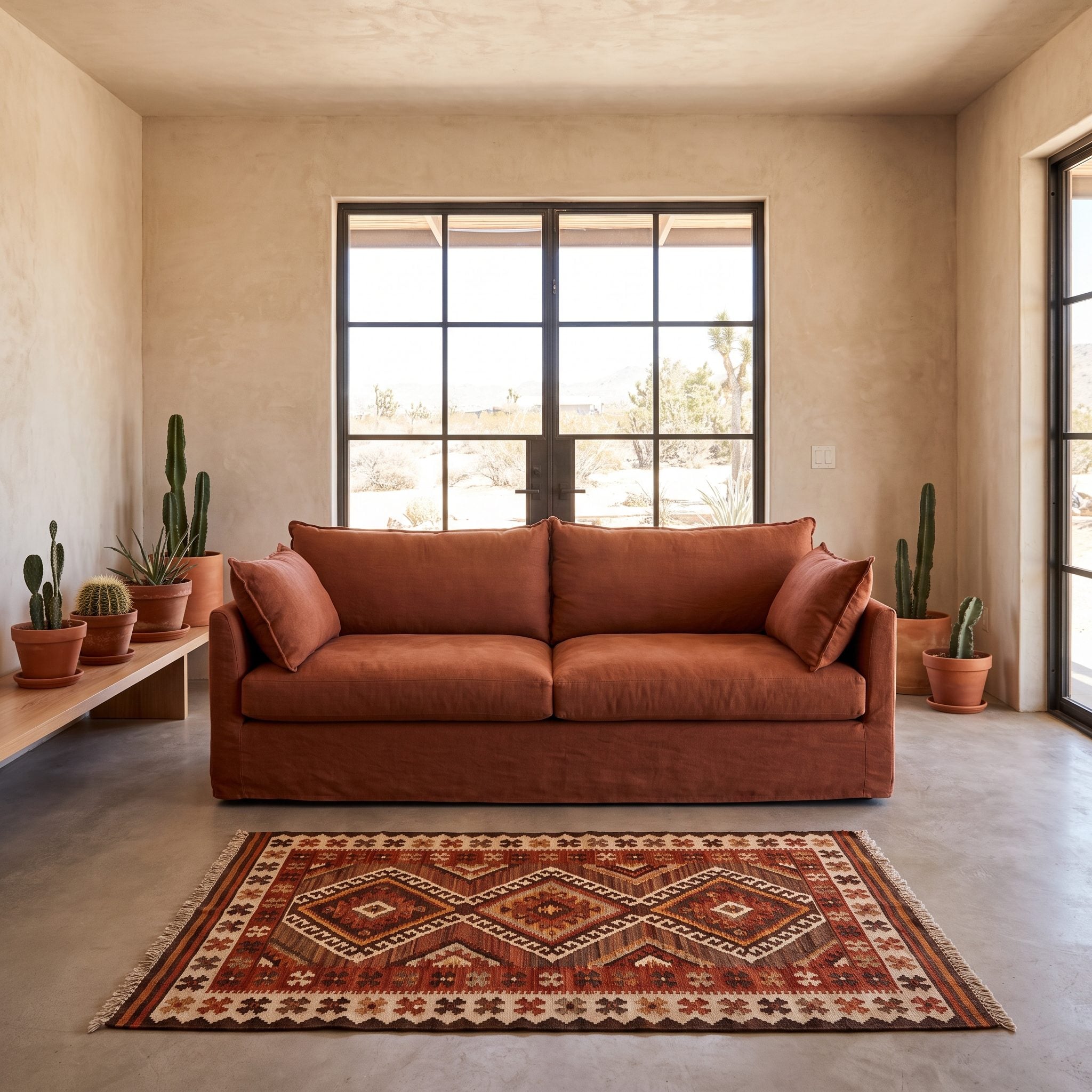
The rust sofa already has presence. The busy undersized rug beneath it competes rather than supports, while one small print on a wide plaster wall leaves too much unresolved space above.
Both seats stay, along with the wood table and brass floor lamp. A large flatwoven sand-colored rug quiets the floor, and a broad woven wall textile introduces enough width and texture to answer the sofa without stealing its color story. The room becomes earthier and more expansive at the same time.
24. Library Lounge: Let the Sofa Hold Its Own
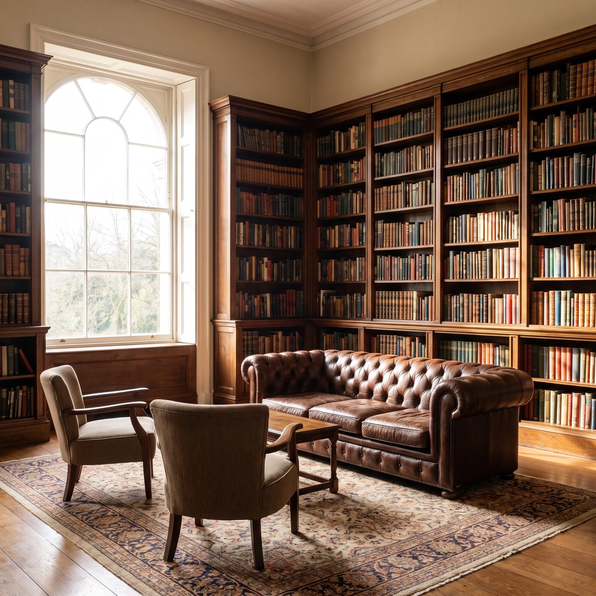
Floor-to-ceiling walnut bookshelves packed with books create enormous visual density. Beside them, tiny end tables and narrow lamps make the olive sofa feel like an afterthought rather than part of the room’s principal composition.
Broader end tables establish a stronger datum at arm height, while large shaded table lamps give the seating enough volume to answer the shelving. The smaller tables can move somewhere less demanding. Nothing competes with the book wall; the sofa simply stops being outgunned by it.
23. Contemporary Glamour: A Larger Soft Center
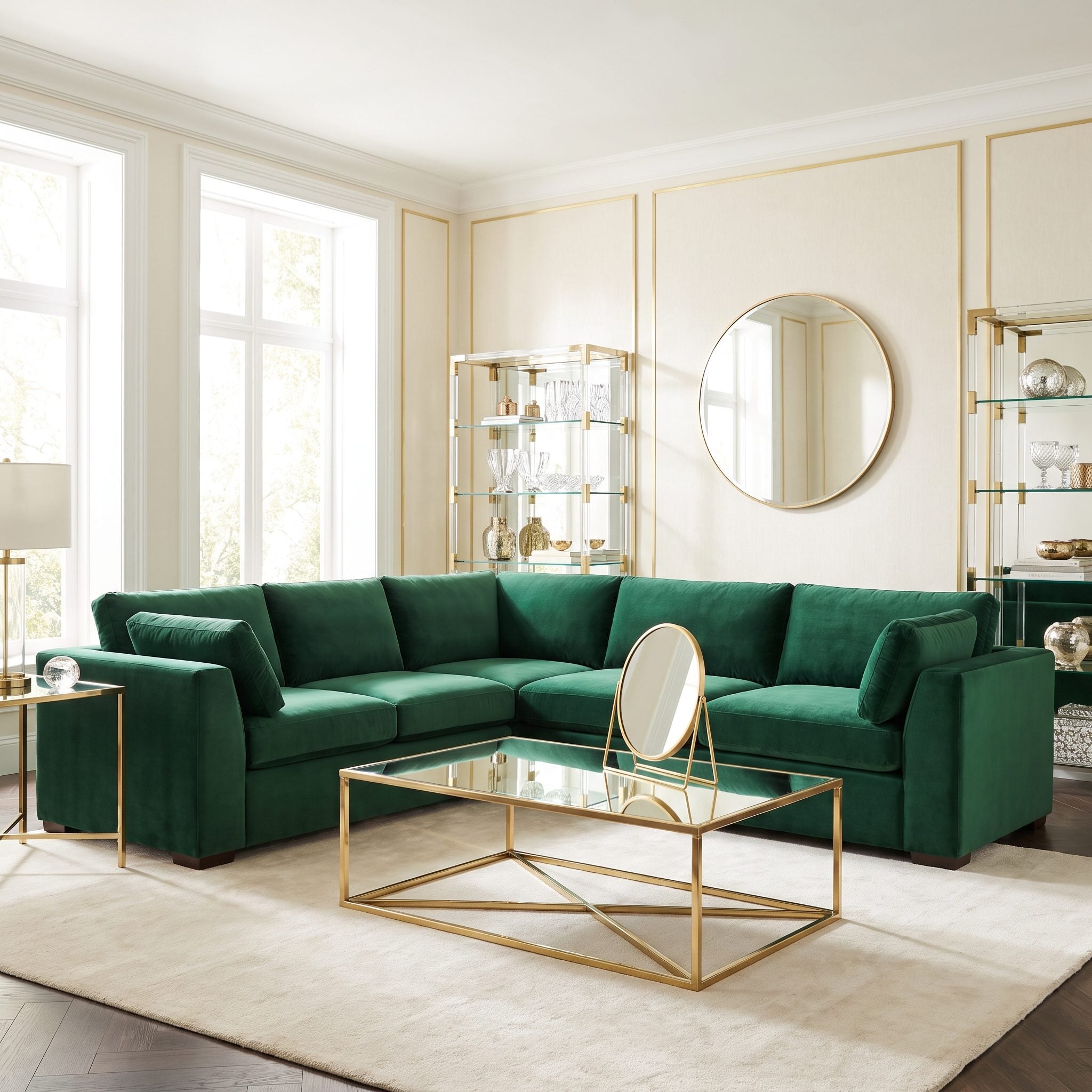
Plum velvet and cream upholstery already establish a luxurious palette. The thin little metal table at the center and undersized mirror above the sofa simply do not occupy enough visual territory to finish the arrangement.
A broad upholstered coffee ottoman with a stable tray gives the seating a softer, fuller center, while a large horizontal mirror extends the composition across the sofa wall. Plushness now has scale as well as texture.
22. Collected Traditional: Bigger Foundations, Familiar Details
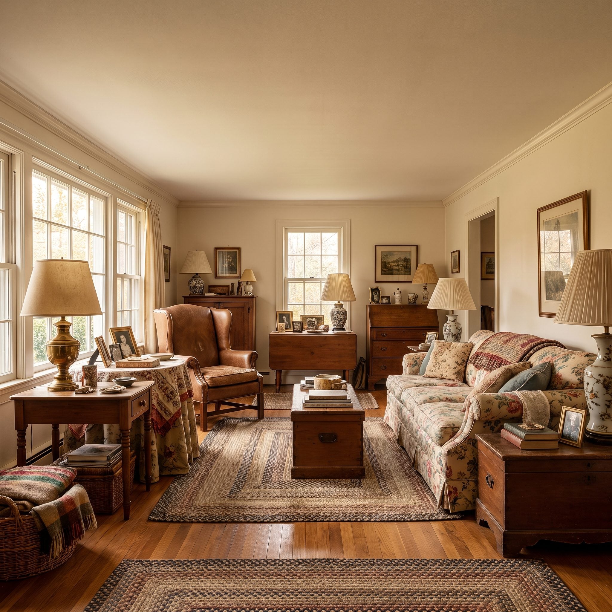
A floral sofa, wingback chair, familiar lamps, and years of family photographs can create character without creating order. The problem begins when a busy little rug competes with the upholstery and scattered pictures break the wall into unrelated fragments.
Nothing sentimental needs to disappear. A large plain sage wool rug gives the patterned furniture a quieter foundation, while the photographs gain more force when regrouped into one compact rectangular composition. The room remains collected; the visual noise simply acquires boundaries.
21. Double-Height Living Room: Give the Upper Wall Something to Carry
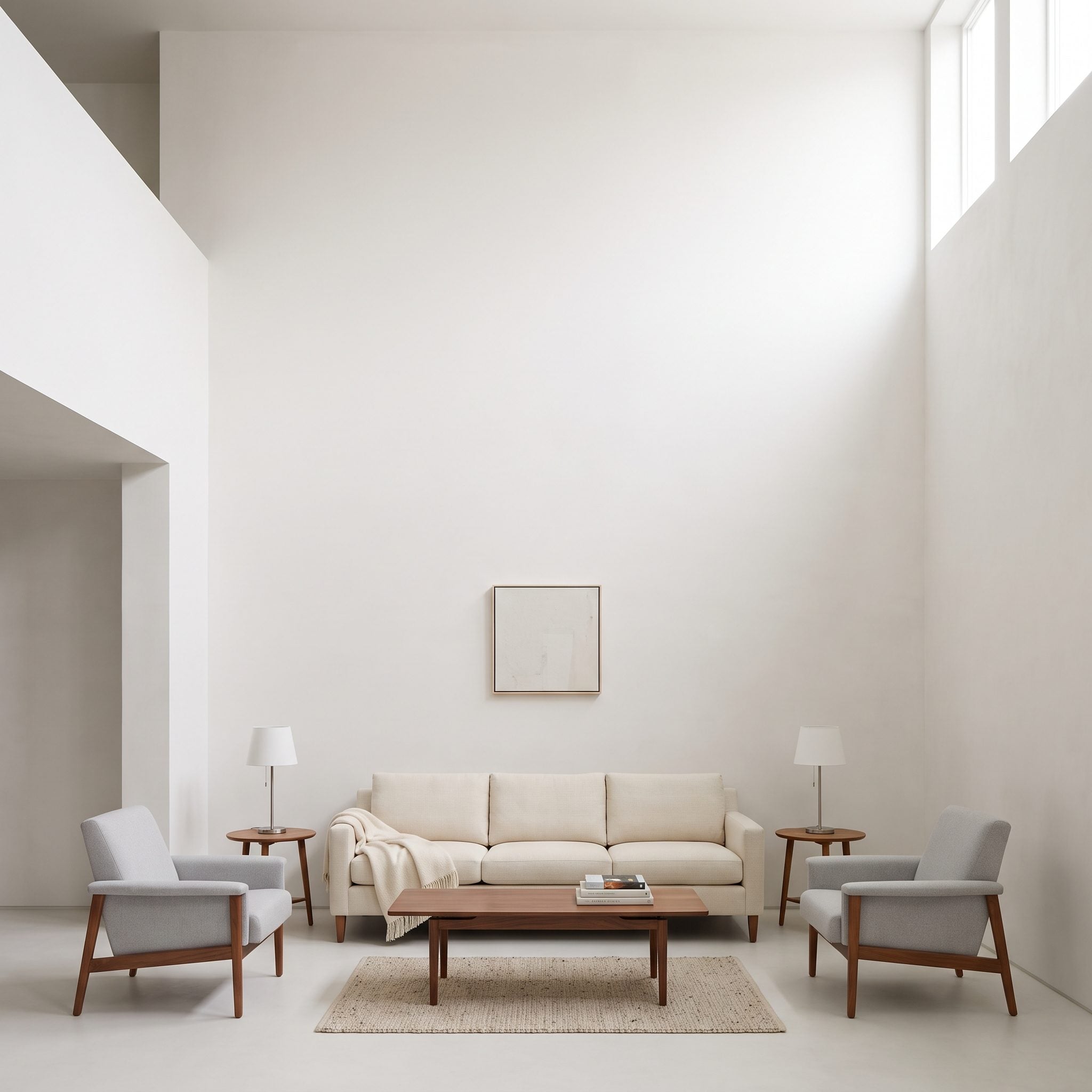
Tall rooms eat timid gestures alive. A cream sofa and two chairs can have perfectly reasonable proportions at floor level and still look stranded beneath an enormous expanse of blank wall.
A large vertical canvas can claim that upper register while an expansive rug brings the seating into one coherent lower field. The art should respond to the wall rather than merely to the sofa beneath it; the rug should respond to the complete seating group rather than just the coffee table. Height above and footprint below finally belong to the same room.
20. Low-Ceiling Retreat: Broad Rather Than Tall
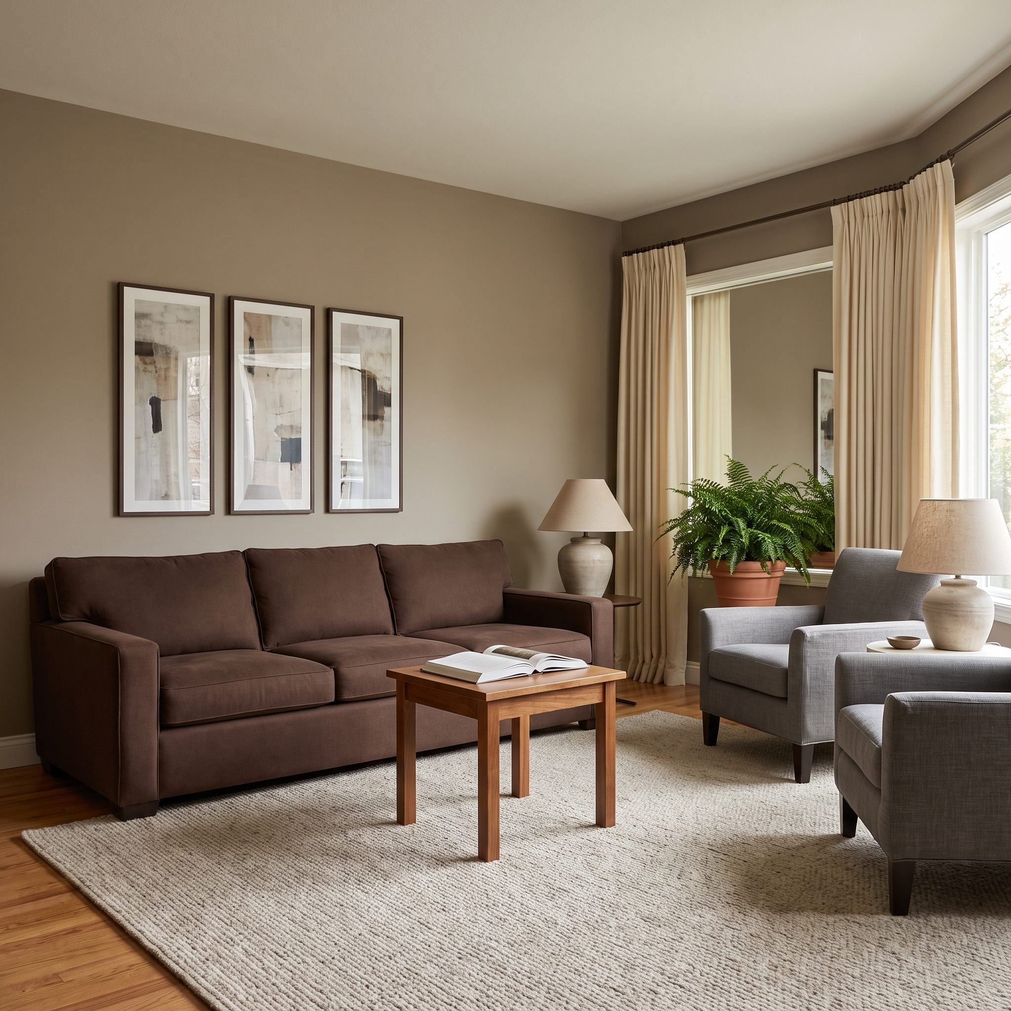
Low ceilings are not automatically a flaw. The trouble starts when skinny vertical pictures and a narrow high coffee table keep emphasizing exactly how little height the room has.
Run the composition sideways instead. One wide panoramic photograph stretches the wall horizontally, while a long low table reinforces the same direction closer to the floor. Sofa, rug, chairs, curtains, and lamps can remain untouched. In this particular room, breadth creates ease where more vertical emphasis would only tighten the space.
19. Garden Room: Match the Furnishings to the Breadth of the Glass
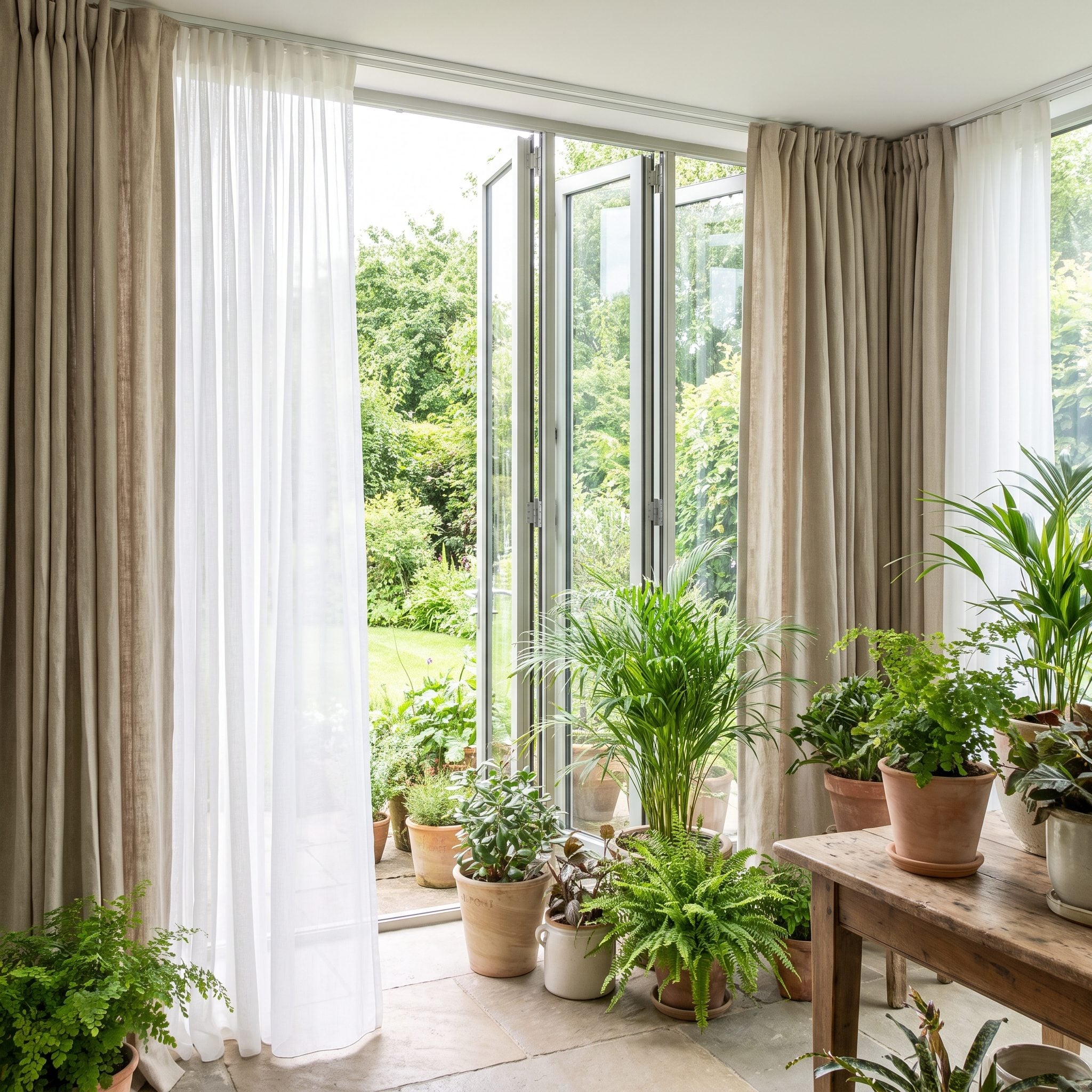
The garden doors dominate the elevation, yet narrow curtain panels and a tiny round table operate at a completely different scale. The furniture seems gathered beside the glazing rather than composed with it.
Full-height linen curtains with enough fullness to frame the opening can stack clear when the doors are open. In front of the green sofa, a broad oval wood coffee table extends the center horizontally without blocking the route outdoors. The room starts responding to the width of its best architectural feature.
18. Asymmetrical Chaise Lounge: Balance Without Forced Symmetry
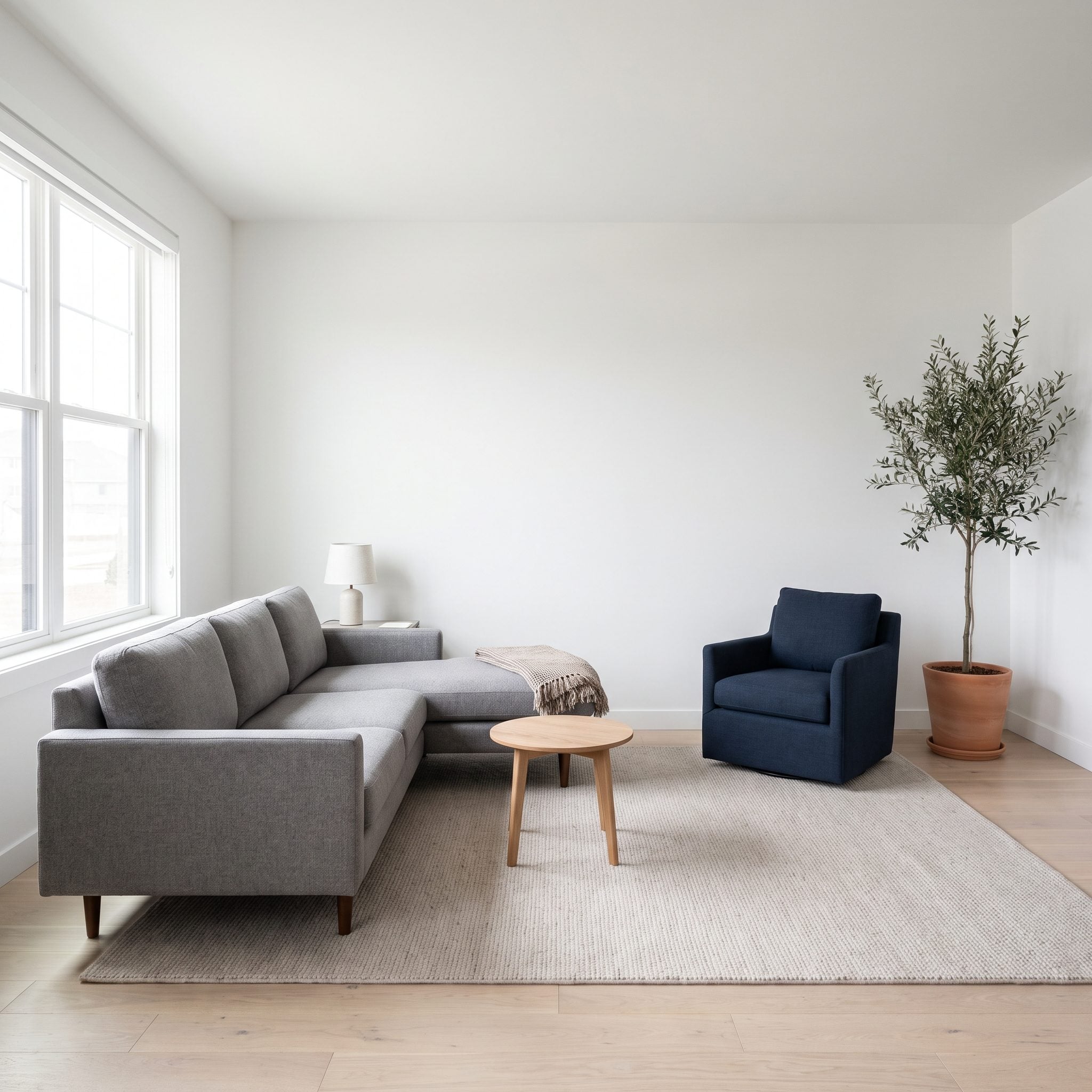
A chaise sectional is asymmetrical by design. Centering a tiny table on its total width only advertises the imbalance, while a small lamp at the short end leaves all the visual mass piled on one side.
Balance does not require matching halves. An offset oval table can serve the principal seats instead of obeying the sofa’s outer dimensions, while a tall floor lamp at the end opposite the chaise contributes vertical mass where the composition needs it. The room remains asymmetric, but it no longer feels tilted.
17. Conversation Salon: Two Sofas, One Composition
🔥 Would you like to save this?
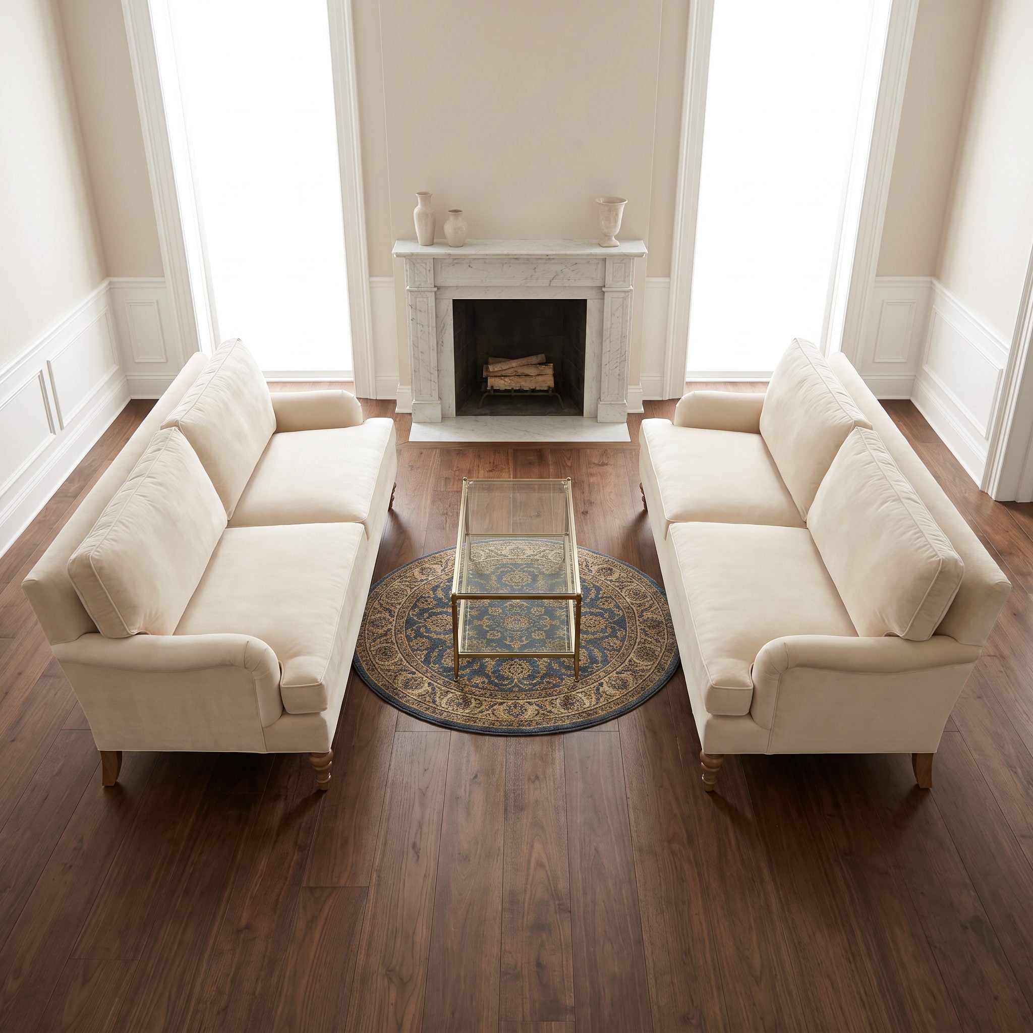
Two facing sofas create a conversation layout almost automatically, but a rug that stops inside both seating lines and a miniature table marooned between them break that relationship into three separate parts.
Let one rug extend beneath the front portions of both sofas and give the center a substantial square coffee table that can be comfortably reached from either side. The shared foundation creates the same kind of useful cohesion that can make a teal bonus room or formal sitting room feel naturally conversational.
16. Compact Luxury: Use Length Without Filling the Floor
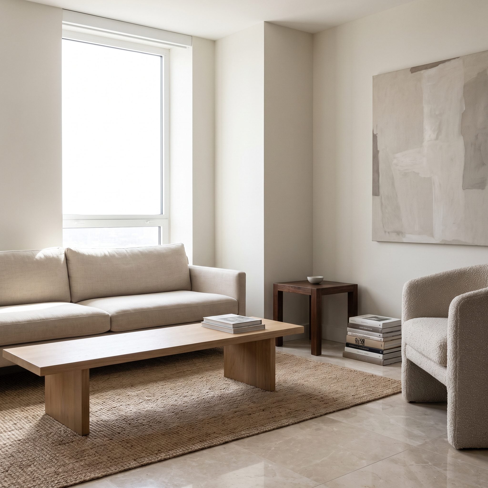
A compact room does not automatically need miniature furniture. Too many undersized objects can chop a small space into restless fragments, especially when both the table and wall art stop well short of the loveseat they serve.
A shallow elongated oval coffee table introduces length without excessive depth, while one wide landscape artwork stretches the wall horizontally. The key is not simply “go bigger.” It is choosing dimensions that reinforce the room while keeping the primary path comfortably open.
15. Family Lounge: Enlarge the Foundation Without Losing the Favorite Rug
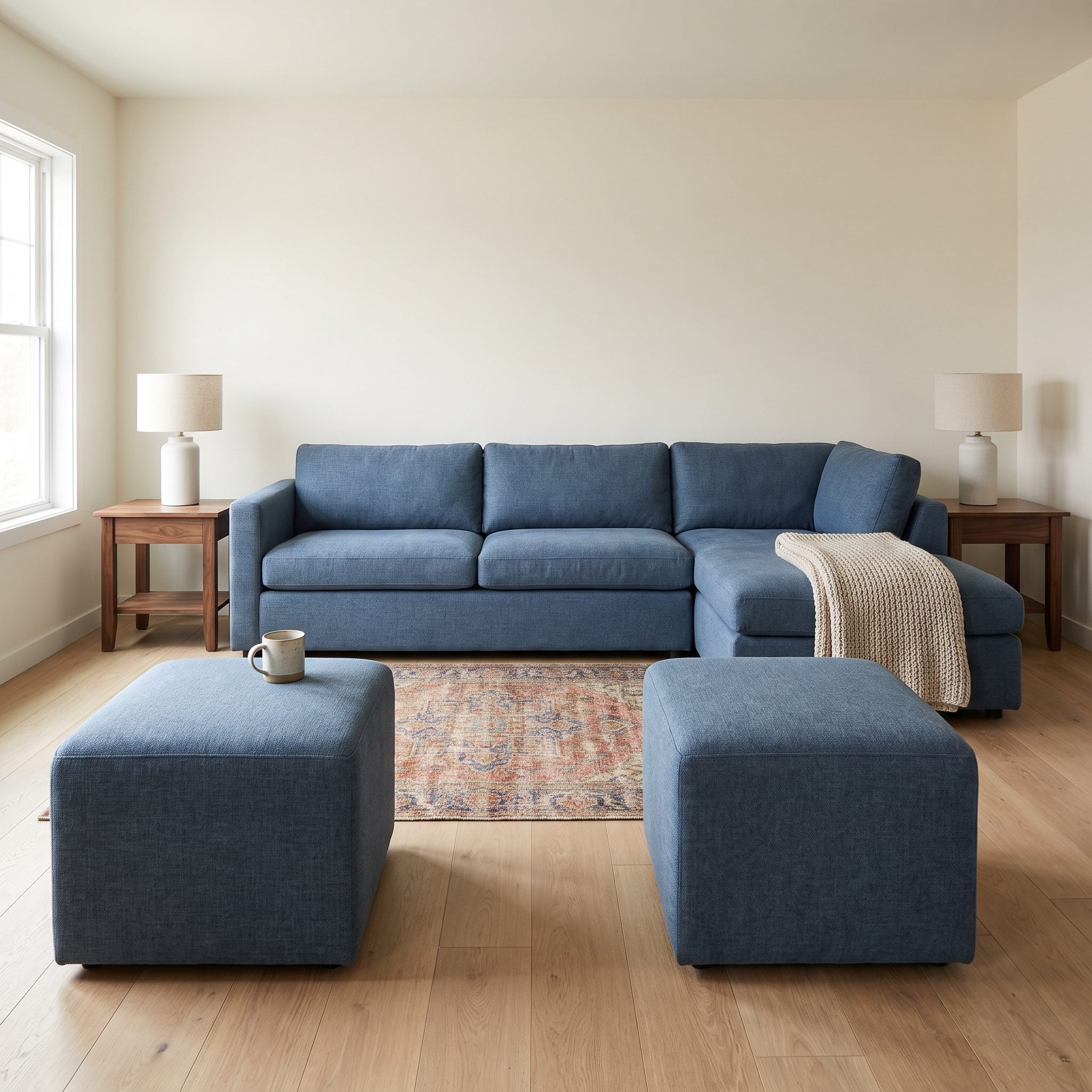
The denim-blue sectional works. The patterned rug works. They simply do not connect because the rug stops before the seating begins, while two separate ottomans break the center into competing little islands.
Layer the favorite rug over a larger neutral foundation so the original pattern remains visible while the sectional gains a proper floor field beneath its front legs. Push the ottomans together into one broader center and add a stable tray. A suitable rug pad should keep the layers flat and reduce shifting. The sentimental piece stays; the scale problem disappears.
14. The Deep Sofa: Give the Coffee Table Width as Well as Length
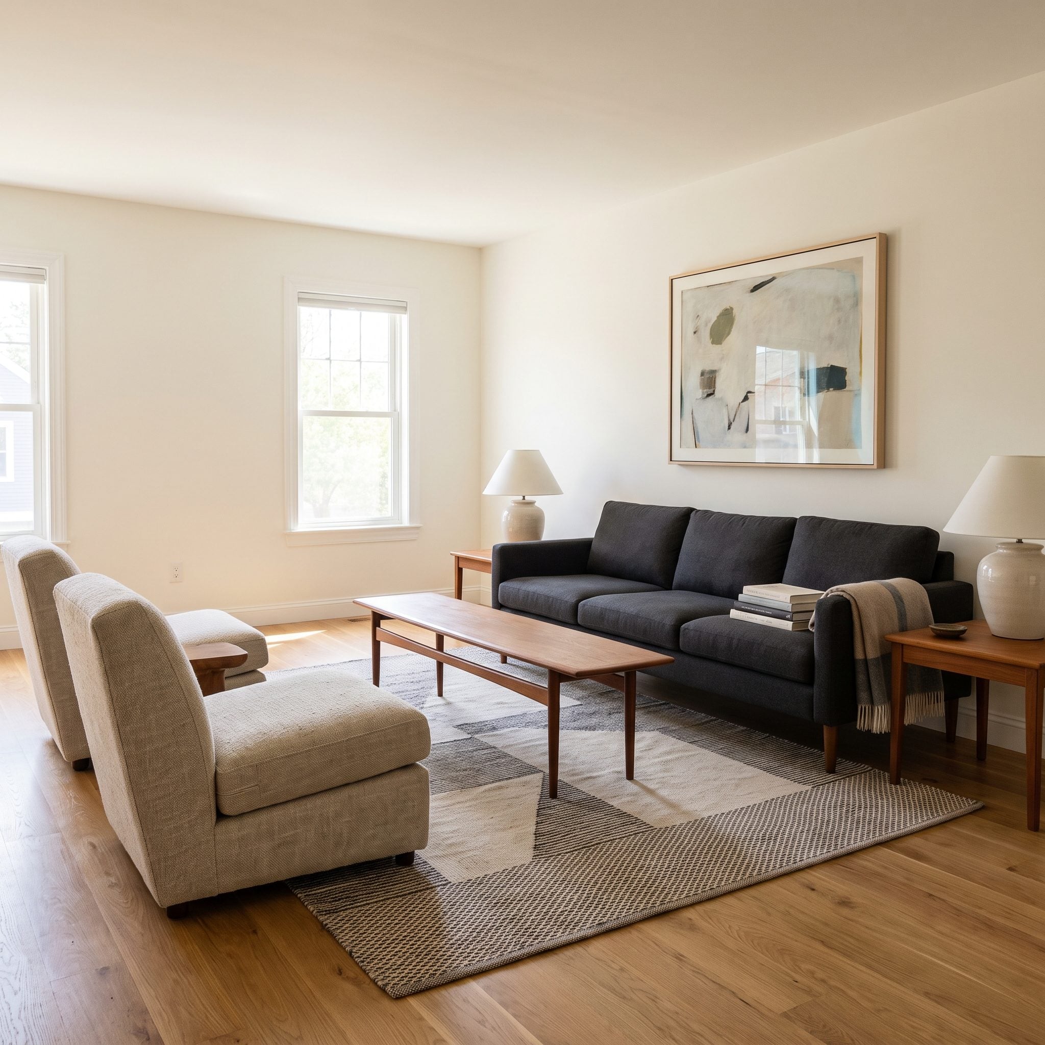
This proportion problem is easy to miss. A deep charcoal sofa faces lounge chairs across a coffee table that may be long enough but is far too narrow to give the middle of the group any real presence.
A broad rectangular smoked-oak table can answer the sofa’s depth while also serving the chairs opposite. The useful dimension is not a fixed percentage of sofa length; it is enough surface area to relate to both sides while preserving comfortable reach and circulation. The existing skinny table can move beneath a window, where its shallow profile becomes an advantage.
13. The Long Lumbar Cushion: Fix the Scale on the Sofa Itself
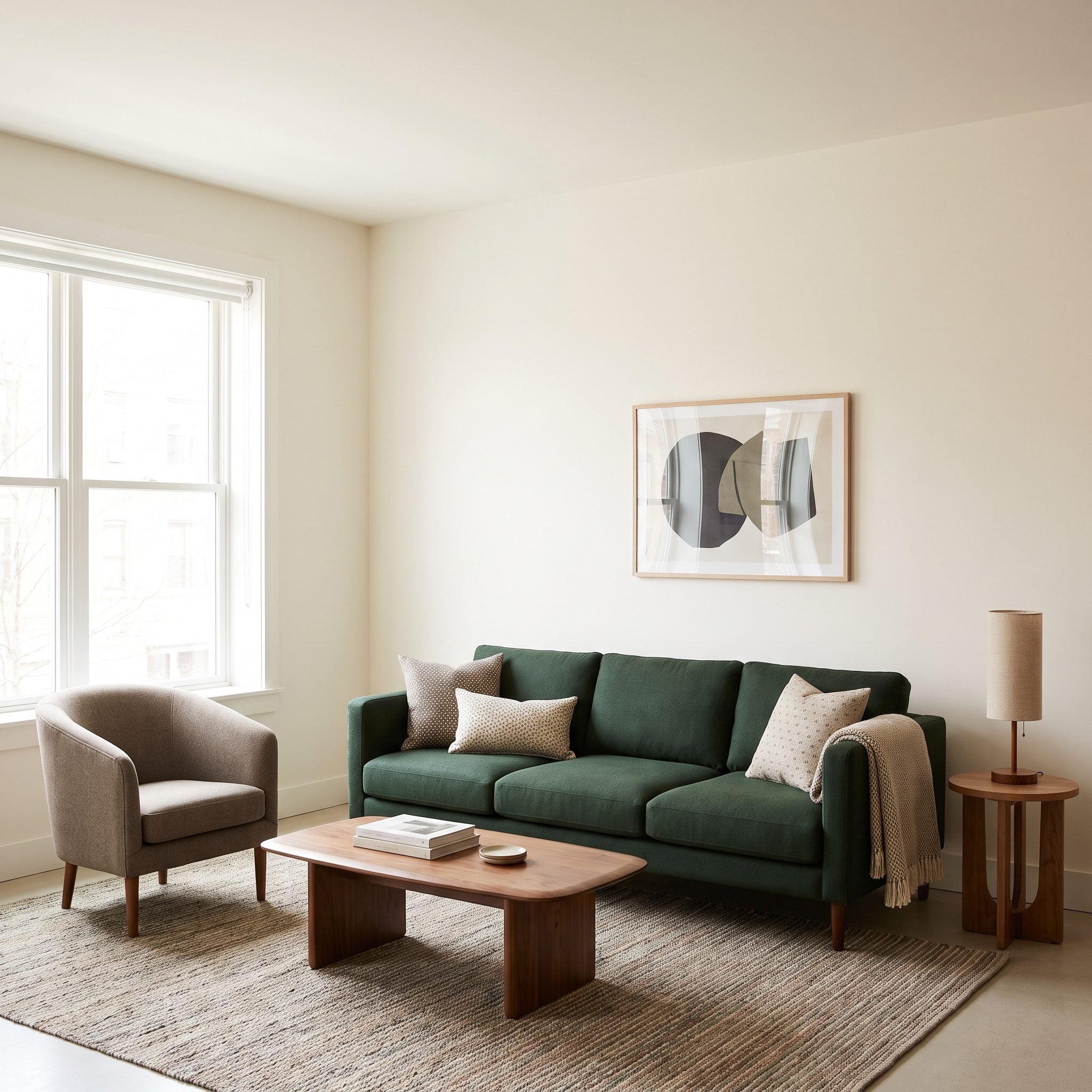
A deep forest-green sofa covered with a scatter of undersized pillows loses the very quality that makes it appealing: generous uninterrupted upholstery. Too many small shapes turn a broad seat into visual confetti.
One generously scaled lumbar cushion across the center, flanked by two quieter squares, leaves more of the sofa visible while still adding support and contrast. A substantial ceramic lamp on the existing side table gives the adjacent object a similar increase in presence. Fewer forms, better proportion, more sofa.
12. The Oversized Mount: Keep the Art, Enlarge Its Presence
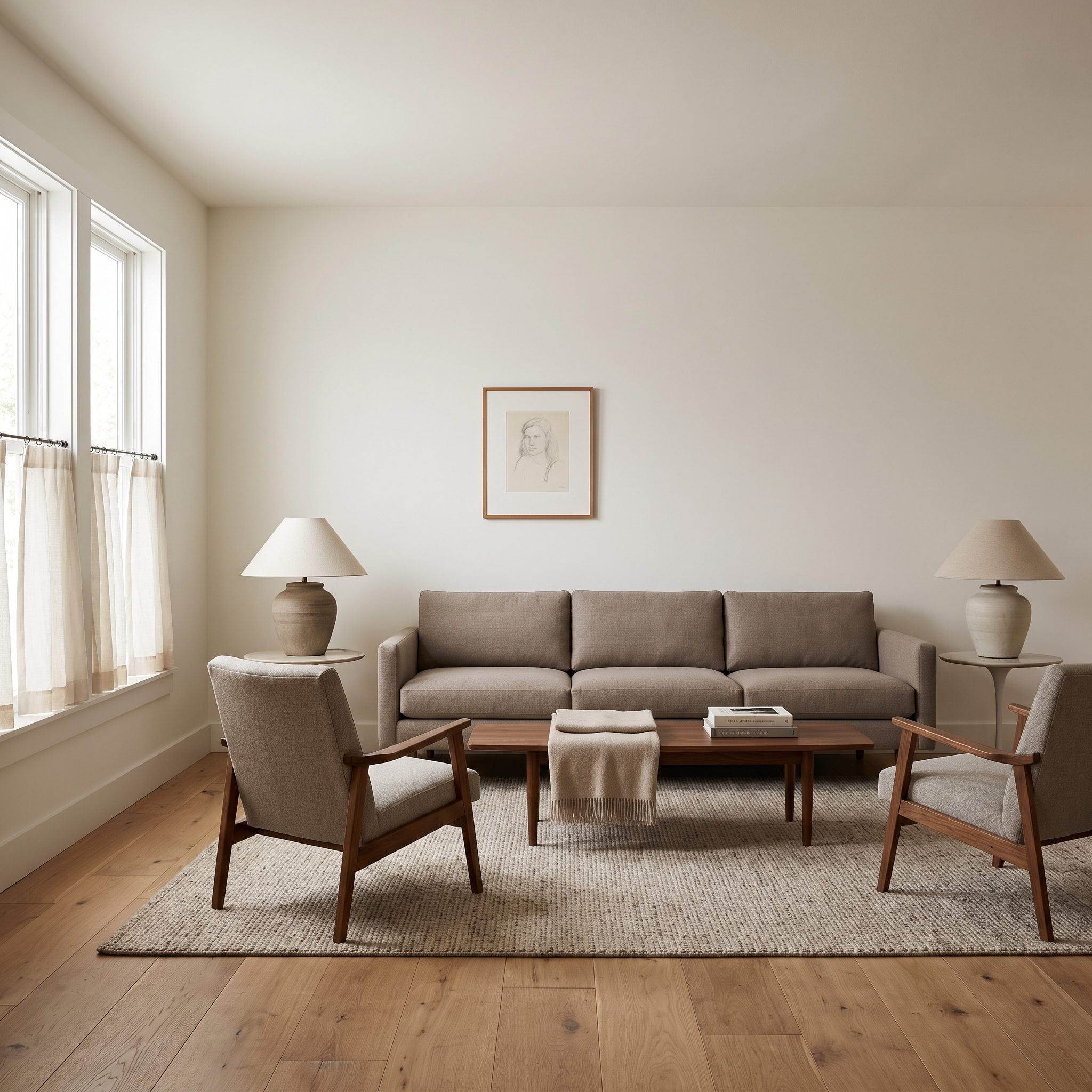
A treasured drawing can be entirely right for the room and still look lost inside a narrow frame surrounded by a vast wall. The artwork is not undersized as an object; its presentation is undersized for the surface around it.
Reframe rather than replace. A generous archival mount and more substantial frame expand the visual footprint without altering the original piece. Full-length curtains mounted higher on the wall can add a second vertical element nearby. Meaning stays intact; presence increases.
11. Fireplace Lounge: Match the Seating to the Hearth
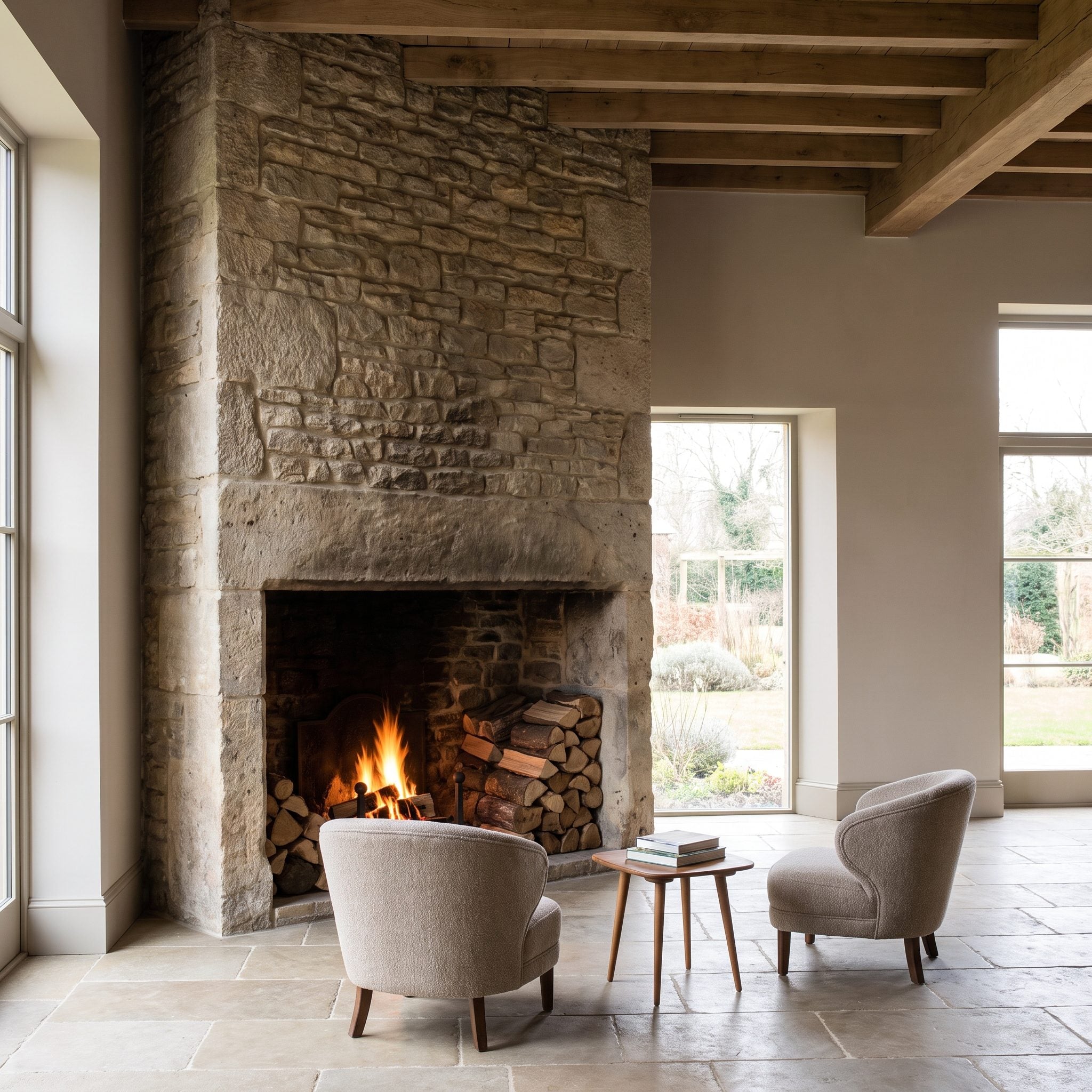
A stone fireplace running toward the ceiling brings enormous mass into one side of the room. Against it, an undersized rug leaves the seating visually unbound, while lamps with pin-thin shades barely register. Together they make the furniture look as though it arrived from a smaller house.
A broad textured rug can enlarge the perceived seating footprint, while fuller linen lampshades give the light fixtures enough silhouette to register against all that stone. The beige sofa itself was never lacking presence; the surrounding pieces simply were not helping it meet the hearth on equal terms.
10. Warm Monochrome: Let Form Carry the Contrast
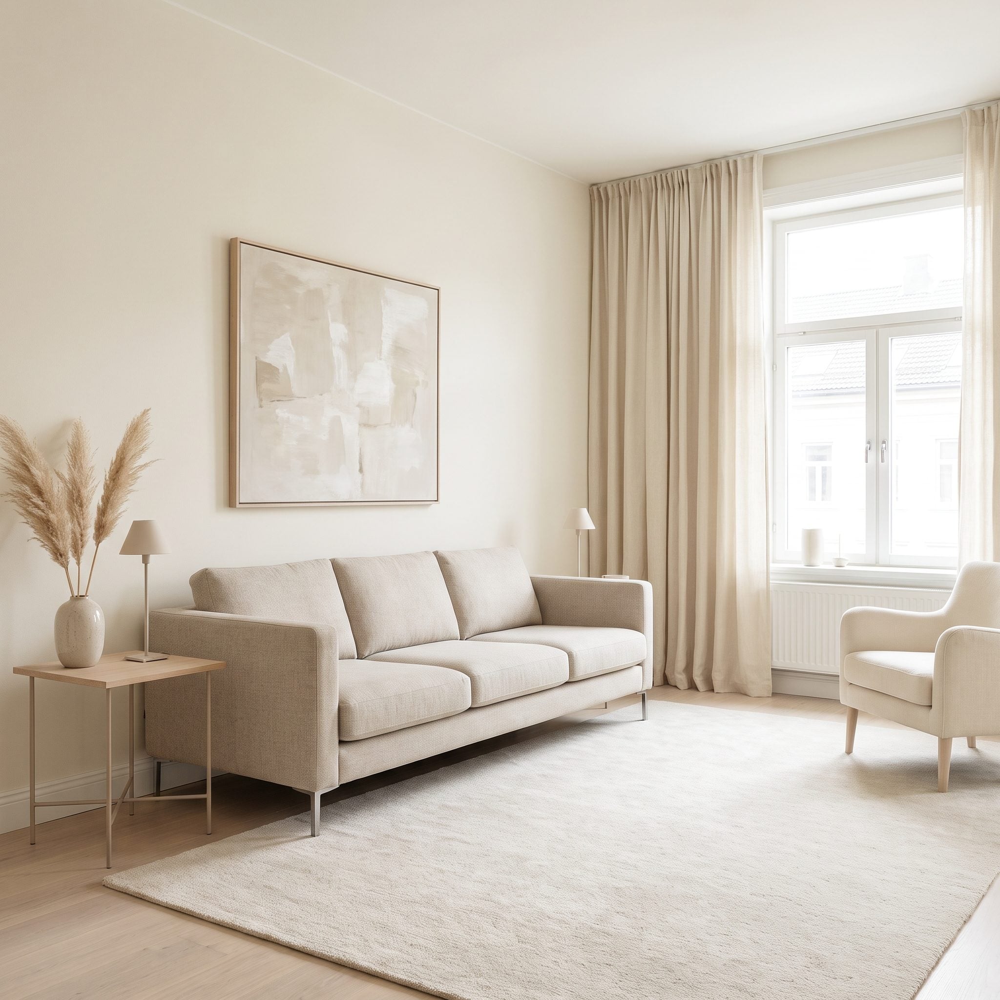
When nearly everything sits between oatmeal, cream, and pale stone, color contrast stops doing much of the compositional work. Shape, material, shadow, and scale have to take over.
A broad travertine coffee table brings denser mass and mineral texture to the center, while substantial ceramic lamps replace thin verticals that nearly disappear against the pale room. The palette remains restrained, but the silhouettes gain enough difference to create depth. The same principle can apply in a lavender living room or any other low-contrast palette.
9. Modern Classic: A Stronger Symmetrical Frame
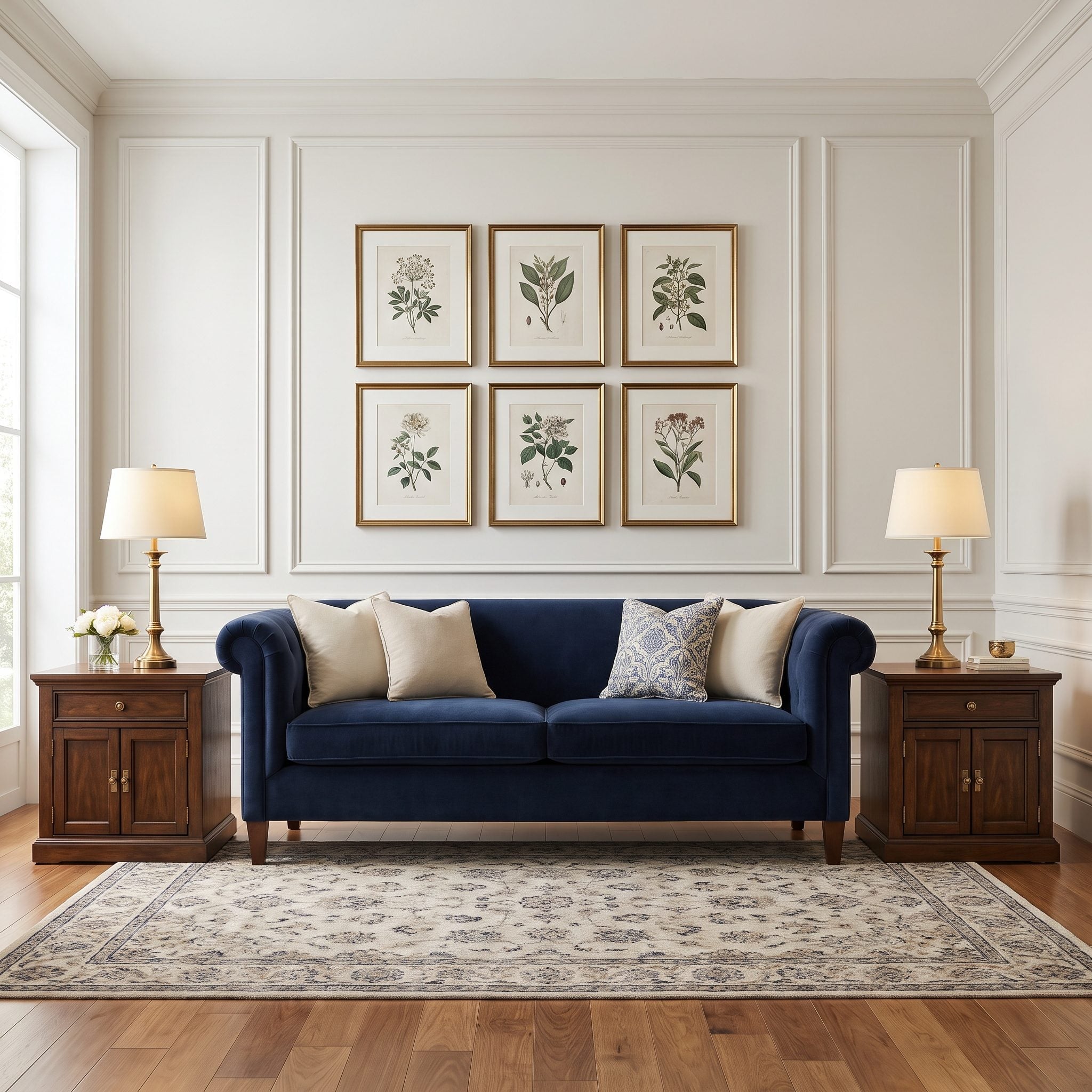
A navy rolled-arm sofa carries considerable visual weight. Skinny end tables and one lonely little print above it leave the sofa looking heavier than it actually is because the surrounding frame barely registers.
Bring wider end tables up to roughly arm height and use a pair of tall artworks whose combined presence relates convincingly to the sofa’s span. The original narrow tables can move beside an armchair or into the entry. Symmetry then becomes a framework rather than decoration.
A balanced frame gives the sofa a clear center and lets mismatched or inherited details feel coherently placed.
The same strategy can help a grandmillennial living room where traditional furniture needs stronger surrounding structure rather than replacement.
8. Coastal Lounge: Give the Center Enough Mass
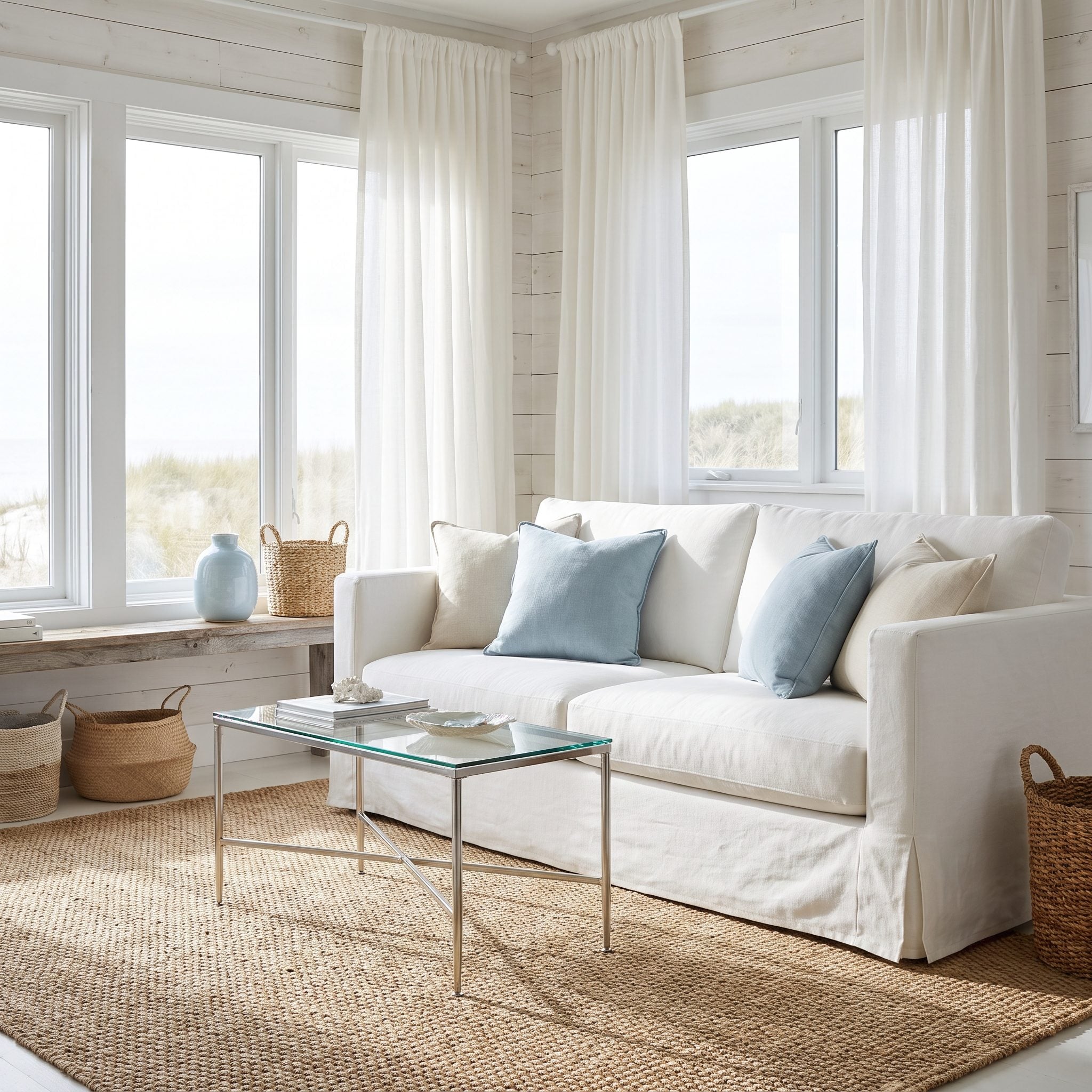
A delicate glass table in front of a generous slipcovered sofa barely occupies the center of the seating group. The sofa is relaxed and substantial; the table looks temporary by comparison.
A broad bleached-oak coffee table introduces enough footprint and opacity to hold the middle, while chalk-white ceramic lamps give the edges more presence. Nothing about the sofa becomes less casual. Its neighbors simply start speaking at the same volume.
7. The Floating Sofa: Finish the Back With a Longer Console
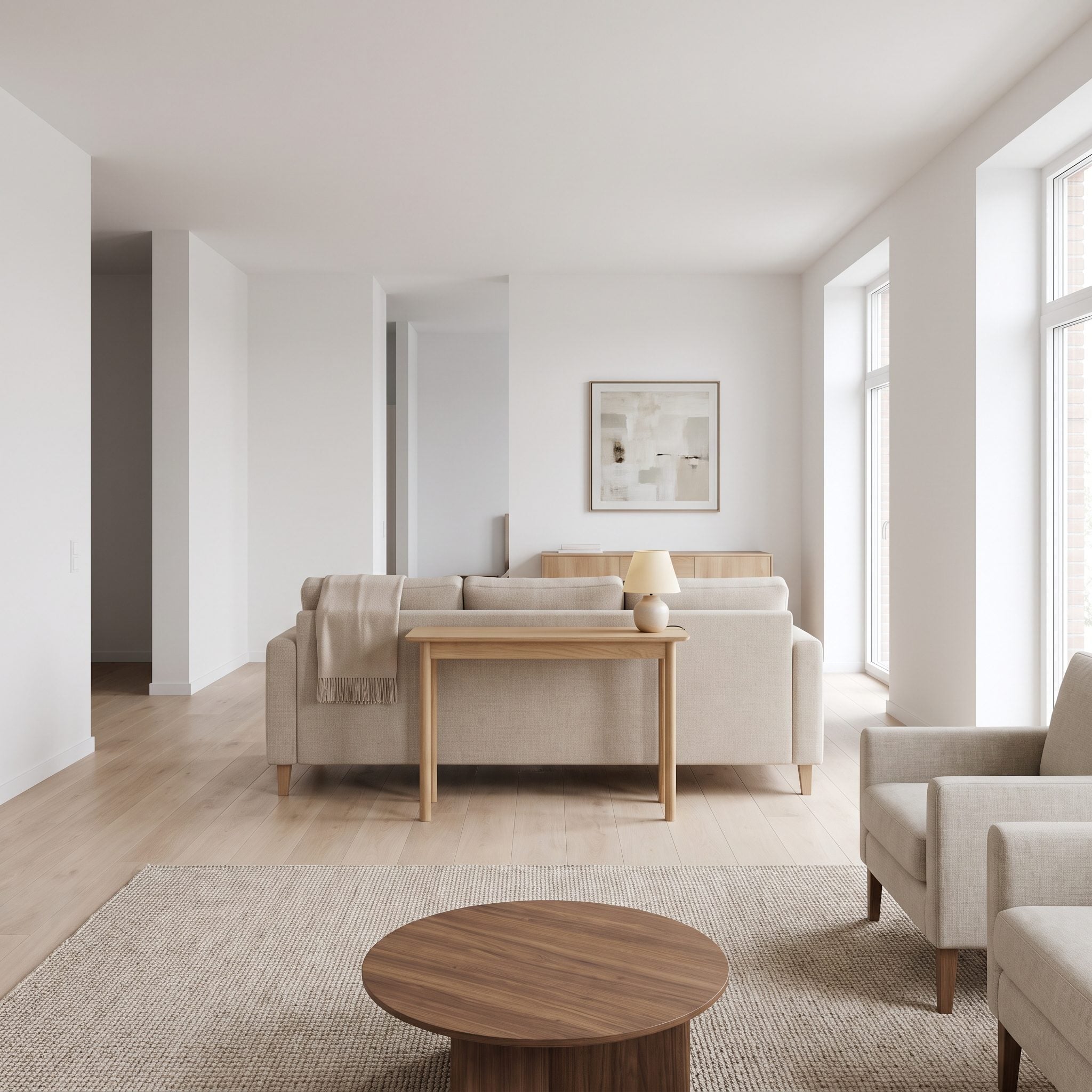
A freestanding sofa dividing living and dining space performs architectural work from both sides. A short console and one undersized lamp behind it leave the exposed back looking unresolved.
Use a console long enough to answer most of the sofa’s rear elevation while staying below the back line, then place two brass table lamps comfortably within its footprint. The shorter console can move to an entry or narrower wall. From the dining side, the sofa now has a finished elevation instead of a piece of furniture parked behind it.
6. Midcentury Collected: Two Small Corrections Restore the Period Mix
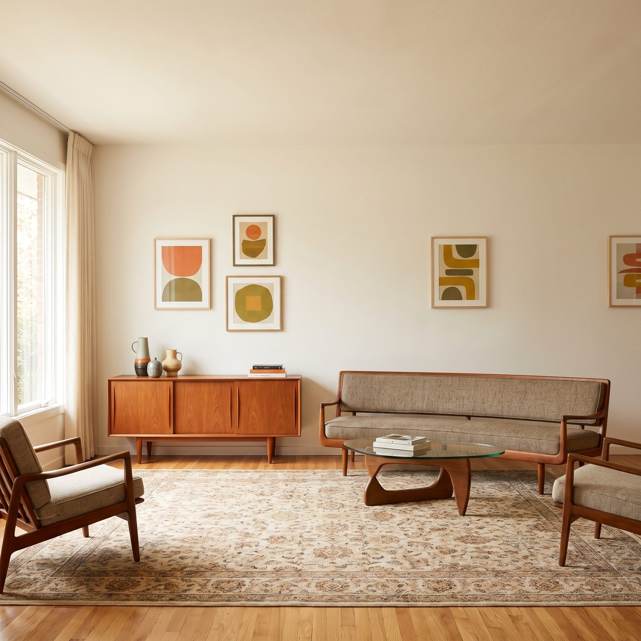
The mustard sofa and teak lamp already belong together. The wall does not: four small prints are spaced so widely that they stop reading as a collection, while the undersized shade makes the lamp base look disproportionately large.
Regroup the existing art into a tighter aligned composition and fit the lamp with a drum shade whose diameter and height visually balance the base. No universal ratio works for every lamp; the correct shade depends on the base’s width, height, shape, and the fixture as a whole. Here, simply giving both art and lighting more coherent proportions lets the period pieces settle into place.
5. The Rug Beneath the Whole Sofa: Turn the Seating Group Into a Full Platform
🔥 Would you like to save this?
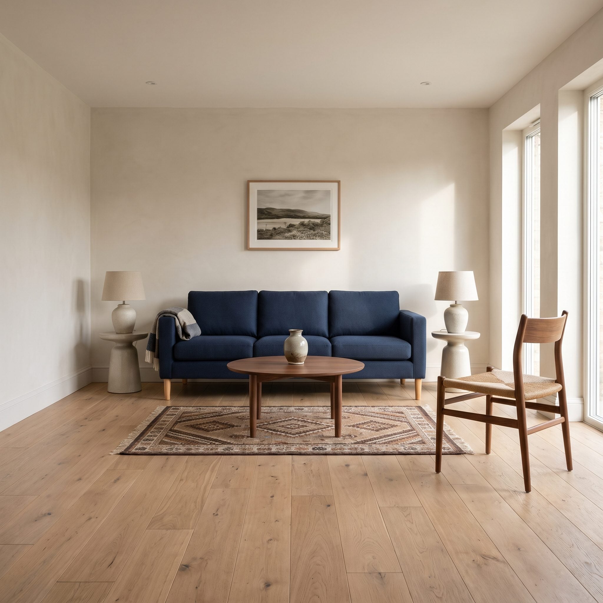
This room calls for a different rug strategy from the common front-legs-only approach. The navy sofa and side chair sit in a setting where a clearly visible perimeter around the entire group would give the arrangement more authority.
A room-sized bordered rug can hold every seating leg within one defined field while still leaving visible flooring around the outside. The border becomes an architectural outline for the group rather than a patch under its front edge.
4. Warm Minimalism: One Rug Turns Three Seats Into One Group
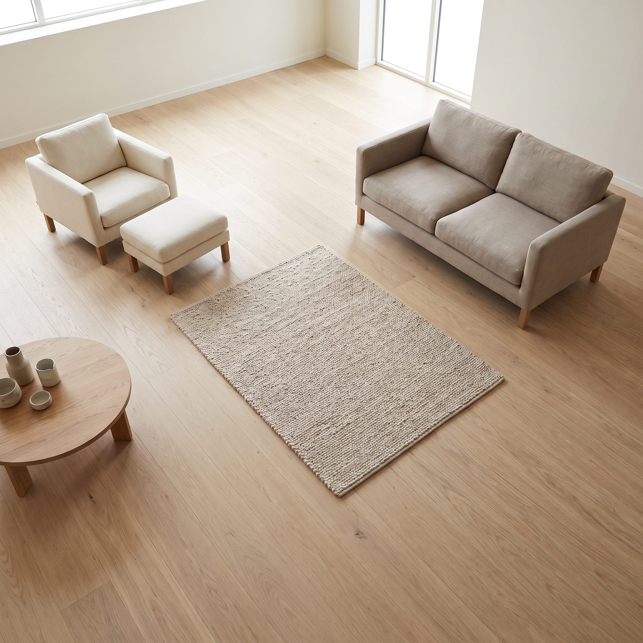
The sofa and two oak chairs are already a logical seating group. A rug that stops short of the chairs makes them look like neighboring furniture rather than participants in the same conversation.
An oatmeal wool rug extending beneath the front legs of all three seats provides one continuous floor field, while the wide canvas above balances that breadth on the wall. The beige sofa sits between two substantial planes instead of floating between unrelated objects.
3. Corner Sofa: Make the Art and Table Reach Both Runs
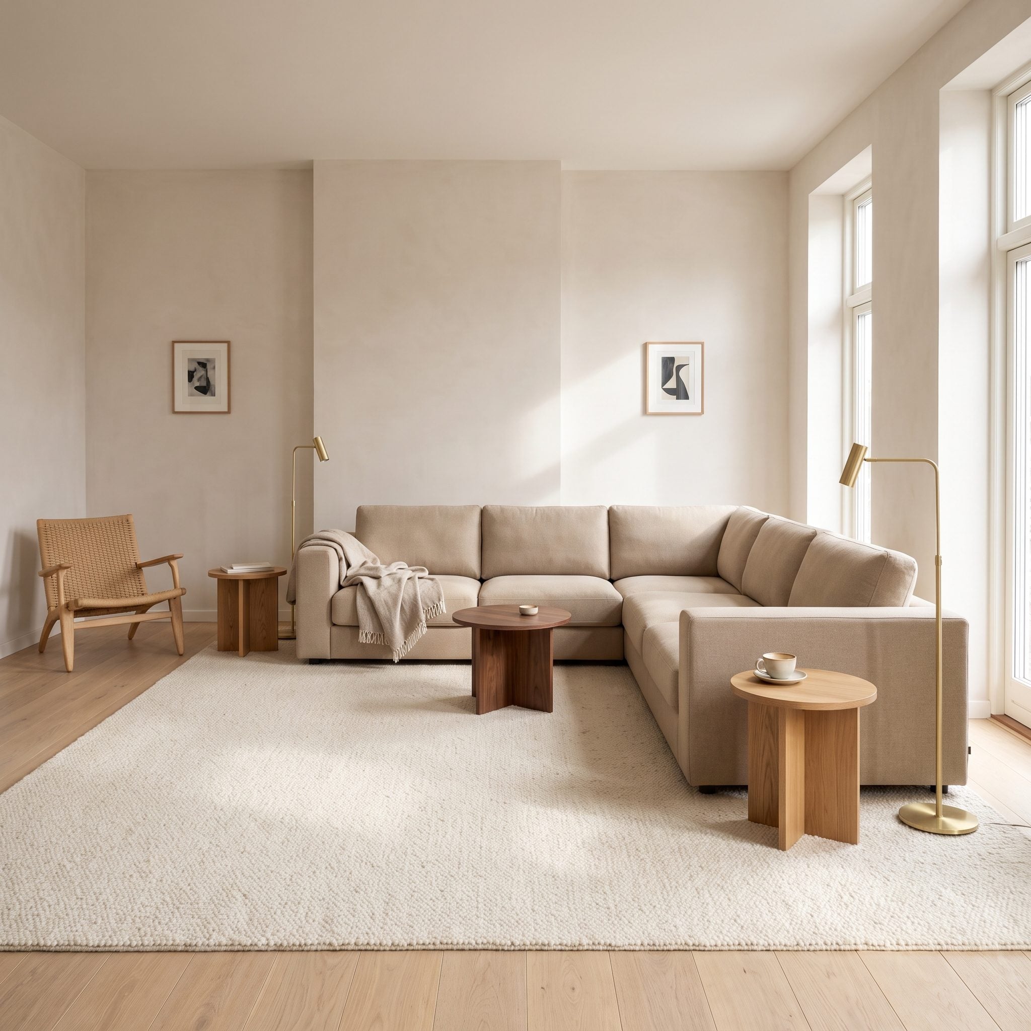
Two tiny pictures above a large corner sofa leave acres of wall unresolved, while a small circular table serves only one portion of the seating. Both problems come from treating an L-shaped sofa as though it were one short straight run.
The cream wool rug, oak side tables, chair, and lamps can stay. A coordinated pair of oversized canvases can turn the corner with the sofa, while a rounded triangular table reaches toward both runs without filling the opening between them. Preserve comfortable clearance between table and seating rather than treating that space as a walking aisle.
2. The Low Sofa Beneath a High Window: Build the Composition at Seating Height
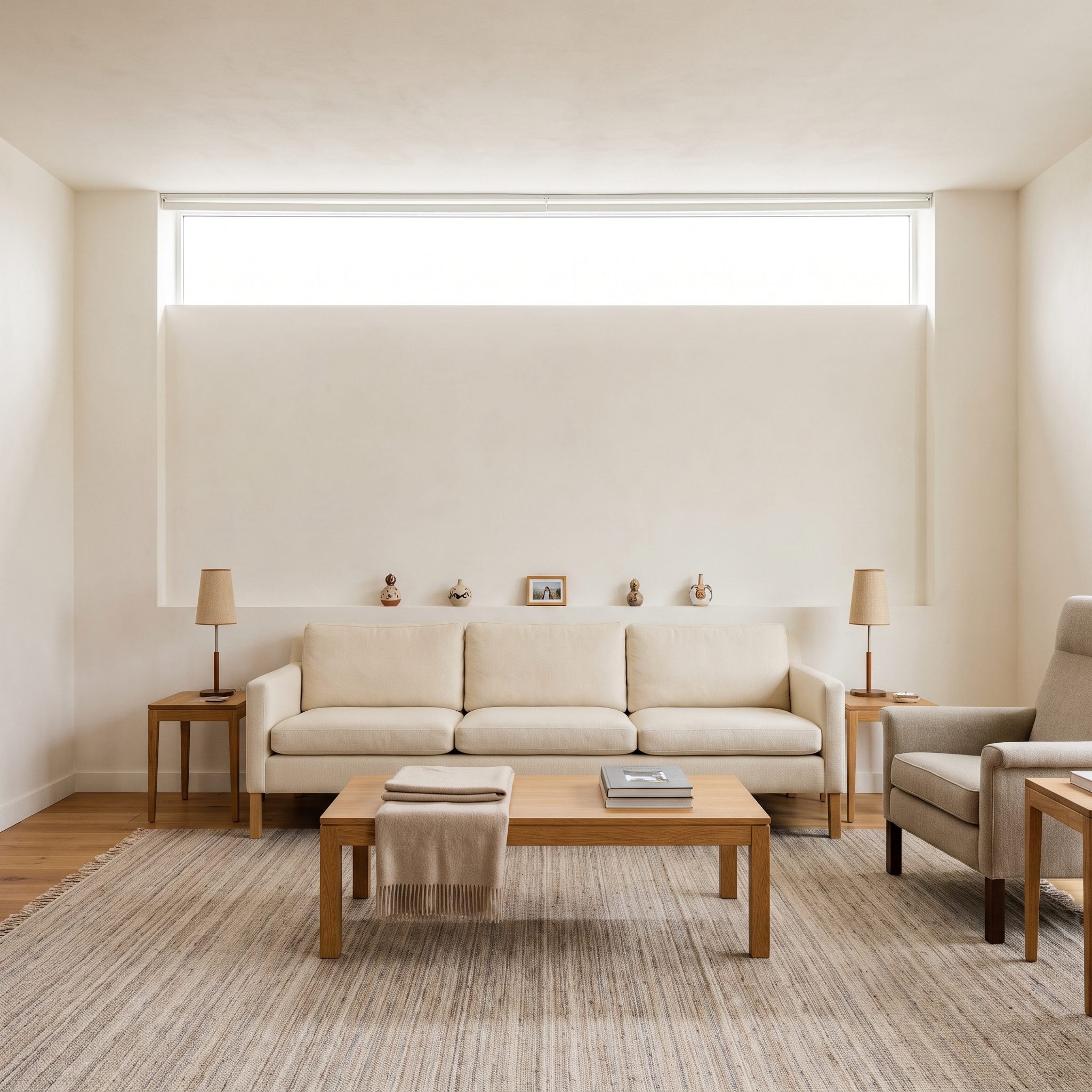
A high horizontal window brings in excellent light but leaves an awkward strip of wall between sill and sofa. Filling that band with scattered little ornaments merely emphasizes how fragmented it is.
One oversized horizontal artwork fitted comfortably into that zone can connect the sofa to the window above without obscuring the glass. Broader lamps with low, generous shades reinforce the same seating-height register at either side. The unusual wall starts looking designed around rather than tolerated.
1. Collected Luxury: Four Small Proportion Errors Can Undo an Entire Room
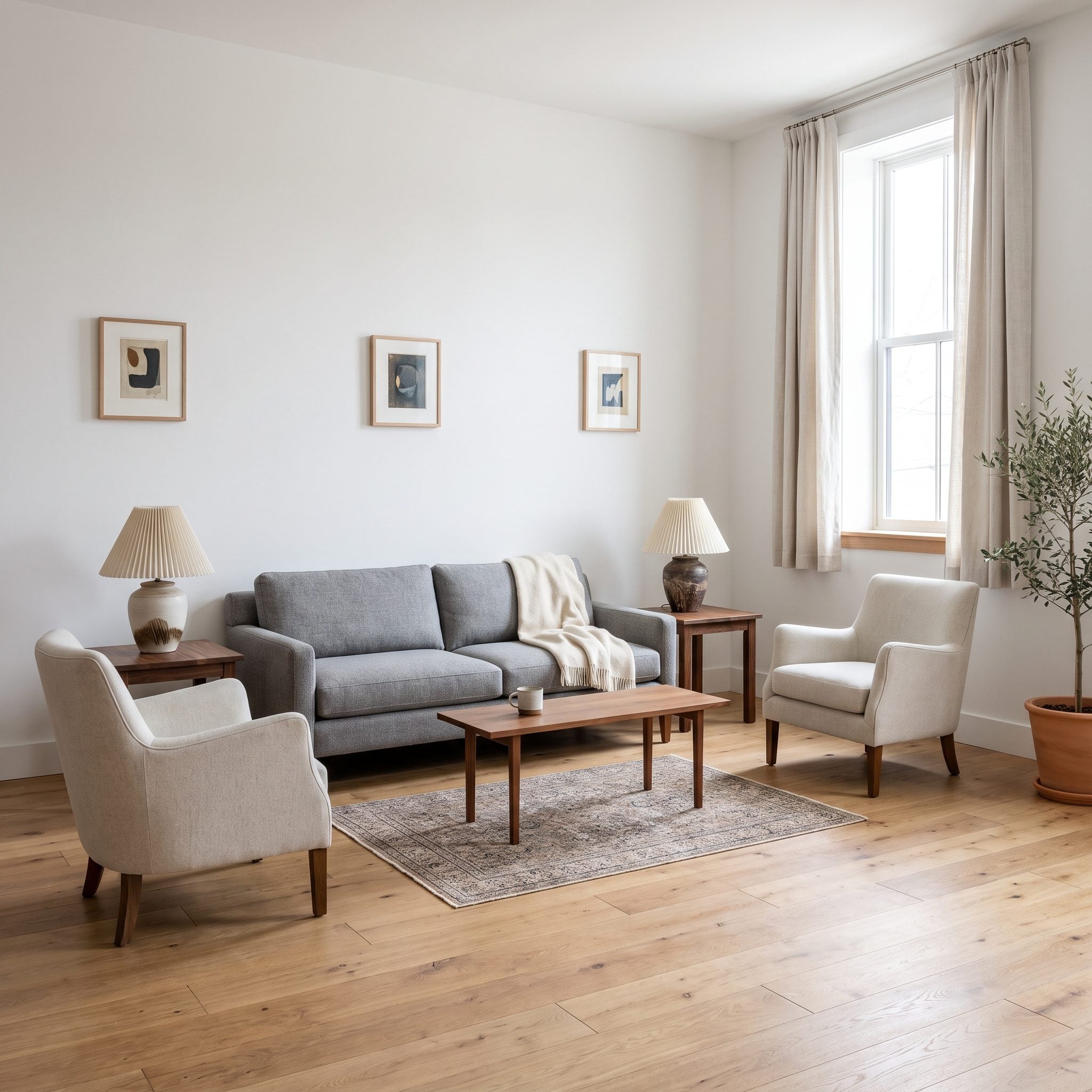
This room brings the whole argument together. The gray sofa works. The armchairs work. The art is worth keeping. Yet four surrounding elements are operating below the scale of everything they serve: a rug that stops before the seating can gather around it, abbreviated curtains, a coffee table too slight for the center, and lampshades that make the bases look oversized.
Correct those relationships rather than replacing the room. Give the seating a rug generous enough to establish its full footprint. Let the curtains use more of the wall height. Bring in a substantial travertine coffee table with enough reach for the group. Fit the existing lamps with shades proportionate to their bases and consolidate the art into a stronger wall composition. The old coffee table can move beside a reading chair, where its smaller scale becomes useful instead of apologetic.