
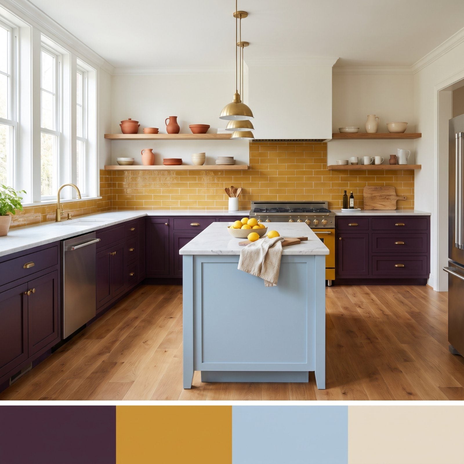
Most people play it safe in the kitchen. White cabinets, grey counters, a backsplash chosen to offend no one. But color-shy kitchens are the beige minivans of the home. These kitchens prove that two colors nobody thought to pair can hold a room together better than any safe neutral ever did.
38. Aubergine Cabinets and Mustard Tile in a Transitional Kitchen
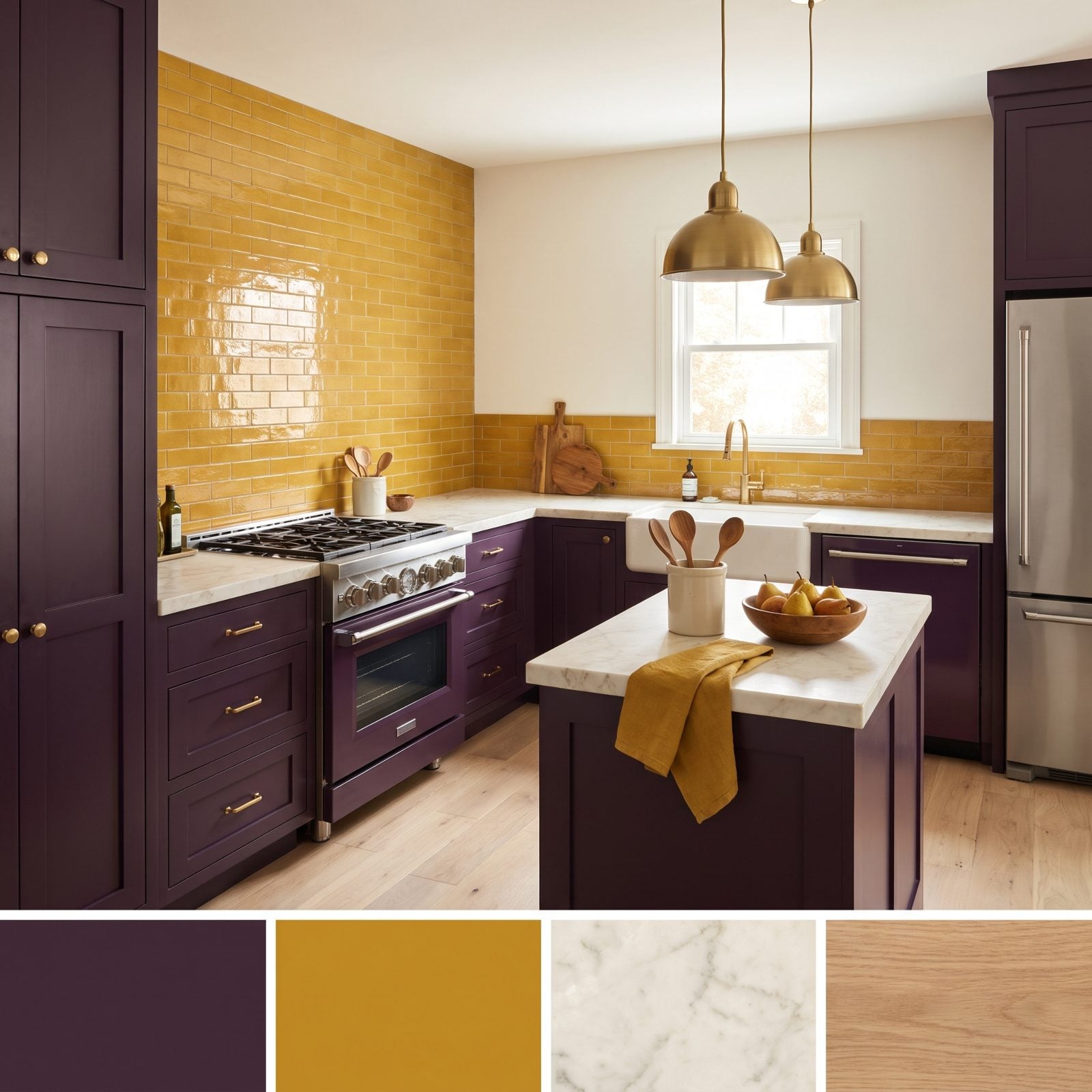
Aubergine and mustard sound like a bruise. On paper, awful. In this kitchen, though, the mustard tile is doing the work that white would have wasted, bouncing warm light back onto the dark cabinets so the room never reads as a cave.
In order to come up with the very specific design ideas, we create most designs with the assistance of state-of-the-art AI interior design software. Also, assume links that take you off the site are affiliate links such as links to Amazon. this means we may earn a commission if you buy something.
The logic is simple contrast. A deep, moody base needs a hot, saturated partner to feel intentional instead of gloomy, and the cream marble and oak floors are the referees keeping the two from brawling. I got this wrong for years — dark cabinets with grey everything, then wondering why the room felt like a parking garage.
What Our Readers Say
- In our Hot or Not photo matchups, kitchens where white dominated won fewer of their head-to-head matchups than expected, taking 41% against an expected 47%.
From Home Stratosphere reader polls and votes.
37. Powder Blue Cabinets With a Jolt of Tomato Red
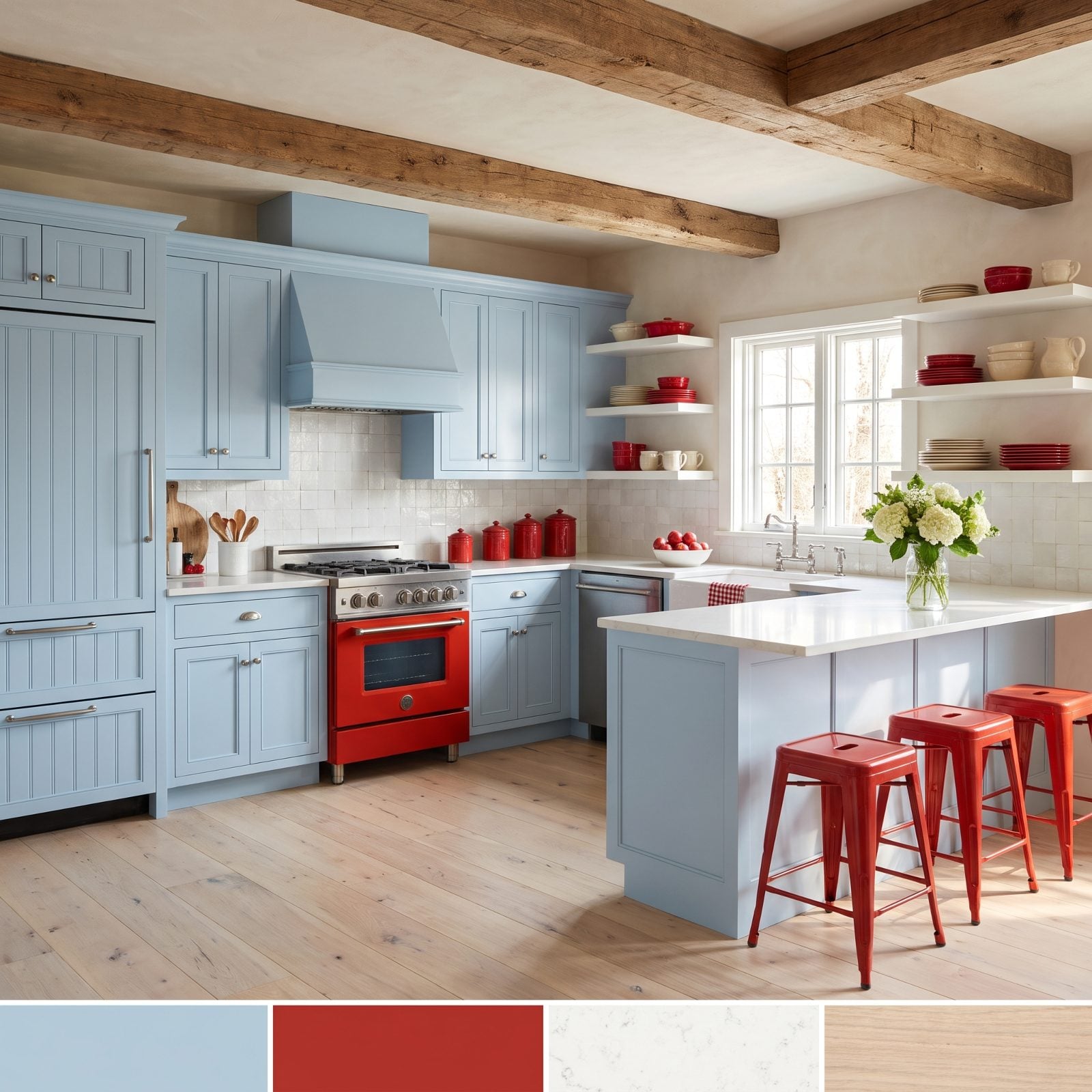
Everything about powder blue says calm — then the tomato red shows up and the whole room wakes up. That tension is the point, because a cabinet color this quiet would drift into forgettable without something loud to push against.
The red is repeated with real confidence here. Range, the canisters, the stand mixer, the kettle, bowls, apples, a gingham towel, the stools. Keeping it to one shade is what stops the kitchen from tipping into diner territory. This is farmhouse kitchen decor with the volume knob set to exactly the right spot, and I’d buy those tomato red bar stools in a heartbeat.
36. Burnt Orange Cabinets and Cobalt Tile, Mediterranean Style
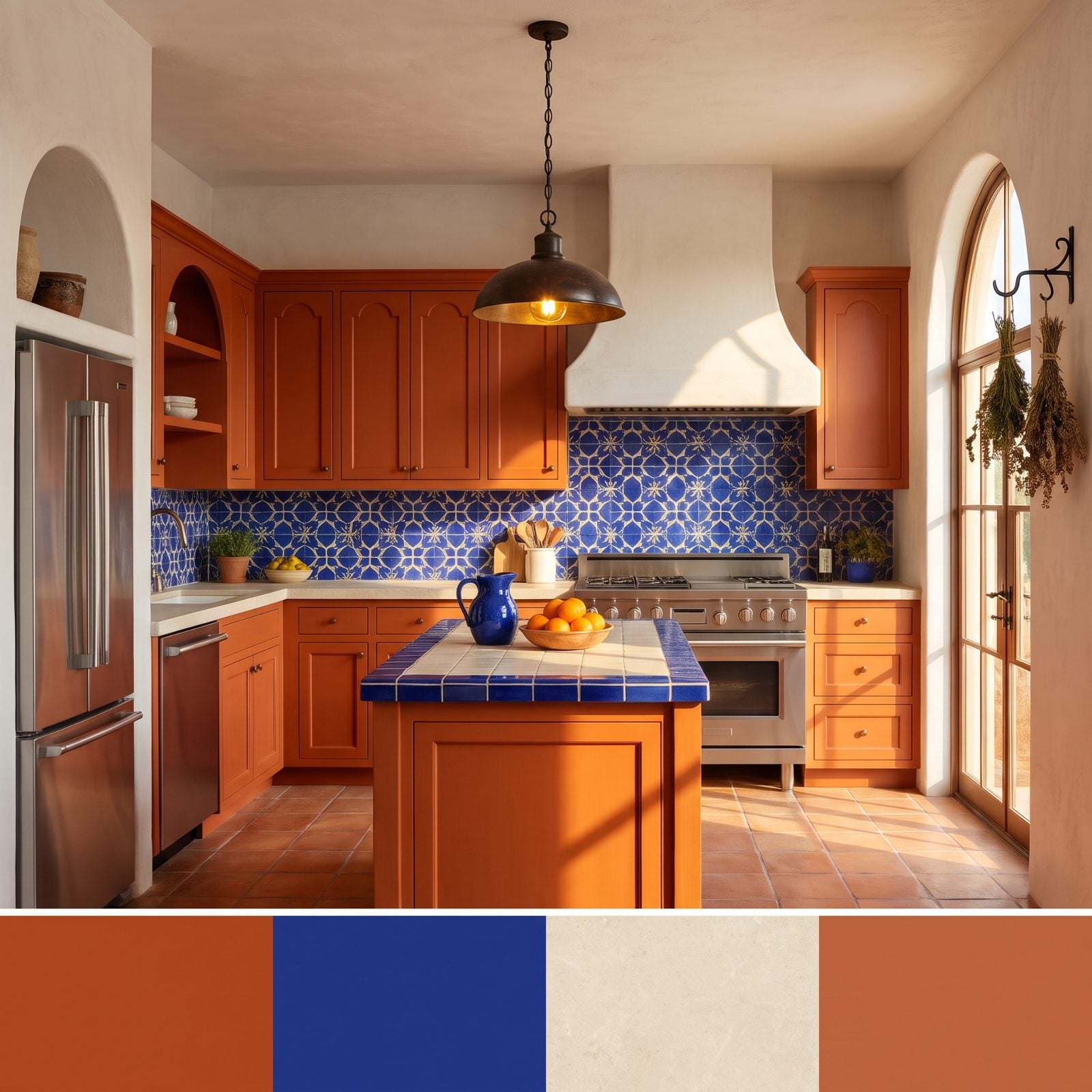
Burnt orange and cobalt is the combination the Mediterranean figured out centuries ago and we keep rediscovering. Warm earth, cool sea. The patterned cobalt tile gives the eye somewhere to land, and the orange cabinets keep it from feeling cold.
What sells it is the limestone and terracotta sitting in between, dialing both colors down from circus-bright to lived-in. This is the warmest blue kitchen inspiration on the list, which sounds like a contradiction until you stand in a room like this at four in the afternoon.
35. Lavender Cabinets Grounded by Olive Green Stone
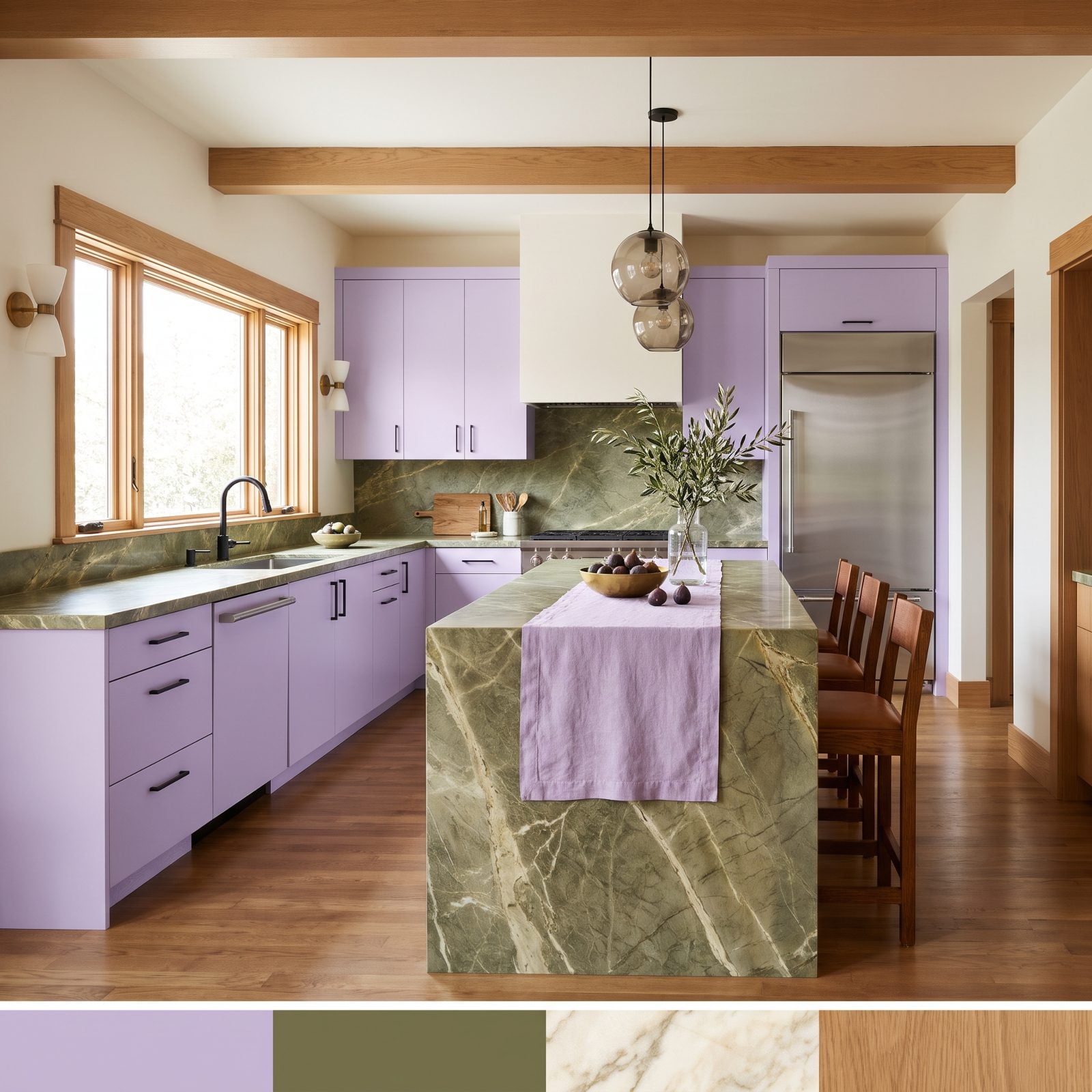
Lavender could go nursery in a heartbeat. The olive green marble is what keeps it adult — that earthy, slightly dirty green pulls all the sweetness out of the lavender and leaves something grown-up behind.
Both colors are muted and dusty, so the pairing reads as tonal rather than loud, a gentler strategy than the high-contrast kitchens above. The olive waterfall island is the anchor. Without that weight, the whole room would float away.
34. Turquoise Cabinets With Oxblood Red Doing the Drama
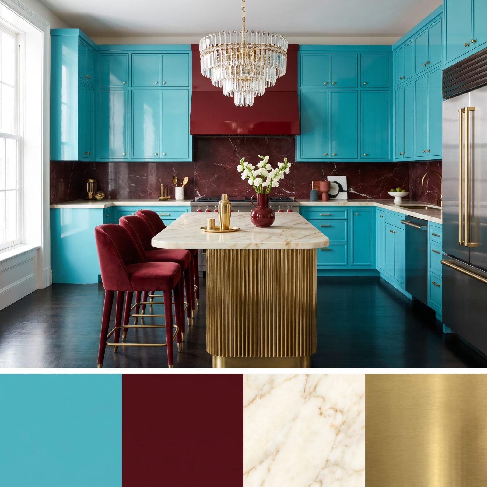
This is the loudest room on the list and it knows it. Turquoise lacquer plus oxblood red is a gamble, but the deep red is so dark it behaves almost like a neutral, letting the turquoise be the star without a shouting match.
Brass is the peacemaker. It warms the cool turquoise, flatters the red, and ties the whole glam kitchen renovation together with one metal. Those oxblood velvet bar stools are the kind of thing you talk yourself out of and regret for years.
33. Chartreuse Cabinets Softened by Dusty Rose Tile
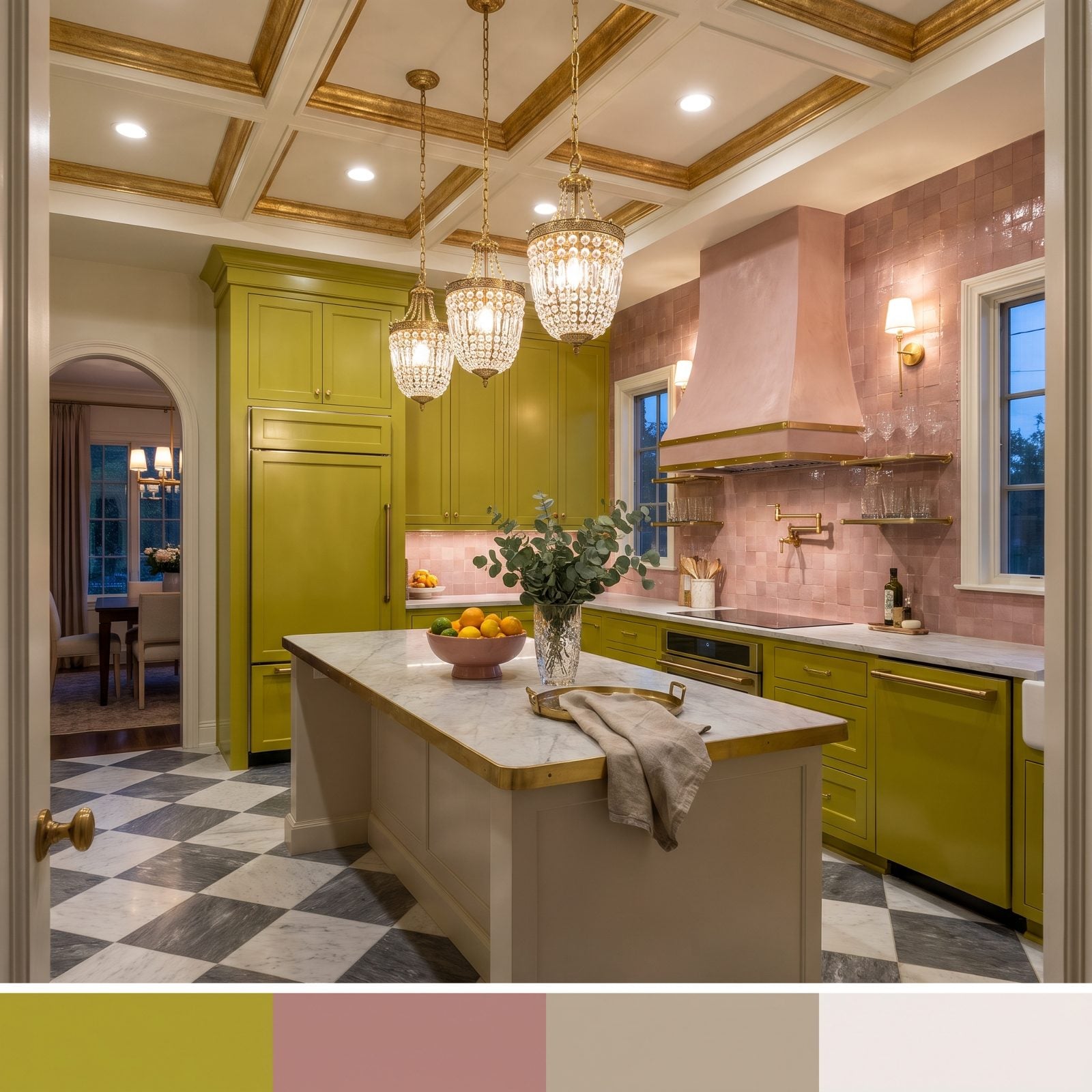
Chartreuse is a difficult color. Too much of it and the room feels like a highlighter. The dusty rose tile is the clever move here — a muted, powdery pink that cools the acid green down to something you’d actually want to cook in.
Green and pink are opposites, which is where the snap comes from. The white marble and plaster hood keep the energy from spilling over. This one reads as the youngest kitchen on the list, and I mean that as a compliment.
32. Chocolate Brown Cabinets Against Icy Blue Walls
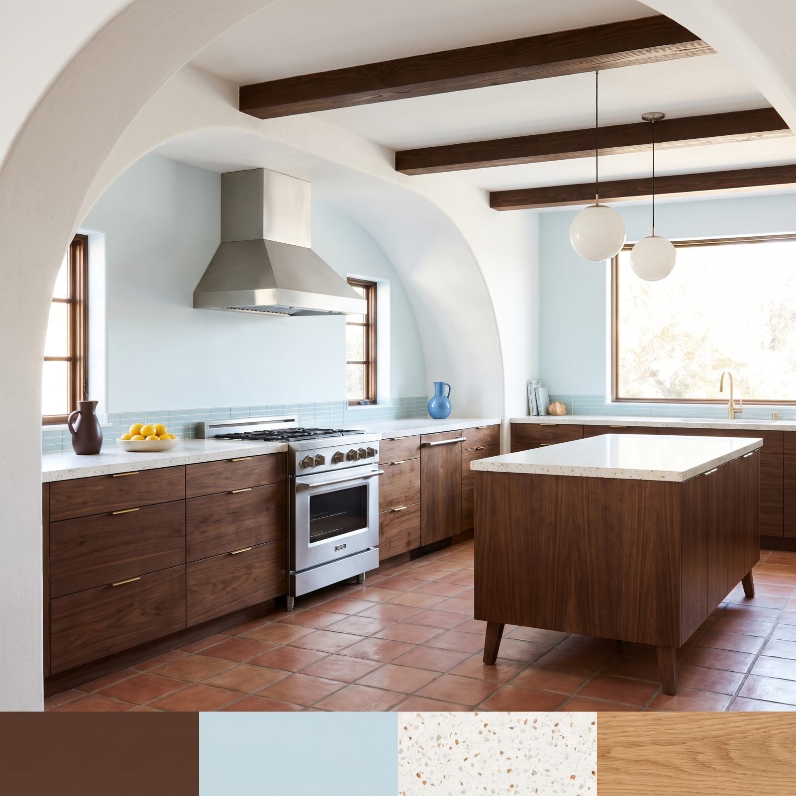
Warm and cool in the same room, done right. The chocolate walnut cabinets are heavy and grounding, and the icy blue walls float above them like cold air settling over warm earth.
That temperature gap is the whole trick. A warm cabinet against a warm wall goes muddy fast, so the cold blue gives the brown somewhere to breathe, and the terrazzo flecks quietly reference both. This is a mid-century entry, and one we’d happily live in.
31. Brick Red Cabinets Trimmed in Mint Green Millwork
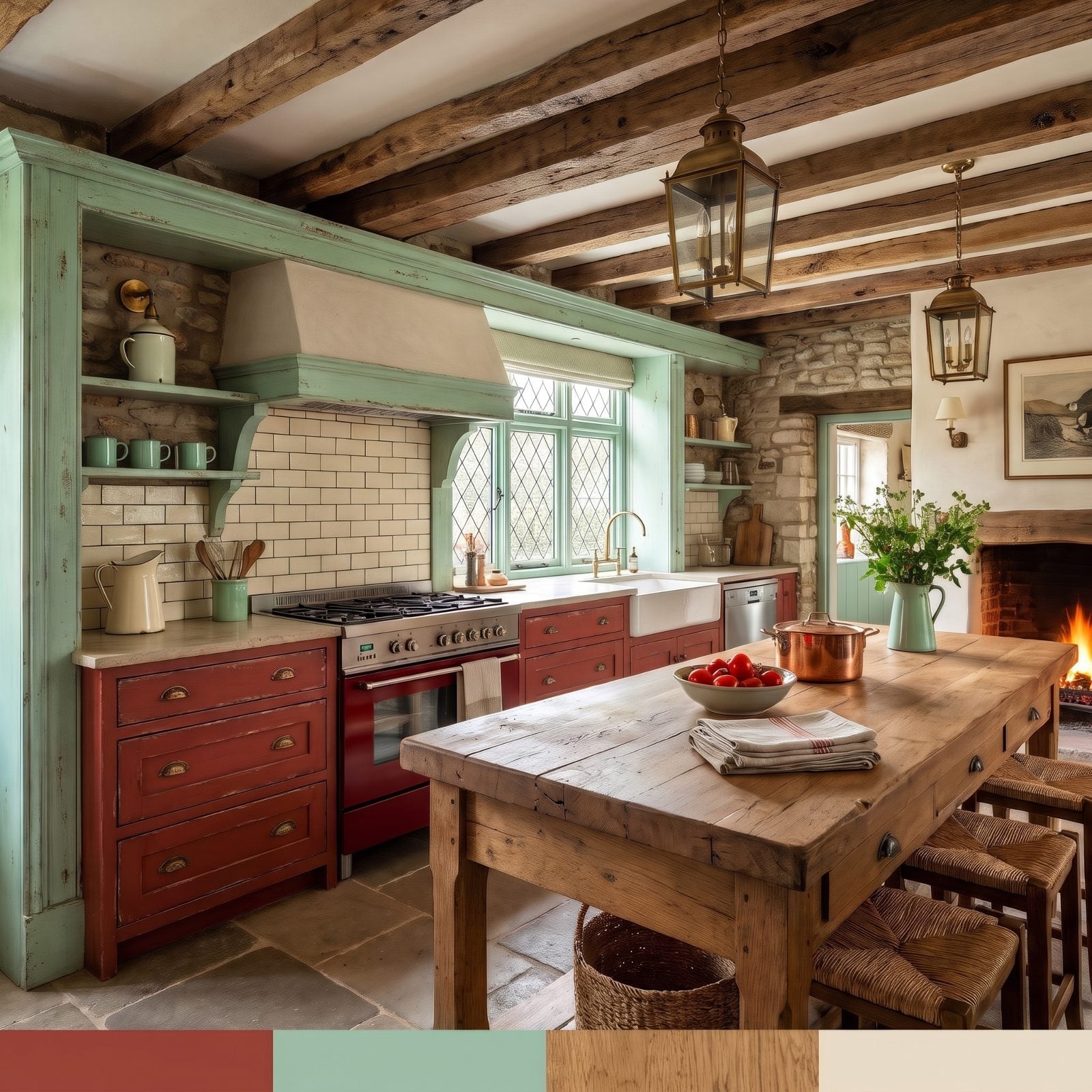
Brick red and mint green should not get along. One’s a warm clay, the other’s a cool candy. But the mint is kept to the millwork, the trim, the slim stuff, so it reads as a bright outline around all that earthy red rather than a competing block of color.
Pale stone counters, cream tile and a chunky wood island are the glue. This is a proper country kitchen renovation where nothing matches on paper and everything belongs in person.
30. Salmon Pink Cabinets With Moss Green Stone
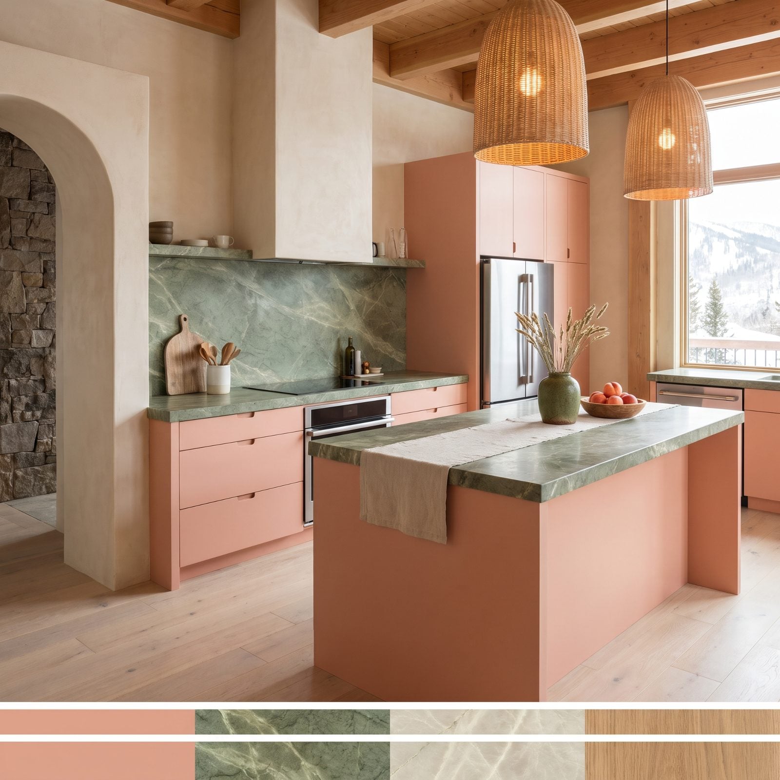
That moss green marble is the hero, no argument. Deep, dusty, almost forest-floor in color, it gives the chalky salmon cabinets the gravity they’d otherwise lack.
Salmon and moss are both muted, both a touch dusty, which is why they settle together instead of fighting. The matte finishes and limewashed oak keep everything soft and quiet. This room lowers your heart rate the second you walk in, the way a forest trail does. A moss green ceramic vase on the island is all the accent it needs.
29. Midnight Blue Cabinets Warmed by Apricot Walls
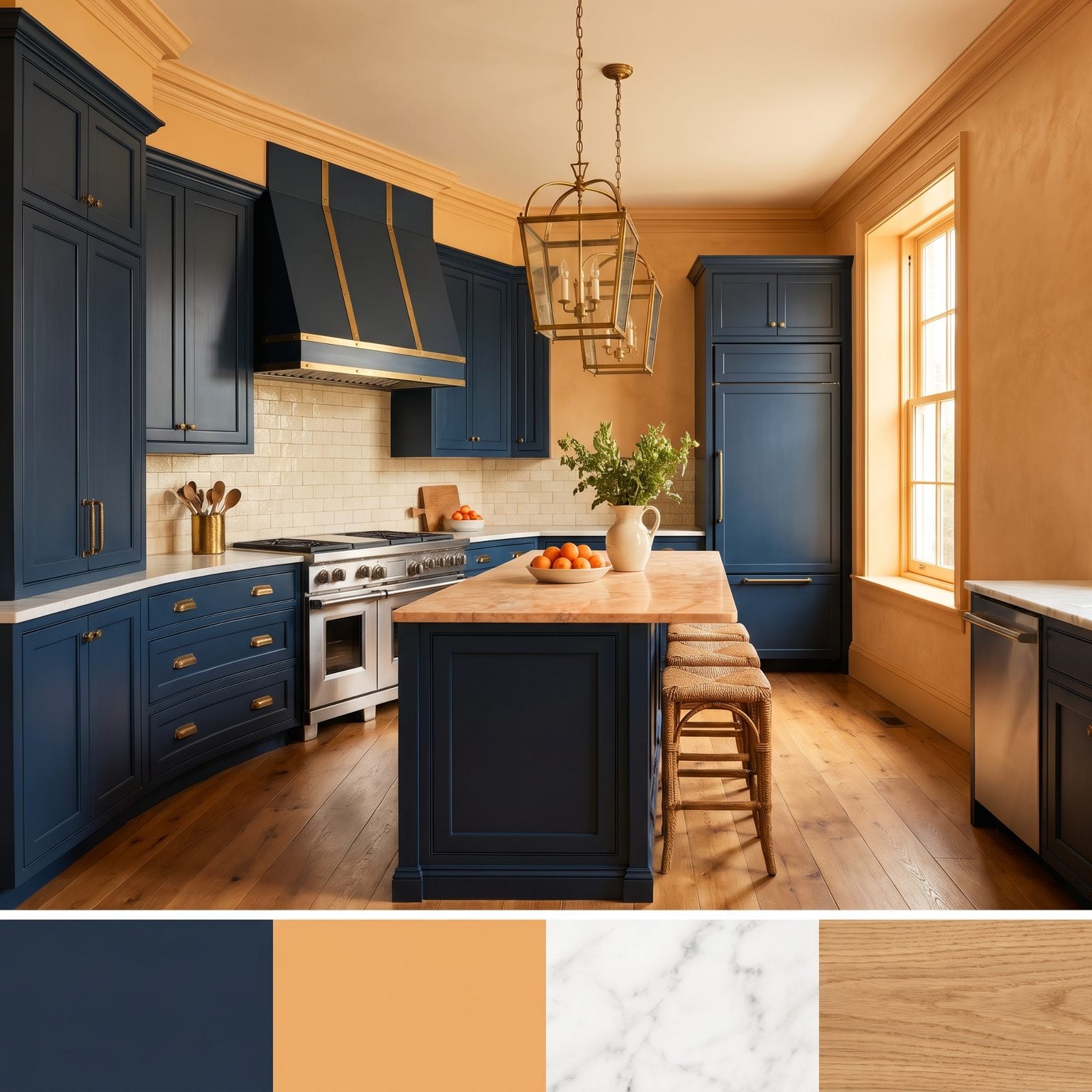
Navy kitchens are everywhere, which is exactly why most of them feel safe. The apricot walls are what rescue this one — a warm, sunny peach wrapped around the deep inky blue, turning a familiar combination into something you actually remember.
Cold cabinet, warm wall, the same idea as the chocolate-and-ice-blue kitchen, only flipped. Brass hardware and apricot marble on the island carry the warmth down into the blue so the two halves of the room talk to each other. The best teal kitchen cousins know the trick too: a dark cabinet needs a warm partner or it just sits there being dark.
28. Emerald Cabinets Meet Bubblegum Pink Tile in a Transitional Kitchen
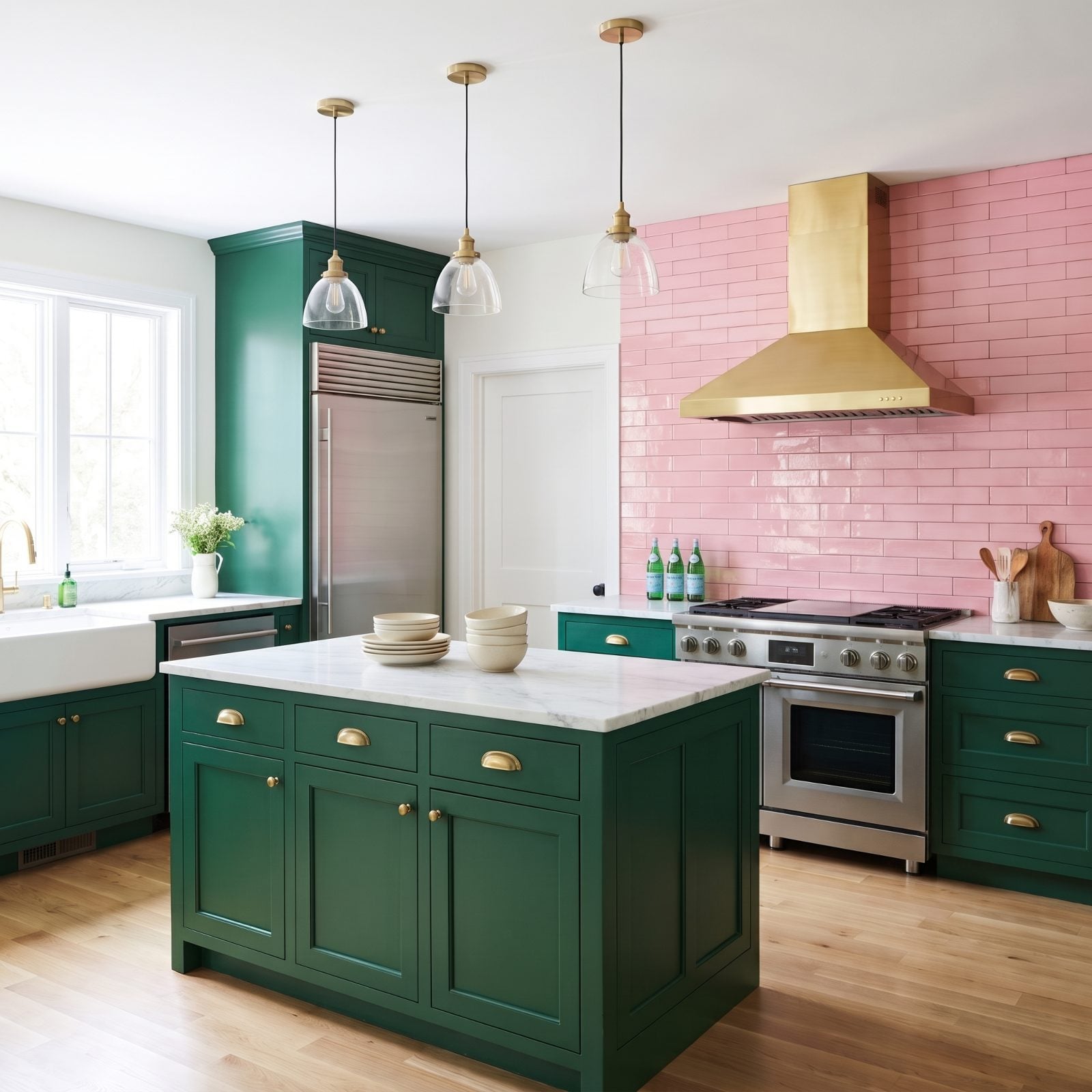
Green and pink should fight. They don’t here, and the reason is discipline. The emerald does all the structural work: cabinets, island, the whole lower register, while the pink stays up on the wall as glossy tile, running behind the range and stopping there, while the window wall stays plain white. Two colors, two jobs, no overlap.
The marble counters and honey oak floor act as referees. Strip those neutrals out and you’d have a candy shop; leave them in and you get bright kitchen decor that knows exactly what it’s doing. Brass hardware warms the whole thing up and keeps the pink from going cold.
27. Terracotta and Cornflower Blue in a Relaxed French Country Kitchen
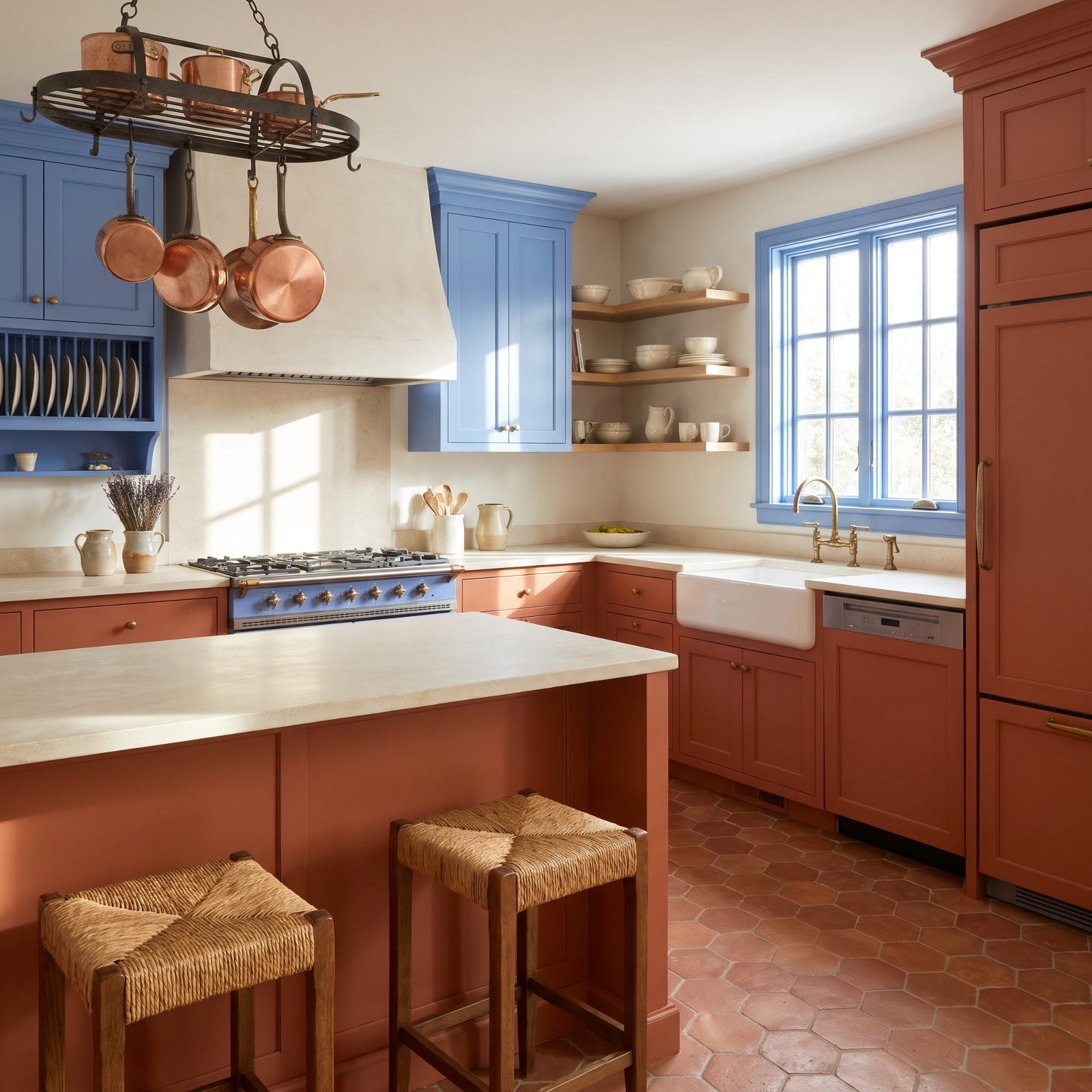
Terracotta on the bottom, cornflower blue up high. That’s the whole color plan, and it mirrors the way light moves through a room, warm and grounded at the floor, cooler and airier as you climb toward the ceiling.
The limestone counters and hexagon clay floor keep everything in the earth-tone family so the blue millwork lands as a surprise rather than a clash. Call it farmhouse kitchen decor with a Provençal accent. The blue range cooker is the hero piece, anchoring both colors at once.
I used to think terracotta read dated. A good blue partner fixed that opinion fast.
26. Lemon Yellow Cabinets Against Charcoal Stone, Modern Farmhouse Style
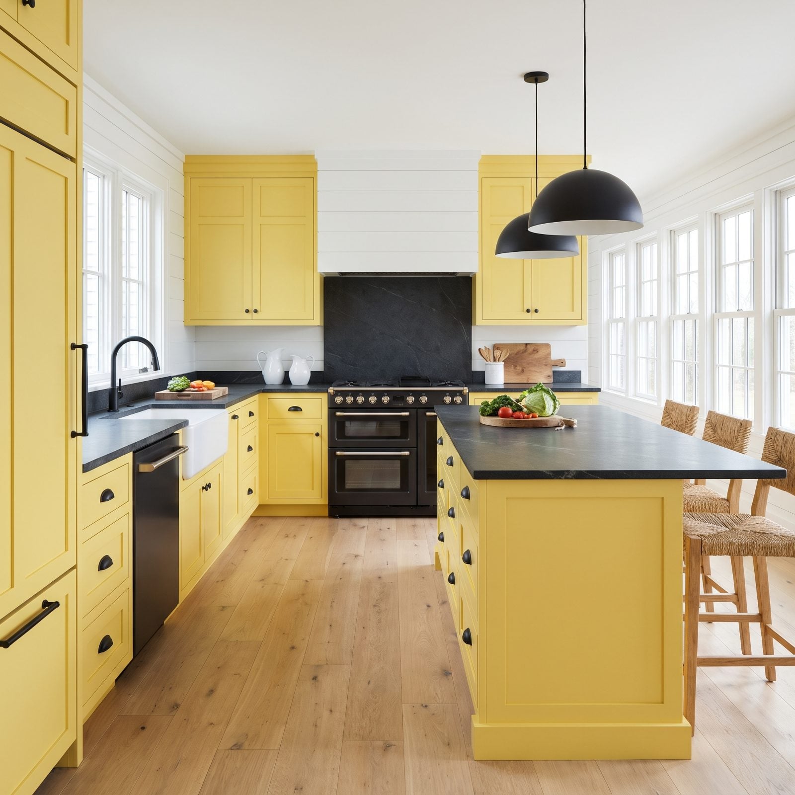
Yellow this saturated could easily tip into nursery territory. The charcoal stone stops that cold. Dark soapstone on the counters and up the backsplash hands the lemon cabinets a heavy, serious partner, and all that weight makes the color read sophisticated rather than sweet.
Black hardware and matte pendants pull the charcoal story up into the air, and the white shiplap keeps the room from feeling closed in.
25. Seafoam Cabinets With Mulberry Accents in a Craftsman Kitchen
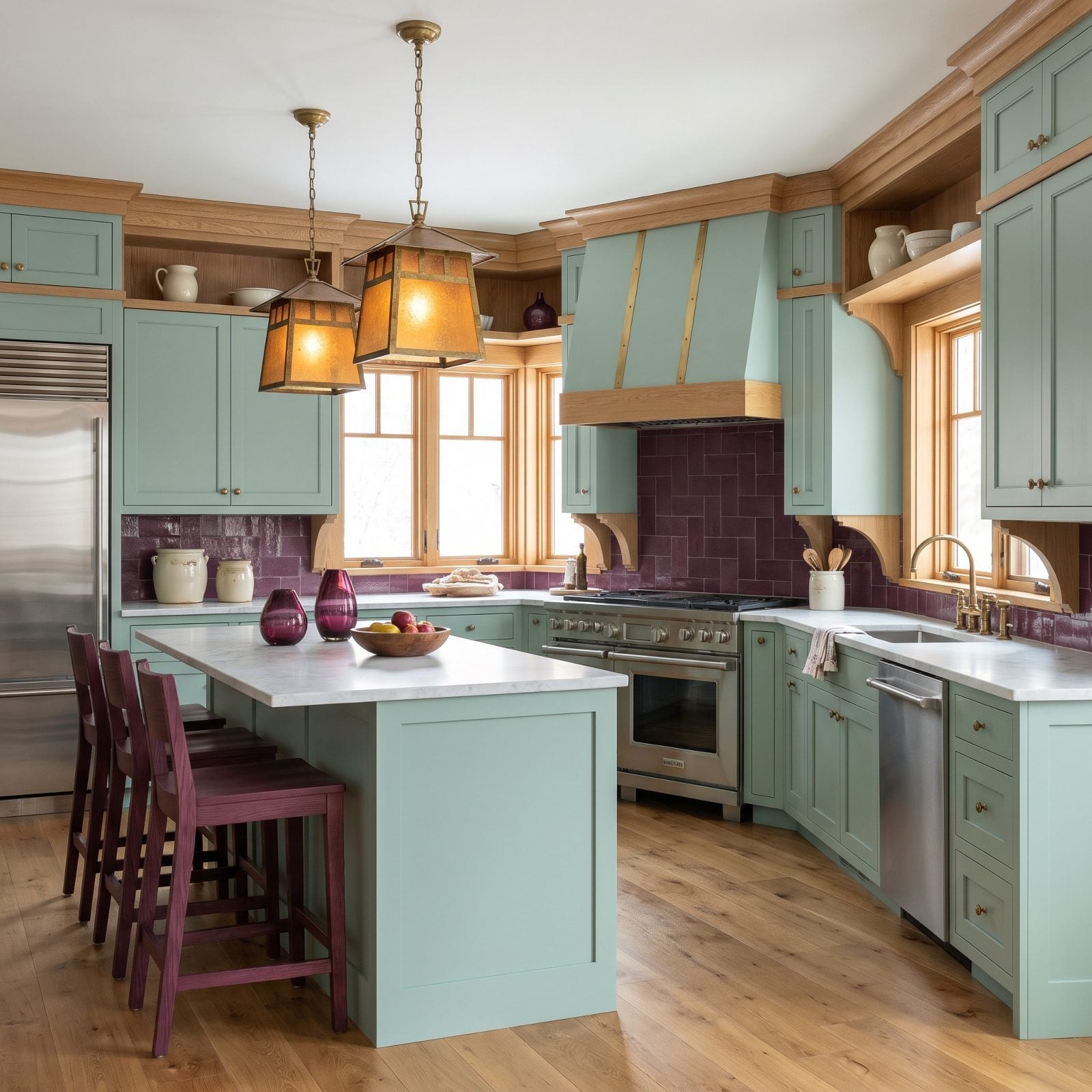
Seafoam carries the room at full volume while mulberry whispers back from the backsplash tile and a few glass vases. That lopsided split is exactly why the pairing feels calm instead of theatrical.
These two sit far apart on the wheel, but both are soft enough to keep the contrast gentle. The deep mulberry gives the pale green somewhere to look, a dark note in an otherwise airy room, and quartersawn oak trim with honed marble keeps the Craftsman bones honest.
24. Clay Pink Cabinets and Petrol Blue Millwork, Industrial Loft Edition
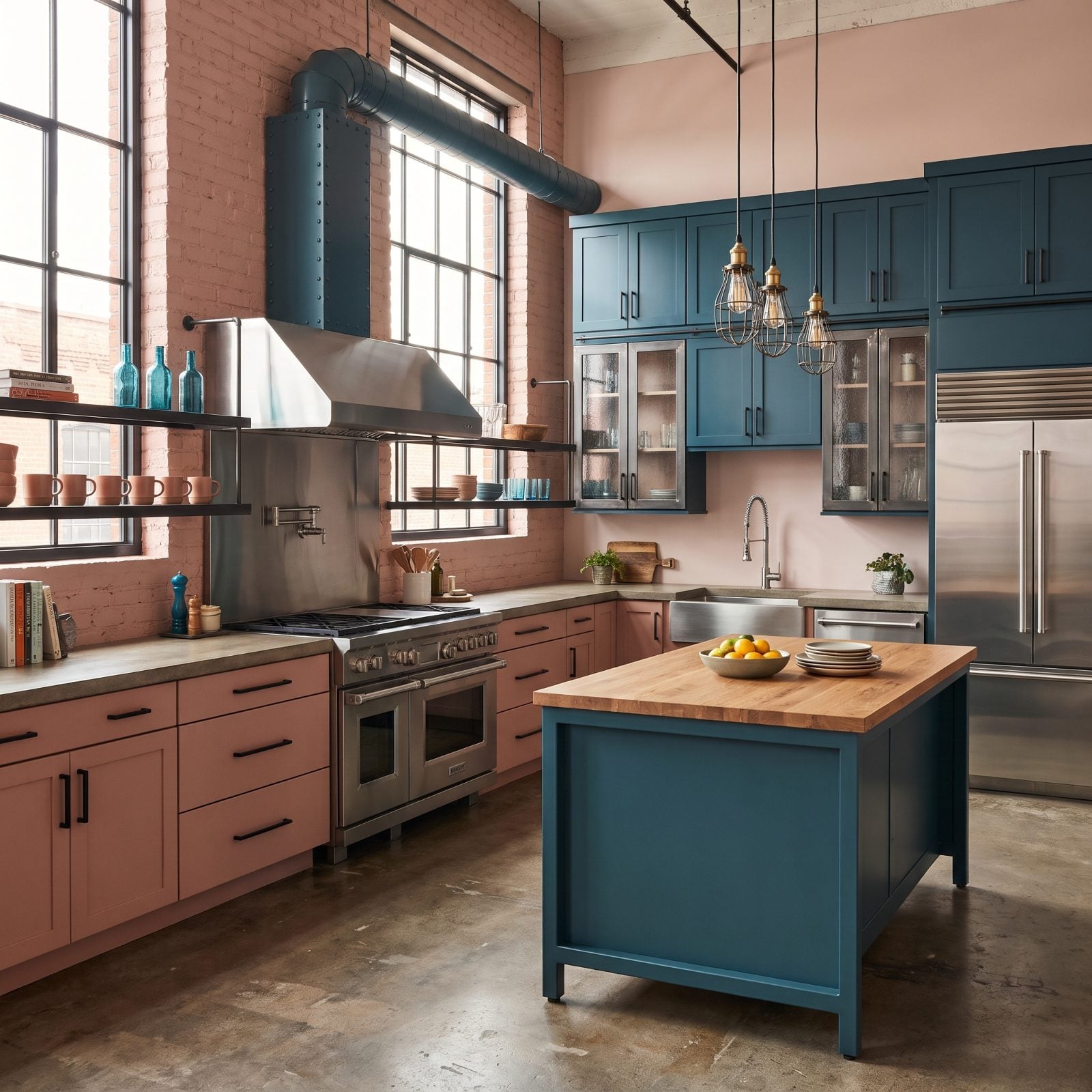
Pink in an industrial loft sounds like a joke until you see it against petrol blue and raw concrete. The clay tone here is muted, almost mineral, so it behaves more like a warm neutral than a statement. That restraint is what lets it sit next to steel and brick without flinching.
Petrol blue handles the moody work up top, deep enough to swallow light, dark enough to make the pink glow by contrast. Fans of a teal kitchen will recognize that blue as a cousin of their favorite shade, just dragged toward slate.
23. Indigo Cabinets Lit Up by Marigold Accents in a Hollywood Glam Kitchen
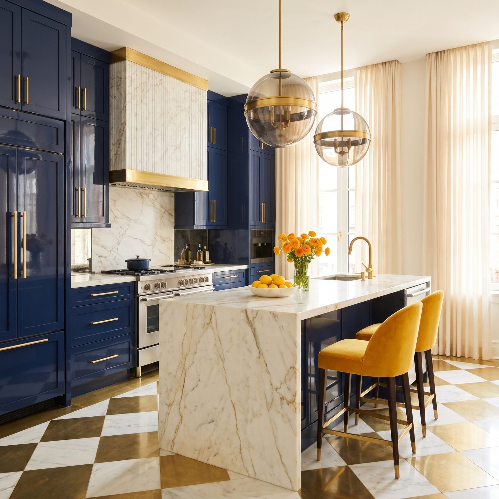
High-gloss indigo lacquer reflects everything, which is the entire point of a glam kitchen renovation. Light bounces off those cabinet faces, and the gold-veined Calacatta catches it mid-air.
Marigold shows up only where it counts: velvet stool cushions, a vase, a bowl of lemons. A little of that heat against all that cool blue works like a brass button on a navy coat. The restraint is what makes it expensive-looking rather than loud.
Indigo and marigold are opposites on the color wheel, so each one makes the other look more like itself.
22. Dusty Blue Cabinets With Cinnamon Stone in a Rustic Kitchen
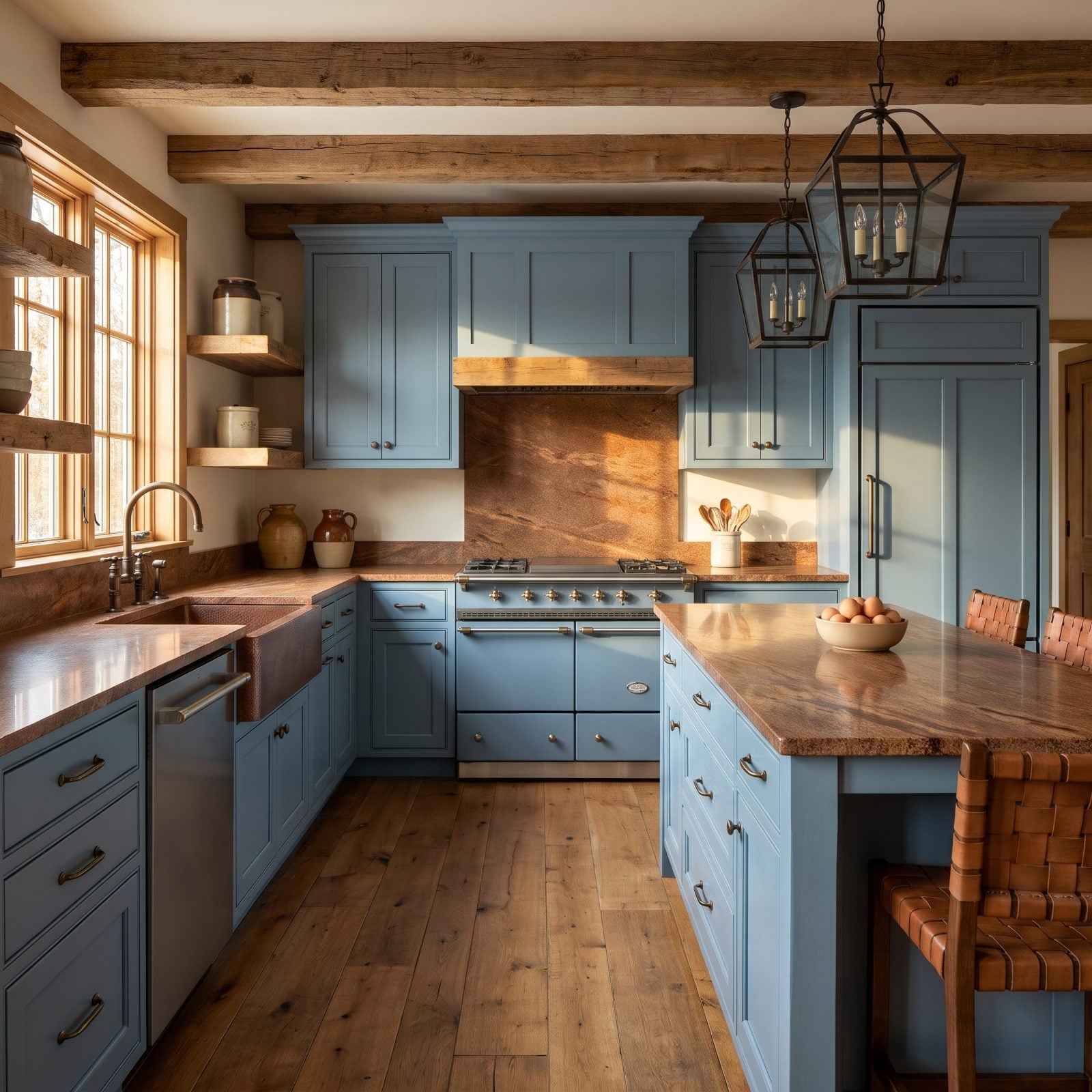
Cool blue and warm cinnamon are a temperature argument, and the room wins it by handing each side its own territory. Blue owns the cabinets, cinnamon owns the stone, and the oak floor plays peacemaker between them.
That cinnamon granite isn’t a safe choice. It carries real red-brown movement, the kind most people would quietly match to beige cabinets and call it a day. Set against dusty blue, it becomes the warmest thing in the room, and the whole space feels like late-afternoon light caught in cabinetry.
21. Black Cabinets and Periwinkle Walls in a Contemporary Kitchen
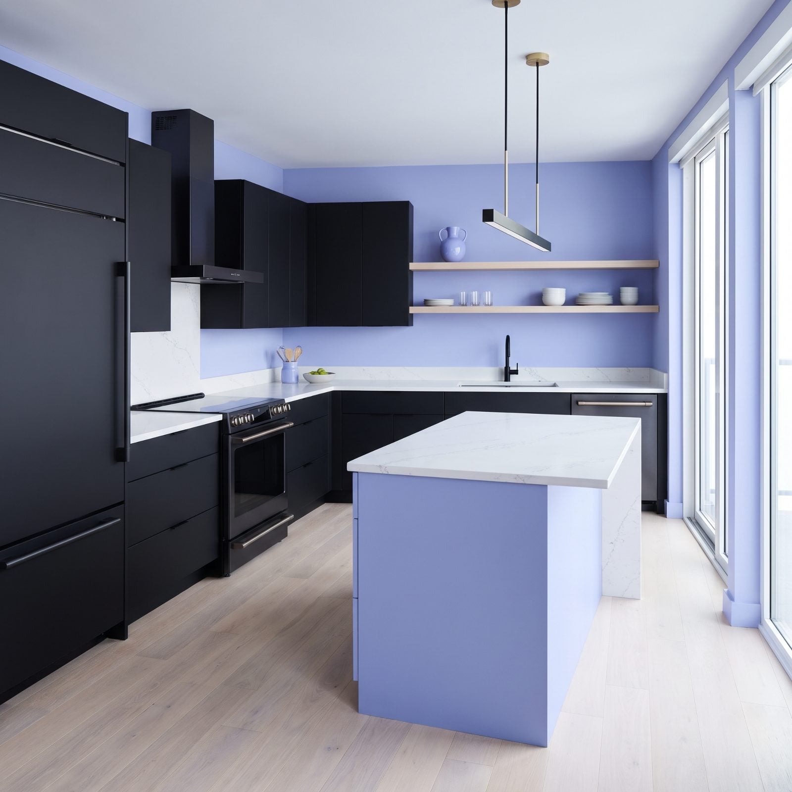
Black cabinets usually get paired with white and left alone. Dropping periwinkle on the walls instead is the move that makes this kitchen worth a second look, because the soft blue-violet pulls all the harshness out of the black and gives the eye something gentle to land on.
White quartz and pale ash floors keep it from going gloomy. Think of it as grown-up blue kitchen inspiration that swaps navy for something quieter.
Black-dominant kitchens tend to collect fewer hearts from our readers than the other kitchens in the same articles, 44% versus 57%, which makes a softer partner color worth considering.
20. Cream Cabinets, Electric Blue and Cherry Red in a Mid-Century Kitchen
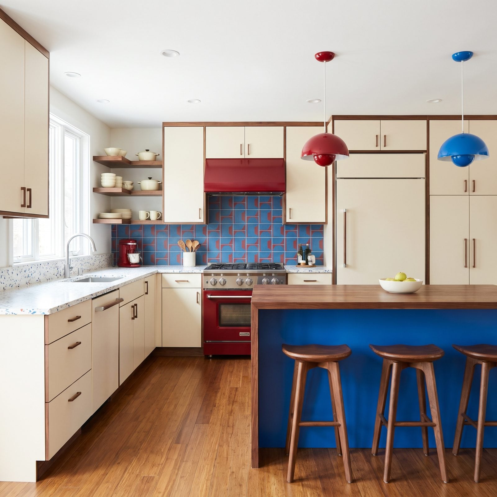
Cream dominates by a wide margin so the two loud primaries have somewhere soft to sit. Electric blue takes the island, cherry red takes the range, and the terrazzo counter stitches both back together with its speckled flecks.
Walnut trim keeps the whole thing from reading like a toy. Rare is the kitchen where two bold colors share the stage and neither one steals it.
19. Avocado Cabinets and Soft Orchid Walls, Modern Organic Style
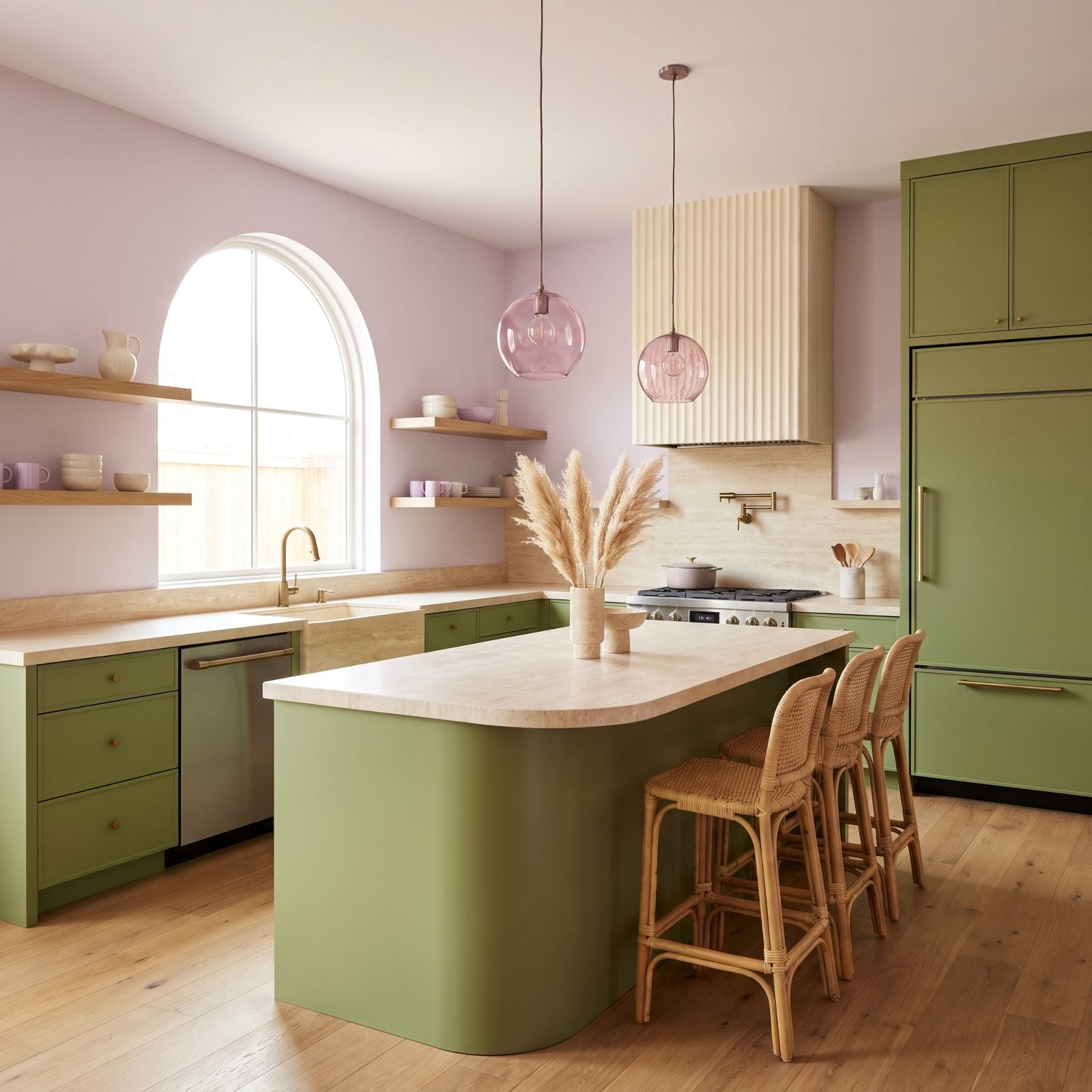
Avocado green got laughed out of kitchens in the eighties, and it’s back for revenge in a muted, earthy tone that behaves more like a warm olive. Soft orchid on the walls is the unexpected partner, a dusty lavender that cools the green down just enough.
Travertine counters and fluted plaster hold everything in the organic modern family, all curves and matte texture. The handblown orchid-tinted pendants are the one place the two colors actually touch, and that little overlap is what makes the palette feel deliberate.
Honestly? This is a combination we’d happily put in our own house.
18. Royal Blue Cabinets Warmed by Camel Brown Millwork in a Transitional Kitchen
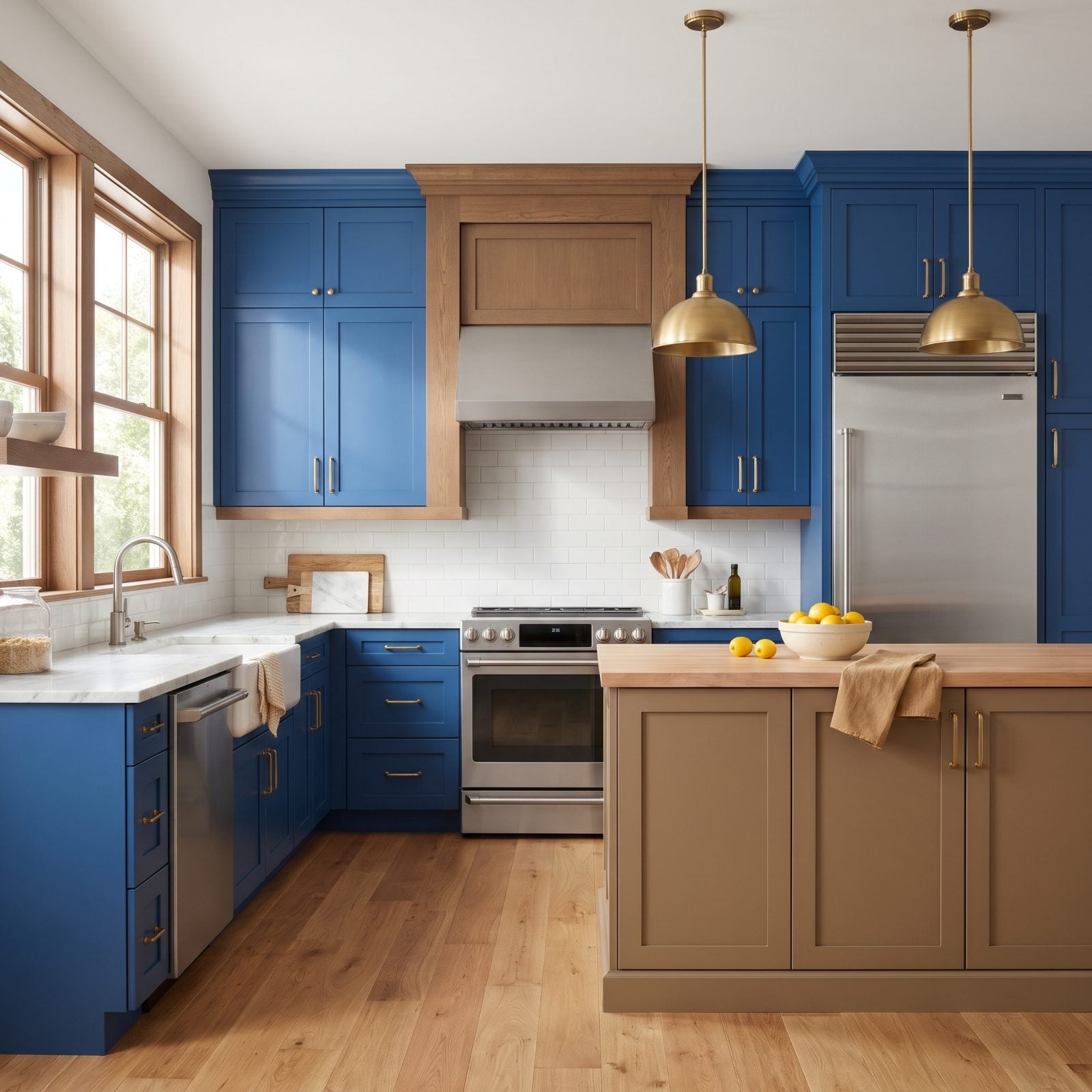
Royal blue could read cold on its own, and the camel brown millwork is what keeps it from going arctic. That honey-toned oak hood and the floating shelves pull the blue back toward something you’d actually want to cook in.
The whole move here is temperature. Blue sits on the cool end, camel on the warm, and the white marble plays referee between them while the island splits the difference with a butcher-block top. Nervous about committing an entire kitchen to blue? This is your proof it works once you give it a warm counterweight. For more blue kitchen inspiration, the warm-wood pairing shows up again and again.
17. Mauve Cabinetry Sparked Awake by Acid Green in a Contemporary Galley
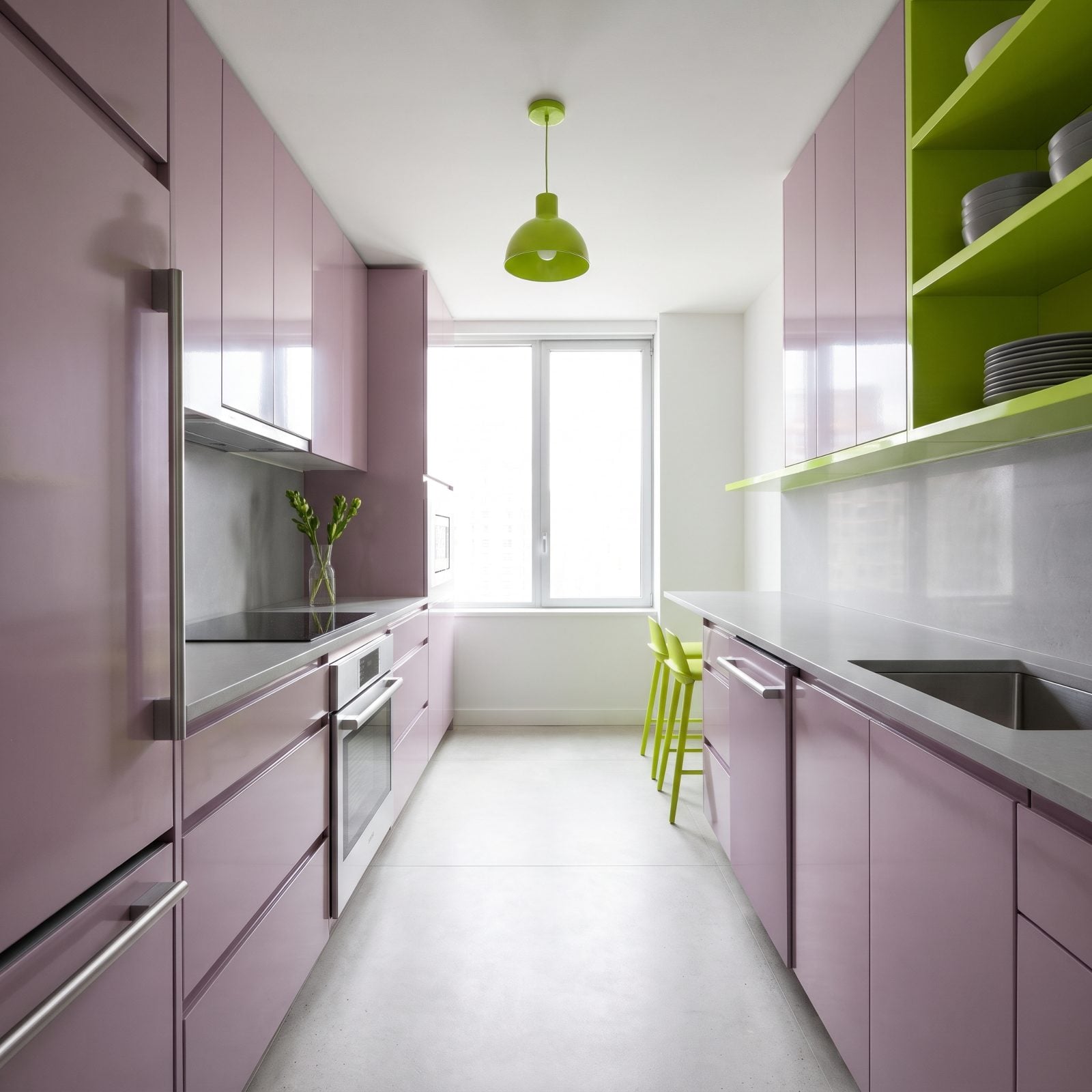
Mauve on its own drifts toward sleepy. The acid green is the espresso shot. Just a ledge, a shelf unit, and two stools in that electric yellow-green, and the whole galley snaps awake.
This is accent work, not an even split. The mauve carries most of the room while the green turns up in three deliberate spots, and that restraint is everything. A little acid green travels a long way. A lot of it would start a brawl.
16. Jade Green Cabinets Against Cranberry Walls in a Hollywood Glam Kitchen
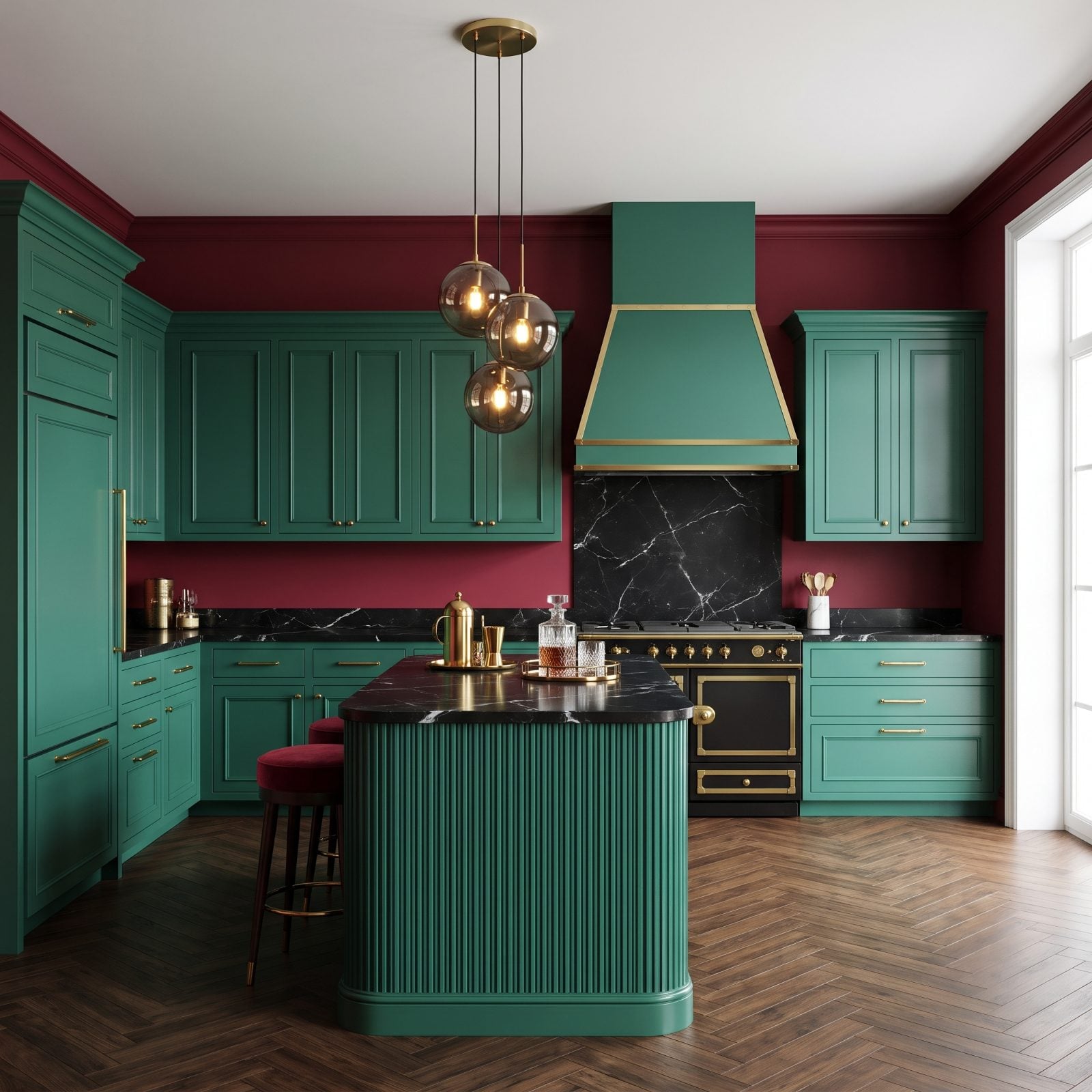
Everything in this kitchen is fighting for attention, and somehow nothing is losing. Jade cabinets, cranberry walls, brass hardware, black marble. On paper it should be chaos, but in the room it reads like a jewel box someone cracked open on purpose.
Green and red are complements, sitting dead opposite each other on the wheel. Pushed to these deep, muddied-down shades they stop looking like a holiday and start looking expensive. The brass keeps the peace, warming both colors and nudging the whole thing into agreement. Welcome to the deep end of teal kitchen territory, where saturation does the heavy lifting.
Complementary colors feel loud at full brightness and sophisticated when you darken them both.
When we asked readers whether they would buy brass or black pulls, the vote was a coin toss, 48% for brass and 49% for black.
15. Rose Pink Cabinets Grounded by Espresso Stone in a French Country Kitchen
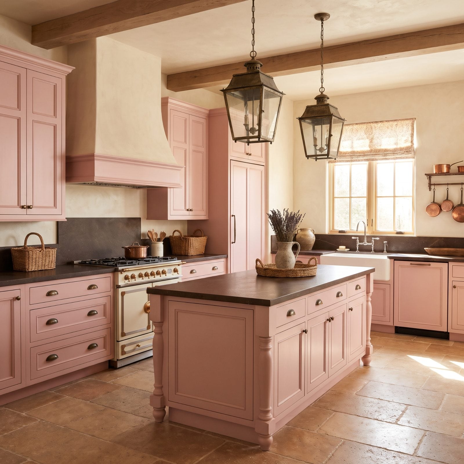
Rose pink reads sweet until you give it something heavy to lean on. The espresso stone countertops are that something. Dark, leathered, almost chocolate, and suddenly the pink has gravity.
Here the whole logic is weight distribution: soft color up high on the cabinets, a dark anchor across the counters and island top, warm limestone underfoot. Your eye travels down from light to dark the way it would across a landscape at dusk. This is a grown-up pink, and it’s harder to pull off than people assume. For more country kitchen renovation cues, soft paint over dark natural stone is a reliable bet.
14. Storm Gray Cabinets Under Watermelon Pink Walls in a Mid-Century Modern Kitchen
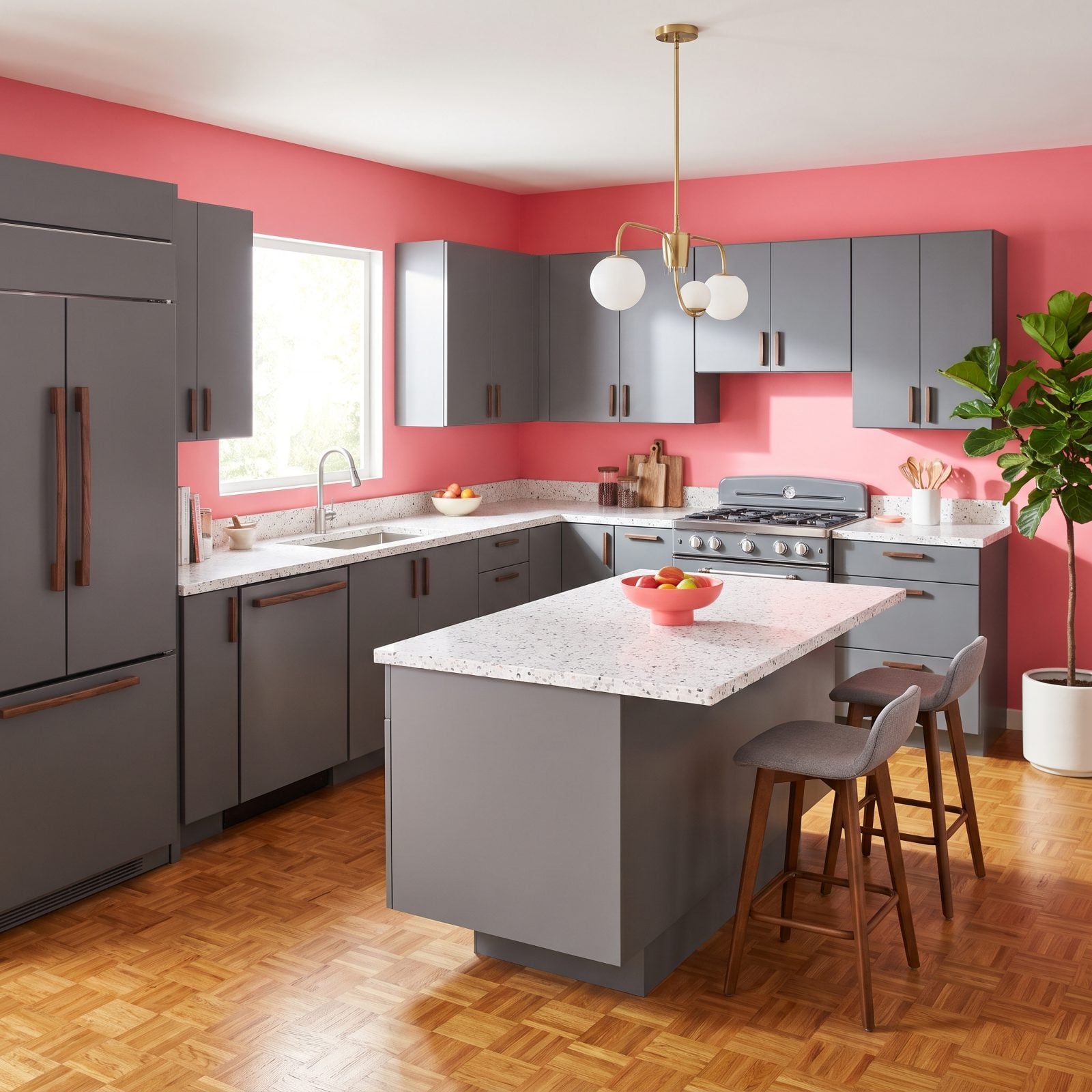
Gray cabinets plus watermelon pink walls shouldn’t be this cheerful, but the terrazzo counters give the whole thing away. Look closely and you’ll spot both colors chipped right into the stone. That’s the detail that ties it together.
Storm gray works as a true neutral here, built to let the pink walls sing without competing. The bright kitchen decor payoff is that terrazzo, which repeats both colors in miniature so your eye reads them as intentional rather than random.
13. Blue-Black Cabinets Meeting Citron Green Stone in an Industrial Loft Kitchen
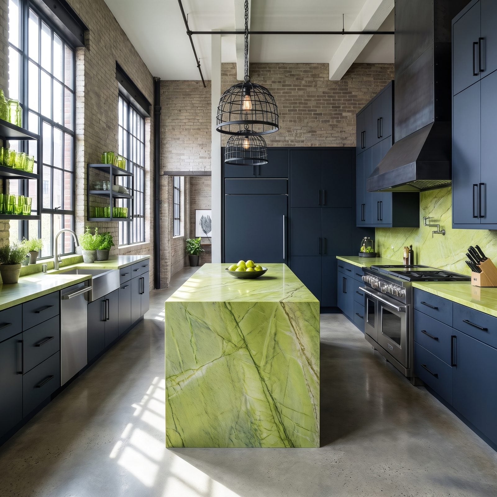
That citron waterfall island carries the entire room. Against cabinets dark enough to pass for black, the yellow-green quartzite practically lights up from inside.
Maximum contrast, minimum fuss. The blue-black swallows light while the citron throws it right back, so your eye lands on the stone and stays put. Everything else, the brick, the steel, the concrete, hangs back and lets those two do the talking.
12. Dusty Coral Cabinets Cooled by Juniper Green Millwork in a Coastal Kitchen
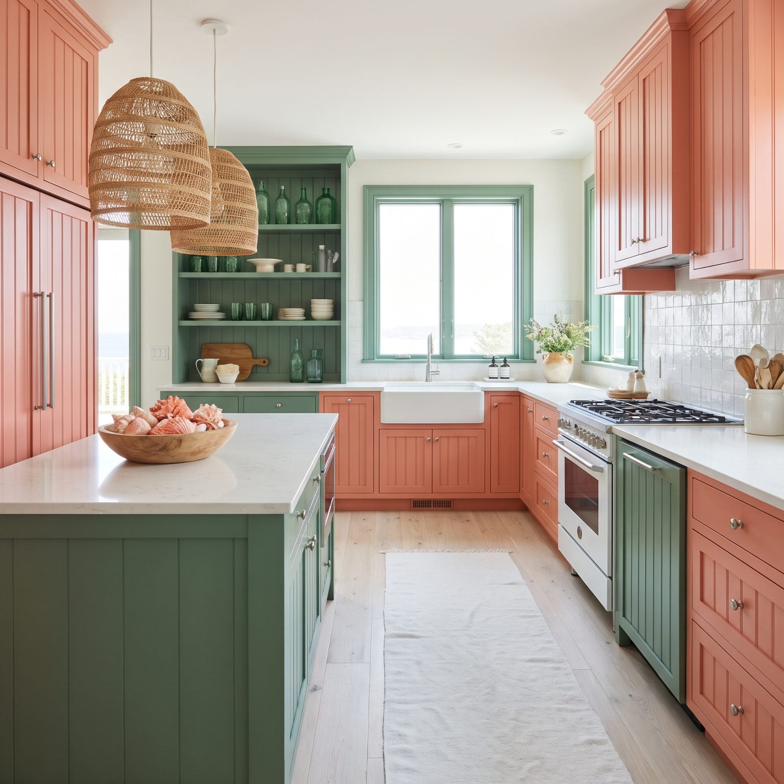
Coral and green already live next to each other out in nature, which is why juniper millwork feels inevitable against those dusty terracotta cabinets. Picture a reef. Or a clay pot with something leafy spilling over the rim.
Both colors are muted and sun-washed, and that’s what keeps a coastal room from going cartoonish. The juniper island base is the quiet anchor while the coral does the warming, and the whitewashed oak floor and zellige tile dilute everything just enough to breathe.
11. Opal Blue Cabinets With Burnished Brass and Rouge in a Modern Glam Kitchen
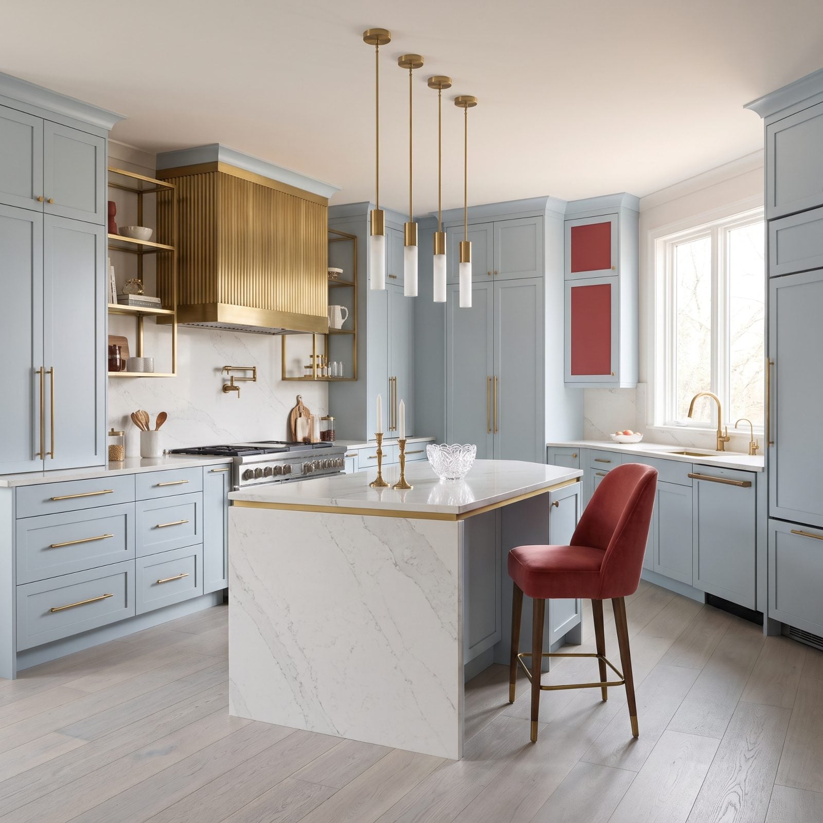
Opal blue is barely a color, more the suggestion of one, which is precisely why the burnished brass and rouge can afford to be loud. The milky blue-gray cabinets recede and hand the spotlight to the metal and the muted red.
This glam kitchen renovation runs entirely on restraint. Rouge velvet bar stools and a handful of brass pieces carry the whole personality while the cabinetry stays soft. Pair one quiet color with two warm accents and you land somewhere luxurious without the room ever raising its voice.
10. Mushroom Taupe Cabinets Lifted by Ultramarine Stone in a Modern Organic Kitchen
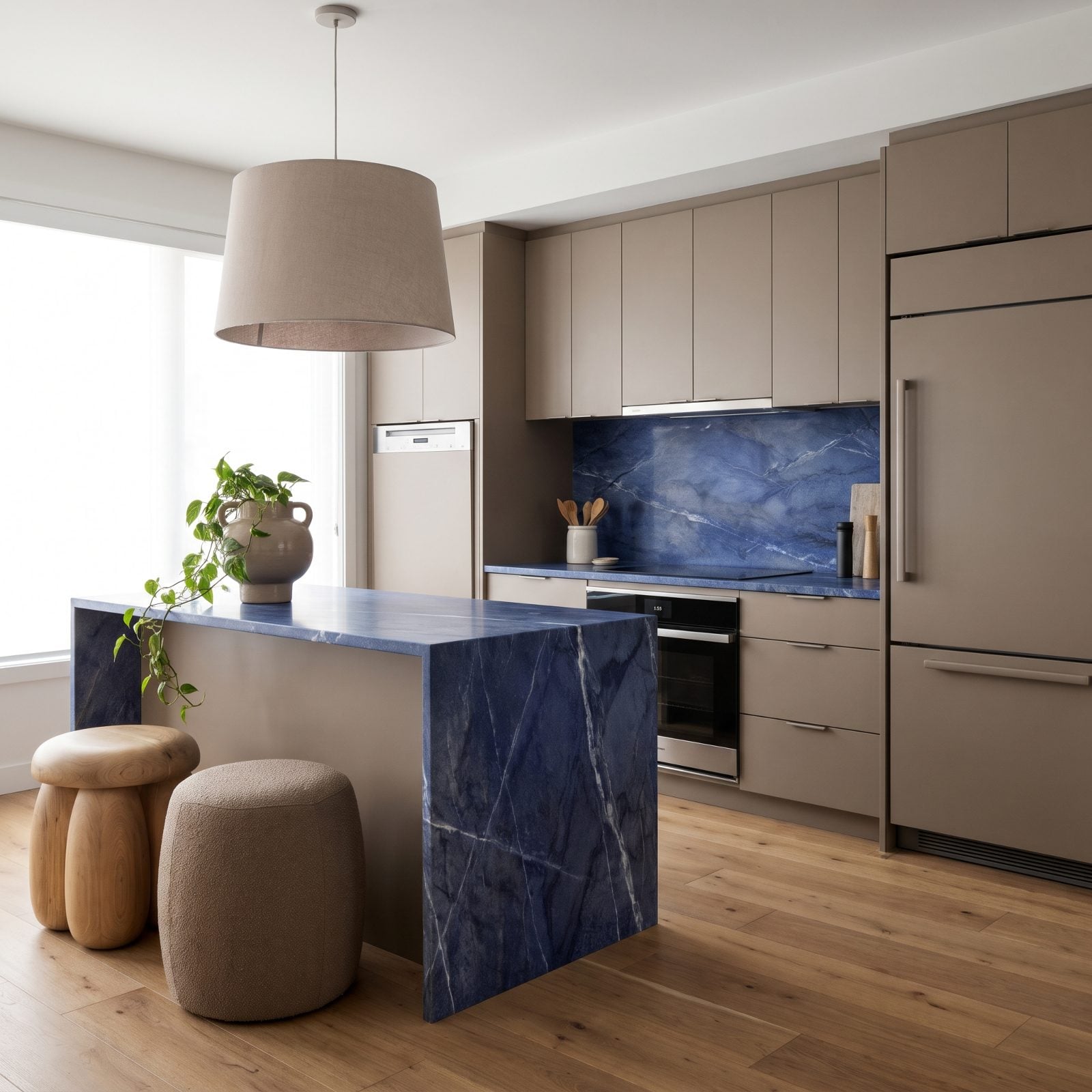
Mushroom taupe is the ultimate backdrop color, neither warm nor cool, just quietly present. Set an ultramarine stone against it and the blue lands like a jolt of cobalt dropped into a bowl of oatmeal.
The entire room orbits that one dramatic stone. Taupe cabinets, oak floors, boucle stools, every surface earthy and soft, so the lapis-toned waterfall island becomes the single event in the room. One bold material surrounded by calm beats ten competing ones almost every time.
9. Spruce Green Cabinets With Tangerine Tile in a Spanish Revival Kitchen
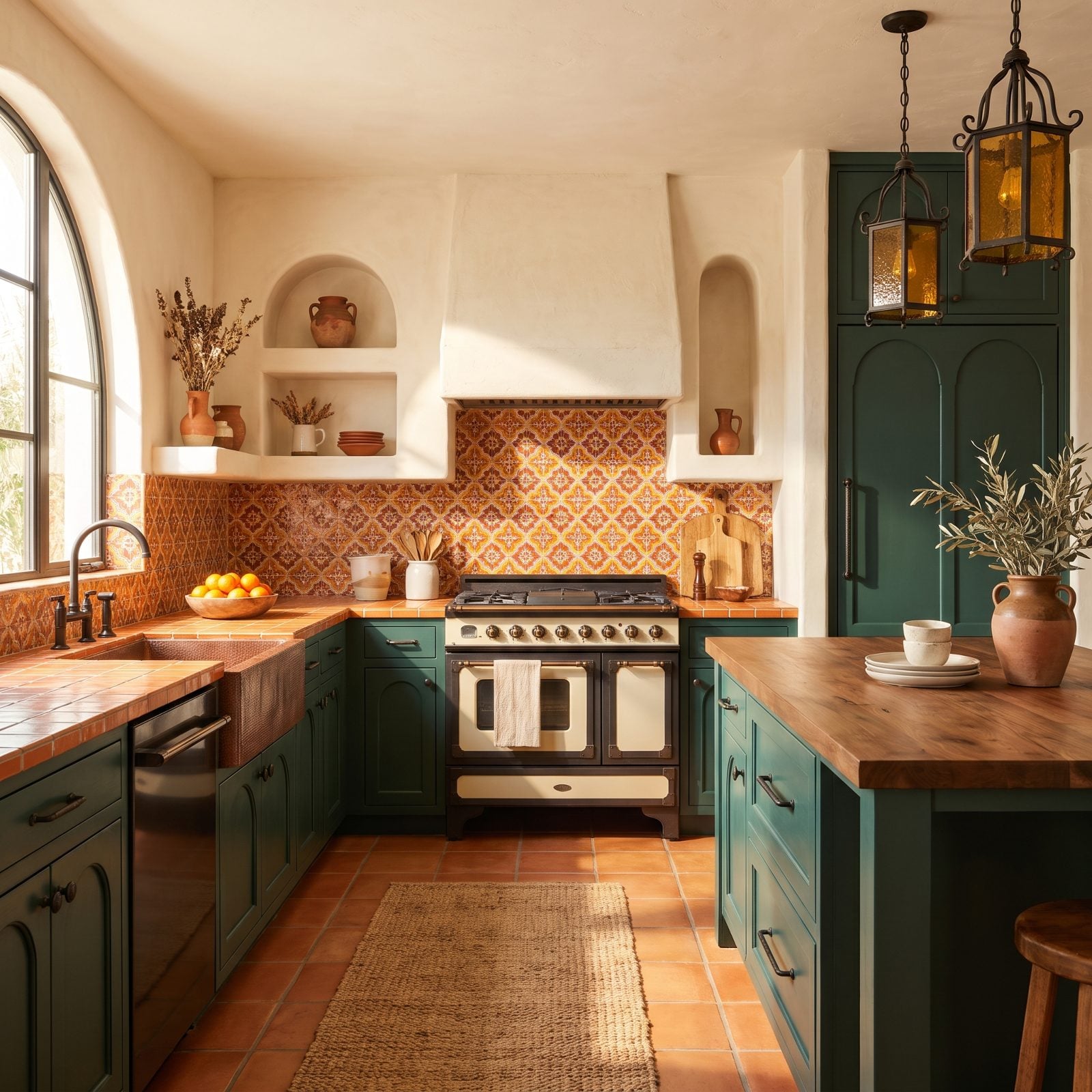
Deep spruce green beside a wall of tangerine tile is the boldest pairing in this gallery, and also the most historically honest. Spanish and Moorish tile has worked this exact combination for centuries, and the warm terracotta floor ties it straight to the ground.
Green and orange sit close enough on the wheel to feel related, far enough apart to crackle. In shadow the spruce goes nearly black, which lets that geometric tangerine tile burn bright, and the cream plaster walls keep the whole thing from overheating. A kitchen with a pulse, and it earns every degree of it.
8. Soft Black Cabinets Playing Off Lavender Walls and Ochre Hardware
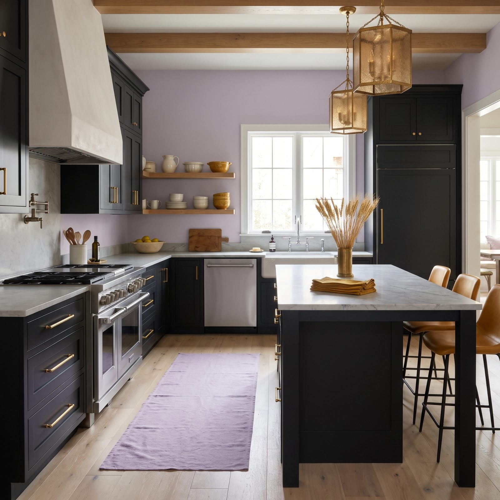
Black cabinets usually go cold and severe. Pair them with lavender walls, though, and the whole thing softens up fast. The dusty lilac takes the hard edge off that matte black while the ochre hardware stops the room from ever feeling precious.
Ochre is the smart move here — warm, a little earthy, bridging black and lavender without a fight. The ochre leather counter stools and brass pulls echo the same note, so your eye travels the room instead of snagging on one spot.
7. Peach Cabinetry Set Against Deep Bottle Green Walls
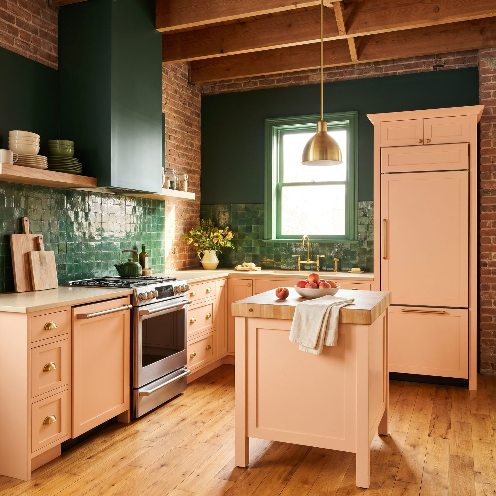
Peach and bottle green shouldn’t work. One’s a dessert, the other’s a library. Together they land somewhere fresh and a little vintage, like a 1930s hotel that aged well.
The green does the heavy lifting on the walls, which lets the peach cabinets glow rather than shout. Warm cream counters keep both colors honest. Want more ideas in this direction? There’s plenty of bright kitchen decor worth studying.
6. Rich Rosewood Fronts With a Pale Pistachio Tile Run
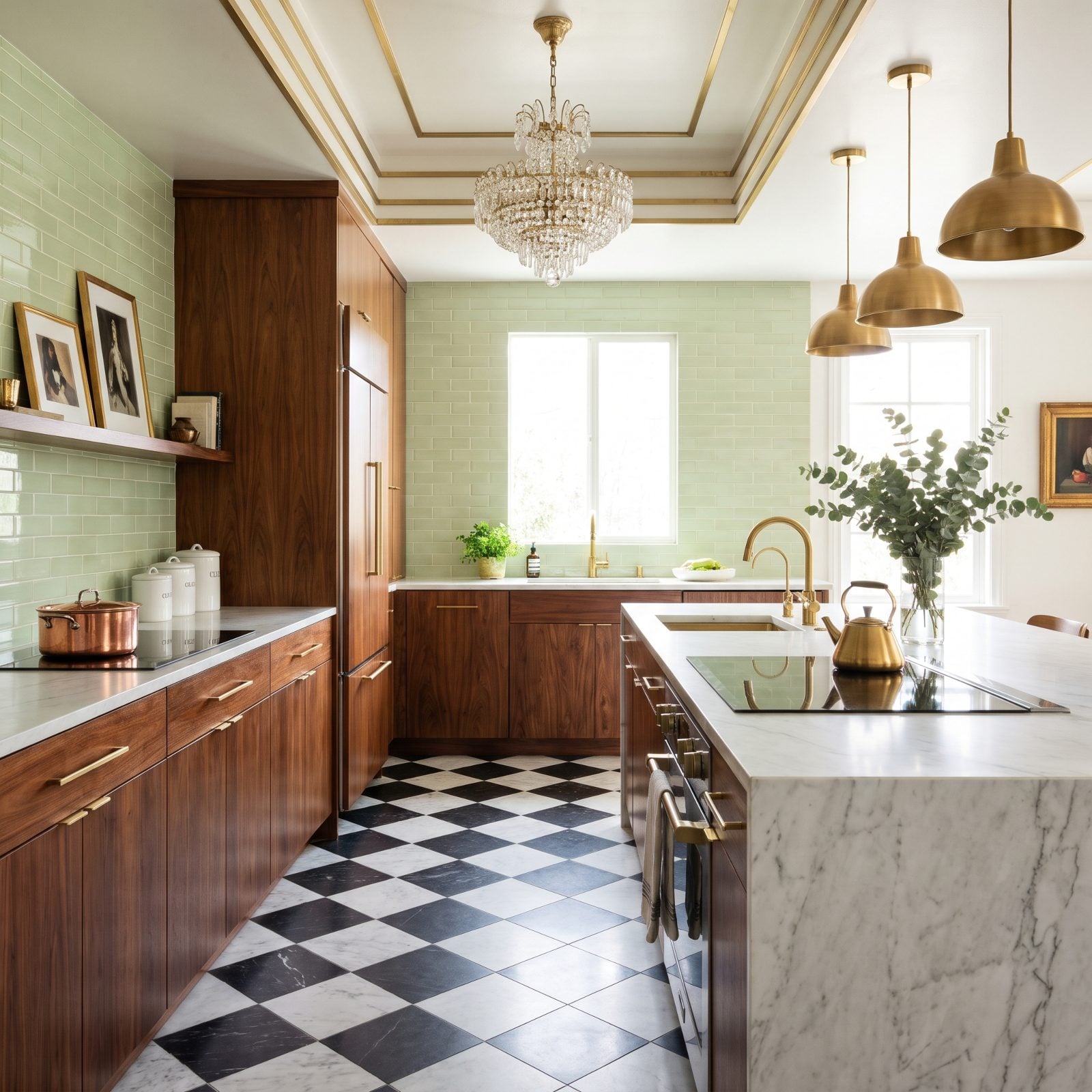
Rosewood’s reddish grain against soft pistachio tile looks obvious once you see it and impossible before. Warm brown, cool green, both muted enough to behave themselves.
Here the wood is the star and the pistachio plays backup. That restraint is what makes it read as grown-up rather than kitsch. I’ve watched this combination fall apart when the green gets too bright — keep it chalky and you’re fine.
5. Garnet Cabinets Warmed by Buttercream Tile
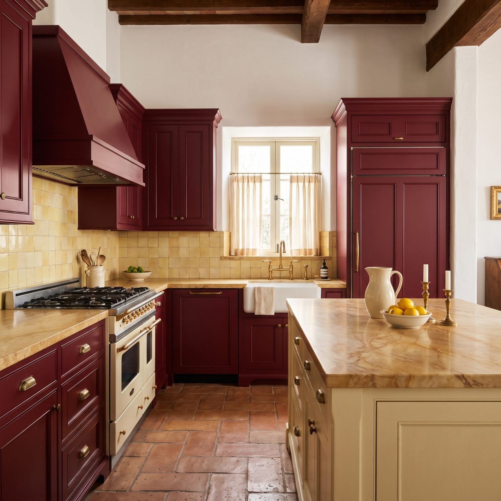
Garnet is a tough cabinet color. Push it wrong and you’ve built a steakhouse. Pair it with buttercream tile instead and it turns into something warmer, almost edible.
The buttercream backsplash is the release valve, lightening the whole room so those deep red cabinets feel cozy instead of heavy. Honey-veined marble carries both tones across the counters. This is a country kitchen renovation move that never dates.
4. Smoky Lilac Cabinets Grounded in Tobacco Brown
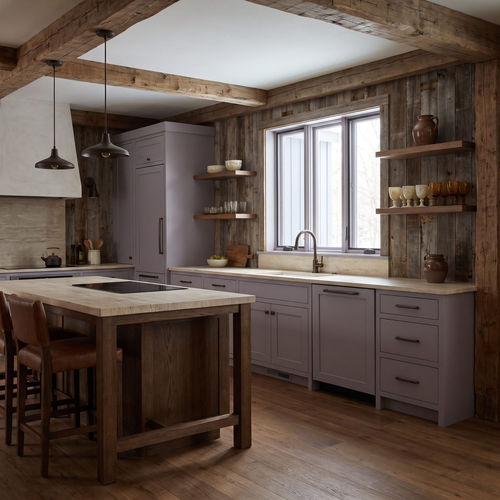
That floor-to-ceiling lilac-grey is pulling a clever trick. It reads cool and ethereal right up until the tobacco brown drags it back down to earth. Strip out the brown and this kitchen would float clean off the page.
The tobacco leather counter stools and bronze fixtures give the smoky lilac something warm to lean on, while travertine counters sit right in the middle, borrowing from both. Quiet, confident, and it looks better in person than in any listing shot.
3. Wasabi Green Cabinets Meeting Soft Coral Stone
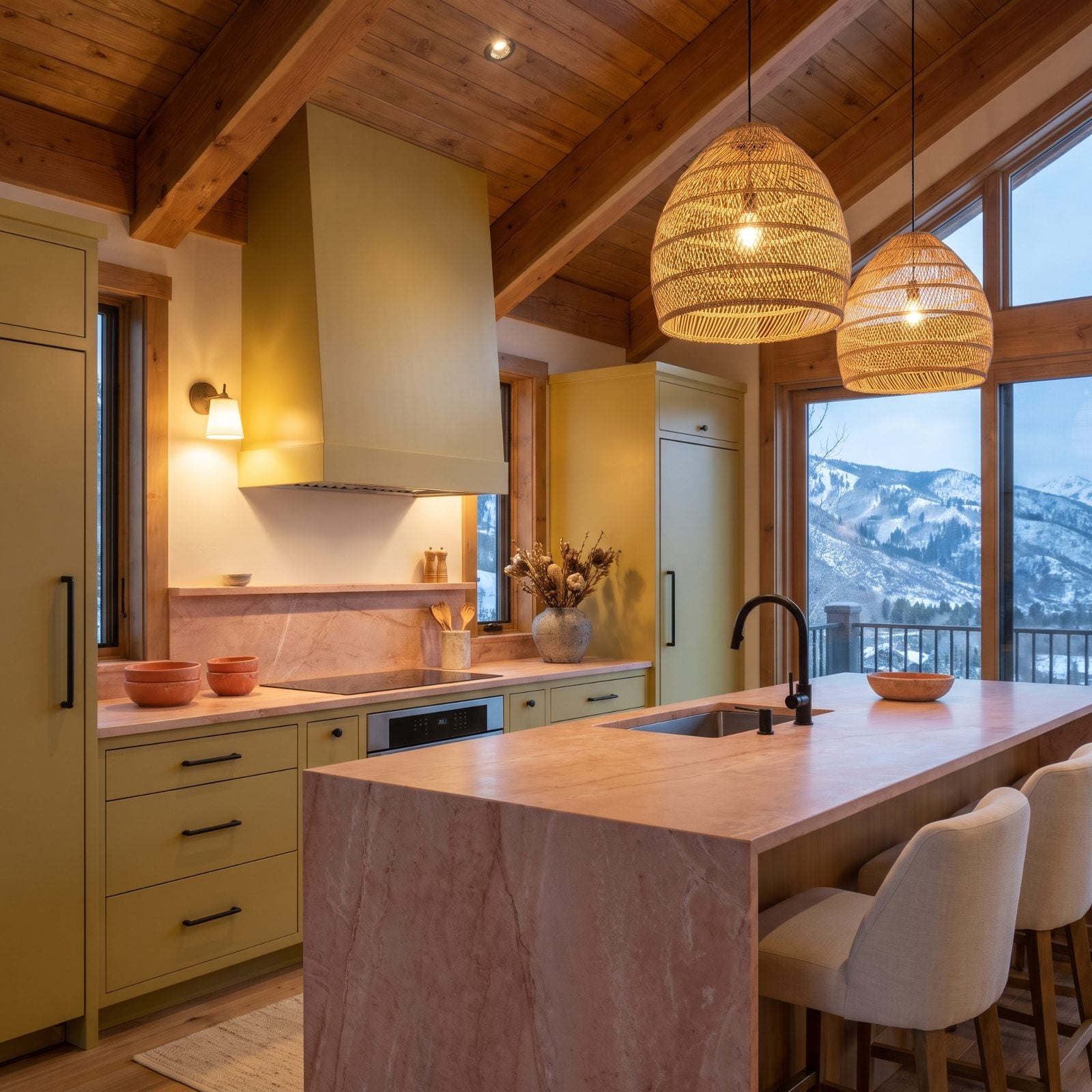
Wasabi green and coral stone is a gamble, and it pays off in sunlight. The muted yellow-green cabinets and the warm coral counters sit almost opposite on the wheel, which is exactly why they hum together.
Restraint is what keeps it out of playground territory. Matte black hardware, pale oak floors, and not one extra color anywhere else. That coral waterfall island earns its spot as the single bright gesture. Honestly? One of our favorite combinations here.
2. Sand Beige Cabinets With Magenta and Teal Doing the Talking
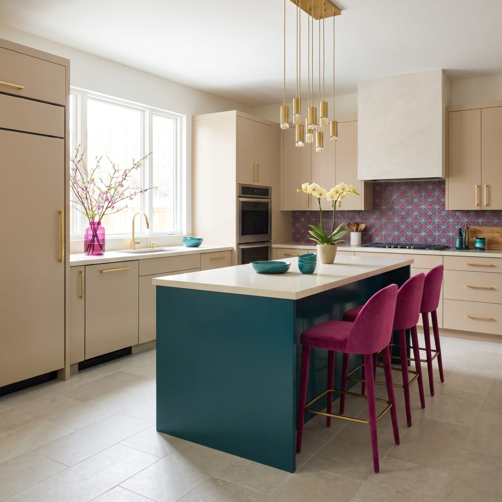
Beige gets a bad rap as the color of giving up. Here it’s the smartest decision in the room. The sand cabinets become a neutral canvas that lets magenta and teal go as loud as they like without the kitchen collapsing into chaos.
The teal lacquered island and magenta velvet counter stools carry the bold color in big, confident blocks rather than scattered trinkets, and gold hardware ties it all back to the warm beige. That’s how you do maximalist color without a headache. For more fearless palettes, a proper glam kitchen renovation is a good rabbit hole.
1. Navy Cabinets Topped With Coral-Pink Counters
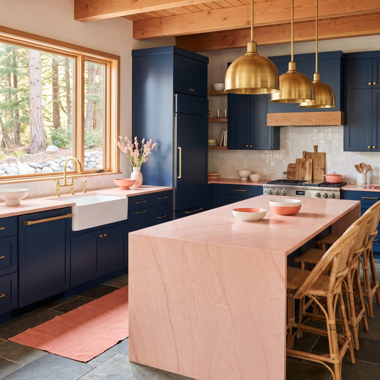
Navy cabinets with coral-pink counters sounds like a sunset gone wrong — until you stand in the room. The deep blue and the warm pink are near-opposites, and that clash is what gives the kitchen its snap.
White zellige tile and brass fixtures play referee between the two, keeping the energy bright instead of tense. Navy is everywhere right now, and deservedly so. There’s endless blue kitchen inspiration if you want to dig around before committing.
Pair a deep moody blue with one warm, unexpected counter color and the whole kitchen stops feeling safe in the best way.