
🔥 Would you like to save this?
Bedrooms that feel like good hotels rarely win by cramming in more furniture. They win by editing harder. The nightstand stops being a storage depot. The lighting comes from more than one lonely ceiling fixture. Bedding gets layered instead of piled on. One chair earns its corner. One piece of art gets enough room to matter.
In order to come up with the very specific design ideas, we create most designs with the assistance of state-of-the-art AI interior design software. Also, assume links that take you off the site are affiliate links such as links to Amazon. this means we may earn a commission if you buy something.
That doesn’t mean every transformation here is a weekend project. Some involve new lighting, wall treatments, flooring, or built-ins; others come down to color, textiles, scale, and subtraction. These 29 before-and-afters are less a shopping list than a study in what makes a bedroom feel considered. Watch what gets added, certainly. But pay just as much attention to what finally gets out of the way.
29. Dark, Warm, and Completely Unapologetic About It
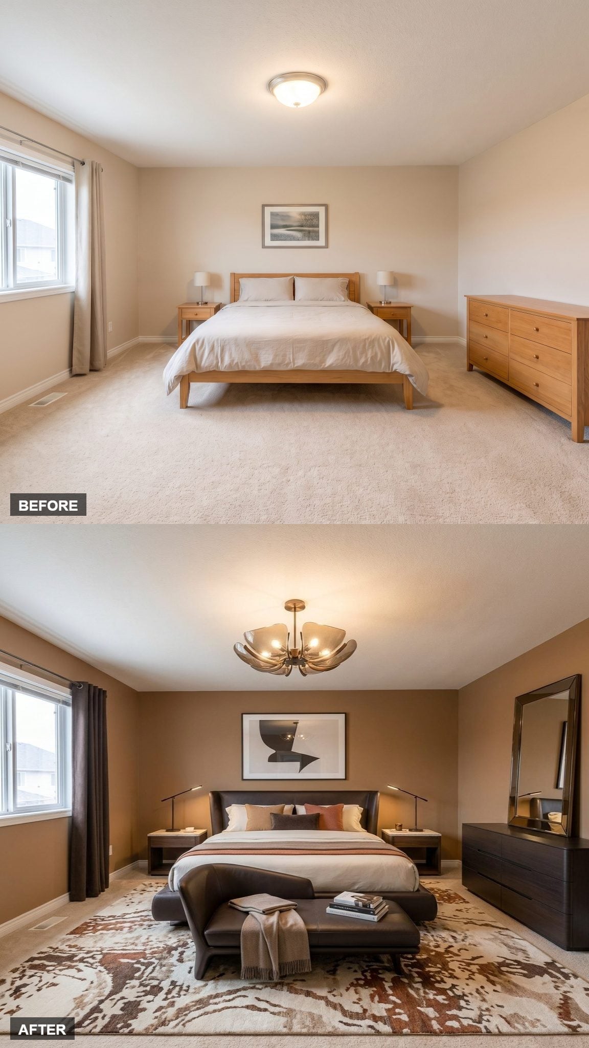
Deep caramel-brown walls make the first move, immediately taking the room somewhere richer than standard hotel beige. A low near-black upholstered platform bed keeps the center of gravity close to the floor, while an abstract charcoal-and-cream print gives the headboard a single strong companion instead of a wall full of small distractions.
Slim floor lamps flank the bed without loading up the nightstands. Underfoot, a botanical rug pulls rust, ivory, and espresso into one field, and a dark dresser with a leaning mirror keeps the opposite side visually substantial.
Then there is the brass chandelier. Its sculptural bowl-shaped shades are exactly the interruption all those dark surfaces need. Moody without becoming murky, this is a good reminder that “hotel-like” does not automatically mean pale.
28. Dusty Rose Takes Over the Room Without Turning Sugary
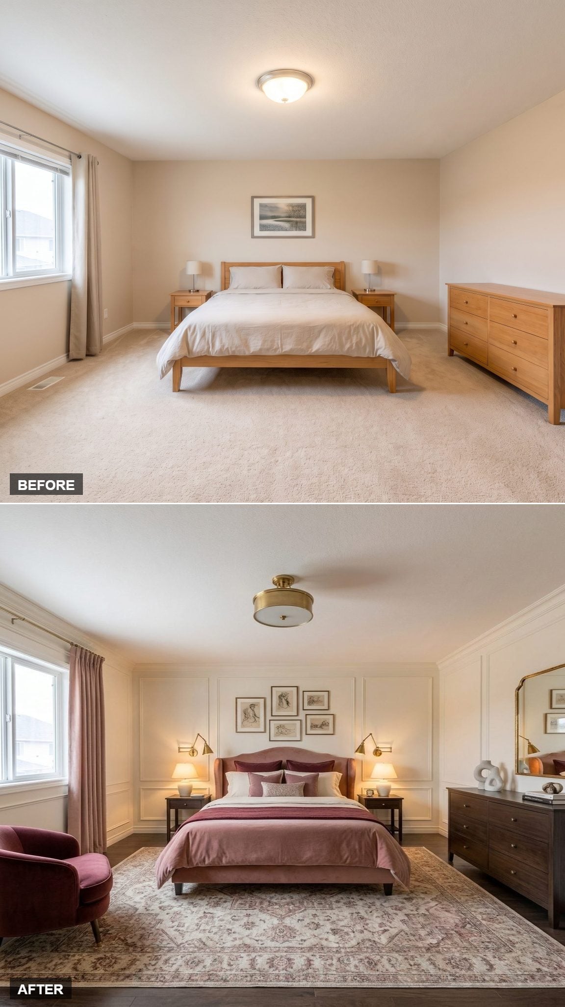
Mauve doesn’t usually win a bedroom. In this room, it dominates and nothing feels overdone.
The upholstered bed sets the rules. Dusty rose velvet covers the tufted headboard, then blush, burgundy, and softer neutrals repeat the idea across the bedding without turning the room into a theme. Brass swing-arm sconces leave the bedside surfaces clear and give the wall a more tailored rhythm.
Dark walnut furniture prevents the palette from floating away, while a vintage-style rug brings enough age and pattern to rough up all that polish. Crown molding and board-and-batten detailing add architectural relief; a brass semi-flush fixture repeats the metal finish overhead. The result feels composed because the same few decisions keep showing up in different forms.
27. Navy Paneling and a Glowing Tray Ceiling Change the Entire Hierarchy
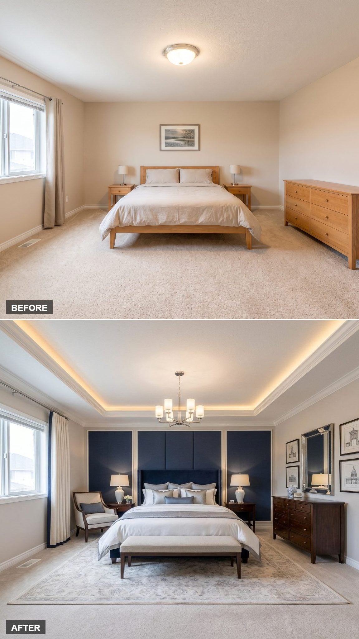
Floor-to-ceiling navy paneling turns the bed wall into architecture rather than backdrop. The tall upholstered headboard stays in the same dark family, so instead of competing with the wall it becomes part of one broad composition.
Above it, cove lighting tucked into the tray ceiling washes warm light across the upper edges of the room. That’s the useful lesson here: the ceiling is no longer dead space. It participates.
Dark walnut furniture keeps the lower half grounded, while the patterned rug gives the bed zone definition without introducing another loud color story. The room is dramatic, but nearly all of the drama comes from surfaces and light rather than objects.
26. Mid-Century Walnut, Rust, and Olive Keep Every Era Cue on Speaking Terms
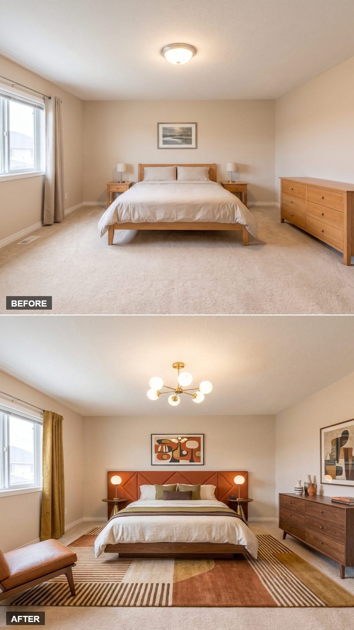
A brass chandelier with globe bulbs gives the ceiling a strong period cue without turning the room into a showroom. Below it, the burnt-sienna leather headboard carries diagonal quilting that adds texture while the walnut-finished nightstands keep their tapered legs and clean profiles.
The rug is the mediator. Terracotta and cream connect the headboard to the surrounding wood, while olive curtains introduce a quieter third color. Abstract art repeats the earthy palette higher on the wall.
Nothing here is pretending to be a preserved 1960s interior. It borrows the useful parts — walnut, brass, low profiles, saturated earth tones — and leaves the museum rope somewhere else.
25. French Provincial Furniture Turns the Bedroom Into Its Own Little World
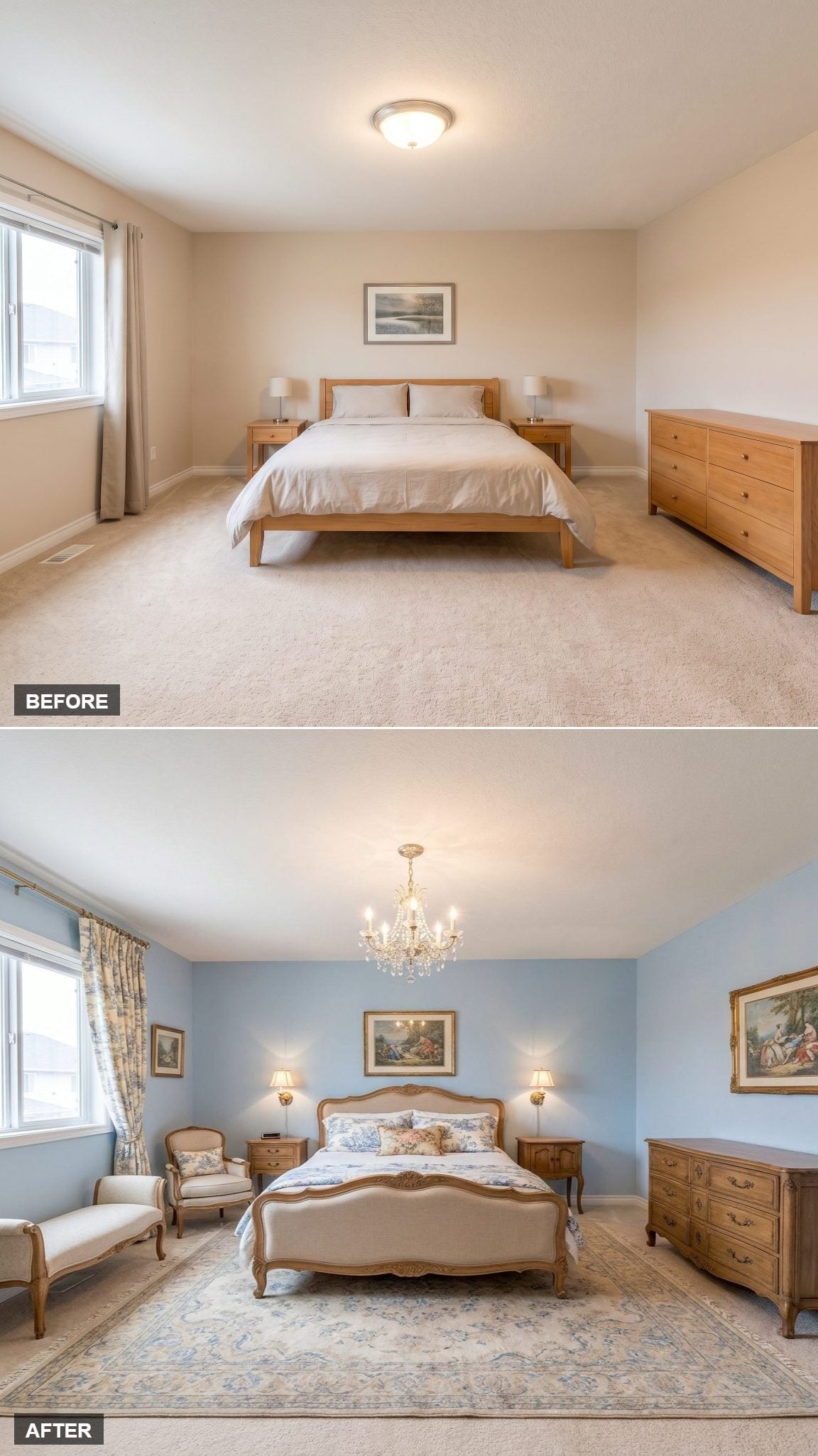
Pale blue walls give the carved oak bed enough quiet space to command the room. Its ornate headboard is not trying to disappear, and neither is the crystal chandelier above it.
Toile curtains and a floral rug continue the period language instead of abandoning it halfway through. That’s what keeps the room from feeling like one antique bed dropped into an otherwise generic shell.
The hotel lesson here is not “buy French Provincial furniture.” It is commitment. Once the bed establishes this much character, the surrounding pieces need to answer it rather than pretending nothing happened.
24. Pendant Lights at Pillow Height Make the Bed Wall Feel Purpose-Built
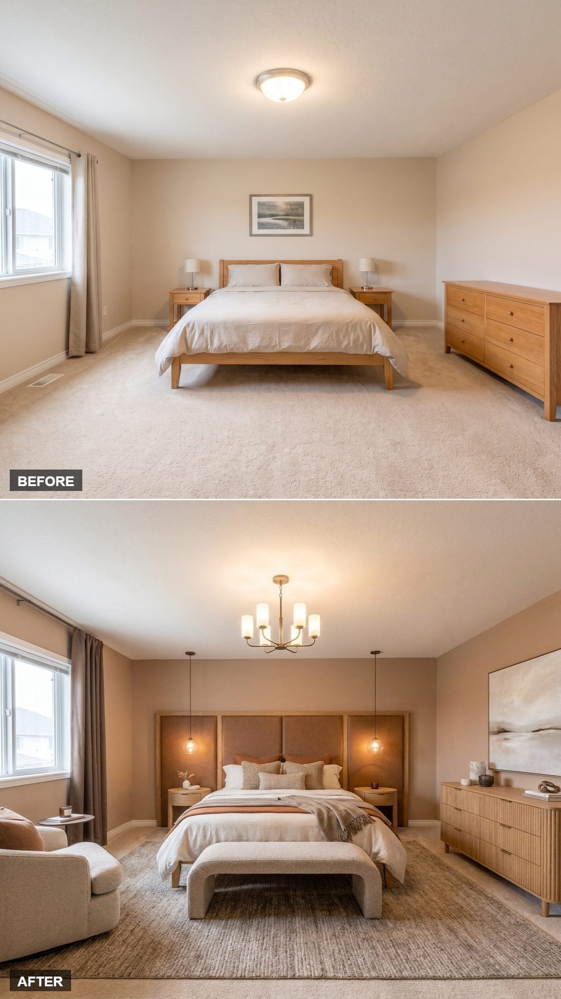
Warm brass pendants drop low on either side of the upholstered headboard, turning lighting into part of the bed composition instead of two unrelated objects sitting on furniture.
That vertical drop leaves the nightstand area visually cleaner and gives the wall a symmetry hotels use constantly: bed in the center, light exactly where it is needed, almost nothing wandering between the two.
A fluted dresser adds texture across the room and the rug brings softness underfoot, but neither competes for top billing. This one works because the lighting knows exactly where to stop.
23. Desert Art Gives the Room Its Palette Before the Furniture Gets a Vote
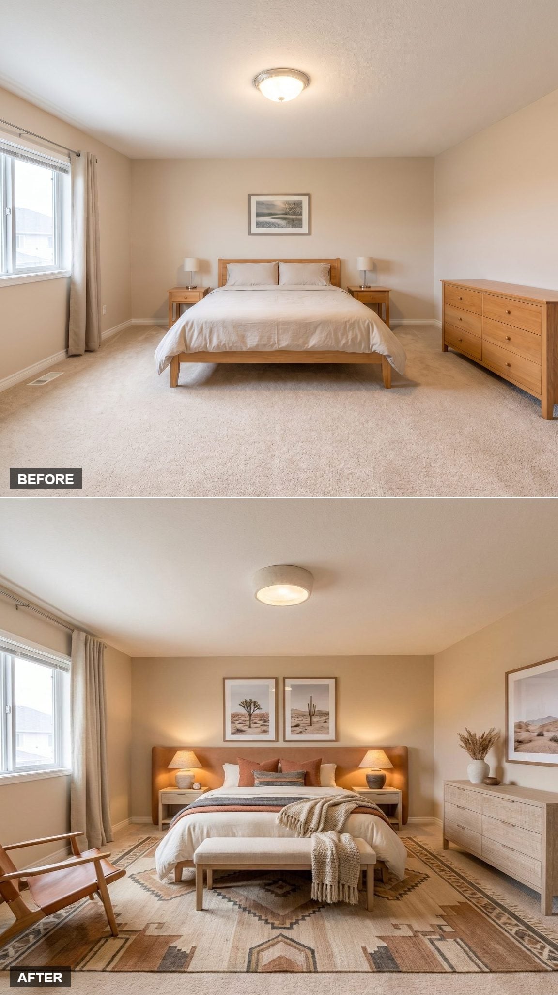
Two desert prints above the leather-upholstered headboard supply nearly the whole color map: terracotta, dusty blue, sand, caramel. The throw pillows pick those shades up again without matching them so exactly that the room starts looking cataloged.
A Southwestern-patterned rug defines the bed zone, while a slatted wood chair and linen bench introduce different textures without changing the palette. The bleached-oak dresser keeps the opposite wall comparatively light.
This is the easiest kind of cohesion to understand and one of the hardest to fake: choose one strong visual source, then let the room borrow from it rather than asking every object to invent its own story.
22. Navy Velvet and Scalloped Lines Give the Room a Quiet Art Deco Streak
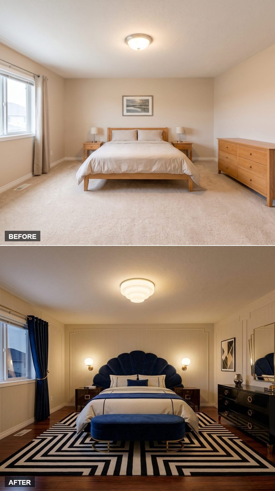
The navy velvet headboard does not need much help. Its scalloped outline gives the bed enough geometry to suggest a 1930s hotel without turning the room into a movie set.
Brass wall sconces sharpen that impression, while dark walnut nightstands and a black lacquer-look dresser bring weight to the lower half. A black-and-white geometric rug keeps the Deco reference graphic rather than nostalgic.
Navy drapes and a matching bench repeat the strongest color just enough. A lot is happening, but nearly all of it answers the same question.
21. Floating Nightstands Make a Slate-Blue Bed Feel Even Lighter
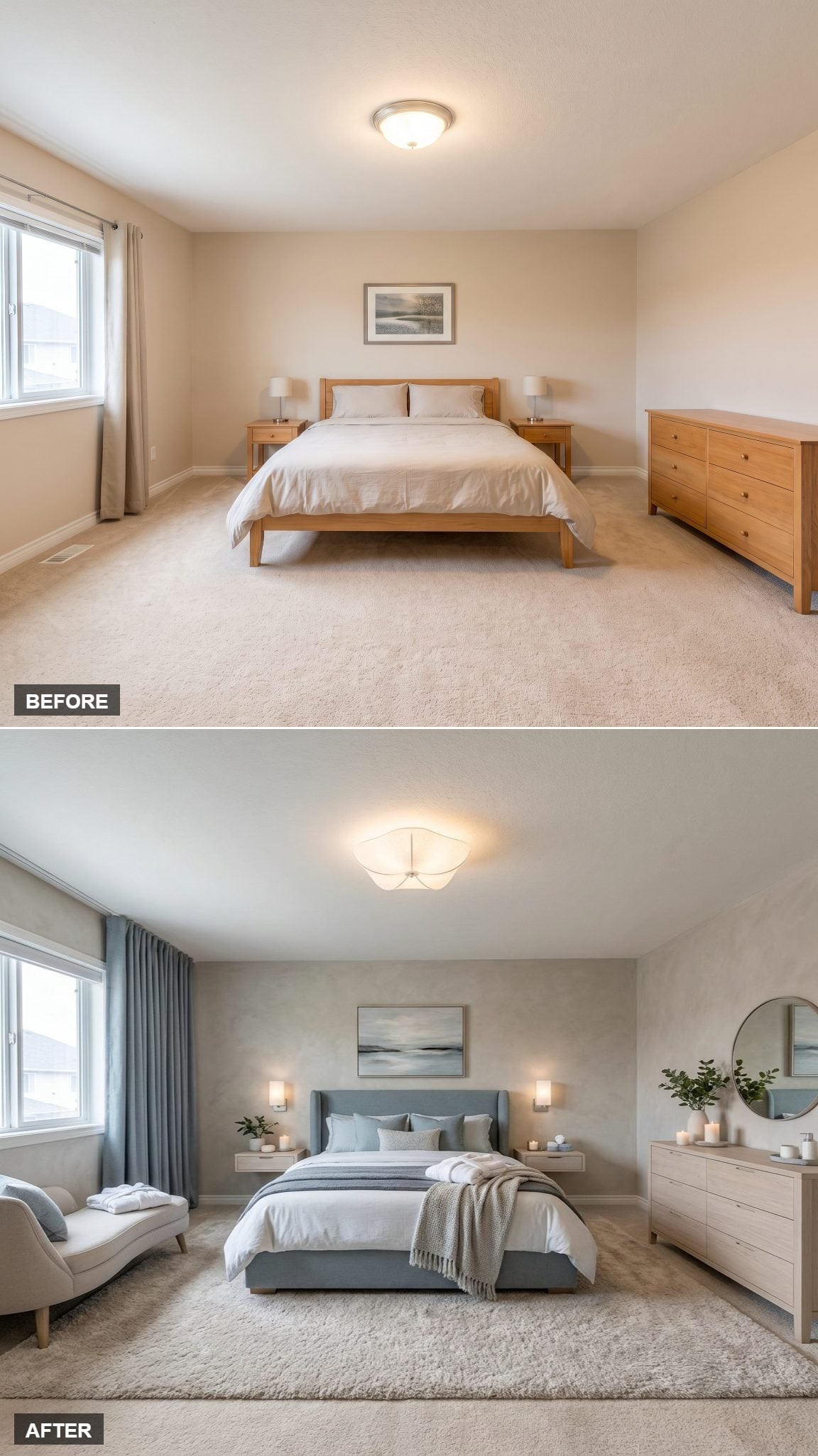
A slate blue-gray upholstered platform bed resets the palette immediately, but the more useful trick is happening beside it. Floating nightstands expose the floor beneath them, reducing the visual mass around the bed.
Wall sconces continue that cleanup by moving the reading light off the tabletop. Across the room, a light ash dresser with a round mirror, candles, and one small plant keeps the styling controlled rather than barren.
The effect is not that the room magically became larger. It simply stopped filling every available edge with furniture.
Did You Know: Wall-mounted nightstands expose more flooring and can reduce the amount of visual mass clustered around a bed. That makes them especially useful when the goal is to make a small bedroom feel less crowded without changing its actual footprint.
20. Carved Wood and Lantern Light Take the Room Somewhere Completely Different
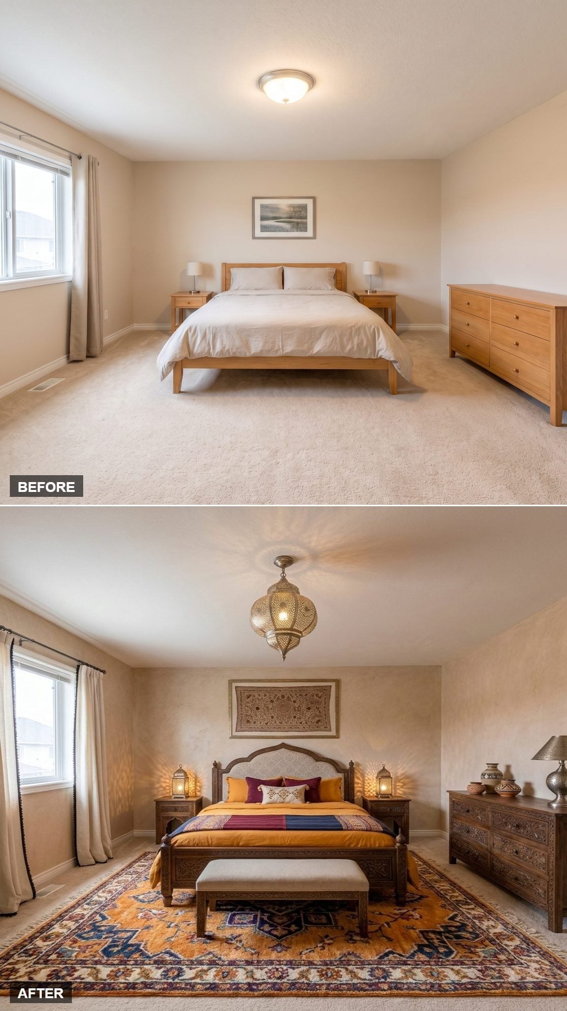
Dark carved-wood furniture gives this room an immediate sense of weight, especially around the arched upholstered headboard. Warm lanterns flank the bed and cast a softer, more patterned glow than a pair of standard lamps would have managed.
Saffron and crimson bedding pull their colors from the rug below, where deep reds, golds, and darker accents make the floor part of the palette instead of background.
The strength here is density with discipline. Carving, pattern, lanterns, and saturated color could easily start competing. Instead, they are all speaking roughly the same visual language, which makes the abundance feel intentional rather than crowded.
19. A Low Walnut Platform and Paper Lighting Bring the Volume Way Down
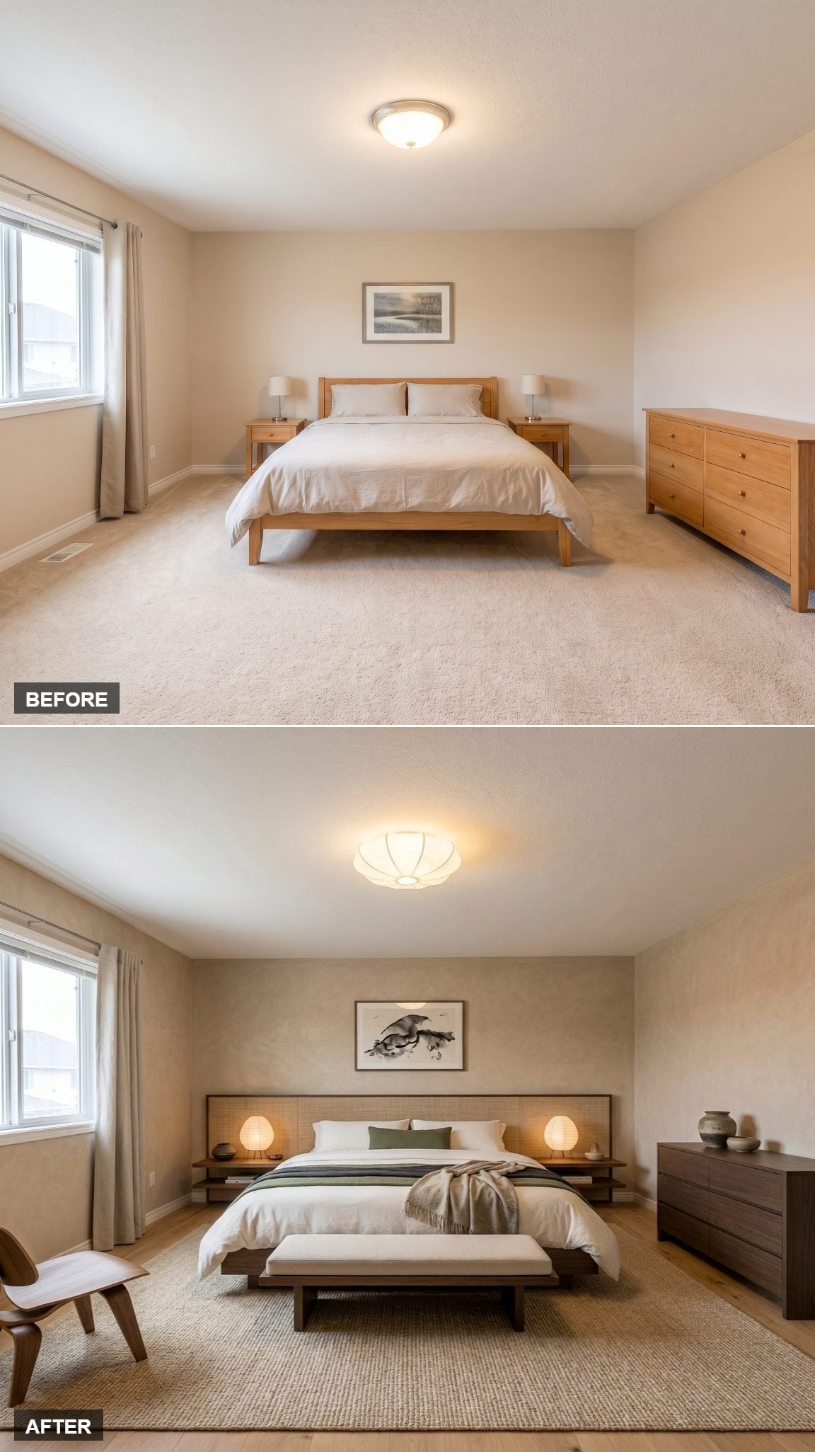
A ribbed paper fixture overhead creates a soft, diffuse glow and immediately pulls the room toward a Japanese-influenced simplicity without turning the reference into costume.
The dark walnut platform bed sits noticeably low, with floating shelves aligned to the same horizontal line. That keeps the furniture visually quiet and lets the open wall above feel more generous.
White bedding does most of the work, interrupted by a sage lumbar pillow and a loose linen throw. A few ceramic vessels on the dresser are enough. The room understands that empty surface is also a design decision.
18. Limewash-Look Walls and a Terracotta Arch Make Softness Architectural
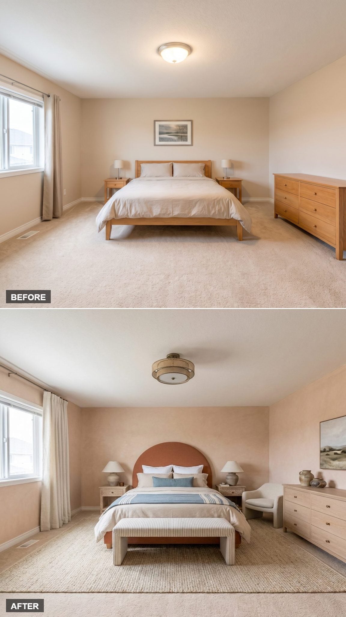
Blush limewash-look walls catch light unevenly, giving the surface a depth that ordinary flat paint would not suggest. Against them, the terracotta arched headboard becomes the room’s one big shape.
A striped bench introduces pattern at the foot of the bed, while linen drapes pool lightly at the floor and a rattan ceiling fixture keeps the palette warm without adding another hard material.
Then one dusty blue pillow breaks the spell just enough. That cool note matters because everything around it is restrained enough to let a small contrast register.
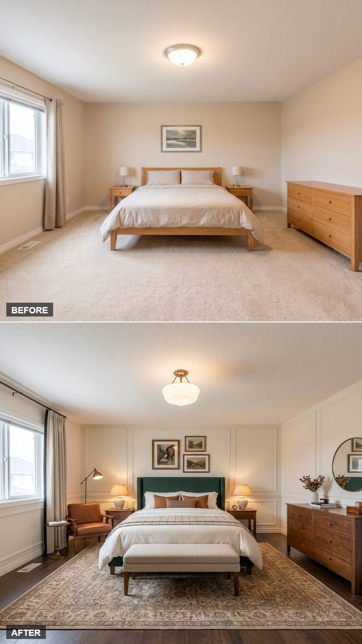
17. Forest Green, Wainscoting, and Three Levels of Light Borrow a Hotel Trick
🔥 Would you like to save this?
Picture-frame wainscoting stretches across the bed wall, giving the room architectural relief before any furniture enters the conversation. A deep forest-green wingback headboard adds the strongest color, while warm brass repeats through the lighting.
The bed is not relying on one overhead fixture. An amber-shaded bedside lamp, brass ceiling light, and reading lamp near the leather chair all operate at different heights.
That layered approach is one reason well-designed hotel rooms often feel more comfortable after dark: the lighting can shift with what the room is being used for instead of blasting everything from the ceiling.
16. Rattan, Tropical Art, and One Oversized Pendant Turn the Bedroom Into a Destination
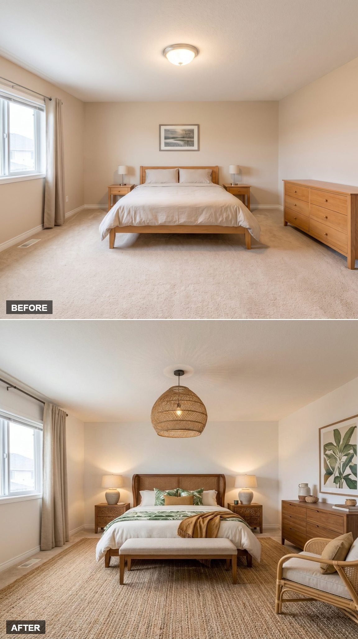
An oversized woven pendant hangs low over the bed, large enough to give the ceiling real presence without relying on crystal or metal. Below it, carved wood and cane detailing bring the same natural texture into the headboard.
Ochre and sage bedding works against crisp white, while tropical-print pillows pick up the framed banana-leaf art on the wall. A jute rug adds another rougher surface over the carpet, and a rattan chair gives one corner an actual purpose.
The trick is not the tropical theme. It is repetition without duplication: woven fiber appears in several places, but never in exactly the same form.
15. Sage Green and a Floral Headboard Let Pattern Take the Lead
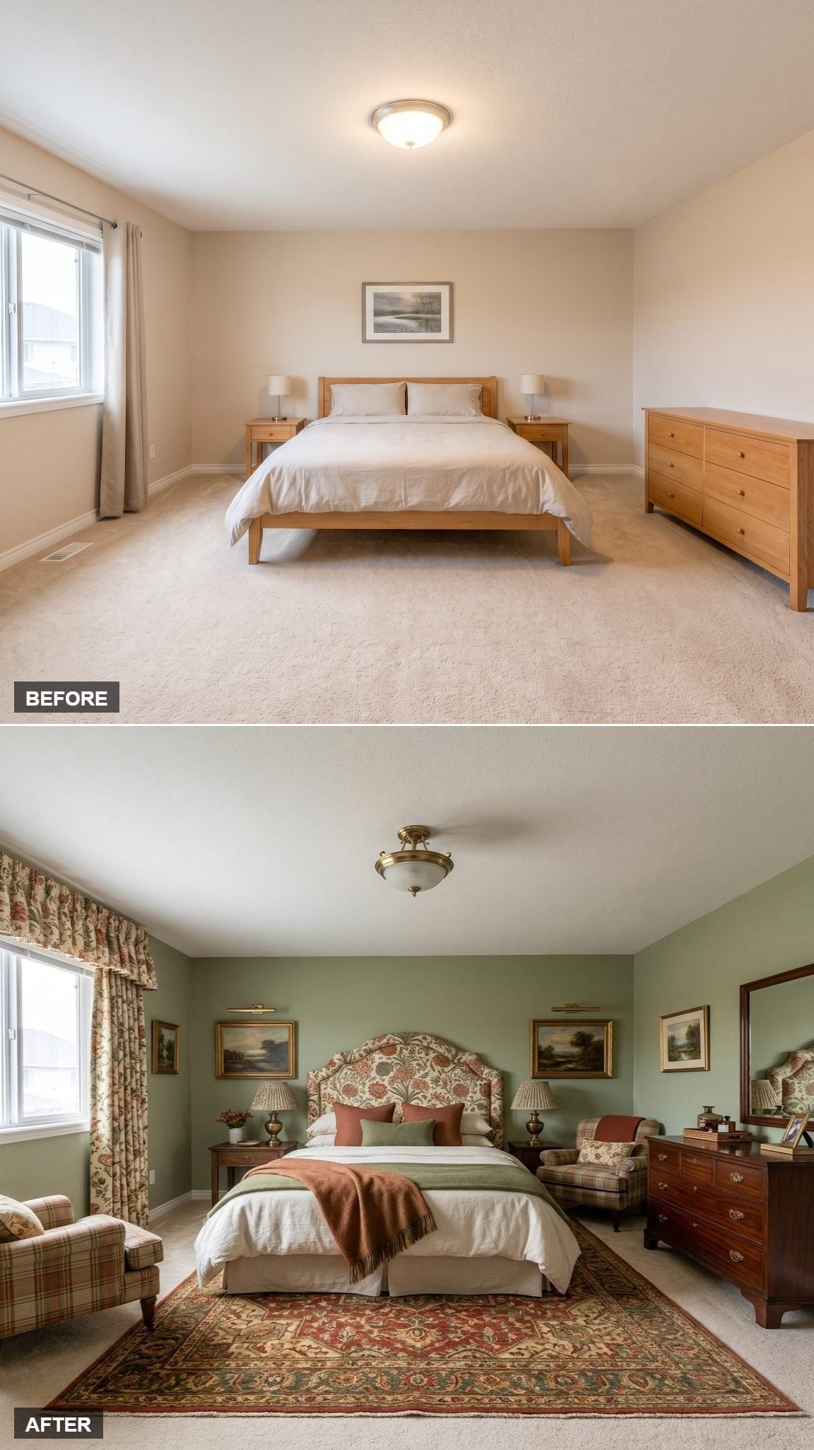
Sage green walls create a muted backdrop for a headboard that has no interest in being quiet. Terracotta-and-cream floral upholstery becomes the room’s pattern source, with rust pillows and a burnt-sienna throw carrying those warmer notes onto the bed.
Gilt-framed landscape art introduces another traditional layer, while the mahogany-toned dresser and brass hardware give the room some darker weight.
The deep red-and-ivory Persian-style rug finishes the lower half. This is not a room built by adding neutral pieces until nothing can offend anyone. It knows what it likes.
14. Olive Velvet Gives the Bed a Shape You Remember
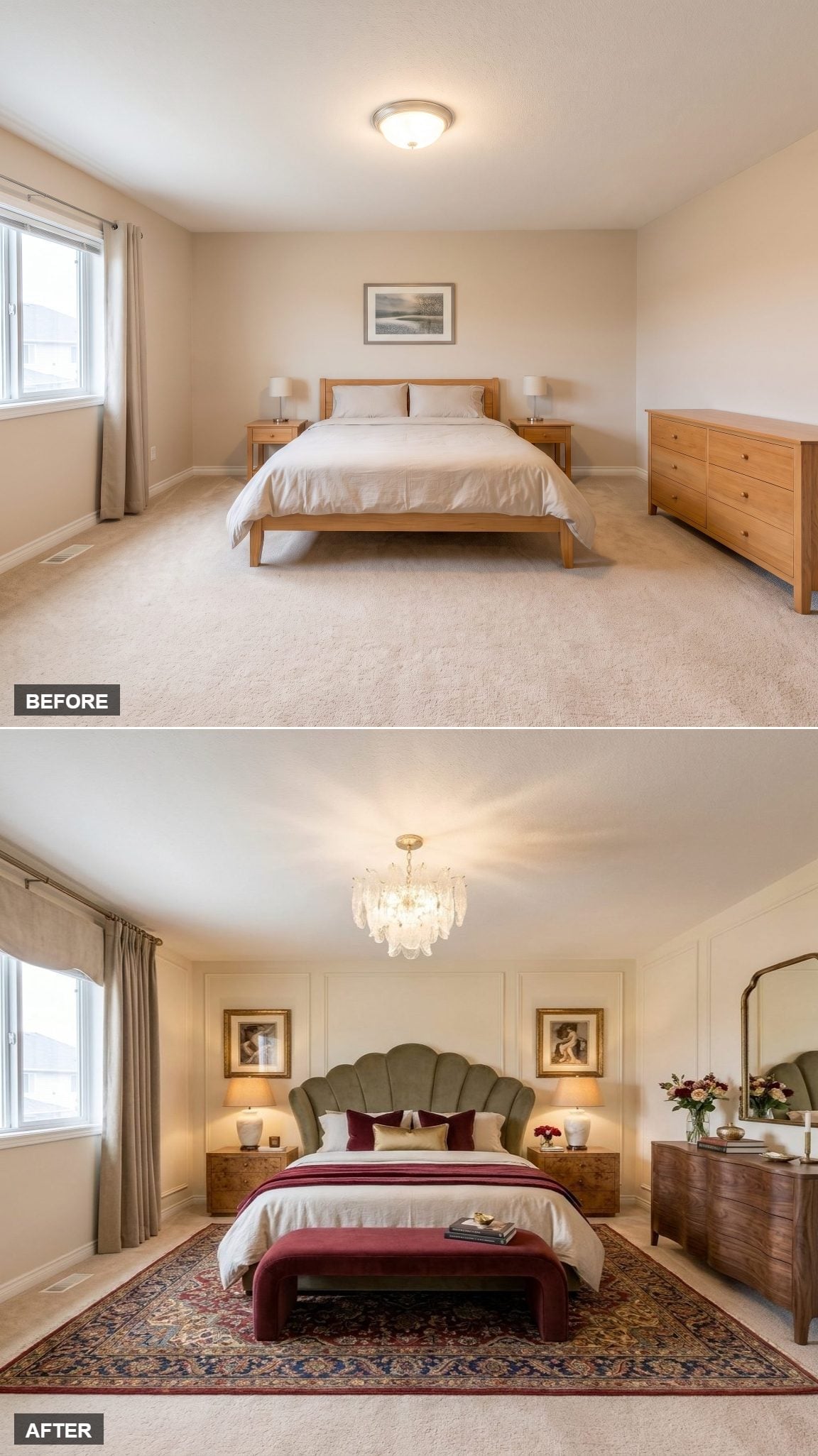
A scalloped olive velvet headboard gives the bed a silhouette before color even enters the discussion. Burgundy pillows and a velvet bench deepen the palette while burl-wood nightstands keep it from becoming too polished.
A Persian-style rug adds pattern underfoot, and wainscoting gives the walls architectural detail without changing the room’s footprint.
Overhead, the glass chandelier becomes a visual destination. It draws the eye upward and, paired with warmer bedside lamps, prevents the entire room from depending on one pool of ceiling light.
Why That Chandelier Matters More Than Decoration
A chandelier in a bedroom can act as a compositional anchor as much as a light source. Here it gives the center of the ceiling a clear focal point, while the lower bedside lamps handle a different layer of illumination. That separation — ambient light above, warmer task light lower down — is one of the simplest ways to make a bedroom feel more adaptable after dark.
13. Slatted Oak and a Paper Pendant Make Texture Do the Talking
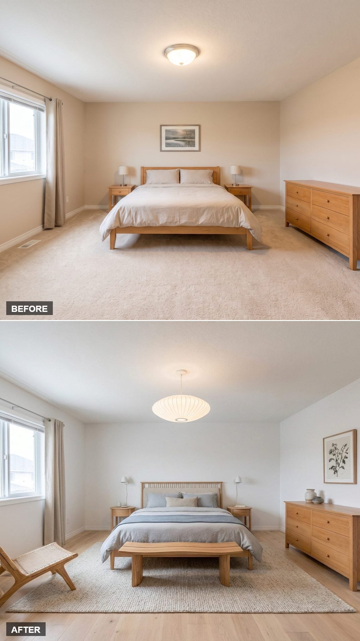
Natural oak repeats from the slatted headboard to the live-edge bench, giving the room continuity without turning every piece into a matching set. A sculptural paper pendant introduces a lighter material overhead and prevents all that wood from becoming too visually dense.
Crisp white walls leave most of the warmth to the furniture, while blue-gray bedding introduces a cooler interruption. The woven rug makes the transition between those two temperatures feel deliberate.
Color Story: White walls can act as neutral breathing room when natural wood is supplying most of the warmth. A cooler blue-gray textile is enough to interrupt the beige-and-oak family without sending the room into an entirely different palette.
12. Three Headboard Panels Give One Wall More Rhythm Than Paint Ever Could
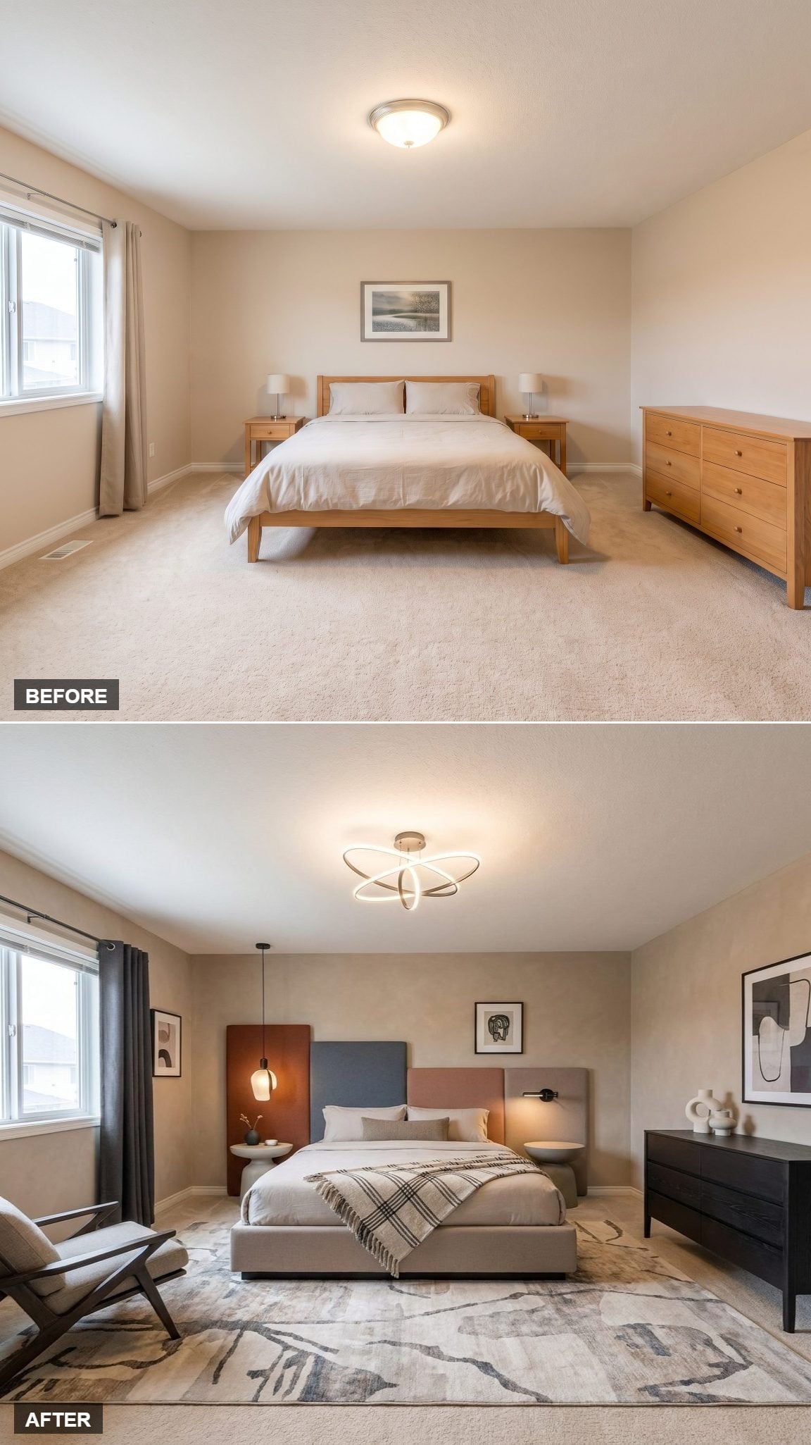
The headboard is the reason to stop here. Three upholstered panels in blue-gray, dusty rose, and terracotta sit side by side, slightly mismatched by design and far more interesting for it.
Lighting follows the same willingness to mix. An orbital-style ceiling fixture handles the center of the room while one drop pendant beside the bed introduces a second height and a more intimate pool of light.
An abstract rug in muted gray and sand keeps the floor quieter than the headboard, and a low chair near the window gives the room somewhere to go besides bed-to-dresser.
Pro Tip: A multi-panel headboard can introduce several colors without spreading them across an entire wall. Keeping at least one quality consistent — similar saturation, related undertones, repeated fabric texture, or a shared shape — is one way to make the variation feel deliberate rather than random.
11. A Persian Rug Moves the Focal Point Below the Bed
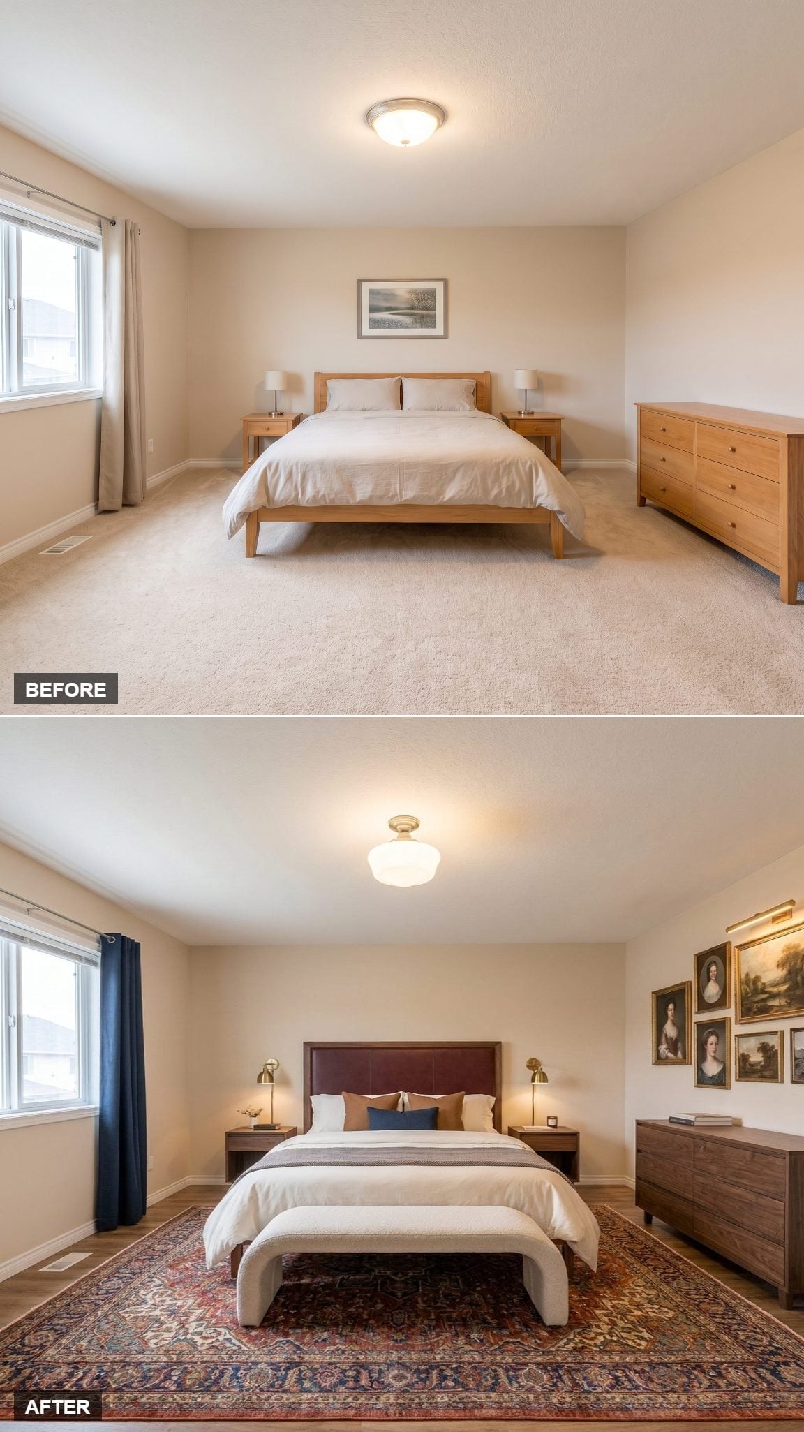
Dark navy curtains ground the window, while a tufted burgundy leather headboard picks up that depth without matching it. Rust and navy pillows connect the two sides of the palette across the bedding.
But the rug is the decision that reorganizes the room. Its deep red-and-navy medallion pattern puts the visual center below the bed rather than above it.
Then the right wall gets weird in the best way: gilt-framed portrait paintings cluster above a walnut dresser. Odd combination on paper. In practice, it becomes the corner you remember.
10. A Tall Taupe Headboard Makes Wall Art Completely Optional
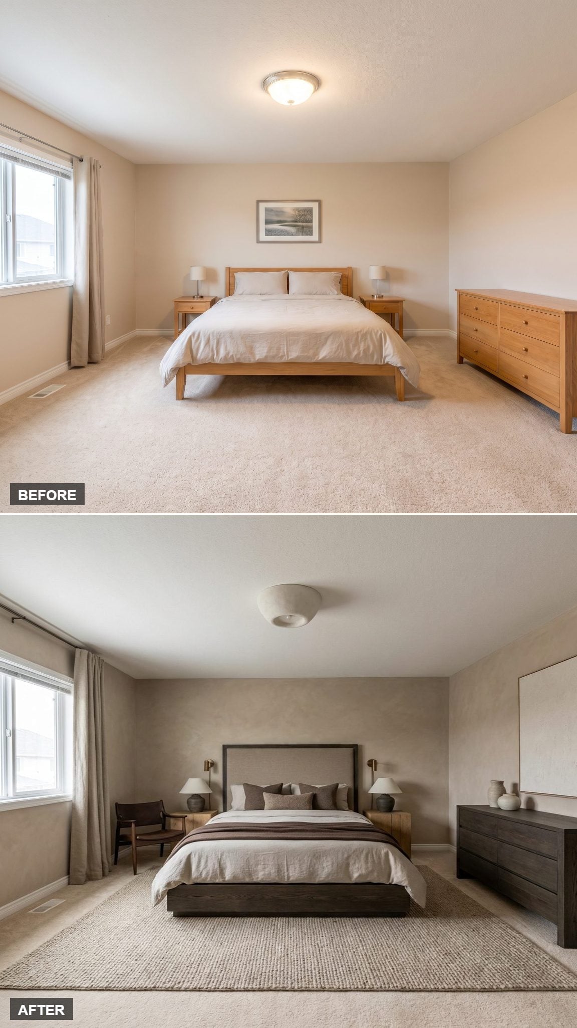
Warm greige walls with a subtle plaster-like texture create a quiet field around an oversized taupe upholstered headboard. Its height fills enough of the bed wall that hanging art above it would almost feel redundant.
A dark espresso platform frame gives the bed a strong base, and a dresser in the same near-black family repeats that weight across the room.
Swing-arm sconces keep task lighting off the nightstands and reinforce the height of the headboard. Instead of decorating every empty patch of wall, this room lets one big upholstered plane do the work.
9. A Rattan Headboard Proves the Bed Doesn’t Need to Be Upholstered to Feel Soft
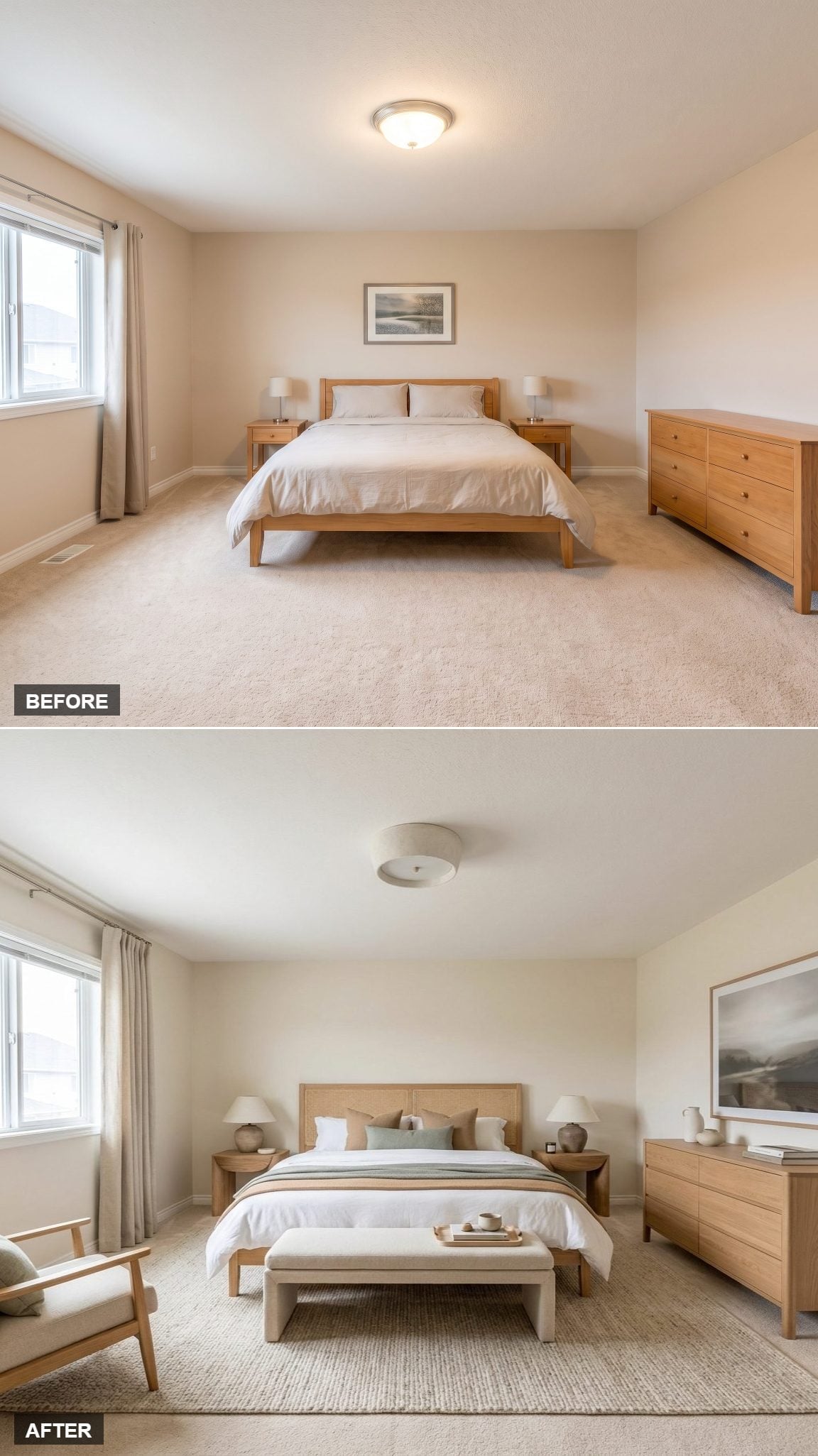
Warm ivory curtains fall all the way to the floor, immediately lengthening the vertical lines around the window. Against them, the rattan-panel headboard adds texture without introducing another heavy block of upholstery.
The bench at the foot of the bed extends the furniture arrangement beyond the mattress and gives the room the kind of layered footprint often seen in hotels: bed, footboard zone, then open circulation beyond.
The bedding stays comparatively restrained, which is the right choice. Cane already supplies plenty of pattern at the headboard; another loud textile would only interrupt it.
8. Blue Walls and a Lantern Pendant Give the Ceiling Something to Say
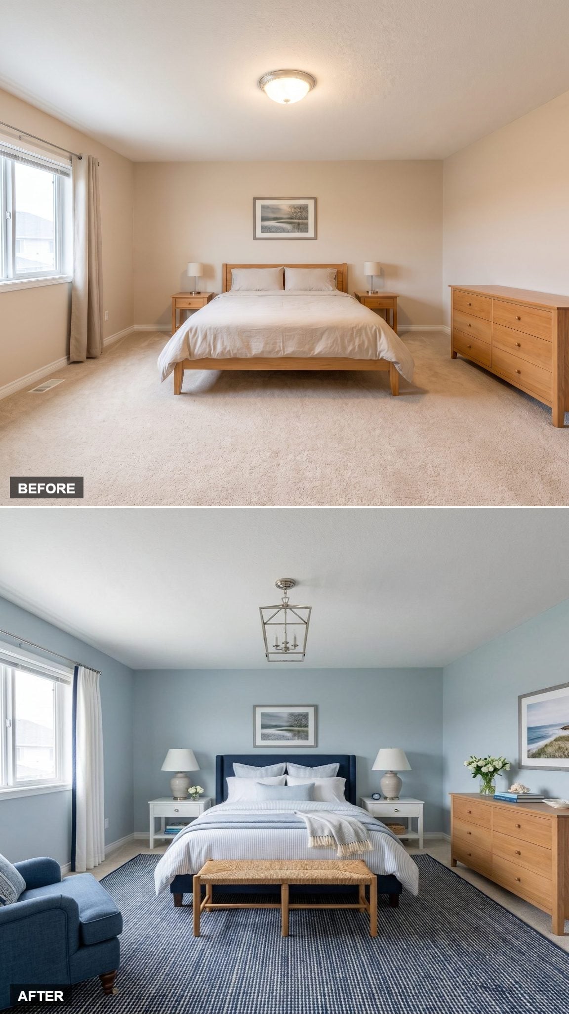
Powder-blue walls keep the room calm without reducing everything to white and beige. The lantern-style pendant overhead gives the ceiling a defined object rather than an anonymous light source.
White nightstands with open lower shelves keep the sides of the bed visually lighter, while the navy upholstered headboard pushes the blue palette several shades deeper.
A rush-seat bench at the foot adds woven texture and stays open enough that it does not create a visual barricade between bed and dresser. Small move, useful restraint.
7. Built-In Side Tables Make the Bed Read Like One Piece of Architecture
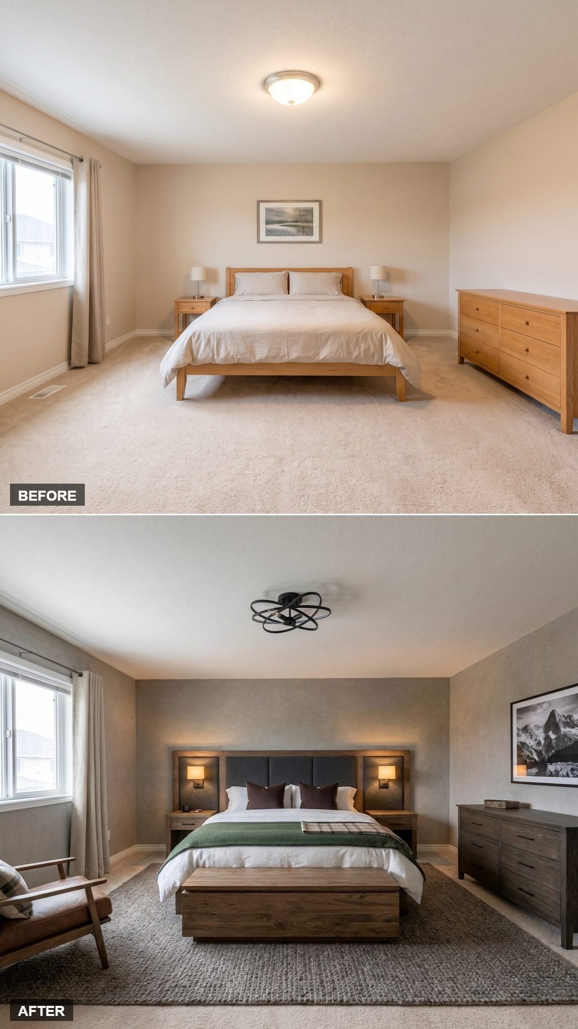
The walnut platform bed extends directly into built-in side tables, making the entire sleep zone read as one horizontal composition instead of a bed flanked by unrelated furniture.
Integrated sconce lighting continues that logic. The lamps belong to the headboard unit rather than sitting on top of separate tables, which leaves the whole arrangement unusually clean.
Green and burgundy layered over white bedding keep the dark wood from dominating. This is the sort of hotel move worth stealing conceptually: fewer separate objects, more pieces that feel designed to belong together.
6. Walnut and Boucle Give an Empty Corner an Actual Job
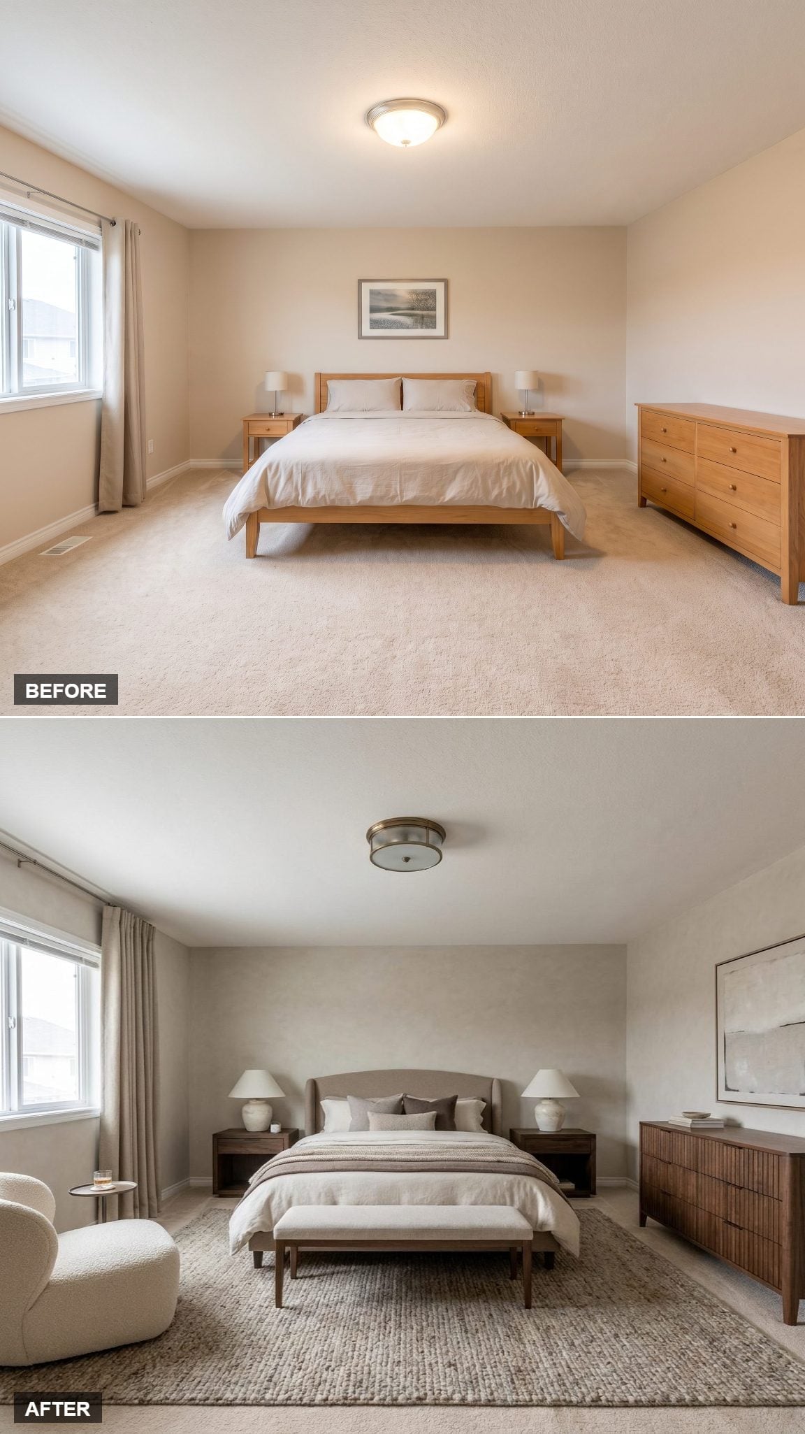
Walnut nightstands bring warmth to either side of the bed without introducing another color family, while textured jute underneath keeps the floor casual enough to offset the cleaner furniture.
The boucle armchair matters because it gives the room a second destination. A bedroom instantly feels more considered when every corner is not merely leftover circulation space.
Layered bedding reinforces the hotel comparison, but the chair is what pushes this beyond a nicely dressed bed. The room now has somewhere to sit when sleeping is not the assignment.
5. Floating Nightstands and Rattan Keep the Floor Visually Quiet
🔥 Would you like to save this?
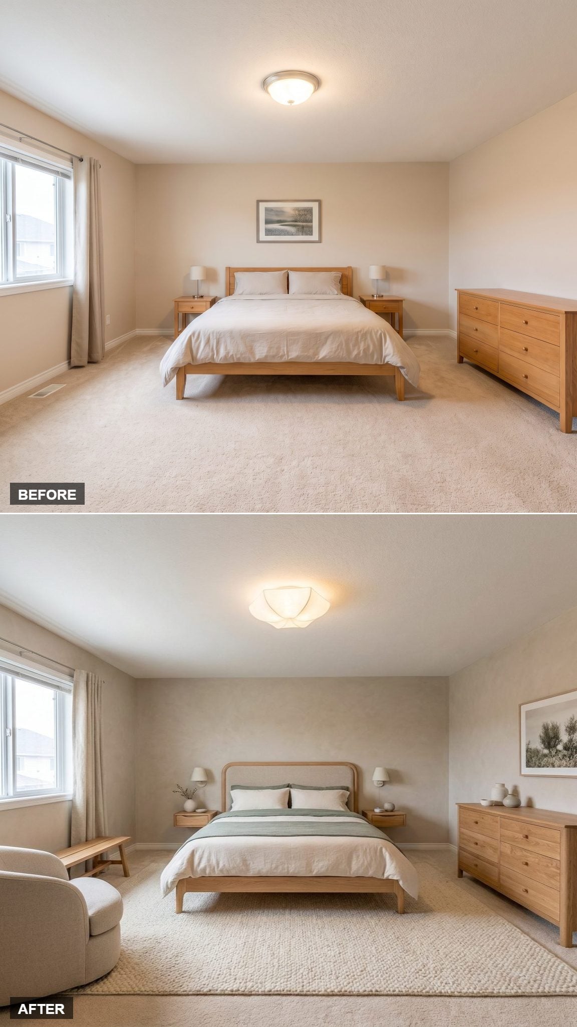
Rounded rattan detailing gives the bed texture without sending the room fully rustic. Against it, white bedding gets one restrained sage runner rather than six competing layers.
Floating nightstands expose the floor beneath them, while wall-mounted sconces keep their surfaces almost entirely free. A couple of ceramic vessels are enough.
Across the room, a wood dresser carries a loose grouping of pottery at varied heights. No giant mirror, no twelve-piece styling vignette. The room gets interest without looking as though someone finished decorating five minutes before the photograph.
4. Olive Walls and a Leather Lounge Chair Make the Bedroom Feel Lived In
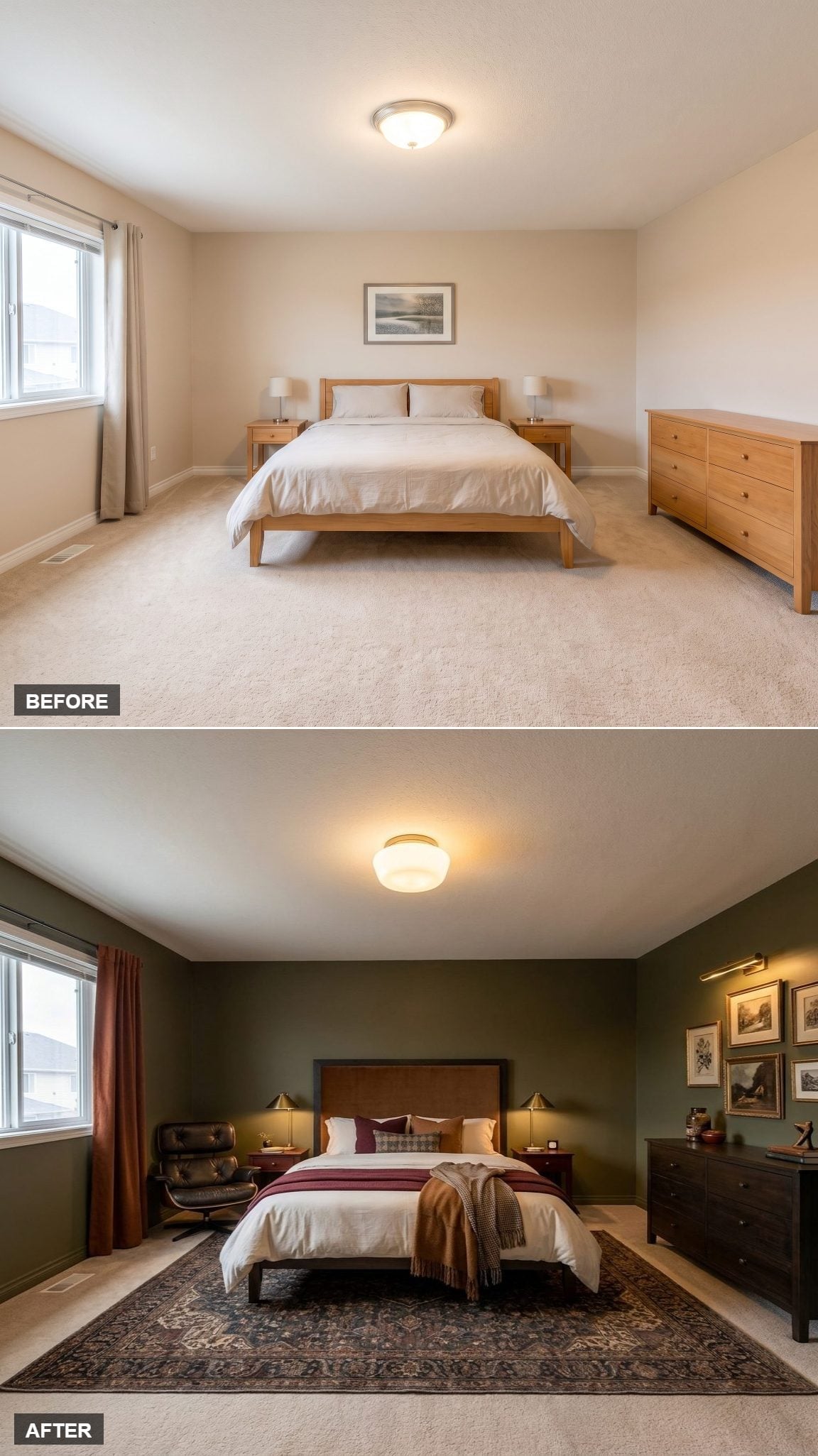
Olive walls turn the warm ceiling light into part of the palette rather than something to fight. A tall camel-colored upholstered headboard bridges that green with the deeper burgundy and navy notes in the Persian-style rug.
White bedding gets a wine-colored runner and caramel throw, enough layering to feel finished without burying the bed.
Then the black leather lounge chair in the corner changes the room’s function. It does not look like decorative filler; it looks like somewhere a person might actually sit. That distinction is one reason the room feels inhabited rather than staged.
3. Dark Taupe and Brass Pendants Give the Bed Wall a Sharper Edge
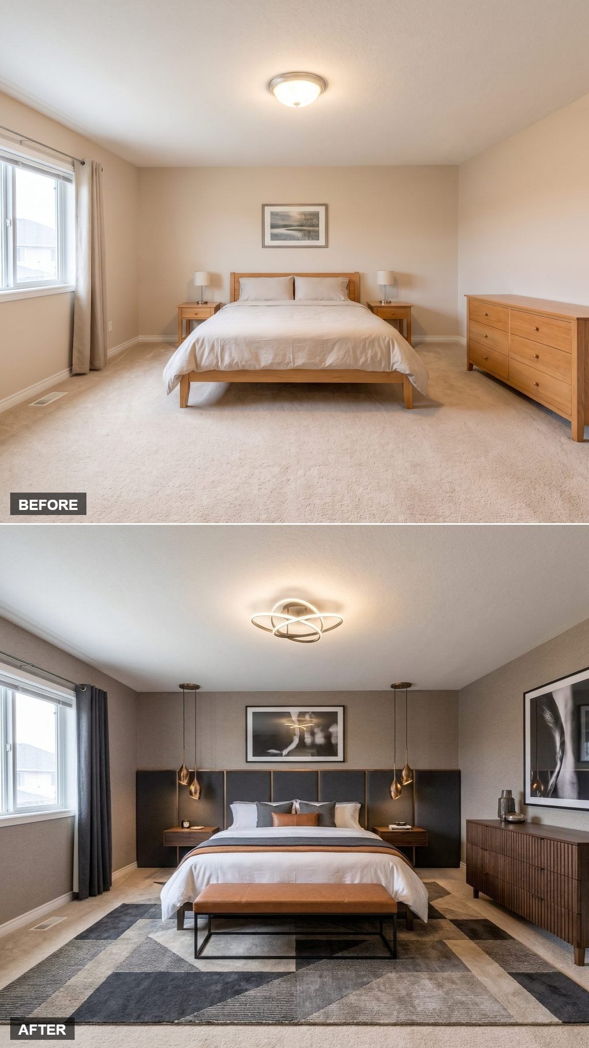
Dark taupe walls and a charcoal upholstered headboard create a much more restrained backdrop than the brass pendants hanging on either side. Their warm metallic finish becomes the room’s brightest accent without requiring another decorative object on the nightstands.
Fluted walnut furniture adds linear texture, while the charcoal-and-sand rug keeps the lower half in the same subdued family.
A cognac leather bench at the foot provides the one warm color break. That’s what distinguishes this from the earlier pendant-light room: the lighting may frame the bed, but the leather bench supplies the tension.
2. Slate Walls and a Linear Pendant Strip the Hotel Look Down to Geometry
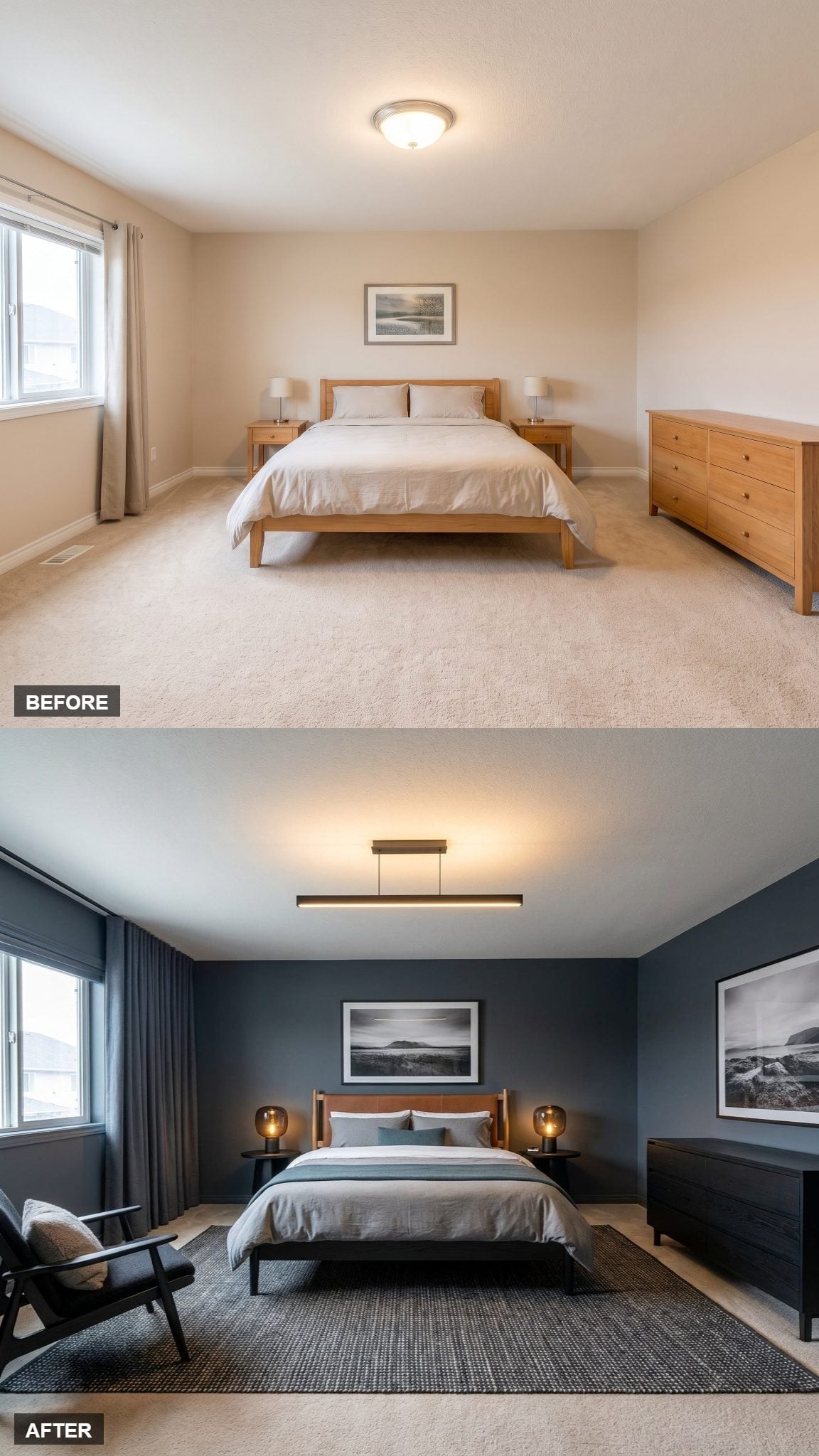
Charcoal-blue walls collapse the visual field around the bed, making the lighter bedding and warm lamps stand forward almost immediately.
A black linear pendant introduces one long horizontal gesture at ceiling height instead of another round decorative fixture. Globe table lamps answer it with softer shapes lower down, so the lighting never feels copied and pasted from one level to another.
Muted teal appears sparingly in the bedding. That’s enough. The room already has strong walls, strong geometry, and three distinct pools of contrast; another color story would only crowd the point.
1. Portuguese-Style Tilework Saves the Most Dramatic Bed Wall for Last
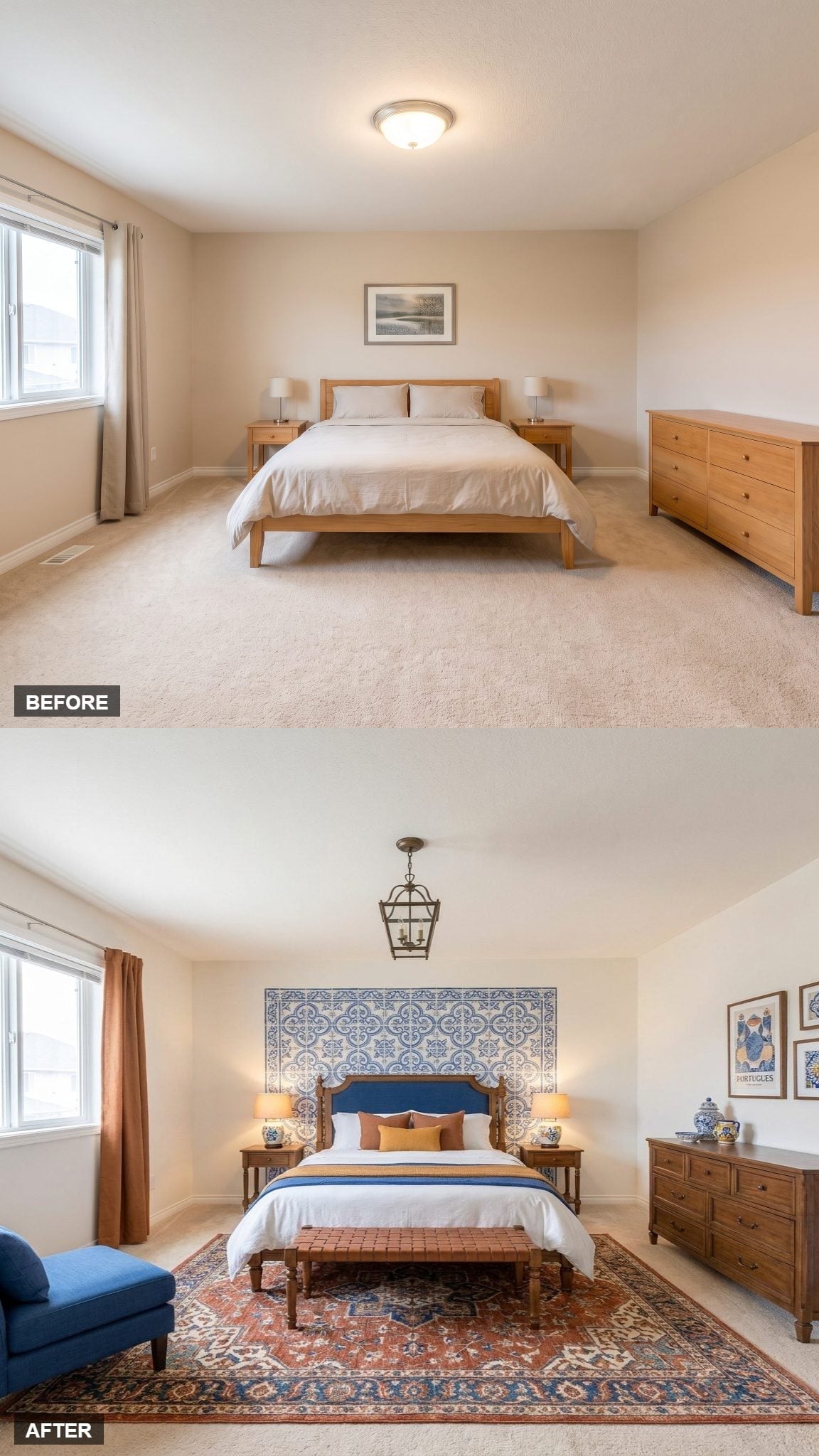
Blue velvet anchors the bed, but the oversized Portuguese-style tile panel behind it is what makes this room impossible to confuse with any of the previous 28. Instead of hanging a small picture above the headboard, the entire wall becomes the artwork.
A wrought-iron lantern pendant brings darker lines overhead and keeps the blue-and-white palette from becoming too delicate. The fixture doesn’t need to be enormous. Against that patterned wall, restraint is the smarter move.
And that may be the useful thread running through all 29 rooms. The hotel feeling never came from one magic headboard, one expensive chandelier, or a prescribed palette. It came from hierarchy. One thing gets to be memorable. The supporting pieces know when to help, when to repeat, and — just as important — when to disappear.












